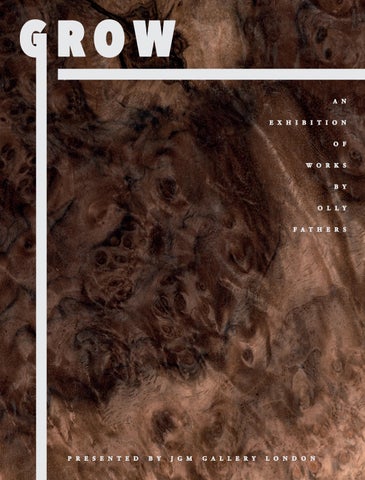

GROW

JGM GALLERY LONDON
AN EXHIBITION OF NEW WORKS BY OLLY FATHERS
12 MARCH - 19 APRIL 2025
USING LESS of the stained timber that featured in much of his earlier work, Olly Fathers places greater emphasis in this exhibition on the organic aspects of his medium. Consistent with this are the protrusions of shapes beyond the borders, as though the timber, recharged with energy, is now outgrowing the conventional margins of an artwork. This novel approach is particularly distinct because of its juxtaposition with the rectangular works in Grow which seem confined by comparison, like buds waiting to bloom.
There is, then, an invitation to think of these works as existing in a state of flux, and in the mind's eye the audience may imagine the timber to be moving toward a more expanded iteration of its present form. This strikes a line of continuity with Fathers' previous exhibition at JGM Gallery, Tangram, in which he and the artist, Dominic Beattie, presented works as constituents of a larger, unresolved puzzle. In Grow Fathers shifts away from this conception of his work as a human construct, instead presenting it as an autonomous evolution of nature.
A notable influence on this series is a concept espoused by Michelangelo in his poem, Non ha l’ottimo artista alcun concetto (1547), where he argues that a sculptor does not create but instead reveals the work of God encased within a block of marble by removing the superfluous material around it. Adopting a secular reinterpretation of this idea, Fathers invites the audience to see the forms in his work not as creations of his own making, but as inherent structures of the natural world, waiting to be uncovered. That is, the creative process is seen by the artist as a collaboration with nature, rather than an imposition upon it.
Before this body of work, Fathers would often only use two or three different veneers for any single piece of artwork. Grow however, features works constructed with greater material variety, and includes veneers cut from birch, spalted beech, figured sycamore, tamo, bubinga, Kevasingo, dyed tulip, ash, pear and birds eye maple, amongst others. Consequently, the compositional arrangements are more complex and nuanced than those previously produced by the artist. While he rejects any kind of narrative or representational
reading of his work, Fathers admits that the audience might inevitably associate certain shapes with globes, clocks or architectural structures. He emphasises, however, that the process itself guides him, and that these arrangements are prompted by technique, spontaneity, and the materials presented to him.
Jennifer Guerrini Maraldi, Director of JGM Gallery, says that “These works represent an exciting development in Olly's artistic practice, and we are thrilled to be showing them to the public for the first time here at JGM Gallery.”
Based in Brixton, London, Olly Fathers constructs works with wooden veneers, using this medium to explore the effects of scale, shape and colour on his audience. Aside from his interest in these formal qualities, he will often delve conceptually deeper, addressing and recontextualising historically significant philosophical questions. Despite the ostensibly highbrow nature of these interrogations, he always retains a sense of play and simplicity, encouraging the viewer, through the puzzle-like aesthetic of his work, to contemplate variations of the composition before them.
Modernist architecture, the flow of public traffic in built-up cities, and early computer technology are notable influences on Fathers' geometric abstractions. In this there is an intriguing contrast between form and content, as these arrangements are presented to the audience in the distinctly pre-industrial and pre-technological guise of timber. The result is an aesthetic that is at once old and new, familiar and novel. Above all, Fathers' practice is grounded in his obsession with − and indeed his mastery of − woodwork, a practice with craft connotations but which, in his hands, becomes the vehicle for profound examinations of the human experience.
Fathers' work has been exhibited in significant artistic institutions, including Saatchi Gallery, London, and he has partaken in various commissions of note, most recently for the collections of Soho House in London, Tel Aviv, Amsterdam, and Mumbai.


Olly Fathers, Wander Through (detail), 2025, walnut burl, Kevasingo, iced birch, cherry, 121cm x 243cm. Image courtesy of Paul Williamson.

BY JULIUS KILLERBY
JULIUS KILLERBY IS AN ARTIST AND THE ASSOCIATE DIRECTOR OF JGM GALLERY. HE HAS PREVIOUSLY HELD POSITIONS AT THE AUSTRALIAN PAVILION (2022 VENICE BIENNALE), METRO GALLERY, SCOTT LIVESEY GALLERY AND FLINDERS LANE GALLERY IN MELBOURNE, AUSTRALIA. WITHIN THE CONTEXT OF HIS OWN PRACTICE, HE HAS EXHIBITED AT THE ART GALLERY OF NEW SOUTH WALES, THE ART GALLERY OF BALLARAT AND GEELONG GALLERY, AMONGST OTHER SPACES.
Olly Fathers working in his South London studio, 2025.
PORTRAITS OF MATERIAL
IRECENTLY met with Olly Fathers at his glass-ceilinged, art-crowded studio in South London. As a workspace it has, unsurprisingly, something of the same care and balance recognisable in his work. How does he understand his own creative process? Partly, he says, it is guided by his materials and the way he engages with them. His choice of veneer for a large work, for instance, might be determined by the complexity of the grain, and whether or not its detail will be lost on a grand scale. Some timbers are also denser than others and consequently harder to cut into certain shapes, or perhaps so fragile that they chip when made into a triangle rather than a square. “ ese are all part of the thought process when coming to designing and ultimately making the piece. e veneer does dictate aspects of the design and I love working within this constant dynamic of problem solving.”
e timber not only guides Fathers' process, but seems to be what the works themselves depict. Much as Jackson Pollock produced paintings about paint, or Lucian Freud made that same medium “work as esh,” Fathers' subject and materials seem intertwined. His only task is how best to reveal the timber's qualities and the life it has lived up until the moment he presents it to his audience. ere is here an interesting parallel between Fathers' practice and an idea espoused by Michelangelo in his poem Non ha l’ottimo artista alcun concetto (1547), in which he argues that a sculptor does not create, but instead reveals the work of God encased within a block of marble by removing its super uous material.
e greatest artist does not have any concept
Which a single piece of marble does not itself contain
Within its excess, though only
A hand that obeys the intellect can discover it.
In a secular reinterpretation of this idea, Fathers invites his audience to view these works as inherent structures of the natural world, waiting to be uncovered. ough this concept is expressed in much of his work, it is perhaps given more

emphasis in Grow than in any of his previous exhibitions. is emphasis is conveyed by minimising evidence of the artist's hand, such as the application of paint to the timber, which was far more ubiquitous in Tangram, the artist's previous exhibition at JGM Gallery. e result is not as minimalist, however, as one might think, and to compensate for what would otherwise be quite sparse and chromatically dull compositions, Fathers has used many more veneers in Grow than he usually would, sometimes between six and seven for each artwork. is material variety, which includes birch, spalted beech, gured sycamore, tamo, bubinga, Kevasingo, dyed tulip, ash, pear and birds eye maple, amongst many others, results in works with incredible detail and complexity.
One of the few impositions upon the medium are the geometric compositions in which Fathers' presents it. ese aid the viewer in di erentiating the veneers and also highlight their aesthetic qualities. In rough e Canopy for instance, the curvilinear grain of the marbled walnut corresponds to the curve of the circles it is cut into. rough e Canopy exempli es another aspect of the works in this exhibition, namely a subtle sense of motion and even precariousness. e three circles almost appear to be moving through the rectangular passage of birch like pinballs collecting at the bottom of a machine. ough Fathers generally evades any kind of narrative or representational reading of his work, he admits that his audience may have their own associations with these compositions, and this is one of mine: the sense of movement and ricochet that a circular form inevitably evokes.
Slow Hours a work composed with six types of veneer cut into circles, semicircles and rectangles, conveys a similar degree of motion, but with di erent aesthetic mechanisms. Each shape nestles neatly against another, except for a circle of blue-dyed tulip that Fathers suspends in the negative space of the bottom right corner. Especially in contrast to the other shapes, which seem con ned by comparison, this Neptune-like form appears to be drifting away, or perhaps falling into the slant of the semi-circle beneath it. e textural juxtaposition of its vaporous veneer with the hard-edged lines of the fumed oak beneath it also conveys a sense of separation and instability, like oil gliding on the surface of water. e overall e ect is an almost imperceptible degree of movement, which is perhaps expressed most distinctly in e Giants In a wholly new approach, Fathers extends the shapes of this artwork beyond the con nes of its border, as though they are, as the exhibition's title underscores, growing. Much like Michelangelo's Non ha l’ottimo artista alcun concetto, Fathers here conceives of his materials as existing independent of his impositions upon them. In fact, he extends this concept, suggesting that the artwork encased within is not revealed by the artist through a subtractive method, but that it develops with or without his removal of “its excess”.
e works in Grow can be thought of as portraits of the artist's material. In presenting the timbers' inner layers, however, Fathers perhaps reveals more about his subject than the wrinkles on a face ever could. As he explained to me, rot in the wood can dis gure the grain, causing its lines to drop sharply, like the change in rhythm on an electrocardiogram. You can determine the age of a tree by the number of its growth rings and, through the science of dendroclimatology, the climates and atmospheric conditions under which it grew. ese works thus display a series of environmental conditions and the passage of time, the culmination of which is their presentation here at JGM Gallery.
FOOTNOTES
Olly Fathers (in conversation with the author), 2025.
Lucian Freud, “Lucian Freud in Conversation with Michael Auping” (May 7, 2009), in Lucian Freud: Portraits (London: National Portrait Gallery, 2012).
Michelangelo Buonarroti, Non ha l'ottimo artists alcun concetto, in e Sonnets of Michelangelo translated by Elizabeth Jennings, 87. New York: Tiger of
1995.

Opposite: Olly Fathers, Through The Canopy 2025, walnut burl and birch, 42cm x 32cm. Image courtesy of the artist's studio.
Julius Killerby, 2022. Image courtesy of JGM Gallery.
the Stripe,

Left to right: Olly Fathers (1) Wander Through, 2025, walnut burl, Kevasingo, iced birch, cherry, 121cm x 243cm, (2) Earthy Gleam 2025, spalted beech, birch, dyed tulip, Japanese ash, English brown oak, 62cm x 47cm, (3) Light Chases Shadow 2025, honey cherry, iced birch, Karelian birch, dyed tulip, birch, 211cm x 123cm. Image courtesy of Paul Williamson.

IN THE WEEKS PRECEDING GROW , JULIUS KILLERBY VISITED OLLY FATHERS IN HIS SOUTH LONDON STUDIO. THE VISIT WAS AN OPPORTUNITY FOR FATHERS TO DISCUSS HIS WORK & THE UPCOMING EXHIBITION.
FOLLOWS IS A TRANSCRIPT OF THEIR CONVERSATION.
Entrance to Olly Fathers' South London studio, 2023.
Image courtesy of Justyna Kulam.
JULIUS KILLERBY What is distinct about this body of work compared to previous ones which you've produced?
OLLY FATHERS In this body of work we (Olly and his partner, Emma Fathers) wanted to use more natural tones with the veneers. In the past we have used a lot more dyed veneers. In Grow aside from the actual compositions, we wanted the emphasis to be on the wood grains themselves.
JK Will the exhibition be entirely devoid of colour, then?
OF Well we thought about it for a while, and we were considering not using colours at all, but then we did decided to incorporate colours which, although not necessarily natural, are colours which one might associate with the natural world; blues and greens for example.
JK In your last exhibition at JGM Gallery, Tangram you seemed to be emphasising the fact that the works in that show were human constructions. e title itself, which referenced a geometric puzzle, was quite an overt reference to that. In this exhibition, however, would you say that the emphasis is more on the organic aspects of your work and medium?
OF Not necessarily with the shapes and forms. We decided to use certain shapes because of the familiarity or associations that one might have with them. Circles, for instance, might be suggestive of a wheel and, by implication, movement. We will also try to make compositions that are balanced, with certain shapes resting on each other, or in a position that creates an overall sense of harmony. Some of these, though, might reference − perhaps subconsciously − some bits of architecture or design. So, the compositions aren't directly inspired by something necessarily natural but the tones, the palette and the wood grains are de nitely trying to reference that a bit more.
JK I imagine that with the use of less colour the eye is also going to be more drawn to the veneer itself.
OF Yes, and as opposed to the works in Tangram which were predominantly monotone and made up of only two veneers, the works in Grow are made up of between four and seven di erent veneers. Because of this we have to be a lot more considered in the way we put the compositions together, as making all the components complement one another is a much more complex process. We will sometimes have a really interesting veneer, and we'll then have to think how best to use that and how to highlight its qualities. e veneers, in some cases, almost help decide the composition.
JK And because you are using many more veneers, I would assume that the new works are, despite having less stains and dyes, almost more chromatically complex.
OF Yes, and trying to make ve or six veneers work together is a lot more challenging. Certain tones and grains pop out more and consequently almost occupy a foreground, whereas others might recede. e use of so many veneers has almost created a lot more compositional depth and complexity. at's taken a greater understanding of the veneers and how they work together.
JK Have you been looking at any new source material for this exhibition? Any new artists who might be on your radar?
OF I have actually just made a point of researching more about the veneers themselves, rather than looking to any art historical references, or anything like that. We have also worked with a lot more suppliers. is exhibition has veneers in it that have come from about six di erent suppliers within the UK. Before, we might have only used two or three. So we have really tried to expand the types of material that we are working with.
JK What are some of the veneers that you've used in this show?
OF ere's one called tamo, which is Japanese ash. It generally has this in-
credible guration going through it, so I am incredibly excited to have that in the exhibition. ere's also some engineered veneers, which are produced in a really interesting and eco-friendly way. What the suppliers do is they replicate rarer or more endangered wood veneers by building up layers of pigment on a more common veneer. ey look nearly identical to the real endangered veneers but are, as I say, a more responsible way to source them, and they have been a lot of fun to work with.
JK Have you got quite a close relationship with your supplier then?
OF I do now, yes.
JK You and Emma are probably their best customers, I imagine.
OF Some of their most frustrating customers *laughs*. ey do like the variety of veneers that we are interested in. Often, people want to buy one veneer in bulk, whereas we want lots of di erent and interesting ones.
JK Are some veneers harder to work with? Are denser timbers, for instance, harder to cut?
OF Yes, de nitely. One of the things we have to factor in when designing the compositions is that some of the timbers are prone to splitting, or when they arrive they are not very at so you have to treat them before cutting. If it's a larger piece it has to have multiple joins in the veneer. Some of the veneers also lend themselves much better to that process than the others. So, when we are designing and planning the pieces, we are very much thinking, “Okay, that rules out this or that”, or “If we want to use that veneer, it has to be that size.” ings like that. ese are all part of the thought process when coming to designing and ultimately making the piece. e veneer does dictate aspects of the design and I love working within this constant dynamic of problem solving.
JK What is the title of this exhibition and why?
OF e title of this exhibition is Grow. ere's an obvious double meaning, because of course trees and wood grow, and particularly in this exhibition we’ve really focused in on the natural burls and beauty in the grains of the wood. But I am also seeing this body of work as a development in our practice. An artistic growth.
JK I often get the sense with your work that, as the viewer, you are invited to consider variations of the composition that you, the artist, have presented. I suppose the title is consistent with this, in that the audience is encouraged to consider more expanded iterations of the artwork's current form. Would you agree with that?
OF Yes, as I have touched on before, with the shapes and forms that we use, there is a sense of movement toward something else. In Grow, some of the works we are producing for it are not going to be contained by the conventional rectangular or square format, and there will be works with shapes and forms that extend beyond the border of the artwork.
JK And I guess the grain of the veneer is also something that the audience would inevitably associate with growth and trees. Something that is not entirely static, but is developing almost imperceptibly.
OF Yes, the grain itself is such a great natural record of time passing. Although static pieces in themself, when you study them, the works really do give that sense of something that has grown, each with their own unique record of this in completely unique wood grains.
JK Because you are using less colour in this exhibition than you previously have, do you have to use particularly interesting wood veneers to make a compelling piece of work, and perhaps in answering that, could you explain what you and Emma are looking for when you are deciding which veneers to work with?
OF Yes, the way we approach this body of work is to have less contrasts between the veneers, and for the overall e ect to be a lot more subtle. e nice thing about the veneers is the way in which they catch the light sometimes. ey change as you walk around them. Something we have always been interested in is trying to make a work where the audience is encouraged to move around it and bend down to look up at it, look from the side, to catch the light in di erent ways. In doing that, it's actually a bit more challenging to get a veneer to work next to another one. It's very easy if they are strongly contrasted or look very different to each other, but it's actually quite challenging to pair two veneers that are only subtly di erent, and then to expect each one to stand out. Often we'll play with things, like having the grain go in a di erent direction. is can create a subtle di erence in how the light hits it, even with the same type of wood. So there are some elements like that, and then we do have bits that highlight some really crazy, interesting veneers, which have this interesting patternation going through them. It's been nding some of these veneers and being able to use them on this scale which has been a really interesting part of this show.
JK Am I right in saying that this is the rst time you have made works which protrude beyond the borders?
OF We have made wall-based sculptures before, however, those were much more three-dimensional, whereas these new works are more similar to the twodimensional works we make, but with the extensions beyond the border. Also, because they won't have frames, you'll be able to see the veneers going around the edges, almost tricking the eye into thinking of them three-dimensionally. ey're a lot more playful.
JK How do you put these compositions together before cutting out the veneers? Will you make preliminary drawings?
skills, but you know being able to build walls in galleries or do a shop tting is a very di erent skill to dealing with wood veneers. I used to make quite intricate paintings, using masking tape. Everything that I've ever done has always been quite delicate and intricate, but I had never actually handled and worked with wood veneers. at's been part of the reason as to why it's been so much fun, learning about it and researching how to do it, looking at YouTube, reading books, various di erent things, but mainly trial and error. It's been that element that's been the driving force, and still is really. It's this constant exploration of guring out how to work, how to make this bigger, better, more interesting.
JK So your process is your main inspiration then?
OF Yes, de nitely. e way the works are made, it's rare that we'd nish a body of work and be struggling for another idea. ere's so many di erent possibilities with the material, and so many ideas that come along with it, that it's more a case of having time to explore them properly.
JK Do you have a favourite shape that you use, and what do you think is the e ect of that shape in your work?
OF When I was rst making them, I think it was far more rigid. I'd use primary shapes like squares, rectangles, and a recurring thing is the use of a circle. I think that's because it's a very satisfying and powerful shape that people have a lot of associations with. It also has these connotations with movement. So it's a useful shape, it's a strong shape but, technically, it's actually quite a tricky thing to cut out from a veneer.
JK How do you cut the circles?

Yes, because of the nature of the medium, when we are making these


OF Yes, because of the nature of the medium, when we are making these works everything has to be meticulously planned out to the millimetre. Sometimes, it might start o with a sketch, but often it will be drawn up straight on the computer in Adobe Illustrator. Initially, we will be working with lots of di erent designs. We then decide our favourite ones and tighten those up, scale them up, to perfectly match and join everything. at'll be the starting point in the process of cutting the veneers into all the shapes. You're then e ectively making a big veneer jigsaw puzzle, which then gets joined and glued together.


JK We were speaking before about how when you were younger you used to also be interested in guration and portraiture. Your work has clearly come a long way since then. When did you rst come up with your current practice?


I think it was 2019. It was just before Covid when

OF I think it was 2019. It was just before Covid when I started experimenting with wood veneer. Not in the way that we are now, but just out of intrigue. I was just interested in the medium and how people worked with it. Initially, my experimentations with it didn't go all according to plan but once I started to gure it out and realised that it was working for me, it just sort of clicked.


JK Did you already have the woodwork skills necessary for it?
OF No, not really. I mean, I had woodwork


Essentially with home made compass cutters of varying shapes and sizes. It's far less high-tech than people might think.
OF Essentially with home made compass cutters of varying shapes and sizes. It's far less high-tech than people might think.


Opposite: Olly Fathers, The Giants 2025, bubinga, iced birch, walnut burl, cherry and birch, 85cm x 85cm. Image courtesy of Paul Williamson.

Left to right: Olly Fathers (1) Endlessly Swaying 2025, figured sycamore, ash, birch, birds eye maple, Karelian iced birch, 62cm x 47cm, (2) Wander Through 2025, walnut burl, Kevasingo, iced birch, cherry, 121cm x 243cm. Image courtesy of Paul Williamson.

JK But painstaking and nerve-wracking I imagine?
OF Yes, de nitely. You are also kind of limited by the shapes that you can use. ey have to be hard-edged shapes so that you can cut and pair them with other veneers. If they are not hard-edged you obviously can't join them. When we were rst making them, they were far more rigidly composed and we were applying more rules to them. For instance, we'd make works composed of exact halves, thirds, or quarters of each shape, whereas now the shapes and their relationship to each other is a lot more uid. Now that we also have a better understanding of how to cut the shapes, it's given us a lot more scope compositionally. Now they don't have to necessarily be a perfect semi-circle or it doesn't have to be a completely straight square or rectangular shape.
JK Are your works wholly devoid of narrative? Do they perhaps relate to certain moments from you and Emma's life?
OF No, they don't really relate to a certain moment or anything like that. Afterwards, we might see something in it, but that's not a driving force in the making of these works. I look back at them now and of course for me they make me remember certain times in my life, but that's more to do with what was going on whilst we were making them.
JK If they are devoid of narrative, is there then a feeling which you are trying to convey or elicit from your audience?
OF I think that the feeling or sensation can come across in the choice of the veneers and shapes. Some of them have a softer, calmer feeling than others. A lot of people say to me that they nd them really calming and tranquil. I also think that has to do with our familiarity with the material. When some of the veneers are put together in certain ways, they do have connotations of things like the sea and movement. So, we are mindful of that when we're making them but we're not trying to depict that as a direct sort of reference. You know, we are not trying to make it look like a seascape or something quite as obvious as that, but we are aware that people have these kinds of connotations with them as well.
JK So you are comfortable, then, with people interpreting the work in their own way, rather than receiving it in the exact way that you and Emma intend?
OF Yes, I love to hear peoples' interpretations of our work. I actually heard someone say that one of them looks like a penguin *both laugh*. I think that part of the beauty of it is it can really trigger di erent emotions for di erent people. As the person making the pieces it's really nice to hear that, and hear the bene ts that it's giving others.
JK I know that architecture is a big in uence on your work. Is there any type of architecture which is of particular interest to you?
OF I am very interested in minimalist architecture. Brutalism is something I have always been fascinated by. Even around here in South London, just over the road from my studio, there's the Brixton Recreational Centre. In many ways it's quite an ugly building, but it has a lot of really sharp edges and joins. If you go inside, you'll see that there are overlapping balconies and interesting things like that. It's not necessarily a building that everyone would like but I nd it really interesting. ere's another building called Dawsons Heights, which is near the Horniman Museum, also in South London. I actually met both the architects. ey're a couple called George Finch and Kate Mackintosh. I was speaking to them about the architecture and what they were trying to do with it was actually really interesting. e building is a block of ats, which is ostensibly quite boring. What they did though was they made the balcony of each at stick out in di erent areas. Kate's reasoning for that was, as she described it to me, so that when kids are playing in the playground, they can look up and point to which is their at, and have something to reference it by. I thought that was really nice.
JK For this exhibition, I know that you are making a very tall work. You mentioned to me earlier that you are trying to create this e ect that as the viewer approaches it they are almost enveloped by it. Has this love of architecture
prompted you to work with scale a lot more, and to take advantage of its e ects?
OF Yes, I think so. at work will be very tall and narrow and the idea is that when you stand in front of it, it will have an overpowering sense of height and loom over the viewer. It's not meant to intimidate but it will just be nice for it to have that presence.
JK Almost as though you can't take it in all at once?
OF Yes, exactly.
JK Are the shapes in your work ever representational? Might a circle perhaps represent a globe or a clock? Or might a square ever represent a window or a building?
OF Not directly but sometimes those shapes are used sort of like tools in a way. If a circle is overlapping another shape, like a square, it kind of changes it. It might suggest something else, almost as though the shape is going through a window, and that then creates a sense of depth in the work. I think that I sometimes use a subconscious reaction to things like that, like windows, door frames, man-made structures. ere's an incredible installation that I once saw. It was a Fred Sandback work. He'd made a doorframe with string and suspended it in midair. ere was nothing else. I had this pretty profound moment when walking through the doorframe, and I felt this chill. So, I will sort of use shapes that we're familiar with as a sort of tool to create depth or suggest something. ey are never directly referring to something representational but I am certainly aware of the power of the shapes and the e ects they can have on the audience.
JK Could you speak a bit about the importance of texture in your work?
OF Yes, well with this exhibition we are trying to put more emphasis on the veneers themselves and, as I say, use a lot more of them. We’ve spent a lot of time looking for di erent species of veneers for this show. ere's a few that have much stronger and striking patternation than those we've previously used. Often, the patternation can be a ected by some kind of pain or discomfort that the tree has experienced, which I nd quite fascinating.
JK So the grain can tell us something about the environmental conditions that the veneer has been subjected to?
OF Yes, you can get guring through the tree, which is what gives some of the veneers this beautiful ripple e ect. at often occurs as a result of the tree going through a certain degree of discomfort. Rather than the grain going straight up, it's e ectively sort of moving and shivering as it's growing. e oak, for instance, is a tone that many people will be familiar with, because of its use in furniture and certain things, but you can get di erent tones in oak that occur because of fungal infections. at can make the timber darker, for instance. You also sometimes nd gradients going through the timber and that often happens because the wood has fallen and been partly submerged or buried in a bog, sometimes for hundreds or even thousands of years. Wood veneer is so fascinating to me, and that is a massive driving force in my practice, the material itself and researching and learning about it.

ARTWORK IMAGES


Olly Fathers, Saturn Rising, 2025, figured sycamore, birch, Karelian birch, cherry, 100cm x 108cm
Olly Fathers, The Giants, 2025, bubinga, iced birch, walnut burl, cherry, birch, 85cm x 85cm

Olly Fathers, Saturn Rising 2025, figured sycamore, birch, Karelian birch, cherry, 100cm x 108cm. Image courtesy of Paul Williamson.

Olly Fathers, Wander Through 2025, walnut burl, Kevasingo, iced birch, cherry, 121cm x 243cm


Olly Fathers, Light Chases Shadow, 2025, honey cherry, iced birch, Karelian birch, dyed tulip, birch, 211cm x 123cm
Olly Fathers, The Calm Of This Space, 2025, dyed eucalyptus, dyed birds
eye maple, figured sycamore, ash, bleached beech, birch, iced birch, iced maple, 124cm x 91.5cm


Editorial design: Julius
Artwork Photography: Olly Fathers' studio & Paul Williamson.
Front cover: Olly Fathers' veneer, 2023. Image courtesy of Justyna Kulam.
Back cover: Olly Fathers in his South London studio, 2025. Image courtesy of Justyna Kulam.
Killerby.
Photography: Justyna Kulam, Paul Williamson & Julius Killerby.