

An introduction
to our brand
Our strategic framework ensures we deliver a cohesive and elevated experience across every touchpoint and line of business.
Purpose, Positioning, and Audience
This simple framework outlines three key components of our strategy: Because: Our purpose We provide: Our positioning To: Our Audience
Experience
This framework and the principles within it ensure we deliver the feeling of being On a Cloud across every part of the experience, regardless of business line.
Our passion for every aspect of global flight runs incredibly deep
On a Cloud
One to one We build a personal touch around each and every customer. Details matter
When you have it all, it’s the smallest details that matter most.
Minimal is the way We remove barriers and complexity by saying and showing less. Stay grounded We stay mindful of every decision to help shape a better world.
Positioning, and Audience
At the surface, there is calm. A fine layer of simplicity and elegance. This is where you are.
You experience flight in its smoothest form.
From seamless repairs to hand-crafted interiors, the beauty is built in. The details pre-designed.
You already know where you want your experience to take you. We are how you get there.
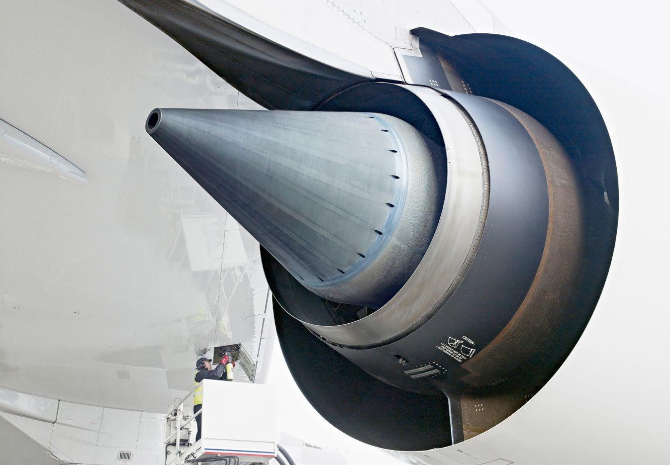
Underneath one engine part lie thousands of hours of meticulous sculpting.
Within a single charter sit the countless hands that crafted the journey.
That’s where we are.
The artisans underneath the art. The effort behind effortless.
Behind any seamless Jet Aviation interaction is a huge amount of work by a team of dedicated and passionate people.
The refreshed brand identity heroes the often untold stories behind great aviation experiences.
The effort1 behind effortless 2
1 Effort — Though our clients will only know the feeling of being On a Cloud, underneath their experience lies a foundation of individuals pouring countless hours into the details.
2 Effortless — Our calm and considered identity uses annotations and footnotes to reveal the expertise that makes effortless aviation possible while letting important moments breathe.
Our four creative principles, evocative, detailed, minimal, and honest, allow our brand to flex while ensuring we deliver a singular, coherent experience.
Evocative Detailed
Warm and sensory, we capture the feeling of being On a Cloud by utilizing poetic language and imagery.
Precise and crafted, we revel in the finest details, with a Swiss-inspired grid and considered language.
Minimal Honest
Concise and succinct, we reduce complexity wherever possible to create a sense of calm and ease.
Upfront and candid, we use imagery and language to share the often unseen effort that lies behind every flight.
Utilizing our brandmarks
Our Brandmark consists of two core elements with distinct yet essential roles. The monogram acts as a shorthand for our brand, while the endorsed wordmark communicates our name and our relationship with General Dynamics.
Monogram
Our monogram is an abstracted JA which takes the form of a plane's tail fin. A fluid and dynamic mark that evokes a sense of movement and ease.
Wordmark
Our wordmark is formed using bespoke geometric character forms to build a sans serif expression that is strong, simple and well-crafted.
Endorsement
Formed from the General Dynamics' logotype, the endorsement clarifies our relationship with our parent company.
Our monogram is an abstracted JA which takes the form of a plane's tail fin. It is a fluid and dynamic mark that evokes a sense of movement and ease.
Clear Space
Clear space is the area surrounding the brandmark that is kept free of other elements.
The minimum clear space, shown on the right, is the height of one monogram.
Minimum Size
The specified minimum sizes, measured to the width of the monogram.
Digital 25px
Print 4mm
Color
The monogram should only appear in Classic Navy, or white if reversed out of a solid color or image.
In the limited situations where color cannot be used, the monogram may appear in black, for example, a fax.
Usage
The monogram can appear in isolation or as apart of the brandmark with the endorsed wordmark.
It should never appear multiple times within the same page or display.
Classic Navy Monogram
Our brandmark combines the monogram with the endorsed wordmark. The wordmark is formed from bespoke geometric character forms to build a sans serif expression that is strong, simple, and well-crafted.
Clear Space
Clear space is the area surrounding the brandmark that is kept free of other elements.
The minimum clear space, shown on the right, is the height of one monogram.
Minimum Size
The specified minimum sizes, measured to the width of the brandmark.
Digital 247px
Print 46mm
Color
The brandmark should only appear in Classic Navy, or white if reversed out of a solid color or image.
In the limited situations where color cannot be used, the brandmark may appear in black, for example, a fax.
Usage
The brandmark should never appear multiple times within the same page or display.
Classic Navy Brandmark
Reversed
It is critical that the brandmark is applied correctly to ensure consistency across the experience.
Outlined here are a number of things to avoid.
Do not recolor
Do not use the wordmark without the monogram
Do not remove the endorsement
Do not rearrange brandmark elements
Color Palette
Color is a vital part of our identity that helps to ensure every touchpoint feels distinct and ownable.
Core Palette and Balance
Our core palette consists of Classic Navy and Warm Red, combined with Crisp White. The bands of color shown on the right are roughly representative of color balance. We feature a dominant amount of white and negative space in layouts.
Digital Neutrals
These colors are intended for use in digital applications, but could be adapted for print use with testing.
These color specifications must be followed consistently to maintain the integrity of our visual brand identity. Always use the color values appropriate to your intended reproduction method.
Color Application
It is critical all layouts incorporate both Classic Navy and Warm Red. To ensure consistency there is a simple theory to applying color.
Headlines
Headlines are always red, unless reversed out of a color (navy or red).
Brandmarks
Brandmarks and monograms are always navy, except when reversed out of a color background.
Footnotes
Footnotes are always red, and if a call to action is used as a footnote, it should also be red.
White Space
Perhaps the most important color of our palette is no color at all. Be sure layouts incorporate large areas of white space.

Our functional palette is an extended color palette reserved for use in charts, graphs, and tables.
Where possible, its application should be limited, and tints of our core palette should be used before utilizing the other functional colors.
Our core palette can only be tinted for use in charts, graphs, and tables; it should not be used this way in any other applications.
Articulating our tone of voice
Our voice tells us how we should write, speak, and engage with audiences. These principles are a way to ensure that no matter the subject matter, our communications will feel consistent and true to the Jet Aviation brand.
These tone of voice principles have been derived from the overall strategy, and applied to verbal specific use cases.
Evocative
Use warm, sensory language to spark the feeling of being On a Cloud
Consider words and phrases that describe sensations (smooth, stillness) Incorporate second person sentences to establish a personal touch
Detailed
Speak to our craft with carefully considered cadence, to convey our passion for every detail.
Minimal
Be concise and succinct, reflecting the stress-free experiences we shape.
Revel in a singular detail for a sentence, or even a paragraph
Use punctuation and word choice to create a short, sharp rhythm
Honest
Be open to sharing the effort and craftsmanship that lie within every experience.
Create headlines that focus only on what the client sees — the tip of the iceberg
Elevate only what is fitting and necessary for the communication
Stay humble with behind the scenes language (beneath, underneath)
Use our annotations to reveal the breadth of capabilities behind each experience
Evocative
We talk about “air” to bring in a feeling of lightness.
Detailed
The comma causes the reader to take a purposeful pause. This is the precise rhythm we can achieve even at smaller touchpoints through careful punctuation.
Minimal
We keep this touchpoint neat and succinct to let the message breathe.
Honest
At a smaller touchpoint, not every principle will be dialed up. Here, we lean less into this principle.
Air, crafted
Evocative
This principle is less present at this touchpoint.
Detailed
We say “artisans” and “craft” to convey our devotion to the details. We also get alliterative (artisans/art, countless/craft) to show the precision can live even in our choice of letters.
Minimal
We let the “countless hours” and references to artistry speak to our capabilities, rather than listing them.
Honest
We talk about the process that underlies flight with the phrase “behind the art,” and speak candidly to the amount of hours we put into our work.
We
are the
artisans behind the art of flight, devoting countless hours to craft the perfect experience.
Evocative
We begin the manifesto from the perspective of the reader, integrating personal touch and sensory language (“surface,” “fine layer”) to make the emotions feel tangible.
Detailed
Use of mirroring sentence structures1 and callbacks2 introduces a careful balance and symmetry into the text.
1 'You already know where' / 'We are how'
2 This is where you are' / 'That’s where we are'
Minimal
Leaning into the sharp punctuation that the Detailed principle gives us, we use incomplete sentences to denote a concise, singular thought.
Honest
We use words like “underneath” and “within” to position ourselves clearly in the process as the artisans diligently working to enable effortless experiences.
At the surface, there is calm. A fine layer of simplicity and elegance. This is where you are. You experience flight in its smoothest form.
From seamless repairs to hand-crafted interiors, the beauty is built in. The details pre-designed. You already know where you want your experience to take you. We are how you get there.
Underneath one engine part lie thousands of hours of meticulous sculpting. Within a single charter sit the countless hands that crafted the journey. That’s where we are.
The
artisans underneath the art. The effort behind effortless.
Evocative
We begin with a focus on the reader’s perspective — the sensation of touching down, and the feeling of seamlessness.
Detailed
Since the body copy talks primarily about our capabilities, as opposed to the client feeling, we italicize “superior” as the detail we are most diving into.
Minimal
The headline alludes to the feeling, or the output, while letting the body copy divulge the details.
Honest
We use behind the scenes language then pay it off with, “Seamless is just the surface,” as if to indicate the full sum of capabilities always available for use.
This is what superior service feels like
Touch down in Seletar Airport or Changi International Airport, and feel the expertise of the Singapore FBO team working to craft a seamless experience for you.
Behind every seamless FBO experience in the APAC region, our comprehensive team of experts is working to ensure top quality standards at every turn. From transportation to fueling, from catering to cleaning, the details are designed with you in mind.
Seamless is just the surface.
Contact us today to find out how we can assist your journey.
Jet Aviation Singapore
1075 West Camp Rd, Seletar
Aerospace Park 797800, Singapore
Core to the brand is a pairing of typefaces that balance craft and utility to create a typographic expression that feels refined and considered without losing a sense of warmth.
On the following pages we've outlined how to set, color, and place each of the brand typefaces.
This is GT Super Display Light and Light Italic. Used for headlines, the typeface balances the fluid movements of calligraphy with the resolved, sharp edges of a classic serif.
This is Arial Regular. Used for subheads, body copy and annotations, the secondary font is inspired by iconic Swiss typefaces. The output is an elegant, considered typography full of utility.
Headlines
Headlines should always set in GT Super Display Light and can use italics to emphasize a word or phrase.
Annotations
Numeric annotations are added to our headlines to let our most important messaging moments breathe while the corresponding footnotes can share details about the expertise that makes effortless aviation possible.
Footnotes
Unpacking the annotated word or phrase footnotes should always start with a superscript number corresponding to the headline annotation.
Color
Application of color to typography is an integral part of our design system, as demonstrated on the right.
Headlines Warm Red 1
Annotations Warm Red 2
Footnotes Warm Red
Titles Warm Red
Subheads Classic Navy
Body Copy Classic Navy Headlines
Headlines and Annotations
Seamless 1 is just the surface
1 Seamless — The weeks our flight managers spend precisely planning every moment of your next journey
About Us
Subheads and Body Copy
Our History
Since 1967, Jet Aviation has been the source of flight in its smoothest form, maintaining, designing, and chartering private aircraft. From your time in the air to those moments in between, you can expect a simple beauty in any journey with us.
Behind every seamless interaction are our people, the artisans of aviation, honing their craft in Aircraft Management, Maintenance, Repairs, Overhauls, Completions, Staffing, Charter, and Fixed Base Operations. And with locations around the world, you can trust us to be everywhere you need to be.
We are the effort behind effortless experiences in flight.
Seamless 1 is just the surface
1 Seamless — The weeks our flight managers spend precisely planning every moment of your next journey
About Us
Our History
Since 1967, Jet Aviation has been the source of flight in its smoothest form, maintaining, designing, and chartering private aircraft. From your time in the air to those moments in between, you can expect a simple beauty in any journey with us.
Behind every seamless interaction are our people, the artisans of aviation, honing their craft in Aircraft Management, Maintenance, Repairs, Overhauls, Completions, Staffing, Charter, and Fixed Base Operations. And with locations around the world, you can trust us to be everywhere you need to be.
We are the effort behind effortless experiences in flight.
Leveraging our design system
The starting point for layouts is determining the margins.
For consistency across the various sizes and orientations of our communications, we have developed a mathematical formula: Divide the length of the diagonal by 30 to derive the margin size.
Note: Depending on the nature of the collateral and production requirements, the size of the margin may need to be adjusted.
Page Margin
Margin Size Diagonal Length / 30
Using a logical and adaptable grid system will help build well-structured collateral that provides consistent brand expression.
A 6-column grid system is recommended for vertical layouts, and a 12-column grid is recommended for horizontal layouts.
As a starting point, size the gutters to one-third the width of the margin. This can be adjusted based on the specifics of the collateral. Grid System
Columns 6 or 12
Gutters Margin Width / 3
6-column grid for vertical layouts
12-column grid for horizontal layouts
The preferred placement of the brandmark and monogram is at the bottom left corner of the collateral.
As a principle, the brandmark is sized such that the height of the monogram is half the width of the margin (the same rule applies when the monogram is used alone).
The size or the brandmark may need to be adjusted in some cases, most specifically when the size or proportions of the communication would render the brandmark below minimum size requirements. Brandmark Height Margin x 0.5 Position Bottom Left
Brandmark size and placement
Monogram size and placement
Our grid is the basis for the two parts of our flexible design system; the footer and window.
This simple system ensures that every layout feels calm, considered, and effortless.
Footer
The footer area remains clear of all graphic elements, with the exception of the brandmark, monogram, annotations and Jet Aviation URL.
The height of the footer is five times the height of the monogram.
Footer Height Margin x 2.5
The
Window
The window area is where photography is placed. The window can vary in height, but imagery placement is restricted to the area from the top trim edge of the collateral to the top of the footer area.
Determining the footer height
The flexible window
The diagrams on the right show the flexibility in sizing and placing photographs in the window area.
The window area is fitted to the width between the margins. The height of the window is calculated as 1/2, 3/4 or the full height of the area from the top trim edge to the top of the footer.
The headline sits either on the image or in the white area above or below the image. To make layouts more dynamic, the headline is aligned to the grid, but placed off-center.
The same rules apply for both vertical and horizontal formats.
Window Specs
Max. Width Margin to Margin
Max. Height Page top to Footer
net liquia 1 quam
net liquia 1 quam
volor
net liquia quam
net liquia 1 quam
Dolectecte
Dolectecte
Dolectecte
Dolectecte
The exhibits on the right demonstrate how to bring the different elements together.

The artistry behind every journey

The artistry
behind every journey

The artistry behind every journey
The artistry behind every journey

Air, crafted

Built from our creative principles, photography plays a key role in articulating the seamless and calm feeling of the Jet Aviation experience.
Evocative
Light and graceful our images evoke the feeling of being On a Cloud.
Detailed
Elegant and considered, there is an artful nature to the images we create.
Minimal
A clear focal point and the use of negative space like the sky or tarmac deliver a sense of calm to our imagery.
Honest
A voyeuristic view to the world of aviation our images pull the viewer into the moment.


Composition
How we compose each image is key in ensuring our photography feels unique and on-brand.
Composition
Images should feel calm. Avoid multiple angles, contrasting colors and visual noise caused by too many small objects.
Frame
Each image should be framed to have one clear focus. Using negative space to minimize visual noise and complexity is key.
Lighting
The light should feel soft and even; avoid the high contrast of bright highlights and dark, hard shadows.
Perspective
Avoid angles and perspectives that make objects look warped or exaggerated.
Depth of Field
Where possible the images should avoid a narrow depth of field.

The tone of our imagery is key to capture the feeling of our brand promise On a Cloud.
The light, warm, and slightly desaturated tonality of our imagery, as well as simple compositions, ensures we convey a sense of ease even when depicting the hustle behind the scenes.
Our imagery should incorporate light sky-like tones of blue and warm grays and beiges that complement our primary palette. Where possible we should avoid incorporating our brand's core colors into images.

While it is ideal to create the most on-brand imagery in camera, color grading each image can help ensure our photography feels consistent across the brand.
Through this process, our imagery achieves the light, warm, and slightly desaturated tonality that is integral to our brand. These details should be used as a guide only; each image should be assessed individually and modified accordingly.
Dynamic Range
The dynamic range of the image has been compressed, so that blacks are more gray, and whites are less bright.
Saturation
The image is desaturated to soften and calm the image.
White Balance
The temperature and tint of the white balance has been shifted to make the image warmer.
Hue, Saturation and Lightness
The blues in the image have been slightly desaturated and lightened to soften the image.


While all our photography should feel cohesive and follow the same guidance, there are additional considerations when photographing our people.
Composition
Images should still feel calm, even if capturing our team in action. Where possible simplify the setting to ensure a calmer shot.
Framing
Each image should be framed to have one clear focus; this could be a person, or a detail of their work activity.
Depth of Field
Where possible the images should avoid a shallow depth of field; however, when bringing focus to our people in busier environments, the technique may be used.
Retouching
While we don't want to alter our people or their features, light retouching of cuticles or tidying flyaways can ensure detail shots looks great at every scale.


