Jaymie Kennedy
CONTACT
jaymiekennedy.va@gmail.com
https://www.linkedin.com/in/jaymiekennedy (954) 562-1483
SKILLS
Revit
Enscape
AutoCAD
Procreate
FF&E Selection
Construction Documents
Customer Service
ACHIEVEMENTS
Undergraduate Leadership Award Department of Interior Design | 2023-2024
IIDA President of the Interior Design Student Organization 2023-2024 | Article Feature
Responsible for scheduling and organizing social, networking, and workshopping events.
Oversee a team of eight executive board members to ensure that all tasks are completed and members are gained through outreach.
IIDA Vice President of the Interior Design Student Organization 2022-2023
Assisted the presidents with tasks related to event planning, career fair preparation, and outreach with ASID and IIDA.
Received honorable mention for annual Department Charrette design competition 2021
Participated in the Interior Design Department’s annual Charrette competition to design a secret society on Florida State University’s campus.
EXPERIENCE
Design Intern
P&H Interiors (May 2023-Current)
Interned with the FF&E and Interior Architecture Departments in a luxury residential design firm in Coral Springs, Florida.
Currently assisting designers with client presentations, art and lighting packages, FF&E selection, and floor plan redlines.
Executive Assistant to the CEO
CESC, The Kearney Center (May 2022-April 2023)
Assistant to Chief Executive Officer of a non-profit homeless shelter in Tallahassee, Florida.
Scheduled meetings, organized fundraisers, and advocated for individuals struggling with homelessness.
Design Intern McManus Kitchen & Bath (March 2021-August 2021)
Organized and maintained a Kitchen & Bath design showroom in Tallahassee, Florida.
Oversaw shipment of supplies and organization of jobsite folders for current and upcoming projects.
Sales Leader Express (August 2017-November 2020)
Responsible for daily operations and administration for retail location in Tallahassee, Florida.
Managed schedules while meeting and exceeding daily metric goals.
Responsible for the retail store's visual presentation.
VOLUNTEERING
Nims Outreach
2023-2024
Volunteered with students from Nims Middle School to show them the benefits of pursuing an education in design. 2023 event took place at Florida State University 2024 event took place at Florida A&M University
Adobe Suite InDesign Photoshop Acrobat Illustrator

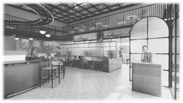
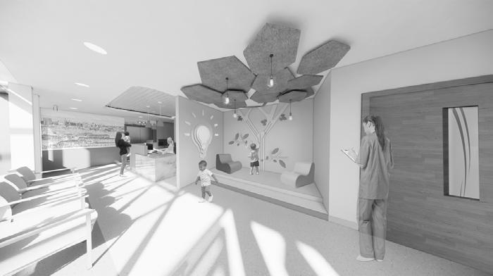
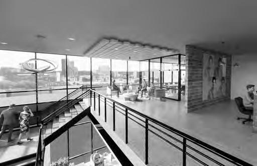

TABLE OF CONTENTS THE 18TH 02 HARBORSIDE HEALING 03 ARTIST RETREAT 05 ZUBI 04 HOTEL LAUREL 01


HOTEL LAUREL
Hotel in Antalya, TurkeyHOTEL LAUREL
Hotel inAntalya,Turkey
01
Project Brief
Over the course of one semester, I was tasked with designing an eight-story, 54,800 square foot hotel located in Antalya, Turkey. Using Revit, Enscape, and Photoshop, the final hotel design includes a reception and concierge, retail location, multiple dining experiences, standardand king size suites, full-service spa, and spaces for back of house usage, including a staff breakroom, kitchens, and staff locker rooms. The hotel caters to travelers, employees, and locals to act as a popular attraction in Antalya’s bustling metropolis.
SiteContext

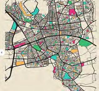
Antalya isthe fastest-growing cityinTurkey, and a major destination spotfor touristsfromaroundthe world toenjoy its beaches and Turkish culture.Visitorscan explore the ancient Roman,Byzantine,and Ottoman architectural influenceswhile enjoyinglocal cuisine and culturalimmersions.
HISTORY

CULTURE
Antalya isnot short ofentertainment.Witha vibrant nightlife and plentytoexplore duringthe day,the citybringsforth anurban lifestyle witha metropolitanfeel. Totruly appreciateAntalya,it’s essential toexplore its demographic diversity,which shapesthe city’sidentityand contributes toits uniquecharm.
SITES
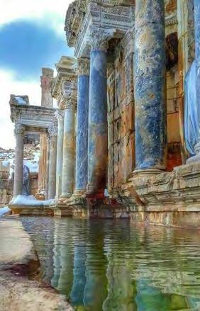
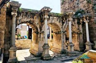
The city'sOld Town(Kaleiçi) isone ofthe largest attractions in Antalya,withthe narrow, cobbled streets lined byuniqueOttoman housesthatoffer touristsa chancetoexperienceTurkish culture withoutdoor shoppingand foodvendors.Hadrian’s Gateand Antalya’s Archaeology Museumare iconicsites ofinterest.


Hospitality Project - Spring 2024
G e n çl i k FevziÇakmakCdNo2207100Muratpaşa/Antalya, Tü r k iy e
Welcome toHotel Laurel
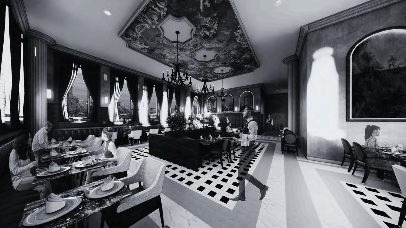
Asvisitorsenter the Hotel,theyare transported toanother time, bringingforth feelingsofgrandiose wonder. The architectural marvels ofantiquity greet you withtoweringcolumns and intricate mosaics,setting the stage for anunforgettable journey through history and luxury. Asa traveler, yourexperiencebeginswitha seamlesscheck-inprocess,where moderntechnologymeets timelesshospitality. The grand atrium, withits cofferedceilingsand large bench seating servesasthe heart ofthe hotel-a place where travelers and localscan cometogethertosocialize and unwind. Visitorscan takethe monumentalstairstoany ofthe eight levels, the elevators,orventure intothe retailspace orbar & cafe.
DESIGN PROCESS
Concept Development
The art of antiquity calls upon a chance for retrospection and is essential in driving the design of the new hotel. With a focus on the grand and opulent nature of Ancient Roman and Ottoman architecture and design, the hotel will bring forth an exciting and memorable experience to draw in travelers and locals. Characterized as a design hotel, the idea that travel can be luxurious while also accessible is embraced in each space. Utilizing the form and scale of ancient arches and columns will reflect the historical attractions in Antalya while bridging the gap between modern and antiquated design practices. Design implications for travelers, employees, and locals are implemented to ensure ease and comfortability while also promoting an exciting place to visit.


and adjacent cafe. Black and white checkered flooring tile is the predominant flooring for the main level, immediately drawing users in and is a nod to the ancient belief that masonic flooring represents the duality of human nature.


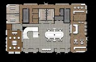
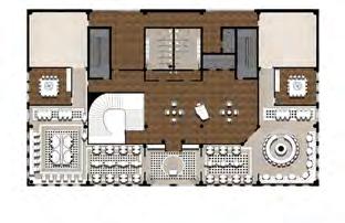
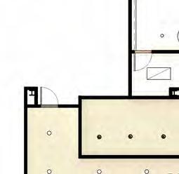
STAFFLOCKERS OF.2 OF.2 OF.1 W.RR M.RR RESTROOMCORRIDOR CONCIERGE ELEVATORWAITING RETAIL RETAIL ST. LUGGAGE ST. RECEPTION
VESTIBULE
CAFE
VESTIBULE
BAR&LOUNGE
BREAKROOM STAFFLOCKERS KITCHEN (NIS)
SERVICE (NIS) PRIVATEDINING
HOST&WAITING RESTAURANT OPENTO BELOW LOBBY&ARTGALLERY PRIVATEDINING M.RR W.RR PUBLICRESTROOMS
KITCHEN (NIS)
KITCHEN (NIS)
BAR&LOUNGE
Level 1:Ember & Steel ArtistryBazaar

Thisretailspace showcases handmadegoods fromlocal vendors, calling uponthe famousstreetmarkets inAntalya, and incorporating Turkish culture intothe hotel for travelers toenjoy.Named for the Roman god offireand craftsmanship,Vulcanisbest known asa blacksmithand artisan.The goalfor the retailspace istodrawusers intothe buildingthrough exteriordisplayspromoting the goods toanyonewalking by.
Level 1:The CybeleCafe
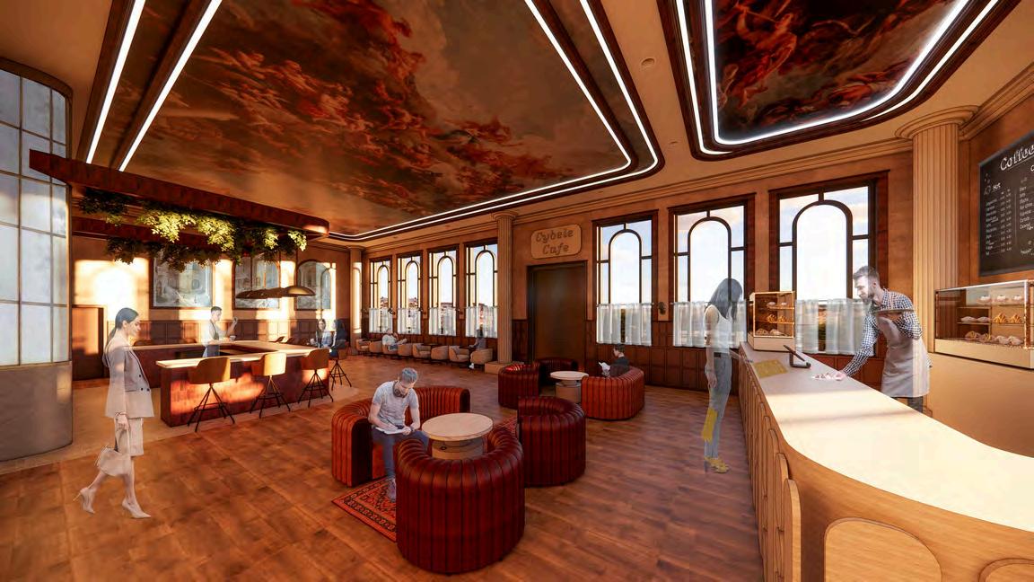
The Cybelebar & cafecreates a warmand invitingatmosphere where guestscan unwind, graba quick breakfast,orenjoy anevening drink beforeexperiencingAntalya’s vibrant nightlife.Cybeleisknown asthe mothergoddess and the mistressofwildnatureand she has beenwidelyacceptedassuchinTurkish culture.Large plush seating options can behometo travelers needing tocompleteworkfor longperiods oftimeorsimplyfor a cup ofcoffee.
Level 2: The Ops Eatery

As guests enter the restaurant, they are greeted by a host and shown to their seats. Choosing from banquette, bistro, or half-round booth seating, the restaurant serves parties of all sizes, even offering two private dining rooms for large parties or events. As guests move to their seats, they are greeted by a warm atmosphere, an abundance of artwork, and intricate molding details to call to a harmonious blend of modern sophistication and ancient charm
Level 2: Bar & Lounge
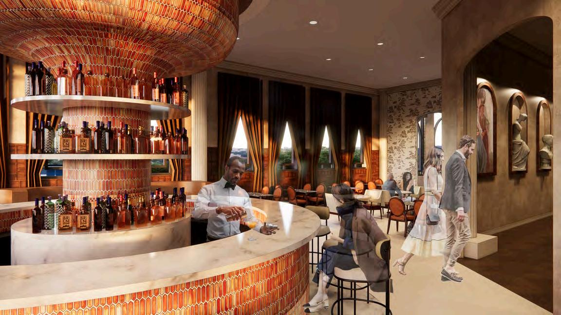
Guests may also choose to sit at the bar & lounge adjacent to the Eatery, where they can enjoy excellent service and panoramic views of Antalya’s historical attractions.


Levels 3-8 include the sleeping floors, with level 8 also including a full-service spa and private library and lounge for guests staying in the King Suites. Guests may choose to stay in a standard size suite, available with 2 double beds or 1 king bed, an ADA suite, or a King Suite, which includes a living and dining area.


Finally, level 8 includes more King Suites, a spa complete with massage rooms, a steam room, a full service nail salon, and a private library and lounge for guests staying in a King Suite.
KINGSUITE STANDARD DOUBLE STANDARDKING HOUSEKEEPING VENDING/ ICE ELEVATORWAITING ADASUITE ADASUITE ADASUITE KINGSUITE KINGSUITE KINGSUITE STANDARDKING STANDARD DOUBLE STANDARDKING STANDARDKING KINGSUITE PRIVATELIBRARY/ LOUNGE SPA HOUSEKEEPING VENDING/ ICE ELEVATORWAITING KINGSUITE KINGSUITE KINGSUITE KINGSUITE KINGSUITE
The Sleeping Floor Corridor


Entering the king suite, you are struck by the fusion of antiquity and comfort, creating a . The plush bedding adorned with luxurious linens and pillows promises a restful night’s sleep after a day of exploration, and the living area, complete with a sleeper sofa, provides extra room for more guests to enjoy the suite.
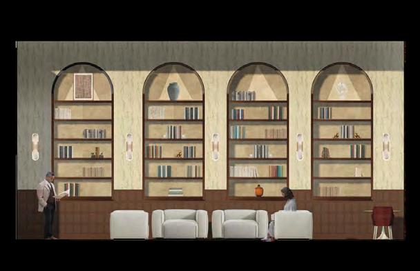
Level 8 Library & Lounge
The library and lounge includes oversized seating, including armchairs, sofas, and ottomans, to create an atmosphere of luxury and comfort while encouraging visitors to learn more about Turkey’s history and culture. A perfect place for a rainy day, the library and lounge promotes visitors to stay in a King Suite to allow for access to this hidden gem.
VENDING/


THE 18TH
Breakfast & Lunch Cafe
Breakfast & Lunch Cafe
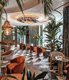
02 The 18th
Project Brief
Over the course of four weeks, myself and a fellow design student were tasked with designing a breakfast and lunch café located at the Cascades Mixed Use Development, adjacent to Tallahassee’s famous Cascades Park. Using Revit, Enscape, and Photoshop, we were put to the test to create an exciting and memorable project that was ultimately chosen to be displayed on site.
Site Context
The breakfast and lunch cafe is located in suite 113 of the Cascades Mixed Use Development and is approximately 2,600 square feet. With values rooted in collaboration and community engagement, The 18th includes a full bar, booth and chair table seating options, and a retail addition that sells merchandise reflective of the company’s brand. Designed with working individuals in mind, The 18th is the perfect place to bring a client or enjoy a luxurious lunch break. Unlike other nearby restaurants, The 18th caters to daytime attendance and welcomes all ages on weekends. The café is reminiscent of a 1920s speakeasy, calling on the feelings of freedom and nostalgia after the 18th Amendment repealed prohibition. Universal design principles such as equitable use, perceptible information, and appropriate size and space for approach and use were implemented throughout the design to ensure accessibility for all users.
Co-Designer: Grayson Avriett

Retail Project - Spring 2023
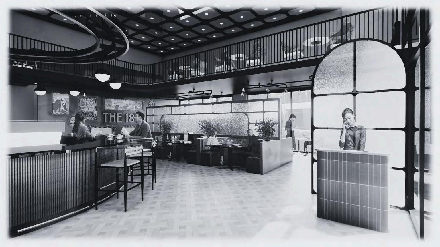
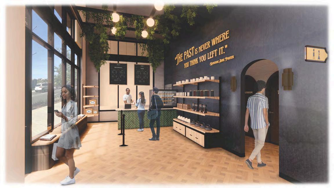
Welcome to The 18th
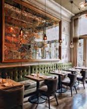
Upon entering the space, customers are greeted by the host stand and welcomed scheme and nostalgic mood aid in creating an opulent atmosphere that acts as the perfect place to host client meetings or luxurious lunch breaks for the tenants of the surroundings businesses. The large wall in the main dining space is adorned with images from the 1920s in gilded frames to tie the concept into the design.
DESIGN PROCESS
The design of The 18th is inspired by the concept of contemporary nostalgia, the idea of integrating past events with present experiences. The space will elicit feelings of opulence and sophistication through the use of contrasting materials, delineated spaces, and strategic branding placement to immerse users in experiences of the past. Inspired by a 1920s speakeasy with a modern twist space for business associates to patron. With the mood of the space in mind, emphasis, unity, contrast, and color will lead the design in creating a posh atmosphere, while drawing users into the notion of contemporary nostalgia.
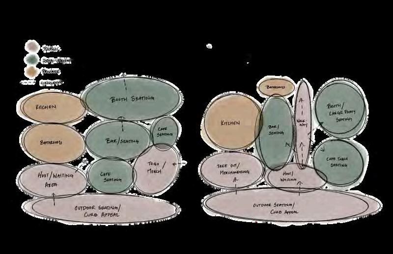
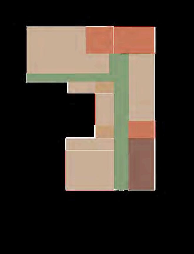
The Blocking Diagram the space planning process, taking into account square footage as relative to the given building shell.
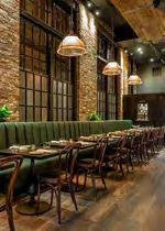
The Bar Experience

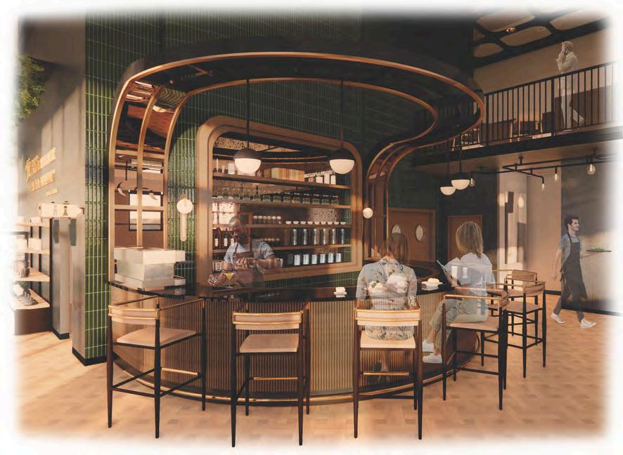
The bar is the focal point of the space, drawing patron’s eyes to the eclectic colors and contrasting materials that create a moody and comforting atmosphere. It includes a built-in shelving unit with an antique mirrored backing which beckons users with its enticing curvilinear shape, inviting customers to take a seat and enjoy an additional space to bask in the nostalgic design.
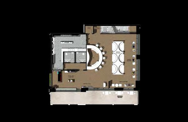
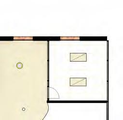
REFINED SPACE PLANNING - LEVEL ONE
floor plan
The level one floor plan consists of a retail store and takeout area, two universal ADA restrooms, a fully equipt kitchen, and options between banquette, bistro, and outside seating. As customers enter the space, they are greeted by a host and taken to their


REFINED SPACE PLANNING - LEVEL TWO
floor plan
The mezzanine that makes up level two take up approximately one third of the café space. The mezzanine consists of bistro tables and a banquette booth seating option for large parties. The shape and size of the second level offers users an intriguing view of level one and the bar below.


The Retail Space shows a takeout area for patrons to easily grab their food as well as merchandise with The 18th’s logo. The store is strategically positioned adjacent to the restaurant exit, so patrons must walk through the retail space before leaving, enticing them to make a purchase or to do so when picking up their takeout order. There is also a window connecting to the kitchen for staff to easily prepare and pass the takeout food to the person working at the cash wrap.
Branding & Universal Design Principles
The name "The 18th" is inspired by the 18th Amendment, which repealed prohibition and also the 18th century, which is when coffee was introduced to America. Photos of this era are displayed throughout the café. Products are displayed along the walls on industrial-style shelving units with storage on the bottom for overstock. The exposed shelves with industrial pipes is reminiscent of the 1920s and contributes to the branding.


The18th BREAKFAST&LUNCHCAFE The18th BREAKFAST&LUNCHCAFE The18th The18th BREAKFAST&LUNCHCAFE


HARBORSIDE HEALING
Baltimore Pediatric Clinic
Baltimore Pediatric ClinicHARBORSIDE HEALING 03
Project Brief
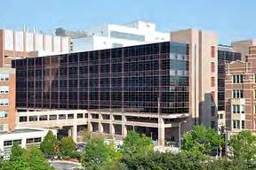
Completed over approximately ten weeks, this newly constructed pediatric primary care clinic in Baltimore, Maryland will provide a place for healing and growth to patients from birth to eighteen years of age, with accommodations to treat behavioral health issues. The clinic’s design scope will include Exam Rooms, Public Areas, both Administrative and Physician Workrooms, a Manager’s Office, Nurse’s Station, Staff Lounge, Medical Room, Soil Room, both Family Restrooms and Staff Restrooms, a Patient Education Space, and an Outdoor Area. Intuitive wayfinding will decrease confusion that can lead to stress and anxiety among users. Using Ulrich’s Theory of Supportive Design, anxiety-easing design elements will be incorporated into the clinic to provide patients, caregivers, and staff with a positive experience in what might otherwise be a stressful location.
Site Context
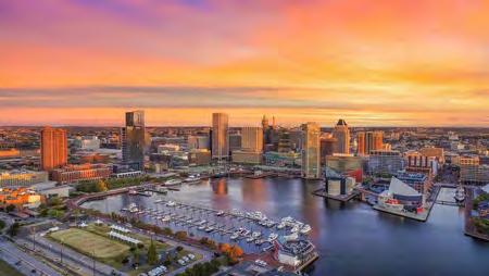
The clinic is located at 10 N Green St, Baltimore, Maryland, at the site of the existing VA Medical Center in Downtown Baltimore. The provided clinic shell is approximately 3,267 square feet with a 272 square foot outdoor garden area. Only 3 blocks from Baltimore’s famous Inner Harbor, Harborside Healing gets in name from this popular attraction and connects the visitor and their caregiver to nature to ease anxiety when in the clinic.

Healthcare Project - Fall 2023
The Pediatric Clinic is located in the existing VA Medical Center in downtown Baltimore.
The clinic is close to the University of Maryland and is central to other medical centers in Baltimore.
The Clinic gets its name from the iconic Inner Harbor, as well as the inspiration for the color palette.
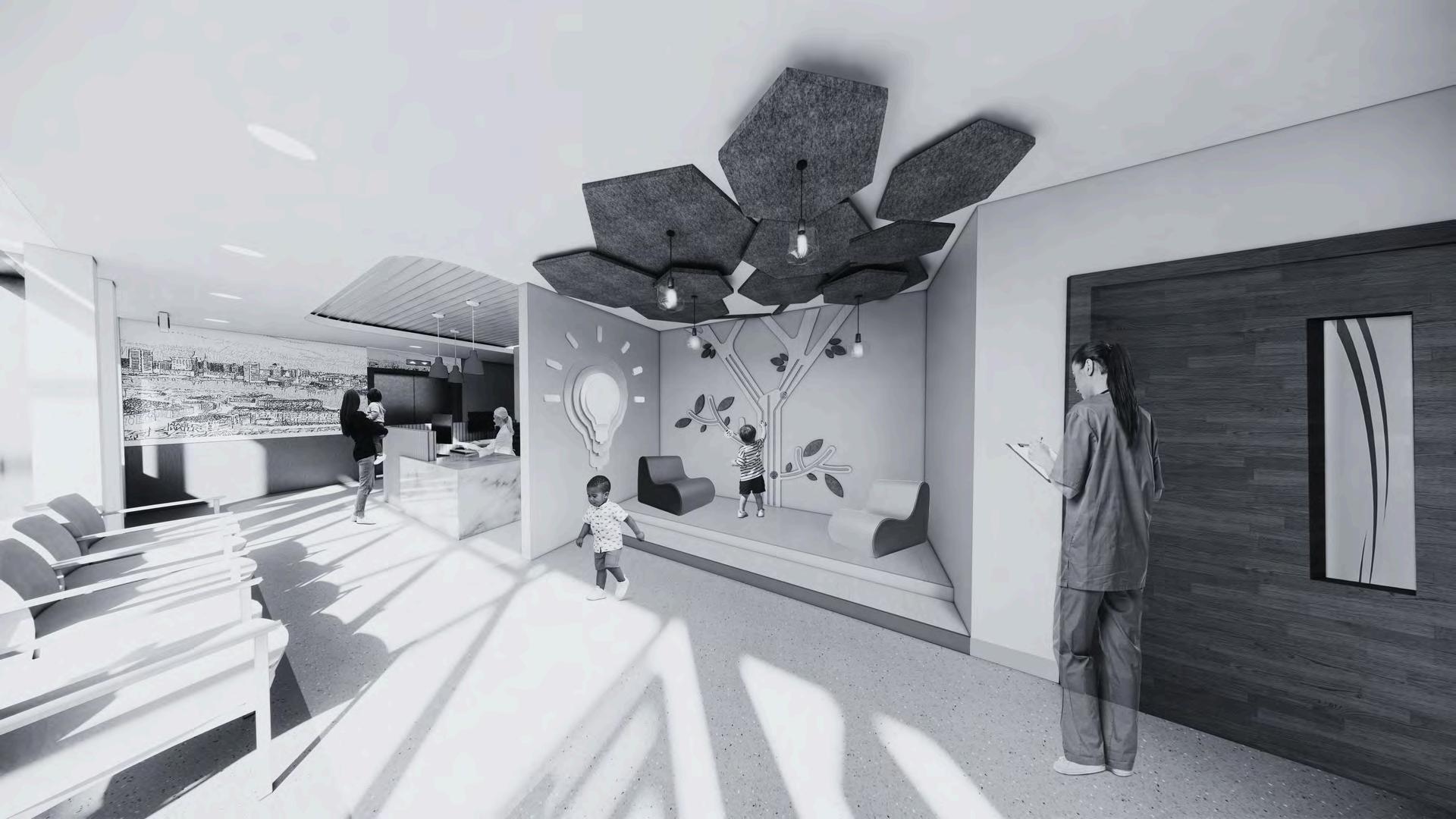
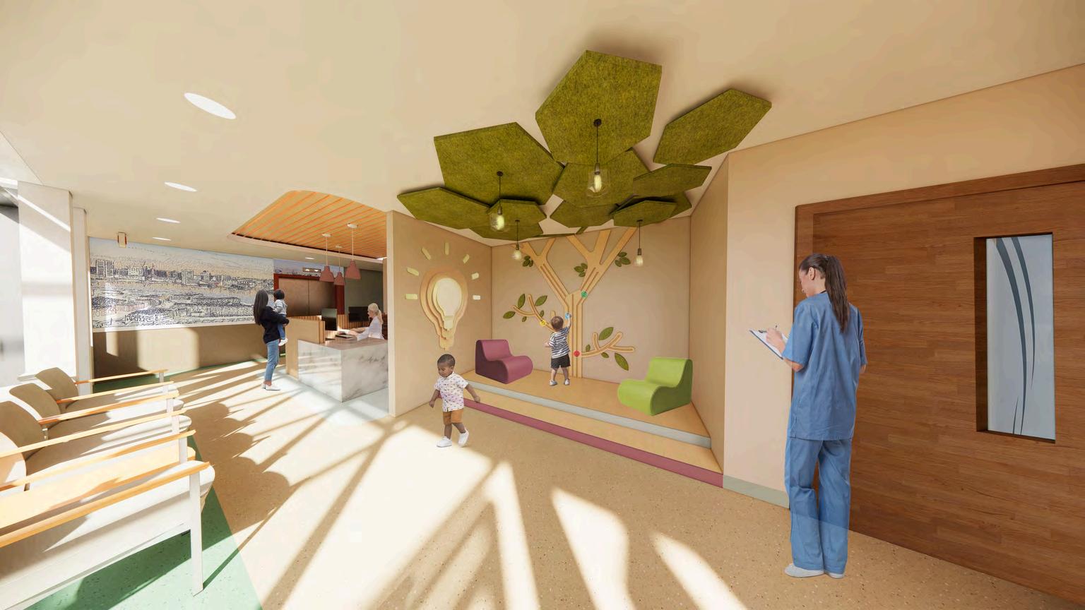
Welcome to Harborside Healing
Patients and visitors are welcomed into the clinic through reception and guided into the adjacent waiting area. The waiting area includes an interactive space dedicated to young patients, providing positive distractions and visual excitement. While visitors are waiting, they are encouraged to find comfort in the earth-tone colors and motifs reminiscent of the natural environment.

DESIGN PROCESS
Concept Development
When faced with feelings of stress or anxiety, it is paramount to feel understood and be put at ease. The Harborside Healing Pediatric Clinic located in Baltimore, Maryland is driven and inspired by the concept that purpose fuels passion. Passionate healthcare professionals will lead each patient interaction to ensure that they have a positive understanding of the clinic and feel inspired to overcome their personal struggles. The design itself will lend to its purpose that each person entering the clinic is living an individual experience. The design will be supported by Ulrich’s theory of supportive design and will include intuitive wayfinding, colorful graphics, and connections to nature to ease any anxieties or fears. The idea that purpose fuels passion drives home the notion that healing is not linear, and each person’s journey is their own.
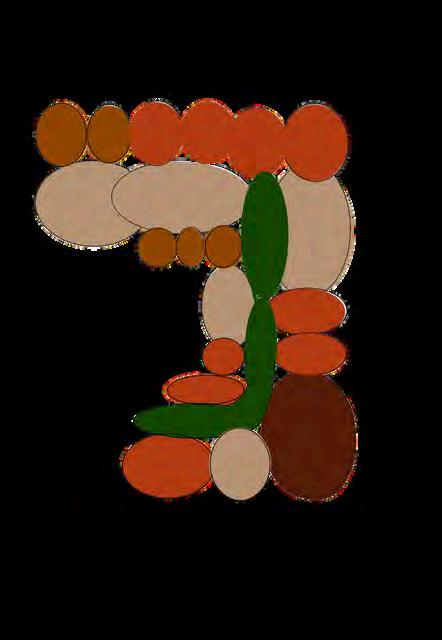
The Bubble Diagram illustrates the initial space planning process, taking into account zoning and proximity. Consideration is given to primary and secondary adjacency, ensuring users can easily access and navigate each space.
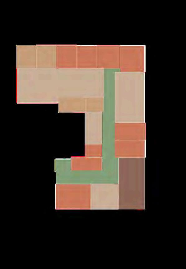
The Blocking Diagram shows the refined planning of the pediatric clinic. Accurate square footage and spacing allows for a clear view of the circulation for visitors and staff.
public restroom reception manager’s office waiting area staff lounge staff restroom EXAM ROOM staff workroom patientvitals soil room medical room EXAM ROOM EXAM ROOM EXAM ROOM EXAM ROOM EXAM ROOM EXAM ROOM EXAM ROOM nurse station patient ed. admin workroom healinggarden& outdoorseating visitor’s entry/exit staff’s entry/exit publicspaces patientspaces staffspaces staffcirculation visitorcirculation
staff’s entry/exit visitor’s entry/exit public restroom reception manager’s office waiting area staff lounge EXAM ROOM staff workroom patient vitals soil room medical room EXAM ROOM EXAM ROOM EXAM ROOM EXAM ROOM EXAM ROOM EXAM ROOM nurse station patient ed. admin workroom healinggarden& outdoorseating PLAYAREA STAFF RESTROOM
publicspaces patientspaces staffspaces staffcirculation visitorcirculation
The Healing Garden

Access to nature is paramount for reducing stress. The Healing Garden provides additional seating to visitors and staff who may wish to enjoy the outside environment on a lunch break or team meeting. This is also a preventative way for sick patients to be able to separate from healthy patients if desired. Tinted windows provide privacy without hindering the view of the downtown Baltimore cityscape.
Branding & Universal Design Principles
The chosen branding elements all connect the user to the natural environment. A soft earth-tone color scheme, natural materials, and a title referring to Baltimore’s Inner Harbor all relate users to nature, which accordingly, promotes the comfortability of the space, easing anxiety and providing patients, visitors, and care providers with a positive experience in the clinic. The fonts used are child-like and easy for users to understand.
HARBORSIDE HEALING
PEDIATRICCLINIC


Project Stakeholders
AgeRange: 20-65+
Rangeof backgrounds varies
MEDICAL PERSONNEL
(PHYSICIANS,NURSES, PA’S,COUNSELORS)
Staffworkroom with4 workstations
NursesStation StaffLounge
StateofMind: calm-stressed
Needto maintainlevelheadedness
Abilities: needtobeable toworklong hourswithhigh movability
StateofMind: calm-situational stress;typically low-medium stress
Physicalabilities mayvary dependingon position
AgeRange: 0-18
Rangeof backgrounds varies
StateofMind: calm-stressed dependingon reasonforvisit
PATIENTS
Abilitiesvary, reasonforvisitmay affectphysical abilities,require diversefurniture selections&easy accessibilityto examrooms
Spaciousexam rooms HealingGarden Educationspace
ADMIN& MANAGERS
Manager’sOffice Workroomfor2-3 employees
Abilitiesmay varybut caregiversmust beableto physicallycare forthepatient
Custom Millwork


AgeRange: 20-65+
Rangeof backgrounds varies
AgeRange: 20-65+
Rangeof backgrounds varies
StateofMind: calm-slightly stressed; typicallylowmediumstress
ADDITIONAL STAFF
(RECEPTIONIST, JANITORIALSTAFF)
Abilitiesmay varybut janitorialstaff musthavehigh physical mobility
Receptionarea MedicalRoom SoilRoom
Reception& WaitingArea HealingGarden
FAMILY& CAREGIVERS
FamilyAge Range: 0-100+
Caregiver
StateofMind: calm-stressed dependingon patient’s situation
AgeRange: 18-65+

B C A ACCESSIBLE COUNTER AT 2‘-6” AFF STANDING TRANSACTION TOP AT 3‘-8” AFF
Manufacturer: Wilson Art Style: Solid Surface 9913SS Name:
Perlato Manufacturer:
Art Style:
Oak 8246 Name: High Pressure Laminate C B Map of Baltimore A
Calacatta
Wilson
Abisko
Environmental graphicsrepresenting Baltimoretopromote citypride
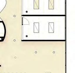
REFINED SPACE PLANNING


Floor Plan
When planning the space for the clinic, some key goals were considered: utilizing windows to take advantage of the outdoor views and allow natural light to flow through the spaces, providing storage options for medical personnel, patients, and visitors, incorporating anxiety-easing design elements to provide positive distractions, selecting comfortable and flexible furniture, and providing patients with comfortable exam rooms.
Reflected Ceiling Plan

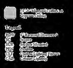
RETURN,TYP. NIS NIS ELEV. SUPPLY,TYP. DIFFUSER&COVE LIGHTING LIGHTING&COLOREDCEILINGSTRIPS DENOTEROOMSINMAINCORRIDOR 9'-0"CEILINGHEIGHT GLASSCURTAINWALL 9'-0"CEILINGHEIGHT GWBONMETALSTUD HEIGHTSANDMATERIALS 8'-6"CEILINGHEIGHT GWBONMETALSTUD 9'-0"CEILINGHEIGHT 2'X4'ACT 9'-0"CEILINGHEIGHT WOODBEAMDETAIL HANGINGACOUSTICAL TILES,VARYINGHEIGHTS
CUSTOMBENCH SEATING ELEV. GUARDRAILS NIS E DESK SCALE LOCKERS INTERACTIVEPLAYAREA T/P DW REF. NIS PLANTERS PRINTER/COPIER T/P
WAITINGAREA RECEPTION HEALINGGARDEN PUBLIC RR PATIENT VITALS INFANTEXAMROOM EXAMROOMS,TYP. STAFFWORKROOM SOIL ROOM MEDICAL ROOM NURSESTATION PATIENT EDUCATION MANAGER’S OFFICE STAFF RR STAFFLOUNGE ADMIN WORKROOM
FLOOR FINISH KEY
Lonseal, “SprayFoam”
Tarkett RubberTile, “SprayFoam”
Lonseal, “SandDune”
Lonseal “SingingBirds”
LLFlooring, “Herringbone”
Lonseal, “Whisper”
Tarkett RubberTile, “Vineyard”
Tarkett RubberTile, “NuggetFalls”
The Nurse Station

The Nurse Station is easily identifiable, promoting a seamless transition for guests between spaces. Environmental graphics are used to promote city pride as visitors prepare to exit the clinic. Universal design is implemented throughout the clinic, including guard rails, wide corridors, and colored flooring transitions to denote different areas and ground landmarks in the clinic.
Staff Lounge
The Staff Lounge acts as a place for staff to find respite and enjoy a meal or break from performing their daily work activities. Warm tones are used in the lounge to promote a calm atmosphere, encouraging staff to collaborate or enjoy time alone to regroup.

comfortable position and medical storage is present in drawers on the side. Colors vary between each exam room.
Colorful wall art provides patients with positive distraction and natural motifs aid in providing a calming atmosphere.
A B C H D E F G A B C D E F G H
X-rays and test results screen creates an efficient way to communicate results with patients and caregivers. When not in use, it offers patients a positive distraction with a setting that resembles a printed photo.
Hand sanitizing station is adjacent to the door.
Frosted doors prohibit patients from feeling confined without compromising privacy.
Sharps disposal is concealed to prevent anxiety for patients waiting to see their care provider.


ZUBI
Advertising Agency Zubi Advertising AgencyProject Brief
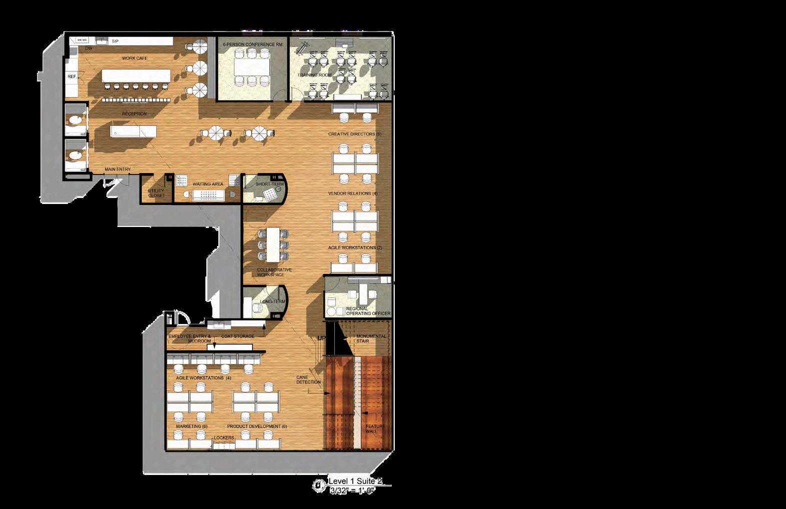
Over the course of ten weeks, I was tasked to design an inclusive, hybrid workplace for a forward-thinking multicultural marketing firm in Nashville, Tennessee. To plan and design the new office space, the project required work space on two levels for approximately 35 employees, including Agile Workstations and offices for executive staff, Short and Long-term Enclaves, Meeting Spaces, Soft Seating Areas, and a Monumental Stair to create a welcoming and motivating working atmosphere that reflects the values and mission of the assigned company, Zubi.
Site Context
The new build site is located in Nashville, Tennessee and is approximately 10,000 square feet. The front of the building faces south, southeast on Jefferson Street. This street is considered an arterial street of Nashville, so it does get busy during rush hour. The site is surrounded by apartment buildings on three sides, blocking mountain views. The buildings have enough distance between the site that Zubi will still have access to some daylight.


z
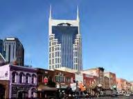
b
u i 04 WorkplaceProject-Spring2023 AT&TBuilding StateCapitolBuilding FirstHorizon ParkStadium BicentennialCapitol StatePark Overall City View
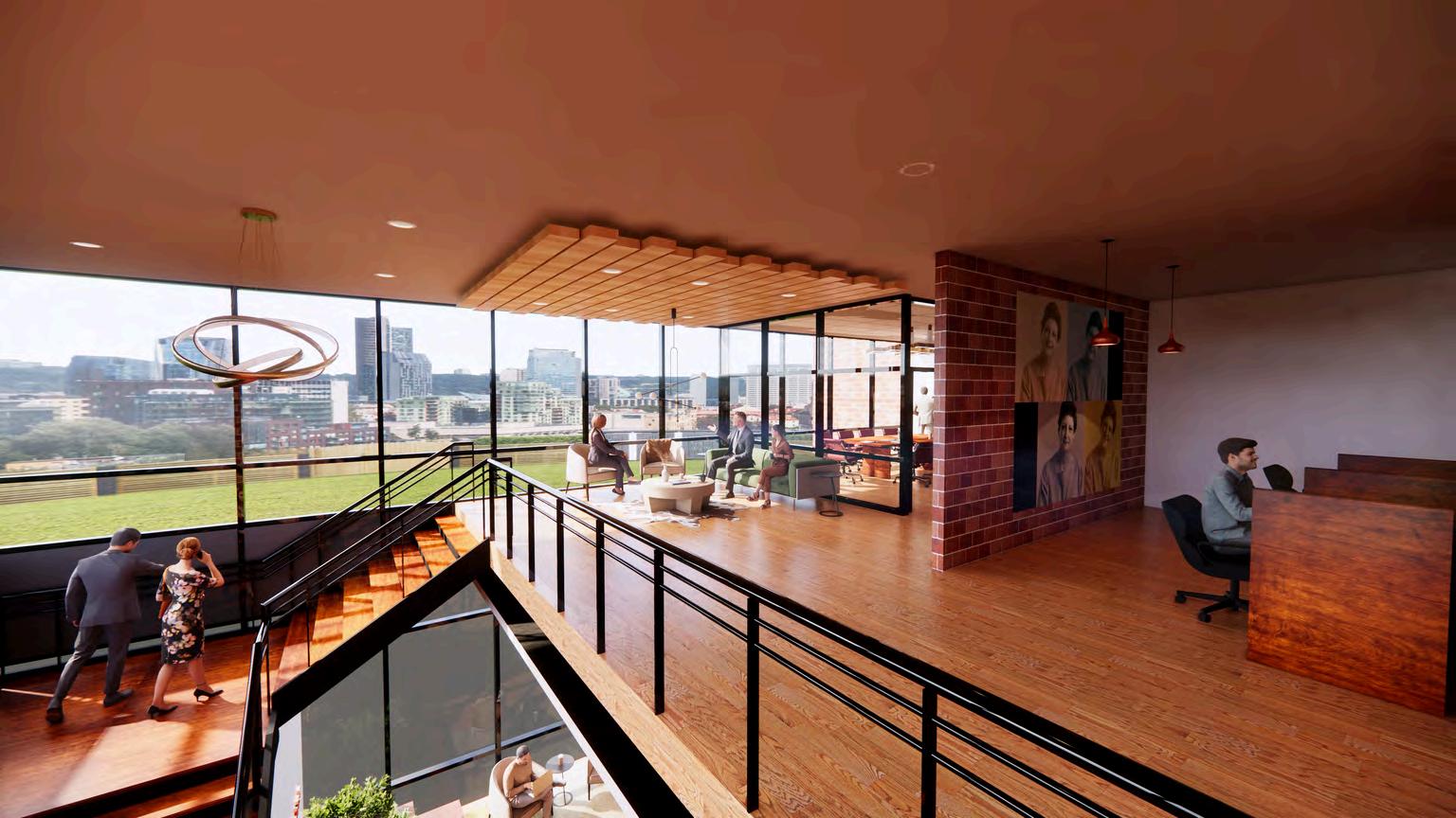
Conference Room Waiting
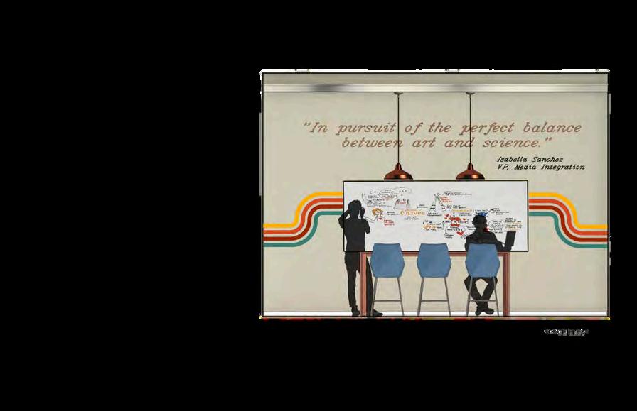
The view of the level two Conference Waiting Area provides viewers with a glimpse into how natural light plays a role in this suite. The large windows bring in an abundance of natural light and offers employees a visual break from working on computers or in offices. A cutout in the floor allows users to have visual access to level 1 and offers another view of the Monumental Stair.
DESIGN PROCESS
Concept Development
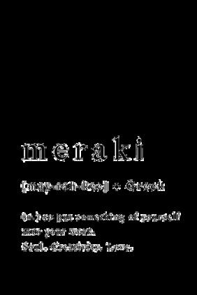
The workplace designed for Zubi Advertising will incorporate the properties of the understanding of meraki, meaning to do something with soul, creativity, or love; to put something of yourself in your work. Zubi’s mission is to work with a purpose to represent customers, the community, and the brands they advertise for. The design will highlight the personal needs of Zubi employees within the space to motivate and enlighten the advertisers and executives. The style of the space will reflect the versatility of the work the company produces and be reminiscent of its origin in Miami, Florida, to include bold colors and organic shapes. The design will incorporate various spaces for the staff to work, including offices for executive level staff, and common areas for employees to come together and collaborate. The workplace will be open and inviting to dismantle hierarchical stereotypes that may prevent junior staff from openly collaborating with executives. Furniture will be arranged in circles and themes of rounded edges will be present throughout the space to evoke comfort and, with colors that promote productivity. Staff will feel motivated to come to work and provide results with pride.
Level One

Level Two
The initial space planning process consisted of Bubble and Blocking diagrams. The Bubble Diagrams show the initial space planning process, outlining which areas are best suited to be public, semi-private, and private based on the client's needs. The Blocking Diagrams take into account squarefootageandimportantadjacencies.
hall1 monumental stair regional operating officer agile work waitingarea shortterm shortterm collab. space productdevelopment & marketing workcafe reception mainentry vendor relations creative directors employeeentry agilework cafe 6person conf.rm training room vendor relations creative directors agile work hall1 reception mainentry waiting area shortterm shortterm collab. space employeeentry agilework productdevelopment & marketing monumental stair regional operating officer LEGEND primarypath secondarypath hallways public semi-private private stairs monumental stair coffee& tea bar agilework hall2 longterm shortterm longterm IT& tech bar server rm legal& reg. regional counsel regional financial officer agilework management & admin accounting ceo small meetingrm HR shortterm shortterm longterm IT& tech bar server rm regional counsel regional financial officer monumenta lstair conf. waiting shortterm longterm ceo smallmtg rm shortterm shortterm longterm HR management & admin accounting 10person conf.rm legal& reg. longterm coffee& tea bar agilework hall2 agilework
Welcome to Zubi Advertising

Environmental Preference Theory
Thetheorystudieshowpeopleprocessenvironmentalinformationandhoworif they need to make more sense of their environment to better predict what may occur and to plan their actions accordingly. Kaplan and Kaplan developed this theory according to four elements: coherence, legibility, complexity, and mystery. Coherence refers to the way the average person makes sense of an environment through understandable context. Legibility refers to how an individual is able to understand the scene and the objects within it. Complexity relates to the number of different understandable components within the space. Mystery is how much an environment contains hidden informationorrequiresfurtherunderstanding.(Kopec,D.(2012).
Preference Complexity Coherence Mystery
The view of Reception offers viewers a glimpse into the main entry space of the Zubi office. The Reception aims to evoke excitement for clients to work with Zubi and trust that this company can meet their advertising needs. A custom reception desk includes a transaction top and an accessible counter for seated users to easily utilize.
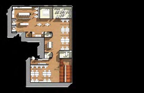
REFINED SPACE PLANNING - LEVEL ONE
Floor Plan
The theory "open vs closed spaces" is applied to the workstation packs throughout the design. Having the workstations open provides the employees with easy access to collaboration, and their location provides natural light that aids in creating a positive and motivating work environment.


Reflected Ceiling Plan
After the initial space planning process, the Reflected Ceiling Plan was developed using Revit and then Photoshop to include the ceiling materials. The concept meraki is seen in the curvilinear and wood architectural drop down ceilings which offer breaks in the geometry of the workplace and help to inspire employees to think outside of the box, taking into account the lighting needs throughout each space.
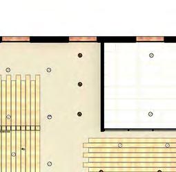
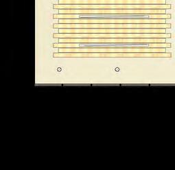
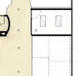
RDW MIL MIL PEN PEN MIL RDW RWW MIL RDW RDW MAINENTRY RDW WORKCAFE MIL RDW RDW RDW RECEPTION UTILITY CLOSET MIL RDW RDW RDW RDW RDW PEN PEN PEN MARKETING(6) RDW PEN RDW RDW WAITINGAREA PEN PEN AGILEWORKSTATIONS(4) RDW RDW LCL CLM RDW RDW MIL EMPLOYEEENTRY& MUDROOM PEN LONG-TERM RDW RDW PEN RDW SHORT-TERM COLLABORATIVE WORKSPACE 6-PERSONCONFERENCERM. RDW PEN PRODUCTDEVELOPMENT(6) RDW RDW RDW RDW RDW RDW AGILEWORKSTATIONS(2) LCL MONUMENTAL STAIR REGIONAL OPERATINGOFFICER RDW SPT SPT RDW RDW SUR SUR PEN RDW RDW PEN PEN PEN RDW level 1
REFINED SPACE PLANNING - LEVEL TWO
Floor Plan
After the initial space planning process, the Floor Plan was developed using Revit and then Photoshop to include the floor materials. The concept meraki is seen in the large conference rooms, where employees can showcase their work, collaborative spaces, where collaboration can boost productivity and pride, and the wall graphics which evoke excitement and motivation.


Reflected Ceiling Plan
After the initial space planning process, the Reflected Ceiling Plan was developed using Revit and then Photoshop to include the ceiling materials. The concept meraki is seen in the curvilinear and wood architectural drop down ceilings which offer breaks in the geometry of the workplace and help to inspire employees to think outside of the box, taking into account the lighting needs throughout each space.
PEN PEN SUR SUR SHORT-TERM RDW RDW AGILE WORKSTATIONS(4) SUR SUR LONG-TERM RDW RDW RDW SUR PEN PEN RDW SUR EMPLOYEE ENTRY PEN PEN SMALLMTGROOM CLM PEN RDW RDW RDW PEN 10PERSONCONFERENCERM. SURSUR LONG-TERMSHORT-TERM SUR PEN SUR SUR LCL RDW RDW HUMANRESOURCES LEGAL®ULATORY(3) SUR SERVERRM PEN PEN RWW RWW ITHELP BAR RDW RDW LONG-TERM RDW RDW PEN RDW RDW RDW RDW RDW RDW RDW SMALLMTGROOM RDWRDWRDW CONFERENCE WAITING RDW RDW PEN PEN PEN PEN LCL RDW RDW SUR RDW PEN SUR SUR SUR CEOOFFICE PEN RDW RDW PEN ACCOUNTING (4) MANAGEMENT&ADMIN (4) AGILEWORKSTATIONS (2) PEN REGIONALCOUNSEL REGIONALFINANCIAL OFFICER RDW SUR SUR PEN RDW RDW COFFEE/TEABAR level
2
The Monumental Stair

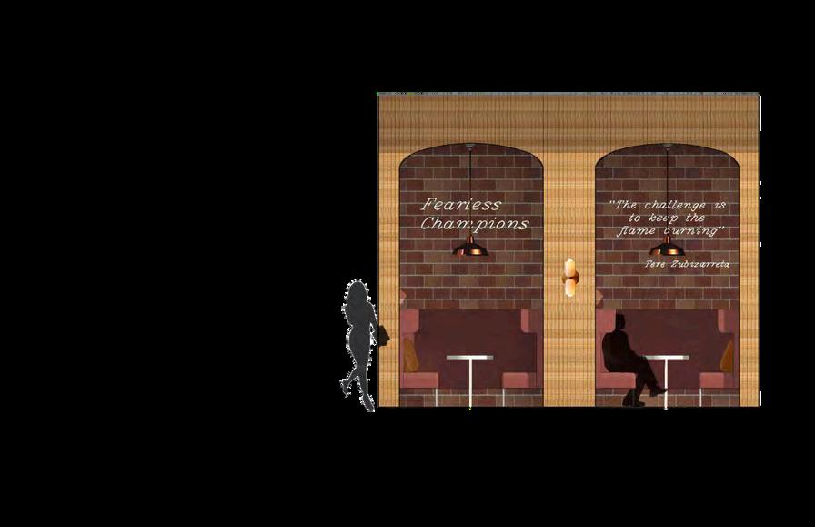
The view of the monumental stair shows how circulation and workstations are balanced as the user moves through the space. The stairs are 8' wide and include under tread lighting to illuminate the steps. A frosted glass wall includes the Zubi logo etched into it's face along with their company motto, "fearless champions." A small seating area offers a place to recharge from working at a desk and offers a view of the Nashville landscape.
Agile Seating Elevation
LEGEND
A. Illuminated lettering brings hierarchy to the wall graphics.
B. Panels offer privacy without closing off the user from the rest of the space.
C. A quote from the founder brings inspiration and pride to the space as it reminds the user of Zubi's mission to work for the community.
D. Booths can act as agile workstations or seating for the work cafe.
C.B. D.
The Workstation Clusters
LEGEND
A. Drop-down curvilinear ceiling offers a visual break in the geometry of the workplace.
B. A custom lighting fixture runs along the length of the curved ceiling.
C. Whiteboard and pin-up space offers a place for employees to showcase their ideas and work collaboratively with other staff members.
D. Branding palette is used in the furniture selection and wall covering.
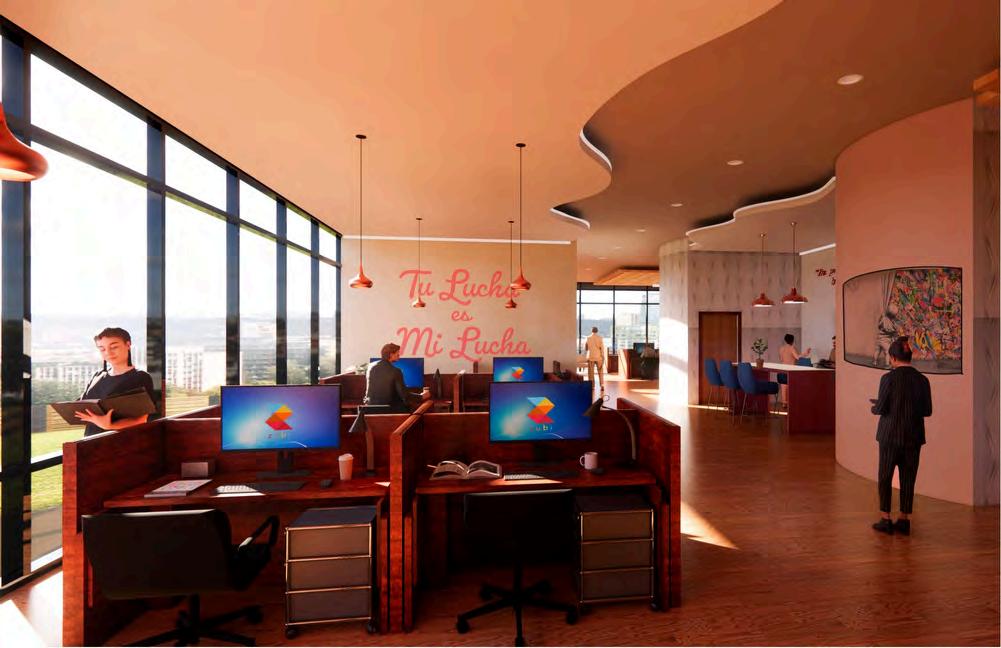
The workstation perspective shows the main hallway on level one that leads to the monumental stairs. Workstation clusters allow for the open plan to be used to its full advantage by prompting employees to work together easily when needed. Graphics are used to inspire and motivate employees. "Tu lucha es mi lucha" means "your fight is my fight" and is the slogan for Zubi's advocacy campaign.
D.

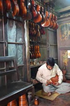


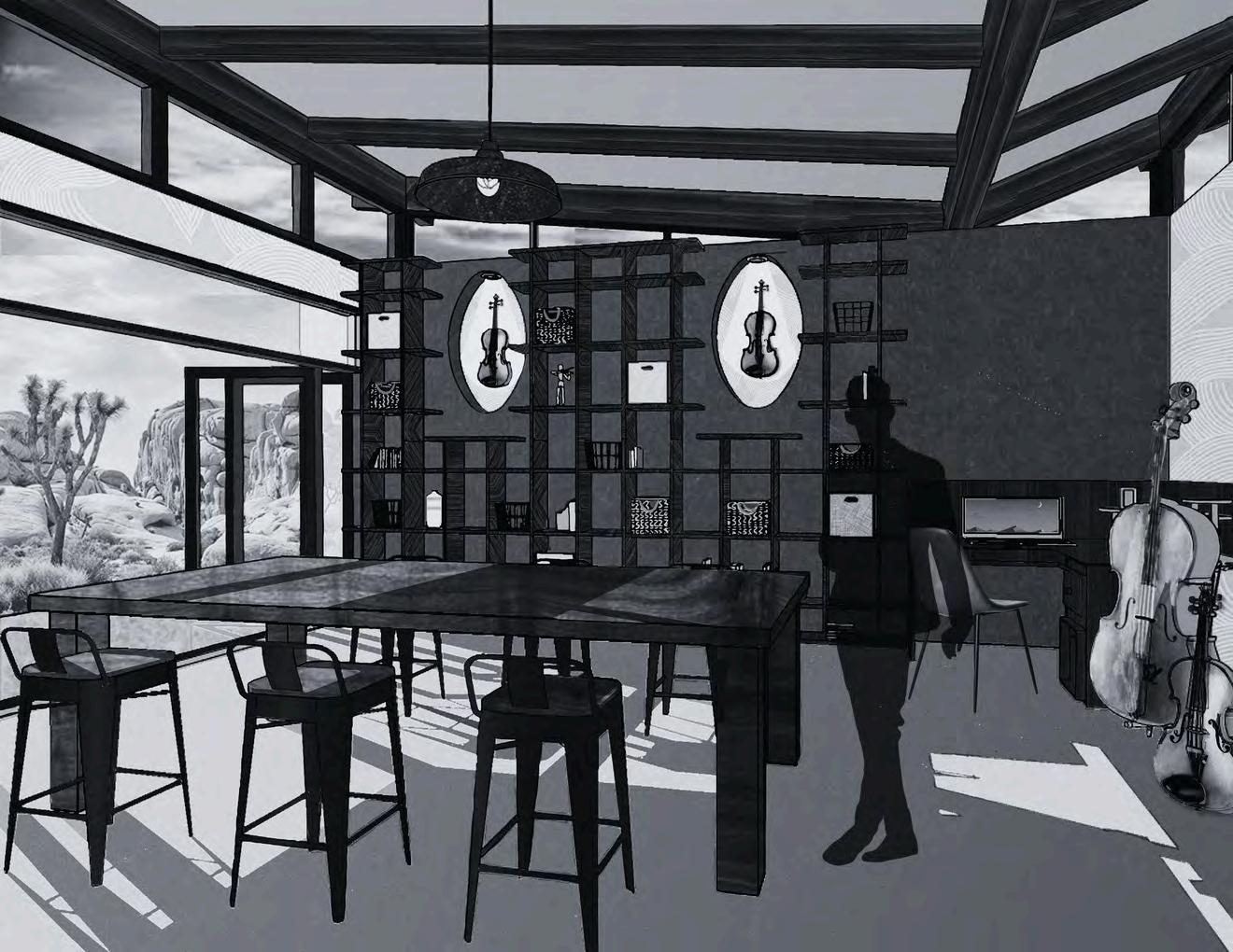
ARTIST RETREAT
Sanctuary for a Luthier
ARTIST RETREAT
Sanctuary for a Luthier
05
Project Brief
The purpose of this project was to utilize hybrid rendering skills to create an artist retreat for a Luthier, or violin maker. Before being rendered in various digital programs including Sketchup, Photoshop, and Procreate, the drawings were created using the skills obtained in Graphics II to render by hand using markers, colored pencils, and freehand sketching. The Artist Retreat was the final project in the Graphics II course.
Site Context
The retreat space is approximately 800 square feet and is located in the deserts of Arizona. The design includes space for the Luthier to construct violins and cellos and a lounge to meet with clients to go over design ideas.


Mixed Media Project - Spring 2021
A Look at the Main Work Space
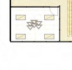
The retreat boasts a large open space where the artist can work and relax while taking meetings with clients. The plan includes a large worktable, abundant storage and display space, and a lounge area with comfortable seating for four.
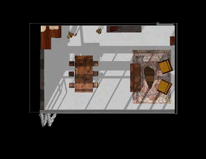
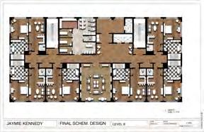
Floor Plan SPACE PLANNING

The original floor plan was created using Sketchup and was used during the initial design process. The final renderings were created using Photoshop and Procreate, along with hand rendering.
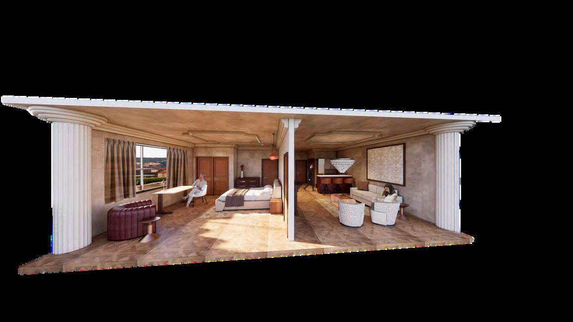
Section View

This section of the studio shows a cut-through of the building, displaying the artist's workspace and display area. This was created in Sketchup and then hybrid rendered in Photoshop and Procreate as well as by hand with colored pencils and marker.
Entrance Vignette
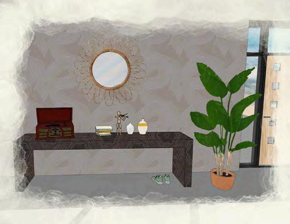
The vignette of the entrance shows the details of the whimsical wallpaper, greenery, and display of personal items in the workshop. Guests visiting feel welcomed by the residential feel of the space.
Lounge Area
Desk Vignette
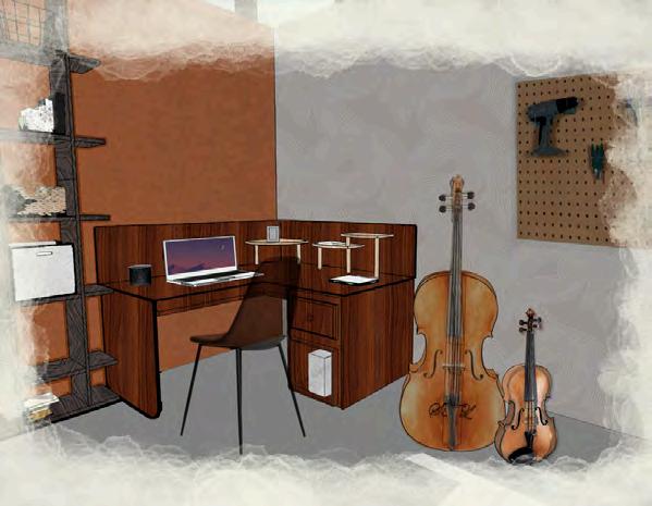
The vignette of the desk shows where the Luthier spends the most time working and researching violin repairing techniques and skills. The vignette was created using Sketchup, Procreate, and Photoshop.
The lounge area acts as a place to meet with clients or decompress after working long hours fixing and tuning violins and cellos. The perspective was created using Photoshop and Procreate after being developed in Sketchup.
Thank you for your time! (954) 562-1483 jaymiekennedy.va@gmail.com