
JULY 2017 | VERSION 1 visual brand identity
intro
At Frigidaire, everything we put out into the world is a reflection of our values, products, and brand as a whole. That means consistency is key. We want to make sure the brand consumers engage with online looks and feels like the same brand they interact with in store. This guide was created to make accomplishing that goal as simple as possible. This guide is intended to be updated over time as we introduce new products, campaigns, and strategies.


Bold fresh
organicORDER
There’s a moment when we all begin to realize that not all of the chaos in our daily life can make sense or be organized.
It’s at that moment when we start to relax, take things as they come, and really begin to appreciate our surroundings and the people in our lives that make them unique. This is the inspiration behind Organic Order.
And the foundation on which Frigidaire can shine.


Through vibrant imagery, authentic moments and purposeful messaging, we look to deliver a brand expression that is confident and engaging. One that speaks genuinely with our consumers. And clearly differentiates us from our competitors.
All to create a brand that elevates life’s moments in a way that is fresh, modern and bold.


our
voice
Our voice should reflect our brand personality .
Defining a brand voice helps create purposeful, consistent expression. It’s what we say and how we say it. It's the way we construct sentences, the sound of our words and the spirit of our communication.

OUR VOICE SHOULD EXPRESS THE FOLLOWING BRAND ATTRIBUTES:
Confident
Purposeful
We love sharing what makes us special and unique, but we stop short of being full of ourselves.
We know that the way you run your home has purpose, which is why, no matter how you do it, you have our support.
Unapologetic
Upbeat
We’re always true to ourselves. We’re proud of who we are, and we like to celebrate what makes us, well, us.
We’ve got a spring in our step and a smile on our faces.
HOW OUR BRAND VOICE COMES TO LIFE
While we’ll have different things to say depending on where we’re saying them, everything should always sound like it’s coming from the same place. Stay true to our brand personality and principles and speak confidently from the heart.
MORE TIME TO DO WHAT YOU love. splashMAKE A IN YOUR LAUNDRY ROOM.
EXAMPLE HEADLINES:
Practical never looked so stylish. At home in any home. Say hello to the total package.
EXAMPLE IN-STORE POP:
Don't wait to bake your best. Make more meals at once.
Charming, confident, benefit-focused headline uses our accent font to punctuate the most emotional part of our communication.
EXAMPLE SOCIAL POSTS/RESPONSES:
.@SpoonForkBacon is making #FathersDay dreams come true with this Breakfast Pizza Recipe. Aaaaaaaand I just drooled on my keyboard. Awesome.
The only way these 3-step ice cream sandwich recipes could be easier is to get someone to make them for you. *Looks around for nearest human* [LINK]
2 our
colors
color OUR COLOR PALETTE
Distinct. Vivid. Expressive. Confidently owning a color, together with a complementary color palette, enables our brand to stand out from the crowd.
Our primary berry and secondary charcoal and white colors present a modern feel for the brand, while bold accent colors — used prudently — allow for greater flexibility within our identity to keep the brand vibrant and fresh.
Very Berry is our predominant color. It is the foundation and the thread that carries across our brand lines and is to be used with consistency and confidence.
Clean
White, and Crisp
Charcoal are our secondary colors. An ideal accomplice to our primary color, these colors, in purposeful combination with Very Berry, help to distinguish our three brand lines: Frigidaire, Frigidaire Gallery and Frigidaire Professional.
Tertiary colors of Ripe Plum, Ice Blue and Fresh Citrus are used primarily as UI accents to bring additional excitement and versatility to digital expressions.
PRIMARY COLOR
VERY BERRY
Hero messages
Main backgrounds
Supporting messaging
Supporting elements
SECONDARY COLOR CLEAN WHITE
Secondary messaging
Background elements Accent elements
SECONDARY COLOR CRISP CHARCOAL
Secondary messaging
Background elements Accent elements
COLOR BUILDS
PRIMARY COLOR
VERY BERRY

C0 M90 Y56 K0
R239 G64 B90
HEX# EE405A
TERTIARY COLOR RIPE PLUM

TERTIARY COLOR FRESH CITRUS

C4 M18 Y100 K0 R225 G206 B0 HEX# FFCD00
SECONDARY COLOR CRISP CHARCOAL

426C
SECONDARY COLOR CLEAN WHITE

PANTONE® WHITE
C70 M63 Y62 K58
R51 G51 B51
HEX# 323333 C0 M0 Y0 K0 R255 G255 B255
HEX# FFFFFF
TERTIARY COLOR ICE BLUE

REMINDER:
Tertiary colors should be used prudently as accent colors only to our dominant primary and secondary brand colors. Tertiary colors should also be used individually and not in combination within the same design element.
PANTONE®
PANTONE®
BACKGROUNDS
Occasionally, transition backgrounds are used to provide emphasis on products and create variation in layouts. These are not formulaic gradients. They are custom-created single-color transitions based upon the situation. See examples below.
DO:
Use only the primary & secondary colors as transition backgrounds. Ensure the transition is subtle and only one-color.
When in doubt, use this formula for Very Berry & Crisp Charcoal: 100% brand color transitioning to 50% brand color
When in doubt, use this formula for Crisp Charcoal: 25% brand color transitioning to 0% brand color

MORE TIME TO DO WHAT YOU


MAKE A
IN YOUR LAUNDRY ROOM.
HOW TO USE OUR COLORS
While our color palette offers flexibility, Very Berry is the dominant primary color and should be clearly represented across our brand through all communications.
Secondary colors help to further define the Frigidaire Gallery and Professional sub-brands and are used to bring depth to the Frigidaire brand line.
Tertiary colors are used sparingly as accents to create contrast between our primary and secondary colors.
Use Very Berry as the primary color.

Use the tertiary colors sparingly and as accents.


Use the appropriate color to define each sub-brand.

Create unusual or vibrating color combinations.
Change our colors or use old/outdated brand colors.
Use tertiary colors as backgrounds, unless approved for specific uses, such as digital applications.

Use too much of any tertiary color or combine them in odd ways.

USING OUR COLORS TO CREATE SUB-BRAND DISTINCTION
Color and color weight play a crucial role in identifying and defining our sub-brand lines in retail environments and to customers.
Our base Frigidaire line leans heavily into our VERY BERRY color with CLEAN WHITE, providing a clean secondary accent.


REMINDER:
For Frigidaire Gallery, the emphasis of color switches to CLEAN WHITE with splashes of VERY BERRY in support.
Frigidaire Professional uses predominately CRISP CHARCOAL with touches of VERY BERRY to create a high-end, aspirational look.
When multiple sub-brands are represented, always use Frigidaire Gallery as the masterbrand color combination.

3 our
logo
PRIMARY BRAND LOGO
All current logos may be downloaded at electroluximages.com. Please be sure to change out any outdated logos with the new versions.
REMINDER:
When multiple sub-brands are represented, always use the Frigidaire Masterbrand logo as the lead in communications.
TWO-COLOR USAGE
ONE-COLOR USAGE
SUB-BRAND LOCKUPS
LOGO CLEAR SPACE & MINIMUM SIZE
Minimum size rule. There will be some exceptions where there is restricted space, for example on merchandise and some digital applications 26mm
IMPROPER USE OF LOGO
Our logo is vital to our brand expression. Proper consideration is needed to best represent Frigidaire in the market. As such, here are examples of what not to do when using the Frigidaire mark.
Place the logo over backgrounds that visually compete with the logo.

DO NOT: DO NOT: DO NOT: DO NOT:
Stretch or distort the logo in any way. Use outdated logos not listed within this guide.

Use the logo on tertiary backgrounds.
DO NOT: DO NOT:
Apply a black logo on a color background.


Represent the logo in non-brand colors
4 our
typography
PRIMARY BRAND FONT
Typography is a crucial way to help bring our unique brand expression forward. As a way to best represent the brand, we look to use multiple weights of our font to provide latitude in our messaging.
Gotham
Considered Expression. Our brand typeface is well proportioned and geometric. It brings a sense of order and refinement, yet is still expressive in its form.
BODY COPY STYLE
Gotham Book, 10pt/14pt Left Justify
Nisi tem re ommoloreptur sam quam, et et aris delis molori odi officimin perspisque vidis eaquo iur repta quamus, cumquis audia doluptias dis dolum doluptatque sitatur? Catibus eum exero demquam nem eris explate di aliqui doloritio conecte volorec tatiore rchicid quianim quiam vellestium que pressed quiatempore sin rehentem et doluptistin pro venitasit odit quodist rumenis molorro tecturionsed que enimus aut qui aut res mos magni cus elenihit latum aut fugiandit aut audia nimenis am nus ex eos molupta eprovid ma dest laceatem est, quam aut facest, tem est aute comnis am esent restia qui si dem sequian digent, optatur qui tempore ceremquid.
EDITORIAL/CALL-OUT STYLE
Gotham Book, 28pt/36pt Left Justify
Nisi tem re ommoloreptur sam quam, et et aris
delis molori odi officimin perspisque vidis eaquo iur repta quamus, cumquis
GOTHAM WEIGHT OPTIONS
Gotham Thin ABCDEFGHIJKLMNOPQRSTUVWXYZ abcdefghijklmnopqrstuvwxyz0123456789
Gotham Light ABCDEFGHIJKLMNOPQRSTUVWXYZ abcdefghijklmnopqrstuvwxyz0123456789
Gotham Book ABCDEFGHIJKLMNOPQRSTUVWXYZ abcdefghijklmnopqrstuvwxyz0123456789
Gotham Medium ABCDEFGHIJKLMNOPQRSTUVWXYZ abcdefghijklmnopqrstuvwxyz0123456789
Gotham Bold ABCDEFGHIJKLMNOPQRSTUVWXYZ abcdefghijklmnopqrstuvwxyz0123456789
SECONDARY ACCENT FONT
Custom Fresh
Complete Expression. Our second typeface is stirring and approachable. Its organic nature creates a refreshing contrast with our first typeface to bring excitement and interest to our messaging.
REMINDER:
You can find Custom Fresh on ElectroluxImages.com under Frigidaire > Marketing Materials > Logos, Badges, ADA Materials, & Guidelines
ABCDEFGHI JKLMNOPQR STUVWXYZ
The quick brown fox jumps over the lazy dog.
BRINGING TYPE TOGETHER
While each typeface stands out on its own, the Frigidaire brand messaging best comes to life when the Gotham & Custom Fresh intermingle with each other. Below are some examples of how the type can interplay with a key, descriptive word highlighted by the accent font.
Use Gotham as the primary font.
Ensure Custom Fresh is used to showcase the more inspiring, key word within the message.
Use Custom Fresh for every word.
Use Gotham extra-light.
Use Gotham all-caps when paired with Custom Fresh in lockups.
Use Custom Fresh in all-caps.
Put an artificial glow or shadow around the type.
Make Custom Fresh smaller than 32 pt.
Put Charcoal type on a Very Berry background. More time to do what you love.
LIFESTYLE
AUTHENTIC MOMENTS
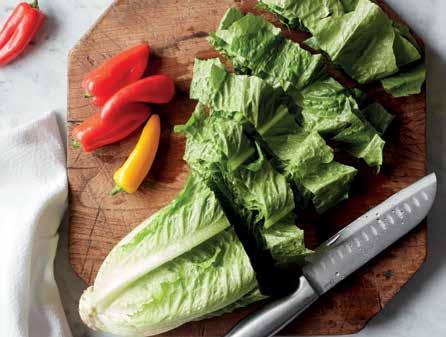
Colorful, real, and comfortable. Genuine moments, never staged. All captured from a unique perspective that connects with our consumer and has an up close and personal feel.
Note: This contains some example photography that is not licensed for use.


STILL LIFE ORGANIZED MOMENTS
Vibrant and alive. Always bright, not dark or moody. Never exactly perfect, but is orderly, colorful, and captivating. When depicting food, dishes should be simple and delicious – never overly intricate or fancy.
Note: This contains some example photography that is not licensed for use.


IMPROPER USE OF PHOTOGRAPHY
Our photography is an extension of our brand and proper use of our images is important to maintain brand integrity. The best way to use our images is as they are - without any alteration.
DO NOT:
Turn our photography to black & white (or apply any other filters).

DO NOT:
DO NOT:
DO NOT:
Place borders around our photography. Place large glows or feathers around our photography.

Place type over the important or busiest parts of a photo.

Aborum niam aciendi te num, vidunti scimagnam excerum est quam verferum aperum aut quodio. Nequam commolor sequodi ciisqui si que occabores et que ma cus, quiam facienis earum, sus.

DO NOT:
Place product images directly over lifestyle or food photography.


DO NOT:
Stretch or distort our photography.

our
design approach
In terms of design, the triangle is the heart of the brand. It’s felt throughout the logo. So we'll nod and lean into this angular shape in all our work. We’ll portray a unique and modern look that’s ownable to the brand.
design approach
USE OF ANGULAR DESIGN ELEMENTS
Using angles gives us an intentional brand indicator that breaks consistency. Through this visual element, we can easily and adequately represent the Frigidaire brand in all communications. When using the angular shape in design, remember a few things:
DO:
Ensure the largest block of color is appropriate for the subbrand.
Allow products images to break the plane of the angle when appropriate.
DO NOT:
Place images into small triangles.
DO NOT:
DO NOT:
Place the logo inside a triangle. Round the corners of the triangle.
DO:

Utilize the proper angle (63 degrees, based upon the Frigidaire triangle).

Change the angle or alter its transparency, unless approved for specific uses, such as digital applications.

Use old or outdated designs.

OrbitClean Wash Technology
RETAIL TRADE ADS:
PAGE EXAMPLES how it comes to together
1/2
Frigidaire Base uses a large Very Berry angle with a white background. Event lockup is reversed.
Frigidaire Gallery uses a large white angle with a light charcoal gradient background. Event lockup is in Very Berry.


Page Borders can be used for smaller ads that are placed next to each other. They should be Very Berry.
Tallest Product breaks the plane of the blade.
Frigidaire Professional uses a large charcoal angle with a light charcoal gradient background. Event lockup is reversed with the largest word in Very Berry .

Callouts are limited to a maximum of TWO per ad.
SMUDGE PROOF LOGOS
All current logos may be downloaded at electroluximages.com. Always double check that you are using the correct Smudge-Proof logo for the product line you are working with. Also, be mindful to use dealer-specific logos only with that dealer.

FRIGIDAIRE AND FRIGIDAIRE GALLERY
FRIGIDAIRE GALLERY BLACK STAINLESS

FRIGIDAIRE PROFESSIONAL
POP VERSION
LOWE'S VERSION
FINGERPRINT RESISTANT
STAINLESS STEEL
POP VERSION
BLACK STAINLESS STEEL
PACKAGING
DIGITAL
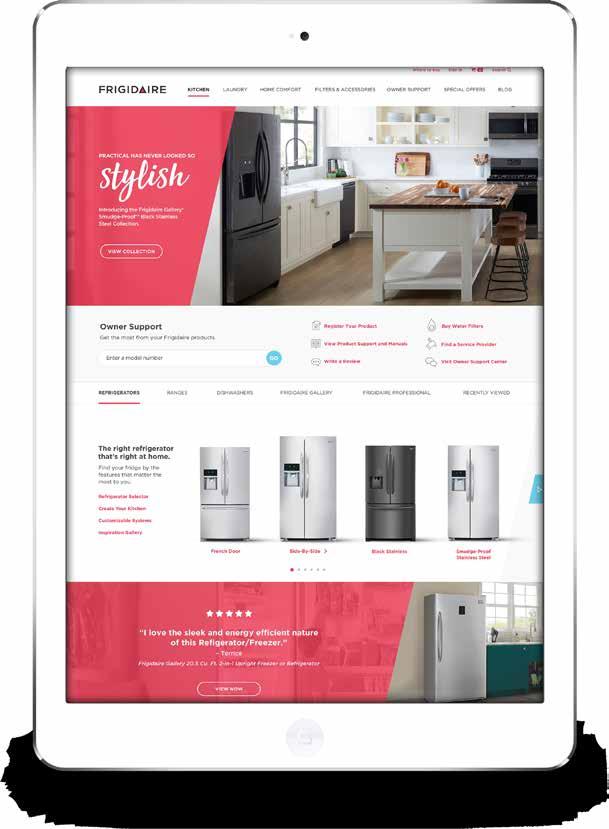
The digital space has its own considerations and challenges, which are explored further in the Digital VBI. Here are a couple examples of how our design approach applies to the digital executions.

DIGITAL
CONSIDERATIONS:
Prominent color is determined based upon sub-brand.
Angled element is positioned at a consistent angle.
Logo is always on a field of color - never a photo.
Custom Fresh is incorporated only in the name/headline, where appropriate.
Product images are cut out of background and break the plane of the angled element.
Drop shadows are used minimally to ground the products. They are matched with the direction of the light source, if applicable.
The digital space has its own considerations and challenges, which are explored further in the Digital VBI. Here are a couple examples of how our design approach applies to the digital executions.
how it comes together
DIGITAL
The digital space has its own considerations and challenges, which are explored further in the Digital VBI. Here are a couple examples of how our design approach applies to the digital executions.


7 our
video approach
note:
This section applies to all Frigidaire product feature, influencer, provisioning and ownership videos. Guidelines and parameters found in this guide were established based on Photoshop set to RGB, 1920x1080, 72 dpi.
TITLE CARD // FRIGIDAIRE + FRIGIDAIRE GALLERY

Logo Placement
For optimal legibility and contrast place Frigidaire and Frigidaire Gallery logo on 60% white overlay. Frigidaire brand logos should never exceed a dimension of 500px wide and 150px tall. Logo should never be smaller than 300px wide and 80px tall.
Title Safe Zone
This boundary is 10% in from each edge of the frame. All essential text, logos, graphics, and titles should be inside this inner boundary.
Background Overlay
For optimal legibility and contrast, use 70% white background.
TITLE CARD // FRIGIDAIRE PROFESSIONAL

Logo Placement
For optimal legibility and contrast use reverse versions of Frigidaire Professional logo and place it on dark background overlay. Frigidaire Professional logo should never exceed a dimension of 500px wide and 150px tall. Frigidaire logos should never be smaller than 300px wide and 80px tall.
Title Safe Zone
This boundary is 10% in from each edge of the frame. All essential text, logos, graphics, and titles should be inside this inner boundary.
Background Overlay
For optimal legibility and contrast use Crisp Charcoal from our brand color palette. R51 G51 B51, multiplied at 70% opacity.
TITLE CARD // FRIGIDAIRE / FRIGIDAIRE GALLERY + INFLUENCER

Logo Placement
For optimal legibility and contrast place brand mark on 60% white background overlay. Frigidaire logos should never exceed a dimension of 500px wide and 150px tall. Frigidaire logos should never be smaller than 300px wide and 80px tall. Partner logos should never exceed the height of the divider line.
Divider Line
When applicable, this graphic element should be used to establish separation between Frigidaire branding and Partner logos. Line is 100% crisp charcoal, 1px wide and 30px tall.
Background Overlay
For optimal legibility and contrast, use white at 70% opacity.
Title Safe Zone
This boundary is 10% in from each edge of the frame. All essential text, logos, graphics, and titles should be inside this inner boundary.
TITLE CARD // FRIGIDAIRE PROFESSIONAL + INFLUENCER

Logo Placement
For optimal legibility and contrast, use reverse versions of Frigidaire Professional logo placed on dark background overlay. Frigidaire Professional logos should never exceed a dimension of 500px wide and 150px tall. Frigidaire logos should never be smaller than 300px wide and 80px tall. Partner logos should never exceed the height of the divider line.
Divider Line
When applicable, this graphic element should be used to establish separation between FD branding and Partner logos. Line is 100% white, 1px wide and 30px tall.
Background Overlay
For optimal legibility and contrast, use Crisp Charcoal from our brand color palette. R51 G51 B51, multiplied at 80% opacity.
Title Safe Zone
This boundary is 10% in from each edge of the frame. All essential text, logos, graphics, and titles should be inside this inner boundary.
TITLE CARD // SUPER + FRIGIDAIRE / FRIGIDAIRE GALLERY + INFLUENCER

Super
In instances when a hero logo lockup is created, a combination of our brand fonts Gotham and Custom Fresh is encouraged. See the Typography section of this brand guide for details on font choice.
Logo Placement
Frigidaire brand marks should never exceed a dimension of 500px wide and 150px tall. Frigidaire brand marks should never be smaller than 300px wide and 80px tall. Partner logos should never exceed the height of the divider line and should never be larger than the Frigidaire the brand logo.
Divider Line
When applicable, this graphic element should be used to establish separation between FD branding and Partner logos. Line is 100% white, 1px wide and 30px tall.
Background Overlay
For optimal legibility and contrast, use white at 70% opacity.
Title Safe Zone
This boundary is 10% in from each edge of the frame. All essential text, logos, graphics, and titles should be inside this inner boundary.
TITLE CARD // SUPER + FRIGIDAIRE / FRIGIDAIRE GALLERY + INFLUENCER

Title Card Super
In instances when a hero logo lockup is created, a combination of our brand fonts Gotham and Custom Fresh is encouraged. See the Typography section of this brand guide for details on font choice. For optimal legibility and contrast, use white for small type and 'Very Berry' for large accent words when supers are placed on a dark background.
Logo Placement
For optimal legibility and contrast, use reverse versions of brand marks placed on dark background overlay. Frigidaire brand marks should never exceed a dimension of 500px wide and 150px tall. Frigidaire Brand marks should never be smaller than 300px wide and 80px tall. Partner logos should always be reversed against dark backgrounds and should never exceed the height of the divider line.
Divider Line
When applicable, this graphic element should be used to establish separation between FD branding and Partner logos. Line is 100% white, 1px wide and 30px tall.
Background Overlay
For optimal legibility and contrast, use Crisp Charcoal from our brand color palette. R51 G51 B51, multiplied at 80% opacity.
Title Safe Zone
This boundary is 10% in from each edge of the frame. All essential text, logos, graphics, and titles should be inside this inner boundary.
Supers // SUPERS + DISCLAIMERS

Title Safe Zone
This boundary is 10% in from each edge of the frame. All essential text, logos, graphics, and titles should be inside this inner boundary.
Super
For feature text we use 11pt, Gotham Medium, and for optimal legibility and contrast, we encourage supers to be placed within our angled tab element. For Frigidaire and Frigidaire Gallery, the angled tab element should be treated in white, at 70% opacity. For Frigidaire Professional, the angled tab element should be Crisp Charcoal (R51 G51 B51) and set to 70% opacity.
Disclaimer
Place all disclaimers in the lower left corner. Use Gotham Medium and reverse against a subtle feathered shadow gradient at the footer. For optimal legibility, legal text should not be smaller then a size of 7pt.
Dark Gradient Feather
In instances where a disclaimer or brand element appears, use a dark feathered gradient at the footer of the video.
Supers // SUPERS + DISCLAIMERS

Super
If appropriate, we encourage the use of Custom Fresh as an accent font to delineate header call-outs from feature text. For feature text we use 11pt, Gotham Medium. For optimal legibility and contrast, supers should be contained within our angled tab element. For Frigidaire PRO, the tab element should be treated in Crisp Charcoal (R51 G51 B51) and set to 70% opacity. For Frigidaire and Frigidaire Gallery, the angled tab element should be treated in white, at 70% opacity.
Disclaimer
Place all disclaimers in the lower left corner. Use Gotham Medium and reverse against a subtle feathered shadow gradient at the footer. For optimal legibility, legal text should never be smaller then 7pt.
Dark Feathered Gradient Element
In instances where a disclaimer or brand element appears, use a dark feathered gradient at the footer of the video.
Title Safe Zone
This boundary is 10% in from each edge of the frame. All essential text, logos, graphics, and titles should be inside this inner boundary.
END CARD

Call to Action
When it applies, a CTA should be used to direct viewers to learn more about a specific topic or product. CTA's should be created using our brand font Gotham Bold. For optimal legibility, font should never be smaller then 9pt. Placement of the CTA should always reside well within the safe zone.
End Card Backgrounds
For optimal legibility and contrast, use light gradient background for Frigidaire and Frigidaire Gallery specific videos. For Professional specific videos use crisp charcoal gradient background.


End Card Duration
End card should never exceed more then 3-seconds in length.
IMPROPER USE OF VIDEO ELEMENTS:
Don't use drop shadows behind text for contrast.

Don't make a partner logo larger than the Frigidaire logo. Both marks should be equal in weight.

Don't use floods of "Very Berry" color for title card backgrounds.
Don't use non-brand colors.

our
campaign aesthetic
SUPERS & VISUAL ELEMENTS
This page applies only to Frigidaire Frigidaire outbound video content creation.
Add 1-2 hand-drawn, simple illustrations, if appropriate.

Only use White type.

Alter the colors of the type. Use Custom fresh for every word.


Add a simple shape behind 1 or 2 words, if appropriate.

Add a heavy shadow or glow behind the type. Use a combination of Gotham & Custom Fresh.

NOTE: Subject to evolve based on director and post production execution

Use excessive or non handdrawn illustrations.
