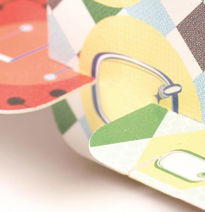
DESIGN COLLECTION
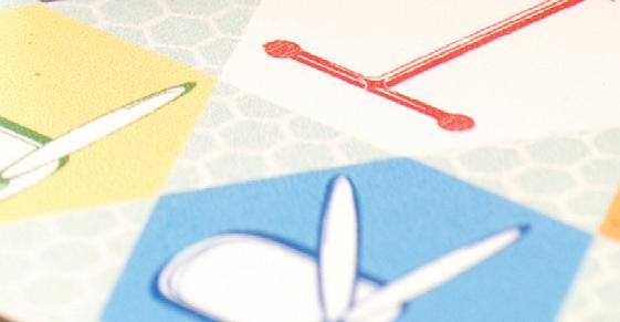
I was in uenced by Charles and Ray Eames’ fur niture when I began developing my concept for this typeface. I wanted to create a decorative typeface that resembled the unique shapes and for ms of the fur niture, recognize their moder n characteristics, and design an application that carried the personality of the Eames typography.
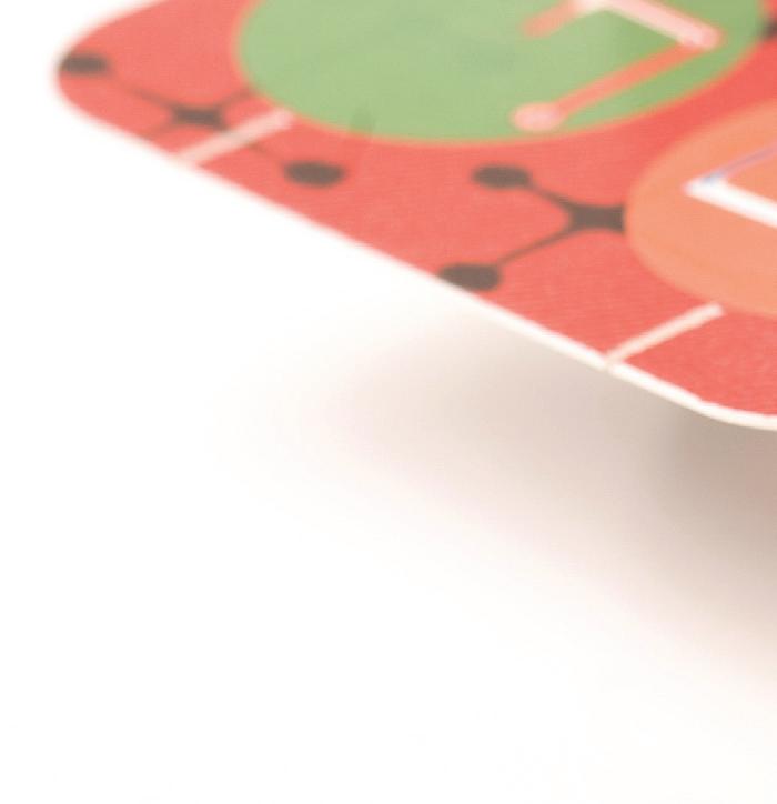
The House of Cards has 12 cards per set, each card measures 2 ¼" x 3 ½" and is printed on Mohawk Loop, Antique White, 28pt c2s.
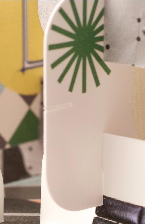
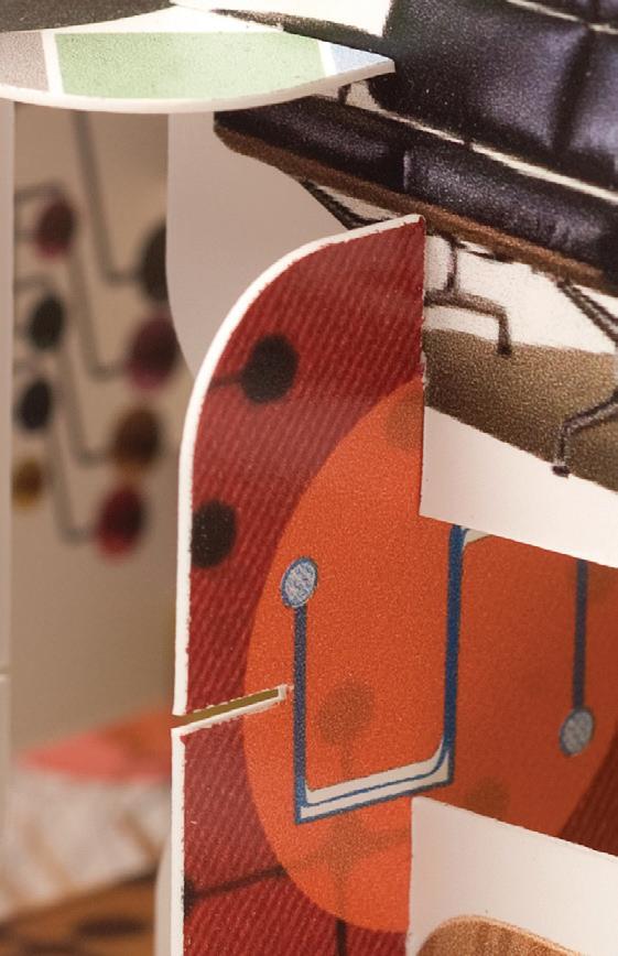
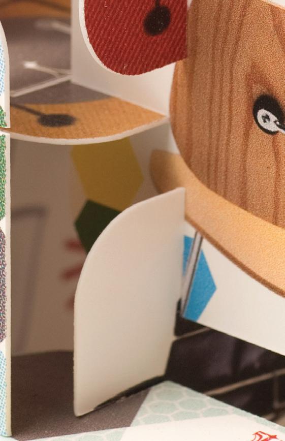
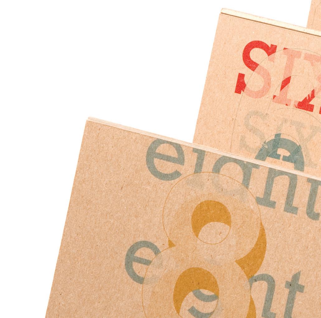
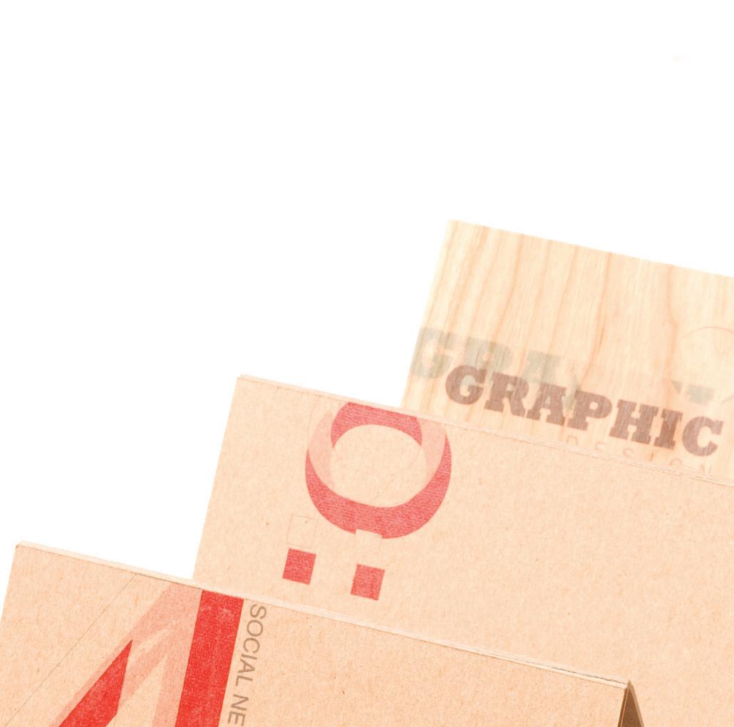
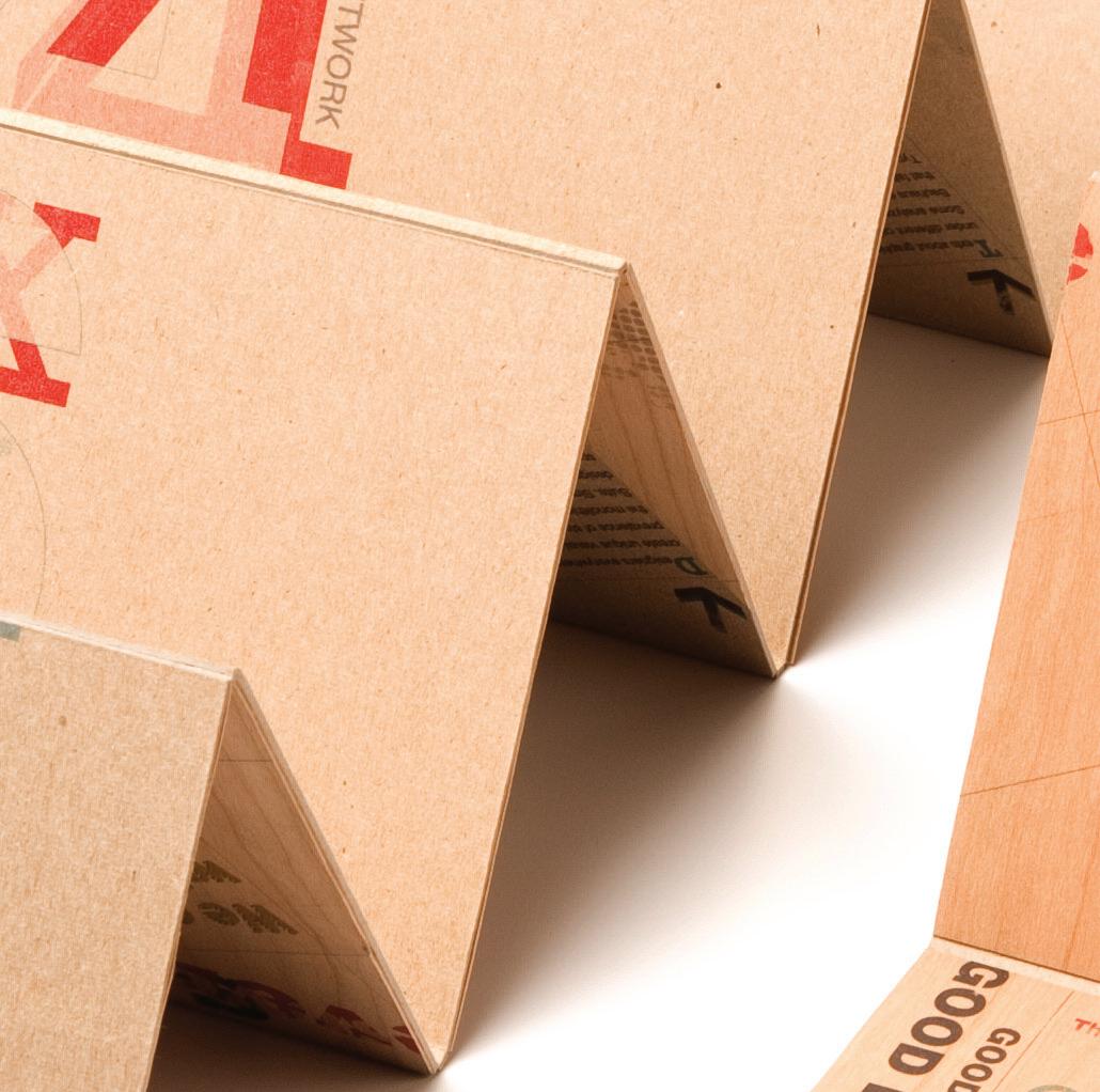
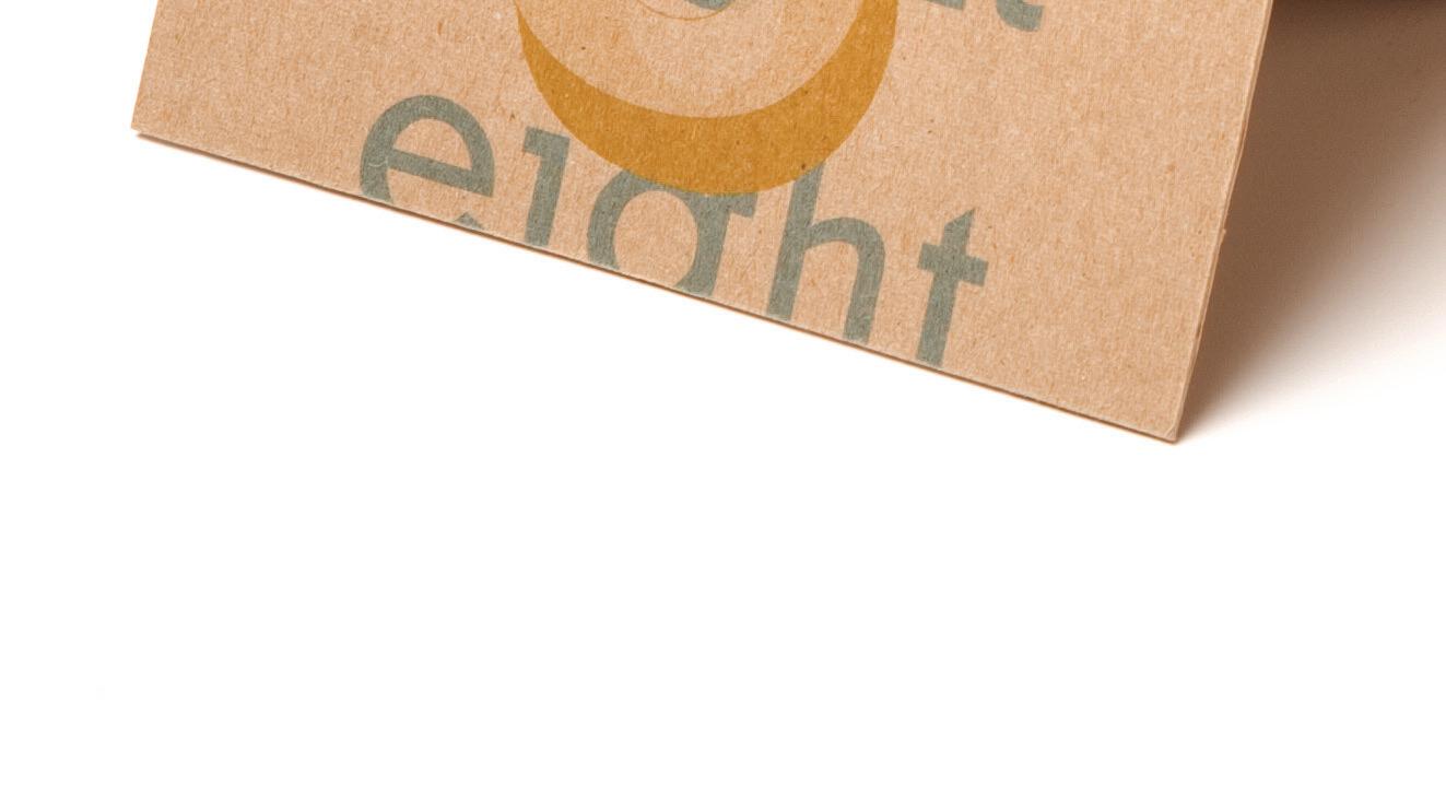
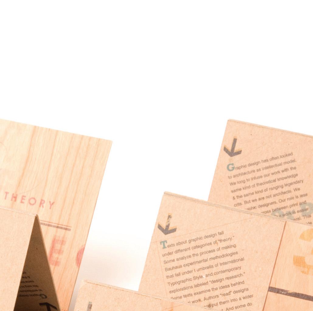
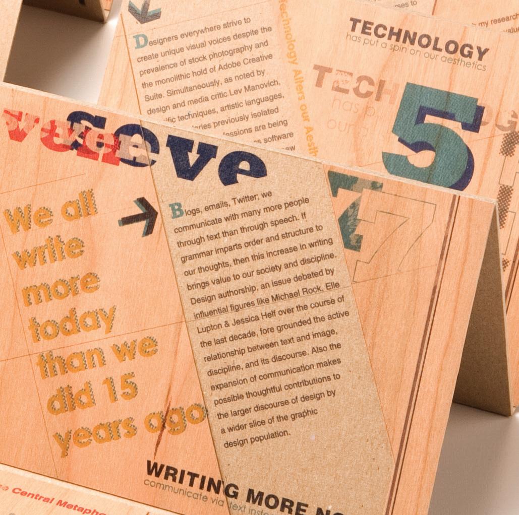
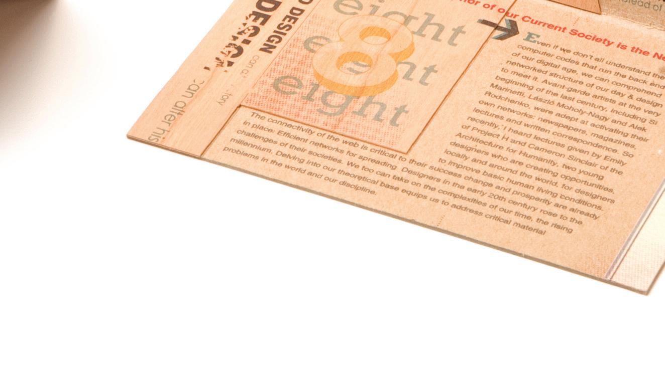
WOOD + CHIPBOARD ACCORDION
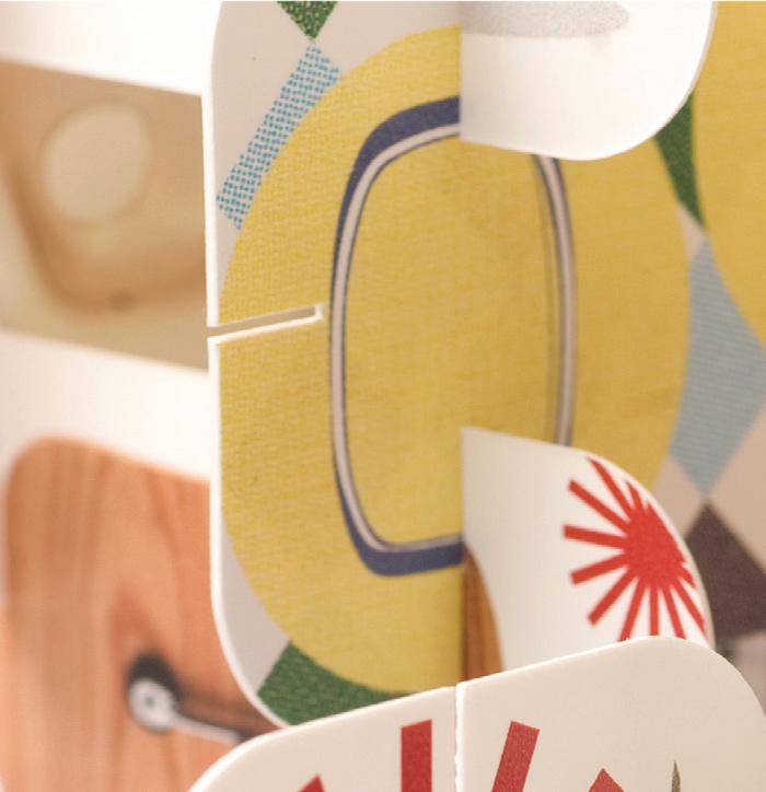
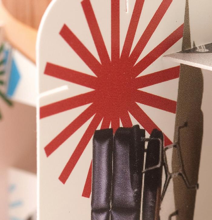
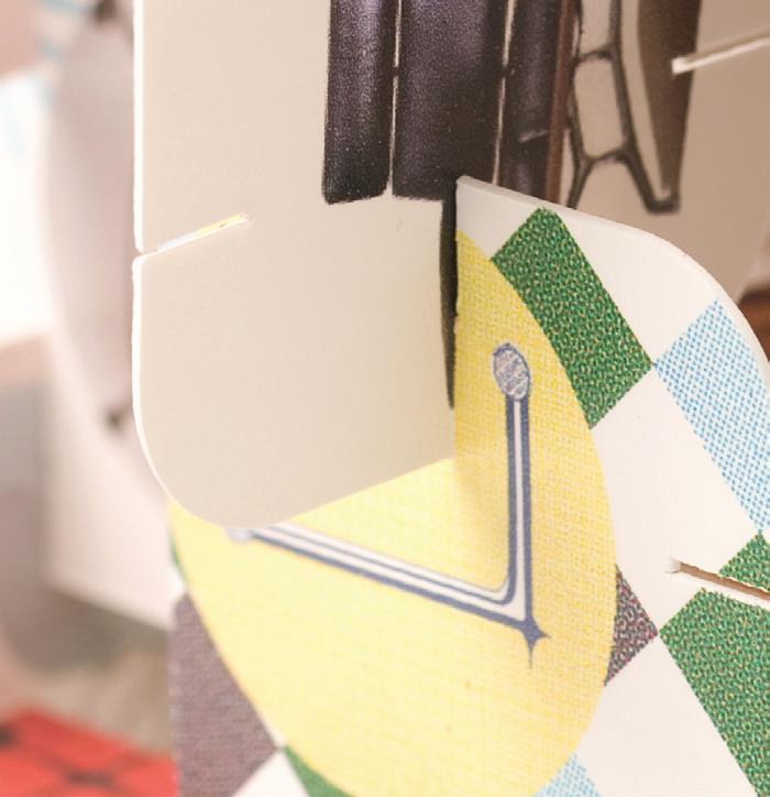
The accordion composition is printed on cherr y wood veneer that’s inter twined with chipboard to create a layer e ect that ar ticulates the theor y behind the design while expressing the body of the ar ticle “Graphic Design Theor y?” written by Helen Ar mstrong.
My design intent is to provide a continuous unifor m ow from Ar mstrong’s ar ticle to the accordion design. The overall design exempli es a unique take on the ar ticle by creating visual dir t on type, numerical hierarchy and grid structure that speaks a nice consistent rhythm from each panel design. The size of each accordion is 45 " x 7 " .
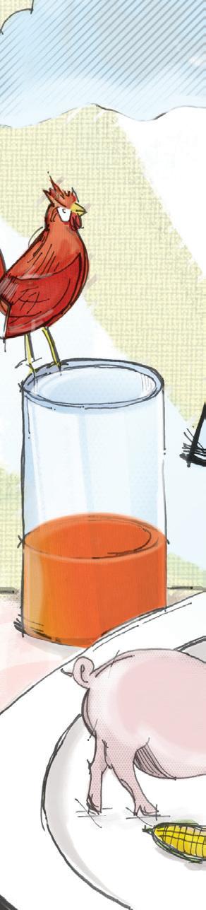
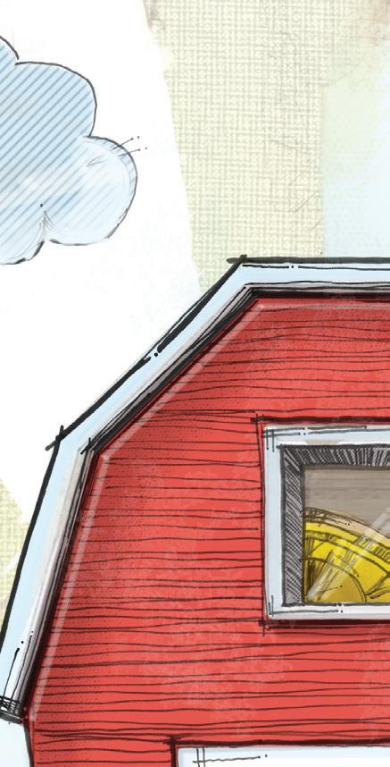
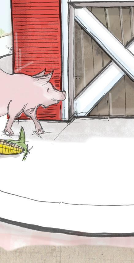
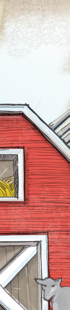
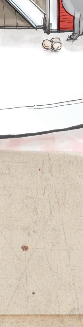
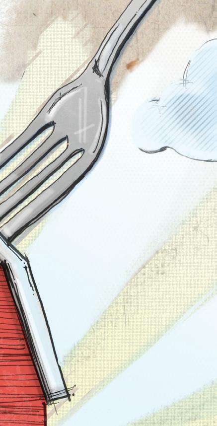
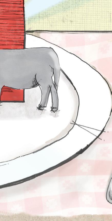
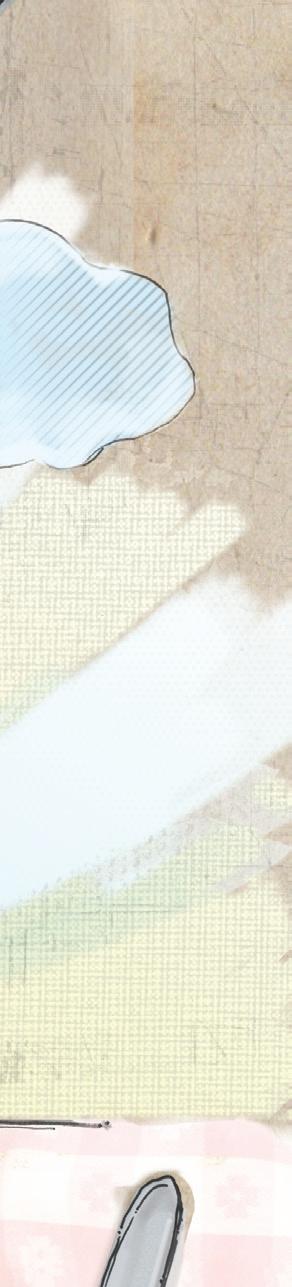
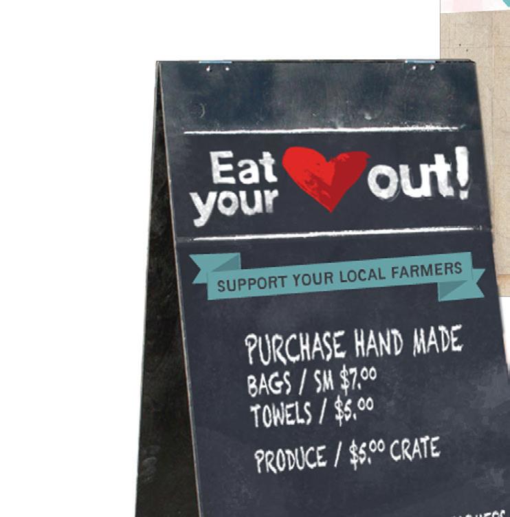
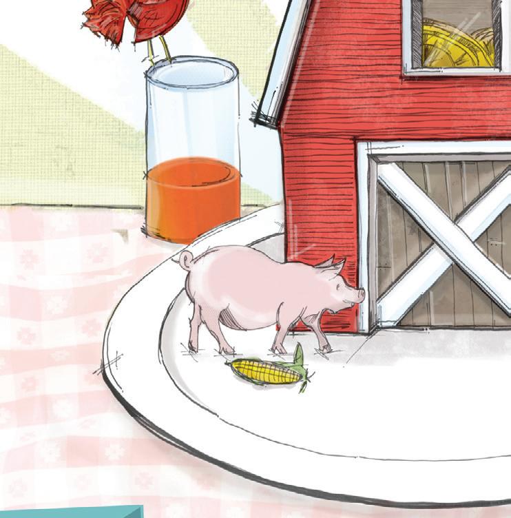
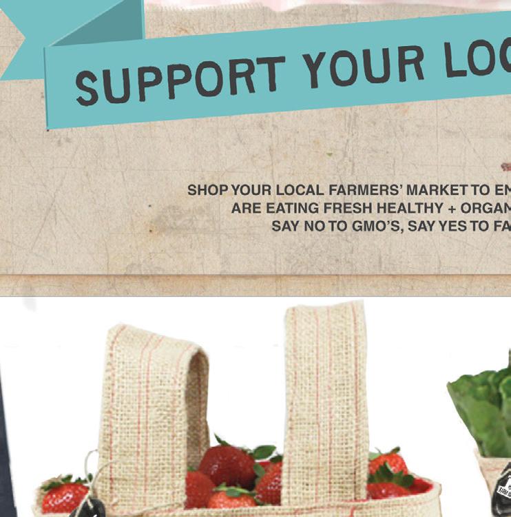
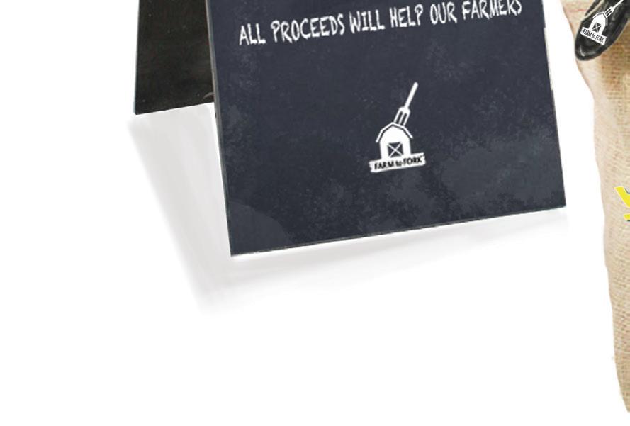
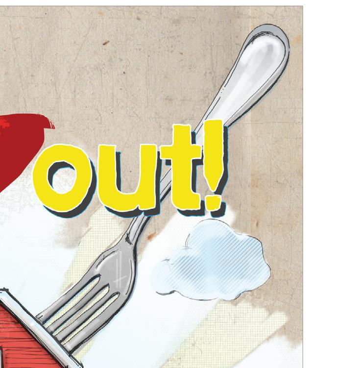
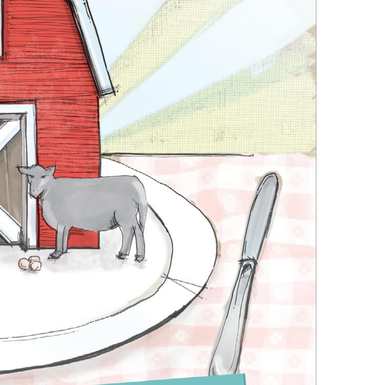
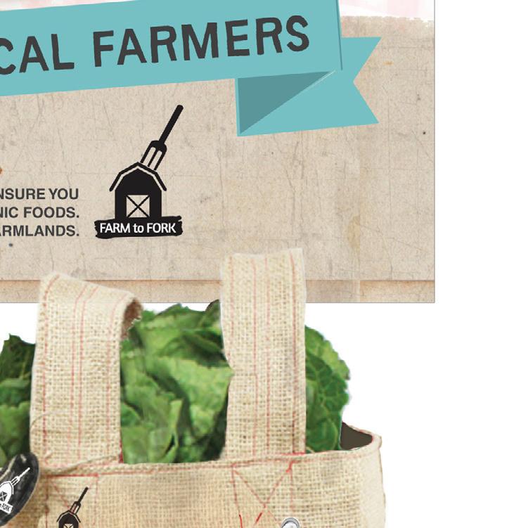
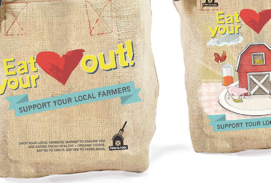
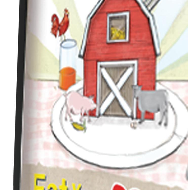
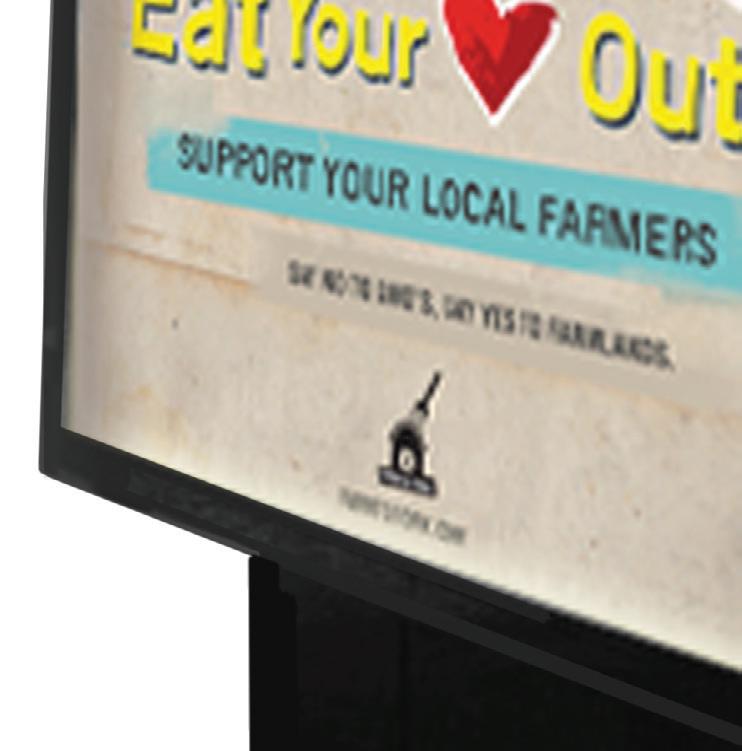
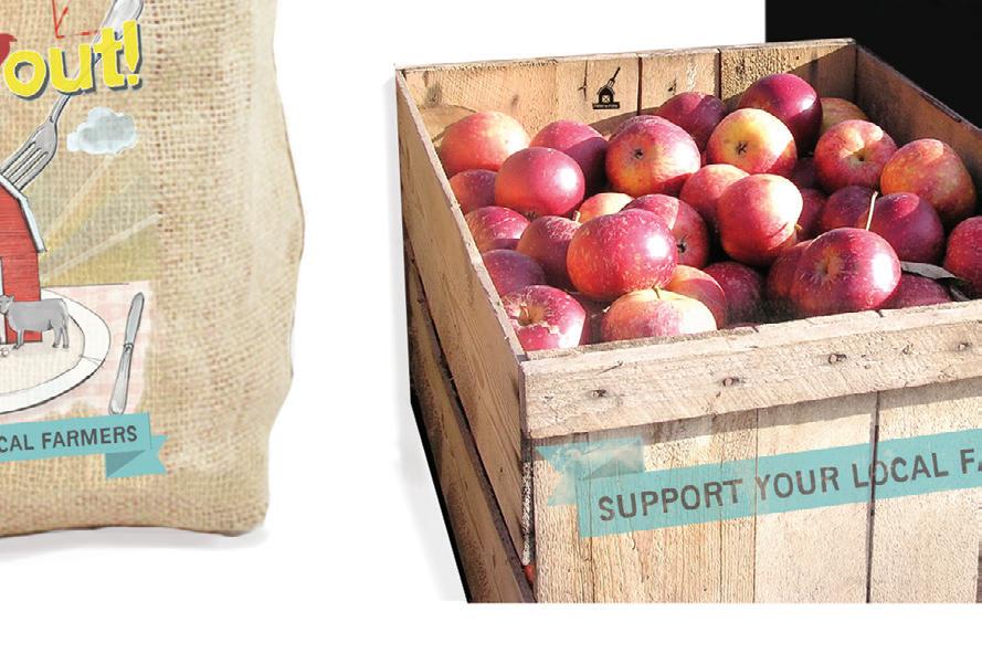
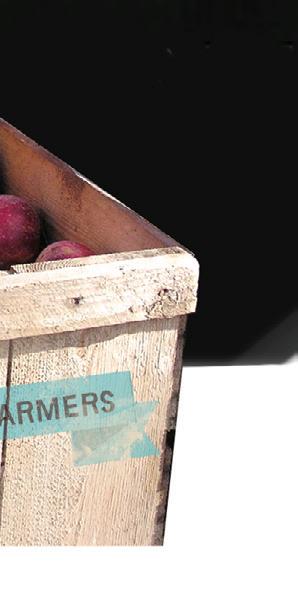
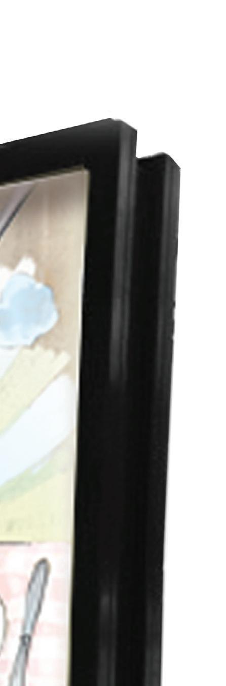
The campaign objective for FARM to FORK was to communicate the impor tance of suppor ting local far mers and the bene cial suppor ts the target audience gain with their health, monthly budget and environment.
The campaign components ranged from posters at the local far mers market, to bus stop posters throughout downtown Kansas City, to far mers market food crates, to sustainable burlap market bags and the signage at the entrance of the far mers market.
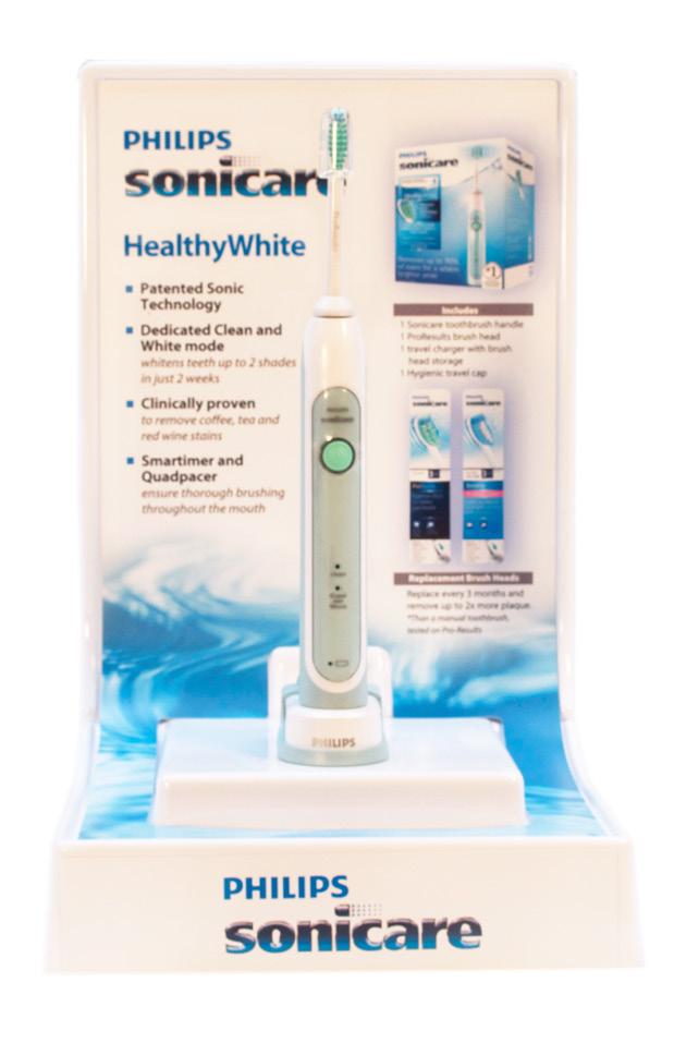
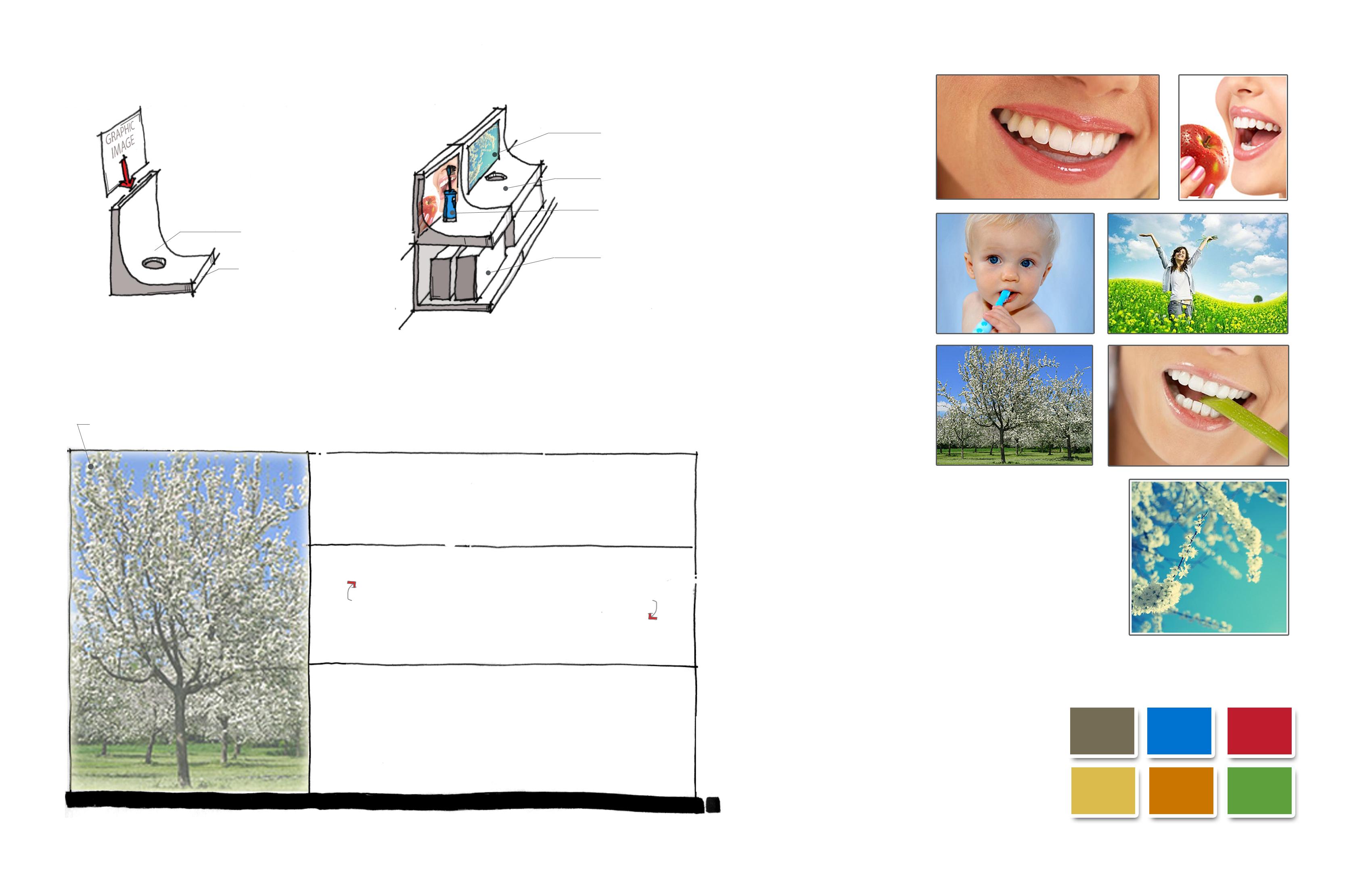
ORAL CARE TOUCH & LEARN
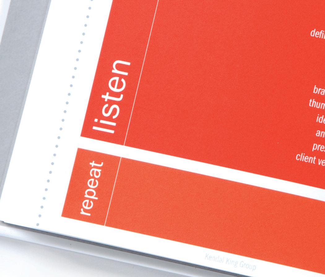
Philips reached out to the company Kendal King Group to redesign the Oral Care section at Walmart. I had the pleasure to take on this project as the lead designer and design the Touch & Learn form and the communication graphics that collate with 10 different products that Philips, Oral B and Waterpik represent at Walmart. In May 2011, this project was tested in 20 different test stores throughout the U.S. In Spring 2012, there were an additional 100 stores where these displays were tested. So far, the client, Philips, is very pleased with the success and sale increases the Touch & Learns have brought in for their company.
BRAND GUIDELINES
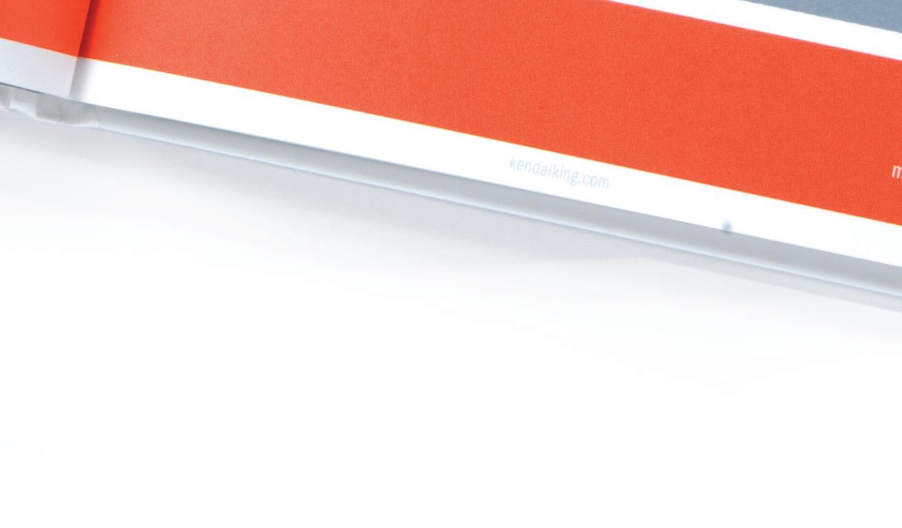
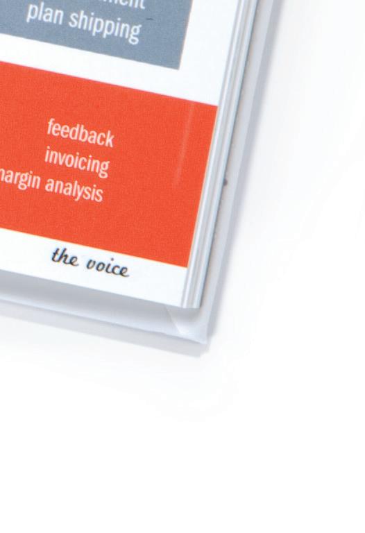
Client: Kendal King Group
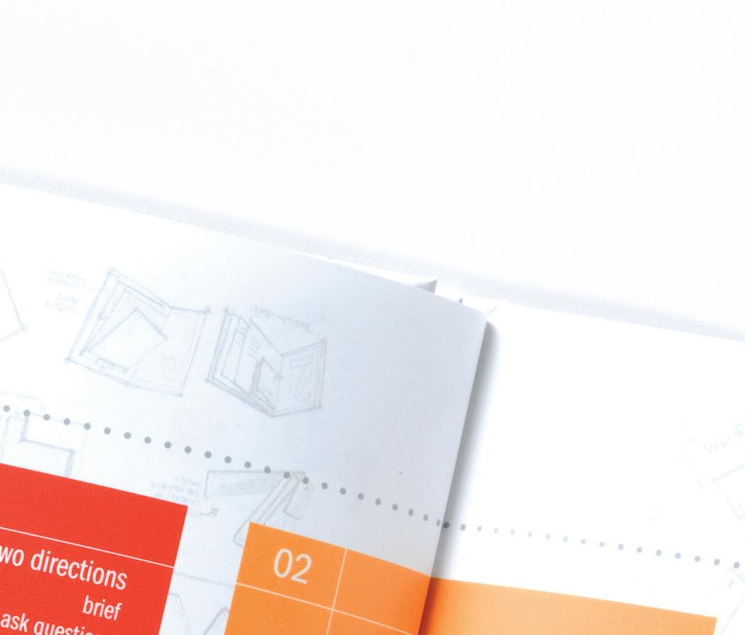
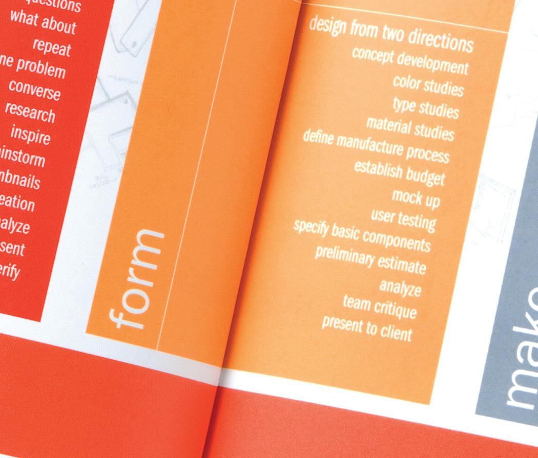
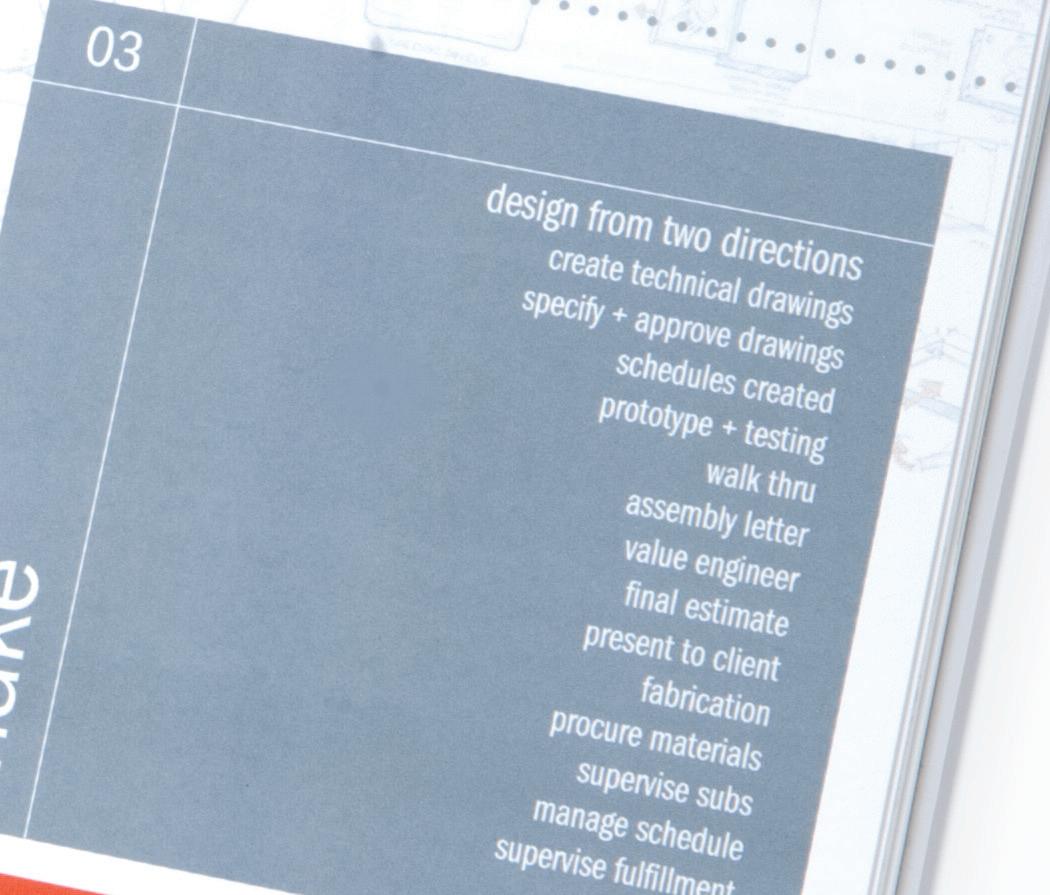
Kendal King Group was in need of an identity standards manual to help clarify the use and implementation of their brand. This detailed manual included color palettes, typeface usage, layout specifications and visual reference for their design process.
The book size is 7" x 7", printed on Mohawk Premium Paper.
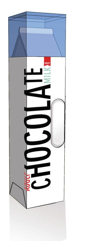
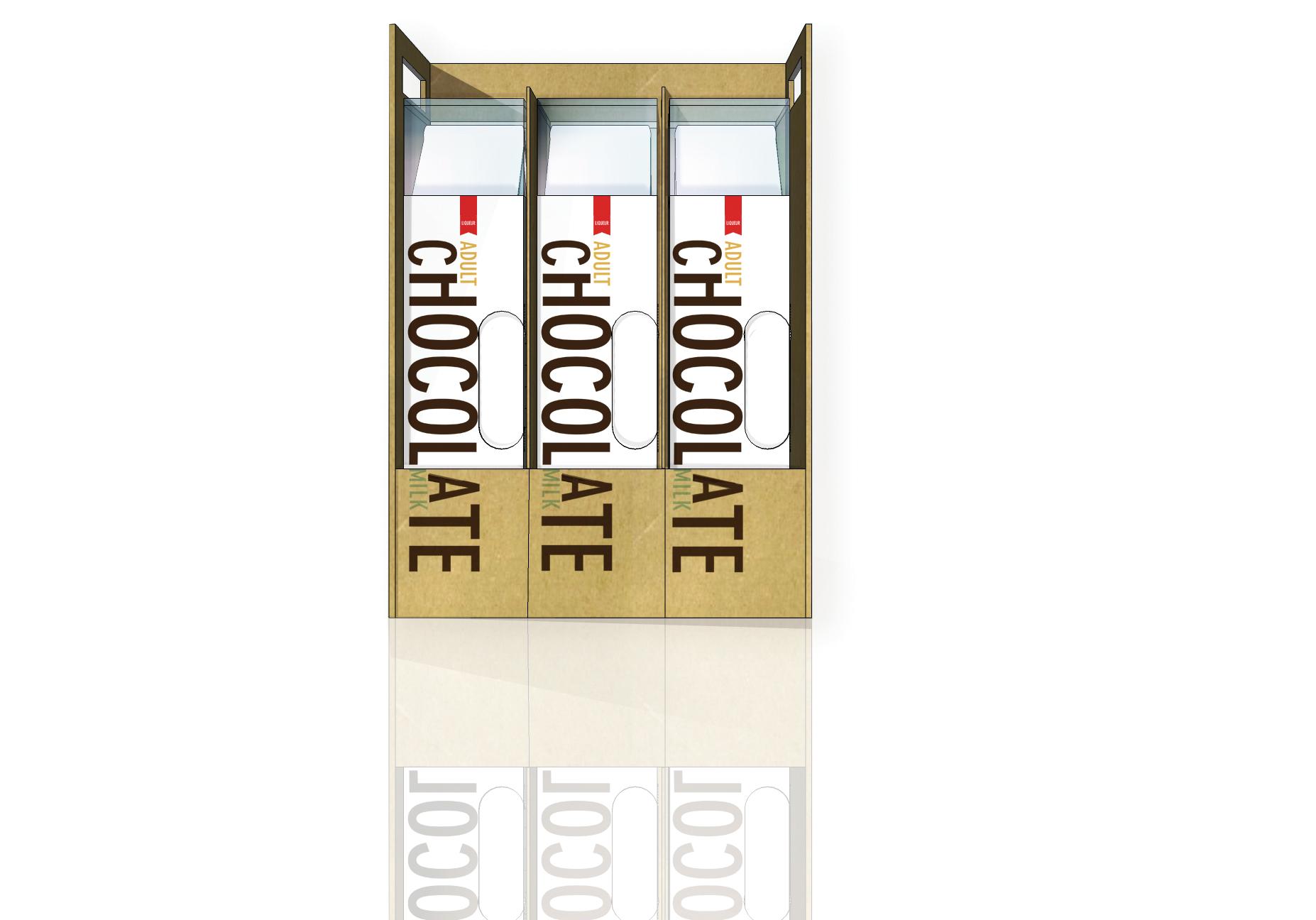
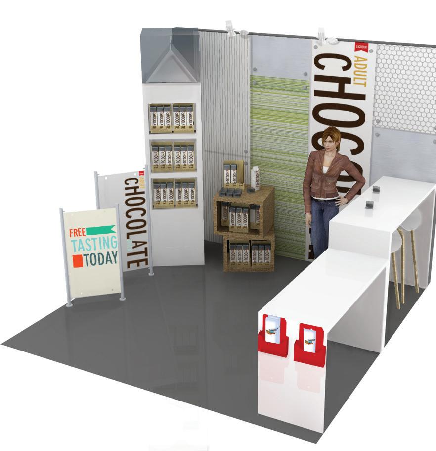
ADULT CHOCOLATE MILK
The states feel the name and current container are too similar to chocolate milk and therefore could appeal to an underage audience.
In order to address these concerns, I proposed a redesign of the brand including new identity and packaging. My intent for Adult Chocolate Milk was to create a sustainable package design that reduced its carbon footprint and provided diverse usability for another form or function.
The product container is made out of Tetra Pak, a sustainable material, and is 2.5 " W x 9 " H x 2.5 " D. The packaging is made from recyclable corrugate board and measures 8"W x 12"H x 3"D.
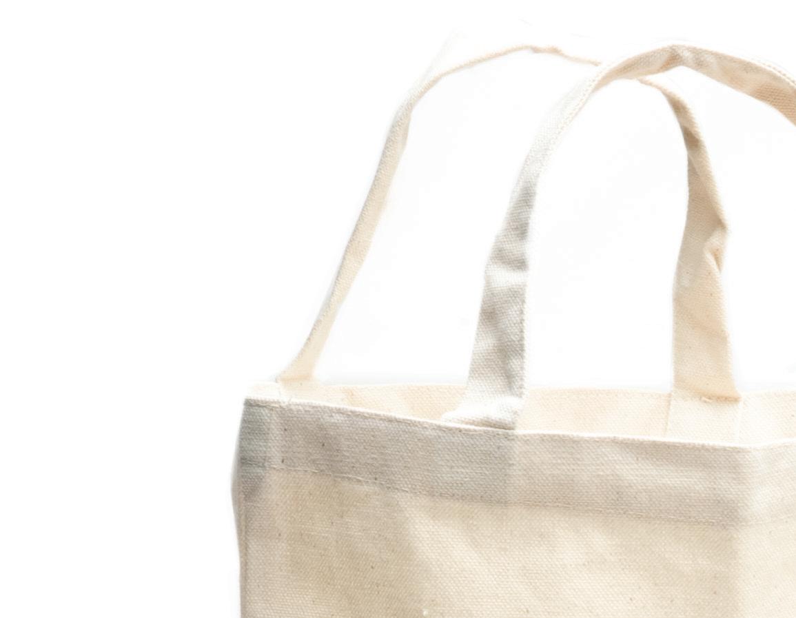
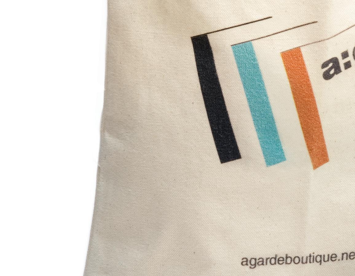
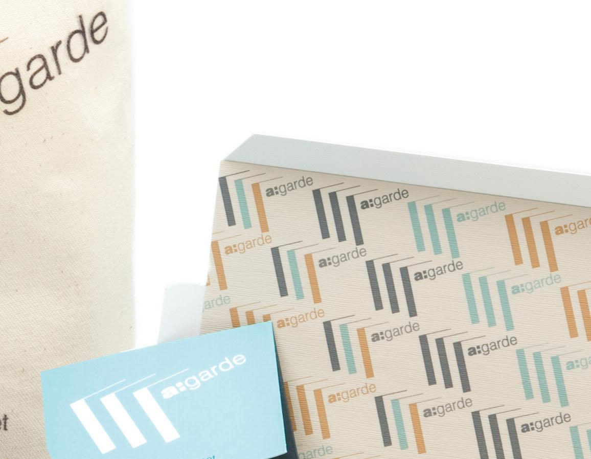
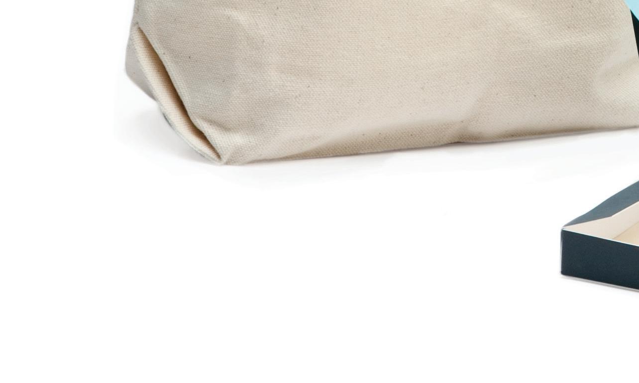
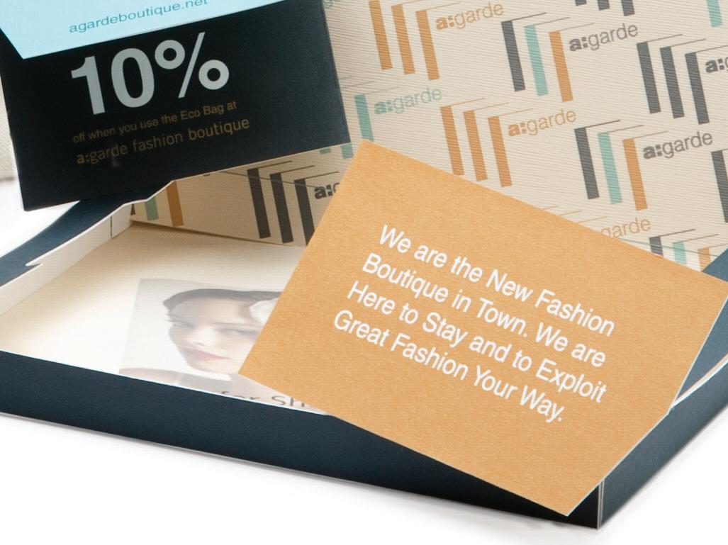
A:GARDE PROMO MAILER
a:garde is a fashion boutique located in Portland, Oregon, that focuses on vintage, modern fashion with an Australian flair. The intent of this project was to create a promo mailer that complimented a:garde’s fashion identity by supporting the environment and providing savings for the end user.
The promotional mailer contains an Eco Friendly canvas bag that communicates the boutique’s identity screen printed onto the bag along with a 10% discount card for the potential shopper to utilize each time they shop at a:garde.
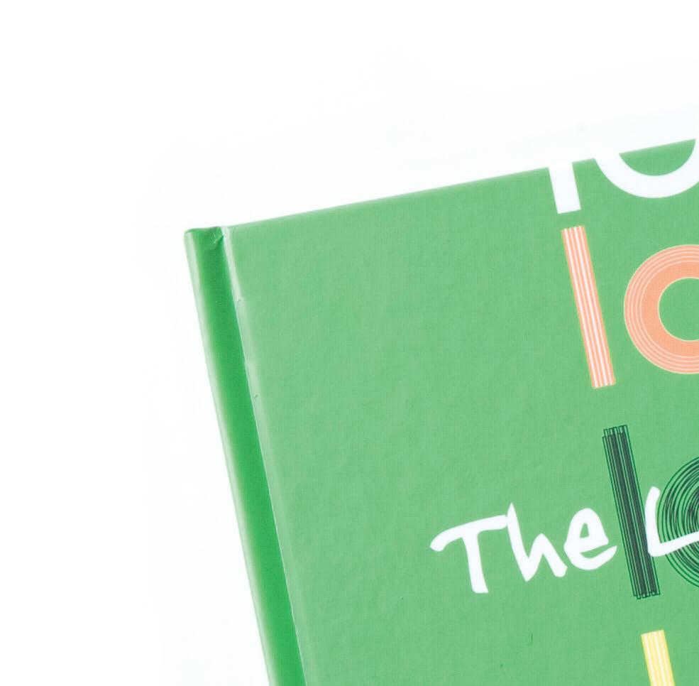
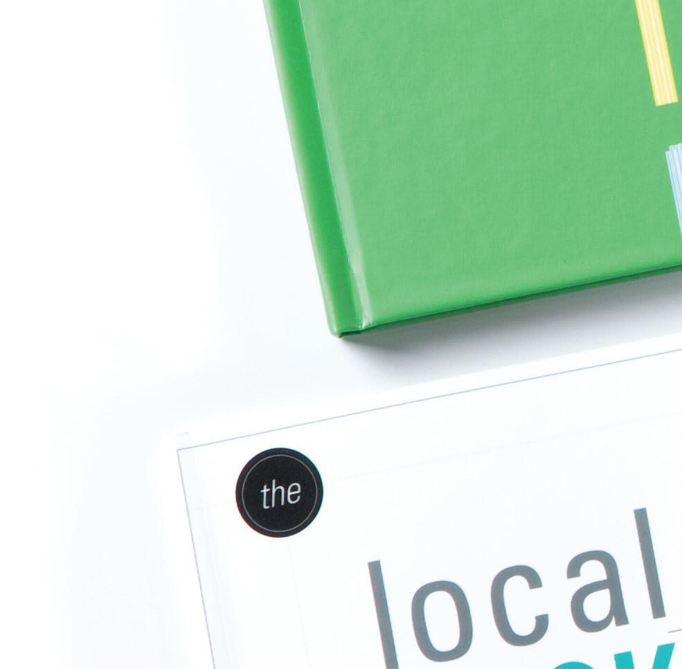
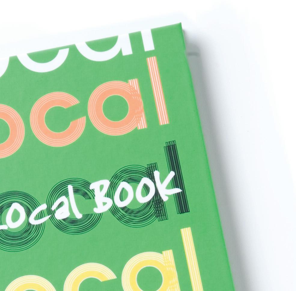
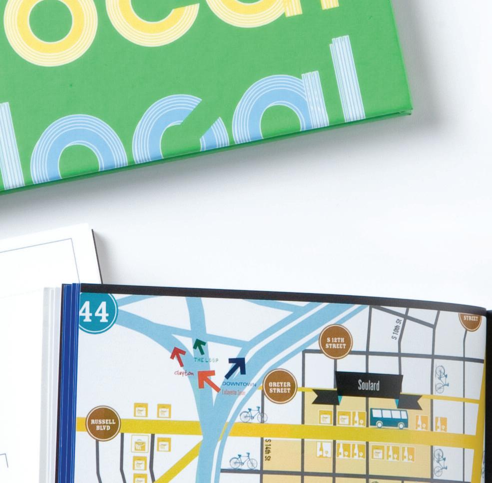
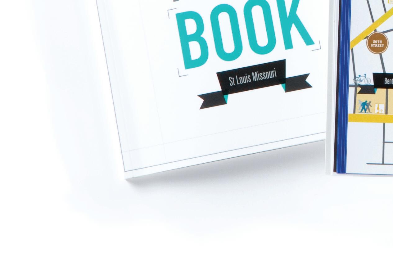
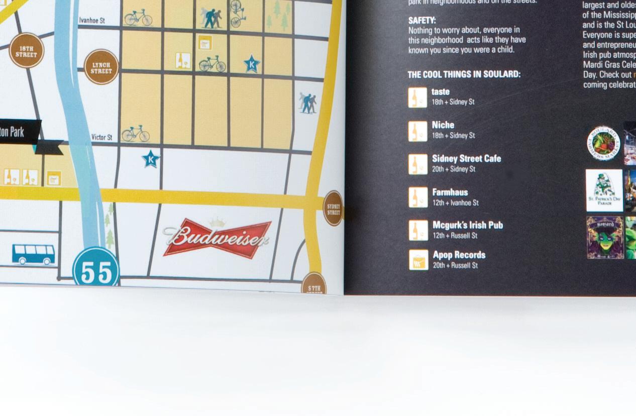
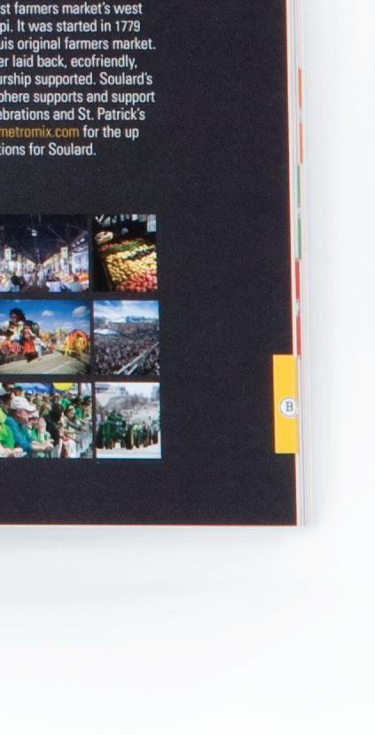
THE LOCAL BOOK
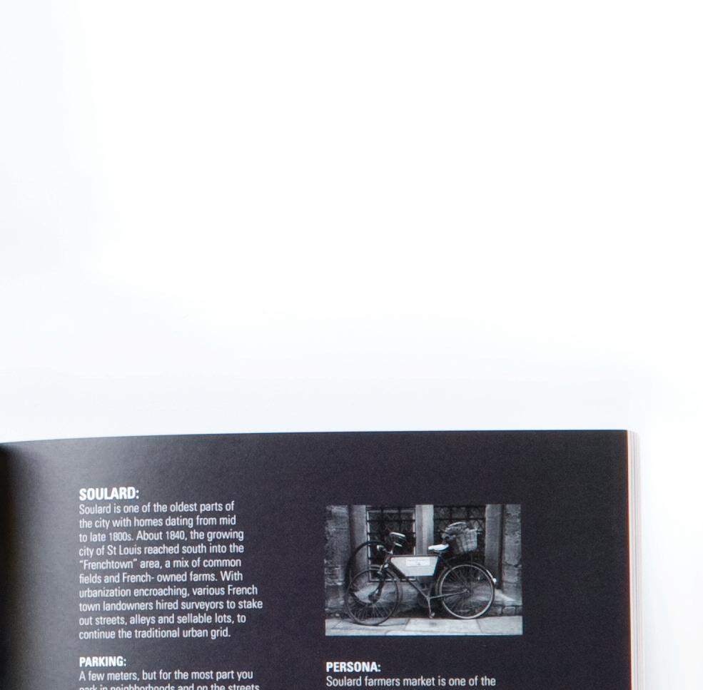
The communication piece was created while I lived in St. Louis, Missouri, to provide an inner city view for travelers and visitors to utilize when experiencing the city and what the local neighborhoods have to offer. My intent was to provide a vehicle that was organized by the neighborhoods and to provided listings of the local boutiques and independent restaurants.
The Local Book measures 7" x 7" and printed on Mohawk Premium, Neon White Brightness,100lb Cover.
The process book size is 8.25" x 9.75" and printed on Mohawk Premium, Bright White,100lb Cover
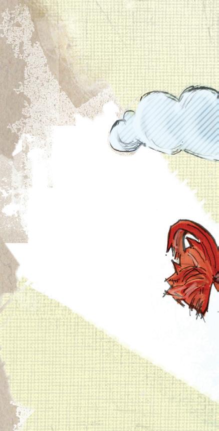
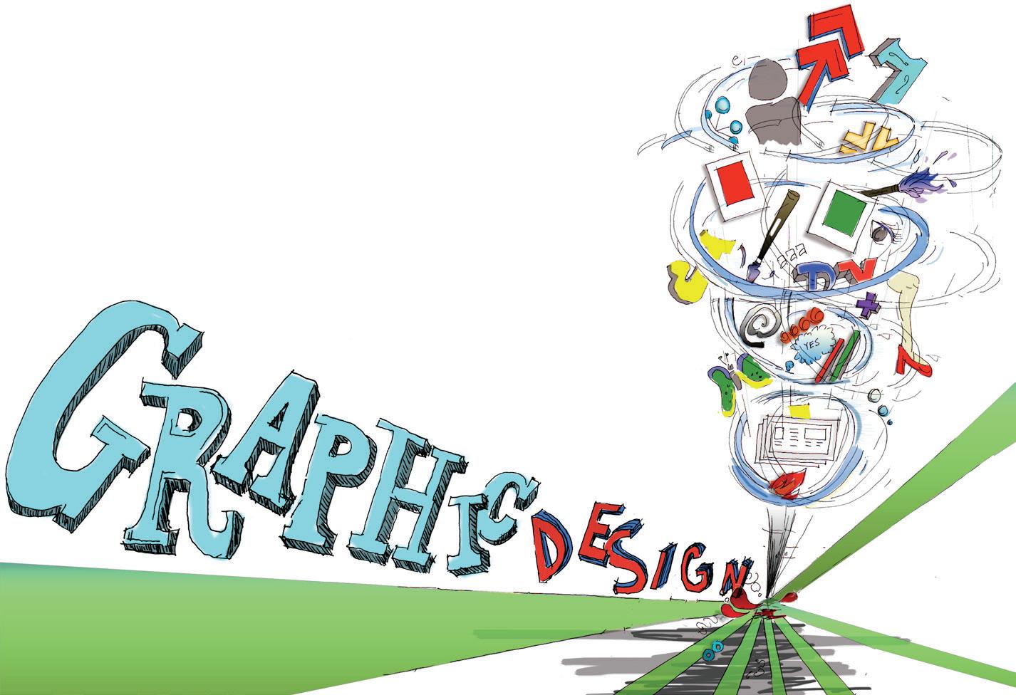
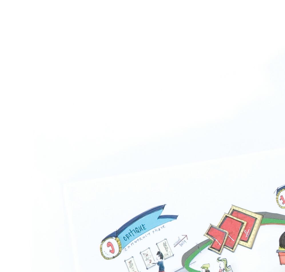
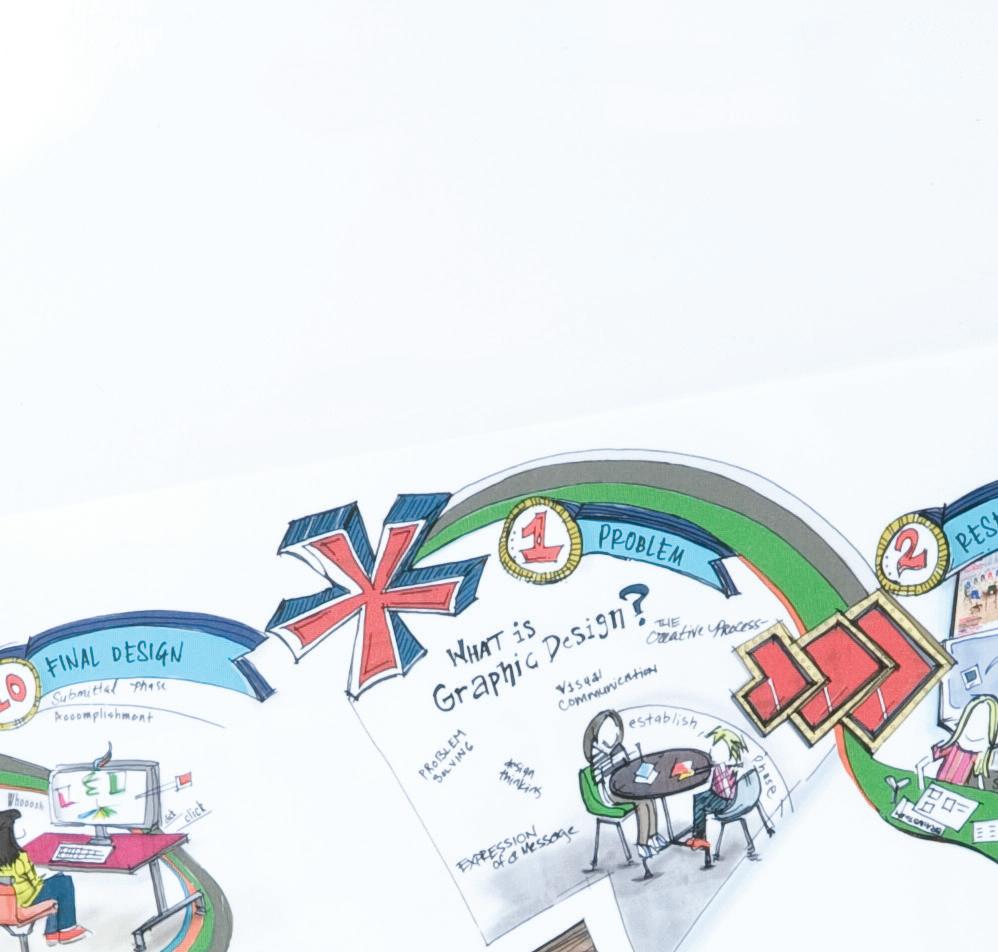
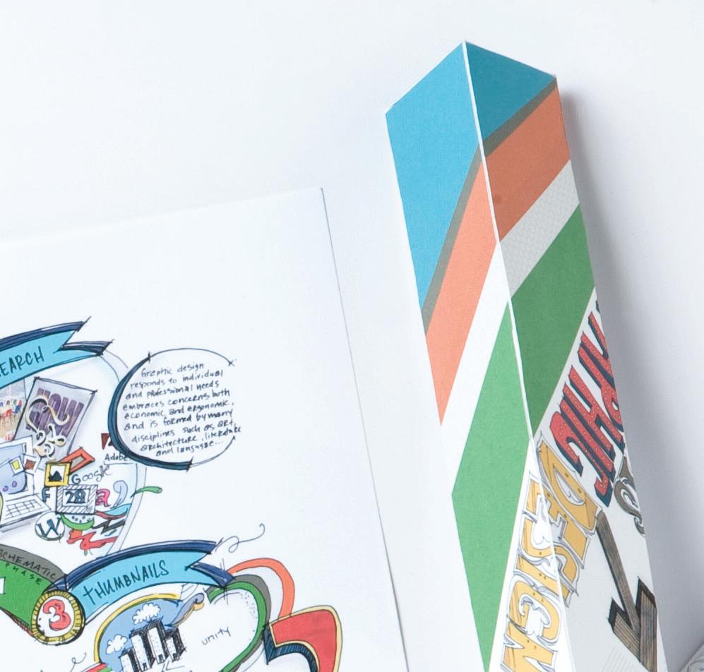
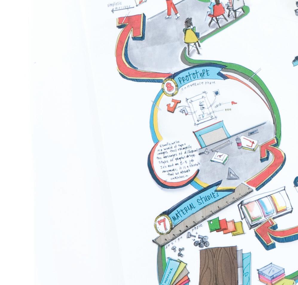
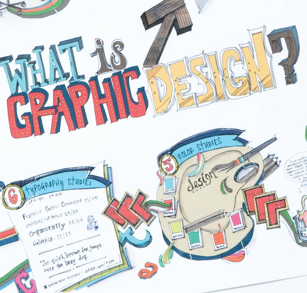
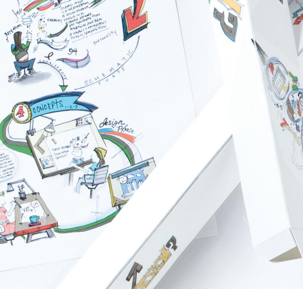
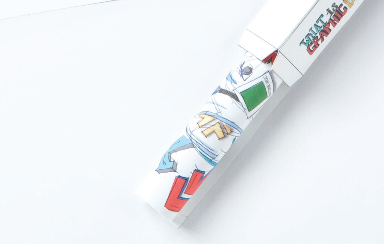
WHAT IS GRAPHIC DESIGN?
This poster was designed to communicate the graphic design creative process to a teen audience. This is based on my own creative methodology. The poster is contained in a triangular shaped package; the graphics on the package design compliment and are consistent in tone with the poster illustration.
The original size of the poster illustration is 18" x 24" and printed on Mohawk Loop Smooth, Pure White, 100T.
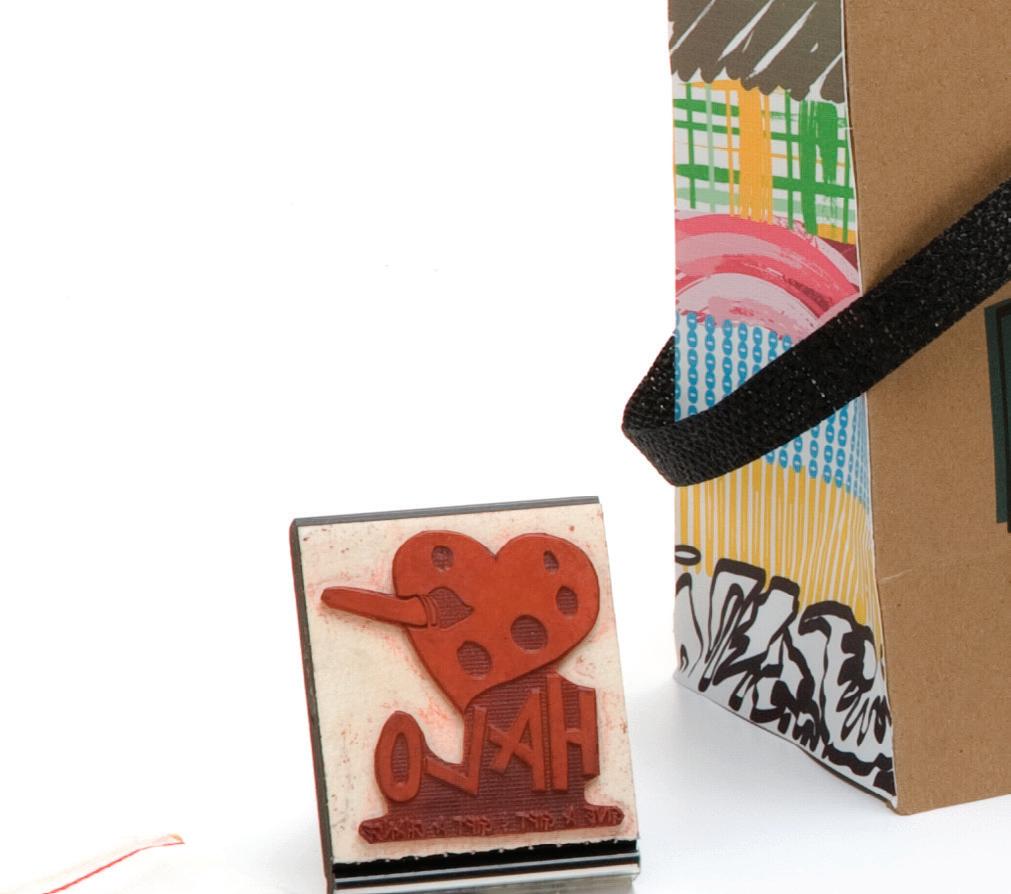
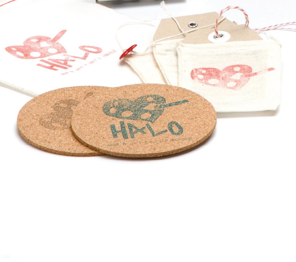
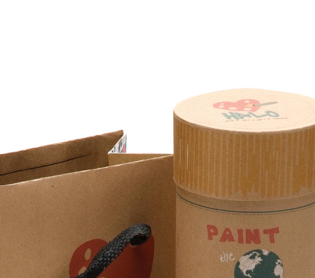
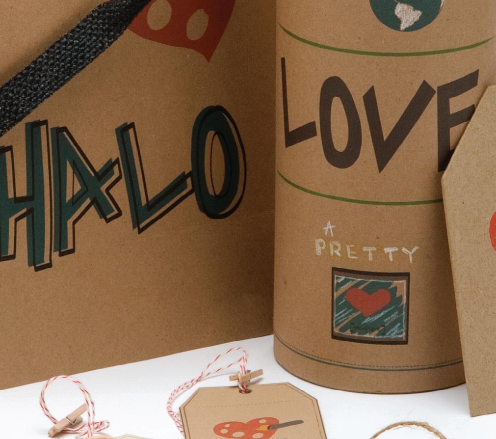
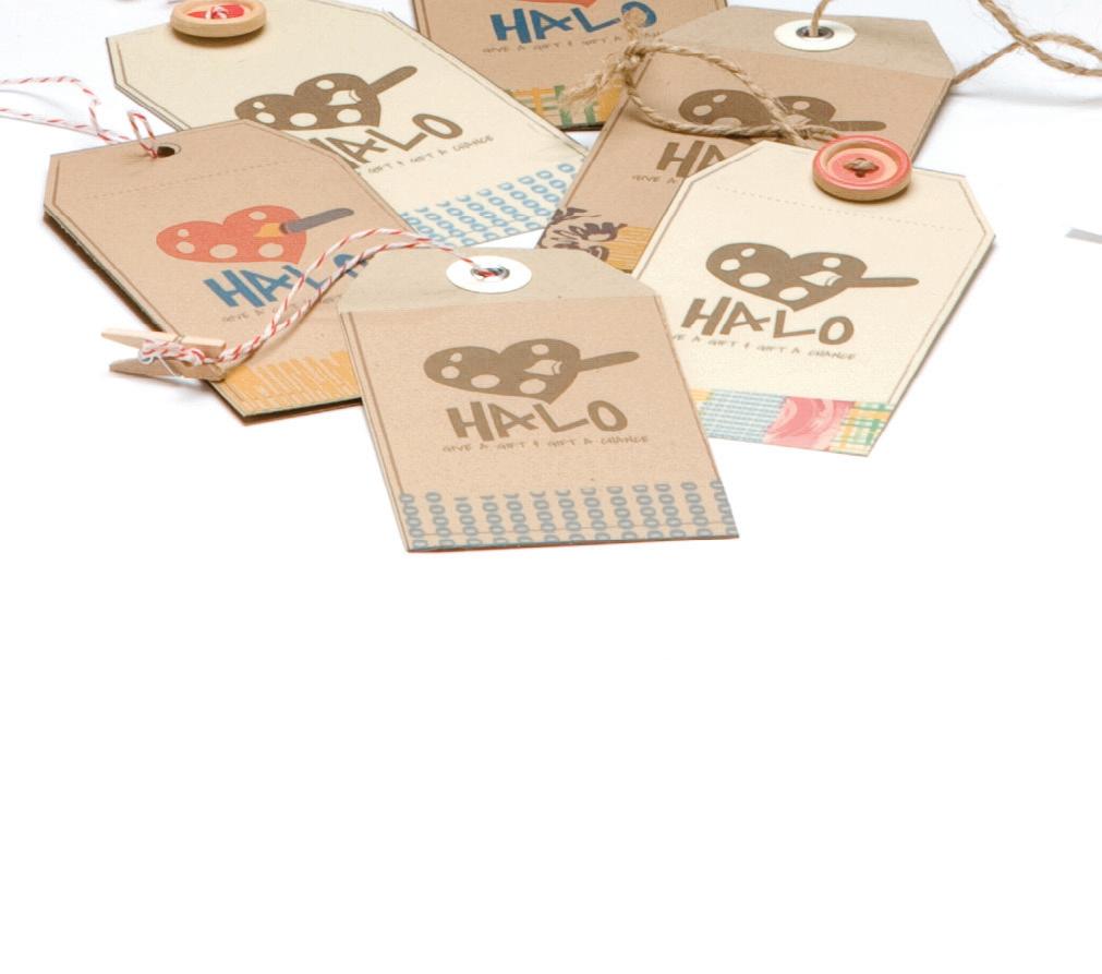
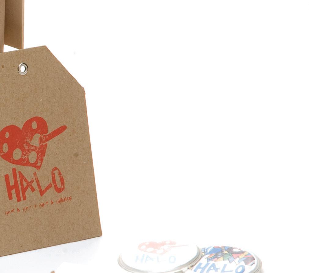
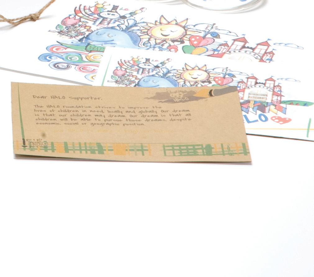
HALO FOUNDATION
For this campaign I had the opportunity to work with a local non-profit organization. I chose to reach out to the HALO Foundation, a group who provides art therapy and enhances the living conditions for orphans worldwide.
The objective for this campaign was to create a new branding look for HALO’s foundation product line for the upcoming year that exemplified characteristics of kid vision intertwined with a boutique feel.
The new identity communicated a consistent tone from their logo to the interior of their event space to the personality of the products. The family of components range from retail bags to clothing tubes, retail hang tags, thank you notes, campaign - identity flair pins and other miscellaneous items.