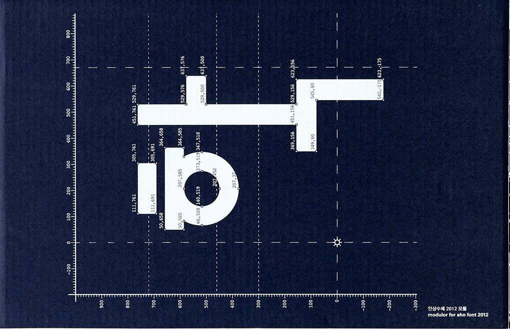
AHN SANG SOO AND AG TYPOGRAPHY INSTITUTE
Dating back to 1985, specimens of Ahn’s digital type represent the origins of Exploration and play found in Hangul design Today.
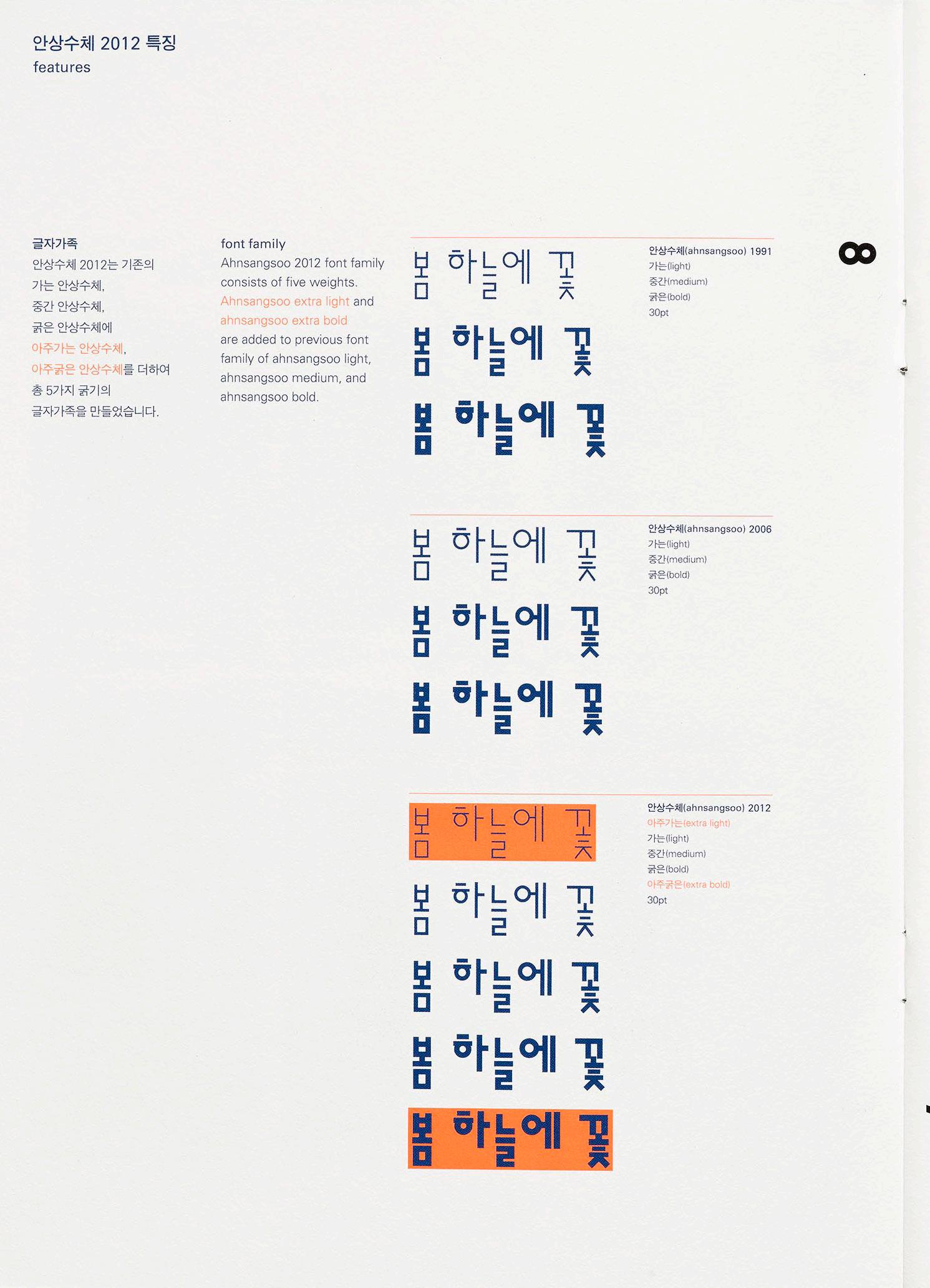
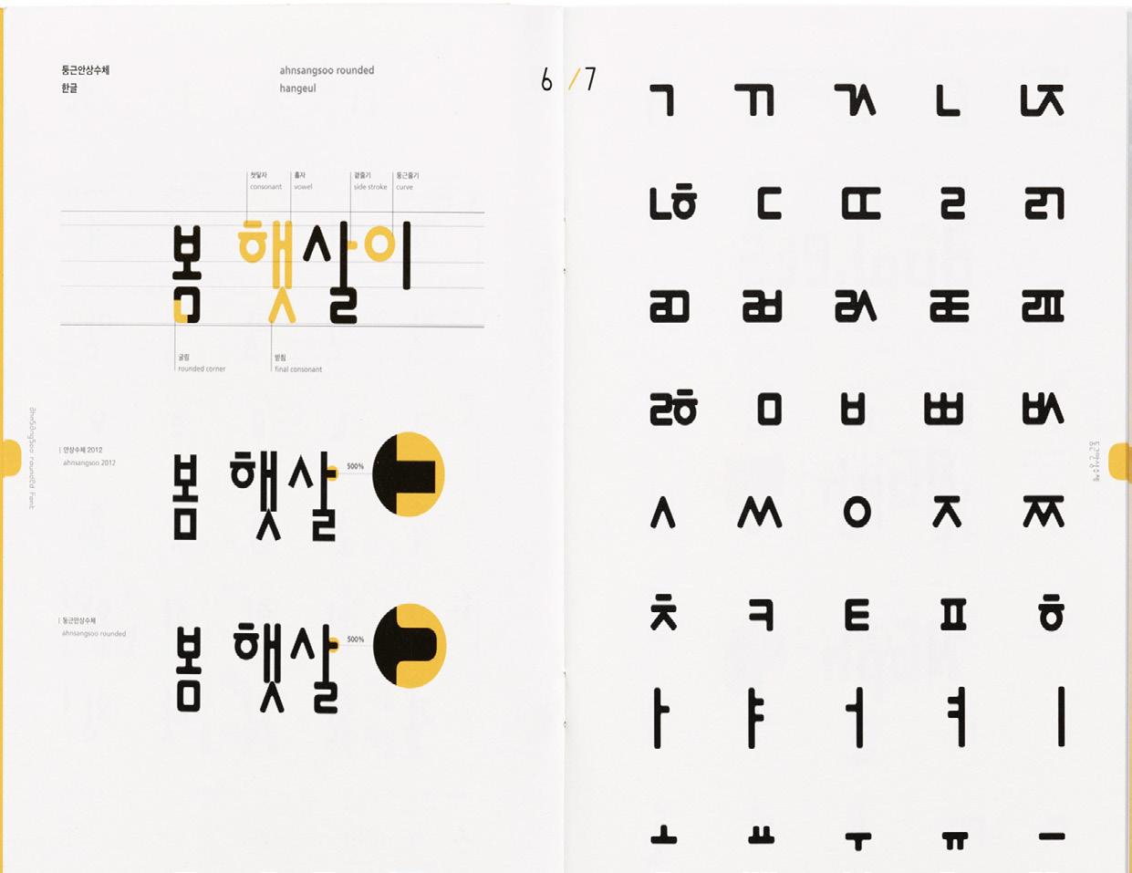
Ahn Sang Soo is often recognized as the father of contemporary Korean type design, and for good reason. His first typeface designed in 1985 broke the molds of Hangul’s traditional design and paved a path of experimentation for the young script. An alumnus and now a professor and Head of the Graphic Design department of Seoul Hongik University, he’s made major typographic contributions in both design and discourse. In 2012, he founded the Paju Typography Institute (PaTI), an alternative design school, as well as AG Typography Institute, an organization that’s dedicated to not only the design of new typefaces, but research, writing, exhibitions, and book design. He’s also published several design books and translated seminal works on typography by Jan Tschichold and Emil Ruder into Korean. Since AG’s founding, Ahn’s original designs have expanded and new faces have been developed. Throughout his career, his typographic lens has also been applied to print magazines, visual arts, photography, poetry, architecture, and more — altogether representing Ahn’s legacy, and his emphasis on the importance of design, research, and play.
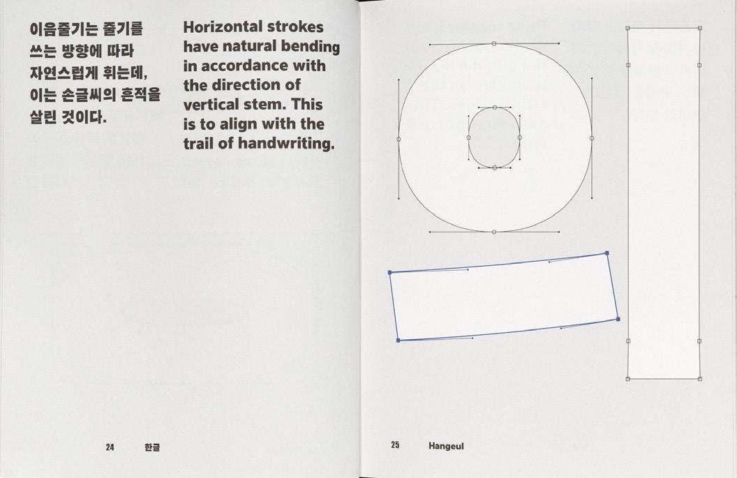
1
3 LETTER FORM ARCHIVE NEWS

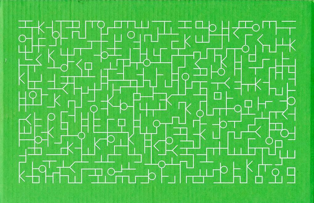
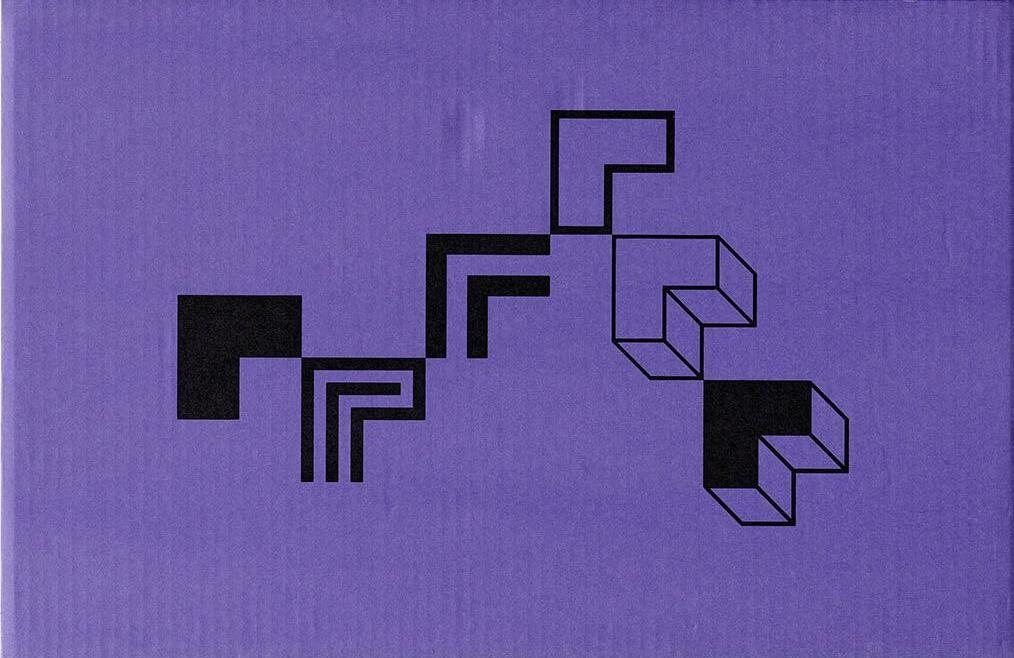 Specimens covers for Ahnsangsoo, Leesang, Mano, and Myrrh, AG Typography Institute.
For Hangul designers, coming into contact with Ahn’s work was pivotal in shaping how they see the letter forms and have applied Ahn’s philosophies to their own practices. Type designer and Type Media graduate Ham Minjoo describes Ahn as being one of her heroes since she came across his work in university. One of the most groundbreaking works for her is Ahn’s first typeface named after himself. “If you look at Ahnsangsoo, even though it was designed in 1985, it’s very modern and natural. Hangul is modular by design, and this typeface is clearly based on Hangul’s philosophy and construction. With this typeface, Ahn defined a new way of looking at Hangul,” Ham said.
5 LETTER FORM ARCHIVE NEWS
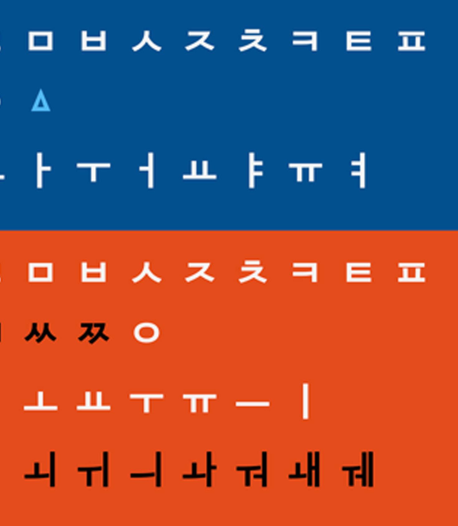
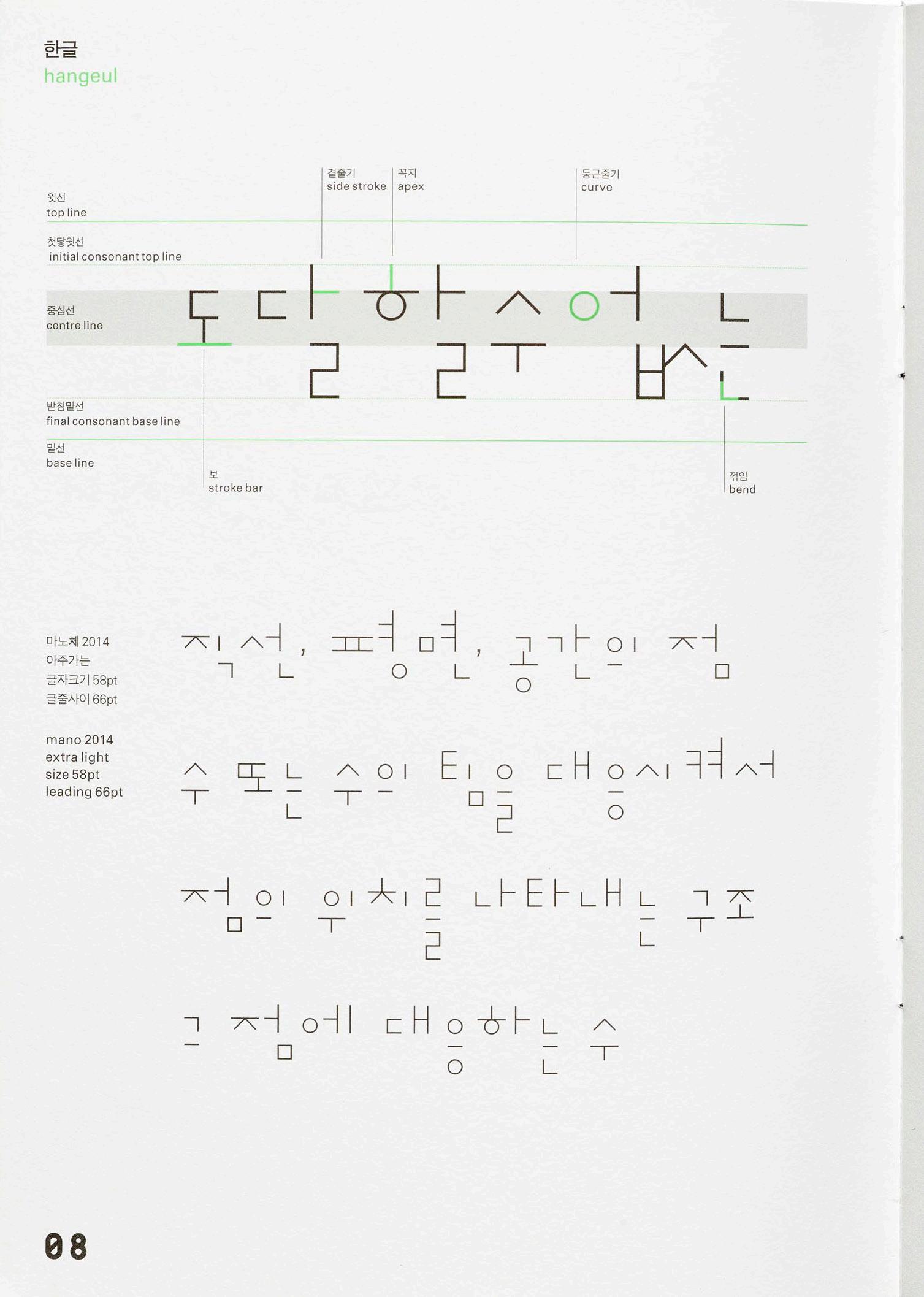
Understanding Ahn’s designs goes hand in hand with the history of Hangul’s construction. Up until the mid-15th century, Chinese was the main script of the Joseon dynasty, and the practice of reading and writing Chinese characters was only available to the educated elite. King Sejong, the ruler at the time, felt dissatisfied that his subjects could not communicate their concerns to him and decided to come up with a new system. He’s known for saying that using Chinese characters for Korean was
“like trying to fit a square handle into a round hole” and developed 28 letters for the new writing system, 24 of which still remain today. These letters make up components called jamo, the building blocks for Hangul’s syllables. He said, “It is my wish that people may learn these letters easily and that they be convenient for daily use.” Today, South Korea has one of the highest literacy rates in the world.
7 LETTER FORM ARCHIVE NEWS
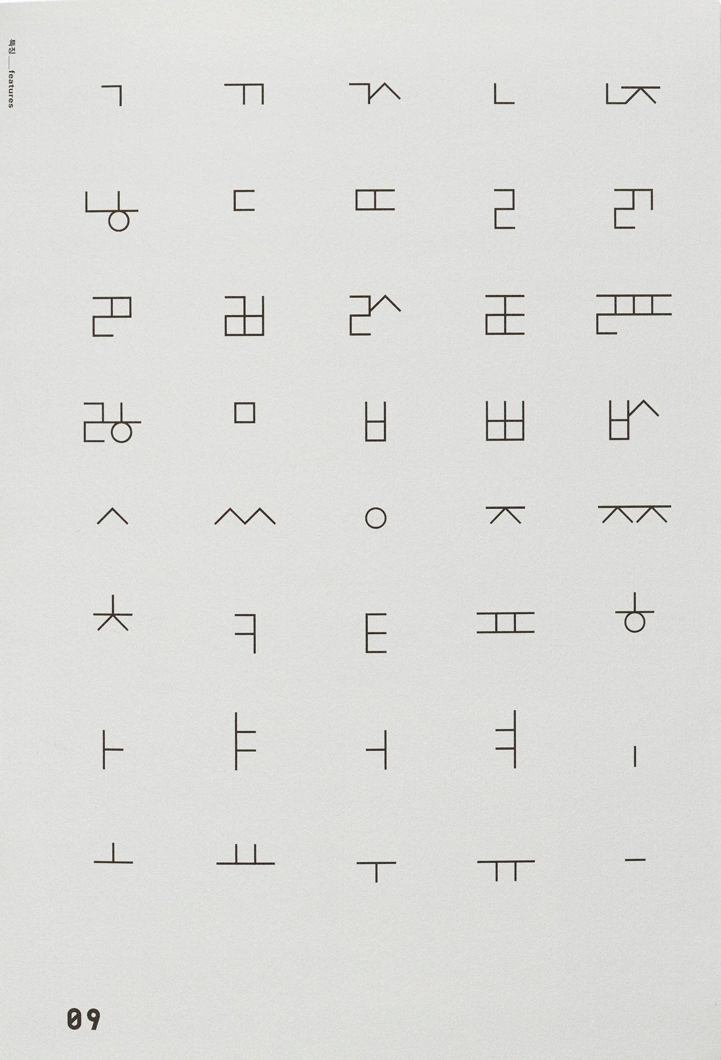
The simple and modular letter forms are made by combining basic shapes like circles, squares, triangles, and lines. Lars Kim, a designer and letterpress printer who recently spoke about Korean typography in our Letter form Lecture series, explains: “Ahn played with how letter forms interact, whether by elongating connecting lines between characters, breaking them apart with empty space or treating individual letters as purely graphic elements. He broke from tradition but also drew from it to create a new paradigm in Korean typography.”
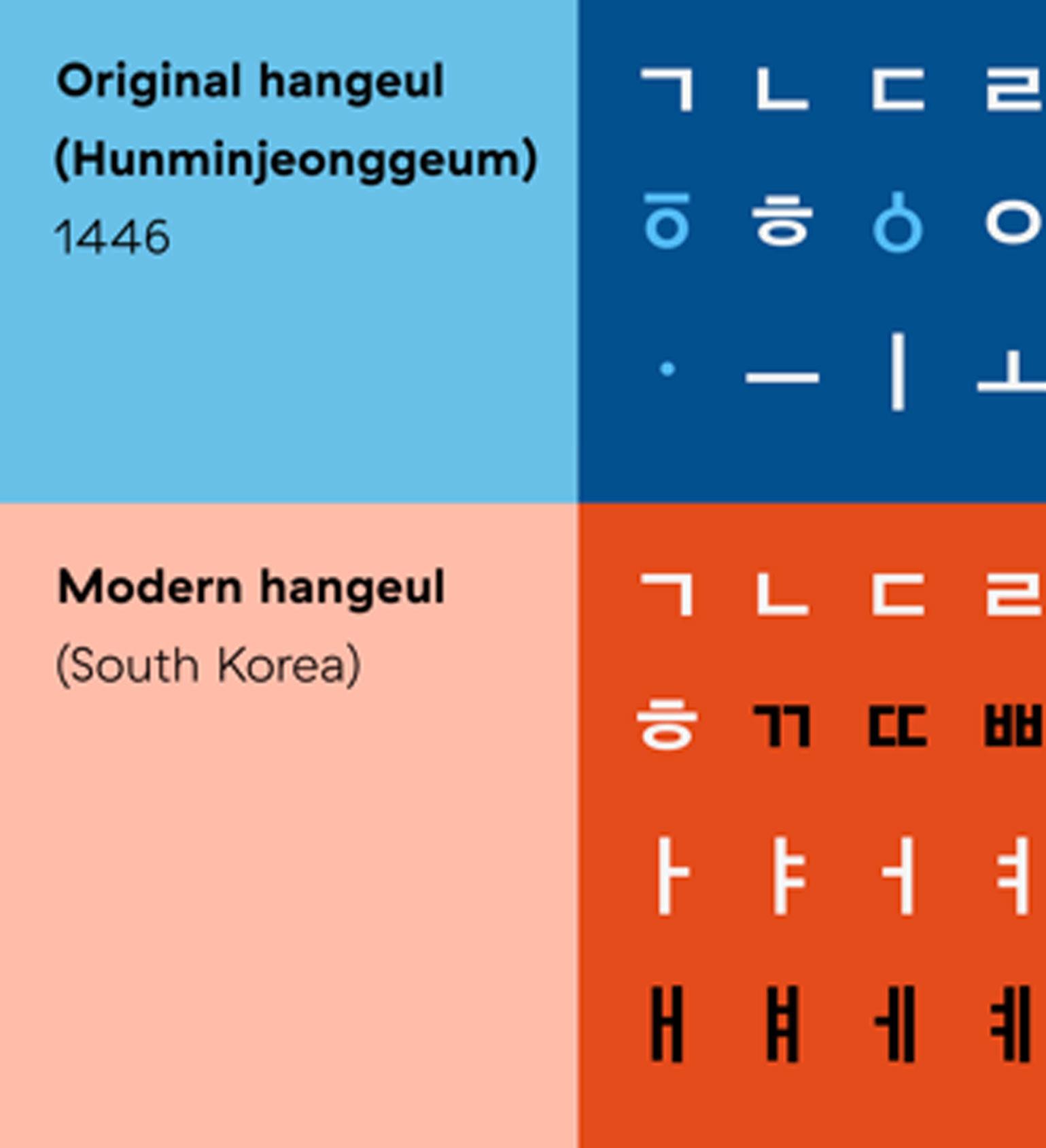 Image courtesy of Lars Kim, slide from her Letter form Lecture “Survey of Korean Calligraphy, Typography, and Print”. The light blue letters from the original hangul were eventually dropped.
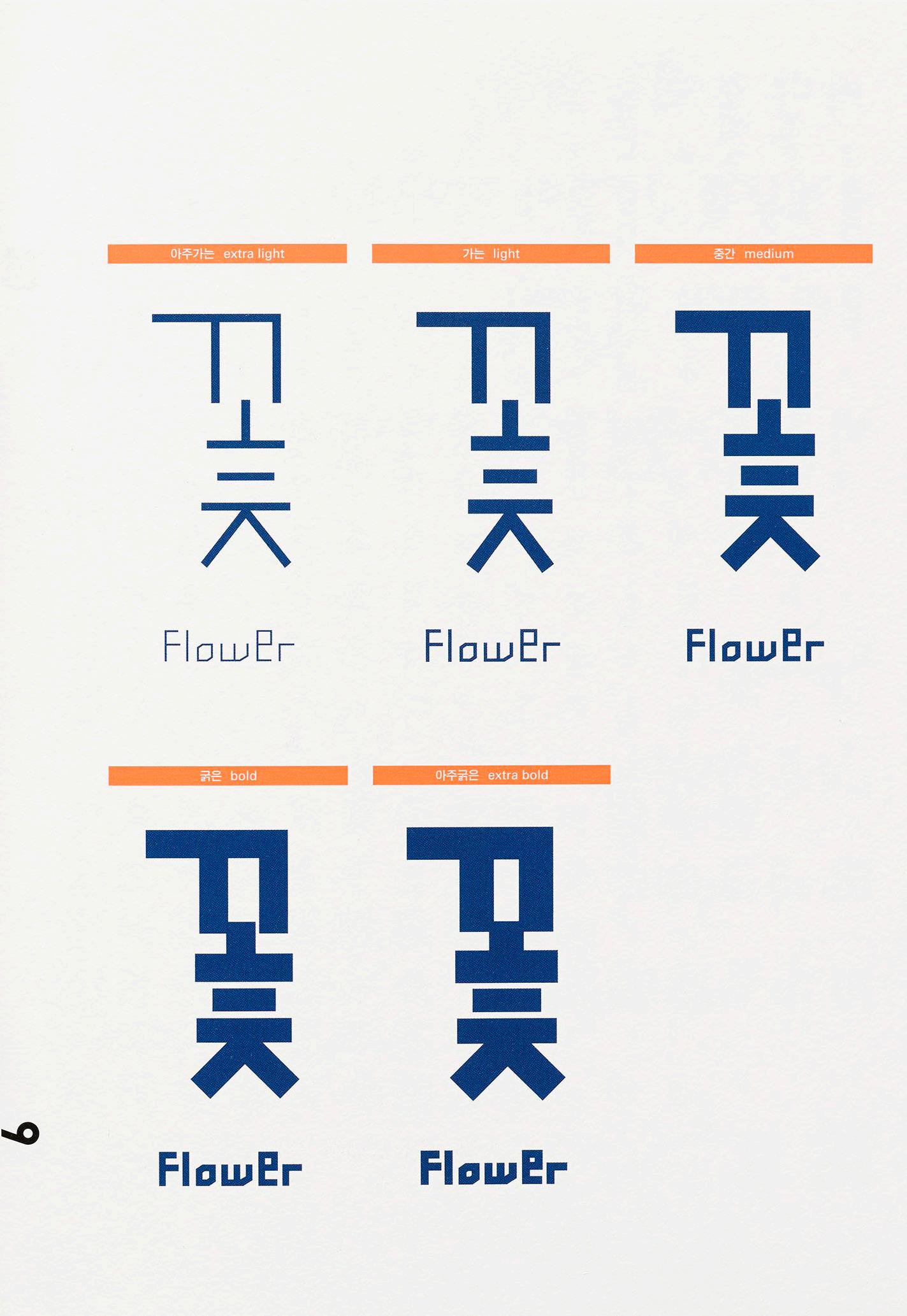
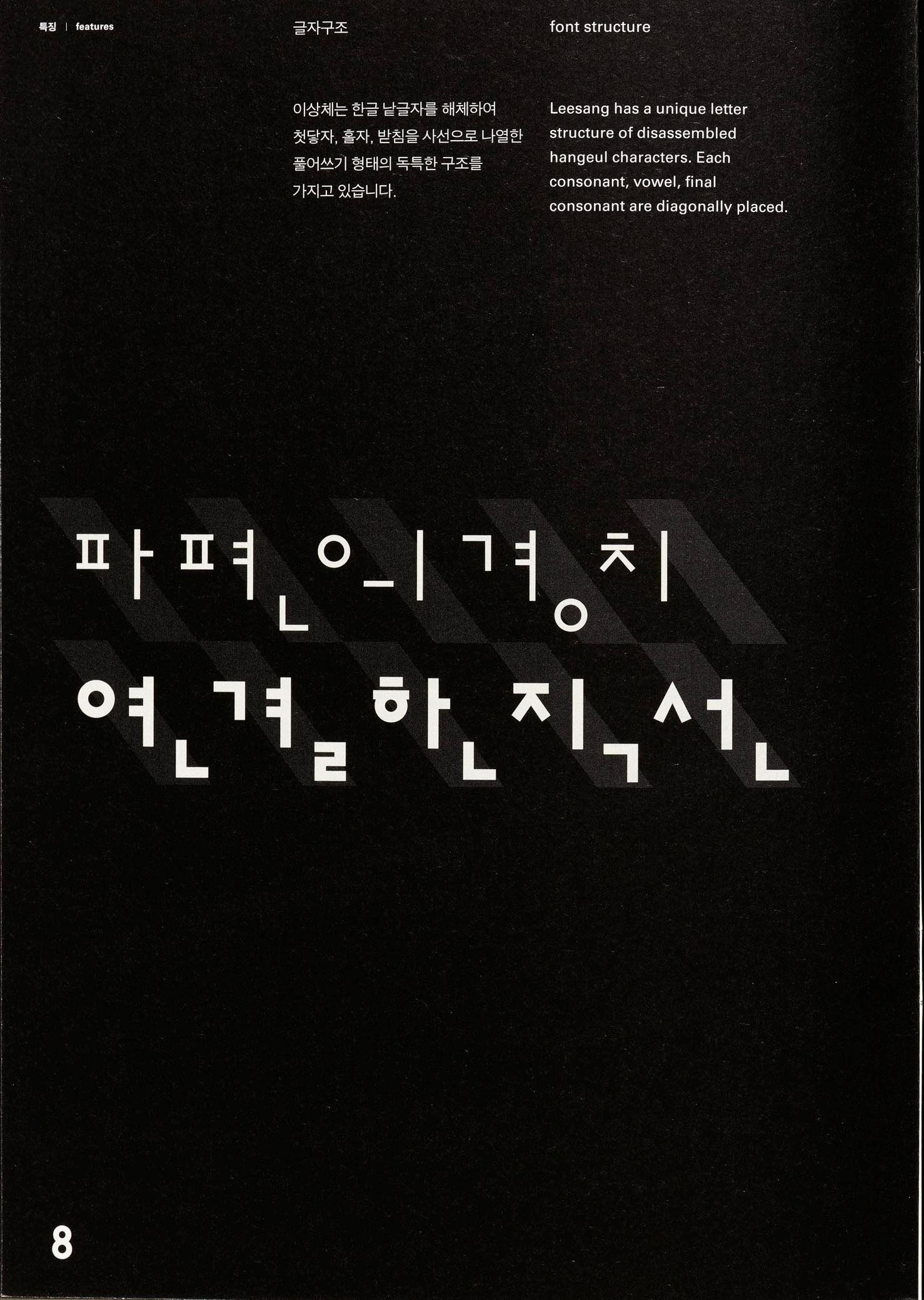
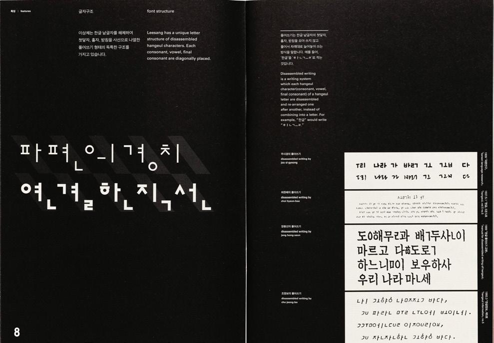
The Leesang typeface is a prime example of Ahn innovating on Hangul’s forms while honoring the past. First designed in 1988 and expanded in 2013, it was inspired by Korean avant-garde and surrealist novelist and poet, lee sang. “This typeface breaks apart the syllabic block of Hangul into “disassembled” characters, said Yoon Min Goo, a designer currently pursuing an MA in Type Design at ECAL who worked on expanding and refining Leesang. “Each consonant, vowel, and final consonant are rearranged one after the other on the baseline. This dissemblance makes room for appreciating and focusing on the construction, beauty, and materiality of each individual letter.
9 LETTER FORM ARCHIVE NEWS
Leesang, 2014.
For Lars, Ahn’s work reminds her that beauty can be found in older visual forms, and still evolve along with cultural identity over time. “My work is often inspired by yeobaek, or emptiness and blank space, a concept which comes from classical brush painting but can also be seen in Ahn’s typefaces. When I design for letterpress, I add extra breathing room in between letters, which aids in legibility and honors the relief process. Beginning with space also allows me to slow down and connect with new visual ideas. That’s where I feel most creatively inspired and free,” Kim said.
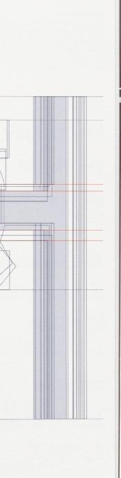
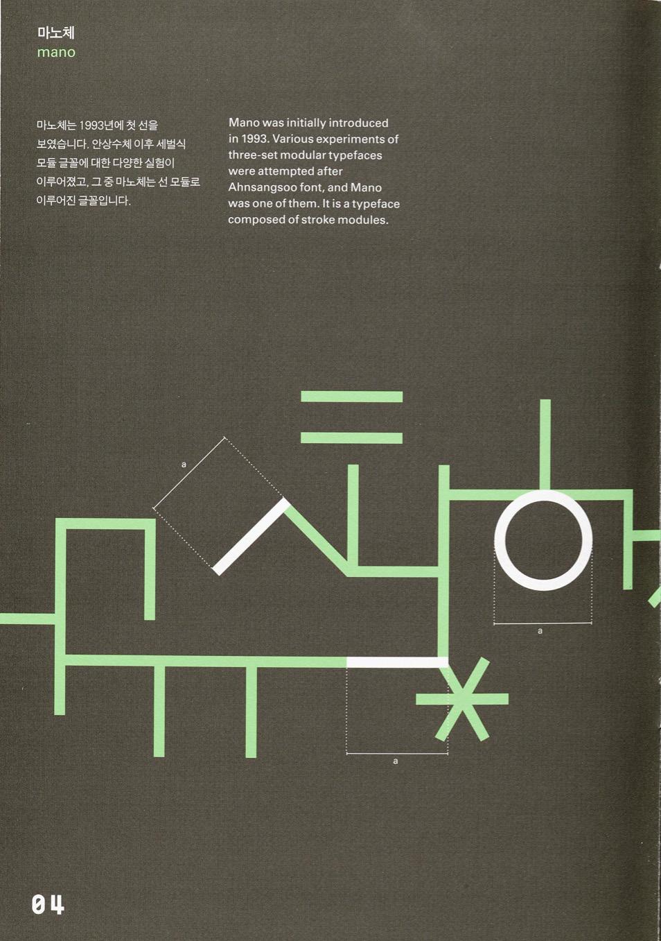
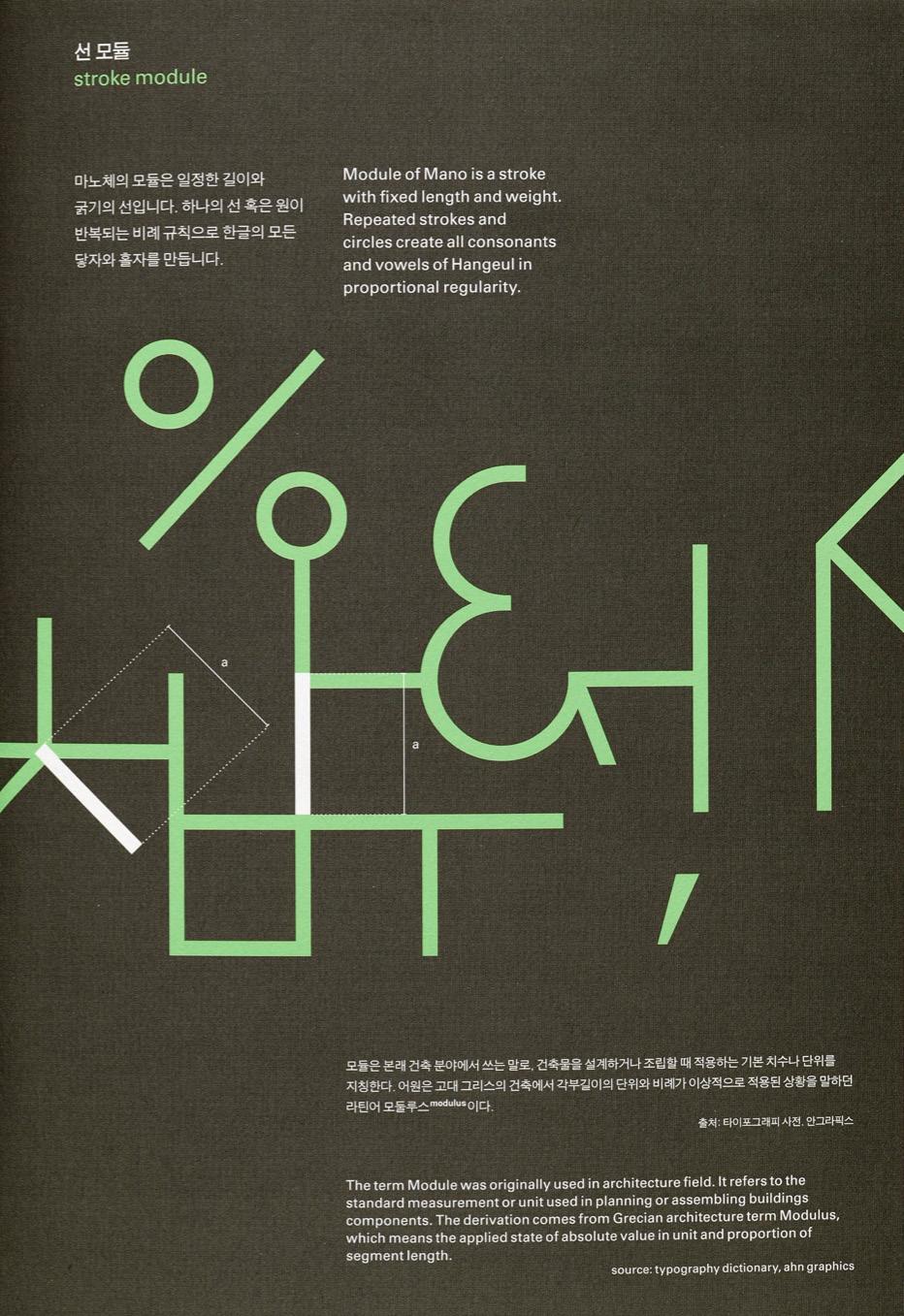
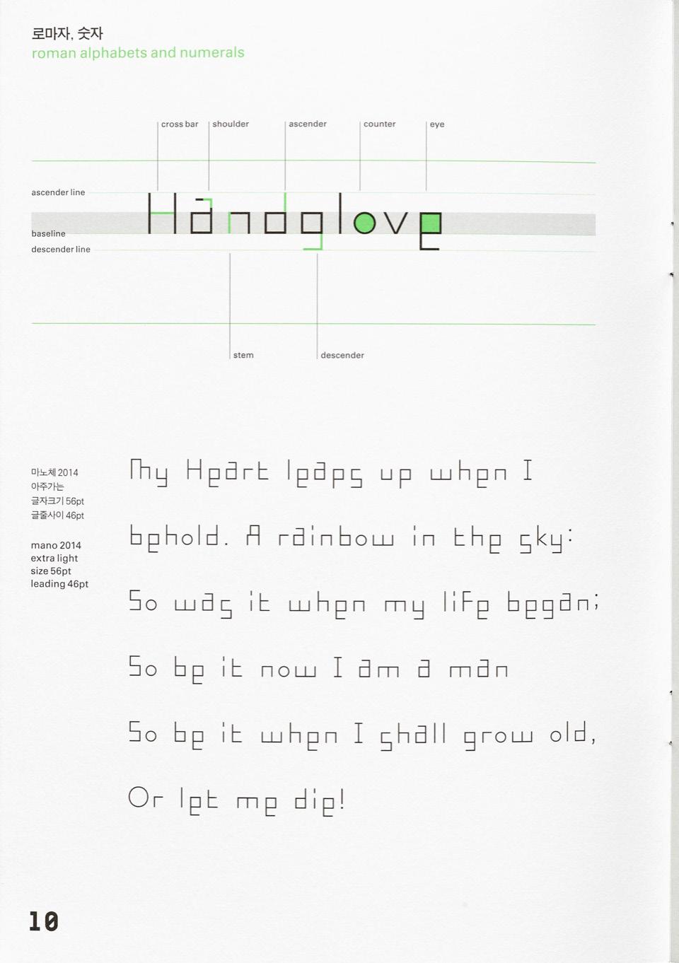
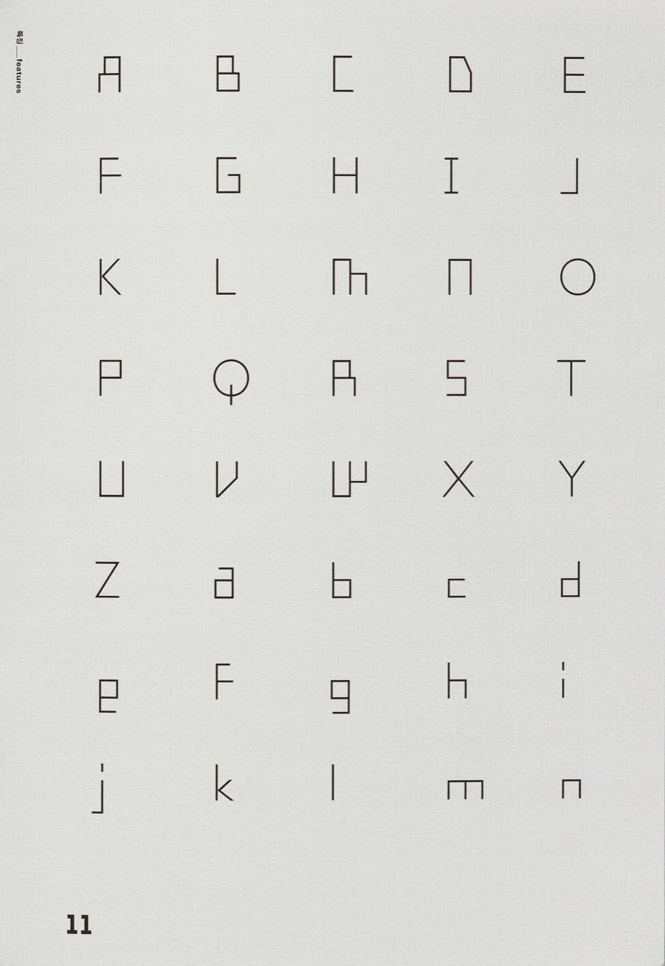
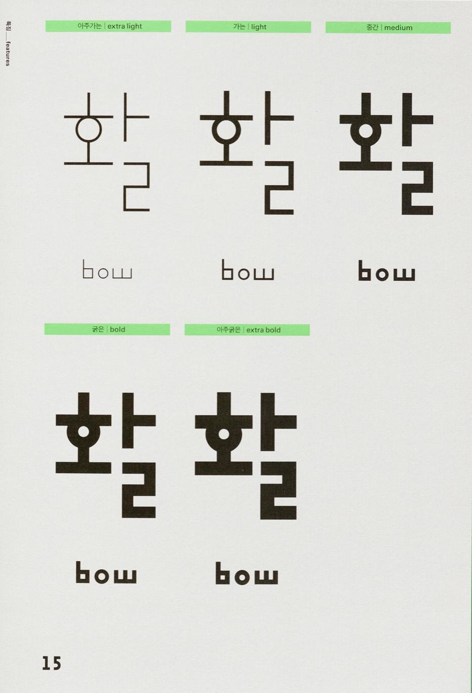
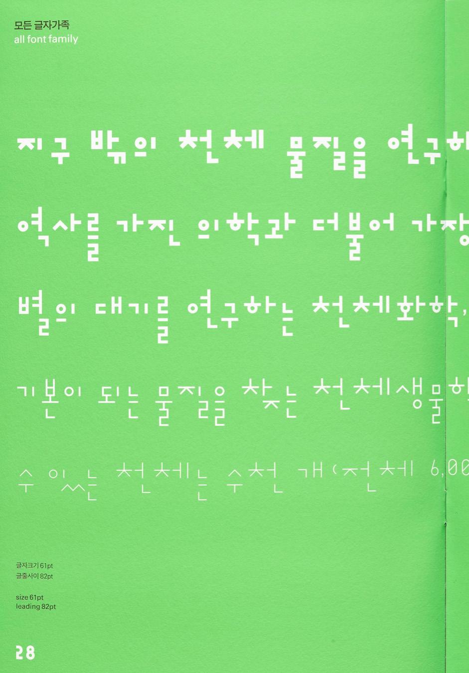
Aside from the round characters, any Mano, introduced in 1993, plays with the stroke module. thing else with an angle is comprised of a stroke that’s fixed in length and width. This modularity results in interesting design characteristics, like how some characters end up sharing a side stroke (X and X), or how characters that take up more vertical space (X and X) are dramatically lengthened. The quirkiness of the Mano shines even more when characters are formed into syllabic blocks, typeset and result in a rhythmic line. In its Latin counterpart, which is included in each of Ahn’s typefaces, the wavy baseline is all the more apparent — with the lowercase ‘e’ and ‘s’ descending, and the ‘g’, and ‘a’ ascending.
11 LETTER FORM ARCHIVE NEWS
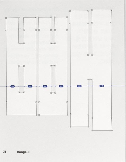
As with all type design, even with a rule in place, sometimes it has to be broken. The specimen for Mano includes a fold-out detailing the visual adjustments made after the modularity created quirks in spacing. Some of the tweaks include attatching final consonants together, tightening the spacing between first consonant and vowel, and lengthening the diagonal strokes a bit to optically match the lengths of the horizontal and vertical strokes.
Mano, AG Typography Institute, 1988-2014.
13 LETTER FORM ARCHIVE NEWS
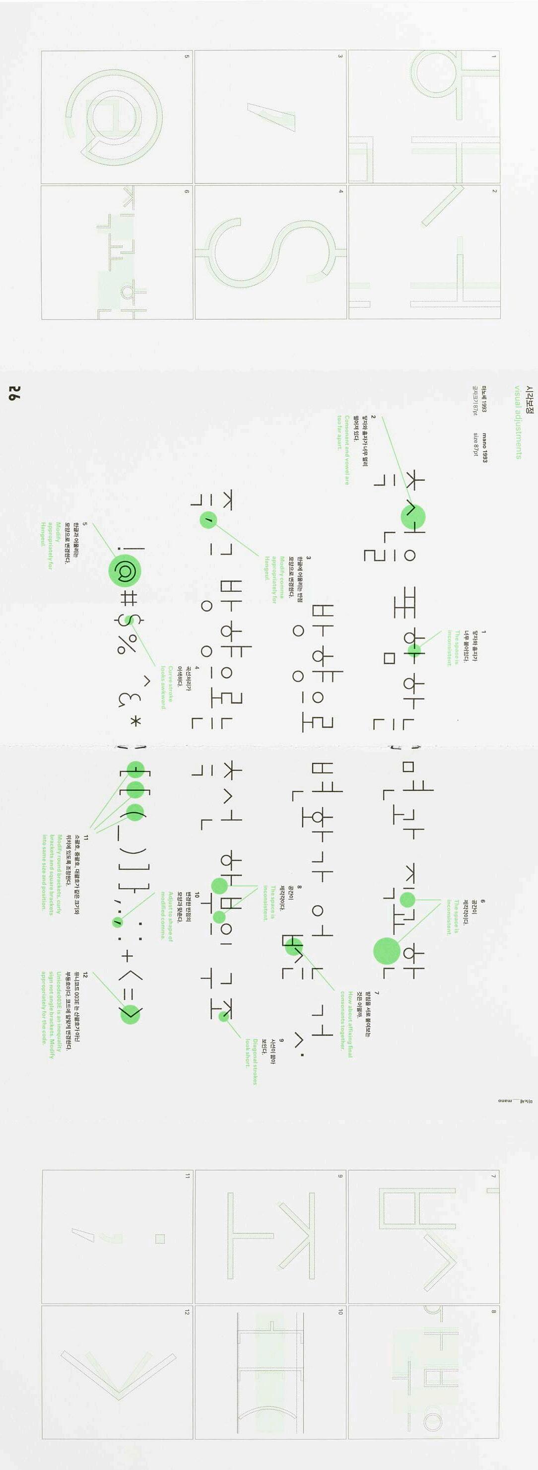
Foldout in Mano Specimen showing adjustments, 2014.
Ahn’s view on Hangul as a graphic material is especially apparent in his projects outside of type design. For the gate of his personal residence, the uniform stroke widths of Mano were the perfect puzzle pieces for the pattern. “[That gate] stuck with me as a beautiful and stunning piece of typographic design. I love how at first glance it feels like random shapes, but when you look closer all of the jamo immediately become apparent and clear,” said Aaron Bell, founder of Saja Type based in Seattle. “What always struck me about Ahn Sang Soo’s work was his willingness to play with the concept of Hangul; treating it not just as a writing system, but as graphic medium of expression. This opens up an entirely new way of perceiving and designing with the script. In my lettering work, I really like creating pieces that express joy, and have an element of play. I can’t help but think that some of that lively spirit is inspired by his example.”
15 LETTER FORM ARCHIVE NEWS
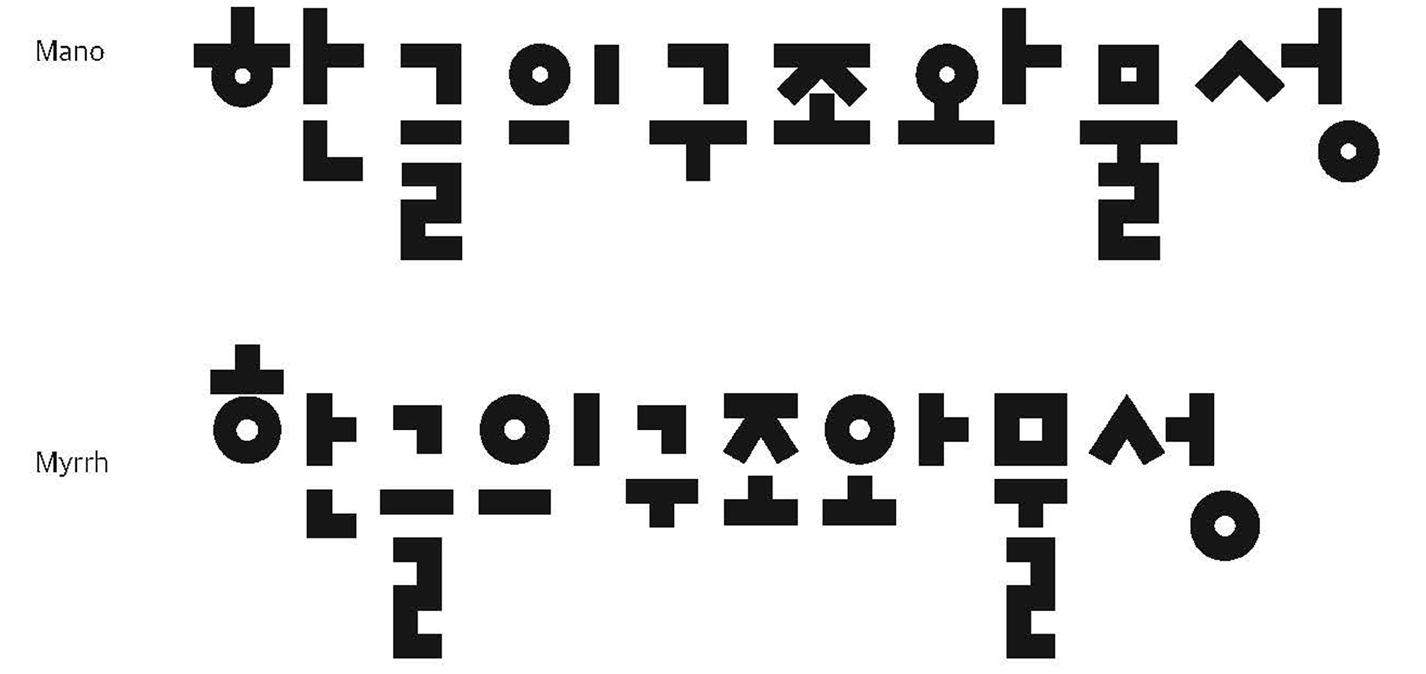
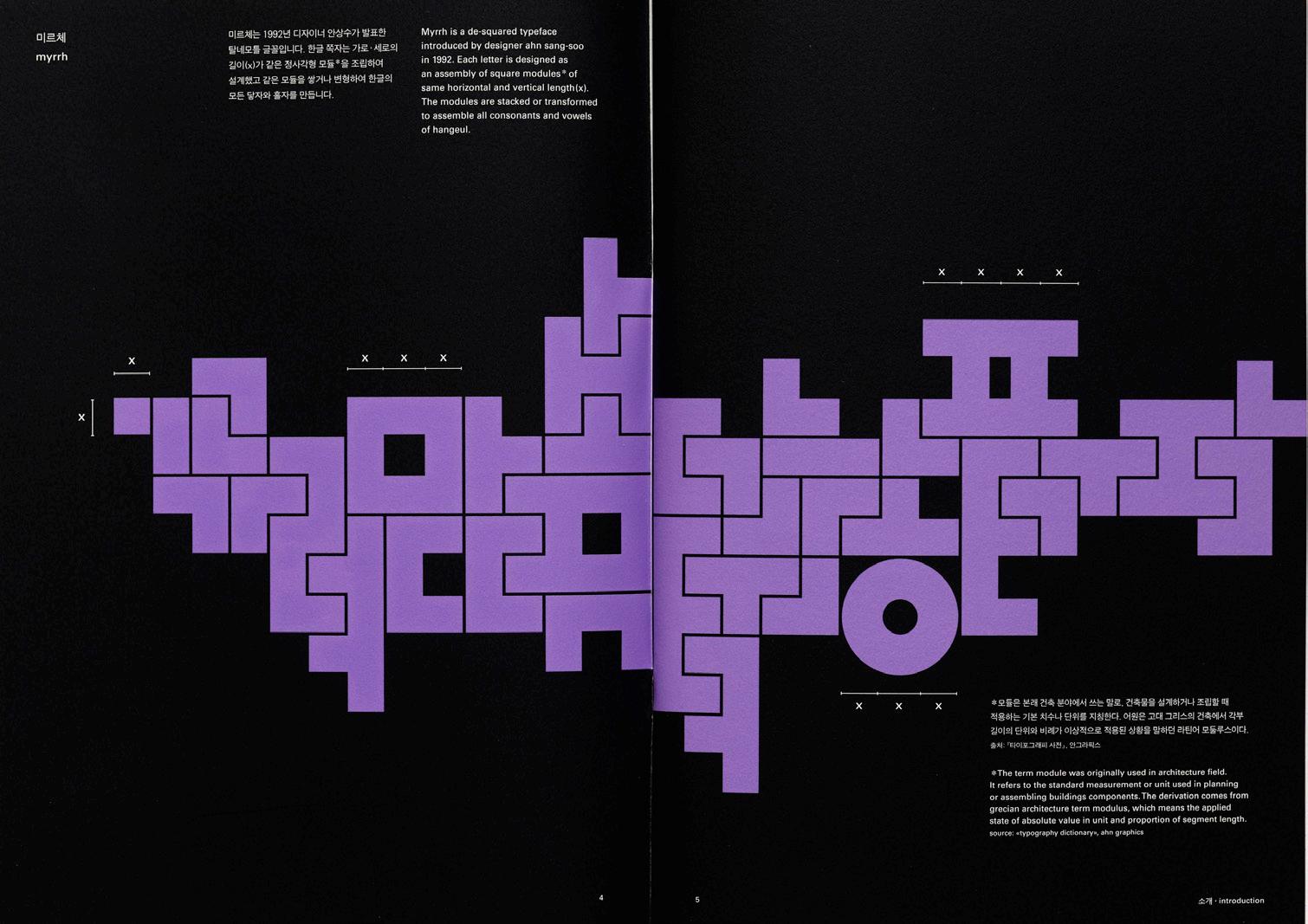
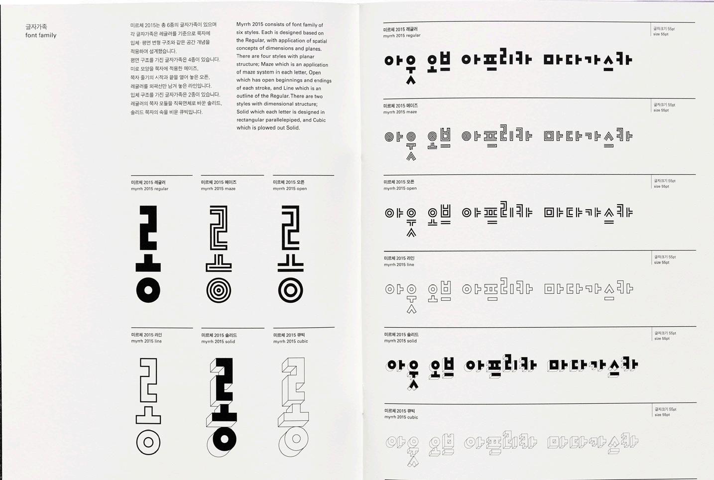
Myrrh, one of Ahn’s newer typeface families, consists of six styles that explore space and dimension. Maze applies the visual structure of a maze inside the letter forms, Open is like an inline style, while Solid and Cubic are dimensional explorations of the typeface. Myrrh looks related to Mano, and according to Yoon, “In the case of Mano, much discussion was needed in designing the extra-bold thickness. If the stroke is too thick, it can look really similar to Myrrh regular. While designing, it was important to keep in mind the impression and character of Mano different from Myrrh as it got bolder.” What definitively distinguishes these two typefaces apart is the way they each approach modularity. Instead of using one stroke as the modular element, Myrrh uses one square unit.
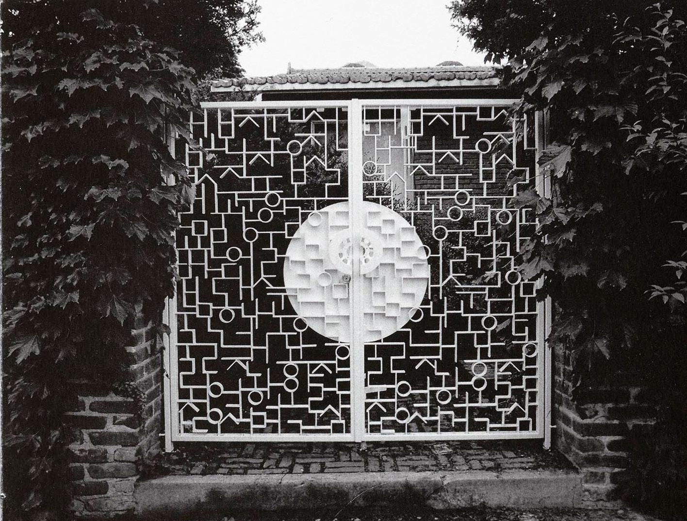
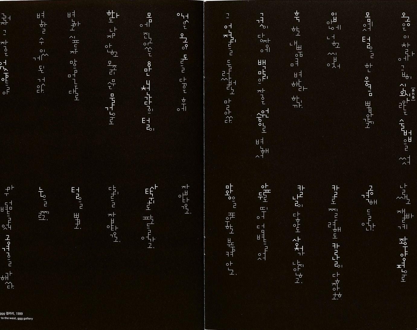
 Since Hangul can be set both horizontally and vertically, these two examples of Mano in use demonstrate how Ahn’s typefaces are also a graphic medium. Left: Hangul gate, Pyeong-Chang, Seoul, 2000. Right: Composition for journey to the west, ginza graphic gallery, 1999.
Comparison of Mano Extra Bold and Myrrh Regular. Image courtesy of Yoon MinGoo and AG Typography Institute.
Since Hangul can be set both horizontally and vertically, these two examples of Mano in use demonstrate how Ahn’s typefaces are also a graphic medium. Left: Hangul gate, Pyeong-Chang, Seoul, 2000. Right: Composition for journey to the west, ginza graphic gallery, 1999.
Comparison of Mano Extra Bold and Myrrh Regular. Image courtesy of Yoon MinGoo and AG Typography Institute.
17 LETTER FORM ARCHIVE NEWS
Considering these subtleties and the importance of context was a major lesson Yoon learned while at the Institute. “I learned from Ahn the attitude of approaching Hangul in terms of ‘graphics’ rather than simple letters, that we always have to think about whether a detail, a decision is right for the place and design. No matter how small the design detail might be, we should approach type with care,” Yoon said. “Hangul, being a younger script, has a shorter history within the world of type design. For that reason, there are not many kinds of Hangul fonts. This also means that the direction of Hangul font design is unlimited, and I hope that many people around the world will pay attention to the new possibilities, experiments, and beauty of Hangul font design.”
Next time you’re at the Archive, we invite you to take a closer look at these specimens, which were awarded a Red Dot: Grand Prix Design Award in 2015. They offer a look into the local history of Korean language and design, and are also an important part of our global type history and discourse. We have Ahn to thank for opening up Hangul to more experimentation and play, and hopefully inspiring this attitude in our own practices too.
1992–2015. 19 LETTER FORM ARCHIVE NEWS
Myrrh,
COLLECTION FROM AC TYPOGRAPHY INSTITUTE
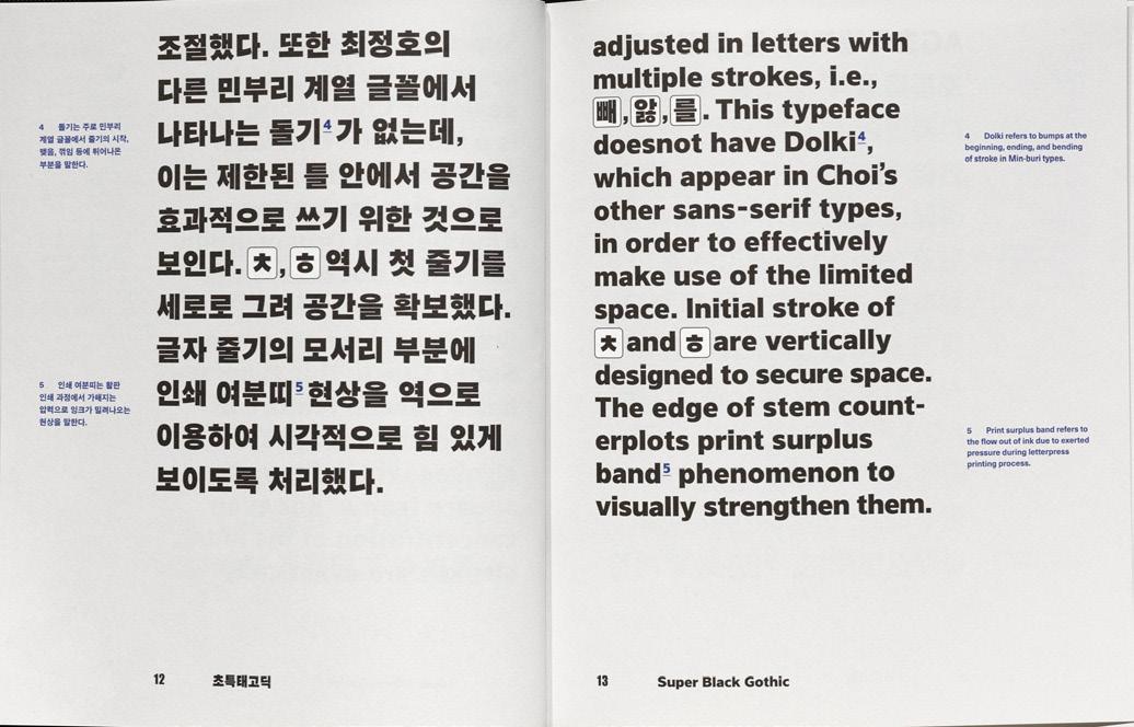
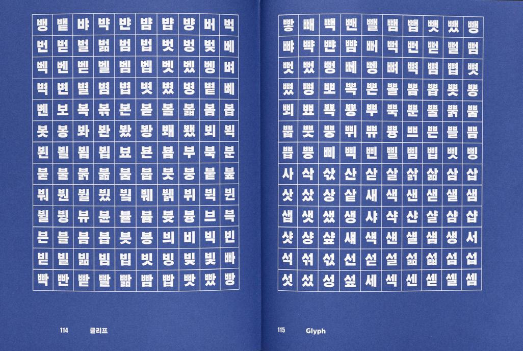
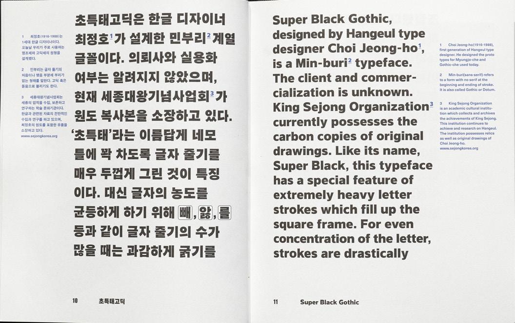
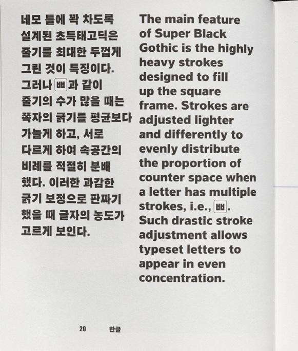
1 - 6. Super Black Gothic, specimen design by Yoon Mi Goo, 2017. 7. Choi Jeong-ho’s Exhibition. Photo courtesy of Yoon Min Goo and AG Typography Institute. 8. Leesang, 1988-2013. 9 - 10. Ahnsangsoo, 1986-2012. 11. Leesang, 1988-2013. 21 LETTER FORM ARCHIVE NEWS
 12. Mano, 1992-2014.
23 LETTER FORM ARCHIVE NEWS
13.
Mano, 1992-2014.
25 LETTER FORM ARCHIVE NEWS
 14. Mano, 1992-2014.
27 LETTER FORM ARCHIVE NEWS
 15. Mano, 1992-2014.
29 LETTER FORM ARCHIVE NEWS
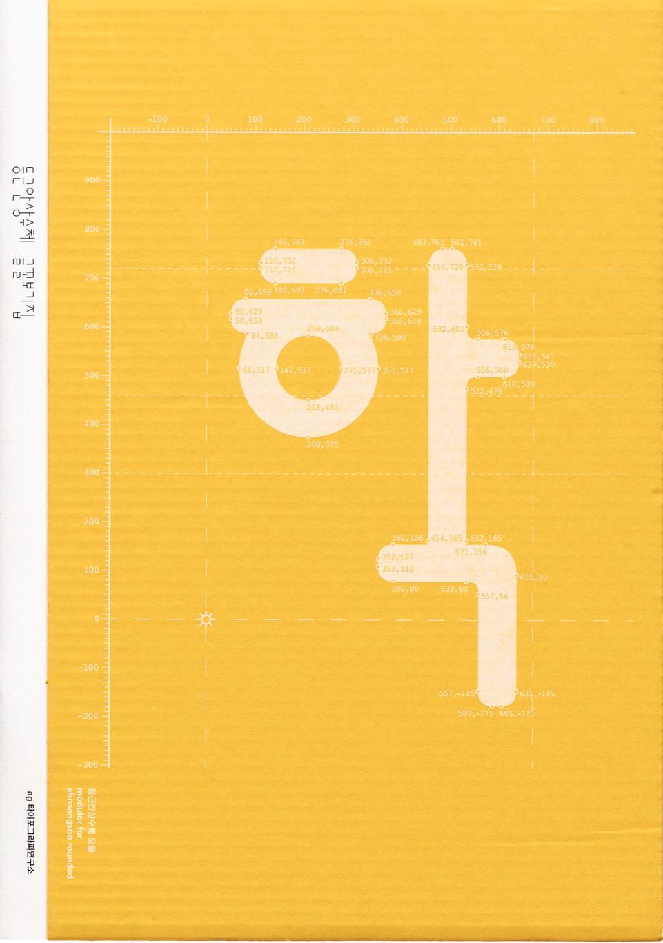
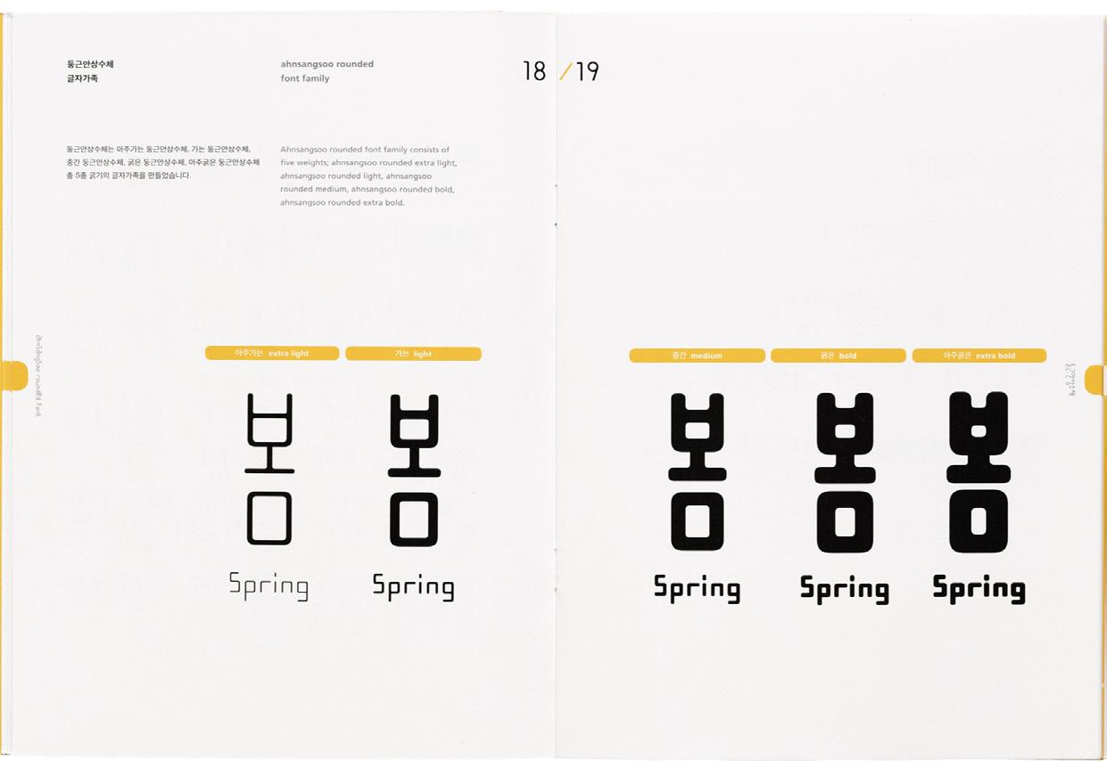
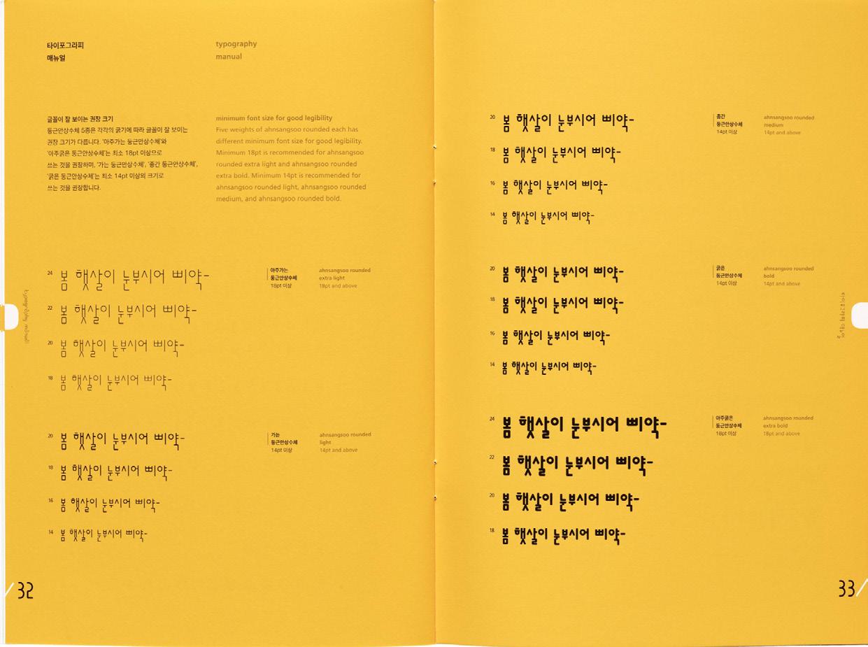
16 - 19. Ahnsangsoo rounded, 2013-2014.
31 LETTER FORM ARCHIVE NEWS
2
So, Gutenberg Didn’t Actually Invent Printing As We Know It
Type
If you heard one book called “universally acknowledged as the most important of all printed books,” which do you expect it would be?
If you were Margaret Leslie Davis, the answer would be obvious. Davis’s The Lost Gutenberg: The Astounding Story of One Book’s Five-Hundred-Year Odyssey, released this March, begins with just that descriptor. It recounts the saga of a single copy of the Gutenberg Bible—one of the several surviving copies of the 450-year-old Bible printed by Johannes Gutenberg, the putative inventor of the printing press, in one of his earliest projects—through a 20th-century journey from auction house to collector to laboratory to archive.
M. SOPHIA NEWMAN
2
On the Unsung Chinese and Korean History of Movable 33
Davis quotes Mark Twain, who wrote, in 1900, a letter celebrating the opening of the Gutenberg Museum. For Davis, Twain’s words were “particularly apt.” “What the world is to-day,” Twain wrote, “good and bad, it owes to Gutenberg. Everything can be traced to this source. . . .” Indeed, Gutenberg’s innovation has long been regarded an inflection point in human history—an innovation that opened the door to the Protestant Reformation, Renaissance, the scientific revolution, the advent of widespread education, and a thousand more changes that touch nearly everything we now know.
The only problem?
The universal acclaim is, in fact, not so universal—and Gutenberg himself is a, but not the, source of printing. Rather, key innovations in what would become revolutionary printing technology began in east Asia, with work done by Chinese nobles, Korean Buddhists, and the descendants of Genghis Khan—and, in a truth Davis acknowledges briefly, their work began several centuries before Johannes Gutenberg was even born.
In a traditional printing press, small metal pieces with raised backwards letters, known as movable type, are arranged in a frame, coated with ink, and applied to a piece of paper. Take the paper away, and it’s a printed page. Do this with however many pages make up a book, and there’s a printed copy. Do this many times, and swiftly printed, mass-produced books appear.
The printing press is often said to have been created by Gutenberg in Mainz, Germany, around 1440 AD, and it began taking root in Europe in the 1450s with the printing of the aforementioned Bible. Books themselves had been present in Europe long before then, of course, but only in hand-copied volumes that were accessible mainly to members of the clergy. Access to mass-produced books revolutionized Europe in the late 1400s, with advancing literacy altering religion, politics, and lifestyles worldwide.
The universal acclaim is, in fact, not so univesal—and Gutenberg himself is a, but not the, source of printing. Rather, key innovations in what would become revolutionary printing technology began in east Asia, with work done by Chinese nobles, Korean Buddhists, and the descendants of Genghis Khan—and, in a truth Davis acknowledges briefly, their work began several centuries before Johannes Gutenberg was even born.
In a traditional printing press, small metal pieces with raised backwards letters, known as movable type, are arranged in a frame, coated with ink, and applied to a piece of paper. Take the paper away, and it’s a printed page. Do this with however many pages make up a book, and there’s a printed copy. Do this many times,
and swiftly printed, mass-produced books appear. The printing press is often said to have been created by Gutenberg in Mainz, Germany, around 1440 AD, and it began taking root in Europe in the 1450s with the printing of the aforementioned Bible. Books themselves had been present in Europe long before then, of course, but only in hand-copied volumes that were accessible mainly to members of the clergy. Access to mass-produced books revolutionized Europe in the late 1400s, with advancing literacy altering religion, politics, and lifestyles worldwide.
35
“What the world is to-day,” Twain wrote, “good and bad, it owes to Gutenberg. Everything can be traced to this source.”
M. SOPHIA NEWMAN
At least, this is how the story is rendered in most books, including, for the most part, The Lost Gutenberg. But a single sentence late in the book nods to a much longer story before that: “Movable type was an 11th-century Chinese invention, refined in Korea in 1230, before meeting conditions in Europe that would allow it to flourish—in Europe, in Gutenberg’s time.”
That sentence downplays and misstates what occurred.
The first overtures towards printing that began around roughly 800 AD, in China, where early printing techniques involving chiseling an entire page of text into a wood block backwards, applying ink, and printing pages by pressing them against the block. Around 971 AD, printers in Zhejiang, China, produced a print of a vast Buddhist canon called the Tripitaka with these carved woodblocks, using 130,000 blocks (one for each page). Later efforts would create early movable type— including the successful but inefficient use of ideograms chiseled in wood and a brief, abortive effort to create ceramic characters. Meanwhile, imperial imports from China brought these innovations to Korean rulers called the Goryeo (the people for whom Korea is now named), who were crucial to the next steps in printing history. Their part of the story is heavy with innovation in the face of invasion.
First, in 1087 AD, a group of nomads called the Khitans attempted to invade the Korean peninsula. This prompted the Goryeo government to create its own Tripitaka with woodblock printing, perhaps with the aim of preserving Korean Buddhist identity against invaders. The attempt would be prescient; it preserved the concept and technique for later years, when more invaders eventually arrived. In the 12th and 13th centuries, the Mongol ruler Genghis Khan had created the largest empire in human history, which stretched from the Pacific coast of Asia west to Persia. After he died in 1227, his successor, Ögedei Khan, continued conquering, including gaining ground that Genghis Khan had never held. In 1231, Ögedei ordered the invasion of Korea, and in 1232, invading Mongol troops reached the capital. As part of their conquering, they burned the Korean copy of the Tripitaka to ash.
The Goryeo dynasty immediately recreated the book. This is thought to have been “as prayers to the power of Buddhas for the protection of the nation from the invading Mongols,” per a text by Thomas Christensen, but it was also done with the intention of preserving the dynasty’s culture. This was important; attacks by Mongols would continue for the next 28 years.
It is important to recognize what this means. The innovation that Johannes Gutenberg is said to have created was small metal pieces with raised backwards letters, arranged in a frame, coated with ink, and pressed to a piece of paper, which allowed books to be printed more quickly. But Choe Yun-ui did that—and he did it 150 years before Gutenberg was even born. Perhaps it should be Choe Yun-ui whose name we remember, not Gutenberg’s.
However, Korea’s printed books did not spread at a rapid pace, as Gutenberg’s books would 200 years later. Notably, Korea was under invasion, which hampered their ability to disseminate their innovation. In addition, Korean writing, then based closely on Chinese, used a large number of different characters, which made creating the metal pieces and assembling them into pages a slow process. Most importantly, Goryeo rulers intended most of its printing projects for the use of the nobility alone. The Tripitaka reboot was scheduled to take Korean monks until 1251 AD to complete, and, meanwhile, the rulers began expanding into printing other books. In 1234 AD, they asked a civil minister named Choe Yun-ui to print a Buddhist text called The Prescribed Ritual Text of the Past and Present (Sangjeong Gogeum Yemun). But the lengthy book would have required an impossibly large number of woodblocks, so Choe came up with an alternative. Building on earlier Chinese attempts to create movable type, he adapted a method that had been used for minting bronze coins to cast 3-dimensional characters in metal. Then he arranged these pieces in a frame, coated them with ink, and used them to press sheets of paper. When he was done, he could reorganize the metal characters, eliminating the need to persistently chisel blocks. It was faster—to a certain extent. He completed the project in 1250 AD.
37
M.
SOPHIA NEWMAN
The Tripitaka reboot was scheduled to take Korean monks until 1251 AD to complete, and, meanwhile, the rulers began expanding into printing other books. In 1234 AD, they asked a civil minister named Choe Yun-ui to print a Buddhist text called The Prescribed Ritual Text of the Past and Present (Sangjeong Gogeum Yemun). But the lengthy book would have required an impossibly large number of woodblocks, so Choe came up with an alternative. Building on earlier Chinese attempts to create movable type, he adapted a method that had been used for minting bronze coins to cast 3-dimensional characters in metal. Then he arranged these pieces in a frame, coated them with ink, and used them to press sheets of paper. When he was done, he could reorganize the metal characters, eliminating the need to persistently chisel blocks. It was faster—to a certain extent. He completed the project in 1250 AD.
However, Korea’s printed books did not spread at a rapid pace, as Gutenberg’s books would 200 years later. Notably, Korea was under invasion, which hampered their ability to disseminate their innovation. In addition, Korean writing, then based closely on Chinese, used a large number of different characters, which made creating the metal pieces and assembling them into pages a slow process. Most importantly, Goryeo rulers intended most of its printing projects for the use of the nobility alone.
Nonetheless, it is possible that printing technology spread from East to West. Ögedei Khan, the Mongol leader, had a son named Kublai who had situated himself as a ruler in Beijing. Kublai Khan had access to Korean and Chinese printing technology, and he may have shared this knowledge with another grandson of Genghis Khan, Hulegu,
was then ruling
who
“
Perhaps it should be Choe Yun-ui whose name we remember, not Gutenberg’s.”
the Persian part of the Mongol empire. This could have moved printing technologies from East Asia westward by thousands of miles. “Mongols just tended to take their technologies everywhere they go, and they become a part of local culture, sometimes acknowledged, sometimes not,” Colgate University Asian history professor David Robinson explains.
To get from East Asia to Persia at that time, one traveled the Silk Road. In the middle of that route lay the homeland of the Uyghur people, a Turkic ethnic group that had been recruited into the Mongol army long before. “If there was any connection in the spread of printing between Asia and the West,” the scholar Tsien Tsuen-Hsien wrote in Science and Civilization in China in 1985, “the Uyghurs who used both blocking printing and movable type had good opportunities to play an important role in this introduction.”
This is because, in the 13th century, Uyghurs were considered distinguished, learned people—the sort for whom printing might be a welcome innovation. They had also something no one else in printing had had up till then: an alphabet, a simple group of relatively few letters for writing every word one wished to say.
There was no explosion of printing in the Western Mongol empire. “There was no market, no need for the leaders to reach out to their subjects, no need to raise or invest in capital in a new industry,” the historian John Man points out in his book, The Gutenberg Revolution. Nonetheless, movable-type Uyghur-language prints have been discovered in the area, indicating the technology was used there.
Furthermore, the Mongols may have carried the technology not only through Uyghur and Persian territory, but into Europe, including Germany. The Mongol empire repeatedly invaded Europe from roughly 1000 to 1500 AD; that period saw the entry of enough Western Asian recruits and captives to bring the loanword horde from their Turkic languages into European ones. “Generally, if something is going from East Asia [to the west], it would be hard to imagine without the Mongols,” Christopher Atwood, a Central Eurasian Studies professor at Indiana University, said in an interview.
39
M. SOPHIA NEWMAN
Eventually, early capitalists in Europe invested in Johannes Gutenberg’s business venture—the one that combined technology quite like the movable type innovated by Choe Yun-ui with a screw-threaded spiral mechanism from a wine or olive press to ratchet up printing to commercial speeds. That business took decades of his life to bring to fruition, forced him into bankruptcy, and led to court filings by investors who repeatedly sued him to get their money back. As Davis notes in The Lost Gutenberg, these records are the means by which we know Gutenberg and his Bible: “This most famous of books has origins that we know little about. The stories we tell about the man, and how the Bibles came to be, have been cobbled together from a fistful of legal and financial records, and centuries of dogged scholarly fill-in-the-blank.”
Indeed, the entire history of the printing press is riddled with gaps. Gutenberg did not tell his own story in documents created on the printing presses he built; to the best of modern knowledge, he did not leave any notes on his work at all. And if Gutenberg was reticent, the Mongols, their Uyghur compatriots, and Eastern Asia government heads were even more so. But if doubts are natural, then the result we’ve made of them is not. The fantastical idea that Gutenberg alone invented the printing press ignores an entire continent and several centuries of relevant efforts and makes no effort to understand how or why technology might have spread. During a study of Gutenberg’s lettering techniques, computer programmer Blaise Agṻera y Arcas pointed out how strange this is: “The idea that a technology emerges fully formed at the beginning is nuts. Anyone who does technology knows that’s not how it works.”
To her credit, Davis notes the same, explaining it this way: “Perhaps the image of Johannes Gutenberg as a lone genius who transformed human culture endures because the sweep of what followed is so vast that it feels almost mythic and needs an origin story to match.”
But Davis, who was unavailable for an interview for this article, does little to correct the record in The Lost Gutenberg. She mentions China just a few times and Korea only once—and the Mongols, Uyghurs, and non-Christian aspects of printing history not at all. Indeed, she never explains that the Gutenberg Bible is not universally acclaimed as the most important book in history. Nor are copies of the Bible the oldest books created with movable type that still exist today—although a reader could be forgiven for gathering that impression from The Lost Gutenberg.
Rather, the earliest extant movable-type-printed book is the Korean Baegun Hwasang Chorok Buljo Jikji Simche Yojeol (“The Anthology of Great Buddhist Priests’ Zen Teachings”). It dates to 1377 and has served as a starting point for scholarship on the origin of movable type.
Korea regards it and other ancient volumes as national points of pride that rank among the most important of books. But it is only very recently, mostly in the last decade, that their viewpoint and the Asian people who created printing technologies have begun to be acknowledged at all. Most people—including Davis, who declined an interview with the remark, “I’m afraid I can’t really add much further on the topic of ancient printing”—still don’t know the full story.
41
“The fantastical idea that Gutenberg alone invented the printing press ignores an entire continent and several centuries of relevant efforts.”
M.
SOPHIA NEWMAN
3
The Prophet
Kahlil Gibran
Utterly unique and beloved around the world, The Prophet is a collection of twenty-six poetic essays by the Lebanese artist, philosopher, and writer Kahlil Gibran. Telling the story of the prophet Al-Mustafa and his conversations with various acquaintances as he returns home after a long absence, the book touches on subjects of universal convern, including love, friendship, passion, pain, religion and freedom. Thought-provoking, comforting and wise, the simple truths of The Prophet remain compelling and rewarding nearly a century after it was first published.
PROPHET BY KAHLIL GIBRAN
3 43
THE
PROPHET BY KAHLIL GIBRAN
ON LOVE... 45 THE
When love beckons to you, follow him,
Though his ways are hard and steep.
And when his wings enfold you yield to him,
Though the sword hidden among his pinions may wound you.
PROPHET BY KAHLIL GIBRAN
47 THE
And when he speaks to you believe in him. Though his voice may shatter your dreams as the north wind lays waste the garden. For even as love crowns you so shall he crucify you.
Even as he is for your growth so is he for your pruning.
Even as he ascends to your height and caresses your tenderest branches that quiver in the sun, So shall he descend to your roots and shake them in their clinging to the earth.
Like sheaves of corn he gathers you unto himself.
PROPHET BY KAHLIL GIBRAN
49
THE
He threshes you to make you naked.
He sifts you to free you from your husks.
He grinds you to whiteness.
He kneads you until you are pliant;
And then he assigns you to his sacred fire, that you may become sacred bread for God’s sacred feast.
BY KAHLIL GIBRAN
51 THE PROPHET
All these things shall love do unto you that you may know the secrets of your heart, and in that knowledge become a fragment of Life’s heart. But if in your fear you would seek only love’s peace and love’s pleasure.
Then it is better for you that you cover your nakedness and pa ss out of love’s threshing-floor,
Into the seasonless world where you shall laugh, but not all of your laughter, and weep, but not all of your tears.
PROPHET BY KAHLIL GIBRAN
53 THE
Love possesses not nor would it be possessed; For love is sufficient unto love.
When you love you should not say, ‘God is in my heart, ‘but rather, ‘I am in the heart of God.’
And think not you can direct the course of love, for love, if it finds you worthy, directs your course.
Love has no other desire but to fulfil itself. But if you love and must needs have desires, let these be your desires:
BY KAHLIL GIBRAN
55 THE
PROPHET
PROPHET BY KAHLIL GIBRAN
ON CHILDREN... 57 THE
Your children are not your children. They are the sons and daughters of Life’s longing for itself.
They come through you but not from you, And though they are with you yet they belong not to you.
You may give them your love but not your thoughts, For they have their own thoughts. You may house their bodies but not their souls, For their souls dwell in the house of tomorrow, which you cannot visit, not even in your dreams.
BY KAHLIL GIBRAN
59 THE PROPHET
You may strive to be like them, but seek not to make them like you.
For life goes not backward nor tarries with yesterday.
The Archer sees the mark upon the path of the infinite, and He bends you with His might that His arrows may go swift and far. Let your bending in the Archer’s hand be for gladness; For even as He loves the arrow that flies, so He loves also the bow that is stable.
You are the bows from which your children as living arrows are sent forth.
PROPHET BY KAHLIL GIBRAN
61 THE
Kahlil Gibran was born into an impoverished Christian family in Bsharri, Lebanon in 1883. His masterpiece, The Prophet, was first published in 1923 and is among the most-read books of the last century, inspiring the lyric-writing of John Lennon, among others. But Gibran enjoyed only scant recognition in his own time. His health broken by chronic illness and self-neglect, he died in 1931 aged just forty-eight in his adopted home of New York. He is buried at Bsharri, where his tomb, now a museum, is visited by more than 50,000 pilgrims annually.
THE PROPHET BY KAHLIL GIBRAN
63
