Major: Communication Design
Xin-Yi Isabelle Yu
Parsons School of Design
Major: Communication Design
Xin-Yi
Isabelle Yu
2021 - 2022 Course Catalogue
Typography Studio/Lab
Focusing on using mainly typography in projects relating campaigns, posters, and book making; as well as learning the techniques to book binding and book productions.
Interaction Studio
Study of building websites and webpages, including navigation, introduction to user experiences and user interaction.
Interaction Lab
Linked to Interaction Studio, mainly focusing on learning how to use the technical coding language and formatting in HTML, CSS, and Java Script.
Redesigning: Alice’s Adventures in Wonderland
Cat 1 Yu
“Oh, you can’t help that, we’re all mad here...”
- the Cheshire
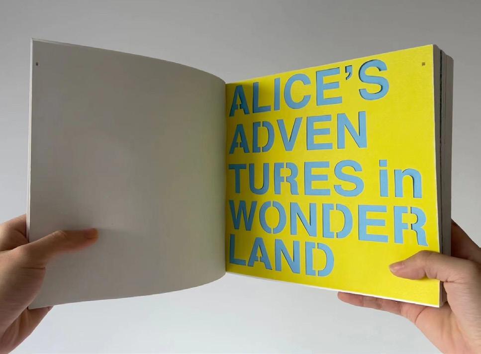
Alice’s Adventures in WonderlandCover Page Designed by Xin-Yi Isabelle Yu

2 Yu
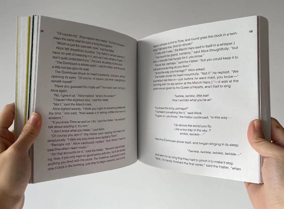
Redesigning: Alice’s Adventures in Wonderland, was my very first book project at the end of first semester in sophomore year. As my first complete book design, it is the combination of many of my ideas with one semester worth of information I learned about arranging text and balancing type with limited imagery. It was difficult at first due to the number of chapters, pages, and sections of the book that had to be considered, but through finding a style and testing typefaces to match the concept of both the design and the storyline, things eventually came in to place.

3 Yu
Hand cut over French fold, perfect pound.
Page 4 Yu
Half Title
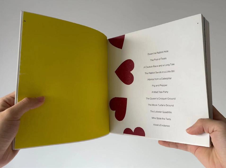
Content 5 Yu
Table of
Chapters Highlight
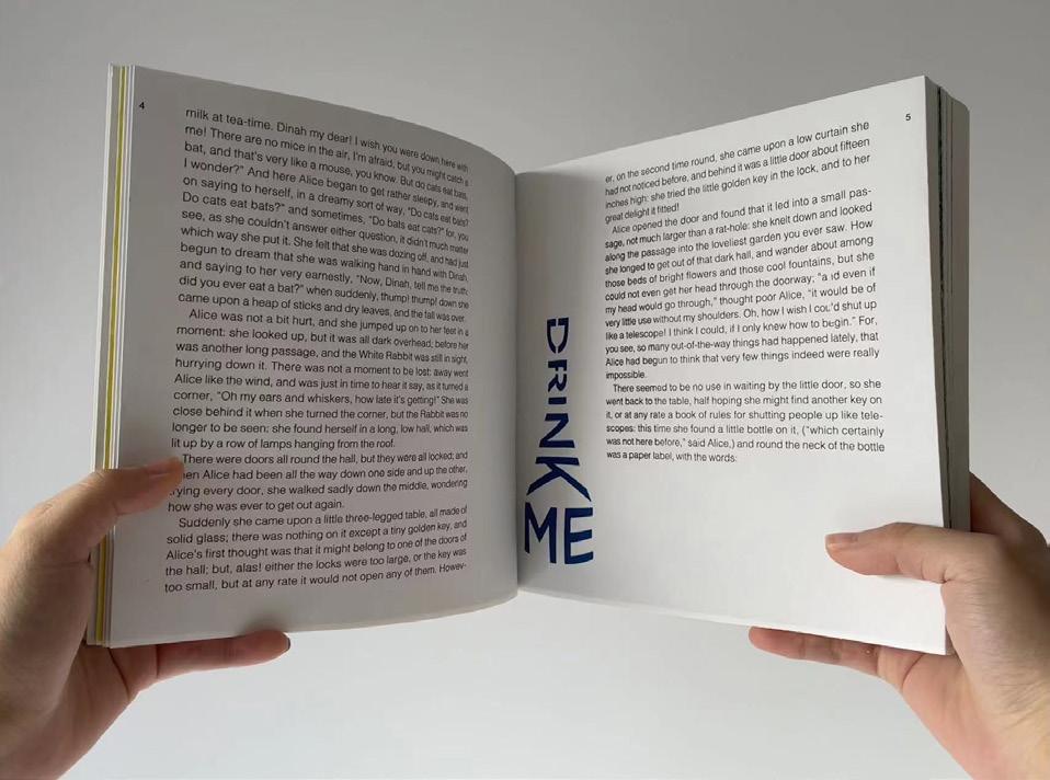
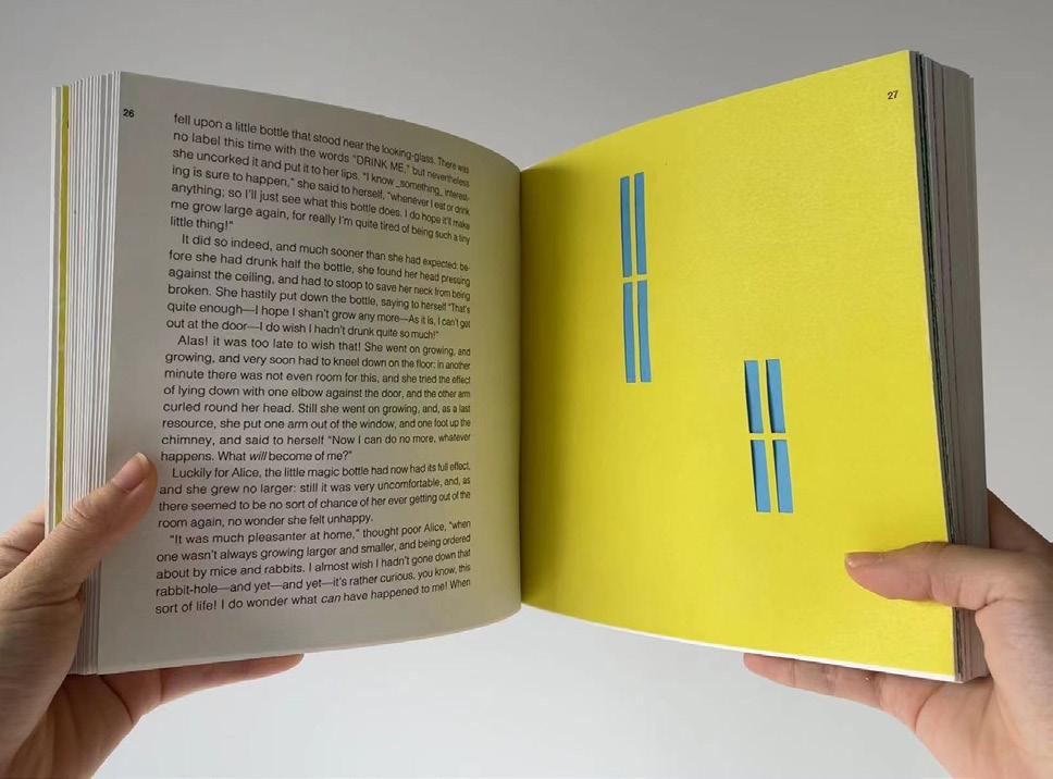
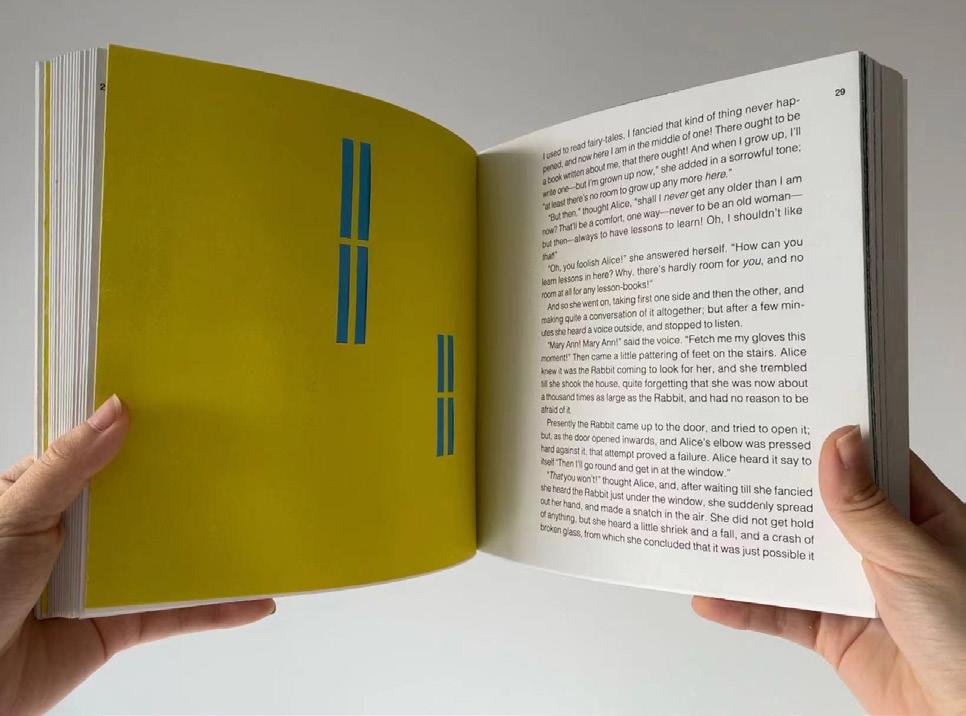
Working around context: “drink me”, creating a silhouette of the bottle that Alice drank from.
* “Drink Me” from Chapter 1
6 Yu
Same technique on the context: “eat me”, forming the text into the shapes of a cookie on top of another.
* “Eat Me” from
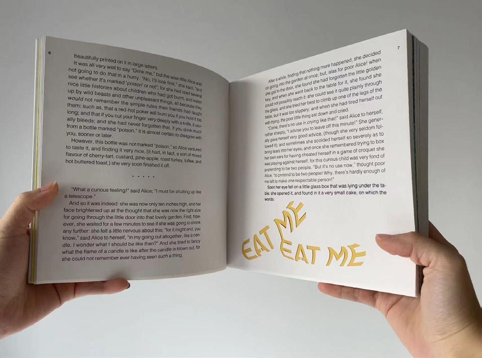
7 Yu
Chapter 1
Some chapters had less imagery to work with, so I focused more on the arrangements of a combined bodies of text.
*Alice turning turning larger and her voice stretches further from her feet from Chapter 2
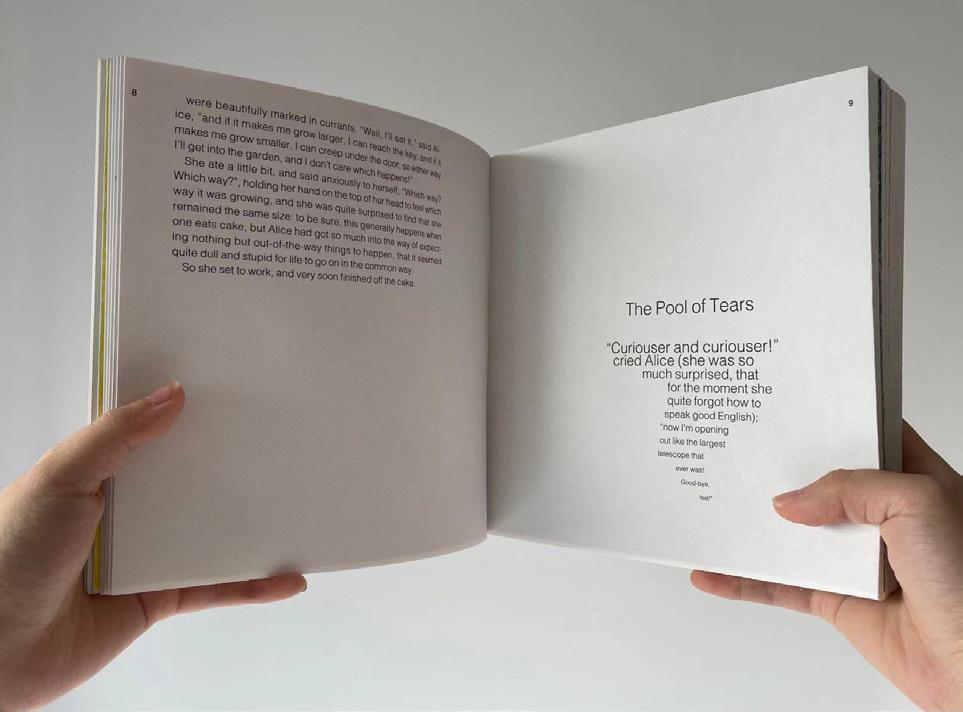
8 Yu
I learned to experiment with the different styles of one font family to represent a certain tone or moment of the context.
9 Yu
I became more familiar with placing and cutting out the shapes of a possible imagery, and learned to pick out specific characters that gave a hint of the story line or a frame of the story setting.
* “The Mouse” from Chapter 1
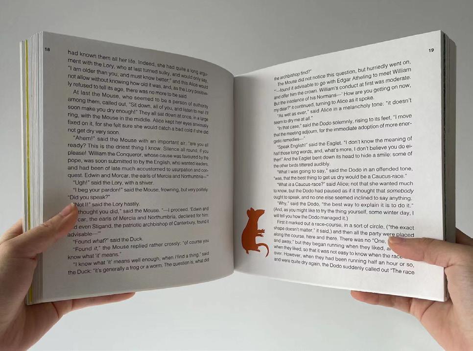
10 Yu
The Mock Turtle
from Chapter 9 11 Yu
*
I became more familiar with placing and cutting out the shapes of a possible imagery, and learned to pick out specific characters that gave a hint of the story line or a frame of the story setting.
*Alice trapped in the White Rabbit’s house from chapter 4
12 Yu
*Alice trapped in the White Rabbit’s house from chapter
4 13 Yu
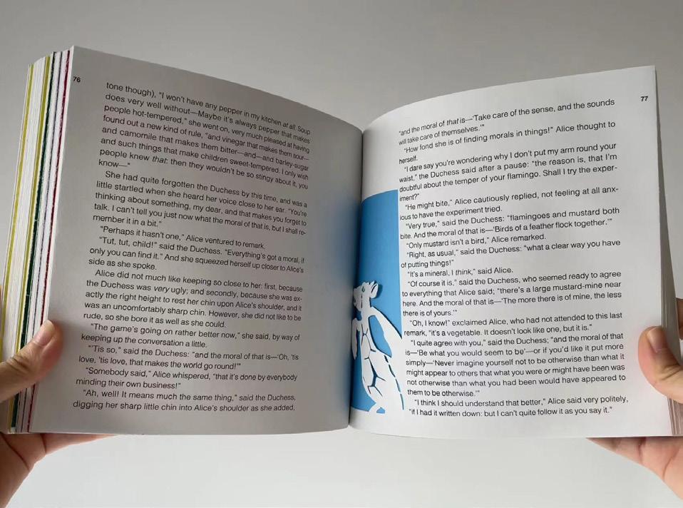
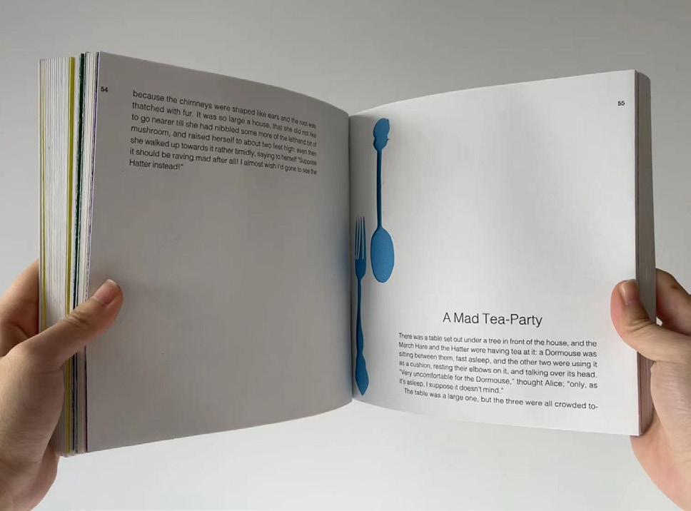
*Cake fork and tea spoon from chapter 7
14 Yu
*The Queen’s Qroquet Groud, from chapter
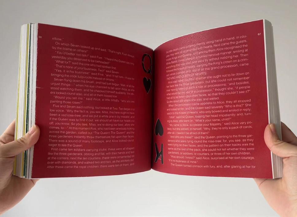
15 Yu
7
The Hatter is a crazed character with run on sentences and a silly attitude, I wanted to use the spacing of the lines to his song to address his characteristics.
*The Hatter singing his song from chapter 7
16 Yu
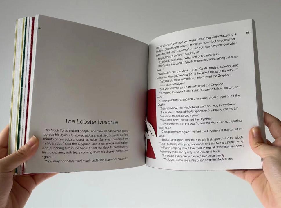
chapter 10 17 Yu
*The Lobster from
Alice’s Adventures in WonderlandBack Cover Page Designed by Xin-Yi Isabelle Yu

18 Yu
Being a final touch to conclude this project, I designed the cover and back cover pages in reference to the rabbit hole that started and ended the story for Alice. As the cover page presents itself as a rabbit hole looking in from the outside, the back cover leads the vision out from the hole to bring the reader to an end as Alice returns to reality.

19 Yu
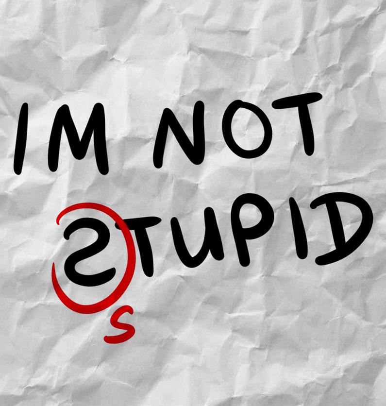
Campaign Design: I’M NOT STUPID X TED
teachers waste their time by asking questions that are intended to discover what the pupil does not know, whereas the true art of questioning is to discover what the pupil does know or is capable of knowing.”
- Albert Einstein 23 Yu
“Most
Campaign DesignI’M NOT STUPID x TED 24 Yu
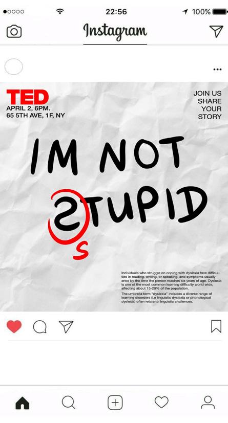
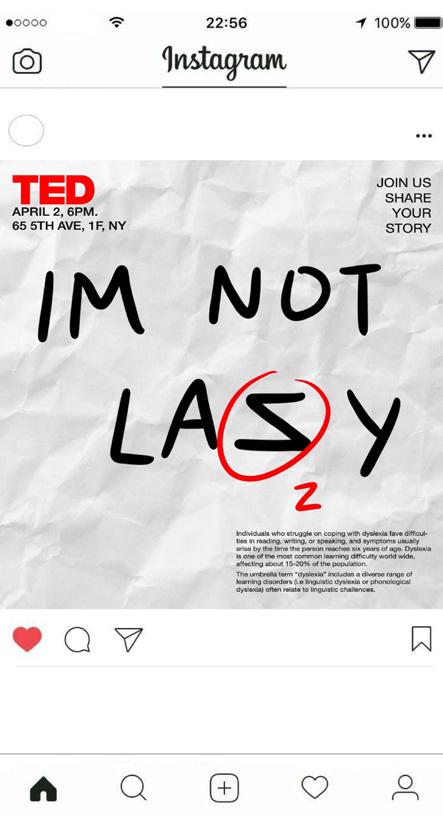
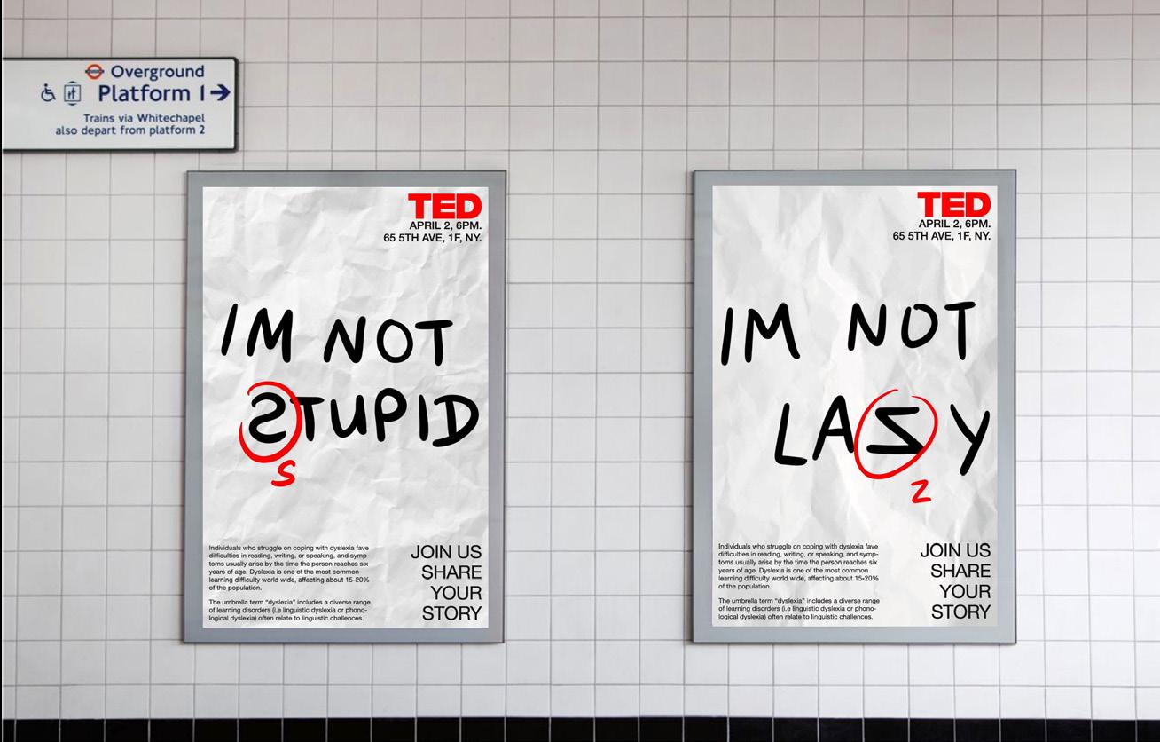
This was not my first campaign design, but I feel like it was one of the most challenging. The assignment required me not only to design the campaign but also to come up with the campaign event. My idea was then setteled on the theme of learning difficulties, specifically students with dyslexia, combined with a TED talk event.
I myself am a dyslexic and has been coping with its affects since I started primary school, I wanted this project to be something that had potential, as well as something that was personal to myself.
Being a dyslexic myself, I am aware of my grammatic and spelling mistakes getting out of hand from time to time, for that reason, I purposefully left my mistakes in the posters for my audience to notice. I think this called to a sense of questioning, leading the audience to want to know more through reading this poster, and therefore, to feel invited to join the event to either learn about or share stories about experiences with learning difficulties.
25 Yu
26 Yu Actual size: 23-3/8 x 33-1/8 inches 594 x 841 mm A1 size
27 Yu
Home (noun) the place where one lives permanently, especially as a member of a family or a house hold. -
Dictionary 31 Yu
Oxford Languages
Home
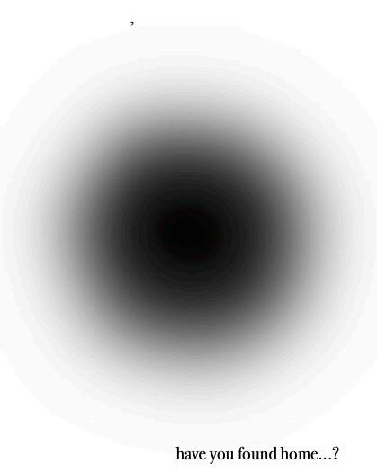
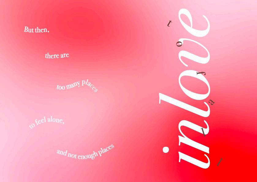
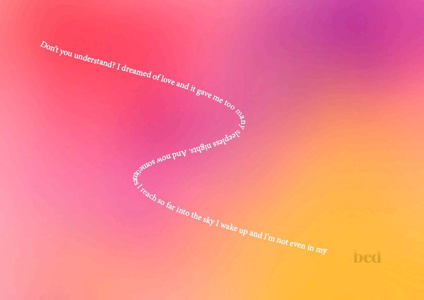
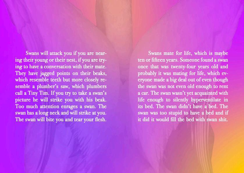
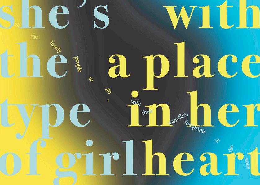
The assignment required me to create a booklet revolving the theme of “home”, which did and did not come in many forms for me. I figured the basic understanding of a home was a place or a house where one was born or grew up in, however, I started moving around at a very young age and felt attachment to almost anywhere but the house I grew up in. Therefore, I decided to base this project on something anyone could feel relatable to, I wanted to express a feeling of disconnection as much as a connection, which brought me to my realization that my home was anywhere I was. One requirement was to put together the booklet through choosing three pieces of writings/poems. My choices were:
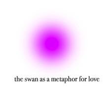
- The Swan as a Metaphor for Love by Amelia Gray
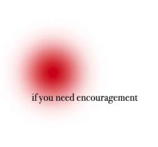
- if you need encouragement from Pillow Thoughts by Courtney Peppernell
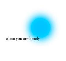
- when you are lonely also from Pillow Thoughts by Courtney Peppernell
32 Yu
I started out the booklet with an empty space for a reader to fill out their name, and a question that I felt targeted youth of this generation who are still in search of answers to many questions. I wanted anyone who was reading this booklet to feel like it is as much theirs as it is mine.
33 Yu
34 Yu
35 Yu
36 Yu
37 Yu
38 Yu
I chose to end the booklet by giving myself and the reader the freedom to decide, at whatever time, the answer to the question at the beginning of the booklet. I wanted the content to be steps to finding or discovering an answer to “have you found home?”, and one could revisit it however many times before they decide to write down their own answer.
When I finished printing and binding the booklet, the answer I wrote myself at the back was “where ever I was.”
39 Yu
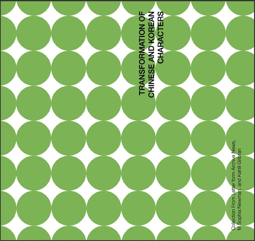
Reading Reader: Transformations of Korean and Chinese Characters
- Collection from Letterform Archive News, M Sophia Newman, and
Kahlil Gibran“Love does not possess, nor it be possessed, for love is sufficie nt unto love.”
43 Yu - The Prophet
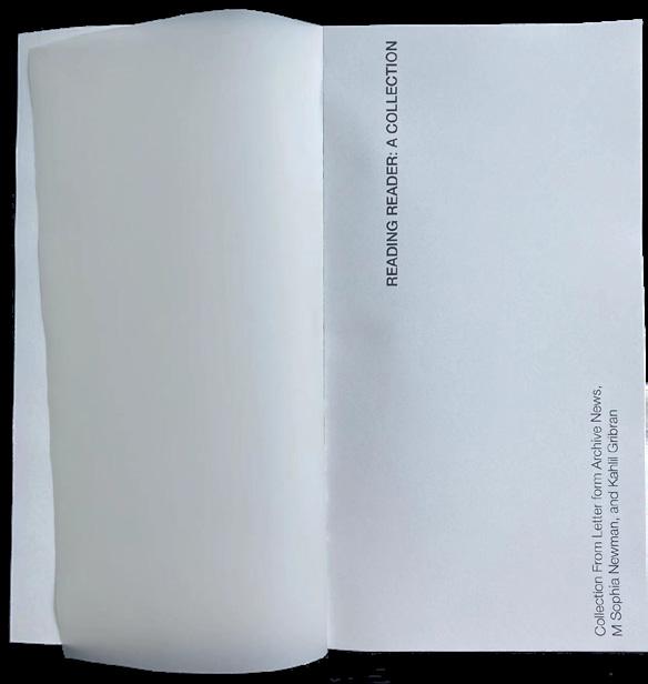
Reading Reader: A Collection
After creating posters, booklets, campaigns and books,
I felt in control of how I wanted to arrange the layout of Reading Reader.
I had specific plans about how I wanted every factor to be, and learned to organize these ideas and bring them into life:
- Book cover
- Content page
- Chapter dividers
- Page numbers
- Background color
- Margins and columns
- Trim marks and bleed
I enjoyed the planning progress very much, which paved the path to a content and satisfying design.
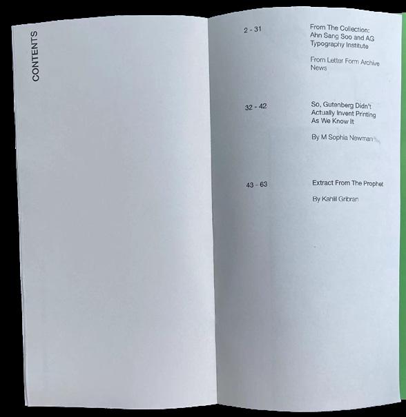
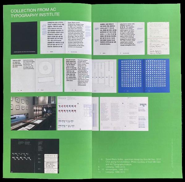
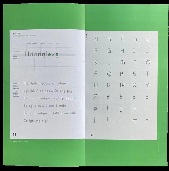
The book is also separated into three sections:
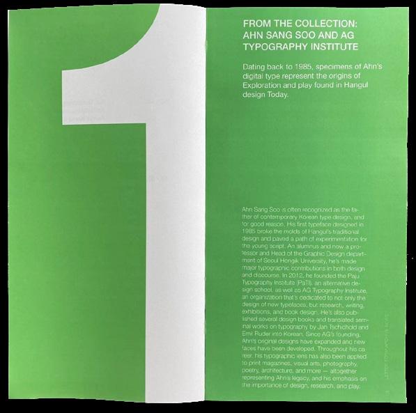
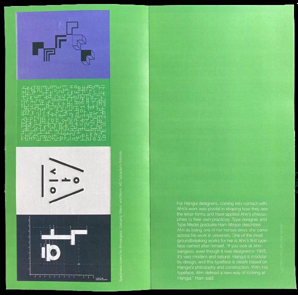
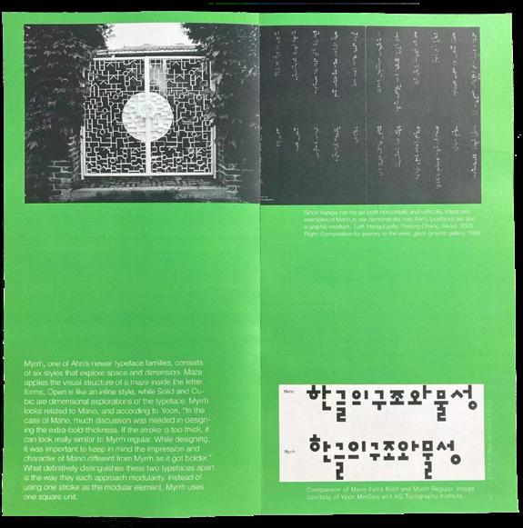
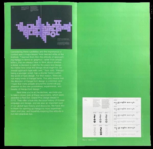
1. From the Collection: Ahn Song Soo and AG Typography Institute - Dating back to 1985, specimens of Ahn’s digital type represent the origins of Exploration and play found in Hangul Design today.
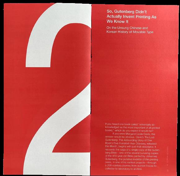
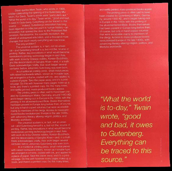
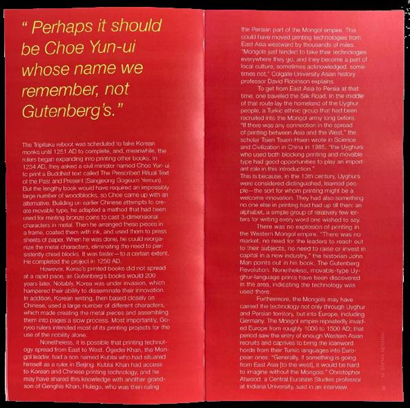
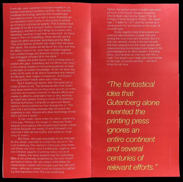
2. So, Gutenberg Didn’t Actually Invent Printing As We Know It - On the Unsung Chinese and Korean History of Movable Type
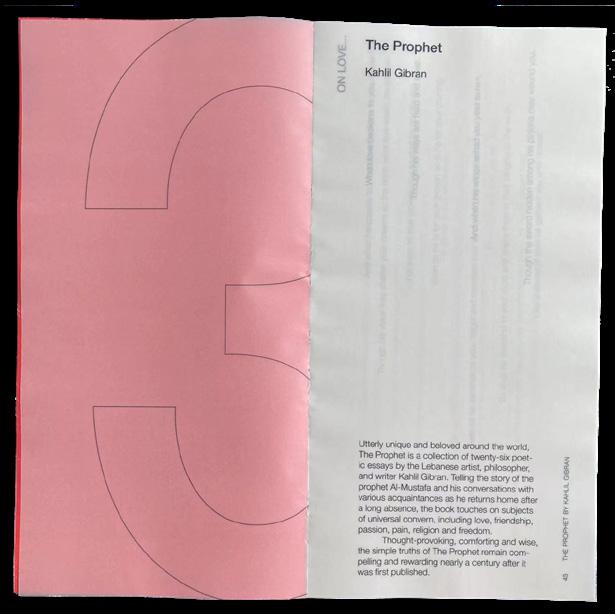
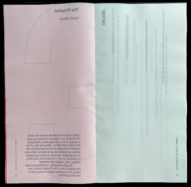
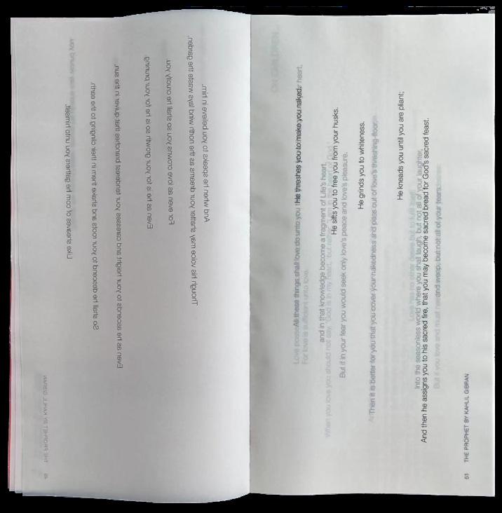
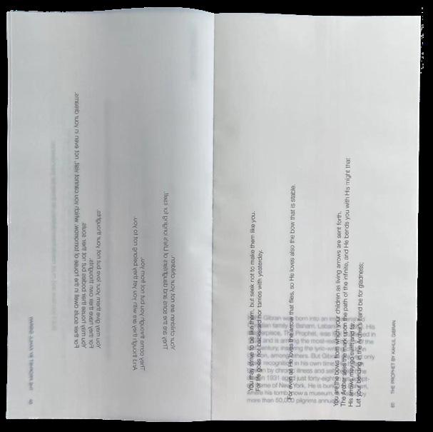
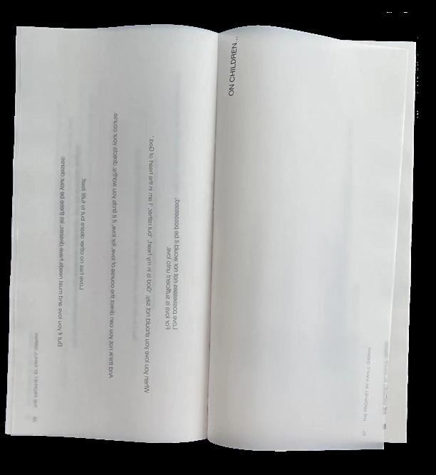
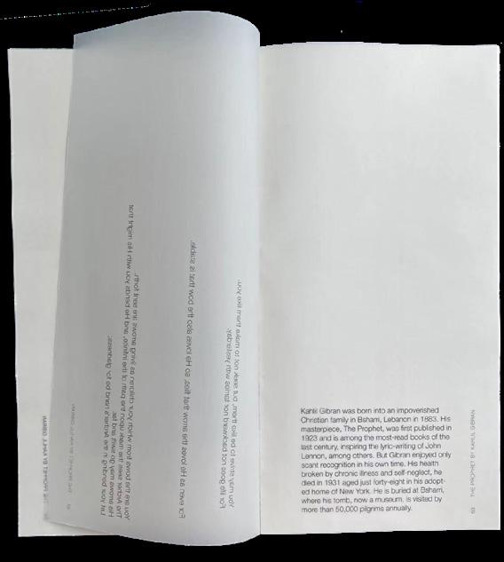
3. The Prophet - By Kahlil Gibran
44 Yu
45 Yu Actual size: 12 x 9 in/page 24 x 18in/spread Perfect Bound
46 Yu
47 Yu
48 Yu
49 Yu
50 Yu
51 Yu
52 Yu
53 Yu
54 Yu
The first and second article used in the book were mainly focused on balancing type, space and images. I wanted to use the two articles to show my style of working with the elements that create a balanced layout. Section one in green was heavily reliant on images, which was where I feel I demonstrated finding the midground between body text and the pages of images. Section two in red was heavily on words, which is where I had to create space for the reader’s eyes to rest by placing larger, heavier text in some areas to somewhat have the page be less busy.
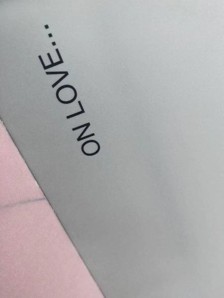
Lastly, section three was where I wanted to give creativity a chance. I used transparent paper to emphasize two short poems from The Prophet, and placed the text horizontally so that as each page went by it would seem like the words fell from above, also referencing to the story of The Prophet itself.
55 Yu
Instructors: Typography Studio 1: Paul Carlos Typography Lab 1: Han Groffery Interaction Studio 1: Ilya Yavnoshan Typography Studio 2: Kelly Walters Interaction Studio 2: Devin Washburn Interaction Lab 2: Beatriz Loranzo
Contact Xin-Yi Isabelle Yu: email: yxybelle3156@gmail.com Phone Number: +1 646 469 3156