International Research Journal of Engineering and Technology (IRJET)
e-ISSN: 2395 -0056
Volume: 04 Issue: 01 | Jan -2017
p-ISSN: 2395-0072
www.irjet.net
A Review on data visualisation tools Used for Big Data Bibhudutta Jena
School of Computer Engineering, KIIT University bibhuduttajena728@gmail.com
Abstract-Data visualization is an enactment of
2. TECHNIQUES REPRESENTATION
presenting the outcomes generated from analysis process of big data. On the basis of complexity of the data being analysed and the aspects from which it is analyzed, visuals can vary in terms of their dimensions such as one/two/multi dimensional. Now-a-days different class of tools are available in the market for data visualizing process. Some of them can be available on the open source platform which can be accessed and used with providing any cost. The paper aims to provide the notion of data visualization and need to visualize data in big data analytics. It also gives a brief idea about different tools used in data visualization to present the analyzed results.
IN
VISUAL
DATA
Data can be represented in multiple forms which consist of simple line diagrams, bar graphs, tables, matrices etc. Some techniques are generally used for a visual presentation of data are as follows. Isoline – It is basically a 2D data representation of a curved line that generally transfers constantly on the surface of the graph, the plotting of line generally drawn on the basis of data arrangement instead of data visualization [3].
Key words: Big data, Data visualisation, Isoline, Isosurface image
1. INTRODUCTION Data visualization is the study of presenting data in visual manner. Due to the enhancement of digital technologies, the width of manifold has enlarged manifold. Visuals in the form of graphs, images diagrams have completely escalated the internet. Visualization can be considered as an excellent medium to analyze and share information [1]. Instructional designers concentrate on scientific visualization to build learning content more interesting and easy to understand. Visual images assist to convey a huge amount of information to the brain of human beings. Similarly Visual analytics integrates the power of computational intelligence and computational power of modern computers. Data visualization also helps in detecting problems perceiving trends and outliers and also point out absorbing in a large dataset [2].
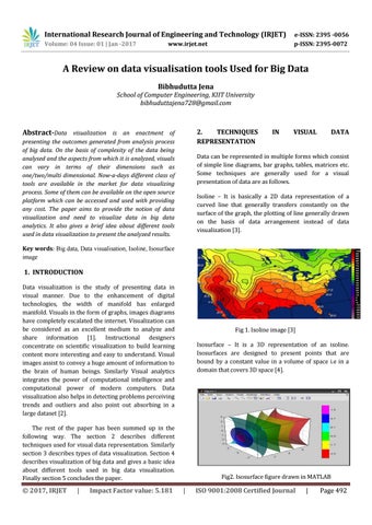
Fig 1. Isoline image [3] Isosurface – It is a 3D representation of an isoline. Isosurfaces are designed to present points that are bound by a constant value in a volume of space i.e in a domain that covers 3D space [4].
The rest of the paper has been summed up in the following way. The section 2 describes different techniques used for visual data representation. Similarly section 3 describes types of data visualization. Section 4 describes visualization of big data and gives a basic idea about different tools used in big data visualization. Finally section 5 concludes the paper.
© 2017, IRJET
|
Impact Factor value: 5.181
Fig2. Isosurface figure drawn in MATLAB
|
ISO 9001:2008 Certified Journal
|
Page 492