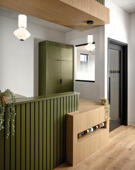
Design for the Brain, Not Just the Eye
Helping individuals flourish in the right neuro-setting.
Canadian identity is on display for both the world and locals to see.
CANADIAN INTERIORS
Helping individuals flourish in the right neuro-setting.
Canadian identity is on display for both the world and locals to see.
A ne w c ol lecti on for resi denti al an d co ns tru ct io n pro je cts
b y Silestone


Our solutions for int erio r d esi gn cover fr om kitchen surfa ces, to bathr ooms and fu rn iture, with up to 25-year guaranteed r es istance and durability.
Ou r d eca des o f pion eeri ng lead er ship in th e surfac e indust ry endorse us to prov ide high quality products.
Our low-crystalline silic a surfac es are made wi th 10 0% renewable electrical energy and 99% recyc led water.
THROUGH THE MIND’S EYE
How neuroscience is recalibrating the built environment.
By Rhys Phillips
GREY MATTER
The role neutral interior design played in a historic meeting of the minds at the 2025 G7 Summit.
By Tory Healy
STAYING IN CHARACTER
Spurred in part by the current political climate, a renewed focus on Canadian travel has hospitality brands and designers alike looking to capture the ineffable qualities of life north of the 49th parallel.
By Evan Pavka
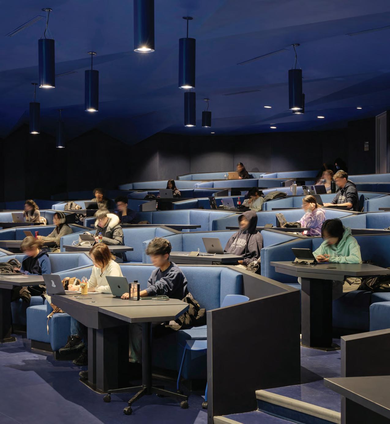
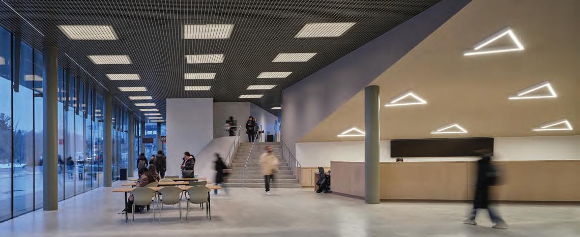
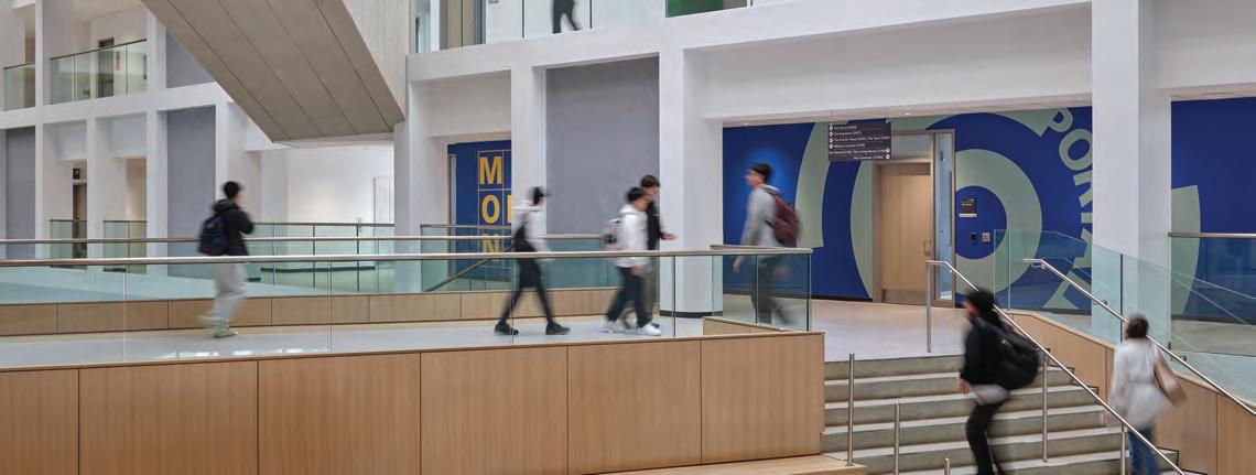
COVER – Sam Ibrahim Building at the University of Toronto Scarborough, designed by CEBRA and ZAS.
by Doublespace Photography
09/10 2025
10 ARIDO JOURNAL
12 CAUGHT OUR EYE
14 SEEN Ceramic tile collections draw inspiration from a rapidly evolving world at Coverings 2025; a human-centred future of commercial design was on display at NeoCon 2025.
18 THE GOODS Neuroaesthetic principles are guiding products that reduce stress, promote healing and enhance social connection.
36 GOOD READS A survey of interior designers with a unique, personal and occasionally poetic vision of what living in the Big Smoke can mean.
38 OVER & OUT 3D-printed living artwork is Canada’s contribution to La Biennale di Venezia.

solutions

Editor in Chief Peter Sobchak
Art Director Roy Gaiot
Contributors
Jeremy Cheff, Tory Healy, Evan Pavka, Rhys Phillips
Online Editor Lucy Mazzucco
Publisher Faria Ahmed
416-441-2085 x. 5 fahmed@canadianinteriors.com
Vice President / Sales Steve Wilson swilson@canadianinteriors.com
Circulation Manager circulation@canadianinteriors.com
President & Executive Publisher Alex Papanou
Partners


Canadian Interiors magazine is published by iQ Business Media Inc.
126 Old Sheppard Ave, Toronto, ON M2J 3L9 Telephone 416-441-2085
e-mail: info@canadianinteriors.com website: www.canadianinteriors.com
Canadian Interiors publishes six issues, per year. Printed in Canada. The content of this publication is the property of Canadian Interiors and cannot be reproduced without permission from the publisher.
Subscription rates > Canada $38.95 per year (plus taxes) U.S.A. $71.95 USD per year, Overseas $98.95 USD per year.
Back issues > Back copies are available for $15 for delivery in Canada, $20 USD for delivery in U.S.A. and $30 USD overseas. Please send payment to:
Canadian Interiors, 126 Old Sheppard Ave, Toronto, ON M2J 3L9 or order online www.canadianinteriors.com
For subscription and back issues inquiries please call 416-441-2085 x2
e-mail: circulation@canadianinteriors.com, or go to our website at: www.canadianinteriors.com
Member of the Alliance for Audited Media


ISSN 1923-3329 (Online), ISSN 0008-3887 (Print) H.S.T. # 80456 2965 RT0001 iQ Business Media Inc. Canada Post Sales Product Agreement No. 43096012
Humans have always been obsessed with exploring frontiers, typically the kind that are “out there.” But a new awakening is emerging, one interested in mapping what’s “in here,” that is, our minds. And what’s been discovered so far is a vast inner complexity. As the plethora of thematically similar CEU talks at NeoCon this year vividly illustrated, the evolving language of neurodiversity has emerged as one of design’s most dynamic frontiers. But not as simple compliance with checklists, but a fundamental reframing of how we conceive, plan, and inhabit space. No longer limited to questions of physical access, designers should be exploring how to design for the unseen differences in how people sense and process the world.
This is not simply about swapping out fluorescent lights, adding a soft chair or quiet rooms. It’s about reimagining how environments shape perception, mood, cognition, and belonging. At the heart of this shift lies a recognition that neurological difference is not a deviation from the norm, but part of the norm itself. Neurodivergent individuals— those with autism, ADHD, dyslexia, PTSD, and so on—represent a significant portion of the population. Yet until recently, their experiences within the built environment have largely been overlooked by an architectural canon prizing visual coherence, spatial efficiency, and universal access, while rarely asking: whose cognition is being prioritized?
If NeoCon speakers were any indication, designers are beginning to ask that question, with an emerging consensus: environments that consider cognitive difference are fundamentally better for everyone, but to get there requires abandoning the one-size-fits-all myth. “The most enduring fallacy of universal design has been its attempt to flatten human need into a single solution,” said one speaker. Neuro-inclusive design, by contrast, starts with the premise that neurological variation is not something to be smoothed out, but instead designed for.
This shift reframes the role of the interior designer beyond merely a curator of form and function to a translator of cognitive experience. For example, a workplace filled with visual clutter or acoustic unpredictability can send a neurodivergent mind into overload, while another individual in the same room might not register discomfort at all. One person’s energizing brainstorm room may be another’s source of social anxiety. What we’re learning through brain health research, workplace ethnographies, and neuroaesthetic studies is that design is not neutral. It either supports or suppresses.
By Peter Sobchak


As seen in our cover story, innovative practices are beginning to approach neurodiversity not as a challenge to solve, but as a lens through which to reimagine what the built environment can do. Circulation paths, material finishes, even the semantics of wayfinding all become part of a broader system of signals the brain is constantly decoding.
The most effective neuro-inclusive environments are shaped by interdisciplinary collaboration: partnerships with clinical researchers, industrial psychologists and accessibility advocates to translate scientific insight into spatial expression, while also inviting neurodivergent individuals not only into the design brief, but into the design process itself (while remembering that the standard charrette, built on rapid ideation and extroverted energy, often excludes the very voices we are talking about).
The irony is that many design strategies already exist under the banner of “good design.” But now the conversation is catching up to the science. Biophilic principles, long touted for their calming effects, are being embraced anew for their role in sensory regulation. Predictable spatial sequences, once seen as efficient, are now recognized as critical for cognitive processing. Even colour, often reduced to branding or trend, is being reconsidered given its capacity to impact perception, behaviour, and emotional regulation.
Of course, advances in policy are beneficial—such as WELL and LEED standards beginning to incorporate neurodiversity into their frameworks—but guidelines alone don’t spark transformation. For that to happen, designers must become educators and help clients understand why a space that feels “fine” to one person might feel unbearable to another. They must challenge briefs that assume sameness and bring forward data to support difference. They must, as one NeoCon speaker put it, “design for the edges, because that’s where innovation lives.”
What’s emerging is not just a new approach to interiors, but a new ethos of design. One that replaces compliance with curiosity, values variability over uniformity, and human potential over market average. “Our brain is mapping the world,” said E.O. Wilson. “Often that map is distorted, but it’s a map with constant immediate sensory input.” As we continue to build for a cognitively diverse world, the question is not whether our spaces are inclusive enough, but whether we are bold enough to imagine what inclusion really looks like.
Since 1979, Brading has been the trusted partner for architects, designers, and luxury home builders across the GTA and cottage country. We specify, design, supply and install precision shading systems for both residential and commercial projects.
•50’ motorized curtain tracks for Massey Hall
•40’ x 23‘ motorized curtains at the Schwartz Reisman Auditorium, U of T
•300’ span of interior motorized shades for OLG Theatre, Niagara Falls
•Custom digitally imprinted motorized shades for the Ismaili Centre and Aga Khan Museum
• A significant number of luxury custom projects through a trusted network of home builders

canadianinteriors.com/podcasts

27 Examination Alternative Project: An Equity-Centered Solution

glimpse into Toronto’s diverse, but far from exhaustive, residential talent.
In Ontario, there was time where post-secondary Interior Design education could be offered in French. I was fortunate to have studied interior design solely in French in Ottawa and am proud to be a fully bilingual Registered Interior Designer with the Association of Registered Interior Designers of Ontario (ARIDO). Cross-provincial work between Ontario and Québec is nothing new; the Ottawa community of members work often on projects and with clients from the Gatineau area. The same is true with Association professionnelle des designers d’intérieur du Québec (APDIQ) members leading projects in Ottawa.
This growing collaboration between ARIDO and APDIQ is also not new and has that tribe feel to it. Real community and allyship between bordering Provinces founded in a genuine desire to work together, find consensus on commitments and uphold them, and through the process of creation and collaboration, each feeling seen and respected by the other. It’s a relation where one is always mindful of the other, with a consistent practice of staying in touch and moments of connection born again and again on an ongoing basis. On a larger scale and with a broader lens, the collaboration between Ontario and Québec brings together two thought-leadership groups who have greater aspirations, collectively, for the profession of interior design in their respective jurisdictions.
By Jeremy Cheff
This collaboration demonstrates to practitioners in both provinces that their associations are committed to finding ways to build bridges and elevate the profession, bringing it out of antiquated practices and far from serving solely as gatekeepers to the profession. This collaboration embodies care that shows us that when we work together, and are able to put aside differences and biases, we can advocate for progression, fair access to qualifying practitioners, and protect the public by giving them access to qualified individuals.
When we gather to collaborate, you can feel the energy and vision building. It’s a joint approach to hear one another, even when we may disagree and fully lean into a respectful place of consensus to move forward, together. It mimics how the profession practices. Collaborating with other disciplines, parties to the project and the client; identifying issues and presenting solutions for the design to move forward and be born into existence.
This also requires listening to our respective members, and intentionally hearing about their frustrations, experiences and barriers while fulfilling our roles as regulatory bodies. For without the profession, and the individuals that make it up, where would it be today?
The practice of interior design is not just what we do. We, as Registered Interior Designers, are here because it’s what we chose as a journey and a role to fulfill — each of us inspired and motivated to join the ranks for different and/ or similar reasons but coming together to design and build with purpose.
On September 20, 2025, at the APDIQ Symposium in Montréal, Québec, ARIDO will sign the next phase of the Ontario and Québec alliance. The next reiteration of the agreement will expand beyond the new Registered Interior Designer Assessment (RIDA). It will see both organizations committing to building more for our respective members, the tools and resources they need to be the best version of the profession possible. It will see the development of a Design Fee Guide that will ensure practitioners in Québec and Ontario are paid for the full value of their services while educating the public about why design matters and carries importance as a service. It will mandate the development of interior design contracts which can be used in both Ontario and Québec by our respective members, ensuring terms and conditions support the practice of interior design in its most ethical foundations while also protecting the clients our members serve.
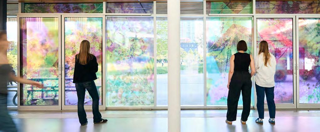
Casting Agent One of several installations for Sun/Shade, The Bentway’s summer public art exhibition under Toronto’s Gardiner Expressway, Hamilton, Ont.-based Natalie Hunter’s Bathed in Strange Light transformed The Studio’s western windows into a living lens. Using layered, translucent photographs that respond to shifting sunlight, the installation cast luminous patterns across concrete interiors and terrace. As light refracts off nearby high-rises, Hunter’s slow-moving, sun-activated cinema captures the ephemeral choreography of urban space. Blurring photography, architecture, and time, her work reframed CityPlace’s glass-and-steel density into a meditation on movement and our relationship with light.
Humanize Health RxART’s Canadian debut brings contemporary art into clinical spaces with museum-worthy intent. At Toronto’s Princess Margaret Cancer Centre, Mi’kmaw artist Jordan Bennett’s Blueberries with Nan injects vivid colour and cultural symbolism into the healing environment. Referencing the Mi’kmaq tradition of gifting berries at feasts, his piece conjures themes of vitality, resilience, and care. Alongside Elizabeth McIntosh’s project at West Park Healthcare Centre, these commissions from the New York-based non-profit mark a thoughtful intersection of art, wellness, and national identity.
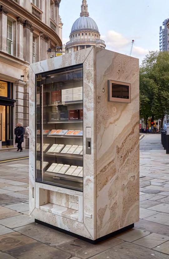
B4 At Clerkenwell Design Week in London, Italgraniti’s Automatica reimagined the vending machine as a tactile design ritual. Developed with architect Simon Astridge, the installation transformed food dispensers into porcelain tile samplers across three city sites. Playful yet precise, the project echoed Italgraniti’s automated factory, offering a poetic take on materiality, process, and industrial nostalgia. Visitors exchange tokens collected from a showroom on Clerkenwell Road for tiles: a subversive ode to production, repetition and design, quite literally, dispensed by machine.
Below Bars At the 26th edition of the International Garden Festival in Grand-Métis, Québec, Peek-a-Boo by Hermine Demaël and Stephen Zimmerer transforms the idea of borders into an experiential landscape (this year’s Festival mission statement). Composed of powder-coated steel grates, the installation flips the architectural wall on its side, tracing the liminal edge between earth and sky. Four kinetic “windows” shift between open and closed, revealing 13 possible spatial configurations. The result is a tactile garden that blurs the line between sculpture and space, inviting interaction and reflection.

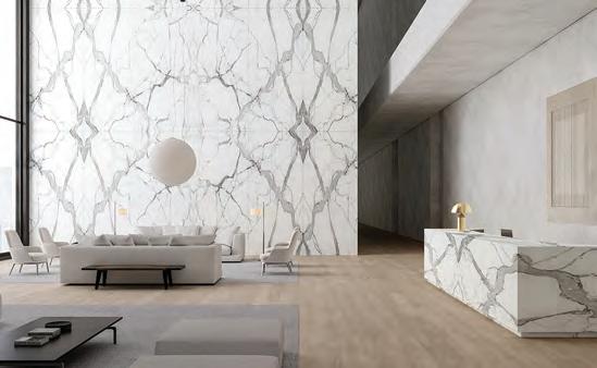
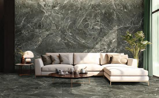
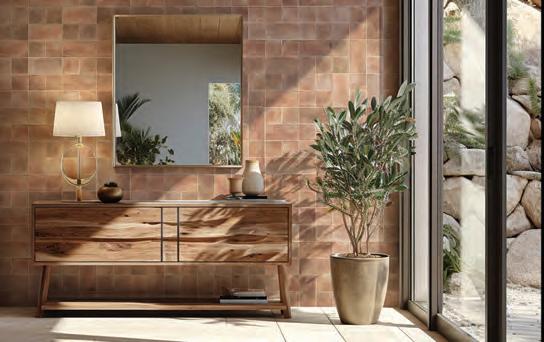
At Coverings 2025, companies unveiled a range of durable and versatile ceramic tile collections that draw inspiration from the rapidly evolving world and offer a creative departure from everyday life.
The tile industry brought its A-game to Orlando this year, showing off new examples of eye-popping colour, human-centered textures, and high-tech integration. On display were warm palettes of sand-inspired neutrals and rich earth tones next to gold-veined marble looks and deep ocean blues in a trend that has been coined “Drenching” which envelops rooms in cohesive colour or stone patterns. Technology is being merged seamlessly into surfaces (think pressure-sensitive lighting and induction capabilities), allowing tiles to take on natural textures, mimicking raw stone, torn fabric, or corrugated paper. Mosaics have returned in large formats, fusing old-world craft with digital precision, and of course biophilic design reigns, with ceramics supporting plant life and evoking organic forms. The result is a tile landscape that is multi-sensory, personal, timeless in material but radically of the moment.
Aeterna Sintered Slabs , from Anatolia, combines cutting-edge technology with the beauty of natural stone and the sophistication of contemporary design. With 60 colours and an array of surface finishes, Aeterna Sintered Slabs meet the design needs of any project, whether for countertops, facades, intricate details, kitchens, bathrooms or interior floors.
Avalanche Honed Marble Collection, from Marble Systems, evokes the stillness and purity of a mountain snowfall with soft grey hues, available in floor and wall tiles to mosaics and refined moldings.
Luxe Ensemble Porcelain Tile Collection by Panariagroup USA replicates some of the world’s most well-known and coveted marbles, with each colour available in a Lux or Soft finish.
Argent 2.0, a new porcelain tile by Crossville, is inspired by classic Argent limestone, an earthy sedimentary rock quarried in Catalonia, Spain. The collection comes in 13 evocative tones and is the latest addition to the company’s carbon neutral portfolio.
Equipe by Menorca is a good example of how the tile industry is celebrating energy, movement and bold designs through daring, colour-driven collections. Made of white body ceramic, this collection’s irregular edges and flux glaze evoke the authenticity of handmade ceramics, with a subtle crackle that adds texture and depth.
Spike Bars by Wow Design offers ceramic tiles in an unusual new shape: a parallelogram with a diagonal relief pattern that follows the sloping edges of the tiles, ideal for designers embracing maximalism within their projects. Available in nine autumnal colours, ranging from beige or earthy shades to blues and greens in both a matt and a glossy finish.
Morella by Cerámica Da Vinci is one of several Spanish companies shifting away from the ubiquitous cool grey and are instead welcoming the warmth and depth of earthy browns. Manufacturers are exploring the full spectrum of this natural hue with collections ranging in colour from soft taupe and sandy beige to rich mocha and deep chocolate.
Immensa by Ceramiche Coem is a new collection confirming that, as always, size does matter. Oversized and ultra-durable at 162×324cm and 12mm thick, it transitions seamlessly from tile to countertop, sink, or table, bringing refined stone textures to high-performance, multifunctional design. A bold scale for contemporary interiors, engineered with Italian precision.
Oltrenero is the result of a partnership between Italian tile maker Mirage and Mount Etna lava stone supplier Nerosicilia. The results channel the raw geology of Sicily—lava stone, Pietra Pece, Comiso, and Ragusa—into sculptural, three-dimensional surfaces. Through artisanal techniques and thermal treatments, stone becomes a medium of expression, revealing its volcanic memory. The result: textured architectural elements that fuse innovation with the primal language of the earth.
By Peter Sobchak
Nearly 50,000 professionals converged in Chicago for NeoCon 2025 to explore emotionally intelligent designs, multisensory showrooms and next-gen tools driving the human-centered future of commercial design.
“So, what’s next?” seemed to be the phrase reverberating through the halls of The Mart. But not in a negative tone of disappointment; more in a “we’ve got a lot to see…!” pitch coming from assembled throngs. And it was an accurate assessment: from circularity and neuro-inclusion to AI-enabled materials, the show revealed bold new directions for workplace, healthcare, and learning environments. “I loved the level of creativity in product design and finishes, especially the bold use of colour [and] saturated tones alongside softer palettes,” said Tom Polucci, firm-wide Director of Interiors at HOK.
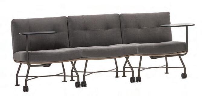
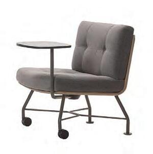
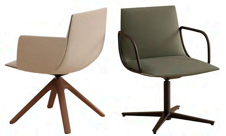
Unifi | Keilhauer Designed by EOOS and winner of multiple awards at NeoCon including a Gold Best of, this collection features side and lounge chairs with four-leg or sled bases, caster options, and tablet arms in four laminate finishes. FSC-certified wood, BIFMA LEVEL 3, and carbon-neutral credentials meet durability needs, while modularity, combo upholstery, and reinforced handles enhance functionality across workplace settings.
Astoria | Halcon This collection took home the show’s Best of Competition award (among others) for its sculptural bases, premium materials, and concealed casters. Available in anodized aluminum, rich woods or matched veneers, the collection includes optional in-surface or edge power, anodized trim, and a refined metal rail.
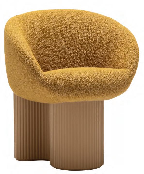
Bolete Armchair | Andreu World The 70-year-old company went big at NeoCon, celebrating that anniversary with a new 20,000-sq.-ft. showroom and unveiling nearly two dozen products (nine of which won Best of NeoCon awards). Famous names proliferated, including Patricia Urquiola whose Bolete Armchair integrates the iconic central base of the collection, made from recycled and recyclable Pure ECO thermopolymer, and combines it with an upholstered shell that incorporates armrests fluidly integrated into the volume of the seat.
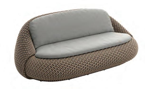
Atolo | Dedon Designed by Claudio Bellini, this collection features a modular trio of a lounge chair, two-seater, and footstool made with durable DEDON Fiber in a tripletone crosshatch weave. Gently sloped backrests, low profiles, and precision detailing ensure ergonomic comfort and resilience, even in extreme weather. Available in two fiber colourways; footstool in light only.
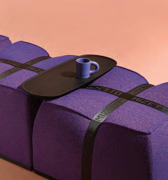
Cargo | Mizetto Inspired by logistics straps and cargo cubes, Karl-Magnus Lillqvist Sjöberg at ADDI designed this modular sofa system as three precision-shaped modules with removable covers and integrated tray. Beyond geometry, modularity also exists in the construction: fastened not with glue but with an underneath connector, assembly and disassembly can be done onsite, and the straps and fabric cover can easily be removed for cleaning or replacement.
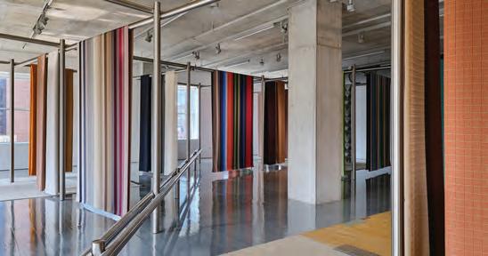
Stick Frame | Maharam In Fulton Market, Maharam celebrated a decade with American industrial designer Leon Ransmeier by debuting Stick Frame: a modular display system of stainless-steel tubing that functions as “micro-architecture.” The grid structure showcased 30 textiles, including reissues from Knoll Textiles and sustainable collaborations with designers Paul Smith and Sander Lak for Maharam; reissues of designs by Alexander Girard; and rugs by new collaborator Edith van Berkel.
Aeron ESD Chair and Stool | Herman Miller NeoCon and the Aeron are like pb+j, so of course the newest upgrade to this legendary performance suspension chair is shown here. Designed specifically for electrostatic discharge (ESD) environments, the new version addresses the need for comfort and support in workspaces commonly found within the tech, semiconductor, and innovation sectors, such as clean rooms, data centers, laboratories, and electronics assembly areas.
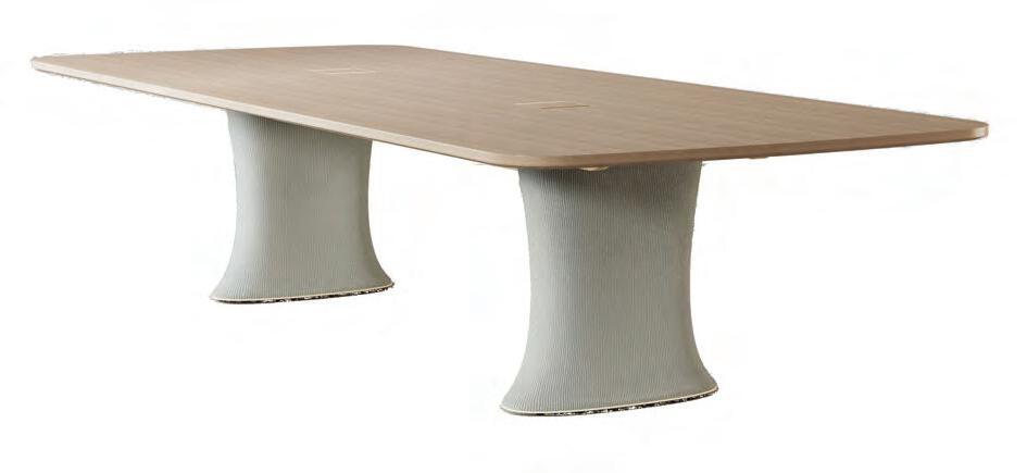
Una | Niënkamper This design by modus ID impressively merges adaptability with zero-waste knit-to-shape technology. Its height-adjustable conference and wall-mounted tables feature sculptural Flex-Knit bases: ribbed, tensioned textile sleeves anchored by oval rings. The internal telescoping mechanism ensures seamless motion, while removable covers enable clean cable management.
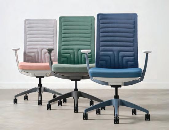
Evo | Allsteel The best-seller now features a zero-waste Quilted Knit Back made with SEAQUAL yarn from upcycled marine litter. The engineered channels flex with movement, eliminating adhesives and excess materials for easy disassembly. Carbonneutral options, painted aluminum finishes, 4D arms, and dual-density foam round out Evo’s ergonomic, sustainable, and design-forward enhancements.

A quiet revolution is unfolding across the commercial interiors sector, one where emotional well-being, inclusivity, and sensory nuance are no longer fringe concerns, but fundamental pillars of design. At the intersection of neuroscience and aesthetics, a new neuroaesthetic lens is reshaping how we conceive space: not only as functional, but as healing, grounding, and even cognitively uplifting.
“The concept of neurodiversity is pushing designers to think differently, not just about spaces for those diagnosed with conditions like ADHD, autism, or dyslexia, but for everyone,” comments Pallavi Dean of Dubai-based architecture and interior design studio Roar.
“After all, everyone’s brain works uniquely, and a space designed thoughtfully for diverse needs naturally benefits all employees.”
This shift is grounded in science. Researchers are uncovering how the brain reacts to light, sound, texture, layout, and how these seemingly subtle design elements can profoundly affect cognition, stress levels, and social engagement. From cognitive load and colour psychology to the amygdala’s response to fractals, neuroscience is recalibrating how we approach comfort, creativity, and control in interior architecture.
“Unlike physical barriers, sensory barriers are not always obvious and often go unaddressed. Yet they affect all of us, neurotypicals and neurodivergents alike,” says Kay Sargent, Director of Thought Leadership, Interiors at HOK.
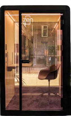
Design-forward manufacturers are rising to the occasion. Viccarbe’s Noha Chair, designed in collaboration with Italian architects Ludovica Serafini and Roberto Palomba, introduces the warmth of home into communal spaces with its elegantly pillowy profile. Silen’s Zen add-on takes the ubiquitous pod to meditative new heights with ambient lighting, immersive soundscapes, and switchable smart glass. Turf brings a new tactility to visual serenity with Wood Textures, a line of digitally rendered finishes inspired by wood cuts and veneer, merging biophilic beauty with sensory-conscious function.
Nature, unsurprisingly, remains a primary muse. But today’s designers are engaging with it through the language of data. Surface materials are being reconceived using the principles of fractal geometry: those endlessly repeating patterns found in leaves, coastlines, and tree branches. Such natural geometries are now understood to reduce stress, restore focus, and engage the eye with just the right amount of visual complexity.
Momentum Textiles & Wallcoverings offers a compelling case in point with its Renaturation Collection, created in collaboration with 13&9 Design. Rather than simply referencing biophilia, this

wallcovering series is rooted in scientific precision. Each pattern is calibrated to an optimal fractal dimension (between 1.7 and 1.74 on the D-value scale), a sweet spot shown to elicit positive neurological responses across diverse populations, including the neurodivergent.
This understanding of design as a therapeutic modality is also shaping the future of healthcare environments. Industrial designer Von Robinson, founder of Play Orbit Studio and a veteran of Steelcase Health, has partnered with healthcare furnishings company Kwalu to launch the Ellie Collection, an emotionally intelligent suite of seating conceived for connection, calm, and care.
“This intuitive, non-verbal design language has the power to soothe the brain’s amygdala, lower stress, reduce heart rate, and more,” explains Von Robinson. “In healthcare especially, there’s a move away from cold, harsh, and clinical settings toward spaces that address holistic well-being with natural forms, materials, and rhythms that nurture recovery.” The series, which includes a patient recliner and a sleeper sofa, uses biophilic curves and neuroaesthetic cues to subtly regulate stress, elevate mood, and ease interactions between patients, caregivers, and visitors alike.
The message is clear: the future of interiors is deeply sensory, quietly inclusive, and scientifically informed. Through the marriage of elegant design and cognitive empathy, commercial interiors are being reimagined not just as spaces to occupy, but as environments that understand us.

By Rhys Phillips
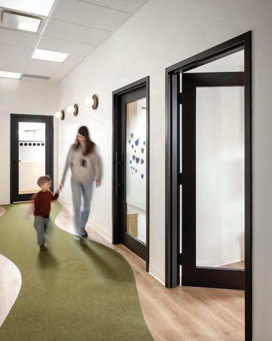
This spread A residence and day centre for adults on the autism spectrum, The Centre Lise et Yvon Lamarre in Montréal by Lemay applies neuroinclusive design by integrating spatial logic with calibrated sensory control. Using its Sensory Fragmentation Framework, developed by Lemay’s FLDWRK unit in collaboration with Fondation Yvon Lamarre, the architects developed spatial, material, and sensory interventions that respond to neurodivergent users who experience both hyper- and hyposensitivity. Muted colour palettes and consistent materials prevent visual overload, while gentle textures and balanced daylight fixtures mitigate tactile and glare stimuli. Softened corners and thresholds smooth spatial transitions. The campus unfolds through four architectural fragments including individual houses, transition zones, shared commons, and exterior landscapes, offering graduated engagement.
It is a small irony that as the very idea of science seems under increasing threat, there is a growing movement towards a rigorous application of evidence-based design that relies on sophisticated neural research. Increasingly, the terms neuro-design, neuroaesthetics and neuro-divergence are finding their way into design firms’ self-descriptions.
Briefly defined, neuro-design integrates results from neuroscience into the design process. By understanding how the brain perceives and processes sensory information, designers can create more engaging experiences. For example, the use of colour, shapes and patterns can be optimized to evoke specific emotional responses and improve the quality of user interaction.
Neuro-aesthetics more narrowly explores the neural mechanisms underlying why certain designs or their elements are perceived as
How neuroscience is recalibrating the built environment.
“beautiful” or pleasing as well as how these perceptions influence our subsequent behaviour and emotions.
Finally, neuro-divergence design involves understanding and accommodating diverse cognitive load abilities and sensory sensitivities. While this is frequently applied to individuals with autism or ADHD, the term “neuro-inclusive” suggests a more complex need to accommodate preferences that are not universal to our genetic codes and DNA
Neuro-design, and particularly aesthetics, often begin with the idea that such things as “beauty” spring from species-wide neural biases in the brain that arrive preloaded through a long genetic and DNA history. Thus, there tends to be a universal beauty preference involving, for example, symmetry, average-
ness, proportional harmony, and biophilic complexity, all honed by evolutionary survival.
In exploring this intersection of neuroscience and interior design, Toronto-based NeuroDesign Academy has centred on the idea that our aesthetic and restorative responses to design and aesthetics are evolutionarily hard-wired, and that beauty, biophilic cues and responses to spaces resonate across cultures because they are encoded in our neurobiology. The Academy’s motto, “Defined by Beauty, Backed by Science,” and its guiding maxim, “Form Follows Feeling,” both rest on the premise that aesthetic experiences are primarily universal, DNA-driven imperatives, and that tapping into them allows designers to craft spaces that reliably enhance well-being.
As founding director Linda Kafka explains, “our brains were sculpted for millions of years in nature, and we spent almost our entire evolutionary history in nature with only a small part, maybe 6,000 years, in
the built environment. We evolved from living with trees and this is where we live today. What’s beautiful in this,” she says, referring to an image of a treeless cityscape. “What have we done to ourselves?”
A universal presence of genetic responses means human brains are tuned to recognize and reward quite specific characteristics; and they do so in our non-conscious, Kafka argues, 95 per cent of the time. Across cultures, for example, symmetry in facial features tends to activate brain regions associated with reward and trust, suggesting an evolutionary bias toward recognizing health and genetic fitness. Symmetry also extends beyond faces into interiors where mirror-balanced façades, equal-sided room layouts, and centrally aligned furnishings all register as harmonious and pleasing.
Similarly, averageness, or proximity to a population’s mean facial template tends to evoke positive responses, likely because they signal genetic diversity and developmental stability. In design, this
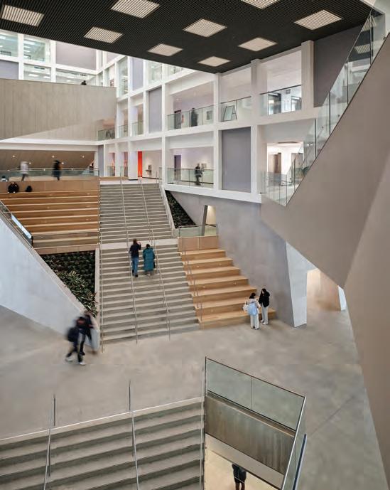
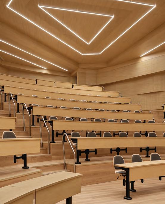
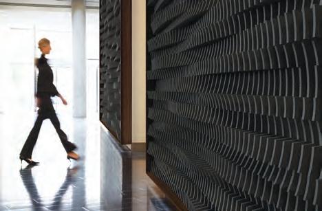
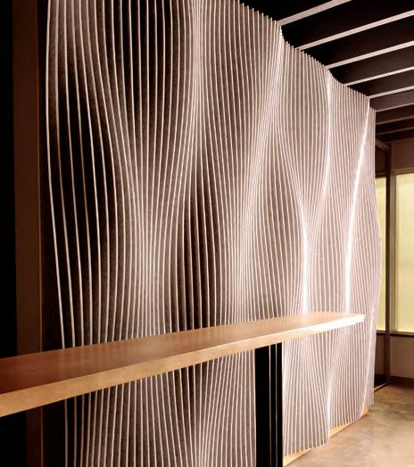
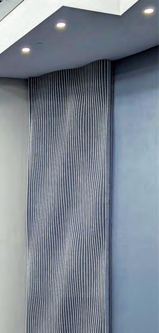
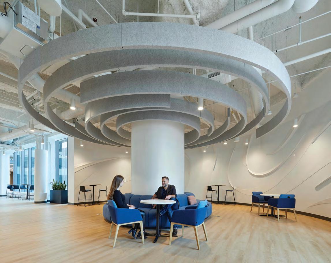
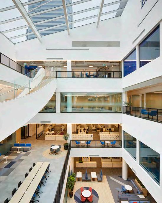
This spread The Sam Ibrahim Building at the University of Toronto Scarborough plan unfolds as interlocking “printer’s tray” compartments arranged in concentric rings around a six-tiered grand stair, clustering 20 classrooms, lounges, and pods. Designed by Danish firm CEBRA and Toronto’s ZAS, this ripple-inspired layout reduces navigational stress and cues transitions between active, social and low-stimulus zones. Recessed daylight “harvesting” and tunable LEDs enable automated and occupant-controlled shifts in brightness and colour temperature, aligning circadian rhythms and personal preferences. Pale concrete, warm wood strips and textured insets provide reassuring haptic feedback.
translates into favouring forms and patterns that feel familiar, such as arched windows with gentle curves, softly rounded furniture silhouettes, or repeating tessellations that echo natural proportions. Proportional harmony, particularly the tried-and-true Golden Ratio, further taps hardwired reward pathways. Spaces resembling the Golden Ratio often evoke a sense of balance and harmony, even if we are not conscious of a mathematical underpinning.
British architect Thomas Heatherwick, designer of the muchpraised neuro-design driven Maggie’s Centre Leeds, recently commissioned a study from Colin Ellard, a cognitive neuroscientist and director of the Urban Realities Laboratory at the University of Waterloo, to do a “boring building” study of Toronto. He found our eyes can’t anchor to modern blank buildings because there are no details and that the visual complexity of historic buildings notably influenced mood and stress levels. Sensory-rich environments promote mental wellbeing (Adolf Loos, given the
long-lasting impact of his 1913 essay “Ornament and Crime,” may have a lot to answer for!). According to Kafka, another study found subjects in buildings with views of primarily linear objects (buildings) complained about headaches and exhaustion by 3 o’clock. “The researchers found that constantly staring at vertical lines takes a toll on cognitive load.”
Survival instincts play a not-insignificant role in defining comfortable environments. Our ancestors, goes the argument, traversed open savannas where threats could emerge from any direction. As a result, human brains evolved to seek out environments offering both prospect (clear views) and refuge (protected enclosures). Findings of survival-driven “prospect-refuge theory,” therefore, might argue that spatial comfort through back-to-wall seating relaxes the amygdala (a fear processing part of the brain) and clears sightlines that satisfy threat detection. Overhead canopies balance enclosure with openness in vaulted ceilings or suspended baffles.
In addition, biophilic safety cues such as water features and abundant greenery signal resource abundance and low threat, reducing cortisol and enhancing focus. Textural interplay mimics skin tone signals of health and vitality. Matte-and-gloss contrasts, pastel underlays, and subtle highlights evoke warmth, approachability, and human scale.
Roger Ulrich’s 1984 study found hospital patients recovering from surgery who viewed nature scenes instead of a brick wall had faster recovery, lower stress, and higher “pleasure” ratings and this kicked off the now well-established evidence-based medical facility design movement. In their 1999 paper, Vilayanur Ramachandran and William Hirstein outlined a set of eight guiding principles— ranging from peak-shift effects to grouping—that they argue underlie why specific visual patterns tend to be appealing across different societies. Both before and after this influential work, multiple other studies have supported and nuanced the theory of genetically embed preferences.
Complicating these “universal” bottom-up drivers, however, lie genetic polymorphisms: discontinuous genetic variations existing in the same population that can modulate an individual’s reward sensitivity outside the norm. Variants in dopamine-related genes tune how an individual may respond quite differently from the norm regarding design aesthetics. While symmetry and proportion may spark similar initial reactions, colour perception diverges even among genetically similar individuals. Variations in retinal opsin genes affect how finely we distinguish hues, making some people more sensitive to subtle shifts in blues or reds. Serotonin transporter variants, for example, shape mood stability and stress resilience in response to lighting schemes and colour palettes. Opsin gene variations govern hue discrimination, making one person’s vibrant teal subdued to another.
Individuals with dopamine-sensitive alleles may prioritize rich, high-contrast patterns that strongly engage reward centres while
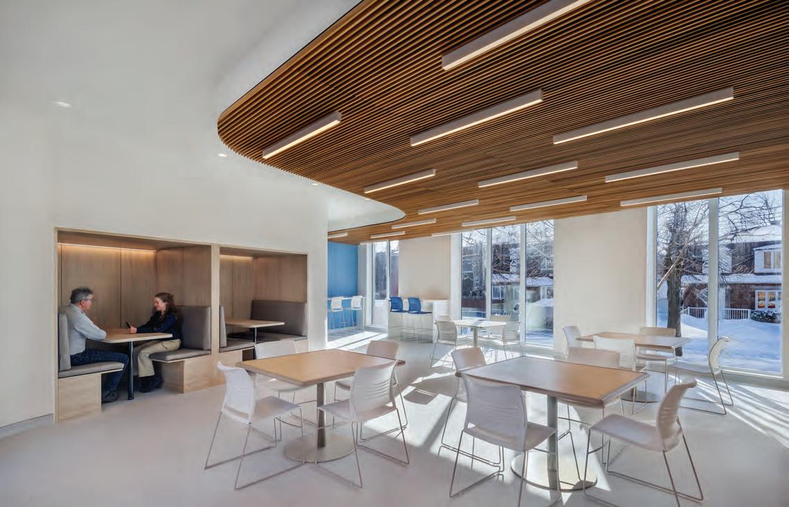
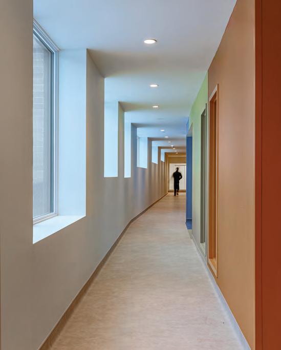
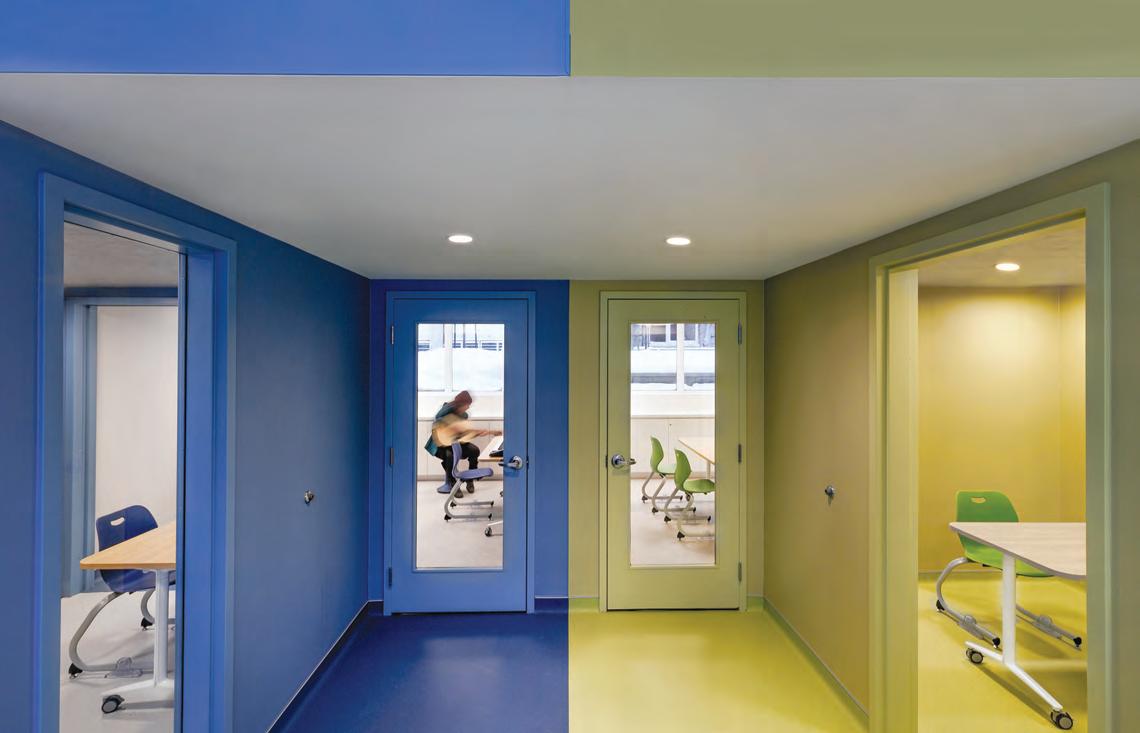
This spread Designed by Zeidler Architecture, a central “ripple” motif radiates from BMO Academy’s central stairwell, guiding movement and reducing navigational stress while introducing biometric shapes. Curved corridors and concentric zones are intended to create a calming, intuitive journey that mirrors natural water patterns. Acoustics and lighting which include glass partitions balanced with soft goods ensure speech clarity in active zones while maintaining low reverberation in quiet areas. Recessed cove lighting and flexible LEDs create gentle transitions of brightness and colour temperature but allow users to adjust visual stimuli. Light blues, soft greys, pale concrete, and warm wood finishes minimize glare and visual clutter while smooth glass, polished metal, and subtle wood grain offer tactile variety without overwhelming the senses.
those with serotonin-stabilizing variants might gravitate toward calming palettes and soft gradients. Such diversity, from a designer’s perspective, ensures a “one-size-fits-all” colour scheme will never satisfy everyone, underscoring why neutral backdrops plus accent lights or adjustable LEDs are often used to optimize broad appeal. Ironically, says Kafka, grey has been the go-to for homes, yet neuroscience has shown it increases stress and may be why there is a resurgence in earth tones, natural dyes and more warm hues.
Emerging neuro-diverse design, therefore, recognizes that cognitive and sensory variations reflect a spectrum of common polymorphisms. Frequently referenced in design projects is autism that is largely polygenic, meaning it arises from the combined effect of thousands of common variants, each nudging neurodevelopment in small ways. All this underscores that while genetics shape neurocognitive profiles, no single DNA blueprint can universally prescribe
optimal design solutions. The challenge for the designer is compounded when spaces are designed neither for the “universal” influences nor solely for such individual profiles.
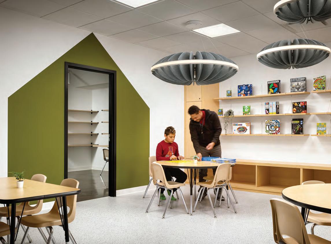
Joanne Fernandes, project lead for Holland Design’s award-winning Wonderment Child Centre in Calgary, emphasizes crafting flexible spaces that adapt to each child’s unique needs, ensuring every material, light source, and acoustic treatment is tailored to individual sensory profiles. For the BMO Academy in Toronto, Ian Franceschi, creative director of interior design at Zeidler Architecture, reports “we were able to enhance the planning strategies and address sensory regulation, focus, and cognitive variability. This produced a wider range of environments: from quiet zones and low stimulation areas, both acoustic and visually, to larger flexible gathering and event spaces.” Instead of “additional” areas, they integrated inclusive responses “into a broader design rationale and used it as a lens through which decisions were made.”
This spread Wonderment Child Centre in Calgary by Holland Design blends foundational neuro-design strategies with principles tailored for neurodiverse learners to foster both stimulating yet soothing environments. The design incorporates zoned experiences while interactive features offer creative sensory profiles. Sliding door abacuses and wall-mounted pegboards let children adjust auditory and visual stimulation at will, empowering those who seek extra input or need moments of withdrawal. Clearly marked routes, consistent material cues and organic-shaped pathways reinforce predictability and reduce anxiety for all young learners who respond best to routine and spatial clarity.
While the argument for understanding embedded universal responses to guide neuro-design and aesthetics is compelling, there are also counter studies that have challenged these findings. Lived experience such as education, culture, education and even the interaction with distinct physical environments, it is argued, may hone or even counter embedded preferences. For example, a study of responses to European and Chinese landscape art found Western viewers had neuro-positive responses to the former but negative to the latter while Chinese viewers reacted positively to the later but neutrally to the former.
Several studies found the preference for the Golden Ratio in designs yielded mixed results or failed to show across-culture “universality.” Also, while the link between “averageness” in faces or objects connected to perceptions of safety and health is well-documented in Western samples, cross-cultural work has shown significant variation. Similarly, some studies testing the preference for clear sightlines coupled with shelter found personal familiarity with landscape type or task demands could reverse these preferences. Many critics
continue to complain that too much of the research reflects sample bias skewed towards Joseph Henrich’s (and others) 2010 acronym WEIRD (Western, Educated, Industrialized, Rich, Democratic).
Cultural-neuroscience research shows that even basic perceptual and emotional circuits are tuned by local norms, language, education and accumulated experience. For instance, the positive neuro-responses to the Golden Ratio using Italian students can be neutral or even aversive in other populations. Cross-cultural architectural surveys confirm that ornament, colour symbolism, spatial hierarchies and organic motifs carry locally specific meanings.
What feels “restorative” in a Finnish sanatorium may not translate directly to a Japanese ryokan or an Omani majlis, because decoration, materiality and shape are freighted with cultural narratives. Minimalist tatami rooms in Japan draw serenity from learned ritual just as Baroque opulence appeals through centuries of contextual conditioning. Kafka recognizes this key nuance. “Our reaction is subject to many things. It is subject to culture, to race, religion, age. Part of what we as human beings find attractive and beautiful may differ. Some
may find a minimalist space beautiful while others will find a more maximalist space more beautiful.” Even Anjan Chatterjee, considered by many as the godfather of neuro-aesthetics, argued in 2013 that evolutionary pressures endow humans with foundational aesthetic inclinations, but these are continually reshaped by such variables as cultural symbols, educational contexts, and personal narratives.
The implications for neuro-design practice are that we begin with universal tendencies such as daylight, biophilic cues, organic forms and moderate complexity, but must always validate with the actual user. Expect and embrace variation from education, social norms and personal history that may cue different neural pathways. Neuro-design tools like EEG, eye-tracking or post-occupancy surveys should be applied in the field, in each cultural context, rather than assumed. In short, core biases toward nature, gentle curves or symmetry likely do spring from our DNA and deep evolutionary heritage, but they are far from impervious to the sculpting force of culture, learning and environment. In terms of culture, Fernandes laments that although Wonderment uses carefully designed play areas to encourage positive interaction between
children from different cultures, she believes understanding crosscultural neuro differences needs more investigation.
A truly human-centered neuro-design practice recognizes both our shared brain “hardware” and our richly diverse and “evolving” brain-software. For designers, these findings suggest a blueprint involving first engaging universal triggers (although cross cultural universality needs more work); second, factoring in implications of neurodiversity; and third, mediating results with individual, environmental and cultural cues. In all three areas, the sophisticated brain monitoring tools of neuroscience will have a roll to play. Only this will produce truly neuro-inclusive design. It is happening, says Kafka (some larger firms, such as Lemay and Denmark’s CEBRA boast their own internal neuro-design research units, with projects featured here), but unfortunately “not fast enough. We have yet to have one neuroscience laboratory in any Canadian design department to train the next generation of designers.”
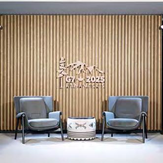
By Tory Healy
The role neutral interior design played in a historic meeting of the minds at the 2025 G7 Summit.
Photography by Lisa Stinner-Kun
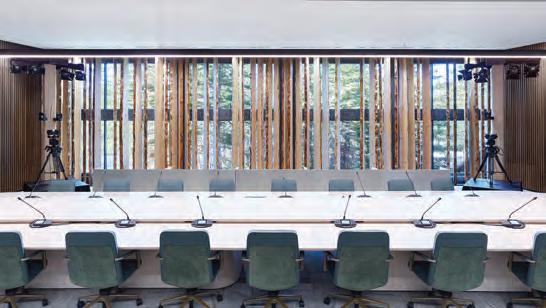
This spread Set against the jagged drama of the Kananaskis Range, the Summit’s Outreach Room became a sculptural extension of the landscape. Spruce timbers were positioned before a sheer curtain wall, drawing the wilderness inside while underscoring Canada’s forestry legacy. The vertical rhythm echoed the surrounding peaks, a gesture both architectural and environmental. Sustainability, raw materiality, and symbolic permanence converged, as wood, stone, and light framed an atmosphere designed to spark dialogue.
On June 17, Prime Minister Mark Carney concluded the 2025 G7 Summit with the statement, “In Kananaskis, Canada’s Presidency showed that we’re ready to create new international partnerships, deepen alliances, and lead member nations into a new era of global cooperation. Canada,” Carney said, “has the resources the world wants and the values to which others aspire. Canada is meeting this moment with purpose and strength.” A bow-tying comment to a heavily scrutinized three-day affair. After all, it was then and continues to be a tumultuous time, with an international tariff war and even sovereignty at stake. Carney, raised in Alberta and a former Governor of the Bank of Canada, might have taken a golden rule from journalism—“show don’t tell”—before delivering those lines. For what he and the Summit
venue designers presented was stealth wealth and a calm resolve to correct course, with the value of this nation’s grit visible in the metal, wood, and stone details, not the neutral façade.
Like most G7 Summits, an annual affair dating back to 1976, the participating global leaders and their entourages arrived at the site via helicopter and motorcade. Hosted by the Pomeroy Kananaskis Mountain Lodge, about an hour’s drive from Banff National Park in sleepy Kananaskis, Alberta, the property is remote but not unknown. Built in 1986, Pomeroy housed 1988 Calgary Winter Olympic athletes and visitors and, in 2002, that year’s G8 summit. The resort features four large main buildings and, despite its size, promises intimate “fireside moments” against a Rocky Mountain backdrop.
As you would imagine, security was tight. It is reported that safeguarding infrastructure and staffing cost half a billion dollars. Planning likely began before it was announced during the 2024 G7 Summit held in Puglia, Italy, that Canada would host next. Updates to the venue though would not begin until much later when the client, Public Services and Procurement Canada (PSPC) on behalf of Global Affairs Canada, would engage designers to ready the Pomeroy’s conference centre.
An RFP was not issued. Instead, the Government enacted a directed procurement procedure, engaging one of four Prairie architecture firms that essentially alternate fulfilling ministry needs. 1x1 Architecture Inc. of Winnipeg was next in line and thus formally engaged as the Prime Consultant for the redesign of the aging conference centre.
1x1 was sent a Terms of Reference document to define the parameters of the project and expectations on deliverables. But it was not until principal and project architect Travis Cooke, along with 1x1 interior designers Ashley Jull and Erika Sammons, and architectural intern Evan Schellenberg, toured Pomeroy in October 2024 with the PSPC that the challenge was revealed. Once inside the 20,000-sq.-ft. conference centre, peeling wallpaper, broken mobile panels, poor acoustics, and cracked cement were identified. But not yet a decor theme. While trying to eke this out, a government official showed 1x1 precedent-setting photos of the recent G7 Summit in Italy held at a luxury resort surrounded by an olive grove, which perfectly matched the region’s emblem. Now the ask was clear: a politically and contextually on-brand wilderness retreat that spurred connectivity, from bringing
the outdoors in to crafting “Made-in-Canada” spaces for frank dialogue. The conference centre required work and, with only eight months to go, it was all hands on deck for the medium-sized firm.
Once pomp, cliché and potentially politically charged colour schemes were off the table, 1x1 did what it does best: sustainable, context-driven design reflecting a deep care for material sensitivity, heritage conservation and regional identity. And the client? PSPC was keen to help. Weekly group meetings often led by PSPC project manager, Kirsten Koch, kept communication between parties tight, an undisclosed budget honoured, and the renovation on track.
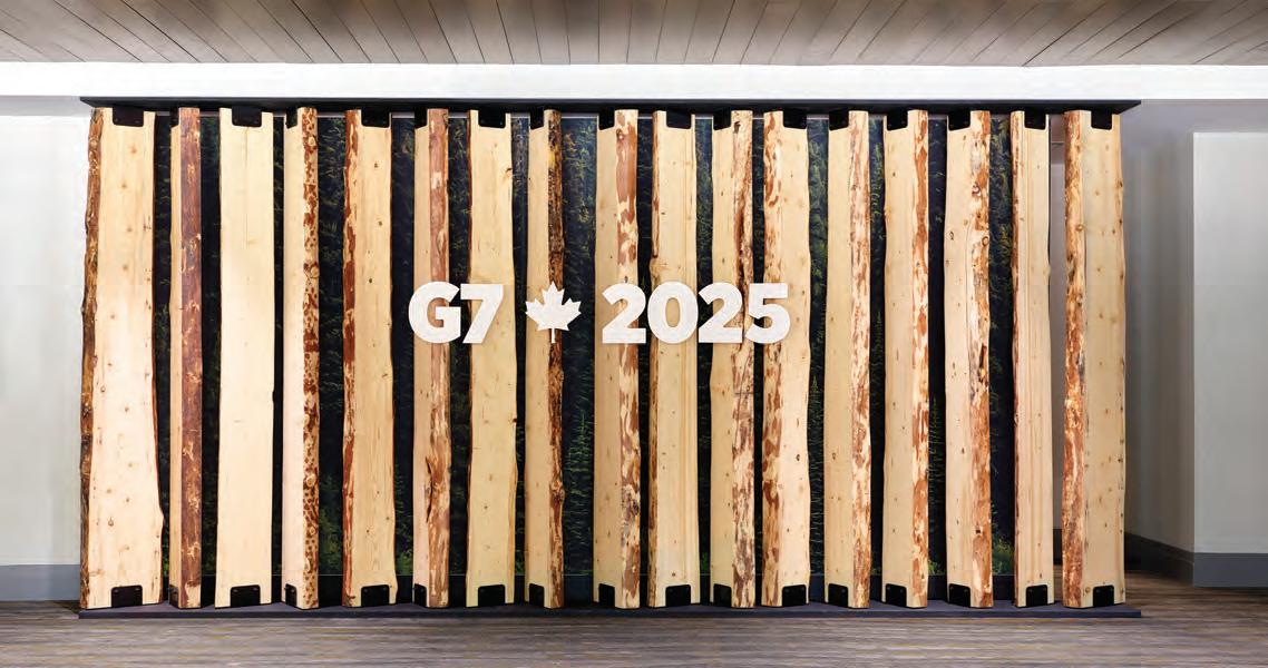
1x1 rejuvenated 13,500 of the total 20,000 square feet, optimizing the main and bilateral meeting rooms as well as the connecting corridors on the ground floor. At the entrance and along the sides of the conference building, single doors were doubled, allowing for efficient and discreet comings and goings. In the lobby, a photoop-worthy stand of 16-ft.-tall spruce planks felled by Parks Alberta during a firebreak was installed. The lobby then transitions into a public foyer, a 100-ft.-long path leading past the press room en route to the meeting rooms and grand Outreach Room (formerly the “Gold Ballroom,” an Olympic holdover). This corridor was treated to gallery-style placements of Canadian artwork, including paintings selected by Global Affairs Canada.
Here, visitors begin to see the Lodge’s refresh as well as clever procurement. A mighty 1,200-lb. table designed by Thom Fougere and carved from Tyndall stone that was quarried in Manitoba, subtly
saluted the limestone-clad Parliament Buildings three provinces away. Deeply striated, the stone adds dimension and intrigue to the corporate setting. Customized carpet, lighting, and furnishings were provided by large-scale Canadian manufacturers including Bensen and Nienkämper as well as independent makers, all signaling the nation’s fabrication capabilities, material resources, and abundance of talent. Inside the meeting rooms, one-on-one seating arrangements enabled “fireside chats” hushed by thick felt wall panels and grounded by artist Destiny Seymour’s drum stools.
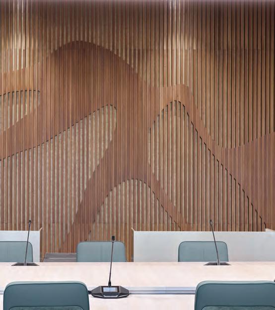
1x1 replaced the walls between the meeting rooms, Outreach Room, and the corridor. New steel-studded sliding drywall panels now enable spaces to expand and contract with ease. 1x1 used these to install custom millwork by Camantra featuring oversized etchings of the mountain-scape featured in the G7 logo. Subtle gold flecks throughout the millwork nod to the rooms’ former Olympic uses and provide further texture.
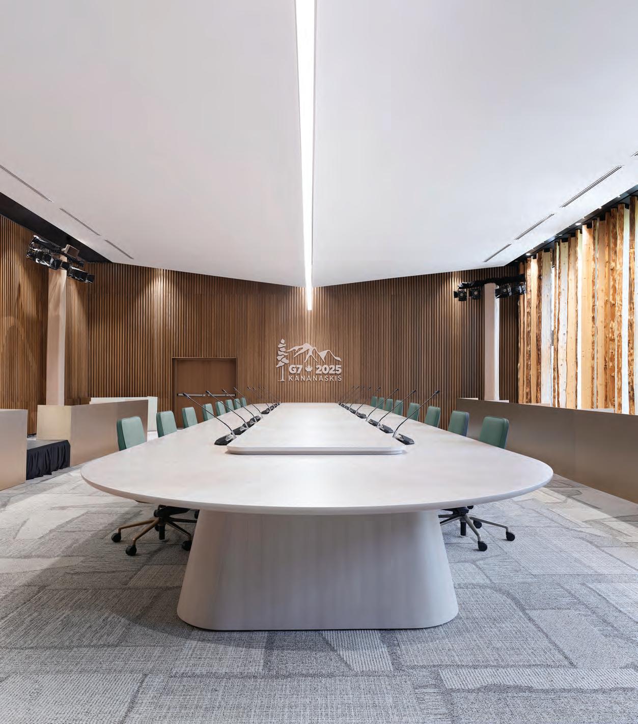
Another 42 spruce planks were employed in the Outreach Room, as a sunlight-filtering focal point against the curtain wall and hat tip to a primary Canadian export. This, the most-televised space, was where Carney met with the six other leaders and their guests of honour. In the centre of the room, a seamless 39-ft.-long oak table, custom-designed by Teknion, took pride of place, encircled by Keilhauer chairs and crowned by a dropped ceiling feature shaped like an inverted mountain peak. This was perhaps 1x1’s most powerful design intervention: a sophisticated reminder of the Summit’s surroundings and the need for pointed conversation.
This spread The interior scope of work included the renovation of a range of spaces including the main meeting room as well as bi-lateral meeting rooms and connecting corridors. Robust spruce, fir, and oak spoke of permanence, while Dolomitic limestone furniture anchored the space in Canada’s architectural DNA. Subtle metallic glints recalled Olympic triumphs from 1988. Every detail, from rough-sawn timber, layered finishes, and understated luxe, channeled national identity through material choices.
In the end, Global Affairs Canada shared, “We are proud of what we achieved with the 2025 G7 Summit, in a year where we faced many domestic and global challenges. We received positive comments from those who attended the Summit about the visual aspects, and the design elements helped us succeed in our goal of highlighting the best of Canada.” And if the “show, don’t tell” approach to making space for dialogue—grey yes, but detailed—fell short, Carney took to Facebook after the event to write, “Canada has what the world needs, and we need to get back into the business of exporting it to new markets. We’re building one united Canadian economy, and there’s more to come.” While this may not be articulated until France’s 2026 G7 Summit, we now know, as 1x1 can attest, our government is an ideal client and collaborator.
By Evan Pavka
Spurred in part by the current political climate, a renewed focus on Canadian travel has hospitality brands and designers alike looking to capture the ineffable qualities of life north of the 49th parallel.
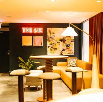
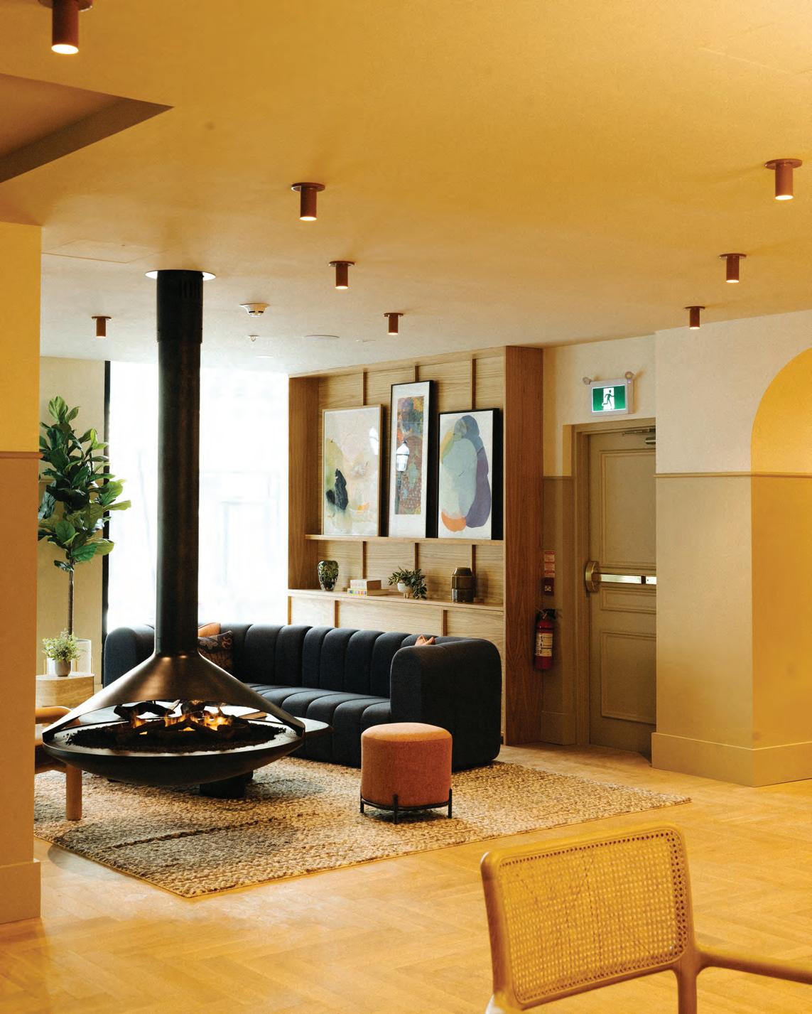
This spread FRANK Architecture & Interiors transformed the 12-storey charcoal brick tower of Toronto’s old Strathcona Hotel by layering nostalgia and eclectic detail through warm palettes, expansive windows, and murals by local artists. Bespoke objects from Canadian makers pepper the guest rooms and public spaces, including the Humble Donkey café, a communal lobby, and the “6ix” social floor. Every element, from uniforms to CanLit libraries, reinforces Union Hotel’s celebration of Toronto’s creativity and cultural fabric.
When the 47th president of the United States of America was inaugurated, few would have expected that such an intense spotlight would come to illuminate Canada rather than its southern neighbour. As threats of tariffs renewed a dormant sense of nationalism north of the 49th parallel, flows of U.S. travel slowed in favour of efforts to bolster regional and national tourism. A relatively weak Canadian dollar, comparatively, further turned the country into an attractive destination for international travellers seeking to strategically skirt any support of the American economy. Accordingly, recent reporting by The World Travel & Tourism Council (WTTC) notes travel and tourism in Canada is set to reach record-breaking levels this year. It’s a trend not going unnoticed by hospitality brands, directly implicating how designers are being tasked with imbuing their projects with an elusive and often intangible national character.
“The quality of hospitality is very high here,” explains Kristen Lien, principal of Calgary- and Banff-based FRANK Architecture & Interiors, on the further draw of Canadian destinations like Toronto.
The veteran practice—now synonymous with elevated food and beverage offerings in the Prairies—has been slowly increasing its presence in the Ontario capital, culminating in the new Union Hotel. Following a successful collaboration on the Westley Hotel in Calgary, the studio was approached again by the Silver Hotel Group to reimagine the former 189-room Strathcona Hotel in downtown Toronto as a novel boutique hub. While strategically located amidst office towers and local landmarks like Union Station, the 12-story building needed a significant overhaul to re-evaluate its offerings and re-articulate its connection to the city.
“We talked about the project as needing to be this place where different walks of life meet, and a sort of armature for culture,” says Lien. To wit, the designers looked to the history of the area, particularly the adjacent garment district, to craft the rebranded hyperlocal lifestyle property. What emerged was the “idea of the tapestry,” she adds, as a nod to both the site’s industrial heritage and the qualities of the city itself: an evolving network of cultures,
neighbourhoods, industries, practices and people woven together. “There’s something to be said about the authenticity of a concept,” she asserts, “and tying it back to a string of local context or the place that the property is grounded in.”
At Union, this authenticity manifested as both literal and figurative gestures extending from collaborations with local artists and makers to planning considerations that focused on bridging the interior with the streetscape. In the spartan rooms, layered materials ranging from geometric tiles to upholstery refer to the city’s rich history of textiles, while the limited footprint forced the designers to reconsider the expanded social role of the public amenities. Locating the concierge at the rear of the ground floor provided room to situate gathering spaces along the street. Open seating interspersed with private meeting zones and space for congregation across the lobby lounge further centre the hotel as a “launch pad” for guests. Alongside, operable windows create further visual and formal connections that intermingle travellers with passersby. The cumulative effect is akin to an urban living room anchored by a suspended fireplace.
“When people are travelling, especially for leisure, they’re coming to explore a place: the food, the natural environment or the cul-
ture,” she concludes. “We aimed to tie into the authenticity of that experience.” Within these spaces, Toronto-based artists were enlisted to create custom murals evoking distinct aspects of the city and its milieu, including a vibrant piece by Hello Kirsten (Kirsten McCrea) along the banquets in the Humble Donkey café and lounge that draws influence from nearby art deco architecture, railway lines and, fittingly, textile histories. These softened geometric forms are carried throughout, from low reliefs in the wood-clad bar to the arched niches beyond. With leading national producers and creators providing everything from coffee to toiletries to the books lining the ground-floor library, this emphasis on craft is quite literally woven through the entire project.
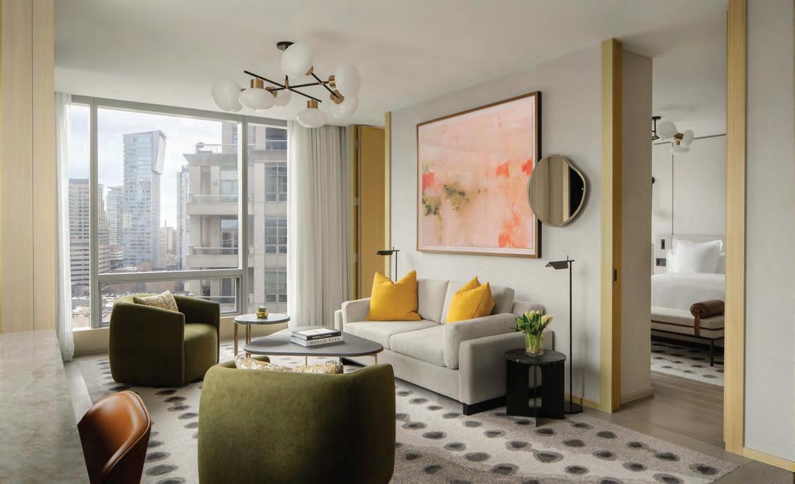
Only a few blocks north, local practice DesignAgency faced similar challenges in reworking 259 guest rooms and suites for the Toronto flagship of the Four Seasons Hotels and Resorts. The premier Canadian luxury brand looked to the practice to renew and refresh the decade-old accommodations. “The brand has a lot of history here, which made reimagining the guest rooms and suites for the flagship’s next chapter especially meaningful,” says founding partner Anwar Mekhayech, It also brought with it its own set of challenges in expressing the nuanced qualities of Canada’s largest metropolis while meeting the expectations of an international
By Peter Sobchak
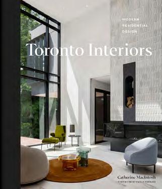
A glimpse into Toronto’s diverse, but far from exhaustive, residential talent showcases polished projects while hinting at the stories still untold.
A common refrain these days is “Toronto is having a design moment,” but it feels more accurate to say the city on the lake is having many design moments, not all of them good, and depending on how long you’ve been watching this city, some of those “moments” appear to be dragging on. However, behind closed doors and not necessarily visible from the city’s sidewalks there is certainly a robust moment of residential design happening, visible within the 264 pages of Toronto Interiors: Modern Residential Design.
Authored by veteran design editor Catherine MacIntosh, this visually rich hardcover takes a survey approach and singles out 30 design studios that are leaving a mark on the city’s residential identity. With over 90 projects photographed in full colour, it’s a glossy love letter to the city’s built environment, but one that also prompts questions about visibility and inclusion in such curated spotlights.
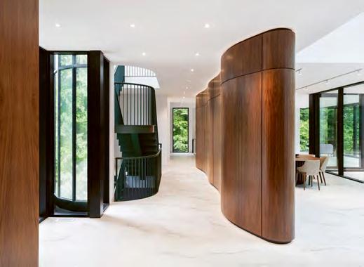
The book opens with a foreword by Paolo Ferrari, whose reflection on Toronto as a city “informed by its diversity” sets the tone for what follows: a collection of homes that span heritage restorations, urban infills, minimalist townhouses, and expressive material palettes, from Batay-Csorba’s barrel-vaulted High Park residence to Atelier Sun’s contemplative light-driven interiors, and many others that feel like the guest list for a “cool kids” party. In fairness, Mac-
Intosh brings an approachable, enthusiastic tone and her introduction is refreshingly candid about the challenge of narrowing down Toronto’s creative field, acknowledging that the featured firms represent only a fraction of the talent at work. The book, then, becomes a curated snapshot, not a definitive survey.
The book’s strongest moments are those that reveal the tension between Toronto’s architectural past and its evolving design consciousness. Many of the projects featured grapple with that legacy: rethinking narrow bay-and-gables, injecting light into wartime bungalows, or delicately intervening in Edwardian shells. Here, staircases become sculptural statements, vintage elements are reframed, and millwork does the heavy lifting of modern life.
Stylistically, Toronto Interiors highlights the city’s design dialect, one that privileges quality materials, thoughtful spatial transitions, and emotional resonance over flash. The influence of Scandinavian restraint, Japanese spatial logic, and European detailing threads its way through many of the projects, forming a design vernacular that feels uniquely Torontonian in its “borrow from everywhere” hybridization.
Still, the editorial decision to spotlight only 30 firms—however diverse in approach and experience—inevitably omits many voices. In a city lauded for its cultural multiplicity and creative depth, any list becomes a limitation. One wonders what alternative stories might emerge from designers working outside the high-visibility, high-budget sphere. That said, the book doesn’t pretend to be comprehensive and would probably prefer to be seen as a starting point for a larger, ongoing conversation.
Ultimately, Toronto Interiors is a beautifully produced addition to the design bookshelf. It captures a city in aesthetic flux, stepping confidently into a more expressive and individualized era. For interior designers, architects, and design enthusiasts, it’s part inspiration and part documentation. Just don’t mistake it for the whole picture.

By Lucy Mazzucco
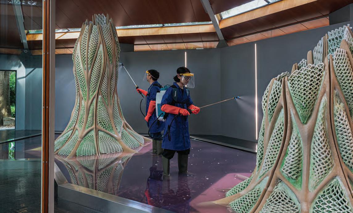
Titled Picoplanktonics, the exhibition is a global first at the intersection of architecture, biotechnology and art, showcasing the potential for collaboration between humans and nature.
“For Picoplanktonics, we have created some of the largest living structures on this platform to date combining sand, a biocompatible glue, and a marine cyanobacteria that is capable of dual carbon sequestration. These structures pull down carbon dioxide from the atmosphere and convert it into biomass and minerals,” says Andrea Shin Ling, a Canadian architect, bio-designer and lead for the Living Room Collective, alongside core team members Nicholas Hoban, Vincent Hui, and Clayton Lee. “This research is still in its early phase, so the entire exhibition is an ongoing experiment,” adds Ling.
The installation transforms the Canada Pavilion into an aquatic micro-ecosystem where architectural structures grow, evolve, and naturally degrade alongside their living components. “In the middle of the Pavilion are two trees that have been encased in glass; a clear visual indicator of the architecture trying to dominate nature,” says Ling. “We’ve created these two trunk-like living structures that reference the trees; but for the exhibition, we’ve adapted the Canada Pavilion so that it can support the living structures, including a 3,000-litre pool filled with a synthetic
saltwater solution.” Caretakers will be onsite tending to the structures for the duration of the exhibition.
Commissioned by the Canada Council for the Arts through a juried competition, the exhibition is site-responsive and has been designed, according to Ling, through the “lens of control” which provides visitors with a unique experience that awakens the senses. “It begins with the living prints encased within incubation tanks in living structure form within the adapted Canada Pavilion and left outside to nature’s devices,” says Ling. “There’s also a sensorial experience to the exhibition, where the structures’ smell of the sea and the pool adds humidity to the space.” Since Picoplanktonics is ever-evolving, Ling says that what the exhibition looks like can change in a week or month’s time as some pieces get stronger and others fall apart. “The colour of the structures will also vary depending on how well the bacteria grows. The greener the colour, the more cyanobacteria are present,” she says.
“Being able to represent Canada is a privilege of a lifetime,” says Ling. “Climate change is an urgent issue and to be able to contribute to this global dialogue with architects and the wider general public, feels critical and productive.”


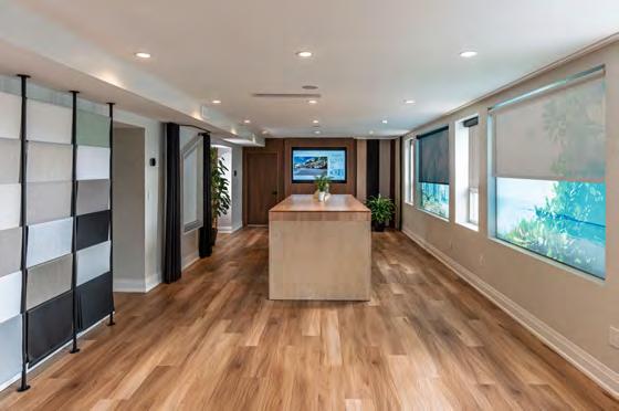
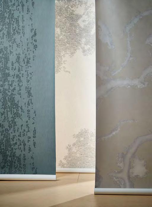
With its understated texture and timeless colour, this reconstituted wood look offers quiet sophistication for education.
Versatile. Durable. Livable.
Explore the 2025 Woodgrains and Patterns Collection