The Iona Way
Brand Book & Style Guide
July - 2023


The Iona Way
Brand Book & Style Guide
July - 2023
Welcome to Iona College.
This Iona College Brand Book has been prepared to assist College staff, and external shareholders and suppliers, to ensure consistency with, and adherence to, the College’s corporate style in all internal and external documentation, merchandise, materials and other collateral both physical and digital.
Iona’s visual identity reflects who we are and how we are perceived in the wider community, as well as the values and standards that we uphold in line with the College’s Vision and Mission.
This Brand Book will outline the correct usage of Iona College’s logos, colours, marks and fonts when preparing material in an official capacity. These usage guidelines must not be altered by anyone without prior permission from the Rector, Principal or Marketing & Communications Manager.
If you require further clarification on this Brand Book or any usage guidelines, contact the Iona College Communications Department at: communications@iona.qld.edu.au
Kia kaha, Michael Westlake Marketing & Communications Manager
Iona College is a Catholic school for boys conducted by the Missionary Oblates of Mary Immaculate, within the Archdiocese of Brisbane in Quandamooka country. All members of our community are Ionians.
Since 1958, Iona has served our region in partnership with families and the wider community to form young men of quality who make a positive difference to the lives of others.
With an Oblate sense of daring, Iona is known for its pursuit of excellence, strong sense of community, authentic faith, learning, service and aspiration.
We are guided always by the life of Jesus Christ, whose openness, inclusiveness and commitment to those in need inspires and challenges us every day, and by His servant Eugene de Mazenod – our Patron Saint and the Founder of the Oblate Order.
Our vision
To be the accessible and aspirational Catholic school for families, forming men who are authentic, grounded, respectful and connected to a community that, like Jesus, serves and inspires.
Our mission
Through God’s gift of the Oblate charism, Iona College will continue to invest in our community to form young men who are inspired to grow into their potential to live, learn, lead and serve.
The Iona College Crest represents the foundations of faith, strength and community that our school is built on, and the Catholic values and standards Ionians are expected to uphold.
The Crest is in the shape of a shield, and within it is an arm holding a cross. Beneath is the Latin phrase “In Hoc Signo Vinces”, which translates to “In This Sign You Will Conquer”.
“In Hoc Signo Vinces” were the words that changed Christianity forever.
In 312AD, the Roman Emperor Constantine the Great was leading his troops into the famous Battle of Milvian Bridge in the great civil war for control of Rome. When he looked at the afternoon sun, he saw above it a lighted cross, and the words “In Hoc Signo Vinces”.
Not being a Christian, Constantine did not know what the vision meant. But that night he was visited in a dream by Jesus, who told Constantine to put the cross on the shields of his solders before battle so “in this sign you will conquer”.
Constantine woke the next morning as a true believer. He put the cross on the shields as Jesus had told him, won the battle, and took his position as Master of Rome.
Before that time, Christians were persecuted and killed in Rome – most famously at the Colosseum where Christians were thrown to lions as entertainment for the masses.
One year later, Constantine issued the Edict of Milan, which granted Christians the freedom to practise their faith, and recognised them as legal citizens of Rome for the first time.
Under his reign, Christianity spread throughout the empire, eventually becoming the official religion of the Roman Empire.
The Iona Crest is based on the family crest of Fr Patrick O’Donnell, who was Archbishop of Brisbane in the early years of the College’s life - both as a tribute to him, and to ensure the Archdiocese would look favourably on the new school, and give it the time it needed to establish itself, survive and thrive.
A range of Crests exist for maximum contrast and to ensure there is a Crest for every occasion. Variations include stacked, horizontal, stacked minimal, shield with motto, and shield only.
A “mark” is typically an essential part of a brand that can be used in a range of contexts, but is particularly useful where a full logo is either too big or small to be effective.
Iona College’s mark is its bound cross.
This cross was part of the family crest of Fr Patrick O’Donnell, the former Archbishop of Brisbane, and is an intrinsic part of our history.
The cross is not just a representation of our faith.
It symbolises the resilience, determination and judicious, shrewd thinking of our Founders, who adopted the Archbishop’s crest as an ace up their sleeve to convince a wavering Fr O’Donnell to persist with the Iona College concept.
It is a symbol of spirit, as much as spirituality.
Iona has a secondary ‘professional’ logo which still encapsulates the essence of Iona, while providing more flexibility in design – particularly at scale.
This is known as the Iona Oblate Logo, with the full version focused on the Cross from the College Crest, but with the motto replaced by formal acknowledgement of our religious order and Founders – the Oblates of Mary Immaculate.
The stacked, vertical design with the words bordered by dividers created by the Iona Line evokes imagery of the Iona College Chapel, which is the spiritual heart of our community.
This is the primary version of this logo. However, similar to the Crest, the Iona Oblate Logo is available in different variations to suit design and need.
The Iona Oblate Logo should only be used in a corporate or commercial environment, specifically for the Board, corporate communications, and regarding the Iona College Foundation.
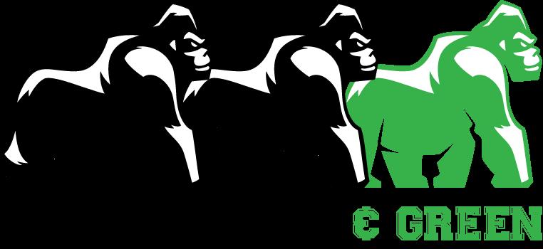
The gorilla was first adopted as an unofficial mascot for Iona College in 1992, when a very weathered gorilla suit (known as ‘The Beast’) was used as a de-facto cheerleader when the College competed in events in the then TAS (The Associated Schools) competition.
Over time, the gorilla became more widely accepted, and in recent times has been officially adopted as an Iona College logo and key part of our branding.
Initially used just for Iona’s sports teams, the Iona gorilla is now used across all areas of College life and is an immediately recognisable symbol of Iona across the wider community.
The gorilla is now used as the main brand for Iona for everything where the formality or commercial application of the Iona Crest is not required.
While the gorilla is the less formal of Iona’s two main marks, it still carries strong messaging in its deliberate design: Strength, resilience, confidence, humility – and always moving forward with eyes focused on what is ahead.
There are many different elements that go into life at Iona College, that support our community and contribute significantly to our culture, traditions and ‘The Iona Way’.
The Iona Parents & Friends Association is an obvious example, providing a terrific support network for all aspects of College life, especially new families who are just beginning their journeys as Ionians.
To help formalise the role of the P&F, a new logo has been designed incorporating the Iona Crest, and the Cormorant typeface.
The new P&F logo has been designed with a circle device, signifying the embracing role the P&F provides to the school and our community.
This circle device will now be used as the base for any other elements of the College requiring more formal branding and a sense of ownership among its members through a custom logo.
The example shown here is for the Iona Primary Golf Academy, which begain in 2023.
Another important part of our Iona culture is the Iona Old Boys Association.
The circle device has again been incorporated to reflect the embracing and nurturing role the Old Boys play to the next generation of Ionians, but with the Cormorant font replaced with the Varsity sport font, to reflect the more social aspect of the Old Boys.
In 2023, a new element to the Old Boys network was created with the introduction of ‘The Silverbacks’an exclusive membership group created to honour our Old Boys who have reached 50 years since graduation.
In nature, the silverback is the mature male that is the leader of a gorilla troop, responsible for protecting and nurturing the younger members, and teaching the next generation of their responsibilities so they may one day lead.
It is a fitting analogy for our most senior Old Boys, and reflective of the role they play in Iona’s culture and tradition.
Versions
Only standard logos may be used, and should be selected based on best fit for context, intended audience, and layout.
Colour
Logos should only ever be used in white, black, paper, or ink—and selected based on which background colour will provide sufficient colour contrast.
Background
Logos must always be on a solid background.
Changes
Do not transform, tweak, recolour, obscure, or in any other way alter logos.
Size
Ensure logos ares large enough to be seen. Typically this is no smaller than 20mm or 50px at its narrowest dimension.
Margin
By default, a minimum margin of “5% of a logo’s width” should be given to all logos.
Over the years, the Gorilla has taken on a life of its own and has found himself in all sorts of situationsfrom drinking coffee to championing green initiatives.
The Brand Book is clear about not altering any of the Iona logos. But the Gorilla is the more casual of our marks, so a certain creativity and artistic licence can be used to give an Iona look and feel to various situations by altering the Gorilla.
In general, if changes to the Gorilla are made, they still must feel part of Iona’s look and feel — employing consistent ideas of space and colour.
However, a certain amount of artistic licence is allowed, as per the following examples. But any alterations must be approved and created by the Communicatons department.


To introduce a more modern, classical and professional feel, the following fonts will become Iona’s standards: Cormorant
• Serif font. Crisp, consistent, and timeless.
• Used for headings and major text.
DM Sans
• Sans-serif font. Clean lines and clear, rounded letters.
• Used for paragraph text and long-form content.
Both are Google Fonts, so are free and open-source, and can also be hosted directly by Google for web projects.
Aside from its pleasing aesthetics, ‘Cormorant’ is an apt choice. In nature, the cormorant is the black seabird that is known to assist fishermen to find a catch.
There are wonderful synergies with Iona - black being our colour; the seabird talking to our bayside location at Lindum; and Ionians being challenged to follow the words of Jesus to become ‘fishers of men’ (Matthew 4:19).
Sports font
Cormorant
DM Sans VARSITY ABCDEFGHIJKLMONPQRSTUVWXYZ abcdefghijklmnopqrstuvwxyz 0123456789
ABCDEFGHIJKLMONPQRSTUVWXYZ abcdefghijklmnopqrstuvwxyz 0123456789 ABCDEFGHIJKLMONPQRSTUVWXYZ 0123456789
Title
Cormorant bold
5–6x font size
0.8x line height
Heading 4
DM Sans bold 1.2x size 1.2x line height
Uppercase >55% opacity
LOREM IPSUM DOLOR
Heading 1
Cormorant bold
3–4x font size
0.8x line height
Heading 2
Cormorant bold
2.5x font size
0.8x line height
Caption
DM Sans bold 1x size
1.2x line height
LOREM IPSUM DOLOR SIT AMET, CONSECTETUR ADIPISCING ELIT.
Paragraph
DM Sans regular 1x size 1.5x line height
Lorem ipsum dolor sit amet, consectetur adipiscing elit, sed do eiusmod tempor incididunt ut labore.
Heading 3
DM Sans bold
1.2x size
1.2x line height
Uppercase
LOREM IPSUM
List
DM Sans regular 1x size 1.2x line height
Lorem ipsum dolor sit amet, consectetur adipiscing elit, sed do eiusmod tempor incididunt ut labore.
Text should generally be left aligned. Exceptions may exist for specific artistic effect, captions of images, etc.
The following palette section contains an outline of colour and colour usage. However, long-form text should almost always be white, black, paper, or ink.
Varsity should only ever be used within sporting contexts and follow heading and title recommendations. Varsity must always be used in all caps to ensure proper display.
DM Sans should still be used for all long-form sporting documentation text. Varsity is for headings only.
Iona’s brand has been famously black and white since Archbishop James Duhig declared it so in 1957 — and this will never change.
The updated brand guidelines, however, do bring extended nuance — allowing Iona’s communications to be more adaptable to different situations and contexts.
At its core, Iona’s brand is built upon stark white and black. Those in Iona who have only passing interactions with branding (e.g. teachers, administration) are encouraged to keep to the binary for all documentation, policies, etc.
The challenge, however, is that black and white can (at times) feel sterile. Therefore, this Brand Book includes a variant monochrome spectrum from “Paper” to “Ink”.
This monochrome spectrum contains slightly more red and slightly less blue to create warmer shades of grey.
The logos to the right demonstrate the subtle, but meaningful shift.
There may be times where more emotion, context, attention, variety, or feeling needs to be conveyed in a way that monochrome may struggle to achieve. Or, there are times when greater levity is needed — such as newsletters.
The extended palette of colours is drawn from Iona’s 10 existing Houses. Any shade or tint of these colours may be used to create their own monochromatic palettes.
Lorem ipsum dolor sit amet, consectetur adipiscing elit, sed do eiusmod tempor incididunt ut labore et dolore magna aliqua. Lectus quam id leo in vitae turpis. Integer feugiat scelerisque varius morbi enim. Nascetur ridiculus mus mauris vitae ultricies.
Ut venenatis tellus in metus vulputate eu scelerisque felis imperdiet. Amet consectetur adipiscing elit pellentesque.
Amet mattis vulputate enim nulla aliquet porttitor. Turpis massa sed elementum tempus egestas. Elit ullamcorper dignissim cras tincidunt lobortis feugiat
Lorem ipsum dolor sit amet, consectetur adipiscing elit, sed do eiusmod tempor incididunt ut labore et dolore magna aliqua. Lectus quam id leo in vitae turpis. Integer feugiat scelerisque varius morbi enim. Nascetur ridiculus mus mauris vitae ultricies.
Lectus quam id leo in vitae turpis. Integer feugiat scelerisque varius morbi enim.
Lorem ipsum dolor sit amet, consectetur adipiscing elit, sed do eiusmod tempor incididunt ut labore et dolore magna aliqua.
Bias monochrome
The monochrome palette should almost always be used in most contexts. The extended palette should be used only sparingly for particular effect, context, or hierarchy.
Icons and illustrations
The extended palette may be used extensively in icons and illustrations.
Mixing Colours
Core colours should never be mixed.
Colour contrast
Please see the accessibility section for more information on appropriate colour contrast.
Icons summarise information and concepts. They are a visual shortcut to help the viewer immediately understand context and surrounding content. They are consistent in style and should be simple, playful, and engaging.
Icons within this Brand Book are not exhaustive, rather should serve as inspiration for the creation of bespoke icons as needed.
Icons are inspired by Iona’s Oblate Cross — a solid shape surrounded by a thin line. Icons are used to help orient the reader to particular information, provide visual shortcuts, and offer visual interest.
The following page has a selection of starter icons.
Colour
Icons may be in any Iona colour appropriate to its context.
Size
Icons exist within a 500x500px bounding box with 50px padding.
Design
Icons must always include a combination of filled shape and offset stroke - the Iona Line.
At 500x500 proportions, the stroke of the line should be 10px thick and should sit 30px beyond the solid shape.
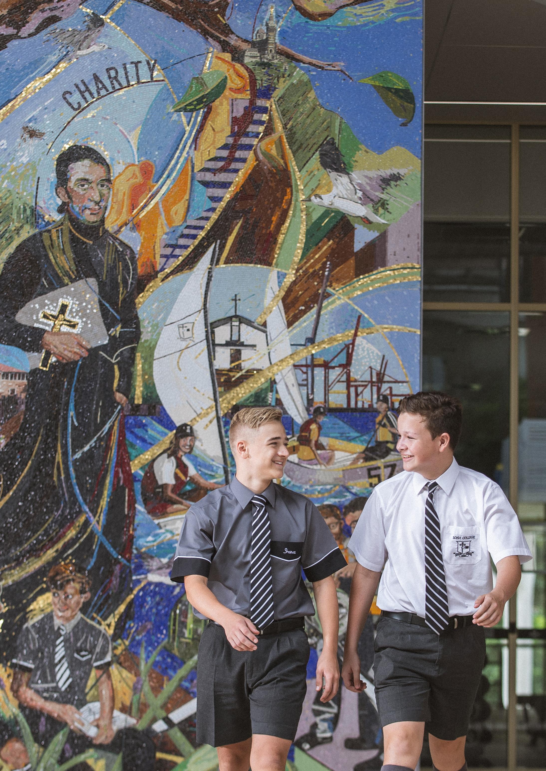
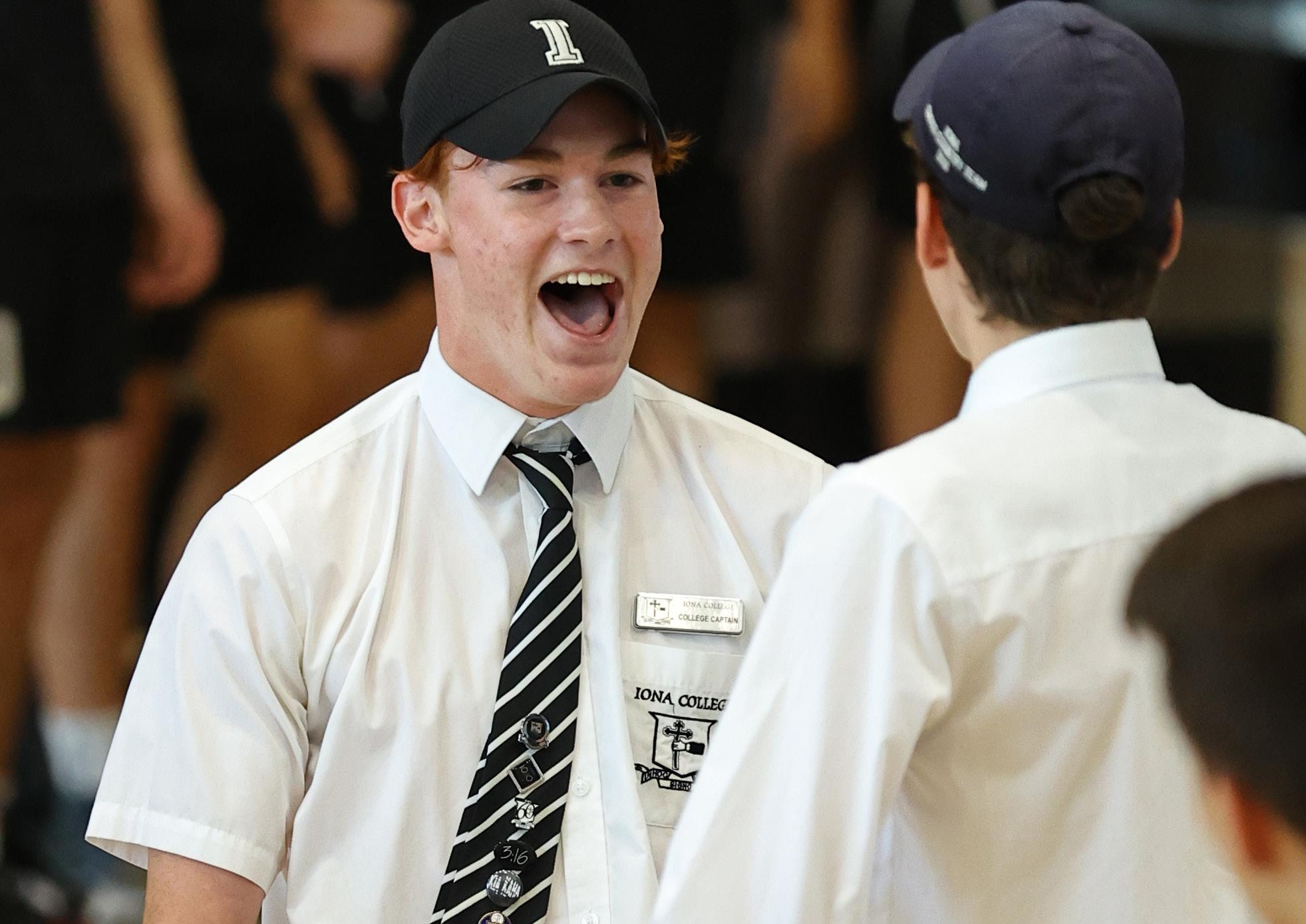
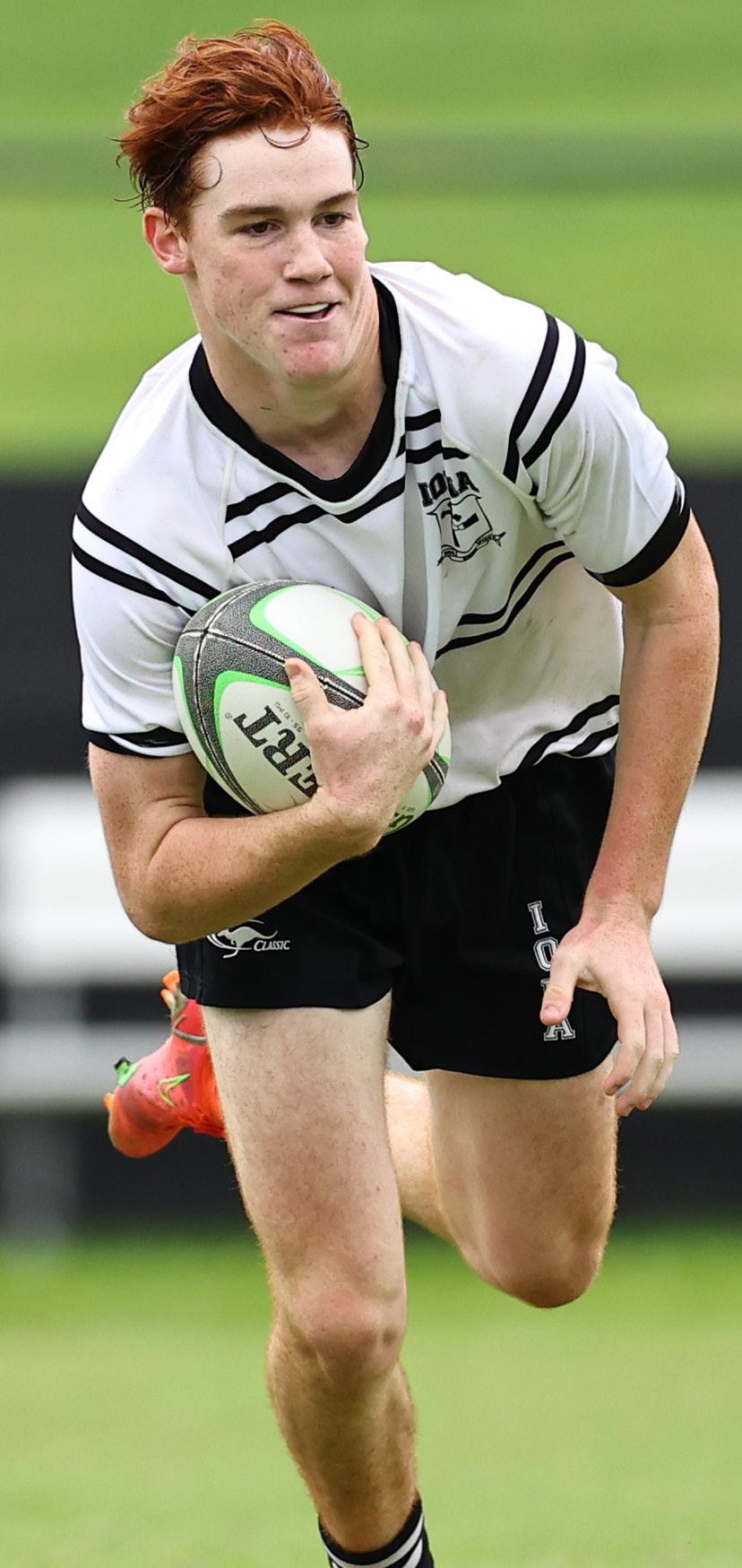
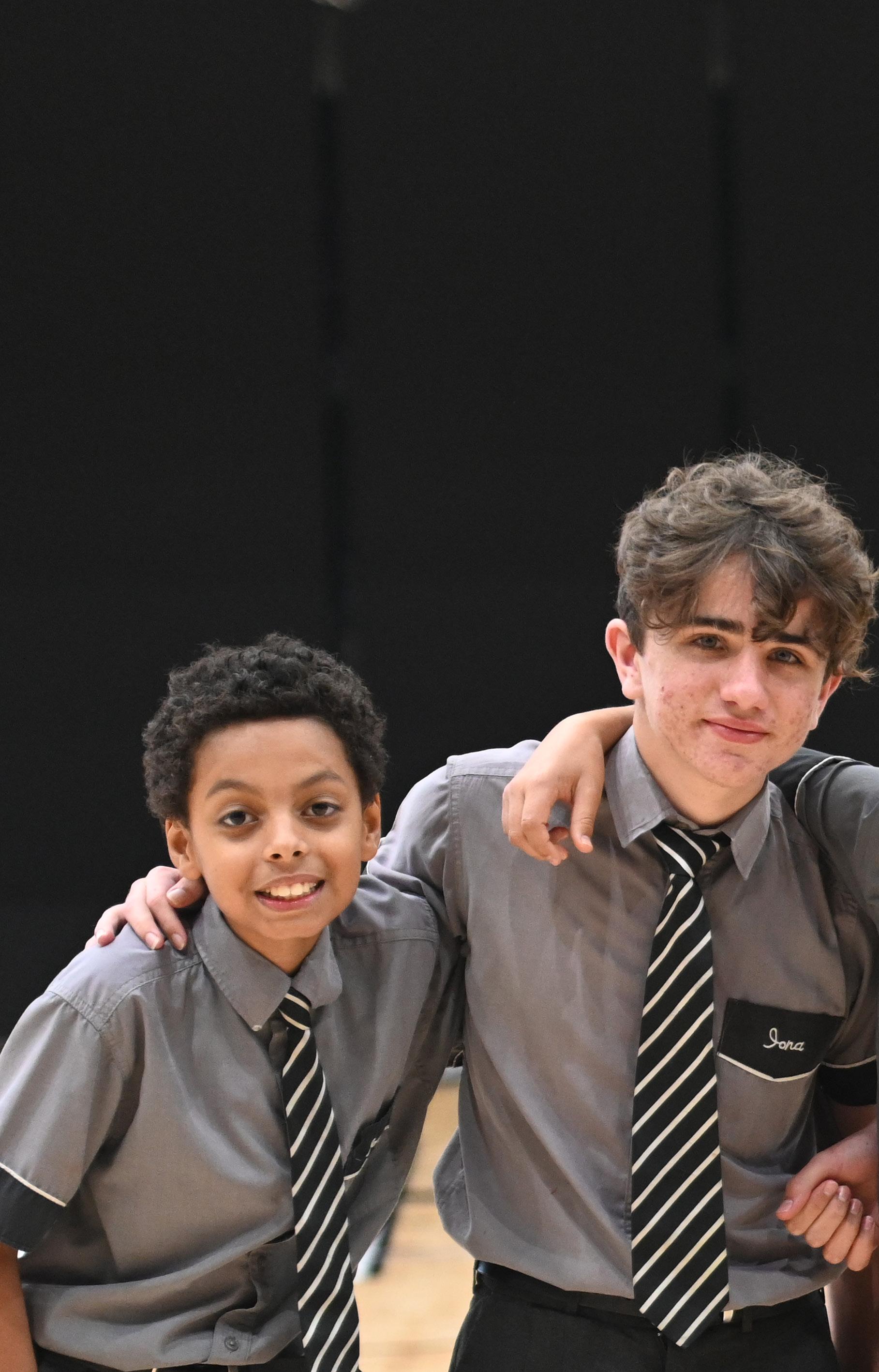
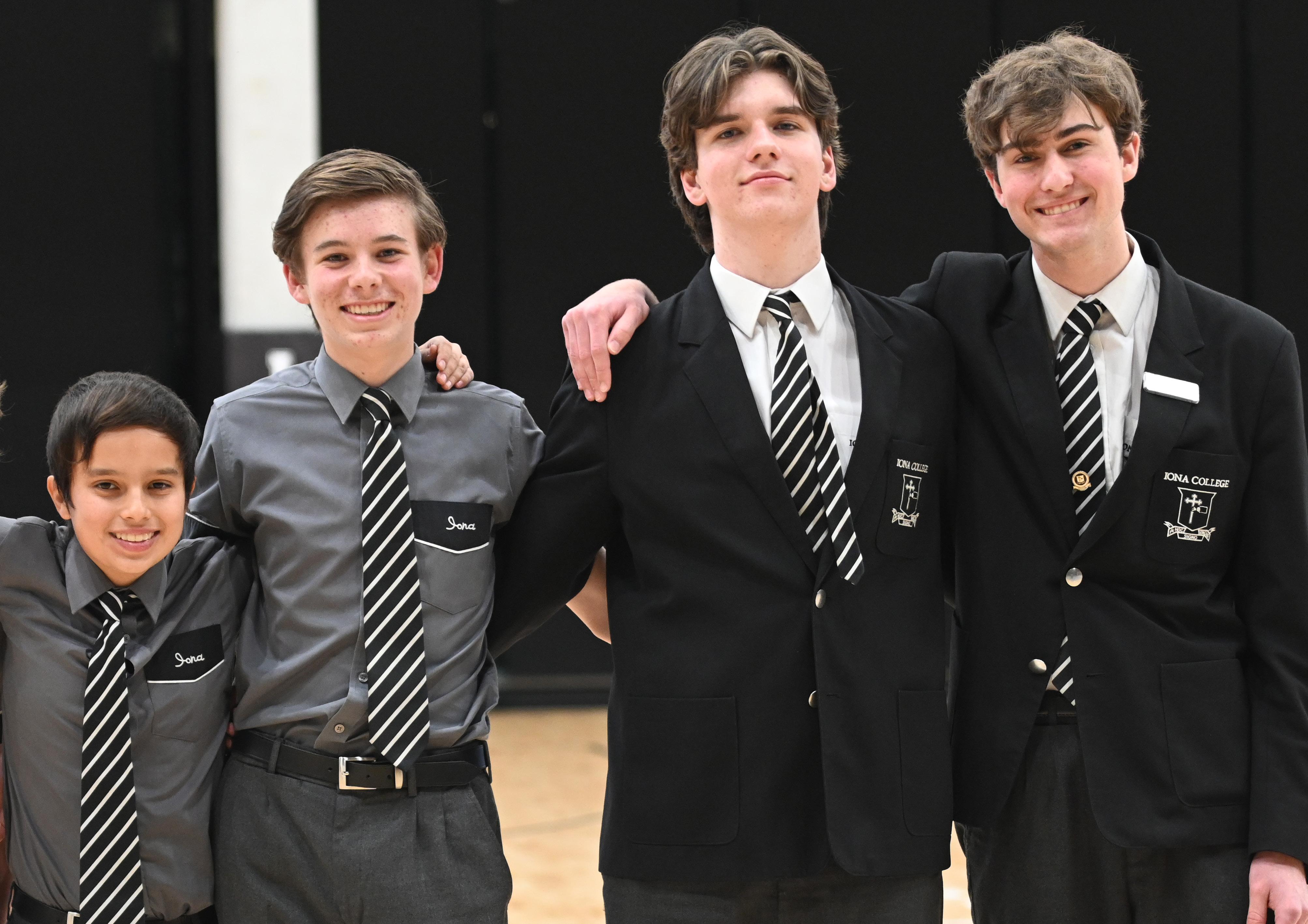
Iona’s monochromatic brand is stark. Therefore, immersive and engaging photography is heavily utilised to bring warmth, emotion, and depth to Iona’s visual universe.
Photography should be engaging, bespoke, and relevant to its context.
Illustrations are typically used to evoke a sense of emotion, tone, or context.
They exist in a space between icons and photographs where icons aren’t complex enough to adequately convey a feeling or message, and photography is too literal.
Size
Imagery should always be large and take pride of place.
Attribution
All imagery must be appropriately attributed if sourced externally.
Subject
Photography should have a bias to faces where possible and appropriate.
Authenticity
Avoid external stock photography. Where there are gaps in imagery, Illustrations may be used.
Colour
Photography should have a bias to full colour, as black-and-white images will not contrast with Iona’s colour scheme.
Illustrations should always use a single monochrome palette.
Illustrations should always consist of simple, 2D geometry.
Content
Illustrations may convey literal objects or abstract concepts.
Although illustrations will typically use filled shapes, the Iona Line may also be incorporated where appropriate.
Iona should always aim to ensure all content and media is accessible by everyone — taking into account visual, audio, sensory, physical, or psychological needs.
As a rule of thumb, Iona should aim to observe Web Content Accessibility Guideline (WCAG) standards. Although these guidelines are designed for digital environments, they are a useful guideline for physical materials, too.
All materials produced by (and for) Iona should meet WCAG’s AA colour contrast rating. This is a a contrast of at least 4.5:1 for all standard text and 3:1 for largescale text. Note: Decorative or artistic text that does not convey important data (e.g. Iona’s varsity ‘I’ logo) does not necessarily need to adhere to a AA rating.
The following is an illustrative example of colour contrasts within Iona’s monochromatic palette.
All video and audio should include captions and transcriptions (with appropriate colour contrast).
Flashing imagery
Flashing imagery should be kept to a minimum.
All imagery should include “alt text” or description (including all media posted to social media).
Appropriate content warnings should accompany any content that deals with potentially traumatic or emotionally triggering material.
Primary scrolling (e.g. website) should bias a single dimension.
Discreet divs such as carousels are an exception.
All design should be simple, consistent, and clear.
Further information
Please refer to WCAG for comprehensive standards and further information.
Physical assets might include, but are not limited to:
• Documentation
• Business cards
• Signage
• Branded paraphernalia
• Clothing / merchandise
When assessing whether a physical asset should be produced, the following questions should be asked:
What is the likely lifespan of the asset?
How long is the user likely to keep the asset?
If the answer to either question is less than 12 months, there is a strong case for not creating the asset or replicating it within a digital experience. The creation of waste is not only unsustainable, but is also an expense for the College.
Plastics and other non-recyclable materials should always be avoided where possible.
Where possible, assets should be sourced locally, made with local materials by ethical businesses. This helps our local economy, and reduces miles of goods travelled.
Supply chains for all physical assets must be free of anything that negatively impacts human rights, animals or the environment.
There should always be a bias towards simple, 2D geometry in all layouts.
White space helps create visual hierarchy, to focus the user’s attention, and to support understanding.
Time and care should always be taken to simplify, edit, and minimise content.
Say more by using fewer words.
Movement
In dynamic media (e.g. video), movement should help give life to Iona and convey the emotions and values of the College.
In general, a bias should exist towards:
• Subtle animation
• Micro interactions
• Dynamism, not flashy gimmicks
All of Iona’s crests, logos, marks and devices are trademarks with intellectual property rights that are registered and protected by law.
The College’s various trademarks represent Iona’s unique brand identity, and must never be used in any way that may cause confusion, dilution or harm to Iona’s reputation.
The express, written consent of Iona College Limited must be obtained by any party seeking to use Iona’s intellectual property for commercial or non-commercial purposes outside of the daily running of the school.
None of Iona’s crests, logos, marks or devices may be altered for use by another party.