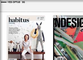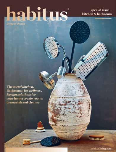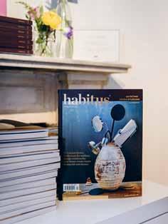
JULY – SEPTEMBER | 2015 AUD$16.95 | NZ$16.95 | USD$17.95 CDN$18.95 | GBP£9.90 | SGD$11.95 living in design # 28 Southern beauty: the other home of (and side to) Nick Tobias. De-coding The Smart Home. Buhrich House, a personal memoir.
A benchmark in office sustainability
For the award-winning 1 Bligh Street, we worked with Architectus in collaboration with Ingehoven architects and developer Grocon to specify bathroom fixtures and fittings. The reduced flow tapware and water saving toilet suites, together with the building’s innovative recycling technology, is saving approximately 100,000 litres of water per day, helping 1 Bligh Street meet its 6 Green Star rating.
Discover more solutions for your commercial projects at specify.caroma.com.au

1 Bligh Street Sydney NSW
6 Green Star rating
A unique space for professionals
Our new website is home to a range of resources for industry professionals, including the latest images, product information and tools to help you with your projects.

Industry case studies
Create your own specifications
Download BIM files easily

All the brands you’ve trusted in one location specify.caroma.com.au

classic
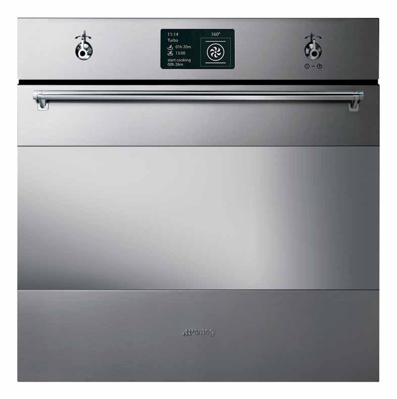
THE SMEG CLASSIC • WHILE FASHIONS MAY COME AND GO, STYLE REMAINS ETERNAL SMA14699

THE SMEG CLASSIC • WHILE FASHIONS MAY COME AND GO, STYLE REMAINS ETERNAL SMA14699
classic


smeg.com.au
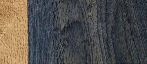
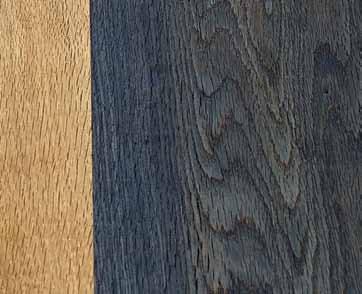
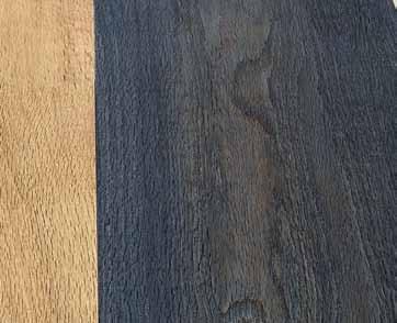
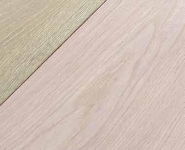
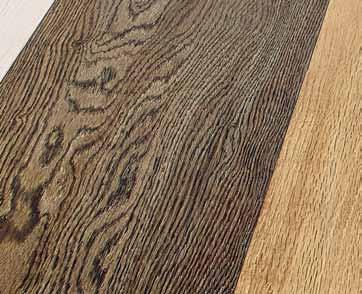
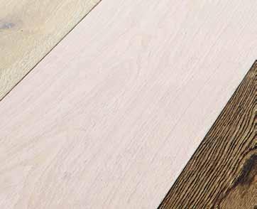
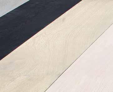
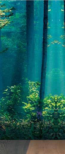
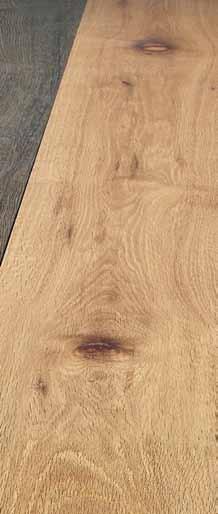
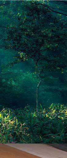
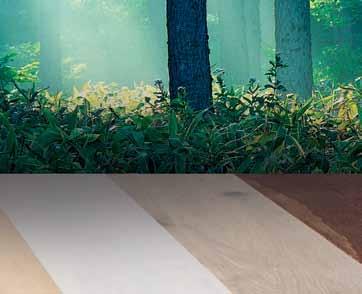
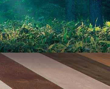
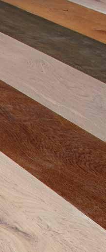
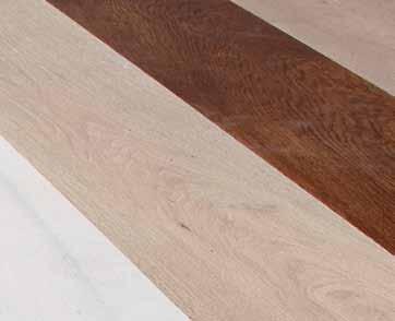
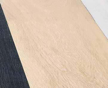
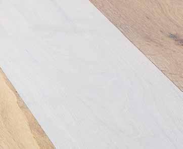
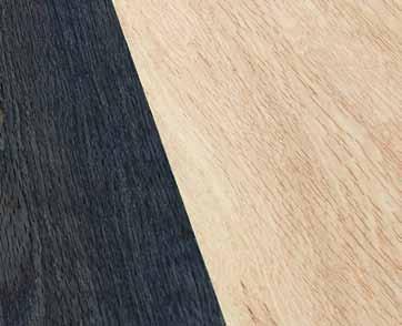
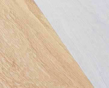
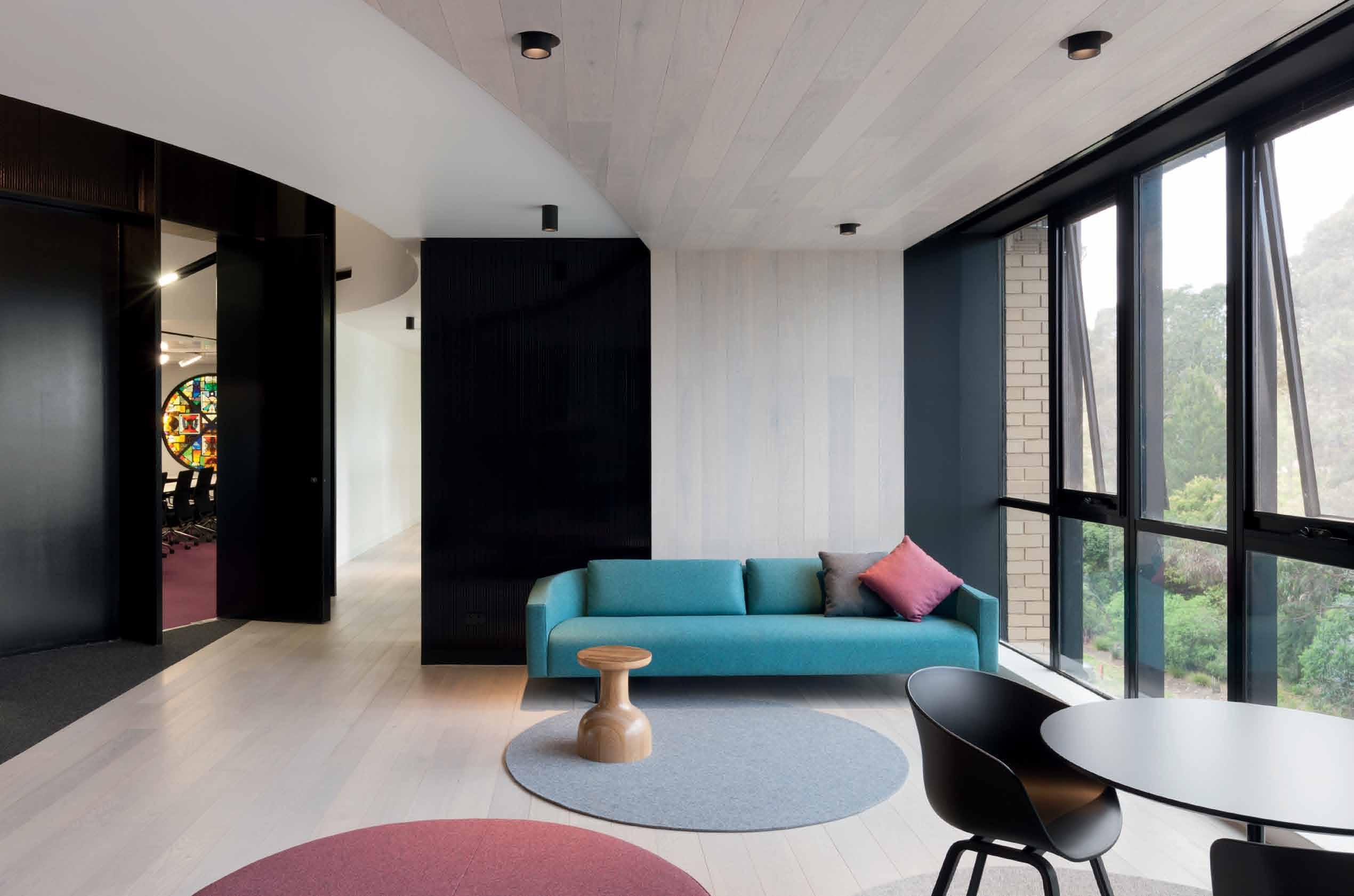
tongue n groove timber constructed of FSC European Oak treated with natural oils in 15 beautiful colours allowing for easy maintenance







Showrooms
Shop 2 188 Chalmers Street, Surry Hills NSW 2010
P 02 9699 1131 F 02 9690 0929



575 Church Street, Richmond VIC 3121
P 03 9427 7000 F 03 9427 0100
tonguengrooveflooring.com.au











Australia 1300 306 960 Singapore +65 6511 9328 www.stylecraft.com.au
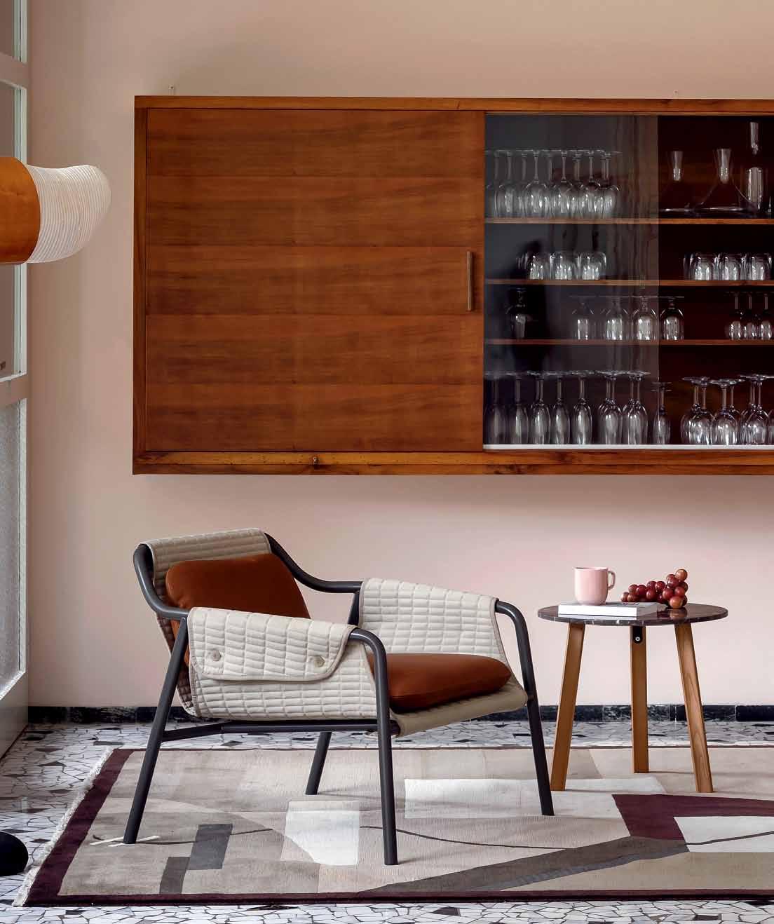
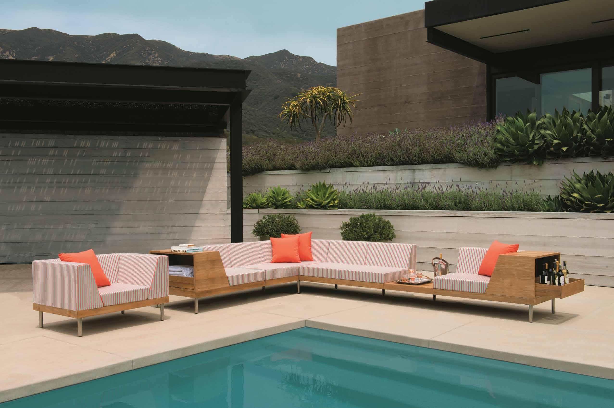
Featured | Jacket Lounge by Patrick Nourget & Ruler Side Table by Gordon Guillaumier
Things are just things unless there is a story and a meaning behind them. We take a deeper look at design products and ideas, to find their true value.
30. DESIGN NEWS
Discover products that prompt the imagination, provide a sense of luxury, surprise us with humour and stop us in our tracks with their pure simplicity.
38. BOOKS
High-tech, sensitive to environment and sensitive to social context. These are the qualities that make a home smart, according to three recent titles on the subject. Mandi Keighran tackles the issue of intelligence when it comes to architecture and design.
Confidence and commitment
to
originality and quality create a certain kind of human. These are the traits of a Design Hunter ® , whether in business or the arts.
44. NICK TOBIAS
75. ORCHARD PIPER
Nick Tobias and his wife Miranda advocate for constant expression of self, so that when it comes to crafting your home, you have cultivated the confidence to create something that is uniquely you.

59. ADELINE OOI
She brings a fresh perspective to the Hong Kong version of an established art fair. We find out how Adeline Ooi plans to use art to draw the Asia Pacific region together.
65. ALY AITKEN
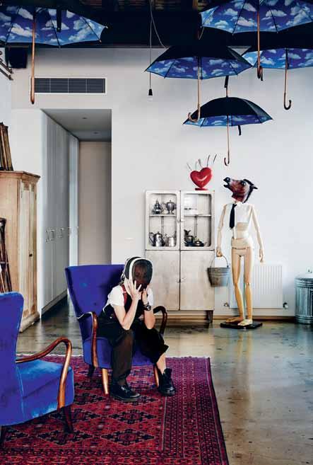
An ex-motorbike warehouse in inner Melbourne is an unlikely 5-storey backdrop for the dream-like home and art studio of Aly Aitken. Architect Peter McIntyre provided the spatial canvas and Aly did the rest.
They are small but have a powerfully attractive proposition when it comes to housing. We meet Orchard Piper, a boutique developer that is expanding the definition of value. #65
# 28
#30
The Smart Home
82. INTELLIGENT LIVING
Does technology make a home smart? Simple design strategies? Or a combination of both?
91. IN THE SHADOWS
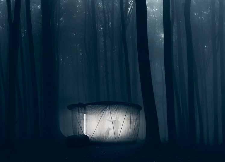
Light up a luminescent landscape in this character-filled photo shoot styled by Amanda Talbot.
101. DESIGN NEWS
Lighting, and products that are low-tech and hi-tech in nature – all can be considered as essential to the Smart Home.
108. SMART DESIGN
#82
A warehouse, a farmhouse, a ‘ blood moon’ house and more. It’s quite a mixed bag but we love the stories behind them all.
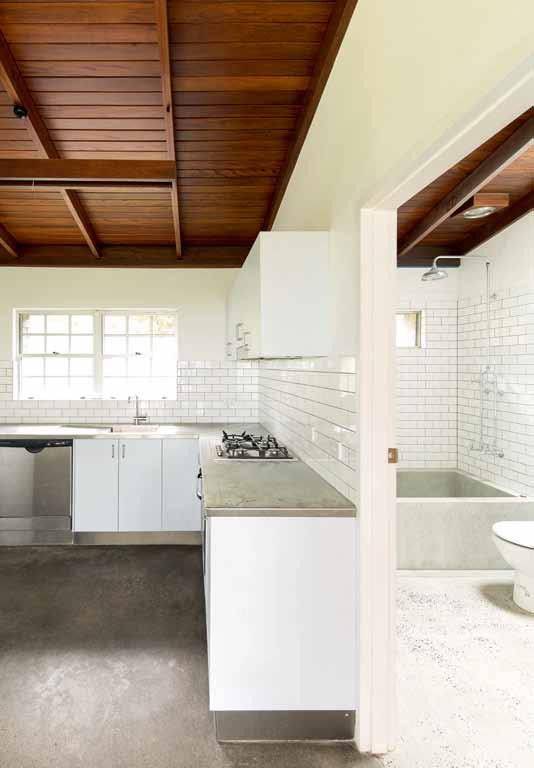
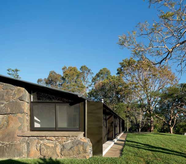
114. STONE & WOOD HOUSE
Marrying an Asian sensibility with a typical farmhouse structure could make a matrimonial mess, but Teeland Architecture has achieved a successful relationship in this home in Queensland.
125. INNER-CITY WAREHOUSE
A project that started as an invitation-only ideas competition has finished as a winning home by Architects AJC and The Gentry that truly fulfils the meaning of that ubiquitous word – unique.
141. 17BR-HOUSE
Conservation is key for Singapore shophouses and this one by ONG&ONG is no exception –featuring a characteristically showstopping sculptural staircase.
155. JANUS ET CIE
We become acquainted with a luxury outdoor furniture brand that – while founded 37 years ago – is new to us in the Asia Pacific.
162. LUNE DE SANG
The residents named the project after a blood moon and the rest of their tale is just as romantic and emotive. CHROFI are bringing a very special vision to life near Byron Bay on the NSW north coast.
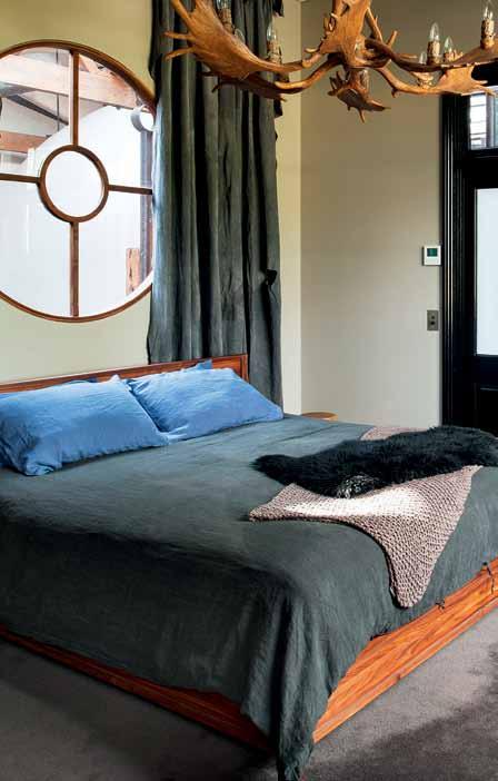
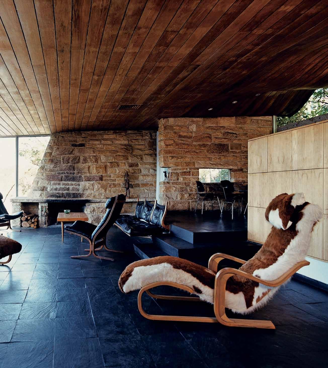
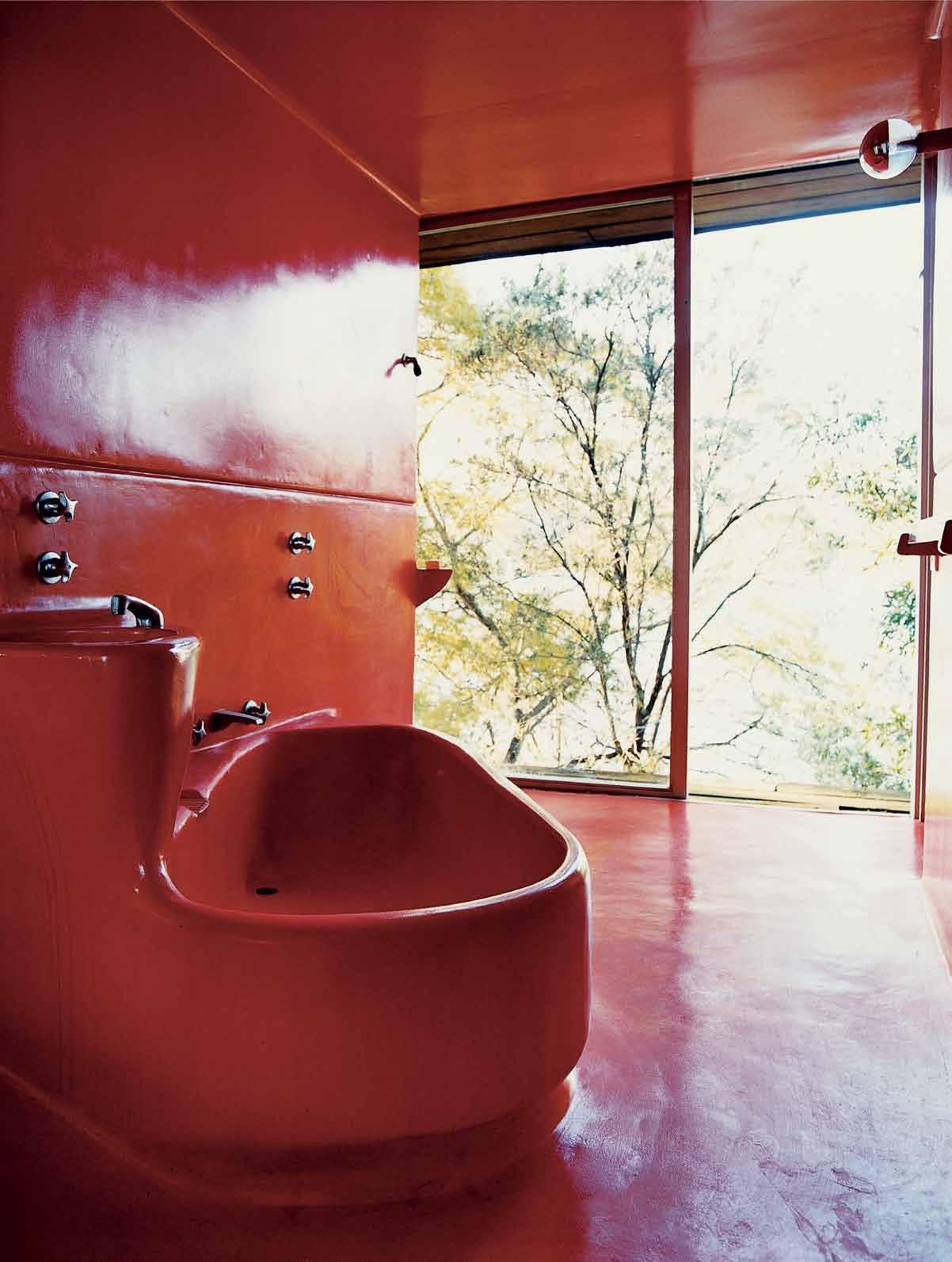
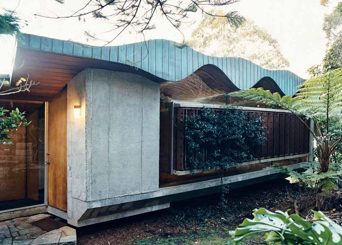
179. BUHRICH HOUSE
A personal take on a very public project. Hear Neil Buhrich ’s insights on the heritage-listed home in Sydney’s northern suburbs designed by his father, the late Hugh Buhrich –in which Neil now lives.
Sir James Dyson has seen huge development in Smart Design, from his student days to his position at the helm of his Dyson business. #125
# 28


BOILING | CHILLED | SPARKLING
IT’S WATER. REFRESHED.
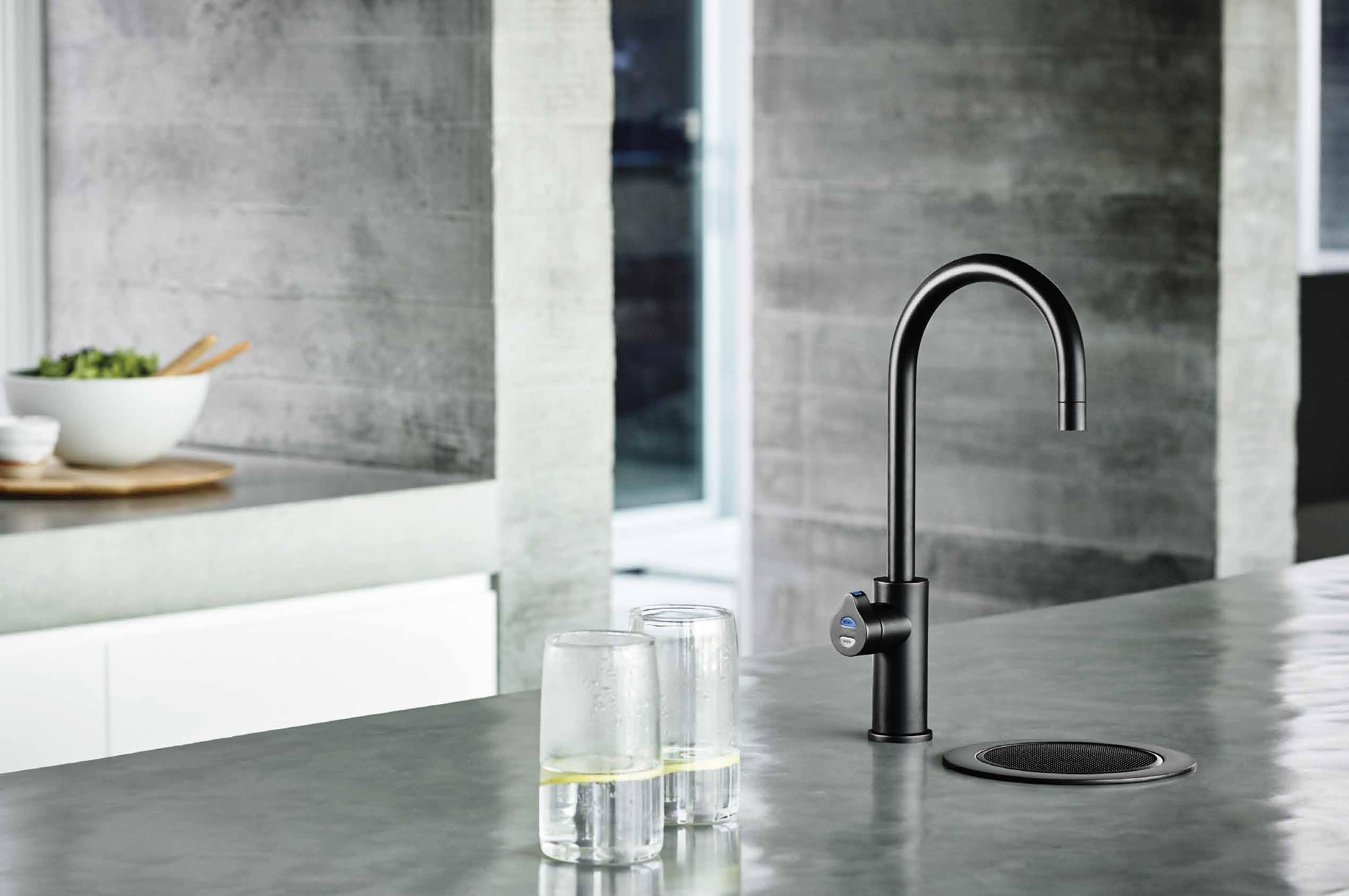

zipwater.com
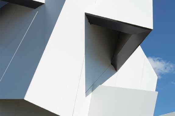
BEYOND THE WALL by DANIEL LIBESKIND





W R A TY YEAR
LARGE FORMAT INFINITE POSSIBILITIES
Thanks to the size (up to 3200 x 1440 mm) and the lightness of Dekton (from 8 mm thick), the design possibilities for your kitchen, bathroom, façade, walls or high transit floors are growing exponentially.


tsDEKTON ADVANTAGES



9 8 5
7 1 2
www.dekton.com
HIGHLY UV RESISTANT HIGHLY SCRATCHRESISTANT RESISTANT TO ABRASION
RESISTANCE TO FREEZING AND THAWING COLOUR STABILITY DIMENSIONAL STABILITY
RESISTANT TO STAINS MAXIMUM RESISTANCE TO FIRE AND HEAT SUPERIOR MECHANICAL RESISTANCE
LOW WATER ABSORPTION FIREPROOF MATERIAL HIGH RESISTANCE TO HYDROLYSIS
RESISTENCIA A LAS MANCHAS RESISTANT ALTAMENTE RESISTENTE AL RAYADO HIGHLY SCRATCH RESISTANT ESTABILIDAD AL COLOR ESTABILIDAD DIMENSIONAL DIMENSIONAL STABILITY RESISTENCIA AL HIELO Y DESHIELO RESISTANT TO ICE & THAWING ALTA RESISTENCIA A LOS RAYOS ULTRAVIOLETAS HIGH UV RESISTANCE ALTA RESISTENCIA MECÁNICA HIGH MECHANICAL RESISTANT ALTA RESISTENCIA A LA HIDROLISIS HIGH RESISTANT TO HYDROLYSIS MÁXIMA RESISTENCIA AL FUEGO Y AL CALOR HIGH RESISTANCE TO FIRE AND HEAT MATERIAL INCOMBUSTIBLE FIREPROOF MATERIAL RESISTENCIA A LAS MANCHAS RESISTANT TO STAINS ALTAMENTE RESISTENTE AL RAYADO HIGHLY SCRATCH RESISTANT ESTABILIDAD AL COLOR COLOR STABILITY ESTABILIDAD DIMENSIONAL DIMENSIONAL STABILITY RESISTENCIA AL HIELO Y DESHIELO RESISTANT TO ICE & THAWING ALTA RESISTENCIA A LOS RAYOS ULTRAVIOLETAS HIGH UV RESISTANCE ALTA RESISTENCIA MECÁNICA HIGH MECHANICAL RESISTANT ALTA RESISTENCIA A LA HIDROLISIS HIGH RESISTANT TO HYDROLYSIS MÁXIMA RESISTENCIA AL FUEGO Y AL CALOR HIGH RESISTANCE TO FIRE AND HEAT MATERIAL INCOMBUSTIBLE FIREPROOF MATERIAL
6 4 3
0
RESISTENCIA A LA ABRASIÓN RESISTANT TO ABRASION RESISTENCIA A LA ABRASIÓN RESISTANT TO ABRASION REDUCIDA ABSORCIÓN DE AGUA REDUCED WATER ABSORPTION

AD

the first word
NICKY LOBO | EDITOR

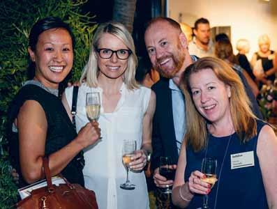
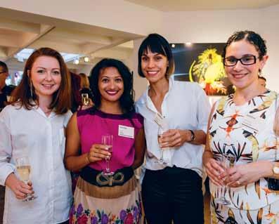
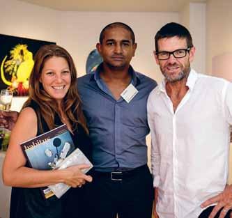
We celebrate our growing Design Hunter® community across all channels.
Unearthing the root meaning of the Latin term prompts a new understanding of the contemporary derivatives and reveals a complex interplay between them. ‘Integrity’ becomes a whole or complete way of being, an integration of internal values and external behaviours, which is exactly what the south coast home of architect Nick Tobias on page 44 demonstrates. And ‘integration’ deepens to become an act of making something whole again – or returning something to integrity – such as through the massive re-vegetation initiative in the Lune de Sang project on page 162.
Website | habitusliving.com
Facebook | habitusliving
Pinterest | habitusliving
Instagram | @habitusliving
Twitter | @habitusliving
HABITUS MONTHLY FIGURES
These two stories are also linked by some common features: they are both properties some distance away from cities or suburbs, motivated by the idea of family coming together, and take a long-term and holistic view of architecture and landscape. Simple, yet vast, themes in the proposition of how to live.
These examples, along with our creative personalities, residents, designers and architects involved in the featured stories, present an unwavering point of view, which finds physical expression through the spaces they create and live in.
Integration is also an important element of The Smart Home, our themed section for this issue starting on page 81. Whether talking about integrating technology, or integrating our daily rhythms and environmental rhythms (seasons) with our living spaces, connecting circles of understanding is a strategy for smart thinking.
As a side note, trees also figure prominently in this issue, particularly the planting and regeneration of native forests. Returning the land – and our way of living – to a simpler, symbiotic and more sustainable ethos is perhaps the smartest design decision of all.
Two particular words come to my mind when reading over this issue: integrity and integrate. I’ve not considered them side by side before, but they both come from the Latin integer, which means ‘untouched, unhurt, unchanged, sound, fresh, whole, entire, pure, honest’.
Total Engaged* Audience (per month) #110,000+ Total Reach** All Channels (per month) #1,000,000+
Join us on your favourite channel and engage with us.
Magazine readership*** #30,000+ Social media following #50,000+ Habitusliving.com Unique monthly visits #50,000+ Newsletter subscribers #20,000+ *Engagement refers to a person actively engaging with a piece of content at least once during a given period. **Reach refers to the total number of different people, at least once, exposed to a medium or piece of content during a given period. Publisher claim 3 readers every copy circulated. ***
journeys
Jiwen bA i 17BR-HOUSE #141
Jiwen Bai is a Singaporean architecture and interiors photographer, who first discovered a passion for photography five years ago. This hobby-turned-career is fuelled by Jiwen’s passion for design: “Even though everyone sticks to the same design fundamentals, creativity allows different results to be produced.” When not working, Jiwen enjoys playing video games, and looking for the perfect plate of hokkien noodles.

JA mes Dyson
SMART DESIGN #108
Sir James Dyson is a British inventor, industrial designer and founder of the Dyson company. He set up the James Dyson Foundation in 2002 to support design and engineering education, and to encourage students to think differently. The Foundation runs the James Dyson Award for product design, industrial design and engineering.

Peter firth
INTELLIGENT LIVING #82
Guy Allenby
LUNE DE SANG #162
Guy Allenby was child a when his family left Britain on a ship headed for the Antipodes. It was seeing his Darwin home torn apart by Cyclone Tracy, funnily enough, which set him on the path of being so fascinated with design. Now living in Sydney, Guy works as a writing and communications specialist and is the author of several books.


Geoff be Atty
INNER-CITY WAREHOUSE #125
Geoff Beatty has been a professional photographer for 34 years, a decade of which has been spent in photojournalism with major newspapers. When not shooting, Geoff can be found sculpting with brass, writing novels for children, and refining his pizza skills in a wood fired oven. As for challenges, Geoff says, “ the biggest challenge in a world awash with imagery is discretion and restraint”.

el
A nA CA stle
INNER-CITY WAREHOUSE #125
Multi-talented Elana Castle is an architect, photographer and writer based in Sydney. These three different pursuits comes together at a meeting point of common inspiration.
“I’m constantly inspired by the people I meet, especially those fearlessly pushing boundaries in the realm of design and technology,” she says. An incurable traveller, Elana particularly loves how good design helps craft meaning and memories in space.
Peter Firth represents The Future Laboratory ’ s views in saying: “ We love the way that finelyexecuted design can tell us stories about the society that we live in, and how visual design directions can create links that show that the zeitgeist is moving with a new tenor.” This UK trend forecasting and brand strategy consultancy took a new approach to the idea of a Smart Home for this issue. “ The clichéd ‘ home of the future ’ won’t just be about bleeping gadgets, but about sophisticated design doing what it should do – that is, finding the answer to complex problems in a simple way.”
JA mes Geer
ALY AITKEN #65

Melbourne’s James Geer begun his photography career in 1999 in New York. Initially crafting a niche in the fashion and lifestyle communities, James now works through commissions with distinguished publications, advertising agencies, entertainment and other companies worldwide. These days, his passion for design shines through. “I am all about scale and light, whenever either of these elements make my heart beat faster, I am a happy man”.
mA n Di KeiGhr A n
BOOK REVIEW #38
Mandi Keighran is a London-based writer and editor specialising in design, architecture, food and travel writing. Currently deputy editor of N by Norwegian , and a regular writer on major architecture and interior design projects, Mandi says that it’s writing that “helps to make sense of the world around me. I love the process of putting disparate ideas down on paper and weaving them together”.


habitus takes the conversation to our contributors, discovering their inspirations and design hunter™
Ameli A King
ORCHARD PIPER #75
Amelia King is a photographer and video maker from London, now based in Melbourne. With an architect father, “My photography work has somehow always had architectural design in the background,” Amelia says. For her, “the pictures become your words,” and each click is essentially starting a conversation.

K Atherine lu
NICK TOBIAS #44
“
My role as the photographer is to encourage the public ’s understanding of the benefits of good architecture and hopefully demand more from our built environment,” says Sydney-based Katherine Lu. She believes that, “ Good architecture has the ability to improve our quality of life. By designing thoughtful spaces we can significantly impact the mood, productivity and general wellbeing of its occupants ”.

AA rOn POCOCK
17BR-HOUSE #141
Aaron Pocock has been in the business of shooting architecture and design for over 12 years. Split between Singapore and Melbourne, Aaron is a frequent traveller throughout Asia on work assignments. Ever on the lookout for inspiration, Aaron enjoys seeing how designers respond to briefs in different cultures and environments, and revels in the challenges present in best interpreting these designs.
lynn tA n

17BR-HOUSE #141
Lynn Tan is trained as an architect and has also been a freelance contributor to publications in Singapore and abroad. Writing is an extension of her passion for architecture, interior design and cars. She considers the written language and built environment powerful forms of expressions. Delving into the design process gives her an adrenaline rush as strong as when she was behind the wheel of her 450bhp racing machine.
CorreCtionS:
In Habitus special issue #1–Kitchen & Bathroom, we incorrectly captioned the Apaiser product on page 38. Visit habitusliving.com to read the full feature of the Kelly Hoppen x Apaiser collection.

In the same issue, the Corian CASF Washplane bench top on page 47 was designed by Omvivo, not Corian CASF as noted. Our apologies to Omvivo.
In Habitus #27 we provided the incorrect contact details for AK47 Space Australia. The correct website is ak47space.com.au

Untitled-4 1 13/01/2015 9:51 am
EDITOR
Nicky Lobo nicky@indesign.com.au
ASSISTANT EDITOR –ONLINE
Tess Ritchie tess@indesign.com.au
ORIGINAL DESIGN TEMPLATE one8one7.com
CREATIVE DIRECTOR
Christopher Holt christopher@indesign.com.au
SENIOR DESIGNER
Michelle Byrnes
DESIGNERS
James McLaughlin james@indesign.com.au
Sophie Taylor s.taylor@indesign.com.au
MEDIA & PRODUCTION COORDINATOR
Tina Fluerty tina@indesign.com.au
CONTRIBUTING WRITERS
Guy Allenby, Elana Castle, Stephen Crafti, James Dyson, Peter Firth, Mandi Keighran, Andrew McDonald, Paul McGillick, Lynn Tan, The Copy Collective
CONTRIBUTING PHOTOGRAPHERS
Jiwen Bai, Brett Boardman, Castle & Beatty, Jared Fowler, James Geer, Amelia King, Katherine Lu, Aaron Pocock, Tim Robinson, Michael Wee
CONTRIBUTING STYLIST
Amanda Talbot
CONTRIBUTING ILLUSTRATOR Herds of Birds
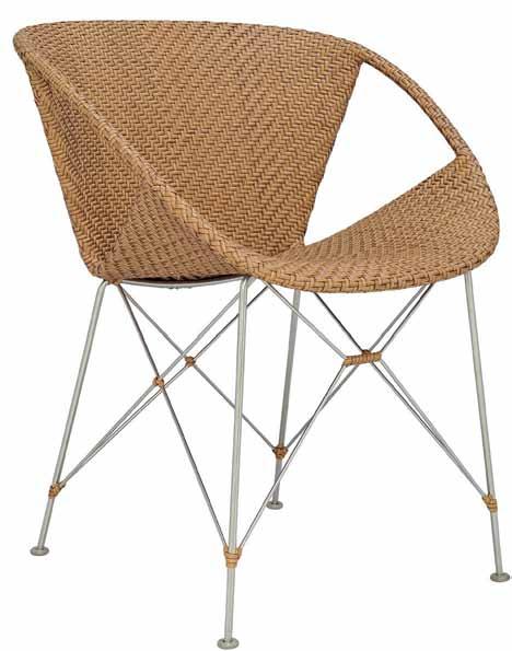
The SenSit is a sensory-stimulating chair that provides security, calm and increased levels of concentration among users.

The enveloping arms enclose your body, soothing the nervous system in a comforting and therapeutic fashion.
For more information visit www.activemobility.com.au
major
CEO / PUBLISHER
Raj Nandan raj@indesign.com.au
PA TO PUBLISHER
Elizabeth Davy-Hou liz@indesign.com.au
PRODUCTION MANAGER
Sophie Mead sophie@indesign.com.au
FINANCIAL DIRECTOR
Kavita Lala kavita@indesign.com.au
ACCOUNTS
Gabrielle Regan gabrielle@indesign.com.au
Vivia Felice vivia@indesign.com.au
ONLINE COMMUNICATIONS
Radu Enache radu@indesign.com.au
Ryan Sumners ryan@indesign.com.au
EVENTS & MARKETING
Tegan Schwarz tegan@indesign.com.au
Angela Boustred angie@indesign.com.au
Bonnie Eskdale bonnie@indesign.com.au
BUSINESS DEVELOPMENT MANAGER
Colleen Black colleen@indesign.com.au (61) 422 169 218
MEDIA COORDINATOR Marigold Banta marigold@indesign.com.au
COVER IMAGE
Nick Tobias (p.44)
Photography by Katherine Lu
HEAD OFFICE
Level 1, 50 Marshall Street, Surry Hills NSW 2010 (61 2) 9368 0150 | (61 2) 9368 0289 (fax)
MELBOURNE
Suite 11, Level 1, 95 Victoria Street, Fitzroy VIC 3065 | (61) 402 955 538
SINGAPORE
4 Leng Kee Road, #06–08 SIS Building, Singapore 159088 (65) 6475 5228 | (65) 6475 5238 (fax)
HONG KONG
Unit 12, 21st Floor, Wayson Commercial Building, 28 Connaught Road West, Sheung Wan, Hong Kong indesign.com.au
available through subscription,
throughout Australia, New Zealand, South-East Asia and the United States of America. This issue of Habitus magazine may contain offers or surveys which may require you to provide information about yourself. If you provide such information to us we may use the information to provide you with products or services we have. We may also provide this information to parties who provide the products or services on our behalf (such as fulfilment organisations). We do not sell your information to third parties under any circumstances, however, these parties may retain the information we provide for future activities of their own, including direct marketing. We may retain your information and use it to inform you of other promotions and publications from time to time. If you would like to know what information Indesign Media Asia Pacific holds about you please contact Nilesh Nandan (61 2) 9368 0150, (61 2) 9368 0289 (fax), info@indesign.com.au. Habitus magazine is published under licence by Indesign Media Asia Pacific. ISSN 1836-0556
issue #28 habitusliving.com
HAB28_HPV_ActiveMobility wSID.indd 1 6/05/2015 9:45 am Printed in Singapore. All rights reserved. No part of this publication may be reproduced, stored in a retrieval system, transmitted in any form or by any other means, electronic, mechanical, photocopying, recording or otherwise. While every effort has been made to ensure the accuracy of the information in this publication, the publishers assume no responsibility for errors or omissions or
this publication.
in
of
a
publication,
in Australia.
is
any consequences of reliance on
The opinions expressed
this publication do not necessarily represent the views of the editor, the publisher or the publication. Contributions are submitted at the sender’s risk, and Indesign Media Asia Pacific cannot accept any loss or damage. Please retain duplicates
text and images. Habitus magazine is
wholly owned Australian
which is designed and published
Habitus
published quarterly and is
at
newsagencies and bookshops
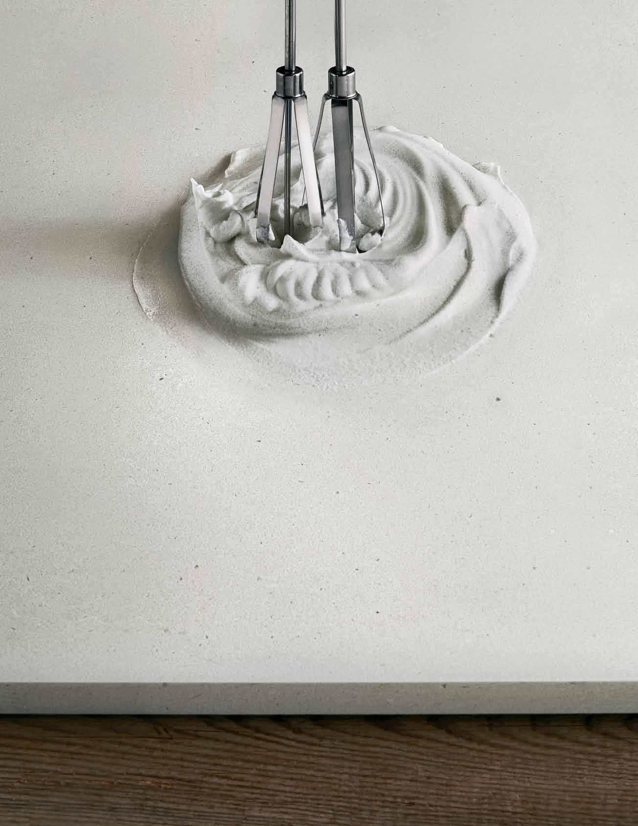


Raw Concrete™ www.caesarstone.com.au Our new designs Fresh Concrete™ CONCRETE. DOMESTICATED.
Get a glimpse of the action behind the scenes of the habitus photo shoot.


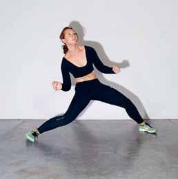


Behind the scenes
Each issue when we put together our 8-page shoot, stylist Amanda Talbot dreams up an out-of-the-box concept. This issue was no exception. She had our dancer jumping and twirling against a white wall, to be placed into the product shots in post-production. Her brief was to (pretend to) interact with the products as if they were characters – depending on the set up, they were menacing, soldierly, astral or floral. We think the results look fantastic, take a look on page 91.

=
issue #28 habitusliving.com
photography tim robinson

66 King Street, Sydney 2000 Ph: 02 9299 0372 576 Chapel Street, South Yarra 3141 Ph: 03 9804 7213 Shop 143 Emporium, 287 Lonsdale Street, Melbourne 3000 Ph: 03 9663 1695 marimekko.com


TIEMPO COLLECTION ATLANTA • • CANCÚN • CHICAGO • • DANIA BEACH DUBAI • • LONDON • LOS ANGELES • MEXICO CITY • MONTERREY SAN FRANCISCO SHANGHAI • SYDNEY • TORONTO • +61 410 546 999




28 97 83 _N AU BA THROOM DESIGN CENTRE •A LE XA ND RI A-8 4O ’R IO RD AN ST.0 28 33 97 10 3 •A UB UR N-1 03 -1 23 PA RR AMATTAR D. 02 87 48 43 67 VI SI TO UR WE BS IT E-W WW .D OM AY NE .C OM .A U Do ma yn e ® st or es ar eo pe ra te db yi nd ep end en tf ra nc his ee s. Fl ow 90 0B at hr oo mF ur ni tu re Col le ct io n Ho esc hU no On eF re es ta nd in gB at h
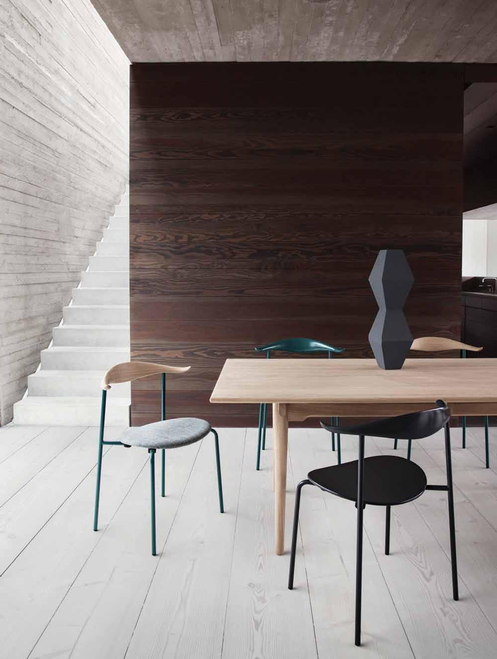
Settle in for some good design








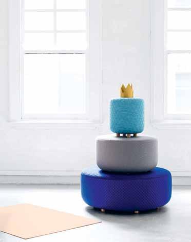
Poetic geometry
A reinvention of the classic ottoman design, the COCO ottoman from Anaca Studio feeds the senses with colour, texture and shape. With a frame made of both hardwood and plywood as well as a high resilience foam, the threeitem range is both stylish and sturdy, fully upholstered in stretch textiles.
anacastudio.com.au


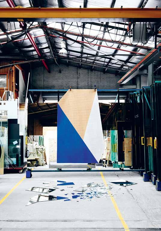
SHARD is the second collection of designer rugs for Fiona Lynch Designed and made in Australia from Irish goat hair, Shard’s design is all about fractured forms, jagged and abstract hues, and striking visuals. The collection features elemental colour palettes of reds, earthy indigos, browns and brilliant cobalt blues, designed for both residential and commercial spaces.
fionalynch.com.au
Machined from solid brass into three playful geometric shapes, the DAMIAN COAT HOOK is an especially elegant hanging solution. They ’re also practically proportioned to hold coats, hats and even coat hangers securely. Designed by Joel Savage and James Groom , the polished hooks are available individually from Savage Design
savagedesign.com.au
#28 habitusliving.com
issue
The GOLDEN SHELF, conceived by Auckland designer Clark Bardsley, is an extrusion of Fibonacci’s golden ratio; a mathematical formula derived from the beauty in nature. Comprised of birch ply and made to order, the sweet little shelf features a nesting design style which accommodates multiple sized objects while still being a striking visual piece on its own.


clarkbardsleydesign.com


ARCUS ENTRANCE TABLE pairs traditional furniture making methods with wooden boat-building techniques. Shown at the ‘ exhibition at Design Tasmania, the curved wood piece (along with the rest of the collection), pushes the boundaries of modern, straight-edged furniture design into flowing, curvaceous forms, which hint at their inspiration – the classic yacht.
Synthesis ’

nickrandalldesign.com


The new fabric collection by Creations Metaphores , released in Paris earlier this year, is inspired by movement, dance and music. Aptly boasting evocative names to match the inspired colour designs, such as Love Me Tender, Twist, Cabaret , Diapason and Entrelas , the range emphasises contrast; blending bright colours with pretty, delicate tones.

KAARI is the Finnish for arc or bow. It is also a new furniture collection made up of an assortment of large wall-mounted shelves, along with rectangular and round tables in two sizes, a desk, wall console and even a small round shelf. The design company responsible is Artek , who looked to fuse tradition with contemporary aesthetics. The result is a neat hybridisation of solid wood and steel bands; in other words, a very good-looking shelf.
artek.fi / anibou.com.au
creations-metaphores.com / boyac.com.au
1 . lightbox # 31
Turning Japanese
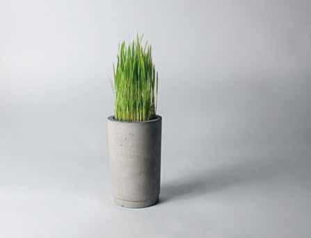
Shanghai design studio Bentu has released a new architecturally designed collection of lighting and planters, cleverly crafted from recycled building materials. The elegant and minimal design, which sees concrete lamps and planters serving as natural housings for plants, are quietly striking.
bentudesign.com / meizai.com.au
A charming paperweight and pin cushion created entirely from leftover materials in the workshop belonging to Norweigan designer Lar Beller Fjetland – let us introduce you to POMME LIGHT. This delicious cork apple is finished off with a leather stalk and brings together Fjetland ’ s enthusiasm for design and fascination with nature.
hem.com / district.com.au
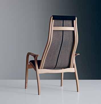
The LAMINO CHAIR , designed by Yngve Ekström in 1956, has been given a sleek new 2015 run by Swedish compatriots Nudie Jeans . Still handmade in Sweden, the chair is a true classic of Swedish furniture design. Made with a beautiful wooden frame and designed with excellent ergonomics in mind, the Lamino is just what we want: a traditional piece for a modern audience.
fredishere.com.au


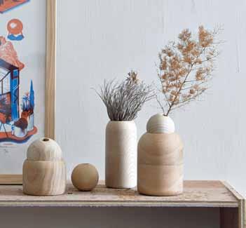
Taiwan’s Kimu Design has released a new range of wooden vases under the everplayful name PINOCCHIO. The design of this range is simple: a wooden vase and a wooden sphere, meaning the direction of the flower can be changed to suit a particular mood. Made from ash, beech and cherry, the delicate-looking pieces strike a sweet middle ground between design and nature.
kimudesign.com
issue #28 habitusliving.com
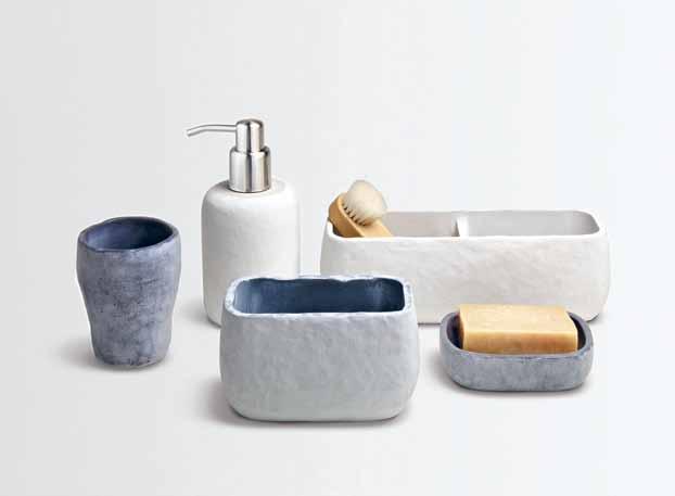
Hand made from a mixture of stone powder with resin, Milk Design ’s STONE range of bathroom accessories and containers for the Feel Good brand are both earthy and aesthetically pleasing. Evoking serenity and feelings of relaxation and harmony, the range perfectly exemplifies Feel Good’s key design principals and ethos.
milkdesign.com.hk
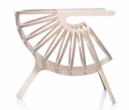
Portuguese design studio Branca ’s new range of wooden furniture unites traditional Portuguese craftsmanship with contemporary minimalist aesthetics. Design diligence and high quality is clear in the SHELL CHAIR , carefully fashioned from natural birch to serve as a comfortable piece of furniture that looks stunning. There ’s also the option to complete the seat with leather or cotton covered cushions.
branca.com / domo.com.au
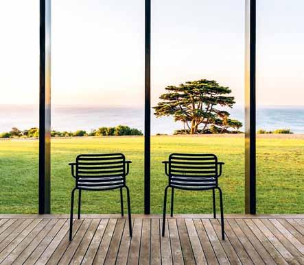
Carefully designed with fresh character, the BOMBALA OUT furniture and chair collection is just as happy indoors as it is out. Designed by Ross Didier, the range of chairs, armchairs, bar stools, lounge chairs and tables is a truly versatile one; each piece is fabricated with high quality stainless steel and finished in resilient powdercoated colours.
didier.com.au / cultdesign.com.au
1 . lightbox # 33
Winter warmers
Warm and comfortable, the HUSK SOFA is a gorgeous example of how the construction process helps define an object. The cushioned structure, designed by Patricia Urquiola for B&B Italia , makes a feature of the softer parts of the sofa, making for a fascinating design that embraces as it impresses. Available in two sizes, Husk is an elegant and casual seating solution distributed throughout Australia by Space Furniture. bebitalia.com / spacefurniture.com.au

The new FACE IT BLANKET from Lucky Boy Sunday is made from 100% natural merino wool. The stand out feature, however, is a unique face image on each blanket, inspired by an artistic take on the world of children. The playful designs are part of the brand’s modern luxury knitted art toys and soft furnishings for the home.
luckyboysunday.dk / littlepiestreet.com.au
Aljir Fine Crafts has designed a naturalistic and minimalist range of wooden cutlery. The set, made of sawo wood with a natural finish, is practical and beautifully crafted, serving as food ready items and artistic statements. The tactile range also exemplifies the company’s motto of seeking ‘pleasure in a sacred wood’.

aljirfinecrafts.com


issue #28 habitusliving.com
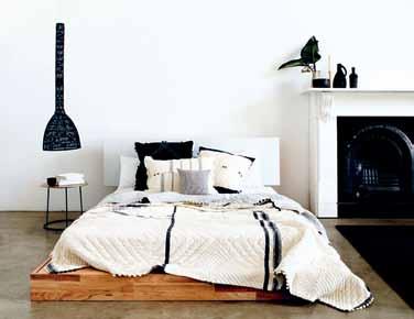
Cultivated from a love of handcrafted textiles, the INJIRI TEXTILES range of hand loomed fabrics – available from Spence & Lyda – comes from Indian designer Chinar Farooqui . The yarn-dyed, hand-woven fabric features plaid, striped, or checked patterns in a combination of colours, and was inspired by traditional Indian clothing work. Injiri is both homely and modern and quite possibly the most inviting bedwear we ’ve seen yet. Just look at that set up.
spenceandlyda.com.au
Seneca Textiles has unveiled two new collections from OSBORNE & LITTLE and LORCA . Because we love choice, the 12 colour options of Osborne & Little ’s fabric collection suits us well. And we love Lorca because the range features a subdued and minimalist colour palette, perfect for quietly slipping into a room.

senecatextiles.com
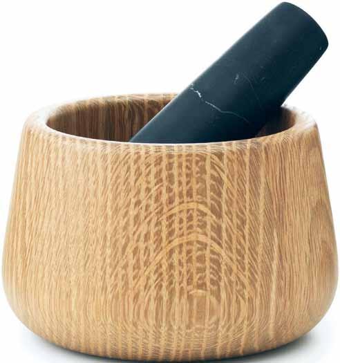
Made entirely from solid oak and robust marble. Yes, we want to hold these weighty, comfortable utensils by Danish designer Simon Legald for Normann Copenhagen. The expansion of the CRAFT range, which sees the addition of a mortar and pestle and rolling pin, continues to use exclusive natural materials and be of the highest quality. And, just like the pre-existing salt and pepper mills, the mortar and pestle is ideal for frequent everyday use –modern and classic at the same time.
normann-copenhagen.com / surrounding.com.au
1 . lightbox # 35
Yesteryear
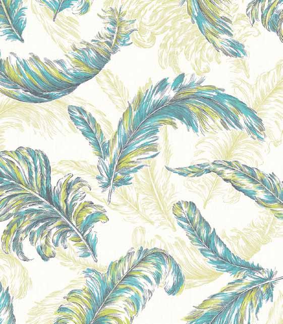
A new Graham & Brown wallpaper, the GILDED FEATHER , has been designed by fashion designer to the stars, Julien Macdonald Inspired by falling feathers and aesthetics used on many of Julien’s catwalk gowns, this subtle design is available in a range of colours, suitable for any room in the home. Produced using Graham & Brown’s paste-the-wall technology, the range is easier to hang than ever before.
grahambrown.com
A handsome, modern take on the traditional basket, MAGGIE ’ S BASKET was designed in collaboration between cooking icon Maggie Beer and designer Jon Goulder. Originally conceived as a part of a Jam Factory Exhibition called ‘ Be Consumed ’, the limited edition basket is handmade from waterformed leather and pre-steam bent then laminated solid oak.

jongoulder.com
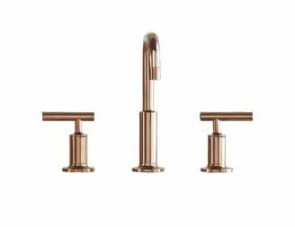
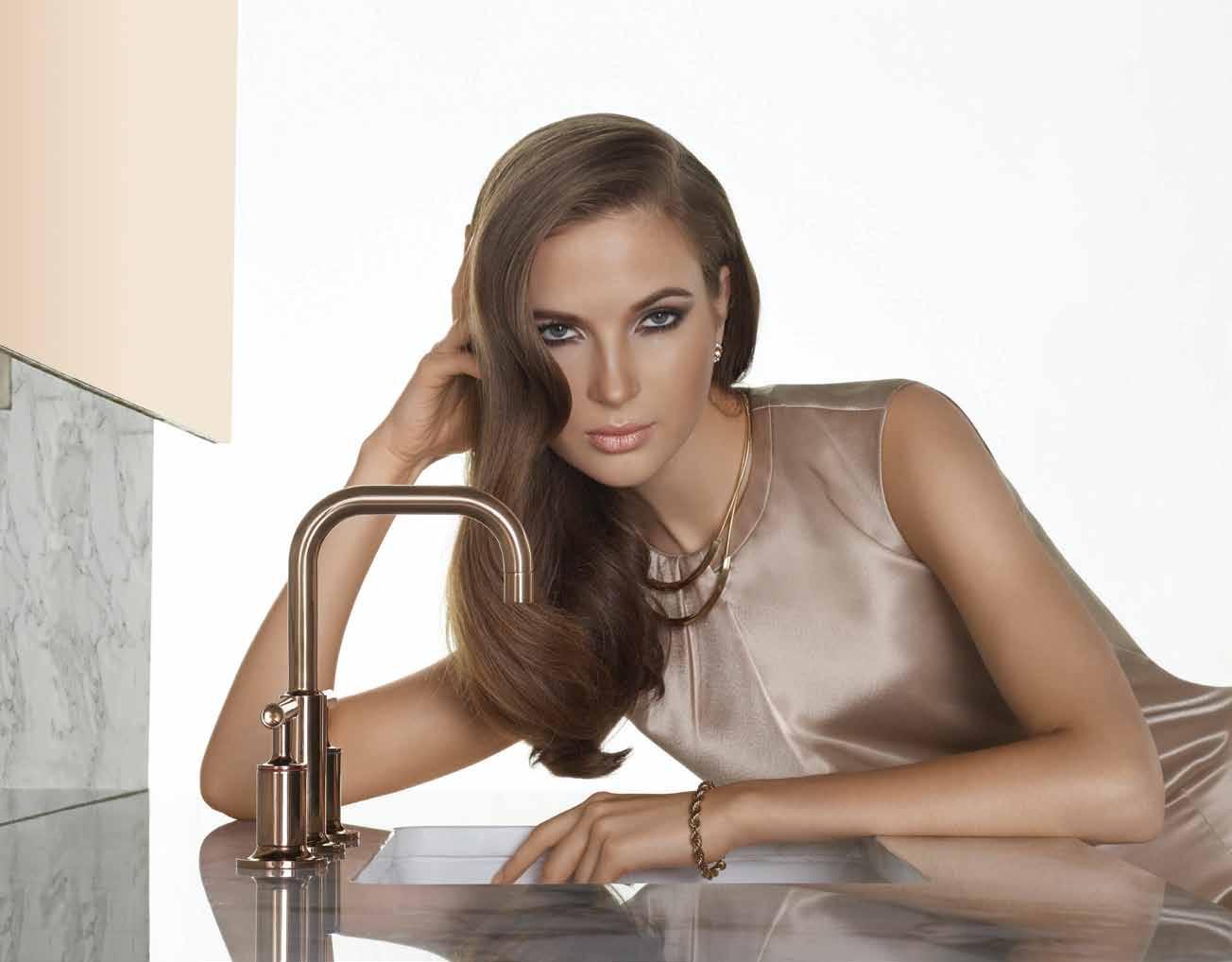
The gorgeous Rose Gold colour is the first thing that strikes about the new faucet from Kohler

Physical Vapour Deposition technology applied to the brassware will keep the tapware looking amazing. A precious coating creates a beautiful finish that retains its shine with no need for polishing.
au.kohler.com
The JOEY tent is a kids’ tent for family camping trips. Designed by Home Camp with just a dash of nostalgia, the tent is made from durable water, fire and mould-resistant canvas and features a sewn-in waterproof floor, making it more than just a cute tent for kids. The tent is launched with a range of items to make the camping trip complete, including mugs, blankets and sleeping bags.
homecamp.com.au

issue #28 habitusliving.com


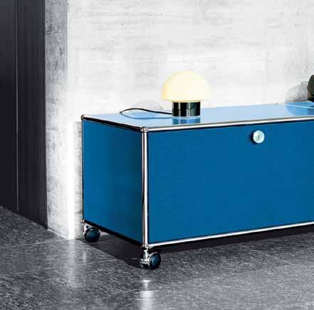
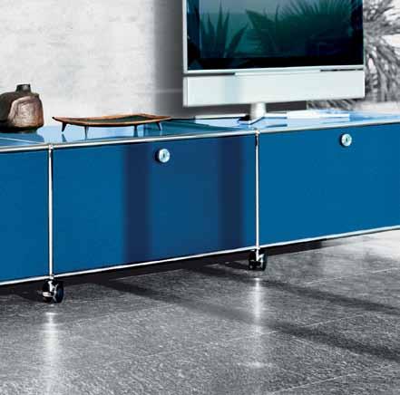

Elegant, flexible and timeless USM is architecturally designed to suit your every need Request detailed information or visit our showrooms Select USM Haller pieces available for Quick Ship delivery Sydney: 02 9380 7922, 17 Thurlow Street, Redfern Melbourne: 03 9821 5300, 99 Commercial Road, South Yarra Brisbane: 07 3100 8842, 15 James Street, Fortitude Valley Perth: 0411 035 082 Adelaide: 0401 176 668 Hobart: 03 9821 5300 USM U. Schärer Söhne AG, Switzerland, info.au@usm.com - www.usm.com www.ecc.com.au

issue #28 habitusliving.com
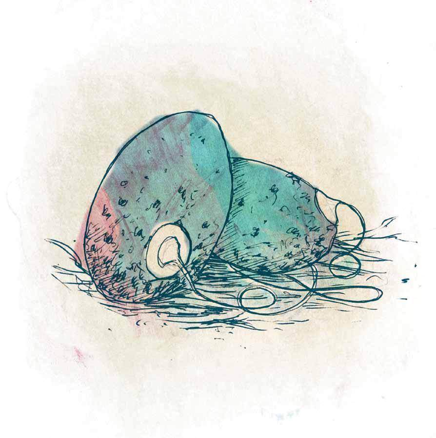
Architecture, design & intelligence
As technology races ahead, the ‘smart home’ is a hot topic – but is high-tech really all that intelligent? Mandi Keighran asks what makes a home smart.
Tex T Mandi Keighran | illusTraTion h erds of Birds

1 . lightbox 39
The ‘smart home’ is nothing new –it’s been anticipated for over half a century now. Think back to George and Judy Jetson’s home from the 1960’s Hanna-Barbera animation: there was Rosie, the robot maid; a home environment that transformed at the flick of a switch; an automated kitchen; talking watches and flying cars. Not so different, in fact, from this year’s Consumer Electronics Show in Las Vegas – the largest trade show of its kind – where the world was introduced to over 20,000 new high tech gadgets and gizmos, including Samsung’s PowerBot robotic vacuum, LG’s smart fridge, Mercedes’ driverless car, hundreds of smart watches, lock systems that communicate with smart phones, and a slew of new internet-ofeverything and home-automation systems. The future, it seems, is here.
Most of this technology has been around for a while, but it’s only now that it’s becoming an affordable reality and regular consumers have the potential to transform their home into an ultra high-tech machine. There’s no doubt that this slick vision of future home life is appealing at first glance – who wouldn’t want a home that looks after itself? – but, just how intelligent is the reality of a smart home?
‘Interface: people, machines, design’ is an exhibition running at Sydney’s Powerhouse Museum until October that looks at how
designers have made complicated information technology products – phones, computers, home entertainment systems – easy to use and thus an integrated part of domestic life. The accompanying catalogue is a beautifully designed object itself, which playfully engages the reader through its own design – a minimal, thick card cover with an embossed title that invites touch, and black edging on the pages. It tracks the development of the now-familiar technologies that preceded home automation and the companies behind them – Apple, Braun, IBM et al – but perhaps what the book is most successful at showcasing is not the modernday marvels of technology, but the speed at which it becomes obsolete. In just 100 years, as the book effectively shows with two full-page photographs over a double page spread, we have come from scrawling on slate to trawling the web on an iPad. How smart is technology if it necessitates constant replacement, and do we really want to let our homes – which are, in most cases, built to last for many lifetimes – be subjected to something so ephemeral?
The problems with so-called smart homes can start even before the technology is outdated. In one well-reported incident, Berlin’s first smart home, built by futurist pioneer Paul Rojas, completely froze – the real-life equivalent of Mac’s spinning beach ball of death. The culprit: a single light bulb that needed replacing. Play this scenario out to its full potential – as writer Mat Honan did last year with a short story for Wired titled ‘The Nightmare on Connected Home Street’ – and you get the stuff of horror films: hyper-connected homes with obsolete and incompatible technology breaking down or contracting viruses and wreaking havoc. This is, at least for now, the realm of fiction, but it certainly begs the question: if high-tech gadgetry and home-automation systems are
Just how intelligent is the reality of a smart home?
not so smart – and could feasibly be construed as the opposite – what is a smart home?
Australian architecture editor and author, Karen McCartney, offers a compelling perspective in her recently released – and lusciously designed – large-format coffee table book Superhouse. “A superhouse is one that delivers a 360-degree completeness of form; its exterior and interior have a seamless execution and, above all else, it is awe-inspiring,” she writes in the foreword. Although she calls the homes she features ‘superhouses’ they are, on the whole, defined as such because they are smart – not by way of superfluous gadgetry but because of a sensitive and strong connection to and understanding of nature.
The 19 houses featured in the book – each photographed by Richard Powers – are variously successful in meeting the definition set forward by McCartney, and some feel a little like luxurious follies that, while beautiful, are not overly intelligent. Others, however, are breathtakingly so – from Piero Lissoni’s dramatic adaptation of a private theatre in Monza to the striking simplicity and ruthless efficiency of Jan Benthem’s experimental, demountable Almere House.
This connection to the natural landscape is particularly intelligent in the case studies McCartney has included from Australia and New Zealand by Wood Marsh Architecture, John Wardle Architects, Virginia Kerridge Architect, Paul Morgan Architects, and Fearon Hay. A long-standing cultural connection to the great outdoors in this part of the world has given birth to a nation of architects with an ingrained sensitivity to and understanding of aspect, outlook, shading and passive cooling. At its best, contemporary Antipodean architecture could be said to represent a new kind of vernacular.
The Trunk House in Victoria’s Central Highlands by Melbourne architect Paul Morgan is a wonderful example. It draws its design language from the surrounding forest, and the distinctive structural columns from which it takes its name are actually locally sourced bifurcated eucalypts. The stringybark trees cleared from the site were milled on location to create lining boards for the main space, and the result is a sustainable home that is sensitive to its context both inside and out.
Another Australian author and editor, Paul McGillick, offers an even more compelling definition of the smart home in his recently released book Sustainable Luxury: The New Singapore House, Solutions for a Livable Future For McGillick, the intelligence of a home is measured by its architecture’s responsiveness not only to its environmental but also its
issue #28 habitusliving.com
social context. In tropical Singapore, with its characteristic social structure in which it is common for three generations to live together, this translates to ingenious planning solutions for multi-generational homes, lush internal courtyards and other passive strategies for cooling, and a sophisticated relationship between internal and external spaces. As McGillick notes in the foreword, sustainability in Singapore is not an option, it is an imperative – and it is one that encourages creative and intelligent solutions. “With most of the homes in this book,” he writes, “the marriage of luxury and sustainability has been achieved not by spending huge sums of money but by the application of some simple, imaginative and well thought out strategies.”
Namly Drive House by Chang Architects – winner of the 2013 World Architecture Festival Award for Best Villa – is a beautiful and intelligent response to its local environmental and social context as well as that of Singapore as a whole. “The house is a highly imaginative response to the challenge of multi-generational housing where the problem is invariably how to be ‘separate but together’,” writes McGillick. “At the same time, it is a wonderful celebration of living in a tropical climate – of living with the climate rather than railing against it.”
This re-interpretation of the tropical house cleverly employs recessed living spaces, overhangs, timber screens and a multitude of strategies to bring the landscape into the
interior. The thermal mass of the concrete structure combined with these other passive cooling strategies keep the house cool at all times. Not only is the home environmentally sustainable, but its planning offers a solution for a sustainable family life for three generations.
Smart, then, as McCartney alludes to and McGillick clearly shows, is sustainable. Sustainable in the holistic sense of the word, in a way that embraces a home’s entire context, rather than simply the conventional environmental sense. It is a home in which solutions are inherent to the fabric of the building, and whose architects have thought beyond the now to create a building that will stand the test of time. It’s difficult to see how cutting edge technology with its inevitably short lifespan and issues of compatibility fits in with this definition of intelligence in the home.
There is a quote in Superhouse by Pierro Lissoni, which reads, “To be simple, I think, is quite complex … Complexity is the private face of simplicity.” For a home to be smart it must respond to its context in a holistic way that appears effortless, simple and ingrained in the architecture – a complex thing to achieve.
INTERFACE
Campbell Bickerstaff
Powerhouse Musuem
176pp hardcover, $39.95
SUPERHOUSE
Karen McCartney
Penguin Books Australia
336pp hardcover, $79.99
SUSTAINABLE LUXURY
Paul McGillick
Tuttle
224pp hardcover, $39.95
1 . lightbox 41
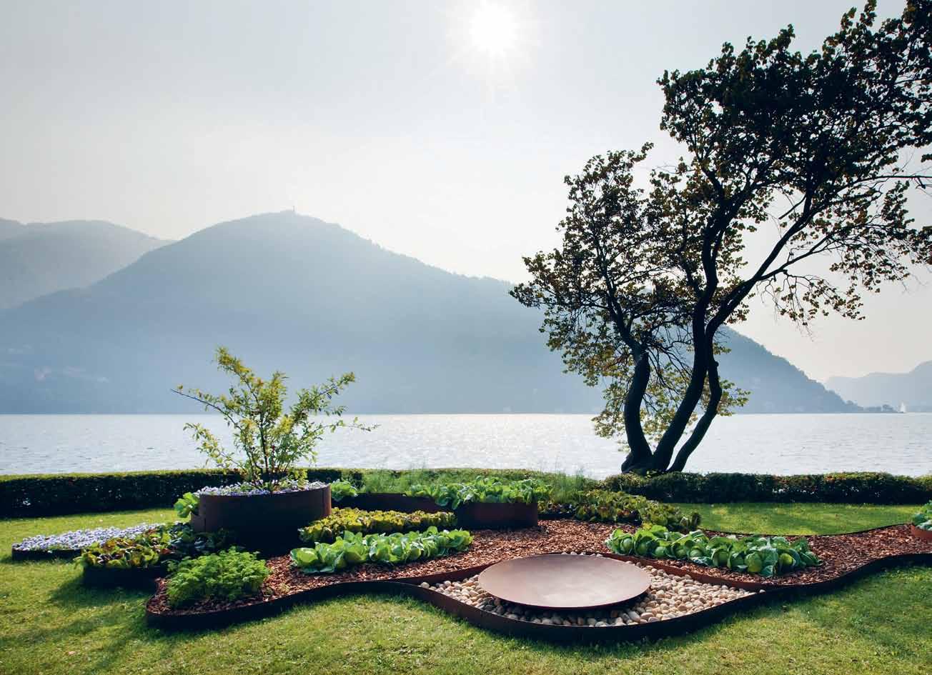
Ak47 is the benchmark company for those who are looking for the best outdoor fire pits, garden fabric and decorations representing the perfect synthesis between utility and made in Italy design.


Fire pits which adapt to every outdoor space, getting in tune with the host environment and materializing the idea of the hearth as a source of daily serenity and ancient shelter.

For more information, visit ak47design.com or contact info@ak47space.com.au.


Find your personal expression













Southern beauty
Architect NICK TOBIAS has a thriving practice in Sydney, where he is also based most of the time. But it’s to TILBA , on the far south coast of NSw, that he and his family escape to as often as they can, for a more relaxed way of life.
issue #28 habitusliving.com
Tex T Nicky Lobo | PhoTogra Phy k aTheriN e Lu


# 45 2 . portrait


previous
|
issue #28 habitusliving.com
|
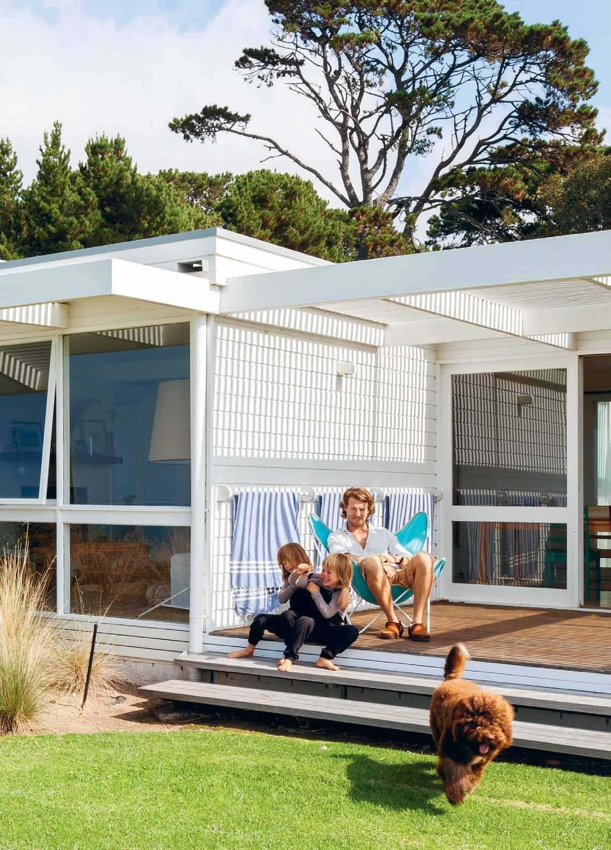
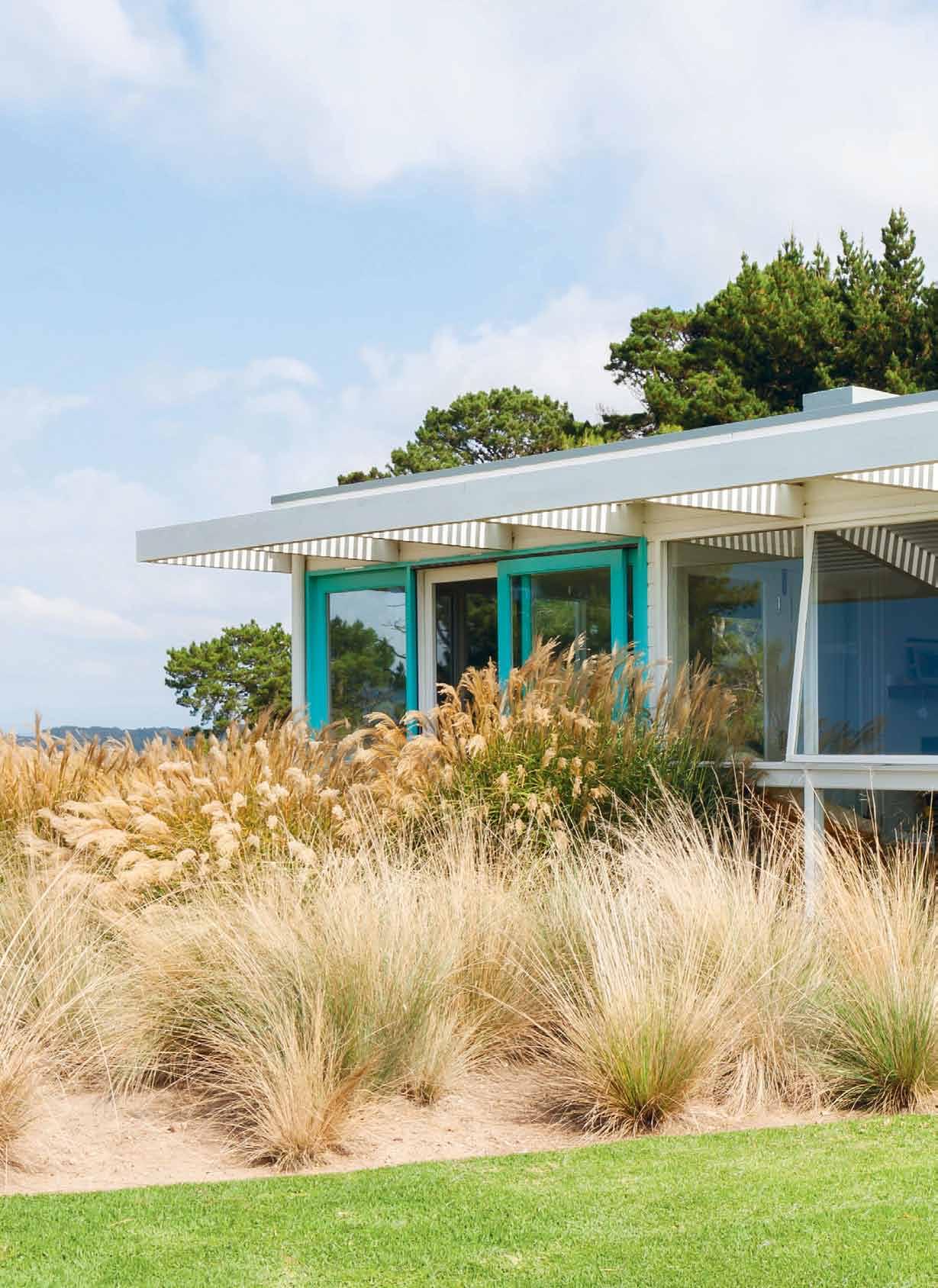
nick tobias, his sons samson and griffin, and their pet lagotto, dado, on the back deck, which faces the water left | a hedge has been inserted to create a sense
of arrival. right
the angular lines of the structure are softened by the native grasses and vegetation in the landscape.
Although Nick Tobias and his wife Miranda purchased their holiday home on the south coast of NSW six years ago, the story actually begins another 25 years before that, when Miranda’s father decided to build a holiday home for his then-young family. He chose the location carefully, looking for somewhere that reminded him of his own childhood holidays in the beachside suburb of Sorrento in Victoria in the 1950s. “There was not a lot [back then],” Miranda says. “There were wooden fishing boats and he used to fish with his grandfather.”


Tilba is not so different from this romantic image. Comprising two villages near the Princes Highway about six hours drive south of Sydney, it has a charming geography of bush, farmland and gentle hills rolling to the Tasman Sea. It was settled during the 19 th Century gold rushes and this was probably the busiest Tilba will ever be – the most recent census in 2011 has the population at a total of 391 people.
This number doesn’t take into account the part-time population, which includes Miranda’s parents, Miranda and Nick plus their two young boys Samson and Griffin, and soon, two of Miranda’s brothers and their families. Together, they are making good of Miranda’s father’s vision – to have a place where the family can come together for holidays, regardless of their dispersed day-to-day lives. One by one the children are returning to the place of childhood memories to build homes on adjoining, very
# 47 2 . portrait

above
issue #28 habitusliving.com
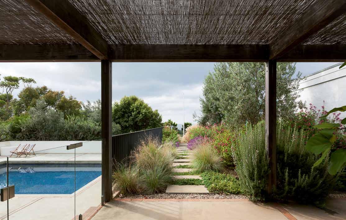
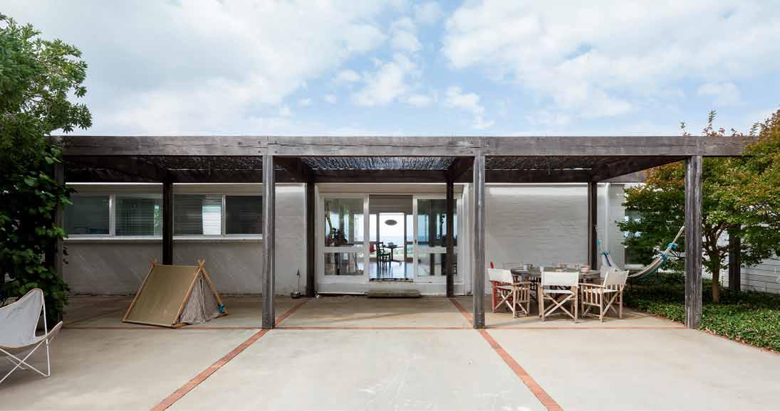
| a perennial garden between the pool and home includes a glimpse of the sea. below | the family do some chalk drawings, catching the afternoon sun in the western courtyard. opposite | the western elevation, viewed from the entry hedge, reveals the modular nature of the 1970’s home
integrated properties. It is, in a sense, a family compound, a common mode of living in SouthEast Asia, but more rare in Australia.
“This was a separate property when we bought it,” Miranda says, referring to her and Nick’s 100-acre property. “What we’ve done is pull up all the fences within and between the properties,” she continues. “So it really becomes like this rolling heartland or wilderness”. Previously cleared as farmland, the couple have made it their mission to return the land to its original state, planting literally thousands of trees along the lakes, the boundaries of the property and the hills, deftly defining the natural contours of the land with the natives as if with a paintbrush.
These trees were only planted six years ago but some of the eucalypts are already nine metres in height. They have taken to the volcanic soil with tremendous virility, almost unbelievably so. But Nick explains the reason why – they are a local species seeded from the mountain behind the property, so have a natural affinity to the area. Miranda, a writer, offers a more mystical explanation – the power of Mount Gulaga, which symbolises the figure of the mother for local indigenous tribes, and thus fertility.
The home itself is very simple. Originally built in the 1970s, it is almost a kit home, with a series of spaces built on a 4.2 x 4.2 metre grid. “It’s this really nice little structure because it’s
# 49 2 . portrait

NICK
ARCHITECT &
sI dENT left
and lighT-filled in The morning
|
To The kiTchen Through The
ThaT
can
and
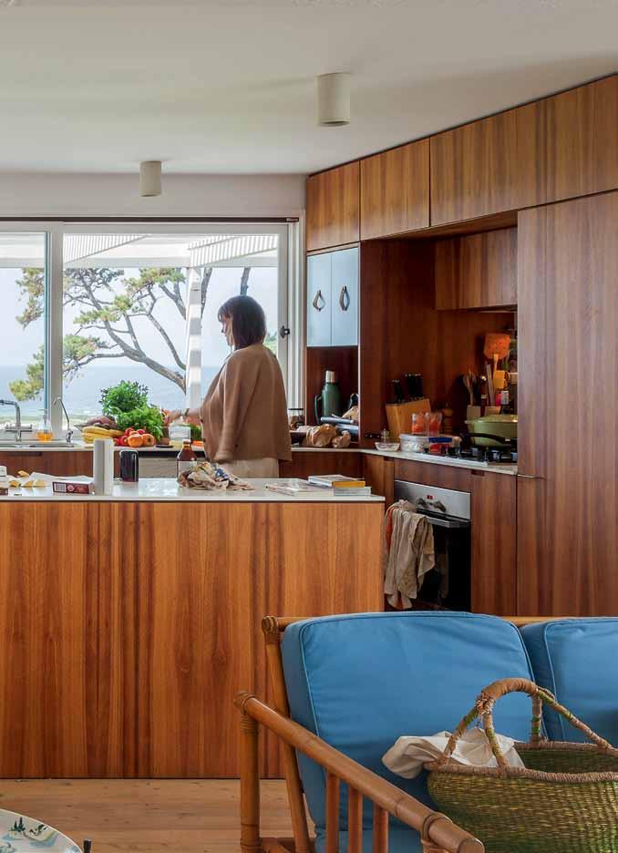
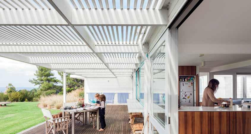
playing children while preparing or cleaning up af Ter meals. issue #28 habitusliving.com
We stripped it back and really embraced that modular model.
|
RE
| The easT-facing open plan living area and kiTchen is relaxed
right
The easTern deck connecTs
glazing and a window, so
parenTs
easily waTch over
communicaTe wiTh
pretty much modular,” says Nick. It has a 1950s beach shack character, which was somewhat hidden under the “1980s beige vibe” the previous owner preferred. “We stripped it back and really embraced that modular model and re-fit with new kitchen and bathrooms, a bit of an extension to the south,” Nick tells me. “And then the key issue was creating and enveloping in gardens.”

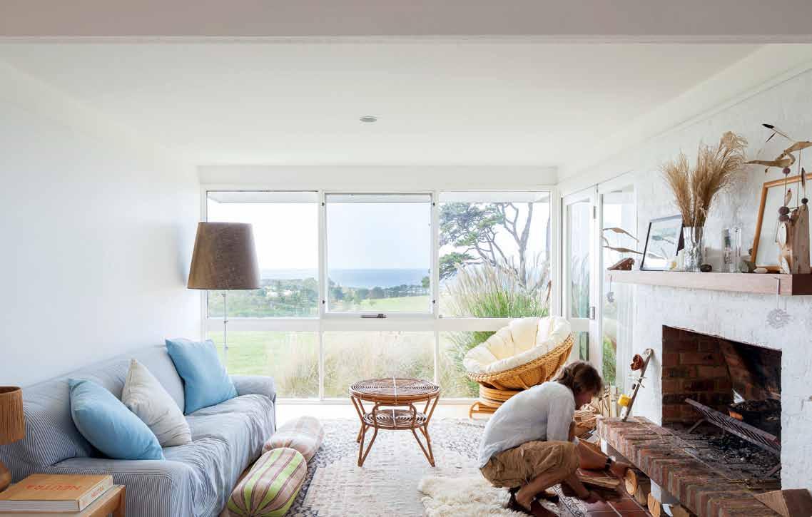
The layout is easy: an open kitchen/living space as you enter; a wing on the north side containing the children’s bedrooms, guest room and bathroom; a wing on the south side containing more ‘living’ space, flanked by Nick’s study (and Lego-building zone, which has to be contained so Dado, the excitable 8-month-old Lagotto Romagnolo, doesn’t eat the pieces). Adjacent to this southern living space is a western wing containing the main bedroom and an ensuite bathroom, providing a bit of privacy and retreat for the parents. Finishes are few and simple – timber floors, timber-lined walls, plasterboard ceilings, exposed timber beam structure and bagged brickwork, with a splash of colour in the warm orange mosaic bathrooms and glazing along the eastern side to make the most of the incredible view to the water. It’s a no brainer, really.
You feel quite keenly the architect’s touch in the subtle framing of the experience of the house, “The sense of entry and procession and a way of making sense of the planning, both internally and externally,” as Nick describes it. This begins with the hedge separating the garage/parking space and the home proper, which “really stops people [when they arrive],

# 51 2 . portrait
lets them get out of the car and take a breath of fresh air,” says Nick. A slot entrance creates a moment of arrival and comprehension as the home comes into view. Down a few steps along a pink wall takes you into a courtyard and to the house. Along this western side is a timber ‘spine’ or walkway connecting the house with a perennial garden and pool to the north. The pool area is sunken so that “when the wind’s blowing and it’s rough at the beach, the kids can still be playing [in the pool]”. The western courtyard too provides a sheltered space for playtime and family time in the afternoons when the coastal wind picks up.
“We need shelter, because the weather is very violent here,” Miranda says. “Big storms come up from the south, and they are very cold and wild. Then you get hot northerlies. You have to create spaces where you can get away from the extreme weather”. When the weather is not so extreme, the open deck along the eastern, seaward side of the home, appeals. The family breakfasts here with the morning sun and, on calm evenings, they often spread out blankets, sheepskins and bolsters on the adjacent lawn for an evening picnic.
issue #28 habitusliving.com

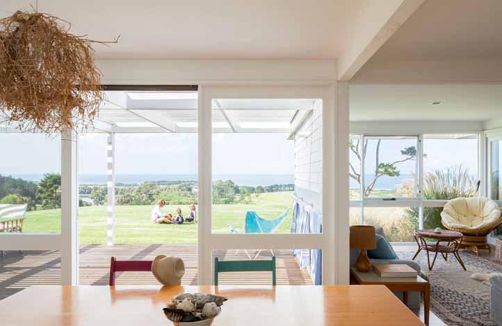
opposite | this lounge room on the southern side of the house is used often in the afternoons and evenings – even during summer you can have a log fire burning a couple of nights a week. AB oVe | the view from the office is picturesque. Below | this table is used for playing, writing or dining, as the family needs. # 53 2 . portrait

issue #28 habitusliving.com
This home and the property encourage a particular, relaxed way of life.
The other major architectural intervention is in the masterplanning: the removal of fences, moving gates and roads, creating linkage roads, planting trees and creating new wildlife corridors. It’s working – huge black Gang Gang cockatoos, sea eagles and hawks take it in turns to patrol the area.
This home and the property encourage a particular, relaxed way of life. A path has been mowed through the knee-height paddock grass so the family can ramble barefoot down to the beach, about a kilometre from the house. Built to 1970s proportions, the living spaces – although open plan – feel intimate and cosy. “The kids never feel scared here” Nick muses. A huge vegetable garden at Miranda’s parent’s house is raided for seasonal meals, bolstered by cheap local oysters and fresh bread from Bermagui, just 20 minutes drive away.

It’s very modest yet incredibly rich. Of course an architect can have a home like this, you might say, but Nick and Miranda firmly believe that this place is a result of knowing how they want to live and having the confidence to create just that. For them its about being constantly in the process of considering, consolidating and editing.

opposite | the private courtyard off the master bedroom on the southern side of the home. above | the master bedroom is simple. below | the cheerful orange mosaics warm up the bathrooms and also nod to the decade the home was originally built in.
# 55 2 . portrait
Nick points out that, “Clients that have built things a number of times have more confidence and are able to say, ‘You know what? I don’t need it to be that big. I understand the importance of the balance between built form and garden’.”

“You don’t need to build a house to express that,” adds Miranda. “It can be expressed in everyday things, whether it’s the way you cook, the way you lay a table, the way you dress. If you take an original view, and care, when the time comes for something really big – like building a home – you might have the confidence to go for it.”
“We obviously live in a commercial world and valuation is [mostly] done on a quantitative, not qualitative basis,” states Nick. “But when you get into qualitative aspects – How do you feel? Is there something uplifting? Is it nourishing? – that’s where things get creative, and expressive and subjective, and all those wonderful parts of life.”
“It’s the magic,” agrees Miranda.
Discover Nick’s Design Hunter picks at habitusliving.com/issue28/tobias Tobias Partners
tobiaspartners.com
|
above | looking back at the eastern side of the home from the gently sloping lawn, capturing the house within the context of the native trees that surround it. issue #28 habitusliving.com




Sydney Indesign 13-15 August 2015 Brought to you by Fashion Partner Event Partner Media Partners Strategic Partners Silver Sponsors Diamond Sponsor Gold Sponsor Platinum Sponsor sydneyindesign.com.au Facebook: /indesigntheevent Twitter: @indesign_event Instagram: @indesigntheevent An essential experience for the Design Hunter® . Join 9,000+ interior designers, architects and design lovers as they discover, share and connect. Register your attendance at sydneyindesign.com.au for free to receive your all-access pass to showrooms and event locations. In association with Production Partner Founding Partner Major Sponsor Education Partner Program Partner
a rtistic vanguard
Adeline OOi is bringing contemporary strategies, such as crowdfunding and social media, to AsiA’s biggest art fair. But at the core remains the traditional mission to present the diversity of the region’s artists and encourage the growth of the collector market.

Tex T The copy collecTive | phoTography © arT basel
# 59 2 . portrait

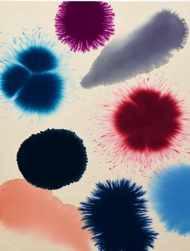
PREVIOUS | ADELINE OOI. D I rEctO r As IA , Art BA s EL ab OVE lEft | Intu ItI on 13 (2015) m Ix ED tEch NI qu E ON LINEN 180 x 140 cm, BY G IAc O m O sANtIAGO rOGADO, GALErIE mA rk mLLEr. ab OVE RIGHt | untItLED tINA LEch NEr. OPPOSItE | 20.12.96 – 17.01.97 (1996-97) O IL ON cANvAs , 130 x 162 cm BY Z AO WO u- kI GALErIE PA scAL L AN s BErG issue #28 habitusliving.com
Adeline Ooi is doing a lot of talking these days. As the new Director Asia of Art Basel, the Malaysian-born curator and art advisor is adjusting to the highly public role, which requires her to have countless conversations with artists, dealers, collectors and journalists.

“This is definitely not a behind-the-desk job,” she says, with a laugh. “It’s all about engaging.”
Adeline took the reins of Art Basel’s show in Hong Kong – the biggest annual art fair in Asia – in January, only two months before the launch of this year’s event, so she hit the ground running. “It’s a very intense process,” she says. “Someone said fear and adrenaline are great motivations for success. I certainly hope so.”
Adeline is not a stranger to Art Basel, having worked as the show’s VIP Relations Manager for the past two years. Her new role is a big step up, but one she is excited to be taking.
The world’s leading international art show, Art Basel, started in Basel, Germany in 1970. A second edition of the show opened in Miami in 2002, with the Hong Kong iteration following in 2013. Although somewhat of a new player on the Asian art scene, Art Basel’s Hong Kong show hosted some 60,000 visitors this year across almost 38,000 square metres of exhibition space.
“Of course I would be silly to not be a bit afraid because this is a huge organisation I’m now representing,” Adeline says. “Nevertheless, it’s been amazing. And fun, to be honest.” She’s not about to let the fear hold her back from achieving her ambition. “I think one can dream,” she laughs. “The hope is really to be able to make the Hong Kong show the best.”
Adeline has taken over the role from Art Basel Hong Kong’s founding director Magnus Renfrew, who worked closely with curators (including Artspace’s Alexie Glass-Kantor) to put together the 2015 event. This year they presented 233 galleries from 37 countries and territories around the world, including Australian dealers Sullivan & Strumpf, Roslyn Oxley9 Gallery and Darren Knight Gallery.
“I’ve known Adeline for 10 years now and she’s an amazing curator,” says Alexie, who was responsible for the Encounters sector of the show, featuring a series of large-scale sculpture and installation works by leading artists from around the world. “She has an extraordinary reputation in Asia and an incredible knowledge of South-East Asian art.”
Adeline’s knowledge comes from an extensive career working in the region, firstly as curator and program director of Valentine Willie Fine Art Gallery in Kuala Lumpur. More recently, she was co-founder and director of RogueArt, a cultural agency based in Malaysia with clients that include artists, galleries, institutions, and corporate and private collections.
Art Basel’s Hong Kong show is open to both industry representatives as well as the general public, and has a crucial role within the Asian art scene, bringing together artists, galleries and collectors from across Australia, New Zealand and South-East Asia. “It’s becoming a meeting place for the region, and I love all the perspectives and skills that people bring to it,” says Alexie. “We’re seeing the building of a vocabulary and much more trans-regional support for collections.”
2 . portrait # 61
The concept of trans-regionalism is a big one, and Adeline is well aware of – and prepared for – the challenge. “The problem is that Asia is huge,” she admits. “There are so many different aspects to Asia, depending on where you stand and where you are looking. One’s definition of Asia in India would be completely different to a Chinese definition of Asia or an Australian one.”
One of Adeline’s plans for Art Basel’s future shows in Asia is to strengthen the culture of collecting in the region. The concept of collecting is relatively new in the Asian market, so one of Adeline’s goals is to find ways to educate and support new buyers. The strategy includes the creation of a course at Auckland University in collecting contemporary art, through which Adeline hopes to demonstrate that it is possible to enter the market on any level. “You don’t have to spend pots and pots of money,” she says. “It’s about buying pieces that are within your means.”
Another important focus for Adeline’s directorship will be protecting buyers as well as artists and galleries. She believes longevity is the key to success in the art world and that this can only be achieved through a communal, ethical, supportive approach.
“We know that being an artist is probably the most difficult job on earth,” says Adeline. “For us [at Art Basel] it’s not about a quick buck because we are here to stay. We want to do as much as we can to build the art scene in Asia and to build on these relationships.”
Adeline wants to harness the power of social media and embrace new methods – such as a Kickstarter crowdfunding to support noncommercial art projects. This will allow her to broaden the scope of Art Basel in Hong Kong. She would like “to be able to hopefully cast that net wider, [offer] a more diverse presentation of Asia, to be able to present deeper content and more substantial content as the years progress.”
“You have to think long-term [with art] because it’s not as though we are coming here to peddle a little gadget,” she continues. “It’s about culture and appreciation.”
The next Art Basel Hong Kong takes place on March 22-26, 2016.
 Art Basel Hong Kong | artbasel.com
above | VISITORS AT ART BASEL HONG KONG 2015.
You don’t have to spend pots and pots of money. It’s about buying pieces that are within your means.
issue #28 habitusliving.com
A deline | director A si A

 SMOKING JACKET, TUXEDO
Architecture of surprise
Looking for a bit more edge to her life, artist Aly Aitken moved from the suburbs to an old motorcycle workshop in inner Melbourne where the line between art and home is indistinguishable.

Tex T STephen CrafTi | phoTography Jame S geer
# 65 2 . portrait

issue #28 habitusliving.com
Artist, Aly Aitken, raised three children in a Californian bungalow in the suburbs. It ticked all the boxes, but she was looking for a larger ‘canvas’ and a larger studio to work in. Indeed, her website thecupboard.com.au takes its name from the cupboard-like workspace she formerly occupied at home. The idea to move house gained legs while Aly was studying fine art at RMIT University. “I didn’t realise there were so many warehouses in Melbourne’s back lanes,” she says. She and her husband, Peter, stumbled across what had once been a motorcycle workshop. “When we first inspected it, there were a few dodgy office partitions on one level,” she recalls. “Another must have been used as a squat.”
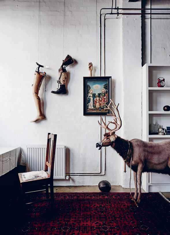
The three-level warehouse came with a roof space, a timber staircase and a rough brick wall interior. It was these imperfections that attracted Aly and Peter, and they decided to engage architect, Peter McIntyre. “[My husband] Peter and I saw a number of McIntyre’s beach houses. Some of his homes have that wonderful Dr Suess feel. There are few straight lines.”
While McIntyre looked after the bones of the renovation, adding two levels and creating a skylight/lightwell, Aly took charge of the interior, with a clear idea of what she was
previous | InspIred by artIst
MagrItte, aly aItken’s
has a surrealIst
|
to
Is
graffItI AB ove | aly’s hoMe Is fIlled wIth unusual objects and artefacts IncludIng a taxIderMy deer and artIfIcIal lIMbs. # 67 2 . portrait
rené
sIttIng area
qualIty opposiTe
the rear entrance
aly’s hoMe/studIo
plastered wIth
after from the outset. “I wanted this place to respond to the warehouse, built at the turn of the 20 th Century. I wanted a slightly industrial aesthetic and was keen to include commercial fittings. My brief to Peter was extremely specific, room to room. I even had the fittings sorted well before work started.”
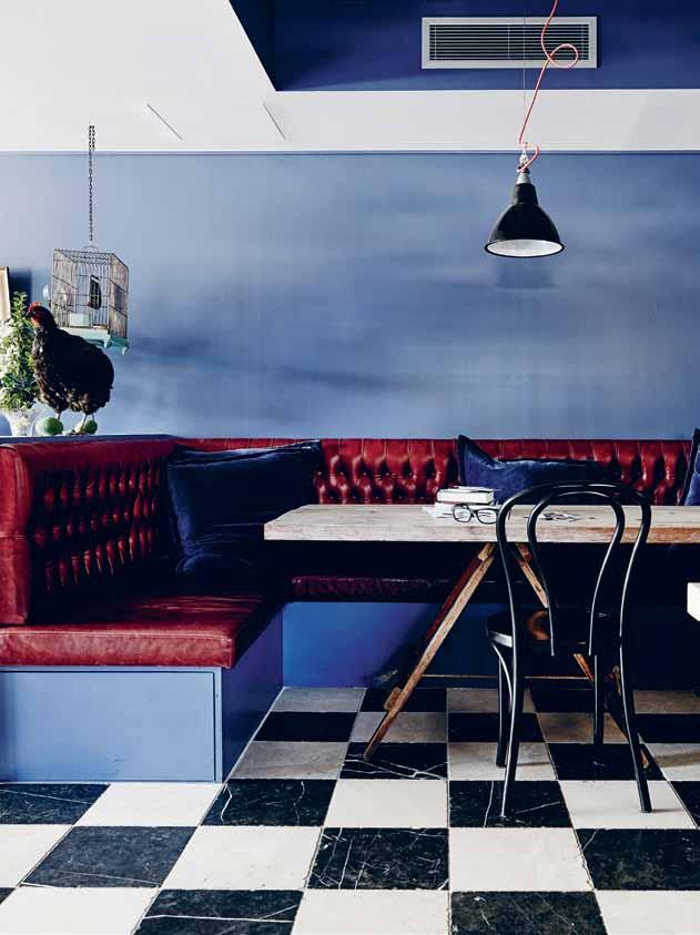
Spread over six levels, including a rooftop garden, the house is like exploring the inside of Mary Poppins’ bag. Each level exemplifies Aly’s extraordinary eye, and she continually curates her own work and wonderful collection of objects in this magical setting. “Leaving a garden behind was probably the most difficult aspect of moving to the city. But the rooftop has a swing. And when I need time to contemplate something I’m working on, or a new project, there’s nothing more exhilarating than having the wind against your face. There’s a sense of flying,” she says.
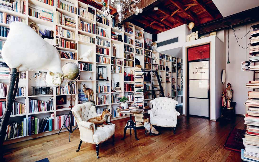
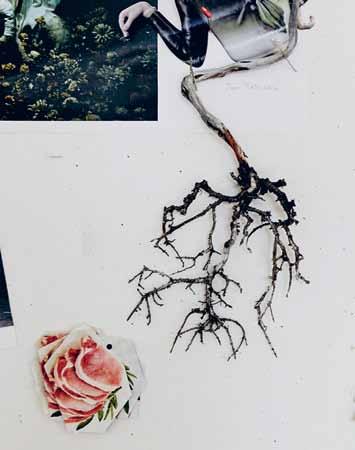
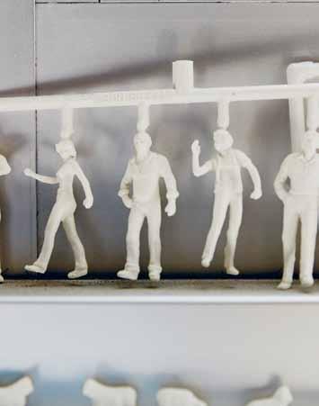
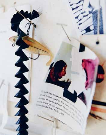
Aly moves from her workbench at ground level to her studio on the fifth level, depending on the work. All the timber used for her sculpture starts life on the bench, framed by saws and drills. But it is her studio, occupying an entire level, which beckons each day. Covered pegboards, magazine cuttings and baskets of things collected (including animal parts) are meticulously organised. If she isn’t working on a sculpture, she is generally on the living level. This features a small terrace garden at one end and a living room at the
issue #28 habitusliving.com

OPPOSITE
and also
# 69 2 . portrait
| The kiTchen feaTures a large builT-in banqueTTe-sT yle seaT To allow family and friends To gaTher. ABOVE | The living area adjacenT To The kiTchen includes many religious arTefacTs as well as a life-sized flamingo BELOW | The sTudy, compleTe wiTh builT-in floor To ceiling bookshelves, is filled wiTh objecTs and arT, boTh found
made by aly.
She continually curates her own work and wonderful collection of objects in this magical setting.

issue #28 habitusliving.com




# 71 2 . portrait
opposite | the studio, located on the top level (just below the roof terrace) is filled with her unusual creatures and paintings. AB oVe | aly’s studio is a visual feast with many items waiting to be fashioned into magical figures.

ABOVE
issue #28 habitusliving.com
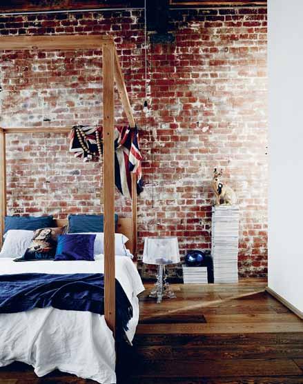
| The main bedroom includes original disTressed brick walls and new Timber floors. BElOw | an ouTdoor Terrace on an upper level ‘grounds’ The warehousesT yle home. OPPOSITE | The roof Top garden, which includes a swing, creaTes a sense of escape and allows aiTken To conTemplaTe her nex T projecT
A steel painted flamingo welcoming the family into the living room is crowned by a swag of red velvet curtains.


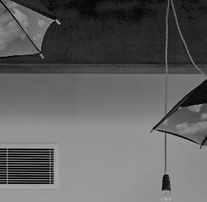
Daisy, one of the couple’s daughters, is used to having friends marvel at both the generosity of the spaces, but also the ‘sets’ her mother has curated. “Many of my friends are speechless when they visit for the first time. People just tend to wander off and explore, even when we’re having a dinner party,” she says. The second level, which contains the children’s bedrooms, includes a series of opened umbrellas, in homage to Belgian surrealist artist René Magritte. “I intend to eventually turn these into pendant lights,” says Aly. Even a cupboard, clearly labelled ‘For Use in Case of Emergency’, is not an over-sized medical cupboard, but storage for a pull-out bed for guests.
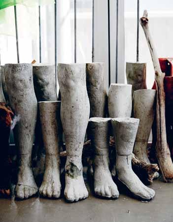
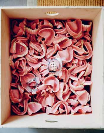
One of the most coveted spaces in the Aitken household is what is referred to as the ‘Curiosity Cabinet’. Lined with built-in bookshelves that extend almost four metres to the ceiling, the study is a mélange of finely curated objects, books and artefacts, collected by Aly over a lifetime. Two taxidermy foxes, one sitting on a tattered armchair, the other resting on the ground, is particularly poetic and heartfelt. Nothing is predictable. There are surprises at every turn. Even the lift has been transformed into a mini-gallery, featuring faux-turf on the floor and framed artificial goldfish in plastic bags of water. “I love the unexpected,” says Aly. “Even when I start working on a piece, I never really have a fixed idea of how it will turn out. It’s just trusting your own judgement.”

catupultdesign.net.au | 02 8001 6646 Australian
COLLECTION HAB28_QP_Catapult.indd 1 14/04/2015 9:30 am
designed and made Hunter armchair, part of the CATAPULT SIGNATURE
# 73 2 . portrait
Aly Aitken | thecupboard.com.au
Singapore Indesign Intimate
09–10 July 2015
Curated Spaces

Red Dot Design Museum and National Design Centre will host unique product showcases in a compact design experience.
Design Conversations
For the first time ever in Singapore, Indesign hosts a series of conversations about workplace, hospitality and residential design.
The Project
Products are transformed into installations as suppliers and retailers team up with designers to challenge the limits of their creativity.
Design: up close and personal Singapore Indesign Intimate presents a concise, accurate and power-packed slice of what’s happening in design in South-East Asia.
singaporeindesign.com.sg


Facebook: /indesigntheevent
Twitter: @indesign_event
Instagram: @indesigntheevent

Brought to you by In association with Media Partners Strategic Partners Conversations Partner Platinum Sponsor
understated luxury
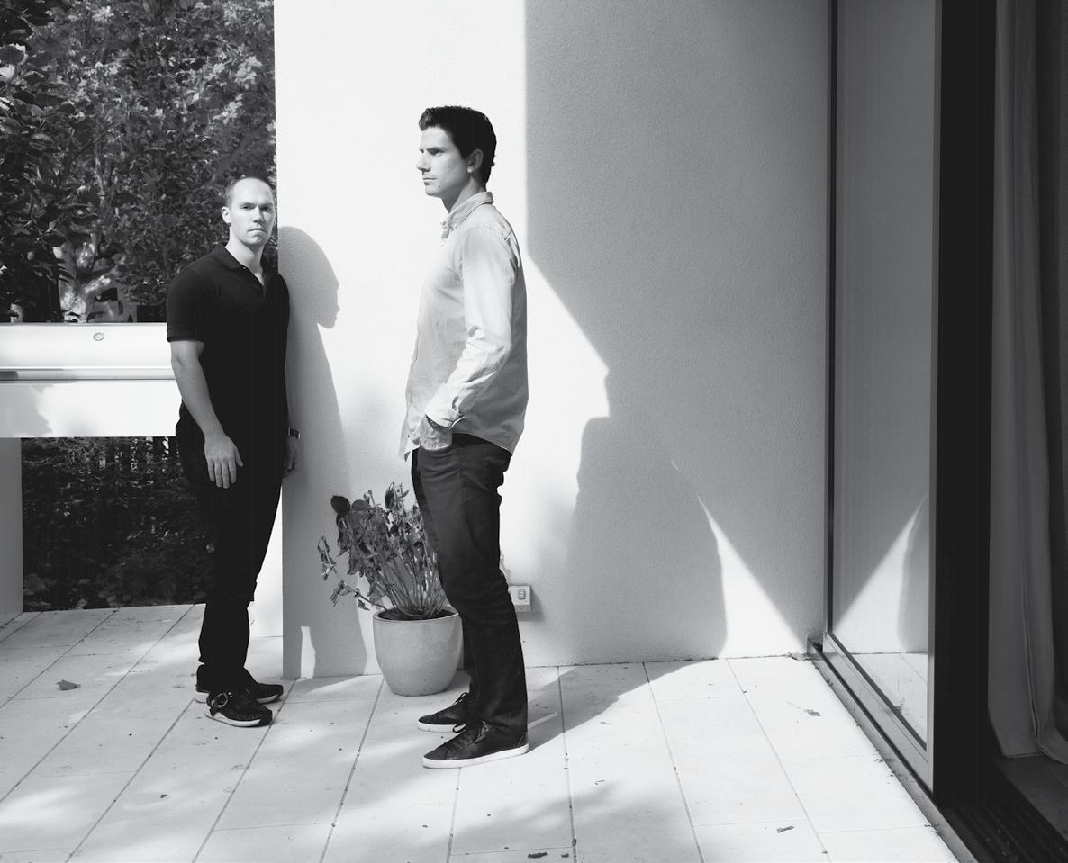
They were childhood friends, attended the same business management course at RMIT and now they are partners in Orchard Pi Per , a classy boutique property developer of luxury multi-residentials. Meet the owners of the company, Luke McFie and r ick GrO n Ow, who are rapidly changing the way we think about apartment living.
Tex T paul mcgillick | phoTography amelia king
# 75 2 . portrait
Life is a journey containing many subjourneys. For some this consists of treading water. For others, it is just a series of accidents. But for a special breed – like Luke McFie and Rick Gronow – it is the single-minded pursuit of a dream.
Luke wanted to be a builder, but his stepmother, a businesswoman, “opened my eyes to the business side of property,” he says. “All I wanted to do after that was to get into the city and work for the best developer I could find”. That proved to be Mirvac who, in the late 1990s and early 2000s, was dominating the surging Melbourne property scene. “Mirvac,” says Luke, “was a great learning ground and was very design-driven with strong vision.”
At this point, Mirvac was led by Kevin Hunt. “He was the guy,” says Luke, “who gave it all that vision and energy.” Hunt subsequently left to work for Lang Walker and later gave Luke a call inviting him to join him there. “It was a chance to work five days a week with the guy I would have [previously only] gotten an hour out of, an apprenticeship with someone I saw as an industry leader. So I took the job in about five seconds,” he recalls. “Then I went on the most intensive three or four years of my life with Kevin. It’s breakfast. It’s meetings all day. It’s dinner and then drinks at night. It was an incredible education from this guy I had idolised in property. He allowed me to grow.”
Hunt’s emphasis on design and product made Luke realise that this was what really interested him. Working with Hunt “was the first time I had to justify my thoughts on issues – a very grown-up thing for a young property person,” says Luke. The process made him realise what his tastes were, “because [up until then] I hadn’t really been challenged as to what I thought or what I liked because I had always been told that is what I had to deliver”.
The key connection Hunt made was creating value, says Luke, and “creating quality through space, proportion, light and the intangibles”. Mirvac was a very design-revenue focused business, but Walker had a cost-
issue #28 habitusliving.com
# 77 2 . portrait
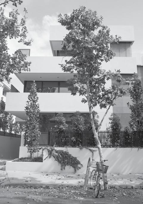
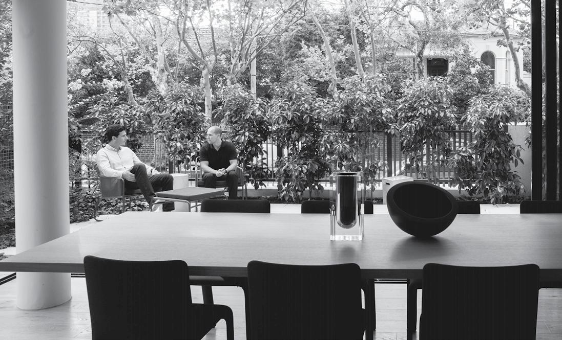
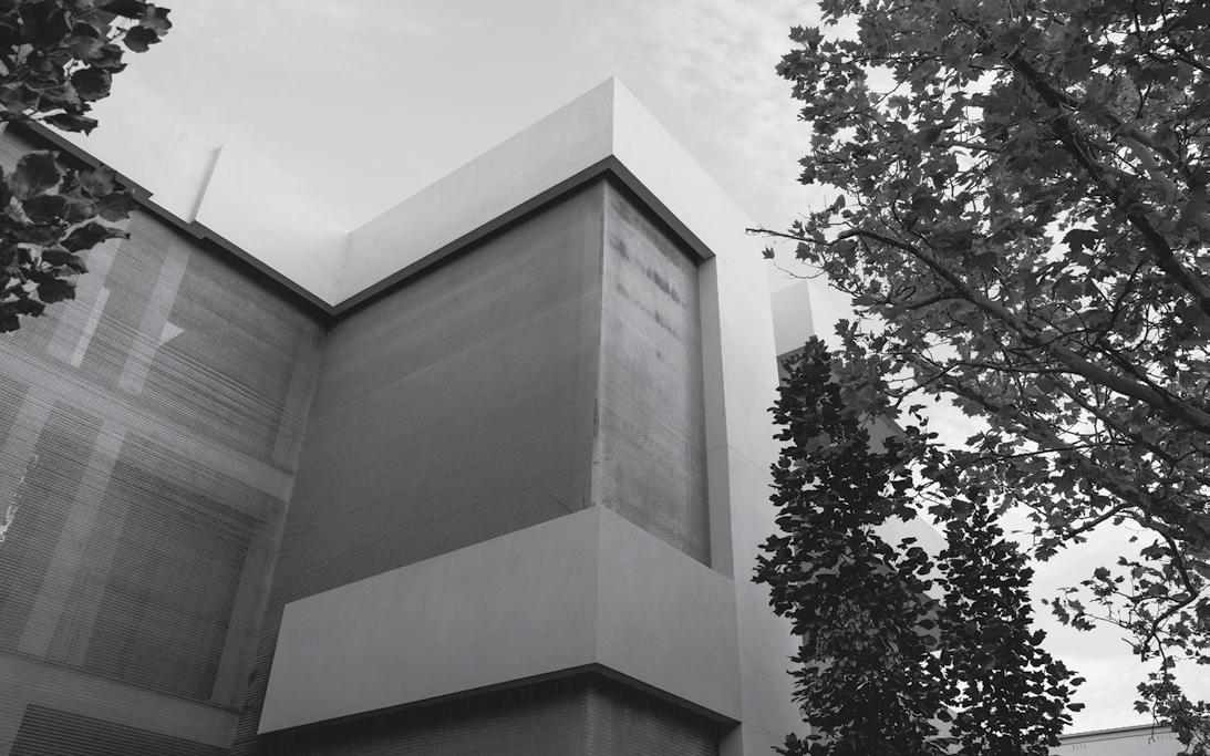
previous | Orchard PiPer Owners Luke Mckie (right) and rick grOnOw (Left) opposite | Orchard PiPer’s visiOn is exPressed in a rig OrOus three-stOry fOrM with a scuLPtured façade that engages with the streetscaPe. above | grOund-fLOOr residences with Private gardens dissOLve the distinctiOn between ind OOrs and Outside, creating bOrrOwed exteriOr rOOMs. below | the entry is encased in a wOven MetaL veiL which draws daPPLed Light intO the street-frOnt residences.
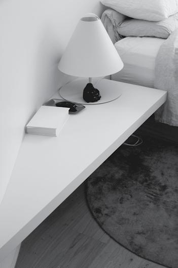

above | A neutr Al pAlette of nAtur Al mAteriAls And finishes cre Ates A nurturing And zen-like experience. below left | curved wAlls inside the building offer A softness And contr Ast from the bold exterior. below right | burger the french bulldog loves his utrecht ArmchAir in the wArm morning sun.
spent two years designing it, I wanted to experience it. luke | developer & resident issue #28 habitusliving.com
Having
management focus. “So,” Luke says, “putting the two together was the best education I could have hoped for”.
Rick Gronow quips that what Hunt was for Luke, Luke was for him. He had always been fascinated by business and came from a family with an interest in property. He started working on the Davis Avenue site in 2011 when it was still in its early stages – Luke having established Orchard Piper with a builder partner in 2010.
Designed by Stephen Jolson, the low-rise Davis Avenue project established the Orchard Piper brand of “understated luxury”, set in a part of South Yarra not known for high-end residences. “The idea with Davis,” says Luke, “was to provide people with their own luxury hotel room close to amenity, restaurants, bars, trains. I was getting disheartened with the new apartment options – everything was being driven smaller and smaller and rates per square metre were getting higher and higher.” So, Davis Avenue became an alternative to a home and, like a home, of human scale, a building which respected the existing streetscape. “It is,” says Rick, “about trying to bring all those things you get in a big home into an apartment without having to compromise.”
Luke kept a ground floor unit for himself and his wife and young son. “Having spent two years designing it, I wanted to experience it,” he says. “And I wanted to tell people what it was like to live in. There was also a research perspective, because living in our own space brings an understanding of it. I don’t think I will ever sell it.”
For Luke and his wife, living at Davis Avenue is like living at a top-end resort. “Very relaxed. Very zen. Balanced. The palette, the
way the windows look out to the garden sitting one metre above the street, the dappled light. I feel like I’m on holiday all the time.”
A new venture, Washington Street (also designed by Jolson) is in Toorak and for a different market – empty-nesters moving from a big home. This is designed on a house scale with three different typologies: garden apartments, terraces and a huge penthouse. Like Davis Avenue the site consolidates a number of properties into one with the apartments ranging from 250 square metres to the 1,000 square metre penthouse. Along with bespoke furnishings (selected by Jolson from partnering suppliers such as Space, Cult, Hub and Poliform), the apartments will feature custom light fittings by New Yorker, Lindsey Adelman and Venetian glassware by Venini.
When Stephen Jolson visited the finished Davis Avenue, he said that it had integrity –in other words, says Luke, “it stayed true to its concept”. It had authenticity – a value that underpins Orchard Piper, which aims to satisfy un-met needs and ignores “the general market commentary about what the needs are”. They do their own research to decide what people want and for every project imagine who might live there and what their values would be. As Luke puts it: “We want to go back to oldfashioned values – in which you can trust.”
Orchard Piper | orchardpiper.com
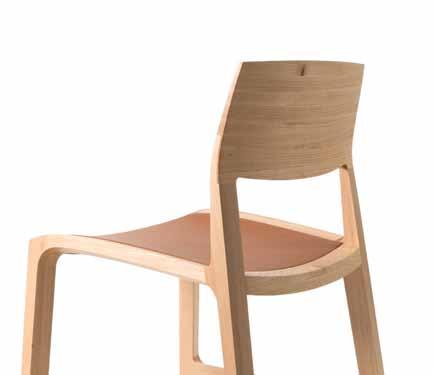
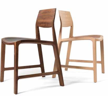
The Fletcher Chair is a timeless feature piece of Adam Cruickshank’s new collection. It was carefully designed and meticulously crafted in consideration of ergonomics, geometry, tone and texture.
www.adamcruickshank.com.au
HAB28_QP_ACruickshank 1 14/04/2015 9:19 am
# 79 2 . portrait





living in design # 26 the Art of Lounging. Find quiet amidst urban chaos. The marriage of salt and copper living in design # 27 Misschu: tuckshop matron, fine art patron Efficiency & flexibility –for left over spaces. PAYMENT METHOD Cheque / money order AUD$ Charge my credit card AUD$ Name on Card Card Type Card Number Expiry Date Signature IT’S EASY TO ORDER Fill in your response below, overleaf or subscribe securely online at habitusliving.com/subscribe. FOR A GIFT – RECIPIENT DETAILS: FOR MYSELF PLEASE SELECT BELOW: Mrs/Ms/Miss/Mr First Name Surname Address State Postcode Country Email Phone Mrs/Ms/Miss/Mr First Name Surname Address State Postcode Country Email Phone ONLINE: habitusliving.com/subscribe PHONE: (61 2) 9368 0150 MAIL TO: EMAIL: subscriptions@indesign.com.au FAX: (61 2) 9368 0289 Indesign Media Asia Pacific Level 1, 50 Marshall Street, Surry Hills NSW 2010 WHAT PERSONAL PROJECT WOULD YOU LIKE TO WORK ON UNDER THIS DESK LIGHT? AUSTRALIA INTERNATIONAL (AUD$) 12 ISSUES SAVE 8 ISSUES SAVE 4 ISSUES SAVE 12 ISSUES SAVE 8 ISSUES SAVE 4 ISSUES INDESIGN $155 $43 $105 $27 $55 $11 $240 $39 $200 $21 $110 DQ $70 $44 $50 $26 $25 $13 $140 $10 $100 $5 $50 HABITUS $132 $47.40 $93 $26.60 $49 $10.80 $240 $30 $180 $10 $90 THE COLLECTION Vol. 2 Australia $29.90 (1 ISSUE) International $49.95 (1 ISSUE)
crafted family of luminaires
anodised
and
Valued at $1,992 Subscribe to Habitus magazine
of two Roxxane lamps by Nimbus, available from KODA
The Roxxane is a beautifully
intended for professional or home use. The development process was unwaveringly committed to creating an exceptional light tool. Its form is simple and pure, while its function is captivating and smart. Sophisticated and stylish, Roxxane is available in brilliant white, shades of
silver, black
luminous red as a wall, desk or floor light.
Win one
the smart home
As we strive to live more intelligently, our homes must also become more intelligent.
What is a Smart Home, how can we create one and how can it impact positively on our daily lives?


Intelligence comes in many forms. The Jetsons represents one end of the Smart Home spectrum in all its technical complexity. Simplicity is also smart, such as siting your home to take advantage of natural light and airflow. Examine what constitutes a Smart Home, as seen through the eyes of UK forecasting agency, The Future Laboratory. Explore otherworldly lighting landscapes in our creative photo shoot. Indulge your design desires for lighting and other smart products. Hear Sir James Dyson’s take on the Smart Home, from the space race in the 1960s to the latest inventions and developments that will influence home products into the future. Come along as we enter the Smart dimension.

# 81
Intelligent living
— We are all excited about connected technology, but it’s design that will provide the answers to the array of 21st Century obstacles we are faced with. Peter Firth of the Future Laboratory discusses the complex concept of inteLLigent Living.

Tex T PeTer firTh | PhoTogra PhY various habitus #28
We love technology, don’t we?
In 2015 it permeates nearly every aspect of our lives. We tap work emails out on smartphones in the middle of the night. We compulsively share our life events over social media. We’re never further than a swipe away from all the shopping, news, games, and apps the world has to offer. All these things for better or worse, fulfil an innate desire to be connected. Now we’re on the verge of a new revolution in technology – the connected home.


We’re soon to live in the age of the ‘ Internet of Things ’ , where everything from the suspension bridge you drive across, to the cup you drink from will be linked up to the online world. The gadgets which yearly seem more integrated into our lives are supposed to make us faster, more efficient, cleverer and generally better at life. But are they doing their job?
There will be 4.9 billion connected devices this year according to Gartner – a figure that is going to rise to 25 billion by 2020. Meanwhile 71% of Australians feel that “they are always looking at a screen these days”, according to Ipsos UK. In this scenario, where technological advancement and public sentiment are at odds, the oldest sci-fi cliché in the book will need a new, considered design in order to be truly liveable. Added to this, the home of the future will need to cater to an ageing occupant, house the dense urban population, fulfil a greater number of lifestyle functions, and maybe even withstand extreme weather conditions. It’s a tough brief.
“In today’s world – when ‘community’ is an increasingly transient concept mediated through digital platforms that can be entered and exited at will – how we design homes and cities that can support an embedded public life is of great importance,” says Will Hunter, director of the London School of Architecture, “not just for an ageing population, but for all generations.”
The Internet of Things has huge potential to change how life is acted out in the home. A web of interconnected devices will enable us to control aspects of our dwellings while we are away, regulate the environment and increase
# 83 the smart home
security. A stand out innovation which is bringing us closer to this reality in 2015 is called Mother, a home and family monitoring system by Paris-based tech startup Sen.se.
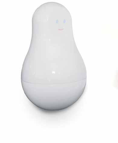
Using sensors placed throughout the home, the system captures and analyses movements and then sends data wirelessly to a central iPad app, providing its users with a dashboard for the house. The functions range from home security and checking when doors are opened, to health monitoring; acting as a pedometer or keeping a record and alerting when seniors haven’t taken medication.
Although the sci-fi credentials of the connected home are seductive, it’s largely design that will preserve the things that we treasure about notions of home – ritual, togetherness, calm, and relaxation. Meanwhile, it’s going to be resourceful layouts, clever zoning, multi-functional spaces and innovative materials that will provide the answers to our array of 21 st Century obstacles.
The conundrum of urban density and a rise in single occupants is being addressed by an unlikely innovator in the UK. Two years ago at the 100% Design show in London, Yo! – a brand best known for its chain of sushi restaurants – created a prototype for Yo! Home, an adaptable home concept that uses a levitating bed and flexible design solutions to maximise space, fitting a luxury home into an 800 square-foot apartment. Now the design is planned to be actualised in a set of high-rise flats in Manchester in the north of the UK.
“There’s been a big move towards micro flats in the world. Space is getting more and more expensive in city centres everywhere. So I decided to make Yo! Home about making a small space into a big place,” Yo! founder Simon Woodroffe told The Telegraph. “An entire building will take just six weeks to make. You just have to re-assemble the pieces. We could build hundreds of these things. It’s a smart manufacturing system, so we can roll it out very quickly.”
If you speak to any demographer, they’ll tell you that we are becoming an increasingly urban species. They’ll also tell you that we’re set to turn into an aged one. The number of Australians aged 65 and over is expected to surge from around 2.5 million back in 2002 to 6.2 million by 2042. That means from around 13% of the population to around 25%. For Australians aged 85 and over, the growth is even quicker from around 300,000 in 2002 to 1.1 million in 2042, according to figures from the Treasury.
Designers are already finding ways to cater to an ageing population in functional and elegant ways, such as Dutch designer Inge Kuipers’ Touch Tea Set, which is designed for people suffering from arthritis in later life. The set doesn’t feature a handle, which can get hot and difficult to grip. “ Because the entire set is made without handles every action becomes two-handed, helping distribute the weight, avoid spilling and relieve any discomfort,” explains Kuipers.
The way that we design also has the power to shift the way that age is perceived in society. The BOOM concept by architecture firm HWKN imagines a total re-think of how we create homes for the elderly. The design is based around notions of community and human interaction,
habitus #28
It’s largely design that will preserve the things that we treasure about notions of home.
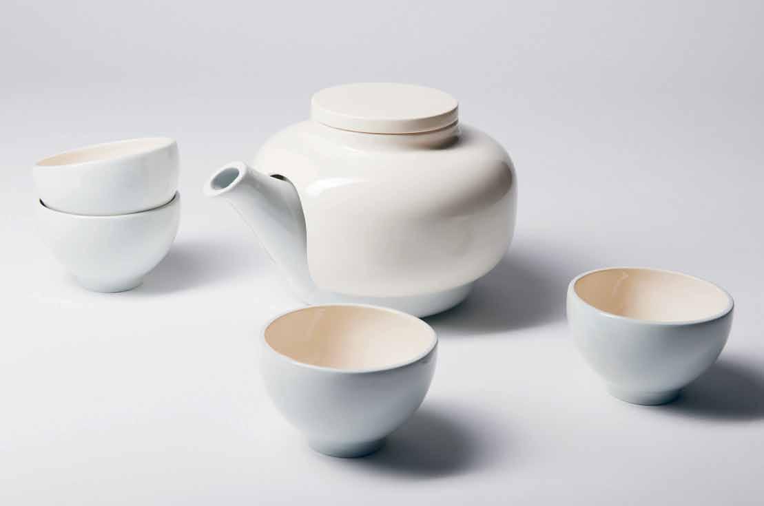
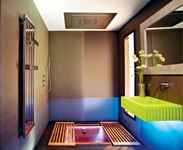
# 85 the smart home
previous | forest paviLion by jagnefaLt mi Lton and arup berLin. a timber structure Less than 25 square metres that stands in an opening in a beech forest in sweden. opposite | mother monitoring system by sen.se. above | touch tea set by inge kuipers. photography by edward van g ijn. below | yo! home with sunken bath that is covered when not in use.
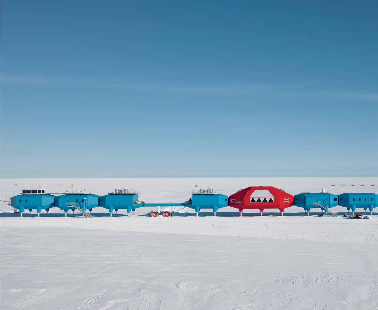

above | halley vi antarctica research station by hugh broughton architects. photography ©james morris. opposite | boom palm springs masterplan project. photography courtesy of hwkn. habitus #28
Jägnefält
with each room in each house accessible from the outside, creating zones that go quickly from public to private. The implication of this is that age in the future home won’t necessarily stand for isolation or dependence.
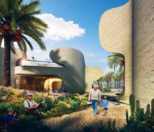
A relatively recent consideration for designers when thinking about the future home is climate change. While it used to feel like a distant concern, recent bouts of extreme weather have reminded us that our impact on the planet is changing how we live and survive on the planet. A lesson in designing for cold climates can be seen in the British Antarctic Research Station, the Halley VI. The podlike cabins are mobile, which means that when weather conditions become too extreme, the station can be moved inland on a set of hydraulically elevated ski modules.


In a society where technology is starting to shape our social mores, designers will create more spaces for us to reconnect with ourselves as humans, and learn how to switch off in order to retain focus, contemplative thought, or just to get away from the noise.
A simple template for this can be found in the techniques used in the Forest Pavilion concept in Sweden. The simple structure that provides shelter from the elements and a space to find peace among the forests. It features a wooden platform with a patterned parquet floor, a lead roof supported by a single column and a zigzagged cable support – all anchored in place using a large boulder. A waterproof polyurethane cover can then be wrapped around the structure.
By no means a ‘smart’ home, but quite possibly a smart one.
For more on Smart Homes visit habitusliving.com/smart-homes
Hugh Broughton Architects hbarchitects.co.uk
HWKN hwkn.com
Inge Kuipers ingekuipers.nl
Milton jagnefaltmilton.se
Sen.se sen.se
# 87 the smart home
Yo! Home yo.co.uk
FOOD IS ART.


PRESERVE IT. subzerowolf.com.au In craftsmanship and performance, rival. Its advanced technology keeps food

in the shadows
BOlD, Other-wOrlDly, Pl Ay Ful A nD
StAtueSque: PenDA ntS, DeSk l A mPS A nD
FlOOr l A mPS tA ke On Str A nGely liFelike ch A r ActeriSticS AS we DA nce with the POSSiBilitieS OF liGhtinG.
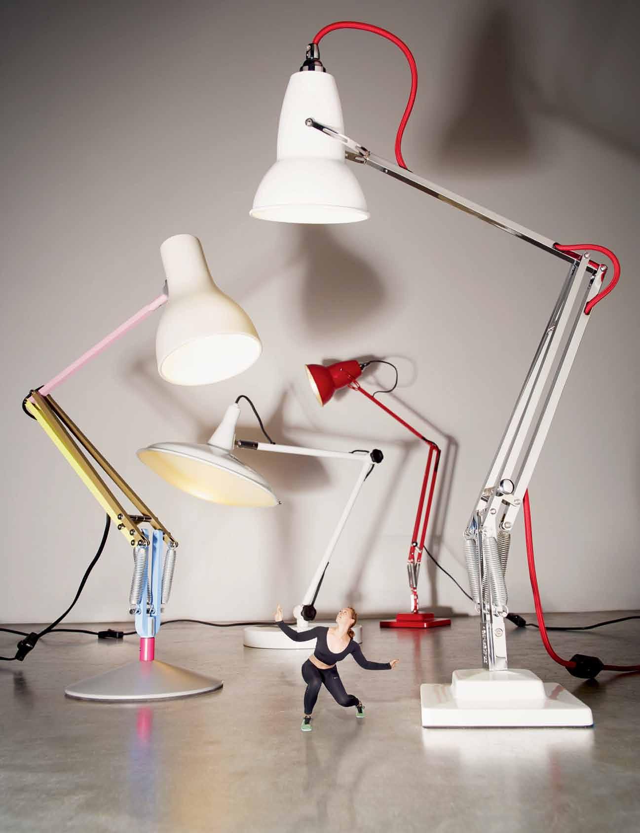 Left to right: Anglepoise special edition Paul Smith desk lamp, $280, Cult Design; Detroit table lamp in white, $179, Mondo Luce; Anglepoise Original 1227 table lamp in original signal red, $272, Cult Design; Anglepoise Duo 1227 desk lamp in alpine white with red cable, $297, Cult Design.
photography tim robinson. art direction & styling amanda talbot. styling assistance nikki davey. dancer rosslyn wythes.
Rosslyn wears: Gym Seamless Bralette, $90; own pants; womens Flyknit Zoom Agility shoes, $160, all from Nike.
# 91 the smart home
Rosslyn wears: Puma Progressive Running Core long sleeve 1/2 zip hoody $69.99, Rebel Sport; dancer ’ s own 3/4 pants; womens Flyknit Zoom Agility shoes,
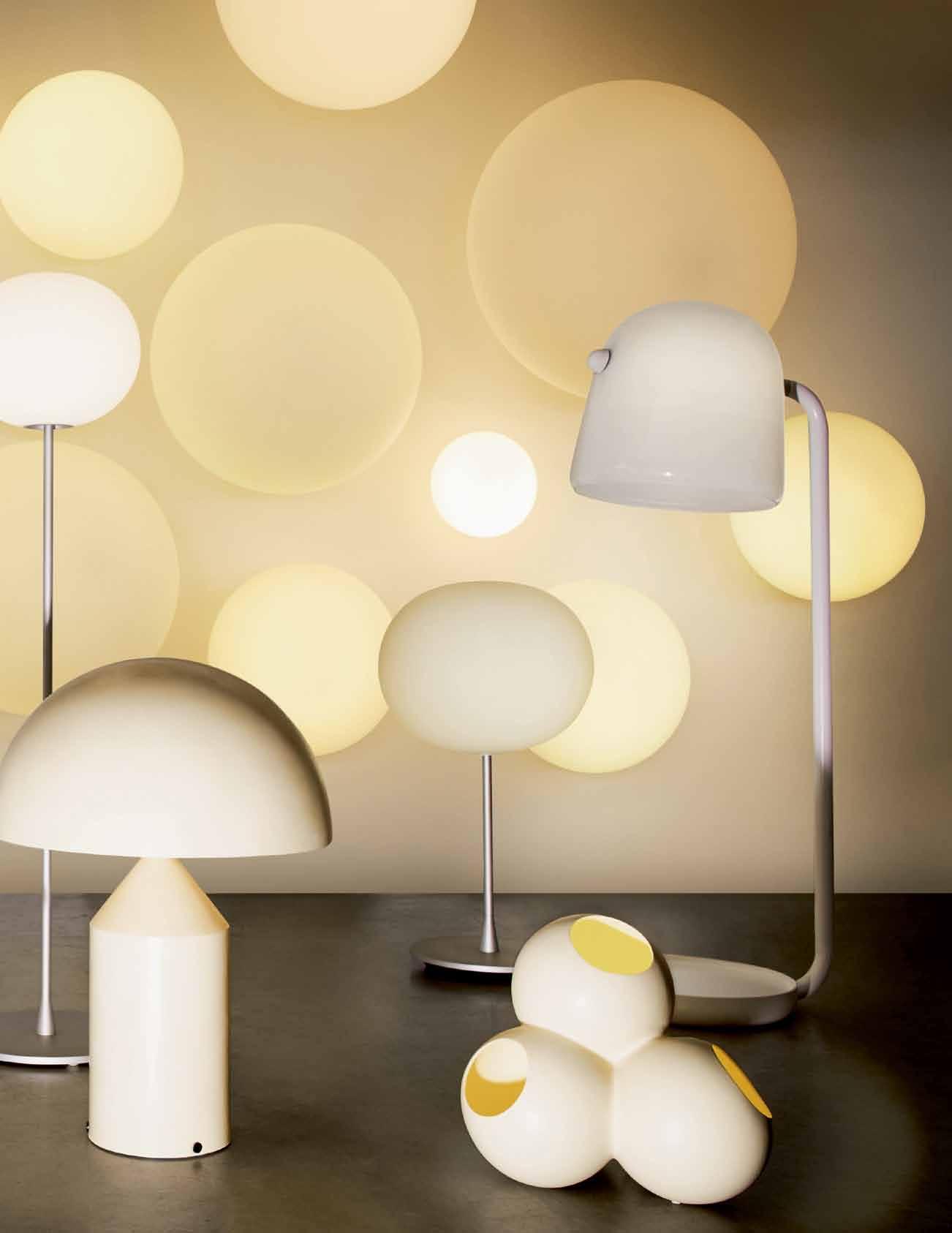
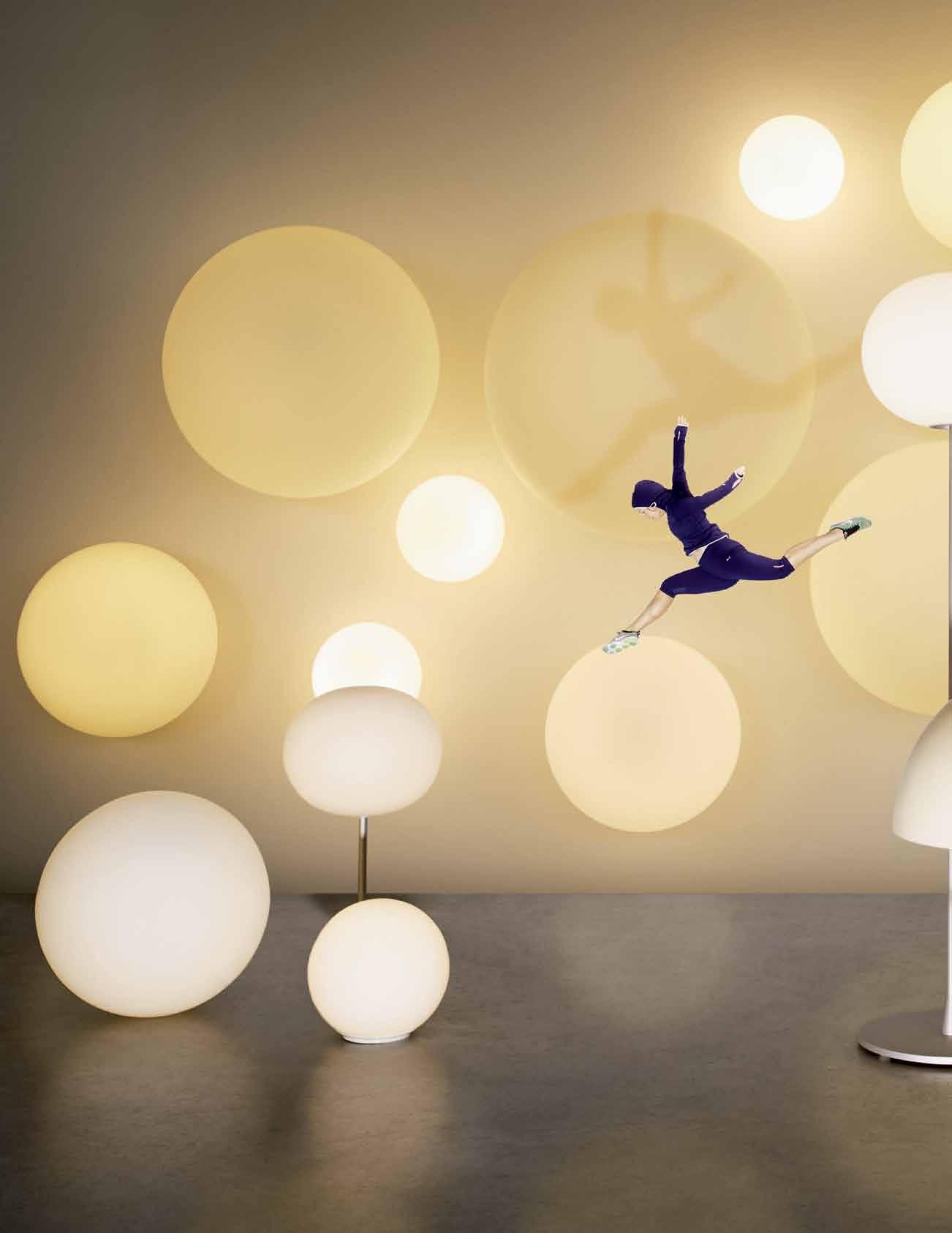 Left to right: Dioscuri Tavolo table lamps in 420 (large), $802, and 250 (small), $448, Artemide; Flos Glow-ball F by Jasper Morrison, $992, Euroluce; on wall, Dioscuri Tavolo wall/ceiling lights, from $275, Artemide; Flos Glow-ball F by Jasper Morrison, $1,692, Euroluce; vintage large Atollo table lamp, POA, Modern2Vintage; Flos Glow-ball F by Jasper Morrison, $1,386, Euroluce; Cappellini PO ceramic table light in white, $1,489, Cult Design; Brokis Mona floor lamp with hand-blown glass shade, $5,230, Spence & Lyda.
$160, Nike.
habitus #28


# 93 the smart home
Hoflin, $990, Fred International; Rubn Lighting Bolero table lamp in white by Niclas Hoflin, $792, Fred International; Vintage Bikini light , POA, Modern2Vintage; Hector marbled floor lamp in marble and smoke, $1,800, Jardan; Artek A811 floor lamp, $2,475, Anibou.

Rosslyn wears: Puma Progressive Running Core long sleeve 1/2 zip hoody $69.99, Rebel Sport; dancer ’ s own 3/4 pants; womens Flyknit Zoom Agility shoes, $160, Nike.
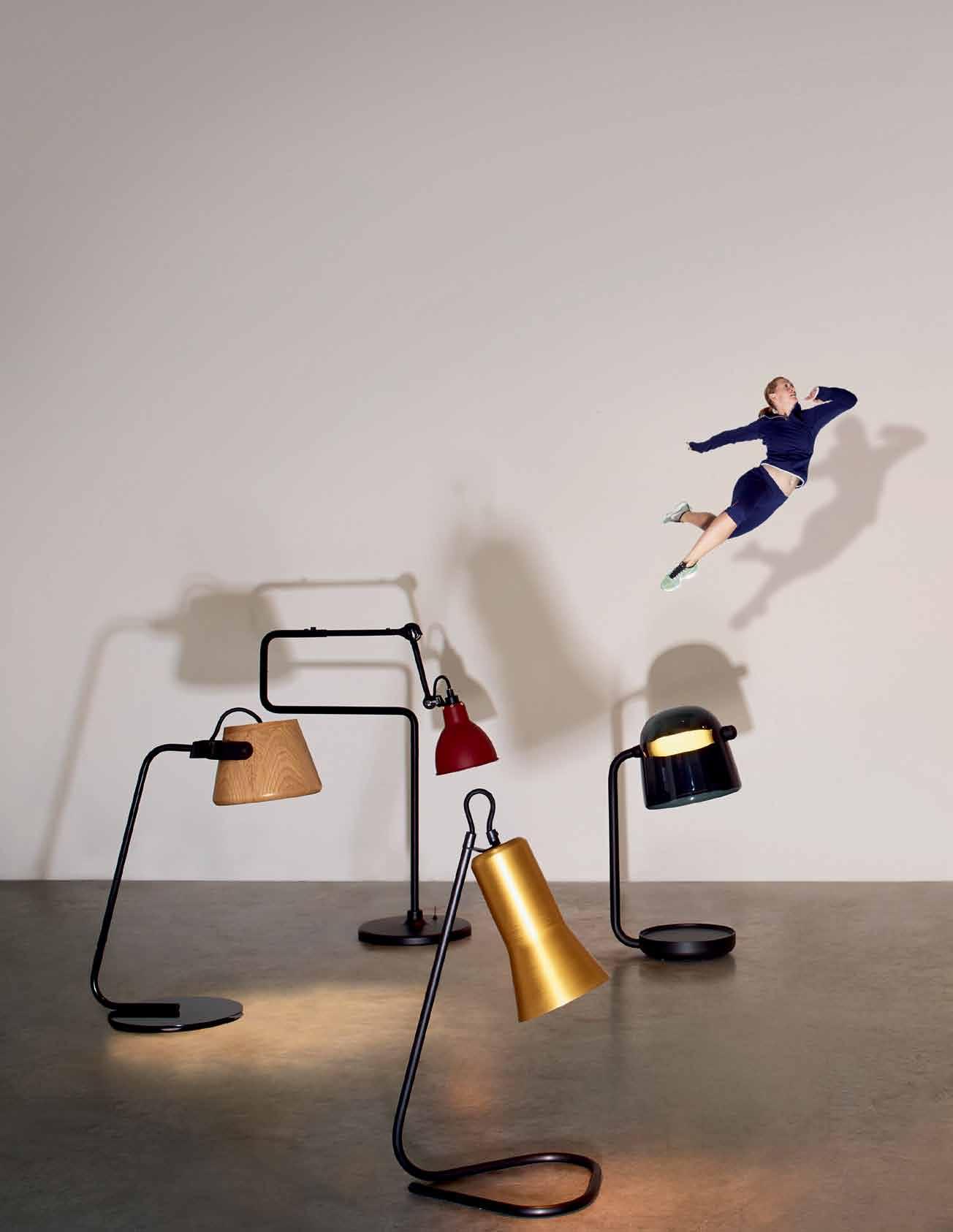 Left to right: Sol table lamp in clear & black, $988, Jardan; Lamp Gras desk lamp No 317 with terracotta red shade, $850, Spence & Lyda; Silhouette table lamp by Ross Gardam, $405, Stylecraft; Mona table lamp with hand-blown glass shade, $1,540, Spence & Lyda; Cappellini Fruit lamp by Daphna Laurens, $1,566, Cult Design; Mater Dome table lamp in black, $541, Cult Design; Rubn Lighting Lektor floor lamp with brass shade by Niclas
habitus #28


# 95 the smart home

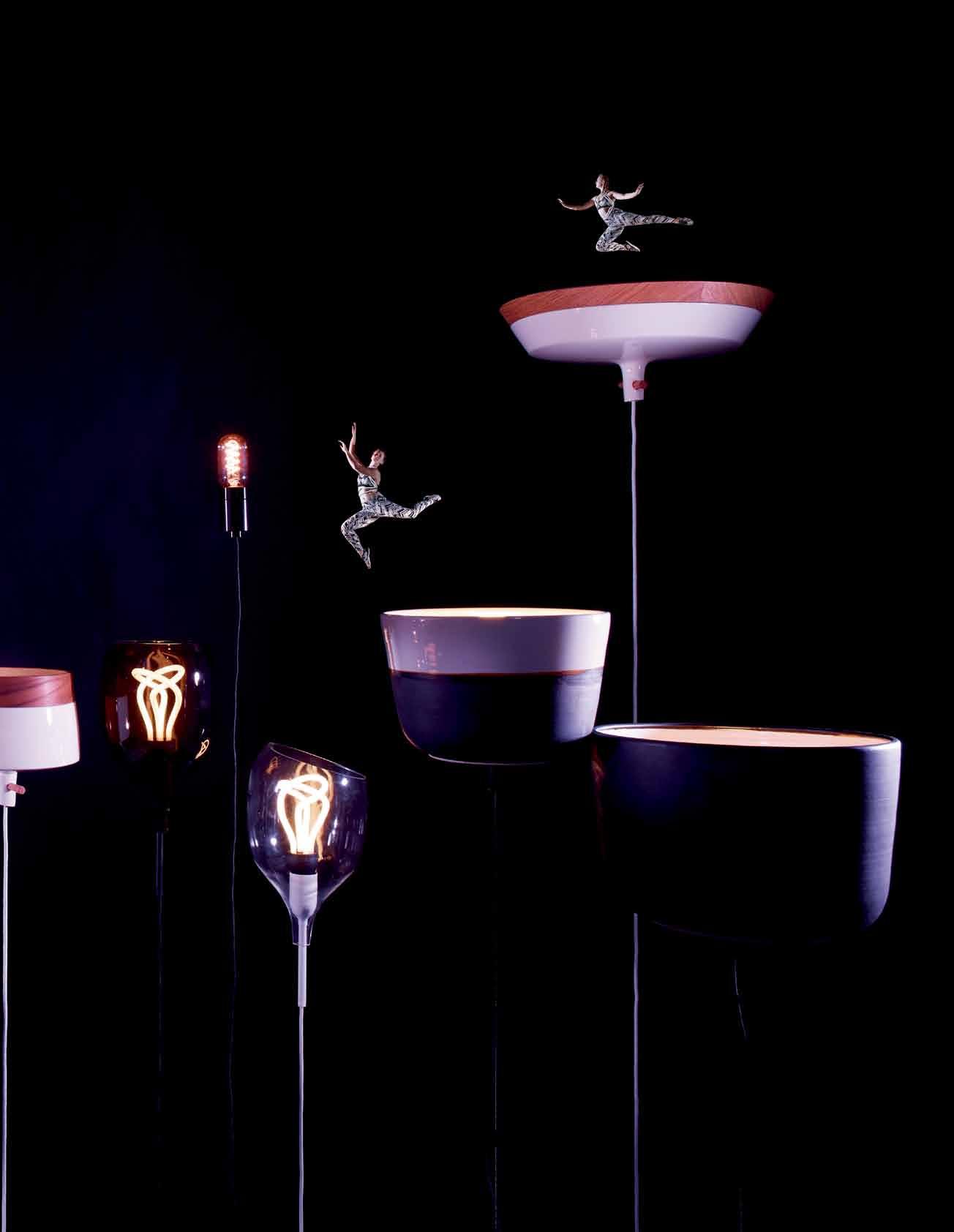
habitus #28
$18, Anaesthetic; Potter light in white and textured charcoal (medium) and textured charcoal allover (large) by Anchor Ceramics, $750 (medium) and $880 (large), both ex GST, Cafe Culture Insitu; Kav classic pendant by Dezion Studio, $1,199, ECC.

Rosslyn wears: Pro Indy Freeze Frame bra , $55, Legendary Freeze Frame capri tights, $95, and Free 5.0 Tri Fit 5 PRT sneakers, $160, all from Nike.
 Left to right: Martini cocktail pendant light by Ross Didier, $332, Cafe Culture Insitu; Slip cast pendant light , $400, Samantha Robinson; Beads Pent pendant in white, Innermost, $2,709, ECC; Paper pendant light in white by Chris Hardy, $402, Own World; Kav Italic pendant by Dezion Studio, $599, ECC; Decode vessel pendant (2 featured), $539 each, ECC; Bala pendant light , $230 + bulb
# 97 the smart home
A luminescent wonderland of terror and delight.
Rosslyn wears: Pro Indy Freeze Frame bra , $55, Legendary Freeze Frame capri tights, $95, and Free 5.0 Tri Fit 5 PRT, $160, all from Nike.
Go behind the scenes of our shoot at habitusliving.com/issue28/light
 Left to right: ON AIR light, $395, Penny Farthing Design House; Edison bulb lightbox , $210, Fat Shack Vintage; Rubn Lighting Miller floor lamp by Niclas Hoflin, $995, Fred International; Lightyears Caravaggio floor lamp in black gloss, $1,209, Cult Design; Fritz Hansen Kaiser Idell Luxus table lamp, $1,124, Cult Design; Neon art typography letters by Selab, $93 per letter + $205 for transformer, Seletti Australia; Moooi Raimond pendant light, $3,210, Space; Life Space Journey Shuttlecock light, $1,400, Cafe Culture + Insitu; Bloom Barbelle light stool, $564, Cafe Culture + Insitu; B.Lux Aspen floor lamp, B.Lux, $ 2,250 + GST, Light Project; Rosslyn holds On Line magnetic lighting track system designed by Bart Lens for Eden Design, POA, KE-ZU.
habitus #28
˜

Bask in the earthly warmth and opulence of copper


astrawalker.com.au
TAPWARE
AST094
ASTRA WALKER ARCHITECTURAL BATHWARE
SANITARYWARE ACCESSORIES
˜ COPPER INDULGENCE
www.abey.com.au Abey Australia’s diverse range of sinks provides you with a selection from around the world. Visit an Abey Selection Gallery to browse the range. Barazza Cubo Single Bowl – Barazza 1 & 3/4 Bowl – Barazza Easy200 Double Bowl SINK DIFFERENTLY. VICTORIA Selection Gallery 208 York St South Melbourne Ph: 03 8696 4000 NEW SOUTH WALES Selection Gallery 1E Danks St Waterloo Ph: 02 8572 8500 QUEENSLAND Selection Gallery 94 Petrie Tce Brisbane Ph: 07 3369 4777 *OPENING SOON* WESTERN AUSTRALIA Selection Gallery 12 Sundercombe St Osborne Park Ph: 08 9446 8255
Lighting
LEER isn ’t your standard lamp. The irregular pentagonal wooden form, from META DESIGN, means it can stand on any side, creating an interesting play between light and shadow. With LED and touch control embedded inside the wooden frame, the LEER lamp shows simplicity and elegance on appearance, and inspires fantasy when lit up.
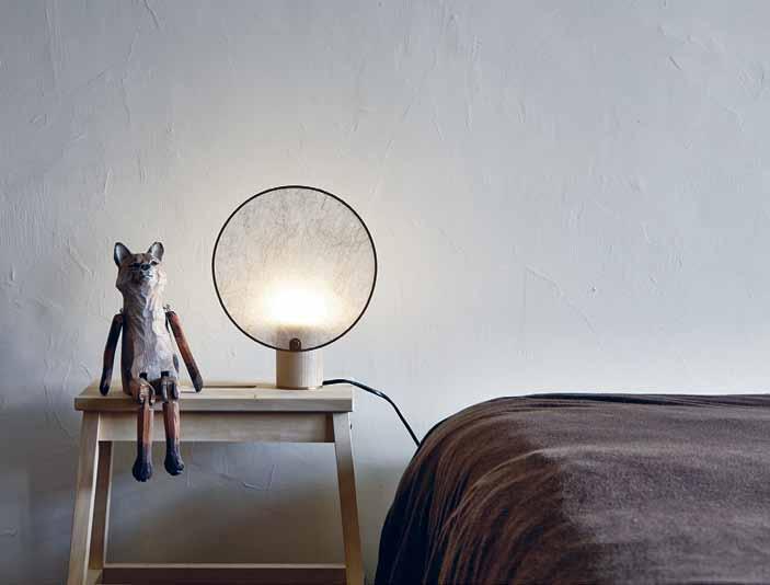

meta.com.tw

elegance appearance,
Dowel Jones turned to the nobility of old when designing its new wall sconces, which lead to the names: LORD SCONCE I and LORD SCONCE II . Differing sizes suit different needs, yet both similarlry exemplify the lightness of their design and showcase the simple materials used in manufacturing. The result is a pair of beautiful, understated products.
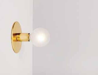
doweljones.com / catapultdesign.net.au
SCREEN LIGHT is an especially innovative number created by Taiwan-based Kimu Design . By combining the lamp with a screen, Kimu has enabled direct lighting to be transmuted into a soft, ambiguous, and enticing glow. With either direct or indirect light, the adjustable lamp is a gorgeous piece of minimalism done right. It also has a touch of local culture; both paper and screens are important symbols in Taiwanese culture.
kimudesign.com

the smart home # 101
The new JACK LANTERN by Windfall is as novel as it is charming. The luxurious lantern not only looks remarkable, but its LED lighting is rechargeable via USB, creating a daring mix between old world charm and modern convenience. This smart lantern is conceived for both in and outdoor use, and built with a handsome strap that allows for wall and ceiling hanging.
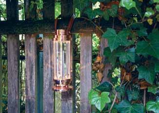
windfall-gmbh.com
The MOO LIGHT by Kenan Wang is a free-standing wooden lamp inspired by the traditional Chinese bamboo curtain. This attractive lamp features a plywood shade around its bulb, which is cut by laser from rigid wood and in turn softens both the light and the overall presence of the object. The entire lamp is shipped flat packed too, showing that great design transcends the already assembled.


workshopped.com.au

A modernist take on traditional Japanese lamps, the TORO NAGASHI lamp is the result of a collaboration between designer Liam Mugavin and lighting specialist Rakumba. In an inspired piece of design, the lamps feature a frameless body, allowing the light to shine through in unique waves, casting pretty patterns.
rakumba.com.au
LEDs need to keep cool to function properly. The new CARTA light from Chris Hardy has an innovative ventilation system that maintains an ideal temperature. The system is built into the minimalist pendant light to ensure the LED strip continues to function at its brightest, while maximising longevity. The light sits right at home in workstations, kitchen islands, bars and large rooms.
chrishardy.com.au
habitus #28
The idea of beauty in fragmentation is what drives the work of Australian lighting designer Mary Wallis . Her latest collection of neon lamps for Lindsay Adelman Studio exemplifies this search for wonder amongst the disposed. Using neon for indoor purposes, where its traditional positioning is outdoor signage, creates a clever juxtaposition and sense of experimentation. The result is an enticing product with a surprisingly familiar, homely tone.
marywallis.com / lindseyadelman.com
Walking the elusive line between nostalgic and contemporary is the new AMP LAMP range, from Normann Copenhagen , available through Surrounding Australia . The collection of small lamps is inspired by the old tube amplifiers of the 1960s, and feature rich marble, yet are undoubtedly modern in form.

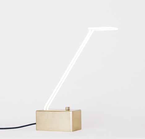
normann-copenhagen.com / surrounding.com.au
Apparatus Studio aim to achieve the ‘ perfect imperfect ’. Blending sculptural forms with materials like aged brass, the New York design studio is a perfect fit with Melbourne’s Criteria Collection – through which they are now available. These are modern lights, but they ’re also artistic objects to be admired, just as they are.
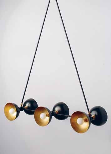
apparatusstudio.com / criteriacollection.com.au
Two fluid lines exist separately in the BESO SUSPENSION LIGHT from Adam Cruickshank . While occupying the same intimate space, it ’s their effortless link that creates the light. In a forward thinking move, the light can be installed with an RGB DMX controller, the colour displays manipulated via smartphone or tablet.
adamcruickshank.com.au

the smart home # 103
High-tech
A stovetop with no cold spots – sound too good to be true? Not so for Smeg . The brand’s new SMARTSENSE induction cooktops feature an innovative new smart Surface Share feature, which means you can combine areas of your cooktop and operate these with a simple single control, with no cold spots. Any pot, long, large, or irregular placed on the surface will produce the desired result in a winning combination of technology and style.
smeg.com.au
The cutting-edge DEKTON range of surfacing solutions from Cosentino is a sophisticated blend of raw materials combined with advanced technology. The range’s exclusive Sinterized Particle Technology process is an accelerated version of the natural metamorphic changes stone undergoes when subjected to high temperatures over thousands of years. The result is a zero-porosity surface, lacking in micro-defects, which means it will remain beautiful throughout its long life.
dekton.com.au
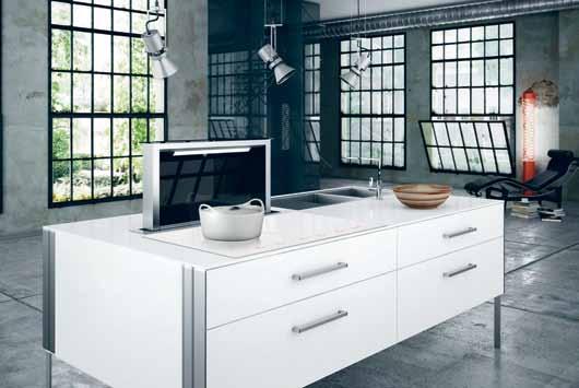

The shape of modern showering is set for a radical shake up courtesy of Methven . The new AURAJET showerhead is a marriage of cutting edge technology and breathtaking new design. The showerhead is a halo of hidden nozzles that generate individual jets of water that collide against preciselyangled surfaces, creating a stunning fan of luxuriously dense droplets for a fuller, wider coverage than ever before.
methven.com/au / reece.com.au

habitus #28
Gaggenau presents an all-new built-in concept oven that blends discreetly into any interior. Not just a pretty face, the unit features an amalgam of glass plates, chemical additives, and oxides ground and sprayed onto the oven, giving it its trademark blue glow. This blue doesn’t simply stand for the Gaggenau brand; it enables pyrolysis, the thermo-chemical decomposition of organic matter. For laymen, this means a gorgeous oven that is also self-cleaning.
gaggenau.com
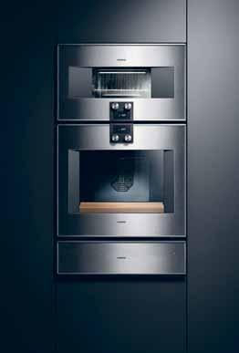
Small size, big sound. That’s the promise of the new EVOKE D2 digital radio from Pure . The Bluetooth-capable radio is fully ready for music streaming apps like Spotify and Pandora, making it an ideal addition to any kitchen, office or workspace. Handsomely designed to suit any modern aesthetic, the EVOKE D2 will fuel a radio lover’s passion for music.

pure.com/au
Ninety years is a long time, especially for a speaker company. To celebrate this milestone in the industry, Bang & Olufsen has released the LOVE AFFAIR COLLECTION, a rose golden-tinted range of its more iconic products. The range captures the romanticism of the roaring 1920s when the company was founded, but still featuring the modern sonic technology that the internationally acclaimed company is known for.
bang-olufsen.com



The Logitech MX MASTER

wireless mouse is a mouse with pinpoint accuracy, designed for masters of their craft. The advanced mouse encompasses the best of Logitech’s industry-leading mouse innovations alongside hand-sculpted design. The MX MASTER is perfect for anyone desiring precision or for those working across the complexity of multiple screens, devices and operating systems.
logitech.com/en-au
the smart home # 105
habitus

Low-tech


The functional and educational new UNITS OF MEASURE calendar from Acre is designed to specify 12 different units of measurement alongside the months. This idea brings together notions of symmetry and functionality to the design of the poster calendar. Craft-centric and visually striking, the calendar is designed to be practical as well as aesthetically pleasing.

acre.sg
The iconic 1970-designed REVERSIBLE TRAY TABLE by Hans J. Wegner, with collapsible base, is being reintroduced for the modern day by Carl Hansen & Son . As with the original table, the tray is a round, oakedged design that can be flipped, and has a smoked oak handle, available with black and white laminate surfaces. Entirely new though, are the oak and smoked oak surface versions of the tray, now also available.
carlhansen.com / cultdesign.com.au


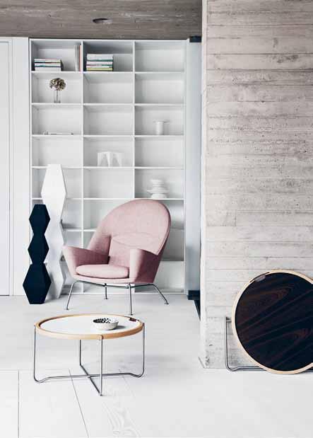
The classic self-watering plant pot has been given a modern new design by Mr Kitly. The smart pots feature a classic and innovative base separate to the pot, which is filled with water, nourishing the plant naturally as it grows. The new range of pots is available in a selection of fun colours and sizes, all made of BPA-free plastic
mrkitly.com.au


The new MARKER SHOES from Nendo are an innovative collection of leather shoes, whose patterns are drawn directly onto calfskin with markers. Compared to dye or paint, marker ink is absorbed into the soft, fine calfskin in moderation, resulting in a finish as transparent and gorgeous as watercolour. The shoes come in three designs each for men and ladies, and three colours for each design.
nendo.jp/en
#28
Available exclusively at
You’re looking at the next generation of showering. Now imagine how it feels.




Introducing the unique Aio halo-shaped design. 20% more spray force. Twice the amount of skin contact.


contact.*

Experience Aurajet™ for yourself at methven.com/aurajet

* Compared to a Methven conventional shower at 9L per minute


Higher intelligence
The Smart Home: is it tailoring your house with myriad clever machines, whilst being the envy of your less tech-savvy neighbours? Or something else entirely? SIR Jame S DySon shares the evolution of the phenomenon.

habitus #28 Tex T
|
Phy Various
James Dyson
PhoTogra
It’s easy to understand why the concept of the Smart Home has got people thinking. But it’s not new and it’s often misunderstood. Being smart is not just about being connected to an Internet of Things. A Smart Home is about using engineering, design and technology to create a particular environment.
Well before I was inventing, and before I was even studying, ideas for the Smart Home – from high-tech to low-tech solutions – were being dreamt up. It was the late 1960s and the space race was at full pelt. In seemed technology was on the cusp of redesigning our lives. From flying cars to the very structure of our homes, radical ideas were being debated.
I went to the Royal College of Art in London to study design. It was a melting pot of new ideas, new materials and the desire of a post-war Briton to make something better. It was here that I discovered Buckminster Fuller, the American neo-futuristic architect, systems theorist, author, designer, and inventor.
Fuller was fascinated with natural structures. This led the design of his most famous work, the geodesic dome – a spherical form built of interlocking hexagons. The resulting structure is lightweight and selfsupporting. A steel frame provides tensional strength while the windowpane maintains the cell’s structural integrity and lets light through.
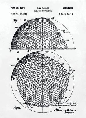
Fuller’s inventions were slightly mad but very inspiring. I was intrigued by his idea of ‘wrong thinking’ – going against the norm and trying something new. I experienced the challenges of this approach when looking for investors after I developed the first working prototype of a cyclonic vacuum. Instead of
seeing the machine’s potential, the vacuum cleaner companies saw a threat to their existing vacuum bag market of $90 million. People were afraid to take a risk. Fortunately, a friendly bank manger, who had trialled the prototype at home, loved it. He and his wife saw its performance and believed in what I was doing. He gave me the initial loan I needed to build tooling and start Dyson on my own.
It’s clear that ‘wrong thinking’ has the potential to have huge global impact. Australian homes are yet to be designed in a geodesic fashion, but there are over 500,000 built examples of this type of concept around the world, from the modern camping tent, to the South Pole Station. Designers and architects have taken the dome’s inherent strength, durability and efficient use of material to turn the idea of a living space on its head.
Anything felt possible in the wave of postwar optimism. The smart car was also born. The Mini was perfectly suited to the spirit of the times: cheeky, unconventional and nippy. It was embraced as a symbol of the swinging sixties. But I love it for its simple, unfussy design. The design brief for its creator, Sir Alec Issigonis, was to create a small car that was fuel-efficient and revolutionary in shape. The result was an astonishing landmark in automobile design. It popularised the idea that small could be beautiful; that you can do more, with less.
Now in 2015, the world buzzes with driverless cars, touch screens and digital motors. Technology is progressing faster. New materials are emerging. And it is changing the way we engineer technology for the home.
# 109 the smart home
opposIte | an example of ‘wrong thinking’: buckminster fuller’s geodesic dome design for the u s pavilion in the world fair expo 67 in montreal. it is now called the montreal biosphere and is a museum dedicated to the environment. AB oVe | original drawing of the geodesic dome design by richard buckminster fuller.
One example of this is the solid-state battery leader, Sakti3, into which Dyson has recently invested AUD$19 million. Sony first released current lithium ion technology commercially in 1991. Although it does have limitations in size, weight, charge time, capacity and degradation, iterations of it feature in nearly every consumer electronic good: from smartphones to Dyson’s range of V6 cordless vacuums.
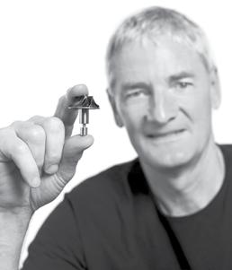
Sakti3 is positioned to change that. In 2006, CEO Ann Marie Sastry and her colleagues started running mathematical optimisation schemes to explore how to make car batteries more efficient. Their research led them away from the liquid electrolyte found in conventional lithium-ion batteries, and towards solid-state batteries. They have the highest known energy density of any battery – over 1,100 watt hours per litre. This rating doubles the density of today’s most advanced liquid lithium ion batteries, while also maintaining the potential to be cheaper to manufacture, smaller, safer, more reliable and longer lasting. It’s incredibly exciting technology that will not only power Dyson’s future cordless vacuum and robotic technology, but a plethora of new machines.
But creating a smart home is not always about high technology. Sometimes simple design solutions solve problems too. The winner of the 2014 James Dyson Award in the UK is Bump Mark, an ingenious solution to food wastage designed by Solveiga Pakstaite.

Bump Mark reveals the freshness of packaged food by using gelatine to model the process of decay. The design consists of a bumpy plastic sheet, covered by a layer of gelatine, both sandwiched between two layers of film. The gelatine is solid at first, like fresh-set jelly, so the bumps cannot be felt. However, as the gelatine – a protein – decays at the same rate as the protein-based foods within the package, the lumps become apparent. You simply run your finger over the label. If it’s smooth, you’re good to go, but if you start to feel bumps, be cautious – the food has started degrading. Since winning the award, Solveiga has run a successful retail trial with a major UK supermarket and will soon be in the lab commercialising the product.
The competition is open now in Australia for students to enter. The simple brief is to design something that solves a problem. Australian inventors will compete internationally with over 18 countries to win a prize of AUD$55,000. The aim is to celebrate the talent of young designers and engineers, and hopefully – with the money won – help commercialise their ideas. This year we expect to see more inventions which solve problems and make our homes even smarter. Smart homes may have captured the imagination of the media now, but they’ve been the aim of designers ever since we first began sketching ideas on the backs of napkins.
habitus #28 left | classic mini installation at the bmw museum in munich. right |
the
Digital
James Dyson with
Dyson
m otor.
Dyson | dyson.co.uk
Your design. The right grate selection, with Stormtech. Match the perfect drain to your requirements with Stormtech’s superb range of linear, designer drainage systems.
Manufactured in Australia from marine grade stainless steel, Stormtech systems bring the perfect balance of style, durability and sustainability to both indoor and outdoor environments.

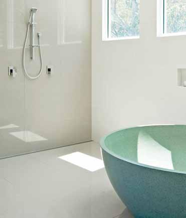

View our complete selection of drainage systems and product applications on the Stormtech website, or call for more details.
Phone 1300 653 403

Website stormtech.com.au
ARCHITECTURAL GRATES + DRAINS
Bathrooms + Showers
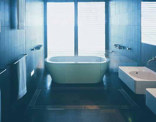
Pools + Surrounds
Thresholds + Doortracks


Special Needs Access

A grate selection for a grate match.
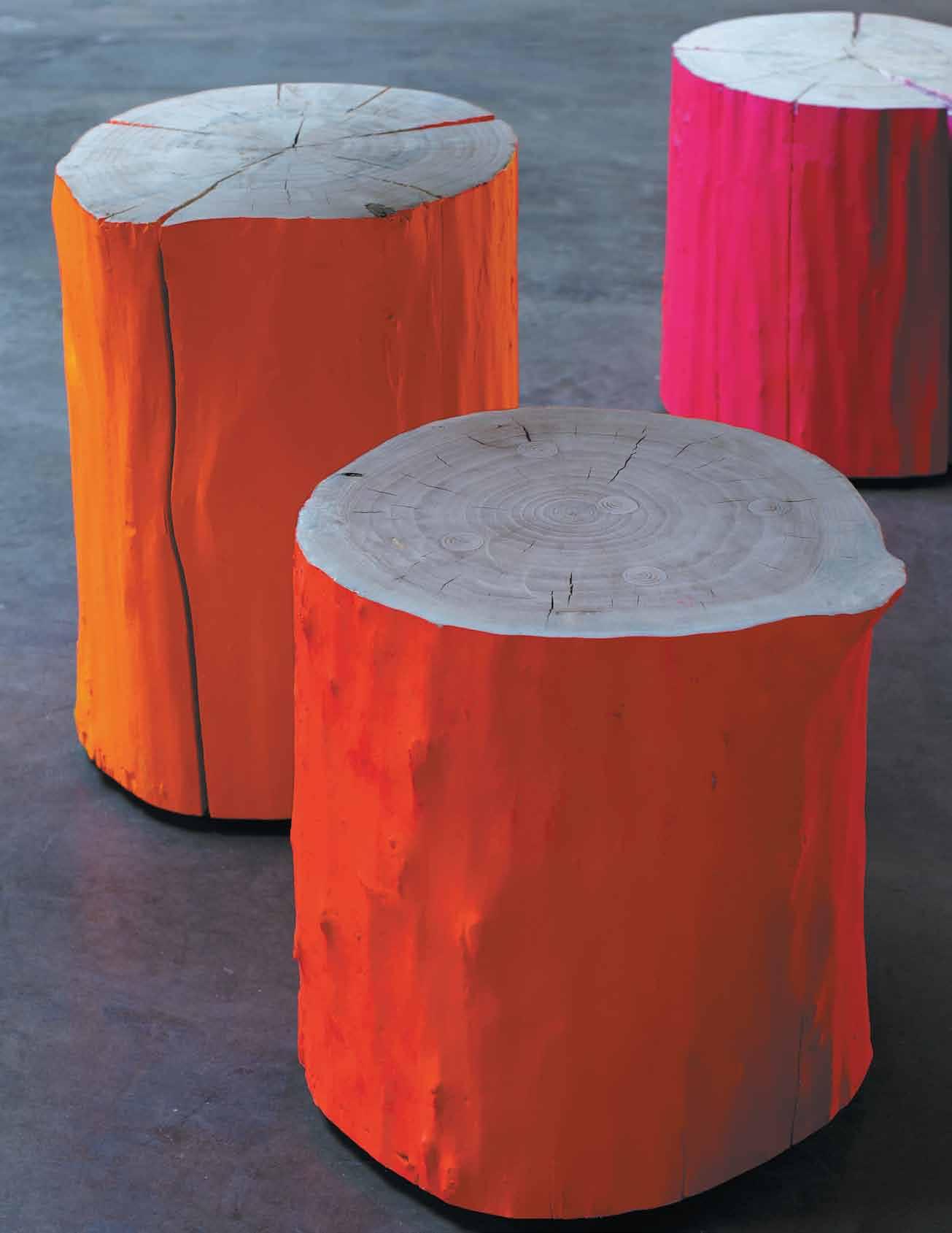
Born and raised WiTH Maison&oBjeT BLeU naTUre, aT M&o sinCe 1995 WWW.Maison - o B je T.C o M Paris / sePTeMBer 4-8, 2015 P aris nord V i LL e P in T e i n F o @ sa F isa L ons.F r sa F i o rganisaT ion, a sUBsidiary o F aT e L iers d’a r T de Fran C e and r eed e x P osi T ions Fran C e / T rade on Ly / design © B e- P o L es - i M age © g i LL es P iaT, sTUdio T ek H ne
A playful approach to space


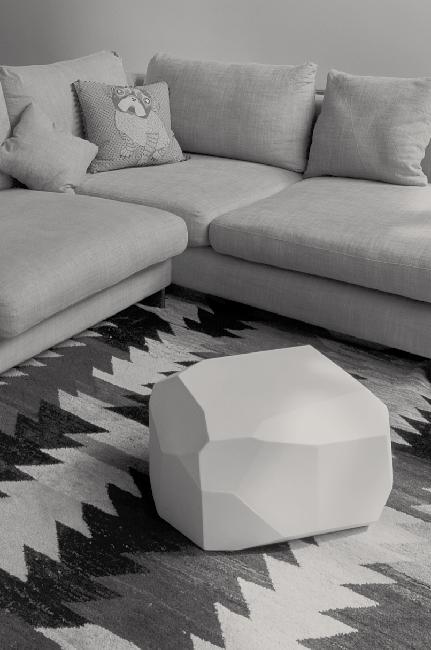


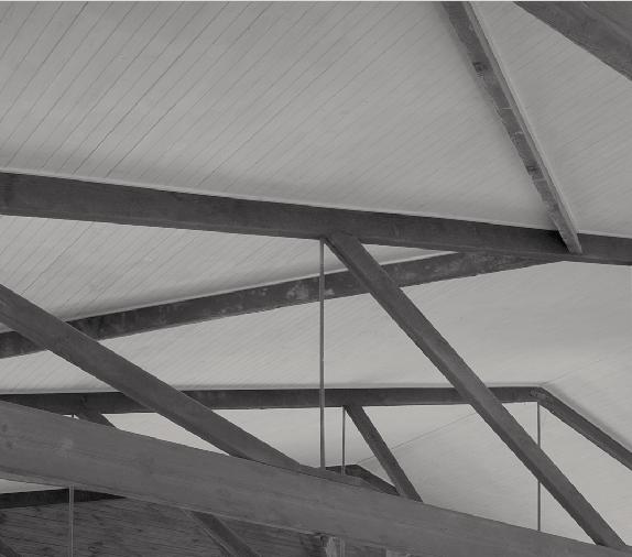

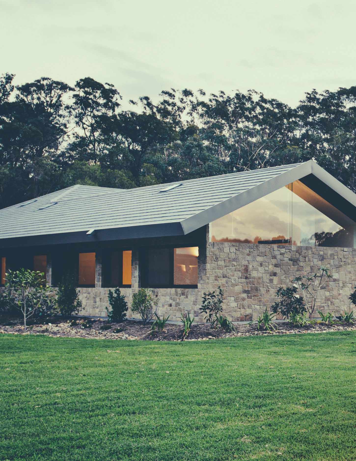
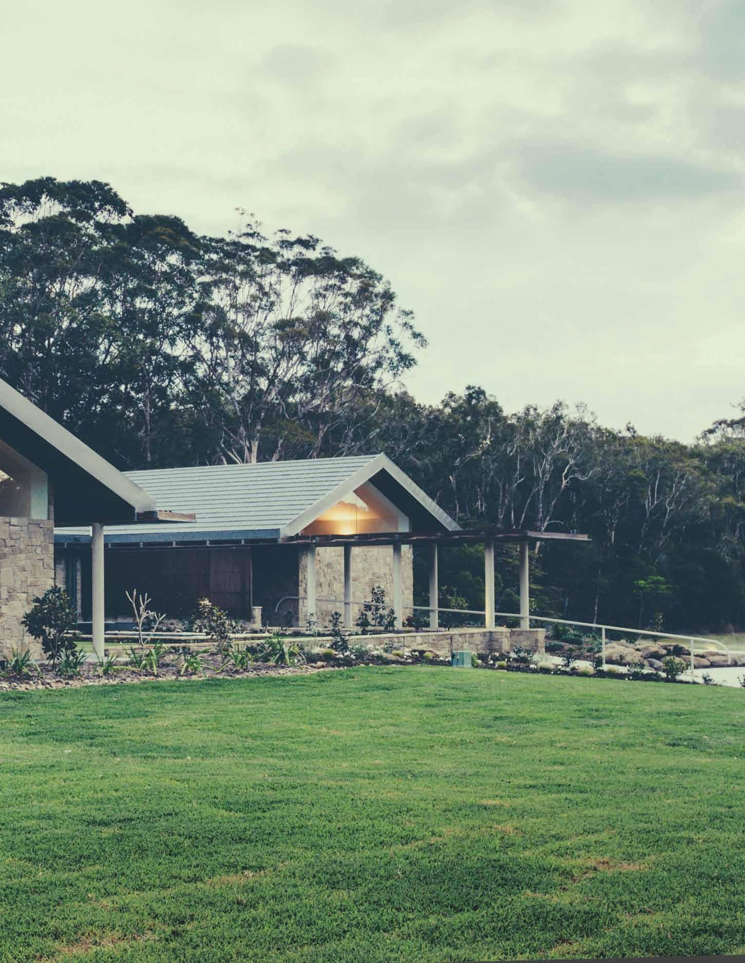
issue #28 habitusliving.com
Light and shadow
A house on Queensland’s SunShine CoaSt is a bold mix of tropical modernism and Australian vernacular. Paul MCGilliCk shared a visit to this arcadian retreat with its architect, DaviD teelanD.


Tex T Paul McGillick | PhoToGra Phy JareD FoW ler
3 . on location # 115
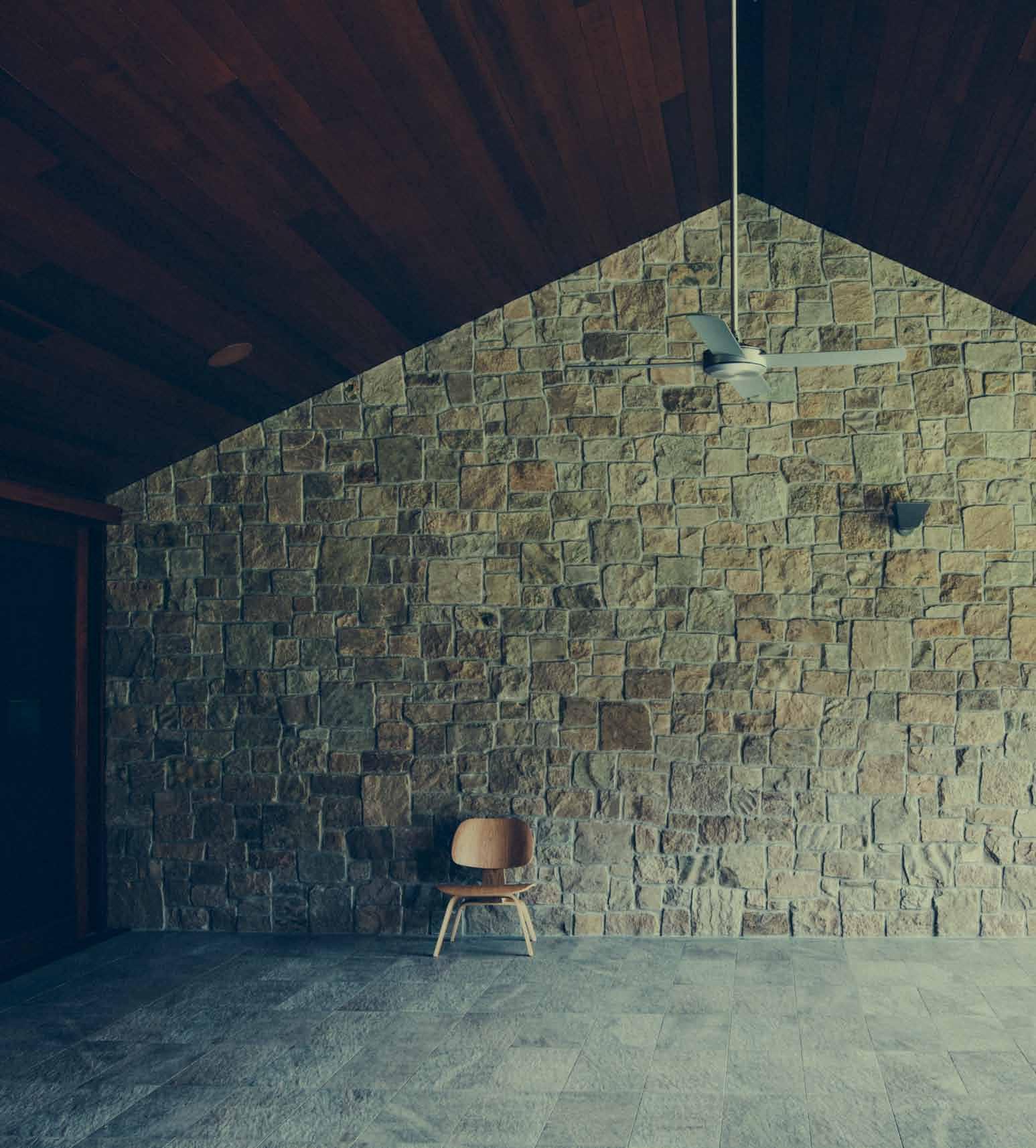
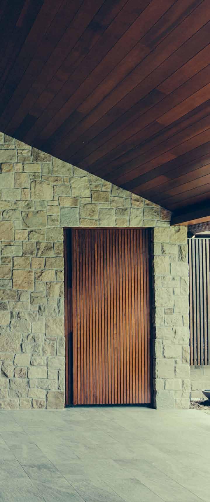
previous | The T wo new wings of The house wrap around a garden courT yard, wiTh The house iTself embraced by The heriTage foresT above | The play of naT ural maTerials is epiTomised by The expansive ou Tdoor dining garden Terrace. issue #28 habitusliving.com
The vision of Habitus as a regional magazine of the Asia-Pacific is driven to an important extent by the recognition that there are key climatic and cultural affinities between Australia and its northern neighbours in South and South-East Asia. At the very least the region shares an all year round benign climate and to a certain extent a tropical and sub-tropical climate. This is conducive to an outdoor lifestyle, connection between indoor and outdoor living, and living in the landscape.
In recent years, architects throughout the region have looked to traditional architecture for inspiration. Initially, this was a largely sentimental quest. But architects quickly realised there were things to learn from traditional strategies which would help us to live with the climate, not against it, leading to the extensive adoption of passive strategies for cooling, ventilation and the use of natural light.

While tropical modernism may be mostly associated with the architects of South-East Asia, its equivalent has been strongly in evidence in Australia. In the more temperate parts of the country, names like Glenn Murcutt and Peter Stutchbury are familiar. But in the tropical and sub-tropical northern parts of the country there are plenty of familiar names: Troppo in the Northern Territory, and Queenslanders such as Gabriel Poole, Rex Addison, Kerry and Lindsay Clare, Shane Thompson and John Mainwaring among others. As early as 2000, Peter Hyatt celebrated Australian tropical modernism in his book, Local Heroes – Architects of Australia’s Sunshine Coast

3 . on location # 117
So, it is always a good idea to check up on what architects are doing on the Sunshine Coast. Teeland Architects’ Stone and Timber House is an intriguing recent addition to the story: a house which responds to the sub-tropical climate of the Sunshine Coast with an engaging mix of tropical modernism, a dash of Asian aesthetic and a lashing of traditional Australia country style.
On arrival, the impression is anything but South-East Asian. This is a very large property and from the road the house sits somewhat in the distance on top of a rise. There are two man-made lakes (for flood mitigation), home to large numbers of wild ducks, and the property is ringed by a conservation eucalypt forest. In short, this is a very beautiful location. Things change as we get closer. The house has a strongly linear form which derives from the fact that it consists of an original house (the eastern wing) now linked to a new central living/dining/kitchen space and new western wing. The house and its two open north-facing courtyards are inflected by lovingly cultivated sub-tropical gardens.
This hint of Asia is picked up with the entry sequence, an extended journey of arrival. From the driveway drop-off, we walk down a path of natural stone. On our left is a spotted gum batten screen, filtering the north-eastern sunlight and partially screening off the main courtyard. At the end of this path, visitors can turn left and enter the courtyard or continue to the formal house entry. If they do this, they will pass through an exquisite transitional space with a small pond and the calming sound of a fountain. This space has a high pyramidalshaped ceiling with a skylight at its triangulated apex. This acts like a sun dial with a brilliant slash of sunlight which moves across the wall during the course of the day.
In the introduction to Jun’ichirō Tanizaki’s wonderful reverie, In Praise of Shadows, Louis Kahn is quoted as saying, “The sun never knew how wonderful it was until it fell on the wall of a building.” This play with sunlight – the house has a series of naturally lit gallery spaces – is made possible by the need to pitch the roof at a minimum 25 degrees to cope with the heavy sub-tropical rainfall.
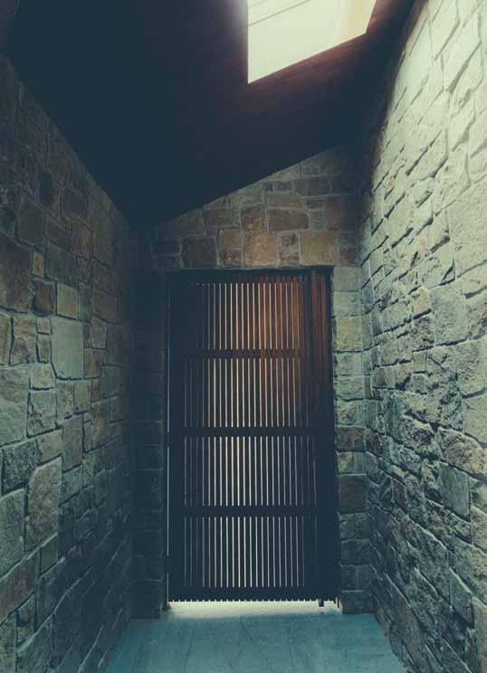
above | An intimAte
pA
le A
stone-lined
ssAgewAy
ds from the entry sequence to the gA rden court. opposite | the entry sequence with the wAter fe Ature lit by the high, triAngul Ated skylight.
issue #28 habitusliving.com
This acts like a sun dial with a brilliant slash of sunlight which moves across the wall during the course of the day.
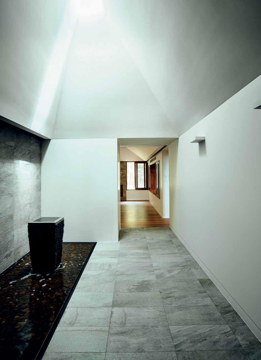
3 . on location # 119
READING ROOM LIVING/DINING KITCHEN LAUNDRY DRYING COURT GARAGE OUTDOOR LIVING/ DINING REFLECTION POOL ENTRY BEDROOM ROBE BATHROOM UTILITY COURT POWDER ROOM ART STUDIO GYM GAMES ROOM POOL GARDEN 1 2 3 4 5 6 7 8 9 0 q e w r t y u i o 6 7 7 5 1 2 4 8 8 9 3 e e e e e q 0 0 0 0 0 0 u o y w r t issue #28 habitusliving.com
The spacious, flowing linear interior of the house – basically, just one room deep, thus allowing ample natural lighting and cross-ventilation –continues the material conversation between timber, stone and the garden landscape which gives the house its subtle South-East Asian quality. Long corridors and high-pitched highlight windows amplify this by offering framed glimpses of borrowed landscape.
The roof form extends into generous overhangs which provide shading. The rain runs off these gutterless overhangs into the side gardens and swales.
The western wing is the private domain. Apart from the master bedroom and bathroom, it includes a private sitting room. Here a series of finely customised rosewood windows begins, to continue around the rear elevation and the main living room. Private it might be, but it wouldn’t sit quite right in this wonderfully open house if it remained entirely private, hence, the intriguing opening, like a service bay, which simultaneously connects and separates the sitting room and the living room.
An enticingly long corridor connects the new house with the original house. Along the way is a new eastern wing of guest bedrooms which helps frame the main courtyard leading from the living and kitchen area. This courtyard is

opposite | floor plan. above | The laundry courT aT The rear of The house is given characTer by The Timber baTTen screen.
3 . on location # 121
The material conversation between timber, stone and the garden landscape...
drop box
archiTecT Teeland Architects
proJecT Team David Teeland, Matthew Noffke
sTrucTural engineer Ad Structure
hydraulic engineer Burnett Lynch
conTracTor JW Construction
Teeland a rchi T ecTs
(61 7) 5471 2809 teeland.com.au
lighTing
finishes
Spotted
fiXed & fiTTed
Cedar
the heart of the house with its sheltered terrace looking past a water feature and out to the panorama of the grounds and the forest.
The original house is now mainly a games room, leading out to the secondary courtyard and swimming pool. With its bar, pool table, kitchenette and additional guest bedroom, it makes the whole guest wing effectively a self-contained unit.
Ultimately, this house is all things to all men. While it has the delicacy and meditative aesthetics of Asia, it is equally a modern version of a country homestead with all its typical informality and roominess. On the one hand, the house is perfect for large gatherings and entertaining. On the other, it has many intimate spaces, offering privacy and escape from the mob. And, while it has the ruggedness of a homestead, it also enjoys a delicate materiality with an understated conversation between a variety of materials, highlighted by some beautifully wrought finishes and craftsmanship.
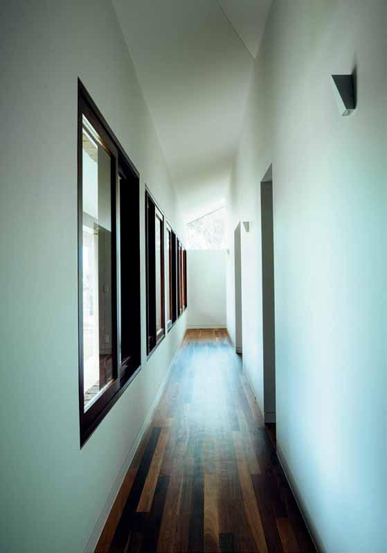
left | The long corridor of The bedroom wing is enriched by The rosewood floor and window surrounds. right | d e Tail of The sTeps inTo The swimming pool.
Custom LED lighting designed by Teeland and manufactured by Melec Lighting. Other lighting by Inlite Lighting.
gum hardwood. Stone D porcelain tiles by Ceramica Senio. Balcony floor in frosted tempered and laminated glass. Bench tops in white granite supplied by Project Stone. Cavalier Bremworth wool capret. Natural sandstone walling is Clancy in Random Ashlar range from Eco Outdoor. Terracotta roof shingles by Monier.
issue #28 habitusliving.com
timber soffits, spotted gum hardwood screens, hardwood doors, windows and joinery supplied by North Coast Joinery. Ceiling fans supplied by Hunter Pacific. Villeroy & Boch sanitary items. Hansa tapware. Smeg kitchen appliances. Abey stainless steel sinks. Barben Axis series bathoom fittings. Gainsborough Peloris door hardware. Blum joinery hardware.
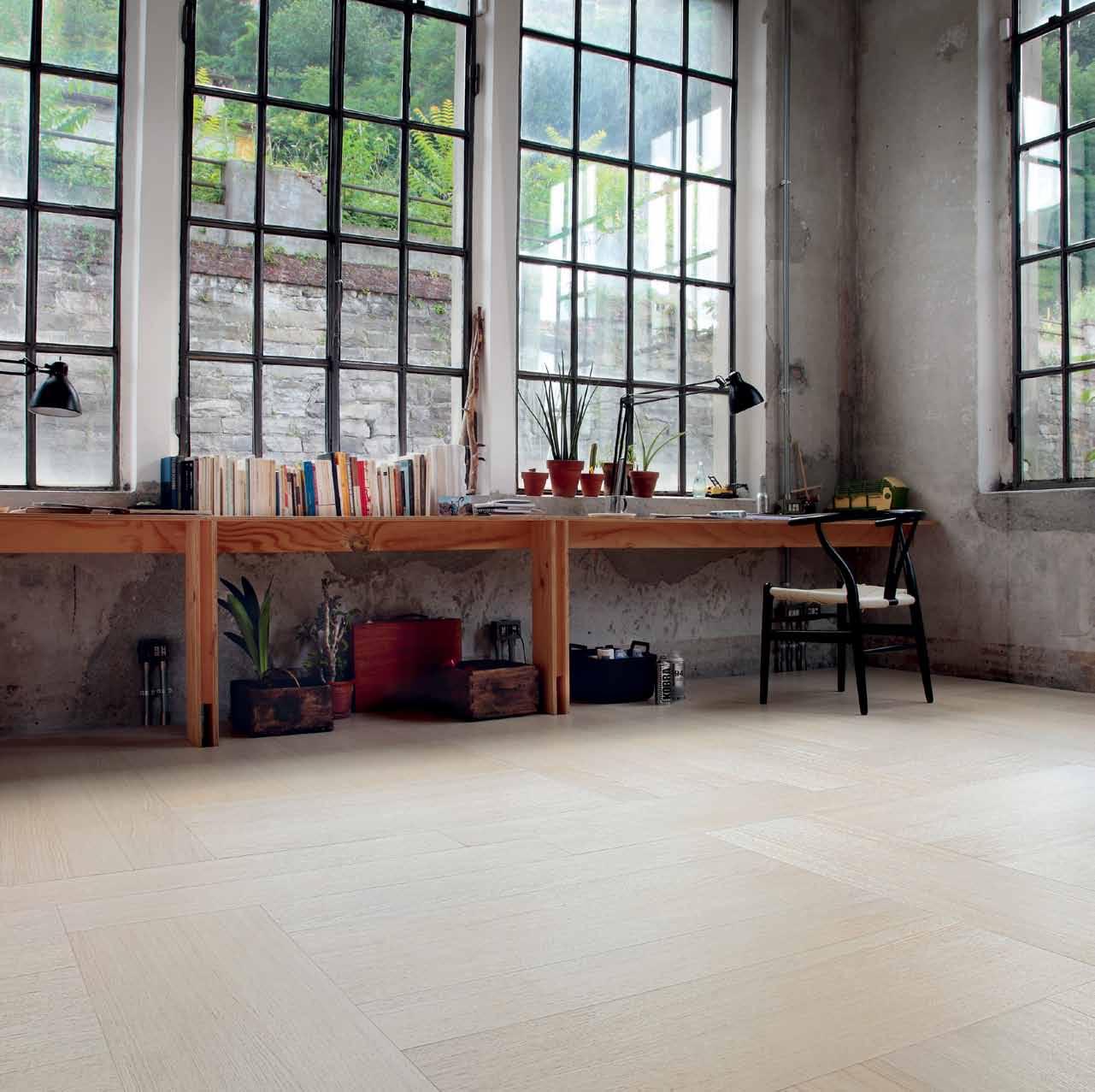

DIRECTING DESIGN INDUSTRY PROFESSIONALS TO THE RIGHT JOBS IN AUSTRALIA AND ACROSS ASIA
DIRECTING DESIGN INDUSTRY PROFESSIONALS TO THE RIGHT JOBS IN AUSTRALIA AND ACROSS ASIA
careersindesign.com.au
careersindesign.com.au
3D VISUALISER
3D VISUALISER
ACCOUNT MANAGER
ACCOUNT MANAGER
ADMINISTRATION
ADMINISTRATION
AGENT/DISTRIBUTOR
AGENT/DISTRIBUTOR
FIND
FIND
BLOGGER
BLOGGER
BUSINESS DEVELOPMENT
BUSINESS DEVELOPMENT
CAD DESIGNER
CAD DESIGNER
CAMPAIGN MANAGEMENT
CAMPAIGN MANAGEMENT
CUSTOMER SERVICE
CUSTOMER SERVICE
DESIGN MANAGER
DESIGN MANAGER
DESIGNERS
DESIGNERS EDITOR
EDITOR
EVENTS CO-ORDINATOR
EVENTS CO-ORDINATOR
GRAPHIC DESIGNER
GRAPHIC DESIGNER
INDUSTRIAL DESIGNER
INDUSTRIAL DESIGNER
INTERIOR DESIGNER
INTERIOR DESIGNER
LECTURER
LECTURER
LIGHTING SALES
LIGHTING SALES
PERFECT
PERFECT
MEDIA ExECUTIVE
MEDIA ExECUTIVE
NATIONAL SALES MANAGER
NATIONAL SALES MANAGER
OPERATIONS MANAGER
OPERATIONS MANAGER
PA / SALES SUPPORT
PA / SALES SUPPORT
PHP DEVELOPER
PHP DEVELOPER
PR ACCOUNT MANAGER
PR ACCOUNT MANAGER
PRODUCTION MANAGER
PRODUCTION MANAGER
PROJECT MANAGER
PROJECT MANAGER
SPECIFICATION
SPECIFICATION
RETAIL INTERIOR DESIGNER
RETAIL INTERIOR DESIGNER SALES
SALES
SHOwROOM MANAGER
SHOwROOM MANAGER
SHOwROOM SALES CONSULTANT
SHOwROOM SALES CONSULTANT
STATE MANAGER
STATE MANAGER
STUDIO LEADER
STUDIO LEADER
TECHNICAL OFFICER
TECHNICAL OFFICER
wAYFINDING DESIGNER
wAYFINDING DESIGNER
wEB DESIGNER / DEVELOPER
wEB DESIGNER / DEVELOPER
ARCHITECTURE
ARCHITECTURE
DESIGN
DESIGN
INTERIORS
INTERIORS
MEDIA
MEDIA
AGENCY
AGENCY
ADVERTISING
ADVERTISING
RETAIL COMMERCIAL FURNITURE
RETAIL COMMERCIAL FURNITURE
LIGHTING
LIGHTING
TEx TILES
TEx TILES
YOUR RESIDENTIAL ARCHITECTURE
YOUR RESIDENTIAL ARCHITECTURE
DESIGN
DESIGN
INTERIORS
INTERIORS
MEDIA
MEDIA
AGENCY
AGENCY
PUBLISHING
PUBLISHING
RETAIL
COMMERCIAL
RETAIL COMMERCIAL FURNITURE
FURNITURE
LIGHTING
LIGHTING
TEx TILES
TEx TILES
PRODUCT RESIDENTIAL JOB
PRODUCT RESIDENTIAL JOB
EDUCATION
EDUCATION
DESIGN INTERIORS
DESIGN INTERIORS
MEDIA ADVERTISING
MEDIA ADVERTISING
RETAIL COMMERCIAL FURNITURE
RETAIL COMMERCIAL FURNITURE
LIGHTING
LIGHTING
TEx TILES
TEx TILES
PRODUCT
PRODUCT
A Winning warehouse
An acoustic sleeping pod. An internal garden oasis. Two full entertainment areas and a glass-fronted indoor pool. ALLEN JACK + COTTIER ’s overhaul of a 1920s Sydney warehouse is like nothing you’ve seen before.
text e
|
lana Castle
photography Castle + Beatty
3 . on location # 125
There was a time when converted warehouses were still a novel concept and transforming dilapidated and cavernous expanses of commercial real estate into residential city pads became de rigueur. Yet, as the trend has gathered momentum, it has developed a somewhat predictable design trajectory.
However, when Sydney businessman John Winning purchased a 1920s warehouse in inner-city Sydney, the CEO of Winning Group envisioned something different: a private domain that would extend well beyond the expected. Well beyond semi-industrial furnishings and sparsely occupied space.
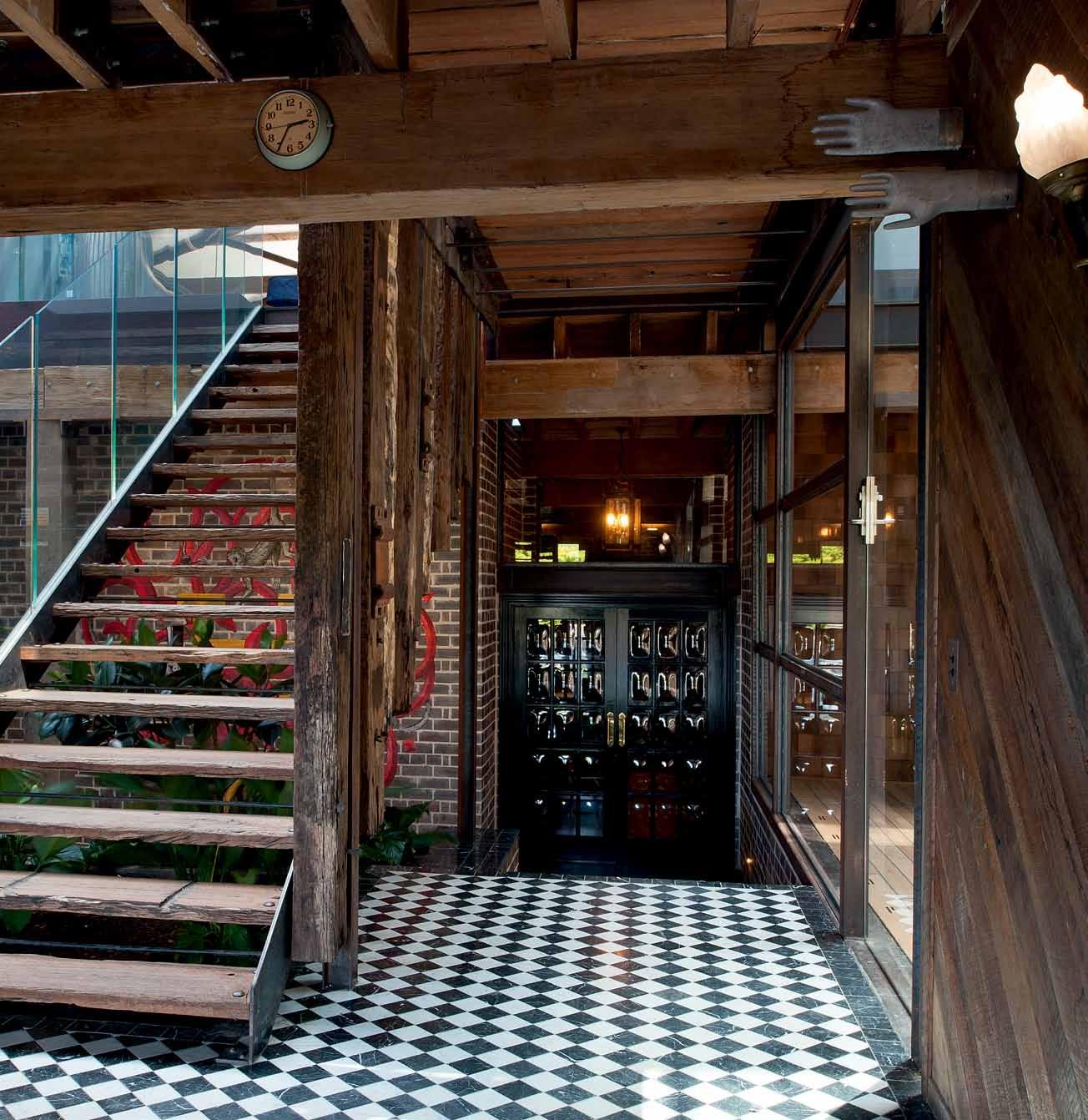
“I wanted the warehouse to be completely unassuming from the street but upon entering, to evoke a feeling of being anywhere in the world,” Winning explains. “I wanted to be able to get lost inside, without feeling like you needed to get out, so it was important for the space to contain all the best parts of any other home – all in one location. I wanted great views. I wanted great entertaining spaces, a pool, natural light and a garden but I also wanted to allow the space to remain primarily open.”
Recognising the inherently challenging nature of his brief, Winning held an ideas competition, inviting a handful of architects to present their ideas. From the get-go, one practice stood out for their bold design approach, originality, and unmistakable ingenuity.
Winning was immediately drawn to architect Peter Ireland’s scheme. Joint Principal of Allen Jack + Cottier Architects, Ireland proposed the creation of additional space and light within the already voluminous, 1,100 square metre interior, achieved by
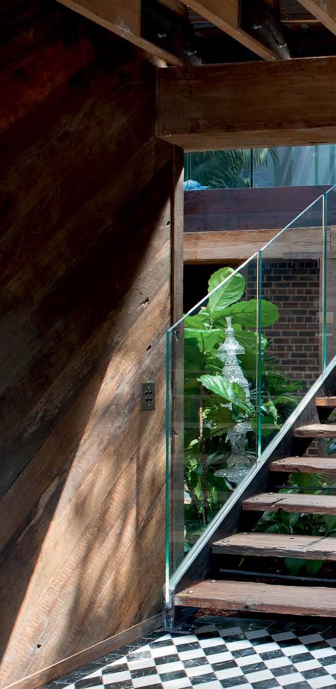
issue #28 habitusliving.com


3 . on location # 127
previous | a detail of the timber beam structure and fibre glass insertion. above | the entrance foyer features n oir & b lanc tiles from d i lorenzo. from this landing you can enter the sliding doors on the right to the indoor pool area, go down the stairs ahead to reach the entertainment zone on the lower level, or up the stairs to the open plan living area.
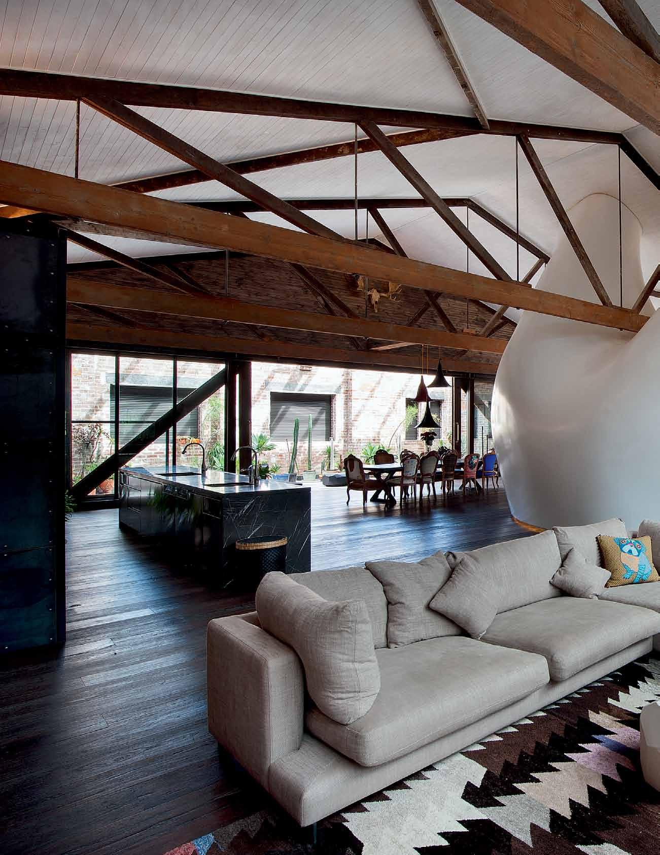
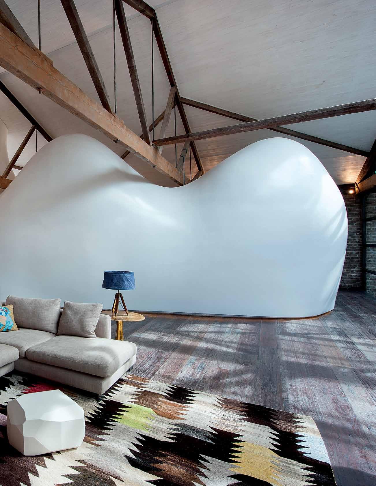
issue #28 habitusliving.com


3 . on location # 129
The result is a completely seamless form that appears to float about the floor and undulate.
removing a 3-bay-wide cross section of the warehouse and converting it into a naturally illuminated, internal garden. But it was Ireland’s ‘man-cave’ concept that ultimately sealed the deal. Ireland’s proposal included the insertion of an acoustically-insulated, cocoon-like master suite, that would float, bend and fold under the original, exposed timber trusses.
“Due to concerns about nearby traffic noise, I had made it clear that I wanted a bedroom that didn’t connect directly to any external walls or the roof,” explains Winning, “but the challenge was to build a bedroom that would feel both grand and not break up the warehouse space, acting more like a sculpture or piece of art as opposed to another room.”
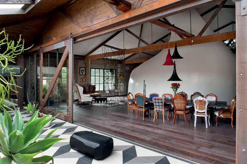
Ireland’s solution elegantly reconciles Winning’s seemingly contradictory criteria. “The warehouse was conceived of as an inward-looking fantasy, an introverted place that doesn’t borrow from the outside world,” explains Ireland. “The bedroom retreat really epitomises this idea, whilst conserving the character of the warehouse environment.”
The organically-shaped form is intentionally separated from the orthogonal grid of the warehouse, composed of fourteen 3-dimensional expanded polystyrene and epoxy resin sections – an approach that presented a range of acute design, construction and mechanical challenges. “In addition to designing a self-supporting structure, the cave
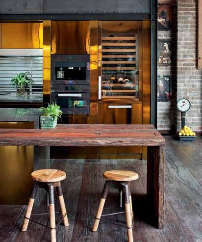 previous | the open plan living area, although one large space, is dominated by the curvaceous sleeping pod. above | the dining table made by c raft d esign realisation, surrounded by chairs sourced on g umtree and refurbished. below | the kitchen featuring waxed mild steel, electroplated gold finish, noir marble and mirror tiles from d i lorenzo. opposite | the outdoor terraces features an ever-changing arrangement of unique plant varieties, including salvaged succulents.
issue #28 habitusliving.com
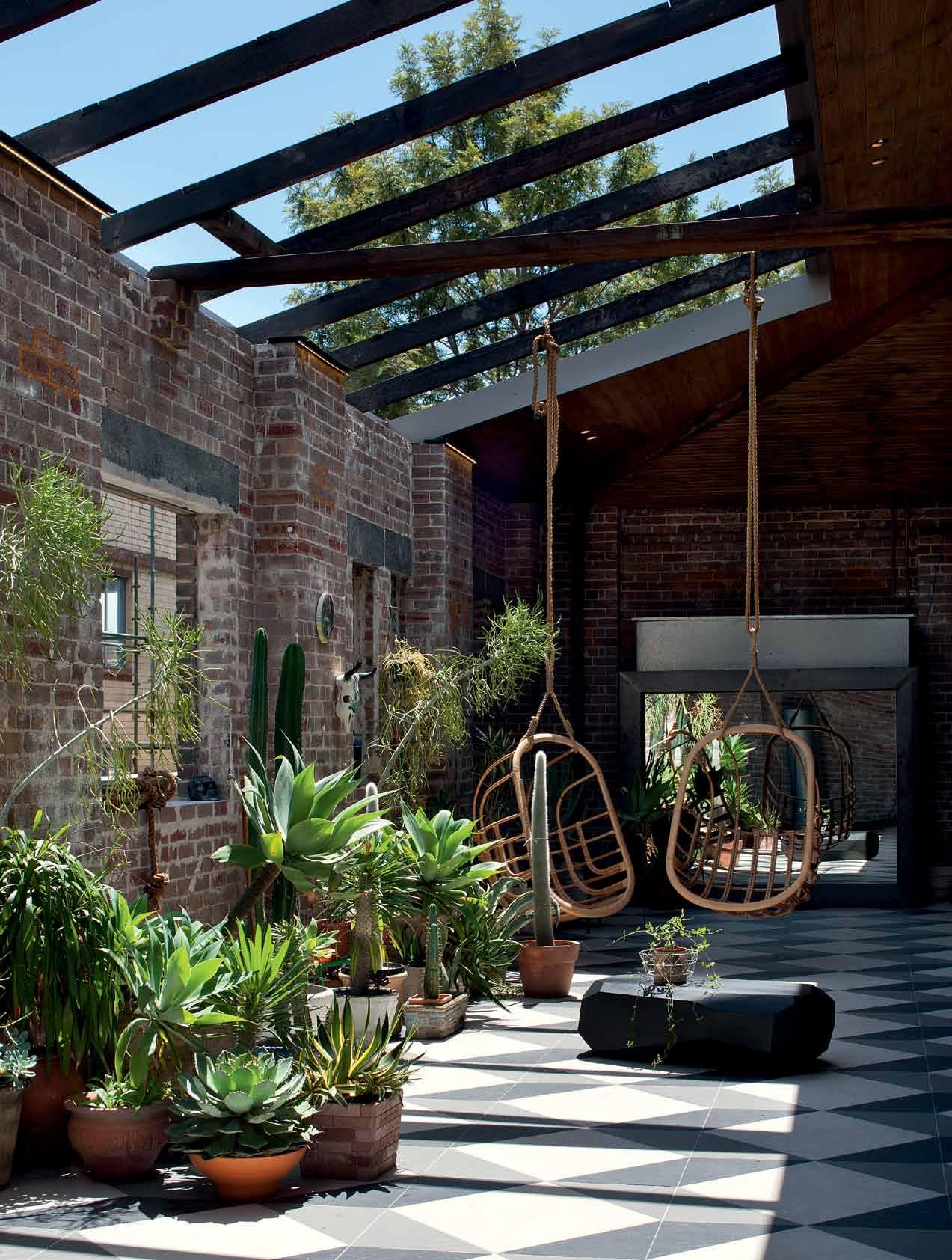
# 131 3 . on location
The undulating internal wall morphs into Winning’s bed and bedside joinery, curving round the organically shaped leather floor.

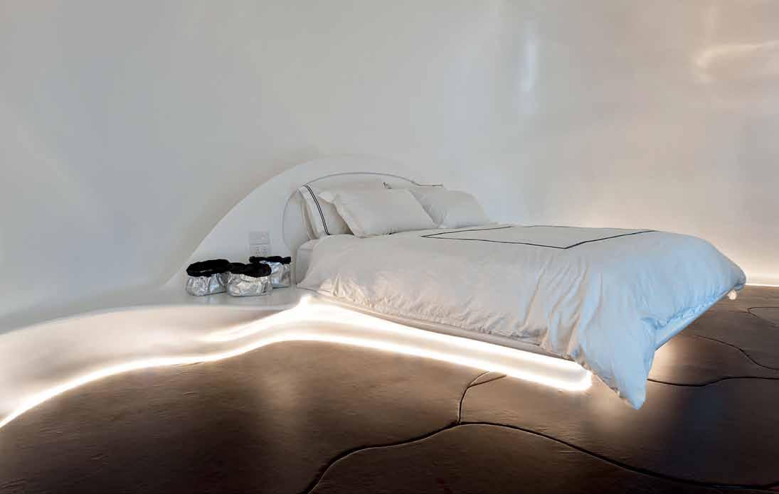
issue #28 habitusliving.com
had to be easily assembled and seamlessly finished on site,” explains Ireland. “The elements also had to fit perfectly in between the existing trusses, as well as incorporate a full range of services including temperature control, plumbing and audio systems.”
The architects turned to specialist engineering company MouldCAM to transform their 3D renderings into practical and buildable form using a range of sophisticated technology. “We developed a CNC process to cut all the cave’s surfaces through 360 degrees, assuring the accuracy of the overall geometry,” explains Jaime Marina, MouldCAM’s engineering director. “The epoxyfibreglass laminates were then scanned using a 3D probe to ensure that the geometry still matched the architects’ model. The sections were then joined via fibreglass tape and faired out to remove any sign of the junctions.”
The result is a completely seamless form that appears to float above the floor and undulate under the warehouse’s heavyset structural framework. Inside, the undulating internal wall morphs into Winning’s bed and bedside joinery, curving round the organically shaped leather floor to form the master ensuite that features marine decking and curvaceous bathroom furniture.
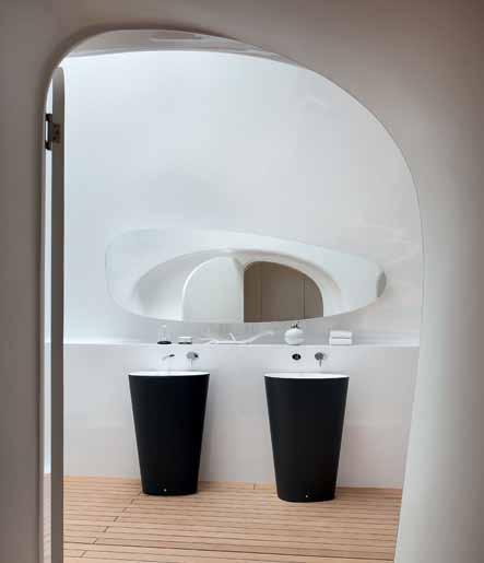
At street level, the architects’ other spatial interventions, including the new steel structural overlay, become apparent as soon as you step through the (intentionally non-descript) front door. The dramatically carved out double volume void is defined by a lush internal garden, glass sculptures from Sculptures By The Sea, a graffiti wall and the bright blue hues of the glass-walled indoor pool area – which also includes its own externally timber-clad steam room.
As one ascends the stairs from the entry, which are offset by balustrades composed of reclaimed timber uprights, the upper story – and the man-cave – come into sharp focus. Inspired by Winning’s love of music, the casual lounge area is fronted by a bespoke entertaining station which includes a home theatre system from Winning’s Appliances Online business, Martion, audio speakers handcrafted in Germany and vinyl and digital turntables. The space backs onto a large open plan kitchen – appropriately decked out in premium Winning appliances (such as Sub Zero, Wolf, Miele, Qasair and Zip) and luxuriously clad in electroplate brass finish and waxed mild steel –and a dining area bookended by a south-facing garden terrace. A bridge links the main area to a guest bedroom and Winning’s sumptuously
opposite above | a freestanding entertainment system in the master ensuite which also houses a/c ducting and an integrated wardrobe at the rear. opposite below | the master bed appears to float above the floor. above | view through to the master ensuite.
3 . on location # 133

issue #28 habitusliving.com
SLEEPING

OPPOSITE | INTERNAL GARDEN OASIS. ABOVE | FLOOR PLANS. BELOW | BEDOUIN BEDROOM WHICH FEATURES BESPOKE LEATHER DRAPES BY ALEXIS WALHOFF. e 9 0 q 7 5 6 2 4 8 3 GROUND FLOOR MEZZANINE 1 r w t y u i o o p a d s ENTRY EMPIRE ROOM UTILITY BATHROOM GARAGE BAR MUSIC LOUNGE SMOKING FOREST PLANT POOL STEAM CABIN 1 2 3 4 5 6 7 8 9 0 q e
KITCHEN
ALCOVE
LOUNGE
DINING TERRACE CAVE
POD
ROOM
w r t y u i o p a s d 3 . on location # 135
VOID BRIDGE WALK-IN-ROB BEDOUIN
BATH
decked-out dressing room, which features bespoke shopfittings and cerise velvet curtains.

In addition to the bold architectural strokes, what is equally evident is that every space has been remarkably styled, the bold interior language attributable to the creative genius of designer, Kelly Ross, creative director of The Gentry. Ross beat other contenders to the interior designer role by taking Winning’s brief and composing a fantastical narrative for the entire project. “I wanted to fulfil the client’s vision for a completely immersive space where people would forget time, feeling like they were both in a sanctuary or a retreat, whilst representing his individual tastes and style,” explains Ross. “My idea was to model each space on a series of theoretical muses, drawing out their character traits through the spaces.”
For example, one of the two guest bedrooms on the lower level – the ‘empire room’ – is modelled on a 1960s Bond girl, a playful and daring character whose Brit-style has been interpreted in the form of two queen-sized double bunks draped in oversized Union Jack Flags, underscored by British paraphernalia like a vintage tennis racquet display. “The ‘cabin room’ depicts a simmering, hibernating brunette with an air of mystery,” adds Ross.
above | DesigneD
D
issue #28 habitusliving.com
by the g entry, the walk in robe features custom cabinetry an
railings by art o f k itchen. below | the floor to the walk in robe is composeD of han D selecteD belt tiles from i nghua ting. opposite | the bar.

# 137 3 . on location
drop box
Architect Allen Jack & Cottier Architects
Project teAm
Peter Ireland (Design Architect), Rob Harrison (Consultant) + Bronwyn Litera (Consultant)
interior Designer
Kelly Ross (The Gentry)
mArine fAbricAtion
MouldCAM (Jaime Marina)
structur Al consultAnt
O’Hearn Consultants
Pool contr Actor Wahoo Pools
mechAnicAl consultAnt
Active Air Conditioning
certificAtion Weir Philips
builDer Pinsent
Property Maintenance
steelwork Jorgen Hansen of Interspace
AJC
(61 2) 9311 8222 architectsajc.com
The Gen T ry
(61) 413 664 250 thegentry.com.au
lighting In Bedouin room, 21 Antler light from Canadian Light Co. In Cabin room, industrial lights from rescue salvage, brass wall lamp with Edison globes and Marine light from Coco Republic. In Cabin bathroom, light with Edison globes. In Empire room, custom marching drum light and Streetlight from Beacon Lighting. Heritage light in Empire bathroom. In Music room WC, Neon light from Seletti. Egyptian antique light to entrance.
furniture
Dining table is custom by Craft Design Realisation, chairs sourced on Gumtree & refurbished, and gramaphones for custom light sourced at Lunantiques/ Mitchell Rd Antiques.
On Outdoor Terrace, METEOR-L METEOR Large Bench/Table in Matte Black from Space Furniture, various reclaimed pots, props and artwork from Ahoy Trader/ Long Road Home and hanging chairs from Lived In Coogee. In Bedroom Cave, PRISMATIC Coffee Table in Black Coated Sheet Aluminium and LOSANGES 2 Rug from Space Furniture. Irish georgian antique couch- Sourced from The Great Gatsby and wingback chairs sourced from monastery and upholstered in
“There are no obvious mirrors in the space. It is intentionally dim, making it difficult to see the details. Everything is clad in or made from timber or steel, reinforcing the cabinlike aesthetic.”
An ex-prop maker, Ross has created a theatrical mis-en-scene that borders on the staged but successfully avoids the pastiche. The designer has artfully and painstakingly selected all the interior furnishings and finishes, working with Winning’s personal collection of paraphernalia to create a relaxed curation of artefacts which includes a couch purchased from the set of The Great Gatsby, revitalised Gumtree finds, a vintage leather belt floor and a vignette of much-loved carpentry tools once belonging to Winning’s grandfather.
“Winning’s fast-paced life as a young CEO may sometimes feel like a high-profile stage but this home is where he retreats to be himself, to be with friends, to be surrounded by his passions,” Ross continues. Appropriately, each space shares authentic stories about the owner and reinforces the out-of-the-box vision shared by his team of talented collaborators.
custom artwork. In Lounge, 2/3 seater from Camerich, tea trolley sourced at auction, Cabinet from Lunantiques, restored antique loom rug, gold side table from Orson & Blake, side lamp from Ici Et La, METEOR-S METEOR Small Bench/Table in Matte White from Space Furniture and custom music booth in leather. In Bedouin room, solid Queen bed in Oak Sound Like Home and mirror from Mitchell Road Antique Centre. In Cabin Room, King steel + timber bed frame from Gumtree, stool from rescue salvage, side tables from Long Road Home and tree branch hooks from Nook. In Cabin bathroom, Apothecary bottles from The Society Inc. In Empire room, custom Queen bunk beds and stool from Seletti. In Music room, tables from New Direction Imports and chairs + sofas from auction.
finishes
All unique timbers sourced by The Gentry, glass/steel framing throughout interior by Interspace/ Urban Archive and timber floor by SE Timbers. Dining floor Ironbark from Princess Pier by Malphus Developments. Outdoor terrace features trio of outdoor tiles, Amber tiles cut to tessellation. Custom

Kitchen in waxed mild steel with electroplate gold finish and noir marble by Art Of Kitchens, Mirror tile and honed slate to kitchen toilet and cabin bathroom from Di Lorenzo. In Bedouin bedroom, linen bedding from Bedouin and custom leather drapes by Alexis Walhoff. In walk in robe, custom floor belt tiles by Inghua Ting. In Cabin room, bed linen from Sheridan. Drapes throughout from Homelife Furnishings. In Empire room, carpet from SE Timbers, bed linen by Sheridan, custom Union Jack drapes by Alexis Walhoff, custom curtain rods from Ici et La and restored stained glass door. In Empire bathroom, Hex marble floor tiles and marble wall tiles from Skheme, custom mirror and wallpaper from Anthropologie. Tiles in laundry from Amber. In Music room, custom carpet by Tsar, Skheme tiles to bar front and WC, custom tiles to top and back of bar. In Entrance, noir & blanc tiles from Di Lorenzo.
fiXeD & fitteD
Kitchen sink and tapware from Winnings Appliances, Kitchen box door hardware from Mother of Pearl Traders. Window framing by Interspace/ Urban Archive. On
Outdoor terrace, custom brass barn door hardware from Urban Archive and barn doors by Steady built/ Urban Archive. In Kitchen toilet, tapware from Astra Walker, sink from the Stone Superstore, toilet from Rogerseller and storage from Uashamama. In Bedouin room, custom clothes rack in copper, Slim Tech tiles from Di Lorenzo, classic white sink from Heritage Botany, Olde English shower from Astra Walker and toilet from Rogerseller. Walk in robe manufactured by Art Of Kitchens and brass door from Heritage Botany. In Cabin bathroom, anthracite sink from Boffi, workbench by Crowley & Grouch, taps from Astra Walker, black toilet from Parisi and custom black mirror. In Empire room, mirror cabinet from Mitchell Rd Antiques, Dot wall hooks from Seletti, mirror from auction and restored shutters. In Empire bathroom, bath in custom thermoglaze colour, shower curtain from Anthropologie and taps from Astra Walker. In Laundry, concrete sink, custom tap and steel garage door. In Music WC, sinks from Studio Bagno and toilets from Astra Walker. In Entrance, stairwell by Steady Built/ Urban Archive.
issue #28 habitusliving.com
Sydney Indesign LiveLife Design Hunter ® Series
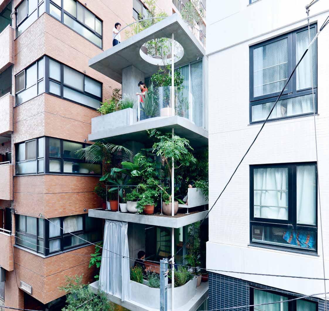
A unique conversation series that explores living in design.
How will we live in the future? Who bestows the ‘icon’ status on something or someone? How do you begin to collect art and design?
We tackle these questions and more with a panel of creative experts at the LiveLife Design Hunter® Series. Join us during Sydney Indesign 13-15 August.
Visit sydneyindesign.com.au to find out more.
Brought
to you by
Photography by Iwan Baan
RSVP Indesign
Create a curated experience for the ultimate Design Hunter®. From the team that brought you the most effective design events experienced in this region, RSVP Indesign offers you a total event design, production and management service.
What can we dream up for your event? Get in touch with our team on (61 2) 9368 0150.
 Mr. Wolf Clock in Mint & White by The Curious Craftsmen
Second chance

A decrepit pre-war SINGAPORE shophouse is given a new lease on life thanks to homeowners who saw its potential, and architects ONG&ONG who pulled off the modern, yet respectful intervention.

text Lynn tan | photography a aron pocock & jiwen bai
3 . on location # 141
The ubiquitous shophouse can be considered a vernacular architecture of South-East Asia and it is an integral part of Singapore’s cultural and architectural heritage. Pockets of conserved shophouses can still be found in various locations around the island but unfortunately, many have fallen into disrepair or have been insensitively altered beyond recognition.
The 17BR-House is located within the Blair Plain conservation area situated west of the downtown core. It is a compact cluster of two- and three-storey shophouses and terrace houses of the Early, Transitional, Late Shophouse and Art Deco styles built between 1900 and 1940. Along with two friends, the homeowner won an auction for the combined sale of three adjacent units, which was how he came into possession of the shophouse.
Having lived in Asia for 19 years, nine of them in Singapore, the French homeowner and his Singaporean wife have always dreamt of buying a dilapidated shophouse and restoring it to its former glory. “Our first house in Singapore was a conservation shophouse that we got married in, so you can say that we have a soft spot for shophouses,” he says.
The homeowner knew exactly what he wanted. “Our most important criteria was to retain the large volumes and I would rather
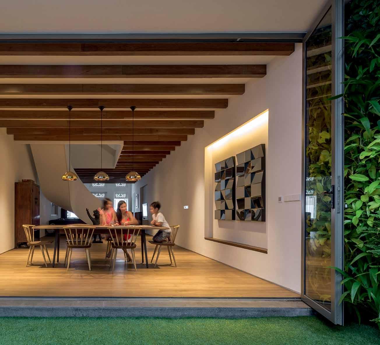

issue #28 habitusliving.com


previous
3 . on location # 143
| A predominAntly white pAlette with timber Accents help reflect As much nAtur Al light As possible. opposite | the teAk timber floor gives A wArm And tropicAl touch to the house while wooden beAms mAke reference to tr AditionAl shophouse elements. Above | the french-singAporeAn couple’s love for shophouses from A bygone er A hAs blossomed into A contempor Ary fAmily home thAt is Also child friendly.

issue #28 habitusliving.com
forego more rooms for more generous and brighter living spaces,” he emphasises. This being sunny Singapore, he also wanted to integrate lush vegetation and outdoor space within the shophouse. And while he wanted a modern design, it was important to preserve some elements of the past – “to remind us of the history of our house,” he says.
However, because the shophouse had been brutally gutted and drastically modified during its previous incarnation as an office, it would require tremendous effort to restore the shophouse for residential use. This was where architects Diego Molina and Maria Arango from ONG&ONG came into the picture. “In reconciling the old and new, it was essential to strike a balance between the shophouse’s colonial past and the necessities of contemporary urban living in order to bring back the once-lost spirit of the place, as well as to meet the needs of a modern family,” explains Diego.
One of the most significant interventions on the first storey was the introduction of a courtyard to bring much-needed natural daylight and ventilation into the long and dark interior sandwiched between two party walls. Conceived as an intimate garden complete with carpet grass and a green wall, the courtyard also connects the living

opposite | A courtyArd is An effective meAns of introducing much-needed nAtur Al light And ventil Ation into A long And nArrow shophouse And AccentuAtes the seAmless lineAr progression of spAces. above | the kitchen is not just for cooking And eAting but Also A pl Ace where the fAmily hAngs out.
3 . on location # 145
The courtyard ... conceived as an intimate garden complete with carpet grass and a green wall.
The organic structure seems to take on a life of its own, like a tree that has blossomed over time.
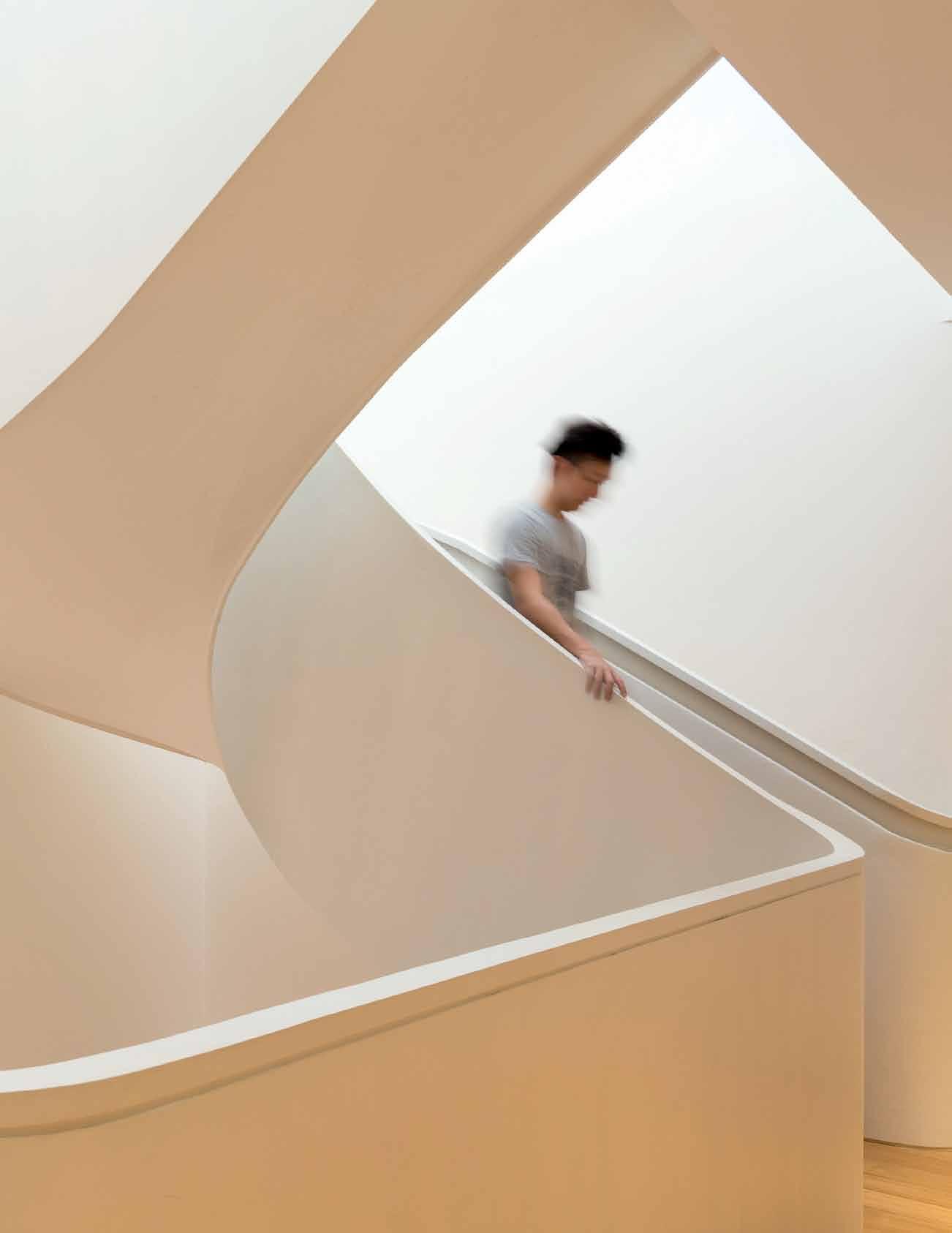

issue #28 habitusliving.com


3 . on location # 147
room housed within the block in front with the kitchen located in the rear block. “I love cooking and it is important for me to be able to interact with my family and my kids, who may be playing in the courtyard or hanging out in the living room, while I am preparing lunch or dinner in the kitchen,” says the homeowner. The kitchen itself is designed as a family area with an exceptionally high ceiling and a seamless transition to the courtyard, which makes it a very usable and “soothing place to relax with the family”.
The focal point in the first storey, and possibly in the entire design, is the staircase. Its sculptural, ribbon-like form is in contrast with the rectilinear massing of the shophouse and the organic structure seems to take on a life of its own, like a tree that has blossomed over time. The purpose of the staircase is as symbolic as it is functional. “We wanted to create a fluid relationship between the spaces so as to ensure an open communication between levels and family members,” says Maria. The feature staircase extends all the way up to the third storey. Skylights in the jack roof directly above the staircase allow additional daylight to filter into the heart of the shophouse. “The result is simply striking and
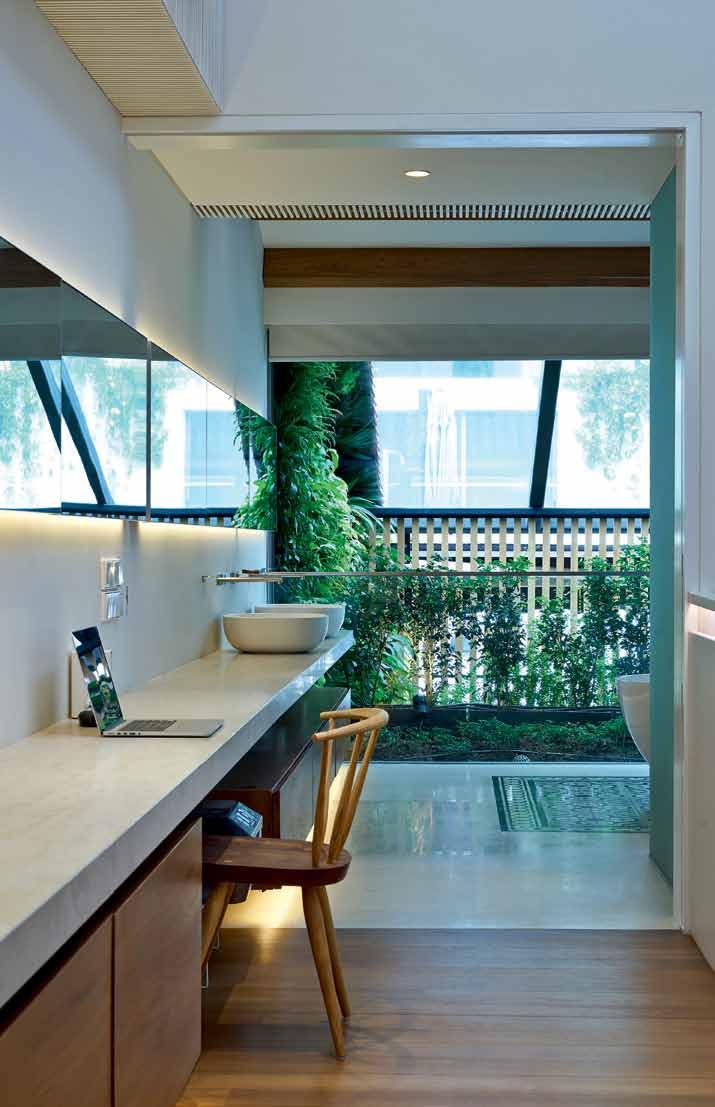
issue #28 habitusliving.com
previous | The sculpTural sTaircase is The focal poinT of The house and The archiTecTs and homeowners devoTed a loT of Time To iTs design. above | The archiTecTs have embraced The lengTh of The shophouse and Transformed iT inTo a series of connecTed spaces, in This case, from The masTer baThroom To The corridor To The masTer bedroom, insTead of segmenTing Them. opposite above | The masTer baThroom, wiTh iTs adjacenT garden, provides reprieve wiThin an urban conTex T opposite below | The openness of The design, as well as The use of pasTel colours and Timber ceiling beams creaTe a lofT-like feeling wiThin The masTer bedroom.
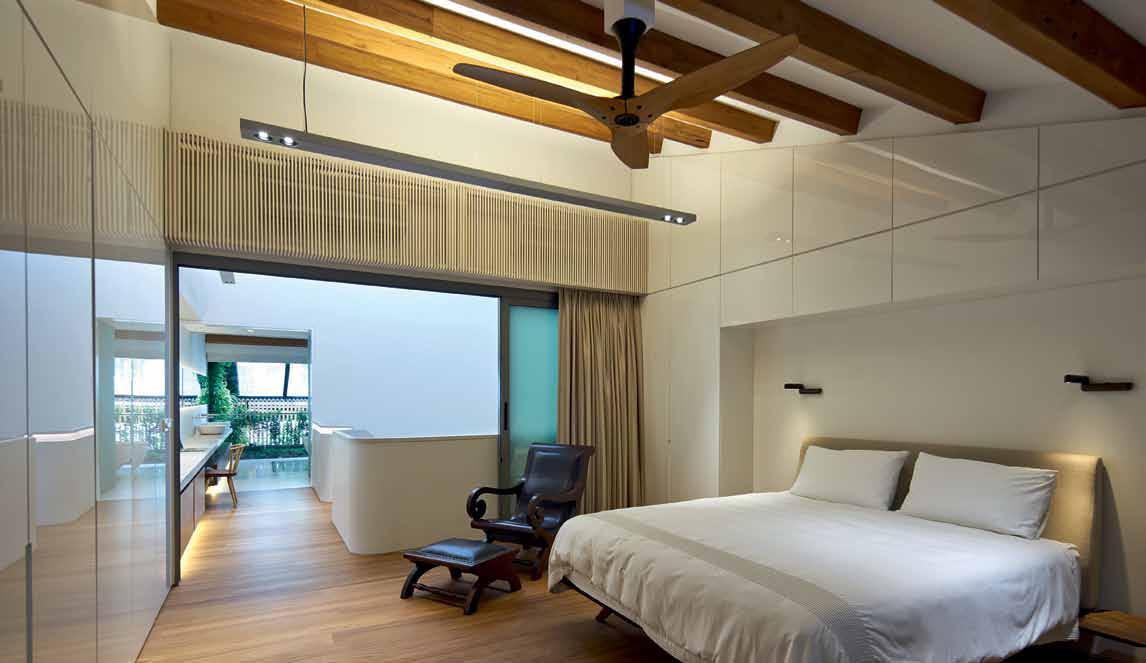
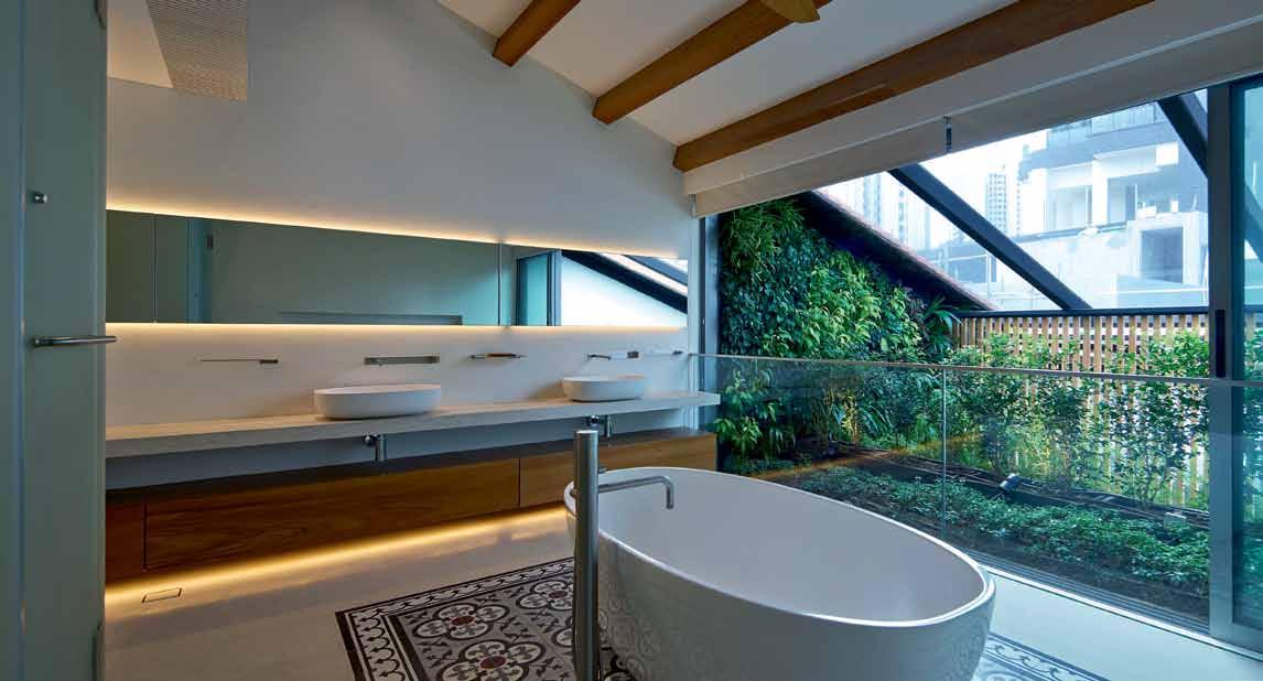
3 . on location # 149
ROOF MEZZANINE FIRST FLOOR SECOND FLOOR 2 2 2 2 2 2 3 1 r e 9 9 9 0 q 7 7 5 6 4 8 w LIVING STAIRCASE DINING COURTYARD 1 2 3 4 DRY KITCHEN STORAGE BEDROOM BATHROOM VOID MAIDS ROOM MASTER BEDROOM MASTER BATHROOM ROOF DECK POOL 5 6 7 8 9 0 q e w r issue #28 habitusliving.com
it provides a sense of the sheer internal volume of the house,” comments the homeowner.
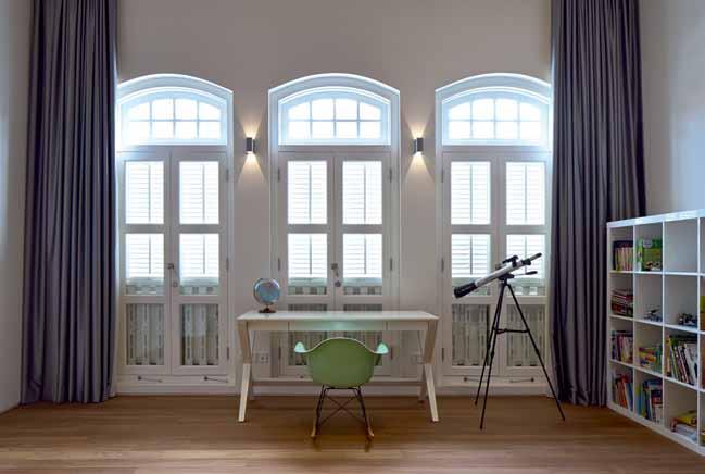

On the second storey are two bedrooms separated by the vertical circulation void. Instead of a utilitarian stairwell and passageway between the two rooms, the architects have integrated bookshelves and storage spaces along the long corridor, which also conceal mechanical and electrical services for the rooms.
The architects wanted to add a wall at the back of the front block to create a symmetrical envelope that complements the restored roof, but conservation regulations stipulate that a partition wall cannot be erected directly at the rear edge of the roof. To overcome this, the architects extended a balcony behind the rear bedroom and added a timber screen instead. This achieves the desired form while complying with regulations. It also maintains visual connection with the courtyard and green wall.
Due to the central location of the stairwell, the master bedroom and master bathroom are separate, unlike most homes with an ensuite situation. But because they occupy the entire third (top) storey, privacy issues are mitigated. The architects have ingeniously incorporated a long slab of limestone that serves as the vanity counter in the master bathroom at one end and continues as a desk along the corridor leading to the master bedroom. This element psychologically connects the two spaces while fulfilling functional requirements.
opposite | floor
above | The
|
The
serve as a
The
plans.
bedrooms have a decidedly modern design while being respecTful of The shophouse T ypology. below
TradiTional windows from
original façade
reminder of
shophouse’s rich hisTory and culT ural heriTage.
3 . on location # 151
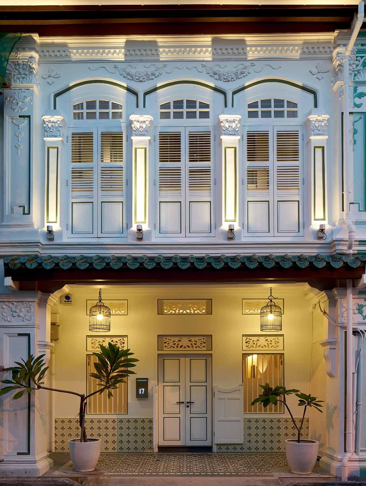
issue #28 habitusliving.com
drop box
archiTecT ONG&ONG
proJecT Team members Diego Molina & Maria Arango, Tomas Jaramillo
Valencia, Camilo Pelaez, Lee Cheow
Yeh, Chee Yunn Ee, Julius Caramat, Ryan Manuel
builder U.sage Contracts
civil and sTrucTural engineer
MSE Consultants
mechanical and elecTrical engineer Rankine & Hill
QuanTiT y surveyor WS Surveyorship
landscape conTracTor Nyee Phoe
Flower Garden
green wall specialisT Uniseal Global
lighTing supplier Lightcraft
kiTchen supplier Furnistyle Concept
ToTal floor area 404 square metres
ONG&ONG
(65) 6258 8666 ong-ong.com
furniTure and arT work Client’s own.
finishes
New exposed teak beams. Generally, teak flooring throughout supplied by Sin Kim Heng Marketing, Perswood. Balcony floor in frosted tempered and laminated glass. Timber slat screens to courtyard are in teak. In bathrooms, limestone floor tiles supplied by Polystone and Italian handmade Domenico Mori wall tiles supplied by Boffi Studio. In master bathroom, painted cement floor tiles supplied by Tresstone. Vertical green wall by Uniseal Global. Artificial turf supplied by Nyee Phoe Flower Garden. Antique V-profile unglazed Clay roof tiles supplied by U.sage Contracts. Timber slats around air conditioning units in teak sprayed painted white. Timber cladding at
The façade also underwent extensive restoration work. Previously an office, the shophouse had two doors but in reverting back to residential use, the iconic single pintu pagar door assumed its rightful position as main entrance. On the second storey, the original long windows were reinstated. Shiny enamel Peranakan dado tiles were also used as a decorative feature in the façade.
“The main challenge for this project was to successfully re-instate the historical value and residential characteristics that had been removed when the shophouse was converted into an office previously,” says Diego. The result is a home that is not just perfect for a modern family, but which is also a fitting tribute to the shophouse.
“We feel lucky to be able to own a part of Singapore’s heritage against a backdrop of ever-increasing new high-rise buildings,” sums up the homeowner.
See another project by ONG&ONG at habitusliving.com/issue28/ong-ong
the rear service block facing the spiral staircase is in Burmese teak cladding. In bedrooms, cupboards finished with high gloss acrylic by U.sage Contracts. Street façade, including mouldings, motifs and decorations, is fully retouched and repainted plaster. All wooden elements of the façade, including windows, transoms, French windows, louvred panels, and balustrades, were carefully restored in accordance to the guidelines and parameters of the URA’s conservation department.
fixed & fiTTed
Sprayed painted bent steel staircase structure and balustrade custom-made by U. sage Contracts. Spiral staircase at rear is custom-made by U.sage Contracts. Haiku ceiling fans by Big Ass Fans supplied by Spectra Instruments. Kitchen tapware is
ONO by KWC supplied by Furnistyle Concept. Kitchen island counter finished in Carrara marble. Bathroom tapware for all bathrooms supplied by Boffi Studio. Bathroom basins supplied by Boffi Studio and bathtub in Master Bathroom is Victoria & Albert Barcelona supplied by Wan Tai & Co. Limestone to bathroom countertops. Joinery by U.sage Contracts in high gloss acrylic surface. Living Room console in limestone and solid teak planks by U.sage Contracts. Blinds and curtains supplied by Owner.
lighTing
Pendants over dining table are Tom Dixon supplied by Xtra. Wall lights are Delta Yuoi supplied by Lightcraft. In master bedroom, pendant light is LC Nobody 140 supplied by Lightcraft and bedside wall lights are supplied by owner.
opposite | The façade has been resTored To iTs former glory and provides a window To The shophouse’s pasT, presenT and fu T ure. above | a seven-me Tre long pool and deck in The rear block above The kiTchen T urns an oTherwise mundane roof Terrace inTo a relaxing sancT uary.
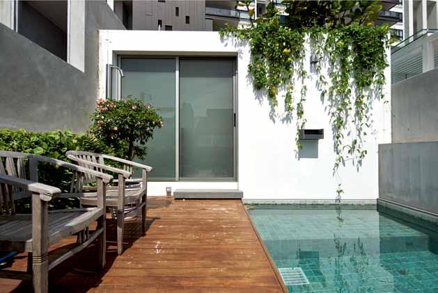
3 . on location # 153
Discover beautiful products
Meet inspiring people
Indulge in architecture and design
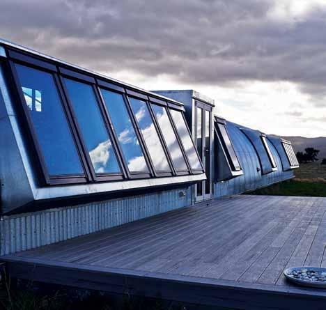
Across Australia, New Zealand, South and South-East Asia
The online community for Design Hunters ®
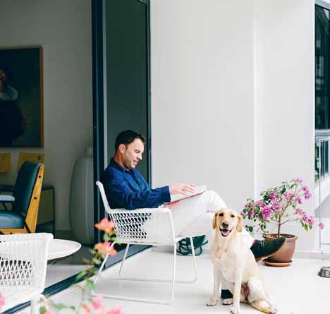

Website | habitusliving.com
Facebook | habitusliving
Pinterest | habitusliving
Instagram | @habitusliving
Twitter | @habitusliving
ABOUT SPACE’S LED-NATIVE 2BY4 SUSPENSION LIGHT PHOTOGRAPHY REBECCA TOH PHOTOGRAPHY PETER WHYTE
Setting the scene
JANUS ET CIE is a furniture brand new to Australia and relatively new to Asia, but it’s a name that will soon be familiar. Founder, Janice Feldman, shares the story of the company, her favourite products and what is behind the unusual name.
 text Stephen todd | photography JanuS et Cie
3 . on location # 155


Binder is an exclusive digital library of leading design magazines, custom publications and design catalogues. Download the free architecture and design newsstand app on iTunes. iPad is a trademark of Apple Inc., registered in the U.S. and other countries. Your personal design library on hand, on iPad, all the time Engage, promote, inform An industry resource for designers, specifi ers and suppliers To publish your digital design publication to Binder today, email us at binder@indesign.com.au aD
as the Milan Furniture Fair came to a close in April and an army of frenzied bloggers rushed to disseminate the latest crazes and fads, JANUS et Cie just kept sailing on, like an elegant ocean liner. Immune to the vagaries of temporary trend, the 37 year-old North American furniture company established in Los Angeles by Janice Feldman is a case study in entrepreneurial spirit. “I started working when I was thirteen,” Janice, recounts, “so I could buy my own Princess phone!” A trained artist and interior designer, Feldman also studied graphic arts and industrial design. “With those passions, I guess it’s not surprising that JANUS became my path, but I am proud, humbled, inspired and amazed to see my vision come to life. What began as a small showroom rep firm carrying lines for established furniture and textile companies has evolved into a global lifestyle furnishings brand with hundreds of employees, that I fondly refer to as my ‘et Cie’ [French for ‘and company’] plus 15 flagship showrooms and dozens of field offices in nine countries.”
The name of the company defines its philosophy. A homonym for Janice’s name, Janus is also the Roman god with two heads, one looking forward and the other backward. This symbolically “embodies my own
approach to design and to life,” Janice says: “Zest for innovations of the future, respect for traditions of the past. The ‘et Cie’ was to honour that a company, like a life, is a collective as well as an individual effort. Looking back almost 40 years later, this philosophy is still the essence of our company.”
With a mission to be “the definitive source for site, garden and casual furnishings”, over the past decade the JANUS empire has expanded beyond North America to straddle London, Dubai, Singapore, Macau, Shanghai, Hong Kong and, most recently Australia –with its Antipodean headquarters soon to be opened in Sydney. Interestingly, regional teams constantly feed back to the nerve centre in LA allowing JANUS to provide the most appropriate of their 120,000 inventory – as well as develop particular ranges – to suit local taste and aspirations.
Pieces like the Fibonacci dining chairs or armchairs, their elegant proportions a direct reference to the perfection of the Fibonacci sequence, the mathematical touchstone of all pure Modernist design, and the basis of the Golden Mean. Or the Tiempo series, a rigorous modular teak and upholstery system with in-built storage modules for bar or linen services – as perfect in harbourside in Sydney as at poolside in Palm Springs. Available in

previous | suki-o armchair and whisk round dining table. above | tiempo outdoor lounge with in-built storage.
# 157 3 . on location

Discover the latest Australian design talent. Explore an emerging-designer showcase this August 13–15 as we celebrate the outstanding work of the 2015 Launch Pad Finalists. Head to launch-pad.com.au to find out more. Brought to you by Production Partner Founding Partner Major Sp onsor Education Partner Program Partner aD
a wide range of indoor/outdoor plain weave solution-dyed fabrics, the Tiempo is as easy to customise as it is to reconfigure, providing a range of options to suit individual – and everevolving – tastes. Add a Flutter umbrella, its flirtatious ruffles evocative of a passing breeze, and this is lifestyle furniture with a capital ‘L’.
Aesthetics aside, what’s perhaps most remarkable about JANUS et Cie is the company’s absolute commitment to customer service. “Our clients are our partners,” Janice iterates. “Our best clients are our local brand ambassadors. We are inspired by their input, a local perspective, so we come to market with exactly the right product offering for their needs.”
Asked to name her favourite series for now, Janice doesn’t hesitate. “The Suki-O chair!” The Suki-O won a Red Dot Design Award and is now housed at the Red Dot Museum in Singapore. “We are very proud and excited to have received one of the highest accolades in product design,” Feldman demures. “And I am also particularly proud of The Masters Aluminum Series we just launched in February.” Working in close collaboration with designer Orlando Diaz-Azcuy, Feldman intended the Masters series to something that the industry had never seen before. “Our mutual aim has always been to inspire industry and craft at its finest, and to bring true heirlooms into being”.
In effect, the Masters Aluminium Series of metal furnishings is impeccably extruded and die-cast in solid aluminium. Sculptural, its intricate metalwork defies traditional methodologies and elegantly conveys the historical reference of the designs. Substantial frames, world-class engineering and precision welds ensure that each piece is as meticulously detailed beneath the finish as it appears on the surface. Furnished with signature JANUS et Cie cushions, the result is a glamorous ensemble of masterpieces reflecting relaxed, luxurious refinement.
An industrial behemoth with a fine eye for designer sensibilities and market desire, JANUS et Cie is forging the path forward. While the other brands flounder about, trying to capture fleeting mood, this is one company that knows where it’s going. Straight into real peoples’ homes.


above | Tiempo. below | suki-o.
3 . on location # 159
Janus et Cie | janusetcie.com
Australia
Print
Indesign Magazine | Quarterly
Habitus Magazine | Quarterly
Habitus Kitchens & Bathrooms | Yearly
DQ Magazine | Quarterly
Digital
Indesign Live | Website
Habitus Living | Website

The Collection | Website
Events
Sydney Indesign | Every 2nd year
Melbourne Indesign | Every 2nd year
Brisbane Indesign | Every 2nd year
Indesign Launch pad | Yearly
Indesign Luminaries | Quarterly
Indesign In Discussion | Yearly
Habitus Conversation Series | Yearly

Habitus Design Gallery | Monthly
Creative Services
Indesign Creative Services | Marketing
RSVP Indesign | Events Management
Singapore
Print Cubes Magazine | Every 2nd Month
Lookbox Living | Every 2nd Month
Digital Indesign Live SG | Website
Lookbox Living | Website
Events
Singapore Indesign | Every 2nd year
Hong Kong
Digital Indesign Live HK | Website
Events
Hong Kong Indesign | Every 2nd year
Indonesia
Print Indesign Magazine ID | Quarterly
Digital Indesign Live ID | Website
Photography by James Knowler + Crew
“It’s
 Rajesh Nandan, CEO Indesign Media
indesign.com.au

our endless passion for great design that drives our readers’ interest.”
Harness the power of Indesign Media. Whenever you aim to engage and influence active professionals in interiors, architecture or design, your best move always is to talk business with Indesign Media.
Media now offers you more tools to market your brand than any other media organisation in this region –print media, digital media and events media commanding respect wherever you want to take your brand.
Indesign
-
+61 2 9368 0150


issue #28 habitusliving.com
Landscape legacy
A custom bed and a blood moon inspired a visionary American couple to undertake the creation of this magnificent set of buildings on their property in Byron Bay, brought to life by CH ro FI


# 163 3 . on location
text Guy Allenby | photoGr A phy brett boA rdm A n
The Andy and Deidre Plummer story isn’t an easy one to tell in a few pages. And that’s on account of the fact that what started eight years ago as a reasonably ordinary mission to get a new bespoke timber bed built, transmuted into an architectural and landscaping odyssey of biblical proportions that won’t reach full maturity for another 300 years.
This extraordinary timeframe is how long it will take for the 100,000 new trees in the Plummers’ timber plantation to reach their full potential at the couple’s 93-hectare property at Federal in the rolling green hinterland near Byron Bay, New South Wales. One day the plantation, if managed well, will provide a sustainable source of fine timber in perpetuity.
How radically the world, its climate and this particular little corner of Australia will change between now and the early 2300s is anybody’s guess of course – but one thing is clear: some of the grand concrete ‘sheds’ the couple have also had designed and built to help service the place they’ve dubbed Lune de Sang (or ‘Blood Moon’ – so called because of the lunar eclipse that shone above the property on the eve of the purchase) will still be here, in one form or another, hidden in the forest, for at least the next three centuries.


And really, it’s precisely this astonishing built-for-the-long-term ethos that’s at the very essence of what’s happening here. Not that Andy Plummer found it very easy to secure an architect on the same wavelength to help them realise their ambitious dreams.
“I had put this ‘book’ together with pictures and words,” explains Andy, “and in particular it referred to Andy Goldsworthy and that kind of
issue #28 habitusliving.com


# 165 3 . on location
previous and above | Lune de sang boasts two bunker- Like sheds. aLthough shown here empty, this one functions as a storage for machinery. t he shed is embedded into the hi LL with massive concrete beams providing the basic structure. at one end a huge timber door with a stee L frame swings open, with a series of pivoting ‘garage doors’ opening to the view at the bui Lding’s front.

above | The STone h ou S e i S an alTeraTion To an exi STing hou S e on The properT y and i S u S ed a S a gueST hou S e. The living S pace i S now open plan. opposite | The kiTchen in The STone hou S e wa S boughT off-The-S helf To mee T budge T con STrainTS issue #28 habitusliving.com
integration that he does. And I remember the words I used; I said it’s about ‘stitching and suturing and integration and digging in’.”
British artist Goldsworthy is known for his sculptures that are integrated into their very particular topography and settings in nature and then photographed for posterity. Decay and impermanence are very much a part of the artist’s oeuvre.
The Plummers’ approach is arguably less fleeting – given the scale of both their planted and built legacy – but they do fully expect their concrete sheds to age and be adapted and re-used, or eventually fall into ruin, much as centuries-old structures in other parts of the world. Similarly the powerful stone retaining walls that have been built as part of the plan will likely remain, in part, for centuries to come.
It’s an approach that is antithetical to the lightweight and relatively transient design ethos that’s more usually served up in an Australian landscape that has no ‘permanent’ human-made structures or dwellings that date back more than 200 years. The continent’s incredibly rich and diverse indigenous, artistic and cultural heritage reaches back millennia of course – but Australia’s formal architectural history, of the kind ‘dug in’ to the earth, is in its early infancy.
A succession of architects were approached and “we’d come up here,” says Andy, sitting on the verandah of the old renovated log cabin

3 . on location # 167
that’s been a weekend retreat and the nerve centre for this extraordinary project, “and they would start talking about Aboriginal songlines and lightly touching the earth … and I’d go ‘uh-uh, have you read my book?’.”
John Choi of CHROFI Architecture says he wasn’t aware that others had been rejected and says Andy got in contact and said: “ ‘I don’t want you to design or draw anything. Just come up and I’ll pay you by the hour’,” remembers John. “He had given me that brief and I had read it,” he emphasises, adding that he had found himself focusing on the buildings rather than “the plantation part. But that was the most startling thing arriving [and seeing it]. There were just so many people. Just preparing the land for planting is so much work.” At key points, such as preparing a new parcel of land for planting, a gang of as many as 70 people can be toiling on the property. It’s a huge undertaking.
The vision for creating dwellings and outbuildings on the property, meanwhile, has been equally ambitious.

In the years since John Choi has been designing for the Plummers he has created five structures in all. The Plummers had originally bought a 40-hectare property eight years ago (with an existing log cabin and timber farmhouse on it) and then gradually bought up new parcels of land around the original piece “for the various sheds and things we needed,” says Andy.
The ‘sheds’ have manifested as two imposing concrete bunker-like pavilions, one the primary storage area, where tractors and trailers are stored; the other an
The vision for creating dwellings and outbuildings on the property has been equally ambitious
issue #28 habitusliving.com
above | The original Timber roof, concre Te floor and sTone fronT and side wall have been re Tained in The sTone house. opposite | a ‘breaThable’ glass façade and slaTTed blinds open To a lawn and provide a specTacular view of The properT y.

3 . on location # 169


issue #28 habitusliving.com
The detailing and expressions are robust, simple but immaculately considered – more akin to residential design than agricultural expressions.


# 171 3 . on location
office and workshop. The detailing and expressions are robust, simple but immaculately considered – more akin to residential design than agricultural expressions. The office/ workshop ‘shed’ – essentially one single space – enclosed by a series of lofty parallel L-shaped concrete beams, as if laid on their side into the hillside – doubles as an entertaining area.


Elsewhere on the property there’s the Stone House that has been renovated to Choi’s design into an elegant weekender. The original structure, consisting of a stone wall and timber structure and ceiling, were retained. Near the entrance to Lune de Sang meanwhile there’s a three-bedroom manager’s residence just completed and there’s a new pavilion (or what Diedre calls the Town Hall) underway, central to what is now an entire community.
Why so many buildings?
The simple answer is that Lune de Sang is designed to be a place where the Plummer clan can gather. Andy and Diedre Plummer – who are expatriate citizens of the United States (and whose permanent home is in Sydney) –first came to Australia 33 years ago and their offspring of four children and nine grandchildren means the family’s total, including their children’s partners, comes to 19 souls. The fine timber plantation-cum-hobby farm provides the backdrop and reason-to-be for this extraordinary family retreat.
issue #28 habitusliving.com
previous, opposite and above | The second shed on The properT y is big enough To fiT a TracTor – even Though This shed funcTions more as a workshop and enTerTaining space, when needed. The concre Te beams are bu TTressed inTo The hill and resT on a monumenTal sTone wall. g lazing on The norThern and sou Thern edges is fully operable.


3 . on location # 173


3 e e 9 0 q 7 5 6 4 8 w
issue #28 habitusliving.com
GENERAL MANAGER’S RESIDENCE


SHED GENERAL MANAGER’S RESIDENCE STONE HOUSE ENSUITE LAUNDRY BATHROOM KITCHEN LIVING ROOM DINING ROOM OFFICE VERANDAH BEDROOM MASTER BEDROOM LAUNDRY / SHOWER 1 2 3 4 5 6 7 8 9 0 q e w r
PLAN e e e 9 7 4 8 r STONE HOUSE 3 . on location # 175
SITE
To call it a ‘hobby farm’ understates it hugely of course, but Andy Plummer had retired from the mining business and they were looking for a new challenge. They came up with the idea to purchase the land and plant native trees – of the kind perfect for fine timber – after the couple had approached local artisan Tony Kenway to build a bed from local hardwood. Kenway had shown him his store of timber, as part of the process. It had twigged with Andy that this extraordinary resource was precious and dwindling and then, by some astonishingly long-term leap of imagination, the pair decided they were going to do something about it.
“It’s like a portfolio investment,” Andy explains. “We might not cut the trees down in my lifetime but its still worth money. We thought we’d come up here twice a year and hug them and pat them and things like that. We knew nothing about trees. But we thought it would be something interesting to do and we thought it would give us an excuse to come to this part of the world.”
It’s some excuse and will prove quite a living legacy.
drop box
ARCHITECT CHROFI
PROJECT TEAM John Choi, Toby Breakspear, Steven Fighera, Tai Ropiha, Jerome Cateaux, Clinton Weaver, Linda, Felix Rasch
SITE MANAGER Tony Kenway
STRUCTURAL ENGINEER DW Knox & Partners
CIVIL, HYDRAULIC & ELECTRICAL ENGINEER Northrop
LIGHTING CONSULTANT Electrolight, Architectural Lighting Design


PLANNER Planners North
COST PLANNER QS Plus BUSHFIRE & WASTE WATER
BCA Check
CERTIFIER Techton
BUILDER Cedar Creek Constructions
DIRECTOR Lyle Le Sueur
FOREMAN Karl Vikstrom
STONEMASON Robert Hartett and Sons
TOTAL FLOOR AREA Shed 1: 1, 320 square metres Shed 2: 2, 360 square metres
Stone House: 120 square metres
General Manager’s Residence: 155 square metres (internal) + 130 square metres (porch)
CHROFI (61 2) 8096 85000 chrofi.com
LIGHTING Lighting generally throughout by Zumtobel. Angled beam lights by Sylvania Lighting Australasia. Internal wall light by Gamma Illumination.
FINISHES
Glazed white ceramic tiles by Naturally Tiles. Landscape wall system by Maccaferri. Honed flooring by Cedar Creek.
FIXED & FITTED
Operable doors by Steve Jones, Monarch Doors. Joinery by Men Joinery. Motorised bi-fold doors by Monarch Renlita. Pivot doors and motorised awning windows by Lietzke. Hose reel by London Fire and Safe. Outdoor tap, spout and sink by RBA, Galvin Engineering. Toilet by Caroma. Shower taps and rose by Rogerseller. Mixer tap by Vola. Bathroom basin by Franke. Windows and doors by Fairview Windows. Gas cooktop by Baumatic. Showerset is Olde English Showerset. Toilet pan is Newport by Fowler. Exposed G Series lever by Caroma. Washing machine by Miele. Shading screens by Vollay. Fireplace by Cheminees Philippe.
previous | SITE PLAN SHOWING SOME OF THE HARDWOOD TREES PLANTED AS WELL AS FLOOR PLANS FOR THE STONE HOUSE AND GENERAL MANAGER S HOUSE above | THE TWO SHEDS SEEN TOGETHER LOCATED SEPARATELY ON THE SITE BUT BOTH NESTLED INTO THEIR LANDSCAPE THE PLAN IS THAT THE STRUCTURES WILL EVENTUALLY BECOME HIDDEN BY THE TOWERING TREES THAT SURROUND THEM ABOVE IS THE WORkSHOP – SEEN HERE OPENED UP AND BELOW IS THE MACHINERY SHED WITH ITS DOORS CLOSED
issue #28 habitusliving.com
Creative Suites
within the walls of a heritage-listed icon, and against the creative panorama of Surry Hills, Paramount by The Office Space exists to enhance your 9-5 work life. Paramount is a place where business is both pleasurable and distinctive.
Paramount by The Office Space represents a bold new concept in office real estate. Based in Sydney’s Surry Hills, the area is a serviced office space that exists for distinctive businesses on the hunt for a truly sophisticated and modern working environment.

The new space offers 22 private office suits for one to five people, along with an array of meeting facilities and a business concierge team. Created with discerning and creative business managers in mind, Paramount appeals to a local and international audience. With design, service and a first-class experience all tied into the trademark Office Space offering, businesses looking for a space with modernity and style to reflect their brand, will have much to love.
Set within the walls of a heritage-listed icon, and against the creative panorama of Surry Hills, Paramount by The Office Space exists to enhance the working, 9-5 lives for both businesses and employees. The Office Space builds, equips and services a range of beautiful bespoke office environments for the creative and small business community. Paramount is
a location where business is pleasurable and distinctive, where modern and effortless luxury prevails.
Designed by Domenic Alvaro of award winning architectural firm Woods Bagot, the area creates a thoughtful environment for working and business interactions. The design showcases the original Art Deco elements of the Surry Hills location, reinterpreting the style into an acknowledgment the rich heritage of the area yet heralding a new function for the space.
Set The Office Space | (612) 8218 2100 theofficespace.com.au
habitus promotion › The Office Space #177 issue #28 habitusliving.com
Celebrated and iconic mid-century design pieces from Walter Knoll and Molteni Co are complimented by Bassam Fellows’ range of hand-crafted and contemporary modernist furniture, along with pieces from AB Projects’ inaugural collection. Fine details like Marc Newson for Noritake glassware and gorgeous floral arrangements by Hermetica provide stylish accents and create a sense of warmth in the office environment. Finally, a curated selection of Australian and international artworks is displayed throughout both the common spaces and offices, solidifying the modern and highly appealing feel. Above | The Boardroom aT ParamounT By The office SPace.


Products, projects, people & ideas to inspire your own home. Available in print and digital: habitusliving.com/kitchenbathroom binderapp.com.au First-ever habitus special issue –kitchen & bathroom Out now.
Photography by Gorta Yuuki
Buhrich house
It has been called "the finest modern house in Australia", designed by the late HUGH BUHRICH . His son, NEIL BUHRICH lives in the heritage-listed home on Sydney ’ s NORTH SHORE , presenting a unique opportunity to remember his father's wonderful approach to design and architecture –room by room.

photography michael wee
3 . on location # 179
My father did not like finicky details. You can see that there are no handles on the cupboard doors. Behind the doors on the right is the hi-fi equipment. Loudspeakers were put into the walls.


Strip lights were hidden behind the pelmets. The strip lights were above the glass windows on the left. They go right along the whole distance.

issue #28 habitusliving.com


3 . on location # 181

issue #28 habitusliving.com
My father didn’t use many colors; black and white was what he liked. He said that he had no color sense. Some people would argue this bathroom proves it! But occasionally he’d splash out.

This bathroom is molded fibreglass. The ceiling, floor, everything, is in two pieces. You can see where the line is.
The glass window has no curtains and it fully exposes a person in the shower to anyone paddling by. It never was a worry to my father... more to my mother.

3 . on location # 183
The overall structure is organic, but it still has crisp lines. At the main entrance, you can see the sinusoidal copper face, which reflects the ceiling inside.
Father joined the merchant navy for a time, which he enjoyed, and he was influenced by the sea. Some of the houses he built have sort of sea-like qualities about them.

issue #28 habitusliving.com


3 . on location # 185

issue #28 habitusliving.com
In the kitchen there ’s no appropriate space to put in a bigger fridge so we had to live with a bar fridge. It ’s not very hard. Everyone did in those days. The front of the fridge is veneered to match the cupboards and that was fairly innovative at the time.
The kitchen is set in an open plan design. It’s neat, but it’s not a modular kitchen. When it needs to be replaced, the fittings will need to be individually made. There are costs to looking after protected houses.

3 . on location # 187
Having no fear of heights, my father used to walk down these steps at age 84. You can see there are no railings – that wouldn’t have been such a big problem except it ’s about a 10 metre drop more or less down to the water.
Challenged by visitors about the absent railing, he used to insist that the structure was a sculpture and not a stair and the Council should see it as a sculpture.

issue #28 habitusliving.com
Making space work
A1940s rooftop penthouse apartment in Sydney’s upmarket eastern suburbs was the chosen site for this new bachelor pad. While abundant with views of Sydney harbour, the site was not abundant with space, nor was the living area well designed, two elements that comprised a tricky architectural brief for Rolf Ockert Design.
The solution saw a mixture of major building work in the living room, and minor corrections in the other spaces. The initial wall to the terrace was removed completely and replaced with a glazed extension that enlarges the living room area, allows for a panoramic view across the harbour, and draws in the existing landscape of mature trees.
The interior layout is defined by a fullheight, gently sweeping spine wall of dark African wenge timber veneer. This feature connects the entry and the living area, leading visitors into the heart of the apartment’s living area, rectifying the previously disorienting organisation of the apartment.

The kitchen and living area has been made as generous as possible through the removal of several existing internal walls. An existing widening in the corridor has been integrated into the living zone as a bar area for the wine-
loving client. The sequence of spaces now flows from the entry through to the spine wall, resulting in spatial generosity beyond the actual square footage.
A ribbon of custom joinery follows this sequence, tying the spaces together. Due to this common element, the spaces feel connected and are read as belonging together. The Pacific walnut veneer is lighter and more notably grained than the wenge on the wall, giving this display element its own independence and playfulness.

The layout of the bedroom part of the apartment was left largely as is, with minor adjustments of new built-in joinery picking up on design cues and materials from the living room.
Terrace decking and new steel balustrade finalise the build. Done in ocean liner style they reference not only the era of the existing apartment block but also the magnificent views over Sydney Harbour.
Rolf ocke Rt Design finds beautiful solutions in this bachelor pad.
Rolf Ockert Design (61) 400 661 858 | rodesign.com.au issue #28 habitusliving.com
We have been busy the last quarter, with two issue launches
Kitchen & Bathroom special
Our first special issue, complete with a sultry chocolate cover and bronze foil, was launched at M Contemporary gallery in Woollahra. This issue covers the most renovated spaces in the home – the kitchen & bathroom. Copies are on newsstands now so grab yours for a visual, cultural and intellectual feast.
See images from the event at habitusliving.com/issue28/kblaunch

Guests enjoyed refreshments, Veuve Clicquot and taking home their own copy of the magazine.


issue #28 habitusliving.com
photography by fiona susanto
habitus issue #27
We officially launched our last issue, featuring Nahji Chu on the cover, at the Living Edge showroom. Subscribers, contributors and people involved in the issue mingled with the Habitus team, and enjoyed misschu food, a few beverages and 15% off purchases all night.


See images from the event at habitusliving.com/issue28/hab27
The T eam aT Habitus magazine T hank our adverT iSer S for T heir SupporT uSe T he direcTory To See whaT page a Specific adverT iSemen T iS on, and viSiT T heir web SiT e To learn abou T The producTS and ServiceS They provide.
Habitus magazine is available at newsagents and bookstores across Australasia, South-East Asia, the USA, Canada, Europe, South America and the Middle East. Habitus is published quarterly in March, June, September and December. To subscribe securely online visit habitusliving.com/magazine or email subscriptions@indesign.com.au to subscribe or request a full list of locations where Habitus magazine is available.
A taste of misschu, a spot of light shopping, and the latest issue.
# 191
a bey australia 100 abey.com.au active mobility 020 activemobility.com.au adam cruickshank 079 adamcruickshank.com.au ak47 Space australia 042 ak47space.com.au a paiser p ty ltd 019 apaiser.com a stra walker 099 astrawalker.com.au binder 156 binderapp.com.au caesarStone 021 caesarstone.com.au careers i ndesign 124 careersindesign.com.au caroma d orf ifc–001 specify.caroma.com.au catapult d esign 073 catapultdesign.net.au cdk Stone ibc cdkstone.com.au culT 028 cultdesign.com.au d ekton 012–013 dekton.com d omayne 026–027 domayne.com.au ecc l ighting and f urniture 037 ecc.com.au farage 064 farage.com.au habitusliving.com 154 habitusliving.com hansgrohe australia p ty ltd obc hansgrohe.com.au i ndesign media a sia pacific 160–161 indesign.com.au Janus et cie 024–025 janusetcie.com k itchen and bathroom Special 178 habitusliving.com kohler australasia 057 au.kohler.com l aunch pad 158 launch-pad.com.au l ive l ife 139 sydneyindesign.com.au maison& objet australia 112 maison-objet.com marimeko 023 marimekko.com mercedes-b enz australia 009 mercedes-benz.com.au methven 107 methven.com/au multyflex - Sub z ero 088–089 multyflex.com.au parisi i ndustries 016 parisi.com.au poliform 063 poliform.com.au royal oak f loors 014–015 royaloakfloors.com.au r S vp i ndesign 140 tegan@indesign.com.au Singapore i ndesign 074 singaporeindesign.com.sg Smeg 002–003 smeg.com.au Space f urniture 090 spacefurniture.com.au Stormtech 111 stormtech.com.au Stylecraft 006 stylecraft.com.au Subscriptions 080 habitusliving.com/subscriptions Sydney i ndesign 058 sydneyindesign.com.au The o ffice Space 177 theofficespace.com.au Tongue n groove 004–005 tonguengroove.com.au v intec 189 vintec.com.au w inspear 123 winspear.com.au z ip 010–011 zipindustries.com
Your map to where the stories in this issue come from where is available
Design creates culture. Culture shapes values. Values determine the future.
issue #28 habitusliving.com
Singapore #141
#59 Hong Kong
#108 UK
#163 Byron Bay #125 Sydney
world
RobeRt L. PeteRs


Melbourne 4-6 Freighter Rd, Moorabbin 03 8552 6000 Melbourne Showroom 597 Church St, Richmond 03 8552 6090 Sydney 20 Yulong Cl, Moorebank 02 9822 5155 W www.cdkstone.com.au E info@cdkstone.com.au Sydney Showroom 40-42 O’riordan St, Alexandria 02 9822 5910 Gold Coast 26 Wrights Pl, Labrador 07 5537 3222 Perth 30 Darlot Rd, Landsdale 08 9406 3100 This work of nature is CDK Calacatta Borghini, stunning as a benchtop, splash back, wall or floor. @cdkstone #worksofnature EVERY WORK OF NATURE IS ONE OF A KIND


Shower Pleasure. www.hansgrohe.com.au


 Art Basel Hong Kong | artbasel.com


 SMOKING JACKET, TUXEDO


 Left to right: Anglepoise special edition Paul Smith desk lamp, $280, Cult Design; Detroit table lamp in white, $179, Mondo Luce; Anglepoise Original 1227 table lamp in original signal red, $272, Cult Design; Anglepoise Duo 1227 desk lamp in alpine white with red cable, $297, Cult Design.

 Left to right: Dioscuri Tavolo table lamps in 420 (large), $802, and 250 (small), $448, Artemide; Flos Glow-ball F by Jasper Morrison, $992, Euroluce; on wall, Dioscuri Tavolo wall/ceiling lights, from $275, Artemide; Flos Glow-ball F by Jasper Morrison, $1,692, Euroluce; vintage large Atollo table lamp, POA, Modern2Vintage; Flos Glow-ball F by Jasper Morrison, $1,386, Euroluce; Cappellini PO ceramic table light in white, $1,489, Cult Design; Brokis Mona floor lamp with hand-blown glass shade, $5,230, Spence & Lyda.
$160, Nike.
habitus #28

 Left to right: Sol table lamp in clear & black, $988, Jardan; Lamp Gras desk lamp No 317 with terracotta red shade, $850, Spence & Lyda; Silhouette table lamp by Ross Gardam, $405, Stylecraft; Mona table lamp with hand-blown glass shade, $1,540, Spence & Lyda; Cappellini Fruit lamp by Daphna Laurens, $1,566, Cult Design; Mater Dome table lamp in black, $541, Cult Design; Rubn Lighting Lektor floor lamp with brass shade by Niclas
habitus #28


 Left to right: ON AIR light, $395, Penny Farthing Design House; Edison bulb lightbox , $210, Fat Shack Vintage; Rubn Lighting Miller floor lamp by Niclas Hoflin, $995, Fred International; Lightyears Caravaggio floor lamp in black gloss, $1,209, Cult Design; Fritz Hansen Kaiser Idell Luxus table lamp, $1,124, Cult Design; Neon art typography letters by Selab, $93 per letter + $205 for transformer, Seletti Australia; Moooi Raimond pendant light, $3,210, Space; Life Space Journey Shuttlecock light, $1,400, Cafe Culture + Insitu; Bloom Barbelle light stool, $564, Cafe Culture + Insitu; B.Lux Aspen floor lamp, B.Lux, $ 2,250 + GST, Light Project; Rosslyn holds On Line magnetic lighting track system designed by Bart Lens for Eden Design, POA, KE-ZU.
habitus #28


 previous | the open plan living area, although one large space, is dominated by the curvaceous sleeping pod. above | the dining table made by c raft d esign realisation, surrounded by chairs sourced on g umtree and refurbished. below | the kitchen featuring waxed mild steel, electroplated gold finish, noir marble and mirror tiles from d i lorenzo. opposite | the outdoor terraces features an ever-changing arrangement of unique plant varieties, including salvaged succulents.


 Mr. Wolf Clock in Mint & White by The Curious Craftsmen


 text Stephen todd | photography JanuS et Cie


