With
a
thin-and-thick approach that emphasizes lost-and-found edges, Hsin-Yao Tseng unveils the beauty of everyday scenes.
By RosemARy BARRett seidneR
a
By RosemARy BARRett seidneR
TThe joy and en T husiasm in 26-year-old hsin-yao Tseng’s face and voice as he talks about his work says everything about the passion he feels for his art. at such a young age, with many awards and honors already achieved, Tseng paints pictures that resonate with a maturity well beyond his years. h is dedication to creating art comes from the core of his being.
“ i was born to be an artist,” says Tseng. “Growing up as an only child, i found companionship in my art. i developed a great respect for it, in the same way siblings grow to respect each other. When i paint, i paint with the compassion and love i have for people and life—not just for the painting. For me, painting has always been a form of meditation.”
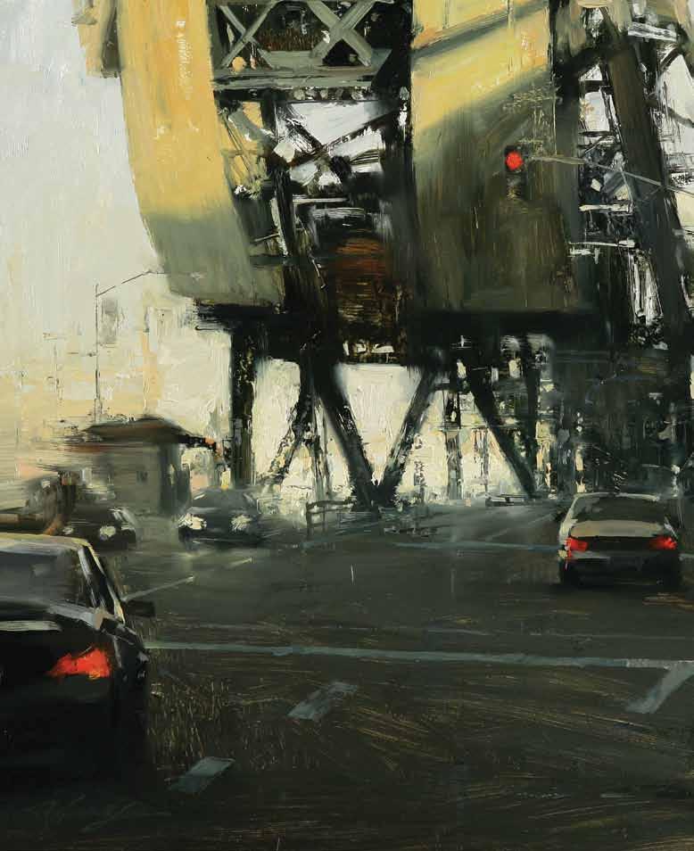
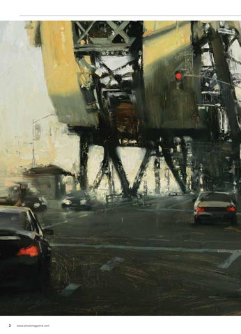
left: “ Painting alla prima with brushes and palette knives,” says Tseng, “I played with the texture of both the paint and the architectural elements in The Bridge (oil, 16x16).”
Born in Taipei, Taiwan, in 1986, he believes that a career in fine art had always been his destiny, and his path to its realization has been one of extraordinary commitment, along with untiring support from his parents.
he began drawing at age 5, depicting trains he’d see when meeting his mother at the station after work each day. Later he was impressed by his older cousin’s cartoon sketches and still life drawings. “ my cousin was an art student at the time,” says Tseng, “and i saw myself being like him one day.”
Artistic Journey
Perhaps the trains Tseng drew foretold the journey—both real and figurative—of his formal art education. at age 10 he began art classes, which led to enrollment at an art high school in Taiwan.
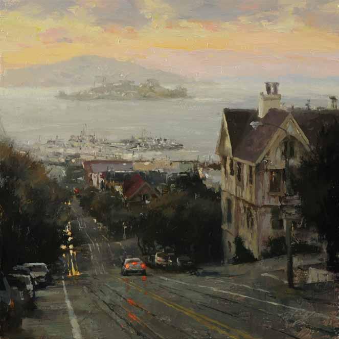
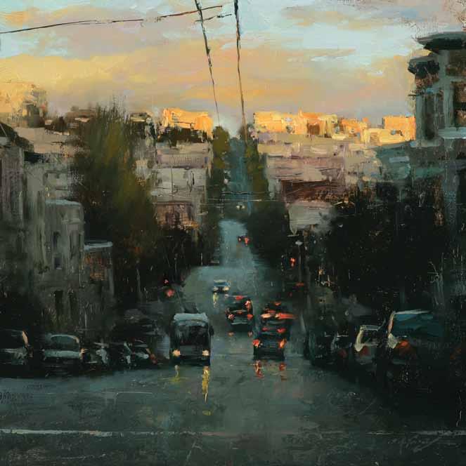
Below: “Evening at Hyde St. (oil, 12x12) is a classic view from my studio at the n orth beach area, overlooking the San Francisco bay,” says Tseng. “I paid attention to the subtle color temperature change in the background.”
Later he moved to the united states where he eventually studied at the academy of a rt university in san Francisco, but first there was a year in—Wisconsin?
“ yes, Wisconsin!” says Tseng. “ my father thought that in Wisconsin there wouldn’t be many foreigners, so i’d be able to study and learn english and to fully experience a merican life and culture. i knew no one there. i was on my own. i took english classes and one drawing class.”
With acceptance into the academy of a rt university, he was under the tutelage and mentorship of instructors and artists Craig
nelson, Zhaoming Wu, Tomutsu Takishima, Carolyn meyer and adam Forfang. Tseng, with his strong work ethic, honed his skills, refined his technique and expanded his interest in landscapes and still lifes to include portraits and figures.
i mbued in Tseng’s work is a quiet confidence, a sense of peaceful energy, as well as a level of accomplishment that belies his age. a lthough his earlier years of study focused on watercolor and charcoal, oil is now his preferred medium for his painterly technique.
RiGHt: “I Never Told You (oil, 30x20) reminds me of my past,” says Tseng. “Many people, when they’re younger, aren’t able to say that they like someone. When the end of the year comes, it’s too late because they’re moving on.”
san francisco’s Charm
Tseng painted in watercolor for six years, but now paints mainly in oil. oil paint is so flexible,” says Tseng, i like my paintings to have a thin-and-thick quality to them—but what i love most about oils is that i can continuously work the painting without worrying about destroying the surface. i like to apply layers of paint on top of each other and, at times, remove the paint as well.” The body and substance of the oil paint itself appeals to Tseng: “ i like how the heavy weight and texture of oil pigment looks when it’s applied to the canvas.” no matter what he elects to paint, Tseng finds that the city of san Francisco provides him with endless subject matter. h is walks to and from the academy have inspired his expressive cityscapes that capture the hilly streets, characteristic architecture, daily bustle of people, lights and traffic, busy wharves and bay views in all lights and atmospheric moods, from morning to dusk to night and from bright sun to fog or rain. he deftly employs his deliberate brushstrokes, capturing the light to impart the illusion of depth, life and energy. But for all the subject matter that the city provides, whenever he has the opportunity, he heads out of the city to paint seascapes and rustic settings in muir Woods and Bodega Bay.
“ i like to paint everything!” admits Tseng. “For my current body of work, i challenged myself to do something i hadn’t done before—multiple-figure compositions (see Working Thin to Thick, pages ••–••). Through these figures in a variety of environments, i ’m exploring social relationships. in a world that has become unpredictable, fast-paced and loaded with conventional imagery, i want to remind people of the simplicity of humanity through ordinary scenes that express the interaction between people in an environment. he continues: “ nothing stays the same. i want to capture the simple concepts of joy, love and anything else that exists around us but that we don’t normally notice.”
stand Back and squint Tseng works in his studio from life and photo references. often listening to music while he works, especially that of Taiwanese singer jay
Surface: Raphael oil-primed linen on board; Utrecht and Blick cotton canvas; wood, birch or hardboard panel prepared with Gamblin oilpainting ground and Gamblin Gamsol
Medium: 70 percent linseed oil, 10 percent poppyseed oil, 20 percent Gamblin Gamsol
Palette: titanium white (lefranc & Bourgeois); cadmium lemon; cadmium yellow light; cadmium yellow medium; cadmium orange; cadmium red; permanent alizarin crimson; yellow ochre; transparent iron oxide red; burnt umber; ultramarine deep cobalt blue; light viridian; sap green; a cool purple combination of ultramarine blue, alizarin crimson and varying degrees of white; gray mixed from leftover paint (variety of manufacturers, including Rembrandt , Gamblin, winsor & newton and Utrecht)
Optional colors: flake white, cadmium yellow deep, ivory black, Mars violet deep ( winsor & newton), cerulean blue hue, kings blue (Rembrandt)
Brushes: Royal & l angnickel Series L5590 long sable flats, Nos. 2–44; Rosemary & Co. Series 279 mongoose flats, Nos. 2–10; Robert simmons and Utrecht bristle flats in all sizes; Hwa Hong (Korean company) Series 156 nylon flats, Nos. 1 & 2
Palette knives: flat- and triangle-shaped in all sizes
Other : lots of paper towels
By Hsin-yAo tsenG
1 2
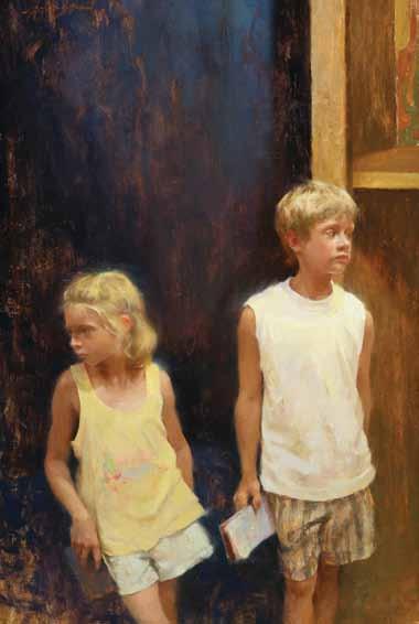
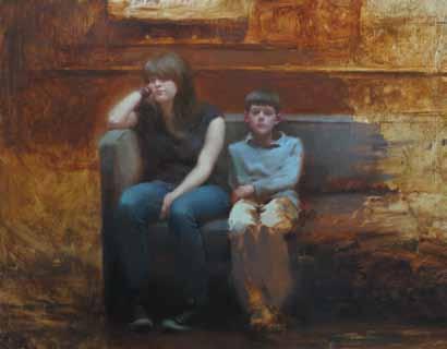
At the National Gallery of Art in Washington, D.C., I noticed a young boy and a teenage girl sitting next to each other. They were obviously bored, despite being surrounded by Rembrandt’s paintings—restless kids waiting for their parents to finish viewing the art. I took many photos and then, back at the studio, began a series of pencil sketches consisting of simple abstract shapes executed as two-value studies. I looked for big shapes, rhythmic movement and good composition. This demonstration shows only one of many ways to approach a painting. To me, there are no limits to the possibilities.
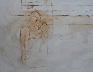
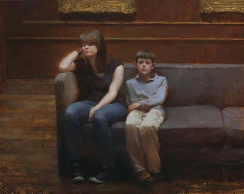
1. Toning: I toned a stretched, oil-primed Raphael linen surface with a thinned mixture of ultramarine deep, cadmium red and burnt umber. After the surface dried, I began sketching the general placement of the figures and the environment. For this underdrawing I used a No. 2 Royal & Langnickel sable flat brush loaded with a mixture of diluted yellow ochre, transparent iron oxide red and burnt umber.
2. Underpainting: I decided to execute this painting using a thin-to-thick approach, so I kept in mind what areas of the underpainting would remain visible after the picture was complete. During this stage I created a simple light-and-shadow pattern with a basic drawing. Making careful measurements, I continued establishing spatial relationships among the two figures, environmental elements and negative spaces. I loosely blocked in the shadow areas and unified the shadows by using the same color I’d used for the drawing.
3. Proportion, Edges, Value and Temperature: Next, I began applying paint over my underdrawing, starting with the girl’s face and working downward. I made decisions regarding design, value, proportion and edge quality based on my artistic intuition. I noticed that both the figures’ heads were slightly too big in my underdrawing, so I used the surrounding elements to adjust the proportions. The change is most
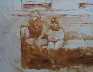
noticeable when you compare the image in the previous step with the image in the next one. Moving forward, I continued working the form and anatomy of the figures while focusing on the soft-hard, lost-and-found qualities of the edges. I kept in mind that, because the light (coming from the ceiling window) was cool, I would make the shadows warm. Also, I kept my shadows transparent to emphasize the thin-to-thick approach.
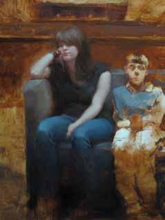
4. Background and Focal Point Balance: I continued developing the figure of the boy, concentrating on fold variations in his shirt and pants while looking for opportunities to simplify. Next, I blocked in the couch and the background. Slowly, I refined the interior decoration, including the frames on the wall. I paid close attention to the value relationships between the background elements and the figures in the foreground so that the secondary details wouldn’t compete with the focal point of the boy and girl. I decided to soften the highlights on the gold frames and darken the left corner to emphasize the light shining down on the figures.
5. Edge Adjustments, Highlights and Accents: In the final stages, I went back to the focal point, the children’s heads, and worked on improving the likenesses. I stood back to look at my painting from a distance. From this vantage point, I could determine where my sharpest edges would be as well as which edges I could soften most. I also decided where I would place my brightest highlights and darkest accents. Usually, sharp edges and highlights are key to moving the viewer’s eyes around the surface of a picture. The sharpest edges on this piece are at the joints—knees, elbows and shoulders—and at some of the cast shadows on the faces. Because the main light source is from the ceiling, the brightest highlights are located on the top planes of the subjects, such as the knees and shoulders. These edges and highlights were some of the last details I addressed on Waiting to Leave (oil, 22x28).
“The
Chou, he usually has up to three paintings in progress at any time, working stage by stage and layer by layer on each one. he keeps a sofa chair opposite his easel so that when he takes a break, he can sit back and examine his painting from a distance.
“ it’s really important to squint your eyes while studying your subject and to stand back from your painting frequently,” advises Tseng. “ s quinting simplifies the details so you can see the big shapes and value patterns of the subject. a lso, you get a sense of the lostand-found edges. standing back from your painting allows you to evaluate the unity of
the whole piece. s eeing the unity prevents you from overworking detailed areas or making unnecessary brushstrokes.
s quinting can also help you see values. To Tseng, achieving the proper value is more important than trying to get the correct color of the subject: “ if you have a wide range of values within your painting, you have flexibility in your color choice as long as you’re mindful of color harmony.”
plein Air encounters
a lthough most of his work is done in the studio, Tseng considers painting en plein air a
ABove: ”The challenge in painting New Beginning (oil, 30x40) was the overall flat lighting.” says Tseng. “To create contrast, I focused on the local value patterns.”
beneficial exercise. “ i find that direct interaction with nature helps me build authority in my brushwork and eliminates guesswork,” says Tseng. “When painting on location, i ’m not wondering whether a detail is distorted by the camera or whether the color really is as it appears in a photo. When painting en plain air or in short sessions with a model posing in the studio, i use the alla prima method and finish one part of the piece before i move on to the next area in the composition.”
feel the e xcitement a s far as composition and subject matter are concerned, Tseng always bears in mind advice he recalls from a lex Kanevsky, a guest lecturer at the academy of a rt university: “Kanevsky said: ‘ if you are not excited about what you paint, then your painting won’t excite the viewer either.’”
Constantly learning and visiting museums to study the work of the masters, Tseng has long been influenced by john singer sargent, a nders Zorn, a ntonio mancini, Ramon Casas i Cabró, and Giacomo Favretto. Contemporary masters who inspire him are Richard schmid, morgan Weistling, mian situ, Zhaoming Wu,
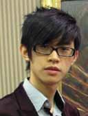
born in Taipei, Taiwan, in 1986, Hsin-Yao Tseng, received his bachelor of fine art degree in painting from Academy of Art University, San Francisco, in 2009 and his master of fine art degree from the same university in 2012. His many awards include a Certificate of Exceptional Merit in the 2012 Portrait Society of America International Portrait Competition and a Certificate of Excellence in the same competition in 2010; finalist in the Art renewal Center Salon for 2008-2009, 2009-2010 and 2010-2011; and second place in the portrait/figure category of The Artist’s Magazine ’s 2008 Annual Competition. He’s represented by the Legacy Gallery in Scottsdale, Arizona; Waterhouse Gallery, in Santa b arbara, California; the Garden Gallery in Half Moon b ay, California; and Howard/ Mandeville Gallery in Kirkland, Washington. Visit his website at hsinyaotseng. mosaicglobe.com.
jeremy Lipking, Ben a ronson, and jeremy mann. “ studying the works of these artists helps me improve my skills and define my own direction as my painting career progresses,” says Tseng. “For me, my ongoing challenge is learning how to say more while still being able to simplify. Less is more.” n
Freelance writer RosemARy BARRett seidneR is a director of Miller Gallery in Cincinnati, o hio.