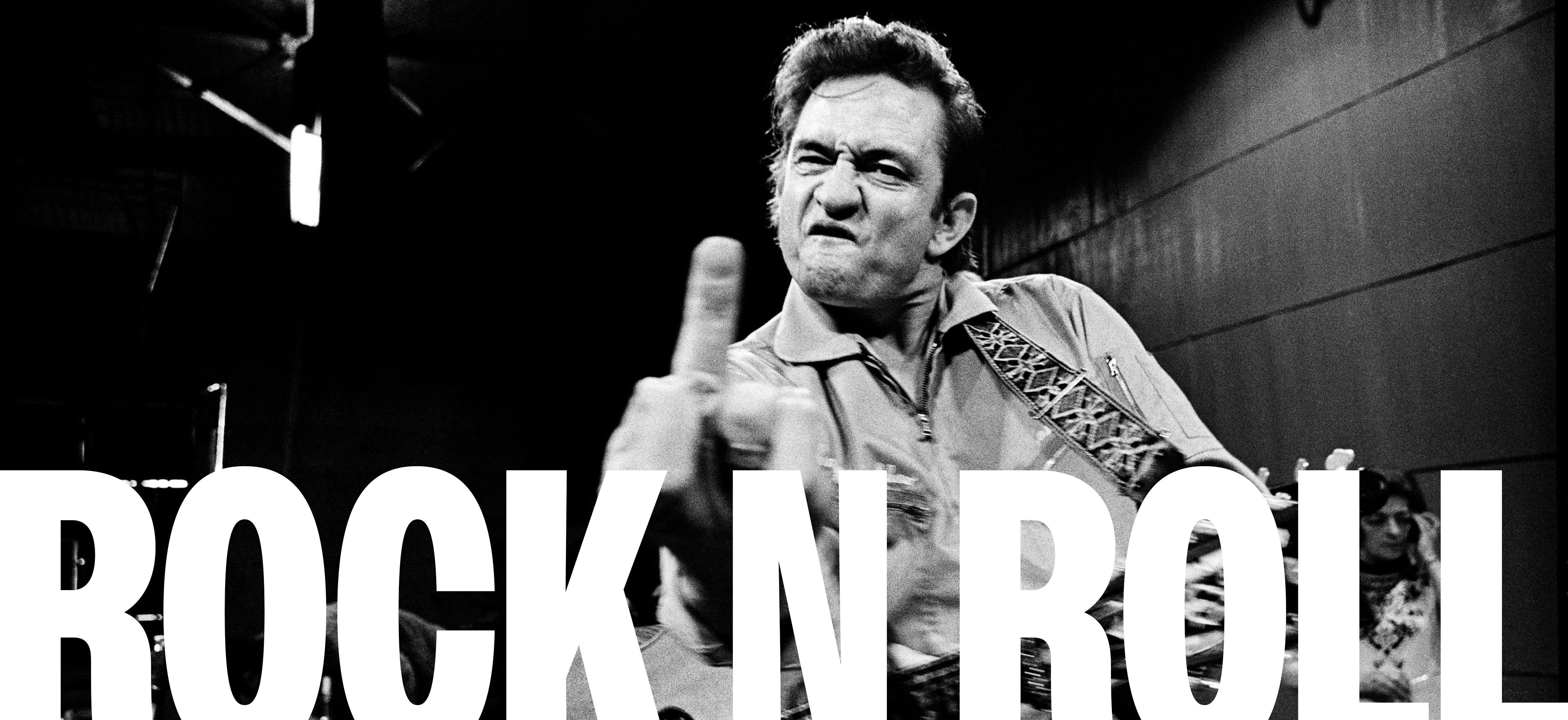
Logo. Image. Colour. Typography
All crucial elements to any brand when building a visual identity. From the fashion industry to social media platforms, a strong visual strategy is crucial in supporting a brands story, helping target consumers identify and relate to a company.
INTRODUCTION 01
When creating a successful visual identity there are 5 questions to consider:

1. Is it appropriate for my target audience?
2. Is it different, recognisable, and memorable?
3. Will it stay relevant?
4. Can it be used across a variety of assets? (Digital, Print, Fashion etc...)
5. Does it communicate the brands core values and brand story?
Overall, when we look at the most successful examples of branding in multiple industries we think of Nike, Apple, Coca Cola, the list goes on, and the reoccurring themes are simple, yet effective, revolutionary, yet timeless, and unique, yet adaptable.
Dribble - Renee Fleck om/stories/2020/07/21/visual-identityfor-digital-products
(Jul 21, 2020)
So, what is the importance of visual identity in rock music and how has the evolution influenced me and other designers?
MOTIVATION 02
As a graphic designer creating a visual identity and branding has always been something I’ve enjoyed learning about and taken an interest in, inside and outside of my studies at university.
For a while now I’ve worked with a band started by my brother, creating album art, logos and concepts which took my interest in branding to another level as I started to explore the importance of identity in the music industry. Throughout the second part of this project where I’ve had to design a publication based off the brand guidelines I’ve created for them, I’ve really learnt the importance of creating a story to go along with the artist, as in the music industry talent will only get you so far, but it’s your image that keep people engaged. By doing this, I started to notice similarities and differences in branding in fashion, technology and food companies compared to music which inspired me to pick this theme for my research report.
Not only do I have a strong interest in branding, but I have also always used music as a source of inspiration in my graphic design work, informing the way my personal style has developed. As well as design, I studied classical music, so I’ve always had an interest in the technicalities of music, however my personal music tastes sit more within 80s rock, alternative, indie and funk styles. Due to this, I find a lot of inspiration from the juxtaposition of styles, whether this be mixing contrasting typefaces, colour, or combination of imagery. This has inspired me to research into this more, and specifically understand where styles in rock have come from, and why they are so important in the development of branding within the music industry.
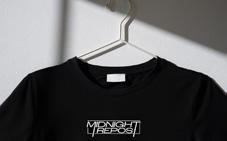
 Midnight Repost SLB Photography
Someone who is not only one of my biggest design inspirations but also helped revolutionise design within the rock industry is Barney Bubbles. His eclectic, advent-garde style, pushed boundaries and incorporated bold typography, collage, and surreal imagery. He is most well known for his collaborations with artists Elvis Costello and Ian Dury, creating striking album covers and other promotional materials inspiring countless generations of designers to think outside the box. He is such an important reference for me, as his work exemplifies what branding in rock is, and how I became interested in the topic for this research report.
https://daily.redbullmusicacademy.com/2015/03/barney-bubbles-feature
(Mar 13, 2015)
https://www.creativereview.co.uk/design-genius-barney-bubbles-book/
(Jan 19, 2022)

TYPOGRAPHY
Often band logos use a typeface that represents the characteristic of their music aesthetic. Rock music as a principle is a simple genre of music to write as it uses the same 3 chords, and time, so it’s no surprise that a lot of typefaces used are in all caps, heavy weighted lines and squared shapes rather than rounded. As I mentioned before, The Beatles typography logo has pioneered others, and the use of typography has been used amongst others for example:
Pink Floyd
Pink Floyd have had their fair share of logos including their iconic rainbow triangle, division bell symbol and signature style. However a common theme is the use of handwritten, signature style type through the majority of logos they’ve used.
ACDC
The ACDC logo history includes 3 major redesigns. The logo we see today was designed in 1977 and can be characterised by angular sans serif type and black colour palette, making it powerful and masculine.

Linkin Park
A more ‘modern’ example can be seen in Linkin Park’s type logo. Having gone through a few changes, the band returned to their 2000 logo. Characteristics include; gradient black palette, stamp style, and both ‘N’s’ facing backwards.

Just from these few examples, we can see the similarities include; a black and white colour palette, thick and heavy typefaces, letter stylisation and manipulation, and strong angled lines.
However, as the genre developed through to the early 70s, with the introduction of metal inspired music, typefaces became a lot more experimental and expressive. A clear example of this can be seen in Metallica’s iconic logo, with the elongation of the M and A, electricity influence and forced perspective.


SYMBOLS
Aside from type-based logos, symbols came to play. When I say The Rolling Stones what comes to mind? Well, I asked 10 of my friends, and most if not all of them said the lips. John Pasche’s red tongue and lips, designed in 1971 was and continues to be an iconic symbol of The Rolling Stones. The icon was originally inspired by the Hindu Goddess Kali, but as the band grew a following, fans often connected it to Mick Jaggers mouth, prompting sexual connotations and creating their ‘bad boy rock band’ reputation. It’s interesting to refer to this as it shows a clear example of where branding, as well as their songs, style, and on/off-stage personas became their brand.
Symbols became popular as a piece of iconography adopted to cultivate a stronger association with a band. It also makes up a bands signature stamp, used by; The Who, Radiohead, Nirvana and many more.
The Rolling Stones Logo
1000 Logos
https://1000logos.net/rolling-stones-logo/

Colour use is considered a lesser important element to branding in rock. When you think of McDonalds you instantly connect the colour red and yellow, or the same with Shell garage, however when I think of a rock logo my answer would usually be black and white.
Although there are obvious exceptions to this like ACDC and Iron Maiden, from my research I’ve noticed a common theme of a type logo being black and white, with the occasional accent colour added in like red. If you think about this in colour psychology it makes sense as black is often recognised as a powerful, sleek, and defining colour with red also representing sex, power and energy, all things rock bands appreciate being associated with.

COLOUR
” ”
Your image as a musician sells your music, and your music sells your image.
To show all of these elements more visually, I’ve put together case studies in the format of a timeline to show where logo designs came from and how they’ve changed and evolved through the life-span of rock music from 1950 through to modern day.
VISUAL TIMELINE 04
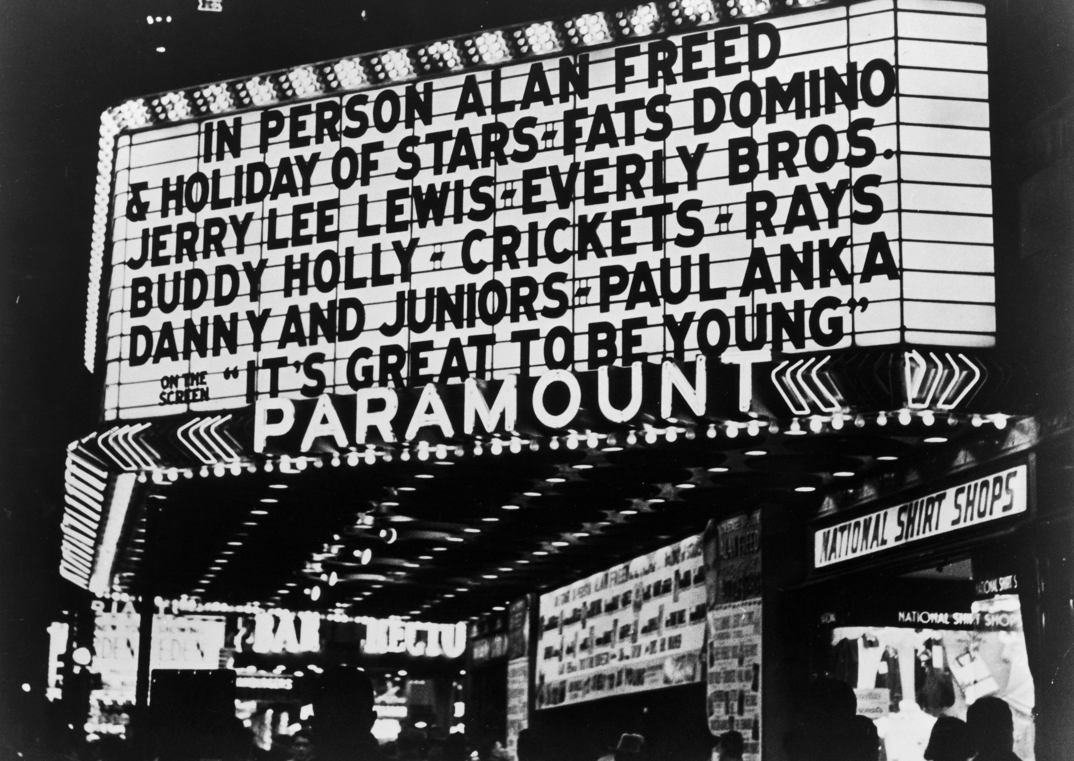
Rock Music starts to develop and be designed as a genre of popular music that originated as ‘rock n roll’ in the US
UDiscover Music - Martin Chilton
https://www.udiscovermusic.com/stories/best-rocknrollsoundtracks/
(Mar 7, 2023)
FlyPaper - Dan Ryfsnyder
https://flypaper.soundfly.com/discover/on-july-9-1955-rock-n-rollwent-1-with-bill-haleys-rock-around-the-clock/

(July 9, 2018)

1950
The Beatles, an English rock band, are regarded as the most influential band of the time and considered pioneers of rock development, and music as an art form. One of the first bands to use a type-based logo. Although their logo was not fully defined as their official branding until 1982, their black typeface logo appeared throughout their career on their drumskin during live shows and became an iconic symbol recognized by their audience.

1000 Logos -The Beatles Logo
https://1000logos.net/beatles-logo/ (Feb 24, 2023)
Uncut - Uncut
https://www.uncut.co.uk/reviews/the-beatleson-air-live-at-the-bbc-volume-2-1276/ (Nov 11, 2013)

The Who, formed in London 1964, a leading band when it comes to branding with the use of typeface and symbol combined. Their bullseye design, featuring the colours of the British flag represents their roots, while the arrow on ‘O’ was designed to represent masculinity, and the connection of the two ‘H’s’ represented unity. Although, similarly to the Beatles, their logo never appeared on any studio albums, it’s worn by their audience as a ‘badge of honour’ (ultimateclassicrock).


The Who Website - The Who
https://www.thewho.com/2014-the-who-logo/ (Sep 8, 2017)
Poster Freaks - The Who
https://posterfreaks.co.uk/products/the-wholive-at-leeds-rolled-nm (Sep 8, 2017)
Fleetwood Mac are an important reference when referring to importance of logo. Although the band first formed in 1967, throughout the years and having had 16 band members since forming, their logo has always stayed the same. It’s also a lot different compared to other classic rock bands we see, it features a softer type, using curved lines and delicate decoration.

Joom - Fleetwood Mac
https://www.joom.com/tr/products/60ed542319b40f018f9d2bb9
Albums That Should Exist - By Paul
http://albumsthatshouldexist.blogspot. com/2021/02/fleetwood-mac-trodd-nossel-studios.html

1960 1964 1967
The Rolling Stones were on of the first bands to use a symbol as their logo over a typeface one. Their lips and tongue logo designed by John Pasche, became a symbol for sexuality and provocative imagery, creating their ‘bad boy band’ image. They’ve never had a set type logo, throughout their career, they have always used decorative fonts, adapted to reflect the aesthetic if their music and image.


1000 Logo - The Rolling Stones
https://1000logos.net/rolling-stones-logo/ (6 March, 2023)
Extra Chill - Chris Huber
https://extrachill.com/2020/12/rolling-stonestongue-and-lips-logo-meaning.html
(11 Dec, 2020)
Iron Maiden are possibly the best example of their branding becoming their visual identity. Their typeface logo, heavily inspired by the Metal era is featured on all of their studio albums and is on the list for the most recogniseable logos in the world with their red, white and black colour palette. They also introduced ‘Eddie the Skeleton’, a mascot used on album covers, stage designs and other assets. This is the first time a bands logo/ style became part of their performance value.
Book by Eduardo Benatar and
Iron Maiden: Where is Eddie?
https://www.simonandschuster.com/books/ Iron-Maiden-Where-is-Eddie/Eduardo-Benatar/9781970047196

Area 51
https://area51.co/gmedia/iron_maiden_live_ eddie-jpg/

(16 Aug, 2018)
Rock music in the 80s explored soft rock, glam metal, thrash metal, shred. Although metal music gained popularity in the 70s, branding in the 80s saw a rise in metal inspired typefaces with harsh angles and electric inspired imagery. Metallica guided the golden age of branding in logo design, using their typeface logo full of sharpness to reflect the music of the band. It’s one of the first examples of using branding to reflect aesthetic of the music rather than of the artists.
World Vector Logo - Metallica
https://worldvectorlogo.com/logo/metallica

Zopyros - Metallica Event Poster
https://strategic.sanctionthin.za.com/index. php?main_page=product_info&products_ id=27596

1960 1964 1967
1971 1975 1981
Lindsay Lee
Guns n Roses, similarly to queen, had a more complex and decorative logo design. Unlike Queen’s which represented royalty, Guns n Roses use traditional American imagery of 2 pistols and roses representing how the band used to be two separate bands and their joining.

UKPosters - Guns n Roses Logo
https://www.ukposters.co.uk/posters/guns-nroses-logo-v675
1000 Logos - Queen Logo
https://1000logos.net/queen-logo/ (Feb 8, 2023)
Oasis is possibly my favourite example of how important logo design is to a band. Before 1993 Oasis had no record deal, fanbase or branding. Once they had all of those, they had a logo designed to work across every asset (including black and white press ads), they ditched the union flag design they initially had and were left with simple, lowercase typography against a black box which is now used on every studio album they release.


Foo Fighters is a classic example of modernisation ruining their type design. If you look at the evolution of their logo, the typeface has changed constantly and it has resulted in an over-simplified standard bold typeface like a lot of highend fashion houses now use. The most successful part of their branding comes from the symbol of the 2 ‘F’s’ which have become iconic to their fanbases. In 2017 they remade the symbol, updating the type to a simpler, more geometric symbol but still keeping the same message throughout.

UKPosters - Guns n Roses Logo

https://www.ukposters.co.uk/posters/guns-nroses-logo-v675
1000 Logos - Queen Logo
https://1000logos.net/queen-logo/ (Feb 8, 2023)
1000 Logo - Foo Fighters Logo

https://1000logos.net/foo-fighters-logo/ (24 Feb, 2023)
Deviant Art - Pompelina
https://www.deviantart.com/pompelina/art/ Foo-Fighters-Logo-328401035 (21 Sep, 2012)
1985 1991 1994
Moving into more modern rock, Arctic Monkeys branding is a clear example of simple yet effective. Although their logo has changed a handful of times, the positioning and perspective manipulation has stayed the same. Their most recogniseable one designed in 2017, uses glyphs of varying heights, this distortion meant that they did not form to a straight line giving the effect of a ‘flag’ effect, used before by Black Sabbath.

Reddit - Renzonsanchez
https://www.reddit.com/r/arcticmonkeys/comments/8zezvk/arctic_monkeys_logo_history/

Typeroom - Matthew Cooper
https://www.typeroom.eu/matthew-cooperand-the-art-of-the-cover-of-a-decade
(18 Feb, 2020)
The 1975, although more of a pop rock band, their branding takes inspiration from rock music with a modern say twist. In modern day music, we see how logos/ and branding have taken on a new role and become part of artists style and performance. The 1975 use this box motif which can be seen on album covers, in music videos and stage set ups, often accompanied by the use of a neon sign.

Logos Discovery Engine - The 1975 Logos
https://www.logolynx.com/topic/the+1975
Scientists of Sound - The 1975 | Settle Down
https://www.sos-music.co.uk/2014/01/the1975-settle-down-official-video.html
(30 Jan, 2014)

1985 1991 1994
2002 2002
Deadmau5

AXS
https://www.axs.com/artists/110703/deadmau5-tickets
From this list of references, we can clearly see the importance of visual identity in rock music, and the evolution of logo designs. Now with the evolution of branding coming full circle, Logo design is at the forefront. Take DeadMouse and Marshmello, both electornic music producers, whose logo is so integral to their performance that they embody it and use it as masks to perform in.
Marshmello

Spotify
https://open.spotify.com/artist/64KEffDW9EtZ1y2vBYgq8T
CONCLUSION 05
Bandzoogle - Monica Strut
https://bandzoogle.com/blog/5-ways-to-create-a-brandaround-your-music
(Sep 20, 2022)
As part of my conclusion, I would like to propose a question to emphasise all the points I’ve spoken about witin this report:
‘What would music be like if artists didn’t use branding?’
Throughout this report I’ve spoken about the importance of visual identity and its strongest success stories within the industry, but when we think about it music is predominately an aural art, written to be heard and not seen so why do we need branding at all?
The answer is pretty simple, branding is made to enhance the music, seen as a powerful tool designed to express an artist’s vision, connect their audience, and convey their artistic vision visually through logo, studio album design and personal style. Through carefully crafted visual elements, rock musicians can attract attention, provoke emotion, and generate intrigue amongst fans and potential listeners whilst standing out within an extremely crowded industry.
Pinterest - The 1975 https://www.pinterest.co.uk/nathanfabiniak/ the-1975/


Meet me at the Pyramid Stage - By Melisssa
https://meetmeatthepyramidstage.com/10best-music-venues-uk/

Throughout this research report, as well as my project, I have explored the question ‘What is the importance of visual identity in rock music? and how has logo design evolved?’ Throughout my degree and personal work, music (especially rock) has always been one of my biggest sources of inspiration whether that be visually, or the way I approach a topic, meaning nine times out of ten it has been my first port of call for any visual outcomes. I think personally this research was important for me to conduct because although I have turned to music as a source of inspiration and have always admired the Rolling Stones tongue as an iconic image, I don’t think I’ve ever fully delved into branding within music and what it takes to create a successful visual identity. I have also never understood the lengths music has gone in defining so many artists careers. I also think that branding in graphic design is an extremely relevant topic right now with the way the industry is heading into AI developed imagery taking over manmade outcomes. Looking back into so many references of iconic symbolism, stories and logos has made me realise the slowly fading connection designers are having with brands now that a computer can generate 10x the amount we can in half the time.
Research is something I usually love to conduct however for some reason I really struggled focusing and gathering relevant information for this project. As I look back at it, I picked a very close and personal topic to my design work, so I think the fact that I had so many existing opinions and ideas surrounding it, I struggled to go into the research process with a fresh and open mind. I definitely think this affected the way I went about literacy research so if I could go back and start this project again, I would start my research earlier, and find alternative forms of research, other than articles and books, that I might’ve engaged more successfully with. Having said that, I did watch a variety of movie style documentaries at the beginning of this project including; Bohemian Rhapsody (inspired by Queen) and Rocketman (inspired by Elton John) to be able to connect my passions into the question I picked. Queen is obviously very iconic for their onstage persona and off-stage style, which I personally credit Freddie Mercury with, but there’s a scene in the movie where Freddie comes in with a hand drawn rendition of their new name and logo which gave context to the connection of band image and logo. This along with a variety of articles, formed the foundation of my research report and what made me want to add on the additional question about how logo designs have evolved.
POSITION 06
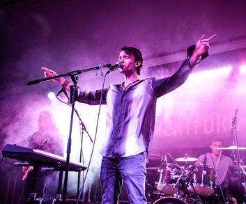
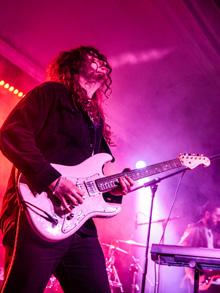
As I said before, music is my biggest inspiration in my work, but working with branding in the industry is something I’ve started to explore outside of Uni with my work for my brother’s band ‘Midnight Repost’. I have designed album covers for them previously, and when we started this project, they decided to go through an entire rebranding period and asked me to help so I thought this would coincide with my question perfectly as a visual outcome. To visually represent my question, I decided to create a brand guideline presented as a digital publication.

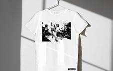
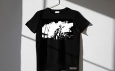


During this, I took all of the research points I had learnt, combined them with some interview responses and personal judgement to design; a logo, colour palette, signature typeface, merch, album design concepts, a web page design, style guide and photography guide. In one of the first CoP workshops, Gabi mentioned that brand guidelines can often look quite corporate, so this was definitely something I kept in mind throughout the creation of my editorial outcome. I combined a lot of my personal design style like big, bold type and fun layouts to let each element shine in a professional way, but keeping it modern, fresh and representative of the bands aesthetic.
I combined a lot of my personal design style like big, bold type and fun layouts to let each element shine in a professional way, but keeping it modern, fresh and representative of the bands aesthetic. I also thought about my audience which is why I ended up choosing a digital format instead of a printed one. I kept imagining a busy record exec on the tube trying to look at new, upcoming artists and having to faff around with multiple sheets of paper, and ultimately decided that a digital one would be best as not only is it more sustainable, but everyone also has easy access to either a phone or computer at most times.
BIBLIOGRAPHY
Book:
Rock Graphic Originals: Revolutions in Sonic Art from Plate to Print 1955 - 1988
Peter Golding (Nov 27,2018)
Visual Research:
Pinterest - Honey Priestnall: Unit 8
https://www.pinterest.co.uk/honeypriestnall/unit-8/
Behance
https://www.behance.net/
Website Articles:
Creative Review - Emily Gosling
Celebrating the design genius of Barney Bubbles (Jan 19, 2022)
https://www.creativereview.co.uk/design-genius-barney-bubbles-book/
(Date Accessed: May 20, 2023)
RedBull Music Academy - Ian Lynman
The Genius of Graphic Designer Barney Bubbles (Mar 13, 2015)
https://daily.redbullmusicacademy.com/2015/03/barney-bubbles-feature
(Date Accessed: May 20, 2023)
Visual Identity: What It Is and Why It Matters for Your Brand
Kylie Goldstein: Branding Expert and Marketing Blogger (Aug 29, 2021)
https://www.wix.com/blog/2021/08/visual-identity/#:~:text=What%20is%20visual%20identity%3F,help%20customers%20identify%20a%20brand.
(Date Accessed: May 9, 2023)
UNLABELED ACADEMY: ARTIST BRANDING SINCE 2015
https://www.unlabeledmusic.com/unlabeled-academy/artist-branding/#:~:text=Artist%20branding%20involves%20channeling%20music,than%20just%20music%20it%20represents.
(Date Accessed: May 9, 2023)
MUSIC BRANDING STRATEGIES FOR THE MODERN ARTIST & MUSICIAN CIPHR (JOHN DOBIE) (2018)
https://producerhive.com/featured/branding-yourself-as-a-musician/ (Date Accessed: May 9,2023)
Branding The Band: The Rise Of Logos In Music
(September 7, 2022)
By Brett Milano
https://www.udiscovermusic.com/stories/the-rise-of-music-logos/
(Date Accessed: May 9, 2023)
The surprising story behind The Beatles logo
Daniel Piper, Amelia Bamsey
(last updated January 10, 2022)
https://www.creativebloq.com/news/beatles-logo
(Date Accessed: May 14, 2023)
Clementine Zawadzki | Art | Hero Magazine
(31 July 2017)
The graphic artist whose work defined a musical revolution
https://hero-magazine.com/article/104092/barney-bubbles
(Date Accessed: May 17, 2023)
Documentaries:
Bohemian Rhapsody
Inspired by the real life story of Queen Watched through Disney Plus
Rocketman
Inspired by the real life story of Elton John Watched through Sky
Images:
Images used have all been credited where placed