2 minute read
DESIGN PRACTICE

from Research Report

Ian Dury
Twitter https://twitter.com/IanDuryOfficial/status/1387798832499486722
Advertisement
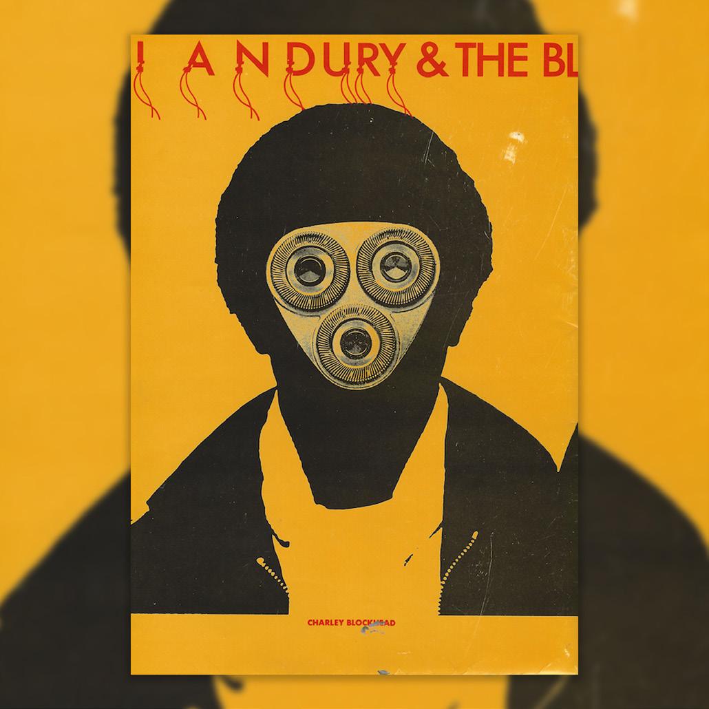
Ian Dury and The Blockheads: On Tour
One of a series of 5 oversized posters designed by Barney Bubbles, for Ian Dury. to promote the fist Stiff Records tour (known as Live)
AnotherMan - Daisy Woodward https://www.anothermanmag.com/life-culture/9958/the-man-who-changed-the-faceof-album-artwork-barney-bubbles
(July 20,2017)
Eye Magazine - John L Waters https://www.eyemagazine.com/review/article/what-a-genius

2008
MoMA https://www.moma.org/collection/ works/156073
1979
Elvis
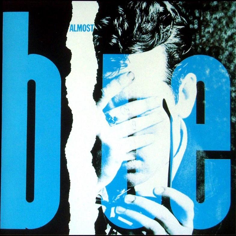
Costello and The Attractions: Almost Blue
A studio album cover for the album, Almost Blue. Bubbles’ artwork for Costello is some of his most inventive, he came up with the idea of placing adverts in 3 different UK music papers, when pieced together made 1 image.
Nick Low: Cracking up
Bubbles developed a way of placing an accurate visual representation of an artists music at the forefront, reflecting the mood, idea and the musician behind it.
Ian Dury and The Blockheads: Do It Yourself
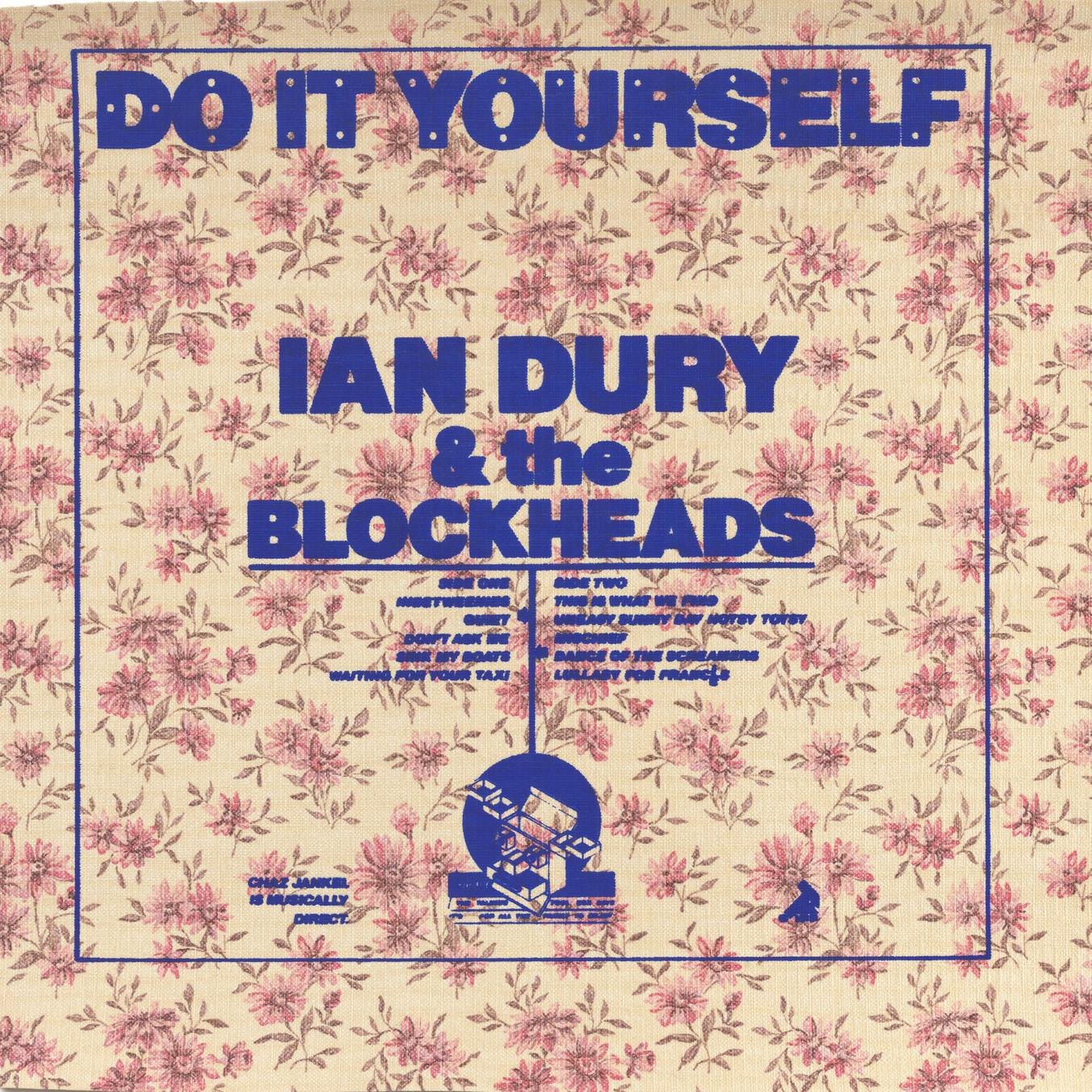
This cover was the first to be created for Ian Dury and the Blockheads by Barney Bubbles. It is arguably one of most widepread advertising campaigns produced from an album cover as it has 34 known variations each featuring different wallpaper designs.
In this essay, I’m going to refer to branding examples used in rock bands starting from the 60s (when rock branding started with pioneers like The Beatles and The Rolling Stones), through to modern day, giving examples of how rock branding has evolved but also the core elements that have remained the same and continue to work successfully.
Whether it’s 4/4-time, energetic live performances, or electric instruments rock music gained popularity in the US in the early 1950s. The genre is heavily influenced by RnB and can be characterised by the use of three chords, catchy melodies and consistent back beats. The first pioneers included Elvis Presley and Chuck Berry, however as the movement progressed through to the mid-50s, we saw the rise of rock bands. Along with leading the movement, the rise of The Beatles saw the beginning of logo designs within music. Although their logo didn’t appear on any album covers until 1982, their black typographic logo (mostly seen on Ringo Starr’s drumskin) became a recognisable image amongst their fan bases.
Branding
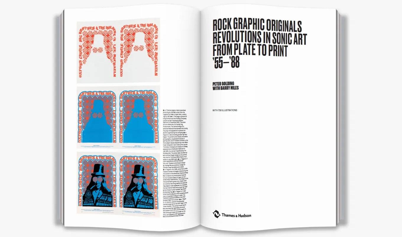
Branding for a band is especially important as with multiple band members with different lifestyles, looks and opinions, it helps develop a cohesive aesthetic for their music as well as creating a single story that audiences can follow, and can be adapted for multiple assets a lot easier. I have a book called ‘Rock Graphic Originals’ which has often been my first port of call at the start of a project. Written by Peter Golding, the book delves into the visual artistry and design behind some of the most iconic rock albums and promotional materials.
It showcases work by Barney Bubbles, Storm Thorgerson and Hipgnosis offering a complete exploration of their creative processes and the impact they had on music and design. Through my research into this book, multiple news articles, research reports as well as my personal observations, I started to see a lot of similarities in regards to the approach of branding a rock band. The most obvious being colour, typography and narrative with an overarching theme of simple, yet effective.