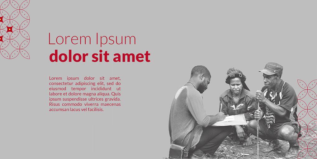
Portfolio 2025 Graphic Designer - Lucky Lukman Hakim
Graphic Design Portfolio
Hi, I’m Lucky. I’m a graphic designer.
Working between collaboration and creative exploration, I strive for creating works that resonates with today’s society and driven with good intention.
My work surrounds a wide range of brands, from nonprofits organization, SME, food & beverages to health & beauty. A combination of graphics and communication, I plot out system that include creating story or narrative, design assets, to working on details.
Education
Purwadhika Digital Talent Incubator (2024) Digital Marketing
Work Experience
Sirco Commerce, Sirclo 2021 - Present
Associate Creative Designer
As an Associate Creative Designer at SIRCLO-Commerce, I am responsible for supporting creative materials for enterprise marketing purposes at multiple marketplace. I am also a dedicated designer for L’Oreal Group: Consumer Product Division(CPD) at Tokopedia.
Kalibrr Indonesia 2019 - 2021
Associate Graphic Designer to Freelance Graphic Designer
As a graphic designer under Talent Growth, I was responsible for supporting creative materials for Employer Branding, Public Relationship, Sponsorship, and Partnership
Project Experience
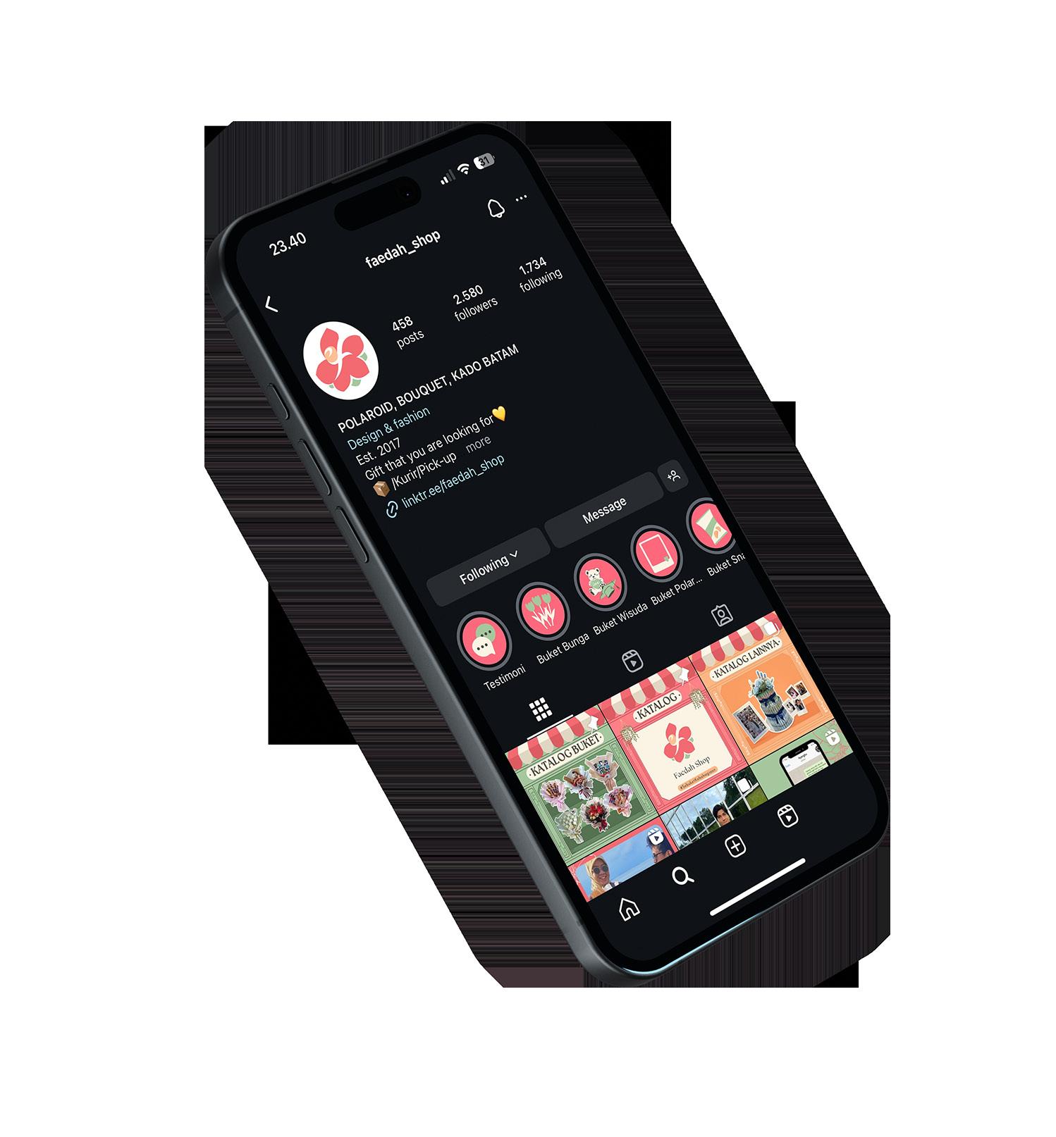
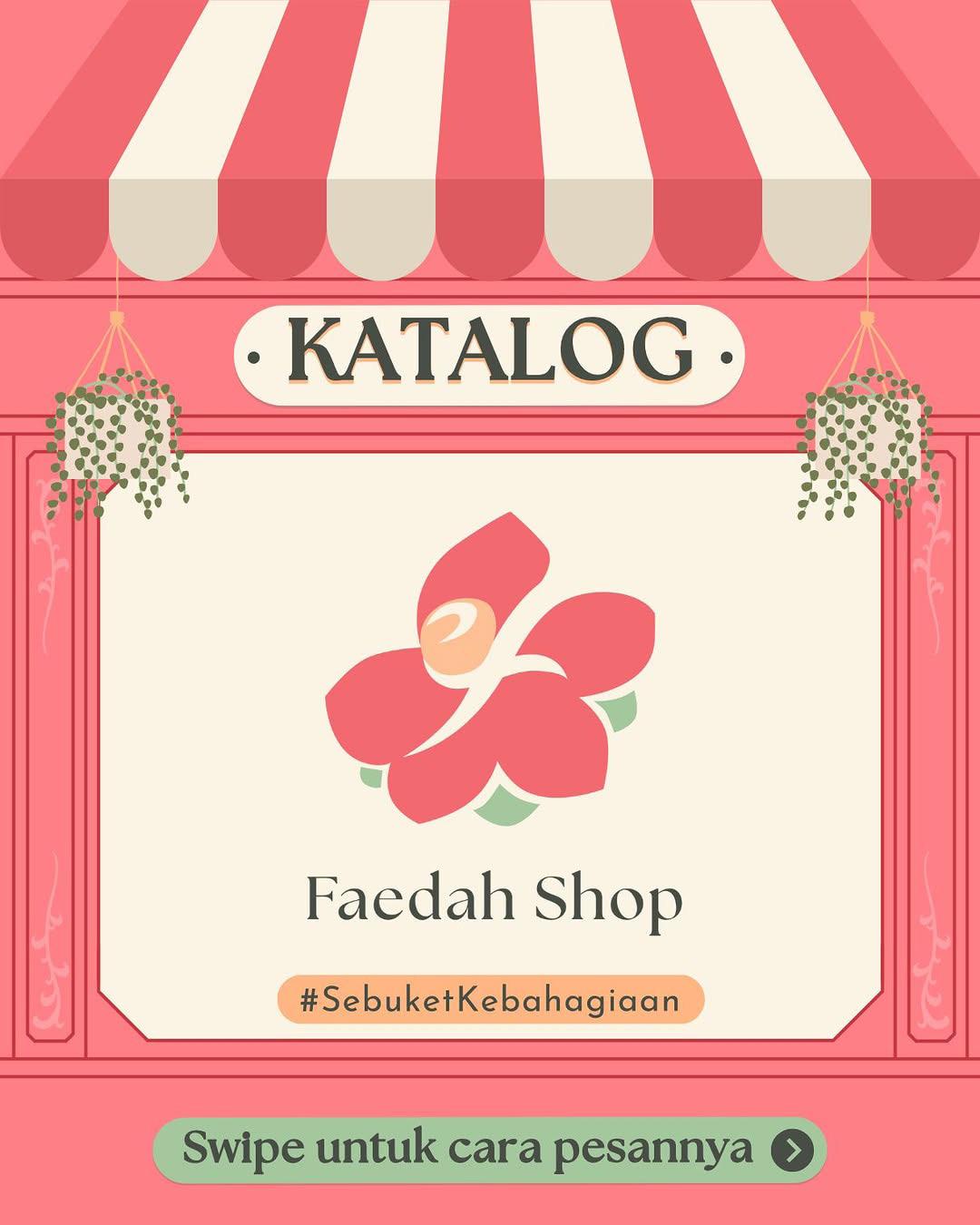
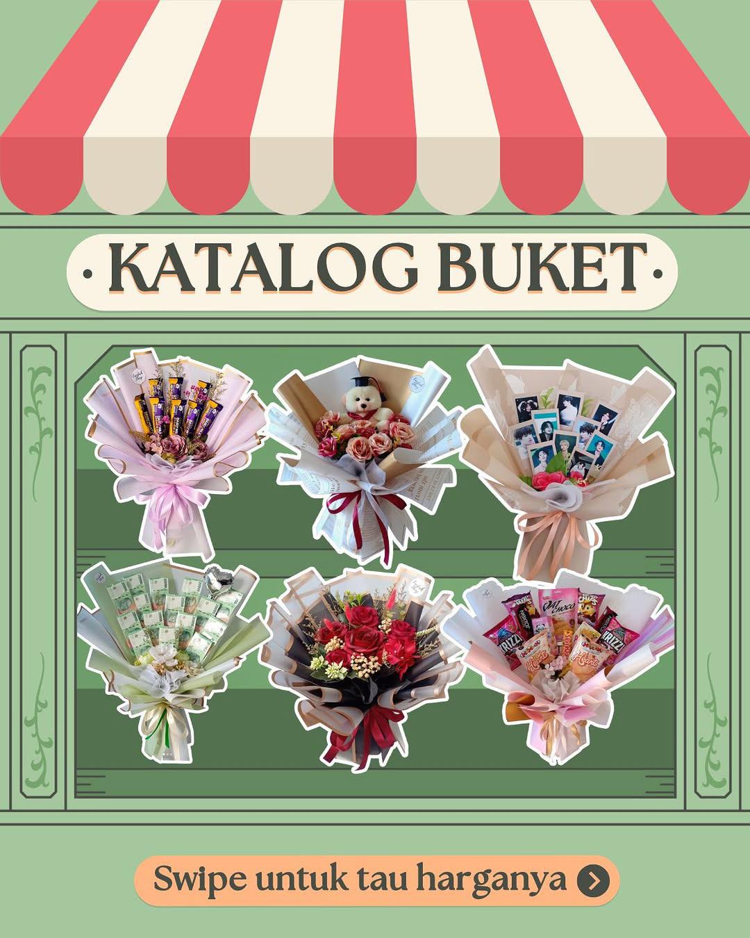
Faedah Shop
Social Media Manager
Astra Daihatsu Tuparev
Digital Marketing Specialist
Paddi Hills
Digital Marketing Specialist
UNDP
Freelance Graphic Designer
Ogilvy Indonesia
Freelance Graphic Designer
Language
Bahasa Indonesia (Native) English (Conversational Proficiency)
Bandung Institute of Technology (2014 - 2018)
Interior
Current Residence Contact
Jakarta Greater Area
| hluckylukman@gmail.com
Sirclo is a leading e-commerce enabler in Indonesia that provides services and solutions for businesses. I was assigned to handle several brands that varies from food, health care, to beauty brand. The scoop of work I worked on is to provide creative materials for campaigns including banner, motion video, discovery pages in several marketplaces, and also digital network (ads).
The design process on working these banners is to coordinate the given words or copy, with the brand campaign; the items they wanted to highlight, thematic campaign, etc. In order to create a cohesive design, I cooperated with content writer and key account to create the design.
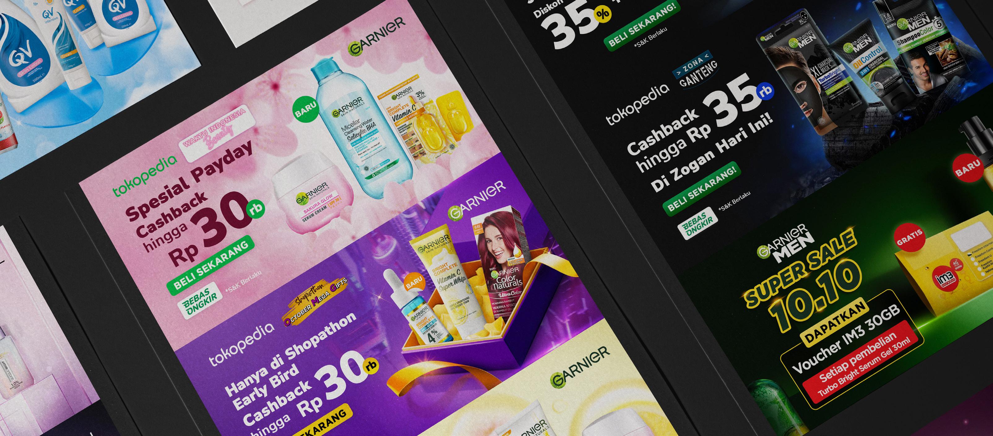
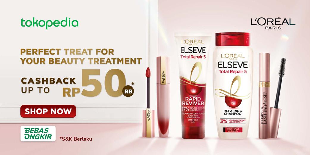
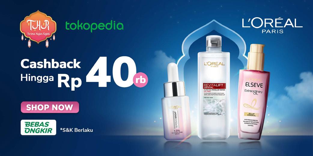
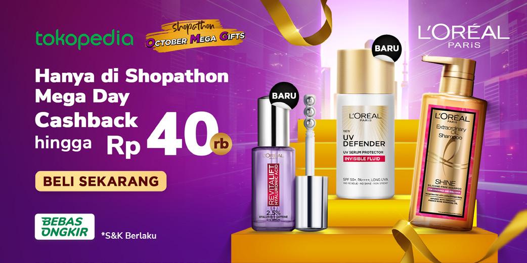
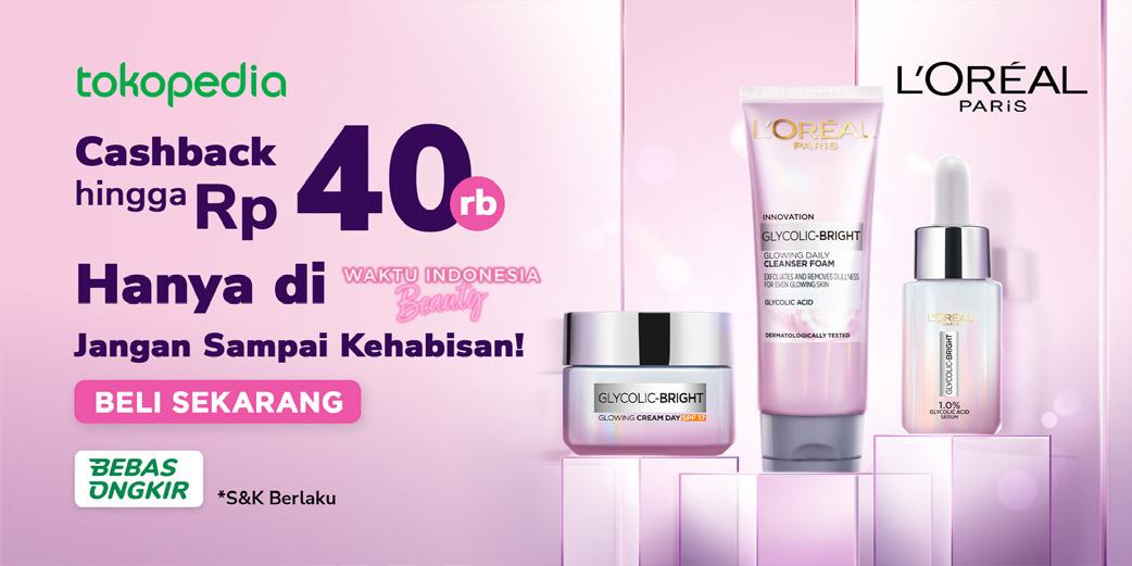
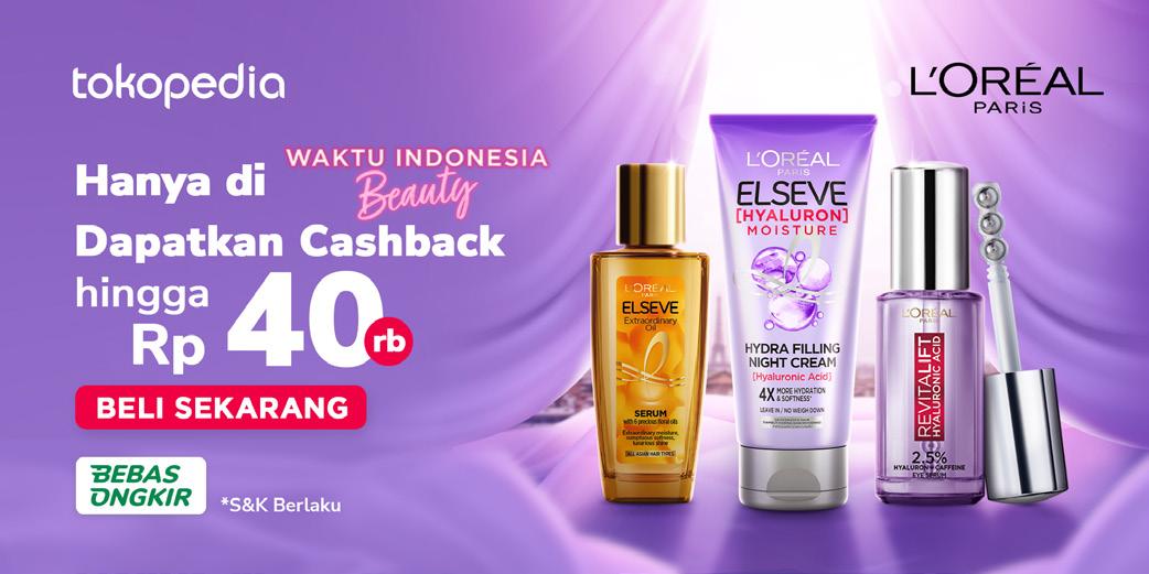
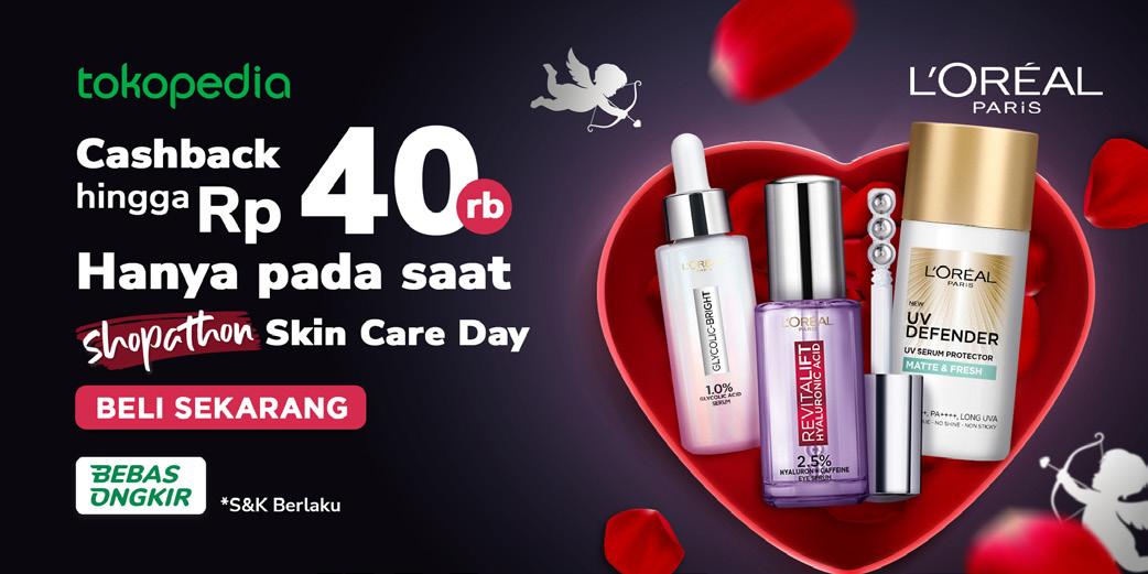
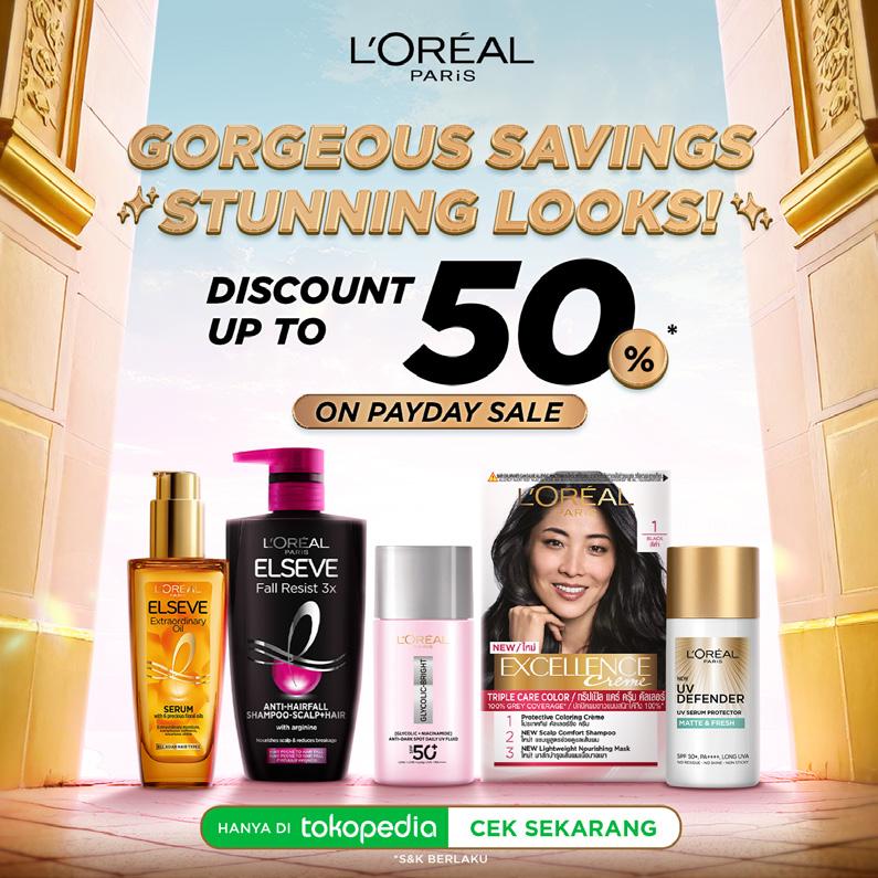
At Sirclo, I am responsible to provide designs for L’Oreal at Tokopedia that varies from Broadcast Chat Banner, TDN, Discopage, social media, and marketplace banner. In several times, L’Oreal give me creative freedom to design these banners. I explore through visual differentation to create a highend and rich visual.
On a monthly event such as Shopathon, L’Oreal request for a thematic banner to incorporate their campaign from Valentine’s Day, Ramadan, and a cyberpunk-dystopian world. I created visuals with background and ‘easter eggs’ to create more depth and engaging visual.
S01. L’Oreal Banners
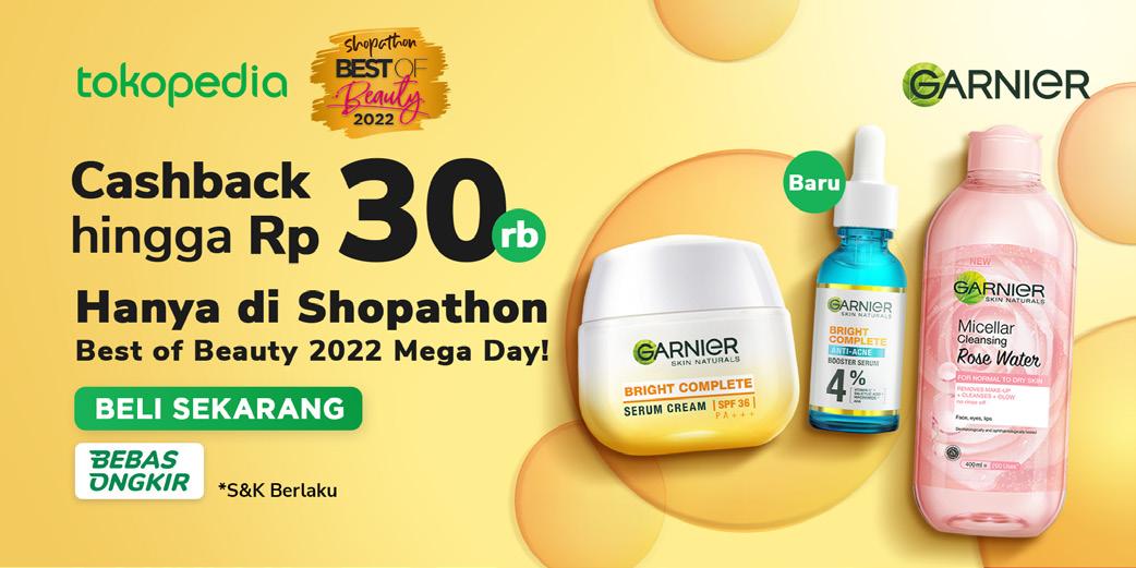
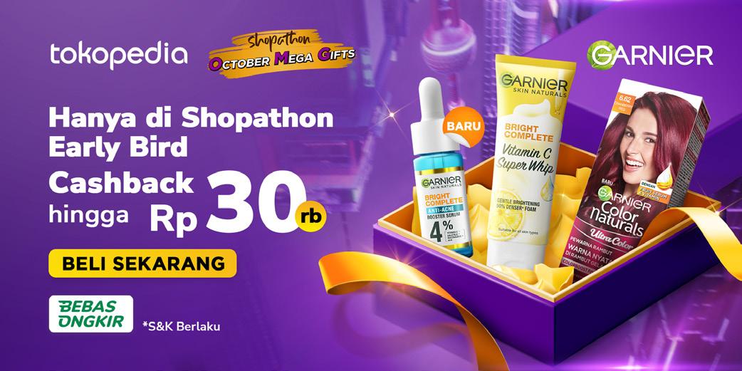
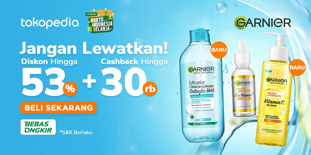
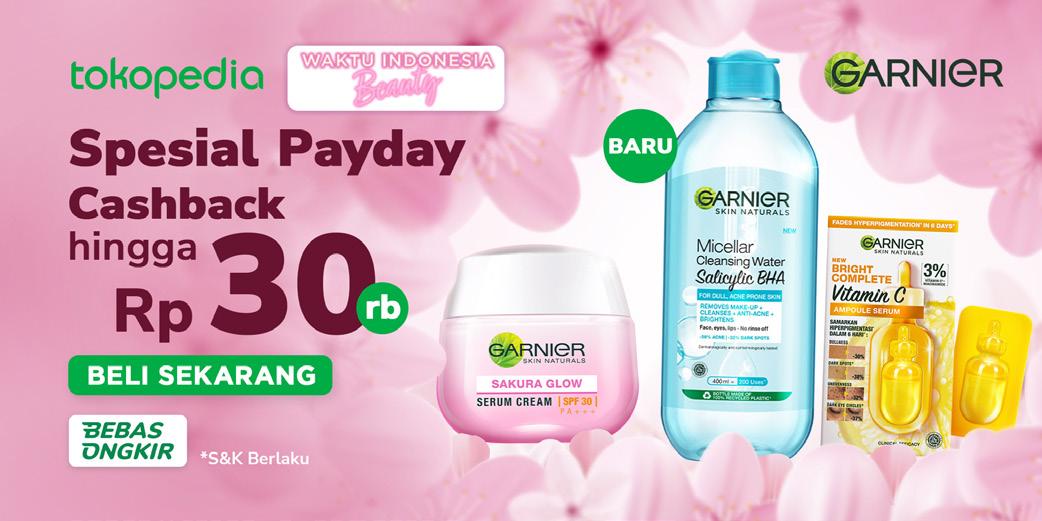
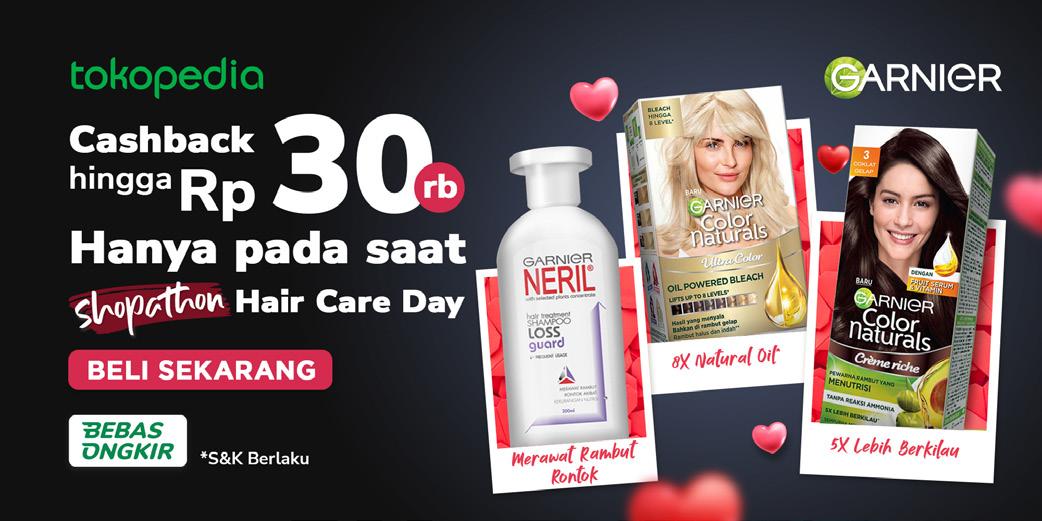
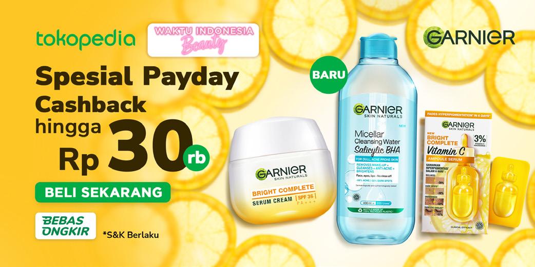
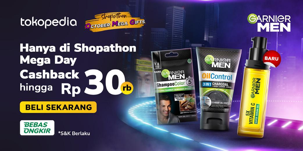
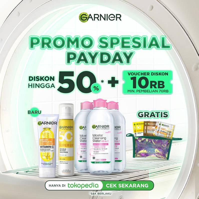
At Sirclo, I am also responsible to provide designs for Garnier and Garnier Men designs. I aimed the overall design for Garnier to be bright and fresh that align with their Green Sciences commitment. The key visual conveys the feeling of rejuvenation, natural beauty, and positivity. I want it to inspire viewers to connect with the product on an emotional level and evoke a desire to experience the same sense of freshness.
I tried to put natural refreshment to the overall design by putting crystal clear waters, visual ingredients, glass disc as a potential visual elements. I also applied soft or warm lighting with a slight sun beam to enhance the sense of warm and radiance.
S02. Garnier Banners
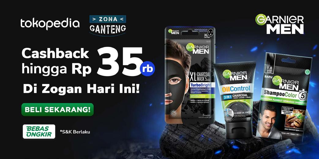
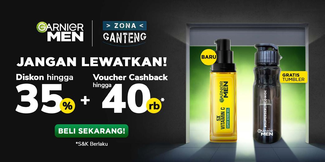
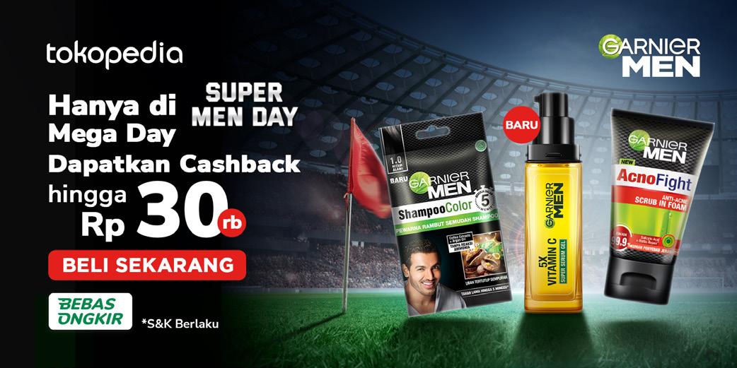
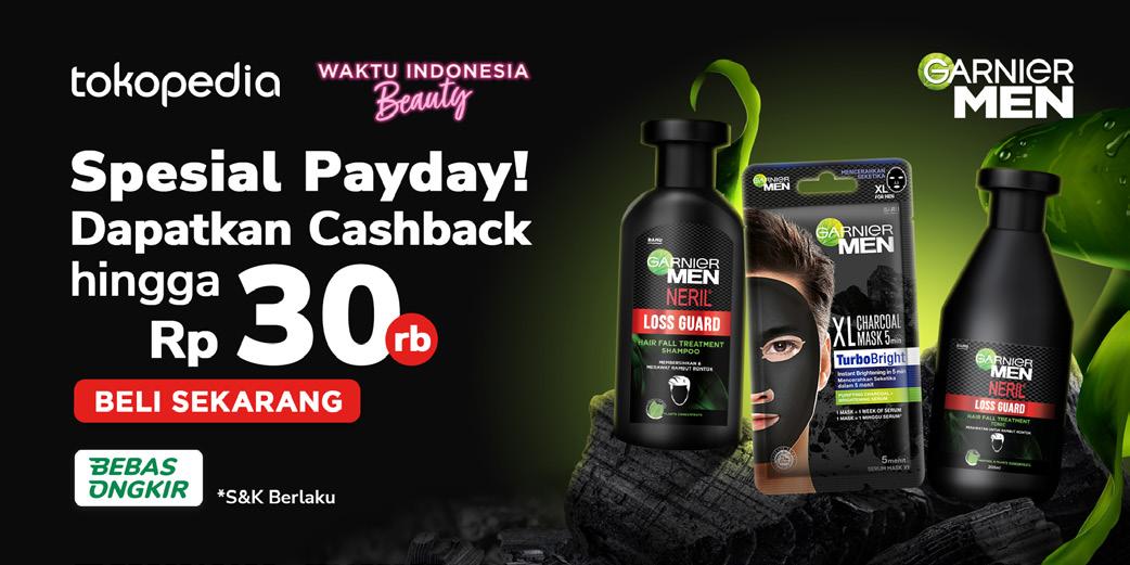
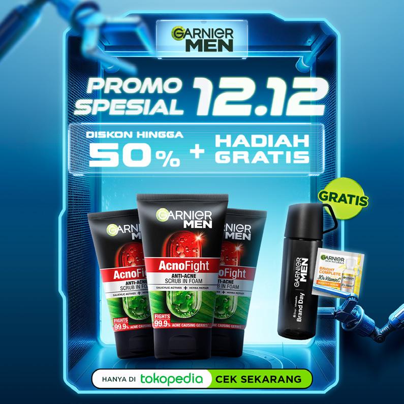
For Garnier Men, I aimed to create a strong and masculine visual for the overall designs. I create the designs to exude confidence and ruggedness. But as Garnier Men also have Green Sciences commitment, I also combine fresh and masculine visual that inspire a connection between the product and environment. It should convey the idea that freshness and vitality are not at odds with masculinity but can complement and enhance it.
To reach the strong and masculine visual, I created several designs that embracing industrial theme, cyberpunk or dystopian visual. For the lighting, I applied a dramatic, highcontrast lighting to emphasize the product. For the fresh and masculine visual, I created the visual by putting natural elements, especially the product ingredients and wood textures.
S03. Garnier Men Banners
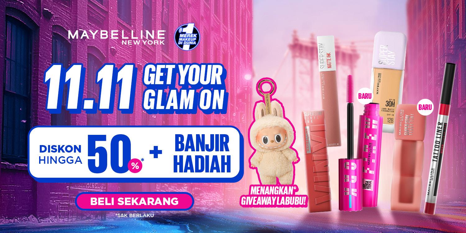
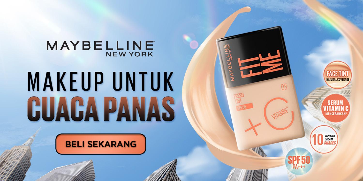
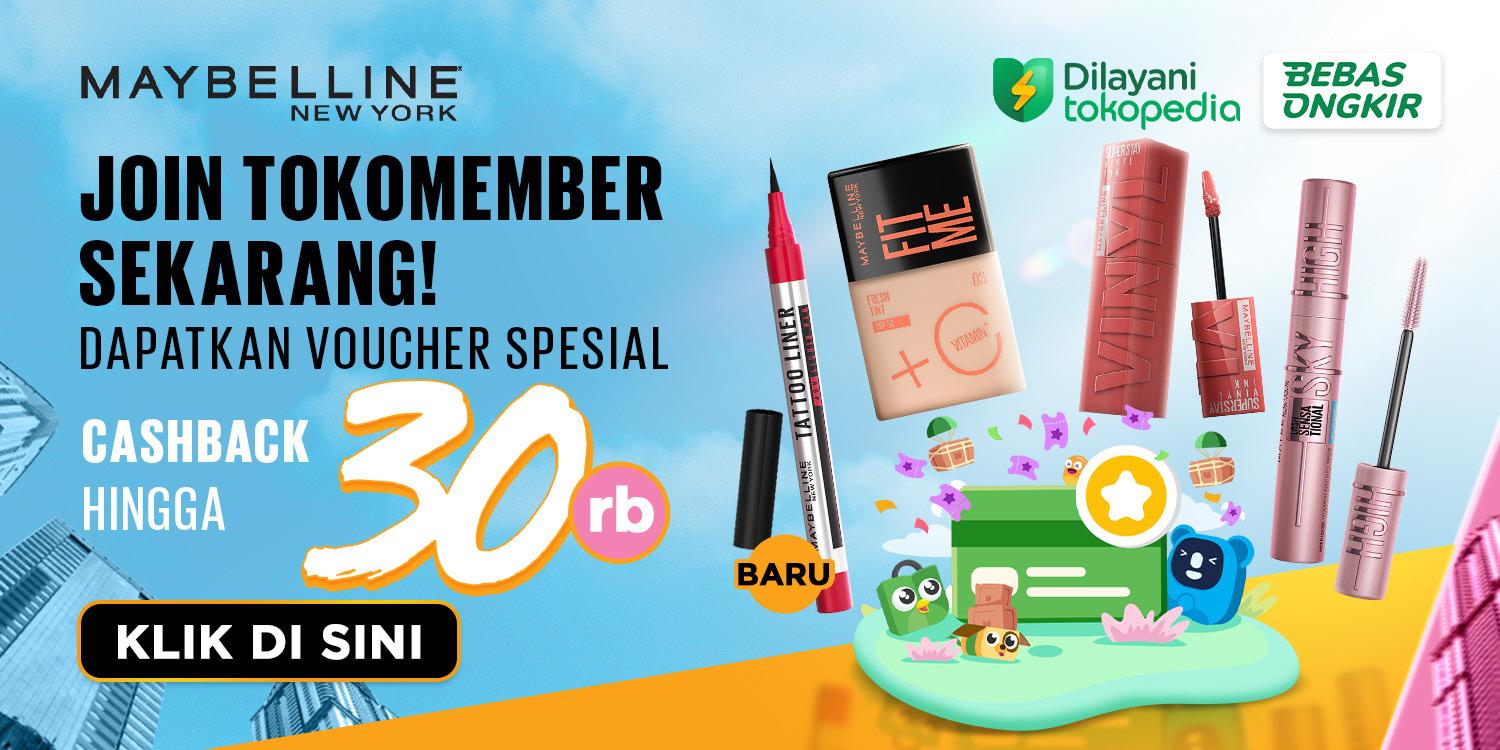
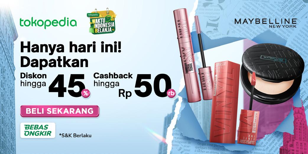
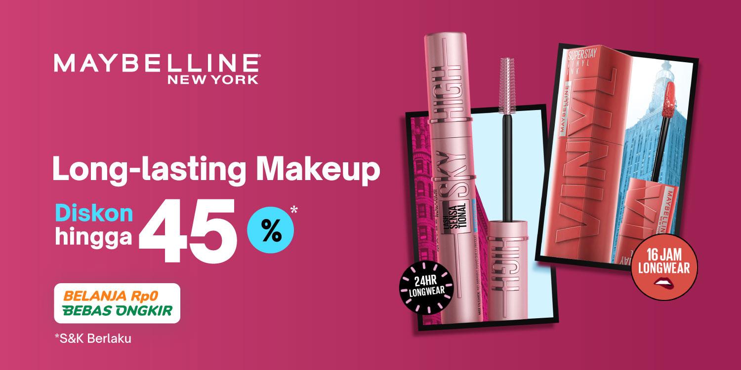
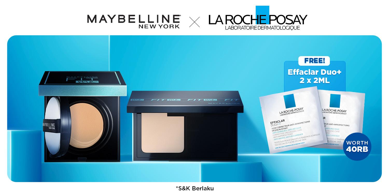
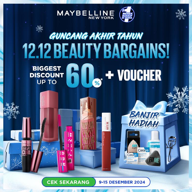
At Sirclo, I am responsible to provide designs for Maybelline at Tokopedia. I want to create a sophisticated and trendy visual to match the brand demographic. I create a bold visual to strike confidence within the user and inspire them to embrace the latest beauty trend with elegance and confidence. I wanted to convey the idea of using the product is a fashion statement and a means of self-expression.
To bring that concept into my works, I designed it by applying pops of color to create visual interest and adding abstract artistic elements. I also designed the product as something that popped up to convey the sense of confidence and empowerment to user.
S04. Maybelline Banners
Aside from L’Oreal Consumer Product Division brands, I also designed several brands, from food and beverages, pet care, and also beauty products. To create these key visual, I tried to approach through telling story, so the product not just ‘there’ but also tells story. These are several designs and brands I’ve work on.
S05. In-store Banners
AI Usage
As technology become a pivotal media to the creative creation, there are several adjustment to the process, especially the use of AI. AI can be a dependable source to create what we’ve had in mind and references, but for me personally, my way of use of AI is for getting assets that quite hard to achieve and a combination of digital, real assets and shapes. In my opinion, that allows you to get a variety and exciting results.
S06. AI Usage on Banners
S07. AI Usage on Banners
E-Commerce Page Revamp
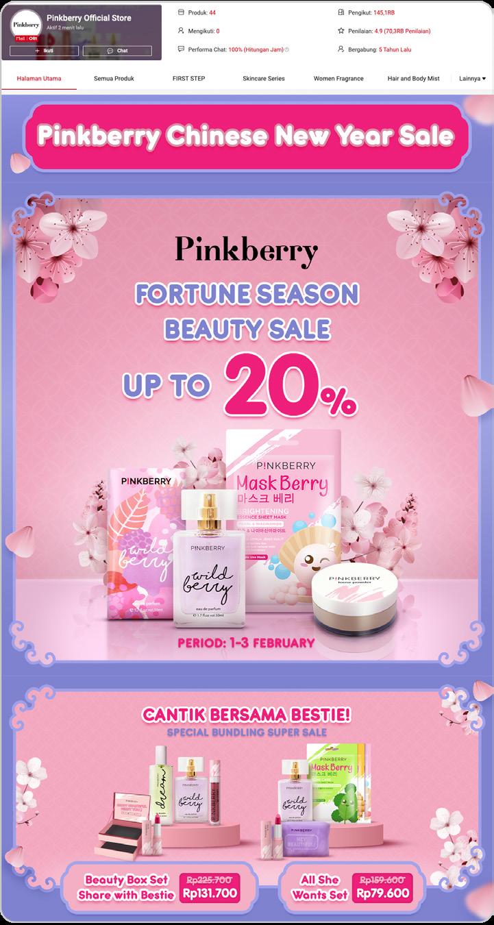
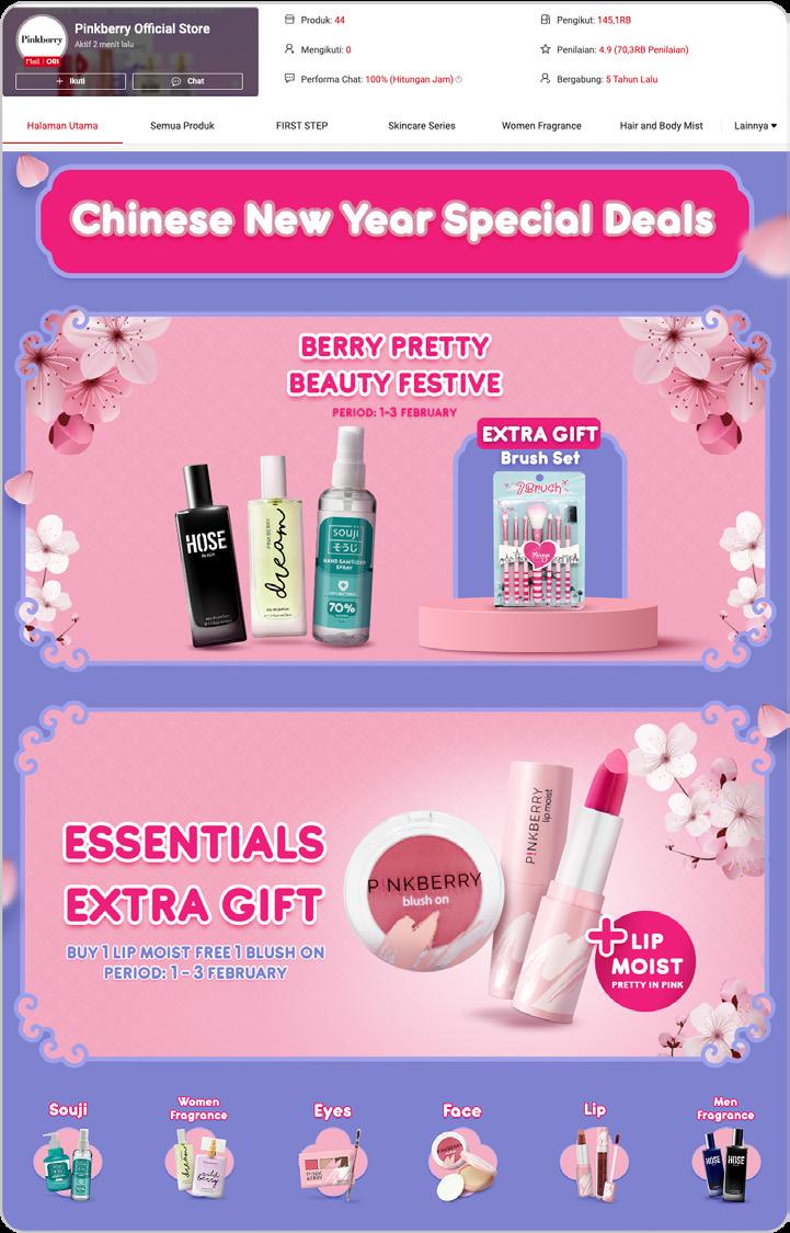
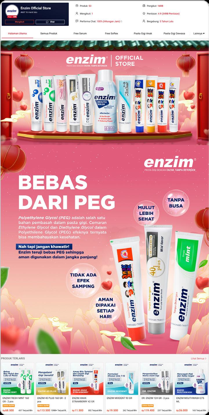
These are several e-commerce page on thematic revamp. Due to deliver great results, I’ve able to create a cohesive designs throughout the requested collaterals. On creating these designs, I was exploring on how these theme could integrated with the brand itself, such as calming, preppy, or full creativity freedom.
S08. PinkBerry Revamp
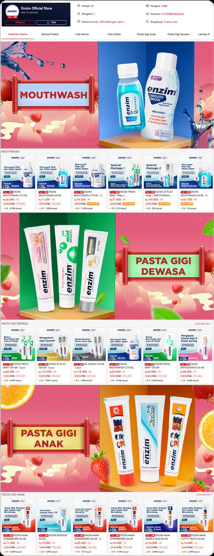
S09. Enzim Revamp
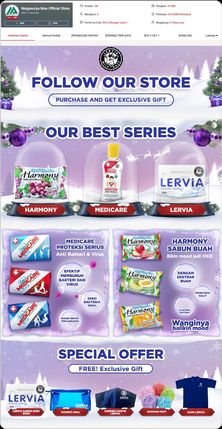
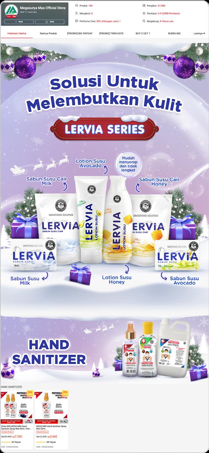
S10. Lervia Revamp
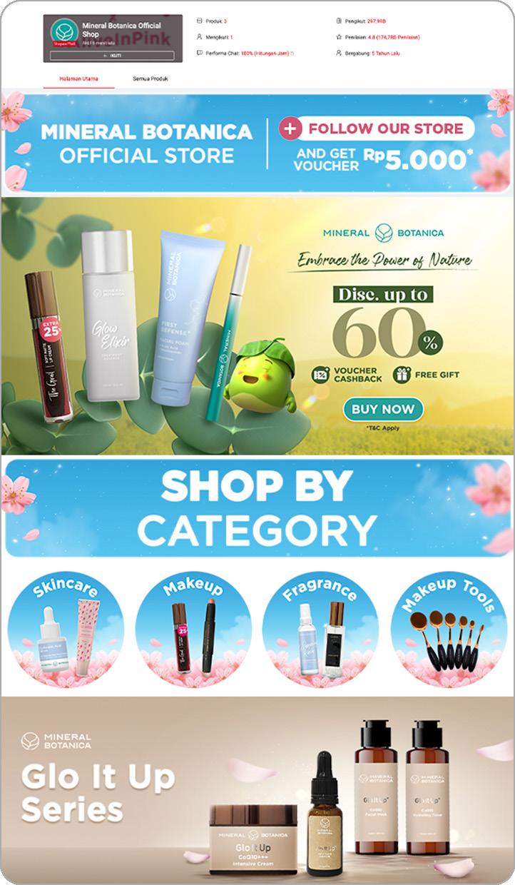
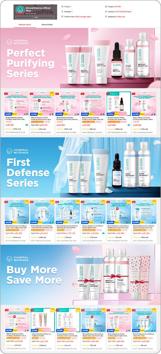
S11. Mineral Botanica Revamp
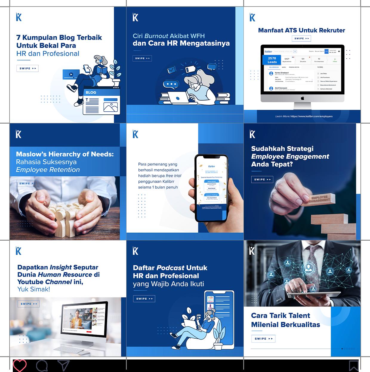
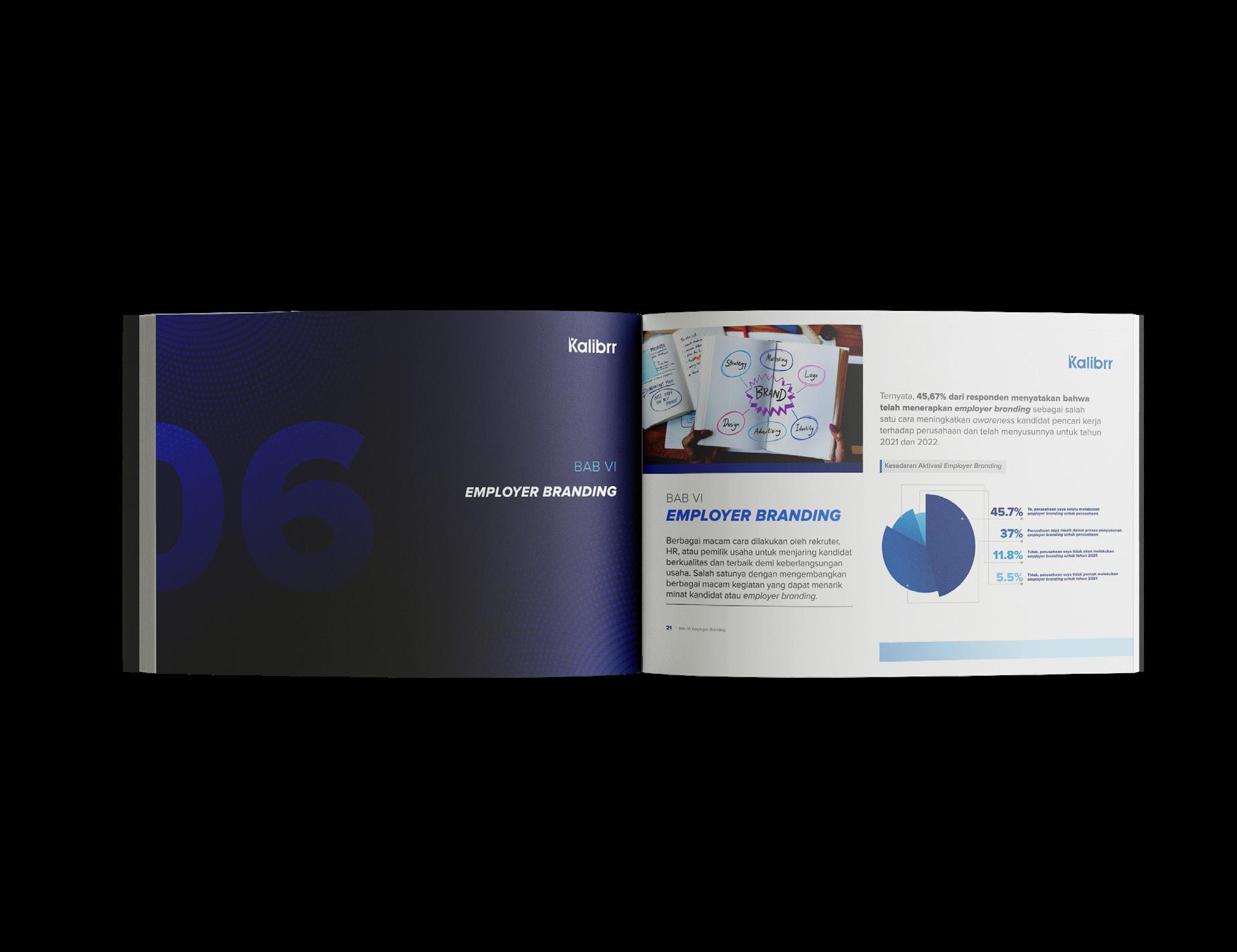
Kalibrr Publication
Kalibrr Internal Publication is a recap of my works at Kalibrr, which mainly focused on internal publication. The works under Kalibrr internal publication are mostly social media, advertising, editorial and editorial works.
Kalibrr Rebranding
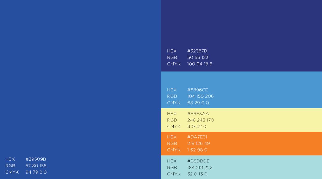
As 2020. Kalibrr decided to rebranding the design. The rebranding keywords are ‘Global’, ‘Premium’, ‘Fresh’, and emit ‘Multinational’. Understanding that the brand should look fresh, global, multinational, and premium at the same time, I’ve decided to take basic form such as rectangular and circular form combined with asymmetrical layout. The color palette itself not only focusing on blue color hue, but also added a contrary color such as orange or white.
K01. Old Design
K02. New Design
K03. Color Palette
Instagram Content
16 The design style before rebranding itself focused on flat design with blue and white dominant. The color scheme that applied was more broad than rebranding design which consist blue, yellow, orange, and light blue. The design layout also more dynamic and fresh by using memphis elements and assets.
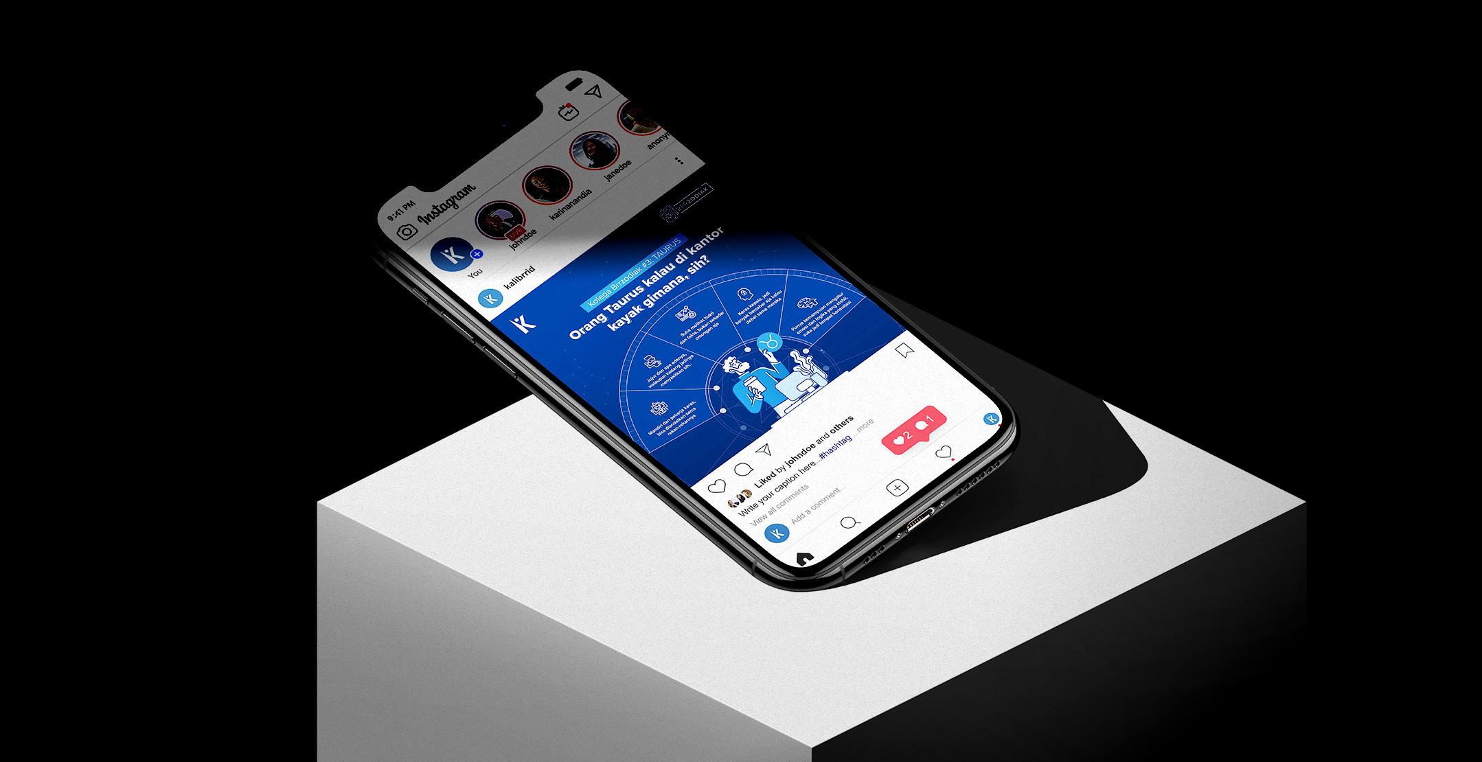
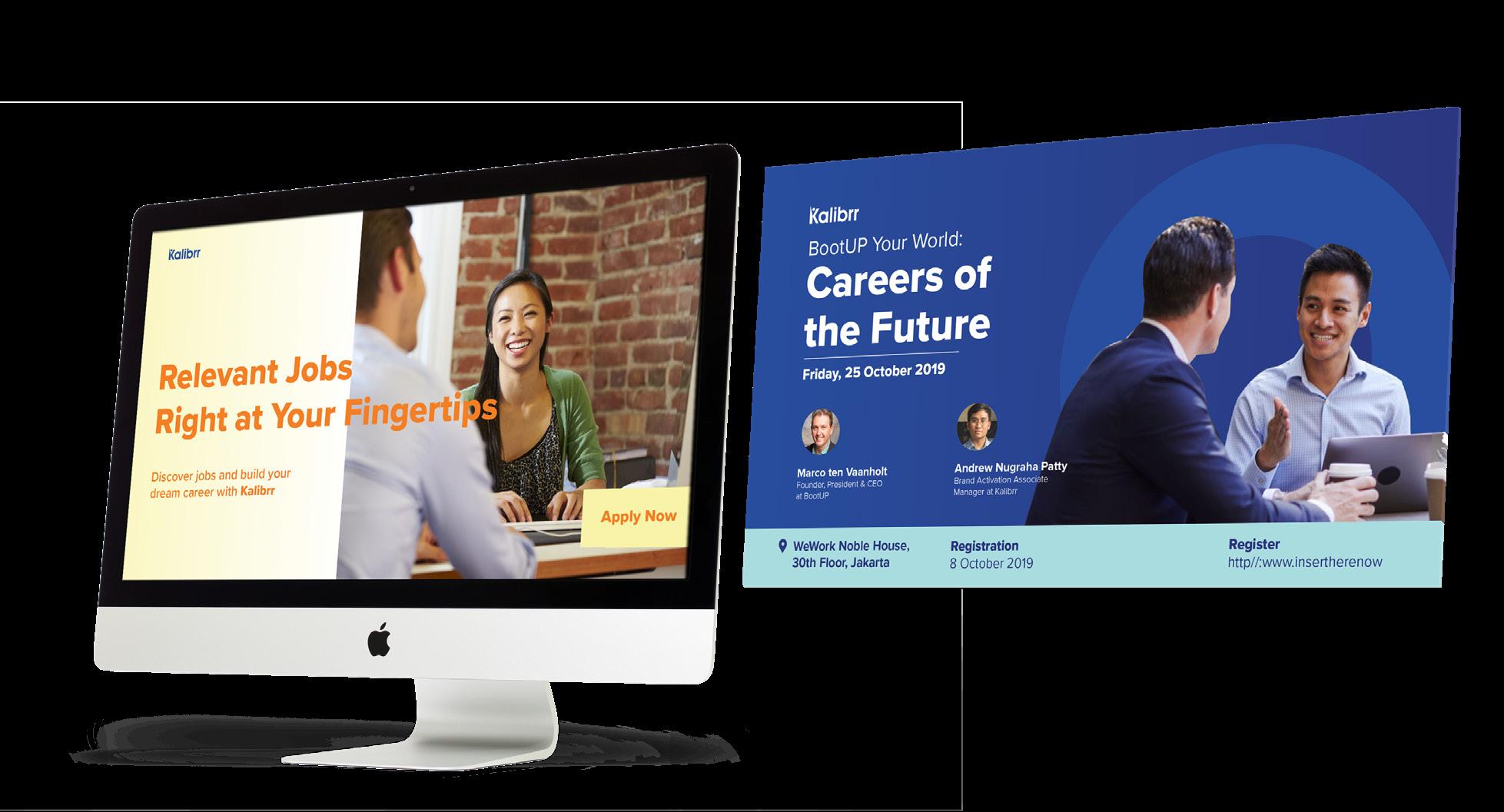
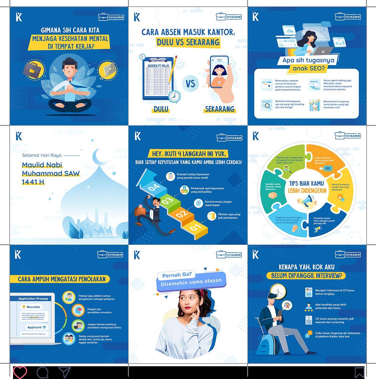
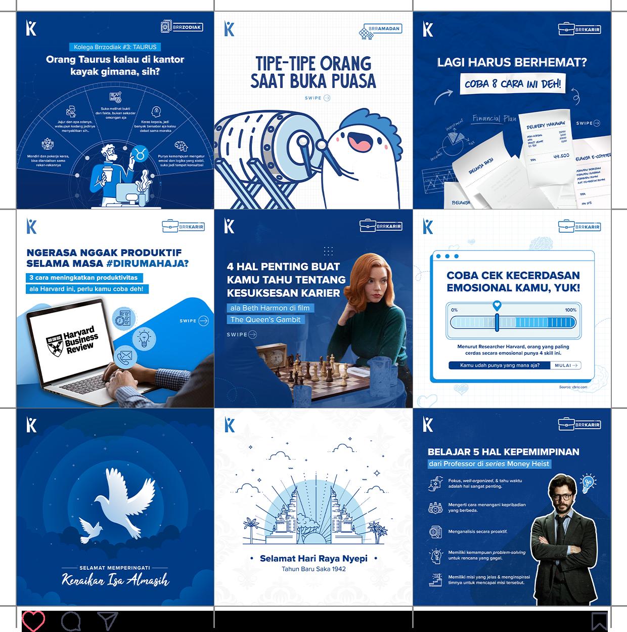
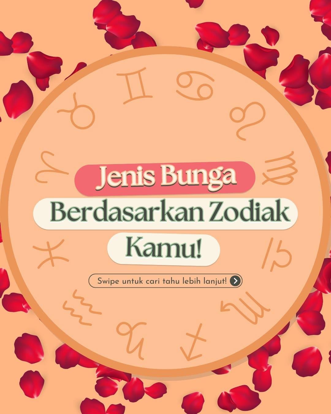
After Kalibrr’s rebranding, these are several Instagram post that I’ve been working on. The contents are also speaks about career-life, career-wise personality, and fun content such as astrology, etc. Kalibrr’s rebranding design takes a different approach to suit the new brand identity by using blue monochromatic color scheme and a spacious layouting.
These also social media post of Kalibrrhub, a subsidiary account of Kalibrr for Human Resources people. The difference from the general design was Kalibrrhub design is more formal, so I use a lot of rectangular shape and professional photos aside from illustration.
K04. Before Rebranding
K05. After Rebranding
K05. After Rebranding
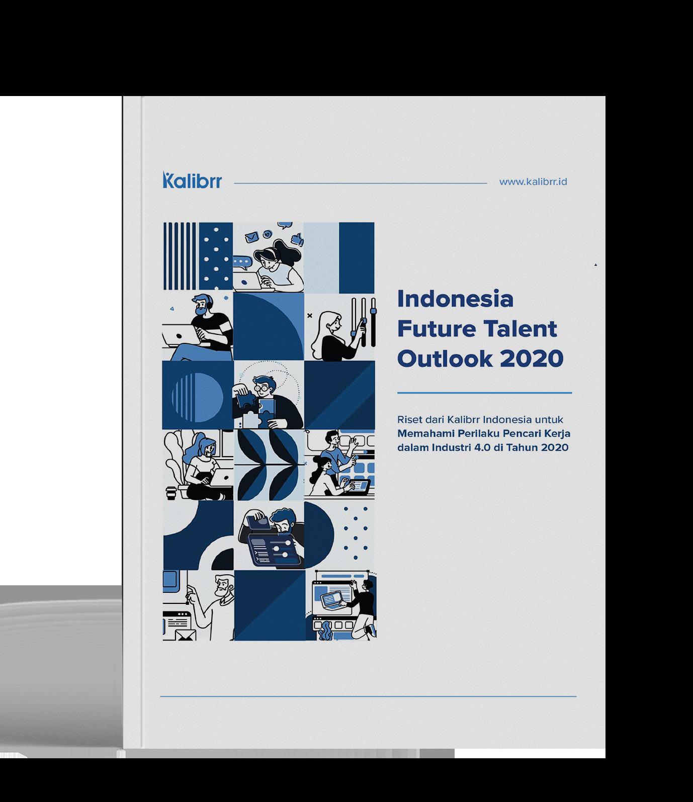
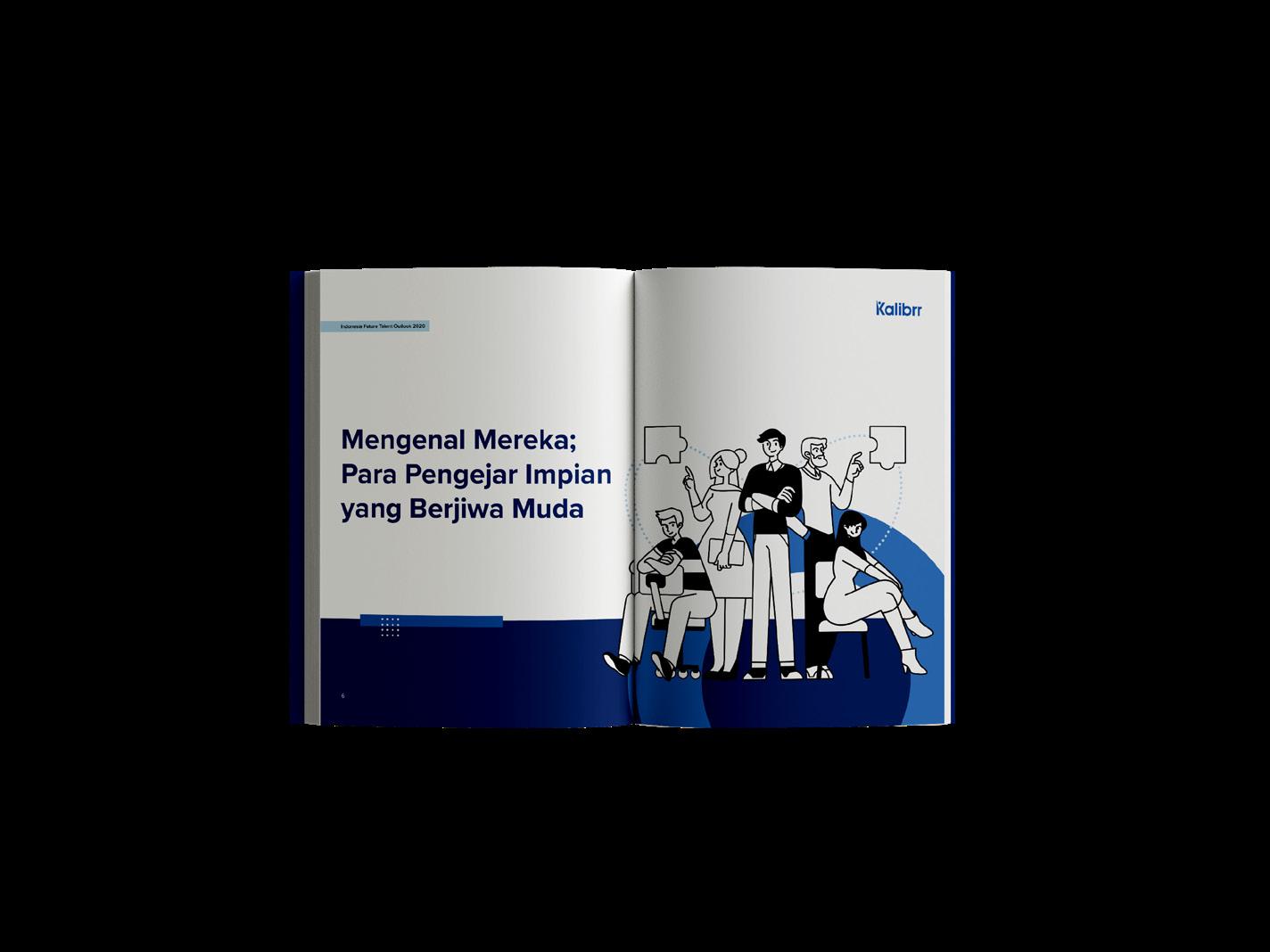
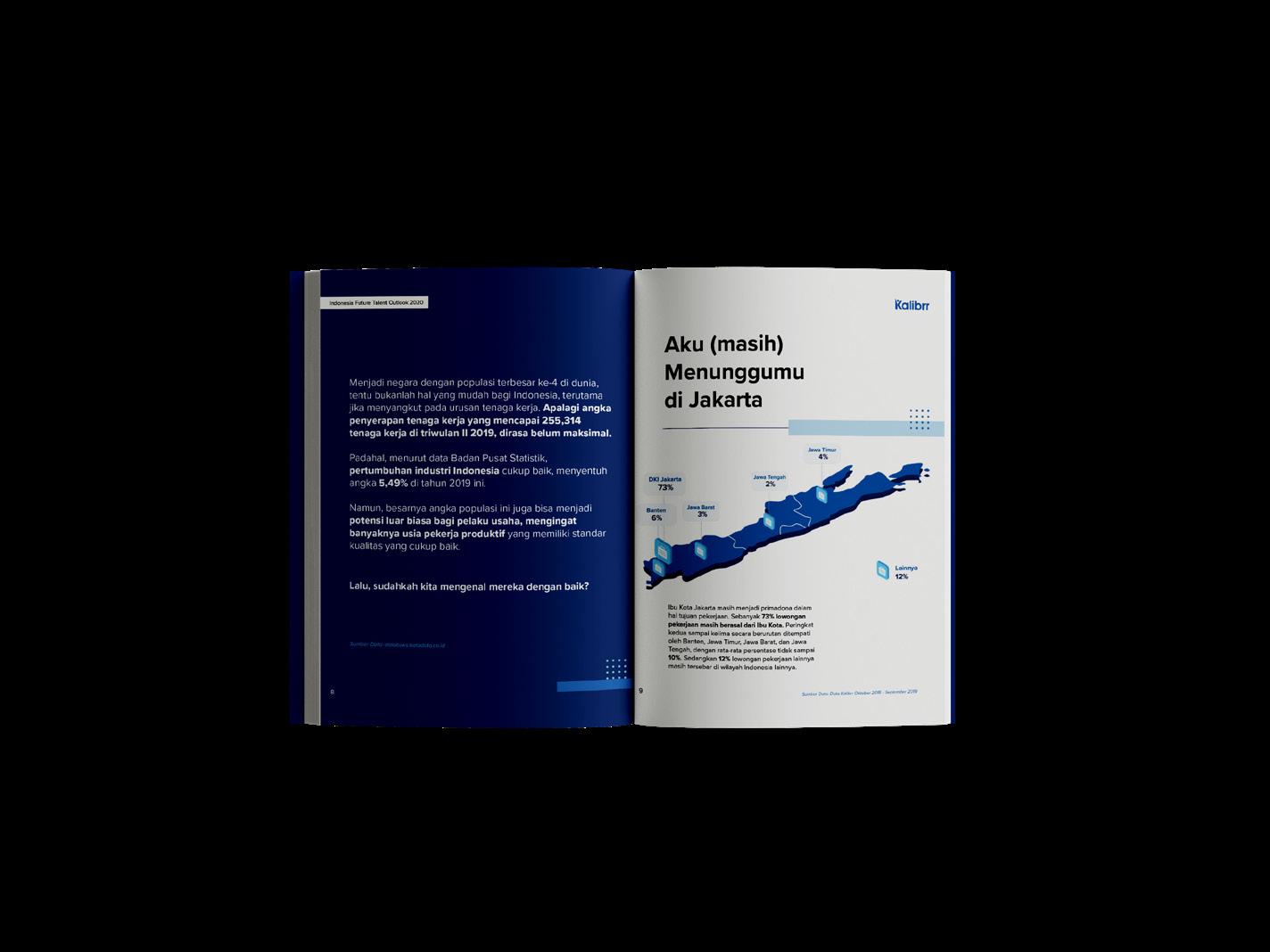
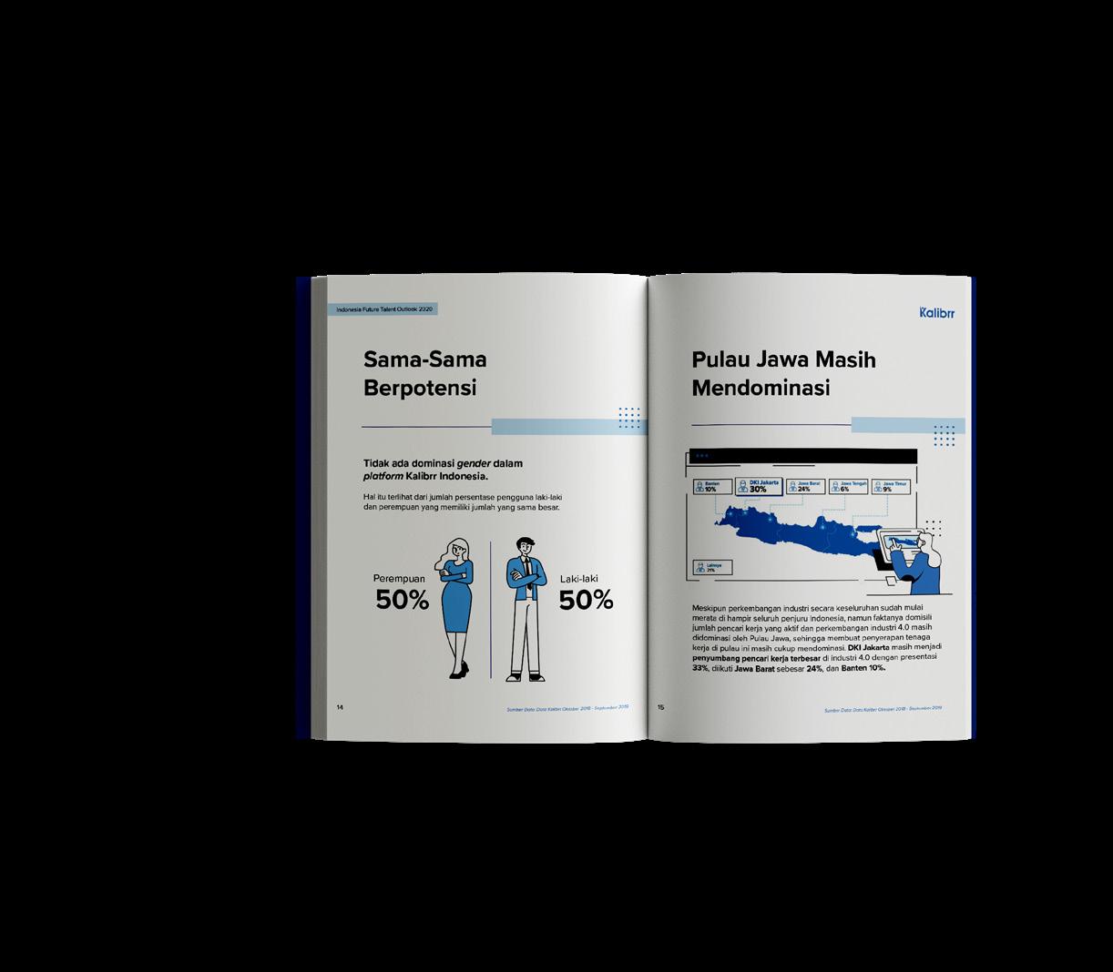
Kalibrr E-Book was a project by my division in Kalibrr to provide insights for both jobseeker and recruiter about job talents forecast. Both me and my supervisor worked on the E-Book to bring a clean and clear understanding through infographic. It is designed after Kalibrr’s rebranding, so the design took approach on cleanliness and simplicity. The color scheme also monochromatic color scheme around blue.
Kalibrr B2B E-Book was a project by my division in Kalibrr to provide insights for recruiter about talent recruitment forecast. I was assigned to visualize data and layouting its content. The design took approach on cleanliness and simplicity. The color scheme also monochromatic color scheme around blue.
Kalibrr B2B E-Book
K07. Kalibrr B2B E-Book
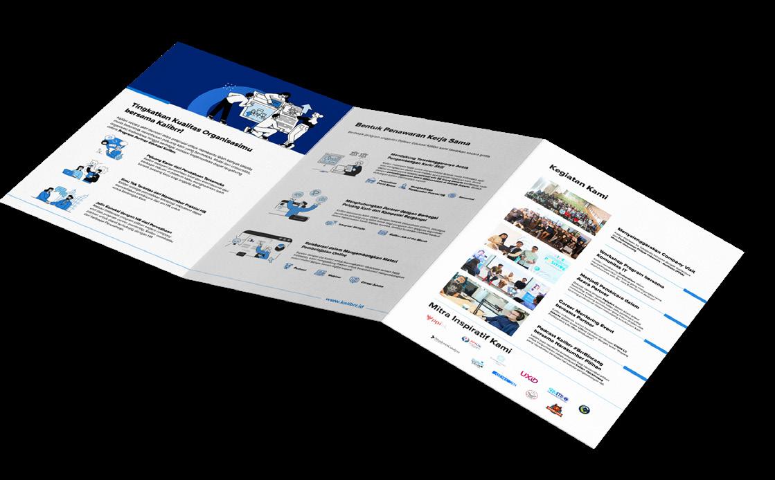
These are several printed publication for Kalibrr that designed before and after rebranding. The flyers was targeted for jobseekers so the design brief was to create an informative insight about jobseeking. For the brochure, it was targeted for communities so the design was semi-formal, with the rectangular shape and clean, minimalistic design.
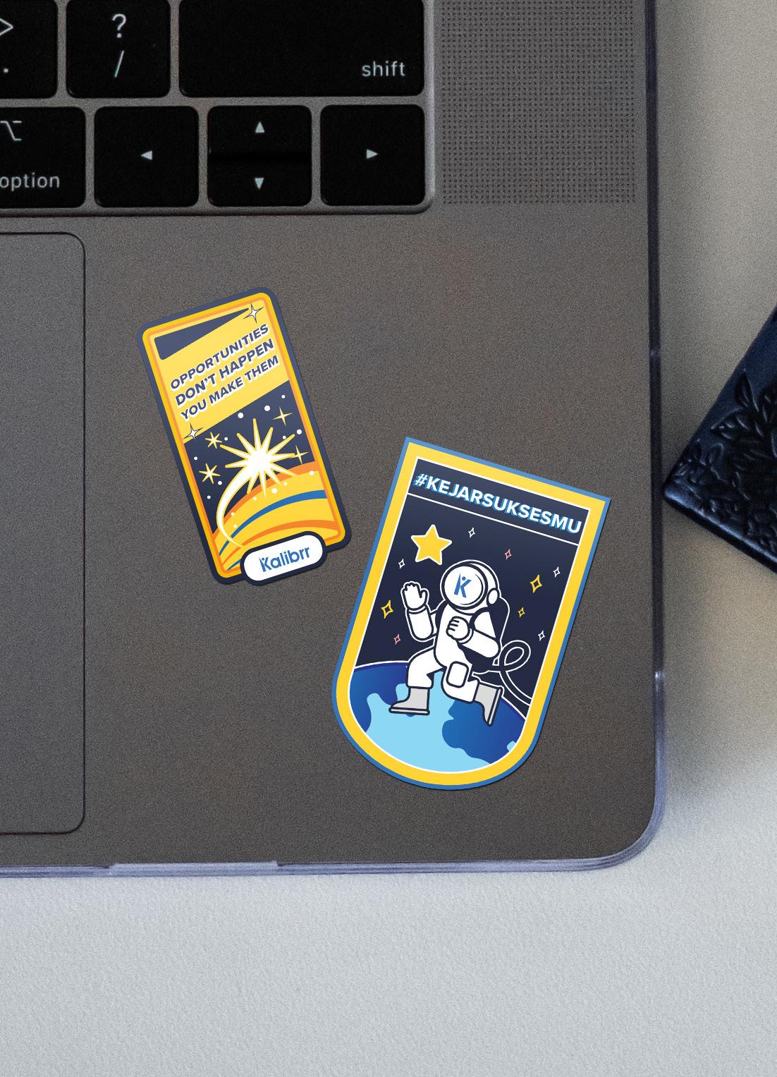
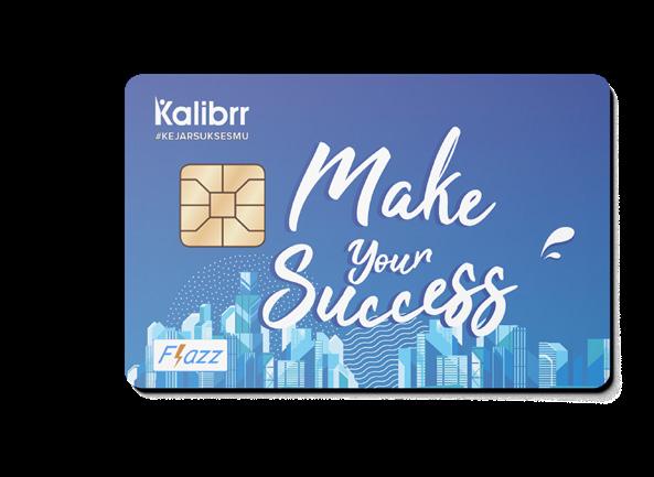
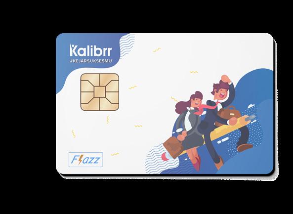
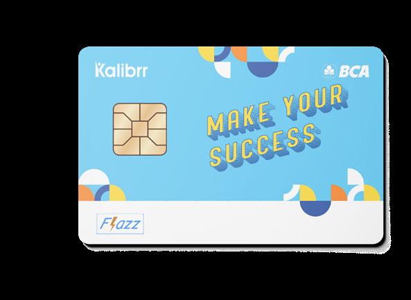
Kalibrr also provides items for internal employee so that they could be proud of Kalibrr everywhere they go. The items are notebooks, stickers, and electronic money card. The designs are based on Kalibrr’s branding, which focused on flat illustration, high-hope and achieving key message.
Kalibrr Items for Internal
K08. Kalibrr Flyers
K09. Kalibrr Brochure
K10. Stickers K11. Flazz Card
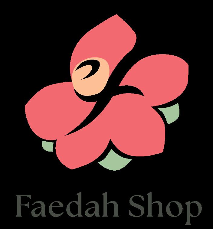
Faedah Shop
identity that circles around beauty, warm, and lovely. By choosing vibrant, nature inspired colors, and implemented serif font as main typography created a lovely and warm feeling to the brand.
Brand Identity
F01. Logo
F02. Typography
The form itself takes a flower bouquet, which one of the main product of Faedah Shop. By inserting an “F” as the negative space for Faedah, it means that behind happy and warm moments, Faedah Shop helps to create those moments.
The Seasons
Josefin Sans
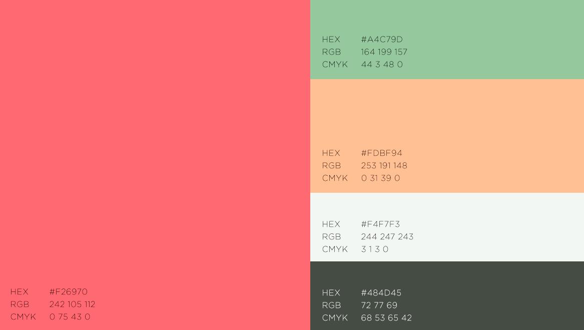
F03. Color Palette
Graphic Design
Faedah Shop old content and competitor are similar in showcasing their products, which became sort of a catalogue. I see this as a good opportunity to rebrand Faedah Shop to distinguish them from their competitor.
By applying the main colors and designs to the content, it will create signification from their past content and competitor.
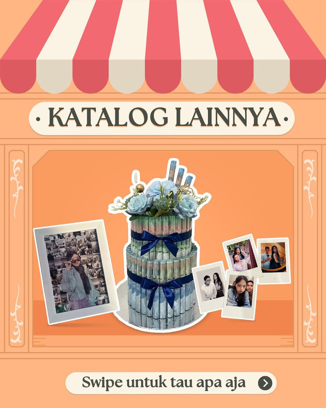
Faedah Shop
F04. Social Media
Brand Identity
Hippocampus Seahorse
The logogram takes form of hippocampus, both seahorse and brain structure. It exudes an air of intelligence, reliability, trustworthiness, and persistence. It captures the essence of the hippocampus, not only as a symbol of memory and learning, but also a symbol of persistence and luck, while maintaining a modern and minimalistic aesthetic.
The logogram also using the concept of negative space that create a silhouette of a paper plane and its flight path. It conveys the idea of simplicity, adventures, the willingness to take risks in pursuit of new horizons.
Paper Plane
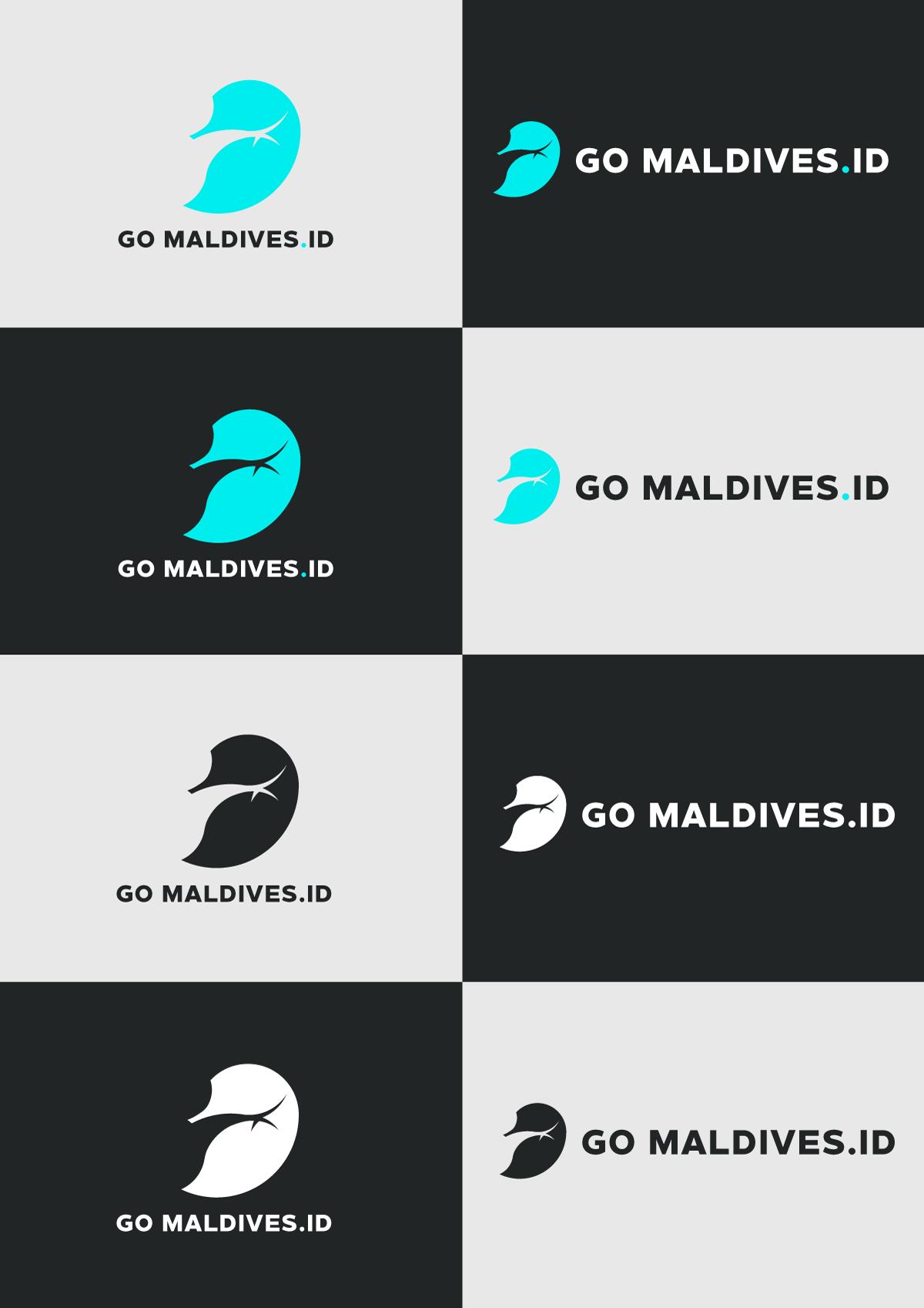
G01. Main Logo
G02. Horizontal Logo
G03. Icon
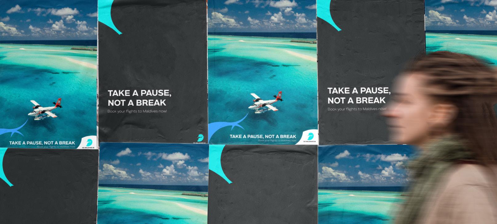
Matahari Aa Aa Aa Aa
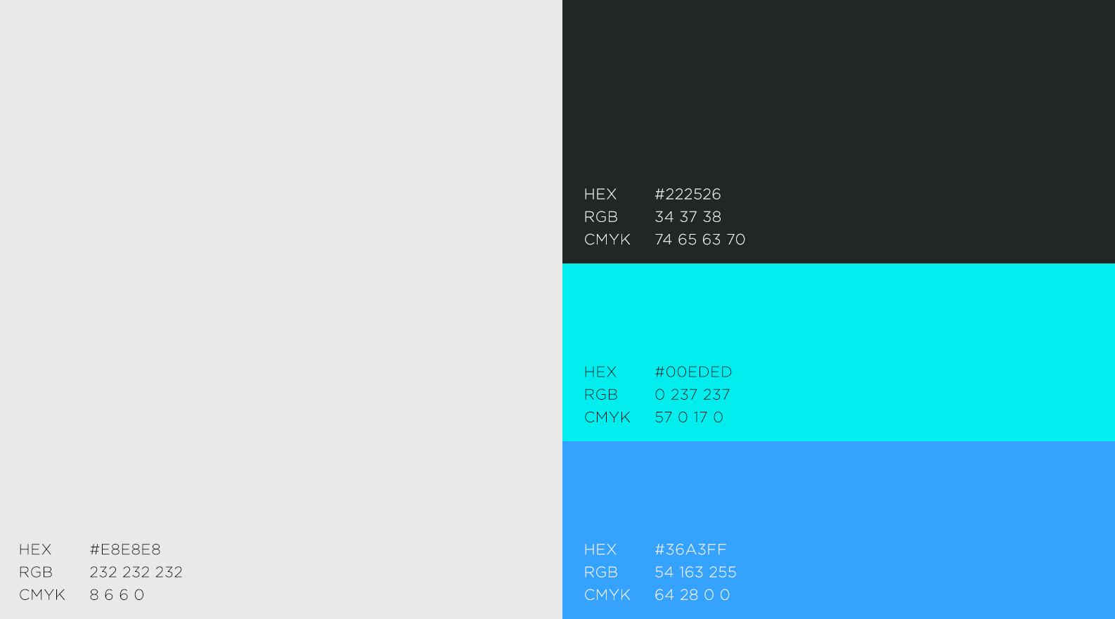
To distance GoMaldives.id from its competitors, I embraced a contrasting color palette of aqua, azure, gray, and black. The choice of typography was unequivocal, Matahari. It resonates a modern and visual captivating brand presence that separates GoMaldives. id apart from its competitors.
Type Face
G04. Color Palette
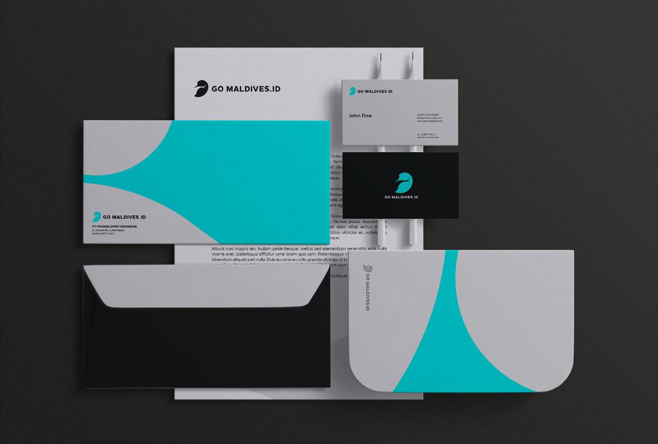
G05. Logo Applications
Graphic Design
Design Collaterals
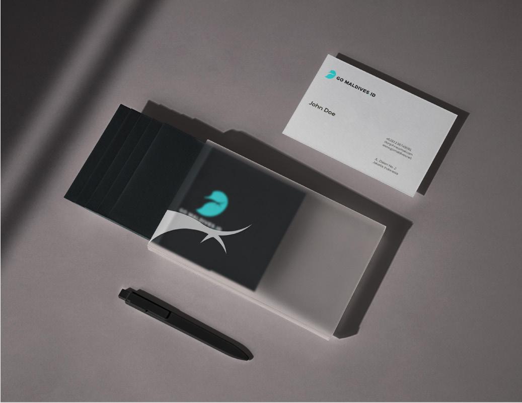
G06. Stationaries
G07. ID Card
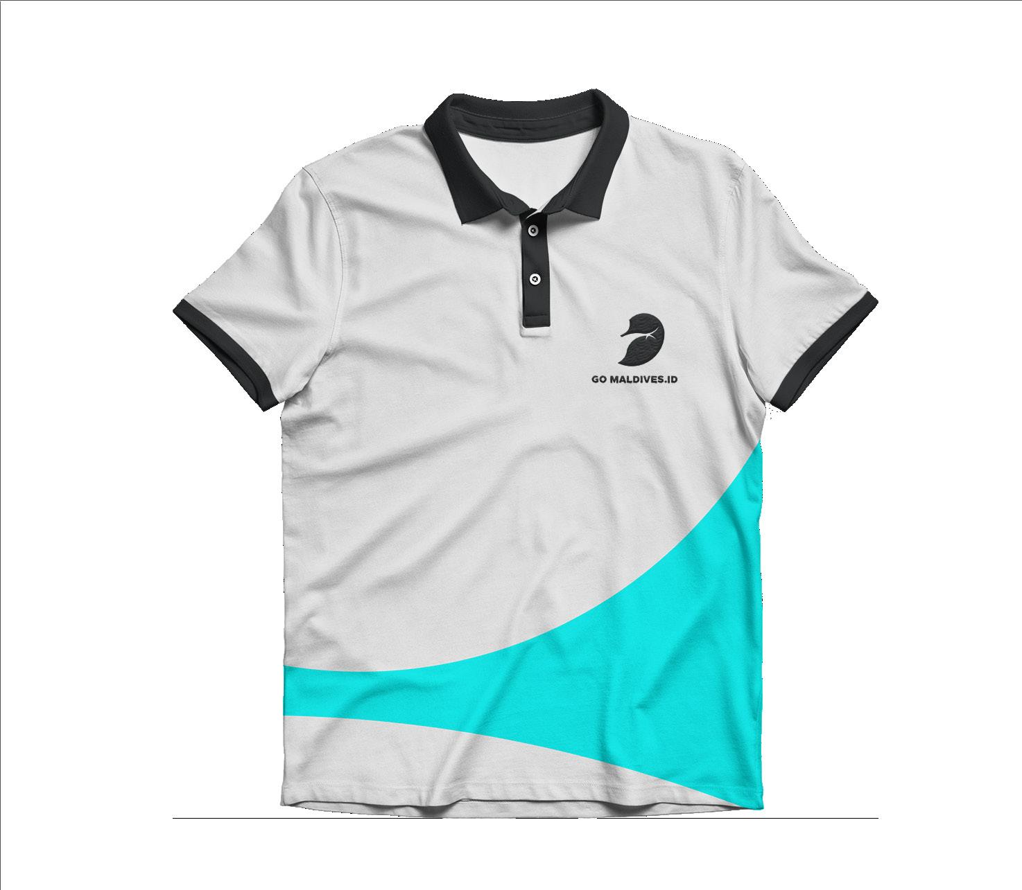
G08. Shirt
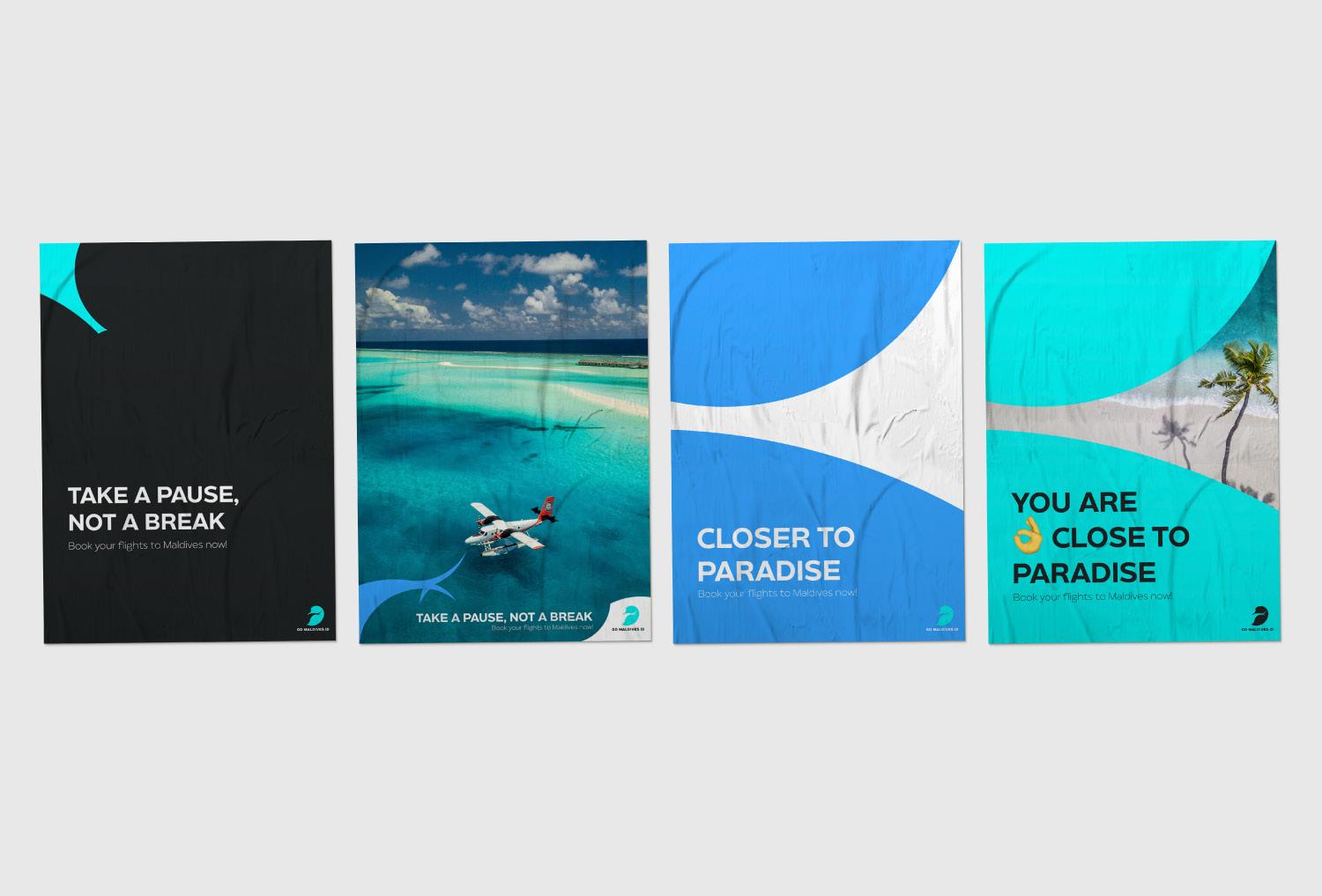
G09. Posters
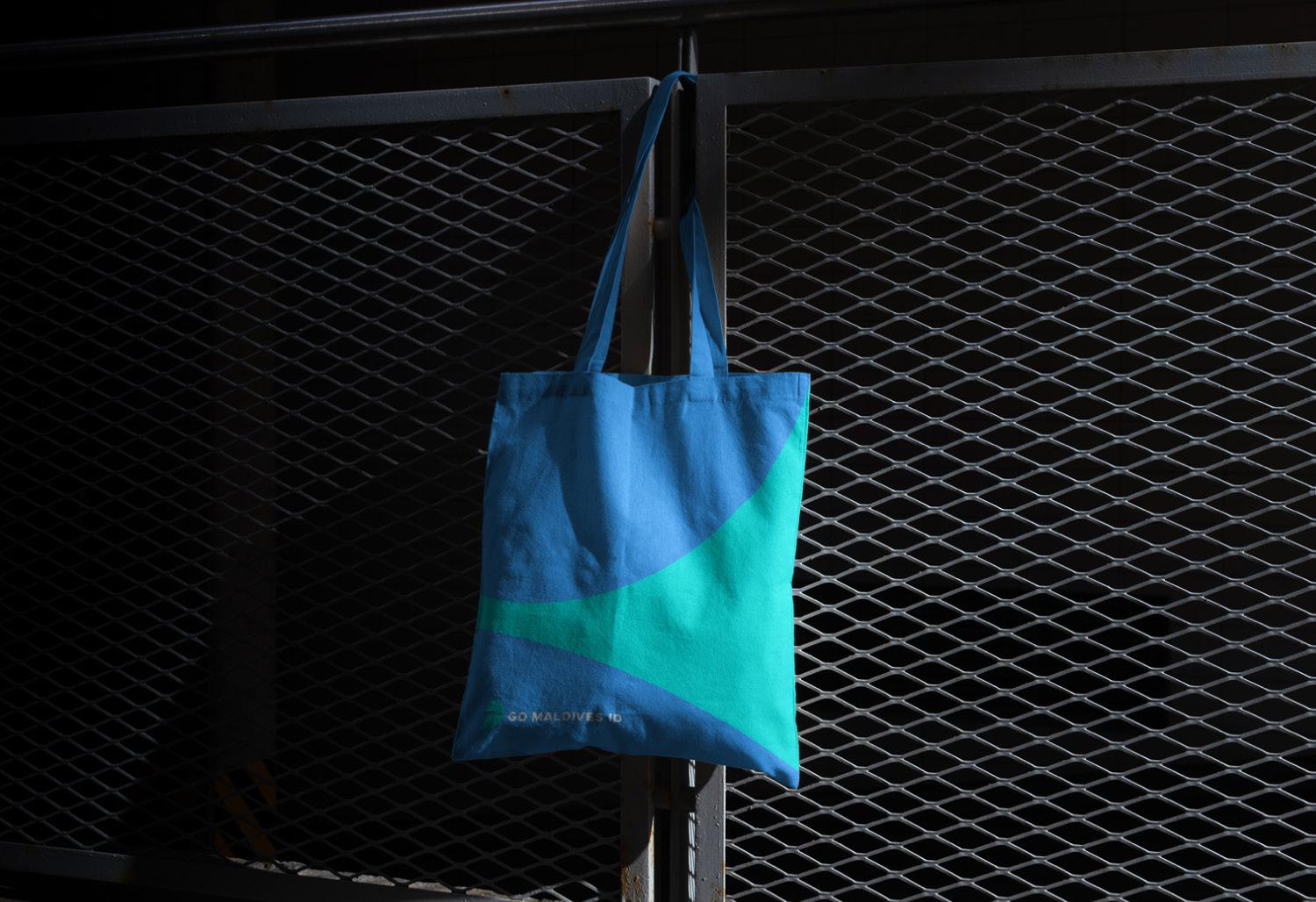
G10. Tote Bag
Graphic Design
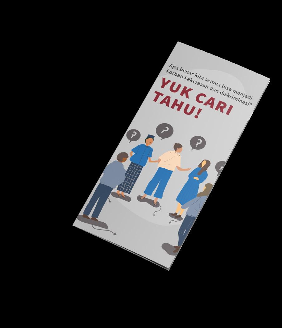
MAJu (eMpowering Access of Justice)
MAJu
(eMpowering Access to Justice)
MAJu (eMpowering Access to Justice) is a collaboration project of Ogilvy, USAID, and The Asia Foundation alongside the Ministry of Law and Human Rights, to increase community access, especially marginalized and repressed community, for their rights on the eye of law.
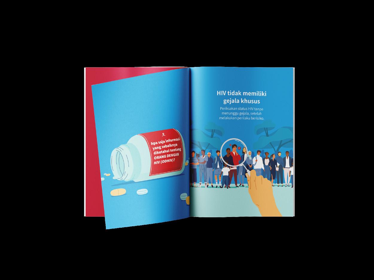
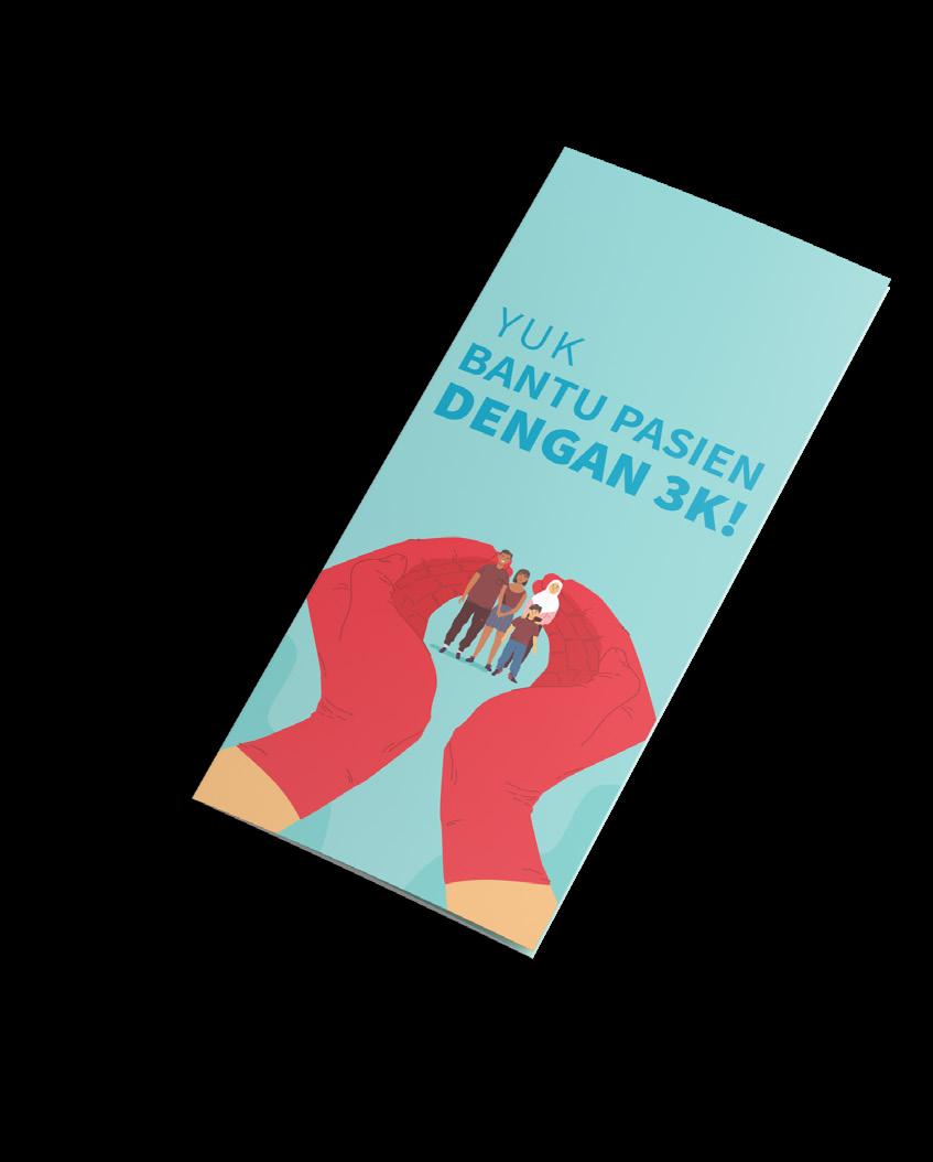
MAJu focused on two issues that happened on marginalized and repressed community, which is human rights and health (HIV) issue. In order to accomplish the goals, MAJu produced few publication and media to the targeted community. I got the opportunity to work on the project together with one of my colleague. The product of the campaign itself are brochures, fact check cards, and a pocket book.
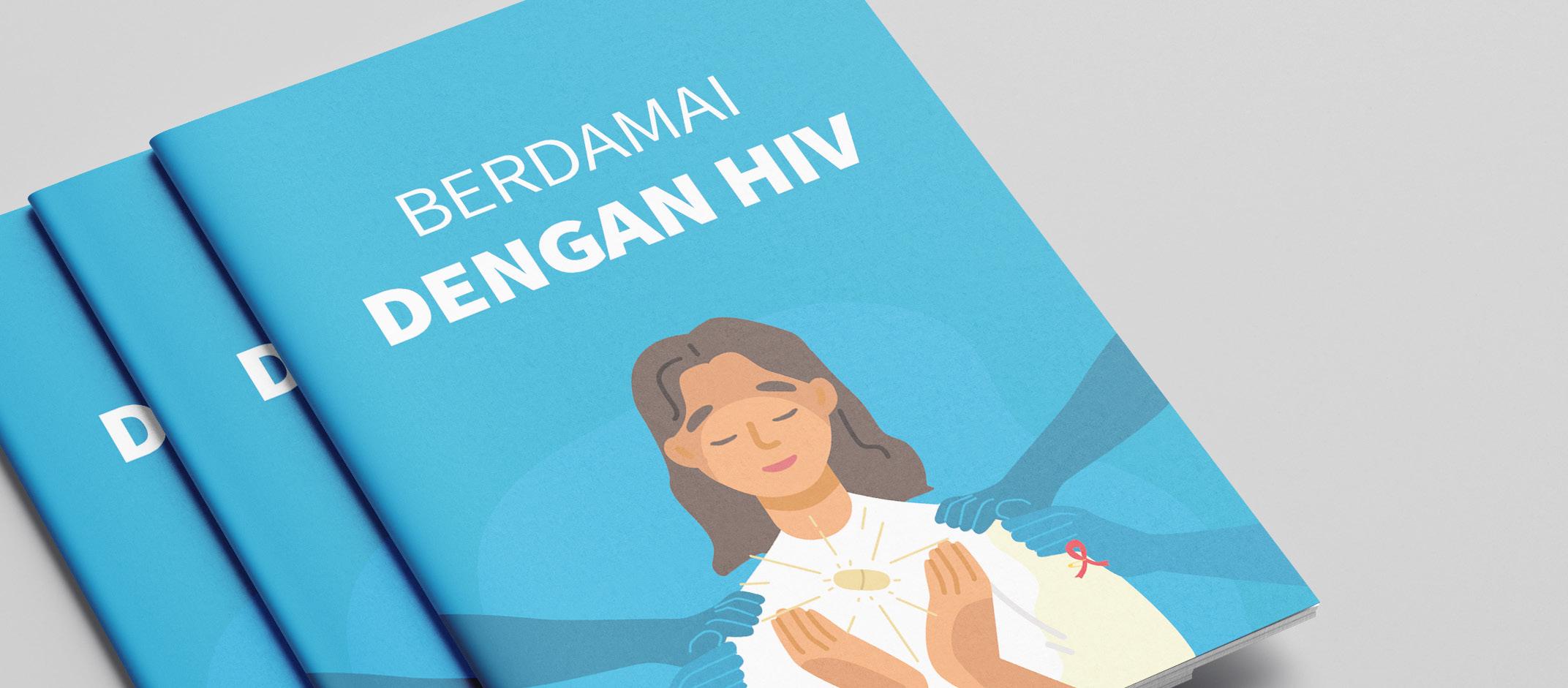
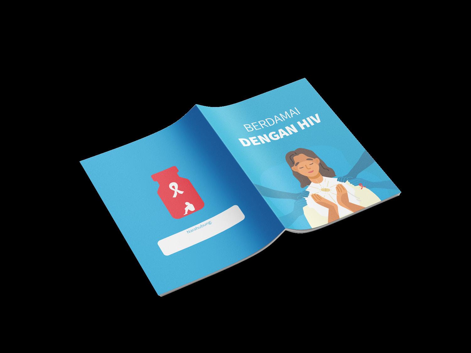
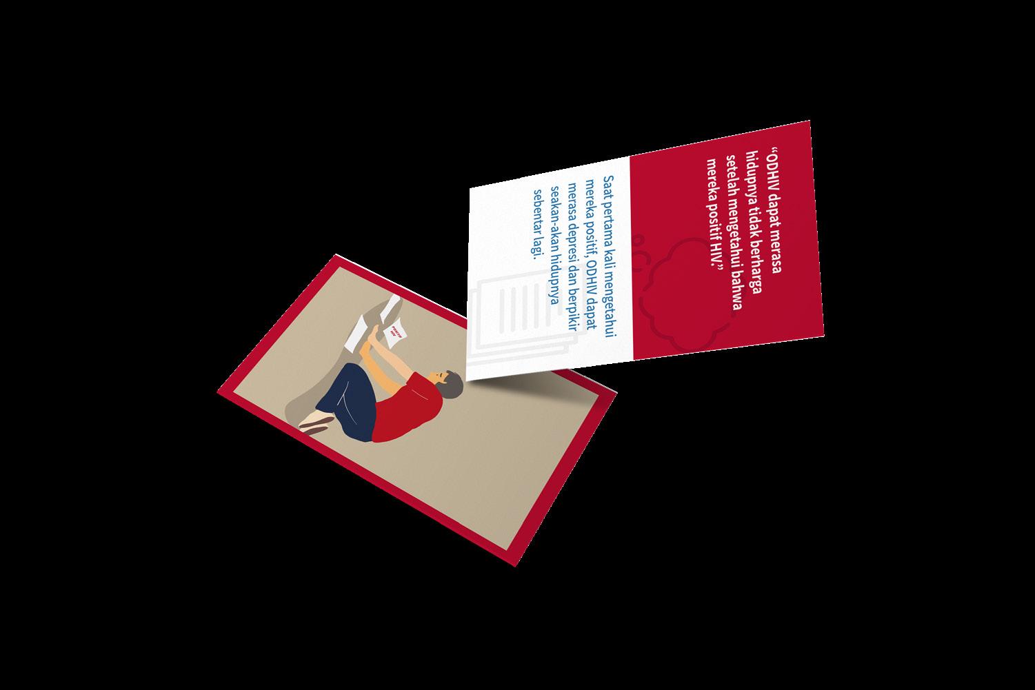
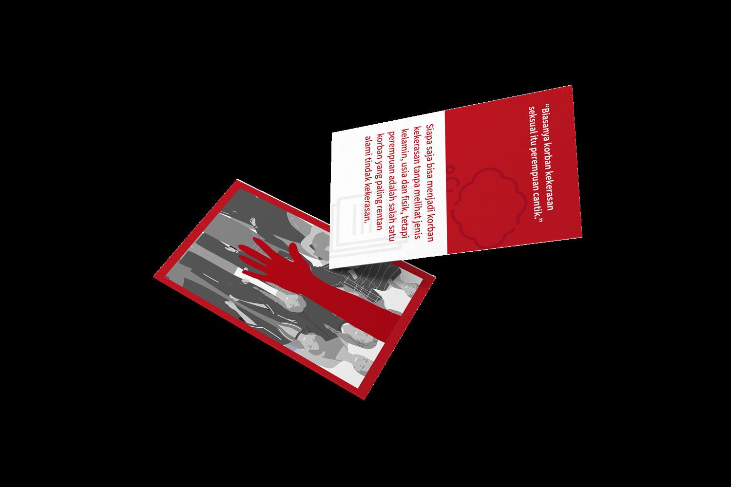
MAJu’s pocket book are designed as a speaking guidance for Key Opinion Leaders. It is contains the fact check cards and brochures summarization. MAJu’s pocket book are designed as a speaking guidance for Key Opinion Leaders. It is summarize the fact check cards and brochures content that later described to the targeted communities.
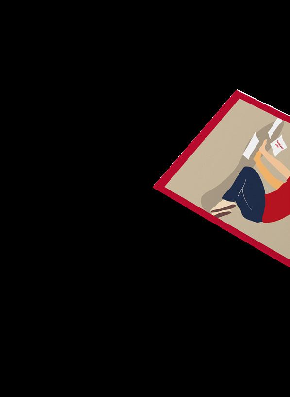
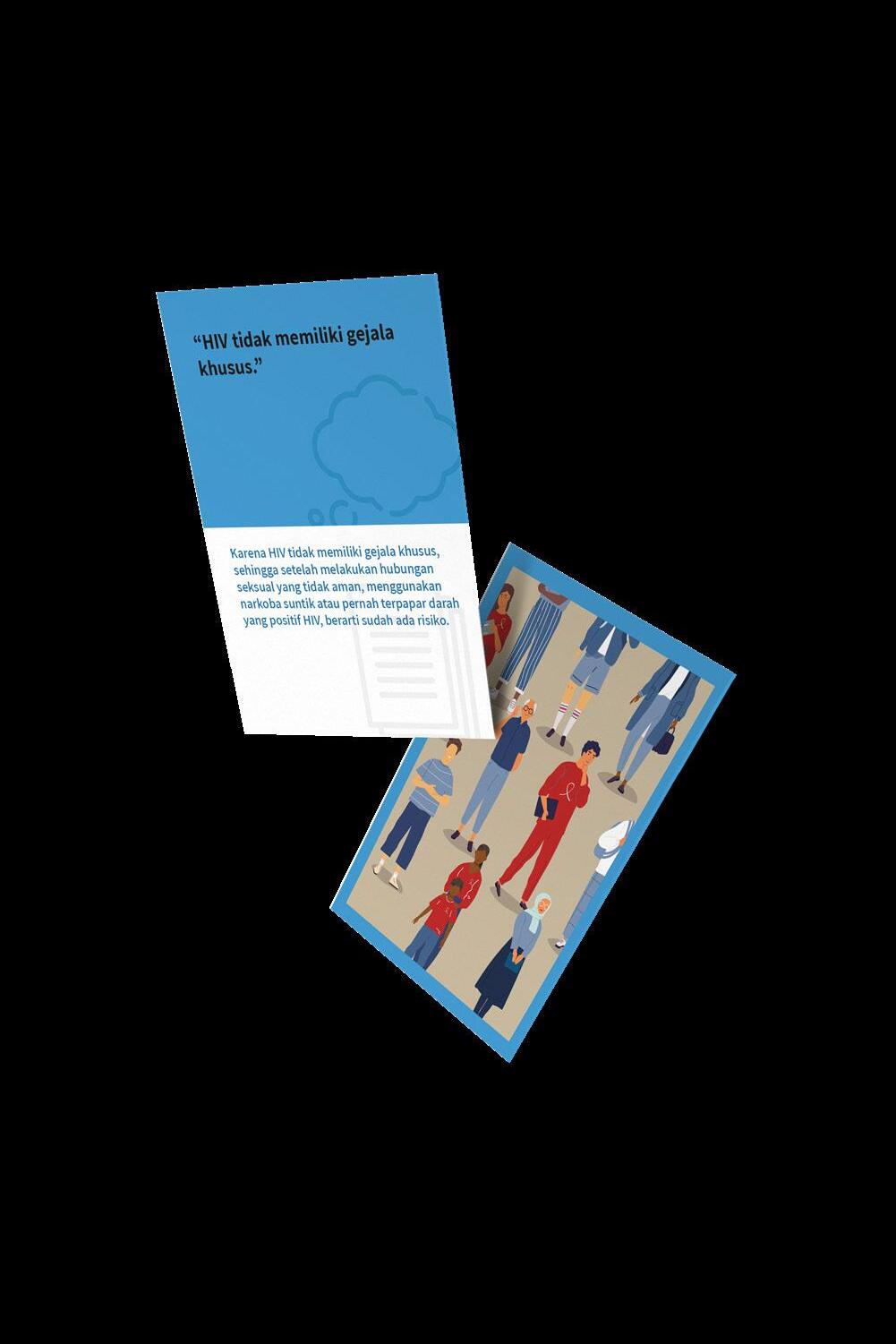
The illustration on each pocket book are designed to portray the content, implicitly. In order to not offend any communities and validates any public generalization, the illustrations were illustrated as general as possible. For instance, general public opinion towards HIV is sticks to LGBT+ communities, so we’re avoiding to illustrate any parts of LGBT+ communities as a patient on Access to Health Services pocket book.
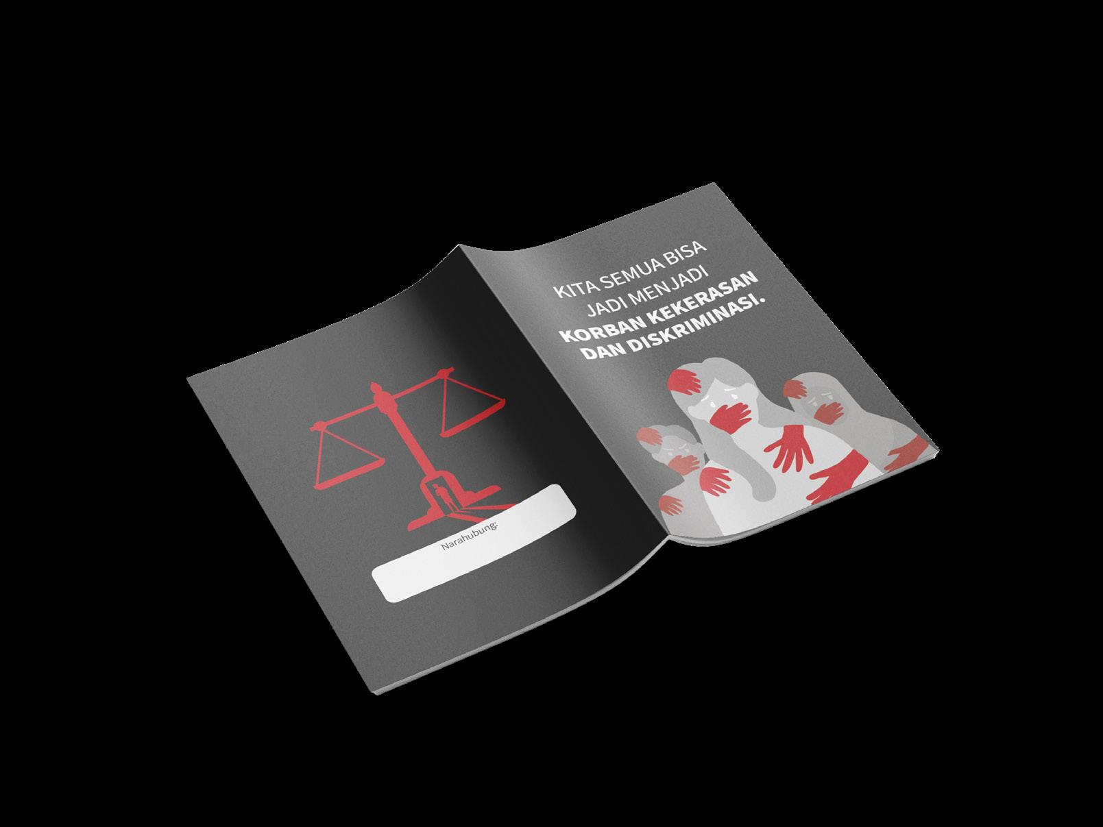
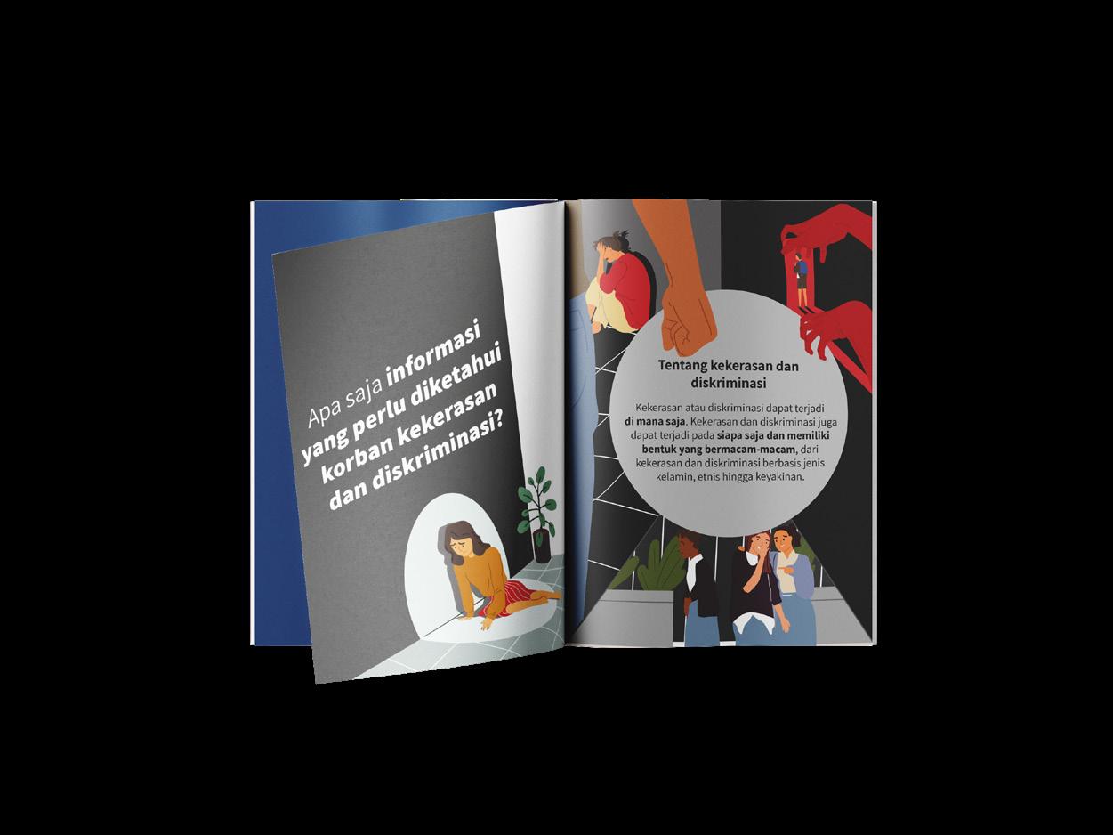
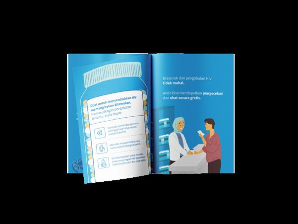
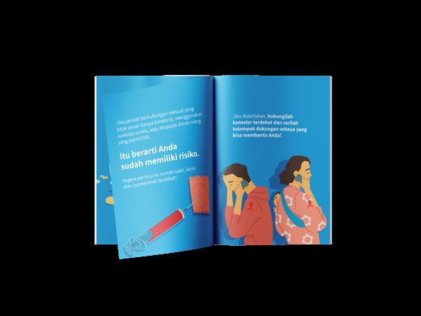
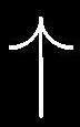
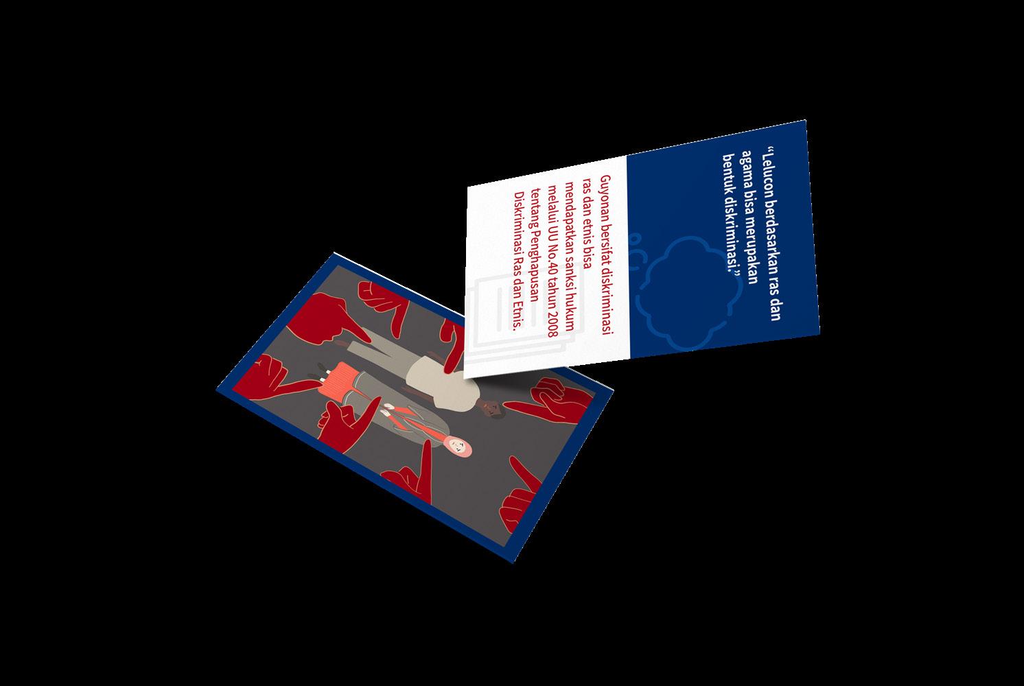
MAJu also provides brochures for related officer and targeted communities. The objectives of each brochures are different based on the targeted user but the main outline is to bring a certain information to its user. For targeted communities, the brochure provides information of health risks, consequences, and step by step on how to check for HIV. The illustrations portrays the highlighted information on the brochure.
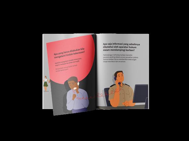
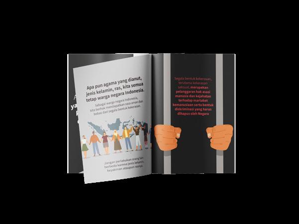
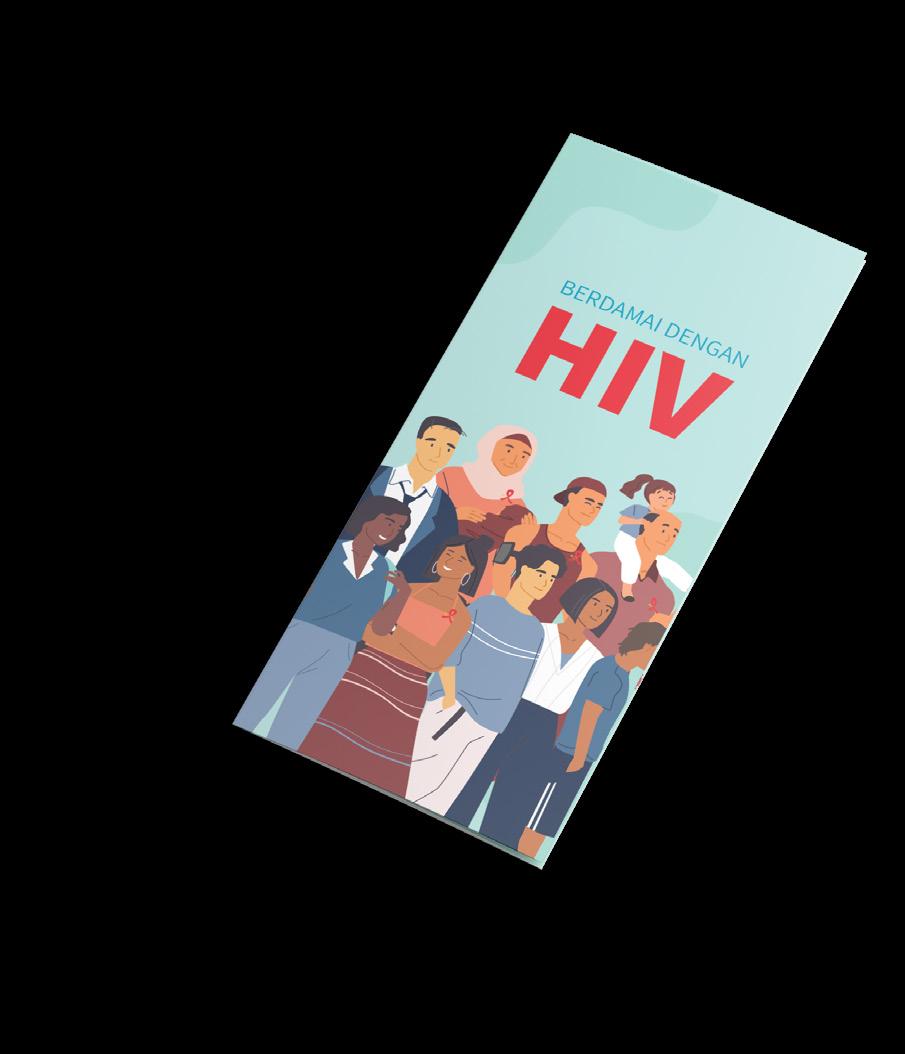
The brochure for law officer contains information on how to act and handle victims. The illustration on the brochure portrays the officer as a guardian for the victim, tough yet friendly. The brochure for targeted communities of acces for law and justice contains informations about any kinds of discrimination and sexual abuse and how to handle the situation. The illustration on the brochure are designed to evoke the target curiousity on the issue.
Brochure of Access for Health Services
Brochure for Health Officer
Brochure for Targeted Communities
Brochure of Access for Law and Justice
Brochure for Law Officer
Brochure for Targeted Communities
Graphic Design MAJu (eMpowering Access of Justice)
Fact Check Cards of Access for Health Services
Fact Check Cards of Access for Law and Justice
The fact check cards are divided into two grouping based on the targeted user, officers and targeted communities. It is to differentiate the cards because the cards will be putted into one box. It also applied for law and human rights cards. The objectives of the card itself is to justify certain myths or missinformation with fact check and also to inform about the victim needs and how to take an action to that.
The illustration also designed to evoke the targeted community, so the illustrations are implicitly portrays the myths or facts, which later will be described by the facilitator.
Cards for Health Officer
Cards for Targeted Communities
Cards for Law Officer
Cards for Targeted Communities
Graphic Design
MAJu (eMpowering Access of Justice)
Graphic Design
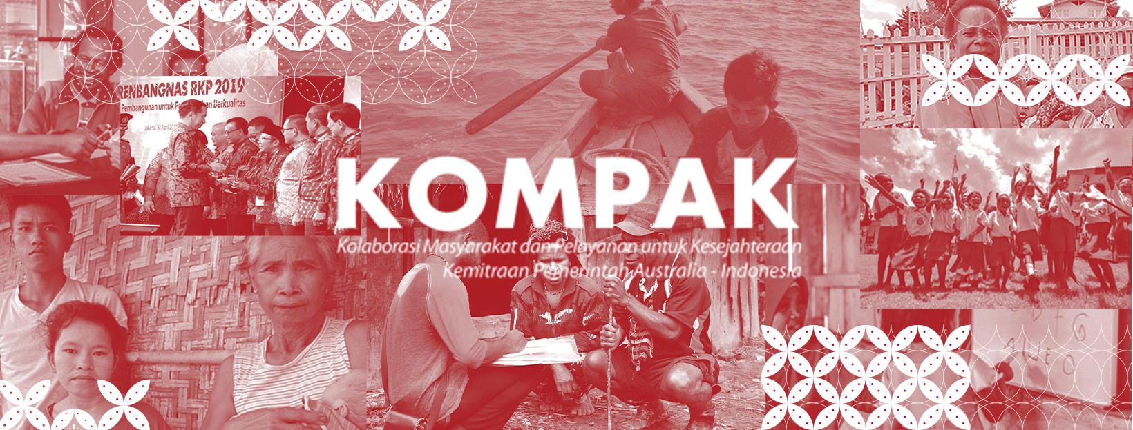
KOMPAK
(Kolaborasi Masyarakat dan Pelayanan untuk Kesejahteraan)
Kolaborasi Masyarakat dan Pelayanan untuk Kesejahteraan (KOMPAK) Scoop of Works
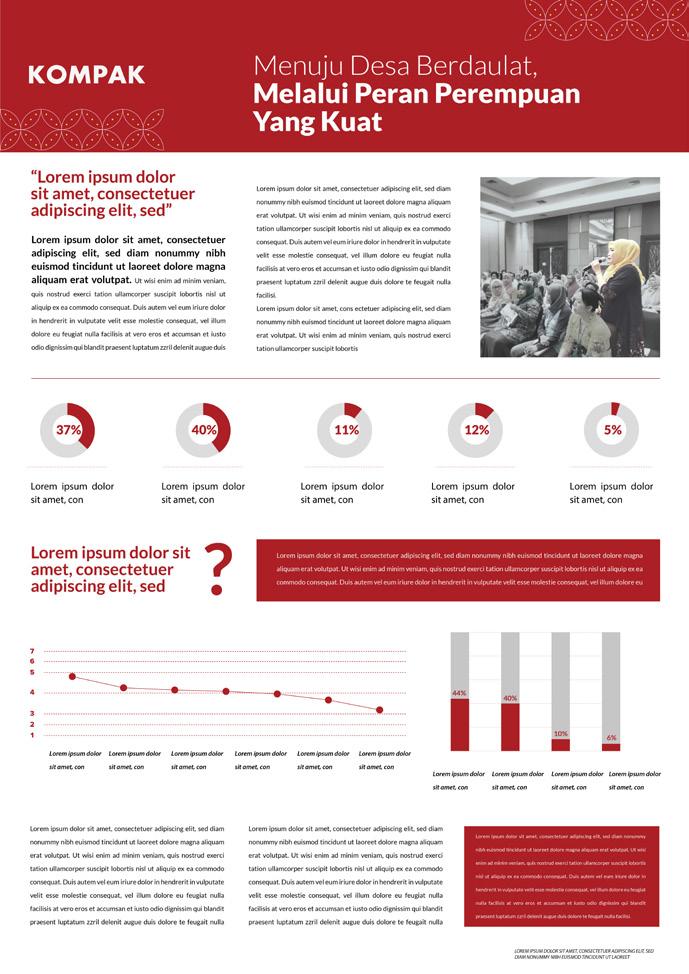
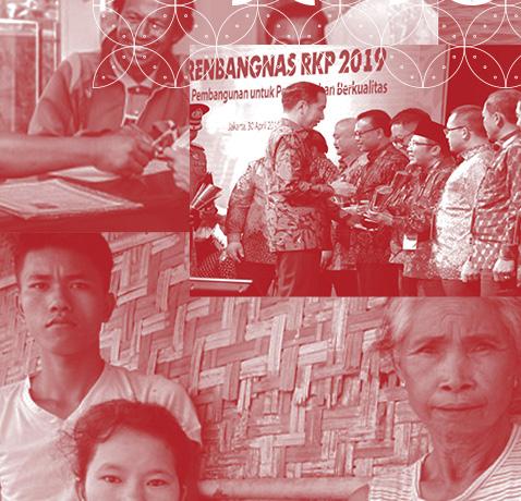
KOMPAK (Kolaborasi Masyarakat dan Pelayanan untuk Kesejahteraan) is a project of Ogilvy and DFAT (Department of Foreign Affairs and Trade Australia) alongside the Indonesian Government. The purposes of KOMPAK itself is to reduct poverty and adressing inequality in Indonesia. KOMPAK’s actual project has already finished before and to deliver it to a bigger audience, it is needed to be designed well. The work scoops I work on for KOMPAK are creating key visuals for the project products.
I got the opportunity to work on the project together also with one of my colleague. The product of the project itself is social media pages, infographic, and press release. KOMPAK wants to be pictured as clean, sleek with a touch of traditional. To get the clean and sleek design, KOMPAK designed with a monochromatic color scheme around KOMPAK’s red color, and grayscale colors. For the photo treatment, KOMPAK has two different treatment into a cut-out design and cropped design.
Graphic Design
Kolaborasi Masyarakat dan Pelayanan untuk Kesejahteraan (KOMPAK)
KOMPAK Key Visuals
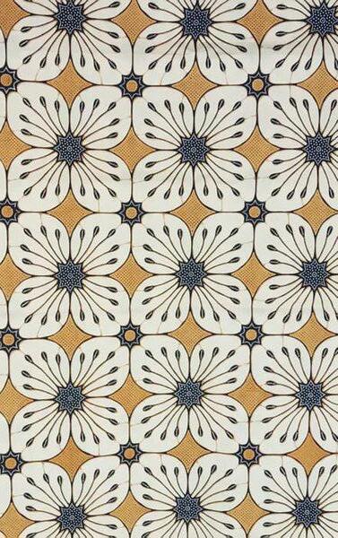
To bring a touch of traditional into the overall design, KOMPAK designed using a pattern from Batik Kawung Kembang. Batik Kawung Kembang was choosen to fit KOMPAK’s project purposes which addressing inequality. Kawung Kembang is a symbol of equality and justice, and also have a quite simple form for a Batik pattern.
There are five minimalized patterns from the Batik which will be used as the design assets for the whole project.
KO01. Batik Kawung Kembang
#a81e24
#938c8d
#141414
#ffffff
KO02. KOMPAK Infographic
Graphic Design
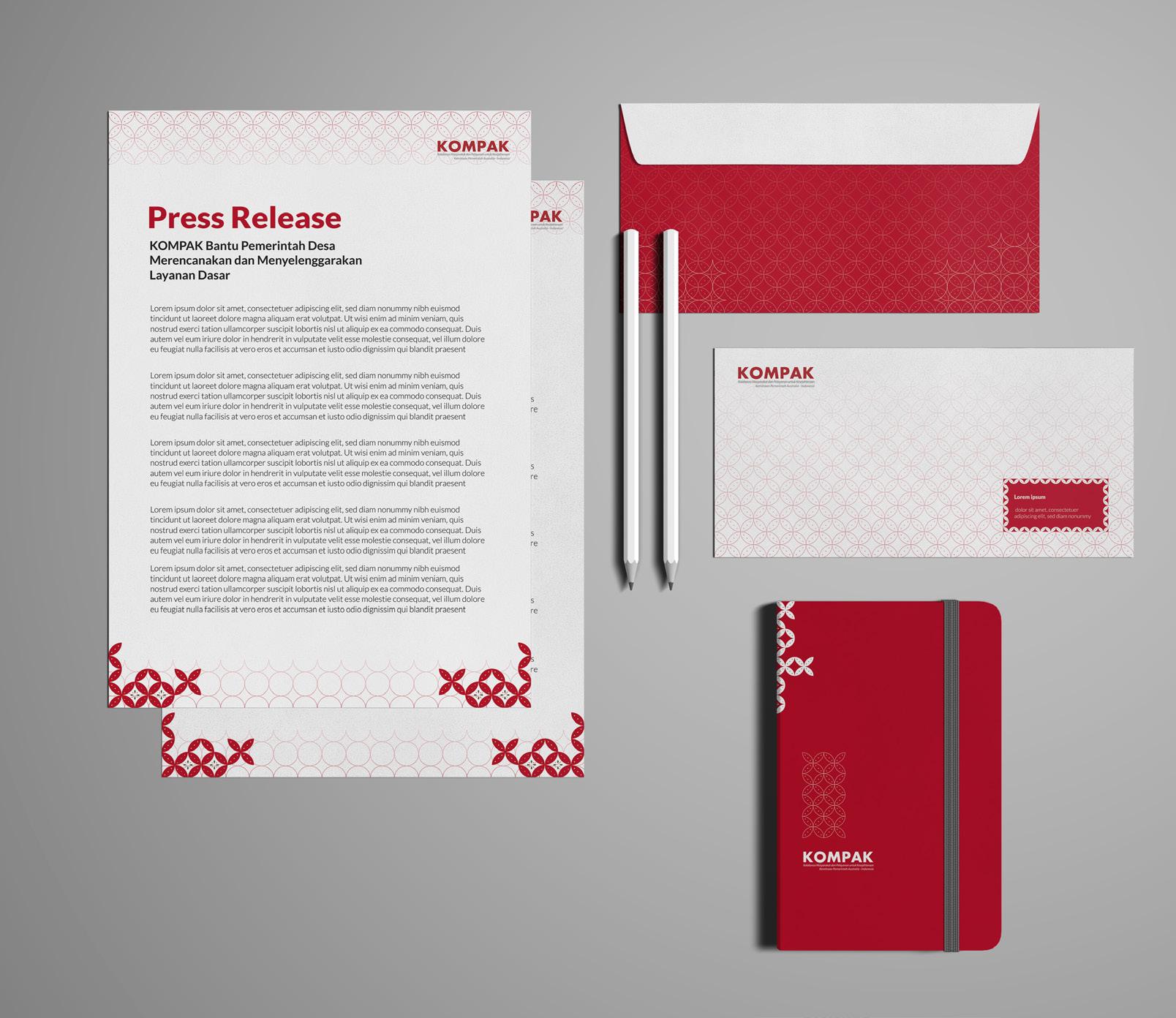
Press Release
KOMPAK Press Release was designed as clean as possible so that the message will not be distracted by the design assets. For the press release, I also designed the envelopes and notes which might be needed later.
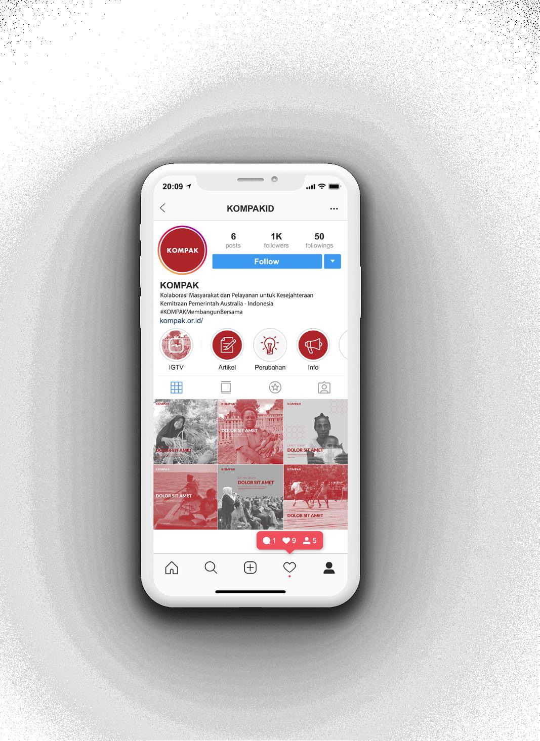
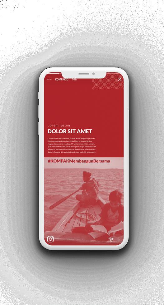
Instagram Account
KOMPAK Instagram will be designed in monochromatic color scheme in red and grayscale to bring a clean and sleek mood. For any colored pictures in carousell will be keep as it is but for the cover itself should use monochromatic colors.
Kolaborasi Masyarakat dan Pelayanan untuk Kesejahteraan (KOMPAK)
KO03. Stationaries
Graphic Design
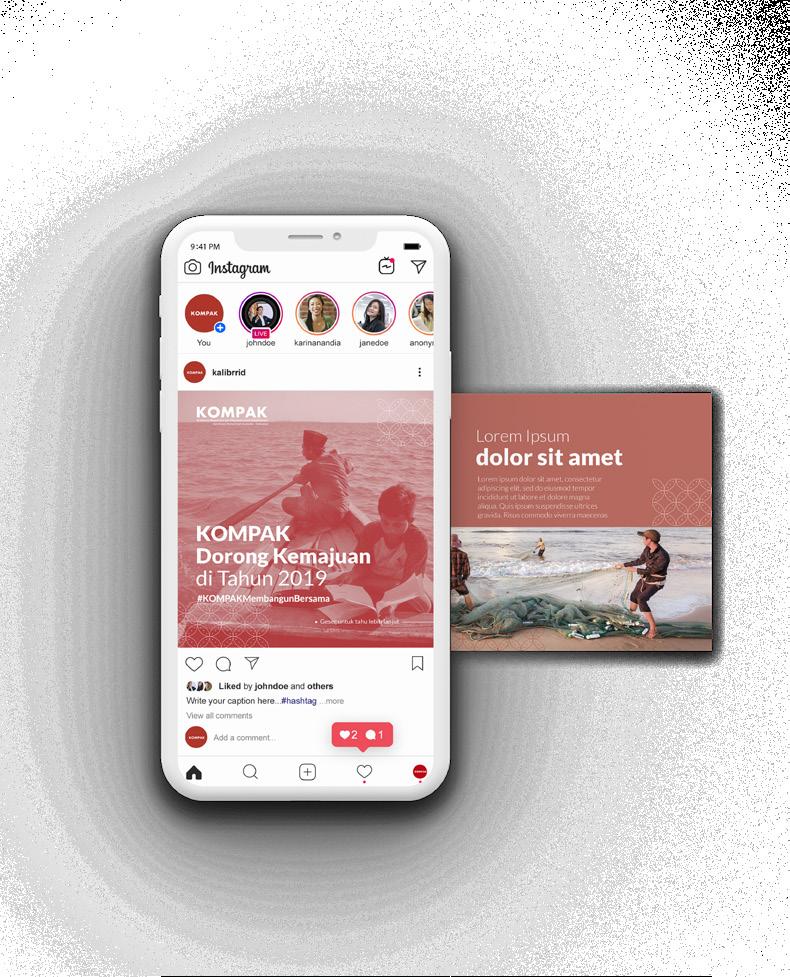
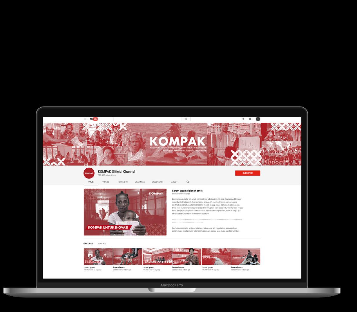
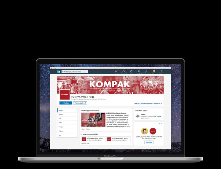
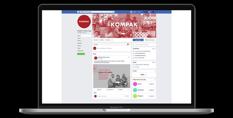
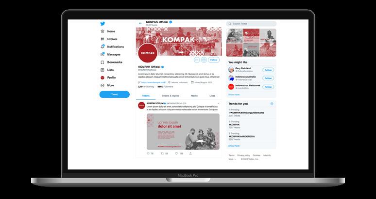
There are several social media pages for KOMPAK such as Youtube, Facebook, Twitter, and Linkedin page. The designed product consist social media banner for each social media and pictures or thumbnaiils that will be needed for the page.
Kolaborasi Masyarakat dan Pelayanan untuk Kesejahteraan (KOMPAK)
KO04. YouTube Page
KO05. Linkedin Page
KO06. Facebook Page
KO07. Twitter Page
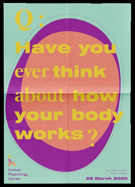
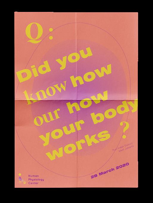
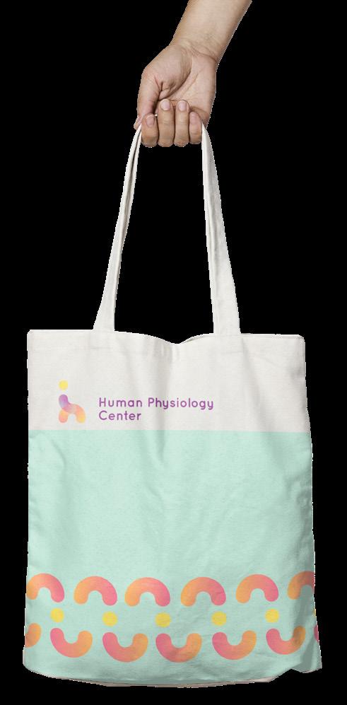
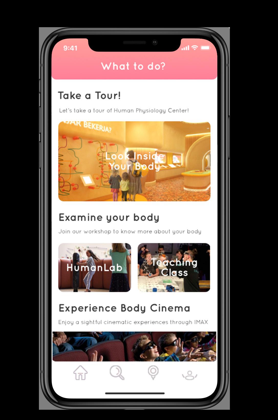
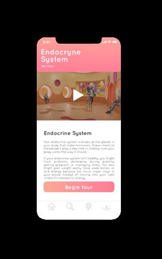
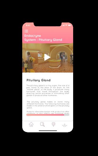
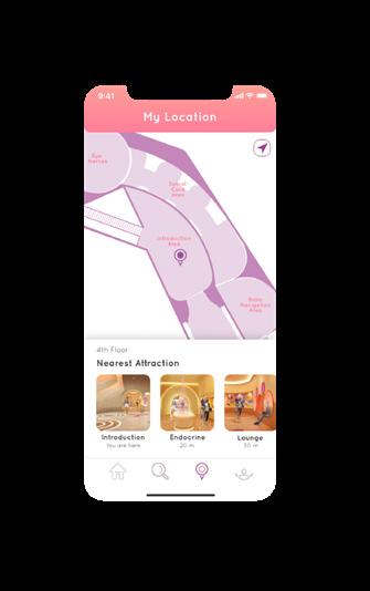
Human Physiology Center
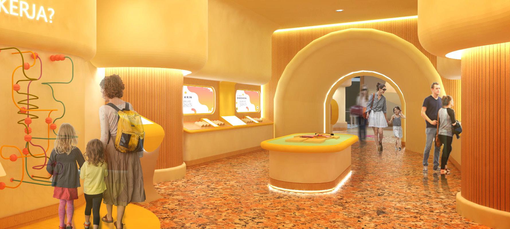
Human Physiology Center is my interior design final project. There’s several reasons why I choose a health education facility as my final project. The reasons are the lack of physiology education in the community, lack of awareness for a healthy lifestyle and the rise of catastrophic diseases. Therefore, Human Physiology Center was created to raise awareness and educate people about their body.
The facility’s design are focusing on the usage of interactive technology and interactive for all five senses (hearing, touch, smell, sight, and taste) to bring innovation into content education, especially about human physiology. To built a cohesive design as a whole, I also created the facility’s brand identity and other design such as UI/UX design and editorial design. Designing this project was truly an exciting process because I got the opportunity to learn new things along the way such as branding, editorial, and UI/UX designing.
Graphic Design
Human Physiology Center
Brand Identity
The logo takes on the letter “H” from “Human” and resembling the form of a walking human. Body movement is the basic form of physiology which I tried to illustrated as a representation of the whole Human Physiology Center.
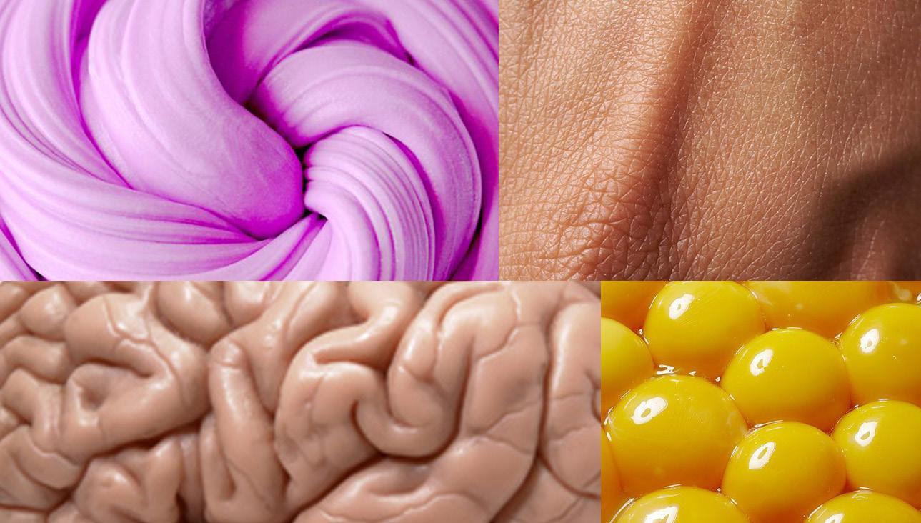
The color scheme take approach on flesh and neutral colors to bring the experience of how does it feel to be inside a body. In order to fit the main user and a ergonomically friendly facility, the actual color needs to be undersaturated to maintain the color concept and the ergonomic.
The brand identity itself took an approach on the primary target of Human Physiology Center, which are kids around 7-13 years old. Human Physiology Center focused on human physiology education to kids on their early stage. The brand identity itself were formed based on the primary target of Human Physiology Center, which are kids around 7-13 years old.
HP01. Moodboard
HP02. Color Palette
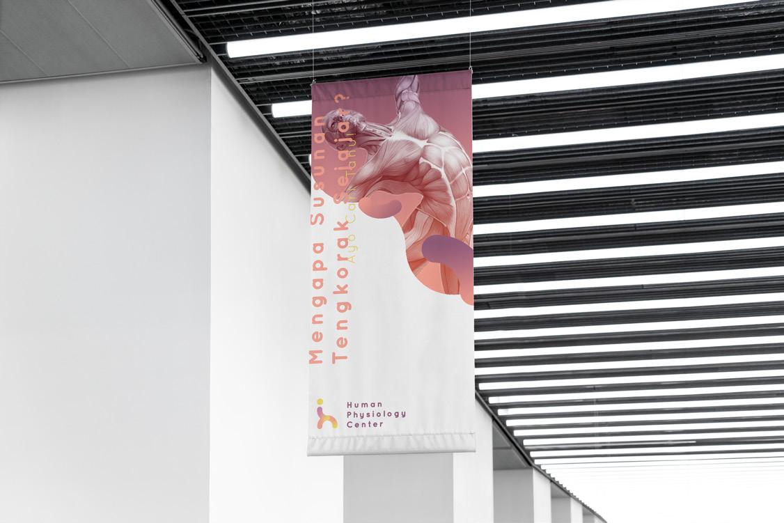
I created a few design elements, assetts, which later applied to the facility. From printed media such as banner, guide book, ticket wristband to user interfaces were created to bring an immense brand image to the facility. These are several designs of Human Physiology Center’s branding and souvenir.
HP03. Posters
HP04. Tote Bag
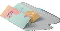
HP08. Guide
HP09. Hanging Banner
HP05. Wristband
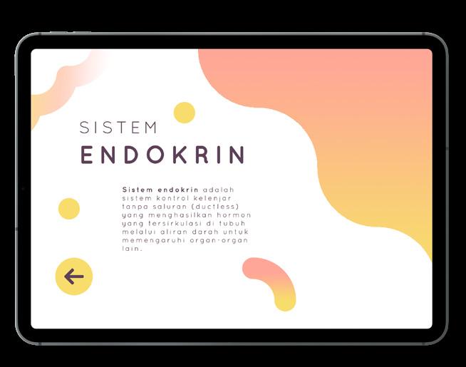
HP06. User Interface
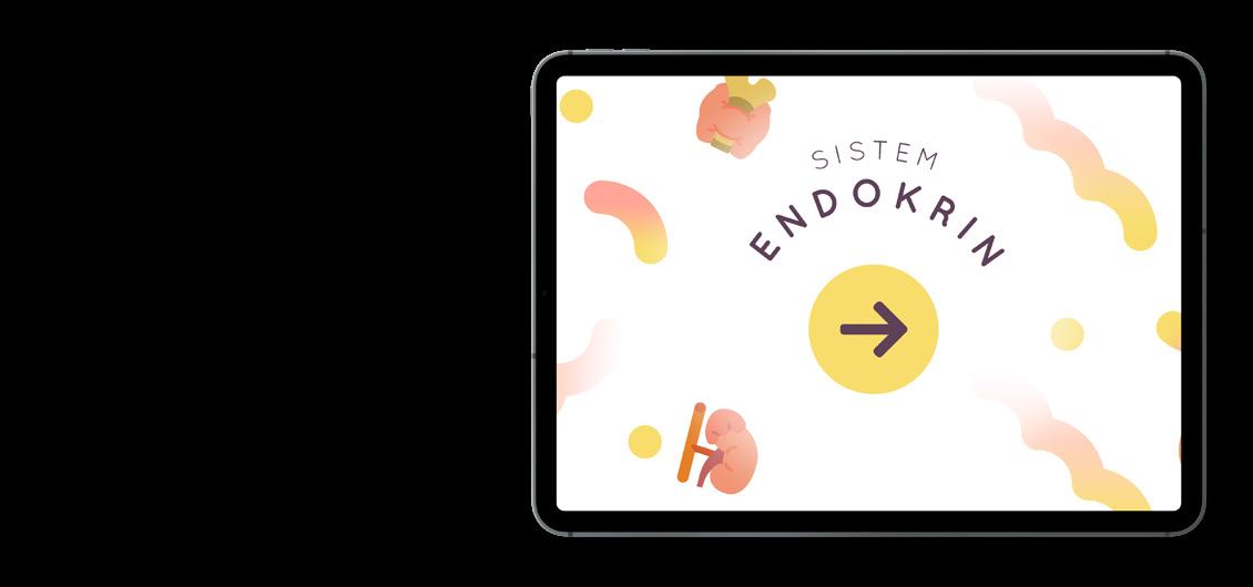
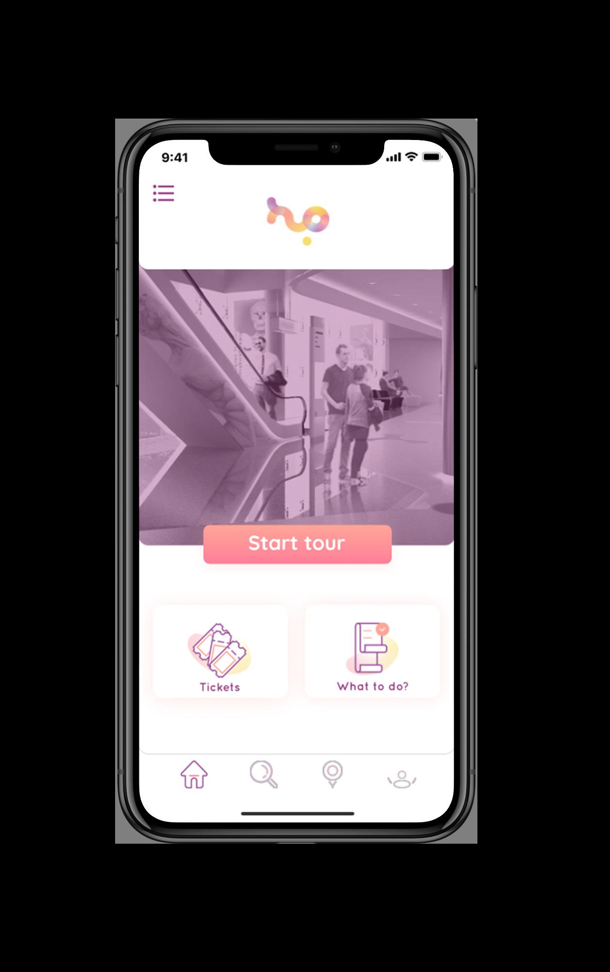
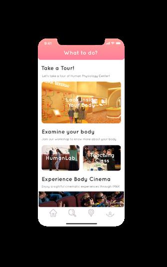
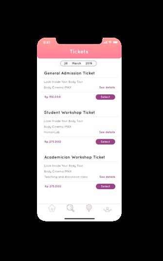
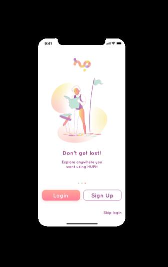
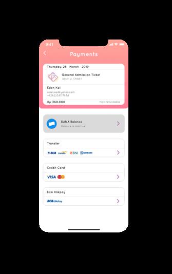
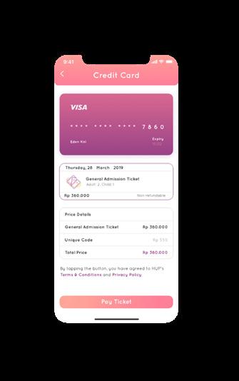
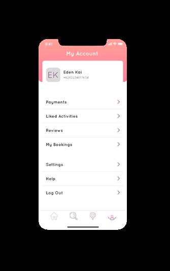
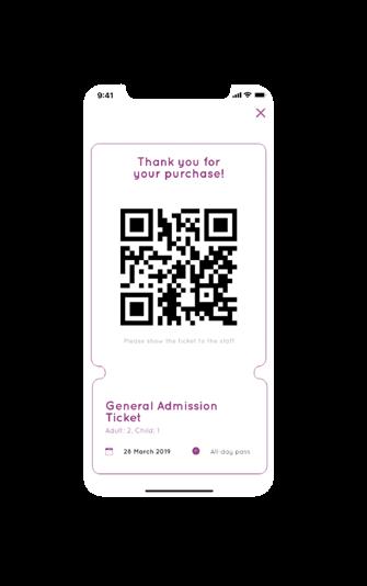
To bring an one-stop experience to the visitor, Human Physiology Center also provides mobile application, which is called HUP. Concerning on how electronic devices at hand, HUP targeted the secondary user which are students, young adult to adult especially parent.
The main purpose of HUP is to guide visitor on everything they want to know about Human Physiology Center. With HUP, visitors can access a detailed information of each zone and attraction on Human Physiology Center, and also purchasing tickets. Adult user can access any detailed information regarding to human physiology with HUP, especially parents, they can also describe the human physiology through HUP.
HP10. UI Design
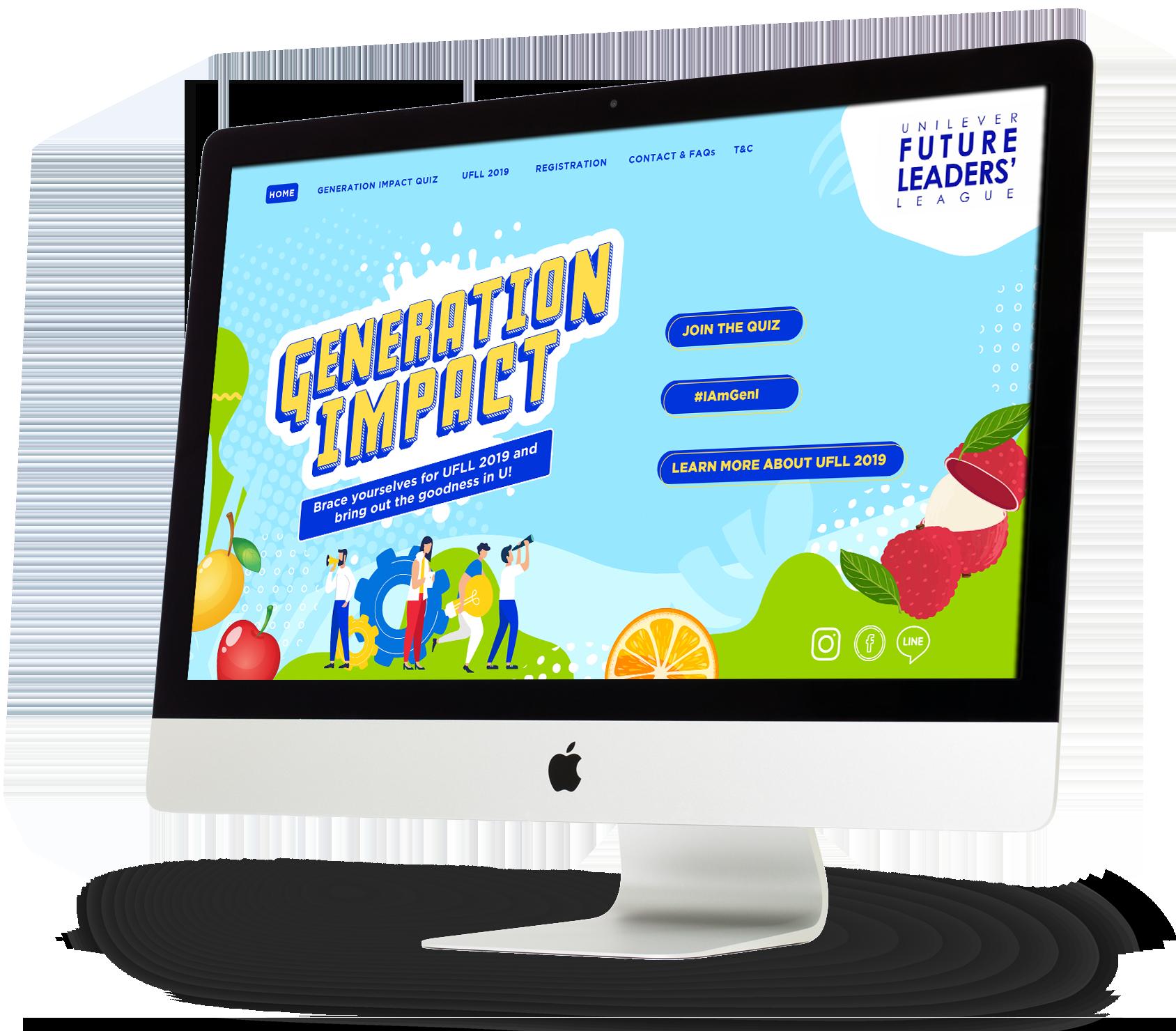
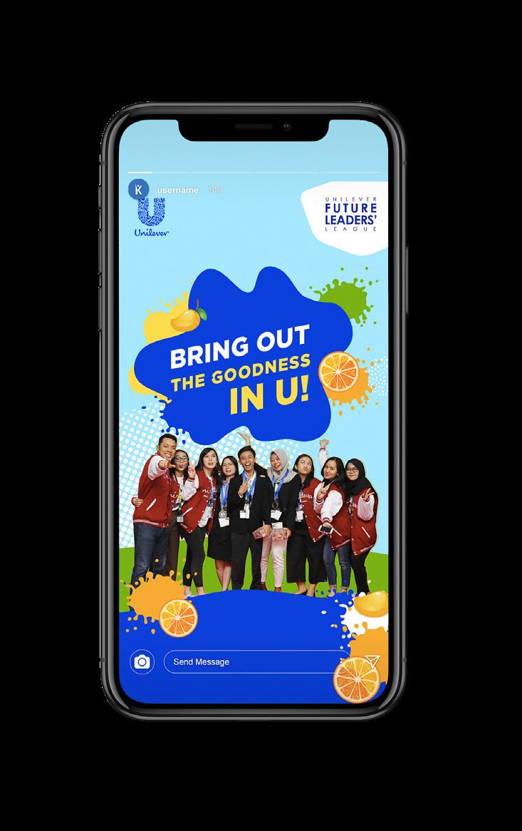
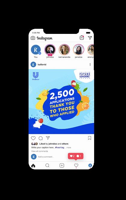
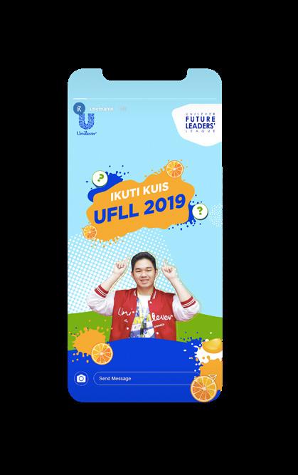
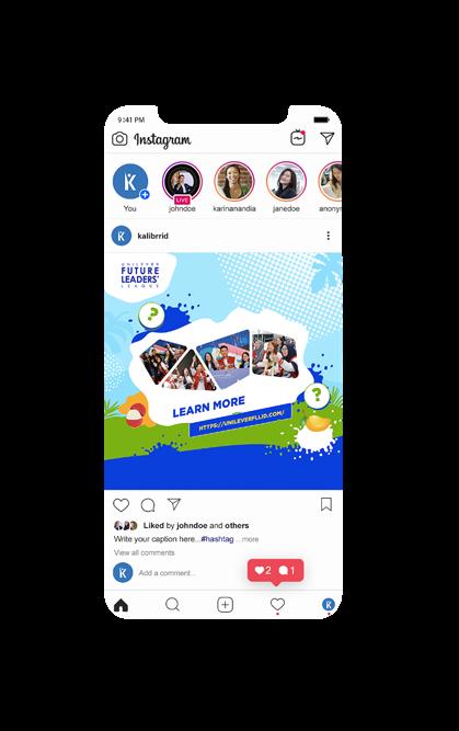
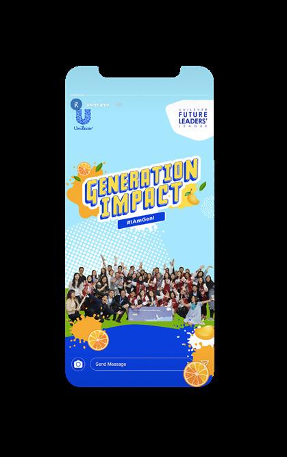
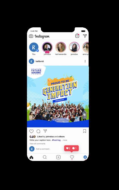
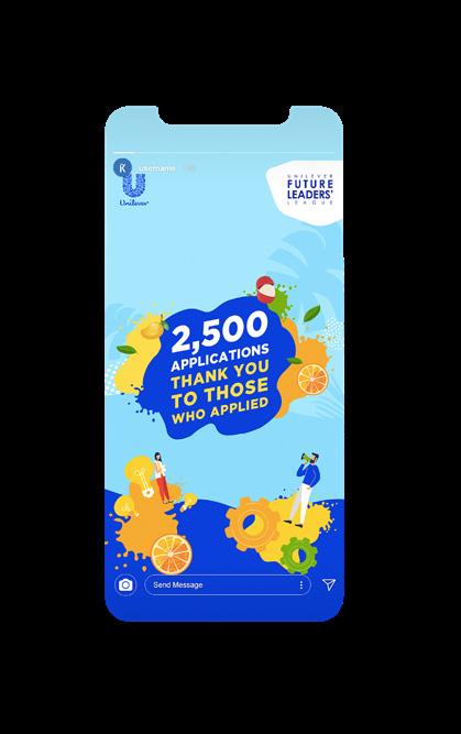
Unilever Future Leaders League
Unilever Future Leaders League is an annual business case competition held by Unilever. This project was my first job project at Kalibrr. I got the opportunity to create its social media publication and designed the website interface.
The design itself had already proposed before I joined Kalibrr, but I got the chance to create some of it’s component and design assets. I also designed few social media contents for the event advertisement.
UL03. Instagram Story
UL02. Instagram Ads
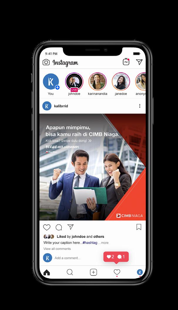
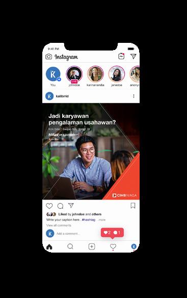
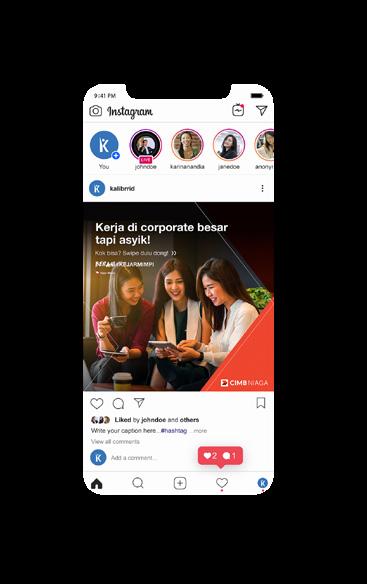
CIMB Niaga Advertisement
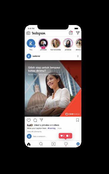
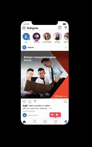
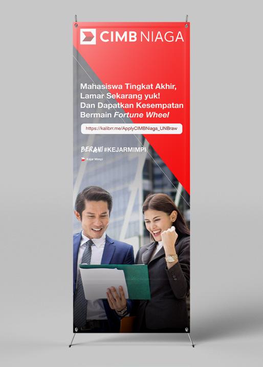
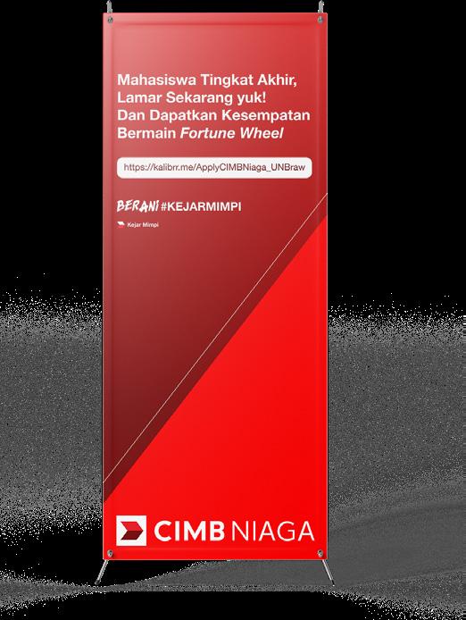
CIMB is one of Kalibrr’s client and I got the opportunity to handle the project. The main goal from this project is to reach a certain amounts of candidates to apply on CIMB Niaga by media advertising, newsletter, and offline event. This project started from January to April 2020.
The overall design was centered on humaninterest visual which following CIMB’s brand guideline. To achieve the targeted candidate, the design should be eye-catchy to its viewer.
I also assigned to design some of its publication event items such as X-Banner and posters. The design also following the brand guideline.
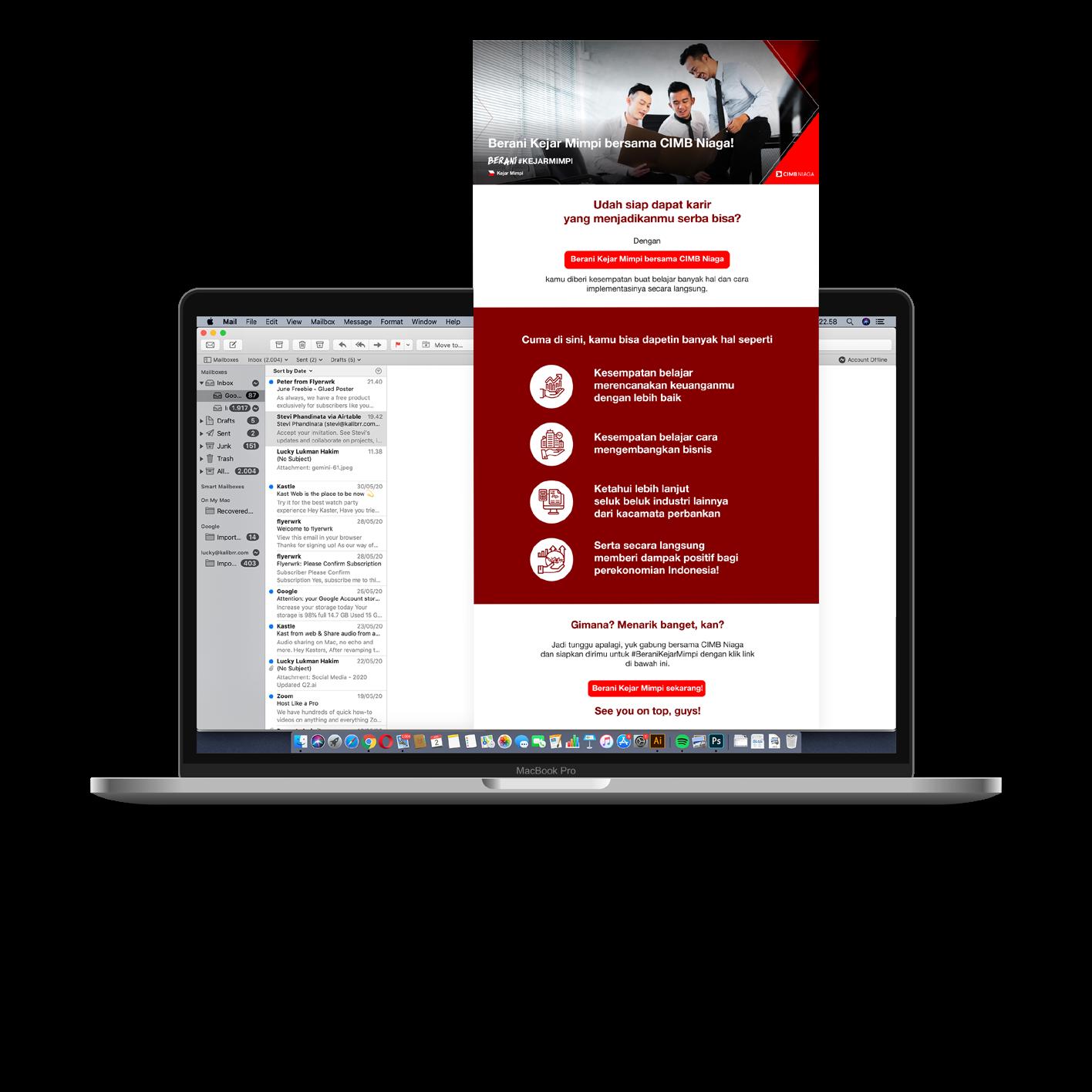
CN01. Newsletter
CN02. Instagram Ads
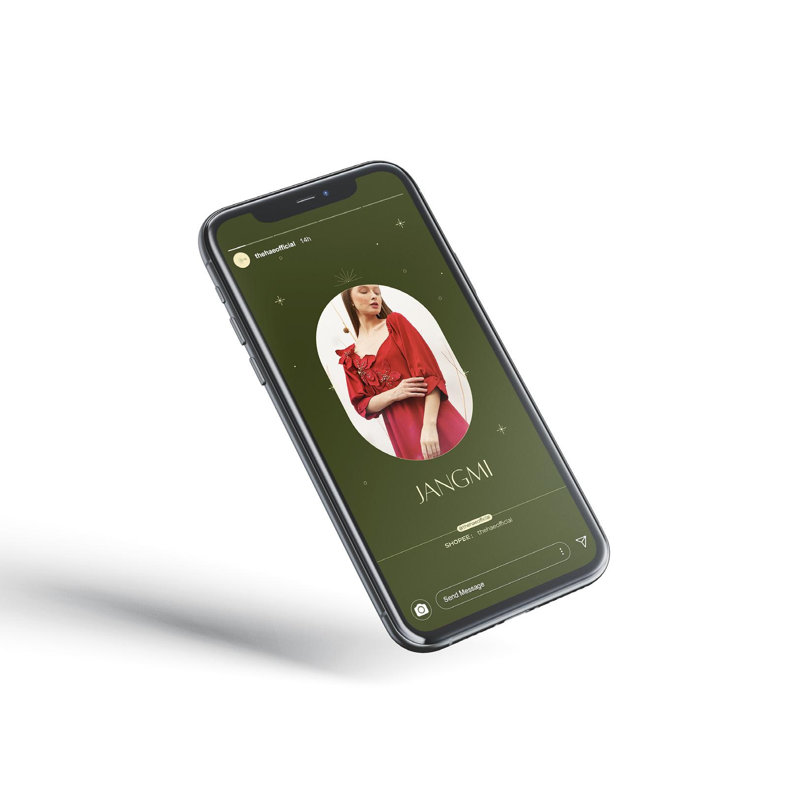
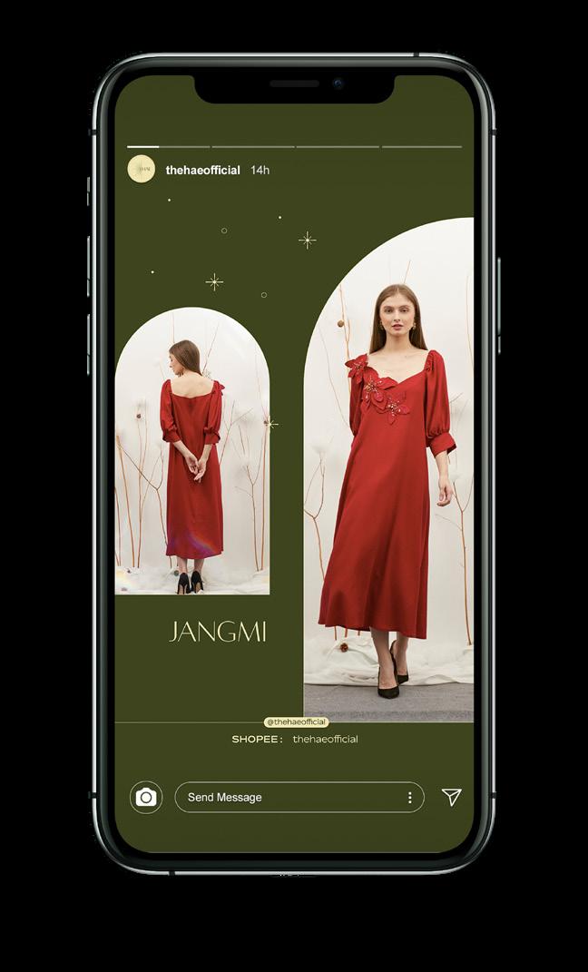
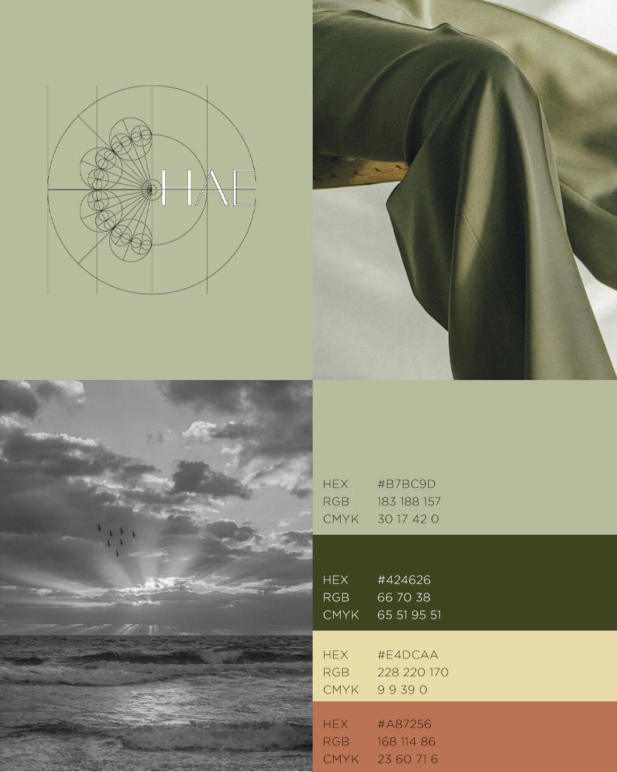
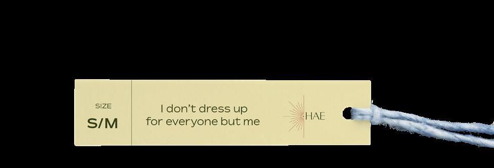
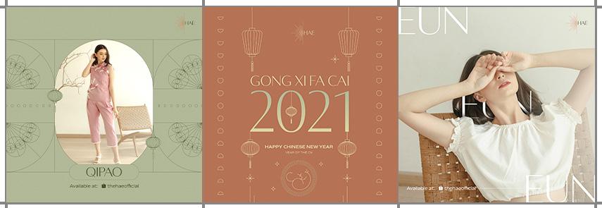
HAE Brand Identity and Social Media
HAE is a women’s clothing brand that mainly runs on Instagram. HAE itself is taken from Korean which means the sun. For this project, I have to create the brand identity such as logo, packaging stickers, hang tag, labels, and also designed the brand’s Instagram contents.
which appears on the left side of the “HAE”. The morning sunray is gentle and refreshing which inline with the brand image. HAE’s brand identity takes a serene, gentle, and earthy, which applied on the color pallette.
Logo
HAE01. Mood and Color Palette
HAE02. Instagram Feed
HAE03. Instagram Story
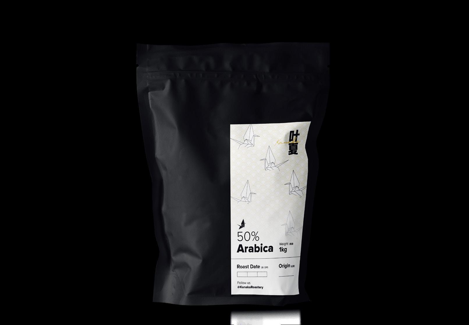
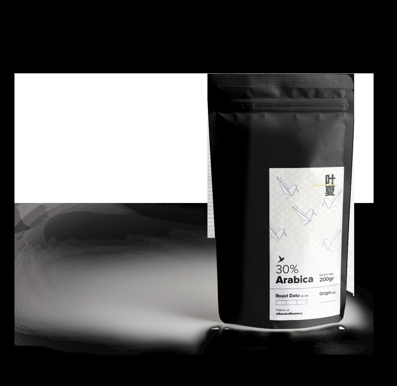
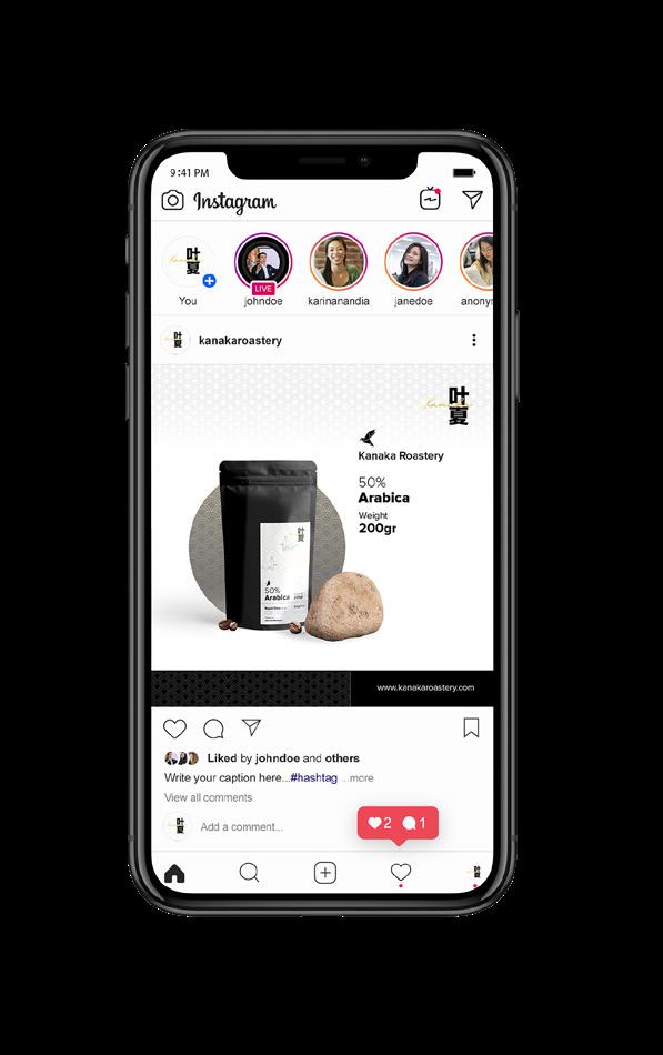
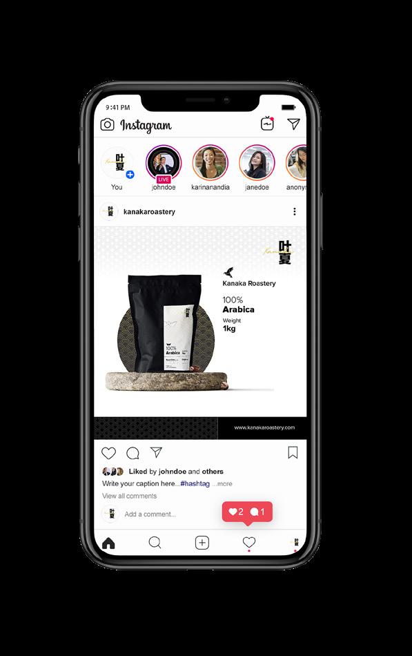
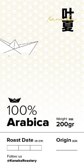
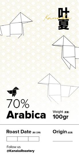
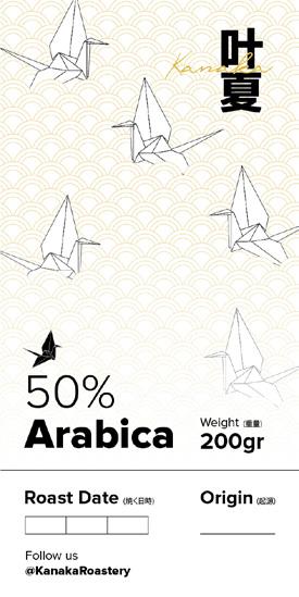
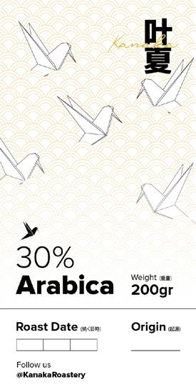
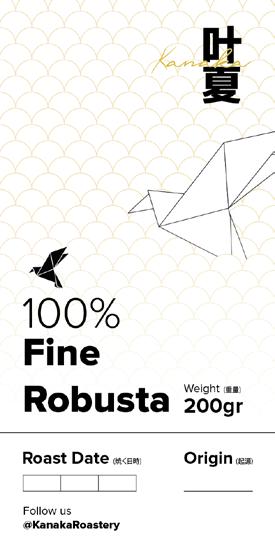
KANAKA Roastery
KANAKA Roastery
KANAKA Roastery is a coffee brand that mainly runs in Instagram. My scoop of works for this project was to continue create social media content and several branding items such as packaging stickers. KANAKA Roastery takes a Japanese minimalism and I put it into the design for social media and packaging.