Graphic Design Portfolio
(hluckylukman@gmail.com) (2023)
Lucky Lukman Hakim
3 Kalibrr Publication 08 - 11 2 Sirclo Commerce 04 - 07 1 Resume 02 - 03 9 CIMB Niaga Advertisement 27 10 HAE Branding & Social Media 28 11 KANAKA Roastery 29 12 GOFIT App 30 13 Tokopedia Train Ticketing 31 - 32 14 ADDPet 33 15 Digital Imaging 34 - 37 4 MAJu 12 - 15 5 KOMPAK 16 - 19 6 Human Physiology Center 20 - 23 7 Ganesha Leadership Forum 24 - 25 8 Unilever Future Leaders League 26 2023 Graphic Design Portfolio Index
Hi, I’m Lucky. I’m a graphic designer. Working between collaboration and creative exploration, I strive for creating works that resonates with today’s society and driven with good intention. My work surrounds a wide range of brands, from non-profits organization, SME, food & beverages to health & beauty. A combination of graphics and communication, I plot out system that include creating story or narrative, design assets, to working on details.
Work Experience
Sirco Commerce, Sirclo
Kalibrr Indonesia
Kalibrr Indonesia
Freelance Experience

Ogilvy Indonesia
Education Bandung Institute of Technology
2021
Associate Creative Designer
- Present
2020
Freelance Graphic Designer
- 2021
2019
Associate Graphic Designer
2019
2020 Associate Graphic Designer
2017
Designer Interior Internship
- 2020
Kalibrr
-
Hello Embryo
- 2017
2021
Freelance Graphic Designer
2020
Freelance Graphic Designer
Rain Barrel Communication
- 2021
UNDP
- 2021
2020
Graphic Designer
- 2021 Freelance
2014
2023
- 2018 Interior Design, Bachelor of Design Cumulative GPA: 3.57/4.0
Current Residence Contact Pagedangan, Tangerang Selatan 082234177634 | hluckylukman@gmail.com
Bahasa Indonesia (Native) English (Conversational Proficiency)
Graphic Design Portfolio Resume
Language
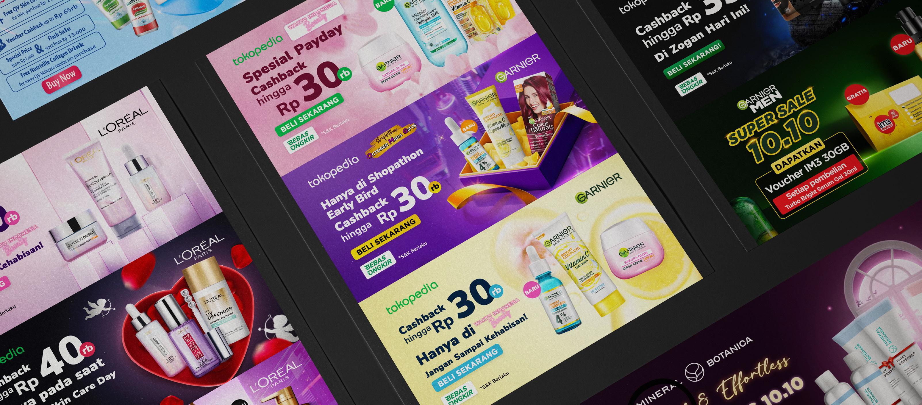
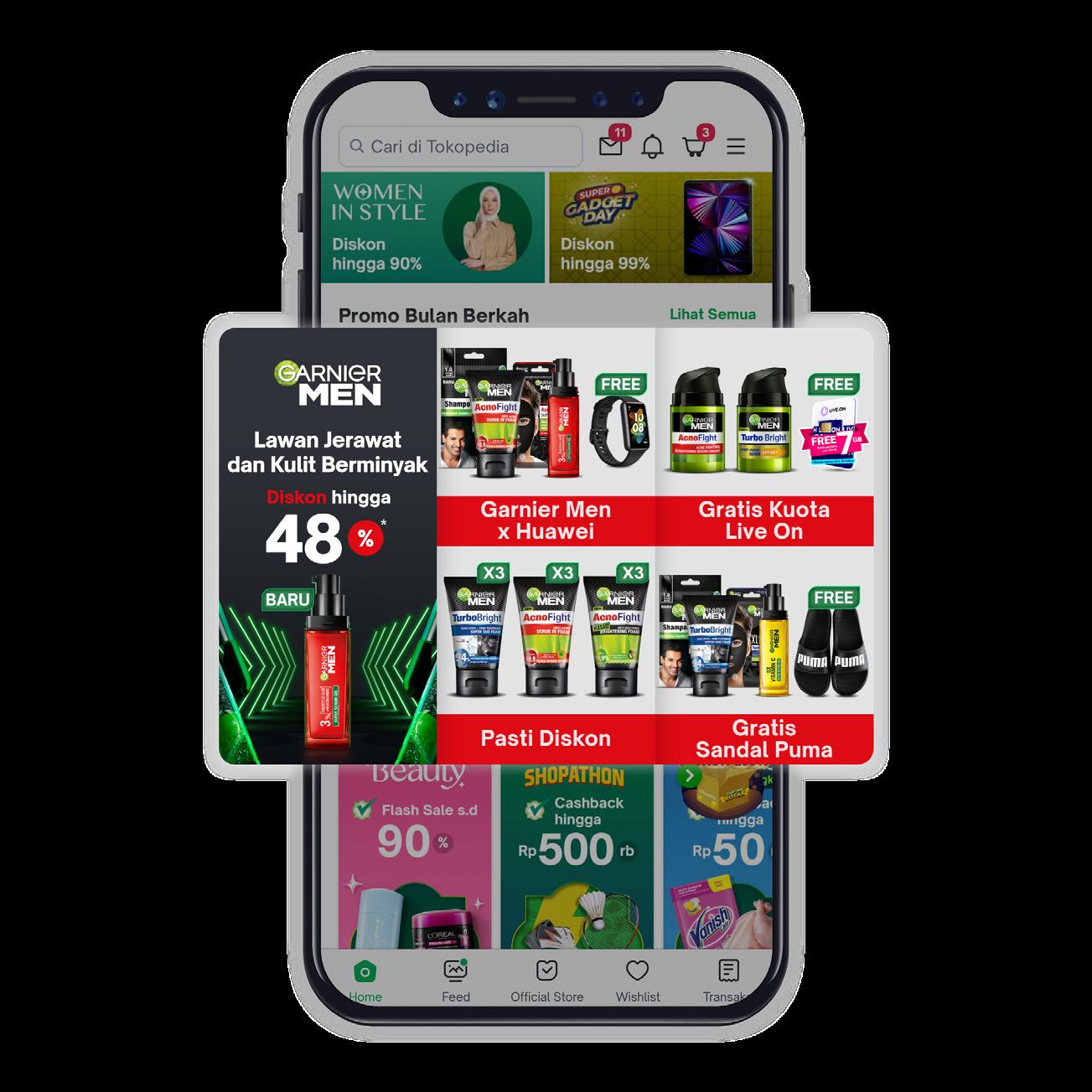
Sirclo Commerce
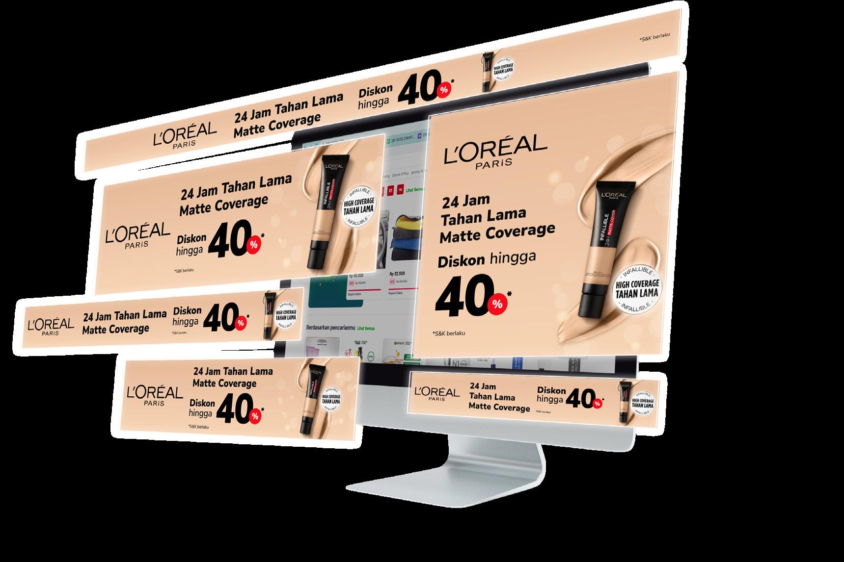
Sirclo is a leading e-commerce enabler in Indonesia that provides services and solutions for businesses. I was assigned to handle several brands that varies from food, health care, to beauty brand. The scoop of work I worked on is to provide creative materials for campaigns including banner, motion video, discovery pages in several marketplaces, and also digital network (ads).
The design process on working these banners is to coordinate the given words or copy, with the brand campaign; the items they wanted to highlight, thematic campaign, etc. In order to create a cohesive design, I cooperated with content writer and key account to create the design.
2021 - Present Graphic Design Sirclo Commerce
04
Scoop of Works Digital Imaging Tools Adobe Photoshop Adobe Illustrator
Broadcast Chat Banners
Graphic Design Digital Imaging 05 2021 - Present
Banners
1:1
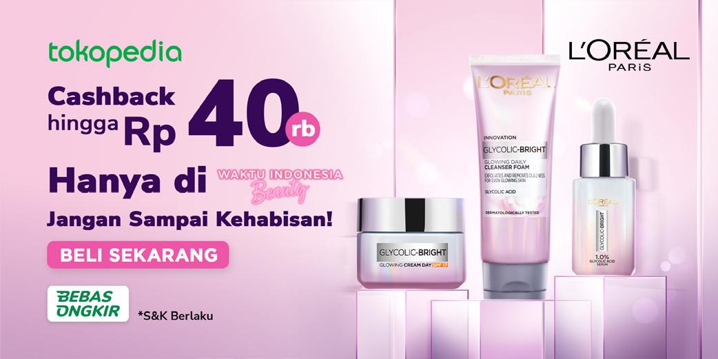
Sirclo Commerce also provide designs for marketplaces campaign. I am responsible to create and design the brand needs for campaign at Tokopedia. I got to create design based on the marketplace guidelines.
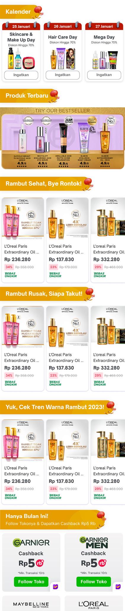
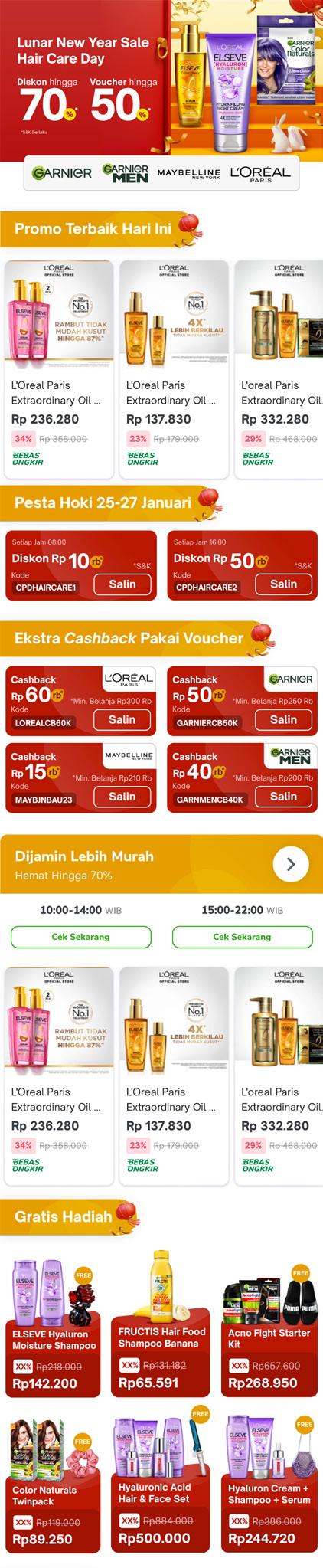
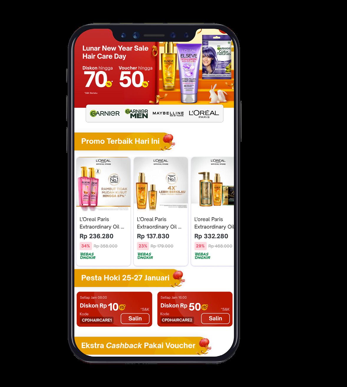
The designs started from the brand campaign brief, what products they want to highlight or key visual from the highlighted product. After receiving the brief, I tried to implement and create a visual that sums up the campaign.
06
2021 - Present
Graphic Design
Sirclo Commerce
Discopage
Dynamic Channel
Sirclo also provide creative assets for advertising brand campaign. I was assigned to create several Tokopedia ads (TDN) that spread inside the marketplace. These are the several designs I have worked on.


07
2021 - Present Graphic Design Sirclo
Tokopedia Display Network
Graphic Design
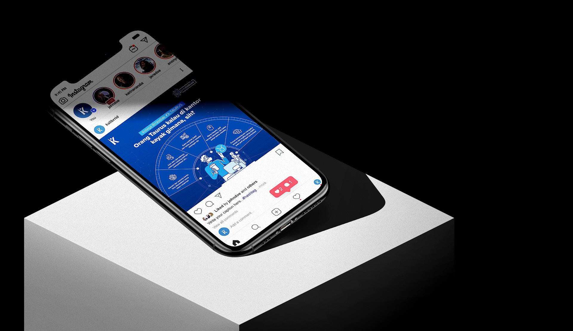
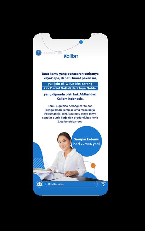
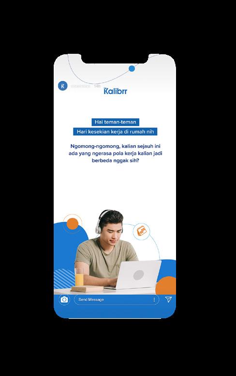
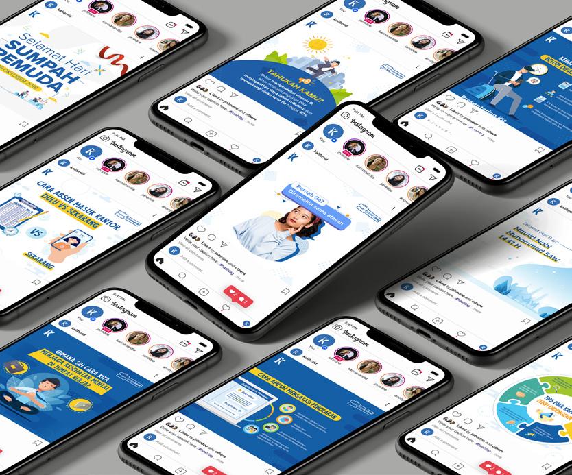
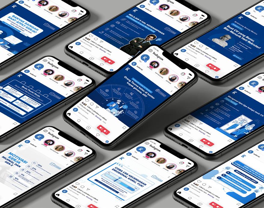
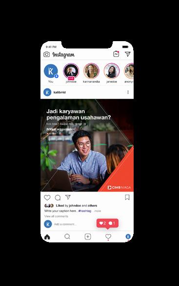
Kalibrr Internal Publication
Branding Company Rebranding

Kalibrr Rebranding

As 2020. Kalibrr decided to rebranding the design. The rebranding keywords are ‘Global’, ‘Premium’, ‘Fresh’, and emit ‘Multinational’.

Kalibrr Publication
Scoop of Works

Social Media Content
Branding
Editorial
Advertising
Tools
Adobe Illustrator
Adobe Photoshop 08
Kalibrr Internal Publication is a recap of my works at Kalibrr, which mainly focused on internal publication. The works under Kalibrr internal publication are mostly social media, advertising, editorial and editorial works.

Before Proposed Design
Understanding that the brand should look fresh, global, multinational, and premium at the same time, I’ve decided to take basic form such as rectangular and circular form combined with asymmetrical layout. The color palette itself not only focusing on blue color hue, but also added a contrary color such as orange or white.
2019 -2021
Instagram Content
These are several post on Kalibrr’s Instagram before Kalibrr Rebranding. The content itself mainly focused about career tips, office-life, etc.
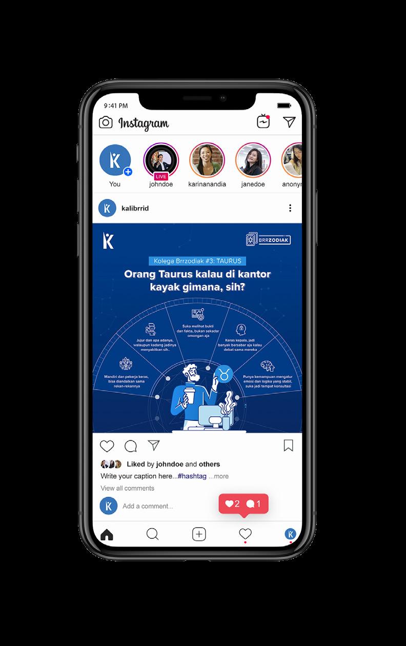
After Rebranding
After Kalibrr’s rebranding, these are several Instagram post that I’ve been working on. The contents are also speaks about career-life, career-wise personality, and fun
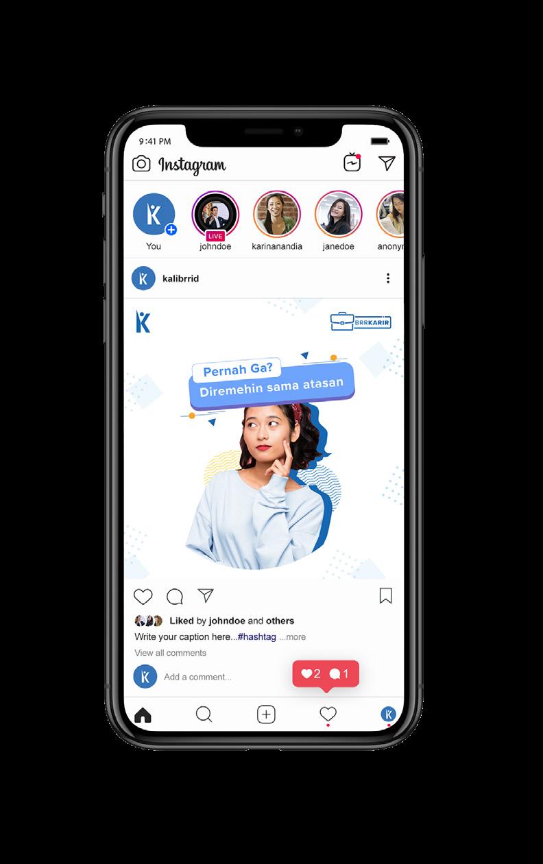
The design style before rebranding itself focused on flat design with blue and white dominant. The color scheme that applied was more broad than rebranding design which consist blue, yellow, orange, and light blue. The design layout also more dynamic and fresh by using memphis elements and assets.
Kalibrr’s rebranding design takes a different approach to suit the new brand identity by using blue monochromatic color scheme and a spacious layouting.
09
2019 -2021
Graphic Design Kalibrr Internal Publication Branding Company Rebranding
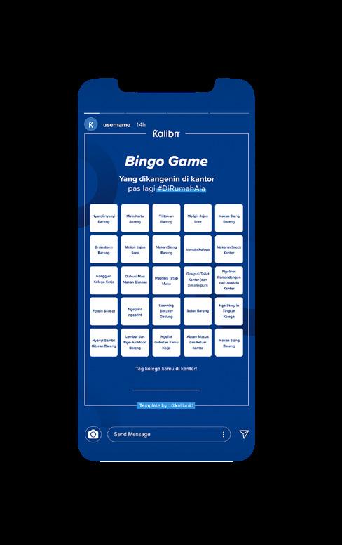
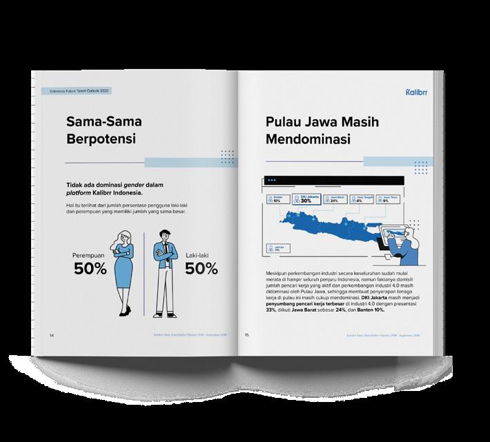
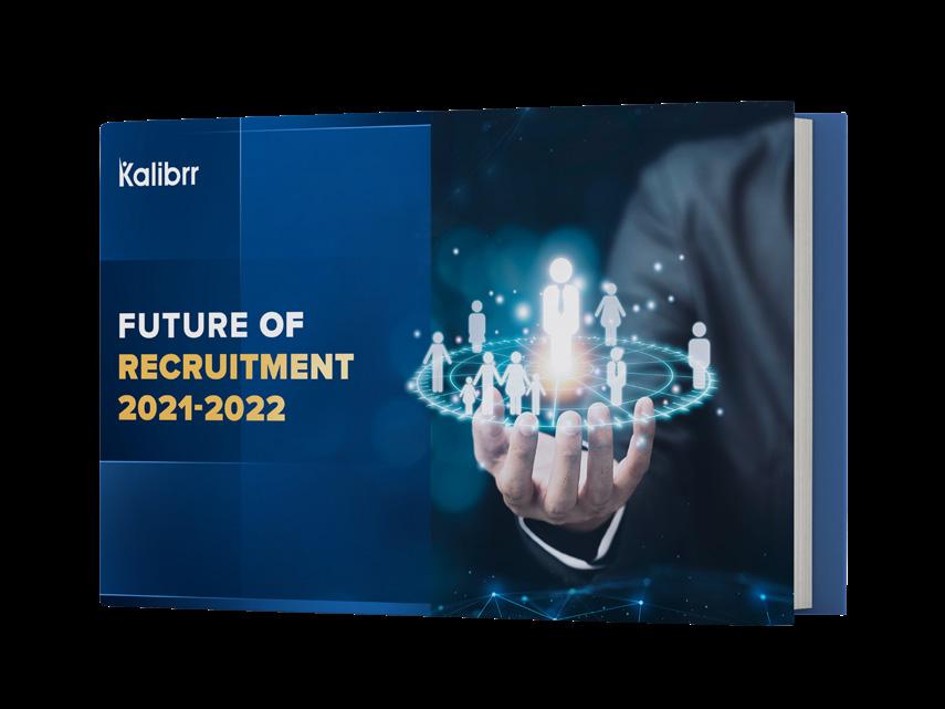
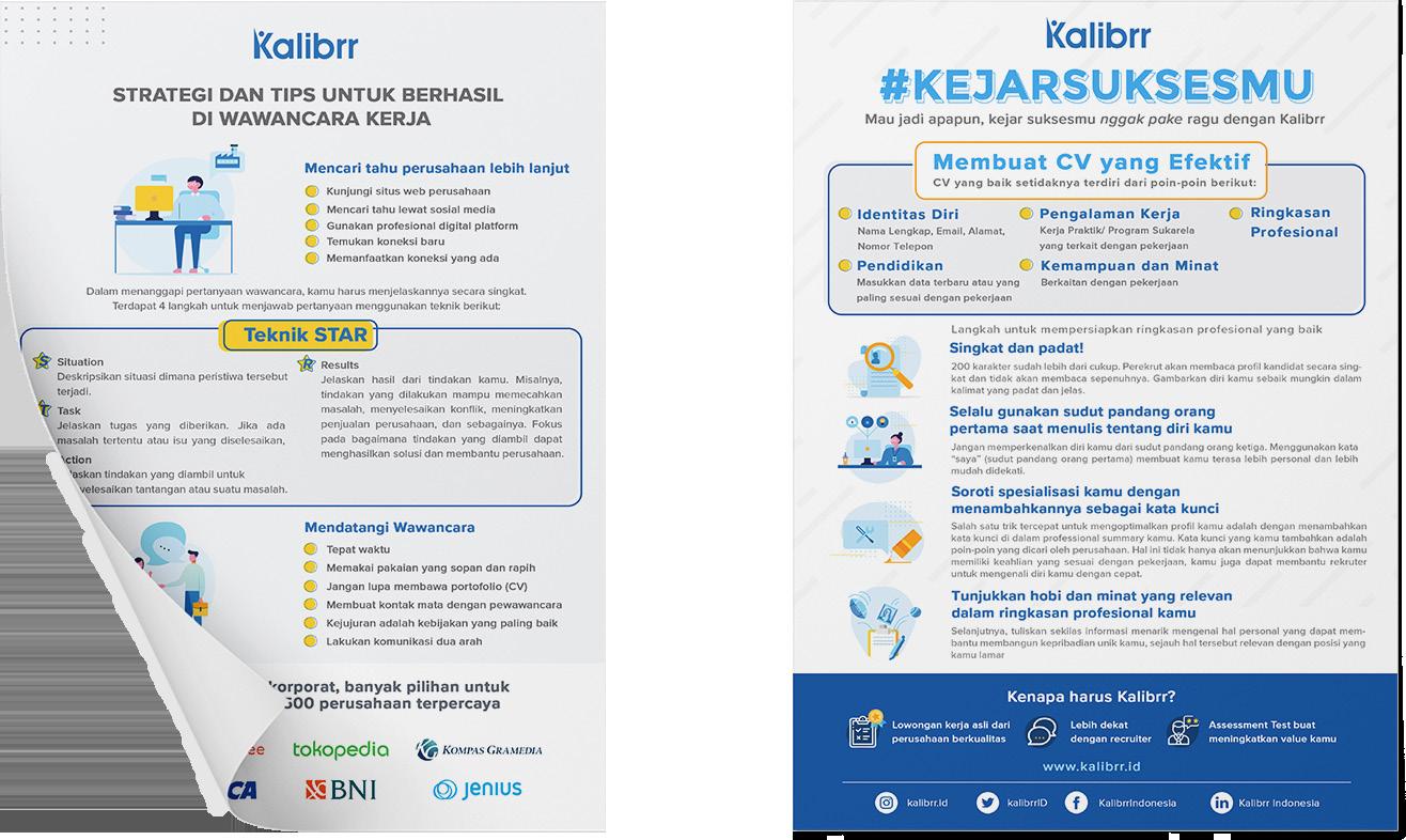
Kalibrr E-Book was a project by my division in Kalibrr to provide insights for both jobseeker and recruiter about job talents forecast. Both me and my supervisor worked on the E-Book to bring a clean and clear understanding through infographic. It is designed after Kalibrr’s rebranding, so the design took approach on cleanliness and simplicity. The color scheme also monochromatic color scheme around blue.
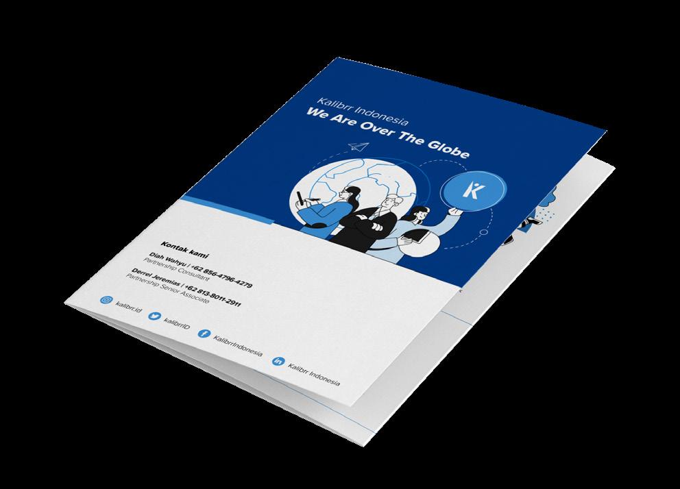
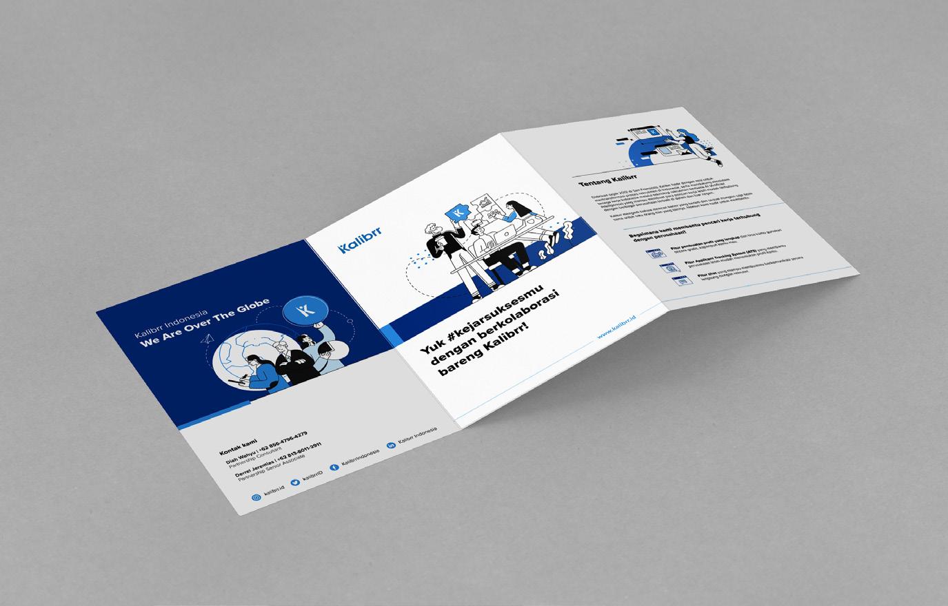
Kalibrr Brochure was intended to be published for communities that visible to participating with Kalibrr. The communities are student association and technology communities.
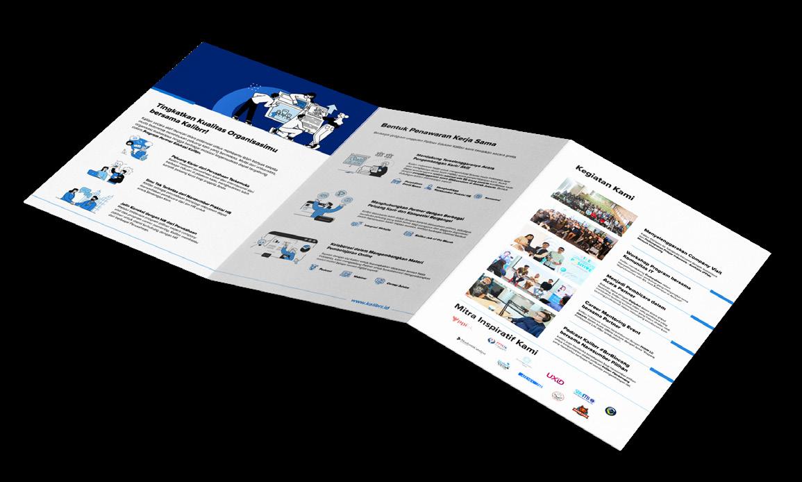
10
Kalibrr E-Book
2019 -2021 Graphic Design Kalibrr Internal Publication Branding Company Rebranding
Flyer for Brand Awareness
The flyers were used to raise awareness about Kalibrr and its purpose. It was distributed to offline event participants in order for them to use Kalibrr as their job portal. The information on the flyer was around work-life and pre-work-life tips and trick. The flyer was designed before Kalibrr’s rebranding, so the design around flat design. The color scheme itself also around white, blue, and yellow or orange as the emphasis color.
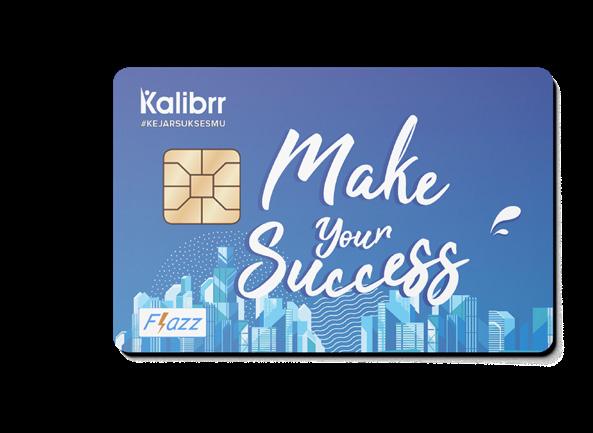
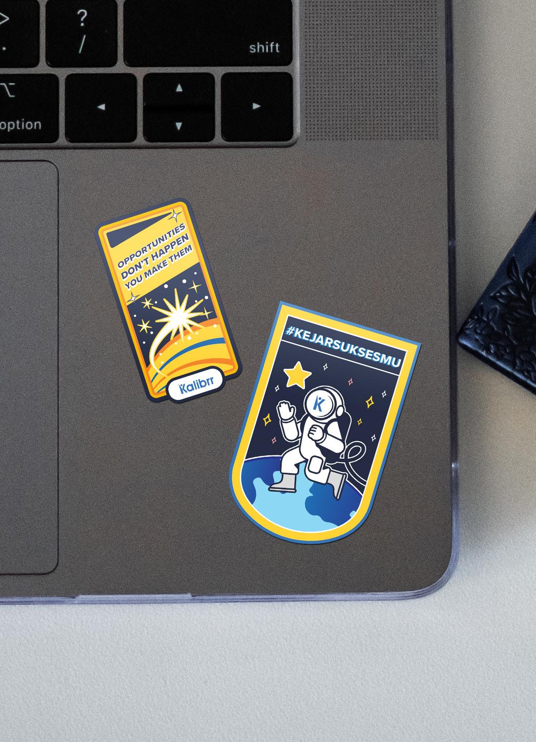
Kalibrr Items for Internal
Kalibrr also provides items for internal employee so that they could be proud of Kalibrr everywhere they go. The items are notebooks, stickers, and electronic money card. The designs are based on Kalibrr’s branding, which focused on flat illustration, high-hope and achieving key message.
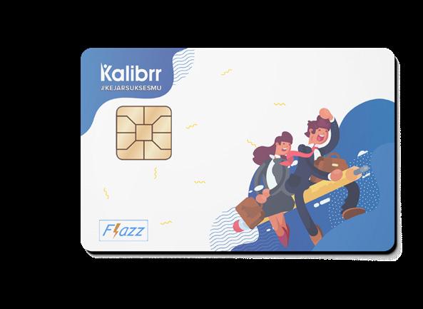
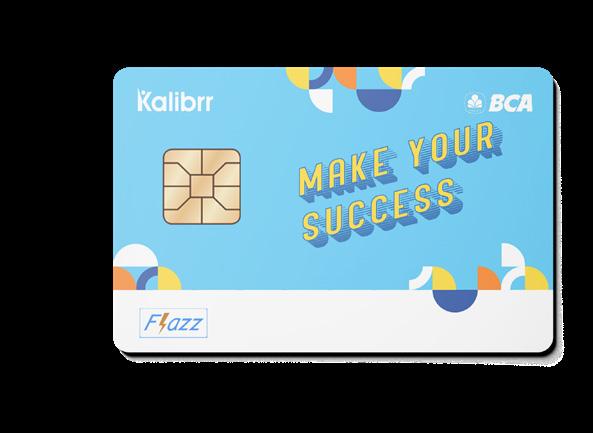
11
2019 -2021 Graphic Design Kalibrr Internal Publication Branding Company Rebranding
Graphic Design
MAJu (eMpowering Access of Justice)
MAJu
Scoop of Works
Branding
Editorial
Digital Illustration
Tools
Adobe Illustrator
Adobe Photoshop
Editorial Brochure & Pocket Book
Illustration
Digital Illustration
(eMpowering Access to Justice)
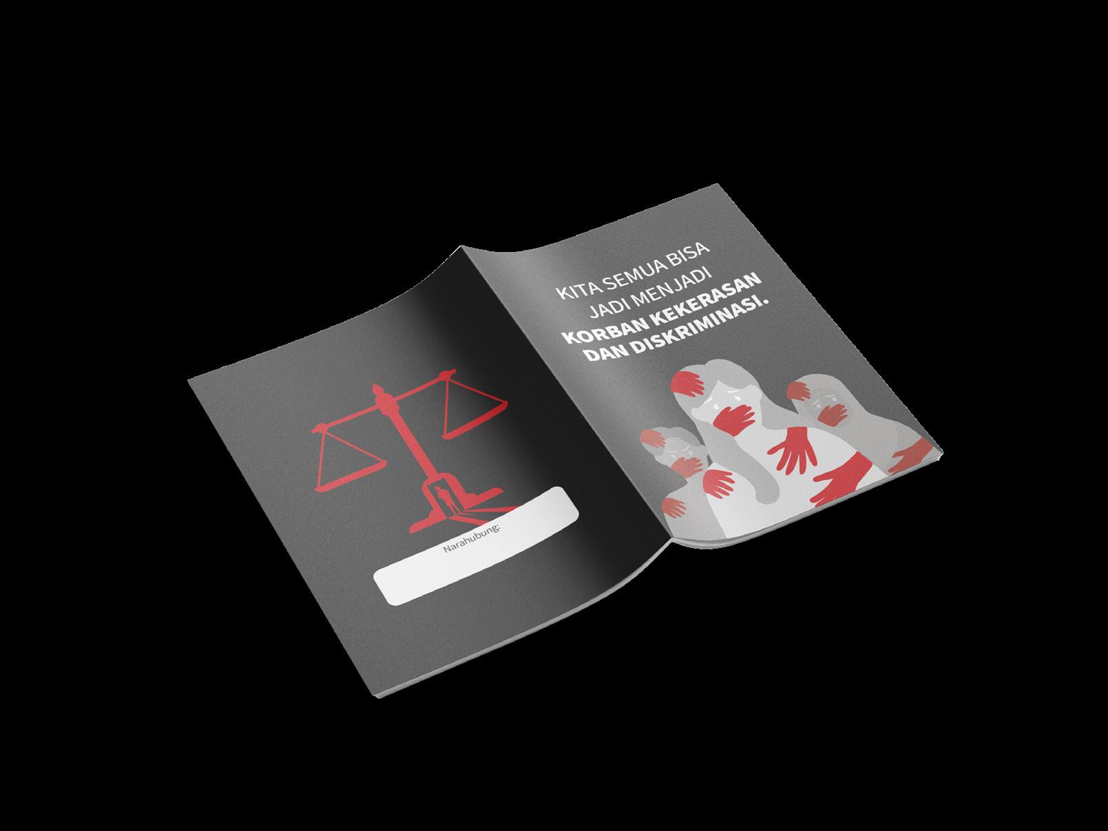
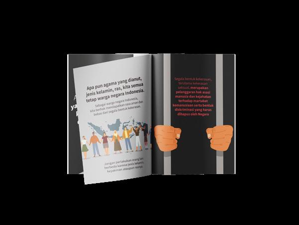
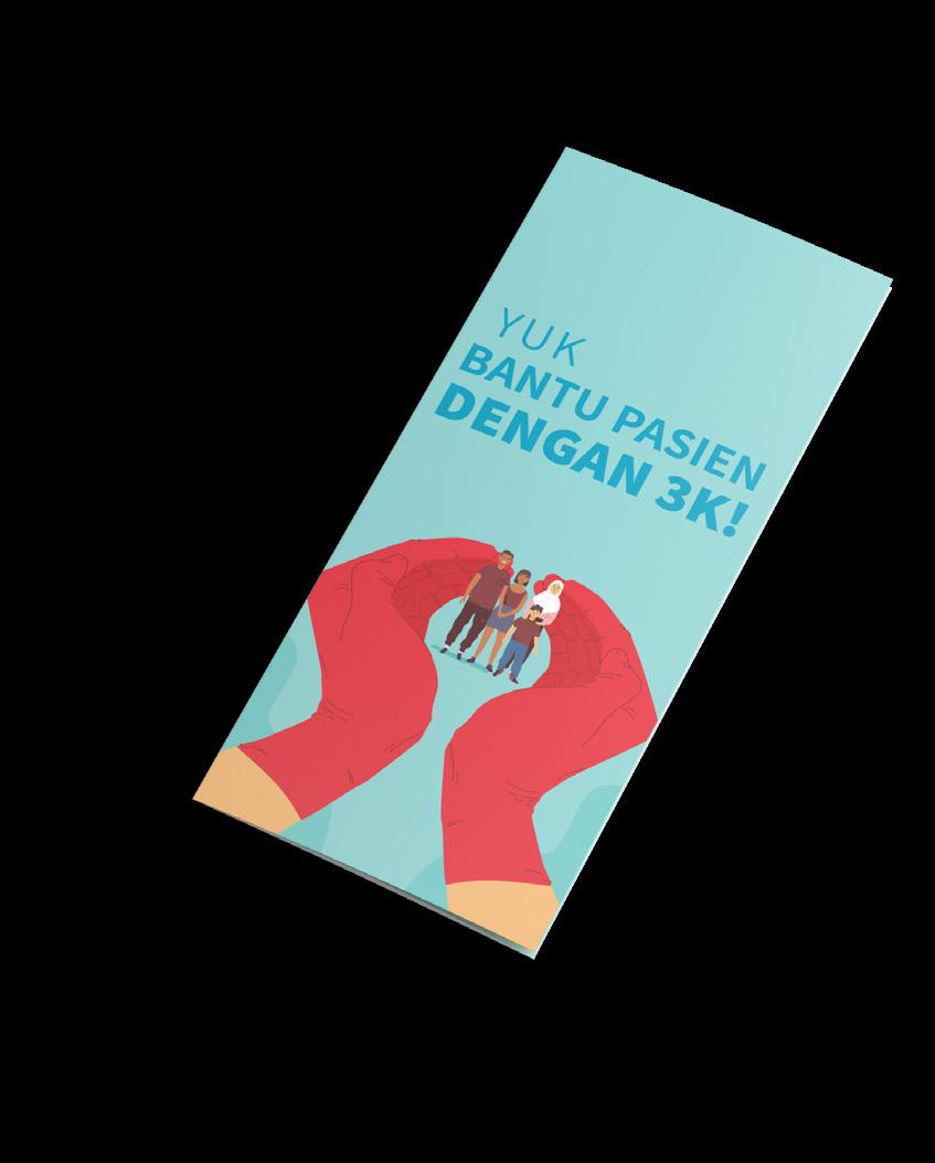
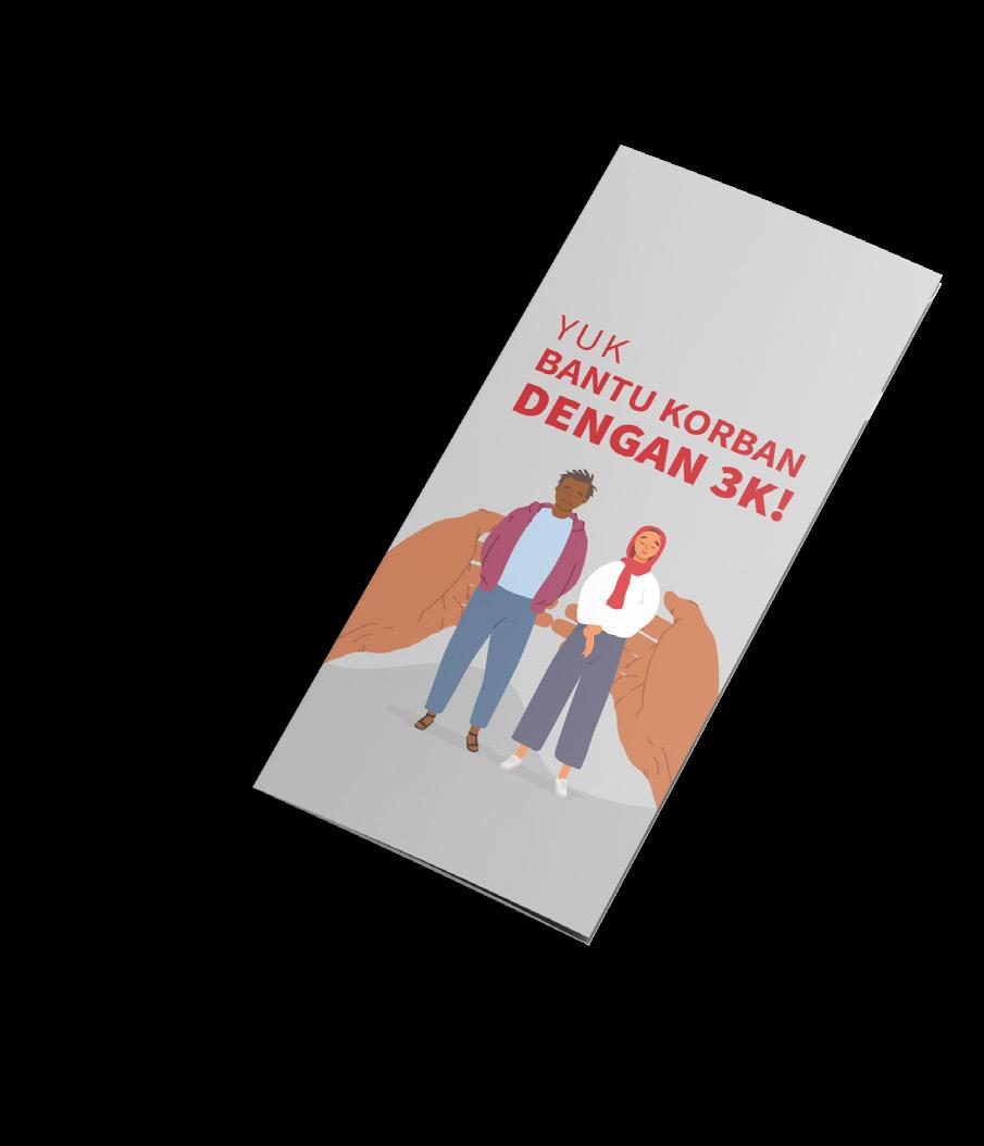
MAJu (eMpowering Access to Justice) is a collaboration project of Ogilvy, USAID, and The Asia Foundation alongside the Ministry of Law and Human Rights, to increase community access, especially marginalized and repressed community, for their rights on the eye of law.
MAJu focused on two issues that happened on marginalized and repressed community, which is human rights and health (HIV) issue. In order to accomplish the goals, MAJu produced few publication and media to the targeted community. I got the opportunity to work on the project together with one of my colleague. The product of the campaign itself are brochures, fact check cards, and a pocket book.
12
2020
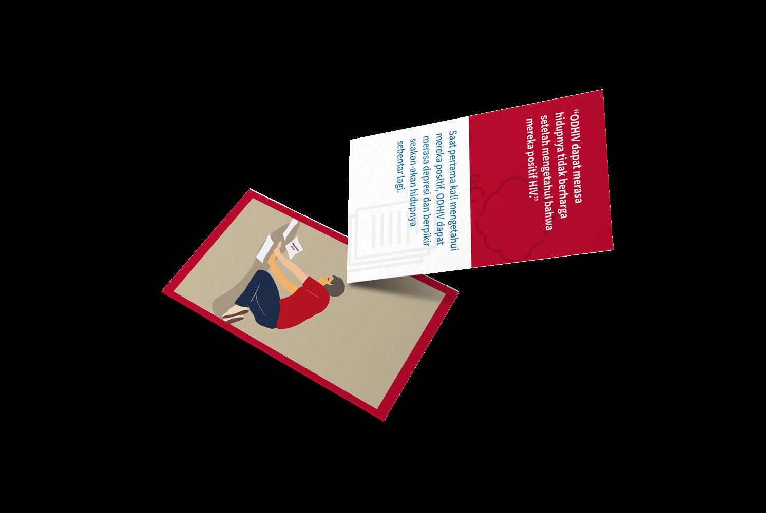
MAJu’s pocket book are designed as a speaking guidance for Key Opinion Leaders. It is contains the fact check cards and brochures summarization. MAJu’s pocket book are designed as a speaking guidance for Key Opinion Leaders. It is summarize the fact check cards and brochures content that later described to the targeted communities.
The illustration on each pocket book are designed to portray the content, implicitly. In order to not offend any communities and validates any public generalization, the illustrations were illustrated as general as possible. For instance, general public opinion towards HIV is sticks to LGBT+ communities, so we’re avoiding to illustrate any parts of LGBT+ communities as a patient on Access to Health Services pocket book.
13
Graphic Design
Editorial
Illustration Digital
2020
MAJu (eMpowering Access of Justice)
Brochure & Pocket Book
Illustration
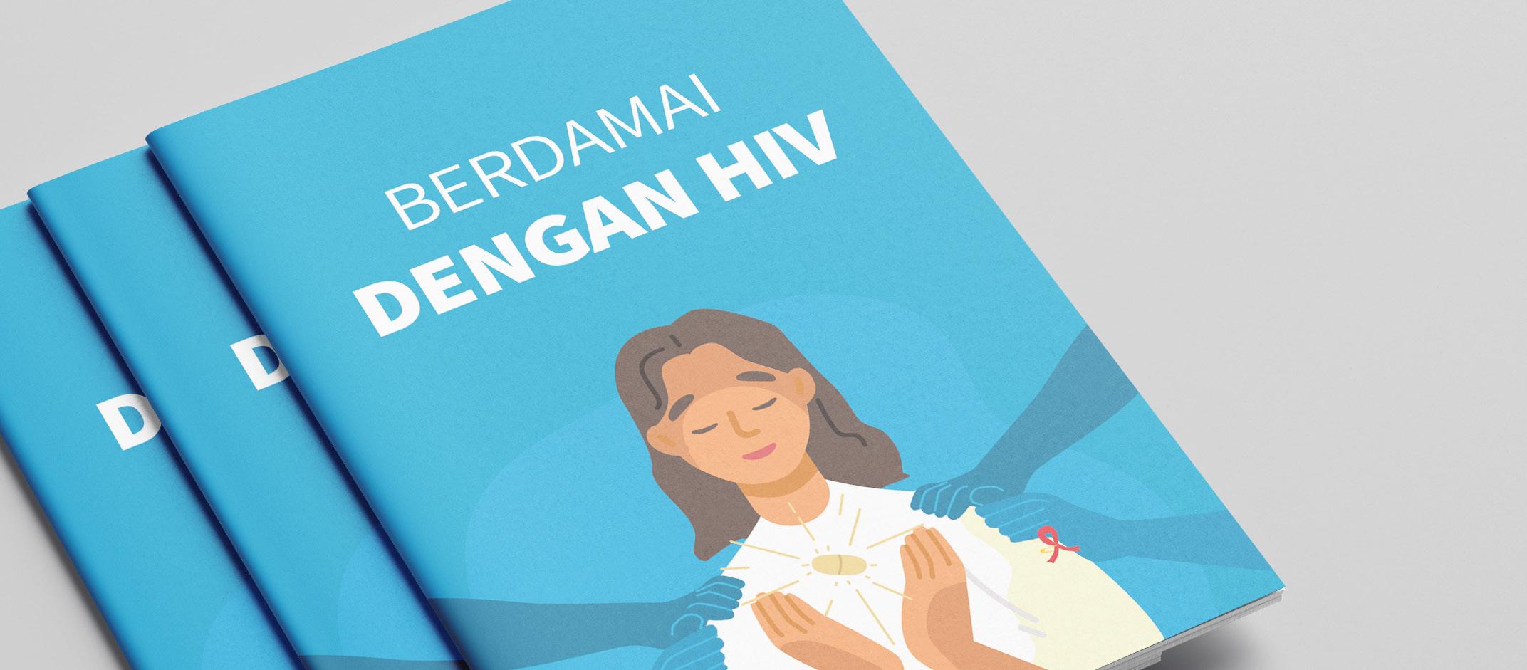
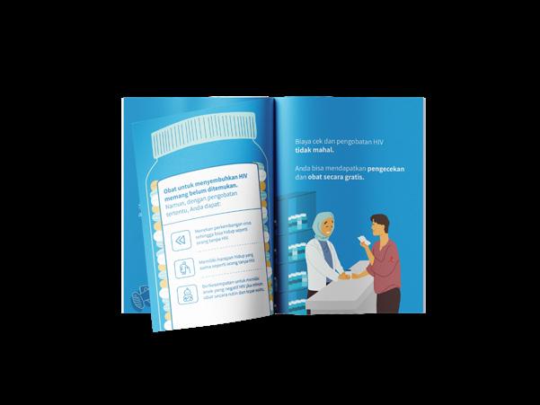
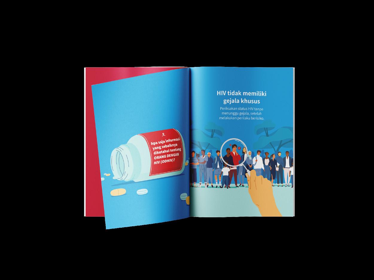
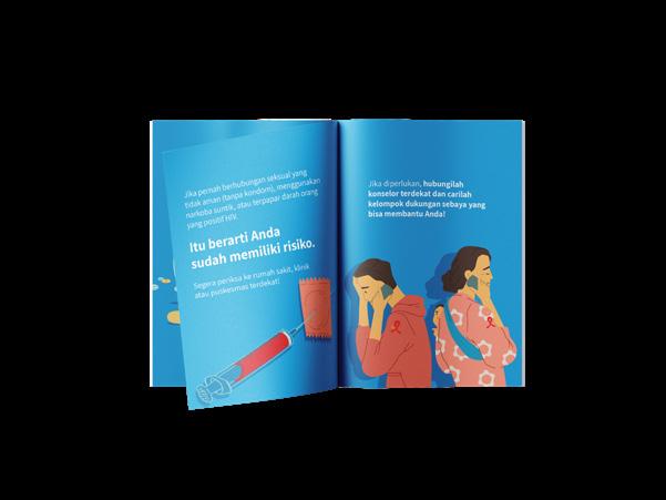
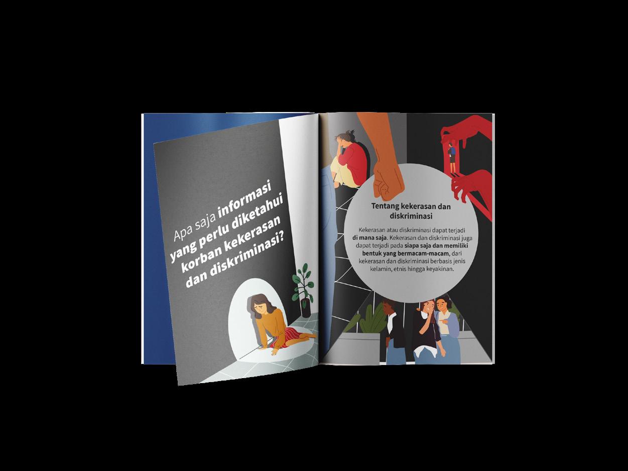
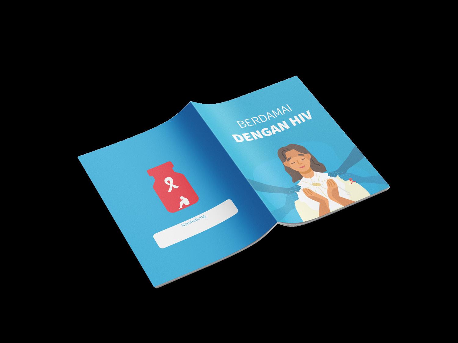
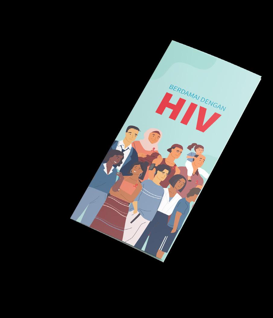
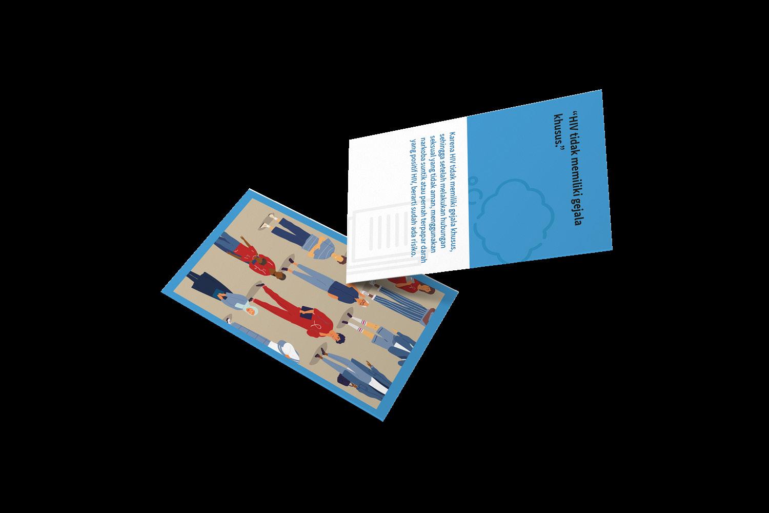
MAJu also provides brochures for related officer and targeted communities. The objectives of each brochures are different based on the targeted user but the main outline is to bring a certain information to its user. For targeted communities, the brochure provides information of health risks, consequences, and step by step on how to check for HIV. The illustrations portrays the highlighted information on the brochure.
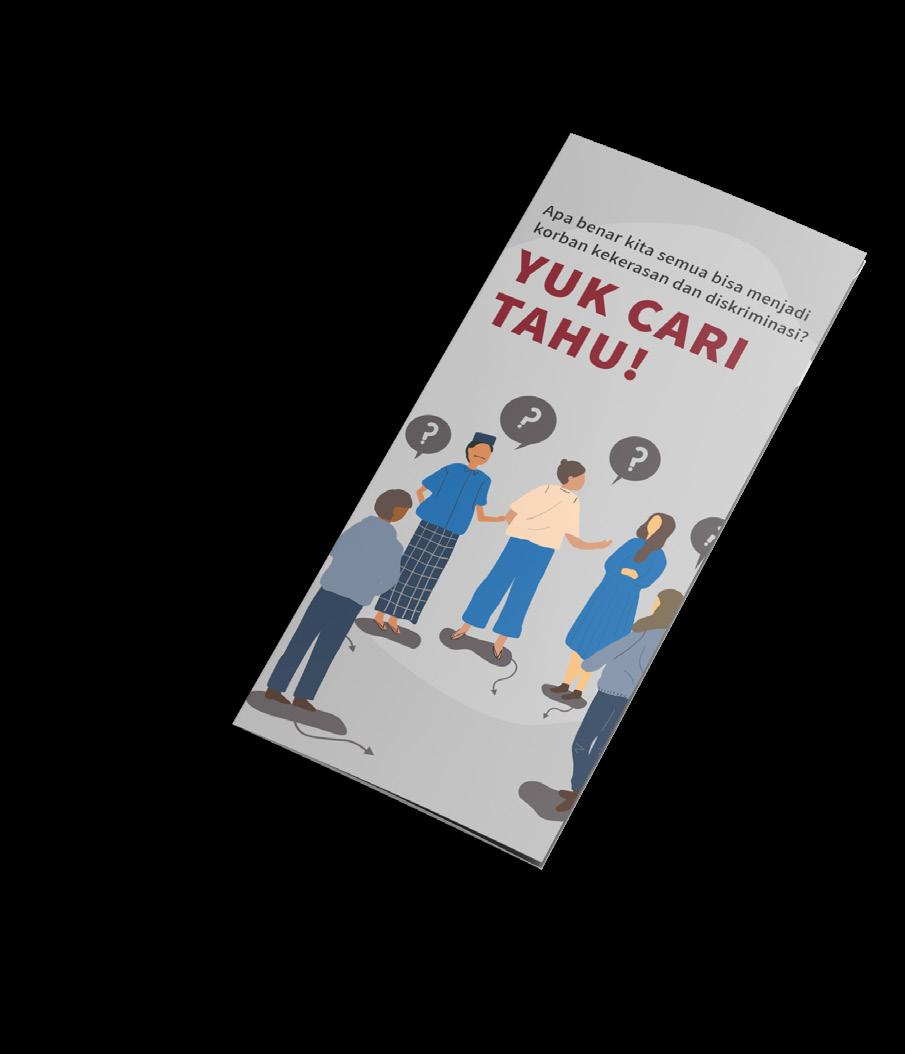
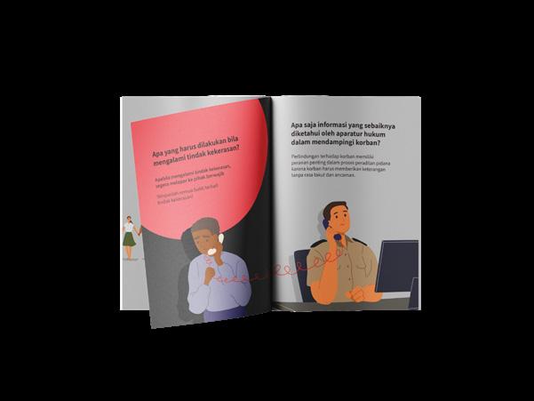
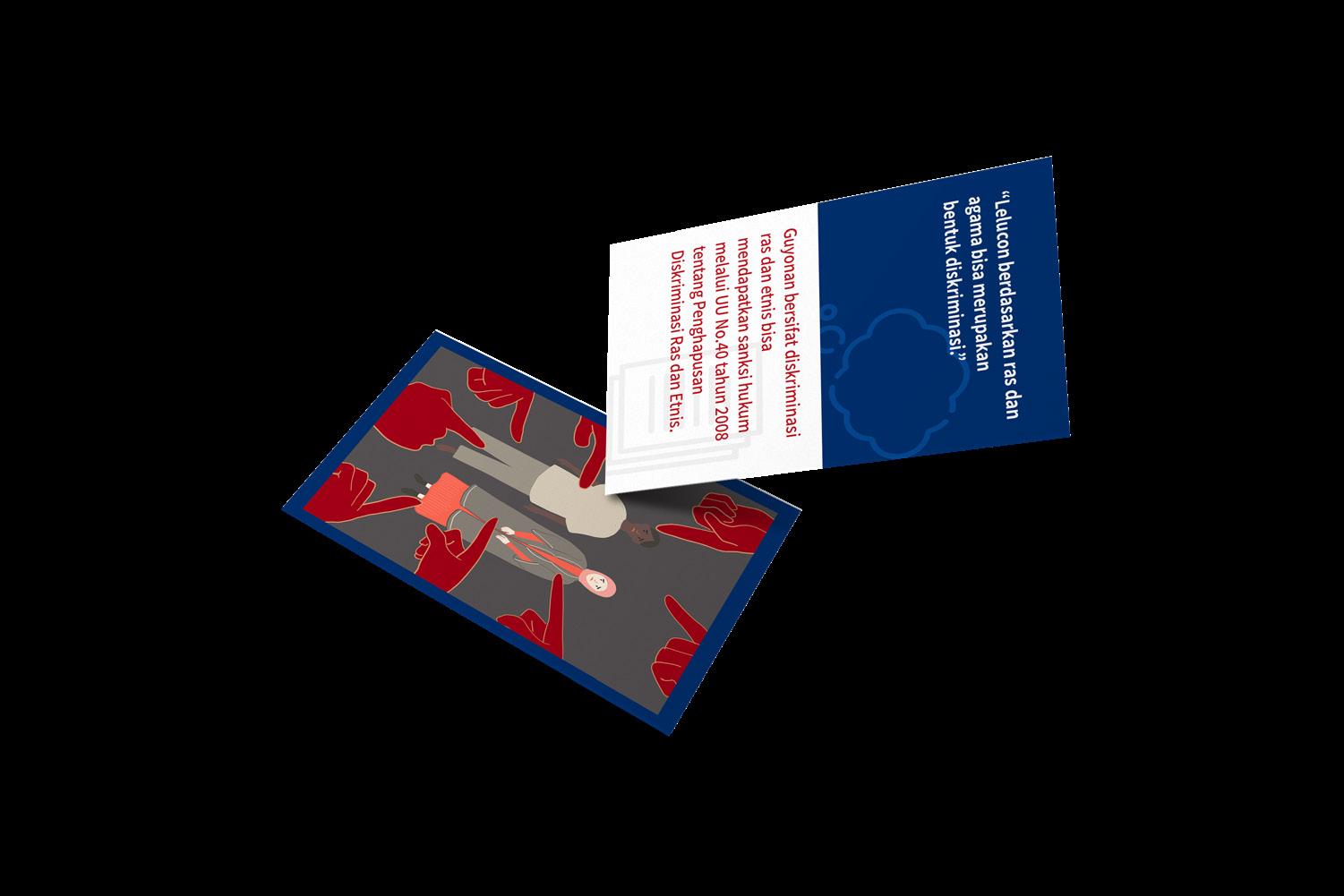
The brochure for law officer contains information on how to act and handle victims. The illustration on the brochure portrays the officer as a guardian for the victim, tough yet friendly. The brochure for targeted communities of acces for law and justice contains informations about any kinds of discrimination and sexual abuse and how to handle the situation. The illustration on the brochure are designed to evoke the target curiousity on the issue.

14
Brochure of Access for Health Services
Brochure for Health Officer Brochure for Targeted Communities
Brochure of Access for Law and Justice
Brochure for Law Officer Brochure for Targeted Communities
Graphic Design
MAJu (eMpowering Access of Justice) Editorial Brochure & Pocket Book
2020
Illustration Digital Illustration
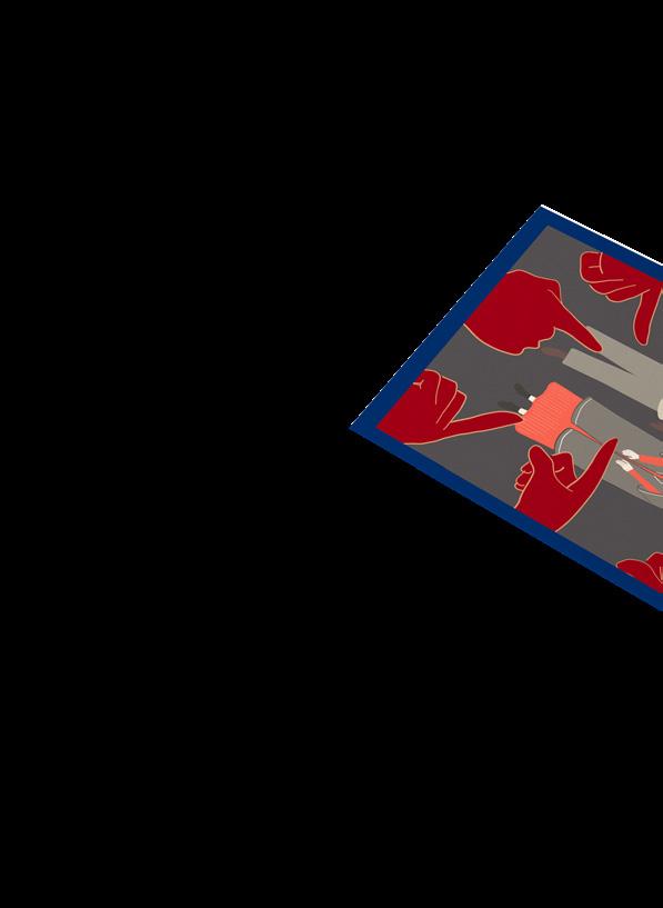
Fact Check Cards of Access for Health Services
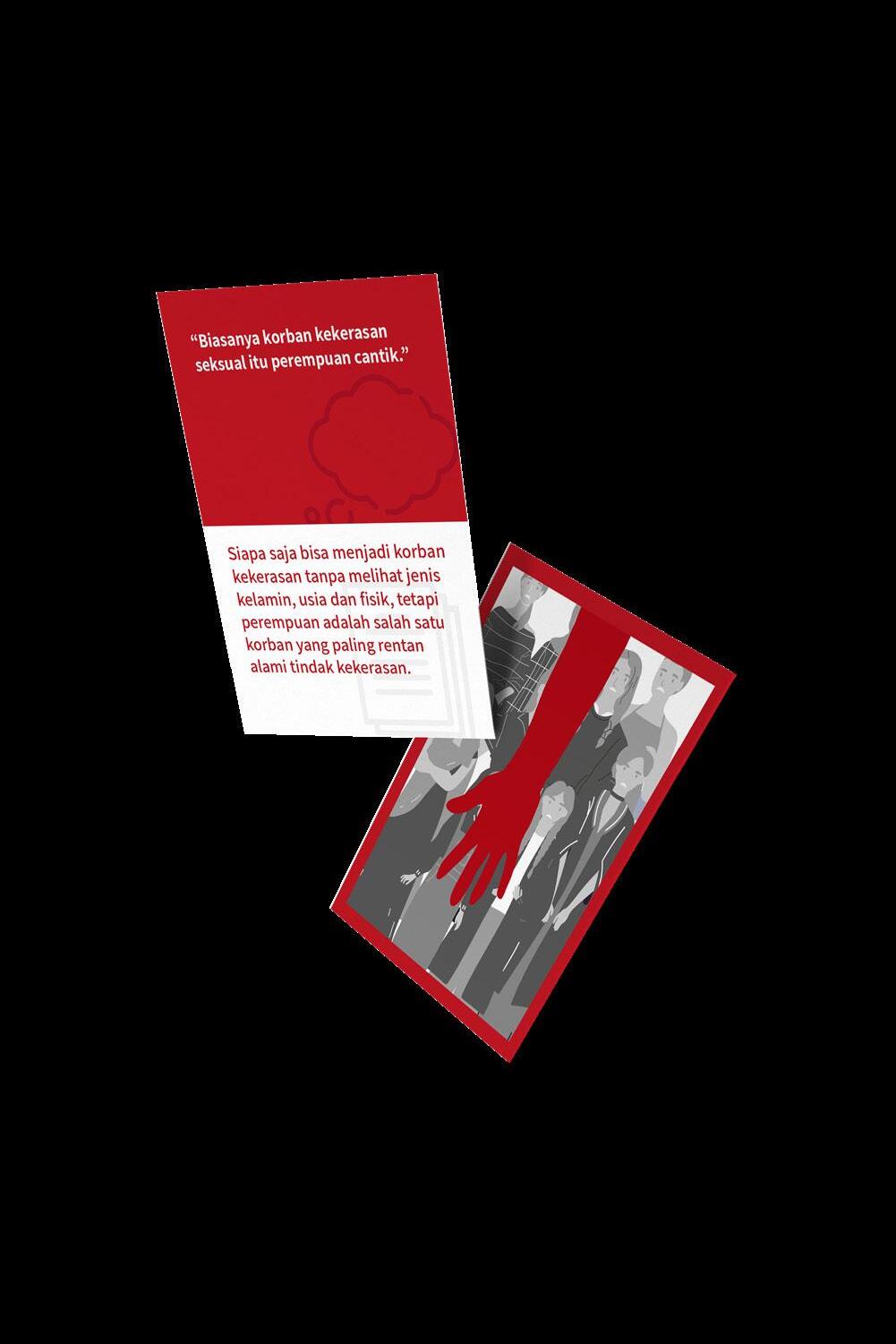
The fact check cards are divided into two grouping based on the targeted user, officers and targeted communities. It is to differentiate the cards because the cards will be putted into one box. It also applied for law and human rights cards. The objectives of the card itself is to justify certain myths or missinformation with fact check and also to inform about the victim needs and how to take an action to that.
Fact Check Cards of Access for Law and Justice
The illustration also designed to evoke the targeted community, so the illustrations are implicitly portrays the myths or facts, which later will be described by the facilitator.
Cards for Health Officer Cards for Targeted Communities
15
Graphic Design
Editorial Brochure &
Book Illustration Digital
2020
Cards for Law Officer Cards for Targeted Communities
MAJu (eMpowering Access of Justice)
Pocket
Illustration
Graphic Design
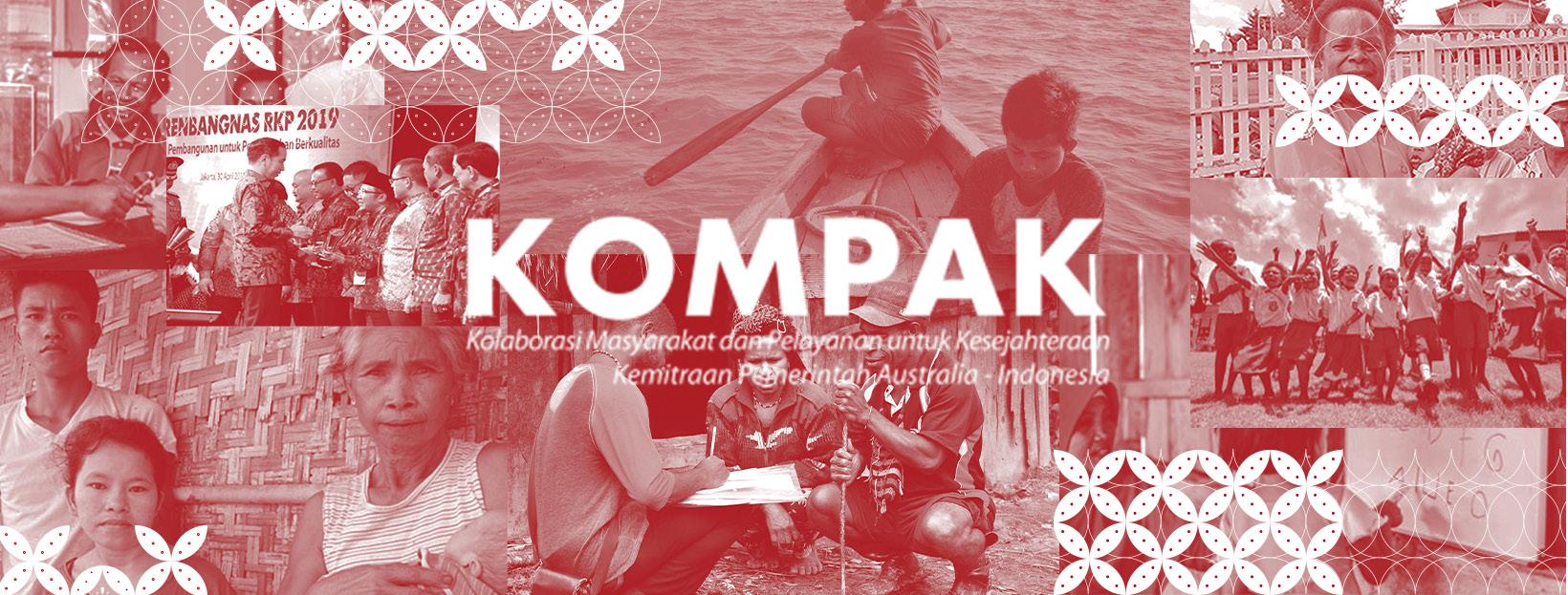
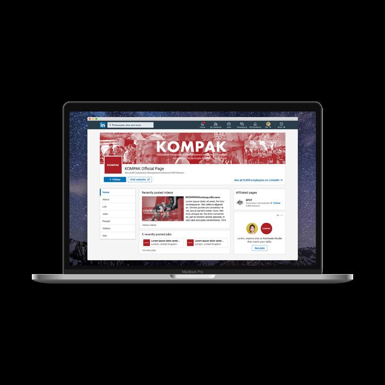
Kolaborasi Masyarakat dan Pelayanan untuk Kesejahteraan (KOMPAK)
Brand Identity Key Visuals
KOMPAK
(Kolaborasi Masyarakat dan Pelayanan untuk Kesejahteraan)
Scoop of Works
Brand Identity
Editorial Design
KOMPAK (Kolaborasi Masyarakat dan Pelayanan untuk
Tools Adobe Illustrator Adobe Photoshop
Kesejahteraan) is a project of Ogilvy and DFAT (Department of Foreign Affairs and Trade Australia) alongside the Indonesian Government. The purposes of KOMPAK itself is to reduct poverty and adressing inequality in Indonesia. KOMPAK’s actual project has already finished before and to deliver it to a bigger audience, it is needed to be designed well. The work scoops I work on for KOMPAK are creating key visuals for the project products.
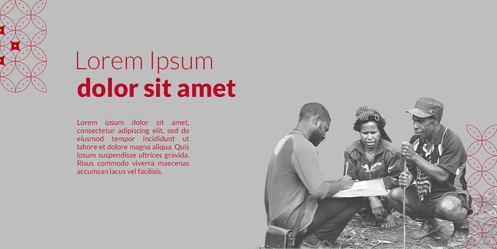
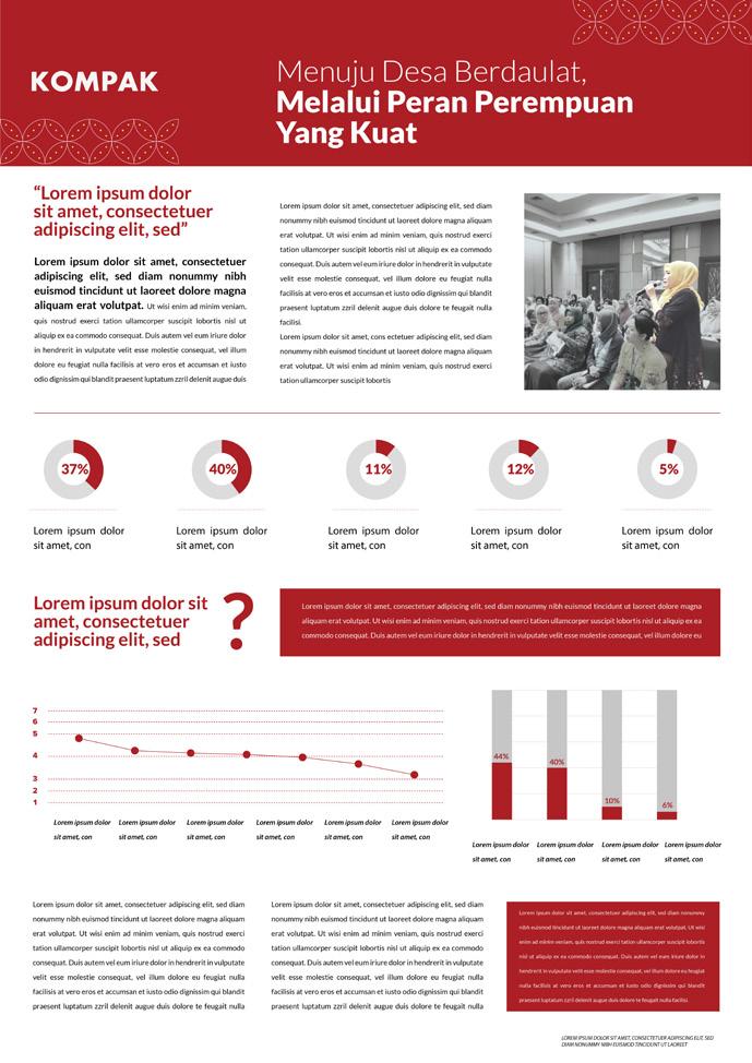
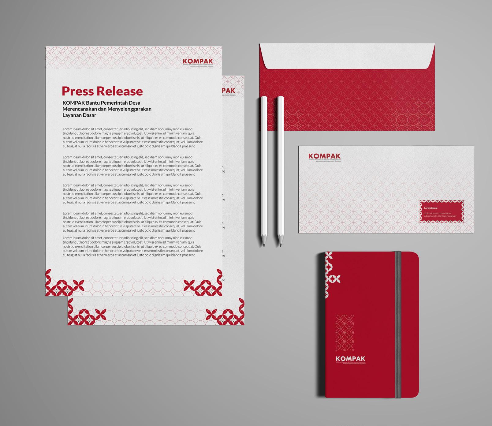
I got the opportunity to work on the project together also with one of my colleague. The product of the project itself is social media pages, infographic, and press release. KOMPAK wants to be pictured as clean, sleek with a touch of traditional. To get the clean and sleek design, KOMPAK designed with a monochromatic color scheme around KOMPAK’s red color, and grayscale colors. For the photo treatment, KOMPAK has two different treatment into a cut-out design and cropped design.
16
2020
Social Media Content Social Media Pages
Graphic Design

KOMPAK Key Visuals
Brand Identity Key Visuals
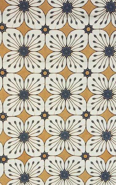
To bring a touch of traditional into the overall design, KOMPAK designed using a pattern from Batik Kawung Kembang. Batik Kawung Kembang was choosen to fit KOMPAK’s project purposes which addressing inequality. Kawung Kembang is a symbol of equality and justice, and also have a quite simple form for a Batik pattern.
Social Media Pages 2020
Social Media Content
There are five minimalized patterns from the Batik which will be used as the design assets for the whole project.
17
Batik Kawung Kembang
#a81e24 #938c8d #141414 #ffffff
KOMPAK Infographic
Kolaborasi Masyarakat dan Pelayanan untuk Kesejahteraan (KOMPAK)
Graphic Design
Press Release
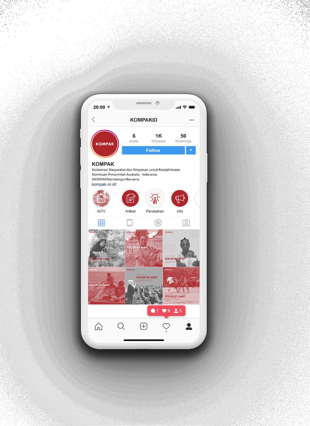
Instagram Account
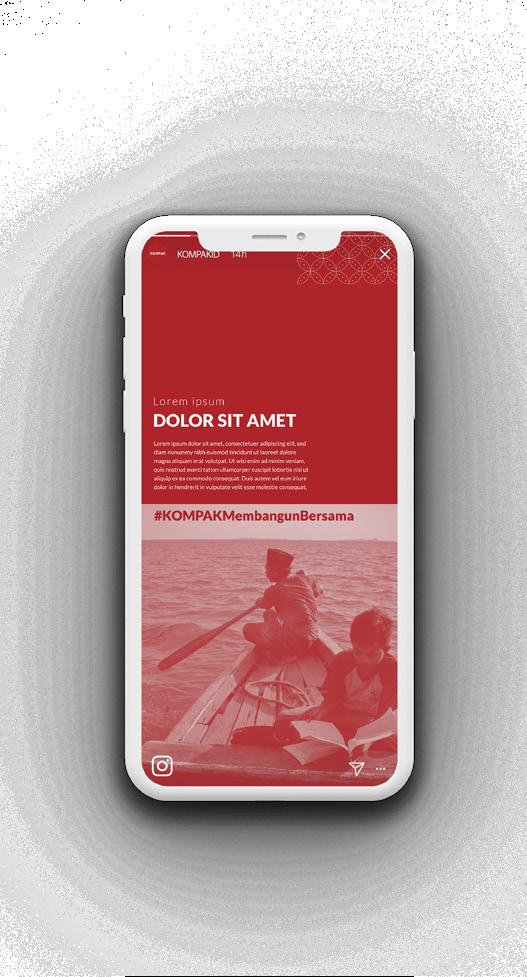
KOMPAK Press Release was designed as clean as possible so that the message will not be distracted by the design assets. For the press release, I also designed the envelopes and notes which might be needed later.
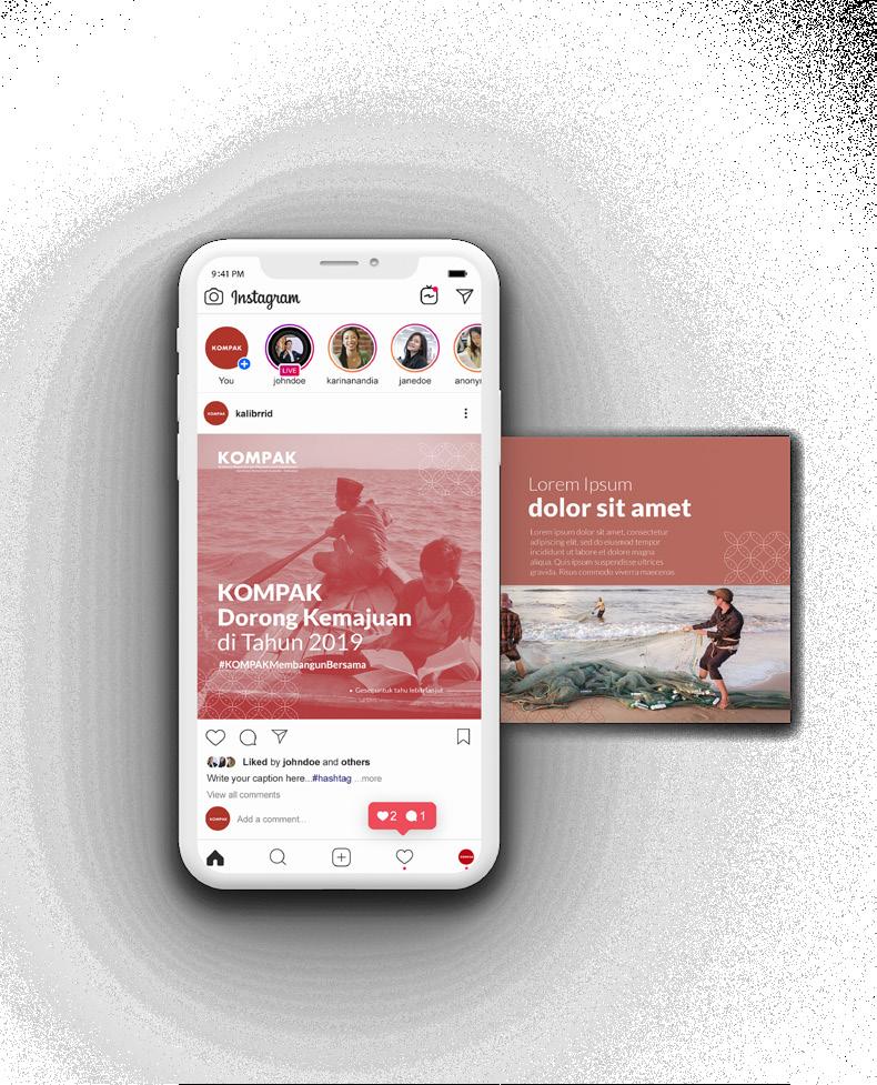
KOMPAK Instagram will be designed in monochromatic color scheme in red and grayscale to bring a clean and sleek mood. For any colored pictures in carousell will be keep as it is but for the cover itself should use monochromatic colors.
18
Kolaborasi Masyarakat dan Pelayanan untuk Kesejahteraan (KOMPAK)
2020
Brand Identity Key Visuals Social Media Content Social Media Pages
Graphic Design
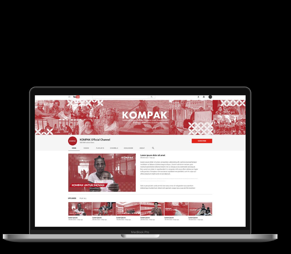
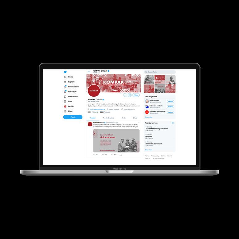
There are several social media pages for KOMPAK such as Youtube, Facebook, Twitter, and Linkedin page. The designed product consist social media banner for each social media and pictures or thumbnaiils that will be needed for the page.

Brand Identity Key Visuals
Social Media Content
Social Media Pages
19
Linkedin Page
Twitter Page
Youtube Page
Facebook Page
Kolaborasi Masyarakat dan Pelayanan untuk Kesejahteraan (KOMPAK)
2020
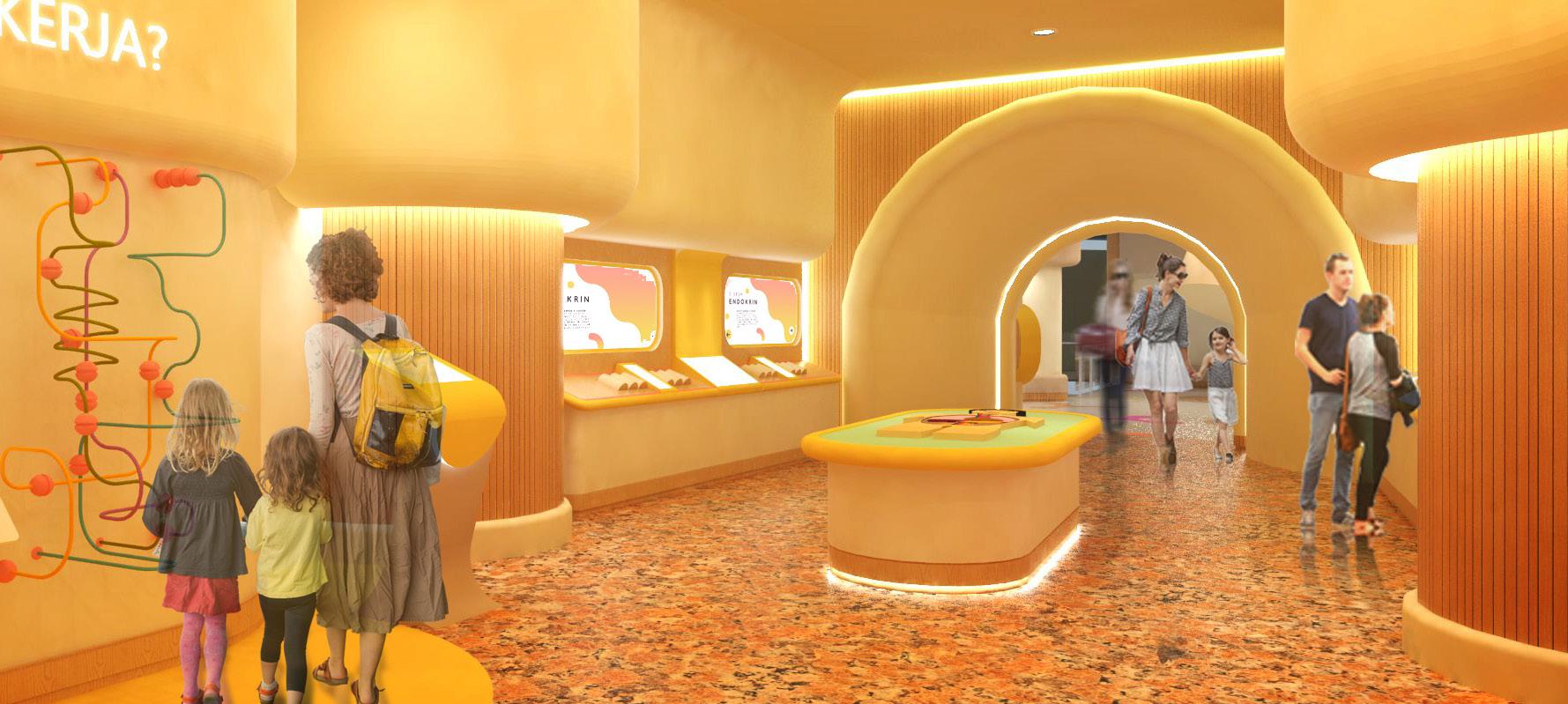
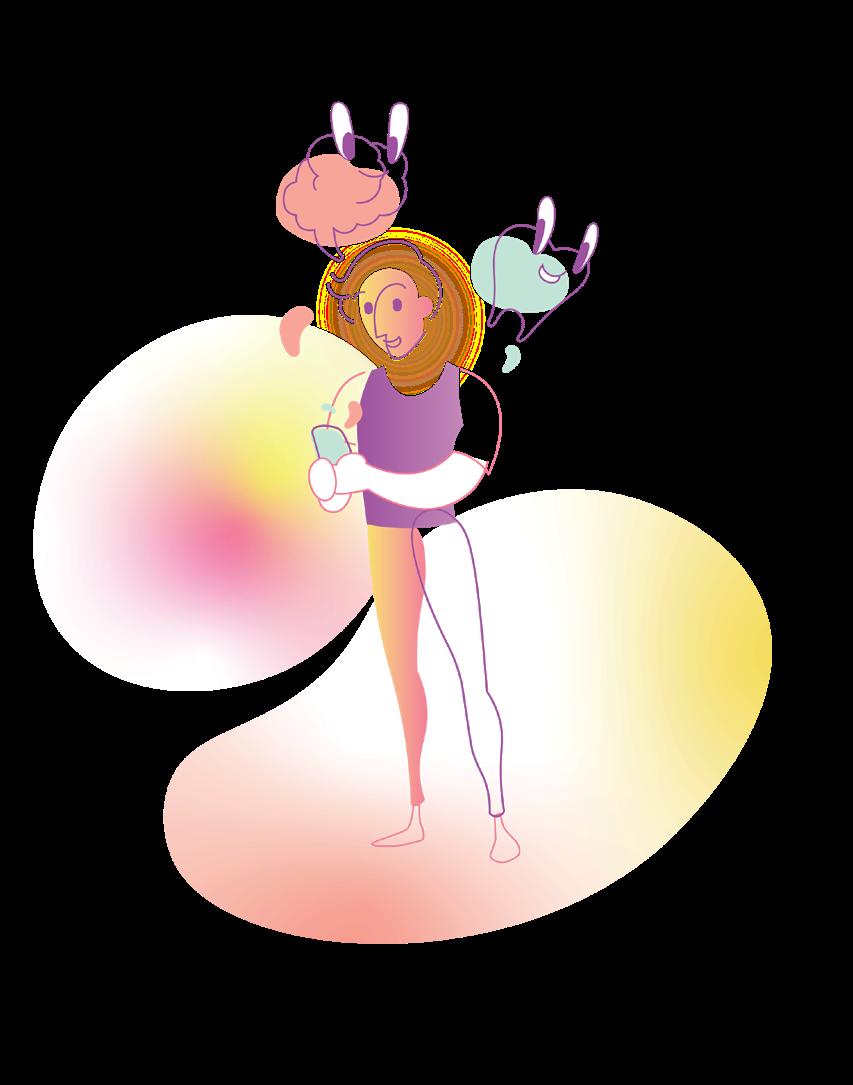
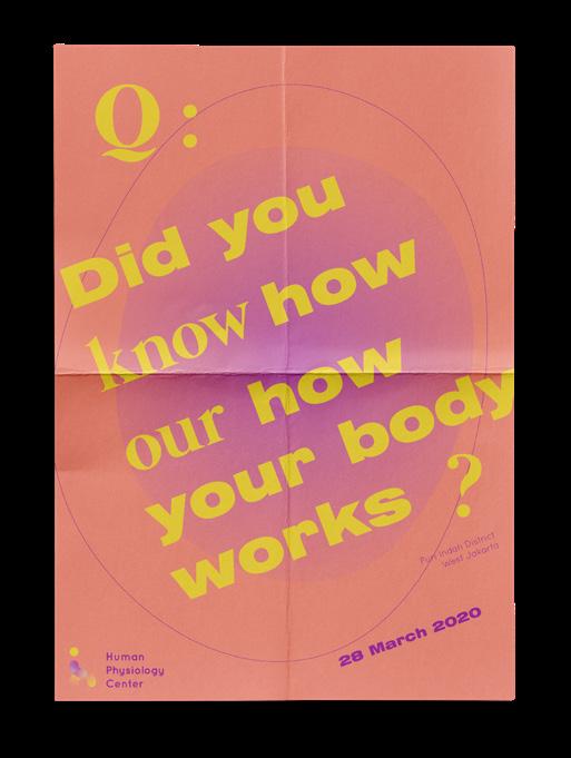
Human Physiology Center
Scoop of Works
Branding
Editorial
Interior Design
UI/UX Design
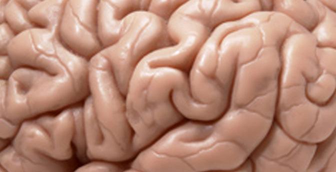
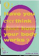
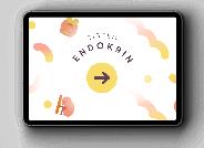
Human Physiology Center is my interior design final project. There’s several reasons why I choose a health education facility as my final project. The reasons are the lack of physiology education in the community, lack of awareness for a healthy lifestyle and the rise of catastrophic diseases. Therefore, Human Physiology Center was created to raise awareness and educate people about their body.
The facility’s design are focusing on the usage of interactive technology and interactive for all five senses (hearing, touch, smell, sight, and taste) to bring innovation into content education, especially about human physiology. To built a cohesive design as a whole, I also created the facility’s brand identity and other design such as UI/UX design and editorial design. Designing this project was truly an exciting process because I got the opportunity to learn new things along the way such as branding, editorial, and UI/UX designing.
2018
Graphic Design
Human Physiology Center
Adobe Illustrator Adobe Photoshop Sketchup Adobe Xd 20 Branding Brand Identity
Tools
The logo takes on the first acronym letter “H” and resembling the form of a walking human. Body movement is the basic form of physiology which could be illustrated with a walking human.

Illustration
Color Scheme

The color scheme take approach on flesh and neutral colors to bring the experience of how does it feel to be inside a body. In order to fit the main user and a ergonomically friendly facility, the actual color needs to be undersaturated to maintain the color concept and the ergonomic.
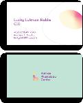
The brand identity itself took an approach on the primary target of Human Physiology Center, which are kids around 7-13 years old. Human Physiology Center focused on human physiology education to kids on their early stage. The brand identity itself were formed based on the primary target of Human Physiology Center, which are kids around 7-13 years old.
21
Brand Identity 2018 Graphic Design
Human Physiology Center
Branding Brand Identity
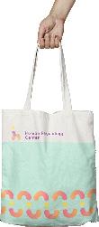
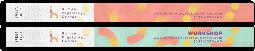
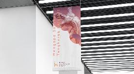
I created a few design elements, assetts, which later applied to the facility. From printed media such as banner, guide book, ticket wristband to user interfaces were created to bring an immense brand image to the facility. These are several designs of Human Physiology Center’s branding and souvenir.
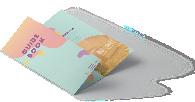 Guide Book
ID Card
Hanging Banner
Guide Book
ID Card
Hanging Banner
22
Posters
Totebag
2018
Ticket Wristband
Graphic Design
Human Physiology Center
Branding Brand Identity
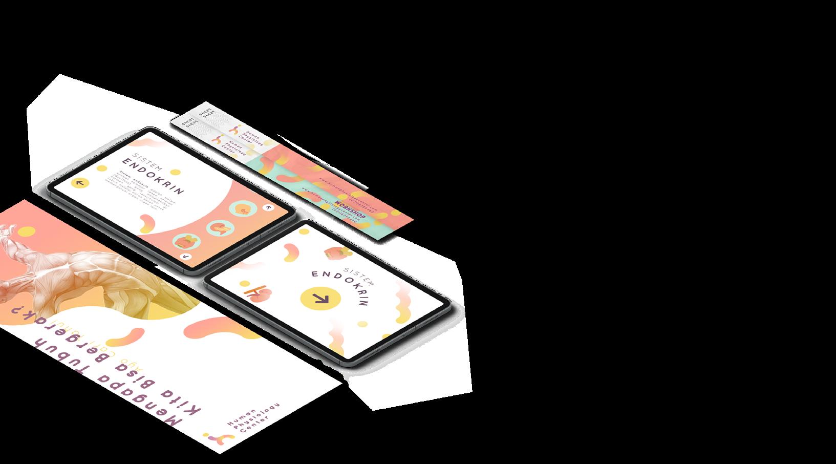
To bring an one-stop experience to the visitor, Human Physiology Center also provides mobile application, which is called HUP. Concerning on how electronic devices at hand, HUP targeted the secondary user which are students, young adult to adult especially parent.
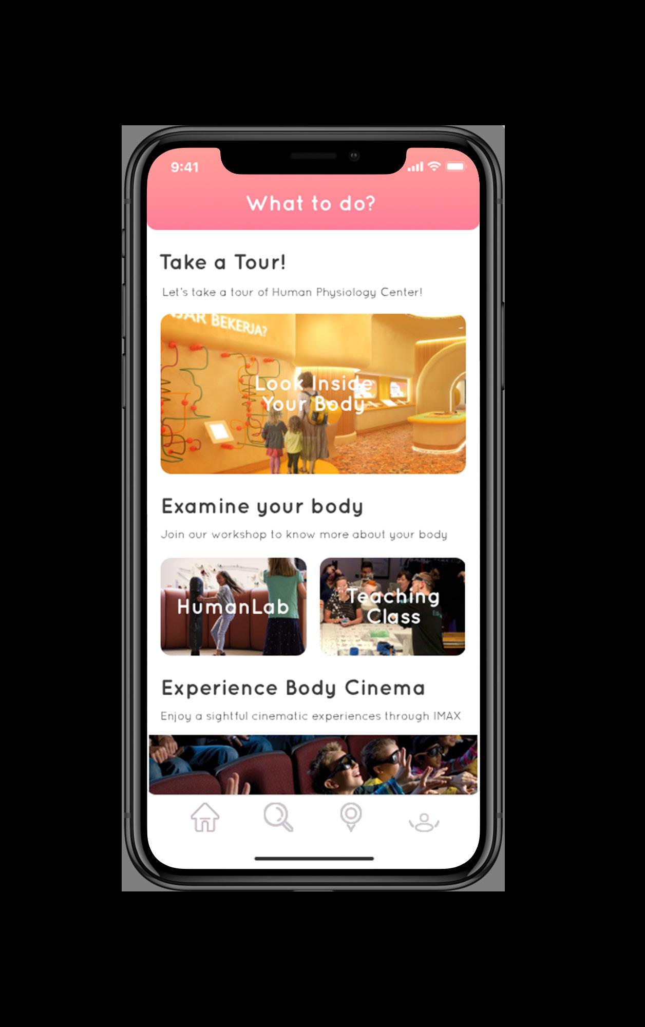
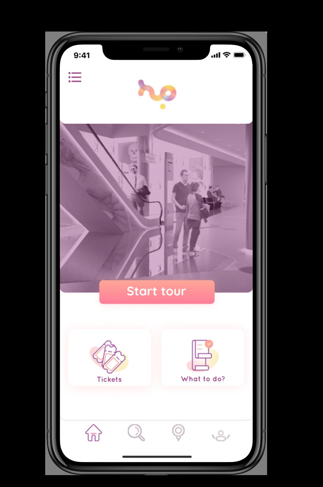
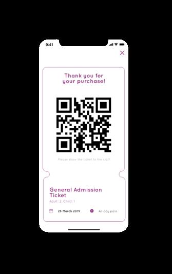
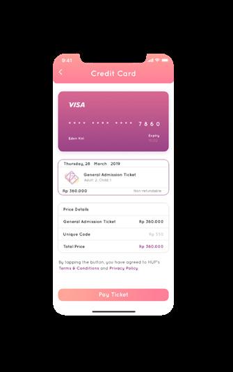
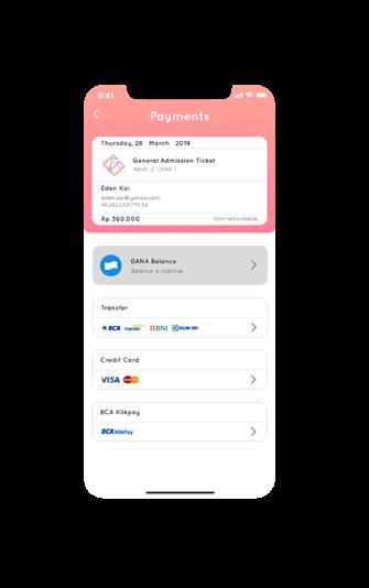
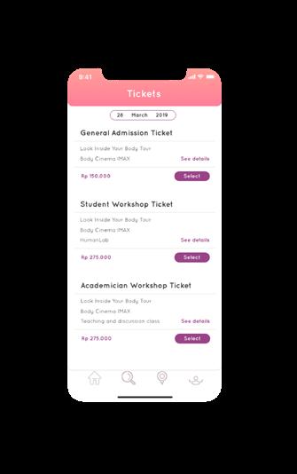
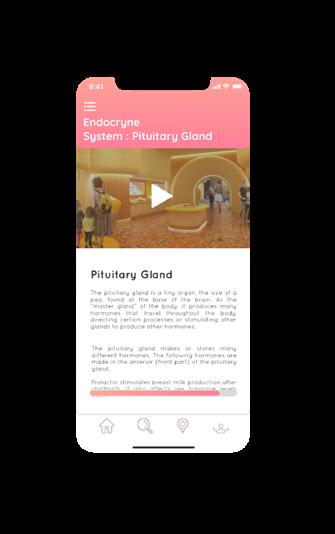
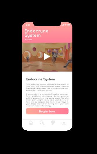
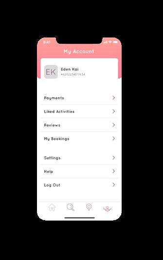
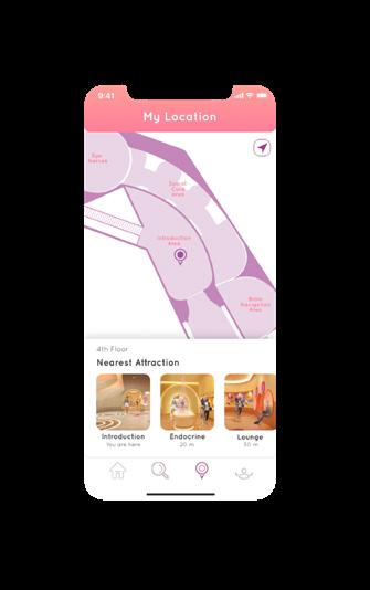
The main purpose of HUP is to guide visitor on everything they want to know about Human Physiology Center. With HUP, visitors can access a detailed information of each zone and attraction on Human Physiology Center, and also purchasing tickets. Adult user can access any detailed information regarding to human physiology with HUP, especially parents, they can also describe the human physiology through HUP.

23
UI Design
Mobile
2018 Graphic Design Human Physiology Center UI/UX Design UI Design
Application
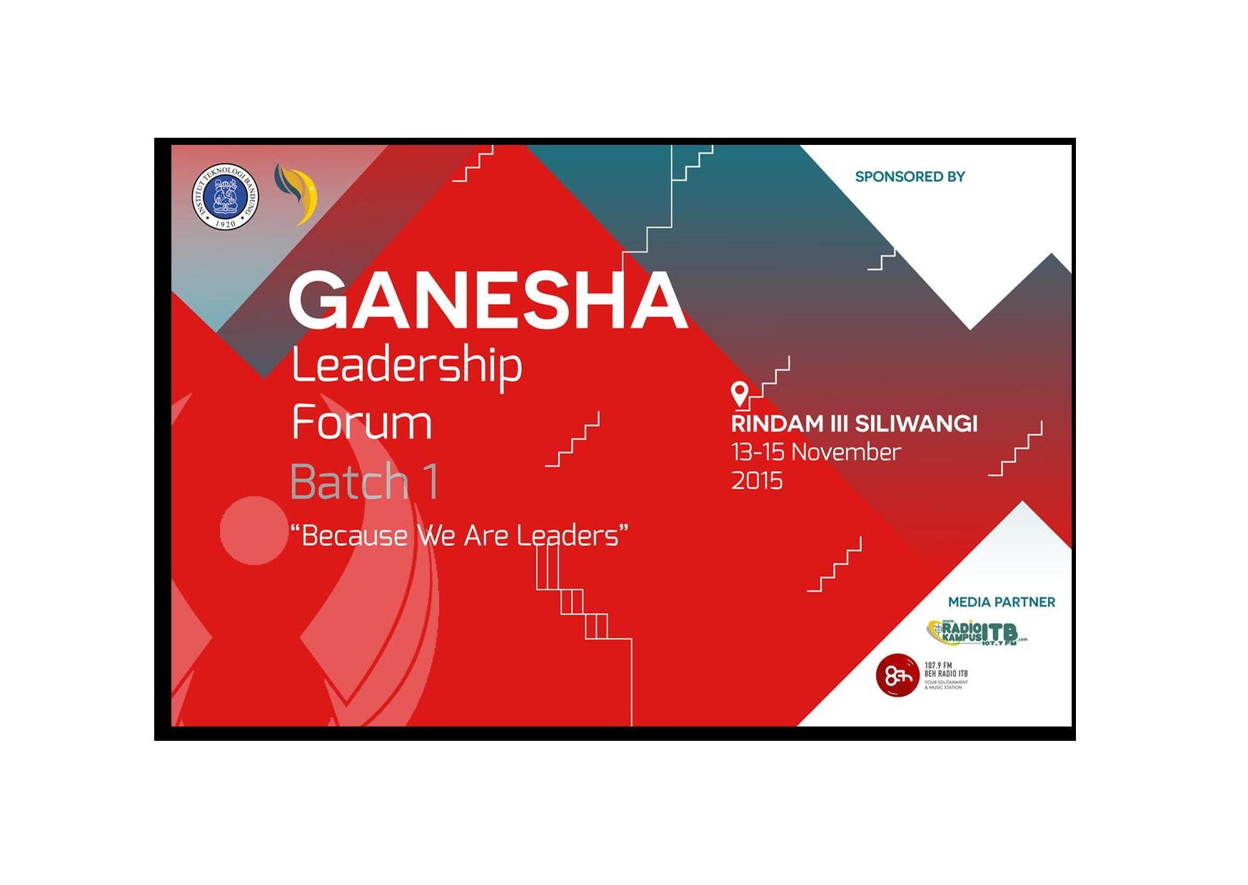
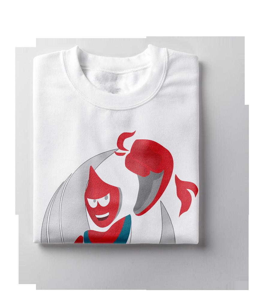
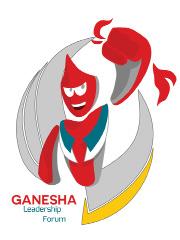
Ganesha Leadership Forum
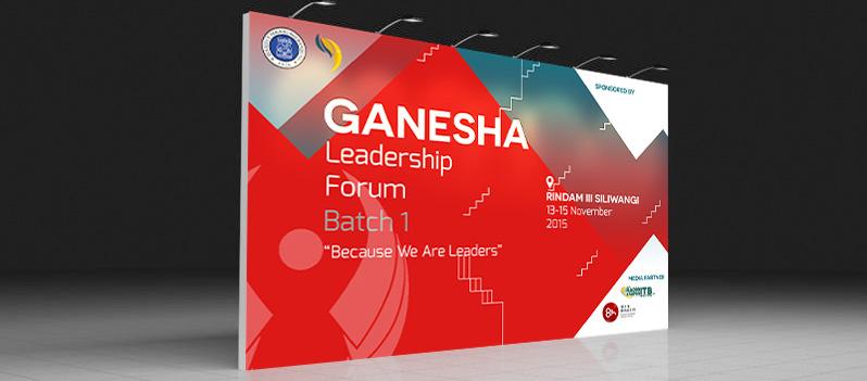
Ganesha Leadership Forum is an event held by KM ITB which circles around leadership and training for ITB student. In this event, I designed the identity of the event and the items such as backdrop, nametag, committee tees, and certificate.
The indentity designs were dominantly red to picture the high-spirited leadership and high energy. Combined with blue and yellow, the overall design was to aim a highly-motivated and youthful program.
2015
Graphic Design
Ganesha Leadership Forum
24
of Works Brand Identity Tools Adobe Photoshop Corel Draw
Scoop
Branding Brand Identity
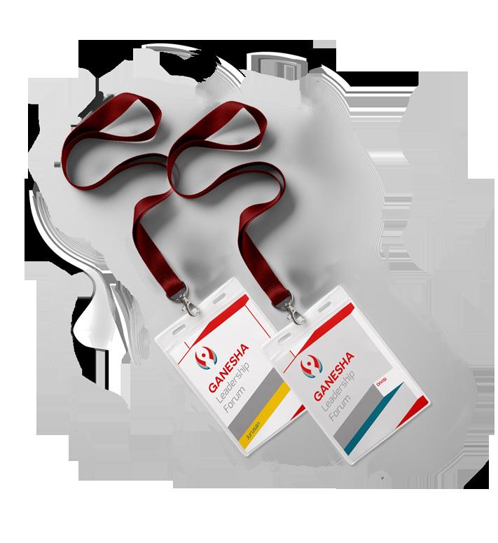
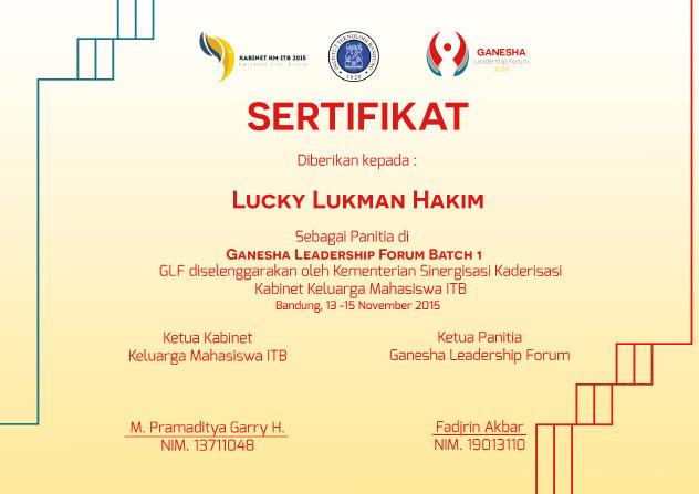
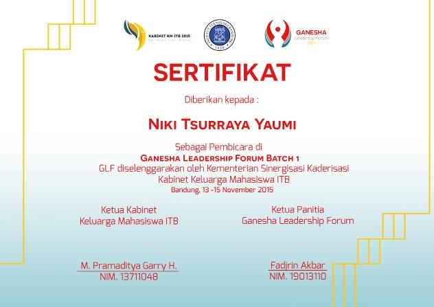
Mascot Logo Backdrop Committee Tee Certificate Nametag 25 2015
Forum Branding Brand Identity
Graphic Design Ganesha Leadership
Unilever Future Leaders League
Scoop
Tools
Adobe Illustrator
Adobe Photoshop
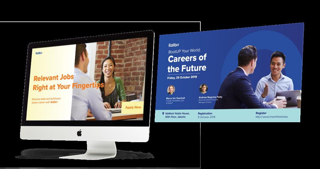
Unilever Future Leaders League is an annual business case competition held by Unilever. This project was my first job project at Kalibrr. I got the opportunity to create its social media publication and designed the website interface.
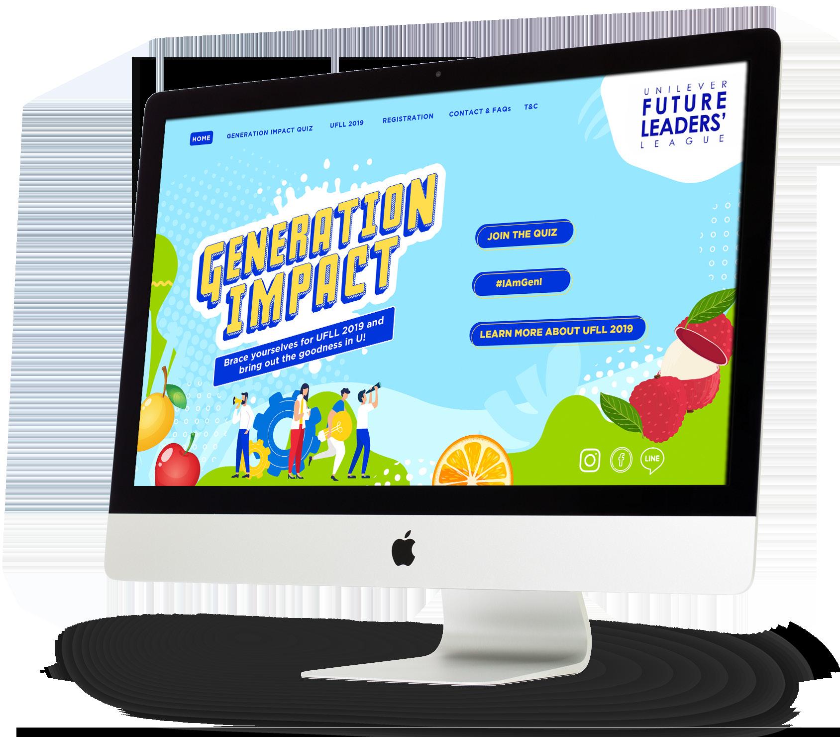
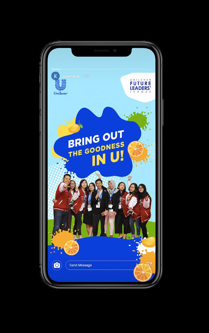
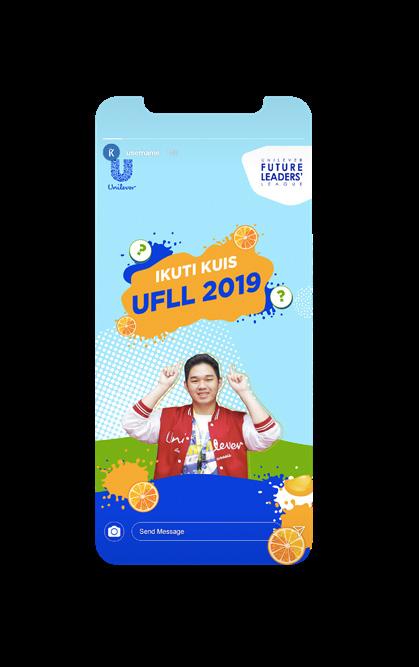
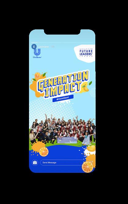
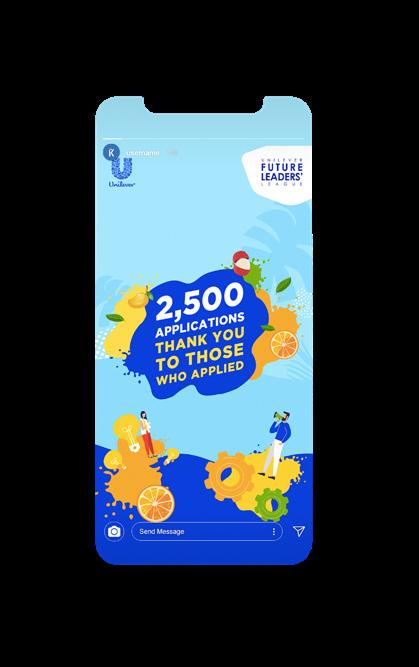

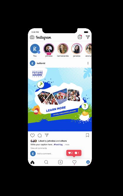
The design itself had already proposed before I joined Kalibrr, but I got the chance to create some of it’s component and design assets. I also designed few social media contents for the event advertisement.
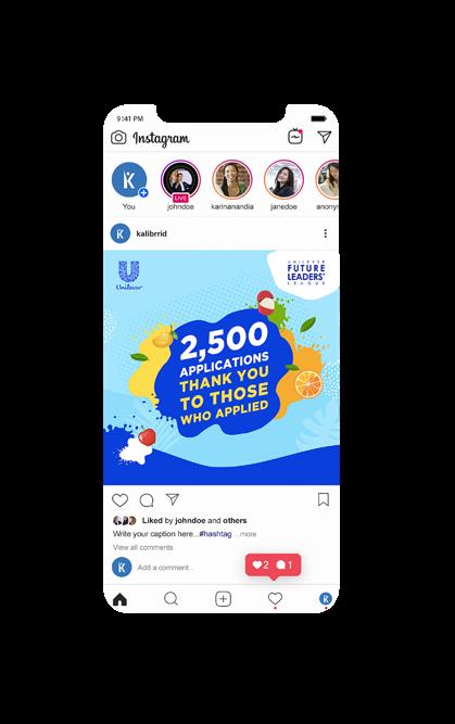
Social Media Content Ads and Publication 2019 Social Media Ads Instagram Story Publication
Design
Future Leaders League
Graphic
Unilever
of Works UI Design
Social Media Content
26 UI Design Website Design
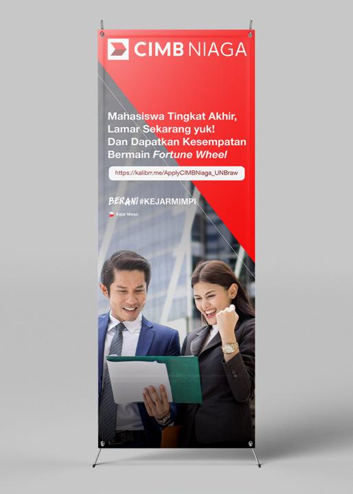
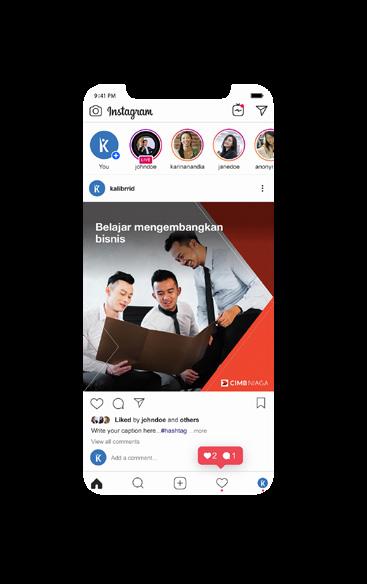
The overall design was centered on humaninterest visual which following CIMB’s brand guideline. To achieve the targeted candidate, the design should be eye-catchy to its viewer.
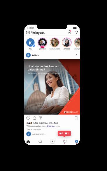
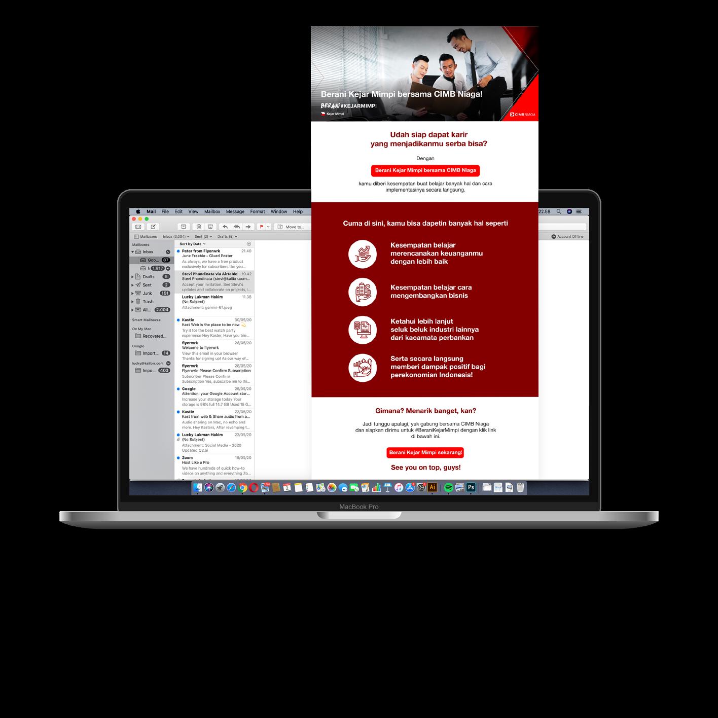
CIMB Niaga Advertisement
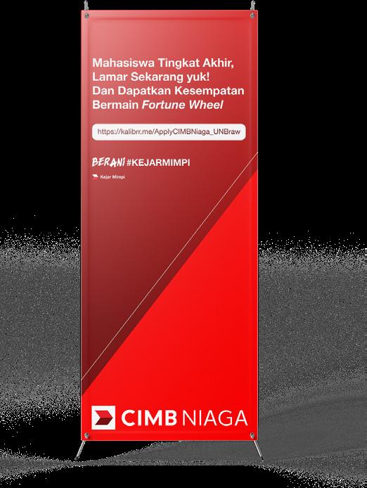
Scoop of Works
Social Media Content
Media Advertising
Tools
Adobe Illustrator
Adobe Photoshop
CIMB is one of Kalibrr’s client and I got the opportunity to handle the project. The main goal from this project is to reach a certain amounts of candidates to apply on CIMB Niaga by media advertising, newsletter, and offline event. This project started from January to April 2020.
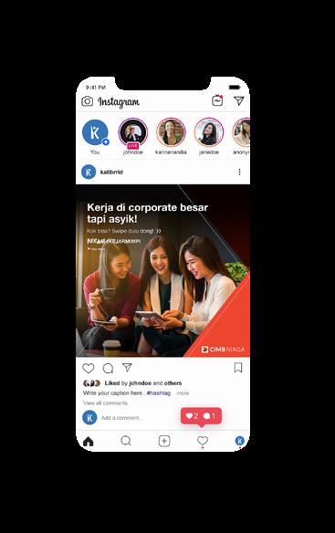
I also assigned to design some of its publication event items such as X-Banner and posters. The design also following the brand guideline.
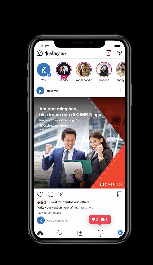 Instagram Advertisement
27
Newsletter Design
Social Media Content Ads and Publication 2019 Graphic Design CIMB Niaga Advertisement
Graphic Design
Social Media Content Instagram Content
Branding Brand Identity
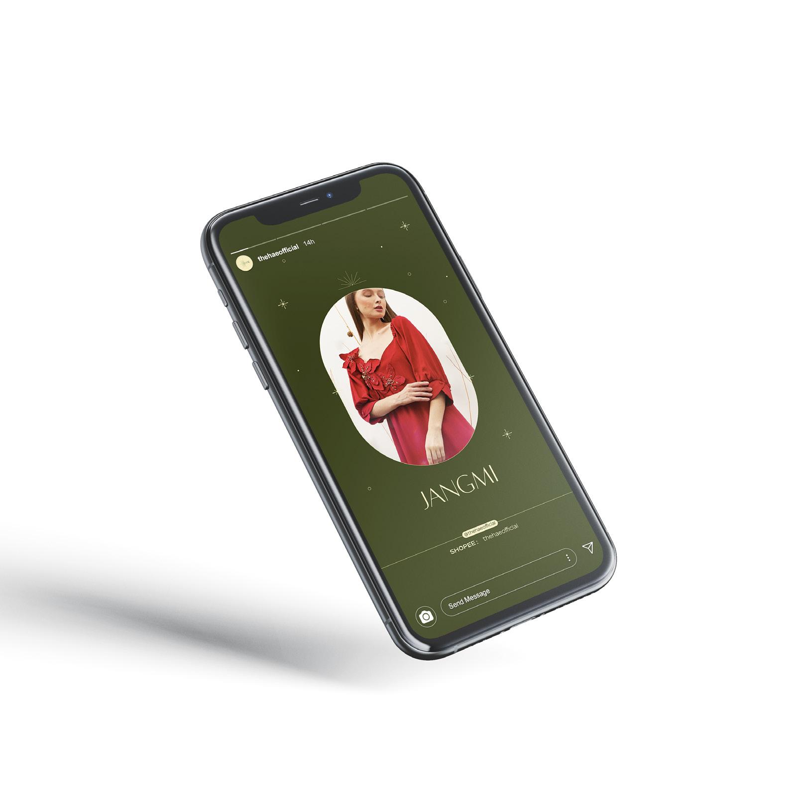
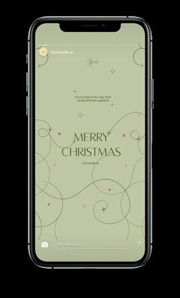
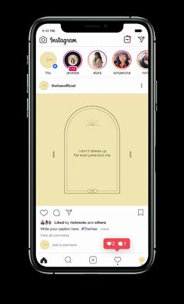
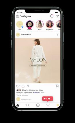
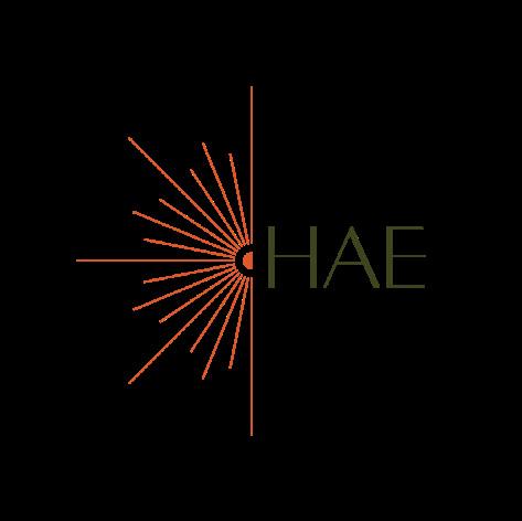
HAE Brand Identity and Social Media
Scoop of Works
Branding
Social Media Content
Tools
Adobe Illustrator
Adobe Photoshop
HAE is a women’s clothing brand that mainly runs on Instagram. HAE itself is taken from Korean which means the sun. For this project, I have to create the brand identity such as logo, packaging stickers, hang tag, labels, and also designed the brand’s Instagram contents.
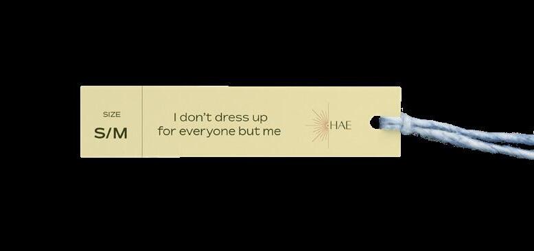
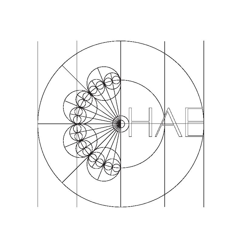
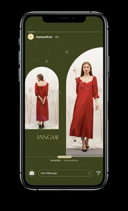
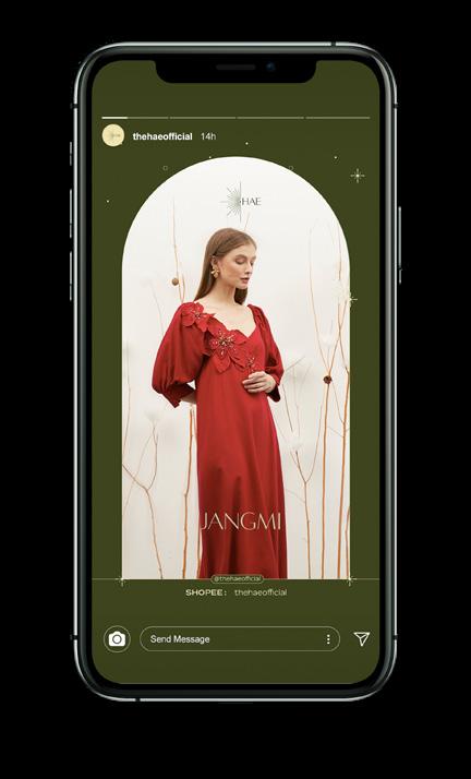
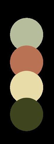
The HAE logo takes the form of a rising sun, which appears on the left side of the “HAE”. The morning sunray is considered as gentle and refreshing which in line with the brand image. HAE’s brand identity takes a serene, gentle, and earthy, which applied on the color pallette.
HAE Brand Identity and Social Media
28
2020 Instagram Post
#F1E6B2
#B6BD9C
#3D441E
#BA7254
Hangtag
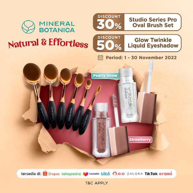
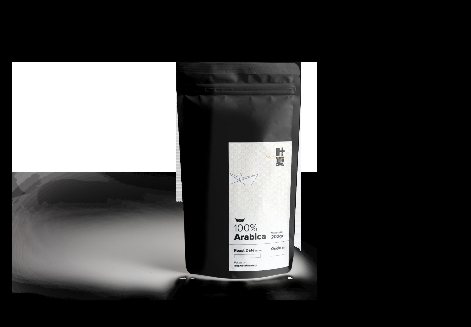
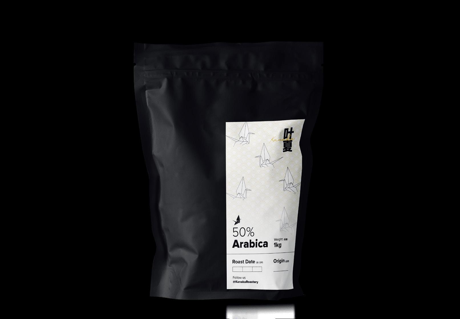
KANAKA Roastery
Scoop of Works
Social Media Content
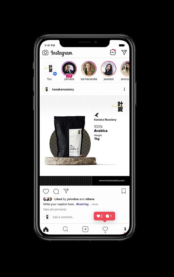
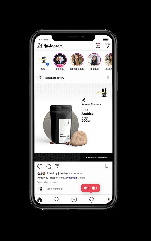
Branding
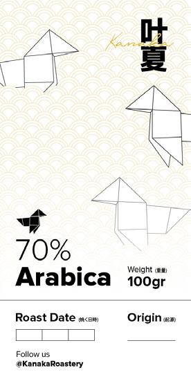
Tools
Adobe Illustrator
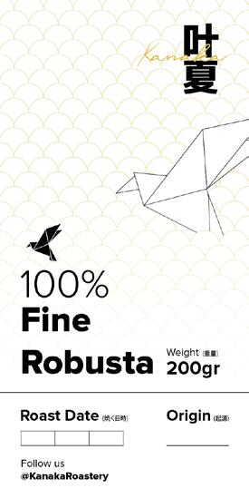
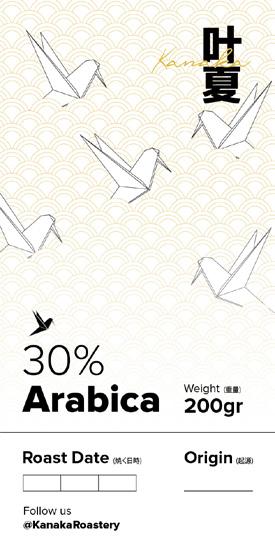
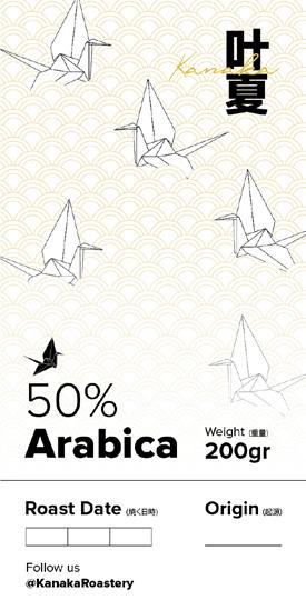
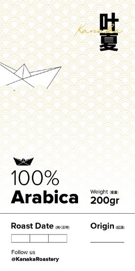
Adobe Photoshop
KANAKA Roastery is a coffee brand that mainly runs in Instagram. My scoop of works for this project was to continue create social media content and several branding items such as packaging stickers. KANAKA Roastery takes a Japanese minimalism and I put it into the design for social media and packaging.
29
Social Media Design
Design
Media Content
2020
Stickers Packaging
Graphic
KANAKA Roastery Social
Instagram Content
GOFIT App
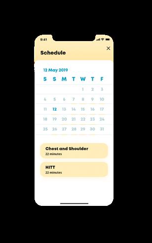
Working out is basically a new dependence to a certain community nowadays. But, who doesn’t like to be motivated while taking some exercises? With GoFit, you could exercise and have your personal trainer monitored your progress anywhere.
GoFit is an one-stop personal workout trainer apps which provides programs from trainer all around the world. GoFit allows the user to select your own personal trainer for any tips and suggestion to your gains.
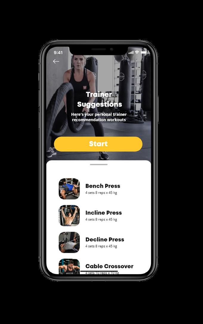
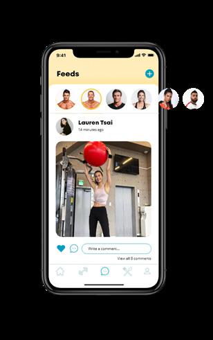
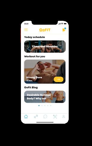
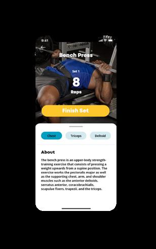
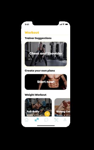
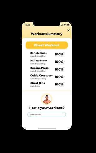
GoFit also provides suggestion on user’s daily intake and meal recipes. It is important to be motivated along the way to reach the goals, so GoFit also provides spaces for communicate with each other, especially with the user with the same personal trainer.

2019
UI/UX Design GOFIT App
UI Design
30
Scoop of Works UI/UX Design Tools Adobe XD Adobe Illustrator
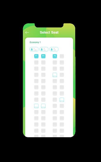
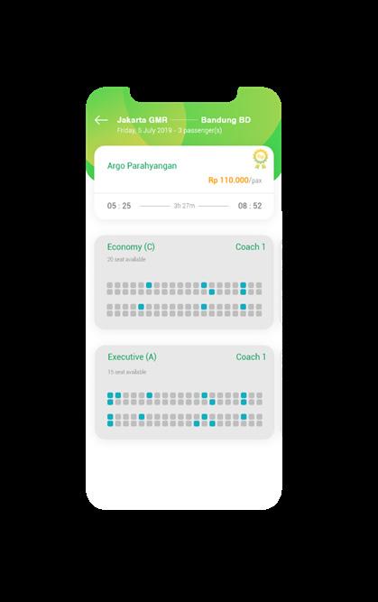
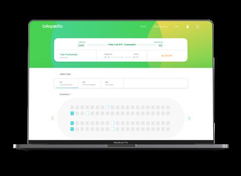
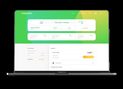
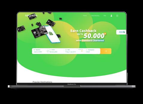
Tokopedia Train Ticketing
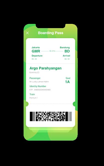
Tokopedia train is a product of Tokopedia, which focused on train ticket booking. This product serves train purchasing and provides information and recommendation about destinations. Tools Adobe XD Adobe Illustrator
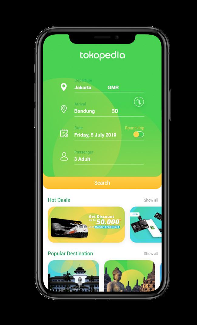
By conducted a qualitative interview with user, I redesigned the page to know certain things that can be developed from the existing app and Tokopedia train ticketing could stands as equal as similar traveling app.
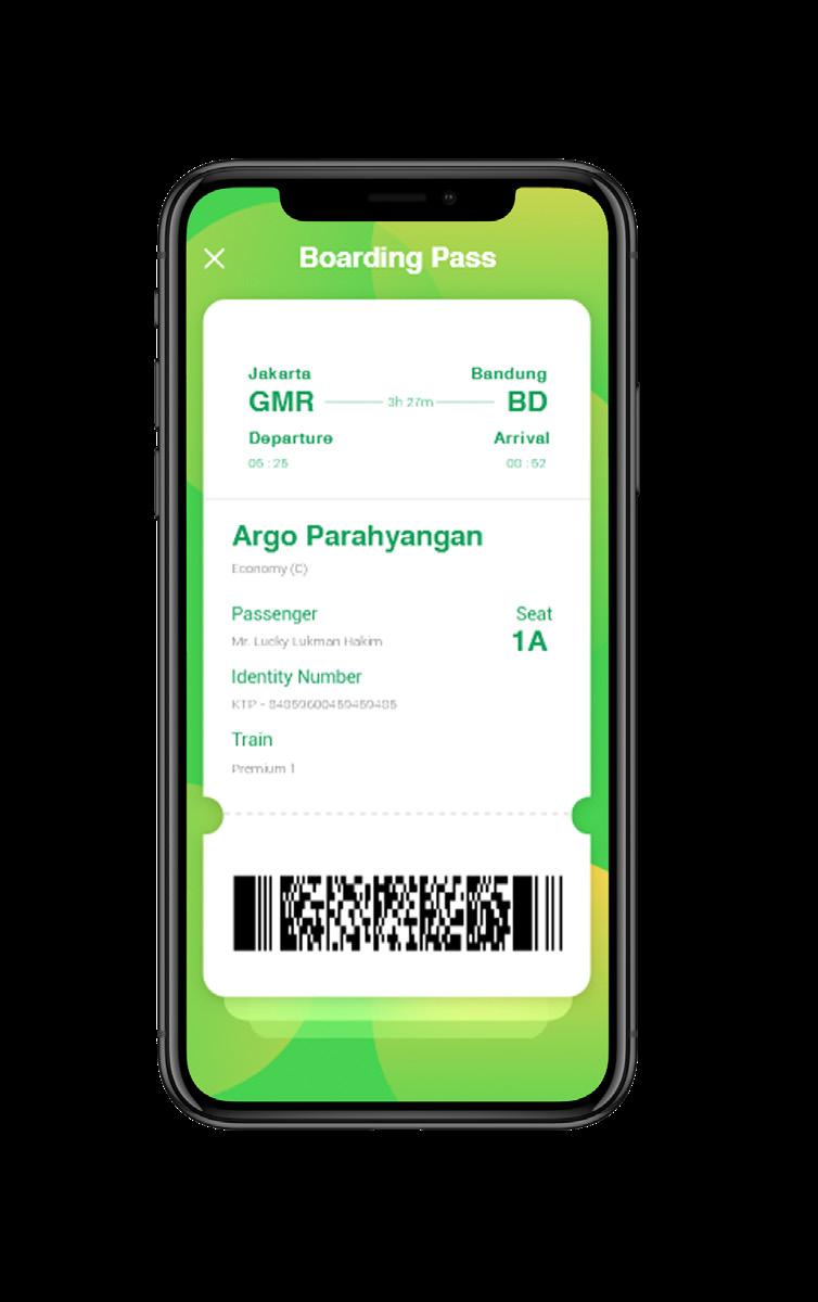
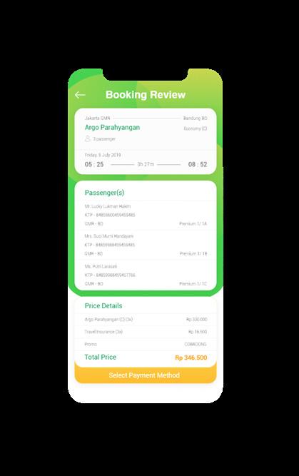
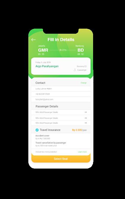
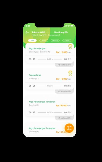
The application shows available seats so that user can decide to take on which coach, especially in group. The application also provides popular destination and where-to-go-list.
31
UI Design
Scoop of Works
UI/UX Design
2019
UI/UX Design
Tokopedia Train Ticketing
Tokopedia Train Ticketing
Tokopedia train also provides desktop version for user who want to access from their computer. The landing page of Tokopedia Train Ticketing is emphasizing promotional ads to inform user about the promotion.
The landing page of Tokopedia consists of a large commands to train route. It is applied to emphasize the main reason of the product itself, which is booking train ticket.
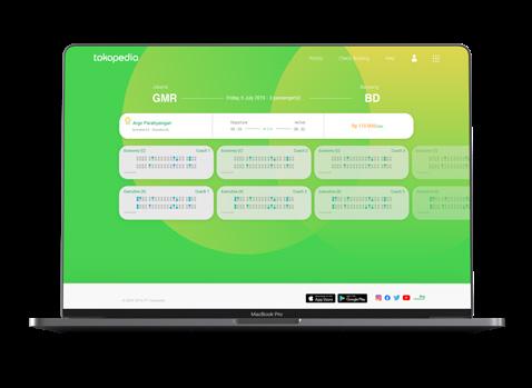
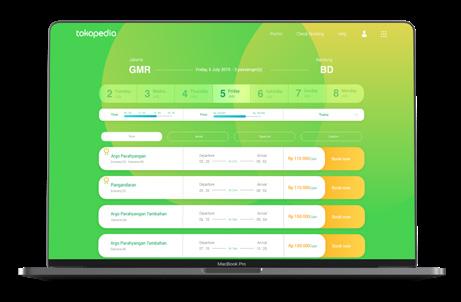
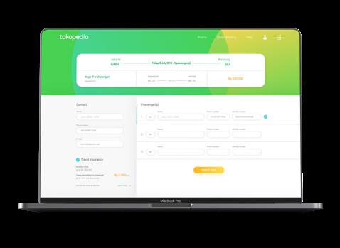
The whole process of train ticketing are mainly the same with the mobile version. The difference between the mobile app version is the simpler process on the desktop version.
 Website Design
32
Scoop of Works UI/UX Design Tools Adobe XD Adobe Illustrator 2019 UI/UX Design
Tokopedia Train Ticketing
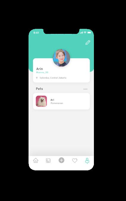
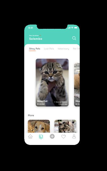
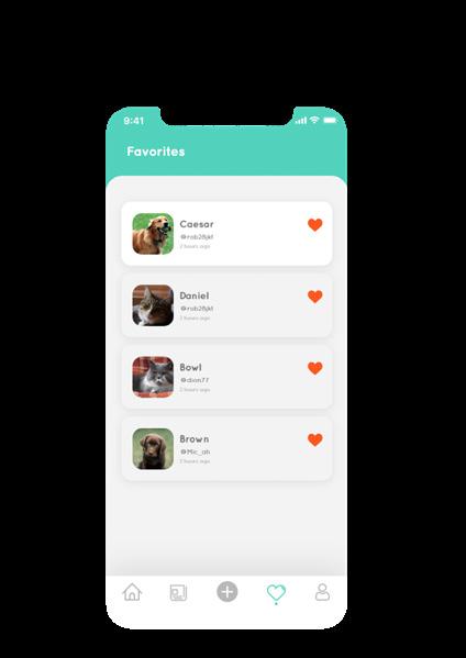
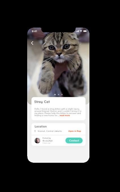
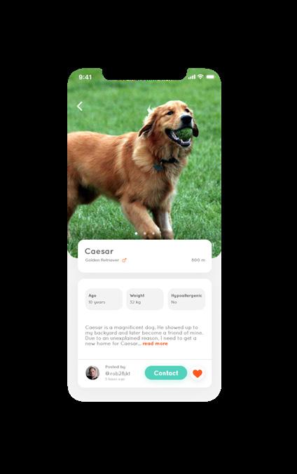
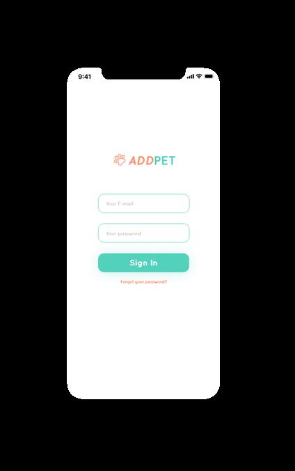
ADDPet
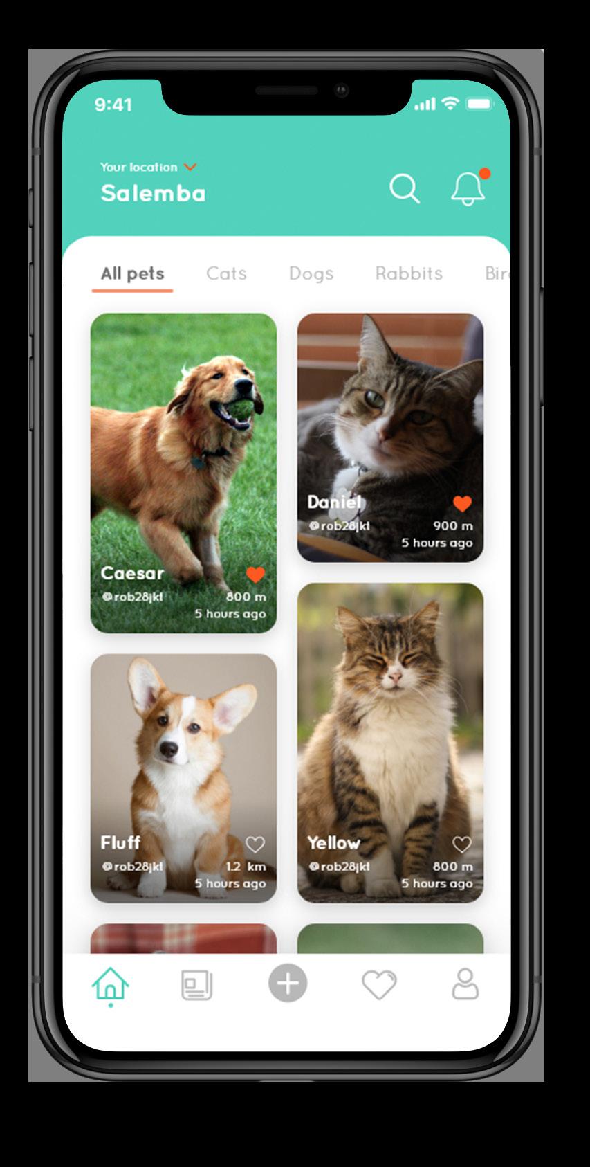
There are millions of homeless, neglected, mistreated and abused animals, especially house-pet in Indonesia. In order to prevent more mistreated house-pet so as looking for their new home, ADDPET are created.
ADDPET is not only an adoption service but also provides a house-pet hospitality service in general instead. ADDPET user could contact the nearest pet shelter if they found a homeless pet.
ADDPET also provides space for user to upload their current pet (or passed pet) as a way the other user want to see how the user treated their pet before.
33
UI Design
Scoop of Works UI/UX Design Tools Adobe XD Adobe Illustrator 2019 UI/UX Design ADDPet App
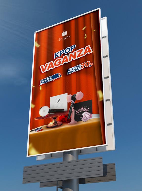
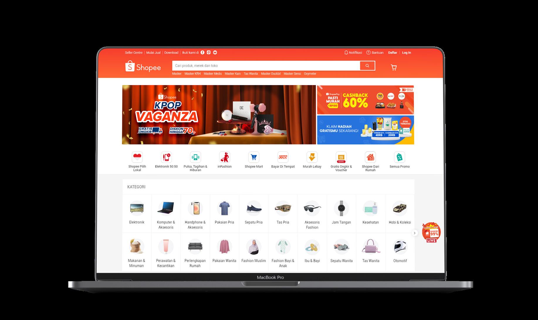
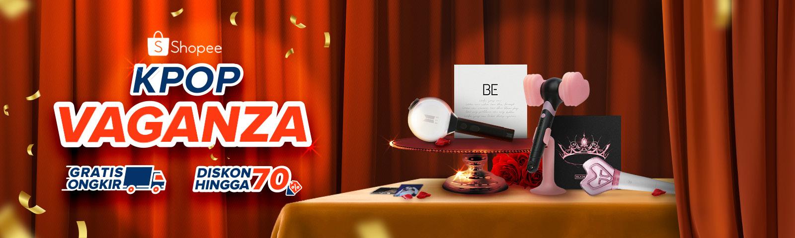
Digital Imaging
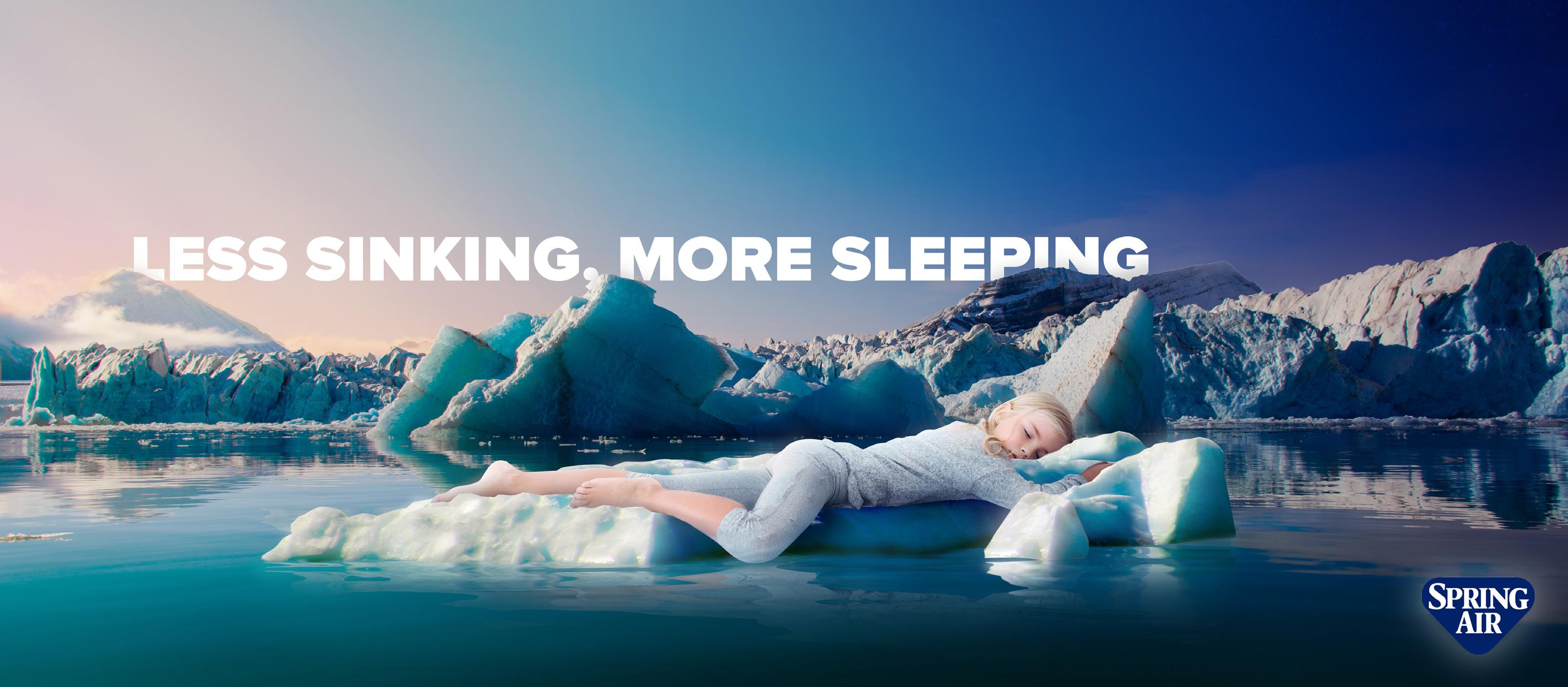
I like to explore and train my photo editing skill. The first time I did digital imaging was back in the college, were I have to give a finishing touch to the interior I’ve worked on. I have to put people and other finishing to the rendered image to bring a realistic image of the interior.
Later on, I’ve started to explore my photo editing skill after I saw art editorial projects and ads. I started to work on Shopee assessment test and several ideas I’ve had in mind. These explorations are my personal projects and not affiliated with the brand.
2021 Graphic Design Digital Imaging
34
Scoop of Works Digital Imaging Tools Adobe Photoshop Adobe Illustrator
The idea of the Spring Air design is to show that you can sleep anywhere you want without being disturbed.
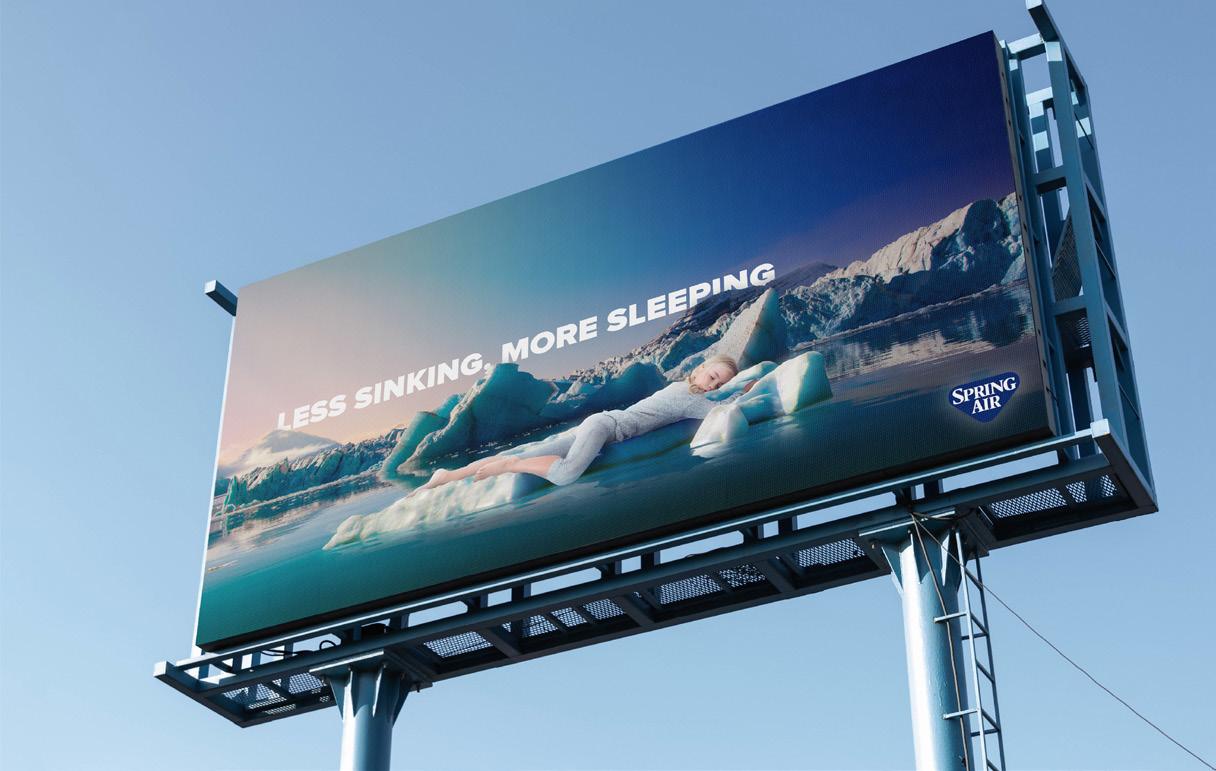
designed website banner which can also be applied to offline media such as vertical billboard.
35 2021 Graphic Design Digital Imaging
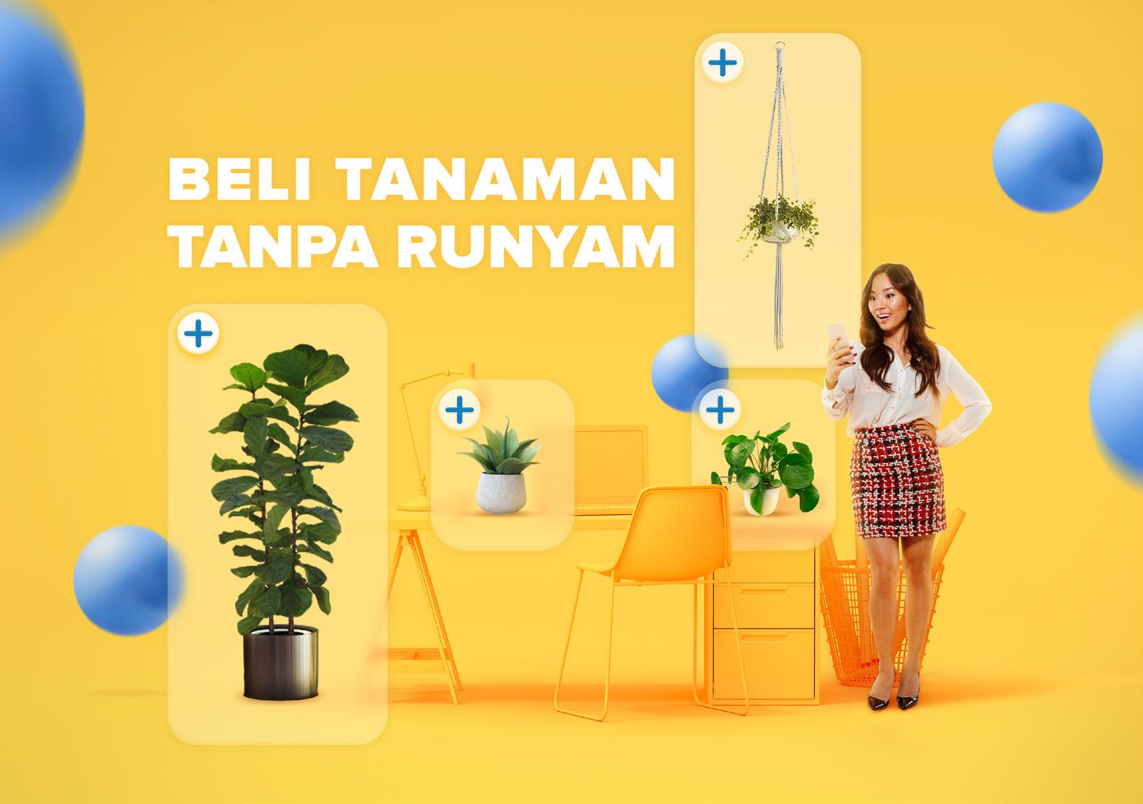
As a houseplant enthusiast, I was wondering “what if we can buy houseplants in an integrated device” so I came up with an idea of buying houseplants with ease within a single touch.
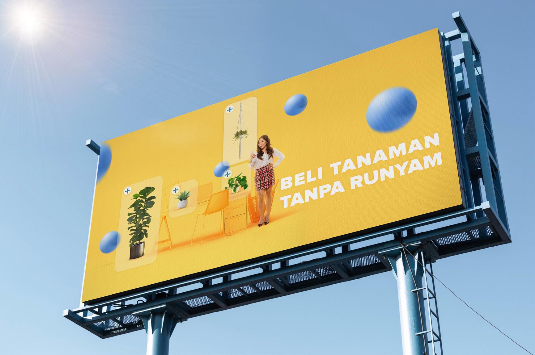
The one color interior was choosen to create a contrast to the plants. Ease of purchased is represented with the plus symbol on each houseplants.
36
2021
Graphic Design
Digital Imaging
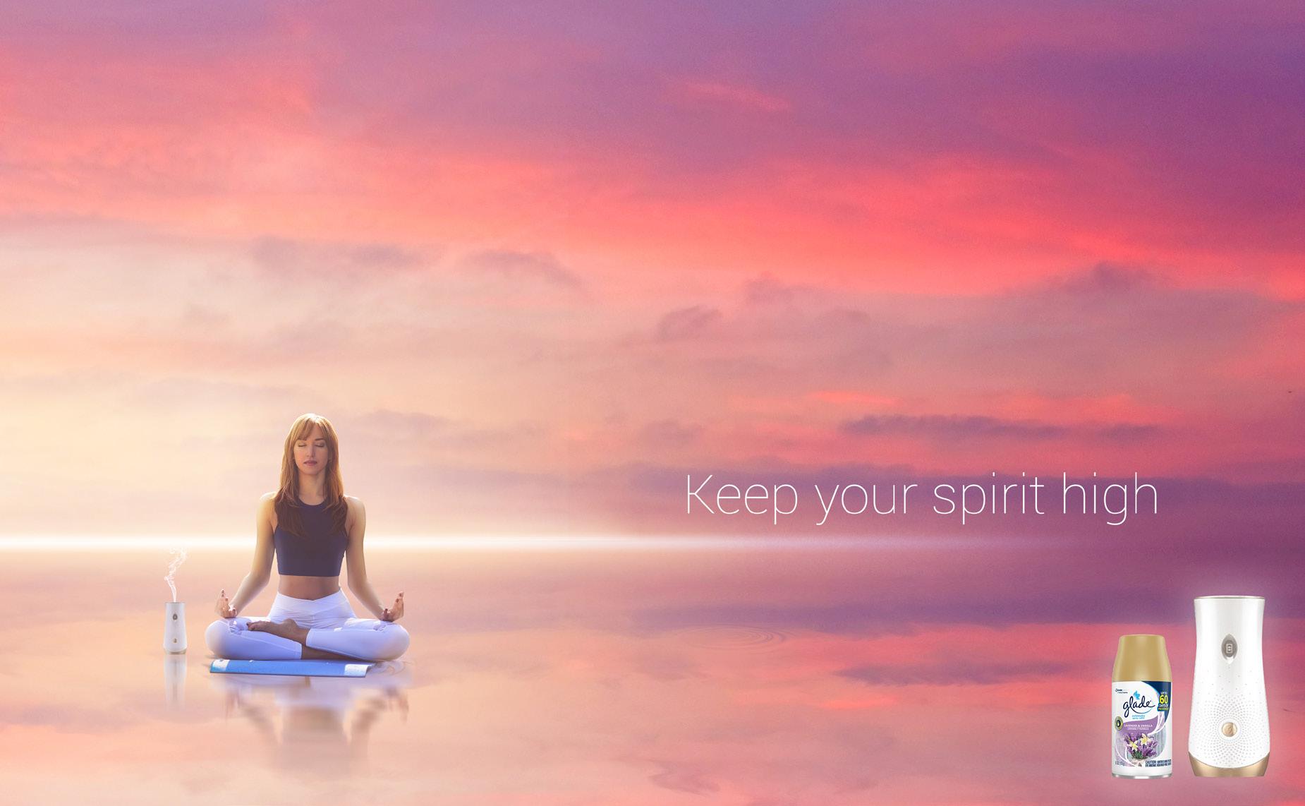
For the Glade air freshener design, I have this idea of people doing yoga and because of Glade air freshener, they reach the solitude which later depicted as an infinite sea.

The design also applicable for offline media such as billboard.
37
2021 Graphic Design Digital Imaging

Great! You’ve made it! So, how is it? Are you interested? If you’re interested, please don’t hesitate to contact me on: hluckylukman@gmail.com +6292234177634 https://www.linkedin.com/in/lucky-lukman-hakim-17a203119/
