Brand Identity Guidelines I Version 1.0
Table of Contents
IntroductIon
Who we are ...........................
Our Inspiration ..................
Our Mission ..........................
Our Vision ..............................
Our Goals ...............................
Our Personality ..................
VIsual IdEntIty systEm
Brand Identity System......................
Logomark................................................
Monogram..............................................
Primary Lockup.....................................
Secondary Lockup...............................
Logo Misuse...........................................
typoGraphy
Brand Typography...................
App Hierarchy...........................
Print Material Hierarchy.......
Email Hierarchy.......................
GraphIc ElEmEnts
& ImaGEry
Graphic Elements.............
Photography.........................
Photography Don'ts.........
ux uI KIt
App.............................................................
Interactive Components...................
Iconography...........................................
Brand In usE
Card & Merch.....
Media............................
Voice...............................
Tone................................
App................................ Print Materials........................
artworK FIlE IndEx
Logomark............................
Monogram..........................
Primary Lockup................
Secondary Lockup...........
Business
Social
Brand
Brand
Mobile
color palEttEs Core
Color
03 08 19 25 28 32 43 36 2 3 4 5 6 7 29 30 31 9 10 12 14 16 18 20 21 22 24 37 38 39 40 41 42 33 34 35 26 27 44 45 46 47 Be Wilder Branding Guidelines I 1
Color Palette............
Combinations........
WHO WE ARE
Be Wilder is a women owned non-profit organization led by expert solo hikers. We aspire to encourage women and give them direction in their hiking journey so they can propel themselves into the wilderness.
Our motto:
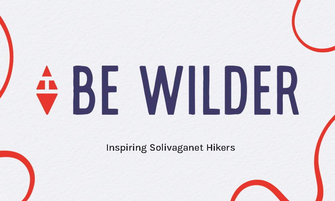
“Inspiring solivigant hikers”.
Be Wilder Branding Guidelines I 2 Introduction
OUR INSPIRATION
Grandma Gatewood was an American ultralight hiking pioneer. She was the first women solo hiker to trek the 2,168 mile Appalachian Trail in 1955 at the age of 67. Her adventure was possible through her selfactualization of outdoor knowledge and wits.
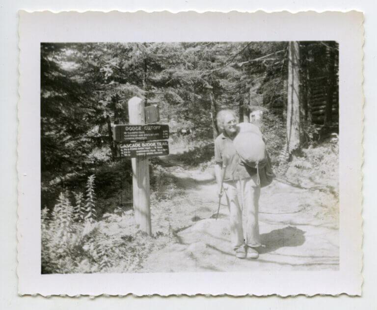
If those men can do it, so can I .
- Emma Rowena Gatewood
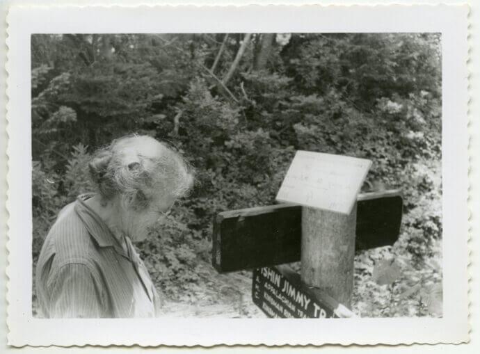
Staff, AMC. “Grandma Gatewood: The First Woman to Solo Hike the Entire Appalachian Trail.” Appalachian Mountain Club (AMC), March 1, 2023. https://www. outdoors.org/resources/amc-outdoors/history/grandma-gatewood-the-first-woman-to-solo-hike-the-entire-appalachian-trail/.
“
Be Wilder Branding Guidelines I 3 Introduction
Source:
OUR MISSION
At Be Wilder, our purpose is to assist women solo hikers to Plan, Pack, and Persist in their trail journey.
From beginner to intermediate, users can curate their experience to accomplish their hiking goals.
Be Wilder Branding Guidelines I 4 Introduction
OUR VISION
To support women to become solivigant hikers and persist in their trail journey.
solivigant [soh-LIH-va-ghent]
(adjective): To wander alone.
Be Wilder Branding Guidelines I 5 Introduction
OUR GOALS
CONNECT
To foster a community of women’s solo hikers to pass down their expertise for the next generation.
GROW
Give resources for solo hikers to work on their outdoor skills and hiking goals.
EXPLORE
To give users the flexibility to change the direction of their paths at anytime.
Be Wilder Branding Guidelines I 6 Introduction
OUR PERSONALITY
Our brand archetype is The Explorer. Brand Promise: Unleashing the spirit of adventure, our brand fosters personal growth and invites you to explore uncharted territories.
WE ARE
- Adventure-seeking
- Proactive
- Self-Actualizing
- Innovative
- Curious
- Resilient
WE ARE NOT
- Indecisive
- Passive
- Conformist
- Arrogant
- Inconsiderate
- Stagnant
Be Wilder Branding Guidelines I 7 Introduction
VIsual IdEntIty systEm
Be Wilder Branding Guidelines I 8
Brand Identity System
The visual identity system consists of: - Logomark - Monogram - Primary Lockup - Secondary Lockup
LOGOMARK
MONOGRAM
In general, a logo is any of these components of the visual identity system.
The Monogram, Primary Lockup, and Secondary Lockup combines the Be Wilder logomark and brand typeface in a defined relationship called a "Lockup". These combinations are exclusive to these lockups and are not to be utilized in any alternate way.
PRIMARY LOCKUP
SECONDARY LOCKUP
Be Wilder Branding Guidelines I 9 Visual Identity System
Logomark
The Be Wilder logomark consists of the two triangles. The upright triangle references traditional trail marker “Hike Starts Here”. It shows this app is the starting place for a solo hiker’s journey. The upside down triangle is used by feminist groups to represent the female gender.
Together, the triangles create a compass shape to symbolize the direction that the app will give its user for their solo hiking journey.
The Logomark is to only be used for the app icon, favicon (app/website icon), profile picture for social media. See pages 5-6 for lockup applications.
The Logomark should be utilized in applications where the height is more than or equal to 1/2 of an inch.
LOGOMARK
1/2" MINIMUM HEIGHT
Be Wilder Branding Guidelines I 10 Visual Identity System
Logomark Clearspace
Clearspace is used to allow the visual identity to breath and maintain its integrity. Clearspace must be used when using the Logomark. No outside elements may cross the clearspace. Clearspace is included in the artwork files and in the minimum height limitations.
Clearspace Unit
The clearspace unit of measurement is the height of the 'W' from the Amaya typeface.
Be Wilder Branding Guidelines I 11 Visual Identity System
LOGOMARK CLEARSPACE
Monogram
The Be Wilder monogram consists of a combination of the Logomark and an 'BW' abbreviation of Be Wilder in the Amaya typeface.
This lockup is the monogram logo for Be Wilder. It can be used when applications need a short space while the brand name is still incorporated.
The Monogram should be utilized in applications where the height is more than or equal to 1/2 of an inch.
MONOGRAM
1/2" MINIMUM HEIGHT
Be Wilder Branding Guidelines I 12 Visual Identity System
Monogram Clearspace
Clearspace is used to allow the visual identity to breath and maintain its integrity. Clearspace must be used when using the Monogram. No outside elements may cross the clearspace. Clearspace is included in the artwork files and in the minimum height limitations.
Clearspace Unit
The clearspace unit of measurement is the height of the 'W' from the Amaya typeface.
Be Wilder Branding Guidelines I 13 Visual Identity System
MONOGRAM CLEARSPACE
Primary Lockup
The Be Wilder Primary Lockup consists of a combination of the Logomark and Amaya typeface. The typography is positioned to the right of the logomark.
This lockup is primary logo for Be Wilder. It will be the default logo to use in any branding elements, merchandise, etc. It is best used when a long horizontal formate is needed.
The Primary Lockup should be utilized in applications where the height is more than or equal to 1/2 of an inch.
PRIMARY LOCKUP
1/2" MINIMUM HEIGHT
Be Wilder Branding Guidelines I 14 Visual Identity System
Primary Lockup
Clearspace
Clearspace is used to allow the visual identity to breath and maintain its integrity. Clearspace must be used when using the Primary Lockup. No outside elements may cross the clearspace. Clearspace is included in the artwork files and in the minimum height limitations.
Clearspace Unit
The clearspace unit of measurement is the height of the 'W' from the Amaya typeface.
Be Wilder Branding Guidelines I 15
PRIMARY LOCKUP CLEARSPACE
Secondary Lockup
The Be Wilder Secondary Lockup consists of a combination of the Logomark and Amaya typeface. The typography is center aligned with the logomark in the middle of 'Be' and 'Wilder'.
This lockup is the secondary logo for Be Wilder. It will be the alternative option when the Primary Lockup cannot be used in branding. It is best used in applications that call for a vertical formate.
The Secondary Lockup should be utilized in applications where the height is more than or equal to 3/4 of an inch.
SECONDARY LOCKUP
3/4" MINIMUM HEIGHT
Be Wilder Branding Guidelines I 16 Visual Identity System
Secondary Lockup Clearspace
Clearspace is used to allow the visual identity to breath and maintain its integrity. Clearspace must be used when using the Secondary Lockup. No outside elements may cross the clearspace. Clearspace is included in the artwork files and in the minimum height limitations.
Clearspace Unit
The clearspace unit of measurement is the height of the 'W' from the Amaya typeface.
Be Wilder Branding Guidelines I 17 Visual Identity System
SECONDARY LOCKUP CLEARSPACE
Lockup Misuse
The Be Wilder visual identity is the official mark of the business and should be rendered with the utmost consistency and dignity. It should never be tweaked, stretched, or otherwise manipulated. This page shows typical mistakes to be avoided.
• Do not change the typography
• Do not apply any filters, such as drop shadows or emboss
• Do not create alternate lockups other than the ones provided
• Do not apply a stroke to the identity design
• Do not adjust placement, spacing, and/or scale any element of the identity design
• Do not outline any part of the identity design
• Do not stretch the identity design in any direction other than in proportion
• Do not switch color combinations
Do not change the typography
Do not adjust placement
Do not apply any filters
Do not outline
Do not create alternate lockups
Do not distort, stretch, or condense
Do not apply a stroke
Do not switch colors
Be Wilder Branding Guidelines I 18 Visual Identity System
typoGraphy
Be Wilder Branding Guidelines I 19
Brand Typography
Be Wilder utilizes two typefaces: Amaya and Karla.
Amaya is a hand-drawn typeface created by Taylor Penton and is inspired by a vintage snake bite kit. These types of kits are common among hikers for minor injury prevention. This typeface was selected because its visual message of 'aiding' is the same as Be Wilder's core mission and vision.
It can be purchased for personal and commercial use for $25 here: https://www.taylorpenton.com/fonts/p/amaya
For more additional seats or web font licenses: https://www.taylorpenton.com/typeface-licenses
The secondary typeface for Be Wilder is Google font Karla. It is to be used in body copy or in combination with Amaya.
Karla is a variable-weight typeface created by Jonny Pinhorn. This typeface was selected for its inspired by humanist proportions and has a modern and friendly appearance.
It can be downloaded for free here: https://fonts.google.com/specimen/Karla
It has an Open Font License, for more information on the rights and licensing: https://fonts.google.com/specimen/Karla/about
a B c d E F G h I J K l m n o p Q r s t u V w x y Z 0123456789 !&?
Aa Bb Cc Dd Ee Ff Gg Hh Ii Jj Kk Ll
Mm Nn Oo Pp Qq Rr Ss Tt Uu Vv
Ww Xx Yy Zz 0123456789
!&?
AMAYA
Be Wilder Branding Guidelines I 20 Typography
KARLA, MEDIUM
App Hierarchy
The App utilizes the typeface Karla. The Typography guide here is in reference to Trail previews, Trail descriptions, Skills, Vlogs/ Shorts previews, Vlog/Shorts descriptions, and the main Navigation.
The app uses the Google font Karla for all its typography. This font has variable-weight, which allows flexibility in hierarchy and lowers eye strain with its round features.
Header 1
ExtraBold, Medium I 24, 22, 20 I Kerning: Optical I Tracking: 1 I Leading: 100%
Header 2
Medium I 20, 18, 13 I Kerning: Optical I Tracking: 1 I Leading: 100%
Header 3
Medium, Regular I 15,12 I Kerning: Optical I Tracking: 1 I Leading: 100%
Body
Bold, Medium I 18, 16, 14 I Kerning: Optical I Tracking: 1 I Leading: 100%
HEADER 1
HEADER 2
HEADER 3
HEADER 1
BODY
Navigation
Medium I 11 I Kerning: Optical I Tracking: 1 I Leading: 100%
TRAIL, VLOG AND ARTICLE PREVIEW

HEADER 1
BODY
Be Wilder Branding Guidelines I 21 Typography
Print Material Hierarchy
Posters utilize the typeface Karla. Posters are utilized for promotion for the app. Either as a stand-alone, collaboration, or series. They will most likely be placed in hiking gear stores or on the street.
Header 1
Here are the most common dimensions:
• Vertical Medium Store Poster (18" x 24")
• Vertical Large Store Poster (24" x 36")
• Horizontal Medium Store Poster (24" x 18")
• Horizontal Large Store Poster (36" x 24")
• Street Billboards (11" x 17")
• Vinyl Medium Banner (10' x 4')
• Vinyl Large Banner (12' x 4')
Bold, Extra Bold I 128, 248 I Kerning: Optical I Tracking: 5 I Leading: 100% I Sentence Case I Body Bold, Semi Bold, Extra Bold I 34, 180 I Kerning: Optical I Tracking: 5 I Leading: 218% I Sentence Case I We want you to be Wild. Discover new trails and skills with our app. It is never too late to start your own journey. POSTER TEXT EXAMPLE Be Wilder Branding Guidelines I 22 Typography
BILLBOARD EXAMPLE
HEADER 1
BODY
HEADER 1
BODY
 HORIZONTAL POSTER EXAMPLE
Be Wilder Branding Guidelines I 23 Typography
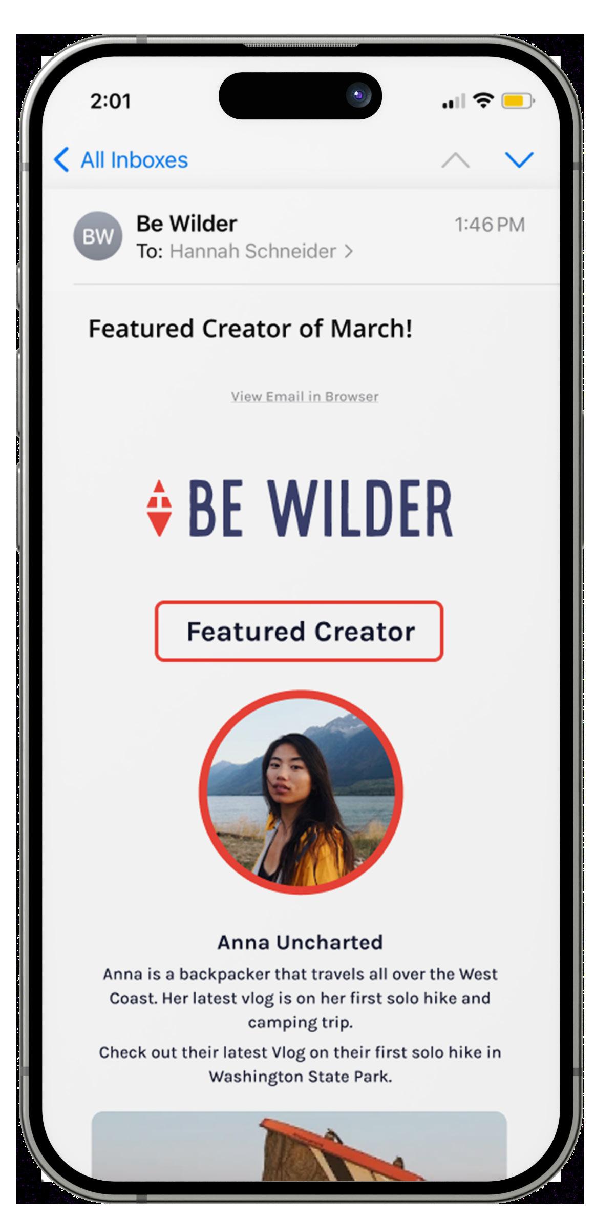
Email Hierarchy
Emails utilize the typeface Karla. They are sent to user for updates, Featured Creator content, Achievements, and announcements.
They utilized similar graphic and imagery elements to the Posters with orange outlines and a button to direct them to the location of the content in-app.
The goal of the emails is to keep our users informed and up to date on latest trends, information, and activities.
Header 1
Medium, Bold I 24 I Kerning: Optical I Tracking: 1 I Leading: 100% I Alignment: Center
Sub Header
Bold, Medium I 18, 12 I Kerning: Optical I Tracking: 1 I Leading: 100% I Alignment: Center
Body
Medium I 14, 12 I Kerning: Optical I Tracking: 1 I Leading: 100% I Alignment: Center
EMAIL TEXT EXAMPLE
Anna Uncharted
Anna is a backpacker that travels all over the West Coast. Her latest vlog is on her first solo hike and camping trip.
HEADER 1
HEADER BOX
SUB HEADER
BODY
Be Wilder Branding Guidelines I 24 Typography
color palEttEs
Be Wilder Branding Guidelines I 25
Identity Color Palette
The Be Wilder identity system should be reproduced using the Core Color Palette. In contexts where the use of core colors is not an option, or when the core colors conflict with the application, the identity system may be reproduced in the neutral color palette.
Tints and shades the color palettes may also be utilized throughout the App and Printed Material.
Neutral Palette
The neutral palette acts as a foundation that works with the core color palette.
*Note: CMYK, RGB, and Hex values are provided and should be used in the appropriate context. CMYK should be used for print collaterals; RGB and Hex values should be used online. The CMYK color values will be used for the majority of the print collaterals.
CORE COLOR PALETTE
CMYK: 0,89,84,0
RGB: 238, 66,56
HEX: #ee4238
NEUTRAL PALETTE
CMYK: 88,82,31,18
RGB:57,63,108
HEX: #393f6c
CMYK: 4,3,13,0
RGB: 243,240,222
HEX: #f3f0de
CMYK: 91,83,51,66
RGB: 18,22,45
HEX: #12162d
CMYK: 76,46,86,48
RGB: 47,73,44
HEX: #2f492c
CMYK: 0,0,0,0
RGB: 253,253,253
HEX: #fdfdfd
CMYK: 2,24,75,0
RGB: 249,196,90
HEX: #f9bf4d
Inspiration Middle Ground Independence Trail Ink Growth Paper Map Connect
Be Wilder Branding Guidelines I 26 Color Palettes
Color Combinations
Here are two color combinations between the Core Color Palette and the Neutral Color Palette. These combinations meet WCAG requirements and are ratios of 8 or higher. Do NOT use any other two color combinations outside these given pairings.
Additional accent colors are included and should be used for graphic elements or points of emphasis.
Be Wilder Branding Guidelines I 27 Color Palettes
GraphIc ElEmEnts and ImaGEry
Be Wilder Branding Guidelines I 28
Graphic Elements
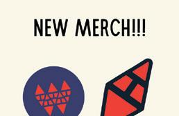
Graphic Elements consist of the illustrated elements and Accent Marks. They are on select print materials and marketing collaterals.
Illustrations
Illustrations are designed similar to icons. They're simplistic in nature and are rounded.
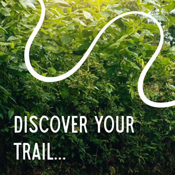
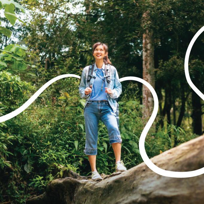
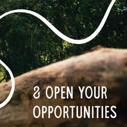
Line of Action
The line of action is non-linear, but playful and full of adventure. It directly interacts with the subject to show them as the center of their journey and plan. The line itself is also varying in width to emulate the markings of a map.
Accent Marks
Accent marks are points of emphasis in phrases and/or quotes for Print/Marketing materials. They show a positive connection between technology, nature, and/or emphasize the encouraging tone of Be Wilder campaigns.
ILLUSTRATIONS
LINE-OF-ACTION
ACCENT MARKS
Be Wilder Branding Guidelines I 29 Graphic Elements and Imagery
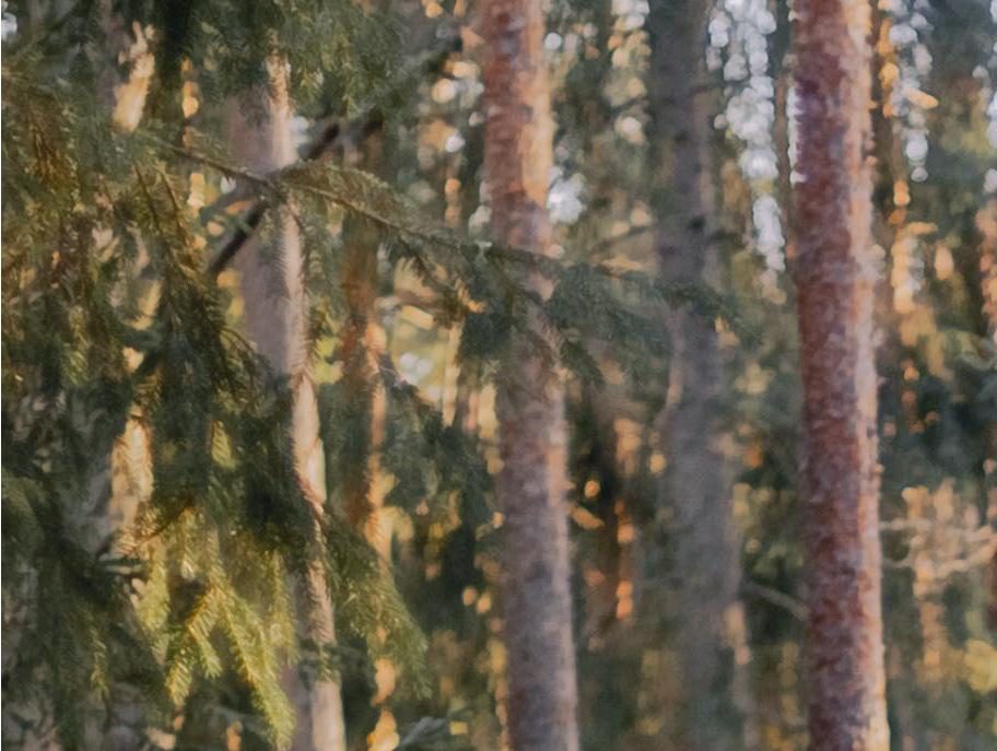
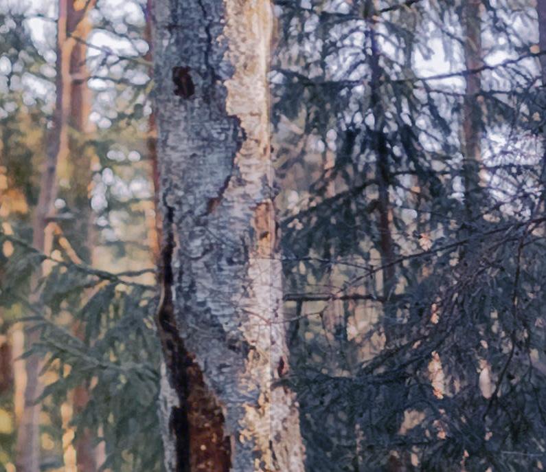
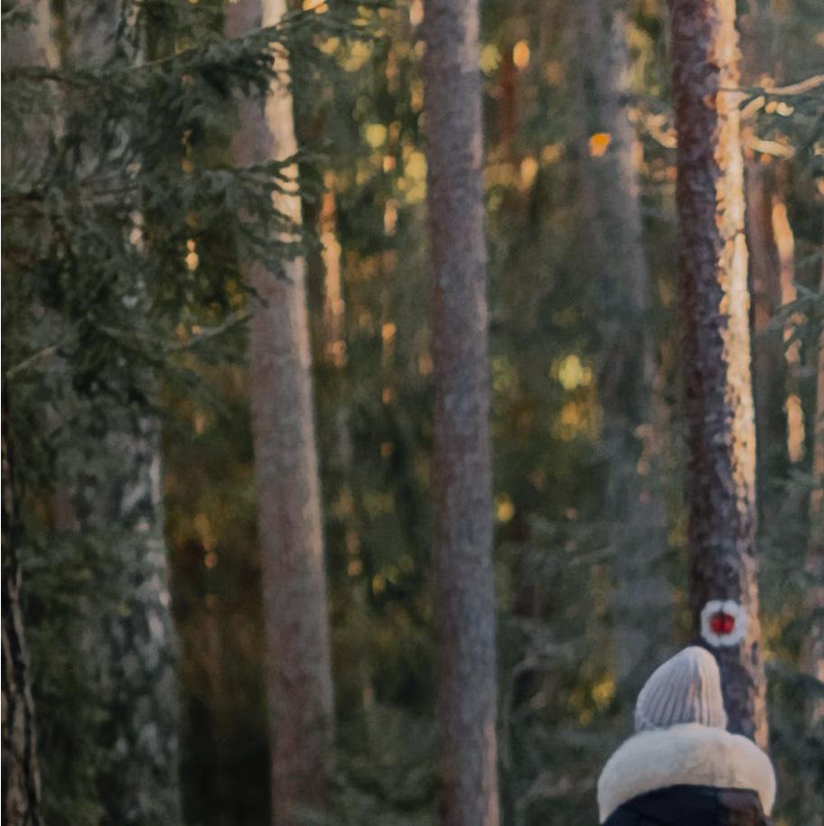
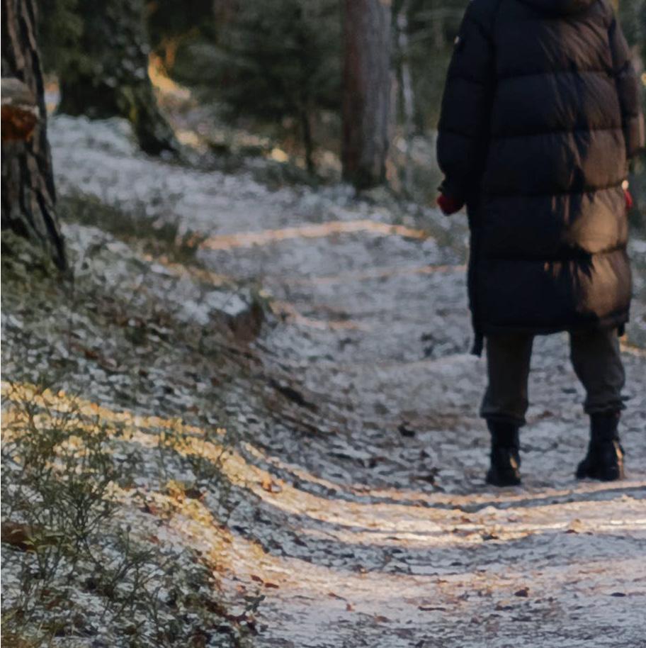
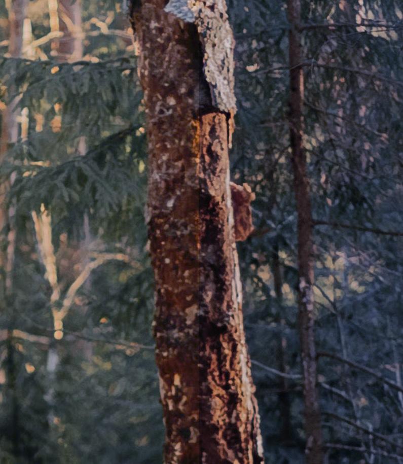
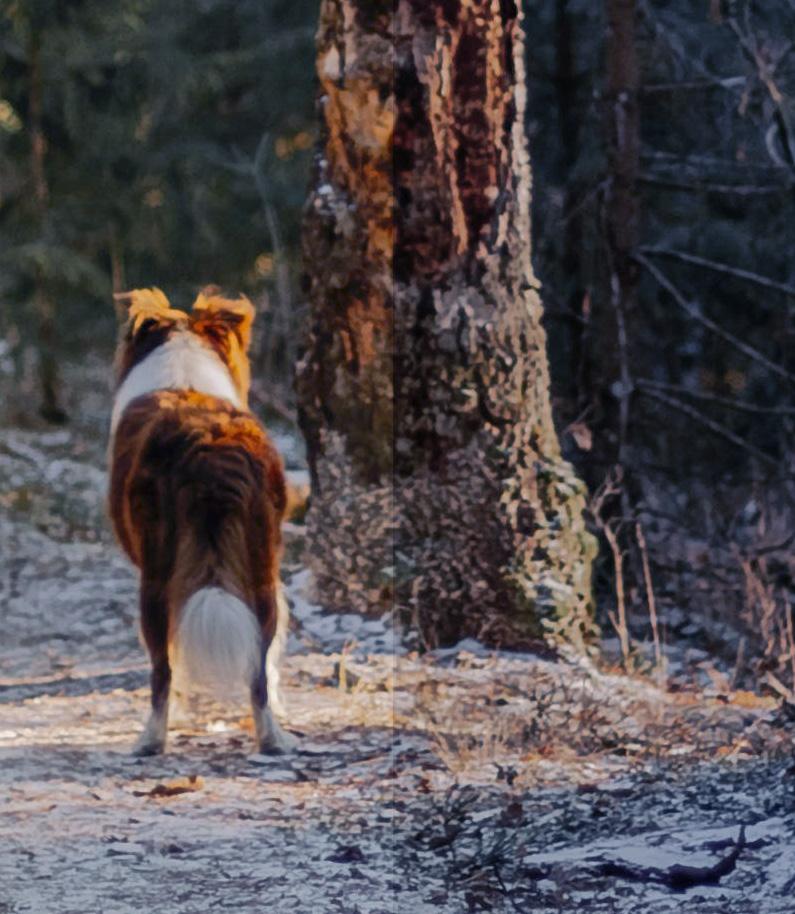
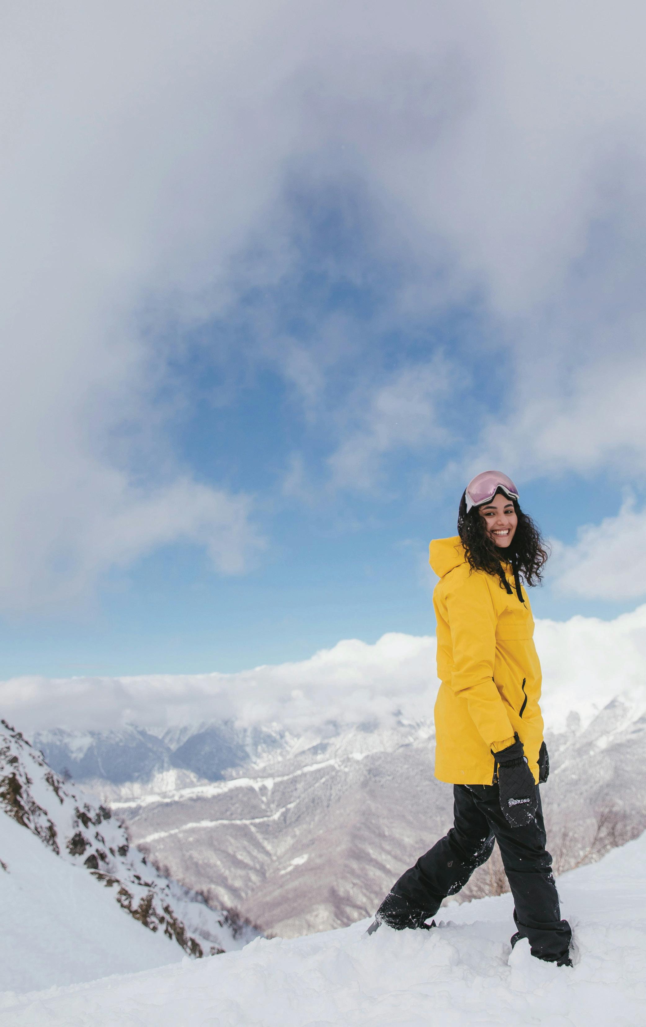
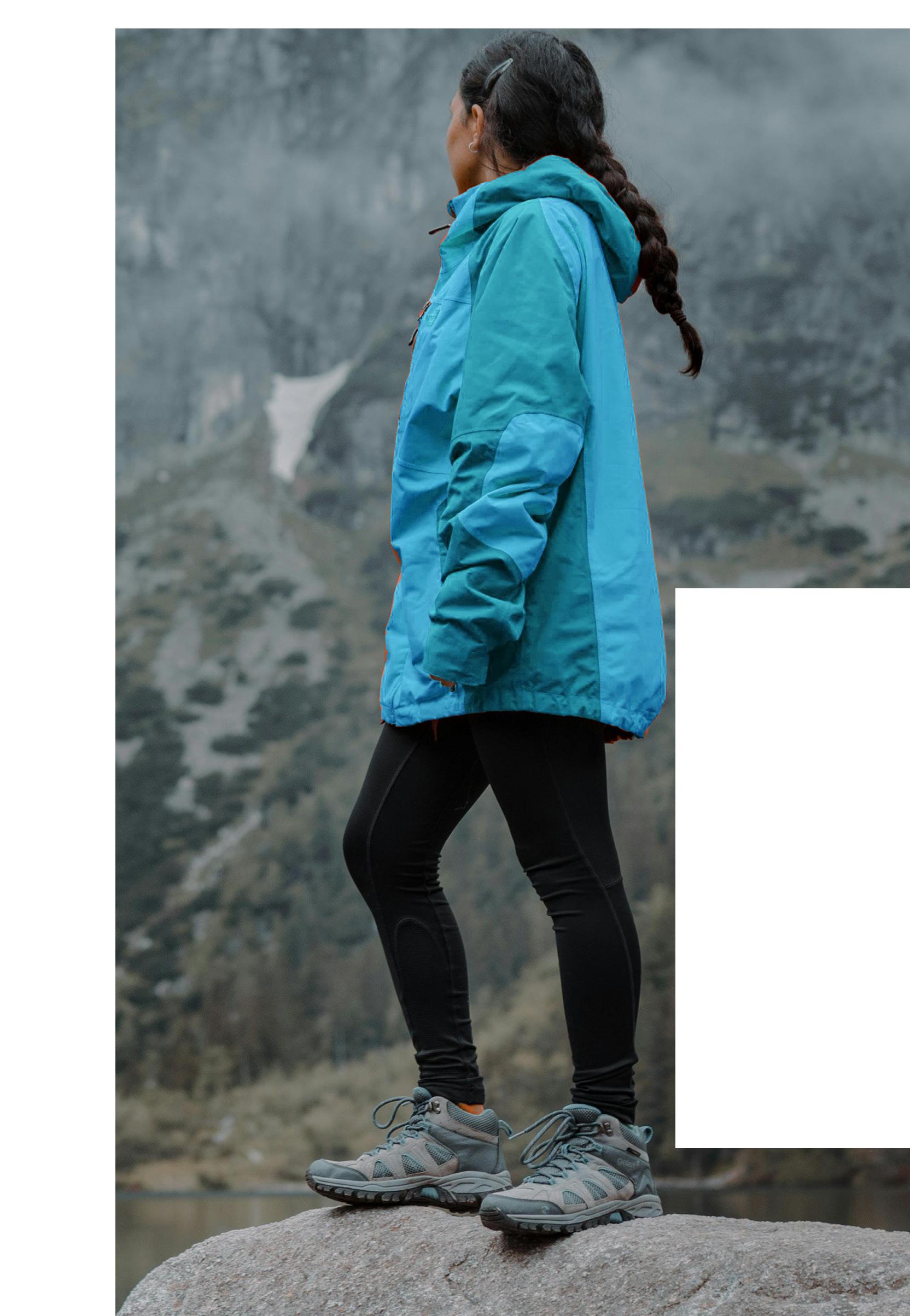
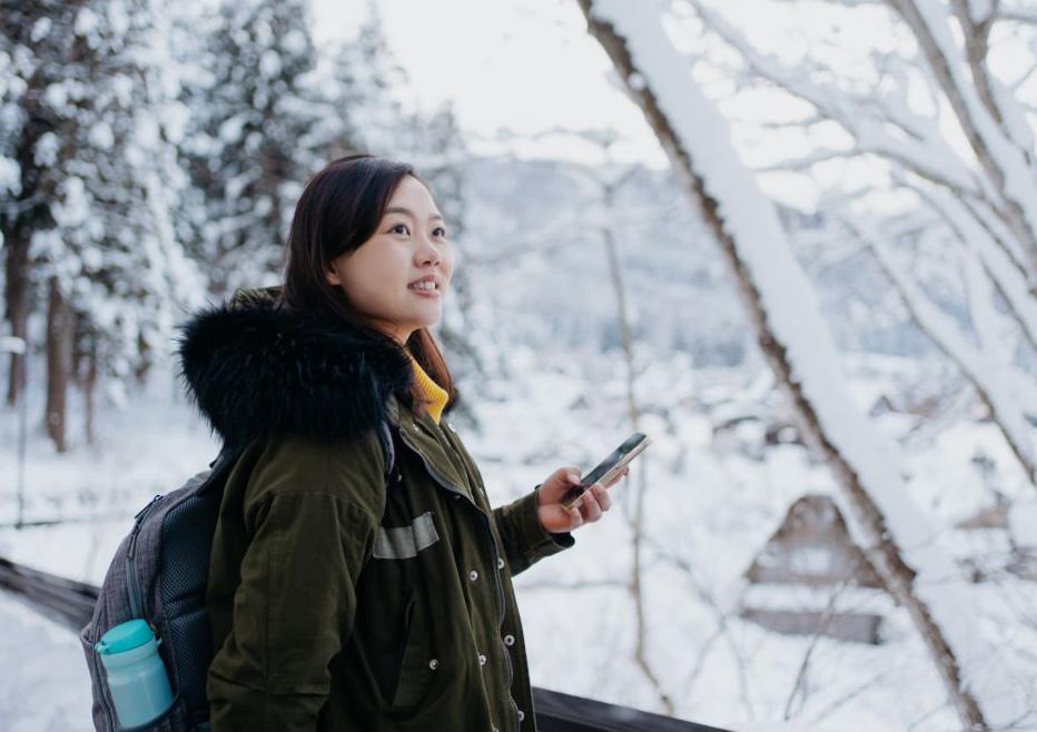
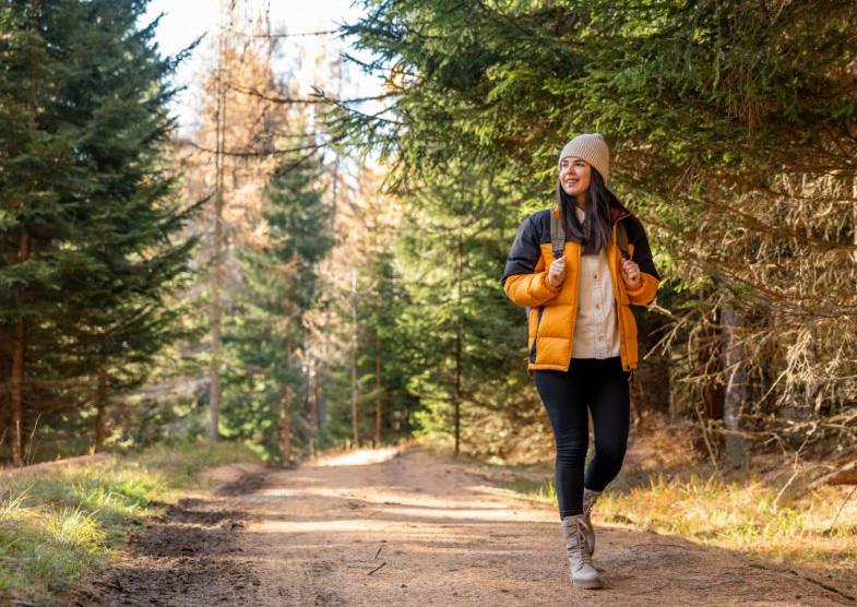
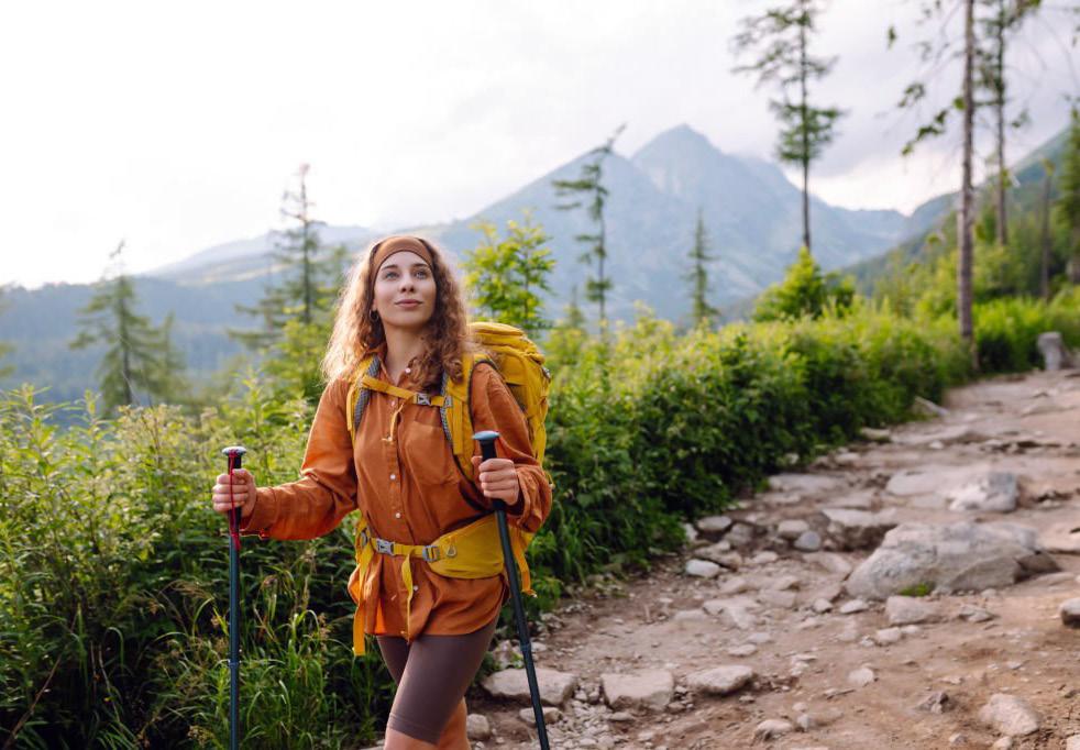
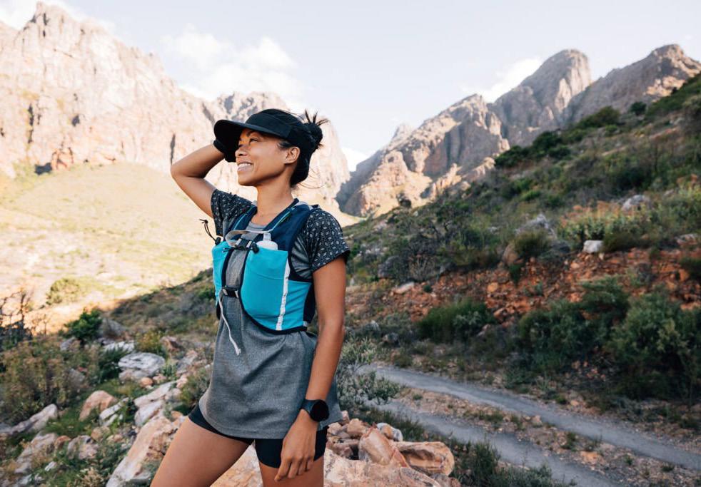
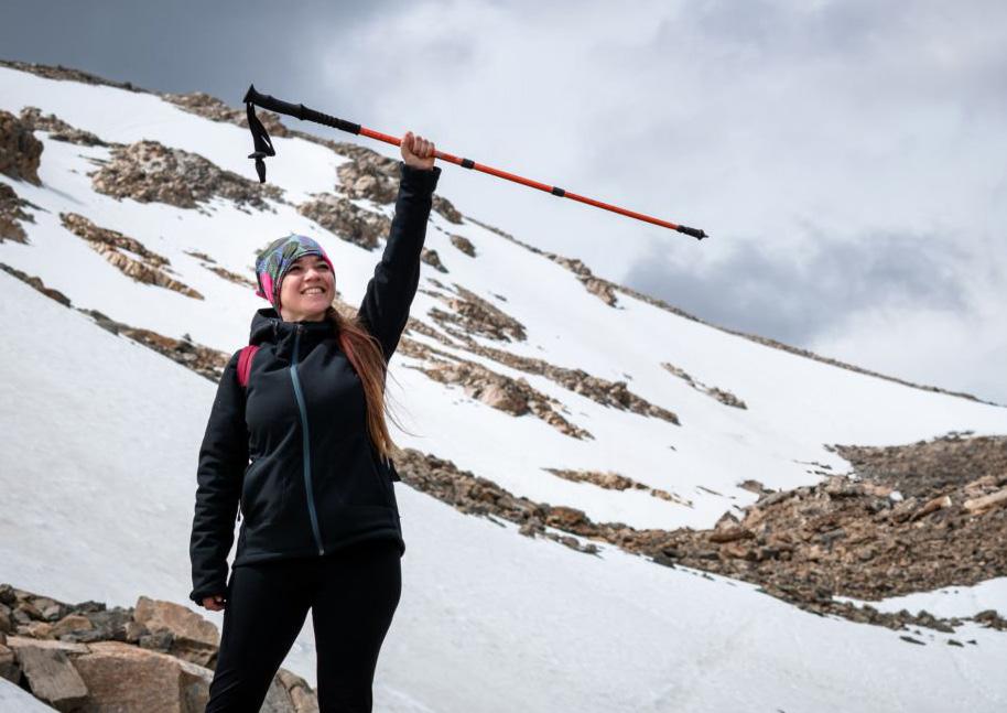
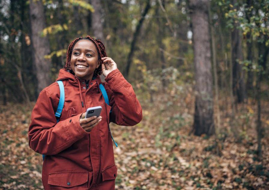
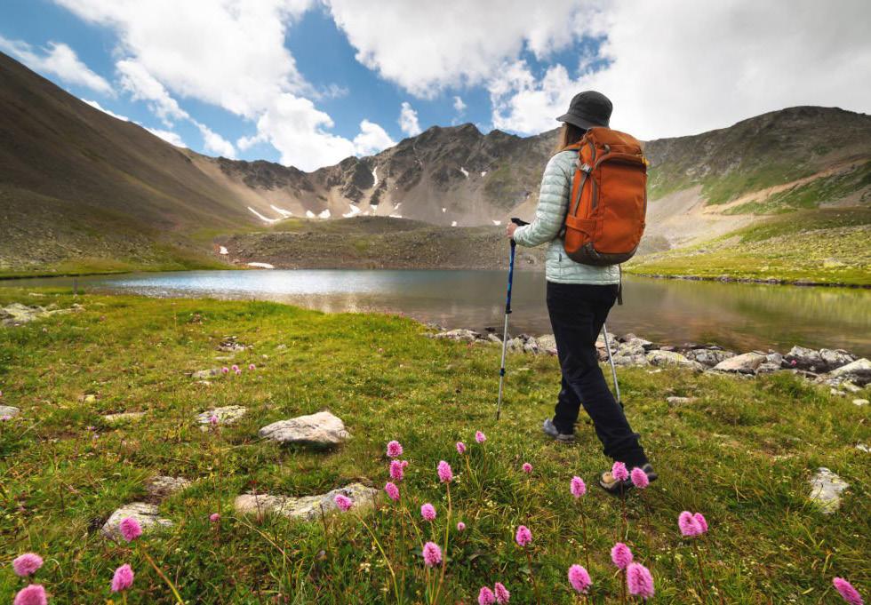
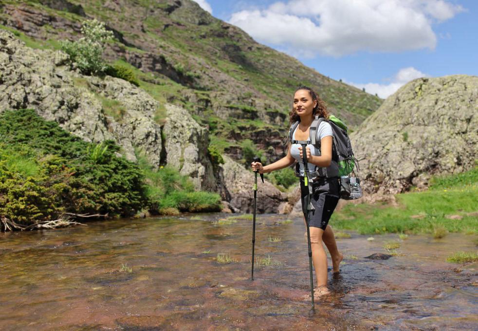
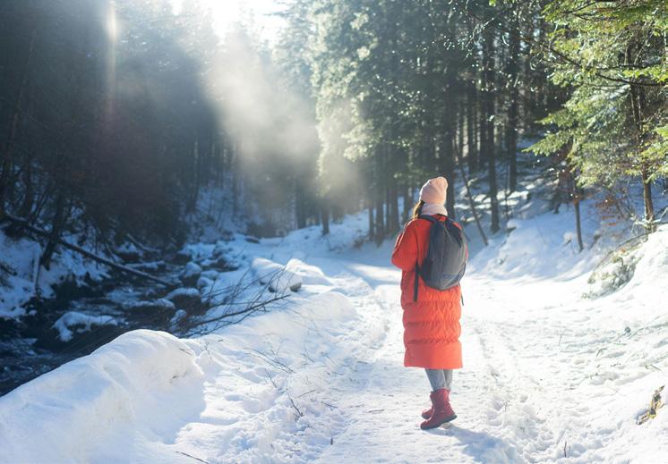
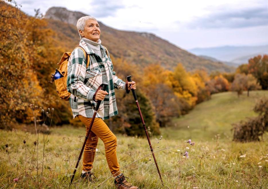
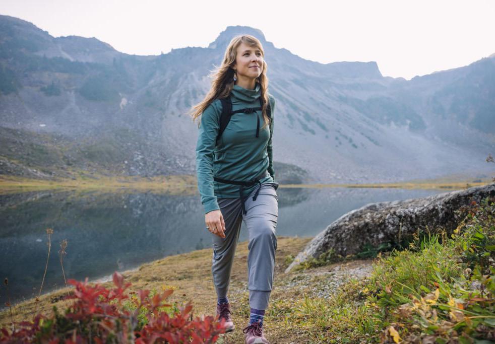
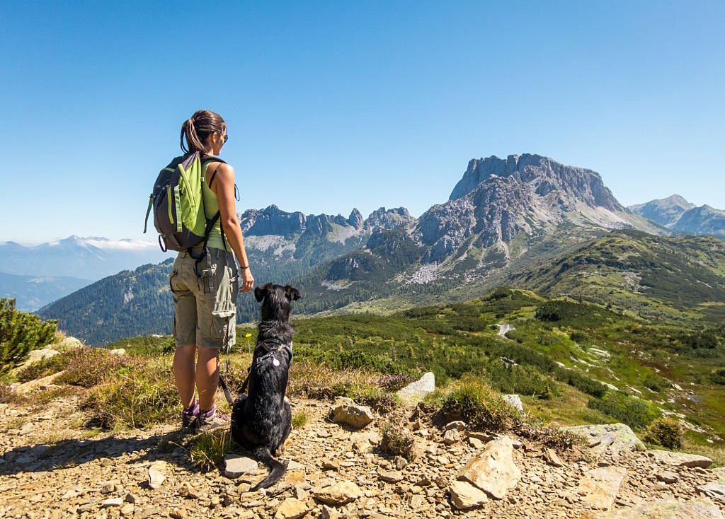
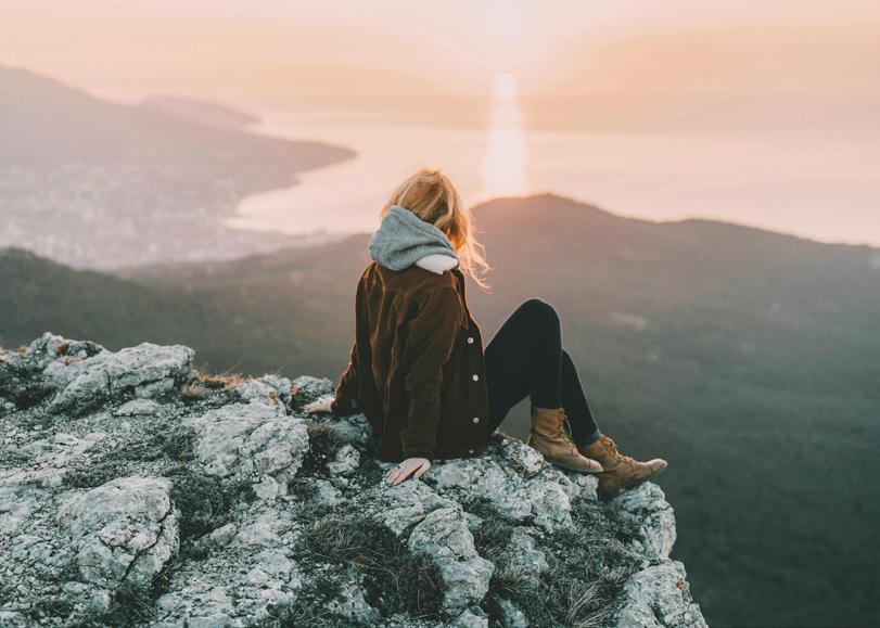
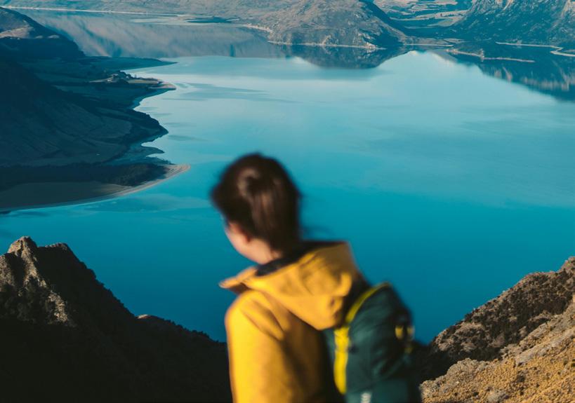
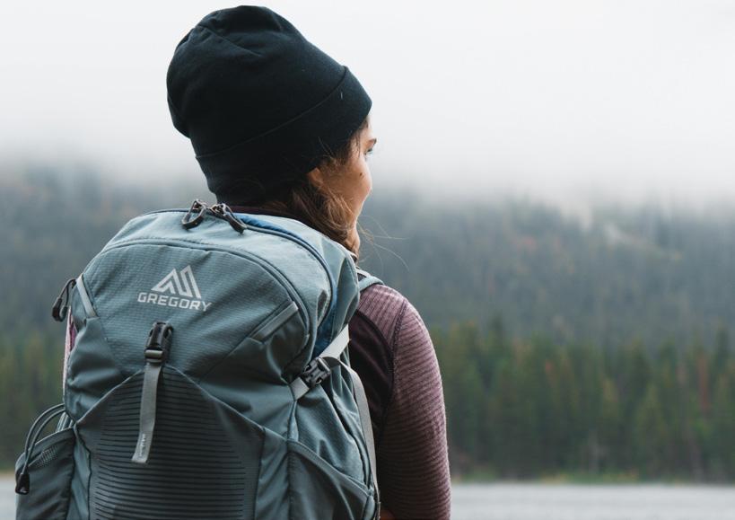
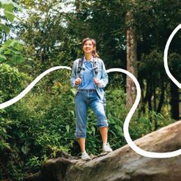
Photography
The Be Wilder photography model may follow the four seasons of Winter, Fall, Spring, and Summer. This will allow flexibility in the different aesthetics of the year. These images should present women solo hikers in a positive and clear light. When showing solo hikers and phones, it should convey the phone as a directional device or guide, rather than a photographic mechanism.
All photos should follow the characteristics of: wonder, admiration, discovery, satisfaction, journey,etc.
Any promotional material must call back to the three main goals of Be Wilder: Connect, Grow, and Explore.
Be sure to pay attention to the composition, lighting, and exposure of the shot. It’s important to capture the environment as it is. Photos should represent a clear framework and realistic view of nature. It should also show the a motive/ campaign's goals and call-to-action.
Photos from Pexel.com and iStockphoto.com.
Be Wilder Branding Guidelines I 30 Graphic Elements and Imagery
WINTER FALL SPRING SUMMER
Photography Don'ts
Photography is a major extension of the brand’s tone and visual image. Using the wrong type of photography can quickly give our audience the wrong impression. Please pay attention to the following things when choosing photography to represent Be Wilder.
• Do not use heavily filtered photos or unnatural lighting and edits. Photos should be a realistic view of nature.
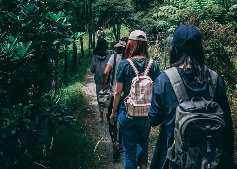
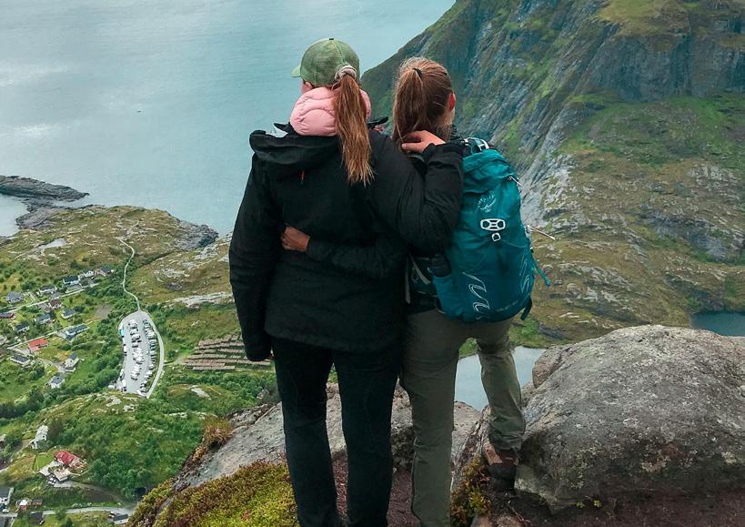
• Do not use groups of women hiking together. Be mindful that this brand is for solo hikers.
• Do not use photos with blurry subjects. The subject should be well lite, easy to find and in focus.
• Do not photos with negative facial expressions. (Ex. Frustration, sadness, confusion, etc.) This brand is supposed to affirm the safety and planning of a hike.
• Do not have a photos with other brands being the focus. Be Wilder should be the main and first branding element noticed.
• Do not have a photo series with just one body type and/or race. Recall standards for Diversity, Equity, and Inclusion (DEi Standards).
Filter Photos
Brand photos should reflect a realistic view of nature. Recall that Be Wilder is for everyone and not just one version/ aesthetic of nature.

Negative Expressions
Frustration, sadness, etc. can cause confusion on the mission of Be Wilder. This brand is supposed to affirm the safety and the easy of planning a hike.
Hiking Groups
Be mindful that this brand is for solo hikers. The subject should reflect this.
Unclear Subject
The subject should be well lite, easy to find, and in focus. The subject should almost always be the person.
Alternative Brands
Be Wilder should be the main and first branding element noticed. This is subject to change when it comes to collaborations.
One Body/Race Presented
Recall that hiking can be for anyone. It does not exclude different body types or race.
Be Wilder Branding Guidelines I 31 Graphic Elements and Imagery
ux/uI KIt
Be Wilder Branding Guidelines I 32
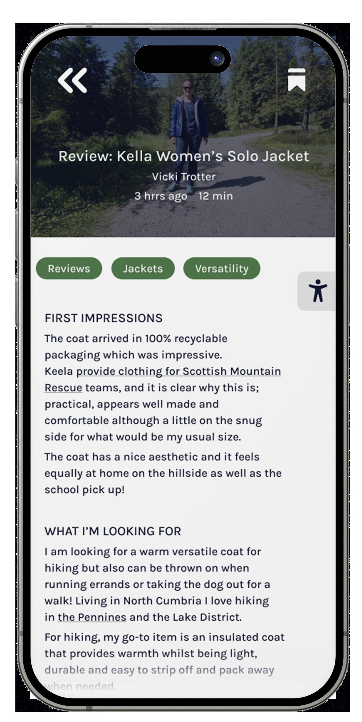
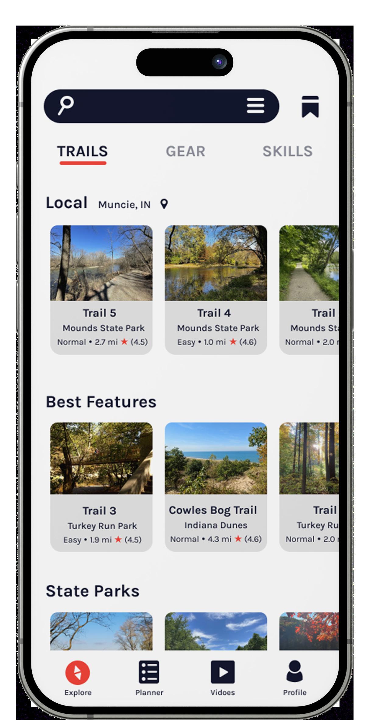
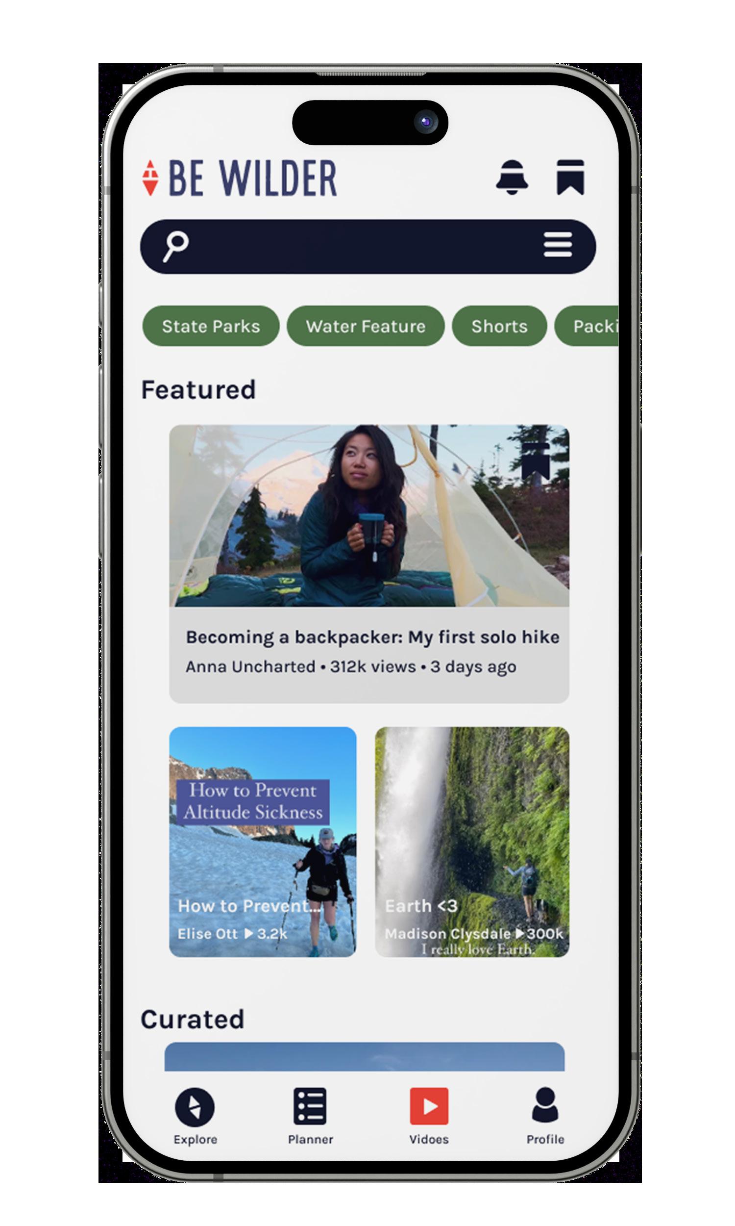
App
The app is designed based on a 8 column grid with a margin of 20 px and gutter space of 16 px.
Spacing
Standard spacing between a Header 1 and an Article Preview is 20 px. The spacing between a group of Header 1 and Informational Box(s) is 40 px.
For Article Previews like articles, vlogs, and trail descriptions there is a space of 16 px.
For Tags / Filters, there is a space of 6 px.
Between the search bar and Header 1 there is 24 px of space.
GRID GRID-IN-ACTION
ARTICLE PREVIEW SPACING 6 px 16 px 20 px 16 px 20 px 24 px 40 px UX/ UI Kit Be Wilder Branding Guidelines I 33
Interactive Components
All UX/UI elements are pulled from the app. This system includes components and iconography.
The use of tints and shades of the Core Color Palette and graphic elements were personalize before applying them to our products’ UI.
Components
Components are interactive elements within the app. They guide the user to next steps, specific content, show progress, and more.
Buttons are pill shaped. Other components are rounded elements by 10 px. The active part of the component is typically in the color 'Inspiration'. Other variation of Core colors like 'Connection' or 'Growth' are used in Tags / Filters. While a classic Emergency red is used for the SOS.
The padding on buttons is 25 px for horizontal spacing and 10 px for vertical spacing.
Accessibility
Accessibility includes type size, sound and light/ dark mode. These are ready throughout all articles of information and the preferences can be edited directly in the user's account settings.
COMPONENTS
COMPONENTS PADDING
ACCESSIBILITY
Graphic Elements and Imagery Be Wilder Branding Guidelines I 34
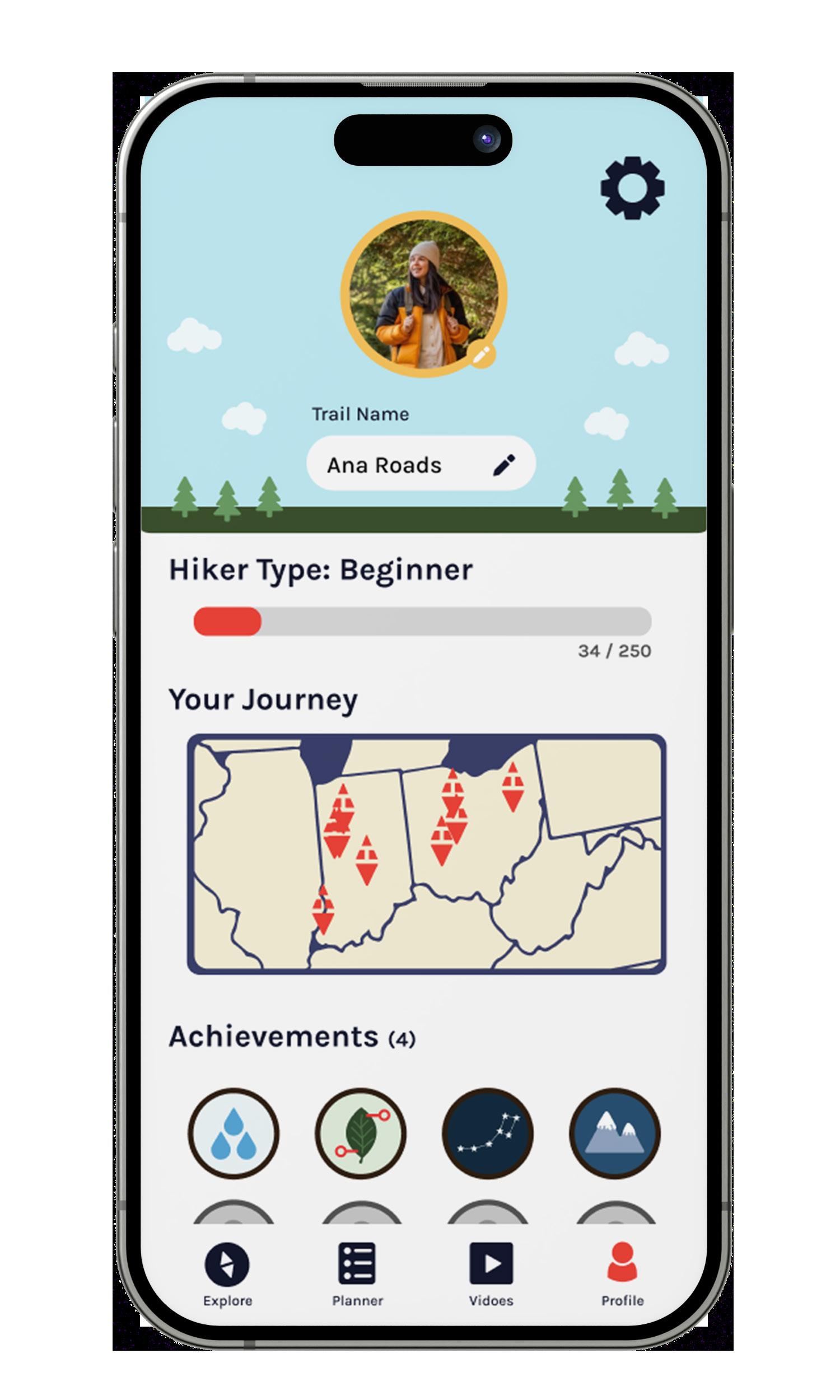
Iconography
Style Requirements
The Be Wilder icon system uses the two principles of the logomark. Icons are either individual elements making the shape or a silhouette shape, or a combination of the two.
Icons have corners rounded to 1 to 3 px. Linear icons are built in a 3 pt stroke.
The icon library is used consistently throughout our product interfaces and app. The library consists of filled icons, linear icons, and achievement badges.
Icons are based on a 7 x 7 px grid system. The achievement badges were created in a style similar to Girl Scout badges.
The complete icon library can be found here .
LINEAR
ICONS
GRID SYSTEM
FILLED ICONS
ACHIEVEMENT BADGES
Graphic Elements and Imagery Be Wilder Branding Guidelines I 35
Brand In usE
Be Wilder Branding Guidelines I 36
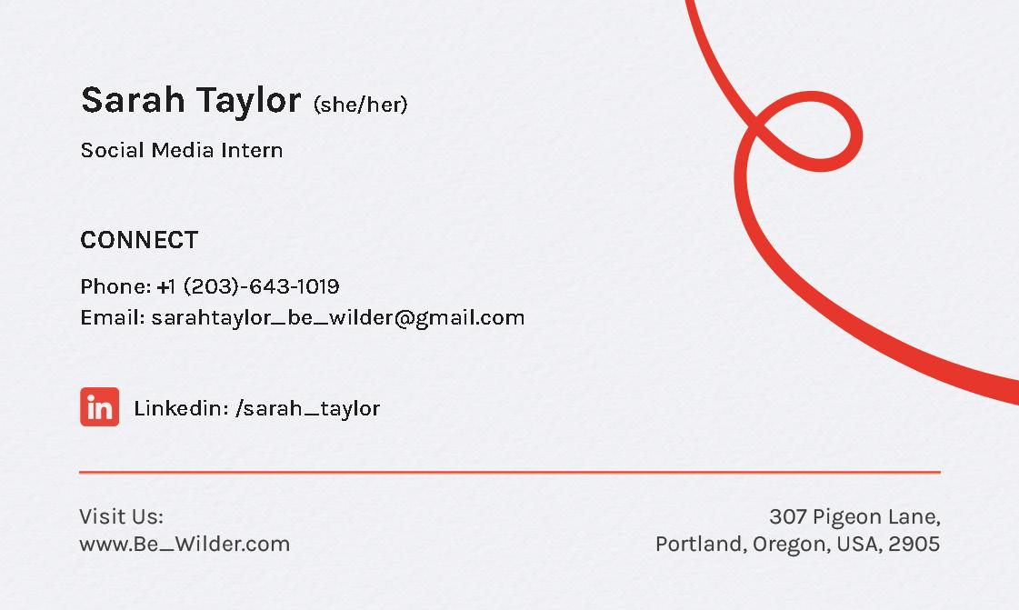
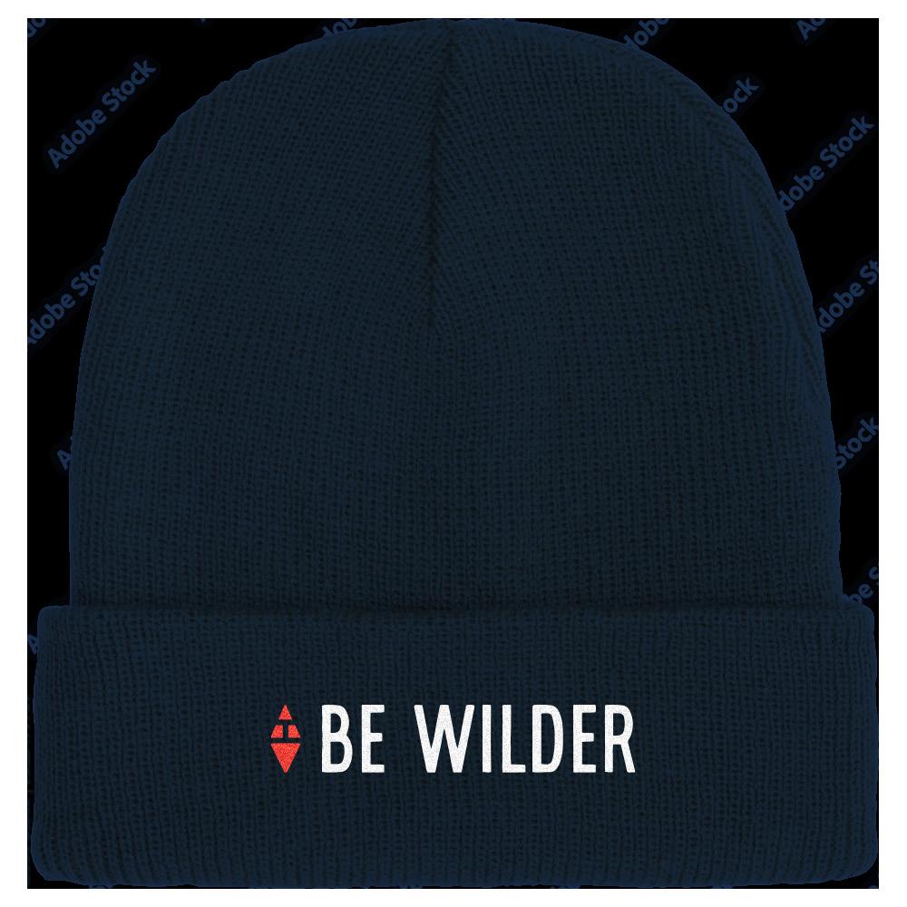
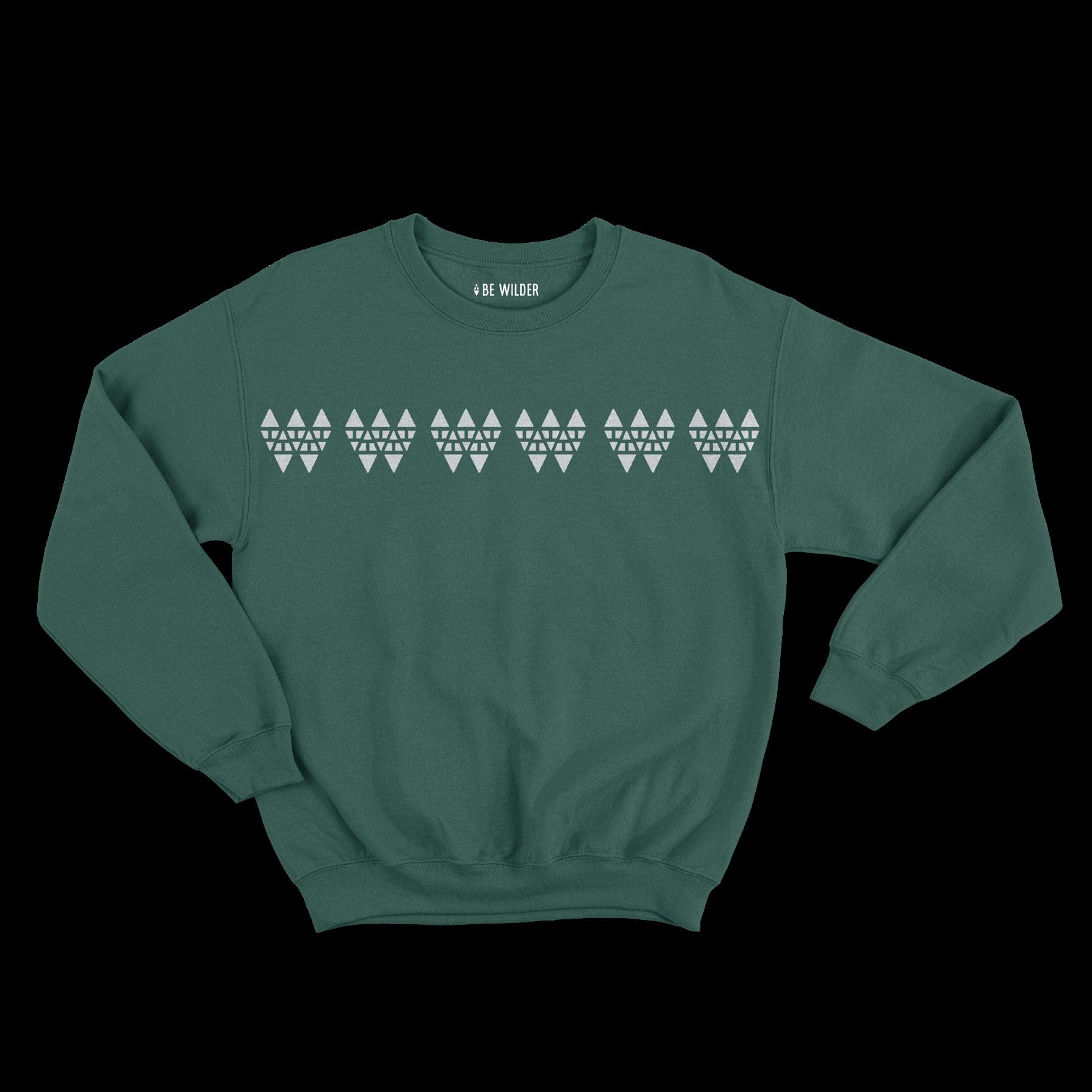
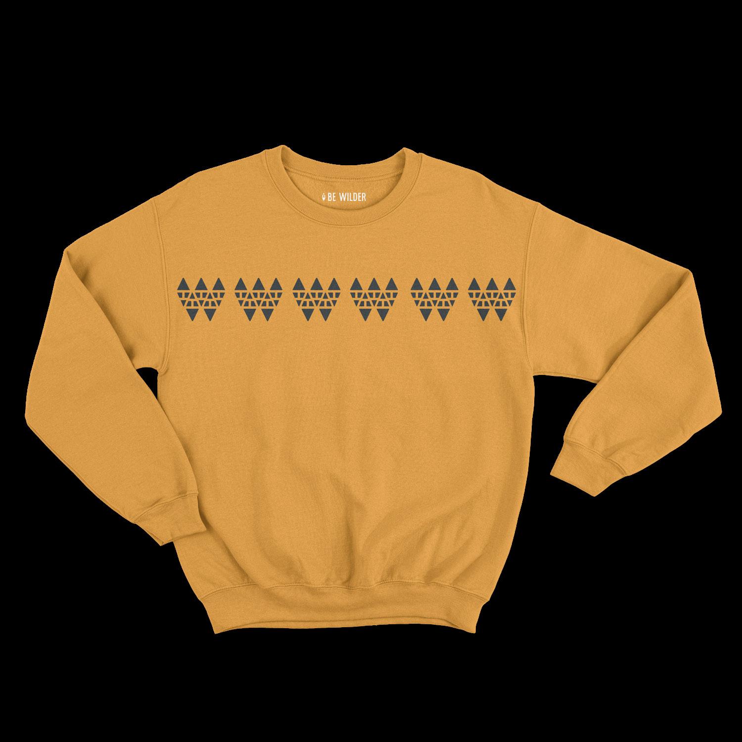
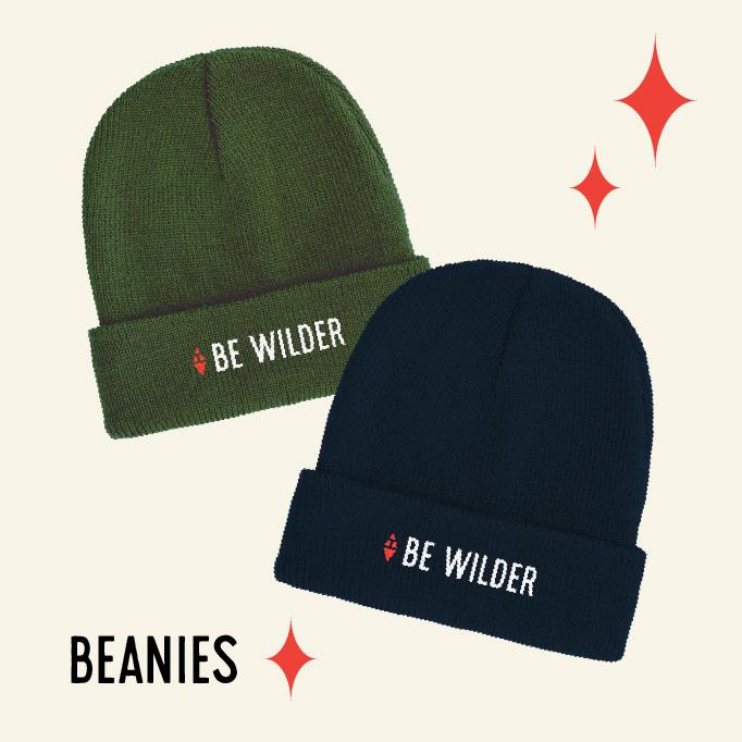
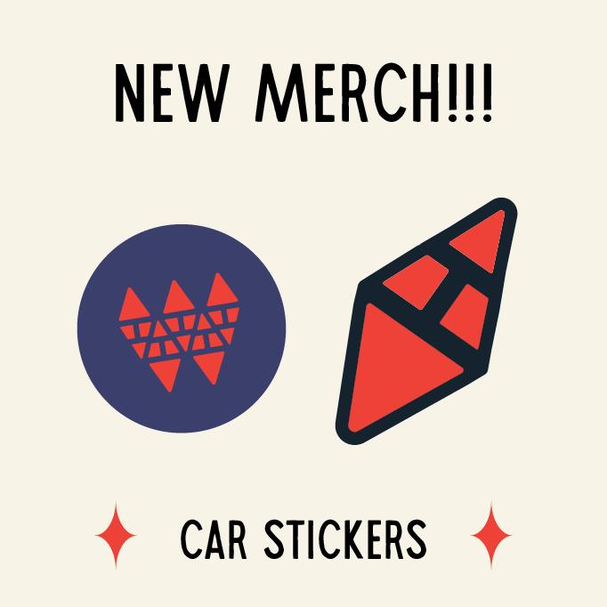
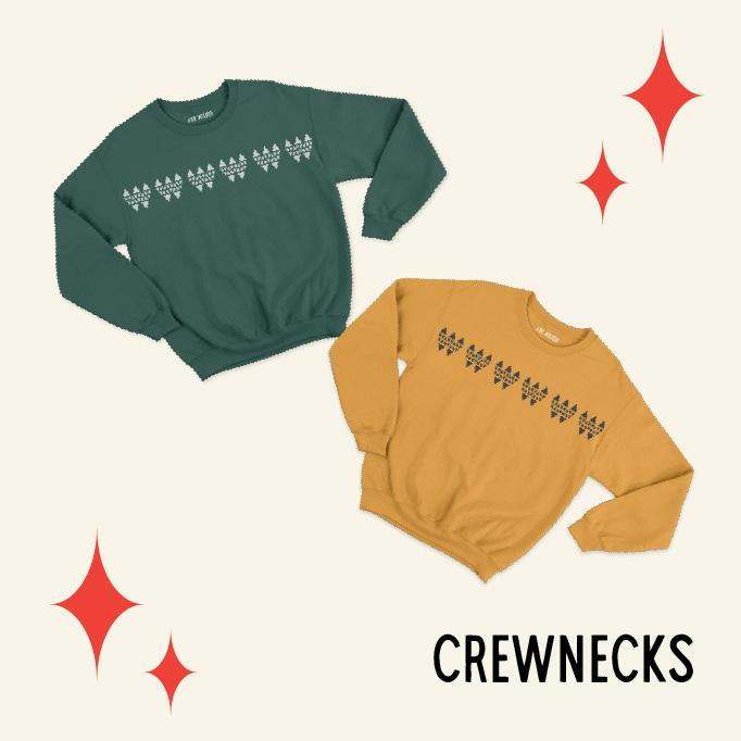
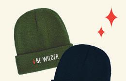
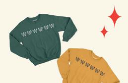
Business Card & Merchandise
Be Wilder's visual aesthetic continues throughout its physical collaterals. This can include business cards and merchandise like beanies, crew neck sweaters, tote bags, and more.
BUSINESS CARD
The business card is used for networking events to foster collaborations and connect with creators.
The merchandise acts as visual marketing to those outside of online spaces like the app or social media. Its proceeds also contribute to the conservation efforts of Be Wilder.
MERCHANDISE
Brand In Use Be Wilder Branding Guidelines I 37
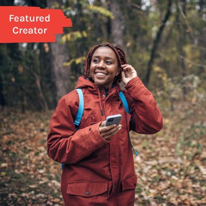
Social Media
Be Wilder has platforms on Instagram and Facebook. These accounts will utilize the logomark for the profile picture. Additionally, posts will be provided for updates about trail images, featured creators, collaborations, app updates, and more.
Posts in general should be informational or educational rather than entertainment. The social media's goal is to encourage the idea of spending time in nature. They also all adhere graphic element and photo standards.
Series/ Stand Alone Post
Series post should be publicized consecutively and should be able to stand alone if needed. Regular posts should be stand alone and have minimal graphic elements.
Captions
Optional and should be 10 to 45 words. It should also include relevant tags and hashtags to obtain its broadest reach.
Vlogs/Shorts
These videos should be from Featured Creators, trails, or show nature. The length of videos should be between 15 - 60 seconds.
SERIES POST EXAMPLE


STAND ALONE EXAMPLE
CAPTION EXAMPLE
Bianca Davis is April's Featured Creator! Bianca has been solo hiking for four years and has expertise in weekend camping. Look for her full post in our app!
#featuredcreator #be_wilder #camping Creator: @bianca_adventures

Brand In Use Be Wilder Branding Guidelines I 38
Brand Voice
Be Wilder is a statement of encouragement and motiviation. It acts as a call-to-action while being confident and friendly. This voice values honesty, confidence, encouragement, and curiosity.
WE VALUE OUR VOICE IS OUR VOICE IS NOT
Honesty
Transparent, authentic, and realistic Deceptive or withholding
Confidence
Affirming, strong, and kind
Insecure or judgemental
Encouragement
Motivating, supportive, friendly, and upbeat
Brutal or condescending
Curiosity
Steady, calm, and open-minded
Confusing or disorderly
Brand In Use Be Wilder Branding Guidelines I 39
Brand Tone
Be Wilder's brand tone sets the mood of the messages to our target audience of Millennials and Gen Z through our crafted word choice and writing style.
Our content is primarily around the App and then through Print Material, Social Media and Emails.
CONTENT USER TYPE
App
Print Material
(Posters, Bill Boards, etc.)
They're looking to learn about planning a hike and connect with fellow solo hikers.
They're looking for a place to learn, plan, and grow in their hiking goals.
GOAL
TONE
To inform and direct. Keep it clear, simple, and thoughtful.
Social Media
They're looking for representation and highlights of the app and conversation efforts.
To peak curiosity or motivate.
Be thought-provoking, inspiring, and concise. Short phrases or quotes do it best.
To show transparency and proactivity
Be friendly, inviting, and open. Can use niche terms, but be sure to have explanations in captions.
Emails
They're looking to be kept in the loop.
To highlight personal efforts or new media.
Be personable and expressive.
Brand In Use Be Wilder Branding Guidelines I 40
Mobile App
Be Wilder's mobile app is the main point of connection between our target audience and service. When adding pages or screens, please utilize the brand colors, graphics/illustrations and photography standards within the app. Update information like new skills, achievements, etc. when it is necessary.


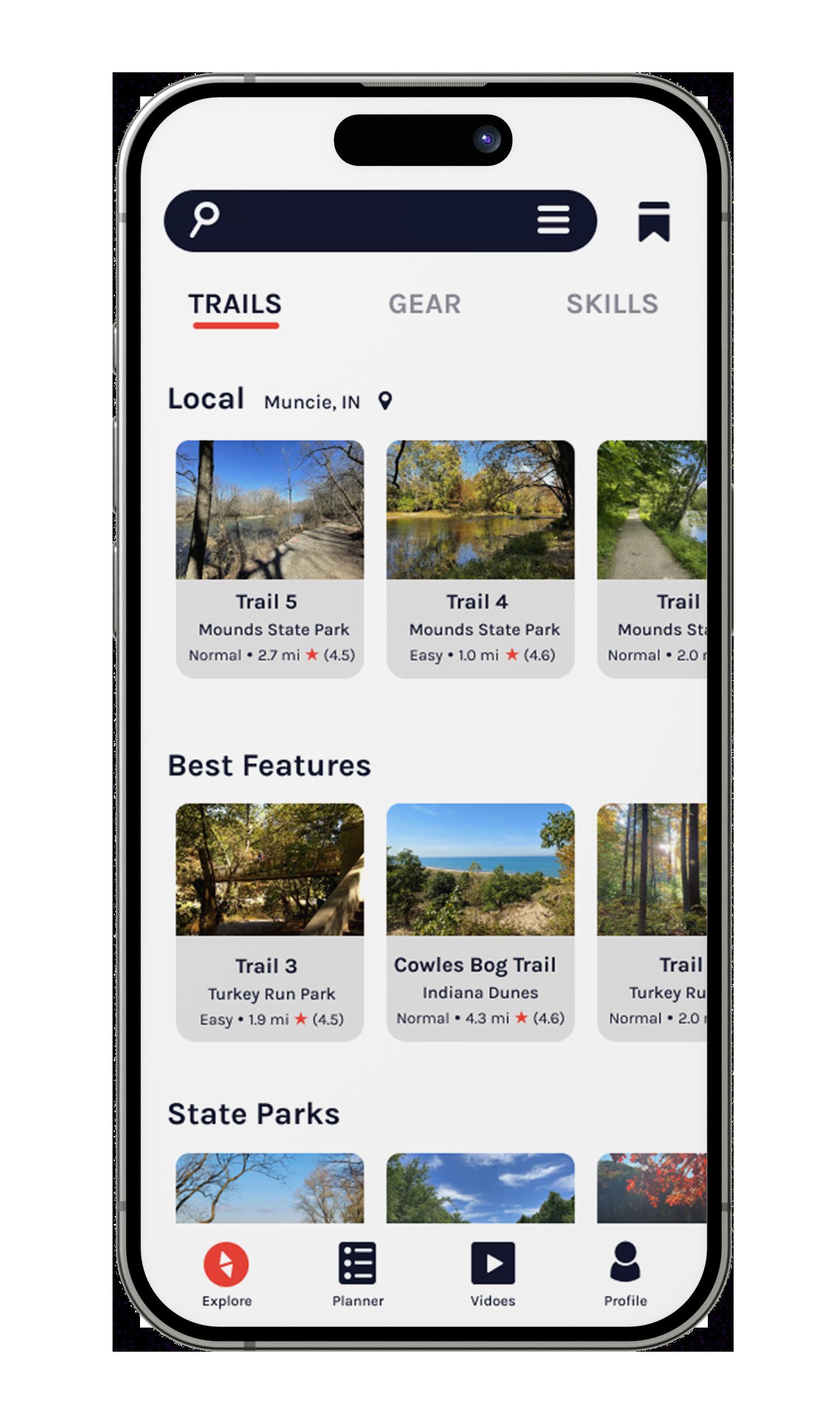
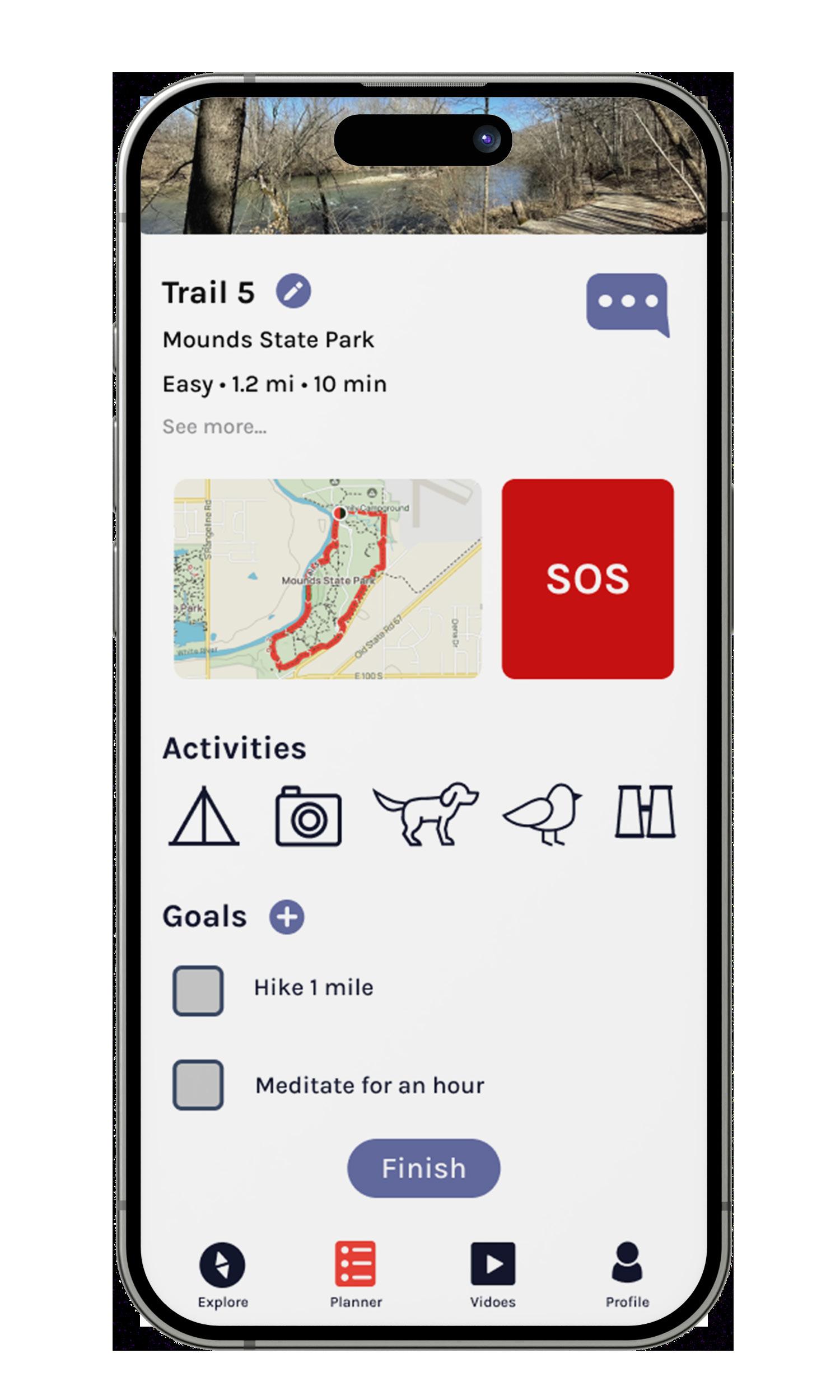
IPHONE EXAMPLE Brand In Use Be Wilder Branding Guidelines I 41
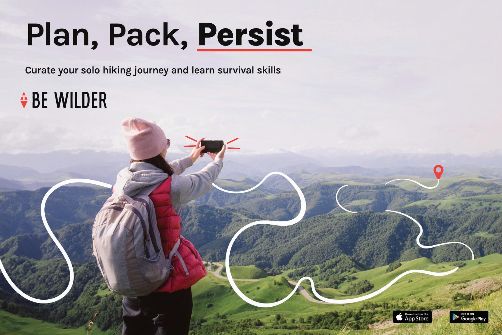
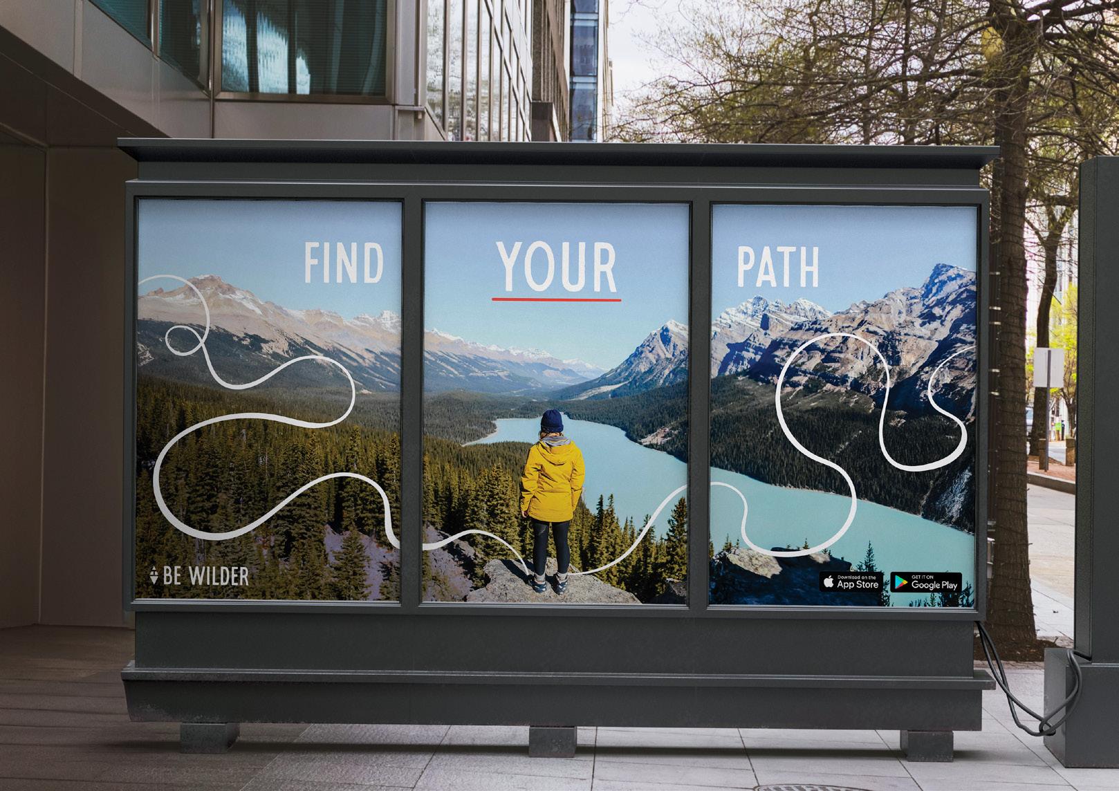
Print Material
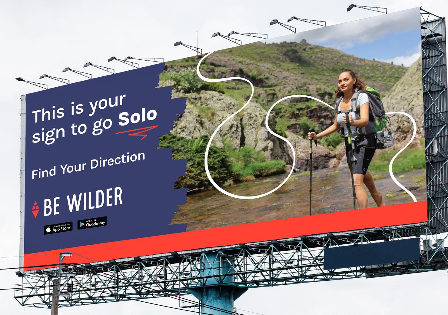
Be Wilder's print material includes store posters, street posters, bill boards, and more. It's important that Be Wilder has public representation and marketed in spaces where any solo hiker could see it.
Whether it's getting new hiking gear to passing it by on the road or street, the target audience's interaction should be overall inviting and affirming to a person's need to go solo.
POSTER SERIES
HORIZONTAL POSTER
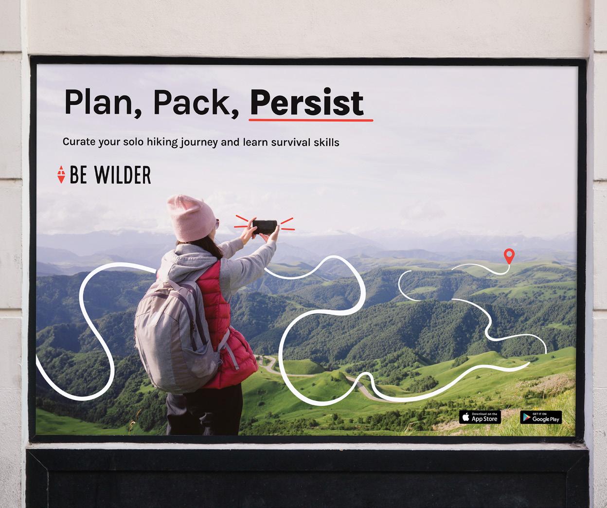
COLLABORATIVE POSTER
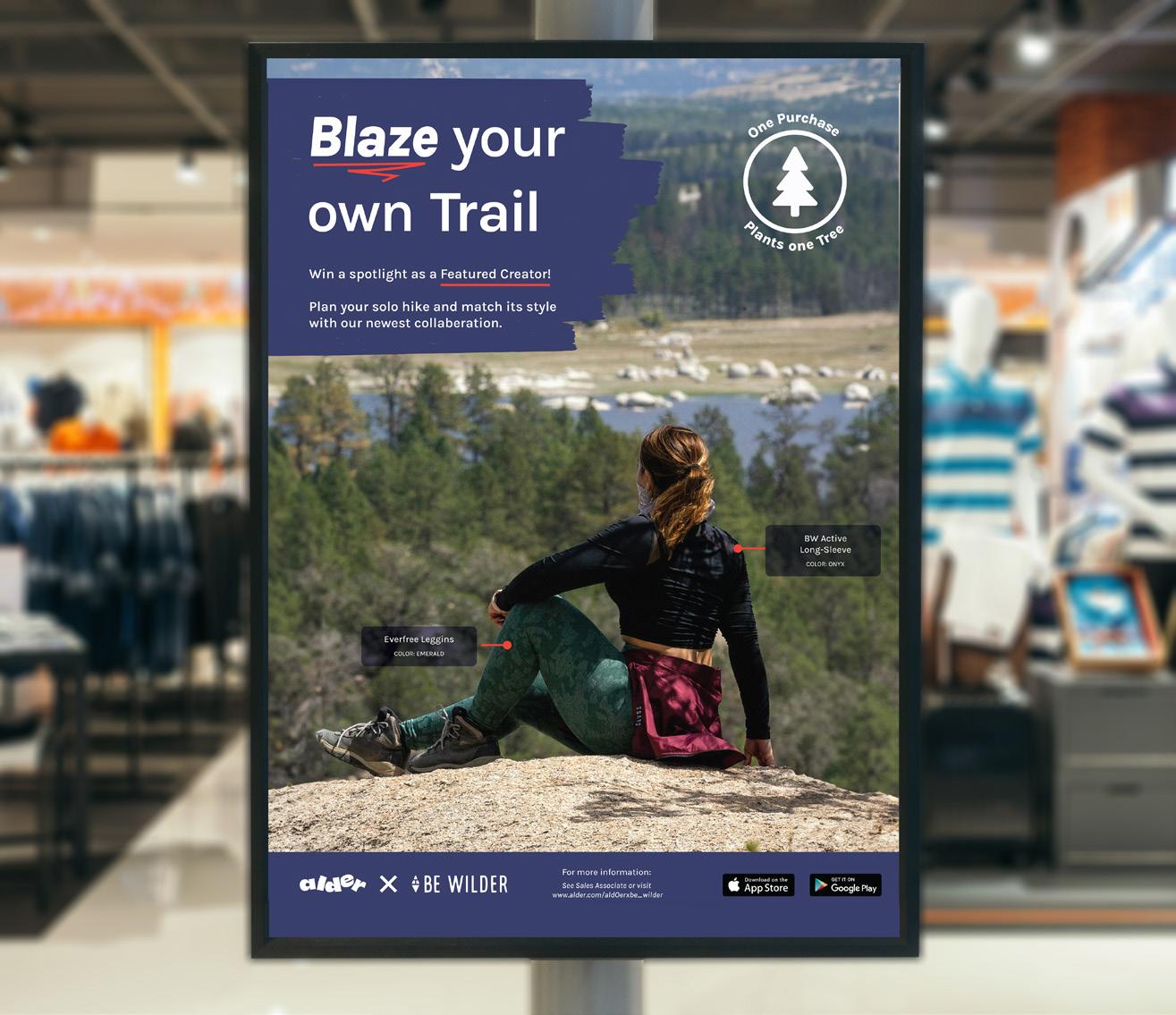
BILL BOARD
Brand In Use Be Wilder Branding Guidelines I 42
artworK FIlE IndEx
Be Wilder Branding Guidelines I 43
Artwork File Index
Included on pages 44-47 are the Be Wilder visual identity components. They are provided in black and white (BW), and color. All files are provided in the following formats: JPEG, PNG, SVG, & PDF.
Notes for the file format usage:
JPEG files are intended for online use, but they have been saved at a high quality, providing you flexibility in their use. A JPEG is a flattened graphic and contains a white background.
PNG files are intended for your app/website. It is a transparent graphic, which means that it is not have any background color.
PDF files are intended for print. They are a scalable vector format, which does not lose quality when printed in large or small sizes.
Ai files are intended for making any sizing changes. They are a scalable vector format, which does not lose quality when printed in large or small sizes.
LOGOMARK
Be_Wilder_Logomark_RGB_BW.jpeg
Be_Wilder_Logomark_RGB_BW.png
Be_Wilder_Logomark_RGB_BW.pdf
Be_Wilder_Logomark_RGB_BW.ai
Be_Wilder_Logomark_CMYK_BW.jpeg
Be_Wilder_Logomark_CMYK_BW.png
Be_Wilder_Logomark_CMYK_BW.pdf
Be_Wilder_Logomark_CMYK_BW.ai
Be_Wilder_Logomark_RGB_Color.jpeg
Be_Wilder_Logomark_RGB_Color.png
Be_Wilder_Logomark_RGB_Color.pdf
Be_Wilder_Logomark_RGB_Color.ai
Be_Wilder_Logomark_CMYK_Color.jpeg
Be_Wilder_Logomark_CMYK_Color.png
Be_Wilder_Logomark_CMYK_Color.pdf
Be_Wilder_Logomark_CMYK_Color.ai
Be Wilder Branding Guidelines I 44
Artwork File Index
Included on pages 44-47 are the Be Wilder visual identity components. They are provided in black and white (BW), and color. All files are provided in the following formats: JPEG, PNG, SVG, & PDF.
Notes for the file format usage:
JPEG files are intended for online use, but they have been saved at a high quality, providing you flexibility in their use. A JPEG is a flattened graphic and contains a white background.
PNG files are intended for your app/website. It is a transparent graphic, which means that it is not have any background color.
PDF files are intended for print. They are a scalable vector format, which does not lose quality when printed in large or small sizes.
Ai files are intended for making any sizing changes. They are a scalable vector format, which does not lose quality when printed in large or small sizes.
MONOGRAM
Be_Wilder_Monogram_RGB_BW.jpeg
Be_Wilder_Monogram_RGB_BW.png
Be_Wilder_Monogram_RGB_BW.pdf
Be_Wilder_Monogram_RGB_BW.ai
Be_Wilder_Monogram_CMYK_BW.jpeg
Be_Wilder_Monogram_CMYK_BW.png
Be_Wilder_Monogram_CMYK_BW.pdf
Be_Wilder_Monogram_CMYK_BW.ai
Be_Wilder_Monogram_RGB_Color.jpeg
Be_Wilder_Monogram_RGB_Color.png
Be_Wilder_Monogram_RGB_Color.pdf
Be_Wilder_Monogram_RGB_Color.ai
Be_Wilder_Monogram_CMYK_Color.jpeg
Be_Wilder_Monogram_CMYK_Color.png
Be_Wilder_Monogram_CMYK_Color.pdf
Be_Wilder_Monogram_CMYK_Color.ai
Be Wilder Branding Guidelines I 45
Artwork File Index
Included on pages 44-47 are the Be Wilder visual identity components. They are provided in black and white (BW), and color. All files are provided in the following formats: JPEG, PNG, SVG, & PDF.
Notes for the file format usage:
JPEG files are intended for online use, but they have been saved at a high quality, providing you flexibility in their use. A JPEG is a flattened graphic and contains a white background.
PNG files are intended for your app/website. It is a transparent graphic, which means that it is not have any background color.
PDF files are intended for print. They are a scalable vector format, which does not lose quality when printed in large or small sizes.
Ai files are intended for making any sizing changes. They are a scalable vector format, which does not lose quality when printed in large or small sizes.
PRIMARY LOCKUP
Be_Wilder_PrimaryLockup_RGB_BW.jpeg
Be_Wilder_PrimaryLockup_RGB_BW.png
Be_Wilder_PrimaryLockup_RGB_BW.pdf
Be_Wilder_PrimaryLockup_RGB_BW.ai
Be_Wilder_PrimaryLockup_CMYK_BW.jpeg
Be_Wilder_PrimaryLockup_CMYK_BW.png
Be_Wilder_PrimaryLockup_CMYK_BW.pdf
Be_Wilder_PrimaryLockup_CMYK_BW.ai
Be_Wilder_PrimaryLockup_RGB_Color.jpeg
Be_Wilder_PrimaryLockup_RGB_Color.png
Be_Wilder_PrimaryLockup_RGB_Color.pdf
Be_Wilder_PrimaryLockup_RGB_Color.ai
Be_Wilder_PrimaryLockup_CMYK_Color.jpeg
Be_Wilder_PrimaryLockup_CMYK_Color.png
Be_Wilder_PrimaryLockup_CMYK_Color.pdf
Be_Wilder_PrimaryLockup_CMYK_Color.ai
Be Wilder Branding Guidelines I 46
Artwork File Index
Included on pages 44-47 are the Be Wilder visual identity components. They are provided in black and white (BW), and color. All files are provided in the following formats: JPEG, PNG, SVG, & PDF.
Notes for the file format usage:
JPEG files are intended for online use, but they have been saved at a high quality, providing you flexibility in their use. A JPEG is a flattened graphic and contains a white background.
PNG files are intended for your app/website. It is a transparent graphic, which means that it is not have any background color.
PDF files are intended for print. They are a scalable vector format, which does not lose quality when printed in large or small sizes.
Ai files are intended for making any sizing changes. They are a scalable vector format, which does not lose quality when printed in large or small sizes.
SECONDARY LOCKUP
Be_Wilder_SecondaryLockup_RGB_BW.jpeg
Be_Wilder_SecondaryLockup_RGB_BW.png
Be_Wilder_SecondaryLockup_RGB_BW.pdf
Be_Wilder_SecondaryLockup_RGB_BW.ai
Be_Wilder_SecondaryLockup_CMYK_BW.jpeg
Be_Wilder_SecondaryLockup_CMYK_BW.png
Be_Wilder_SecondaryLockup_CMYK_BW.pdf
Be_Wilder_SecondaryLockup_CMYK_BW.ai
Be_Wilder_SecondaryLockup_RGB_Color.jpeg
Be_Wilder_SecondaryLockup_RGB_Color.png
Be_Wilder_SecondaryLockup_RGB_Color.pdf
Be_Wilder_SecondaryLockup_RGB_Color.ai
Be_Wilder_SecondaryLockup_CMYK_Color.jpeg
Be_Wilder_SecondaryLockup_CMYK_Color.png
Be_Wilder_SecondaryLockup_CMYK_Color.pdf
Be_Wilder_SecondaryLockup_CMYK_Color.ai
Be Wilder Branding Guidelines I 47
thanK you!
For
IN 47034
any questions contact: Hannah J Schneider hjschneiderdesign@gmail.com 467 Blueberry Court Muncie,
