2023 BRANDING GUIDELINES
TABLE OF CONTENTS Introduction 01 1 Lockups 02 1.1 Clear Space 03 1.2 Logo Misuse 04 2 Typography 05 2.1 Website Typography 06 3 Color Palette 07 3.1 Combinations 08 4 Layout Guidelines 09 4.1 Stationary Mockups 10 4.2 Nail Box Mockups 11 4.3 Social Media Mockups 12
INTRO
Shaping the Experience
To be precise, clearly communicate, and help show self expressions, is the goal of any nail tech. This is the same manner in which branding guidelines work.
Within Ains Artistry scope of work the re-brand stands to shape the viewer’s perspective on who Ains Artistry audience is, what is the environment, and quality service.
01
1.0 LOCKUPS
Note: All artwork files provided will be in the maximum sizing.
Primary Lockup
This the logo that will be your default logo for all branding unless otherwise stated.
Sizing Limitations
Maximum: 7153 x 4992 px
Minimum: 0.45%
Secondary Lockup
This logo is in a longer horizontal view. This will only be used in social media banners like Facebook & Twitter. There can be no change in color.
Sizing Limitations
Maximum: 1500 x 500 px
Minimum: 851 x 315 px
Aspect Ratio: 2:3
Favicon/Profile Picture
This lockup is only for your website favicon also know as the tab icon.
Additionally it will serve as the profile picture on social media. These dimensions are at their largest size for media will not need further scaling. There can be no change in color.
Favicon Dimensions: 18.36 X 36 px
Profile Picture Dimensions: 204 X 400 px
Favicon
Secondary Lockup (Horizontal)
Primary Lockup (Vertical)
02
Profile Picture
1.1 CLEAR SPACE
Clear space for lockups is to help ensure your logo is not jeopardized by outside elements. It is best described as a boundary. Nothing can go into the boundary.
The clear space is formed from x-hight of the "s" in ‘Ains’. This is 28% of the height of Ains Artistry™.
Please utilize this when pairing your lockups with other elements like a different company’s logo, descriptions, bar codes, etc.
This is already included in your artwork files.
03
Secondary Lockup (Horizontal)
Primary Lockup (Vertical)
1.2 LOGO MISUSE
These are examples of what is not allowed with the lockup systems.
It includes clear space violations and arrangement misuse.
A General Rule of Thumb
- Do not stretch, warp, or distort the logo in any way (horizontally or vertically)
- Do not have anything within the clear space except for the lockup itself
- Do not rearrange or detach any elements from the lockups
- Do not add a stroke
- Do not put the logo on an angle
- Do not recolor logo unless its a solid color. (See 4.0 Color or Mockups)
04
2.0 TYPOGRAPHY
Note: This section is an explanation of the typography used for the logo. These fonts are not to be used for other elements except the logo itself.
‘Ains’ Font
Gothiks Round, Book
Gothiks Round was created by Daniel Sabino. It has a variety of weights that reflect the linear quality of nail art. It was manipulated to have a rounder quality on the ends of the letters to evoke the liquid aspect of letter art.
“This kind of morphology was chosen because it accepts condensation in a very natural way, giving to this sanserif a very unique personality.”
- Daniel Sabino
Original Final Version
‘Artistry’ Font
FinalSix, Book
FinalSix was created by José M Urós. It was selected due to it‘s inspiration of the "undulating movement of water in a pool"which is reminiscent of nail polish. "Form follows meaning" is also expressed in the way nail it is representative of the wear’s personality or mood.
“...the idea of the undulating movement of water in a pool....FinalSix’s characters have rounded tops, bottoms, and diagonals, creating a wavy feeling. Urós defines the process as “form follows meaning.”
- José M Urós
05
2.1 WEBSITE TYPOGRAPHY
Karla
Karla was created by Jonny Pinhorn.
It is a grotesque sans serif family which has been expanded now to a variable font with a weight axis ranging from Extra Light to Extra Bold plus full support of Western, Central, and South-Eastern European languages. https://fonts.google.com/specimen/Karla/about
This is the current typography used on the website. It was continued for the selection due to it’s easy read and flexibility to a variety of mediums like print or website.
Please continue to use this type for the website, but also printed options as well like stationary, nail boxes, business cards, etc.
This is an example of the body copy. “If nails aren’t bare please select appropriate soak off option so we have enough time! I am located inside of Madjax on the first floor. There is a parking lot across the street on Jackson, and across the street on Main. Please call me if you need help parking or finding me! I look forward to seeing you :)”
www.ainartistry.com/about
Ab Bb Cc Dd Ee Ff Gg Hh Ii Jj Kk Ll Mm Nn Oo Pp Qq Rr Ss Tt Uu Vv Ww Xx Yy Zz 0 1 2 3 4 5 6 7 8 9 ® ™ © € $ ¢ ¥ ₨ € @ = − + > <
06
3.0 COLOR PALETTE
Millennial Pink
A bright shade of millennial pink. This color is also inspired by the former logo and Millennial’s Pantone color. This is the main color for ‘Ains’ in the lockups.
Gen Z Yellow
A gold shade of yellow to represent the target audience of Gen Z. This color was inspired from the Gen Z’s Pantone color. This the secondary color for ‘Artistry’ in the lockups.
Perfect Bead
An off-white base for the website and other branding. The name is reflected of the acrylic bead that is used to create gel nails.
UV Black
A basic blue-black for any sort of text or black and white concept. The name is from the UV black light that cures gel nails.
Millennial Pink
CMYK: 0,52,9,0
RGB: 255,151,178
HEX: #FF97B2
Gen Z Yellow
CMYK: 11,30,100,0
RGB: 229,178,35
HEX: #E5B223
Perfect Bead
CMYK: 1,0,1,0
RGB: 252 , 251 , 250
HEX: #FCFBFA
UV Black
CMYK: 75,68,62,74
RGB: 28,29,33
HEX: #1C1D21
07
3.1 COMBINATIONS
Millennial Pink & Gen Z Yellow
These colors may only go together and not with any other color. They may only be used in the primary logo as shown. You cannot inverse these colors either. (See 1.0 Lockups)
Perfect Bead & UV Black
Perfect Bead and UV Black can be used as background colors and for the nail box. This is for the single-colored logo variations. This is to insure your colors pop.
Single Use Color
Single/ Solid color Lockup may only be used for nail designs or select photos. (See Section 4)
A General Rule of Thumb
- Do not combine light lockup on Perfect Bead
- Do not have combine dark lockup with UV Black
08
4.0 LAYOUT GUIDELINES
Stationary
Business card: Align Center Right/Left
Letter: Align Center
Website
Align Center at the top of the website
Photos
These photos will be only for social media posts.
For nail design posts:
- Place the solid color logo in the bottom right corner. This is the only time a solid color may be used. All other photos must use the Primary lockup. (See 1.0 Lockup)
For general posts:
- Put the logo in the bottom right corner either in Black or White version of the Primary Logo


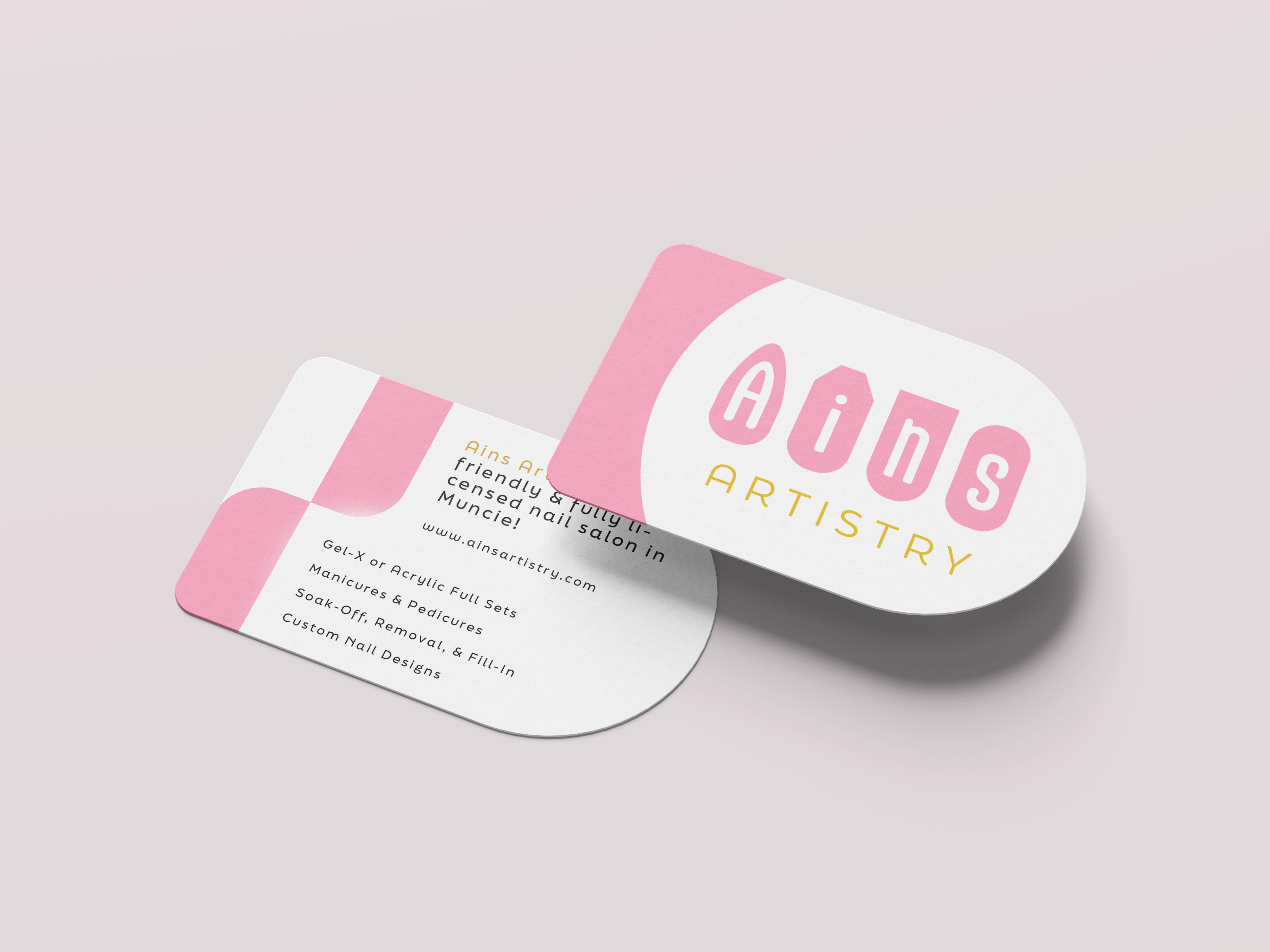

Business card Website Letter 09 Ains Art Nail salon in Muncie, IN Opening at 10:00 A.M. tomorrow Make Appointment
4.1 NAIL SET MOCKUPS
Card Dimensions: 4 X 5 inches (Vertical)
4 X 6 inches (Horizontal)
General
2-3 Color Scheme
Single Silhouette Symbol: your symbol must be legible and fit into the square template.
Front Lockup Dimensions: 135 X 79 px
Named Theme: 50% of ‘Artistry’ size
Backside/Description
Body Copy: Karla, Regular, size 10 pt, Maximum 35 words
Theme :
▪ Color: Perfect Bead
▪ Size: +3 pt of size from front
Vertical Nail Set
Barbie Core
Backside/Description
Barbie Core
This nail set is the embodiment of stereotypical Barbie.
Barbie can be anyone, but always with a pink flare. www.ainsartistry.com
Backside/Description
Mermaid Core
Mermaid Core
01 This nail set is the embodiment of the mystical Mermaid.
sea foam parties to dolphin friends, she’ll sweep your legs away.
From
www.ainsartistry.com
Horizontal Nail Set Template 01 www.ainsartistry.com
This is an example of the body copy/ description. This will give a brief explanation for the name of the theme and it’s characteristics.
This is an example of the body copy/ description. This will give a brief explanation for the name of the theme and it’s characteristics. www.ainsartistry.com
Theme Here www.ainsartistry.com Theme Here
Theme Here
Here 10
Silhouette Symbol
Theme
4.3 SOCIAL MEDIA MOCKUPS
Photo Aesthetic
Off-white or nude background with soft lighting.
Maintain a square formate for all photos
Profile Description
"Ains Artistry is your friendly & fully licensed nail salon in Muncie!
Gel-X or Acrylic Full Sets Manicures & Pedicures
Soak-Off, Removal, & Fill-In Custom Nail Designs
www.ainsartistry.com"
Banner/ Cover Photo Options
The secondary logo should be the banner default or it can be one of the recent nail designs.


11
Banner with Secondary Logo
Banner with Nail Designs
ARTWORK FILE INDEX
Vertical Logo
CMYK
Black, Full Color, White
RGB
Black, Full Color, White
Horizontal Logo
CMYK
Black, Full Color, White
RGB
Black, Full Color, White
Favicon/Profile Picture
RGB
Full Color
12
