MADE IN HAMPTON 2023
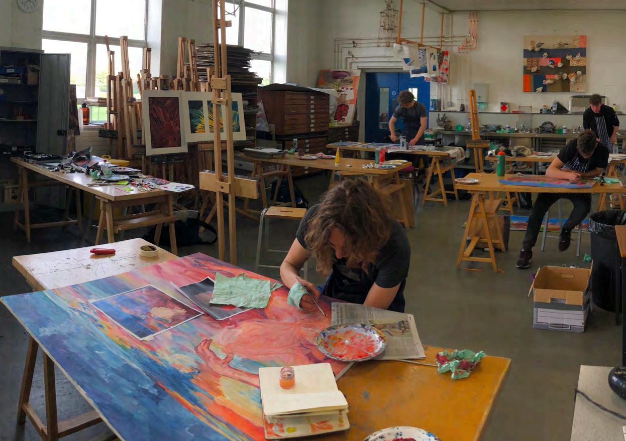
Welcome to the second edition of Made in Hampton, our magazine showcasing the remarkable talents of Hampton’s Upper Sixth artists. Their work was exhibited in the Art department gallery during summer term 2023, including at evening private view events for our community. It is especially exciting and inspiring to see the variety of media used: painting, printmaking, photography, mixed media and digital iPad paintings all feature in the following pages.
Six of our Upper Sixth Leavers followed the A Level Art course and many of them will continue to benefit from the subject at university, via courses including Architecture and Fine Art. Others will be reading for degrees in which their artistic flair, creativity and imagination will be significant assets.
Whatever their future pathways, the acquired attributes of independent thinking and research, along with an ability to take a distinctive approach, will prove invaluable to these Hamptonians. Studying Art in the Sixth Form has enabled them to develop these abilities and many more besides.
We do hope that you will enjoy Made in Hampton 2023.
The Art Department at Hampton provides the means for pupils to focus on personal response and encourages self-expression above all. Work included in the second edition of Made in Hampton shows the diverse responses that each generation of art pupil brings to their own making process. Work is underpinned by a strong focus on building the key skills of drawing and responding to the world around us. Pupils are encouraged to develop these skills from the First Year onwards with a balanced programme of projects that develop a range of skills and explore a diverse range of media. Independence and reflection are promoted throughout the GCSE and Sixth Form courses, enabling pupils to grow in confidence and maturity.
Academic achievement continues to remain exceptionally high, and pupils use their Art qualification to apply for a diverse range of courses including Fine Art and Architecture, but also Medicine, Mechanical Engineering and Natural Sciences.
The work produced in the Art Department by our Sixth Form is a springboard for many to go on to develop at Degree level and into exciting creative careers beyond this. Work is experimental, risk-taking, and forward-looking because there is no ‘right answer’.
The Art Department is an inspiring and welcoming environment in which to learn, and we aim to nurture a love for the creative arts in all our pupils that will stay with them for life.
 Kevin Knibbs Headmaster
Karen Williams Head of Art
Kevin Knibbs Headmaster
Karen Williams Head of Art
Arjan
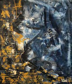
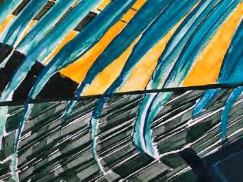
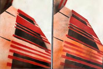
Throughout the last year of work, we have covered titles including, Combinations, Relationships and, for my exam piece, Three. I interpreted the brief Com b inations practically, as a combination between mediums. This led me to slicing up and rearranging images, but also weaving. I made several studies weaving together different photographs and also a diptych in gouache on watercolour paper titled, My Street. This piece was designed to bridge and contrast the tight back streets hidden away behind architectural marvels and an open park path surrounded by nature. It is a statement piece that suggests we should be working to incorporate nature within the heart of our cities. Weaving led me to explore the Bauhaus movement through artists like Anni and Josef Albers. My weavings became more abstract, which led me to produce a variety of lino prints and a final, large-scale weaving titled, Skyline. This weaving was based upon a view from Millennium Bridge, London, which I abstracted and planned digitally, before cutting out hundreds of paper strips and weaving it. This was a very fiddly yet satisfying process.
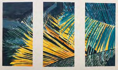
For the topic Relationships, began by looking for relationships between colour and texture. This led me to looking into Peter Lanyon’s work. then produced a series of large-scale painting on cardboard using mix media to create different textures. I also explored the idea of texture and colour by looking at Peter Smyth who produced one point perspective work looking at natural forms using vivid colours. This led me to create a series of inspired paintings and a final acrylic pain ti n g on canvas titled, Dancing Light. This piece depicts a series of leaves under extreme lighting which I digital abstracted and used as subject matter for my final piece.
I began my work for Three with a clear idea of how I could incorporate the number into my work. However, the most effective way to me seemed compositionally through the form of a triptych or dividing an image into thirds. The idea of splitting the image and potentially experimenting with collage led me to look at Matisse. studied his use of colour in depth and was particularly interested in the organic forms found in his work. These forms later led me to looking into close up photography of natural subject matters which served as the basis for my series of pieces, Foliage in flux. These pieces are gouache paintings on water colour paper. The piece is an exploration of light and close up imagery.
Calum
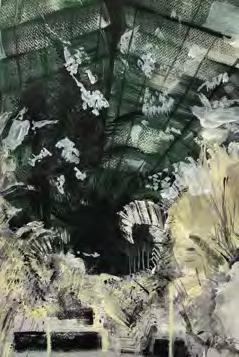
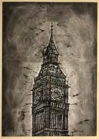
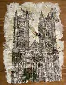
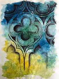
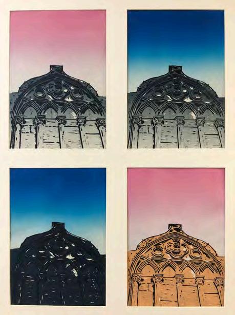
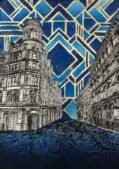
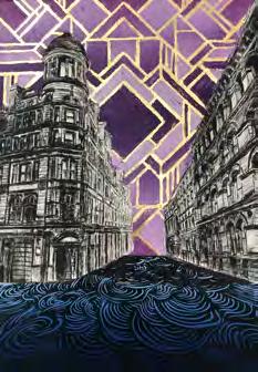
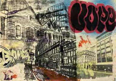
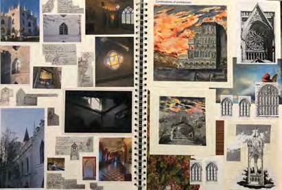
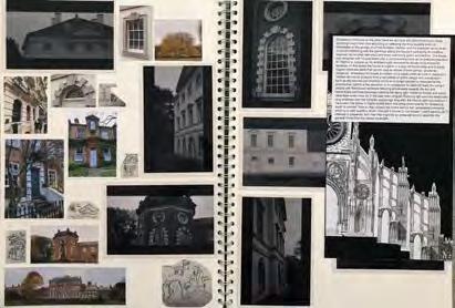
When we first received the theme Relationships at the start of our upper sixth year, the initial idea that came to mind was the exploration of the relationship between buildings and their surrounding environments. To draw inspiration, I began by taking a series of photographs both in and outside of school, focusing both on close-ups, which were inspired by the Boyle Families photography, and larger scale images, looking at neo-gothic buildings such as Westminster Abbey and St Pauls Cathedral. In the following pieces of art, I wanted to convey the beauty of these gothic structures whilst still maintaining their rich history and consistent presence in society, regardless of any political or economic turbulence. I began this presentation with a series of small scale, coloured studies inspired by the work of Maria Susarenko, a Kazakhstan-born artist whose work comprises a multitude of meticulous lines embedded with streaks of colour. So, to conclude this body of work, I drew a large-scale black drawing depicting the Western facade of Westminster Abbey, I drew this onto a textured surface mounted unto a large wooden background.
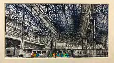
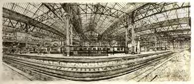
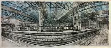
Later in the year, we received our final piece titles, to which chose the topic Endings. wanted my new work to be not too dissimilar to my prior pieces of art, and thus I felt the topic Endings would allow me to both continue and advance my studies of architecture. After creating a series of both monoprints and lino prints, I found myself drawn to etchings, prompting me to create a series of smaller scale etchings of Waterloo and its surrounding areas which led neatly towards my final piece. For my final piece, I created a large-scale etching which allowed me to capture both the intricacy and enormity of London’s biggest station. This coupled with the panoramic lens used to take the original image together conveys the scale of the structure. eventually settled on a triptych of prints, each slightly differing from the other through the use of both black and sepia ink, as well as adding colour to my final print, with the differing prints portraying the ever-changing nature of the world that surrounds us.

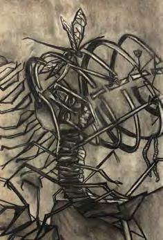
Insects was the theme chose from the prompt list for my final project, running from the previous title of Relationships I wanted to continue to explore vulnerabilities and presentation of self through the unique visual language of bugs and the like. I explored textures and space through the porous mark making of mono-printing, language of writhing and evolution through painting and digital pieces as well as employing the fine print details of etching to illustrate the limbic malaise of centipedes.
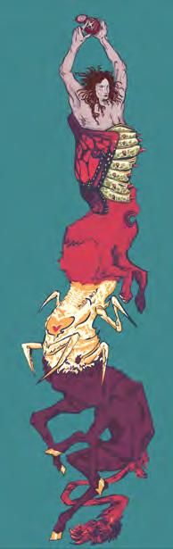
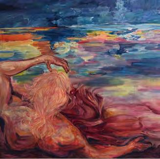
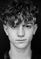
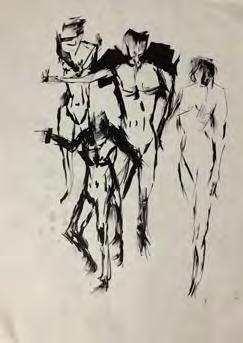
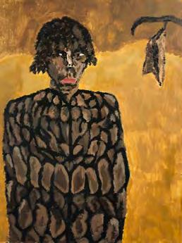
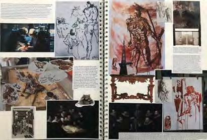
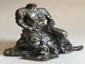
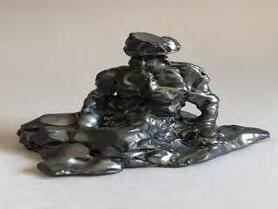
I found oil painting to be the medium which best held my interest in exploring the subject, resulting in my final pieces comprising large scale figure-based portraits having gained a strong foundation from the life drawing offered earlier in the year. The dynamism and elongation of form is the language I chose to explore in relation to insects. Foreshortening and twisting both the composition and the figure. The first insects painting pictures a distorted figure clambering out of a shell, the limited colour palette is unified with the oceanic imagery and slug or fish aligned aspects of the figure. It’s a painting about perception and movement through pressure as well as leaving of sanctuary. The final painting is reflective of new horizons and hierarchy. The figure becomes one with the seascape as they look out at the vista, the composition relating the viewer to seeing the now and its consequences using a high and warped horizon line and exploring the sky in its reflection.
Dan
Harrison
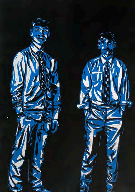
In my final year as an art scholar at Hampton chose to do the theme of 1920’s. I thoroughly enjoyed the process of generating unique and interesting ideas as well as the iteration process, refining an idea for my final piece. I was immediately gripped by the Art Nouveau and Art Deco styles from this decade and knew that this was the direction I wanted to take my project. I love trying lots of styles and media so I decided on a multimedia piece, a combination of lino and etching prints. I drew upon my experiences with these different printmaking techniques to create two, two block lino prints in addition to a large sketchy styled etching. For example, my work before Christmas used a similar chiaroscuro technique despite such a different subject matter. I created a diptych with two lino blocks of figures and focused on how the light created texture and form within their clothing and poses. This style of printing was transferable to my latest artworks, making use of the mid tones whilst printing.
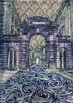
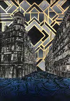
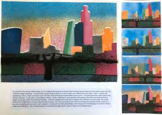
I then collated an image with lots of sky and ground and two interesting buildings. The straight and rigid lines of the buildings provide a contrast to the rhythm and fluidity of the ground and also a juxtaposition to the stylised art deco style. What really brings the piece together is the gold leaf between the blocks of colour in the sky, a staple point of this style. Despite certain bumps along the process of creating this piece I am extremely pleased and proud of the outcome.
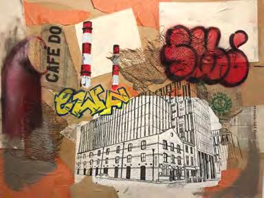
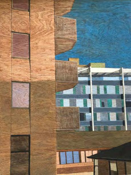
The theme I worked with at the beginning of Upper Sixth was Relationships, which lead me to think about connections between certain aspects within art. Most things have a connection, and entwine with each other, so when using pictures taken in London and Spain, I experimented with different materials to help me understand what connection I wanted to develop within my work. Buildings fascinated me and became a large focus of mine because of their unique and intricate features. Experimenting with different surfaces and materials, allowed me to create good texture. Working in acrylic paint on wood for the final piece in this topic showed a connection of the wood grain being exposed through the paint.
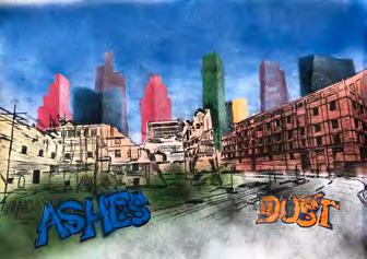
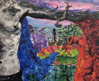
For my final project, I selected the title Endings, because I felt that would be able to develop my ideas effectively. Gathering inspiration from artists, wanted to show a modern take on this title. My pieces moved from the precise, accurate work of lino prints to more free and expressive spray paint and monoprints. From here, I began to develop strong ideas for my final piece, deciding to mix the two techniques together. Having worked around derelict buildings throughout this period, I felt monoprinting illustrated them best, as it can be inaccurate and messy, helping to demonstrate the ending of the building’s life. However, when there are endings there are usually new beginnings. So, using spray paint, I created skyscrapers behind with bright colours, which symbolise modern life growing, contrasting and emphasising the end of the destroyed, dull, lifeless buildings beneath. The graffiti words used were specifically chosen to address that the building was returning to the earth.
Isaac
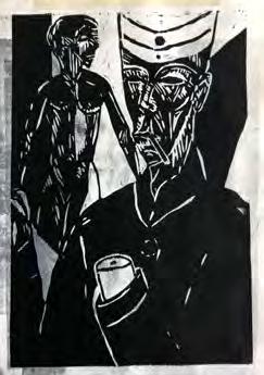
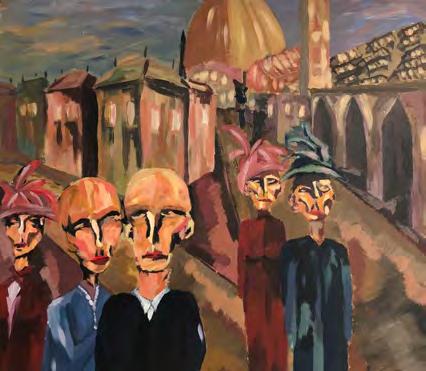
The theme for our coursework was relationships. German expressionism piqued my interest as it was an art movement that happened during WW1 and depicted emotions of uncertainty, worry and trauma, and challenged the disjointed, unstable leadership system in Germany that was leading the country into war. I explored the relationship between the war and its effect on artists’ psyche and artwork. I looked at German Expressionist styles, especially those of Kirchner, and used his ‘Street Scenes’ as inspiration for larger pieces of work. I also looked at Edvard Munch, who was an earlier expressionist, and his use of facial expression. In a different direction, I started to use watercolor and made small studies of whimsical city landscapes. Combining these together wanted to create a German Expressionist style painting of a street scene and city landscape.
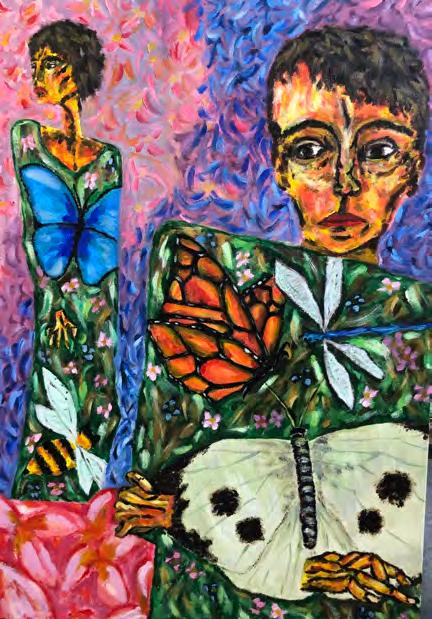
A new theme Insects was introduced, and my initial ideas were based around Kafka’s Metamorphosis and the morphing of insects and the human body. These were primarily black and white pieces, mono prints and charcoal. Later, I went down an entirely different route, using a much brighter colour palette. I looked at Klimt and Egon Schiele as was interested in their combinations of flat form with 3-D form. For my final piece I mixed my interests together to create a painting of human body morphed with a flat form display of colourful insects, while maintaining the German Expressionist style in their faces.
Rory
Dan – History of Art
Hampton School Hanworth Road, Hampton, Middlesex TW12 3HD T: 020 8979 5526 www.hamptonschool.org.uk
