MADE IN HAMPTON 2022
WELCOME
to the inaugural edition of Made in Hampton, a magazine showcasing the remarkable creative talents of our Upper Sixth artists. Their work was exhibited in the Art Department gallery during summer term 2022 and it was our pleasure to welcome so many pupils and parents to view the wonderful artwork on display at evening private view events.
Made in Hampton is a new initiative that aims to record the talent of our senior pupils and to help others enjoy the imaginative approach of those studying A Level Art. Nine of our Upper Sixth Leavers took the A Level course and many of them will be studying the subject at university via courses including Architecture, Fine Art and Design for Future Living. Others will be reading for degrees in which their artistic skills will be a significant asset ‒ Engineering, Physics, Medicine, English and Business Studies.
Whatever their respective future pathways, the acquired attributes of independent thinking and research, risk-taking, and the ability to take a distinctive approach will prove invaluable to these Hamptonians. Studying Art at Sixth Form level has enabled them to develop these abilities and many more besides.
It is especially exciting and inspiring to see the variety of media used; painting, sculpture, printmaking, film and animation are all included in the pages that follow. We do hope that you will enjoy Made in Hampton 2022.
THE Art Department at Hampton provides the means for pupils to focus on personal response and encourages selfexpression above all, so that work included in the first edition of Made in Hampton shows the diverse responses that each generation of art students brings to their own making process.
Work is underpinned by a strong focus on building the key skills of drawing and responding to the world around us. Pupils are encouraged to develop these skills from the First Year onwards with a balanced programme of projects that develop a range of skills and explore a diverse range of media. Independence and reflection are promoted throughout the GCSE and Sixth Form courses, enabling pupils to grow in confidence and maturity.
Academic achievement continues to remain exceptionally high and pupils use their Art qualification to apply for a diverse range of courses including Fine Art and Architecture, but also Medicine, Mechanical Engineering and Natural Sciences.
The work produced in the Art Department by our Sixth Form is a springboard for many to go on to develop at Degree level and into exciting creative careers beyond this. Work is experimental, risk-taking and forward-looking because there is no ‘right answer’.
The Art Department is an inspiring and welcoming environment in which to learn and we aim to nurture a love for the creative arts in all of our pupils that will stay with them for life.
 Kevin Knibbs Headmaster
 Karen Williams Head of Art
Bayley
To begin my exploration under the given title “version and diversion” I began by creating a series of collages from copies of National Geographic from the 1980’s, the resulting juxtaposing imagery led me to continue on to explore abstract portraiture and the work of Frank Auerbach. Connecting the two with the title by creating a number of versions of the recognisable but with a number of diversions that change their meaning or look. I subsequently set out to create a large-scale piece that focused of diversions of the senses by subverting a well-known object (a human hand) by changing their context to something uncomfortable and uncanny. My next series of work was centred around a flat bed scanner. Using it, first, as an alternative means of photography, taking self-portraits inspired by the work of Francis Bacon and playing with directional light. This led me to the creation of my final piece, an animation created on the flatbed scanner using the three mediums of plasticine, poetry and painting.


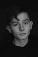
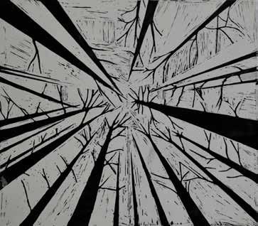
Working with the title ‘Version and Diversion’ this year, I started by looking at nature, and how specifically trees vary in the way they look. By doing multiple prints I was able to explore a wide variety of styles and shapes of trees. Ultimately culminating in paintings showcasing the texture, shapes, and colours of trees. A variation and development of this idea came through interpretation of the title ‘version’ to be ‘inversion’, whereby I inverted photos to paint. Exploring the different colour palette this idea gave to me, allowed for a deeper understanding of paints and colours and their uses.


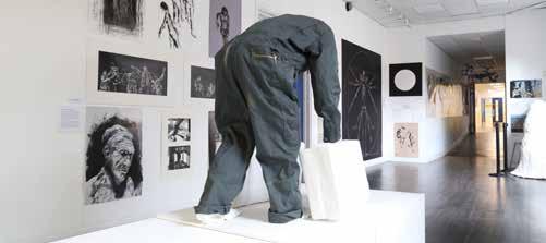
In order to work with the title, I ‘diverted’ my attention to sculpture developing an idea which ended with a figure attempting to carry to sculpted suitcases. This sculpture is open to interpretation through its lack of identity, creating a narrative of ambiguity. This sculpture relates to the title ‘version and diversion’ through the idea the figure is a traveller (suggested by the suitcases) moving from place to place. In addition, the figure is clothed in a boiler suit suggesting it is a labourer/worker.
Charlie
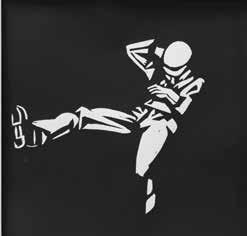
This year’s title on ‘Version/Diversion’ forced me to diversify my ideas and styles of work to lengths that I had never explored before. I began the project by researching artists heavily associated with ‘anatomy’ such as Da Vinci and Vesalius. Following my essay, an insight into the inextricable link between science and art was a good starting point, and I did a series of mono-prints and Indian ink drawings to convey this. However, quickly discovered that the scientific accuracies restricted my ideas. Therefore, I resorted to a more abstract route involving colour to expand my ideas, and keeping ‘anatomy’ as the core theme. The result was a painting saturated with anatomical features in an expressive manner. My next piece for ‘Version/Diversion’ was significantly impacted by the work of Christopher Nevinson, who utilised shapes to construct his pieces. I was keen on adopting this style in my works and made a sequence of lino-prints and a painting based on his work. A stronger reliance on primary sources such as photos were evident in this project and were ultimately key in formulating my large final piece, which was based upon a series of photos I took of one of my classmates. Incorporating the style of Nevinson in an angular, cubist-like manner worked well with the scene I was trying to create.



Emad

With the title of ‘Version & Diversion’, I started by exploring collections of similar shapes and versions of patterns in sculpture. Inspired by Henry Moore’s and Peter Randall-Page’s sculptural work, I explored the forms around me that I could reinterpret in sculpture. I was especially captivated by the way buildings layer against each other and the shapes of the human body (investigating in life drawing). This culminated in a group of 3 sculptures taking on these abstract forms.
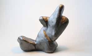


My next inspiration was fabric, exploring the patterns that can be derived from folds and creases. Reducing images of fabric down to high contrast black and white reveals the shapes cast by light, and an interesting positive/negative space interplay is revealed. These shapes were perfect for a lino print, which led me to looking at Eduardo Chillida. His printmaking had a clear path into sculpture, which motivated me to do the same. From breaking down the initial inspiration point to 2D black and white, reinvented it in 3D as a large sculpture, the final point of my work.


The overarching theme to this project has absolutely been abstraction. I find it so much more interesting to experiment with how to reinterpret something than to simply display it realistically. I get so much out of taking the shapes and patterns around me and creating new versions of them.

Ethan
Having been given the title ‘Version and Diversion’ this year, I began by studying statues of religious figures and after doing our first life drawing session I had been inspired to continue to work with human figures. This led me to look into Chiaroscuro woodcuts from the Renaissance as they primarily focused on robed women like the Parisian statues I was studying and had similar religious undertones. Chiaroscuro took its name from the Italian word ‘light’ (chiaro) and ‘dark’ (scuro) and these woodcuts are always printed in many different versions, often with different coloured ink. After producing multiple lino cuts, I chose to work on wood for a larger print of a cherub which I designed myself.


Moving on from this, I visited the LUX Exhibition in February, an immersive experience with 12 different artists working in radical ways to present a new wave of contemporary art. I took the opportunity to take photos of people standing in front of the instillations and projections which created a blurred silhouette, almost indistinguishable in pictures. This ‘diversion’ of light was fascinating, and to continue this approach we projected abstract designs onto our life drawing model and separately myself using Bill Viola’s photographs and designs taken from the Moroccan designer, Charef Tajer, creative director of the luxury clothing brand Casablanca. Finally, produced a painting of myself standing in front of one of Tajer’s vibrant North African landscapes as the detailed sun-baked terracotta and pops of pastel create a chaotic yet serene atmosphere, further blending my body and diverting the light.


Gabriel
LouisMy first thought after receiving the brief ‘version and diversion’ for this year of work was the idea of the diversion of man from apes, an area I explored through a series of monoprints. This prompted me to explore one of the many things that makes us as humans unique –our ability to instantly recognise and empathise with complex emotions through only a glance at another’s face. I attempted to exploit this trait in my work with clay and wax. Working in this area led to an interest in split personality disorder, which inspired the construction of ‘Campfire’; a multimedia piece in clay, wire and MDF. This piece plays on the idea of what it would be like if all the versions of the self were sat around a campfire talking.


Halfway through the year, the invasion of Ukraine by Russia began. Stories from both sides of the conflict made their way through social media and inspired me to explore each perspective of the same war, touching upon the censorship of media and civil unrest of many Russians, and the fearful yet resilient nature of the Ukrainian people. The obvious choice of media given the topic of version and diversion was printmaking, and inspired by Kathe Kollwitz’ woodcuts I chose to use traditional lino to create a diptych piece reflecting the struggles of both nations.


Ludo




For our upper sixth year we were given the theme of ‘Version and Diversion’, initially the ideas I had in relation to this theme were on the concept of evolution, and how species adapt, evolve and diverge from one another over time. I focused my work on this idea into the skulls and skeletons of mammals, as they are all versions of the same collection of bones, just of varying sizes and proportions. I wanted to convey the idea that we, as humans, are not all that different from the animals around us. So to conclude this body of work, I painted a life-size, full skeleton of a human, chimpanzee and gorilla, in which they share the same torso, but have separate limbs and skulls, I took inspiration from da Vinci’s ‘Vitruvian Man’ in the way I structured the painting, as I wanted an anatomically accurate and scientific feel to the piece.

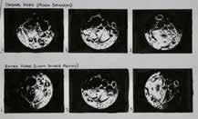
After working on my first concept for some time, I wanted to take my work in a very different direction, focusing on the idea of painting in white, and how the absence of colour could draw attention to other qualities such as texture and brushwork. Through my exploration of this I became very interested in how the textured artworks respond to light. With certain artworks completely changing in their appearance when light is shone upon them from different angles. In order to effectively convey this, wanted to create some sort of moving artwork, featuring a constantly moving light source, which slowly, but consistently alters the appearance of the piece. I decided upon the moon as the subject matter for this, over an abstract composition because the familiarity of the moon lent itself better to the tranquil feel I was aiming for.

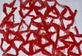
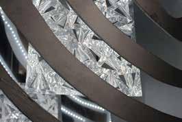
After receiving the title ‘Version and Diversion’, I began my project with the idea of camouflage and how it is natural for animals and humans to disguise themselves, both physically and mentally. I enjoyed exploring this concept as the nature of an artist includes the identification of flaws within our own existence and paralleling those with our surroundings. It is my belief that as an artist it is important for those who view my art to confront themselves within it and tackle issues, issues that perhaps people might not have the confidence to fight outwardly. I undertook this project using a mixture of cut metal and polished mirrors, designed to be viewed in the dark.
In a continuation of the title, moved on from the more profound concept of inter-personal reflection onto the more creative aspect of analysing the meaning of language. Ancient civilisations, specifically the Egyptians, fascinate me as their modernity and progression did not match the period they lived in. As a result, their written language is more artistic than anything else, for their symbols and images depict much more than a singular letter or phrase. This diversion from what language usually is, interests those who understand that beauty can be found in history, marking art as timeless in its form and essence.
But perhaps the real version of things can be found in the diversion from the beliefs and actions of the prescribed norm, ending in the triumph against the mundane.



Sam
SamThis year we were given the title ‘Version and Diversion’ and I began looking the abstraction of human faces with a focus on horror artworks. Following this, I moved onto exploring complete abstraction in the form of Suprematism: an art form that expresses ones ‘inner spiritual thoughts’. Next, I wanted to combine the realistic human features with the abstract shapes in my own way so I developed some bright coloured paintings of the human body. Leading on from this I decided to look at dancers and their movement. Following the influences of Degas and Dali I developed an animation and a painting that both come under the title ‘The Lone Dancer’.


Hampton School Hanworth Road, Hampton, Middlesex TW12 3HD T: 020 8979 5526 www.hamptonschool.org.uk
