

A Digital and Manual Solution Process Book
Haley Livesay

My Idea:
While working on making a logo for a sustainable coffee brand, I created my own letters for the company name ‘Mugs’.These letters were produced to resemble organic hand-drawn letter forms, comparable to imperfect forms of pottery and clay sculptures.To further this emphasis of relation to studio arts and it’s handmade aesthetic, I incorporated a printmake of the logo, as well as a digital design. As these letters developed, I began to think more about how a fully flushed typeface would look in this specific style. Since working with printmaking in my original logo design, it was important to have two solutions to this typeface, both digital and manual. However, there were many questions I had to ask before stepping into the creative process. I had to do some research.
Do I create numbers and puncuation?
Do I create numbers and puncuation? Is this logo readable when small?
Do I take similar steps to my original logo process?
What would‘Coffee Shop’ look like?
How would other letter lock up with this type?
How would manual vs. digital processes differ?
Research:
My first step consisted of looking at some similar projects on platforms like Behance and Dribbble. Printmake typography is not something that has never been done before, so making sure my type looks unique and factors in visual communication of something new was important to factor in.
Looking at some of these examples of organic type and printmake versions inspired the look of my type. However, none of these typefaces successfully encapsulate the idea behind this new typeface.
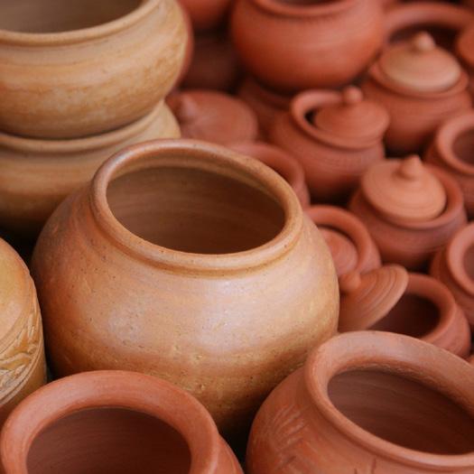
I was looking to create a typeface that showcases ceramic art. Although these letterforms are organic, they don’t have influences from curves you find in ceramic pieces.


Similarly, with these printmakes of multiple letterforms, I was looking to produce an entire alphabet that produces a texture, comparable to these examples.


Beginning The Process:
Following a similar pattern to my original logo, I began to create letterforms through Adobe Illustrator. Since my focus on handdrawn, organic forms, I considered how each letter would look in line with the logo (the pre-existing letterforms).


Variations of Letterform A along side original logo in Illustrator

Working with this particular letterform, letter A, took a few tries to find the right variant that was both aesthetically pleasing alongside the logo, as well as readable to the viewer.


“Which varitation feels most readable, yet like a sucessful, beautiful ceramic piece?

For the letterform A, this was the most successful form out of the variants produced. From here, each letterform followed the same process.
Digital Production:
While following the same steps, I started to complete the typeface letter by letter.When I got to a certain point in the alphabet, I started making other words out of the new letterforms.


Finalized Digital Alphabet
After repeating these processes, I produced all letterforms from A-Z.
Manual Production:
This process was a failed attempt at creating a printmake of the typeface. Although successfully transferred, these letterforms would have been stamped backwords if continued.


Failed Lithograph Process
Transfer Paper
Using the same transfer technique, I restarted the linocut process for each letterform.


Failed Lithograph Process cont.

Digital Solution:
Finalized Digital Alphabet
Manual Solution:

