1 minute read
Good Example

I believe this example of Typography In The Wild to be a good example. This poster contains the word “KINDNESS” in bold and beveled with an understroke. While a lot is happening on the poster, I believe the postitioning of the text is aesthetically accurate and works perfectly with the subjects of the poster. The understroke allows for an almost “lift” out of the paper and the beveled edges of the letterforms allows for contrast to draw the audience’s eyes directly to the text firsthand. The kerning, while appearing closer than a normal kerning, works out perfectly with the purpose of the lettering as it adds even more contrast and the subject of closeness within the poster without forcing the letters to become conjoined with one another. While many may see that too much contrast can be distracting, the contradicting black and white text to the subjectivity of color within the poster adds to the almost need for this fontface as it draws in the audience’s eye at a higher magnitutude than the physical elements could ever do just on their own.
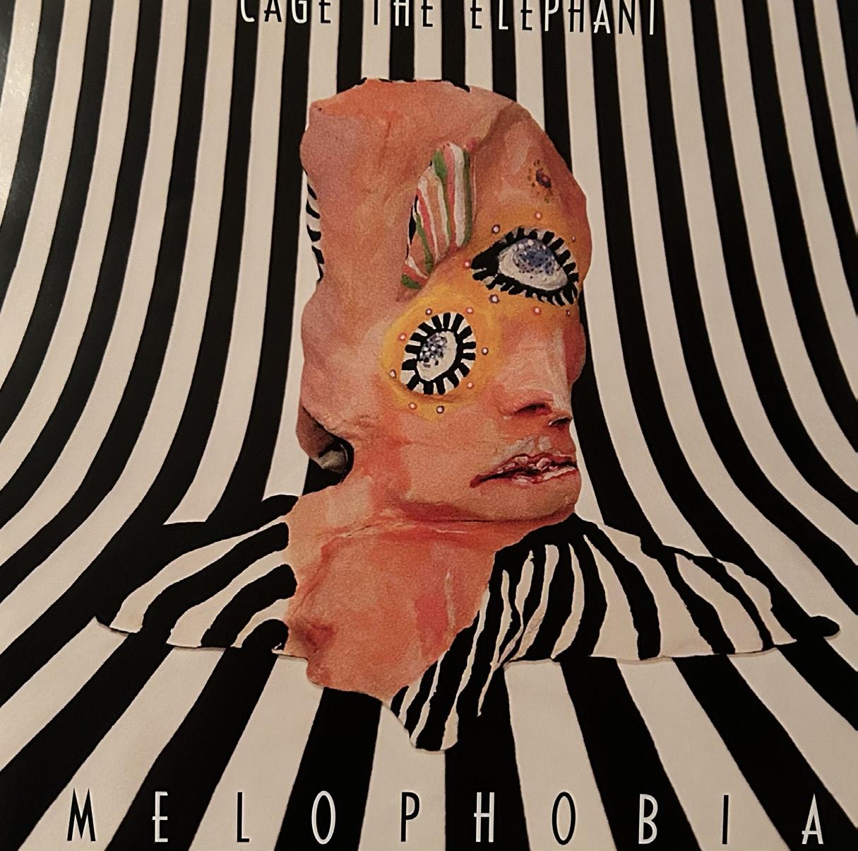
I believe this example of Typography In The Wild to be a bad example of Typography. While looking at an artistic aspect, the physicality of this music album cover poster is intriguing and works very well for the target audience, but the typography does npt worl properly. Looking from an aspect of professionalism, the typeface is very difficult to read here, with the black and whiite interchanging every letter. While this effect works well with the purpose, it makes it very difficult to read unless the album is right in your face or unless you are someone who has seen it many times. The letterform positioning can alos become awkward, as the kerning is not as evently proportioned as it could be. Additionally, the name of the band is in a font size at least a third of the size as the title, making it extremely difficult to read with the color issue and the hard-to-read font sizing. Overall, this could have been much better if the fontface maybe was not altering colors or if the type was bolder and more visible to any audience.
Advertisement