2 n. 2022/09.1023 1036545352415455738392113 ARE YOU MR. ERWITT?! cover guest KOURTNEY ROY portfolio TOTETSU Training Institute office architecture ADRIANA FLOREA BALOIU romanian artist LUCA BORTOLATO photo project RESIDENCE W home design FOREVER AND A DAY art exhibition MOSTAFA NODEH minimal photography ALAN MAGLIO photo collage PINGTUNG PUBLIC LIBRARY public architecture PIERO ATCHUGARRY GALLERY gallery opening DOSSIER 05/2022 community selection READ ON glamouraffair.vision RIVISTA BIMESTRALE DI FOTOGRAFIA, ARTE E DESIGN BIMONTHLY REVIEW OF PHOTOGRAPHY, ART AND DESIGN Registrazione al Tribunale di Milano n° 27 del 14/02/2019 Registration at the Law Court of Milan n° 27 of 14/02/2019 Cover Credits Elliott Erwitt, FRANCE, Provence, 1955 - © Elliott Erwitt Editorial Staff Direttore responsabile | Editor in Chief ALESSIO GILARDI Direttore artistico | Art Director FLAVIO TORRE - satisfystudio photo Direttore digitale | Digital Director STEFANO GILARDI Responsabile copertina | Cover Manager MARIA VITTORIA BARAVELLI Collaborazioni | Collaborations ELEONORA ANNA BOVE ALESSANDRA SCARCI Contact WEBSITE | www.glamouraffair.vision E-MAIL | INSTAGRAMFACEBOOKinfo@glamouraffair.vision|www.facebook.com/glamouraffairpage|www.instagram.com/glamouraffair Publisher QUADRIFOLIUM GROUP Srl P.zza XX Settembre, 40 23900 Lecco©2022info@quadrifoliumgroup.comwww.quadrifoliumgroup.comItaly-Allrightsreserved Printer G&G srl Via Redipuglia, 20 35131 Padova


65 4 24 103 45 83


4 Are you Mr. Erwitt?! Ballata per Elliott Erwitt a cura di / curated by Maria Vittoria Baravelli Elliott Erwitt, USA, New York, 1954, American actress Marilyn Monroe - © Elliott Erwitt

5
“Era gentile, una donna estremamente intelligente e la cosa straordinaria è che era impossibile farle una foto brutta. Il modo migliore per fotografare la gente è così al naturale senza troppi fronzoli” Elliott Erwitt

6 “Elliott è molto legato a Milano, città dove trascorse l’infanzia fino alla partenza per gli Stati Uniti a causa delle leggi razziali.” Biba Giacchetti Elliott Erwitt, USA, Wilmington, North Carolina, 1950 - © Elliott Erwitt

7 “A 15 anni ho comprato una fotocamera a lastre. Quando presi dimesti chezza cominciai a vedere il mondo con occhi diversi. Io vivo da quando ho sedici anni e mezzo”. Elliott Erwitt Elliott Erwitt, FRANCE, Paris. 1989 - © Elliott Erwitt

Le foto di Nixon e ancor prima quelle del funerale di JF Kennedy in cui con il suo teleobiettivo ha registrato una delle foto più iconiche e struggenti impresse nella nostra memoria.
8
Jacquelin, distrutta, inconsolabile piange mentre una lacrima le cade dal viso ma non scivola via e rimane intrappolata per sempre nella sua veletta nera. Devo confessarvi che c’è un altro motivo che mi lega al fotografo americano ed è un aneddoto esilarante successomi a Paris Photo, qualche anno fa. Ero alla fiera di fotografia, tra i lunghi corridoi del Grand Palais; Vidi un signore accompagnato da una donna, ed era proprio il signor Erwitt. Camminava lento ma deciso come sapesse perfettamente dove andare. Ad un tratto come a rallen tatore notai una ragazza che procedeva a passo sostenuto USA. New York. 1999 Elliott Erwitt
“Io sono una insalata russa: sono nato a Parigi, sono cresciuto in Italia poi a Los Angeles e poi a New York, è ovvio che questi cambiamenti possano incidere sulla tua vita e sul modo di relazionarti con il mondo” Non ho mai avuto il piacere di intervistare Elliott Erwitt eppure mi sembra davvero di conoscerlo da sempre. Dal primo momento in cui una persona, chiunque essa sia, cominci ad interessarsi al mondo della fotografia, il signor Erwitt, veterano dell’agenzia fotografica Magnum, si impone come pietra miliare da cui non si può prescindere. Uno dei pochi che ha saputo raccontare il Novecento, il suo paese con una lente nitida e poetica al tempo stesso.
La sua normalità intrisa talvolta di commozione, altre volte di sarcasmo ed ironia fino ad arrivare a dei veri e propri paradossi.
I have never had the pleasure of interviewing Elliot Erwitt and yet I really feel like I have known him forever. From the first moment that a person, whoever he or she may be, begins to take an interest in the world of photography, Mr. Erwitt, a veteran of the Magnum photo agency, stands out as a milestone that cannot be ignored. One of the few who has been able to tell the twentieth century, his country with a lens that is both sharp and poetic. His normality imbued sometimes with emotion other times with sarcasm and irony to the point of real paradoxes. The photos of Nixon and even earlier those of JF Kennedy’s funeral in which with his telephoto lens he recorded one of the most iconic and poignant photos etched in our memory. Jacquelin, devastated, inconsolable weeps as a tear falls from her face but does not slide away and is forever trapped in her black veil. I must confess that there is another reason that ties me to the American photographer and it is a hilarious anecdote that happened to me at Paris Photo a few years ago. I was at the photography fair, among the long corridors of the Grand Palais; I saw a gentleman accompanied by a woman, and it was indeed Mr. Erwitt. He was walking slowly but purposefully as if he knew perfectly well where to go. All of a sudden as if in slow motion I noticed a girl proceeding at a brisk pace as one who is eager to meet someone he adores.

9Elliott Erwitt, USA, Times Square, New York City, 1950 - © Elliott Erwitt

10 “I cani sono molto comprensivi, non se ne hanno a male e soprattutto non chiedono una copia delle stampe! Sono soggetti molto umani” Elliot Erwitt Elliott Erwitt, USA, New York City, 1974 - © Elliott Erwitt

11
- © Elliott Erwitt

“La fotografia dei due fidanzati allo specchietto retrovisore è stata scattata a Santa Monica. Mi è saltata agli occhi 25 anni dopo al momento in cui l’ho scattata. Immagino ci siano altre scoperte che potrei fare, sto passando in rassegna tutto quello che ho fatto per vedere se c’è ancora qualcosa di buono” Erwitt, USA, California, 1956
Elliot Erwitt Elliott
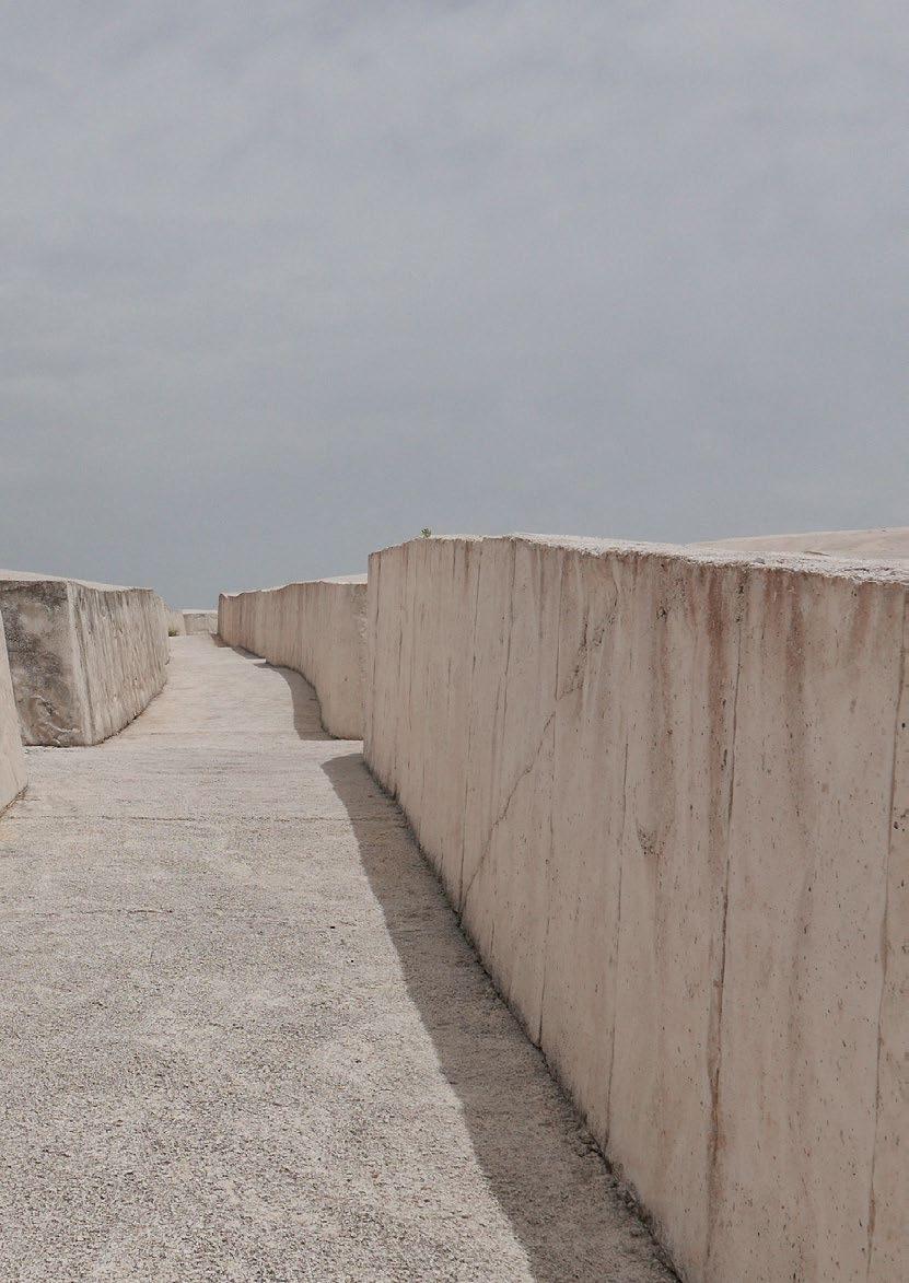
12 Elliott Erwitt, FRANCE, Provence, 1955 - © Elliott Erwitt

These shots are flanked by those devoted to animals, particu larly dogs, taken in poses that are more often than not funny or that recall an anthropomorphic attitude of imitation of man. At the Diocesan Museum in Milan, there is no shortage of images revealing Erwitt’s romantic spirit, showing couples in love exchanging tender moments inside cars or embracing in the Place du Trocadéro in front of the Eiffel Tower on a rainy day, while the silhouette of a man jumps over a puddle. by MARIA VITTORIA BARAVELLI
Contenuto di / Content
Al Museo Diocesano di Milano non mancano le immagini che rivelano lo spirito romantico di Erwitt e che mostrano coppie d’innamorati che si scambiano momenti di tenerezza all’in terno delle auto o si abbracciano in place du Trocadéro davanti alla Tour Eiffel in un giorno di pioggia, mentre la silhouette di un uomo salta una pozzanghera. She had a stack of the American photographer’s books in her hands and in the other, her phone open to the google page where she had searched for the photographer’s face to make sure she was not mistaken. As she arrived near the accom panied gentleman she decelerated, looked at the phone one last time and only once she was sure that every physiognomic feature more or less matched, she cleared her throat and said, Excuse me Sir, are you Mr. Erwitt? Rhetorical if not pleonastic question I thought, but he amazed me. He turned slowly, looked into her eyes and smugly replied, No, sorry, I’m not!. He slipped away between aisles until he snuck into a booth, where in the meantime an extraordinary event was about to begin, a book signing by that photographer who chron icled the 900’, the one who photographed Nixon and Marilyn Monroe. A book signing to celebrate the work and life of Elliot Erwitt.
One of the recurring themes in Erwitt’s career is that of the children he loves-he had six children and an exponential number of grand children-and with whom he always had a special relationship. The calming images, in which the little ones are caught in their joyfulness, the little girl in Puerto Rico or the little Irish boys, both photographed for a campaign to promote tourism in the two countries.
The exhibition set up at the Museo Diocesano Carlo Maria Martini in Milan and open until Oct. 16, is a retrospective dedicated to one of the most important photographers of the 20th century through a wide selection of his most famous black and white and color shots. From the ironic and surreal to the romantic, from portraits of celebrities and children to images of travel and metropolises. 100 famous shots and images that he himself had chosen to use for his editorial, institutional and advertising work, from political to social from architecture to fashion. So many themes are covered by the photographer. He always looks at reality, from the best known to the most intimate and personal, as Museo Diocesano director Nadia Righi reminds us “with a curious gaze, sometimes with a subtle and delicate irony that makes his shots always fascinating and capable of bringing new reflections.” A great portraitist, Erwitt has immortalized numerous person alities who have shaped the history of the 20th century, from the fathers of the Cuban revolution, Fidel Castro and Ernesto Che Guevara, in a rare smiling expression, to the American presidents he has photographed from the 1950s to the present with a particular fondness for J.F. Kennedy, whom he esteemed and whom he fixed on film in an official pose and an unusual one while smoking undisturbed during the Democratic convention in 1960.
A questi scatti si affiancano quelli dedicati agli animali, in parti colare ai cani, presi in pose il più delle volte buffe o che richiamano un atteggiamento antropomorfo d’imitazione dell’uomo.
I never really fully understood that irony and why he told hat poor enthusiastic girl that he was not Elliot Erwitt. I think, however, that the anecdote well explains him and his Beingphotography.interested in humanity and human comedy, a style not only of photography but of his own life. Knowing how to capture the wonder and amazement in the monotony of everyday life. As he himself had said “ it’s about reacting to what you see, without preconceptions.”
13 come chi ha la smania di incontrare qualcuno che adora. Aveva tra le mani una pila di libri del fotografo americano e nell’altra, il suo telefono aperto sulla pagina di google in cui aveva ricercato il volto del fotografo per essere certa di non sbagliare. Arrivata vicino al signore accompagnato decellerò, riguardò un ultimo istante il telefono e solo una volta assicu ratasi che ogni tratto fisionomico più o meno coincidesse si schiarì la voce e disse: Excuse me Sir, are you Mr. Erwitt? Domanda retorica se non pleonastica pensai, ma lui mi stupì. Si girò piano piano, la guardò negli occhi e compiaciuto rispose: No, sorry, I’m not!. Sgattaiolò via tra un corridoio e l’altro fino ad intrufolarsi in uno stand, in cui nel mentre era in procinto di iniziare un evento straordinario, un book signing di quel fotografo che ha raccontato il 900’, colui che ha fotografato Nixton e Marilyn Monroe. Un firma copie per celebrare il lavoro e la vita di Elliott Erwitt. Non ho mai capito davvero fino in fondo quella ironia e il perché lui a quella povera ragazza entusiasta disse di non essere Elliott Erwitt. Credo tuttavia, che l’aneddoto ben spieghi lui e la sua Interessarsifotografia.dell’umanità e della commedia umana, uno stile non solo fotografico ma delle sua stessa vita. Saper cogliere la meraviglia e lo stupore nella monotonia della quotidianità. Come lui stesso aveva detto ” si tratta di reagire a cosa si vede, senza preconcetti” La mostra allestita al Museo Diocesano Carlo Maria Martini di Milano e visitabile fino al 16 Ottobre, è una retrospettiva dedicata ad uno dei fotografi più importanti del Novecento attraverso un’ampia selezione dei suoi scatti più famosi in bianco e nero e a colori. Da quelli ironici e surreali a quelli romantici, dai ritratti delle celebrità e dei bambini alle immagini dei viaggi e delle metropoli. 100 scatti famosissimi ed immagini che lui stesso aveva scelto di utilizzare per i suoi lavori editoriali, istituzionali e pubblicitari, dalla politica al sociale dall’architettura alla moda. Tanti sono i temi trattati dal fotografo, Egli guarda sempre alla realtà, da quella più nota a quella più intima e personale, come ci ricorda il direttore del Museo Diocesano Nadia Righi “con uno sguardo curioso, talvolta con una sottile e delicata ironia che rende i suoi scatti sempre affascinanti e capaci di portare nuove riflessioni”. Grande ritrattista, Erwitt ha immortalato numerose personalità che hanno caratterizzato la storia del XX secolo, dai padri della rivoluzione cubana, Fidel Castro ed Ernesto Che Guevara, in una rara espressione sorridente, ai presidenti americani che ha fotografato dagli anni cinquanta fino a oggi con una particolare predilezione per J.F. Kennedy che stimava e che fissò sulla pellicola in una posa ufficiale e in una insolita, mentre fuma indisturbato durante la convention democratica nel 1960. Uno dei temi ricorrenti nella carriera di Erwitt è quello dei bambini che ama – ha avuto sei figli e un numero esponenziale di nipoti –e con i quali ha sempre avuto un rapporto speciale. Alle immagini tranquillizzanti, in cui i piccoli sono colti nella loro allegria, la bambina di Puerto Rico o i ragazzini irlandesi, entrambi fotografati per una campagna di promozione turistica dei due paesi.
(@mariavittoriabaravelli) WEBSITE | chiostrisanteustorgio.it INSTAGRAM | @museodiocesanomilano FACEBOOK | Museo Diocesano di Milano
14 Kourtney Roy è una nota fotografa, creativa, regista canadese, nata precisamente a Nothern Ontario nel 1981. Nel suo universo fotografico, la realtà si mescola con l’immaginazione. Si diverte spesso e volentieri a usare se stessa come modella, ritraendosi in situazioni che richiamano infine veri e propri fotogrammi di film. Osservando attentamente le sue immagini, infatti, non può non risultare evidente qualche somiglianza estetica con la fotografia di Guy Bourdin, anche nell’utilizzo dei colori, nonché coi film di David Lynch. Vanta la pubblicazione di libri fotografici: “Ils pensent déjà que je suis folle” (Edizioni Filigranes, 2014), “Northern Noir” (Edizioni La Pionnière, 2016), “Sorry, no vacancy” (2017), “The Tourist” (2020). Tra i suoi progetti fotografici, invece, spiccano: “The Tourist”, “Monster Inside”, “Northern Noir”, “The Ideal Woman”, “Lady Dior”. Secondo Kourtney, il mondo ha un potenziale segreto capace di trasformare se stesso in un set cinematografico. E non può proprio fare a meno di catturare questo dettaglio, strappandoci in alcuni casi anche un sorriso. All’interno della serie “Northern Noir”, in particolare, sembra quasi aver di fronte dei fotogrammi di un film noir a tutti gli effetti. Le immagini risalgono in parti colare all’estate e all’inverno del 2015, durante innumerevoli viaggi in Northern Ontario e British Colombia, in Canada.

Kourtney Roy is a well-known Canadian photographer, creative, filmmaker, born precisely in Nothern Ontario in 1981. In her photographic universe, reality is mixed with imagi nation. She often and willingly enjoys using herself as a model, portraying herself in situations that finally recall real film stills.
Looking closely at her images, in fact, some aesthetic similar ities with Guy Bourdin’s photography, including in the use of colors, as well as with David Lynch’s films, cannot fail to become apparent. She boasts the publication of photographic books: “Ils pensent déjà que je suis folle” (Editions Filigranes, 2014), “Northern Noir” (Editions La Pionnière, 2016), “Sorry, no vacancy” (2017), “The Tourist” (2020). Her photography projects, however, include “The Tourist,” “Monster Inside,” “Northern Noir,” “The Ideal Woman,” and “Lady Dior.” According to Kourtney, the world has a secret potential capable of turning itself into a movie set. And she just can’t help but capture this detail, in some cases even bringing a smile to our faces. Within the “Northern Noir” series, in particular, it almost seems as if we are looking at frames from a full-fledged film noir. The images date specifically from the summer and winter of 2015, during countless trips to Northern Ontario and British Colombia, Canada.
Kourtney Roy
15

16


18


20


22 INSTAGRAM | @kourtneyroy FACEBOOK | Kourtney Roy


24 TOTETSU Training Institute MOTIVE Inc

25

26

On the second floor, rooms and their corresponding key cards are color-coded in the colors of the various train lines that Totetsu Kogyo services. On the key cards are lines representing small sections of track. Side by side, the cards can combine into a myriad of different route maps. Through the design, the designer strove to create a space that would help trainees feel a sense of pride in their work.
27
Il designer ha cercato di creare uno spazio che aiutasse gli apprendisti a sentirsi orgogliosi del proprio lavoro.
Sulle key card sono presenti linee che rappresentano piccole sezioni di binari. Affiancate, le carte possono essere combinate in una miriade di mappe di percorsi diversi.
Al secondo piano, le stanze e le relative key card sono codificate con i colori delle varie linee ferroviarie servite da Totetsu Kogyo.
Il progettista ha creato un sistema di orientamento presso il Totetsu Training Institute, costruito dall’azienda per contribuire a preservare la sua eredità di competenze uniche, migliorare la sua abilità tecno logica e sviluppare risorse umane altamente qualificate.
The designer created a wayfinding system at the Totetsu Training Institute, built by the company built to help preserve its legacy of unique expertise, enhance its technological prowess, and develop highly capable human resources.

For the design motif, the designer used rail lines, the core identity of Totetsu Kogyo, which continues to thrive in the rail sector. Due to the characteristics of the space, some of the rooms in the facility are in blind areas. The rail-line design marks flow lines to those rooms, offering affordances for spatial movement.
To capture the company’s personality with creative aesthetic accents, the designer also used rail scrap for the facility’s name sign and portions of the stairs.
Per il tema del design, il progettista ha utilizzato le linee ferroviarie, l’identità principale di Totetsu Kogyo, che continua a prosperare nel settore ferroviario. A seguito delle caratteristiche dello spazio, alcune stanze della struttura si trovano in aree cieche. Il design delle linee ferroviarie segna le linee del percorso verso queste stanze, offrendo possibilità di movimento spaziale.
Totetsu Kogyo Co., Ltd., founded at the request of the former Ministry of Railways to maintain and reinforce Japan’s rail system, is a general construction company with far-reaching expertise in the field of rail-related construction.
Per catturare la personalità dell’azienda con accenti estetici creativi, il progettista ha utilizzato anche scarti di rotaie per l’insegna col nome della struttura e per alcune parti delle scale.
Totetsu Kogyo Co., Ltd., fondata su richiesta dell’ex Ministero delle Ferrovie per mantenere e rafforzare il sistema ferroviario giapponese, è un’impresa di costruzioni generali con una vasta esperienza nel campo delle costruzioni ferroviarie.
28


29

30

31


Technical
Type: Training Center Design Firm:
WEBSITE | CourtesyFACEBOOKINSTAGRAMmotive.tokyo|@motiveincdesign|MotiveInc.ofv2com-newswire
Con sede a Tokyo, MOTIVE Inc. è stata fondata da Takuya WAKIZAKI nel 2019. Lo studio si occupa principalmente di orientation design = environmental information design. Il sole del mattino sorge a est. L’odore della marea vi dice che il mare è vicino. Quando si vede la luce davanti al tunnel, si può trovare la via d’uscita. Takuya Wakizaki ritiene che gli esseri umani abbiano la capacità di adattarsi e agire nell’ambiente ricevendo lo “stimolo = informazione” emesso dall’ambiente. In che modo i vari “stimoli = informazioni” presenti nel mondo agiscono sul cervello, sulla mente e sul corpo per diventare il “movente” che spinge le persone ad adattarsi all’ambiente e ad agire? Qual è la differenza tra le informazioni che portano al “movente” e quelle che non lo portano?

Client:
Design Category: Wayfinding
Completion
Designer:
32
Photo:
Location:
Così come i designer di mobili attingono ripetutamente al corpo umano per realizzare sedie confortevoli, lo studio attinge al “pensiero” e al “movente” umano per lavorare su orientation design = environmental information design. sheet System Ibaraki, Japan Totetsu Kogyo Co., Ltd. Date: December 2021 MOTIVE Inc. Takuya WAKIZAKI Takeshi SHINTO, MOTIVE Inc.
33
Based in Tokyo, MOTIVE Inc. was established by Takuya WAKIZAKI in 2019. The firm engages primarily in orientation design = environmental information design. The morning sun rises to the east. The smell of the tide tells you that the sea is near. When you see the light ahead of the tunnel, you can find your way out. Takuya Wakizaki believes that humans have the ability to adapt and act in the environment by receiving the “stimulus = information” emitted by the environment. How do the various “Stimulus = Information” in the world act on the brain, mind, and body to become the “motive” in which people adapt to their environment and act? What is the difference between information that leads to “motive” and information that does not? Just as furniture designers draw repeatedly on the human body to make comfortable chairs, the firm draws on human ‘thinking’ and ‘motive’ to work on orientation design = environmental infor mation design.

34

35 ADRIANA FLOREA BALOIU

Le sue opere dinamiche ed evocative sono piene di movimento e di motivi geometrici astratti che catturano immediatamente l’attenzione dello spettatore. Caotico e controllato al tempo stesso, il suo uso poetico del colore, le linee spugnose e i morbidi motivi ripetitivi sottolineano l’importanza della sponta neità nel suo processo artistico. Per Adriana, la creazione di ogni singola opera d’arte è un’avventura coinvolgente, impos sibile da abbandonare. Le opere di Adriana, che hanno vinto numerosi premi, sono state esposte in numerose mostre e sono conservate da istituzioni collezionistiche internazionali.

Adriana Florea Băloiu (nata nel 1979), filologa e artista visiva, cofondatrice e curatrice della piattaforma d’arte contempo ranea Go Art Projects e della galleria d’arte Go Contemporary di Bucarest, vive e lavora a Bucarest, in Romania. Ha conseguito i diplomi BFA e MFA in Pittura presso l’Università Nazionale delle Arti di Bucarest, Romania. Adriana è membro della Romanian Plastic Artists Union dal 2015. È stata membro del Comitato di selezione internazionale della Biennale di Firenze 2017. Nel 2017 Adriana è stata premiata con il Woman ART Award 2017, Woman’S Essence Show, Musa International Art Space, Parigi, 2017.
36
Le opere di Adriana Florea Baloiu, affermata artista rumena, sono esplorazioni della mente umana e del comportamento.
cm24x18canvas,onAcrylic2021.recipe,Dreaming
37 cm120x100canvas,onAcrylic2022.feelings,Mixed

38

Tomorrowland, 2019. Acrylic on canvas, 150x200 cm Nel 2018, l’Unione degli artisti plastici della Repubblica di Moldavia ha assegnato ad Adriana il premio “Mihail Grecu” nell’ambito dei “ Moldovan Salons 2018”. Dal 2012 Adriana ha tenuto nove mostre personali, sia in Romania che all’estero. Tra le più recenti ricordiamo “Recipes Incubator” presso l’Istituto Culturale Romeno, Lisbona, 2018, “Rhinoceritis” Galerie Fantom, Berlino 2017, “Jam in shoes”, Seabam Gallery (Kube Musette), Bucarest, 2017, “Another time”Galeria Simeza, Bucarest, 2016 (‘Art at the window’), “Adinuţa and the stuffed bear”, Go Contemporary (parte della Biennale di Bucarest, 2016) e Braila Museum, 2015. Adriana ha esposto in oltre 60 mostre collettive. Queste partecipazioni includono: “Azulejo, envisaged by Romanian artists”, organizzata dall’ICR di Lisbona e dal Museo Quinta da Cruz, Viseu, Portogallo, 2018, “Moldovan Salons” - Bacău e Chisinau, 2018, “Art100 - Together in Europe” - Galateca, Bucarest e Atelierhaus Aachen, 2018, National Painting Salon, Bucarest, 2017, “We Contemporary”, Palazzo Velli Expo, Roma, 2017, Woman’s Essence, Espace Commines, Parigi, 2017, “Walls” - Go Art Projects & Fantom, Berlino, 2016, Biennale Interna zionale di Pittura Chisinau 2015, Florence Biennale X, 2015, “Dark Matter”, Berlino, 2015, “Tendencies in Contemporary Romanian Painting”, Berlino, 2015, “Metha-lan” - AnnArt Gallery Bucharest, 2014, UNArte 150 Years. Painting, Graphic Arts, Sculpture” - Dalles Hall, Bucarest (RO). Le sue opere si trovano in collezioni private e pubbliche internazionali. Established Romanian artist Adriana Florea Baloiu’s artworks are explora tions of the human mind and behaviour. Her dynamic and evocative pieces are full of movement and abstract geometric patterns which instantly capture the viewers attention. Both chaotic and controlled her poetic use of color, spongy lines and soft repetitive patterns emphasis the importance of spontaneity within her artistic process. For Adriana, the creation of each unique artwork is an addictive adventure impossible to abandon. Adriana’s prize winning artworks have been exhibited extensively and are held by international collecting institutions. Adriana Florea Băloiu (b. 1979), philologist and visual artist, co-founder and curator of Go Art Projects contemporary art platform and Go Contemporary art gallery in Bucharest lives and works in Bucharest, Romania. She has BFA and MFA degrees in Painting from the National University of Arts Bucharest, Romania. Adriana is a member of the Romanian Plastic Artists Union since 2015. She was a member of the International Selection Committee of Florence Biennale 2017. In 2017 Adriana was awarded with Woman ART Award 2017, Woman’S Essence Show, Musa Inter national Art Space, Paris, 2017. In 2018, the Plastic Artists Union from the Republic of Moldova granted Adriana the award „Mihail Grecu” as part of the „Moldovan Salons 2018”. Since 2012, Adriana had nine solo shows, both in Romania and
39

40 cm120x90canvas,onAcrylic2019.Skinless,

cm120x100canvas,onAcrylic2022.hope,Messy
41 abroad. Some of the most recent are “Recipes Incubator” at Romanian Cultural Institute, Lisbon, 2018, “Rhinoceritis” Galerie Fantom, Berlin 2017, “Jam in shoes”, Seabam Gallery (Kube Musette), Bucharest, 2017, “Another time” – Galeria Simeza, Bucharest, 2016 (‘Art at the window’), “Adinuţa and the stuffed bear”, Go Contemporary (part of Bucharest Biennale, 2016) and Braila Museum, 2015. Adriana has exhibited in over 60 group exhibitions. These participations include: “Azulejo, envisaged by Romanian artists”, organized by ICR Lisbon and Quinta da Cruz Museum, Viseu, Portugal, 2018, “Moldovan Salons” – Bacău and Chisinau, 2018, “Art100 - Together in Europe” – Galateca, Bucharest and Atelierhaus Aachen, 2018, National Painting Salon, Bucharest, 2017, “We Contem porary”, Palazzo Velli Expo, Rome, 2017, Woman’s Essence, Espace Commines, Paris, 2017, “Walls” – Go Art Projects & Fantom, Berlin, 2016, International Painting Biennale Chisinau 2015, Florence Biennale X, 2015, “Dark Matter”, Berlin, 2015, “Tendencies in Contemporary Romanian Painting”, Berlin, 2015, “Metha-lan” – AnnArt Gallery Bucharest, 2014, UNArte 150 Years.Painting, Graphic Arts, Sculpture” – Dalles Hall, Bucharest (RO). Her works can be found in private and public international collections.

CourtesyINSTAGRAMadrianafloreabaloiu.com|@adriana_baloiuFACEBOOK|AdrianaBaloiuofARTZGALLERY,Shanghaiwww.artzspace.art|@artzgallerysh
42
cm120x90canvas,onAcrylic2019.Skinless, cm150x100painting,Digital2020.matrix,Deceiving

|
Going back to childhood memories with an interrogative, melan cholic eye, my visual discourse takes an introspective approach set between emotional and rational, reality and fantasy, from a micro-personal context to general issues. Mediums of visual exploration include painting, photography, sculpture, collage, objects, installation, digital media.
Starting with a state of constant contemplation upon human mind and behavior mixed with playful, but satirical point of view, my work illustrates stereotypes such as absurdism, superficiality, mass thinking, historical obedience, mindless conformity as portrayal of society, pointing to nonsense, deviation and contradiction.
Partendo da uno stato di costante contemplazione della mente umana e del comportamento, mescolata a un punto di vista ludico ma satirico, il mio lavoro illustra stereotipi come l’assurdità, la superficialità, il pensiero di massa, l’obbedienza storica, il conformismo insensato come ritratto della società, indicando l’assurdità, la deviazione e la contraddizione.
Tornando ai ricordi d’infanzia con un occhio interrogativo e malin conico, il mio linguaggio visivo ha un approccio introspettivo che si colloca tra l’emotivo e il razionale, la realtà e la fantasia, da un contesto micro-personale a questioni generali. I mezzi di esplorazione visiva includono la pittura, la fotografia, la scultura, il collage, gli oggetti, l’installazione e i media digitali.
WBSITE

44

45
LUCA BORTOLATO
46

LB: E’ la scelta l’aspetto interessante. Le persone scelgono una determinata fotografia per un determinato motivo. Io divento custode di questo atto. Ascolto le parole che descrivono il legame con l’immagine, diventando custode di intime confessioni spesso sussurrate. E’ un grande privilegio e una grande responsabilità portare con me centinaia di voci di ogni parte d’Italia.
LB: Io non sono un ciclista. Non lo sarò mai. Amo la mia bicicletta, quella che ho usato in questo lungo viaggio, perché, come le fotografie che trasporto, era una bicicletta “inutile”, dimenticata per 40 anni in un garage. Io l’ho riattivata proprio per questo progetto. Certamente è un viaggiare lento e questo porta con sé il fatto di osservare il mondo ad un’altra velocità, più da vicino. In bici diventi un ficcanaso che guarda a fondo le cose intorno. Pedalare da solo è stato fondamentale per un percorso di dialogo malinconico con se stessi, dove le domande sono state di più delle risposte.

EAB: Il progetto “Fotografie Inutili” include 35 tappe ufficiali in cui doni personalmente le fotografie conservate. Quali sono gli effetti emotivi che questo gesto scaturisce dentro di te?
Luca Bortolato: L’aspetto della “tangibilità” è fondamentale nel mio lavoro. Le persone si sono disabituate al toccare oggetti e cose, soprattutto in questo momento storico post pandemia. Questo aspetto diventa ancora più importante nel rapporto con una fotografia. Oggi viene vissuta come un insieme di pixel su di uno schermo illuminato. L’immagine è immate riale, condivisibile all’inverosimile, persa. Poterla toccare la porta alla forma di oggetto presente, vero. Il tempo per poterla osservare è diverso. E’ un tempo nostro, intimo, che possiamo gestire come vogliamo. Siamo solo noi e la fotografia.
Eleonora Anna Bove: L’idea del disfacimento si ricollega in antitesi a quella del donare e dunque ricevere/custodire. Le fotografie acquisiscono alla luce di questo gesto una nuova valenza, perdendo quello stato iniziale di inutilità. Oggigiorno il materiale fotografico di famiglia viene conservato prevalen temente in digitale o addirittura tramite i social, se pensiamo alla sua pubblicazione. Sarebbe bello ritornare alle vecchie abitudini della stampa e della sua condivisione. Al piacere di toccare con mano quello che appunto risulta immateriale, come nel caso del ricordo. Potremmo dire che il tuo progetto fa ricordare ai tuoi partecipanti questo piacere.
LB: It is the choice that is the interesting aspect. People choose a certain photograph for a certain reason. I become the custodian of this act. I listen to the words that describe the connection to the image, becoming the keeper of intimate, often whispered confessions. It is a great privilege and responsibility to bring with me hundreds of voices from all parts of Italy.
Eleonora Anna Bove: The idea of decay relates in antithesis to that of giving and thus receiving/keeping. Photographs acquire a new valence in light of this gesture, losing that initial state of uselessness. Nowadays, family photographic material is mostly stored digitally or even through social media, if we think about its publication. It would be nice to return to the old ways of printing and sharing it. To the pleasure of touching what precisely turns out to be immaterial, as in the case of memory. We could say that your project makes your participants remember this pleasure. Luca Bortolato: The aspect of “tangibility” is fundamental in my work. People have become disaccustomed to touching objects and things, especially in this post-pandemic historical moment. his aspect becomes even more important in the relationship with a photograph. Today it is experienced as a collection of pixels on an illuminated screen. The image is immaterial, shareable to the extreme, lost. Being able to touch it brings it to the form of a real, present object. The time to be able to observe it is different. It is our own, intimate time, which we can manage as we wish. It is just us and the photograph.
47
EAB: The “Fotografie Inutili” (Useless Photographs) project includes 35 official stages where you personally donate the photographs you have kept. What emotional effects does this gesture trigger within you?
EAB: Quali sono le emozioni che ti scaturisce il viaggio in bicicletta, come lo appunti e come si ricollega al momento della tappa vera e propria?
48

49

EAB: What results is a heterogeneous material: audio/video/ photo/writing. How do you plan to proceed in its reorganization thereafter? LB: The process of reworking all this material will be a long one. I have to come back first, with my body but mostly with my mind. The audios have become more and more valuable, mile after mile. I realized that in these words are contained secrets confided to a stranger, intimacies shared. In the different accents I find the journey, from north to south including islands. Images and sounds, this will probably be the result of these three months of travel in Italy.
LB: I am not a cyclist. I will never be one. I love my bicycle, the one I used on this long journey, because, like the photographs I carry, it was a “useless” bicycle, forgotten for 40 years in a garage. I reactivated it for this very project. Certainly it is a slow travel and this brings with it the fact that you observe the world at another speed, more closely. On a bike you become a nosy person looking deeply at things around you. Cycling alone has been crucial to a journey of melancholy dialogue with oneself, where the questions have been more than the answers.
EAB: Raccogli il tuo “materiale emotivo” su un diario. Come procedi alla sua stesura? Hai un metodo?
LB: Il processo di rielaborazione di tutto questo materiale sarà lungo. Devo prima tornare, con il corpo ma soprattutto con la mente. Gli audio hanno acquistato sempre maggior valore, chilometro dopo chilometro. Mi sono accorto che in queste parole sono racchiusi segreti confidati ad uno sconosciuto, intimità condivise. Nei diversi accenti ritrovo il viaggio, da nord a sud isole comprese. Immagini e suoni, questo sarà probabil mente il risultato di questi tre mesi di viaggio in Italia.
LB: I keep a diary out of fear of forgetting the thousands of things I have experienced. I don’t usually do that. In this project I felt a strong desire to record with pen on paper because every day is a different place, a different bed, different people. This accumu lation of information needs to be put down on paper, leaving my mind free to experience the here and now, letting the memories go on the pages of the journal. Every night before I go to bed, I call to mind the events of the day. I recount them, trying not to leave anything out. I thus reset what has been, ready to welcome the next morning the new day as a blank page yet to be written.
EAB: Collect your “emotional material” in a journal. How do you go about writing it down? Do you have a method?
EAB: Nella scelta della fotografia, i partecipanti seguono quasi sempre dei criteri visivi dal carattere psicologico/emotivo. Quali sono le emozioni che ti piacerebbe trasmettere?
EAB: Quello che ne deriva è un materiale eterogeneo: audio/ video/foto/scrittura. Come pensi di procedere nella sua riorga nizzazione successivamente?
LB: Tengo un diario per la paura di dimenticare le migliaia di cose vissute. Non sono solito a farlo. In questo progetto ho sentito forte il desiderio di registrare con penna su un foglio perché ogni giorno è un luogo diverso, un letto diverso, persone diverse. Questo accumulo di informazioni deve essere messo nero su bianco, lasciando la mia mente libera di vivere il qui e ora, lasciando andare i ricordi sulle pagine del diario. Ogni sera, prima di coricarmi, richiamo alla mente gli avvenimenti della giornata. Li racconto cercando di non tralasciare nulla. Azzero così quello che è stato, pronto ad accogliere al mattino seguente il nuovo giorno come una pagina bianca ancora tutta da scrivere.
EAB: When choosing photography, participants almost always follow visual criteria with a psychological/emotional character. What emotions would you like to convey?
50
LB: Mine is a simple gesture: giving. This is enough to generate emotions in people. I have the task of recording them through photos and audio where I listen without any judgment. It is a huge heritage that is invaluable.
LB: Il mio è un semplice gesto: donare. Basta questo per generare emozioni nelle persone. Io ho il compito di registrarle attraverso foto e audio dove ascolto senza giudizio alcuno. E’ un patrimonio enorme che ha un valore inestimabile.
EAB: What are the emotions you get from traveling by bicycle, how do you note it, and how does it relate back to the moment of the actual stage?

51

52 IIntervista di / Interview by ELEONORA ANNA BOVE (@eleonoraannabove) WEBSITE | FACEBOOKINSTAGRAMlucabortolato.com|@luca_bortolato|LucaBortolatophotography

53

54

55 RESIDENCE W fws_work

56

57
La residenza W è stata progettata da fws_work per portare un senso di tranquillità in una casa che si affaccia sulla città di Qinpu, nota per il suo rapido sviluppo e per il suo snodo di trasporti. Il proprietario è un pilota di linea, che trascorre la maggior parte del suo tempo viaggiando costantemente tra diversi Paesi con brevi soggiorni. Per lui la casa è un rifugio che offre un senso di relax nel momento in cui arriva a casa. Per rispondere al desiderio di relax del proprietario, fws_work progetta con materiali “tattili”, come l’intonaco e il legno di quercia, come sfondo principale, accompagnati da canne intrecciate, vetri rigati, piastrelle in ceramica encaustica e arredi in lino per creare un calore sensoriale. Inoltre, la raffinata maestria artigianale è rivelata da dettagli di fresatura uniformi in tutto l’edificio. La selettiva palette di materiali e i dettagli di falegnameria evocano i ricordi del cliente di una casa di campagna durante l’infanzia, nonché i soggiorni mediterranei vissuti durante i suoi viaggi. fws_work combina l’ingresso, la cucina, la zona lettura, la sala da pranzo e il soggiorno in uno spazio luminoso a pianta aperta per migliorare la spaziosità e la flessibilità, concentrandosi al contempo sulla creazione di una circolazione intuitiva, basata sulle abitudini del cliente. La circolazione intuitiva è definita da elementi indipendenti, come il divisorio a mezza altezza che si collega al tavolo da lettura e il bancone della cucina allungato. Nel frattempo, la pesante trave strutturale esistente è stata rivestita con pannelli in legno di quercia per separare


In contrasto con l’atmosfera rilassata della tavolozza neutra, le fresature in legno tinto di nero, le piastrelle in ceramica encau stica, le maniglie in pelle e il piano di lavoro in pietra danno forma a una cucina cupa e a un bancone bar esteso. L’oscurità della cucina e del bancone del bar favorisce un puro stato di immersione, permettendo al cliente di immergersi nelle sue passioni per la cucina e la degustazione di whisky. La calda illuminazione del ripiano penetra attraverso l’anta del mobile in rattan, accompagnata dai riflessi posteriori di bicchieri e stoviglie che arricchiscono lo sfondo dei momenti culinari.
Collegando l’area aperta con le camere da letto e una sala multifunzionale, il corridoio di transizione è avvolto da pannelli in legno di quercia e pareti in gesso. La parete divisoria parziale è stata sostituita da strati di pannelli di canna intrecciata e vetro nervato per attirare la luce del sole nel corridoio, garan tendo al contempo la privacy e l’isolamento acustico della stanza. La falegnameria allineata dalle pareti al soffitto crea profondità e dimensione quando la luce risplende. Inoltre, l’applique circolare all’estremità fa eco allo specchio circolare dell’ingresso e si armonizza con il linguaggio formale lineare di tutta la casa. Oltre alla tavolozza neutra coerente con l’area aperta, il colore verde acqua intenso sfuma il confine tra la parete superiore e il soffitto, portando un senso di serenità nella camera da letto per il riposo dopo una lunga giornata.
58 visivamente la zona giorno e pranzo, dedicata al relax, dalla zona lettura e cucina, orientata alla funzionalità, ed attenua la pesantezza visiva della trave strutturale.

Residence W is designed by fws_work to bring a sense of tranquility to a home overlooking the city of Qinpu, known for its fast development and transportation hub. The owner is an airline pilot, spending most of his time constantly traveling between different countries with short stays. For him, home is a haven to provide a sense of relaxation at the moment when he arrives home. To respond to the owner’s desire for relaxation, fws_work designs with tactile materials, such as plaster and oak wood, as the essential backdrop, accompanied with woven cane, ribbed glass, encaustic ceramic tiles, and linen furnishings to form a sensory warmth. In addition, refined craftsmanship is revealed through consistent millwork details throughout. The selective material palette and joinery details evoke the client’s memories of a country home in childhood, as well as Mediter ranean retreats experienced during his travels.

59
fws_work combines the entry, kitchen, reading, dining, and living areas in a light-filled, open-plan space to enhance spaciousness and flexibility, while focusing on creating intuitive circulation, based on the client’s routines. The intuitive circulation is defined by freestanding fixtures, such as the half-height divider connecting to the reading desk, and the extended kitchen counter. Meanwhile, the existing heavy structural beam is clad with oak wood panels to visually separate the laid-back living and dining area from the function-driven reading and kitchen space, and softens the visual heaviness of the structural beam. Contrasting with the laid-back feeling of the overall neutral
60 palette, the black stained wood millwork, encaustic ceramic wall tiles, leather handles, and stoned countertop shape the moody kitchen and extended bar counter. The darkness of the kitchen and bar counter fosters a pure state of immersion, allowing the client to dive into his passions for cooking and whisky tasting. The warm shelf lighting penetrates through the rattan cabinet door, accompanied by rear reflections of glasses and tableware that enrich the backdrop of dining Connectingmoments. the open area with bedrooms and a multi-func tional room, the transitional hallway is wrapped with oak wood panels and plaster walls. The partial partition wall was replaced by layers of woven cane panels and ribbed glass to draw sunlight into the hallway, while providing privacy and sound insulation for the room. Aligned joinery from walls to the ceiling creates depth and dimension when the light shines. In addition, the circular wall light on the end echoes the circular mirror in the entry, and balances with the straight-lined design language throughout the house. In addition to the neutral palette consistent with the open area, the deep teal color blurs the boundary between the upper wall and the ceiling, bringing a sense of serenity into the bedroom for rest after a long day.


61

62


63
FACEBOOKINSTAGRAMfwswork.com|@fws_work|FWS-work
Courtesy of v2com-newswire Technical sheet Official Project Name - Residence W Location: Taoyuan, Taiwan Client: Private Design team: Yu-Hsiang Fu (Lead Designer); Yi-En Lee (Designer) Construction Management: ArchinSpace / Noel Huang Photographer: Suiyu Studio Project completion date: March 2021 Gross floor area: 130 sqm / 1400 sqft WEBSITE |
FWS_WORK fws_work è uno studio di design multidisciplinare con sede a New York e Taipei. Creiamo ambienti coinvolgenti fornendo servizi di interior, branding e furniture design. I nostri progetti si basano su concetti/narrazioni ricchi, su processi collaborativi e sull’apprez zamento dei dettagli. “fws” è l’abbreviazione di “fellows”. fws_work is a multi-disciplinary design studio based in New York and Taipei. We create engaging environments by providing interior, branding, and furniture design services. Our projects are grounded in rich concepts/narratives, collaborative process, and detail appreciation. “fws” is shortened for “fellows”.

64 Dorothy Circus Gallery Via dei Pettinari 76, Roma (Italy) 35 Connaught St, St George’s Fields. London (UK) WEBSITE | dorothycircusgallery.it INSTAGRAM | @dorothycircus FACEBOOK | @dorothycircus Dreamer of dreams, 2022. 64x41 cm


65
By Jana Brike
FOREVER AND A DAY

Le 12 opere inedite, si aprono su paesaggi onirici dettagliati che guidano lo sguardo dello spettatore sulle figure femminili intente nella scoperta giocosa, inconsapevole e a tratti ingenua del mondo che le circonda.
Giunta alle soglie del 15° anno dalla sua fondazione, la Dorothy Circus Gallery di Roma è particolarmente orgogliosa di presentare, per la prima volta nel proprio spazio espositivo, la personale della pittrice contemporanea Jana Brike dal titolo “Forever and A Day”. Quale istituzione fondata e gestita da donne, Dorothy Circus ha da sempre diffuso valori sociali e sostenuto l’audacia, l’impatto e il cambiamento soprattutto in relazione al tema della femminilità.
Le ragazze adolescenti sono quasi sempre le protagoniste, a volte raffigurate in scene di esplorazione erotica, diventano metafore della continua scoperta di noi stessi e rappresentano la crescita che tutti noi compiamo nel corso della nostra vita, indipendentemente dall’età biologica o dal sesso.
Temi sensibili quali i diritti delle donne, l’uguaglianza di genere e il rafforzamento delle fragilità sono stati ampiamente proposti al pubblico attraverso il programma curatoriale della galleria, anche recentemente dedicando particolare attezione alle relazioni materne e all’iconografia femminile nella storia dell’arte, attraverso la collettiva “Mother and Child”, tenutasi sia a Roma che a Londra, che ha avuto tra i suoi protagonisti Jana Brike con il dipinto “the Peaceful Warrior”. Come gli artisti e gli scrittori più coraggiosi, Jana Brike si assume la considerevole e inevitabile responsabilità di trasformare i senti menti collettivi e i momenti storici ad essi collegati in immagini e narrazioni che abbiano il potenziale di perdurare nel tempo. Nata nella Lettonia occupata dai sovietici nel 1980, la pittrice surrealista Jana Brike crea straordinari scenari ricchi di suggestioni, attraverso i quali intravediamo il mondo intimo e personale dell’artista, che lei stessa descrive come una “poetica autobiografia visiva” attraverso la quale Jana trasmette l’essenza dei sentimenti collettivi al pubblico, al presente e al futuro, immergendosi completamente in una rivoluzione sociale del nostro tempo. Il mondo interiore e lo stato contemporaneo dell’anima umana, i sogni, l’amore, il dolore, la vasta gamma di emozioni che la condi zione umana manifesta cosi come la trascendenza di esse, la crescita e la scoperta di sé diventano fulcro dell’arte di Jana Brike.
Anche la vulnerabilità e l’intimità sono una caratteristica importante del lavoro di Brike. La nudità e la natura si accom pagnano spesso nei suoi dipinti che Brike ha descritto il corpo umano come “vulnerabilità nella sua nudità”.
Le opere di Brike sono, grazie a queste caratteristiche, un inno alla femminilità libera, una celebrazione della Terra e della Natura che invoca la libertà dall’oppressione e che si eleva come un coro purissimo a cui tutti nel profondo desideriamo aderire. Nell’arte di Brike sono la vita ispirata, il rapporto con l’ambiente in cui vive e il suo ruolo di madre a combinarsi per creare il linguaggio visivo unico, personale ma universale dell’Artista.
Per quanto ogni dipinto possa essere disarmante, è un’espres sione della realtà soggettiva dell’essere un’artista donna sotto gli occhi del pubblico, che racconta una storia di femminilità senza filtri nel primo quarto del XXI secolo.
L’arte di Jana Brike è infatti fortemente radicata nel concetto cardine della Galleria, che ha sempre indirizzato il proprio impegno curatoriale verso la presentazione di mostre il cui focus sono le narrazioni femminili nell’arte, con particolare attenzione alle artiste donne che guidano l’attenzione del pubblico all’a scolto della voce femminile, autrice di storie a lungo taciute e che oggi si rivela quale connettore dell’umanità.

Rimandando al folklore tribale delle origini lettoni di Jana, l’autrice tesse i suoi racconti criptati pieni di mistero e drammatici intrighi. Ricchi di metafore e simbolismi, i dipinti inediti di Brike, splendi damente realizzati, si leggono come poesie visive ricche di signi ficato, che si svelano come racconti di crescita e trasformazione.
Nei suoi dipinti c’è spesso una contrapposizione di durezza/ realismo/crudezza e speranza, i corpi diafani mostrano graffi sanguinanti, incisioni o arrossamenti sulla pelle in totale contrasto con ciò che le circonda, gli elementi delicati quali farfalle e fiori.
66
Jana Brike’s Art is dearly rooted in the gallery core concept which has always directed its efforts towards curating exhibitions that focused on the return of the female narra tives in Art, with particular attention to women artists bringing the public attention to the female voice as the narrator and the connector of humanity.
Sensitive topics of feminism, gender equality and women’s rights have been emphasised through the gallery’s curatorial programme, which also recently dedicated particular attention to maternal relations and female iconography in the art world with the major collective exhibition ‘Mother and Child’ held both in Rome and London also featuring Jana Brike’s painting “the Peaceful Warrior”.
Born in Soviet-occupied Latvia in 1980, the surrealist painter Jana Brike creates extraordinary whimsical scenarios through which we glimpse into an intimate world of what she describes as a ‘poetic visual autobiog raphy’ yet Conveying the essence of the collective senti ments to audiences, present and future by fully immerging in a social revolution of our time.
There is often a juxtaposition of harshness with hope in her paintings, with figures showing bloody scratches, incisions or redness on their skin and surrounded by butterflies or flowers.
Vulnerability and intimacy is also an important charac teristic of Brike’s work. Nakedness and nature often go together in her paintings, and Brike has described the human body as ‘vulnerability in its nakedness’.

Rich in metaphor and symbolism, Brike’s new beautifully crafted body of paintings read like visual poetry brimming with meaning, unfolding like tales of growth and trans Withinformation.the 12 brand new artworks presented, detailed dreamscapes show female figures, in playful and unself conscious discovery of the world around them.
67
The frequently portrayed adolescent girls, sometimes depicted in scenes of erotic exploration are metaphors for the continual discovery of ourselves and represent the growth we all do throughout our lives no matter what our biological age or gender. Her works in this way act as a paean to free-spirited femininity, a celebration of Earth and nature, and freedom from oppression that rises like the purest choir we all urge to join in. Ultimately, living an inspired life, her relationship with her native environment, and her role as a mother, all combine to create Brike’s uniquely personal yet universal visual Disarminglylanguage candid though each painting may be in artic ulating the subjective reality of being a woman artist in the public eye telling a no filter story of womanhood in the first quarter of the 21st century.
On the occasion of the beginning of the 15th year from its foundation Dorothy Circus Gallery Rome is extremely proud to present for the first time in its own space a solo exhibition by the contemporary painter Jana Brike titled Forever and A Day.
Two angels in misty woods, 2022. 41x55 cm
As a women founded and runned industry Dorothy Circus has always spread social values and stood for the bold, the impact and the change.
Common to the most brave artists and writers, Jana Brike tasks with the weighty and inevitable responsibility of transforming the collective feelings and the historical moments related, into images and narratives that carry the potential to endure over time.
The main focus of Jana Brike’s art is the internal space and contemporary state of a human soul, dreams, love, pain, the vast range of emotions that the human condition offers and the transcendence of them all, the growing up and Muchself-discovery.akintothetribal folklore of Jana’s Latvian heritage, she weaves her encrypted narratives filled with haunting mystery and dramatic intrigue.
68 Rebirth of venus, 2022. 35x52 cm

69Teller of tales, 2022. 37x55 cm

70 One breath, 2022. 30x40 cm

WBSITE
Born in Soviet-occupied Latvia in 1980, Jana Brike is a figurative painter creating extraordinary whimsical scenarios through which we glimpse into an intimate world of what she describes as a ‘poetic visual autobiography’. Common to all of her works is the wondrous and regenerative presence of nature, especially the archetype of water that together with other elements composes an intuitive and personal symbolism through which the artist engages with themes of exploration, growth, innocence, curiosity, transcendence and love. Her detailed dreamscapes show human figures, often adolescent females, in playful and unselfconscious discovery of the world around them. There is often a juxtaposition of harshness with softness in her paintings, with figures showing bloody scratches, incisions or redness on their skin and surrounded by butter flies or Vulnerabilityflowers.and intimacy is also an important characteristic of Brike’s work. Nakedness and nature often go together in her paintings, and Brike has described the human body as ‘vulnera bility in its nakedness’. The frequently portrayed adolescent girls, sometimes depicted in scenes of erotic exploration are metaphors for the continual discovery of ourselves and represent the growth we all do throughout our lives no matter what our biological age or gender. Her works in this way act as a paean to free-spirited femininity, a celebration of Earth and nature, and freedom from oppression. Thirst, 2022. 64x41 cm | INSTAGRAMjanabrike.com|@janabrikeFACEBOOK|JanaBrike

Nata nel 1980 nella Lettonia occupata dai sovietici, la pittrice figurativa Jana Brike crea straordinari scenari ricchi di suggestioni, attraverso i quali si intravede il mondo intimo e personale dell’ar tista, che lei stessa descrive come una “poetica autobiografia visiva”. Comune a tutte le sue opere è la presenza meravigliosa e rigenerante della natura, in particolare l’archetipo dell’acqua che, insieme ad altri elementi, compone un simbolismo intuitivo e personale attraverso il quale l’artista affronta temi di esplora zione, crescita, innocenza, curiosità, trascendenza e amore. I suoi dettagliati paesaggi onirici mostrano figure umane, spesso giovani donne nell’età dell’adolescenza, alla scoperta giocosa e inconsapevole del mondo che le circonda. Nei suoi dipinti c’è spesso una contrapposizione di durezza e morbidezza, i corpi diafani mostrano graffi sanguinanti, incisioni o arrossamenti in totale contrasto con la delicatezza della pelle e gli elementi che le circondano quali farfalle e fiori. Anche la vulnerabilità e l’intimità sono una caratteristica impor tante del lavoro di Brike. La nudità e la natura si accompagnano spesso nei suoi dipinti e l’Artista stessa descrive il corpo umano come “vulnerabilità nella sua nudità”. Ragazze adolescenti sono quasi sempre le protagoniste delle opere di Brike, a volte raffigurate in scene di esplorazione erotica, diventando metafore della continua scoperta di noi stessi e rappresentando la crescita che tutti noi compiamo nel corso della nostra vita, indipendentemente dall’età biologica o dal sesso. In questo modo le sue opere rappresentano un inno alla femminilità senza filtri, una celebrazione della Terra e della Natura e della libertà dall’oppressione.
71
72 INSTAGRAM | @nodehphoto FECEBOOK | nodehphoto

73 MOSTAFA NODEH

74
In questo caso, la pittura rappresenta l’immaginazione dell’artista e la possibilità di creare in base a ciò che si ha in mente, mentre la fotografia offre la possibilità di catturare un momento puro e unico.
Mostafa Nodeh (nato nel 1980) è un artista e fotografo autodidatta iraniano di Guilan, sulla costa setten trionale dell’Iran. È noto per le sue accattivanti fotografie di paesaggio minimaliste in bianco e nero che, ispirate alla fotografia concettuale, sono fortemente radicate in temi, idee e simbolismi. Nodeh ha una formazione in pittura e, sebbene la fotografia sia oggi il suo mezzo preferito, riconosce un forte legame tra pittura e fotografia e spesso combina aspetti di entrambe nel suo processo di lavoro.
Le opere di Nodeh sono quindi una combinazione di idee premeditate, spesso ispirate dai suoi stessi pensieri e sogni, e di casualità e coincidenze. La precedente esperienza di Nodeh nella pittura è visibile anche nelle fotografie stesse. Si può notare, ad esempio, nelle sue magistrali transizioni tra luce e ombra, nella texture, nei toni, nelle sfumature e nei colori, che a volte ricordano aspetti della pittura, ma anche nel trattamento onirico del soggetto e nella composizione complessiva.

Con una disposizione limitata e accuratamente selezionata degli elementi, le opere minimaliste di Nodeh raggiungono un livello di astrazione che stravolge la nozione di tempo e spazio. In altre parole, quando guardiamo le sue immagini è impossibile dire quando e dove sono state scattate, il che le rende difficili da ancorare a qualsiasi realtà a noi nota. Questa realtà surreale e ultraterrena raffigurata nelle sue immagini crea un’interessante e inaspettata tensione, o contrasto, tra l’opera e il mezzo fotografico, che tradizionalmente porta con sé l’idea di catturare o documentare la realtà.
Il mondo di Nodeh potrebbe essere descritto per molti versi come un mondo di contrasti, e i contrasti sono effettivamente presenti nell’essenza stessa delle sue immagini. Quando si guardano per la prima volta le sue fotografie, si rimane colpiti dalla loro bellezza e semplicità. Le sue opere, tuttavia, sono tutt’altro che semplici e l’apparente bellezza nasconde filosofie più profonde. Le ombre scure, le linee decise e le forme geometriche nitide creano una presenza sorprendente. Come una tempesta in arrivo, esse accennano a un’inquietudine che è ulteriormente accentuata dalla distanza dei soggetti, che appaiono piccoli rispetto ai grandi paesaggi, alle costruzioni e alla forza brutale e cruda della natura.
75

Nodeh ha descritto il suo processo di lavoro facendo un parallelo con la realizzazione di un film. Proprio come un regista che gira un film, sceglie il luogo, imposta lo scenario e decide il soggetto appropriato, che a volte viene scelto, a volte attende sul posto e a volte si trova lì per caso quando viene scattata la foto.
Ciò che risulta evidente nel lavoro di Nodeh è un delicato equilibrio. Un gioco tra forza ed eleganza, rigore e morbidezza, pesantezza e assenza di peso, dove l’ombra e la luce sono ugual mente convincenti. Questi forti contrasti creano una presenza potente, quasi ipnotica, che è allo stesso tempo minac ciosa e invitante, mentre l’apparente minimalismo emette una sensazione di abbandono e solitudine, che è allo stesso tempo spaventosa e rassicurante.
Allo stesso tempo, la luce, i toni caldi e le morbide texture organiche emettono un forte senso di serenità, pace e speranza. Una calma dopo una tempesta e la promessa di un futuro luminoso.
76
Quando guardiamo al lavoro di Nodeh da questa prospettiva di regista, le sue fotografie diventano parte

77 di un processo narrativo. Come immagini fisse di un film, accennano a una storia, ma non la rivelano completamente. Questo lascia spazio all’interpretazione e alla possibilità di inventare la propria storia.
Di natura molto poetica ed esistenziale, le opere di Nodeh ci invitano a riflettere sulle domande più profonde della vita. Qual è il suo significato? Come la stiamo spendendo? O a confrontarci con questioni più politiche, come quali vite contano? O chi è usa e getta? Nel contempo, esse contengono anche un altro importante messaggio, che forse è la radice del minimalismo di Nodeh: “Per me la fotografia minimalista è un’arte, in quanto gli artisti imparano a tralasciare gli elementi extra che sembrano essere molto necessari in una vita così frenetica. La vedo come un linguaggio interna zionale per comunicare con le persone di tutto il mondo”.
Le opere di Nodeh sono altamente simboliche e i paesaggi brulli, i passi nella neve, le strutture che indicano edifici o gabbie, gli uccelli che volano verso la libertà, le persone minuscole contro le grandi costruzioni, le scale, le strade e le scalinate infinite possono essere interpretate come metafore della vita. Tutti accennano a un viaggio, a una lunga e lenta camminata e ai percorsi che si possono scegliere al suo interno.

78
Mostafa Nodeh (b. 1980) is an Iranian artist and self-taught photographer based in Guilan, on the northern coast of Iran. He is known for his captivating minimalist landscape photographs in black and white, which, inspired by conceptual photography, are strongly rooted in themes, ideas and symbolism. Nodeh has a background in painting and while photography is his preferred medium today, he recognizes a strong link between painting and photography, and often combines aspects of both in his working process Here painting stands for the artist’s imagination and the possibility to create in accordance with whatever is in one’s mind, while photography offers the ability to capture a pure and unique moment. Nodeh’s works are thus a combination of premeditated ideas, often inspired by his own thoughts and dreams, and chance and coincidence. Nodeh’s earlier experience in painting is also visible in the photographs themselves. It can for example be seen in his masterful transitions between light and shadow, the texture, tone, shading and color, which at times resemble aspects of painting, but also in his dreamlike treatment of the subject matter and in the overall composition.

With a limited and carefully selected arrangements of elements, Nodeh’s minimalist works reach a level of abstraction, which twists the notion of time and space. In other words, when we look at his pictures, it is impossible for us to tell when and where the pictures were taken, which makes them difficult to anchor in any reality known to us. This surreal and otherworldly reality depicted in his pictures creates an inter esting and unexpected tension, or contrast, between the work and the medium of photography, which traditionally carries with it an idea of capturing or documenting reality. Nodeh’s world could in many ways be described as a world of contrasts, and contrasts are indeed present at the very essence of his pictures. When first looking at his photographs one is struck by their beauty and simplicity. His works are, however, far from simple and the seeming beauty hides deeper philosophies. The dark shadows, strong lines and sharp geometric shapes create a striking presence. Like an emerging storm they hint of unease, which is further empathized by the distance to the subjects that appear small against large landscapes, constructions and the overall brutal and raw force of nature.
79

At the same time, the light, warm tones and soft organic textures emit a strong sense of serenity, peace and hope. A calm after a storm and the promise of a bright future. What becomes evident in Nodeh’s work is a delicate balance. A play between strength and elegance, rigor and softness, heaviness and weightlessness, where shadow and light are equally Thesecompelling.strong contrasts create a powerful, almost hypnotic presence, that is both threatening and inviting, while the apparent minimalism emits a feeling of loneliness and solitude, that is both fright ening and reassuring. Nodeh has described his working process by drawing parallels to film making. Much like a film director shooting a movie, he picks the location, sets the scenario and decides on the appropriate subject, which at times is chosen, at times waits at the location and at times just happens to be there when the picture is taken. When we look at Nodeh’s work from this film maker perspective his photographs become part of a
80

Nodeh’s works are highly symbolic and the barren landscapes, footsteps in the snow, structures that indicate buildings or cages, birds flying towards freedom, tiny people against large constructions, ladders, roads, and endless stairways can be interpreted as metaphors of life. They all hint of a journey, a long slow walk and the paths there are to choose within it. Very poetic and existential in nature, Nodeh’s works invite us to reflect on the deeper questions in life. What is the meaning of it? How are we spending it? Or to engage with more politically charged questions such as which lives matter? Or who is disposable? All the while they also hold another important message, which perhaps is the root of Nodeh’s minimalism: “To me minimal photography is an art in the way that artists learn how to omit the extra elements which seem to be very necessary in such a hectic life. I see it as an international language to communicate with the people round the world.”
81 narrative process. Like still images from a film they hint of a story, but do not reveal the full tale. This leaves space for interpretation and for us to make up our own story.

82 messaggioIl-SeriesStop

83 ALAN MAGLIO DI CHI SONO LE CASE VUOTE? di Maria Vittoria Baravelli

84 Stop Series - Il fotografo

85
Alan Maglio: My artistic investigation is developed through an exploration of the themes of the unconscious, memory and the uncanny. I personally take original images depicting nocturnal or indoor environments, which then lend themselves to becoming the setting in which I practice the insertion of “external” iconographic fragments. The manipulation enacted transforms the overall atmosphere and contributes to a sense of estrangement, in logical and temporal terms. A sense of unease and suspension runs through the new dimension in which we find ourselves, in fact these are dreamlike, ambiguous, unreal but possible settings. Through collages there is always an alteration of truth some characters are taken and brought into other contexts and everything sinks into interpretation. You combine different moments creating possible stories.
Alan Maglio: La mia indagine artistica si sviluppa attraverso un’esplorazione dei temi dell’inconscio, della memoria e del perturbante. Scatto personalmente immagini originali che ritraggono ambienti notturni o interni, che poi si prestano a diventare lo scenario in cui pratico l’inserimento di frammenti iconografici “esterni”. La manipolazione messa in atto trasforma l’atmosfera generale e contribuisce ad alimentare un senso di straniamento, in termini logici e temporali. Un senso di inquie tudine e sospensione attraversa la nuova dimensione in cui ci ritroviamo, di fatto si tratta di ambientazioni onirica, ambigue, irreali ma possibili. Attra verso i collage c’è sempre una altera zione della verità alcuni personaggi vengono presi e portati in altri contesti e tutto naufraga nell’interpretazione. Unisci momenti diversi creando storie possibili. Maria Vittoria Baravavelli: What are the themes you research?
Maria Vittoria Baravavelli: Quali sono i temi che ricerchi?

AM: The work develops through analog editing of images from various sources, including several archives of 1960s and 1970s news photographs. Through cutting the original prints, which effec tively destroys the source materials, I extract some fragments that I then relocate in a new original setting. To isolate a human figure from its context, to remove a chair, a vase, a glass from the scene - operating surgically with a scalpel - is to intentionally give up everything else. Translocating some visual elements into a new context has the flavor of capture, of arbitrary appro priation. And at the same time it shows how artistic interference can be the viaticum by which the achievement of a new dimension passes.

MVB: Come prende forma la tua ricerca?
AM: Il lavoro si sviluppa attraverso il montaggio analogico di immagini provenienti da varie fonti, tra cui diversi archivi di fotografie di cronaca anni ’60 e ’70. Attraverso il taglio delle stampe originali, che di fatto distrugge i materiali di partenza, estraggo alcuni frammenti che poi ricolloco in una nuova ambientazione originale. Isolare dal contesto una figura umana, togliere dalla scena una sedia, un vaso, un bicchiere - operando in maniera chirurgica con un bisturi - significa rinunciare intenzionalmente a tutto il resto. Traslocare alcuni elementi visivi in un nuovo contesto ha il sapore della cattura, dell’appropriazione arbitraria. E al contempo mostra come l’inter ferenza artistica possa rappresentare il viatico dal quale passa il raggiungi mento di una nuova dimensione.
86
MVB: How does your research take shape?
87 Stop Series - Gelosia

88 Stop Series - Un avvenimento

MVB: Mi racconti delle storie nere?

MVB: Can you tell me about black stories?
AM: A very important research project for me is the one that saw the publication of the volume “Ultima Edizione - Storie Nere dagli archivi de La Notte.” The book presents many unpublished materials from the photographic archives of La Notte, a daily newspaper published in Italy from 1952 to 1995, in three daily editions. Together with the other authors Matarazzo and Garzillo, I investigated an important segment of the archive that brings to light the production of crime images in the second half of the twentieth century. The opportunity to be able to work directly on the original negatives produced by the editorial photographers was one of the peculiar ities of this research.
89
AM: Un progetto di ricerca per me molto importante è quello che ha visto la pubblicazione del volume “Ultima Edizione - Storie Nere dagli archivi de La Notte”. Il libro presenta molti materiali inediti dall’archivio fotografico de La Notte, un quotidiano pubblicato in Italia dal 1952 al 1995, in tre edizioni giornaliere. Insieme agli altri autori Matarazzo e Garzillo, ho indagato un importante segmento dell’ar chivio che riporta alla luce la produ zione di immagini di cronaca nera nella seconda metà del Novecento. L’opportunità di poter lavorare diretta mente sui negativi originali prodotti dai fotografi di redazione è stata una delle peculiarità di questa ricerca.
FACEBOOKINSTAGRAMWBSITE(@mariavittoriabaravelli)|alanmaglio.com|@alan_maglio|AlanMaglio
AM: I have created a new series of works in collaboration with Fujifilm Italia, using Instax Wide films on which I mounted black-and-white subjects on images of night scenes. The series, soon to be published, is titled “Nightscapes” and investigates the atmospheres charac teristic of noir, detective films, with a focus on suspense and supernatural themes. Cinema is one of the great sources of inspiration that continue to revitalize my artistic journey, perhaps this time I tried to make a bizarre cross between the suggestions of Carl Theodor Dreyer’s “Vampyr” and those of Claude Chabrol’s “La femme infidèle.” VITTORIA BARAVELLI
MVB: What are the most recent projects you are working on?
Intervista di / Interview by MARIA
90
AM: Ho realizzato una nuova serie di opere in collaborazione con Fujifilm Italia, utilizzando pellicole Instax Wide sulle quali ho montato soggetti in bianco e nero su immagini di scenari notturni. La serie, di prossima pubbli cazione, si intitola “Nightscapes” e indaga le atmosfere proprie del noir, dei film polizieschi, con un occhio di riguardo alla suspense e ai temi del soprannaturale. Il cinema è una delle grandi fonti di ispirazione che conti nuano a rivitalizzare il mio percorso artistico, forse questa volta ho cercato di realizzare un bizzarro incrocio tra le suggestioni di “Vampyr” di Carl Theodor Dreyer e quelle di “La femme infidèle” di Claude Chabrol.
MVB: Quali sono i progetti più recenti a cui stai lavorando?

91 Stop Series - Compiacimento estremo

92 PINGTUNG PUBLIC LIBRARY MAYU architects

93

94


95


La Pingtung Public Library è un progetto di ampliamento e ristrutturazione di un centro culturale esistente, costruito origi nariamente nel 1983 e situato al centro del Millennium Park della città di Pingtung. L’obiettivo principale della trasforma zione è introdurre trasparenza e accessibilità all’edificio, un tempo ermetico, e al suo paesaggio disorientato. A scala urbana, viene proposto un nuovo atrio trasparente, collegato al lato occidentale dell’edificio esistente. L’asse archi tettonico e gli accessi vengono ruotati di 90 gradi, in modo che la biblioteca si affacci direttamente sulla città. Invece di arrivare attraverso una serie di viali e piazze formali, il nuovo orientamento guida i visitatori attraverso la foresta e i portici prima di entrare nella biblioteca. Pertanto, l’architettura è più in sintonia con le condizioni fisiche e psicologiche dei lettori della biblioteca contemporanea.

La nuova hall è costituita da una pianta a parallelogramma ed è sostenuta da una struttura in acciaio a forma di V continua.
Sono state create diverse “isole di attività”, tra cui un’area salotto sommersa, un mezzanino galleggiante e una coppia di lanterne sospese. Le facciate continue in vetro espanso collegano l’interno all’esterno, rivelando le attività della biblioteca alla città e viceversa.
A scala architettonica, trasformando l’atrio d’ingresso originale in una sala di lettura in legno e i suoi tre livelli di scaffali compatti di libri in un atrio luminoso e multifunzionale, l’edificio originaria mente frammentato e congestionato diventa fluido e identificabile. Due scale distinte, una a chiocciola e una a gradini, completano il percorso dei lettori, offrendo al contempo diversi tipi e possibilità di seduta lungo il percorso. Sfruttando la vista sul parco circostante, la pianta aperta e la materialità naturale, la pianificazione della biblioteca e la distribuzione degli arredi possono raggiungere l’individualità, la flessibilità e un senso di intimità che sono caratte ristiche importanti delle biblioteche contemporanee. L’esterno della struttura originale è ora rivestito con pannelli di alluminio bianco e lamelle. Un porticato si estende dall’ingresso originale per fungere da spazio intermedio tra la sala di lettura e il prato, che è stato trasformato a partire dall’ingresso. Il nuovo progetto paesaggistico collega senza soluzione di continuità la biblioteca al parco circostante, invitando i cittadini a utilizzare questo nuovo spazio pubblico indipendentemente dal loro scopo.

The exterior of the original structure is now clad in white aluminum panels and louvers. An arcade extends from the original entrance to function as an in-between space between the reading room and the lawn, which was transformed from the depleted entrance plaza. The new landscape design connects the library seamlessly to its surrounding park, inviting citizens to use this new public space regardless of their purpose.
The new lobby consists of a parallelogram plan, and is supported by a continuous V-shaped steel structure. Several “activity Islands” are arranged, including a sunken seating area, a floating mezzanine, and a pair of suspended lanterns. The expanded glass curtain walls link the interior to the exterior, revealing the activities of the library to the city, and vice versa.
The main objective of the transformation is to introduce trans parency and accessibility to the once hermetic building and its disoriented landscaping. At urban scale, a transparent new lobby is proposed and attached to the western side of the existing building. It turns the architectural axis and approach 90 degree in order to make the library face the city directly. Instead of arriving through a series of formal boulevards and plazas, the new approach guides visitors through the forest and arcades before entering the library. Therefore, the architecture is more attuned to the physical and psychological conditions of contemporary library readers.

At architectural scale, by transforming the original entrance lobby into a wooden reading room, and its three levels of compact book storage into a bright, multi-functional atrium, the originally fragmented and congested building becomes fluid and identifiable. Two distinct staircases, one spiral and one stair-seating, complete the reader’s circulation path, while providing various seating types and opportunities along the journey. Taking advantage of surrounding park views, an open floor plan, and natural materiality, the library programming and furniture deployments can achieve individuality, flexibility, and a sense of intimacy that are important characteristics of contem porary libraries.
The Pingtung Public Library is an extension and renovation project of an existing cultural center, originally built in 1983 and located in the middle of the Millennium Park of Pingtung City.

98


99


100


101 Technical sheet Location: No. 69, Dalian Road, Pingtung City Construction Material: Steel & Reinforced Concrete Site Area: 59289.53 m2 Building Area: 2416.26 m2 Total Floor Area: 8596.86 m2 Number of Stories: 6 + 1 (basement) Overall Design Time: 2017/4 ~ 2018/2 Overall Construction Time: 2018/5 ~ 2020/2 MAYU architects MAYU architects, fondato nel 1999 come Ma-Lone Chang Architects e successiva mente rinominato Ma-Lone Chang and Yu-lin Chen Architects, è uno studio interdi sciplinare con sede a Kaohsiung, Taiwan. MAYU architects, founded in 1999 as Ma-Lone Chang Architects, and later renamed Ma-Lone Chang and Yu-lin Chen Architects, is an interdisciplinary practice based in Kaohsiung, Taiwan. WEBSITE | CourtesyFACEBOOKINSTAGRAMmayuarchitects.com|@mayu_architects|Yu-linChenofv2com-newswire

102

103 PIERO ATCHUGARRY GALLERY Cooming soon in Milan with SOLIDS

cm46x61paper,onPaper(detail).2021Optimism,GreyMaggi,Marco
In December 2018, with a space established in Garzón in 2014, Uruguay, Piero Atchugarry expanded his program to North America with a second location near Miami’s renowned Design District neighborhood. Now the gallery’s center of operations, the Miami location was the result of a shared vision. Together with architects Diana Boytell and Leonardo Noguez, Piero Atchugarry renovated a 1955, 9,000-square foot warehouse into an exhibition space that deliberately merged the indus trial interior with the natural world present outdoors. The Piero Atchugarry Gallery is committed to supporting and presenting the work of international artists with an institutional approach.
In order, Piero Atchugarry Gallery in Miami and Garzón
105
Piero Atchugarry gallery presents a contemporary art program and modern art survey. With locations in Garzón, Uruguay, and Miami, Florida, the gallery focuses mostly on the primary market and the promotion of art internationally and therefore it represents artists from Brazil, Cuba, Denmark, Germany, Italy, Japan, Mexico, Uruguay, United States, and Venezuela.


In April of this year (2022), the gallery established its first extension office in the heart of Sao Paulo, Brazil. Home to several of the gallery’s artists, Brazil was the right location for an external office space that would make it much easier for clients in Brazil and South America at large to access the gallery’s inventory and become better acquainted with the gallery’s artists. Now, the gallery is opening its second extension office in the heart of Milano. Italy is a natural market for the gallery, Piero was born and raised there and he is actively engaging with plenty clients. The gallery has been active in the Italian territory since its conception, consistently participating in the leading Italian art fairs such as MiArt, Artissima, and Artefiera Bologna. Given the gallery strong European clientele base, specifically residing in Italy, Switzerland, Germany, Spain & Belgium, Milano is the ideal location for showcasing the vast inventory the gallery has to offer.
La galleria Piero Atchugarry presenta un programma di arte contemporanea e una rassegna di arte moderna. Con sedi a Garzón, in Uruguay, e a Miami, in Florida, la galleria si concentra soprattutto sul mercato primario e sulla promozione dell’arte a livello internazionale e pertanto rappresenta artisti provenienti da Brasile, Cuba, Danimarca, Germania, Italia, Giappone, Messico, Uruguay, Stati Uniti e NelVenezuela.dicembre 2018, con uno spazio stabilito a Garzón nel 2014, in Uruguay, Piero Atchugarry ha esteso il suo programma al Nord America con una seconda sede vicino al rinomato quartiere del Design District di Miami. Ora centro operativo della galleria, la sede di Miami è il risultato di una visione condivisa. Insieme agli architetti Diana Boytell e Leonardo Noguez, Piero Atchugarry ha ristrut turato un magazzino di 900 metri quadrati in uno spazio espositivo che fonde deliberatamente gli interni industriali con il mondo naturale presente all’esterno. La Galleria Piero Atchugarry si impegna a sostenere e presentare il lavoro di artisti internazionali con un approccio istituzionale. Nell’a prile di quest’anno (2022), la galleria ha aperto la sua prima sede nel cuore di San Paolo, in Brasile. Sede di molti artisti della galleria, il Brasile era il luogo giusto per un ufficio esterno che avrebbe reso molto più facile per i clienti brasi liani e sudamericani accedere all’inventario della galleria e conoscere meglio gli artisti della galleria. Ora la galleria sta aprendo il suo secondo ufficio nel cuore di Milano, in Italia. L’Italia è un mercato naturale per la galleria, Piero è nato e cresciuto lì e si sta impegnando attivamente con molti collezionisti. La galleria è stata attiva sul territorio italiano fin dalla sua nascita, partecipando costantemente alle principali fiere d’arte italiane come MiArt, Artissima e Artefiera Bologna. Data la forte base di clienti europei della galleria, in particolare residenti in Italia, Svizzera, Germania, Spagna e Belgio, Milano è la sede ideale per esporre il vasto inventario che la galleria ha da offrire.

106

Keita Miyazaki: Rhizome, Piero Atchugarry Gallery - Miami September 10th, 2021 — November 6th, 2021
107

108 cm81x103x109steel,tire,Air,2016.I.U.B.P.,Sassolino,Arcangelocm80x260x204rope,andstonesglass,Steel,2014.#8,NADIRPinto,Túlio


109 cm200x130papaer,onWatercolor2020.Lagrillo,deIcebergRodriguez,Dagoberto

PIERO ATCHUGARRY GALLERY Spaces and Offices United States | 5520 NE 4th Avenue, Miami, FL Uruguay | Cam. a Sierras de Garzón 5, Garzón - 8CMH+77C, Garzón Brasil | Rua Nova Cidade, 147, Apto 13, Vila Olímpia, Sao Paulo Italy | c/o Solids, Foro Bonaparte 70, Milano (opening 13th september 2022) | pieroatchugarry.com - sol-ids.com INSTAGRAM | @pieroatchugarrygallery - @solids_milano FECEBOOK | Piero Atchugarry Gallery - Solids SOLIDS - Core Tower (project), Milano (Italy)
110
La galleria ha preso in considerazione vari siti e potenziali collaborazioni con altre aziende, ma alla fine ha deciso di collaborare con l’importante studio di architettura di Milano, Sol-ids. Società multidisci plinare di consulenza architettonica e ingegneristica, Sol-ids ha una visione unica e, come la Galleria Piero Atchugarry, condivide valori fondamentali simili: qualità e innovazione. “Riteniamo che Sol-ids sia il nostro partner ideale.” Insieme, Piero Atchugarry Gallery e Sol-ids uniranno le loro risorse e competenze per raggiungere obiettivi comuni. The gallery looked into various sites, and potential collaborations with other businesses but ultimately decided on a collaborative opportunity with Milano’s prominent architecture firm, Sol-ids. A multidis ciplinary, architectural and engineering consulting firm, Sol-ids has a unique vision and like Piero Atchugarry Gallery, shares similar core values such as: quality and innovation. “We believe Sol-ids is our ideal partner.” Together, Piero Atchugarry Gallery and Sol-ids will pool their resources and expertise to achieve a shared goal.
WEBSITES

111


113 Dossier 05/2022

Photo @savairisphotoCredits:

114 Gallery

COMPLICATED LIFE Alireza Bagheri Sani

115

116

117

118

119

120
Alireza Bagheri Sani was born on August 8th 1984. Got a film making degree at IYCS (Iranian Youth Cinema Society) Since 2017 to date being as a photographer. It is in to Minimalist and Conceptual and Street photography. His Motto is”Minimalism as a lifestyle is the art of letting go...”
“This collection has already been ideas and designs and then I went looking for a location to take minimalist photos of the concept of the dried surface of the salt lake. We went to the location with coordination and design of clothes with models and it was implemented my goal is to show today’s complex relationships.”

Alireza Bagheri Sani è nato l’8 agosto 1984. Ha conseguito una laurea in cinematografia presso l’IYCS (Iranian Youth Cinema Society) Dal 2017 ad oggi è fotografo. Si occupa di fotografia minimalista, concettuale e di strada. Il suo motto è “Il minima lismo come stile di vita è l’arte di lasciarsi andare...”.
“Questa collezione è già stata ideata e progettata e poi sono andato alla ricerca di una location per scattare foto minima liste con l’idea della superficie essiccata del lago salato. Siamo andati sul posto con il coordinamento e lo styling con i modelli ed è stato raggiunto il mio obiettivo di mostrare le complessità delle relazioni odierne.” |
WEBSITE
Models:FACEBOOKINSTAGRAMalirezabagherisani.COM|@alireza.b.sani|AlirezaBagheriSani@milan_sabah@samantoloei
121

122 #GAddicted GlamourAffair Instagram selection #GAddicted

123 3 42516


124 9 10 11712 8


125 13 14 15 18 17 16


126 20 19 24 21 22 23


127 27 30 282925 26


128 Pag. 122 Photo: @matteobevilacqua_photography Model: @elisaandr97 Pag. 123 1. Photo: Model:@grzegorzklosok@paulina.iskrzycka 2. Photo: @luisapuntelli2 3. Photo: Model:@mat_ian_ph@nausicaa_yami_ 4. Photo: @alessandro_zenok_lombardo_ 5. Photo: @dedkova.photo 6. Photo: MakeDesigner:Stylist:Model:@colaninno_tina@adriana.papana@tairaceci@valsoya_up:@letiziapalmirotta Pag. 124 7. Photo: Model:@rosycarletti_photography@cristinaspa_96 8. Photo: @iffi_bass 9. Photo: @la___laz 10. Photo: Model:@c.s.photographer@elisaandr97 11. Photo: Model:@inns_pics@hunulvelf 12. Photo: @ausricka Pag. 125 13. Photo: Model:@mazzarolo_giuseppe@azure.fothos 14. @Photo: @les_photos_de_claire Model: @cristinaspa_96 15. Photo: @photography_hannaneh 16. Photo: @elsie.hgn 17. Photo: @nogi_kuchiko 18. Photo: @nenerock_photo Pag. 126 19. Photo: @julia_vikhrova 20. Photo: Model:@leonshaydulin@_in_vina_veritas_ 21. Photo: @payman_ml 22. Photo: Model:@larisa_usmanova_44@gayana_82 23. Photo: @savairisphoto 24. Photo: @maijabondar Pag. 127 25. Photo: Model:@victoria.zabrodina.photo@annomores 26. Photo: @lady_with_camera_ 27. Photo: Model:@isabellaquaranta_ph@eli_cojo 28. Photo: @kadir.senses 29. Photo: @vatruhka_bs 30. Photo: Model:@oxanaprikhodko@sofya_wonder_ PHOTO CREDITS