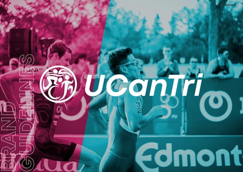
UCanTri @gerarddesigns
02
BRAND STRATEGY
THE LOGOS
Overview
Primary
Secondary
Submark
COLOURS
TYPOGRAPHY
Primary
05
BRAND ELEMENTS
Brand
06
07
IMAGERY
08
SOCIAL MEDIA
Social Media Avatars
Tiles Insagram
Instagram Highlights Banners
BRAND IN USE
Brand Application Brand Application
Brand Application
PAGE/ 2 @gerarddesigns CONTENTS 04
Typeface Secondary Typeface Typographic Heiracy Typography Layouts 19 20 21 22 01
Who We Are Our Brand Values Our Brand Personality Our Brand Keywords 4 5 6 7
Logo
Logo
& Favicon Logo Misuse 9 10 11 12 13 03
Colour Palette Using Tints Logo Usage 15 16 17
Marks Icon Set Brand Pattern Illustration Style 24 25 26 27
29
Instagram
Stories
31 32 33 34 35
37 38 39
STRATEGY
PAGE/ 3 @gerarddesigns BRAND
WHO WE ARE
Here is where you are going to explain a little bit about the brand, who are they, what do they do, what are their goals.
UCanTri (UCT) is a group of individuals who got together for the love of life and a healthy lifestyle, who welcomes newbie and aspiring triathletes alike into the fold. The goal is not just to join multisport events but also to form a bond like no other, like a family, while still being able to keep up a healthy lifestyle and enjoying each other’s company in the process

PAGE/4 @gerarddesigns 01 BRAND STRATEGY
OUR BRAND VALUES
Brand values determine UCanTri’s identity, message and personality. These brand principles guide story, actions, behaviours and decision making processes.
We create a happy atmosphere
Free of judgements, for all members of this family by helping each other out and encouraging each other in whatever his/her goal/s may be.
We are a family We are inclusive
Members of the family help and support each other, no matter what.
Whatever your age, state, you can start doing triathlon.
PAGE/ 5 @gerarddesigns
1 2 3 01 BRAND STRATEGY
OUR BRAND PERSONALITY
Brand personality is a framework that helps UCanTri shape the way people feel about its service, values and mission.
UCanTri’s brand personality elicits an emotional response among its peers and its potential audience with the intention of inciting positive actions that benefit the team.

DETERMINED, DEDICATED, FAMILY-ORIENTED, HELPFUL, ENERGETIC, VISIONARY.

PAGE/ 6 @gerarddesigns 01 BRAND STRATEGY
EXPERT, EMPATHETIC INCLUSIVE PROFESSIONAL
HONEST, DYNAMIC
PAGE/ 7 @gerarddesigns Branded keywords are keywords or phrases used by our potential audience and sport to seek more specific information about UCanTri.
01 BRAND STRATEGY
OUR BRAND KEYWORDS
LOGOS
PAGE/ 8 @gerarddesigns THE
OVERVIEW
We have a ‘branded house’ model where UCT is the masterbrand and our secondary logos are clearly endorsed by UCT. This approach should be adopted when branding any future acquisitions or product developments. Care should be taken not to confuse the viewer by keeping the number of logos as limited as possible. Each secondary logo should have a simple meaningful name that is pre-fixed by the parent UCT.
UCanTri
PAGE/ 9 @gerarddesigns
02 THE LOGOS
Our logo consists of three figures that represents individual sports. The orientation of the figures in the symbol respects the succession of disciplines; swimming-cycling-running. Additionally the orientation creates a never-ending cycle symbolizing motion and dedication to the discipline. The logo was stylized in such a way to depict fluidity and energy as well as to create an overall more approachable look to its elements. The logo is encased by a circle that not only holds all the elements together but also symbolizes community.
Lastly Hidden within the Logo are the letters U,C and T.
Placements: The complete logo should ideally be placed on the top left of any canvas.
UCanTri
UCT
MINIMUM WIDTH: 13MM, 50PX
PAGE/ 10 @gerarddesigns PRIMARY LOGO
02 THE LOGOS
SECONDARY LOGO
Our secondary logo consists of three shapes stylized to resemble the letters of the brand. The orientation of the figures creates a shape that is visually appealing, balanced and stable. The secondary logo’s purpose is to
further supplement the brand’s recallability and to serve as a stylized monogram version of the brand.
UCanTri
UCT
MINIMUM WIDTH: 25MM, 95PX
PAGE/ 11 @gerarddesigns Placements: The complete logo should ideally be used especially in smaller scale mediums.
02 THE LOGOS
SUBMARK
Submark logos are simple, small, but i dentifiable brand designs. Submarks fit in condensed spaces where the larger logo variations won’t work.
The main focus for the submark is its usage of bold lines and simple lines making them identifiable even when scaled down.
Placements: Use as Social media display image and favicon.
FAVICON
UCT
MINIMUM WIDTH: 20MM, 75PX
MINIMUM WIDTH: 8MM, 30PX
PAGE/ 12 @gerarddesigns A favicon is usually your logo down to it’s simplest form, and used mainly as the little icon next to your web address.
02 THE LOGOS
LOGO MISUSE
These are the common logo misuse. To ensure consistency throughout your brand please make sure that you do no use the logo in the below variations.
UCanTri
Do not change the letter colours
Do not rotate the logo

Do not outline the logo
Athletics
Do not add in a drop shadow
Do not add in any other text
Do not place the logo in a shape
Do not stretch or warp the logo
PAGE/ 13 @gerarddesigns
UCanTri UCanTri UCanTri
UCanTri UCanTri 02 THE LOGOS
PAGE/ 14 @gerarddesigns COLOURS
COLOUR PALETTE
Black: We use black as our base dark color to keep things simple but also to symbolize metal and cycling.
White: We use white as our base light color to keep things simple and to complement black.
Sky Blue: We use sky blue as one of our two accent colors. It doubles in meaning as a symbol for water and swimming.
Hot Pink: We use hot pink as one of our two accent colors. It doubles in meaning as a symbol for blood and running.
BLACK
#faf3f0
RGB: 250, 243, 240 CMYK: 1, 3, 3, 0
SKY BLUE
#18d8ef RGB: 24, 216, 239 CMYK: 60, 0, 11, 0
HOT PINK
#1d1d1b
RGB: 29, 29, 27 CMYK: 71, 65, 67, 90
WHITE
#00000 RGB: 0, 0, 0 CMYK: 0, 0, 0, 0
PAGE/ 15 @gerarddesigns
03 COLOURS
USING TINTS
Using our accent colors as extensions of our brand often creates a pairing with photography. And with photography, oftentimes we require some images to be overlayed with our colors. Here we use our accent colors and black as overlays utilizing transparency even percentages.
SKY BLUE
HOT PINK
BLACK
PAGE/ 16 @gerarddesigns
100% 80% 60% 40% 20%
100% 80% 60% 40% 20%
100% 80% 60% 40% 20% 03 COLOURS
Here we see the usage of the logo on different colored backgrounds. When it comes to multicolored
backgrounds such as pictures, we use the white version.
PAGE/ 17 @gerarddesigns LOGO USAGE
UCanTri UUCanTri CanTri UCanTri 03 COLOURS
TYPOGRAPHY
PAGE/ 18 @gerarddesigns
PRIMARY TYPEFACE
Here is UCT’s primary typeface. We use Mont Bold for our Headers and when highlighting important texts to signify emphasis and value. This font is very sharp and straightforward, perfect for a sporting culture.
Lorem ipsum dolor sit amet, consectetur adipiscing elit. Sed quis fermentum turpis. Proin id laoreet ex. Aenean erat nunc, elementum sit amet consequat nec, bibendum at arcu. Ut efficitur nisl felis.
Lorem ipsum dolor sit amet, consectetur adipiscing elit. Sed quis fermentum turpis. Proin id laoreet ex. Aenean erat nunc, elementum sit amet consequat nec, bibendum at arcu. Ut efficitur nisl felis.
PAGE/ 19 @gerarddesigns
Aa ABCDEFG H IJK L M N O P RS T U V WX Y Z a bcde f gh i j k l m noprst u vwxy z 1 23 4 5 67890@ #$ % * ? MONT 04 TYPOGRAPHY Bold
SECONDARY TYPEFACE
Lorem ipsum dolor sit amet, consectetur adipiscing elit. Sed quis fermentum turpis. Proin id laoreet ex. Aenean erat nunc, elementum sit amet consequat nec, bibendum at arcu. Ut efficitur nisl felis.
Lorem ipsum dolor sit amet, consectetur adipiscing elit. Sed quis fermentum turpis. Proin id laoreet ex. Aenean erat nunc, elementum sit amet consequat nec, bibendum at arcu. Ut efficitur nisl felis.
Lorem ipsum dolor sit amet, consectetur adipiscing elit. Sed quis fermentum turpis. Proin id laoreet ex. Aenean erat nunc, elementum sit amet consequat nec, bibendum at arcu. Ut efficitur nisl felis.
PAGE/ 20 @gerarddesigns
Here is UCT’s secondary typeface. We use Product Sans Regular on Subheaders as well as body texts. In terms of usability A a ABCD E F GHIJ KLMNOP RS T U V W XY Z a bc d ef g hi j k l mnoprstuvwxy z 1234 5 6789 0 @ # $ %* ? Product Sans Regular 04 TYPOGRAPHY
HIERARCHY
Here is where you can show off the typographic hierarchy, how will each of the fonts in previous pages be used. What is the leading, tracking and kerning for each font.
THIS IS THE HEADLINE FONT
This font will be used for sub-headings.
This font will be used for body copy. Lorem ipsum dolor sit amet, consectetur adipiscing elit. Sed quis fermentum turpis. Proin id laoreet ex. Aenean erat nunc, elementum sit amet consequat nec, bibendum at arcu.
PAGE/ 21 @gerarddesigns
TYPOGRAPHIC
B UTT ON F ON T B UTT O N F O N T Headline Sub-heading Body Copy Accents & Buttons Mont Bold Uppercase 0pt Leading 0 Tracking Product Sans Regular 5pt Leading 0 Tracking Product Sans Regular 5pt Leading 0 Tracking Mont Bold Uppercase 250 Tracking 04 TYPOGRAPHY
Horizontal Layout
H E R E
Vertical Layout Square Layout
PAGE/ 22 @gerarddesigns UCT CLICK
UCT
04 TYPOGRAPHY TYPOGRAPHIC LAYOUTS The addition of typographic details contributes hugely to the overall UCT look and feel. Lorem ipsum dolor sit amet, consectetur adipiscing elit. Sed quis fermentum turpis. Lorem ipsum dolor sit amet, consectetur adipiscing elit. Sed quis fermentum turpis. Proin id laoreet ex. Aenean erat nunc, elementum sit amet consequat nec, bibendum at arcu amet. LOREM IPSUM DOLOR SIT AMET LOREM IPSUM DOLOR SIT AMET
PAGE/ 23 @gerarddesigns BRAND ELEMENTS
BRAND MARKS
These are our brandmarks. It is the most valuable asset within our visual identity and should be treated as such. The brandmarks consists of two key elements as shown; the monogram and the discipline/sport exhibited. Both have been crafted specifically for UCT and they are uniquely ours.
Please only use supplied artwork files,do not attempt to recreate or redraw.
All brandmarks are also supplied as white versions so that they can be reversed out of dark backgrounds.
PAGE/ 24 @gerarddesigns 05 BRAND ELEMENTS
ICON SET
Our icon set is tailor-made for the the daily activites our brand experiences, helping to create a cohesive image throughout digital and print media.
PAGE/ 25 @gerarddesigns 05 BRAND ELEMENTS
BRAND PATTERN
Our brand pattern was created with the direction provided by our moodboard that revolves around the aesthetic provided by the 70s and 80s era Miami beach, famously depicted in Miami Vice and GTA Vice City from its colors, patterns all the way to photography and artstyle.
PAGE/ 26 @gerarddesigns 05 BRAND ELEMENTS
ILLUSTRATION STYLE
Our Illustrations serve as an extension of our brand elements alluding to the pop-art trend used in the 70s and 80s mixed in with neon line signages that were popular at the time, creating images that depict various activities and exercises.
PAGE/ 27 @gerarddesigns 05 BRAND ELEMENTS
IMAGERY
PAGE/ 28 @gerarddesigns
IMAGE DIRECTION

Our application on photography is an extension of our brand as it helps amplify our message. Ideally shots that create geometric angles, close-up shots or distant action shots would create a cohesive and impactful visual aid that supplements our brand.


PAGE/ 29 @gerarddesigns 06 IMAGERY
PAGE/ 30 @gerarddesigns SOCIAL MEDIA
SOCIAL MEDIA AVATARS
Use this space to show off the social media avatars the client will be using. Explain which colour variation will be used for what platform.
UCanTri Team PH


The difference between try and triumph is just a little umph. ucantriph@gmail.com
Following Message Email
PAGE/ 31 @gerarddesigns 07 SOCIAL MEDIA
UCT UCT UCT UCT UCT
Posts Followers Following 120 10k 800
INSTAGRAM TILES


Our feed is essential in showing of who we are what we are all about. We try to balance functional design and expressive design as much as possible.


PAGE/ 32 @gerarddesigns UCT UCT UCT UCT UCT 07 SOCIAL MEDIA
INSTAGRAM STORIES
Our presence in various video sharing platforms such as facebook stories, instagram stories/reels and tiktok, it is only fitting to have frames appropriate for our brand whenever we share our daily experiences.


UCT
PAGE/ 33 @gerarddesigns 07 SOCIAL MEDIA
INSTAGRAM HIGHLIGHTS
Our Instagram Highlight icons primarily makes use of the elements found in our main logo, supplemented by our brand icons.
PAGE/ 34 @gerarddesigns 07 SOCIAL MEDIA
BANNERS
Our banners for show the wide range of functional and expressive design we have. Our logo is interdependent with all our other brand elements and therefore does not necessarily need to be part of our banner.
PAGE/ 35 @gerarddesigns 07 SOCIAL MEDIA
BRAND IN USE
PAGE/ 36 @gerarddesigns
BRAND APPLICATION
Brand application refers to the physical representation and consistent application of brand identity across visual and verbal media. In visual terms, this can include signage, uniforms, liveries, interior design and branded merchandise. This refers to marketing and branding as a unified whole.

@gerarddesigns 08 BRAND IN USE
BRAND APPLICATION
Our brand applied on textile and our team uniforms aids in expressing our brand especially during competitions and training.


PAGE/ 38 @gerarddesigns
08 BRAND IN USE
BRAND

Here are samples of our brand applied onto print media such as merchandise and business cards. Being able to translate our onto various objects is made easy through the use of our brand elements to sustain cohesion.


PAGE/ 39 @gerarddesigns
08 BRAND IN USE
@gerarddesigns UCanTri THANK YOU! Email Us ucantriph@gmail.com Follow Us @ucantri_ph Visit Our Website ucantri.com.ph