this portfolio contains my studies of type through experimental posters. sourced from adobe fonts.
Inspired by the typography of the Industrial Revolution, I aimed to capture the raw, gritty essence of that era. Chandler 42 became the perfect choice, embodying the bold, utilitarian feel of massproduced typefaces from that time. My goal for the poster was to evoke the rough, unrefined character of the period—where design was made for function rather than finesse, yet still held a sense of strength and boldness in its presence. The result is a design that feels both timeless and firmly rooted in the industrial age.


This poster sought to blend avant-garde design with abstraction, and Bestial Bold by Seymour Chwast was the ideal font choice. A playful evolution of his earlier Blimp font, Bestial Bold is now enhanced with faces, adding an intriguing layer to the type. My intention was to approach the design with a sense of experimentation, particularly in the layout of the text. I wanted the arrangement to complement the bold, chunky letters while maintaining a sense of whimsy and visual impact. The result is a dynamic fusion of form and function that feels both unconventional and engaging.


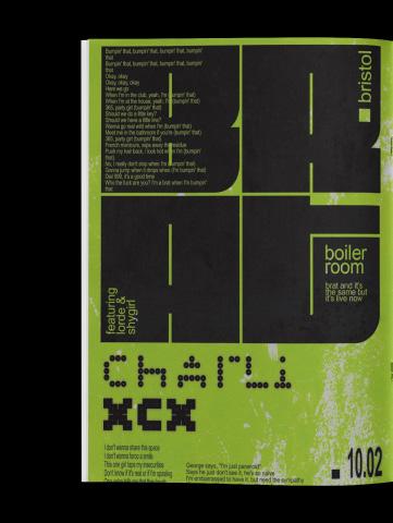
In my exploration of typography during the technological revolution—the era marked by the invention of the personal computer—designers were introduced to a whole new realm of possibilities. Littlebit is a quintessential typeface of this digital age, crafted through pixels and grids. For this poster, I wanted to capture the rigid, digital essence of early computer design. The layout was intentionally structured to convey a sense of mechanical precision, reflecting the nascent world of computing while embracing its technological roots. The result is a design that feels both reflective of its time and rooted in the digital landscape.


Bauhaus has always been a style I’ve gravitated toward, and my studies in typography naturally led me to explore the Bauhaus-inspired qualities of the font Mekon. Simple, clean, and bold, it perfectly embodies the principles of the movement. To further emphasize this aesthetic, I incorporated the iconic Bauhaus color palette of blue, red, and yellow. Recreating Mekon was a truly satisfying process, as it allowed me to immerse myself in the minimalist, geometric beauty of the Bauhaus tradition while adding my own modern interpretation.
I was drawn to a font that was bold, loud, and unapologetically abrasive, and Fit was the perfect choice. Its wide, obtrusive form demands attention, taking up space in a way that feels both commanding and forceful. I was captivated by its unique variations, each adding to its intense personality. While creating a legible final design was a challenge, it also allowed me to break a few design rules in pursuit of making a bold statement. Red and black felt like the only natural pairing, amplifying the font’s power and giving the design an unmistakable punch.


