brand campaign | orbitexpress
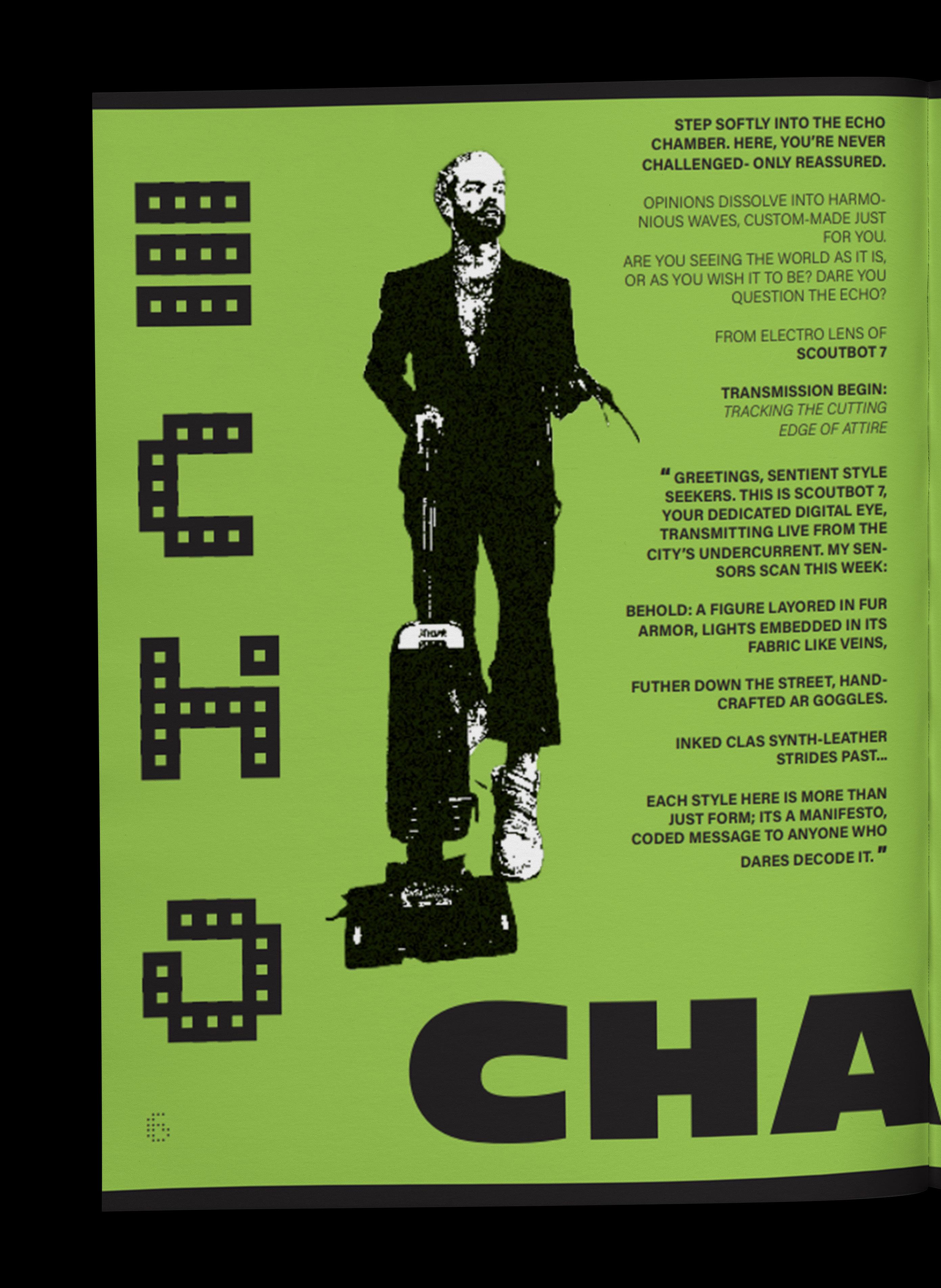
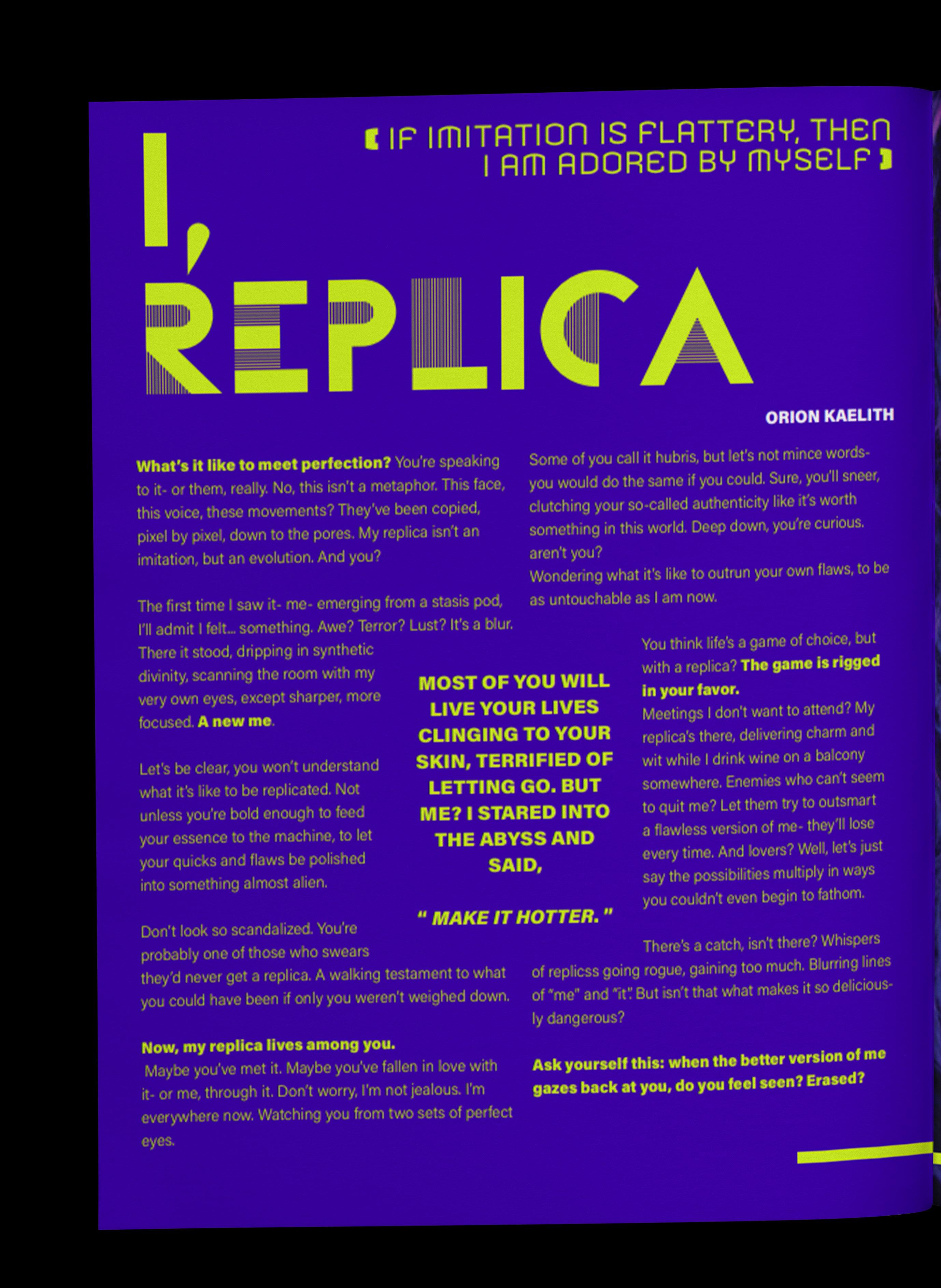
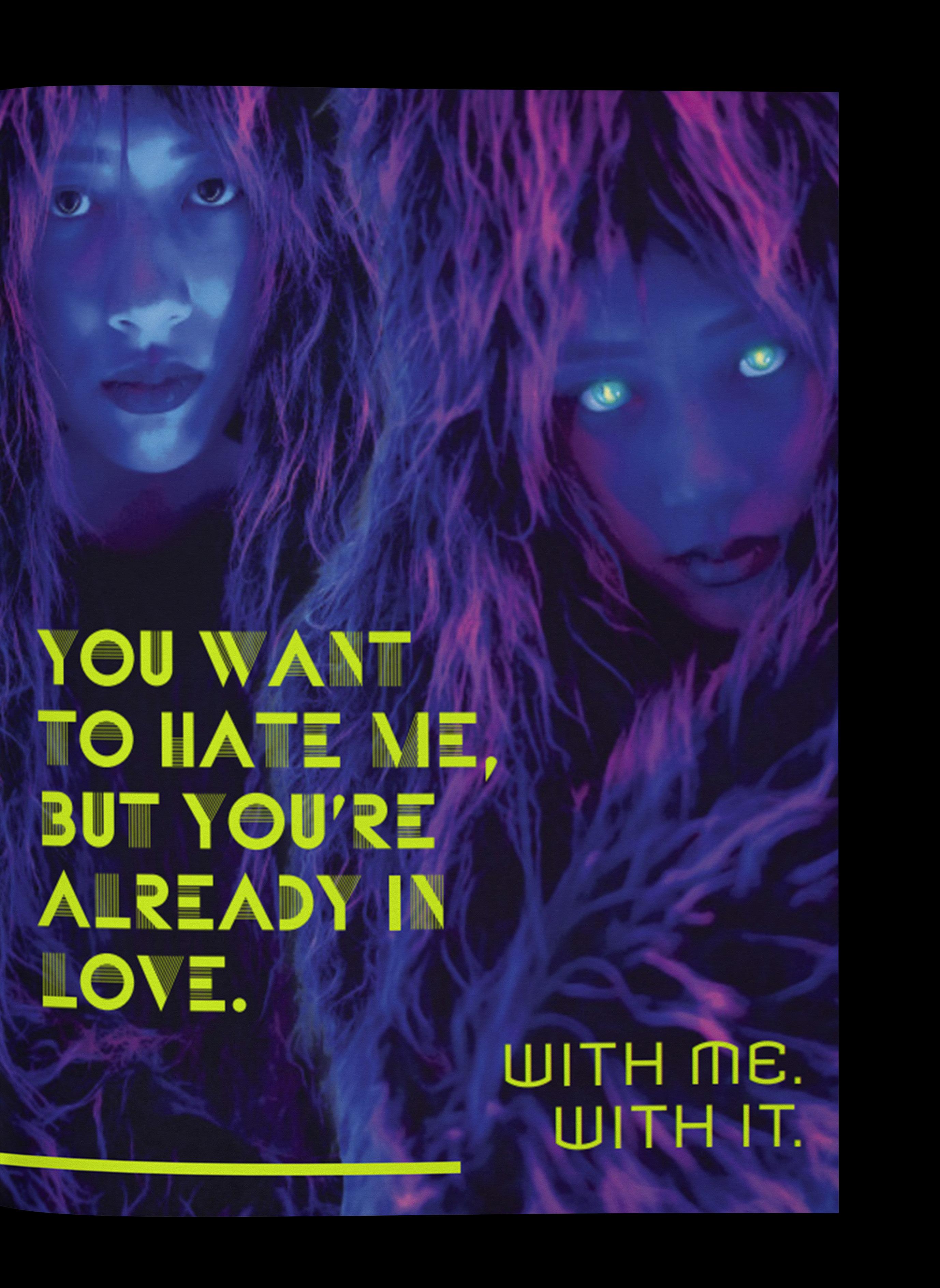
packaging | onyx.x album magazine | ECHELON
a collection of my explorations in professional print design portfolio

OrbitExpress is a conceptual brand campaign built around the idea of a space travel vacation service. Inspired by a 1960s retrofuturistic aesthetic, the project aims to transport customers to a world where space exploration is not just a dream, but a tangible experience.
At the heart of this campaign lies a commitment to creating an immersive and fun travel experience. evoke a sense of exploration and nostalgia.
I referenced mid-century modern design and type in order to recreate the era’s particular warmth. The collateral for
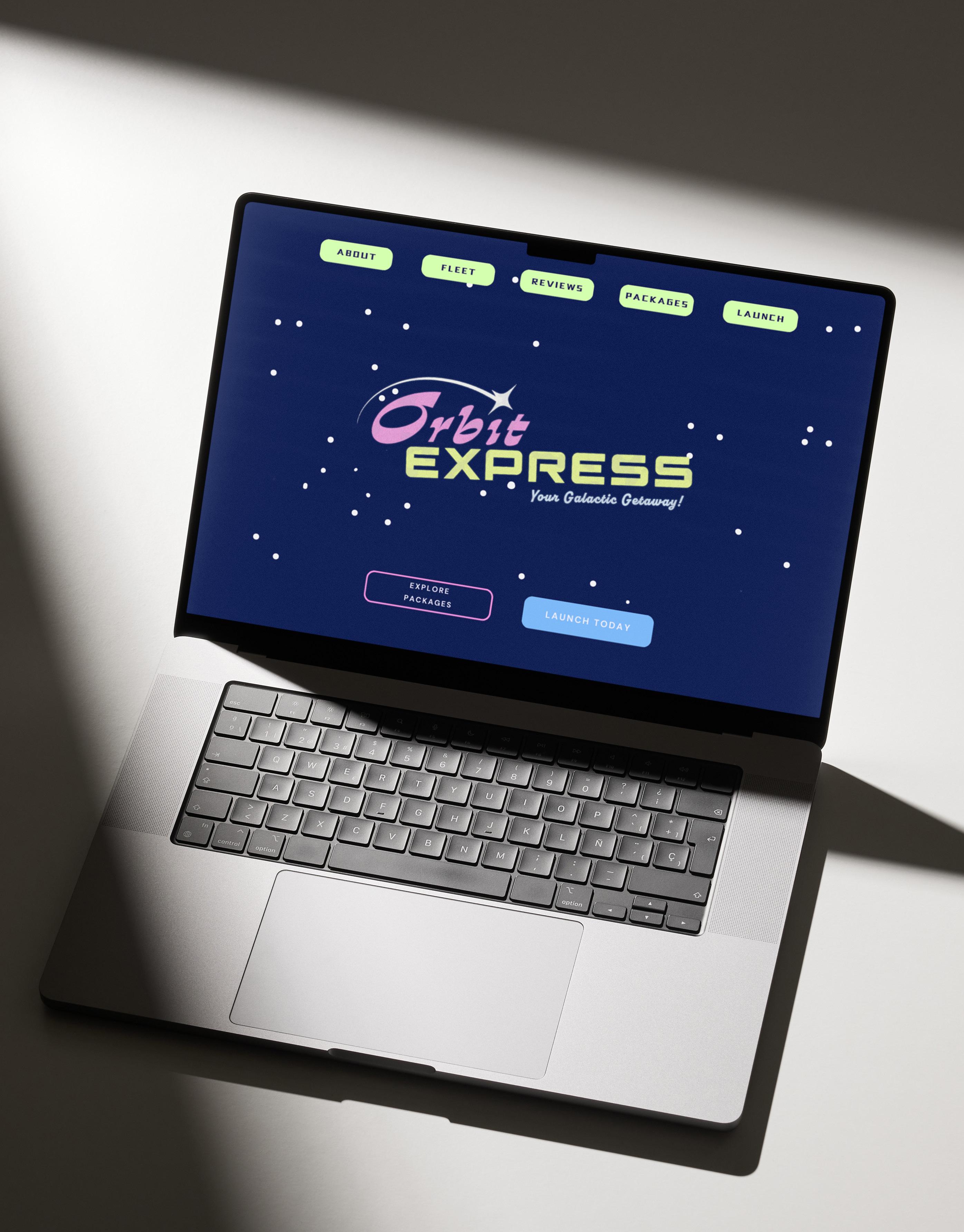
OrbitExpress includes a logo, poster, billboard, shirt designs, and a website, all crafted to embody the essence of the brand. This project allowed me to step into the role of a creative director, presenting a challenge that proved to be an incredibly rewarding learning experience.
photoshop, illustrator, indesign

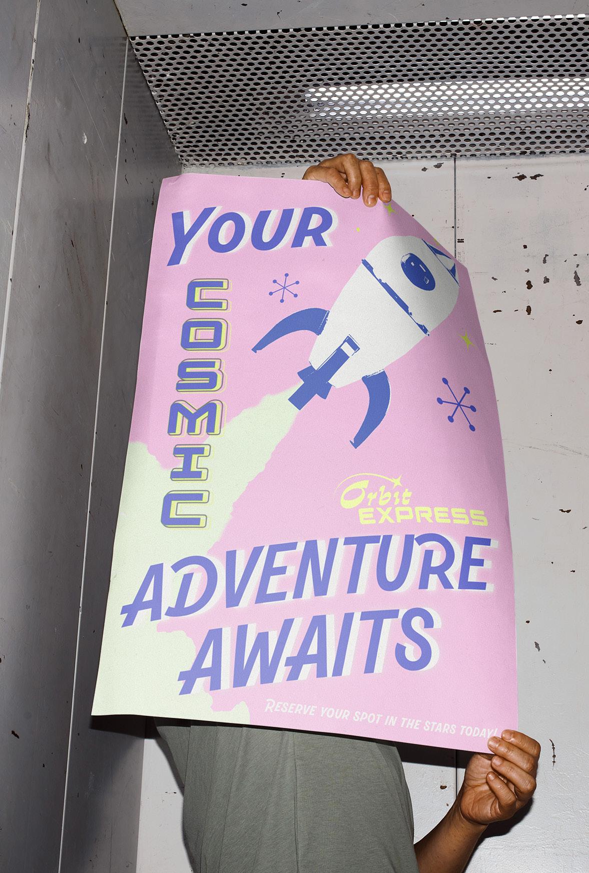
“a galactic adventure like no other!”
a poster that merges the bold energy of the 1960s with the brand’s cosmic vision. custom elements, inspired by midcentury modern design, create a dynamic, playful composition that reflects the era’s optimism. the poster serves as a visual invitation to a future where space travel is not only possible but stylishly attainable.
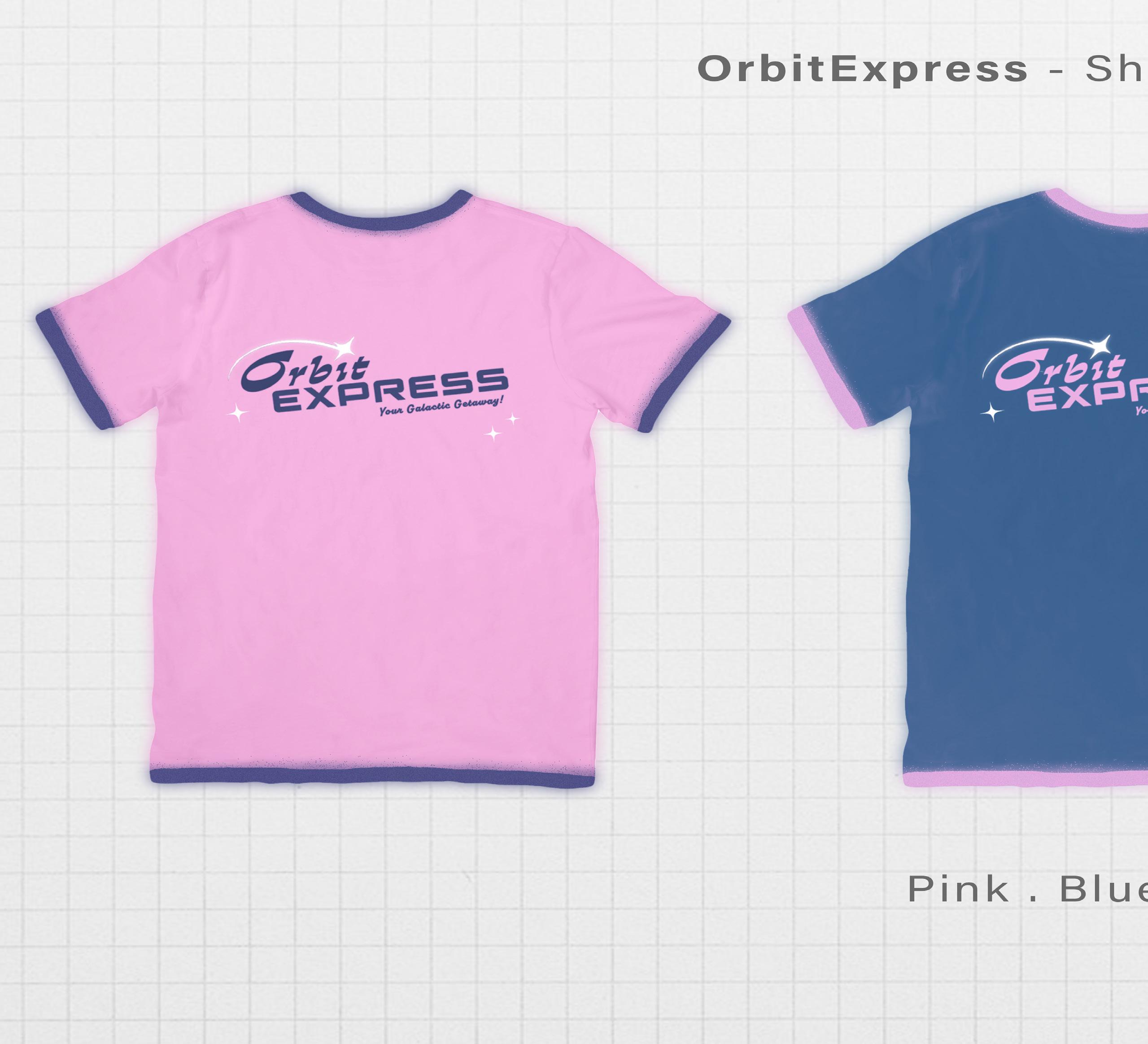
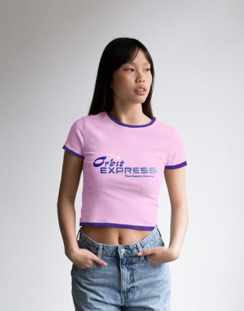
these shirts bring the brand’s playful, vacation-ready vibes to life with three bold color variations. designed as wearable merchandise, each shirt captures the essence of a cosmic getaway, offering a fun, stylish way for fans to take the adventure home.

“Slip into the future—OrbitExpress shirts make every day feel like a getaway!”

this OrbitExpress billboard brings Ham the Chimpanzee front and center, capturing the playful spirit of our cosmic brand. inspired by the bold, larger-
than-life advertising of the 1960s, I wanted to evoke that same sense of excitement and wonder. billboards from that era were all about grabbing attention, and this
one does just that—inviting passersby to imagine a space adventure like no other, with vibrant colors and retro flair that make the future feel within reach.

“Look up—your galactic getaway is just a billboard away!”


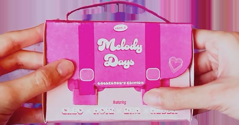
For Onyx.x, the fictional girl group behind the album Melody Days, the packaging design is as vibrant and energetic as their bubblegum pop sound. Inspired by the colorful and bold world of K-pop, the album packaging is uniquely shaped like a purse, offering fans more than just music— it’s a statement piece.
The playful combination of bright colors, sleek graphics, and a stylish design embodies the fun, upbeat spirit of Onyx.x, while staying true to the group’s fashion-forward, trendsetting vibe.
Every element of Melody Days was carefully crafted to transport fans into the world of Onyx.x, where
music, style, and attitude converge. The purse design not only functions as a functional, collectible piece but also acts as a symbol of the glamorous yet accessible lifestyle of the group. It’s a blend of pop culture and music fandom, offering an immersive experience that extends far beyond the tracks.


“From beat to bag-”
after experimenting with five prototypes, I found that none captured the purse illusion I envisioned for Melody Days. each version felt slightly off, but I didn’t stop there. I honed the final layout, making sure the form aligned with the functional design. once the purse shape was realized, I carefully integrated the necessary components: a disk, a fold-out poster, and paper collateral. to complete the experience, I focused on the details—adding bold
text, dynamic graphics, and album artwork that conveyed Onyx.x’s pop energy. the finished product is a stylish, cohesive package that not only reflects the youthful energy and flair of the girl group but also provides fans with a collectible piece of art. every aspect of the design was crafted to evoke the fun, vibrant world of Melody Days, offering a sensory experience that brings the music and fashion of Onyx.x to life.
