introduction foreward
In 2023, I am honoured to welcome you all to the 46th Fremantle Arts Centre Print Award.
We often celebrate decades of achievement 20th, 30th, 40th etcetera. However, I think we are all in agreement that 46 of anything is no mean feat – quite the achievement for an art prize, and to celebrate that we have quite the selection of exceptional finalists.
Hailing from across Australia, we have been struck by the sheer breadth of entries and were prompted to frequently ask ourselves the age old question – what defines a print? As you will see beyond this page – the scope of a print is vast, continuing to expand and delight and challenge us all.
There are many superb people to thank - our judges; Curator Glenn Iseger-Pilkington, Exhibition Coordinator Emma Buswell, Installations Coordinator Tom Freeman, and our brilliant install crew whose skill and craftsmanship brings the Print Award to life every time. It has been a pleasure to watch this exhibition reveal itself over recent weeks.
The Fremantle Arts Centre is a key cultural and learning precinct situated on Whadjuk Nyoongar Boodjar in Walyalup (Fremantle), a place that is celebrated for its innovation, culture and creativity. For this, it is important to acknowledge The City of Fremantle and the State Government through the Department of Local Government, Sport & Cultural Industries for their long term support of the Fremantle Arts Centre as we reach across our community, region, and nation.
In this the Fremantle Arts Centre’s 50th year, heart-felt congratulations to our prize winners and all the finalists of the 46th Fremantle Arts Centre Print Award.
Olwyn Williams
A/Director, Fremantle Arts Centre
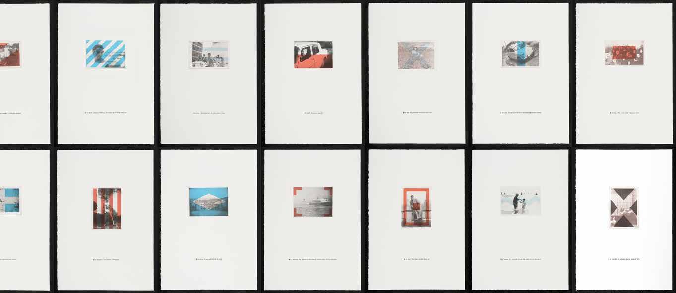
50 emerging, established and cross-disciplinary artists come together for our 46th Fremantle Arts Centre Print Award. 50 were chosen as a nod to the Fremantle Arts Centre’s 50th birthday – a diverse array of Australian talent representing the many forms of print making methods available today.
Founded in 1976, just a few years after the establishment of the Fremantle Arts Centre, the Print Award was initiated as a way of attracting interstate artists and audiences to the centre. Now in its 46th year, the Print Award is Australia’s oldest print prize and the Fremantle Arts Centre’s longest running exhibition series, attracting entries from a huge range of established and emerging artists across Australia.
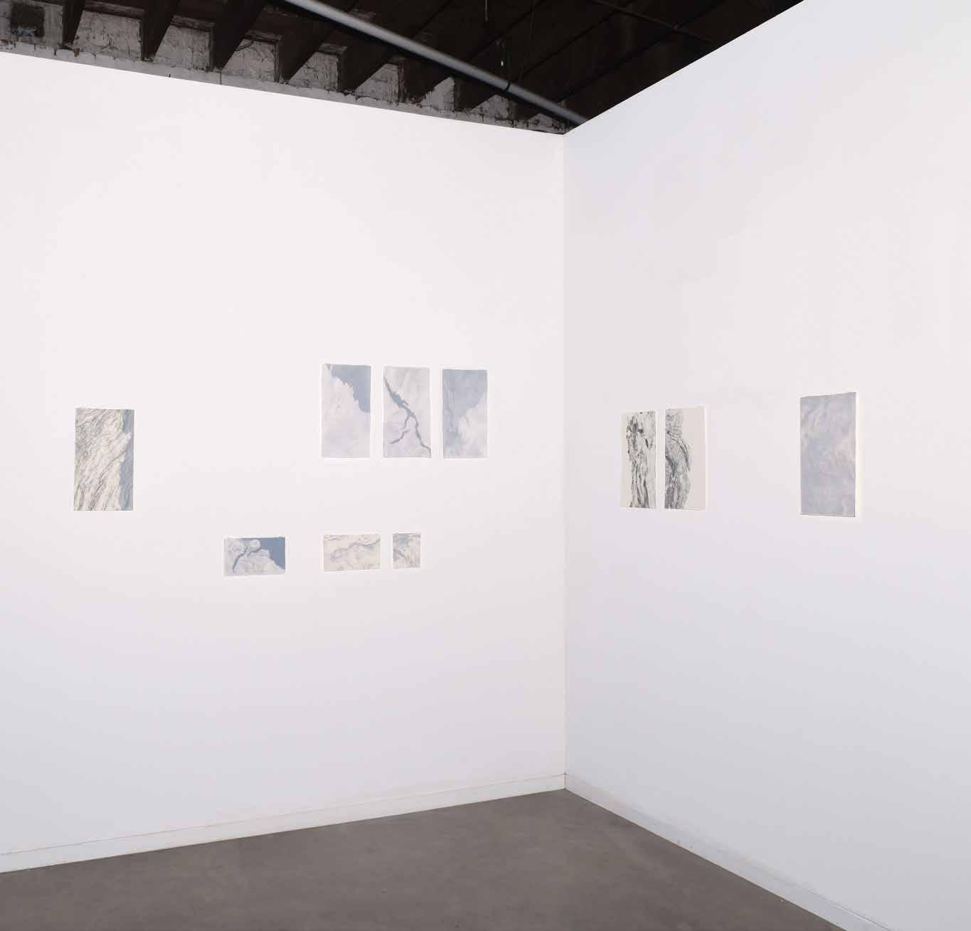
Today’s Print Award finalists draw from myriad disciplines and backgrounds. Audiences will enjoy small to large-scale artworks across a range of innovative print making methods and materials, including 3D, etching, lino and wood cut, digital and screen printing. As viewers move through the space they will encounter significant pieces including Anthea Boesenberg’s compelling 50 years, a series of prints, on a large draped paper, each representing a day of her life and culminating in a floor to ceiling creation. Other notable works include Amanda Page’s Ice is a Metaphor for Change, depicting ever-changing ice masses using the method of cyanotype, a camera-less way to capture images and one of the oldest known photographic processes.
Printmaking has evolved and continues to change, and the Print Award presents innovative techniques alongside established mediums. Fremantle Arts Centre invited a panel of industry leading professionals to discuss these techniques and continue the conversation of what determines a print today. Our judges this year include Annika Kristensen: Senior Curator, Australian Centre for Contemporary Art, Melbourne and Visual Arts Curator at Perth Festival; Timmah Ball: Writer, Artist and curator of Ballardong Noongar heritage; and Tom MÙller, Western Australian visual artist and co-founder and Artistic Director of the Fremantle Biennale. We also welcomed Helen Carroll, Curator of the Wesfarmers Collection of Australian Art, to judge the First Nations Award, a newly formed category supported by Wesfarmers Arts.
We invite you to explore the fifty works selected for this year’s Awards, and to continue discussions around print and print making. Printmaking plays different roles in our lives, and often mirrors advances in technology and human creativity. The Fremantle Arts Centre Print Award in an invitation to consider the possibilities of printmaking now, and into the future.
Print Award judges: Annika Kristensen, Timmah Ball & Tom MÙller

award winners
FIRST PRIZE
Judged by Timmah Ball, Annika Kristensen & Tom MÙller
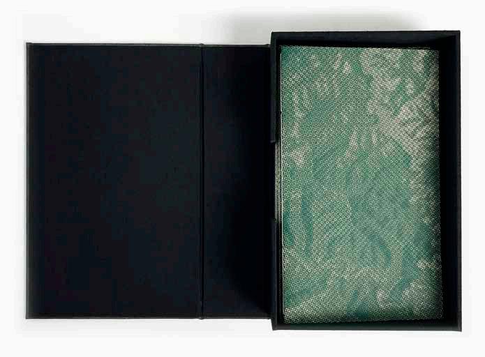
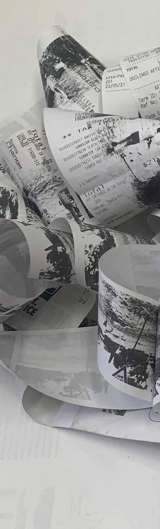
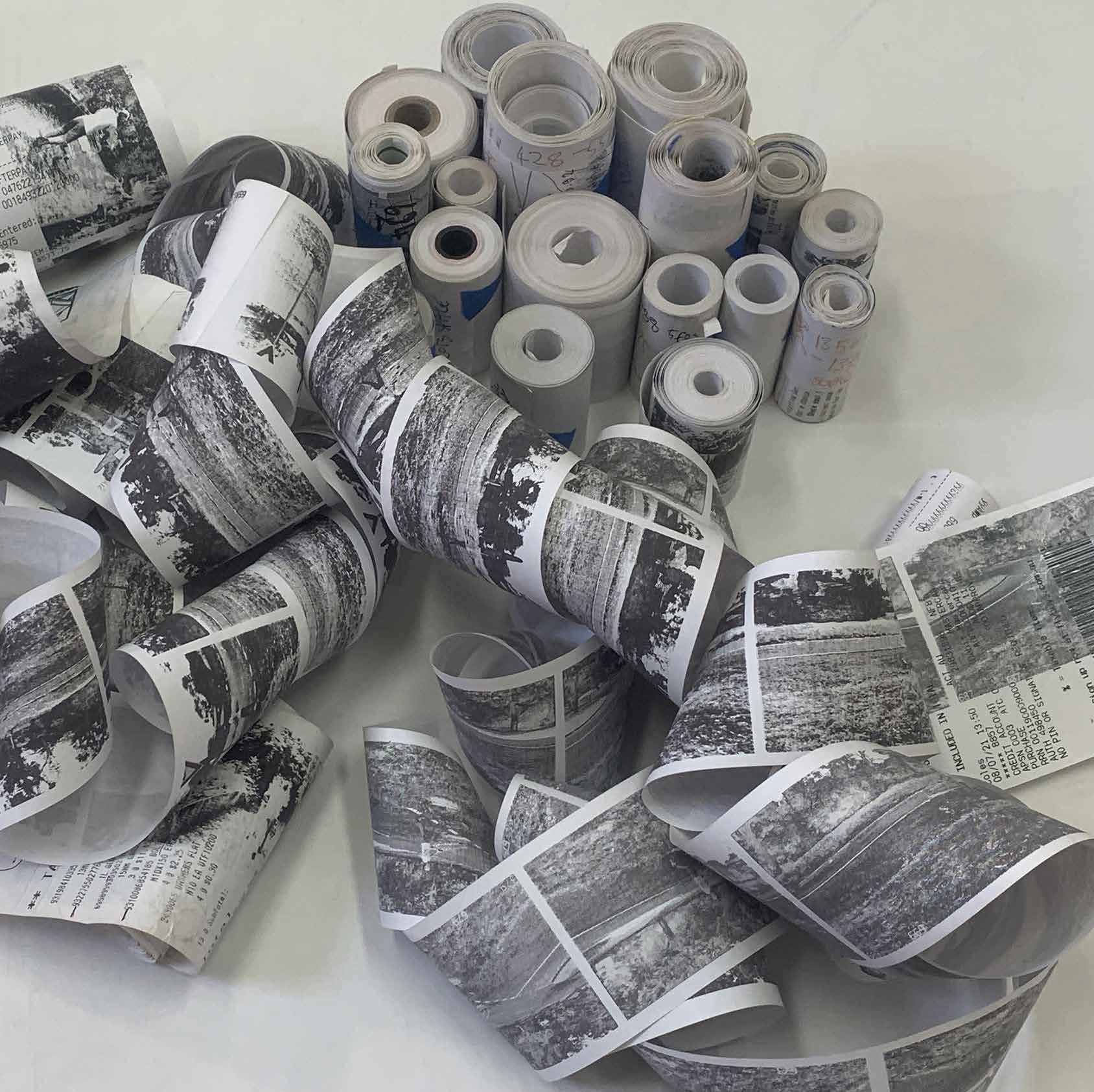
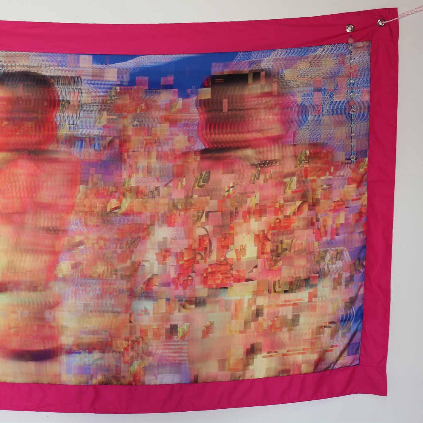
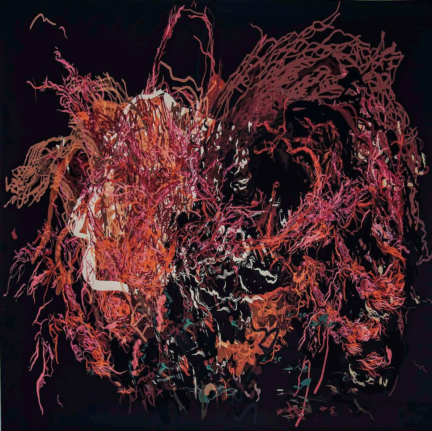
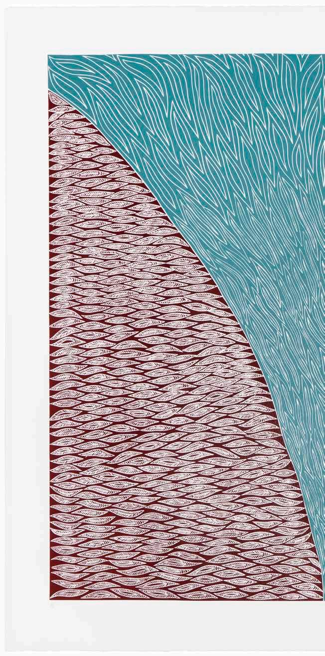
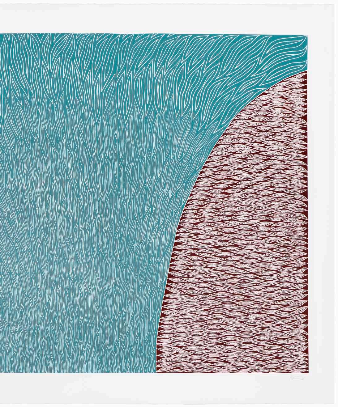
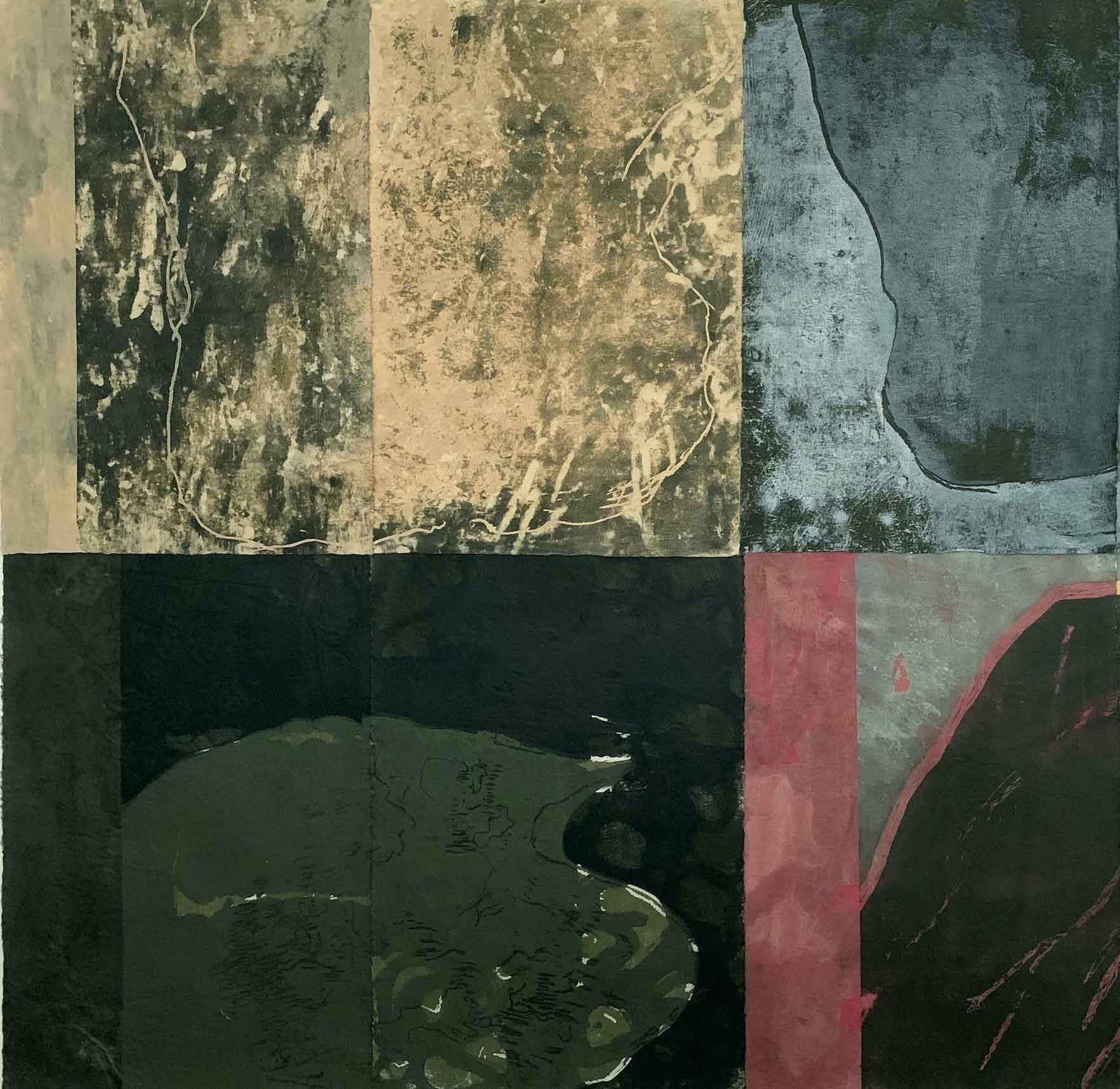
Jacky Cheng
Yue Lao – God of Matchmaking and Marriage, 2021
The judges were unanimous in their decision to award this work the First Prize in this year’s Fremantle Arts Centre Print Award. Cheng’s work Yue LaoGod of Matchmaking and Marriage, 2021 extends the field of printmaking through its use of the ‘readymade’ print in the form of torn off calendar pages, a practice and process of starting the day which she has ritualistically undertaken throughout her life.
This ambitious work reaffirms and cements Cheng’s commitment to exploring the medium, processes and possibilities of working with paper. Like many of Cheng’s works, Yue Lao- God of Matchmaking and Marriage, 2021, is an exploration of the diasporic, it seeks to create a belonging though practices which connect to her cultural homelands and communities, while articulating a sense of unease, making sense of her world through doing and making, rather than thinking. Made from printed calendars, the work is both a deconstruction of time, and an attempt to weave a timeless form into existence.
SECOND PRIZE
FIRST NATIONS PRIZE
Judged by Helen Carroll, Wesfarmers Arts
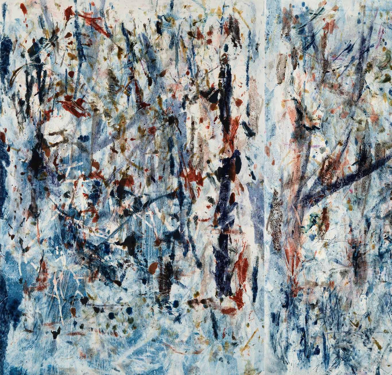
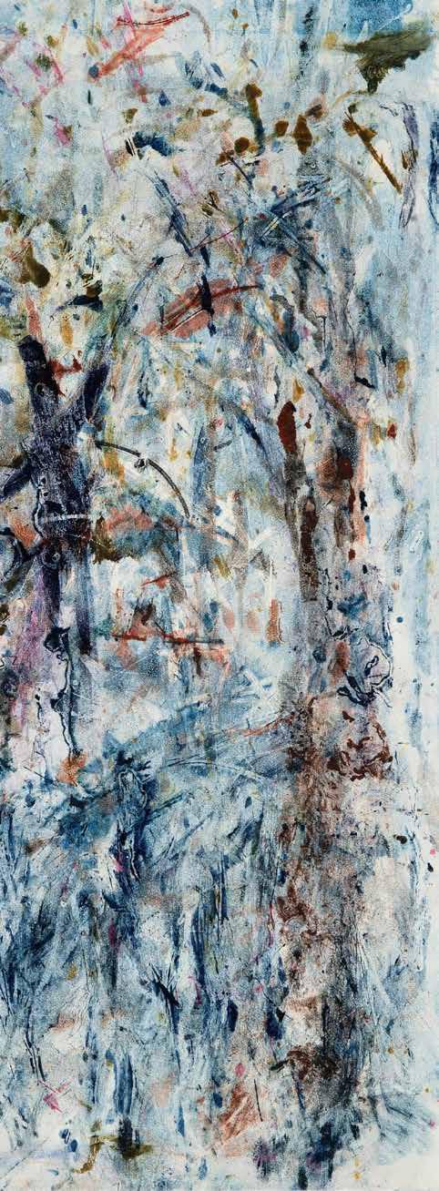
Stephen Brameld & Jay Staples Forest, 2023
Kieren Karritpul (NT), Traditional Fish Basket, 2022
Ngen’gi wumirri Peoples, Nauiyu Nambiyu (Daly River)
HIGHLY COMMENDED
Judged
Yvonne Rees Pagh
Yokai, 2023
The sheer scale of Stephen Brameld and Jay Staples’ Forest, 2023 is an invitation into the processes of the work itself, a collaboration that is also co-authored by the natural world. The judges described this work as having elemental qualities, offering an experience akin to walking into the wilderness. The staining processes, enabled by nature and used in making this work, extends not only upon the notion of collaboration between artists, but also upon contemporary printmaking practices. Forest, 2023, is situated within a history of landscape painting in Australia which is both romantic and uneasy.
The judges responded to the commanding and restrained properties of this work, and to the organic qualities which will inevitably shift over time. Readily available canvas, and the tannins rendered by the merbau timber, interplay to create a surface of muted tones and subtle mark-making that beautifully capture a sense, a place, and timelessness.
Kieren Karritpul’s Traditional Fish Basket, 2023, has a beautiful lightness, but also rich and layered depth that speaks strongly to the qualities of water. This work, which depicts a fish trap evokes a sense of calm, of the meditative experience of sitting with, and watching water. Striking and commanding, the work holds the eye and has a radiating presence. While Kieren is a young artist, the work is mature and confident, embodying the learnings and teachings of his old people and his larger community. The influence of many generations of weavers and storytellers is seen in this singular work. This is Kieren’s cultural inheritance, which he now contributes to through his practice, for future generations.
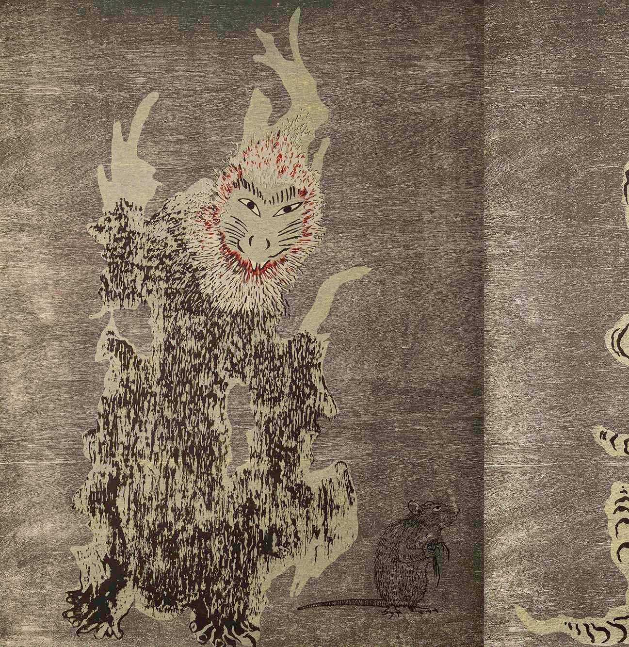
Yokai, 2023, evokes the strange and mysterious within our everyday, speaking to our love of animals within the domestic sphere while also capturing the supernatural spaces that are connected to our worldviews. Pictorially, the work offers a palpable tension between the three protagonists, creating intrigue for audiences around the events which have preceded this moment. The work is technically skilful, while maintaining a relatable charm that holds its whimsy. Yokai, 2023 is a memento mori, a reminder of our own mortality while celebrating treasured creatures and companions, and the joy and meaning they bring to our lives.
Judged by Timmah Ball, Annika Kristensen & Tom MÙller
by Timmah Ball, Annika Kristensen & Tom MÙller
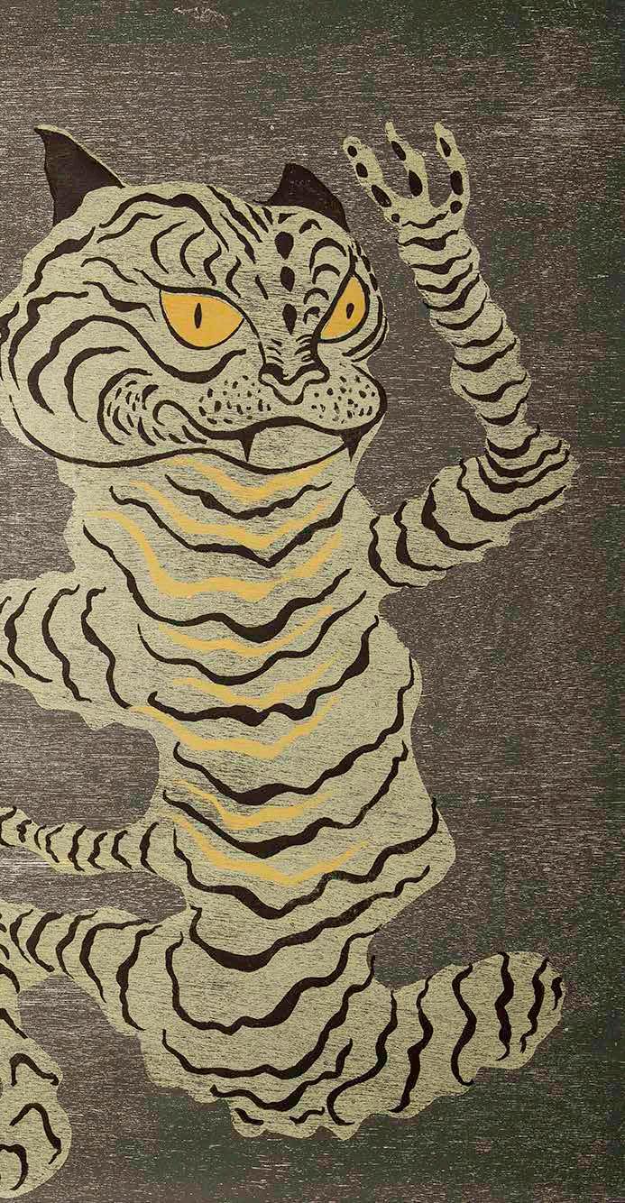
Yvonne Rees-Pagh (TAS)
Yokai are a shadowy phenomena in ancient Japanese folklore. They appear as bizarre, semi-familiar creatures, sometimes benign and sometimes evil, ghostlike and shape-changing. In this print, Yvonne Rees-Pagh fondly remembers her deceased cats, and some rats she looked after but which mysteriously disappeared. She styles her remembered pets as yokai spirits, with features that are both striking and indistinct. “At night I sometimes imagine that the cats and rats are still alive and prancing around together in the garden,” says Rees-Pagh. Her creatures are printed using traditional wood-block printing techniques, influenced by the ukiyo-e animal prints of Japanese master Utagawa Kuniyoshi.
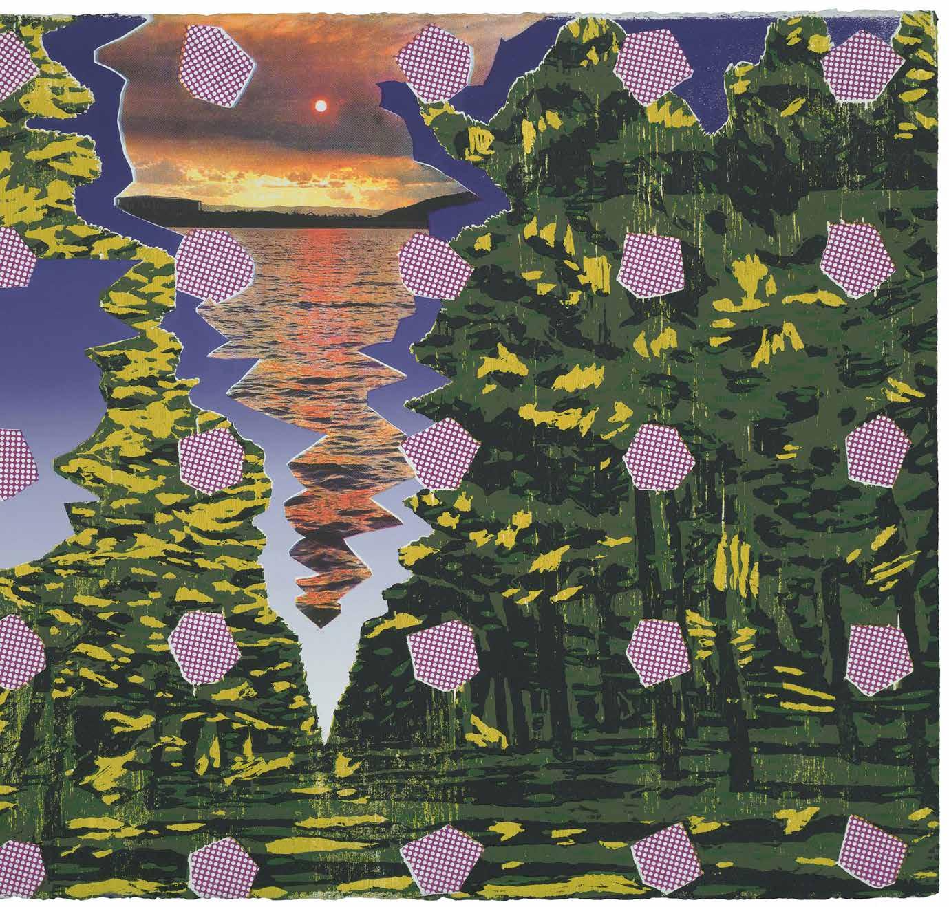
Joel Arthur (ACT)
Various Sensations brings together contrasting landscape images and gridded matrix patterns, using collaged fragments that jostle and fuse with one another. Artist Joel Arthur begins with simple observations of everyday life, photographing moments and textures. Each layer is chosen for its striking quality, and for the memory it triggers for the artist. In this print, carved woodblock and screenprinted photography are regularly layered with heightened pink polka dot rhombuses. This detachment from the colours and shapes of the natural world becomes “a vibration that delivers a visual tactility and becomes sensory or experiential”. The work presents the artist’s process of absorbing the surrounding world, observing it, feeling it and drawing on memories of sensation.
Various Sensations, 2022
Reduction woodcut and screen print
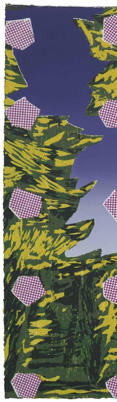
Edition 1/7
Printed by Max Gosling
(Megalo Print Studio)
56 x 76 cm
Anthea Boesenberg (NSW)
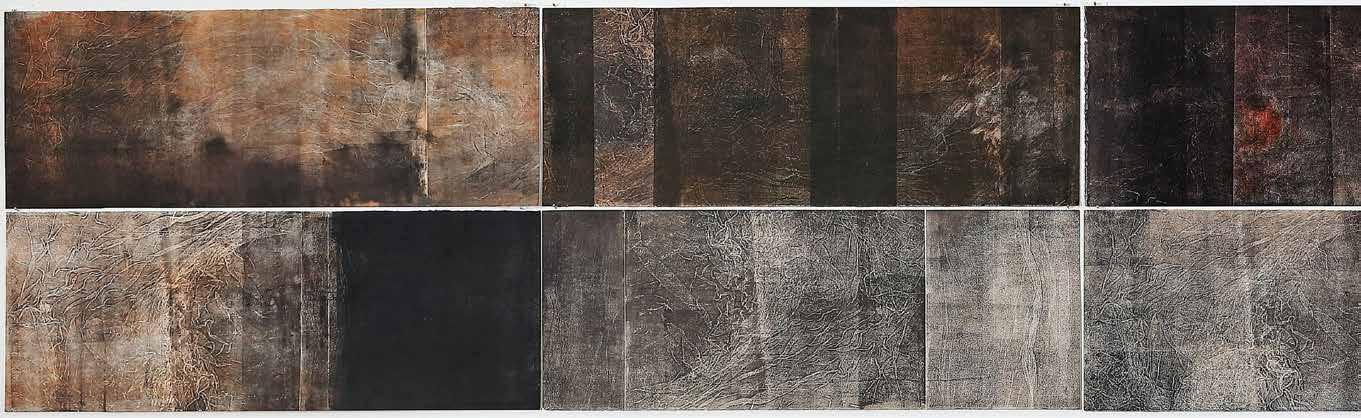
This print is a visual representation of fifty years of time in the life of artist Anthea Boesenberg. One stamp has been made on its surface for every day of the fifty year period, a total of 18,250 stamps. This may seem like an enormous number, representing a significant amount of time in the life of an individual.
Take a look at the print: is this what you imagined fifty years would look like, plotted out day by day? Is it bigger or smaller than you anticipated? “I had imagined that a lifetime of days would fill the whole gallery or more”, reflects Boesenberg. “I ask myself how I spent all those days”. Though it was simple, the printing process inking, stamping and counting – took a protracted time to complete. Like a life, the resulting work is fragile and messy at the edges.
50 years, 2023
Tamping on Tengucho
Edition 1/1
1100 x 97 cm
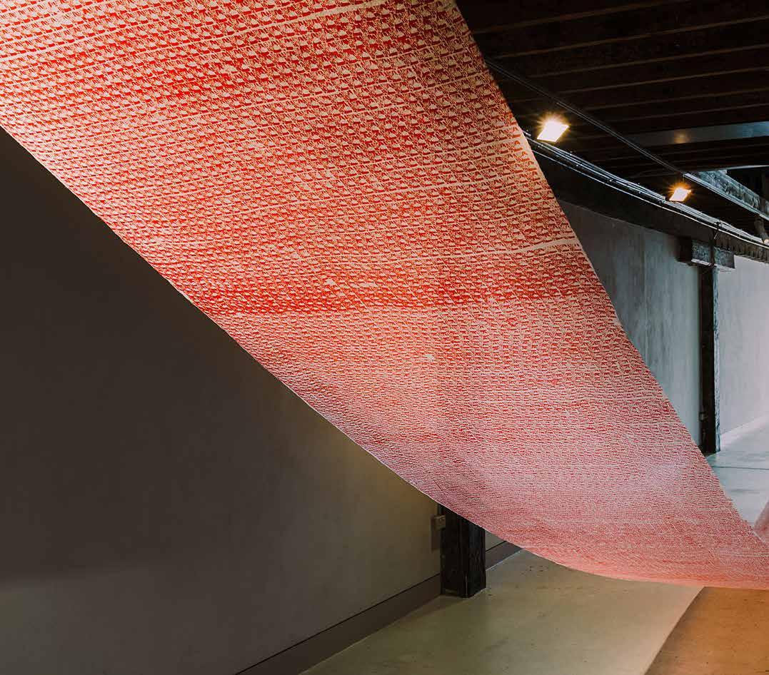
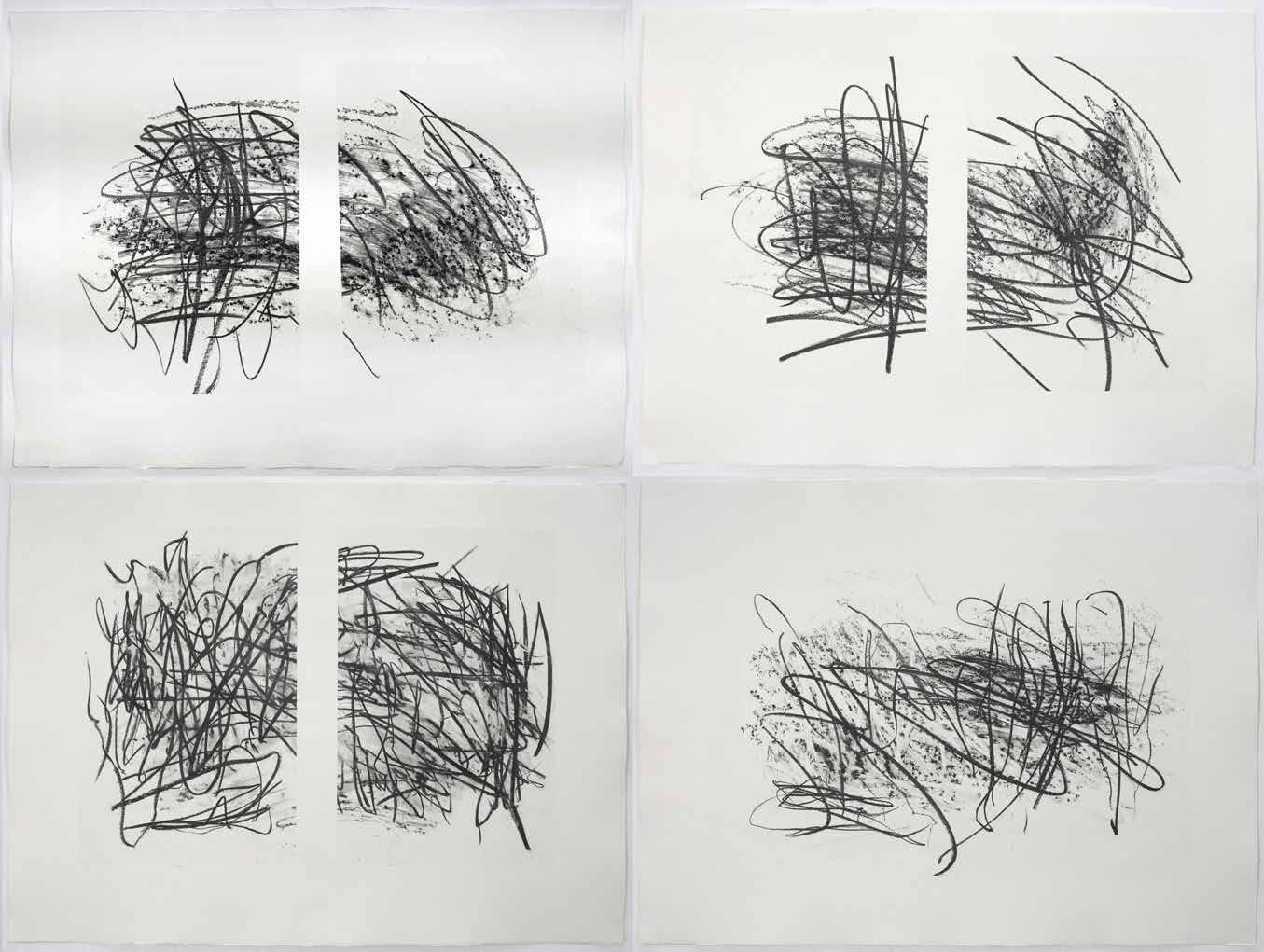
Monique Bosshard Curby is interested in the iterative nature of the printmaking process. Working with a limited number of plates, she produces image after image which while similar, shift slightly from one to the next. Between the first and the last print, changes take place, the translucent layers of ink merge together. The prints are now arranged in the gallery with gaps between them, like chapters in a narrative. We might examine the work for signs of beginnings, endings and logical sequence. For and-and, Curby used gauze as the primary material to mark her intaglio plates, utlising its flexibility and adaptability to further emphasise a process of accretion of marks, density and detail.
 Monique Bosshard Curby (WA)
and-and, 2021
Relief and monoprint on Magnani paper
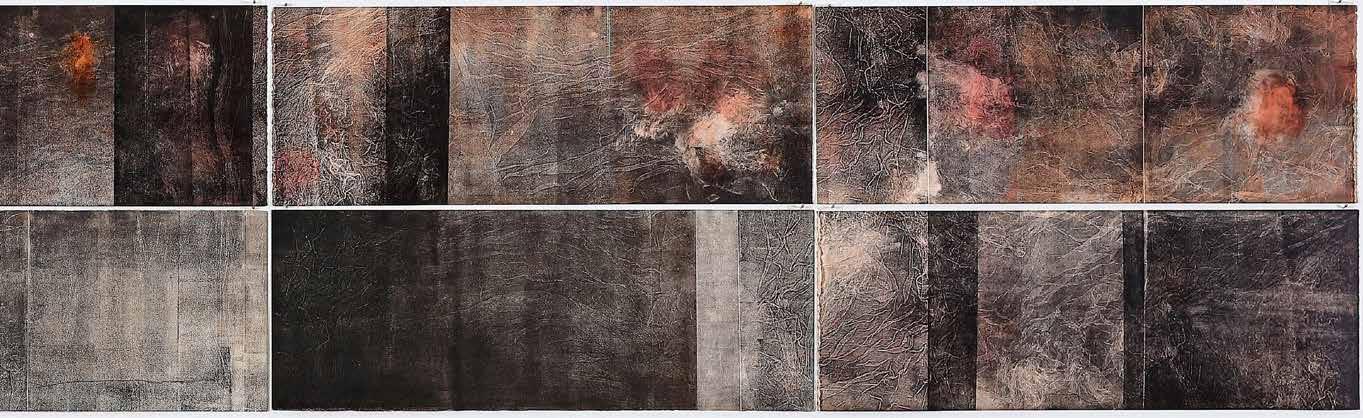
Edition 1/1
56 x 382 cm
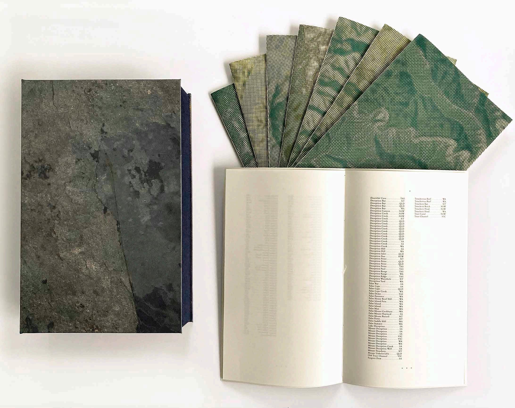
Deidre Brollo (ACT)
Unsettled, 2022
Artist’s book: 8 hand-bound dossiers housed in a solander box
Edition 5/8
33 x 21 x 8 cm
In creating Unsettled, Deidre Brollo collated a litany of thousands of contemporary Australian placenames, each of which has a unique relationship to politics, culture, topography and toponymy. In reading the place names in this book we may reflect on how writing, language and naming have been used as colonial and bureaucratic tools to shape, control and ‘settle’ zones of upheaval in Australia. “By inscribing the map with traces of emotion, bewilderment, violence, subjugation, opportunity and failure, this printed evidence of settlement speaks not just of individual events, but of systemic ways of thinking, being and acting,” says Brollo. The artist aims to disrupt the unreflective manner that many of us use to read maps and find places, reminding us of the “unfinished and restless nature of this country and its history”.
double_dragon_diagram, 2022 Carbon transfer on paper, mounted on cradle board Edition 1/1
90 x 122 x 3 cm
double_dragon_diagram is part of Matthew Brown’s Dragon Archive project, in which the artist explores the way that laypeople, fans and the public might contribute to the way that museum collections are formed and displayed. The artist works within a digital milieu; in this work he has accessed dragon imagery online and arranged it in a manner inspired by aquariums, dioramas, and screensavers. The resulting picture has a flattened, eddying effect that challenges traditional, systematic ways of displaying visual information, such as in a page of search results or a museum display case. The print was produced by hand-transferring blue pigmented wax onto paper, mounted on a cradled ply board.
Matthew Brown (WA)
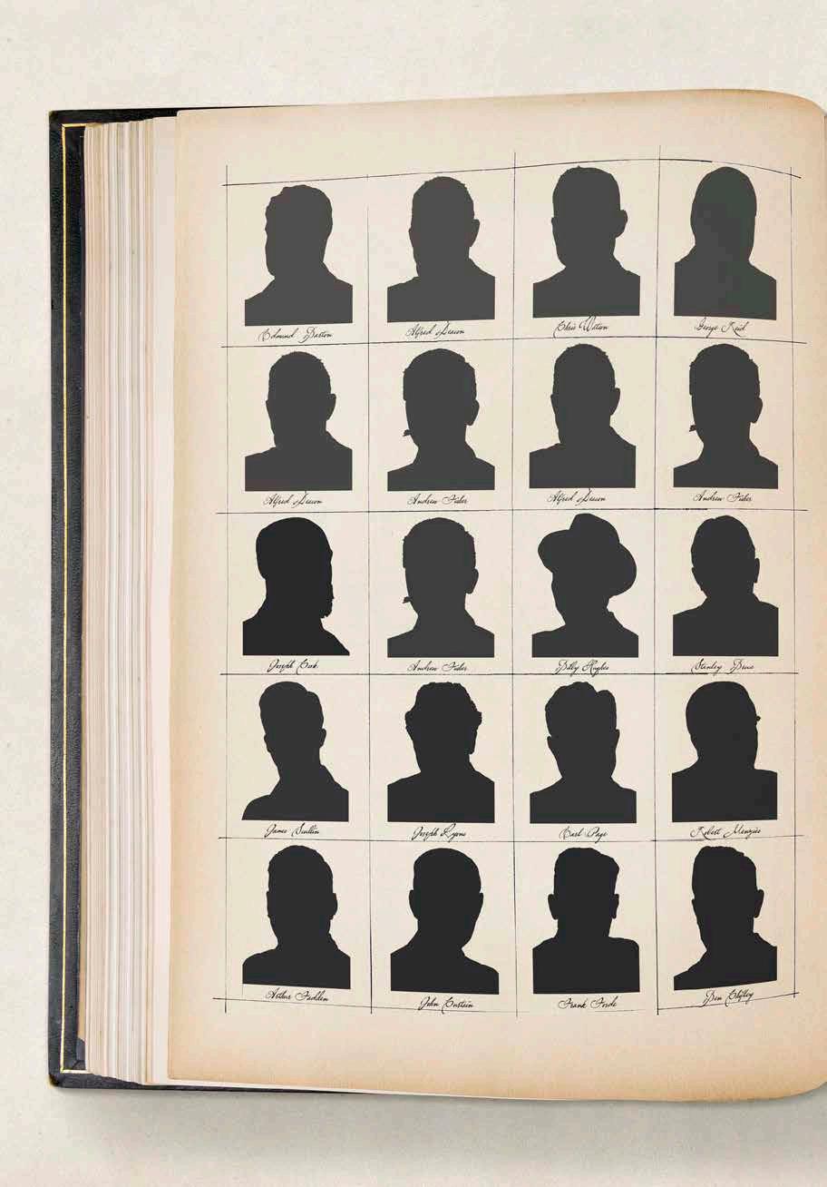
Peter Burgess (NSW)
This digital collage is a reference to The Ledger Book of William Bache, a 19th-Century album containing tens of thousands of hand-cut silhouette portraits made by the travelling artist William Bache in the United States. There is much genealogical interest in the book, as living relatives of the sitters identify the names and profiles of their ancestors.
Burgess’ version of the ledger contains a silhouette record of all of Australia’s Prime Ministers to date, from Barton to Albanese. Though digital, the process of layering and assembling this work mirrors that of a screenprint. “Hopefully by now, digital printing is fully accepted into the orthodoxy of formal printmaking,” says Burgess.
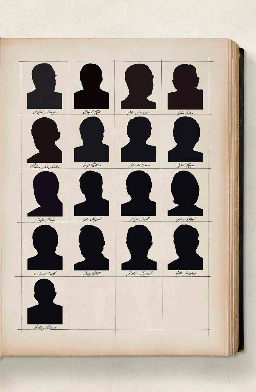
William Bache’s PMs, 2023
Ultrachrome ink on Hahnemuhle
Photorag, 308 gsm
Edition AP/5
74 x 99 cm
Bina Butcher (WA)
Remnant is a collaborative project between Bina Butcher and her mother Melissa Butcher. The print depicts a tract of remnant bush on their re-vegetated family property in the South West. With a focus on tree barkfrom the area, Remnant is a meditation on aspects of aging and the cyclical nature of the Australian bush. Butcher stripped, re-arranged and layered fragments of printed imagery to reveal unique textures and rhythms beneath, and enriched this substrate with delicate hand embroidery. Her use of fine detail invites slow, close inspection. “Duration is important to this work,” explains the artist; “time spent looking, uncovering overlooked facets of nature, allowing for more intimate and quiet contemplation of our surroundings.”
Remnant , 2023
Paper lithography, solvent transfer, monoprint, hand embroidery, Somerset satin paper, rice paper
Edition 1/1
85 x 360 cm
Seong Cho (NSW)
Terrestrial Symphony VIII is an abstract expression of the sensory experience of being in the ancient Australian Gondwana rainforests. Tangled vines, damp moss, knotty undergrowth and twisting tree trunks are suggested by thick lines and busy textures. The artist bound together brushes made from twigs and leaves, painting with them onto her uncut woodblocks, then meticulously carving out the unpainted wood to produce a highly complex printing block. “The large scale represents the hypnotising endlessness of the forest, the sense of movement and symphony of sounds that echo and allow the visitor to escape from reality,” says Cho. “I wanted to convey the beauty of our natural environment and the importance of protection from commercial, industrial and climaterelated destruction.”
Terrestrial Symphony VIII, 2023
Multi wood block print on Korean mulberry paper
Edition 1/2
122 x 120 cm
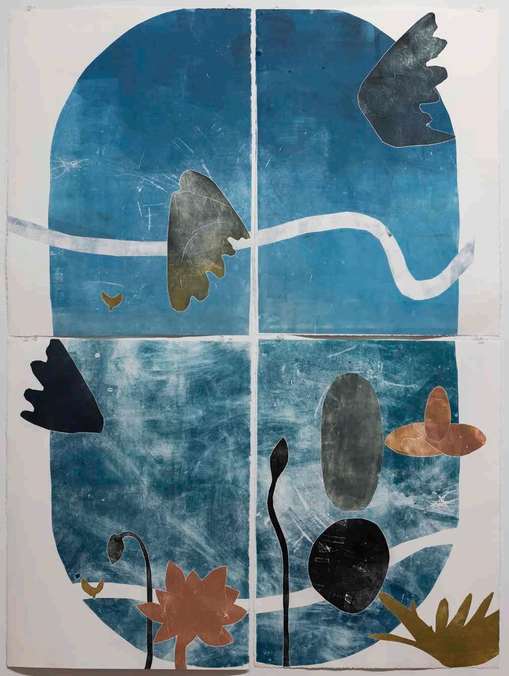
Jo Darvall (WA)
Jo Darvall uses observation, meditation and “passing through” as key activities of her artmaking. This variously takes the form of walking through Western Australian landscapes, leafing through books and archives about the land, or watching the rising moon. “For me, these processes are grounded in being more attentive,” says the artist, “and to honour the species and ecosystems that are under constant threat in the colonial Anthropocene”. With her print Hydrosphere No 1, the artist uses graphic botanical silhouettes on a four-quartered background toenvision the cycles, rhythms and wisdom of the natural world.
Hydrosphere No 1, 2023
Monoprint on Arches BFK
Edition 1/1
152 x 114 cm
Eleanor Davies (WA)
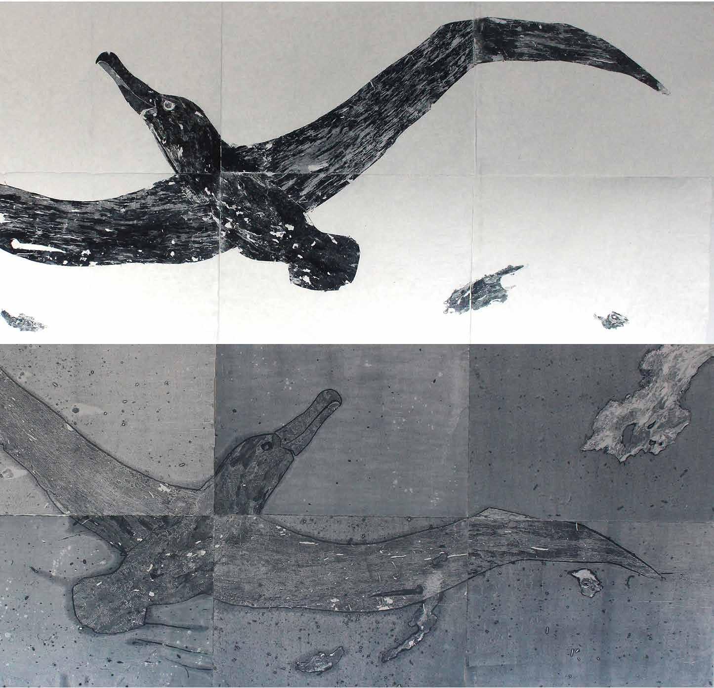
Ascension is inspired by a memory: nine years old, Eleanor Davies and her family walked the shore of Bathers Beach after a fierce storm to see what had washed up. “It was calm and clear,” she remembers. “Stretched out on the sand was a wandering albatross that had died in the storm. It seemed untouched by the forces that brought it to land. I was in awe. I wanted to honour this beautiful, majestic bird.” The textured wings of the albatross are realised using bark collected by the artist from the coastal areas of Menang, Wardandi and Walyalup Boodja. After each print, the bark disintegrates, making each layer of printing unique and unreplicable.
Ascension, 2023
Monoprint
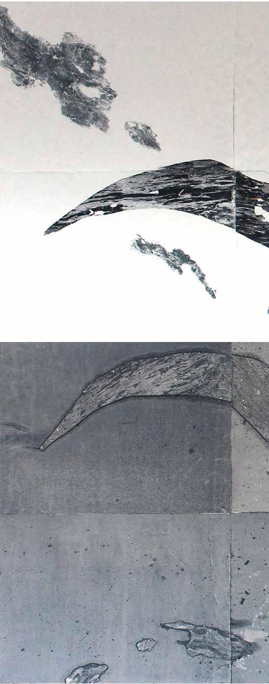
Edition 1/1
220 x 311 cm
 Spur, 2023
Multi-plate aquatint
51 x 51 cm
Edition 2/16
Spur, 2023
Multi-plate aquatint
51 x 51 cm
Edition 2/16
Erica Elgin (VIC)
A work in two parts, Spur is a vivid, textured print made by cutting marks into a layer of soap ground on a copper printing plate. A sequence of plates are printed one after the other, each contributing a subtle shift in colour, until a rich amalgamation is reached.
Artist Erica Elgin works intuitively and meditatively as she etches her plates with abstractions of plant life and natural forms. “Abstraction reaches into the subjective realm of emotion,” says the artist; “The viewer is encouraged to form an empathetic connection and attentive appreciation of the constant but often blindly experienced presence of flora.”
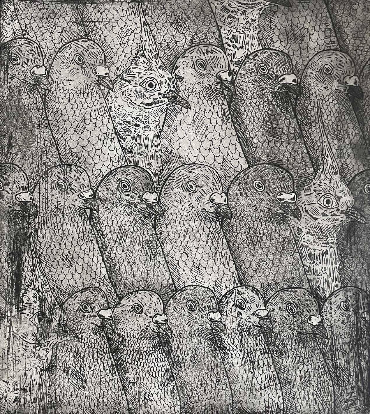
Aren’t We All Pigeons?, 2023
Metal etching, ink on paper
Edition 1/3
60 x 53 cm
Taylor Gollan (WA)
The clown game at the royal show but it’s birds.
It was sad to see it go – The Wallerawang Power Station, 2022
Linocut relief print on Velin BFK Rives
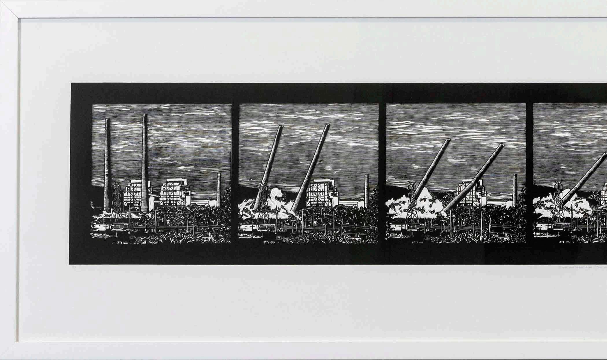
Edition 4/4
52 x 204 cm
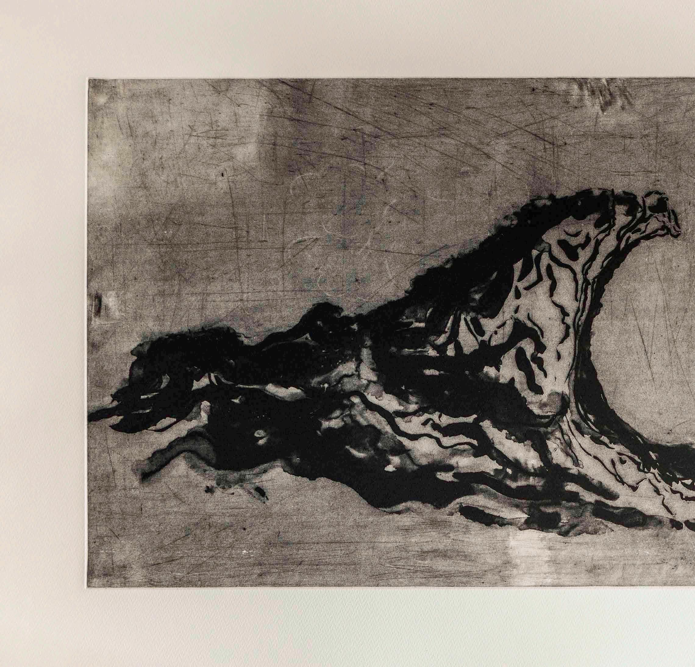
Caitlin Graham (NSW)
This print is a blow-by-blow depiction of the 2021 demolition of the Wallerawang Power Station near to artist Caitlin Graham’s home. The complex, with its towering chimney stacks, had long cut an iconic silhouette on the local skyline, and many members of the community gathered along the road to watch it come down. Some mourned the loss of a cherished landmark and others were happy to see it go. Either way, the artist
notes, the demand for coal-fired power is ever-increasing. “This work is not a demonstration of a diminishing coal industry but a celebration of the station’s almost seven decades of service to the community and to Australia,” she says. “The station worked beyond its life expectancy and fulfilled an ever-increasing demand for power.”
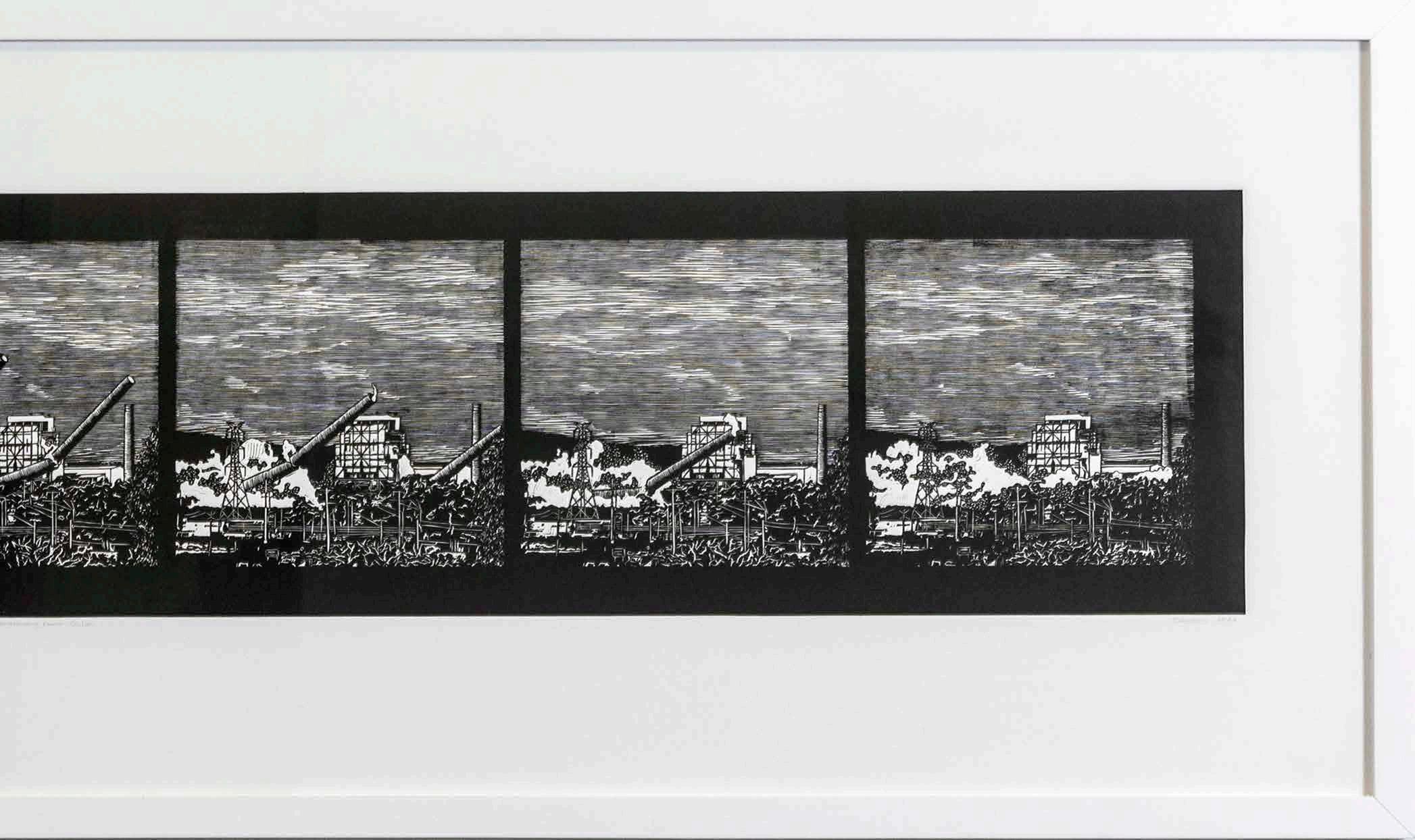
Yoshiko Gunning (WA)
Yoshiko Gunning’s printmaking and installation artworks are concerned with the qualities of light; how it refracts and reflects off the materials she uses, how shadows are cast and contrast is formed between light and dark. The artist developed this print during her residency at Fremantle Arts Centre, and was inspired by close scrutiny of the light effects in the studio space she worked in. The image combines plant forms with constructed shapes, to create “a formal rhythm unified by light”. Gunning’s influences are many and varied: traditional Japanese flower arranging inspired the botanical aspects of this print, and the contemporary buildings of Tadao Ando informed the architectural elements.
Circle composition #3, 2023
Inkjet print
Edition 1/3
Printed by Joe Landro
109 x 110 cm
Nicci Haynes (ACT)
Nicci Haynes’ film The cost is a stop-frame animation that was made by printing out individual frames of footage on a receipt printer. The source images were taken from phone video recordings of a shopping trolley being pushed around the suburbs, and they were printed on old receipt rolls. In the film, “nothing happens”, says the artist. Rather, the artwork is an experiment into alternative ways to create moving images without using traditional film stock. “Once I started thinking in terms of film as a serial, I realised that any material that comes in a long strip has the potential to become a film: a roll of sticky tape, a till roll, sentences.”
The cost, 2022 video
Edition 1/5
3 minutes 7 seconds
The space between, 2022
Giclée print
Edition 1/1
Printed by Tyson Foster (Fox Lab Fine Art) 90 x 77 cm
Sarah Hewer (WA)
The space between is part of an ongoing series of artworks in which Sarah Hewer uses raw, intuitive mark making to explore the complexities and paradoxes of memory, perception and identity. The intense darkness of this print is contrasted to a central moment of brightness. In the opposition of light and dark, Hewer sees many symbolic dichotomies: strength and fragility, connection and disconnection, love and loss. The artist combined digital, mechanical and elemental techniques to build up the image: “I started with a flame imprinting into my camera, then the marks of my pen on a digital tablet were transferred to the screen, and finally, the digital file was printed on paper.”
Kendal Heyes (NSW)
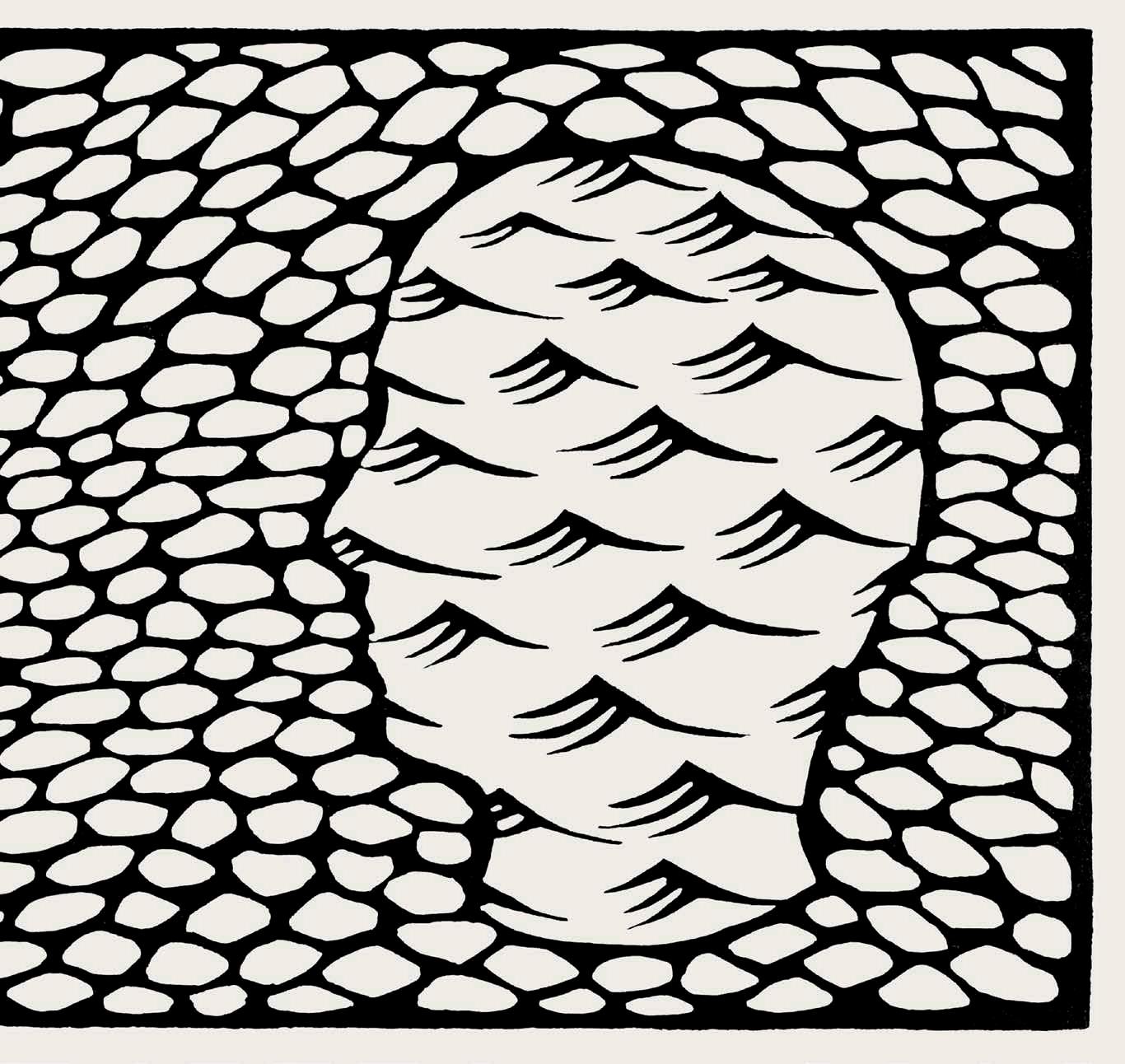
Shallow and Deep presents two silhouettes of heads in profile, each consisting of stylised representations of water: one is the rippling shallows, the other is the peaking of ocean waves. Artist Kendel Heyes balanced planning with improvisation as she cut this design into a linoleum plate for printing on an etching press. This approach reflects her feeling that “printmaking has a connection to the psyche or unconscious that other mediums don’t. It may have something to do with the image emerging from a dark background, like a dream, but I often find that the printmaking process produces unexpected images that are mysterious even to me.”
Shallow and Deep, 2023
Linocut on Somerset paper
Edition 1/5
18 x 30cm
M is for Madraseh (school), 2023
Artist’s book, cyanotype and screen printing
Edition 1/1
50 x 66 x 5 cm
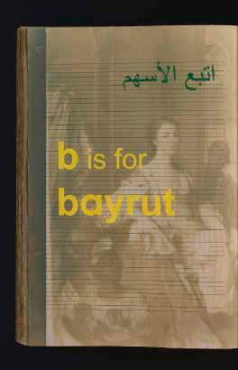
Deanna Hitti (VIC)
M is for Madraseh (school) is a highly personal work for artist and previous FAC Print Award winner Deanna Hitti. It describes the disappearance of Lebanese language from the artist’s family life while growing up in a bicultural home in Australia. The book takes the form of an Arabic school textbook. Each English letter corresponds to an object from Hitti’s family home using their Arabic names. “Arabic was the first language I learnt to read, write and speak as a child,” she explains. “I was taught English sounds and how to draw the English alphabet using Arabic. In this work I’m exploring multicultural identity and what it means to be Australian in current times.”
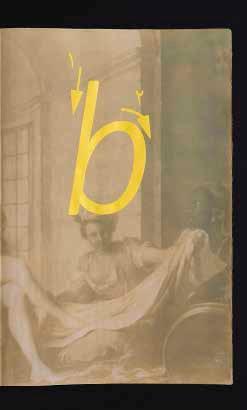
Sam Huxtable (WA)
With Self portrait as a digital entity, artist Sam Huxtable gives visual form to the complex relationship between queer identity and the digital realm. The Internet is a place that blurs the boundaries between our physical lives and their technological counterparts: our online and offline personas. Huxtable manipulated multiple photographic self-portraits so that they became abstracted, amplifying “the fluidity of the digital space, where identities can be constructed, transformed, and expanded”. The use of satin fabric evokes both fluidity and flamboyancy to examine “the inherent queerness of digital space, where the intricacies and nuances of the self form an ever-transforming web of connections and interpersonal relations held in technological landscapes.”
Self portrait as a digital entity, 2022 Digital print on satin, cotton and found objects
Edition 1/1
Printed by Next State 120 x 170 cm
Bron Ives (VIC)
For thousands of generations the Painkalac Creek and its surrounding lands, waters and creatures have been cared for by Traditional Owners: the Gadubanud People to the west, and the Wadawurrung People to the east. Painkalac 2030 is a visual guide to that estuarine community of eels, tadpoles, bats, moths, reeds and water. The print is the result of artist Bron Ives’ practice of observation,
sketching, photography and research into the behaviours and morphology of these animals in their habitats. Thinlayers of rust and navy inks evoke the glow just before sunrise and after sunset. With this work, Ives considers “our relationship with the increasinglythreatened saltwedge coastal estuaries, hoping they thrive beyond2030.”
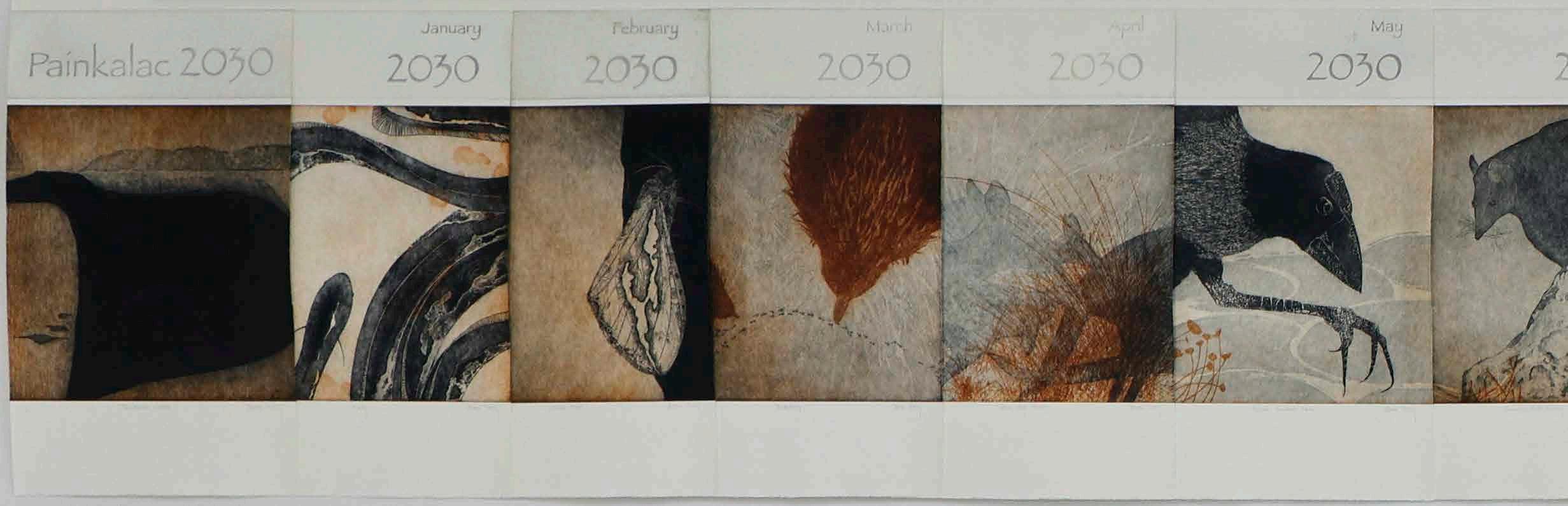
Painkalac 2030, 2021
Multi-plate etching
Edition 1/2
83 x 493 cm
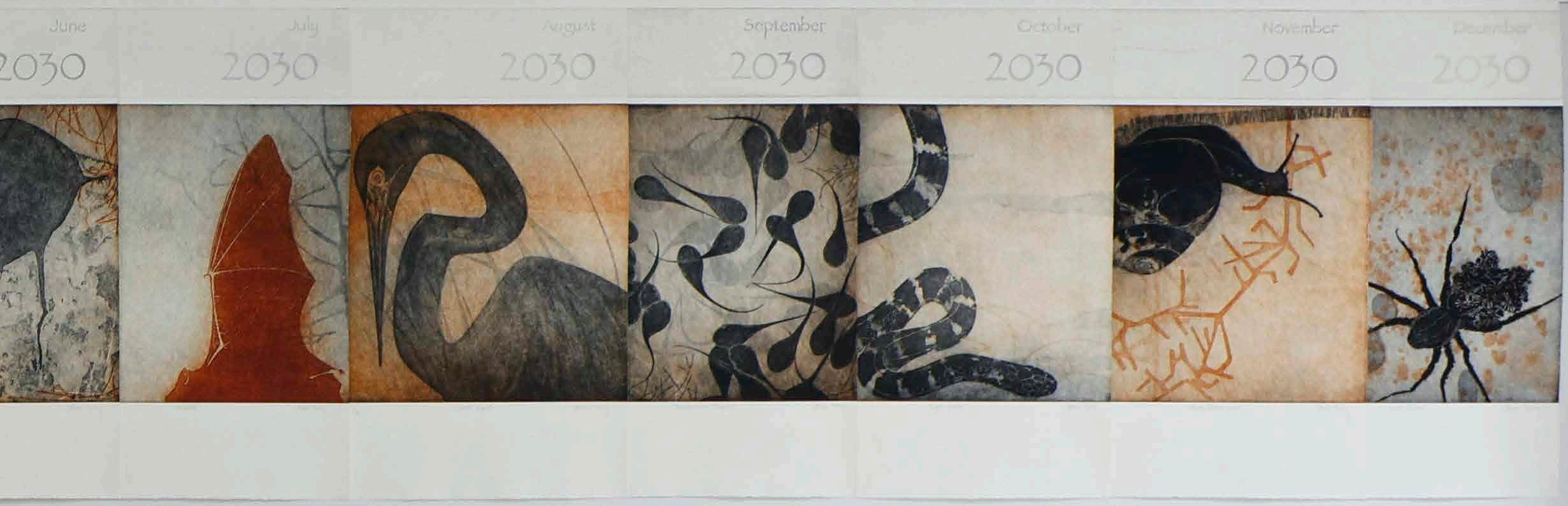
Time Machine (ii), 2023
Electromechanical parts
Edition 1/2
17 x 12 x 17 cm
Rob Kettels uses a combination of approaches, from sculpture and print to experimental mechanisms and installations, to explore the great narratives of Western culture. In Time Machine (ii), the artist and Curtin University PhD candidate has built a kinetic compendium of maps from the Geological Survery of Western Australia. Each map depicts the rock and mineral composition of the lithosphere, brought together into a bright, churning animation, rotated by a spindle.
“These maps embody both the scientific knowledge of geology and the potential commodification of the Earth’s crust,” says Kettels.
Rob Kettels (WA)
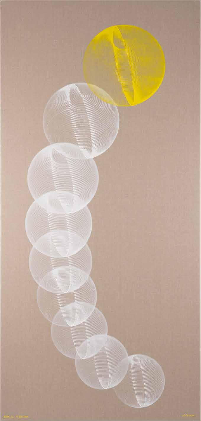
Hiroshi Kobayashi (WA)
The Moon speaks is a work that reflects artist Hiroshi Kobayashi’s unique multi-step artmaking process. He began in the CAD software environment, constructing a two-dimensional projection of nine spheres, each wrapped in a continuous spiral from pole to pole. This digital graphic made its way onto linen via an inventive combination of mechanical and traditional printing. Kobayashi placed out dots of oil paint which were taken up and marked forward with a cutting plotter and pressurised air dispenser. “The plotter traces the precise spots with a single brush stroke and repeats, stretching, blurring and layering the paint,” says Kobayashi. “The infinite aspect of the object is generated through simple repetitive movements in the nature.” Only the signature is hand written.
The Moon speaks, 2023 Oil on linen
Edition 1/1 214 x 102 x 3 cm
Guy Louden (WA)
On the eve of the 1951 referendum to ban the Communist Party, my grandfather buried his political literature. In this artwork, the story is told through the aesthetics of William Morris, a 19th century artist who combined medievalism with a communist ethos. Though Morris’ work seems archaic today, it represents an idealised conception of communism which still appeals in contrast to the brutality of the 20th century.
During my grandfather’s life, this sort of radical politics declined and nearly disappeared in Australia. By the time of my own upbringing, it was only ever presented as quaint or ironic. In the making of this artwork, I aimed to recover this familial and social tradition, to rehabilitate my grandfather’s understanding of communism – utopian, but moral, hopeful, and experimental.
Tradition of Hope, 2022 (detail)
Laser engraving on paper
Edition 2/2
Printed by artcom fabrication
167 x 122 cm
Judith Martinez Estrada (NSW)
Memory Flags is an artwork inspired by Judith Martinez Estrada’s father, who worked for the Australian Navy and loved its structure, organisation and ceremony. A photograph that once belonged to him (the ‘A for Alpha’ panel in this print) got Estrada thinking about how easy it is to misread images: the picture is murky, indistinct and its central figure could be anything; lighthouse, sail, person, mirage. She adapted this “reading/misreading”
phenomenon across twenty-six panels, one for each letter of the semiotic Maritime Signal Code. The Code acts “as a cryptographic form of code for reading messages,” says Estrada. “I have applied it here to categorise how we relate images to collective, post and familial memory.”
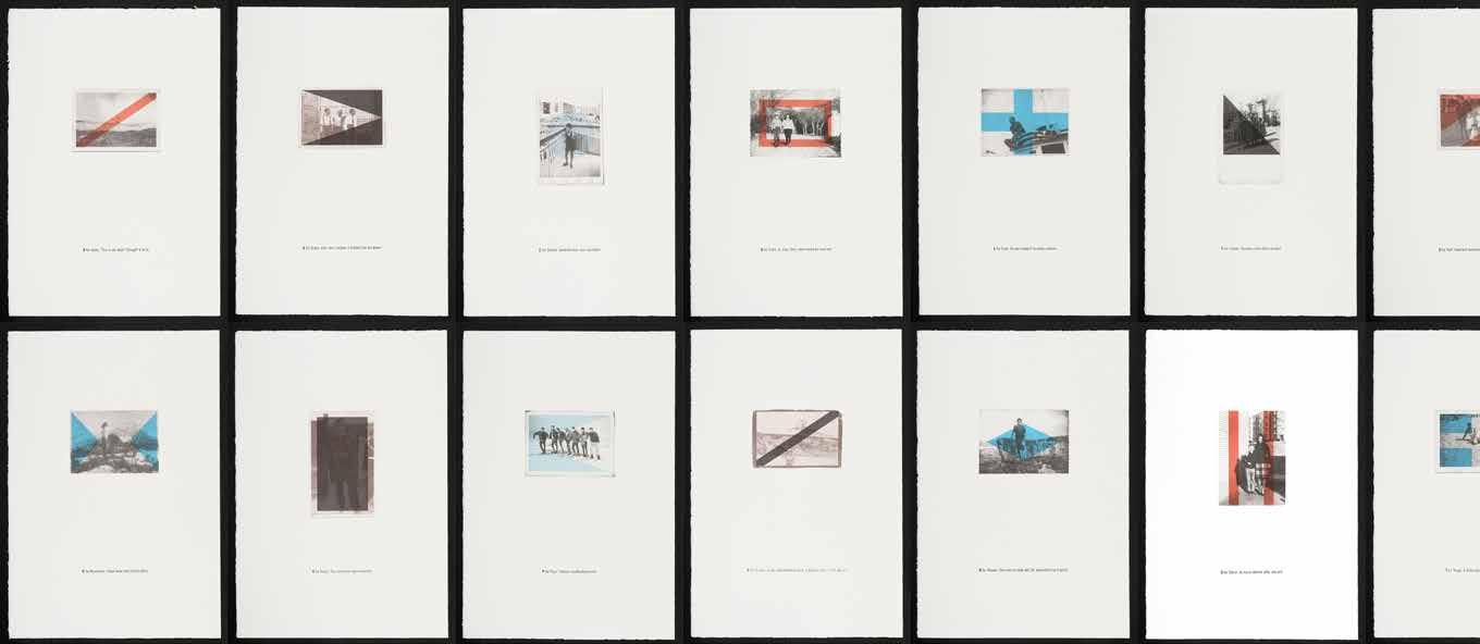
Memory Flags – An Impossible Typology, 2022
Screenprint on paper
Edition 5/26
Printed by Judith Martinez Estrada and Alex Lundy (Megalo, Canberra)
113 x 512 cm
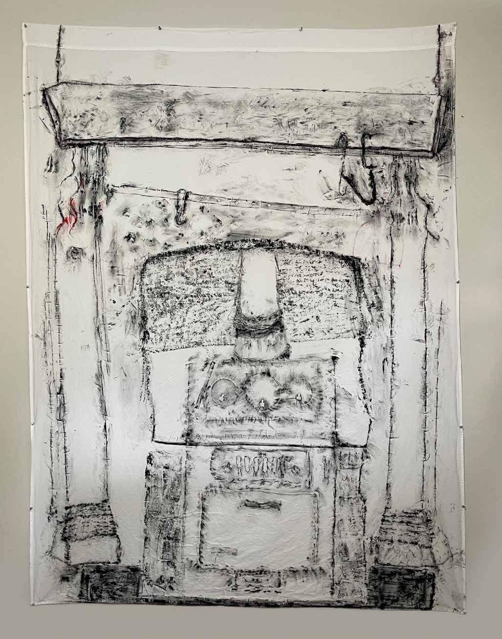
Clyde McGill (WA)
Traditionally, the hearth was the centre of the home, a place of gathering, celebration, rest, work and storytelling. In an international climate where many homes are threatened by war, social disruption and climate change, Clyde McGill offers this homely image as a touchstone to meditate on what happens when home is lost.
“Hearth, the word, also includes of course, Heart and Earth, both important features for our quality of existence,” says McGill. “as I worked, I was reminded of the difficulties many of us have, in being at home, and keeping a place we call home.”
Hearth, 2023
Frottage with ink and acrylic on cotton
Edition 2/4
240 x 178 cm
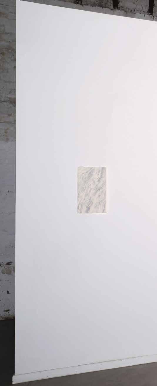
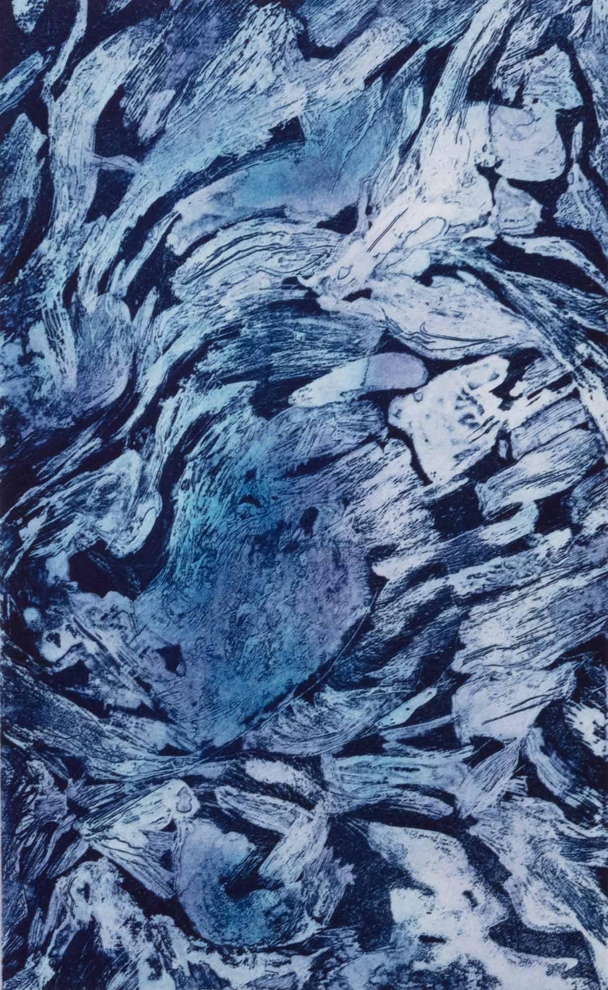
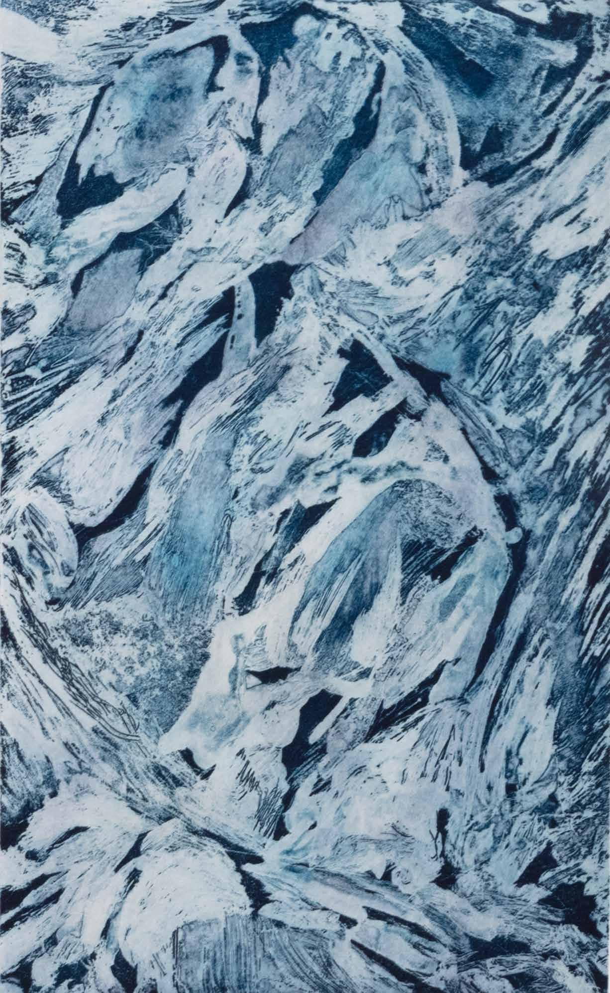
Amanda Page (VIC)
Always in flux, a dramatic structure one minute and gone the next, ice is a metaphor for change and transformation. The icebergs in Amanda Page’s Ice is a Metaphor for Change no longer exist. The artist photographed the masses, which had calved from the Antarctic Peninsual land ice mass, in 2017. “They wear their path in sediment striations,” says Page; “compressed blue ice stripes devoid of air, and
dimpled surfaces, indicating some have toppled as they carve their unique path of erosion, disintegration and decay, melting and drifting, eroded by sea currents, the elements and time.” Captured in cyanotype, a camera-less way to capture images, this sequence used the momentary atmospheric effects of light and reagent to record changes in material (ice) and process (melting).
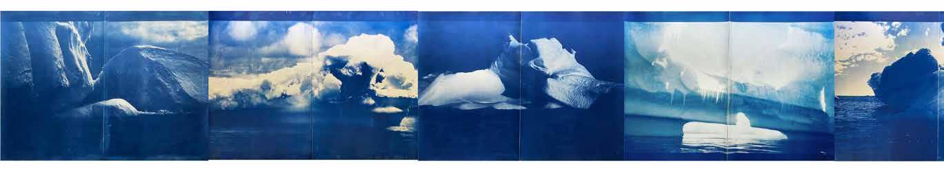
Ice is a Metaphor for Change, 2021
Cyanotype on Hahnemuhle 300gsm paper
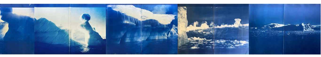
Edition 2/2
236 x 320 cm
Seaweed Heart, 2020-2021
Giclée Print/Digital Drawing
Jenny Potts Bar (WA)
Seaweed Heart is based on a series of sketches made by artist Jenny Potts Barr in Cowaramup Bay, in Southwestern WA. Seaweed is a ‘blue carbon’, quietly helping the planet survive human inhabitation through filtration, ecosystem support and carbon-fixation. A sea wrack is the mass of seaweeds and seagrasses that are cast ashore by tide and storm. “There’s so much emotion and drama in sea wrack, tossed, entwined, and wreathed,” says Barr. “It’s these connections between image and language, humanity, and Nature, that I’m drawing on in Seaweed Heart.”
by Fox Lab Fine Art Printing 80 x 80 cm
Edition 1/50 Printed
Karen Prakhoff Rickman (WA)
Echoing the layered nature of the bushland, Floodplains uses a mixture of additive and reductive monotype techniques including ghost prints, offset printing, bark and paper stencils. Artist Karen Prackhoff Rickman’s print is driven by time spent in the few remnant wetlands on the Swan River floodplain. It is “a place of mutable shadows, light and reflections, says Rickman. “It is both beautiful and bewildering. Each layer speaks of memory, time, loss and renewal.”
Floodplains, 2023 Monoprint with oil-based ink on BFK rag paper
Edition 1/1 108 x 150 cm
Andy Quilty (WA)
Using techniques of frottage (or rubbing over paper to capture an impression of the surface beneath) and automatic drawing, artist Andy Quilty has made an indirect document of a stormy scene in an outer suburban carpark: tyre skid imprints on bitumen encircling the burnt-out remains of a stolen $280,000 Maserati Quattroporte. Located amongst high-end real estate on La Seyne Crescent in Warnbro, the carpark is scheduled for demolition after resident complaints of hooning and anti-social behaviour. “The transcription offound forms and marks into a gallery context positions the automotive burnout as an egalitarian form of outer suburban drawing,” says Quilty. “The burnout performance and destruction of luxury property are acts of resistance to encroaching gentrification in working-class coastal suburbs.”
La Seyne (burnouts and stolen Maserati Quattroporte), 2022
Graphite monotype on paper
Edition 1/1
112 x 228 cm
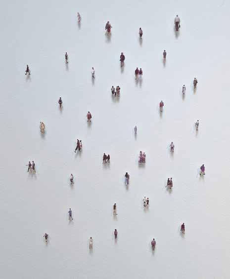
Walyalup Wandering, 2023
Four-colour silk screen on Stonehenge paper
Edition: AP
60 x 70 cm
Lili Renfrey (WA)
The miniscule figures of Lili Renfrey’s floating printed installation Walyalup Wandering are a glimpse into the comings and goings of the people of the artist’s local neighbourhood, on Whadjuk Noongar Boodja in Walyalup (Fremantle WA). Cut off from any landscape or context, we see the crowd as frozen in mid-journey, without any discernable purpose, origin or destination. We therefore lean in to inspect these wanderers at close quarters, looking for clues. Perhaps we may see ourselves in some of these tiny characters as they pass across the gallery wall, casting quiet little shadows.
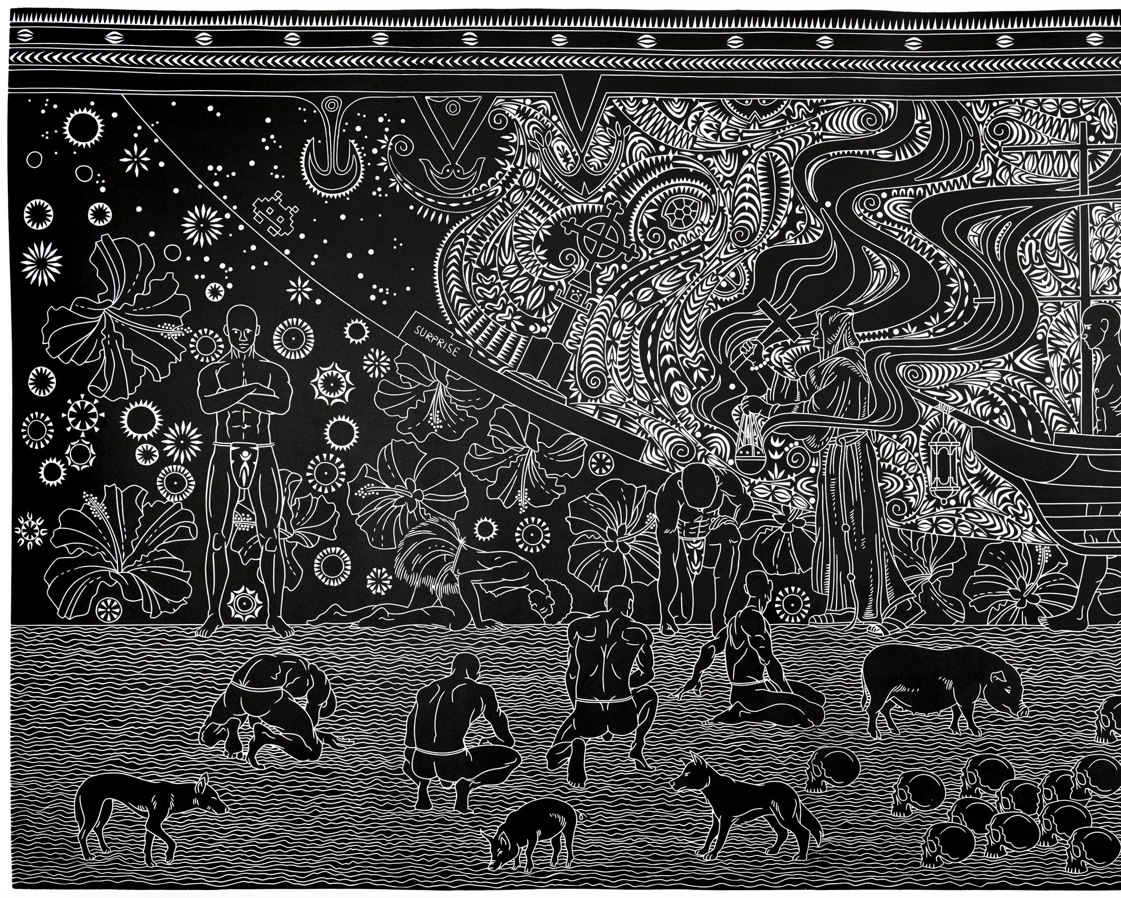
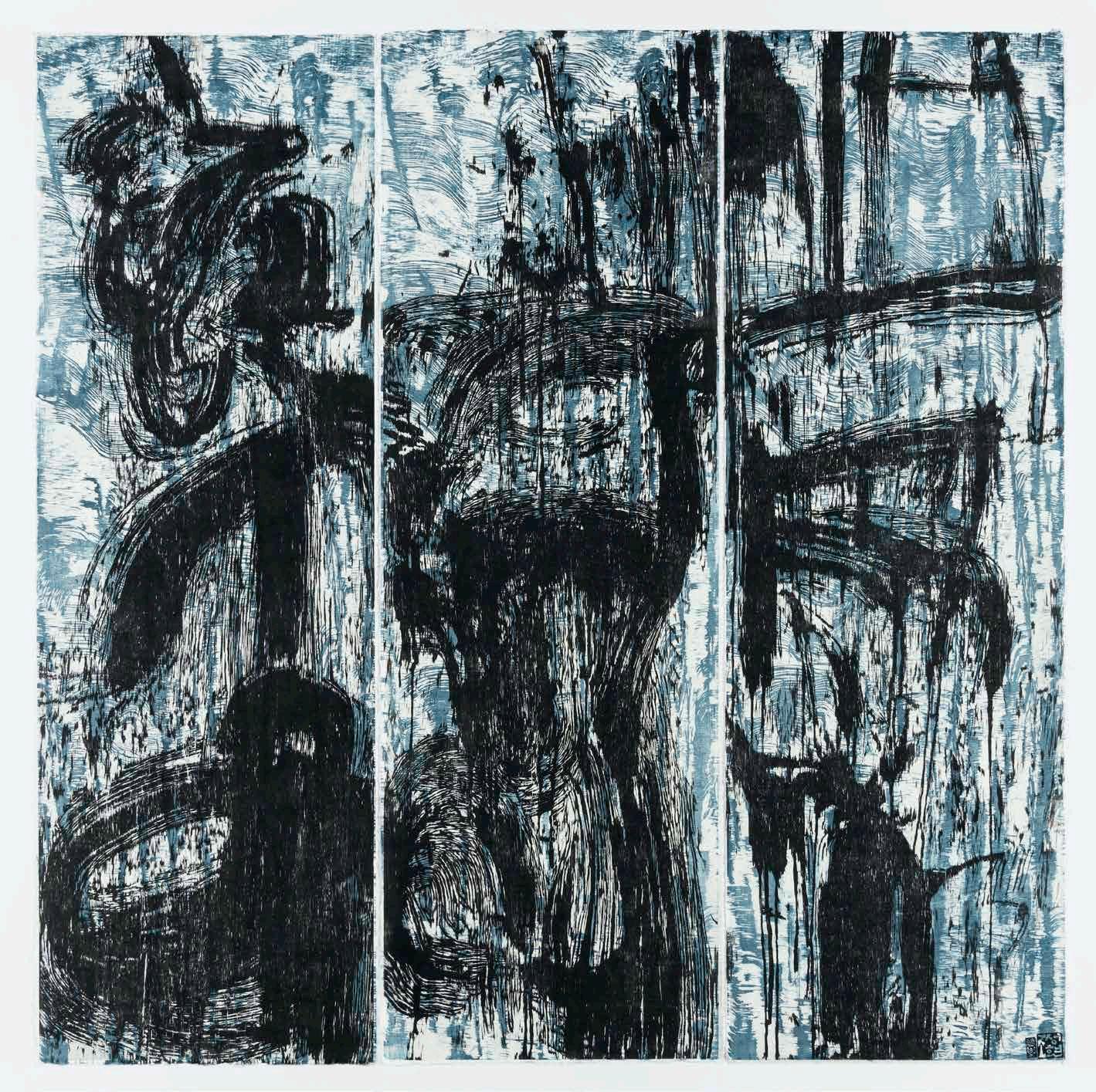
Darkness to Light, 2022 Linocut, Pantone black ink on Alpha-cotton Hahnmemule paper
Edition 3/10
Printed by Theo Tremblay
100 x 187 cm
Darkness to Light records a significant event in Torres Strait Islander history: the landing of the ship Surprise on the shores of Erub (Darnley Island) on the first of July, 1871. The vessel was carrying members of the London Missionary Society, including the influential Reverend Samuel McFarlane, and it was these passengers who first introduced Christianity to the region. As this new system of belief swept through the Island population, it precipitated the reduction of violence between the different island groups, who had previously been warring. “The arrival of Christianity changed the Islands forever,” says Robinson. “ The anniversary of The Coming of the Light, an integral part of cultural identity to Torres Strait Islander peoples, is celebrated on the first of July throughout the islands.”
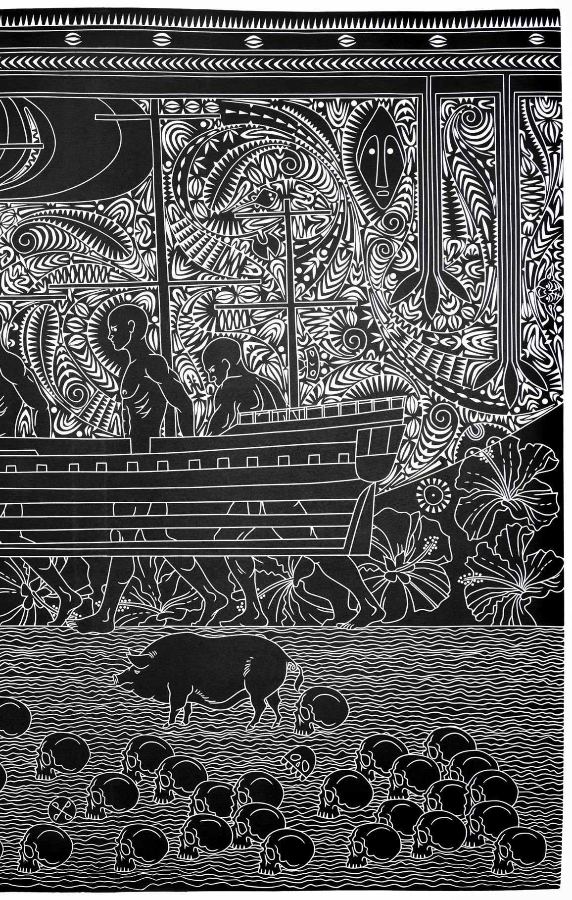 Brian Robinson (QLD)
lpi (water, rain), 2021
Vinyl-cut print on paper
Edition 5/2AP + Edition of 5
Printed by David Jones - Corvine Art
154 x 203 cm
Teho Ropeyarn (QLD)
Angkamuthi and Yadhaykana, Woppaburra People, Batchulla Peoples (Queensland)
Teho Ropeyarn is descended from the Angkamuthi and Yadhaykana clans from Injinoo on the mainland, Badu, Moa and Murray Island in the Torres Strait; Woppaburra people (Great Keppel Island) and Batchulla people (Fraser Island). His practice is focussed on traditional and historical stories, significant events, dreaming sites, totems, the four clan groups that make up the Injinoo peoples and ceremonial body designs encompassing spiritual connection to Country and community on both land and sea. “The work is carved out of vinyl flooring and is the topographical view of the mouth of Cowal Creek, where Injinoo community is situated in Cape York. The colours reflect the land and sea. The turquoise water patterns consist of two types of water: the freshwater (small water pattern) and the saltwater across the top (large water pattern)”.
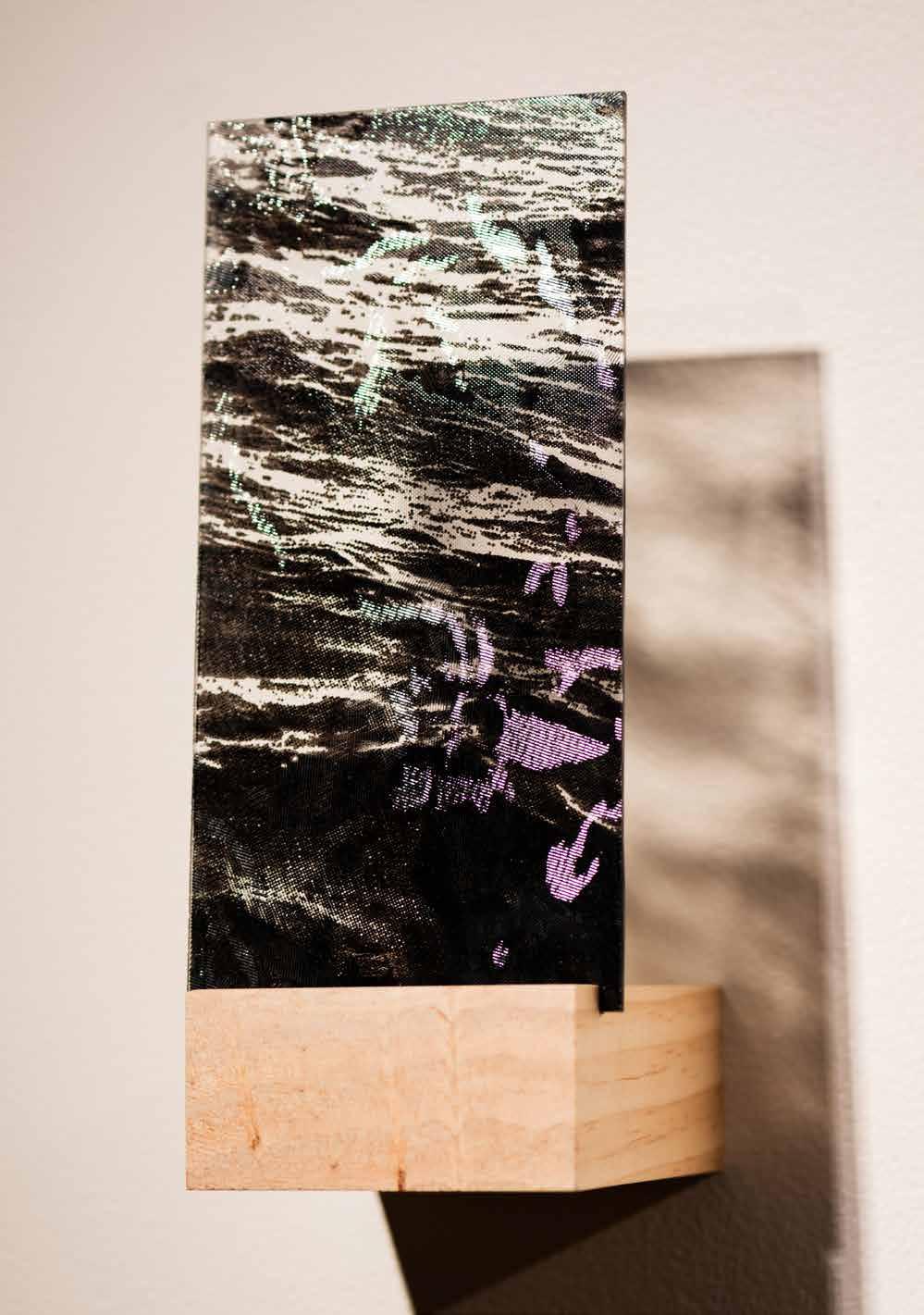
Frag-mento, 2023 (detail)
Enamel screenprint on glass
Unique state
31 x 49 x 12 cm
Kristy Scaddan (WA)
Kristy Scaddan’s artworks address ecological disruption, environmental change, and a metaphysical connection to place. The artist considers the various interactions we have with sites at the fringes of the urban world, where human systems of order give way to that which is untamed and unplanned.
Combining printed textures with found objects, such as the 1970s floral glass pane used here, Scaddan creates “mementos of the past”. In this work, light passes through photographic details of the surface of a body of water, adhered to the glass in fired enamel. It’s “a fragmented scene that captures a new recollection of place, interrupted by motifs of a forgotten time when resources felt plentiful,” says the artist.
Celeste, 2021
Monotype on paper
Edition 1/1
76 x 56 cm
Marianne Sebetti (VIC)
Balance and form are the key players in Celeste, a minimal, monochromatic composition by multidisciplinary artist Marianne Sebetti. The print is made using the artist’s preferred technique of monotype, an intuitive process where each prepared copper plate produces only a single press impression. The ink patterns and textures can only be used once, giving a sense of spontaneity and experimentation to the act of printing. Here, “rich velvety blacks add depth and intensity to the compositions whilst geometric elements and clean lines lend a sense of harmony and continuity to the visual narrative,” says Sebetti.
Body of Water, 2023
Relief print on stained handmade
Korean paper
Unique state
188 x 248 cm
Gary Shinfield (NSW)
This print began during a period of immersion in natural bushland in the Blue Mountains of New South Wales. Artist Gary Shinfield sought closeness to nature by working on the ground beside a body of water, surrounded by a pristine environment.
Textural imprints were taken directly from the ground itself using natural pigments and ink washes. The artist then carved and printed vinyl plates with a baren and wooden spoon, right there by the water’s edge. Later finished in the studio, these four panels “reveal resonant shapes and map pathways of experience,” explains Shinfield. “It is a unique state print inspired by nature, and the title refers to nature perceived and responses of the body.”
Kieran Stopp
(VIC)
Combining various contemporary printmaking processes like etching, drypoint, digital and photographic printing, Large Swell by Kieran Stopp is an exploration into thecomplex relationship we all have with the ocean. The ocean is at once a great danger, a key resource, a place of leisure and of spirituality. “The ocean fascinates me,” says Stopp. “At times it’s devastatingly powerful, at others, it is beautiful and serene. To explore these mixed feelings, I have worked with multiple printmaking processes.” Indian ink drawn onto transparent film helped the artist capture a sense of fluidity; layers of photographic and digital manipulation enhanced the qualities of transparency, while engraving brought shadows and highlights into the scene.
Large Swell, 2021
Etching
Edition 1/10
56 x 73 cm

Colin Story (WA)
A common expectation of artists is that their artworks should communicate an idea or a moment in full, hopefully richly, beautifully and directly. There are many impediments to this, not least of which is that every viewer who comes along to see the artwork brings their own interpretation and ideas to what’s in front of them.
Of this print sequence, which fluctuates in concertina and gives us its story in blurred, mysterious frames, artist Colin Story states: “only you have the answer. Make it be what you want it to be.” What do you see?

Through a glass, darkly?, 2023
Digital photography
Edition 1/1
Printed by Complete film solutions
13 x 200 cm


Bronwyn Treacy (NSW)
Touch, desire and sensation are bodily states that we understand instantly and intuitively, without the need for language. Through collage and monotype printmaking, artist Bronwyn Treacy works to channel the “subterranean undercurrent” of the body.

The artist’s movements, idioms and gestures have been caught up in the expressive lines and forms of the print itself. “The paper matrix acts a tabula rasa,” she says, “void of preconceived ideas, through which the intellect dissolves and visions of the unknown body emerge.”
The body is a deep, deep lake, 2023
Monotype collage, Japanese rice glue, BFK Rives Arches paper
Unique state
63 x 270 cm
Justin Trendall (NSW)
Continuing his years-long practice of creating maps for cultural, not just geographical, phenomena, artist Justin Trendall turns his focus to plotting out the incidence of bush fires in his native New South Wales.
The title Fires near me refers to the NSW Government app used to track fires. Also charted into this weblike field of lines and names is a litany of the organisation names of Sydney’s artist-run gallery spaces, the two histories overlaid with equal prominence and ornament. The result is a map of two parrallel histories that are “both marginal and mainstream.”
Fires near me, 2023
Screen print on linen, shells
Unique State 74 x 53 cm

Jenni Vacca (WA)
Jenni Vacca’s River Serpent adopts an experimental, contemporary form of printmaking in which the image is formed up from pressing sheets of paperclay directly into the trunk of a fallen Eucalyptus tree. The embossed texture that results is accentuated and finished with a coating of black sand brushed over its surface. The growth pattern of this particular tree is revealed in relief upon close inspection.
Each clay fragment is wrapped around a band of central negative space, creating an abstracted, monochromatic arrangement that creates a bridge between the complexities of the original tree and the formality of the gallery space.

 River Serpent, 2022
Paperclay
Edition 1/1
54 x 250 x 4 cm
River Serpent, 2022
Paperclay
Edition 1/1
54 x 250 x 4 cm

Peter Ward (VIC)
Studio Selfie #1, 2016/2023
Hand-coloured linocut
Edition 1/1
50 x 50 cm
At first glance, Studio Selfie may appear like a classical self-portrait. The artist, Peter Ward, is depicted standing in his “benign” studio environment, beside his printing press and an idyllic landscape gleaming through the window. This print is in fact a time capsule. The artist first carved it in 2016. When revisiting the original carved linoleum plate and reprinting it in 2023, he has had occasion to reflect on what life looks like seven years later in the wake of the global pandemic and environmental degradation. In this new iteration, Ward has “darkened the mood to create an other-worldly, sombre feel”. The artist states, “while I still look roughly the same my sense of wellbeing has altered markedly.”
Bridie Weaver (QLD)
Lace is artist Bridie Weaver’s response to an immersive exploration of the environment of Lutruwita (Tasmania). To begin, Weaver made a series of sketches of lichen isles down tree trunks, webs of sea foam and other natural forms. As she worked, the artist began to notice that a theme of islands and archipelagos emerged in her work, just as she noticed it in the culture and life of Tasmania itself. “Collecting these natural suggestions of micro-islands became the basis of my print-making practice while in Tasmania,” she says.
In this work, we see “the concentric circles of white wash around the Tasman Peninsula, a brief collision between white sea form and velvet black land.”
Lace, 2022
Mezzotint and aquatint

Edition 25/25
21 x 29 cm


Grid Sample Book #1-6, 2022

Solvent ink on outdoor banner vinyl, thread, buckram, archival tape, card, cord, Chicago screws; hand bound
Edition 1/3
140 x 125 x 4 cm
Gera Woltjer (WA)
Gera Woltjer’s artmaking starts with collecting. For many years, the artist has been collecting grids, meshes, tiles and cross-hatched patterns of all kinds, sourcing everyday, industrial and architectural items. In the studio, Woltjer then begins to play with her treasure trove of amassed materials, arranging and layering them to find new ways to celebrate the regular and universal pattern of the grid. In these sample books, Woltjer presents some of her findings from “scouring sites of urban architecture, construction and everyday domestic spaces for grid patterns and grid-like materials” and invites us to share in a moment of “grid-appreciation.”
Jessi Wong (VIC)
Jessi Wong’s artworks use as their source the various forms in nature in which we can find pattern and repetition, such as stars, woodgrain and striated rocks.

In this print we see the Aurora Australis, or the Southern Lights, as seen from the southernmost tip of Australia. The colour of this celestial phenomenon is dependent on the chemicals in the atmosphere when hit by electrons from the solar system. Oxygen gives off green and yellow colours while nitrogen sometimes causes pink. “Combining a variety of printed papers, collage and pen, my artworks challenge perceptions of replication and traditional printmaking,” says Wong.
Aurora, 2022
Woodblock, collage, pen
Unique State
57 x 76 cm


Christopher Young (WA)
Nine - Brynderwyn Motel, Unit 6 is a biographical work, a digital recreation of a place that was once at the centre of the artist’s life. “In 1984, my parents took up the lease of a motel on the outskirts of a small village in New Zealand. In the early days they were dependent on heavy industry. In particular, an oil refinery that was under construction and a local dairy factory. However, once the construction of refinery was completed in 1986, bookings dropped off considerably.” Young and his brother both worked in the motel, cleaning, serving meals and interacting with guests. As the motel is now closed, the colours and layout of the motel’s now-dated interior have been recreated from the artist’s own careful recollection and consultation with his mother.
Nine - Brynderwyn Motel, Unit 6, 2022 (detail)
Digital print on paper and 3D print
Edition 1/5
Printed by Churchill Imaging 42 x 110 cm

Jarrods Head, 2023
Mixed Media
Edition 1/1
Printed by Fitzgeralds Printing
51 x 40 x 30 cm
Declan Young (WA)
‘Jarrods Head’ Cuboid Jarrod gleams, Geometry of friendship, Unforgettable.


 Detail of Yue Lao- God of Matchmaking and Marriage, 2021


 First Nations Art Prize judge: Helen Carroll, Wesfarmers Arts