PORTFOLIO
A R C H I T E C T U R E

TABLE OF CONTENTS Kit of Parts Iteration 1 – 5 Orthographic drawing Section cuts Renders

Micro-Studio Site analysis Precedence User requirements Modelling Orthographic Section analysis Axonometric 2 Point Perspective Final Render TABLE OF CONTENTS ```````````````
KIT OF PARTS

`
MODELLING

`
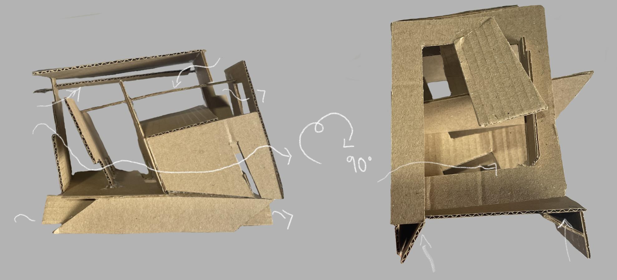
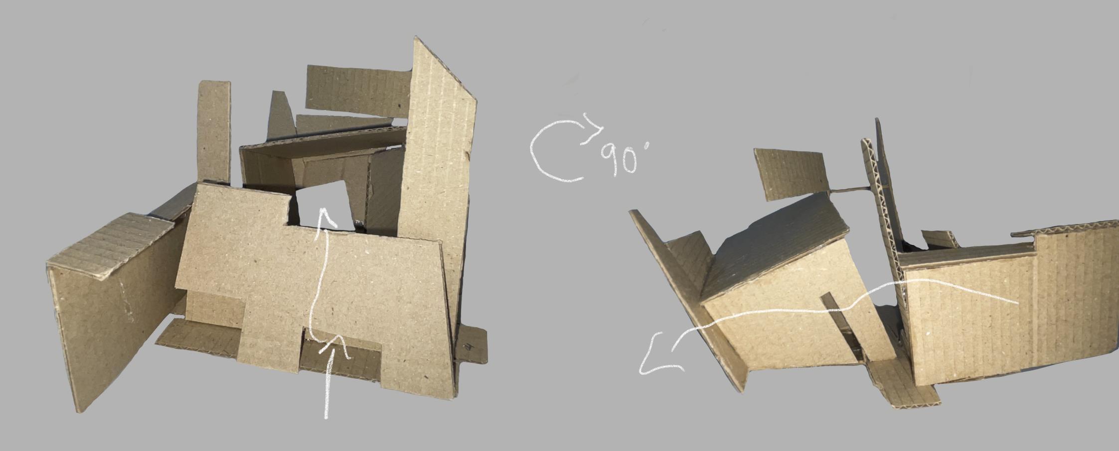
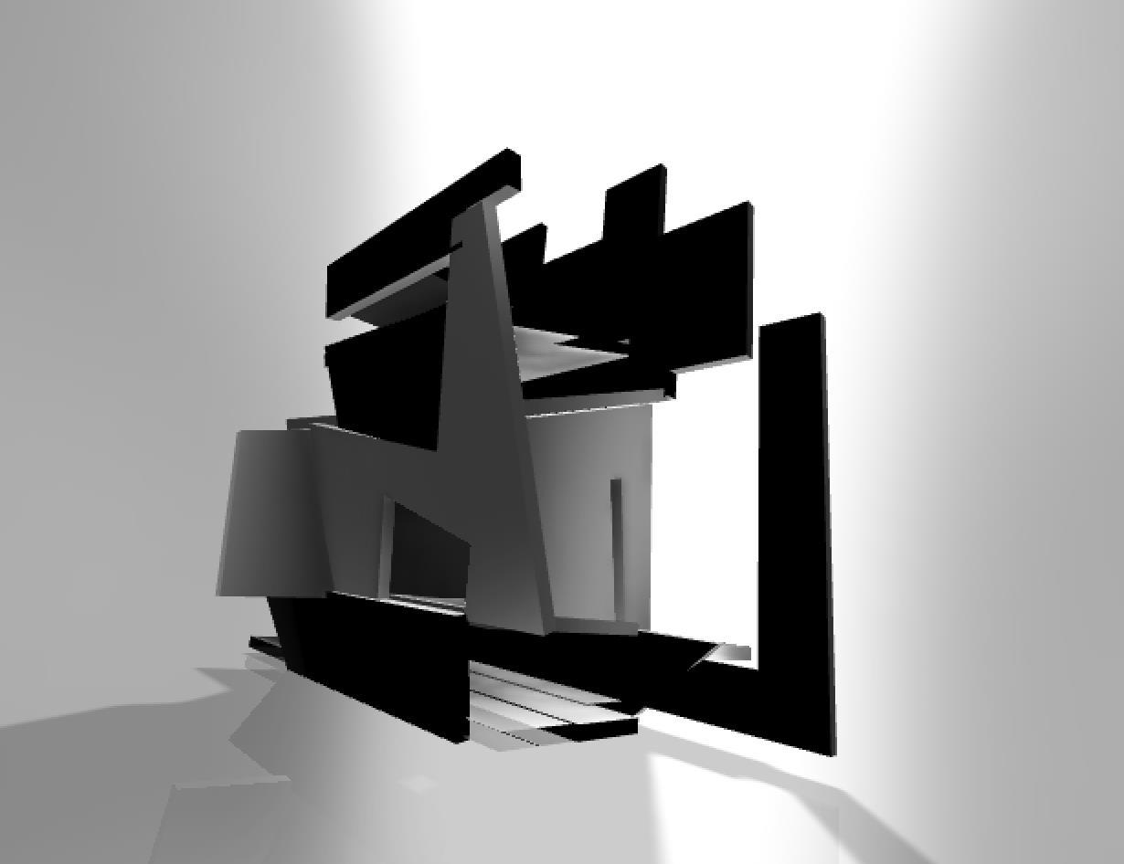
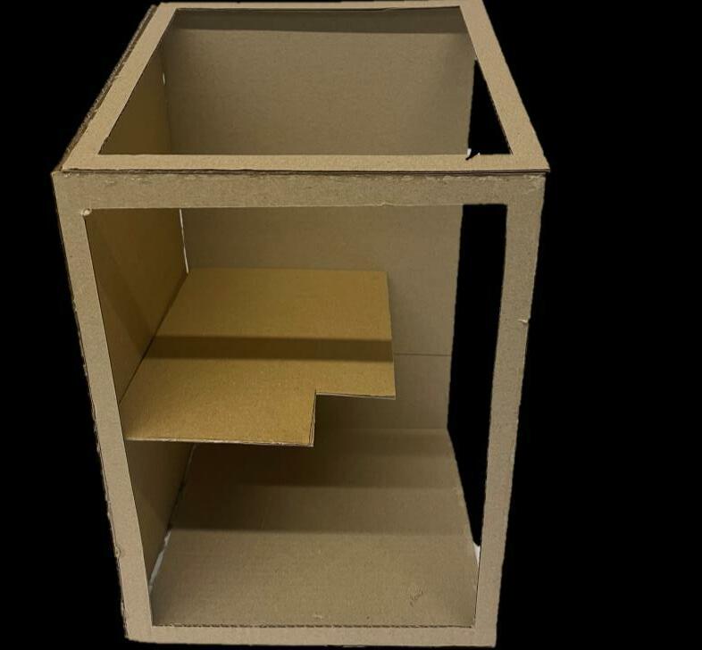
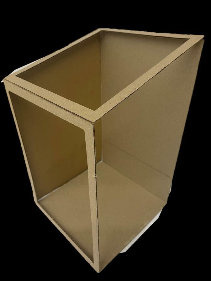
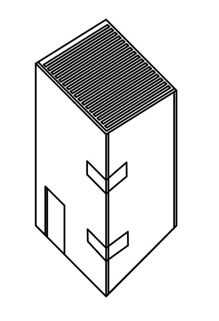
My first iteration explores the constrictions and contrasts of space, where the front view is compact with minimal free flowing space, as portrayed through the arrows on the previous page, a 90 degree turn will show a much more open space.
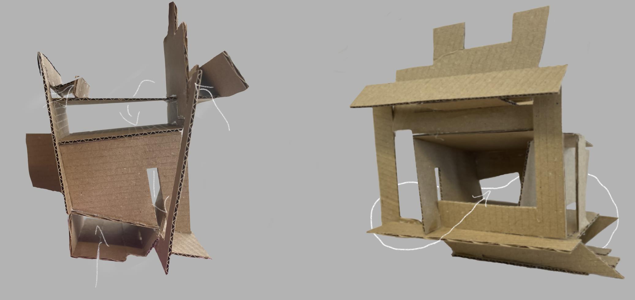
The denser front view completely contradicts the side one, perhaps highlighting how open space can be exhibited in lesser thought of environments. I grew to love the model due to this very idea.

N 1 `
I T E R A T I O


`
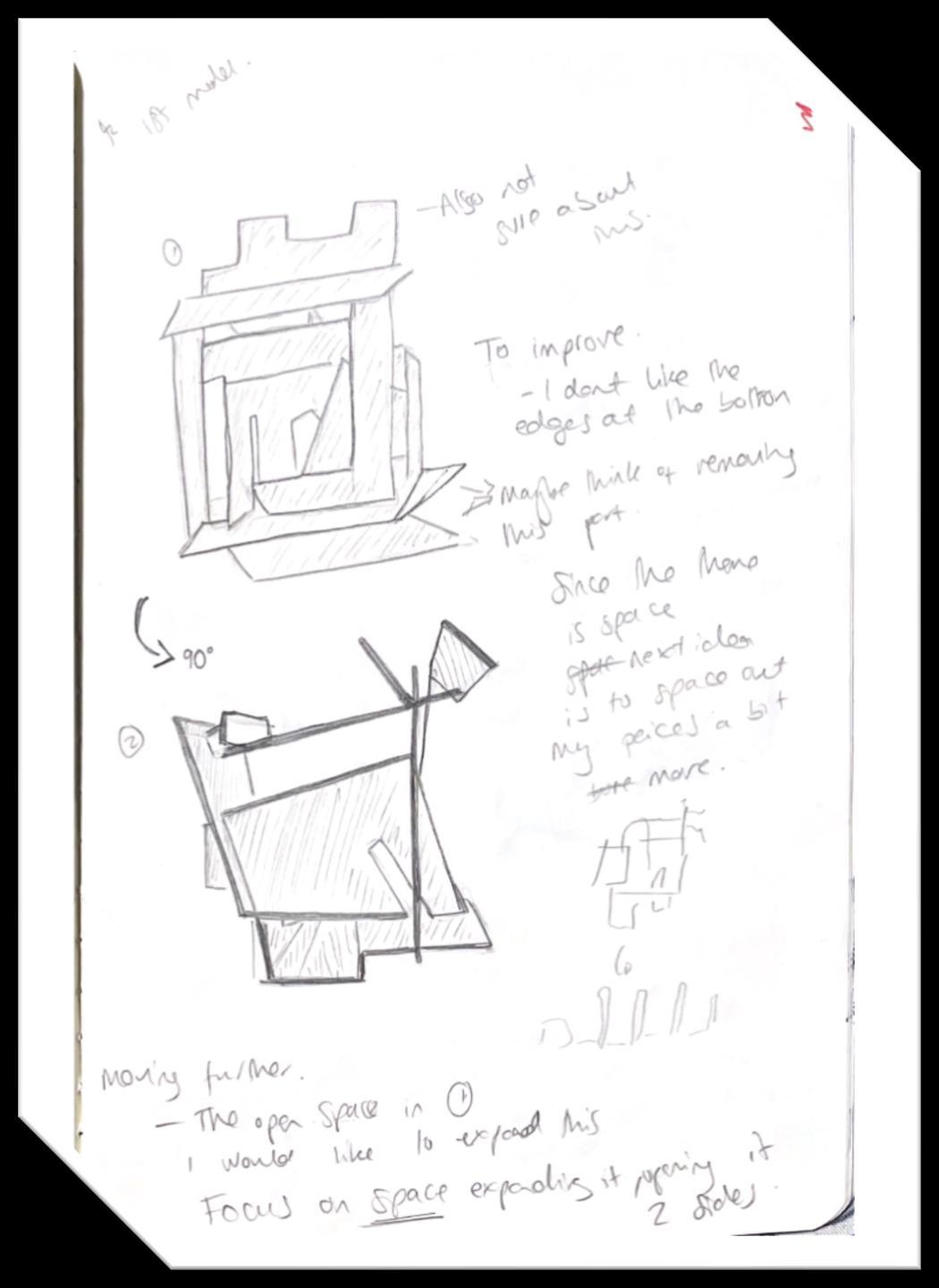
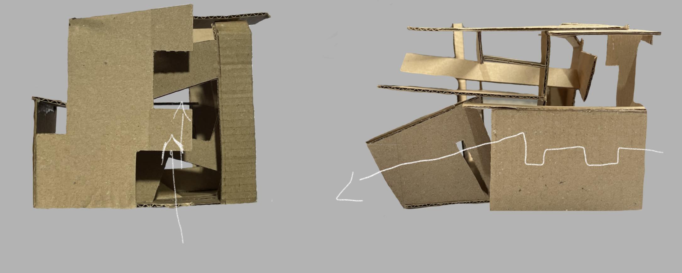
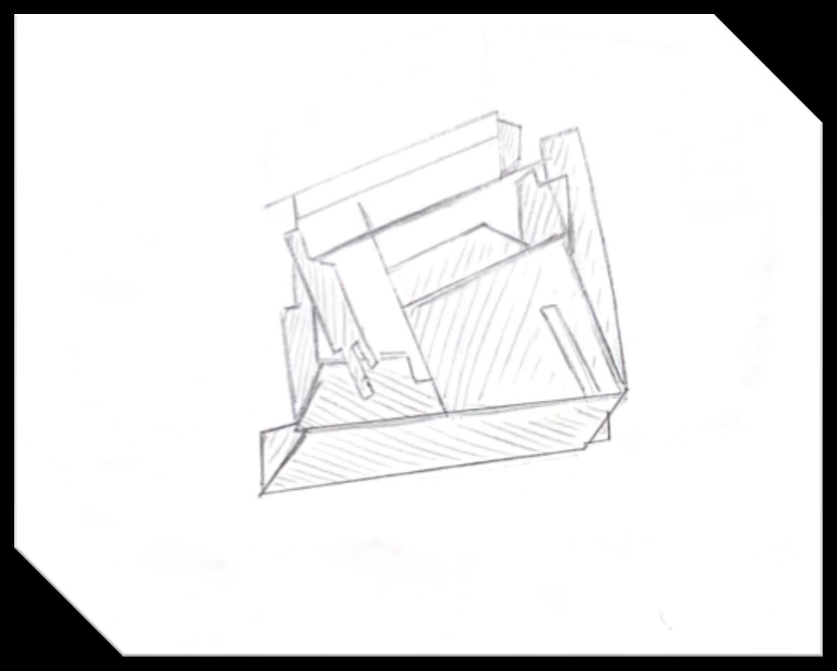
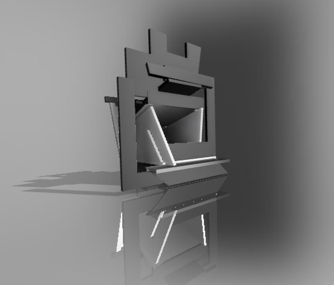
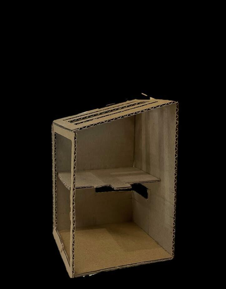
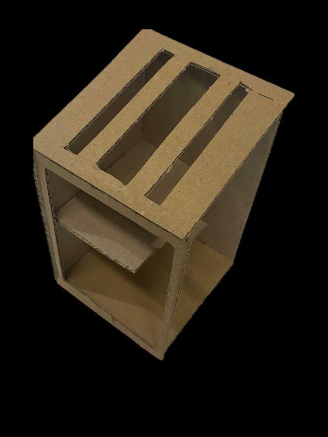
With my second iteration, I wanted to challenge this free flow vs constricted idea. On the left is now the side view where I tried to enhance the different routes that the space within the model can be explored by. The pathways weren’t as clear as the first model but there was definitely still the forward pushing route as seen by the arrows. Turning to the front we again see lots of obstruction.

N 2
I T E R A T I O

`
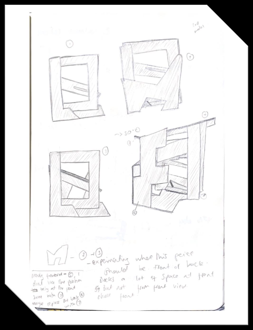
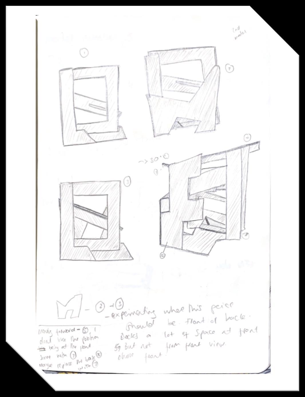
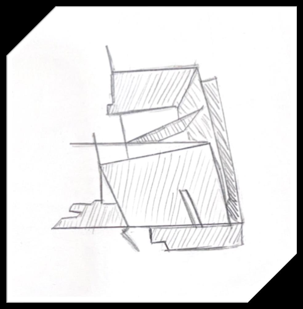
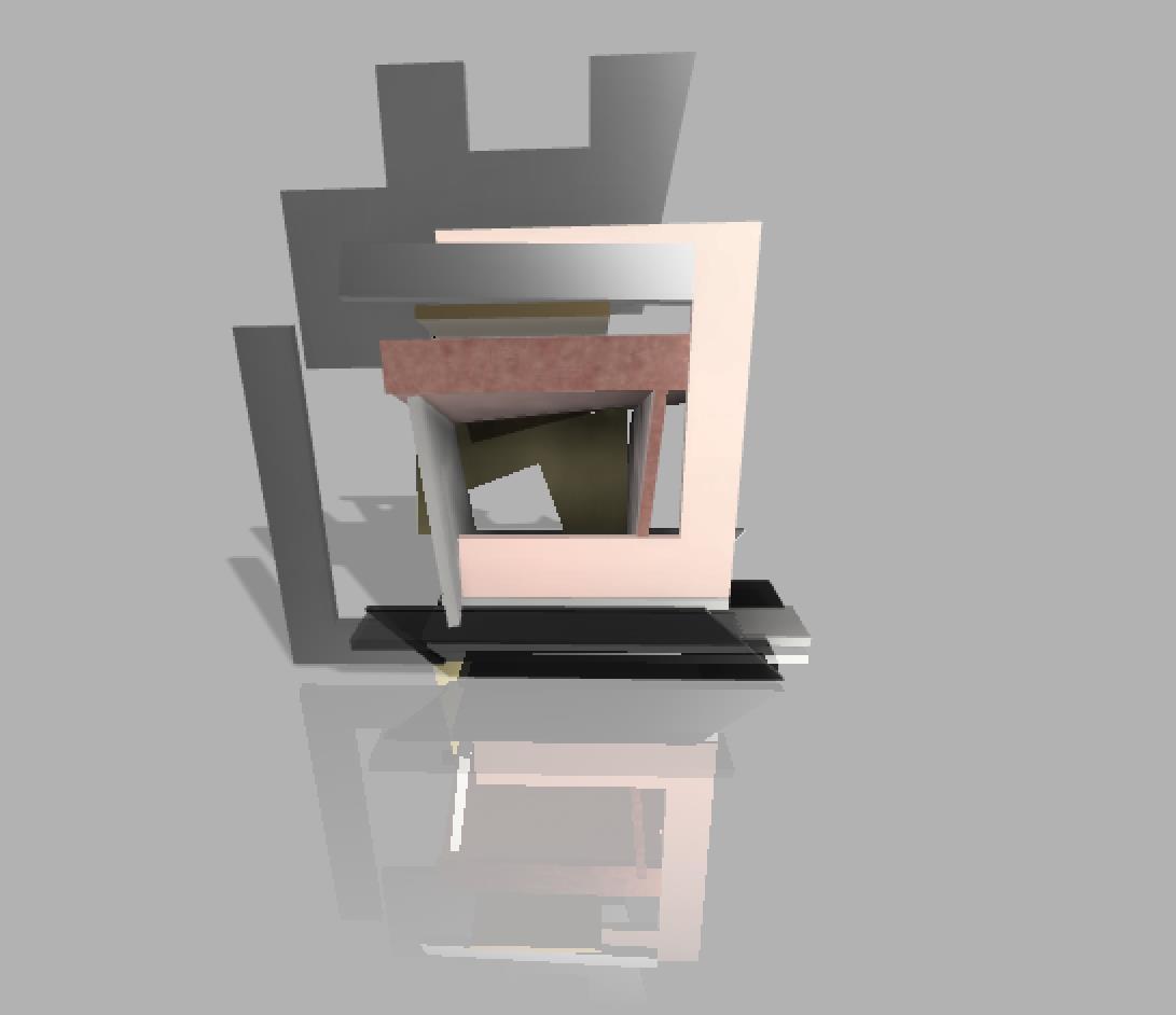
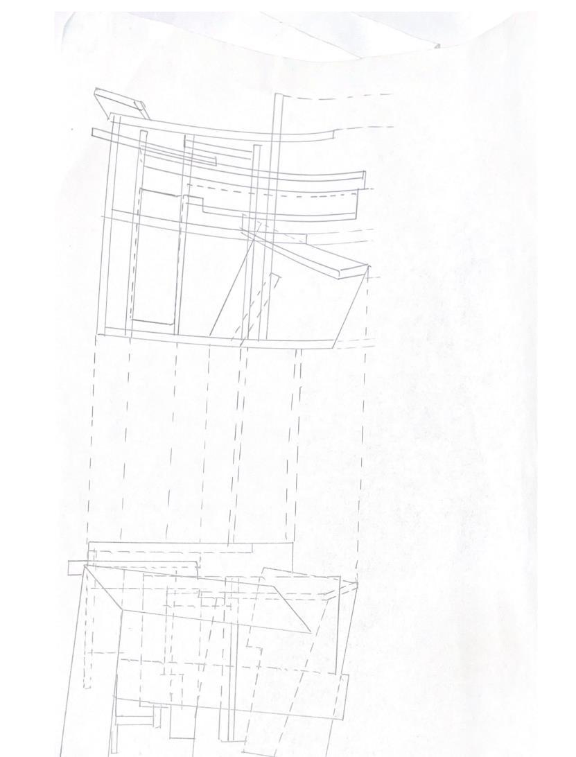
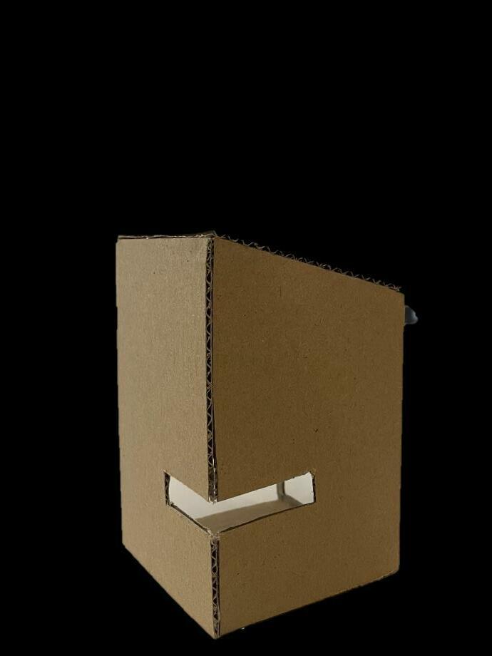
Iteration 3 shows a less compact model, from both the front and side view. The open space was still being explored, as was the denser view in a similar way to iteration 2. There is a forward push with a main pathway however multiple spaces in between. I was extremely intrigued by this idea of obstructions which still provide a route so I used different parts from my kit to create an obstruction yet still a way forward.

N 3
I T E R A T I O

``
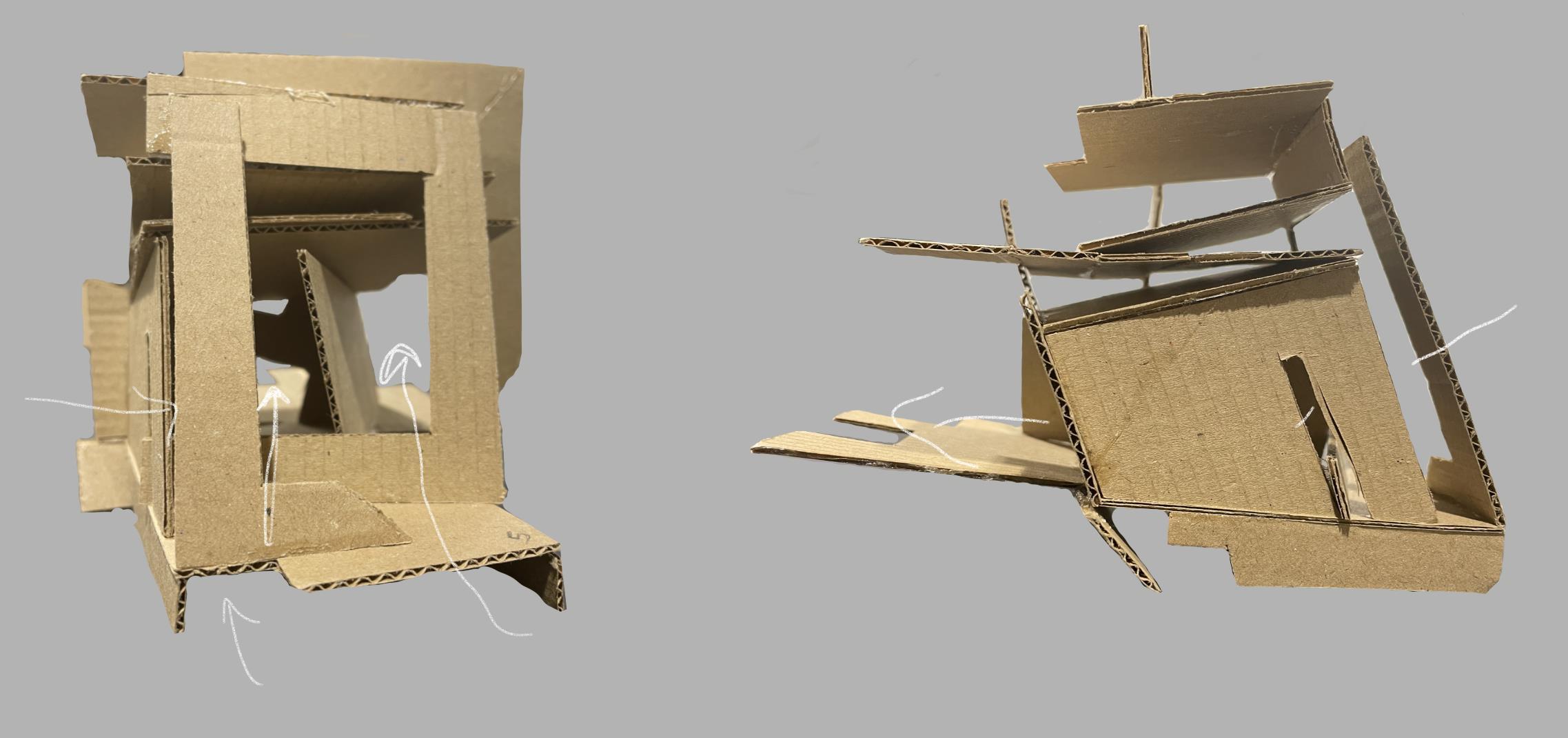
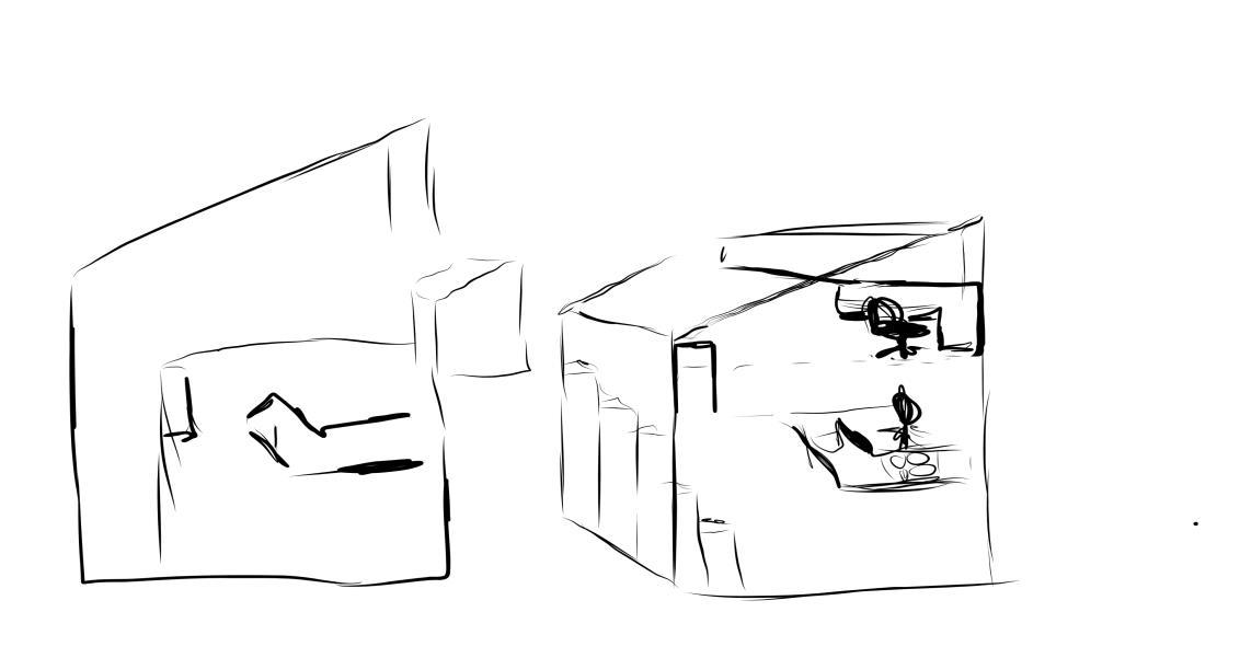
Iteration 4 was an investigation of a bigger space. The dense and compact models were providing a great concept but to rule out a wider space, I had to try it out and understand why exactly I thought it wouldn’t work. Again, I maintained the pathway and the open space during this exploration. I did not like the wide look at all, though there was a lot of space – the outside of the model was taking over too much to appreciate the space inside.
I T E R A T I O

4 `
N

`
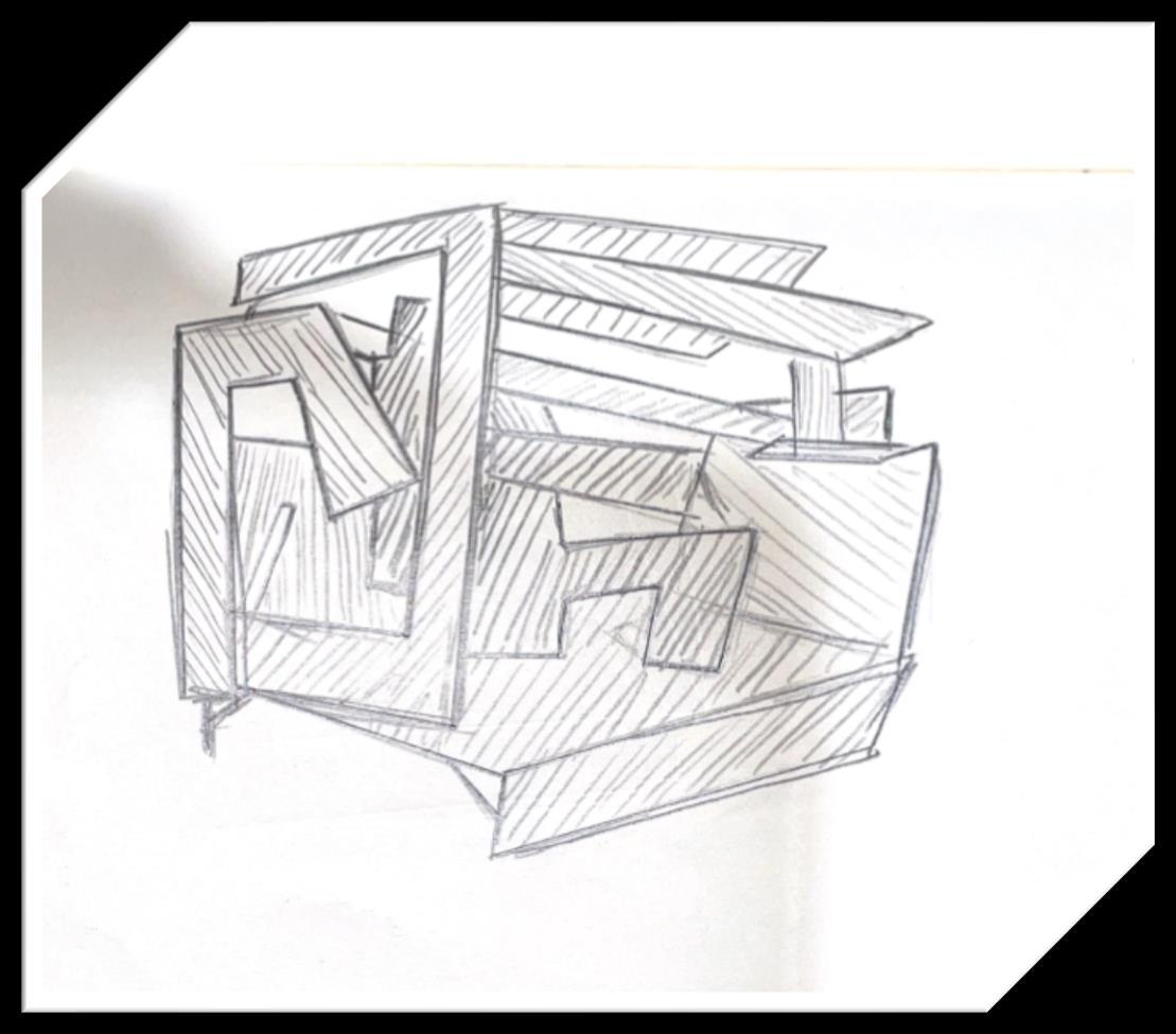
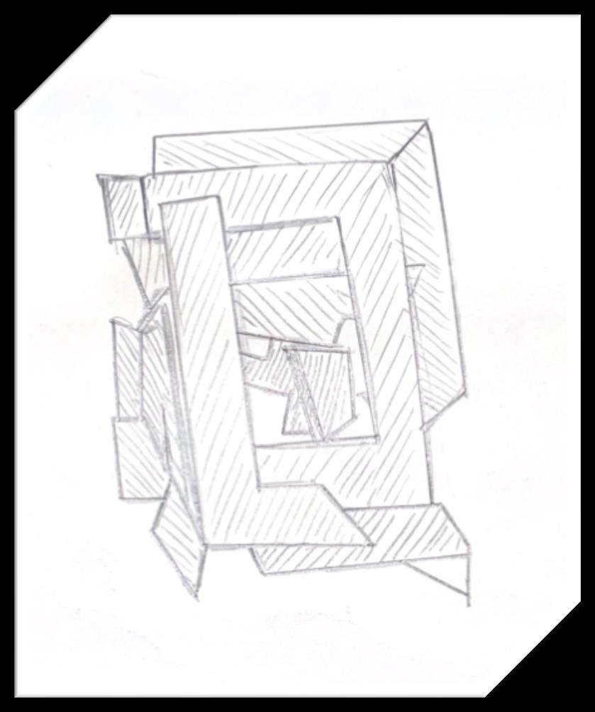
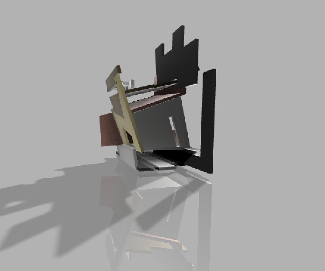
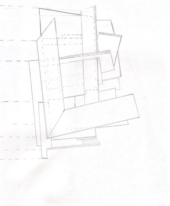
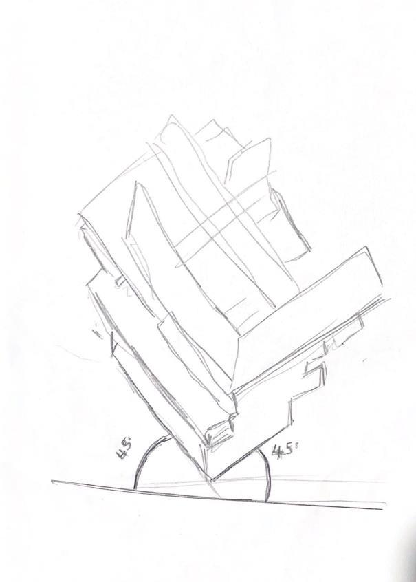
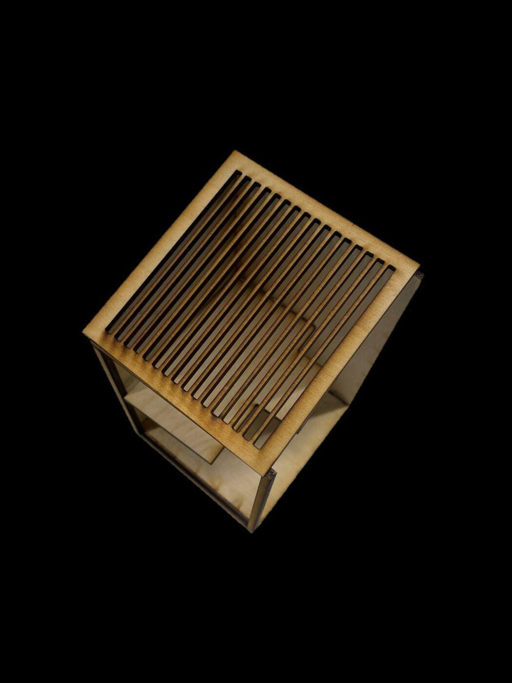
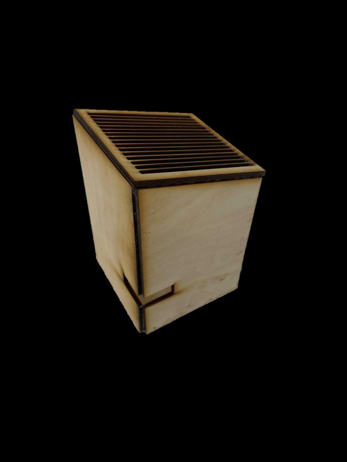
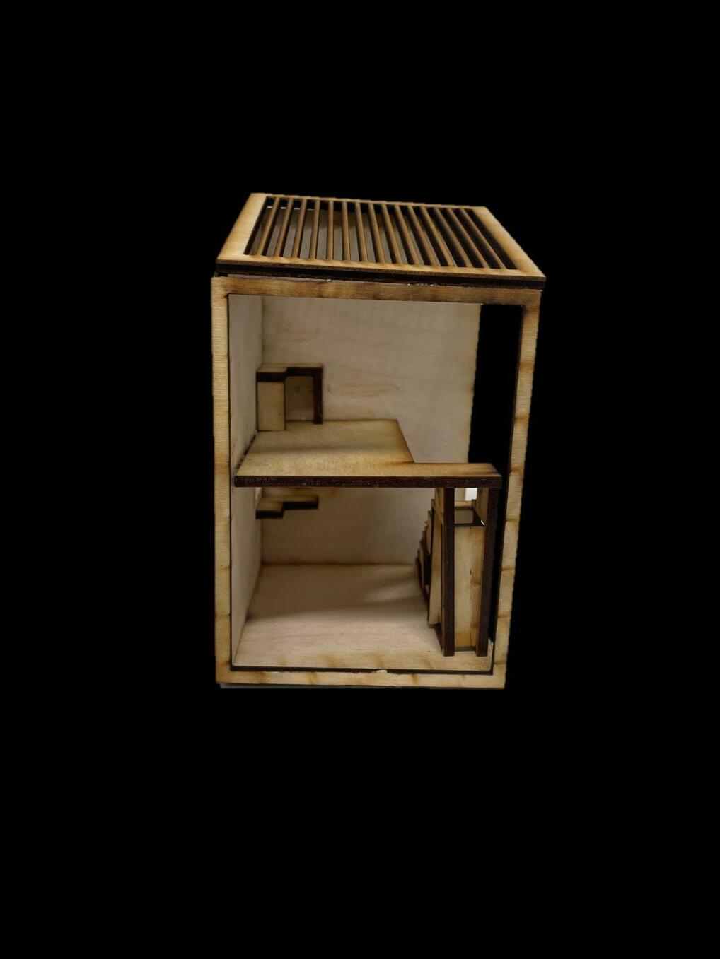
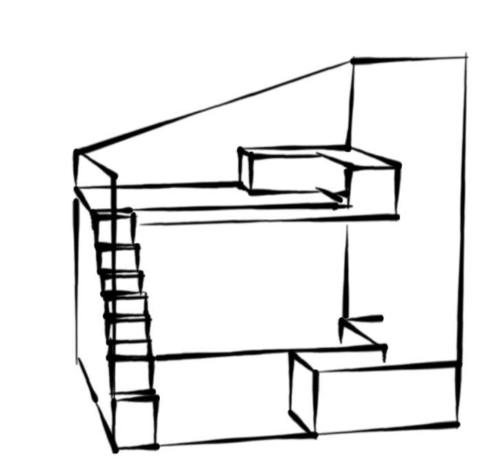
My final model was a combination of what I thought was the best features of my previous models,. There were themes and aspects that I ran with through the end, for example the piece highlights, as well as the open space idea. This iteration is somewhat a balance between a compact and open space.

I T E R A T I
N 5
O

`
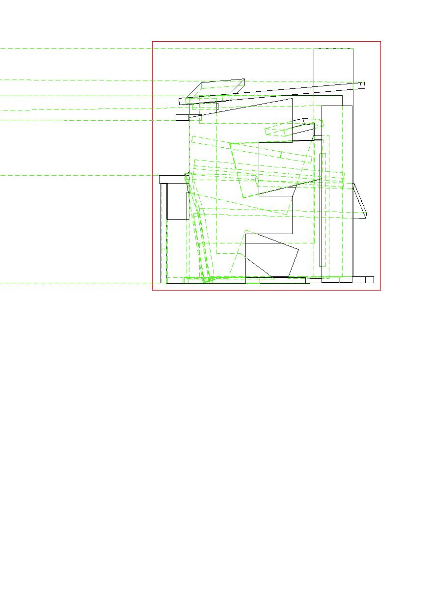
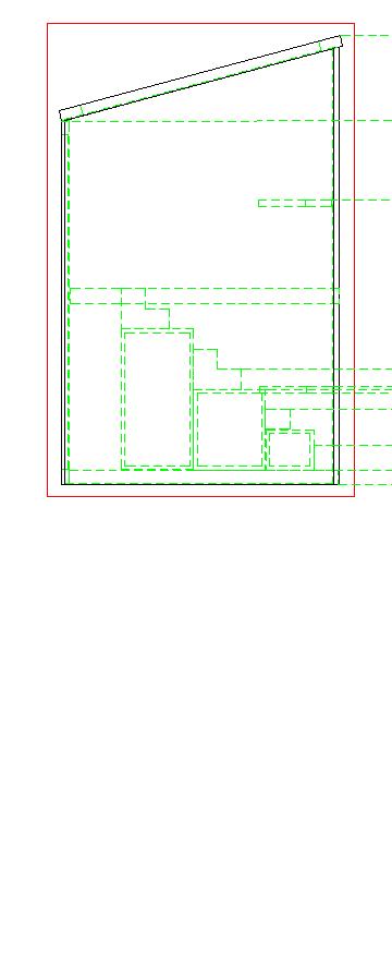
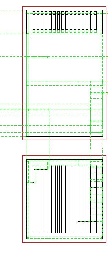
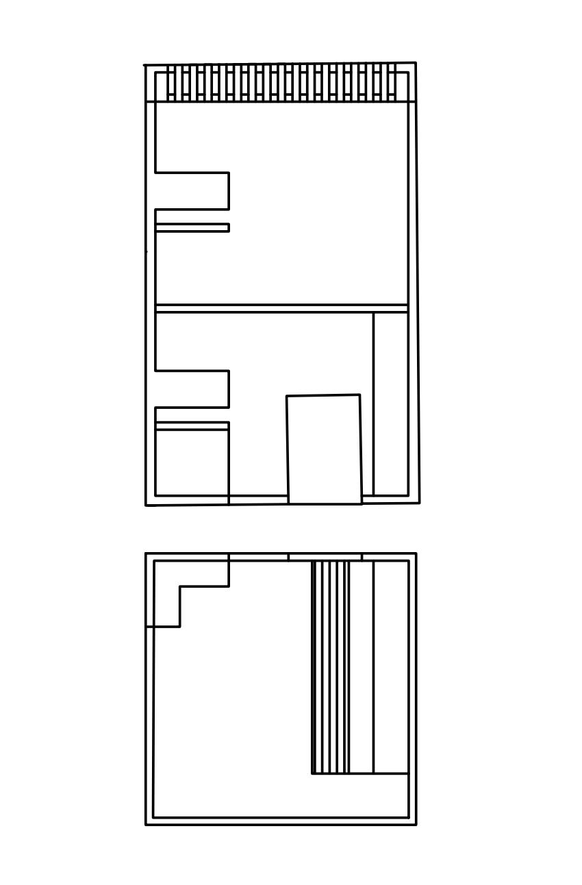
ORTHOGRAPHIC
`
SIDE VIEW
TOP VIEW
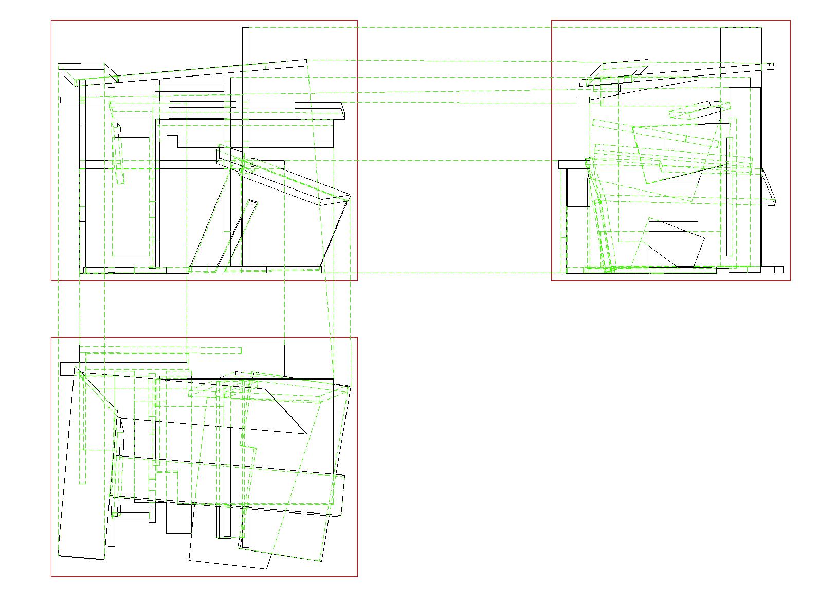
FRONT VIEW
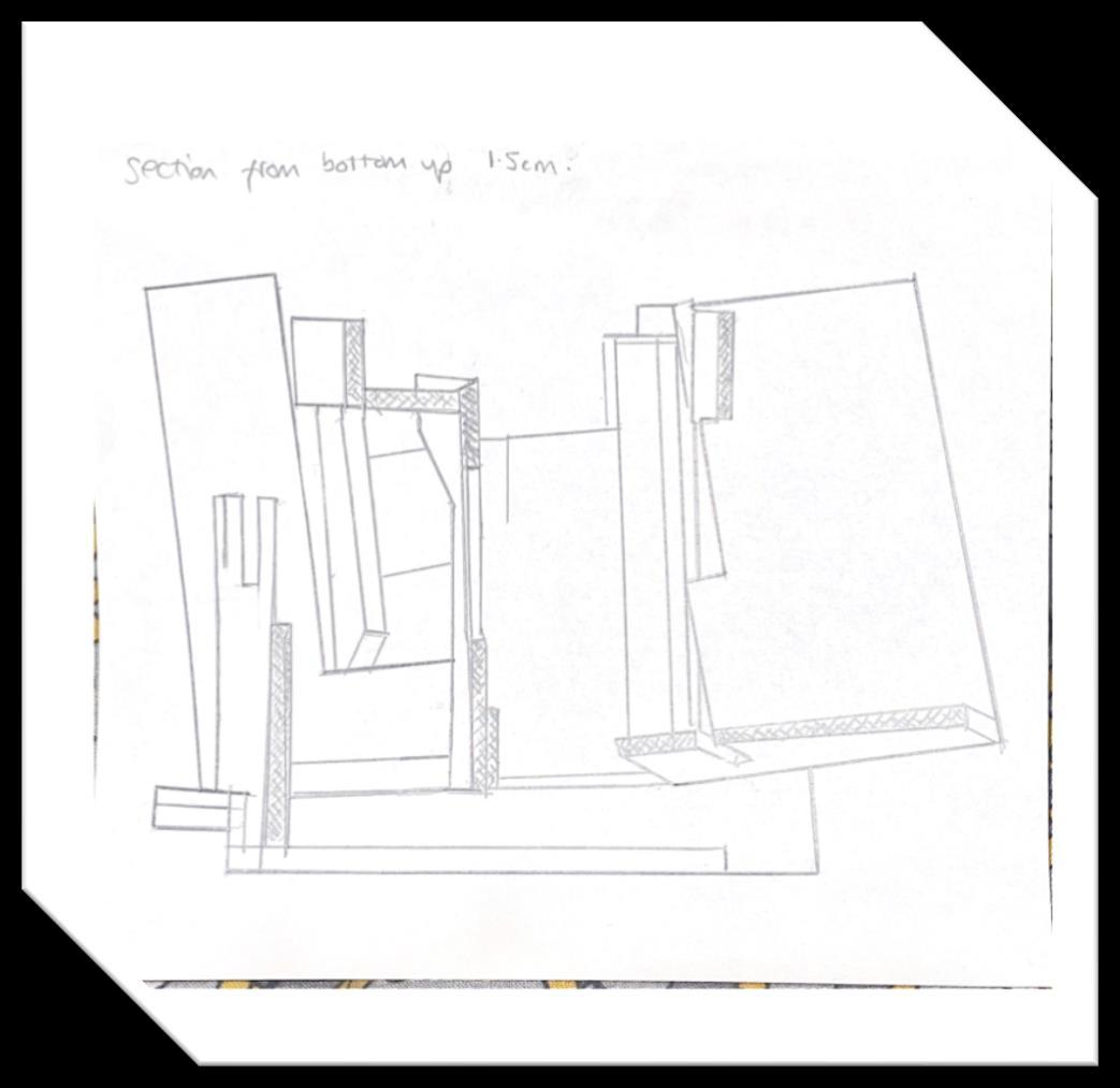
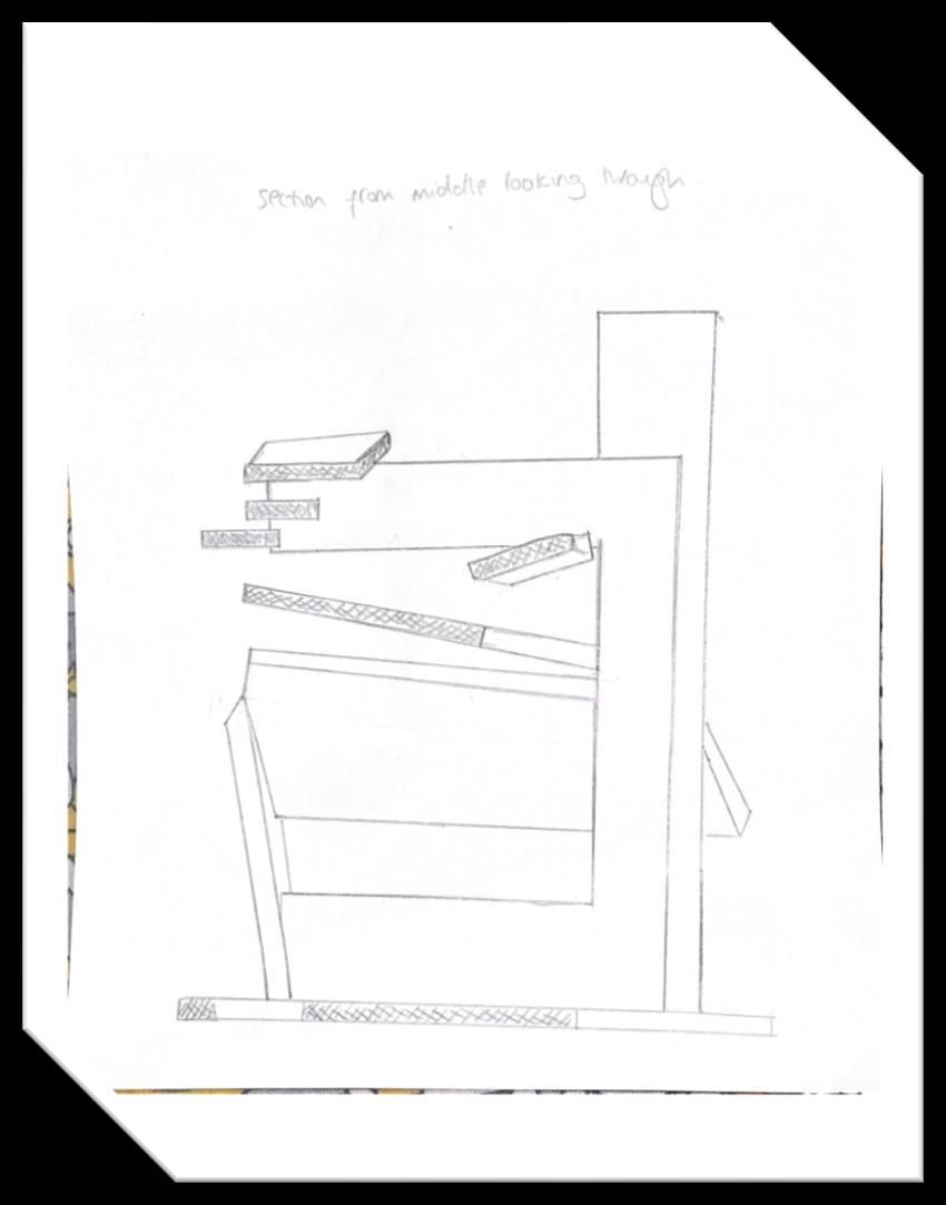
SECTION CUTS

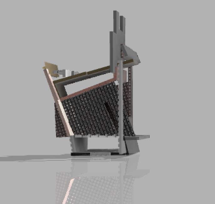
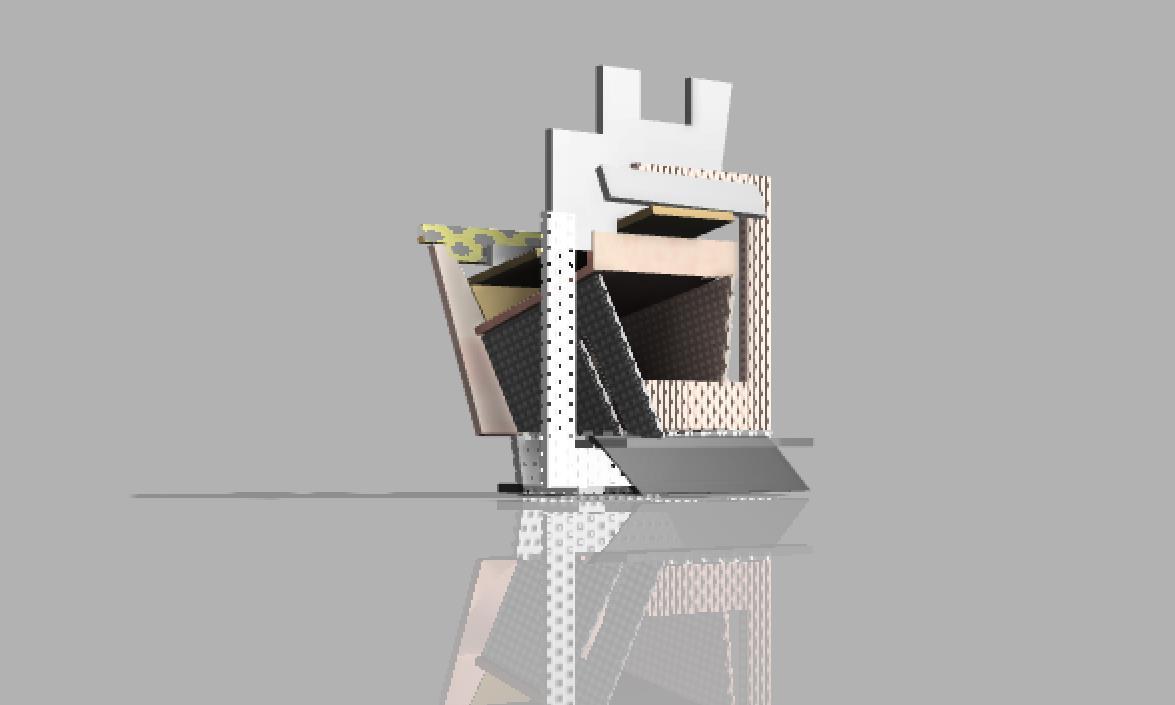
RENDERING

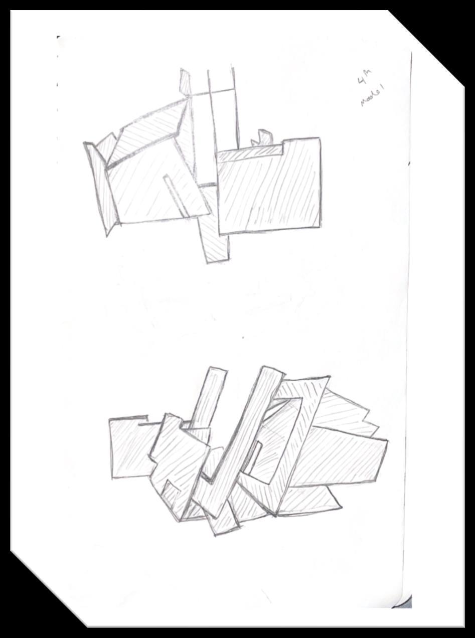
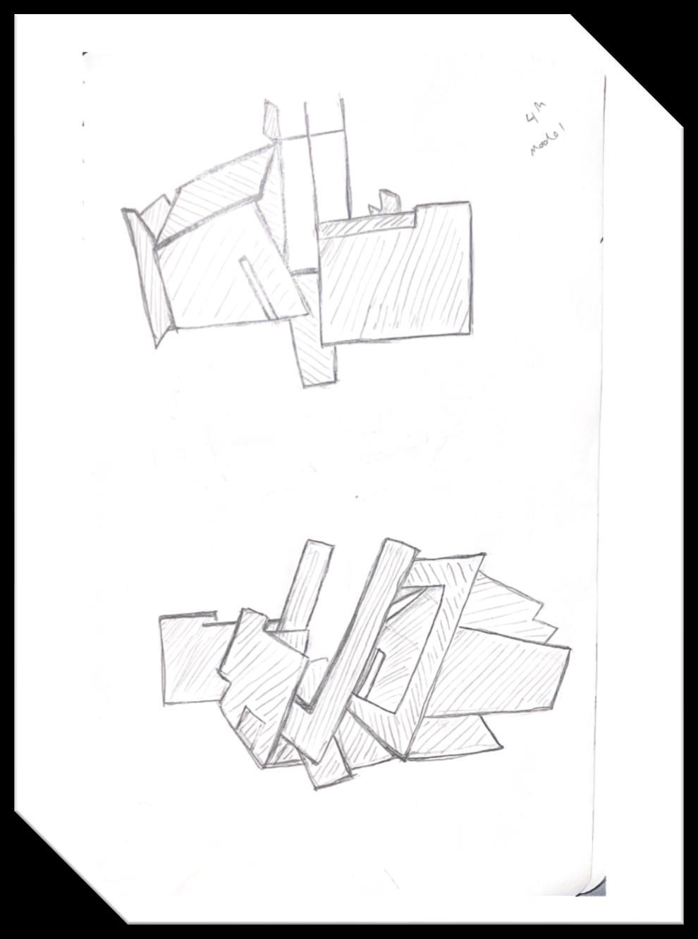
SKETCHBOOK
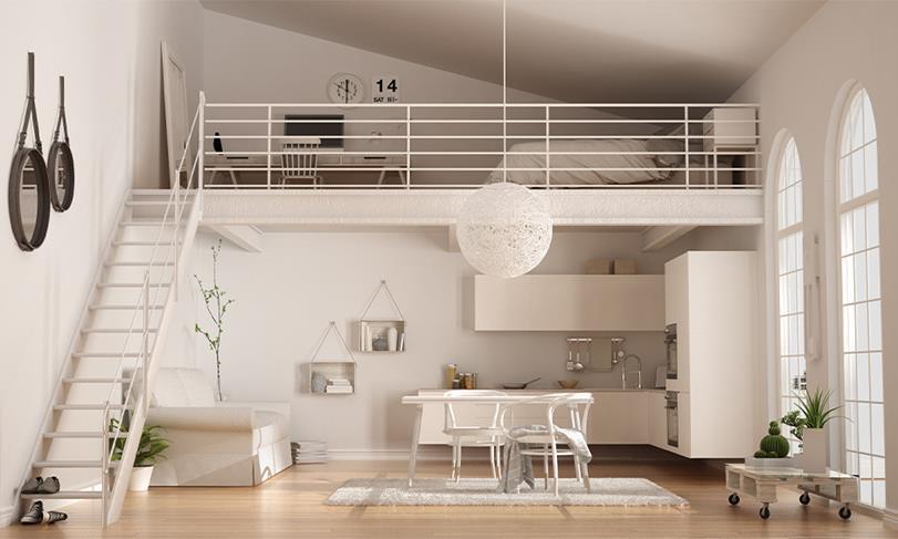
MICRO STUDIO
SITE ANALYSIS
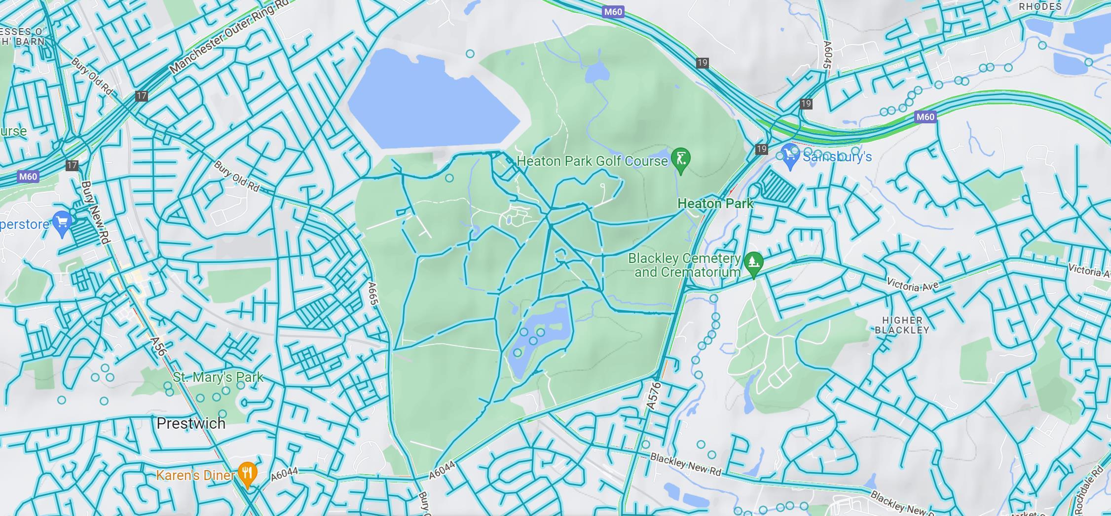
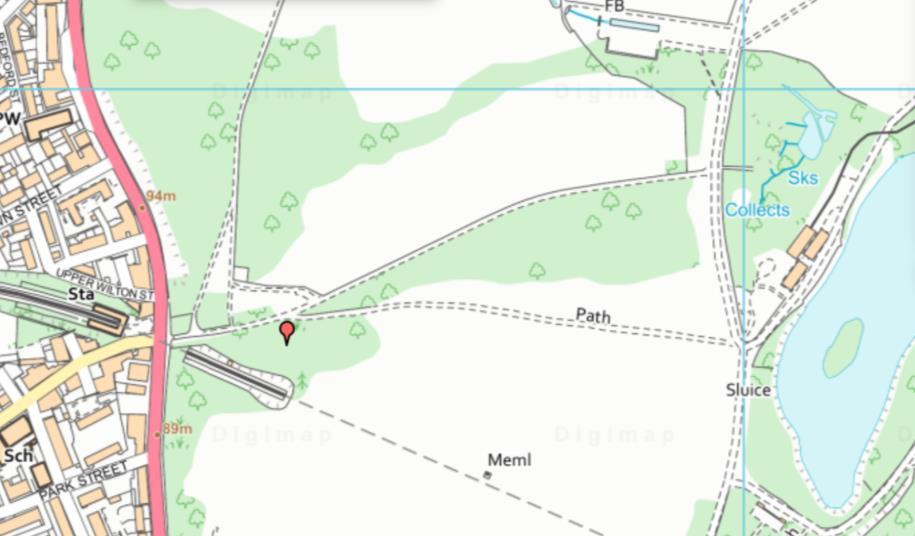
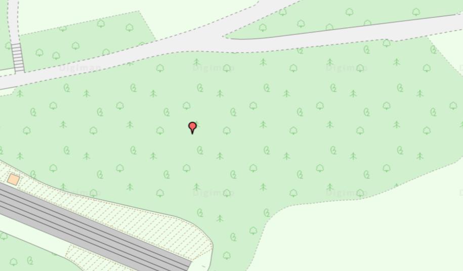
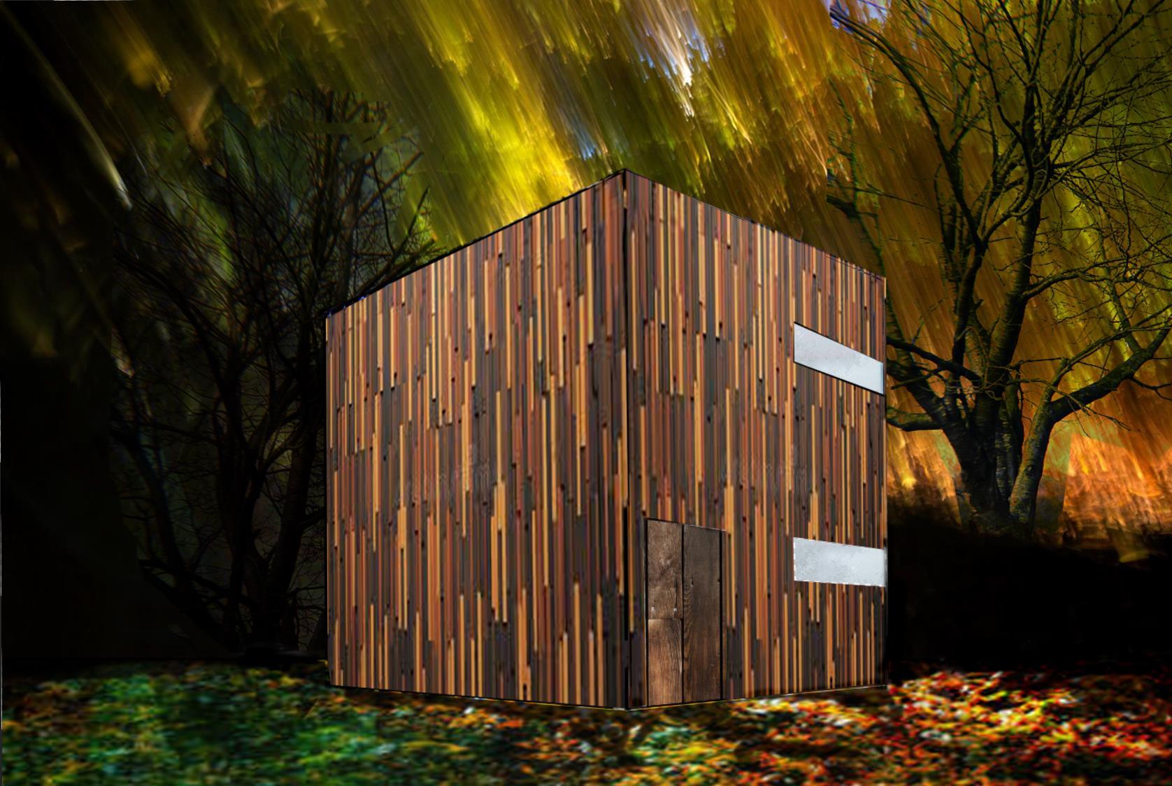
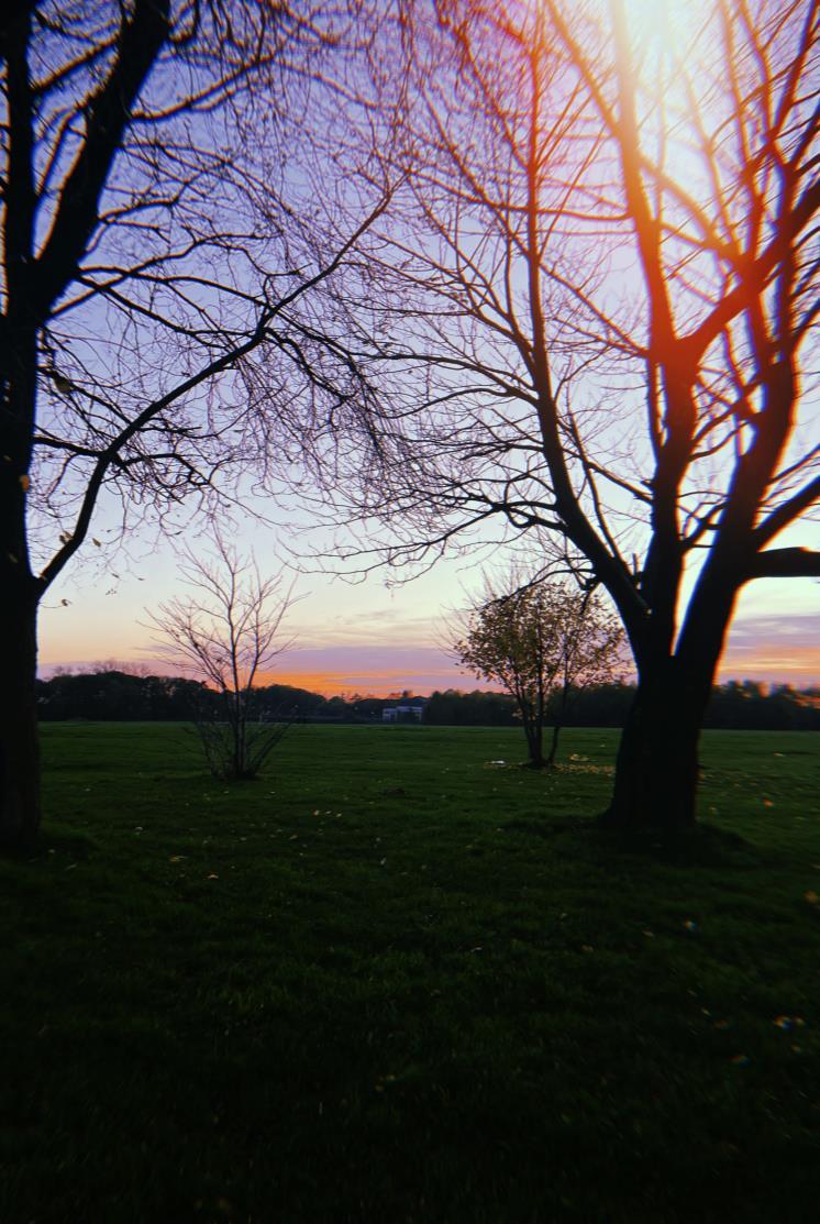
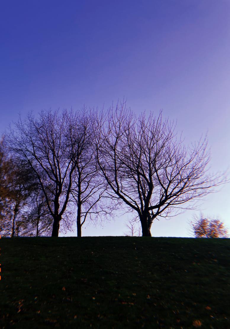
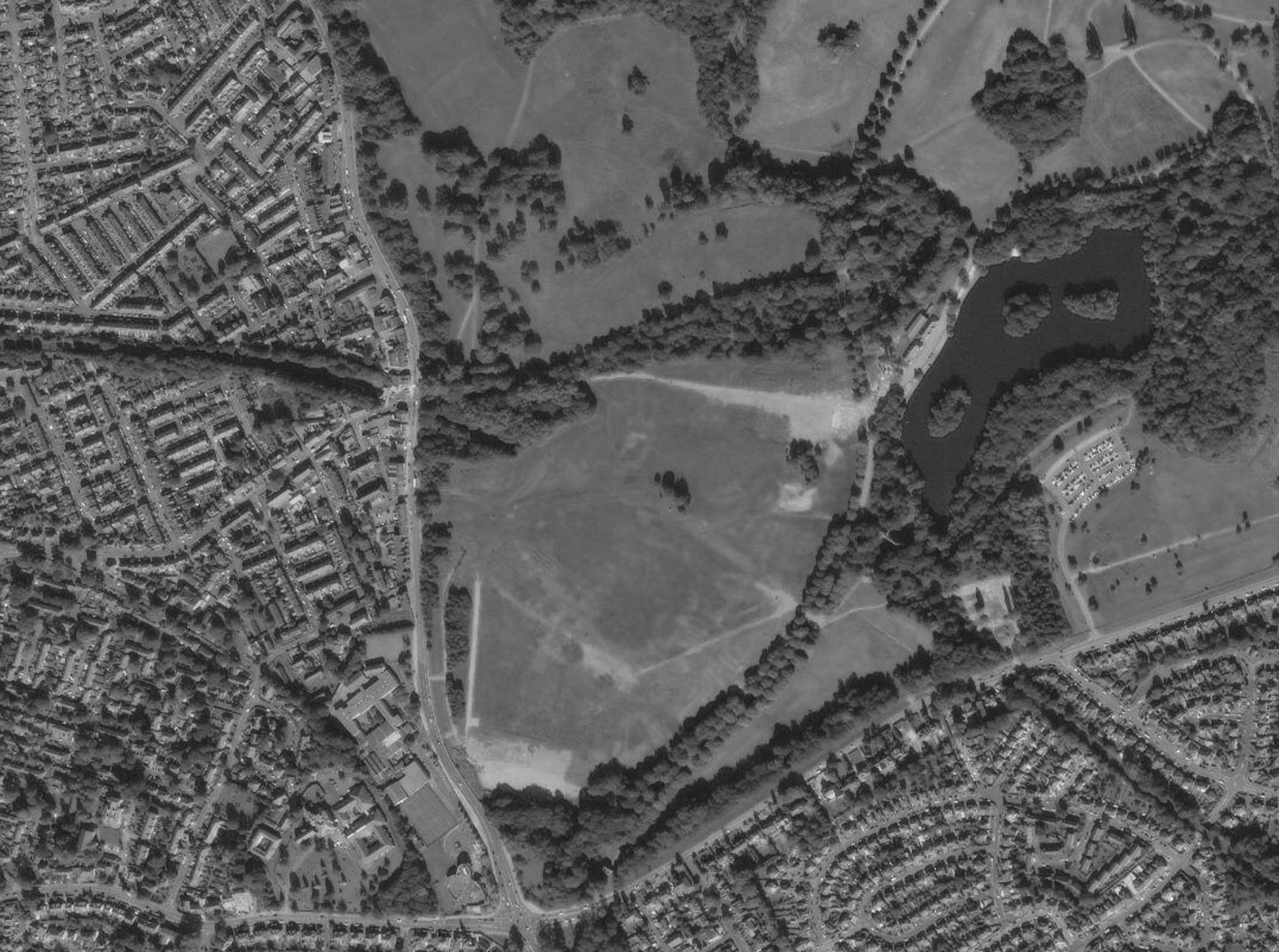
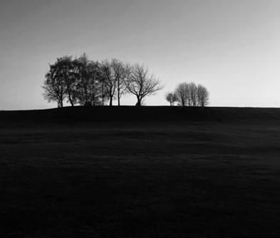
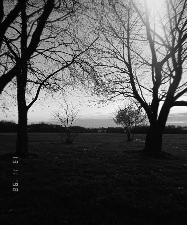
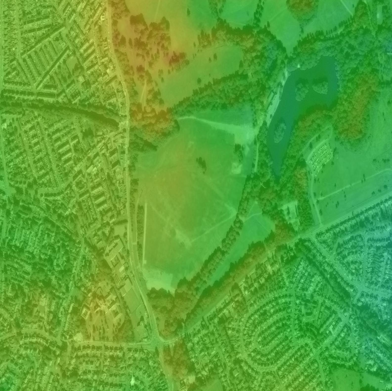
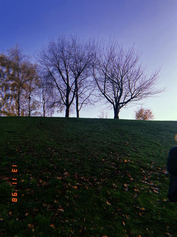
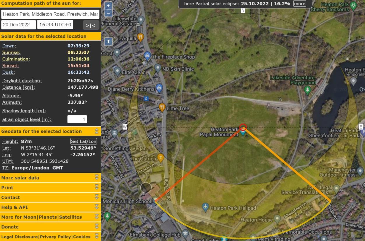
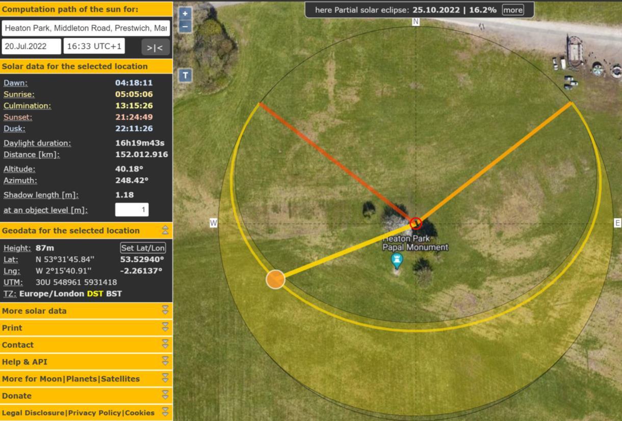
The site I have chosen is a secluded area of Heaton park – a place where a few trees are, to maintain a homely feel rather than complete isolation which would make me somewhat anxious. I chose a place on top of a small hill, with a great green field on one side allowing a clear view for sunrise and sunsets.
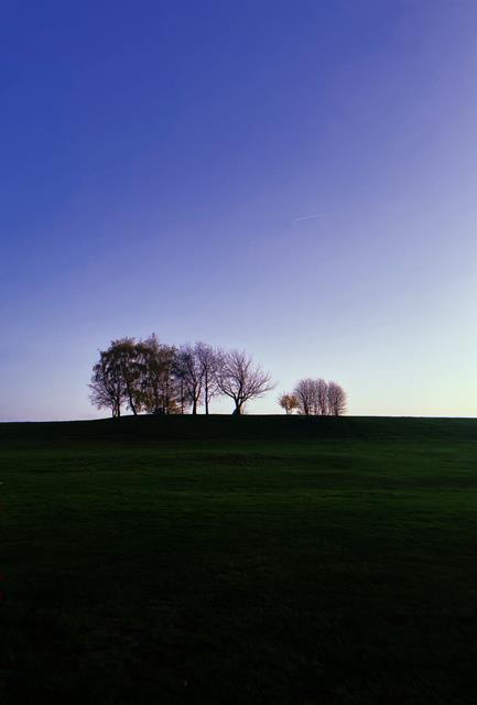
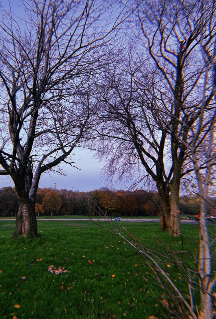
I chose to build my studio in the midst of the trees rather than the green landscape as I wanted more to my site than just grass, but I felt it important to also have a clear and clean site. When I saw the trees, it gave a welcoming feel which I think is due to the natural shape of the branches joining together to create a roof like look
JULY DECEMBER
HEATON HALL
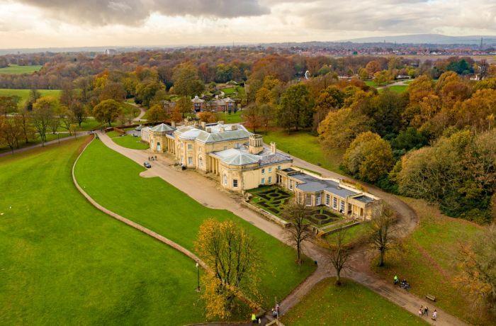
Designed by architect James Wyatt for Sir Thomas Egerton, who wanted a more modern space to live.
PRECEDENT
ILYA Derkach - Moscow
July 2016 - Hut on a tree
SZUMIN Wang, Tapei
A little design, Feb 2019
USER EXPERIENCE

1. to create a space to study, to write and to learn efficiently.
2. to ensure a space where I can cook, as I find it difficult to concentrate and focus without snacking to refuel my focus.
3. to maintain a clean and compact environment, clutter free and free from urban distractions.
MODELLING
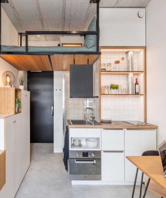
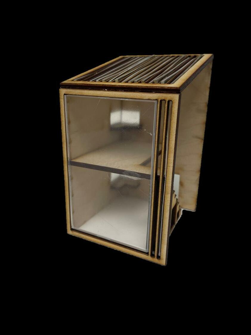
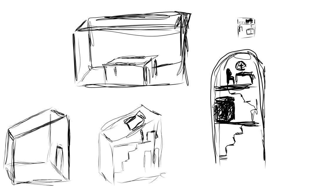
Inspired by Sir Egerton of Heaton Hall wanting to live in a modern environment, and the welcoming trees of Heaton Park. My first model consisted of a almost full glass wall and ceiling –bringing in as much sun as possible. I quickly realised the possibility of overheating and the need for a window, specifically by my kitchen unit on the first floor.
I T E R A T I O N 1
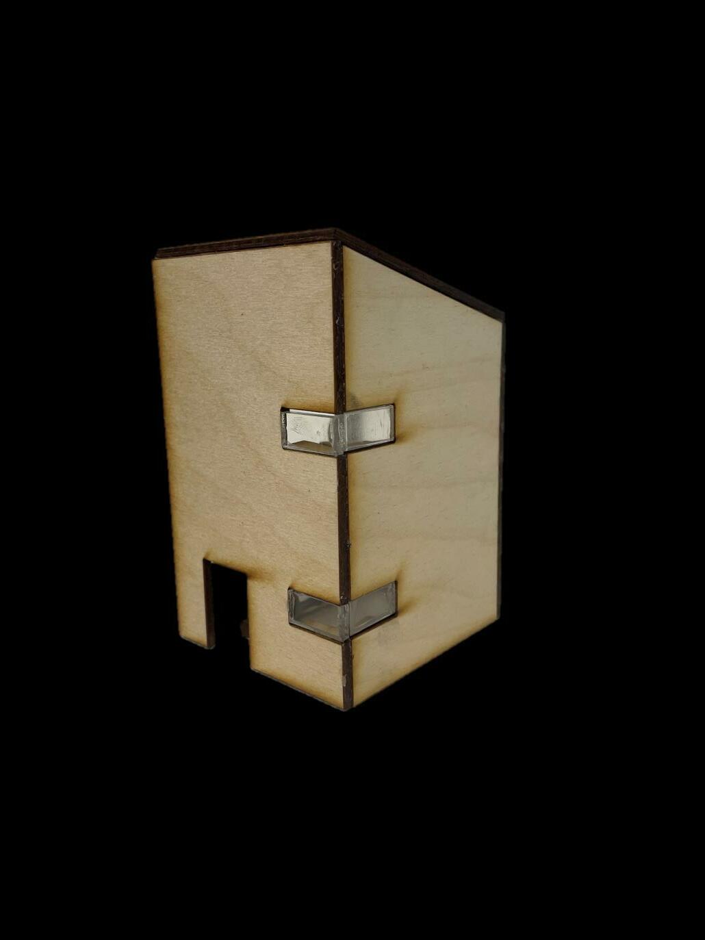
I added some columns in, to prevent too much sunlight, possible overheating and the distraction of a full glass ceiling. Despite the temptation. I also added a window that goes along the kitchen unit, to allow the exchange of air and steams while cooking. The design had started to become more interesting but I was unsatisfied with the columns in the ceiling.
I T E R A T I O N 2
My third model showed a much more satisfying roof which on a bright day would produce a stunning alteration of shadows. I was content with this design however my study space was facing a wall – which I wanted to change. I also needed a way to get to my study on the second floor.
I T E R A T I O N 3
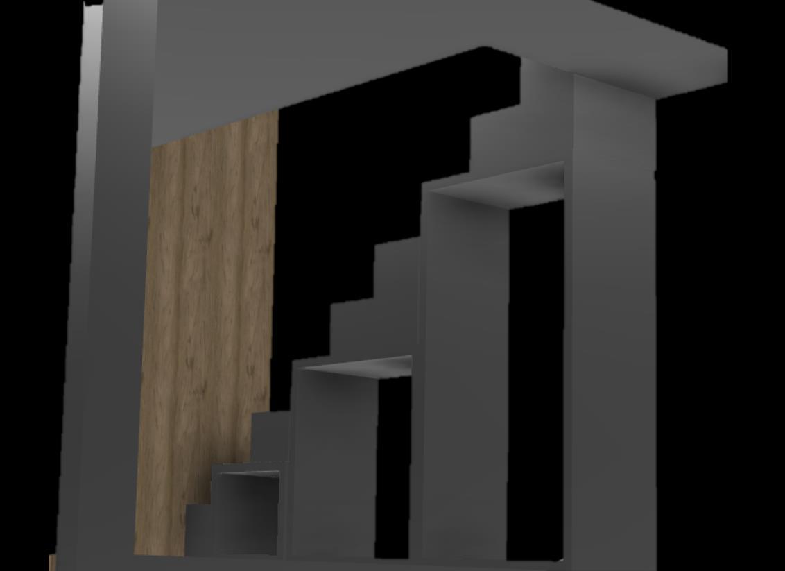
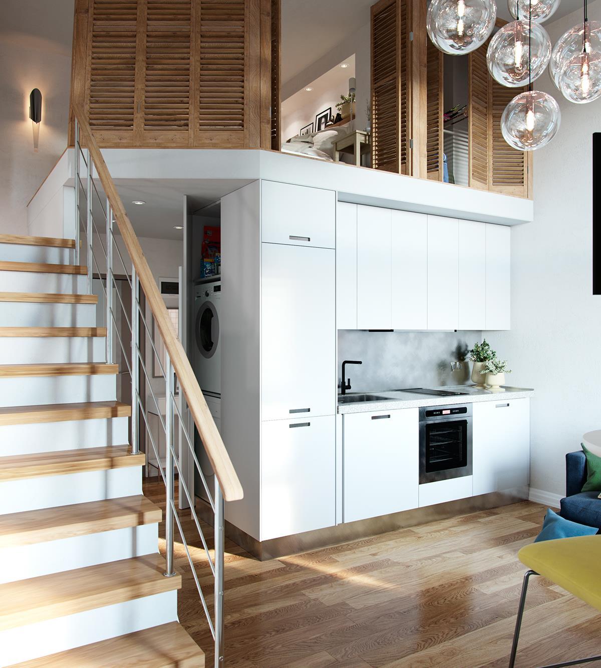
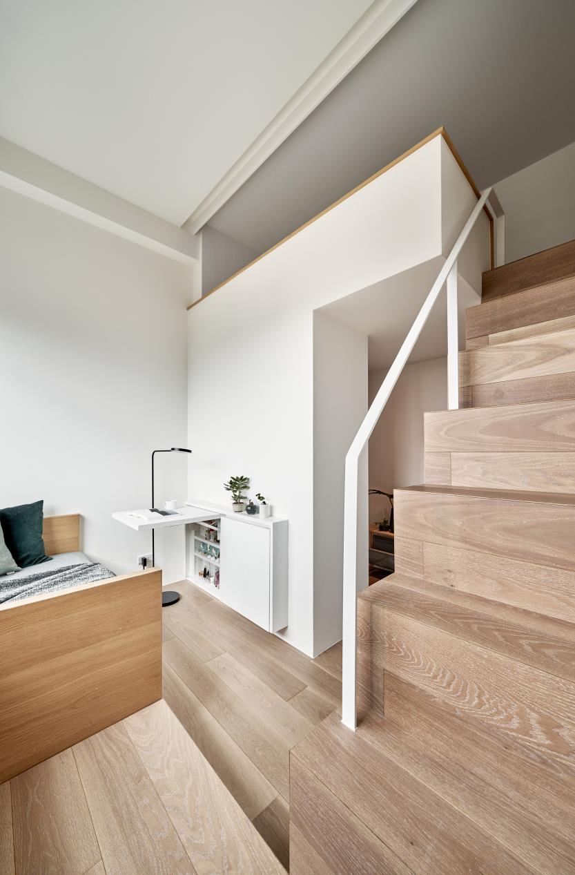
I created a set of stairs which worked extremely well with my third user requirement which was to create a clean and clutter free environment free from urban distractions. Within my stairs I created units where outdoor items such as coats, bags etc would be put away before becoming one with the study, a place to study, eat and feel content. My fourth model however had still not solved the problem of facing a wall in a corner while studying, it felt too constricted and I wanted to improve the glass exterior so that when going up to the second floor, I am not anxious looking out and ahead.
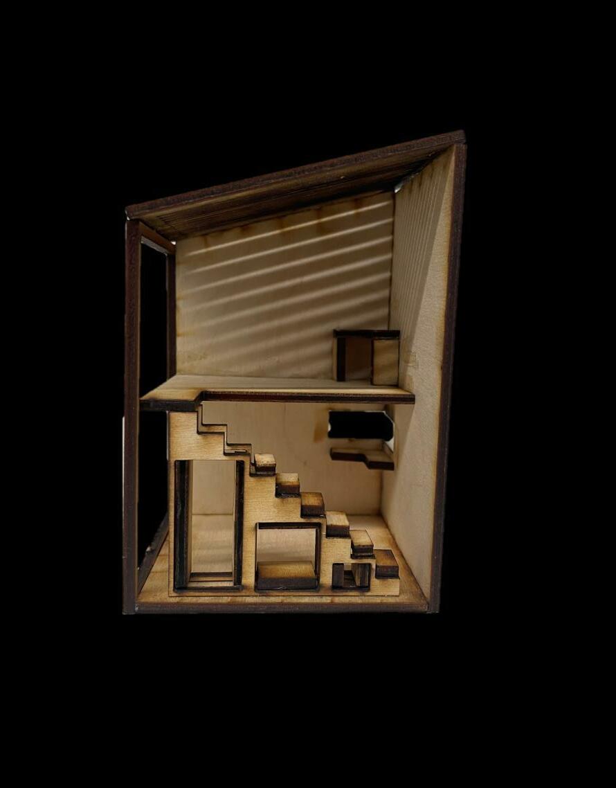
I T E R A T I O N 4
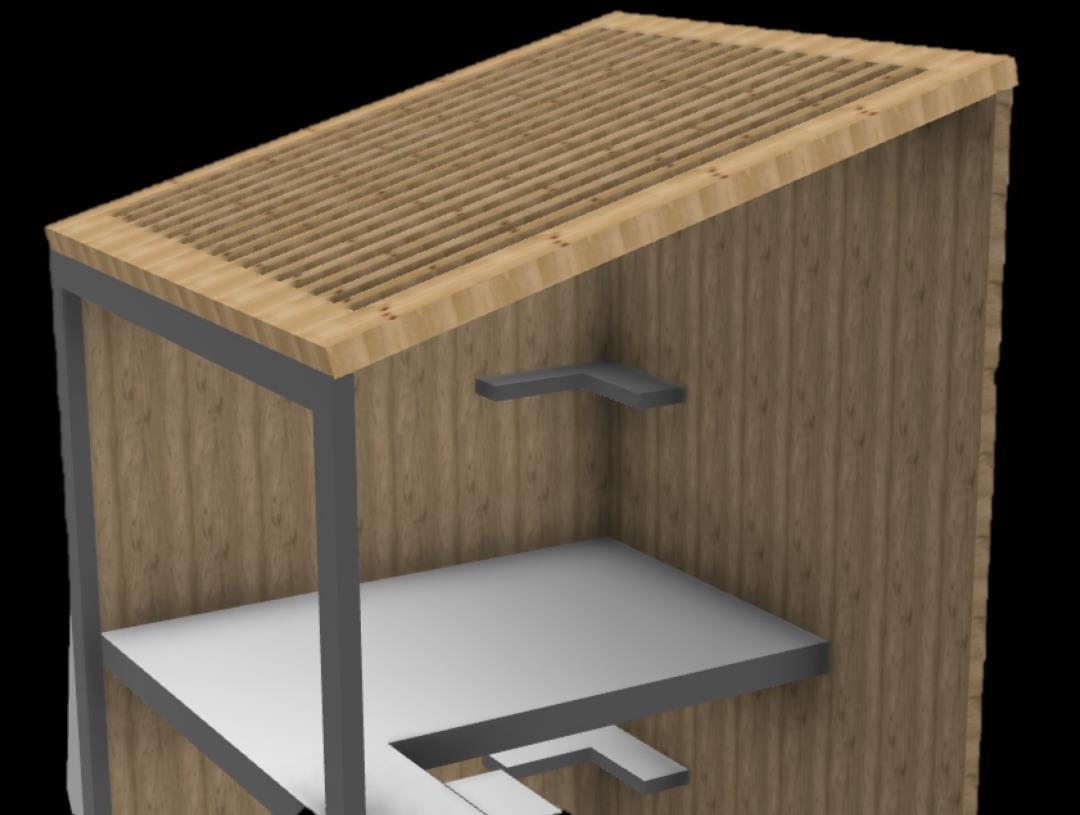
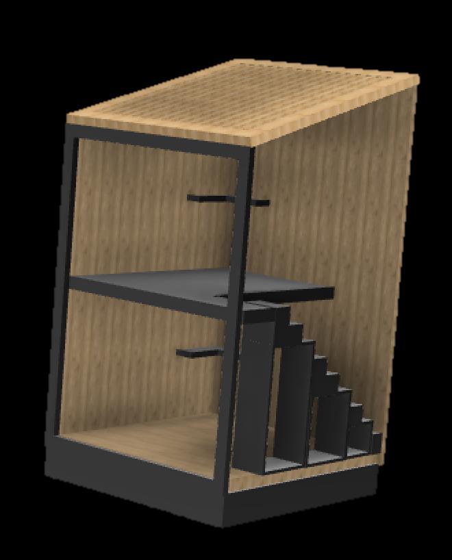
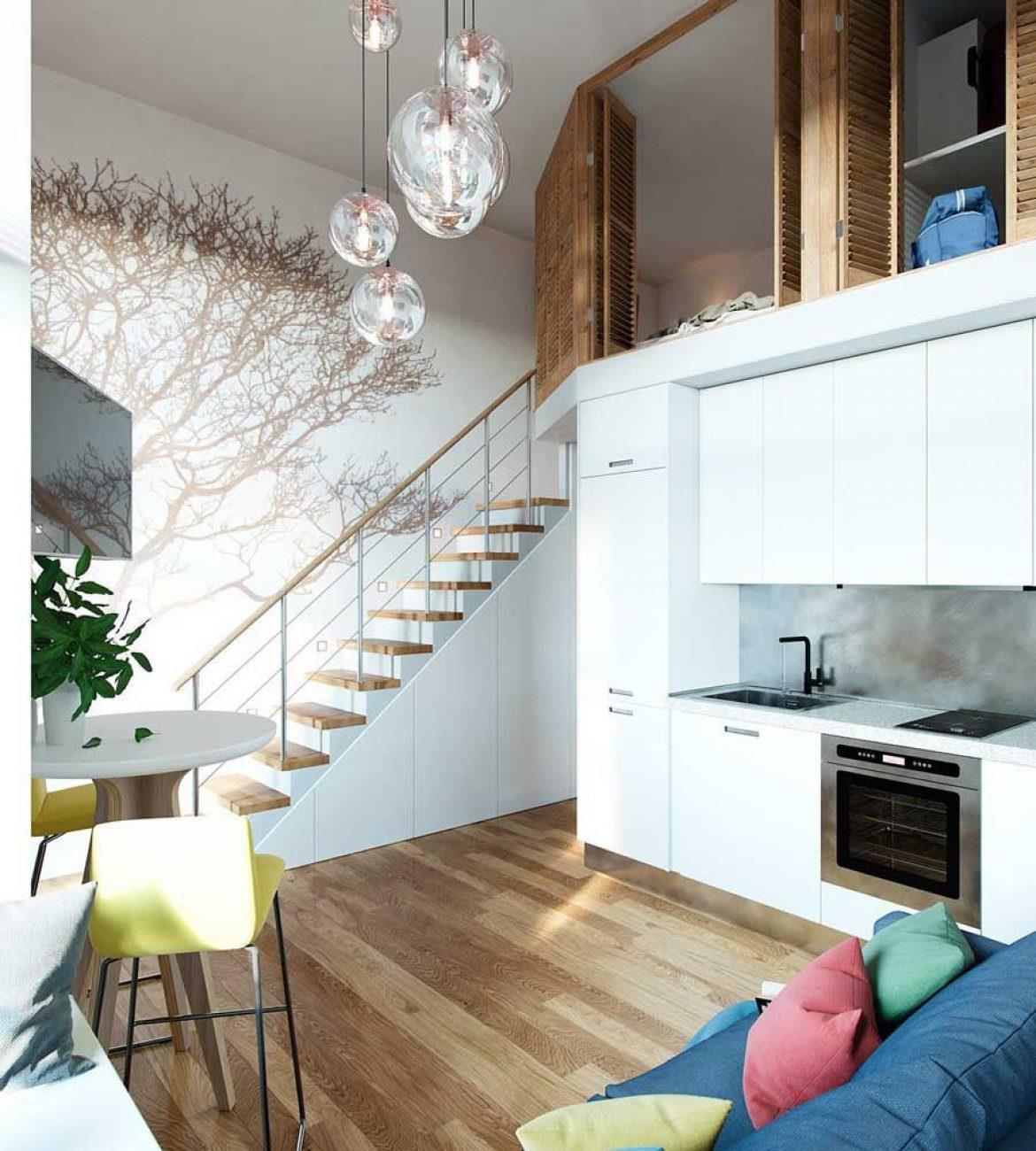
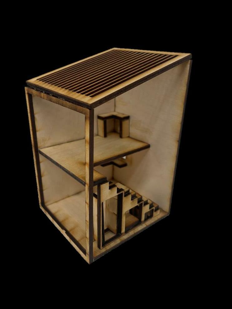
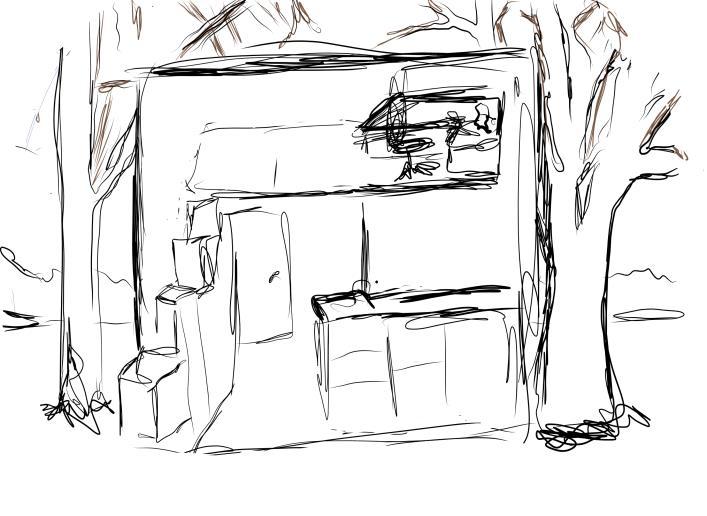
The fifth and final model of my Micro Studio, had windows above the study area, the kitchen unit and let a great show of light in from the glass wall and ceiling without letting too much in. It had stairs which helped maintain a clean and efficient working space, A secluded area for cooking and one for studying too. I dropped a couple of the columns down from the ceiling to the ground to prevent the anxious feeling of the word watching me. My final model had achieved my user requirements in the way I wanted them too and fits with my site.
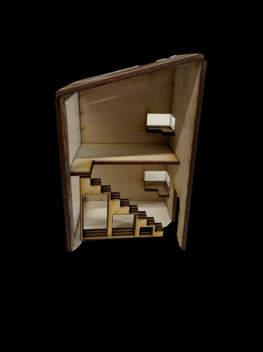
I T E R A T I O N 5
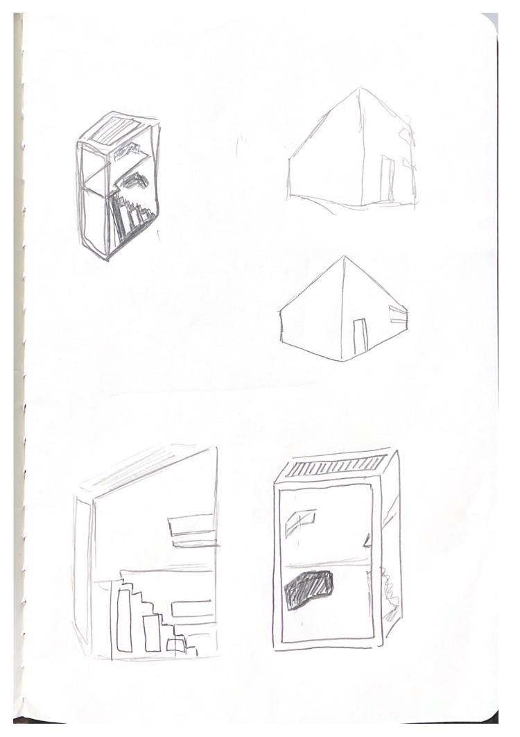
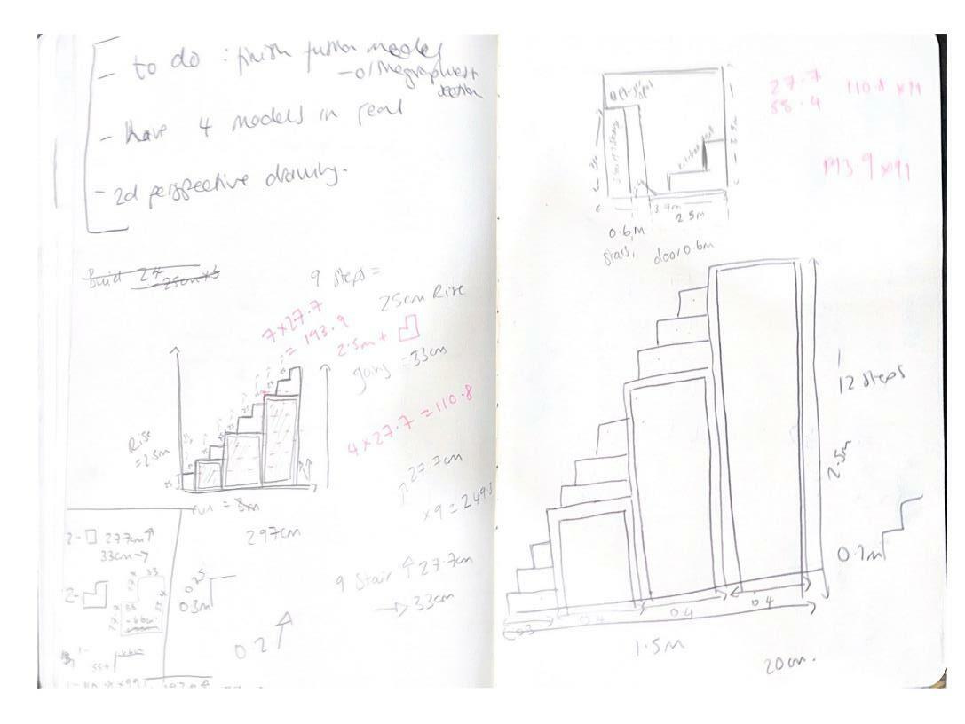
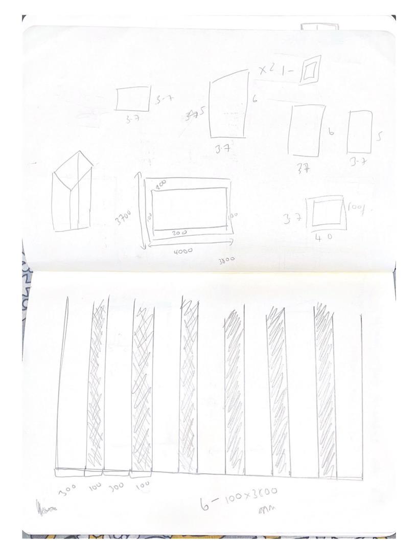
SKETCHBOOK
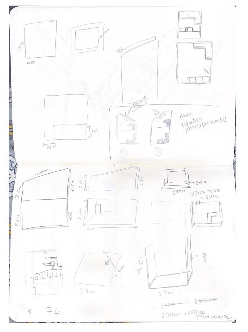
SKETCHBOOK
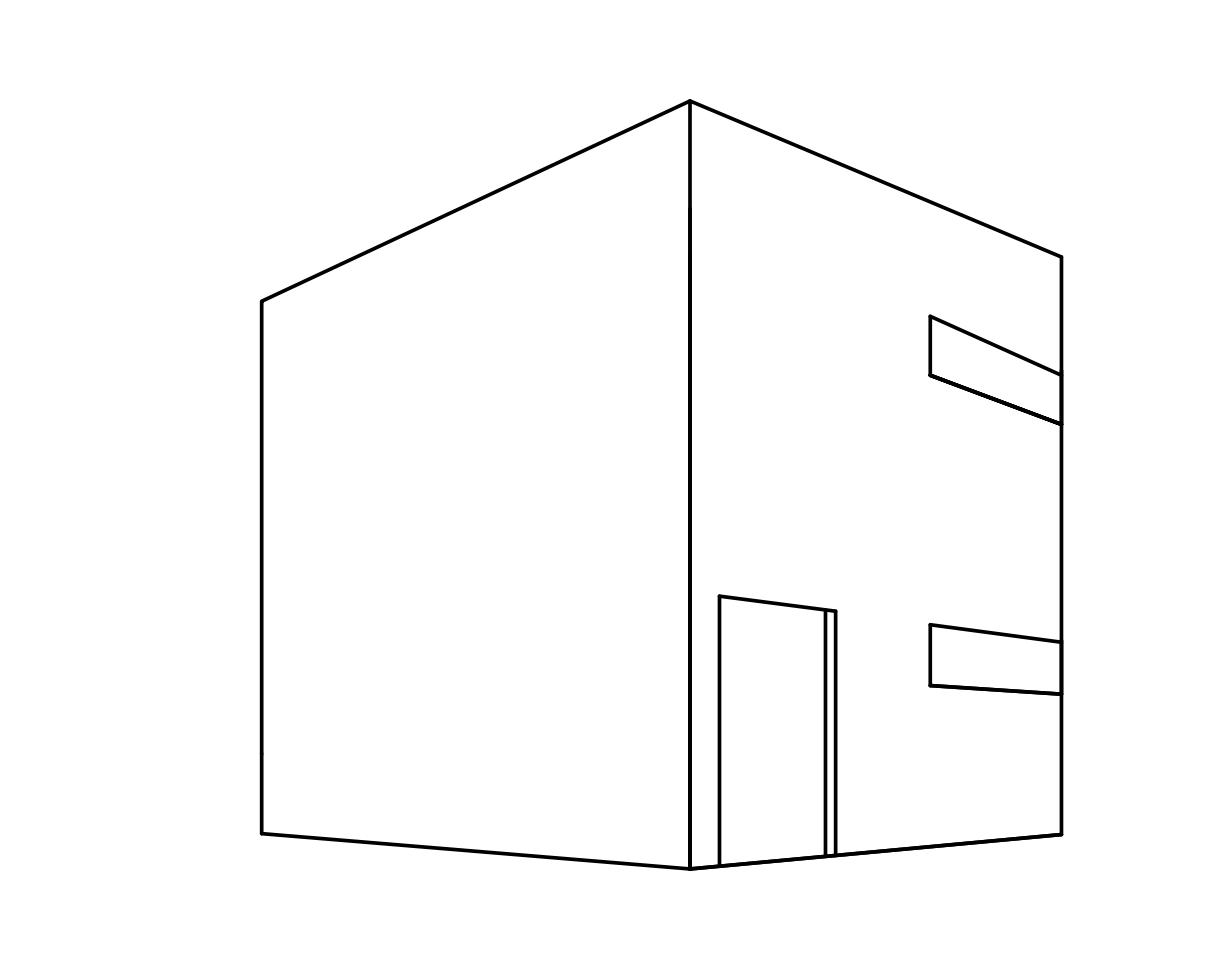
ORTHOGRAPHIC

FRONT VIEW


SECTION VIEW
AXONOMETRIC
2 POINT PERSPECTIVE
RENDERING