
Ethan Greenough Virginia Tech Interior Design Portfolio 2024

As my last name would suggest, I love the color green! This love for the color also comes from growing up next to the Appalachian Mountains. While in school at Virginia Tech, a majority of my projects have taken inspiration from the beauty of nature. This inspiration has driven me to create designs that reflect the physical aspects, such as roots and branches of trees, to less visible feelings, like the sense of being connected with the forest you’re standing in.
I have also had a drive to create spaces that not only take inspiration from nature but also help protect it. Sustainability has been a passion of mine and is something I take into consideration in every project. To better execute sustainability practices in my projects, I have received my LEED Green Associate certification and plan to continue my studies of different sustainability practices.


The goal of this project was to renovate a preexisting shell within a community that has a need for specific merchandise. To most
InterconnecteD is a boutique retail store located in . The store was created to reflect the unique experience that hammocks, hiking shoes, and winter jackets were selected to cater to the various outdoor activities residents take part in.
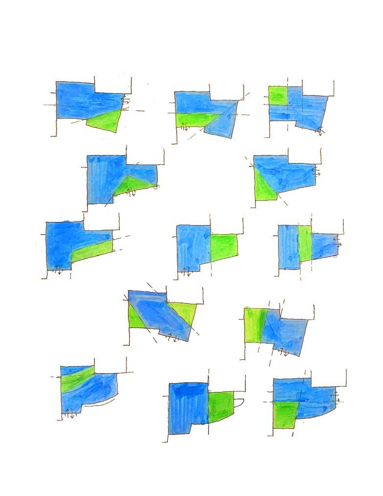
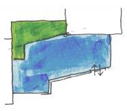
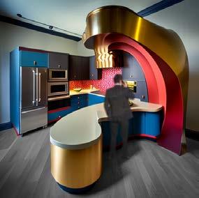
The Celtic Tree of Life represents a connection deeper than our eyes can see. The root system of the tree reaches out and connects everything together. As you walk through the space, you are greeted by the same blue triangular form as was in the

InterconnecteD’s logo is based on the Celtic roots of an
Oak Trees are also the trees represented in the Celtic Tree of Life representing a connection


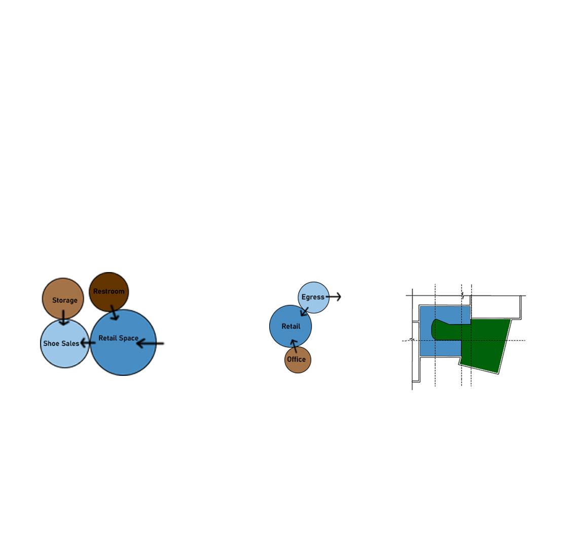


mezzanine, trace paper was used to explore the overall form. The final shape is inspired by the Tree that the


 Cross Section

Due to Park City’s deep connection to nature, the materials selected have a focus in sustainability and locality to both relate back to the concept of connection along with being planet health-minded.


Originating from the UK, ripple+ is a company that creates a zero-nicotine alternative to a traditional vape. The diffusers, or vaporizers, that they manufacture are designed to give the user an enjoyable experience through the use of natural flavors derived from plants. These flavors are designed to reinforce the positive benefits that the natural plant may hold.
The company originated with four flavors: RELAX, DREAM, POWER, and BOOST. These flavors evoke the feeling that the name suggests. To help differentiate between flavors, ripple+ has paired each with a distinct color. These feelings and colors informed my design through various factors such as space planning and wayfinding.


Level 1: RELAX, DREAM, POWER
Level 2: RELAX, POWER, BOOST
Through the process of constant changes, the new ripple+ office has developed into one that can promote a proper separation of work and relaxation while also being intermingled throughout.


Furniture and finishes were selected to follow the organic curves and forms of the brand. As seen in the perspectives, the fluid color on the walls flows through the space and the furniture is meant to reflect those curves and movements.


 Large Meeting Room
Teknion
Pineapple Contracts
Andreu World
Level 1
Axon
Level 2
Axon
Large Meeting Room
Teknion
Pineapple Contracts
Andreu World
Level 1
Axon
Level 2
Axon
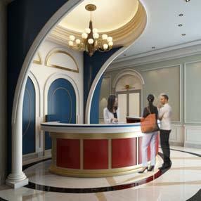
The custom reception desk features the + in the brand name along with four extrusions wrapping around the side. These extrusions represent the four core flavors
The small curve in the desk, paired with the extrusions, directs the users of the space to continue deeper into the space.
 Reception


Group Project: Frannie Klein and Hannah Nofziger
Community Center

The Blacksburg YMCA helps people from all walks of life. It is a place for the people of the New River Valley (NRV) to receive support. The YMCA provides for those who are food insecure, clothing drives, and welcomes international visitors and residents.
This 3,000 sq. ft remodel creates a more efficient and welcoming space for the YMCA so they may better serve the NRV. The design concept focuses on the push and pull of tectonic plates that help create the unique mountains and valleys of the surrounding area.
Historical roots are mined in layers, carving the scenery into intimate hollows. The sun floods mountains with blue ridges and purple rays. The push and pull of Blacksburg’s landscape create natural peaks, waves, and edges. Boundless elevation. Techtonic push and pull create boundaries while the YMCA breaks them down. Generating boundless opportunities for diverse communities in and around the NRV


All renderings highlight the different features of the remodeled space such as the front entrance area, private office, commercial kitchen, and more. The renderings were processed in Enscape and then Photoshop to create a precise and exciting depiction of the team’s design.

Outside of the normal responsibilities a team member may have, such as being directly involved in collaboration and concept design, I was also responsible for building the SketchUp model. I was also the one creating Enscape renderings. This helped create a streamline building and rendering process.


 Welcome
Sustainability was a focus of this project. Because of that, materials were selected that both have durability along with sustainable conscious attributes.
From CornBoard, a sustainable and acoustically conscious material, to the Allsteel furniture, everything has been picked specifically to meet the client’s needs for the space.

This project looks at creating a that into a 3D model. It also was an introduction to the use of digital software and rendering perspectives.
Three foundational principles governed the design: Organization, and Permeation grid-like pattern, a continuous permeation the model at multiple locations. The other six fundamentals were inspirational throughout the model, such as focusing on a through the spaces, creating distinctive transition through the space.


 Cross Section


 Facade Diagram


From mechanical to abstract, this project takes a look at creating technical drawings of a manual whisk. Using those drawings, an abstract poster was created to reflect the unique movements and shapes that the whisk creates.

