COLOR GROUPINGS PRIMARY
COLORS
It’s all in the name, and the name is blu. ink. Our initial color work-up was a monochrome of blues and from there everything else fell into place.
Blue Charcoal is our go-to with Catalina Blue being used for buttons & accents, while shades like Half Baked make up the foundation for “blueprint topography”.
COMMERCIAL SECONDARY COLORS
With the Commercial side of our business, it was important that we pulled on tones to convey a sense of sophistication & longevity.
Evergreen trees and forest foliage inspired most of these accents with wintery blue hues from local bodies of water.
RESIDENTIAL SECONDARY COLORS
The residential facet of our business offers a more vibrant collection of colors, similar to the splash of sunshine and wild flowers we experience in our spring and summer months.
Home buying and selling is a work of passion—we hope to convey that in everything we do.
These colors should be used on all company-wide blu. ink marketing assets—digital and print.
That being said, we have some “Do’s and Don’ts”.
Check ‘em out!
THE DO’S
Blu.ink deliverables should always include Blue Charcoal.
Our website’s homepage, and any landing pages we build, should include usage of each primary blu. ink color.
In print: use the lighter, faded color variations instead of changing the opacity. They are set to 75% and 50% “opacity”.
THE DON’TS
Please do NOT use Stiletto on any commercial assets or web pages.
There should always be more Blue Charcoal than any other color—aside from white (#FFFFFF).
Blue
HEX: CMYK: RGB: 010326 89, 83, 53, 72 1, 3, 38 343551 83, 78, 43, 37 52, 53, 81 67687D 64, 56, 36, 11 103, 104, 125
Charcoal
HEX: CMYK: RGB: 031E71 100, 95, 24, 19 3, 30, 113 354B8D 92, 81, 14, 2 53, 75, 141 6878AA 65, 52, 11, 0 104, 120, 175 Catalina Blue HEX: CMYK: RGB: 014023 89, 45, 92, 55 1, 64, 35 34664F 79, 39, 72, 27 52, 102, 79 678C7B 63, 31, 54, 7 103, 140, 123
Green HEX: CMYK: RGB: A32E38 25, 94, 77, 18 163, 46, 56 B55860 24, 76, 54, 7 181, 88, 96 C88288 21, 56, 36, 0 200, 130, 136
HEX: CMYK: RGB: EE883E 3, 56, 85, 0 238, 136, 62 F1A065 3, 46, 66, 0 241, 160, 101 F5B88B 2, 31, 47, 0 245, 184, 139
Cardin
Stiletto
Jaffa
Azo Sans (Light)
Adobe Typekit— Tracking 0.18em (or 2px)
All caps
Azo Sans (Light)
Adobe Typekit— Tracking 0.12em (or 1px)
Sentence casing
Azo Sans (Light)
Adobe Typekit— Tracking 0.24em (or 3px)
All caps
Zenon (Regular)
Adobe Typekit— Tracking 0.12em (1px)
Sentence casing
HEADING
Sub-heading text
HEADING 3 TEXT
This is our body copy’s typeface. It’s titled, “Zenon”— yes, like the girl of the 21-st Century!
We’ve chosen a serif typeface for a few reasons, the first of which is readability. According to studies, serif typefaces tend to be the world’s favorite—like printed books or magazines.
12
Azo Sans (Regular)
Adobe Typekit— Tracking 0.12em (1px)
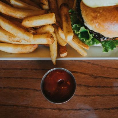
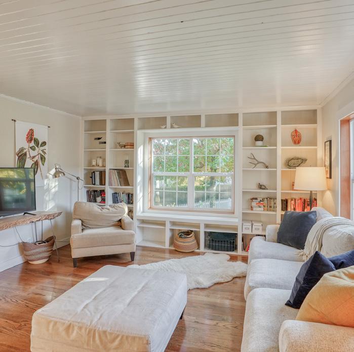
RESIDENTIAL PHOTOGRAPHY
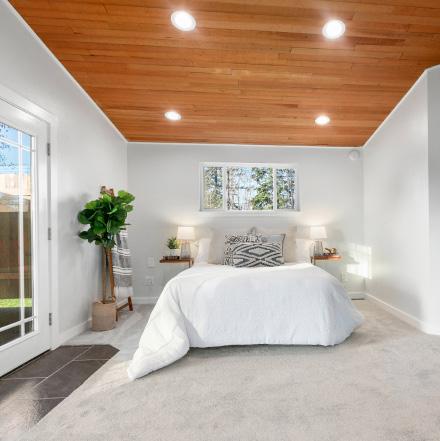
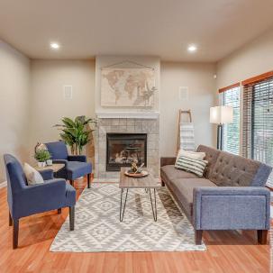

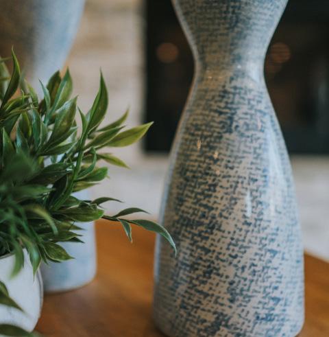
We pride ourselves in masterful storytelling.
blu.ink real estate works closely with Nicholas Graves Photography for all listing presentation imagery. Our pictures should be bright and well-presented, making each listing as desirable as it is unique.
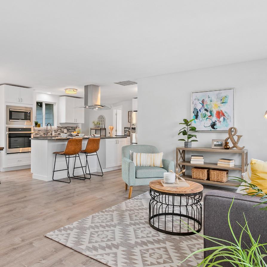
COMMERCIAL PHOTOGRAPHY
Commercial real estate is as much selling a feeling as it is a working piece of property. Even vacant buildings house a story and it’s our job to draw it out.
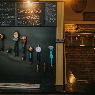
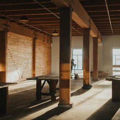
We combine typical listing imagery with lifestyle photojournalism and article exposes. Elle Cartier Photography has been our go-to inhouse person for these projects.

MATTERPORT TECHNOLOGY
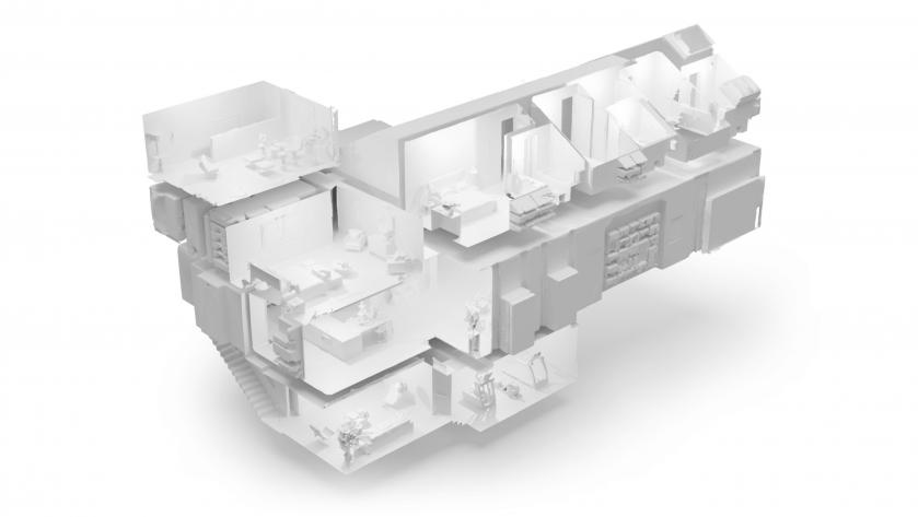
We also utilize Matterport camera technology in both side of our business. Offering a 3-D map of any listing to any interested party at the drop of a link.
While we currently don’t offer the equipment in-house, we have recommendations for photographers who are more than capable!
digital tours at your fingertips!
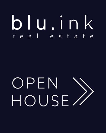
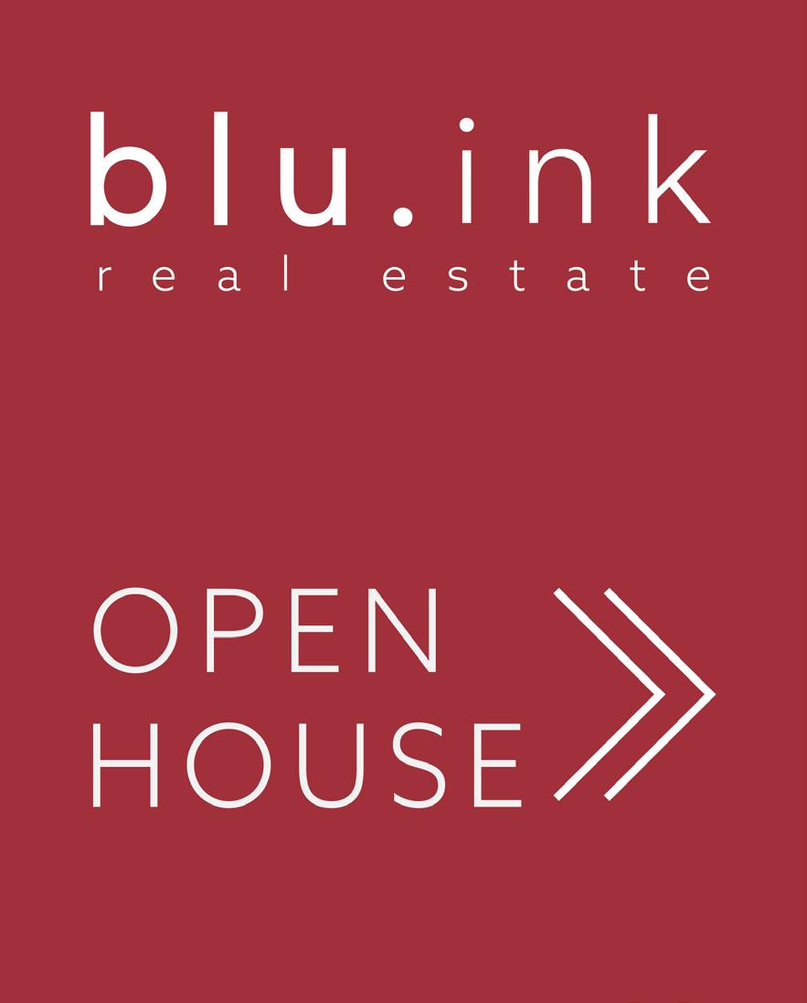
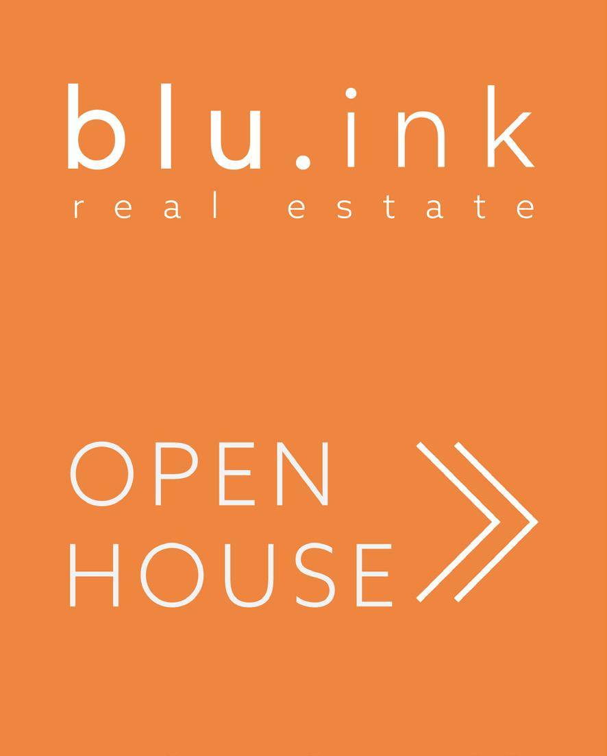
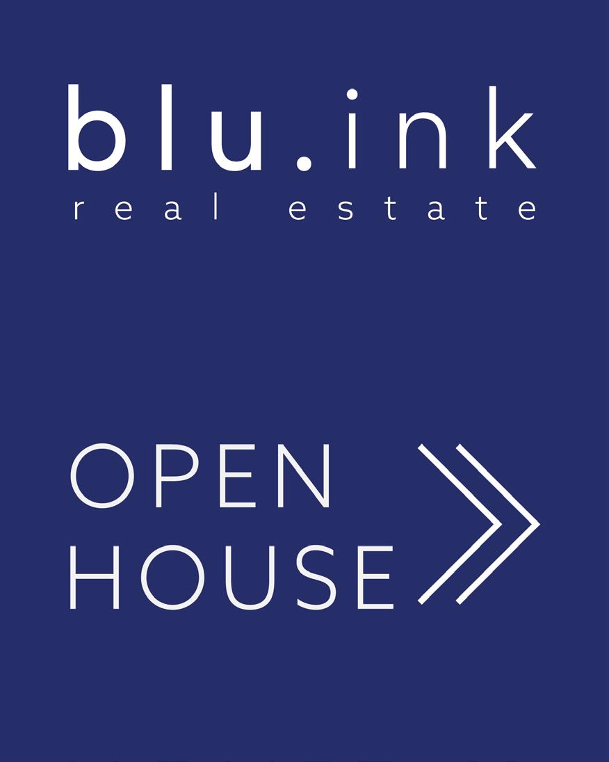
THE SIGN DESIGN
Our signs are designed to read much like a magazine cover. The idea being, one can swap the solid background for a dynamic image at any time and it would carry the same weight as our signs.
We have tested this theory and found it to work well when preparing covers for listing presentations, marketing, and more!
Our signs are meant to read much like a magazine cover. The idea being that one can swap the solid background for a dynamic image at any time and it would carry the same weight.

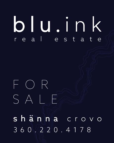
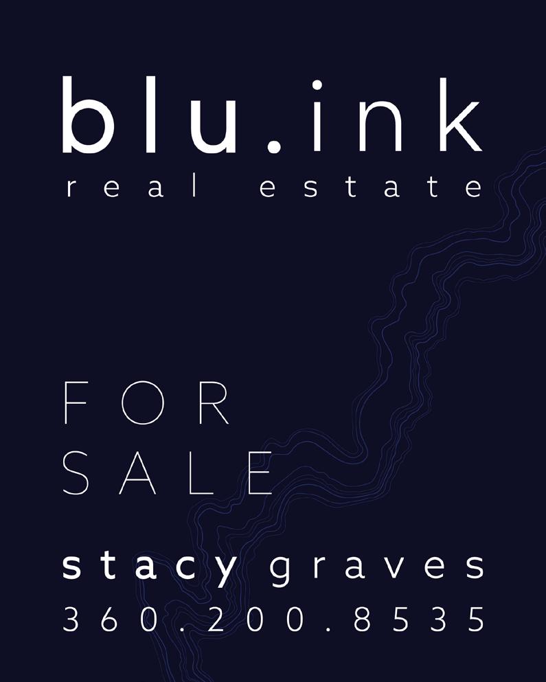 SIGN W/ RIDER OPEN HOUSE SANDWICH DIRECTIONALS
HAVE FUN WITH THEM!
Open house signs should be as exciting as prospecting for a new property, so we’ve designed a selection to reflect that! We highly encourage you to have fun with your listings, stagger your signs in different areas and draw potential buyers in a brand new way!
WE’RE SO GLAD TO HAVE YOU!
And we can’t wait to see how you make blu. ink your own.
Don’t hesitate to reach out to our Creative person, Elyssa, with any questions. She can be reached by email at marketing@blu.ink
Welcome to the company!