OUR STORY
THE STORY BEHIND OUR BRAND
Our credit union was founded in 1930 under the management of Eli Lilly to protect its employees from street lenders and loan sharks during the Great Depression. Since then, we’ve become a trusted partner for many organizations in Central Indiana and across the nation.
While our history spans nearly a century, our credit union created Elements as a brand in 2015. Over the years, we’ve evolved from our original name, Eli Lilly Credit Union, to the acronym Elfcu, and finally, Elements Financial on January 6, 2015.
In 2019, we solidified our name with a purpose statement: Empowering members to achieve financial success. This purpose is at the heart of our brand, and it shapes the way we engage with our members and communities around us.
As you explore our brand guidelines, you’ll learn how to interpret our brand’s voice, style, look, and feel. These principles keep the Elements Financial experience consistent and memorable. Thank you for being a part of our journey. Together, we’ll continue building a brand that leaves a lasting impact.
- The Elements Marketing & Communications Team
OUR VOICE
OUR PERSONALITY
Every business has a brand and personality, and ours is expressed through our words. We like to keep a consistent voice when interacting with members and partners to build trust and connection by using language that is:
Inclusive & Inviting:
We support members at every stage – no matter who they are.
Encouraging & Empowering:
We use words that give members the confidence they need to succeed.
Informative & Educational:
We are financial wellness experts who share practical tips and strategies for managing personal finances.
Everyone who banks with Elements should feel empowered to make well-informed financial decisions, and we’re here to provide the tools and resources to help. That’s why we do what we do – to make the journey toward financial success feel hopeful, achievable, and fulfilling!
BRAND PAIRINGS
At Elements, we are “Like a Bank, Only Better.” We reinforce this tagline through our 4 key themes and phrases
BETTER RATES. FEWER FEES. TRUSTED ADVICE. FRESH APPROACH.
Being a member at Elements means enjoying the best products and services with higher deposit rates, lower loan rates, and fewer fees. This claim is emphasized through our special perks like:
∙ Higher Deposit Rates and Lower Loan Rates than our top banking competitors
∙ No PMI on our First Time Homebuyer mortgage program
∙ No balance transfer fee, international transaction fee, or annual fee with our Signature Rewards Credit Card
Our credit union provides a platform for members to expand their financial literacy through state-ofthe-art technology. We meet members where they are with financial resources such as:
∙ Virtual Events & Community Workshops
∙ Social Media Content
∙ Financial Advice Article Library
∙ Better Money Podcast Episodes
∙ Complimentary Financial Reviews & Personalized Budget Management
phrases we call our Brand Pairings:
HIGH TECH. HUMAN TOUCH.
Elements is digitally focused on best-in-class online and mobile banking, which creates easy banking solutions for our members. Our financial tools and technology are backed by financial experts ready to provide tailored advice and education whenever, wherever, and however you need it.
∙ SavvyMoney Credit Score Program
∙ Personalized Budgeting Tools
∙ Banzai Financial Wellness Modules
RESPECTED LOCALLY. ACCESSED GLOBALLY
Since 1930, our credit union has been rooted in our community, and we are honored to be named the official credit union of several Indianapolisbased companies.
∙ Members in all 50 States and 50 Countries
∙ 90,000+ Surcharge-Free ATMs
∙ 5,000+ Shared Branches
∙ Nearly 1,000 Community Volunteer Hours Logged by Employees on our Annual Purpose Day
OUR STYLE
We’ve found that finances and grammar have much in common. Just as precision and consistency are crucial when managing money, they are equally important when it comes to grammar usage. Here’s how we stay consistent in our writing style at Elements.
Casing
Titles should always be capitalized, excluding conjunctions (of, or, and).
EX: The Benefits of Credit Cards
Numbers
Numbers should be written out numerically after one - ten.
EX: With our Signature Rewards Visa, you can get a $200 cash bonus and 0% Intro APR for six months on purchases and balance transfers. One benefit is the convenience of paying with a tap, swipe, or chip.
Dates, Times, and Locations
Dates – Day of the Week, Month Date, Year
EX: Thursday, September 5, 2024
Time – Hour am/pm
EX: 12:00 pm – 1:00 pm
Time Zones – EST, PST, etc.
EX: 2:00 pm EST
Punctuation
Commas = Clarity! Use the Oxford comma when needed.
EX: Our financial resources include advice articles, workshops, and free credit counseling.
Minimize the use of hyphens in names, when possible
EX: High-Yield Savings, High Yield Savings
Symbols and Abbreviations
Abbreviations are everywhere in banking! Here are the ones we use most often:
Acronyms: SEG (Select Employer Group), IRA (Individual Retirement Account), APY (Annual Percentage Yield), PIN (Personal Identification Number), APR (Annual Percentage Rate), HINT (High Interest Checking), HELOC (Home Equity Line of Credit)
Shortened Words: Info (Information), Auto (Automobile), Intro (Introductory)
OUR LOOK
OUR LOGO
Why “Elements”?
We wanted our look and feel to be original while still paying tribute to Eli Lilly and Company. Our name, “Elements,” symbolizes the 118 chemical elements found on the periodic table, giving a nod to Lilly’s scientific nature.
The Origin of the Cube
Just like our name, we chose to base our main brand colors on Eli Lilly’s recognizable brand colors. The Elements red, blue, and green were chosen to represent the elements of nature: fire, water/air, and earth. The cube, or hexagon, shape also reflects Eli Lilly, symbolizing three components of a molecule schematic.
LOGO VARIATIONS
The Elements logo is available in these approved variations. We prioritize using our full-color logos with “FINANCIAL” in black on light backgrounds and white on dark backgrounds. In cases where the background intereferes with full-color logo legibility, we have the option of using a one-color version.
Any alterations to the logo must be created in partnership with the MarCom team.


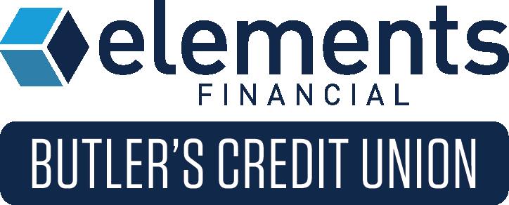
In limited cases, Elements MarCom will work with special partners in the community, such as the Indianapolis Indians and Butler University, to create co-branding. Examples of that are shown here:
Indianapolis Indians Use Only
State of Indiana Use Only
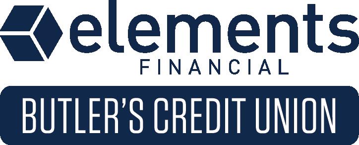
University Use Only
COLOR PALETTE
COLOR HIERARCHY
TYPOGRAPHY
Our typeface is an important part of our brand identity. Typography is more than using the correct font; it’s about the overall appearance of the text.
Our primary brand typeface is DIN OT. Like our name, brand colors, and logo, we chose this typeface to honor our founding company, Eli Lilly. The font family offers two styles, Regular and Condensed, that we use interchangeably, but only one style is used at a time to maintain consistency.
Headers: Bold/Condensed Bold
Subheaders & Copy: Regular/Condensed Regular + Medium/Condensed Medium for emphasis
Rates & Offers: Bold/Condensed Bold
Calls-to-Action (CTAs): Medium/Condensed Medium
Disclosures: Condensed Regular + Condensed Bold for emphasis
Informative Documents: Regular with Bold Headlines
Social Media Graphics: Black/Condensed Black
Presentation Slides: DIN OT family (Black, Bold, Medium, Regular)
Figma Emails & Newsletters: Bold Arial for headlines, Arial for copy
If DIN OT is unavailable, Calibri is a great substitute and is very close to our brand typeface.
DIN OT - Black
ABCDEFGHIJKLMN
OPQRSTUVWXYZ
abcdefghijklmn opqrstuvwxyz
ABCDEFGHIJKLMN
OPQRSTUVWXYZ
abcdefghijklmn opqrstuvwxyz
DIN OT - Condensed Black
ABCDEFGHIJKLMN
OPQRSTUVWXYZ
abcdefghijklmn opqrstuvwxyz
ABCDEFGHIJKLMN OPQRSTUVWXYZ abcdefghijklmn opqrstuvwxyz
DIN OT - Bold
ABCDEFGHIJKLMN
OPQRSTUVWXYZ
abcdefghijklmn opqrstuvwxyz
ABCDEFGHIJKLMN OPQRSTUVWXYZ
abcdefghijklmn opqrstuvwxyz
DIN OT - Condensed Bold
ABCDEFGHIJKLMN
OPQRSTUVWXYZ
abcdefghijklmn opqrstuvwxyz
ABCDEFGHIJKLMN OPQRSTUVWXYZ abcdefghijklmn opqrstuvwxyz
DIN OT - Medium
ABCDEFGHIJKLMN OPQRSTUVWXYZ
abcdefghijklmn opqrstuvwxyz
ABCDEFGHIJKLMN OPQRSTUVWXYZ
abcdefghijklmn opqrstuvwxyz
DIN OT - Condensed Medium
ABCDEFGHIJKLMN OPQRSTUVWXYZ
abcdefghijklmn opqrstuvwxyz
ABCDEFGHIJKLMN OPQRSTUVWXYZ abcdefghijklmn opqrstuvwxyz
DIN OT - Regular
ABCDEFGHIJKLMN OPQRSTUVWXYZ abcdefghijklmn opqrstuvwxyz
ABCDEFGHIJKLMN OPQRSTUVWXYZ abcdefghijklmn opqrstuvwxyz
DIN OT - Condensed Regular
ABCDEFGHIJKLMN OPQRSTUVWXYZ abcdefghijklmn opqrstuvwxyz
ABCDEFGHIJKLMN OPQRSTUVWXYZ abcdefghijklmn opqrstuvwxyz
STOCK PHOTOGRAPHY
As you look at our photo selections, you’ll notice the subjects are focused on everyday experiences in which our members might see themselves using our products and services.
While all the photos below match the style you typically see within an Elements advertisement, the choices on the right are specifically “non-camera aware.” This means the subjects of the photo are engaging in the scene with one another, and not directly with the camera. It comes across more authentic and invites viewers to picture themselves in the situations.


BRANDED PHOTOGRAPHY
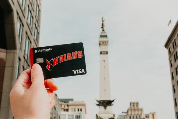
Branded imagery gives us customization, adding real products and people using our services. Plus, we are able to show diversity through:
Age | Gender | Race | Family Makeup | Outfits | Location | Small Businesses | Community Settings
We are also intentional about any screenshots appearing in the imagery, ensuring they represent attainable goals for our members, such as an average credit score.



CREATIVE STRATEGY - PROMOTIONS
Our promotions highlight offers per the Marketing Calendar and are communicated through a variety of channels including in-branch marketing, social media, BD handouts, digital ads, online banking graphics, eNewsletter mentions, direct email, and more.
They tell a story and look to elicit a feeling from our members. We often ask ourselves:
∙ What kind of person would benefit from this product or service?
∙ Can the person envision themselves using the product or service?
∙ Would the target audience relate to the look and sound of the promo?
∙ Have we highlighted a diverse group across the concurrently running promos?
Our promotions typically begin with a poster, then are expanded to include other marketing assets. These advertisements typically include: Bento Grid Design Style, Relevant Imagery, Brand Colors, Seasonal Colors, or Colors Complimentary to Image, Specific Call to Action Boxes, Pattern Related to Theme or Photo, Accompanying Statistic (when possible)
When developing our headers and subheaders, we consider using the following:
∙ Branded words ∙ Phrases or pairings ∙ Rhyming
∙ Alliteration ∙ Action words ∙ Product-related themes


CREATIVE STRATEGY - SOCIAL MEDIA
Social media is more than just a marketing tool. We use it to inform, engage, and empower, while showcasing the human elements that make our brand unique. You can find us on Facebook, Instagram, LinkedIn, X (formerly Twitter), Glassdoor, and Indeed. We use a mix of organic content, paid boosted posts to reach a targeted audience via Meta, and digital paid ads strategically placed on Google, YouTube, audio streaming platforms, and podcasts.
What We Share:
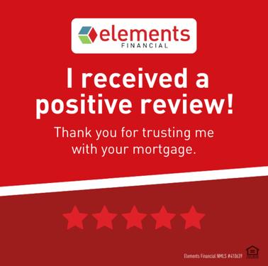
∙ Promotions: We present our financial products and promotions through an educational tone, so followers understand the benefits of the product.
∙ Financial Education & Quick Advice Videos: We offer timely, digestible tips through advice articles, quick videos, and podcast content—especially around fraud prevention and smart money habits.
∙ Giveaways: From tickets to local events to gift cards from businesses we love, giveaways help us reward our followers and reach potential new members.
∙ Human Elements: We spotlight exceptional employees through engaging stories that put real faces to our brand, highlighting the passion and dedication behind the work we do.
∙ Community Impact: Updates that showcase how we give back—through financial education workshops, community partnerships, and hands-on volunteerism that reflects our values in action.


OUR FEEL
OUR PURPOSE
Our purpose is to "empower members to achieve financial success," and it defines why we're here. Sure, we offer checking and savings products, credit cards, loans, and investments. Yet, as a credit union, profits are returned to our members in the form of higher deposit rates, lower loan rates, and fewer fees. Because our goal is to improve the financial lives of our member-owners, we provide personal attention and financial wellness education, such as various events with our partner companies and community. To stay focused on this purpose, we look to our Strategic Themes:


OPERATIONAL EXCELLENCE
ORGANIZATIONAL HEALTH
MEMBER EXPERIENCE
OUR APPROACH
At Elements, our approach to Marketing & Communications is grounded in a simple but powerful equation: Culture + Brand = Reputation.
Our Purpose Statement drives our culture and brand: Empowering members to achieve financial success. As a credit union, we provide the necessary tools, resources, and education for our members to achieve the financial goals that matter most to them.
Our Culture impacts how we show up to work daily as we build relationships with other employees, our members, and the community.
Our Brand allows our business to remain true and consistent in our approach through our look, our voice, and the overall experience our employees create.
When culture and brand align, they create our Reputation—what people feel and believe about Elements. Our reputation evolves from every supportive interaction we have, every competitive product and service we offer, and every financial goal our members achieve.
DIVERSITY IN ADVERTISING POSITION STATEMENT
Our marketing model meets people where they are, no matter who they are. Specifically within our imagery, we aim to reflect diversity in race, ethnicity, age, sexual orientation, gender identity, and disabilities to accurately portray the communities in which we serve. Our members, including our own employees, should recognize themselves in our ads and feel that our brand is welcoming, inviting, inclusive, warm, and friendly while also offering the valuable benefits of:
∙ Better Rates. Fewer Fees.
∙ High Tech. Human Touch.
∙ Respected Locally. Accessed Globally
∙ Trusted Advice. Fresh Approach.
The Marketing Team at Elements Financial seeks to create content, both verbal and visual, to which our audiences can identify. One of the most effective marketing methods is relatability. Market research finds that consumers will not support brands that lack representation, on the basis of race, gender, and sexual identification. The team behind Elements Marketing understands and supports this power of choice and takes it into account with the daily decisions we make related to our work.
Ultimately, our department is here to create an empowering brand environment for members, employees, and the community at large.

