2024PORTFOLIO.
Elaina Eland
Elaina Eland
Hi! I’m Elaina Eland, a web and graphic design student at Johnson & Wales University, set to graduate in 2025. My passion for creativity began in childhood, where I explored everything from painting with acrylics to crafting weatherproof stickers and vinyl decals.
Originally a computer science major, I discovered my true calling in design and transitioned to Johnson & Wales’ graphic design program. Now, six semesters in, I’m honing my skills and growing every day as a designer.
I hope you enjoy exploring my portfolio and seeing my journey through creativity and design!
Email: elainaelanddesign@gmail.com
Website: elainaeland.com
LinkedIn: @elainaeland
Dribbble: @elainaeland
Instagram: @elainaelanddesign
scan me to see my website!
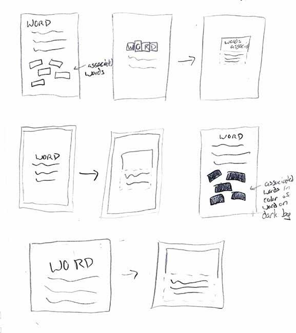
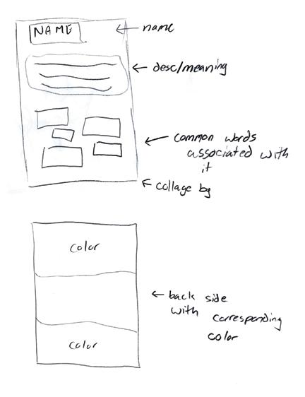
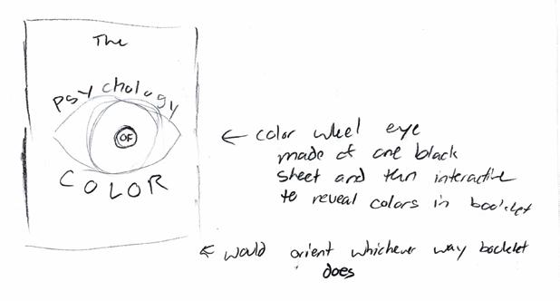
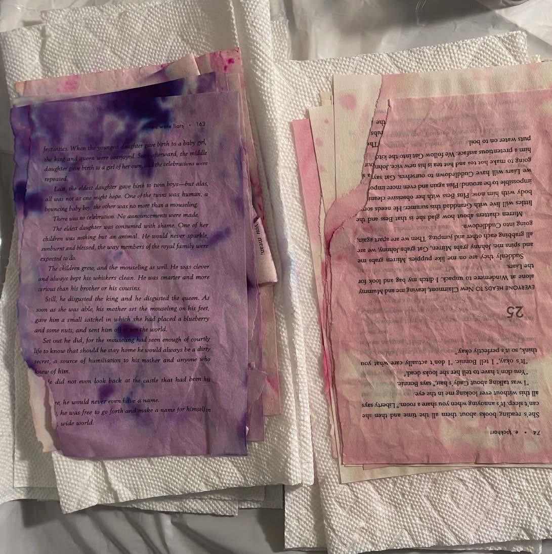
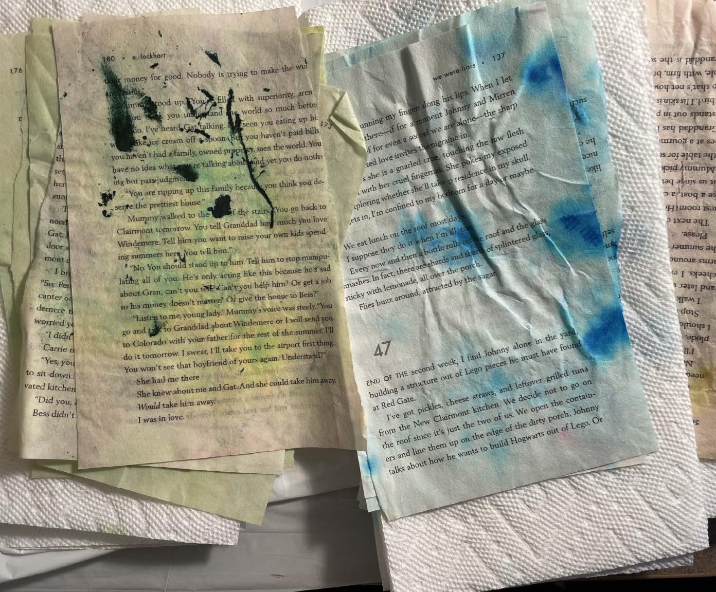
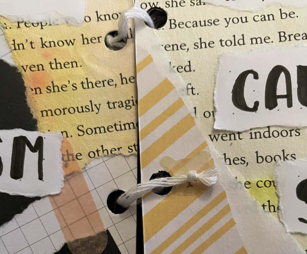
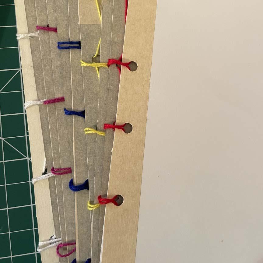
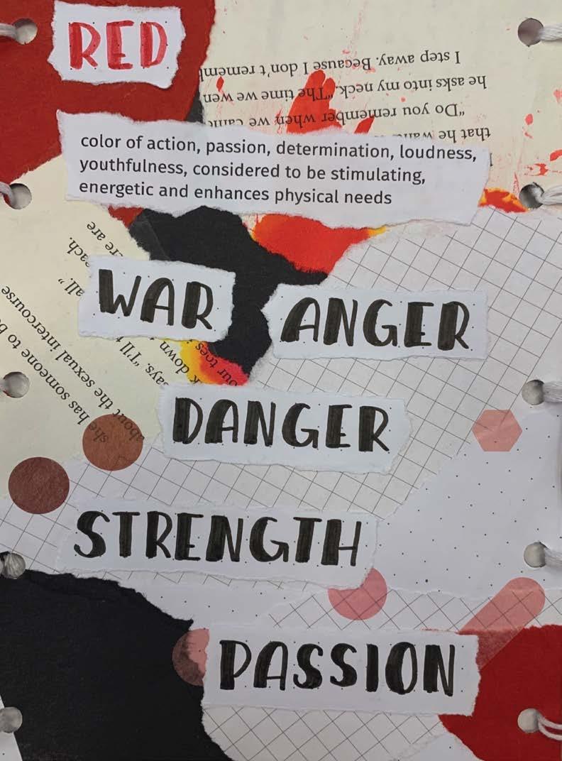
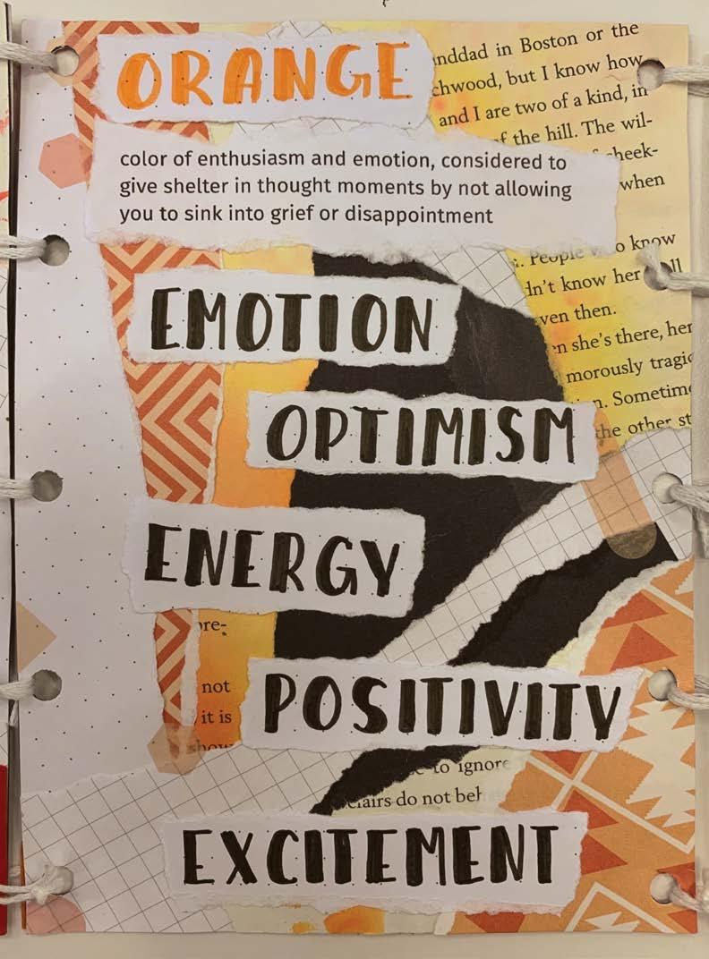
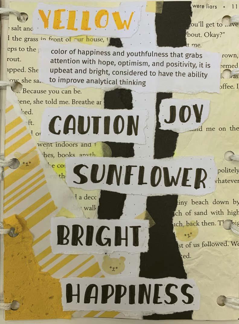
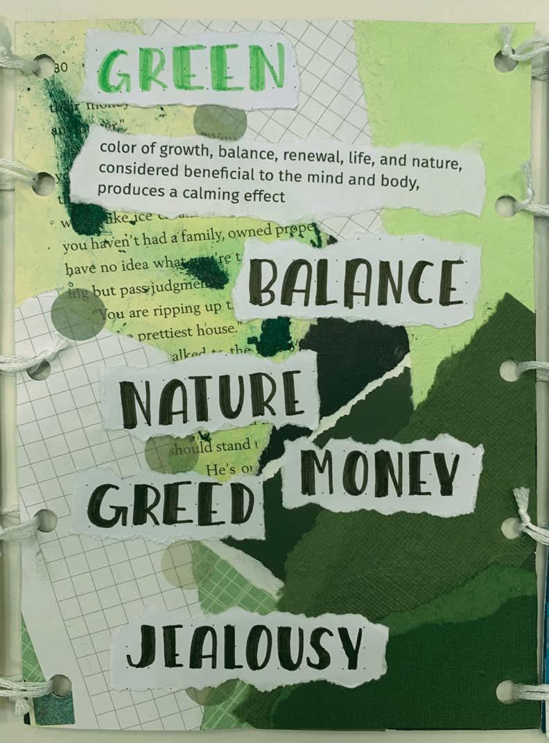
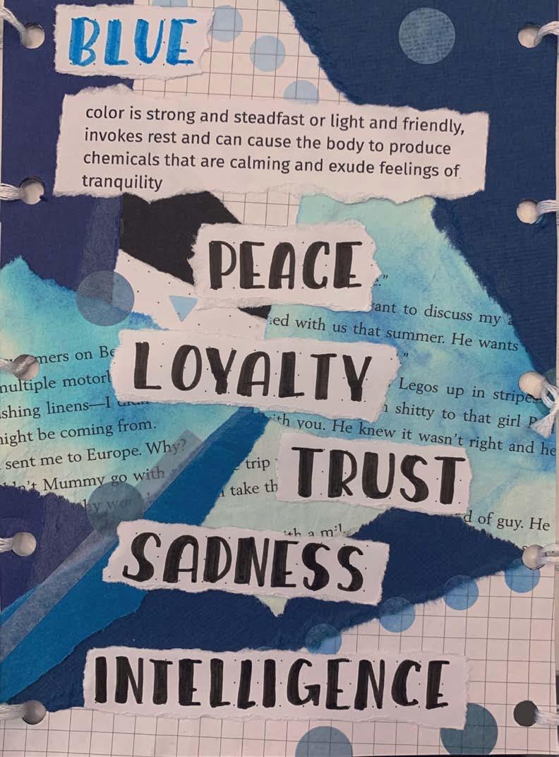
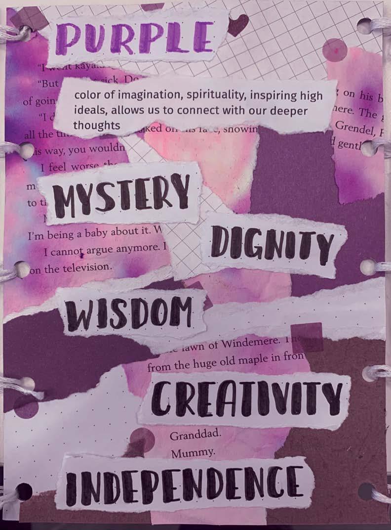
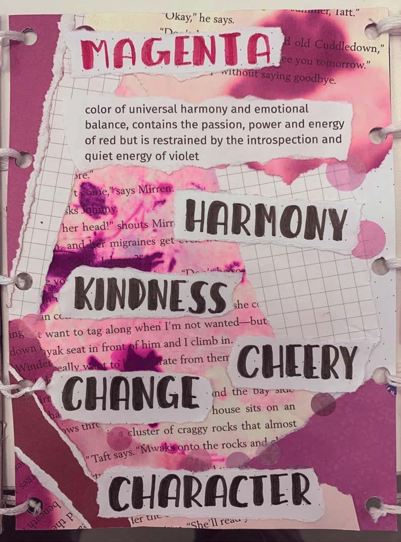
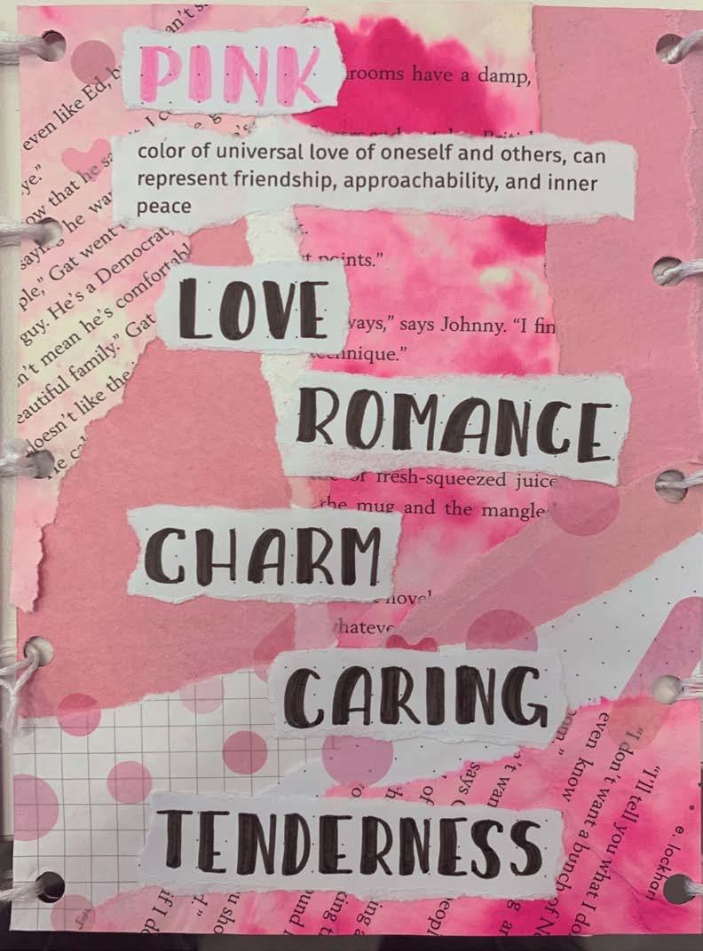
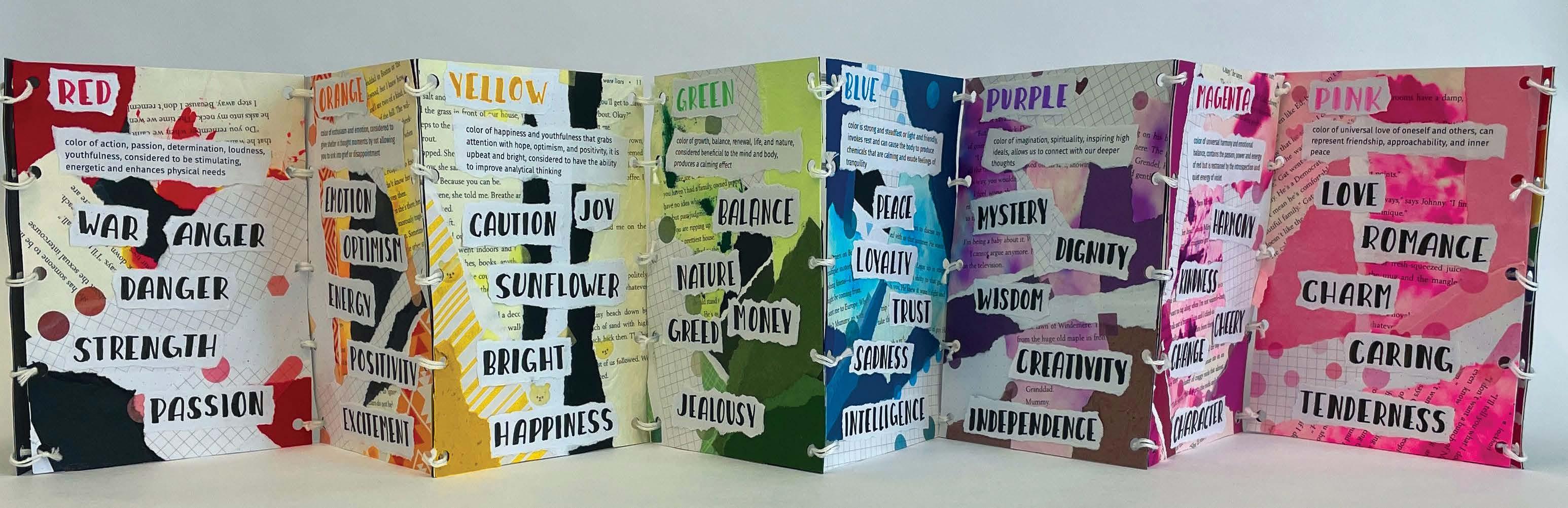
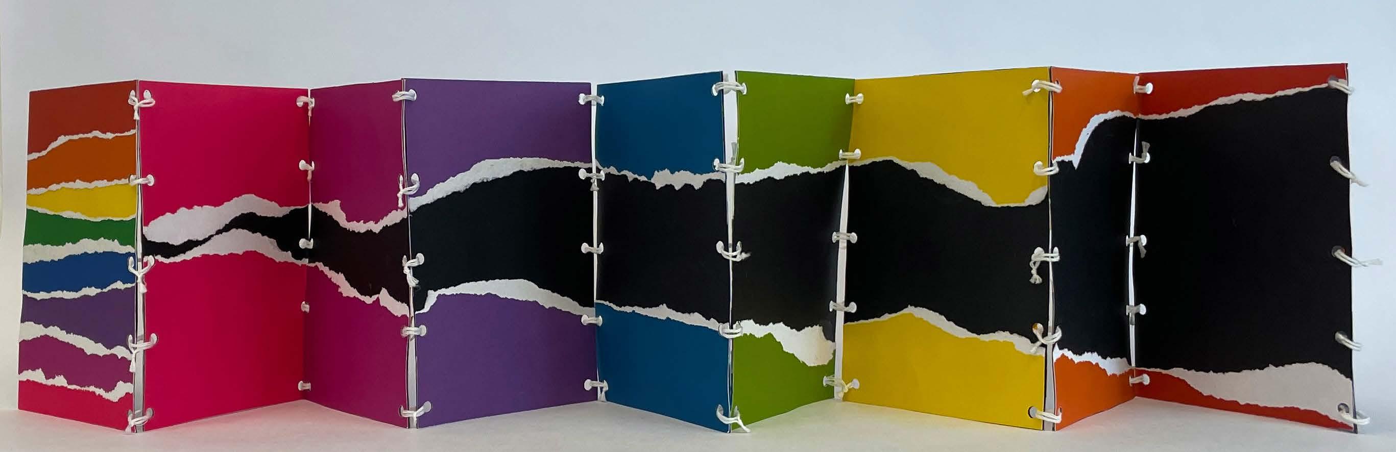
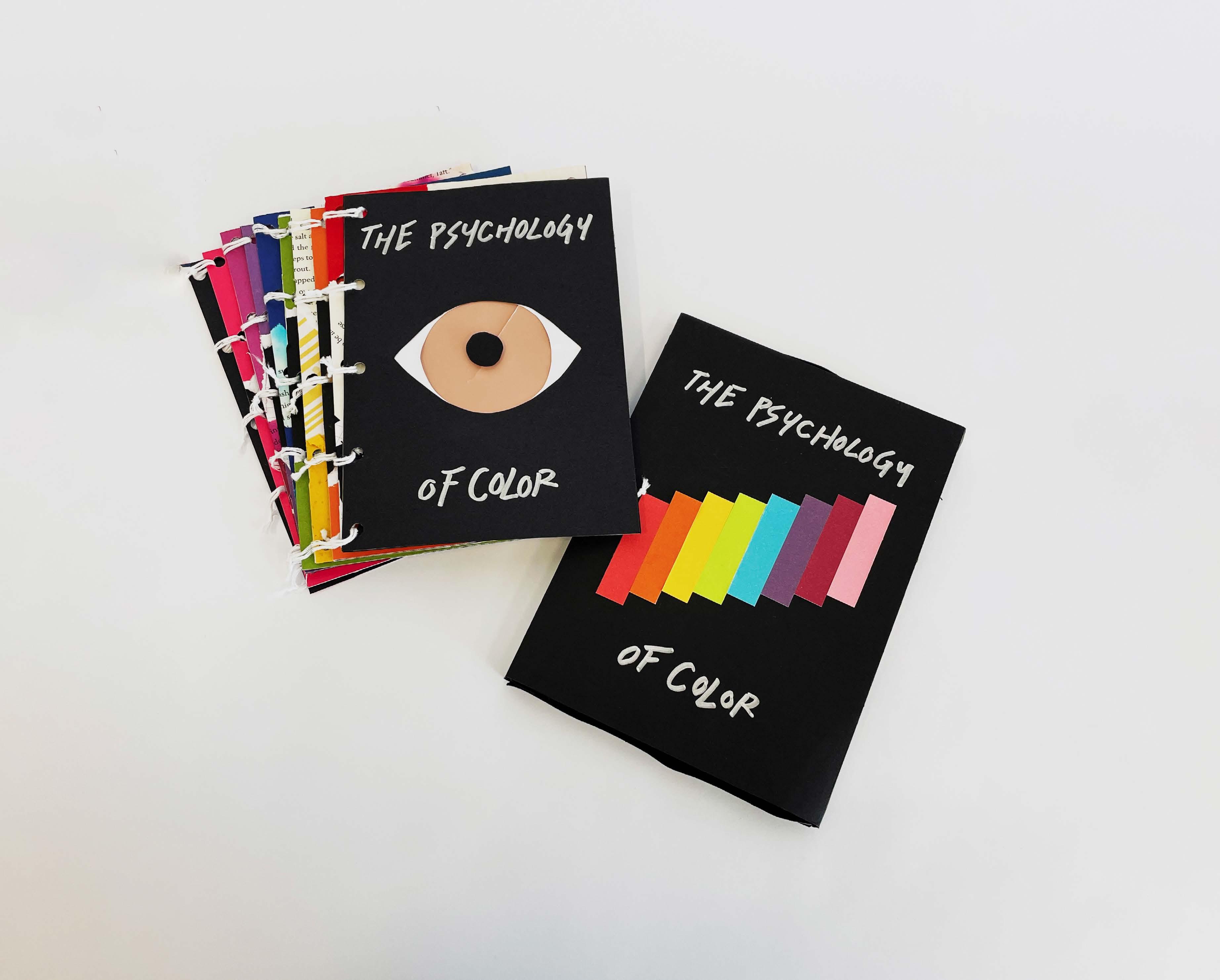
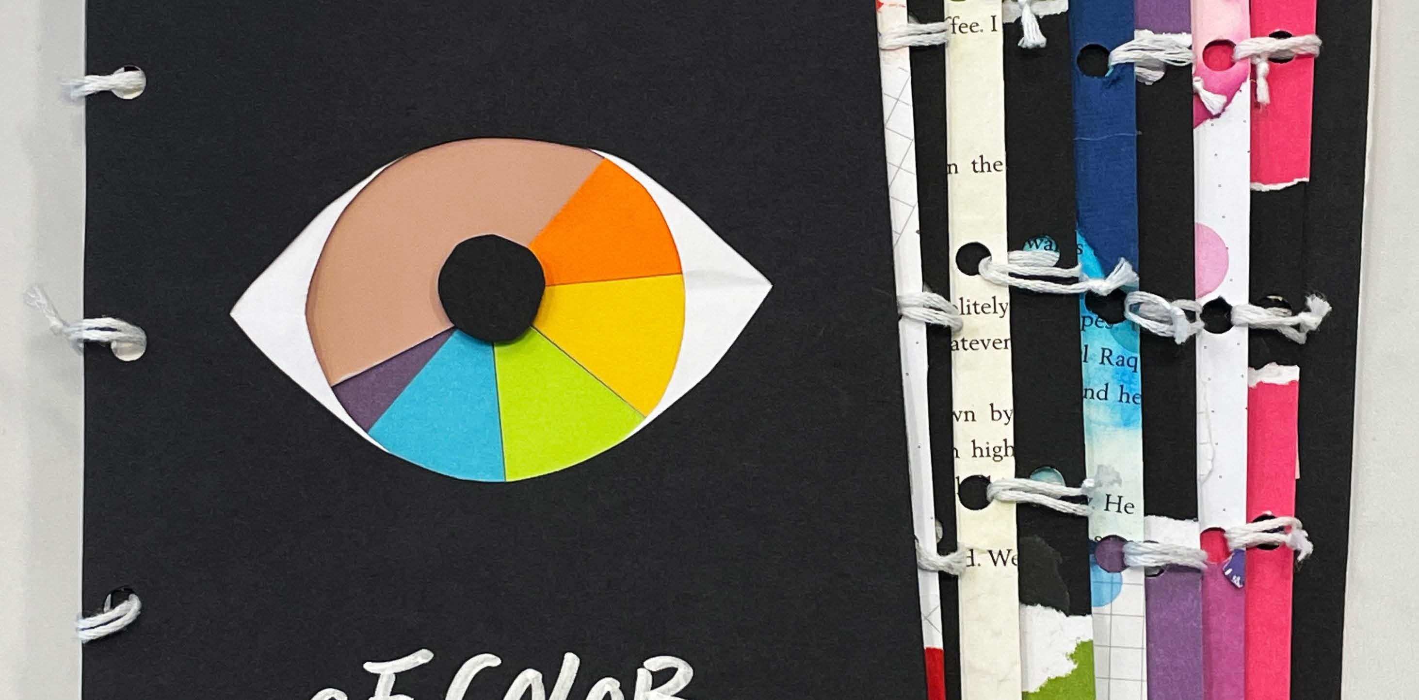
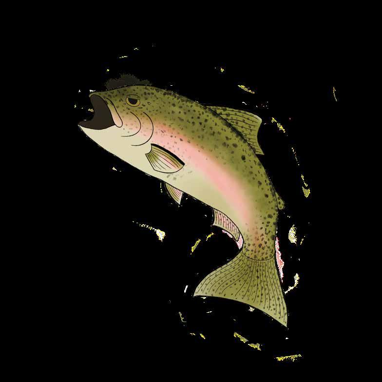
representing the psychology behind colors in a handmade accordion book
Design and handcraft an accordion-style booklet with a custom box to hold it. The theme of the booklet would be the psychology of color. The project required unique materials, construction properties, had to be entirely handcrafted and non-digital design, mixed media, typography, and the elements and principles of design.
After researching colors, the Psychology of Color booklet, was created. Each page contained a collage themed around a color using materials such as book pages, stickers, handwritten typography, and scrap paper.
The full handcrafted booklet was designed and produced under the name, The Psychology of Color. The project showcased my skill to use non-digital items and techniques.
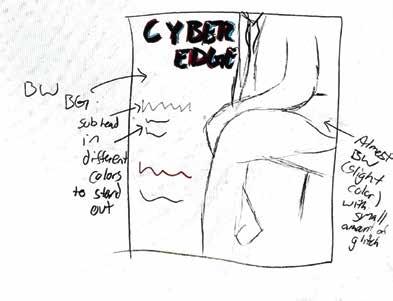
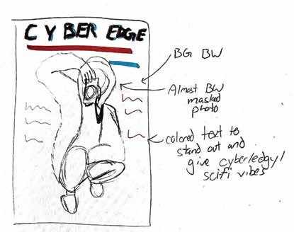
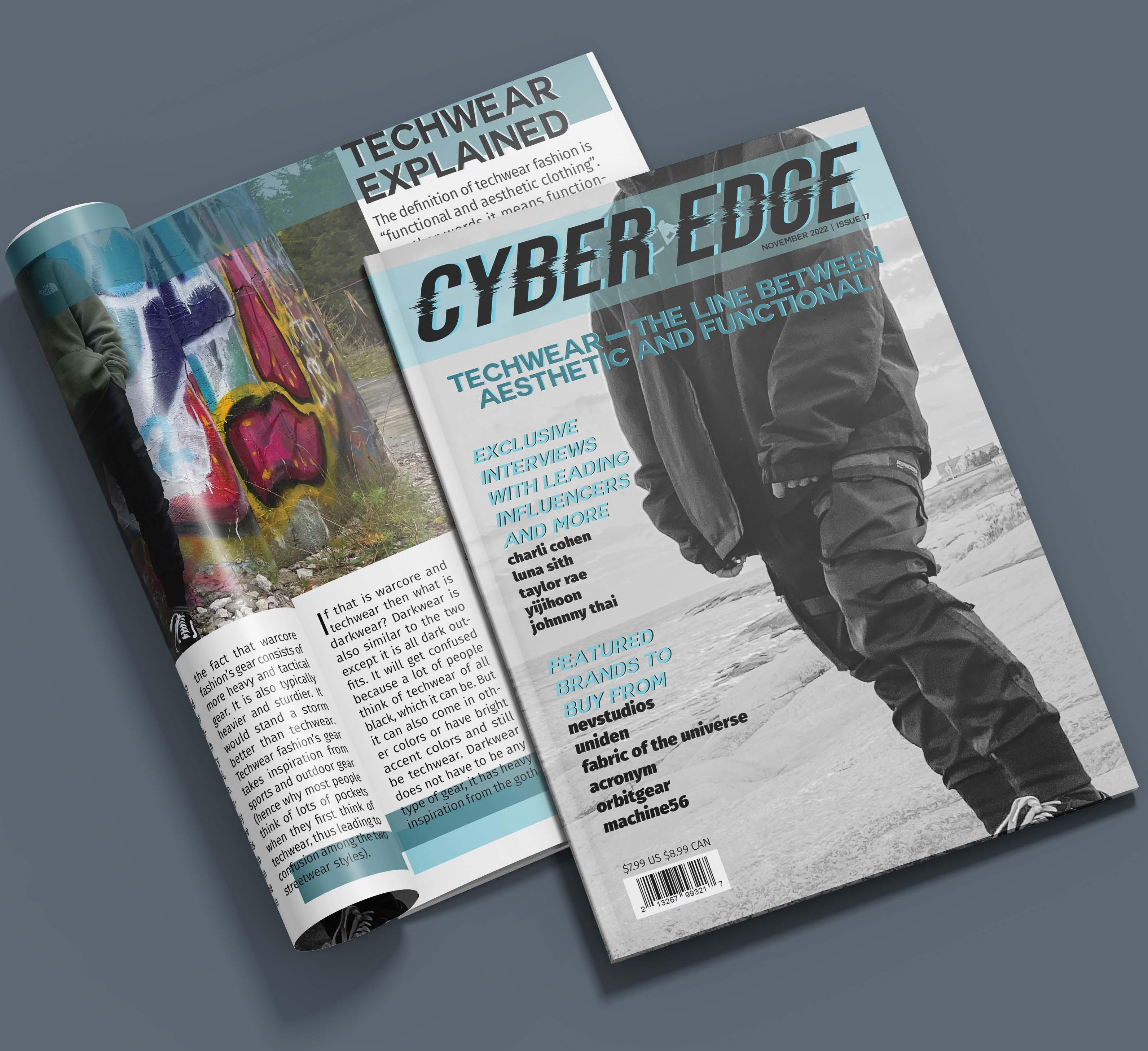
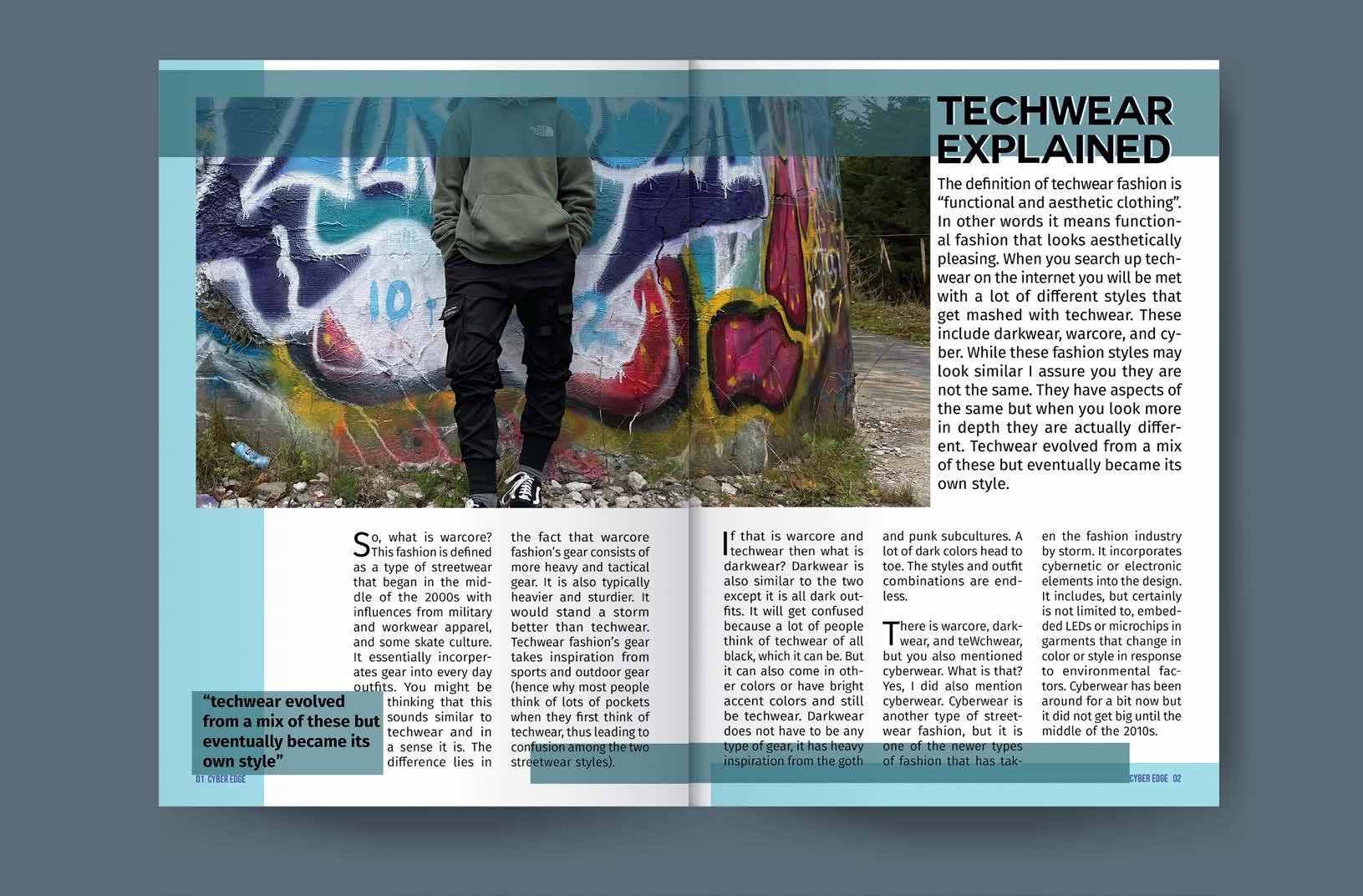
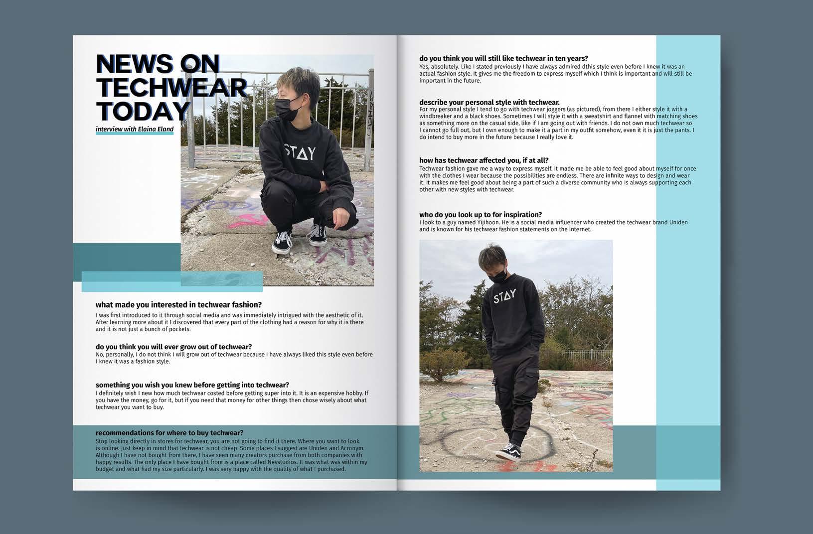
designing a publication for techwear; aesthetics meet functionality within the clothing industry
Plan, develop, layout and create content for a fictitious mini magazine. The magazine features a double-page spread article, an interview, creative piece and two print advertisements.
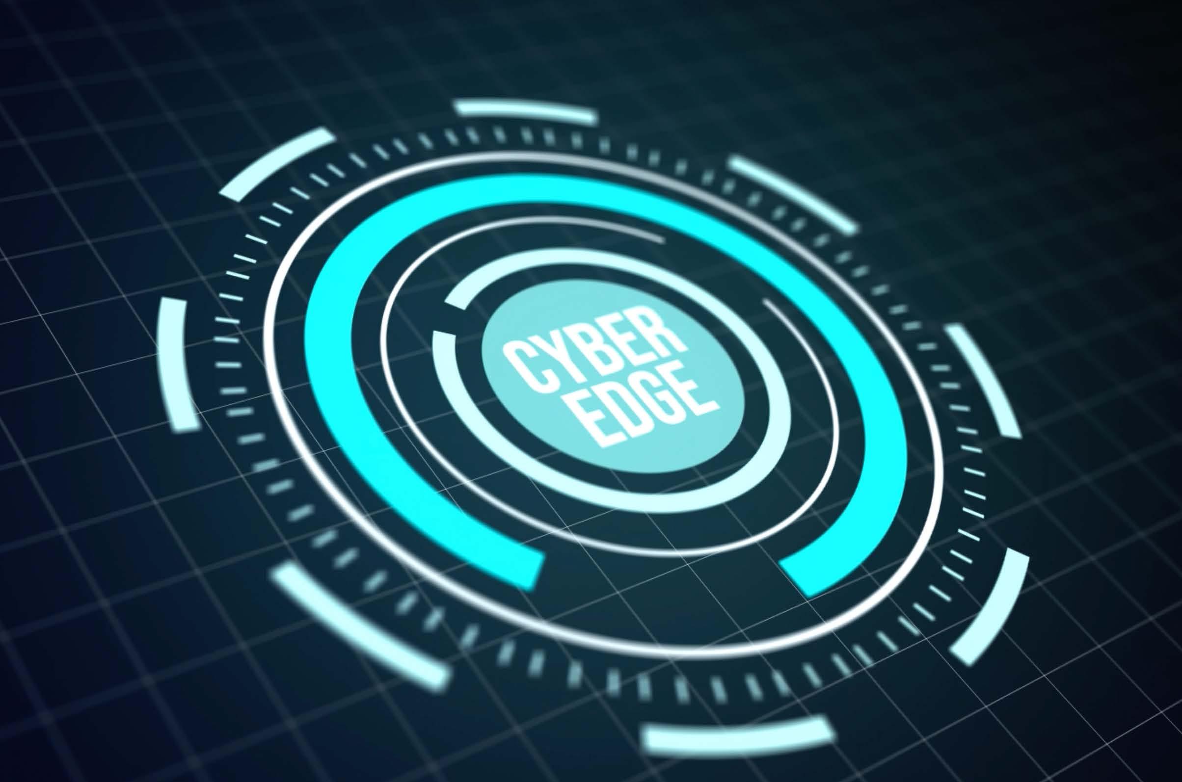
Based on research and inspiration, Cyber Edge, a techwear fashion publication was born. An exploration of typography, layout, and editorial design combined with my personal interest in techwear fashion brought this idea to life.
A digital and printed, constructed 8-page, full-color mini magazine that was later on expanded to include an animated logo showcasing my skill with motion graphics and standing out among the other static magazines.
Know-how: Adobe Illustrator, Adobe Photoshop, Adobe InDesign, Adobe Lightroom, and Adobe After Effects
OBJECTIVE
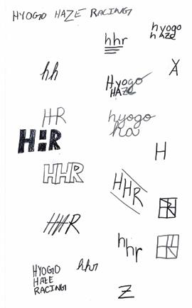
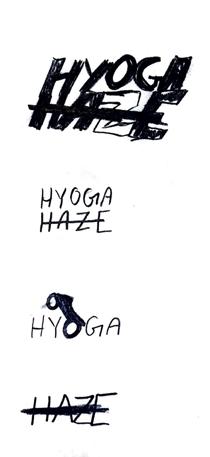
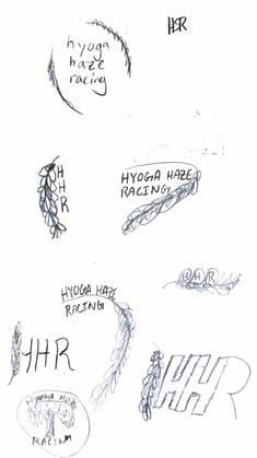
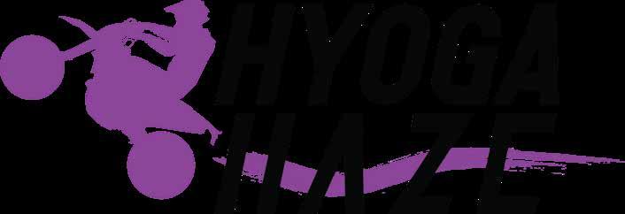
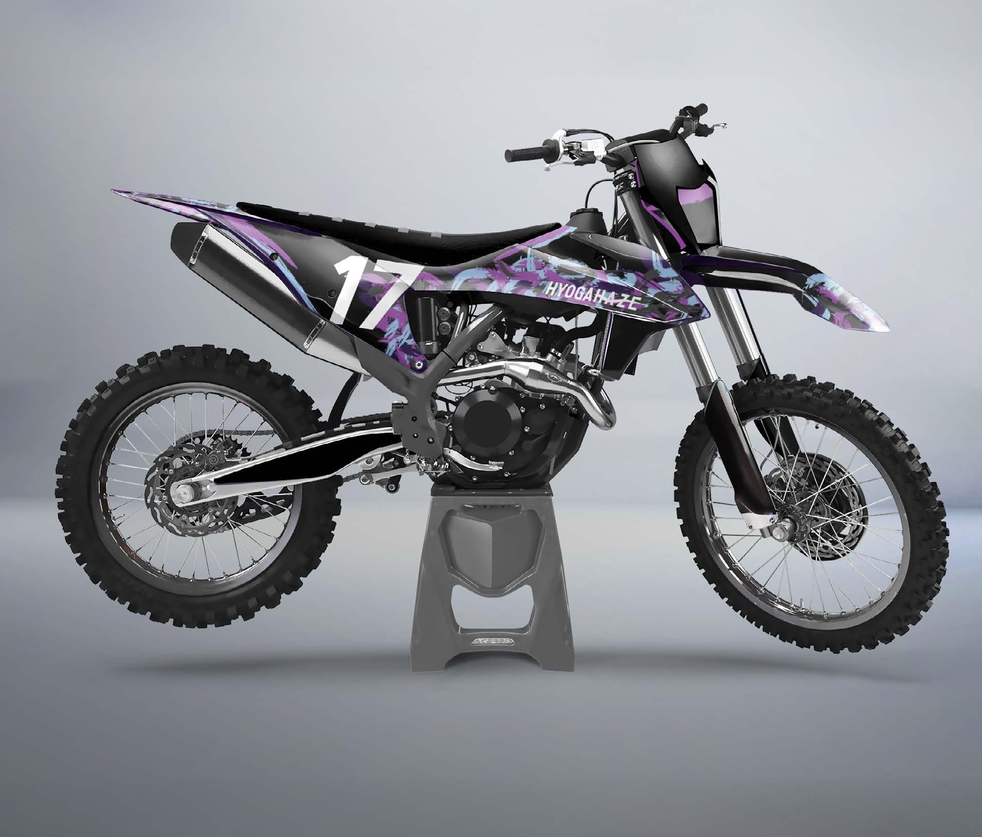
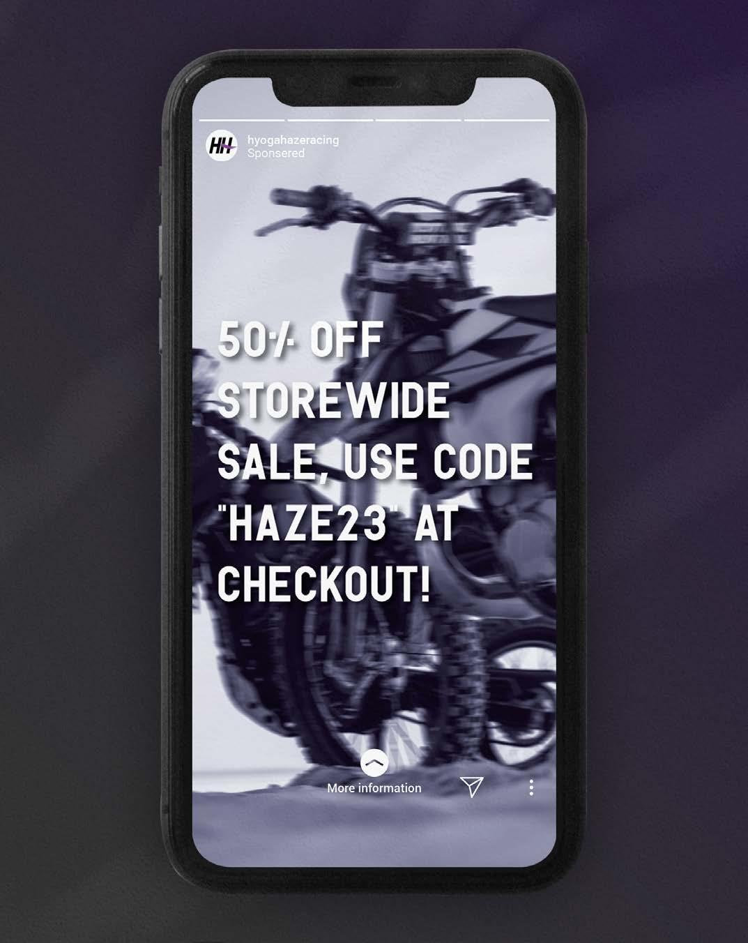
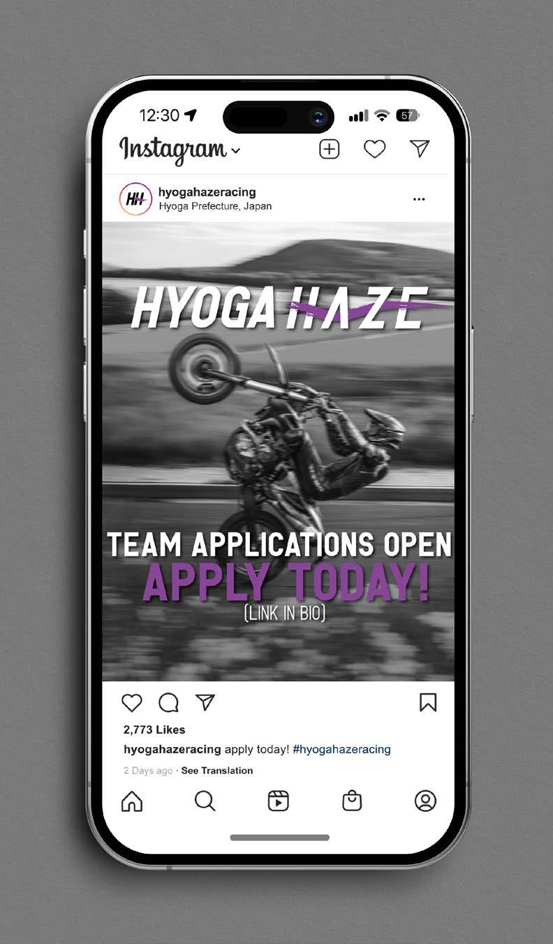
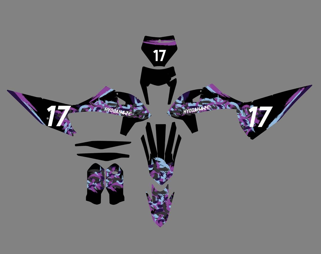
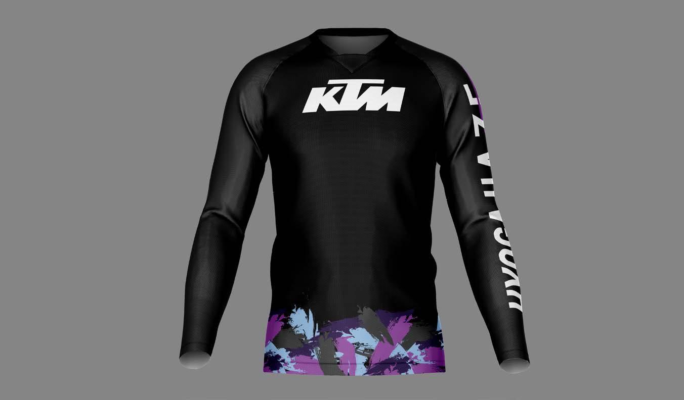
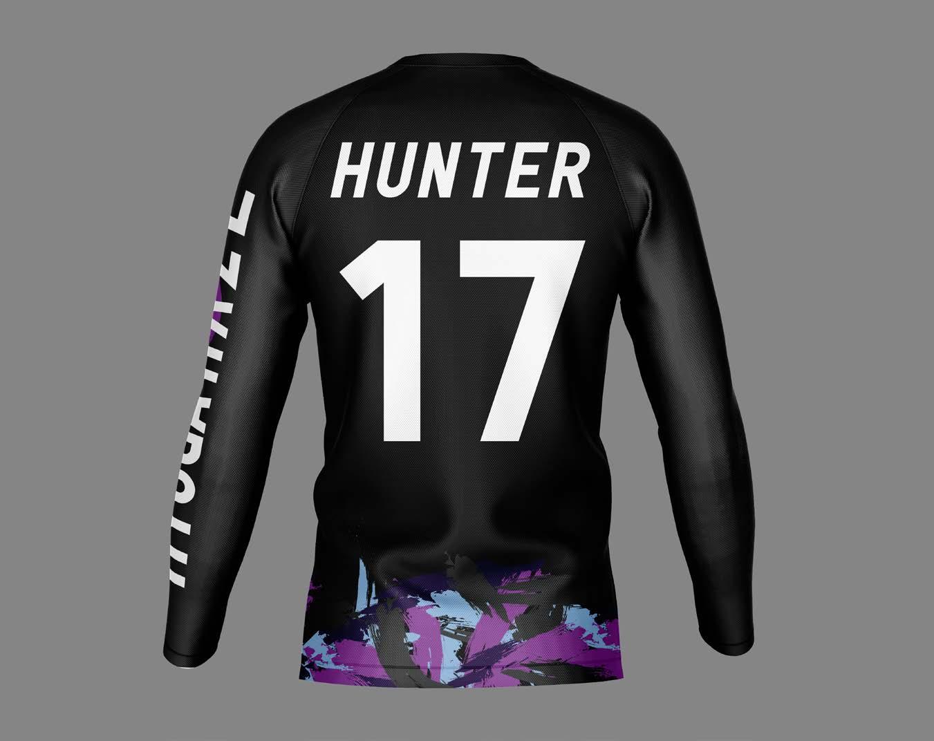
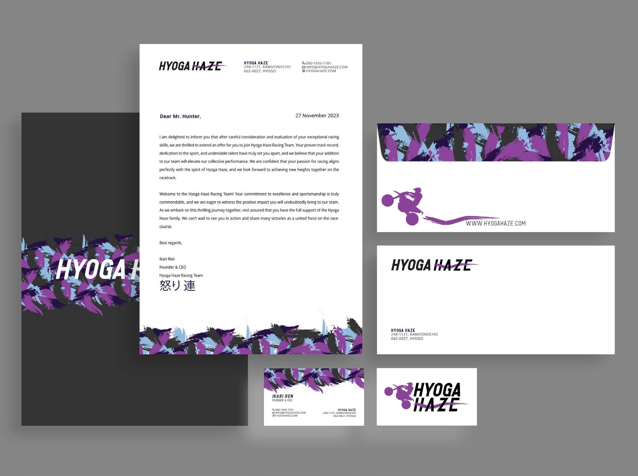
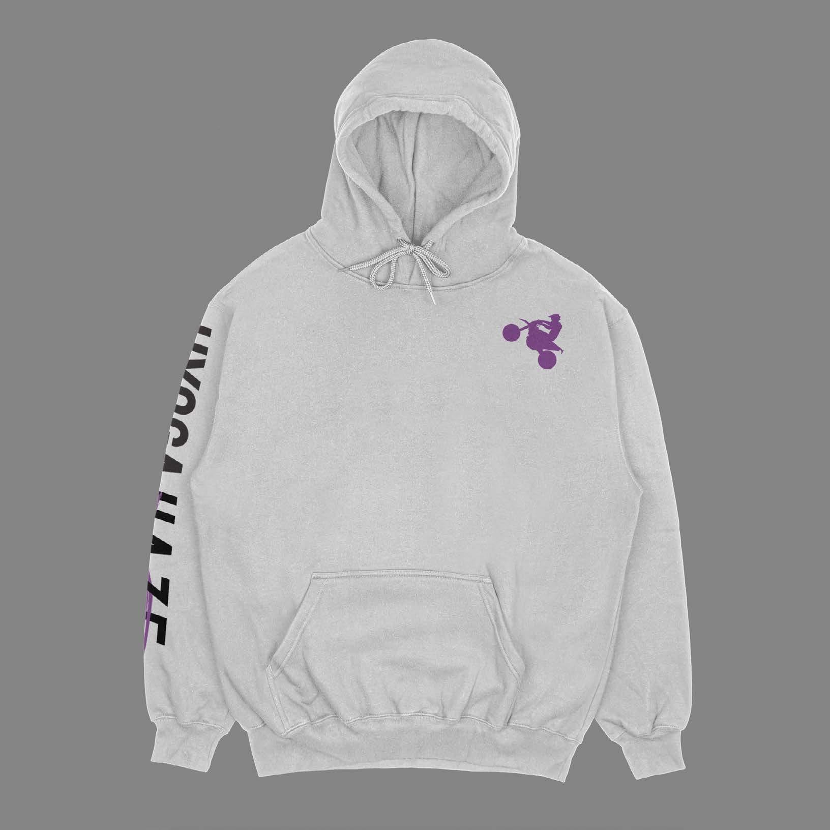
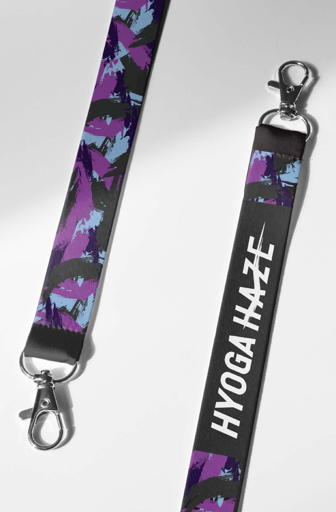
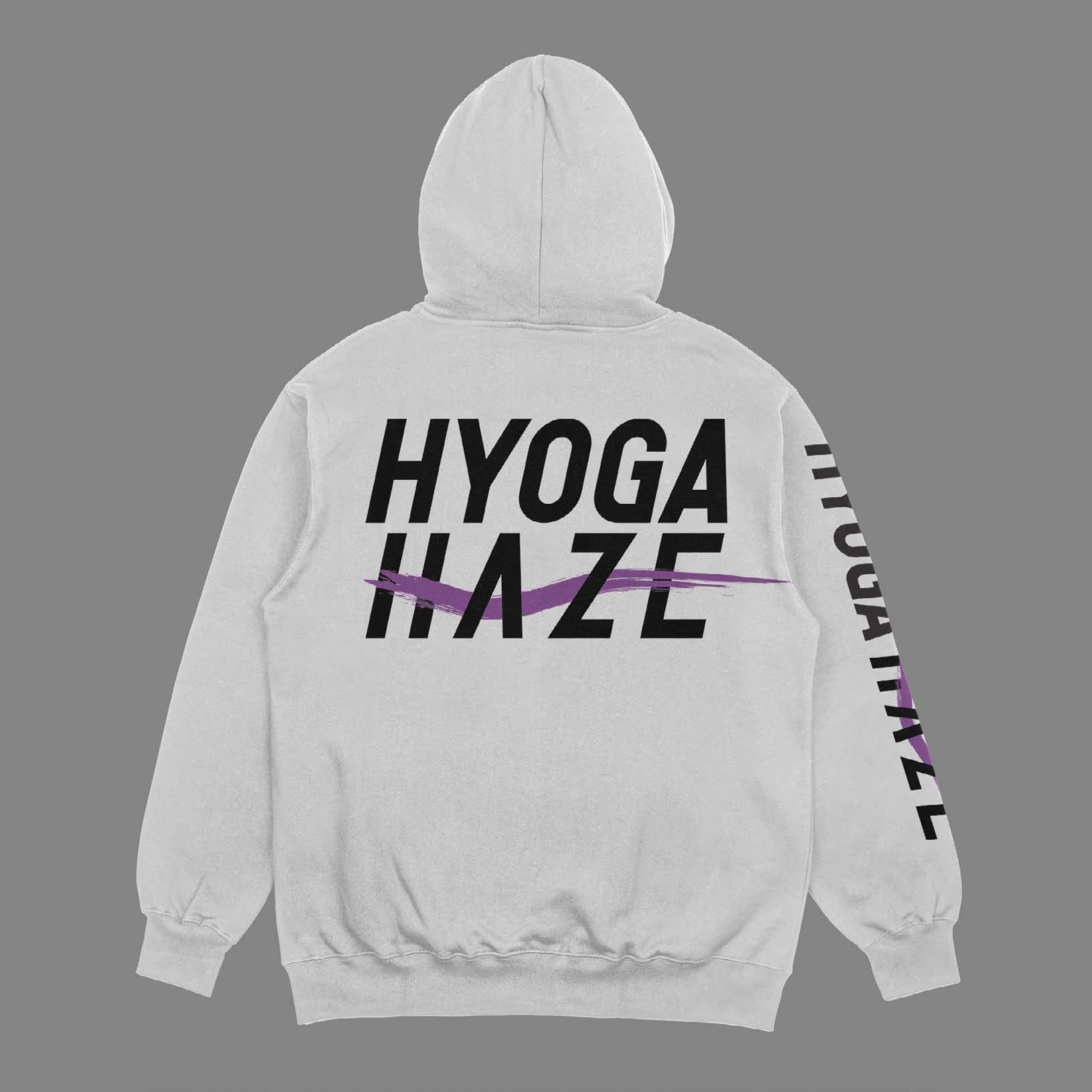
Create a brand of a fictitious company of our choice. In the end the brand must have a full brand, a vehicle wrap, a uniform, brand identity package, and merchandise.
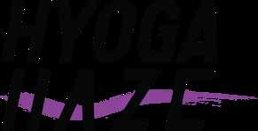
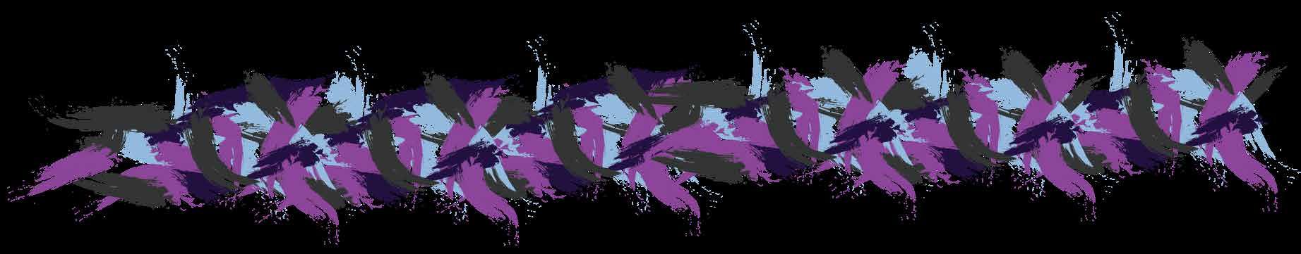
I decided to dive uncharted territory and create a motocross racing company called Hyoga Haze. After researching motocross companies, bike brands, and motocross events Hyoga Haze was ready to be put in action.
A fully branded Hyoga Haze was designed and produced.
Know-how: Adobe Illustrator, Adobe Photoshop, and Adobe InDesign

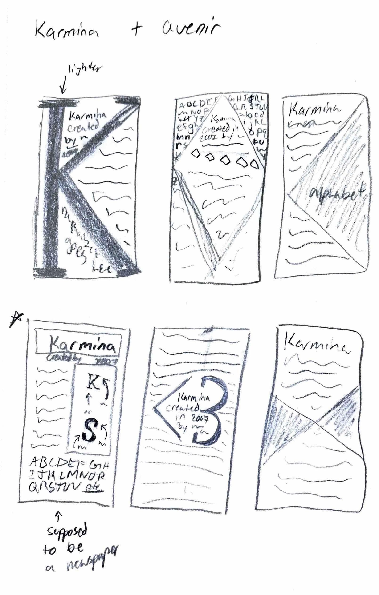
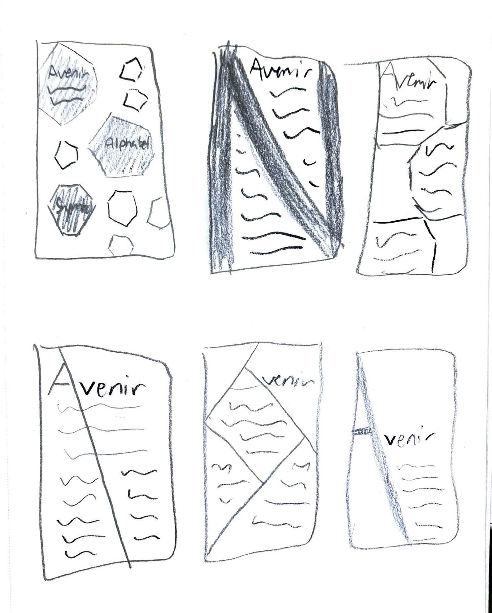
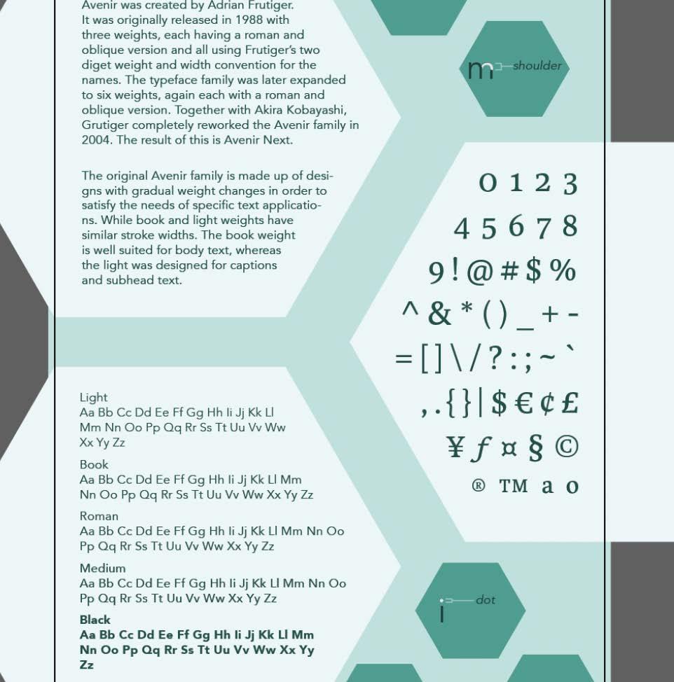
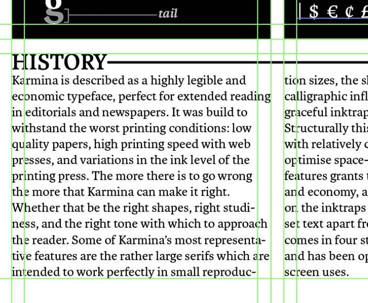
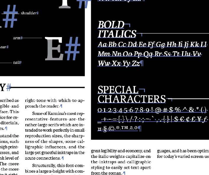
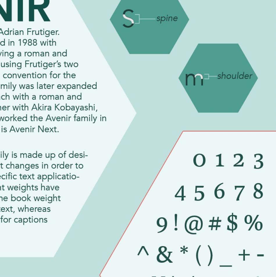
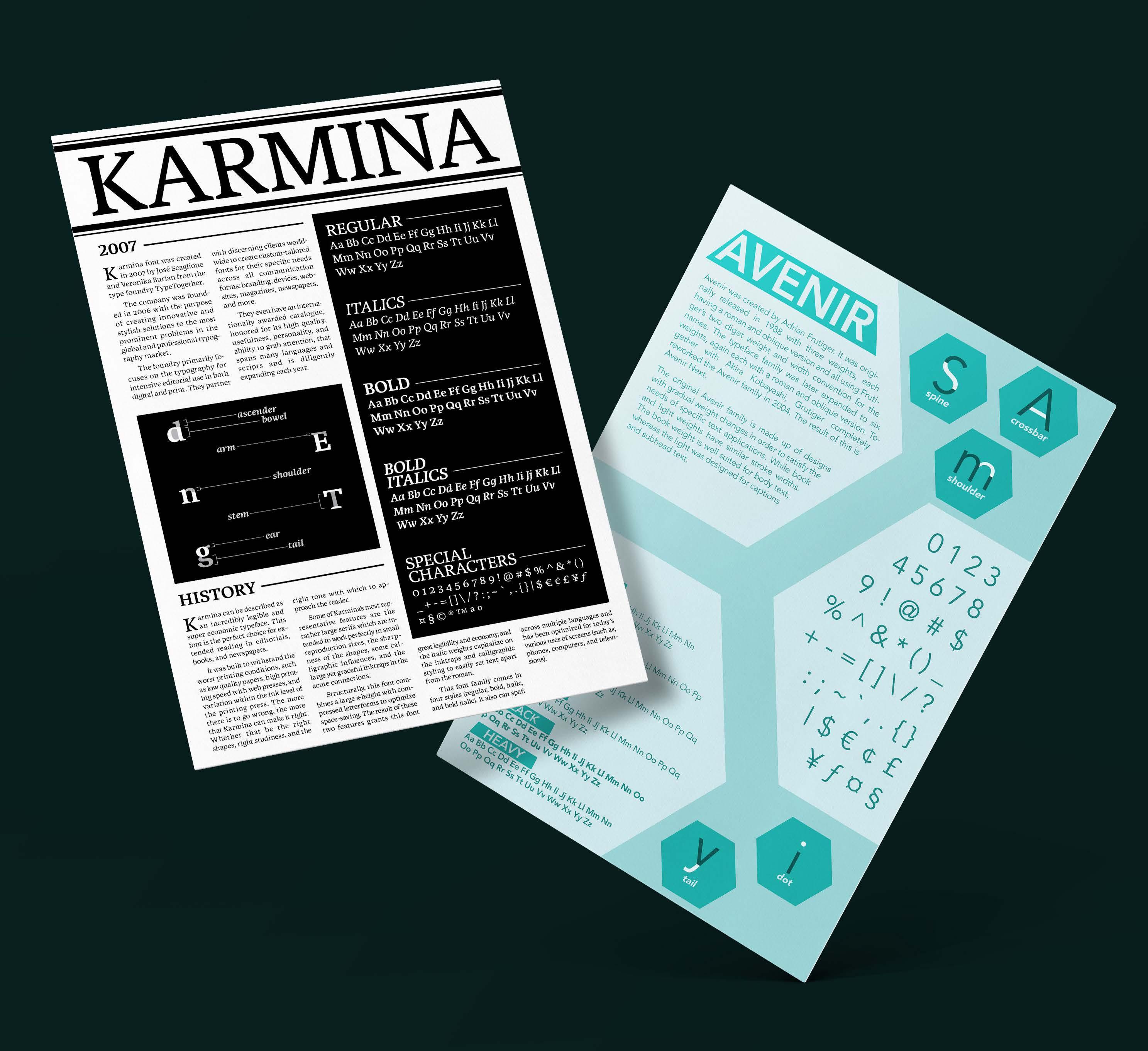
Create two visually compelling 11x17 posters that showcase the unique characteristics and histories of a serif font and sans serif font, while demonstrating expertise in typographic research and Adobe Illustrator.
PROCESS
The fonts chosen for this project were Karmina and Avenir. After researching the origins, design philosophy, and key features of both fonts the posters were ready to be executed.
Two 11x17 typographic posters were created. Each design effectively capturing the essence of the featured font by blending the history of the fonts and visually appealing layouts.
Know-how: Adobe Illustrator and Adobe Photoshop
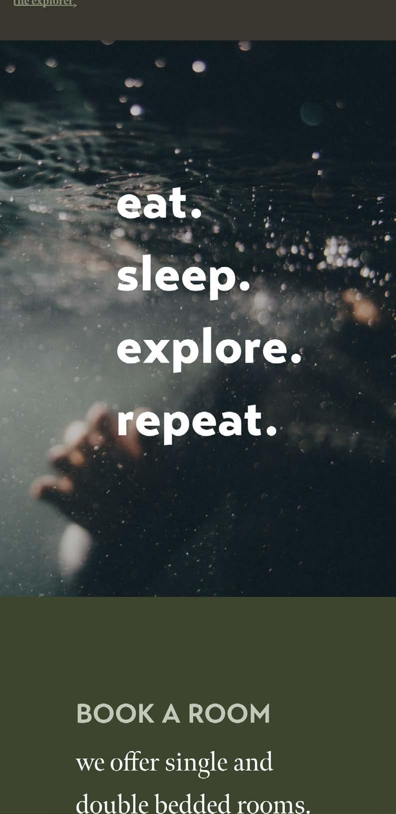
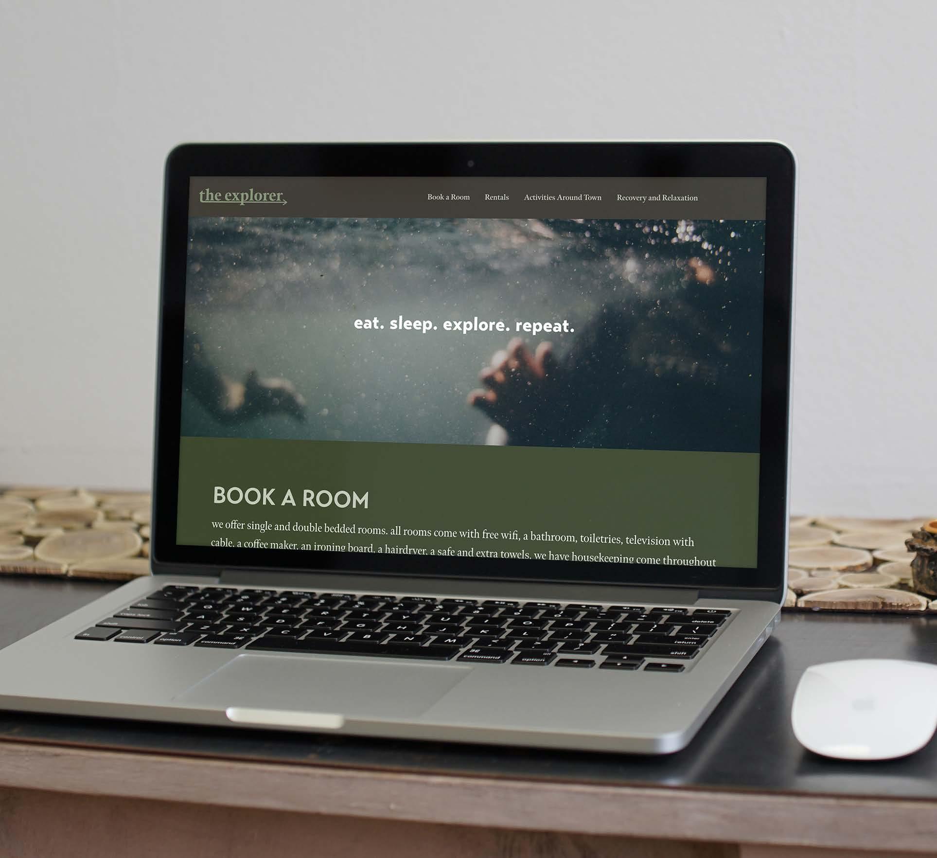
eat. sleep. explore. repeat.
Design and develop a responsive, single-page website for a fictitious boutique hotel. The Explorer, aimed to attract the outdoorsy and active individuals.
Based on research and inspiration, The Explorer, was created. Inspired by themes of adventure and nature, the design was focused on a clean, modern layout with outdoor imagery and earthy tones to resonate with the audience.
Everything was coded with HTML and CSS. All pages have interactive elements and are responsive according to their design.
Know-how: Adobe Illustrator, Adobe Photoshop, Adobe XD, GitHub, basic HTML and CSS
trails have the most photo opportunities or designated photo spots
recover y activities rentals booking
eat. sleep. explore. repeat.
we offer single and double bedded rooms all rooms come with free wifi, a bathroom, toiletries, television with cable , a coffee maker, an ironing board, a hairdryer, a safe and extra towels. we have housekeeping come throughout the day to clean up the room for you so you can come back to a nice clean room and crash check out available rates below! check availability check in date check out date
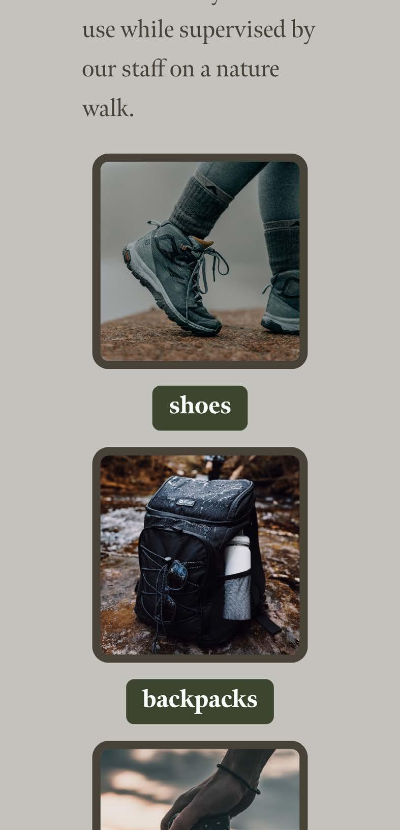
we have all had that experience of forgetting something at home when going away on vacation don t worry we have you covered! we have rentals for hiking shoes, backpacks, and even cameras that you can use while supervised by our staff on a nature walk
s oe rentals
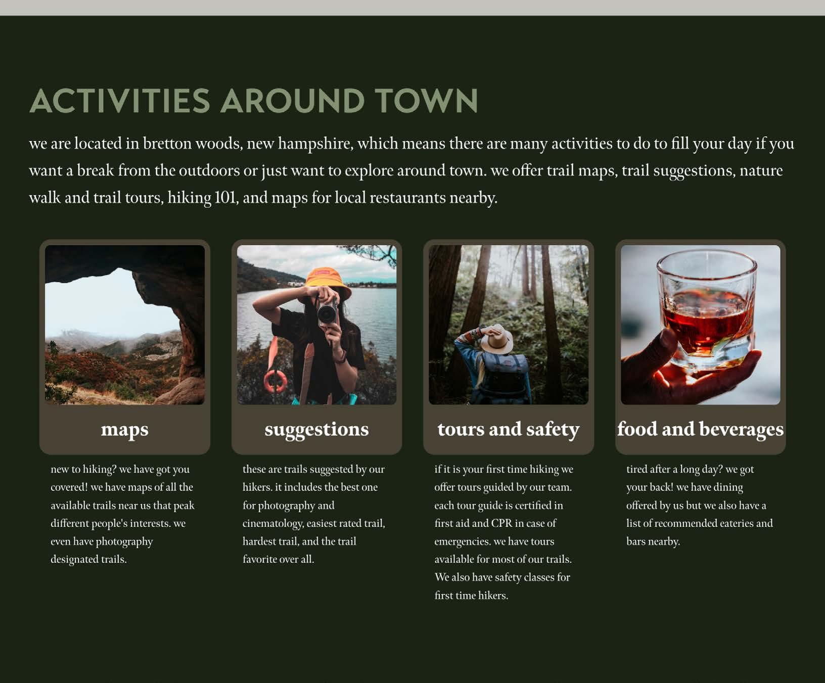
we are located in bretton woods new hampshire , which means there are many activities to do to fill your day if you want a break from the outdoors or ust want to explore around town we offer trail maps, trail suggestions, nature walk and trail tours hiking 101, and maps for local restaurants nearby maps
new to hiking? we have got you covered! we have maps of all the available trails near us with difficulty ratings, types of trails, best features of each trail, and which trails have the most photo opportunities or designated photo spots
these are trails suggested by our hikers it includes the best one for photography and cinematology, easiest rated trail hardest trail, and the trail favorite over all s ggestions
to rs and safety
if it is your first time hiking or you are still a little uneasy about it we have tours our tours are guided by our team which includes employees who live here year round and who live here part time each tour guide is certified in first aid and R in case of emergencies e have tours available for most of our trails e also have safety classes for first time people
tired a�er a long day? we got your back! we have dining offered by us but we also have a list of recommended eateries and bars nearby food and beverages
and who live here part time each tour guide is certified in first aid and R in case of emergencies e have tours available for most of our trails e also have safety classes for first time people
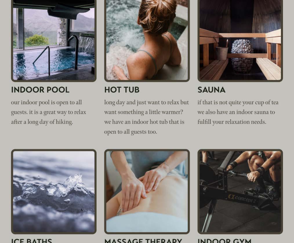
a long day of outdoor activities can be tiring , we know that is why we have many amenities for you to use to relax we have an indoor pool, hot tub, sauna , ice baths, and massage therapy along with that we also have an indoor gym for the rainy days our indoor pool is open to all guests it is a great way to relax a�
we also offer ice baths which are used to soothe muscles reduce inflammation, improve breathing , and give your mood a ma or boost it is a common way to help your body recover a�er a long day learn more
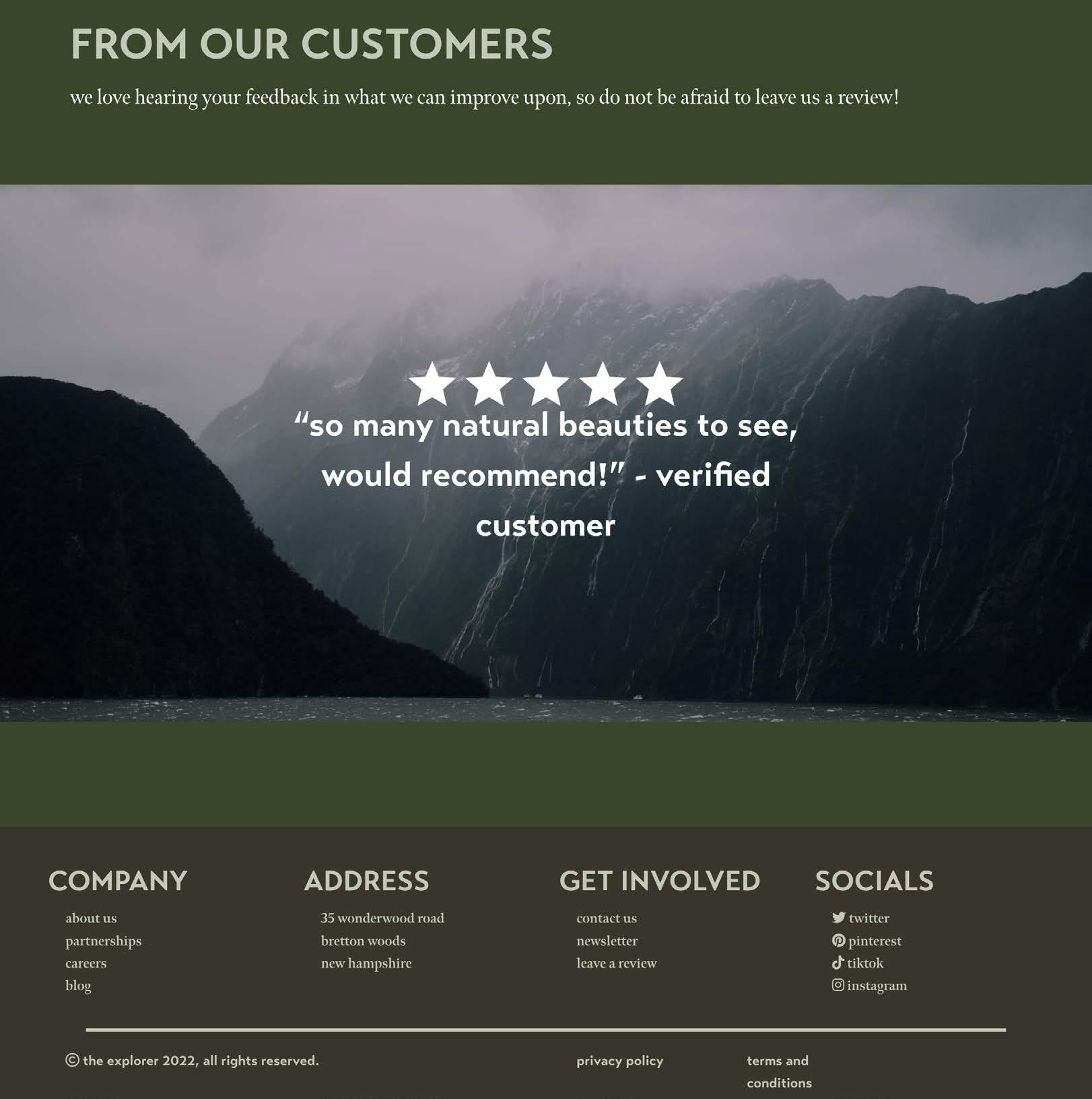
we love hearing your feedback in what we can improve upon, so
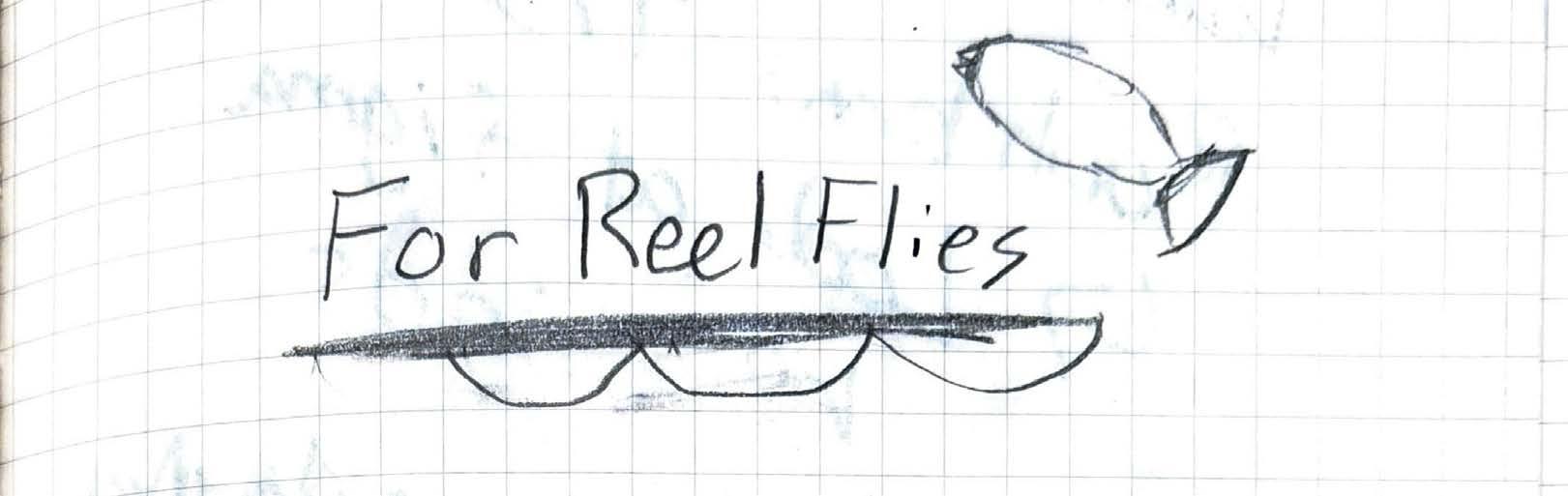
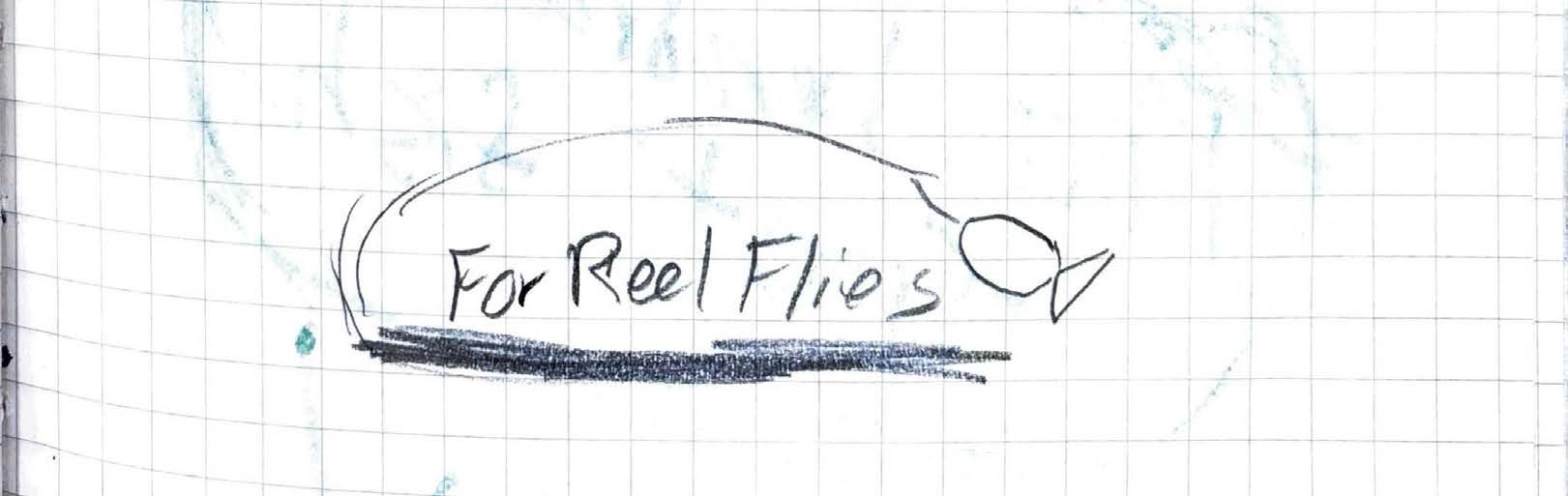
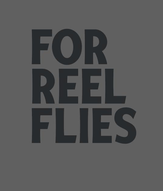
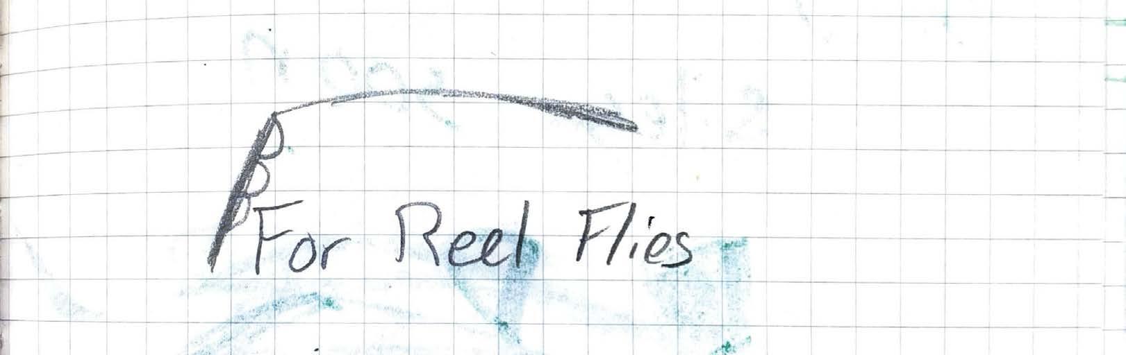
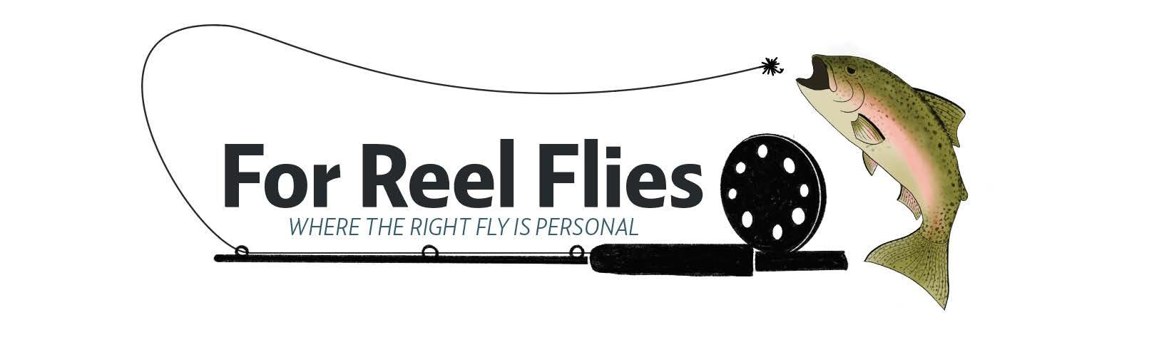
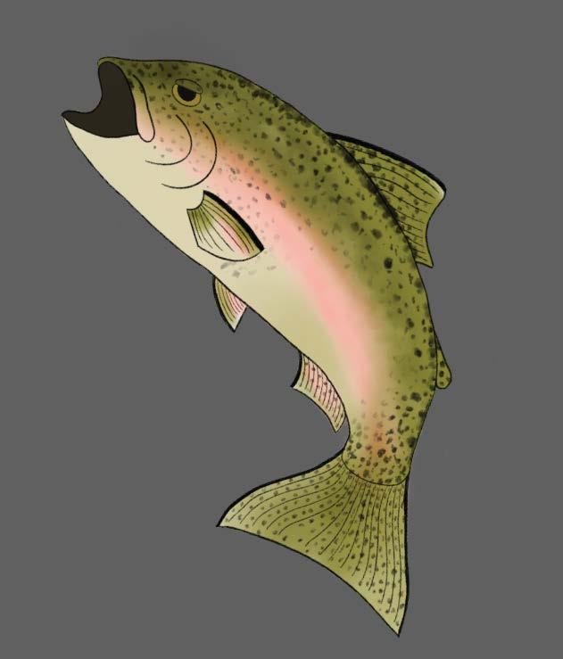
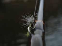
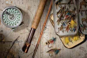
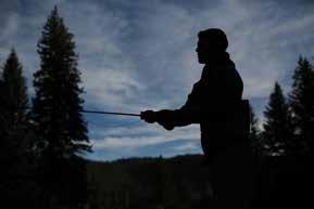
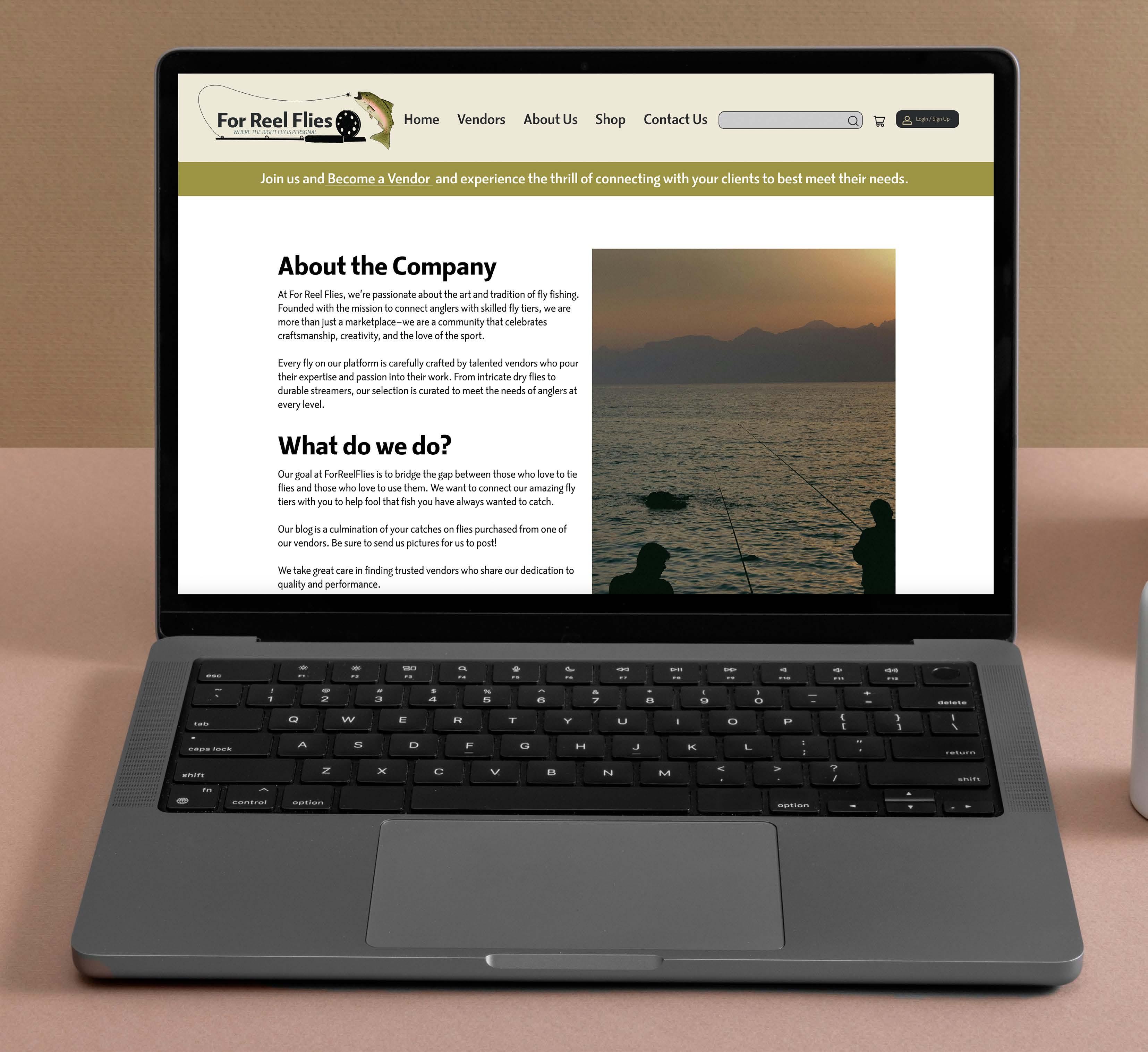
Design a website and give a brand refresh for the company For Reel Flies. The company is an online marketplace for fly fishing where people can buy and sell flies.
Based on research, inspiration, and numerous conversations over zoom, the For Reel Flies website came together. The inspiration behind the site and how it came to be was after the owner was scammed. The site aims to build trust between the customer and the vendor.
A brand refresh and a full design of the front end of the website including pages such as home, about, contact, and shop, were created.
Know-how: Adobe Illustrator, Adobe Photoshop and Figma

Body


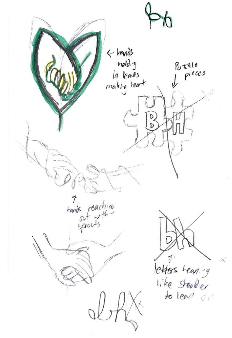
OBJECTIVE
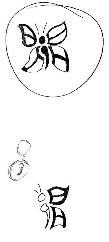
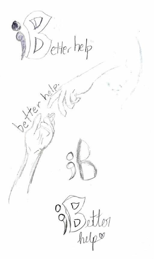
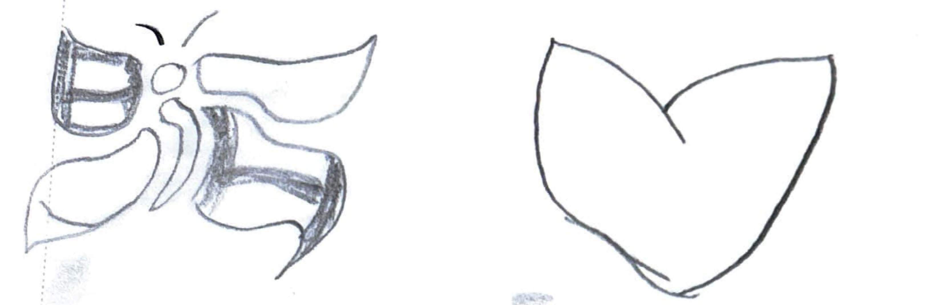
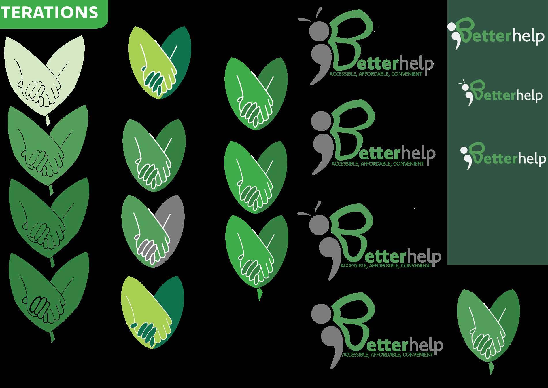
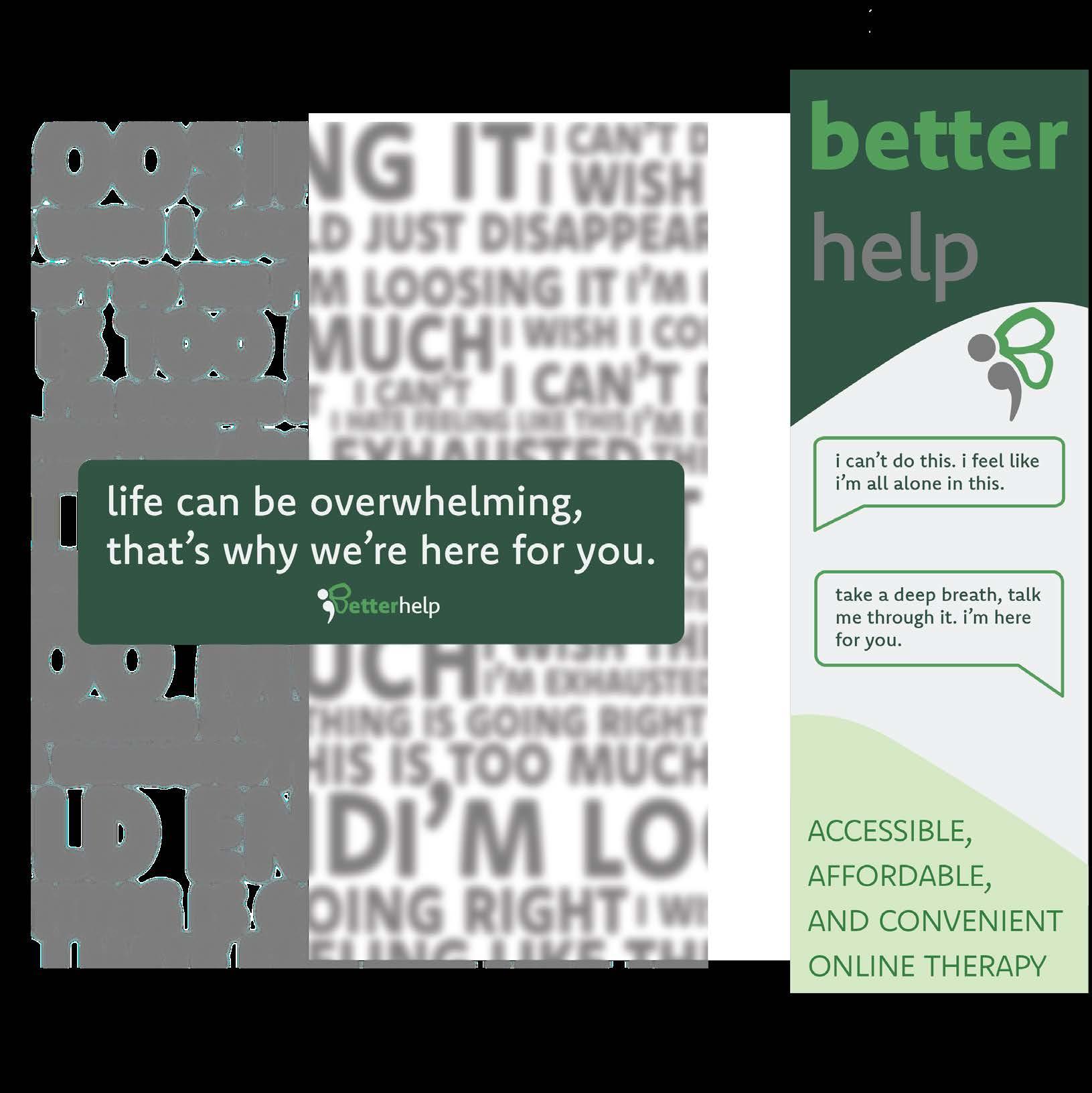
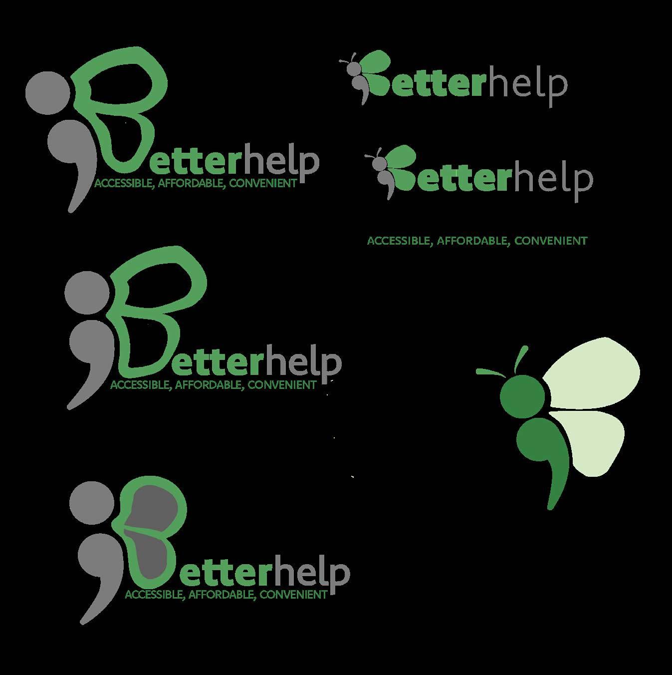
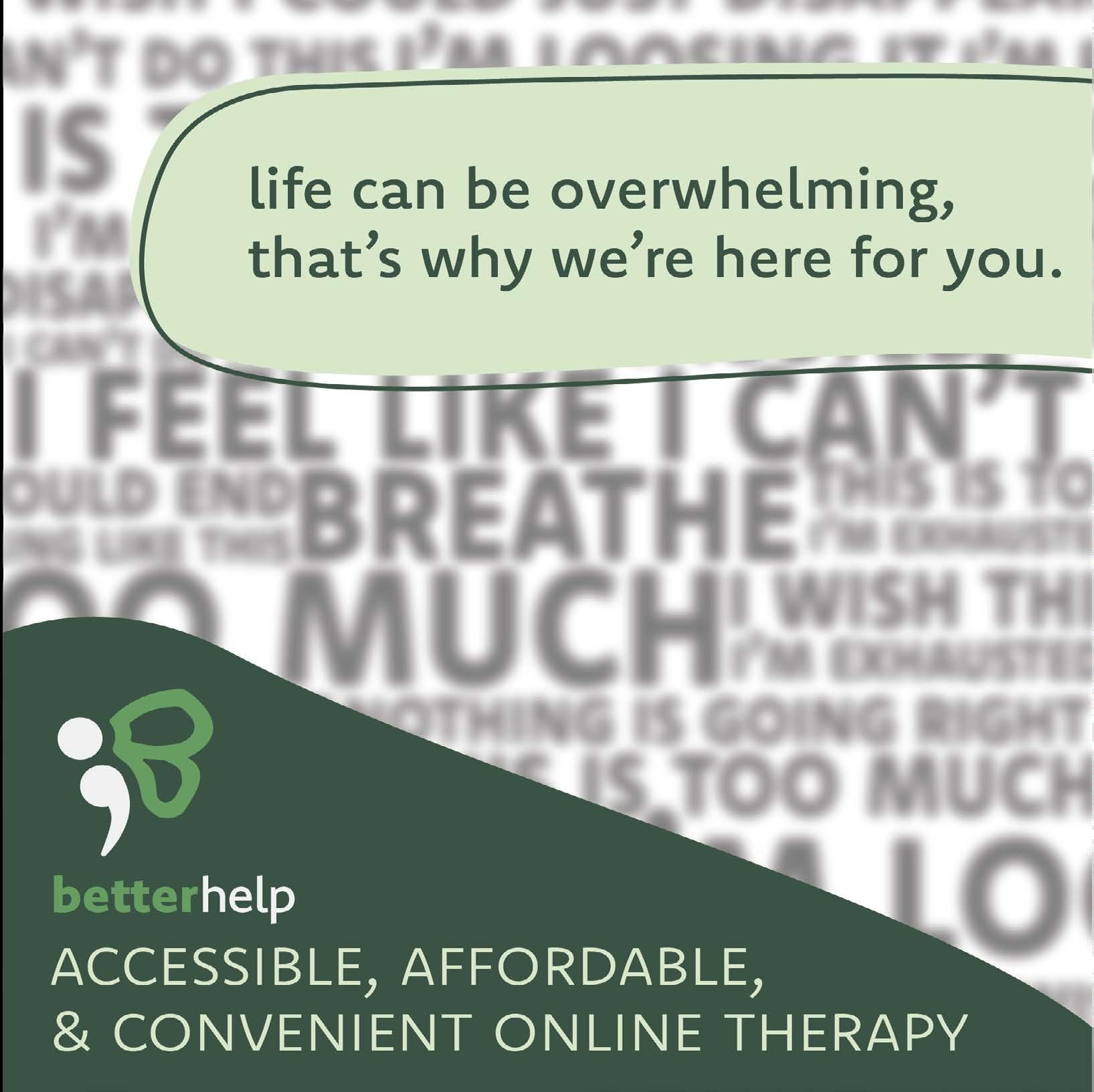
To redesign BetterHelp’s brand identity, through a new logo, a mobile website, and social media advertisements.
PROCESS
Based on research about the brand and competitors, an redesign of BetterHelp was made. The redesign aimed to make the site more user friendly and easier on the eyes.
RESULT
A redesign of BetterHelp was created including a new logo, advertisements, and layouts.
Know-how: Adobe Illustrator, Adobe Photoshop, Adobe XD


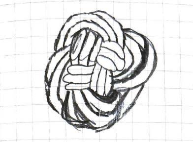
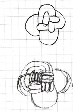
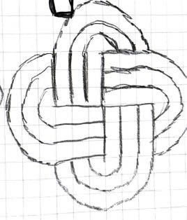
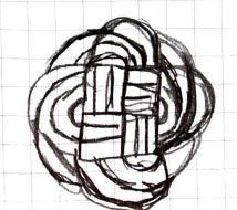
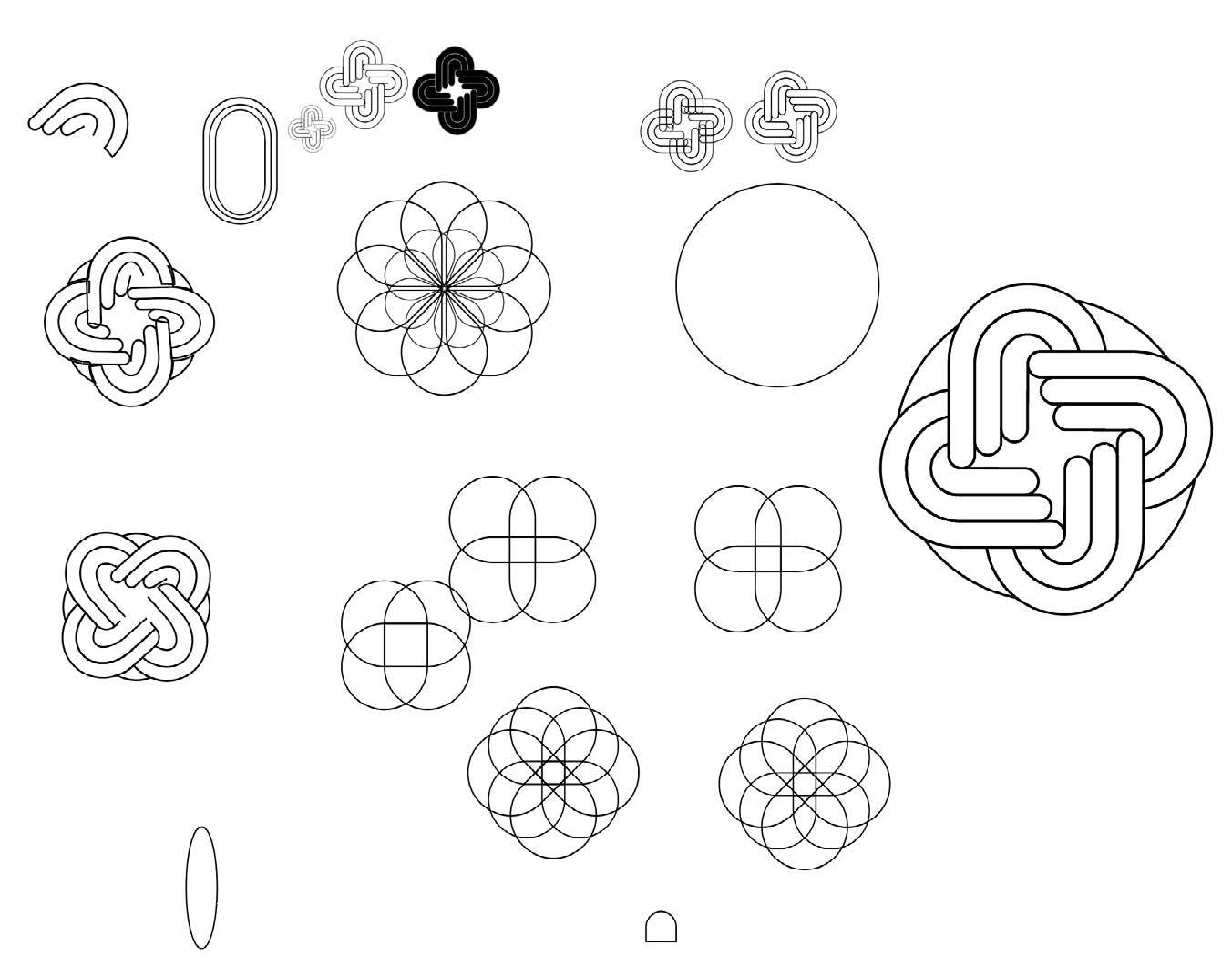
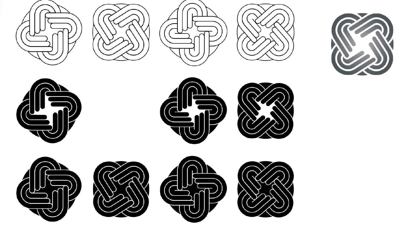
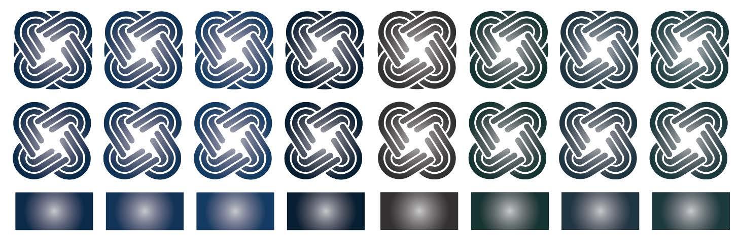
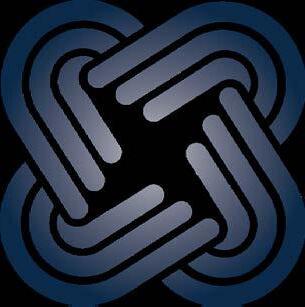
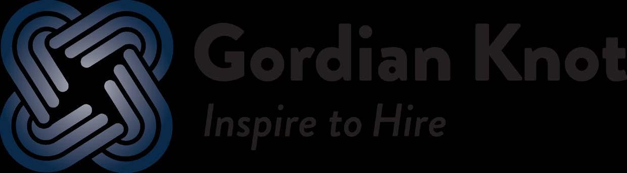
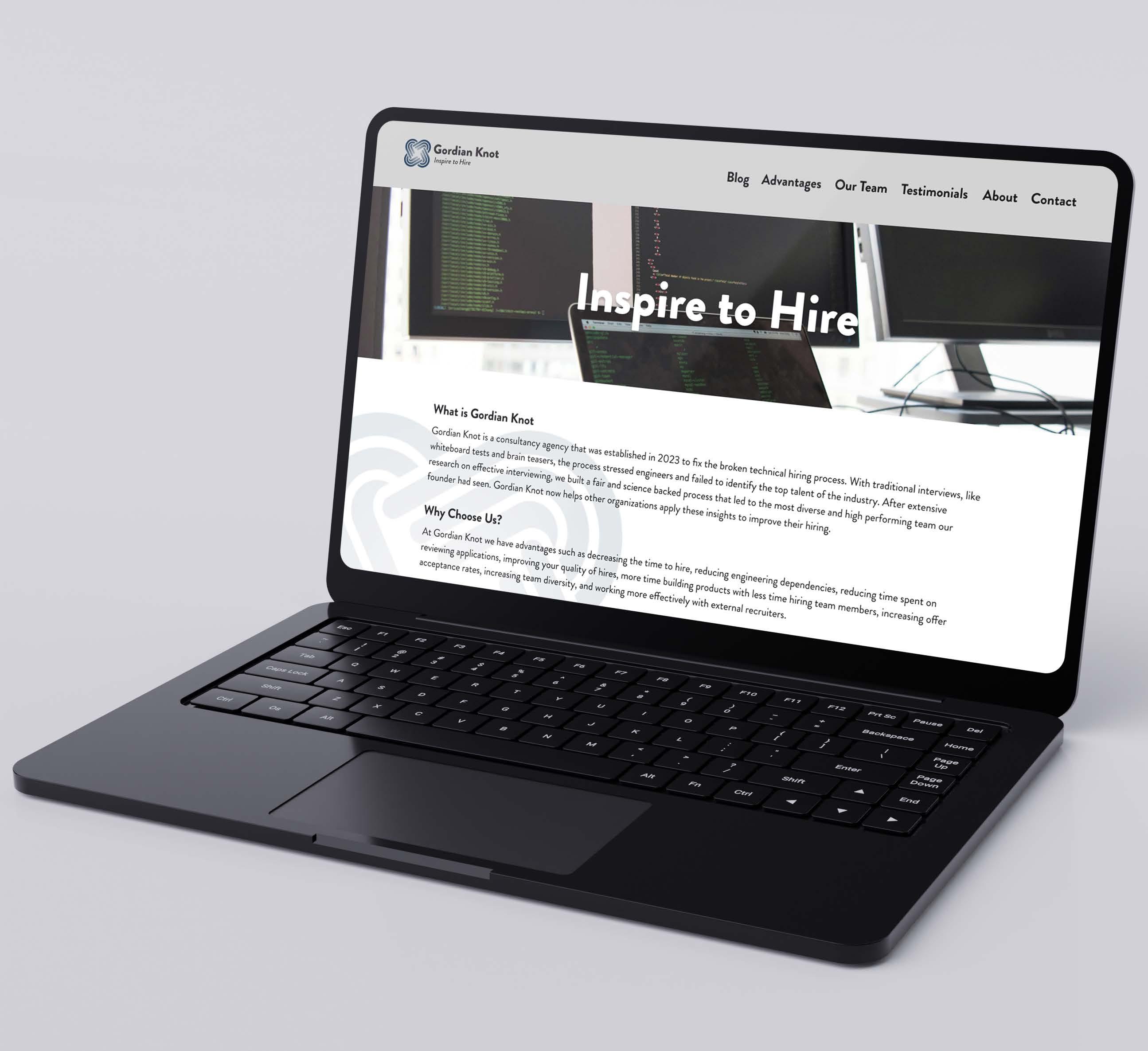
To create a new brand identity and redesign the website for Gordian Knot, a software engineering hiring company connecting organizations with diverse, high-performing talent. This rebrand aimed to enhance market presence and drive their revenue growth.
Based on research about the company Gordian Knot the website was due for an update. The branding was created with inspiration from the Alexander the Great legend. The website was redesigned into a easier to digest pages, the newly branded elements and visual hierarchy.
The rebranding and website redesigned helped Gordian Knot establish a brand identity while upholding their goal aspirations of the company. The project positioned them as a forward thinking leader in the software industry.
Know-how: Adobe Illustrator, Adobe Photoshop and Figma


Stacked
Subheading - Brandon Grotesque Bold (25pt)
Bodycopy - Brandon Grotesque Regular (20pt)
Bodycopy Alternative - Brandon Grotesque Bold (20pt)
Button - Brandon Grotesque Regular (18pt)
Button Alternative - Brandon Grotestque Regular Underline (18pt)
Caption - Brandon Grotesque Light Italic (16pt)
0,0,0,0
Gordian Gray
#c9cacb
18,14,15,0
Blueprint Blue
#8394a4
131,148,164
52,35,27,1 Iron Bound Steel
#363c42
54,60,66
75,64,56,47
Alexander the Blue Hex: #0d2a49
13,42,73
100,84,43,43
Black
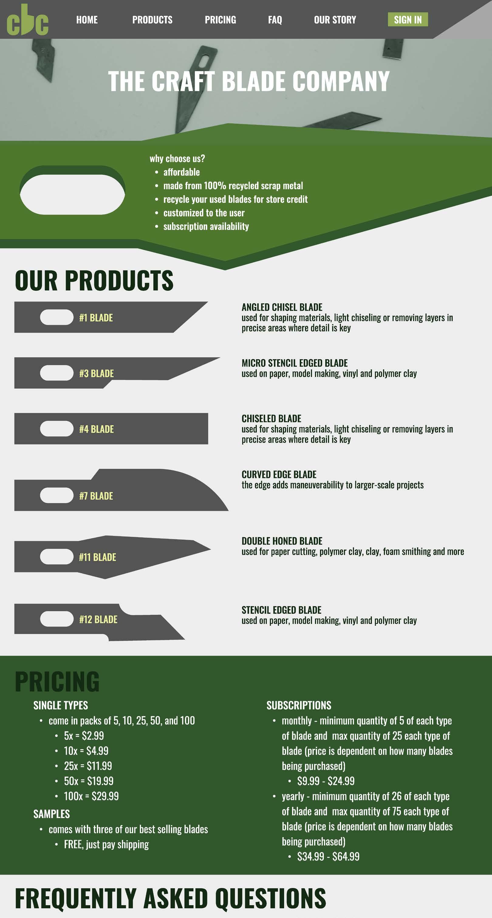
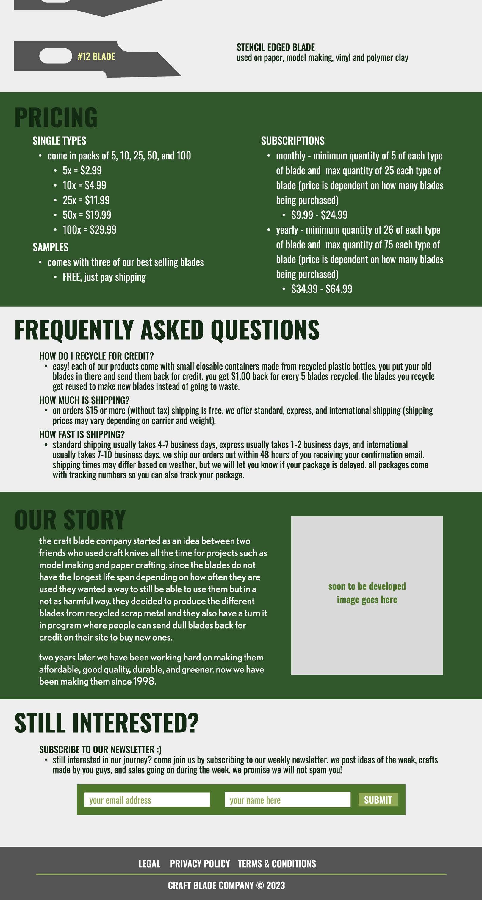
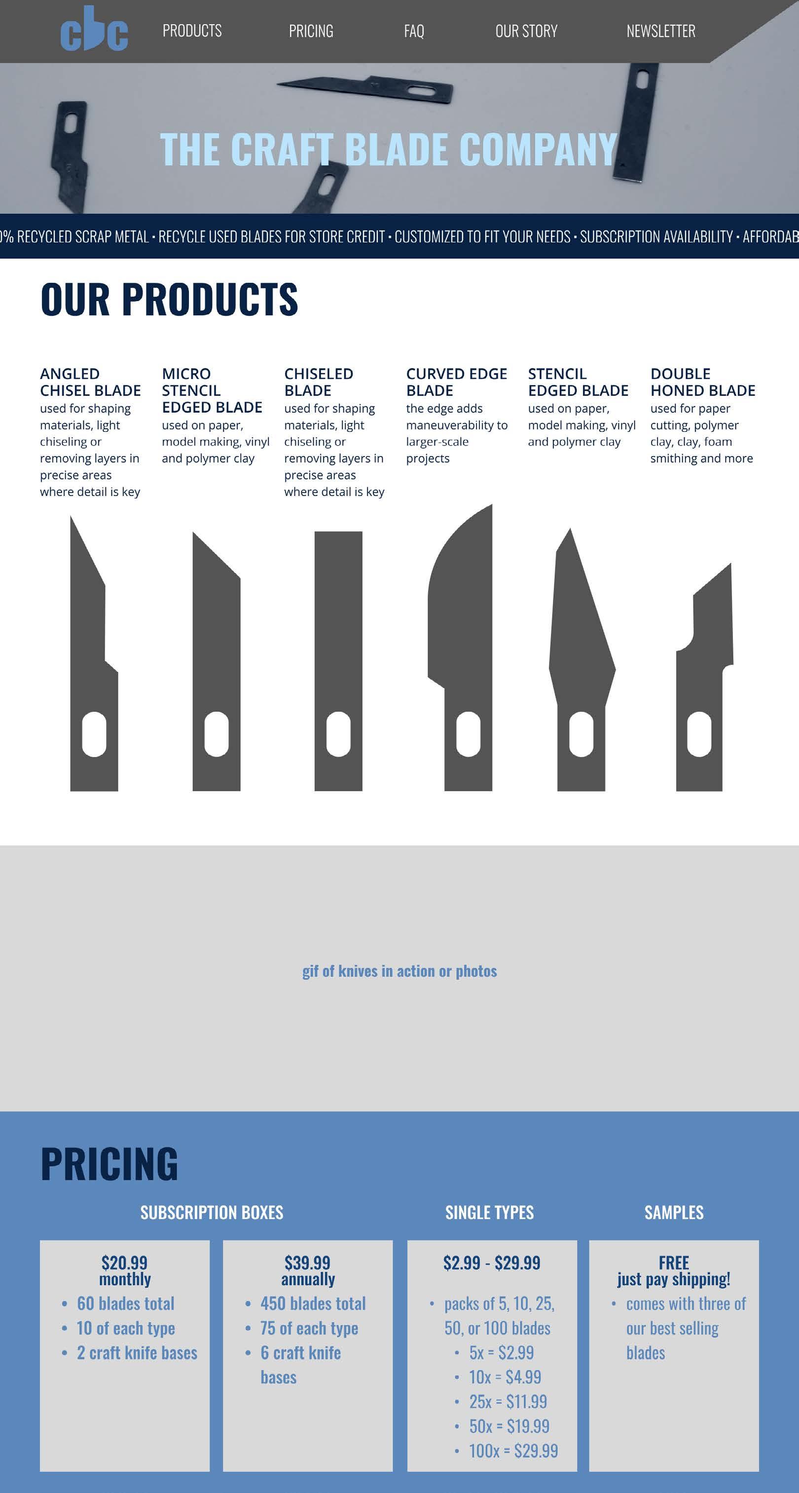
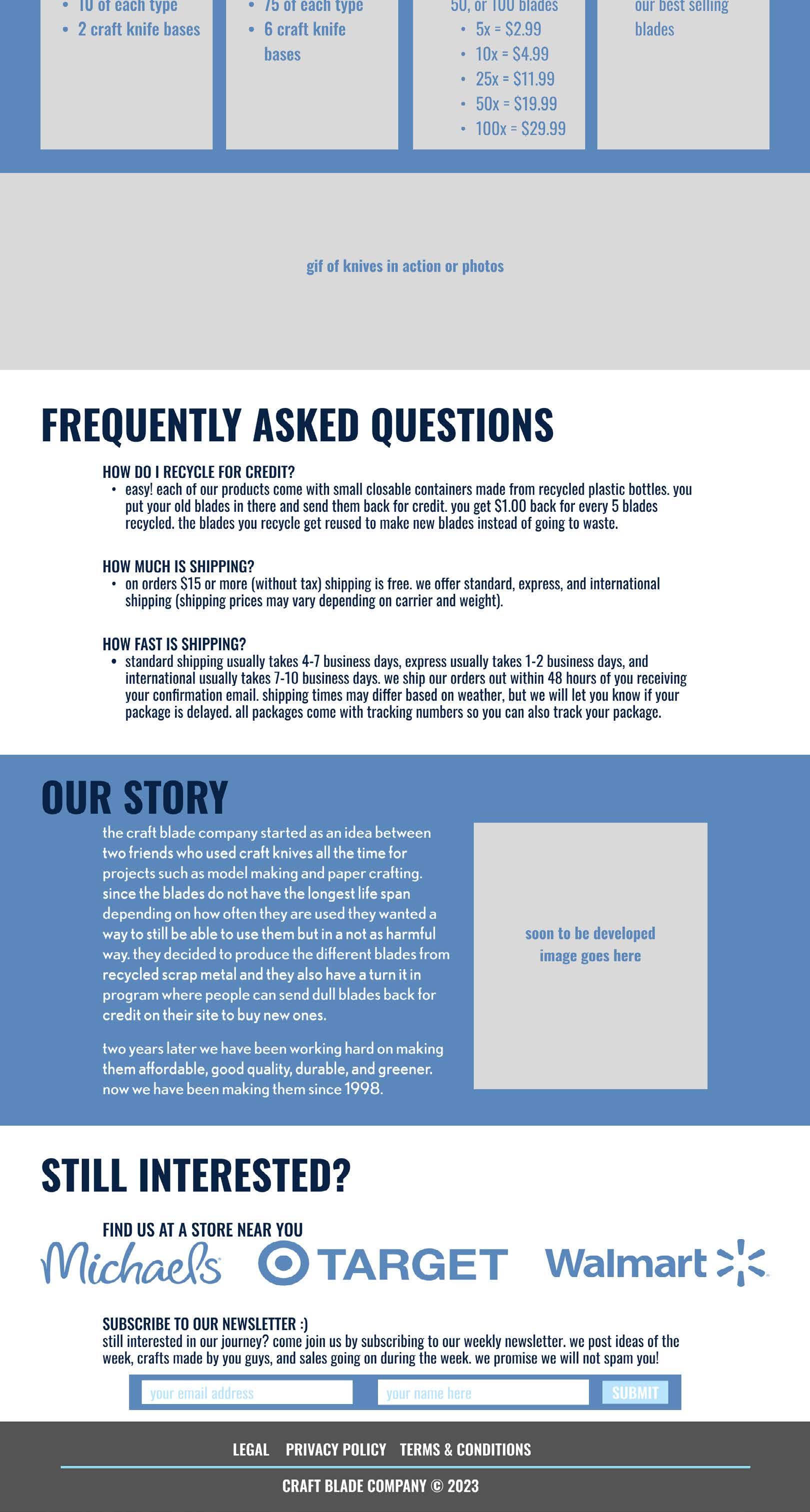
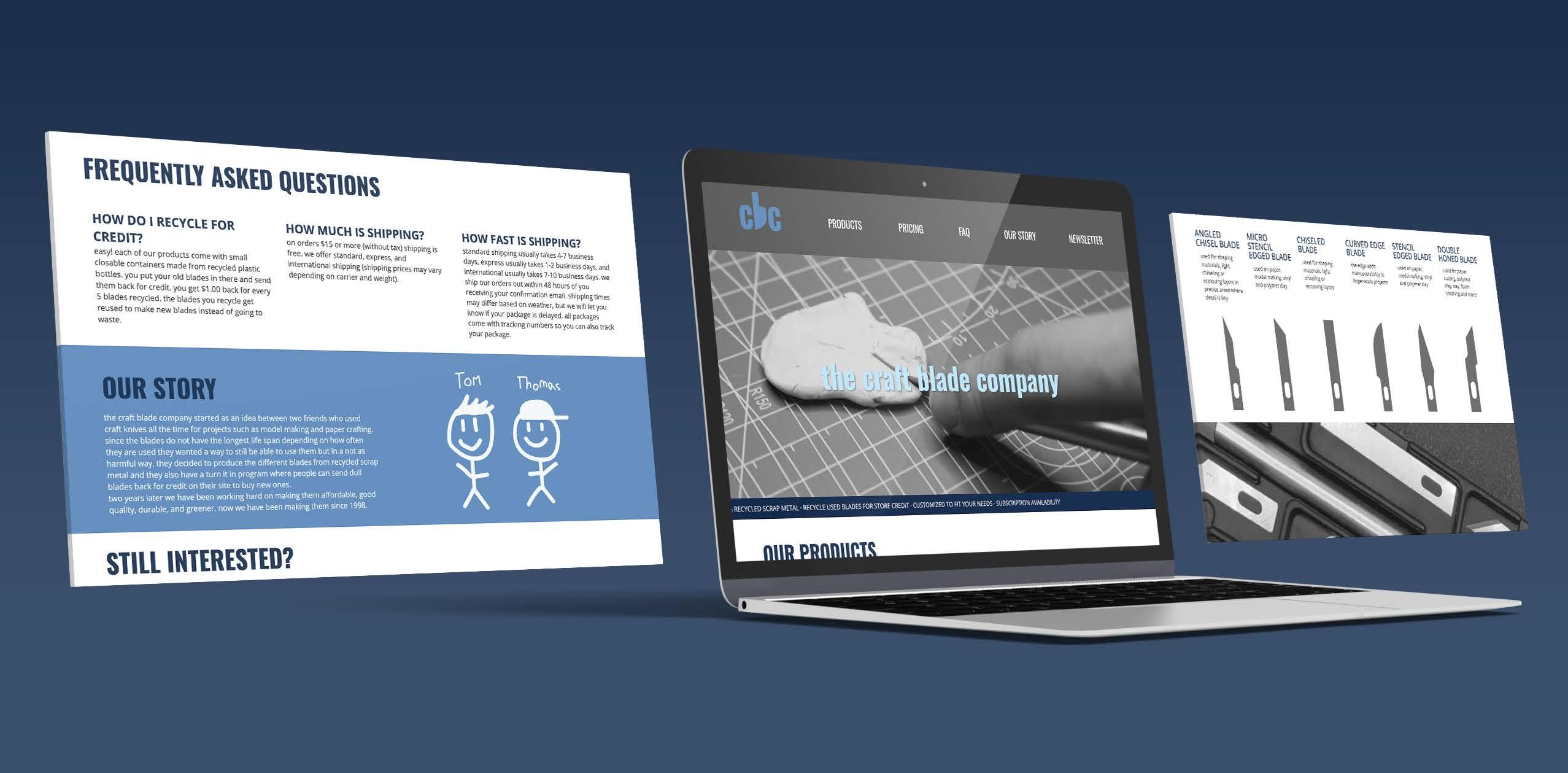
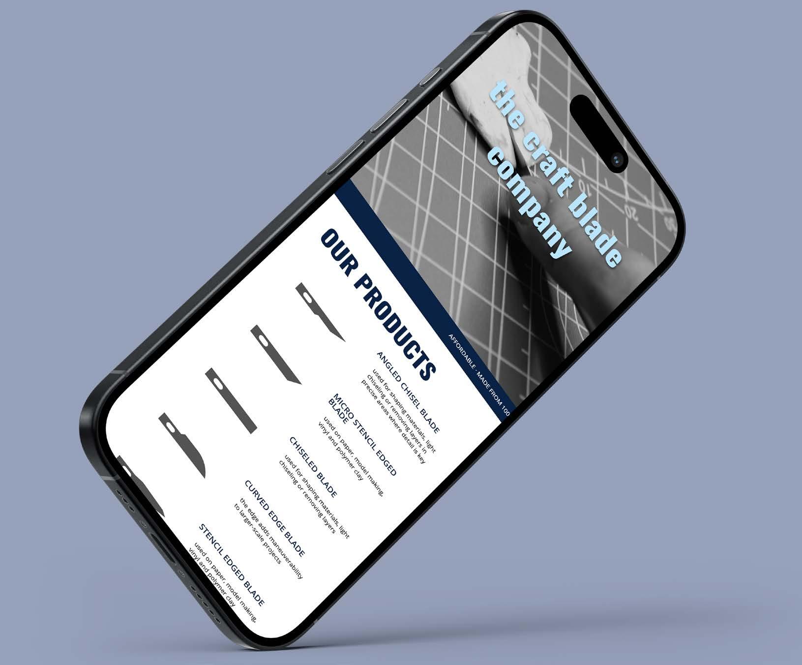
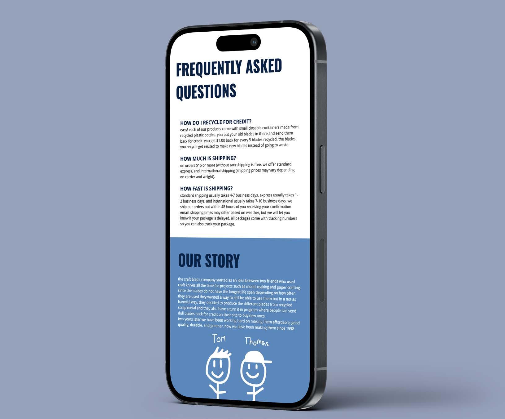
To create and design a one-page long-scrolling website for a fictitious company called The Craft Blade Company. The project began by selecting and purchasing a single item from the dollar store to serve as the product focus for the website.
The item chosen for this project was a craft knife. I researched the item’s features, usability, and target audience to better inform the design and user experience.
The completed one-page scrolling website effectively showcased The Craft Blade Company’s utility knife as broth practical and stylish. The design combined with responsive development ensured ease of use on all devices.
Know-how: Adobe Illustrator, Adobe Photoshop, Adobe XD, basic HTML and CSS
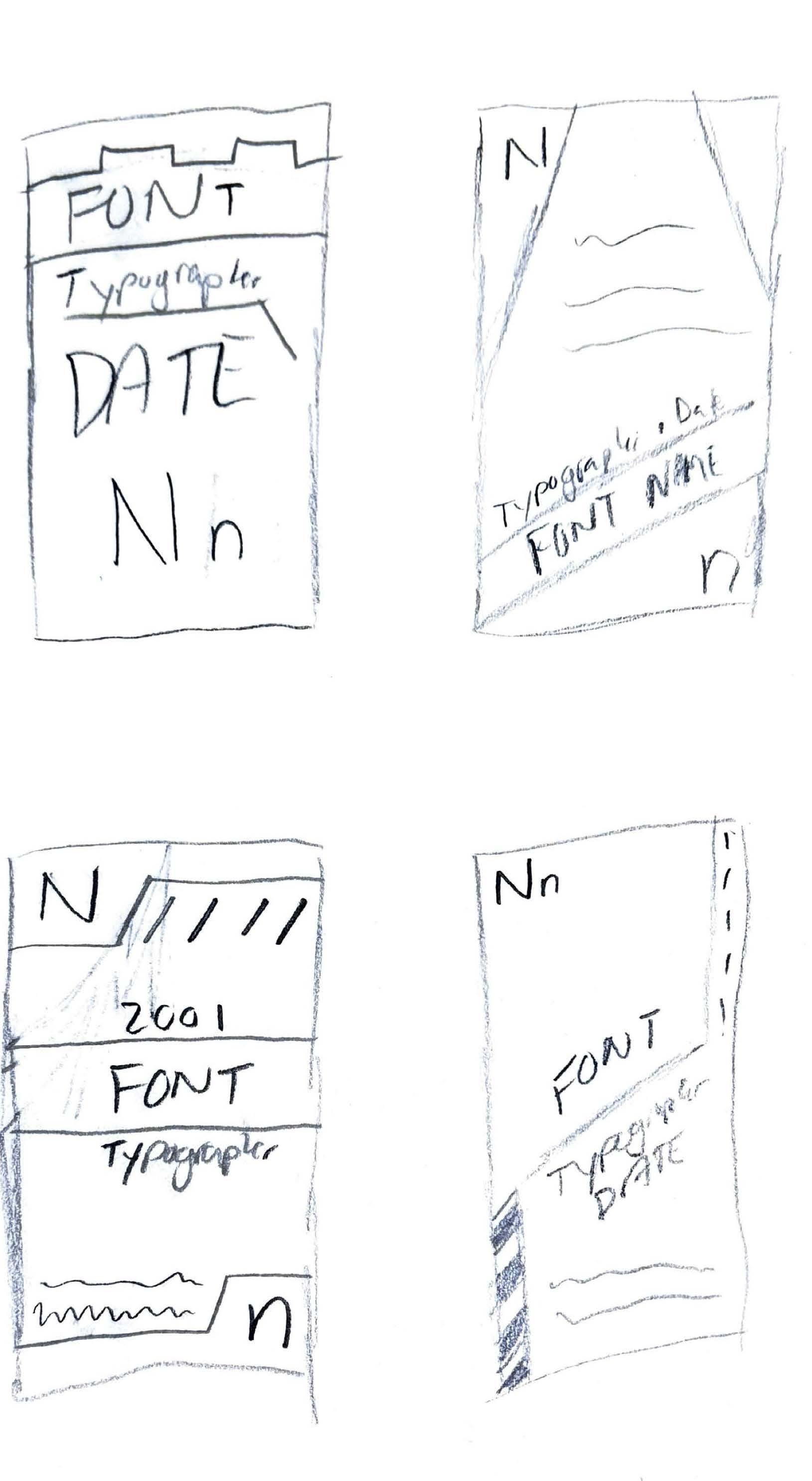
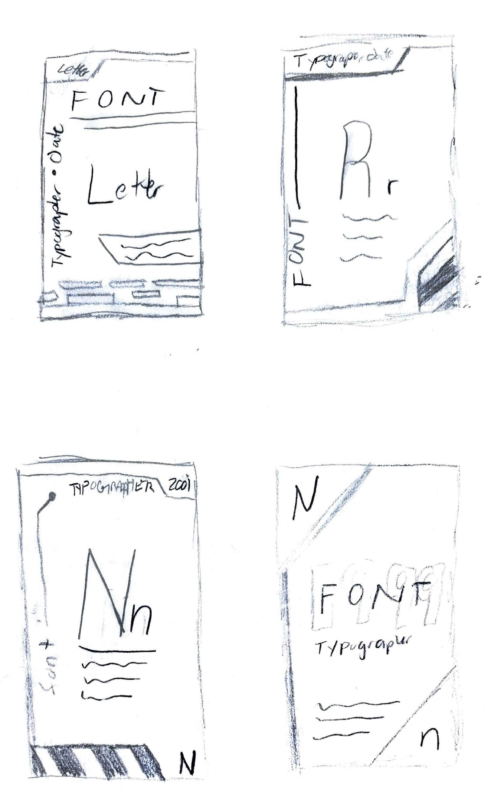
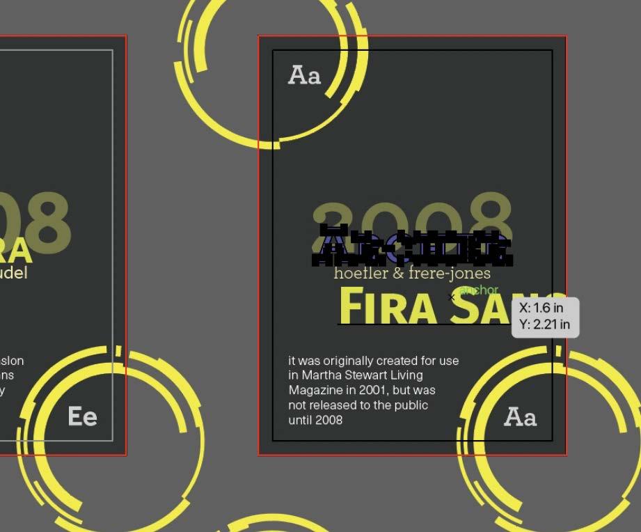
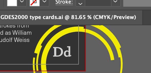
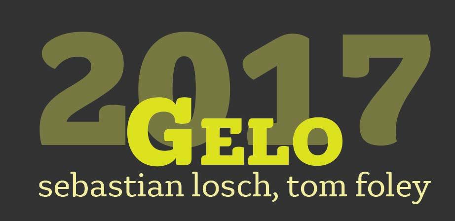
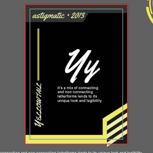
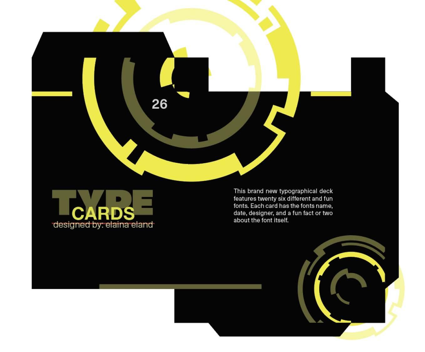
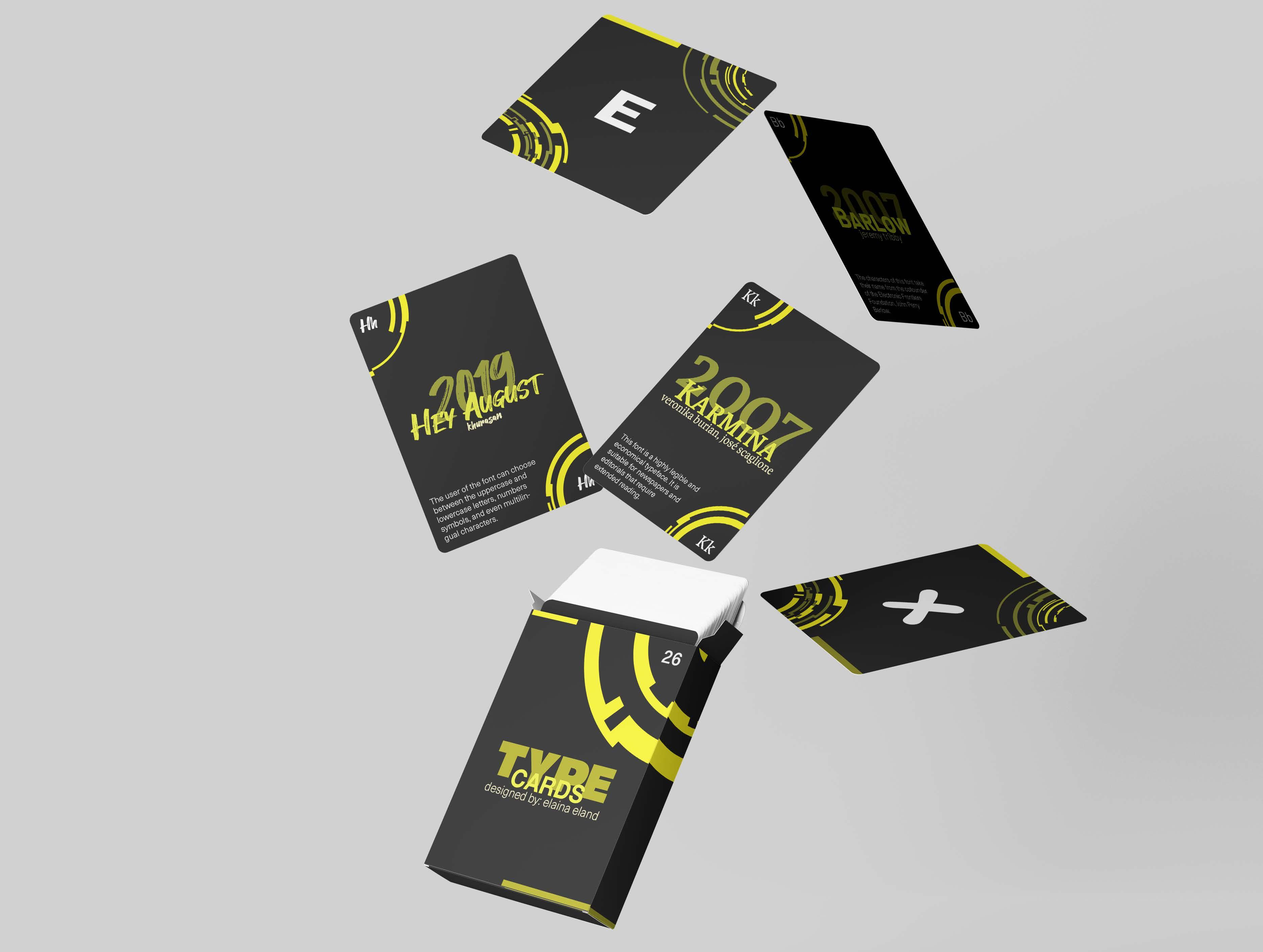
To design and create a custom typography-themed deck of cards, with each card representing a letter of the alphabet (A-Z). Each card would feature a unique font while incorporating a creative cohesive design to bring the whole deck together.
Based on inspiration and research of different typography styles and various typefaces, I designed a concept deck with twenty six individual letter cards. Each card featured a different font and their unique history.
The A-Z typography deck was successfully designed, printed, and assembled. It offered an educational and creative exploration of typefaces.
Know-how: Adobe Illustrator and Adobe Photoshop
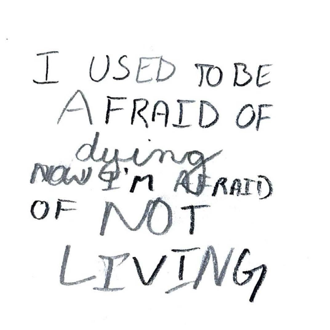
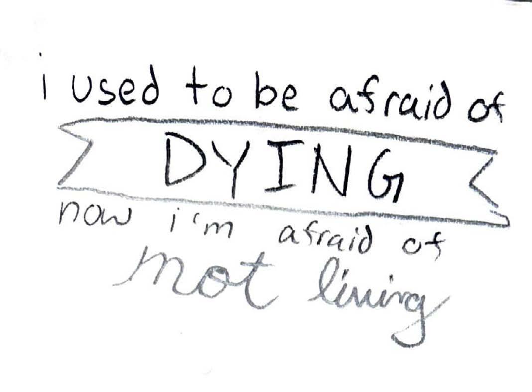
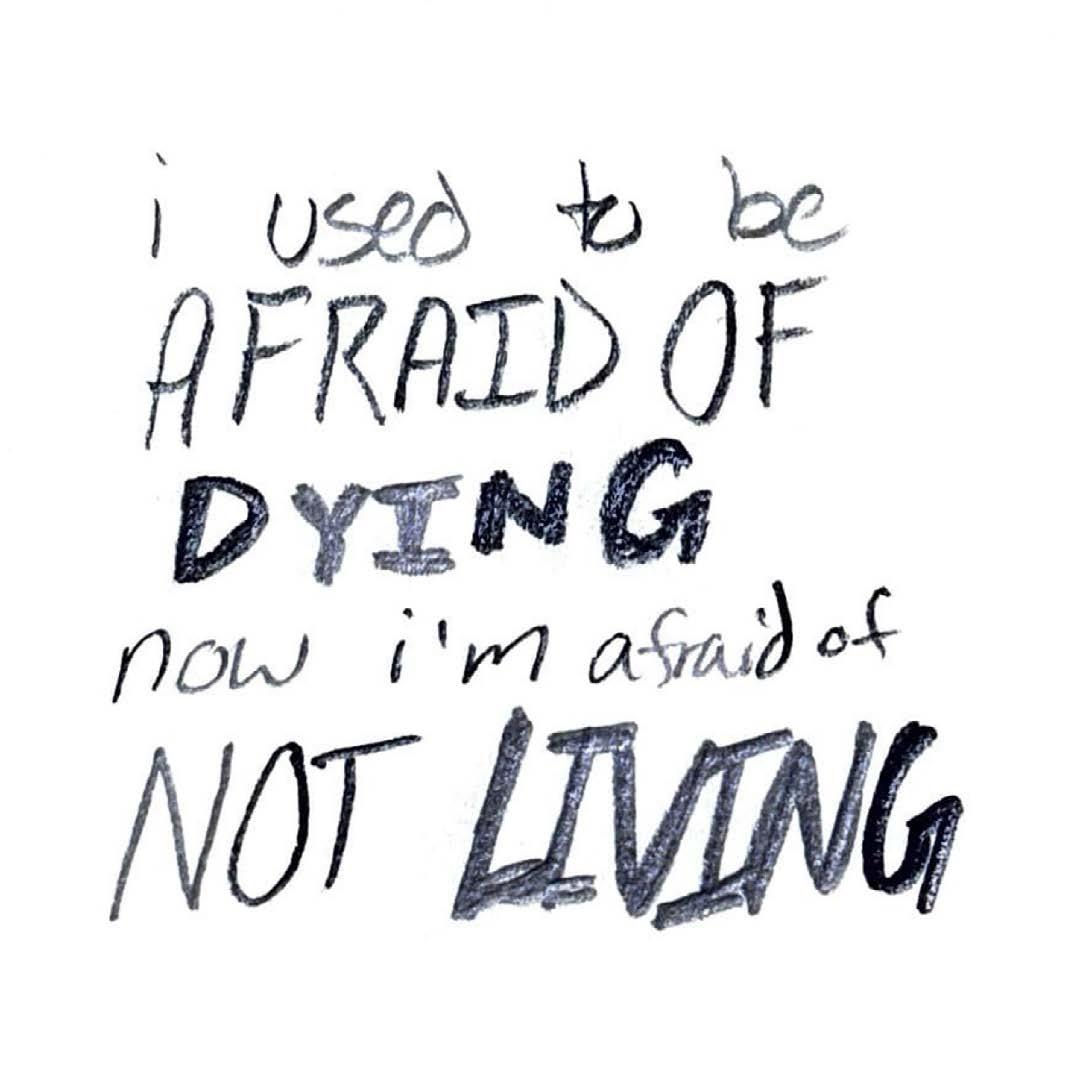
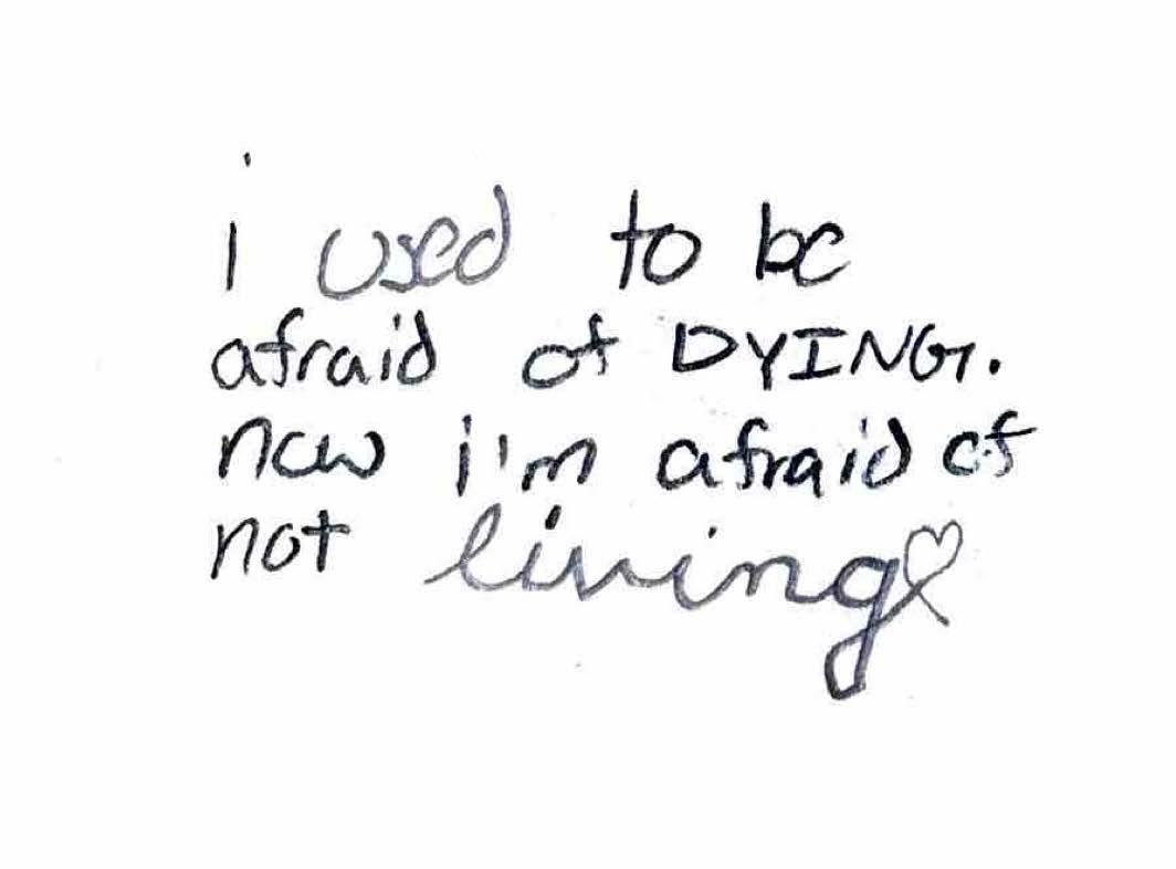
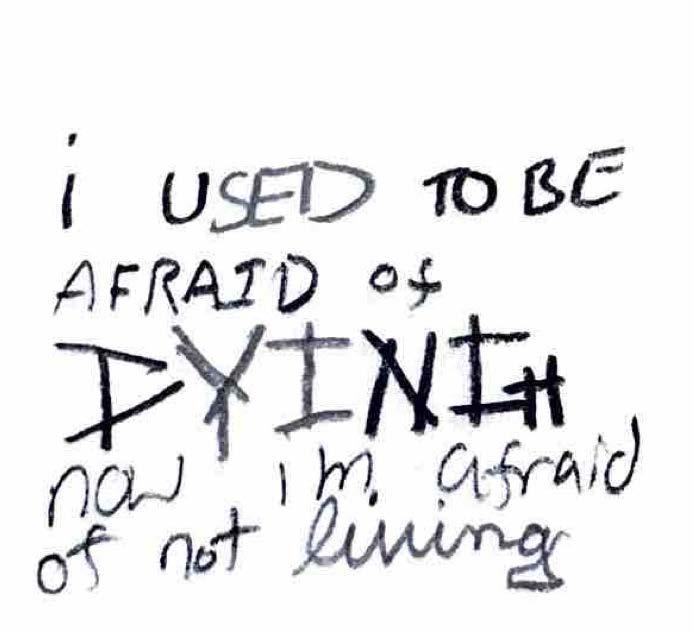
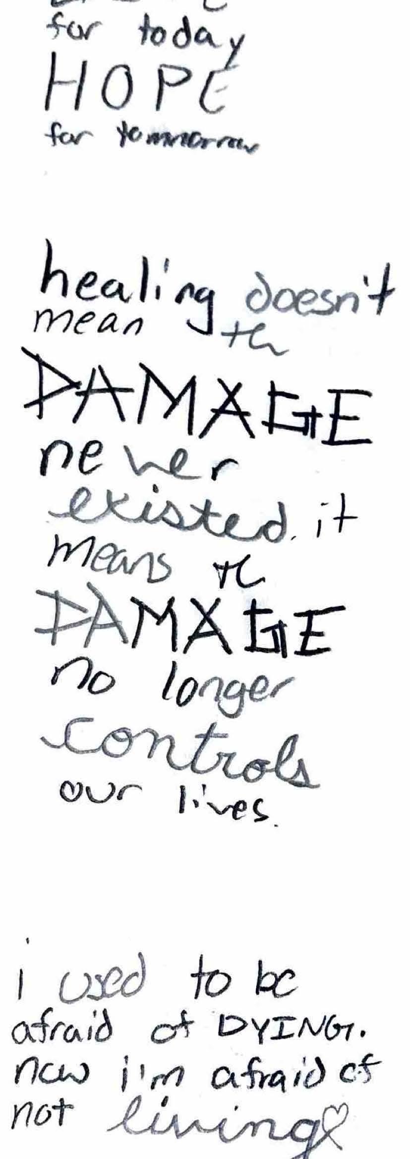
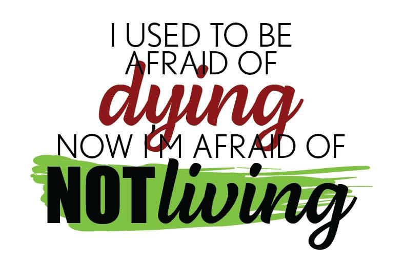
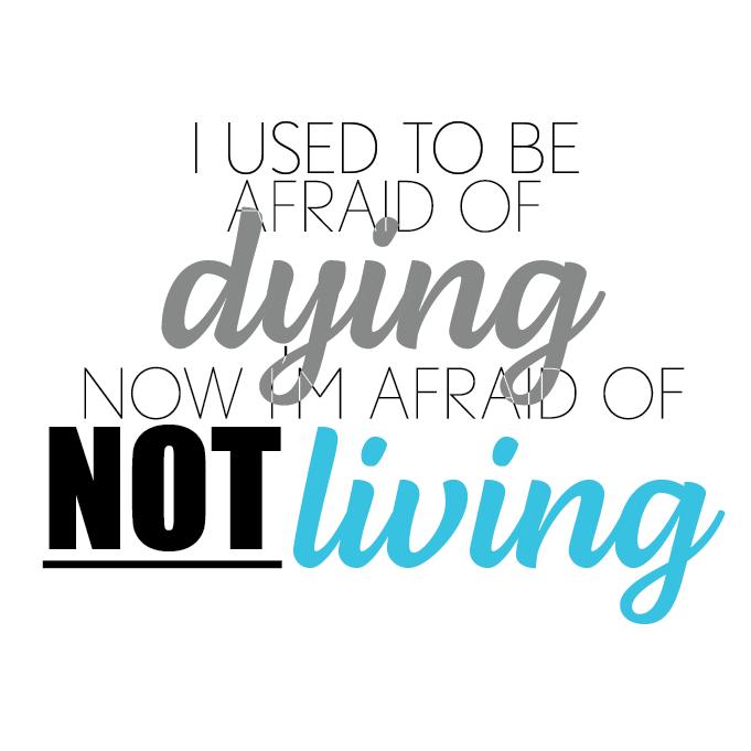
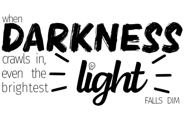
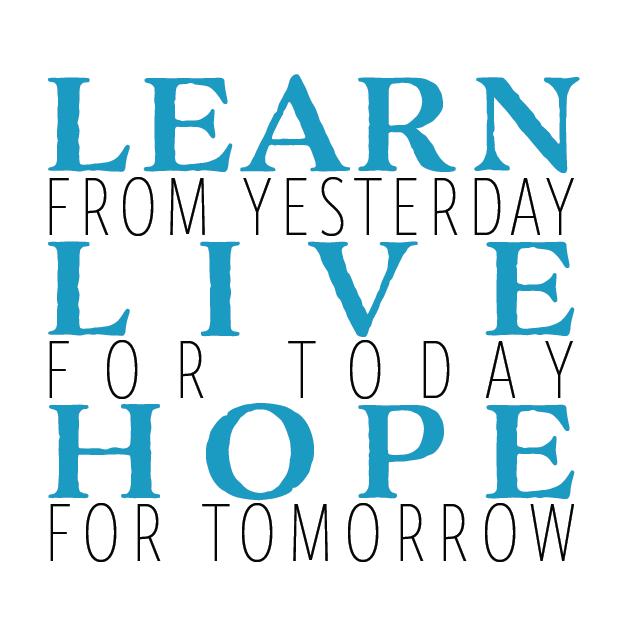
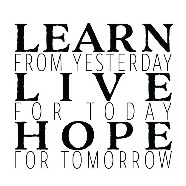
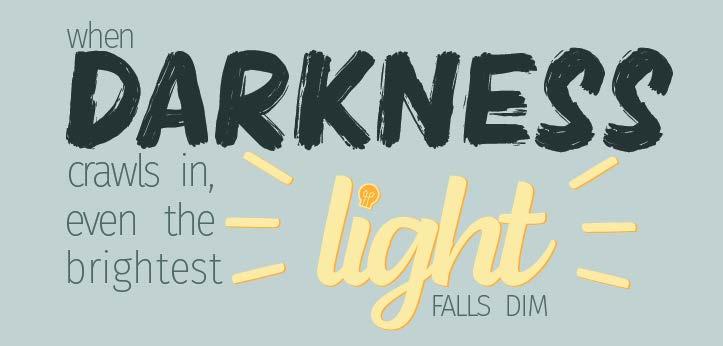
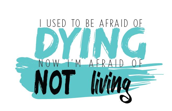
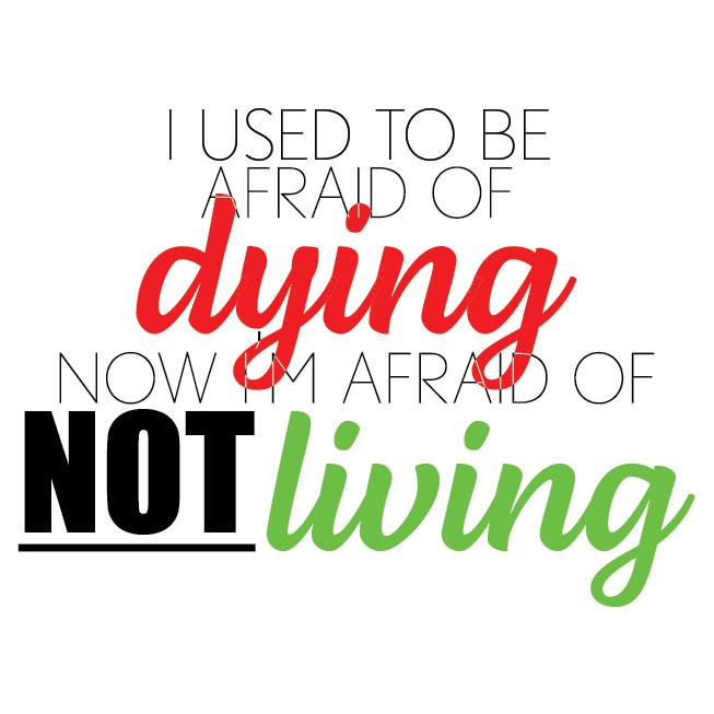
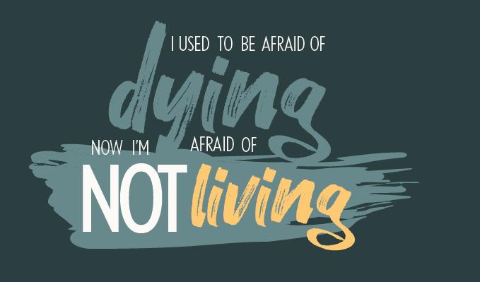
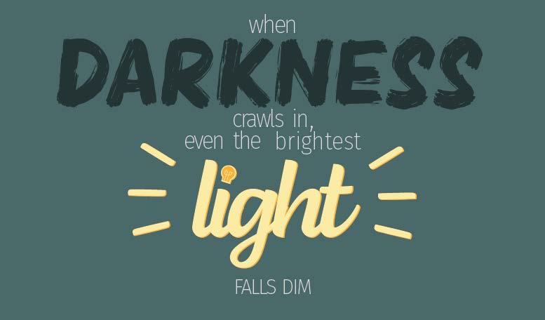
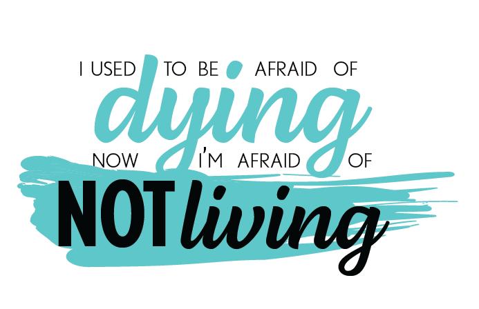
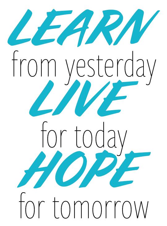
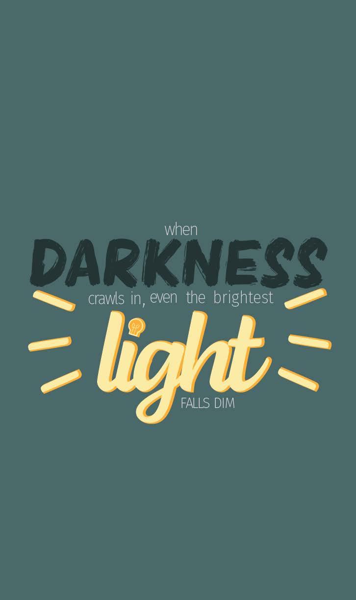
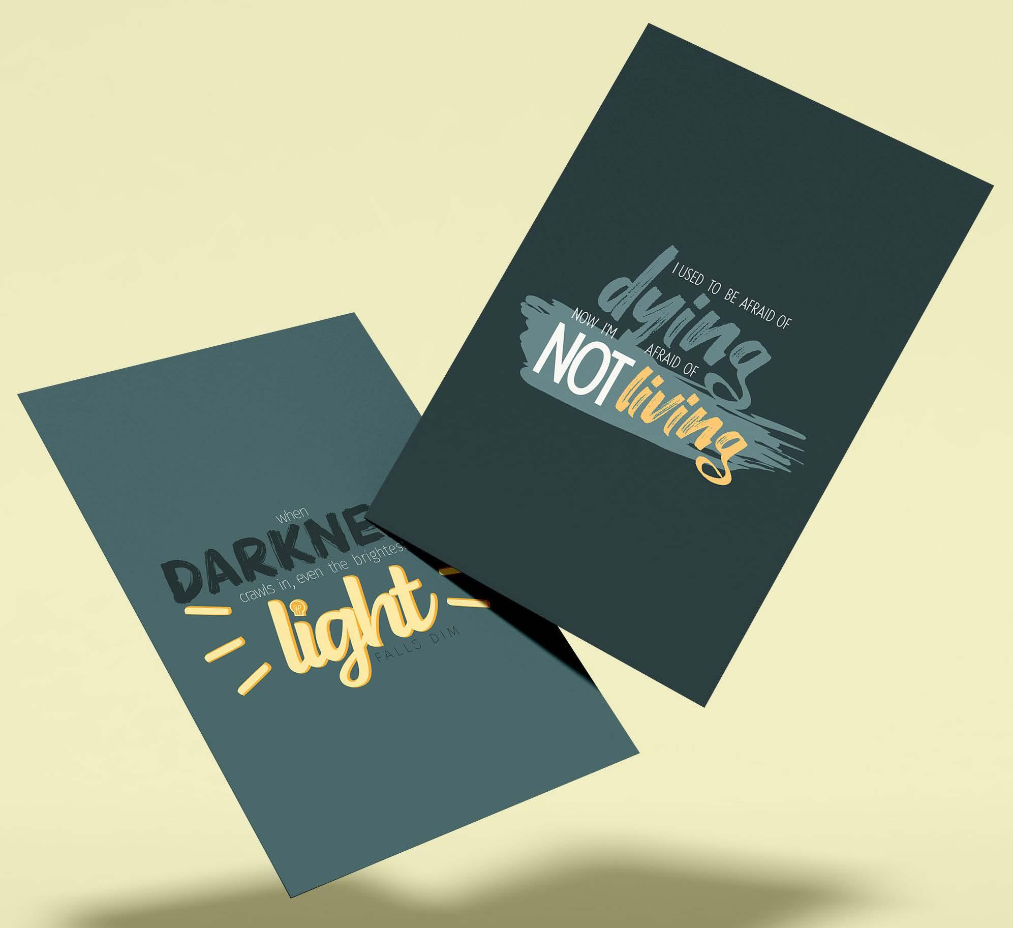
illustrating typographic quotes on posters
The project aimed to reimagined and visually represent two meaningful quotes through typographic illustrations.
Explored themes and emotions of the two quotes I chose. For the first quote focused on the transition from fear to a sense of urgency for life. For the second quote, emphasized the light and shadow by designing typographic elements to suggest dimming lighting and darkness.
In the end the project produced two illustrative quote posters, each showcasing a different and distinct visual interpretation of the chosen phrases.
Know-how: Adobe Illustrator and Adobe Photoshop
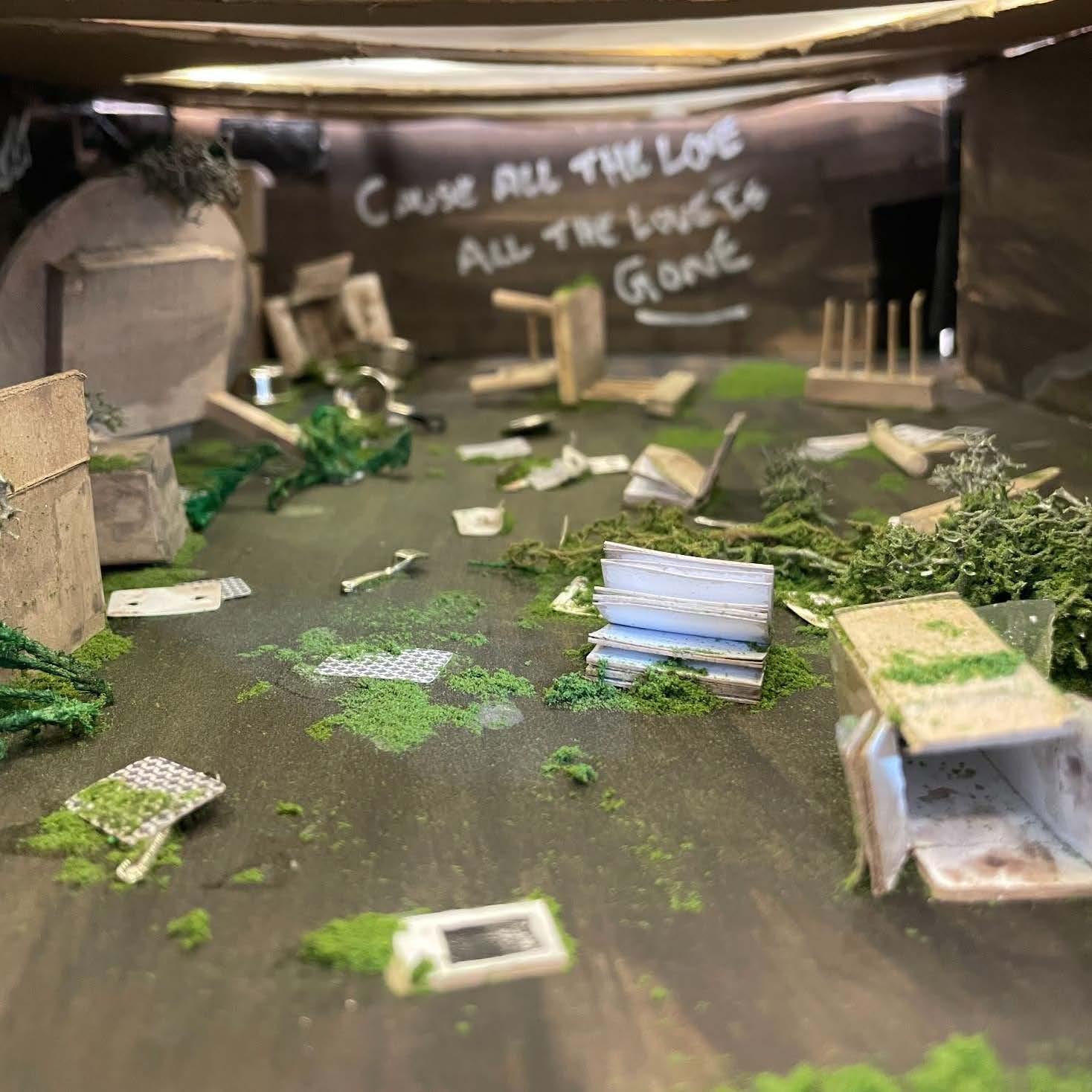
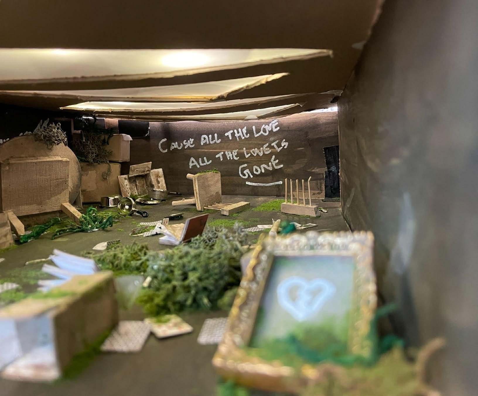
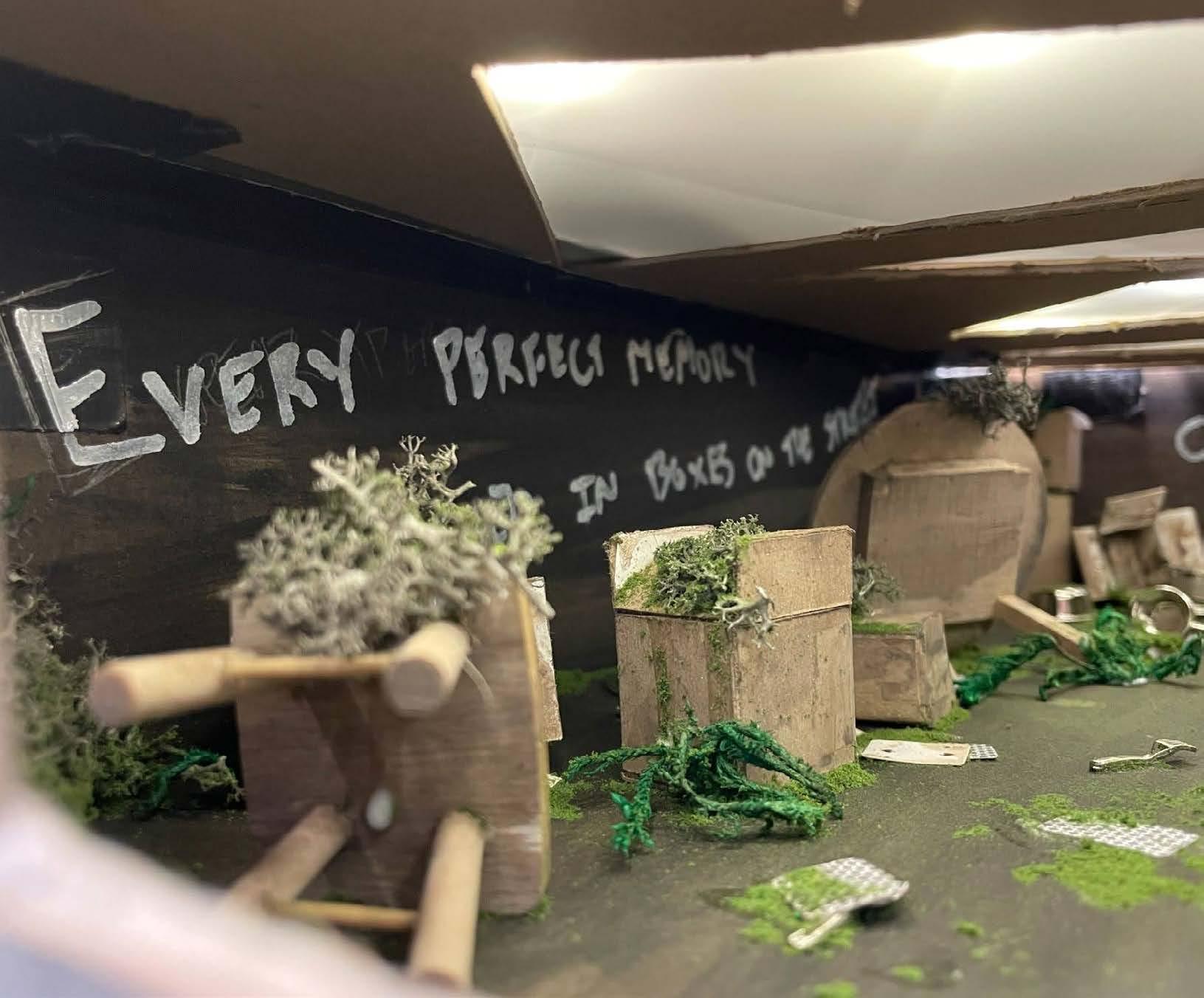
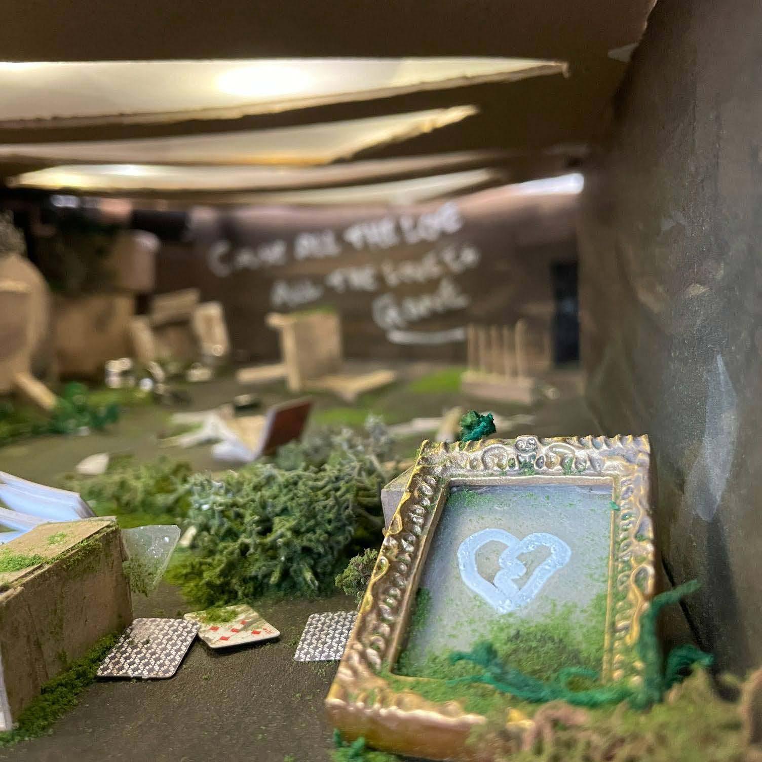
visualizing a with a scale model installation
The project required designing a custom installation that visually and conceptually interpreted a chosen song within a 3D model of our classroom. I selected the song Yard Sale by Alex Warren for its themes of leaving behind painful childhood memories and moving forward despite the emotional toll.
Analyzed Yard Sale while focusing on its depiction of loss, nostalgia, and resilience. Conceptualized the installation as a symbolic representation of discarding painful memories while embracing the need to move forward.
The completed installation effectively captured the essence and emotional depth of Yard Sale. The project demonstrated the power of spatial and lighting design to evoke profound emotion and tell a meaningful story.