Clock & Compass
how john byron plato gave farmers a real address
University of Iowa Press, Iowa City
Mark Monmonier
University of Iowa Press, Iowa City 52242
Copyright © 2022 by the University of Iowa Press www.uipress.uiowa.edu
Printed in the United States of America
Design by Ashley Muehlbauer
No part of this book may be reproduced or used in any form or by any means without permission in writing from the publisher. All reasonable steps have been taken to contact copyright holders of material used in this book. The publisher would be pleased to make suitable arrangements with any whom it has not been possible to reach.
Printed on acid-free paper
Library of Congress Cataloging-in-Publication Data
Names: Monmonier, Mark S., author.
Title: Clock and Compass: How John Byron Plato Gave Farmers a Real Address / Mark Monmonier. Description: Iowa City: University of Iowa Press, 2022. Identifiers: lccn 2021030561 (print) | lccn 2021030562 (ebook) | isbn 9781609388218 (paperback) | isbn 9781609388225 (ebook)
Subjects: lcsh: Plato, John Byron, 1876–1966. | Compass system (Cartography) | Rural geography Maps United States History. | Farms Location United States. | Cartographers United States Biography. Classification: lcc ga407.p53 m66 2022 (print) | lcc ga407.p53 (ebook) | ddc 526/.64 dc23
lc record available at https://lccn.loc.gov/2021030561
lc ebook record available at https://lccn.loc.gov/2021030562
For my grandsons, Camden and Cooper
Preface ix
1. No Real Address 1
2. Denver 16
3. Semper 32
4. Exploiters and Advocates 48
5. Ithaca 62
6. Ohio 88
7. Washington, DC 98
8. Camp Plato Place 108
9. Remission 114
10. Postmortem 136 Acknowledgments 145 Notes 147
preface
Clock and Compass is an outgrowth of my book Patents and Cartographic Inventions, written to offer (as its subtitle promised) “a new perspective for map history.” By calling attention to the several hundred map-related inventions among the several million clever ideas vetted by the US Patent Office during its first two centuries, I introduced academic historians of cartography and map enthusiasts in general to a broad range of ingenious but little-known strategies for pinpointing places, navigating highways, folding maps, projecting worldviews, manufacturing globes, and exploring the promise of electronic circuitry. Few of these patents received wide recognition—Buckminster Fuller’s iconic Dymaxion projection and some clever starburst folding schemes are prominent exceptions. Most merely demonstrated that not all clever ideas are worth marketing. The patents system certifies originality but cannot guarantee sales, profit, or even an uncertain launch.
Among the various inventions featured in Patents, one stands out: John Byron Plato’s “Clock System,” which uses distance and direction from a nearby business center to give farmhouses an address as specific and workable as the house numbers and street names used in cities. Devised several decades before utility companies, town governments, and E-911 offices extended street-numbering into the countryside, the Clock System depended upon both a map and a directory, which also accommodated the paid advertising that supported compilation and distribution. At a time when most rural residents lacked telephone service, it played a role similar to the phonebook, which might have contributed to its demise. At the nexus between residents, advertisers, and the directory publisher, the Clock System occupies a small but not insignificant place in the history
I first learned of the Clock System a few decades ago in the 1980s, though I cannot be certain. I vaguely recall browsing the map library at Syracuse University, where I am on the geography faculty, and finding a Compass System map and directory for Oswego County, New York, which lies between Onondaga County, where I live, and Lake Ontario. I photocopied a few key pages and stuck them in a “for-later-use” folder, in a file drawer where I stockpiled ideas for new projects. Note that I said Compass System, not Clock System, because the Oswego map, copyrighted in 1938, relied on Plato’s basic framework (business center, distance, and direction) but was published by a firm that revived Plato’s game plan five years after he left town at the onset of the Great Depression.
That few Clock System and Compass System maps have survived in libraries, public map collections, and personal caches of antique road maps is both understandable and puzzling. Understandable because ephemera, such as phonebooks and flyers, are often deemed too common, too fleeting, and thus too insignificant to merit systematic archiving and cataloging. And puzzling because their detailed and fascinating pictures of past landscapes are of obvious value to local historians and collectors of road maps and other Americana once important to everyday citizens. More troubling is the apparent fact that almost all the maps Plato filed with his copyright applications have gone missing. The Library of Congress, which normally would receive one of the two “deposit copies,” lists only his “Clock System Map of Onondaga County” in its online catalog. The map, never registered for copyright when it was published in 1927, was donated to the Library in 1992.
Clock and Compass attempts to construct as revealing a biography of Plato as available evidence might allow, while weaving in key details about his invention and its impacts as well as his business model and collaborators. The framework is largely chronological, starting with a concise description of the problem Plato sought to solve: a problem rooted in rural sociology as well as cartography. My research strategy for probing his solution is both archival and analytical. Newspaper stories retrieved through searchable databases supplement archived census materials, city directories, and other genealogical tools collectively known as Big Microdata. Additional
x | preface of wayfinding and telecommunication technologies that evolved into the satnav and the internet. Plato’s invention fully merited its featured treatment in Patents’ second chapter, which focused on geographic location.
evidence includes the temporal and geographic patterns of mapping activity as documented by Plato’s copyright registrations, and the form and content of the maps themselves. As with my previous books, I rely heavily on maps and diagrams to tell the story. Some are facsimiles, chosen to illustrate what Plato was up to. Others are my own designs, intended to summarize geographic relationships; discussion of their development will, I hope, help the reader appreciate that maps are not only part of the story but part of the storytelling.
As an academic sleuth, I sought to find and connect as many relevant dots as needed to craft a coherent story about what Plato did, why he did it, and with what impact. I cannot say, “as many relevant dots as possible” because a researcher can always initiate one more search or look under one more rock. As a map historian, I must rely on interpolation and extrapolation, and use “apparently” to flag iffy explanations and interpretations. Plato might have helped by donating his business records to a historical society, or by marrying young and siring observant offspring, or at least by being born into a tribe of long-lived kinfolk committed to preserving his memory—but he didn’t. That said, he enjoyed writing and talking to news reporters, and left a host of facts, which I could usually (but not always) triangulate. Not everything is knowable, but by and large I think I got it right.
mark monmonier DeWitt, New York
clock and compass
no real address
Relative isolation put rural residents near the forefront of the nation’s rapid shift in personal transportation from steel rails to paved roads. In 1916 the United States railway network reached its peak of 254,037 route miles.1 Although the railnet still registered a robust 249,052 miles by 1930, these oft-cited estimates are deceptive: steam railroads had made longdistance travel ever more practicable, at least between stations with passenger service. Streetcar systems extended this accessibility within cities large and small, and electric interurban lines put some of the adjacent countryside, and many farmers, within reach. 2 Nonetheless, these fixed-route conveniences did not serve everyone and were not to last. The principal disrupter was the motor car.
Before the 1920s became the age of automobile design, improved reliability and lower prices had made the 1910s an age of personal motorized transport. Industrious carriage makers and machinists became automobile manufacturers, and car dealerships found willing buyers in both urban and rural settings.3 Some farm-machinery dealers discovered car sales a profitable sideline as well-off or debt-tolerant farmers recognized the automobile as an affordable supplement to their more utilitarian pick-up truck. In cities and small towns, affluent homeowners delighted in a new use for their carriage house or backyard stable. Great wealth was not a prerequisite for city residents dissatisfied with the dubious convenience of an electric streetcar network focused on downtown. Although only 2 percent of American households owned a car in 1910, automobility increased markedly over the next two decades. The federal census did not count households with cars, but a New York Times statistician estimated per-household car-ownership rates of 28 and 59 percent for 1920 and 1930,
respectively.4 Outside medium and large cities, where the trolley remained a convenient alternative, proportionately more households owned cars.
Fueling the transition to car ownership was the petroleum industry, which followed the discovery of oil in Titusville, Pennsylvania, in 1859. Production initially focused on kerosene, used principally for illumination as a substitute for whale oil. Although the earliest motor cars ran on natural gas, which was difficult to produce and store, improved internalcombustion engines created a profitable use for gasoline, an overly volatile and largely useless byproduct of kerosene production. 5 Discovery of oil fields elsewhere in Appalachia and in Kansas and Oklahoma fostered the creation of John D. Rockefeller’s Standard Oil monopoly, broken up by a 1911 Supreme Court decision. Successor companies like Esso and Socony developed networks of local gasoline and motor-oil dealers, essential to long-distance motoring.6
Although a dirt road still ran past the typical farm, an expanding network of paved highways increased the rural traveler’s range and aspirations. In the 1870s bicyclists eager for solid, stable pavement free of mud, stones, and dust initiated the Good Roads Movement, embodied by the League of American Wheelmen, founded in 1880.7 The League lobbied state governments for smooth roads, paved with macadam, another recent innovation, and started its own magazine, Good Roads, in 1892.8 The movement gained further support from the Grange Movement and the US Post Office, which was experimenting with Rural Free Delivery service in the 1890s.
In the 1910s turn-by-turn instructions in guidebooks, sometimes reinforced with simple maps and photographs, helped motorists navigate the irregular and poorly marked routes connecting cities and larger towns.9 In the mid-1920s the American Association of State Highway Officials provided a more stable framework for small- and intermediate-scale road maps by establishing a nationwide numbering scheme with standardized signage.10 The free road map emerged in the late 1920s, when low-cost printing and economies of mass production at Rand McNally, General Drafting, and H.M. Gousha intersected the competitive needs of petroleum companies, such as Esso and Texaco, with supply chains supporting thousands of franchised or company-owned gas stations.11 Up-to-date disposable maps encouraged motorists to find a route and just follow the signs. However helpful these navigation aids, uncertainty arose when the destination was off the numbered network.
2 | chapter one
In the era before farms acquired house numbers, rural travelers venturing outside their immediate neighborhood or beyond the network of numbered highways often relied on hand-drawn maps or verbal directions. Locally prominent visible landmarks were useful reference points, as when a traveler was told, “Go about three miles until you see a large red barn, and then bear left.” Countable guidance like “fourth house on the right” underscored the need to show individual structures to reinforce a reliable representation of noteworthy bends and straight stretches. Today’s electronic navigation systems recognize the value of locally distinctive landmarks, as when a motorist’s GPS says, “Turn left at the gas station,” or “turn right at the second set of traffic lights.”
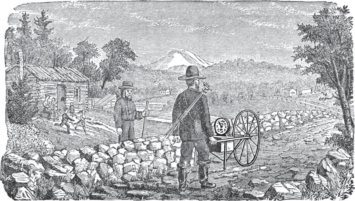
Farmers sufficiently prosperous to own one might consult the family’s county land-ownership atlas. In the latter half of the nineteenth century a team of surveyors would descend on a county, check names of householders, and measure distances along roads with a wheelbarrow odometer, also called a surveyor’s perambulator (fig. 1).12 They consulted plat maps and other data readily available at the county courthouse, and compiled maps for oversize atlas pages (roughly 17 × 14 inches). Because the surveyorcanvassers also took orders for the finished atlas—buyers eager to see their house and name on the map had to prepay—publishers of these so-called subscription atlases had no need to front the costs of engraving and printing.13 As a further appeal to vanity, for an additional fee the atlas could include an engraved sketch of the buyer’s home embellished with mature shade trees and meticulously trimmed ornamental plantings. The lucrative county atlas business, along with spinoffs such as county wall maps and state atlases, accounted for four of the eighteen chapters in muckraker Bates Harrington’s 1890 book How ’Tis Done: A Thorough Ventilation of the Numerous Schemes Conducted by Wandering Canvassers, Together with the Various Advertising Dodges for the Swindling of the Public. 14
Despite the hype and high-pressure salesmanship, these county-format atlases have been praised as generally reliable representations of the late-nineteenth-century American landscape, particularly useful for counties where original ownership records were lost in a fire or flood.15 Coverage was notably thorough in rural parts of the Central and MidAtlantic states, where local landowners able to afford them were relatively numerous. Clara Le Gear, who compiled a cartobibliography for the Library of Congress, identified county atlases published in the 1860s and 1870s
Address | 3
figure 1. Wheelbarrow odometer, a push-cart device for measuring distance along roads. From Bates Harrington, How ’Tis Done: A Thorough Ventilation of the Numerous Schemes Conducted by Wandering Canvassers; Together with the Various Advertising Dodges for the Swindling of the Public (Syracuse, NY: W. I. Pattison, 1890), 17.
covering fifty of the fifty-five New York counties north of New York City.16 By 1900 an atlas had been published for most counties in the agricultural states of the Midwest. These atlases enrich the reference collections of county historical societies and genealogical departments of public libraries fortunate to own one.
Subscription atlases were designed to flatter as well as inform. Printed at scales of approximately 1:31,680 (two inches to the mile), their maps were sufficiently detailed to show individual homes and residents’ names, as well as the orientation of a farmstead’s rectangular footprint.17 As illustrated in figure 2, from an atlas published in 1874, the engraver often had a preference for jerky straight-line segments, no doubt easier to inscribe than the more realistic smooth curves that later mapmakers could delineate efficiently with pen and ink. Although this atlas made it easy to pinpoint some destinations, it was of limited use for in-vehicle navigation by a 1920s’ motorist because many of the residences shown had disappeared. And why risk damaging a would-be family heirloom on a local road trip? Putting farmers on the map did little to help them with wayfinding.
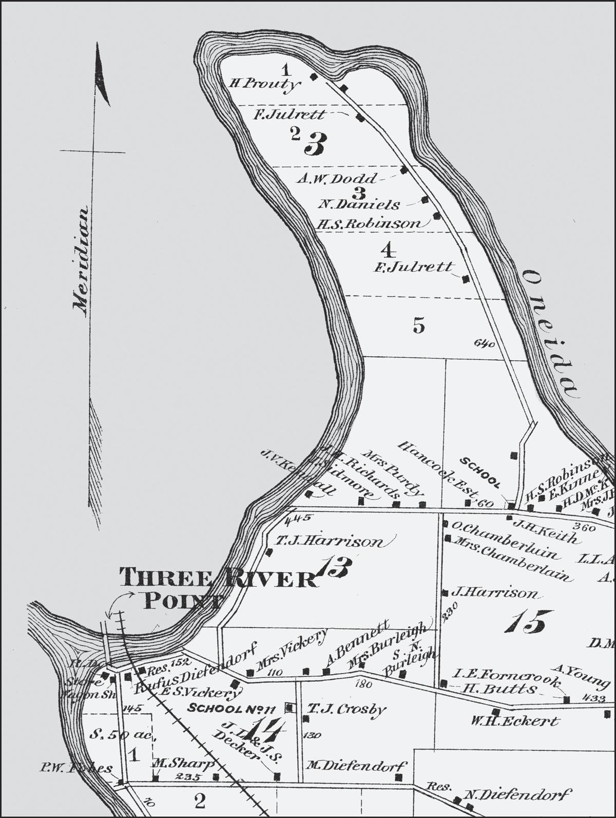
figure 2. An 1874 county atlas provides a detailed rendering of a neighborhood in the northwestern corner of the Town of Clay, in Onondaga County, New York.
Excerpt from the northwestern corner of the map for the Town of Clay, in Sweet’s New Atlas of Onondaga Co., New York: From Recent and Actual Surveys and Records under the Superintendence of Homer D. L. Sweet (New York: Walker Bros. & Co., 1874), 16–17.
Courtesy Map and Atlas Collection, Bird Library, Syracuse University.
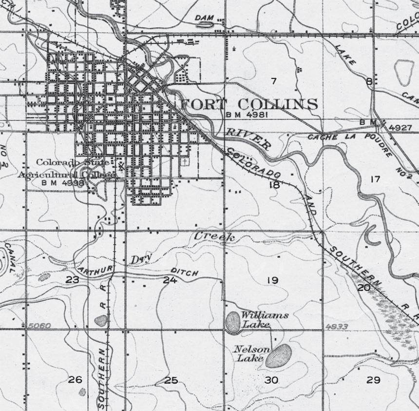
figure 3. Excerpt from Fort Collins, Colorado, 15-minute US Geological Survey topographic map. 10.9 × 10.7 cm. Map scale (1:62,500) is readily apparent from the section lines, one mile apart and often occupied by a road. Excerpt from US Geological Survey, Fort Collins, Colorado (quadrangle map), 1:62,500, 15-minute series, 1906. Courtesy Map and Atlas Collection, Bird Library, Syracuse University.
Another cartographic product suitably detailed to show individual farmsteads was the US Geological Survey (USGS) topographic map, typically published at a scale of 1:62,500 (roughly one inch to the mile). Established in 1879, the USGS initiated an ambitious program of quadrangleformat mapping, but coverage was a slow build.18 Although the typical quadrangle encompassed 15 degrees of latitude and 15 degrees of longitude, some of the early USGS quadrangle maps covered four times the area (30 degrees of latitude and 30 degrees of longitude) on the same
size sheet (roughly 17 ´ 21 inches) at half the scale, 1:125,000 (roughly one inch to two miles).
The excerpt in figure 3, from a 15-minute quadrangle map of Fort Collins, Colorado, published in 1906, includes several basic feature categories. Though not apparent on this black-and-white version, color coding distinguishes natural features from human imprints like infrastructure and feature names. Lakes, ponds, reservoirs, streams, rivers, and irrigation canals—collectively known as hydrography—are blue; elevation contours, spot elevations (at selected road intersections), and dams are brown; and roads, railways, structures, and other forms of “public culture” are black.
Many feature types are apparent from their distinctive shape or accompanying labels: mostly straight double-line symbols represent roads, heavier single lines with small, evenly spaced cross-ticks portray railroads, and alternating long and short dashes delineate the municipal boundary. The dominant water feature is the Cache La Poudre River, flowing from northwest to southeast and receiving drainage from perennial streams (thin continuous lines) as well as seasonal streams (long dashes separated by three dots) such as Dry Creek, about a mile south of the city line. Irrigation canals, such as Arthur Ditch (south of Dry Creek), reflect a semiarid climate in which farmers depend on an artificial water supply. Italic type for water features reflects a well-established cartographic convention.
Elevation contours are everywhere. With a vertical interval of 20 feet, these brown lines are widely spaced where the land slopes gently toward the river and closer together where the land pitches more steeply toward a tributary. Within and immediately adjacent to the city boundary are numerous small black rectangles representing structures. Aside from the few rectangles with a cross indicating a church, the map makes no distinction among residential, commercial, industrial, and governmental uses. Along city blocks with closely spaced structures the rectangles coalesce. Outside the city the map shows farmsteads but usually omits barns and other outbuildings. The smooth curves of the Colorado and Southern Railway, which follows the meandering river on higher ground, contrast with the two comparatively straight tracks that converge on the city from the east and south. Waterways and railroads are named, but the area’s more numerous roads remain anonymous—a clear limitation for anyone wanting to use a USGS topographic map as a wayfinding aid.
Real Address | 7
Even so, a motorist might find some solace in the general pattern of roads running north–south or east–west and spaced a mile apart, as if on a grid. After all, an odometer could be useful in following verbal directions gleaned from the map; for instance, “from the center of town go five miles east; then turn right and go three miles south; then turn left, go about a quarter mile, and look for the white house on the right with the name ‘G. Jones’ on the gatepost.” This instruction might work in many parts of the Fort Collins area, but not all sections of the rectangular grid have a doubleline road symbol and not all roads follow a cardinal direction. Although the grid could be a basis for street naming and assigning addresses, this was not the practice in the early twentieth century.
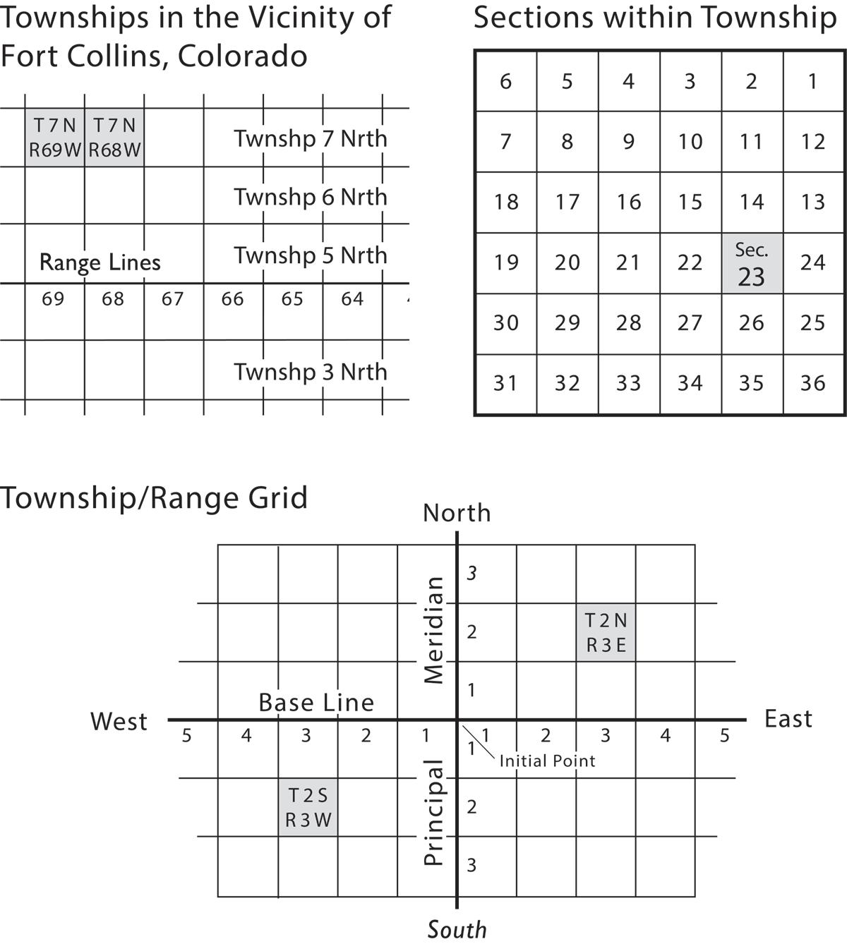
The area’s rectilinear road pattern and similar grids in many other states reflect a recipe for subdividing land known as the Public Land Survey System (PLSS).19 Created after the Revolutionary War when the new nation began acquiring territory west of the original thirteen colonies, the PLSS was a systematic strategy for describing tracts of land that the government would eventually sell, allocate for worthy purposes like education and railroads, or give to settlers who agreed to occupy and put to productive use an allotment of 160 acres. The system was implemented piecemeal, with individual survey districts covering all or part of a state, or perhaps multiple states. Each survey district was framed by a “principal meridian” and a parallel called a “base line,” which intersected at an “initial point.” As described in the lower part of figure 4, a survey district was divided into square “townships,” six miles on a side and organized into a grid of rows (also called townships) and columns called ranges. Because township rows are numbered north or south of the base line and ranges are numbered east or west of the principal meridian, a township’s location can be referenced by its pair of township and range numbers. Examples labeled (T.2S, R.3W) and (T.2N, R.3E) illustrate this strategy.
PLSS locations are hierarchical, which makes the system useful for subdividing land and setting up local governments but too complicated for giving directions, assigning addresses, or general wayfinding. Each township is divided into thirty-six one-square-mile “sections,” measuring one mile on each side and numbered in the meandering zigzag scheme shown in the upper right part of figure 4. In turn, each section encompasses 640 acres, which can be subdivided into four 160-acre quarter sections. Considered large enough to support a family, the quarter section was the
figure 4. Key elements of the Public Land Survey System include township and range numbers referenced to the base line and principal meridian (lower) and the zigzag numbering of square-mile sections within each thirty-six squaremile township (upper right). Diagram in the upper left locates the two townships covering the area in Figure 3. Compiled by the author.
typical grant to homesteaders. Its locational reference begins on the left with the fractional part (e.g., SE ¼, Sec. 23, T.2N, R.3E). A quarter section can be subdivided further into quarter-quarter sections of 40 acres.
On USGS quadrangle maps for a PLSS area, township and range numbers can be found in the comparatively vacant part of the map sheet that mapmakers have dubbed the “collar,” with township numbers down the South
left and the right, and range numbers along the top and the bottom. Within the map proper, sections are numbered according to the prescribed zigzag scheme (fig. 4, upper right). For example, in figure 3 the label for Sec. 23, T.7N, R.69W is slightly below and to the left of the A in “ARTHUR DITCH” (in the lower-left portion of the excerpt), and Sec. 24 is immediately to its right. Section boundaries not apparent in the road system are portrayed by thin vertical and horizontal lines (right side of fig. 3), distinctly weaker than the double-line road symbols. That the excerpt straddles parts of two townships is apparent because immediately to the right of Sec. 24, T.7N, R.69W is Sec. 19, T.7N, R.68W, with Williams Lake in its lower-left corner. The vertical boundary between the two sections runs northward through the “t” in Fort Collins. Though sold to the general public, USGS topographic maps were rarely used for wayfinding, and few farmers are likely to have owned one.
Another kind of large-scale map was designed specifically for rural wayfinding, but even fewer farmers ever owned or saw one. When Rural Free Delivery (RFD) was established in the late nineteenth century, the Post Office Department began mapping the rural delivery routes used by letter carriers based at a local post office.20 Although these maps were an in-house management tool, their comprehensive description of the road network made them a topographic map of sort—not all topographic maps have elevation contours. In addition to roads and railways, they showed rivers, streams, and county boundaries.
The Post Office had been using maps since its inception. Local postmasters obviously needed to know their station’s immediate neighbors. Moreover, because postal employees or contractors who carried mail from station to station followed prescribed routes with measured distances, detailed maps were essential for planning arrivals and departures as well as for setting compensation. In 1837 an in-house Division of Topography began replacing outside mapmakers. 21 Its key product was the intercity postal-route map, which encompassed entire states or parts of adjoining states. Intercity maps included county boundaries and, well before the century’s end, railroads with a mail contract.22 Letters traveling a hundred miles or more moved mostly by train.
RFD service began as an experiment with three routes in West Virginia in 1896, when the Post Office surveyed forty-three additional routes in twenty-nine states.23 By 1899 RFD service had increased to 412 routes,
spread across forty states and one territory. That year the Post Office Department established the first countywide mail service in Carroll County, Maryland, roughly forty-five miles northwest of Washington, DC. Other maps, narrower in scope, described routes emanating from a single local post office. The number of individual routes rose steadily, reaching 43,866 in 1915, when it leveled off.24 Residents could propose a route that was less than twenty-five miles long, on a gravel or macadam surface, with at least a hundred families within a quarter mile of the route; delivery was only to boxes along the designated route, and the application had to include a map.25 The Post Office regulated the size and shape of the rural mailbox, with its distinctive attached flag that could be raised to tell the carrier to pick up outgoing mail.26
Rural-delivery maps were essential because local postmasters needed to know that all designated mail recipients were on one of their routes, that the local system of routes was efficient and duplication was minimal, and that workload was more or less equitable or carriers were appropriately compensated. Intra-government cooperation inspired the Post Office to share these maps with other federal agencies, most notably the Army (especially for Corps of Engineers projects and as predecessor of the Air Force) and the Department of Agriculture (for marketing and soil survey activities). After the Department began selling maps to the public in 1908, postal cartography informed many of Rand McNally’s various local and regional maps and atlases. The biggest single buyer was the Fuller Brush Co., which used rural-delivery maps to facilitate door-to-door sales.27
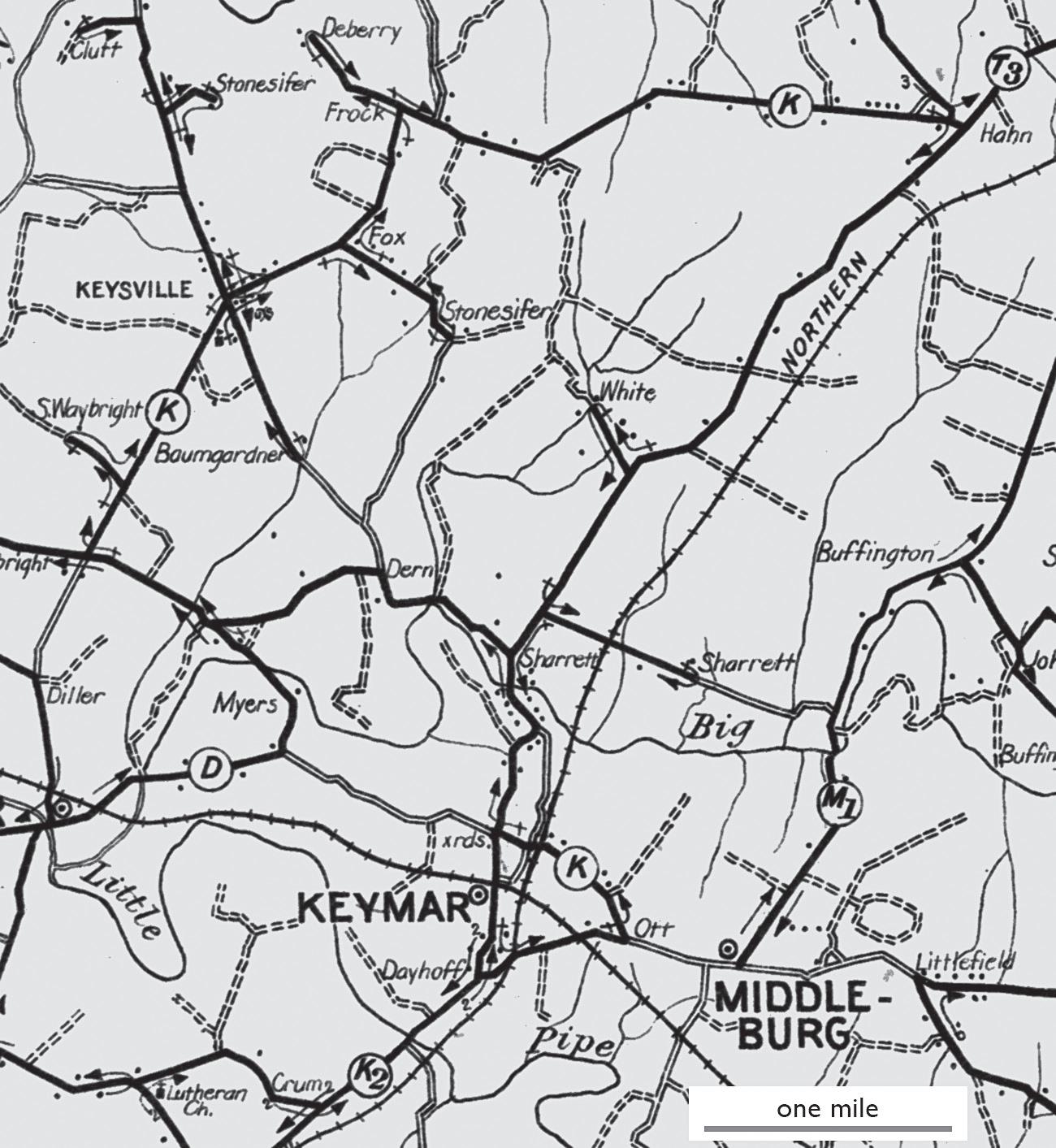
Rural-delivery maps told the mail carrier where to go and in what sequence. On the 1911 edition of the Carroll County rural-delivery map (fig. 5), bold lines and arrows show each carrier’s prescribed movement along a route identified by a letter, a number, or both. Neighboring routes intersect with minimal overlap. Double-dashed lines represent unimproved roads, carefully avoided, and surnames identify mail recipients at turning points. In an elaborate countywide dance, carriers anchored to a home post office ventured forth to navigate a complex path with whatever zigzags and reversals were needed to reach all residents.
The excerpt in figure 5 focuses on route K, out of Keymar, Maryland, but also shows part of route K2. Both routes begin at the Keymar post office, marked by a dot-within-a-circle symbol just south of the railroad track, and run a quarter mile south toward the Dayhoff residence, where
figure 5 . Excerpt from 1911 rural-delivery route map of Carroll County, Maryland, describes route K, based at the Keymar post office, 10.8 × 12.0 cm. Excerpt from US Post Office Department, Map of Carroll County, Md., Showing Rural Delivery Service (Washington, DC: Post Office Department, 1911). Digital image from the Library of Congress, https://www.loc.gov/item/2012585334/.
route K turns east. Tiny arrows describe a generally clockwise path that reaches the Clutt household (at the upper left) and the Hahn residence (in the upper right) before turning south toward the starting point. Along the way the map prescribes numerous side trips, with out-and-back movements reaching residences off the general circuit. Small dots akin to the
structures on a USGS map mark numerous unidentified homes along the route. The carrier learned the recipients’ names, often inscribed on their mailbox along with a box number.
For a substitute or new letter carrier learning the route, the ruraldelivery map was indeed a wayfinding map. For nonemployees, not so much. Not sold locally, the maps were of limited use unless a local postal worker who knew the route marked the specific destination. (Or unless the visitor consulted the local property map at the courthouse.) Because the locations of rural residences were very much a matter of local knowledge, an outsider would have faced the daunting task of driving the route looking for the right mailbox or asking neighbors along the way.
Wayfinding was far easier in cities, where street names and house numbers gave everyone an address useful for more than delivering mail. And by century’s end most large or growing cities inspired at least one enterprising cartographer to create a detailed map that not only named all the streets but also included an index that pointed the user to a specific part of the map.28 Expanding cities, such as turn-of-the-century Denver, were an attractive cartographic market because visitors and new residents needed a street guide and urban growth soon made older editions obsolete. Advertising blocks on folded editions sold at newsstands, bookstores, drug stores, and other high-traffic retailers helped the map publisher keep the price low and capture market share. Volume sales to banks and real estate dealers made the map a promotional tool useful for attracting customers with a free folded street guide bearing the firm’s name, location, and other specifics on an outside panel.29
Despite its straightforward content, the indexed street map challenged its creator’s ingenuity.30 As a commercial product with a thin profit margin, the map’s single-sheet rectangular format constrained map scale, which in turn could have a profound effect on usefulness and aesthetics. Additional tradeoffs arose in the selection of a printing method, use of color, sheet size, folding scheme, typeface, and lettering size, as well as the allocation of panels for advertising, local history, front and back covers, and the street index. A key decision was the map’s geographic scope—how large an area to cover—and which more densely settled areas warranted a detail inset or perhaps their own, relatively large portion of the printed sheet, which raised the further issue of how much redundant coverage to allow. Printing on both sides of the paper allows for a smaller, less wieldy sheet but
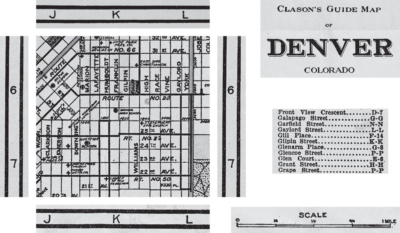
f igure 6. Graphic excerpts describing the grid-reference and street-index schemes on Clason’s Guide Map of Denver, Colorado (1917); street map excerpt is 4.8 × 4.4 cm. Excerpts from Clason’s Guide Map of Denver, Colorado (Denver: Clason Map Co., 1917). Digital image from Western History and Genealogy Dept., Denver Public Library, https://digital.denverlibrary.org/digital/collection/p16079coll39/id/811.
invites questions about whether or where to partition the city or county. Is a departure from the north-up convention worth the resulting confusion or annoyance? It is usually not okay for North and South Main Streets to run toward the upper right and lower left corners, respectively, unless they are so positioned on the ground. Above all, type must be legible, and lines representing streets should not interfere with street names.
Linking the map’s lines and labels to the alphabetical list of street names typically depends on a rectangular index grid that divides the map into square cells, identified by a letter and a number. The grid’s columns might be labeled alphabetically starting with A at the left and its rows numbered downward from 1 at the top, so that cell “C–7” would be three columns in and seven rows down. If a street crosses multiple cells, the index might point out the cell encompassing the beginning or largest part of the street name. Each cell is a neighborhood of sort, although the cells’ straight-line boundaries almost always slice through homogeneous neighborhoods.
Multiple excerpts clipped from Clason’s Guide Map of Denver, Colorado (fig. 6), published in 1917 (and other years), show that the index grid need not be inscribed directly on the map.31 At center-left an excerpt from the street map covers a square area roughly 1.1 miles on a side. It sits between excerpts from the letter strips along the map’s top and bottom edges and between excerpts from the number strips along the map’s left and right edges. At the upper right is an excerpt from the index, which lists streets by name, alphabetically, along with a pair of grid coordinates. For streets aligned with one of the cardinal directions—the dominant pattern in this part of Denver—the grid reference is either two identical numbers for a street running east–west or two identical letters for a street running north–south. For example, Gilpin Street, a north–south street referenced as “K-K,” is clearly in the K column.
Anyone with excellent vision or a magnifying lens could use the Clason map’s index and virtual grid to locate a specific block. For example, a user interested in 2825 Gilpin Street could look for the block number “2800” attached to York Street, just north of the route 28 streetcar line (which runs along 28th Avenue, labeled outside the excerpt area to the right). Because of consistent address numbering, the savvy user could easily figure out that the 2800 block of Gilpin was six blocks to the west of the 2800 block of York. Once on the block, house numbers made it easy to find 2825, which faces Fuller Park (one of many parks, large and small, overprinted in transparent green). Tiny labels also reveal several other destinations in the vicinity; for instance, Manual High School (a block and a half south and a block west) and the East Side Christian Church (a block and a half north and a block east). Although tiny type challenged the user’s visual acuity, Clason obviously considered these additional features worth having—another of the many design tradeoffs confronting the map publisher.
House numbering and street addressing conventions like these gave city residents the real address that their country cousins lacked. Although the Post Office’s RFD service, introduced in the 1890s, was a huge step in reducing rural isolation, an RFD number was good only for delivering mail, not for helping travelers find farms. Moreover, a farmer selling livestock, which the buyer might need to see, could be at a distinct disadvantage, as J. B. Plato soon discovered.