Over and above their precision, there is something more to numbers-maybe a little magic-that makes them fun to study. The fun is in the conceptualization more than the calculations, and we are fortunate that we have the computer to do the drudge work. This allows students to concentrate on the ideas. In other words, the computer allows the instructor to teach the poetry of statistics and not the plumbing.
Computing
To take advantage of the computer, one needs a good statistical package. We use Stata, which is available from the Stata Corporation in College Station, Texas. We find this statistical package to be one of the best on the market today; it is user-friendly, accurate, powerful, reasonably priced, and works on a number of different platforms, including Windows, Unix, and Macintosh. Furthermore, the output from this package is acceptable to the Federal Drug Administration in New Drug Approval submissions. Other packages are available, and this book can be supplemented by any one of them. In this second edition, we also present output from SAS and Mini tab in the Further Applications section of each chapter. We strongly recommend that some statistical package be used.
Some of the review exercises in the text require the use of the computer. To help the reader, we have included the data sets used in these exercises both in Appendix B and on a CD at the back of the book. The CD contains each data set in two different formats: an ASCII file (the "raw" suffix) and a Stata file (the "dta" suffix). There are also many exercises that do not require the computer. As always, active learning yields better results than passive observation. To this end, we cannot stress enough the importance of the review exercises, and urge the reader to attempt as many as time permits.
New to the Second Edition
This second edition includes revised and expanded discussions on many topics throughout the book, and additional figures to help clarify concepts. Previously used data sets, especially official statistics reported by government agencies, have been updated whenever possible. Many new data sets and examples have been included; data sets described in the text are now contained on the CD enclosed with the book. Tables containing exact probabilities for the binomial and Poisson distributions (generated by Stata) have been added to Appendix A. As previously mentioned, we now incorporate computer output from SAS and Minitab as well as Stata in the Further Applications sections. We have also added numerous new exercises, including questions reviewing the basic concepts covered in each chapter.
Acknowledgements
A debt of gratitude is owed a number of people: Harvard University President Derek Bok for providing the support which got this book off the ground, Dr. Michael K. Martin for calculating Tables A.3 through A.8 in Appendix A, and John-Paul Pagano for
assisting in the editing of the first edition. We thank the individuals who reviewed the manuscript: Rick Chappell, University of Wisconsin; Dr. Todd G. Nick, University of Mississippi Medical Center; Al Bartolucci, University of Alabama at Birmingham; Bruce E. Trumbo, California State University, Hayward; James Godbold, The Mount Sinai School of Medicine of New York University; and Maureen Lahiff, University of California, Berkeley. Our thanks to the teaching assistants who have helped us teach the course and who have made many valuable suggestions. Probably the most deserving of thanks are the students who have taken the course over the years and who have tolerated us as we learned how to teach it. We are still learning.
In 1903, H. G. Wells hypothesized that statistical thinking would one day be as necessary for good citizenship as the ability to read and write. Statistics do play an important role in many decision-making processes. Before a new drug can be marketed, for instance, the United States Food and Drug Administration requires that it be subjected to a clinical trial, an experimental study involving human subjects. The data from this study must be compiled and analyzed to determine whether the drug is not only effective, but safe. In addition, the U.S. government's decisions regarding Social Security and public health programs rely in part on predictions about the longevity of the nation's population; consequently, it must be able to predict the number of years that each individual will live. Many other issues need to be addressed as well. Where should a government invest its resources if it wishes to reduce infant mortality? Does the use of a seat belt or an air bag decrease the chance of death in a motor vehicle accident? Should a mastectomy always be recommended to a patient with breast cancer? What factors increase the risk that an individual will develop coronary heart disease? To answer these questions and others, we rely on the methods of biostatistics.
The study of statistics explores the collection, organization, analysis, and interpretation of numerical data. The concepts of statistics may be applied to a number of fields that include business, psychology, and agriculture. When the focus is on the biological and health sciences, we use the term biostatistics.
Historically, statistics have been used to tell a story with numbers. Numbers often communicate ideas more succinctly than do words. The message carried by the following data is quite clear, for instance. In 1979, 48 persons in Japan, 34 in Switzerland, 52 in Canada, 58 in Israel, 21 in Sweden, 42 in Germany, 8 in England, and 10,728 in the United States were killed by handguns [1]. The power of these numbers is obvious; the point would be made even if we were to correct for differences in population size.
As a second example, consider the following quotation, taken from an editorial in The Boston Globe [2]:
Lack of contraception is linked to an exceptionally high abortion rate in the Soviet Union-120 abortions for every 100 births, compared with 20 per 100 births in
Great Britain, where access to contraception is guaranteed. Inadequate support for family planning in the United States has resulted in 40 abortions for every 100 births-a lower rate than the Soviet Union , but twice as high as most industrialized nations
In this case , a great deal of information is contained in only three numbers: 120, 20, and 40. The statistics provide some insight into the consequences of differing attitudes toward family planning.
In both these examples, the numbers provide a concise summary of certain aspects of the situation being studied. Surely the numerical explanation of the handgun data is more illuminating than if we had been told that some people got killed in Japan, fewer in Switzerland, more in Canada, still more in Israel, but far fewer in Sweden, and so forth. Both examples deal with very complex situations, yet the numbers convey the essential information. Of course, no matter how powerful , no statistic will convince everyone that a given conclusion is true The handgun data are often brushed away with the aphorism "Guns don't kill people, people do." This should not be surprising; after all, there are still members in the Flat Earth Society. The aim of a biostatistical study is to provide the numbers that contain information about a certain situation and to present them in such a way that valid interpretations are possible
l. l Overview of the Text
If we wish to study the effects of a new diet , we might begin by measuring the changes in body mass over time for all individuals who have been placed on the diet. Similarly, if we wanted to investigate the success of a certain therapy for treating prostate cancer, we would record the lengths of time that men treated with this therapy survive beyond diagnosis with the disease . These collections of numbers , however, can display a great deal of variability and are generally not very informative until we start combining them in some way. Descriptive statistics are methods for organizing and summarizing a set of data that help us to describe the attributes of a group or population. In Chapter 2 , we examine tabular and graphical descriptive techniques . The graphical capabilities of computers have made this type of summarization more feasible than in the past, and a whole new mode of presentation is available for even the most modest analyses.
Chapter 3 goes beyond the graphical techniques presented in Chapter 2 and introduces numerical summary measures. By definition, a summary captures only a particular aspect of the data being studied ; consequently , it is important to have an idea of how well the summary represents the set of measurements as a whole . For example , we might wish to know how long AIDS patients survive after diagnosis with one of the opportunistic infections that characterize the disease . If we calculate an average survival time , is this average then representative of all patients? Furthermore, how useful would the measure be for planning future health service needs? Chapter 3 investigates descriptive techniques that help us to answer questions such as these .
Data that take on only two distinct values require special attention. In the health sciences, one of the most common examples of this type of data is the categorization of being either alive or dead. If we denote the former state by 0 and the latter by 1, we are able to classify a group of individuals using these numbers and then to average the results. In this way, we can summarize the mortality associated with the group. Chapter 4 deals exclusively with measurements that assume only two values. The notion of dividing a group into smaller subgroups or classes based on a characteristic such as age or gender is introduced as well. We might wish to study the mortality of females separately from that of males, for example. Finally, this chapter investigates techniques that allow us to make valid comparisons among groups that may differ substantially in composition.
Chapter 5 introduces the life table, one of the most important techniques available for study in the health sciences. Life tables are used by public health professionals to characterize the well-being of a population, and by insurance companies to predict how long a particular individual will live. In this chapter, the study of mortality begun in Chapter 4 is extended to incorporate the actual time to death for each individual; this results in a more refined analysis. Knowing these times to death also provides a basis for calculating the survival curve for a population. This measure of longevity is used frequently in clinical trials designed to study the effects of various drugs and surgical treatments on survival time.
In summary, the first five chapters of the text demonstrate that the extraction of important information from a collection of numbers is not precluded by the variability among them. Despite this variability, the data often exhibit a certain regularity as well. For example, if we look at the annual mortality rates of teenagers in the United States for each of the last ten years, we do not see much variation in the numbers. Is this just a coincidence, or is it indicative of a natural underlying stability in the mortality rate? To answer questions such as this, we need to study the principles of probability.
Probability theory resides within what is known as an axiomatic system: we start with some basic truths and then build up a logical system around them. In its purest form, the system has no practical value. Its practicality comes from knowing how to use the theory to yield useful approximations. An analogy can be drawn with geometry, a subject that most students are exposed to relatively early in their schooling. Although it is impossible for an ideal straight line to exist other than in our imaginations, that has not stopped us from constructing some wonderful buildings based on geometric calculations. The same is true of probability theory: although it is not practical in its pure form, its basic principles-which we investigate in Chapter 6---can be applied to provide a means of quantifying uncertainty.
One important application of probability theory arises in diagnostic testing. Uncertainty is present because, despite their manufacturers' claims, no available tests are perfect. Consequently, there are a number of important questions that must be answered. For instance, can we conclude that every blood sample that tests positive for HIV actually harbors the virus? Furthermore, all the units in the Red Cross blood supply have tested negative for HIV; does this mean that there are no contaminated samples? If there are contaminated samples, how many might there be? To address questions such as these, we must rely on the average or long-term behavior of the diagnostic tests; probability theory allows us to quantify this behavior.
Chapter 7 extends the notion of probability and introduces some common probability distributions. These mathematical models are useful as a basis for the methods studied in the remainder of the text.
The early chapters of this book focus on the variability that exists in a collection of numbers. Subsequent chapters move on to another form of variability-the variability that arises when we draw a sample of observations from a much larger population. Suppose that we would like to know whether a new drug is effective in treating high blood pressure. Since the population of all people in the world who have high blood pressure is very large, it is extremely implausible that we would have either the time or the resources necessary to examine every person. In other situations, the population may include future patients; we might want to know how individuals who will ultimately develop a certain disease as well as those who currently have it will react to a new treatment. To answer these types of questions, it is common to select a sample from the population of interest and, on the basis of this sample, infer what would happen to the group as a whole.
If we choose two different samples, it is unlikely that we will end up with precisely the same sets of numbers. Similarly, if we study a group of children with congenital heart disease in Boston, we will get different results than if we study a group of children in Rome. Despite this difference, we would like to be able to use one or both of the samples to draw some conclusion about the entire population of children with congenital heart disease. The remainder of the text is concerned with the topic of statistical inference.
Chapter 8 investigates the properties of the sample mean or average when repeated samples are drawn from a population, thus introducing an important concept known as the central limit theorem. This theorem provides a foundation for quantifying the uncertainty associated with the inferences being made.
For a study to be of any practical value, we must be able to extrapolate its findings to a larger group or population. To this end, confidence intervals and hypothesis testing are introduced in Chapters 9 and 10. These techniques are essentially methods for drawing a conclusion about the population we have sampled, while at the same time having some knowledge of the likelihood that the conclusion is incorrect. These ideas are first applied to the mean of a single population. For instance, we might wish to estimate the mean concentration of a certain pollutant in a reservoir supplying water to the surrounding area, and then determine whether the true mean level is higher than the maximum concentration allowed by the Environmental Protection Agency. In Chapter 11, the theory is extended to the comparison of two population means; it is further generalized to the comparison of three or more means in Chapter 12. Chapter 13 continues the development of hypothesis testing concepts, but introduces techniques that allow the relaxation of some of the assumptions necessary to carry out the tests. Chapters 14, 15, and 16 develop inferential methods that can be applied to enumerated data or countssuch as the numbers of cases of sudden infant death syndrome among children put to sleep in various positions-rather than continuous measurements.
Inference can also be used to explore the relationships among a number of different attributes. If a full-term baby whose gestational age is 39 weeks is born weighing 4 kilograms, or 8.8 pounds, no one will be surprised. If the baby's gestational age is only 22
weeks , however, then his or her weight will be cause for alarm. Why? We know that birth weight tends to increase with gestational age, and, although it is extremely rare to find a ba by weighing 4 kilograms at 22 weeks, it is not uncommon at 39 weeks. The s tudy of the extent to which two factors are related i s known as correlation analysis; this is th e topic of Chapter 17. If we wish to predict the outcome of one factor base d on the value of another, regression is the a ppropriate technique. Simple linear regression is investigated in Chapter 18 , a nd i s extended to the multiple regression setting-where two or more factor s are used to predict a si ngle outcome-in Chapter 19. If the outcome of interest can take on only two possible values, s uch as alive or dead , a n alternative technique must be ap plied ; logistic regression is explored in Chapter 20.
In Chapter 21 , the inferential method s a ppropriate for life ta bles are introduced . The se technique s enable us to draw conclusions about the mortality of a population base d on a samp le of individuals drawn from the group.
Finally, Ch a pter 22 examines an issue th a t is fundamental in inference-the concept of the representativeness of a sample. In any s tudy, we need to be confident th a t the sample we choose provides an accurate picture of the population from which it is drawn . Several different methods for se lecting representative samp le s are de scri bed. The notion of bias and various problems that can arise when choosing a sample are discussed as well. Common sense play s an important role in sam pling , as it doe s throughout the entire book .
1.2 Review Exercises
1. Design a study aimed at investigating an issue that you believe might influence the health of the world. Briefly describe the data that you will require, how you will obtain them, how you intend to analyze the data, and the method you will use to present your results. Keep this study design and reread it after you have completed the text.
2. Consider the following quotation regarding rapid population growth [3]: 512 million people were malnourished in 1986-1987, up from 460 million in 1979-1981.
(a) Suppose that you agree with the point being made. Justify the use of these numbers.
(b) Are you sure that the numbers are correct? Do you think it is possible that 513 million people were malnourished in 1986-1987, rather than 512 million?
3. In addition to stating that "the Chinese have eaten pasta since 1100 B.c.," the label on a box of pasta shells claims that "Americans eat 11 pounds of pasta per year," whereas "Italians eat 60 pounds per year." Do you believe that these statistics are accurate? Would you use these numbers as the basis for a nutritional study?
Bibliography
[1] McGervey, J.D., Probabilities in Everyday Life, Chicago: Nelson-Hall, 1986.
[2] "The Pill's Eastern Europe Debut," The Boston Globe, January 19, 1990, 10.
[3] United Nations Population Fund, "Family Planning: Saving Children, Improving Lives," New York: Jones & Janello.
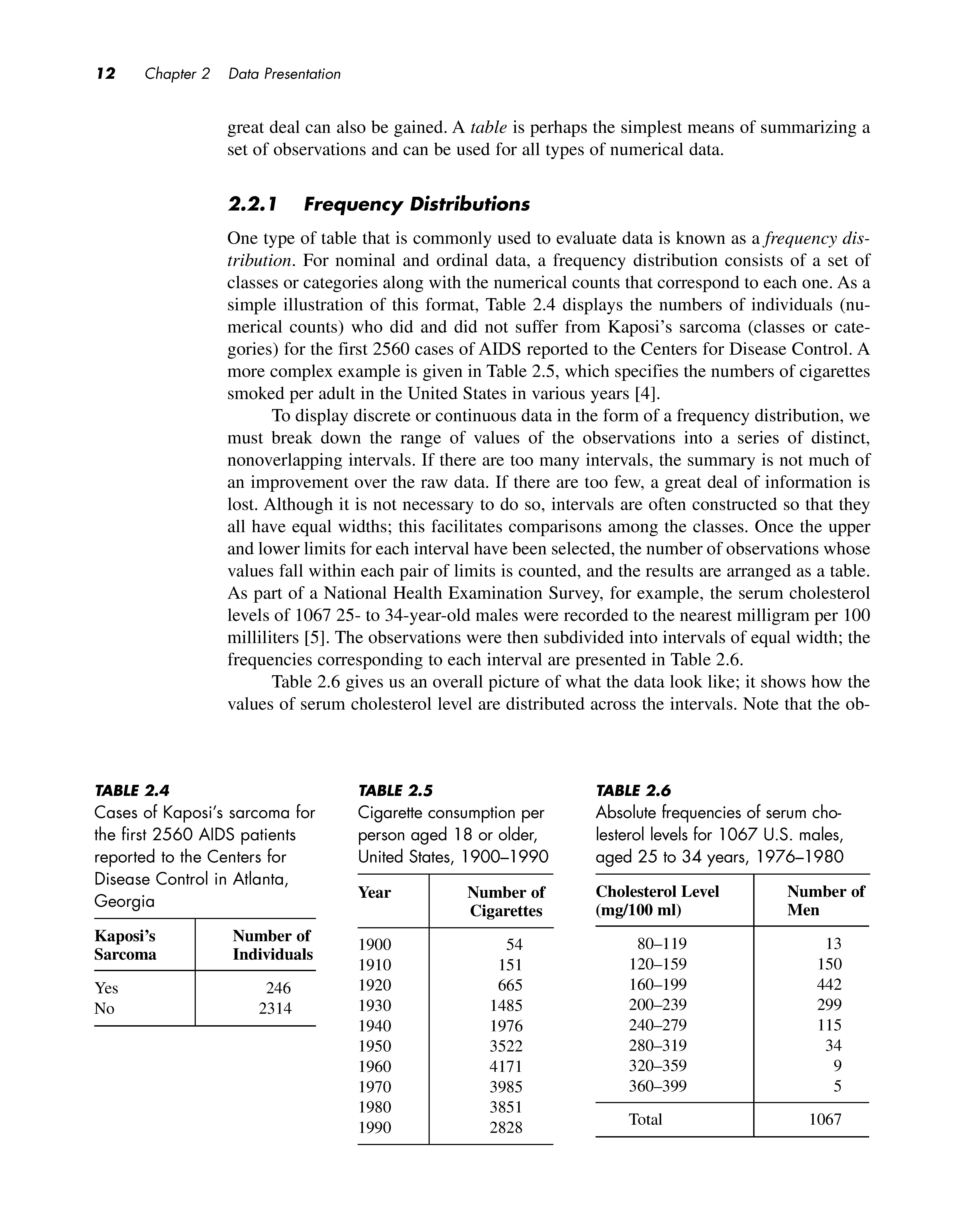
Every study or experiment yields a set of data. Its size can range from a few measurements to many thousands of observations . A complete set of data , however, will not necessarily provide an investigator with information that can easily be interpreted. For example , Table 2.1 lists by row the first 2560 cases of acquired immunodeficiency syndrome (AIDS) reported to the Centers for Disease Control and Prevention [1] . Each individual was classified as either suffering from Kaposi ' s sarcoma , designated by a 1, or not suffering from the disease, represented by a 0 . (Kaposi ' s sarcoma is a tumor that affects the skin , mucous membranes , and lymph nodes.) Although Table 2.1 displays the entire set of outcomes , it is extremely difficult to characterize the data . We cannot even identify the relative proportions of Os and 1s . Between the raw data and the reported results of the study lies some intelligent and imaginative manipulation of the numbers , carried out using the methods of descriptive statistics
Descriptive statistics are a means of organizing and summarizing observations. They provide us with an overview of the general features of a set of data. Descriptive statistics can assume a number of different forms ; among these are tables, graphs , and numerical summary measures . In this chapter, we discuss the various methods of displaying a set of data. Before we decide which technique is the most appropriate in a given situation , however, we must first determine what kind of data we have .
2. J Types of Numerical Data
2. l. l Nominal Data
In the st ud y of bio s tati st ics, we e n coun ter ma ny di ffe re n t types o f num e ri c al da ta. Th e diffe rent ty pe s h ave va r yin g d eg rees of str uc t ure in th e re lati o ns hip s amon g po ss ibl e value s . One o f the simple s t types of d a ta i s n om in a l data, in whi c h the valu es fa ll in to unord e red c ate gori es or cl ass e s . A s in Ta ble 2.1, numb e rs are ofte n used to re prese n t the categ ori es . In a certain s tud y, f or in st ance, ma les mi gh t be a ss i gne d
TABLE 2.J
Outcomes indicating whether an individual had Kaposi's sarcoma for the first 2560 AIDS patients reported to the Centers for Disease Control and Prevention in Atlanta, Georgia
Although the attributes are labeled with numbers rather than words , both the order and the magnitudes of the numbers are unimportant. We could just as easily let 1 represent females and 0 designate males. Numbers are used mainly for the sake of convenience; numerical values allow us to use computers to perform complex analyses of the data.
Nominal data that take on one of two distinct values-such as male and femaleare said to be dichotomous or binary , depending on whether the Greek or the Latin root for two is preferred. However, not all nominal data need be dichotomous . Often there are three or more possible categories into which the observations can fall. For example, persons may be grouped according to their blood type , such that 1 represents type 0 , 2 is type A, 3 is type B, and 4 is type AB. Again, the sequence of these values is not important. The numbers simply serve as labels for the different blood types , just as the letters do . We must keep this in mind when we perform arithmetic operations on the data. An average blood type of 1.8 for a given population is meaningless. One arithmetic operation that can be interpreted , however, is the proportion of individuals that fall into each group. An analysis of the data in Table 2.1 shows that 9.6% of the AIDS patients suffered from Kaposi's sarcoma and 90.4% did not.
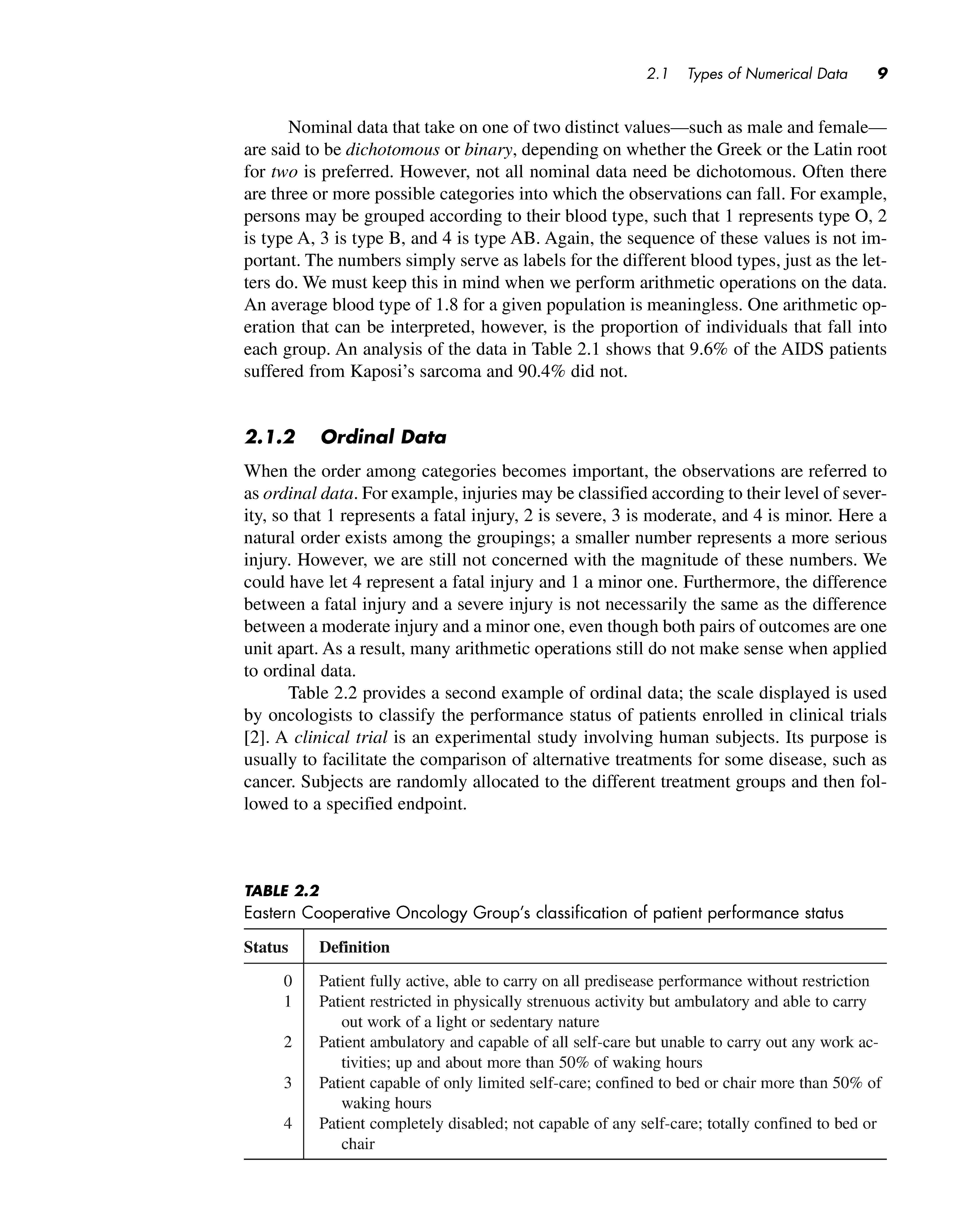
2. J.2 Ordinal Data
When the order among categories becomes important, the observations are referred to as ordinal data . For example, injuries may be classified according to their level of severity, so that 1 represents a fatal injury, 2 is severe, 3 is moderate, and 4 is minor. Here a natural order exists among the groupings; a smaller number represents a more serious injury. However, we are still not concerned with the magnitude of these numbers. We could have let 4 represent a fatal injury and 1 a minor one. Furthermore, the difference between a fatal injury and a severe injury is not necessarily the same as the difference between a moderate injury and a minor one, even though both pairs of outcomes are one unit apart. As a result, many arithmetic operations still do not make sense when applied to ordinal data.
Table 2.2 provides a second example of ordinal data ; the scale displayed is used by oncologists to classify the performance status of patients enrolled in clinical trials [2]. A clinical trial is an experimental study involving human subjects. Its purpose is usually to facilitate the comparison of alternative treatments for some disease, such as cancer. Subjects are randomly allocated to the different treatment groups and then followed to a specified endpoint.
TABLE 2.2
Eastern Cooperative Oncology Group's classification of patient performance status
Status Definition
0 Patient fully active, able to carry on all predisease performance without restriction Patient restricted in physically strenuous activity but ambulatory and able to carry out work of a light or sedentary nature
2 Patient ambulatory and capable of all self-care but unable to carry out any work activities; up and about more than 50 % of waking hours
3 Patient capable of only limited self-care; confined to bed or chair more than 50 % of waking hours
4 Patient completely disabled; not capable of any self-care; totally confined to bed or chair
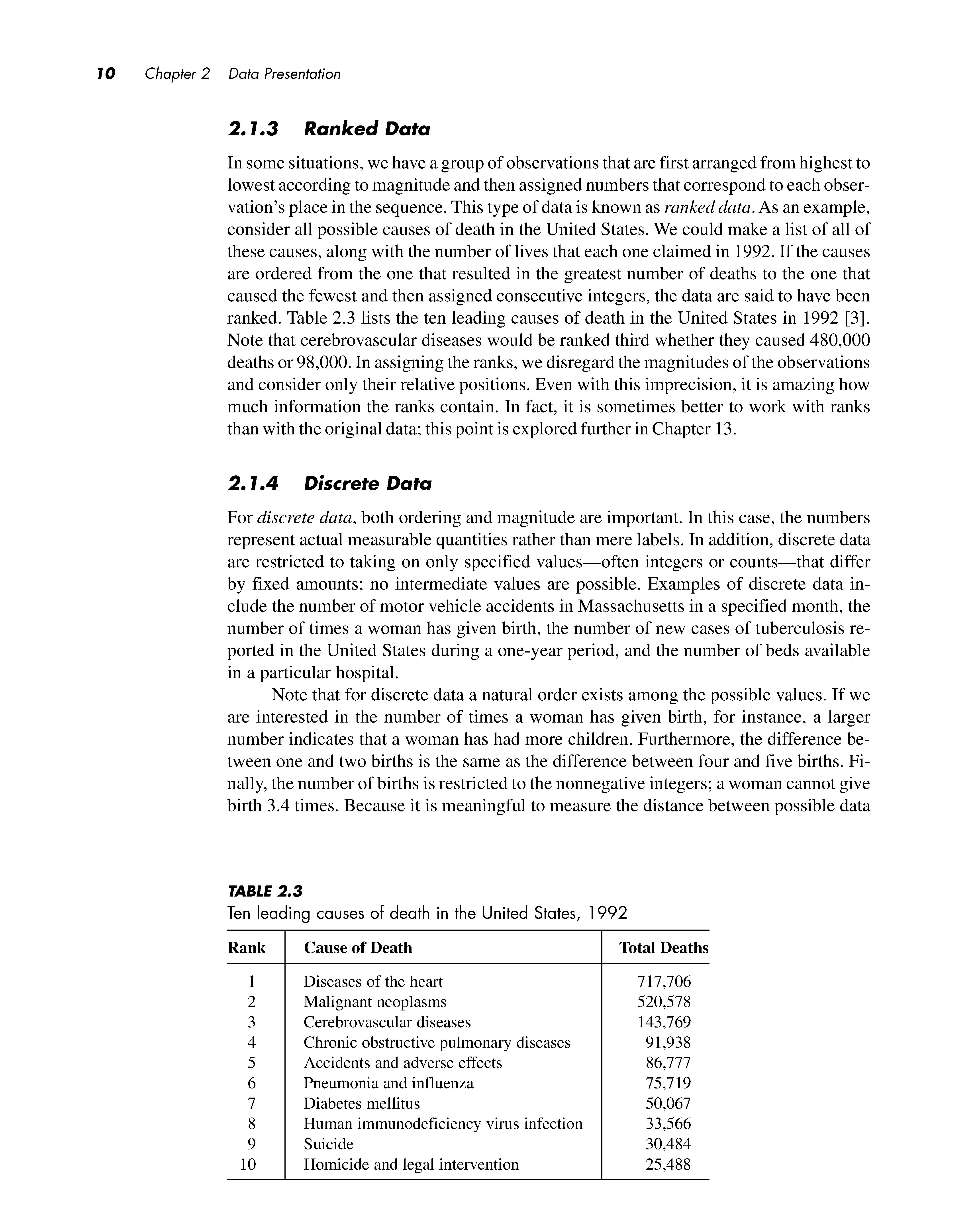
2. J.3 Ranked Data
In some situations, we have a group of observations that are first arranged from highest to lowest according to magnitude and then assigned numbers that correspond to each observation's place in the sequence. This type of data is known as ranked data. As an example, consider all possible causes of death in the United States. We could make a list of all of these causes, along with the number of lives that each one claimed in 1992. If the causes are ordered from the one that resulted in the greatest number of deaths to the one that caused the fewest and then assigned consecutive integers, the data are said to have been ranked. Table 2.3 lists the ten leading causes of death in the United States in 1992 [3]. Note that cerebrovascular diseases would be ranked third whether they caused 480,000 deaths or 98,000. In assigning the ranks, we disregard the magnitudes of the observations and consider only their relative positions. Even with this imprecision, it is amazing how much information the ranks contain. In fact, it is sometimes better to work with ranks than with the original data; this point is explored further in Chapter 13.
2. J.4 Discrete Data
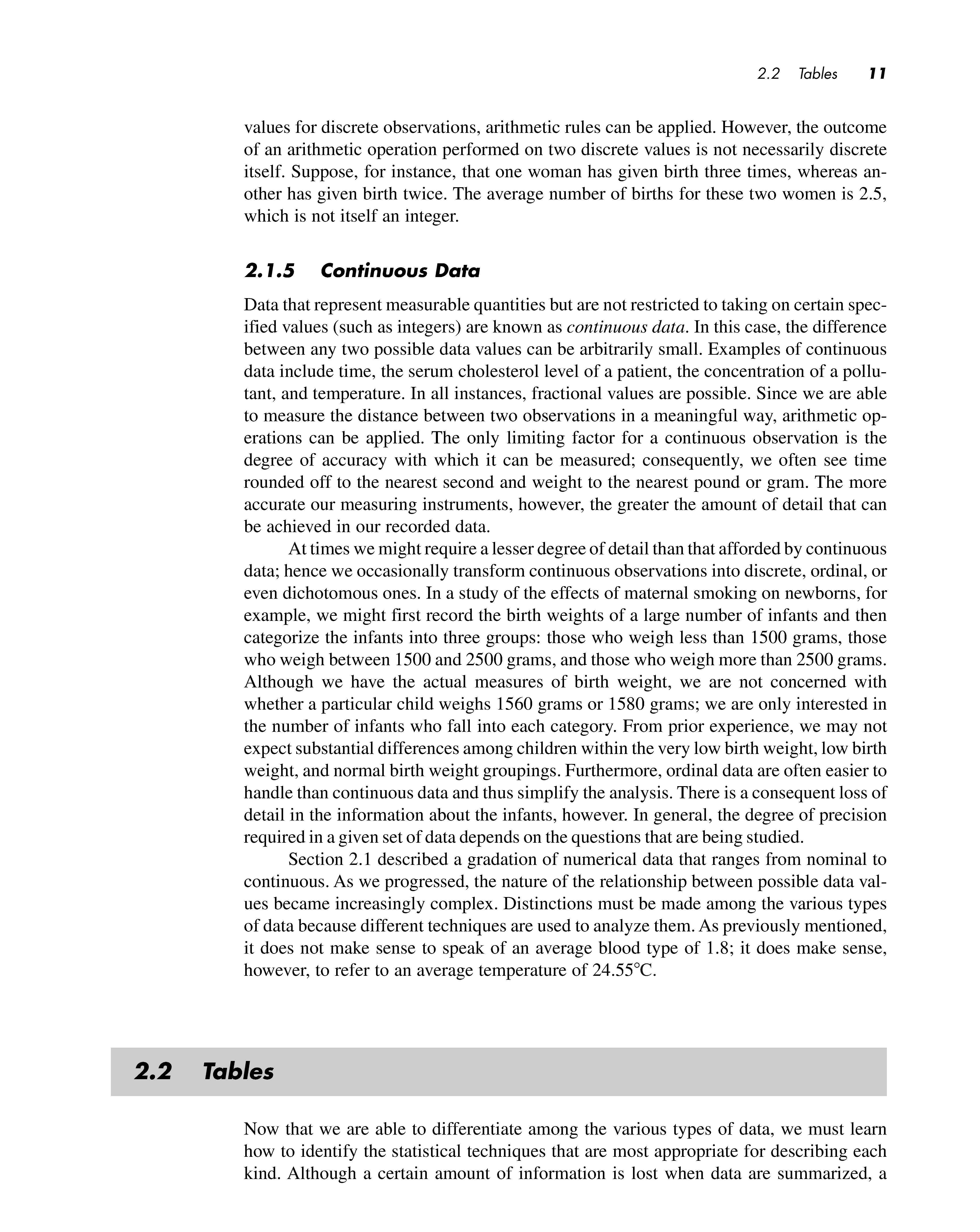
For discrete data, both ordering and magnitude are important. In this case, the numbers represent actual measurable quantities rather than mere labels. In addition, discrete data are restricted to taking on only specified values-often integers or counts-that differ by fixed amounts; no intermediate values are possible. Examples of discrete data include the number of motor vehicle accidents in Massachusetts in a specified month, the number of times a woman has given birth, the number of new cases of tuberculosis reported in the United States during a one-year period, and the number of beds available in a particular hospital.
Note that for discrete data a natural order exists among the possible values. If we are interested in the number of times a woman has given birth, for instance, a larger number indicates that a woman has had more children. Furthermore, the difference between one and two births is the same as the difference between four and five births. Finally, the number of births is restricted to the nonnegative integers; a woman cannot give birth 3.4 times. Because it is meaningful to measure the distance between possible data
TABLE 2.3
values for discrete observations, arithmetic rules can be applied. However, the outcome of an arithmetic operation performed on two discrete values is not necessarily discrete itself. Suppose, for instance, that one woman has given birth three times, whereas another has given birth twice. The average number of births for these two women is 2.5 , which is not itself an integer.
2. J.5 Continuous Data
Data that represent measurable quantities but are not restricted to taking on certain specified values (such as integers) are known as continuous data. In this case , the difference between any two possible data values can be arbitrarily small. Examples of continuous data include time, the serum cholesterol level of a patient, the concentration of a pollutant, and temperature. In all instances, fractional values are possible. Since we are able to measure the distance between two observations in a meaningful way, arithmetic operations can be applied. The only limiting factor for a continuous observation is the degree of accuracy with which it can be measured ; consequently, we often see time rounded off to the nearest second and weight to the nearest pound or gram. The more accurate our measuring instruments , however, the greater the amount of detail that can be achieved in our recorded data.
At times we might require a lesser degree of detail than that afforded by continuous data; hence we occasionally transform continuous observations into discrete , ordinal, or even dichotomous ones. In a study of the effects of maternal smoking on newborns , for example, we might first record the birth weights of a large number of infants and then categorize the infants into three groups: those who weigh less than 1500 grams , those who weigh between 1500 and 2500 grams, and those who weigh more than 2500 grams. Although we have the actual measures of birth weight , we are not concerned with whether a particular child weighs 1560 grams or 1580 grams; we are only interested in the number of infants who fall into each category. From prior experience , we may not expect substantial differences among children within the very low birth weight, low birth weight, and normal birth weight groupings. Furthermore , ordinal data are often easier to handle than continuous data and thus simplify the analysis. There is a consequent loss of detail in the information about the infants , however. In general, the degree of precision required in a given set of data depends on the questions that are being studied.
Section 2.1 described a gradation of numerical data that ranges from nominal to continuous. As we progressed , the nature of the relationship between possible data values became increasingly complex. Distinctions must be made among the various types of data because different techniques are used to analyze them. As previously mentioned, it does not make sense to speak of an average blood type of 1.8; it does make sense , however, to refer to an average temperature of 24.55 °C.
2.2 Tables
Now that we are able to differentiate among the various types of data, we must learn how to identify the statistical techniques that are most appropriate for describing each kind. Although a certain amount of information is lost when data are summarized, a
great deal can also be gained. A table is perhaps the simplest means of summarizing a set of observations and can be used for all types of numerical data.
2.2. 1 Frequency Distributions
One type of table that is commonly used to evaluate data is known as a frequency distribution. For nominal and ordinal data, a frequency distribution consists of a set of classes or categories along with the numerical counts that correspond to each one. As a simple illustration of this format, Table 2.4 displays the numbers of individuals (numerical counts) who did and did not suffer from Kaposi's sarcoma (classes or categories) for the first 2560 cases of AIDS reported to the Centers for Disease Control. A more complex example is given in Table 2.5, which specifies the numbers of cigarettes smoked per adult in the United States in various years [4].
To display discrete or continuous data in the form of a frequency distribution, we must break down the range of values of the observations into a series of distinct, nonoverlapping intervals. If there are too many intervals, the summary is not much of an improvement over the raw data. If there are too few, a great deal of information is lost. Although it is not necessary to do so, intervals are often constructed so that they all have equal widths; this facilitates comparisons among the classes. Once the upper and lower limits for each interval have been selected, the number of observations whose values fall within each pair of limits is counted, and the results are arranged as a table. As part of a National Health Examination Survey, for example, the serum cholesterol levels of 1067 25- to 34-year-old males were recorded to the nearest milligram per 100 milliliters [5]. The observations were then subdivided into intervals of equal width; the frequencies corresponding to each interval are presented in Table 2.6.
Table 2.6 gives us an overall picture of what the data look like; it shows how the values of serum cholesterol level are distributed across the intervals. Note that the ob-
TABLE 2.4
Cases of Kaposi's sarcoma for Cigarette consumption per Absolute frequencies of serum chothe first 2560 AIDS patients person aged 18 or older, lesterol levels for 1067 U.S. males, reported to the Centers for United States, 1900-1990 aged 25 to 34 years, 1976-1980 Disease Control in Atlanta,
Georgia
TABLE 2.5
TABLE 2.6
servations range from 80 to 399 mg/100 ml, with relatively few measurements at the ends of the range and a large proportion of the values falling between 120 and 279 mg/100 ml. The interval160-199 mg/100 ml contains the greatest number of observations. Table 2.6 provides us with a much better understanding of the data than would a list of 1067 cholesterol level readings. Although we have lost some information-given the table, we can no longer recreate the raw data values-we have also extracted important information that helps us to understand the distribution of serum cholesterol levels for this group of males.
The fact that one kind of information is gained while another is lost holds true even for the simple dichotomous data in Tables 2.1 and 2.4. We might feel that we do not lose anything by summarizing these data and counting the numbers of Os and Is, but in fact we do. For example, if there is some type of trend in the observations over time-perhaps the proportion of AIDS patients with Kaposi's sarcoma is either increasing or decreasing as the epidemic matures-this information is lost in the summary.
Tables are most informative when they are not overly complex. As a general rule, tables and the columns within them should always be clearly labeled. If units of measurement are involved, such as mg/100 ml for the serum cholesterol levels in Table 2.6, they should be specified.
2.2.2 Relative Frequency
It is sometimes useful to know the proportion of values that fall into a given interval in a frequency distribution rather than the absolute number. The relative frequency for an interval is the proportion of the total number of observations that appears in that interval. The relative frequency is computed by dividing the number of values within an interval by the total number of values in the table. The proportion can be left as it is, or it can be multiplied by 100% to obtain the percentage of values in the interval. In Table 2.6, for example, the relative frequency in the 80-119 mg/100 ml class is (13/1067) X 100% = 1.2%; similarly, the relative frequency in the 120-159 mg/100 ml class is (150/1067) X 100% = 14.1 %. The relative frequencies for all intervals in a table sum to 100%.
Relative frequencies are useful for comparing sets of data that contain unequal numbers of observations. Table 2. 7 displays the absolute and relative frequencies of serum cholesterol level readings for the 1067 25- to 34-year-olds depicted in Table 2.6, as well as for a group of 1227 55- to 64-year-olds. Because there are more men in the older age group, it is inappropriate to compare the columns of absolute frequencies for the two sets of males. Comparing the relative frequencies is meaningful, however. We can see that in general, the older men have higher serum cholesterol levels than the younger men; the younger men have a greater proportion of observations in each of the intervals below 200 mg/1 00 ml, whereas the older men have a greater proportion in each class above this value.
The cumulative relative frequency for an interval is the percentage of the total number of observations that have a value less than or equal to the upper limit of the interval. The cumulative relative frequency is calculated by summing the relative frequencies for the specified interval and all previous ones. Thus, for the group of 25- to 34-year-olds in Table 2.7, the cumulative relative frequency of the second interval is
1.2 + 14.1 = 15.3%; similarly, the cumulative relative frequency of the third interval is 1.2 + 14.1 + 41.4 = 56.7%. Like relative frequencies, cumulative relative frequencies are useful for comparing sets of data that contain unequal numbers of observations. Table 2.8 lists the cumulative relative frequencies for the serum cholesterol levels of the two groups of males in Table 2. 7
TABLE 2.7
Absolute and relative frequencies of serum cholesterol levels for 2294 U.S. males, 1976-1980
Ages 25-34
TABLE 2.8
Relative and cumulative relative frequencies of serum cholesterol levels for 2294 U.S. males, 1976-1980 Ages 25-34
Ages 55-64
According to Table 2.7 , older men tend to have higher serum cholesterol levels than younger men do. This is the sort of generalization we hear quite often; for instance, it might also be said that men are taller than women or that women live longer than men. The generalization about serum cholesterol does not mean that every 55- to 64-year-old male has a higher cholesterol level than every 25- to 34-year-old male, nor does it mean that the serum cholesterol level of every man increases with age . What the statement does imply is that for a given cholesterol level, the proportion of younger men with a reading less than or equal to this value is greater than the proportion of older men with a reading less than or equal to the value . This pattern is more obvious in Table 2.8 than it is in Table 2.7. For example , 56.7 % of the 25- to 34-year-olds have a serum cholesterol level less than or equal to 199 mg/100 ml , whereas only 25.9 % of the 55- to 64year-olds fall into this category. Because the relative proportions for the two groups follow this trend in every interval in the table, the two distributions are said to be stochastically ordered . For any specified level , a larger proportion of the older men have serum cholesterol readings above this value than do the younger men; therefore, the distribution of levels for the older men is stochastically larger than the distribution for the younger men. This definition will start to make more sense when we encounter random variables and probability distributions in Chapter 7. At that point , the implications of this ordering will become more apparent.
2.3 Graphs
A second way to summarize and display data is through the use of graphs , or pictorial representations of numerical data. Graphs should be designed so that they convey the general patterns in a set of observations at a single glance. Although they are easier to read than tables , graphs often supply a lesser degree of detail. Once again , however, the loss of detail may be accompanied by a gain in understanding of the data . The most informative graphs are relatively simple and self-explanatory. Like tables , they should be clearly labeled , and units of measurement should be indicated.
2.3. J Bar Charts
Bar charts are a popular type of graph used to display a frequency distribution for nominal or ordinal data. In a bar chart, the various categories into which the observations fall are presented along a horizontal axis. A vertical bar is drawn above each category such that the height of the bar represents either the frequency or the relative frequency of observations within that class . The bars should be of equal width and separated from one another so as not to imply continuity. As an example, Figure 2.1 is a bar chart that displays the data relating to cigarette consumption in the United States presented in Table 2.4. Note that when it is represented in the form of a graph , the trend in cigarette consumption over the years is even more apparent than it is in the table.