

LEONARD & LOUISE RIGGIO
Collected Works


LEONARD & LOUISE RIGGIO
Collected Works

LEONARD & LOUISE RIGGIO
Collected Works
AUCTION
May 2025
20 Rockefeller Plaza
New York, NY 10020
EXHIBITION
Saturday 3 May 10.00am-5.00pm
Sunday 4 May 1.00pm-5.00pm
Monday 5 May 10.00am-5.00pm
Tuesday 6 May 10.00am-5.00pm
Wednesday 7 May 10.00am-5.00pm
Thursday 8 May 10.00am-5.00pm
Friday 9 May 10.00am-5.00pm
Saturday 10 May 10.00am-5.00pm
Sunday 11 May 10.00am-5.00pm
HEAD OF SALE
Vanessa Fusco +1 212 636 2094 vfusco@christies.com
AUCTION CODE AND NUMBER
In sending absentee bids or making enquiries, this sale should be referred to as BEACON-24160
ABSENTEE AND TELEPHONE BIDS
Tel: +1 212 636 2437
FURTHER INFORMATION
This is not a sale catalogue. Christie’s has a direct financial interest in the property, and for certain lots, Christie’s has funded all or part of our interest with third party guarantors. These lots will be noted with symbols on their lot pages on christies.com. The sale of these lots are subject to the Conditions of Sale, Important Notices and Explanation of Cataloguing Practice which are set out online, with other important sale information at christies.com.
Please scan for complete auction information

LEONARD & LOUISE RIGGIO

Leonard & Louise Riggio at their Bridgehampton home, 2019. Photo: Joe Carrotta for The New York Times / Redux Pictures. Artwork: © 2025 The Isamu Noguchi Foundation and Garden Museum / Artists Rights Society (ARS), New York.
LEONARD & LOUISE RIGGIO: COLLECTED WORKS
Leonard & Louise Riggio: Collected Works
For Leonard and Louise Riggio, collecting was intrinsically tied to their lifelong curiosity about the world. The couple were trusted partners in all aspects of life, from business to philanthropy to art, and their shared passions blossomed into an important, wide-ranging collection that spanned a variety of subject matter, media, and techniques. Leonard & Louise Riggio: Collected Works presents a selection of artworks from this esteemed collection, which they lovingly built together over the course of thirty years. It also provides a fascinating glimpse into the anthology of ideas and concerns that occupied a diverse roster of artists—from Piet Mondrian to Pablo Picasso, the Surrealists to the Abstract Expressionists—each piece tracing the radical spirit of creativity and revolution that shaped artmaking over the course of the last century.
A tenacious and charismatic New Yorker whose business acumen transformed an entire industry, Leonard (Len) Riggio was the founder of Barnes & Noble, and ushered the company from a single store on New York’s 5th Avenue into the world’s largest bookseller. Len and Louise met in 1974 and married shortly thereafter, marking the beginning of a true life-long partnership. Having come of age during the civil rights era, they were both passionate about social justice and together became deeply involved with advocacy initiatives for an array of causes, including literacy and public education. Generous patrons of the arts, they also played an instrumental role in shaping the landscape of New York’s art world in the late twentieth and early twenty-first centuries, through their generous support of the establishment of Dia Beacon, one of the largest exhibition spaces in the United States for modern and contemporary art. Speaking of their commitment to the development of the institution, Len explained: “These are landmarks of our civilization. They have to be preserved. They tell us what people were doing and thinking at that point in time. So we made that commitment.”
Len and Louise’s first forays into art collecting began with purchasing inexpensive prints and posters for the walls of their home. Their journey entered a new phase in the 1990s, the moment Len saw Richard Serra’s Torqued Ellipses, a revelatory experience which in part inspired his dedicated stewardship of Dia Beacon. From that moment forward, the couple devoted themselves to learning expansively about art, visiting galleries, museums and auctions to see and experience artworks firsthand. Len was drawn to contemporary objects; Louise’s preferences are more historical, and yet while their tastes varied, they blended beautifully, finding works that spoke to both of them. Rather than setting out with a clearly defined acquisition plan, the couple’s collecting journey was driven by their own deep connections to each individual piece of art they purchased—“We bought quietly.
“Art tells a story and we liked being part of that story.”
LOUISE RIGGIO

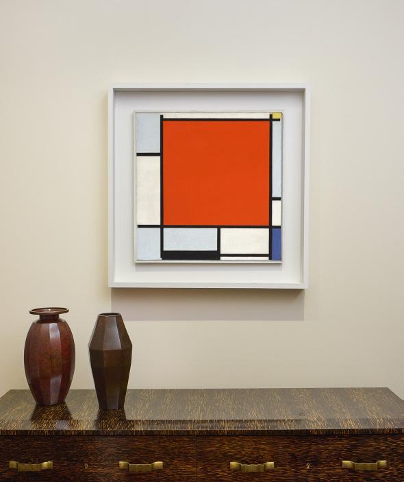
The Manhattan residence of Leonard & Louise Riggio. From left to right: Balthus, Jeune fille en vert et rouge (Le chandelier), 1944-45; René Magritte, Les droits de l’homme, 1947-48; Andy Warhol, The Last Supper, 1986. LEONARD & LOUISE RIGGIO:
It was instinctive,” Louise has explained. “We went to the so-called classics. Each acquisition informed us to something else. It was a learning experience.”
Len and Louise not only acquired works for the pleasure of living with these beautiful objects every day, but also for the engagement it gave them with a host of revolutionary artists and thinkers who challenged some of our most profound ideas about life and art. Within their elegant New York apartment, works by the leading figures of Modernism and Post-Modernism sat side-by-side, showcasing the rich and multi-layered dialogues that existed between artists working across different movements, media and periods of history, revealing unexpected affinities and connections in the process. As Louise has noted, “When Len and I bought a piece of art, we felt as if we were inviting that work into our home to live with us, to become part of our family. We always talked about the dialogue each of the pieces had with each other, which inspired and complemented their placement.”
At their home on Park Avenue, Mondrian’s iconic Composition with Large Red Plane, Bluish Gray, Yellow, Black and Blue greeted visitors as they entered the vestibule, and René Magritte’s Les droits de l’homme was hung above the fireplace in the family’s den, near works by Max Ernst and Arshile Gorky. In the living room, works by Picasso interacted with pieces by Alberto Giacometti and Fernand Léger, while the dining room was home to paintings by Willem de Kooning, Jackson Pollock and others. As such, their New York apartment represented something of a capsule collection—a rich and multi-layered homage to the eclectic array of writers, thinkers and creators who have had a hand in transforming culture and society through the twentieth century. As Len explained, it was this aspect of the works when seen together that fascinated the couple: “…it becomes fun to try to grasp these riddles and complex issues the artists were looking to solve.”
Intriguingly, for many of the artists in the Riggio collection, the written word remained woven into their creative thinking. For some, such as Mondrian and his fellow artists within the De Stijl movement, writing served as an important outlet in which they explored and solidified their groundbreaking theories and approaches to art making, abstraction and space. Similarly, the Surrealist movement had its foundation in poetry, before evolving to cover all forms of the visual arts. For Magritte, literature remained an important touchstone for his own lyrical vision throughout his career—in Les droits de l’homme, the artist invokes the title of Thomas Paine’s foundational treatise The Rights of Man, while in his renowned L’empire des lumières paintings, he drew inspiration from the poetry of his former comrade and the founder of Surrealism, André Breton. In the wake of
World War II, the philosopher, playwright and novelist Jean-Paul Sartre found parallels between his writing and the art of a former member of the Surrealist group, Alberto Giacometti, claiming the Swiss sculptor and his daring new work as a key representative of Existentialism. For Abstract Expressionists such as Willem de Kooning and Franz Kline, meanwhile, the lyrical poets of the Beat Generation provided the soundtrack to their lives.
From radical new visual languages and Surrealist musings on consciousness, to the enduring influence of classicism and the artist’s own existential investigations into the self, this rich, encyclopedic collection demonstrates Len and Louise’s long-standing appreciation for the ways in which creativity is central to the human condition. Most importantly, though, it is a collection filled with memories, intrinsically intertwined with the lives of the couple who shaped it. Indeed, each piece reflects a moment in Louise and Len’s personal story: “It was about our love and our time together,” Louise has said, beautifully conveying a sense of the ways in which the collection has been a true collaboration between the couple, a testament to their enduring partnership and devotion to one another over the past five decades.
The vestibule of the Manhattan residence of Leonard & Louise Riggio, featuring Piet Mondrian’s Composition with Large Red Plane, Bluish Gray, Yellow, Black and Blue, 1922.
“I like to buy art by feel more than by sight.”
LEONARD RIGGIO

Pablo Picasso’s Femme à la coiffe d’Arlésienne sur fond vert (Lee Miller) and Grand vase aux danseurs (A.R. 114) in the Manhattan residence of Leonard & Louise Riggio.
A New Language

More than at any other time in history, the twentieth century saw artists challenge accepted traditions in search of new modes of artistic expression. Often spurred on by political upheaval and technological advances, they began to harness the formal elements of art—line, form, color, and materials—to offer up a radical transformation of the way that art looked. Abandoning centuries old conventions of art being used to represent the physical or spiritual world, artists were increasingly portraying the emotional and psychological tensions which they felt were inherent in a rapidly changing society.
The Dutchman Piet Mondrian arrived in Paris determined to shake up an art scene already roiling with revolutionary ideas. The artist was a leading figure in a movement known as De Stijl, whose avowed aim, as he put it, was to create “a pure new plastic representation of space” (quoted in S. Hunter et al., Modern Art: Painting Sculpture Architecture Photography, New York, 2004, p. 160). With its uniform planes of primary and secondary colors, delineated by horizontal and vertical black lines, Composition with Large Red Plane, Bluish Gray, Yellow, Black and Blue painted in Paris in 1922, was the ultimate presentation of the complete break with figuration that Mondrian desired and an early example of his iconic new language of abstraction.
Mondrian’s bold idiom unleashed a century of artistic innovation across both Europe and America. In the United States, artists like Agnes Martin and Robert Ryman would later abandon all vestiges of figuration with their unique painterly styles that acknowledged the importance of the surface of their paintings—in Martin’s case, her grids and graphite lines, and in Ryman’s case, his flurry of thick impasto. By contrast, the German artist Gerhard Richter used his unique “squeegee” technique to further interrogate the previously hallowed surface of the canvas by continuously laying down and scraping off layers of paint to reveal the previous layers of his compositions.
Even though Mondrian depicted his new artistic language in two dimensions, the sense of artistic freedom had an equally profound impact when applied to threedimensional works by artists such as Julio González, David Smith, and Barbara Hepworth. González developed a new language of sculpture that opened up the form in a unique blend of Cubism, abstraction, and even Surrealism, which would form the basis for much of the modern sculpture that followed in the twentieth century. These sculptures used the space and intervals between forms as expressive and structural elements in their own right.
“The task today, then, is to create a direct expression of beauty—clear and as far as possible ‘universal.’”
PIET MONDRIAN
The period also saw artists investigate and embrace the physical properties of their chosen mediums to produce new forms of expression. Sculptors in particular embraced the inherent qualities of their materials, often with dramatic results. “I ran across reproductions in Cahiers d’Art of González’s and Picasso’s work,” David Smith recalled, “which brought my consciousness to this fact that art could be made of iron. But iron-working was labor, when I thought art was oil paint” (quoted in “González: First Master of the Torch” in Julio González, exh. cat., Tate, London, 1970, p. 25).
However, the artist who arguably took Mondrian’s ideas to their ultimate conclusion was Yves Klein, whose total elimination of representation produced a whole new artistic manifestation. Using his signature International Klein Blue (IKB), a pigment he developed himself, the Frenchman sought to evoke the purely spiritual: “It is through color that I have little by little become acquainted with the immaterial,” Klein noted (quoted in S. Hunter, op. cit., 2004, p. 329). As with Martin and Richter, the surface of Klein’s Untitled blue monochrome, (IKB 272) is crucial, not just as a support, but as integral to the work’s conceptual apparatus. The texture that occurs organically across the surface ensures the picture functions as a field generating an alternative vision, preventing the viewer from seeing the work as an individualized rectangular shape and instead allowing the support to disappear and reveal the immaterial sublime.
The progression into abstraction that Mondrian ushered into the art world was arguably responsible for the greatest period of artistic creativity in history. Using these new languages of expression, artists unlocked the unlimited potential of line, color, and form that had hitherto been constrained in replicating the physical world. They were now able to explore the totality of the human experience. Cubism has often been seen as the tipping point, but as Mondrian himself pointed out, “While in Cubism, from a naturalistic foundation, there sprang forcibly the use of plastic means, still half object, half abstract, the abstract basis of pure plastic art must result in the use of purely abstract means” (quoted in ibid., p. 160).

BARBARA HEPWORTH (1903-1975)
The Family of Man: Figure 2, Ancestor II signed, numbered and inscribed with foundry mark 'Barbara Hepworth 4/4 Morris Singer FOUNDERS LONDON' (on the back of the lower element) bronze with dark brown and green patina Height: 109Ω in. (278 cm.)
Conceived in 1970; this bronze version cast in 1974
PROVENANCE: Estate of the artist.
PaceWildenstein, New York (acquired from the above). Acquired from the above by the present owner, 1996.
EXHIBITED:
New York, Wildenstein & Co. Inc., Barbara Hepworth: Sculptures from the Estate, October-November 1996, pp. 7, 31, 74 and 109 (illustrated in color, p. 75).
New York, Pace Gallery, Barbara Hepworth: A Matter of Form, March-April 2018, no. 62 (illustrated in color).
LITERATURE:
A.M. Hammacher, intro., Barbara Hepworth: The Family of Man—Nine Bronzes and Recent Carvings, exh. cat., Marlborough Fine Art, Ltd., London, 1972, pp. 6, 20 and 63, no. 2 (full series illustrated in color in situ, pp. 16-17; another cast illustrated in color, p. 21; another cast illustrated again, p. 63).
Barbara Hepworth: "Conversations," exh. cat., Marlborough Gallery, Inc., New York, 1974, pp. 9 and 17, no. 2 (another cast illustrated in color, p. 16).
A.M. Hammacher, Barbara Hepworth: Revised Edition, New York, 1998, p. 203 (full series and another cast illustrated, pp. 198-199, fig. 178).
Dr. Sophie Bowness will include this work in her forthcoming revised Hepworth catalogue raisonné under the catalogue number BH 513b.


Timeless and totemic, Barbara Hepworth’s The Family of Man: Figure 2, Ancestor II is an evocative and powerful rendering of a monumental figure. Comprised of four bronze blocks, and standing at nearly three meters tall, the present sculpture possesses an immortal gravitas, and was conceived by Hepworth as one of nine individual sculptures that make up the group known as The Family of Man. Alongside its eight sculptural kin—Ancestor I, Parent I, Parent II, Bride, Bridegroom, Young Girl, Youth, and Ultimate Form—the present work is a musing on humanity, on our relationships to each other, and to ourselves. While the figures of The Family of Man exist in a relative dynamic to one another, they also all stand alone—though their identity is tied to the other generations of the “family,” they each retain their own personal individuality.
The idea for The Family of Man group had lingered in Hepworth’s imagination for many decades. “The Family of Man has been in my head for a long time,” she reflected in 1973. “I think, maybe, since I was a child” (quoted in A. Matheson’s interview with Hepworth, The Australian Women’s Weekly, 16 May 1973; reproduced in S. Bowness, ed., Barbara Hepworth: Writings and Conversations, London, 2015, p. 287). The upright modular format Hepworth employed in the group enriches the character of each figure, inviting the viewer to ponder the variety of these cubic and rounded shapes as a means toward understanding the metaphorical relationships between one sculpture and the next, and within the group as a whole. “The combined titles suggest the seven ages,” Alan G. Wilkinson has observed (exh. cat., op. cit., 1996, p. 21).
Barbara Hepworth’s Family of Man series, outside the Morris Singer Foundry near Basingstoke, England, January 1972. Photograph by Studio St. Ives Ltd. © Bowness.

Hepworth moved to St. Ives, on the northern coast of the Cornwall peninsula, in August 1939, and was immediately struck by the Cornish landscape: “I was enchanted: the bays, caves, promontories, the beaches, hills and rocks, the stones weathering” (quoted in E. Mullins, “Barbara Hepworth,” 1970; reproduced in S. Bowness, op. cit., 2015, p. 224). “It was during this time that I gradually discovered the remarkable pagan landscape which lies between St. Ives, Penzance and Land’s End,” she later wrote, “a landscape which still has a very deep effect on me, developing all my ideas about the relationship of the human figure in landscape—sculpture in landscape and the essential quality of light in relation to sculpture... I was the figure in the landscape and every sculpture contained to a greater or lesser degree the ever changing forms and contours embodying my own response to a given position in that landscape… There is no landscape without the human figure: it is impossible for me to contemplate pre-history in the abstract” (Barbara Hepworth: Carvings and Drawings, London, 1952, n.p.).
It was in Cornwall that Hepworth encountered the roughly hewn neolithic stone monuments that dotted the landscape. These monoliths, known as menhirs, as well as other prehistoric stone structures, were to profoundly impact the artist. Hepworth had known and visited the neolithic stone circles at Stonehenge and Avebury, but reflected in a 1970 interview with Alan Bowness that she had not known of such sites in Cornwall, before Desmond Bernal, seeing a resemblance, mentioned the county’s ancient dolmens, cromlechs, and quoits in the foreword to an exhibition of Hepworth’s works in 1937. “All it did coming here was to ratify my ideas that when you make a sculpture you’re making an image, a fetish, something which alters human behavior or movement... Any stone standing in the hills is a figure, but you have to go further than that... To resolve the image so that it has something affirmative to say is to my mind the only point. That has always been my creed. I like to dream of things rising from the ground—it would he marvelous to walk in the woods and suddenly come across such things” (quoted in A. Bowness, ed., The Complete Sculpture of Barbara Hepworth, 1960-69, London, 1971, p. 13).
Hepworth recalled that whenever she came across the menhirs or dolmens, she always felt compelled to interact with the stone, “to pat it, or pick some flowers and put them on it: it’s very ancient this feeling, and very pagan” (quoted in E. Mullins, “Barbara Hepworth’s ‘Family’” in Daily Telegraph Magazine, 7 April 1972; reproduced in S. Bowness, op. cit., 2015, p. 249). Hepworth sought to create this
Men-an-Tol, Cornwall, England. Photo: Dorling Kindersley/UIG / Bridgeman Images.
“I’ve got this dream of a new big sculpture—nine figures walking up a hill. It’s an idea that has been boiling for years… Significance in the number of figures? Three times three.”
BARBARA HEPWORTH

Prototypes for Parent I, Parent II, and Bridegroom, from The Family of Man in the carving workshop, November 1970. Photograph by Studio St. Ives Ltd. © Bowness.
LEONARD & LOUISE RIGGIO: COLLECTED WORKS
same impact with her own work, aiming to evoke what she called an “ancient response” in the viewer, encouraging them to interact with the sculpture, to move around it, or touch it. Her capacity to prompt a primitive, and profoundly human, reaction through her sculpture is evident in Ancestor II, where the viewer is immediately awestruck by the mystical might of the towering bronze figure. The titles of each of the “family members” reveal the identity of the figure within the series, and its relation to the others. As an “ancestor,” Ancestor II has a generative and quasi-mythical role within the group. This is perhaps amplified by the fluted, column-like form, on which the three upper quadrants rest. The number of vertical undulations vary on each of the four sides of the form, which imbues the work with a biomorphic sense of fluidity, their wavelike, sweeping ripples recalling the Cornish sea.
A sense of verticality dominated Hepworth’s sculptural oeuvre, and the artist acknowledged that all her life she had seen her sculpture as vertical. Just as the upright monoliths in Cornwall possessed a figurative quality, so too do her sculptures evoke the grandeur and the power of the standing human figure. While many of her sculptures are a kind of “single form,” often titled as such, The Family of Man sculptures are multi-partite. Through this innovative structure, Hepworth was able to explore the idea of descendancy, repeating—with slight modifications—some of the segments of the figures. For example, the lower middle quadrant of Ancestor II and the upper middle quadrant of Parent I both have a conical central hole, while the uppermost segments of Ancestor I and Ultimate Form share visual similarities. This strengthens the sense of family and lineage, an allusion, perhaps, to family resemblance.
Hepworth maintained that familial heritage was an anchor of oneself, and that through connection with one’s forebearers and descendants, it was possible to ascertain a better understanding of one’s own identity. The uppermost bronze block of Ancestor II is symmetrically concave on two of its sides, as if, Janus-like, it looks both forward and backward into time, a striking representation of identity, and an individual’s connection to both their past and present.
ROBERT RYMAN (1930-2019)
Untitled
signed ‘RYMAN’ (lower right)
oil on stretched sized linen canvas 23¬ x 23¬ in. (60 x 60 cm.)
Painted circa 1962-1963.
PROVENANCE:
PaceWildenstein, New York
Bonnier Gallery, New York and Xavier Hufkens, Brussels, 2000
Private collection, Europe, 2000
Anon. sale; Sotheby’s, London, 7 February 2007, lot 25
Private collection
Anon. sale; Christie’s, New York, 11 May 2011, lot 49
Acquired at the above sale by the present owner
EXHIBITED:
Brussels, Xavier Hufkens Gallery, Robert Ryman: Paintings from the Sixties, September-December 2000, pp. 22-23 (illustrated).
LITERATURE:
"Mercato dell'arte?," ics ART, vol. 6, no. 5, May 2017, p. 21 (illustrated).
D. Buren, "Ryman, la resistance de l'invisible," Beaux Arts, 12 February 2019, digital (illustrated).
This work will be listed as catalogue number 1962.037 in the forthcoming catalogue raisonné project being organized by David Gray.
COLLECTED WORKS
LEONARD & LOUISE RIGGIO:

“I wanted to compose, to compose with my instrument, to improvise, to find out all the things you can do with the instrument... Painting really resembles music that way.”
ROBERT RYMAN

Robert Ryman in his studio, New York, late 1960s.
Photo: Dorothy Beskind, courtesy the Smithsonian Archives of American Art, Washington, D.C.
LEONARD & LOUISE RIGGIO: COLLECTED WORKS
Robert Ryman’s Untitled demonstrates the artist’s intuitive grasp of the physicality of his materials, marshalling paint onto raw linen in a pure play of light and space. An early masterpiece made just as Ryman was establishing his iconic style, Untitled exhibits a radical economy and unhurriedness which, through the paring down of its constituent elements, generates a complete protean world unto itself. Exuding exquisite control, Ryman provides a direct and deliberate sensory experience to the viewer, the painting eloquently achieving the artist’s proclaimed ambition for his work to create the “experience of enlightenment. An experience of delight, and well-being, and rightness. It’s like listening to music. Like going to an opera and coming out of it and feeling somehow fulfilled—that what you experienced was extraordinary” (quoted in “Robert Ryman Interview with Robert Storr” in Abstrakte Malerei aus Amerika und Europa/Abstract Painting of America and Europe, exh. cat., Galerie nächst St. Stephen, Vienna, 1986, p. 219).
A fury of intense richly polychromatic underpainting—deep leafy and acidic greens, burnt ochres, turquoise, and terracotta browns—peak through the white terrain crafted from buttery white curls, with inch-wide brushstrokes impressing thick impasto where one dab of paint meets another. “As I worked and developed the painting, I found that I was eliminating a lot,” Ryman describes. “I would put the color down, then paint over the color, trying to get down to the few crucial elements. It was like erasing something to put white over it” (quoted in R. Storr, Robert Ryman, exh. cat., Tate Gallery, London, 1993, p. 16). The artist’s embrace of a full spectrum of brilliant color beneath his signature white pigment formulates an exuberant expression of visual delight. “The welts of underpainting exert pressure on their white mantle such that one begins to feel the temperature of the buried color like a pulse or sinuous movement beneath the skin,” writes Robert Storr. “Submerged colors seem to irradiate and be subsumed by the bleached plane that confronts the viewer, as if one were witnessing white light being created, as it theoretically is, by the chromatic fusion of the total spectrum” (“In the American Grain” in S. Hoban and C. J. Martin, eds., Robert Ryman, New York, 2017, p. 21).


This union of light and color is contained within Ryman’s square canvas by an outer boundary of untouched canvas. The textural and chromatic contrast between the artist’s painterly application and the desiccated linen border contains and focuses the work’s potent effects. Similarly to Mark Rothko’s “allover” and all around canvases, Ryman attends to every facet of his works, and these poignant bare borders are as much a part of the overall composition as the painted ground, contributing to the whole via the revelation of the various layers and physical properties contained within the painted portion of the canvas.
Untitled’s powerful physicality leads from Ryman’s autodidact development as an artist, toiling with different paints, brushes, and supports alone in his New York apartment after shifts as a security guard at The Museum of Modern Art, distilling the lessons learnt from the great masterpieces by Matisse, Cezanne, and Picasso adorning his workplace into experimental productions. Ryman thus learned how to paint much like the Old Masters, with one eye toward the achievements of his predecessors, and the other on the materials of his craft. Ryman was deeply intrigued by the differing qualities of paints, supports, brushes, and brushstrokes, and strove to understand how the most minute change in execution would affect an entire composition. Carefully attuned to the bristles of his brush and the angle of his application, the artist strove to directly render these lessons onto the canvas with as little interference as possible. Thus, each canvas became square, to remove any sense of external referent which
Robert Ryman, Love Lines, circa 1962. Private Collection. © 2025 Robert Ryman / Artists Rights Society (ARS), New York.
Claude Monet, Blue Waterlilies, circa 1916-1919. Musée d’Orsay, Paris.

rectangular forms might hold, be it a window or a doorway. His unprimed linen canvases establish a direct dialogue between paint and support without needless intercession.
Ryman’s first interest was in music, studying jazz in college and becoming a member of the Army Reserve Band while serving in the Korean War. Ryman later moved to New York to pursue his passion for jazz, studying under the bebopper pianist Lennie Tristano in 1952. Happenstance led Ryman to take a job as a security guard at MoMA to support himself while building his budding music career, just in time to see Mark Rothko’s Number 10, 1950 entering the museum’s collection. This experience profoundly impacted him: “When I saw this Rothko, I thought ‘Wow, what is this? I don’t know what’s going on but I like it.’ What was radical with Rothko, of course, was that there was no reference to any representational influence. There was color, there was form, there was structure, the surface, the light—the nakedness of it, just there. There weren’t any paintings like that” (quoted in R. Storr, exh. cat., op. cit., 1993, pp. 13-14). This revelatory experience pushed Ryman to put down the saxophone in favor of the paint brush, following Rothko’s example by pursuing painting.
Ryman’s oeuvre, however, remains inflected with his jazz training. The relentless tempo and improvisational structures constituent in jazz are made apparent in the riotous movement of Ryman’s brushstrokes, each work a painted bebop composition. Ryman describes this equivalence between music and painting in his work, saying that “I wanted to compose, to compose with my instrument, to improvise, to find out all the things you can do with the instrument… Painting really resembles music that way. You develop something and then you take the part that interests you. That’s how it happened” (quoted in J. Szwed, “Robert Ryman: Musician, Painter,” in op. cit., 2017, p. 111).
Untitled magnificently conveys Ryman’s conception of enlightenment, the work’s brilliant passages of chromatic energy abutting the artist’s iconic white registers. It perfectly expresses the irreproducible nature of Ryman’s idiosyncratic style. It is nigh impossible to convey in reproduction—either photographic or ekphrastic—the depths of energy and spatial potential expressed when experiencing the work in person. Storr remarks that the first step for appreciating Ryman is to “acknowledge the limits of the language at our disposal and so recognize painting’s essential independence from what can be said about it,” the artist instead insisting “example by example on contemporary painting’s equal demand and capacity to exist and be experienced as an irreducibly physical and aesthetic experience” (R. Storr, exh. cat., op. cit., 1993, pp. 15, 37).
Mark Rothko, No. 10, 1950. Museum of Modern Art, New York. © 1998 Kate Rothko Prizel & Christopher Rothko / Artists Rights Society (ARS), New York.
JULIO GONZALEZ (1876-1942)
Forme sévère
welded iron
Height (excluding base): 31º in. (79.4 cm.)
Executed circa 1936-1937; unique
PROVENANCE:
Hans Hartung and Roberta González (daughter of the artist), Paris.
Fondation Hartung-Bergman, Antibes (by 1994); sale, Christie's, London, 30 June 1999, lot 364.
PaceWildenstein, New York (acquired at the above sale).
Acquired from the above by the present owner, 1 November 1999.
EXHIBITED:
London, Tate Gallery and Montpellier, Musée Fabre, Julio González, September 1970-January 1971, p. 44, no. 85.
Mannheim, Städtische Kunsthalle, Julio González: Plastik und Zeichnungen, March-May 1977, no. 47 (illustrated).
Charleroi, Palais des Beaux-Arts, Julio González: 57 sculptures, 35 dessins, November-December 1977, no. 45.
Madrid and Barcelona, Fundación Juan March, Julio González, Esculturas y dibujos, January-May 1980, no. 50 (illustrated).
New York, The Solomon R. Guggenheim Museum; Frankfurt, Städtische Galerie im Städelschen Kunstinstitut and Berlin, Akademie der Künste, Julio González: A Retrospective, March-October 1983, p. 178, no. 215a (illustrated).
Cajarc, La Maison des Arts Georges Pompidou and Valencia, IVAM Centre Julio González, Hans Hartung dialogue avec Julio González: Peintures, dessins, sculptures, 1937-1949, June 1991-January 1992 (illustrated)
Paris, Galerie de France and Lugano, Galleria Pieter Coray, Une rencontre: Hans Hartung et Julio González 1935-1952, January-May 1992, p. 38, no. 32 (illustrated, p. 39).
Bern, Kunstmuseum, Julio González: Zeichnen im Raum, June-September 1997, p. 190, no. 163 (illustrated).
Otterlo, Kröller-Müller Museum, Picasso, González, Miró en Chillida: Vier Spaanse Beeldhouwers, Experiment en Ruimte, November 1997-January 1998, p. 111, no. 30 (illustrated, p. 110).
LITERATURE:
J. Merkert, Julio González: Catalogue raisonné des sculptures, Milan, 1987, p. 255, no. 225 (illustrated).


Filled with raw energy and a powerful sense of presence, Forme sévère is the embodiment in three dimensions of a form that occupied Julio González’s creative imagination repeatedly between 1936 and 1938. This was the most productive period of González’s career, during which he refined his experimental style, using his skills in forged and welded metal to create a highly expressive, austere, abstract sculptural language that marked a radical departure from carving and modeling traditions. Carefully constructed from a progression of flat sheets of iron, González’s works from these years celebrate the properties of their materials and the method of their fabrication, ushering in a new approach to form and sculpture that would prove revolutionary for generations of younger artists through the rest of the twentieth century.
As Marilyn McCully has noted, “The most important body of work that Julio González produced as a sculptor was done over a relatively short period of time, during the last fourteen years of his life” ( Julio González: A Retrospective Exhibition, exh. cat., Dickinson, New York, 2002, p. 13). Born into a family of metalsmiths, González had joined his older brother Joan in their father’s workshop at the age of fifteen, and as an apprentice learned to cut, hammer and forge all kinds of metal, making jewelry and decorative objects. He was especially drawn to hand-
Julio González and his son-in-law Hans Hartung in the studio, Arcueil, circa 1938-1939.
Photo: Institut Valencià d’Art Modern, IVAM. Generalitat. València.
“To project and draw in space with the help of new devices, to use this space, and construct with it as if it were a newly acquired material—that is my endeavor.”
JULIO GONZALEZ
forged ironwork, a specialty in Barcelona since the Middle Ages, which had experienced a major revival in the late nineteenth century with Gaudí and the Art Nouveau movement, and supplemented his practical training with classes at the city’s Escuela de Bellas Artes. This in-depth knowledge and familiarity with various materials gave him a strong understanding of the plasticity of different metals when heated, their individual properties and potential for transformation and creative expression.
González had moved to Paris with his family at the turn of the century, and for many years made a living there as a highly skilled craftsman, collaborating with a number of progressive sculptors such as Constantin Brancusi and Pablo Gargallo, while also continuing to pursue his own creative path in painting. During the First World War, he worked at a Renault factory in BoulogneBillancourt that had been requisitioned for the war effort, where he learned the technique of oxyacetylene welding, a method that would prove highly influential in his later experiments. It was not until 1928, however, when he rekindled his friendship with Pablo Picasso, that González found his true artistic direction. Picasso had always had a predilection for sculpture, and had made some of his greatest artistic breakthroughs working in three dimensions. Having already created assemblages in both wood and various forms of cardboard, he wanted to experiment with metal, though lacked the technical know-how to be able to do this. Working side by side in González’s studio, the pair inspired each other— González providing the practical expertise and knowledge of the material, and Picasso the creative impetus—to create metal assemblages, La femme au jardin and Tête de femme as well as linear constructions, known as Figures. González’s imagination took flight, and from 1929 onwards, he began to make his own freestanding metal sculptures.
González’s sculptural approach was radical for the time. Due to the technical skill needed to forge and weld metal, sculpting directly in this medium was almost impossible for artists without a background in these methods. With his extensive training, González was perfectly placed to conjure new and daring compositions directly out of this material, allowing him to “draw in space,” as he described his method. Using metal off-cuts and remnants that littered his small studio in Arcueil, González developed a bold constructive style that remained


rooted in his sensitivity to the intrinsic nature of his medium. In the mid- to late-1930s, his sculptures gradually became more volumetric, enhancing the weight and presence of his earlier, linear constructions. Standing at over 31 inches (79 cm.) in height, Forme sévère is a prime example of this mature aesthetic, marrying a palpable sense of solidity and mass, with an openness and space, that shifts and changes as the viewer moves around the sculpture.
For González, this internal play of form and negative space was essential to the success of a work of art: “In order to give his work the maximum power and beauty, the sculptor is obliged to conserve a certain mass and to maintain the exterior contour,” he wrote. “So it is on this mass that he has to focus his attention, his imagination, his technical skill, his way of conserving all its power… In traditional sculpture a leg is formed from a single block; but in sculpture that uses SPACE as a MATERIAL, that same leg may be HOLLOW, made at a STROKE within an assembly that thus forms one block. Traditional sculpture has a horror of hollows and empty spaces. This new kind of sculpture makes the maximum use of their potential and now thinks of them as an INDISPENSABLE material” (“Notes on Sculpture,” circa 1930; quoted in Picasso and the Age of Iron, exh. cat., The Solomon R. Guggenheim Museum, New York, 1993, p. 283).
In Forme sévère, the melted residue at the joints and edges has been left clearly visible, calling attention to the innate beauty of the metal and to the elegance with which González has welded together the various parts to construct his form. Indeed, his sculptural practice retained a level of improvisation, as González responded directly to his materials as he worked, making decisions or changing tact as he progressed through the various stages of fabrication. As Margit Rowell has noted, the results “illustrate the vision, logic and skills of a man who thinks, sees and assembles directly in metal” (exh. cat., op. cit., New York, 1983, p. 21).
Opposite: Present lot illustrated (detail).
Alongside this, González maintained a dedicated practice of drawing. Across numerous sketchbooks, he explored and developed his ideas, inventing complex, semi-abstract structures and forms that he explored in three-dimensions. Abstrait (Etude pour ‘Femme au miroir’), a drawing of 1937, clearly shows that González at one time considered using an inverted version of the claw-like structure of Forme sévère as the biomorphic pedestal of an elaborate construction that in its scale and complexity would rival his largest and most important work to date, Femme au miroir. The distinctive curved form of this sculpture also appears in slightly altered format in a number of preparatory sketches for Femme au miroir itself, most notably in Etude pour femme au miroir where in an upright position it forms the structure of the arm holding the woman’s mirror.
Julio González, Woman Combing her Hair, 1936. Museum of Modern Art, New York. © 2025 Artists Rights Society (ARS), New York / ADAGP, Paris. Photo: © The Museum of Modern Art / Licensed by SCALA / Art Resource, New York.
AGNES MARTIN (1912-2004)
The Peach
signed, titled and dated ‘”The Peach” a. martin ‘64’ (on the reverse) oil and graphite on canvas 72 x 72 in. (182.9 x 182.9 cm.)
Executed in 1964.
PROVENANCE:
Noah Goldowsky Gallery, New York
William J. Hokin, Chicago
Anon. sale; Christie’s, New York, 7 November 1990, lot 19
Private collection, Tokyo
PaceWildenstein, New York and C & M Arts, New York
Acquired from the above by the present owner, 2001
EXHIBITED:
Museum of Contemporary Art, Chicago, Selections from the William J. Hokin Collection, April-June 1985, p. 77 (illustrated).
Dia Beacon, …going forward into unknown territory… Agnes Martin’s Early Paintings 1957-67, May 2004-April 2005, n.p., no. 21 (illustrated on the exhibition brochure).
Dia Beacon, Agnes Martin: “…unknown territory…” Paintings from the 1960s, April-November 2005.
New York, Craig F. Starr Gallery, Surface / Infinity: Vija Celmins, Brice Marden, Agnes Martin, April-May 2012, n.p., no. 12 (illustrated).
East Hampton, Guild Hall Museum, Aspects of Minimalism: Selections from Private East End Collections, August-October 2016.
LITERATURE:
L. Cooke and M. Govan, Dia Beacon, New York, 2003, pp. 206-209 (illustrated).
P. Schmidt, A. Tietenberg and R. Wollheim, eds., Patterns in Design, Art and Architecture, Basel, 2005, p. 190 (illustrated).
N. Princenthal, “Off the Grid: Louise Bourgeois’s Recent Drawings,” ArtUS, vol. 7, March-April 2005, p. 20 (illustrated).
C. Finch, “The Carnival Stops for a Gray Day,” Artnet News, 20 November 2006, digital (illustrated).
T. Barrett, Why Is That Art?, New York, 2008, p. 119, fig. 4.2 (illustrated). M. Schieren, Agnes Martin: Transkulturelle Übersetzung, Munich, 2016, p. 305, no. 189 (illustrated).
T. Bell, ed., Agnes Martin Catalogue Raisonné: Paintings, digital, ongoing, no. 1964.006 (illustrated).


Agnes Martin’s The Peach is an early example of the profound and sublime canvases with which the artist made her name. Painted in 1964, her simple grid of graphite lines was in stark contrast to the prevailing artistic landscape of the time, including the expressive gestures of Abstract Expressionism and the playful bravado of Pop Art. In part a response to memories of her native Canada, and in part a response to her own emotions living in New York, Martin developed this unique grid visual aesthetic which, as the critic Dore Ashton noted, “eliminated all but essentials for her poetic expression” (quoted by P. Peiffer, The Slip: The New York City Street That Changed American Art Forever, New York, 2023, p. 135). This would form the basis for a singular practice that would last over forty years and was unlike anything else at the time, breathing new life into the painted surface and paving the way for subsequent generations of artists.
The Peach is an early example of this distinctive format, using her favored support of a large 6 x 6 foot square canvas. Of this configuration Martin stated, “My formats are square, but the grids are never absolutely square, they are rectangles, a little bit off the square, making a sort of contradiction, a dissonance, though I didn’t set out to do it that way. When I cover the square surface with rectangles, it lightens the weight of the square, destroys its power” (quoted in D. Schwartz, Agnes Martin: Writings, Ostfildern-Ruit, 1992, p. 29).
The present work was painted in 1964, a key year for the artist. It was during this period that the Whitney Museum of American Art in New York purchased her canvas Milk River, painted the previous year. This canvas has strong parallels to the present work, in that its unified field and seamless appearance makes any
Agnes Martin, Night Sea, 1963. San Francisco Museum of Modern Art. © 2025 Estate of Agnes Martin / Artists Rights Society (ARS), New York.
Agnes Martin, Milk River, 1963. Whitney Museum of American Art, New York. © 2025 Estate of Agnes Martin / Artists Rights Society (ARS), New York

one piece of it equal to anything else. The critic Barbara Rose wrote that year that, alongside artists such as Ad Reinhardt, Martin was producing “some of the most advanced painting being done today,” with her work celebrated not only for its purity, but also for the extreme discipline in its approach to composition (quoted in “Agnes Martin: Innocence and Experience” in F. Morris and T. Bell, Agnes Martin, exh. cat., Tate, London, 2015, p. 57).
For over four decades, Martin explored her perceptions of truth and beauty by using a simple grid that annulled the complications of conventional space. Her early upbringing in the vast open plains of Canada and her formal training at university in New Mexico gave her—in the tradition of the nineteenth-century Romantics such as Caspar David Friedrich—an almost mystical understanding of tranquility, space and a deep appreciation of the spiritual forces of nature. Her grids are far removed from the work of earlier painters such as Kazimir Malevich or Piet Mondrian. Deeply personal, her compositions of simple, almost invisible colors, combine with gossamer horizontal or vertical lines that actually grew from the traditions of the Abstract Expressionists. Although minimal in effect, her art was not an intellectual exercise, but an emotional one. Martin might seem to have broached the reductive nature of Minimalism, yet her visual poetry is light years removed from that movement’s brute materialism. Instead, her aim was to induce a state of rapt contemplation in the beholder, comparable to the experience we might feel when sitting alone amid a tranquil landscape.
An interest in the sublime led Martin to the work of Mark Rothko and Barnett Newman, both of whom used art as a way of expressing certain concrete but ineffable feelings. But rather than concentrating on the expressionistic free-flowing movements of the brush to convey her ideas, Martin chose a poetic geometric style to express her metaphysical ambitions. With its warm pale ground on top of which Martin has executed her delicate series of blocks, it is as if we are looking through a diaphanous veil into a secretive world within. The Peach’s warm tones evoke its given title but Martin was at pains to point out that her works were not meant to be descriptive, “My paintings have neither objects, nor space, nor time, not anything—no forms…They [are] not really about nature,” she insisted, because they depict “not what is seen,” but “what is known forever in the mind” (quoted in ibid.). Part of a generation of North Americans who were inspired by the teachings of Zen Master D.T. Suzuki, Martin adopted and adapted Zen’s calm contemplative vision of nature and the world as illusion and combined it in her art with the vast space of the American landscape to create sublime but simple works of surprising depth and transcendental beauty.
Agnes Martin, Jack Youngerman, Robert Indiana, Delphine Seyrig and her son, and Ellsworth Kelly, mid-1950s.
Photo: Hans Namuth. Courtesy Center for Creative Photography, University of Arizona © 1991 Hans Namuth Estate.
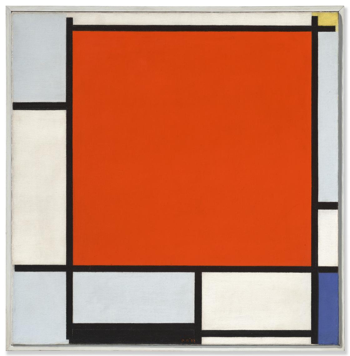
PIET MONDRIAN (1872-1944)
Composition with Large Red Plane, Bluish Gray, Yellow, Black and Blue
signed with initials and dated 'PM '22' (lower center) oil on canvas
21º x 21 in. (54 x 53.3 cm.)
Painted in Paris in 1922
PROVENANCE:
Antony Kok, Tilburg and Leiden (acquired from the artist, 1922).
Henri-Georges Doll, New York and Ridgefield, Connecticut (acquired from the above through Nelly van Doesburg, 21 May 1952); Estate sale, Christie’s, New York, 12 May 1992, lot 142.
Private collection, Monte Carlo (acquired at the above sale).
Blains Fine Art, London (acquired from the above).
Acquired from the above by the present owner, 1 March 2000.
EXHIBITED:
Houston, Contemporary Arts Museum, The Sphere of Mondrian, FebruaryMarch 1957 (titled Composition).
The Hague, Gemeentemuseum; Washington, D.C., National Gallery of Art and New York, The Museum of Modern Art, Piet Mondrian, December 1994-January 1996, p. 210, no. 102 (illustrated in color).
LITERATURE:
Letter from P. Mondrian to T. van Doesburg, May 1922.
Letter from P. Mondrian to A. Kok, August 1922.
Letter from P. Mondrian to A. Kok, 5 December 1922.
H. Henkel, "Mondrian: A Life in Pictures" in Mondrian: From Figuration to Abstraction, exh. cat., The Seibu Museum of Art, Tokyo, 1987, p. 207.
J.M. Joosten, Piet Mondrian: Catalogue Raisonné of the Work of 1911-1944, New York, 1998, vol. II, p. 305, no. B144 (illustrated).
M. Bax, Complete Mondrian, London, 2001, p. 506 (illustrated).
C.W. de Jong, ed., Piet Mondrian: Life and Work, Amsterdam, 2015, p. 375 (illustrated).
D. Wintgens, Peggy Guggenheim and Nelly van Doesburg: Advocates of De Stijl, Amsterdam, 2017, p. 129.
“It is probably not easy to be an original. It takes a lot of experience and serious introspection.”
PIET MONDRIAN

COLLECTED WORKS
Piet Mondrian, circa 1922. Photographer unknown.
LEONARD & LOUISE RIGGIO:
Painted in 1922, Composition with Large Red Plane, Bluish Gray, Yellow, Black and Blue encapsulates the purity, elegance and extreme rigor of Piet Mondrian’s revolutionary mature aesthetic. It was during the early 1920s, while living in Paris, that Mondrian solidified and explored fully the potential of NeoPlasticism, the ground-breaking approach to abstraction he had pioneered towards the end of the First World War. Using only the fundamental elements of painting—the straight line, primary colors and the three non-colors of black, white and gray—Mondrian believed that he could create an idealized pictorial form of pure equilibrium that would reintegrate a fundamental sense of beauty into life. “The task today, then, is to create a direct expression of beauty—clear and as far as possible ‘universal’,” Mondrian wrote. “It will be a purely plastic beauty, that is, beauty expressed exclusively through lines, planes or volumes and through color—a beauty without natural form and without representation. It is purely abstract art” (“Purely Abstract Art”; reproduced in H. Holtzman and M.S. James, The New Art—The New Life: The Collected Writings of Piet Mondrian, London, 1986, p. 199).
When he left the Netherlands for Paris in June 1919, Mondrian was still using a modular grid and gradated color as the basis of his work. During his first year in France, however, his art underwent a radical transformation—restricting himself to purely abstract rules of geometry and color, he began to use a refined visual language of squares or rectangles of primary hues, set in white fields and bounded by intersecting straight lines. Intended to evoke principles of balance and harmony, these works marked a key breakthrough in his pursuit of “a true vision of reality,” and by the end of 1920, Mondrian had painted his first genuinely Neo-Plastic composition. Over the course of the subsequent two years, he executed more than thirty paintings using this radically reduced pictorial vocabulary—approximately one-fifth of his total Neo-Plastic output—testing and exploring its limits. However, Mondrian was surprised to find his bold new idiom stood in stark contrast to the prevailing trends of the rappel à l’ordre then sweeping through the European art world, which favored a return to figuration and classical ideals. Nevertheless, he remained unswerving in his devotion to the theories of Neo-Plasticism, relentlessly pursuing and promoting its potential as a thoroughly modern pictorial language to fellow artists, collectors and gallerists.

As a result, he attracted attention from several key figures in the Parisian art world, most notably the dealer Léonce Rosenberg, who published Mondrian’s text Neo-Plasticism in French translation in January 1921, and included several of his recent paintings in a well-attended group exhibition three months later.
Mondrian completely immersed himself in his art during this pivotal period, working intensively and using the core concepts of Neo-Plasticism within the arrangement and form of his own living space. In his apartment and studio at 26 rue du Départ, where he moved in October 1921, he covered the white walls with primary colored, geometric cardboard shapes, arranged, like in his paintings, according to his carefully worked-out Neo-Plastic principles. He painted all the objects in the studio, including the few pieces of furniture he had and his treasured gramophone player, in bright primary hues, so as to create what he described as “a new design for living.” Entering from the dark hallway, the bright, immaculately ordered space astonished visitors—Alexander Calder, recalling his pivotal first visit to the studio, wrote of the impact this experience had on his creative imagination: “It was a very exciting room… I suggested to Mondrian that perhaps it would be fun to make these rectangles oscillate. And he, with a very serious countenance, said: ‘No, it is not necessary, my painting is already very fast.’ …This one visit gave me a shock that started things. Though I had often heard the word ‘modern’ before, I did not consciously know or feel the term ‘abstract.’ So now, at thirty-two, I wanted to paint and work in the abstract” (Calder: An Autobiography with Pictures, New York, 1966, p. 113).
Atelier Mondrian, 26 rue du Départ, Paris, 1926. Photograph by Paul Delbo.

Alexander Calder, Untitled, c. 1940. McNay Art Museum, San Antonio. © 2025 Calder Foundation, New York / Artists Rights Society (ARS), New York. Photo: © McNay Art Museum / Art Resource, NY.
Another visitor to the rue du Départ was the artist, critic and author of one of the first monographs on Mondrian, Michel Seuphor, who wrote a detailed account of how the artist used the space. “The room was quite large, very bright, with a very high ceiling,” Seuphor recounted. “Mondrian had divided it irregularly, utilizing for this purpose a large black-painted cupboard, which was partly hidden by an easel long out of service; the latter was covered with big gray and white pasteboards. Another easel rested against the large rear wall whose appearance changed often, for Mondrian applied to it his Neo-Plastic virtuosity. The second easel was completely white, and used only for showing finished canvases. The actual work was done on the table. It stood in front of the large window facing the rue du Départ, and was covered with a canvas waxed white and nailed to the underside of the boards. I often surprised Mondrian there, armed with a ruler and ribbons of transparent paper, which he used for measuring. I never saw him with any other working tool…” (Piet Mondrian: Life and Work, New York, 1955, pp. 158-160).
It was here, in the midst of this carefully designed and restrained studio space, that Mondrian began work on Composition with Large Red Plane, Bluish Gray, Yellow, Black and Blue in 1922. By this time, Mondrian had defined the essential elements of his Neo-Plastic visual idiom, and spent much of that year working to further refine his ideas. Using primarily square format canvases, he experimented and played with the internal dynamics of his compositions, adjusting the arrangement of the grid, the thickness of his dividing lines, the saturation of color and the placement of various elements within the boundaries of the canvas. Filled with a dynamic internal energy, in which each line, each plane, each color is brought to life by its relationship to the other elements within the painting, Composition with Large Red Plane, Bluish Gray, Yellow, Black and Blue proves just how dynamic Mondrian’s restrained artistic language could be. As John Milner explained: “all that changes [in Mondrian’s work] is the number of elements, the proportions of the parts, and the rhythm they establish. This was enough for Mondrian. Here were the fundamentals of his paintings. Their relationships stood for all that existed, and he could see in those infinite relationships the visual evidence of his view of the world, his own cosmology” (Mondrian, London, 1992, p. 163).
Despite their apparent simplicity, works such as Composition with Large Red Plane, Bluish Gray, Yellow, Black and Blue are based on a complex system of balance and imbalance, symmetry and asymmetry, that the artist arrived at intuitively, through careful and prolonged contemplation before his works. The principle focus of the canvas is the vibrant red square, which is the largest and most prominent form

within the composition, positioned just slightly off-center. The surrounding planes are executed in subtly different tones of white and gray, while pops of yellow, black and vibrant blue, are arranged towards the edges of the canvas. The black lines dividing these planes of color vary slightly in width, lending a subtle sense of depth and dynamism to the grid, with the thicker lines granted a greater power and solidity within the composition than their counterparts. Having said this, unlike other compositions from this period where these black lines appear to continue infinitely beyond the space of the canvas, in Composition with Large Red Plane, Bluish Gray, Yellow, Black and Blue they appear to taper off towards the edge in places, allowing the bright primary colors they border to interact directly with their neighboring planes of white or gray. This is most noticeable in the upper right corner of the composition, where tiny slivers of soft yellow pigment float freely into the adjoining spaces, creating an unexpected impression of delicate layering and three-dimensionality within the canvas.
Piet Mondrian, Composition, 1921. The Metropolitan Museum of Art, New York.
Photo: © The Metropolitan Museum of Art / Art Resource, New York.
“It
is not enough to place side by side a red, a blue, a yellow, and a gray, because that remains merely decorative. It has to be the right red, blue, yellow, gray, etc. : each right in itself and right in relation to the others.”
PIET MONDRIAN


Piet Mondrian, Composition with Red, Blue, Black, Yellow and Gray, 1921. Kunstmuseum den Haag.
Photo: © Kunstmuseum den Haag / Bridgeman Images.
Piet Mondrian, Tableau 2, 1922. The Solomon R. Guggenheim Museum, New York. Artwork: © 2025 Mondrian / Holtzman Trust.
Photo: © The Solomon R. Guggenheim Foundation / Art Resource, NY.
“I believe that equilibrium can exist with dissonants.”
PIET MONDRIAN

Piet Mondrian, Composition with Yellow, Blue, and Blue-White, 1922. The Menil Collection, Houston. © 2025 Mondrian / Holtzman Trust.
LEONARD & LOUISE RIGGIO: COLLECTED WORKS

Composition with Large Red Plane, Bluish Gray, Yellow, Black and Blue was acquired directly from Mondrian in the year it was painted by the poet, and founding member of De Stijl, Antony Kok. An innovative writer with an interest in new modes of expression, most notably experimental klankpoëzie or sound poetry, Kok was quickly absorbed into the circle of avant-garde artists and intellectuals around Theo van Doesburg, following their meeting in 1914. Kok came to play an important role in the establishment of the group’s periodical, De Stijl, contributing numerous articles and poems on the subject of modern life and art to the magazine. During these years he also became close to Mondrian, and he remained an important comrade and confidante for the artist through the early 1920s following his return to Paris. Writing to Van Doesburg in April 1922, Mondrian detailed a recent visit from the poet, during which he had purchased a painting from him—“I spent some particularly pleasant days with Kok,” he wrote “…it cheered me up to meet a kindred spirit once again at last. He has a clear vision…” (quoted in J.M. Joosten, op. cit., 1998, p. 305).
Further correspondence from later that year reveals that Mondrian was in fact working on two separate pictures for Kok at this time— Composition with Yellow, Blue, and Blue-White (Joosten, no. B143; The Menil Collection, Houston), and the present work, Composition with Large Red Plane, Bluish Gray, Yellow, Black and Blue. According to a letter dated August 1922, one of Kok’s works was finished quite quickly, but the artist was still pondering over the second painting, which he continued to do to the end of the year. The two works appear to have been delivered to Kok the following spring, and remained with him until the early 1950s, at which point Nelly van Doesburg acted as a broker for the poet during one of her visits to New York. She sold a total of four paintings by Mondrian from Kok’s collection to a series of important American buyers, including John Streep, John L. Senior Jr. and Jean and Dominique de Menil. Composition with Large Red Plane, Bluish Gray, Yellow, Black and Blue was sold to Henri-Georges Doll at this time, and is the last of this quartet of paintings formerly in Kok’s collection to remain in private hands.
Piet Mondrian and Nelly van Doesburg in Mondrian’s studio at 26 rue du Départ, Paris, 1923.


GERHARD RICHTER (B. 1932)
Abstraktes Bild
signed, inscribed and dated ‘911-3 Richter 2009’ (on the reverse) oil on canvas 78æ x 118¿ in. (200 x 300 cm.)
Painted in 2009.
PROVENANCE:
Marian Goodman Gallery, New York
Acquired from the above by the present owner, 2009
EXHIBITED:
New York, Marian Goodman Gallery, Gerhard Richter: Abstract Paintings 2009, November 2009-January 2010, n.p., no. 54 (illustrated).
LITERATURE:
E. Garbin, Il bordo del mondo: La forma dello sguardo nella pittura di Gerhard Richter, Venice, 2011, p. 161.
D. Elger, ed., Gerhard Richter Catalogue Raisonné, Volume 6, Nos. 900-957, 2007-2019, Berlin, 2022, pp. 170-171, no. 911-3 (illustrated).

“A picture like this is painted in different layers, separated by intervals of time.”
GERHARD RICHTER

Gerhard Richter in his studio, 1994. Photograph by Benjamin Katz. Photo: © 2025 Artists Rights Society (ARS), New York/ VG Bild-kunst, Bonn. Artwork: © Gerhard Richter 2025 (28032025).
A sublime example of Gerhard Richter’s famed abstract paintings, Abstraktes Bild stands at the culmination of almost three decades of painterly exploration. In this large-scale work, expansive sweeps of ethereal pigment envelop a panoramic canvas; an initial consideration announces an almost monochromatic veil of white, but further attention discloses a subtle palette of soft greens, red, blues, pinks, and mauves that emerge through the diaphanous upper layer of paint to make themselves visible. The artist began his interrogations of the painted surface in the 1960s with his “blurred” photo paintings, a revolutionary series of works which evolved into his Abstraktes Bilder, the now iconic series of paintings which have come to dominate the latter part of his career. These majestic works are celebrated as some of the most visceral and cerebral examinations of what it means to be a painter working today and are now sought after by both major collectors and institutions alike.
The outward simplicity of a painting such as Abstraktes Bild belies the time taken in, and complexity of, its realization. As the artist himself explains, “A picture like this is painted in different layers, separated by intervals of time. The first layer mostly represents the background, which has a photographic, illusionistic look to it, though done without using photograph. This first, smooth soft-edged paint surface is like a finished picture; but, after a while, I decide that I understand it or have seen enough of it, and in the next stage of painting, I partly destroy it, partly add to it, and so it goes on at intervals, ‘til there is nothing more to do and the picture is finished” (quoted in U. Wilmes, “Gerhard Richter: One Moment in Time. On the Documentation of the Conditions in which Abstract Paintings are Made,” in U. Wilmes, Gerhard Richter: Large Abstracts, exh. cat., Museum Ludwig, Cologne, 2008, p. 138).
The result is a considered study of how paint is applied to the surface of a canvas and the resulting effects that can be achieved. In this manner it has parallels to Claude Monet’s famed Water Lilies and his meteorological studies of the French countryside, particularly the haystacks that dotted the landscape. Between 1890 and 1891, he completed almost thirty such paintings in which he made a conscious effects to record the effects of ever shifting light on his subject matter.
“I’m working away at a series of different effects (of stacks),” Monet wrote to the critic Gustave Geffroy, “but at this time of year, the sun sets so quickly that I can’t keep up with it…” (quoted in J. House, Monet: Nature into Art, New Haven, 1986, p. 198). In Haystacks (Effects of Snow and Sun) (The Metropolitan Museum of Art, New York) from 1891, the combination of the setting sun refracting off the snowy surface of the haystacks produces a subtle, yet dazzling, use of color which can also be seen in the surface of Abstraktes Bild


Peter Doig, Cobourg 3+1 more, 1994. Provinzial Rheinland Vericherung, Dusseldorf. © Peter Doig. All Rights Reserved, DACS 2025.
Claude Monet, Haystacks (Effect of Snow and Sun), 1891. The Metropolitan Museum of Art, New York.

Painted in a landscape format, the present work can also be considered alongside the established tradition established in the eighteenth century by artists such as the German Romantic painter Caspar David Friedrich. He was interested in capturing on canvas the feeling of nature as a place for profound spiritual and emotional encounters. He developed pictorial vistas that emphasized intimacy, open-endedness, and the complexity of an individual’s response and relationship to the natural world. The results were paintings that were meditative, mysterious, and full of wonder. For Richter, the German tradition of a strong, intimate relationship with the landscape still rings true. But belonging to a generation who came of age in the immediate aftermath of World War II, Richter’s approach was to question the response of artists to the resulting horrors; his response was to challenge the cultural hegemony and develop a completely new form of artistic language.
While aesthetically Richter’s Abstraktes Bilder may recall the work of earlier artists, philosophically and contextually, they differ. Richter has often criticized abstraction because of the “phony reverence” it inspires, declaring, in contrast, that his abstractions were “an assault on the falsity and the religiosity of the way people glorified abstraction” (G. Richter, interview with B.H.D. Buchloh, 1986; in G. Richter, The Daily Practice of Painting: Writings and Interviews 19621993, London, 1995, p. 141). Rather than an homage to abstraction, Richter’s abstract pictures address the problems of painting and the difficulties confronting contemporary painters working under the great weight of the history of painting at a moment when many artists had abandoned the medium itself. According to Richter, his abstract works represent “my presence, my reality, my problems, my difficulties and contradictions” (quoted in D. Dietrich, “Gerhard Richter: An Interview,” in The Print Collectors Newsletter, 16, no. 4, SeptemberOctober 1985, p. 128).
Caspar David Friedrich, Monk by the Sea, 1808-1810. Alte Nationalgalerie, Berlin.
“All that I am trying to do in each picture is to bring together the most disparate and mutually contradictory elements, alive and viable, in the greatest possible freedom.”
GERHARD RICHTER
Thus, Richter’s Abstraktes Bild forms an important part of the artist’s belief about the fundamentals of painting. In both physical and painterly forms it represents the artist’s faith in painting as the highest form of human endeavor. Although they adhere to no known logic or ideology they are created through a carefully thought out and precise accumulation of paint and executed in a thoroughly distinctive process during which Richter deliberately avoids all conventional rules of aesthetics in order to arrive at work that belies pictorial ideology. “I can... see my abstracts as metaphors,” Richter has said; they are “pictures that are about a possibility of social coexistence. Looked at in this way, all that I am trying to do in each picture is to bring together the most disparate and mutually contradictory elements, alive and viable, in the greatest possible freedom. No Paradises” (quoted in G. Richter, op. cit., 1995, p. 166). This deliberate ambiguity is intended to demonstrate that all perception is an illusion. By seemingly providing several layers of conflicting abstract reality, Richter presents a “forestlike” mystery where the viewer quite literally can’t see the wood for the trees. Playing with the surfaces of his abstracts, Richter is in effect exploring them in the same way that he explored the ambiguity of blurring in his photographic paintings of the 1960s. As with these works, Richter is clearly still fascinated with surface and the insight it can provide into the mystery of what lies beneath. Opposite: Present lot illustrated (detail).

YVES KLEIN (1928-1962)
Untitled blue monochrome, (IKB 272)
dry pigment and synthetic resin on gauze mounted on panel 30Ω x 22 in. (77.5 x 55.9 cm.)
Executed in 1956.
PROVENANCE:
Galleria Apollinaire, Milan
Private collection, 1957
Private collection, by descent from the above Anon. sale; Christie’s, London, 27 June 1996, lot 54
Acquired at the above sale by the present owner
EXHIBITED:
Milan, Galleria Apollinaire, Proposta Monocroma Epoca Blu, January 1957. New York, L&M Arts, Yves Klein: A Career Survey, October-December 2005, pp. 48-49, no. 14 (illustrated; titled Blue Monochrome, Untitled (IKB 272)).


Triumphantly announcing the arrival of Yves Klein’s iconic blue paintings, the artist’s Untitled blue monochrome, (IKB 272), a panel of vivid ultramarine blue exuding extra-dimensional depth, is one of the eleven original blue monochromes exhibited at Galleria Apollinaire’s legendary 1957 show Yves Klein: Proposte monochrome, Epoca Blu. This celebrated exhibition saw the first unveiling of International Klein Blue (IKB), Klein’s groundbreaking chromatic innovation which fundamentally altered the course of art history. Untitled blue monochrome, (IKB 272) potently advances Klein’s conception of color as the ultimate artistic achievement, allowing the viewer to “bathe in cosmic sensibility,” liberated from the oppressive nature of line and form (quoted in P. Karmel, “Yves Klein: Supernova,” in Yves Klein: A Career Survey, exh. cat., L&M Arts, New York, 2005, p. 11). Klein’s singular achievement in Untitled blue monochrome, (IKB 272) is announced by the noted author Dino Buzzati, who proclaimed that, “in terms of figurative renunciation, formal purity or abstractionism, we will not be able to go further for centuries” (“Blu Blu Blu: Un fenomeno alla Galleria Apollinaire,” Corriere d’Informazione, 9-10 January 1957).
Yves Klein at Yves Klein: Proposte monocrome, Epoca Blu, Galleria Apollinaire, Milan, 1957. © Succession Yves Klein c/o Artists Rights Society (ARS), New York / ADAGP, Paris 2025.
“In the basilica of St. Francis there are monochromes that are completely blue. It really is incredible... What a precursor! Talk about a precursor! Long live Giotto!”
YVES KLEIN

Klein conceived his solo show entirely of blue works after realizing that audiences were misinterpreting his previous exhibitions of different colored monochromes as purely decorative. The artist considered his unique blue color to have a quality closest to pure space, associating it with immateriality—evoking a spiritual silence, wherein one might find their own inner meaning. In the present work, Klein used a paint roller to apply his blue pigment over his gauze-covered wooden panel treated with casein, creating a decadent, velvety texture exhibiting an almost unearthly appearance of depth. This distinctive textured surface is exemplary of his earliest Monochromes and crucial to the work’s conceptual apparatus. The delicate ridges that occur organically across the surface ensures the picture functions as a field generating an alternative vision, preventing the viewer from seeing the work as an individualized rectangular shape and instead allowing the support to disappear, revealing the immaterial sublime.
With the present work, Klein consolidates his position at the forefront of the European avant-garde, propelling the possibilities of paint past figuration toward what he with the art critic Pierre Restany termed Nouveau Réalisme Untitled blue monochrome, (IKB 272) in a sense goes beyond abstraction, aiming to put its viewership into a spiritual state of mind through the establishment of an immaterial void. Klein’s friend and fellow artist Jean Tinguely describes Klein as a “iconoclastic anti-painter” rebelling not just against art history, but painting itself (quoted in M. Koddenberf, Yves Klein: in/out studio, New York, 2016, p. 9).
The Basilica of St. Francis in Assisi. Photo: Scala / Art Resource, NY.
Yet, in favoring color over form or line, Klein inserts himself in a lineage of artists leading all the way back to Giotto. Visiting Assisi in 1958, Klein wrote on a postcard sent to his gallerist Iris Clert: “In the basilica of St. Francis there are monochromes that are completely blue. It really is incredible, the imbecility of art historians who had never spotted this before. They are all signed ‘Giotto.’ What a precursor! Talk about a precursor! Long live Giotto!” (Postcard to Iris Clert, 7 April 1958, The Estate of Yves Klein). The recto image of the postcard shows a reproduction of Giotto’s fresco depicting the legend of Saint Francis, the saint’s robes colored a rich, ultramarine blue duplicated in the luminous sky.
Klein’s radical blue paintings proved an immediate sensation, enrapturing artists, critics, and the broader public. Italian artists Piero Manzoni and Lucio Fontana were both inspired by Klein’s revelatory blue paintings, directly leading Manzoni to his Achrome series of white paintings, and Fontana to purchasing a work from the exhibition, now at Fondazione Lucio Fontana. Galleria Apollinaire became a celebrated convening point for the avant-garde, attracting prominent figures including Adriano and Ada Parisot, Lutka Pink, Claude Bellegrade; collectors Italo Magliano and Peppino Palazzoli purchased works from the show, and other examples shown in the exhibition now reside in institutions including the Staatsgalerie Stuttgart and the Museu Coleção Berardo, Lisbon. Untitled blue monochrome, (IKB 272) reveals the first definitive thrust Klein made into his famous explorations in his namesake blue pigment which propelled him to worldwide acclaim. This powerful, rare work is the terminus a quo of his pivotal Blue Period, from which his Anthropométries and Archisponges claim their proud inheritance.

Installation view, Yves Klein: Proposte monocrome, Epoca Blu, January 2-12, 1957, Galleria Apollinaire, Milan.
© Succession Yves Klein c/o Artists Rights Society (ARS), New York / ADAGP, Paris 2025.
DAVID SMITH (1906-1965)
Egyptian Landscape
stamped with the artist’s signature, inscription and date ‘David Smith G2 1951’
(on a metal plate welded to the base)
steel, bronze and paint
26æ x 49¬ x 18æ in. (67.9 x 126 x 47.6 cm.)
Executed in 1951.
PROVENANCE:
Estate of the artist
Marlborough Gallery, New York
Jane and Richard D. Lombard, Rye, New York, 1970
Gagosian Gallery, New York
Acquired from the above by the present owner, 2001
EXHIBITED:
New York, Kleemann Galleries, David Smith: Sculpture and Drawing, April 1952, n.p., no. 8.
New York, Fine Arts Associates (Otto Gerson Gallery), Sculpture by David Smith, September-October 1957, n.p., no. 1 (illustrated).
Memorial Art Gallery of the University of Rochester; Phillips Exeter Academy, Lamont Art Gallery; Cambridge, Massachusetts Institute of Technology, Hayden Gallery; Washington, D.C., Phillips Collection; Indianapolis, John Herron Museum of Art; Hartford, Wadsworth Atheneum; Carbondale, Southern Illinois University and San Antonio, Witte Memorial Museum, David Smith, November 1961-March 1963.
New York, Solomon R. Guggenheim Museum; Dallas Museum of Fine Arts and Washington, D.C., Corcoran Gallery of Art, David Smith, MarchDecember 1969, pp. 12, 24 and 72-73, no. 39 (illustrated).
New York, Drawing Center and Houston, Museum of Fine Arts, Sculptors' Drawings Over Six Centuries, 1400-1950, March-September 1981, n.p. (illustrated).
Indianapolis Museum of Art and New Orleans Museum of Art, Crossroads of American Sculpture: David Smith, George Rickey, John Chamberlain, Robert Indiana, William T. Wiley, Bruce Nauman, October 2000-September 2001, p. 87 (illustrated).
New York, Solomon R. Guggenheim Museum, David Smith: A Centennial, February-May 2006, pp. 302 and 311, no. 56 (illustrated).
Glens Falls, Hyde Collection, Songs of the Horizon: David Smith, Music, and Dance, June-September 2023, pp. 31 and 62, pl. 30 (illustrated).
LITERATURE:
F. O’Hara, “David Smith: The Color of Steel,” ARTnews, vol. 60, no. 8, December 1961, p. 70.
B. Gelman, "SIU Gallery Exhibits Metal Sculpture," Southern Illinoisan, 17 January 1963, p. 24 (illustrated).
David Smith 1906-1965, exh. cat., Cambridge, Fogg Art Museum, 1966, p. 72, no. 199.
C. Gray, ed., David Smith by David Smith, New York, 1968, p. 64 (illustrated).
D. L. Shirey, “Man of Iron,” Newsweek, vol. 73, no. 13, 31 March 1969, pp. 78-80 (illustrated).
R. Fabri, “David Smith Retrospective,” The Ohio Art Graphic, 28 May 1969, pp. 16-17 (illustrated).
B. Diamonstein, ed., The Art World: A Seventy-Five-Year Treasury of ARTnews, New York, 1977, p. 312
R. E. Krauss, The Sculpture of David Smith: A Catalogue Raisonné, New York and London, 1977, pp. 27 and 50-52, fig. 249 (illustrated).
S. E. Marcus, David Smith: The Sculptor and His Work, Ithaca and London, 1983, pp. 53-54, 75 and 110, fig. 18 (illustrated).
M. Brenson, “David Smith: Freedom and Myth,” Sculpture, vol. 25, no. 1, January-February 2006, p. 28 (illustrated).
P. Plagens, “Modernism’s Heavy Metal,” Newsweek, vol. 147, no. 7, 13 February 2006, p. 58 (illustrated).
A. Gouk, “Steel Sculpture Part I: From Gabo to Caro,” Abstract Critical, 17 April 2014, n.p.
C. Lyon, ed., David Smith Sculpture, A Catalogue Raisonné, 1932-1965, Volume Two, 1932-1953, New Haven and London, 2021, pp. 364-365, no. 289 (illustrated).
K. Wilkin, “’Songs of the Horizon: David Smith, Music, and Dance’ Review: Rhythms of Abstraction,” Wall Street Journal, 9 August 2023, digital.
A. Thompson, “Songs of the Horizon: David Smith, Music and Dance,” Brooklyn Rail, September 2023, digital.
A. F. Hall, “The Mind of the Welder,” Lake George Mirror, 6 September 2023, digital.


Alberto Giacometti, Le Nez, 1947. Collection Fondation Alberto & Annette Giacometti, Paris. © Succession Alberto Giacometti / Artists Rights Society (ARS), NY 2025.
Expanding across three-dimensional space with a calligraphic elegance, David Smith’s Egyptian Landscape is an outstanding example of the great American sculptor’s works from his early maturity. Executed with the assistance of his second John Simon Guggenheim Fellowship and made contemporaneously to some of Smith’s most pivotal achievements, Egyptian Landscape is unique in its masterful integration of green patinated cast bronze and steel elements. Smith exquisitely juxtaposes the two materials, evoking at once the persistence of classical antiquity imbued in the bronze forms and the relentless advance of modernity articulated in the prefabricated steel. As such he evocatively incorporates past and future within the present work to expand the boundaries of postwar sculpture whilst inventing a novel American vernacular.
Egyptian Landscape expands horizontally across space, its three cast-bronze elements held by interlinking linear steel bars. The central bronze element evocatively recalls Alberto Giacometti’s Le Nez, which Smith saw exhibited at Pierre Matisse Gallery in 1947, while simultaneously resembling animalistic artforms from ancient Egypt, most notably figures of the god Anubis. This twofold influence—ancient and modern—expands across the rest of the sculpture whilst encapsulating Smith’s oeuvre writ large.

The artist’s deep knowledge of and respect for his materials parallels and informs the art historical duality embraced in Egyptian Landscape. While his use of cast-bronze denotes the influence of antiquity, the steel elements point toward his working process and his practice’s deep synergies with the advent of modernity. Reflecting on his favored medium, Smith comments, “The material called iron or steel I hold in high respect. What it can do in arriving at form economically, no other material can do. The metal itself possesses little art history. What associations it possesses are those of this century: power, structure, movement, progress, suspension, destruction, brutality” (quoted in D. Anfam, “Vision and Reach: The World is Not Enough” in David Smith: A Centennial, exh. cat., Whitney Museum of American Art, New York, 2006, p. 20).

Egyptian Landscape also signifies the artist’s synthesis of drawing, painting, and sculpting, exemplifying the concept of “drawing in space.” The present work is one of the last where the artist made a detailed preparatory drawing. For Smith, draftsmanship and sculpture were inextricably linked, and his works challenge the dichotomy established from the Italian Renaissance onward between the painters and sculptors, resolving the paragon by integrating the intellect of painting and the physicality of sculpting together into one artwork. David Anfam celebrates this art historical turning point, announcing how “David Smith’s vision is perhaps the most concerted bid in the twentieth century to grant sculpture the large conceptual empire that a painter can evoke, with the relative ease and some few strokes, upon the microcosmic plane of a canvas” (ibid., p. 17).
Egyptian Landscape encapsulates Smith’s proclamation that sculpture is “as free as the mind, as complex as life” (ibid., p. 18). Eloquently synthesizing antiquity with modernity via its unique integration of bronze and steel, the work also anticipates Smith’s later practice. Perfectly poised and beautifully balanced, Egyptian Landscape unifies Smith’s great skill and intense intellect into a singular form, merging past and present to point toward sculpture’s future possibilities.
Egyptian Landscape (1951), Raven I (1956), Ridge Runner (1953), Bolton Landing, NY, circa 1956 (present lot illustrated).
Photo: David Smith.
© 2025 The Estate of David Smith / Licensed by VAGA at Artists Rights Society (ARS), NY.
David Smith, Untitled (Study for Egyptian Landscape), 1950-1951. Estate of David Smith, New York. © 2025 The Estate of David Smith / Licensed by VAGA at Artists Rights Society (ARS), NY.
ROBERT RAUSCHENBERG (1925-2008)
Cusp (Hoarfrost)
signed and dated ‘Rauschenberg 75’ (lower left) solvent transfer, paper bags and newsprint on fabric 48 x 37Ω in. (121.9 x 95.3 cm.)
Executed in 1975.
PROVENANCE:
Leo Castelli Gallery, New York
Acquired from the above by the present owner, 1994
EXHIBITED:
New York, Twining Gallery, Stuff & Spirit: The Arts in Craft Media, May-June 1984. Roslyn Harbor, Nassau County Museum of Art, Two Decades of American Art: The 60's and 70's, May-September 1990, n.p. (illustrated).
LITERATURE:
Robert Rauschenberg, exh. cat., Ferrera, Galleria Civica D'Arte Moderna, 1976, n.p. (illustrated).


Ghostly images flicker shadow-like across Robert Rauschenberg’s Cusp (Hoarfrost). These phantasmagoric pictures, wrought from contemporaneous magazine publications, emerge like shadows from the opaque translucency of the diaphanous fabric support—itself barely material—merely two pins on the upper edges holding the work as it billows with the slightest disturbance.
The Hoarfrost series was the innovative American artist’s first to deal with fabric, executed just after his move to Captiva, Florida. Initially coming upon the idea after cleaning a lithographic stone with cheesecloth and solvent and noting the metamorphized image impregnated upon the cotton fabric, Rauschenberg set to work producing this defining series. Printed on his new green-painted Griffin flatbed press—affectionately named “Grasshopper”—the artist laid his fabric in the press, then arranged selected paper images—in this case, advertisements from the 7 November 1974, edition of The Los Angeles Times—on top, some flat and face down, others wadded, crumpled, or torn. After spraying a fine mist of solvent over the entire assembly, he layered padding on top then sent the work through the press, exacting thousands of pounds of pressure upon the barely material fabric to create his hallucinatory imagery.
Rauschenberg’s first interactions with photographic transfers occurred in the 1960s, when Andy Warhol instructed him on the silkscreen technique. Rauschenberg utilized the transfer technique to overlap images onto each other, their original spatial meaning canceling out into a crescendo of optical
Robert Rauschenberg, Sybil (Hoarfrost), 1974. Whitney Museum of American Art, New York. © 2025 Robert Rauschenberg Foundation / Licensed by VAGA at Artists Rights Society (ARS), New York.
Robert Rauschenberg, Glacier (Hoarfrost), 1974. Menil Collection, Houston. © 2025 Robert Rauschenberg Foundation / Licensed by VAGA at Artists Rights Society (ARS), New York.

noise. This amalgamation of illusionary imagery created what art historian Leo Steinberg considered the single most important artistic breakthrough of the twentieth century, the construction of the flatbed picture plane, where “the painted surface is no longer an analogue of a visual experience of nature but of operational processes” (“Encounters with Rauschenberg,” in S. Schwartz, ed., Modern Art: Selected Essays, Chicago, 2023, p. 87).
Hoarfrost’s inception can be first traced to Rauschenberg’s 1958 project to illustrate each Canto of Dante’s Inferno. For each drawing, the artist would read a Canto with his friend Michael Sonnabend, an art dealer and Dante scholar, before translating verse into image. Rauschenberg discovered the term hoarfrost in Canto XXIV, the artist explaining that “hoarfrost is like a mock frost, but it’s a warning about the change of seasons” (quoted in M.L. Kotz, Rauschenberg / Art and Life, New York, 1990, p. 162). Dante lent on the natural phenomenon in a metaphor describing a fleeting emotion, the resultant visual effect so profound as to deeply affect Rauschenberg, who translated the scene into a tableau strewn with silver grey effervescence hesitantly laid across the sheet, the forms’ abstracted shapes suggesting their fleeting nature.
The work recalls another Western tradition, depictions of the Veil of Veronica, the fabric said by medieval legend to have captured the visage of Jesus Christ. Veronica’s veil can be conceptualized as a precursor to Rauschenberg’s photographic transfer process. Zurbaran’s seventeenth-century painting depicting the subject bears stylistic similarities to Rauschenberg’s work as well, the Old Master’s evocative painted veil hung similarly to the American artist’s fabric, Christ’s face just barely discernable from the cloth’s folds much as the transferred media only barely registers from the fabric support.
Just as for Dante’s hoarfrost, “but the color from his brush soon fades away,” Rauschenberg’s media proved fungible in his Hoarfrosts (The Portable Dante, trans. M. Musa, New York, 1995, Canto XXIV, 6). The artist describes how “The first ones [in 1974] were very obscure, they were almost like brushstrokes. And in many cases you had to know what the image was in order to be able to see it… I was actually trying to dematerialized the surface as much as I could so that you had a sense of the fabrics being there so the light would have something to fall on” (quoted in M.L. Kotz, op. cit., 1990, p. 162).
The work’s delicate execution and interaction with its surroundings, constantly modulating against the slightest breeze, captures the essence of both Dante’s metaphor and Rauschenberg’s broader artistic project, deconstructing symbolic allusion to advance a bold, innovative art.
Francesco de Zurbaran, Veil of Veronica, circa 1635-1640. Nationalmuseum, Stockholm.
ED RUSCHA (B. 1937)
Johnny Tomorrow
signed twice, titled and dated twice 'Ed Ruscha 1984 EDWARD RUSCHA "JOHNNY TOMORROW" 1984' (on the backing board) oil on canvas
36 x 40 in. (91.4 x 101.6 cm.)
Painted in 1984.
PROVENANCE:
James Corcoran Gallery, Los Angeles
Anthony d'Offay Gallery, London
Kukje Gallery, Seoul
Private collection, Seoul
Private collection
Anon. sale; Sotheby's, New York, 10 November 2010, lot 185
Acquired at the above sale by the present owner
EXHIBITED:
Los Angeles, James Corcoran Gallery, Ed Ruscha: New Paintings, January-February 1985.
Seoul, Kukje Gallery, Ed Ruscha, November-December 1999, pp. 8 and 38, no. 3 (illustrated).
LITERATURE:
Edward Ruscha: Romance with Liquids, Paintings 1966-1969, exh. cat., New York, Gagosian Gallery, 1993, p. 103. R. Dean, ed., Edward Ruscha: Catalogue Raisonné of the Paintings, Volume Three: 1983-1987, New York, 2007, pp. 104-105, no. P1984.14 (illustrated).
& LOUISE RIGGIO: COLLECTED WORKS
LEONARD


Emerging from his iconic word paintings, Ed Ruscha’s Johnny Tomorrow sees the eponymous text suspended cinematically at the center of a twilight sky. Marking Ruscha’s triumphant return to painting with conventional materials, the canvas evinces the lessons learnt from his novel explorations in unconventional media— which spanned gunpowder to jelly and chocolate—during the artist’s sojourn away from his paintbrush. Ruscha approaches the canvas with a newfound lyricality, attending even more closely to the subtle effects of his materials after years of experimentation. The effects are visually and mentally engaging, the artist himself noting that the present work “scratches at the back of the brain” (quoted in R. Dean and E. Wright, eds., Edward Ruscha: Catalogue Raisonné of the Paintings, Volume Three: 1983-1987, New York, 2007, p. 104).
In the present work, Ruscha deploys an innovative technique to compose his image, which he terms “reverse stenciling.” First engaging stenciled letters to demarcate his carefully constructed typefaces across the canvas, Ruscha then painted the composition. After completing the painting, he removed the stencils, revealing his letters as spaces of white gessoed ground in an irreversible, subtractive process. His technique was at once thoroughly contemporary while simultaneously recalling the red-figure Attic vase painters of antiquity. The effect compellingly completes his composition in a single revelatory act, establishing Ruscha’s text as a preconceived figure against the painted ground. Ruscha elucidates how he views his meticulous process-based practice separately from the painterly approach of the Abstract Expressionists, describing how “they wanted to collapse the whole art process into one act; I wanted to break it into stages” (quoted in The Works of Ed Ruscha, exh. cat., San Francisco Museum of Modern Art, 1982, p. 27).
Ed Ruscha, The Back of Hollywood, 1977. Musée d’Art Contemporain, Lyon. © Ed Ruscha.

Johnny Tomorrow evokes in its swarthy upper register the last vestiges of sunlight shining through scattered clouds, the fading light signaling the end of the day poignantly juxtaposing with “tomorrow” to imbue the work with a sense of cyclicality, one day ending anticipating the coming tomorrow. The mellow cream yellow in the foreground recalls the day’s first illumination as the sun peaks above the horizon, the clarity of tone and form resembling daybreak.
Ruscha plays into this association through his strategic placement of “tomorrow” within this dawn-colored passage, establishing a dichotomy between the upper twilight signaling the ending of one day and the lower dawn heralding a new beginning. The artist challenges expectations, evincing what Dave Hickey describes as the way his paintings “derive their complexity from their complicity with the world around them… they are complexity itself” (“The Song of the Giant Egress” in R. Dean and E. Wright, op. cit., 2007, p. 10). The work’s title references the many Hollywood movies and characters named Johnny, as well as the American slang phrase “Johnny on the spot.” Simultaneously serious and cheeky, Johnny Tomorrow elegantly condenses low and high brow culture into a singular tableau, reveling in Ruscha’s mastery of the possibilities of text and the ambiguities of linguistic meaning.
Frederic Edwin Church, Twilight in the Wilderness, 1860. Cleveland Museum of Art.
The Enduring Ideal

Alongside the broad array of revolutionary artistic developments and dazzling breakthroughs of the twentieth century, the pull of tradition remained a powerful undercurrent within the avant-garde. Indeed, for many of the artists featured in the Riggio Collection, the art of the past was never far from their minds, offering a constant source of inspiration, challenge and stimulus for their own creativity. The following selection of works trace the different ways in which these pioneering figures examined and investigated a set of ideals and principles that have endured across centuries, boldly reimagining and reinterpreting them for a modern audience.
Shocked by the scale of the devastation wrought by the First World War, artists across Europe began to search for a different means of expression in the years following the conflict, which they believed would counteract the chaos and pandemonium of the era. By the 1920s, a new trend had emerged known as Le rappel à l’ordre (The Return to Order), which promoted a classical aesthetic and a renewed emphasis on clarity, purity and monumentality in art. Though at first hesitant to embrace this approach in his painting, Fernand Léger found inspiration in the great collections of the Louvre and other Parisian museums, prompting him to move away from the fractured forms of his earlier work and embrace a more timeless style, rooted in the human figure. His paintings from the opening years of the decade, such as Les trois personnages devant le jardin (1922), showcase this dynamic new approach, successfully balancing tradition and modernity in a single image.
Pablo Picasso was equally affected by the arrival of the rappel à l’ordre. His fascination with the art of the past had been firmly solidified following a trip to Italy in 1917, where he encountered ancient artefacts, architecture and frescoes first hand. Looking to the Old Masters, to classical sculpture and the art of antiquity, he developed a style of painting that stood in stark contrast to his ground-breaking Cubist works a decade earlier. Dating from 1922, Mère et enfant showcases Picasso’s renewed focus on the clarity of line and form in his work, depicting a young woman with classical features through a soft, restrained palette. Drawing on the traditions of Renaissance religious painting, Picasso explores the enduring image of the mother and child, transforming it into a touching portrait of his wife Olga and young son, Paul. Over forty years later, Willem de Kooning tackled the same subject in his painting Woman and Child (circa 1967-1968), reaching a startlingly different conclusion than Picasso. Using the theme as a means to experiment with the materiality of his paints, de Kooning played with the human form, expanding its presence through visceral, semi-abstract strokes of vibrant pigment that dissolve the woman’s form into a complex interplay of color.
“The art of the Greeks, of the Egyptians, of the great painters who lived in other times, is not an art of the past; perhaps it is more alive today than it ever was.”
PABLO PICASSO
The great painters of the Italian Renaissance were also of central importance to those artists who favored a more traditional form of figurative art through the twentieth century. Like Picasso, Balthus was profoundly influenced by a pilgrimage he made to Italy as a young artist, where the carefully constructed frescoes of Piero della Francesca took root in his imagination, informing his approach to composition in works such as Jeune fille en vert et rouge (Le Chandelier) (circa 1944-1945). John Graham found a means to move beyond his geometric, abstract idiom of the 1930s and early 1940s through the example of the Italian Quattrocento, transposing traditional ideals of feminine beauty, proportion and balance into his art. Similar concerns underpin Alberto Giacometti’s Nu dans l’atelier (Annette) (1954), an elegant portrait of the artist’s wife Annette in the midst of his studio, which presents a vision of the nude female form that is at once intensely modern, and yet inherently timeless. In contrast, Kerry James Marshall has sought to challenge and upend the homogeny of the art historical canon and the legacy of the Old Masters—works such as Small Pin-Up (Lens Flare) (2013) elevate the Black figure to a position of prominence and power, returning these individuals to a space in which they have been traditionally sidelined.
Similarly, the three works in the Riggio collection by Andy Warhol all offer intriguing meditations on the traditions of Western art, which he investigates and probes through a range of contemporary imagery and media. For example, in Mao (1973) Warhol invokes the traditions and expectations of portraits of power, foregrounding their role as a political tool to shape and influence the perception of a leader. In Cagney (1964), he examines the shifting concept of the modern hero in the twentieth century, offering an alternative form of narrative painting, mediated through film. With The Last Supper (1986) Warhol went even further, taking an image of Leonardo da Vinci’s renowned fresco at the convent of Santa Maria delle Grazie in Milan and translating it through his iconic silkscreen process. The result is a statement not only on the enduring power of this iconic image, fueled by its dissemination in photographic and printed form, but also, Warhol’s own position within the lineage of the history of art—positioning himself as both a successor to the great masters of the past, and an iconoclastic disruptor who challenged the very foundations of art as we know it.
BALTHUS (1908-2001)
Jeune fille en vert et rouge (Le Chandelier) oil on canvas
36¿ x 35æ in. (91.8 x 90.8 cm.)
Painted in 1944-1945
PROVENANCE:
M. Puech, Paris.
Eugène Marich, Paris.
Frank Perls Gallery, Beverly Hills (probably acquired from the above).
Pierre Matisse Gallery, New York (acquired from the above).
Helen Acheson, New York (acquired from the above, 22 May 1963).
The Museum of Modern Art, New York (bequest from the above, 1978, and until 1997).
PaceWildenstein, New York (acquired from the above).
Acquired from the above by the present owner, 6 August 1997.
EXHIBITED:
Paris, Galerie Beaux-Arts, Balthus: Peintures de 1936 à 1946, November-December 1946, no. 20.
The Arts Club of Chicago, Balthus, September-October 1964, no. 11 (illustrated; dated 1939).
Paris, Musée des arts décoratifs and Knokke-le-Zoute, Casino Municipal, Balthus, May-September 1966, p. 22, no. 9 (illustrated, p. 23; dated 1939).
London, Tate Gallery, Balthus, October-November 1968, p. 37, no. 15 (dated 1939).
Detroit, Donald Morris Gallery, A Benefit Exhibition of Balthus Paintings and Drawings, November-December 1969, no. 8 (illustrated; illustrated again in color on the cover; dated 1939).
Marseille, Musée Cantini, Balthus, July-September 1973, no. 9 (illustrated; dated 1939).
Berkeley, University Art Museum, Balthus: Matrix, November-December 1980 (dated 1939).
New York, The Museum of Modern Art, Balthus: Works from the Collection, September-December 1981 (dated 1939).
Paris, Musée national d'art moderne, Centre Georges Pompidou and New York, The Metropolitan Museum of Art, Balthus, November 1983-May 1984, pp. 146 and 349, no. 20/58 (illustrated in color, p. 147; illustrated again, p. 349; dated 1939).
New York, The Metropolitan Museum of Art, Balthus: Cats and Girls, Paintings and Provocations, September 2013-January 2014, p. 108, no. 23 (illustrated in color, p. 109).
Basel, Fondation Beyeler and Madrid, Museo Nacional Thyssen-Bornemisza, Balthus, September 2018-May 2019, p. 164 (illustrated in color, pp. 62-63).
LITERATURE:
R. Char, "Balthus, ou le dard dans la fleur" in Cahiers d'Art, Paris, vols. XX-XXI, 1945-1946, p. 199 (first state illustrated, p. 207; titled Jeune fille à la lampe).
P. Moses, "The Challenge: Fascination of Balthus" in Chicago Daily News, 10 October 1964, p. 11 (illustrated).
J.W. Faulkner, "The Wonderful Works of Art: Haunting Works of Balthus Fill Arts Club Exhibition" in Chicago Tribune, 27 September 1964, pp. 78-79 (illustrated, p. 78).
R. Paulson, "Balthus: Between Covers" in Bennington Review, no. 6, December 1979, pp. 78-79 (illustrated, p. 78).
J. Leymarie, Balthus, Geneva, 1982, p. 130 (illustrated; dated 1939).
S. Klossowski de Rola, Balthus, London, 1983, p. 96 (illustrated in color, pl. 33).
J. Clair, Metamorphosen des Eros: Essay über Balthus, Munich, 1984, pp. 79 and 81 (illustrated, fig. 61; dated 1939).
S. Klossowski de Rola, Balthus, London, 1996, p. 156 (illustrated in color, pl. 42).
C. Roy, Balthus, Paris, 1996, p. 113 (illustrated in color).
V. Monnier and J. Clair, Balthus: Catalogue Raisonné of the Complete Works, Paris, 1999, p. 145, no. P 152 (first and final states illustrated, p. 144).
S. Klossowski de Rola, ed., Balthus: Correspondance amoureuse avec Antoinette de Watteville, 1928-1937, Paris, 2001, pp. 401-402.
G. Néret, Balthasar Klossowski de Rola, Balthus: The King of Cats, Bonn, 2003, p. 69 (illustrated in color).
M. Bal, Balthus: Works and Interview, Barcelona, 2008, pp. 134 and 136 (illustrated in color, p. 135).
C. Viéville, Balthus et le portrait, Paris, 2011, p. 74 (illustrated in color, p. 75).
N. Strasse, Collection Jean Bonna: Dessins du XIXe au XXe siècle, du romantisme à l’après-guerre, Geneva, 2019, p. 292 (illustrated).


On the eve of the Second World War, after a seven-year courtship and an intervening marriage to another man, Antoinette de Watteville agreed to wed Polish-French artist Balthasar Klossowski de Rola, best known by his sobriquet Balthus. The war years would test the pair; Balthus would be mobilized to Alsace, suffer psychological and physical injury and be discharged from service, before he and Antoinette would move from Paris to Champrovent and on to her native Switzerland in search of refuge. Painted during this intense period of upheaval, Jeune fille en vert et rouge (Le Chandelier) is an arresting, dreamlike portrait of Antoinette in which place and time appear fractured and ambiguous. Despite being in her early thirties at the time of the work’s completion, she is depicted here as an adolescent. The voyeurism typical of many of Balthus’s depictions of young women seems to give way under Antoinette’s knowing, direct gaze—loaded with meaning and as if she offers an unspoken message to the viewer. Seemingly wrenching us out of time itself and into a quiet, uncertain and rarified present, Jeune fille en vert et rouge (Le Chandelier) is a tour de force, showcasing Balthus’s ability to bewitch and transport his audience.
Paradoxically, it is only by turning our eyes to Balthus’s revered predecessors that we can come to fully understand the disjointed sense of time within Jeune fille en vert et rouge (Le Chandelier). Lamenting modern painting’s self-induced amnesia of its own origins, the artist reflected in his autobiography: “From [modernity] we can only return to the wisdom of Italian Fresco painters, their slow patience, love for their profession, and their certainty of achieving beauty” (Varnished Splendors: a Memoir, New York, 2001, pp. 78-79).
Piero della Francesca, The Resurrection of Christ, circa 1460. Palazzo della Residenza, Sansepolcro.
Balthus, Résurrection (d’après Piero della Francesca), 1926. Private collection.

Prime among these masters to whom the artist calls us to return was Piero della Francesca. At age 18, the young Balthus traveled to Arezzo, spending the summer of 1926 producing oil studies of Piero’s frescoes. This pilgrimage would leave a lasting mark on Balthus’s developing style, particularly the clarity of Piero’s paintings, his preponderance for rituals, and his compositional structuring, which found parallels in Balthus’s own formal geometric order. Charles de Tolnay’s words on the fifteenth-century artist seem to correspond directly to works such as Jeune fille en vert et rouge (Le Chandelier): “Ritual solemnity is characteristic of all Piero’s compositions. His figures never seem to perform a transient action in this world, nor to take part in any real event; they appear immersed in a sacred cult with slow and solemn gestures, sometimes with serious, impassive expression, sometimes with serene piety… the simplification of the souls of Piero’s characters permits the artist, as well as the spectator to concentrate on the effects produced by form, color and line… It is as if one had soared into a world of archetypes” (“La Résurrection du Christ par Piero della Francesca” in Gazette des Beaux-Arts, 1954; quoted in P. de Vecci, The Complete Paintings of Piero della Francesca, New York, 1967, p. 12).
And yet, Balthus is right to insist upon his distance from the Renaissance—if this painting is religious, it is only so adverbially, not adjectivally. The work’s near-square canvas almost takes on the quality of a medium format photograph, starkly composed and frozen. Balthus’s simplification via the intensification of shadow sharply cleaves the composition with modern panache, much like the knife thrust into the half loaf of bread at lower center and the bifurcated red and green tricot that Antoinette wears (a garment she specifically purchased to pose for Balthus). Despite the fact that any one of the objects set out in front of Antoinette could be at home in a Dutch still life, we need no appliances, lightbulbs, or products of industrial life to know that Jeune fille en vert et rouge (Le Chandelier) is a product of the twentieth century. The delicate beauty of the subject, the evocative composition of the work and its voided, ambiguous setting come together to invoke the enduring ideals of the past and gesture towards a misty, indeterminate, modern future.
In their analysis of Jeune fille en vert et rouge (Le Chandelier), some scholars have noted the painting’s parallels to the occult world of Oswald Wirth’s Tarot. Antoinette seems to be fashioned as “The Magician,” confronting viewers with perhaps not a divine presence but a divining
Le Bateleur (The Magician) from Oswald Wirth’s Tarot, circa 1889. Photo: Gem Archive / Alamy Stock Photo.
“If we could return to Giotto’s deliberation, Masaccio’s exactitude, and Poussin’s precision!... Real modernity is in the reinvention of the past, in refound originality based on experience and discoveries.”
BALTHUS

Balthus, Le Goûter, 1940. Tate, London. © 2025 Artists Rights Society (ARS), New York / ADAGP, Paris.
LEONARD & LOUISE RIGGIO: COLLECTED WORKS
one. Sabine Rewald notes, “The objects laid out on the white tablecloth—a silver cup, half loaf of bread with a knife stuck in it, and a candlestick—relate to those often depicted on tarot cards. Arrayed on tables beside the magicians, these arrangements of objects were more likely to contain swords, however, than kitchen knives. The magicians often wielded batons as magic wands. The girl holds a candlestick” (op. cit., exh. cat., 2013, p. 108). Antoinette’s left arm proceeds towards us, as if she has knowingly and resolutely selected the unlit candlestick from the table’s array to push forwards, sharing with us a hazy insight plucked from our future. Her right hand recedes into the shadow of her cloak, the slight bend of her knuckles suggesting she is perhaps concealing something from us.
In a 1936 letter he sent to Antoinette, Balthus excitedly remarked that he had begun work on a painting he described as Le Chandelier. Scholars such as Yves Guignard believe that the present work is the very same mentioned in this letter, which Balthus would only complete in 1945. Despite the chaos of the war years, this would mean that Balthus and Antoinette brought Jeune fille en vert et rouge (Le Chandelier) with them in their flight to Fribourg, Switzerland where the work would at last be finished. An early photograph reveals the painting’s former state and lends further credence to the theory that Balthus worked on this portrait of Antoinette over the course of several years. In comparing this initial state to the final result, Balthus’s perfectionistic commitment to the piece is apparent; he deepened the scene’s contrast, significantly reworked the candlestick and bread, and conspicuously thrust the kitchen knife into the fray. Once completed, the work was acquired by a Parisian collector and thereafter would remain in New York City collections for over sixty years. After passing through the hands of gallerists Frank Perls and Pierre Matisse, the work was acquired by Helen Acheson in 1963, who bequeathed the painting to The Museum of Modern Art, in whose collection it remained for two decades. The work was subsequently deaccessioned by the institution and acquired by Leonard and Louise Riggio in August of 1997.
ANDY WARHOL (1928-1987)
The Last Supper
stamped with the artist's signature 'Andy Warhol ©' (on the overlap); signed and inscribed by Frederick Hughes 'I certify that this is an original painting by Andy Warhol completed by him in 1986 Frederick Hughes' (on the overlap)
acrylic and silkscreen ink on canvas
40 x 40 in. (101.6 x 101.6 cm.)
Executed in 1986.
PROVENANCE:
Estate of Alexander Iolas, Milan, acquired directly from the artist, 1986 Their sale; Sotheby’s, New York, 5 May 1994, lot 216 Froehlich Collection, Stuttgart Anon. sale; Sotheby’s, New York, 9 November 2010, lot 16
Acquired at the above sale by the present owner
EXHIBITED:
London, Tate Gallery; Kunsthalle Tübingen; Staatsgalerie Stuttgart and Württembergischer Kunstverein Stuttgart; Deichtorhallen Hamburg and Vienna, Bank Austria Kunstforum, Sammlungsblöcke: Stiftung Froehlich, May 1996-August 1997, p. 215, no. 308 (illustrated).
Walsall, New Art Gallery, BLUE: borrowed and new, February-May 2000, p. 29.
LITERATURE:
Andy Warhol – Anselm Kiefer – Cy Twombly, exh. cat., Berlin, Heiner Bastian Fine Art, 1996, pp. 14-15, no. 7 (illustrated; titled Last Supper (Blue)).


Andy Warhol in front of his work The Last Supper, Milan, 1987.
Photo: Giorgio Lotti / Archivio Giorgio Lotti / Mondadori Portfolio via Getty Images.
Artwork: © 2025 The Andy Warhol Foundation for the Visual Arts, Inc. / Licensed by Artists Rights Society (ARS).
“When [Warhol’s] Last Supper was displayed in Milan, in a kind of citywide two-man show with Leonardo, 30,000 people flocked to see it, hardly any of whom went to see the ‘other’ Last Supper...”
ARTHUR DANTO
Andy Warhol’s The Last Supper is the artist’s ultimate statement, culminating as both the apogee of a lifetime of creativity and final series in the titan of twentieth-century art’s highly influential oeuvre. The painting sees Warhol revisiting and meditating on both his long and varied career as well as the broader history of art. His creative engagement and dialogue with Leonardo da Vinci’s iconic masterpiece asserts his prominence in the art historical canon and serves as a powerful reiteration of the principles and techniques which served Warhol’s entire artistic enterprise. The series was first exhibited to the public in Milan at Warhol-Il Cenacolo in 1987, where over thirty thousand people passed through the exhibition to catch a glimpse of the new masterpiece of twentiethcentury art shown across the street from Santa Maria delle Grazie, the convent where Leonardo’s original fresco remains in situ. This would be the final lifetime exhibition for Warhol, who died just a month after the opening, and provides a fitting swansong to the artist’s storied life.
Leonardo’s early masterpiece became an obsession for Warhol, who produced an astounding quantity of preparatory material for the work, fabricating prints, engravings, drawings, screenprints, and even sculptural models in order to deconstruct and reimagine Leonardo’s tableau. The repetitious methods used in obsessively copying and altering the source material reenacts Leonardo’s own struggles with his fresco. The present work follows from Warhol’s previous

silkscreen series of celebrities created two decades prior in the choice of an iconic, instantly recognizable subject, however the artist is here using the silkscreen technique not merely as a means of reproduction but as a tool for deconstruction, each replication serving to penetrate the innovative formal structure of the Old Master. Warhol presents the work as a double image, stacking two duplicated Last Suppers on a single canvas. This achieves a deliberate conceptual manipulation of perspective, reinterpreting Leonardo’s inventive use of one-point linear perspective into a multiplicity of perspectival effects. Leonardo’s careful construction, placing Jesus at the absolute center of the composition, is undermined and challenged by Warhol’s double image, which destabilizes and decenters these effects.
Leonardo’s Last Supper was Warhol’s ideal subject, as a decade after completion the fresco had already deteriorated due to an unsuitable experimental binding method, and so no longer reflected the glory of the original work. Centuries of restoration and conservation exist alongside thousands of copies of the fresco,
Leonardo da Vinci, The Last Supper, 1495–1497. Santa Maria della Grazie, Milan.

creating a cacophonous array of related images all purporting to represent an idealized yet nonexistent referent. The masterpiece is thus studied and understood more from copies than from the faded original fresco, a fact emphasized through Warhol’s choice of source material for The Last Supper: an amateur photograph of a widely-circulated nineteenth-century engraving of the work placed upon a blue field. Warhol’s employment of blue pigment harmonizes the composition while fracturing the atmospheric effect Leonardo achieves in the original fresco, flattening the composition. The present work is thus a duplicated interpretation of a reproduction of a copy of the original, its very relation to the original a vivid assessment in the ways art becomes iconic through the dissemination of copies. Through these many intermediaries, Warhol is able to access and analyze Leonardo’s technique and structure in a way analogous to an art historian.
It is fitting that Warhol’s last silkscreen project would return to Leonardo da Vinci, as one of his first silkscreen works produced in the 1960s were of the Florentine master’s Mona Lisa. Beyond the symmetry of initiating and terminating his decades-long exploration of silkscreens with works after Leonardo, The Last Supper is also notable for its religious overtones, depicting Jesus’s last night before his crucifixion. Warhol himself was religious, attending mass weekly, and the theological component of Leonardo’s work must have moved the artist. Warhol’s interpretation of a sacred image reveals how a deeply spiritual work can be transmuted into an astute comment on popular culture through the endless effects of mechanical reproduction, recalling Walter Benjamin’s theory of how an artwork’s aura is devalued through reproduction. Warhol’s masterful reinterpretation of the theme reestablishes an auratic function to The Last Supper, powerfully infusing Leonardo’s inventions with Warhol’s insights to create a trans-historical dialogue reflective of temporalities and resolutions. This powerful artistic message is further amplified by its status as a work in Warhol’s final series, becoming the artist’s definitive statement.
Andy Warhol, Mona Lisa, 1963. Metropolitan Museum of Art, New York. © 2025 The Andy Warhol Foundation for the Visual Arts, Inc. / Licensed by Artists Rights Society (ARS).
PABLO PICASSO (1881-1973)
Mère et enfant
oil on canvas
51º x 38¿ in. (130.2 x 96.8 cm.)
Painted in Dinard in summer 1922
PROVENANCE: Estate of the artist.
Jacqueline Roque-Picasso, Mougins (by descent from the above).
Catherine Hutin-Blay, Aix-en-Provence (by descent from the above).
PaceWildenstein, New York (acquired from the above).
Acquired from the above by the present owner, 25 May 1995.
EXHIBITED:
Madrid, Museo Español de Arte Contemporáneo, Picasso en Madrid: Colección Jacqueline Picasso, October 1986-January 1987, p. 74, no. 12 (illustrated in color, p. 75; titled Mère et enfant (Portrait de Olga Picasso)).
New York, PaceWildenstein, Picasso and Drawing, April-June 1995, p. 117 (illustrated in color, pl. 34; titled Portrait of Mme Picasso).
Milan, Palazzo Reale, Picasso: 200 capolavori dal 1898 al 1972, September 2001-January 2002, p. 357, no. 56 (illustrated in color, p. 198; titled Portrait de Mme Picasso).
New York, Gagosian, Picasso’s Women: Fernande to Jacqueline, A Tribute to John Richardson, May-June 2019, p. 47 (illustrated in color; titled Mère et enfant (Portrait de Olga Picasso)).
LITERATURE:
J. Palau i Fabre, Picasso: From the Ballets to the Drama, 1917-1926, Barcelona, 1999, pp. 324 and 514, no. 1196 (illustrated in color, p. 324; titled Maternity).
The Comité Picasso has confirmed the authenticity of this work.

“To me there is no past or future in my art. If a work of art cannot live always in the present it must not be considered at all.”
PABLO PICASSO

Picasso in Pompeii, 1917. Photograph by Jean Cocteau.
LEONARD & LOUISE RIGGIO: COLLECTED WORKS
Pablo Picasso spent the summer of 1922 with his wife, Olga Khokhlova, and their infant son Paul in Dinard, a fashionable seaside resort at the mouth of the river Rance, popular due to its relative proximity to Paris. The summer proved immensely fruitful for the artist, who produced more than sixty oil paintings and nearly two hundred drawings between June and September, ranging from tender portraits of his small family, to landscape sketches and Cubist still lifes. Perhaps the most evocative of this group of works are a series of classicized female figures, both ethereal and monumental, which recall the idealized features of Quattrocento Madonnas or sculptural Hellenistic goddesses. Their coiffures are parted in the middle and gently waved, redolent of antique statuary, with sharp brows and heavy lidded eyes that appeared as though carved from stone. Mère et enfant, painted at the height of that contented summer, demonstrates the manner in which these figures are both gracious and enigmatic—like sculptures come to quiet, contemplative life. The present work exemplifies Picasso’s incomparable ability to distill and synthesize a wealth of pictorial and thematic possibilities in his work, as he quarried from the art of the past in the years following the First World War, to reach an innovative artistic idiom fully his own.
Picasso’s initial first-hand encounter with the Mediterranean’s art historical heritage coincided with his meeting and courting of Olga, a Ukrainian-born ballerina then at the apex of her career with the Ballets Russes. The two had both traveled to Rome in February 1917 to prepare and rehearse Serge Diaghilev’s premiere production of the ballet Parade. While designing the stage sets and costumes for the show, and in the company of his friends, the writer Jean Cocteau and the choreographer Léonide Massine, Picasso sojourned to Naples to view the excavated remains of ancient Pompeii. Massine later recalled: “Picasso was thrilled by the majestic ruins, and climbed endlessly over broken columns to stand staring at fragments of Roman statuary” (quoted in J. Clair, ed., Picasso, 1917-1924: The Italian Journey, exh. cat., Palazzo Grassi, Venice, 1998, pp. 79-80).
Picasso examined the surviving artworks on display at the Museo Archeologico Nazionale in Naples, where he likely saw the Farnese Juno—now thought to be the goddess Diana, a Roman copy after a Greek sculpture carved in the fifth


century BCE. The sculpture became the source of many regal female figures Picasso depicted in subsequent years, often fused with Olga’s delicate features across numerous pages and canvases. The artist also seized the opportunity to study examples of ancient fresco paintings: a photograph taken by Cocteau shows Picasso pointing to a mural of Bacchus and Silenus. Evidently struck by what he saw, he brought home postcards of this and other Pompeiian wall paintings, now housed at the Musée Picasso in Paris. The muted, terracotta palette of the present work might suggest the earthy tones of ancient fresco techniques. Before returning to Paris, Picasso also visited Florence, where he admired the masterpieces at the Gallerie degli Uffizi’s iconic Sala dei Primitivi, including paintings by Raphael and sculptures by Michelangelo.
Shortly before embarking on his voyage to Italy in 1917, Picasso traversed two distinct stylistic avenues, moving effortlessly between a late synthetic Cubist manner and a more naturalistic, classically modulated mode of figuration which Olga would come to embody in his oeuvre. While champions of each approach strove to discredit his efforts in the other, the seemingly contrasting notions of Cubism and Classicism appeared to Picasso to be dual sides of the same coin—the culmination of Western art in its most provocative, modern form, ever generating potent dialects of representation from which dazzlingly transformative ideas could burst forth. Picasso had produced classicized drawings as early as 1914, and following the 1918 Armistice, his ongoing exploration of Classicism as a means of expanding the parameters of
Postcard of the Pompeian fresco “Niobe’s daughters playing knucklebones” from the Museo archeologico Nazionale, Naples. Musée national Picasso, Paris.
Photo: © RMN-Grand Palais / Art Resource, NY.
Leonardo da Vinci, The Virgin and Child with Saint Anne and the Infant Saint John the Baptist (‘The Burlington House Cartoon’), 1507-1508. National Gallery, London.

contemporary art gained new impetus. Now, the European avantgarde to which he belonged embraced an ethos of renewal linked to a heightened awareness of and reverence for tradition. Adhering to le rappel à l’ordre—the “call to order,” as coined by Cocteau—artists increasingly rejected modern conventions in favor of looking to the past, from classical antiquity to the Italian Renaissance to the great French masters of the previous centuries, notably Nicolas Poussin, Jacques-Louis David, and Jean Auguste Dominique Ingres. In the eyes of these artistic circles, the humanistic cultural imperative of these periods could heal the wounds that four years of gruesome carnage had inflicted on the modern world, thus satisfying a yearning for veritable rebirth into a period of unity, stability, and harmony.
Picasso and Olga married in July 1918, after having postponed the nuptials from May due to an injury that briefly debilitated Olga. The newlyweds took an apartment in the trendy rue la Boétie, which had become the center of the Parisian art trade, allowing them to enter a new stage in their lives—Picasso as a celebrated member of the beau mode, and Olga in her role as a celebrity’s wife. In February 1921, they welcomed their only child together, a son named Paulo Joseph. Not long after, Picasso began to explore intimate and tender depictions of his new family. Until that point, Olga had often been transformed into a Greco-Roman goddess in her husband’s art—her features exaggerated volumetrically to mythological proportions, or depicted as a divinely beautiful Italian Madonna, or a Spanish matron in a lace mantilla. Now, aspects of each were consolidated to capture the poignancy of the maternity scenes in which the new mother becomes a timeless model of ennobled feminine grace.
In Mère et enfant, Olga gazes at her young son as he sits serenely in her lap, an impenetrable look on her refined features, captured in a striking monochrome palette. Her head is bowed in silent contemplation, as though caught in a moment of reverie, appearing as venerated and impregnable as any classical deity or Renaissance Virgin. Rather than displaying an exacting likeness, the work is an affectionate idealization, showcasing the subtle power of expression that Picasso summoned through the urbane style of portraiture his wife inspired. Olga’s features are subtly distorted, the space between her eyes widened and her lips minimized. Picasso must have used an exceptionally fine brush in his treatment of the two figures, creating the impression that the work was executed in ink on aged paper rather than painted in oils on canvas. While clearly evoking the various sources that so inspired Picasso at this juncture of his career, the work defies exact identification with any specific antique or classical example.
Olga and Paul Picasso, 1921. Musée national Picasso, Paris.
FERNAND LEGER (1881-1955)
Les trois personnages devant le jardin
signed and dated 'F LEGER 22' (lower right); signed and dated again and titled 'Les 3 personnages devant le Jardin 22 F LEGER' (on the reverse) oil on canvas
25¬ x 36º in. (65 x 92 cm.)
Painted in 1922
PROVENANCE:
Galerie Simon (Daniel-Henry Kahnweiler), Paris. (Possibly) Galerie Louise Leiris (Daniel-Henry Kahnweiler), Paris. Galerie Georges Bernheim, Paris. Eliane Oppenheimer, Paris. Niveau Gallery, New York.
Ralph F. and Georgia T. Colin, New York (possibly by 1948, until at least 1970). Private collection, New York.
Anon. (acquired from the above, 1999); sale, Christie’s, New York, 8 November 2006, lot 44.
Acquired at the above sale by the present owner.
EXHIBITED:
Northampton, Massachusetts, Smith College Museum of Art, Some Paintings from Alumnae Collections, June 1948.
New York, Staten Island Museum, Fine Art from Private Collections, January-February 1958, no. 22.
New York, M. Knoedler & Co., Inc., The Colin Collection: Paintings, Watercolors, Drawings and Sculpture, April-May 1960, p. 47, no. 41 (illustrated).
New York, The Lotos Club, Lotos Leaf, 1961, p. 11.
New York, Galerie Chalette, Fernand Léger: The Figure, April 1965, no. 7 (illustrated).
Richmond, Virginia Museum of Fine Arts, Collector of the Year, February-March 1970.
New York, Acquavella Galleries, Inc., Fernand Léger: A Loan Exhibition for the Benefit of The New York Hospital Auxiliary, October-December 1987, p. 56, no. 31 (illustrated in color).
LITERATURE:
W.T. Catledge, ed.,"Staten Island Presenting Loan Show of Art" in The New York Times, 12 January 1958, p. 79 (illustrated).
L.G. Ramsey, ed., "Modern Art: The Distinctive Collection of Mr. and Mrs. Ralph F. Colin" in The Connoisseur, vol. 145, no. 585, April 1960, p. 208 (illustrated).
J. Fitzsimmons, ed., "A Selection of Works from the Collection of Mr. and Mrs. Ralph F. Colin" in Art International, vol. IV, no. 2/3, 1960, p. 47 (illustrated).
G. Bauquier, Fernand Léger: Catalogue raisonné de l'œuvre peint, 1920-1924, Paris, 1992, vol. II, p. 234, no. 333 (illustrated in color, p. 235; titled Personnages devant le jardin).


Filled with an intriguing play of forms, figures and objects, Les trois personnages devant le jardin is a rich example of Fernand Léger’s distinctive style during the early 1920s. The figure compositions from this period mark a significant turning point in the evolution of Léger’s oeuvre during the years immediately following the end of the First World War, as the artist navigated the many cross-currents of post-war modernism. By the time Léger received a medical discharge from the French army in early 1917, ending his front-line service in the war, it had been over three years since he had picked up a paintbrush. Many developments had transpired in the Parisian and wider European art world in the interim, from later synthetic cubism and constructivism, to abstraction and neo-plasticism. Perhaps most notably, a new interest in classicism was gaining traction among the avant-garde, transforming their work with its emphasis on clarity, purity and monumentality. Eager to make up for lost time, Léger plunged himself into his work once again, experimenting, investigating, testing and syncretizing various pictorial ideas he observed around him, to create his own unique painterly language.
When he first resumed painting in 1917, Léger had remained dedicated to the brash, anti-order convictions of his earlier, cubist-inspired work. He viewed the Great War as an irrefutable sign that society had broken with the outworn values
Léger and Le grand déjeuner, 1921, in the artist’s studio, 1926, Paris. Photograph by Thérèse Bonney. Photo: © Library of Congress, Prints & Photographs Division, reproduced courtesy of The Bancroft Library, University of California, Berkeley.
“Modern man lives more and more in a preponderantly geometric order.”
FERNAND LEGER
of the past and was now entering a new, genuinely modern reality. He persisted in countering the increasingly conservative, and at times even escapist classicism of the post-war Paris school by advocating the use of wholly contemporary and cosmopolitan subject matter, which he cast in uncompromisingly dissonant and dynamic pictorial forms. He simply painted, as he put it, “what was going on around me” (quoted in D. Kosinki, ed., Fernand Léger: The Rhythm of Modern Life, exh. cat., Kunstmuseum Basel, 1994, p. 68). Gradually, however, Léger had begun to reconsider his position regarding this classicizing trend—le rappel à l’ordre (“the call to order”) as it was known. As a result, his paintings from the opening years of the decade sought to meld tradition and modernity, creating a concise synthesis of seemingly divergent idioms—declaring it “an epoch of contrasts,” Léger explained that with these works, he was “consistent with my own time” (quoted in E.F. Fry, ed., Fernand Léger: The Functions of Painting, New York, 1973, p. 30).
Central to this new approach within Léger’s painting was the reappearance of the human figure. During the late teens, Léger had concentrated on the mechanical aspects of modern life in the city, a world of architecture, engineering, machines and commercial activity. From 1920 onward, however, he shifted his focus to the figure, transferring his mise-en-scène to the domestic interior. “I had broken down the human body,” Léger explained, referring to his earlier work, “so I set about putting it together again and rediscovering the human face... I wanted a rest, a breathing space. After the dynamism of the mechanical period, I felt the need for the staticity of large figures” (quoted in C. Lanchner, Fernand Léger, exh. cat., The Museum of Modern Art, New York, 1998, p. 188). The new, genuinely modern conception of the figure must be massive and monumental, possess substance and solidity, Léger decided, so that it might properly assume and hold its place in the mechanical environment.
Léger’s revised approach to the figure during this period was greatly influenced by his re-immersion in the art of the Old Masters. The Parisian museums had been closed during the war, and their collections placed in storage for safe-keeping. Beginning in 1919, the galleries at the Louvre were gradually re-installed, as were treasures from the trove of medieval art in the Musée de Cluny. The return of these artworks to public view gave further impetus to the Neoclassical revival sweeping through Paris, allowing artists to study first-hand

the art of the past and absorb its central tenets. Léger was amazed at the ability of the manuscript illuminators and the primitivist painters of the fourteenth and fifteenth centuries to create figures that projected a powerful pictorial presence, placed as they were against flat, patterned backgrounds that made minimal use of developed perspective.
He was similarly interested in the rounded and full-bodied forms seen in the figures of the French master Jean Fouquet, as well as the Le Nain brothers, whose La famille de paysans dans un intérieur quickly became a favorite among modern artists for the classic simplicity of its realism, and the straightforward and non-sentimentalized treatment that the brothers had accorded their subject. Through these examples, Léger realized that genre painting, which the Impressionists and successive modernists had dismissed, was actually still viable for a painter of the twentieth century, provided that its elements were drawn strictly from modern life and were depicted without the overlay of sentiment. This is the task he set for himself, which he would undertake by treating the human figure, as he stated, “not as a sentimental element, but solely as a plastic element” (quoted in J. Cassou and J. Leymarie, Fernand Léger: Drawings and Gouaches, London, 1973, p. 46).
Antoine and/or Louis Le Nain, La famille de paysans dans un interieur, circa 1642. Musée du Louvre, Paris.


Fernand Léger, La femme et l’enfant, 1922. Kunstmuseum, Basel.
Fernand Léger, Personnages dans un jardin, 1922. The Metropolitan Museum of Art, New York.
Painted in 1922, Les trois personnages devant le jardin is a masterful example of this new direction in Léger’s art. The setting appears to be a light-filled solarium, its expansive windows and open French doors revealing the rolling hills and verdant greenery of a rural landscape. Using the door panels as markers, Léger has divided the composition into three distinct sections, in the manner of a medieval altarpiece, comprising a central panel and two wings. Three figures occupy the central section, crowded into the doorway, their forms overlapping one another as they hover on the threshold between the garden and the domestic interior. A collection of simple, quotidian furniture surrounds them in this space—tables crowded with silverware and food, sideboards decorated with lamps and potted plants, colorfully patterned cabinets and chairs—each addition a reflection of the everyday rhythms and activities of modern life. As crammed as the composition may appear in places, each object, furnishing and figure has been clearly delineated and occupies a space of its own, allowing a lively interplay of contrasting shapes, forms and colors across the canvas.
Léger painted five compositions within this setting over the course of 1922, altering the number of figures, the selection of objects, their relationships to one another, and the color scheme in each canvas (Bauquier, nos. 331-335). While in the initial Etude pour la femme et l’enfant (Bauquier, no. 331; Private collection) he focuses solely on the reclining female figure at the center of the configuration, in La liseuse, mère et enfant and La femme et l’enfant (Bauquier, nos. 334 and 335; Private collection and Kunstmuseum, Basel) the woman is joined by a young child, who she appears to be reading to from the open book in the foreground. In the present work and its closest companion Personnages dans un jardin (Bauquier, no. 332; The Metropolitan Museum of Art, New York), Léger expands the composition to include a third figure, positioned behind the reclining woman. In both of these scenes, the identity of these three protagonists appear deliberately ambiguous—apart from the central figure, their genders and precise age remain unclear. As a result, the meaning of Les trois personnages devant le jardin remains something of a mystery—the work may describe a family of father, mother and child, captured in an ordinary moment in the middle of the day, or, a more interesting reading would presume these figures to be a woman symbolically evolving through the stages of life, represented here by three different generations.

PABLO PICASSO (1881-1973)
Grand vase aux danseurs (A.R. 114) stamped and numbered 'Madoura Plein Feu/ Empreinte Originale de Picasso/ 10' (on the interior of the neck); dated '24 juin 50' (on the side of the base) terracotta vase, partially engraved, with white engobe Height: 27æ in. (70.5 cm.)
Conceived on 24 June 1950 and executed in a numbered edition of 25
PROVENANCE:
Marina and Willy Staehelin-Peyer, Switzerland; sale, Sotheby's, New York, 13 November 1997, lot 431.
Acquired at the above sale by the present owner.
LITERATURE:
A. Ramié, Picasso: Catalogue of the Edited Ceramic Works, 1947-1971, Paris, 1988, p. 63, no. 114 (another version illustrated in color).
Conceived in 1950, Grand vase aux danseurs is one of the finest examples of Pablo Picasso’s early ceramic works, produced just three years after the artist began working alongside Suzanne and Georges Ramié at the Atelier Madoura pottery studio in Vallauris. Picasso enjoyed the interplay between the two dimensional and the three dimensional that ceramics offered, the manner in which they incorporated both sculpture and painting, while still remaining functional items. In these early examples from the 1950s, his inventive spirit is on full display, as he explored and mastered the medium, experimenting with the combination of painting, incising, and the effects of different engobes, to reach a new form of artistic expression.
Vallauris had ancient associations with the art of ceramics—a center for pottery production since Roman times, it was well known for its amphorae, produced from the distinctive local pink and reddish clay. The undulating form, surface decoration and contrasting colors of Grand vase aux danseurs are particularly reminiscent of the ceramics of antiquity. One of just three vases that Picasso created on
this large scale, the work features the full-length forms of two flute players, a dancing woman, and a hand-standing acrobat, which flow across the curved surface of the vessel in a manner that recalls classical Roman precedents. Picasso’s renewed fascination with ancient art at this time was rooted in his experiences of the Côte d’Azur: “It’s strange,” he mused, “in Paris, I never draw fauns, centaurs or heroes from mythology… it’s as if they live only here” (quoted in M. McCully, “Painter and Sculptor in Clay” in Picasso: Painter and Sculptor in Clay, exh. cat., Royal Academy of Arts, London, 1998, p. 28).
The present Grand vase aux danseurs was formerly owned by the Swiss collectors Marina and Willy Staehelin-Peyer, who built an impressive collection of modern art through the second half of the twentieth century. Alongside works by Claude Monet, Edvard Munch, Henry Moore, Marc Chagall, Henri Laurens and Bernard Buffet, they acquired a number of works by Picasso over the years, including a vibrantly colored drawing, Tête de diable (1963), with a handwritten dedication from the artist to Willy and Marina.
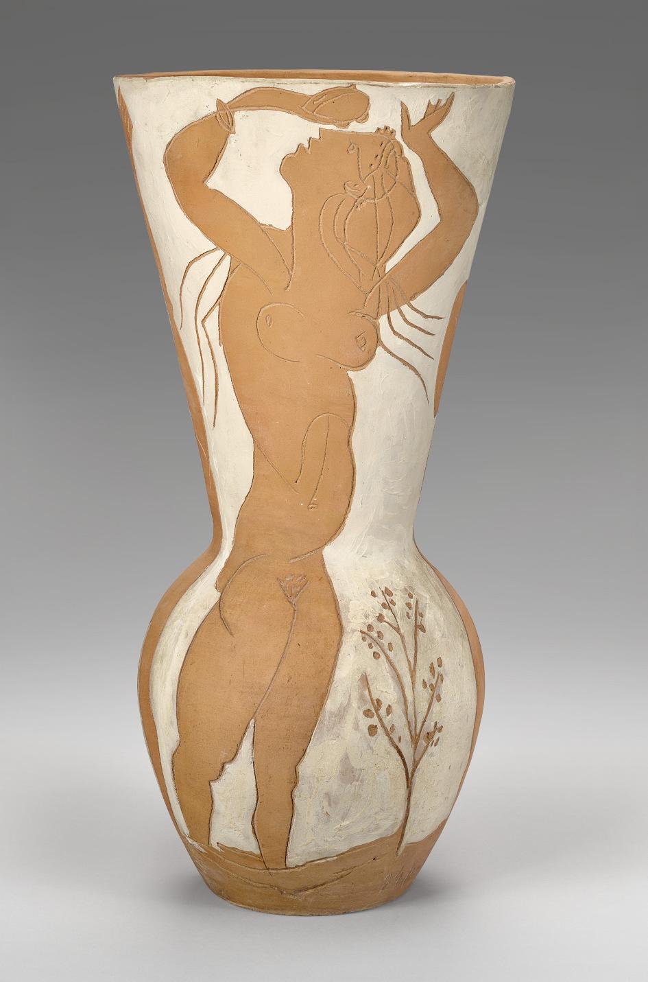
JOHN GRAHAM (1886-1961)
Head of a Woman
oil, chalk, ballpoint pen, colored pencil, graphite, brush pen and ink on tracing paper laid down on board 24¿ x 18æ in. (61.3 x 47.6 cm.)
Executed in 1954.
PROVENANCE:
Mr. and Mrs. Harris B. Steinberg, New York Private collection, by descent from the above Anon. sale; Sotheby's, New York, 15 November 1995, lot 2 Acquired at the above sale by the present owner
EXHIBITED:
New York, Museum of Modern Art, John D. Graham: Paintings and Drawings, August-October 1968, n.p., no. 19 (illustrated).
Water Mill, Parrish Art Museum, John Graham: Maverick Modernist, May-July 2017, pp. 109, 133 and 175, pl. 61 (illustrated).
LITERATURE:
J. R. Mellow, "John Graham: An Underground Realist," New York Times, 1 September 1968, p. D19 (illustrated).
A. H. Merjian, "John Graham," Frieze, October 2017, digital (illustrated).
In the 1930s, John Graham was declared by The New York Times to be “an avid defender of the modernist position in art” (J. Mellow, “John Graham: An Underground Realist,” The New York Times, 1 September 1968). A friend and mentor to many of the painters who would go on to become founding members of the New York School of abstract painting (including Arshile Gorky, Willem de Kooning, and Jackson Pollock), Graham’s early work was distinguished by dramatic blocks of geometric color. However, by the 1940s his post-Cubist style of abstraction had given way to a new mode of painting that was based on classical prototypes. Painted in 1954, Head of a Woman is an exemplar from this important period of discovery, displaying many of the influences from the Italian Renaissance that would come to define his later career.
The present work skillfully incorporates Renaissance ideals of feminine beauty, most noticeably those found in the works of Leonardo da Vinci and Raphael, with contemporary painterly flourishes. Here, Graham’s striking female figure is composed of flowing brushwork overlaid with a grid-like structure, exhibiting the same combination
of artistic and scientific principles that can be seen in works such as da Vinci’s Mona Lisa (circa 1503-1506, Musée du Louvre, Paris) and Vitruvian Man (circa 1490, Gallerie dell’Accademia, Venice).
In Head of a Woman, the artist painted his image on the reverse of a sheet of tracing paper, which also lends a muted, shimmering quality to its surface. He then added details at the front in ink, enhancing the work’s overall complexity. Reinforcing this surface tension is a system of squares and rectangles, as well as astrological symbols superimposed on the sitter’s face. Also visible is a handwritten text from Dante’s Divine Comedy; translated from the formal Italian it aptly reads “don’t think about what other people think or say, but just keep straight and follow your own path.” Included in the artist’s first institutional retrospective, The Museum of Modern Art’s 1968 exhibition John D. Graham: Paintings and Drawings, the present work showcased his later oeuvre, with critics declaring “these late works… have a strange and compelling authority” (ibid.). More recently, the painting was selected for the Parrish Art Museum’s retrospective John Graham: Maverick Modernist in 2017.

ANDY WARHOL (1928-1987) Cagney
signed and dated ‘Andy Warhol 64’ (on the reverse) silkscreen ink on paper laid down on paper 30¡ x 40 in. (77.2 x 101.5 cm.)
Executed in 1964. This work is unique.
PROVENANCE:
Leo Castelli Gallery, New York Ronald Feldman Fine Arts, New York Gallery Sho Contemporary Art, Tokyo Private collection
Anon. sale; Sotheby’s, New York, 14 November 2006, lot 58 Acquired at the above sale by the present owner
LITERATURE:
G. Frei and N. Printz, eds., The Andy Warhol Catalogue Raisonné: Paintings and Sculpture 1961-1963, vol. 1, New York, 2002, p. 349.
F. Feldman and J. Schellmann, Andy Warhol Prints: A Catalogue Raisonné, 1962-1987, 2003, pp. 41-42, no. I.1b (another version illustrated).
J. Brody, “Andy Warhol’s Cagney Prints,” Print Quarterly, vol. 26, no. 2, June 2009, pp. 142-153, no. 116 (illustrated).
& LOUISE RIGGIO: COLLECTED WORKS
LEONARD


Cornered up against a wall, Andy Warhol’s depiction of the legendary actor James Cagney is one of the most iconic representations of the American gangster in popular culture. Using a publicity photograph of the American acting icon, Cagney is also one of the first works in which the artist casts his acerbic eye over the Hollywood fame machine. This would provide a rich seam of inspiration and the resulting works—from Gold Marilyn Monroe (1962, The Museum of Modern Art, New York) to Silver Liz (1962, The Andy Warhol Museum, Pittsburgh) and his totemic images of Elvis Presley—have become some of the most celebrated paintings that Warhol ever produced. Cagney also displays Warhol’s interest in the theme of violence in America, which would develop into his celebrated Death and Disaster series. Depicting a defiant James Cagney, this work becomes a portrait of the ultimate anti-hero, capturing the essence of America’s fascination with the gun and with the mobster several years before Hollywood capitalized on it with movies such as Bonnie and Clyde and The Godfather.
One of only seven known unique works on paper that Warhol made using this particular screen (the only canvas version resides in the collection of the Nationalgalerie, Staatliche Museen zu Berlin), the origins of the source image that the artist used to produce this work has recently been thrown into question. For many years scholars assumed that it was a publicity photo used to promote Cagney’s 1931 movie, The Public Enemy. This was an idea propagated to some extent by Warhol himself who mentioned the film not only to dealer Heiner
Andy Warhol filming Taylor Mead’s Ass at the Factory, New York, 1964.
Photo: © Fred W. McDarrah/MUUS Collection.

Bastian but also to Rainer Crone in the 1960s and whose book, Andy Warhol, became the original de facto early catalogue raisonné. This “fact” made its way into an early Warhol catalogue raisonné of prints and even the prestigious catalogue raisonné of paintings and has subsequently been repeated by many other publications. However, research by Wendy Weitman, in preparation for her 1999 exhibition, Pop Impressions Europe/USA: Prints and Multiples from The Museum of Modern Art, has revealed that the source actually comes from the 1938 classic Angles with Dirty Faces (J. Brody, “Andy Warhol’s Cagney Prints,” Print Quarterly, XXVI, 2009, p. 146). Of the seven known versions on paper, four are in public institutions including the collection of The Museum of Modern Art, New York.
Cagney, with its depiction of gun violence, proved to be particularly prescient for Warhol. Working from his home on November 22, 1963, Warhol and Gerald Malanga were silkscreening The Kiss (Bela Lugosi) when news of John F. Kennedy Jr.’s assassination broke. Like the rest of the nation, Warhol was deeply affected by these events and would himself later become involved in two gun incidents. Once, in September 1964, when fellow artist Dorothy Podber shot through a stack of Marilyn paintings that Warhol had in his studio and, more seriously, in 1968 when radical feminist Valerie Solanas appeared at the Factory and shot at him and at his friends. Though three shots were fired at the artist, a single bullet had ricocheted through his spleen, liver, pancreas, esophagus, and both lungs when Solanas had corned the artist underneath his desk, holding the gun against his flesh.
Ever ambiguous, in Cagney, Warhol manages to present us with something that contains the possibility of death and violence yet at the same time celebrates the glamour of Hollywood and the silver screen. As with so much of Warhol’s work, it contains an intriguing duality that portrays two conflicting emotions. It is a thrillingly opaque picture that today continues to confront, defy and engage its viewer and it is perhaps for this reason that Warhol’s Cagney works sets an enticing precedent for much of what was to follow.
Andy Warhol, Double Elvis, 1963. Museum of Modern Art, New York. © 2025 The Andy Warhol Foundation for the Visual Arts, Inc. / Licensed by Artists Rights Society (ARS).
ALBERTO GIACOMETTI (1901-1966)
Nu dans l'atelier (Annette)
signed and dated 'Alberto Giacometti 1954' (lower right) oil on canvas
39¡ x 31æ in. (100 x 80.5 cm.)
Painted in 1954
PROVENANCE:
Philippe Dotremont, Brussels (by 1960). Gianni Malabarba, Milan (by 1963).
Private collection, Monte Carlo.
The Pace Gallery, New York (acquired from the above). Acquired from the above by the present owner, 11 November 1994.
EXHIBITED:
Eindhoven, Stedelijk van Abbemuseum, Jonge Kunst uit de Collectie Dotremont, Brussel, February-March 1960, no. 28 (illustrated; titled Intérieur à l’atelier and with incorrect dimensions).
Arezzo, Galleria Comunale d'Arte Contemporanea, Mitologie del Nostro Tempo, May-June 1965, p. 47 (illustrated).
New York, PaceWildenstein and Dallas, Nasher Sculpture Center, The Women of Giacometti, October 2005-April 2006, p. 92 (illustrated in color, p. 74; titled Studio Interior).
New York, The Pace Gallery, 50 Years at Pace, September-October 2010, p. 26, no. 7 (illustrated in color; titled Studio Interior).
LITERATURE:
G. Ballo, Vero et falso nell’arte moderna, Turin, 1962, no. 48 (illustrated in color; titled Interieur à l’atelier).
The Comité Giacometti has confirmed the authenticity of this work which is registered in the Fondation Giacometti’s online database, the Alberto Giacometti Database, under the AGD number 4643.

“To know what I was seeing, it became necessary for me to try to paint.”
ALBERTO GIACOMETTI

Alberto Giacometti painting a portrait of Annette, Paris, 1954. Photograph by Sabine Weiss. Photo: © Sabine Weiss. Artwork: © Succession Alberto Giacometti / Artists Rights Society (ARS), NY 2025.
In Nu dans l’atelier (Annette) Alberto Giacometti focuses on the elegant, nude form of his young wife Annette, seated amid the clutter and paraphernalia of the artist’s legendary Parisian studio. While Giacometti had explored painting in his youth, it was not until his return to Paris following the end of the Second World War that he fully embraced the practice, immersing himself once again in the interplay of color and form on canvas, which paralleled his explorations and studies of the human figure in drawing and sculpture. This shift coincided with Giacometti’s renewed interest in working from life, which underpinned his art of the early 1950s, bringing with it a heightened sense of observation. To this end, the artist chose to depict a few individuals repeatedly—Annette, his brother Diego, and some close friends—to study their essential human presence, and “to create,” as Giacometti stated, “a complete whole all at once” (quoted in J. Lord, A Giacometti Portrait, New York, 1965, p. 59).
Giacometti had first met Annette Arm in 1943 in Geneva, and was immediately captivated by the intensity and directness of her gaze, as well as her frank and open manner. Widely known for her charm, Simone de Beauvoir once remarked that Annette’s “eyes devoured the world. She couldn’t stand missing anything, or anyone” (quoted in exh. cat., op. cit., 2005, p. 19). Following the end of the War, Annette followed Giacometti back to Paris and quickly became one of the most important inspirations for his work, her constant presence allowing him to study her features and form intensively. In the present painting, Annette occupies a corner of the workroom that served as Giacometti’s studio for decades, situated at 46 rue Hippolyte-Maindron, in Montparnasse. Affectionately nicknamed “the cave,” the artist had moved into the space in December 1926, and though it had no running water, a rough concrete floor and a roof that leaked, it became the primary site of his artistic activity for the following forty years. “It’s funny, when I took this studio... I thought it was tiny...” Giacometti recalled. “But the longer I stayed, the bigger it became. I could fit anything I wanted into it” (quoted in L. Fritsch and F. Morris, eds., Giacometti, exh. cat., Tate, London, 2017, p. 105).
Most likely entering from the room she shared with Giacometti just off the main work space, Annette would have taken her position in a chair whose legs were placed on red marks on the floor, while the artist sat on a stool before his easel a short distance away, similarly marked off to preserve the precise distance between the painter and his sitter. In the upper right-hand corner of the


composition, the ascending diagonal of the stairway that led from the studio to the second floor mezzanine is glimpsed in a network of lines, while below a series of brief brushstrokes trace the outlines of shelves and cupboards, as well as stacks of canvases leaning against the walls and mysterious, almost spectral, objects scattered across the floor.
The studio had a near archaeological character to it, with walls covered in sketches of Giacometti’s ideas, drawings and paintings, a ceiling riddled with holes and surfaces covered with dust, clay and plaster. When the artist Françoise Gilot visited the space, she recalled: “I was struck by the degree to which the physical aspect of the place recalled Giacometti’s painting. The wooden walls seemed impregnated with the color of clay, almost to the point of being made out of clay. We were at the center of a world completely created by Giacometti... There was never the slightest color accent anywhere to interfere with the endless uniform gray that covered everything” (F. Gilot and C. Lake, Life with Picasso, London, 1964, pp. 204-205). The subtle tones that dominate Nu dans l’atelier (Annette) offer a clear impression of the extent to which Giacometti’s pictures and his universe bled into one another during this period. However, although the palette is dominated by layers of gray, white, ochres, browns and grisaille, there are flashes of brilliant color among the quickly rendered strokes of paint, especially red, their presence adding an electric jolt to the picture’s surface, and drawing the eye.
Alberto Giacometti, Pommes dans l’atelier, 1953. Sprengel Museum, Hannover. © Succession Alberto Giacometti / Artists Rights Society (ARS), NY 2025.
Alberto Giacometti, Nu assis dans l’atelier, 1953. Carnegie Museum of Art, Pittsburgh. © Succession Alberto Giacometti / Artists Rights Society (ARS), NY 2025. Digital Image: Carnegie Museum of Art, Pittsburgh, PA / Art Resource, NY.

Annette’s slender figure appears to coalesce before our eyes from a loose filigree of linear brushstrokes which both construct and model her presence on the canvas in an unrelenting accretion and layering of contours and pentimenti. The lines seem to follow the path of the eye as it might visualize the subject, the more salient aspects of her features receiving repeated working from the brush, with certain elements heightened with whitish paint to further emphasize their effect. The resulting build-up of pigment on the surface of the canvas calls attention to Giacometti’s use of paint as matière, as a substance with a physical presence in its own right. His deliberate softening of the paint in the area around the figure, meanwhile, creates a vague, halo-like appearance, offering a subtle contrast to the densely-layered network of brushwork that comprises Annette’s form, throwing her into relief against her surroundings.
At some point in the progress of the picture Giacometti added an internal frame, a few inches inside the periphery of the canvas edges. As Valerie Fletcher has explained, the purpose of this pictorial device was to locate the figure firmly within the space the artist had created within the composition: “Giacometti usually painted a linear frame around the subject of each painting, after the motif was established, to determine the final proportion of the figure to its environment. By painting a frame around the figure he controlled the effect of what might be termed ‘being in space’… The framing device creates a subliminal tension between illusion and reality, or rather between Giacometti’s reality and the canvas reality” (The Studio of Alberto Giacometti, exh. cat., Musée national d’art moderne, Centre Georges Pompidou, Paris, 2007, pp. 187188). To the left and right of the figure in Nu dans l’atelier (Annette), Giacometti adds touches of a paler gray paint within this boundary, partially concealing a series of tack-holes that run along both edges, which suggest he adjusted the size of the canvas as he worked on it.
The overall effect foregrounds Giacometti’s presence within the creation of the work—the frame places the viewer in the painter’s own shoes, as he studied, absorbed and translated Annette’s familiar form onto canvas, revealing his subjective experience of seeing whilst producing the final image. As Christian Klemm has noted, “it was the essential presence of the human being, as it appears to the artist, that he sought to grasp—the ceaseless dialogue between seeing and the seen, eye and hand, in which form continually grows and dissolves” (Alberto Giacometti, exh. cat., The Museum of Modern Art, New York, 2001, p. 222).
Paul Cezanne, Femme à la cafetière, circa 1895. Musée d’Orsay, Paris.
WILLEM DE KOONING (1904-1997)
Woman and Child
signed 'de Kooning‘ (lower left); dedicated ‘to Emilie with Love’ (on the reverse) oil on paper mounted on canvas 55 x 36 in. (139.7 x 91.4 cm.)
Painted circa 1967-1968.
PROVENANCE:
Emilie S. Kilgore, Texas, acquired directly from the artist, 1977
Her sale; Christie’s, New York, 11 May 2011, lot 60
Acquired at the above sale by the present owner
EXHIBITED:
Beverly Hills, Salander-O’Reilly Galleries, Inc., Willem de Kooning: An Exhibition of Important Paintings and Works on Paper, January-February 1991.
LEONARD & LOUISE RIGGIO: COLLECTED WORKS

“Flesh was the reason why oil painting was invented.”
WILLEM DE KOONING

Emilie Kilgore and Willem de Kooning in his studio, East Hampton, 1975. Photo: © Nancy Crampton. All Rights Reserved. Artwork: © 2025 The Willem de Kooning Foundation / Artists Rights Society (ARS), New York.
With its flowing ribbons of color and broad painterly gestures, Willem de Kooning’s Woman and Child is a superlative example of the artist’s distinct style of figurative painting. Taking a subject which has been a continuous source of inspiration for much of art history, de Kooning infuses it with the sense of dynamic energy that distinguished Abstract Expressionism. The figures resonate with a degree of sensual energy that is found only in the most successful of the artist’s paintings from this particular period as he worked to produce a newer, more vital, series of almost intuitive marks. Acquired directly from the artist by his lover and muse Emilie Kilgore, this painting held a special place in de Kooning’s oeuvre as, when Kilgore selected the work, the artist said approvingly, “That’s a very good one!” Famously critical of his own paintings, this comment provides a ringing endorsement of this particular example of his new style of Woman painting.
Set amidst a landscape of lush greens and warm yellows, the figure of a woman and child are rendered in a series of rapidly executed and expressive brushstrokes. As de Kooning’s heavily laden brush traverses the canvas he manifests the figures out of passages of rich impasto; fleshly limbs are fashioned out of strokes of pale white and pink, while fields of red help to accentuate the sensual nature of the female figure. Elsewhere, a litany of different paint handling techniques—from scumbling to expressive Pollocklike drips—contribute to the highly expressive surface.
In contrast to de Kooning’s earlier depictions of women from the 1950s, these later paintings possess a much more sophisticated approach to the female figure. By this point in his career, the artist was spending more time in the bucolic surroundings of Springs, Long Island, and this manifested itself clearly in his more open compositions. The 1960s were also abundant with innovation in terms of the materials he used in the studio, as he had developed expertise in introducing new and various media in his oil paints. He produced significant results by including water (which added a unique volume and viscosity to the paint), safflower oil (significantly extending drying time, and thus, malleability and working time), and large amounts of white paint (producing high degrees of luminosity), all of which can be seen in the present work.


Thus, Woman and Child is a prime example of the individualism and dynamism associated with de Kooning’s output of the 1960s, evidencing that his engagement with the female figure worked to transcend the tension between picture and event, observation and genre. De Kooning’s sensuous paintings of women provoke what it means to depict elementally and radicality: “I have no opinion on women… I do not particularly stress the masculine or feminine viewpoint. I am concerned only with human values” (quoted in S. de Hirsch, “A Talk with de Kooning” in Intro Bulletin: A Literary Newspaper of the Arts 1, no. 1, October 1955, pp. 1 & 3).
De Kooning’s depictions of women are among some of the most iconic works of the postwar period. The paint’s physicality and the way in which it has been applied, the color and the gestural sweeps and play of this tactile and, in de Kooning’s hand, seemingly infinitely pliable medium, powerfully evoke the artist’s own sensual and sexually charged response to women, their bodies, their skin and their features. The maternal nature of this work marks a somewhat softer depiction of women than some of his more high-octane representations. Unlike his earlier representations of women, the abundance of soft, pink tones in Woman and Child is prompted not so much by fear, but more a wry and benevolent sense of warmth and affection.
Opposite: Present lot illustrated (detail).
Raphael, The Small Cowper Madonna, circa 1505. National Gallery of Art, Washington, D.C.
Willem de Kooning, Woman in Landscape III, 1968. Whitney Museum of American Art, New York. © 2025 The Willem de Kooning Foundation / Artists Rights Society (ARS), New York.

ANDY WARHOL (1928-1987) Mao
stamped three times with the Estate of Andy Warhol and five times with the Andy Warhol Foundation for the Visual Arts, Inc. stamps and numbered 'PA 80.021' (on the overlap); numbered again 'PA 80.021' (on the stretcher)
acrylic and silkscreen ink on linen 40 x 34 in. (101.6 x 86.4 cm.) Executed in 1973.
PROVENANCE:
The Andy Warhol Foundation for the Visual Arts, New York Acquired from the above by the present owner, 1999
LITERATURE:
N. Printz, ed., The Andy Warhol Catalogue Raisonné: Paintings and Sculptures 1970-1974, vol. 3, New York, 2010, pp. 210-211 and 213, fig. 107, no. 2319 (illustrated).
LEONARD


Andy Warhol’s portrait of the Chinese Communist leader Mao Zedong is one of the artist’s most effecting treatises on the power of the image. When the present work was painted in 1973, its subject was the leader of the world’s most populous nation, a country closing in on one billion people. As the Chairman of the Chinese Communist Party, Chairman of the People’s Republic of China, and Chairman of the Central Military Commission, Mao’s official portrait would have been everywhere. Together with Marilyn Monroe, Elizabeth Taylor, and Elvis, Mao entered Warhol’s pantheon of people whom he committed to canvas and became one of his most inspired. As legendary curator Kynaston McShine noted, “if Warhol can be regarded as an artist of strategy, his choice of Mao as a subject—as the ultimate star—was brilliant. The image of Mao… is probably the one recognized by more of the earth’s population than any other—a readymade icon representing absolute political and cultural power. In Warhol’s hands, this image could be considered ominously and universally threatening, or a parody or both” (Andy Warhol Retrospective, exh. cat., The Museum of Modern Art, New York, 1989, p. 19).
Warhol’s Mao canvases marked a return to painting for an artist who had spent much of the previous few years concentrating on his film projects. It is perhaps fitting then that these portraits are among the most painterly of his career. Rendering his subject’s features in bold, black silkscreen inks, Warhol also lavished the painting with a series of energetic brushstrokes which are especially evident in the broad, loose, gestural marks beneath the screened image. Mao’s
Andy Warhol, Liz #6, 1963. San Francisco Museum of Modern Art. © 2025 The Andy Warhol Foundation for the Visual Arts, Inc. / Licensed by Artists Rights Society (ARS).
Andy Warhol, Shot Sage Blue Marilyn, 1964. Private Collection. © 2025 The Andy Warhol Foundation for the Visual Arts, Inc. / Licensed by Artists Rights Society (ARS).

face is rendered in bold yellow orange azo and indo orange red pigments, complemented by permanent deep green jacket. Coupled with the silkscreen of Mao, these subjective interjections of energetic expression add a touch of subversion towards a collective regime that proscribed individual artistic creativity. The present work is one of only four of the 1973 paintings in which the orientation of the face has been reversed when compared with those that make up the rest of the series (two of these are in the collection of the Andy Warhol Museum, Pittsburgh). It was acquired directly from the artist’s estate and has remained in the present owner’s collection for over twenty-five years.
Having already immortalized Hollywood celebrities, Warhol’s decision to depict a political leader might have seemed an unusual one. In fact, the idea for these works appears to have come from the gallery owner Bruno Bischofberger. As Warhol’s friend Bob Colacello recalled, “it began with an idea from Bruno…, who had been pushing Andy to get back to painting, as had Fred [Hughes]. Bruno’s idea was that Andy should paint the most important figure of the twentieth century.” The first name that came up was Albert Einstein who, in Colacello’s words, “was responsible for both the technological richness and technological terror of life in this century.” Andy had a different idea, “I was just reading in Life magazine that the most famous person in the world was Chairman Mao. Shouldn’t it be the most famous person, Bruno?” (quoted in N. Printz, ed., op. cit., 2010, p. 165).
While Warhol was initially captivated by the idea of reproducing an image that had become pervasive, his choice of the Communist leader ran in parallel with the artist’s own investigations into the power of images in modern culture. Ironically, both Mao and Warhol understood the power that an image could have and, just like the Chinese leader, Warhol’s rendition of an authoritarian ruler was anchored in the media’s power to create, canonize and commodify personas for collective absorption. While Warhol’s earlier logolike representation of movie stars and consumer products such as Coca-Cola bottles and Campbell’s Soup cans reflected the ethos of American capitalism and the publicity machinations that underpinned it, Warhol’s Mao reveals the centrally controlled propaganda apparatus of Chinese communism. Mao’s physiognomy was propagated via billboards, posters and pamphlets throughout China; indeed, Warhol derived the silk-screen image for Mao from an official state portrait in the Little Red Book (officially titled Quotations from Chairman Mao TseTung), the widely circulated collection of the leader’s ideology.
Andy Warhol holding a Mao painting, Palais Galliera, Paris, 1974.
Photo: Andreas Mahl.
KERRY JAMES MARSHALL (B. 1955)
Small Pin-Up (Lens Flare)
signed and dated ‘K. J. MARSHALL 2013’ (lower right)
acrylic on PVC panel
29æ x 23æ in. (75.6 x 60.3 cm.)
Painted in 2013.
PROVENANCE:
Jack Shainman Gallery, New York Private collection, 2013
Anon. sale; Sotheby’s, New York, 14 November 2019, lot 2
Acquired at the above sale by the present owner
EXHIBITED:
Antwerp, Museum van Hedendaagse Kunst Antwerpen; Copenhagen, Kunsthal Charlottenborg; Barcelona, Fundació Antoni Tàpies and Madrid, Museo Nacional Centro de Arte Reina Sofía, Kerry James Marshall: Painting and Other Stuff, October 2013-October 2014, pp. 46-47 and 186 (illustrated).
LITERATURE:
C. Gaines, G. Tate and L. Rassel, Kerry James Marshall, London and New York, 2017, p. 26 (illustrated).


Kerry James Marshall’s striking Small Pin-Up (Lens Flare), painted in 2013, is the artist’s challenge to centuries of art historical tradition in which the Black figure was either relegated to the sidelines or neglected altogether. Employing a heady blend of scholarly understanding and contemporary portraiture, Marshall presents a bold rendition of this once neglected subject with bravado and confidence. “Somebody had to start placing those figures at the very center of what the work is about,” the artist has said (quoted by C. Walsh, “The Art of the Possible” in The Harvard Gazette, online [accessed: 1/15/2025]). Forming an important body of work within his oeuvre, a sister painting to the present work, Small Pin-up (Fingerwag), also painted in 2013, was included in the artist’s highly acclaimed retrospective exhibition organized by The Museum of Contemporary Art, Chicago; The Metropolitan Museum of Art, New York; and The Los Angeles County Museum of Art, Los Angeles in 2016-2017.
Filling the majority of the canvas, Marshall presents the figure of a Black woman, positioned with her back to us. Looking coquettishly over her shoulder, his subject engages our attention not as a demure object of our gaze, but as the controller of it. While much of her figure is enveloped in shadow, the level of detail which Marshall bestows on the figure displays the true mastery with which he understands his subjects. “Extreme blackness plus grace equals power,”
Caspar David Friedrich, Woman before the Rising Sun, 1818. Museum Folkwang, Essen.

Marshall states, “I see the figures as emblematic; I’m reducing complex variations of tone to rhetorical dimension: blackness” (quoted by L. Tattershall, “Black Lives, Matter” in H. Molesworth, ed., Kerry James Marshall, exh. cat., The Museum of Contemporary Art, Chicago, 2016, p. 59). In addition to the adroitness with which he renders his figures, in Small Pin-Up (Lens Flare) Marshall adds further flare (literally) by including the photographic effects that result from shooting directly into the sun. This “solarization” results in a halo of sorts around the subject as the sun’s rays are refracted into a kaleidoscope of dazzling colors.
The artist’s Black female figures, such as the example in the present work, are said to be Marshall's response to a 1996 book called The Great American Pin-Up. The book claims to explore the history and cultural importance of the genre, but only includes pictures of white women. “However problematic people might think the idea of the pinups are,” the artist has said, “you still can’t allow the field to be dominated by a single type of image and not have a counter image that represents something else. That’s unacceptable” (quoted by C. Walsh, op. cit.). Marshall deliberately places his work within the history of image making as a whole, in the process giving a voice to those who have often gone unheard. “I think it’s important for a black artist to create black figure paintings in the grand tradition,” the artist has said, “…they don’t immediately call attention to themselves. I started out using history painting as a model because I wanted to claim the right to operate at that level” (quoted by K. Lund in H. Molesworth, ed., exh. cat., op. cit., 2016, p. 116).
Born in 1955 in Birmingham, Alabama, Marshall spent his formative years in South Central Los Angeles, which at that time was embroiled in the often-violent struggle of the Civil Rights Movement. It is against this backdrop that he began to shape his worldview, which naturally leads him to produce work that reflects the social and political reality of black Americans. “You can’t be born in Birmingham, Alabama, in 1955 and not feel like you’ve got some kind of social responsibility,” Marshall has explained, “you can’t move to Watts [in Los Angeles] in 1963 and grow up in South Central near the Black Panthers’ headquarters and see the kinds of things I saw in my developmental years and not speak about it” (K.J. Marshall and D. Smith in Conversation; quoted in Along The Way, Kerry James Marshall, exh. cat., Camden Arts Centre, London, 2005, p. 17).
Romare Bearden, Patchwork Quilt, 1970. Museum of Modern Art, New York. © 2025 Romare Bearden Foundation / Licensed by VAGA at Artists Rights Society (ARS), NY.
Beyond Consciousness

From the radical breakthroughs of Dada and Surrealism, to the beginnings of Abstract Expressionism, painters, writers and sculptors across the decades have explored art as a manifestation of the psyche, incorporating dream imagery, hallucinations, and automatic techniques into their creative endeavors. Searching for a break from rationalism and formal convention, these artists looked to the realm of the subconscious and the uncanny, dreams and fantasies, to achieve a new means of expression that moved beyond consciousness. Considered in tandem with one another, the following selection of works from the Riggio Collection showcases the diversity and range of these explorations across the past century, revealing the creative potential that lay in the realms of mystery and the unconscious.
Max Ernst had been involved in Dada circles while living in Cologne and, following his move to Paris in the early 1920s, he subsequently became immersed in the nascent group of Surrealist writers and artists active in the French capital. Etamines et marseillaise de Arp (1919) evocatively captures the sensation of visual shock the artist had felt upon seeing a diverse array of objects and imagery condensed together in a printed catalogue. Channeling the almost hallucinatory images that his brain suggested when confronted with these printed ephemera, he created a series of so-called “overpaintings” which transformed illustrations of quotidian objects into otherworldly creatures and plant life. Ernst was a key pioneer of many semi-automatic techniques among the Surrealist group, most notably developing and championing frottage, grattage and decalcomania, which tapped into chance and the artist’s own unconscious impulse to reach a free, unmediated process of expression. Executed in 1942, Le peuple des oiseaux features passages of frottage which Ernst subsequently worked into a cast of mythical, avian-human hybrids, their forms harking back to a strange childhood dream that had remained with the artist for years.
In contrast to Ernst’s celebration of automatism, René Magritte favored a carefully executed, almost hyper-realistic painterly style. Rooted in the familiar, his images were depicted with painstaking clarity, making their strange suggestions and mysterious subjects all the more impactful as a result. In Les droits de l’homme (1948) Magritte transforms a simple object—a bilboquet from a children’s ball game—into an odd, humanoid character draped in a cloak, who appears to be in the midst of delivering a speech. In L’empire des lumières (1949), meanwhile, the strange confluence of night and day is an artistic intervention so subtle that viewers often fail to grasp its striking and profound implications at first glance. Through such clever juxtapositions and subversions, Magritte intended to force his viewers to question their perception of reality, pushing them beyond their conscious acceptance of the world around them, and revealing the rich seam of mystery that lay inherent in the everyday.
“In my pictures I showed objects situated where we never find them. They represented the realisation of the real if unconscious desire existing in most people.”
RENE MAGRITTE
Though he never formally joined the Surrealist movement, Pablo Picasso was closely associated with the group at various points in his career, exploring similar ideas and concepts in his work through the late 1920s, and maintaining close friendships with several leading figures within the movement. During the summer of 1937 he spent an idyllic sojourn in the company of a coterie of Surrealist poets, writers and artists in a small hotel in Mougins, in the South of France. As several of his companions noted, Picasso was gripped by a creative fervor that summer, leading him to paint a series of humorous portraits of different members of the group. Rather than relying on formal sittings with his subjects, or photographs taken during the trip, Picasso based his depictions on memories and personal impressions of their character, unconsciously absorbed during the hours they spent in one another’s company. Painted during the final weeks of this seminal trip, Femme à la coiffe d’Arlésienne sur fond vert (Lee Miller) is a testament to the stimulating company Picasso enjoyed that summer, in which the famed photographer Lee Miller’s likeness is boldly transformed under the artist’s subversive gaze.
Alberto Giacometti was equally drawn to the magnetism of the Surrealists in Paris during the late 1920s. In works such as Le Couple (1926) the Swiss sculptor tapped into the traditions of non-Western art—an interest he shared with André Breton and his circle—to create enigmatic, symbolic representations of the human figure. Following the outbreak of the Second World War, many of the key protagonists of the European avant-garde were forced to flee the continent, with many Surrealist artists relocating to New York. Here, they were embraced by a generation of young artists, eager to test the boundaries of representation and personal expression. For Arshile Gorky, the Surrealist’s celebration of automatism and the unconscious directly influenced his organic, intuitive approach to abstraction, while Barnett Newman believed that the art of the future would combine the abstract languages of Mondrian and Kandinsky with elements of the Surrealists’ distinctive approach, a concept he began to examine in watercolors such as Untitled (1945). The example of the Surrealists, their bold focus on mystery and chance, memory and the untrammeled artistic impulse, continues to resonate with artists to this day—in Her World (2019) Reggie Burrows Hodges conjures a dream-like scene that powerfully recalls the mysterious and absorbing atmosphere of many Surrealist masterpieces.

ALBERTO GIACOMETTI
(1901-1966)
Le Couple
signed, numbered and inscribed with foundry mark 'A. Giacometti 3/6 Susse Fondeur Paris' (on the back of the base)
bronze with brown and green patina 23Ω x 15º in. (59.7 x 38.7 cm.)
Conceived in 1926; this bronze version cast in 1958
PROVENANCE:
Pierre Matisse Gallery, New York (acquired from the artist, 1958).
The Museum of Modern Art, New York (acquired from the above, 1982 and until 2010).
PaceWildenstein, New York (acquired from the above).
Acquired from the above by the present owner, 15 January 2010.
EXHIBITED:
The Cleveland Museum of Art, The Spirit of Surrealism, October-November 1979, pp. 122-123, no. 71 (illustrated, p. 122).
New York, The Museum of Modern Art, Selections from the Permanent Collection, July-August 1991.
New York, The Museum of Modern Art, Alberto Giacometti, October 2001-January 2002, pp. 62 and 268 (illustrated, pl. 20 and p. 268).
Paris, Musée national d'art moderne, Centre Georges Pompidou, L'atelier d'Alberto Giacometti, October 2007-February 2008, p. 401, no. 83 (illustrated in color, p. 282; dated 1955).
LITERATURE:
D. Sylvester, Alberto Giacometti, exh. cat., Arts Council Gallery, London, 1955, no. 2 (another cast illustrated, pl. VI).
W. Hofmann, Die Plastik des 20. Jahrhunderts, Frankfurt, 1958, p. 139.
E. Scheidegger, ed., Alberto Giacometti: Schriften, Fotos, Zeichnungen, Zurich, 1958, p. 81 (another cast illustrated, p. 100).
P. Bucarelli, Giacometti, Rome, 1962, no. 3 (another cast illustrated).
J. Dupin, Alberto Giacometti, Paris, 1962, p. 192 (another cast illustrated).
F. Meyer, Alberto Giacometti: Eine Kunst existentieller Wirklichkeit, Stuttgart, 1968, p. 50.
C. Huber, Alberto Giacometti, Paris, 1970, pp. 20 and 123 (another cast illustrated in color, p. 21).
R. Hohl, Alberto Giacometti, Stuttgart, 1971, p. 38 (plaster version illustrated).
A. Bovi, Giacometti, Florence, 1974, pp. 7 and 89 (another cast illustrated in color, pl. 5).
M.F. Brenson, "The Early Works of Alberto Giacometti: 1925-1935," Ph.D. diss., Johns Hopkins University, 1974, pp. 35-36 and 222 (titled Figures).
S.M. Poley, "Alberto Giacomettis Umsetzung archaischer Gestaltungstormen in seinem Werk zwischen 1925 und 1935" in Jahrbuch der Hamburger Kunstsammlungen, vol. 22, 1977, pp. 175-186 (another cast illustrated, p. 177).
B. Lamarche-Vadel, Alberto Giacometti, Paris, 1984, p. 31 (another cast illustrated, fig. 42).
J. Lord, Giacometti: A Biography, New York, 1986, p. 94 (another cast illustrated, pl. 4).
C. Juliet, Giacometti, New York, 1986, p. 17 (plaster version illustrated).
Y. Bonnefoy, Alberto Giacometti: A Biography of His Work, Paris, 1991, pp. 137-138, no. 126 (plaster version illustrated, p. 137; another cast illustrated in color, p. 139).
T. Dufrêne, Alberto Giacometti: Les dimensions de la réalité, Geneva, 1994, pp. 21, 23, 25-27 and 30.
D. Sylvester, Looking at Giacometti, London, 1994, p. 39.
J. Soldini, Alberto Giacometti: La somiglianza introvabile, Milan, 1998, pp. 31, 33-36 and 282, no. 21 (another cast illustrated, pl. VII).
Y. Bonnefoy, Alberto Giacometti, New York, 2001, p. 76 (another cast illustrated; illustrated again).
J. Dupin, Giacometti: Three Essays, New York, 2003, pp. 39-40.
A. González, Alberto Giacometti: Works, Writings, Interviews, New York, 2006, pp. 23-24 (another cast illustrated in color, p. 22).
The Comité Giacometti has confirmed the authenticity of this work which is registered in the Fondation Giacometti’s online database, the Alberto Giacometti Database, under the AGD number 274.


One of the first sculptures publicly exhibited by Alberto Giacometti in Paris, Le Couple is a bold testament to the artist’s highly experimental approach to the figure during the mid- to late-1920s. This was a pivotal moment in Giacometti’s artistic development, as he absorbed and synthesized the influences of art from Africa, Oceania, and pre-Archaic Europe, as well as Cubism and Surrealism, to reach a unique artistic idiom that propelled him to the forefront of the European avant-garde. The artist had moved to Paris at the age of twenty, to study sculpture at the Académie de la Grande Chaumière under Antoine Bourdelle.
After years of struggling to capture his visual experiences accurately in his work, however, he took the decision in 1925 to “work at home from memory... This resulted... in objects which were for me as close as I could get to my vision of reality” (quoted in Alberto Giacometti 1901-1966, exh. cat., Royal Academy of Arts, London, 1996, p. 12). A key work from this innovative period, Le Couple explores the forms of a man and woman, standing together like a pair of totemic idols, their figures at once similar to one another, yet intrinsically different.
Created concurrently with the artist’s iconic Femme cuillère, Le Couple focuses on the masculine-feminine dichotomy, a theme that would occupy Giacometti endlessly throughout his career. Distilling the human form down to a collection of signs and essential, geometric shapes, Giacometti conjures a pair of ambiguous, archetypal visions of man and woman, juxtaposed side-byside. The highly stylized figures can be read simultaneously as mask-like faces and representations of the full-length body, each detail suggesting both facial
Alberto Giacometti in his studio, rue Hippolyte Maindron, Paris, 1927. Photographer unknown. Photo: © Bridgeman Images.

features—such as eyes, noses and mouths—and other aspects of the human form, such as breasts, hands and sexual organs. Executed in a curving, ellipsoid shape, the female character, for example, contains elements that may alternately be read as eyes or breasts, while the vertical almond detail towards the base suggests both a mouth and a vulva. This same shape is repeated in the male figure’s eye, a detail that introduces a degree of tension and voyeurism to the pairing—as Christian Klemm has explained: “like the chiasmic transposition of the sexual features of one into the eyes of the other, [this detail] indicates other dimensions of the figures’ sexuality” (exh. cat., op. cit., New York, 2001, p. 62).
The sculpture reveals the impact of non-Western art on Giacometti’s bourgeoning style during the 1920s, particularly African and Oceanic sculptures. He was a frequent visitor of the Musée d’Ethnographie du Trocadéro at this time, as well as the Musée des Antiquités nationales, both of which displayed a range of objects—including plaster casts of recent archaeological finds—from Africa, the Cyclades, and PreColumbian cultures. A number of the artist’s friends were also keen connoisseurs and collectors of non-Western artefacts and artworks, while periodicals such as L’Esprit nouveau and Cahiers d’art frequently included photographs and articles on the subject. In order to deepen his understanding and connection to these alternative conceptions of form and volume, Giacometti surrounded himself with a diverse array of imagery and objects in his studio on the Rue Hippolyte-Maindron.
A photograph from 1927 sees the artist seated near a Kota Reliquary figure, which he had recently purchased from the artist Serge Brignoni, its powerful, angular form dominating the modest desk.
The exaggerated depictions of sexual attributes found in many of these ancient and non-Western works appear to have shaped Giacometti’s own preoccupation with the concept of “male” and “female” at this time, as he worked to reduce these roles to their most elemental and universal signifiers. In Le Couple, Giacometti deliberately places the two figures slightly apart on the rectangular base, introducing a palpable tension within the sculpture, deploying the negative space between their forms to emphasize both their connection to one another, and their inherent disparities. At the same time, the female figure leans ever so slightly towards the male, a subtle effect that animates the space further, perhaps suggesting the erotic pull and physical connection between the two. The present cast of Le Couple was acquired directly from Giacometti in 1958 by Pierre Matisse, before being purchased by The Museum of Modern Art in New York in 1982, where it remained for almost thirty years before entering the collection of Leonard and Louise Riggio.
Alberto Giacometti, Femme cuillère, 1927. Fondation Alberto Giacometti, Paris. Photo: © Bridgeman Images.
RENE MAGRITTE (1898-1967)
Les droits de l'homme
signed 'Magritte' (lower left); dated and titled '"LES DROITS DE L'HOMME" 1947-1948' (on the reverse)
oil on canvas
57 x 45¿ in. (144 x 114.6 cm.)
Painted in 1947-1948
PROVENANCE:
Irving Abbey, New York (acquired from the artist, 1949). Alexander Iolas Gallery, New York (by 1960). Galleria del Naviglio, Milan (by 1962).
Private collection, Venice (acquired from the above); sale, Christie's, London, 26 March 1984, lot 36.
Marisa del Re Gallery, New York (acquired at the above sale).
The Pace Gallery, New York (acquired from the above).
Mark Goodson, New York (acquired from the above, 17 December 1985). PaceWildenstein, New York (acquired from the above).
Acquired from the above by the present owner, 24 October 1996.
EXHIBITED:
Brussels, Galerie Dietrich, Exposition Magritte, January-February 1948. New York, Hugo Gallery, Magritte, May 1948, no. 2. Beverly Hills, Copley Galleries, Magritte, September 1948, no. 3. New York, Parke-Bernet Galleries, Inc., The Arts of Belgium, June-August 1960, p. 39, no. 57.
Dallas, Museum for Contemporary Arts and Houston, The Museum of Fine Arts, René Magritte in America, December 1960-February 1961, no. 23.
Knokke-le-Zoute, Casino Communal, L'Œuvre de René Magritte, July-August 1962, p. 47, no. 73.
Milan, Galleria Schwarz, Magritte, December 1962, no. 2 (illustrated).
New York, The Museum of Modern Art; Waltham, Brandeis University, Rose Art Museum; The Art Institute of Chicago; The Pasadena Art Museum and Berkeley, University Art Museum, René Magritte, December 1965-November 1966, p. 44, no. 45 (illustrated).
New York, The Pace Gallery, René Magritte: Paintings, Drawings, Sculpture, May-June 1990, no. 7 (illustrated in color).
New York, PaceWildenstein, Modern Masters from The Collection of Mark Goodson, October-November 1995, p. 30 (illustrated in color, p. 31).
New York, The Pace Gallery, 50 Years at Pace, September-October 2010, p. 39, no. 20 (illustrated in color).
LITERATURE:
Letter from R. Magritte to P. Nougé, 17 January 1948.
Letter from R. Magritte to A. Iolas, 8 January 1949.
Letter from B. Jackson to R. Magritte, 5 June 1949.
Letter from A. Iolas to R. Magritte, 5 July 1949.
Letter from A. Iolas to R. Magritte, 12 December 1949.
Letter from R. Magritte to A. Iolas, 16 December 1949.
Letter from R. Magritte to A. Bosmans, 20 September 1961.
L. Pierard, "Magritte: Le Surréaliste" in Le Peuple, 30 January 1948.
L. Scutenaire, Magritte, Antwerp, 1948 (illustrated, pl. 17).
Magritte, exh. cat., Galleria l'Attico, Rome, January 1963 (illustrated; dated 1945).
J. Canaday, "Floating Rocks and Flaming Tubas" in Horizon, vol. V, no. 3, January 1963, p. 82 (illustrated in color, p. 83).
N. Calas, "Pearls of Magritte" in Arts Magazine, vol. 46, April 1972, pp. 47-49, no. 6.
L. Scutenaire, Avec Magritte, Brussels, 1977, p. 130 (illustrated).
H. Torczyner, Magritte: Ideas and Images, New York, 1977, pp. 153 and 268, no. 302 (illustrated, p. 153).
F. Perceval, ed., René Magritte: Lettres à André Bosmans, 1958-1967, Paris, 1990, p. 201.
S. Gablik, Magritte, New York, 1991, pp. 31 and 200, no. 21 (illustrated, p. 30).
D. Sylvester, ed., René Magritte, Catalogue Raisonné: Oil Paintings and Objects, 1931-1948, London, 1993, vol. II, pp. 395-396, no. 638 (illustrated, p. 395).
R. Hughes, The Portable Magritte, New York, 2001, pp. 265 and 435 (illustrated in color, p. 265).
A. Blavié, ed., René Magritte: Ecrits complets, Paris, 2016, p. 261.
LEONARD & LOUISE RIGGIO: COLLECTED

“The existence of the world and our own existence are shocking to contemplate. They are absolutely incomprehensible whatever explanations are offered.”
RENE MAGRITTE

René Magritte, 1950. Photographer unknown.
LEONARD & LOUISE RIGGIO: COLLECTED WORKS
In 1948, while musing on the purpose of the titles he assigned to his paintings, René Magritte proclaimed: “I think the best title for a picture is a poetic one. In other words, a title consistent with the more or less lively emotion we feel when we look at the picture” (“On Titles,” 1948; in K. Rooney and E. Plattner, eds., René Magritte: Selected Writings, Richmond, 2018, p. 115). Across a series of handwritten manuscripts—now preserved in the Archives of Contemporary Art in Belgium and collectively known as “On Titles”—the artist offered a collection of short statements on some of his recent work. Among these brief notes, Magritte wrote about Les droits de l’homme: “Here, man is reminded of his right to act on objects and change the world” (ibid., p. 114). Invoking the French translation of Thomas Paine’s seminal treatise, The Rights of Man, as well as H.G. Wells’s radical 1940 manifesto on universal human rights in the face of war, the painting presents an enigmatic, uncanny scene, in which an inanimate object is brought to life, in order to deliver a speech. Completed on 16 January 1948 and included in a series of solo exhibitions that year, Les droits de l’homme is a testament to Magritte’s unique approach to Surrealism in the aftermath of the Second World War, as he sought to depict “the most ordinary reality in such a way that this immediate reality loses its tame or terrifying character and presents itself with mystery” (quoted in H. Torczyner, Magritte: Ideas and Images, New York, 1977, p. 203).
At the heart of the composition stands a variation on one of Magritte’s iconic leitmotifs, the mysterious bilboquet. This object had first made its appearance in the artist’s Surrealist paintings of the mid-1920s, taking inspiration from a popular handheld game of the same name, known in many cultures throughout the world. The bilboquet typically consists of a ball with a hole bored into it, which fits on a spike at the top of a wooden stick shaped to fit the hand, and is attached to the handle by a string. In a test of dexterity, the player must fling the ball upward, and then try to catch it on the spike as often as possible within a designated period of time. In Magritte’s interpretations of this object, the wooden baton takes on numerous different roles within his surreal compositions: in Portrait de Georgette Magritte (Sylvester, no. 76; Musée national d’art moderne, Centre Georges Pompidou, Paris), for example, the bilboquet remains true-to-scale, its familiar shape offering a stabilizing support to the empty wooden picture-frame that leans against it. However, in Le jockey perdu (Sylvester, no. 81; Private collection) rows and rows of bilboquets appear as towering tree-trunks, creating a strange man-made forest, while in works such as La naissance de l’idole (Sylvester, no. 89; Private collection) and Le Rencontre (Sylvester, no. 99; Kunstsammlung Nordrhein-Westfalen, Dusseldorf), Magritte

anthropomorphizes the wooden object, adding an eye, a hand or an arm to the bilboquet, transforming it into an unsettling quasi-human presence, at once animate and inanimate. The artist would refer to the bilboquets simply as his “wooden figures,” and they are in many ways reminiscent of Giorgio de Chirico’s strange, inanimate mannequins—trovatori, muse, and more—that populated his Metaphysical works.
By the 1940s, the bilboquet had evolved into a distinctly figurative presence—in 1945 Magritte further enhanced the effect, playing with its silhouette to create more pronounced curves, adding naturalistically rendered arms and hands that often gesture animatedly, and, perhaps most notably, elongating the spherical shape of the ball atop the handle into a bulbously spouted form that comes to represent a proudly elevated head. The squat shape of the bilboquet’s newly formed mouth and snout also recalls a nineteenth-century mortar, an artillery piece used for hurling explosive shells in steep trajectories over the walls of fortifications. The content of wartime newsreels may have suggested this allusion to Magritte—in some pictures where the artist has employed this form, the mouth of the bilboquet actually bursts forth in flames, like a cannon being fired (Sylvester, no. 626; Private collection). Described by Harry Torczyner as an
René Magritte, Le jockey perdu, 1926. Private collection. Photo: Bridgeman-Giraudon / Art Resource, NY.

“anthropoid bilboquet,” these new characters seem eager to show off their gift of speech, and they usually appear, as seen here, draped in a richly-hued red cloak, and adopting a formal and declamatory stance, bringing to mind a noble orator or statesman (ibid., p. 152).
In Les droits de l’homme, one such speaker stands alone on a well-lit thoroughfare, seemingly life-size and imposing, a gentle seascape and overcast sky serving as a serene backdrop. The uncanny quality of the scene is heightened by the strange pairing of objects that flank this central character—to the left and partially tucked away behind the bilboquet’s cloak is a roughly hewn boulder, while to the right, a tuba is dramatically engulfed in flames on the pavement. As the bilboquet delivers its speech, it holds a glass of water in one hand, while the other raises a small leaf by way of a prop, perhaps a visual aide to something this mysterious character is attempting to explain to an unseen audience. When combined with the title, this subtle gesture creates the impression that the bilboquet is delivering a profound message to his audience, perhaps a political statement or a call to action, a meditation on nature maybe, or an attempt to dissect the meaning of reality and man’s place within it. However, the subject of the bilboquet’s speech and its intentions ultimately remain a mystery to us, its impassioned proclamations left an unknowable enigma for the viewer to ponder.
In this way, Les droits de l’homme, as with so much of Magritte’s work, defies any clear, logical explanation. Throughout his life, the artist repeatedly refuted the myriad of psychological and biographical interpretations that sought to decode the meaning of his work, maintaining time and again that it was the image alone that mattered. “I have nothing to express!” he once exclaimed, “I simply search for images, and invent and invent… only the image counts, the inexplicable and mysterious image, since all is mystery in our life” (quoted in M. Blots, “Silhouette: René Magritte” in La Métropole, 2 July 1951; in K. Rooney and E. Plattner, eds., op. cit., 2018, p. 138). Indeed, when Les droits de l’homme was included in a touring exhibition of America in 1960-1961, Magritte lamented the strange, seemingly arbitrary interpretations that had been attached to the painting by various critics: “A recent experience has made me realize the gap between one intelligence and another,” he wrote in a letter to André Bosmans. “I have just heard an ‘explanation’ of one of my pictures,
René Magritte, Les rencontres naturelles, 1945. Musées Royaux des Beaux-Arts de Belgique, Brussels. © 2025 C. Herscovici / Artists Rights Society (ARS), New York.

Les droits de l’homme. It appears that the fire in my picture is Prometheus’s fire, but also a symbol of war! The figure holding the leaf is a representation of peace—the leaf is an olive leaf!! … But I won’t go on, because the imagination of painting enthusiasts is inexhaustible, but very banal, these enthusiasts being entirely devoid of inspiration...” (letter to A. Bosmans, 20 September 1961; quoted in D. Sylvester, ed., op. cit., 1993, p. 396).
Letters from the late 1940s between Magritte and his principle dealer in America, Alexander Iolas, reveal that, having failed to find a buyer when initially shown at exhibition in 1948, the artist was eager for Les droits de l’homme to be offered directly to The Museum of Modern Art in New York for a discounted sum. However, despite Iolas’s efforts and numerous overtures on the artist’s behalf—which included a generous offer for the painting to be gifted to the museum’s collections by John and Dominique de Menil—Les droits de l’homme remained with the dealer, and was instead sold to Iolas’s accountant, Irving Abbey. When it last appeared at auction at Christie’s in March 1984, the work achieved a new record price for a painting by Magritte.
René Magritte, Le Cicérone, 1947. Private collection. © 2025 C. Herscovici / Artists Rights Society (ARS), New York.
Photo: Bridgeman Images.
“To be a Surrealist is to banish from your mind what you have seen ‘before’ and to search for what you haven’t seen ‘yet.’”
RENE MAGRITTE

Les droits de l’homme on view at the exhibition “René Magritte,” at the Hugo Gallery, New York, May 1948. © 2025 C. Herscovici / Artists Rights Society (ARS), New York.
MAX ERNST (1891-1976)
Etamines et marseillaise de Arp signed, dated and titled 'max ernst 1919 étamines et marseillaise' (lower edge) gouache, pen and black ink, pencil and ink stamps on printed paper laid down on card
Sheet size (irregular): 12 x 10 in. (30.5 x 25.5 cm.)
Mount size: 17¿ x 13¿ in. (43.5 x 33.5 cm.)
Executed in Cologne in 1919
PROVENANCE:
Paul Eluard, Paris; sale, Hôtel Drouot, Paris, 3 July 1924, lot 9. Collection Rosenberg (acquired at the above sale).
Kurt and Arlette Seligmann, New York (by 1961); sale, Christie’s, New York, 3 November 1993, lot 251.
The Pace Gallery, New York (acquired at the above sale).
Acquired from the above by the present owner, 30 June 1994.
EXHIBITED:
Berlin, Kunsthandlung Dr. Otto Burchard, Erste Internationale Dada-Messe, July-August 1920, no. 82.
Paris, Galerie Au Sans Pareil, Exposition Dada: Max Ernst, la mise sous whisky Marin, se fait en crème kaki et en cinq anatomies, vive le sport, May-June 1921, no. 19.
Paris, Galerie Beaux-Arts, Exposition internationale du Surréalisme, January-February 1938, p. 5, no. 82.
New York, The Museum of Modern Art and The Art Institute of Chicago, Max Ernst, March-July 1961, no. 180.
LITERATURE:
W. Spies, Max Ernst-Collagen: Inventar und Widerspruch, Cologne, 1974, pp. 26-27, 45, 203 and 487, no. 75 (illustrated).
W. Spies, S. and G. Metken, Max Ernst: Oeuvre-Katalog, Werke 1906-1925, Cologne, 1975, p. 159, no. 315 (illustrated).
W.A. Camfield, Max Ernst: Dada and the Dawn of Surrealism, Munich, 1993, p. 365, no. 33 (illustrated, pl. 39).
Max Ernst executed Etamines et marseillaise de Arp at the height of his involvement with the Dada movement in Cologne. This work is a deft example of the artist’s celebrated “overpainting” technique—collage-type works in which the artist painted over printed illustrations recycled from an assortment of scientific and mechanical material. Through this method, Ernst granted pictorial forms to his enigmatic, preternatural visions, crafting inexplicable worlds filled with hybrid creatures assembled from automated plants and anthropomorphized machines.
In 1936, Ernst recalled the experience which inspired these works: “On a rainy day in 1919… a teaching aid catalogue caught my attention. I saw advertisements for all kinds of models—mathematical, geometrical, anthropological, zoological, botanical, anatomical, mineralogical, and paleontological—all elements of such a differing nature that the absurdity of their being gathered together confused my eyes and my mind, calling forth hallucinations which in turn gave the objects represented new and rapidly changing
meaning… All that was needed to capture this effect was a little color or a few lines, a horizon here, a desert there, a sky, a wooden floor and so on” (“What is the mechanism of collage?” in H.B. Chipp, Theories of Modern Art, Berkeley, 1968, p. 427).
Etamines et marseillaise de Arp was one of a select number of these early “overpaintings” to feature in Ernst’s landmark solo show at the Galerie Au Sans Pareil in Paris in 1921, an exhibition which introduced the artist to the Parisian avant-garde. The work was previously owned by Ernst’s close friend and one of the founders of the Surrealist movement, the pioneering French poet Paul Eluard. It was later acquired by the Swiss-American Surrealist artist Kurt Seligmann, at whose wedding Ernst was a witness together with Jean Arp. Indeed, the title of the present work is a playful reference to Arp, an active member of the Zurich Dada group whose friendship was one of the many forces which drew Ernst into the movement.

ARSHILE GORKY (1904-1948)
Virginia Pastel
crayon, India ink and graphite on paper laid down on canvas 20¬ x 27Ω in. (52.4 x 69.9 cm.)
Executed circa 1943.
PROVENANCE:
Estate of the artist
Xavier Fourcade Inc., New York, 1978
Victoria and S.I. Newhouse Jr., New York, 1984
Marc de Montebello Fine Art Inc., New York, circa 1990
Private collection, New York
Anon. sale; Sotheby’s, New York, 15 November 1995, lot 4
Acquired at the above sale by the present owner
EXHIBITED:
London, Tate Gallery, Arshile Gorky: Paintings and Drawings, April-May 1965, n.p., no. 65 (titled and dated Virginia Landscape, circa 1944).
Brussels, Palais des Beaux-Arts and Rotterdam, Museum Boymans van Beuningen, Arshile Gorky: Paintings and Drawings, May-September 1965, n.p., no. 87 (titled and dated Landschap in Virginia / Virginia landscape, circa 1944).
New York, M. Knoedler & Co., Inc., Gorky: Drawings, November-December 1969, pp. 37 and 58, no. 73 (illustrated; dated 1943-1944).
Southampton Art Gallery; Sheffield, Graves Art Gallery; Sunderland Art Gallery; Dundee, City Art Gallery; Oxford, Museum of Modern Art and London, Serpentine Gallery, Arshile Gorky: Paintings and Drawings, December 1975-April 1977, n.p., no. 24 (titled and dated Virginia Landscape, 1944).
New York, Xavier Fourcade Inc., Arshile Gorky: Important Paintings and Drawings, April 1979, n.p. (illustrated; titled and dated Virginia Landscape, circa 1944).
New York, Solomon R. Guggenheim Museum; Dallas Museum of Fine Arts and Los Angeles County Museum of Art, Arshile Gorky, 1904-1948: A Retrospective, April 1981-February 1982, pp. 182-183, no. 153 (illustrated; dated 1943-1944). Madrid, Sala de Exposiciones de la Fundación Caja de Pensiones and London, Whitechapel Art Gallery, Arshile Gorky, 1904-1948, October 1989-March 1990, p. 147, no. 76 (illustrated; dated 1943-1944).
New York, Hauser & Wirth, Arshile Gorky: New York City, September-October 2024.
LITERATURE:
J. Levy, Arshile Gorky, New York, 1966, p. 120, pl. 96 (illustrated; dated circa 1944).
"Mirror of Memory: Gorky's Cruel Change," Mizue, vol. 9, no. 894, September 1979, p. 21 (illustrated).
D. Anfam, “Arshile Gorky: Tradition and Identity,” Antique Collector, vol. 61, no. 2, February 1990, p. 29, fig. 4 (illustrated).
J. Tully, “Auction Reviews: Contemporary Art,” Art & Auction, vol. 18, no. 6, January 1996, p. 89.
E. Costello, ed., Arshile Gorky Catalogue Raisonné, New York, digital, 2022-ongoing, no. D0998 (illustrated).


Extoling an elegance and visual forcefulness, Virginia Pastel is one of Arshile Gorky’s seminal late abstractions. Central to both the artist’s personal vernacular and to the broader development of postwar art, the present work foretells Abstract Expressionism’s nascent emergence. Produced at a significant moment in Gorky’s life, Virginia Pastel shows a close-up, abstracted view of the natural landscape most likely situated around Crooked Run, his wife’s family farm in Virginia. Here, immersed within nature, Gorky delighted in returning to the earth after leaving the urban environment of New York, which had provided intellectual nourishment but had also stifled his creativity. The present work shows an abstracted view of flowers and grass viewed closely against a moving blue sky. The work’s overall effect merges the intellect with the experience of nature, with André Breton describing the artist “giving [himself] up to the depicted subject until a kind of match is made where artist and subject and art are one” (quoted in J.C. Lee, “Arshile Gorky: The Power of Drawing” in Arshile Gorky: A Retrospective of Drawings, exh. cat., Whitney Museum of American Art, New York, 2003, p. 63).
Arshile Gorky, Water of the Flowery Mill, 1944. The Metropolitan Museum of Art, New York. © 2025 The Arshile Gorky Foundation / Artists Rights Society (ARS), New York.

Working from sketches made en plein air, Gorky translates these observations into an imaginative overview of the preparatory images, flattening the perspective onto the two-dimensional picture plane and weaving positive and negative space together to suggest a spatial penetration into the support. Flowers and imaginative vegetation take shape through economically drawn lines, some confidently sketched in one pass, as seen particularly in the leftmost and upward elements, and others vigorously outlined in graphite and ink to create bold black lines cutting through the colorful field. Gorky likewise alternates and experiments with his pigments, in some parts lightly rubbing crayon against the paper grain to integrate color into the support, and in others passionately providing passages of densely worked polychrome flush with intermediate color; exemplary is the sky at the top right and the use of deep azure and violet pigment blended against a blue crayon base, creating a composition pulsing with energy.
Gorky assimilates the breadth of art history into this engaging and innovative composition, employing his prolonged study across the span of the art historical canon, running from Old Masters, including Bruegel, Paolo Uccello, Vermeer, Raphael, Piero della Francesca, and Jean-Auguste-Dominique Ingres, to modern innovators such as Paul Cezanne and the experimental Cubists Pablo Picasso and Georges Braque. The artist saw modern art and abstraction as a continuous progression of the past, rather than a break with tradition. Gorky not only studied but practiced the lessons of his predecessors at each phase of his artistic career, stopping to master each period’s language before moving on to the next. Moving stylistically from neoclassicism through Impressionism to Cezanne and onto Cubism, this consistent development is best demonstrated in his drawings, with Virginia Pastel representing the culmination of his decades of practice and one of the first revelations of his new abstracted idiom.
Arshile Gorky drawing in a field at Crooked Run Farm, Lincoln, Virginia, summer 1944. Photograph by Agnes Magruder Gorky. © Estate of Agnes Fielding, courtesy of the Arshile Gorky Foundation.
Gorky’s lines delineating space are executed with a muscular confidence, demonstrating his masterful draftsmanship learned from these decades of study.
The artist’s sensitivity to line and mark making allow his black delineations to hold a rhythmic and almost arabesque calligraphic sensitivity, which the scholar of Abstract Expressionism David Anfam attributes to the artist’s interest in Armenian medieval manuscript illuminations. Gorky contrasts his linear elements—emerging from his dalliance with surrealist automatism—with the natural movements of his colorful forms, implicating his intellectual artistic conceptions within the overall organic composition. The artist learned from Leonardo da Vinci the notion of line as the prime conceptualization of the intellect, with the Florentine artist writing, “the line has in itself neither matter nor substance and may rather be called an imaginary idea than a real object and this being its nature it occupies no space” (The Notebooks of Leonardo da Vinci, trans. J.P. Richter, London, 1880, p. 47). Gorky’s influential innovation is to treat negative space as a form equivalent to positive space, establishing a spatially unified compositional arrangement wherein the bare areas of the paper are as potent as the most heavily worked passages.
Strikingly contemporary in appearance, Gorky remains committed to traditional compositional structures, his ingenious swelling, rounded forms collapsing into curving and folding panes within an implied grid. The artist’s metamorphosing of his acute observation of the natural world into a sensuous experience of abstract shapes and organic forms fulsomely demonstrates why Gorky has often been described as the father of Abstract Expressionism. Janie C. Lee aptly notes that “the works of Gorky’s maturity were so original that there were few who could comprehend and appreciate his achievement in his own lifetime,” yet his powerful influence continues to be felt across the great breadth of twentieth and twenty-first century art (exh. cat., op. cit., 2003, p. 13).
Opposite: Present lot illustrated (detail).

RENE MAGRITTE (1898-1967)
L'empire des lumières
signed 'Magritte' (lower right); dated and titled '"L'EMPIRE des LUMIÈRES" 1949' (on the reverse)
oil on canvas
19 x 23¿ in. (48.2 x 58.7 cm.)
Painted in 1949
PROVENANCE:
Alexander Iolas Gallery, New York (acquired from the artist, August 1949).
Hugo Gallery, New York (acquired from the above).
Nelson A. Rockefeller, New York (acquired from the above, 30 March 1950).
Louise Auchincloss Boyer, New York (gift from the above, December 1950).
Gordon Auchincloss Robbins, New York (by descent from the above, July 1974).
Louis K. Meisel Gallery, New York (acquired from the above).
Daniel Filipacchi, Paris (acquired from the above, 1974).
Byron Gallery, New York (by 1978).
Private collection (acquired from the above, 1981); sale, Christie's, New York, 13 November 2017, lot 12A.
Private collection (acquired at the above sale); sale, Christie's, New York, 10 November 2023, lot 16B.
Acquired at the above sale by the present owner.
EXHIBITED:
Brussels, Palais des Beaux-Arts and Paris, Musée national d'art moderne, Centre Georges Pompidou, Rétrospective Magritte, October 1978-April 1979, p. 224, no. 145 (illustrated in color; detail illustrated in color on the cover).
Milan, Galleria del Milione, René Magritte: Il buon senso e il senso delle cose, May 1984, p. 51, no. 11 (illustrated in color, p. 37).
LITERATURE:
Letter from R. Magritte to A. Iolas, 8 August 1949.
Letter from R. Magritte to A. Iolas, 2 March 1950.
Letter from A. Iolas to R. Magritte, 7 April 1950. Magritte, exh. cat., Hugo Gallery, New York, 1951, no. 8 (illustrated on the back cover).
H. Michaux, "En rêvant à partir de peintures énigmatiques" in Mercure de France, December 1964, p. 587.
C. Bussy, "L'accent grave: Emission radiophonique" in Le fait accompli, nos. 19-20, April 1969.
Peintres de l'imaginaire: Symbolistes et surréalistes belges, exh. cat., Galeries nationales du Grand Palais, Paris, 1972, p. 118.
J. Vovelle, "Peintres de l'imaginaire: Symbolistes et surréalistes belges" in Cahiers d'histoire de l'art contemporain, no. 2, March 1973, p. 34.
D. Sylvester, ed., René Magritte: Catalogue Raisonné, Oil Paintings, Objects and Bronzes, 1949-1967, London, 1993, vol. III, pp. 4-5, 10, 17, 77, 145, 157, 162, 187, 200, 210, 222, 227, 228, 261, 368 and 387, no. 709 (illustrated, p. 145).
S. Gohr, Magritte: Attempting the Impossible, New York, 2009, pp. 224-226 (illustrated in color, p. 225).
C. Haskell, René Magritte: The Fifth Season, exh. cat., San Francisco Museum of Modern Art, 2018, p. 126 (illustrated in color, pl. 51).

“This intense personal interest in night and day is a feeling of admiration and astonishment.”
RENE MAGRITTE

René Magritte, 1967. Photo: Marcel Broodthaers. © 2025 Artists Rights Society (ARS), New York / SABAM, Brussels / The Art Institute of Chicago / Art Resource, NY. Artwork: © 2025 C. Herscovici, London / Artists Rights Society (ARS), New York. LEONARD &
In 1949, René Magritte placed a new canvas upon the easel in his studio in Brussels, and set out to explore an intriguing, mysterious idea that had been percolating in his imagination for several years. This was a landmark moment in the artist’s career, marking the arrival of a motif that would quickly become one of the most celebrated and iconic subjects within the Belgian Surrealist’s oeuvre the L’empire des lumières. A decade earlier, while staying with the collector Edward James in London during the spring of 1937, Magritte had given a presentation at Roland Penrose’s London Gallery in which he discussed “certain features peculiar to words, images and real objects” (quoted in D. Sylvester, ed., op. cit., 1993, p. 53). In one example early in the discussion, the artist cited the opening line of André Breton’s poem L’Aigrette, from Terre de clair (1923): “If only the sun would shine tonight” (ibid.). This intriguing proposition stuck in Magritte’s mind, and grew into the L’empire des lumières works, the deceptively simple concept offering an elegant summation of his unique form of Surrealism, which revels in unexpected contradictions.
The first in this acclaimed series, the present painting establishes the core elements of the theme. Here, a row of ordinary suburban houses are bathed in deep shadows, the surrounding trees and shrubbery almost disappearing into darkness, while above the blue expanse of a day-lit sky stretches over the rooftops, soft white clouds drifting through the atmosphere. At first glance the painting appears to simply present a familiar street scene in the crepuscular light of dusk or dawn. Yet, on further inspection the intensity of the darkness, combined with the soft glow of the streetlamp and the lights from within the houses, suggests two opposing timelines exist simultaneously within the scene— here, both night and day are visible, the two colliding unexpectedly in a single moment. This idea would prove extremely fruitful for Magritte, and he would go on to create a total of sixteen further versions in oil on the theme over the following fifteen years, with several more iterations in gouache, each variation subtly different from the next as he probed and examined its poetic potential.
Alongside Breton’s poem, the L’empire des lumières paintings hark back to a gouache Magritte executed in 1938, titled Le Poison (Sylvester, no. 1142; Museum Boijmans Van Beuningen, Rotterdam), where a row of buildings took on the appearance of the night sky, dotted with constellations of stars and a delicate crescent moon, transforming the bricks and mortar streetscape into an evocative, otherworldly vision of the cosmos. In many ways, Le Poison was a continuation of Magritte’s ongoing fascination with translating and transforming the sky. From his earliest Surrealist paintings it had been a recurring character in his

work, its familiarity allowing him to investigate the world of appearances, and question our understanding of its properties. In L’empire des lumières, the sky once again becomes an essential tool in Magritte’s arsenal to disrupt and challenge expectations. Simplifying the concept explored in Le Poison, the artist creates a composition that is all the more unsettling for its quiet strangeness. The setting is a well-maintained, bourgeois quarter of town, not dissimilar to the location of Magritte’s own home in Brussels, executed with a delicate precision and attention to detail that only reinforces the uncanniness of the juxtaposition of night and day.
Magritte discussed the idea behind his L’empire des lumières paintings in a commentary written for a 1956 television program, later published in the exhibition catalogue Peintres belges de l’imaginaire, Grand Palais, Paris, 1972: “For me, the conception of a picture is an idea of one thing or of several things which can be realized visually in my painting. Obviously, all ideas are not ideas for paintings. Naturally, an idea must be sufficiently stimulating for me to get down to painting the thing or things that inspired the idea. The conception of a painting, that is, the idea, is not visible in the painting: an idea cannot be seen by
René Magritte, Le Poison, 1938 or 1939. Museum Boijmans Van Beuningen, Rotterdam. © 2025 C. Herscovici / Artists Rights Society (ARS), New York.


René Magritte, Le Retour, 1940. Musées Royaux des Beaux-Arts de Belgique, Brussels. © 2025 C. Herscovici / Artists Rights Society (ARS), New York.
Photo: Banque d’Images, ADAGP / Art Resource, NY
Max Ernst, Day and Night, 1941-1942. The Menil Collection, Houston. © 2025 Artists Rights Society (ARS), New York / ADAGP, Paris.

the eyes. What is depicted in the painting is what is visible to the eye, the thing or things that had to inspire the idea. So, in the painting L’empire des lumières are things I had an idea about—to be precise, a nocturnal landscape and a sky above in broad daylight. The landscape evokes night and the sky evokes day. This evocation of day and night seems to me to have the power to surprise and enchant us. I call this power ‘poetry.’ I believe this evocation has such a ‘poetic’ power because, among other reasons, I have always been keenly interested in night and in day, although I’ve never had a preference for one or the other. This intense personal interest in night and day is a feeling of admiration and astonishment” (“L’empire des lumières” April 1956; reproduced in K. Rooney and E. Plattner, eds., René Magritte: Selected Writings, Richmond, 2018, p. 167).
The artist’s friend Paul Nougé, the leader of the Brussels Surrealist group, is reported to have provided the title for the subject, for which the most appropriate English translation is “The Dominion of Light.” “English, Flemish, and German translators take [dominion] in the sense of ‘territory’,” Nougé noted, “whereas the fundamental meaning is obviously ‘power’, ‘dominance’” (quoted in D. Sylvester, op. cit., 1993, p. 145). Nougé was undoubtedly sensitive to Magritte’s conviction that his paintings never expressed a singular idea, but rather were a form of stimulus that created new thoughts in the mind of the viewer. “Titles
René Magritte, L’empire des lumières, 1950. The Museum of Modern Art, New York.
© 2025 C. Herscovici / Artists Rights Society (ARS), New York.
Photo: © The Museum of Modern Art / Licensed by SCALA / Art Resource, New York.

play an important part in Magritte’s paintings,” stated the poet, “but it is not the part one might be tempted to imagine. The title isn’t a program to be carried out. It comes after the picture. It’s as if it were its confirmation, and it often constitutes an exemplary manifestation of the efficacy of the image. This is why it doesn’t matter whether the title occurs to the painter himself afterwards, or is found by someone else who has an understanding of his painting. I am quite well placed to know that it is almost never Magritte who invents the titles of his pictures. His paintings could do without titles, and that is why it has sometimes been said that on the whole the title is no more than a conversational gambit” (quoted in S. Whitfield, Magritte, exh. cat., Hayward Gallery, London, 1992, p. 39).
After the present work’s completion, the image continued to reverberate through Magritte’s imagination, and had a profound impact on his own conception of reality: “After I had painted L’empire des lumières,” the artist explained in 1966, “I got the idea that night and day exist together, that they are one. This is reasonable, or at the very least it’s in keeping with our knowledge: in the world night always exists at the same time as day. (Just as sadness always exists in some people at the same time as happiness in others). But such ideas are not poetic. What is poetic is the visible image of the picture” (ibid., no. 111). The subject proved incredibly popular with the artist’s collectors, leading to a number of direct commissions for new versions. However, Magritte was adamant that each work should evolve naturally from his own artistic pondering, writing to his dealer Alexander Iolas “I have to find a way of justifying the replica in my own mind” (quoted in C. Greenberg and D. Pih, eds., Magritte A-Z, London, 2011, p. 49). In each iteration he made subtle alterations, experimenting with the particulars of the scene, amplifying different aspects of the landscape, subtly adjusting the colors of the sky or the density of the clouds, even expanding the sense of space and recession within the picture. Different architectural styles were adopted in some versions, providing unexpected hints as to the location of the setting, or the socio-economic status of the residents, while the towering trees that surround the building began to take on a distinct sense of individuality and character from one canvas to the next.
René Magritte, L’empire des lumières, 1954. The Peggy Guggenheim Collection, Venice. © 2025 C. Herscovici / Artists Rights Society (ARS), New York. Photo: © Bridgeman Images.

As David Sylvester recorded, the inaugural work in the series, the present L’empire des lumières, was named as one of three the artist sold to Iolas on a statement of account dated 8 August 1949 (see D. Sylvester, op. cit., 1993, p. 145). Iolas shipped the painting in September to the Hugo Gallery, New York, of which he was director. Nelson A. Rockefeller, then chairman and president of Chase National Bank in Rockefeller Center, while also serving in similar roles at The Museum of Modern Art, New York, purchased this L’empire des lumières from the Hugo Gallery on 30 March 1950. That Christmas, he gave the picture as a gift to Louise A. Boyer, his secretary, who later became his executive assistant when he served as Governor of New York State. Subsequent versions of the L’empire des lumières motif were acquired by many of the artist’s most important and active patrons, including Jean and Dominique de Menil—who donated one work from the series to The Museum of Modern Art in New York, before promptly requesting another from Magritte for their own collection—Harry Torczyner, Peggy Guggenheim, Barnet Hodes, the composer Richard Rogers, and the Musées Royaux des Beaux-Arts de Belgique, Brussels. Positioned at the very beginning of this iconic series, the present L’empire des lumières is a pivotal work, revealing the earliest evolutions of this profoundly mysterious motif in Magritte’s imagination, as he wrestled with how to bring his vision to life on the canvas.
LEONARD & LOUISE RIGGIO: COLLECTED WORKS
Opposite: Present lot illustrated (detail).
René Magritte, Le faux miroir, 1929. The Museum of Modern Art, New York.
Photo: © The Museum of Modern Art/Licensed by SCALA / Art Resource, NY.

PABLO PICASSO (1881-1973)
Femme à la coiffe d'Arlésienne sur fond vert (Lee Miller) dated and numbered '2 septembre 37 II' (on the stretcher) oil and Ripolin on canvas 31√ x 25¬ in. (81 x 65.1 cm.)
Painted in Mougins on 2 September 1937
PROVENANCE:
Estate of the artist.
Bernard Ruiz Picasso, Paris (by descent from the above). PaceWildenstein, New York (acquired from the above).
Acquired from the above by the present owner, 22 May 2007.
EXHIBITED:
Vienna, Kunstforum and Kunsthalle Tübingen, Picasso: Figur und Porträt, Hauptwerke aus der Sammlung Bernard Picasso, September 2000-June 2002, pp. 152 and 155, no. 60 (illustrated in color, p. 154).
Milan, Palazzo Reale, Picasso: 200 capolavori dal 1898 al 1972, September 2001-January 2002, p. 359, no. 102 (illustrated in color, p. 239; dated 20 September 1937).
Hamburg, Bucerius Kunst Forum, Picasso und die Mythen, December 2002-March 2003, p. 245, no. 100 (illustrated in color, p. 173).
Copenhagen, ARKEN Museum of Modern Art, Picasso: For All Times, January-June 2004, pp. 105 and 116, no. 20 (illustrated in color, p. 105; illustrated again in color on the cover).
Museo Picasso Málaga, Picasso: Antología, October 2004-February 2005, p. 140, no. 76 (illustrated).
Arles, Fondation Vincent van Gogh, Pablo Picasso: Portraits d’arlésiennes, 1912-1958, July-October 2005, pp. 68 and 163 (illustrated in color, p. 69; dated 20 September 1937).
Museu Picasso Barcelona, Lee Miller: Picasso en privado, May-September 2007, p. 165 (illustrated in color).
LITERATURE:
D.D. Duncan, Picasso's Picassos: The Treasures of La Californie, London, 1961, p. 224 (illustrated; with incorrect numbering).
The Comité Picasso has confirmed the authenticity of this work.
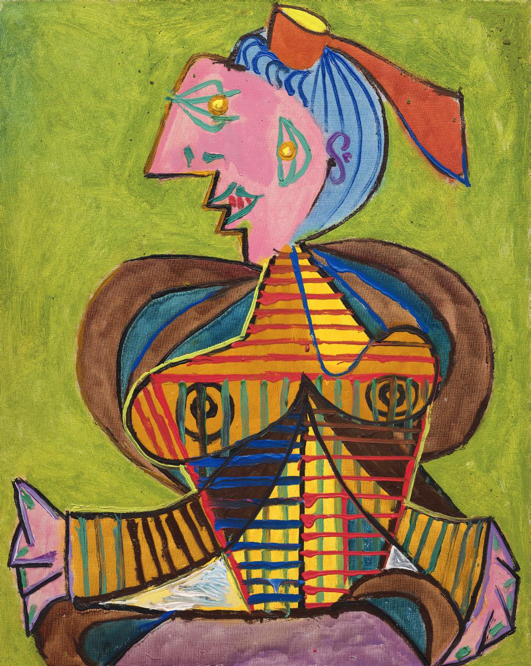

Lee Miller, Self-portrait, 1930. © Lee Miller Archives, England 2025. All rights reserved. leemiller.co.uk
LEONARD & LOUISE RIGGIO: COLLECTED WORKS
Painted in a resplendent array of vibrant tones, Femme à la coiffe d’Arlésienne sur fond vert (Lee Miller) is one of an important series of seven portraits that Pablo Picasso painted of the celebrated American photographer Lee Miller over the course of a sun-filled sojourn during the summer of 1937. This was a landmark year within Picasso’s career, marked by an intense surge of creativity in response to contemporary events, which saw the creation of some of his most important works: Guernica (Zervos, vol. 9, no. 65; Museo Nacional Centro de Arte Reina Sofía, Madrid) was completed in the spring, while the haunting La femme qui pleure (Zervos, vol. 9, no. 73; Tate, London) reached its final iteration in the fall. Alongside these monumental works, a dazzling array of portraits occupied Picasso’s imagination, ranging from sensuous depictions of MarieThérèse Walter, to highly charged portrayals of Dora Maar, and boldly colored images of close friends and acquaintances. Most notable are the dynamic series of paintings Picasso created of the group of Surrealist artists, photographers and writers he spent the summer with in the south of France that year, each a testament to the highly creative environment and fruitful friendships that underpinned this trip.
The artist had departed Paris just two weeks after he presented the finished Guernica at the Exposition Universelle, traveling with Maar to Mougins—a small, hilltop village overlooking the Mediterranean—in search of sunshine and respite. Here, they joined the poet Paul Eluard and his wife Nusch, Man Ray and Ady Fidelin, the British Surrealist Eileen Agar and her husband the writer Joseph Bard, and Roland Penrose and his new partner, Lee Miller. Man Ray later recalled, “We all stayed at a pension hotel, the Hôtel Vaste Horizon, back in the country in Mougins, above Antibes… After a morning on the beach and a leisurely lunch, we retired to our respective rooms for a siesta and perhaps love making. But we worked, too. In the evening Eluard read us his latest poem, Picasso showed us his starry-eyed portrait of Dora” (quoted in Picasso and the Camera, exh. cat., Gagosian, New York, 2014, p. 231).
Miller had only met Penrose a few months before the Mougins trip, following her return to Paris, a city she adored and had called home for several years during the early 1930s. She had first visited the French capital in 1925, aged 18, and was immediately intoxicated by the world of art and bohemianism that she found there. Upon returning to New York, she was discovered by the publishing magnate, Condé Nast, who encouraged her to pursue a modeling career, leading to her appearance on the cover of Vogue in March 1927. Soon, however, Miller decided she would “rather take a picture than be one,” and set out for the French capital again in 1929, armed with an introduction to Man Ray from Edward Steichen and an ambition to become a photographer herself. She met the American Surrealist photographer by chance in a café. “I told him boldly that I was his new student,” she later recalled. “He said he didn’t take students, and anyway he was leaving Paris for his holiday. I said, I know, I’m going with you— and I did” (quoted in A. Penrose, The Lives of Lee Miller, London, 1999, p. 25).

Man Ray agreed to Miller’s request, and the pair soon became lovers. While she posed for him frequently, the two also collaborated on innovative photography projects—most famously developing the solarization technique together. After almost a year working in his studio, Miller began to take on her own projects, and in 1932 she left Man Ray and returned home to New York, where she set up her own photography studio. The lure of Paris did not wane however, and finally in 1937 she arrived once more in the city, and was immediately re-immersed in the Surrealist world she had once inhabited. Attending a fancy-dress ball alongside the likes of Max Ernst, Georges Bataille, and gallerist Julien Levy, she was introduced to Penrose, who had come, together with Ernst, dressed as a beggar. “Blond, blue-eyed and responsive she seemed to enjoy the abysmal contrast between her elegance and my own slum-like horror,” Penrose later wrote (quoted in ibid., p. 74).
Paul Eluard and Pablo Picasso on the beach in Juan-les-pins, France, September 1937. Photograph by Eileen Agar. © Tate
“Picasso’s energy, in no way sapped by the ordeal of Guernica, expressed itself not only in his physical enjoyment of the unfailing sunshine but also in the constant invention of his mind.”
ROLAND PENROSE


Pablo Picasso, Tête de femme (Nusch Eluard), 1937. Museum Berggruen, Berlin.
© 2025 Estate of Pablo Picasso / Artists Rights Society (ARS), New York.
Pablo Picasso, La femme au chat (Portrait cryptique de Paul Eluard), 30 August 1937. Collection Hersaint.
© 2025 Estate of Pablo Picasso / Artists Rights Society (ARS), New York.
“It was an astonishing likeness. An agglomeration of Lee’s qualities of exuberant vitality and vivid beauty put together in such a way that it was undoubtedly her but with none of the conventional attributions of a portrait.”
ROLAND PENROSE

Pablo Picasso, L’Arlésienne, 1937. Scottish National Gallery of Modern Art, Edinburgh. © 2025 Estate of Pablo Picasso / Artists Rights Society (ARS), New York.
LEONARD & LOUISE RIGGIO: COLLECTED WORKS
Two weeks later, Penrose and Miller returned to his native England together and the pair traveled with Man Ray and Ady Fidelin to Truro, in Cornwall, where they met up with the Eluards, Ernst and Leonora Carrington, as well as Herbert Read, E.L.T Mesens, and Agar. A month later, many of this coterie of writers, artists and poets regathered, this time in Mougins, where they were joined by Picasso and Maar. Far removed from the ever worsening political situation in Europe, Mougins offered them an escape, and the group spent a carefree, creatively fertile and liberating summer together. Evocative photographs taken by Miller, Maar and Agar immortalize this summer sojourn, recording the languorous lunches, days spent on the beach, meandering adventures through the surrounding countryside, and conversations beneath the striped shadows cast by the cane trellis of the hotel terrace.
Using his hotel room as a make-shift studio, Picasso painted numerous colorfilled portraits of his companions over the course of this vacation, driven by what Penrose has described as “a diabolical playfulness” (Picasso: His Life and Work, London, 1958, p. 279). Nusch was depicted wearing an elaborate Niçoise hat in Portrait de Nusch Eluard (Museum Berggruen, Berlin), her face covered in garish make-up, while Paul was transformed into a fantastical female peasant in La femme au chat (Zervos, vol. 8, no. 373; Private collection). Picasso doesn’t appear to have painted these works from life but rather, having absorbed the likeness and character of his chosen sitter during the hours they spent together during the group’s activities and outings, translating their likeness through his own, unique pictorial language, to create a humorous caricature-like image. Miller became Picasso’s primary focus towards the end of the summer—the artist was said to have been captivated by her classical beauty, her striking intellect and her deeply creative spirit. Beginning in early September, he commenced a group of seated portraits, each of which show Miller in the quintessential Arlésienne costume, featuring most prominently the ribbon-trimmed headdress.
The artist appears to have relished the very act of painting in these works, boldly exploring and playing with the materiality of his paints In Femme à la coiffe d’Arlésienne sur fond vert (Lee Miller) Picasso transforms Miller through a vibrant, fantastical palette—her torso is recorded in a colorful weave of linear stripes of pigment, the thick strokes of paint deliberately allowed to drip freely, recording an impression of the speed and energy with which Picasso attacked the canvas. Penrose, describing his first encounter with one of these paintings of Miller, explained: “On a bright pink background Lee appeared in profile, her face a brilliant yellow like the sun with no modeling. Two smiling eyes and a green mouth were placed on the same side of the face, and her breasts seemed


like the sails of ships filled with a joyous breeze. It was an astonishing likeness. An agglomeration of Lee’s qualities of exuberant vitality and vivid beauty put together in such a way that it was undoubtedly her but with none of the conventional attributions of a portrait” (ibid., p. 109).
While Picasso’s decision to dress Miller (and also Paul Eluard) in the traditional costume of the Arlésienne may have been prompted by the local festivals taking place in Mougins, Arles and Nice that summer, the works also clearly pay homage to Vincent van Gogh’s series of striking portraits depicting Madame Ginoux from 1888, the owner of the Café de la Gare in Arles. While Picasso had long revered Van Gogh’s visceral, expressionistic take on the world, the Exposition Universelle of 1937 had included a large exhibition of Impressionist, Post-Impressionist and modern art together. Here, Picasso was able to regard his own work in the same context as Van Gogh, prompting him perhaps to return once again to the Dutch master’s work for inspiration, aided by postcard reproductions of several of Van Gogh’s compositions. It was also during this pivotal summer of 1937 that Picasso learned that he, like Van Gogh, had been branded a “degenerate artist” by Hitler, and that the Nazis had begun to confiscate works, including his own, from German museums and collections. By deliberately invoking and appropriating the work of Van Gogh, Picasso appears to not only pay homage to the artist, but also demonstrate, in the face of derision, their shared status as defiant trailblazers of avant-garde art.
Pablo Picasso, L’Arlésienne, 1937. Musée Réattu, Arles. © 2025 Estate of Pablo Picasso / Artists Rights Society (ARS), New York.
Photo: Scala / Art Resource, NY.
Vincent van Gogh, L’Arlésienne, 1888. The Metropolitan Museum of Art, New York.

While Picasso and Miller remained close following the summer of 1937, the outbreak of the Second World War two years later cut off all contact between the two. Picasso remained in Paris for much of the conflict, holed up in his Left Bank studio, while Miller initially returned to England with Penrose, before becoming a photojournalist for Condé Nast. In 1944 she received her accreditation from the US Army and became one of only a handful of female combat war correspondents to cover the front-lines of the war in Europe. With an unflinching eye, she recorded the siege of Saint-Malo, fighting in Alsace, and later, Hitler’s apartment in Munich, as well as the liberation of the concentration camps of Dachau and Buchenwald.
It was while covering the chaos that followed the Liberation of Paris that she set out to find news of Picasso, racing through streets littered with still smoking tanks to reach the artist’s studio. “Picasso and I fell into each other’s arms,”
Miller wrote in her dispatch from Paris, “and between laughter and tears, we incoherently exchanged news about friends and their work, and looked at his new pictures, some of them painted while the Battle of Paris raged” (“In Paris… Picasso Still at Work” in Vogue, vol. 104, no. 7, 15 October 1944, p. 98).
The artist’s joy at the Liberation and being reunited with his old friend can be palpably felt in the photographs from their meeting, the most iconic of which sees the artist embracing Miller in her uniform, gazing adoringly up at her face in apparent disbelief at her presence.
Picasso and Lee Miller in his studio, 7 rue des Grands-Augustins, Paris, 1944. Photograph by Lee Miller. Photo: © Lee Miller Archives, England 2025. All rights reserved. www.leemiller.co.uk. © 2025 Estate of Pablo Picasso / Artists Rights Society (ARS), New York.
BARNETT NEWMAN (1905-1970)
Untitled
watercolor on paper
15¿ x 20æ in. (38.4 x 52.7 cm.)
Painted in 1945.
PROVENANCE:
Estate of the artist
Annalee Newman, New York, by descent from the above
The Pace Gallery, New York, 1991
Acquired from the above by the present owner, 1994
EXHIBITED:
Baltimore Museum of Art; Detroit Institute of Arts; Museum of Contemporary Art Chicago; New York, Metropolitan Museum of Art; Amsterdam, Stedelijk Museum; Paris, Musée National d’Art Moderne, Centre Georges Pompidou; Cologne, Museum Ludwig and Kunstmuseum Basel, Barnett Newman: The Complete Drawings, 1944-1969, April 1979-April 1980, no. 20 (New York, pp. 72-73, illustrated; Amsterdam, n.p.; Paris, p. 32; Cologne, p. 42; Basel, p. 42).
Katonah Museum of Art, Watercolors from the Abstract Expressionist Era, April-June 1990, n.p., fig. 11 (illustrated).
New York, The Pace Gallery, Group Exhibition of Gallery Artists, December 1991-January 1992.
Minneapolis, Walker Art Center; Saint Louis Art Museum and New York, The Pace Gallery, The Sublime is Now: The Early Work of Barnett Newman, Paintings and Drawings 1944-1949, March-November 1994, n.p., no. 16 (illustrated; detail illustrated on the front and back covers).
Philadelphia Museum of Art and London, Tate Modern, Barnett Newman, March 2002-January 2003, pp. 124-125, no. 10 (illustrated).
LITERATURE:
H. Rosenberg, Barnett Newman, New York, 1978, p. 166, no. 132 (illustrated).
J. Russell, “Newman’s Mastery of The Pen and Crayon,” New York Times, 27 May 1979, p. D25.
H. Rosenberg, Barnett Newman, New York, 1994, p. 166, no. 132 (illustrated).
M. McNickle, “The Mind and Art of Barnett Newman,” Ph.D. dissertation, University of Pennsylvania, 1996, pp. 166-180.
R. Shiff, C. Mancusi-Ungaro and H. Colsman-Freyberger, Barnett Newman: A Catalogue Raisonné, New Haven and London, 2004, p. 385, no. 138 (illustrated).


Flowing, serpentine lines dancing across vertical bands of translucent color exhilarate in Barnett Newman’s Untitled, an exceptionally rare exemplar of the watercolor drawings which mark the genesis of his mature career. Newman had destroyed all of his early works around 1940 in reaction to the horrors of World War II and desisted from art making until 1944, whereupon the artist energetically engaged with this medium in tandem with his theoretical writings to develop his iconic artistic style. Untitled, one of four pure watercolors made by the artist, all in 1945, is the apogee of this development, the work’s grace and fluidity of execution denoting Newman’s newfound confidence and unique vocabulary. Examples from this important series are held at The Museum of Modern Art, New York and the Neue Nationalgalerie in Berlin. The present work offers incredible insights into the unique interplay of imagination, analysis, and resolution in the great abstract artist’s work which emphasize his persistent singularity.
Installation view, Barnett Newman: The Complete Drawings, 1944-1969, April 1979 - April 1980, The Baltimore Museum of Art (present lot illustrated). Artwork: © 2025 Barnett Newman Foundation / Artists Rights Society (ARS), New York.

Embracing a restrained visual vocabulary, Newman formulates vaguely adumbrated biomorphic shapes interspersed with various tendril-like lines intermingled amongst short dashes and zigzags against a variegated ground of modulated, earthly, pigments drawn from a single color family. The artist deploys his watercolors with a brush calligraphically, as if working in ink, exploring new possibilities of spatiality and atmosphere, offered by a purely abstract idiom. Newman’s staccato lines exude expert control, altering variously from broad and soft deployments to precise results. Here Newman delineates a new type of space, advanced from Impressionistic and Cubist notions. The artist remarked that, “Drawing is central to my whole concept… if I have made a contribution, it is primarily in my drawing… instead of using outlines, instead of making shapes or setting of spaces, my drawing declares the space. Instead of working with the remnants of space, I work with the whole space” (quoted in B. Richardson, Barnett Newman: The Complete Drawings, 1944-1969, exh. cat., The Baltimore Museum of Art, 1979, p. 18). In Untitled, Newman articulates his new spatial philosophy via color, line, shape, and space in telling anticipation of his revolutionary stripe paintings.
While abstaining from artistic production from 1940, Newman immersed himself within the vibrant New York artistic scene whilst simultaneously producing copious written treatises on modern art. Newman had theorized modern art to have two painting schools, the pure abstractionists led by Mondrian, and the Surrealists, of whom Kandinsky was a sometimes-member. Writing in 1944, Newman anticipated that the future of modern art would be the fusion of these two schools, and sought to synthesize these two approaches. Simultaneously, Joan Miró’s famous series of paintings on paper, the Constellations, were exhibited for the first time at Pierre Matisse Gallery. Newman much admired Miró, particularly in the Catalan artist’s ability to develop an idiosyncratic painterly language which imbued abstract forms with subject matter communicated through signs alone. Newman described Mondrian and Miró as “the most original of the abstract European painters” and the lessons of European Abstraction are powerfully communicated in the present work (quoted in A. Temkin, Barnett Newman, exh. cat., The Philadelphia Museum of Art, 2002, p. 32). One of only two pure watercolors in private hands, Barnett Newman’s Untitled is a portal to a comprehensive understanding of the great Abstract Expressionist painter’s artistic development.
Joan Miró, Constellation: Women on the Beach, 1940. The Metropolitan Museum of Art, New York. © Successió Miró / Artists Rights Society (ARS), New York / ADAGP, Paris 2025.
MAX ERNST (1891-1976)
Le peuple des oiseaux
signed 'max ernst' (lower right) pastel, charcoal and frottage on toned paper 18 x 14 in. (45.7 x 35.6 cm.)
Executed in 1942
PROVENANCE:
David Hare, New York
Private collection, New York.
The Pace Gallery, New York (acquired from the above).
Acquired from the above by the present owner, 17 February 1995.
EXHIBITED:
New York, PaceWildenstein, Drawings, January-March 1995.
This work will be included in the forthcoming volume of the Max Ernst catalogue raisonné, currently being prepared by Werner Spies in collaboration with Sigrid Metken and Jürgen Pech.
Le peuple des oiseaux belongs to a series of some twenty works of the same subject produced by Max Ernst in 1942 and published in limited edition portfolios by the Surrealist magazine VVV in 1943. These are variations of the motif featured in Ernst’s celebrated 1942 painting Le Surréalisme et la peinture, now at The Menil Collection in Houston, in which composite, bird-like figures are arranged in an array of configurations. The studies were created during a volatile time for the artist—Ernst had been labeled a “degenerate artist” by the Nazi regime in his native Germany, and then interned as an enemy alien in his adopted home of France. In 1941 he fled the carnage of war-torn Europe for the safety of New York, where his marriage to the wealthy collector and gallerist Peggy Guggenheim unraveled shortly after his arrival. The present work, displaying a melancholy yearning for a sense of stability during tumultuous times, demonstrates Ernst’s virtuosity in channeling his deeply personal experiences into a surreal visual language.
Using his innovative frottage technique, the artist placed a terracotta sheet of paper on a textured surface to produce a tactile world into which he inserted the anthropomorphic creatures of his visions. Here, three undulating, interlocking
human-bird hybrids nest in the center of the work, gracefully huddled together in a familial, tender scene as the two larger figures appear to protectively shelter the third. The smallest character is perhaps the most human-like, its sinuous form treated in a luminous, silky yellow among the otherwise monochromatic composition. Birds had long exerted an important influence on Ernst’s imagination, and since childhood he had held an unconscious connection between these animals and people. The artist came to identify himself with birds throughout his oeuvre, his preoccupation manifesting through his famous alter-ego, Loplop.
Other works from this series are held in the collections of The Museum of Modern Art, New York, The Philadelphia Museum of Art, and The Dallas Museum of Art. The present composition was previously in the collection of David Hare, an American artist famed for his Surrealist sculptures who became associated with the movement when prominent members of the group, Ernst amongst them, arrived to New York. From 1942 to 1944, Hare founded and edited VVV along with Ernst, André Breton, and Marcel Duchamp.

REGGIE BURROWS HODGES (B. 1965)
Her World
signed with the artist's initials and dated 'RBH 2019' (on the reverse) acrylic and pastel on canvas, in artist-appointed frame
70 x 59¿ in. (177.8 x 150.2 cm.)
overall framed: 70æ x 60 in. (179.7 x 152.4 cm.)
Executed in 2019.
PROVENANCE:
Private collection, acquired directly from the artist Karma, New York
Acquired from the above by the present owner
LITERATURE:
A. D'Souza, To Look Upon Everything in the World as an Enigma, New York, 2023, p. 31, no. 11 (illustrated).
Radically reappraising the landscape genre, Reggie Burrows Hodges paints Her World in hazy, ethereal brushstrokes which probe the imprecision of memory, examining the interrelationship between subject and environment. Hodges strikingly primes his white canvas with an inky black ground, over which he layers forms and pigment with a painterly confidence. His solitary figure emerges out from this dark ground, materialized in recessive space and stripped of identifying context, facing away from the viewer and gazing up toward the distant lighthouse which crowns the composition. Hodges evocatively describes his artistic inspiration being “the study of moments and translating the essence of them through color, figuration, abstraction, and various techniques of mark making… I’m interested in intersecting an internal experience and symbolizing that in my work in order to present a view of my personal heritage and journey” (quoted in “Reggie Burrows Hodges,” Joan Mitchell Foundation, online [accessed 03/12/25]).
Hodges’s title, Her World, alludes to Andrew Wyeth’s Christina’s World, held in The Museum of Modern Art. Both artists depict a Maine landscape with an unconventional composition wherein the horizon line is placed at the upper limits of the canvas, establishing a profound sense of recessive space via atmospheric perspective. Both works include a solitary female figure viewed from behind whose confronting gaze lies upon the horizon. While Wyeth’s figure is a portrait, depicting his neighbor defiant in the face of her polio diagnosis, Hodges’s figure is shrouded in anonymity, embracing tenuous ambiguities and integrating her within the painted environment. The artist attends carefully to each part of his composition, the potent, looming red barn articulated just as carefully as the background lighthouse or the foregrounded figure. Hodges privileges neither figure nor landscape, integrating both within his serene tableau.

LEONARD & LOUISE RIGGIO: COLLECTED WORKS
The Existential Self

“A painting is not a picture of an experience; it is an experience.”
MARK ROTHKO
Dating from the eighteenth century, but popularized in the late-nineteenth century by the writings of the Danish thinker Soren Kierkegaard, Existentialism emphasized the distinctiveness and importance of personal experience. The writer Jean-Paul Sartre became the most vociferous proponent of the movement in post-World War II Europe and his circle of friends included artists such as Alberto Giacometti and Jean Dubuffet. All three would shape discussions around the themes of trauma, anxiety, alienation, the struggle for identity and the search for authenticity, ideas which became prevalent in much of the art of the period and beyond to the present day.
Existentialism’s focus on individualism made it a rich seam of inspiration for many artists. It proved particularly useful to the movement that became known as Art Informel, of which Dubuffet was a central figure and whose paintings sought to address the un-easy coexistence of mind and body. Flattened against its panel support and literally “carved” out of thick layers of impasto, the artist’s Joyeuse Commère challenged that previously prevalent position that beauty was the primary concern of art. Instead, Dubuffet’s highly distinct style of painting celebrated the value in every individual, even those who did not conform to social norms.
Alberto Giacometti was the artist who arguably adopted the ideas of Existentialism to its fullest extent. A close friend of Sartre, the Swiss-born artist was interested in examining the movement’s ideas regarding alienation and anxiety in the wake of World War II. Having lived through the trauma of conflict, Giacometti, along with many of his generation, struggled to find a purpose in art. Eventually he concluded that “The object of art is not to reproduce reality, but to create a reality of the same intensity” (quoted in “Existentialism in Modern Art,” The Art Story, online [accessed: 3/27/2025]). This idea lay at the heart of Existentialism as Giacometti examined how we relate to each other as increasingly isolated human beings separated by physical or psychological space. This can be seen in both his sculptural forms such as Composition avec trois figures et une tête (La Place) (conceived in 1950; cast before July 1952) and in his famed Femmes de Venise series.
Although primarily a European movement, Existentialism also became a stringent force in the work of the American Abstract Expressionists, particularly those who adhered to the critic Harold Rosenberg’s notion of “Action Painting.” Their foregrounding of the painterly process became the driving force of their creativity as it expressed the artists’ desire for freedom and authenticity. Rosenberg believed that when painters such as Franz Kline and Clyfford Still stood in front of their canvases, it was a personal encounter and thus the process of painting revealed the true personality of the artist, resulting in a totally honest form of artistic expression.
Kierkegaard’s beliefs about the importance of the individual experience have seen a resurgence in the twenty-first century as ideas about race and identity have come to the fore. One of the major proponents of this is the painter Kerry James Marshall, whose powerful canvases seek to re-insert the Black figure into the art historical canon. In Lost Boys: AKA Black Al (1993), Marshall tackles the struggle for identity head on, giving his subject the existential authority that he strived for without sacrificing any sense of majesty.
Employing the language of photographic reportage (which has become particularly prominent during times of conflict), Stan Douglas carefully composes A Luta Continua, 1974 in the present, exploring the idea of historical reconstruction which appears across his oeuvre. His panoramic photograph is constructed from found source imagery, yet re-constructed by the artist to bring it into the contemporary world. With works such as this, Douglas transfers historic anxiety to today and “leaves the images to be deciphered via echoes that are ephemeral, unstable, and charged with meanings that become more apparent in retrospect” (R. Kushner, “Close-Up: Rebel Movement,” Artforum 50, no. 8, April 2012, online [accessed: 2/25/2025]).
Existentialism is a philosophy that has proven particularly useful for artists interested in the exploration of human emotions and dynamics of power. Its focus is on how individuals see the world, and the special character of their personal experience, while also championing freedom and autonomy. The following selection of works from the Riggio Collection powerfully demonstrate the different approaches and interpretations of this philosophy across the twentieth century.

MARK ROTHKO (1903-1970)
Untitled
acrylic on paper laid down on panel
57√ x 40æ in. (147 x 103.5 cm.)
Painted in 1968.
PROVENANCE:
Estate of the artist
Kate Rothko Prizel, New York, 1988
Pace Gallery, New York
Acquired from the above by the present owner, 2016
EXHIBITED:
New York, Pace Gallery, Mark Rothko: Dark Palette, November 2016-January 2017, pp. 42-43 (illustrated).
This work is being considered for inclusion in the forthcoming Mark Rothko Online Resource and Catalogue Raisonné of works on paper, compiled by the National Gallery of Art, Washington.
LEONARD & LOUISE RIGGIO: COLLECTED WORKS

“I can only say that the dark pictures began in 1957 and have persisted almost compulsively to this day.”
MARK ROTHKO

Mark Rothko in his studio, New York, circa 1960. Photo: © Dan Budnik. All Rights Reserved. Artwork: © 2025 Kate Rothko Prizel & Christopher Rothko / Artists Rights Society (ARS), New York.
LEONARD & LOUISE RIGGIO: COLLECTED WORKS
Mark Rothko’s Untitled is an evocative painting from an important period in the artist’s career. Executed shortly before his death in 1970, it is an exemplar from a series of works which he produced following the important Seagram Murals Rothko radically reappraised his earlier style after completing this important commission, paring down his compositional structure and employing a dark, atmospheric palette that exudes a striking tonal proximity. As such, Untitled fully articulates Rothko’s practice during this pivotal period, fully embodying his existentialist philosophy and reflective of the full measure of his acclaimed career to reveal the enduring possibilities of painting as a meaningful practice in light of modernity.
Evoking a sober sensuality, Untitled’s two rectangular panes of dark pigment rest like veils over a ground of hazy subdued amber. Demanding a close and committed engagement, the work slowly reveals itself to the viewer, with the complexities of the surface slowly emerging whilst layers previously obscured come into being in an intricate play of painterly sprezzatura. Paradoxically, despite its palette, the work radiates with an internal light, animating the space of the speculator’s encounter. The velvety interaction between the black and amber fields establish a perceptual challenge enabling the artist’s articulated brushstrokes to dryly confront the viewer.
Rothko shifted his working practice from the large oil canvases typical of the 1950s toward working with smaller acrylic works on paper after suffering an aneurism in April 1968, the evolution in materials allowing him a greater dexterity in making variations; the planar nature of the paper surface similarly led Rothko to dramatically reevaluate the relationship between the artwork and the support. The artist allows his paint to thin and drip in some areas, notably at the top of the work, accentuating the disparity between paint fields and between paint and paper. The signature horizontal line of thick maroon pigment bisecting the work functions as a liminal interval between the work’s two dark zones, thrusting a transient stasis upon his visual field.

The dark palette typical of Rothko’s later works have sometimes been erroneously ascribed to the artist’s failing health and long bouts of depression; this analysis fails to fully consider how this extraordinary body of work marks a consciously radical point of departure for the artist in which he reevaluates his entire oeuvre, reinterpreting his earlier tableaux to challenge one last time the existentialist struggle against his own painterly praxis. Representing what he regarded as the ultimate realization of abstract painting, Rothko employs his blacks and swarthy pigments against the conception of legibility, resolutely rejecting the validity of symbolism in order to fully explore the opacity of vision itself. Rothko’s close confidant, the critic Dore Ashton, describes this palette as an “exasperation at the general misinterpretation of his earlier work—especially the effusive yellow, orange and pinks of three years back. He seems to be saying in these new foreboding works that he was never painting luxe, calme, and volupté, if we had only known it!” (“Art” in Arts and Architecture, 75, no. 4, April 1958, pg. 8).
Mark Rothko, Red on Maroon (Seagram Building series), 1959. Tate, London. © 1998 Kate Rothko Prizel & Christopher Rothko / Artists Rights Society (ARS), New York.


Caspar David Friedrich, Moonrise over the Sea, 1822. Alte Nationalgalerie, Berlin.
Rembrandt Harmensz van Rijn, Stormy Landscape, circa 1637-1638. Herzog Anton Ulrich Museum, Braunschweig.

Not merely a departure from his earlier polychrome canvases, Rothko here dismantles their logic, regenerating an aesthetic theory of abstract modernism at the same time as the foundations of this school seemed most at threat. Just as Kazimir Malevich’s Black Square utilizes the color black to proclaim the birth of modernist painting, Rothko returns to black in order to regenerate the movement, allowing his austere pigments to resonate across a full range of sensual possibilities. Untitled reverberates with the theory of the German philosopher Theodor Adorno, who writes how the ideal of blackness was necessary for art to “survive in the context of extremity and darkness, which is social reality” and that “blackness too—the antithesis of the fraudulent sensuality of culture’s facade—has a sensuous appeal” (Aesthetic Theory, London, 1997, pg. 59). Rothko employs his shades of black against the societal and aesthetic challenges erupting in the late 1960s, the work rejecting external participation in order to fully withdraw into itself. The work operates on a similar level as Frank Stella’s Black Paintings in their subversion of spatial illusion and rejection of
Frank Stella, Marriage of Reason and Squalor, 1959. Saint Louis Art Museum. © 2025 Frank Stella / Artists Rights Society (ARS), New York.

referents, while Rothko’s masterful manipulation of his layers of black paint recall Ad Reinhardt’s skill in imbuing apparently monochrome canvases with barely perceptible geometric forms.
Rothko thus employs his restricted, opaque palette not as a delineation of his personal travails but as an invocation of the overwhelming grandeur which guided his idiosyncratic aesthetic theory. Untitled is in deep conversation with Rothko’s contemporaries, defending the legacy of the Abstract Expressionists through a revitalized rejuvenation of the artist’s style. The American director Stanley Kubrick employs a similar stylistic conceit in his contemporaneous film 2001: A Space Odyssey, employing Monoliths—black cuboids symbolizing the enigmatic and transcendent absolute, a negation countering human consciousness—as a significant plot driver. That Rothko and Kubrick both coincidentally employed the color black in order to raise humanistic queries in an antagonistic age demonstrates that Untitled is conversant with the milieu from which it emerged, its style and composition aligned more so with its times than with the artist’s internal turmoil. That The Rolling Stones’ rock anthem “Paint it Black” came out just two years prior intensifies the sense of Rothko’s canny parallelism with the wider avant-garde.
Untitled probes the spectator, exuding into their space and demanding their close scrutiny; only with close engagement does the work begin to reveal itself. A paean to abstract painting, Rothko here advances the conception of what paint could achieve while revitalizing and reimagining his own artistic vocabulary to stay abreast of social and artistic developments. While retaining the awesome aura associated with his practice, the present work propels Rothko’s signature painterly style into a new era in order to strike precisely at his uncompromising aesthetic theory.
Mark Rothko, Untitled (Black on Gray), 1969–1970. Solomon R. Guggenheim Museum, New York.
© 1998 Kate Rothko Prizel & Christopher Rothko / Artists Rights Society (ARS), New York.
ALBERTO GIACOMETTI (1901-1966)
Femme de Venise I
signed and numbered 'Alberto Giacometti 6/6' (on the left side of the base); inscribed with foundry mark 'Susse Fondeur. Paris' (on the back of the base) bronze with brown and green patina Height: 41¡ in. (105.1 cm.)
Conceived in 1956; this bronze version cast in 1958
PROVENANCE:
Galerie Maeght, Paris
Galerie Claude Bernard, Paris. Anon. sale, Parke-Bernet Galleries, New York, 26 February 1970, lot 62. Galerie Beyeler, Basel.
Thomas Gibson Fine Art Ltd, London (acquired from the above).
Jeffrey H. Loria & Co., Inc., New York (acquired from the above).
Acquired from the above by the present owner, 13 May 1998.
EXHIBITED:
New York, PaceWildenstein and Dallas, Nasher Sculpture Center, The Women of Giacometti, October 2005-December 2006, p. 92 (illustrated, p. 76).
New York, The Pace Gallery, 50 Years at Pace, September-October 2010, p. 28, no. 8 (illustrated in color).
London, Gagosian Gallery, Alberto Giacometti, Yves Klein: In Search of the Absolute, April-June 2016, pp. 38 and 136 (illustrated in color, pp. 38-39 and 136).
LITERATURE:
P. Selz, ed., Alberto Giacometti, New York, 1965, pp. 67 and 116, no. 49 (another cast illustrated, p. 69).
R. Hohl, Alberto Giacometti, Stuttgart, 1971, p. 308 (another cast illustrated, p. 119).
J. Lord, Giacometti: A Biography, New York, 1986, pp. 355-358 and 382 (another cast illustrated, pl. 25).
H. and M. Matter, Alberto Giacometti, New York, 1987, p. 219 (another cast illustrated, pp. 118 and 121).
Y. Bonnefoy, Alberto Giacometti: A Biography of His Work, Paris, 1991, p. 401, no. 376 (another cast illustrated).
The Comité Giacometti has confirmed the authenticity of this work which is registered in the Fondation Giacometti’s online database, the Alberto Giacometti Database, under the AGD number 4640.

“I have certainly been painting and sculpting to get a better grip on reality, to see better, to understand things around me better.”
ALBERTO GIACOMETTI
Alberto Giacometti with his sculptures at the 28th Venice Biennale, June 1956.
Photo: Fedele Toscani, courtesy of Giacometti Foundation Archives. Artwork: © 2025 Alberto Giacometti Estate / Licensed by VAGA and ARS, New York.
LEONARD & LOUISE RIGGIO: COLLECTED WORKS
Conceived in early 1956 in preparation for the twenty-eighth edition of the Biennale di Venezia, Alberto Giacometti’s renowned series of sculptures known as the Femmes de Venise played a significant role in establishing the artist’s fame and reputation as the most important European sculptor of the postwar era. Comprising nine individual, but closely related, standing female figures cast in bronze, this group of works offers an important insight into Giacometti’s artistic process at this time—working organically from a single clay model, he revised and refined the figure repeatedly over the course of several months, allowing him to achieve a succession of powerful new visions of the nude female form. Among the earliest sculptures created as part of this groundbreaking series, Femme de Venise I embodies many of the key tenets and concepts that characterized Giacometti’s visionary project, her statuesque form filled with a rich sense of character and poise.
In 1955 the French government invited Giacometti to exhibit selections from his oeuvre in the main gallery of the state pavilion at the Venice Biennale, which was scheduled to open the following June. The artist had already agreed to a major retrospective exhibition at the Kunsthalle Bern, which would run concurrently with the Biennale, and the prestigious occasion of these dual exhibitions called for a maximum effort from Giacometti, prompting a rush of sustained and feverish activity that lasted through the first half of 1956. While deciding which pieces to include in the Biennale, Giacometti was reluctant to rely too heavily on his older sculptures, which he felt were more suitable for the overview of his career that would take place in Bern. Indeed, as his brother Diego noted, the artist generally preferred to show his very latest sculptures at exhibition: “He was never satisfied with anything and wanted to reject everything, make something better, and only did the work the day before” (quoted in R. Hohl, ed., Giacometti: A Biography in Pictures, Osfildern-Ruit, 1998, p. 154). As a result, Giacometti set to work on a new group of sculptures that would serve as a major and most up-todate statement of the current direction of his work, settling on one of his favorite leitmotifs—the standing nude woman.
The result was an incredibly focused and sustained exploration of the human figure over the course of several months. Giacometti wanted these new sculptures to be understood as having evolved by means of his exploratory, metamorphosing process. Instead of aiming towards a final and conclusive state, and then settling on a single outcome that would mark the sum of his efforts to that point, he wanted to reveal the very process of making the figures by tracking the evolution of his idea, revealing the changing and varied

states his sculptures went through as he worked. Using a single armature, Giacometti reworked the clay figures almost daily, driven by a compulsive sense of refinement and revision, as he relentlessly built up, broke down, and often destroyed his figures-in-progress.
Once he was satisfied with the figure or felt he had achieved a result that interested him the most at that moment, Giacometti would pause in his sculpting, and ask Diego to make a plaster cast of the clay figure. Across the series of the Femmes de Venise, the female standing figure grows, shrinks, is flattened and then rounded, eroded and re-developed, following the artist’s flowing vision, each individual sculpture depending on the destruction of the preceding one. As David Sylvester explained, “the last of the states was no more definitive than its predecessors. All were provisional. And from his point of view, every head and standing figure was a state, hardly more than a means towards doing the next” (Looking at Giacometti, New York, 1994, p. 85).
The Femmes de Venise at the Pierre Matisse Gallery, New York, 1958. © 2025 Alberto Giacometti Estate / Licensed by VAGA and ARS, New York.

James Lord, the artist’s biographer, described the extraordinary dynamism of Giacometti’s approach in these works: “In the course of a single afternoon this figure could undergo ten, twenty, forty metamorphoses as the sculptor’s fingers coursed over the clay. Not one of these states was definitive, because he was not working toward a preconceived idea of form, Alberto’s purpose was not to preserve one state of his sculpture from amid so many. It was to see more clearly what he had seen. In plaster, the revelation was more luminous than in clay. Once a figure existed in plaster, however, it stood apart from the flux in which it had developed. It had achieved an ambiguous permanence and made an apparent claim for survival. If the artist allowed it to survive, to be cast in bronze, this was by reason of curiosity and comparison, not as potential evidence of achievement” (op. cit., 1986, pp. 355-356).
The Femmes de Venise sculptures stand at an important moment of transition in Giacometti’s art, serving as a compelling synthesis of his many different inspirations and experiences, particularly regarding his work with the human figure. Having spent much of the Second World War modeling miniscule figures that could fit within a matchbox, the artist had a breakthrough in 1947, when he began to model his iconic, attenuated visions of the human form. These works were created from memory, as the artist sought to reconcile perception and reality in a single sculpture. At the beginning of the following decade, however, Giacometti found that he had exhausted this avenue of aesthetic and expressive creation, and returned to working directly from life, using both his brother Diego, and new wife, Annette, as models. As a result, his depictions of female figures in both his paintings and sculptural work during these years became more individualized. While the hieratic, frontal posture remained, these standing nudes differed from his earlier, more “visionary” works—less a statement of universal humanity, and more a portrayal of a unique person, endowed with a distinct physical presence.
When it came time to create the women for the Biennale, Giacometti wanted to combine these myriad sources in a new way, marrying the insights he had taken from his life studies with an inner vision of his subject. Working principally from memory, he shaped a daily procession of female figures with the spontaneous, instinctual and practiced motions of his skillful hands. By May 1956, Giacometti had
Alberto Giacometti, Annette debout d’après nature, 1954.
Fondation Alberto et Annette Giacometti, Paris.
Artwork: © 2025 Alberto Giacometti Estate / Licensed by VAGA and ARS, New York.
followed this progressive way of working to create a total of fifteen individual plaster figures, each one varying in their proportions, details and appearance. He chose to exhibit ten of these at the Venice Biennale in two groups—one of four, and one of six “works in progress.” A further five were shown at his retrospective in Bern, titled there as Figure I through V. The following year, Giacometti selected a total of nine of these plasters—eight from Venice and one from Bern—to cast in bronze, titling them all Femmes de Venise, regardless of the one that had been shown in Switzerland. It was not until 1958 that the group were first displayed together as a contained series, at the Pierre Matisse Gallery in New York.
The numbering of the nine Femmes de Venise in bronze does not necessarily reflect the specific order in which the plaster models were executed over the course of 1956. It seems likely, however, that Femme de Venise I was completed early, if not first of all, in the sequence. The plaster version of Femme de Venise I, now held in the collection of the Fondation Alberto and Annette Giacometti in Paris, was among the works shown at the 1956 Biennale, and is visible in an installation photograph of the exhibition at the French Pavilion. Closely related to the preceding series of Nus debouts that had been occupying Giacometti, her figure is the most robustly naturalistic, with pronounced and expressively modeled female features. Beneath broad and powerful shoulders, the natural curves of her torso are elegantly articulated, a gently sinuous line running from her full breasts, through her narrow waist to the slight swell of her stomach and rounded hips. There is a distinct sense of character to the figure, as she gazes in self-absorbed contemplation into the distance, her slightly raised head and powerful stance suggesting a certain resolve and inner strength that is not as apparent in her more impassive sisters. Indeed, while Femmes de Venise II, IV and V are her next closest relatives, none of these figures display such exaggerated contrasts, or to the same degree the sculptor’s apparent pleasure in the pure tactile quality of the surface.

Giacometti working on the plaster version of Femme de Venise V in his Paris studio, 1956. Fondation Alberto et Annette Giacometti, Paris. Photograph by Isaku Yanaihara © Suki Yanaihara / Permission granted through Misuzu Shobo, Ltd., Tokyo. Artwork: © 2025 Alberto Giacometti Estate / Licensed by VAGA and ARS, New York.
Opposite: Present lot illustrated (detail).

CLYFFORD STILL (1904-1980) PHX-14
incised with the artist’s signature, inscription and date ‘Clyfford 45 R’ (lower left) oil on canvas
34Ω x 31Ω in. (87.6 x 79.3 cm.)
Painted in 1945.
PROVENANCE:
John Stephan, Newport, acquired directly from the artist Estate of John Stephan, Newport
Their sale; Christie’s, New York, 11 November 2003, lot 23
Acquired at the above sale by the present owner
EXHIBITED:
New Haven, Yale University Art Gallery, The Tiger’s Eye: The Art of a Magazine, January-March 2002, pp. 80 and 85 (illustrated; titled Untitled).
New York, Di Donna Gallery, Paths to the Absolute: Kandinsky, Malevich, Mondrian, Newman, Pollock, Rothko, Still, October-December 2016, p. 92, pl. 13 (illustrated; titled 1945-R).

“A great free joy surges through me as I work… as the blues or reds or blacks leap and quiver in their tenuous ambience or rise in austere thrusts to carry their power infinitely beyond the bounds of the limiting field…”
CLYFFORD STILL

Clyfford Still, 1952. Photograph by Hans Namuth. Courtesy Center for Creative Photography, University of Arizona © 1991 Hans Namuth Estate.
A radical vision of the sublime, Clyfford Still’s PHX-14 is an exceedingly rare early masterpiece from the father of Abstract Expressionism. Executed during a crucial year for Still, PHX-14 captures the artist just past the threshold of his mature abstraction, made upon his first arrival to New York. His inspired originality—with loose and sweeping gestures of warm pigment morphing into pulsating forms that breathe and reverberate out from the picture plane, his surfaces exhaling color to envelop their external environments—immediately captured the attention of the New York art world, enrapturing Peggy Guggenheim who hastened to organize a solo show for the West Coast artist. Clement Greenberg locates this period as “about the time that Clyfford Still emerged as one of the most original and important painters of our time—and perhaps as more original… than any other in his generation” (“‘American-Type’ Painting” in Partisan Review, Spring 1955, p. 221). Still’s fastidious control over his oeuvre insured that ninety-four percent of his extant works remained with his estate, deposited with the Clyfford Still Museum; of the remainder, barely sixty works remain in private hands, the present painting is the only work from this critical year—which witnessed Still’s invention of a unique mode of application and development of a compellingly novel stylistic signature—to ever come to auction.
This brief, pivotal period monumentally impacted the development of the New York School, Still evincing what Greenberg describes as “the first serious abstract pictures I ever saw” and significantly shaping Mark Rothko’s and Barrett Newman’s development toward their abstract idioms (ibid., p. 221). Of exceptional provenance, the present work is one of two Still paintings acquired directly from the artist by his close friend, the American hard-edge painter John Stephan, and remained in his collection until 2003. The work was included in Yale University Gallery’s 2002 exhibition The Tiger’s Eye: The Art of a Magazine, in homage to Stephan’s influential cultural magazine The Tiger’s Eye.
PHX-14 compels the gaze, drawing the viewer inward, its strokes and pigments gesturing to the unspeakable translated both instantaneously and slowly across time. The work contains a stately choreography of weighted and kneaded passages of color in organic hues, burnt oranges, creamy whites maneuvering around the bravely employed chasm of deep black cutting across the composition as a yawning abyss. For Still, “black was never a color of death or terror,” but instead “warm and generative” (quoted in K. Kuh, “Clyfford Still” in J.P. O’Neil, ed., Clyfford Still, exh. cat., The Metropolitan Museum of Art, 1979, p. 11). Here, the black plane centers the composition, with the other areas seeming to both surge through and yet be transformed by space, dematerializing the previous dichotomy between form and space which upheld modern painting, and providing instead a new vernacular where the two conceits are now indistinguishable .


Underlying the work is an energetic tidal rhythm surging back and forth across the composition. The jagged edge of the flamelike black form cuts across and into the softly articulated expanse of off-white, whilst simultaneously containing the vividly voluminous garnet red expanding out and across the left side of the picture pane. The two parallel notes of burnt orange laid linearly overtop the upper left corner assimilate the black and garnet zones together, narrowing the color contrast via the repetitious shape edges deployed to overlap the two areas. The black exerts a gravitational pull upon the rightward forms, whose vast expanses of Tuscan tan and apricot gradually seep, tide-like, into the white, their progression only briefly delayed by the vertical white passage at the center right. The artist’s metaphoric draftsmanship enlivens the canvas through his expert wielding of his palette knife, his oils flickering and convulsive, his forms both static and careering vertically out of the picture plane. Seen here is the complete reinvention of the sublime through the orchestral interaction of avowedly nonrepresentational forms; art historian and curator Katharine Kuh describes the effect as “having nothing to do with landscape or any possible subject, they frankly exploit all possible means to make the painting itself the entire experience. The painting is the sum total and to search beyond that is to invalidate the meaning of the work” (ibid.).
Mark Rothko, No. 1 (Untitled), 1948. Museum of Modern Art, New York.
© 1998 Kate Rothko Prizel & Christopher Rothko / Artists Rights Society (ARS), New York.
Clyfford Still, 1947-8-A, 1947-1948. Buffalo AKG Art Museum. © 2025 City & County of Denver, Courtesy Clyfford Still Museum / Artists Rights Society (ARS), New York.

Still arrived in New York for the first time during the summer of 1945, having spent the previous two years teaching in Virginia. The artist’s emergent abstraction had already been treated to a solo exhibition at the San Francisco Museum of Modern Art, and his previous acquaintance with Mark Rothko led to an introduction to Peggy Guggenheim, whose immediate passion for Still is evinced by the rapidity in which she showed his work at her Art of This Century gallery—first, in her Autumn Salon the same year, and then a solo exhibition which opened in February 1946. Rothko wrote the exhibition catalogue to the latter, noting that Still had achieved his revolutionary abstract style while “working out West—and alone,” and that his art was “of the Earth, of the Damned, and of the Recreated” (First Exhibition—Paintings; Clyfford Still, exh. cat., Art of This Century, New York, 1946, n.p.). Utterly devoted to his calling as an artist, Still moved into a Greenwich Village apartment, momentarily using his small kitchen as a studio. His daughter Diane evocatively records his dedication, which she witnessed during a trip to visit her father in 1945: “when I awoke sometime in the middle of the night, I saw my father painting at an easel in the kitchen” (D. Still Knox, “Foreword” in D. Sobel and D. Anfam, eds., Clyfford Still: The Artist’s Museum, New York, 2012, p. 8). It was in this frenzy of movement that Still painted PHX-14, articulating for the first time the abstract style which deconstructed his previous work. As David Anfam aptly surmises: “his old preoccupation with arid earth hot suns, bloody hands, frigid and benighted lives became transfigured in his final three and a half decades into a visual poetry
Mark Rothko, Clyfford Still, and Douglas MacAgy, San Francisco, 1946. Photograph courtesy of the Clyfford Still Archives.
of drought and fire, luminosity and obscurity” (“Still’s Journey” in ibid., p. 96). One sees the painter’s evolution from just a year earlier, when he painted Jamais, now in the Peggy Guggenheim Collection. The Guggenheim work’s Surrealist figuration serves as a prelude to PHX-14, the black figure morphing into Still’s signature black chasm, while the yellow vertical striations are translated directly into the central passage. This translation bears witness to an artist deeply versed in figurative art’s finalized formation of an abstract vernacular.
The artist considered PHX-14 to be a breakthrough arriving at his mature style. Two years later, he created a replica of the work for his personal record, which is now held in the Clyfford Still Museum. Still only made fifty-nine replicas across his career. The artist describes his idiosyncratic process, stating that “making additional versions is an act I consider necessary when I believe the importance of the idea or breakthrough merits survival on more than one stretch of canvas” (quoted in Repeat/Recreate: Clyfford Still’s Replicas, exh. cat., Clyfford Still Museum, Denver, 2016, p. 14 ).
Still was born in North Dakota and spent a peripatetic childhood across North America’s great Western expanse, moving between Alberta, Canada and Washington State. Still’s abstract works evoke this Western setting, embodying the spirit and mythos of the West as a place where nature and the supernatural comingle, a space of emptiness and eminence, destructive violence and inner rebirth. His canvases are at their heart paysages moralisés, each work a simulacra of a landscape, its subject the human condition rather than nature. Still paints with a directness which achieves the sublime, succeeding with the artist’s selfproclaimed aim to “show that this instrument, the limited means of paint on canvas, has a more important role than to glorify popes and kings or decorate the walls of rich men” (quoted in op. cit., p. 96). PHX-14 is an eloquent initiation of Still’s mature abstraction, announcing for the first time the artist’s groundbreaking abstract style which forever altered the New York art world.

JEAN DUBUFFET (1901-1985)
Joyeuse commère
signed and dated ‘J. Dubuffet 52’ (lower right); signed again, inscribed, titled and dated again 'Joyeuse commère J. Dubuffet Février 52 New York' (on the reverse) oil on panel
25¬ x 17æ in. (61.6 x 45.7 cm.)
Painted in 1952.
PROVENANCE:
Pierre Matisse Gallery, New York
Cordier and Ekstrom, New York
Mrs. M. S. Dammann, Rye, New York, 1962
Anon. sale; Sotheby’s, New York, 12 May 1994, lot 296 Frans Jacobs Gallery, Hilversum, Netherlands
Private collection, Amsterdam, 1994
The Pace Gallery, New York, 1994
Acquired from the above by the present owner, 1995
EXHIBITED:
Hannover, Kestner Gesellschaft, Jean Dubuffet, October-December 1960, n.p., no. 38.
Zurich, Kunsthaus, Jean Dubuffet, December 1960-January 1961, p. 29, no. 40.
LITERATURE:
M. Loreau, Catalogue des travaux de Jean Dubuffet, Fascicule VII: Tables paysagées, paysages du mental, pierre philosophiques, Paris, 1979, p. 81, no. 123 (illustrated).
Jean Dubuffet’s Joyeuse commère is a rare and exceptional example of the artist’s pivotal Intermèdes series, his raw, distorted figure emerging out from the thickly impastoed paint layers in a masterful demonstration of technical bravado. Painted in January 1952, in the midst of Dubuffet’s six-month residency in New York City, the work is one of only a few examples to come out of the artist’s Bowery studio, manifesting a potent realization of the cross-Atlantic artistic pollination between the European avant-garde and the burgeoning New York School. Joyeuse commère’s thickly laid impasto is eloquently kneaded onto the picture plane then incised and carved to reveal a solitary figure who emerges out from the ground in a crescendo of textural variance. This figure, extracted out of the pastelike surface, evocatively encapsulates Dubuffet’s interest in the illegible, immeasurable, or de-standardized body, a form which resists the classicizing anthropomorphism favored in the Neoclassicism of interwar Europe. Flattened
against the panel support, Dubuffet’s depersonalized personage typifies the artist’s rejection of Vitruvian and humanist ideals defining the body as perfectly proportioned and measurable, instead articulating his novel theorization of beauty: “I believe that beauty is nowhere. I consider this notion of beauty as completely false. I refuse absolutely to assent to this idea that there are ugly persons and ugly objects. This idea is for me stifling and revolting” (“Anticultural Positions: Notes for a Lecture Given at the Arts Club of Chicago, December 20, 1951” in M. Rosenthall, Jean Dubuffet, “Anticultural Positions,” exh. cat., Acquavella Galleries, New York, 2016, p. 32). Dubuffet’s revolutionary innovations with figuration and materials challenged the Western artistic tradition and radically reinvented painting, his poignant confrontation contra to conventional portraiture and his emphasis on materiality profoundly impacting the development of postwar art on both sides of the Atlantic.

ALBERTO GIACOMETTI (1901-1966)
Composition avec trois figures et une tête (La Place)
signed and twice numbered 'Alberto Giacometti 6/6' (on the right side of the base); inscribed with foundry mark 'Alexis Rudier Fondeur Paris' (on the back of the base)
bronze with dark brown patina
Height: 22º in. (56.5 cm.)
Width: 21æ in. (55.2 cm.)
Depth: 16Ω in. (41.9 cm.)
Conceived in 1950; this bronze version cast before July 1952
PROVENANCE:
Galerie Maeght, Paris.
Sidney Janis Gallery, New York (acquired from the above, 1964). PaceWildenstein, New York (acquired from the above).
Acquired from the above by the present owner, 24 July 2001.
EXHIBITED:
Alberto Giacometti, exh. cat., Pierre Matisse Gallery, New York, 1950, pp. 3 and 5-6 (another cast illustrated, p. 19).
New York, Sidney Janis Gallery, Old Masters in XXth Century European Art, February-March 1966.
New York, Sidney Janis Gallery, Selected Works from Two Generations of European and American Artists, January 1967, no. 35.
New York, Sidney Janis Gallery, Giacometti and Dubuffet, November 1968, no. 3 (illustrated in situ).
New York, Sidney Janis Gallery, 20th Century European Art, February-March 1970, no. 39 (illustrated in situ).
New York, Sidney Janis Gallery, Giacometti: Exhibition of Paintings, Sculpture and Drawings, Commemorating the Tenth Anniversary of the Death of Alberto Giacometti, January 1976, no. 8 (illustrated; illustrated again in situ in the 1968 and 1970 exhibitions at Sidney Janis Gallery, New York).
New York, Sidney Janis Gallery, Exhibition of Sculpture, Painting and Drawing by Alberto Giacometti, September-November 1985, no. 35 (illustrated; illustrated again in situ).
London, Gagosian Gallery, Alberto Giacometti, Yves Klein: In Search of the Absolute, April-June 2016, pp. 16 and 136 (illustrated in color, pp. 17 and 136).
LITERATURE:
Letter from A. Giacometti to P. Matisse, circa 1950
D. Sylvester, Alberto Giacometti, exh. cat., Arts Council Gallery, London, 1955, no. 21 (another cast illustrated, pl. X).
E. Scheidegger, ed., Alberto Giacometti: Schriften, Fotos, Zeichnungen, Zurich, 1958, p. 81 (another cast illustrated, p. 112).
P. Bucarelli, Giacometti, Rome, 1962, p. 78, no. 40 (illustrated).
J. Dupin, Alberto Giacometti, Paris, 1962, p. 256 (another cast).
R. Hohl, Alberto Giacometti, Stuttgart, 1971, pp. 139-140 and 308 (another cast illustrated, p. 123).
B. Lamarche-Vadel, Alberto Giacometti, Paris, 1984, p. 135 (another cast illustrated, fig. 189).
C. Juliet, Giacometti, New York, 1985, p. 76 (another cast illustrated).
H. and M. Matter, Alberto Giacometti, New York, 1987, p. 219 (another cast illustrated in color, pp. 88-89).
Y. Bonnefoy, Alberto Giacometti: A Biography of His Work, Paris, 1991, p. 347, no. 319 (another cast illustrated in color, p. 346).
T.B. Jelloun, ed., Alberto Giacometti and Tahar Ben Jelloun, Paris, 1991, p. 11 (another cast illustrated).
A. Schneider, Alberto Giacometti: Sculpture, Paintings, Drawings, New York, 1994, no. 58 (another cast illustrated, pl. 56).
D. Sylvester, Looking at Giacometti, New York, 1994 (another cast illustrated, pl. 7).
The Comité Giacometti has confirmed the authenticity of this work which is registered in the Fondation Giacometti’s online database, the Alberto Giacometti Database, under the AGD number 4641.

“Art is only a means of seeing. No matter what I look at, it all surprises and eludes me, and I am not too sure what I see.”
ALBERTO GIACOMETTI

LEONARD & LOUISE RIGGIO: COLLECTED WORKS
Alberto Giacometti standing beside a cast of Composition avec trois figures et une tête (La Place) in his studio at rue Hippolyte Maindron, Paris, 1953. Photograph by Michel Sima. Photo: © Michel Sima. All rights reserved 2025 / Bridgeman Images. Artwork: © Succession Alberto Giacometti / Artists Rights Society (ARS), NY 2025.
Over the course of a two year period between 1948-1950, Alberto Giacometti created a series of multi-figure compositions that would prove to be among the most important developments in his oeuvre since the end of the Second World War. As explained by the artist’s biographer James Lord, this was a period of astonishing productivity for the artist, in which he honed the iconic vision for which he is now famed, and produced a string of masterpieces: “The years 1949 and 1950 were anni mirabiles for Giacometti, wonderful in the wealth, diversity, and mastery of works produced. One after another, the most extraordinary productions emerged from his studio” (Giacometti: A Biography, New York, 1986, p. 303). Conceived in 1950 and cast before July 1952, the present Composition avec trois figures et une tête (La Place) is an early lifetime cast of one of the most intriguing works from this series of sculptures. Upon a rectangular base, three towering, elongated women of varying sizes stand facing the viewer, their forms thinned to the extreme, while the head of a male character appears towards the edge of the base, mysteriously sinking, as if it is about to disappear from view entirely.
Giacometti initially envisioned these multi-figure groupings as situated in une place, that is, the representation of encounters between figures in a particular setting or space. Suggesting the brief interactions between people within a cosmopolitan square, Composition avec trois figures et une tête (La Place) is the most restrained of three groupings composed on and integrated into these rectangular bases; the other two are Composition avec neuf figures, better known as La Clairière, and Composition avec sept figures et une tête (La Forêt). While the figures in La Clairière are exclusively female, in both the present work and La Forêt the presence of a male head adds a new dimension to the configuration, offering a striking visual counterpoint to the elongated women. In each of these works, by placing the figures within the set, defined space of the geometric base, Giacometti generates a palpable tension between the various characters, activating the negative space surrounding their forms and conjuring a sense of interaction and engagement between each of the figures. Here, the base suggests an urban context, the platform derived from the notion of the city square and the arrangement of the different figures indicating the way that city-dwellers pass without stopping, speaking, even seeing each other. Connected yet isolated, they offer a striking insight into the experience of life in the metropolis, reflecting contemporary commentary on the human condition during the post-war years of existentialism.


These sculptures made their debut at an exhibition dedicated to Giacometti’s recent work, staged in December 1950 at Pierre Matisse’s eponymous New York gallery. In contrast to the highlights of his previous show at the gallery—a landmark, breakthrough moment in Giacometti’s career, held in January 1947, which had featured large, sometimes life-size, and single attenuated figures and body parts—the multi-figure compositions were executed on a much smaller scale, yet contained a striking new complexity and tension. As the introduction to the 1950 exhibition catalogue, Matisse translated passages from a recent letter in which Giacometti explained the genesis of these new sculptures: “Every day during March and April 1950 I made three figures (studies) of different dimensions and also heads. I stopped without reaching what I was looking for but was unable to destroy these figures which were still standing up or to leave them isolated and lost in space. I started to make a composition of three figures and one head [La Place], a composition which came out almost against myself (or rather it was done before I had time to think about it)...” (quoted in Alberto Giacometti, exh. cat., Pierre Matisse Gallery, New York, 1950, pp. 5-6).
Alberto Giacometti, Quatre femmes sur socle, 1950. Fondation Alberto et Annette Giacometti, Paris. Artwork: © 2025 Alberto Giacometti Estate/Licensed by VAGA and ARS, New York.
Photo: © Bridgeman Images.
Alberto Giacometti, Composition avec sept figures et une tête (La Forêt), 1950. The Metropolitan Museum of Art, New York. Artwork: © 2025 Alberto Giacometti Estate / Licensed by VAGA and ARS, New York.

At first, Giacometti was concerned that the gap between these figures appeared too calculated, their placement too measured. The artist had not needed to deal with such issues in his sculptures since the mid-1930s when, at the end of his early surrealist period, he had ceased bringing together multiple elements in a work and turned instead to modeling solitary figures from life or memory. The solution to this problem, however, soon became apparent most unexpectedly, while working in his small studio: “A few days later, looking at other figures which, in order to clear the table, had been placed on the floor at random, I realized that they formed two groups which seemed to correspond to what I was looking for. I set up the two groups without changing their positions and afterwards worked on the figures altering neither positions nor dimensions” (ibid., p. 6).
The thin, elongated figures which have since become so inextricably linked to Giacometti, were still a relatively new development in his work at this point—it was only in the years after the end of the War that he had begun to explore these filiform human sculptures. Following the end of his association with Surrealism, Giacometti had begun to create works that he hoped would be more readily legible than his more allusive works from the 1930s. Accordingly, he was making works based on the human figure in which he sought to capture the kernel of their existence; yet as Giacometti pared away the material, he found that his sculptures were shrinking to miniscule proportions. When he returned to Paris in September 1945, it is said that he was able to fit his entire war-time production, executed during a three-year exile in Switzerland, into just six small matchboxes.
At this juncture, Giacometti was unsure how to move forward with his figurative experiments, but promised himself that he would not let his figures decrease any further in size. It was a few months later, on a trip to a cinema in Montparnasse that Giacometti had the revelation he needed to progress, or as he described it in later years, the “shock which upset my whole conception of space and set me definitely travelling along my present path” (quoted in Y. Bonnefoy, op. cit., 1991, p. 298). Sitting in the cinema, he suddenly became acutely aware of the difference between the images conveyed in black and white on the screen and those experienced in real life, a feeling that was accentuated when he emerged into the bustling city streets after the film had ended. This irrevocably altered Giacometti’s sculptural
Catalogue cover for the exhibition of Giacometti’s work, Pierre Matisse Gallery, New York, 1950. Artwork: © 2025 Alberto Giacometti Estate/Licensed by VAGA and ARS, New York.


practice, as he became fixated upon the reproduction of the reality that he could observe in front of him. This was not a mimetic, naturalistic reproduction of reality, however, but rather a portrayal or a distillation of human presence, and the artist’s highly personal perception of this. “What is important is to create an object capable of conveying a sensation as close as possible to the one felt at the sight of the subject,” he explained (quoted in J. Lord, op. cit., 1986, p. 279).
In Composition avec trois figures et une tête (La Place), Giacometti eschews any attempt at capturing the individual features of the women before him, reducing their forms to basic silhouettes. As a result, they appear as exceedingly thin, static, vertical shards of bronze, emphatic in their textured appearance, yet almost melting away within the surrounding space. Most importantly, they are rendered in deliberately discordant scales to one another, creating an impression of recession within the sculpture—indeed, it is as if they are standing at slightly different distances from the viewer, playing with our sense of perception and our appreciation of the surrounding space. Giacometti was fascinated by capturing such an impression in his sculptures, explaining that “If I look at a woman on the opposite pavement and I see her all small, I feel the wonder of a small figure walking in space, and then, seeing her smaller still, my field of vision becomes much larger. I see a vast space above and around that is almost limitless” (quoted in D. Honisch, “Scale in Giacometti’s Sculpture” in A. Schneider, ed., Alberto Giacometti: Sculpture, Paintings, Drawings, London, 2008, p. 67).
Opposite: Present lot illustrated (detail).
The present cast of Composition avec trois figures et une tête (La Place) on view at the exhibition “20th Century European Art” at the Sidney Janis Gallery, New York, February-March 1970. Artwork: © 2025 Alberto Giacometti Estate / Licensed by VAGA and ARS, New York.
FRANZ KLINE (1910-1962)
Untitled oil on canvas
65¬ x 82¡ in. (166.7 x 209.2 cm.)
Painted in 1955.
PROVENANCE:
Sidney Janis Gallery, New York
Marilyn and Bernard Brodsky, New York, 1962
Marisa del Re Gallery, New York
Greenberg Gallery, Saint Louis
Ron Pizzuti, Columbus, 1986
PaceWildenstein, New York, 2002
Acquired from the above by the present owner, 2002
EXHIBITED:
Seattle World’s Fair, Century 21 Exposition; Boston, Institute of Contemporary Art and Waltham, Brandeis University, Rose Art Museum, Art Since 1950: American and International, April-December 1962, p. 32, no. 34.
Amsterdam, Stedelijk Museum; Turin, Galleria Civica d’Arte Moderna; Brussels, Palais de Beaux-Arts; London, Whitechapel Gallery; Kunsthalle Basel and Vienna, Museum des 20. Jahrhunderts, The International Council of the Museum of Modern Art, New York, N.Y.: Franz Kline, A Retrospective Exhibition, September 1963-April 1964, p. 17, no. 28.
LITERATURE:
A. Zevi, Kline, Milan, 1987, p. 22, no. 18 (illustrated).
Franz Kline 1910-1962, exh. cat., Castello di Rivoli Museo d’arte Contemporanea, 2004, p. 351 (illustrated).
Hauser & Wirth Institute, Franz Kline Paintings, 1950-1962, Digital Catalogue Raisonné, digital, 2023-ongoing, no. 94 (illustrated).

“I am concerned with that area of excitement belonging to natural phenomena such as a gigantic wave poised before it makes its fall, or man-made phenomena such as the high bridge spanning two distant points.”
FRANZ KLINE

Franz Kline in his studio, New York. Photo: © Fred W. McDarrah/MUUS Collection. Artwork: © 2025 The Franz Kline Estate / Artists Rights Society (ARS), New York.
LEONARD & LOUISE RIGGIO: COLLECTED WORKS
Painted at a watershed moment in the artist’s career, Franz Kline’s Untitled of 1955 is a monumentally-scaled example of the highly coveted black-and-white paintings that have come to define his iconic style. A quintessential example of Action Painting writ large, the present work embodies all the force of these iconic black-and-white paintings. Broad, black strokes made using a thick brush render the canvas in two, where a thick, black diagonal is topped with an arching, bridge-like structure. The brushwork is swift and feathery, as if the massive structure might loosen from its moorings, only to fly off into the air at any moment. Evoking the steel armature of the bridges, trestles and buildings of lower Manhattan, Untitled extolls the visceral power of black and white, making it an unequivocal Kline masterpiece.
For Kline, 1955 proved to be an important, life-changing year. Of the twenty works the artist painted in 1955, eight are now found in museum collections, including Wanamaker Block (Yale University Art Gallery, New Haven), Vawdavitch (The Museum of Contemporary Art, Chicago), Orange Outline (North Carolina Museum of Art, Raleigh), and White Forms (The Museum of Modern Art, New York). It was in 1955 that Kline was approached by Sidney Janis, the venerable New York gallerist who also represented Jackson Pollock, Willem de Kooning and Mark Rothko. Kline would debut his first solo show with Janis the following March, where he showed Wanamaker Block (1955), Mahoning (1956; Whitney Museum of American Art, New York), and several other important paintings that are now synonymous with his style. The show was a commercial success, and it afforded Kline a newfound sense of financial stability that would only grow as the years went on.
At this time, Kline limited himself to a modicum of means, but by doing so, he found an astonishing new visual language, one that was raw and direct in its simplicity but deeply emotional as well. With this new vernacular, Kline expressed the dynamics of a changed postwar world. The vigorous and existential act of painting itself, with all the drama and emotion that went into it, became his means to an end. The art critic Harold Rosenberg coined the term “Action Painting” in 1952 to describe this phenomenon. Together with Pollock, de Kooning, Rothko, and Clyfford Still, Kline was one of the most celebrated artists of this new, exciting style, which brought New York to the forefront of the artistic avant-garde


Painted in 1955, Untitled is filled with the strong, muscular black-and-white forms that the artist would continue to streamline and perfect as the years progressed. The brushwork is swift and assured. Kline sometimes used commercial paints that he thinned down with turpentine, affording him a sleek, speedy medium that dried to a subtle sheen. Whereas the primary structure is defined by a broad diagonal line that is intersected by a vertical element, Kline has painted shorter strokes that project outward at oblique angles, creating a sense of flight, speed, and bristling movement in the present work. The painterly statement is emphatically clear. It is bold, raw and decisive, further highlighted by bright white paint, but also allowing areas of the unpainted linen support to show through. The painting thus reveals itself for what it is. The art critic Kenneth Sawyer zeroed in on this effect in 1960, writing: “he brings the viewer closer to the act of painting than any artist working in America today [...] I cannot see an oil by Franz Kline without absorbing a bit of its energy and power... the experience renews as it rewards” (quoted in Recent Paintings and Drawings by Franz Kline, exh. cat., New Arts Gallery, Atlanta, 1961, n.p.).
Franz Kline, Vawdavitch, 1955. The Museum of Contemporary Art, Chicago. © 2025 The Franz Kline Estate / Artists Rights Society (ARS), New York.
Franz Kline, Wanamaker Block, 1955. Yale University Art Gallery, New Haven. © 2025 The Franz Kline Estate / Artists Rights Society (ARS), New York.

In 1956, just one year after the present work was painted, the art critic Thomas Hess wrote that in Kline’s pictures, white and black count as colors, just as they did with Velázquez. Indeed, although he is known for his black-and-white paintings, Kline is in fact a master colorist. He sometimes began his black-and-white paintings with bright colors like red, green, blue and yellow, but gradually painted them out, or allowed one or two select hues to remain. In the present work, traces of ultramarine blue are visible beneath the black, particularly within the central axis. Elsewhere, Kline used a very pale peach to change the tone of the white paint, particularly in the upper left and lower right quadrants. In these places, the peach tone nearly matches the color of the unprimed linen ground. Elsewhere, pale gray has been applied to the white, particularly in the upper left edge, evoking a clouded-over winter landscape, where buildings and bridge meet sky on a winter’s day.
Kline came of age in Wilkes-Barre, Pennsylvania, in the 1920s and 1930s. Growing up in “coal country,” he was familiar with the railyards, steel mills and coalmining that fueled American industry at an unprecedented scale in the first half of the twentieth century. When he moved to New York in 1938, the urban landscape became an important element in his paintings, with bridge and tower motifs forming a part of his painterly vernacular. The welded steel expanse of bridges like the George Washington Bridge (newly constructed in the late 1920s and finished in 1931) and the older Brooklyn Bridge, both seem to be invoked in the present work. So too did the welded steel skyscrapers—glimpsed between the narrow canyon of neighboring buildings—thrill him with excitement and new possibilities. He once explained, “I am concerned with that area of excitement belonging to natural phenomena such as a gigantic wave poised before it makes its fall, or man-made phenomena such as the high bridge spanning two distant points” (quoted in D. Anfam, “Franz Kline: Janus of Abstract Expressionism” in C. Christov-Bakargiev, Franz Kline 1910-1962: A Survey, exh. cat., Castello di Rivoli Museo d’Arte Contemporanea, Rivoli-Turin, 2004, p. 49).
Willem de Kooning, Black Untitled, 1948. The Metropolitan Museum of Art, New York. © 2025 The Willem de Kooning Foundation / Artists Rights Society (ARS), New York.
KERRY JAMES MARSHALL (B. 1953)
Lost Boys: AKA Black Al
signed and dated 'K. MARSHALL 92' (lower right)
acrylic on paper and canvas collage 26¡ x 26º in. (67 x 66.7 cm.)
Executed in 1993.
PROVENANCE:
Koplin Gallery, Santa Monica
Kathleen and Irwin E. Garfield, Los Angeles, 1993
Anon. sale; Sotheby’s, New York, 17 May 2018, lot 401
Acquired at the above sale by the present owner
EXHIBITED:
Santa Monica, Koplin Gallery, Kerry James Marshall: The Lost Boys, April-May 1993.
Cleveland Center for Contemporary Art; Overland Park, Johnson Community College Gallery of Art; Saint Louis, University of Missouri, Gallery 210; Pittsburgh Center for the Arts and Winston-Salem, Southeastern Center for Contemporary Art, Kerry James Marshall – Telling Stories: Selected Paintings, November 1994-October 1995, p. 33.
San Diego State University, University Art Gallery, Kerry James Marshall: Looking Back, April-May 1997.
Los Angeles Municipal Art Gallery, Allegorical Re/Visions, December 1997-January 1998, p. 5.
Kassel, Museum Fridericianum, Documenta XII, June-September 2007.
LITERATURE:
C. H. Rowell, "An Interview with Kerry James Marshall," Callaloo, Emerging Male Writers: A Special Issue, Part 1, vol. 21, no. 1, Winter 1998, pp. 261 and 266 (earlier version illustrated).
R. M. Buergel and R. Noack, Bilderbuch: Documenta Kassel 16/06-23/09 2007, Kassel, 2007, p. 218 (illustrated).


Kerry James Marshall’s powerful portrait Lost Boys: AKA Black Al belongs to an important series of paintings from the early 1990s in which the artist redefined the nature of contemporary portraiture. The result of Marshall’s forensic study of the history of Western painting (including portraiture, self-portraiture, history painting, genre painting, landscapes, and even abstraction) was a remarkable series of canvases which reintroduced the Black figure into modern painting. As the artist himself noted, “the overarching principle is still to move the black figure from the periphery to the center and, secondly, to have these figures operate in a wide range of historical genres and stylistic modes culled from the history of painting. Those really are my two overarching conceptual motivations. I am using African American cultural and social history as a catalyst for what kind of pictures to make. What I’m trying to do in my work is address Absence with a capital A” (quoted in “The artist in conversation with Dieter Roeltraete” in “An Argument for Something Else” in N. Haq, ed., Kerry James Marshall: Painting and Other Stuff, exh. cat., Museum van Hedenaagse Kunst Antwerpen, 2014, p. 26).
Sporting a well-worn gray t-shirt, the subject of Marshall’s mesmeric painting stares out of the picture plane with a look that defiantly engages with his audience. Immediately surrounding his head appears a green halo, over which has been painted the letters A K A, these in turn have been overlaid with a series of swiftly executed decorative floral motifs intertwined with dramatic curlicue
Sandro Botticelli, Giuliano de’ Medici, circa 1478-1480. National Gallery of Art, Washington, D.C.
Portrait of the Boy Eutyches, Roman Period, A.D. 100-150. Metropolitan Museum of Art, New York.
“The overarching principle is still to move the black figure from the periphery to the center…”
KERRY JAMES MARSHALL
flourishes. It is only when the eye settles on the date 1973-1989 in the lower register, that the viewer fully comprehends that this is a memento mori for a young man who died at the age of just sixteen.
Although the artist has stated that the idea behind these painting was, in part, a reaction to the Western canon and paintings such as Sandro Botticelli’s Giuliano de’ Medici (circa 1478-1480, National Gallery of Art, Washington, D.C.) which memorialized a murdered son of the famous Italian dynasty, the Lost Boys paintings also hold a highly personal meaning for Marshall. Shortly before he embarked on the series his younger brother was sent to jail, and this traumatic event brought home to the artist the realities of life for many African American men.
Marshall had also always been interested in children’s literature (early in his career, he had wanted to be a children’s book illustrator) and J.M. Barry’s Peter Pan, a story of a group of boys who had never really grown up had personal resonance for him. “…if I apply that concept of being lost in a Never, Never Land to a lot of young black men,” he once said, “where in some cases it wasn’t that they had a willful desire never to grow up, as much as they often never had an opportunity to grow up because there were far too many young black men cut down very early in their lives… so it was thinking about that book and that concept of being lost from Peter Pan and then applying it to a concept of being lost: lost in America, lost in the ghetto, lost in public housing, lost in joblessness, and lost in illiteracy. And all of those things sort of changed… all of those things came together with the fact my brother now seemed to be one of those lost” (quoted in C. Rowell, “An interview with Kerry James Marshall” in Callaloo, vol. 21, no. 1, pp. 263-272).
The resulting series has become one of Marshall’s most important. Part of his response to his upbringing and the effect that this had on his life, it has become an iconic piece that reflects the experience of a generation and creates a complex vision of the modern African American experience. He uses the somber childhood references for profoundly critical ends. The faithful rendering of the human figure alongside the surreal and abstract passages of paint work to subtly undermine the historic genre of portraiture, creating a complex and compelling image that is steeped in a sense of lost innocence.
GLENN LIGON (B. 1960)
Untitled (I Feel Most Colored When I Am Thrown Against a Sharp White Background) signed and dated ‘Glenn Ligon 1990’ (on the reverse) oil stick, gesso and graphite on panel 80 x 30 in. (203.2 x 76.2 cm.) Executed in 1990.
PROVENANCE:
Max Protetch Gallery, New York, 1990
Eileen and Peter Norton, Santa Monica, 2000 Hauser & Wirth, New York, 2015
Acquired from the above by the present owner, 2015
EXHIBITED:
New York, Whitney Museum of American Art, Whitney Biennial 1991, April-June 1991, pp. 153 and 379 (illustrated).
Santa Barbara, University Art Museum; Santa Monica Museum of Art and Raleigh, North Carolina Museum of Art, Knowledge: Aspects of Conceptual Art, January-October 1992, pp. 20 and 70 (illustrated). Hartford, Wadsworth Atheneum, Glenn Ligon / MATRIX 120, August-November 1992, pp. 4, 9 and 11 (illustrated).
London, Institute of Contemporary Arts, Mirage: Enigmas of Race, Difference and Desire, May-August 1995, n.p. (titled Untitled (I Feel Most Colored...)). Philadelphia, University of Pennsylvania, Institute of Contemporary Art, Glenn Ligon: Unbecoming, January-March 1998, pp. 12-13 and 56 (illustrated; dated 1990-1991).
Contemporary Arts Museum, Houston and ArtPace San Antonio, Other Narratives, May-October 1999, pp. 16, 46 and 54, pl. 7 (illustrated; dated 19901991).
New York, Whitney Museum of American Art; Los Angeles County Museum of Art and Modern Art Museum of Fort Worth, Glenn Ligon: AMERICA, March 2011June 2012, pp. 27, 57, 60, 98 and 273, pl. 18 (illustrated).
LITERATURE:
Glenn Ligon: To Disembark, exh. cat., Washington, D.C., Hirshhorn Museum and Sculpture Garden, Smithsonian Institution, 1993, n.p., fig. 4 (illustrated). Coloring: New Work by Glenn Ligon, exh. cat., Minneapolis, Walker Art Center, 2001, p. 10 (illustrated; dated 1990-1991).
Glenn Ligon: Some Changes, exh. cat., Toronto, The Power Plant, 2005, p. 126 (detail illustrated; dated 1990-1991).
G. Ligon, Yourself in the World: Selected Writings and Interviews, New Haven and London, 2011, pp. 97-98, fig. 38 (illustrated).
Glenn Ligon: Encounters and Collisions, exh. cat., Tate Liverpool, 2015, pp. 23 and 26 (illustrated).
Untitled (America)/Debris Field/Synecdoche/Notes for a Poem on the Third World, exh. cat., Los Angeles, Regen Projects, 2019, n.p. (illustrated).
J. Hoff, Glenn Ligon: Distinguishing Piss from Rain; Writings and Reviews, Zurich, 2024, pp. 211, 250 and 330 (illustrated).
LEONARD & LOUISE RIGGIO: COLLECTED WORKS


One of the most important works from Glenn Ligon’s early body of work, Untitled (I Feel Most Colored When I Am Thrown Against a Sharp White Background) is the first of the artist’s Door Paintings, a series of twenty-one works which established his reputation as one of the most influential voices in contemporary painting. Exhibited at the Whitney Biennial in 1991, it is one of the first paintings in which Ligon used text to explore the nature of the Black experience. By taking a single line from a seminal essay by the influential writer Zora Neale Hurston and repeating it over and over again until it dissolves into illegibility, the painting acts as a powerful metaphor for the highly constructed nature of race and identity.
On an imposing panel support, Ligon repeatedly stencils the line “I feel most colored when I am thrown against a sharp white background” one word at a time. The artist first came across this unique support after he became frustrated with constantly moving a spare door around his studio in the Clockwork Building in Lower Manhattan. After shifting the door one too many times, he suddenly realized that it would make the perfect surface for his paintings due to its uncompromising nature, making it highly suitable for holding the marks produced by his oil stick stencil. In addition, its anthropomorphic shape and scale was ideal for works that often dealt with the body and the self.
Installation view, Whitney Biennial 1991, April 2–June 30, 1991. Whitney Museum of American Art, New York (present lot illustrated).

As Ligon stencils each word, he is required to make a series of decisions with regards to its placement and how much white space to leave between each word. When these seemingly insignificant choices are considered cumulatively, they begin to take on a much greater significance. It is in this respect that Ligon’s choice of text and the method of its realization come together as the raised forms of the words set against the stark white ground manifest, in part, the sentiment in Hurston’s original text. As Scott Rothkopf, the curator of Ligon’s critically acclaimed 2011 retrospective at the Whitney Museum of American Art, explains: “…if Hurston’s moving essay relates to her sudden and painful recognition of her blackness, in the precarious differentiation of a letter from its ground and from the marks adjacent to it acts as the perfect embodiment of her fraught discovery” (“Glenn Ligon: AMERICA” in S. Rothkopf et al., Glenn Ligon AMERICA, exh. cat., Whitney Museum of American Art, New York, 2011, p. 28).
Jasper Johns, Gray Alphabets, 1956. Menil Collection, Houston. © 2025 Jasper Johns / Licensed by VAGA at Artists Rights Society (ARS), NY.
“I do not always feel colored. Even now I often achieve the unconscious Zora of Eatonville before the Hegira. I feel most colored when I am thrown against a sharp white background.”
ZORA NEALE HURSTON, “HOW IT FEELS TO BE COLORED ME” (1928)
Zora Neale Hurston was an American writer, anthropologist and documentary film maker. She made her name writing about the contemporary issues that faced the Black community in the United States and became a central figure in the Harlem Renaissance. In her 1928 essay How It Feels to Be Colored Me she explores her experiences of being Black in a society that emphasizes racial differences, before ultimately concluding that she must embrace her identity and see herself as a part of a larger, universal experience. Together with his appropriation of texts by other prominent Black American writers such as Ralph Ellison (The Invisible Man) and James Baldwin (Stranger in the Village), Ligon’s choice of Hurston signals the struggles of African Americans to claim agency and voice in white America.
Rothkopf argues that close analysis of Ligon’s process and his choice of subject is crucial to understanding the full potential of this painting: “…it is only by carefully considering Ligon’s process that we are attuned to the great range of expression in his paintings…the text alone had become the image, the vehicle of his painterly concerns. He could say something in his art and still work within the field of painting, and those two activities were no longer antagonistic but one and the same” (ibid., pp. 26-28).
Widely exhibited, Untitled (I Feel Most Colored When I Am Thrown Against a Sharp White Background) stands as an important contribution to the history of American contemporary painting. Its astute melding of subject and process results in a painting that is both visually arresting and conceptually powerful. Ligon would build upon these Door Paintings to produce a powerful body of work, resulting in him becoming one of the most important and respected voices in contemporary art.
Opposite: Present lot illustrated (detail).

STAN DOUGLAS (B. 1960)
A Luta Continua, 1974
signed and dated 'Stan Douglas 21/3/12' (on a certificate of authenticity label affixed to the reverse)
chromogenic print, flush-mounted on Dibond, in artist-appointed frame image: 47Ω x 71º in. (120.7 x 181 cm.)
sheet/flush mount: 48 x 71æ in. (121.9 x 182.2 cm.)
overall framed: 50Ω x 74º x 21/2 in. (128.2 188.5 cm.)
Executed in 2012. This work is number two from an edition of five plus two artist's proofs.
PROVENANCE:
David Zwirner, New York
Acquired from the above by the present owner, 2012
EXHIBITED:
New York, David Zwirner, Stan Douglas: Disco Angola, March-April 2012. New York, Museum of Modern Art, XL: 19 New Acquisitions in Photography, May 2013-January 2014 (another example exhibited).
Geneva, Centre de la photographie Genève, FALSEFAKES - 50JPG, June-July 2013 (another example exhibited).
Nîmes, Carré d’Art - Musée d’Art Contemporain; Munich, Haus der Kunst; Copenhagen, Nikolaj Kunsthal and Dublin, Irish Museum of Modern Art, Stan Douglas: Photographs 2008-2013, October 2013-September 2015, pp. 136-137 and 205 (another example exhibited and illustrated).
London, Victoria Miro, Stan Douglas: Disco Angola, November 2013-January 2014 (another example exhibited).
Lisbon, Museu Coleção Berardo and Brussels, WIELS, Stan Douglas: Interregnum, October 2015-February 2016 (Lisbon, pp. 47 and 54, another example exhibited and illustrated; Brussels, pp. 137, 142 and 144, another example exhibited and illustrated).
Berlin, Julia Stoschek Collection, Stan Douglas: SPLICING BLOCK, November 2019-March 2020, pp. 74-75 (another example exhibited and illustrated).
LITERATURE:
R. Kushner, "Rebel Movement," Artforum, vol. 50, no. 8 , April 2012, pp. 176 and 178 (illustrated).
C. Davies and N. Stelte, "Disco and the Angolan Civil War," New Yorker, 21 March 2012, digital (illustrated).
A. Doran, "Stan Douglas: David Zwirner," Art in America, June/July 2012, p. 158 (illustrated).
J. Farago, "Stan Douglas: David Zwirner," frieze, June/July/August 2012, no. 148, pp. 208-209, no. 3 (illustrated).
S. O’Toole, "Stan Douglas: Disco Angola - Fictional Histories," foam, no. 31, Summer 2012, pp. 109 and 128 (illustrated).
Stan Douglas: Scotiabank Photography Award, exh. cat., Göttingen, 2014, pp. 215 and 295 (another example illustrated).
Potently demonstrating photography’s political potential, Stan Douglas’s A Luta Continua, 1974 is one of eight images comprising the Canadian artist’s influential Disco Angola series. Douglas, adopting the personage of a fictitious photojournalist, juxtaposes the emergence of disco with the rapid decolonization of Angola in the wake of the Carnation Revolution. Each large, panoramic photograph is carefully constructed from found source imagery, four works devoted to disco and four depicting Angolan subjects. With this series, Douglas “leaves the images to be deciphered via echoes that are ephemeral, unstable, and charged with meanings that become more apparent in retrospect” (R. Kushner, “Close-Up: Rebel Movement” in Artforum, vol. 50, no. 8, April 2012, online [accessed: 3/25/2025]).
A Luta Continua, 1974 was inspired by an image of a white colonist standing in front of the initials MPLA—standing for the People’s Movement for the Liberation of Angola— emblazoned across a cinder-block wall. The title, meaning “the struggle continues” in Portuguese, was a revolutionary slogan during Mozambique’s war for independence from Portugal, and remains culturally significant both in Mozambique and as an adopted slogan taken up by activist movements worldwide. For his recreation, Douglas found a near-identical cinder-block hut, painted the façade to mimic his source, and positioned his model in the exact pose as the original, the only difference being that his model is a Black woman. Writer and critic Rachel Kushner notes how here, “the complicating shades of class and skin tone are reinflected in the color scheme of her outfit: pure green, so that she forms, with the black and red behind her, the color trio of the pan-African flag, especially freighted with significance in the early 1970s, at the apex of nationalliberation movements” (ibid.).

SALE CONTACTS
HEAD OF SALE
Vanessa Fusco
Head of Department, Impressionist and Modern Art +1 212 636 2094 vfusco@christies.com
Rachel Ng
Associate Specialist, Post-War and Contemporary Art +1 212 636 2538 rachelng@christies.com
Emory Conetta Junior Specialist, Post-War and Contemporary Art +1 212 636 2253 econetta@christies.com
Olya Voronetskaya
Cataloguer, Impressionist and Modern Art +1 929 317 3976 ovoronetskaya@christies.com
SALE COORDINATOR
Olivia DeMuth +1 310 385 2613 ODeMuth@christies.com
ILLUSTRATIONS
PAGES 1, 85:
ACKNOWLEDGMENTS
Christie’s would like to thank Louise Riggio, Marianna McDevitt, Maria Florez, Mary Ellen Keating, Joel Levin and Larry Zilavy for all their support and assistance in the making of this publication.
WRITERS
Matthew Biedermann
Alice Broadbent
Lee Cohen
Jennifer Duignam
Stephen Jones
Rotem Porat
DESIGNER
Kent Albin
COPYRIGHT CO-ORDINATION
Sebastien Grimbaum
Anne Homans
SPECIAL THANKS
Viviana Barberi
Camdin Bartholomew
Alexandra Bass
Mallory Burrall
Charles Capstick-Dale
Quinn Carlisle
Lee Cohen
Emory Conetta
Alexandra Daniels
Melanie Davroux
Abby Farha
Ava Galeva
Alexandra Gesar
Vlad Golanov
Sumako Kawai
Imogen Kerr
Kate Lawlor
William Lee
Gin Lin
John Lyons
Matt Masin
Rachel Ng
Laura Phillips
Rotem Porat
Rusty Riker
Rebecca Roundtree
Corrie Searls
George Sutton
Anndrew Vacca
Olya Voronetskaya
Barrett White
Rachael White Young
Lavinia Zhao
Andy Warhol, The Last Supper, 1986. © 2025 The Andy Warhol Foundation for the Visual Arts, Inc. / Licensed by Artists Rights Society (ARS).
PAGES 2, 196:
Alberto Giacometti, Femme de Venise I, Conceived in 1956, this bronze cast version in 1958.
© Succession Alberto Giacometti / Artists Rights Society (ARS), NY 2025.
PAGE 4:
Gerhard Richter, Abstraktes Bild, 2009. © Gerhard Richter 2025 (0035).
PAGE 6:
Glenn Ligon, Untitled (I Feel Most Colored When I Am Thrown Against a Sharp White Background), 1990.
© Glenn Ligon, Courtesy Hauser & Wirth.
PAGE 19:
Yves Klein, Untitled blue monochrome, (IKB 272), 1956.
© Succession Yves Klein c/o Artists Rights Society (ARS), New York / ADAGP, Paris 2025.
PAGE 82:
Balthus, Jeune fille en vert et rouge, 1944-1945.
© 2025 Artists Rights Society (ARS), New York / ADAGP, Paris.
PAGES 142, 256-257:
René Magritte, L’empire des lumières, 1949.
© 2025 C. Herscovici / Artists Rights Society (ARS), New York.
PAGE 145:
Arshile Gorky, Virginia Pastel, c. 1943.
© 2025 The Arshile Gorky Foundation / Artists Rights Society (ARS), New York.
PAGE 199:
Franz Kline, Untitled, 1955.
© 2025 The Franz Kline Estate / Artists Rights Society (ARS), New York
PAGE 253:
René Magritte, Les droits de l’homme, 1947-1948.
© 2025 C. Herscovici / Artists Rights Society (ARS), New York.
PAGES 254-255:
Barnett Newman, Untitled, 1945.
© 2025 Barnett Newman Foundation / Artists Rights Society (ARS), New York.


INDEX
Balthus 86
Douglas 250
Dubuffet 224
Ernst 158, 190
Giacometti 120, 146, 208, 226
Gonzàlez 32
Gorky 160
Graham 114
Hepworth 20
Hodges 192
Klein 62
Kline 234
De Kooning 126
Léger 104
Ligon 244
Magritte 150, 166
Marshall 136, 240
Martin 38
Mondrian 42
Newman 186
Picasso 98, 112, 176
Rauschenberg 72
Richter 54
Rothko 200
Ruscha 76
Ryman 26
Smith 68
Still 216
Warhol 92, 116, 132


