Paul Goldberger is the New School’s Joseph Urban Professor of Design and the former Architecture Critic for The New Yorker and The New York Times, where in 1984 his architecture criticism was awarded the Pulitzer Prize. One of the nation’s most respected architecture critics, he is the author of many books, including Building Up and Tearing Down: Reflections on the Age of Architecture (2009), Why Architecture Matters (2009; reissued 2023), Building Art: The Life and Work of Frank Gehry (2015) and Ballpark: Baseball in the American City (2019).
ROBIN LANE FOX
Robin Lane Fox is Emeritus Fellow of New College, Oxford, and taught Ancient History at Oxford University from 1977 to 2014. He is the author of Thoughtful Gardening (2010) as well as many acclaimed, widely translated books on classical history. He has been the gardening correspondent of the Financial Times since 1970.
MAX CARTER
Max Carter is Vice Chairman of 20th and 21st Century Art at Christie’s.
ANNABEL MATTERSON
Annabel Matterson is Head of Research, Impressionist and Modern Art, at Christie’s.
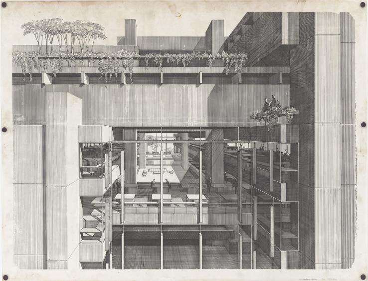
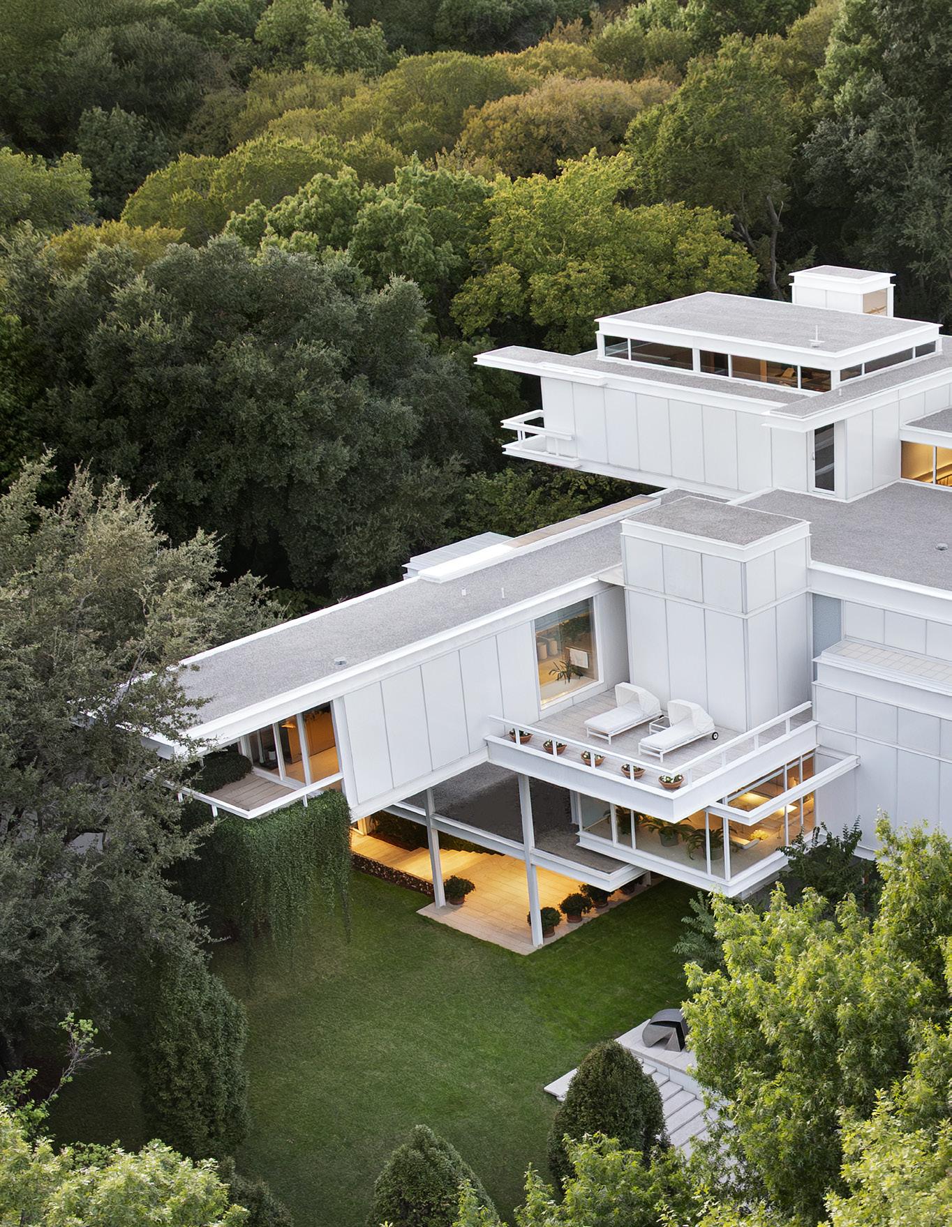
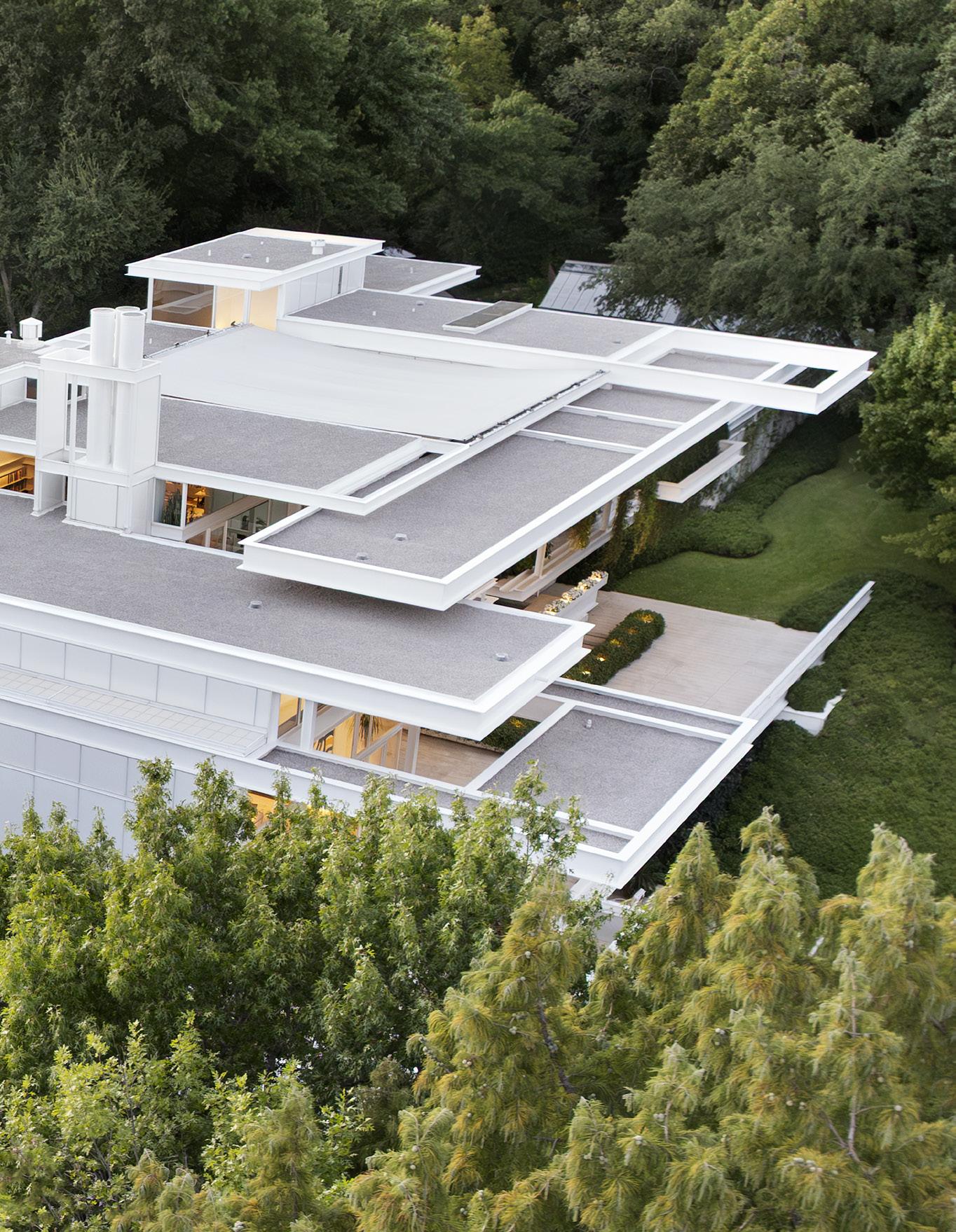
The Bass House
PAUL GOLDBERGER
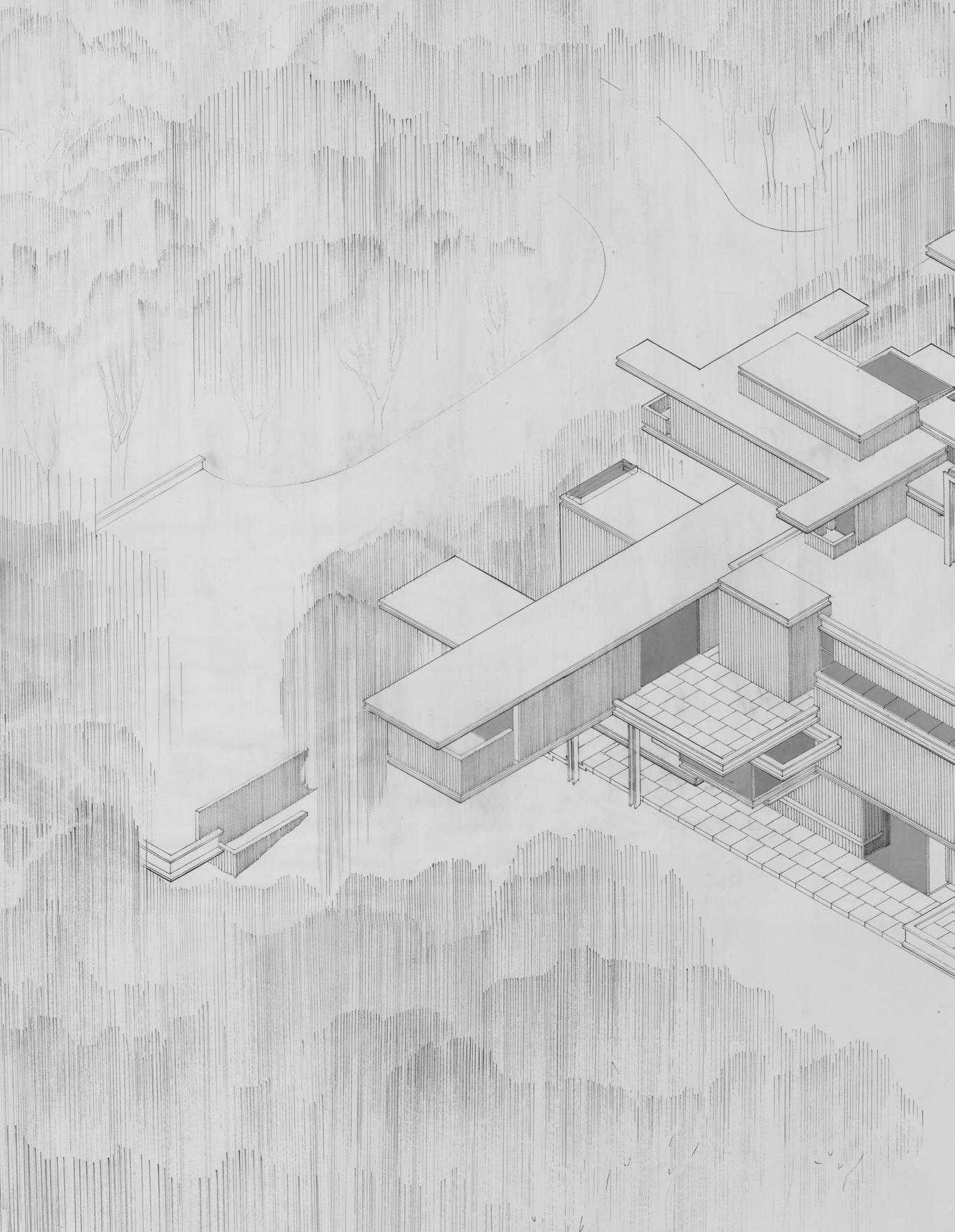
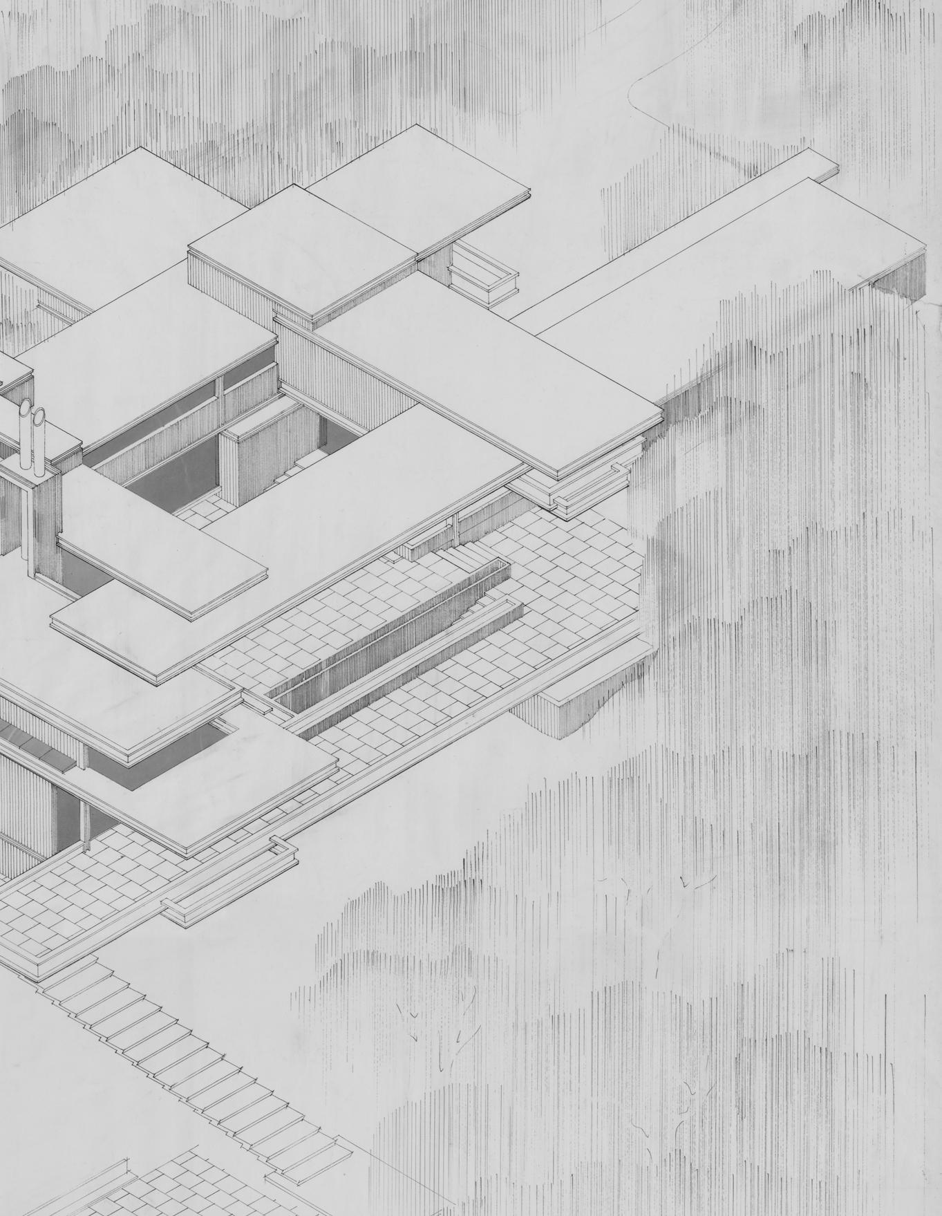
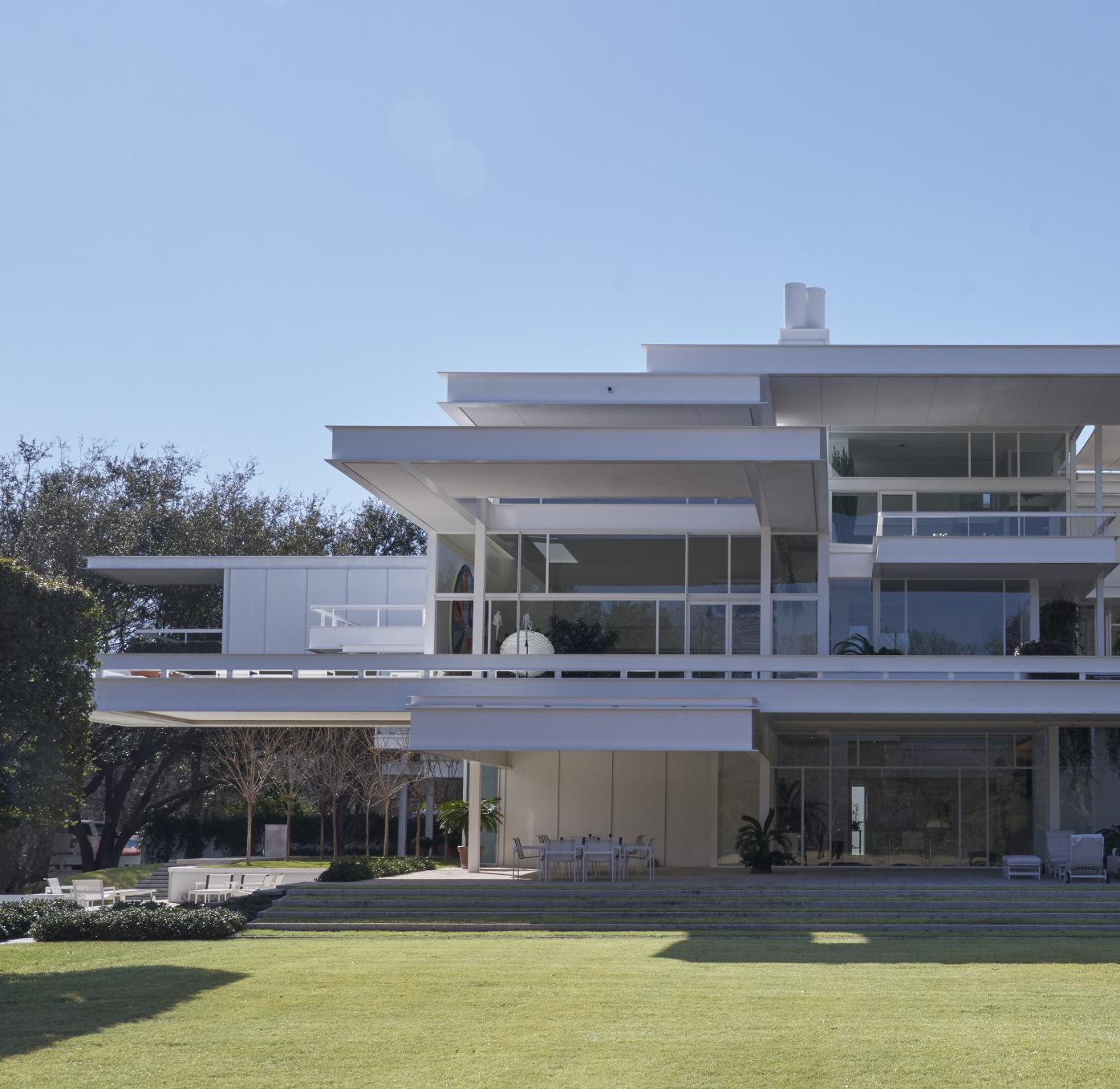
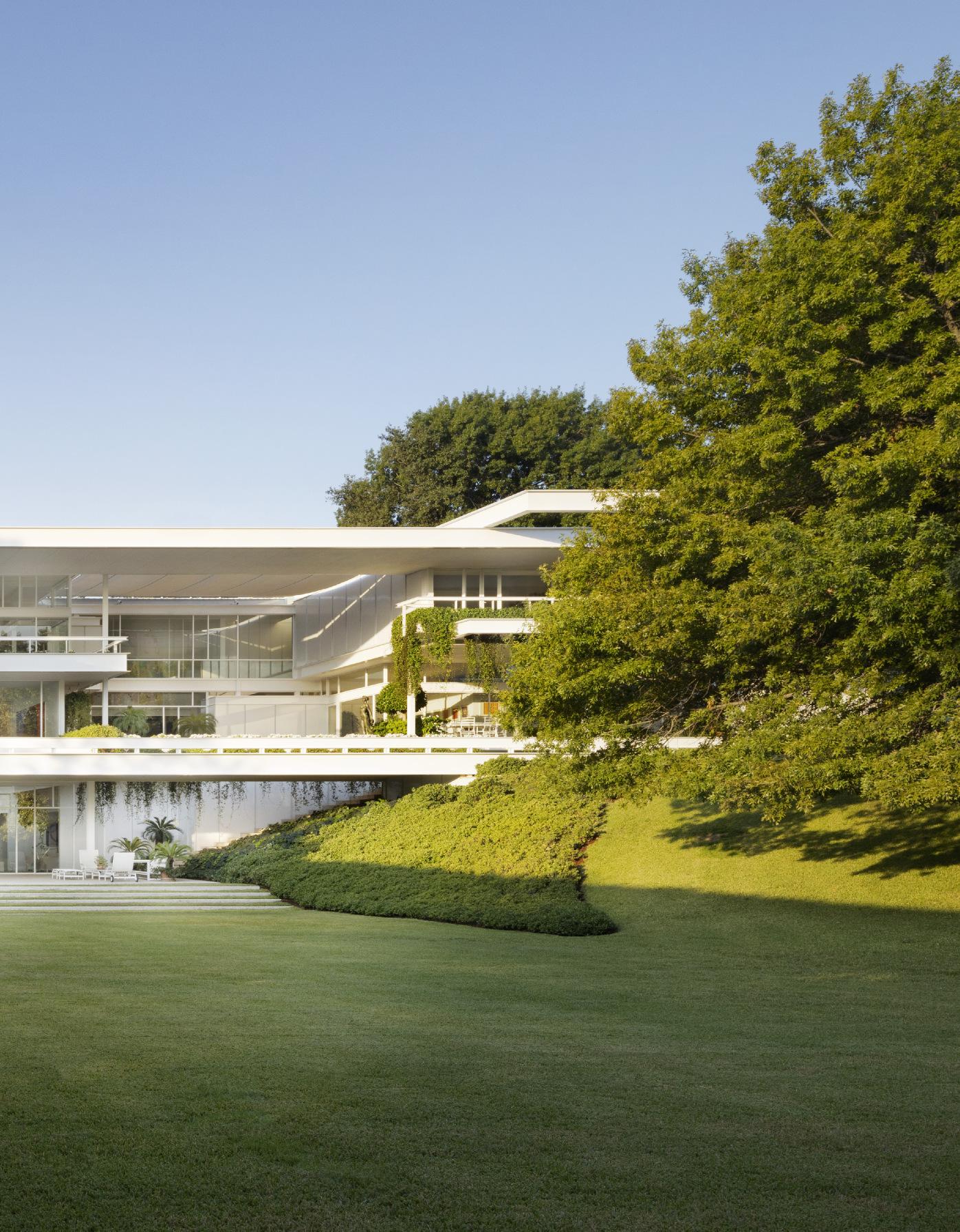
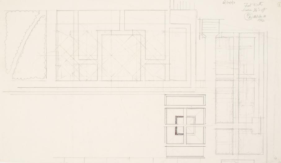
Paul Rudolph designed skyscrapers, academic buildings, government and civic buildings, apartments, townhouses, public housing, libraries, and some of the most important postwar modern houses in the United States. But his architectural oeuvre contains only one truly grand, expansive villa, and that is the house Anne and Sid Bass commissioned in 1970 in Fort Worth, Texas, which remains one of the great achievements not only of Rudolph’s prolific career, but of American architecture in the second half of the twentieth century. It is less known than Rudolph buildings like the Art and Architecture Building at Yale (renamed Paul Rudolph Hall in 2009 in memory of the architect), or the townhouse on the Upper East Side of Manhattan owned for years by the fashion designer Halston, or the Government Services Center in Boston, or the headquarters of the Burroughs Wellcome Corporation in Raleigh, North Carolina. The Basses, unlike Rudolph’s corporate and institutional clients, were fiercely private, and not until the house was around 15 years old would they permit any photographs of it to be published. Over time, a few images of the house have found their way into books on Rudolph’s work. But it has still been mostly off the radar of architectural history, which is unfortunate, since it is a house that not only represents Rudolph at his most lyrical, even dramatic, as well as at his most refined. It is a house that, had it been better known, might have shifted the trajectory of Rudolph’s entire career.
It is important to say here, before describing the Bass House, that its architect was among the most celebrated in his profession in the years before its construction, the architectural wunderkind of the 1950s and 1960s. He became the head of the Yale department of architecture before he was 40, and his buildings were as talked about as those of his contemporaries like Eero Saarinen and Philip Johnson, not to mention those of elder statesmen like Mies van der Rohe and Le Corbusier. The building he designed for the art and architecture departments at Yale was on the cover of every architectural magazine when it opened in 1963. Its striking façade of ribbed concrete and glass is a monumental composition that managed to recall elements of both Wright and Le Corbusier and at the same time be powerfully original—the Guggenheim Bilbao of its time, and everyone took notice. That building’s remarkable form seemed to sum up all the ambitions of 20th century modern architecture and at the same time push them forward.
Like so many of his modernist predecessors, Rudolph delighted in breaking out of the box, in seeking a new kind of space that seemed open and unconfined. He did it not with curves, not with unusual shapes, but by making everything, space and structure alike, feel as if it were floating. Stairs were floating treads, terraces and decks were floating planes, rooms and corners and overlooks were cantilevered everywhere. Still, much of Rudolph’s architecture felt heavy, not light—his frequent use of concrete made many of his buildings harsh, and they could seem, to some, like monumental abstract sculpture more than building, statements by an architect who had a vision shaped by a love of form more than of human use. By the 1980s he had fallen out of fashion. He had no patience with the post-modern movement that had risen on a claim of modesty, rejecting Brutalism, the latemodern label often given to Rudolph’s work. Post modernism sought instead to find ways to integrate historical form into contemporary architecture. Rudolph would have none of it. He stayed the course, producing up until his death in 1997 visions of a modernist future that would come, paradoxically, to feel more and more anchored in the past.
from top left:
Paul Rudolph’s drawing for the Art and Architecture Building at Yale University, New Haven, circa 1959. Library of Congress, Washington, D.C.
Paul Rudolph’s photograph of the Burroughs Wellcome Center, circa 1969. Library of Congress, Washington, D.C.
Paul Rudolph’s photograph of the Boston Government Service Center, 1962. Library of Congress, Washington, D.C.
Clockwise
Paul Rudolph’s photograph of the Wilson Residence, Sarasota, circa 1954. Library of Congress, Washington, D.C.
...Rudolph expressed monumentality not through heaviness, but through a sense of lightness and refinement, with a series of horizontal planes [...] their forms playing off each other in a composition of exquisite balance.
Sid Bass graduated from Yale in 1965, at the height of Rudolph’s fame; he had watched the Art and Architecture building rise and open to acclaim during his undergraduate years, and he was excited by Rudolph’s architecture. Not long after his graduation he married Anne Hendricks, a Vassar graduate who shared his love of art and architecture, and just a few years later, as the couple prepared to settle in Fort Worth where the Bass family interests are based, they purchased a large parcel of land in nearby Westover Hills and turned to Rudolph and asked him to design them a house. The charge was straightforward: a house that would be suitable for the life of a young family—there were two small daughters—that would also include extensive spaces for art, music, books, and entertainment, as well as ample gardens. While the Basses were demanding and wanted to be sure that the house met all the needs of their large program, they also saw themselves as patrons who wanted to enable the making of an important work of architecture.
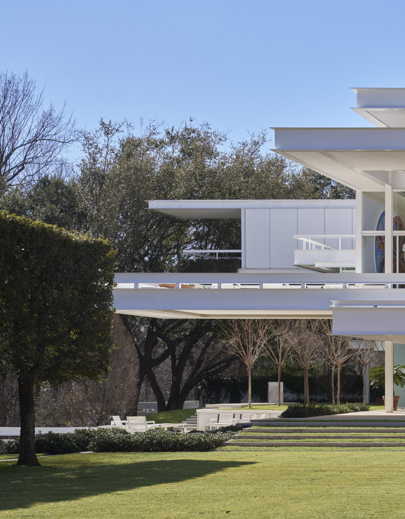
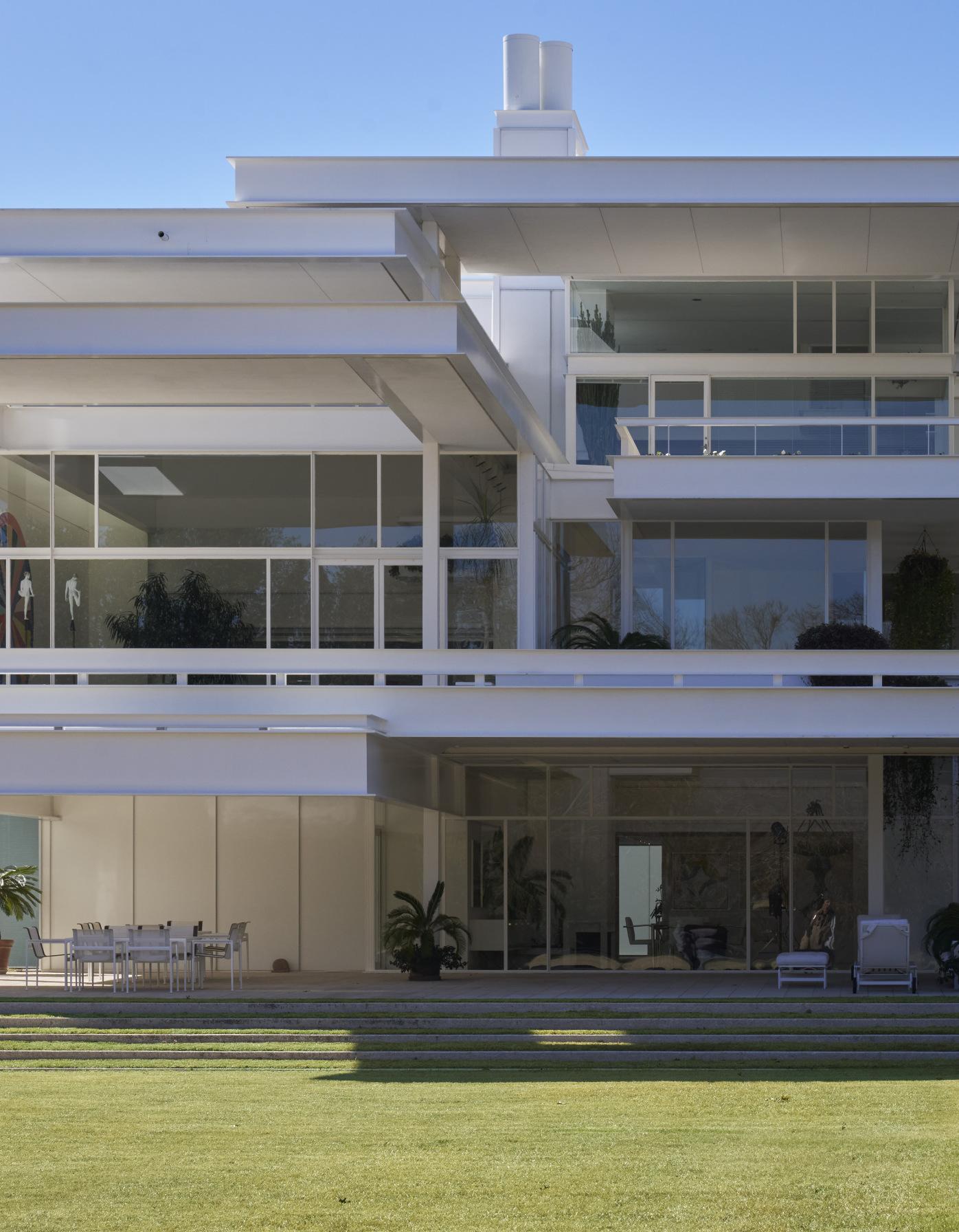
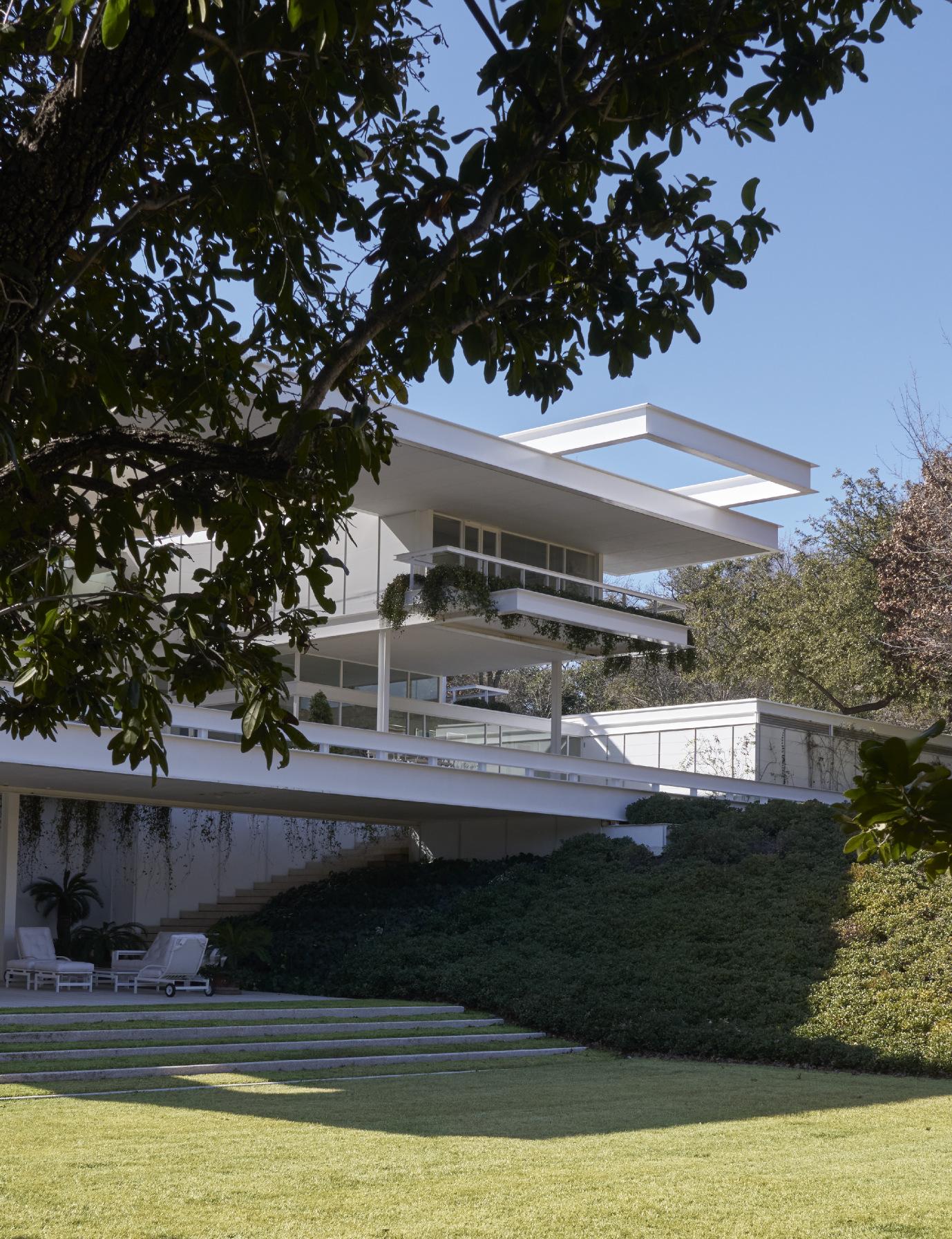
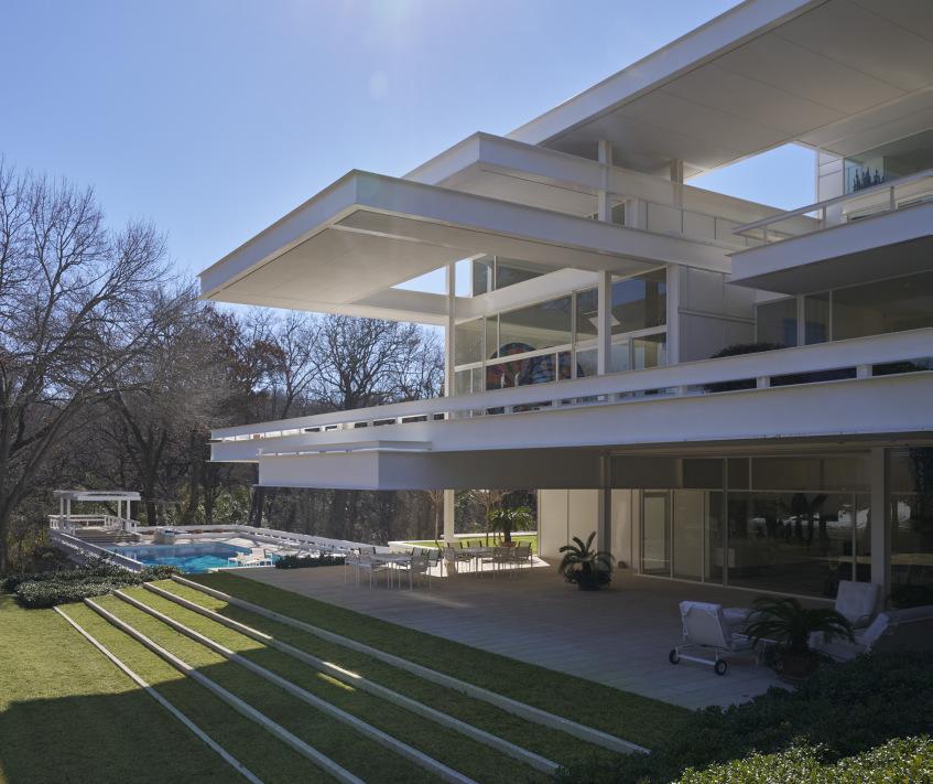
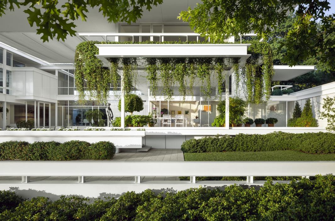
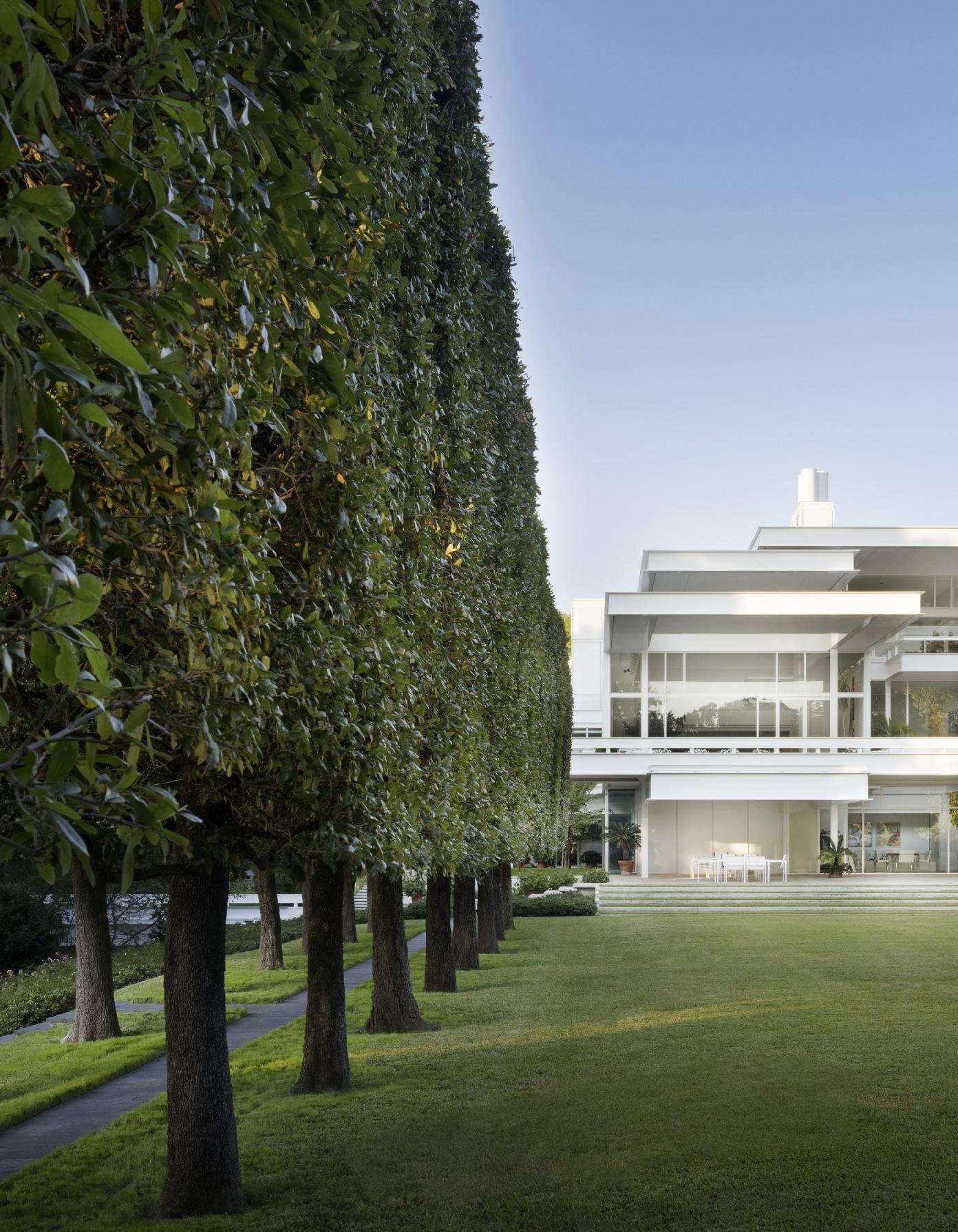
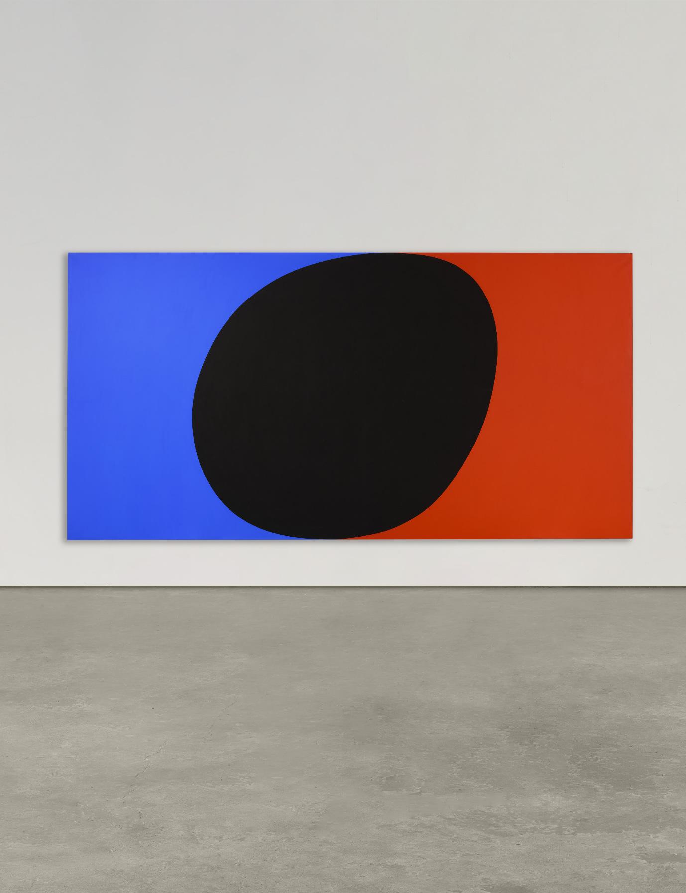
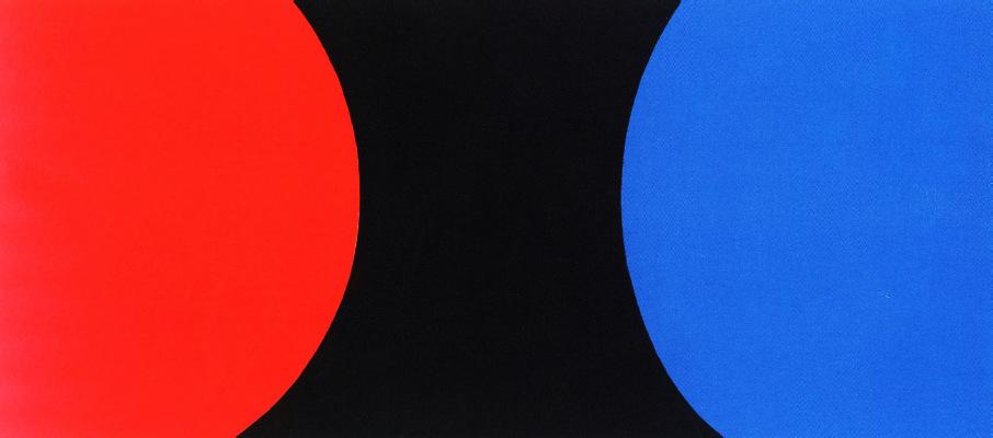
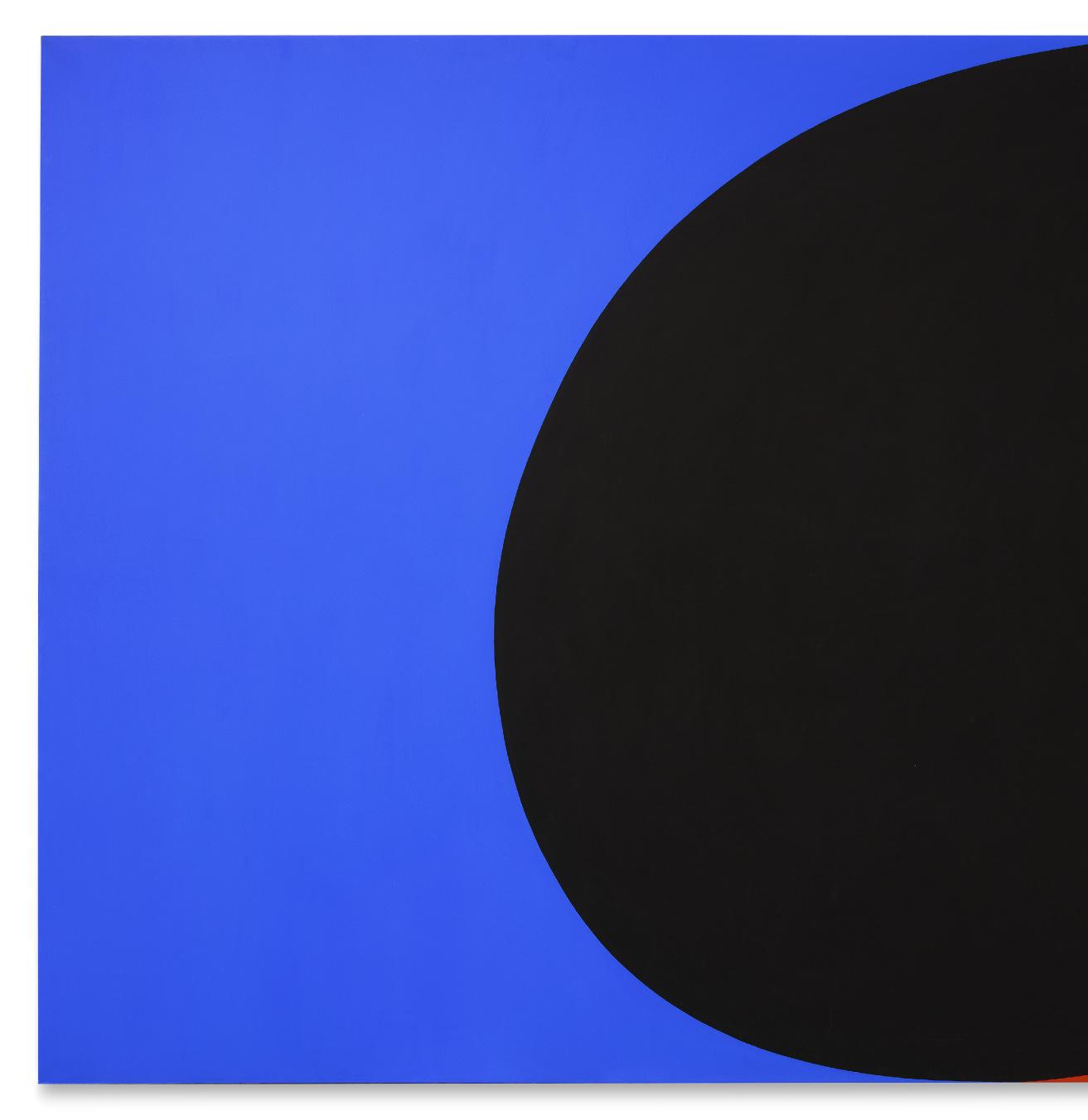
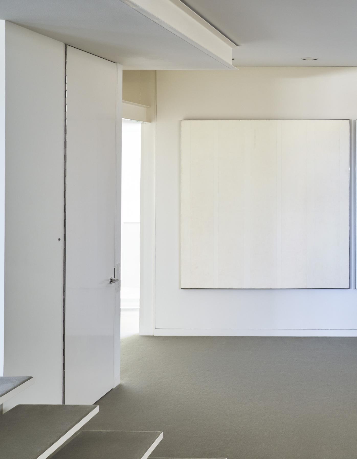
And that is what they got. The house Rudolph created for Anne and Sid Bass is soaring and elegant in a way that not all of Rudolph’s work was, its monumental spaces perfectly suited for housing their growing collection of large-scale artworks. It is white, which harkens back to the architect’s early work in Sarasota, Florida, where he designed a series of light, often white, houses of startling originality. But it has the grandeur and scope of ambition of his major buildings; indeed, it may be the only Rudolph building that joins the light, tensile
“...that rare work which is composed of such delicate balancing of forces and counterforces, transformed into spaces thrusting horizontally, vertically and diagonally, that the whole achieves the serenity which marks all great works of art.”
PAUL RUDOLPH, DESCRIBING FRANK LLOYD WRIGHT’S FALLINGWATER
quality of early Rudolph with the self-assurance, not to say the monumentality, of his later ones. Only this time Rudolph expressed monumentality not through heaviness, but through a sense of lightness and refinement, with a series of horizontal planes stretching across the long façade, their forms playing off each other in a composition of exquisite balance. It is a house defined most of all, perhaps, by the word precision.
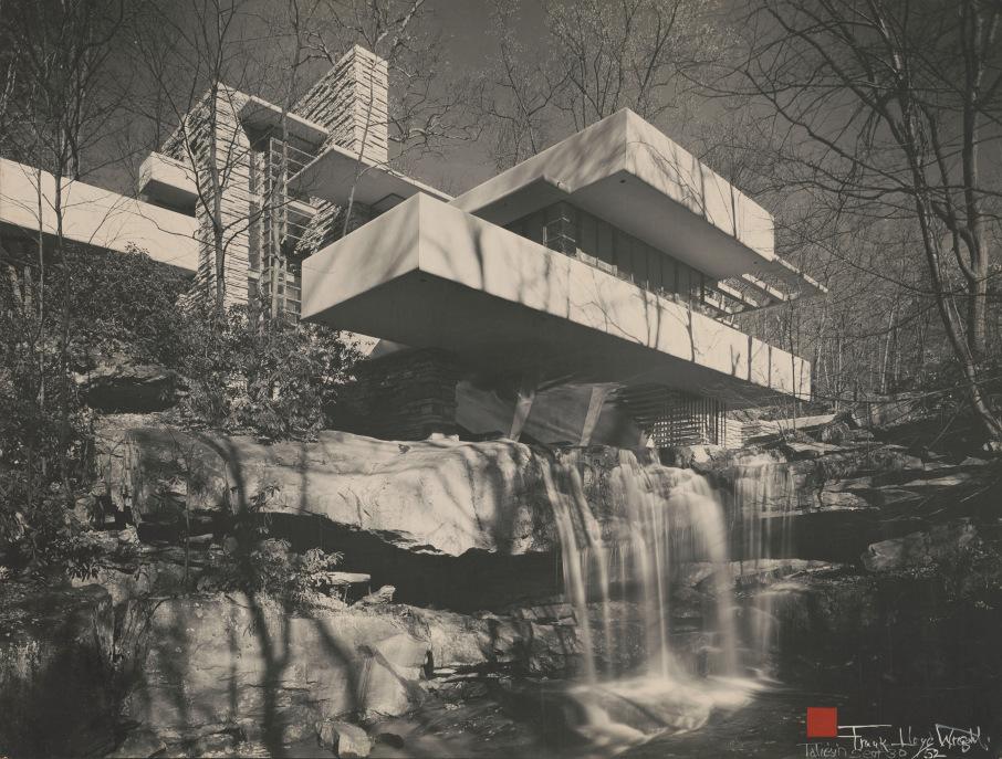
You cannot fail to think of Frank Lloyd Wright’s Fallingwater when you see this house; indeed, from one angle in the large garden, the arrangement of floating planes seems a deliberate echo of Fallingwater, perhaps the most famous modern house of the 20th century. But even in the portions of the house that are less literally invocations of Fallingwater, Rudolph’s intentions are clear. In an essay he wrote about Fallingwater for a Japanese publication before designing the Bass House, Rudolph described Wright’s great house as “that rare work which is composed of such delicate balancing of forces and counterforces, transformed into spaces thrusting horizontally, vertically and diagonally, that the whole achieves the serenity which marks all great works of art”—a perfect description of what he would seek to do, and ultimately would achieve, in the Bass House.
Frank Lloyd Wright’s Fallingwater, Fayette County, Pennsylvania. Photo: Bill Hedrich. Library of Congress, Washington, D.C.
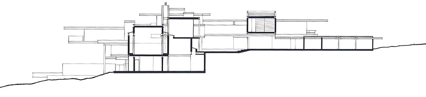
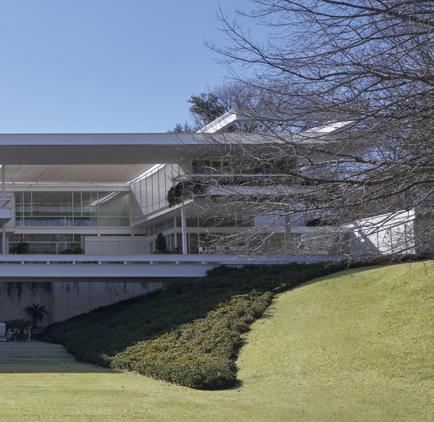
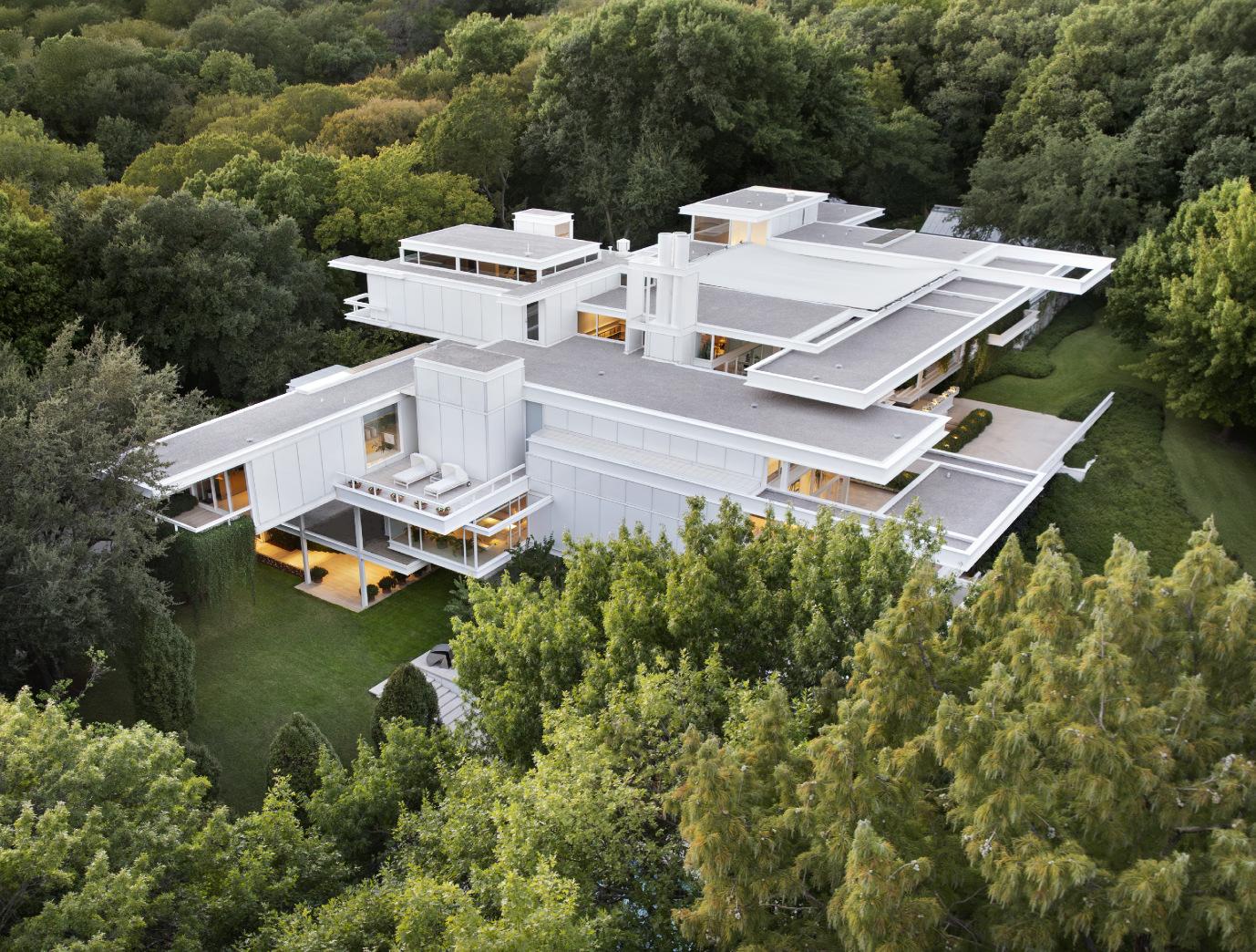
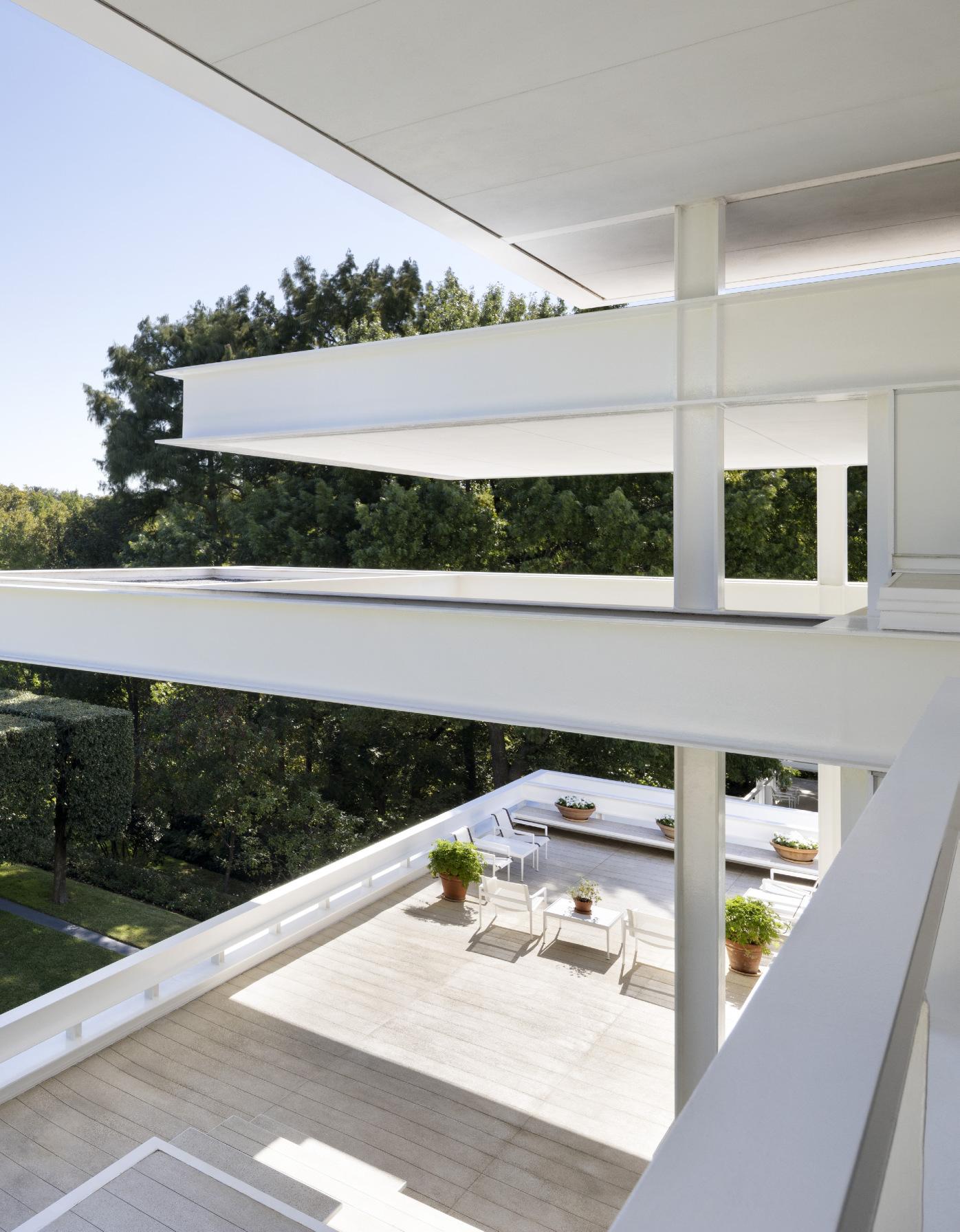
Rudolph structured the house as a kind of pinwheel, with the various floating and intersecting horizontal planes spiraling upwards around a central courtyard.
Rudolph, as always, was doing more than paying homage to Wright, or to any other architect who influenced him; he is showing us how he reinterprets their work and uses it as a springboard toward his own. The Bass House never feels as if it is burrowed into the landscape, as Fallingwater is. It is lighter, even though it is bigger than Fallingwater, and it hovers over the landscape, appearing to float ever so lightly over the lawn and the gardens. You can tell that Rudolph also thought about Mies van der Rohe’s great Edith Farnsworth House outside of Chicago, another building of white metal and glass that seems to float. But where the Farnsworth House was a modernist version of a small cottage, the Bass House is a modernist’s interpretation of a great country house, with all the formality and all the certainty, if none of the symmetry, of Blenheim or Chatsworth. And where Fallingwater projected out from its setting to cantilever like a great balcony over the waterfall, with only one real façade, the Bass House has four facades, each slightly different, and each part of a three-dimensional composition that is as intricate, in its way, as a Rubik’s cube.
Rudolph structured the house as a kind of pinwheel, with the various floating and intersecting horizontal planes spiraling upwards around a central courtyard. The house is entered at the garden level, where there is an informal living room that today would probably be called a media room, but in its day, an era long before wide-screen televisions, it was called the playroom and also serves as a casual library. (There is a larger, more
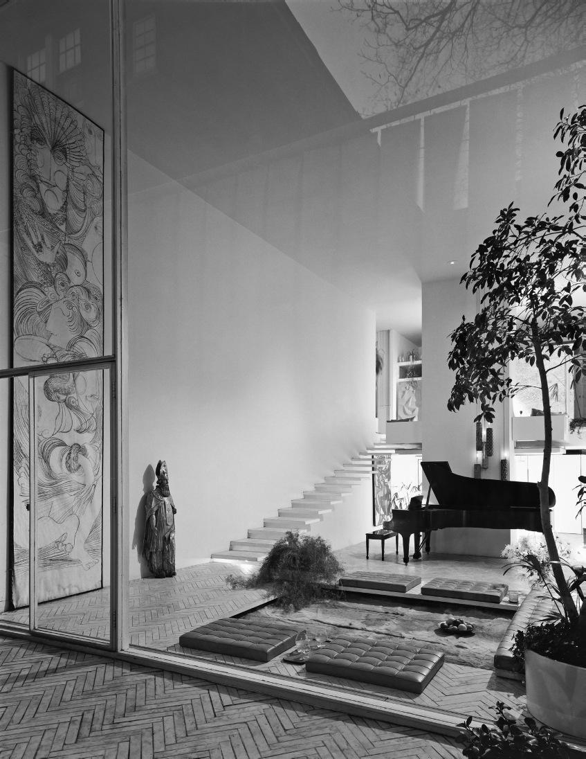
formal library upstairs.) The garden level also has a guest suite and an entry foyer that gives way to one of Rudolph’s first big interior gestures, his version of a traditional grand staircase, in this instance comprised of wide horizontal treads set within a two-story space that overlooks a small courtyard.
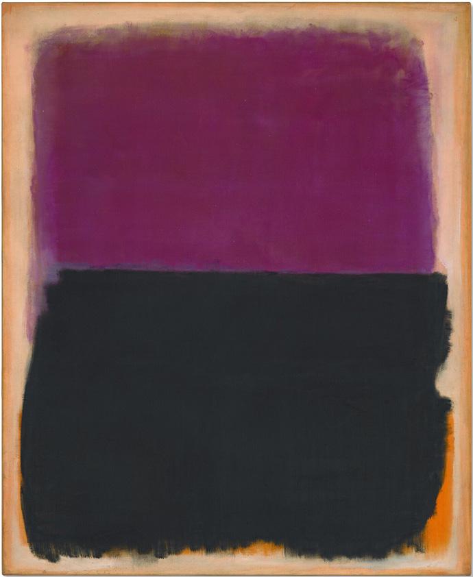
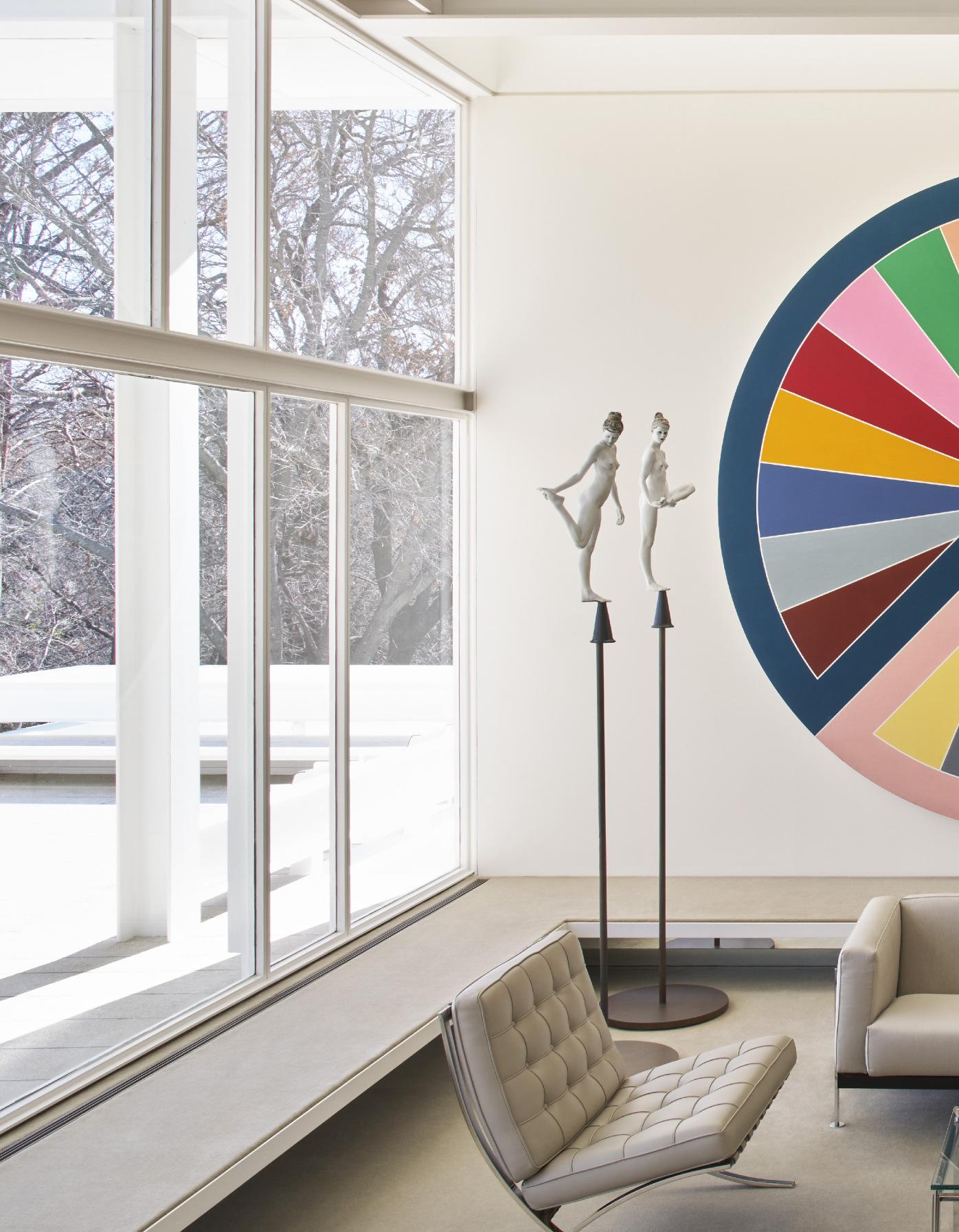
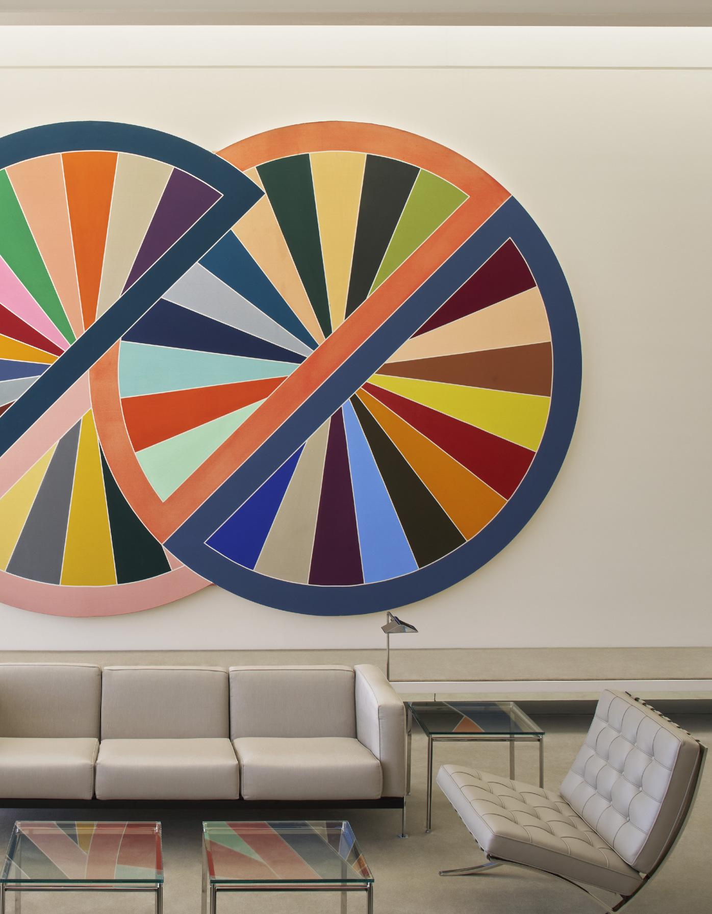
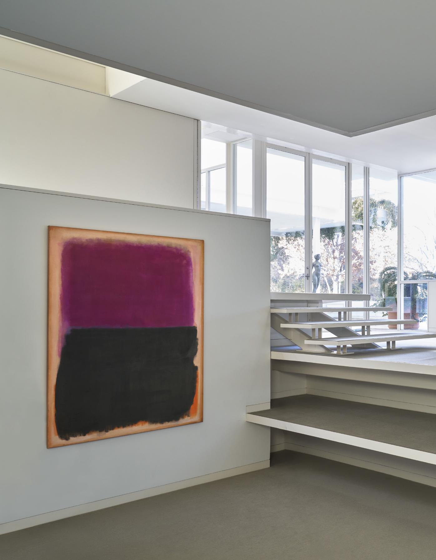
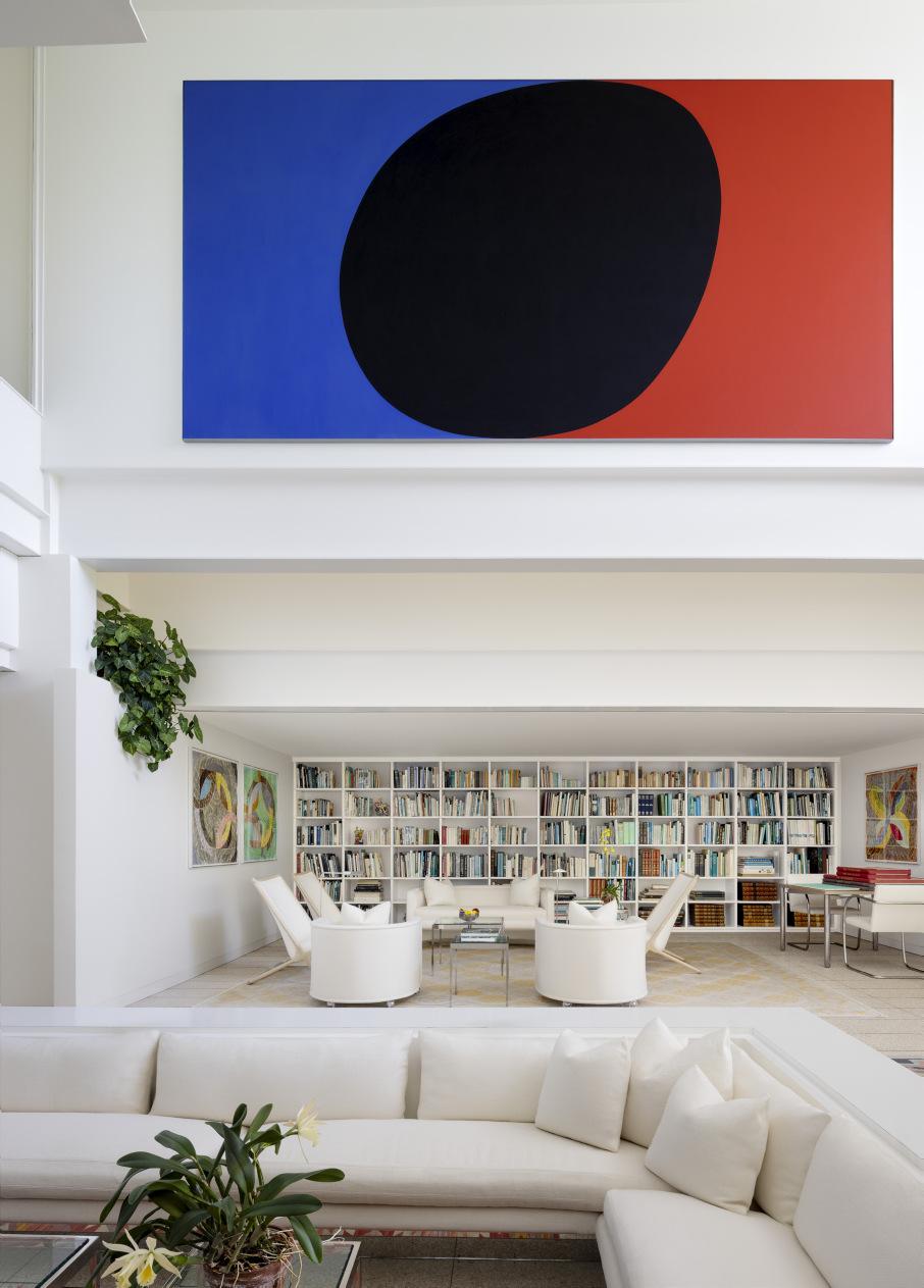
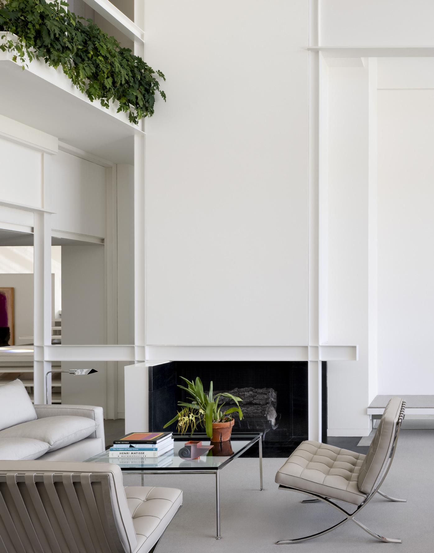
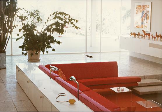
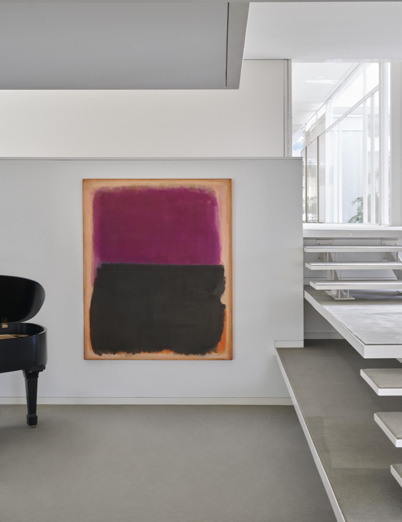
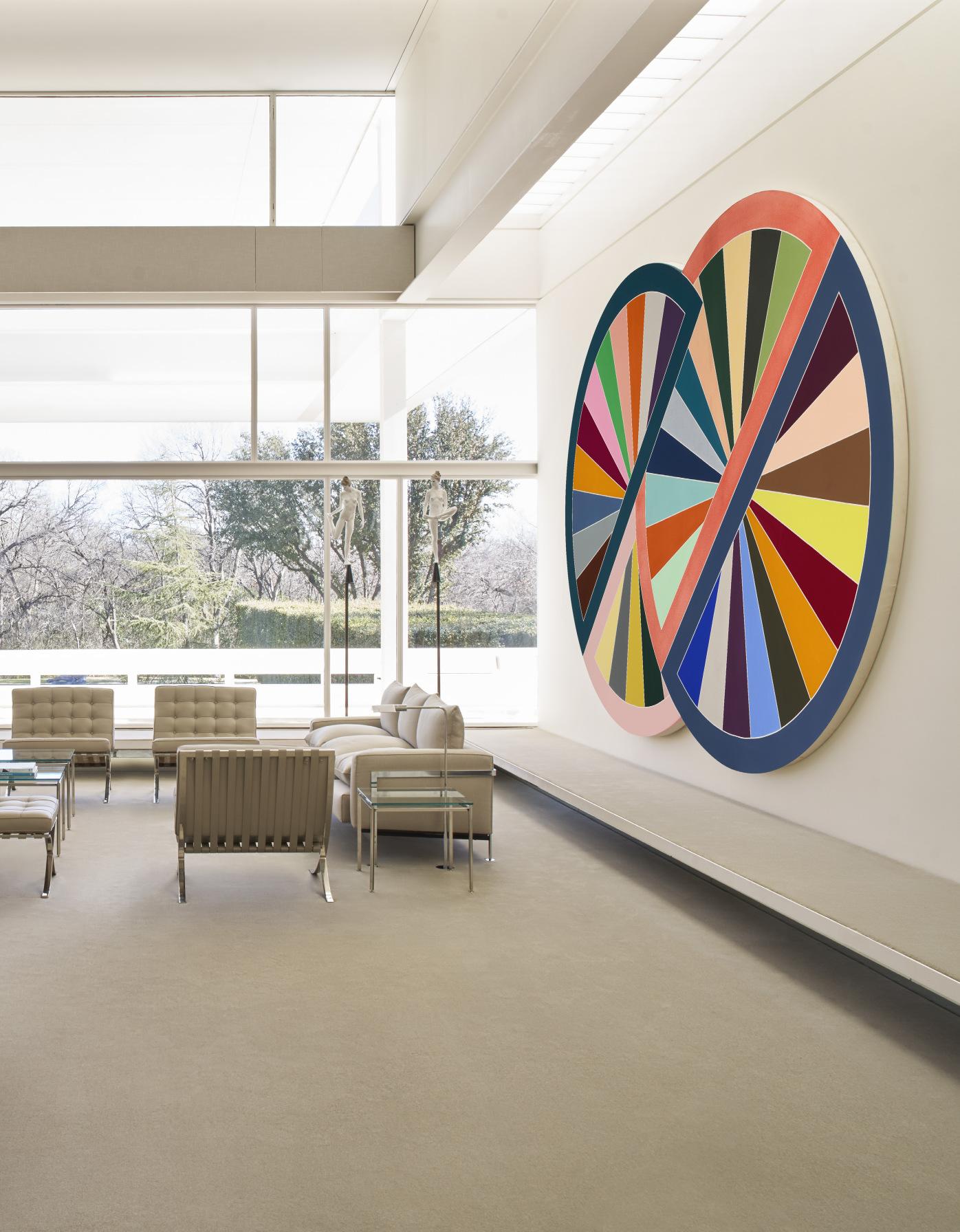
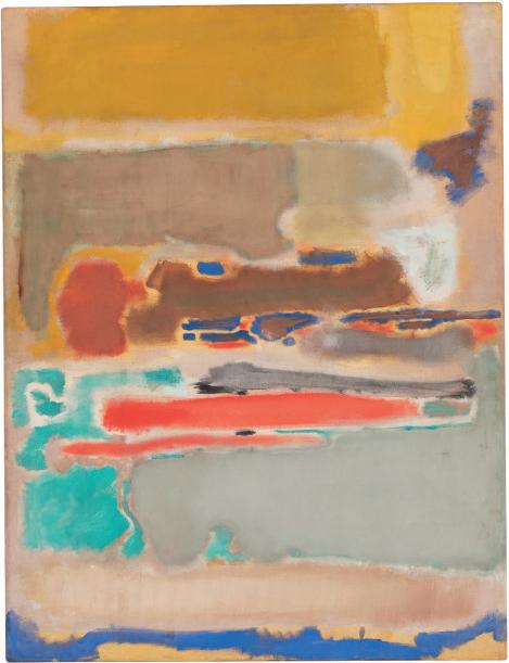
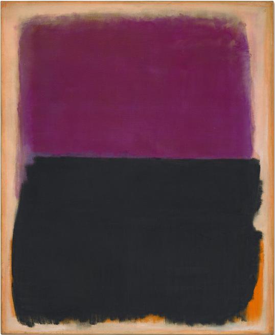
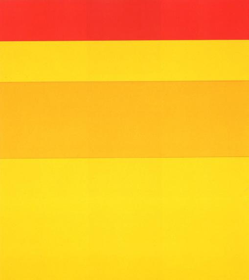
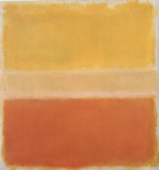
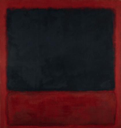
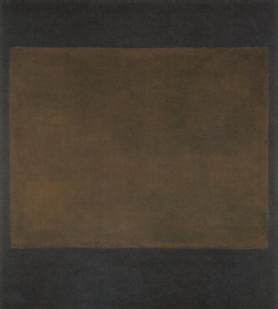
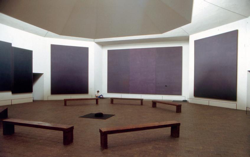
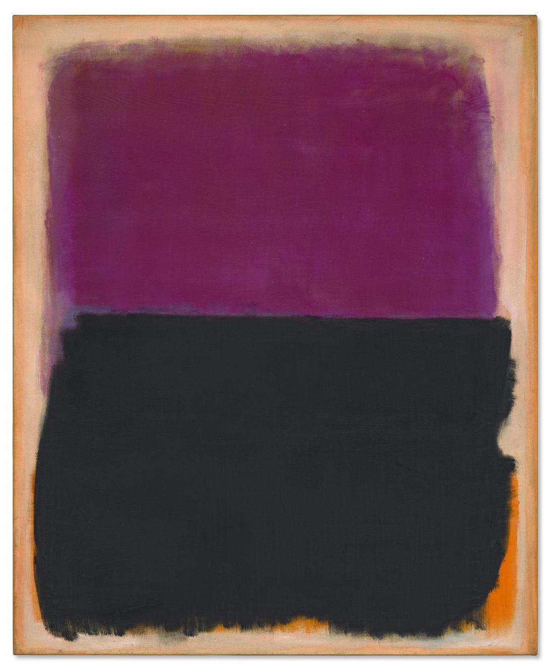
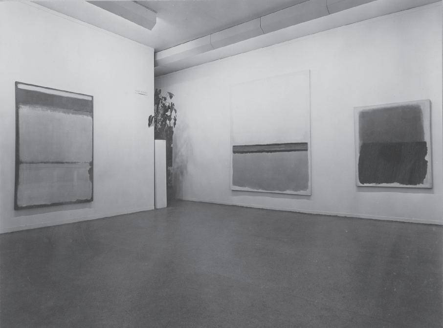
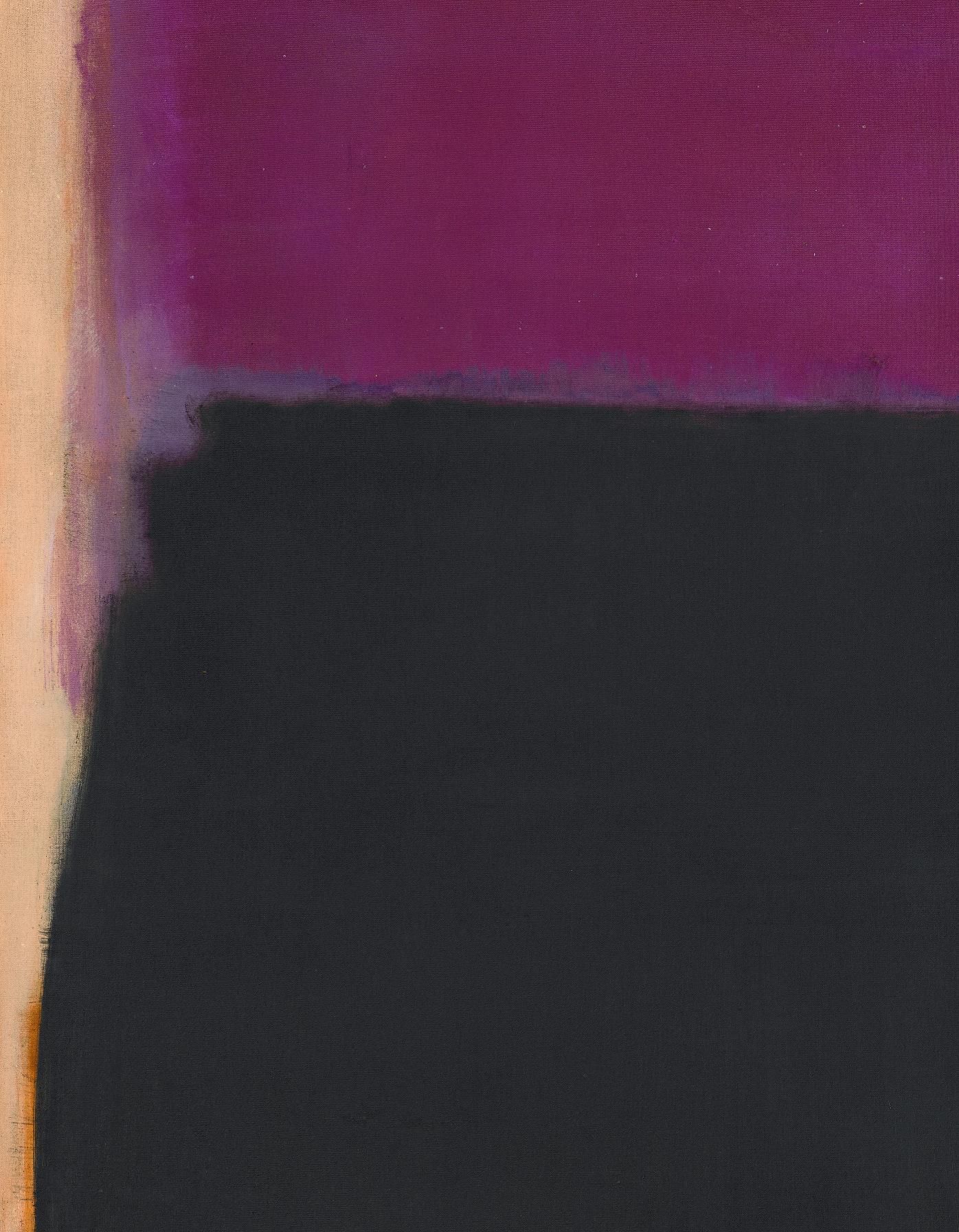
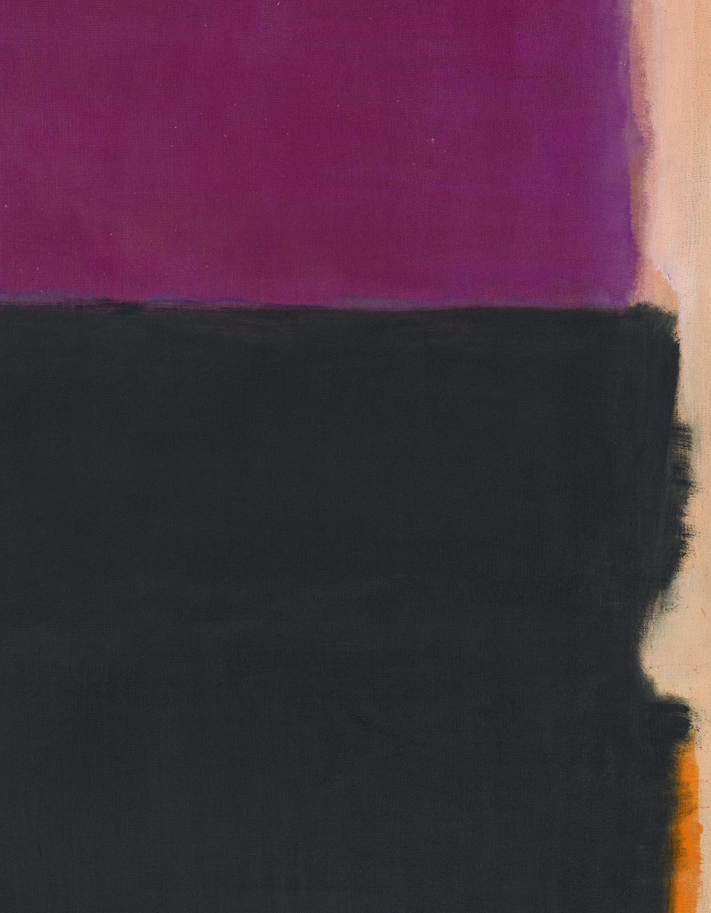
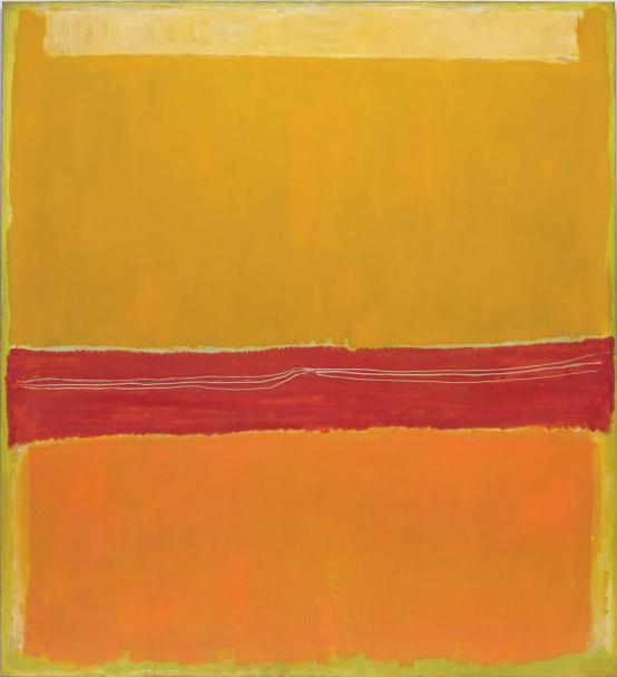
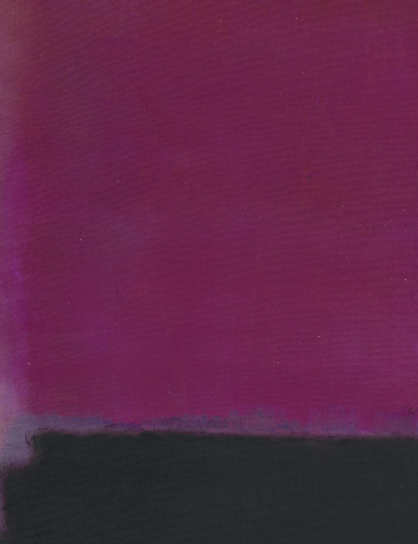
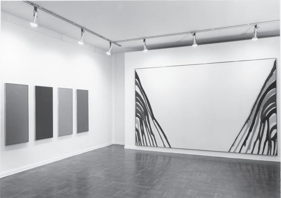
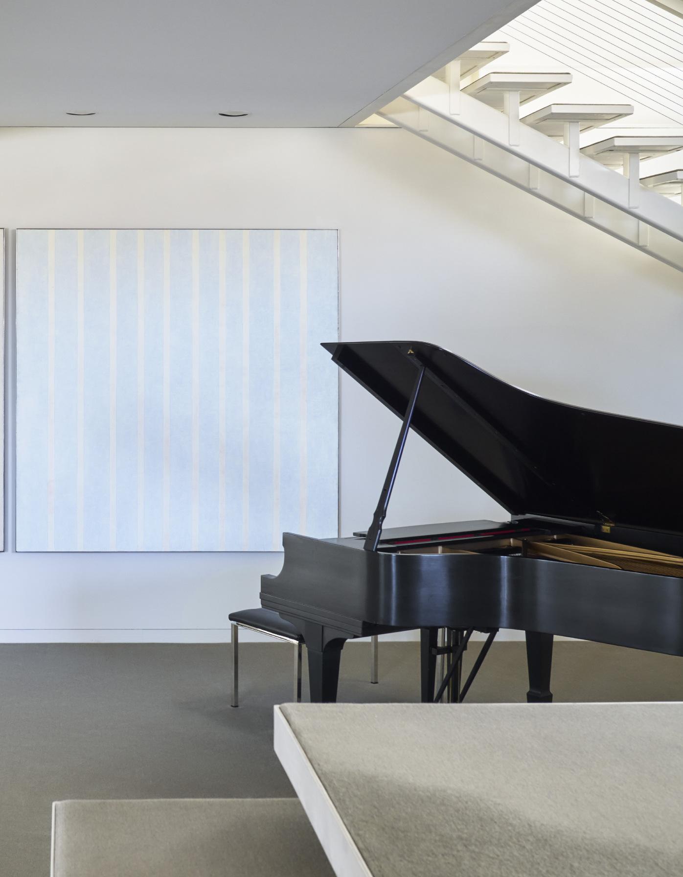
The staircase leads to the main entertaining floor above, and the spiral continues— Rudolph liked few things more than frequent changes in level, and the first room, known as the music room, is really the initial step in a sequence of spaces that next goes another four steps up to the main living room and its adjacent area, where there is a “conversation pit” of built-in seating three steps below the floor. If the stair up from the entry is Rudolph’s interpretation of the grand stair hall of a traditional villa, the two-story living room is its Great Hall, with two large, solid walls facing each other, accommodating major works by Morris Louis and Frank Stella. The sunken area, for more intimate conversations, is smaller and lined with windows to connect to the surrounding landscape. A Calder mobile was suspended above, level with the black and plum Rothko hanging across the room.
The spiral continues up another four steps to the level of the formal dining room, another double-height space, this one with a glittery glass tabletop of Rudolph’s design. Here, as in many of the public rooms, the furnishings were classic modern pieces like Mies van der Rohe’s Barcelona chairs covered with an unusual, light-colored taupe leather, or his Brno chairs. It was clear that the Basses wanted a level of refinement that would preclude extensive use of the mirrors, furniture made of Lucite, orange carpeting, and other elements that the architect favored in many of his interiors (although the dining table, which Rudolph designed, is covered in small mirrors, and there are mirrored nightstands in the bedroom, and there were even some touches of orange in the original interiors that were later replaced). The Basses selected Rudolph because they saw him as one of the most gifted makers of architectural form and space of his time, but they were well aware that Rudolph’s gifts as an architect led him to feel a comfort with experimentation that had from time-to-time yielded results that were garish or simply awkward. To assure
Paul Rudolph’s original upholstery in his signature orange for the Bass House’s Playroom seating. Photograph courtesy of the consignor.
that “their house had none of the sometimes makeshift qualities typical of Rudolph’s other projects,” as the architect’s biographer Timothy Rohan has written, the Basses encouraged Rudolph to use classic modern furniture and to use a limited palette of color within the rooms, letting the bold, vibrant color of the art serve as a striking counterpoint to both the interior design and to Rudolph’s elegant white structure. The result was spaces in which the works of art were fully integrated into the design, each piece connecting to the house and its setting.
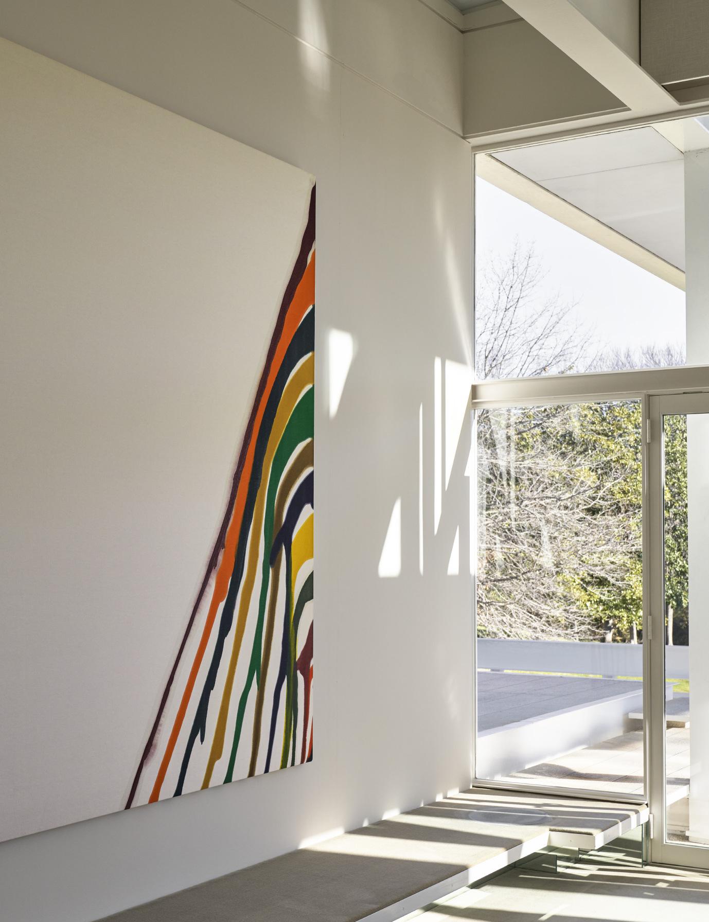
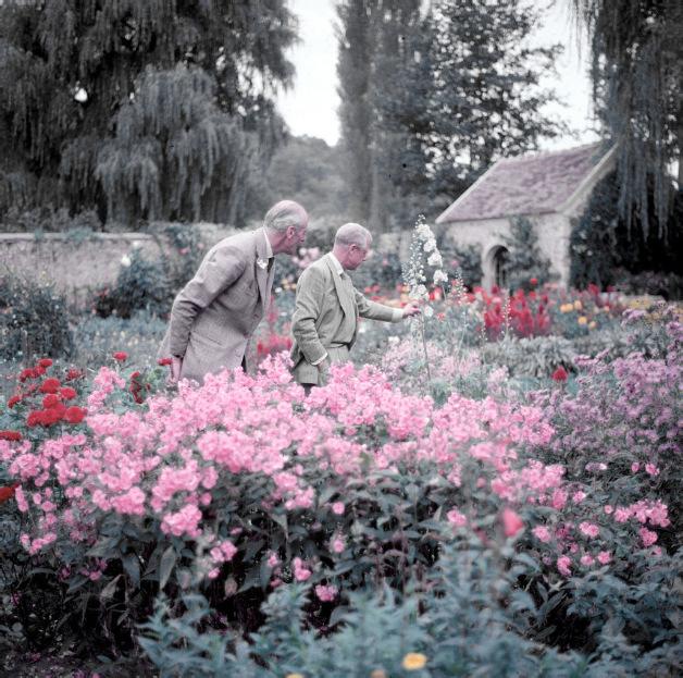
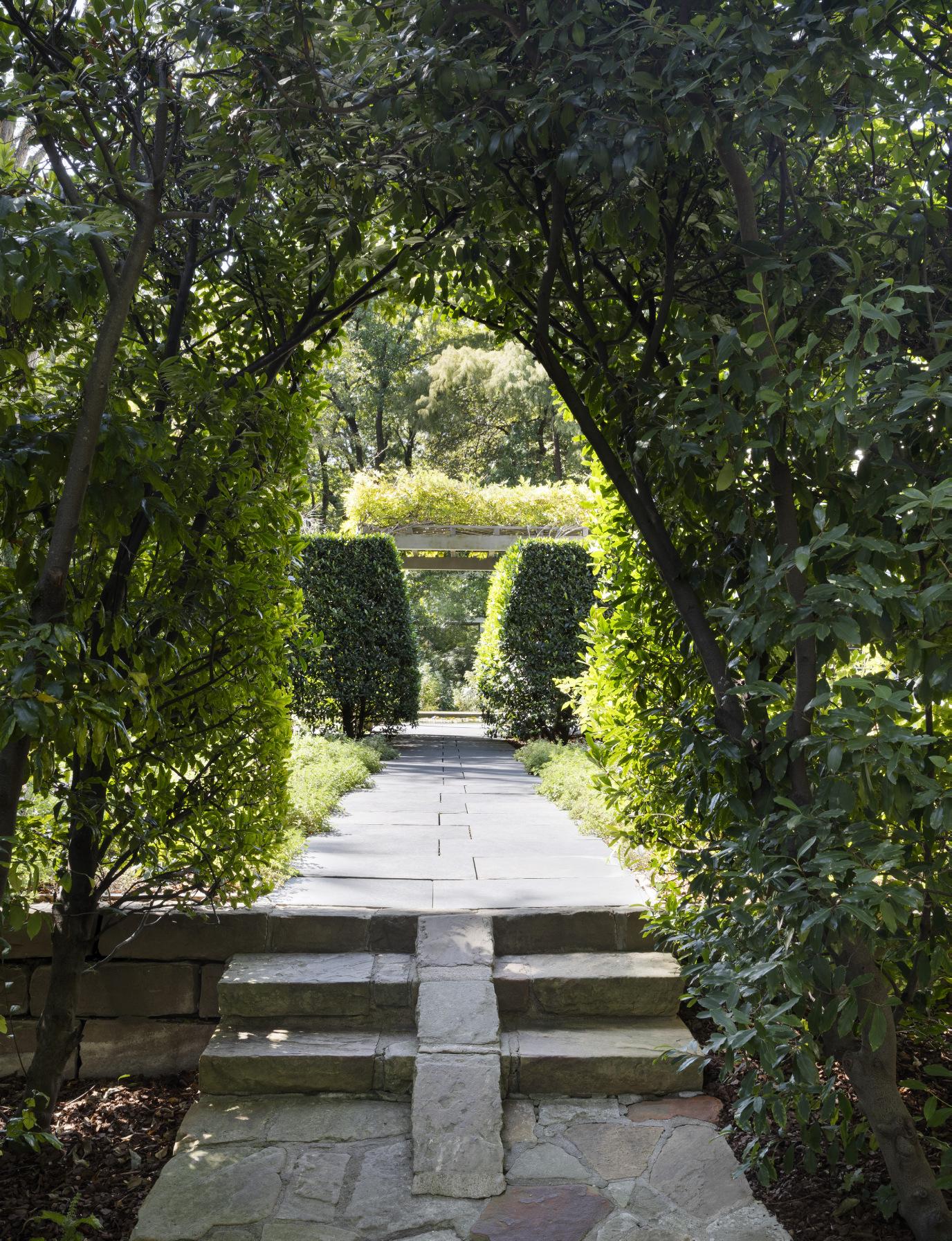
A breakfast room, kitchen and service areas are beyond the dining room, each a distinctive space in itself, and each open to views of the landscape and surrounding gardens. The spiral continues to a level of children’s rooms and nanny’s quarters, and around and up again to the primary bedroom suite, the library, and a long, narrow dressing area and bathroom that cantilever out over the landscape. The primary bedroom, the only major room that is not painted white, is lined in a warm gray fabric that also comes over the bed to create a kind of modern interpretation of a canopy bed. There are few windows in this room; it is more of a cocoon. The house has no operable windows, but almost every room has a glass door leading to one of the many outdoor decks on each level, some of which are cantilevered from the body of the house as if they were small viewing balconies, and others of which project out in the form of spacious seating areas with views to the landscape, designed originally by Robert Zion and later embellished by Russell Page, who added formal gardens and oak allées that play off against Rudolph’s powerful lines.
The spiral procession continues up through the house—and perhaps spiral is an odd word to use to describe a house made entirely of straight lines—to reach an upper level that was originally planned as an art studio, and which became Anne Bass’s studio for ballet practice. A rare Severini dancer hung in the library one level below. And then to the roof, where a pair of round chimneys, painted white, are the only architectural elements to play off Rudolph’s composition of straight lines and floating planes.
The house Anne and Sid Bass commissioned is at once extravagant and restrained, sumptuous and disciplined.
After Anne and Sid Bass divorced in 1988, Anne Bass continued to live in the house. She retained it for the rest of her life, even as she spent more of her time in New York and Connecticut, and the exquisite interiors and gardens were maintained as they had been when the house was her full-time residence. (Even the white-framed set of swings, a custom design by Rudolph for the Bass daughters, remains as it was when the house was new.)
The house Anne and Sid Bass commissioned is at once extravagant and restrained, sumptuous and disciplined. It suggested a whole new direction for Rudolph, a direction that he never had the chance to play out in his unusual career. Rudolph designed other white buildings, and numerous other houses, but none had the finesse of the Bass House, which possesses an elegance, even a majesty, that was not always apparent in his other work. Rudolph’s architecture was bold, but most of it was full of rough edges, both literally and figuratively, which was one of the reasons his career faltered. At the Bass House, the rough edges became refined, and Rudolph’s daring spatial adventurism inspired by Frank Lloyd Wright was joined to a precision and subtlety inspired by Mies van der Rohe. The result is unique: Paul Rudolph’s greatest achievement, a house that showed how close his work could come to the sublime.
The Bass Garden
ROBIN LANE FOX
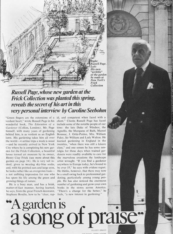
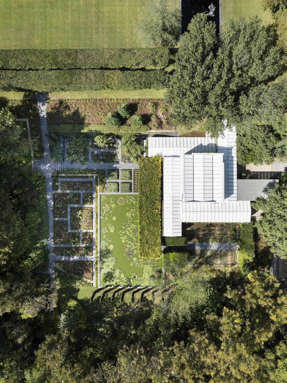
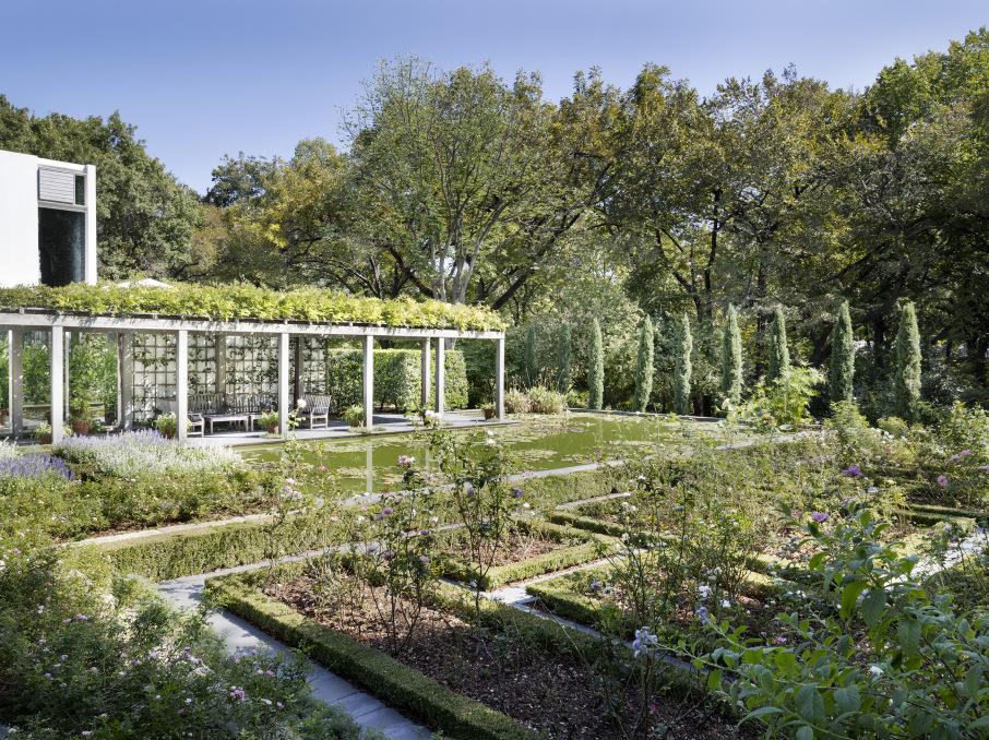
The Bass residence’s admired modern architecture and superb collection of modern paintings are not the only reasons why it has continued to fascinate connoisseurs. The outer landscape in its grounds was planted by Robert Zion as a green complement to the building. The gardens nearer to the house waited ten years for an appropriate designer. They were then assigned to Russell Page, the towering genius among landscape gardeners from Britain in the 20th century. The gardens perpetuate one of the last designs Page carried out. They are extremely important evidence for his taste and skill and for the underlying thinking which makes him a major figure in the history of gardens as art.
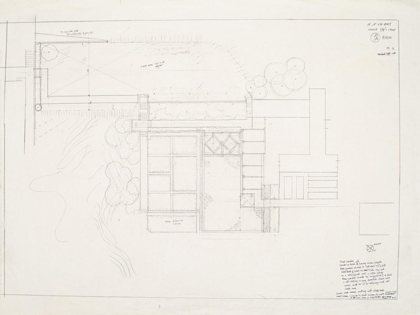
In 1981, Anne Bass was pondering how to design her gardens when she hit on an article depicting the small front garden which Russell Page had recently designed for the Frick Museum on East 70th Street in New York. Like many then and since, she was greatly taken with its style and took the magazine with her to a meeting to be attended by the Bass residence’s architect, Paul Rudolph. Rudolph arrived with a copy of exactly the same article, also intending to advocate Page as the designer for the Bass garden. Page would surely have seen a higher hidden power behind this concordance. It led to him to a job which was to absorb him for more than two years.
In 1981, Page was in his early seventies, a gaunt figure, bald, impressively tall and with a furrowed brow which projected an intense seriousness of manner and bearing. Anne Bass was in her early forties, a lover of fashion, ballet and books. She had enjoyed gardening
with her father as a girl, but had mostly grown orchids, geraniums and impatiens. Page, by contrast, had worked on stately commissions far and wide, beginning in the 1930s. In 1950-51 he had laid out an admired garden in London for the iconic post-war Festival of Britain. In 1958 he had won the top gold medal for a formal fruit and vegetable garden laid out at Chelsea Flower Show with apple trees pruned by a top French nursery. Since 1945 most of his work had lain outside Britain. His clients included the exiled Duke of Windsor in France, members of the Agnelli car-making family near Turin and his great friends, the de Belder family at their magnificent arboretum in Belgium. In America his first commission had been a woodland and water garden at Kiluna Farm on Long Island for the Paleys. Since then his American assignments had multiplied.
In the early 1980s, while working for the Bass family, he was also still laying out tumbling flowery gardens for the Vails in Cleveland, Ohio and landscaping a huge park round Pepsi Cola’s company headquarters at Purchase in New York State. Pepsi’s chief executive was the inspiring Donald Kendall who hired Page to design an entire landscape in the belief that a beautiful setting would add pleasure and commitment to all those who worked for the company there. The huge PepsiCo park with its sculptures, pools and a sinuous “golden path” curving throughout is Page’s ultimate masterpiece. One of the fascinations of the Bass garden is that it was designed and planted at the same time, a witness to Page’s continuing talent on a smaller and more personal scale.
After visiting the garden and showing little enthusiasm at first for its modernist house of steel and white enamel, Page wrote to Anne Bass assuring her he would “get some charm into the place, if it kills me.” He had already worked in gardens in hot summer climates, including south Italy, but Fort Worth also had hard water and alkaline soil. There are no rules, Page’s assistant in Italy, Paolo Pejrone, young at the time, remembers him proclaiming. In a magazine article in the 1980s Page explained that “rules are servants, not masters.” However, he was unusual among British garden designers for his formal training as an artist, having learned to draw and paint at the Slade School in London before he ever designed a garden and then refreshing his skills as a draftsman with lessons from his friend, the artist Oskar Kokoschka, in London in the late 1940s.
Excerpt from “The Shaping of a Garden,” House & Garden, vol. 149, no. 7, July 1977, presumably the article that Anne and Paul brought to their meeting in 1981.
Page’s garden for the Frick Museum, New York. Photo: Sergi Reboredo / Alamy Stock Photo.
Clockwise from top left:
Page’s garden for the Royal Horticultural Society Show, Chelsea, 1958. RP/4/3/4 (1 of 3), Archive of Garden Design.
Page’s garden at the Agnelli family villa in Piedmont, as featured in Vogue magazine in 1967. Photo: Horst P. Horst / Condé Nast via Getty Images.
Page with the Duke of Windsor at the Duke’s summer home, Le Moulin de la Tuilerie, Gif-sur-Yvette. Photo: Frank Scherschel / The LIFE Picture Collection via Collection / Shutterstock.
...he dwelt on the need for a garden to complement a house, tie it into its surrounds and even take a cue from its architectural style.
The Bass garden rests on meticulous spacing, measurement and formality, rules which Page always applied but never allowed to dictate what he imagined in full detail in his mind’s eye.
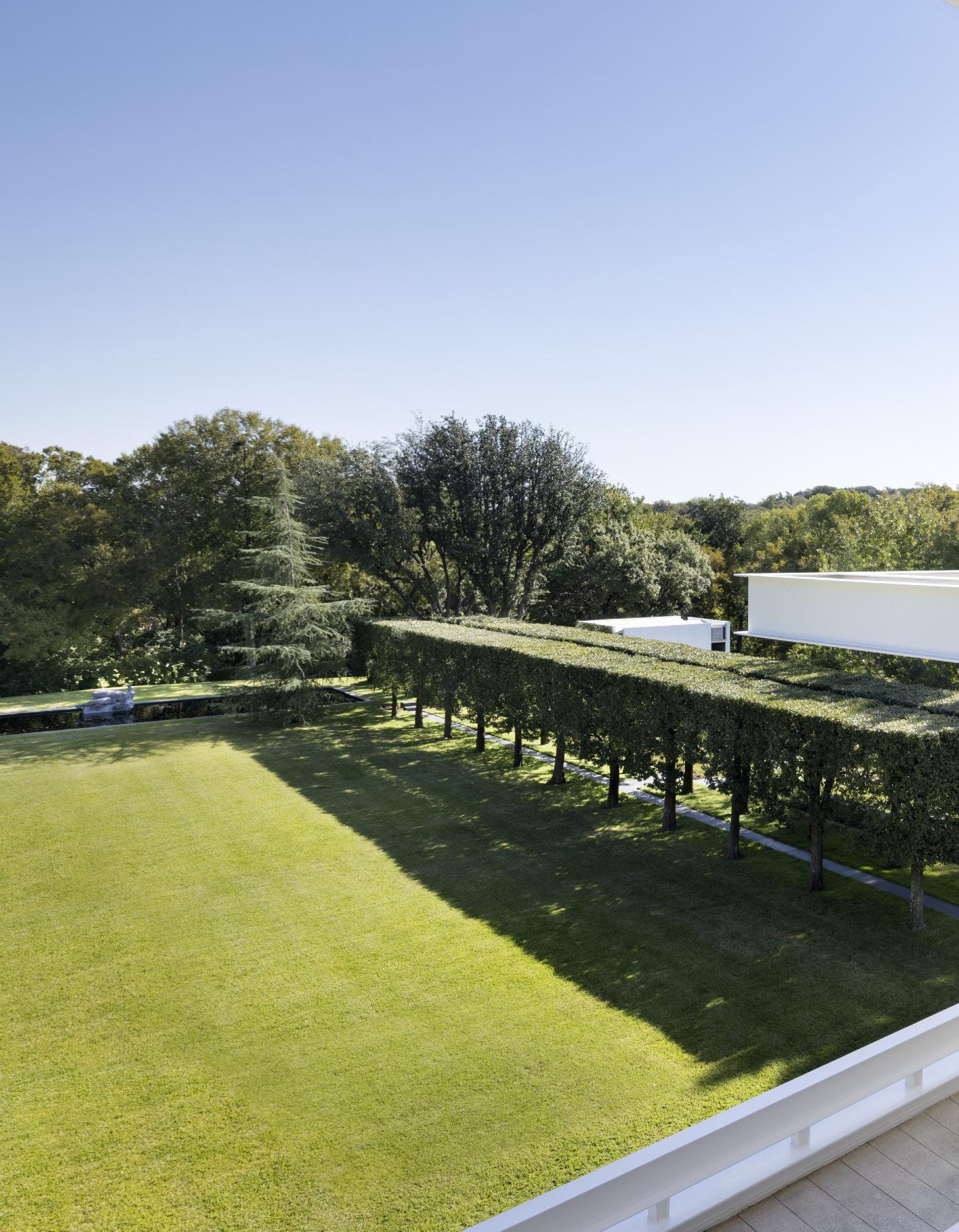
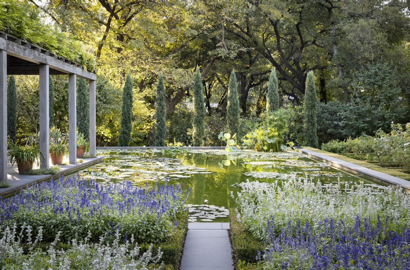
The garden divides into three distinct sections. The first is the immediate surround of the house itself, always a crucial element in Page’s designs. His remarkable book, The Education of a Gardner (1962), had been published twenty years earlier and remains essential reading for all serious landscape designers. In it he dwelt on the need for a garden to complement a house, tie it into its surrounds and even take a cue from its architectural style. The rectangular lines and subtly changing levels of Rudolph’s architecture began to resonate with Page the more he lived with them. On steps outside the house he specified and positioned a cluster of low pots to be filled, as they still are, with seasonal white flowers. From a viewing point on a long corridor inside the house too, he contrived a long sight line far out into the main lawn beyond. He then flanked the lawn with a bank of Indian Hawthorn on one side and a carefully positioned walkway of clipped evergreen Southern Live Oak, Quercus virginiana, spacing them only four yards apart in a double line. The lawn’s vista led out to three deodar cedar trees and a low darktiled pond, eventually to be set with La Rivière, a lead statue of a reclining female nude which the Basses acquired in May 1984 before Page’s death eight months later.
Eventually the deodar cedars became too big and had to be replaced with younger trees, one of which has recently died in an extremely cold winter. Nonetheless the passage from lawn to informal landscape beyond is still clear. Page handled the descent onto the
[Page]
was unusual among British garden designers for his formal training as an artist...
main lawn from the terrace with masterly restraint. A series of steps, the first two lines of them four yards apart, the next ones only a yard apart, were made from pale stones laid vertically and set level with the lawn between them. This cleverly planned entry works beautifully, but remains unobtrusive, a hallmark of Page’s design around the house. Selection and then emphasis, he believed, were crucial in making a garden, especially round a residence.
Page was allotted a ground floor bedroom with a view onto an existing swimming pool at one side of the residence. The bright blue of the pool outside his window clashed with his stated preference for white, black, possibly even red or at best navy blue as a swimming pool’s color, but there was no changing it. As focal points on this side of the house he positioned white-flowered crape myrtle trees, Lagerstroemeria indica Alba, well suited to Fort Worth’s summer heat, and in a pencil sketch specified that they should be pruned as upside-down mopheads. As usual, flowery planting came later. The gardeners’ last memory of Page was of him standing in silence and pondering for a long while beside a bed by the swimming pool before declaring “Seafoam” and walking away. He had decided that the white rose Seafoam should be planted, a variety he liked and had used elsewhere.
The garden then had to descend steeply down and reach an orchid house already designed by Rudolph, a structure not much to Page’s liking. He and Rudolph disputed for months about the style of the steps required, but Page prevailed, devising excellentlyproportioned flights, a skill at which he excelled. The steps were made of a blue-grey stone imported from Pennsylvania, a natural material which Page was also using at the PepsiCo garden and which gives a fine contrast to the paler stone on site. He planted one of his favorite pink roses, The Fairy, to spill over the blue-grey steps’ edges and flanked them with big bushes of blue-flowered Hibiscus Bluebird, sketching that it should be pruned to resemble the shape of an “upside-down ice cream cone.” Three fine Italianate urns with green and silver-grey planting dignified the steps’ conclusion and a group of columnar Italian cypresses gave a cleverly devised verticality, another hallmark of Page’s designs. He compared cypresses to trump cards in a game of bridge.
They watched in admiration as [Page] laid out thousands of plants, never at random and seldom consulting the dense plans he had drawn in detail but carried in his head.
Beyond this beautiful descent, he contrived a shaded landscape of swamp cypresses, underplanted with oak leaved hydrangeas, bulbs, evergreen groundcover, and wood ferns. Even he could not have realised how tall the trees would become, complicating the life of their underplanting. Beyond again, a stream flowed down the far side of the lower garden, but Page redirected and widened its course, giving it an elegant curve and supporting it with a stone retaining wall. He used the huge volume of excavated soil to build up the bank beyond into a mixed shrub garden, majoring on white- and pinkflowered viburnums and more than a dozen varieties of peony in a bed by the garden of cut flowers, optimistic choices which did not survive the summer heat, at times so hot that an egg, if cracked, would fry on the blue-grey stone paving. Page was no stranger to bold diversions of a river, exemplified in his raising of an entire river valley at Villar Perosa near Turin. The Bass residence is an important, but under-appreciated, example of his bold skill with water, widening its course in order to slow it because a rushing stream, he considered, detracted from a garden.
Between the diverted stream and the bank of swamp cypresses Page laid out a subtle flower garden, spreading so as to front the existing conservatory for Anne’s beloved orchids. He fronted the building with a pergola of wooden posts, planted with his favourite white and blue wisterias, and placed big pots of flowery white agapanthus underneath. The pool was concluded on the stream’s side by another vertical line of Italian cypresses, nine “trump cards” in all, with a path leading to a small garden for
flowers for cutting set in wooden-edged little beds. It is backed by a wall with pears pruned tightly to make sloping single-stemmed cordons.
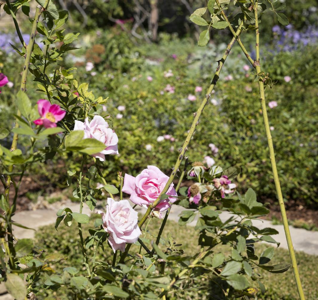
In front of the pergola Page devised an L-shaped shallow pond with carefully selected waterlilies, setting it almost at the level of the surrounding blue-grey paving, a placing he was also using for the fine pools in the PepsiCo garden. A clipped box bed with interlocking rectangular patterns was then devised in the foreground. To one side were rose beds, especially one of white Iceberg roses, also evident in Page’s garden for the Frick museum, but many older varieties were planted too, from white Madame Hardy to pink-peach Gruss an Aachen. Further beds were packed with white triumph tulips, always Page’s favorites, and white and blue pansies for spring and blue and white Salvia farinacea for summer and beside them, a box edged bed of clipped grey cotton lavender and then a profusion of herbaceous plants too. Anne had suggested a garden of white flowers only, fashionable at the time, but Page rejected it as “boring.” Instead, he edited the colors of the borders, centring them on tones of pink, white, blue, and silver.
When Anne protested that he was placing the plants too closely together, he replied that he had to, as he might not have much life left. He also told the gardeners to forget all they had learned at horticultural school: he had his own proven range of plants, distinctive demands for pruning and an exact vision for placing each item. They watched in admiration as he laid out thousands of plants, never at random and seldom consulting the dense plans which he had drawn in detail but carried in his head. Not everything survived the extreme heat, let alone the freakishly cold winter of 2020-21. Flower gardens are a process, constantly changing, but enough survives to convey Page’s vision.
On a long view the lower garden plays with elements Page had already devised for another contained masterpiece, his garden at Silvio Pellico near Turin, designed in 1956. It had used the same interlocking rectangular patterns of box, tightly clipped cotton lavender and the green verticality of Italian cypresses. The Bass garden integrated these elements in a new way without falling into an eclectic cluster of styles, a failing Page explicitly criticised in crucial pages of his Education of a Gardener as “a ragbag of style
Page’s garden for Villa Silvio Pellico on the outskirts of Turin.
Page’s garden for the Bass Residence. Photograph by Steve Freihon.
has nothing to do with real style.” Nonetheless, the garden’s three sections are very diverse: woodland and water, flowery profusion and box hedging, a restrained tying of the modern house into its setting.
For Anne the garden became a new preoccupation, eventually needing five gardeners to maintain it. She described Page as her mentor and teacher, one who pushed her to look up every plant he chose and to visit the gardens in Italy and England he most admired. She soon looked on him as a dear friend too, one who grew to share her fondness for high fashion and scented geraniums and for afternoon tea during his long visits to her home. He even began to help her daughter with her homework. For Page the house and its art became an increasing fascination. He did not copy any of the art’s abstract patterns in his plantings, unlike the style devised by his great contemporary, Roberto Burle Marx in Brazil, also a practicing artist. Nonetheless, the relation between the Bass garden and the house’s art is important.
Out of the apparent diversity of the garden’s three sections, Page devised unity and harmony. He always stressed the importance of getting to know the “genius” of a place before designing a garden for it, but there was a further level to his endorsement of this old principle. Page was a committed supporter of the mystical theories of George Gurdjieff, the Armenian-Greek emigré from revolutionary Russia whose magnetic presence and imposing, but bogus, teachings found devoted followers in polite society, especially in France in the 1920s and 1930s. In his Education of a Gardener, Page hints enigmatically at the welcome new realisation that “a re-exploration of man’s psychic world,” not only by Freud but by “spirituality, occultism, alchemy, astrology,” means that a “new approach to man, to nature, to God is very slowly emerging.” He is partly alluding to Gurdjieff’s so-called “fourth way” and its continuance by his aide, P.D. Ouspensky. In wartime Page traveled on government business from Egypt to Sri Lanka, noting the style of landscapes and gardens, becoming aware of the “human dignity” in Islamic societies and “humility and love working like yeast in the daily commerce of life” in big Indian cities but also keeping Gurdjieff’s mystical and Orientalist theorizing and iconic reference points in mind.
In a monastery near Cairo and in wartime Damascus Page believed he “had already caught glimpses of the Islamic approach to God.” After the war he agreed to marry Gurdjieff’s daughter with whom he had a son. He then became a convinced supporter of the mystic theorizing of Idries Shah, another pupil of Gurdjieff, which passed off as “Sufism” and attracted many readers, but no scholars, to its notion of a hidden esoteric wisdom in the world.
In an article in 1983, just after the Bass garden was planted, Page wrote, “I first attack a problem as an artist; my preoccupation is with relationships between objects, whether it is a wood or a pond, a rock or a plant or a group of plants.” He went on to say how each object “sends out beyond its physical body vibrations which are specific to itself.” This notion traces back to Gurdjieff’s teachings on cosmic rays and influences, ideas which are utterly unfounded and rank as non-scientific nonsense. So do the theories of Idries Shah, an aristocratic Afghan, the son of a similarly fantasising and fabricating father. Artists, striving for a concealed reality, have sometimes had an affinity with these theories of harmony and vibrations, including the architect Frank Lloyd Wright, a devotee of Gurdjieff, and Doris Lessing who was fascinated by Idries Shah’s book on “Sufism,” as he presumed to call his inventions.
In the Bass residence, Page saw fine work by Mark Rothko, no Sufi nor Gurdjieffite but an artist who was fascinated by mythology, the “religious” experience, he said, of artistic creation and a “spirituality” underlying the material world. He could also enjoy work by Agnes Martin, who was drawn to ethical Buddhism, so far as she understood it, and the value of silence and introspection as approaches to the attainment of harmony. Unfounded pseudo-theorizing can inspire and sustain great artists. Page insisted that garden designers “need nourishment,” through looking, reading, talking. His engagement with pseudo-science fit his search for harmony and unity in the spaces he designed. It helped to make his work into art, aptly exemplified at the Bass residence which he grew to enjoy so much.
Art from the Bass House
MAX CARTER
In The Education of a Gardener (1962), the landscape designer Russell Page shared his cardinal professional rule: “I try to put myself in my client’s place and imagine that I have to spend the rest of my life with the garden which I am going to lay out—in other words, that I am designing and planting as though for myself. This at once clears the field of all kinds of fancies and conceits. If I insist on indulging in them they will either remain to reproach me or else be cleared away as evidence of my incompetence.” No client could ask for more, and it was in this spirit that Page, the architect Paul Rudolph—who may have found it harder to resist the “fancies” and “conceits” he was known occasionally to indulge in—and the Basses themselves approached the Bass House.
Page quipped that his great book might have been called Other People’s Gardens. He had his own garden “only once and very briefly... a plot behind a London house.” Rudolph’s finest works were, conversely, nothing if not personal. For the Yale Art & Architecture Building (1958-63), he was, his biographer Timothy Rohan has written, “in the unusual position of designing a building to house the department he chaired, to some degree acting as his own client.” And his home at Beekman Place was the sort of self-directed experiment where “guests at his occasional parties sometimes had vertiginous reactions; one woman fainted and was removed on a stretcher. Wine glasses set down on what appeared to be solid surfaces often plunged and shattered on distant floors below.”
...the works of art from the Bass House equaled and even elevated Rudolph’s sublime interiors and Page’s garden beyond.
Neither, of course, was conceit-free: see the Beaux-Arts plaster casts of ancient reliefs that dotted the A & A Building or the wall-length deodorant billboard behind his fur-covered bed in New York. But Rudolph House, where he lived in New Haven, did achieve the sort of restraint Page espoused. As with the Bass House, its airy living room was white, double-height and marked by the striking juxtaposition of rail-less staircase and piano.
The genesis, discipline and beauty of the Bass House and Garden are the subjects of the preceding essays. “If [you are] to have ‘magic’,” Page advised, “you have to take your work further and give it an extra dimension.” The Basses did not leave magic to others. Somehow, the works of art from the Bass House equaled and even elevated Rudolph’s sublime interiors and Page’s garden beyond.
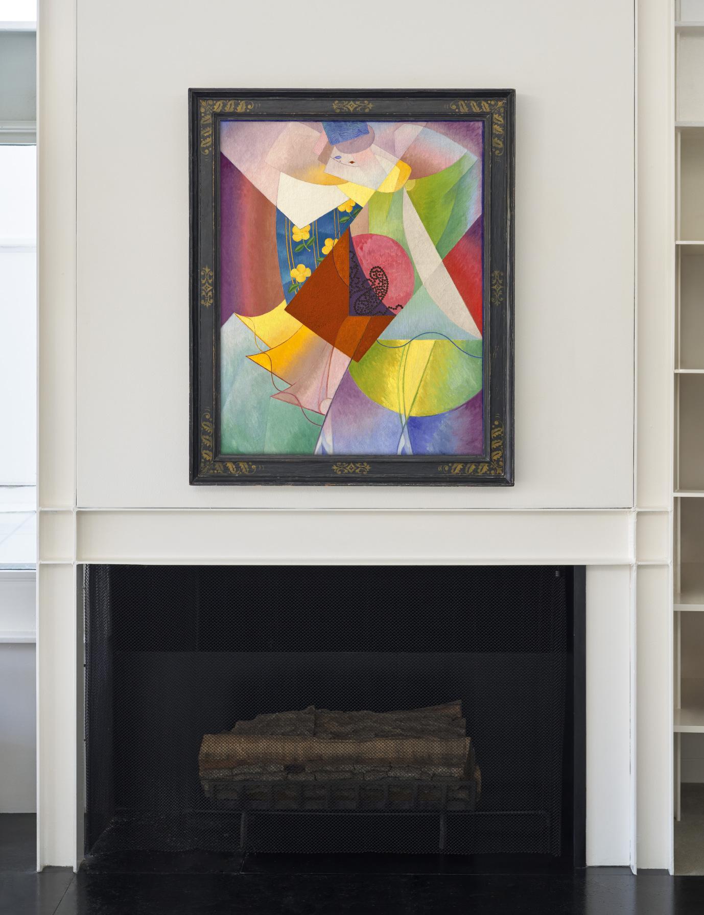
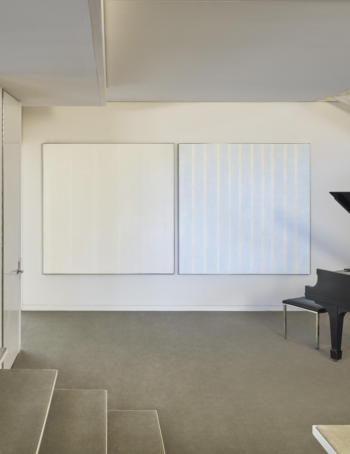
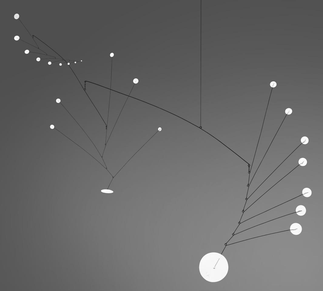
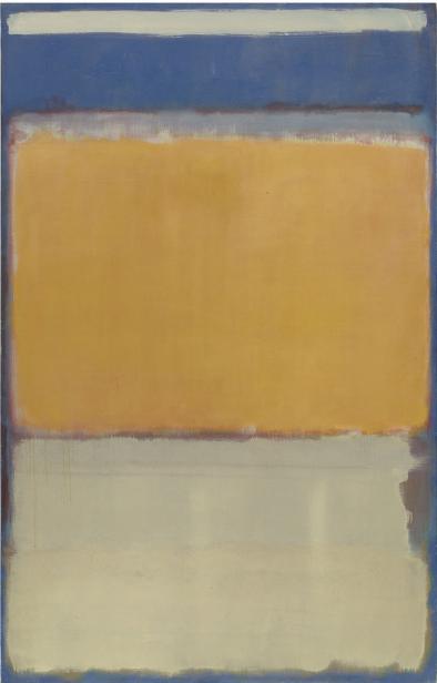
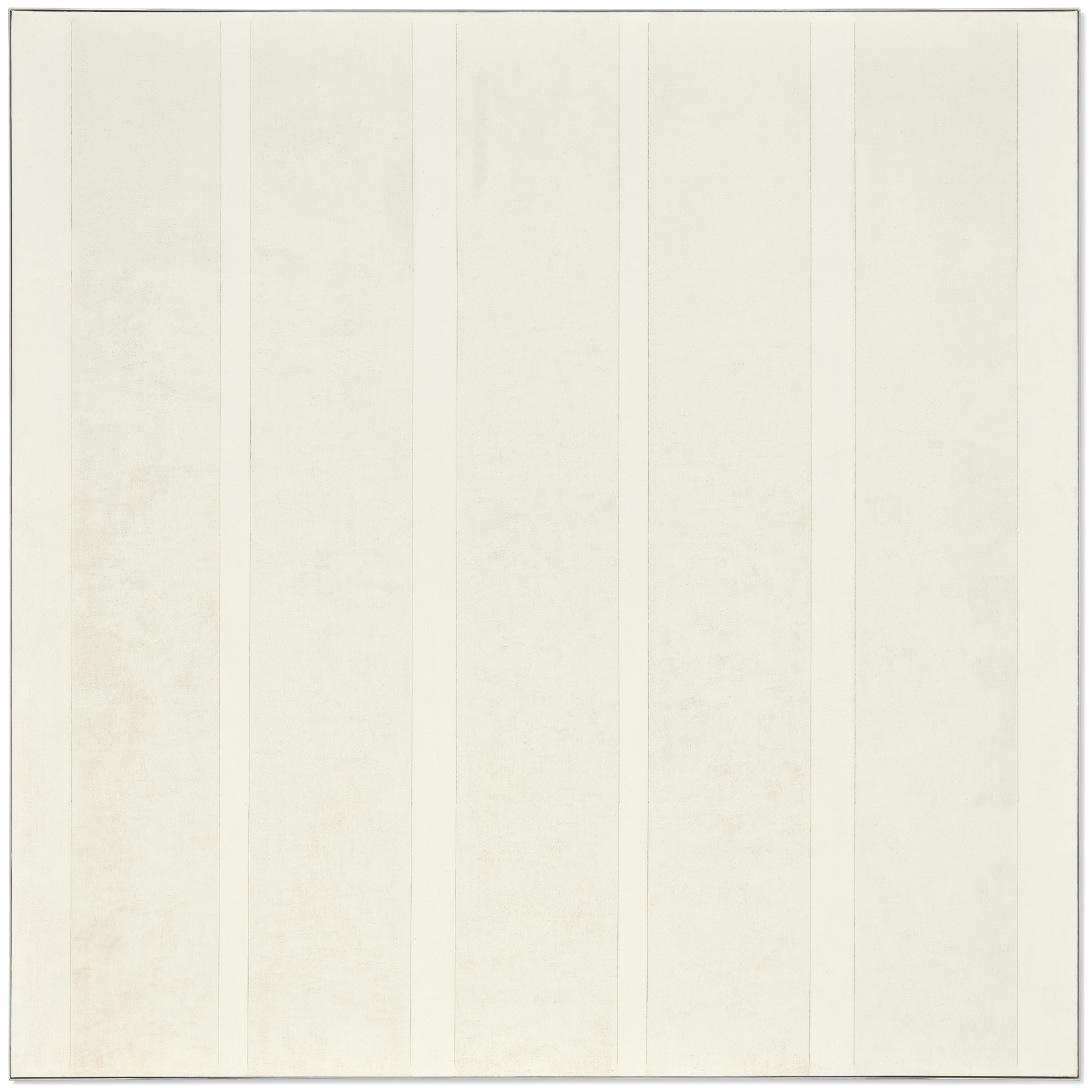
Calder’s 1949 Gypsophila, suspended above the conversation pit, echoed the Bass House’s poise, movement and deceptively simple engineering. (Severini’s 1915-16 dancer, in the upstairs library, is imbued with the same dynamism and balance.) Page no doubt approved, too, of its floral titling (more commonly, Baby’s Breath). The Rothko’s forms hovered between the floating staircase and piano. Rothko was known to play, and in the 1930s made it his habit to paint with the radio tuned to WQXR, New York’s classical music station. The two Martin oils placed nearby, Untitled #2 and #11, date to 1975, around the time the Bass House neared its completion. A stillness and, as with the house, asymmetry mark out this corner.
The genius of the Bass House was modernism’s triumph over the traditions and scale of easel painting.
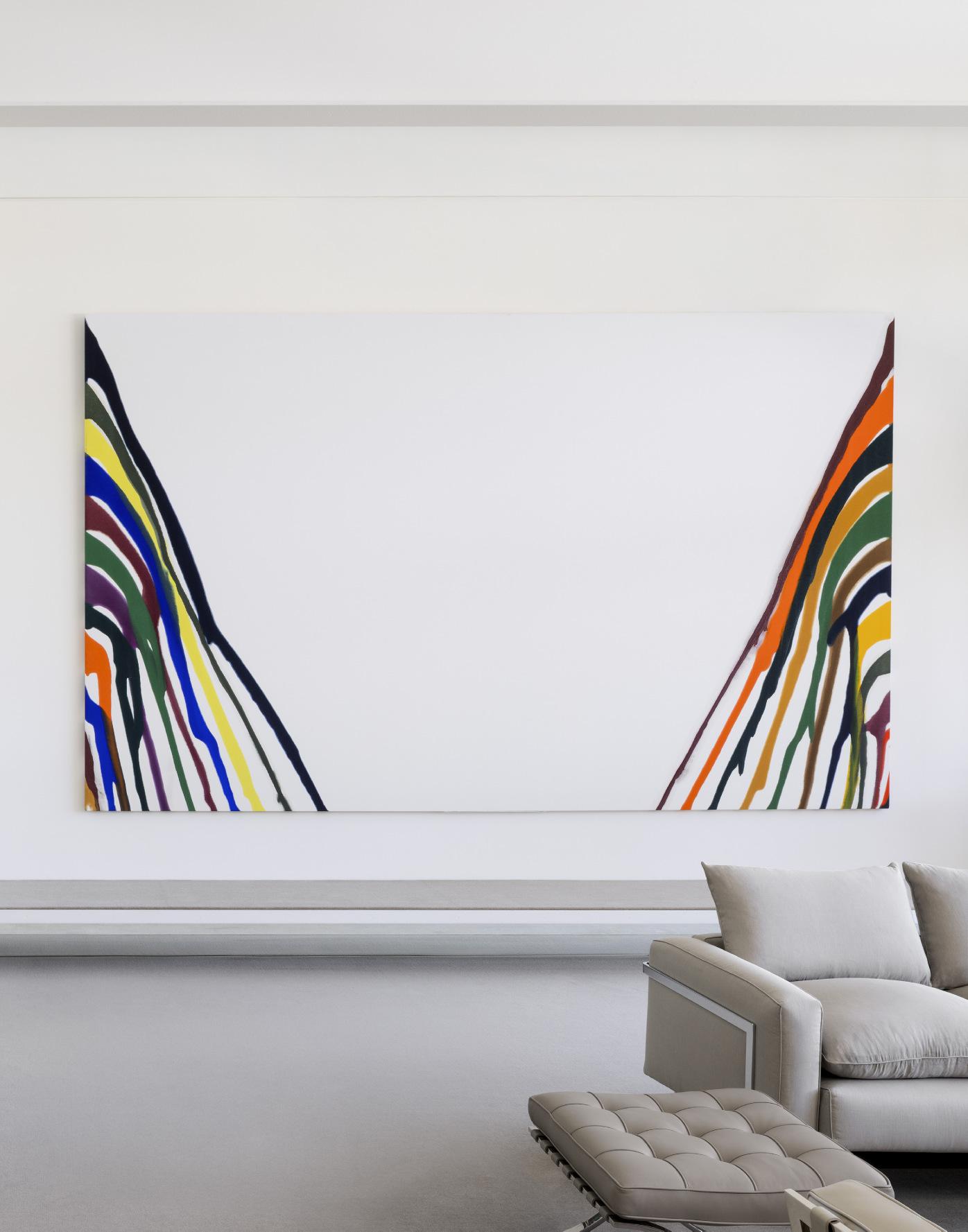
Stella’s Itata, hanging along the staircase, mirrored the house’s straight-edged purity and—in its low, exquisite sheen—subtle finishes. It formerly belonged to Rudolph’s friend and peer, Philip Johnson. Stella’s colossal Firuzabad III (1970) softens, bends and brightens the artist’s line, but its basis also lies in architecture, in its case the concentric layout of the Iranian city of the same name.
“Somewhere in [every] garden lurks the genius loci,” Page observed in his Education. “Like the detective in a thriller, I have to decide from the data surrounding me, which are the right clues to follow up, what I can suppress and what veils the true character of that particular place.” The genius of the Bass House was modernism’s triumph over the traditions and scale of easel painting.
Rothko commented on his evolving practice and perspective in 1951, the year he painted the Bass canvas. While “historically the function of painting large pictures is something very grandiose and pompous,” his own were “very intimate and human... To paint a small picture is to place yourself outside your experience, to look upon experience as a stereopticon view or with a reducing glass. However you paint the larger picture, you are in it. It isn’t something you command.” A dozen years later, one of the chief criticisms of Rudolph’s A & A Building would be the modest size of its low-ceilinged top-floor studios. “Rudolph had not anticipated that studio spaces would have to become bigger to
“However you paint the larger picture, you are in it. It isn’t something you command.”
MARK ROTHKO
accommodate large-scale canvases,” Mr. Rohan relates, “in part because of the delayed introduction of abstract expressionism to Yale. Albers, the chair of the art department, had resisted its introduction.” Richard Serra, Nancy Graves and Chuck Close never painted on-site.
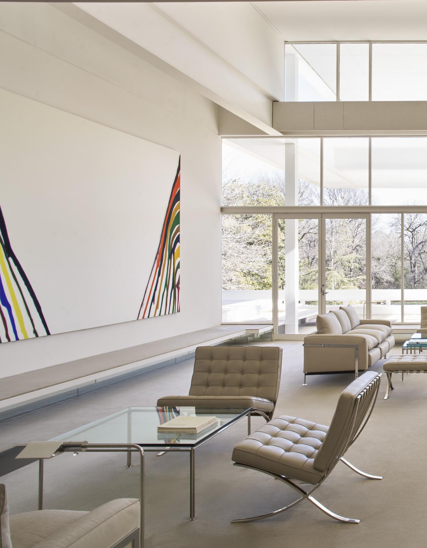
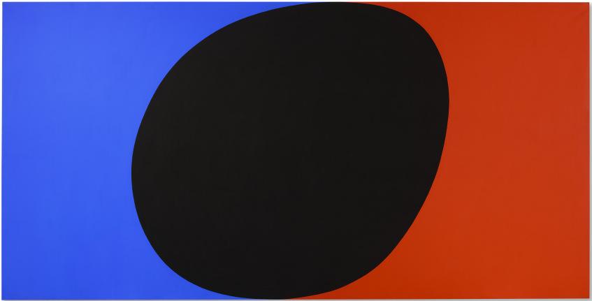
Rudolph made no such mistake in the Bass House. The monumental Kelly and the Louis and Stella (Firuzabad III) that faced one another in the living room are, in this way at least, the Bass House’s most emblematic objects, articulating as they do the possibilities of post-war art and architecture.
To walk through the Bass House and Garden was to enter the intimate worlds of Page, Rudolph, the Basses and the artists they collected, and to marvel at their faultless integration. Page became and remained close with Anne Bass until his death in 1985. Rudolph’s Bass-commissioned towers in Fort Worth catalyzed the projects in Asia that would give shape to his career in the 1980s and 1990s. The Sid Bass-led restoration and renaming of the A & A Building (to Rudolph Hall) in 2007-08 punctuated their fourdecade association. Sid Bass had first encountered Rudolph at Yale as an undergraduate in the early 1960s. A contemporary review of the A & A Building suggests the wonders of the Bass House that were to come: “few who visit this building can resist... its light, its inventive furnishings, its use of art work.”
20th Century Evening Sale 12 May 2025
Alfred Stieglitz at 291, circa 1911-1917. Photographer unknown. Philadelphia Museum of Art.
291 and the Future
ANNABEL
MATTERSON
Photographer, collector, gallerist and patron, Alfred Stieglitz understood modernity in all its forms. From the turn of the century he tirelessly strove to make and exhibit art that stood at the forefront of Modernism. Though, while he recognized New York as the future home of the avant-garde, most of the city’s inhabitants did not. Modern art was reviled, ridiculed and largely ignored in these opening decades of the twentieth century. Through his gallery, 291, Stieglitz sought not only to exhibit contemporary art, but to educate and inform audiences who had little other opportunity to see the latest artistic developments from both home and abroad.
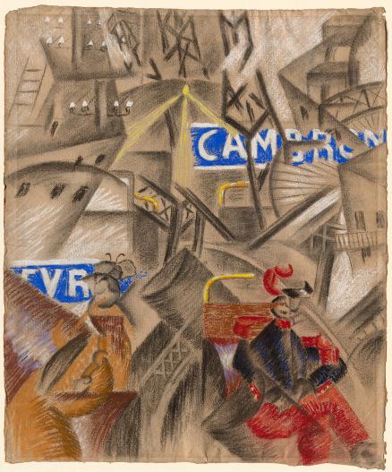
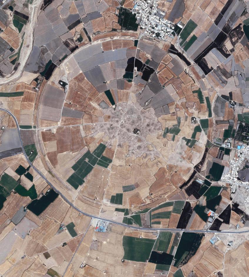
Stieglitz’s description of New York as a new kind of modern metropolis sounds as if it could have come from the mouth of a Futurist. Though the home of the skyscraper and the Brooklyn Bridge would have seemed the apotheosis of the Futurist group’s deification of the modern city, it was not until 1917 that Futurism first appeared in New York. In the spring of this year, the work of Gino Severini was shown at 291. This would be the gallery’s final year of operation—this inaugural exposition of Futurism a fitting tribute to the man who had brought the “future” of art to America.
Comprising twenty-five works, Severini’s 291 exhibition showed a selection of oils, drawings and pastels which had been chosen by the artist himself. Ranging from his signature Futurist works to his more recent classically-inspired Cubist compositions,
“You speak of New York as an unspeakable place. It is truly that. But it is fascinating. It is like some giant machine, soulless, and without trace of heart… Still I doubt whether there is anything more truly wonderful than New York in the world just at present.”
ALFRED STIEGLITZ
the exhibition conveyed the development of Severini’s work from 1912 through 1916, featuring his dancers, scenes of Paris, still lifes and a recent mother and child composition. By 1917, the artist was turning away from the central tenets of Futurism to instead embrace the past. As a result, the exhibition captured an important moment in Severini’s career, presenting his own carefully constructed vision of his art at this time.
In the introduction to the exhibition, which was also published in The Sun on 11 March 1917 (the catalogue of the show does not seem to have survived), Severini wrote, “In the works that I exhibit, one may discern the search for a balance between reason and sensibility. I have wanted also, while obeying the tendency toward composition which I have inherited from the old Italians, to attain a new classicism through the construction of the ‘picture’… And so I have in an orderly and logical way made use of the elements acquired during several years of research, and I have applied them to a ‘subject’” (quoted in J.M. Lukach, “Severini’s 1917 Exhibition at Stieglitz’s ‘291’” in The Burlington Magazine, vol. 113, no. 817, April 1971, p. 205).
The exhibition was a triumph. Around half of the works in the show were sold and the press was mostly positive. “Masterly execution defines them all,” one review commended (quoted in ibid., p. 196). “A most happy surprise,” Severini wrote to Stieglitz in July 1917,
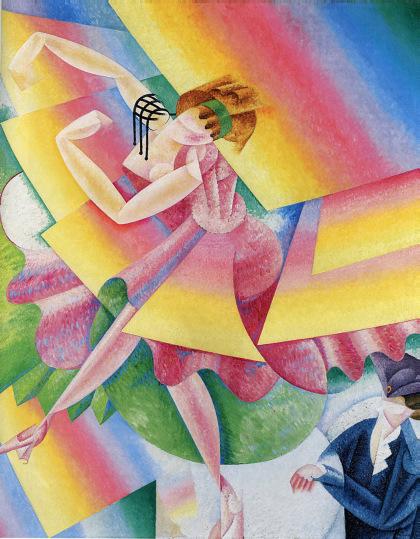
Gino Severini, Danseuse, 1915. Private collection. Sold London, 25 June 2008, £15,049,250 GBP ($29,659,538 USD).
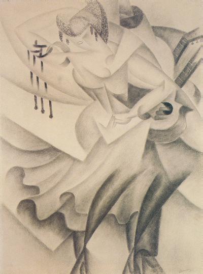
Gino Severini, Guitariste et danseuse espagnols, 1915. The Art Institute of Chicago.
291, Fifth Avenue. 1917. Alfred Stieglitz/Georgia O’Keeffe Archive, Yale Collection of American Literature. Beinecke Rare Book and Manuscript Library.
“I cannot tell you how happy I am of this veritable success that surpassed my hopes and that I owe to your great activity and authority” (quoted in ibid., p. 204).
Severini’s Danseuse was among this carefully selected group. It was acquired shortly after the show by the legendary collector, lawyer and Armory Show organizer, John Quinn, who was, along with Stieglitz, one of the most instrumental figures of the art world at this time. Quinn purchased a total of six oils, three pastels and a drawing featured in the exhibition, a selection that demonstrated the breadth of Severini’s subjects. Danseuse remained in Quinn’s collection until his untimely death in 1924, at which point it was acquired from his estate sale held three years later by civil rights attorney Arthur B. Spingarn.
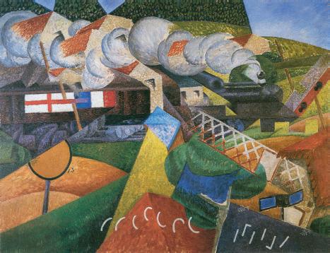
Quinn bought this vivid, radically abstracted scene of a dancer mid-performance together with two other oils of the same theme: the first, also titled Danseuse, was latterly sold in 2008, when it made the world record price for the artist. The other is likewise in a private collection. A drawing, Guitariste et danseuse espagnols, is now housed in The Art Institute of Chicago. Alongside these dancers, Quinn also acquired two of Severini’s famed scenes of military trains speeding through the countryside, one of which, Train de la Croix Rouge traversant un village is now in The Solomon R. Guggenheim Museum, New York. The earliest work from the group, the 1912-1913 Métro-Grand Roue-Tour Eiffel, a deftly rendered scene of urban life, today resides in The Cleveland Museum of Art.
The story of how Severini’s work came to be shown at 291 in many ways tells that of Stieglitz himself. First and foremost a photographer, by the turn of the century he was considered one of the leading protagonists of the medium. In 1902 he founded the PhotoSecession, a group for avant-garde photographers. A year later, the first edition of his periodical, Camera Work, was published. Quickly the need for a space to show Stieglitz’s work and that of his contemporaries became apparent. Together with Edward Steichen, in 1905, they opened what was first called the Little Galleries of the Photo-Secession. In a series of modest rooms at 291 Fifth Avenue, some of the most cutting-edge work of the time was shown.
Soon, the gallery’s exhibitions expanded from showing solely photography to include all art forms. Stieglitz passionately believed that the American public should have the
“Futurism… This kind of work which nobody really knows in New York.”
MARIUS DE ZAYAS
opportunity to see, and by extension, understand and appreciate, contemporary art.
More than a commercial enterprise, the gallery, which would later become know simply by its address, 291, was from the very start dedicated to showing European and American Modernism. As he described in Camera Work: “It should be remembered that the Little Gallery is nothing more than a laboratory, an experimental station, and must not be looked upon as an Art Gallery in the ordinary sense of that term” (quoted in op. cit., 1973, p. 55). The space reflected this spirit of discovery: the small rooms lent an intimacy, inviting viewers to contemplate the art works free from artifice or distraction. With walls covered in neutral-colored burlap, the simplicity of the light-filled rooms was in itself novel when compared to the dark, imposing grandeur of other established turn-of-thecentury galleries. Stieglitz’s installation photographs of the various exhibitions are indeed artworks in themselves, as well as invaluable records of the daring works he chose to show.
In 1908, 291 held the first exhibition of Auguste Rodin’s drawings in America. Steichen, who was then based in Paris, was close to the sculptor, whose work was by this time well known in New York. His drawings, however—expressive, erotic, sometimes near abstract renderings of the female form—were not. The controversy created by this exhibition would continue as the gallery’s constantly varied and provocative shows ensued. This same year a number of Henri Matisse’s works on paper were shown. As Camera Work described: “The New York ‘art-world’ was sorely in need of an irritant and Matisse certainly proved a timely one” (ibid., p. 60).
Brancusi exhibition at 291, 1914. Photograph by Alfred Stieglitz.
Picasso-Braque exhibition at 291, 1915. Photograph by Alfred Stieglitz.
The gallery continued with a series of “firsts.” In 1909, the first exhibition of contemporary American artists, John Marin and Alfred Maurer, was held, followed by the inaugural showing of Henri de Toulouse-Lautrec’s work. A year later, Stieglitz returned to the art of his peers, organizing a landmark exhibition of nine American artists, including Arthur Dove, Marsden Hartley, Marin, Steichen, Max Weber, and others. In 1910, the first ever exhibition of Henri Rousseau anywhere in the world was held at 291. A year later, a group of Paul Cezanne’s watercolors was displayed before Pablo Picasso’s debut in America.
Despite often vitriolic critical hostility, Stieglitz never ceased to exhibit art which he felt was relevant. About the Picasso exhibition one critic wrote: “The display is the most extraordinary combination of extravagance and absurdity that New York has yet to be inflicted with, and goodness knows it has had many these two seasons past. Any sane criticism is entirely out of the question; any serious analysis would be vain. The results suggest the most violent wards of an asylum for maniacs, the craziest emanations of a disordered mind, the gibberings of a lunatic!” (ibid., p. 84). Another critic, Thomas Craven, said that 291 was a “bedlam of half-baked philosophies and cock-eyed visions” (quoted in K. Hoffman, Alfred Stieglitz: A Beginning Light, New Haven, 2004, p. 231).
Sales were not the primary purpose of Stieglitz’s exhibitions. If someone bought an artwork, it was because Stieglitz saw that they understood and appreciated it in the way that he believed it should be valued. Rather than regarding his role as “selling” a work of art, he believed he was “placing” it with someone who would look after it for future generations. He often bought any unsold works from an exhibition—which were in many cases numerous—so that they were not all returned to the artist. “What greater pleasure is there than to create opportunities to those who are deserving?,” he wrote to Hartley (quoted in P. Rose, Alfred Stieglitz: Taking Pictures, Making Painters, New Haven, 2019, p. 111).
Stieglitz believed that 291 was contributing in part to a larger plan—to raise attention and increase understanding and appreciation of modern art. In 1911, he wrote to the editor of the Evening Sun imploring The Metropolitan Museum of Art, then the leading art institution in New York, to “give [Americans] a chance to study the work of Cezanne and
“The pictures looked very well in the little rooms. And I am sure you would have enjoyed how they were presented. From every point of view the exhibition was a success.”
ALFRED STIEGLITZ TO GINO SEVERINI
Van Gogh; although deceased, their work is the strongest influence on modern painting. I firmly believe that an exhibition, a well-selected one, of Cezanne’s paintings is just at present of more vital importance than would be an exhibition of Rembrandts” (quoted in op. cit., 1973, p. 85).
At the end of this same year, Stieglitz reflected, “I have undoubtedly had the most vital year in my career… [The Picasso exhibition] was possibly the most interesting yet held there, and that is saying a great deal, when one remembers what a remarkable series of shows have been held there; undoubtedly the most remarkable ever held in this country as far as art is concerned… Europe has nothing similar to our place. There have been greater, larger exhibitions there but there never has been such a series with such a definite purpose… There is certainly no art in America today; what is more, there is, as yet, no genuine love for it… it’s a pity I can’t afford more time for this branch of work [his photography]; but daily I realize, more and more, that in sacrificing my own photography I have gained something I could have never possessed in any other way—and that is certainly a bigger thing” (ibid., pp. 85-86).
With the Armory Show of 1913—officially the International Exhibition of Modern Art— Stieglitz saw an opportunity for his aims to be realized. He was invited to be an Honorary Vice-President, though was not responsible for choosing works to be included.
Gino Severini, Nature morte, 1916. The Art Institute of Chicago.
Gino Severini, Train de la Croix Rouge traversant un village, 1915.
The Solomon R. Guggenheim Museum, New York.
He implored his fellow New Yorkers to visit, writing in a newspaper of the time, the New York American: “If you still belong to the respectable old first primer class in art, you will see there stranger things than you ever dreamed were on land or sea—and you’ll hear a battle cry of freedom without any soft-pedal on it” (ibid., p. 95). While the Armory Show is often regarded as the first great exposition of Modernism in America, many of the artists included in this notorious display had already been shown at 291—a reflection of Stieglitz’s prescience and fervent belief in the importance of his artistic endeavor.
The outbreak of the First World War curtailed Stieglitz’s trips to Europe in search of new artists for his exhibition. Instead he relied on friends and acquaintances to introduce new artists and ideas to him. These included Walter Pach, a key champion of modern art at the time, and Marius de Zayas, an artist and later gallerist whom he had met some years prior. It was in the summer of 1916 that De Zayas wrote to Stieglitz, including photographs of Severini’s work. “They were brought to me by Pach,” he described in his letter, “who is a friend of Severini and who received a letter from this artist asking him to see if it would be possible to have an exhibition of his work in New York” (quoted in op. cit., 1971, p. 196). He thought that Stieglitz would relish exhibiting “Futurism… this kind of work which nobody really knows in New York” (ibid., p. 196).
Pach had met Severini in Paris and invited him to take part in the Armory Show. Severini agreed on the condition that his Futurist comrades be included too. In the end, however, the movement’s leader and mouthpiece, Filippo Tommaso Marinetti, decided that the Futurists would not participate in the show. Two years later, the group, including Severini, did contribute works to the Panama Pacific Exposition held in San Francisco, however, poor placement in an annex pavilion meant that the Futurists remained largely unseen, with little publicity or comment. Having realized the error of not accepting Pach’s offer, Severini remained keen to show his work in New York. In September, De Zayas wrote to Stieglitz again, confirming that he had sent his letter offering an exhibition on to the artist’s intermediary, Pach, writing, “I believe it will be a very good thing to show the futuristic tendencies, so the people at least will not take every manifestation of modern art as Futurism” (ibid., p. 199).
Severini’s exhibition perfectly fulfilled De Zayas’s desire to differentiate Futurism from other so-called “isms” of the avant-garde. While featuring an array of works that depicted the Futurists’ signature subject, the modern city, as well as Severini’s famed dancers, the exhibition also showed the distinctive visual language that the artist had developed to convey the sensations of contemporary life. With a combination of line and color, he captured everything from speeding trains to the movement of a dancer’s skirt amid the noisy atmosphere of the dance hall. Severini imparted movement and dynamism with his often frenetic arrays of intersected lines that construct so many of his compositions.
Writing about the exhibition, Charles Caffin described the artist’s deft use of line in a chalk drawing of a dancer, “Every line is instinct with the volatility of life, some responding to one another, others in opposition, as the movement evolves and recoils and evolves again in continuity” (“Severini’s Work Seen at ‘291’” in New York American, 12 March 1917). Color was also employed by the artist to create the often multivalent viewpoints and overwhelming impression of a multitude of sensations. By contrast, a number of Severini’s later works, especially from 1916, demonstrated a more restrained approach: instead of the whirling tones of his Futurist works, his compositions had a more planar, cubist construction, which showed the direction Severini would continue to move towards. “As a group,” Anne Coffin Hanson has written, “they mark the conclusion of the Futurist moment” (Severini futurista, 1912-1917, exh. cat., Yale University Art Gallery, New Haven, 1995, p. 26).
Aside from Quinn’s purchase of ten of the twenty-five works in the exhibition, records show that two others were acquired by individuals—one of which was likely Arthur B. Davies—while the remaining thirteen were kept by Stieglitz (listed in op. cit., 1971, p. 199). After his death, his wife, Georgia O’Keeffe, ensured that his collection was left to American institutions. As a result, most of Severini’s exhibited works are now housed in museums including The Art Institute of Chicago, The Metropolitan Museum of Art, and The Museum of Modern Art, New York.
“Europe has nothing similar to our place. There have been greater, larger exhibitions there but there never has been such a series with such a definite purpose.”
ALFRED STIEGLITZ
Not long after the close of Severini’s show, America entered the First World War. Stieglitz wrote to Severini, apologizing that he had been waiting “for the moneys due to you on your pictures. I have been urging the purchasers to let me have them so that I could forward them to you, telling them of your needs. But things over here are in a very unsettled condition. The War has disturbed the American equilibrium tremendously. And the American optimism, for which it has always been so famous, has also received a rude shock… The pictures looked very well in the little rooms. And I am sure you would have enjoyed how they were presented. From every point of view the exhibition was a success” (quoted in op. cit., 1973, p. 114).
In many ways echoing his country’s sentiments, Stieglitz decided to close 291 not long after Severini’s exhibition. His last show was the work of O’Keeffe. The zealous embrace of the future, so manifest in the Futurists’ work and in Stieglitz’s own artistic enterprise was brought into question by the war. Though Stieglitz’s career—both his photography and his work as a gallerist—would continue to flourish, never again would the spirit of unabashed optimism that so shaped 291 be as prevalent. Severini’s exhibition was therefore a fitting finale to both the artist’s own life as a Futurist and to the revolutionary operations of 291.
GINO
SEVERINI
(1883-1966)
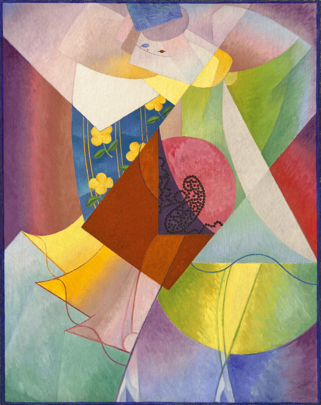
Danseuse
signed 'G. Severini' (lower right) oil and sequins on canvas
36º x 28æ in. (92.2 x 73 cm.)
Executed circa winter 1915-1916
$1,500,000-2,500,000
PROVENANCE:
Alfred Stieglitz, New York (acquired from the artist, March 1917).
John Quinn, New York (acquired from the above, 10 April 1917); Estate sale, American Art Association, New York, 10 February 1927, lot 360.
Arthur B. Spingarn, New York (acquired at the above sale); Estate sale, Sotheby Parke-Bernet, New York, 27 April 1972, lot 92.
M. Knoedler & Co., Inc., New York.
Stephen Mazoh & Co., Inc., New York (by 1974).
Acquired from the above by Anne H. and Sid R. Bass, 2 January 1980.
EXHIBITED:
Paris, Galerie Boutet de Monvel, Gino Severini: 1re exposition futuriste d'art plastique de la Guerre et d'autre œuvres antérieures, January-February 1916, no. 14 or 15.
New York, 291, Drawings, Pastels, Watercolors and Oils of Severini, March 1917, no. 6.
Dusseldorf, Städtische Kunsthalle, Wir setzen den Betrachter mitten ins Bild: Futurismus 1909-1917, Malerei, Skulptur, Zeichnung, Musik, Architektur, Fotodynamik, Film, Bühne, March-April 1974, no. 158.
New York, The Metropolitan Museum of Art, Summer Loan Exhibition, July-August 1979.
New Haven, Yale University Art Gallery and Fort Worth, Kimbell Art Museum, Severini futurista: 1912-1917, October 1995-April 1996, pp. 113, 130 and 133-134, no. 31 (illustrated in color, p. 115).
LITERATURE:
J.M. Lukach, "Severini's 1917 Exhibition at Stieglitz's '291'" in The Burlington Magazine, vol. 113, no. 817, April 1971, pp. 197, 199, 203 and 206.
J.M. Lukach, "Severini’s Writings and Paintings 1916-1917 and His Exhibition in New York City" in Critica d’Arte, vol. XX, no. 138, November-December 1974, pp. 74 and 76-77 (illustrated, p. 62).
J. Zilczer, "The Noble Buyer:" John Quinn, Patron of the Avant-Garde, Washington, D.C., 1978, p. 187.
D. Fonti, Gino Severini: Catalogo ragionato, Milan, 1988, p. 207, no. 255 (illustrated).
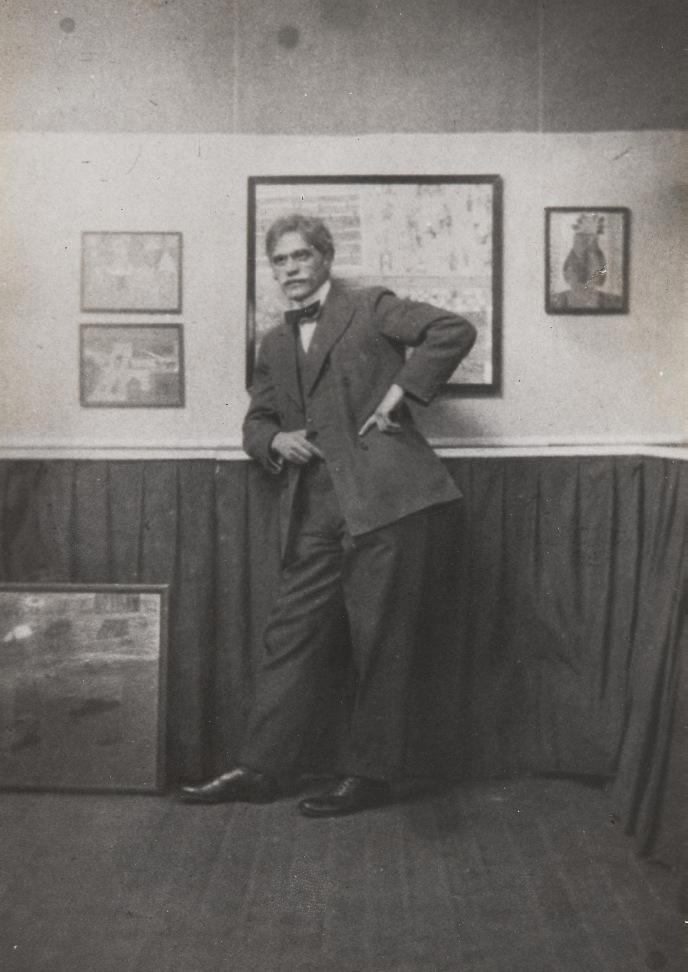
Gino Severini attending the opening of his exhibition at the Marlborough Gallery, London, 7 April 1913.
GINO SEVERINI
Danseuse
CIRCA WINTER 1915–1916
The modern dancer, caught up in the rhythm of the latest fashionable routine, became the central focus of Gino Severini’s work following his move to Paris in the opening decade of the twentieth century. Dazzled by the feverish energy and fast pace of the buzzing metropolis, the young Italian came to associate dynamism not only with the innovations of modern machines and new technology, but also the pulsating, magnetic energy of the modern city. In particular, Severini believed that the vitalistic frenzy that emerged at night in the bars, dancehalls, and cabarets of Paris perfectly encapsulated the modern experience, as professional and amateur dancers alike crowded into the most popular nightspots to perform the latest popular routine. This glittering and engulfing atmosphere, with its riotous mix
of movement, rhythm and noise, captured the artist’s imagination instantly, and—thanks to his own dancing talent—he quickly became a frequent visitor to the most thrilling nightclubs in Paris. In his autobiography, the artist described the heady environment of these nocturnal revelries, recalling: “they were carnivalesque parties with carriages full of beautiful masked and undressed women, with showers of confetti, multi-colored streamers, etc. The atmosphere was one of total frenzy, undoubtedly animated by quantities of champagne” (The Life of a Painter, trans. J. Franchina, Princeton, 1995, p. 54).
Focusing his attention on the figures that surrounded him on his nightly escapades, Severini began a series of compositions focusing
“A picture will no longer be the faithful reproduction of a scene, enclosed in a window frame, but the realization of a complex view of life or things that live in space…”
GINO SEVERINI
on the dynamic movements of various forms of dance, in an effort to capture a sense of the heady joie de vivre that underpinned his experiences in the French capital. As the artist explained, his aim was to capture an impression of being in these dancehalls and nightclubs: “A picture will no longer be the faithful reproduction of a scene, enclosed in a window frame, but the realization of a complex view of life or things that live in space…” (quoted in S. Fraquelli, Gino
Severini: From Futurism to Classicism, exh. cat., The Estorick Collection, London, 2000, p. 5). Like his Futurist colleagues, he sought to capture the very sensation of this movement in his paintings, employing complex shifting viewpoints, fragmented forms, and intricate networks of lines to convey the speed and power of the human body in motion.
Painted over the winter of 1915-1916, Danseuse is an elegant summation of Severini’s evolving aesthetic at this time, as he began to experiment with a radical fusion of Futurist and Cubist idioms. Stepping away from the complete dissolution of form which had marked his most recent abstractions, Severini places the figure once again at the center of the composition, building the dancer’s form in a series of interlocking, semi-abstract planes of subtly modulated color. The effusive, bright palette enlivens the entire picture surface, and captures a sense of the energy that emanates from the dancer during her performance. Severini wanted his colors “to be diamonds and to be able to make abundant use of them in my pictures so as to make them gleam with light and richness”
Gino Severini, Danseuse à Pigalle, 1912. Baltimore Museum of Art.
Gino Severini, Danseuse, 1915-1916. Pallant House Gallery, Chichester.
(quoted in D. Fonti, Gino Severini: The Dance 1909-1916, exh. cat., The Peggy Guggenheim Collection, Venice, 2001, p. 15). Here, the vibrant tones are complemented by a new sense of pattern and texture, most notably in the inclusion of the floral design of the woman’s dress, and the addition of small sequins to the center of the canvas in a sinuous, looping pattern.
Danseuse was among a group of recent works Severini selected for exhibition at Alfred Stieglitz’s gallery 291 in New York in March 1917. According to the artist, it was the Mexican-born artist Marius de Zayas who had organized the show, having met Severini in Paris the previous year, and facilitated the transport of the artist’s work across the Atlantic. The exhibition proved a huge success, with Severini recalling in his autobiography: “We were quite glad when some good news arrived at our house and was brought to the studio by Jeanne. It was the ‘non plus ultra’ of good news: a letter from America with an important cheque enclosed. The letter was translated by my neighbor, an American painter, and we learned that almost all of my show at Stieglitz’ gallery in New York had been sold and that soon another remittance would be on its way to me” (op. cit., 1995, p. 178).
Danseuse was purchased from Stieglitz on 10 April 1917 by one of the leading collectors and promoters of modern art in America during the opening decades of the twentieth century, John Quinn, who by the 1920s owned the single largest collection of modern European paintings in the world. Through his vehement opposition to the censorship of modern art and literature, as well as his support of the 1913 Armory Show in New York, Quinn was responsible for introducing American audiences to some of the most important artists and movements of the twentieth century. The painting subsequently entered the collection of Arthur B. Spingarn, a fellow New York lawyer and key figure in the fight for civil rights for African Americans. Influenced by the injustice he witnessed while working on a civil liberties case during the early years of his career, Spingarn took up the role of chairman of the NAACP's Legal Committee in 1911, and remained heavily involved in the organization for over half a century, guiding and directing its tireless fight for equality through the courts. A collector of rare books and prints, Spingarn purchased Danseuse, as well as Raymond Duchamp-Villon’s Seated Woman, from Quinn’s estate sale in 1927.
ALEXANDER CALDER (1898-1976)
Gypsophila
incised with the artist’s monogram ‘CA’ (on the largest element)
sheet metal, wire and paint
53 x 48 x 15 in. (134.6 x 121.9 x 38.1 cm.)
Executed in 1949
$6,000,000-8,000,000
PROVENANCE: Private collection.
Perls Galleries, New York (acquired from the above, circa 1967).
Acquired from the above by Anne H. and Sid R. Bass, 1968.
EXHIBITED:
New York, Buchholz Gallery, Calder, November-December 1949, p. 6, no. 8 (illustrated as a drawing).
New York, Perls Galleries, 24 Major Acquisitions, February-April 1968, p. 7, no. 6 (illustrated).
The Fort Worth Art Museum, Twentieth Century Art from Fort Worth Dallas Collections, September-October 1974, p. 35.
This work is registered in the archives of the Calder Foundation, New York, under application number A07525.
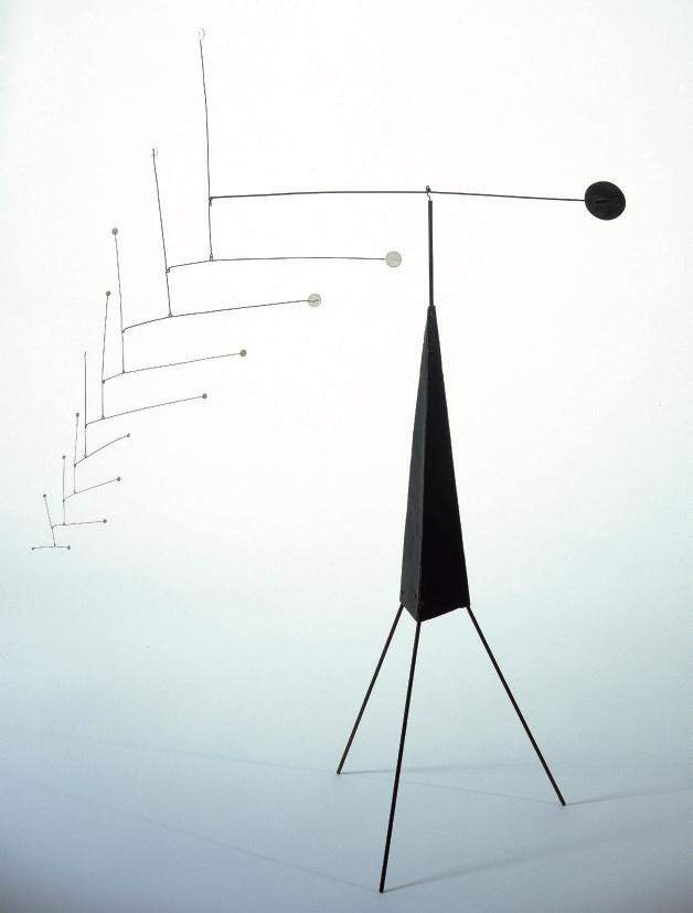
Alexander Calder’s Gypsophila is a majestic, double spray hanging mobile, which embodies the exquisite and effortless elegance of the artist's greatest work. As one of the twentieth century’s most beloved artists, Calder’s appeal is universal, but of all his work, the hanging mobiles of the 1940s are among the most covetable and celebrated of his career. Gypsophila, executed in 1949, is one of only two hanging mobiles of the same name that Calder created between 1949-1951; five others are standing mobiles, including Large Gypsophila on Black Spike (1951) at the Buffalo AKG Art Museum. Calder titled his abstract works after their creation based on formal associations, and Gypsophila, a series of cascading discs exquisitely balanced on thin wire supports, recalls the tiny white blossoms
of the flower also known as Baby’s Breath Here, the weightless splendor of the upwardly thrusting elements reflects the intuitive methods to pull off their balance. Perfectly equipoised, Gypsophila appears to float effortlessly on a gentle breeze. “To most people who look at a mobile, it’s no more than a series of flat objects that move,” Calder so aptly explained. “To a few, though, it may be poetry” (quoted in S. Rodman, Conversations with Artists, New York, 1957, p. 142).
Each of Calder’s hanging mobiles offer up an invitation into a transcendent space, a place where the patient viewer is rewarded by the infinite subtleties of the artist’s work, as it floats and dances before their eyes. In Gypsophila, a lithe and balletic creation, a series of flat
“To most people who look at a mobile, it’s no more than a series of flat objects that move. To a few, though, it may be poetry.”
ALEXANDER CALDER
white discs are cantilevered and balanced in such a way as to connote a feeling of utter weightlessness. Their magical suspension activates the surrounding space, while also hinting at the hidden, invisible forces at work at the subatomic level. This is Calder’s sublime gift; for although Gypsophila may evoke the delicate floral sprays of its namesake, it is a nonobjective sculpture that creates an entirely new universe of its own, in which the delicate spheres spontaneously move according to their own, unique gravitational pull.
By the time he constructed Gypsophila in 1949, Calder was celebrated as an avant-garde pioneer with a simple yet profound aesthetic. His signature round discs are among the most
important shapes in his formal vocabulary. In the present work, Calder has put together twentyone white discs of varying sizes, arranged in two separate, lyrical sprays that are connected by a thin, wire strand. Together, they extend vertically and horizontally into a four-and-a-halffoot range. “The simplest forms in the universe are the sphere and the circle,” Calder once said. “I represent them by discs and then I vary them” (quoted in K. Kuh, The Artist’s Voice: Talks with Seventeen Artists, New York, 1962, p. 39).
To create these sorts of compositions, Calder often began with an abstract shape at its tip and then worked backwards from there. “I
start by cutting out a lot of shapes,” as he once described his method. “Next, I file them and
“I feel that there’s a greater scope for the imagination in work that can’t be pinpointed to any specific emotion.”
ALEXANDER CALDER
smooth them off. Some I keep because they’re pleasing or dynamic. Some are bits I just happen to find. Then I arrange them, like papier collé, on a table, and ‘paint’ them—that is, arrange them, with wires between the pieces if it’s to be a mobile, for the overall pattern” (quoted in S. Rodman, Conversations with Artists, New York, 1957, p. 140). As a purely abstract composition, Gypsophila is breathtaking to behold, and its form evokes a delicate feeling as it moves effortlessly in the wind.
It should be noted that Calder’s mobiles, while they exist in parallel with nature, never slavishly copy from it. When asked which had influenced him more, nature or technology, Calder replied: “Nature. … You see nature and then you try to
emulate it” (quoted by K. Kuh, op. cit., p. 39).
Within this natural world, Calder was able to harness a sort of universal abstract language of energy, which he then transformed into elegant and poetical sculpture. The exquisite power of a refined, abstract vocabulary is one that he shared with many of his contemporaries, who were ultimately the pioneers of twentiethcentury art. These included Jean Arp, Joan Miró and Piet Mondrian. In fact, it was in Mondrian’s studio where Calder, impressed by the overall environment, subsequently came upon the idea for his unique form of abstract art. Looking back, he recalled: “It was more or less directly as a result of my visit to Piet Mondrian’s studio in 1930, and the sight of all his rectangles of color deployed on the wall, that my first work in
“It is a little hot-jazz tune, unique and ephemeral, like the sky, like the morning. If you missed it, it is lost forever.”
JEAN-PAUL SARTRE
the abstract was based on the concept of stellar relationships … For though the lightness of a pierced or serrated solid or surface is extremely interesting the still greater lack of weight of deployed nuclei is much more so” (A Propos of Measuring a Mobile, October 7, 1943, online via www.calder.org/bibliography [accessed” 4/7/2025}).
By 1949, Calder had become one of the most internationally renowned American artists. He was poised on the cusp of a decade that would prove to be transformational in his work.
In 1943, Calder was the subject of a mid-career retrospective at The Museum of Modern Art, which was curated by James Johnson Sweeney and Marcel Duchamp. A few years later, in 1946, he was given a major solo exhibition at the Galerie Louis Carré in Paris. The seminal catalogue essay, written by Jean-Paul Sartre, praised the poetical qualities of Calder’s oscillating and gliding mobiles. He described them as “a little hot-jazz tune, unique and ephemeral, like the sky, like the morning. If you missed it, it is lost forever” (J.-P. Sartre, Alexander Calder: Mobiles, Stabiles, Constellations, Paris, 1946, online).
of the present lot from exhibition catalogue, Calder, November 30–December 17,
metallic powder in polymer emulsion on shaped canvas
77Ω x 134¬ in. (196.9 x 341.9 cm.)
Painted in 1964
$6,000,000-8,000,000
PROVENANCE:
Leo Castelli Gallery, New York. Ferus Gallery, Los Angeles (acquired from the above, 1964). Jacques Kaplan, New York. Leo Castelli Gallery, New York.
Philip Johnson, New York; sale, Christie’s, New York, 10 May 1983, lot 39. Acquired at the above sale by Anne H. and Sid R. Bass.
EXHIBITED:
Los Angeles, Ferus Gallery, Frank Stella in an Exhibition of New York, January-February 1965.
New York, The Museum of Modern Art, The 1960s: Painting and Sculpture from the Museum Collection, June-September 1967.
New York, The Museum of Modern Art; London, Hayward Gallery; Amsterdam, Stedelijk Museum; Pasadena Art Museum and Toronto, Art Gallery of Ontario, Frank Stella, March 1970-May 1971, pp. 92 and 99 (illustrated, p. 99).
LITERATURE:
M. Schwager, Resource/Response/Reservoir: Stella Survey, 1959-1982, exh. cat., San Francisco Museum of Modern Art, 1983, no. 8 (illustrated vertically).
R. Reif, “Auctions: Postwar art in 3 sales” in The New York Times, 6 May 1983, p. C26.
L. Rubin, Frank Stella: Paintings 1958-1965, A Catalogue Raisonné, New York, 1986, pp. 212-213, no. 225 (illustrated, p. 213).
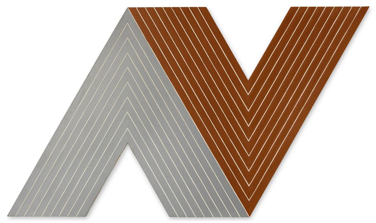
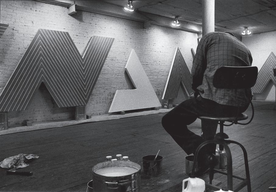
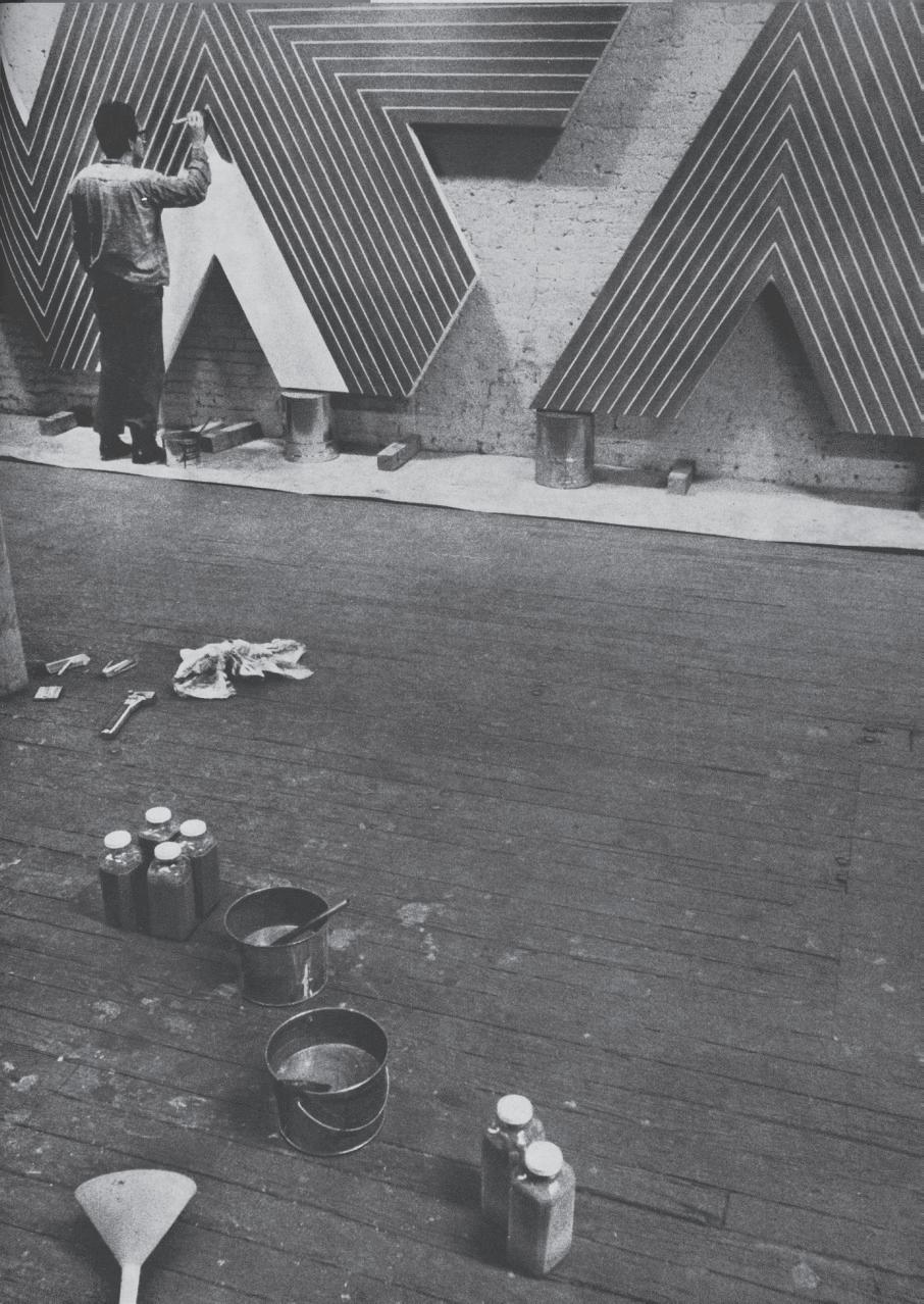
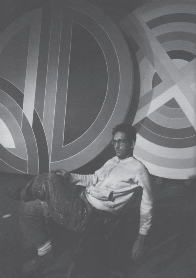
Frank Stella in his studio, New York, circa 1964–1965 (present lot illustrated).
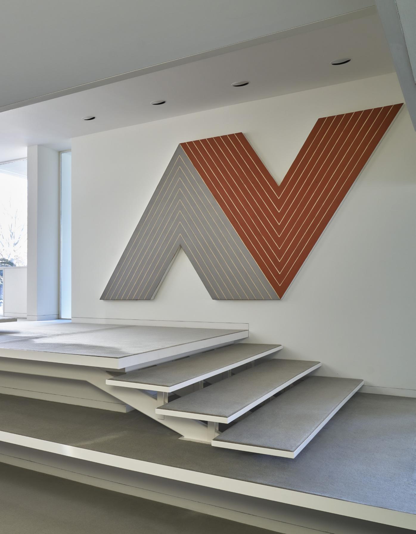
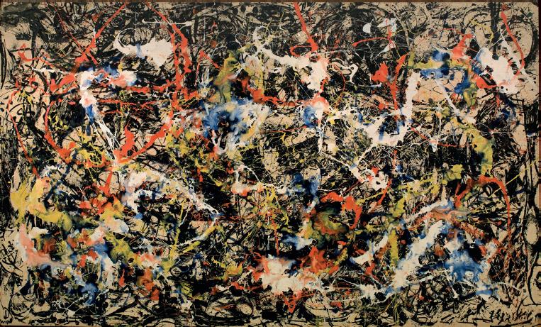
Promoting a pointed but ever-evolving vision for the future of abstract painting, Frank Stella’s oeuvre exists between the emotional charge of Abstract Expressionism and the ordered exactitude of Minimalism. Harnessing not just the application of paint on canvas, but also the very support itself, Itata is the result of an artist working at the boundaries of traditional painting in the twentieth century. Formerly in the collection of the legendary Modernist architect and art patron Philip Johnson, the present work display's Stella's overriding drive for creativity.
Speaking about this compunction, the artist noted, “After all the aim of art is to create space— space that is not compromised by decoration or illustration, space within which the subjects of painting can live” (quoted in, S. Everett, Art Theory and Criticism: An Anthology of Formalist,
Avant-Garde, Contextualist and Post-Modern Thought, New York, 1995, p. 246). By reducing his works down to a programmatic series of even stripes inspired by the very width of his brush, Stella created a one-to-one correlation between the physicality of the work and the resulting piece. Though seemingly autonomous, the viewer is actually witnessing large, even brushstrokes that methodically trace the very hand of the artist.
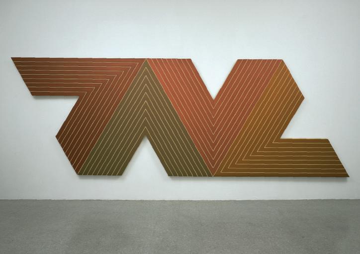
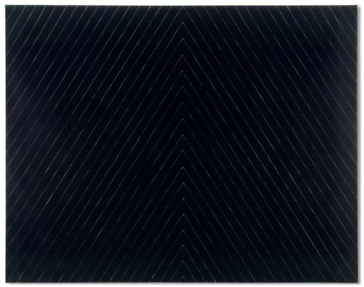
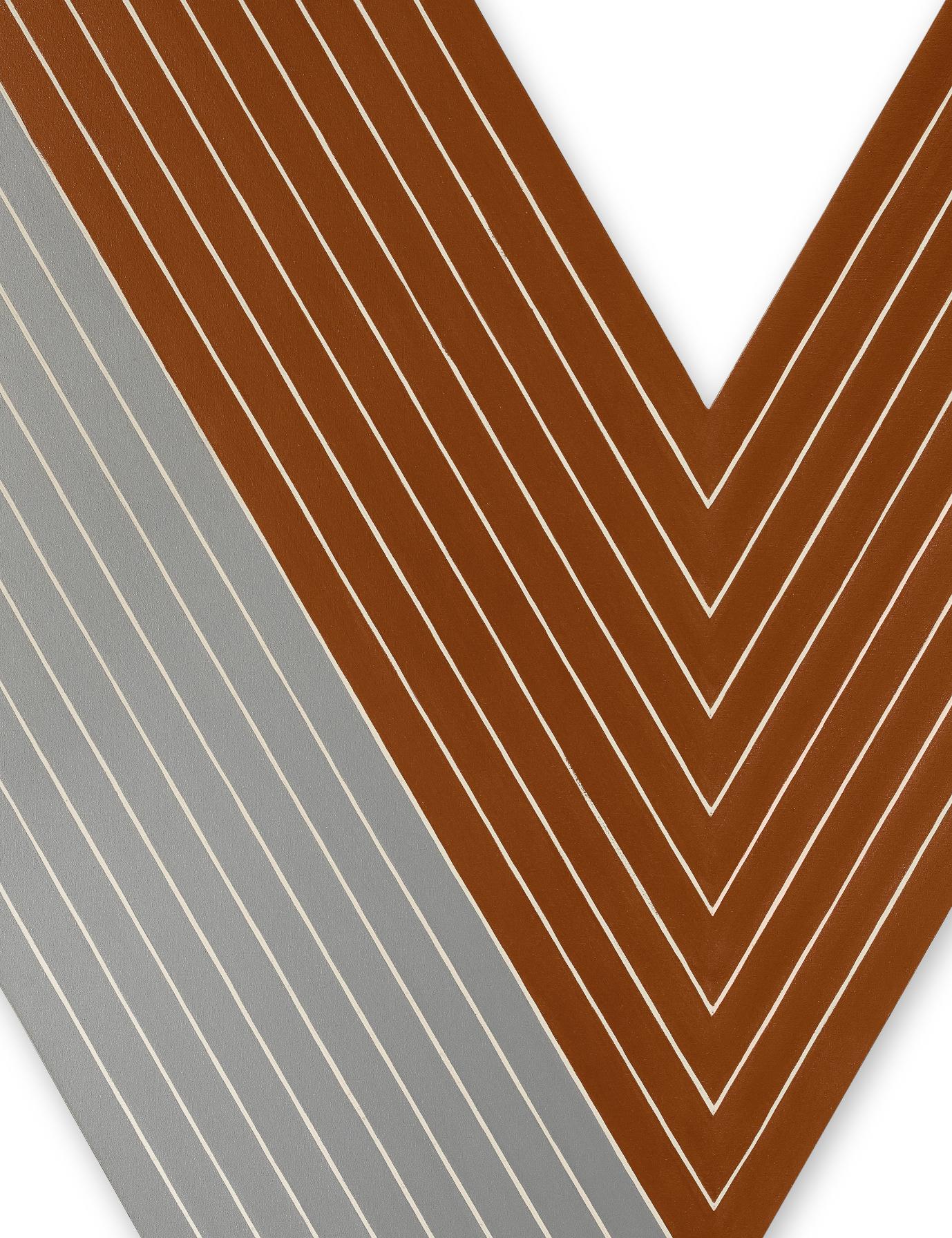
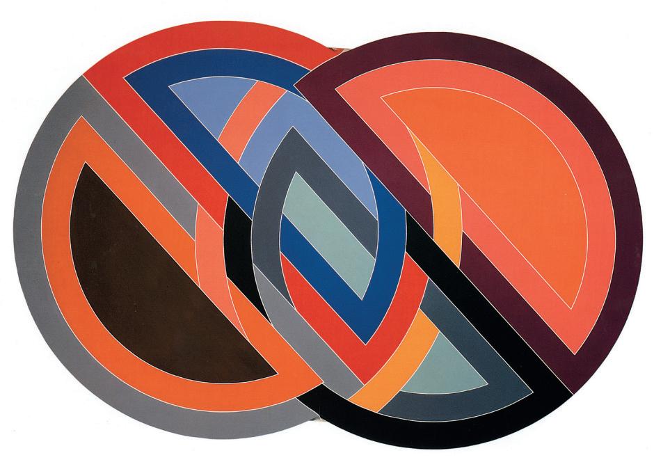
Itata comes from Stella’s dynamic Notched-V series of paintings which incorporated several V-shapes abutted to each other. Named after historic ships, themselves christened with names found in nature, works from this suite exhibit a reserved palette of earthen shades. Itata takes this connection to the physical realm more literally, as Stella painted with a metallic powder
The painting is self-contained and we are witness to its internal energy. Just as it pushes, it pulls; as it cools, it heats up.
mixed into a polymer emulsion. The resulting tones are those of industrial elements. The left segment is a steely gray with all the cold shimmer of a steamship while the right portion is painted in a rusty iron red-brown. The duality of coolness and warmth serves as a visual and atmospheric balance within the work while also referencing his Aluminum and Copper paintings of the preceding years. Stella’s trademark use of bare canvas to separate his bands of color creates an optical undulation that pushes up and down at the same time.
The artist remarked a few years after finishing this work: “My painting is based on the fact that only what can be seen there is there. It really is an object. Any painting is an object and anyone
who gets involved enough in this finally has to face up to the objectness of whatever it is that he’s doing. He is making a thing... All I want anyone to get out of my paintings, and all I ever get out of them, is the fact that you can see the whole idea without any confusion... What you see is what you see” (quoted in B. Glaser, “Questions to Stella and Judd,” Art News, September, 1966, p. 6). The painting is self-contained and we are witness to its internal energy. Just as it pushes, it pulls; as it cools, it heats up. Itata is a powerful example of the potential energy inherent in Stella’s shaped canvases.
Stella began studying art history and painting in 1950, continuing his studies at Princeton before graduating in 1958. During this time, he came to
“My painting is based on the fact that only what can be seen there is there. It really is an object. Any painting is an object and anyone who gets involved enough in this finally has to face up to the objectness of whatever it is that he’s doing. He is making a thing… All I want anyone to get out of my paintings, and all I ever get out of them, is the fact that you can see the whole idea without any confusion… What you see is what you see.”
the realization that his interests lay beyond representational painting. Initially working in the gestural style of the New York School, a visit to Jasper Johns’s first solo exhibition cemented an idea in Stella’s mind: that painting should be what it appeared to be. Robert Rosenblum remarked, “The overriding effect of Stella’s work continues to affirm his unswerving faith in the absolute autonomy of art and in abstraction as the only viable language” (quoted in L. Rubin, Frank Stella Paintings 1958 to 1965: A Catalogue Raisonné, New York, 1986, p. 23).
Stella maintained that abstraction was the only way forward, and that his generation of painters were some of the first to exist where this notion could be held as true. By paring his practice down to the bare elements and essentially clearing the burden of emotional or representative nuance, his canvases became forthright and irrefutably about painting itself.
As an artist, Stella’s trajectory traces the path of 20th-century painting into the future. Touchstones throughout his oeuvre have served as evolutionary markers in the history of abstraction. His Black Paintings, first shown in
1959, set the stage for a career-long investigation that the artist continues to this day. Rosenblum, speaking in 1970, noted, “One constant, at least, of this decade is the importance of the Black Paintings as epochal art history; for now, like then, they retain the watershed quality so apparent when they were first seen in 1959. Today too they have the character of a willful and successful manifesto that would wipe out the past of art and that would establish the foundation stones for a new kind of art” (quoted in S. Guberman, Frank Stella: An Illustrated Biography, New York, 1995, p. 46). He may well have replaced “decade” with “century,” as the hard lines and shaped canvases that Stella produced have been the proverbial seed for myriad young artists in the years since. Though his paintings became more lyrical and colorful as the years progressed, the artist has never lost his connection to the actual making of the work and the quest for innovation. Eschewing the traditional rectilinear format in favor of a convergence of line, color, and shape in perfect harmony, works like Itata make it hard to speak about paintings as something divorced from our own physical world.
FRANK STELLA (1936-2024)
Firuzabad III
polymer and fluorescent polymer paint on shaped canvas 120 x 180 in. (304.8 x 457.2 cm.)
Painted in 1970
$1,000,000-2,000,000
PROVENANCE:
David Mirvish Gallery, Toronto. Private collection, Canada. Anon. sale, Christie’s, New York, 12 November 1980, lot 41. Acquired at the above sale by Anne H. and Sid R. Bass.
EXHIBITED:
Toronto, Art Gallery of Ontario, Frank Stella, April-May 1971, no. 58.
LITERATURE:
L. Germany, Great Houses of Texas, New York, 2008, p. 182 (illustrated in color in situ at The Bass House).
Abstraction stoked the creative fires of twentieth century painting, and Frank Stella added fuel to the flames. His monumental canvases evolved from restrained formal simplicity to exotic hued compositions that both embraced and challenged the nature of the artform. Firuzabad III is a particularly striking example of the artist’s ability to bend not only the visual content but the physical materials to his will. Created on a large figureeight, the thick, even brushstrokes of a modern master meld paint with the support in an amalgam sprung from the need to push painting to its limits.
Carl Andre, on the occasion of Stella’s inclusion in the groundbreaking Sixteen Americans exhibition at The Museum of Modern Art, noted,
“Art excludes the unnecessary. Frank Stella has found it necessary to paint stripes. There is nothing else in his painting. Frank Stella is not interested in expression or sensitivity. He is interested in the necessities of painting. Symbols are counters passed among people. Frank Stella’s painting is not symbolic. His stripes are the paths of brush on canvas. These paths lead only into painting” (quoted in Sixteen Americans, exh. cat., The Museum of Modern Art, New York, 1959). Though Andre was speaking of Stella’s earlier, more linear works, pieces like the present work show the dedication and commitment to a singular visual investigation through pure color and line. The stripes become curves. The curves become forms. The forms are inextricably linked to the shape of the canvas and, in doing so, become part of our physical world.
Made up of two interlocking circles which are in turn constructed from two semi-circles, Firuzabad III is a riot of color within a carefully prescribed system of shapes. Both axes sit at the same diagonal, and the various sections radiate from each unit’s central point at an equal pace.
The right circle has halves of salmon orange and dark gray-blue, their interiors filled with a spectrum of colors from burnt umber to deep maroon to cornflower blue in an abstracted fan motif. The left circle, made of the same blue and a peachy pink, exhibits a similar tonal array. However, this section visually overlaps the right like a piece of paper cut halfway. The blue section intercedes in the former’s salmon segment while the latter’s pink area seems to disappear behind the picture plane. Of course, there is no actual physical incursion, but Stella’s masterful
application of paint and use of white lines of raw canvas to separate the colors elicit an optical response from the viewer. The work is flat, solid, and confrontational like the rest of the artist’s oeuvre, but this is confused by an almost trompe l’oeil use of visual space. Like two great wagon wheels careening into each other, Firuzabad III seems to have caught the moment of impact in a perfect harmony.
Part of the artist’s much-lauded Protractor series, Firuzabad III was inspired by a trip to the Middle East. Stella was taken with the circular roads and paths built into the urban environment by city planners of old, and shows this fascination by naming each work after a geographical point in the area. Several canvases share the name of the present lot, delineated by a number, and
Remains of the ancient city of Gor, near Firuzabad. Photograph by Egor Shtefan.
reference the city of Firuzabad in Iran. Though the present day city is laid out on a modern grid, the ancient plan just westward revolved around a perfect circular plan. Firuzabad and other socalled “round cities” were the inspiration for the central core of ancient Baghdad in neighboring Iraq. These geometric plans, formed with such precision by architects of the past, were a catalyst for Stella’s jump from more rectilinear compositions to the realm of curves and arcs.
William Rubin wrote in 1970 about this series, noting that, “owing to their partial and occasionally wholly circular formats, the pictures of the Protractor series are, in the first instance, anti-tectonic in a way hitherto unknown in Stella’s work. But they are also, paradoxically, the first that might be termed unremittingly architectural in both size and
scale... The combination of the architectonic and the curvilinear is inherent, in this sense, in the very protractor motif on which this series is built, since the semi-circle of the protractor rests firmly on its rectilinear base” (Frank Stella, New York, 1970, pp. 131-132). Breaking from the straight lines of his Black Paintings and the many iterations of the Notched-V series, Stella infused monumentality with grace. Combining multiple colors within the same work, he composes a symphony of hues that further enhances the potential energy of the piece. In addition, the reference to the protractor (the title of this series of works) and in the curves of the artist’s canvases, connects them to the physical act of making the work. This push and pull between full absorption and the manual process of the artist’s hand is ever-present in Stella’s work and remains one of its most powerful features.
“Owing to their partial and occasionally wholly circular formats, the pictures of the Protractor series are, in the first instance, anti-tectonic in a way hitherto unknown in Stella’s work. But they are also, paradoxically, the first that might be termed unremittingly architectural in both size and scale.”
WILLIAM RUBIN
Rothko’s Legacy
ANNABEL MATTERSON
“I liked Rothko’s softness, bulkiness,” Frank Stella said in 1970, “the one image— the presence and power of the one thing, but at the beginning, I didn’t realize the full implications of his painting” (quoted by W. Rubin, Frank Stella, exh. cat., The Museum of Modern Art, New York, 1970, p. 10). Mark Rothko’s paintings, monoliths of color that are at once expunged of narrative yet filled with emotive possibility, dominated the artistic landscape of the post-war era. Developing out of his Multiforms, these “signature” works first emerged in 1949. Loose clouds of pigment were stacked one atop the other along the length of the large, rectangular shaped canvases. Color itself—its application, its relationship with other tones in the composition, as well as its effect on the viewer— became the central protagonist of these works. Yet, most importantly, by ridding his art of specific meaning and breaking from the tradition of geometric abstraction of his predecessors, Rothko believed “transcendental experiences become possible... Pictures must be miraculous... a revelation, an unexpected and unprecedented resolution of an eternally familiar need” (“The Romantics were Prompted…” in Possibilities, New York, 1947, no. 1, p. 84; in C. Harrison and P. Wood, eds., Art in Theory, 1900-2000, Oxford, 2003, p. 572).
Consistently rejecting the term “abstraction” to describe his work, as well as denying that he was a “colorist,” Rothko decried purely formal interpretations of his work. “I want pure response in terms of human need,” he once stated (quoted in Mark Rothko, exh. cat., National Gallery of Art, Washington, D.C., 1998, p. 303). All of these aspects served as an
“Pictures must be miraculous... a revelation, an unexpected and unprecedented resolution of an eternally familiar need.”
MARK ROTHKO
inescapable presence to a successive generation of artists—both an example from which to build on and one to rebel against.
Beginning in the late 1940s, Clyfford Still and Jackson Pollock, followed swiftly by Rothko, Barnett Newman and Willem De Kooning, Robert Motherwell, Adolph Gottlieb and Franz Kline, overturned artistic convention with their work. Forming the first truly American art movement, the “New York School,” as they were initially known, forged a new form of painting. Abandoning subject matter, they worked on a dramatically large scale, developing an abstract language of form and color in “all-over” compositions that enabled a near total focus on the act of painting itself, all of which was employed in the service of a profound individual human expression. While these artists had diverse backgrounds and aims, and produced stylistically disparate works, it was this desire to express a deeper level of emotion that served to unite this loosely formed group: the Abstract Expressionists.
By the end of the 1950s, these artists had risen to a level of fame hitherto unseen in America. Their work graced the pages of Life and Vogue magazines. It was frequently exhibited and keenly collected by museums and individuals alike. In 1958, The New American Painting opened at The Museum of Modern Art, New York, before traveling to eight major European cities. Featuring work by Rothko, Still, Pollock and De Kooning, among others, this exhibition was a triumph and cemented the international success of these artists. “But the most convincing evidence of their impact on mid-century art,” William Rubin has written, “was the almost frenetic manner in which their pictorial
The Irascibles, New York, 1950. Top row: Willem de Kooning, Adolph Gottlieb, Ad Reinhardt and Hedda Sterne; center row: Richard Pousette-Dart, William Baziotes, Jackson Pollock, Clyfford Still, Robert Motherwell and Bradley Walker Tomlin; bottom row: Theodoros Stamos, Jimmy Ernst, Barnett Newman, James Brooks and Mark Rothko.
Photo: Nina Leen / The LIFE Picture Collection / Shutterstock.
“We favor the simple expression of the complex thought.”
MARK ROTHKO AND ADOLPH GOTTLIEB
innovations were being adopted by younger painters all over the world” (quoted in exh. cat., op. cit., 1970, p. 7).
For this subsequent generation of artists, the diversity of Abstract Expressionism offered a host of different artistic directions. While De Kooning, Kline and Pollock’s work centered around the gesture, Rothko, together with Still and Newman, offered a legacy of color field painting that loomed large over the artistic landscape of the late 1950s onwards.
Yet this legacy was complex. The new abstract language pioneered by their predecessors, as well as the scale, materials and processes many of them had invented, offered a bold new type of art making and a new conception of what a painting could be. “We favor the simple expression of the complex thought,” Rothko and Gottlieb had written in a manifesto-like letter published in the New York Times in 1943. “We are for the large shape because it has the impact of the unequivocal. We wish to reassert the picture plane. We are for flat forms because they destroy illusion and reveal truth” (“Statement,” in New York Times, 13 June 1943; in op. cit., 2003, p. 569). For artists like Stella, Ellsworth Kelly and Agnes Martin, these words offered a prescient encapsulation of their own forms of pure geometric abstraction some two decades later.
What was more problematic, however, was the weight of personal expression and transcendental feeling that Rothko and his contemporaries regarded as an inherent effect of their art. From Jasper Johns and Robert Rauschenberg to Andy Warhol and his Pop contemporaries, this overtly individualistic and resultantly “expressive” manner of art making was to be wholly rejected.
Starting with the color field painting of the 1950s and 1960s, artists such as Helen Frankenthaler, Kenneth Noland and Morris Louis pioneered new techniques to gain effects that speak to Rothko’s canvases. In 1954, Noland introduced his friend Louis to the influential critic, Clement Greenberg. Together they visited Frankenthaler in her studio, where Louis was deeply inspired by her work. He began to experiment with a similar staining technique, eventually abandoning the brush and pouring paint directly onto the canvas—a technique that can be seen in his Gamma Upsilon in the present collection.
Louis’s bold new direction grew out of Abstraction Expressionism but signaled an important shift towards a more contemplative, autonomous color-based movement.
The layers of delicate color create a similar form of enveloping, often dazzling chromatic intensity, but, in contrast to Rothko, who applied paint to the canvas, Louis soaked it, removing his hand and any traces of gesture entirely from the creation of the work.
As a result, a new form of painterly autonomy and opticality emerged.
Another color field painter who took the principles of this form of art making to a very different conclusion was Ellsworth Kelly. Having returned to New York from Paris in 1954, Kelly had already begun to pursue his form of color field geometric abstraction. In his own words, “Early Newmans and Rothkos were very soft-edged paintings, so in order for me to have my own stability about my beliefs, rather than give in to Abstract Expressionism— which a lot of the young painters were influenced by and carrying on—I felt that I had to resist it” (“Ellsworth Kelly, Interview with Mark Rosenthal, 25 September 1997,” in exh. cat., op. cit., 1998, p. 356).
Unlike Rothko whose planes of color scumble, bleed, blur and merge into one another at the edges, as if receding and simultaneously emerging from the surface of the canvas, Kelly painted meticulously worked forms that are crisp, bold and optically nearing perfection. He never sought to attain any semblance of cold reproduction or inorganic perfection in his painting but rather worked to create compositions that remained tactile and inviting. The aesthetic similarities and equivalences between the two artists’ approaches can be seen in two works from the present group: Kelly’s 1964 Blue Black Red and Rothko’s No. 4 (Two Dominants) [Orange, Plum, Black]. The same amorphously formed
“What I liked about Rothko was that there was no real sort of idea in the paintings. They were a presence, just pure abstraction. When I think about Rothko, it’s color first, the exuberance, the luminosity, and the radiance of color that is so striking.”
ELLSWORTH KELLY
pool of black dominates both compositions, flanked variously by two other tones. While the way in which these pigments are applied is different, the formal artistic concerns appear aligned. “What I liked about Rothko was that there was no real sort of idea in the paintings. They were a presence, just pure abstraction. When I think about Rothko, it’s color first, the exuberance, the luminosity, and the radiance of color that is so striking” (ibid., p. 356).
From the late 1950s, Rothko’s canvases became darker. In his famed 1958 commission, the Seagram murals, he drained his canvases of color, creating a series of more introspective, brooding paintings. This dramatic reduction in chromatic exploration continued through the early 1960s, resulting in his Black paintings of 1964. While frequently regarded in biographical terms as a reflection of the artist’s recurrent illness and depression, these canvases remain formally radical. By this time, Rothko had experimented with a multitude of tones and hues, playing with the pictorial, emotive and spatial effects they could create. The next logical step was to explore how he could achieve ever more intense results with a dramatically restricted palette.
The Black paintings led to Dominique de Menil’s Houston Chapel commission. There, the large, dark hued, all-immersing compositions were created specifically for the space itself, resulting in a radical artistic experience in which space, light and the canvases coexisted
as a single artwork. The stark chromatic minimalism of these canvases was far from meaningless for Rothko. For him, they were portals for the viewer to encounter a deep, religious experience—a more intense effect than any of his previous works.
While for Rothko, these works served to deepen the transcendental possibilities of his canvases, for a new generation of artists, the use of this monochrome was a way to escape all meaning and subject matter. Stella launched Minimalism with his Black Paintings that he had begun in 1959. The same year, his work was included in The Museum of Modern Art’s Sixteen Americans. Carl Andre wrote Stella’s artistic statement: “Art excludes the unnecessary. Frank Stella has found it necessary to paint stripes. There is nothing else in his painting. Frank Stella is not interested in expression or sensitivity. He is interested in the necessities of painting… Frank Stella’s painting is not symbolic. His stripes are the paths of brush on canvas. These paths lead only into painting” (quoted in 16 Americans, exh. cat., The Museum of Modern Art, New York, 1959, p. 76). This idea of total pictorial autonomy formed the central tenets of Minimalism, “an art whose blank, neutral, mechanical impersonality contrasts so violently with the romantic, biographical abstract expressionist style which preceded it that spectators are chilled by its lack of feeling or content,” Barbara Rose wrote in an essay in 1965, “ABC Art” (quoted in J. Fineberg, Art Since 1940: Strategies of Being, London, 2000, p. 294).
Despite this however, Rothko’s indomitable presence was inescapable for Stella. In 1965, a key year in the development of Minimalism, the artist told critic, David Sylvester that, “the simplest way to see my paintings is in the way I can’t help seeing them even now— that they’re just very simply extremely closely related to Abstract Expressionism. It seems to me that their weight and the whole feel of them and the whole way you would have to experience them is sort of the way you would have to experience the American painting of the late fifties. That’s how they look to me even now.” In response to this Sylvester asked, “Except that there aren’t the very visible traces of personal handling.” To which Stella revealingly replied, “Well, that’s not true. If you look at the Black Paintings there’s a lot of sense of hand in them, and they’re, say, close to Rothko in their kind of vibration, in the fuzziness of the edges and everything” (quoted in Interviews with American Artists, London, 2001, pp. 193-194).
“When people find similarities in my paintings with the works of others, it only proves that my work is taking its rightful place in the development of art history.”
MARK ROTHKO
While seemingly the antithesis of Rothko’s work, Stella’s art, like Louis and Kelly, as well as many of their contemporaries, could not have existed without it. Stella took the large scale and immense physical presence of Rothko’s canvases and their overt materiality as painted objects, and pushed these elements of artmaking a step further to attain the austere level of autonomous abstraction that he aspired towards. His shaped canvases— Itata and the later Firuzabad III in the present collection—demonstrate a further progression as he explored the format of the support itself in his quest to create a purely formal form of art.
Rothko once described the difference he perceived between him and his friend, Ad Reinhardt. “The difference between me and Reinhardt is that he’s a mystic. By that I mean that his paintings are immaterial. Mine are here. Materially. The surface, the work of the brush and so on” (quoted in exh. cat., op. cit., 1998, p. 289). Rothko’s work, with its exultant form of abstraction, magnificent scale, and dazzling chromatic luminosity, remained a powerful and very tangible presence for numerous artists who followed in his wake. Luminous windows that both absorb and reflect the viewers’ own experience, his canvases remain beacons of artistic possibility that still radiate today. “The best I can say in the way of describing it,” Stella said, “is that it has what you call visual presence—I mean, something that you feel in front of the painting. It convinces you, something like that” (op. cit., p. 196).
MARK ROTHKO (1903-1970)
No. 4 (Two Dominants) [Orange, Plum, Black]
signed twice and dated ‘MARK ROTHKO MARK ROTHKO 1951’ (on the reverse) oil on canvas
67 x 54æ in. (170.2 x 139.1 cm.)
Painted in 1950-1951
Estimate on Request
PROVENANCE:
Marlborough A.G., Liechtenstein (acquired from the artist, 1969).
Marlborough-Gerson Gallery Inc., New York (acquired from the above, 1973).
Acquired from the above by Anne H. and Sid R. Bass, 1980.
EXHIBITED:
New York, Betty Parsons Gallery, Mark Rothko, March-April 1951.
New York, The Museum of Modern Art, 15 Americans, April-July 1952, p. 47 (titled Number 4).
Zurich, Marlborough Galerie A.G., amerikanische abstrakte Malerie, June-July 1973, pp. 4 and 19, no. 15 (illustrated, p. 19; titled Orange, plum, black and dated 1951).
LITERATURE:
ARTnews, vol. 69, Summer 1970 (illustrated in color in an advertisement on the inside back cover).
D. Anfam, Mark Rothko: The Works on Canvas, Catalogue Raisonné, New Haven and London, 1998, p. 344, no. 453 (illustrated in color).
D. Anfam and D. Sobel, Clyfford Still: The Artist’s Museum, New York, 2012, p. 44 (illustrated in situ at the 1952 exhibition, fig. 34). º
Mark Rothko, California School of Fine Arts, circa 1949-1950.
Dating from a pivotal moment in Mark Rothko’s career, No. 4 (Two Dominants) [Orange, Plum, Black] captures the flowering of the singular artistic vision that would come to define his oeuvre. Painted between 1950 and 1951, during one of Abstract Expressionism’s most rich and fertile creative periods, it is an early example of the iconic distilled color fields that would fuel the artist’s practice until his death in 1970. Upon a shimmering orange and yellow ground, two zones of deep saturated color vie for dominance: a vast swathe of opulent purple, overlaid by a jagged band of black. The hues shift and mutate within the viewer’s field of vision, transformed by the force of their companions; the backdrop glows like an otherworldly halo of light, pushing each field into dramatic relief. Unveiled in Rothko’s final exhibition with Betty
Parsons in 1951, and subsequently included in the landmark group show 15 Americans at The Museum of Modern Art, New York, in 1952, the work has since remained largely unseen in public, shown on just one other occasion in 1973. It bears witness to the birth of a language that stands today among the twentieth century’s most powerful explorations of human experience.
The year 1950 marked a significant milestone in Rothko’s output. Moving away from his early Surrealist-inspired practice, the artist began to simplify the compositional structure of his paintings in 1949, distilling the irregular patches of his first “Multiforms” to cleaner bands of color. By the time of the present work, Rothko had reduced the number of hovering rectangular fields to two or three, stacked on
“The progression of a painter’s work, as it travels in time from point to point, will be toward clarity: toward the elimination of all obstacles between the painter and the idea, and between the idea and the observer… To achieve clarity is, inevitably, to be understood.”
MARK ROTHKO
top of one another against a colored backdrop. This strategy, which would subsequently become synonymous with his oeuvre, brought about an important shift in his approach, allowing him to conceive his color fields as “actors” who played out the grand, sweeping polarities of human emotion. His subjects—“tragedy, ecstasy, doom and so on”—were conveyed through the sheer drama of color and paint alone, allowing the dynamics of friction, tension and revelation to come into sharper and more visceral focus. “The progression of a painter’s work, as it travels in time from point to point,” wrote Rothko in 1952, “will be toward clarity: toward the elimination of all obstacles between the painter and the idea, and between the idea and the observer… To achieve this clarity is, inevitably, to be
understood” (quoted in 15 Americans, exh. cat., The Museum of Modern Art, New York, 1952, p. 18).
The present work captures the moment that this idea visibly beginning to take hold in Rothko’s output. As the title suggests, it stages a dialogue between “two dominants,” pitting intense, saturated hues in counterpoint. Rothko’s purple field shifts between red, blue and pink overtones, with dense passages of paint giving way to thin, translucent layers that blur to a delicate miasma at the edges. The black field cuts across its expanse with a sharp horizontal line, leaving—at the left hand side—a faint suggestion that the purple might continue beneath it. A bluish mauve hue quivers at the point of their interface, like a tide forged from the clash of opposing energies.
Installation view, 15 Americans, April 9 – July 27, 1952, The Museum of Modern Art, New York (present lot illustrated). Photo: Soichi Sunami.
The black itself appears to gravitate downwards, with strong vertical brushwork impelling it to loosen its grip upon the purple. In contrast to the layer above, its edges are deliberate and angular—fraying at the bottom like a swathe of velvet—while light dances across its charred contours in flickering formations. The source of this luminosity is revealed below, in the form of a vivid orange flame that threatens to incinerate the entire composition. As the eye scans the work’s glowing perimeter, it transforms from a portrait of darkness into one of searing light: the terror of the abyss becomes the warmth of salvation.
Rothko’s 1951 exhibition—his fifth and last with Parsons—marked the culmination of this transformative period. Since its founding in 1946, the gallery on East 57th Street had become a hub for Abstract Expressionism, extending the legacy of Peggy Guggenheim’s Art of This Century Gallery. Parsons had showed Clyfford Still in 1947, Jackson Pollock in 1948 and Barnett Newman in 1950, as well as debuting Rothko’s “Multiforms” in 1949: she would come to refer to these artists her “four horsemen of the apocalypse." As David Anfam has written, “There was something apt about the fact that this was [Rothko’s] last show there, because it concluded what the first had begun—the trajectory of the work from its exploratory premises in the mid 1940s to a complete flowering by the end of 1950”
(Mark Rothko: The Works on Canvas, New Haven
and London, 1998, p. 71). Exhibited alongside the present work were paintings now held in major institutions, including No. 10, 1950 and No. 5/ No. 22, 1950 (both held in The Museum of Modern Art, New York), as well as No. 15 (Untitled), 1951 (National Gallery of Art, Washington, D.C.).
The activity around Parsons’s gallery during this period was indicative of a broader phenomenon: namely, the gradual emergence of New York as the new center of the global art world. The present work takes its place within this context, situated against a backdrop of flourishing creative euphoria that set the stage for Abstract Expressionism’s growing international acclaim during the 1950s. Still had made his New York debut in 1946—the same year that the term Abstract Expressionism was coined by the critic Robert Coates—and by 1948 had established the pillars of his mature language. Pollock immersed himself in his drip paintings between 1947 and 1950, while Newman painted his first “zip” painting, Onement, I, in 1948. In 1949, Robert Motherwell inaugurated his Elegy for the Spanish Republic series; the following year, Willem de Kooning began his landmark suite of Women. The distillation of Rothko’s signature style during this period was thus part of a wider consolidation of various major strands of Abstract Expressionism, each seeking a transcendental purpose for painting in the wake of the Second World War. As Newman famously surmised, “Instead of
“Rothko said that he wanted a presence, so when you turned your back to the painting, you would feel that presence the way you feel the sun on your back.”
MURRAY ISRAEL
making cathedrals out of Christ, man, or ‘life,’ we are making it out of ourselves, out of our own feelings” (“The Sublime is Now,” 1948, reproduced in H. B. Chipp (ed.), Theories of Modern Art, Los Angeles, 1984, p. 553).
The 1952 exhibition at The Museum of Modern Art—part of a series in operation since 1929—bore witness to this momentum. Rothko showed eight works in a dedicated room, where the present painting took its place diagonally opposite No. 10, freshly acquired by the museum from the 1951 Betty Parsons exhibition. Major works by Clyfford Still were joined by masterpieces by Jackson Pollock, including his celebrated Autumn Rhythm (Number 30), 1950 (The Metropolitan Museum of Art, New York) and Number 7, 1950
(The Museum of Modern Art, New York). The exhibition was curated by Dorothy C. Miller, who would subsequently mastermind the museum’s seminal touring show The New American Painting in 1958. This historic group exhibition, which traveled to eight major European countries, radically transformed the perception of American art across the Atlantic, inspiring a host of young painters in its wake. The show featured many of the artists included in 15 Americans, among them Rothko himself, and was arguably indebted to the revelations of its 1952 predecessor.
The present work hints at some of the grounds upon which critics began to historicize Abstract Expressionism during this early period. The movement’s dematerialized approach to color
Caspar David Friedrich, The Tree of Crows, 1822. Musée du Louvre, Paris.
Claude Monet, Le Parlement, coucher de soleil, 1903. National Gallery of Art, Washington, D.C.
“…in 1949 [Rothko’s] painting was transformed into a world of extreme light whose radiance obliterated all objects. Its subject, that transcendent ‘I’ of the absolute subjective, is hidden within the painting, woven into the substance of paint itself, and in light itself. What remains invested of human presence in these radically new paintings is the drama of Rothko’s consciousness— and what it mirrors of ourselves.”
and light prompted comparison with the late works of Claude Monet: an artist whose dramatic flaming sunsets and seemingly infinite bodies of water are invoked in the present work’s fiery, luminous depths. Others, notably the critic Robert Rosenblum, found ancestral links in the Romantic period, specifically in relation to the concept of the “sublime”. Where artists such as Caspar David Friedrich had sought to capture the overwhelming majesty of the natural world, Rothko and his contemporaries strove to induce the same intoxicating sensations through abstract color and form alone: the artist’s friend Murray Israel reported that “Rothko said that he wanted a presence, so when you turned your back to the painting, you would feel that presence the way you feel the sun on your back” (quoted in J. E. B. Breslin, Mark Rothko: A Biography, New York, 1993, p. 275). The artist’s fascination with the dialogue between “Apollonian” order and “Dionysian” chaos—informed by his readings of the 19th-century philosopher Friedrich Nietzsche—is particularly palpable in the present work: the sensation of steady, illuminating warmth is held in tension with the looming, nocturnal shadow that threatens to engulf it.
Rothko’s use of light also owes much to his engagement with the work of the Old Masters: notably Rembrandt, whom he counted among his favorite artists. His juxtaposition of colors in
the present work, and his fascination with the contrast between light and dark hues, evinces a deep awareness of chiaroscuro and the Dutch master’s modelling of three-dimensional space. The zones of color advance and recede as the viewer’s eye moves across the surface, bound together in a slow, sacred dance. Rothko was also drawn to the grand spiritual narratives contained within many Old Master works, and in 1950 had been captivated by Fra Angelico’s frescoes in the Convent of San Marco in Florence. Tellingly, a variation on the present work’s luxuriant purple tone would reappear in his own landmark suite of fresco-like paintings for the Houston Chapel in Texas, oscillating between strains of plum, maroon and black. The same mercurial spectrum dominated his Seagram Murals during the late 1950s, themselves inspired by the blind windows in Michelangelo’s Laurentian Library. Interestingly, Francis Bacon’s contemporaneous series of Papal portraits, similarly forged in the light of the Old Masters, would also anchor themselves around the polarities of purple and black, their existential angst illuminated by piercing beams of light.
Despite his conscious rejection of figuration, many of Rothko’s works quiver with architectural hints of the human form. Much like Still’s jagged color fields or Newman’s “zips”—both of which flicker with traces of lone standing
“I think of my pictures as dramas, the shapes in the pictures are the performers. They begin as an unknown adventure in an unknown space.”
MARK ROTHKO
figures—his vertically-stacked bands harbor a curiously anthropomorphic quality. Still’s work, in particular, had an important impact on the evolution of Rothko’s mature language during the late 1940s: the present work’s black color field bears witness of this lineage, jutting into space in the manner of Still’s craggy terrains. Though both artists wholeheartedly embraced abstraction, their arrangements of color, shape and texture were fundamentally linked to human experience, mirroring the conflicts, resolutions,
ambiguities and fluctuations that define our emotional response to the world. “I think of my pictures as dramas,” Rothko once said, “the shapes in the pictures are the performers. They begin as an unknown adventure in an unknown space” (quoted in “The Romantics were Prompted,” Possibilities No. 1, Winter 1947-1948).
The present work captures the inception of this mysterious voyage into the void, marking the moment at which Rothko’s forms began to take on a life of their own.
ELLSWORTH KELLY (1923-2015)
Blue Black Red
signed with the artist’s initials and dated indistinctly ‘EK 64’ (lower left); signed and dated again ‘KELLY 64’ (on the overlap) oil on canvas
91 x 180 in. (231.1 x 457.2 cm.)
Painted in 1964
$4,000,000-6,000,000
PROVENANCE: Sidney Janis Gallery, New York. Max and Jeanne Wasserman, Chestnut Hill, Massachusetts (acquired from the above, 1966).
Anon. sale, Sotheby Parke Bernet, New York, 12-13 May 1977, lot 447. Acquired at the above sale by Anne H. and Sid R. Bass.
EXHIBITED:
Pittsburgh, Carnegie Institute, Museum of Art, 1964 Pittsburgh International
Exhibition of Contemporary Painting and Sculpture, October 1964-January 1965, no. 327 (titled Blue, Black, and Red).
Boston, 180 Beacon Street, The 180 Beacon Collection of Contemporary Art, October 1967, no. 47 (illustrated).
LITERATURE:
J. Canaday, “Art: Pittsburgh Prizes; International Exhibition of Paintings and Sculpture Assembles 400 Works” in The New York Times, 30 October 1964, p. 33 (titled Blue, Black, and Red).
J. Jena, “Carnegie Prize Winners” in Pittsburgh Post-Gazette, vol. 38, no. 78, 30 October 1964, p. 29 (illustrated; titled Blue, Black and Red).
D. McConathy, Derrière le miroir: Kelly (no.149), Paris, 1964, pp. 7 and 11 (titled Red Black Blue).
K. Levin, “Anything goes at the Carnegie” in ARTnews, vol. 63, no. 8, December 1964, pp. 36 and 63 (illustrated, p. 36; titled Blue, Black and Red).
M. Esterow, “Art Decks Halls of Boston Apartment” in The New York Times, 19 October 1967, p. 59.
“Apartment House Is ‘Like Art Museum’” in The Minneapolis Tribune, 5 November 1967, p. 21.
“The Modern Movement II” in Mind Alive, vol. 2, no. 2, 1968, pp. 450-451 (illustrated).
C. Moritz, Current Biography Yearbook: 1970, New York, 1970, p. 216 (titled Blue, Black and Red).
J. Coplans, Ellsworth Kelly, New York, 1971 (illustrated in color, pl. 155).
R. Morris, “American Quartet” in Art in America, vol. 69, no. 10, December 1981, p. 102 (illustrated; titled Blue, Black and Red).
C. Humblet, The New American Abstraction 1950-1970, New York, 2007, pp. 555 and 581, no. 172.
L. Germany, Great Houses of Texas, New York, 2008, p. 182 (illustrated in color in situ at The Bass House).
T. Y. Paik, Ellsworth Kelly, New York, 2015, pp. 19, 119 and 340 (illustrated in color, p. 166).
Ellsworth Kelly at Betty Parsons Gallery, New York, 1963.
Working in an age when vigorous, frenetic Abstract Expressionism was king, Ellsworth Kelly was the triumphant herald of the Hard-Edge movement. Diverging from the energetic chaos and emotional brushwork of his colleagues, Kelly’s adept manipulation of color and form gave birth to a style at the crux of nascent Minimalism and the freedom of abstraction which infused geometric shapes with a post-war sensitivity for time and history. Blue Black Red is a testament to the artist’s mastery of his materials and his ability to fully absorb the viewer into the canvas with little more than three colors in a seemingly straightforward arrangement. Freeing his compositions from the pull of gravity and the traditional orientation of painting, Kelly provides visual buoyancy that beckons to the eye. Gottfried Boehm writes, “The decisive point in Kelly’s development was reached when he abandoned the traditional dynamic of painting’s organization, when form emancipated itself from its customary support, the ground, so that it could from then on lead an independent existence in the visual world” (“In-Between Spaces: Painting, Relief, and Sculpture in the Work of Ellsworth Kelly,” in Ellsworth Kelly: Works 1956-2002, exh. cat., Fondation Beyeler, Basel, 2002-2003, p. 33). Flying in the face of tradition by doing away with any connection to representational composition or emotional output, Kelly sought to more fully combat the passive viewer. His sculptures and canvases call for a fully absorptive experience with the immediacy of a bolt of electricity.
“A quarter of an inch, a half inch off the angle can make a big difference… My eye is like a gyroscope, it can find the right balance.”
ELLSWORTH KELLY
Stretching fifteen feet in length, Blue Black Red is proof of Kelly’s innate ability to create monumental statements out of minimal arrangements of form and color. Oriented horizontally, the rectangular canvas is split into three discrete sections. Corresponding to the colors in the title, the vast areas of unadulterated blue, black, and red march in sequence from left to right. The central element is a slightly irregular circle painted in deep, rich black that serves as an unwavering visual anchor for the rest of the composition. Its edges bloom into its neighbors and smartly collide with the top and bottom of the frame. On either side, the fields of red and blue spread from the very outskirts of the canvas inward to the crisp exterior of this inky void. Kelly’s works are notable for their effortless
mix of precision and the unarguable presence of the artist’s hand. Balance is achieved not by mathematical perfection but by a fortuitous arrangement of interrelated elements. Of this exacting application Kelly has said, “a quarter of an inch, a half inch off the angle can make a big difference... My eye is like a gyroscope, it can find the right balance” (quoted in R. Storr, “Interview with Ellsworth Kelly,” in MoMA, vol. 2, no. 5, June 1999, p. 7). There are no mechanical permutations here, just a dextrous attention to detail and a need for color and shape to be the sole focus, not a painterly brushstroke and certainly not a reference to subject. The asymmetry and fluid line imparts a palpable humanity into an otherwise tack-sharp and exacting composition.
“The decisive point in Kelly’s development was reached when he abandoned the traditional dynamic of painting’s organization, when form emancipated itself from its customary support, the ground, so that it could from then on lead an independent existence in the visual world.”
GOTTFRIED BOEHM
After serving in the Second World War, Kelly studied at the Boston Museum of Fine Arts School before returning to Europe on the G.I. Bill and taking up residence in Paris from 1948 until the mid-1950s. During this time, he transitioned from figurative work into more pure abstraction. This evolution took place as he came into contact with European Surrealism and the ideas of chance espoused by John Cage and Merce Cunningham, both of whom he met during his sojourn on the continent. Furthermore, Kelly was inspired by the works of architecture he came across in Post-War Paris, and he often used his real world observations of shadows and shapes as the impetus for his work. The artist noted, “The
found forms in a cathedral vault or in a panel of asphalt on a roadway seemed more valuable and instructive, an experience more sensual than geometrical painting” (quoted in https:// www.stedelijk.nl/en/collection/1526-ellsworthkelly-blue-red-rocker [Accessed March 12, 2025]).
In 1954, Kelly moved to New York in an effort to connect to the vibrant scene happening there. Though he distanced himself from Abstract Expressionism proper, his interest in the properties of color guaranteed his position as one of the progenitors of Hard-Edge and colorfield painting. Furthermore, his insistence on examining the nuances of shape serve as a logical art historical connection between
“The found forms in a cathedral vault or in a panel of asphalt on a roadway seemed more valuable and instructive, an experience more sensual than geometrical painting.”
ELLSWORTH KELLY
geometric abstraction and the cool formality of Minimalism. Never one to adhere to a prescribed trend, Kelly’s work followed a distinctly individual path throughout his life.
Though his work is often seen through the lens of midcentury thought and the clean, crisp lines of a new age, Kelly himself was deeply mired in the annals of history. Besides his initial reactions to Parisian architecture, his work was a direct commentary on what he saw painting becoming. He called for a return to more immediate experiences of the artform in a 1950 letter to John Cage when he decried, “I am not interested in painting as it has been accepted for so long—to hang on walls of houses as pictures. To hell with pictures… We must make our art like the Egyptians… It should meet the eye—direct”
(quoted in Ellsworth Kelly: A Retrospective, exh. cat., The Solomon R. Guggenheim Museum, New York, 1996, p. 11). For his career-spanning experiment, the artist pushed the limits of color and shape while foregrounding the inimitable qualities of pigment itself. Much like the Impressionists decades before him sought to capture light directly from the world and place it on canvas, Kelly’s startlingly consistent motivator was to divorce color from any sort of representation in order to more fully understand its building blocks and the forces that laid therein. By laying bare this most basic notion of Western painting, works like Blue Black Red serve as striking treatises on the ability of the artist to create pictorial tension with even the most base elements.
Kazimir Malevich, Black Circle, 1923. State Russian Museum, St. Petersburg.
Photo: State Russian Museum, St. Petersburg, Russia / Bridgeman Images.
MORRIS LOUIS (1912-1962)
Gamma Upsilon
Magna on canvas
102æ x 166 ¡ in. (261 x 422.6 cm.)
Painted in 1960
$2,000,000-3,000,000
PROVENANCE:
André Emmerich Gallery, New York. Acquired from the above by Anne H. and Sid R. Bass, 1973.
EXHIBITED:
New York, André Emmerich Gallery, Morris Louis: Unfurled Paintings – 1960, February-March 1970 (illustrated in color).
Cincinnati, Contemporary Arts Center, Monumental American Art, SeptemberNovember 1970.
Honolulu Academy of Arts; Melbourne, National Gallery of Victoria; Auckland City Art Gallery and Santa Barbara Museum of Art, Morris Louis, April 1971-February 1972, no. 6 (illustrated in color on the cover).
Zurich, Galerie André Emmerich, Morris Louis, May-June 1973.
New York, Leo Castelli Gallery, Save Venice, Inc., October-November 1973.
LITERATURE:
E. Lynn, “Louis in Australia“ in Art International, vol. 15, no. 9, 20 November 1971, pp. 30 and 32-33 (illustrated, p. 32).
D. Upright, Morris Louis: The Complete Paintings, A Catalogue Raisonné, New York, 1985, p. 169, no. 391 (illustrated in color).
L. Germany, Great Houses of Texas, New York, 2008, p. 182 (illustrated in color in situ at The Bass House).
Morris Louis, circa 1940. Photographer unknown. National Portrait Gallery, Smithsonian Institution, Washington, D. C.
MORRIS LOUIS
Gamma Upsilon
A monumental apparition spanning over four meters in width, Gamma Upsilon stems from Morris Louis’ ground-breaking series of Unfurled paintings. Created between 1960 and 1961, as the artist took his place on the international stage, these works stand among his finest achievements, defined by their diagonal rivers of luminous colored bands. Cascading down the length of the canvas from the left and right edges, and broadening out towards the center, a flickering spectrum of orange, yellow, green, blue and black unfurls across the present work’s steep gradients, working in counterpoint with the weave of the fabric. Each titled with Greek letters, in the order of being stretched, the Unfurleds represent some of the most virtuosic instances of Louis’ celebrated “staining” technique, in which he applied thinned-out color
to unprimed cotton. By allowing it to soak into the raw texture of the canvas, he shed new light on painting’s materiality, stripping the medium back to its most elemental ingredients. The present work was included in the artist’s major 1971 touring exhibition, which traveled across America, Australia and New Zealand, and was illustrated on the cover of the show’s catalogue. Other examples from the series now reside in institutions worldwide, including The Museum of Modern Art, New York; The National Gallery of Art, Washington, D.C.; The Metropolitan Museum of Art, New York; and The Stedelijk Museum, Amsterdam.
Coming to prominence during the rise of Abstract Expressionism, Louis was championed by the influential critic Clement Greenberg, whom
he met through his friend and fellow artist Kenneth Noland in 1953. During the pair’s visit to New York that year, Greenberg introduced Louis to the work of Franz Kline and Helen Frankenthaler; that weekend, he also saw Jackson Pollock’s works in the flesh for the first time. Though particularly impressed by the raw energy and vast scale of the drip paintings, it was Frankenthaler’s large stained canvases— notably the 1953 work Mountains and Sea—that arguably had the biggest impact on his oeuvre. Upon his return to Washington, D.C., Louis began to experiment with unprimed canvas, applying deliberately thinned acrylic pigment that absorbed directly into the fabric like a dye. Working without a brush, the artist would lean his canvas against the wall, allowing paint to spill down the length of the picture plane. Where much Abstract Expressionist rhetoric had emphasized the primacy of the artist’s hand and psyche, Louis’s works took on a new sense of autonomous freedom. The basic crux of art making—namely, the alchemical interaction between pigment and canvas—was exposed in its most raw state, captured in the mysterious, incandescent moment of ignition.
Following on from his major early series of Veils, the Unfurleds emerged during a breakthrough period for Louis. In January 1960, the critic and
scholar William Rubin—subsequently a curator and director at The Museum of Modern Art, New York—praised the artist in an essay entitled “Younger American Painters” in Art International, naming his recent exhibition of Veils as “one of the most significant in years” (“Younger American Painters,” Art International, January 1960, p. 28). Rubin’s brother Lawrence started to promote the artist’s paintings in Europe and, under a new partnership with the dealer André Emmerich in America, Louis’s works began to achieve financial as well as critical success.
That same year, Greenberg himself published a major assessment of Louis’s work, also in Art International, exalting the artist’s technique and concluding that his work stood on a par with the early pioneers of Abstract Expressionism.
“The fabric, being soaked in paint rather than merely covered by it, becomes paint in itself, color in itself, like a dyed cloth: the threadedness and wovenness are in the color,” he explained.
“The effect conveys a sense not only of color as somehow disembodied, and therefore more purely optical, but also of color as a thing that opens and expands the picture plane” (“Louis and Noland,” Art International, May 1960, p. 28).
The present work sits at a crucial juncture in the Unfurleds, capturing the moment at which the signature formations began to solidify.
“Many examples of twentieth-century art reveal a new expressive ability or a new direction based on the use of a novel technique or material. We can cite pasted newspaper in Braque and Picasso collages, painted paper in a Matisse decoupage, the painterly poured line of Pollock’s classic abstractions… For Morris Louis the staining technique was such a breakthrough.”
E.A. CARMEAN
Louis’ debt to the palettes of Post-Impressionism is evident in the present work’s vivid hues, evoking the luminous tonalities of Henri Matisse and Paul Cezanne.
While many of the early works in the cycle featured broad strokes of color, organized in a variety of patterns, Gamma Upsilon marks the artist’s transition towards thin rivulets that flowed from opposing corners of the canvas. This strategy would come to define the series, distinguished by steep, vertiginous banks of color flanking a triangular expanse of bare linen.
Louis’s debt to the palettes of Post-Impressionism is evident in the present work’s vivid hues, evoking the luminous tonalities of Henri Matisse and Paul Cezanne. As E.A. Carmean has written, “We experience what we might call a ‘multitude of colors’ flowing inward from the
exterior. Louis’s placement, drawing and color juxtaposition, all ingredients which alternately dominated one another in earlier works, are here made equal and mutually supportive.
Like Pollock’s art, here what at first appears so strikingly simple is, in fact, astonishingly rich in its nuances … Louis himself considered these later Unfurleds his greatest works” (Morris Louis: Major Themes & Variations, exh. cat., National Gallery of Art, Washington, D.C., 1976, n.p.). The present work stands as a reminder of this creative pinnacle: the zenith of a career that would be tragically cut short by the artist’s untimely death just two years later.
Installation
,
view, Benefit Exhibition for the Committee to Save Venice
October 18-November 10, 1973, Leo Castelli Gallery, New York (present lot illustrated).
AGNES MARTIN (1912-2004)
Untitled #11
signed and dated ‘a. martin 1975’ (on the reverse)
acrylic and graphite on canvas 72 x 72 in. (182.9 x 182.9 cm.)
Executed in 1975
$3,500,000-5,500,000
PROVENANCE:
Pace Gallery, New York. Private collection, 1976. Pace Gallery, New York.
Acquired from the above by Anne H. and Sid R. Bass, 1977.
EXHIBITED:
New York, Pace Gallery, Agnes Martin: Recent Paintings, May 1976. New York, Whitney Museum of American Art, Surface, Edge and Color, December 1976-January 1977, p. 21..
LITERATURE:
T. Bell, ed., Agnes Martin Catalogue Raisonné: Paintings (www.cahiersdartinstitute.org/catalogues/agnes-martin), no. 1975.012 (illustrated in color).
Agnes Martin’s Untitled #11 evokes “something of sand and sky and old stone,” as the New York Times critic John Russell suggested in 1975, the year it was painted (“Where to Go From Art of the 1950s,” The New York Times, 8 March, 1975, p. 16).
Here, delicate washes of diluted acrylic, carefully pared down to Martin’s signature subtle, hazy blue hue, are applied onto the gessoed canvas in broad vertical columns and bordered by simple graphite lines. This important painting, created at a seminal moment in Martin’s career when she had just settled into her adobe home on a remote, New Mexico mesa, marks Martin’s triumphant return to painting after taking an eight year hiatus. Untitled #11 epitomizes Martin’s renewed interest in the possibilities of perception and experience, as she moved to purify and renew her work, seeking to divorce her output from all
external associations in pursuit of perfection witnessed through illustrating beauty and happiness. This method would sustain her for the remainder of her years and resulted in her most profound works, which call on us to “go and sit and look,” in the artist’s own words (quoted in H. Cotter, “The Joy of Reading Between Agnes Martin’s Lines,” The New York Times, 6 October, 2016, p. C21).
Between each of Untitled #11’s blue columns (numbers were important to Martin; the painting contains eleven blue columns), Martin has left a thin strip of blank, gessoed canvas. Radically different from her earlier works, her series from 1975 employ an asymmetrical composition— the first time Martin deviates from the perfect symmetry she previously favored. Both shocked
“My mind said that they should be asymmetrical… and when I did, it was right. Only after I worked it out on paper did I make the first painting on canvas and you know somehow they came together—I was surprised too.”
AGNES MARTIN
and overawed by the newness of the works when first viewing them, Martin’s close friend and dealer Arne Glimcher exclaimed: “my surprise was obvious, but so was my positive response to their extravagant beauty… Filled with light, the flatness of her previous work is replaced by infinite space. All of her early work seemed chaste by comparison” (A. Glimcher, “Studio visit. Apil 30, 1976. Cuba, New Mexico,” in Agnes Martin: Paintings, Writings, Remembrances, Phaidon 2012, pg. 76). When asked about her newfound asymmetry, Martin responded: “My mind said that they should be asymmetrical… and when I did, it was right. Only after I worked it out on paper did I make the first painting on canvas and you know somehow they came together—I was surprised too” (quoted in op. cit., p. 77). Beyond the structural changes, Martin now emphasizes color and area over line, with
her broad bands of lightly tinted translucent washes of color giving an impression of heavenly effulgence. The importance of this series is further attested to by several other examples’ representation in prestigious institutional collections; Untitled #12 is in Dia:Beacon while Untitled #5 is at The Museum of Modern Art, New York.
Martin espoused a powerful aesthetic philosophy wherein perfection, beauty, and happiness are ontologically interdependent and epistemologically interchangeable, best articulated by the artist at a 1989 lecture she have at the Carnegie Museum of Art, where she said: “when I think of art I think of beauty. Beauty is the mystery of life. It is not the eye it is in the mind. In our minds there is an awareness of perfection” (quoted in “Beauty is the Mystery
“My surprise was obvious, but so was my positive response to their extravagant beauty… Filled with light, the flatness of her previous work is replaced by infinite space. All of her early work seemed chaste by comparison.”
of Life,” in Agnes Martin, Whitney Museum of American Art, exh. cat., 1992, p. 10). Untitled #11 represents a powerful, mature articulation of this theory, which Martin would continue to develop through the remainder of her career.
In 1967, just as Martin began to receive critical acclaim for her work, she suddenly left New York and stopped making art altogether, embarking upon an eighteen-month journey across the United States and Canada. It would be another four years, at least, before she returned to her work and settled into an extremely remote area of New Mexico. She returned to painting again around 1974, surprising her viewers with an array of beautiful colors that included, at first, pink, yellow and blue, and then much later, gray and white. The present work was first exhibited along with Untitled #2 at Martin's Recent Paintings exhibition at Pace Gallery in 1974. Anne H. and Sid R. Bass acquired Untitled #2 directly from the exhibition, then obtained the present work soon after to recreate the powerful synergies the two works establish when installed together.
Around this time, Martin also changed her approach to her titles. Instead of using titles to
describe things in the natural world or to name her experiences, such as The Desert (1965), Orange Grove (1965), or Happy Valley (1967), she called them simply Untitled, and numbers them according to the series that she was working on. As the curator of Martin’s 2016 retrospective at the Guggenheim, Tracey Bashkoff, has explained: “There’s a shift into how one canvas follows another canvas—and is connected to the canvas before it and the canvas after it. And that numbering system brings out the connection between the elements in a body of work” (“Agnes Martin, Untitled #12, 1975,” online; accessed March 12, 2025 via: https://www. guggenheim.org).
Untitled #11 demonstrates Agnes Martin’s engagement in a lifelong quest to express the particularities of her own unique vision. This only truly blossomed once she arrived in the isolation of the New Mexican desert. Remarkably, it would continue to consume her entire life. “There is no halfway with art,” Martin proclaimed, “we wake up thinking about it and we go to sleep thinking about it” (quoted in N. Princenthal, Agnes Martin: Her Life and Art, London, 2015, p. 162).
AGNES MARTIN (1912-2004)
Untitled #2
signed and dated 'a martin 1975' (on the reverse) acrylic and graphite on canvas 72 x 72 in. (182.9 x 182.9 cm.)
Executed in 1975
$1,500,000-2,500,000
PROVENANCE: Pace Gallery, New York. Acquired from the above by Anne H. and Sid R. Bass, 1976.
EXHIBITED:
New York, Pace Gallery, Agnes Martin: Recent Paintings, May 1976.
LITERATURE:
B. Haskell, Agnes Martin, exh. cat., Whitney Museum of American Art, New York, 1992, p. 184 (illustrated in color, p. 75).
M. Glimcher, ed., Adventures in Art: 40 Years at Pace, Milan, 2001, pp. 158-159 (illustrated in color, p. 158; illustrated in color again in situ at Pace Gallery, p. 159).
A. Glimcher, Agnes Martin: Paintings, Writings, Remembrances, London, 2012, p. 78 (illustrated in color).
T. Bell, ed., Agnes Martin Catalogue Raisonné: Paintings (www.cahiersdartinstitute.org/catalogues/agnes-martin), no. 1975.003 (illustrated in color).
Agnes Martin, Cuba, New Mexico, 1974. Photograph by Arne Glimcher.
AGNES MARTIN
Untitled #2
In Untitled #2, Agnes Martin engages with a newly found compositional confidence and innovative use of color. From the first series the artist made after an eight year hiatus from painting, now reinvigorated by the natural grandeur surrounding her New Mexican home and studio, Martin confronts the canvas with the self-assurance of vision that marks out her mature career. Untitled #2 showcases a radical departure in compositional arrangement for the artist, with her trademark bands of color arranged vertically rather than horizontally. In the present example, Martin has placed wide bands of pale pink within a standard, 72-inch square canvas, which she first covers in gesso before applying the pigment. The appearance of the painting changes depending on the viewer’s
position to it. The composition’s apparent unity when seen from a distance dissolves upon close inspection, the brightness of the pink, its ever-so-slightly modulated texture, as well as the wavering graphite lines that delineate each column revealing themselves to the viewer. This contrast, between the economy of its limited palette, and the touch of the artist’s hand, is one of the single greatest gifts of Martin’s work.
Experiencing the painting first hand, the canvas opens up to spread beyond its borders and almost float outward beyond the picture plane. Indeed, “looking at Martin’s art is something of an art in itself,” the art critic Peter Schjeldahl has written, one that is “motivated by continual, ineffable rewards” ("Agnes Martin: A Matter of Fact Mystic,” The New Yorker, 10 October 2016).
“Looking at Martin’s art is something of an art in itself... motivated by continual, ineffable rewards.”
PETER SCHJELDAHL
Despite its Minimalist appearance, in Untitled #2 Martin applies her paint in visible brushstrokes, embracing comparatively vibrant pigments over her formerly austere palette. She appears to be toying with light itself across the surface of the canvas, establishing with time an illusionary sense of infinite space here quite apart from the direct flatness of her previous work. Arne Glimcher, after seeing this series, describes her earlier work as “chaste in comparison,” noting the “sensuality that flows freely over the surfaces of the new canvases… these were hot” (“Studio visit. April 30, 1976. Cuba, New Mexico,” in Agnes Martin: Paintings, Writings, Remembrances, London, 2012, p. 76).
Martin had disengaged from the art world just after first receiving critical and popular acclaim
in 1967, embarking instead on an eighteen month adventure across North America. She did not return to painting until 1974, and the present work emerges from this first painterly resurgence where Martin revitalizes her practice with an array of brighter, beautiful monochromatic colors. Describing the results of her self-imposed isolation and new body of color-forward work, Glimcher writes: "This [was a] joyful reinvention of her process, and would continue for the next nineteen years” (quoted in Agnes Martin: The Distillation of Color, Pace Gallery, New York; accessed March 12, 2025 via: www.pacegallery.com). At this stage in her practice, Martin also alters her titling process, steering away from her previous practice of using descriptive names and instead designating each finished canvas simply as Untitled and a number corresponding to the work’s series.
“When I think of art I think of beauty. Beauty is the mystery of life. It is not in the eye it is in the mind.
In our minds there is an awareness of perfection.”
AGNES MARTIN
Martin’s creativity stemmed from a powerful, idiosyncratic aesthetic philosophy relating to the interrelationship vis-à-vis notions of perfection, beauty, and happiness. Martin best stipulated this approach at a 1989 lecture, stating that “when I think of art I think of beauty. Beauty is the mystery of life. It is not the eye it is in the mind. In our minds there is an awareness of perfection” (quoted in “Beauty is the Mystery of Life,” in Agnes Martin, Whitney Museum of American Art, exh. cat., 1992, p. 10).
Untitled #2 was first presented along with Untitled #11 at Martin’s triumphant exhibition Recent Paintings at Pace Gallery in 1976.
Anne H. and Sid R. Bass acquired the present
work directly from the show, then obtained Untitled #11 soon after, awed by the powerful preferentiality the two works hold when placed together in dialogue. These works perfectly convey Martin’s essentialist visual ideal, employing beauty espoused by perfectly rendered linear elements, distilling these potent emotions in order to inspire happiness in the beholder. The work elegantly demonstrates Martin at her technical best, reflecting her years of solitary reflection and her new embrace of the empty New Mexican plateau where she situated her new studio. Liberated from worldly concerns and embarking on a novel artistic path, the present work demarcates the beginning of Martin’s mature career.
Post-War and Contemporary Art Day Sale
15 May 2025
ANDY WARHOL (1928-1987)
Ballet Slippers [three works]
each signed and dated ‘Andy Warhol 1981’ (on the overlap)
acrylic and silkscreen ink on canvas
each: 30 x 20 in. (76.2 x 50.8 cm.)
Executed in 1981
$300,000-500,000
DAVID SMITH (1906-1965)
Boaz Dancing School
stamped with the artist’s signature and date ‘David Smith 1945’ (on the base)
steel
14 x 13 ¬ x 15 in. (35.5 x 34.3 x 38.1 cm.)
Executed in 1945
$250,000-350,000
KEN PRICE (1935-2012)
Circus Egg
fired and painted clay on wood pedestal ceramic element: 10Ω x 8Ω x 8 in. (25.6 x 20.6 x 20.3 cm.)
overall: 15 x 16√ x 14Ω in. (38.1 x 42.4 x 35.8 cm.)
Executed in 1968
$100,000-150,000
PETER ALEXANDER (1939-2020)
Wedge
incised with the artist’s initials and date ‘P.A. 67’ (on the underside)
cast polyester resin
12 x 8Ω x 8Ω in. (30.5 x 21.6 x 21.6 cm.)
Executed in 1967
$25,000-35,000
ROBERT GRAHAM (1938-2008)
Lise Dance Figure I
incised with the artist’s signature and number ‘R. Graham 6/9’ (on the cone)
painted bronze and silk with copper base
overall: 94 x 20 x 20 in. (238.7 x 50.8 x 50.8 cm.)
Executed in 1979
$15,000-20,000
ROBERT GRAHAM (1938-2008)
Lise Dance Figure II
incised with the artist’s initials and date and stamped with the number ‘RG cast 1982 9/9’ (on the cone)
painted bronze and silk with copper base
overall: 94 x 20 x 20 in. (238.7 x 50.8 x 50.8 cm.)
Conceived in 1979; this version cast in 1982
$15,000-20,000
SAM FRANCIS (1923-1994)
Untitled
signed, dated and inscribed ‘Sam Francis 1967 Tokyo’ (on the reverse)
acrylic on paper
30 x 22Ω in. (76.2 x 56.1 cm.)
Executed in 1967
$20,000-30,000
BILLY AL BENGSTON (1934-2022)
Untitled Drawing, T1
burnished aluminum
50 x 48 in. (127 x 121.9 cm.)
Executed in 1971
$12,000-18,000
NANCY
GRAVES
(1939-1995)
Medusa
incised with artist’s signature, date and title ‘N. S. Graves 7 ‘83 TX MEDUSA’ (on the black element) bronze with polychrome patina 92Ω x 61Ω x 20 in. (233.4 x 155.2 x 50.8 cm.)
Executed in 1983
$20,000-30,000
NANCY GRAVES (1939-1995)
Columnouveau
incised with artist’s signature, date and title ‘COLUMNOUVEAU N.S. Graves 7 ‘82 TX’ (on a flower petal)
bronze with polychrome patina
99 x 40æ x 27Ω in. (251.5 x 102.4 x 68.8 cm.)
Executed in 1982
$20,000-30,000
AUCTIONS
20TH CENTURY EVENING SALE 12 May 2025
POST-WAR AND CONTEMPORARY ART DAY SALE 15 May 2025
20 Rockefeller Plaza New York, NY 10020
VIEWING
For more information, please contact: info@christies.com +1 212 636 2050 christies.com
CONTACT
Max Carter +1 212 636 2091 mcarter@christies.com
Rachael White Young +1 212 974 4556 rrwhite@christies.com
Rachel Ng +1 212 636 2538 rachelng@christies.com
FURTHER INFORMATION
This is not a sale catalogue. The sale of these lots are subject to the Conditions of Sale, Important Notices and Explanation of Cataloguing Practice which are set out online, with other important sale information at christies.com.
Cover, p. 116: Mark Rothko, No. 4 (Two Dominants) [Orange, Plum, Black], 1950-1951.