Volume № 4
travel | lifestyle | design | entrepreneurship | arts | culture | inspiration
Fall 2025
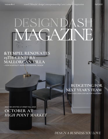
MAGAZINE &TEMPEL RENOVATES 19TH-CENTURY MALLORCAN VILLA + HOW HOSPITALITY INSPIRES RESIDENTIAL DESIGN
BUDGETING FOR NEXT YEAR’S TEAM WHAT DOES 2026 LOOK LIKE FOR YOUR FIRM?
WHAT WE SPOTTED AT HPMKT FALL 2025
OCTOBER AT HIGH POINT MARKET
DESIGN A BUSINESS YOU LOVE