DIYphilosophy
As touched on in chapter 1, both movements were centered around the DIYphilosophy, though it is argued that the way in which this ethos is adapted differs between the two The Subcultures Network (2019) talk about hippies embracing DIYin the sense of ‘freedom to do your own thing’ as individuals, compared to the more ‘collectivist’approach of the punks doing things together Both sides still represent the idea of breaking free from social and political constructs This DIY ideology applies to their personal mantras, art, and independence from the mainstream music industry; it rejected and overcame the barriers, judgments and rules of doing things by the book Bestley (2018, p 9) declares that it was in fact the hippies that first adopted independent publishing, with groups like Here and Now and The Edgar Broughton Band known for their autonomous attitude to production The punks then reignited this approach and made it a significant part of their identity, ‘challenging the very notion of ‘expert’knowledge and aesthetics’, encouraging people to allow passion to overshine technical ability (Heller, 2018) This opened up opportunities for amateurs to enter the field, anyone could be a musician, writer or artist The controversial nature of punk art was rejected by formal galleries, leading artists and writers to join forces and create their own underground publications, fueling a revolt against the media (The Subcultures Network, 2019) The more punk and hippie artists realised that they could do things themselves, the more they strayed from mainstream consumerist society, displaying a shared desire to be free and self-ruling
Anti-establishment
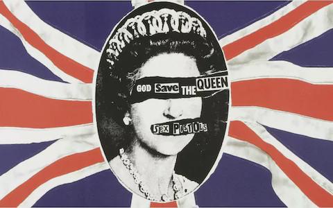
Sabin (1999) recognises this crossover of interest between the two movements, declaring that punk ‘has more similarities with its declared enemy hippy than are sometimes acknowledged’ He goes on to discuss their shared values of anti-conformity, anti-establishment and anti-consumerism, comparing the similitude of ‘The 60s rhetoric of ‘The Revolution’and punk’s rallying call of ‘Anarchy’’.These ideals can be recognised in punk’s use of the circle-Asymbol of anarchy, an acronym of French political writer and socialist Pierre-Joseph Proudhon’s mantra ‘Anarchy is order’.This symbol became part of Punk identity, representing rebellion and revolution Furthermore, Jamie Reid’s crude depictions of the queen in his designs forThe Sex Pistols (see Figure 6) became an iconic visual trope of punk graphics used to cause controversy and mock the monarchy; people were struggling financially and yet taxpayer’s money was being flaunted on celebrations for the queen’s jubilee, naturally causing such a reaction from punk (The Subcultures Network, 2019, p 29) Likewise,Tebby (seeAppendix 5) explains that hippie graphics developed to become very political, particularly in the 70s, following the end of the ‘summer of love’ Morley (2019) adds to this, recognising hippie’s
10
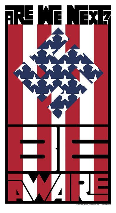
‘anti-establishment resistance and youthful energy’ Just as punks like Jamie Reid made use of the swastika symbol in their designs to cause controversy, hippie artist Wes Wilson used the same shock tactics in his self-published poster, Are We Next? (see Figure 7) Hippies were reacting to the ongoings of the Vietnam War, appauled withAmerica’s involvement, leading to such a reaction from Wilson, comparing theAmericans to Nazis (Typeroom, 2020) Bestley (see Appendix 2) underpins how Oz Magazine, International Times and Suburban Press demonstrate this reciprocated devotion to ‘provocation, political or cultural activism and disrupting the ’status quo'’ Therefore, it is evident that both subcultures were built on the principles of the rebellious youth wishing to make change towards a more collectivist society, reacting against the political happenings of their eras
Sexual Liberation
Adding on to the themes of youth culture and self-expression is punk and hippie’s mutual desire for sexual freedom Punk created a world where people could embrace their sexuality and indulge in all their fantasies without judgment, much like the free love movement of the hippies which welcomed homosexuality and androgyny (Stevenson, 1999) Referring back to the influence of avant-garde, similarly to Dada artists, punks used the human body in their bricolages to intentionally provoke the audience and cause controversy; mainstream society perceived nudity to be taboo, so punks used this discomfort in order to gain attention and dispute social norms (Sladen, 2007, p.11). Comparable to punk’s use of pornographic imagery in their photomontages (The Subcultures Network, 2019), hippies ‘pushed the boundaries’with nudity in their record sleeves and magazines, causing outrage from the establishment (see
Figure 6. God Save The Queen, Jamie Reid, 1977 (The Museum of Modern Art, 2022) Figure 7. Are We Next?, Wes Wilson, 1965 (Typeroom, 2020)
11
Appendix 5) While punks used sexual imagery as an act of defiance, hippies used the body as ‘tool for expression, sexual liberation, experimentation and enlightenment’(Grunenberg, 2005, p151) Moreover, Michael English illustrated nude lovers ‘locked together in eternal balance’in his poster for Middle Earth Club, evoking a feeling of passion and pleasure Though perhaps the attitudes weren’t always completely aligned, the general message both punk and hippies portrayed was one of self-empowerment and liberty
Feminism
Leading on from this is the strong support of feminism from both cultures and the rejection of misogynistic societal thinking.Though women were by no means as privileged as men during these times, the second wave of feminism made considerable progress following the beginning of the women’s rights movement in 1963 (Cochrane, 2013).Though the hippie’s contribution to this was generally passive, they demonstrated their support for women in a spiritual manner Hippie posters often featured curvaceous depictions of ethereal women (see Figure 8), presenting them not as an object like the mainstream media, but as a spiritual figure to be respected and worshiped (Katsumi, 2017). Patriarchal authority was challenged, with more women like MariTepper and Barbara Mendes beginning to share their female perspectives on spirituality and sexuality through art (Margolis, 2021; Moreley, 2019) ‘Dreamy’and ‘alluring’ illustrations of women were drawn in such a way that conveyed admiration over lust; their nude form portrayed in a manner that was ‘pure’and ‘natural’(Peterson, 2002, p 317)
Punk dealt with women’s issues in a more exasperated manner, particularly through the Riot Grrrl movement which was formed as a safe space for females to have a voice within the punk scene (Polyphonic, 2018) This movement birthed Riot Grrrl fanzines like Bikini Kill, which educated people on important issues such as body-image, female pleasure, abortion, menstruation, gender and sexuality (The Subcultures Network, p 295) It gave women and the LGBTQ community a means to be heard and understood, allowing them to reclaim their identity and rebel against the patriarchy Punk fashion feeds into this too, with designers like the iconic Viviene Westwood paving the way for feminism by flipping the male gaze back on itself (Stevenson, 1999) Garments that represented women’s oppression were transformed into outfits that doubled as political demonstrations, taking back the power and throwing it in society’s face Further contributing to the feminist punk scene was activist artist Linder Sterling, known for her revolutionary photomontages and performance art which confronted gender stereotypes (Unframe London, 2021) She conveyed the message that ‘women aren't just objects’by cutting up and reassembling images from women’s and men’s magazines, juxtaposed provocatively to mock conventional repressive attitudes towards femininity (Allen,
12
2019; Bestley, 2012) By obstructing women’s faces with household objects, she conveyed the dehumanisation of patriarchal expectations, highlighting that women are their own entity and should be freed from the oppression of sexual discrimination (see Figure 9) In evaluation, though punk’s demonstration of feminism was far more aggressive, both punk and hippie graphics signify this support for women’s rights, thus sharing many similar core values
13
Figure 8. Example of hippie poster by Wes Wilson, 1966 (The Museum of Modern Art, 2022) Figure 9. Example of punk sleeve design by Linder STerling, 1977 (Reid & Mott, 2010)
Chapter 3
Punk and Hippie’s impact
Punk & Hippie Fusion
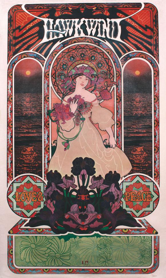
There are cases where punk and hippie graphics have coexisted in unity, designer Barney Bubbles shows evidence of this harmony in his work (Lynam, 2015). Bubbles first established the style of psychedelic design in the 60s and later reemerged as part of the punk aesthetic (Roberts, 2015). Combining the trippy, mystical influence of hippie design with the embodiment of punk’s fierce attitude, he created a legacy which challenged how album art was perceived (Coulthart 2007). Gosling (2022) attests to this explaining that: ‘Bubbles’style is inextricable from the aesthetics and attitude of new wave, drawing a through-line from the acid-laden psychedelia of the 1960s to the snarls of punk, creating a visual language that united their very different approaches to railing against ‘the man’’ His combination of hippie’s psychedelic themes of spirituality, peace and love combined with the gothic typography from punk evidence his influence from both styles, proving that the two styles can complement one another (see Figure 10) Another artist who was influenced by both subcultures is Gary Panter, ‘a self-described hippie who has also been dubbed the king of punk art’(PRINT, 2009) In an interview with Hillary Chute, Panter claims that both punk and hippie were ‘youth movements’ that supported the idea of futurism (Art Forum, 2021) This further underpins the argument that both cultures have influenced artworks simultaneously
14
Figure 10. Example of Barney Bubble’s work, 1973 (Gabirella, 2016)
Together, punk and hippie graphics have influenced many subsequent movements. Starting chronologically, the anarcho-punk subculture was birthed from ‘a combination of hippy idealism and resistance, punk energy and cheek’(Worley, 2016).Anarcho-punk manifested itself as a softer version of punk, taking inspiration from the natural lifestyle of 60s hippie culture, with bands like Crass recognising the ‘continuities between the aspirations of hippy and of punk’(Cross, 2010) Similarly, this punk and hippie fusion can be recognised in the Indie Pop movement, which embodied the anarchic spirit of punk design amalgamated with the optimism of hippie (The Subcultures Network, 2019) Indie Pop was more socially acceptable than punk, as it approached activism in a more peaceful and inspiring way. It took inspiration from punk’s DIYaesthetic, and combined it with hippie’s colourful, happy visuals to communicate their positive yet political message, representing unity between the two
Influence on Rave Culture
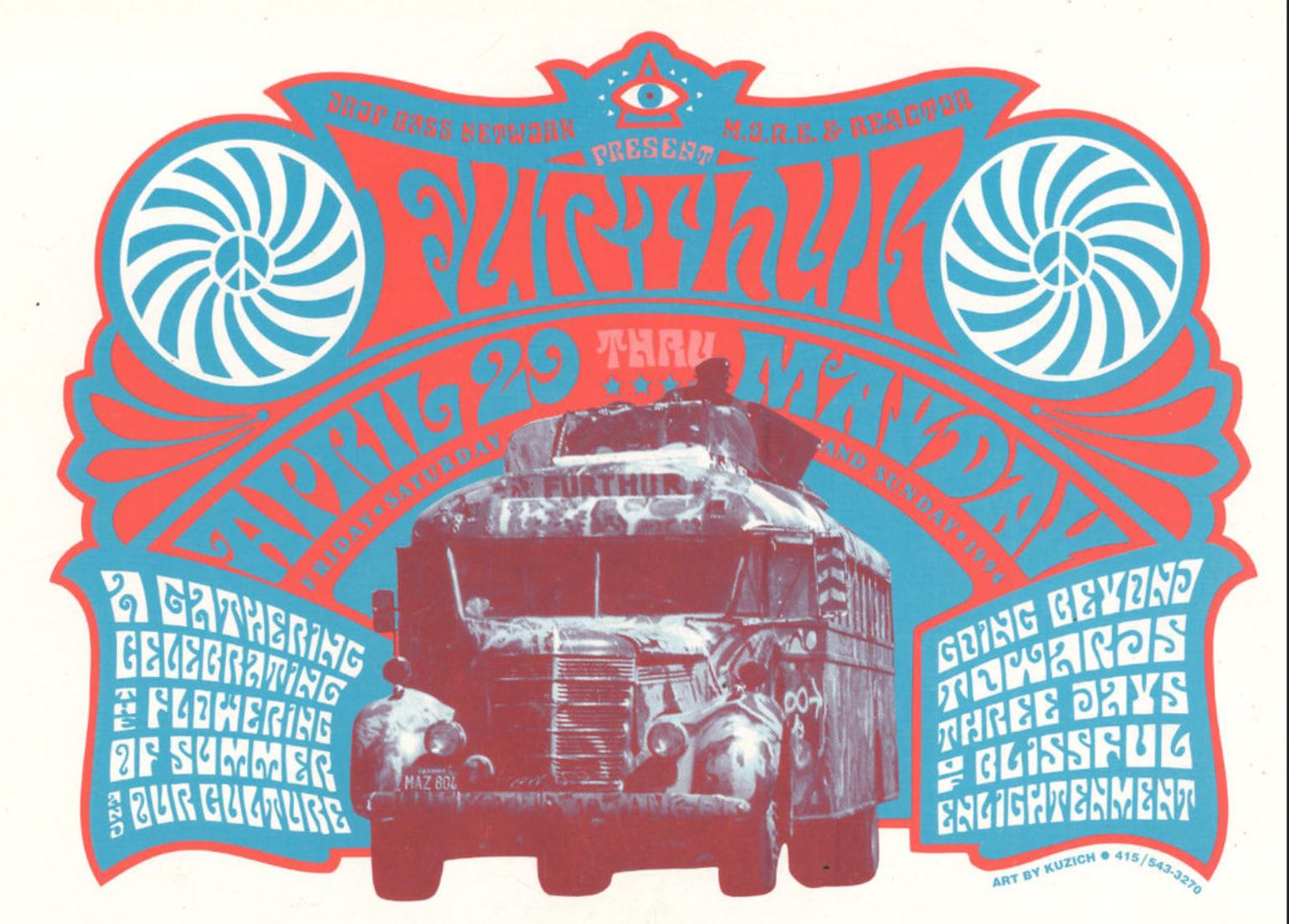
Another example of punk and hippie’s influence is the 90s acid house rave scene, whichTebby describes as a ‘manifestation of the two’(seeAppendix 5). He expands, discussing how rave flyers tap into the DIYpunk aesthetic as well as the hippie psychedelic look Rave culture was born from a significantly similar socio-political environment to both the punk and hippie movements; high youth unemployment, poor education and outdated laws caused a similar revolt to what the 60s and 70s witnessed (Marchant, 2018). For these reasons, the rave scene drew parallels with punk and hippie, all united by the same youthful uproar against the establishment, igniting a desire for liberation and escapism.This rebellious spirit is visible in the experimental rave flyer designs which mirrored punk and hippie’s abolishment of commercial graphic design rules (Parkin, 1999).
In a newspaper article from 1992, promoter Scott Osmond claims: “The ravers have recycled the hippie mantra thing”, demonstrating the influence of the ‘peace and love’hippie ethos (Anonymous,1992) This can be recognised in the visual elements in rave flyers that were ‘borrowed from the 60’s’, such as bubble typography, floral imagery, psychedelic patterns (see Figure 11) and even the smiley face which became an iconic symbol of the era (Parkin,1999)
There were many reasons why the visual language of hippie design was appropriated in rave flyers, not only did it signify the spiritual values of togetherness and unity, but it also replicated the visual effects of psychedelic drugs, which were similarly popular with both cultures. Williams (2018) compares the insurgence of ecstasy in relation to the 90s acid house rave scene to the LSD phenomenon of the 60s hippie movement, both used as a means to escape the political chaos and find community in such troubling times Just as hippie iconography was inspired by
15
such psychedelic experiences, the rave aesthetic also heavily relied upon such visual themes
The use of drugs fed into this theme of surreal escapism which was heavily advertised in rave posters, with catchlines such as ‘takes you into the pleasure zone’used to promote this idea of transportation into an idealistic world Nods to sci-fi themes like galaxies and stars further illustrate the influences from hippie design’s fascination with futurism
Punk’s influence on rave flyers is evident in their implementation of DIYmethods and an autonomous ethos (Berlin, 2022) Often made by hand, the flyers embraced amateurism, and much like punk posters, they were made to be very low-budget and personal (see Figure 12) Just as punk posters were put together briskly, rave flyers also conveyed this need for immediacy, with information ‘scribbled’on in order to disseminate details of illegal parties before the authorities could discover them (Parkin, 1999).The free parties of the 90’s were very punk in attitude, revolting against the government in reclaimed spaces free from the fickleness of commericialism and conformity. Further taking inspiration from punk and hippie graphics, rave flyers made use of collage and scanned imagery, juxtaposing different references from pop culture to create surreal montages that envisioned the experience of the club nights.This method of sampling was used not just in their graphic designs, but also became a huge part of the acid house music itself.Another shared theme between punk and rave graphics is the use of anarchist imagery: ‘This samizdat, anti-establishment, quality of flyers appeals to the subculture in the same way that punk graphics of the seventies did’ This resistance against the government shaped the aesthetic of punk, rave and hippie graphics, as they all refused to conform, so they created their own way of doing things, at the very heart of the DIYethos It is evident how the punk and hippie ethos and style left their mark on its succeeding cultures
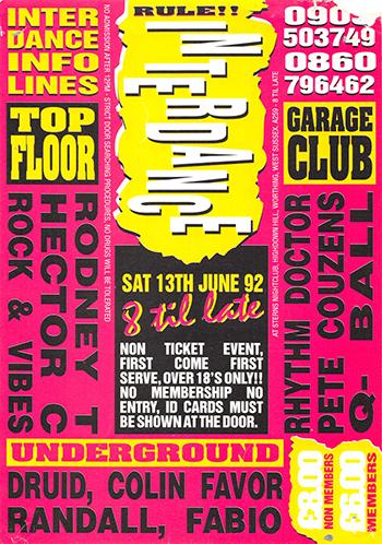 Figure 11. Example of Rave Poster, Further Festival, 1994 (Matos, 2016) Figure 12. Example of rave poster for Interdance, 1992 (Jonson, 2013)
16
Punk’s Legacy Today
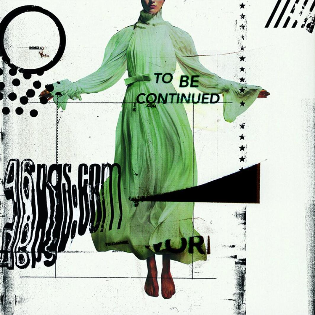
This DIYculture still exists in the present day and remains to inspire many creatives to experiment beyond the restrictions of commercial design rules (Barnes, 2017) Further traces of punk’s footprint include the appropriation of its design aesthetic, which Stevens-Wood (2021) describes as ‘universally iconic, transcending time and geographic location’ The hand-made punk style is heavily replicated in the sense of distressed typography and collaged imagery, however, although the punk ethos still exists as a subculture, it is often used without much consideration for its historical and social context. In an interview with Heller (2022), graphic designer Worthington discusses the diluting effect of new technology on punk design, explaining how it therefore ‘can’t exist now in the same way’.Tebby also recognises how technology has interfered with the authenticity of the punk aesthetic (seeAppendix 5) He expands, explaining how many magazines such as 46 Pages (see Figure 13) embrace the punk DIYaesthetic, using the same handmade processes as they did in the 70s, however, now digital editing is ‘sneaking in’and diminishing the rawness of it, which is besides the original values of punk This illustrates how punk’s legacy does in fact still exist in terms of design, it has just evolved with technology to exist as a modernised hybrid of analogue and digital.
17
Figure 13. 46 Pgs Cover Graphics, Issue 12, 2022. (46 Pgs, 2022)
Hippie’s Legacy Today
Just as punk inspires designers to this day, influence from hippie design is also apparent, as shown by the responses from a focus group (seeAppendix 3) In the focus group, a comparison was drawn between the narrative illustrations in hippie posters and that of modern-day tour posters: ‘I feel like that illustrated look is creating a story and it's much more commonly seen today, they want people to be chucked into a full experience’.Also mentioned were other elements of hippie design that are still used today, such as psychedelic typography, hand-drawn graphics and symmetrical compositions.The London Illustration Fair (2015) can also attest to hippie design’s long-lasting influence on modern-day graphics, having based their event around the theme of psychedelia.They discuss the importance of this movement, and examine how modern artists are inspired by the bright colours, flowing type and surreal imagery Andrew Blauvelt, curator of the Hippie Modernism exhibition says ‘It's difficult to identify another period of history that has exerted more influence on contemporary culture and politics’(Brake, 2015) His exhibition brings attention to hippie’s ongoing effect on current social-impact design, with issues such as women’s and LGBTrights and environmentalism still being referenced in design today Evidently, there are many ways in which the hippie movement has shaped design today, not just as a form of stylistic inspiration, but also as a form of activism for social causes
In summary, punk and hippie graphics have made an apparent impact on the successive subcultures, from the 90’s rave scene right through to the current day Despite their differences, there is clear evidence of the two styles working together in harmony, especially since their underlying messages overlap Inspiration has been taken from both subcultures and in some cases, artists like Barney Bubbles have fused the two together.Though technology has changed, traces of punk and hippie design remain visible in modern graphics, from posters to exhibitions and commercial work, these movements continue to inspire design today.
18
Conclusion
This essay has underpinned the evident correlation between punk and hippie graphics, in terms of both graphical and social principles Though there are apparent differences that separate the two movements, such as visual style and attitude, there remains to be more similarities than seen at first glance; it appears as though deep down, their values and passions overlap In interviews for this essay, high-profile industry experts such as Steven Heller and Russ Bestley have acknowledged these correlations and can attest that although the designs themselves look visually opposing, the underlying messages and contexts behind them resonate
Naturally, there are limitations to this study, it is impossible to deconstruct every single piece of punk and hippie art.Therefore, a more generalised examination was devised, looking at the two movements as a whole by assessing sources that best represented the overall conventions Further research could be explored with more specific examples and could take into consideration perhaps the evolution of both movements side by side on a yearly basis Of course, this approach would require far more time and a much larger word count.
The first chapter established the artistic contrast against punk and hippie design, focusing on the clashing tones of voice and style It was devised that the punk aesthetic was curated from anger and resistance against the government and society, due to the devastating economical state at the time of punk’s uprising This anger translates into their visually aggressive style, using ripped-up lettering and sliced imagery to appear threatening Contrastingly, the hippie aesthetic was formed from a more passive desire for peace and love aided by their use of psychedelic drugs, visually replicated with swirly patterns, fluid shapes and organic imagery However different their attitudes, there is evidence to show the crossovers of avant-garde art influence and the use of DIYmethods
Despite their stylistic differences, the social philosophies behind punk and hippie graphics are in line with another. Both movements displayed similar values for individuality, DIYphilosophy, anti-establishment, sexual liberation and feminism, and were ultimately revolved around youth culture.Though perhaps the two movements conveyed opposite approaches to tackling these issues, the very basis of their ideologies remains the same; rebellious youth wanting change towards a more free society Both subcultures fought against oppression from the government and mainstream culture Together, punk and hippie influenced subsequent design subcultures, most heavily recognised in the rave scene which borrowed elements of both styles, fusing them together to create a new identity, centered around the same values of individuality, youth culture
19
and rebellion Rave culture combined punk’s resistant attitude with hippie’s spiritual optimism, creating an escape from the oppressive political environment.
Furthermore, stylistic influence from punk and hippie design is still evident today in the form of narrative illustration, DIYand custom typography Though technology has advanced significantly from the beginnings of punk and hippie design up until now, meaning the processes and methods have changed, their spirit lives on, but has evolved with time The activist ideology of punk and hippie is still evident today as we see more designers using their art to voice important issues and make steps towards a more inclusive world; they have left their mark, encouraging designers to abolish conventional rules and find freedom in expression
It is well observed that history repeats itself, as evident in the evolution of the punk and hippie movements, which became replaced with the rave scene, which will ultimately be replaced with the next youth uprising Ultimately, the underlying catalyst behind punk, hippie and rave culture that shapes both their philosophical ethos and aesthetic style is the youth reaction to the socio-political environment With the current declining economic state, the cost of living crisis, climate change and ongoing pitfalls from the conservative leadership, it is only a matter of time before a new youth uproar Generation Z have already begun their uproar, with protests for racial equality, LGBTQ rights and climate change, mirroring the spirit of youth rebellion, anti-establishment and liberation that was integral to punk, hippie and rave culture Prepare, for the new youth revolution is coming, and once again, punk and hippie culture will be reborn
20
List of Images
Figure 1
Grunenberg, C (2005) Poster for Canned heat by Lee Conklin, 1968 Summer of love: art of the psychedelic era London:Tate
Figure 2
Fig 2 The Museum of ModernArt (2022) Nevermind the bollocks, by Jamie Reid, 1977
Available from:
https://wwwmoma org/collection/works/156137?artist id=68811&page=1&sov referrer=artist (accessed on 07.11.22)
Figure 3
BBCArts (2017) Sleeve art for Sgt Pepper's Lonely Hearts Club Band by Peter Blake
Available from:
https://wwwbbc co uk/programmes/articles/3TZbNn59V1tMCx3dXXlf2BK/jann-haworth-the-forg otten-creator-of-the-sgt-pepper-cover (accessed on 07 11 22)
Figure 4
Reid, J & Mott,T, (2010) Cover for Sniffin Glue Fanzine, 1976 Loud flash: British punk on paper London: Haunch of Venison
Figure 5
Grunenberg, C (2005) Poster for The Yardbirds by Bonnie Maclean, 1967 Summer of love: art of the psychedelic era. London:Tate.
Figure 6
The Museum of ModernArt (2022) Nevermind the bollocks, by Jamie Reid, 1977 Available from:
https://wwwmoma org/collection/works/156133?artist id=68811&page=1&sov referrer=artist (accessed on 07.11.22)
Figure 7
Typeroom (2020) Are We Next?, by Wes Wilson, 1965 Available from:
https://wwwtyperoom eu/wes-wilson-ode-anti-war-pioneer-rock-poster-psychedelia (accessed on 10 11 22)
21
Figure 8
The Museum of ModernArt (2022) Example of hippie poster, by Wes Wilson, 1966 Available from:
https://wwwmoma org/collection/works/8896 (accessed on 07 11 22)
Figure 9
Reid, J & Mott,T, (2010) Example of punk sleeve by Linder Sterling,1977 Loud flash: British punk on paper. London: Haunch of Venison
Figure 10
Gabriella, V (2016) Example of Barney Bubble’s work, 1973 Available from:
https://veradesignblog.wordpress.com/2016/01/05/barney-bubbles-the-graphic-genius-of-the-70 s-part-1/ (accessed on 8 11 22)
Figure 11
Matos, M (2016) Example of rave poster for Further Festival, 1994. Available from:
https://dailyredbullmusicacademycom/2016/06/nightclubbing-furthur (accessed on 10 11 22)
Figure 12
Johnson, M (2013) Example of rave poster for Interdance, 1992 Available from:
http://wwwravepreservationproject com (accessed on 12 11 22)
Figure 13
46 Pgs (2022) 46 Pgs Cover Graphics, Issue 12, 2022 Available from:
https://46pgs.com/shop/p/no3-wab5e-aer9b-lw23g-bcz69 (accessed on 12.11.22)
22
Bibliography
Allen, J (2019) How Groundbreaking Design WeirdnessTransformed Record Label United Artists,AgainstAll Odds. Eye On Design. [Online] 7 October.Available from:
https://eyeondesign aiga org/label-focus-united-artists-pushed-narcotic-tinged-design-weirdness -groundbreaking-sleeves-against-the-odds/ (accessed on 11 09 22)
Androutsopoulos, J (2009) Typography as a resource of media style: cases from music youth culture Hannover University Available from:
https://jannisandroutsopoulos files wordpress com/2009/09/typography-as-style-resource pdf (accessed on 28.10.22)
Anonymous (1992)They rave and sway ; Latest rage combines drugs with rap- influenced music Telegram & Gazette [Online] 27 November Available from:
https://www.proquest.com/docview/268461071?accountid=10749&parentSessionId=rZ5Ed9t43
FS2MfY6SSB6F6w9FikvqM6VF7B%2F6SgK4oc%3D&pq-origsite=primo (accessed on 02.11.22)
Art Forum (2021) Gary Panter talks about his life and art. Available from:
https://wwwartforum com/interviews/gary-panter-talks-about-his-life-and-art-85393 (accessed on 02 11 22)
Art In Context (2022) PsychedelicArt –An Exploration of the PsychedelicAesthetic inArt Art In Context [Online] 10 March Available from: https://artincontext org/psychedelic-art/ (accessed on 11 09 22)
Barnes, E (2017) Pretty In Punk: An Investigation Into The Visual Legacy Of Punk. BAHons Dissertation, NottinghamTrent University Available from :https://d1wqtxts1xzle7 cloudfront net/54472601/DIss for online-with-cover-page-v2 pdf?Expire
s=1667576283&Signature=bKclFMJ3YjSqiw8yw7BIIgXxRceqAjFTJpCYruuXLbCGuuX-1kN6Jtq VRgd5bja1AJaFjxs2oZxaEgFrJzG2Oc2o6mK-2GaFifphRYMTOXb0-3zMeoZrSH634SiP4STvm
EraMqjbD57UAuDFGVLWwv65y9XsaQ4zqlUe~WIH586vmmVF54VjF7ap8RR2fgTKnQ17AnFq
1-IhrtoDgFE4FtK-NFMFi8i4TpEM-azLWPtRV3bKARi113bLS6Ziw~0PJAqIJKw~ea7Gzu8yj9Bcv
-Q-yuzv-CB7dy0GOqsd3pzgYgLVDBN9qCa-0BmCedkEcudxMQ0WbyyL0L3IVBGzwg &Key-
Pair-Id=APKAJLOHF5GGSLRBV4ZA (accessed on 04 11 22)
23
BBCArts (2017)The forgotten creator of the Sgt Pepper cover BBC Arts [Online] 17 May
Available from:
https://wwwbbc co uk/programmes/articles/3TZbNn59V1tMCx3dXXlf2BK/jann-haworth-the-forg otten-creator-of-the-sgt-pepper-cover (accessed on 07 11 22)
Berlin, C (2022) DIY Flyering: Tracing the iconic rave flyer back to its roots Available from:https://museumofyouthculture com/diy-flyering/ (accessed on 03 11 22)
Bestley, R. (2018) Design it yourself? Punk’s division of labour. Punk & post-punk. [Online] Vol 7, no 1, pp 7–24 Available from:
https://www.ingentaconnect.com/content/intellect/punk/2018/00000007/00000001/art00002# (accessed on 20 09 22)
Brake,A(2015)Hippie Modernism exhibition at the Walker Art Center to celebrate design's trippy side. Available from:
https://wwwdezeen com/2015/07/31/hippie-modernism-exhibition-walker-art-center-minneapoli s-design-trippy-side-counterculture/ (accessed on 04.11.22)
Butler, J (2013)The Routledge Companion to Music and Visual Culture [eBook] Oxford:Taylor & Francis Group Available from:
https://librarysearch bcu ac uk/permalink/44BCU INST/u3k8pk/cdi scopus primary 63196005 9 (accessed on 11 09 22)
Cross (2010)There Is NoAuthority ButYourself ”:The Individual and the Collective in British Anarcho-Punk, Music & Politics, vol 4, no.2.Available from:
https://doi org/10 3998/mp 9460447 0004 203 (accessed on 02 11 22)
Cochrane, k (2013) 1963: the beginning of the feminist movement The Guardian [Online] 7 May Available from:
https://wwwtheguardian com/lifeandstyle/2013/may/07/1963-beginning-feminist-movement (accessed on 07 11 22)
Coluzzi, P(2021)The significance of typography in the linguistic landscape of the 1960s and 1970s: Hippie vs. Punk, Journal of Modern Languages, Vol. 31, No. 1 pp. 88-104.
Available from: https://doi org/10 22452/jml vol31no1 5 (accessed on 02 09 22)
24
Coulhart, J (2007) Barney Bubbles: artist and designer. Available from: http://wwwjohncoulthart com/feuilleton/2007/01/20/barney-bubbles-artist-and-designer/ (accessed on 01 11)
Davis, C (2020)ABriefTimeline of 20th Century VisualArt Movements The Collector [Online]
19 February Available from:
https://wwwthecollectorcom/a-brief-timeline-of-20th-century-visual-art-movements/ (accessed on 19.10.22)
Duque, J. (2019) Spaces inTime:The Influence ofAubrey Beardsley on Psychedelic Graphic Design H-ART Revista de historia, teoría y crítica de arte, no 5 : pp15-38 Available from:
https://doi.org/10.25025/hart05.2019.02 (accessed on 01.10.22)
Gabriella, V (2016) Documenting Barney Bubbles: The Graphic Genius of the 70s.
Available from:
https://veradesignblog.wordpress.com/2016/01/05/barney-bubbles-the-graphic-genius-of-the-70 s-part-1/ (accessed on 8 11 22)
Gastaut,A & Criqui, J -P (2005) Off the wall : psychedelic rock posters from San Francisco
London:Thames & Hudson
Gibbs,A(1996) Destroy: The Definitive History of Punk Culver City: Britannia Press Publishing
Grimes, S. (2022) Music and Movements: Psychedelic Rock Posters and the Counterculture.
Grunenberg, C. (2005) Summer of love : art of the psychedelic era. London:Tate.
Heller, S (2017)TheAcidAesthetic:ABrief History of Psychedelic Design PRINT [Online] 29 April Available from:
https://wwwprintmag com/culturally-related-design/acid-aesthetic-history-of-psychedelic-design/ (accessed on 27 08 22)
Heller, S (2018) Punk’s Deskilling SpiritToday PRINT [Online] 25 June Available from: https://www.printmag.com/daily-heller/too-fast-to-live-too-young-to-die/ (accessed on 29 09 22)
25
Heller, S (2022) Punk Reprised, Rethunk, No Bunk. PRINT [Online] 11August.Available from: https://wwwprintmag com/daily-heller/the-daily-heller-punk-reprised-rethunk/ (accessed on 27 08 22)
Ho,A(2013) Typography today: Emotion recognition in typography. City University of Hong Kong Available from: http://design-cu jp/iasdr2013/papers/2213-1b pdf (accessed on 01.10.22)
Katsumi,Y(2017) Hippie Visual:TheArt of Spiritual Journey towards the Establishment. Reviews Magazine [Online]Available from:
http://reviewsmagazine.net/hippie-visual-the-art-of-spiritual-journey-towards-the-establishment/. 25 October (accessed on 15 09 22)
Kugelberg, J et al (2012) Punk : an aesthetic London: Rizzoli
Klos,A(2016) Jamie Reid and the Punk Rebellion Available from:
https://wwwretroavangarda com/jamie-reid-and-the-punk-rebellion/(accessed on 12 09 22)
Lees, C (2020) How Punk Changed the Music Poster Industry Available from:
https://burstgallery.com/blog/how-punk-changed-the-music-poster-industry/ (accessed on 21 09 22)
Lynam, I (2015) The Genius of Graphic Designer Barney Bubbles Available from:
https://daily.redbullmusicacademy.com/2015/03/barney-bubbles-feature (accessed on 05 10 22)
Marchant, I (2018) A hero for high times : a younger reader’s guide to the beats, hippies, freaks, punks, ravers, new-age travellers and dog-on-a-rope brew crew crusties of the British Isles, 1956-1994 London: Jonathan Cape
Margolis, J (2021) ‘ABubble of Happiness and Visionary Beauty’:The Mystical FeministArt of Barbara Mendes. Nashim : a journal of Jewish women’s studies & gender issues. No. 38, pp. 149–164 Available from:
https://go-gale-com.bcu.idm.oclc.org/ps/i.do?p=AONE&u=uce&id=GALE%7CA671460683&v=2 1&it=r
Matos, M (2016) The scene-defining, acid-drenched festival that was an early peak and future
26
reference point for raves in the Midwest United States Available from:
https://daily.redbullmusicacademy.com/2016/06/nightclubbing-furthur (accessed on 10.11.22)
MN Original (2013) Tom Hazelmyer: Punk Rock Graphics [Video]Available from:
https://www.youtube.com/watch?v=C1jsIR2TQMA (accessed on 19.09.22)
Morley, M (2019)The Cost Of Free Love andthe Designers Who Bore It Meet the Women of Psychedelic Design Eye On Design [Online] 7 March Available from:
https://eyeondesign.aiga.org/women-of-psychedelic-design/ (accessed on 11.09.22)
Mouttett, S (2022) Psychedelic Design Available from:
https://news mediaheroes com au/blog/psychedelic-design (accessed on 12 09 22)
Newsweek (2019)The Sex Pistols' Johnny Rotten Walks Through A History Of Punk Graphics
[Video]Available from: https://wwwyoutube com/watch?v=xlUHXKhSadg
(accessed on 04 10 22)
Okun, M (2011) Hippie Punk Fusion It’s Psychedelic Baby Magazine [Online] 22 July Available from: https://wwwpsychedelicbabymag com/2011/07/hippie-punk-fusion html (accessed on 15.09.22)
Owen,T. et al. (1999) High art : a history of the psychedelic poster. London: Sanctuary Publishing
Parkin (1999) Visual Energy: Flyer Design and its Relationship with Acid House BA
Dissertation.Swansea Institute of Higher Education.Available from:
http://hyperreal org/raves/database/visuale/index html (accessed on 02 11 22)
Peterson, C (2002)Photographic imagery in psychedelic music posters of San Francisco, History of Photography, Vol 26 no 4 pp 311-323 Available from:
https://doi org/10 1080/03087298 2002 10443305 (accessed on 29 09 22)
Polyphonic (2018) Riot Grrrl: The '90s Movement that Redefined Punk [Video]Available from:
https://wwwyoutube com/watch?v=tAbhaguKARw (accessed on 04 10 22)
27
PRINT(2009) Panter’s Playhouse PRINT [Online] 17 June Available from:
https://www.printmag.com/design-books/books panters playhouse/ (accessed on 03.09.22)
PRINT(2016) Violating Optical Principles forTypographic Effect PRINT [Online] 7April
Available from:
https://wwwprintmag com/article/violating-optical-principles-for-typographic-effect/ (accessed on 09 09 22)
Reid, J. & Mott,T. (2010) Loud flash : British punk on paper. London: Haunch of Venison
Roberts, C (2015) Graphic design visionaries London : Lawrence King Publishing
Rosemont, F (2022)Anarchism Britannica [online] 20 September Available from:
https://wwwbritannica com/topic/anarchism/English-anarchist-thought (accessed on 10 10 22)
Sabin, R (1999) Punk Rock: So What?: The Cultural Legacy of Punk [eBook] London: Routledge.Available from:
https://librarysearch bcu ac uk/permalink/44BCU INST/u3k8pk/cdi askewsholts vlebooks 978 1134699063 (accessed on 28.08.22)
Sladen, M (2007) Panic Attack: Art in the Punk Years. London:Merrell Publishers
Stevenson, N & Stevenson, R (1999) Vacant : a diary of the punk years 1976-79 London:Thames & Hudson
Stevens-Wood,T(2021) Is 1977 the year that punk died? BAHons Dissertation, Birmingham City University. (accessed on 04.11.22)
Taylor,T(2019)In what ways was punk a rebellion against the social conditions of the 1970s? The Bristorian [Online] 17 September Available from:
https://www.thebristorian.co.uk/essays/1970s-rebellion-punk (accessed on 10.10.22)
The London Illustration Fair (2015) Psychedelia.Available from:
http://wwwthelondonillustrationfairco uk/psychedelia (accessed on 05 11 22)
The Lostinasda (2012) Mark Perry talks about Sniffing glue fanzine [Online]Available
from:https://wwwyoutube com/watch?v=K3blLpsFPTI (accessed on 19 09 22)
28
The Museum of ModernArt (2022) Jamie Reid.Available from: https://wwwmoma org/collection/works/156133?artist id=68811&page=1&sov referrer=artist (accessed on 07 11 22)
The Museum of ModernArt (2022) Wes Wilson Available from: https://wwwmoma org/collection/works/8896 (accessed on 07 11 22)
The Subcultures Network (2019) Ripped, torn and cut : pop, politics and punk fanzines from 1976 Manchester: Manchester University Press
Typeroom (2020) Wes Wilson: An Ode to the Anti-War Pioneer of Rock’s Poster Psychedelia
Available from:
https://wwwtyperoom eu/wes-wilson-ode-anti-war-pioneer-rock-poster-psychedelia (accessed on 10.11.22)
Unframe London (2021) A History of Feminist Art. Available from: https://unframe london/feminist-art/ (accessed on 17 09 22)
Williams, H (2018)Anew play,AllYou Need is LSD, tracks the importance of psychedelic drugs beyond just flower power Is it time for a third ‘summer of love’? BBC Culture [Online] 17 Oct
Available from:
https://wwwbbc com/culture/article/20181016-how-lsd-influenced-western-culture (accessed on 3.11.22)
Woodcock, G (2022) Anarchism. Available from: https://www.britannica.com/topic/anarchism (accessed on 07 11 22)
Worley, M (2016) The aesthetic of our anger : anarcho-punk, politics and music Colchester: Minor Compositions
29
Appendices
Appendix 1
Heller, S. (2022) Interviewed by Rebecca Eastment via email, 21 September
Do you think that there are any similarities between the visual themes of punk and hippie graphics i.e album artwork, posters etc.? If so, what and why?
Hippie graphics are clearly distinguishable from punk records, posters, etc.The latter is very raw, cut and paste with scant artistry The former can also be raw and DIY, but the album graphics were done by professional graphic designers and painters.There is a finer look to Hippie stuff, even the underground papers had a less caustic look
Do you think that there are any similarities between the messages behind punk and hippie artwork? If so, what and why?
The messages ran the gamut from anti-war and civil rights to music and drugs They were more or less similar messages - the Punks did not have Vietnam to protest and much of that work was not about civil disobedience. But the methods and mannerisms were similar.
Can you think of any examples of posters, album art or merch that incorporate both punk and hippie visuals? If so, how?
The newspaper Slash had a wide variety of covers, some of them reveal crossover. But if you look atAndrew KRivane's books of Punk Graphics and Gushkin's books of pre-punk design, you can see differences.
30
Appendix 2
Bestley, R. (2022) Interviewed by Rebecca Eastment via email, 22 September
What similarities (if any) do you notice between the visual elements of punk and hippie graphics?
I think the key question you need to ask yourself is how do you define what you mean by ‘punk’ and ‘hippie’?That basic distinction is at the heart of your research question There are, obviously, plenty of stereotypes and received histories of both ‘hippie’and ‘punk’– I’m thinking the generic convention of laid back/drugged out late 1960s hippies with long hair, kaftans, psychedelic posters, ‘free love’etc vs. the stereotypical punks with either studded leather jackets and mohicans or reflected graphically by Jamie Reid’s iconic work for the Sex Pistols
However, both stereotypes are problematic when you drill into them and recognise the range of approaches, aesthetics, visual or musical styles and/or regional or chronological distinctions between different types of ‘punk’or ‘hippie’ What I mean here is that ‘hippie’, for instance, covers everything from the San Francisco/Woodstock ‘flower children’of the late 1960s to the White Panthers, radical political groups, the MC5, UATWM, anarchist and free press etc Meanwhile, ‘punk’spans the Ramones,Television, Blondie etc in NewYork around 1975/76, the Sex Pistols, Clash, Damned etc in London 1976/77, the punk and new wave boom more widely in the UK, Europe,Australia and beyond 1977-1980 as well as the punk/hardcore scenes in the US, UK, Europe and beyond 1980-1990, the commercial punk boom of the 1990s (largely centred around Southern California) and the numerous global punk scenes that still exist today, from Brazil to Indonesia, Japan to China,Africa to India etc etc.
So, post-1980s ‘punk’– those studded leather jackets and mohican hairstyles etc – is a long way from 1970s ‘punk’in the UK,Australia or the US, both in terms of fashion, style and dress and in terms of graphic design approaches and methods.The same thing applies to the psychedelic poster art of the late 1960s in comparison with some of the very visually aggressive, political and sometimes ‘offensive’graphics associated with the early 1970s anarchist and underground press
31
Still, as a way of comparing the two, there are indeed some overlaps and some distinctions Jamie Reid was heavily involved in the creation of graphic material for Suburban Press in the early 1970s Alot of that work drew upon or reflected the wider ‘radical hippie’underground press, both in the UK and the US When he was asked to create graphics for the Sex Pistols by Malcolm McLaren, he drew upon some of that existing work and repurposed it to create what would become widely recognised as ’the’punk graphic style of the mid-1970s
What similarities (if any) do you notice between the messages behind punk and hippie graphics?
Building on my previous point… Jamie Reid was working within a wider graphic movement in the late 1960s and early 1970s that involved sharing radical visual themes or styles and/or reflected some of the then-current political and philosophical developments in Europe and the US In France, the Netherlands and Scandinavia, the Situationist International group worked to resurrect some of the radical ideas of the original Surrealist movement of the 1920s. One of those ideas was the notion of détournement – appropriating already existing images and corrupting them in order to undermine their authority or disrupt conventional readings.This was all part of a strategy to reveal and intervene in what Guy Debord called ’the society of the spectacle’– a situation where the population is saturated with mediated images that tell us how to live, how to behave, how to dress etc If you can find a copy, check out Sadie Plant’s book The Most Radical Gesture for a detailed history of the SI and its links to Surrealism
So, there was a current within ‘hippie’graphics that was provocative, political, subversive and used techniques such as détournement to disrupt the status quo. Jamie Reid’s work at Suburban Press is a brilliant example as is his subsequent work for the Sex Pistols While Reid’s work was to become iconic (think of the God SaveThe Queen poster, for instance), it also dominated ‘punk’graphic styles so heavily that other bands and labels had to try to develop alternative approaches so as not to be accused of copying the Sex Pistols. Hence graphics by Malcolm Garrett (for Buzzcocks, Magazine etc) or Jill Mumford (for Siouxsie & the Banshees) looked very different to Reid’s work.
What similarities are there (if any) between the design processes behind punk and hippie graphics?
I guess I’ve answered that to an extent above – the Situationists were very influential to both subcultures and détournement was used as a graphic strategy within some of the more
32
politically radical hippie graphics as well as very heavily in punk I think punk more widely steered toward do-it-yourself (DIY) amateur design, often celebrating its own naivety and ugliness, and relied quite heavily on collage and appropriation, particularly of images (from newspapers, magazines, found graphics etc), whereas hippie graphics might lean a little more toward hand-drawn illustrations/comics/cartoons and hand-rendered lettering styles
Can you think of any examples of graphics that incorporate both punk and hippie styles? If so, in what ways do they convey this?
As in the first chapter of The Art of Punk, Oz magazine, International Times and Suburban Press give a really clear indication of the overlap between the two apparently separate and distinct scenes or styles, particularly in relation to provocation, political or cultural activism and disrupting the ’status quo' Jamie Reid’s poster design for the Sex Pistols single Pretty Vacant features two buses (going to ‘boredom’and ’nowhere’) – the image was taken directly from a late 1960s poster by Point Blank, a hippie activist collective in California
Of course, I’ve talked more here about the overlap between ‘punk’and ‘hippie’, particularly in relation to early UK punk graphics and the ‘political’radical underground wing of ‘hippie’in the UK and US in the late 1960s and early 1970s If we were to follow the stereotypes more closely, I guess we would see a clear distinction between the ‘peace and love’hippie movement and the ‘hate and war’punks in fact, the Clash song ‘Hate and War’was written as an explicit counter reaction to the notion of ‘peace and love’ Equally, later Sex Pistols graphics featured slogans such as ’never trust a hippie’– though that was at least partly a provocation by Reid and McLaren aimed at Virgin Records owner Richard Branson, a deliberate attempt to bite the hand that feeds since the band were signed to Virgin.
33
Appendix 3
Focus Group held by Rebecca Eastment (2022) at Birmingham City University, 6 Oct
What do you notice about the typography in FigureA, how does it make you feel, and what messages do you think are being communicated with it?
William: It's all very custom, they don't really use typefaces. It's very much that they're creating the type explicitly for the thing that they're trying to communicate which probably ends up communicating the message better.
Berenice:It's very fluid.
Josie: I do think it's a little bit illegible,a few of them are quite hard to read, but with the photography as well, it kind of gives you the message anyway
Berenice: For me, it doesn't bother me that I can't read the time, but because I'm viewing it from an artistic perspective
William: I feel like they're using the type much more as a graphic asset as opposed to them using it as a tool of communicating it because as we were saying like if you had that as a promotional poster you would you wouldn't know what it was promoting unless you like spend a lot of time looking like, I feel like if I spent a good five minutes looking at it I'd understand.
Josie: I think with the middle one where the type kind of looks like it's her hair or a headdress or something, I think that's really effective and as well it does just make you stare at longer
The way it’s like a part of the image?
Joise:Yeah
William: I guess on the other hand,the fact that you're trying to figure out where it's saying and because it's so obviously appealing, maybe makes people look at it longer
34
What do you notice about the colours used in FigureA, how does it make you feel, and what messages do you think are being communicated with it?
George:They’re very bright and vibrant, happy colours
William: It's very feel good, really positive
George: With the image of the woman dancing, it reinforces it
What do you notice about composition and layout?
Josie: It’s all very centralised, a lot of it is in the middle and we're going to work our way around what's in the centre
Berenice:There’s a lot of repetition and symmetry in it, which I think is what for me makes these attractive in a way because even though the information's not that obvious, the symmetry is what makes it feel easier on the eye.
George: I like the hierarchy, like the big type and its it goes down in size.
William: I quite like the fact that it sort of seems more in the realm of fine art as opposed to graphics in a way because I quite the way it sort of just seems like they've built the composition up from a central point like they would have had the figure or they would have had the type and then they would have just seen ‘oh that looks nice’, instead of ‘that's supposed to go there because that's where the grid line is’ Yeah, so I feel like it's much more they've gone for what looks visually better as opposed to what is technically better.
What do you notice about the photography/ illustrations used, what themes are they showing?
William: It seems like there’s a lot of images of freedom,like with the hair blowing and the expressive movements, and they're just, like, sort of living their best lives
Josie: I think are very, like, positive and almost like psychedelic
35
What do you notice about the texture and from?
Josie: It looks like collage, all of them look like somebody is taking a very analogue approach and taking the picture of a face and then layered it with something on top of it I just feel like it looks very real and raw, you know? I mean it doesn't look very digital to me
George:Yeah, it's very printy
Berenice:Yeah, like, even in this one, like, with the, I don't what you called, like, kind of the pop art
Me: like halftones?
Berenice:Yeah, the half tone It adds those extra layers to it and gives it depth
William: I feel like it's a lot of like screen printing flat colours, but layered up like you can see that one colours printed per layer, but then the way that the colours are laid out, and it gives a very psychedelic-like hallucinating effect, very trippy
What do you notice about the typography in Figure B?
George: It’s very bold and thick
Berenice: It’s very like hard-hitting, straight to the point , in your face
William: Sans serif
Josie: I don't think any of it matches, it all looks very miss-matched to me, especially the Sex Pistols stuff, it looks like it’s been cut and paste.
36
William:Yeah, it gives very much ransom note I do think though, as opposed to the hippie ones, they do seem to use a lot more actual typefaces. Like the hippie stuff made the type for the specific poster, these ones are sort of making do with what they've got to produce something
Berenice: It’s taking existing elements, this one feels like it scrambles together a bunch of different things and smacked on yeah to create something else, but the hippie ones are like constructed and illustrated
Josie:There’s a lot less care with these, I think it looks like they have taken like no time to do it but it's still like just as effective.
George: It’s very angry - feeling
Berenice: Just a point to make, this one is definitely prioritising like where to be, what time etc., this is trying to communicate information quicker, no faff
What do you notice about the colours?
Josie:There’s not a lot of colour, well there is but there's only like two colours at a time I don’t think they're using colour for the same purpose as the hippie ones, like they are just kind of using it as a background
Berenice:Yeah, the contrast is - I don't feel like colour is the priority in this? It’s heavy black and white becaue that's what you're drawn to, but they need something also to break it up and separate the two
George: It’s almost like they’re using the colour just as an eye grabber, to get attention
What do you notice about composition and layout?
Josie: I think some of them you could argue that they are using grids but in a very loose way, like I feel like they've got the grid there but they're not sticking to it, it's not this rigid sort of design
37
William: I think the overall compositions in comparison to the hippie posters, are much moreAimage based, and B- the hierarchy of them, is more clear, like you can tell what you’re meant to be looking at With the hippie stuff it’s more of an art piece, everywhere you look there's something interesting to look at Whereas here, it's like ‘we want you to look here’
And what about the photography and illustrations used, like the actual imagery? Do you notice any common themes?
Berenice:Again there’s a lot of faces being used to draw you in, naturally I feel drawn to it
George: Especially with the man screaming, it’s very angry again with the dark colours, it’s very moody and angry looking
William: I feel like it explores the same themes of like liberation and freedom but in a much more - instead of it being like a soft, ‘I'm so free’liberating - it's like a you know, ‘fuck the rules’
Josie: It's almost like rebellion They've gone a different way than the hippie posters
William:Yeah definitely
Josie:And they’re definitely both focused around people, a lot of portrait photography and bodies as well
William:These are a lot more promiscuous
What about the texture? How would you compare the texture here compared to the hippie posters?
William: It's a lot more grungy, I feel like there's a lot more texture used and as opposed to the texture being made from layers of colour in the hippie ones, this is like the textures are included in the imagery
Berenice: It's got a lot of grain that feels like common theme within most of the imagery It's very rough and ready?
38
William:Yeah, I think the use of collage is good as well, like with the torn edges
Josie:The Sniffing Glue one- I can’t remember what it's called where you take a picture and you put it on a piece of fabric and then you leave it in the sun and it makes a print - it reminds me of that
Berenice:Yeah, I used to get images, and you'd put glue on it, put it down with water, rub it away and it would leave like a partial image It’s very similar
William: I feel like the hippie type, you can see it was hand-done originally but then it looks much more refined and digital. Whereas this it's like they just scribbled it on there and that added texture really adds to the overall vibe and aesthetic
Now that you've seen both styles and you've got the two together in front of you? Can you draw any common similarities or differences between them as a whole?
Berenice: Can I ask, what’s the time difference between these two?
The hippie posters were first, in the 60s, then there was a crossover in the early 70’s where punk came in and then the punk took over by the late 70’s through to the 90’s.
Berenice: I would've thought it was the other way around, I feel that the hippie one feels more current today than the punk.The punk posters feel rougher and like you just found whatever you can and you put it together, whereas the hippie ones kind of feel more worked on and I feel like you'd see that style more today.
William: See I would have sorted the opposite because I feel like this [punk posters] in a way portrays the development of technology and how when technology came in and printers were accessible, people thought oh we could do things so much quicker, instead of having to take so much time - because when my mum did graphics it at uni, she was like ‘I had to draw out every single typeface by hand’, everything was much more considered and I feel that we are going back to that now, like we’re reminiscing Like, they were just doing stuff to get it out, get it quick and then, just they just wanted to do it that way and it goes along with their messages really well as well I think along with that rebellion thing, I guess they were just having to constantly
39
get new messages out there, they didn't have time to be considering this poster that probably took them like months to make.
Okay, final thoughts Do you see influences of either of these movements in modern day graphics?
George:Yeah definitely, like with the flowing type from the hippie era, that's still used today, and then the big bold type from the punk era is also used today.
Berenice: (points to Led Zepplin poster) I feel like that style is so common to see today like when artists do tour posters of their shows and the dates and stuff, where they're going and when, it that symmetry and creating something like a visual representation of the experience that they're planning for their listeners to have I feel like that illustrated look is creating a story and it's much more commonly seen today, they want people to be chucked into a full experience
William:Yeah, instead of just giving like a date, time and place, it’s giving more of an experience for the consumer But I do also feel like the hippie stuff is more current because you see people making this stuff on Illustrator - obviously, that wouldn't be done Illustrator - but it’s that sort of more hand-drawn stuff, I feel like, in graphics, is making a bit of a comeback, but like more slowly and less rough and ready than that [punk posters]is now Even though collage is obviously still such a massive sector, I feel like now it’s a lot more, considered and intentional
40
Heathecoat, L. (2022) Interviewed by Rebecca Eastment via email, 14 September
So what was your first introduction to Punk?
ThisTony Hawk video game which had one of the greatest soundtracks of all time, that's objective, but there was a lot of underground music on that game including punk as my first introduction It just went from there really like, you know, exploring the underground music punk rock, all of that.All the different sub genres, you name it, it was on that game.
How has punk evolved from when you first experienced it to now?
I don't I don't think it has. I think it's it's been the same since I was three years old. I guess the only way I could answer that question is, how did it change from 2019 when I first started going to gigs to now?And it's kind of like night and day Alot of people stop going to shows I don't think it's necessarily dying I think just as many people, then as now are still listening to it I think it's just not as visible it's definitely something that exists on the internet more so than in real life
What do you think of the biggest differences between punks and hippies? Do you hate hippies?
Yes. Hippies are mean people pretending to be nice and punks are nice people pretending to be mean
Are there any similarities?
I guess hippies want peace through peace, punks want peace through war
Do you feel that there's still a conflict between parks and the modern day?
Back in the 70s and 80s when you know these subcultures started there was a very real disconnect between subcultures I think as these subcultures have gotten older that they've kind of become a lot more difficult to tell the difference between each other I know a lot of people that go to the gigs that I go to that look like hippies but know a lot more punk than me
Appendix 4
41
and vice versa
In what ways do you think, punk visuals communicate the punk values?
DIY You look at a lot of posters, they look like they’ve just been chucked together Someone cut up a newspaper and threw it on a page But I doesn't mean it looks bad It completely fits with the aesthetic I’m not saying DIYis doing a bad job, but you know, as long as there's the relevant information Alot of the posters contain nothing but band names and relevant information, like the venue of a show etc. If it's the more political stuff might be a little bit you know more abstract but it's still stripped down to the point
So you think punk is to the point?
Yeah, it’s always been that way
Do you think there are any similarities between the visual themes of punk and hippie graphics?
I think it's a difficult question to answer Yeah I think there could be a crossover
What about the messages behind the punk and hippie artwork? Do you think there's any similarities?
Peace and love man. Just one peace and love is a lot less aggressive than the other peace and love I think everyone wants the same thing, but how it's put forward can be drastically different Some people might like wearing floral clothing hanging around in fields taking acid, and some people like, you know, marching outside the houses of parliament, and getting really pissed off and saying, PrinceAndrews a nonce you know?
Can you think of any examples of people, whether that be musicians, designers, or artists, that support both punk and hippie movements?
Alot of anarcho-punk bands, Crass,Conflict, ReaganYouth Alot of a lot of anarcho-punk band members would live in communes and were vegetarians,vegans and I don't see how that’s different from being a hippie Making your own clothes, patching your own clothes I’m a lot closer to being a hippie than I’d like to admit I’m an angry hippie
42
Can you think of any examples of graphics that incorporate both punk and hippie visuals?
You know those shirts in that psychedelic pattern, you look at them and think a hippy would wear them, I’ve seen a couple that I’ve thought ‘I could wear that’, throw a couple of patches on it and it'd be me I think I’ve got quite a few clothes that are really loud and colourful, day in and day out I usually wear black jeans with a black jacket, but there's some clothes that someone may mistake me for being a hippie.
There's a subreddit called youth culture and it's like a bunch of different photos from stuff like raves and shows and stuff like that and, and if it weren't for the descriptions, I think I'd struggle to find a lot to tell you, which is which.
If a hippie font was used with a punk slogan and punk colours, how would you receive that? I think it could work, I don't see any reason why it wouldn’t I think after this, I didn’t expect to establish that punk and hippie can be very close.You can mix them up.
What are the most important things about punk to you?
How diverse it can be, because some people think it's like no rules, you know who gives a shit, whatever, blah blah blah, you know, let's let's get drunk and hit the streets or something like that and you know the next person is like all of this music about politics helped me to refine my beliefs, teaching me to live in a world that’s difficult to live in.There's no right or wrong way to do it, it's such a complex thing
43
Appendix 5
Tebby, T. (2022) Interviewed by Rebecca Eastment at Birmingham City University, 30 September
What can you tell me about the similarities or contrast between punk and hippie graphics?
Well, I think a starting point is, is considering the attitude of both eras being sort of anti-establishment? So the art, the hippies were initially, they were all about, you know, peace and love and all that, but it seemed they soon became quite angsty You had the 68 riots in Paris, and, and they became very political and that kind of manifested itself in the 70s Punk was also a bit of a reaction against what was going on for young people in the 70s, when there were no jobs and there were strikes and, you know, there was the three-day week in all that stuff and it was a reaction against the same thing And, in many ways you can kind of see that through, then into the sort of early nineties is the rave thing.There was a recession then but also you had it was a reaction against the kind of slickness of the 80s and the kind of polished dreadfulness that as a teenager, I grew up and when it came to light all the rave graphics and things like that, it was again, it was very punkish, it was very hippie-ish in a way It's a kind of manifestation of the two but I think I think it's the attitude of young people that is the similarity, even if the graphics differ But there are crossover people, there's a guy called Barney bubbles So you see Barney bubbles is interesting because he, obviously, he did these psychedelic bubble show things and then he did album sleeves for Hawkwind and worked for the international times And Oz and things like that And then he kind of got involved with stiff records So he was designing sleeves for the damned and that is really interesting, that sort transcends that Yeah Which I think is quite fascinating I'm a big fan of Barney
So what visual themes and ideas do you associate with punk graphics?
Contrast, mainly and I guess because of the contrast to kind of abruptness about it I guess homemade sort of feeling, anything that goes against anything that was before. So if things were done on a fancy printer, they're not using a fancy printer All that kind of stuff to me, that's what punk is. It's like DIY, I guess, that's the phrase.
44
What visual themes and ideas do you associate with Hippie graphics?
Well, I think you've got a similar thing in terms of things being eye-catching I think psychedelic rock artwork when you look at some of the newAmerican stuff from the Filmore East and the Avalon ballroom, and all those kind of places, they are doing what posters need to do They are eye-catching They obviously are often using a lot of colour, but some of them are using quite limited palettes, probably because of cost implications So, maybe like three colour prints or two colour prints spot colours and the same in with the UK stuff. I mean you had the Fool and he did a lot of the posters in the 60s in London and he painted the outside of the Beatles boutique shop.
And Hapshash in the coloured coat as well, they were kind of like, weird, psychedelic artists from the sixties UK, and then, you know, the old stuff as well So, some of it's weird, because some of it is kind of hippy trippy psychedelic, and I think there is a bit of a difference between the stuff from the states and stuff from here, and then there's the Japanese stuff So then you have to look atTadanori,Yokoo, he's really far out. Japanese graphic design is a separate thing really as well
I suppose, it's kind of eye-catching until you start trying to read it And then a lot of the time you can't read what posters or who's playing So, it makes me investigate it, you have to invest time in it, which I think, is where it kind of differs slightly from the punk stuff The punk is like being punched in the face The psychedelic stuff is more like being punched in the face and then given a tab of acid.
What values, and messages behind the artwork do you associate with punk?
I think they're saying basically, well, I mean, Johnny Rotten was famous for wearing a t-shirt that said, ‘I hate Pink Floyd’and I think that kind of sums it up in a way because it's, it's just saying basically fuck off to everything that's gone before him, which is weird because then they started playing really bad, sort of like three-cord, rock songs that sounded like a poor man's version of Eddie Cochran. But anyway, the music aside it's much more about the idea of it than the actual execution Yeah, I think and but it is political in the sense that it's like, you know, especially when they were pointing a lot of it at the kind of big rock stars of the time You've got all that money and you're really boring and you really bland, you wear beige, you know, we don't want a part of that but we still want a slice of the pie And then you get the Sex Pistols following, the trope, thatThe Beatles did and slayed of making a movie like a rock and roll
45
movie And they did the rock and roll swindle, so they were still in it for the cash It’s a marketing thing, Malcolm McLaren was a clever guy, and he saw of way of tapping into the zeitgeist, which was a lot of unhappy teenagers and when you know, he watched top of the pops and you've got, you know,TV stars, like, David soul, all kind of like dewy eyed singing about this, that, and the other the silver lady and it's like this doesn't represent anybody And so something needed to change and there was an underground scene that they referred to as pub rock So it's kind of a bit heavier, it's like, you know, and then that's why you've got bands like The Strangers coming out because they kind of fitted into Punk, except they had a keyboard player. So they like Bowie, but they didn't like, you know, Freddy you know, they were selective. So it's just that angst, that disappointment, that kind of youth thing
What about themes such as feminism and gender issues and sexuality within Punk and Hippie?
I think the hippie thing got too confused and I think in some ways was a bit too drug addled for its own good and obviously had free love I don’t think that worked, but when it comes to punks a bit more interesting , I think partly why - and this may be why people like Bowie were kind of popular with the punks- is because there was definitely a period of androgyny and things like that in in pop and it was more acceptable, especially in the sort of art side of the world, you know, people's sort of lifestyles and orientations were more acceptable But then there are films like Jubilee that’s got, I can't remember her name but she's like the sort of the goddess of punk and she plays Britannia and that film itself deals quite a bit with sexuality I think from memory and what the attitudes were towards that at the time, they were tapping into this strong feminist character with this Britannia character with a shield, but it was kind of punked out.There were loads of female punk bands, as well as males, there didn’t seem to be a difference The hippie thing was similar in a way, they're just easy going about these things, it wasn't an issue.
So what ways do you think the graphics portrayed that?
Actually I think sometimes the graphics in 60 stuff are actually a little bit questionable and I think especially when you're looking at Oz magazine So there are various covers, they got taken to court, they were done for obscenities, but they were trying to push boundaries.They were trying to sort of say this is what people are talking about, people are interested in this There’s one cover, it's got naked black women on the front cover and the establishment were just beside themselves It's like, John andYoko, they released an album calledTheTwo Virgins, and there they are stark naked on the front cover of an LPand the record shops were done with sort of selling pornography and all the covers had to go in brown paper bags
46
So do you think nudity is quite a common theme in both movements?
Yeah, absolutely, possibly more so in the 60s stuff because I think the clothing was so much more of an issue with the punks because of Malcolm McLaren and the clothes shop, and Vivienne Westwood so it had to be about clothes, so they were often dressed But the hippies are free and running around naked
So my last chapter is going to look at the future of punk and hippie graphics, both separately and together. Do you think they ever have a future together? Can they be merged?
Well, I think you’ll probably find examples where they've already been merged and like anything, it goes around in cycles The rave period I think is worth looking at because I think the rave period tapped into both of them. When the rave scene started and the acid house scene started in the late 80s, it was very DIYbut because of the drugs, it was quite psychedelic So it kind of had a bit of both and if you listen to the music it's kind of very euphoric and kind of out there but it's also incredibly heavy So to me, the rave thing feels like a kind of combination of that
And then I suppose you have to sort of look where it might have gone or where it could go, becauseI think it definitely funneled off a lot of that So I think there would definitely be a way of taking essences from those two scenes, maybe looking at how the rave scene kind of borrowed from them both and examining examples of that and going, well, what did they take from it and what's left? What did they miss?You know, what did they not grasp? Especially looking at some of the flyers and record sleeves from between, I'd say, sort of 88 to about 95, that's when the superclubs came and it kind of went a bit commercial
There's quite a lot of sort of weight put on these movements and I think it's important to kind of unravel what they were really about. I think the 60s hippie thing really: 67 is all hippie love 68, everybody gets pissed off, you’ve got people getting knocked off left, right and centre Hendrix, Janis Joplin, Jim Morrison all come to a sticky end, the Manson Murders, it all kicked off and that is seen as the end of the hippie dream
47
Now you've talked about the rave scene in the 90s, but what do you think the influences of Punk and Hippie are currently?
Well, I have seen a great deal, I mean, I've done some work for from magazine, that's very much, kind of, in the land of sort of the sort of late 90s feeling of homemade graphics, you know, using fax machines, letraset, cut and paste, gluing stuff down, collage, and all that I've got quite involved with that kind of thing And there’s a magazine called 46 pages and they're really embraced that, although the Photoshop is sneaking in and I can spot it a mile away.
So there's very much a movement to have things that are tangible.You know, that kind of the real sort of material, and I think that’s sort of coming through a lot more in a certain area of graphics, that hands on approach, you know we embrace risograph prints, letterpress, screenprinting It’s about realness, honesty, identity and communication
It may seem really weird but I bought a fax machine off eBay for a pound It weighs a ton but what it does to something that you've drawn up in illustrator and some type, you run it through it and it just ruins it in a beautiful way And I think that’s a bit like, with music as well So, like the sound, it's kind of become very difficult to tell what's real and what's not really in terms of sound and in music production and all those kind of things, you know, they have this sort of thing about analogue sounds digital sounds, and I think the same can be said for the graphics It's this kind of hybridness of digital and analogue But it's about I think it's about being real as much as anything And I think that is punk and that is the hippies in the same way It's about, you know, it's got this sort of realness, you feel like you’ve got it in your hand, you own it. I think that's why vinyls have become popular, because you can bloody hold it and it feels that you own something.
48
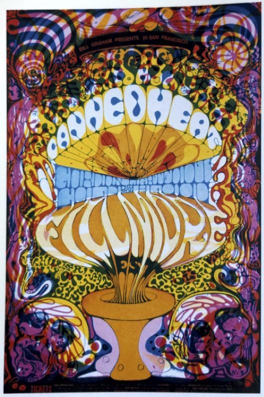
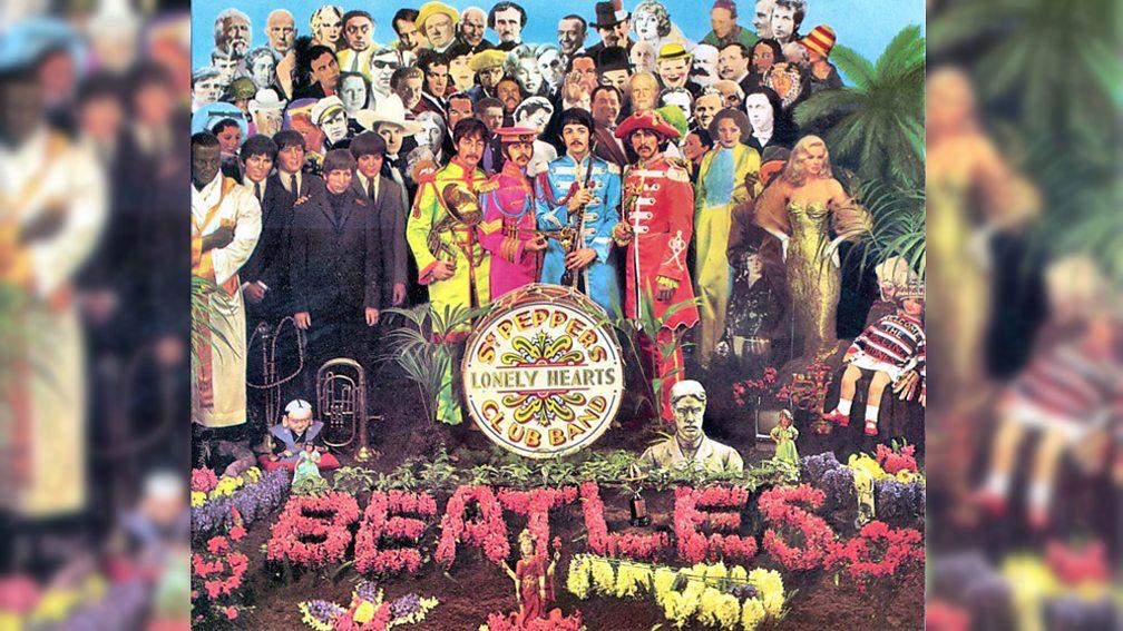
 Figure 2. Never Mind The Bollocks by Jamie Reid ,1977 (The Museum of Modern Art, 2022) Figure 3. Sleeve art for Sgt. Pepper's Lonely Hearts Club Band by Peter Blake, 1967 (BBC Arts, 2017)
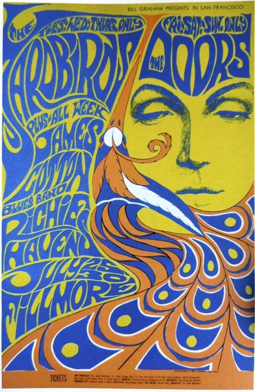
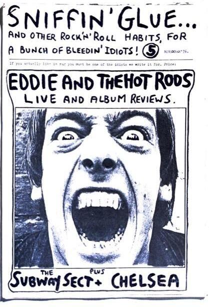 Figure 4. Cover for Sniffin Glue Fanzine from 1976 (Reid & Mott, 2010)
Figure 5. Poster for The Yardbirds by Bonnie Maclean from 1967 (Grunenberg, 2005)
Figure 4. Cover for Sniffin Glue Fanzine from 1976 (Reid & Mott, 2010)
Figure 5. Poster for The Yardbirds by Bonnie Maclean from 1967 (Grunenberg, 2005)