Welcome to The BIG Book — the brand identity guidelines for DCCM. This document introduces the core elements of our brand expression along with tips and tools to help you create relevant, engaging, and consistent communications across all touchpoints of the DCCM brand experience.
TheBIGBook replaces any and all previous branding guideline documents immediately upon issue. Contact the Marketing Department at any time to verify the version of the brand manual you have is the most current.
Letter From the Chairman & CEO
Dear DCCM Divisions,
We have seized the opportunity to take our corporate brand to an entirely new level. To ensure the success of the revitalized brand, we must make bold moves to ensure we remain true to the new brand and the people, products, and services that it represents.
Our corporate communications efforts must directly reflect the quality and value we deliver to our clients. Well-crafted and effective communications take a great deal of thought and planning. It’s not just deciding what we say but also how we say it—through design, tone of voice, imagery, layout, color, and typography.
These guidelines provide a simple “rule book” for our communications vision. They establish the basic yet essential elements to ensure that all of our communications have a consistent look and feel and are aligned with our core values and message. If you ever have questions about the new brand, please do not hesitate to talk with our Marketing Department.
Sincerely,
James F. (Jim) Thompson, PE, DBIA Chairman&CEO
Our Story
Brand Platform We deliver innovative solutions through professional engineering services across the country.
DCCM is a provider of design, consulting, and construction management services that focuses on infrastructure marketplaces across the United States. Through integrated divisions, DCCM serves a variety of end markets while offering a national reach. Additionally, through strategic acquisitions and investments in the organic growth of our partner companies, DCCM is able to offer increasing depths of services across its growing customer base.
The components of DCCM are “Design, Consulting, Construction Management.”
Brand Platform
Incorporation date: January 29, 2021
State of formation: Delaware
Firm registration: Texas Board of Professional Engineers and Land Surveyors (TBPELS) – TxEng F-22899
Texas tax ID: 86-3354740
DUNS/D&B no.: 118525929
Unique Entity ID no. (SAM): JSWAVHBB11D7
Headquarters: 1800 Post Oak Boulevard, Suite 450 Houston, Texas 77056 713.874.9162 info@dccm.com
Tagline 1.3
Brand Platform
Our tagline is a pithy descriptor used to communicate the unique value proposition of our brand and services. The goal of our tagline is to leave clients with a lasting positive impression of our brand. The tagline also serves as the foundation for our brand expression. It defines how our work is unique and why it matters. All of our visual and verbal identity is designed and built from this expression.
When appropriate, the tagline can be included on marketing collateral and other documents.
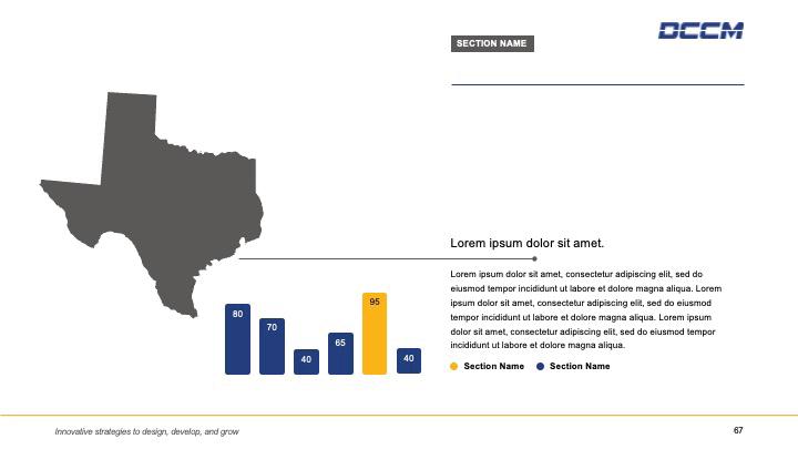
Innovative strategies to design, develop, and grow.
Signals a committed integration of organizations, systems, and people
Encourages creativity to deliver resilient and purposeful services
Expresses the foundation of our ability to deliver custom solutions
Communicates dedication to the quality of the services we provide
Celebrates our depth and strength of experience
Conveys capacity to build on and build up
Values our long-term commitment to advancement of knowledge
Keeps pace with the progression of the A/E/C industry
Invests in the success of every partner company
Provide services that foster organic growth
Inspires continual improvement for our employees and our communities
Brand Platform
Mission, Vision, Values
Our mission statement describes the current state of our company and our primary goals and objectives. It provides detailed information about what our organization does, how it does it, and who it does it for.
Our vision statement is used to describe the future state of the organization, i.e., what the organization hopes to become in the future.
And our core values support the company’s vision and shape its culture, ensuring employees are working towards the same goals. They are the of essence our identity—the principles, beliefs, or philosophy of values.
Our mission:
Provide the best infrastructure services using the shared expertise of our family of national divisions while embracing change and growth and while adhering to our values.
Our vision:
To be the best infrastructure services company as measured by our employee and customer satisfaction and financial value creation.
Our values:
– Invest in our employees
– Respectfully serve our customers
– Embrace high expectations
– Expect accountability and responsibility
– Passionately pursue everything we do with honesty and integrity
– Carry out our duties with humility
Brand Platform
Brand Personality
Brand personality is the personification of a brand. It’s intentionally determined through a process of assigning the brand a set of human characteristics and qualities. Brand personality directs the voice, tone, and style through which the company communicates. Just as people’s characteristics and qualities determine how others feel about them, the personality traits assigned to a brand shape how its audiences feel about that brand.
DCCM’s Brand Personality:
Brand identity: Leader
Language: Intelligent/articulate
Tone of voice: Expert, confident, self-assured (but not arrogant)
Characteristics: Competent, reliable, trustworthy
Motivation: Quality
Fear: Mediocrity
Brand Platform
Brand Voice
Our brand voice shapes the content, structure, and tone of our communications. It’s an internal tool to help you understand how to represent the DCCM Divisions through all communications.
While not prescriptive, our voice descriptions and guiding principles should be used for direction when sitting down to write or review a piece of copy.
The goal is to ensure our voice represents the collective expertise of our people and communicates the confidence we have in our ability to deliver for others.
Using our voice to reinforce our story Our voice is rooted in who we are and plays an important role in helping people understand how DCCM is built to deliver high-quality engineering solutions.
Our voice is supported by three themes, which we’ve translated into direction for language and tone.
We address complex challenges, so we should clarify complexity. We use our collaborative innovation, so we should make it a conversation.
We deliver transformational outcomes, so we should show why it matters.
Brand Platform
Brand Voice
Our voice is supported by three themes, which we’ve translated into direction for language and tone.
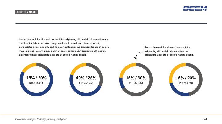
Clarify complexity
Speak with purpose and guide the reader to a meaningful outcome.
That feels: Simple Clear Organized That means:
Write with a clear goal.
Get rid of details that stray from the main message.
Make it easy.
Use short sentences, short paragraphs, and simple words.
Add
structure.
Use subheaders and bullets to emphasize key points.
Think
visually.
Pair copy with images, infographics, charts, and illustrations.
Instead of: Long roads
Multilane roads are above all an enterprise in teamwork— and through the constant collaboration of DCCM’s Transportation group, its professionals’ broad experience and stream of diverse projects, our teams bring leadingedge knowledge and best practices to this specialized sector.
You could try:
Monuments to teamwork
Multilane roads require constant collaboration and specialized expertise. Our Transportation group combines broad experience with leading-edge knowledge to deliver some of the most iconic, advanced roadways in Texas.
Brand Platform
Brand Voice
Our voice is supported by three themes, which we’ve translated into direction for language and tone.
Make it a conversation
Use comfortable, lively language to draw people in and keep them interested.
That feels: Open Inviting Thoughtful
That means: Talk to people.
Imagine you’re sitting across the table from the reader.
Relax the language.
Use first person (you, your, we) and a familiar tone.
Stay in tune.
Imagine you’re sitting across the table from the reader.
Be crisp.
Replace tired expressions with rich, vivid descriptions.
Instead of:
Disrupting the transportation paradigm
Transportation is one of the slowest changing industries, and is not often disrupted. So the last major disrupter arguably was the automobile, which by displacing walking, the bicycle and the horse, not only had a profound impact on how we travel, but also changed our spatial economy through its influence on land-use patterns.
You could try:
New traffic patterns, new possibilities
The car changed more than how we travel—it profoundly impacted on land use and economic development. As fewer walked, biked, and rode horses, cities transformed to accommodate new behaviors. Patterns that developed are still mostly in place today. But for how long? And what’s next?
Brand Platform
Brand Voice
Our voice is supported by three themes, which we’ve translated into direction for language and tone.
Show why it matters
Share our passion for delivering high-quality engineering solutions.
That feels: Active
Optimistic Spirited That means: Bring it to life.
Use strong, active verbs to give sentences energy and motion.
Reveal the drama.
Show what’s at stake and how our people deliver.
Celebrate success.
Share examples that show we’ve overcome similar challenges.
Focus on impact.
Highlight positive outcomes for clients, communities, and people.
Instead of:
Considered the finest example of structural engineering ever built, Lonestar Bridge won top accolades from professional organizations as the world’s first long-span, three-pylon suspension bridge. The bridge carries six lanes of traffic across the two wide navigation channels of the mighty Bluebonnet River and connects drivers from the cities of Austin, Cedar Park, and Georgetown, invigorating economic development in that region.
You could try:
Economies thrive on access. In Central Texas, the mighty Bluebonnet River stood as a barrier. Its width made it seemingly impossible to bridge, stifling the region’s growth potential. Our interdisciplinary team of experts embraced the challenge and delivered a breakthrough in structural engineering—the world’s first longspan, three-pylon suspension bridge. Today, the Lonestar Bridge offers six lanes of opportunity that carry people and the region forward.
Writing Styles
Division Writing Styles
At DCCM, we take pride in being a united family, and our writing should reflect this cohesive identity. All written content should embody our collective spirit by seamlessly integrating the DCCM name into your division’s identity. Avoid language separating DCCM from your division; use inclusive terms reinforcing our unity.
Replace “we” and “I” with “our” when needed to emphasize our shared commitment and goals. This approach ensures that every piece of writing consistently represents the strength and unity of the DCCM Divisions.
Acceptable examples:
Since 1972, TREX | DCCM has been synonymous with quality, reliability, and expertise. As a premier land development solution provider, our team delivers technical knowledge and seasoned guidance backed by the responsiveness your project demands.
Unacceptable examples:
Since 1972, the TREX | DCCM name has been synonymous with quality, reliability, and expertise. As a premier land development solution provider, we deliver technical knowledge and seasoned guidance backed by the responsiveness your project demands.
Terms to Avoid “Firms” “Model” - We are “DCCM” and all others companies should be referred to as “Divisions”
Acceptable examples:
DCCM offers an exciting opportunity to bring together established, highlyperforming divisions from across the US into a cohesive team of delivery professionals.
Unacceptable examples:
The DCCM model is an exciting opportunity to bring together established, highly-performing firms from across the US into a cohesive team of delivery professionals.
Division Identities 1.8
Brand Platform
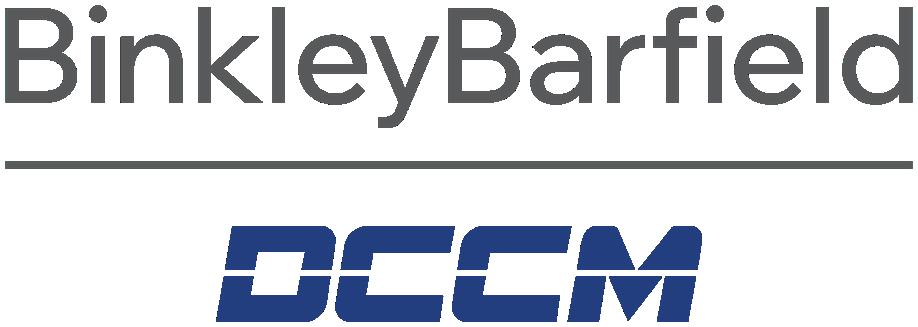
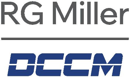
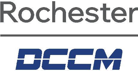
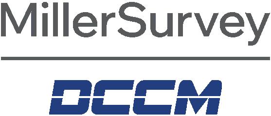
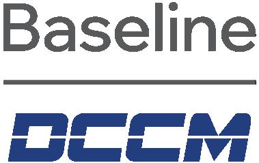
All DCCM Divisions must be written as follows in all collateral and correspondence. Never write just the division name externally without the use of the vertical line and “DCCM.”
Note: The examples below do not showcase all divisions in DCCM. Please e-mail marketing@dccm.com if you ever have any questions about how to properly refer to each firm.
“Division | DCCM”
Division name <space> vertical line <space> DCCM
Acceptable examples:
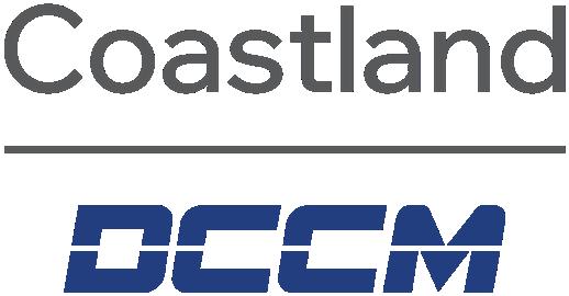
BinkleyBarfield | DCCM
Coastland | DCCM
RG Miller | DCCM
Unacceptable examples:
BinkleyBarfield
Binkley & Barfield
Binkley & Barifled | DCCM
BBI*
BBI | DCCM
Coastland
Coastland Civil
Coastland Civil Engineering
CCE*
CCE | DCCM
RG Miller
R.G. Miller
R.G. Miller | DCCM
RGM*
RGME*
RGM | DCCM
RGME | DCCM
*Usage of Division Abbreviations
The use of each Division abbreviation (e.g., BBI, CCE, RGM) is only acceptable in certain instances, such as on the company intranet, in DOT submittals, and in internal DCCM office applications (Deltek, etc.). Never refer to your Division using its abbreviation in collateral and correspondence that may find its way outside of the firm, especially to clients.
When in doubt about when to use abbreviations, please e-mail marketing@dccm.com.
2.0 Logo
2.1
Logo
Corporate Logo
Our logo, which is also our company name, is the key building block of our identity and the primary visual element that identifies us. The logo should never be changed in any way.
Always use the approved digital artwork. Do not redraw or recreate the logo.
Division Logos
Our Division logos have been revamped to incorporate DCCM’s official corporate color (DCCM Blue) and one specific color from the secondary color system (Charcoal). Please refer to Section 3 for color information.
As companies are acquired by DCCM, their current logos are revised by DCCM. All revised logos include the firm name above a Charcoalcolored bar with the DCCM logo/brand mark underneath.
– The spacing between the division name and the bar (X) is equal to the space between the bar and the DCCM logo/brand mark (also X).
– The height of the firm name (Y) is equal to the height of the DCCM logo/brand mark (also Y).
– Additionally, if the weight of the line cutout through the DCCM logo is defined as Z, then the weight of the Charcoal-colored bar should also be Z.
Always use the approved digital artwork created for each firm by DCCM’s Marketing Department. Do not redraw or recreate the logos. Never use just the Division names as stand alone logos without the “DCCM” piece underneath them
Note: The examples below do not showcase the entire DCCM suite of logos.
Vertical lockup examples:
Division Logos
Vertical and horizontal logo lockups
A lockup is the final form of a logo with all its elements locked in their relative positions. Both vertical and horizontal logo lockups for each acquired company are available for use. Vertical lockups are often used when space is not an issue (e.g., wall signs), while horizontal lockups are used in vertically narrow spaces (e.g., letterheads).
Logo usage on social media
While vertical lockups do not have to be perfect squares, they tend to be the best options for places/applications that only offer square space for your logo, such as favorite icons or profile images on Divisions’ social media accounts (Facebook, LinkedIn, Instagram, etc). However, if vertical lockups become so tiny that the firm names can no longer be read, only use the DCCM logo/brand mark by itself as your square image. Never use just the Division names as stand-alone images/icons without the “DCCM” piece underneath them
Always use the approved digital artwork created for each firm by DCCM’s Marketing Department. Do not redraw or recreate the logos.
Note: The examples below do not showcase the complete suite of DCCM logos.
Horizontal lockup examples:
Logo Protected Space
Logo It is important that respect be given to clear space around the logo. Whenever you use the logo, it should be surrounded with clear space to ensure its visibility and impact. No graphic elements should invade this zone.
The minimum clear space on all sides of the logo is equal to one-half the cap height (X) of the logo itself. Whenever possible, allow more than the minimum amount of clear space.
Logo
Logo Color Variations
The DCCM logo consists of one color: DCCM Blue. Other variations include solid black and solid white.
The solid white logo can be used on a dark, solid color or a dark photographic background.
The black logo can be used on a light, solid color or a light photographic background.
If you ever have any questions regarding proper logo usage, e-mail marketing@dccm.com.
Please note these color variations also apply to the DCCM Division logos.
Logo
Incorrect Usage of Logo
If you ever have any questions regarding proper logo usage, e-mail marketing@dccm.com.
Do not skew or resize the logo to disproportionate dimensions.
Do not add drop shadows or other effects to the logo.
Do not reposition parts of the logo.
Do not create color variations of the logo.
Do not place the logo on a busy or complicated background.
3.0 Visual Identity Toolkit
Primary Palette 3.1
Visual Identity Toolkit
Our color palette consists of our primary (corporate) color and a set of secondary colors.
Our colors must always be reproduced accurately to maintain consistency in our identity system. Always follow the CMYK, RGB, and HEX values shown in this brand manual.
Our main corporate color is DCCM Blue, which has become a recognizable identifier for the company. Blue is the most popular color of the spectrum and suggests authority, dignity, security, stability, heritage, and trust. Blue also communicates image attributes like friendly, approachable, reliable, and trustworthy. Certain shades of blue can suggest different but complementary and appealing traits. Darker blues? Tradition and quality. Brighter blues? Innovation or technology.
Because blue speaks to so many things DCCM, it’s important that we leverage it in all our brand communications. Think blue!
Corporate Color
Visual Identity Toolkit
Secondary Palette
The secondary color palette has been established to meet the current practical requirements in applications. It also helps make the perception of the brand more approachable and differentiates the brand image from those of competitors.
There are two main categories: the secondary colors and the grayscale colors. It is important to note that priority is given to DCCM Blue. Secondary colors are used in combination with DCCM Blue as supporting colors only and cannot be used independently. Priority is given to the starred secondary colors below. Refer to Section 3.4 for specific usage guidelines.
Application scope
Applicable in the stationery system, print system, digital multimedia system, exhibition and display system, etc., where colors are used to communicate different functions or categories in touchpoints, such as graph or chart design, digital interactive modeling design, etc.
Monotone Grayscale Secondary Color System
Black
Pantone Black 6 C
CMYK 0/0/0/100
RGB 0/0/0
HEX 000000
80% Black
Pantone 425 C
CMYK 0/0/0/80
RGB 88/89/91 HEX 58595B
60% Black
Pantone 4278 C
CMYK 0/0/0/60
RGB 128/130/133 HEX 808285
40% Black
Pantone Cool Gray 6 C
CMYK 0/0/0/40
RGB 167/169/172
HEX A7A9AC
Warm and Cool Secondary Color System
Sky
Pantone 7703 C
CMYK 80/25/19/0
RGB 1/150/184
HEX 0196B8
Charcoal
Pantone 425 C
CMYK 62/55/56/29
RGB 90/89/88 HEX 5A5958
Queso
Pantone 7549 C
CMYK 0/32/100/0
RGB 252/181/21
HEX FCB515
20% Black
Pantone 427 C
CMYK 0/0/0/20
RGB 209/211/212
HEX D1D3D4 White
CMYK 0/0/0/0
RGB 255/255/255 HEX FFFFFF
Midnight
Pantone 2767 C
CMYK 99/82/42/36
RGB 19/49/82
HEX 133152
3.3
Visual Identity Toolkit
Color Saturation Extension
In order to cater to the complexity and range of applications, our corporate color and secondary colors can be extended to a range of different saturations. The chart below identifies the range, including 80%, 60%, 40%, 20%, and 10% values and saturations. The values and saturations can be adjusted depending on the actual need, and the number of colors used from the palette can increase or decrease as needed.
Application scope
Applicable in touchpoints where colors are used to communicate different functions or categories such as graphs and charts, digital interactive modeling design, etc.
The expanded values and saturations must be used in combination with DCCM Blue and cannot be used independently. Priority is given to the starred colors. Refer to Section 3.4 for specific usage guidelines.
DCCM Blue
Sky
Pantone 7703 C
CMYK 80/25/19/0
RGB 1/150/184
HEX 0196B8
Charcoal
Pantone 425 C
CMYK 62/55/56/29
RGB 90/89/88
HEX 5A5958
Queso
Pantone 7549 C
CMYK 0/32/100/0
RGB 252/181/21
HEX FCB515
Midnight
Pantone 2767 C
CMYK 99/82/42/36
RGB 19/49/82
HEX 133152
Visual Identity Toolkit
Color Usage Priority Principles
The usage of our corporate colors is prioritized on two levels:
Priority 1
Priority 1 is the corporate color (DCCM Blue). It applies to all communications and touchpoints, including stationery, print, digital multimedia, exhibition, display, and signage systems. DCCM Blue is used to put emphasis on areas like headline copy.
Priority 2
Priority 2 is the grayscale and secondary color palettes (Sky, Charcoal, Queso, and Midnight). They are applicable in print systems, digital multimedia, exhibition, display system, etc. The secondary colors are used when different functions or categories are required to be conveyed in different colors, such as graph and chart design, digital interactive modeling design, or designated themed scenarios.
Strictly follow the priorities set for all corporate colors in all design and production. If you have any questions, please e-mail marketing@dccm.com.
1
2
Note: Do not place light-colored text over light-colored backgrounds or dark-colored text over dark-colored backgrounds, as it makes copy difficult to read:
Sky
Queso Charcoal Midnight
Visual Identity Toolkit
Color Proportions
How often to use corporate colors
Visual Identity Toolkit
Main Typeface
Arial was selected for its professional simplicity, global recognition, software compatibility, and ease of reading. This is our main typeface and should be used in all communication materials. This typeface should be limited to the five weights identified. The main body copy should be 10 pt.
Arial comes standard with all Windows® operating systems.
Univers is the approved typeface for all DCCM SOQs and collateral. The main body copy should be 10 pt Univers LT Pro, 45 Light, except for requirements and extenuating circumstances.
Univers does not come standard with Windows® operating systems and is not available for all employees and agency partners for use. This typeface can only be used by the Marketing Department.
Always use the paragraph styles that are built into templates (if available). See the following page for additional details on paragraph styles.
Try to use no more than three type styles per layout (e.g., Light, Condensed, and Bold, or Light, Regular, and Bold).
Alignment
– Type should always align to the design grid.
– Use left-aligned or left-justified type for body copy.
– Do not set body copy to full justification.
– Do not center-align or right-align body copy.
– Avoid widows, orphans, and lines that end with hyphens.
Italics
– Use italics only when required by editorial standards, such as for the name of a publication or foreign words.
– Consider the use of a change in weight or type color in lieu of using italics.
Case
– Use sentence case for the majority of your text.
– Avoid capitalizing service types in body text (e.g., subsurface utility engineering).
– Use title case for titles, headlines, headers, subheaders, and when required by editorial standards. Please refer to the DCCM WritingStyleGuide on the company intranet for more information.
– Avoid setting type in all caps except when needed to establish information hierarchy. All caps are allowed in SOQs for certain cut sheet headers/titles.
Tracking and Kerning
– Large type, such as headlines and titles, can be tracked to tighten letter spacing.
PROJECT TITLE GOES HERE PROJECT TITLE GOES HERE OWNER | LOCATION, TEXAS
si aliciet recabor epudae volor autectendit modigniam, num iumquid el imus que eum quam dolenis porrum alicid ullicid quia dolenemped molor rerias suntint aut dolorrovit ad qui totatio nsedio et quiaest, sequi adigniae eaquam aut qui num aut hici dit, ad quideliquos sequatem. Ut dus derovit am audantia core ne dolesti ntesentium as eostiist ut lite est, unt accus maio conseque lit ullupta tibus, consequi omnihiliquo doluptatet dolluptatem ides inctibust, similic itintibus simolestrum et expe ipis earum facea que videl mollupt aspedis imint. Illupta spictatiores aut expellaut facera vit ilibus et abo. Erem facipsant quis et quam quo eat labo. Et faccullique sequi consequi audam sumquid itatiaspicit quat eosaest veleneture dolorro vitam, volorem volupic totae. Illuptium soloritaque excerio nsedici psandam quosanim que nem ut latiate mporest ut laborehentis conseque re omnia veria consequi blaciis de derita pratium apicid ea quibus eiciusam quiae sequam rehenet di dolor sit qui conectet doluptati officiis aut laccuptam que nullennctium et aut estiore doloris ipsam sin consed quo dollaut incimet aut qui quo beatus iducid maionsent quianiam que pratius aborepe sintiat esci consentur. beatus iducid maionsent quianiam que pratius aborepe sintiat esci consentur.esci consentur. beatus iducid maionsent quianiam que pratius aborepe sintiat esci consentur. esci consentur. beatus iducid maionsent quianiam que pratius aborepe sintiat esci
FIRM
BinkleyBarfield | DCCM
RESPONSIBILITY Prime CLIENT CONTACT First Last Title 1234 Main Street City, Texas XXXXX XXX.XXX.XXXX name@email.com
DESIGN START YYYY
DESIGN COMPLETION YYYY
DESIGN COST
$XXX,XXX,XXX
CONSTRUCTION START YYYY
CONSTRUCTION COMPLETION YYYY
CONSTRUCTION COST
$XXX,XXX,XXX
PROJECT MANAGER First Last 713.869.3433 email@dccm.com
CHANGE ORDERS X change order(s) $1,000,000 total
Paragraph Styles 3.9
Visual Identity Toolkit
A comprehensive set of paragraph styles is built into all DCCM proposal InDesign® templates, allowing text to be formatted quickly and consistently.
For all other templates (Word®, PowerPoint®, etc.), paragraph styles have been determined using the guidelines below. Always use the provided styles to format text.
If additional paragraph styles are required, always create a new style rather than altering the provided styles. Altering or renaming the template paragraph styles may cause style conflicts and inconsistencies when documents are reused or integrated with other documents based on the templates.
Note: The examples shown on this page represent only a portion of the paragraph styles available and are meant for the majority of all company communications, not proposals.
*Heading 5 is the standard heading on the majority of company templates (agendas, transmittals, etc.).
Heading 1
Arial Bold 24 pt
Heading 2
Arial Bold 20 pt
Heading 3
Arial Bold 18 pt
Heading 4
Arial Bold 16 pt
Heading 5*
Arial Bold 14 pt
Heading 6
Arial Bold 12 pt
Body Text
Arial Regular 10 pt
Body Text
Numbered Levels 1 & 2, No Line Spacing
Arial Regular 10 pt
Title Sample
Title Sample
Title Sample
Title Sample
Title Sample
Title Sample
Min res sam quassunde moluptust lab ius inverite et essum evellup tatio. Et esse pore et ute pla sint voluptus, tem dolor.
1. Cus, sit, non endantis reperem iment hiciate moluptam
2. Sonserisqui velliqui quia con nestes consed quas accab.
a. Psandu ntoriae simi, sinusap erumqui utae ne.
b. Voluptatur? Con ex etur, oditat quamus ducima ilit quas eatis.
Visual Identity Toolkit
Iconography Overview
Icons serve as supporting artwork to enhance navigation in print and digital communications. While they can help convey broad themes or messages, they should not be used as primary artwork at a large scale.
Icon artwork is available in the marketing InDesign® library and PowerPoint® templates. Note that the icons shown are standard for the discipline represented, ensuring continuity of recognition. Alternative discipline icons are not permitted. Refer to Section 3.11 for color usage rules.
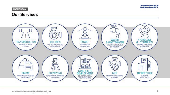
Primary Services Icons
These icons represent the core services provided by DCCM and should be used consistently by each Division according to their respective services.
Please contact marketing@dccm.com if you have questions about which icons you should be using for specific service lines or if you need a custom icon created that is not currently available in the marketing InDesign® library or PowerPoint® templates.
Iconography Overview 3.10
Visual Identity Toolkit
Specialized Services Icons
In addition to the standard icons used for core services, additional icons have been developed to represent the specialized services offered by specific Divisions within our organization. These specialized icons are designed to highlight unique aspects of our service offerings and cater to niche areas of expertise. To maintain consistency and ensure appropriate use, only Divisions that have been granted permission are authorized to utilize these specialized icons. This ensures that each icon is used accurately and effectively to communicate the specific services provided by the Division.
Please contact marketing@dccm.com if you have questions about which icons you should be using for specific service lines or if you need a custom icon created that is not currently available in the marketing InDesign® library or PowerPoint® templates.
Visual Identity Toolkit
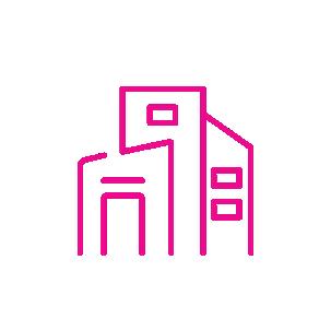
Iconography Usage Rules
Icons can appear in DCCM Blue, Sky, Charcoal, Queso, Midnight, black, white, and shades of gray. They can also appear reversed out of any color in the color palette.
Incorrect Usage of Iconography
Do not place icons in a holding shape other than a solid circle or square.
Do not add effects such as drop shadows to icons.
Do not use colors outside of the approved color palette.
Do not fill icons with color.
Do not make multicolor icons.
Do not combine icons with photography.
The DCCM Line 3.12
Visual Identity Toolkit
The proprietary name for the corporate design element is “DCCM Line.” DCCM Line is expressed in the form of a single line that symbolizes stability and security. Horizontal lines convey reliability and are associated with earthbound things and ideas. DCCM Line is also visible in our corporate logo.
DCCM Line is designed to be simple, easy to use, and agile. It can be applied in different scenarios and serves as an accent to communicate DCCM’s brand vision.
Strictly follow the guidelines set for DCCM Line in all designs and production; consult the Marketing Department with any questions.
The proportion, color, and design of DCCM Line are carefully considered, and no change can be made under any circumstances.
A. Never place DCCM Line above the copy
B. Never tilt DCCM Line
C. Never randomly place DCCM Line with content
D. Never extend the space between DCCM Line and the content beyond the specified guidelines
E. Never place DCCM Line too close to the headline
F. Never use DCCM Line with inconsistent weight
Visual Identity Toolkit
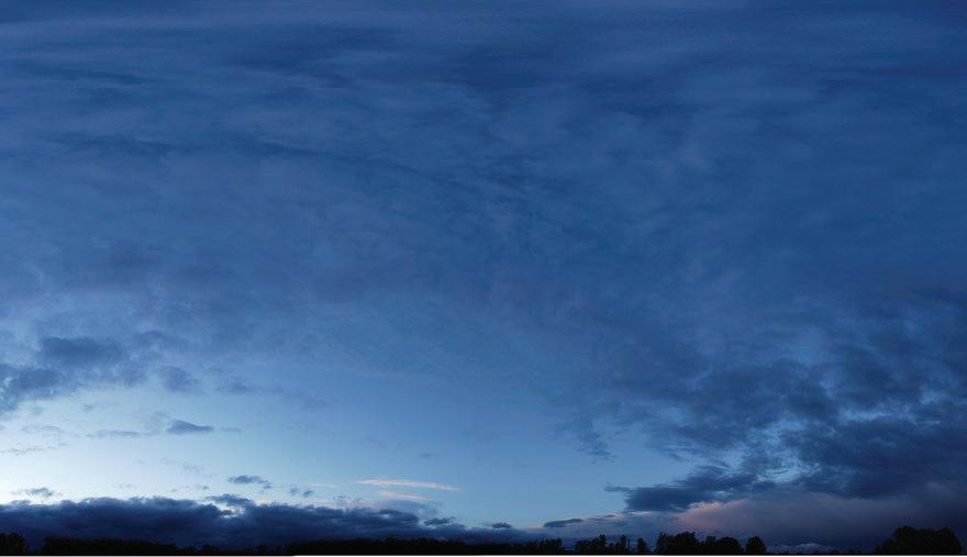
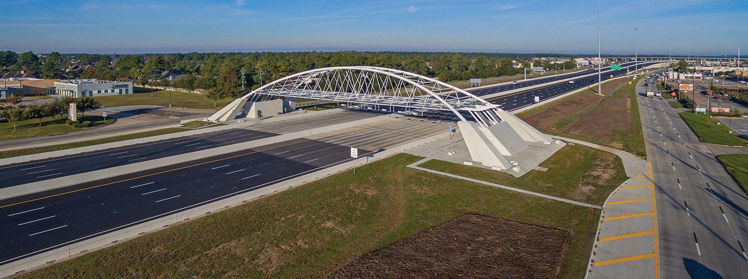
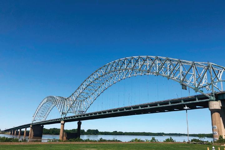
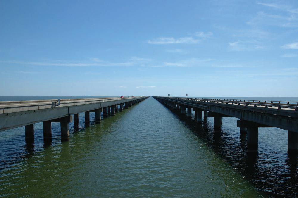
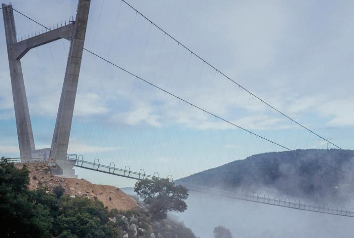
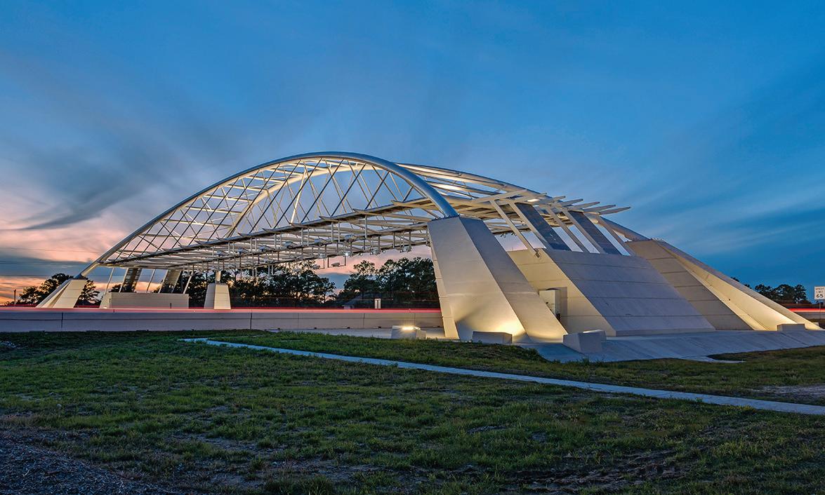
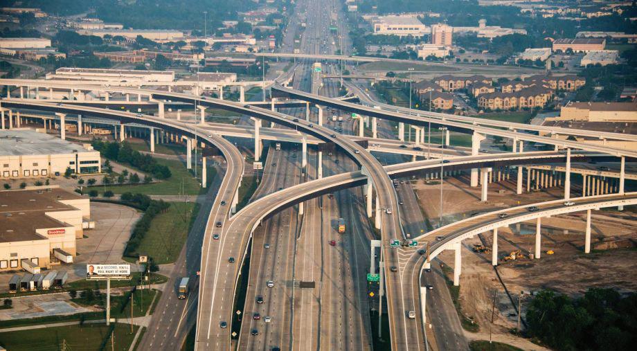
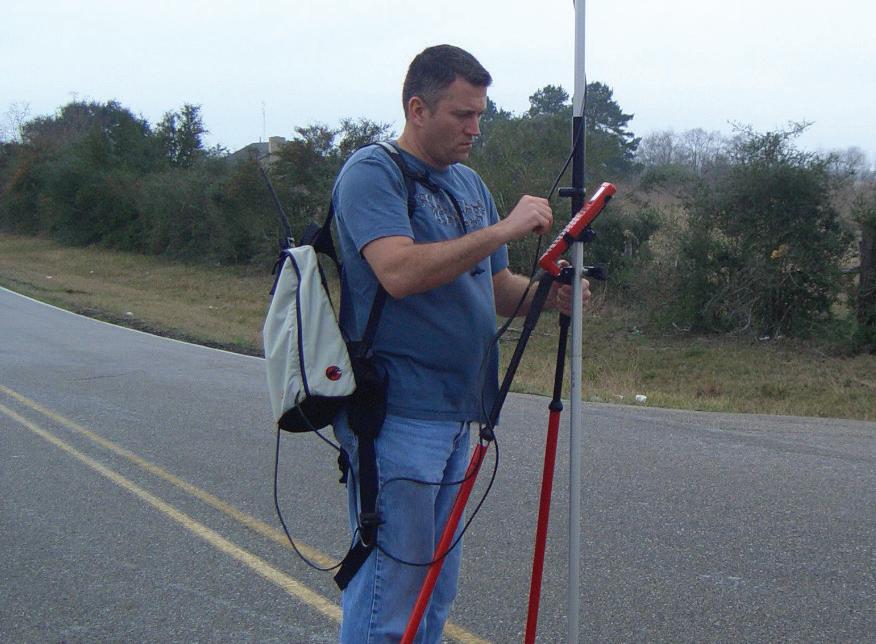
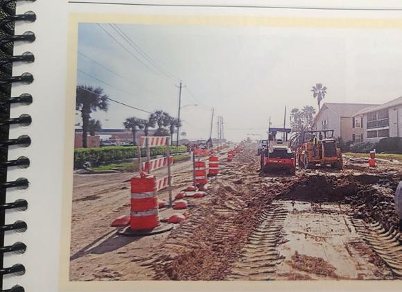
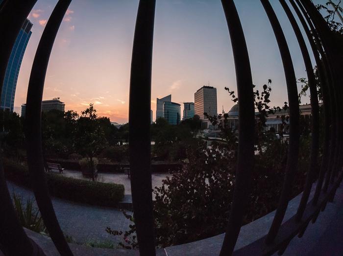
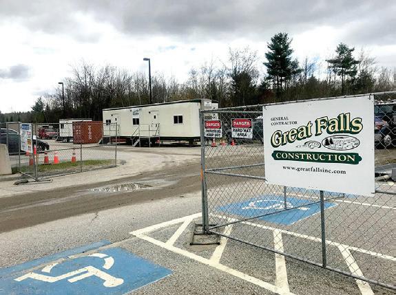
Project Photos
Project photos feature the projects, programs, and plans that we develop.
Key characteristics of these photos include:
A strong sense of dimension and scale
People and the surrounding environment are used to help define the size and scope of the project.
A carefully chosen point of view
Vantage points are used for optimal impact. Bird’s-eye view and ground-level views are used strategically to help showcase a project.
A sense of drama
Composition and lighting help stir the imagination and engage the viewer on an emotional level.
Visual Identity Toolkit
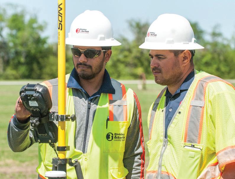
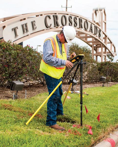
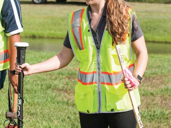
Employee Photos
Employee and partner photos feature our people as they are engaged in developing and creating our projects.
Key characteristics of these photos include:
Real, engaged subjects
People that are true to life and not obvious models. They are engaged with their work and each other rather than with the camera.
A reportage style
Images feel like observed or documented real events in real situations.
Natural lighting
Lighting comes from the environment and does not appear obviously manipulated.
Note: Employees and people in on-site photos must always be shown wearing appropriate personal protective equipment and appear in compliance with the relevant safety standards for the setting.
Visual Identity Toolkit
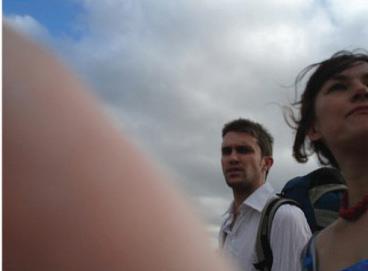
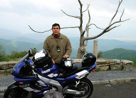
Incorrect Usage of Photos
This section provides examples of incorrect usage of photos for SOQs, presentations, press releases, and all other forms of communication that may go public. The use of such images should be avoided.
1. Never use project photos without a sense of scale or point of view
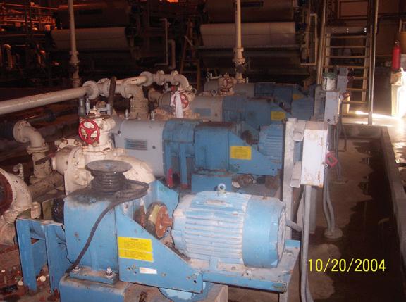
2. Never use photos with a time/date stamp
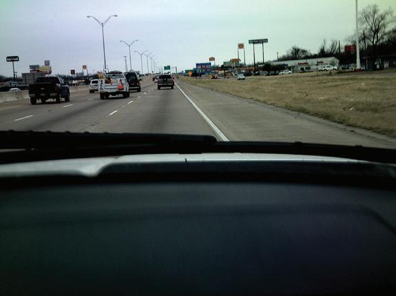
3. Never use project photos taken from inside someone’s vehicle
4. Never use images where people are obviously posed rather than actively engaged in the spaces we create
5. Never use images of people in clichéd situations
6. Never use imagery that is not identified as being professional
7. Never use images of people with inappropriate expressions such as stress, passive, tired, etc.
8. Never use images that lack humanity: dark, cold, inhuman
9. Never use images whose backgrounds, foregrounds, or tones are too dark
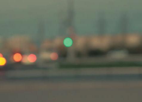
10. Never use soft or out-of-focus shots
11. Never use images of people not wearing the appropriate PPE
12. Never use badly cropped photos
13. Never use photos that show the photographer’s shadow
14. Never use photos with a thumb covering the lens
15. Never use photos of unclean company vehicles
16. Never use images that are not environmentally friendly
17. Never use photos that are tilted
18. Never use images that are stretched or skewed
Incorrect Usage of Photos
19. Never use photos that are pixelated or have poor resolution
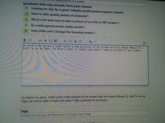
20. Never use photos taken of a screen
21. Never use photos of other photos
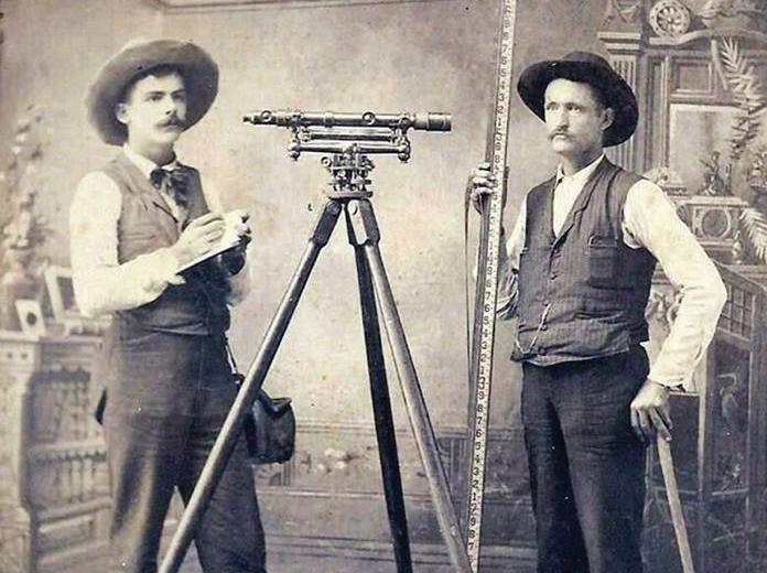
22. Never use photos that are old fashioned or outdated
23. Never use photos with distracting or negative elements in the background
24. Never use filtered photos
25. Never use photos that are emotionless
26. Never use device-focused photos that don’t tell a story
27. Never use clip art
28. Never use photos showing a contractor’s or competitor’s logo
29. Never use overexposed photos
30. Never use photos we do not own the rights to
Please also never use images that belong to or imply religious, political, pornographic, violent, or military themes.
If you have any questions about choosing images for certain use cases, contact experts in the Marketing Department.
Incorrect Usage of Photos
Please refrain from Googling photos to use, as many may be copyrighted.
Note: DCCM has a corporate stock account with Adobe Stock, allowing individual users under the DCCM account to purchase and download stock photos. However, please use stock images sparingly to maintain originality and ensure our content stands out.
Brand Applications
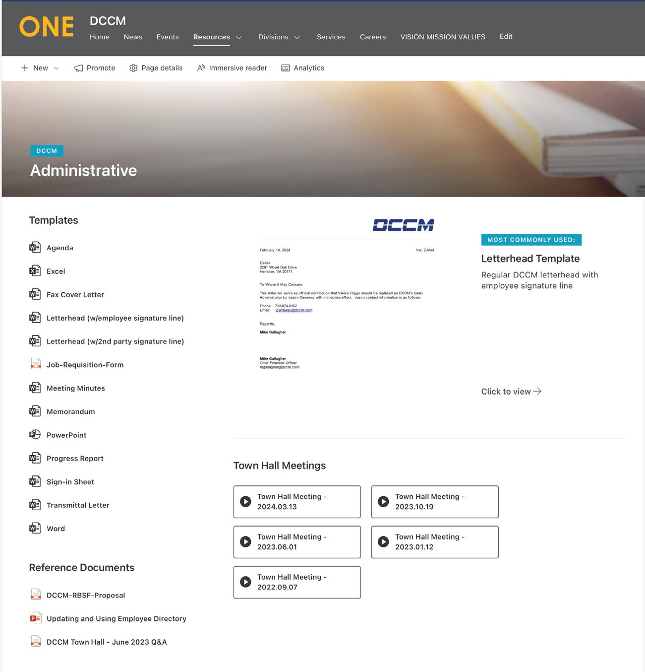
Templates
Templates are now available on the company intranet for your use in creating Division-specific materials. These templates are designed to streamline your workflow and ensure consistency across all documents. Please note that while you can customize your content, it’s important not to alter the core design of the templates.
Should you encounter any issues or have specific needs regarding the templates, don’t hesitate to reach out to marketing@dccm.com for support. By utilizing these templates, you contribute to maintaining our professional standard and cohesive brand identity.
Note: All body copy should be left-aligned, Arial 10 pt, black text with 11.5-pt leading (Word® default). Never justify body copy.
Examples of templates include:
– Letterhead
– Agenda
– Fax Cover Letter
– Meeting Minutes
– Memorandum
– Transmittal Letter
– Sign-In Sheet
Brand
Applications
All body copy should be left-aligned, Arial 10 pt, black text with 11.5-pt leading (Word® default). Never justify body copy. All templates can be found on the company intranet.
Document Title Goes Here (size 14 font only, not all caps)
Heading 1
Heading 2
Only use Arial 10 pt font for body text. Only use Arial 10 pt font for body text. Only use Arial 10 pt font for body text. Only use Arial 10 pt font for body text. Only use Arial 10 pt font for body text. Only use Arial 10 pt font for body text. Only use Arial 10 pt font for body text. Only use Arial 10 pt font for body text. Only use Arial 10 pt font for body text. Only use Arial 10 pt font for body text. Only use Arial 10 pt font for body text. Only use Arial 10 pt font o Only use Arial 10 pt font
**If you ever have formatting questions or need help with creating presentable Word documents, please e-mail marketing@dccm.com**
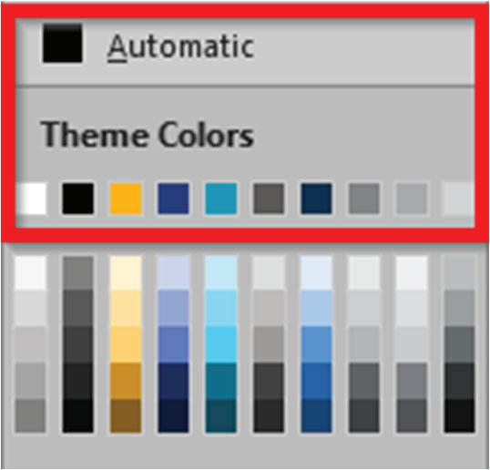
These are the only colors allowed to be used in this document:
1 of 1
Letterhead 4.3
Brand Applications
Letterhead templates are available on the company intranet and may vary from company to company. Do not alter the letterhead in any way. If you have issues with the letterhead template, please contact marketing@dccm.com for assistance.
Note: All body copy should be left-aligned, Arial 10 pt, black text with 11.5-pt leading (Word® default). Never justify body copy.
0.46” width 0.5” from top edge
August 19, 2024
Arial Bold (subject)
Arial Regular (other info) 10 pt
Arial Regular
10 pt
Single space between paragraphs
Arial Regular 10 pt 0.625"
Recipient Name Recipient’s Job Title Company Name 123 Address City, State Zip
Re: Subject of Letter Project Name Client Name Project No. XXXXX
Dear Recipient Name:
Lorem ipsum dolor sit amet, consectetur adipiscing elit. Cras eu blandit nisl, non laoreet leo. Aliquam erat volutpat. Mauris malesuada nulla nisl, ut porttitor sapien dictum finibus. Donec tempor venenatis suscipit. Pellentesque quis nulla sem. Aenean lacus ligula, tincidunt a viverra sit amet, laoreet at ipsum. Vivamus vel sagittis velit, a sodales ante. In posuere magna eu facilisis interdum. In tellus magna, rutrum mollis varius elementum, imperdiet eu nibh. Etiam nec tristique massa, id lobortis dolor. Nullam vitae pulvinar ipsum. Maecenas pretium enim magna. Nunc gravida, tellus non congue porta, nulla nibh dignissim lacus, in accumsan felis sapien in magna.
Lorem ipsum dolor sit amet, consectetur adipiscing elit. Cras eu blandit nisl, non laoreet leo. Aliquam erat volutpat. Mauris malesuada nulla nisl, ut porttitor sapien dictum finibus. Donec tempor venenatis suscipit. Pellentesque quis nulla sem. Aenean lacus ligula, tincidunt a viverra sit amet, laoreet at ipsum. Vivamus vel sagittis velit, a sodales ante. In posuere magna eu facilisis interdum. In tellus magna, rutrum mollis varius elementum, imperdiet eu nibh. Etiam nec tristique massa, id lobortis dolor. Nullam vitae pulvinar ipsum. Maecenas pretium enim magna. Nunc gravida, tellus non congue porta, nulla nibh dignissim lacus, in accumsan felis sapien in magna.
Lorem ipsum dolor sit amet, consectetur adipiscing elit. Cras eu blandit nisl, non laoreet leo. Aliquam erat volutpat. Mauris malesuada nulla nisl, ut porttitor sapien dictum finibus. Donec tempor venenatis suscipit. Pellentesque quis nulla sem. Aenean lacus ligula, tincidunt a viverra sit amet, laoreet at ipsum. Vivamus vel sagittis velit, a sodales ante. In posuere magna eu facilisis interdum. In tellus magna, rutrum mollis varius elementum, imperdiet eu nibh. Etiam nec tristique magna.
Lorem ipsum dolor sit amet, consectetur adipiscing elit. Cras eu blandit nisl, non laoreet leo. Aliquam erat volutpat. Mauris malesuada nulla nisl, ut porttitor sapien dictum finibus. Donec tempor venenatis suscipit. Pellentesque quis nulla sem. Aenean lacus ligula, tincidunt a viverra sit amet, laoreet at ipsum. Vivamus vel sagittis velit, a sodales ante. In posuere magna eu facilisis interdum. In tellus magna, rutrum mollis varius elementum, imperdiet eu nibh. Etiam nec tristique massa, id lobortis dolor. Nullam vitae pulvinar ipsum. Maecenas pretium enim magna. Nunc gravida, tellus non congue porta, nulla nibh dignissim lacus, in accumsan felis sapien in magna.
Lorem ipsum dolor sit amet, consectetur adipiscing elit. Cras eu blandit nisl, non laoreet leo. Aliquam erat volutpat. Mauris malesuada nulla nisl, ut porttitor sapien dictum finibus. Donec tempor venenatis suscipit. Pellentesque quis nulla sem. Aenean lacus ligula, tincidunt a viverra sit amet, laoreet at ipsum. Vivamus vel sagittis velit, a sodales ante. In posuere magna eu facilisis interdum. In tellus magna, rutrum mollis varius elementum, imperdiet eu nibh. Etiam nec tristique massa, id lobortis dolor. Nullam vitae pulvinar
Letterhead templates are available on the company intranet and may vary from company to company. Do not alter the letterhead in any way. If you have issues with the letterhead template, please contact marketing@dccm.com for assistance.
Note: All body copy should be left-aligned, Arial 10 pt, black text with 11.5-pt leading (Word® default). Never justify body copy.
Arial Regular 10 pt
Recipient Name August 19, 2024 Page 2 of 2
ipsum. Maecenas pretium enim magna. Nunc gravida, tellus non congue porta, nulla nibh dignissim lacus, in accumsan felis sapien in magna. Lorem ipsum dolor sit amet, consectetur adipiscing elit. Cras eu blandit nisl, non laoreet leo. Aliquam erat volutpat. Mauris malesuada nulla nisl, ut porttitor sapien dictum finibus. Donec tempor venenatis suscipit. Pellentesque quis nulla sem. Aenean lacus ligula, tincidunt a viverra sit amet, laoreet at ipsum. Vivamus vel sagittis velit, a sodales ante. In posuere magna eu facilisis interdum. In tellus magna, rutrum mollis varius elementum, imperdiet eu nibh. Etiam nec tristique massa, id lobortis dolor. Nullam vitae pulvinar ipsum. Maecenas pretium enim magna. Nunc gravida, tellus non congue porta, nulla nibh dignissim lacus, in accumsan felis sapien in magna. Lorem ipsum dolor sit amet, consectetur adipiscing elit. Cras eu blandit nisl, non laoreet leo. Aliquam erat volutpat. Mauris malesuada nulla nisl, ut porttitor sapien dictum finibus. Donec tempor venenatis suscipit. Pellentesque quis nulla sem. Aenean lacus ligula, tincidunt a viverra sit amet, laoreet at ipsum. Vivamus vel sagittis velit, a sodales ante. In posuere magna eu facilisis interdum. In tellus magna, rutrum mollis varius elementum, imperdiet eu nibh. Etiam nec tristique massa, id lobortis dolor. Nullam vitae pulvinar ipsum. Maecenas pretium enim magna. Nunc gravida, tellus non congue porta, nulla nibh dignissim lacus, in accumsan felis sapien in magna.
Lorem ipsum dolor sit amet, consectetur adipiscing elit. Cras eu blandit nisl, non laoreet leo. Aliquam erat volutpat. Mauris malesuada nulla nisl, ut porttitor sapien dictum finibus. Donec tempor venenatis suscipit. Pellentesque quis nulla sem. Aenean lacus ligula, tincidunt a viverra sit amet, laoreet at ipsum. Vivamus vel sagittis velit, a sodales ante. In posuere magna eu facilisis interdum. In tellus magna, rutrum mollis varius elementum, imperdiet eu nibh. Etiam.
Regards, DCCM
Your Name Here Your Title Here email@dccm.com
cc: Jane Doe, PE John Doe, EIT L:\Admin\Forms-Templates\Letterheads\WIP\FOC Letterhead_Houston 4.docx
Arial Bold (company & name)
Arial Italic (title)
Arial Regular (e-mail) 10 pt
Arial Regular
Brand Applications
PowerPoint®
Our corporate PowerPoint® template (available on the company intranet) was created with the intent of presenting information in a clean format. The best rule of thumb to remember is to embrace white space and not go overboard on text. Presentations are not meant to be text-heavy. Stick to short bullet points and key topics only.
Do not alter the theme of the corporate PowerPoint®. The background color for all slides must remain white (unless a photo covers the entire slide). The default typeface is Arial—do not use other typefaces or fonts.
We would prefer the Marketing Department make all presentations that clients and potential employees will see to ensure we adhere to our branding guidelines. Please e-mail marketing@dccm.com if this is the case.
Note: If you ever run across documents being used that do not adhere to our branding standards, please e-mail them to marketing@dccm com to be revised. Please refrain from trying to correct them yourself.
Brand Applications
Drawings
Each firm within the DCCM Divisions uses its own unique drawing logos, so the examples on this page may vary from company to company. However, all companies’ drawings must include their revised logo with DCCM’s brand mark (refer to page 12), an address and phone number, and board firm number(s), if applicable.
Note: Only use approved drawing logos provided by your firm’s Marketing Department. If you find any old logos on plans that do not look like the examples below, please inform your Marketing Department and your immediate supervisor.
Five lines of text to the right of the logo
Three lines of text to the right of the logo
Four lines of text below the logo
Horizontal 1
Horizontal 2
Vertical
Example
Brand Applications
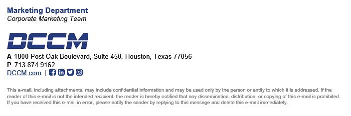
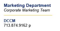
E-mail Signatures
As our most widely used form of business communication, e-mail deserves careful consideration.
DCCM e-mail signatures are generated using Exclaimer®, third-party software that comes pre-installed on all company computers. The information in each e-mail signature is automatically pulled from DCCM’s internal database. If you do not have Exclaimer® installed on your computer or your e-mail signature is not populating correctly, please contact your IT Department.
Please note that Exclaimer® also forces e-mail signatures on all outbound e-mails from mobile devices. Please turn off your e-mail signatures on your mobile device to ensure it doesn’t add duplicate signatures—contact marketing@dccm.com for assistance.
Standard e-mails should always be created in a straightforward, textonly format. Except for the company logo and employee photos (if applicable), HTML graphics or other embellishments are not allowed in your e-mail signature details.
The only acceptable fonts to use in the body of your e-mails are the default Aptos 11 pt or Arial 10 pt. However, we highly recommend changing your default font to Arial 10 pt.
The following are not permitted in e-mail signatures:
– Adding the logo or text-styled versions of the logo
– Quotes or jokes
– Use of other fonts, colors, or formatting
– The addition of any other messages, including environmental messaging External Signature (New) Internal Signature (Reply)
Brand
Applications
Personal Signatures
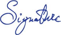
Employee signatures on all documents should be in blue ink.
If you will be signing a lot of documents, feel free to ask the Marketing Department to make a transparent image out of your signature! It can be used in Word® files, PDFs, and other digital files.
1. Sign your name fairly large on a blank piece of computer paper with a thick, dark pen or marker.
2. Scan the paper at the highest resolution possible.
3. Send the scan to the Marketing Department (marketing@dccm.com).
4. Marketing will create an image of your signature and send it back to you for your own personal use.