Select Masterworks of Canadian Art November 26 th , 2025
Select Masterworks of Canadian Art November 26 th , 2025
Wednesday, November 26th at 7 pm EST
The Globe & Mail Centre
351 King Street East, 17th Floor, Toronto, Ontario

Calgary
A selection of artworks will be on display.
Norberg Hall 333b - 36 Avenue SE
October 30 th to November 1 st : 10:00 am - 5:00 pm
Montreal
A selection of artworks will be on display.
Le Mount Stephen 1440 Rue Drummond Algonquin Room
November 12 th and 13 th : 9:00 am - 4:00 pm
Toronto
Cowley Abbott
326 Dundas Street West
November 14 th to 26 th Monday to Friday: 9:00 am - 5:00 pm Saturday and Sunday: 11:00 am - 5:00 pm November 26 th : 9:00 am - 12:00 pm
Please contact our offices to reserve your seat and to register for bidding.
A live stream of the auction will be available at CowleyAbbott.ca on November 26 th .
Electronic submission of bids & printable bidding forms can also be found at CowleyAbbott.ca.
Online bidding is available to our clients via Auction Mobility at live.CowleyAbbott.ca, allowing real‒time bidding via web browser or Apple/Google app.
Please note that purchases through the Auction Mobility online platform are subject to a 21% Buyer’s Premium.

With more than a decade of exemplary service in the Canadian art market, Cowley Abbott has established a reputation for consistently exceeding client expectations. Through a comprehensive suite of offerings— including auctions, private sales, and appraisals—our team leverages extensive expertise, longstanding industry relationships, and an unwavering commitment to providing clients with the highest level of assistance. We invite you to contact our firm to learn more about our specialized departments and services.


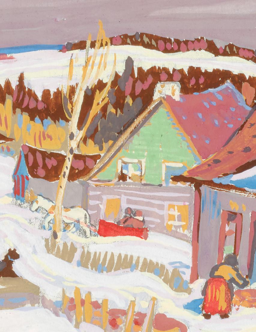
Sleigh at the Front Door; After the Storm, circa 1930 double-sided oil on board signed lower right on the reverse 8.5 ins x 10.5 ins; 21.6 cms x 26.7 cms
A. K. Prakash & Associates Inc., Toronto Private Collection
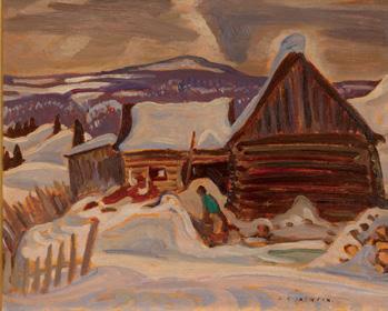
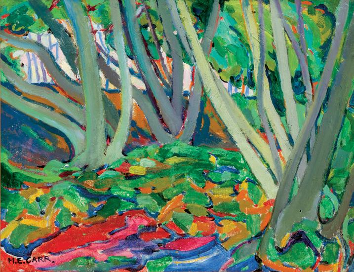
A.Y. Jackson devoted his long career to capturing the essence of rural and northern Canada. His small winter villages are among his most beloved subjects, offering glimpses of everyday life transformed by snow and light. This charming panel demonstrates Jackson’s signature brushwork and his ability to distill atmosphere and narrative from the simplest of settings.
The red-painted house at the centre, its gabled roof covered with snow, anchors the scene against the undulating hills and animated sky beyond. Jackson’s distinctive, rhythmic brushstrokes animate the snow and clouds, lending the entire view a sense of movement and immediacy. Although no figures are present, the sleigh at the edge of the house quietly signals human activity. It hints at a recent arrival or perhaps impending departure, and invites the viewer to imagine the unseen inhabitants going about their day. This subtle narrative touch is typical of Jackson, who often suggested community without explicitly depicting it, allowing the viewer to sense rather than see the presence of people.
On the reverse of this painting is another winter composition, depicting a figure at work beside a woodpile and a log cabin. This second painting underscores Jackson’s tireless observation of rural life and may also represent the same location and the same snowfall as the sleigh composition, but from another vantage point. Double-sided paintings of this quality and completeness are rare in Jackson’s oeuvre and offer a fascinating glimpse into his working process, revealing two complementary narratives within a single work.
$25,000–$35,000
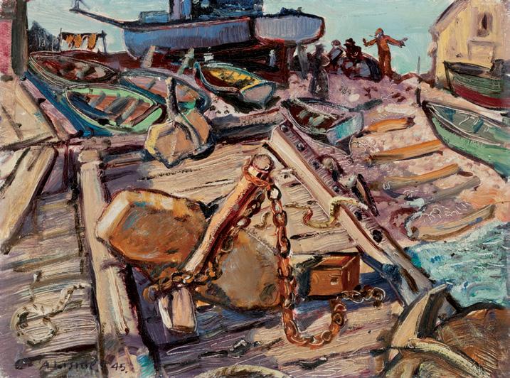
Launching the Blue Boat, Cape Breton. N.S., 1945 oil on board
signed and dated 1945 lower left; signed, titled, dated and inscribed "24" on the reverse 12 ins x 15.75 ins; 30.5 cms x 40 cms
PROVENANCE
Private Collection, Montreal
Walter Klinkhoff Gallery, Montreal, 1984 Private Collection, Collingwood, 1985
EXHIBITED
Paintings and Drawings by Arthur Lismer, Eaton's Fine Art Galleries, Toronto, from 4 February 1946, no. 3 as Launching the Boat Exhibition of Paintings by Arthur Lismer, A.R.C.A., LL.D., The Murphy-Gamble Gallery of Canadian Art, Ottawa, March 1946, no. 3 as Launching the Boat
Canadian Jungle: The Later Work of Arthur Lismer, Art Gallery of Ontario, Toronto; travelling to Dalhousie University Art Gallery, Halifax; Montreal Museum of Fine Arts and the Edmonton Art Gallery, 27 September 1985-8 June 1986, no. 28 as Launching the Blue Boat, Cape Breton
LITERATURE
Lois Darroch, Bright Land: A Warm Look at Arthur Lismer, Toronto/ Vancouver, 1981, see page 145 for a related canvas, The Blue Boat, Neil's Harbour, Cape Breton, 1945
Dennis Reid, Canadian Jungle: The Later Work of Arthur Lismer, Toronto, 1985, no. 28, reproduced page 73
Arthur Lismer’s Launching the Blue Boat, Cape Breton, N.S., 1945 captures the dynamism and rugged vitality of maritime life on Canada’s East Coast. Painted in the mid-1940s, the work situates itself within Lismer’s broader exploration of Canadian identity through scenes of labour, industry, and the natural environment. The painting presents a lively coastal setting where labourers, boats, chains and anchors converge in a rhythmic composition that emphasizes the tactile world of the fishing community. Bold, expressive brushwork conveys both the weight of the equipment and the kinetic energy of human activity, reflecting Lismer’s commitment to portraying the Canadian landscape as a living, humanized environment—animated by the rhythms of work, weather, and community.
This particular painting is Lismer’s second iteration of the subject, related to the canvas The Blue Boat, Neil's Harbour, Cape Breton of the same year. Launching the Blue Boat was included in the 1985 Art Gallery of Ontario exhibition, Canadian Jungle: The Later Work of Arthur Lismer. This exhibition illuminated Lismer’s post-Group of Seven practice, revealing how his mature work turned toward crowded, energetic compositions that celebrated the resilience of human endeavour within natural and industrial environments.
$15,000–$20,000
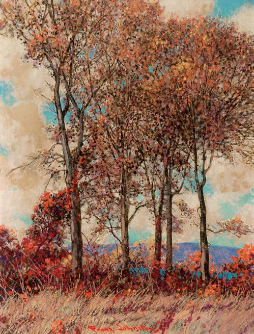
Silent Sentinels oil on board
signed lower centre 22 ins x 17 ins; 55.9 cms x 43.2 cms
PROVENANCE
Private Collection, Toronto
By descent to a Private Collection, Toronto By descent to a Private Collection, Midland
Frank Hans Johnston was a remarkably prolific painter, maintaining notable discipline and consistency throughout his career. Johnston joined fellow members of the Group of Seven on multiple painting expeditions to the rugged wilderness of the Algoma region. In
December 1920, he included around two hundred paintings in an extensive solo exhibition at the T. Eaton Company. In the fall of 1921, Johnston left Toronto to assume the position of principal at the Winnipeg School of Art. His departure marked a break with the Group of Seven, a move which became official in 1924. Johnston’s motivation lay primarily in his desire to exhibit independently.
Silent Sentinels exemplifies Johnston’s mastery of light and pattern. Intermittent patches of teal-blue sky animate the background, contrasting with the muted, autumn tones of the trees and grass. The orange dabs of the shrubbery boldly draw the viewer’s gaze by standing forth from the cool tones of the distant hills and sky. The painting is expertly rendered with fine, precise brushstrokes, with delicate details adding vitality to every component of the picture. Over the course of his career, Johnston’s romantic style evolved and married with traditional realism.
$15,000–$20,000
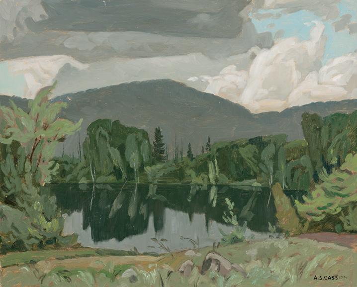
Madawaska River at Jewelville, circa 1959 oil on board
signed lower right; titled and dated "circa 1959" on the reverse 12 ins x 15 ins; 30.5 cms x 38.1 cms
PROVENANCE
Private Collection, Toronto
LITERATURE
Paul Duval, Alfred Joseph Casson: President, Royal Canadian Academy, Toronto, 1951, page 62
An example of A.J. Casson’s mature style, Madawaska River at Jewelville showcases the artist’s sharp design sensibility and deep appreciation for the Ontario landscape. Having begun his career as a commercial artist, Casson brought a strong sense of structure and rhythm to his painting, transforming scenes of quiet rural life into bold, graphic compositions.
Madawaska River at Jewelville exemplifies the painter’s marked shift to a more abstract rendering of the Ontario landscape, which occurred in the mid-1940s. Paul Duval mentions that this change coincided with the end of the war, which may have subconsciously brought Casson an emotional release and a longing for simplicity. The artist began to portray nature in reductive, abstract designs, foregoing literal atmospheric portrayal. Duval writes of this shift: “Suddenly, all of the elements in his paintings become highly simplified into formal patterns. Shapes are condensed into knife-edged rectangles and triangles. Colours are plotted into very deliberate counterpointal arrangements, and natural texture is subdued almost to the point of elimination. Design has become paramount.” The author’s description of Casson’s new style is demonstrated in this painting, where the forest and its reflection in the Madawaska River appear flattened and angular. Above, heavy clouds gather in broad sweeps of grey and pale blue, their sculptural presence enhancing the painting’s compositional balance.
The region around Jewelville, near Barry’s Bay, was a favourite sketching ground for Casson and other Group of Seven members. In contrast to the sweeping grandeur of the north, this landscape captures a gentler, more intimate vision of Ontario.
$20,000–$30,000
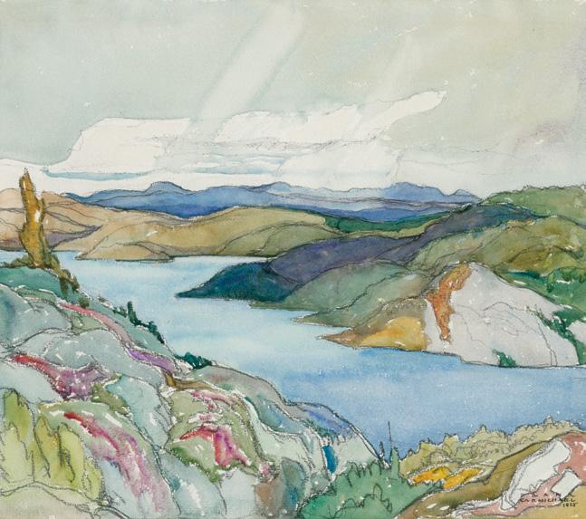
Pic Island, North Shore of Lake Superior, 1925 watercolour signed and dated 1925 lower right; titled on a gallery label on the reverse 10.5 ins x 12 ins; 26.7 cms x 30.5 cms
PROVENANCE
Estate of the Artist
By descent to a Private Collection Roberts Gallery, Toronto Private Collection, Toronto
EXHIBITED
Franklin Carmichael: Paintings, Watercolours and Prints, Art Gallery of Ontario, Toronto; travelling to Orillia Public Library; York Public Library, Toronto; Museum and Art Centre, Sudbury; Tom Thomson Memorial Art Gallery, Owen Sound; Cobourg Art Gallery; Robert McLaughlin Gallery, Oshawa; Barrie Art Club; London Public Library and Art Museum, 1970-1971, no. 20
Franklin Carmichael Watercolours, Art Gallery of Greater Victoria, 3 September-30 October 1981
LITERATURE
Ian M. Thom, Franklin Carmichael Watercolours, Victoria, 1981, unpaginated, reproduced plate 7
Lawren Harris and A.Y. Jackson had first visited the north shore of Lake Superior after a fall sketching trip to Algoma in 1921, and in 1925, invited Franklin Carmichael to accompany them. This trip was Carmichael's first to truly remote country. A vast forested region of pristine lakes and Canadian shield landscape.
Carmichael delights in the interplay of the receding masses of the hills, enlivened by patches of brilliantly coloured vegetation. A fascination with the changing pattern of the skies is evident in his rendition of the banks of clouds, overlapping and intersected by shafts of light or distant showers. The watercolour paint is applied in thin washes, often allowing the paper’s whiteness to break through, conveying the experience of movement and light. A related watercolour, Jackfish Bay, North Shore, Lake Superior, 1926 is in the permanent collection of the Art Gallery of Hamilton.
$50,000–$70,000
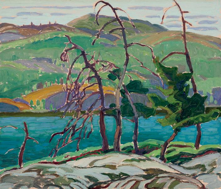
Dead Pines, Cranberry Lake, circa 1932
oil on board
titled, inscribed "OS-F-14", "8" and with estate stamp on the reverse, titled and dated "circa 1932" on a gallery label on the reverse 10 ins x 12 ins; 25.4 cms x 30.5 cms
PROVENANCE
Estate of the Artist
By descent to the Family of the Artist, 1945 Masters Gallery, Calgary Private Collection, Edmonton
Located southeast of Sudbury, Cranberry Lake held deep personal resonance for Franklin Carmichael. Possessing a reflective spirit and a keen sensitivity to the natural world, Carmichael was profoundly moved by the unspoiled beauty of this landscape. Carmichael returned
repeatedly to Cranberry Lake over two decades, producing an extensive body of sketches and paintings. From elevated vantage points, he captured sweeping views of the surrounding hills and lakes, exploring their shifting moods in every season. As the first member of the Group of Seven to immerse himself in this region, Carmichael inspired his peers, including A.Y. Jackson and Arthur Lismer, to visit during the 1930s.
Dead Pines, Cranberry Lake, dating to circa 1932, captures the rugged beauty of northern Ontario through bold design and vibrant colour. The silhouettes of bare trees rise against the shimmering lake, their jagged branches forming a screen, contrasting with the rolling green hills and distant blue-grey mountains. A lyrical yet powerful composition, the work reflects Carmichael’s deep connection to the Ontario landscape. A few years later, in 1935, the artist solidified his bond with the landscape by building a cabin there, where he and his family spent extended periods of time.
$50,000–$70,000
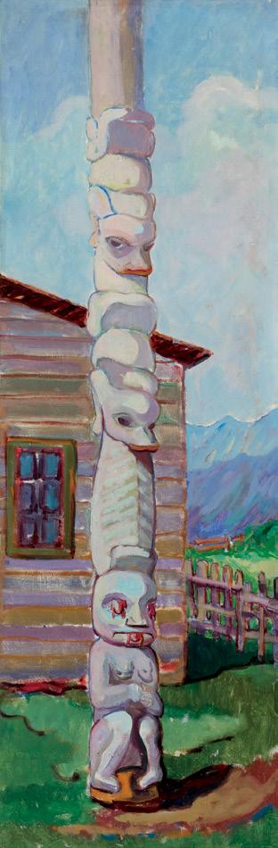
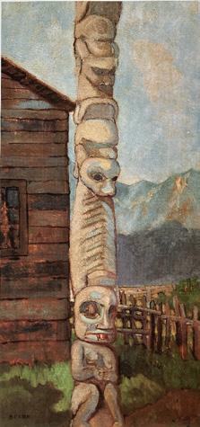
Pole of Harhu, Kispiox, 1912
oil on board
titled and dated 1912 on a gallery label and inscribed "Kispayaks" and "115" on the reverse
37.75 ins x 12.75 ins; 95.9 cms x 32.4 cms
Dominion Gallery, Montreal
Private Collection, Victoria
Masters Gallery, Calgary
Private Collection
Emily Carr, Lecture on Totems, Vancouver, 1913
Marius Barbeau, Totem Poles of the Gitskan, Upper Skeena River, British Columbia, Ottawa, 1929, page 77, see page 235, plate XIII, figure 3, Pole of Harhu, at Kispayaks and page 237, plate XIV, figure 1, Pole of Harhu, at Kispayaks
Susan Crean, Opposite Contraries: The Unknown Journals of Emily Carr and Other Writings, Vancouver, 2004, see for full account of Emily Carr’s Lecture on Totems
Harold J.T. Demetzer, Earl Muldoon and Elmer Derrick, The Tradition Continues: Monumental Sculpture in the Gitanyow and Gitxsan Territories 1986-96, 2005
Gerta Moray, Unsettling Encounters: First Nations Imagery in the Art of Emily Carr, Vancouver, 2006, for a full account of Emily Carr’s sketching see pages 40-42, 96-109
Emily Carr visited the Gitxsan village of Anspayaxw (then spelled Kispiox) on her ambitious sketching trip of 1912 to paint British Columbia’s northern First Nations villages and totem poles. She found more than twenty poles standing here, of which Pole of Harhu was a notable example. We know that she decided to sketch two general views (one from each end) of the village with its stands of poles, later transposed into large oil paintings in her studio, such as Kispiox Village (Royal British Columbia Museum and Archives). She also made four careful close-up studies of single or closely adjacent poles with remarkable imagery, of which the Pole of Harhu is one.
From childhood Carr had felt drawn to the Indigenous population in Victoria and she had already painted scenes of the Salish communities there and around Vancouver, then venturing as far north as the Kwakwaka’wakw villages of ’Yalis (Alert Bay) and T’sakwa’lutan (Cape Mudge). But in 1910-1911 her approach had been completely transformed by a period of studio training in France. Her teachers there had introduced her to Post-Impressionist colour theory and composition, and confirmed her intuition that the carvings of northwest coast Indigenous peoples had great aesthetic merit on their own terms.
The 1912 Pole of Harhu clearly shows the impact of Carr’s colouristic French training. She boldly flattens the space into intense but modulated expanses of colour, with a counterpoint of distinct, curving outlines and patterned areas. The pole itself is outlined with blue and purple lines, its surface modelled in light pinkish lilac shades with pale blue highlights and violet shadows. The darker wood of the plank house behind it is rendered in deeper tones of the same colours, with dark blue shadowing, and the edges of the planks are marked in red. She creates a bright sunlit scene, articulated with firm, decorative outline.
At the time when Carr visited, the Skeena valley was a site of tension and hostility between the Gitxsan and Wet’suwet’en people, to whom the government had allotted inadequate reserves that took no account of their traditional territories, and the flood of incoming settlers, who were pre-empting indigenous lands for agriculture and invading their traditional fishing and hunting grounds. Carr was eager to understand the function and meaning of the poles and to explain their significance to the settler community, whom she sought to educate about the Indigenous traditions and culture that she admired. Carr wrote and delivered a Lecture on Totems for a show of nearly two hundred paintings of First Nations villages and poles that she organized in Vancouver in 1913. There she related the story referred to on the Pole of Harhu , revealing that she had gained sufficient respect from the local Gitxsan people to be given an account:
“One of these old mythological legends told me in Kispiox ran thus... This pole represents a woman's figure on the base, with a frog coming out of each eye and another out of the mouth. This is the story. A beautiful young woman went down to the water to clean her fish. She looked about her for a large flat stone to sit upon while she worked Now a monster in form of a frog had long loved her but she would have nothing to do with him, she used to climb out on a tree leaning over the water and taunt him when he would vainly try to clasp her reflection : so when he saw her come to clean her fish, he flattened himself out among the stones, and she taking him to be a large flat stone, sat upon his back & began to clean her fish; stealthily he slid into the water bearing her with him and down he dived to the bottom: where the fish were his slaves & the frogs his servants. The ducks and geese on the top of the water were the sentinels guarding his realm: For long she live(d) under there & wept & mourned to get back to her home & husband but in vain.– At last it was revealed to her by her guardian spirit, that there was a certain weed which all these people were very fond of & which if eaten by them would produce a sound sleep... She procured large quantities of this weed which they all devoured greedily & were soon fast asleep [so] she passed by the Monster & his people & rose to the top of the water... escaped & got back to her husband.”
Emily Carr
West Coast Totem [Kispiox], 1912 oil on board, 64.1 x 31.7 cms Royal British Columbia Museum and Archives
Not for sale with this lot
Carr
Kispiox Village oil on canvas, 94.6 x 79.4 cms
Donated by friends of Emily Carr, 1933 Royal British Columbia Museum and Archives
Not for sale with this lot
Pole of Harhu, at Kispayaks Not for sale with this lot
Carr’s version of the story of ‘Neegyamks the frog woman is fuller than that given by anthropologist Marius Barbeau, who reproduced the pole in his book, Totem Poles of the Gitksan as Pole of Harhu, at Kispayaks and briefly identified its other images–a set of shingles and two frogs facing downward with waterlily leaves wrapped around their midriffs.
Carr was fascinated by this pole and its record of an ancestral legend, and she made an oil on board sketch entitled West Coast Totem [Kispiox] (Royal British Columbia Museum and Archives) of it in the field. The present painting is a larger studio version where Carr improved the composition and enhanced the luminosity of the colours. The pole appears again right at the centre of Carr’s large village view in Kispiox Village. For the Gitxsan people, the poles act as records of their family lineages and title deeds, documenting their rank and territory. For this reason, copies of the ancient poles are still made and continue their active role in villages like Anspayaks today.
The title of this painting, Pole of Harhu, was taken from Marius Barbeau's book, Totem Poles of the Gitskan, Upper Skeena River, British Columbia (1929), by later owners of the painting, as Carr did not inscribe a title or location. Barbeau discusses the origins of Harhu and the family, stating, “Harhu owns a totem pole, which stands at the head of the rear row, to the northeast.”
We extend our thanks to Gerta Moray, Professor Emerita, University of Guelph, author of Unsettling Encounters: First Nations Imagery in the Art of Emily Carr (UBC Press, 2006) and numerous other publications on Canadian art for contributing the preceding essay.
$800,000–$1,200,000
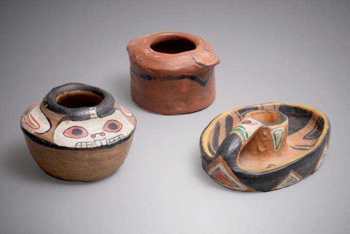
Collection of Klee Wyck Pottery
three painted ceramics
Beaver: "Klee Wyck" incised on the underside, 2.25 ins x 3 ins x 3 ins; 5.7 cms x 7.6 cms x 7.6 cms
Candle Holder: "Klee Wyck" incised on the underside, 1.75 ins x 4.5 ins x 3.25 ins; 4.4 cms x 11.4 cms x 8.2 cms
Pot: "Klee Wyck" incised on the underside, 2 x 3.25 x 2.5 ins; 5 cms x 8.2 cms x 6.3 cms
PROVENANCE
Masters Gallery, Calgary
Private Collection
LITERATURE
Emily Carr, The Emily Carr Collection: Four Complete and Unabridged Canadian Classics, Toronto, 2002, pages 444‒445
“Klee Wyck,” meaning “Laughing One,” was the name given to Emily Carr by members of the Nuu-chah-nulth Nation. Carr later used this name as the title of her autobiography and as the signature on much of her pottery from this period. Drawing inspiration from the Indigenous iconography of the West Coast, she began producing hooked rugs and later pottery from her Victoria home, catering to the tourist market.
At the time, Carr’s family faced financial strain as rising taxes prompted her father to sell off much of his property in lots. Each daughter retained one lot, and Carr built a four-suite apartment on hers to generate rental income. However, with the onset of the First World War, the rental market declined sharply, prompting her to seek other ways to support herself. She raised hens and rabbits, sold small fruits, and produced pottery to supplement her earnings.
Carr described her introduction to pottery making stating, “with the help of a chimney sweep I built a brick kiln in my back yard, firing my own pots. The kiln was a crude thing, no drafts, no dampers, no thermometer - one door for all purposes...Firing my kiln was an ordeal. I stoked overnight, lighting my fire well before day-break so that nosy neighbours would not rush an alarm to the fire department when the black smoke of the first heavy fire belched from the chimney. The fire had to be built up gradually. The flames ran direct among the pots, sudden heat cracked the clay. First I put in a mere handful of light sticks, the clay blackened with smoke. As the heat became stronger the flames licked the black off. Slowly, slowly the clay reddened passing from red hot to white of an awful transparency, clear as liquid. The objects stood up holding their shapes with terrifying, illuminated ferocity. A firing took from twelve to fourteen hours; every moment of it was agony, suspense, sweat. The small kiln room grew stifling, my bones shook, anticipating a visit from the police, fire chief, or insurance man. The roof caught fire. The floor caught fire. I kept the hose attached to the garden tap and the roof of the kiln-shed soaked. The kiln had to cool for twenty-four hours before I could handle the new-fired clay.”
$8,000–$12,000
Forest Landscape, 1911 oil on board mounted to board signed lower left; titled and dated 1911 on the gallery label on the reverse 14 ins x 18 ins; 35.6 cms x 45.7 cms
PROVENANCE
Lawren Harris, Toronto
G. Blair Laing, Toronto Ken Thomson, Toronto Masters Gallery, Calgary Private Collection
EXHIBITED
Emily Carr in France, Vancouver Art Gallery, 22 June-22 September 1991, no. 16
LITERATURE
Ian M. Thom, Emily Carr in France, Vancouver, 1991, pages 14, 24, 2730, no. 16, reproduced page 24 as French Landscape, 1911
Determined to broaden her knowledge of current artistic trends and further her training in drawing and painting, Emily Carr left Victoria for France in 1910 to experience the art of the European avant-garde firsthand. She was accompanied by her sister Alice, who spoke French and served as her interpreter. Ian Thom writes that Carr was startled by the artwork she encountered upon their arrival in the French capital, as “it is likely that Carr was previously only vaguely, if at all, aware of the Fauves and was completely ignorant of Cubism.” Carr had been given a letter of introduction from a woman in Victoria to an English artist residing in Paris, named Harry Gibb. She and Alice met Gibb in Montparnasse and Carr was struck by his modernist work. Though less widely recognized in current scholarship, Gibb was closely connected with the Parisian art world at the time, counting Henri Matisse, Georges Braque and Gertrude Stein as close friends. He exhibited in Paris, New York, and London between 1907 and 1913.
Gibb’s class was held in Crécy-en-Brie, a small village on the Grand Morin river, the rolling countryside surrounded by “tiny quaint villages or little huddles of buildings.” Carr delighted in the landscape and set to work before Gibb arrived. She was pleased to learn that Gibb liked her use of paint and colour sense. The realization that one could paint using colour that did not ‘match’ inspired Carr to produce an extraordinary amount of work in the next two months. Her work became increasingly linear, with a greater confidence in the use of colour, the handling of space and the application of paint. Ian Thom highlights this painting in the exhibition catalogue for Emily Carr in France, remarking that “Forest Landscape suggest[s] that Carr’s approach to landscape was strongly influenced by Gibb. Similar in scale and technique to Gibb’s work, [it] speaks a language radically different to Carr’s painting of only a year before.”
In this vibrant composition, Carr depicts a grove of trees rendered in sinuous, curving forms. Strong diagonal trunks sweep upward; beneath them, the forest floor shimmers with expressive patches of red, blue, orange, and emerald green. The undergrowth and foliage dissolve into bold planes of colour, applied with short, loaded brushstrokes that recall the Fauves and Parisian modernists. Here, Carr has replaced the muted naturalism of her earlier work with a chromatic intensity and a clear structural design. Her interest in capturing the “living movement” of nature is evident.
After three or four months of painting together, Gibb was sufficiently impressed by Carr that he suggested she submit work to the Salon d’automne. When the salon opened in September two of Carr’s paintings were exhibited. As the two artists parted ways, Gibb complimented Carr when he suggested “If you go on you should be one of the women painters of the world.” Forest Landscape is a superb example of Carr’s pivotal French period, when exposure to the radical experimentation of early twentieth-century Paris emboldened her to develop a distinctly modern language—one that would ultimately transform the visual expression of the Canadian landscape.
$125,000–$175,000
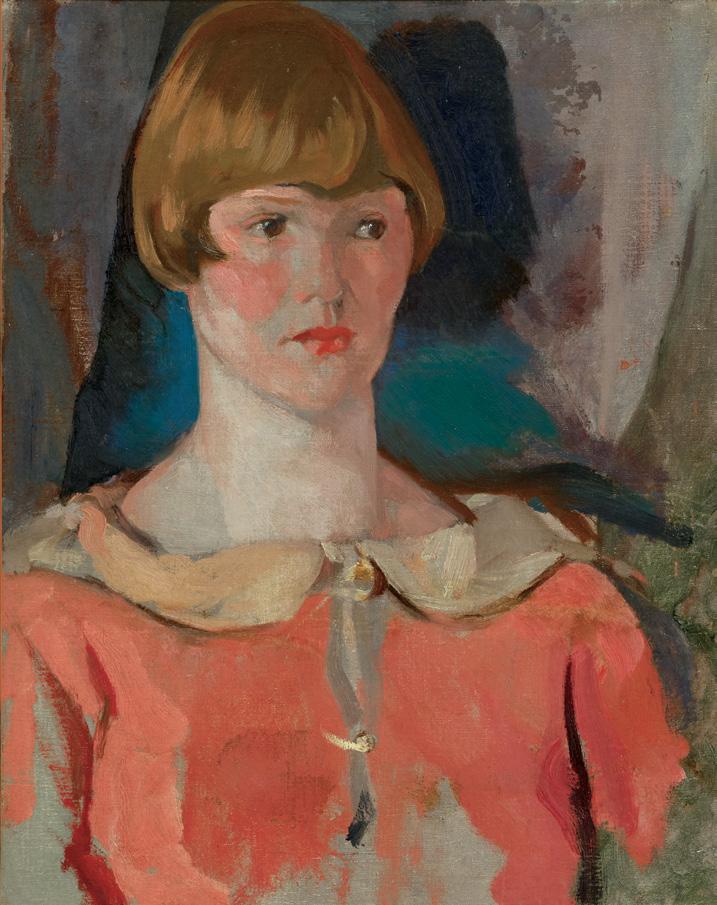
Dorothy, 1925 oil on canvas
titled and dated 1925 on a gallery label on the reverse; Varley inventory no. 546
20 ins x 16 ins; 50.8 cms x 40.6 cms
PROVENANCE
Maud Varley, Vancouver (wife of the Artist) Harrison Galleries, Vancouver Bill Price, Calgary Masters Gallery, Calgary Private Collection
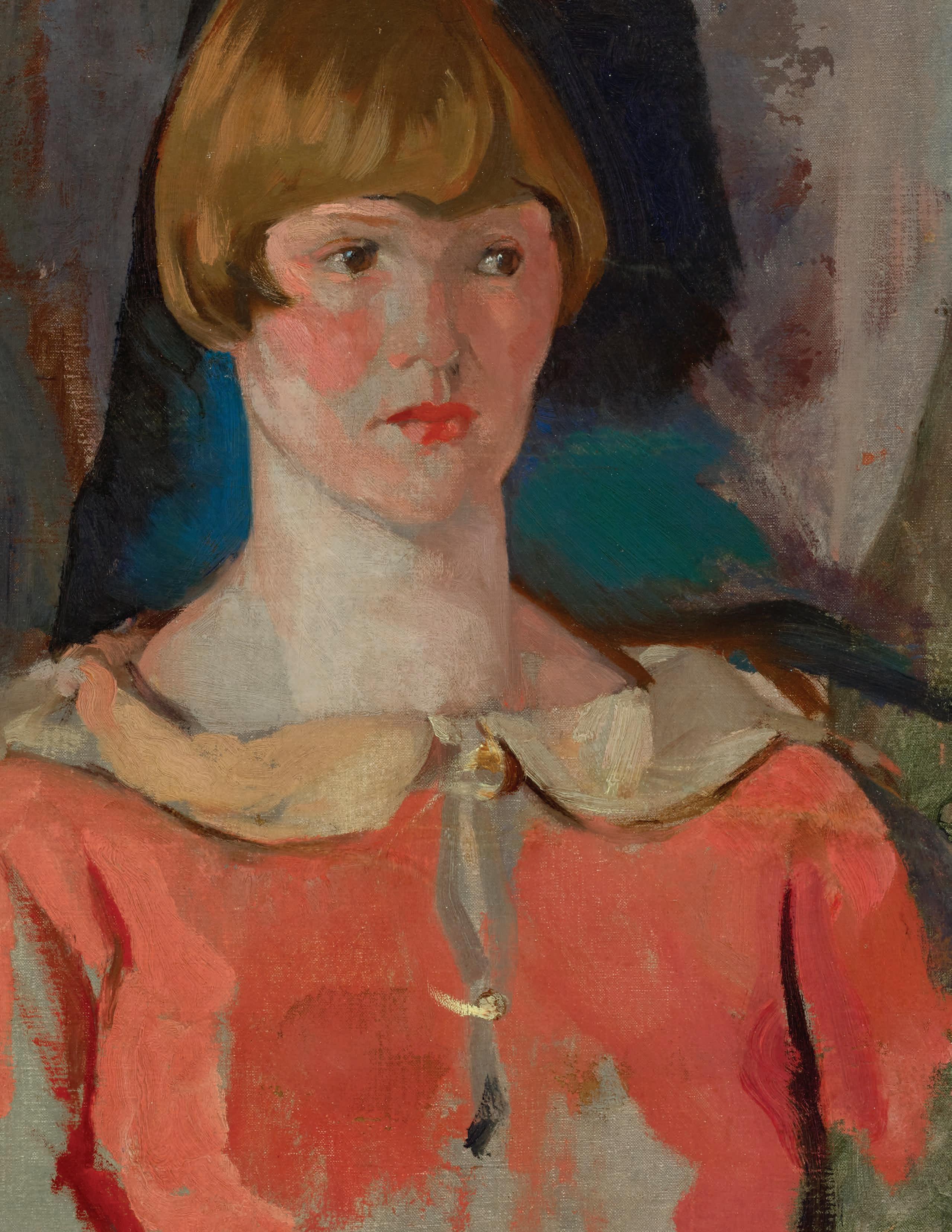
In painting this beautiful portrait of Dorothy, his eldest and only daughter in a family of boys, F. H. Varley was at the height of his powers. The painting of the pretty young girl, with her red cheeks and dress, is charmingly observed, with lively brushstrokes and bright colours. She looks as though the viewer could strike up a conversation with her, intent as she is on posing, her bright eyes pensively looking into the distance. Her modish hair cut in an up-to-date bob is that of a thoroughly modern flapper, but as the viewer can intuit, she is sweetnatured and gentle. In time, she married Clarence Burnham Sewell, an engineer on the British Columbia Ferries and in 1974, died of lung cancer. She was born in 1909.
Purchased in 2014 with the assistance of a Movable Cultural Property grant accorded by the Department of Canadian Heritage under the terms of the Cultural Property Export and Import Act, and with the generous support of the McMichael Canadian Art Foundation
Arthur Lismer Collection, McMichael Canadian Art Collection Archives Not for sale with this lot
The date given in the Varley inventory is around 1925; the date of 1936 on the label on the back is incorrect. Varley painted two portraits of Dorothy in Toronto, the other executed in 1923. Varley moved to Vancouver with his eldest son, John, in September 1926, and the rest of the family (including Dorothy) followed a month or two later. The move west occurred after the 1926 Group of Seven exhibition, which took place from May 7th to 31st, during which he included one of the Dorothy portraits as no. 115, probably the one painted in 1923. Varley’s later portraits, such as Vera of 1931 (National Gallery of Canada), have more stylized facial features and clothing patterns.
Varley’s wife Maud always kept this painting, no doubt happy with the good likeness of her child. She might have wished that Varley would spend more time on it and give it finishing touches. The family first lived in a large boathouse with accommodation above at the east end of Jericho Beach. In 1932, he rented a house on the banks of Lynn Creek in North Vancouver to use as a studio (today its address is 4395 Rice Lake Road), but it quickly became his permanent residence. When he left Vancouver in 1936, Maud moved into the house with her children. Christopher Varley, the artist’s grandson, remembers his grandmother keeping the painting wrapped in plastic behind the sink of the house. When she moved out, around 1962, Dorothy and her husband came to live there.
Varley’s ability to convey uniqueness while still maintaining directness and vitality is fully shown in this portrait. Varley was one of the great portrait painters of the twentieth century and Dorothy has the quality of genius. The young lady grows on the observer, gaining in presence over time.
Maud sold the painting to Harrison Galleries in Vancouver, as a card in the Peter Varley Fonds in the National Gallery of Canada Library and Archives records. It was owned by Bill Price (1927-2021), the star athlete of his day. He was a well-known baseball and basketball player, included in the semi-professional leagues of the time, was an Olympic basketball team alternate in 1956, and as a curler won the Canadian Briers in 1957 and 1958. He was also a golfer and was admitted to the Alberta Sports Hall of Fame in 1986 and also to the University of Alberta Sports Hall of Fame. His business career was in the oil and gas industry.
As a lover of fine art, Price was part of the ownership group of Masters Gallery Incorporated in Calgary, early on and in time, became a partner. From him, the painting passed to Masters Gallery and from it to a private collection where it has been treasured until today. Its appearance on the market is remarkable for its rarity in today’s auction world.
We extend our thanks to Joan Murray, Canadian art historian, for contributing the preceding essay.
$50,000–$70,000
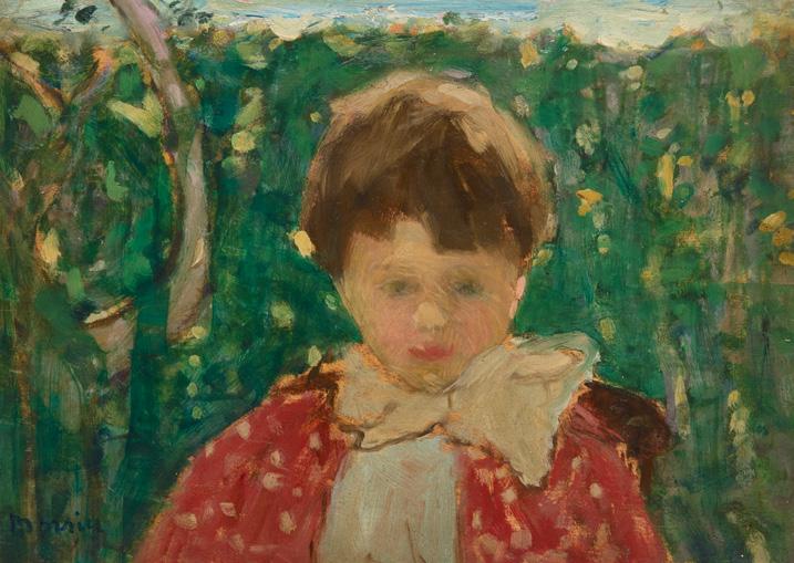
Head of Boy, Capri, circa 1894 oil on board
signed lower left; titled and inscribed "Paris" on a label on the reverse; titled and inscribed "Morrice no. 7" and "1818" on the reverse of the frame 9.5 ins x 13 ins; 24.1 cms x 33 cms
PROVENANCE
W. Scott & Sons, Montreal Private Collection, United Kingdom
EXHIBITED
Eighth Annual Exhibition, Canadian Art Club, Toronto, 1915, no. 86 as Head of Boy
LITERATURE
Robert J., Lamb, The Canadian Art Club, 1907-1915, Edmonton, 1988, listed page 91 (works in Canadian Art Club 1915 Exhibition)
Not for sale with this lot
Head of Boy is one of the few portraits James Wilson Morrice completed during his lifetime. Model studies and portraits count for about six percent of his artistic output. Morrice’s interest in the human figure evolved gradually, and then only after his move to Europe. No portraits of family or friends exist from his early years in Toronto, and only one from his time studying at the Académie Julian, where the students worked from live models.
Unlike landscapes, which James Wilson Morrice favoured painting during his years travelling, figure studies and portraits were produced in bursts of creativity, rather than consistently. Morrice painted his mistress Léa Cadoret, his friend Robert Henri, and William Brymner, all in small format oil sketches, which are more spontaneous than large, carefully planned canvases. Numerous sketches of female models fill his sketchbooks from 1895 to 1898.
Lesser-known are the many drawings and paintings of Italian children from a trip to Italy that we currently date to the spring of 1894, especially a little girl on a vaporetto in Venice, as well as a slightly older one in Capri. Morrice's two sketchbooks from that trip contain many quick drawings of Capri children, usually girls, wearing the local costume. There are four small paintings of an older girl, who Morrice always painted with her eyes down or closed. Morrice spent part of the summer in 1896 in the fishing town of Cancale, north east of SaintMalo, producing more than twenty-five small paintings and sketches, including the rare portrait of a little girl on a vaporetto in Venice (lot 50).
According to Lucie Dorais, a recognized J.W. Morrice expert, the present portrait of a young boy was not discovered until very recently. Though not mentioned in the James Wilson Morrice exhibition databases, it proves to be one of the artist's best early portaits and dates to circa 1894. Depicted on a horizontal panel (rare for a portrait), he is dressed fashionably, posing in front of vegetation that is difficult to place. We may interpret the oval form at left as a kind of shrub typical of Capri, and the blue band at the top could be read as either sky or sea. It bears similarities to other portraits of Capri children, including Girl Knitting (Private Collection), depicting a girl wearing an indigo bolero and puffy gigot sleeves. Like the other children depicted in the sketchbook, their eyes are barely indicated, but the boy in this work and the little tourist girl have theirs open, not yet shy of that strange man focusing on them.
We extend our thanks to Lucie Dorais, Canadian art historian and author of J.W. Morrice (1985), for assisting with the research on this artwork.
$50,000–$70,000
Cowley Abbott is pleased to present a distinguished selection of Quebec art in the Fall 2025 auction season, spanning over a century of artistic innovation and cultural expression. From early portraiture to post-war abstraction, these works together trace the evolution of artistic vision in the province.
Dating to 1852, Théophile Hamel’s painting of a mother and child is a rare and important example of early Quebec portraiture. J.W. Morrice’s intimate depictions of children capture the artist’s poetic sensibility and charm. The magic of the Quebec winter is evoked in the snow-covered village scenes of A.Y. Jackson and Montreal horse-drawn cabs by Robert Pilot.
Modernism takes centre stage with a striking 1950 oil painting by Jean Paul Riopelle, as well as rare to market works by Paul-Émile Borduas and Alfred Pellan—seminal figures whose bold experimentation reshaped Canadian art. The post-war era is also represented through luminous abstract canvases by artists including Yves Gaucher and Rita Letendre, whose mastery of form, texture, and colour reflects the continued innovation of Quebec’s artistic legacy.
These fourteen works celebrate the province’s extraordinary contribution to Canadian art history, in its devotion to beauty, experimentation, and the enduring power of place. Quebec has consistently been a driving force, especially in moments of change and artistic innovation.
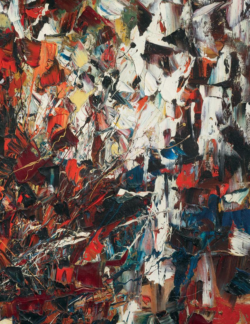
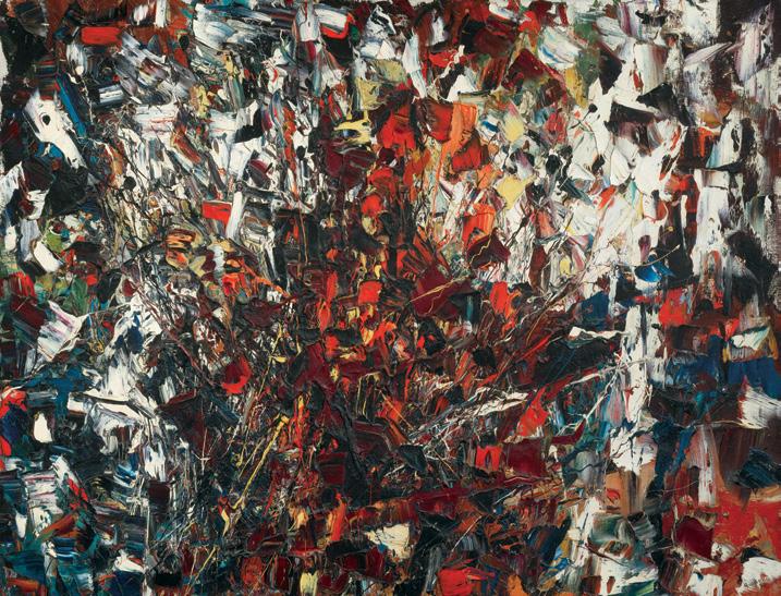
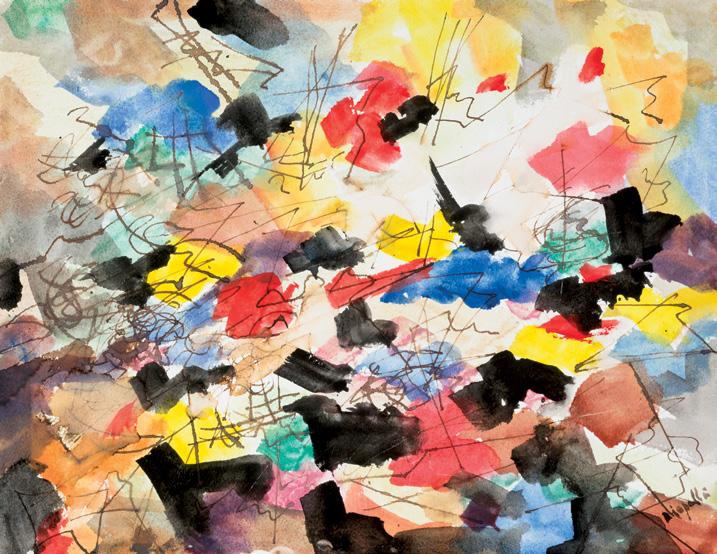
JEAN PAUL RIOPELLE
Sans titre, 1950 oil on canvas
signed and dated 1950 lower right; dated 1950 on two gallery labels on the reverse; catalogue raisonné no. 1950.010H.1950 36 ins x 46 ins; 91.4 cms x 116.8 cms
PROVENANCE
Acquired directly from the Artist, Paris, 1950 Private Collection, Paris Masters Gallery, Calgary, 15 September 2007 Private Collection
EXHIBITED
Riopelle: The Glory of Abstraction , Glenbow Museum, Calgary, 15 May–2 August 2010
LITERATURE
Jean-Louis Prat, "Foreword" in Pierre Théberge, Riopelle, Montreal, 1991, page 12
Yseult Riopelle, Jean Paul Riopelle: Catalogue Raisonné, Volume 1, 19391953, Montreal, 1999, reproduced page 371, no. 1950.010H.1950
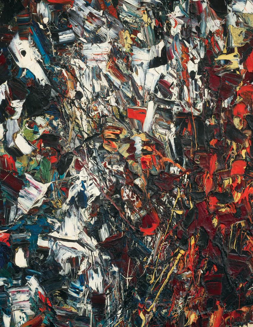
“Jean Paul Riopelle stands at the crossroads of renewal that confronted both the realm and the individual act of painting in the fifties. Related to American and European art but nonetheless distinct, his work has its source in a culture of instinct, one that aims to rigorously preserve its autonomy and its vision while solidly reinforcing the soil from which it springs.” - Jean-Louis Prat
After an initial visit to France in 1946, where Jean Paul Riopelle found an atmosphere conducive to pursuing his artistic ambitions, he settled permanently in Paris in 1947. In 1948, he returned briefly to Montreal for the birth of his eldest daughter and to sign, along with his fellow Automatistes, the Refus Global manifesto—written by his mentor PaulÉmile Borduas, for which Riopelle also designed the cover. In Paris, Riopelle felt freed from the oppressive weight of the Grande noirceur (“Great Darkness”), the period during which the Catholic Church and Premier Maurice Duplessis imposed strict control over Quebec society from 1944 to 1959. The artist sought to invent his own visual language and to create freely, far from dogma and constraint.
It is interesting to observe Riopelle’s formal evolution in the works created between 1949 and 1955, the earliest of which were influenced by French Surrealism—a movement he began distancing himself from by 1949 and 1950. Beginning in 1949, with Le Perroquet vert (catalogue raisonné, no. 1949.010H.1949, pages 277, 369), Riopelle abandoned the paintbrush, instead using a dropper and palette knife to create fine, interlacing lines that crisscross the surface like overlapping nets across the canvas from edge to edge.
Riopelle began his Mosaic series in 1950, including Sans titre. While one can still discern the influence of Automatiste painting, Riopelle was at a pivotal moment in his career, marking the beginning of a new approach. The works from this period recall the style of his ink and watercolour compositions. In formal terms, the ‘all-over’ composition is animated by filaments and splashes of light, in vibrant and at times darker colours that sweep across and energize the surface.
It was at this time that Riopelle began applying paint in thick impastos. He often joked that he painted thickly because he did not know how to make “thin paintings.” In this regard, art critic Patrick Waldberg described Riopelle’s works as “oil sculptures.”
All of the paintings from this creative period are emblematic of a remarkable transition that set Riopelle apart from his contemporaries—through the vigour of his gesture and the force of his expression. Early in this new phase, he abandoned the Automatiste credo of hasard total, since, as has been observed, “Riopelle knew well that ‘total chance’ could turn out to be another illusion, much like the ‘naïveté’ so cherished by the Impressionists.” For him, what mattered above all was intensity —an intensity matched by his extraordinary mastery of the medium and his unfailing sense of composition. His canvases are structured by interlacing bands and sections of colour that give the work both an architectural framework and a heightened dynamism.
Sans titre was acquired directly from Riopelle in 1950, in lieu of rent for the artist's studio in Paris. The painting was then treasured by the family, remaining in the collection until 2007 when Masters Gallery in Calgary was entrusted with the oil on canvas.
We extend our thanks to Sylvie Lacerte, PhD, art historian and independent researcher, for her assistance in researching this artwork and for contributing the preceding essay.
$1,200,000–$1,500,000
Abstraction no. 10 ou Figure athénienne, 1942 gouache
signed and dated 1942 lower right; titled on a gallery label on the reverse, catalogue raisonné no. 2005-0104
18 ins x 24 ins; 45.7 cms x 61 cms
PROVENANCE
Collection of Dr. Otto Bengle, Montreal Gilles Bernard, Montreal Private Collection, Montreal
Galerie Walter Klinkhoff, Montreal Private Collection
EXHIBITED
Œuvres surréalistes de Paul-Émile Borduas, Ermitage, Montreal, 25 April-2 May 1942
942 Surrealist Paintings, Théâtre de l'Ermitage, Montreal, 25 April-2 May 1962
Borduas et les Automatistes, Montreal 1942-1955, Grand Palais, Paris; travelling to Musée d'art contemporain, Montreal, 1 October 1971-16
January 1972, no. 13 as Composition , 1942
Paul-Émile Borduas. 1905-1960, Montreal Museum of Fine Arts; travelling to the National Gallery of Canada, Ottawa; The Art Gallery of Toronto; Musée du Québec, 11 January-15 July 1971, no. 29 as Composition
Paul-Émile Borduas Retrospective, Montreal Museum of Fine Arts, 6 May-11 August 1988, no. 28
The Eye of the Collector, Montreal Museum of Contemporary Art, 18 October 1996-5 January 1997
LITERATURE
Charles Doyon, "The Surrealist (sic) Borduas Exhibition", Le Jour (2 May 1942), reproduced page 4
Robert Élie (under the pseudonym of Pierre Daniel), "Ravishing Paintings by Paul-Émile Borduas", La Presse (25 April 1942), reproduced (upside down) page 55
Robert Élie, "Borduas" in l'Arbre, Collection Art vivant, Montreal, 1943, unpaginated, reproduced figure 8
François-Marc Gagnon, "An Exhibition to See and See Again", Le Devoir (18 December 1971), discussed page 13
Bernard Teyssèdre, Fernand Dumont and Laurier Lacroix, Borduas and the Automatists: Montreal, 1942-1955, Quebec, 1971, no. 13, discussed page 87
François-Marc Gagnon, Paul-Émile Borduas (1905-1960): Biographie critique et analyse de l'oeuvre, Montreal, 1978, reproduced page 527, figure 30
François-Marc Gagnon, "Origin of abstract art in Quebec”, Ministry of Cultural Affairs/Museum of Contemporary Art Conference, Montreal (12 October 1979), reproduced page 272
François-Marc Gagnon, "The meaning of the word 'abstraction,' in art criticism and the statements of painters in the 1940s in Quebec" in Yvan Lamonde and Esther Trépanier, The Advent of Cultural Modernity in Quebec, Quebec, 1986, reproduced page 124
Paul-Émile Borduas, “Manières de goûter une œuvre d'art” in André G. Bourassa, Jean Fisette and Gilles Lapointe, Paul-Émile Borduas: Écrits I, Montreal, 1987, pages 220, 224
François-Marc Gagnon, Paul-Émile Borduas Retrospective, Montreal, 1988, reproduced page 175, no. 28 as No. 10 or Athenian Figure
Marcel Brisebois, The Eye of the Collector, Montreal, 1996, reproduced page 47
Bernard Lamarche, "Borduas and the Collectors" The 50th Anniversary of Refus Global, Le Devoir: Special Edition (9-10 May 1998), reproduced page E20
François-Marc Gagnon, Chronique du mouvement automatiste québécois 1941-1954, Montreal, 1998, pages 67-68
Robert Bernier, A Century of Painting in Quebec: Nature and Landscape, Montreal, 1999, reproduced page 150
François-Marc Gagnon, Paul-Émile Borduas. A Critical Biography, Montreal/Kingston, 2013, discussed pages 130-131
Paul-Émile Borduas: Catalogue Raisonné [online publication], Concordia University, no. 2005-0104, accessed 14 October 2025
Abstraction no. 10 ou Figure athénienne belongs to the sixty or so gouaches painted by Paul-Émile Borduas during the winter of 1942, forty-five of which were exhibited from April 25 to May 2, 1942, at the Foyer de l'Ermitage in Montreal, under the title Surrealist Works of Borduas. This exhibition is particularly important because it is generally recognized as the starting point of the Montreal Automatiste movement. On this occasion, Borduas described to his friend, the art critic Maurice Gagnon, the “automatic” aspect of his approach, emphasizing the intuitive nature of the creative act: “I have no preconceived ideas. Placed in front of the blank sheet of paper with a mind free of all literary ideas, I obey the first impulse. If I have the idea of applying my charcoal to the centre of the sheet or to one of the sides, I apply it without hesitation, and so on. A first line is drawn, dividing the sheet. This division of the sheet triggers a whole thinking process that is always executed automatically.” Influenced by his recent discovery of Surrealism and his reading of André Breton’s Château étoilé, the artist no longer aimed to imitate or represent the outside world, but to adapt the means of painting to his own inner vision. The Montreal exhibition was a resounding success, with thirty-seven of the forty-five works on display being sold. It was Gilles Bernard who acquired the gouache Abstraction no. 10 ou Figure athénienne for $50.
Breaking with the usual formula of the “portrait” composition, Borduas opts for a spatial proposition which boldly embraces the landscape format. Abstraction no. 10 ou Figure athénienne echoes not only “the idealized beauty of bodies and movements” which characterizes Hellenic art but also evokes the capacity for invention of the Greeks, who “spontaneously discovered their means of plastic expression”. For Borduas, what matters now is not the subject represented, but the way in which the painter manages to translate his ideas plastically onto the canvas, to innovate by focusing on the seemingly technical questions of rhythm, volume, light and movement. The skillful combination of triangular and biomorphic forms in Abstraction no. 10 ou Figure athénienne denotes in this respect the decisive influence of Picasso, whose immense field of Cubist experimentation was of particular interest to Borduas at this time. If the latter retains from Cubism the simplification of forms, the geometrization of volumes and the
representation of the subject according to various points in space, we observe in the Canadian painter more flexibility in the tracing of contours and the rendering of form. For the artist, who ventures into the terrain of non-figuration—a step that the French Surrealists would refuse to take—this is a significant leap forward. A few years before his death, positioning his work among contemporary painting practices, Borduas declared: “The gouaches of 1942, which we believed to be Surrealist, were only Cubist.”
We extend our thanks to Gilles Lapointe, associate professor in the Department of Art History at the Université du Québec à Montréal for contributing the preceding text, which has been translated from French. Lapointe is the author of several books on Paul-Émile Borduas and the Automatist movement.
$100,000–$150,000
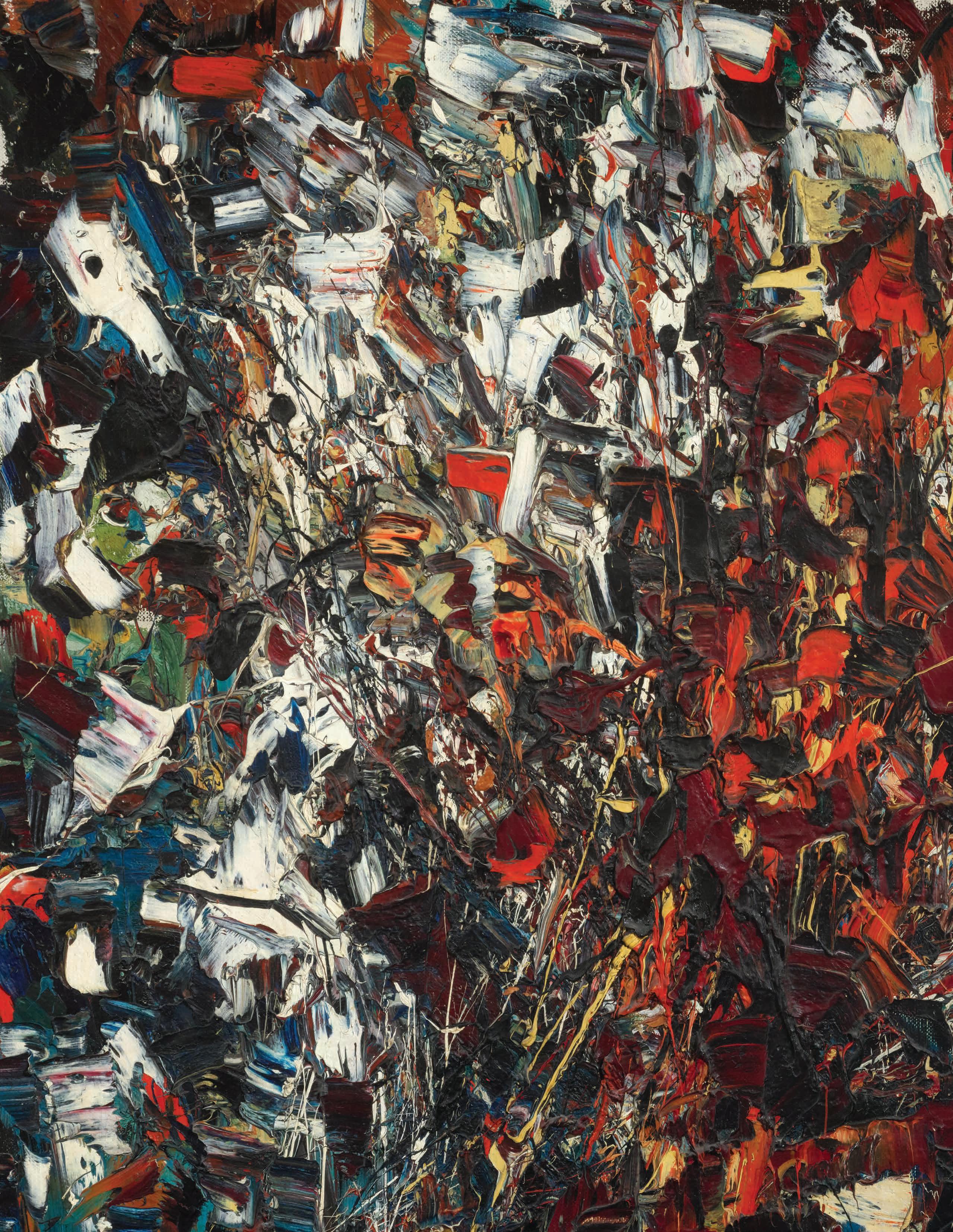
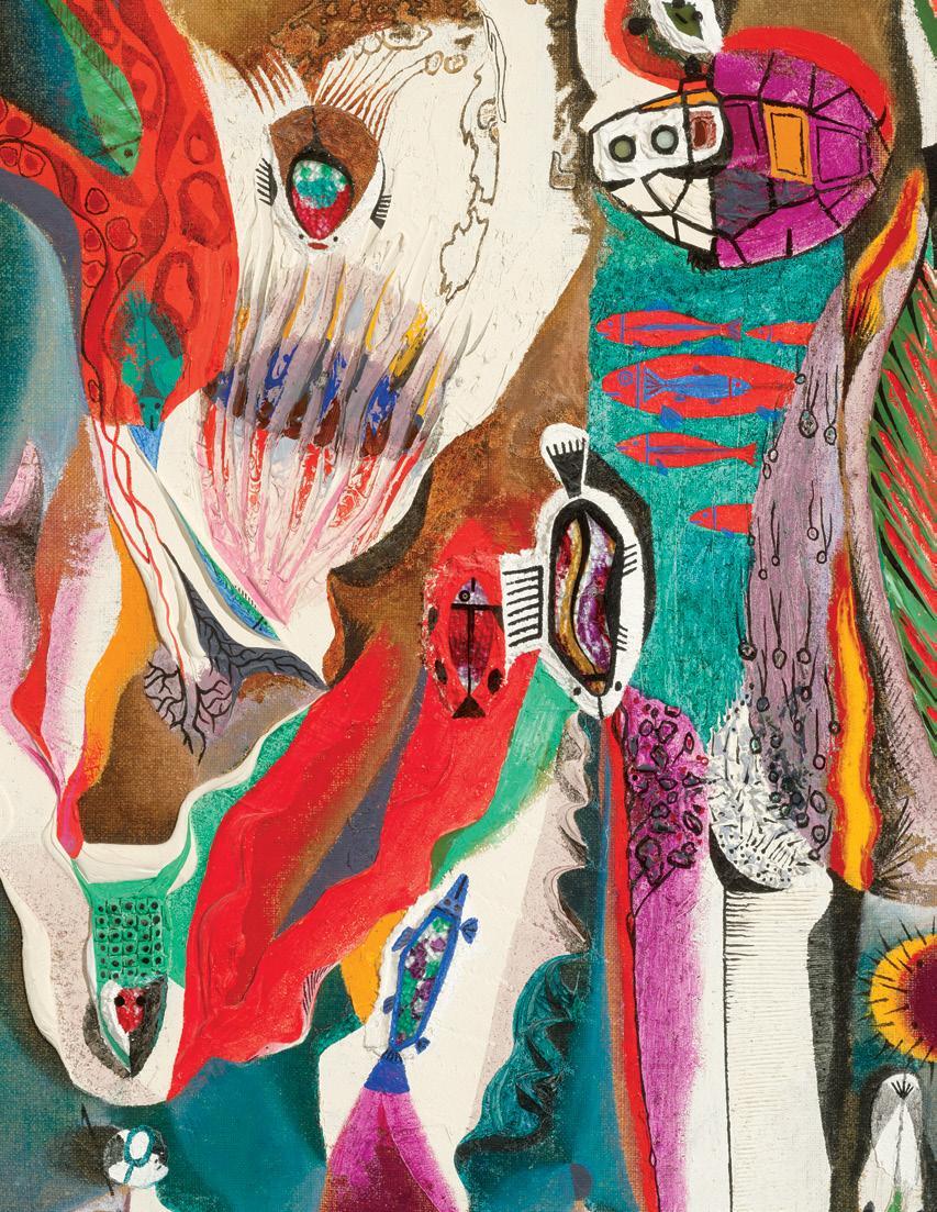
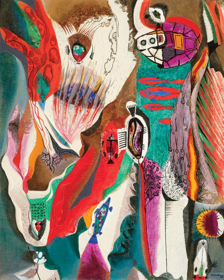
Chasse sous-marine, 1958 oil and silica on board
signed and dated 1958 lower right; titled and inscribed "no. 342" on the reverse
29.5 ins x 23.5 ins; 74.9 cms x 59.7 cms
PROVENANCE
Roland Dumais, Montreal Brian Garber, Montreal Private Collection
EXHIBITED
Quebec Pavilion, Expo '70 , Suita, Osaka, 15 March-13 September 1970 Passion for Art: Works from Private Collections, Glenbow Museum, Calgary, n.d.
LITERATURE
G. de la Tour Fondue, “Pellan”, Interviews Canadiennes, Montreal, 1952, pages 125–139
Jean Seguin, “La peinture”, Antennes, vol. 4, no. 2-3, Montreal, 1957, page 15
Donald W. Buchanan, The Gallery of Canadian Art: 4, Alfred Pellan , Toronto, 1962, unpaginated, no. 29, reproduced as La chasse sous-marine, 1958
M. Théberge quoted in Pierre Roberge, “Pionnier de l’art moderne, Alfred Pellan meurt à 82 ans”, La Voix de l’Est (2 November 1988), page 19
F. Javier Monclús Fraga, Exposiciones internacionales y urbanismo: El proyecto Expo Zaragoza , Barcelona, 2006, page 74
In Chasse sous-marine, Alfred Pellan left behind the strict lines and complex compositions of the 1940s to explore plasticity. Its surface is not merely painted but physically constructed: pigment is thickened with plaster-like substance, forming ridges and layered deposits that cast small shadows. The relief becomes part of the composition’s rhythm, alternating between flat, luminous passages and dense, tactile zones. Within these textures, colour behaves almost as matter. It seems alive: it swells, contracts, and dissolves.
The work is a vibrant, layered composition of abstract and organic forms. Recognizable yet stylized elements such as fish-like forms, circular shapes, and curved figures float in almost liquid motion throughout this universe. Seemingly suspended between underwater depth and an abstract colour field, they create a dynamic between silent
movement and tactile complexity. These spiralling forms that merge natural forces with dream imagery bridge Pellan’s earlier surrealist vocabulary with the exuberant materialism of the 1960s. This union rests on what Pellan described as a practice “based on emotion and revelation”, shaped through the “unpredictable means of plastic and poetic invention”.
Although Chasse sous-marine may at first appear abstract, Pellan refrained from pure abstraction because he felt it led to a standstill in art. On the contrary, he demonstrated an attachment to the human world, even when his paintings seem to dissolve it. He explained that although he often began a canvas in abstract terms, “reality, the human side, began to graft itself on top of it.” With its metamorphic forms, Chasse sous-marine captures that process. Finned shapes recall fish or marine creatures, while others resemble shells, organs, or mechanical fragments. These hybrid motifs are not representations. They are metamorphoses in which one form begins to suggest another. Their contours shift within the relief as though reality itself were being reassembled under new physical laws.
Chasse sous-marine has remained in private collections since its creation, which partly explains its absence from the scholarly literature on Pellan. Its significance, however, is clear from its inclusion in major exhibitions. The painting was shown on two occasions, most notably at Expo ’70 in Osaka, within a setting devoted to “Progress and Harmony for Mankind”. Building on Canada’s prominent role at the exposition and Quebec’s effort to showcase its modern culture abroad, Pellan’s work offered a distinctly poetic counterpart to the technological optimism of the event. Rather than progress through machinery, he proposed progress through imagination that united invention, sensuality, and wonder.
We extend our thanks to Maria Rosa Lehmann (PhD, Sorbonne University), an art historian and computer science scholar whose research bridges cultural history and technology, for contributing the preceding essay. She has held research fellowships at Brown University, Cornell University, the Université du Québec à Montréal, and the German Center for Art History in Paris. She is the author of the Art Canada Institute monograph on Alfred Pellan (2023) and co-author of a forthcoming book on artist Mimi Parent. She contributed to exhibitions, including Une brève histoire de l’avenir at the Louvre Museum (2015). Alongside her art-historical work, she designs datadriven tools for art-historical research, developing analytical platforms and algorithmic models that map the transnational circulation of the avant-garde.
$40,000–$60,000
JEAN PAUL LEMIEUX
Jeune fille en jaune, 1964 oil on canvas signed and dated 1964 lower right; titled and dated 1964 on a gallery label on the reverse 43 ins x 23.5 ins; 109.2 cms x 59.7 cms
PROVENANCE Masters Gallery, Calgary Private Collection
LITERATURE
Guy Robert, Lemieux , Toronto/Montreal, 1975, reproduced page 227 as Jeune fille en jaune (Girl in Yellow), 1964 Guy Robert, Lemieux , Toronto, 1978, page 240 Michèle Grandbois, Jean Paul Lemieux: Life & Work [online publication], Art Canada Institute, Toronto, 2016, page 63
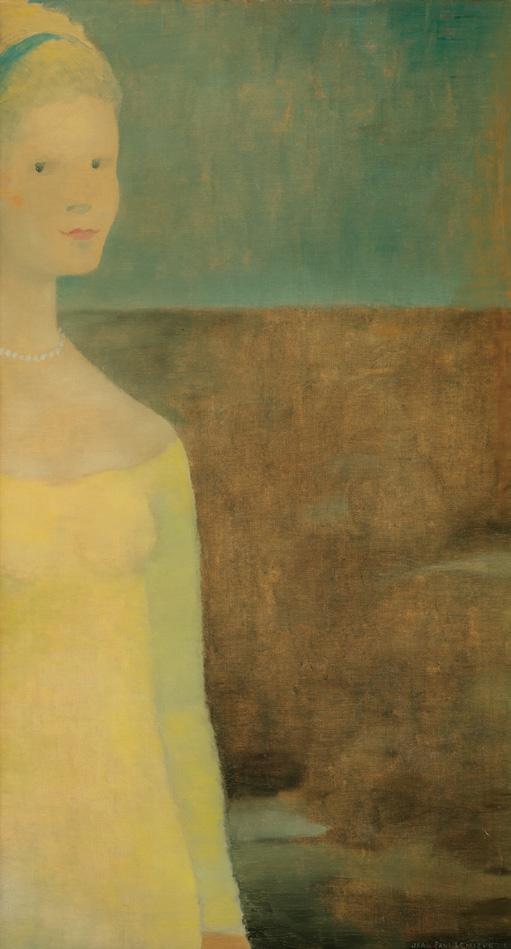
Jean Paul Lemieux is widely regarded as one of Canada’s most significant modern painters, celebrated for his austere yet poetic depictions of figures and landscapes that distill the essence of time, place, and memory. By the early 1960s, Lemieux had arrived at his mature style, combining the formal discipline of European modernism with the quietude and vastness of the Canadian environment.
As Quebec was experiencing a decade of artistic innovation with flourishing avant-garde abstract movements, Lemieux himself turned away from narrative to focus on the flat space of the picture plane. He never fully embraced abstraction, however; the artist rather painted empty landscapes with a bare horizon line or a figure in the foreground. Lemieux “expressed the perilous human condition by showing figures isolated in their personal solitude.” Throughout his career, he depicted his sitters in a frontal stance with a direct view into
the facial expression. The artist is best known for his so–called “classic period” between 1956 and 1970. During these years, Lemieux took inspiration from a number of themes, with time and space being the most significant. Empty spaces inhabited by simplified figures were key features of this period and would develop further as the artist shifted away from the narrative toward the flat space of the picture plane. Lemieux wrote, “In my landscapes and my characters I try to express the solitude we all have to live with, and in each painting, the inner world of my memories. My external surroundings only interest me because they allow me to paint my inner world.”
Painted in 1964, Jeune fille en jaune exemplifies Lemieux’s midcareer exploration of the human figure within ambiguous, almost metaphysical space. A solitary female figure stands along the left edge of the composition, rendered in muted tones of yellow and soft blue. Behind her is a horizon of earthy browns and atmospheric blue. Delicate shifts of pigment suggest the play of light on the woman’s gown, while the softly brushed background creates an atmospheric depth that transcends the painting’s apparent simplicity.
The figure’s pale face and delicate pearl necklace recall portrait conventions and Lemieux’s interest in archetypal imagery. By the 1960s, he had refined this approach to create his celebrated “classic” period, where lone figures or small groups are situated against vast, simplified backdrops. Works from this period convey a sense of infinite space and suspended time, reflecting the influence of both fifteenthcentury Italian fresco painting and the muted palette of northern European art.
The mid-1960s were also a period of growing recognition for Lemieux. He had reached the height of his reputation as one of Canada’s foremost painters. This period saw major milestones, including a retrospective at the Musée du Québec in 1965, his participation in the São Paulo Biennial in 1965 and Expo '67 in Montreal; and soon after, he was named a Companion of the Order of Canada.
$200,000–$300,000
16
JEAN PAUL RIOPELLE
Sans titre, 1947 ink and watercolour signed lower right; catalogue raisonné no. 1947.089P 10 ins x 12.5 ins; 25.4 cms x 31.8 cms
PROVENANCE
Estate of Robert Noakes
LITERATURE
François-Marc Gagnon, Jean Paul Riopelle: Life & Work [online publication], Art Canada Institute, Toronto, 2019, page 56
After reading André Breton's Le Surréalisme et la peinture in 1945, Jean Paul Riopelle was inspired to break away from tradition to pursue non-representational painting. He used ink and watercolour to explore spontaneous, abstract forms, letting gesture, chance, and texture play a role. Riopelle created several small watercolours during these years, consisting of web-like black lines that blur the distinction between foreground and background. The use of ink and watercolour allowed looseness and immediacy–qualities that carried into his mature “mosaic” works.
In 1947, Riopelle moved to Paris to continue his career, where, after a brief association with the Surrealists, he developed his mature style of lyrical abstraction. He participated in the first Lyrical Abstraction exhibition, which took place at the Galerie du Luxembourg in Paris in 1947, and included fourteen participants such as Riopelle and Fernand Leduc. Another participant, French artist Georges Mathieu was enthusiastic about the “new Canadians” and their automatism, which he admired for its “advantageous submission to the demands of spontaneity, pictorial indiscipline, technical chance, romanticism of the brush, the overflowing of lyricism.”
Riopelle’s watercolours form a significant part of his oeuvre, revealing his artistic development as he moved from early automatic writing toward the bold, “mosaic” oil paintings that defined his mature style. These works also illuminate how post-war Canadian abstraction engaged with and transformed the legacy of European Surrealism into a distinctly local movement.
We extend our thanks to Mme Yseult Riopelle for her assistance in researching this artwork and for including the artwork within the Jean Paul Riopelle catalogue raisonné.
$15,000–$20,000
17
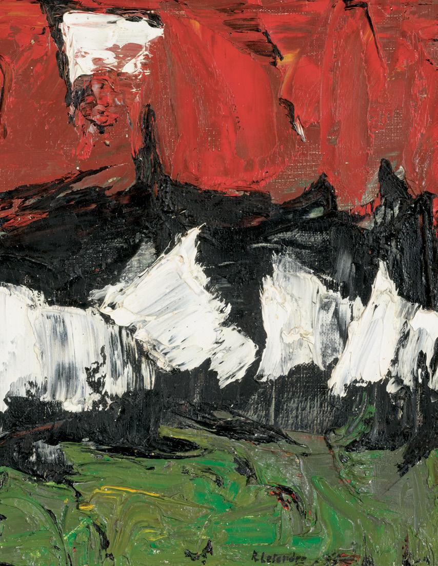
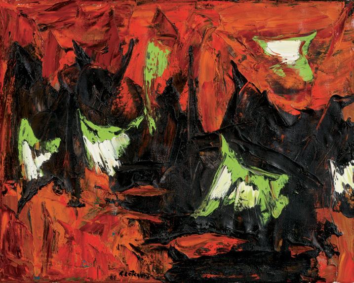
RITA LETENDRE
Jour d'été, 1961 oil on canvas signed and dated 1961 towards lower left; signed, titled and dated on the reverse 16 ins x 20 ins; 40.6 cms x 50.8 cms
PROVENANCE
Private Collection, Montreal
By 1961, Rita Letendre was at a pivotal point in her career. Having emerged from the circle of Automatistes and having exhibited in their last group show in 1955 in Montreal, Letendre quickly moved from gestural, painterly abstraction toward the bold, structured forms that would define her mature style. During this period she was beginning to receive serious national attention. She had just presented solo exhibitions in Montreal and Toronto and had been included in important group shows like The Non-Figurative Artists of Montreal at the National Gallery of Canada in 1956 and The Biennial Exhibition of Canadian Painting in 1961. Letendre’s paintings from this time, including Jour d’été, 1961, feature dense, highly textured impasto and sweeping, explosive strokes of colour in reds, blacks, and whites. In this instance, the artist has added accents of cheerful lime green, perhaps in reference to the title, translating to “Summer Day”.
$25,000–$35,000
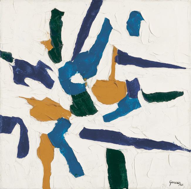
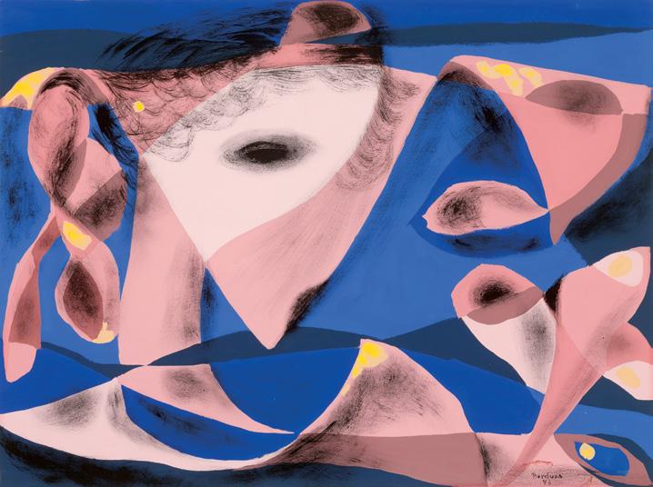
Abstraction en bleu, jaune et vert, 1965 oil on canvas signed and dated 1965 lower right; titled on gallery labels and inscribed "83-90" on the stretcher on the reverse 20 ins x 20 ins; 50.8 cms x 50.8 cms
PROVENANCE
Gerard Gorce, Montreal
Waddington & Gorce Inc., Toronto Parisian Laundry, Montreal
Private Collection
By the early 1960s, Lise Gervais found herself caught in the tension between rival art movements: the Automatistes and the Plasticiens. After aligning herself with the circle of Paul-Émile Borduas, Gervais emerged as a significant contributor to the post-Automatiste movement, alongside fellow artists Rita Letendre and Marcella Maltais. Painted in 1965, Abstraction en bleu, jaune et vert was created during a time when Gervais had returned to teaching at the École des beaux-arts, Concordia University and L’Université du Québec in Montreal.
The textured and colourful surface of this painting vividly captures the vibrant energy with which the artist infused her artwork. Gervais's personal interest in texture and materiality results in expressive and instinctive brushwork, with bold swatches of taupe, black, and teal popping against a crisp white backdrop. These colours, applied with precision, carry a dynamic and instinctive touch, creating a captivating composition that showcases Gervais's artistic expertise.
$15,000–$20,000
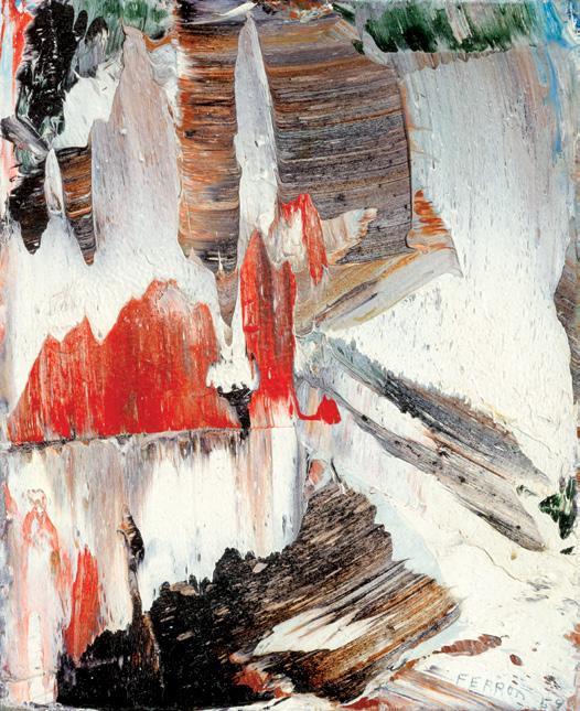
MARCELLE FERRON
Sans titre, 1959 oil on canvas
signed and dated 1959 lower right; signed and dated on the reverse, titled on the gallery label on the reverse 10.5 ins x 8.5 ins; 26.7 cms x 21.6 cms
PROVENANCE
Barry Veenasamy, Ontario Masters Gallery, Calgary Private Collection
A pioneering figure of Quebec’s Automatiste movement and signatory of the 1948 Refus Global manifesto, Marcelle Ferron forged a bold and independent path in the development of post-war Canadian art. Her work of the 1950s exemplifies the move from Surrealist-influenced automatism to a more physical, gestural abstraction, grounded in the emotional force of colour.
Painted in 1959, this compact yet powerful oil on panel captures Ferron at a pivotal moment. Having relocated to Paris in 1953, she immersed herself in the European avant-garde and began to develop the vigorous, highly tactile surface that would become her signature. Here, impastoed strokes of white, ochre, and black clash with passages of luminous brick red and hints of green. Working with a palette knife, she layered dense pigment to create sculptural ridges and valleys, allowing light to play across the surface.
$20,000–$30,000
YVES GAUCHER
TH/G-III ON-D/68, 1968
acrylic on canvas signed, titled and dated 1968 on the reverse 80 ins x 80 ins; 203.2 cms x 203.2 cms
PROVENANCE
Collection of the Artist Winchester Galleries, British Columbia, 2014 Private Collection
LITERATURE
John R. Porter and Michael Martin, Yves Gaucher: Récurrences, Quebec City, 1999, reproduced page 45, figure 45 as THG-III-nd 68
Yves Gaucher extended and refined the pioneering investigations of abstraction initiated in Quebec in the 1940s by Paul-Émile Borduas, Jean-Paul Riopelle, and many others of the Automatiste school. He responded more immediately to the less gestural and Surrealist modalities of Les Plasticiens and to fellow travellers in the “PostPlasticiens” generation of which he was part, including peers Charles Gagnon, Guido Molinari, and Claude Tousignant. He was also drawn to the less gestural types of American AbEx, particularly the work of Mark Rothko and Barnett Newman.
As a printmaker and painter, Gaucher typically worked in series, focusing his attention for a relatively brief period on specific concerns with colour or music, for example. TH/G-III ON-D/68 is an example of his so-called grey-on-grey paintings of 1967 to 1969. The unusual
titles of this and related works refer to the type of paint employed and the date. Neither the individual titles nor the appellation “grey-ongrey” for the group of works do justice to the remarkable subtlety and power of these paintings. For a start, the greys in TH/G-III ON-D/68 are individual and tend to the blue-grey scale.
Gaucher’s Signals/Silences series of 1966 helpfully lends the notion of a signal to these grey paintings. Thinking of the almost imperceptible lines that float on his blue-grey surfaces as indicators is one way to understand these faint yet carefully composed marks. The five lines here differ in weight, hue, and length as they inflect the grey atmosphere in which they appear. Though they are stationary as we look at the canvas, we know that the signals are capable of movement. Nor is the visual the only signal transmitted. Gaucher was famously struck by the spatial movement of sound in the compositions of Anton Webern in Paris in 1962. For the painter and many viewers, the quiet registration of these lines is akin to hearing music, a creation of sounds that move through time. Silent in themselves, the signals can be understood as sonic ciphers. We are left to wonder where these signals come from and to what they point. Do they refer us to our own perceptual apparatus, to the formal capabilities of abstract painting, or perhaps towards the ineffable?
We extend our thanks to Mark A. Cheetham for contributing the preceding essay. Mark is a professor of Art History at the University of Toronto, an independent curator, and art writer. Mark is the author of two books on abstract art: The Rhetoric of Purity: Essentialist Theory and the Advent of Abstract Painting (1991) and Abstract Art Against Autonomy: Infection, Resistance, and Cure Since the ‘60s (2006).
$40,000–$60,000

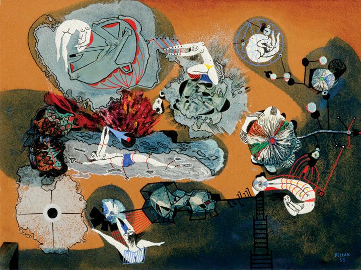
Au soleil noir, 1958 oil and silica on board titled, inscribed "les femmes et la lune" and "#346" and artist stamp on the reverse 14.75 ins x 19.75 ins; 37.5 cms x 50.2 cms
PROVENANCE
Mr. and Mrs. M. Boisvert, Montreal Waddington & Gorce, Toronto Masters Gallery, Calgary Private Collection
EXHIBITED
Hommage à Pellan, Galerie Denyse Delrue, Montreal, 25 April–7 May 1960, Les femmes et la lune ( Au soleil noir was part of a suite of fourteen paintings)
Pellan , Musée du Quebec; travelling to Musée des beaux-arts de Montreal; the National Gallery of Canada, Ottawa, 7 September 1972-8 January 1973, no. 114 (loaned by Mr. and Mrs. M. Boisvert, Montreal)
LITERATURE
“Alfred Pellan. Painter, poet, dreamer”, Star Weekly (6 August 1960), page 17
David Giles and Jean Soucy, Pellan , Quebec City, 1972, no. 114, discussed pages 22, 23, listed page 110 “Introduction” in Pellan , Quebec/Montreal/Ottawa, 1972, page 44
German Lefebvre, Pellan , Toronto, 1973, reproduced page 62
German Lefebvre, Pellan. Sa vie, son art, son temps, Quebec, 1986, page 180, reproduced page 130
In 1958, Alfred Pellan received a grant from the Canada Council that allowed him to explore the physicality of colour and surface, mixing pigment with various materials to create reliefs. Through these experiments, he developed the language that would define his Jardins series. Au soleil noir anticipates that shift. The surface is not merely raised through pigment but built with attached elements: small moulded forms, ridged folds, and embedded materials project into space. Pellan moves beyond painterly relief toward an integrated object. Although thematically distinct from the Jardins, the painting sets the foundation for Pellan’s later exploration of structure, rhythm, and the tactile energy of matter.
Germain Lefebvre spoke of the “shimmering blooms of Au soleil noir,” noting how Pellan’s electric movements scatter across joyfully decorated aerial fields. The painting is built around a series of floating zones, each defined by texture rather than line. Against a warm ochre ground, clusters of material rise from the surface. Circular shapes unfold like flowers or mineral growths, their creased folds catching light from the gold and silver tones around them. The eye moves between compact, crater-like forms and finer drawn connections that link them together.
The naked female bodies of the painting “recline and stretch out, fly away, turn about in space before diving back, light and pneumatic, in joyous fluids and plunging into heady, scintillating matter”. Within this floating environment, the women act less as subjects than as currents of movement linking the different zones of the composition. They animate the work’s tension between gravity and suspension, between the solid crust of pigment and the open space around it. Women don’t merely occupy the image. They build it, holding together its material and emotional core. For Pellan, this sensual cosmology was inseparable from emotion itself: “Love is like life… one cannot escape being dazzled by it. Love is desire, harmony, hope in life.”
Au soleil noir was exhibited in Pellan’s retrospective of 1972 and is listed in the accompanying catalogue, as well as in Germain Lefebvre’s 1986 monograph, which includes a colour reproduction of the work—though with a slightly altered palette. The note “les femmes et la lune” on the back of the painting refers to the series to which it originally belonged. Shown in the exhibition Hommage à Pellan at Galerie Denyse Delrue in Montreal (April 25–May 7, 1960), it included fourteen paintings exploring the relation between the feminine and the cosmic. The built surface and floating figures of Au soleil noir translate the theme of “women and the moon” into form itself, joining the tactile language of the Jardins with the sensual imagery typical of Pellan’s work.
We extend our thanks to Maria Rosa Lehmann (PhD, Sorbonne University), an art historian, computer science scholar and author of the Art Canada Institute monograph on Alfred Pellan (2023), for contributing the preceding essay.
$25,000–$35,000
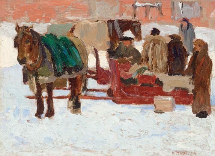
Cabbies, 1924
oil on canvas
signed and dated 1924 lower right; Dominion Gallery stamp on the reverse 6.5 ins x 9 ins; 16.5 cms x 22.6 cms
PROVENANCE
Watson Art Galleries, Montreal Dominion Gallery, Montreal
A. K. Prakash & Associates Inc., Toronto Private Collection, Toronto Heffel, auction, Toronto, 26 November 2015, lot 148 Private Collection
LITERATURE
A.K. Prakash, Impressionism in Canada: A Journey of Rediscovery, Stuttgart, 2015, pages 621, 632, reproduced page 624
Robert Pilot’s Cabbies of 1924 offers viewers a compelling glimpse into the urban fabric of early twentieth-century Montreal. Painted shortly after his return from studying at the Académie Julian in Paris, this artwork demonstrates how Pilot absorbed the painterly vocabulary of Impressionism—its loose brushwork, atmospheric effects, and interest in everyday subject-matter—into a distinctly Canadian context.
The composition is compact and atmospheric. The horses, draped with blankets, stand patiently as their drivers and passengers converse, situating the scene in a world on the cusp of modern transition, where cabbies remained an essential mode of urban transport. Reminiscent of the work of James Wilson Morrice, Pilot’s thick, gestural brushstrokes animate the surface of the canvas, conveying both the chill of the snow and the warmth of human presence.
Pilot’s urban scenes are notable for their ability to capture the poetry of everyday life in a rapidly changing society, balancing structure and atmosphere in equal measure. “He generally excluded the new world from his record–there is, for example, a noticeable absence of automobiles in his compositions,” notes A. K. Prakash. “Rather, his paintings convey a precise image of a world that was soon to disappear.”
In Cabbies, this poetry emerges through the juxtaposition of cold and warmth, labour and leisure, modernity and tradition.
$25,000–$35,000
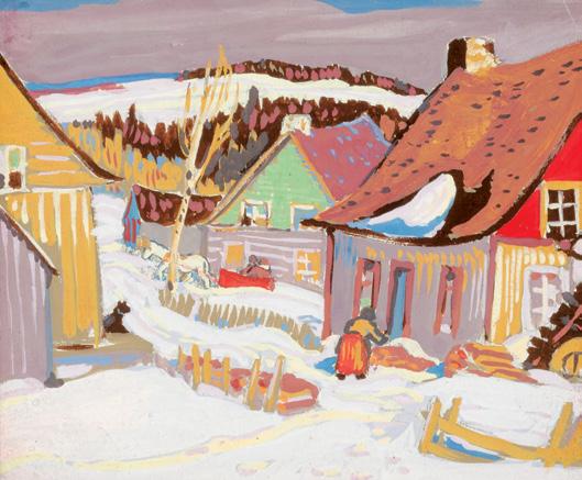
Near Ste. Irénée, circa 1923 gouache titled and dated circa 1923 on the title plate 5 ins x 6 ins; 12.7 cms x 15.2 cms
PROVENANCE
A. K. Prakash & Associates Inc., Toronto Masters Gallery, Calgary Private Collection
LITERATURE
The Group of Seven: Fiftieth Anniversary 1920-1970, Ottawa, 1970, unpaginated, reproduced as Near Ste. Irénée
Painted in 1923, Near Ste. Irénée captures A.Y. Jackson’s deep affection for the rural villages of the Charlevoix region, one of his most beloved painting grounds. The view, with its snow-covered road winding between brightly coloured houses and the vast St. Lawrence landscape beyond, exemplifies Jackson’s ability to infuse humble villages with rhythmic design and expressive colour. The artist’s gestural brushwork and simplified forms convey the visual harmony of the scene as well as the vitality of the people who inhabited these communities. Jackson’s recurring and charming motif of a horse and sleigh is present, plodding through the fresh snow.
Jackson first visited Charlevoix in 1920, after he had already moved to Toronto to share the Studio Building on Severn Street with fellow modern Canadian painters. From there, he embarked on regular sketching trips to rural Quebec and northern Ontario, searching
for subjects that reflected both the ruggedness and the humanity of the Canadian landscape. He returned to the Charlevoix region many times, particularly the villages along the north shore of the St. Lawrence River, such as Baie-Saint-Paul, Les Éboulements, and Sainte-Irénée. The steep hillsides, clustered wooden houses, and brilliant winter light offered ideal subjects for his modern, distinctly Canadian vision. His depictions from the early 1920s, such as Near Ste. Irénée, balance modernist design with a warm, folkloric sensibility that resonated deeply with his vision of Canadian identity. These works were frequently exhibited with the Group of Seven in Toronto, where they helped define the movement’s signature vision of a distinctly Canadian art.
Jackson worked primarily in oil, and most of his works on paper were pencil or oil sketches. His gouaches are rare in the public market. The gouaches that survive often date to specific trips or commissions, and sometimes served as designs for publication. Having trained as a commercial artist early in his career, Jackson was attuned to how a composition might translate into print. Gouache, being opaque and fast-drying, allowed Jackson to create highly legible compositions with strong tonal contrasts–perfect for lithographic or serigraphic reproduction. Compared to oil, the medium’s flat planes of colour and defined outlines reproduced more cleanly in print. In the 1920s and 1930s, he occasionally provided images for Christmas cards, calendars, and reproductions through companies like Rous & Mann or for fundraising causes such as the Canadian War Memorials Fund or Canadian Artists Series. It is possible that Near Ste. Irénée was conceived with this dual purpose in mind—as both a finished artwork and a design adaptable for reproduction, its bold structure and luminous colour harmonies ideally suited to the printed page.
$30,000–$50,000
Les trois baigneuses oil on canvas
signed and dated 1941 upper left; titled and dated on a gallery label on the reverse; catalogue raisonné no. 2005-0093 23.25 ins x 25.5 ins; 59.1 cms x 64.8 cms
PROVENANCE
Dr. Paul Dumas
A. K. Prakash & Associates Inc., Toronto Masters Gallery, Calgary Private Collection
EXHIBITED
Borduas, Dominion Gallery, Montreal, 2-13 October 1943, no. 2 Paul-Émile Borduas Retrospective, Montreal Museum of Fine Arts, 6 May-11 September 1988, no. 32
Paul-Émile Borduas Retrospective, Masters Gallery, Calgary, 11-21 September 2014
LITERATURE
Robert Élie, "Borduas" in l'Arbre, Collection Art vivant, Montreal, 1943, unpaginated, reproduced figure 6
Guy Viau, "Où allons-nous? Où l'Esprit le voudra", Le Quartier latin (5 November 1943)
Robert Élie, Jean Éthier-Blais and Louis Jaque, "Homage to PaulÉmile Borduas", Vie des arts, no. 19, Summer 1960, reproduced page 21
Philippe Sollers, Le Paradis de Cézanne, Paris, 1966, page 66
Guy Robert, Borduas, Montreal, 1972, reproduced page 72, figure 17
Guy Robert, Borduas, Quebec, 1977, page 152
Guy Robert, Borduas or the Quebec cultural dilemma, Montreal, 1977, reproduced page 152
François-Marc Gagnon, Paul-Émile Borduas (1905-1960), Montreal, 1978, reproduced page 537, figure 18
Paul Cézanne, “Lettre du 15 avril 1904 à Émile Bernard” in Correspondance, Paris, 1978, pages 375-376
François-Marc Gagnon, Paul-Émile Borduas, Montreal, 1988, no. 32, reproduced page 183
Gilles Lapointe, Paul-Émile Borduas, Celebrities, Montreal, 1997, discussed page 22
François-Marc Gagnon, Paul-Émile Borduas. A Critical Biography, Montreal/Kingston, 2013, discussed page 89
Paul-Émile Borduas: Catalogue Raisonné [online publication], Concordia University, no. 2005-0093, accessed 14 October 2025
Paul-Émile Borduas’s interest in Cézanne's formal approach to painting coincided with the founding of the Contemporary Arts Society in Montreal in February 1939. The artist then visited the Loan Exhibition. Nineteenth-Century Landscape Painting at the Art Association’s premises, where he admired three small landscapes by the Aix master titled Route en Provence, La route and Auvers-surOise. He discovered a form that moved by the sensation of a real presence, entirely plastic. As his interest in the master’s works grew, Borduas produced in 1939 a first Cézanne-inspired study titled Nature morte aux pommes; this was quickly followed by several paintings: Les oignons rouges (1941), Nature morte: Ananas et poires (1941) and Portrait de Gabrielle Borduas (1941), all of which followed the Cézanne formula. By restoring consistency to pictorial objects decomposed by Impressionist light, Cézanne encouraged a more rigorous construction of the painting. Borduas also drew inspiration in his compositions from Cézanne's “spatial line”–a particular way the French painter had of arranging space by planes in the painting.
Les trois baigneuses originates among the numerous compositions and sketches painted on this theme–more than two hundred–by the pioneer of modern art, and in particular, Les grandes baigneuses (1906) from the W.F. Wilstach collection of the Philadelphia Museum of Art. Art criticism has not failed to establish a strong correlation between the figure on the left of Borduas’s painting and that of the famous Philadelphia painting. In addition to the triangular assembly dear to the Aix master, we find in Borduas's canvas the warm, heavily saturated tones that contribute to the “colour sensations” favoured by Cézanne.
What do the bathers, Cézanne's enigmatic goddesses, represent? Among the motifs chosen by the Provençal artist, this is one of the few in which the painter resorts to imagination. It is impossible to attach them to a particular period. “Looking at a Cézanne, anyone, is thus to be in search of lost reality,” notes Philippe Sollers.
While the theme of the bathers once again denotes Borduas’s sustained attention to Cézanne's world, a central element of his composition, resolutely playful and contemporary, nevertheless seems to distinguish his painting from the canvases of his illustrious predecessor. To the austere and almost mythological gravity of Cézanne's bathers, Borduas here responds with the recreational pastime of a trio of young girls captivated by a ball game. The playful nature of the composition is revealed by the presence, in the centre of the canvas, but slightly offset, of this leisure object; it is no coincidence that Borduas places this green sphere, which he further underlines with a black outline, at the focal point of the work. According to the formula consecrated by Cézanne who prized simple geometric forms, natural forms must be reduced to treating “nature according to the cylinder, the sphere, the cone, all put in perspective, that is to say that each side of an object, of a plane, is directed towards a central point” By appealing to the viewer’s scopic desire, by drawing his gaze to this circle, intensely coloured in green and entirely closed in on itself, Borduas shows that the Cézanne lesson has been perfectly understood.
We extend our thanks to Gilles Lapointe, associate professor in the Department of Art History at the Université du Québec à Montréal, for contributing the preceding text, which has been translated from French. Lapointe is the author of several books on Paul-Émile Borduas and the Automatist movement.
$20,000–$30,000
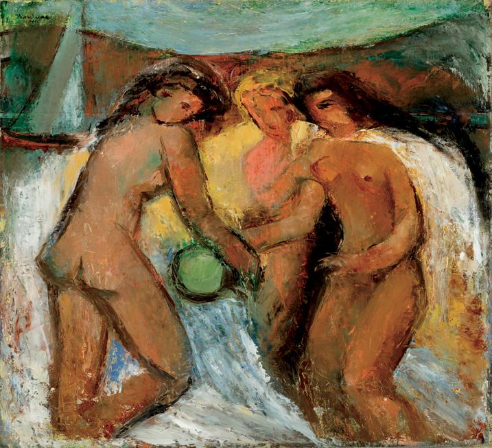
Mrs. David Douglas Young (née Sarah Gunn) with Her Son, George Burns Symes Young, 1852 oil on canvas
signed with initials and dated 1852 lower left; titled and dated on two gallery labels on the reverse 40 ins x 31 ins; 101.6 cms x 78.7 cms
PROVENANCE
Douglas Young, 1852
Mrs. David Douglas Young, née Sarah Gunn, 1910
George Burns Symes Young, 1916
By descent to Elsie Ritchie
Private Collection, Knowlton
Galerie Walter Klinkhoff, Montreal, 1998 Private Collection, Toronto, 2024
EXHIBITED
Canadian Masterpieces, Galerie Walter Klinkhoff, Montreal, September 2008, no. 1
Canadian Art: A Child's World, Annual Loan Exhibition, Galerie Eric Klinkhoff, Montreal, 28 October-11 November 2017, no. 1
Our Children: Reflections of Childhood in Historical Canadian Art, Varley Art Gallery, Markham, 13 April-23 June 2019
13 April-23 June 2019 Not
this lot
Théophile Hamel was one of Quebec’s foremost nineteenth-century painters, often considered the leading portraitist of his generation in French Canada. He was born in Sainte-Foy, near Quebec City, and showed artistic talent from a young age. Around 1834, Hamel began studying under Antoine Plamondon, one of the first professionally trained painters in Quebec. This apprenticeship shaped Hamel’s early style, which was rooted in the European academic and neoclassical traditions that Plamondon had brought back from Italy.
After completing his training, Hamel set up his own studio in Quebec City and quickly became the most sought-after portrait painter in the province. His clientele included politicians, clergy, and members of the professional elite–notably Louis-Joseph Papineau, Sir GeorgeÉtienne Cartier, and other key figures of pre-Confederation Canada. His portraits are characterized by careful attention to facial expression, elegant composition, and a sophisticated use of light. In the 1840s, Hamel spent time in Europe, where he studied Old Masters and refined his technique. When he returned to Quebec, his style had become looser and more confident, with a greater sense of atmosphere and psychological depth.
The adult sitter in this large portrait is Sarah Gunn, who married David Douglas Young in Quebec City in 1850. David was thirtyseven years old and Sarah was twenty-three years old at the time of their wedding. The couple had at least two children, including George Young and Elizabeth Irwin Young. This portrait of Sarah and her son, painted in 1852, was likely commissioned by her husband, as was the norm at the time. David Douglas Young was a squire, merchant, and the president of the Bank of Quebec. Seated in a large and extravagant wingback chair with a carved backrest and gold and orange printed upholstery, the woman is dressed in a dark moiré dress with a lace collar and cuffs, accessorized with ample jewelry, attesting to her social status. The boy is wearing a dress, as was common for young children at the time, and playfully pulls at one of his mother's necklaces as he leans to the right side of the composition. The mother and son both look at the viewer, which was typical of the artist’s portraits. Among Quebec painters, Théophile Hamel stands out for his exceptional depictions of children. Portraits of children, whether alone, in groups or with their parents, are considered to be one of the most significant themes in Hamel’s work.
$30,000–$50,000
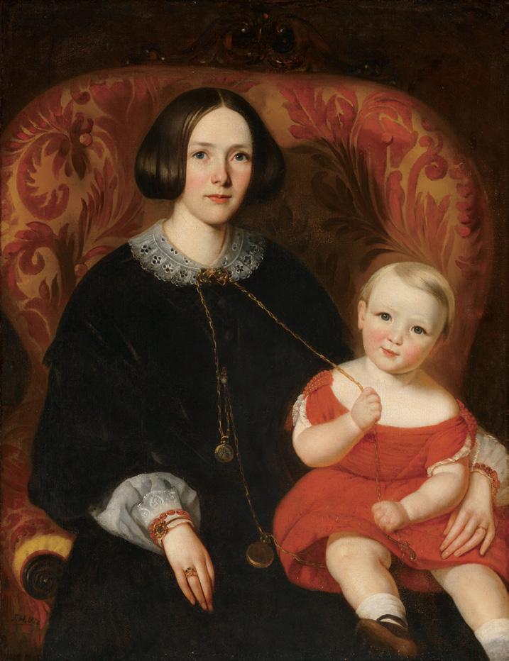
Tree Boles in September, 1939 oil on paper laid on board signed lower right; titled and dated 1939 on a label and inscribed "31" on the reverse 34.5 ins x 22 ins; 87.6 cms x 55.9 cms
PROVENANCE
Private Collection
Walter Klinkhoff Gallery, Montreal Masters Gallery, Calgary
Private Collection
EXHIBITED
Emily Carr: The Mature Years, Vancouver Art Gallery; travelling to Canada House, London and Centre culturel canadien, Paris, 20 June-21 September 1979, no. 40 as Trees in September
LITERATURE
Emily Carr: The Mature Years, Vancouver, 1979, unpaginated, no. 40
Tree Boles in September represents the period of Emily Carr’s career for which she was best known. Though her career was long, productive and marked by outstanding quality, it is her silent, dark forests and tall firs that created a visual legend of the West Coast. It was also in this period of her work, towards the end of her life, that she expressed her view of nature and life as energy. Carr had become deeply religious and the movement within the picture came to represent the spiritual energy, cosmic consciousness and growth. This period is the culmination of a life spent living, working and travelling within British Columbia. A comprehensive body of work that integrates a clear, universal framework while drawing on specific regional insights. Tree Boles in September was painted during one of Carr’s many “spiritual” sketching excursions throughout British Columbia.
Carr’s style evolved considerably over the years. Her early watercolours reflected the English centric nineteenth-century manner encouraged by her training. After a year in France, her approach changed to a Post-Impressionist style with moments of fauvism. However, just when it seemed she was about to hit her stride, the artist painted little for the next fifteen years. This dormant period preceded an explosion of output which would last the rest of her life. Her new style developed rapidly and was marked by a distinctive approach and a conviction, which distinguished Carr’s work thereafter.
In the early 1930s, the artist made a significant change in her painting method by adopting the new medium of oil on paper. Carr wanted to combine the spontaneity of watercolour sketching with the intensity of oil pigments, and she found this to be possible by diluting oil paint with generous amounts of turpentine and applying the mixture to Manila paper. She was able to attain the structure of oil paint with this medium as well as the delicacy of watercolour. It also dried immediately, was easy to layer pigments, and retained its colour intensity–all providing additional convenience. It also had the added benefit of being easily portable and inexpensive. Carr was excited by this discovery.
Carr would venture into the woods with a folding drawing board and her materials to sketch around Victoria and find fresh perspectives for her studio work. What initially began as a testing ground for ideas later became integral to her production, as some of her most daring works were captured in this manner. Tree Boles in September radiates with movement and vitality. The forest is dense beyond the central trees, forming a wall of flowing waves that seem to rise upwards towards the sliver of clear sky and away from the more solid “boles” or trunks of the tree from which the painting derives its name. Rich colour blends together to form a canopy, which is punctuated with glimpses of tree trunks. The eye is drawn up along the trunks of the two trees to the diaphanous sky above.
$200,000–$300,000
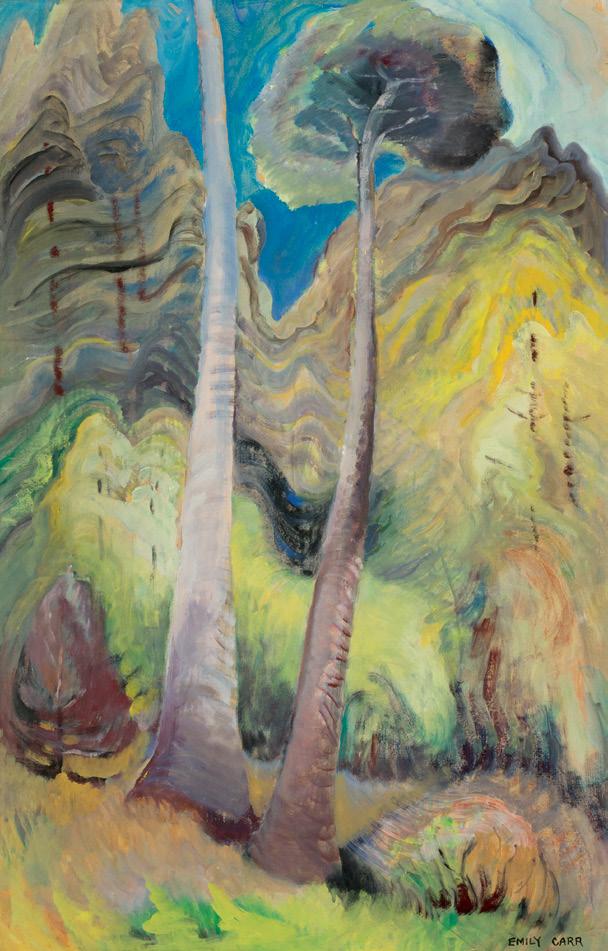
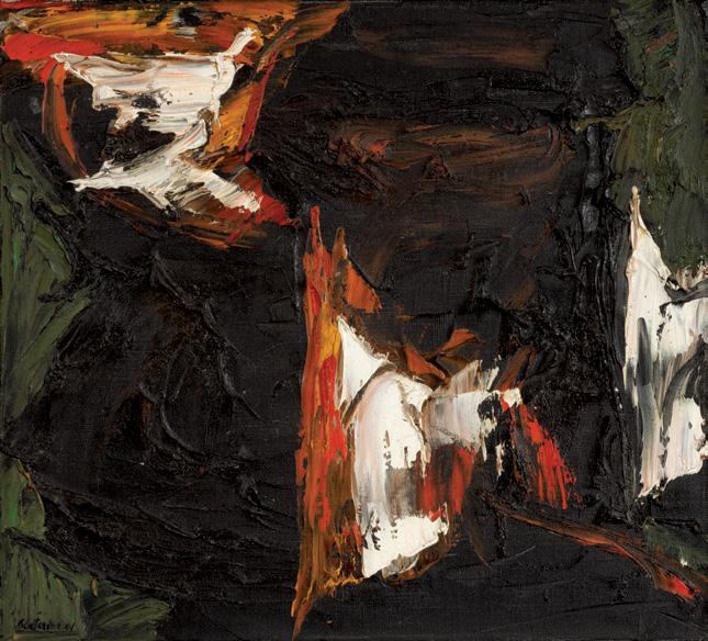
Circuit nocturne, 1961 oil on canvas
signed and dated 1961 lower left; signed, titled and dated on the reverse 18 ins x 20 ins; 45.7 cms x 50.8 cms
PROVENANCE
Private Collection, Toronto
LITERATURE
ICYMI: Remembering Rita Letendre [online publication], The Art Gallery of Ontario, 24 November 2021
The early 1960s were a crucial period for Rita Letendre, both artistically and commercially. Letendre had earned first prize in the Concours de la Jeune Peinture in 1959 and the Prix Rodolphe-deRepentigny in 1960. The following year, the Montreal Museum of Fine Arts held a well-received solo exhibition for the young painter. Critical acclaim fuelled increased demand for her work, which allowed
Letendre to paint full-time and commit herself to the development of her craft. Her paintings of the period demonstrate a rapidly growing confidence, marked by the expert use of rich impastos and the bold use of colour. Using a palette knife or spatula, Letendre would build up a painterly topography in oil on the surfaces of her canvases.
Circuit nocturne features the jagged forms and sweeping areas of black which recur throughout Letendre’s paintings from the early 1960s. The dark expanse, which occupies much of the composition, contains subtle shifts in hue. Like a visual staccato, explosive red and white bursts appear as flashes of light in darkness. Letendre explained: “Light and colour, and sometimes the absence of colour, have always been the key elements in my painting. With its different values, colour reflects the shades of life. But light, from the first shock of birth to the last breath of life–light is life.” The wedge-shaped forms of Circuit nocturne are likely an important precursor to the artist’s later compositions. Letendre’s geometric paintings from the late 1960s on would feature triangular visual structures with sweeping, energetic diagonals.
$20,000–$30,000
Iceberg Fantasy #38, 1987 oil on canvas
signed lower right; titled on a gallery label and dated "870117" (17 January 1987) on the reverse 36 ins x 48 ins; 91.4 cms x 121.9 cms
PROVENANCE
Gift of the Artist
Private Collection, Ottawa
LITERATURE
Doris McCarthy, The Good Wine: An Artist Comes of Age, Toronto, 1991, page 232
In her second autobiography, titled The Good Wine: An Artist Comes of Age, Doris McCarthy writes that she had travelled to the high Arctic seven times, as well as across other provinces and territories multiple times. This “wander-pattern” had taken root in her early days as an artist, following the example of Canada’s leading artists. McCarthy notes that the best way to experience the places she went was to paint them. “Painting demands a concentration and sensibility that grows into an intimacy with the country, greatly intensifying your awareness of it. You come to know it instead of just seeing it”.
Born in Calgary and raised in Toronto, Doris McCarthy is recognized as one of Canada’s foremost landscape painters. She taught frequently at the Central Technical School in downtown Toronto from 1932 until she retired in 1972. After retiring, McCarthy first visited the Arctic with her colleague Barbara Greene. That summer, they headed north, landing first at Resolute Bay before continuing to Eureka, Grise Fiord, and Pond Inlet. In the years that followed, icebergs became a recurring motif in McCarthy’s work and her most identifiable theme.
Although she managed a substantial amount of plein air painting, the conditions were often demanding. McCarthy could not use acrylics or watercolours because they would freeze, and even oils would eventually harden. Painting the Iceberg Fantasy series was a solution to the problem.
McCarthy’s Iceberg Fantasy paintings, of which there are roughly sixty, represent a personal and meditative response to her beloved Arctic landscape. These works evolved from simplified forms to fully realized three-dimensional compositions that balance abstraction and realism. In paintings such as Iceberg Fantasy #38, completed in 1987, McCarthy uses a bold, luminous palette to transform icebergs into monumental yet ethereal structures. Her approach invites viewers into a dreamlike Arctic, emphasizing not just its physical grandeur but its emotional and imaginative resonance.
$60,000–$80,000
Still Life with Hat, 1955 oil on masonite
signed with initials lower left; titled and dated 1955 on multiple labels on the reverse 24 ins x 30 ins; 61 cms x 76.2 cms
PROVENANCE
Mrs. L.L. FitzGerald, Winnipeg Patricia L.F. Morrison, Toronto
Mr. and Mrs. Donald C. Steele, St. Catharines Masters Gallery, Calgary Private Collection
EXHIBITED
Lionel LeMoine FitzGerald, 1890-1956: A Memorial Exhibition (Supplement for the Winnipeg Showing), Winnipeg Art Gallery, 23 February-23 March 1958, no. 104
Painting in Canada, Canadian Government Pavilion, Expo '67, Montreal, 28 April-27 October 1967, no. 8
Canadian Classics, The Morris Gallery, Toronto, 21 October-4 November 1972, no. 37
LeMoine FitzGerald, The Morris Gallery, Toronto, 10-24 February 1973, no. 20
Lionel LeMoine FitzGerald, 1890-1956: The Development of an Artist, Winnipeg Art Gallery; travelling to National Gallery of Canada, Ottawa; Norman MacKenzie Art Gallery, Regina; Musée d’art contemporain de Montréal; Art Gallery of Ontario, Toronto; Glenbow Museum, Calgary, 28 July 1978-1 December 1979, no. 100
Canadian Roots, Rodman Hall Arts Centre, St. Catharines, 8 January-1 February 1982
In Seclusion with Nature: The Later Work of L. LeMoine FitzGerald, 1942 to 1956, Winnipeg Art Gallery; travelling to London Regional Art Gallery; Dalhousie Art Gallery, Halifax; McMichael Canadian Art Collection, Kleinburg; Musée du Québec, Quebec City, 2 October 1988-28 January 1990, no. 75
Lionel Lemoine FitzGerald
Still Life with Hat, 1955
pen and ink on paper, 32.4 x 41.8 cms
Gift of the Douglas M. Duncan Collection, 1970 Art Gallery of Ontario (70/50)
Not for sale with this lot
John Russell Harper, Painting in Canada: A History, Montreal, 1967, no. 8, unpaginated, reproduced Canadian Classics, Toronto, 1972, unpaginated, no. 37, reproduced as The Artist's Desk
Theodore Allen Heinrich, “In the Galleries/Toronto,” artscanada 29, no. 174/75 (December 1972-January 1973), reproduced page 73
LeMoine FitzGerald, Toronto, 1973, no. 20, unpaginated, reproduced as The Hat
Karen Linda Sens, “A Discussion of the Stylistic Development in the Dated Oil Paintings of Lionel LeMoine FitzGerald (1890-1956)” (Master's thesis, University of British Columbia, Vancouver, 1978), pages 94-96
Patricia E. Bovey, Lionel LeMoine FitzGerald, 1890-1956: The Development of an Artist, Winnipeg, 1978, no. 100, reproduced page 71 Marci Lipman and Louise Lipman, Images: Contemporary Canadian Realism, Toronto, 1980, reproduced page 9
Michael Parke-Taylor, In Seclusion with Nature: The Later Work of L. LeMoine FitzGerald, 1942 to 1956, Winnipeg, 1988, pages 35-36, reproduced page XV
Michael Parke-Taylor, Lionel LeMoine FitzGerald: Life and Work, Art Canada Institute, 2019, reproduced page 36
During the latter years of his career, Lionel LeMoine FitzGerald’s art toggled between abstraction and figuration. While the majority of his paintings and drawings after 1950 were based on various degrees of abstraction from nature, he remained devoted to figurative works based on close observation of the empirical world.
In late 1954 and 1955, FitzGerald created several figurative still life drawings and watercolours depicting apples, bottles, and jugs reminiscent of his work from the thirties and forties. These were followed by a series of at least three semi-abstract drawings featuring a hat with other still life objects conceived using a technique of short pen-and-ink strokes that he had developed after 1950. Central to each composition was FitzGerald’s soft, grey felt hat-a personal attribute since he never failed to wear one whenever sketching in the intense sunshine of the open prairie.
FitzGerald’s preparatory drawing Still Life with Hat, dated 18 August 1955 (Art Gallery of Ontario), was squared for transfer to a large piece of masonite. This was the genesis of the large painting Still Life with Hat, begun on 23 August and completed on 25 October 1955. This ambitious picture has the look of paintings made during the artist’s classic period of the early thirties and is considered his last major painting. In keeping with FitzGerald’s dictum that the eye of the viewer should revolve within the boundaries of the frame, the balanced spatial arrangement of the still life objects contributes to an effect of perfect unity.
While the hat is a symbolic self-portrait, the open book references Dr. E.J. “Ted” Thomas, FitzGerald’s physician and friend. In his diary dated 5 December 1955, FitzGerald noted that the picture had been purchased by Dr. Thomas. Although Dr. Thomas never took possession of the painting, he revealed in an interview (in conversation with Michael Parke-Taylor, 21 February 1987) that the book, opened to a page with an hourglass design, not only serves as a memento mori , suggesting that time is running out, but also references the name “Thomas.” FitzGerald depicted the poem Vision and Prayer (1944), written by the Welsh poet and prose writer Dylan Thomas. The stanzas of the poem were composed to conform to a geometrical pattern in the
shape of an hourglass in emulation of the pattern poems of the early seventeenth-century English poets of the metaphysical school. Thus, a close reading of this subtle painting demonstrates the shared erudition of both artist and patron.
We extend our thanks to Michael Parke‒Taylor, Canadian art historian, curator and author of Lionel LeMoine FitzGerald: Life & Work (Art Canada Institute) for contributing the preceding essay.
$70,000–$90,000
Space and Time, 1953
oil on canvas
signed lower right; titled on an exhibition label and estate stamp on the reverse 24 ins x 30 ins; 61 cms x 76.2 cms
PROVENANCE
Estate of the Artist
Private Collection, Ontario
Sotheby's, auction, Toronto, 15 November 2000, lot 132
Andrew Porter, Assilah, Morocco
Waddington's, auction, Toronto, 28 May 2018, lot 46
Private Collection, Toronto
EXHIBITED
81st Annual Exhibition, Ontario Society of Artists, Art Gallery of Toronto, 28 February-30 March 1953, no. 13 as Space and Time Paintings from the Estate of Bertram Brooker, The Morris Gallery, Toronto, 23 April-7 May 1977
It’s Alive! Bertram Brooker and Vitalism, Art Gallery of Windsor; travelling to Agnes Etherington Art Centre, Kingston and Museum London, 10 January 2009-2 April 2011
The Logic of Nature, The Romance of Space: Elements of Canadian Modernist Painting, Art Gallery of Windsor and The Robert McLaughlin Gallery, 16 January-21 March 2010
LITERATURE
Bertram Brooker Archive, OC 7
81st Annual Exhibition, Ontario Society of Artists, Toronto, 1953, no. 13, reproduced page 77
Gary Michael Dault, “Brooker genius as the artist on show again,” Toronto Star (3 May 1977), page F1
Cassandra Getty, The Logic of Nature, The Romance of Space: Elements of Canadian Modernist Painting, Windsor, 2010, listed page 175 Adam Lauder, Out of School: Information Art and the Toronto School of Communication, Montreal/Kingston, 2022, reproduced page 19
Bertram Brooker was among the first painters in Canada to exhibit purely abstract work. Talented and visionary, Brooker worked as an advertising executive, writer and designer, in addition to being a self-taught painter. In the 1920s, Brooker befriended members of the Group of Seven, including Lawren Harris, with whom he shared an interest in spirituality in art.
Brooker engaged with metaphysical concepts through a continual exploration of various modes of painting, including still life, landscape and abstraction. Space and Time features a distinct composition whose genesis can be traced over several years. Brooker’s 1948 Still Life with Pitchers (Homage to Braque) features a fragmented, semiabstract pictorial space in earthy tones. Analytical Cubism provided the artist with a method of utilizing representation as a basis for increasingly abstract compositions. Progression , painted in the same year, incorporates landscape elements into a faceted, mysterious central form. In Space and Time, Brooker makes use of similar visual ideas, but moves away from the influence of Cubism. Appearing like tree trunks, organic motifs are incorporated into ambiguous shapes. The painting is abstract, yet features a strong figure-ground pictorial structure. A softly muted background creates depth while echoing the dominant shapes.
Likely influenced by the French philosopher Henri Bergson, Brooker held a fascination with the minutiae of nature in his later career.
Humble and often overlooked organic forms held a special significance for the artist as metaphors for both physical and metaphysical reality.
In 1977, Space and Time was exhibited at The Morris Gallery in Toronto. Reviewing the show, art critic Gary Michael Dault observed, “And there is the handsome Space and Time, 1953, a diamond-shape of gray/blue inter-tangled root and twig forms floating free in a soft blue space that is a translucent as it is possible to make painted space.”
We extend our thanks to Michael Parke‒Taylor, Canadian art historian, curator and author of Bertram Brooker: When We Awake! (McMichael Canadian Art Collection, 2024) for his assistance in researching this artwork.
$15,000–$20,000
JACK HAMILTON BUSH
Awning, 1974
acrylic on canvas signed, titled and dated January 1974 on the reverse; catalogue raisonné no. 3.3.1974.11
75 ins x 76 ins; 190.5 cms x 193 cms
PROVENANCE
The Artist David Mirvish Gallery, Toronto, 1974 Private Collection, Toronto
EXHIBITED
Jack Bush. Recent Paintings, David Mirvish Gallery, Toronto, 6 April-1 May 1974
LITERATURE
Sarah Stanners, Jack Bush Paintings: A Catalogue Raisonné, Volume 4: 1972-1977, Toronto, 2024, reproduced page 229, no. 3.3.1974.11
The word “awning” is used by Jack Bush to title three of his abstract paintings made between 1960 and 1974. He was not shy about signaling the simple yet perfect source of inspiration: a stretchedout canvas, a brightly coloured textile, and a whole new world when translated into the language of art.
When Painters Eleven disbanded in 1960, Bush was already a fully committed abstract artist, increasingly trusting his own instincts and painting with bold new confidence. In the spring of 1960, Bush completed a painting titled Robin’s Egg on Awning (catalogue raisonné Volume 2, no. 1.151.1960.386). This composition bears thick stripes in black, red, mustard, and unpainted canvas interrupted by a floating blue oval. The picture is stark and abstract but it is also explicit about
Jack Bush
Sketch for "Awning", December 1973
pencil and marker
Collection of the University of Guelph
Not for sale with this lot
what it describes. Bush was literally representing what he saw: a Robin’s egg resting on an awning. The Bush household in North Toronto did in fact have an awning which faced the backyard.
In June 1966, Bush completed one of his first large-scale paintings using water-based acrylics, and simply titled it Awning (catalogue raisonné, volume 3, no. 2.49.1966.00). Technically a late Sash painting, Awning from 1966 expanded the attractive format with a large band of pink at the center, flanked by two close-in-value greens, topped with yellow, and grounded at the bottom with a thick band of burnt sienna. The general shape of the interior forms evokes the look of an awning. At the time, Color Field artists were occupied with the idea of colour suffusing the surface of their canvas, so it is easy to see how an awning, which is essentially a sheet of coloured canvas, could have captured his attention.
By 1974, however, when he painted the present painting, Awning, Bush had reached the height of his career and his paintings synthesized his strengths in colour, composition, and innovation. The mottled ground, which he achieved by applying loosely mixed paint with a roller, plays coyly with the bars of flat colour, as if to provoke an optical illusion of depth without implying it with a technical approach, such as shading. There however, appears to be a darker area of ground colour at the lower left quadrant of the painting. While it looks somewhat intentional (Chris Varley remarked to me recently that it really “works”), it does not appear in either his record book sketch or in the Pentel marker sketch that he produced when planning the painting.
This curious section in the ground colour does, however, remind me of Bush’s terrific painting from 1972 titled June Mulberry (catalogue raisonné, volume 4, no. 2.156.19172.26), which bears a similar smudged ground section, seen on the righthand side of the composition. The “imperfection” in June Mulberry –as with Awning –makes it a perfect example of Bush’s style–he was open and honest with his compositional pivots. In the case of June Mulberry (as evidenced by his record book sketch), he made a choice to eliminate a bar of colour.
Awning, on the other hand, might bear this blurred section of ground paint because he simply dipped his roller in a batch of paint with deeper tones. Looking at the lefthand side of the painting, you will see that the ground colour is lighter in tone than the righthand side. Bush’s studio assistants have remarked that his large canvases often required a few batches of paint to cover the entire surface. Whatever the case may be, this painting’s birthmark is indicative of what Bush valued in his abstract paintings: feeling over theory, passion over verisimilitude, and direct expression over perfection.
We extend our thanks to Dr. Sarah Stanners, currently the Executive Director & Chief Curator of the Canadian Clay & Glass Gallery in Waterloo, Ontario, for contributing the preceding essay. She was the Director of the Jack Bush Catalogue Raisonné Project from 2011 to 2024, when the publication was released as a four-volume set. From 2015 to 2018, Dr. Stanners was the Director of Curatorial & Collections at the McMichael and in 2014 she co-curated the Jack Bush retrospective exhibition with the National Gallery of Canada’s then Director, Marc Mayer.
$200,000–$300,000
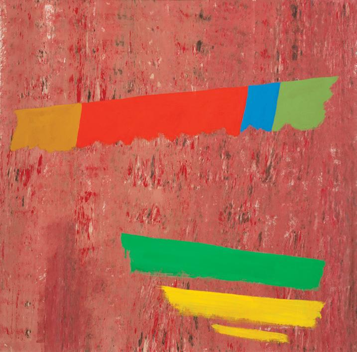
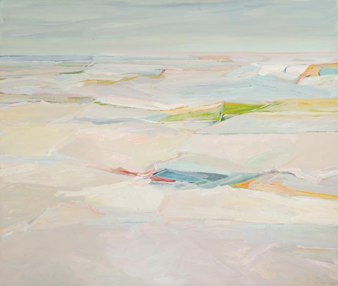
A1, 1979
acrylic on canvas signed lower right; titled on the stretcher; titled and dated 1979 on a gallery label on the reverse
55 ins x 65 ins; 139.7 cms x 165.1 cms
PROVENANCE
Marlborough-Godard, Toronto Private Collection, Toronto
LITERATURE
Ian M. Thom and Andrew Hunter, Gordon Smith: The Act of Painting, Vancouver, 1997, page 46
A restless innovator, Gordon Smith’s paintings moved into a loose, gestural style in the late 1970s, breaking with the structured grids of his Seawall series from the previous few years. In 1978, Smith travelled to Egypt for the third time, an experience which resulted in a new series of works on paper. The studies occasionally depicted palm trees and pyramids, though the artist was here increasingly interested in colour and atmospheric effects. The warm desert hues of these works would influence Smith over the next few years.
Smith spent the summer of 1979 teaching in Sackville, New Brunswick, where he continued to explore a distinct visual territory between landscape and abstraction. Though the title of A1 does not reveal a connection to a specific locale, the work alludes to a coastal scene. The horizontal patchwork of brushstrokes conveys depth while falling away towards a clearly delineated horizon line. The painting is energized by lively, painterly strokes, and concentrated areas of bold hues peak through the neutral greys and blues, which dominate the picture. Art historian Ian M. Thom noted: “When asked to characterize his art from 1979 to 1980, Smith commented that his new works were about ‘colour, the act of painting, surface sensitivity and space’”.
$14,000–$18,000
WILLIAM PEREHUDOFF
AC-77-25, 1977
acrylic on canvas signed, titled and dated 1977 on the reverse 13 ins x 64 ins; 33 cms x 162.6 cms
PROVENANCE
Private Collection, Toronto
LITERATURE
Roald Nasgaard, Abstract Painting in Canada, Toronto/Vancouver, 2007, page 290
Saskatoon artist William Perehudoff maintained a long and formative connection to the Emma Lake Artists’ Workshops. During the sessions of 1962 and 1963, he was introduced to the principles of Post-Painterly Abstraction through the influence of art critic Clement Greenberg and American painter Kenneth Noland. These encounters marked a turning point in his practice, inspiring him to explore the expressive potential of pure colour and to develop a distinctly personal visual language–one that would soon resonate powerfully within the field of Canadian abstraction. In Abstract Painting in Canada, Roald Nasgaard refers to Perehudoff ’s paintings as “plays of light and dark, of transparency and opacity [as] subtle and sensuous.” The artist has said he prefers paintings “with a kind of pulse,” referring to an active interplay among the elements of the picture. Many of the artist’s wide vertical canvases of the mid-to-late 1970s were constructed of coloured ground transversed by vibrant parallel bars of colour, such as AC-7725. Here, a calm, grey ground is energized with stripes of orange, red and pink. By emphasizing the ground and simplifying the figurative elements to simple vertical bars, Perehudoff created a cohesive unity in his paintings. The interplay of contrasting colours enhances the rhythm of the stripes, suggesting musical chords. The long, parallel stripes in primary colours reflect Perehudoff’s commitment to visual form, focusing on reducing painting to its very essence.
$15,000–$20,000
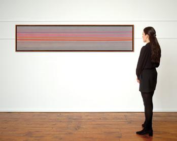
The Rescue, 1949-1950 oil and casein on board signed and dated 1950 lower right; signed, titled and dated 1949 on the reverse; catalogue raisonné no. 1.181.1950.102 13 ins x 27 ins; 33 cms x 68.6 cms
PROVENANCE
The Artist Estate of the Artist, 1974
Jack Bush Heritage Corporation Private Collection, Ontario
EXHIBITED
Jack Bush: Hymn to the Sun, Early Work , Art Gallery of Algoma, Sault St. Marie, Ontario; travelling to Dalhousie Art Gallery, Halifax; The Art Gallery of Newfoundland, St. John’s; Mendel Art Gallery, Saskatoon; Art Gallery of Greater Victoria; Winnipeg Art Gallery; Hart House, University of Toronto; Laurentian University, Museum and Art Gallery, Sudbury; MacLaren Art Centre, Barrie and the Institute for Modern and Contemporary Art, Calgary, 1 May 19771 May 1979
LITERATURE
Michael Burtch, Jack Bush: Hymn to the Sun, Early Work, Sault Ste. Marie, 1997, reproduced page 50
Sarah Stanners, Jack Bush Paintings: A Catalogue Raisonné, Volume 1: 1920-1954, Toronto, 2024, reproduced page 367, no. 1.181.1950.102
The Rescue was painted over an extended period, from early 1949 to March 1950. This long working process may explain the mixture of materials evident in the surface. In Jack Bush’s record book, the painting was initially listed as having been made with casein (a proteinbased paint that produces a matte, chalky finish) but close examination suggests that he later added passages in a thicker medium, such as oil. It seems likely that Bush began the composition in casein and then returned to it months later, enriching the surface with more textured applications of paint to heighten its visual energy and depth.
In 1949, Bush painted at least two watercolours depicting rodeo scenes, At the Fair #1 and At the Fair #2 (catalogue raisonné, volume 1, nos. 1.180.1949.87 and 1.180.1949.88). Both works feature colourful flags animated against an arid, big-sky country setting that anticipates the quasi-desert landscape of The Rescue. While The Rescue develops into a fully realized narrative–a cavalry charge culminating in the dramatic rescue of a woman by a horseman at full gallop–the At the Fair paintings reveal the visual and thematic seeds of that later work. They suggest Bush’s early interest in dynamic motion, vivid colour contrasts, and the storytelling potential of an open, stage-like space.
Toronto’s Royal Winter Fair or the Canadian National Exhibition certainly inspired the two At the Fair paintings and may have also provided a direct visual reference for The Rescue. The Royal Winter Fair and the C.N.E. are renowned for captivating audiences with horse shows and 1949 was a particularly popular year for rodeo themes. The film Junior Rodeo Daredevils was released in 1949. With three young sons at home, it is easy to imagine that cowboys and rodeo adventures were part of the household imagination. Popular culture at the time was saturated with Western heroes and frontier stories.
Aside from the daring rider pickup stunt on horseback, which often wowed a crowd at rodeo performances, it is unknown if The Rescue points directly to any one source story. This painting belongs to several works from this period that explore themes of struggle and mystery, set against the backdrop of an abstracted landscape. In many ways, these landscapes are dreamlike, and a feeling of angst is sustained by the way in which the very real subjects engage in highly unusual scenarios. Painted not too long after the deeply psychological paintings Bush produced between 1947 and 1948, this painting exudes feverish energy. The story is left for us to imagine and enjoy, not defined by a beginning or an end, but anchored in a thrilling climax captured for our delight.
We extend our thanks to Dr. Sarah Stanners for contributing the preceding essay. She is currently the Executive Director & Chief Curator of the Canadian Clay & Glass Gallery in Waterloo, Ontario.
$15,000–$20,000
Missed Opportunity, 1971 mixed media on board signed with initials and dated 1971 lower right; titled "Untitled (Missed Opportunity)" on a gallery label on the reverse 23.5 ins x 7.75 ins; 59.7 cms x 19.7 cms
PROVENANCE
Wynick/Tuck Gallery, Toronto Private Collection, Toronto
William Kurelek is widely celebrated for his vivid depictions of prairie life and his ability to fuse memory, religion, and social critique into deceptively simple visual narratives. Painted in 1971, Missed Opportunity exemplifies Kurelek’s distinctive blend of narrative clarity and rural subject matter, while simultaneously engaging in an ironic commentary on human folly.
The vertical composition is striking for its intimacy and theatrical framing. At the top, we see a hunter crouched on a log in a field of bright yellows and greens under a vast prairie sky. His posture is contemplative but distracted: he is absorbed in lighting a cigarette, the small flame pulling the viewer’s gaze toward his face. Beneath him, in a hollow tree trunk, emerges a rabbit—the very prey he has set out to hunt. The rabbit is both comical and poignant, dangling halfway out of its hiding place, oblivious to the hunter’s inattention. Kurelek wryly underscores the irony of the scene: the hunter, engrossed in a trivial pleasure, fails to notice the chance he has been waiting for.
This seemingly humorous vignette masks a deeper meditation on distraction, morality, and human frailty. Kurelek, a devout Roman Catholic whose conversion shaped much of his mature work, often infused his paintings with moral lessons. Here, the hunter’s lapse may stand as an allegory for spiritual inattentiveness: how easily one misses grace, meaning, or truth when absorbed in secular habits. What might look like a simple hunting anecdote is, in Kurelek’s vision, an emblem of misplaced focus.
Kurelek frequently employed humour, irony, and visual storytelling as tools to make his moral reflections more accessible. Missed Opportunity belongs to a larger body of work where the artist stages scenes exposing humans to vanity, folly, or cruelty. The humour here is gentle rather than grotesque: the hunter is not condemned, but made a figure of human error, caught in a moment of fallible distraction.
Placed within the broader context of Kurelek’s oeuvre, Missed Opportunity reveals the tension between nostalgia and admonition that defines much of his art. He was both an affectionate chronicler of rural labour and a stern moralist, attentive to the spiritual dangers of human frailty. This painting encapsulates his vision: humble subject matter, deceptively simple execution, yet charged with narrative irony and moral resonance.
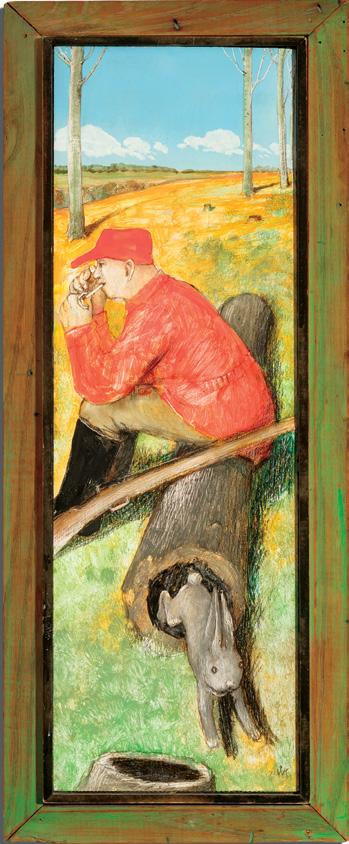
$60,000–$70,000
Saugerties Interior II, West Saugerties, N.Y., 1914 watercolour titled and dated 1914 on the gallery labels on the reverse; inscribed "Saugerties Interior #2 [122]" (by Patsy Milne), "269" (by Duncan estate) and "c" (by Kathleen Milne) on the reverse; catalogue raisonné no. 105.96 18 ins x 18 ins; 45.7 cms x 45.7 cms
PROVENANCE
Estate of the Artist, Toronto Mira Godard Gallery, Toronto
A. K. Prakash & Associates Inc., Toronto Private Collection, Toronto Masters Gallery, Calgary Private Collection
LITERATURE
David P. Silcox, Painting Place: The Life and Work of David B. Milne, Toronto, 1996, page 59
David Milne Jr. and David P. Silcox, David B. Milne: Catalogue Raisonné of the Paintings, Volume 1: 1882-1928, Toronto, 1998, listed and reproduced page 125, no. 105.96
In 1913, five works by David Milne were included in the Armory Show in New York. Milne was the sole Canadian artist to be featured in the pivotal avant-garde exhibition, which served as the controversial introduction of modern painting to a vastly wider audience. That same year, Milne took a three-week holiday away from the city in West Saugerties. Located directly north of New York City, and just west of the Hudson River, the village is nestled in low, rolling hills which rise into the Catskill Mountains. Milne found the brief sojourn so beneficial, that the following year, he transferred his belongings into storage and moved with his wife, Patsy, to West Saugerties for the summer.
The larger town of Saugerties could be reached from New York by train. The Milnes rented a modest cottage eleven kilometres away, accessible either by horse and buggy, or on foot. The small cabin lacked heating, and the couple lived, and slept, mostly outdoors. Milne embraced the rustic setting with enthusiasm, building a large stone fireplace for cooking, and an outdoor table with shelves in the trees by a nearby stream. Eagerly adapting to a rural lifestyle away from the frantic bustle of the city, Milne settled into a routine which incorporated time for painting, practical work and recreation. On Sundays, Milne would walk to Saugerties, indulge in a hamburger, and buy a newspaper. Word of the outbreak of war in Europe would have reached Milne on one of these day trips.
Milne’s landlady, Mrs. Meyers, lived directly across the street from the cottage, and the artist painted her several times. Meyers is believed to be the sitter of Saugerties Interior II. Building on the influence of Henri Matisse and Édouard Vuillard, Milne experimented repeatedly with the motif of a seated figure in an interior setting. Flattening the pictorial space, the artist has constructed a dense composition with lively brushwork and flat areas of colour. The sitter has been depicted with radical simplicity and the expert use of negative space. Milne’s paintings of the period often utilized dense, all-over patterning, contrasted sharply with carefully considered white areas, which Milne considered “dazzle spots”.
Saugerties Interior II bears a similar composition to one of Mine’s most acclaimed oil paintings of the period, The Black Couch (Private Collection). Both paintings feature a female sitter in an interior, depicted with a compact patterning of brushstrokes. Both compositions also incorporate a shelf or table with a clutter of objects crowded along the top of the picture. In the watercolour, Milne appears to have particularly enjoyed painting the various household items lined up on a table at the top of the picture and on a small table by the sitter. Notably, the figure has received far less painterly detail.
Milne’s summer in West Saugerties was not only artistically fruitful, but also marked the beginning of a new commitment to his life-long artistic mission. Art historian David Silcox wrote, “The lengthy stint of uninterrupted painting at West Saugerties fortified Milne’s decision, two years later, to forsake commerce and devote himself solely to painting. Over the summer he produced nearly seventy paintings in oil and watercolour, nearly one a day. All convey an impression of wild and colourful excitement. It is not the colour, but his loose and flowing brush strokes, and his control of shapes, that create this impression, for he continued to work with a tightly restricted palette.”
$60,000–$80,000
Private
Price Realized $480,000 Not for sale with this lot
DAVID LLOYD BLACKWOOD
Three Fishermen on Stage Head, 2013-2021 encaustic on built wood panel titled and dated 2013-2021 by the estate on the reverse 16 ins x 16 ins; 40.6 cms x 40.6 cms
PROVENANCE
Estate of the Artist
LITERATURE
Ken Forsyth, David Blackwood: Revelation, Toronto, 2013, page 18
Hailing from a family of fishermen, the expectation was that David Blackwood would follow in the footsteps of his father and grandfather, who were both sea captains. Given the isolated nature of the community where he grew up, the artist viewed it as a “miracle” that his artistic ambitions were embraced by those around him. Blackwood reflected on his past through his artwork, working largely from memory. The distance allowed him to pare back the narrative and
create strong and cohesive images. It is Blackwood’s experience at sea that radiates from his work, delivering intensity and authenticity.
The encaustic paintings “demonstrate a level of observation and complexity, inventiveness and achievement”, writes Ken Forsyth. “They also show the lengths Blackwood will go to in deconstructing, analyzing and understanding his subject completely. These panels really operate more as carved and painted relief sculptures in which every detail, from the knot holes of the boards down to the screws in the hasps and hinges, is painstakingly carved and dowelled into place by the artist before the encaustic ground is applied. The density of colour, luminous effects, and shadow play across the surfaces of these works achieve a level of richness and verisimilitude that is without equal in Blackwood's work.”
This encaustic painting was a work in progress by David Blackwood, who fashioned paint pots by repurposing empty tuna or salmon tins with wooden handles. These pots filled with encaustic paint would then be heated up before applying the encaustic to the built wood panel Blackwood created.
$20,000–$30,000
French Girl, circa 1911 watercolour
signed lower left; titled and dated circa 1911 on a gallery label on the reverse 20.25 ins x 12.25 ins; 51.4 cms x 31.1 cms
PROVENANCE
Private Collection, England Joyner Waddington's, auction, Toronto, 20-21 November 2007, lot 30 Masters Gallery, Calgary Private Collection
LITERATURE
Maria Tippett, Emily Carr: A Biography, Markham, 1982, pages 95-96 Ian M. Thom, Emily Carr in France, Vancouver, 1991, pages 14, 27-30
Emily Carr’s avant-garde style emerged from her artistic training in France, where she studied under modernist painters Harry Gibb and Frances Hodgkins. French Girl was painted by Carr towards the end of her stay in the late summer of 1911, when the artist spent several weeks honing her watercolour skills in a coastal town in Brittany.
After a tremendously productive and fulfilling experience with Gibb during the summer of 1911, Emily Carr was still not yet ready to return to Canada, detached from the art centres and critics, for she feared that she “would go home and drown in the uncharted sea of tremendousness.” She had heard that an artist from New Zealand named Frances Hodgkins was leading watercolour classes in the small port town of Concarneau, on the coast of Brittany. “An artist with an exuberant Late Impressionist technique”, Hodgkins was a brilliant watercolourist whose work displayed spontaneity and imaginative colour combinations. Carr spent the late summer and early fall of 1911 in Concarneau with Hodgkins, creating watercolour depictions of the
crooked cobblestoned streets and its residents of the old fortified town. The artist said of her stay in Concarneau: “I worked with fresh gay vigor sitting in wine shops and sail lofts on the quay or back in fields. I learnt a lot and was happy.”
Painted during this formative stay in Concarneau, French Girl is a rare and revealing example of Carr’s engagement with the human figure. The watercolour depicts a young Breton woman standing in a stone doorway, dressed in the characteristic regional costume, including a starched white bonnet, black bodice, and patterned apron. Carr found that her new Fauve palette could easily be incorporated into this traditional medium. The softened contour lines and modulated washes of violet, rose, and indigo reveal the artist’s transition from academic naturalism to the more liberated, painterly approach that defined her later work. Maria Tippet remarks that “the heavy broken line with which Hodgkins outlined her forms quickly became the structural basis for almost all of Carr’s Concarneau work.” The strong, loose black outlines of the buildings in French Girl show Carr’s increasing ease in the medium and diminishing concern with detail and realism.
Ian M. Thom writes: “The watercolours from the summer of 1911 are perhaps the most important of the works which Carr executed in France. As a group they have an assurance and immediacy which is not always felt in the oils.” Carr’s stay in Concarneau marked a period of profound change in her watercolour painting, serving as an excellent conclusion to her fourteen-month sojourn in France. She had taken the final leap from the traditional school to the modern in her colourful interpretations of the Brittany coast. Carr visited Paris briefly in the fall, where two of her paintings were being shown in the Salon d’Automne at the Grand Palais. In November 1911, she returned to Victoria a more mature, skilled, and confident artist, and held an exhibition of her French works in March 1912. In an article published by The Vancouver Province on March 27, 1912 regarding her exhibition, Carr was described as “an enthusiastic disciple of the modern French school of art.”
$100,000–$150,000
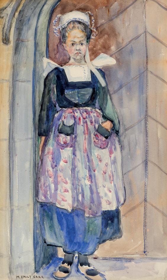
MARY ALEXANDRA BELL EASTLAKE
When Spring Rides Through the Woods, 1900 oil on canvas signed lower right 34 ins x 44 ins; 86.4 cms x 111.8 cms
PROVENANCE
J. Harold Foley, Ottawa, early 1970s By descent to the present Private Collection, Ontario
EXHIBITED
21st Annual Exhibition , Royal Canadian Academy of Arts, National Gallery of Canada, Ottawa, from 15 February 1900, no. 11 as When Spring Rides Through the Woods Annual Spring Exhibition of Oil Paintings, Watercolours, Sculpture, etc., Art Association of Montreal, from 16 March 1900, no. 9 as When Spring Rides Through the Woods
LITERATURE
“Among the Pictures”, Montreal Star (17 March 1900), page 21 Jane Quigley, “Volendam as a Sketching Ground for Painters”, Studio 38 (July 1906), page 123-124
A.K. Prakash, Mary Bell Eastlake (1864-1951), Masters Gallery, Calgary, 25-26 May 2006, page 7
Mary Alexandra Bell Eastlake was known for rarely signing and hardly ever dating her canvases. This canvas, exhibited in 1900 is signed using the artist's maiden name, despite marrying the landscape painter, Charles Eastlake, in 1897. Bell Eastlake continued to use her maiden name in 1900, before switching between her married and maiden names in 1901 and then finally settling on using her married name in 1902.
When Spring Rides Through the Woods was mentioned in an article on the Spring Exhibition of the Art Association of Montreal as among the pictures of note as a, "work which attracts favourable comment. This is a picture of two children in a forest. The colouring is chaste and the composition excellent." Here we see two young girls walking through a forest dotted with spring flowers. When Spring Rides Through the Woods bears all the hallmarks of Bell Eastlake’s work. Known for her highly decorative, rhythmic compositions with a tendency towards pattern, the young girls walk through a field with highly decorative blue flowers lining their path. A shoreline with a cresting wave can be glimpsed through the screen of trees, which has been laid down in flat tones with pure and strong colours as is typical of Bell Eastlake’s other works, including the record-breaking In the Orchard sold by Cowley Abbott in June, 2023. Bell Eastlake was inspired by her contemporaries Mary Cassatt, Helen McNicoll and Laura Muntz Lyall. Katerina Atanassova notes that Bell Eastlake may have viewed Cassatt’s prints in Paris, which inspired the flatness and use of outlined forms visible in her work.
Although not exclusively a figure painter, the artist was known for her depictions of women and children in domestic outdoor settings, which was deemed an acceptable subject for female painters of the time. The viewer is left to speculate at the connection between the two young figures. Are they friends or sisters? Bell Eastlake’s work remains fresh by avoiding making her subjects overly sentimental. The figures are reserved and styled simply, which belies a sympathy for her subjects which avoids becoming maudlin. The artist refused to paint formal portraits, instead preferring to capture her subjects in natural settings.
The costumery of the young girls points to a European subject. The artist travelled widely. After studying in Montreal under Robert Harris, she left for Paris to work at the Académie Colarossi and exhibited at the Salon. Later Bell Eastlake associated with a group of Cornish artists in St. Ives. The artist exhibited extensively including solo exhibitions in London, Montreal, New Zealand and elsewhere. After her marriage, Bell Eastlake and her husband found inspiration in Volendam in Amsterdam. An article from 1906 noted the Eastlakes' interest in the area as they, “wandered about and found subjects at all sorts of out-of-the-way places in England and abroad, seem to have found their inspiration of late at Volendam. Mrs. Eastlake (M.A. Bell) is best known in England by her pastels, and her studies of Dutch child life have already met with much success in England and America.
Price Realized $168,000 Not for sale with this lot
She finds an ever-increasing pleasure in working in Volendam, where the naïve and simple children appeal strongly to her temperament. She is a strenuous worker, keen to attain what she has in view, and her work expresses her own sincere and original personality. Perhaps this freshness of idea is due to her Canadian parentage... Her work is delightful in colour and feeling, and has the essential quality of restfulness.”
As A. K. Prakash writes, "[Eastlake's] children are children of poetry, rather than history. Although painted with stylistic loyalty to her French academic training, they are composed on artistic imagination rather than on the stimulus of external happenings." Indeed, the title,
When Spring Rides Through the Woods, appears to be in reference to a poem titled "Child's Song In Spring" by Edith Nesbitt, which was published in 1895. The poem is an ode to the changing season and uses personification to describe different trees as characters in a springtime scene, with each having a unique personality. The narrator appears to be a child who revels in the joy of spring. Through this lens, the poem invites reflection on growing up, imbuing this rare painting by the female artist with ample meaning.
$15,000–$20,000
Portrait of a Young Girl, circa 1905 oil on canvas titled "Portrait de Mme Clarence Gagnon" on an exhibition label on the reverse 32 ins x 17.75 ins; 81.3 cms x 45.1 cms
PROVENANCE
Collection of Madame Clarence Gagnon, Westmount Mr. and Mrs. Raich, Montreal Collection of Gilles Corbeil, Montreal Private Collection, Ottawa
EXHIBITED
Deux cents ans de peinture québécoise, école française d'été, McGill University, Montreal, 30-31 July 1969, no. 26 as Portrait de Mme Clarence Gagnon
Portrait of a Young Girl is a rare example of renowned landscapist Clarence Gagnon’s mastery of the figure. Gagnon achieved much acclaim for his idyllic landscapes; however, the portraits created by the artist reveal a sensitivity towards the personality of his model and capture an emotional presence of the figure that animates his sitter.
The title, “Portrait of Madame Clarence Gagnon” appears to have been assigned to this painting when it was exhibited in Deux cents ans de peinture québécoise (Two Hundred Years of Quebec Painting) in 1969. An earlier title, Portrait of a Young Girl, was recorded by Walter Klinkhoff in 1967 in a document of authenticity, which also records the painting as no. 17 in Mrs. Gagnon's catalogue. Klinkhoff further
dates the painting to 1905, which raises the possibility that the sitter may not be Gagnon’s wife as it precedes his first marriage to Katherine (Kathryne) Irwin in 1907, or his second marriage to Lucile Rodier in 1919. With no definitive inscription, the present title is retained here for consistency.
For Gagnon, who began his formal arts career at the Art Association of Montreal in 1899, mastery of the figure was foundational to the instruction of many art schools at the turn of the century. Under the tutelage of William Brymner, a leading educator of the French academic method, students progressed through the curriculum by first learning to draw from plaster casts, then on to live models, and finally into the outdoors. This emphasis on figural training taught students both technical and attention to proportion and composition. For Gagnon, this equipped the young artist with a sensitivity and rigour that underscored his atmospheric landscapes of eastern Quebec. Gagnon further refined his skills at the Académie Julian in Paris in 1904 under the guidance of Jean-Paul Laurens.
In this painting, the figure holds a rich blue parasol against a deep red background. On a likely windy day, her hat is tied by a ribbon and her blonde or brunette hair carefully frames her face. The suggested movement of the scene is emphasized by Gagnon in the rendering of the figure's hand and long white scarf. Gagnon has loosely painted the hand and almost allowed the two to combine, capturing the dynamism of the fleeting effect of a wind-swept moment. Such spontaneity, paired with careful attention to colour and composition, reflects Gagnon’s capability as a portrait artist. From atmospheric landscapes to dynamic portraits, Gagnon’s artistic range speaks to the strength of his academic training and his ability to capture both presence, mood, and technical skill in both figures and places.
$30,000–$40,000
Rocky Mountains; Abstract Composition
oil on canvas
titled on the gallery label on the reverse and inscribed Lawren Harris LSH Holdings Ltd. (108) on the stretcher; an abstract composition on the reverse 40.5 ins x 55.25 ins; 102.9 cms x 140.3 cms
PROVENANCE
Howard Harris Collection, Vancouver
The Art Emporium, Seattle as Rocky Mountains Galerie Walter Klinkhoff, Montreal Private Collection, Toronto
A.K. Prakash and Associates Inc., Toronto Private Collection, 2016
LITERATURE
Lawren Harris to Raymond Jonson, August 3rd 1941, as cited in James King, Inward Journey: The Life of Lawren Harris, Markham, 2012, page 284
By the time Lawren Harris returned to Canada after living in New Mexico, he had come to “understand his landscapes… and the abstract paintings, and with them his ongoing theoretical speculation about aesthetic and spiritual matters, as one continuous project.” As part of this ongoing project, he began using the subjects of the mountains he had painted prior to 1929 to express new ideas. Through their shapes, he sought to depict a visual synthesis of the earth’s physical structure–in this case the glacial planes and rock faces, and the earth’s–(in fact the universe’s)–spiritual voice. With intensified interest, Harris revisited specific mountain scenes in his Vancouver studio. He painted an almost quivering, vibratingly alive version of Maligne Lake in the 1950s. It is based on extant paintings and sketches, memories of three visits there, a series of photographs he took, and layer upon layer of deep consideration and reflective thought. Lake Oesa, the location shown in Rocky Mountains is another such place. A sculptural and serene return to a familiar location, it is enough like the place itself to be located on a map–we see the soaring peak of Mount Ringrose at Lake O’Hara, in Yoho National Park–but idealized, reshaped, and rerefined through Harris’s increasingly sophisticated visual vocabulary.
There are at least four versions of the scene we see in Rocky Mountains. Beginning with Lake Oesa-Rocky Mountains, circa 1926-1928, Mountain Sketch XXXII (undated and possibly depicting Victoria Lake), Lake Oesa, and Rocky Mountains, we can follow Harris through the refinement process, charting the evolution of each work, as if we are making a reduction sauce, where all the required ingredients are first combined, but then, as we steam and stir, anything without the desired flavour is removed. Of the four versions, Rocky Mountains alone has a tallness to it, an expanding feeling of upward motion, a distance and aloofness that speak to something more, something distinctly mystical, like the quivering seen in Maligne Lake (National Gallery of Canada), it is understood but yet unknowable. It seems an experience of the place, rather than a rendition of the place.
In Higher States, Lawren Harris and his American Contemporaries, Roald Nasgaard identifies four factors that paved Harris’s road to abstraction. Harris’s “intense spirituality,” in particular his in-depth study of theosophy and transcendentalism. Next, Harris’s longstanding (and, by the 1950s still unchanged) desire to foster, create, and champion a distinctly national, and uniquely Canadian art. Harris campaigned for this home-grown approach prior to, and then quite fiercely during the heyday of, the Group of Seven. He never abandoned it. Third, that the goal of fostering home-grown Canadian art was inseparable from Harris’s conspicuous rejection of any borrowed European artistic mores. The art must be unique. The fourth factor was Harris’s overwhelming enthusiasm for the modern. Moving forward was an absolute necessity. But that did not mean one should never look back. Harris found source material for his abstract painting everywhere, and a direct, rich, and deeply meaningful source was his own mountain work. By the time Rocky Mountains was painted, his plein air period was more than twenty years behind him, yet the soaring forms, with their endlessly morphing palette, and already austere serenity, were an at-hand launchpad to the next. Harris would choose certain works from his studio holdings, sometimes painting directly over the original painting, keeping certain compositional elements to guide the new. Works such as Rocky Mountains, and the related works noted above, provide a fantastic opportunity to chart the painter’s progress without having to peel back the paint. Each work creates a bridge to the next, and in sufficient number as we have here, this bridge is fully supported and strong, enough so that we can walk back and forth with ease, knowing where we are, from whence we have come, and where we now might go. Echoes of topography, hinted at in Rocky Mountains,
Lawren S. Harris
Lake Oesa-Rocky Mountains, circa 1926-1928 oil on panel, 38.1 x 30.5 cms
Private Collection
Not for sale with this lot
Lake Oesa oil on board, 62.5 x 82.5 cms
Private Collection
Not for sale with this lot
are fully expressed in the earlier works, while the esoteric geometry of later Harris masterworks, Untitled, L.S.H. 152, 1950, for example, can be seen in their infancy. In well-known abstracts such as Mountain Experience, painted in 1936, and Abstraction No. 3, from about the same time, we note forms that can be traced directly back to the geography, topography, shapes, and hints of shapes that are based on the terra firma of the physical world of the earlier works. The triangle becomes a sweeping, swirling series of triangular lines, hollowed out and floating. The glacier seen in Rocky Mountains, as well as the shadow on the glacier, even the soaring peak of Ringrose herself are reworked into pure energy. Only the stutter of clouds, breaking on either side of the summit of Ringrose, and the very near ground of the ice sheet remind us of Harris’s attachment to pictorial depth, despite his exploration of the flat picture plane of the modern. Thus, Rocky Mountains is a picture of a foundational mountain experience.
The location Harris has depicted, and the small hanging valleys directly above and below, are to this day highly sought after plein air painting locations. All of the members of the Group of Seven who worked at O’Hara visited this location, and Harris would take Bess there in 1941, spending six weeks at Lake O’Hara Lodge with fellow Vancouver painter Jock Macdonald and his wife Barbara. Harris’s steadfast conviction to always moving forward is apparent in a letter written that summer: “We did very little work but a great deal of climbing and even more clambering around, imbibing the elevation of the spirit of the mountains afford in the hope that it will convert itself into plastic ideas for painting… There is an austere starkness about them than braces me to no end. But there is an almost complete divorce between the naturalistic–representation–and non-objective painting. The one wont’ go into t’other, yet on seeing marvelous mountains and having exciting experiences among and on them I am convinced that there are equivalents in non-objective painting which are more expressive, moving and elevating than any possible representation of them in paint.”
We extend our thanks to Lisa Christensen, Canadian art academic and the author of three award-winning books on Canadian art, for contributing the preceding essay. We extend our thanks to Alec Blair, Director/Lead Researcher of the Lawren S. Harris Inventory Project, for assisting with the research on this artwork.
$400,000–$600,000
Morning at Pangnirtung, 2005 oil on canvas
signed lower right; dated "050105" (1 May 2005) on the reverse 48 ins x 66 ins; 121.9 cms x 167.6 cms
PROVENANCE
Acquired directly from the Artist, May 2005 Private Collection, Toronto
LITERATURE
Doris McCarthy and Charis Wahl, Doris McCarthy: My Life, Toronto, 2006, page 204
Doris McCarthy returned to the Arctic in 1973, where she painted various locations on Baffin Island, including the hamlet of Pangnirtung. A small Inuit community in the Qikiqtaaluk Region of Nunavut, Pangnirtung is situated along a fjord surrounded by towering granite cliffs and glacier-fed waters. In her autobiography, the artist describes her first impressions of Pangnirtung: “The painting was terrific. Twice a day, the tide sent a flotilla of ice floes sailing up the
fiord. As the tide ebbed, they went back to sea.” In her own writings, McCarthy described the silence, the light, and the spiritual vastness of the region as essential elements of her Arctic work. For McCarthy, the Arctic was not a desolate void, but a space of monumental beauty.
In Morning at Pangnirtung, McCarthy captures the serene clarity of the landscape through sweeping contours in a reduced palette of blues, whites, greys and earth tones. The curvilinear treatment of cliffs and snow suggests not only the physical geology of the North but also the subtle movements of light and atmosphere across its surfaces. Snow patterns and cloud formations are reduced to elegant, calligraphic shapes that lend a sense of movement to the otherwise still scene. The central blue void in the sky may represent a clearing in the clouds, a motif used to convey the ephemeral nature of Arctic weather.
Morning at Pangnirtung encapsulates McCarthy’s mature style, wherein she eschews minute detail in favour of broad, sculptural forms and rhythmic movement. This reduction of the Pangnirtung landscape is not a denial of its complexity, but a distillation of its essence-a meditation on light, form, and time.
$40,000–$60,000
Hôtel du Canada, Winter, Marché Bonsecours, 1931 oil on canvas signed lower right; inscribed "Sheppard OSA SP/31" on the reverse of the canvas and estate stamp (no. LG330) on the reverse 13 ins x 16 ins; 33 cms x 40.6 cms
PROVENANCE
Estate of the Artist Canadian Fine Arts, Toronto Private Collection, Ontario Heffel, auction, Toronto, 26 April 2018, lot 231 Private Collection
EXHIBITED
Little Pictures, Ontario Society of Artists, Art Gallery of Toronto, November 1931 as Winter (Bonsecours Market)
LITERATURE
Tom Smart, Peter Clapham Sheppard: His Life and Work, Toronto, 2018, reproduced page 206
A Toronto native, Peter Clapham Sheppard was a chronicler of the urban environment, elevating everyday scenes to subjects of beauty and significance. He witnessed the rapid construction and urbanization of Canadian and American cities in the early twentieth century, which fuelled much of his artistic production. Drawn to scenes alive with human activity, Sheppard frequently depicted crowds in city streets, markets, fairs, circuses, and harbours. His work aligned closely with that of the American artists known as The Eight and, later, the Ashcan School, who portrayed the bustling streets of New York with expressive colour and an anti-academic spirit. Sheppard embodies this approach in many of his urban compositions, including views of Toronto, New York, and, in this instance, Montreal.
Using strong brushwork and bold colours, Sheppard captures the hustle and bustle of the Montreal market. Mist curls upward from the horse’s mouth as it stands in the cold in front of a heavy load of hay. The condensation on the windows of the Hôtel du Canada gives partial glimpses of the activity within and snow gently falls as the subjects go about their routines.
Constructed in 1847, the Bonsecours Market served as the primary public market for the Montreal area for over a century. This Neoclassical structure became a vibrant hub, attracting a diverse array of vendors and shoppers from both the city and beyond. Its lively atmosphere and rich human presence made it an ideal subject for P.C. Sheppard, who had a particular fascination with scenes depicting crowds in urban environments, including markets, county fairs, circuses, and harbours. At the beginning of the 20th century, the inn known as the Hôtel du Canada occupied most of the building depicted in Hôtel du Canada, Winter, Marché Bonsecours, which was located at 339-349, rue Saint-Paul Est. Originally constructed by the soap and candle manufacturer, Andrew William Hood, an inn came to occupy the upper floors starting in 1862, before taking over much of the building from 1903 to 1938. The hotel remained established there for several decades and was later renamed Auberge du Canada in 1942.
$25,000–$35,000
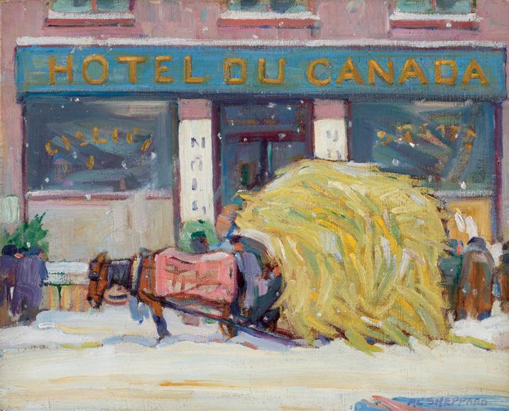
Morgan Cottage, Weston, Ontario, 1935 oil on canvas
signed lower right; titled and dated 1935 on a gallery label on the reverse 5.5 ins x 7.25 ins; 14.6 cms x 18.4 cms
Galerie Walter Klinkhoff, Montreal
A. K. Prakash & Associates Inc., Toronto Private Collection, Ottawa
Waddington's, auction, Toronto, 21 November 2016, lot 48 Private Collection
Alfred Joseph Casson lived most of his life in Toronto where he was born in 1898. His first experience of small-town Ontario was in childhood; he would make frequent visits to Meadowvale, a village west of Toronto, where he had family ties. Villages outside of Toronto, such as Elora, Salem, Uxbridge, and in this instance, Weston, were among the many places he depicted in the 1920s and 1930s. Working full-time at a commercial art firm until 1959, Casson could only leave the city to paint and sketch on weekends and holidays. Morgan Cottage, Weston, Ontario, dating to 1935, exemplifies many of the defining features of his work: a nostalgic depiction of Ontario villages, a strong sense of design, and a distinctive atmosphere achieved through colour and lighting qualities that distinguished him from other members of the Group.
The painting depicts a modest home nestled beneath heavy winter clouds, its angular geometry and clean contours offset by the soft palette of muted browns, mauves, and cool blues. The bare trees, rendered in Casson’s rhythmic, stylized brushwork, frame the composition and lend a quiet dignity to this everyday Ontario landscape. Casson would frequently visit Weston, and his treatment of this then small village on the outskirts of Toronto, reflects his enduring fascination with the harmony between human habitation and the Canadian environment.
$40,000–$60,000
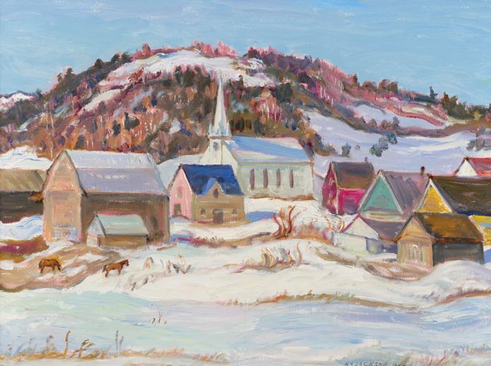
Notre-Dame-de-la-Salette, 1964 oil on canvas
signed and dated 1964 lower right 25.25 ins x 33.25 ins; 64.1 cms x 84.5 cms
Angus MacNaughton
By descent to the present Private Collection, Somerville, Massachusetts
This enchanting painting by A.Y. Jackson depicts a small Canadian village in winter, lively and animated with the artist’s distinctive rhythmic brushwork. In the foreground, we see a snowy landscape with uneven patches of earth and brush poking through, painted in loose, textured strokes. A frozen stream winds across the bottom edge. Clustered houses in muted but varied colours form the middle ground; their simple gabled shapes evoke modest rural life. A white church with a tall spire rises at the centre of the village, becoming the focal point of the composition. Behind the village, a wooded hill slopes upward, its surface dotted with dark evergreens and highlighted with touches of pink and violet. The sky is a cool blue with soft, wispy clouds, reinforcing the crisp clarity of a winter’s day.
Jackson was enamoured with snow’s ability to reflect light, how it holds colour even in shadow, and how shapes become simpler under snow. His winter scenes have crisp, clean air, sharp shadows, bright sky, and subtle hues in the snow that reflect blues, pinks, greys, and warm tones in sunset or dawn.
The oil painting presents a quintessential A.Y. Jackson subject: the charming “Christmas card country”, as he would describe these regions to fellow Group of Seven member J.E.H. MacDonald. The painter-sometimes journeying alone, other times with fellow artists, including Albert Henry Robinson, Arthur Lismer and Frederick Grant Banting-would travel throughout rural Quebec to paint the local scenery. Jackson would often board with families during stays in smaller communities, providing a deep examination of not only the land but also the daily life and culture of the residents.
Notre-Dame-de-la-Salette is a small village located in western Quebec, about sixty kilometres north of Ottawa along the Lièvre River. The area’s rolling terrain, clustered buildings, and winding river valleys offered the rural charm and natural rhythm that appealed to Jackson. In winter, places like Notre-Dame-de-la-Salette provided ideal subjects for his characteristic, lively brushwork and animated compositions. Jackson produced several works of the village both in oil paint and graphite, as it was an easy trip from Ottawa, where he lived in the late 1950s and 1960s.
$70,000–$90,000
Flow, 2011
acrylic on canvas signed and dated lower right; titled and dated 2011 on a gallery label on the reverse 47.5 ins x 67.5 ins; 120.7 cms x 171.5 cms
PROVENANCE
Pierre-François Ouellette art contemporain, Montreal Private Collection, Montreal ByDealers, auction, Montreal, 18 June 2020, lot 41 Private Collection, Ottawa
EXHIBITED
Kent Monkman: Miss America, Pierre-François Ouellette art contemporain, Montreal, 25 August-22 September 2012
LITERATURE
Steve Loft and Rachelle Dickenson, Kent Monkman: Miss America, [online publication], Pierre-François Ouellette art contemporain, 2012, accessed 7 October 2025
Kent Monkman is a contemporary Cree artist born in St. Marys, Ontario, and based in Toronto. Renowned for his bold, narrative paintings, Monkman explores themes of colonization, sexuality, loss, and resilience from a distinctly Indigenous perspective, working across painting, film, installation, and performance.
Flow, a 2011 painting by Monkman, reimagines the grand tradition of nineteenth-century North American landscape painting through a contemporary Indigenous lens. The sweeping mountain vista is rendered with meticulous naturalism—yet Monkman subverts the colonial narrative that such imagery historically upheld. In the foreground, a group of Indigenous figures, some in canoes, occupy the idyllic shoreline with calm authority, reclaiming presence within a landscape once depicted as “untamed” or “empty.” The central whirlpool that disrupts the glassy lake introduces an element of mystery and tension, hinting at unseen forces and histories beneath the surface.
By merging romantic landscape aesthetics with surreal and symbolic interventions, Monkman challenges the viewer to reconsider how the land has been represented throughout history. The painting exemplifies his ongoing dialogue with art history, Indigenous resilience, and the rewriting of cultural memory.
Flow was included in a 2012 exhibition, Kent Monkman: Miss America at Pierre-François Ouellette art contemporain in Montreal. On the gallery’s website, Steve Loft and Rachelle Dickinson write of the show:
“For Monkman, history is not a static, repressive regime of misleading stereotypes and tired art historical tropes, it is a lithe medium ripe for re-imagining and re-population. In Miss America , Monkman has chosen as his inspiration Giovanni Battista Tiepolo. His reworking of Tiepolo’s ceiling cycle The Four Continents (1754), specifically America at Treppenhaus, Residenz at Würzburg, Germany, challenges the euro-western ‘Age of Reason’ through a re-casting of allegory and classism into a Canadian Indigenous context. Tiepolo’s cycle, epitomized, not only the lush allegorical language of Renaissance and Baroque conceptualizations of the world, but also the humanist philosophies that characterize the Enlightenment–the aesthetics of Classical Antiquity coupled with the search for imperial truth through reason to bring order from chaos. Likewise, Monkman, in appropriating these compositional, syntactic and iconographical tools, piles luscious fully-fleshed Indigenous and Non-Indigenous bodies into a climax of the Americas that simultaneously assert and undermine the ‘rationalism’ of the Age.
By Indigenizing the Euro-western canon he creates a tragic-comedy of multiple entendre, played out in a realm of mythic illusions, conscious and unconscious desires, myriad reflections on socio-cultural violence... and acts of pure magic. He creates masterworks of subversion and sensuality, responding to and engaging an anti-colonial discourse steeped in the enduring of rationalism and imperialism within contemporary and historical imagination. These are constructions of presence that disentangle existing paradigms, bringing attention to the exclusiveness of popularly prescribed history. Monkman’s figures posit a profound Indigenization of the landscape in a way unimaginable to art historical dogmatists. His is an 'Americas' peopled by robust bodies grappling within colonial imperial knowledge–no one is exempt.”
$70,000–$90,000
Head of Boy, Cancale, June or July 1896 oil on canvas
titled and dated 1896 on a gallery label on the reverse; inscribed “J.W. Morrice” on the reverse of the canvas, inscribed “Recorded-Buchanan James Wilson Morrice p. 180-Portrait of Boy/Painting Nomad” and “M228” on the stretcher 18 ins x 14 ins; 45.7 cms x 35.6 cms
PROVENANCE
W. Scott & Sons, Montreal (Morrice Estate, Inv. M-228), 1925
Sydney Carter (Montreal dealer), 1936 Private Collection, Montreal, before 1940
By descent to a Private Collection, Montreal, until 2008 Masters Gallery, Calgary, 2025 Private Collection
EXHIBITED
Possibly Memorial Exhibition of Paintings by the Late James W. Morrice, R.C.A., Art Association of Montreal, 16 January-15 February 1925, no. 31 as Head of Boy
LITERATURE
Donald W. Buchanan, James Wilson Morrice: A Biography, Toronto, 1936, listed page 180 as Portrait of Boy, Half-length portrait, full face, blue in costume, black and grey stripes in background. 18" by 15". Not signed. Kathleen Daly Pepper, James Wilson Morrice, Toronto, 1966, listed page 97 as Portrait of Boy
James Wilson Morrice, who had been living in Paris since 1890, decided to spend the summer of 1896 in the bathing resort of SaintMalo. Morrice found inspiration in the nearby fishing village of Cancale, returning to Paris in August with a well-filled sketchbook (Sketchbook #2, Montreal Museum of Fine Arts) and more than twenty-five paintings–only one of Saint-Malo. Compared to what the artist drew and painted before and after, the cancalais summer stands apart because he concentrated on the human figure first and its environment second; in Cancale, that meant local women and children working in the oyster beds (the men were fishing).
Until then, Morrice had painted small and competent landscapes, which he did not exhibit in Paris. However, in the spring of 1896, he sent a dark Nocturne (Private Collection) to the Salon de la Société Nationale, probably encouraged by his new friend from Philadelphia, Robert Henri. Obviously, the American had quickly introduced the Canadian to the most famous works of James McNeill Whistler; Henri’s entry at the Salon (a first for him too), Suzanne, now lost, was perhaps also Whistlerian. Both entries prefigure what each artist will become well-known for: portraits for Henri, landscapes for Morrice; except in Cancale, where his landscapes are few, and more descriptive than atmospheric–young girls walking on the quay, oyster beds, fishing boats, women washing oysters. The remaining Cancale output consists of “portraits”–two of fellow painters, but mostly of local children, including a girl in a pink blouse and a white cap, and the portrait of this boy.
His blue shirt and ample beret are typically cancalais. In The Oyster Beds, Cancale (Private Collection), he walks barefoot in the mud, returning from the beds with a pail and a basket. Here he sits with his back against a stone wall, resting on the (invisible) beach below the quay or the jetty. His face, painted very carefully, is partly obscured by the late afternoon shadow, simplifying the rendering of the eyes, and ranking this portrait study among Morrice’s best. The same care was given to the boy’s clothes: his shirt, already too small for him and soiled, reveals a pink undergarment. So even if his “attributes” (pail and basket) are not visible, we understand that this young boy already works to support his family. Unfortunately, Morrice will not continue in this promising, almost ethnological artistic vein, and his interest in the human figure will remain almost dormant until after 1910.
We extend our thanks to Lucie Dorais, Canadian art historian and author of J.W. Morrice (1985), for contributing the preceding essay.
$50,000–$70,000
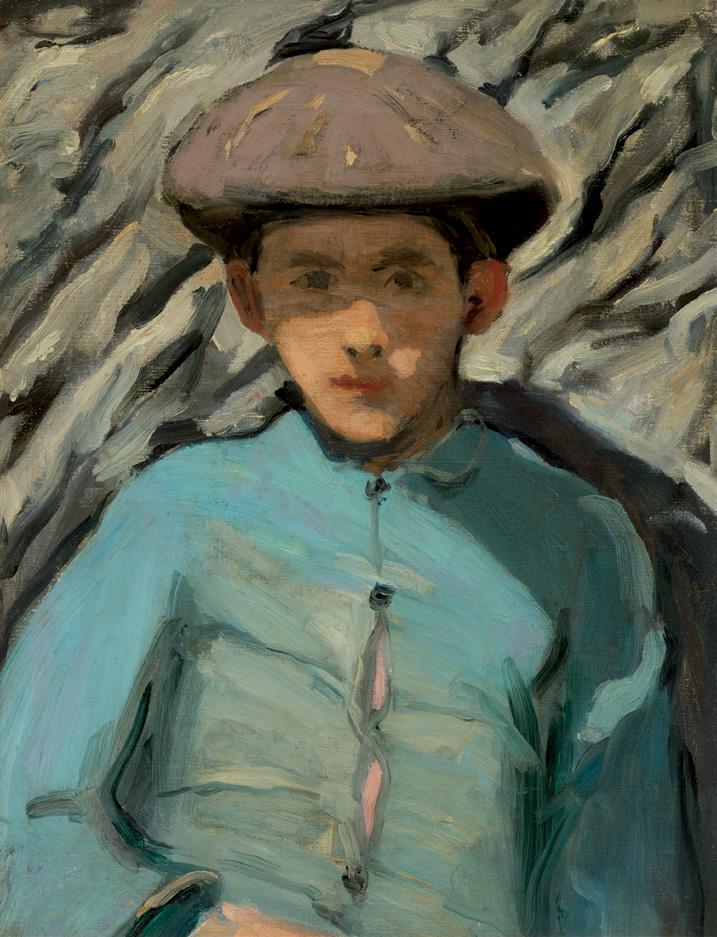
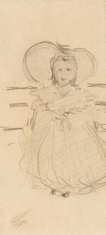
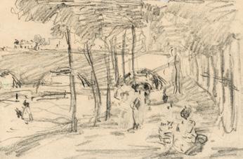
Girl with Bonnet, circa 1894
graphite on paper mounted to paper titled on a label and inscribed "Drawing for #3 of the Morrice limited edition of December 1984" by G. Blair Laing on the reverse 5.75 ins x 2.75 ins; 14.6 cms x 7 cms
PROVENANCE
Vincent Massey Collection
Christie's, auction, London, 9 December 1960, lot 31 as A Sketchbook of Venetian Views, Figure, Landscape and Other Subjects, early 1960s
G. Blair Laing, Toronto
Gifted to John MacAulay, or to his daughter, Carol MacAulay Taylor
Gifted by Carol Taylor to her godson, David Hines (Blair Laing's grandson), 21 July 1981
Masters Gallery, Calgary, 2012
Private Collection
EXHIBITED
J.W. Morrice 1865-1921, Montreal Museum of Fine Arts; travelling to the National Gallery of Canada, Ottawa, 30 September 1962-5 December 1965, no. 133
Girl with Bonnet is part of the Venice Girl on Boat series executed by J.W. Morrice, all from a sketchbook dated circa 1894 that Christie's sold on December 9, 1960. We extend our thanks to Lucie Dorais, Canadian art historian, for her assistance in researching this artwork.
$1,200–$1,500
Street Scene, Paris or Charenton, 1898
graphite on paper mounted to paper titled on a gallery label and inscribed "To Dear David, on his second birthday June 29, 1980. With love, Maurice & Carol" on the reverse 4.25 ins x 6.5 ins; 10.8 cms x 16.5 cms
PROVENANCE
Vincent Massey Collection
Christie's, auction, London, 9 December 1960, lot 30 as A Sketchbook of Figure, Landscape and Other Subjects
G. Blair Laing, Toronto
Gifted to John MacAulay, or to his daughter, Carol MacAulay Taylor, early 1960s
Gifted by Carol Taylor to her godson, David Hines (Blair Laing's grandson), 29 June 1980
Masters Gallery, Calgary, 2012
Private Collection
Street Scene, Paris or Charenton by J.W. Morrice is a work from a sketchbook dated circa 1898 that Christie's sold on December 9, 1960. The graphite is related to the pochade, Bridge in Paris (Private Collection). We extend our thanks to Lucie Dorais, Canadian art historian, for her assistance in researching this artwork.
$1,200–$1,500
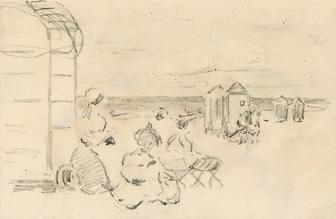
52
JAMES WILSON MORRICE
Beach Scene, Saint-Malo, circa 1898
graphite on paper mounted to paper titled and dated 1905 on the gallery label and inscribed "Given to Andrew by his Mum, 1982 - A.Hines." on the reverse 4.25 ins x 6.5 ins; 10.8 cms x 16.5 cms
PROVENANCE
Vincent Massey Collection
Christie's, auction, London, 9 December 1960, lot 30 as A Sketchbook of Figure, Landscape and Other Subjects
G. Blair Laing
Possibly gifted to Mrs. H.R. Milner (died 1998)
Lunds, auction, Victoria, 17 October 1994, lot 104 as "Attributed to"
Possibly G. Blair Laing
Gifted to Andrea Laing Hines
By descent to Andrew Hines (son), 1982
Masters Gallery, Calgary, 2012
Private Collection
Beach Scene, Saint-Malo by J.W. Morrice is a work from a sketchbook dated circa 1898 that Christie's sold on December 9, 1960. We extend our thanks to Lucie Dorais, Canadian art historian, for her assistance in researching this artwork.
$1,200–$1,500
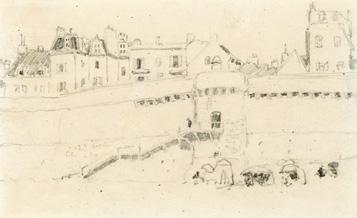
53
The Ramparts, St. Malo, circa 1898
graphite on paper titled and dated 1905 on the gallery label and inscribed "For Blair David Hines, keep growing well–and glowing– your loving Godparents, Maurice & Carol Taylor, June 29, 1979." on the reverse 3.75 ins x 6.25 ins; 9.5 cms x 15.9 cms
PROVENANCE
Vincent Massey Collection
Christie's, auction, London, 9 December 1960, lot 30 as A Sketchbook of Figure, Landscape and Other Subjects
G. Blair Laing, Toronto
Gifted to John MacAulay, or his daughter, Carol MacAulay Taylor, early 1960s
Maurice and Carol Taylor
Gifted to godson, David Hines (Blair Laing's grandson), 29 June 1979
Masters Gallery, Calgary, 2012
Private Collection
The Ramparts, St. Malo by J.W. Morrice is a work from a sketchbook dated circa 1898 that Christie's sold on December 9, 1960. This graphite work is related to the oil on canvas, St. Malo, France, circa 1901 (Private Collection). We extend our thanks to Lucie Dorais, Canadian art historian, for her assistance in researching this artwork.
$1,200–$1,500
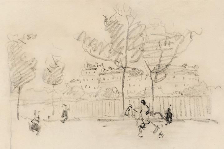
Street Scene, Paris, circa 1898
graphite on paper mounted to paper titled and dated c. 1906 on the gallery label and inscribed "June 29, 1978, To Blair David Hines, our only and much loved Godson. We look forward to your future and many years sharing it with you. Maurice & Carol Taylor." on the reverse
4.25 ins x 6.5 ins; 10.8 cms x 16.5 cms
PROVENANCE
Vincent Massey Collection
Christie's, auction, London, 9 December 1960, lot 30 as A Sketchbook of Figure, Landscape and Other Subjects
G. Blair Laing, Toronto
Gifted to John MacAulay, early 1960s
By descent to Carol MacAulay Taylor (daughter)
Gifted to David Hines (godson, Blair Laing's grandson), 29 June 1978
Masters Gallery, Calgary, 2012
Private Collection
This J.W. Morrice is a work from a sketchbook dated circa 1898 that Christie's sold on December 9, 1960 and is a preliminary study for the oil on canvas, Sur les quais, Paris, circa 1898-1899 (McMichael Canadian Art Collection). We extend our thanks to Lucie Dorais, Canadian art historian, for her assistance in researching this artwork.
$1,200–$1,500
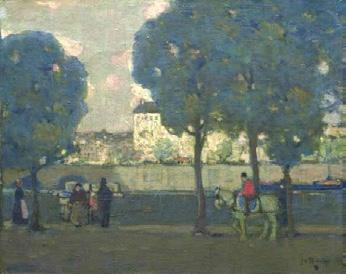
James Wilson Morrice
Sur les quais, Paris, circa 1898-1899 oil on canvas, 50.5 x 61.5 cms
Gift of Michael Burns in memory of Senator Cairine Wilson, McMichael Canadian Art Collection (2021.9) Not for sale with this lot
Poppies and Glass II, Uxbridge, circa August 1941
watercolour
titled and dated 1941 on the gallery label on the reverse; inscribed "Poppies and glass" and "W-253" (by Douglas Duncan) on the reverse; catalogue raisonné no. 403.67 16.75 ins x 14.25 ins; 42.5 cms x 36.2 cms
PROVENANCE
Douglas Duncan/Picture Loan Gallery Vancouver Art Gallery Picture Rental
Mr. and Mrs. Reginald A. Wilson, Vancouver, 1948
Ohler Fine Arts, 1990 Masters Gallery, Calgary, 1990 Private Collection
EXHIBITED
David Milne: Recent Watercolours and Some Etchings, Hart House, University of Toronto, 22 October-12 November 1943
David Milne Paintings, Masters Gallery, Calgary, 4-7
December 1996
Sight and Site: Location and the Work of David B. Milne, Nickle Arts Museum, University of Calgary, 8 August-2 November 1997
LITERATURE
David Milne Jr. and David P. Silcox, David B. Milne: Catalogue Raisonné of the Paintings, Volume 2: 1929-1953, Toronto, 1998, listed and reproduced page 768, no. 403.67
David P. Silcox, Painting Place: The Life and Work of David B. Milne, Toronto, 1996, page 319
Poppies, zinnias and nasturtiums, along with an assortment of household objects, recur in a series of Milne’s still life works of the early 1940s. From this period on, Milne increasingly worked from his imagination rather than from direct observation. Though Milne’s earlier paintings of spring flowers were likely created in the spring, from the late 1930s on, this is no longer necessarily the case. Many of these works exhibit a reduced palette of pinks, reds and oranges glowing
against a dark background. Art historian David Silcox noted the importance of Milne’s distinct palette: “Milne’s pictures suddenly developed a gentler brilliance, but they still had explosive power… The flower pictures painted in the summer of 1941, such as the numerous paintings of poppies… all have a scarlet richness that saturated the paper in a way that was new in Milne’s work, and that he would exploit over the next few years.”
Milne also experimented with wet wash techniques, applying water to the paper immediately before or after putting down colour. The resulting diffused, watery brushstrokes create a glowing, soft-focus effect which contrasts with crisp line work. This distinct technique differentiated Milne from most Canadian watercolourists of the era, instead demonstrating surprising parallels with Asian brush painting. Milne would continue to explore and expand on these methods for the rest of his life.
$12,000–$15,000
WILLIAM KURELEK
Midnight Visit to a Sick Cow (Ukrainian Pioneer Series), 1976 mixed media on board signed with monogram and dated 1976 lower right; titled on the reverse 28.5 ins x 31 ins; 72.4 cms x 78.7 cms
PROVENANCE
Waddington's, auction, Toronto, 7 June 1999, lot 87 Private Collection, Ontario
This painting underlines William Kurelek’s uniqueness as a visual storyteller. Clasping a bucket, a shrouded figure leads herself by implied candlelight to the door of a thatch-roofed barn at midnight. The scene’s nocturnal setting conveys an anticipatory mood, a moment pregnant with purpose; dramatic weight and solemnity are palpable, as though the painting were representing a famous myth or parable. And yet, as his title suggests, the vigil Kurelek makes us witness here, while serious in its local implications, is unremarkable.
Midnight Visit to a Sick Cow is a late work by this Ukrainian-Canadian artist, who passed prematurely at the age of fifty in 1977. It retraces a theme and narrative well-known to Kurelek’s audiences by the 1970s. He was born east of Edmonton to a family of immigrants from western Ukraine and raised on a farm north of Winnipeg before establishing his art career in Toronto. In the early 1960s, Kurelek turned his creative attention to representing his experience of the melding of Ukrainian culture and everyday life on the Canadian Prairies. He went on to devote entire series to the subject, most notably An Immigrant Farms
in Canada (1963), exploring the migration experience of primarily his father, and The Ukrainian Pioneer Woman in Canada (1967), a tribute to his mother that was exhibited at the Ukrainian Pavilion at Expo ’67 in Montreal. This 1976 painting does not appear to be a part of any larger series; indeed, in addition to a major mural commission for the St. Thomas More College at the University of Saskatchewan, his studio efforts at that time were largely focused on representing other contributors to the country’s multicultural mosaic: Jewish, Irish, and Polish Canadians.
The autonomy of Midnight Visit to a Sick Cow, the painting’s lack of any known connection to a larger series, lends it greater interpretive openness. It stands alone; the rather unremarkable activity taking place is unmoored from any overarching story or message. At root, the tension between the painting’s sense of work-a-day routine, on the one hand, and its air of mystery conveyed by the dramatic lighting, nocturnal setting, and the fact that the ailing bovine protagonist’s presence is only implied, on the other, is the very thing that marks Kurelek as a master visual storyteller. Here, the farm-raised artist is resisting sentimentality; the woman is simply doing what needs to be done in order to assure the family’s livelihood. And yet, Midnight Visit to a Sick Cow stirs feelings that resist linguistic description or pictorial representation; there are inchoate hints that something more profound is going on than what the painting shows us. For Kurelek, the stuff you don’t see is just as important as what has been rendered.
We extend our thanks to Andrew Kear, Canadian art historian and Head of Collections, Exhibitions and Programs at Museum London, and author of the Art Canada Institute’s William Kurelek: Life & Work , for contributing the preceding essay.
$40,000–$60,000
JOSEPH CASSON
Quebec Farm, 1968 oil on canvas
signed lower right; titled and dated 1968 on two gallery labels on the reverse; signed, titled and dated on a label on the stretcher 30 ins x 38 ins; 11.81 cms x 14.96 cms
PROVENANCE
Roberts Gallery, Toronto Manuge Galleries, Halifax Private Collection, Halifax
LITERATURE
Margaret Gray, Margaret Rand and Lois Steen, A.J. Casson (Canadian Artists 1), Agincourt, 1976, pages 49-50 Hubert De Santana, “A Painter’s Life: A.J. Casson looks back on 60 years at the easel,” Canadian Art (Spring 1985), pages 64-69
In a Saturday Night Magazine interview with A.J. Casson in 1986, six years before his death, Casson reflects back on his time with the Group of Seven. At the time, he was the only remaining member of the Group. Describing his journeys around the province of Ontario, Casson writes that “I loved to paint villages. I must have covered nearly every village in Ontario, and I’m glad, because they’re pretty much gone now. They’ve all changed, fallen down, or been destroyed”. Quebec Farm was painted during one of Casson’s rarer ventures into another province. Casson painted extensively in Quebec from 1966 to 1975, staying with friends in the region of Grenville, situated on the Ontario-Quebec border along the Ottawa River.
Also during this period was the beginning of a fruitful relationship with Roberts Gallery, where Casson held six solo exhibitions between 1959 and 1979. His work was in high demand, and in 1967, he was awarded the Silver Centennial Medal and featured in the Three Hundred Years of Canadian Art exhibition at the National Gallery of Canada.
When Casson began to paint in oils, he was already under the influence of the Group of Seven, having been brought into the group in 1926, by Franklin Carmichael. Artists like A.Y. Jackson, J.E.H. MacDonald and Franklin Carmichael were his teachers and companions in his formative years. Casson worked for many years in design and lithography, retiring as Art Director of Sampson-Matthews in 1958. His dual career fostered a disciplined approach to composition and colour, evident in the precision and balance of his paintings.
In Quebec Farm, the muted palette of greens, blues and browns brings forth the warmth of a summer day. A farmhouse sits nestled in the rolling hills, surrounded and protected by the trees and the mountain behind. A pathway leads to the house, inviting the viewer into the idyllic scene. The white clouds cast shadows on the still farm below.
A.J. Casson’s landscapes of the mid-1940s began to incorporate a more dramatic lighting that is broken into planes across the surface of the composition. Quebec Farm illustrates this shift, visible in the illuminated middleground surrounding the farmhouse and barn, while the road in the foreground and mountain in the distance remain in shadow.
Authors Margaret Gray, Margaret Rand and Lois Steen write that it was Casson’s colour sense that was his greatest strength as a painter. “His colours induce the magic in his paintings. He uses a simple scheme, a restricted palette”. His paintings reveal a sensitivity to light and weather that imbues even the most structured compositions with atmosphere and life. In a 1985 interview, the artist recalls this strategy as being present since his early days with the Group of Seven, when “exhibitions were flaming with colour.” He elaborated by stating: “Well, I’ve always thought that if you want to stand out, don’t follow the herd. I was inclined to go into subtle greys, to get away from the gaudy. I painted a few gaudy ones, but they never appealed to me.”
$100,000–$150,000
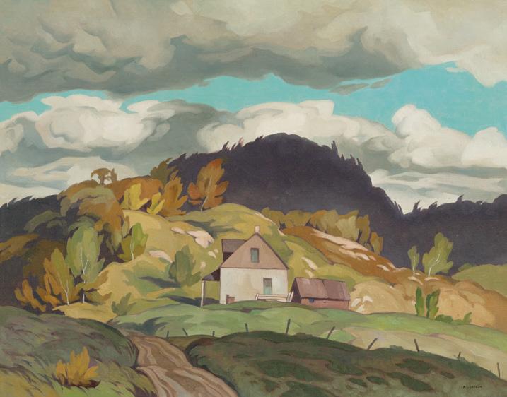
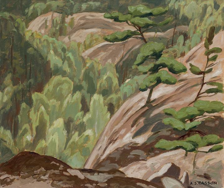
ALFRED JOSEPH CASSON
Cliff at Birch Island, 1949 oil on board
signed lower right; titled on the reverse 9.5 ins x 11.25 ins; 24.1 cms x 28.6 cms
PROVENANCE
Private Collection, Toronto
Cliff at Birch Island captures A.J. Casson’s enduring fascination with the rugged terrain and resilient vegetation of the La Cloche area. Unlike many of the artist’s expansive panoramic landscapes, this composition provides a close, almost intimate view that immerses the viewer within the landscape rather than offering a distant vista.
The steep rock face dominates the foreground, its warm ochres and taupes articulated with angular, deliberate brushwork. Clinging to the precipice are windswept pines, their sculptural forms bent to the contours of the cliff and shaped by the elements. The surrounding dense forest unfolds in layered greens and soft amber tones, rendered with interlocking patterns that suggest both foliage and light. Casson’s tight framing and vertical perspective heighten the sense of depth and immediacy. Executed the same year Casson retired from commercial design to paint full-time, Cliff at Birch Island exemplifies the artist’s uniquely modern translation of the Group of Seven’s vision into a more personal, graphic language of shape and colour.
$20,000–$30,000
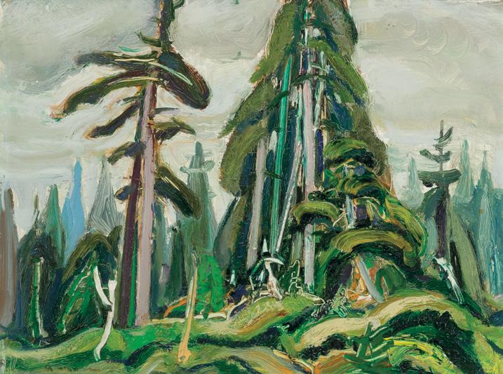
ARTHUR LISMER
West Coast, Vancouver Island, B.C., 1955 oil on board
signed lower left; signed and titled on the reverse 12 ins x 16 ins; 30.5 cms x 40.6 cms
PROVENANCE
Dr. Mary Miller
G. Blair Laing Galleries, Toronto Private Collection Masters Gallery, Calgary, 1980 Private Collection, Calgary
LITERATURE
Dennis Reid, A Concise History of Canadian Painting, Toronto, 1973, page 179
Arthur Lismer’s West Coast, Vancouver Island, B.C., epitomizes the rugged, epic splendour of the wilds of British Columbia. The picture is dense and complex, which would be expected from this point in Lismer’s career. His sense of form and rhythm produced images of substance and organization that resonate with the viewer and create order out of chaos.
Keeping true to the Group's mission of capturing the wild and 'untouched' Canadian wilderness, Lismer has a particularly apt style to capture and document these images of Canadiana. Oil on board works, such as this artwork, give an intimate snapshot of the landscape visited by the Group of Seven. Cerulean blues and emerald greens are punctuated by bright ochres in the work, giving life and vibrancy to the monumental pines that rise from the centre of the composition. Lismer's use of dramatic greens and a broad brushstroke reflects his feelings toward landscape painting in Canada. As Dennis Reid noted, "This later work ...from 1951 to 1968 on annual trips to the lush west coast of Vancouver Island–was undervalued during his lifetime but it is the most original, intensely personal painting of his career."
$20,000–$30,000
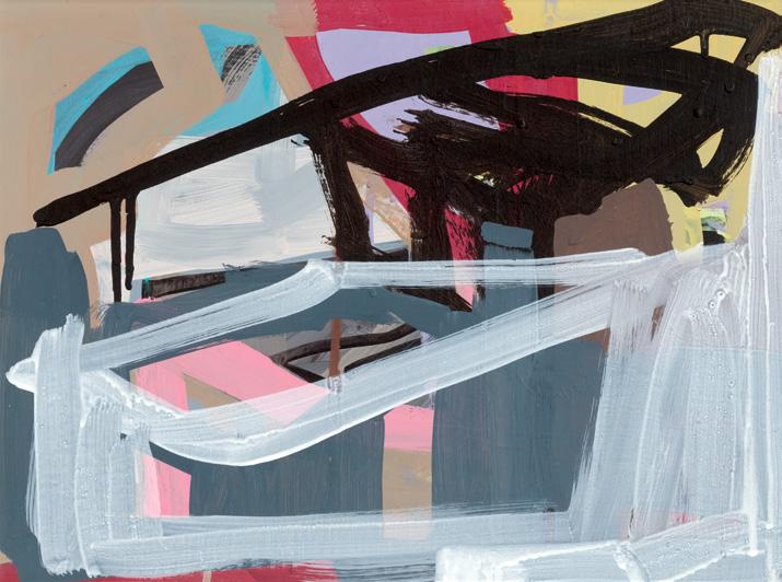
Untitled, 2012
acrylic on canvas
titled and dated 2012 on an exhibition label on the reverse 12 ins x 16 ins; 30.5 cms x 40.6 cms
PROVENANCE
Olga Korper Gallery, Toronto Private Collection, Toronto
EXHIBITED
Denyse Thomasos: Just Beyond, Art Gallery of Ontario; travelling to McMichael Canadian Art Collection, Kleinburg; Art Gallery of Greater Victoria; Remai Modern, Saskatoon; Vancouver Art Gallery; Art Gallery of Nova Scotia, Halifax and The Rooms, St. John’s, 8 October 2022–19 January 2025
LITERATURE
Esi Edugyan, Gaetane Verna & Sarah Milroy, Denyse Thomasos: Odyssey, Kleinburg, 2021, reproduced page 38
Renée van der Avoird, Sally Frater and Michelle Jacques, Denyse Thomasos: Just Beyond, Toronto, 2022, reproduced page 162
Untitled belongs to a series of small-scale abstractions created in the final year of Denyse Thomasos’ life. Distinct from the architecturally driven, monumentally scaled works for which she is best known, this series provides a more intimate exploration of gesture and colour. Without any of Thomasos’s usual motifs and artistic language, Untitled invites us to question and reflect upon the artist’s intent. Does this work indicate a formal departure for the artist? Or was this a natural evolution of Thomasos’s practice? Was this series a part of a much broader project that was ultimately never realized? Or do the echoes of her gestures and use of colour in Untitled connect it to earlier works? Unmistakably, Thomasos’s hand remains present as her energy is embedded in each vibrant brushstroke. Although the scale has shifted and the motifs receded, this work is animated by Thomasos as her hand is evident in each artistic mark.
$14,000–$18,000
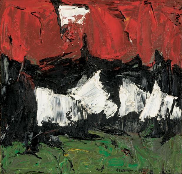
61
RITA LETENDRE
Sans titre oil on canvas
signed lower right; titled on the gallery label on the reverse 10.75 ins x 11.25 ins; 27.3 cms x 28.6 cms
PROVENANCE
Here & Now Art Gallery, Toronto Private Collection, Toronto
LITERATURE
Rita Letendre: The Montreal Years 1953-1963, Montreal, 19 October-18 November 1989, page 30
Sans titre possesses an unexpected vital energy, considering the intimate scale of the work. Likely dating to the early 1960s, the work demonstrates Letendre’s personal reaction to the gestural abstractions of Les Automatistes. The confident use of impasto creates a rich, sculptural surface. The bold composition is organized into clearly demarcated horizontal bands, with a row of spike forms floating through the centre. Letendre experimented with a number of variations of this fundamental visual structure in 1961. The painting is balanced with bands of red and sap green at the top and bottom. These complementary hues are set off by high-contrast black and white. The jagged boundaries of colour carry the association of trees and mountains. Letendre was interested in imbuing her paintings with a primal energy connected to natural forces. She described her work of the period as “the consummation of power” based on a need “to express the force of living nature, the expansion of natural growth.”
$15,000–$20,000
The Painted Flag, 2006 acrylic on canvas signed and dated 2006 on the reverse 36 ins x 60 ins; 91.4 cms x 152.4 cms
PROVENANCE
Private Collection, Toronto
LITERATURE
Bogomila Welsh-Ovcharov, Charles Pachter, Toronto, 1992, pages 4, 5, 139
Known for his colourful, iconic work with distinctly Canadian themes, Charles Pachter lends an irreverence to the contemporary Canadian artistic landscape. Amongst the most notable subjects in Pachter's oeuvre are his barn, Toronto streetcar and moose and queen series, but it is arguably the Canadian flag, which is the artist's best known. With impeccable timing, Pachter’s first exhibition featuring Canadian flag motifs, The Painted Flag, opened on November 7, 1981, one day after Prime Minister Pierre Trudeau announced that the Canadian constitution was being repatriated. The well-attended exhibition featured thirty large canvases in the artist’s newly renovated four-storey private commercial gallery on Queen Street in Toronto. The artist
remembered his initial inspiration behind the series came to him one summer night when he “built a flag-pole out of two-by-fours nailed together, attached a small rayon flag to the top, and manoeuvred the flimsy mast into a fencepost hole. As the sun was setting, I lay down in a hammock to watch the flag undulate slowly in the breeze, rocking back and forth like a primitive mobile.” While Jasper Johns’ grid-like images of the American flag sit apart from patriotism and serve as a jumping-off point for formal abstraction, Pachter’s Canadian flags are observed and emphasize light and shadow. The images extend beyond a captured moment, and flat acrylic backgrounds, at times in improbable hues, show a proficiency comparable to Johns’.
As a childhood friend and collaborator, the renowned novelist Margaret Atwood explains, “Pachter’s conscious exploration of the visual symbolism that surrounded him began, long before the ascendancy of Andy Warhol, when as a teenager he painted the landscape from a two-dollar bill on his bedroom wall, much to the bewilderment of his mother… Since that time, in a career which has now lasted three decades, Pachter has continued vigorously to explore his several media, to diversify his imagery, and to structure and restructure his visual world. In doing so he has restructured the world around him, and has changed profoundly the way we look at our own familiar iconography, even our own banalities… His is a sophisticated art which draws upon many techniques and evokes many echoes, yet it remains strongly individual, and firmly rooted in a ground which Pachter has both excavated and cultivated himself.”
$40,000–$60,000
Field, 1974
acrylic on canvas signed, titled and dated 1974 on the reverse 48 ins x 72 ins; 121.9 cms x 182.9 cms
PROVENANCE
The Arwin Galleries, Detroit Private Collection, Montreal
As one of the few women at the forefront of Canadian abstract art, Rita Letendre occupies a revolutionary place in the country’s art history. Over the course of her career, she created some of the most innovative works of abstraction, her style always fluctuating between gestural and hard-edge approaches. Initially influenced by Paul-Émile Borduas and the Automatistes in the 1950s, but after receiving a major mural commission for the University of California, Letendre shifted toward hard-edge abstraction in the following decade, exploring crisp lines and flattened planes of colour.
Letendre’s large canvases of the 1970s explore her fascination with speed and vibration. The sharp wedges or arrows that cut across the image plane are characteristic of her work from the decade. In Field , a thin black ‘arrow’ shoots downward toward the left edge of the canvas, surrounded by blue, purple and orange bands of varying width and with soft borders. This large painting was completed in 1974, three years after Letendre first adopted the airbrush technique to apply acrylic paint. It marked a turning point in her style from her gestural 1960s work into smoother, more luminous gradients and sharply defined bands of colour. The airbrush allowed her to create seamless transitions and an almost light-filled atmosphere in her work, which became a hallmark of her 1970s paintings. In 1979, Letendre held a solo show at Arwin Galleries in Detroit, further cementing her international presence.
$30,000–$40,000
Pipe Ceremony Blessing, 2012
acrylic on canvas
signed lower left; titled, dated 2012 and inscribed "Banff" on the reverse 20 ins x 24 ins; 50.8 cms x 61 cms
PROVENANCE
Bearclaw Gallery, Edmonton Private Collection, Edmonton
Alex Janvier is a celebrated Canadian Indigenous artist hailing from Treaty 6 territory in Alberta, Canada. His artwork is characterized by vibrant colours and unique lines that convey rich stories reflecting his cultural heritage and personal experiences. The intricate beadwork and birch bark basketry created by his mother and other family members greatly influenced the artist's development. Janvier's striking and unique paintings blend Denesuline imagery with Western modernist techniques, including automatic painting and abstraction.
Pipe Ceremony Blessing showcases the artist’s signature tendril-like abstract forms that swirl and flow like the smoke from the ceremony it represents. These strands radiate from the centre and extend beyond the edges of the canvas. Although the painting is relatively small in size, the use of colour is deliberate and impactful. Peace pipe ceremonies hold deep significance in First Nations culture, symbolizing unity and harmony. Historically, the pipe served as a means to initiate negotiations between different groups, fostering peace and agreement.
$12,000–$15,000
Self Portrait, 1973
acrylic on board
signed in syllabics lower right; titled and dated 1973 on a gallery label on the reverse
40 ins x 32 ins; 101.6 cms x 81.3 cms
PROVENANCE
The Pollock Gallery, Toronto Private Collection, Toronto
Norval Morrisseau has been a prominent artist in the Canadian art scene since his first exhibition in the early 1960s. He is credited as the creator of the Woodland School of Art and a prominent member of Professional Native Indian Artists Inc., or the “Indian Group of Seven”. This was an Indigenous art collective formed in the early 1970s to promote and support Indigenous artists throughout Canada.
Self Portrait was created in 1973, the same year that Morrisseau was appointed a member of the Royal Canadian Academy of Arts. At this time the artist began to explore a blended spiritual perspective between Anishinaabe culture and Christianity in his work. During this period, the artist also continued his struggle with his own demons. This was, however, a highly industrious time for Morrisseau.
During this transformative phase, Morrisseau maintained his collaboration with art dealer Jack Pollock. Morrisseau first exhibited with The Pollock Gallery in Toronto in 1962. Pollock was a painter, art educator, author and gallerist who represented Canadian artists and played a defining role in the Toronto art scene for over three decades.
In Self Portrait, the artist is painted with five serpents surrounding his head and chest. Lister Sinclair and Jack Pollock discuss in The Art of Norval Morrisseau (1979) that according to Ojibway legend, the number five frequently represents the primordial senses of man, the serpents can be seen as representing the duality between good and evil. Confronted by these serpents on each side of him, Morrisseau depicts the battles he had been internally grappling with since his youth.
$10,000–$15,000
Abstract #15, 1956 oil on canvas
signed upper left; signed and dated 1956 on the reverse; registered with Patrimoine Marcil (Estate of René Marcil, no. AP-15) 40 ins x 50 ins; 101.6 cms x 127 cms
PROVENANCE
Patrimoine Marcil
Private Collection, Toronto
René Marcil was a French-Canadian painter, draughtsman and fashion illustrator. Born in Montreal, he spent most of his professional life in New York, Paris and London. In 1947, Marcil played a pivotal role in the successful launch of Christian Dior’s New Look collection in the United States.
Upon his arrival in Paris in 1950, Marcil enrolled at the Académie de la Grande Chaumière. He rented a studio on the Left Bank and quickly became a Montparno, a name for the artists and intellectuals who frequented the Montparnasse cafés and restaurants. He socialized with painters such as Sonia Delaunay, who influenced the evolution of his style to colourful abstraction, akin to the popular Neoplasticism movement. The Galerie l’art français in Montreal described his work from this period as “intense, luminous and has the quality of combining graphic design, great draftsmanship, extraordinary color, fascinating surfaces... [and] poetic feeling.”
Abstract #15 was completed in 1956, while Marcil was still living in Paris (he left the French capital in 1965 to move to London). The composition is an arrangement of shapes that are abstract yet familiar, geometric yet irregular, spontaneous yet structured. Marcil chose a vibrant palette of complementary blue and orange, along with black and white, reminiscent of the modern geometric abstraction he saw in Paris.
$15,000–$20,000
AC-84-29, 1984
acrylic on canvas signed, titled and dated 1984 on the reverse 14.5 ins x 39.5 ins; 36.8 cms x 100.3 cms
PROVENANCE
Private Collection, Toronto
William Perehudoff began his career as a watercolourist, and his lifelong exploration of transparency and opacity carried through to his mature work as a Color Field painter. Working on unprimed linen, he allowed thin pigments to soak into the raw surface, creating depth and atmosphere. In AC-84-29, a wash of thinned grey paint forms a soft foundation, over which the artist layered vibrant vertical bands of pink, yellow, orange, and green. These glossy, tactile strokes hover against the subdued ground, their luminous presence generating both contrast and energy. The raised texture of the paint lends the surface a subtle sculptural quality, enhancing the sense of spatial tension and dimensionality within the composition.
Many of Perehudoff’s canvases of the 1970s and 1980s, such as AC-84-29, reference the reductive formalism of Color Field painting as well as the expansive prairie landscape of his native province. In 1988, Perehudoff was honoured to serve as a leader at an Emma Lake workshop.
$7,000–$9,000
Blue Painting, circa 1959
oil on canvas
signed lower right; signed and titled on the stretcher 48 ins x 34 ins; 121.9 cms x 86.4 cms
PROVENANCE
Private Collection, Toronto
LITERATURE
Ian M. Thom and Andrew Hunter, Gordon Smith: The Act of Painting, Vancouver, 1997, see page 76 for a related painting, Blue Painting No. 2, 1959
Roald Nasgaard, Abstract Painting in Canada, Toronto/ Vancouver, 2008, page 136
A leading figure in post-war Canadian abstraction, Gordon Appelbe Smith rooted his artistic practice deeply in the British Columbian landscape. After immigrating from England in 1933, Smith eventually settled in Vancouver, where the coastal environment remained central to his work over several decades. Although Smith varied his approach to abstraction throughout his career, the landscape consistently served as a key source of inspiration. Drawing from natural geometries and colour harmonies, Smith developed a distinctive visual language that translates the sensory experience of the outdoors onto canvas.
In Blue Painting, Smith applies swaths of blue and yellow to evoke the sensation of ocean depths or a distant horizon. A burst of yellow in the upper right corner ignites the composition with rays of light. This vivid use of yellow cuts through the fields of blue and expressive gestural marks. While Blue Painting does not depict a specific natural scene, Smith anchors his use of colour in a familiar sensory experience. Through layered brushwork and tonal shifts, he conjures a sense of space and atmosphere that is rendered not through literal form, but through abstraction.
$12,000–$15,000
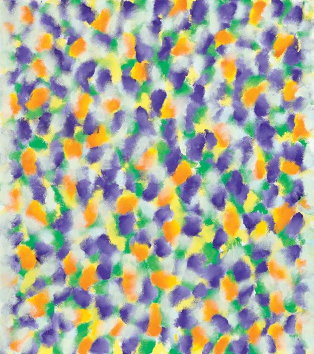
GERSHON ISKOWITZ
Lizabeth's Painting, 1973 oil on canvas signed, titled and dated 1973 on the reverse 45 ins x 40 ins; 114.3 cms x 101.6 cms
PROVENANCE
Moos Gallery, Toronto Private Collection, Toronto
Born in Kielce, Poland, Gershon Iskowitz survived the Holocaust, enduring imprisonment in concentration camps including Auschwitz and Buchenwald. After the war, he studied art in Munich before immigrating to Canada in 1949. His early works of the 1950s and early 1960s are rooted in figurative expressionism, but by the end of the decade, Iskowitz had transitioned decisively toward abstraction, a move that marked the beginning of his mature style. He represented Canada at the Venice Biennale in 1972. By 1973, Iskowitz was at the height of his artistic maturity. His works of this period, such as Lizabeth’s Painting, are filled with vibrant, floating patches of colour suspended in luminous fields. This painting demonstrates Iskowitz’s hallmark precision: jewel-like dabs or veils of pigment hover across the canvas, creating the illusion of depth without conventional perspective.
$25,000–$35,000
70
SOREL ETROG
Mother and Child Yanai, circa 1972-79
bronze stamped signature on the base 10 ins x 6.5 ins x 2.5 ins; 25.4 cms x 16.5 cms x 6.4 cms
PROVENANCE
Acquired directly from the Artist Private Collection, Toronto
The mother and child motif appeared in different sculptures throughout Sorel Etrog's career. Mother and Child Yanai is a new interpretation of the motif presented in Etrog's abstracted figural language.
$9,000–$12,000
71
SOREL ETROG
Hinged Spirit Study, 1978
bronze
stamped signature and numbered 2/7 on the base; titled on a label on the underside 12.5 ins x 4 ins x 2.75 ins; 31.8 cms x 10.2 cms x 7 cms
PROVENANCE
Acquired directly from the Artist Private Collection, Toronto
A casting of an original maquette of Hinged Spirit was presented to Sorel Etrog for the Vancouver Biennale Lifetime Achievement Award in 2005 for his contribution to sculpture and public art.
$9,000–$12,000
Bridge
mixed media on canvas
30 ins x 40.25 ins; 76.2 cms x 102.2 cms
PROVENANCE
Private Collection, Toronto
LITERATURE
Katerina Atanassova, “You are Here: Kim Dorland and the Return to Painting” in Katerina Atanassova, Robert Enright and Jeffrey Spalding, Kim Dorland, Vancouver/Berkeley/Kleinburg, 2014, pages 44, 52
Contemporary painter Kim Dorland excels at creating imagery that is simultaneously abrasive and attractive. A native of Wainwright, Alberta, the artist relies heavily on his tumultuous experiences growing up, translating into works that challenge preconceived notions of the Canadian wilderness. Known for his paintings of landscapes, often including figures, Dorland seeks to demystify the idea of terra nullius —the void, pristine, virgin land often idealized by historical Canadian painting and art history. Rather, the artist often incorporates contemporary figures and objects in a rugged environment, emphasizing one’s place in the landscape. Graffiti, cars, toys and modern infrastructure populate his landscapes, making a contemporary
comment on the traditionally barren Canadian landscape throughout art history. Dorland works in a variety of media, including neon pigments, spray paint and even inkjet technologies.
Bridge depicts a classic Dorland forest scene, with a mix of slender birch trunks and dense fir trees rendered with a striking interplay of textures: passages of thick, impastoed paint of the large tree in the right foreground contrast with thin washes of colour. The luminous jewel-toned green forest is punctuated by a fluorescent orange full moon with a translucent veil descending to the bottom of the canvas. The skull graffiti on the bridge references the destructive human presence and the tension between beauty and unease in the northern landscape.
Curator Katerina Atanassova observes that “Dorland’s world–although referencing locales in his native Wainwright, Alberta–is no longer focused on a specific place but rather represents a kind of ‘anywhere’.”
In many of Dorland’s works, including Bridge, the artist has challenged the conventional notion of the romantic Canadian landscape. Jeffrey Spalding remarks on how Dorland’s scenes of Canadian life and terrain are important because they are truthful. He writes “It may still be plausible to manufacture an encounter with pristine wilderness, but it is not our predominant, day-to-day lived reality. [...] Kim Dorland’s figuration and landscapes sit as a continuity of Canadian art history, not as an anomaly.”
$10,000–$15,000
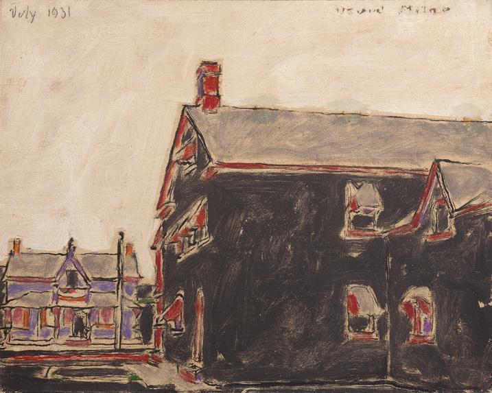
EXHIBITED
Exhibition of Paintings by David B. Milne, Mellors Galleries, Toronto, 1934, no. 51
Hotel and Butcher Shop
(Queen’s Hotel on a Dark Day), 1931
oil on canvas
signed upper right and dated “July 1931” upper left; titled “Hotel and Butcher Shop” and “27” inscribed on the reverse; catalogue raisonné no. 302.73 16.25 ins x 20.25 ins; 41.3 cms x 51.4 cms
The Right Honourable Vincent Massey, 1934
Laing Galleries, Toronto as Black House, Palgrave, 1958
Fred Mendel, Saskatoon
Mrs. Eva Miller, Priddis, Alberta Masters Gallery, Calgary
Collection of Fred and Beverly Schaeffer
Cowley Abbott, auction, Toronto, 1 December 2022, lot 128
Private Collection, Toronto
Exhibition of Pictures by David B. Milne, James Wilson and Co., Ottawa, February 1935, no. 36
Exhibition of Paintings by David B. Milne, W. Scott & Sons, Montreal, 1935, no. 36
Embracing Canada: Landscapes from Krieghoff to the Group of Seven , Vancouver Art Gallery; travelling to Glenbow Museum, Calgary; Art Gallery of Hamilton, 30 October 2015‒25 September 2016
LITERATURE
David Milne Jr. and David P. Silcox, David B. Milne: Catalogue Raisonné of the Paintings, Volume 2: 1929‒1953, Toronto, 1998, listed and reproduced page 517, no. 302.73
Ian Thom, et al., Embracing Canada: Landscapes from Krieghoff to the Group of Seven , Vancouver/London, 2015, reproduced page 183
$60,000–$80,000
Hiver, 1988
oil on canvas
signed lower left; signed, titled and dated 1988 on the stretcher on the reverse 12 ins x 60 ins; 30.5 cms x 152.4 cms
PROVENANCE
Galerie Claude Lafitte, Montreal Private Collection, Toronto
LITERATURE
Guy Robert, Lemieux , Toronto, 1978, page 111
During his period of maturity, known as the “classic period” (1956 to 1970), Jean Paul Lemieux rendered the Canadian landscape not as picturesque scenery but as an existential stage where human figures appear fragile and suspended in time.
At first glance, Hiver offers viewers a seemingly minimalist composition. A low horizon bisects the canvas into two vast planes: the snow-laden ground and the heavy, grey sky above. The horizontal sweep dominates the work, evoking a sense of immensity and silence. Lemieux’s brushwork is broad and economical, favouring tonal modulations of whites and greys over descriptive detail, emphasizing the cold austerity of the scene. The atmosphere is one of desolation, but also of contemplation—an emotional space where viewers can project their own sense of solitude or stillness.
The scene is punctuated by the appearance of a lone male figure in the lower right corner. His face—roughly brushed, almost mask-like— stares directly at the viewer. The figure’s presence transforms the scene into a meditation on human vulnerability within nature and resonates with the artist’s late-life reflections. In Canadian art, winter is often cast as a symbol of endurance, harshness, and survival; for Lemieux, however, it also conveys timelessness and metaphysical silence. Hiver thus stands not merely as a depiction of the season, but as an allegory of mortality and the human condition. The figure’s red-tinged face may signify both the vitality of life and the inevitability of decline, situating the figure between resilience and fragility.
After decades of painting, the artist began to shift away from the narrative toward the flat space of the picture plane. Lemieux observed, “I no longer saw things the same way. A totally different vision was developing in me, a vision that was above all horizontal, which I had never experienced before.” Unlike the heroic depictions of the Canadian wilderness by the Group of Seven, Lemieux’s landscapes resist grandeur. They are humble, quiet, and imbued with a sense of isolation that speaks to the lived experience of winter in Quebec’s towns and countryside. Lemieux’s solitary figures suggest not conquest of the land, but co-existence with its silence and severity. It is a meditation on winter not merely as a season, but as a metaphor for mortality and the quiet resilience of the human spirit.
$60,000–$80,000
Untitled - La Cloche Stormy Sky watercolour
titled on a gallery label on the reverse and an unfinished study on the reverse 10.75 ins x 12.75 ins; 27.3 cms x 32.4 cms
PROVENANCE
Estate of the Artist
By descent to a Private Collection, Ontario Roberts Gallery, Toronto Private Collection, Toronto
LITERATURE
Ian M. Thom, "Introduction" in Franklin Carmichael Watercolours, Victoria, 1981, unpaginated Megan Bice, Light and Shadow: The Work of Franklin Carmichael, Kleinburg, 1990, pages 48, 85
Franklin Carmichael asked high prices for his watercolours in order to reflect their status, which he believed to be equal to oil painting. The artist strongly believed in the independent validity of the medium, and he founded the Canadian Society of Painters in Watercolour in 1925, along with A.J. Casson and F.H. Brigden, in an effort to give the medium the importance and recognition it deserved. As the Group of Seven member who painted most frequently in watercolour, Ian M. Thom declares: “It is in his watercolours that Carmichael made his greatest contribution to the Group and to Canadian painting in general.”
During the late 1920s and 1930s, Carmichael’s style had matured and his interpretation of the landscape strengthened. Megan Bice writes, “Carmichael responded to the sensory and emotional aspects of the physical scene before him rather than transforming the landscape into an expression of a spiritual state.” Moreover, she writes, “the relationship of man to his natural environment was a recurring theme for Carmichael throughout his career... the human presence was never far from his contemplation.” The artist did not simply seek to depict the picturesque, but rather imbue his works with a more complex and contemplative narrative of one’s relation to landscape.
Untitled - La Cloche Stormy Sky bears all the hallmarks of the artist’s iconic rendering of the landscape in watercolour. A dramatic, cloudy sky hovers over the lake below; the jewel-tone blues repeated in the sky, mountains and water, interrupted by the emerald green forest along the shoreline. Carmichael’s confident handling of the watercolour medium gives a clear interpretation of the landscape and instills a feeling of the sublime as the viewer gazes into the uninhabited terrain.
$30,000–$50,000
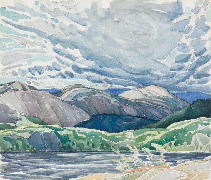
The Severn, circa 1922 oil on board signed, titled and inscribed "$35" and "Lansing" on the reverse 10 ins x 12 ins; 25.5 cms x 30.5 cms
PROVENANCE
Wedding Gift from the Artist By descent to a Private Collection, Toronto By descent to the present Private Collection
EXHIBITED
Possibly Exhibition of Small Pictures and Sculpture, Ontario Society of Artists, Toronto, 1 December 1922-1 January 1923 as On the Severn
LITERATURE
Margaret Gray, Margaret Rand, Lois Steen, A.J. Casson (Canadian Artists 1), Agincourt, Ontario, 1976
Paul Duval and A.J. Casson, A.J. Casson: My Favorite Watercolours, 1919-1957, Toronto, 1982
Megan Bice, Light & Shadow: The Work of Franklin Carmichael, Kleinburg, 1999
Janet Arnett, “Review of James T. Angus, Severn River: An Illustrated History,” [online publication], Canadian Book Review Annual Online, 1995, accessed 10 October 2025
In October 1922, Franklin Carmichael made the first of three known trips to the Severn River, a waterway that joins the north end of Lake Couchiching and Georgian Bay, bridging Simcoe County and the south end of the Muskoka District. The Severn River is part of the larger Trent-Severn Waterway, Canada’s national canal system, completed in 1922. The waterway comprised of natural and man-made elements was designated a Canadian National Historic Site because of its strategic importance as a transportation route. As Janet Arnett has
observed, the Severn was “once the spinal cord for a rapacious lumber industry.” By the time that Carmichael made his way to the region in 1922, new growth forests would have been returning to the stripped nineteenth-century landscape. Carmichael’s The Severn features a foreground spread of such short regrowth in a tangle of orange, red, green and ochre leaves and berries, from maple, oak and sumac trees. In the background, though, the hills remain largely bare, a reminder of the deforestation that had occurred. Between foreground and background, the Severn River bisects the composition.
Carmichael’s early works of the Severn River are by no means numerous, despite his additional trips there in 1923, and again in 1929, which led to his impressive studio watercolour, Old Sawmills, Severn Bridge, 1930 (McMichael Canadian Art Collection, 1974.14). The 1922 Exhibition of Small Pictures and Sculpture by Members of the Ontario Society of Artists documents that Carmichael exhibited one sketch from his travels called On the Severn. Carmichael inscribed $35 on the back of this sketch, an indicator that he possibly had it for sale in this exhibition. Based on the subject of this sketch and his other Severn works, Carmichael’s interest in the area was prompted by the history of lumbering, the deforestation left behind, and the abandoned sawmills. The 1922 sketches he produced would have marked the beginnings of Carmichael’s interest in depicting such human settlements and industrial subjects, which he pursued in the years ahead.
Carmichael’s trip to the Severn River in 1922 was the farthest from Toronto he had yet travelled. Still, it could be accommodated in a short weekend excursion, but not by himself. By 1922, Carmichael had invested heavily in his apprentice, A.J. Casson, who he had hired in 1919, at the design firm of Rous and Mann. From the outset, Carmichael supported the development of Casson’s landscape painting practice outside of work. It was in the Carmichael family car, nicknamed “Old Bell,” that Carmichael and Casson ventured forth to the Severn River in October 1922. Casson vividly recalled the travails of their trip and the high expectations Carmichael held for those whose work he endorsed. He explained: “We’d stay overnight in an old hotel on Friday, get up at 7 Saturday morning and go to Severn Bridge and paint all day, and all day Sunday, and we’d get home to Toronto around 9 P.M. Mrs. Carmichael would give us our dinner and then Frank would have a hundred things for me to see, and about twelve midnight
I’d pry myself away and catch the radial car on Yonge Street to the city limits (now Summerhill) then the Yonge car, then the Bloor car. I’d get home about 3 A.M. and have to be at work the next morning by 8 A.M. But if I didn’t do that, Frank wouldn’t have anything to do with me.” Despite the trials Casson endured, these years were the gestation of an enduring friendship between them. Casson, who remained indebted to his mentor’s support, recalled in 1982, “Frank took a personal interest in me and was more influential than any other single person in shaping my career as an artist.”
We extend our thanks to Catharine Mastin, PhD, art historian, curator, and Adjunct Member of the Faculty of Graduate Studies in Art History at York University for contributing the preceding essay. Catharine curated the exhibition Franklin Carmichael: Portrait of a Spiritualist, organized by the National Gallery of Canada, Ottawa, which toured Canada between 1999 and 2001.
$60,000–$80,000
HARRIS
On the North Shore (ID 763), 1928 ink and gouache on paper mounted to card inscribed "763" on the reverse of the card backing; titled on a gallery label on the reverse 6 ins x 6.75 ins; 15.2 cms x 17.1 cms
PROVENANCE
The Artist
By descent to Howard Kilbourne Harris Estate of Howard K. Harris, 1976, no. 38 as Ellesmere Island ? Masters Gallery, Calgary, circa 1980 Private Collection
LITERATURE
Paul Duval, Lawren Harris: Where the Universe Sings, Toronto, 2011, reproduced page 177 as On the North Shore, circa 1923 Exhibitions Curatorial Box 23, File 1: Harris Retrospective 1948 and Photographs of Canadian Art, Box 6, File 30, AGO Archives, E.P. Taylor Library & Archives, Art Gallery of Ontario, Toronto The Canadian Forum , VIII 91 (April 1928), reproduced page 609
Paul Duval, Group of Seven Drawings, Toronto, 1965, reproduced plate 31
Emily Carr, Hundreds & Thousands, Toronto/Vancouver, 1966, page 15
Joan Murray and Robert Fulford, The Beginning of Vision: The Drawings of Lawren Harris, Toronto, 1982, pages 26, 90-91 Joyner Fine Art Canadian Art Auction, Toronto, 22-23 November 1988, see lot 235 for a related ink drawing
The first issue of The Canadian Forum , an outgrowth of the University of Toronto periodical The Rebel, was published in October 1920. The periodical’s goals were clearly articulated. “The Canadian Forum had its origin in a desire to secure a freer and more informed discussion of public questions and, ... to trace and value those developments of art and letters which are distinctly Canadian.” Close associates of the Group of Seven, Barker Fairley and Peter Sandiford, were among the periodical’s first directors, providing regular coverage of the Canadian art scene, and articles and drawings by individual Group members
Lake Superior (Lake Superior Painting XIX), circa 1927-1928 oil on canvas, 111.8 x 126.9 cms
The Thomson Collection at the Art Gallery of Ontario (103943) Not for sale with this lot
were frequently published in its pages throughout the 1920s. A pre-war graphite drawing of Old Toronto by Lawren Harris was reproduced in the issue of May 1921 and the following month a lovely brush and ink drawing of houses in the Ward. This and future drawings by Harris in The Canadian Forum provided a starker and more effective contrast of black and white and were undoubtedly the instigation for the photo lithographs reproduced in Canadian Drawings by Members of the Group of Seven and launched at the Group’s exhibition in January 1925.
The drawing being offered here bears an evident relation to the canvas Lake Superior now in the Thomson Collection at the Art Gallery of Ontario. A graphite drawing related to the canvas appears to have been the initial concept but both that drawing and On the North Shore have important differences in composition. In both the final canvas and this ink drawing the stylized shafts of light shine down starkly through the curvilinear clouds onto the rocky islands and water. The foreground is characteristically defined by a rocky shore, almost a platform from which the viewer can take in the vast panorama. The conical island defines the centre of the composition in both the ink drawing and painting but in On the North Shore, a broken tree trunk projects lower left and the foreground is framed by additional light shafts on either side. Gouache was a common medium used to cover changes in a composition and was used here to clarify the lines in the light shaft in the left foreground and to break up the details in the repeated lines in the water and clouds upper right. These were not visible when reproduced in the periodical.
In December 1927, Emily Carr visited Harris in his studio and closely observed the painting he was working on, “a big canvas–rock forms in deep purples with three large rocks in the middle distance. The sky was wonderful–swirly ripples with exciting rhythms running through them. The right corner was in brilliant light and from under the cloud shafts of strong sun pierced down on the rocks in straight wide beams that made a glowing pool of pure light on the water that lay flat and still. Behind, was a deep, rich blue distance. To the right the shafts of light turned it paler green-blue. On the other side a blinding blue played richly with the purple rocks. Under the left side of the rippling, swirling grey cloud forms the water lay flat in blue-grey wonderfulness. The foreground was unfinished but would be dark rocks. There was a wonderful feeling of space.” This was clearly the Thomson Collection Lake Superior canvas, but unfinished.
Lawren S. Harris
Lake Superior (ID 463) pencil sketch, 21.6 x 27.3 cms
Private Collection (Sold at Cowley Abbott, 23 November 2017, lot 33) Price Realized $161,000 Not for sale with this lot
In the Group of Seven exhibition in February 1928, Harris showed two paintings curiously titled, Design for a Chapel and A Fantasy The former is the painting currently titled Figure with Rays of Light, also in the Thomson Collection and previously sold by Sotheby’s in association with Ritchie’s in Toronto in May 2006. A sarcastic review (“Junk Clutters Art Gallery Walls While Real Paintings Are Hidden in Cellar,” Toronto Telegram, 18 February 1928) compared Design for a Chapel to “a peeled banana of gigantic size standing on end before a display of northern lights,” confirming the identification. But of the painting titled A Fantasy the reviewers gave no clue save to characterize it and others that Harris exhibited as “pure abstraction” (Fred Jacob, “In the Art Galleries,” Mail & Empire, 18 February 1928).
In 1947, the Art Gallery of Toronto prepared a major retrospective of Lawren Harris’ career. Harris was then living in Vancouver and many of his paintings were in storage in Toronto. The correspondence between Sidney Key, the gallery’s curator, and Harris provides several insights into the artist’s working process and evaluation of his own paintings. The Thomson canvas Lake Superior was in Toronto and on 27 August 1948, Key suggested its inclusion, referring to it as Lake Superior Fantasy. “The title was suggested by Dr. Jackson.” Jackson’s memory might suggest that the canvas was the painting
shown in 1928 but on 2 September Harris responded, “No. 61 Lake Superior Fantasy (unfinished)... I would exclude... Lake Superior Fantasy was never exhibited because to my mind it was not successful. I made a drawing of it but never repainted the thing with improvements in the drawing.” The drawing Harris refers to here is On the North Shore reproduced in The Canadian Forum in April 1928.
In her book on Lawren Harris’ drawings Joan Murray quotes Harris’s fellow artist and friend Yvonne McKague Housser. “His drawings are a key which open the door to what he was thinking and painting… The drawings were important as an introduction, to clarify his mind before he started a painting.” In this case, the graphite drawing was a preliminary introduction and On the North Shore an intermediate step in the process, post-dating the painting Carr saw in December 1927 but preceding the final canvas as known today.
We extend our thanks to Charles Hill, Canadian art historian, former Curator of Canadian Art at the National Gallery of Canada and author of The Group of Seven: Art for a Nation , for contributing the preceding essay.
$40,000–$60,000
FRANK HANS JOHNSTON
Waterfall, Algoma, 1920 oil on board
signed lower left; titled and dated 1920 on a gallery label on the reverse 13.75 ins x 8.75 ins; 34.9 cms x 22.2 cms
Dominion Gallery, Montreal
A. K. Prakash & Associates Inc., Toronto The Art Emporium, Vancouver Masters Gallery, Calgary Private Collection, Toronto
LITERATURE
F.H. Johnston, Toronto to Eric Brown, Ottawa, File 5.42 Johnston, Library and Archives, National Gallery of Canada, Ottawa “Etchings Predominate at Art Exhibition”, Daily Star, Toronto (3 May 1919)
Algoma is intimately associated with the early history of the Group of Seven, inspiring their bold new explorations in the years following World War I. Twenty-five Algoma subjects were included in the first Group of Seven exhibition in May 1920. In August 1918, Frank Hans Johnston received a commission to draw and paint the activities of the flight training schools in southern Ontario for the Canadian War Memorials program; however, a trip to Algoma with Lawren Harris and J.E.H. MacDonald in October interrupted his war work and set him off in a new direction. “Our trip north was a great success –we struck new country in every respect and had a wonderful time sketching for all that was in us,” he wrote to Eric Brown, director of the National Gallery.
Johnston had fifty-seven works in the Algoma exhibition at the Art Museum of Toronto in late April 1919, fifty-one sketches of varying dimensions, and six larger canvases previously shown with the Ontario Society of Artists in March. The writer in the Toronto Daily Star admired Johnston’s contributions, stating, “Mr. Johnston sees nature much as a huge decoration‒the blue and purple mountains with a glimpse of orange sky; the sparkle of autumn foliage against the molten grey of a placid lake‒he eliminates detail and finds wide unbroken expanses.”
In September 1919, Johnston returned to Algoma with Harris, MacDonald and A.Y. Jackson, prior to the first Group exhibition in May 1920. Waterfall, Algoma contains Johnston’s signature loose and expressive brushwork of his early style, with simplified forms that give the composition a quasi-abstract appearance.
Having encountered financial difficulties constructing a house in Toronto, in the fall of 1920, Johnston moved his family to Winnipeg, where he taught at the city’s art school and directed the public gallery. In January 1922, he held an exhibition at the Winnipeg Art Gallery that included three hundred and twenty-six works of which over one hundred bore Algoma titles. In spite of the great number of Algoma subjects he painted, they remain relatively rare today.
$100,000–$150,000
ALBERT HENRY ROBINSON
Spring Frechette, Chaudière River, 1920 oil on board
signed lower left; titled on the reverse 11 ins x 12.75 ins; 27.9 cms x 32.4 cms
PROVENANCE
Private Collection
LITERATURE
Thomas R. Lee, Albert H. Robinson: "The Painter's Painter", Montreal, 1956, unpaginated, see "Chaudière in Spate"
Born in Hamilton, Ontario, Albert Henry Robinson left Canada to pursue academic training in Paris in 1903, where he studied at the Académie Julian under William-Adolphe Bouguereau and at the École des beaux-arts. Having received formal European training, Robinson would remain faithful to his Canadian roots, returning to paint the rural landscapes of Ontario and Quebec for the remainder of his career alongside Clarence Gagnon, Edwin Holgate, and A.Y. Jackson.
With the support of two patrons in 1907, Robinson relocated to Montreal, where he established his studio and met with prominent artists William Brymner and Maurice Cullen. Robinson exhibited with the Royal Canadian Academy of Arts from 1909 to 1933 and then with the Canadian Group of Painters, of which he was a founding member. Robinson was inducted into the Royal Canadian Academy of Arts in 1920, the same year in which he participated as a guest artist at the inaugural exhibition of the Group of Seven in Toronto.
Beginning in 1921, Robinson made annual sketching trips in late winter and early spring along the Saint Lawrence below Quebec City. This painting, Spring Frechette, Chaudière River, would have been made during one of these early trips, possibly accompanied by A.Y. Jackson. The oil sketch, which is a preparatory work for a larger canvas, illustrates the shift from winter to spring, with bare trees and melting snow. Robinson also made annual trips to the north shore throughout the 1920s and early 1930s, such as the picturesque Beaupré and Charlevoix counties, including Saint-Tite-des-Caps, Baie-Saint- Paul, Les Éboulements, Murray Bay (now La Malbaie), Saint-Fidèle and Saint-Siméon.
$10,000–$15,000
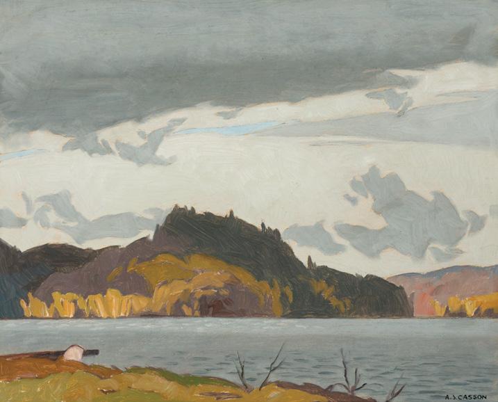
ALFRED JOSEPH CASSON
Clearing After Rain (South Portage), 1972 oil on board
signed lower right; signed, titled and dated 1972 on the reverse 12 ins x 15 ins; 30.5 cms x 38.1 cms
PROVENANCE
Roberts Gallery, Toronto Private Collection, Toronto
LITERATURE
Joan Murray, A. J. Casson , Windsor, 1978, pages 3, 32
Painted in 1972, Clearing After Rain (South Portage) is a striking example of A.J. Casson’s mature and atmospheric vision of the Ontario landscape. Situated at the southern edge of Algonquin Park, the rolling hills of South Portage and its dramatic cloud formations suited Casson’s interest in atmosphere and composition. In this work, the air sits heavy with moisture as clouds have begun to recede into the distance. The presence of the recently ended storm still looms in this scene as the lake and trees in the distance appear darkened.
By the time this work was completed, Casson was well into his fulltime painting career, which began following his retirement in 1958 as Vice-President and Art Director at Sampson-Matthews. Freed from the demands of work, Casson entered a period of complete focus on artistic production. During this time, Casson further explored Ontario, incorporating small-town scenes into his work, as well as revisiting the varied terrains of his early career locations.
Clearing After Rain (South Portage) exemplifies Casson’s late-career refinement to utilize a softer colour palette to define a dramatic landscape.
$18,000–$22,000
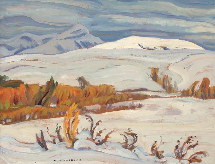
Catharine Mastin, The Group of Seven in Western Canada , Calgary, 2002, no. 160, listed page 203
Snow in September, 1947 oil on board
signed lower left; titled, dated "September 19th, 1947" and inscribed "Bar X Ranch" on the reverse; titled and dated on the gallery and exhibition labels on the reverse
10.5 ins x 13.5 ins; 26.7 cms x 34.3 cms
PROVENANCE
F.E.M. Robinson
R. Carshell, Calgary (owner of Bar X Ranch) Masters Gallery, Calgary Private Collection
EXHIBITED
Trailblazer Donor Event, Glenbow Museum, Calgary, 12 May 1999
The Group of Seven in Western Canada ; travelling to the Glenbow Museum, Calgary; Art Gallery of Nova Scotia; Winnipeg Art Gallery; Art Gallery of Greater Victoria and the National Gallery of Canada, Ottawa, 13 July 2002-2 January 2004, no. 160
Snow in September belongs to A.Y. Jackson’s lifelong practice of sketching small, portable works in the wilderness, which are then brought into the studio as a reference for much larger canvases. By the late 1940s, Jackson spent much of his time in Alberta painting grain elevators and snowy peaks while also spending his summers teaching at the Banff School of Fine Arts. Just as in his own practice, Jackson would regularly take his students outdoors to sketch nature.
Jackson’s work from this period is often more painterly and without a focus on a single dominant element that was typified in his earlier pieces. In Snow in September, Jackson treats the cloudy sky, distant mountains, and swaying foliage with equal attention. Rather than focusing on a singular element, the composition emphasizes the movement shared among the elements. The bending foliage echoes the twisting snow, creating a harmonious rhythm that enlivens and animates what is otherwise a quiet and sparse scene.
$15,000–$25,000
Un dimanche humide, Rue St. Olivier, Quebec, 1983 oil on canvas
signed lower right; signed, titled "Une dimanche humid, Rue St. Olivier, Quebec" [sic] and dated 1983 on the reverse 24 ins x 30 ins; 61 cms x 76.2 cms
PROVENANCE
Galerie Eric Klinkhoff, Montreal Private Collection, Montreal
John Little captures the charm and nostalgia of the residential streets of Quebec City and Montreal through much of his body of work. With particular attention paid to architectural accuracy–influenced by his time working with his father's architectural firm, Luke and Little–Un dimanche humide, Rue St. Olivier, Quebec exemplifies the artist's devotion to capturing urban life in Quebec winter. Snowbank-lined walkways trampled down by pedestrians offer the viewer a decidedly inhabited feel as opposed to the barren landscapes of traditional Canadian art. The viewer stands at street level behind two figures entering a row house, thus becoming an active participant in the scene.
$20,000–$30,000
Mabel Lockerby, Pegi Nicol MacLeod, Kathleen Morris, Marian Scott, Art Gallery of Toronto, January 1941
Yellow House, St. Sauveur, Quebec, circa 1930s oil on board
signed twice lower right; titled on a label on the reverse 10.5 ins x 14 ins; 26.7 cms x 35.6 cms
PROVENANCE
Wedding gift from the Artist to Mr. and Mrs. Morris, Ottawa, 16 October 1948
By descent to a Private Collection, Ontario
A. K. Prakash & Associates Inc., Toronto Waddington's, auction, Toronto, 23 November 2015, lot 42 Private Collection
EXHIBITED
Possibly Fifty-Second Annual Exhibition, Royal Canadian Academy of Arts, Art Association of Montreal, 19 November-20 December 1931, no. 199 as St. Sauveur, Quebec
Possibly Fifty-Ninth Annual Exhibition, Royal Canadian Academy of Arts, Art Gallery of Toronto, 16 November-16 December 1938, no. 160 as St. Sauveur
Kathleen Moir Morris, Mabel Lockerby, Pegi Nicol and Marian Scott, Print Room, Art Gallery of Toronto, 1941 dated 1934
Evelyn Walters, Women of Beaver Hall: Canadian Modernist Painters, Toronto, 2005, page 79
A distinguished member of the Beaver Hall Group and the Canadian Group of Painters, Kathleen Moir Morris is celebrated for her wintery Quebec and Montreal scenes. Morris’s distinctive style, characterized by simplified forms and bold colours, captures the spirit of urban and rural life during the coldest months. Painting en plein air, Morris was undeterred by the deep snow or freezing temperatures. Bundled in a fur coat, Morris often stood directly in sleigh tracks to capture snowcovered houses and churches. This direct engagement with the subject imbues an immediacy and authenticity as evidenced in her sketches.
In 1962, art critic Dorothy Pfeiffer remarked on Morris’s “sense of joie de vivre; her clever use of dabs and dashes of brilliant orange-red livens every canvas”. In Yellow House, St. Sauveur, Quebec, Morris uses the same colouring with orange-red dabs in the figure’s hat and scarf, bringing to life a scene otherwise dampened by the thick layer of snow. Morris is playful in not just her paint choice but also the handling of her brush. Thick application of white, yellow, brown and grey reduces her forms into essential elements, creating a sense of movement in this quiet scene. This simplified, yet expressive approach animates the everyday with warmth and vitality.
$20,000–$30,000

Cowley Abbott Consignor Auctions Ltd.
326 Dundas Street West, Toronto, ON M5T 1G5 mail@cowleyabbott.ca www.cowleyabbott.ca
416-479-9703 1-866-931-8415 (toll-free)
Rob Cowley President Managing Director
Lydia Abbott Vice-President Director of Fine Art
Ryan Mayberry Vice-President Technology
Peter Ohler
Western Canada Representative Head of Private Sales
Duane Imambaksh Director of Technology & Innovation
Katherine Meredith Montreal Representative
Canadian Art canadianart@cowleyabbott.ca
International Art internationalart@cowleyabbott.ca
Private Sales privatesales@cowleyabbott.ca
Appraisals & Valuations appraisals@cowleyabbott.ca
Client Services admin@cowleyabbott.ca
Shipping shipping@cowleyabbott.ca
Canadian Art Department
Anna Holmes
Eryn Brobyn
Katherine Meredith
Patrick Staheli
International Art Department
Perry Tung
Catherine Lacroix
Katherine Meredith
Appraisals & Valuations
Leah Carey
Nicole Plaskett
Catherine Lacroix
Client Services
Nicole Plaskett
Julia De Kwant
Inventory & Logistics
Sydney Rodrigues
Matthew Ohler
Finance
Radek Costa-Sarnicki
Heena Shaik
Photography
Ibrahim Abusitta
Michael Cullen
Catalogue Production & Design
Anna Holmes
Patrick Staheli
Catherine Lacroix
Katherine Meredith
Sydney Rodrigues

Peter Ohler combines connoisseurship with personalized marketing strategies to connect clients with a broad network of collectors, ensuring confidential and convenient transactions at mutually agreed-upon prices. Whether you are searching for a specific artist or have longterm collecting goals, Peter Ohler is dedicated to providing a customized experience.
Peter Ohler
Western Canada Representative Director of Private Sales
peter@cowleyabbott.ca


We provide formal written appraisals of fine art for private collectors, corporations, wealth advisors, lawyers and art advisors. Our appraisers have decades of relevant art market experience, are credentialed members of the International Society of Appraisers (ISA) and are compliant with the Uniform Standards of Professional Appraisal Practice (USPAP). Written to the highest industry standards, our valuations provide current art market insight for estate planning, donation or insurance purposes.
Leah L. Carey Senior Advisor Director of Appraisals & Valuations appraisals@cowleyabbott.ca
This selling exhibition highlights the extraordinary range of Blackwood’s practice and a lifetime of artistic experimentation. Featuring etchings and aquatints, watercolours, drawings, copperplates and an encaustic on built wood panel, this selection of artworks reflects the artist’s lifelong dedication to telling the stories of Newfoundland and Labrador. Among the highlights are twelve prints also on view in the Art Gallery of Ontario’s current exhibition, David Blackwood: Myth & Legend, including iconic works such as The Flora S. Nickerson in the Labrador Sea and April Iceberg Off Bragg’s Island.
October 7 - December 4, 2025

The provisions of these Terms and Conditions of Sale shall govern any proposed or actual transaction between Cowley Abbott (aka Consignor Auctions Limited) (“CAL”) and the prospective buyer/ bidder (“Bidder”). CAL is acting as agent for the person who has consigned the property to CAL for sale, whether as principal, owner or agent (“Consignor”).
1. The descriptions of items offered by CAL (“Property”), including artist, title, medium, size, date of execution, provenance, exhibition history, inclusion/reproduction within literature sources, attribution and genuineness, are subject to change leading to the final sale of said Property (including the process during which bidding is active for the Property during CAL online auctions). Descriptions of Property provided by CAL are not meant to stand as a representation to Bidders and no guarantee or warranty of complete accuracy of the provided descriptions is intended or should be assumed. Bidders are provided the opportunity to view and inspect all Property offered for sale by CAL through public and/or pre‒arranged private viewings prior to a sale’s completion. No sale shall be rescinded due to a lack of correspondence between the provided description of the Property by CAL and the Property itself, including the illustration of the Property provided by CAL. It is the sole responsibility of a Bidder to make arrangements for the inspection of the Property of interest (by the Bidder itself and/ or by the Bidder’s advisers) prior to sale, and to bid in accordance to this actual inspection and/or reliance upon their advisers’ guidance.
2. The Bidder who has successfully bid on Property (the “Successful Bidder”) confirms that any claims relating thereto shall be claims against Consignor, without recourse to CAL. CAL represents the Consignor exclusively and makes no representation or warranty, express or implied, regarding legal title or ownership of the Property offered by CAL and has relied upon the Consignor confirming same to CAL, without further independent investigation. The Bidder shall be solely responsible for satisfying itself of the legal title or ownership of the Property and liens or encumbrances affecting same and the capacity of the Consignor to sell the Property offered.
However, notwithstanding the stipulations listed above, the Successful Bidder may make arrangements for a recognized and fully‒qualified authority, who is accepted by CAL, to inspect the Property prior to collection by the Successful Bidder from CAL’s premises. Should this authority submit in writing to CAL a statement regarding the challenge of genuineness and/ or authenticity of the lot in question, the sale can be rescinded by CAL and a full refund will be provided to the Successful Bidder. The above process must take place within seven days of the final sale of the Property.
3. CAL is pleased to offer a service of providing condition reports on the lots which are offered through its auctions. Please note that these reports are matters of opinion and are prepared by CAL specialists and are not a substitute for a physical inspection of the artwork by the Bidder or their advisors. CAL specialists are not trained restorers and the provided condition reports are not meant to equal a comprehensive report created by a professional restorer. The reports provided by CAL are meant to provide assistance to the Bidder through observations of the artwork and the report will not disclose any imperfections which might be revealed through the process of subsequent restoration. In all cases, the Bidder is advised to consult their own conservator for a complete report with regard to condition (CAL is happy to provide access to the artwork by conservators through public previews and private pre‒arranged appointments). Bidders should be aware that CAL’s warranties with regard to the Property offered through their auctions are limited to the terms listed in the Terms and Conditions of Sale and in no case extend to the condition of the artwork.
4. A buyer’s premium of 20% of the successful bid price is to be paid by the Successful Bidder to CAL as part of the purchase price (a buyer’s premium of 21% of the successful bid price is to be paid by the Successful Bidder to CAL as part of the purchase price where the Auction Mobility technology is used to bid successfully during a live/catalogue auction). In addition, 13% HST (Harmonized Sales Tax) is applied to the successful bid (hammer) price and buyer’s premium. However, HST will not be charged on purchased Property which is shipped outside of Canada. Where purchased Property is shipped outside of the Province of Ontario but within Canada, the applicable HST or GST will be charged based on the tax applications within the province or territory of destination. In both cases, the Property must be collected from the offices of CAL with a waybill provided indicating the destination. It is the sole responsibility of the Purchaser to provide acceptable details and make the necessary arrangements to meet the requirements for altered tax responsibilities based on the destination of the shipped Property. Alterations of invoices and/ or crediting of tax payments will not be completed once CAL has released the Property.
5. The Bidder acknowledges that CAL may collect a commission and associated fees through its agreement with the Consignor of a lot included in a CAL auction.
6. Purchases completed through CAL auctions are not represented to necessarily include copyright allowances to the Successful Bidder for the purchased Property.
7. CAL reserves the right to withdraw any Property from sale for any reason whatsoever and without liability. This withdrawal may occur up to the close of bidding for the Property. CAL also reserves the right to divide lots of Property into smaller lots or to combine individual lots of Property into larger lots. The above can be carried out at the sole discretion of CAL and can occur without notice.
8. Each Bidder must register with CAL, agreeing to the Terms and Conditions of Sale. Registered Bidders represent that they are bidding on their own behalf and are responsible for those lots in which they are the successful high bidder (becoming the Purchaser or Successful Bidder). In the event that a registered Bidder is representing another party, CAL must be contacted regarding this arrangement at least twenty‒four hours prior to the opening of bidding for a particular auction and CAL reserves the right to refuse this arrangement for any reason whatsoever. Failure to abide by this provision shall entitle CAL to deem the Bidder as bidding on its own behalf. Splitting of and/or transferring of an invoice to an individual and/or organization other than the registered Bidder can only be completed at the discretion of CAL and must meet the requirements of such an amendment, including written authorization from both the registered Bidder and its beneficial buyer and the individual or representative of the individual who will become the new invoiced client in such an arrangement.
9. CAL reserves the right to refuse any bid and/or bidd ing registration application at their absolute discretion. Further, CAL also reserves the right to suspend or cancel any account used for bidding at their sole and absolute discretion. CAL also reserves the right to refuse any bid which is not in relation to the provided pre‒sale auction estimate provided by CAL and also reserves the right to not accept a bid recognized to not fall within the set bidding increments during sale. Additionally, CAL reserves the right to accept any bid which does not meet any pre‒established reserve. In no instance may a Bidder withdraw or alter their submitted bid.
10. CAL reserves the right to accept and execute absentee or telephone bids on behalf of prospective purchasers, unable to directly participate in the particular auction. In such a case, CAL provides the service of absentee or telephone bidding as a privilege and shall not be responsible for failure to execute the absentee bid(s)
for any reason whatsoever and shall also not be responsible for errors and/or omissions related to the process. Bidders who wish to employ CAL in the process of absentee or telephone bidding must complete and sign the required documentation (absentee/ telephone bidding form) prior to the start of bidding for the particular auction. In the event that two identical absentee bids are submitted to CAL, the bid which is received earlier (and which has been submitted through a completed and signed absentee bidding form) will take precedence over the later bid(s), allowing the earlier submitted bid(s) to potentially purchase the lot(s) at bid level submitted.
CAL reserves the right to request and charge a deposit to a Bidder submitting an absentee or telephone bid, in relation to the value of the artwork, to a maximum of $10,000 CAD. CAL reserves the right to hold and apply this Deposit to the invoice, should the Bidder become the Successful Bidder. In the event that final payment and invoice settlement is not made within 30 days following the completion of the live auction, then CAL shall have the right to rescind the purchase and the Deposit shall be retained by CAL as liquidated damages. In the event that the Bidder is not successful, the Deposit will be refunded within 10 business days following the completion of the auction.
11. CAL is pleased to provide the opportunity for bidders to participate through online bidding during live auctions via Auction Mobility, a third‒party provider of these services. Please be aware that CAL is not responsible for errors or issues associated with this service which may have an adverse effect on the Client’s ability to bid. A buyer’s premium of 21% of the successful bid price is to be paid by the Successful Bidder to CAL as part of the purchase price where the Auction Mobility technology is used to bid successfully during a live/catalogue auction.
12. At the completion of the sale, the Successful Bidder shall be recognized as the Purchaser and shall then take on complete responsibility and risk for the purchased Property, adhering to all of the Terms and Conditions of Sale. In the event of a dispute between the Successful Bidder and any other Bidder regarding the result of the auction, CAL will have absolute discretion to rescind any transaction with the Successful Bidder and designate a new winning buyer or to withdraw the Property from the auction. In such a case, CAL may choose to re‒offer the Property in a future auction or private sale. In all such cases, final decision shall be made solely by CAL.
13. The Successful Bidder shall make arrangements with CAL for the payment of the whole invoiced amount following the immediate close of the auction, unless alternate arrangements are agreed by CAL for payment of a portion of the invoiced amount. Until full and final settlement of the invoice is completed by the Successful Bidder, the purchased Property will not be released to the Successful Bidder. Failure to pay for purchases may lead to the cancellation of the sale with no promise of re‒offering in a future auction. In the event of failure of payment by the Successful Bidder, CAL reserves the right to suspend and/or delete the bidding account of the Bidder and/or their representatives, all at the sole discretion of CAL. The artwork must be collected by the Successful Bidder or his/her representative or delivered to the shipping destination within 14 days of the invoice date.
14. Immediately following the completion of a CAL online auction, the Successful Bidder shall be charged 10% up to a maximum of $10,000 of the hammer price (the “Deposit”), which amount will be held as a deposit against payment for the Property purchased. The Successful Bidder hereby authorizes CAL to charge the Successful Bidder’s registered credit card with the Deposit. The Successful Bidder shall settle final payment and collect their purchase(s) from CAL within five business days following the completion of any CAL auction. Failure to settle payment and/ or collect the property from CAL within five business days may lead to monthly interest charges of 1.5% in addition to the invoice
amount and/or storage charges for the Property being held on the premises of CAL. Property being held by CAL is being stored at the sole risk of the Successful Bidder and may be stored either on the premises of CAL or at a secondary storage location. In the event that final payment is not made within 30 days following the completion of the auction, then CAL shall have the right to rescind the purchase and, if it is in an online CAL auction, the Deposit shall be retained by CAL as liquidated damages.
15. CAL, its employees or agents, shall not be liable for the loss or damage of any Property purchased through a CAL auction (through negligence or otherwise) while the Property remains in the possession of CAL and once the allowed five business days following an auction closure or completion of a private sale has passed.
16. In any event resulting in failure by the Successful Bidder (Purchaser) to pay for Property purchased either through the defined auction process or a private sale within the five day period following the sale, CAL, in its sole discretion, may re‒offer the Property in question without limiting the terms in place with the Consignor of the Property. Should CAL reoffer the Property, the original Successful Bidder (Purchaser) shall be responsible to CAL and the Consignor for the following: any difference marked as a deficiency between the price achieved and amount invoiced upon the re‒sale of the Property versus the price achieved and amount invoiced to the Purchaser upon the original sale of the Property; any storage charges to CAL for the holding of the Property between its original offering and the reoffering; and the total in sales commissions which CAL would have collected had the original sale of the Property been completed.
17. CAL accepts payment by cash, certified cheque, wire transfer, VISA, Mastercard and/or American Express (AMEX) for the settlement of invoices. Credit card purchases are limited to a maximum of $25,000 CAD and the credit card holder must be present at the time of payment. Artwork purchased with a certified cheque will not be released by CAL until the clearance of the cheque has been confirmed by CAL’s bank. Payments arranged by wire transfer may be subject to administrative charges related to the transfer and banking processes.
18. CAL is pleased to assist clients in arranging for the shipment of their artwork from our Toronto premises. However, it is the responsibility of the Successful Bidder to make these arrangements in full, including the packing, insuring and actual shipment of the Property. Assistance provided by CAL in this regard is provided as a service and CAL carries absolutely no liability through this courtesy. CAL carries absolutely no liability to possible damage of framing (including glass) during shipment arranged by CAL or otherwise.
19. Without limitation, the Purchaser accepts that any lot (Property) purchased through CAL may be subject to provisions of the Cultural Property Export and Import Act (Canada).
20. CAL reserves the right to refuse admission, enrolment and/ or participation in any of their events and/or auctions. Further, CAL reserves the right to refuse admission to their premises to any individual or group of individuals.
21. These Terms and Conditions of Sale and all agreements related to the business of CAL shall be construed under the laws of Ontario and the parties hereby attorn to the exclusive jurisdiction of the Ontario Courts.
22. This agreement may be executed and delivered in a number of counterparts, each of which when executed and delivered is an original but all of which taken together constitute, as applicable, one and the same instrument.
Bell Eastlake, Mary Alexandra (1864-1951) 40
Blackwood, David Lloyd (1941-2022) 38
Borduas, Paul-Émile (1905-1960) 13, 24
Brooker, Bertram Richard (1888-1955) 30
Bush, Jack Hamilton (1909-1977) 31, 34
Carmichael, Franklin (1890-1945) 5, 6, 75, 76
Carr, Emily (1871-1945) 7, 8, 9, 26, 39
Casson, Alfred Joseph (1898-1992) 4, 46, 57, 58, 80
Dorland, Kim (b. 1974) 72
Etrog, Sorel (1933-2014) 70, 71
Ferron, Marcelle (1924-2001) 19
FitzGerald, Lionel LeMoine (1890-1956) 29
Gagnon, Clarence Alphonse (1881-1942) 41
Gaucher, Yves (1934-2000) 20
Gervais, Lise (1933-1998) 18
Hamel, Théophile (1817-1870) 25 Harris, Lawren Stewart (1885-1970) 43, 77
Iskowitz, Gershon (1919-1988) 69
Jackson, Alexander Young (1882-1974) 1, 23, 47, 81
Janvier, Alex Simeon (1935-2024) 64
Johnston, Frank Hans (1888-19490 3, 78
Kurelek, William (1927-1977) 35, 56
Lemieux, Jean Paul (1904-1990) 15, 74
Letendre, Rita (1928-2021) 17, 27, 61, 63
Lismer, Arthur (1885-1969) 2, 59
Little, John (1928-2024) 82
Marcil, René (1917-1993) 66
McCarthy, Doris Jean (1910-2010) 28, 44
Milne, David Brown (1882-1953) 36, 55, 73
Monkman, Kent (b. 1965) 48
Morrice, James Wilson (1865-1924) 11, 49, 50, 51 52, 53, 54 Morris, Kathleen Moir (1893-1986) 83
Morrisseau, Norval (1931-2007) 65
Pachter, Charles (b. 1942) 62
Pellan, Alfred (1906-1988) 14, 21
Perehudoff, William (1918-2013) 33, 67 Pilot, Robert Wakeham (1898-1967) 22
Riopelle, Jean Paul (1923-2002) 12, 16
Robinson, Albert Henry (1881-1956) 79
Sheppard, Peter Clapham (1882-1965) 45
Smith, Gordon Appelbe (1919-2020) 32, 68
Thomasos, Denyse (1964-2012) 60
Varley, Frederick Horsman (1881-1969) 10
Front Cover
Jean Paul Riopelle, Sans titre, 1950 (detail) (Lot 12)
Back Cover
Lawren Stewart Harris, On the North Shore, 1928 (Lot 77)
Inside Front Cover
Paul-Émile Borduas, Abstraction no. 10 ou Figure athénienne, 1942 (detail) (Lot 13)
Inside Back Cover
Frederick Horsman Varley, Dorothy, 1925 (detail) (Lot 10)
Artwork Features
Page 1: Denyse Thomasos, Untitled, 2012 (Lot 60)
Page 2: Lionel LeMoine FitzGerald, Still Life with Hat, 1955 (Lot 29)
Page 4: Rita Letendre, Sans titre (Lot 61)
Pages 26/27: Jean Paul Riopelle, Sans titre, 1950 (detail) (Lot 12)
Pages 74/75: Lawren Stewart Harris, Rocky Mountains (Lot 43)
Pages 84/85: Kent Monkman, Flow, 2011 (Lot 48)
Page 127: William Perehudoff, AC-77-25, 1977 (detail) (Lot 33) COWLEY
Additional images, details and extended essays related to the works of art included in the auction can be viewed at cowleyabbott.ca