Select Masterworks of Canadian & International Art May 28 th , 2025


Select Masterworks of Canadian & International Art May 28 th , 2025
Wednesday, May 28th at 7 pm EDT
The Globe & Mail Centre
351 King Street East, 17th Floor, Toronto, Ontario
SELECT MASTERWORKS OF CANADIAN AND INTERNATIONAL ART

Calgary
A selection of artworks will be on display.
Norberg Hall 333b - 36 Avenue SE
May 1 st to 3 rd
Thursday to Friday: 10:00 am - 5:00 pm Saturday: 11:00 am - 5:00 pm
Toronto
Cowley Abbott 326 Dundas Street West
May 16 th to 28 th
Monday to Friday: 9:00 am - 5:00 pm
Saturday and Sunday: 11:00 am - 5:00 pm May 28 th : 9:00 am - 12:00 pm
Please contact our offices to reserve your seat and to register for bidding.
A live stream of the auction will be available at CowleyAbbott.ca on May 28 th .
Electronic submission of bids & printable bidding forms can also be found at CowleyAbbott.ca.
Online bidding is available to our clients via Auction Mobility at live.CowleyAbbott.ca, allowing real‒time bidding via web browser or Apple/Google app.
Please note that purchases through the Auction Mobility online platform are subject to a 21% Buyer’s Premium.

With over a decade of exemplary service to the art market in Canada, Cowley Abbot contnues to exceed the expectatons of our clientele. Ofering aucton, private sale and appraisal services, the Cowley Abbot team has the experience, relatonships and reputaton to provide the highest level of assistance.


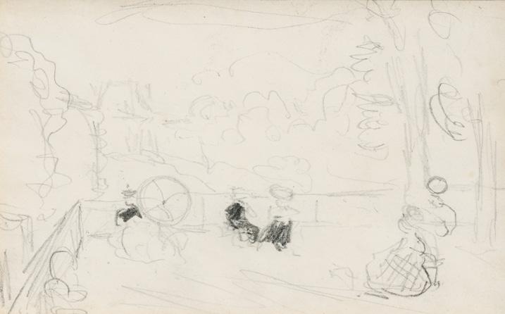
On the Terrace, circa 1898 pencil titled on a gallery label on the reverse 4 ins x 6.5 ins; 10.2 cms x 16.5 cms
PROVENANCE
Rt. Hon. Vincent Massey Collection
Christie's, auction, London, 9 December 1960, lot 30
Private Collection
Paul Duval, Toronto
John Morris Gallery, Toronto
Private Collection, Toronto
Roberts Gallery, Toronto
Private Collection, Toronto
!e celebrated Canadian Impressionist James Wilson Morrice captured the charm of urban life in his small, atmospheric sketches. ! is drawing depicts a lively terrace scene in Paris, where elegantly dressed " gures sit and converse under their parasols in the sun. With his characteristic loose yet deliberate strokes, Morrice conveys the essence of the moment—the hum of conversation, the distant city beyond, and the interplay of light and shadow.
! is drawing was originally part of a sketchbook in the estate of Canadian diplomat Vincent Massey. !e sketchbook was used by Morrice around 1898 in Paris and the surrounding town Charenton, as well as in Saint-Malo, France.
We extend our thanks to Lucie Dorais, Canadian art historian and author of J.W. Morrice (1985), for assisting with the research on this artwork.
$2,000–$3,000
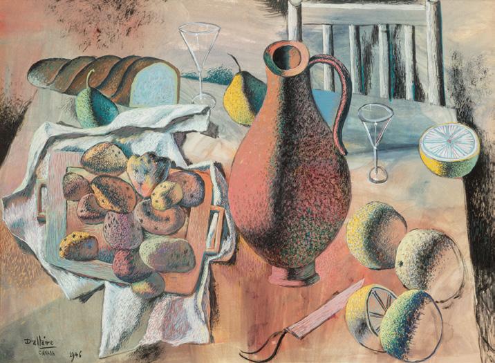
Still Life with Bread and Fruit, 1946 gouache on paper laid down on card signed, dated 1946 and inscribed "Canada" lower left 24 ins x 32 ins; 61 cms x 81.3 cms
PROVENANCE
Private Collection, Montreal
Jean-Philippe Dallaire was largely a self-taught artist. He lived in Paris throughout di #erent periods of his life, where he was exposed to the works of Pablo Picasso, Joan Miró and Salvador Dalí. During World War II, while under the German occupation in France, Dallaire was a prisoner at the St-Denis internment camp. While in prison from 1940-1944, he continued to draw and study Italian. In 1945, Dallaire returned to Canada. Still Life with Bread and Fruit
was completed in the following year, when the artist had begun a teaching position at the École des beaux-arts in Quebec City from 1946-1952. !e gouache exempli "es the artist’s original painterly style that loosely combines many sources of artistic inspiration and remains refreshingly unconstrained by speci "c movements. !e reduction of form, simpli "cation of line, and distorted shapes within this still life composition are indicative of the artist’s practice of incorporating multiple abstract approaches in his compositions. Dallaire was inspired by Italian theatre, mythological " gures, Surrealism, Synthetic Cubism and Art Brut. !e two-dimensional perspective recalls Picasso’s cubist still lifes and even Cézanne’s later reductive paintings of fruit arrangements. Although Dallaire was quite interested in abstraction, he always remained a representational painter. !e artist played a role in the return to " gure painting in Canada during the late 1960s. He later worked for the National Film Board in Ottawa, illustrating animated " lms and accepting commissions to design tapestries.
$12,000–$15,000
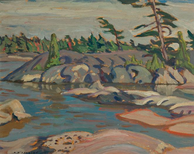
September, Georgian Bay, circa 1920 oil on board
signed lower left; signed, titled on the reverse and inscribed "Box 3" and "$40" on the reverse
8.5 ins x 10.5 ins; 21.6 cms x 26.7 cms
PROVENANCE
Acquired directly from the Artist Private Collection, Drumheller, Alberta
By descent to a Private Collection, Vancouver He#el, auction, Vancouver, 22 May 2008, lot 42 Private Collection, Mississauga
LITERATURE
A.Y. Jackson, A Painter's Country, Vancouver/Toronto, 1958, page 25
Naomi Jackson Groves, A.Y.'s Canada , Toronto/Vancouver, 1968, pages 108, 110
David P. Silcox, e Group of Seven and Tom omson , Toronto, 2003, page 214
Georgian Bay was a region A.Y. Jackson would return to regularly throughout his career, the artist referring to the area as his “happy hunting ground.” He enjoyed the opportunity to paddle around islands and explore the web of channels, a #ording him near-in " nite vistas for sketching. Jackson often stayed with Dr. James MacCallum, a friend and patron to members of the Group of Seven, during his forays in the area. MacCallum’s cottage was located on an island (which MacCallum called “West Wind Island”) in Go Home Bay. David Silcox emphasizes the importance of this relationship for Jackson and his fellow artists, as MacCallum’s support and friendship created “an atmosphere of possibility that gave birth to a stunning array of superb works.”
! is painting exempli "es Jackson’s ability to capture the wild, untamed beauty of the Canadian landscape, emphasizing the strength and endurance of nature. !e colour palette consists of earthy browns, deep greens, soft purples, and muted blues, creating a harmonious yet dramatic natural scene. !e twisted, windswept trees add a sense of dynamism, suggesting the enduring power of nature in the face of the elements. Naomi Jackson Groves con " rms that “with the motif of the wind-swept pine on the wave-beaten shore we reach the storm centre of the Group of Seven in its initial years.” At Georgian Bay the stage is continuously set for the “spectacular storms that rattled the bay”, which were “an inspiration to its visiting artists.”
$30,000–$40,000
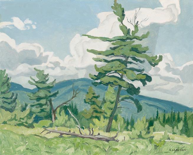
On the Flats at Combermere, 1958 oil on board
signed lower right; signed and titled on the reverse; signed, titled and dated 1958 on a label on the reverse 12 ins x 15 ins; 30.5 cms x 38.1 cms
PROVENANCE
Roberts Gallery, Toronto
Private Collection, British Columbia
By descent to the present Private Collection, British Columbia
LITERATURE
Ted Herriot, Sunday Morning with Cass: Conversations with A.J. Casson , Mississauga, 1993, page 247
!e hamlet of Combermere, a quaint and charming community nestled along the serene banks of the Madawaska River, is a location that A.J. Casson frequently visited for inspiration. On the Flats at Combermere exempli "es the profound in $uence of the Group of Seven—a collective of Canadian landscape painters known for their bold use of colour
and innovative compositions. Casson utilizes a compositional screen of trees that frames the scene, along with a close vantage point that invites viewers to immerse themselves in the serene environment. !e artwork not only re$ects the hallmark characteristics of the Group, such as dynamic forms and vibrant hues, but also showcases Casson’s signature style—a carefully controlled palette that evokes a sense of harmony and balance.
On the Flats at Combermere was created in the year the artist retired from Sampson-Matthews, a commercial printmaking company, to dedicate himself to his passion for painting fully. ! is signi "cant decision marked the beginning of a fruitful chapter in his artistic journey. Shortly thereafter, in 1959, Casson held his " rst solo exhibition at Roberts Gallery, where his work garnered considerable attention and acclaim. By the mid-1960s, his exhibitions were consistently selling out, a testament to his reputation as a prominent " gure in the Canadian art scene. As Ted Herriot remarked in his book Sunday Morning with Cass, "although he modestly accorded serendipity with being a factor prevalent in much of his success, it was, in fact, as much due to his unwavering determination and abundance of energy. ! roughout his life he was one to 'make things happen' much more so than one to 'watch things happen'."
$20,000–$30,000
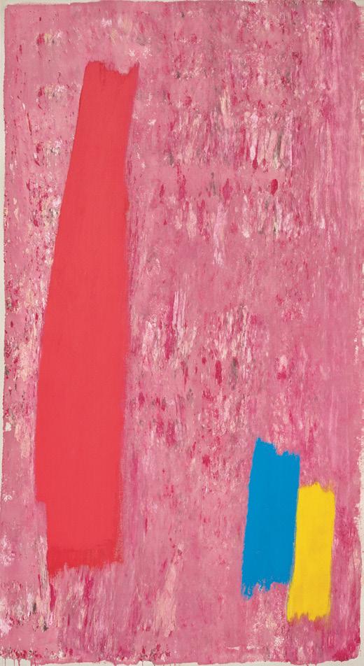
Sans titre, 1972
acrylic on board
7.5 ins x 15 ins; 19.1 cms x 38.1 cms
PROVENANCE
Collection of the Artist
Galerie Simon Blais, Montreal Private Collection
LITERATURE
ICYMI: Remembering Rita Letendre [online publication], !e Art Gallery of Ontario, 24 November 2021, accessed 1 April 2025
She is celebrated for her striking and expressive style, which challenges traditional notions of colour, light, and space. Using a variety of tools—including paintbrushes, airbrushes, palette knives, and even her hands—Letendre captures the essence of life in her work. !e artist $uctuated between gestural and hard-edge abstraction. !e sharp wedges or arrows that cut across the image plane are characteristic of her work from the decade. As Letendre stated, “ !e clean shape started gradually in 1964 from the simpli "cation that was already present in the murals. At that time, I had started doing a series of black and white wedges, the wedge that became more and more arrows. !en at one moment I made lots of lines near the arrow to create a feeling of vibration, that must vibrate into space, the eternal space...that vibration of a space that moves...these arrows are moving through space. I wanted, by the speed of it, to create vibration around.”
$5,000–$7,000
Face Of, 1970
gouache
inscribed "1.30" lower right; signed, titled, dated "September 1970" and inscribed "Toronto", "gouache" and "A4723" on the reverse; catalogue raisonné no. 2.122.1970.46
29.75 ins x 22.25 ins; 75.6 cms x 56.5 cms
PROVENANCE
!e Artist
Waddington Galleries, London, 1970
Waddington Galleries, Montreal, October 1974
Private Collection, Montreal
Private Collection, Ontario
LITERATURE
Sarah Stanners, Jack Bush Paintings: A Catalogue Raisonné, Volume 3, 1966-1971, Toronto, 2024, listed with a sketch on page 414, no. 2.122.1970.46
! is painting may be abstract but every self-respecting Canadian should know what Jack Bush had in mind by reading its title: Face O ". While the timing of the painting’s execution, in September, is a little too early for the NHL season, there was a pre-season game between the Maple Leafs and Canadiens in Toronto on 30 September 1970—the red vs. blue rivalry did indeed face o# and this exhibition game ended in a 4-3 win for Montreal’s team.
Bush was born in Toronto and spent his entire professional life in Ontario’s capital city, but Montreal had been home to the artist during his youth, from about the age of seven to nineteen, when he " nished an apprenticeship in commercial illustration at Grip’s Montreal out "t, where Bush’s father, Charles Bush, was the manager.
Grip—which was the leading commercial art " rm in the country —also had an o%ce in Toronto, which Bush transferred to in 1928. Considering Bush’s 41 years-long career in the business of advertising arts, it is obvious with strikingly graphic paintings such as this that Bush’s prowess for composition, colour, and visual impact shaped his " ne art output in powerful ways.
Here, in gouache, the two solitudes face o#, red against blue–blue against red, but by the hand of a Toronto-born Montrealer, the balance is clear, and beautiful.
We extend our thanks to Dr. Sarah Stanners for contributing the preceding essay. Sarah is currently an Adjunct Professor at the University of Toronto’s Department of Art History and produced Jack Bush Paintings: A Catalogue Raisonné (2024). From 2015 to 2018, she was the Chief Curator of the McMichael Canadian Art Collection, co-curator of the 2014-2015 national travelling exhibition, Jack Bush, co-author of the resulting 2014 exhibition catalogue (Jack Bush) and guest curator and author for Jack Bush: In Studio (2016), organized by the Esker Foundation in Calgary.
$20,000–$30,000
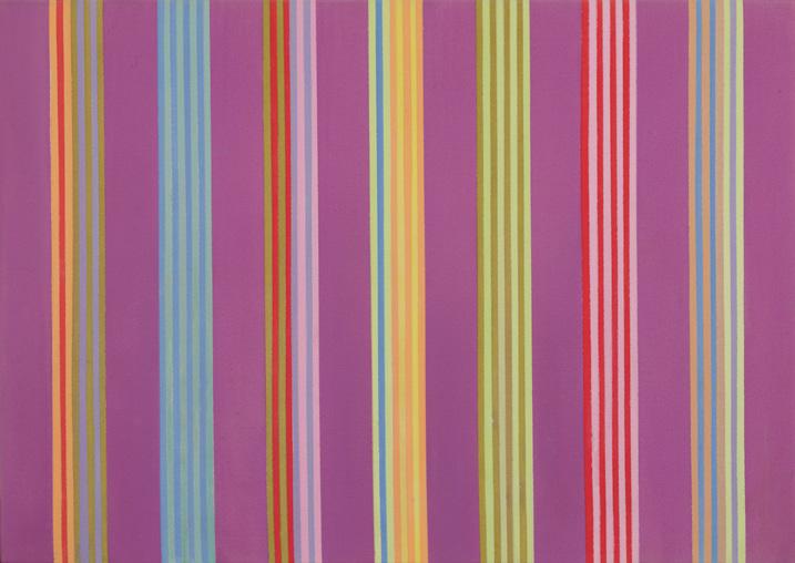
GENE DAVIS
Hell's Calendar #3
acrylic on canvas
21.25 ins x 30 ins; 54 cms x 76.2 cms
PROVENANCE
Purchased from Dunkelman Gallery, Toronto, early 1970s Private Collection, Toronto
LITERATURE
Donald Wall, ed., Gene Davis, New York, 1975, page 27
Jacquelyn Days Serwer with essays by Douglas Davis and Donald Kuspit, Gene Davis: A Memorial Exhibition , Washington, 1987, page 43
Gene Davis, a largely self-taught artist, employed an obsessive approach to repeated taped lines as his primary subject matter. Associated with the Washington Color School, he focused on the primacy of colours by staining acrylic paint directly onto canvases of various sizes and formats.
In an interview with Donald Wall, Davis addresses the essential question of why he chose stripes. He admits: “ ! at’s not easy to answer. At the very beginning, I saw the equal-width stripe format as a kind of response to the painterliness that was in the air in the late Fifties. Stripes, when evenly deployed, have a quality of clarity that seemed absent in abstract expressionism.”
!e richness of the coloured stripes in Davis’s work Hell’s Calendar #3, which features seven larger stripes enclosing eight smaller stripes of various shades of green, blue, red, pink and orange, creates a push-andpull e#ect against the deep violet background. Donald Kuspit describes the e#ect of the stripes: “Davis’s color-stripes serve a double function. !ey can be read as metaphors for the states of consciousness that interpenetrate in ‘perception’, or introspective awareness, of duration, and they can be read as literal units in a spatial succession that is abstractly emblematic of temporal $ow.”
$15,000–$20,000

ANDY WARHOL
Turtle (F&S II.360A), 1985
colour screenprint on Lenox Museum Board signed and numbered 248/250 lower right; titled and numbered on a label on the reverse. Printed by Rupert Jasen Smith, New York; published by CBS, Inc., Los Angeles, California 31.25 ins x 39 ins; 79.4 cms x 99.1 cms
PROVENANCE
Martin Lawrence Galleries, New York Private Collection, Toronto
LITERATURE
Frayda Feldman and Jörg Schellmann, Andy Warhol Prints: A Catalogue Raisonné 1962-1987, 4th edition, Milan, 2003, listed page 148, no. II.360A
Created two years after his Endangered Species series, this work aligned with Andy Warhol's focus on the preservation of wildlife and served as promotional material. !e publication coincided with the release of the 1985 " lm Turtle Diary, adapted by Harold Pinter from Russell Hoban’s novel, exploring the connection between two visitors to the London Zoo who believe the turtles are being unnaturally con " ned and plan to liberate them.
!e themes of connection and liberation in the " lm are echoed in Warhol’s work, serving as a commentary on environmental conservation and the fragility of ecosystems. Despite having existed for millions of years, many species of sea turtles are threatened with extinction due to habitat destruction, overexploitation and climate change. Based on a photograph, Warhol has enhanced the image of the sea turtle with bold tones of blue, green and pink. !e red outline that de" nes its shape not only captures this ancient creature but also elevates it to a commercial Pop Art aesthetic, raising awareness of its plight.
$60,000–$80,000
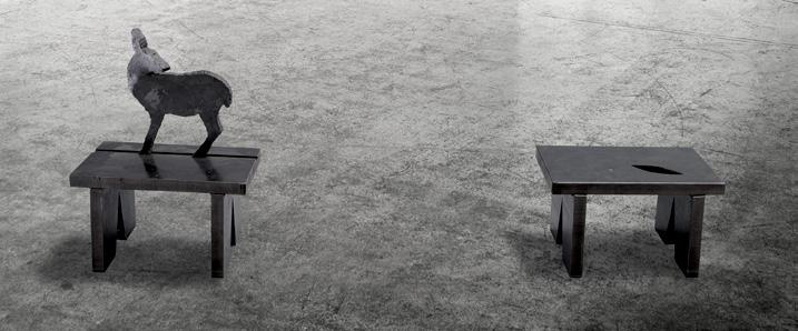
JOHN MCEWEN
Her Nature, 1985
two-part bronze sculpture
- "First Part (with Deer)" (stamped signature, dated 1985, inscribed "Series 1 of 6" and "1 of 2 Parts" on the underside - 19 ins x 14 ins x 10 ins; 48.3 cms x 35.6 cms x 25.4 cms)
- "Second Part" (8 ins x 14 ins x 10 ins; 20.3 cms x 35.6 cms x 25.4 cms)
PROVENANCE
Ydessa Gallery, Toronto !e Bailey Collection (sold to bene"t !e Bailey Arts Foundation)
LITERATURE
Jane Lind, John McEwen , Vancouver/Toronto, 1990, reproduced pages 22-23
Toronto-born artist John McEwen is one of Canada’s most prominent sculptors. Continually exploring di #erent modes of representation, McEwen’s work often depicts animals through two main sculptural approaches: $ attened silhouettes and hollow forms made of mesh of steel stars. Wolves, dogs and deer are recurring motifs for the artist, often appearing in imaginative combinations with human-made objects. McEwen’s subjects consistently explore poetic dynamics between the natural and the manufactured.
Her Nature is a two-part sculpture consisting of similar bench-like forms. !e space between the two components is an integral part of the work. One part features the silhouette of a standing deer. !e deer’s turned head contrasts against the $ at, graphic shape, adding dimension and complicating the sculpture’s representational mode. ! is gesture gives the animal a gentle, lifelike quality in juxtaposition with the austere and industrial material of the work. Simple and direct in form, the deer conveys cautious alertness and attention. !e animal seems ready to bound away at a moment’s notice. !e companion piece employs the negative space of a cutout shape, resembling an eye. While the body of the deer faces away from the cutout, the turned head looks back at the cutout. ! is tenuous connection through gaze is loaded with poetic associations.
While many of McEwen’s works were created as commissions for public spaces, Her Nature was proposed as a private commission and became a catalyst for further experiments. Initially this was an edition of six, but as McEwen experimented with the concept, only four were eventually assembled. In subject and scale, this notable and rare work has an engaging and intimate quality.
! is artwork is being sold to bene"t !e Bailey Arts Foundation.
$10,000–$15,000
High Society, 1964
bronze stamped signature and numbered 2/7 on the base 54 ins x 16.5 ins x 10 ins; 137.2 cms x 41.9 cms x 22.8 cms
PROVENANCE
Pierre Matisse Gallery, New York, 1965 Private Collection, New York Christie's, auction, New York, 14 December 2023, lot 47 Private Collection, Toronto
EXHIBITED
Sorel Etrog: Recent Sculpture, Pierre Matisse Gallery, New York, February 1965
LITERATURE
Carlo L. Ragghianti, Sorel Etrog, Florence, 1968, pages 18-19
Pierre Restany, Sorel Etrog, Munich/London/New York, 2001, pages 27, 77, reproduced page 29 (on display as part of the 1965 exhibition at Pierre Matisse Gallery)
In 1963 Sorel Etrog closed his New York studio and settled in Toronto. His studio was established on an empty $oor of the former Tip Top Tailors clothing factory near the waterfront. Etrog writes that this was a wonderful space where he experienced the most proli "c two years of his life. !e artist had quickly established himself as one of North America’s pre-eminent sculptors.
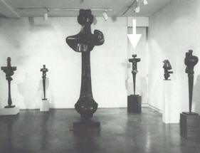
High Society on display at the Pierre Matisse Gallery Exhibition
New York, February 1965
Not for sale with this lot
In Pierre Restany's publication, the artist states, “sculpture for me is like haiku, the essence of an idea. It’s minimal and re" ned, condensed and to a degree symbolic. It feels like I am freezing a moment in time, hoping the viewer will defrost it.”
!e year 1964 can be viewed as the beginning of the artist’s Links period. Following a trip to Europe with his sister in 1963, Etrog discovered Etruscan sculpture at the Archeological Museum in Florence, which he wrote inspired Links. Etrog describes that one of the most challenging dilemmas sculptors face is how to join di #erent parts of the body, or di #erent shapes, without gluing or welding them.
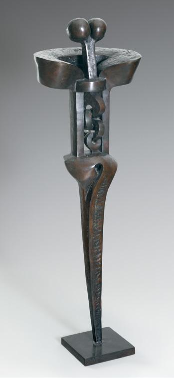
Recalling his discovery of the Etruscan links, Etrog shared that they “showed me how to join multiple shapes organically.” Art historian Pierre Restany asserted that the Link, from 1964 on, became the prime factor of Etrog’s vocabulary.
Etrog captures his new form of anatomy in High Society, connecting and articulating the joints of the body. !e metal components $ow and intertwine with one another, creating a striking presence that stands boldly in front of the viewer.
$30,000–$50,000
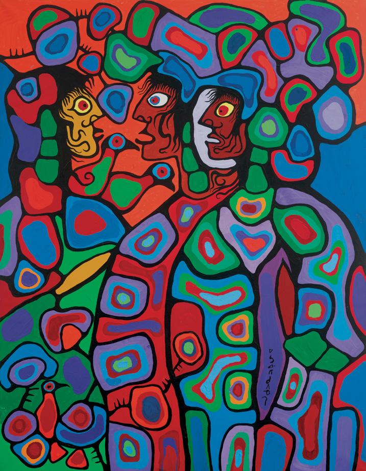
Conversation with Our White Brother, 1980 acrylic on canvas signed in syllabics lower right; titled twice and dated 1980 on the reverse 77 ins x 60 ins; 195.6 cms x 152.4 cms
PROVENANCE
!e Pollock Gallery, Toronto Private Collection
LITERATURE
Norval Morrisseau, Norval Morrisseau: Return to the House of Invention , Toronto, 2005, page 13
Norval Morrisseau is considered to be a trailblazer of contemporary Indigenous art. Norval Morrisseau was the eldest of "ve siblings, born to Grace !eresa Nanakonagos and Abel Morrisseau. Following Anishinaabe customs, he was sent to live with his maternal grandparents at the Sand Point First Nation (now known as Bingwi Neyaashi Anishinaabek), located on the shores of Lake Nipigon in Ontario. It was there that Morrisseau immersed himself in the rich stories and cultural traditions of his people, guided by his grandfather, Moses Potan Nanakonagos, who was a shaman trained in the Midewiwin spiritual tradition. Unlike other children his age, Morrisseau preferred the company of elders and enjoyed listening and learning about traditions or being by himself immersed in his artistic pursuits. Fascinated by local petroglyphs, Morrisseau wanted to depict things he had heard about or seen, such as sacred bears or !underbirds.
Conversation with Our White Brother depicts three " gures, two Indigenous people and one white person, pictured in deep conversation. !e white " gure is surrounded by three birds. Racial politics in art was a key theme in Morrisseau’s work. As Morrisseau explains, “When the Jesuits came, the Indian was around already. !e Indian did not understand them. He tried to understand them, what they were up to. He knew that they were going to be there for a while. He knew how sad it was, seeing his people, how low they were put, how they had previously enjoyed living and needed to live freely again. How do we go about doing that now? We need images. We’re going to use images ourselves.”
In $uenced signi "cantly by Anishinaabe cultural traditions and his distinctive storytelling style, Norval Morrisseau created art that stood out from the trends popular in Eurocentric art communities. His artistic language featured bold black lines that outlined his subjects and segmented their inner spaces. Additionally, he employed a vibrant mix of lines, colours, and compositions that illustrated the idea of interconnectedness. For instance, a striking contrast of colours and lines could highlight di #ering perspectives on the relationship between humans and the land. However, Morrisseau’s deep insight into colonialism challenges the common misconception that he is merely a painter of myths.
Morrisseau was represented by Jack Henry Pollock, founder of !e Pollock Gallery in Toronto. Pollock was a painter, art educator, author and gallerist who represented Canadian artists and played a de" ning role in the Toronto art scene for over three decades. In the summer of 1962, while teaching painting workshops in Northern Ontario funded by the Ontario Government, Pollock met Morrisseau; he immediately recognized the artist's genius and arranged for a solo exhibition at his Toronto gallery that September. !e sold-out 1962 exhibition received unanimous praise and is considered both the launch of Morrisseau’s career but also one of the most important events of the burgeoning Toronto art scene at the time. Morrisseau went on to arguably become Canada's most important Indigenous artist. Pollock developed a reputation for identifying talent in young artists and was instrumental in the careers of many notable artists, including Ken Danby, Charles Pachter, Robert Bateman, Ron Martin and Jack Bush. !e Pollock Gallery also exhibited an impressive array of international artists, many of whom for the " rst time in Canada, including Willem de Kooning, David Hockney, Josef and Anni Albers, and Victor Vasarely. Pollock became known for his discerning eye and his legacy is most closely associated with his discovery and promotion of Norval Morrisseau.
$50,000–$60,000
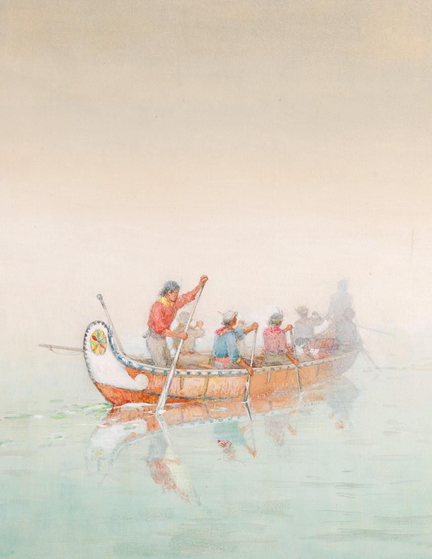
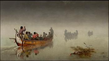
Canoes in a Fog, Lake Superior, 1864 watercolour on paper on pressed paper board signed with initials lower right; titled on a gallery label on the reverse 14.5 ins x 21.5 ins; 36.8 cms x 54.6 cms
PROVENANCE
Walker's Galleries, London, England, March 1914
John Rogers, Toronto By descent to the present Private Collection
LITERATURE
Janet E. Clarke, Frances Anne Hopkins 1838-1919: Canadian Scenery, !under Bay, 1990, see page 85 for a similar work in the collection of the Glenbow Museum
!omas Schultze, Frances Anne Hopkins, Images from Canada , Manotick, 2008, see pages 81-83 for similar works in the collection of the Glenbow Museum
Letter from Edward M. Hopkins to his friend John McIntyre dated 5 August 1864, cited in Mary-Ellen Weller-Smith, Frances Anne Hopkins: Hudson’s Bay Company Wife, Voyageurs’ Artist, Madison, Wisconsin, 2022, page 113
Frances Anne Hopkins
Canoes in a Fog, Lake Superior, 1869 oil on canvas, 68.6 x 121.9 cms
Collection of the Glenbow Museum, purchased 1955 Not for sale with this lot
!e reputation of Frances Anne Hopkins as an artist is well-established within Canadian cultural life. She is well-known for her depictions of daily life in Canada at a key moment in our country’s history, as the canoe brigades and timber rafts gave way to the steamboat and the railroad, and as Confederation took shape in response to American aggression in the post-Civil War period. Her art shows the enormous love she had for a country where she spent almost twelve years of her life, raising several children and being forced to endure the loss of several others. She never forgot the life that she lived here and returned to Canadian themes in her art long after she returned to England.
Hopkins was born in London in 1836 and was raised in a famous and artistic family. Her grandfather, grandmother, and uncles were all artists, while her father Captain Frederick Beechey, R.N., was a notable Arctic explorer and amateur artist himself. She was likely taught to draw and paint by family members. In 1858, she married Edward Martin Hopkins, a Hudson’s Bay Company o%cial and a widower " fteen years her senior, moving to Canada to help raise his three boys from a previous marriage. From 1858 to 1870, she lived mostly in Lachine and Montreal, although returning to England for extended periods of time. She gave birth to six children, of whom only two lived into adulthood. She was left to cope with a large household for many years, but she found time to sketch and paint, and to become involved with the Art Association of Montreal and the Montreal Sketching Club.
Because of her husband’s work, she was able to undertake canoe outings in the vicinity of Montreal and on the St. Lawrence and Ottawa Rivers. She also made three longer journeys: in 1864, she accompanied her husband on a voyage along the north shore of Lake Superior from Fort William to Michipicoten; in 1866, she travelled up the Ottawa River to the Temagami District; and in July-August 1869, she travelled by canoe with her husband from Fort William to Montreal. As her husband noted in a letter to one of his fur trade colleagues: “Canoe travel agrees with her.”
After her return to England, Mrs. Hopkins began to exhibit her art at the Royal Academy and in other London galleries. Her experiences in North America became the dominant theme of her artistic output, as she made use of the many plein air sketches she created during her time in Canada. She had exhibited on multiple occasions in Canada, the last time in the spring Conversazione of the Art Association of Montreal in 1870, when sixteen watercolours, all related to her canoeing experiences, and the disappearing life of voyageur travel, were displayed.
!e two watercolours in this sale represent major subjects of Hopkins’ artistic oeuvre (see lot 13: Lumber Raft on the Ottawa , 1886).
Canoes in a Fog, Lake Superior, is one of several sketches that Hopkins made during her " rst trip on Lake Superior in July 1864 and formed the basis for the " rst painting by her to be accepted for exhibition at the Royal Academy in London in 1869. !e painting, acquired by the Glenbow Museum in 1955, became more widely known after being chosen to be engraved and published by Knoedler & Co. in 1873. Five Hopkins sketches related to the painting are known to exist, with three
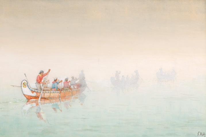
in the Glenbow Museum, one in the Art Gallery of Hamilton, and the " fth being the work in this sale. Each sketch o#ers variations in colours, composition, the presence or absence of certain elements, and dimensions, but this work is in my opinion the " rst large-scale work that she prepared, most notably due to the multi-coloured wheelstar on the stern of the canoe, which is mirrored in the painting, and because of the inscription on the verso, written in the artist’s lifetime. ! is watercolour may have been one of the sketches shipped back to England in October 1866. !e colours remain remarkably bright and the details of the clothing are exquisite. A beautiful work, it records the moment when canoeing transformed from being a means of travel and the transport of goods into a leisure time pursuit.
We extend our thanks to Jim Burant, art historian and curator, for contributing the preceding essay. Jim spent four decades with the art and photo holdings of Library and Archives Canada. He has organized or co organized many exhibitions and has written and lectured widely about aspects of Canada’s visual heritage. His most recent publication, Ottawa Art & Artists: An Illustrated History (2022), was published by the Art Canada Institute. He was awarded the Queen’s Golden Jubilee Medal for services to Canada in 2002, and is a member of the Algonquins of Pikwàkanagàn First Nation.
$60,000–$80,000
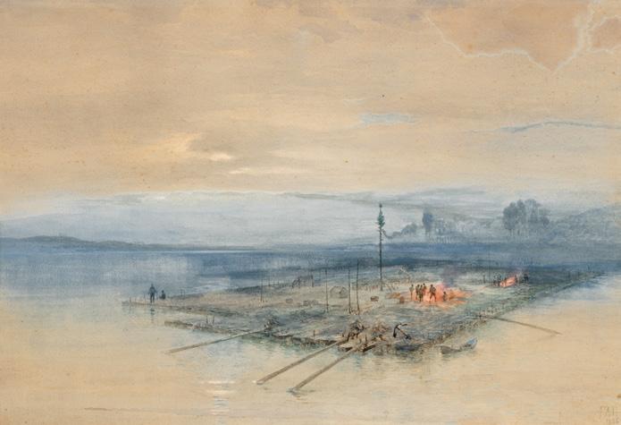
Lumber Raft on the Ottawa, 1886 watercolour signed with initials and dated 1886 lower right 15.5 ins x 22.5 ins; 39.3 cms x 57.2 cms
PROVENANCE
Private Collection
Sotheby's Canada, auction, Toronto, 14-15 May 1973, lot 53 John Rogers, Toronto
By descent to the present Private Collection
LITERATURE
Janet E. Clarke, Frances Anne Hopkins 1838-1919: Canadian Scenery, !under Bay, 1990, see page 77 for a similar work in the collection of the Royal Ontario Museum
!omas Schultze, Frances Anne Hopkins, Images from Canada, Manotick, 2008, see pages 59-61 for similar works in the collection of Library and Archives Canada and the Royal Ontario Museum
Lumber Raft on the Ottawa , signed and dated 1886, represents another Canadian theme which Frances Anne Hopkins chose to represent on several occasions. !ere are at least six such works, with the earliest being an 1862 oil painting sold at auction in 2012. !e Royal Ontario Museum acquired an undated but exquisite watercolour, possibly from family descendants, in 1962, while Library and Archives Canada owns
another undated watercolour of the same subject. Two watercolours of the same subject are still in family hands, with one dated 1868. Hopkins would have likely encountered such timber rafts frequently during her journeys on the St. Lawrence and Ottawa rivers, although by the 1860s they were encountered less frequently than in their heyday in the 1830s and 1840s. Hopkins made a return visit to Canada in 1884, and this may have ignited a renewed interest in Canadian subject matter, as she exhibited a Canadian scene at the Royal Academy the same year as this work. It shows one of the large timber rafts $oating down the river, possibly on Lake of Two Mountains, and is more atmospheric than many of the other works, with the fog on the river and the cooking " res surrounded by the crewmen, likely preparing to enjoy their breakfast meal. Although a late work, it o#ers a romantic and enchanting insight into a particular aspect of nineteenth-century Canadian life.
!e work of Frances Anne Hopkins was the subject of the major exhibition Frances Anne Hopkins, 1838–1919: Canadian Scenery, organized by the !under Bay Art Gallery in 1990. More recently, the life of Hopkins has been the subject of several articles and essays, as well as two full-length studies, !omas Schultze’s Frances Anne Hopkins, Images from Canada (2008) and Mary-Ellen Weller-Smith’s recent biography Frances Anne Hopkins: Hudson’s Bay Company Wife, Voyageurs’ Artist (2022).
We extend our thanks to Jim Burant, art historian and curator, for contributing the preceding essay.
$30,000–$50,000
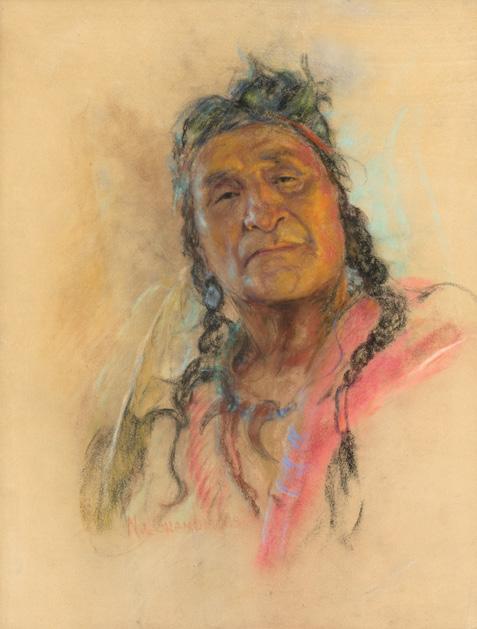
Dan Wildman, Stoney, circa 1945 pastel on paper
27.25 ins x 21 ins; 69.2 cms x 53.3 cms
PROVENANCE
Tara de Grandmaison, granddaughter of the Artist Masters Gallery, Calgary, July 2013 Private Collection, Alberta
LITERATURE
Hugh Dempsey, History in eir Blood: e Indian Portraits of Nicholas de Grandmaison , Vancouver, 1982, page 46
Nicholas de Grandmaison spent four years in a German prisoner of war camp during the First World War, interned with Allied o%cers from France, Great Britain, and other countries. His military training
in cartography and topography had provided him with basic drawing skills, but his talent for portraiture developed during this period as he sketched fellow prisoners and even German o%cers. After the war, the artist moved to Manitoba to work as a farm worker, before moving to Winnipeg to begin his artistic career as a portraitist. By 1930, de Grandmaison was " nding success and exploring farther a "eld, portraying subjects he encountered on his excursions—trappers, prospectors, fur traders, Métis and Indigenous peoples. Blood 148, a First Nations reserve in Alberta, became his main source of inspiration. He frequently visited to paint the people of the Kainai Nation, or Blood Tribe.
De Grandmaison devoted his life to recording the faces of the Kainai Nation. “I wish to preserve their faces for posterity”, he wrote, “I shall paint them until I die.” Using pastel paper imported from France and Grumbacher pastels, he recorded the " ne nuances and warm textures of the faces of these " gures, as exempli "ed in Dan Wildman, Stoney.
$6,000–$12,000
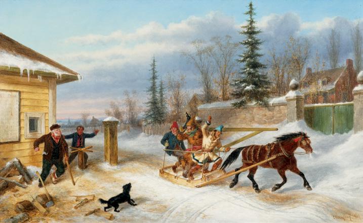
Bilking the Toll Gate, 1869 oil on canvas signed and dated 1869 lower right 14.25 ins x 22.25 ins; 36.2 cms x 56.5 cms
Estate of George Maxwell Bell, Calgary Joseph T. and Florence O'Connor, Vancouver, January 1974 By descent to the present Private Collection, Victoria
David Burnett, Masterpieces of Canadian Art from the National Gallery of Canada , Alberta, 1990, page 26 Ramsay Cook, " !e Outsider as Insider: Cornelius Kriegho# 's Art of Describing" in Dennis Reid, Kriegho ", Images of Canada , Toronto, 1999, page 148
Cornelius Kriegho# was a celebrated nineteenth-century artist known for his romanticized portrayals of Canadian life and landscapes in the years leading up to the Confederation. !e avid traveller produced the majority of his artworks in eastern Canada during the " fteen years he lived in Montreal and Quebec, beginning in 1846. By 1853, Kriegho# was living in Quebec City, where he entered his most proli "c artistic period. He produced a large number of canvases that were innovative in terms of iconography, style and technique. Kriegho# understood his audience’s tastes and was versatile in his themes. His paintings, often small and portable, appealed to the English-speaking governing class and British military personnel, who purchased them as souvenirs of their time in the colony. David Burnett remarks, “Kriegho# ’s years in Quebec were not only the height of his success but were also the time when he produced his " nest work.”
!e artist’s sharp intellect and vivid imagination fully embraced the picturesque life of the habitant, along with the Canadian winters " lled with sleighing and tobogganing. His keen attention to detail captured the essence of a bygone era and its people, leaving behind a valuable
record of that time. His works featured portraits, genre scenes and landscapes of rural Quebec. However, it was the winter landscapes— covered in snow, featuring brightly coloured sleighs, and the colourful attire of the habitants —that brought Kriegho# the most artistic success. He understood that winter was the most iconic and visually stunning season, a time " lled with sleighing parties, snowshoeing, and dances. It was with these winter scenes that he achieved his highest artistic acclaim. !e winter sleighing scene became a highly soughtafter subject during this time, one that Kriegho# revisited often, and it remains a cherished representation of early Canadian art, culture and life.
One of Kriegho# 's most famous compositions, is the subject of this canvas, known as Bilking the Toll Gate. Dated 1869, this canvas illustrates the tensions surrounding toll roads, which were built by private contractors and often resented by local habitants. Historian Ramsay Cook describes how toll fees could consume a signi "cant portion of a day’s earnings, leading to frustration and, at times, playful de" ance—an attitude Kriegho# depicted through a mischievous, nose-thumbing passenger. !e subtle drama of the scene is expertly conveyed in the faces of the characters, at some points appearing almost like caricatures with exaggerated expressions. Characteristic of Kriegho#, the artist has paid special attention to the aspects of the landscape and the attire that, in its own way, honours the region. Kriegho# ’s attention to detail compliments his meticulous draftsmanship and the theatricality of the scene.
Cook references art historian Dennis Reid's argument that, “the tollgate and the tollgate keeper were identi "ed with British authority and patronage and this visual anecdote becomes even more powerful.” ! is element adds a deeper political dimension to Kriegho# ’s visual storytelling. ! rough works like Bilking the Toll Gate, Kriegho# not only documented but also subtly commented on the social and political realities of pre-Confederation Canada, cementing his place as one of the country’s most important early artists.
$80,000–$120,000
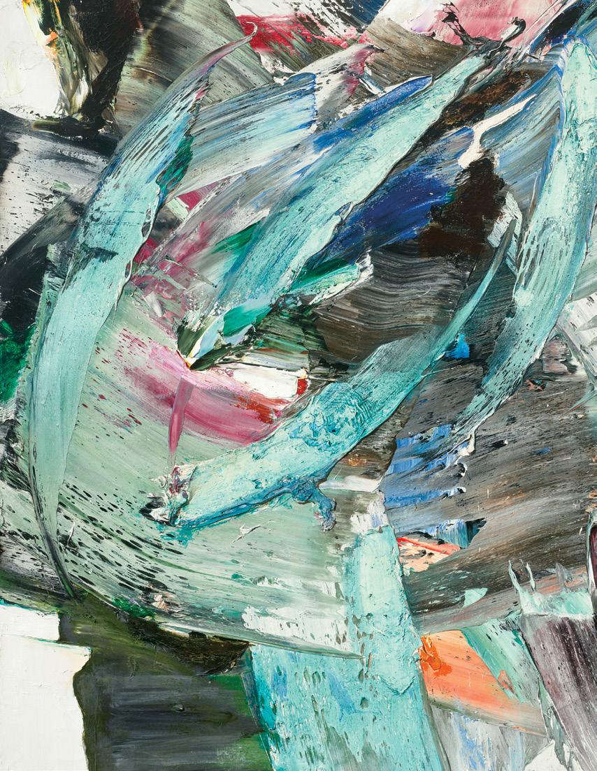
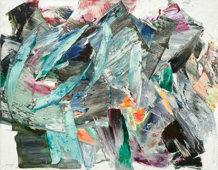
Sans titre, 1964 oil on canvas
signed and dated 1964 lower left; dated 1964 to a gallery label on the reverse 45 ins x 57.25 ins; 114.3 cms x 145.4 cms
PROVENANCE
Gallery Moos, Toronto, Ontario
Robert Cliche and Madeleine Ferron, Saint-Joseph-de-Beauce, Quebec Canadian Art Group, Toronto
Mayberry Fine Art, Toronto/Winnipeg Private Collection
EXHIBITED
Marcelle Ferron de 1945 à 1970, Musée d’art contemporain, Montreal, 8 April-31 May 1970, no. 76
Marcelle Ferron: e Paris Years 1953-1966, Mayberry Fine Art, Toronto, 26 October-29 November 2019
LITERATURE
Herta Wescher and Laurent Lamy, Marcelle Ferron de 1945 à 1970, Montreal, 1970, no. 76
Marcelle Ferron, L'Esquisse d'une mémoire, Montreal, 1996, page 93
Patricia Smart, "L'automatisme: Un lieu d’égalité pour les femmes?", Vie des arts, vol. 42, no. 170 (Spring 1998), page 43
Gregory Humeniuk in Marcelle Ferron: e Paris Years 1953-1966, Toronto/Winnipeg, 2019, reproduced page 16
Marcelle Ferron’s Sans titre of 1964 is an exceptional painting from an exceptional episode in the artist’s six-decade-long career. Its size, brilliance, and unity are a high point from when she was regularly attaining new heights and artistic growth. Her control of colour and paint enabled her to make a painting in which the traces of its making and bold demonstration of colour are laid before us.
Ferron began her art studies in Quebec City with Jean Paul Lemieux in 1942 when she was eighteen. Dissatis"ed, she left and studied with Paul-Émile Borduas in Montreal from 1945 to 1948. Borduas’s openness as a teacher, and the centrality of the individual to his thought shaped Ferron’s artistic and personal ethoses. In her midtwenties, she was a signatory to the revolutionary Refus Global (1948) and the last painter to join the artistically and culturally radical Automatistes. Defying Quebec’s repressive cultural authorities could cost one their job. It cost Borduas his almost immediately, and personal convictions cost many of the Automatistes, Ferron among them. In 1953 she sailed to France with her three young children to escape repression at home, and in the process opened herself to new opportunities. Amid the di %cult conditions in post-war France was a milieu of ambitious artists making and showing bold work unlike anything in Canada. ! is began thirteen years of intense development for Ferron. Over time, it became apparent the thrust of her abstraction was the manifestation of light that would underpin the rest of her œuvre, including later work with stained glass.
In Paris, in a community of ambitious international painters, Ferron knew and admired the American painter Sam Francis, whose paintings of the middle and late 1950s illuminate Ferron’s compositions of the early 1960s. Francis’s active surfaces, resolute use of white, and vibrating light create impressions inspired by Claude Monet’s late paintings of water lilies. Ferron gleaned from Francis and Borduas separately and created material-based painting of shimmering light like Sans titre that are entirely her own.
Her interest in light distinguished her from her peers and spanned her œuvre. ! is singularity shone amongst Borduas’s breakthroughs into the materiality of paint and Jean Paul Riopelle’s breakthroughs into facture and surface. She gleaned from Borduas that paint is always material, not a tool for mimicking the visible world, and that its materiality could be the content of a painting. It never disappeared from her art, and among her paintings its eloquent fusion in Sans titre parallels the e#ects of the stained glass with which she was working by 1964.
Ferron’s Paris paintings of 1953 to 1966 elicit rare pleasures. !ey are direct and they cut through fussy rhetoric just like Emily Carr’s gasoline-diluted oil on kraft paper landscapes of the middle and late 1930s, Jean Paul Riopelle’s paintings of 1952-1954, and Ron Martin’s one-colour paintings of the early 1970s in which light radiates out and over the viewer. Sans titre erupts toward the viewer with sheets of grey punctuated with alizarin crimson, cadmium orange, cobalt green, purple lake and ultramarine like many of Ferron’s paintings of the " rst half of the 1960s. In Sans titre the vertical slashes of cobalt green leavened with white $utter across the surface, making it distinctly engaging and satisfying among Ferron’s most accomplished and important paintings.
We extend our thanks to Gregory Humeniuk, independent art historian, curator and consultant, for contributing the preceding essay.
$300,000–$400,000
JACK HAMILTON BUSH
Vic Day, 1974
acrylic on canvas signed, titled, dated "May 1974 Toronto" and inscribed "acrylic polymer W.B." on the reverse; catalogue raisonné no. 3.7.1974.28 67.5 ins x 37 ins; 171.5 cms x 94 cms
PROVENANCE
!e Artist, May 1974
David Mirvish Gallery, Toronto, March 1975
Ken Carpenter, Toronto
By descent to the present Private Collection, Toronto
LITERATURE
Ken Carpenter, " !e Evolution of Jack Bush", Journal of Canadian Art History IV: 2, 1977-1978, " gure 10, pages 127-128 " !e Inspiration of Jack Bush", Art International XXI, no. 4 (July/August 1977), pages 25-26
Sarah Stanners, Jack Bush Paintings: A Catalogue Raisonné, Volume 4: 1972-1977, Toronto, 2024, reproduced pages 244-245, no. 3.7.1974.28
As its title suggests, Vic Day was painted on Victoria Day, one of Canada’s most welcome holidays, since it signals the kicko# to better weather after the long haul through winter. Historically, the day is focused on a celebration of Queen Victoria, who was to Canada the “Mother of Confederation,” but the most common associations with Victoria Day tend to be " reworks and time spent with friends and family. However non-objective Vic Day appears to be, this painting points to Victoria Day not just by title, but as a subject. Bush’s most abstract paintings sometimes convey subject matter through shapes. ! is is most apparent in his Spasm series from 1969, where darts symbolize the sharp spasms which he felt in his chest as symptoms of angina. Vic Day, and other paintings like it from 1974, feature $ atly coloured shapes that represent friends and family, though only privately to the artist.
In conversation with Terry Bush, the artist’s youngest son, I came to better understand a short series of paintings from the spring of 1974 with titles such as Twosome and Foursome which, like Vic Day, present distinct, $ atly-coloured shapes against a mottled ground produced with a roller brush. In the case of Twosome, the shapes look like the letters “G” and “L” which represent the artist’s friends Leslie and Gladys Wookey. In Foursome, two more " gures enter the picture space, this time one is noticeably larger than the others, and pink, and the other is yellow. !ese two simpler shapes, which represent Mabel and Jack, join the reappearing “G” and “L” on this canvas, to unite the friend group. Seen in this light, the artist’s seemingly random shapes take on some personality. Could the shapes in Vic Day represent the artist and the people with whom he spent the holiday? Foursome was painted in March 1974, just two months before Vic Day, and they share the same tall shape near to a short yellow shape. Could they be abstract symbols of Jack and Mabel? In any case, that is, despite not knowing for sure if these shapes might represent the people in his life, quirky cyphers have always been viewed as markers of the artist’s brilliant individuality.
Professor Ken Carpenter, who proudly owned Vic Day since 1975, saw the individuality of Bush’s work as an asset. In his article for Art International, titled “ !e Inspiration of Jack Bush”, published in the summer of 1977, Carpenter underlined this point with reference to an interview he had previously conducted with the artist:
“Bush’s work always seems very personal, very much the work of Jack Bush. But that result was not something he explicitly intended: ‘Every time I showed a painting at one of those [group] shows, there it was: not like everybody else’s. !e di #erence was Bush, and I couldn’t get rid of it fortunately’.”
Other art critics and curators, such as Terry Fenton and Karen Wilkin, frequently used the term “eccentric” to describe Bush’s abstract paintings. While the hints of nature (or the observable world) in Bush’s abstract paintings made him appear somewhat out of sync with concepts of “purely” abstract painting, this characteristic was also his best quality, and one that was consistently seen throughout his oeuvre, but not in a practiced or formulaic way. As Carpenter stated, so succinctly, “One of the most important constants of Bush’s art is the tendency for the elements to have a life and freedom of their own.” Carpenter made this observation in another feature article on the artist, which he titled " !e Evolution of Jack Bush," and published in the Journal of Canadian Art History, just a few months after his Art International article, which I quoted earlier in this essay. Carpenter outlines the connections between Jack Bush’s early representational art and his later abstract paintings, to suggest that there is an evolution observable in the artist’s work. For example, he correlates Bush’s 1955 painting Re # ection , which features a blurry section achieved through dragged brushstrokes, with the roller ground seen in Vic Day
Being careful not to suggest that Bush expressed himself exclusively within his own o#-beat language of art, Carpenter does outline the wider in $uence on the artist, especially concerning his blurred backgrounds, as seen in Vic Day !e key inspiration in this case is Hans Hofmann, who Jack Bush certainly admired; he even owned a painting by this father of Color Field art. Carpenter draws the comparison between Vic Day and a Hofmann painting from 1962, Memoria in Aeternum , in the collection of the Museum of Modern Art in New York:
“More particularly the importance of Hofmann lies in his " ne sense of interval. If we compare Bush’s Vic Day 1974 with Hofmann’s Memoria in Aeterne [sic] 1962, we see that each has a rich complex of intervals: between the canvas itself and the "eld, between the "eld and the elements, and between the various elements themselves, where each of the intervals is felt and yet not to be de" ned. Everything breathes in a space that seems to exist in front of the canvas but without any part of the picture losing its organic contact with the surface.”
Much of the power of Bush’s late abstract paintings lies in what Carpenter points to in this last sentence. Simply put, there is levity in an implied space (between the " gure and the ground) which is actually $ at as $ at can be. But there is also nature in that space. In his summary paragraphs to “ !e Evolution of Jack Bush,” Carpenter noted: “While Bush remained close to nature, his chosen mode of mature work was high ‘modernist’ painting with all its rejection of the fullness and consistency of spatial clues such as are in keeping with a tactile or more naturalistic space.” ! at Bush struck a balance between observation and the pure invention of abstraction is remarkable, and Vic Day is a " ne celebration of this feat.
We extend our thanks to Dr. Sarah Stanners, an Adjunct Professor, curator, and author who recently produced Jack Bush Paintings: A Catalogue Raisonné (2024), for contributing the preceding essay.
$125,000–$175,000
Sans titre, 1961 oil on canvas
signed and dated 1961 lower right; signed and dated on the reverse, titled and dated on the gallery label on the reverse 24 ins x 20 ins; 61 cms x 50.8 cms
PROVENANCE
Private Collection, Westmount Galerie Cosner, Montreal
Private Collection, Drummondville
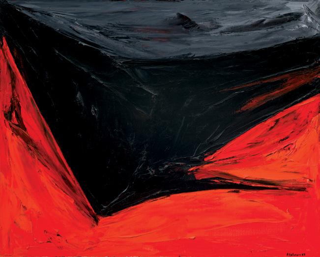
After Lise Gervais completed her education at the École des beauxarts in Montreal, where she received guidance from prominent " gures in the Automatistes movement, the artist found her artistic voice in Abstract Expressionism. Gervais's artwork is known for its bold energy and vibrant colours, applied in thick swathes with a palette knife, making her works instantly identi " able.
Sans titre, created in 1961 shortly after Gervais's return from Spain and coinciding with her debut solo exhibition that February, highlights her deep curiosity about the possibilities of paint. In this dynamic work, the artist's command of colour is strikingly evident. !e painting exudes energy. !e bold red tones take centre stage, beautifully contrasted by deep blacks that enhance the overall composition. Gervais's remarkable ability to blend reds that lean towards orange with those that approach black captivates the viewer.
$15,000–$20,000
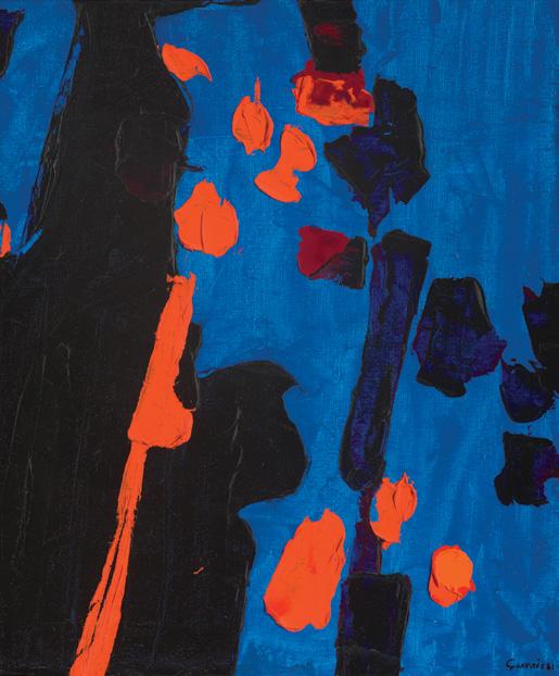
Sans titre, 1965 oil on canvas
signed and dated 1965 lower right; titled on a gallery label on the reverse 32 ins x 40 ins; 81.3 cms x 101.6 cms
PROVENANCE
Gordon and Carol Schacter Masters Gallery, Calgary Private Collection, Calgary
EXHIBITED
e Desire to Acquire: London Collects, Museum London, 3 September 2016-8 January 2017
LITERATURE
Cassandra Getty and Barry Fair, e Desire to Acquire: London Collects, London, 2017, reproduced page 68 "Remembering Rita Letendre," AGOinsider [online publication], Art Gallery of Ontario, 26 June 2017, accessed 10 April 2025
Beginning as an Automatiste painter in the 1950s, Rita Letendre was in $uenced by Paul-Émile Borduas’ revolutionary gestural abstract paintings of the period. Although the Automatistes were instrumental in the evolution of her style, Letendre developed a singular vision in her body of work that resulted in a unique style that pushed boundaries of colour, light and space. Dramatic and evocative, Sans titre, dating to 1965, was completed during a pivotal period of growth in Letendre’s career. Her compositions grew more personal and carefully planned, and she began anchoring masses with carefully visualized gestures amid "elds of thick impasto. After winning " rst prize in the Concours de la Jeune Peinture in 1959 and the Prix Rodolphe-de-Repentigny in 1960, the prize and the additional sales that followed would allow Letendre to dedicate herself to painting full-time.
As the Automatiste group and its a % liates began to abandon their commitment to spontaneity in favour of a more controlled and deliberate structure, Letendre chose to maintain the impulsive and expressive brushstrokes in her work. Sans titre features a black mass pushing down toward the lower left quadrant of the picture with vibrant red splashing up the sides of the mass. Letendre stated, “My thoughts, my attitudes are automatist, which means that I have no set formula. My paintings are completely emotional, full of hair-trigger intensity. ! rough them, I challenge space and time. I paint freedom, escape from the here and now, from the mundane... !e world isn’t only what we see or what we experience.”
$60,000–$80,000
Ladies and Gentlemen (Ivette and Lurdes), 1975
acrylic and silkscreen ink on canvas signed twice, dated 1975 twice and inscribed "To Paulette with love Merry Christmas" on the over ! ap 14 ins x 11 ins; 35.6 cms x 27.9 cms
PROVENANCE
Gift of the Artist
Estate of Paulette Goddard, New York, circa February 1976
Sotheby's Arcade, auction, New York, 10 October 1990, lot 427 Private Collection
Sotheby's Arcade, auction, 7 February 1996, lot 268
Estate of Robert Noakes
LITERATURE
Andy Warhol, e Philosophy of Andy Warhol: From A to B and Back Again , New York, 1975, page 54
Joseph D. Ketner II, Image Machine: Andy Warhol & Photography, Nuremberg, 2013, page 57
Georg Frei and Neil Printz, eds., e Andy Warhol Catalogue Raisonné: Paintings & Sculptures 1974-1976, vol. 4, New York, 2014, page 183, reproduced page 154, no. 2992
! is work is from one of Andy Warhol’s largest, most ambitious and lucrative series of paintings, but least known. Warhol shot over "ve hundred Polaroids of fourteen drag queens recruited by his assistants at !e Gilded Grape, a bar near Times Square, and in the West Village. Warhol produced some of his most painterly canvases and visually inventive prints from these Polaroids. !e subjects are captured in sensual and brazen poses, elevated by Warhol to the status of celebrities and presented as desirable subjects despite being marginalized in society at the time.
!e series is extraordinary for its size, the number of models and the range of poses on display. !e project was commissioned by the Turinbased art dealer Luciano Anselmino, whom Warhol met through the gallerist Alexandre Iolas. Anselmino coined the name of the series, which includes 268 paintings, approximately 65 drawings and collages, and a portfolio edition of ten prints. Warhol would shoot more than 500 Polaroids, an unusual number of photographs in preparation for a single commission. Despite their extensive sittings, each model was only paid between $50 and $100. Nine models signed their street or drag names on at least one of the Polaroids during their sittings, including Ivette and Lurdes in January 1975. While their names “went unrecorded when their portraits were exhibited during Warhol’s lifetime… he publicly observed the notional anonymity of his models in public, while privately archiving their names.” In 2014, the Warhol Foundation published an o%cial list of all the Ladies and Gentlemen paintings, identifying thirteen of the fourteen sitters for the " rst time. !e identity of the fourteenth model remains unknown.
Warhol photographed Ivette and Lurdes individually and together in February 1974, who he would go on to paint in twenty-"ve portraits based on three Polaroids from their sittings. To "t both heads within the frame, Warhol rotated his Big Shot ninety degrees for seven of
the Polaroids. Here, Ivette’s smaller oval face is nestled in the curve of Lurdes’ neck and shoulder, appearing less dominant than her friend. “In all " fteen Polaroids of the pair together, Ivette lurks shyly in the background, pressed against Lurdes from behind, as if the latter were her protector, as she may well have been on the streets… Clearly Ivette and Lurdes did not simply arrive at the Factory together but were like sisters, whom Warhol has grouped in a revealing family portrait.” Ultimately, Warhol was interested not only in capturing the contradictory character of his two models but also in the intimacy of their friendship.
Warhol used his " ngers as a stylus to etch contours and create textures in his paintings. Although he had been employing " nger painting since 1973 to animate the painted surface, it increasingly became a method for drawing as well. With this series, he also changed his approach to creating artwork by layering colours instead of placing local colours and backgrounds side by side on the primed canvas. !e layering of colour and the use of " nger painting are characteristic of Warhol’s creative technique from 1975 to 1977.
Against a uniform purple background, the faces of Ivette and Lurdes are represented in simple brushstrokes, with Ivette looking downward while Lurdes stares resolutely forward. !e darker shade of purple superimposed over the " gures and the black brushstrokes merge, thus visually tying Ivette and Lurdes together. In this reduced format, Warhol adopted a freer style and a more painterly background, exempli "ed in Lurdes’ broadly smeared hair with incised scribbles of the " ngers into the paint. Even though Anselmino had only commissioned " fty paintings of this speci "c size, Warhol painted more than three times as many, producing 158 paintings in total.
!e paintings commissioned by Anselmino were exhibited in 1975 at the Galleria Civica d’Arte Moderna in the Palazzo dei Diamanti in Ferrara, which supposedly included this work. Despite receiving a negative response from the Italian press at the time, these “painterly works were a paean to the sensuality of the subjects as well as the act of painting, an indulgence of both his sexual and artistic fantasies.” As Warhol stated, “I’m fascinated by boys who spend their lives trying to be complete girls, because they work so hard—double-time—getting rid of all the tell-tale male signs and drawing in all the female signs.” ! rough this series, the counterculture celebrity from New York explored notions of sexuality, memorializing these drag queens in paint and print, and ensuring they would not be erased from modern and contemporary history.
!e provenance of this work is remarkable. As the dedication indicates, this work was originally given by Warhol to movie star Paulette Goddard, with whom he had been collaborating on an un " nished memoir since 1974. It was most likely presented to her at the opening of his exhibition in Zurich in February 1976. Over time, the work changed hands through various owners and auctions before being acquired by Robert Noakes, a renowned professional designer whose career spanned over " fty years. In 1970, he founded Robert Noakes Design in a small coach house in Toronto, later establishing Robert Noakes International Limited as his " rm and stature grew. Robert had a deep passion for art, which inspired him to build a collection of over 250 works by Canadian and international artists.
$70,000–$90,000
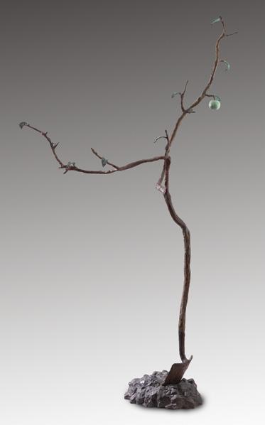
The Prairie Apple, 1987 patinated bronze sculpture signed (incised), dated 1987 and inscribed "JA/PL Foundry" to the base 98.5 ins x 55 ins x 22 ins; 250.2 cms x 139.7 cms x 55.9 cms
Mira Godard Gallery, Toronto Corporate Collection, Toronto
Saskatchewan-based artist Victor Cicansky was best known for his ceramic and bronze sculptures, often depicting fruits, vegetables, and garden-related objects with a playful and surreal touch. Cicansky’s work is deeply in $uenced by his prairie roots, incorporating themes of sustainability, food culture, and the beauty of organic forms. !e artist bridges folk art, surrealism, and social commentary, re$ecting both personal and cultural narratives in his work. Cicansky’s sculptures frequently reference prairie life, urban gardening, and environmental concerns. His pieces carry a strong connection to place, particularly the Canadian prairies, and often celebrate self-su %ciency and sustainable living.
!e artist also created bronze works that play with natural forms in unexpected ways, including this towering sculpture e Prairie Apple. Standing at over eight feet tall, the slender bronze tree has only two main branches and a few leaves sprouting, but a single dangling ripe apple. Upon closer inspection, we see that the tree trunk is in fact a handle for a shovel in the ground. !e sculpture is a prime example of the humourous and surrealist qualities he incorporated into his work. e Prairie Apple also has an additional layer of meaning; it was created in 1987 in honour of the artist’s wife Fran who passed away that year, and whom Cicansky referred to as “the apple of his eye”. !e single green apple on the tree was to represent Fran’s perfection. ! is artwork marked the beginning of a decades-long series of bonsai trees, consisting of hundreds of sculptures with various fruits, the apple being his favourite.
$10,000–$15,000

WANDA KOOP
Standing Withstanding (Infrared-Still); Standing Withstanding (Infrared-Capital), 2017 two acrylics on canvas (diptych) each signed, titled and dated 2017 on the reverse 40 ins x 30 ins; 101.6 cms x 76.2 cms (each)
PROVENANCE
Arsenal Contemporary, New York Private Collection, Montreal
EXHIBITED
Standing Withstanding, Arsenal Contemporary, New York, 1 May-1 July 2018
LITERATURE
"Standing Withstanding" [online publication], Arsenal Contemporary, 1 May 2018, accessed 10 April 2025
Wanda Koop is a renowned contemporary Canadian artist known for her large-scale, immersive paintings that explore the intersection of nature, technology, and human perception. Based in Winnipeg, Koop is widely recognized for her innovative approach to landscape painting, often incorporating abstract and futuristic elements that challenge traditional representations of space and environment. Her work has been widely exhibited across the globe, including a recent show at the Montreal Museum of Fine Arts.
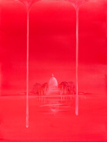
!ese striking canvases were featured in Arsenal Contemporary’s exhibition Standing Withstanding in 2018—the artist’s " rst major solo show in New York City. !e press release describes the show as “a continuation of Koop’s investigation into the contemporary understanding of landscape, in particular this genre as a vehicle for addressing cultural encroachment upon and destruction of the socalled natural world. With a concentration on the interrelationship between nature and human perception, canvases capture the minimal silhouette of various skylines, abstracted through positive and negative space, as a softly optical re-visitation of these sites through the estrangement of memory.”
Here, Koop has employed her signature vibrant colour "elds and minimalistic subject matter. !e diptych features a bold and intense red colour palette, creating a dreamlike and almost surreal atmosphere. !e left panel is nearly monochromatic, with subtle tonal shifts that evoke a glowing, atmospheric expanse. !e right panel introduces a recognizable structure: a domed building, inspired by government and institutional architecture, as suggested by the title. One of Koop’s signature techniques is evident in the vertical drips of paint extending from the top edge and $ anking the building, giving the impression of melting or bleeding colour. ! is e#ect adds a sense of instability, as if the landscape itself is dissolving before the viewer’s eyes.
Despite its minimalist composition, this diptych by Wanda Koop is deeply evocative, leaving the viewer with more questions than answers. !e balance between simplicity and mystery is what makes Koop’s work so compelling—she strips down the subject matter while opening up endless possibilities for interpretation.
$30,000–$40,000
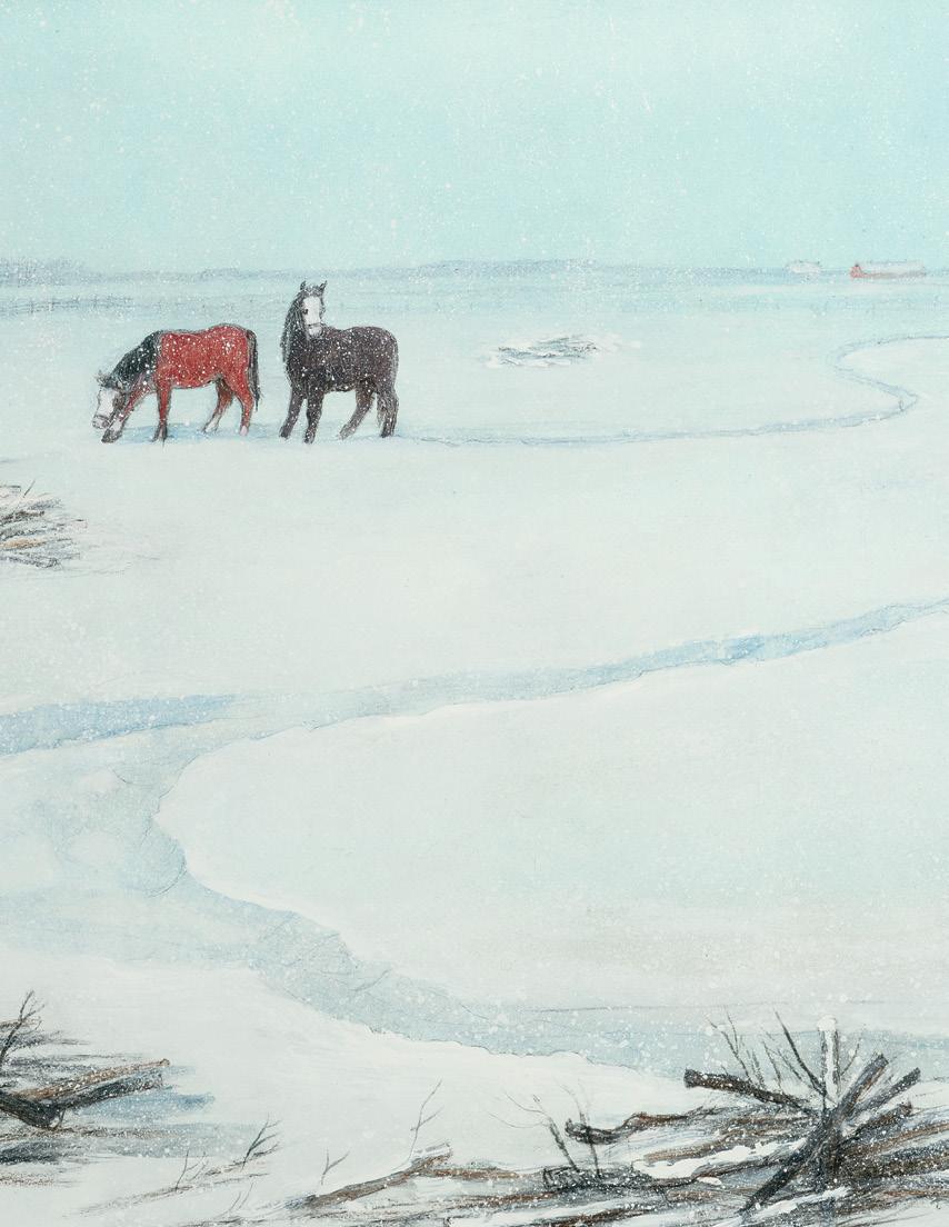
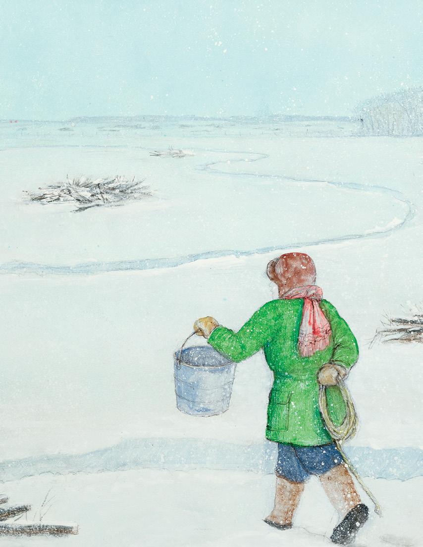
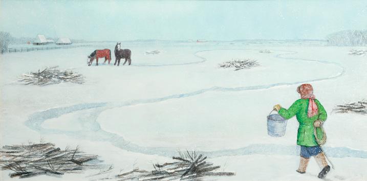
WILLIAM KURELEK
Farm Scene with Two Horses (Going to Feed and Rope), 1974 mixed media on board signed with monogram and dated 1974 lower right; inscribed with the artist's name and "Bau-Xi Gallery, Vancouver" (struck) on the reverse; housed in the artist's handmade frame 17 ins x 34 ins; 43.2 cms x 86.4 cms
PROVENANCE
Acquired directly from the Artist Private Collection, Ontario
LITERATURE
Avrom Isaacs, preface to William Kurelek: An Exhibition of Paintings and Drawings, 1972-1974, Brantford, 1974, unpaginated Patricia Morley, Kurelek: A Biography, Toronto, 1986, page 224
In the mid-1970s the consignor of Farm Scene with Two Horses (Going to Feed and Rope) accompanied a friend to William Kurelek’s studio, where for more than a decade the artist welcomed professional gallerists, seasoned collectors, along with curious neighbours and strangers. In contrast to the gritty warehouses, well-lit industrial lofts, or repurposed historic buildings that many of his Toronto peers were working from, Kurelek set up shop in the basement of his family’s home. In 1965 he, his wife, and the " rst two of their four children moved to 175 Balsam Avenue in the Beaches, a neighbourhood (then considered a suburb) immediately east of Toronto’s downtown. While also known for embarking on lengthy sketching pilgrimages across Canada, between the early 1960s and his premature death at age 50 in 1977, Kurelek’s most consistent creative base was this four-by-six foot unventilated, poorly lit former coal cellar. Drawn to the painting’s composition, the visitor acquired Farm Scene from the artist (it had originally been intended for sale by Vancouver's Bau-Xi Gallery), enjoying it for half a century.
! is panoramic scene depicts a farmer trudging over a snow-covered "eld, following a packed, meandering path that leads to a pair of horses. He holds aloft a bucket of feed, while concealing a coil of rope behind his back, enticing the animals with food so that he can accomplish an ulterior goal. !e painting—its landscape and the activity taking place—reimagines the world of Kurelek’s youth. He was born east of Edmonton in 1927 and raised on a farm north of Winnipeg. His parents, relatives, and many of their friends had either arrived on the Prairies from rural Ukraine over the previous three
decades or were the second-generation o# spring of immigrants. !e two thatched-roofed structures on the painting’s horizon replicate the village houses common in the communities of Kurelek’s ancestors, the " rst permanent lodgings many Ukrainian newcomers built in Western Canada before constructing a modern North American farmhouse.
Farm Scene encompasses two subjects that are central to most of the artist’s mature oeuvre: the virtuous grit of farm life and pride in Ukrainian cultural identity. While Kurelek sometimes treated these subjects separately—he completed series documenting the agrarian experiences of other cultures in Canada and depicted Ukrainian Canadians in contexts beyond farm and "eld—his tendency to draw inspiration from personal memory ensured they often appeared entwined. Kurelek’s interest in his Ukrainian heritage was rekindled in the mid-1960s by the Ukrainian Women’s Association of Canada, whose members encouraged him to paint what became e Ukrainian Pioneer Women in Canada series for display at Expo 67 in Montreal. His interest in documenting farm life intensi "ed after settling in Toronto in 1959, during a series of road trips the artist made through Western Canada beginning in 1963. !ese two interests became increasingly interwoven in work created after 1970, when Kurelek travelled to what was then Soviet Ukraine for the " rst time. He described the “steep thatched roofs” of the old country as a “delightful, paintable [subject].” !eir combined realization in Farm Scene came at a time when Kurelek was experiencing his greatest renown, in Canada as well as the United States.
And yet, as with so many of the artist’s popular genre paintings, what at " rst seems pleasantly mundane and nostalgic about Farm Scene hints at deeper meanings that ultimately re$ect the Roman Catholic faith that had been Kurelek’s guiding light since the late 1950s. Indeed, as his longtime dealer Avrom Isaacs perceptively put it in 1974, the same year this work was painted: “You think you have acquired a nice [P]rairie landscape, but after a while you realize that there is a great deal more there than meets the eye.” For Isaacs, Kurelek was a religious artist at root, “regardless of his subject matter.” !e farmer’s homely and humorous attempt to trick his horses also carries the dimension of a painted parable, Kurelek encoding a subtle reminder of humanity’s capacity for deceit on a minor stage of everyday life.
We extend our thanks to Andrew Kear, Canadian art historian and Head of Collections, Exhibitions and Programs at Museum London for contributing the preceding essay. Andrew is the past Chief Curator and Curator of Canadian Art at the Winnipeg Art Gallery, a curator of the 2011-2012 national travelling exhibition William Kurelek: e Messenger and author of the Art Canada’s Institute’s William Kurelek: Life & Work (2017).
$100,000–$120,000
Echo Bay, Great Bear Lake, 1959-1960 oil on canvas
signed lower left; titled on a gallery label on the reverse
" e following is inscribed on a label on the reverse next to attached maps: "From a sketch made in August 1959 during a trip to Port Radium with Dr. M.H. Haycock of the Mines and Technical Surveys Dept. Port Radium is located at the site of Labine's Radium discovery and the original Eldorado Mine of Eldorado Mining & Re #ning Ltd.
" e general area is shown on the maps. Dr. Jackson made his sketch from a location on the southern point of Gossan Island MR 5824 looking out in Echo Bay across the mouth of the southwestern arm.
" e painting was presented to the AHQ O $ cers Mess on 27 May 1960 by the o$ cers of Corps of RCEME. " e presentation was made by Colonel R.A. Campbell OBE CD, Director of Electrical and Mechanical Engineering to Major General J.D.B. Smith CBE DSO CD, who received it on behalf of the AHQ O $ cers Mess. Dr. A.Y. Jackson was also present for the presentation."
25.25 ins x 32.25 ins; 64.1 cms x 81.9 cms
PROVENANCE
Presented by Colonel R.A. Campbell to Major General J.D.B. Smith and AHQ O %cers Mess, 27 May 1960 Galerie Claude La "tte, Montreal Private Collection, Vancouver He#el, auction, Vancouver, 22 May 2008, lot 107 Private Collection, Mississauga
LITERATURE
Naomi Jackson Groves, A.Y.'s Canada , 1968, pages 208, 212, 214 Dennis Reid, Alberta Rhythm: e Later Work of A.Y. Jackson , Toronto, 1982, page 28
An avid outdoorsman, A.Y. Jackson explored Canada's most remote areas. Travelling by boat or canoe through hundreds of lakes and rivers provided the artist with fresh landscapes to both sketch and investigate while camping with companions throughout his career.
A.Y. Jackson’s " rst trip to Great Bear Lake in the Northwest Territories took place in 1938. Gilbert Adelard LaBine, the prospector who " rst discovered pitchblende, arranged for Jackson to be $own to his Eldorado Mine at Port Radium on Great Bear Lake, where the artist spent six weeks exploring and painting the surrounding countryside. Ten years earlier Jackson had been as far north as Yellowknife and expressed a yearning to see the country further north. Ever the intrepid explorer, Jackson remarked, “I guess I am a compass, always heading north. I really do belong to the caribou country, not to the cow country.”
Great Bear Lake is one of the most prominent geographic features of northern Canada. It has a total area of 31,150 square kilometres, with "ve arms radiating from the central body. It is the eighth largest and most northerly major lake in the world. ! is region, which so intrigued Jackson, was formed during the last retreat of the polar ice cap about ten thousand years ago and is " lled with innumerable lakes, rocky hills, patches of spruce and small birch trees. ! rilled by the vast scale of the country, Jackson wrote to his niece, Naomi Jackson Groves, “ !e skies are far away, and everything that takes place does it over a thousand square miles.” ! is raw and vital northern land so enthralled Jackson that he returned in 1949, 1950, 1951 and 1959. In 1949, he landed in Port Radium with artist Maurice Haycock, and in 1950, at Port Radium again, he explored the Barrens and camped near Teshierpi Mountain, in the Kitikmeot region. In 1951, from Great Bear Lake he travelled with John Rennie farther northeast along the Coppermine River to the September Mountains and west to Hunter Bay. After landing in Port Radium in 1959, he explored Hornby Bay and Atnick Lake, then went on to Lac Rouvière in the Barrens.
During his 1959 trip to Great Bear Lake, Jackson kept an informal diary and wrote letters detailing his experiences. In a letter dated 28 August, he described an event from the 24th:
“We left the buildings of the Eldorado boat yard and, that afternoon, were forced to seek shelter in a small bay behind a point. !e bay was bordered by steep cli # s of rock, which re$ected the sound of our voices, and for that reason, we called it Echo Bay.”
!e name Echo Bay was originally applied by Canadian geologists Dr. James Mackintosh Bell and Dr. Charles Camsell to the innermost bay at what is now Port Radium and not to the neighbouring "ord-like bay, as it applies today.
! roughout his "ve trips to Great Bear Lake, Jackson often collaborated with geologists and mining engineers, sharing in their fascination with the land. In his travels around Canada, Jackson sought to capture the very essence of the land wherever he went, and in this impressive canvas he captures the wild, open land stretching o# into a great distance. Dennis Reid asserts that the “journeys to Great Bear Lake and the Barren Lands resulted in some of the " nest sketches of Jackson’s career. Viewed as a group, they are unrivalled. !e primeval nature of the landscape appealed to him, with its vigorous midsummer life clinging tenaciously to the margins of existence. Nothing extraneous survives. Fundamental values seem clear.”
!e rugged landscape of Great Bear Lake enthralled Jackson. Located on the boundary between boreal forest and tundra, the artist was surrounded by rocky hills, open patches of spruce and no farmlands. Dr. Bell, the geologist with whom Jackson had met in 1928, noted in his research of the area that the striking colours at the entrance to Echo Bay resulted from greenstone with calcspar containing chalcopyrite. He also observed that the lake’s shores were stained with cobalt bloom and green from copper. ! is suggests that the vivid hues seen in Echo Bay, Great Bear Lake were not merely an artistic interpretation but an authentic re$ection of the natural landscape. Not only has Jackson recorded a region rich in geological delights, but an area historically known for its mining activities and industry, re$ecting the abundance of natural resources, stunning scenery and innovation of the people.
$100,000–$150,000

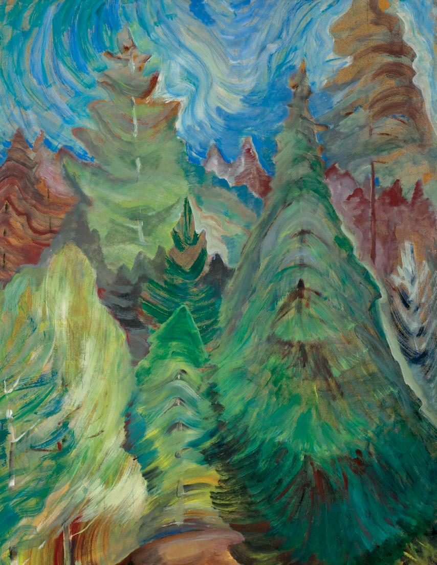
Fir Trees, circa 1935 oil on paper laid on board stamped (twice) in the lower left corner; titled to two gallery labels, inscribed "46", "828C" and "V40" on the reverse 36 ins x 24 ins; 91.4 cms x 61 cms
PROVENANCE
Dominion Gallery, Montreal Masters Gallery, Calgary, 1990 Private Collection, Calgary
EXHIBITED
Emily Carr Retrospective, Masters Gallery, Calgary, 2013
Emily Carr, like her colleagues in the Group of Seven, retained a deep interest in working en plein air throughout her career. While most of her canvases were painted in her studio, the studies, on which these works were based, were always executed outdoors. !e media Carr used for outdoor sketching changed throughout her career. She moved from using watercolour as her principal sketching medium to charcoal and later oil on paper. Most of Carr’s oil on paper sketches are undated, but during the 1930s she used this medium as her preferred sketching method. Carr chose to use sheets of manila paper as the support for her sketches and she employed oil paint, thinned with gasoline, as her principal sketching medium. !e use of oil on paper had several advantages for Carr. !e paper on which she painted was inexpensive and lightweight. !e paper could be readily attached to a painting
board which she could easily transport, along with her paints, out into the natural world. By thinning her oil paint with gasoline, she was able to create a medium that allowed her to work both directly and quickly. !e thinned paint was fast drying, allowing for relatively easy transportation of her " nished oil sketches. Finally, Carr was not a wealthy woman and the use of oil on paper enabled her to make sketches at relatively little cost, while the medium allowed for an intensity of visual expression that watercolour could not provide. In the early 1930s Carr used oil on paper as a sketching medium for canvases which she completed in her studio. She quickly recognized the appealing immediacy of the medium and realized that these expressive images could stand on their own as complete works of art. While there are many examples of oil on paper sketches that are preparatory studies for later canvases, most of Carr’s oil on paper compositions are complete artworks in their own right.
Southern Vancouver Island is a richly forested landscape. Areas around Victoria, where Carr lived, provided a tremendous variety of subjects. During this period Carr had a small house trailer which she called, " !e Elephant". She would have " !e Elephant" transported into the forested landscapes near Victoria and spend concentrated periods of time depicting the forest landscape. !ese sketching trips remained an essential part of Carr’s artistic life until the early 1940s.
Fir Trees is a vivid example of Carr’s direct approach to the forest landscape. A densely treed vista is seen beyond a small patch of soil in the immediate foreground. !e overlapping forms of the trees suggest the density of the forest, but Carr has been careful to distinguish the forms of the individual trees. Subtle variations in colour and brushstroke give the trees distinct forms within the forest. !e use of a line of light to de" ne the form of the pine on the right gives the tree a sense of three-dimensional volume. What is likely a deciduous tree at the left has a $ atter form, but Carr’s use of upward strokes suggests the life force of the tree itself. Indeed, the contrast in tree forms throughout the composition gives the forest both a rich and compelling variety and a strong sense of movement. ! is forest is vividly alive, and Carr has complimented that sense of motion in the swirling patterns of the sky above. !e whole composition is enlivened by the visual force of Carr’s remarkably varied use of paint and form.
Carr’s oil on paper sketches are amongst her most important contributions to Canadian art. No other Canadian painter explored the idea of the sketch more intensely and brilliantly than Emily Carr.
We extend our thanks to curator and art historian, Ian !om, for his assistance in researching this artwork and for contributing the preceding essay.
$275,000–$375,000
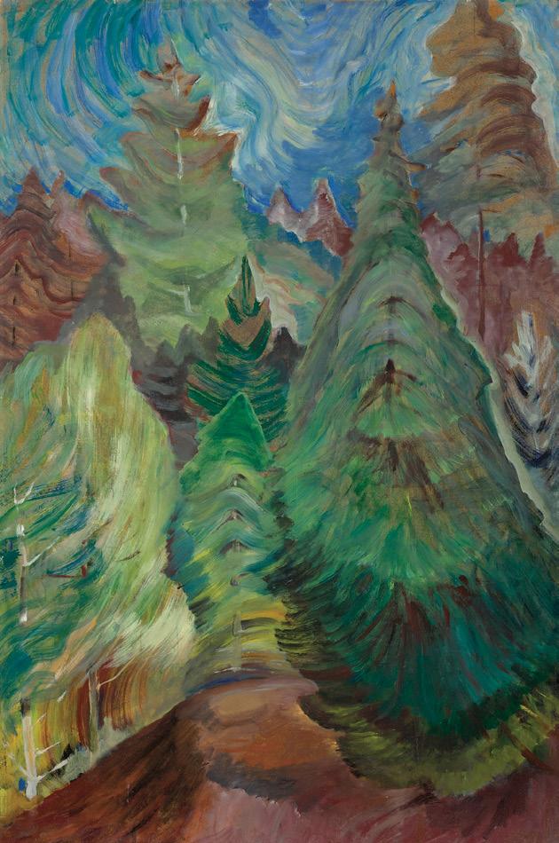
CASSON
The Village Store, Bradford, circa 1928 watercolour signed lower right; titled on a gallery label on the reverse 17 ins x 21 ins; 43.2 cms x 53.3 cms
Roberts Gallery, Toronto
Joyner Fine Art, auction, Toronto, 21 November 1997, lot 58 Masters Gallery, Calgary, March 1998 Private Collection, Calgary
LITERATURE
Paul Duval, Canadian Water Colour Painting, Toronto, 1954, unpaginated Ian !om, Casson's Cassons, Kleinburg, 1988, pages 5, 18
Alfred Joseph Casson lived most of his life in Toronto where he was born in 1898. His " rst experience of small town Ontario was in childhood; he would make frequent visits to Meadowvale, a village west of Toronto, where he had family ties. Here, and later in Guelph, he developed a taste for rural life. After studying in Toronto with artists J.W. Beatty and Harry Britton, Casson began an apprenticeship in the commercial art " rm of Rous and Mann under Franklin Carmichael in 1919. Carmichael, a member of the Group of Seven from its inception in 1920, was an important in $uence on the younger Casson, taking him on sketching trips and introducing him to other Group members. Around this time, Casson began to explore Ontario in a newly purchased car, sketching and painting the rural towns. He later explained that this subject matter had given him the distinct
identity he sought within the Group, as did his penchant for painting in watercolour. His legacy, he believed, was a body of work that recorded for posterity the rapidly disappearing rural towns of Ontario, just as A.Y. Jackson had done in Quebec.
Villages outside of Toronto, such as Elora, Salem, Uxbridge, and in this instance, Bradford, were among the many places he depicted in the 1920s and 1930s. Working full-time at a commercial art " rm until 1959, Casson could go further a "eld to paint and sketch only on weekends and holidays. e Village Store, Bradford exempli "es many of the de" ning features of his work: a nostalgic depiction of rural Ontario, a strong sense of design, and a distinctive atmosphere achieved through colour and lighting qualities that distinguished him from other members of the Group. His deep appreciation for patterning, particularly evident in his architectural subjects, extended throughout the entire composition. ! is painting also contains several " gures standing by the entrance of the store—a rare occurrence in Casson’s work.
On the artist's dedication to watercolours, Paul Duval writes that Casson “had become one of the most powerful and expressive watercolour painters Canada has ever known. His compositions had acquired a sure formalization, his washes were laid with a consummate assurance and the boldness of his colour revealed a brilliance and depth then rarely seen in the medium.” Deep purples accentuate shadow and imperfections in the rock formations while subtle washes of grey and faint yellow illuminate the rocks to the left of the composition. Ian !om writes, “what also emerges with startling clarity is an exquisite, emotional tension. His ability to use composition, colour, light, technique and subject matter to create images of a preternatural, haunting stillness, may be Casson's greatest achievement as a painter.”
$50,000–$70,000
My Dad Just Passing by the Village, 1987 acrylic on canvas signed lower right; titled on the stretcher, titled and dated 1987 on an artist label on the reverse 24 ins x 30 ins; 61 cms x 76.2 cms
PROVENANCE
Masters Gallery, Calgary Private Collection, Calgary
LITERATURE
John Ansor and !ecla Bradshaw, A Cree Life: e Art of Allen Sapp, Vancouver, 1977, page 27
Allen Sapp’s depictions of his memories growing up on the Red Pheasant First Nation close to Battleford, Saskatchewan, reveal an honesty and tenderness. We can imagine as the viewer that we are Sapp, watching his father stand atop a sleigh of logs, leaving tracks in the fresh snow as he is pulled to join the other sleighs in the distance. Further into the scene, under a grey winter sky, two children are playing with dogs, surrounded by the small houses of their village.
Sapp focused on the life of Cree people on the reserve in the 1930s and 1940s and often depicted his own family members. Alex Sapp, the artist’s father, was formerly Alex Saposkum, meaning “He-passesthrough”, but due to societal pressures, the decision was made to anglicize the family name to Sapp. Here Alex embodies this name, as he passes through the scene, working hard to support the young artist and his six siblings; of which only Allen Sapp and two others would survive to adulthood. Given the name Kiskayetum, meaning “Heperceives-it,” Allen Sapp was committed to drawing as early as the age of eight. Sapp’s father has re$ected fondly on his son's interest, saying:
“Sometimes he would do little drawings, drawing all sorts. And my children, those others, did not do that, only him. Kiskayetum was watching us, listening, " xing little things with his hands, drawing pictures on wrapping paper.”
Encouraged by his father to embrace his Cree identity, Allen Sapp kept his ancestral heritage alive within himself by bringing it to life for others through his paintings.
$2,500–$3,500
National Gallery, arriving in Ottawa in October 1939. ! is painting would have been completed right at this time, as it depicts the fall foliage in Kingsmere, a suburb of Ottawa.
Fall Colours, Kingsmere, Ontario, 1939 oil on board
signed and dated 1939 lower left; signed, titled and dated on a label on the reverse 12 ins x 16 ins; 30.5 cms x 40.6 cms
PROVENANCE
Acquired directly from the Artist Mrs. N.D. Young, 1955
By descent to Mr. Doug Young, 1970 Masters Gallery, Calgary, March 1997 Private Collection, Calgary
In 1938, Arthur Lismer accepted a position as a visiting professor at Teacher's College, Columbia University. He devoted the remainder of his time to visiting New York City schools and colleges; there, he studied the concepts of art education. He then accepted a post at the
!e intention was to organize a national art program, but the plan was never fully realized and the outbreak of the Second World War drastically reduced the activities of the gallery. However, Lismer continued lecturing on historical artists such as Brueghel, Goya, Daumier, Cézanne, and Van Gogh. In 1940, he became an Educational Supervisor for the Montreal Museum of Fine Arts. In 1946, he was elected a full member of the Royal Canadian Academy of Arts.
!e foliage and changing of the seasons were a constant preoccupation of the Group of Seven artists. In this painting, a distinct evergreen tree stands prominently near the centre, contrasting with the surrounding trees in warm autumn hues. !e background features rolling hills or distant trees under a blue and grey sky, adding depth and atmosphere. Lismer has used his signature thick and expressive brushstrokes, giving the painting a textured, dynamic quality.
$20,000–$30,000
Green and Brown, Boston Corners, 1917 watercolour signed and dated "June 9, 1917" at right edge; inscribed "Green & Brown" (by Patsy Milne) on the reverse; inscribed "EW #17 David Milne: Boston Corners: Purple and Green" (by Douglas Duncan) on the old mat attached to the reverse; catalogue raisonné no. 107.88 15.25 ins x 22.25 ins; 38.7 cms x 56.5 cms
PROVENANCE
Douglas Duncan, Picture Loan Society, circa 1962 Private Collection, Whitehorse, Yukon
LITERATURE
David Milne Jr. and David P. Silcox, David B. Milne: Catalogue Raisonné of the Paintings, Volume 1: 1882-1928, Toronto, 1998, listed and reproduced page 182, no. 107.88
Katharine Lochnan, David Milne Watercolours: Painting Toward the Light, Toronto, 2005, pages 44, 53
Sarah Milroy and Ian A.C. Dejardin, David Milne: Modern Painting, London, 2018, pages 17-22
Green and Brown, Boston Corners was painted shortly after David Milne and his wife Patsy moved to the small village of Boston Corners, New York in 1917. !e artist grew tired of New York City, and sought a new location that was a reasonable distance from the city, suitable for painting, and, as Milne remarked, “preferably with hills to sit on while painting other hills.” !e plan was to paint full-time while undertaking freelance commercial work. However, Milne ended up " nding it very di %cult to " nd clients in a town with a population of 96, and dedicated most of his time to painting. Art historian Ian Dejardin writes that “Boston Corners was to inspire some of his most distinctive works,
particularly the view over the valley to the hills beyond, the foreground and middle ground marked by strings of trees and buildings. For Canadians, these are among his most iconic paintings.”
For the eighteen months following their move, Milne found all of his watercolour subjects within a few miles of his house. !ey were painted en plein air, often with a graphite sketch beneath the pigment, and Milne claimed not to alter them once they were done. He painted many pictures of the same subjects; they are both variations on a theme and an obsessive search for what he considered perfection. Milne wrote of the Boston Corners years: “Painting subjects were scattered all over the place but rarely were more than two miles away. All were painted on the spot, and then, good or bad, left alone; no attempt was made to develop or change or repaint after the original painting was done. [...] !e radius of my painting was determined by time, load and frame of mind. If my attention hadn’t escaped from the round of day by day events and become " xed on painting subjects and painting methods within the leisurely two-mile walk, it wasn’t apt to that day.”
Green and Brown, Boston Corners illustrates the $ at, pattern-like quality Milne admired in Monet and incorporated into his rural American scenes. !e $ attened perspective and decorative paint application on bare paper recall the fragmented landscapes of Cézanne, whose work he also admired in New York City. !e watercolour is intricately and deliberately composed, while simultaneously loose and spontaneous in its line and contours. Milne’s watercolour method consisted of painting the black outlines of each form, " lling some in with colour applied directly to the paper, and then adding water to the rolling hills in the background to create a soft, blended appearance.
Green and Brown, Boston Corners exempli "es Milne’s strong predilection for line that was given increased prominence during his early years in Boston Corners.
$60,000–$80,000
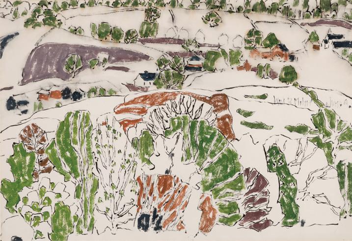
YVES GAUCHER
Ocres, jaune et vert, 1974 oil on canvas signed, titled "Ochres [sic], jaune et vert" and dated "January 1974" on the reverse; unframed 80 ins x 100 ins; 203.2 cms x 254 cms
PROVENANCE
Private Collection, Quebec City Sotheby's, auction, Toronto, 23 November 2010, lot 113 Private Collection, Halifax
Yves Gaucher’s masterly abstractions are a prime example of how various and visually rewarding this mode of painting has been over its roughly hundred and twenty-"ve year history. Historically, Gaucher is part of an unbroken examination of abstraction in Quebec from the 1940s to the present day, a remarkably long and potent engagement. Unlike the famous Automatists of an earlier generation–led by PaulÉmile Borduas– Gaucher nonetheless extended these pioneering investigations of abstraction. He was inspired directly by Les Plasticiens (Jauran [Rodolphe de Repentigny], Louis Belzile, Jean-Paul Jérôme), and Fernand Toupin and their 1955 Manifeste des Plasticiens Like these artists but in a younger cohort of "post-Plasticiens" including Charles Gagnon, Guido Molinari, and Claude Tousignant, Gaucher took abstraction into a more American-looking, hard edge direction.
An innovative printmaker, in painting Gaucher applied pigment with a roller and taped the edges where colours meet to achieve a strikingly clear abstract image. Ocres, jaune et vert–part of the colour-band series Gaucher began in the 1970s–exempli "es this technique and its visual impact. Our mind and body instinctively take measurements of the relationships in size and colour as we stand in front of the work. How do the bands meet and play o# one another? !e yellow band looks quite di #erent where it abuts the vibrant green versus where its edges
meet the ochre just above. ! is painting looks di #erent again from Ocres, jaune no. 2 (Collection Musée d'art contemporain de Montréal), also 1974, for example, where all bands are of a similar hue. We might also wonder how the painting would be di #erent if, for example, we "removed" one of the lateral stripes, as we can easily do by masking our gaze.
Precise edges encourage optical e#ects. Gaucher’s vibrant colour in the mid-1970s is a response, a way to work away from, his exquisitely subdued grey-on-grey works of the late 1960s or those combining grey and blue in the early 1970s. !e opposite of what some New York critics thought was impersonal, Gaucher sought a strong response from viewers. !e mood and e#ect of his colour band paintings extend from his colour choices and their combination. What is our mental state when we stand in front of the painting? Perhaps excitement, or animation? For Gaucher and many viewers, that response is akin to hearing and feeling music. He was famously struck by spatial movement in the compositions of Anton Webern, which he " rst heard in Paris in 1962. Analogies with music are of course central to the pioneers of abstraction, particularly Af Klint, Kandinsky, Kupka, and Mondrian. Gaucher was also fascinated by classical Indian music, titling his own works Raga on occasion. Visually and theoretically, he worked through Josef Albers’s colour experiments and Mondrian’s Neoplasticism as articulated in e New Plastic in Painting (1917) and subsequent essays. "Plastic" here is not a material but the ability to mold and change, used originally in the context of carving and modelling and renewed by Mondrian and other members of De Stijl in the early twentieth century. Gaucher extended and enriched these traditions in our own time.
We extend our thanks to Mark A. Cheetham for contributing the preceding essay. Mark is a professor of Art History at the University of Toronto, an independent curator, and art writer. Mark is the author of two books on abstract art: e Rhetoric of Purity: Essentialist eory and the Advent of Abstract Painting (1991) and Abstract Art Against Autonomy: Infection, Resistance, and Cure Since the ‘60s (2006)
$40,000–$50,000

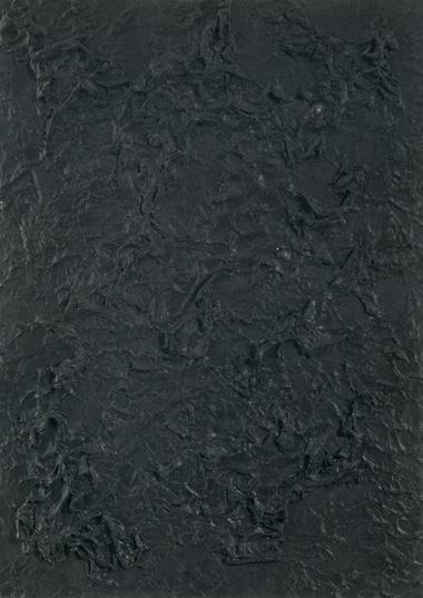
Untitled #7, 1981
acrylic on paper
signed, titled and dated "May 6, 7, 1981" in the lower margin; titled and dated "May 6, 7, 1981" to two gallery labels on the reverse 27 ins x 19 ins; 68.6 cms x 48.3 cms
PROVENANCE
Carmen Lamanna Gallery, Toronto Private Collection, Ontario
Michael Gibson Gallery, London, Ontario Private Collection
LITERATURE
Ron Martin, "A Justi "cation for Abstraction 1988", in Ron Martin: 1971-1981, Toronto, 1989, page 106
Walter Klepac, Ron Martin, To Foil Oils Phase III and IV, Toronto, 1999, unpaginated
Born and raised in London, Ontario, Ron Martin has been associated with the London Regionalism group of artists, which included Greg Curnoe, Jack Chambers, and Paterson Ewen. In $uenced by Curnoe’s interest in Marcel Duchamp and Kurt Schwitters, Martin developed a strategic and conceptual approach to abstract painting. He paints in series, exhausting his objective before moving on to the next. In 1974, Martin began painting black paintings, a colour that he focused on until 1981. !e gestural paintings shared a consistent and pre-de" ned method of working. !e artist would constrain himself to a speci "c size of canvas, a speci "c amount of black paint and a " xed amount of time to make each black painting.
Martin emphasized the importance of the viewer’s intellectual engagement with his work, writing: “When I was installing the scraped-o# black paintings in a 1981 show at the AGO, they looked like empty-blank surfaces with nothing on them. It took an act of the will, through an intense process of observation, to redeem their familiarity. And it was not until this had happened that I realized that the making of these paintings has been reduced absolutely to a physical process that was, in turn, the container for psychic projection, ‘pure’ and ‘simple’. By pure, I mean the idea and by simple, I mean the symbol. Idea and symbol go hand and hand. You cannot have one without the other.”
$12,000–$15,000
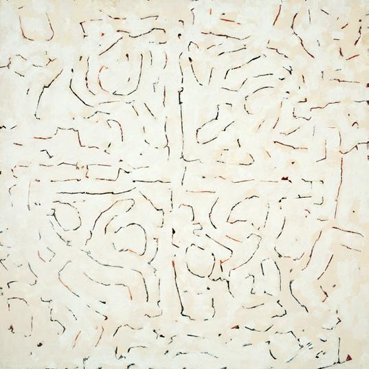
Untitled, 1961 oil on board
signed and dated "July-September 1961" faintly on the reverse 48 ins x 48 ins; 121.9 cms x 121.9 cms
PROVENANCE
Moore Gallery Limited, Toronto Private Collection
In 1958, Ronald Bloore, then the director of the Norman MacKenzie Art Gallery in Regina, brought national and international exhibitions to the city. He and four other abstract painters—Kenneth Lochhead, Arthur McKay, Douglas Morton and Ted Godwin—shared a common professional commitment and became a small but active artistic community. Having studied throughout Canada, the United States, and Europe before moving to Regina, the artists combined the major currents of abstract expressionism in the context of 1950s Saskatchewan.
Bloore organized e May Show in 1960 to coincide with the meeting of the Canadian Museums Association. !e show featured the "ve prominent abstract artists as well as architectural drawings and models
by architect Cli #ord Wiens and sculptures by Wolfram Niessen. !e exhibition drew national attention and inspired Richard B. Simmins, Coordinator of Extension Services at the National Gallery of Canada, to select the work of the "ve artists for a travelling exhibition titled Five Painters from Regina !e exhibition appeared in 1961 in Ottawa and Simmins' essay in the catalogue stressed the importance of Ron Bloore and his in $uence on Emma Lake Workshops. Simmins wrote that Bloore brought to Regina a set of values which challenged the other painters. Bloore painted this large untitled composition in 1961, the same year as the National Gallery exhibition with the group who would become known as “ !e Regina Five”.
Bloore studied archaeology throughout his undergraduate and graduate studies, which in $uenced the geometric forms and o#-white colour palettes of his abstract work. From 1973-1974, the artist travelled to Greece, Turkey, Iran and Spain. Bloore became inspired by the symbolism and archaeological quality of the remaining architecture of these early civilizations. Upon his return to Canada the following year, Bloore destroyed all his previous work and renounced the use of colour. He hoped to achieve the same transcendental quality he felt while looking at ancient architecture. !e light, monochromatic palette of this untitled work from over a decade earlier appears to foreshadow this declaration and o%cial renunciation of colour.
$15,000–$20,000
JACK HAMILTON BUSH
Yellow Bikini, 1971
acrylic on canvas
signed, titled and dated "June 1971" on the reverse; catalogue raisonné no. 2.140.191.28
36.75 ins x 46.75 ins; 93.3 cms x 118.7 cms
PROVENANCE
!e Artist
David Mirvish Gallery, Toronto, June 1971 Mr. C.E. O'Beay, January 1972
Albright-Knox Members Gallery, Bu #alo Private Collection
LITERATURE
Sarah Stanners, Jack Bush Paintings: A Catalogue Raisonné, Volume 3, 1996-1971, Toronto, 2024, reproduced page 481, no. 2.140.191.28
Sometimes, a detail in a painting stands out in a way that you just can’t unsee. I’m not sure if Yellow Bikini came about by chance–perhaps the artist was freely painting abstract shapes and happened to notice one resembling a bikini bottom–or if it was a case of life in $uencing art, as often happened with Bush. He once admitted to "pinching" a colour from his wife’s dress, and he frequently recounted how a mannequin’s out "t in a storefront inspired the shapes in his Sash paintings.
Often an artist’s source of inspiration is not that complicated, and that’s what makes the resulting image so powerful. A simple online search of “yellow bikini” and the year of the painting’s execution, 1971, produces a powerful image: none other than the impossibly beautiful Raquel Welch posing in a yellow bikini, captured by the British photographer Terry O’Neill, and published that year as a life-sized poster print (60 x 24 inches). ! is is not the only image of Welch in a yellow two-piece swimsuit; this bright swimwear set was a standard for the American actress throughout the 1960s.
Within the context of the artist’s oeuvre, Yellow Bikini was painted directly after a series of eleven gouache paintings celebrating springtime’s riot of blossoms, including apple blossoms, cherry blossoms, and forsythia. Comparing these works on paper to Yellow Bikini , it’s apparent that Bush used the same yellow to evoke forsythia and the same pink for cherry blossoms. Bush was always most proli "c during the spring, and Yellow Bikini is, like the season, brimming with a sense of fun and optimism.
!e colours in the abstract shapes pop against the grey browns of the background, a colour which Bush frequently used and likened to the dead wood of winter from which new buds break through. An absolute powerhouse of a painting titled May Burst (recently gifted to the National Gallery of Canada from the Council for Canadian American Relations), measuring more than four meters long, is a close relative of Yellow Bikini. An expressionistic cluster of yellow strokes gather at the top right hand corner of May Burst while a clean stroke of green and pink-red are placed close by, all against the sleeping wood-coloured ground. Yellow Bikini was painted one year before May Burst and may have served as a model for this aesthetic approach. Just as in nature, the buds and blooms appear brighter and sharper against a neutral ground.
Whether Bush was celebrating the vitality of Raquel Welch or the assets of spring, the e#ect is the same: gaiety and the excitement of all things fresh and beautiful.
We extend our thanks to Dr. Sarah Stanners, an Adjunct Professor, curator, and author who recently produced Jack Bush Paintings: A Catalogue Raisonné (2024), for contributing the preceding essay.
$100,000–$150,000
Stumps in the Swamp (recto); Hillside Near Palgrave (verso), circa 1932 double-sided oil on canvas signed lower left; signed on the reverse; catalogue raisonné no. 302.175 and no. 302.197 19.5 ins x 23.5 ins; 49.5 cms x 59.7 cms
PROVENANCE
Acquired directly from the Artist by Vincent Massey, 1934 Laing Galleries, Toronto, 1958
Private Collection, Coral Gables, Florida, 24 December 1963 By descent to a Private Collection, England
He#el, auction, Toronto, 22 November 2017, lot 117 Private Collection, Toronto
LITERATURE
David P. Silcox, Painting Place: e Life and Work of David Milne, Toronto, 1996, page 240
David Milne Jr. and David P. Silcox, David B. Milne: Catalogue Raisonné of the Paintings, Volume 2: 1929-1953, Toronto, 1998, reproduced page 552, Stumps in the Swamp, no. 302.175 and reproduced page 561, Hillside Near Palgrave, no. 302.197
David and Patsy Milne returned permanently to Canada in 1929, and settled in Palgrave—in the Caledon Hills north of Toronto—from the United States in the spring of 1930. An artist who constantly worked out of doors, Milne was attracted to the calm, agrarian landscapes he had also portrayed over his many years living in upper New York State. !e Palgrave paintings of 1930-1933 are among Milne’s most accomplished and valued, yet their unique appearance is more than a style: it re$ects how hard the Great Depression hit the Milnes. !ough he exhibited widely at this time, beyond the patronage of the Massey family, sales were meagre. David Milne worked as a farm labourer in return for " rewood, for example, and struggled to buy art materials.
Characteristically frank and insightful about the connections between his manner of painting and his life circumstances, Milne explained in a letter from this time: “ !e reason for this way of putting on the paint is a feeling for economy–of aesthetic means ... a hankering to do things by the slightest touch on the canvas, the brush meeting it and no more ... Some feeling of economy prevents me from varying hues in the same picture (by adding white or less white). ! is is so strong that I sacri "ce economy of touch ... to economy of value in the hues. !ese things are slight when put in words but they are very strong and control you pretty completely.”
In this scene, Milne depicts a forest landscape in his distinctly expressive visual language. !e composition shows a stand of tall, slender trees—many of them bare—with one striking central tree leaning dramatically to the left. !e brushstrokes are loose but deliberate, giving the trunks and branches an almost calligraphic quality. !e swamp in the foreground is rendered in deep blacks with touches of purple and blue, suggesting re$ections and submerged growth. !e bottom right shows a small burst of foliage in purple tones, and there is a single green conifer to the upper right that contrasts with the otherwise autumnal or wintery tones. !e palette is reduced and selective—Milne often used colour sparingly and expressively. Earthy browns, greens, purples, and black dominate the composition, and are used on the landscape depicted on the reverse of the support.
$80,000–$100,000
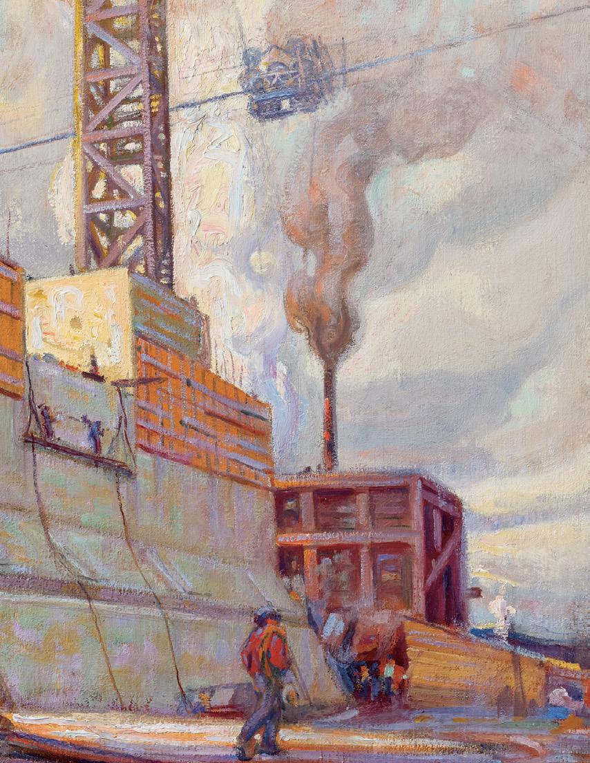
PETER CLAPHAM SHEPPARD
The Bridge Builders, Construction, Bloor Street Viaduct, 1915 oil on canvas
signed lower right; estate stamp on reverse of framing and on crossbar 58 ins x 40 ins; 147.3 cms x 101.6 cms
PROVENANCE
Estate of the Artist
EXHIBITED
44th Annual Exhibition , Ontario Society of Artists, Art Museum of Toronto, 11 March-15 April 1916, no. 117 as Construction, Bloor St. Viaduct at $300
38th Annual Exhibition , Royal Canadian Academy of Arts, Art Association of Montreal, 16 November-16 December 1916, no. 212 as e Bridge Builders (Bloor St. Viaduct, Toronto)
50th Annual Exhibition , !e Ontario Society of Artists, Art Gallery of Toronto, 18 March-24 April 1922, no. 160 as Bridge Building at $350 Paintings and Sculpture by British, Spanish and Canadian Artists and International Graphic Art, Canadian National Exhibition, Toronto, 26 August-9 September 1922, no. 312 as Bridge Building at $400 De ant Spirits: e Modernist Revolution of the Group of Seven , McMichael Canadian Art Collection, Kleinburg, 2 October 2010-30 January 2011
LITERATURE
M.L.A.F. [Fairbairn], "Some Pictures at the Art Gallery", e Toronto Daily Star (11 March 1916), page 5
"Ontario Artists do Daring Work", Mail and Empire (11 March 1916), page 5
Estelle Kerr, "At the Sign of the Maple", e Courier, XIX:17 (25 March 1916), page 13
[Augustus Bridle], "A Little Painting Now and !en", e Courier, XXI:1 (2 December 1916), reproduced page 12 as e Concrete Bridge Harold Mortimer-Lamb, " !e ! irty-Eighth Exhibition of the Royal Canadian Academy of Arts", e Studio, LXX: 287 (February 1917), page 39
!omas Taylor, " !e Bloor Street Viaduct, Toronto", e Journal of the Engineering Institute of Canada , vol. 2, no. 7 (July 1919), pages 485-498 Evelyn McMann, Royal Canadian Academy of Arts/Académie royale des arts du Canada Exhibitions and Members 1880-1979, Toronto, 1981, page 372
Rod Staples, Owen Staples Painter of Canada's Past, Scarborough, 1998, pages 9, 57, 61
Anastasia Rodgers, "Constructing Beauty: !e Photographs Documenting the Construction of the Bloor Viaduct", Archivaria , 54 (Fall 2002), pages 72-91
Ann Marie F. Murnagham, " !e City, the Country, and Toronto's Bloor Viaduct, 1897-1919", Urban History Review, XLII:1 (Fall 2013), pages 41-50
Tom Smart, Peter Clapham Sheppard: His Life and Work , Richmond Hill, 2018, pages 19, 28, 102-107, reproduced page 102, detail reproduced on cover and dust jacket as e Bridge Builders, Construction, Bloor Street Viaduct, 1915
"Bridging the Don: Construction", City of Toronto [online publication], accessed 1 April 2025
A massive reinforced concrete structure, its upper edges still clad in wooden forms, occupies the centre of this remarkable painting. An elevator tower connects the cables carrying concrete-" lled hoppers at the centre of the composition and rises to the blue sky breaking through the clouds. !e blue sky in turn creates a diagonal movement to the blue shadows lower left and to the principal subject of the painting, the workers pulling cables. If the massive structure " lls most of the composition, it is the workers, the “bridge builders”, who animate the scene.
!e bridge being built was in fact one of the most ambitious municipal projects undertaken by the city of Toronto, the Bloor Street Viaduct that would link Bloor Street in the west to Danforth Avenue in the east. !e Don Valley and River had long posed severe problems in cross-city transportation, especially after Toronto annexed Riverdale in 1884 and East Toronto, north of the Danforth, in 1908. !e only bridges crossing the Don were further south between Gerrard Street and the lake and were subject to destruction by $ooding. In 1904 Owen Staples, artist for the Toronto Telegram , began construction of a beautiful Arts and Crafts home near Danforth and Broadview (now 69 Hogarth Avenue) and experienced the challenges faced by workers having to cross the Don. In 1910 he drew the new bridge being built to link Wilton Avenue (now Dundas) to the east side of the river.
!e proposed viaduct had been the subject of repeated debates and its construction was voted down in municipal elections in 1910 and 1912. One issue focused on the route of the connecting roads. At this time Bloor Street only ran east to Sherbourne Street and critics, opposed to the “exaggerated importance of the straight line,” argued that the viaduct should connect to Howard and Parliament streets directing tra %c down to Wellesley Street to cut costs and avoid having to connect Bloor Street to Castle Frank. Finally in January 1913 the Toronto electorate approved a three-part construction: a bridge over the Don Valley from Danforth Avenue to Castle Frank Crescent, another bridge over the Rosedale Ravine, and earth " ll to connect Bloor and Parliament streets. !e Don section would require six concrete piers and the Rosedale section four, lettered from east to west, A through F over the Don Valley, and H through J over the Rosedale Valley Road. Construction started with Pier D, located on the west side of the Don River, the pier depicted in Peter Sheppard’s painting.
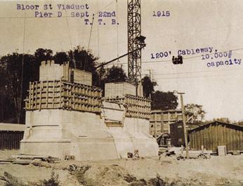
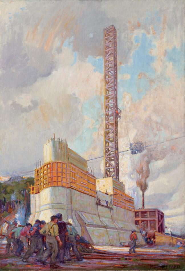
Construction began in January 1915 and advanced rapidly as seen in photographs taken that fall. Attracted by the ambition and scale of this massive project, Sheppard painted oil sketches on site as work progressed. In one sketch, reproduced by Tom Smart in his monograph on Peter Sheppard (p. 104), railway tracks occupy the foreground in front of a recently raised elevator tower, while in a later sketch (p. 106) the pier rises almost to future road level.
Construction of the viaduct was extensively documented in photographs and Sheppard undoubtedly had access to them. Smart reproduces a photograph of Pier D taken on 22 September 1915 from approximately the same angle as Sheppard’s large canvas. However, in the canvas Sheppard dramatizes the scene by elevating the north end of the pier left foreground, and enlarges what is possibly a concrete mixer at the south end below the rising smoke. ! is is merely glimpsed in the September photograph but more clearly seen at the foot of the hill in a photo of piers B, C, and D, taken on 21 October 1915. In the canvas the foreground workers, absent in the photographs, animate the scene and evoke the vast human e#ort of the viaduct’s construction.
Born in Toronto Peter Sheppard, like many of his contemporaries, began his career working for a commercial art " rm and studied at the Central Ontario School of Art and Design (from 1912 the Ontario College of Art), graduating in December 1914. In March 1916 he submitted his large canvas Construction, Bloor St. Viaduct for exhibition with the Ontario Society of Artists. Even amidst all the journalistic fury over J.E.H. MacDonald’s Tangled Garden in the same exhibition, critics praised Sheppard’s ambitious canvas. In e Mail and Empire, the writer noted the uniqueness of the subject matter. “A number of American artists have seen the dramatic power of these engineering
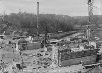
enterprises, and Mr. Sheppard has attacked this subject from the same angle that they have treated it. He shows the men toiling at the construction work, a vital moving scene…” !e same writer noted Owen Staples’ treatment of the same subject “but in a more remote and less compelling manner. His painting is a view of the valley, with signs in the distance that the work is going forward.” And Margaret Fairbairn wrote the Toronto Daily Star, “Mr. Staples gives a distant view of construction work on the Bloor Street viaduct, while Mr. Peter C. Sheppard, under the same title, gives a near view of the enterprise that carries with it an impression of vastness and labor involved that raises it to the level of a great epic.”
Sheppard exhibited the canvas, now titled e Bridge Builders, Construction (Bloor Street Viaduct) with the Royal Canadian Academy of Arts in Montreal the following November. !e new title changed the focus of the subject from the more abstract construction to the heroism of the workers as earlier observed by the Toronto critics. !e Montreal critic and pictorialist photographer Harold Mortimer-Lamb, praised the “ambitious picture” in the pages of the London periodical e Studio while the editor of the Canadian Courier, Augustus Bridle, reproduced the canvas, retitled e Concrete Bridge, beside Early Spring by Sheppard’s former teacher J.W. Beatty. Extrapolating on the importance or lack of importance of Canadian subject matter in art, Bridle wrote, “In the cement picture by Mr. Shepherd (sic), there is no lack of subject. You understand at once that by no kind of brain-twisting could it be considered a picture of sheep, or of twilight, or of the morning after. It is as realistic as a photograph. And it’s considerably, though not typically, a Canadian subject. Other countries build bridges and cement structures. Also one might imagine that the Beatty picture was painted in the State of Maine. To build a national line fence in art is foolishly impossible. We must give the artist room.”
!e Rosedale bridge opened for tra %c on 29 October 1917 and the Don Section on 18 October 1918. !e entire project was completed on 23 August 1919 and was renamed the Prince Edward Viaduct following Prince Edward’s 1919 visit to Toronto. It is more familiarly known today as the Bloor Street Viaduct and is so memorialized in this magni "cent painting by Peter Sheppard.
We extend our thanks to Charles Hill, Canadian art historian, former Curator of Canadian Art at the National Gallery of Canada and author of e Group of Seven‒ Art for a Nation (1995), for contributing the preceding essay.
$100,000–$120,000
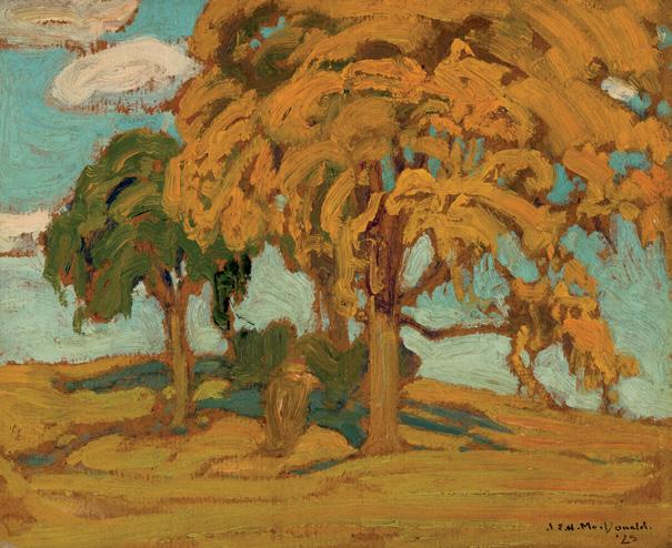
October Elms, 1923
oil on board
signed and dated 1923 lower right; signed and titled on the reverse 8.5 ins x 10.25 ins; 21.6 cms x 26 cms
PROVENANCE
!oreau MacDonald
Dominion Gallery, Montreal, 1923
Mr. Hamilton Larratt Smith K.C. and Harriet Smith
By descent to the present Private Collection, Ontario
LITERATURE
Nancy Robertson, J.E.H. MacDonald, R.C.A., 1873-1932, Toronto, 1965, page 7
Joan Murray, Flowers: J.E.H. MacDonald, Tom omson and the Group of Seven , Toronto, 2002, page 74
Christopher Jackson, e ornhill Circle: J.E.H. MacDonald and his Associates, Markham, 2006, page 5
James Edward Hervey MacDonald is widely regarded for his expansive landscapes of Algoma, Lake O’Hara, and the Canadian Rockies. However, amidst his travels throughout Canada, MacDonald would often " nd inspiration much closer to home.
In 1912, MacDonald and his family moved north of Toronto to !ornhill, later settling on a small four-acre farm named “Four Elms” after the elm trees that towered the property. MacDonald would regularly host artist friends at the “Four Elms” and many of them would ultimately call !ornhill their home. It was in this garden that MacDonald would come to paint his iconic landmark painting, Tangled Garden
Although it remains uncon " rmed if October Elms is located in !ornhill, the image of the lonesome elm trees within rolling hills was a recurring motif for MacDonald’s paintings near his home. ! is a #ection for his surroundings is found in this intimate sketch, capturing the billowing trees as they nearly touch the ground. A brilliant blue-sky peaks between the branches of trees and their imposing height is mirrored in the elongated shadows below them. ! rough this vivid contrast within a serene composition, MacDonald showcases his a #ection for his home and this quiet moment in the Canadian landscape.
It is noted in the records of Dominion Gallery that, upon delivery of this artwork by !oreau MacDonald, this painting was titled Elms, 1923. We extend our thanks to Charles Hill, Canadian art historian for providing additional research related to this artwork.
$20,000–$30,000
L'Escalier, Beauvais, circa 1900 oil on canvas signed lower right 32 ins x 24 ins; 81.3 cms x 61 cms
PROVENANCE
Galerie Georges Petit, Paris, no. 2130, 5 November 1900 Private Collection
Sotheby's, auction, London, 4 December 1968, lot 155 Private Collection, Montreal
EXHIBITED
Société nouvelle de peintres et de sculpteurs, Galerie Georges Petit, Paris, March 1901, no. 61
LITERATURE
Yann Farinaux-Le Sidaner, Le Sidaner: L'Œuvre peint et gravé, Paris, 1989, no. 96, reproduced page 73
Henri Le Sidaner was an Intimist painter with strong in $uences from both impressionism and pointillism, who sought to capture the e#ects of atmospheric light. He created an aura of mysticism with his use of subdued tones and dappled brushstrokes. In the following text provided by Yann Farinaux-Le Sidaner, the great-grandson of the artist and an expert on his work, he describes how Le Sidaner came to Beauvais and recounts the history of this painting:
“On his return from Bruges in May 1900, Le Sidaner met Rodin in Paris at the banquet given in his honour during the Universal Exhibition: 'Why do you go so far?' said the sculptor who advised his young comrade to go and visit the Oise. !e latter was convinced and settled in Beauvais in the middle of the summer with Camille and little Louis: 'It is an enchanted country, by this extraordinary autumn,' he wrote to his friends, 'I work and I am happy having discovered a good retirement in a quiet and pretty provincial life.'
During the year spent in Beauvais, just before the discovery of Gerberoy, the artist a % rmed the new direction of his art: contemplating sleeping cities where the beautiful traces of the past have been preserved. L’Escalier was painted in October in his studio in Beauvais, based on studies taken from the subject, as indicated by the traces of squares that can be found across the surface. As evidenced by the two silhouettes of passers-by in black mantises, the human " gure has lost its place. From then on, it would only be evoked in his work.
Le Sidaner delivered his painting on 5 November, at the price of 500 francs, to his dealer Georges Petit, with whom he had a contract. His views of Beauvais and its surroundings, presented at the 1901 Salons in Paris, were well-received: ' ! is artist manages to make people feel silence,' wrote art critic and poet Émile Verhaeren. L'Escalier contributed to the triumph of the second exhibition of the Société nouvelle de peintres et de sculpteurs, which marked the end of the famous Société Internationale. After 1900, the intimate current would, without saying its name, dominate the Belle Époque.”
We would like to thank Yann Farinaux-Le Sidaner for his assistance with cataloguing this work. A certi "cate of authenticity signed by Yann Farinaux-Le Sidaner accompanies this lot.
$100,000–$150,000
Tres Mujeres Platicando bronze
incised signature, dated 1980 on the lower back of the middle #gure and numbered I/VI on the base
9.5 ins x 15.75 ins x 12.5 ins; 24.1 cms x 40 cms x 31.7 cms
PROVENANCE
Perls Gallery, New York
Elca London Gallery, Montreal Private Collection, Toronto
LITERATURE
Francisco Zúñiga: Sculpture and Drawings [online publication] , Jack Rutberg Fine Arts, Los Angeles, 2018, page 8
Francisco Zúñiga: Catalogue Raisonné [online publication] , no. 877, accessed 10 April 2025
Francisco Zúñiga is a highly esteemed artist in Latin America, recognized for his monumental public sculptures featuring either individual women or groups of female " gures. In both his graphic works and sculptures, his traditionally shawled women convey a sense of calmness, whether posed alone or interacting with one another. Jack Rutberg writes, “ !e " gure-ground relationships in his drawings evoke the same monumental qualities found in his sculptures. What is revealed is that regardless of medium and scale, Zúñiga’s works have an extraordinary capacity to evoke remarkably poignant qualities; at once tender, stoic, and heroically monumental.”
In the smaller format Tres Mujeres Platicando, Zùñiga has created a serene atmosphere as the three women converse in a partial circle. Drawing upon classical and pre-Columbian sources, their faces and draped bodies are sculpted with sensitivity, evoking a calm maternal feeling. !e dark monochrome patina of the bronze enhances the sense of tranquility among the women as they engage in conversation.
$12,000–$16,000
HENRI MATISSE
Fleurs et feuilles, 1942 conté on paper
14.5 ins x 10.5 ins; 36.8 cms x 26.7 cms
PROVENANCE
Pierre Matisse, New York
By descent to Pierre-Noël Matisse, Paris !e Estate of Jacquelyne Miller Matisse
Christie’s, auction, New York, 8-15 February 2023, lot 27 Private Collection
LITERATURE
John Elder "eld, e Drawings of Henri Matisse, New York, 1985, page 84
While Henri Matisse’s cutouts are his most recognizable works— combining the $uid line of his drawings with the vibrant colours of his paintings—his drawings o#er a more intimate mode of expression. Using pen, ink, charcoal and pencil, Matisse showcased his enduring fascination with the " gure, pattern and decoration. According to the artist, he mastered drawing between the end of the thirties and the publication in early 1943 of the book èmes et variations, which was intended to illustrate this accomplishment.
! roughout his career, $owers and plants were recurrent themes in Matisse’s work. As demonstrated in this drawing, they often served as decoration within his larger compositions or as standalone subjects. ! is work presents delicate $owers in bloom, with rounded and tightly clustered petals juxtaposed against thin, elongated leaves in the upper left corner. !e organic, repetitive shapes of $owers and plants provided Matisse with an ideal medium for expressing his $owing, linear designs. Ultimately, he believed that drawing allowed him “to consider simultaneously the character of the model, the human expression, the quality of surrounding light, atmosphere and all that can only be expressed by drawing.”
Georges Matisse has con " rmed the authenticity of this work.
$20,000–$40,000
Sans titre, circa 1962 oil on canvas on board signed lower right 19 ins x 23.5 ins; 48.3 cms x 59.7 cms
PROVENANCE
Parisian Laundry, Montreal Private Collection, Montreal
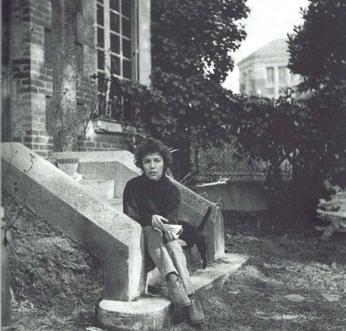
Marcelle Ferron in Clamart
Babalou Hamelin, Le droit d'être rebelle: Correspondance de Marcelle Ferron avec Jacques, Madeleine, Paul et Thérèse Ferron , Montreal, 2016, page 507
Not for sale with this lot
Marcelle Ferron remained faithful to automatism throughout her career; she was driven by the aesthetic, the solidarity of the group, and especially the teachings of Paul-Émile Borduas, who promised her at their " rst meeting that he would show her how to " nd the “joy” in her painting. Ferron had undergone an artistic crisis in the period preceding her meeting with Borduas in 1946, and his art and personality had a life-changing and enduring e#ect on the young painter. A signatory of the Refus Global in 1948, Ferron was one of seven women to sign the manifesto and one of the youngest to do so, at age twenty-four.
By the mid-1950s, Ferron had achieved signi "cant success in Quebec and Canada. She moved to Paris in 1953 and settled in the suburb of Clamart, exhibiting throughout Europe until 1965. Ferron was granted a silver medal at the São Paulo Biennial in 1962, which marked the most recognition a female artist from Quebec had ever received.
In Paris from 1953-1966, Ferron moved away from the Surrealist patterns central to the Automatistes to develop immediately recognizable paintings such as Sans titre. Grounded in her expressive facility with paint, Ferron’s strong gestures with the palette knife create thick layers of colours, ranging from deep purples and browns in the centre to red, yellow and aqua surrounded by the white ground.
In 1966, Ferron returned to Quebec and abandoned painting to work in stained glass for several years. A politically active artist, she became involved in various democratic, trade union, and separatist causes. She was drawn to creating public art that would reach everyone. Committed to the democratization of art, Ferron produced several large-scale stained glass works, including in Champs-de-Mars and Vendôme metro stations in Montreal. She was appointed as a professor at Université Laval, and in 1983 she became the " rst female artist to receive the prestigious Paul-Émile Borduas Prize, inspiring a whole generation of artists working to secure a place for women in the arts.
$40,000–$60,000
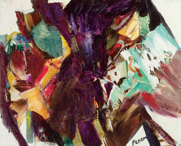
The Good Samaritan, May 1951 oil on masonite
signed and dated 1951 lower left; catalogue raisonné no. 1.183.1951.137
40 ins x 65 ins; 101.6 cms x 165.1 cms
!e Artist
Estate of the Artist, 1974
Jack Bush Heritage Corporation Private Collection, Ontario
80th Annual Exhibition, Ontario Society of Artists, Art Gallery of Toronto, 1952, no. 11
Jack Bush: Early Work , Art Gallery of Ontario, Toronto; travelling to Laurentian University Museum and Arts Centre, Sudbury; !under Bay National Exhibition Centre; Oakville Centennial Gallery; Woodstock Art Gallery; Dalhousie Art Gallery, Halifax; Acadia University Art Gallery, Wolfville, 21 December 1985-January 1987, no. 50
LITERATURE
80th Annual Exhibition, Ontario Society of Artists, Toronto, 1952, no. 11, unpaginated, reproduced
Robert Reid, "Creative Struggle: Jack Bush Earned International Acclaim", Kitchener-Waterloo Record (22 September 1968), page 17
Murray Battle, Jack Bush [video], National Film Board of Canada, Ontario, October 1979
Christine Boyanoski, Jack Bush: Early Work , Toronto, 1985, no. 50, reproduced page 66
"Bush Works at Dal Gallery", Halifax Mail Star and Halifax Chronicle Herald (19 November 1986)
Sarah Stanners, Jack Bush Paintings: A Catalogue Raisonné, Volume 1, 1920-1954, Toronto, 2024, reproduced pages 404-405, no. 1.183.1951.137
Before his international reputation as an abstract painter took shape, Jack Bush was an award-winning painter of landscapes and " gures. As a student of the Ontario College of Art, he won a scholarship for the 1928-1929 school year in the subject of life studies. In 1946, as a member of the Ontario Society of Artists (OSA), he won the prestigious Rolph-Clark-Stone purchase award for a painting in the vein of American regionalism titled Village Procession , now in the collection of the Art Gallery of Ontario.
Bush continued showing in OSA exhibitions, and in 1952 he won the J.W.L. Forster Award for Best Picture in the society’s 80th Annual Exhibition for his powerful oil on masonite painting, e Good Samaritan. Of all the religious paintings by Bush, which were largely produced between the late 1940s and the early 1950s, e Good Samaritan is arguably the best, and the biggest. It is also the only award-winning early work presently not in a museum collection (that is, it may be the only opportunity to acquire an award-winner that predates his Painters Eleven years).
!e Parable of the Good Samaritan is a story told by Jesus in the Gospel of Luke (10:25–37). !e moment that Bush chose to depict is a moment of relief (as felt by the one who is su #ering) matched by a moment of kindness (as exercised by the Samaritan). !e timing here is pivotal, both in the story, and in the way in which Bush described it in paint: dark birds begin to $y away (death is averted) and the drink is about to be accepted (life is promised). It is a moment of mercy in action. !e moral of the story is that no matter what our di #erences are, we must help each other as good neighbours, with love and compassion.
We extend our thanks to Dr. Sarah Stanners, an Adjunct Professor, curator, and author who recently produced Jack Bush Paintings: A Catalogue Raisonné (2024), for contributing the preceding essay.
$45,000–$55,000
Resting Nude
oil on canvas
titled "Nude" to the gallery label on the reverse; F.R. Heaton estate stamp on the stretcher
10 ins x 14 ins; 25.4 cms x 35.6 cms
PROVENANCE
Estate of F.R. Heaton, Montreal
Continental Galleries of Fine Art, Montreal L.M. Hart, Montreal
Private Collection, Montreal
EXHIBITED
e Private Collection of the Late F.R. Heaton , Continental Galleries, Montreal, 22 October 4 November 1949
Ten Montreal Collectors, Montreal Museum of Fine Arts, 8-24 February 1952 (loaned by L.M. Hart)
May Catalogue Show, Walter Klinkho# Gallery, Montreal, May 1991
LITERATURE
[Anon.], "Fine Paintings Shown in Heaton Collection", e Gazette (22 October 1949), page 26, mentions "a comely nude seated in a wooded landscape"
Robert Ayre, "Collection Here Re$ects Discrimination", Montreal Star (15 February 1952), page 32, "mentions a nude in Hart collection"
Lucie Dorais, “Morrice et la " gure humaine/Morrice and the Human Figure”, in Nicole Cloutier, James Wilson Morrice, 1865-1924, Montreal, 1985, page 69
Resting Nude is one of the few portraits and very few nudes
James Wilson Morrice completed during his lifetime. Model studies and portraits count for about six percent of his artistic output.
Morrice’s interest in the human " gure evolved gradually, and then only after his move to Europe. No portraits of family or friends exist from his early years in Toronto, nor from his time studying at the Académie Julian, where the students worked from live models.
Morrice painted his mistress Léa Cadoret, his friend Robert Henri, (likely) Henri Matisse and William Brymner in the mid-to-late 1890s, all in small format oil sketches, which are more spontaneous than large, carefully planned canvases. Numerous sketches of female models " ll his sketchbooks from 1895-1898. Robert Henri wrote to his family that Morrice had painted several very beautiful portraits of models during the autumn of 1898. At about the turn of the century, Morrice seems to have lost interest in the study of the human " gure as a stand-alone subject. His landscapes, meanwhile, became increasingly animated by human activity, and many of the oil sketches of this period show people sitting in cafés. !e subject of nude and clothed models was revived somewhat around 1908, when he presented one at the Salon d’automne in 1908. !e brighter palette of his portraits of the years to come were likely in $uenced by the colourful work of Pierre Bonnard and Henri Matisse.
Author Lucie Dorais has remarked on the link between the artist’s " gural work and his own character, writing: “All of Morrice’s portraits, whether they represent friends or professional models, bear the stamp of his reserved disposition. !e models are almost always seen from a distance, sometimes in pro" le, and most of the nudes have their back to the spectator. !e artist, who was extremely shy, perhaps wished in this way to avoid any interference from the subject, so that he could concentrate on his aesthetic preoccupations, especially the harmony of colour tones.”
We extend our thanks to Lucie Dorais, Canadian art historian and author of J.W. Morrice (1985), for assisting with the research on this artwork.
$40,000–$60,000
JESSIE WILLCOX SMITH
Study for a Portrait oil on canvas
signed lower left; signed on the frame; signed and titled " " e Green Gate" on a label on the reverse
30 ins x 25 ins; 72.2 cms x 63.5 cms
PROVENANCE
Private Collection, Victoria, British Columbia By descent to the present Private Collection
LITERATURE
" !e Secret Was About Covers", Good Housekeeping, November 1917, reproduced page 34 as Study for a Portrait
S. Michael Schnessel, Jessie Willcox Smith, New York, 1977, pages 133, 204
Jessie Willcox Smith was one of the most celebrated American illustrators of the twentieth century. She illustrated over sixty books and created 450 illustrations for periodicals. Her works capture the timeless joys of childhood and motherhood as seen through a woman’s eyes, immortalizing those $eeting moments on print and canvas.
!e beginning of the 1900s provided many opportunities for aspiring illustrators, with advances in printing and a growing public demand for art. After studying at the Pennsylvania Academy of the Fine Arts, the turning point in her career was in 1894 when she attended a class in illustration at the Drexel Institute of Arts and Sciences led by Howard Pyle, who provided the foundation for her future work while o#ering contacts in the publishing industry. Smith would begin working with leading periodicals, such as Collier’s, e Ladies Home Journal, Scribner’s Magazine, and Good Housekeeping. She became universally recognized when o#ered an exclusive contract to illustrate for Collier’s in 1904, where she developed the subject for which she is best known: her idealized and playful representation of children.
During the early 1920s, she devoted much of her time to portrait painting. Study for a Portrait was likely painted in West Mount Airy, where Smith built a home and studio, called Cogshill, her spacious studio facing one of the blossoming gardens. !ere, she focused on her various book and magazine projects and painted several children’s portraits each year. In a productive year, Smith would paint more than a dozen portraits on commission. Her fees were quite substantial for the time: $500 for a bust portrait, $1,000 for a full-length portrait, and negotiable fees for portraits featuring multiple subjects.
!e children were from the Cogshill area and were part of some of the wealthier families in Philadelphia. She allowed them to wander the lush gardens while photographing them with her Kodak box camera. !e children’s appearance became the trademarks of Smith’s young models, characterized by their neatly combed hair and expensive dresses and uniforms. Despite their re" ned look, they embodied the American boy and girl next door. Cogshill not only o#ered interesting nooks and corners where children loved to play, but Smith “would watch and study them, and try to get them to take unconsciously the positions that I happened to be wanting for a picture. All the models I have ever had for my illustrations are just the adorable children of my kind friends, who would lend them to me for a little while.”
In this work, a young girl with short blonde hair steps forward in a doorway, peering behind a green arched door. Her elegant appearance re$ects her parents' re" ned taste: she is dressed in a pristine white dress with long sleeves and a voluminous skirt, paired with white socks and shoes. Smith’s dramatic colour contrast is on full display, juxtaposing her pale form with the darker green hues of the door and vegetation behind her. !e wisteria, with its lavender-blue $owers, delicate leaves and snaking vines, forms a canopy above her head, framing the " gure within the composition. !e green arched door was a recurrent motif in Smith’s works. It initially appeared in an illustration of the same name from e Child in the Garden , published in the edition of December 1903 of Scribner’s
!e young girl is cast in shadows as she steps behind the door, with the play of sunlight re$ecting on the wall while casting interesting patterns on the ground. Smith’s mastery of light and shadow is remarkable. Many of her portraits were, in fact, painted outdoors, since according to Smith, it o#ered “the natural background for childhood. Given leaves, and $owers and sunshine, which is theirs by right, their little faces glow in the full light as though illumined from within.” Despite the doorway dominating the composition, the viewer’s gaze is inevitably drawn to the small, lone " gure at the centre, looking timidly straightforward as she ventures into the slanting light.
Smith was a proli "c illustrator and is today best known for the covers she created for Good Housekeeping spanning " fteen years. !e editor o%cially introduced Smith as their next cover artist in an article from November 1917 alongside black-and-white pictures of some of her works, including Study for a Portrait !e article draws attention to Smith’s vivid depiction of the child as making “one fairly long to reach out and touch her somewhere between neat white toes and drooping curls.”
$20,000–$30,000
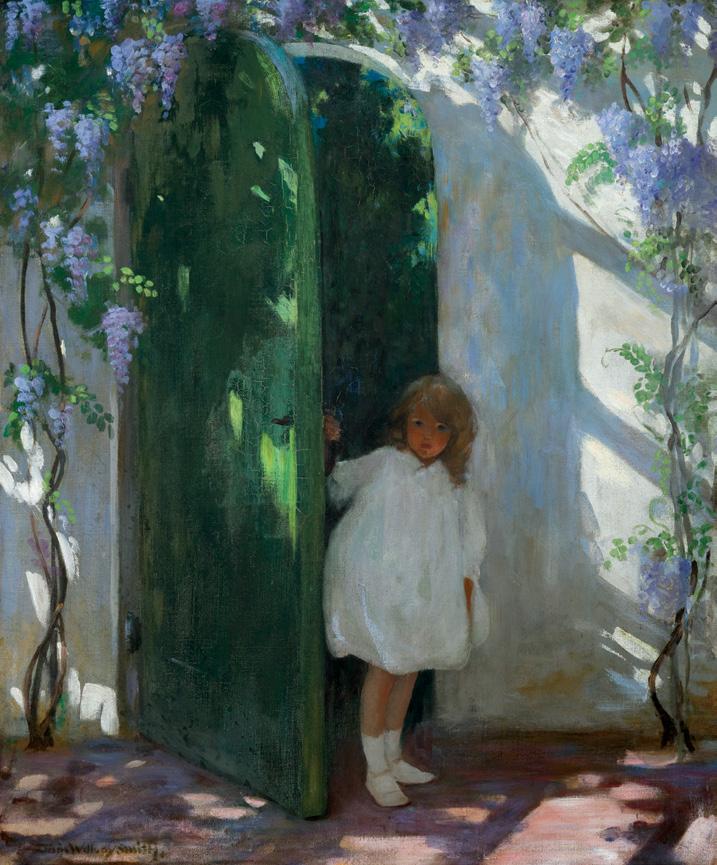
JAMES EDWARD HERVEY MACDONALD
Church by the Sea, N.S., 1922 oil on board
signed, titled, dated 1922 and inscribed "Petite Rivière/1922" on the reverse; titled to a gallery label on the reverse 4.25 ins x 5.25 ins; 10.8 cms x 13.3 cms
PROVENANCE
!oreau MacDonald, !ornhill, Ontario
Mr. & Mrs. R. MacDonald, Woodbridge, Ontario
Sotheby Parke Bernet, auction, Toronto, 18 October 1976, lot 63 Masters Gallery, Calgary, 1979 Private Collection, British Columbia
EXHIBITED
J.E.H. MacDonald, R.C.A., 1873-1932, Art Gallery of Toronto; travelling to the National Gallery of Canada, Ottawa, 12 November 1965-6 February 1966, no. 91
LITERATURE
"Church by the Sea, Nova Scotia by J.E.H. MacDonald, A.R.C.A.", e Canadian Forum , III:28 (January 1923), reproduced page 115 Canadian Drawings by Members of the Group of Seven , Toronto, 1925, unpaginated, reproduced plate 1
E.R. Hunter, J.E.H. MacDonald: A Biography & Catalogue of His Work , Toronto, 1940, pages 28-29, 31-32, 54-55
Nancy Robertson, J.E.H. MacDonald, R.C.A., 1873-1932, Toronto, 1965, pages 11-12, 42, reproduced page 55
Peter Mellen, e Group of Seven , Toronto/Montreal, 1970, page 114, reproduced page 115
Gemey Kelly, J.E.H. MacDonald, Lewis Smith, Edith Smith: Nova Scotia , Halifax, 1990, pages 17-23, 38
Robert Stacey and Hunter Bishop, J.E.H. MacDonald Designer, Ottawa, 1996, pages 4, 63-66, 82, 121
Ian !om, Embracing Canada: Landscapes from Kriegho " to the Group of Seven , Vancouver, 2015, see pages 84-85 for Church by the Sea (Vancouver Art Gallery)
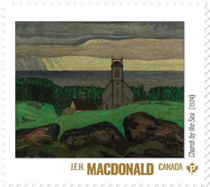
J.E.H. MacDonald played a key role in the early history of the Group of Seven. Like many of his colleagues, he " rst made his living as a commercial artist, working at Grip Printing and Publishing Co. in Toronto from 1894 or 1895. It was there he met the artist Lewis Smith. MacDonald " rst painted in Nova Scotia when he visited Lewis Smith and his sister Edith at Rockingham near Halifax in 1898.
Following a short period working in London, England from 1903 to 1907, MacDonald returned to Toronto as head designer at Grip Limited. It was there he met Tom !omson, and later Arthur Lismer and Fred Varley, and where the foundations for the future Group of Seven were laid. While the landscapes of northern Ontario would become their favoured sketching subjects during the early years of the movement, several members also worked in Nova Scotia. Arthur Lismer taught in Halifax from 1916 to 1919, where he was visited by A.Y. Jackson in 1919 while waiting for his discharge from the army, and in 1921 Lawren Harris also painted in Halifax.
MacDonald returned to Nova Scotia in the summer of 1922, visiting Lewis Smith and his sister Edith in the village of Petite Rivière, a coastal village about seventy-"ve miles south-west of Halifax. In her excellent catalogue of MacDonald’s work in Nova Scotia, Gemey Kelly quotes a 1906 description of the village. “ !e village of Petite Rivière is prettily situated among the hills surrounding a river of that name, and around its mouth quite a business is carried on, but transportation is greatly impeded by the sand bar which compels the vessels to lie o# a mile, all the freight has to be transferred to small boats and so brought to land.” !e sand bar would be the subject of MacDonald’s " rst two Petite Rivière canvases, Outside Harbour Bar and Sea Shore, Nova Scotia , both shown in the spring 1923 exhibition of the Ontario Society of Artists, the latter purchased by the National Gallery of Canada that same year.
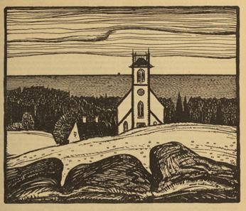
Canadian Forum , III:28 (January 1923), page 115
While MacDonald was especially attracted to the rocks and surf along the ocean shore, he also painted the nearby wharves, "sh houses and barns. A number of these oil sketches would be reworked as illustrations for Grace McLeod Rogers’ Tales of the Land of Evangeline, " rst published in 1890 (the 1891 American edition was illustrated by Henry Sandham) and reprinted with MacDonald’s illustrations by McClelland & Stewart as Stories of the Land of Evangeline in 1923. However, this superb oil sketch of the Wesley Methodist (now United) Church in Petite Rivière was " rst published as an ink drawing in e Canadian Forum in January 1923 and subsequently reproduced in the portfolio of Canadian Drawings by Members of the Group of Seven launched on the occasion of the Group’s exhibition in January 1925. ! ree large boulders de" ne the foreground, set against the broadly brushed grassy incline. !e facade of the church, placed o# centre, dominates the composition. !e adjacent house with its two chimneys is just suggested in the oil sketch but more clearly de" ned in the drawing. Trees separate the buildings from the ocean horizon below the gently $owing bank of clouds.
In 1924 MacDonald worked up the oil sketch into a canvas titled Church by the Sea (Vancouver Art Gallery) that was " rst exhibited with the Ontario Society of Artists in March of that year. !e canvas closely follows the composition de" ned in the oil sketch, the foreground rocks, the church and house, the water and clouds being the principal elements. However, in the canvas the house has only one chimney, a porch has been added echoing the sloped roofs of the church’s side aisles and touches of red and yellow create decorative patterns on the adjacent tree and grass. !e most notable di #erence is the treatment of the sky, light-" lled and blue in the sketch, overcast in the canvas. Heavy rain falls on the horizon at the left.
MacDonald’s biographer, E.R. Hunter observed that MacDonald’s Nova Scotian paintings marked a transition between the rolling rhythms and textured brush strokes of his Algoma canvases and the greater simpli "cation of his mountain paintings following his " rst trip to the Rockies in the summer of 1924. A beautiful, tranquil sketch, brushed in rich colours, Church by the Sea marks an important transition point in MacDonald’s oeuvre.
We extend our thanks to Charles Hill, Canadian art historian, former Curator of Canadian Art at the National Gallery of Canada and author of e Group of Seven‒ Art for a Nation (1995), for contributing the preceding essay.
$125,000–$175,000
Pool, Snowfake, circa 1928 oil on canvas
signed lower right; titled and dated 1928 on a gallery label on the reverse 11.75 ins x 15 ins; 29.8 cms x 38.1 cms
Dr. A.J.W. Alcock, Winnipeg Private Collection, Winnipeg
Pool, Snow # ake, from the collection of L.L. FitzGerald’s Winnipeg neighbour Dr. A.J.W. Alcock, was accepted for the 1958 FitzGerald Memorial Exhibition according to a preliminary typed list of works dated 31 May 1957 (National Gallery of Canada Archives). Although the painting was ultimately not included in the retrospective exhibition, its appearance as number fourteen of twenty-nine oil paintings recorded by the distinguished panel of Ferdinand Eckhardt (director of the Winnipeg Art Gallery), Robert Hubbard (curator of the National Gallery of Canada), and Douglas Duncan (art dealer and collector) con " rms the signi "cance of the picture.
During summer recess from teaching duties at the Winnipeg School of Art, FitzGerald would vacation at his grandparent’s farm in the southern Manitoba community of Snow $ ake. !ere the changeable open skies and $ at wheat "elds of the light-drenched prairie landscape o#ered numerous opportunities for painting. Pool, Snow # ake captures a more intimate outdoor scene. FitzGerald looks downward to an expanse of dark leaves and branches which turn out to be mirror re$ections in the water of trees outside his "eld of vision. Together with the artist’s view upwards to the high horizon, the e#ect is disorienting. ! is startling and complex composition de-emphasizes three-dimensionality and instead draws attention to the picture plane as a $ at surface—one of the hallmarks of modernist painting. ! is is further accentuated by the limited range of colours thinly applied so that small bare patches of unpainted canvas are visible. FitzGerald creates an e#ect similar to the un " nished look characteristic of many paintings by the French Post-Impressionist Paul Cézanne. Abstracting tendencies such as these are a feature of FitzGerald’s most inventive period from 1927 to 1934, when he completed at least a dozen oil paintings that solidi "ed his national reputation.
We extend our thanks to Michael Parke-Taylor, Canadian art historian, curator, and author of the Art Canada Institute's Lionel LeMoine FitzGerald: Life & Work (2017) and editor of Some Magnetic Force: Lionel LeMoine FitzGerald Writings (2024) for contributing the preceding essay.
$14,000–$18,000
68th Annual Exhibition of the Ontario Society of Artists, Toronto, 1940, no. 23, listed page 6
Old Orchard, 1940 oil on board
signed and dated 1940 lower right; signed with insignia, dated 1940 and inscribed "16" and "Cat. no. 9" on the reverse 30 ins x 36 ins; 76.2 cms x 91.4 cms
PROVENANCE
Acquired directly from the Artist by Herbert Laurence Rous By descent to a Private Collection, Toronto Cowley Abbott, auction, Toronto, 12 June 2017, lot 40 Private Collection, Vancouver
EXHIBITED
68th Annual Exhibition of the Ontario Society of Artists, !e Art Gallery of Toronto, 1-31 March 1940, no. 23
Paintings and Water Colours, Canadian National Exhibition, Toronto, 1940 as Old Orchard
Franklin Carmichael, Memorial Exhibition , !e Art Gallery of Toronto, March 1947, no. 15 as Apple Orchard
e Franklin Carmichael Memorial Exhibition , Orillia Artists' Guild, 28-30 April 1961 as Apple Orchard (loaned by H.L. Rous)
Light and Shadow, e Work of Franklin Carmichael, McMichael Canadian Art Collection, Kleinburg, 1990, no. 59
In the Spirit of Carmichael: Orillia's One of Seven , Orillia Museum of Art and History, 27 April-9 July 2005
Paintings and Water Colours, Canadian National Exhibition, Toronto, 1940, unpaginated, listed
Rous & Mann Press Limited Calendar, 1946, reproduced on cover Robert Eyre and Donald W. Buchanan, Canadian Art, vol. IV, no. 4 (Summer 1947), reproduced on cover e Group of Seven: Fiftieth Anniversary, 1920-1970, Montreal/Ottawa/ Toronto/London/Winnipeg/Regina/Edmonton/Calgary, 1970, unpaginated, reproduced (Collection of H.L. Rous)
Ian M. !om, Franklin Carmichael: Prints/Gravures, Kleinburg, 1984, no. 14, reproduced page 12 as Dead Trees
Megan Bice, Light and Shadow, e Work of Franklin Carmichael, Kleinburg, 1990, page 86, reproduced page 90
Joyce Sowby and Randall Speller, "Quality Printing: A History of Rous and Mann Limited, 1909-1954", DA, A Journal of the Printing Arts, no. 51 (Fall/Winter 2002), page 14
In 1939, the Toronto artist and co-founder of the Group of Seven and Canadian Group of Painters, Franklin Carmichael, created a small oil sketch of an old orchard, now held in the National Gallery of Canada collection. !en, in 1940, he developed it into the larger studio painting, Old Orchard !e painting was " rst shown in the 68th Annual Exhibition of the Ontario Society of Artists in 1940 under the title Old Orchard , and in 1947 as Apple Orchard. !e subject was a view just outside Carmichael’s home, studio and gardens in Lansing, now a densi "ed North York, Toronto neighbourhood.
It was in 1919, that Frank and his wife Ada Carmichael purchased this property. Carmichael’s friend, A.J. Casson was a regular visitor there and described Lansing then as “a scattered rural community,” accessible by rail, and then a short walk along “a rickety old boardwalk.” A photograph taken by Carmichael of the orchard con " rms that there was a speci "c tree that interested him, the one in the left foreground with its short right-leaning trunk which divides into two heavy limbs just a short way up from the base. !e painting’s alternate title, Apple Orchard , probably assigned posthumously by his wife, is helpful in
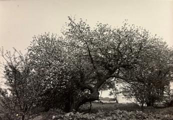
Not for sale with this lot
Not for sale with this lot
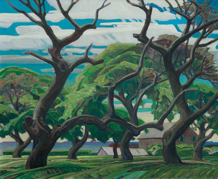
con " rming the speci "c variety of trees integral to this painting. Although there are several other important trees, that one plays a crucial role in the composition. An old tree—depicted alive in the photograph and dead in the painting—it is one with stories to tell of its many harvests, cropped limbs from breakage under bounty, pruning, and age. Its skeletal and organic angular forms provide a strong design structure that governs the overall e#ectiveness of this painting, setting clear boundaries between the foreground and the far distant valley beyond. For Megan Bice, curator of Carmichael’s 1990 retrospective exhibition, Old Orchard is “a powerful, twisted outgrowth of its more domesticated, cultivated predecessor.”
It may seem odd that it took so long for Carmichael to paint this setting, some twenty-one years after the Carmichaels had moved to Lansing. But, unlike many others in the Group of Seven, Carmichael never aspired to traverse Canada’s vast geography. Rather, he preferred a sustained commitment to speci "c places so he could nuance their interpretation. Often, he took years to develop a concept and design for a major painting. In a 1938 radio broadcast while serving as President of the Ontario Society of Artists, Carmichael explained his reasons for considering the familiar: “Pictures are painted in response to the necessity of the artist to express in paint his personal interest in the life and surroundings in which he lives. Whether the outcome is practical in the material sense, or practical in the higher interpretation of that
much abused word, seems to be of small moment. It is creative work, and as such, " nds a response in a growing realization that the Arts contribute to our capacity to enter into enjoyment of the needs of the spirit, as well as the more tangible and material needs of our every-day life.”
! at Old Orchard is a painting mostly about trees should not be surprising for Carmichael had long been interested in depicting speci "c varieties including maple, oak, white pine, jack pine, elm, and wild cherry. He also detailed forests in close-up shallow compositions, such as A Silvery Tangle, 1921 (Art Gallery of Ontario) and e Glade, 1922 (Art Museum, University of Toronto). Trees were for Carmichael one of many ways to consider the cycles of life and beauty of nature’s o#erings in both their natural and cultivated environments.
Old Orchard was the only painting Carmichael made of his Lansing property. He was never one for self-portraiture, despite his skills in " guration. But this scene from his studio window can be see as a form of self-portraiture, that of his immediate surroundings and perhaps as close as Carmichael ever wished to approach the genre. He excluded any reference to his architectural spaces; the outbuildings beyond would have been those of the neighbours.
Afterwards, Carmichael developed Old Orchard as a wood-engraved print. His print practice had been a burgeoning one in the later 1930s during which time he sharpened his command of wood engraving, a relief process working against the wood grain to yield exceptionally " ne detail. A related ink drawing in the National Gallery of Canada collection is probably the study for it since it is almost the same size of three known Old Orchard print proofs held in the McMichael Canadian Art Collection and the National Gallery of Canada. By the time he made this image, Carmichael was exceptionally pro"cient in
26.2
Purchased 1993
National Gallery of Canada, Ottawa
Photo: NGC
Not for sale with this lot
the use of both black and white line engraving in the same image— that is where both black and white lines remain in the " nished image, the white lines being essentially a relief print in reverse.
During his lifetime, Carmichael found very few collectors for his work. He would have been very pleased that his former employer, Herbert Laurence Rous, purchased Old Orchard soon after its completion. In 1909, Rous partnered with Frederick J. Mann to purchase the Imrie Printing Company Limited at 72 York Street, Toronto. Under the name Rous and Mann, the " rm soon began printing and publishing. Carmichael was introduced to the " rm when Albert Robson was hired away from Grip Engraving Company and recruited Carmichael to begin working there in October 1912. He remained for a year before leaving for study in Antwerp in the fall of 1913. Carmichael returned to a war-torn economy in September 1914 and was not rehired full-time by Rous and Mann until January 1916. Soon after that though, he became chief designer and held that position until 1922 when he was then recruited by competitor, Sampson Matthews Ltd. Old Orchard is one of Carmichael’s few easel paintings of the 1940s. Shortly after his untimely death from a fatal heart attack on October 24, 1945 at age " fty-"ve, Rous and Mann expedited a reproduction of Old Orchard for their 1946 calendar, probably as a memorial gesture.
We extend our thanks to Catharine Mastin, PhD, art historian, curator, and Adjunct Member of the Faculty of Graduate Studies in Art History at York University for contributing the preceding essay. Catharine curated the exhibition Franklin Carmichael: Portrait of a Spiritualist, organized by the National Gallery of Canada, Ottawa, which toured Canada between 1999 and 2001.
$400,000–$500,000
19.8 x 25.9 cms
and brown
Gift of Mary Mastin, Toronto, 1993
National Gallery of Canada, Ottawa
Photo: NGC
Not for sale with this lot
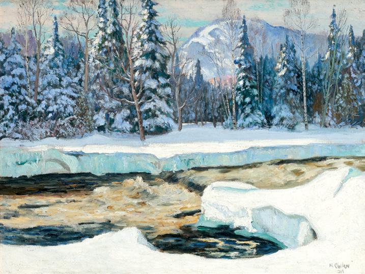
GALBRAITH CULLEN
Mount Baldy, Early Spring, 1928 oil on canvas
signed lower right; titled on a gallery label on the reverse, Cullen inventory no. 1150
24 ins x 32 ins; 61 cms x 81.3 cms
PROVENANCE
Watson Galleries, Montreal, 1948
Mrs. G.M. Strong
Gifted to Kappa Alpha Alumni Association in memory of Bill Strong, R.C.A.F. (son of Mrs. G.M. Strong) Private Collection
LITERATURE
A.K. Prakash, Impressionism in Canada: A Journey of Rediscovery, Stuttgart, 2015, page 302
Having met during their respective studies in Paris, Canadian artists Maurice Cullen and James Wilson Morrice formed a close and collaborative friendship. Cullen had developed his skills painting in an Impressionist style, and was determined to introduce the new
artistic idiom to a Canadian audience. When Morrice visited Canada in the 1890s, the two embarked on painting expeditions, travelling north to Quebec City and to Beaupré. Cullen would repeat sketching trips up and down the St. Lawrence for years to come, gaining a deep familiarity with the scenic vistas of the Laurentians. Author A.K. Prakash noted, “Particularly after he returned to Canada, he realized he had to modify the Impressionism he had learned in France to suit the bold colours and de" ned forms that stood out in the crisp atmosphere of the cold Canadian winter.”
Mount Baldy, Early Spring aptly demonstrates Cullen’s expert skill at capturing the subtle light and atmosphere of a crisp winter day in the Laurentians. !e painting is luminous, with sunlight touching the river and snowy shoreline. With " xed determination, Cullen sketched outdoors, often while standing in frigid temperatures on snowshoes. !e painter would make and prepare his own small painting boards, on which he would sketch on-site. Cullen would then work them up to larger canvases in his studio during the summer months. Later, the same methodology would become the core practice of the artists of the Group of Seven.
We extend our thanks to Eric Klinkho# for research provided from the Maurice Cullen Inventory.
$40,000–$60,000
Devil's Club, circa 1940 oil on canvas
signed lower right; signed and inscribed "1419 Dogwood Ave., Vancouver, BC" on the reverse
30 ins x 37 ins; 76.2 cms x 94 cms
PROVENANCE
Private Collection, Manitoba
Sigvaldson Fine Art, Manitoba
EXHIBITED
33rd Annual Exhibition, British Columbia Society of Fine Arts, Vancouver Art Gallery, 15 May-6 June 1943, no. 66
2nd Annual B.C. Artists' Summer Exhibition, Vancouver Art Gallery, 2 July-25 August 1943, no. 19
64th Annual Exhibition , Royal Canadian Academy of Arts, Musée de la Province de Québec; travelling to the Art Association of Montreal, 5 October-27 November 1943, no. 116 as Devil's Club at $150
W.P. Weston One-Person Exhibition , Western Circuit, Calgary, travelling to Edmonton; Regina; Saskatoon; Winnipeg; Vancouver, 1944-1945
J. Delisle Parker, "In the Realm of Art: Fine Creative Spirit Marks Exhibition by B.C. Artists", Vancouver Daily Province, (21 May 1943) mentions "New phases appear in the exhibits by W.P. Weston, A.R.C.A., especially in the color, simplicity and subtle rhythm running through his Devil's Club "
Born in London, England, William Percival Weston settled in British Columbia in 1909. Weston explored coastal B.C. on frequent sketching trips, impressed with the region’s rugged natural beauty. An admirer of the work of Emily Carr, the two corresponded, sharing their ideas and artistic motivations.
! is painting is a striking depiction of Devil’s Club, a plant known for its large, spiky leaves and deep green foliage. !e composition focuses on the intricate details of the plant, with broad, sharply lobed leaves overlapping each other in a layered, organic pattern. !e rich green hues contrast against the dark trunk and shadowed depths of a forest. Devil’s Club is a medicinal and culturally signi "cant plant in Indigenous traditions of the Paci "c Northwest, often associated with protection and healing. Its thorn-covered stems make it both a defensive plant and a symbol of resilience.
$20,000–$30,000
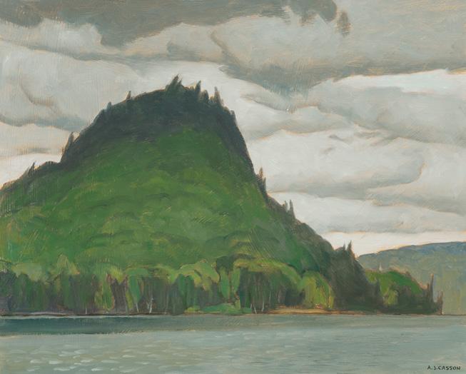
The Camel's Hump, Lake of Bays, 1981 oil on board
signed lower right; signed, titled and dated "July 1981" on the reverse 12 ins x 15 ins; 30.5 cms x 38.1 cms
PROVENANCE
Private Collection, Toronto
LITERATURE
Margaret Gray, Margaret Rand and Lois Steen, A.J. Casson , Agincourt, Ontario, 1976, page 43
A.J. Casson has played a prominent role in the development of Canadian art, quietly having built his reputation as a master painter without sacri "cing the principles of his personal approach to painting. Although a professed lover of travel, Casson never went far a "eld.
Adjacent to Algonquin Park, Lake of Bays is an idyllic oasis in the northeastern part of Muskoka. A small township with over a hundred lakes, the area is a popular destination for cottagers escaping the city. Casson frequented the area on his sketching trips, revelling in the expanse of forests, rocks, lakes, and wetlands to paint.
! is dramatic landscape is dominated by a lush, green mountain rising sharply from the water’s edge. !e dark, jagged crest of the "Camel’s Hump" contrasts with the softer, rolling greenery below and calm lake. !e cloudy sky with sweeping brushstrokes conveys a sense of movement and atmosphere, as if a storm may be approaching or the weather is in $ux. e Camel’s Hump, Lake of Bays is a preparatory work for a 1983 oil on canvas by the same title sold by Cowley Abbott at auction (1 December 2022). Casson changed the vantage point in the canvas and removed the water in the foreground. !e artist also depicted di #erent seasons in the two paintings; while the sketch shows a green forest, the canvas contains soft yellow and red foliage as well as a cool mist rising from the water.
e Camel’s Hump, Lake of Bays is a prime example of a subtly dramatic landscape of this period in Casson’s oeuvre. Regarding the artist’s legacy, Margaret Gray, Margaret Rand and Lois Steen share that, “[Casson’s] hundreds of drawings, sketches and paintings, which have recorded the beauty and the character of his land, are a great legacy indeed. But perhaps from a historical point of view A.J. Casson’s greatest contribution lies in the present-day link which he provided with that vital period when Canadian art took on its own identity. !e Group of Seven laid down the foundations upon which modern art in this country has built, and Casson, although never avant-garde, has made his own unique contribution to the structure. He paints his own vision, una #ected by the tyranny of the new.”
$20,000–$30,000
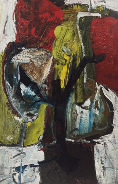
Spector, 1960
oil on board
signed and dated 1960 lower right
46.5 ins x 30 ins; 118.1 cms x 76.2 cms
PROVENANCE
Mazelow Gallery, Toronto
!e Vincent Price Collection for Sears Private Collection
Andrew Auctions, auction, Toronto, 1999
Joan Murray, Whitby Private Collection
Harold Town came to prominence as an artist in the high years of Canadian abstract expressionism with Painters Eleven. He quickly rose to the top of Canadian art's hit parade charts and stayed there.
Critics have named his Painters Eleven period as his most signi "cant, but his work was highly diverse, as revealed in a retrospective of 1986. What obsessed Town was panache or "style," having fun and a feeling of growth and movement. !e mark of a good Town is a sort of motor force that races within the con " nes of his subject. He had himself an almost demonic energy, swinging from pillar to post, but the viewer could never doubt the sense of invention in his di #erent series, from his Spectors in 1960, one of which, e Spector No. 3, won the Canada Council Purchase Award at the Montreal Museum of Fine Arts 77th Annual Spring Exhibition, to the paintings he titled Tyranny of the Corner, his collages, his minimal and psychedelic period, his Stretches, his Snaps, his Toy Horses, and more. Clearly, Town ventured into the brave new world of modern art in Canada with a positive assertiveness, giving his motifs the right emphatic power.
Vincent Price would have been delighted by the work and purchased it for the Sears Price Collection because of its high quality. He also may have been intrigued by the painting because of its subject, since as a movie actor his career was associated with the burgeoning genres of horror, mystery and science "ction. As a lifelong collector, he had learned to buy art extremely well, and in developing the Vincent Price Collection for Sears, he sought to combine the great masters, such as Rembrandt and Picasso, with the best contemporary artists.
During the 1960s, Vincent Price was perhaps the most visible and vocal spokesperson for the visual arts in the United States. !e purchase of Spector by this famous and sophisticated public " gure suggests its importance to Canadian art.
Like other work in the 1960s, the pictorial space is divided into distinct areas. !e work has a dominant, centralizing form, which gathers up the glowing colour, rich texture and "erce painterly activity. In Spector, Town critically confronted the question of surface and structure, animating them to assist in his own way with challenging the central image so much a part of his work, that of other members of Painters Eleven and painters worldwide.
We extend our thanks to Joan Murray, Canadian art historian, for contributing the preceding essay.
$12,000–$15,000
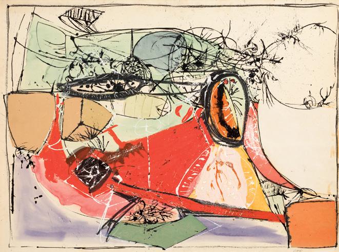
Untitled, circa 1954-1955
watercolour, pastel and ink collage on paper board inscribed indistinctly in the lower right margin; inscribed with the Cahén Archives no. FAMM-058 SL on the reverse; catalogue raisonné no. 058 29 ins x 40 ins; 73.7 cms x 101.6 cms
PROVENANCE
Private Collection, Toronto
He#el, auction, Toronto, 26 November 2009, lot 8 Private Collection, Toronto
EXHIBITED
Oscar Cahén: First American Retrospective Exhibition , Ringling Museum of Art, Sarasota, Florida, 30 September-10 November 1968, no. 42
LITERATURE
Jaleen Grove, Oscar Cahén: Life & Work [online publication], Art Canada Institute, Toronto, 2015, pages 13, 27
Jaleen Grove et al., Oscar Cahén , Fredericton, 2017, reproduced page 82 and listed page 307, no. 058
Born in Germany in 1916, Oscar Cahén arrived in Quebec in 1940 as an interned refugee. By November 1943, Cahén’s art was included in a prestigious exhibition at the Art Association of Montreal, and the following year he moved to Toronto. Around 1949, Cahén began
exploring abstraction, establishing his personal vocabulary of crescents, spikes, ovoids, and hot, startling colour by 1952. He became a founding member of the Toronto abstract artists’ group Painters Eleven, active from 1953 to 1960, including Harold Town, Jack Bush, and William Ronald. !ey joined together in an e#ort to increase their exposure, given the limited interest in abstract art in Ontario at the time. Author Jaleen Grove remarks that “the group legitimized abstract art, inspired younger artists to follow avant-garde directions, and brought Canadian art into conversation with international contemporary art trends and critics. !e work Cahén now produced was playful, bright, and lyrical; it was also bold, dark, and aggressive, re$ecting the ongoing contrasts in Cahén’s life. A growing, invigorating public pro" le encouraged his output: Cahén’s exhibition record between 1953 and 1956 reveals that his art was on display almost constantly.”
With nods to the Abstract Expressionists and Cubists in Europe, the artist’s formal training at the Kunstakademie in Dresden as well as various art schools in Paris, Italy and Stockholm shines through in his execution. Cahén's gestural style, use of bright colours and experimentation with mixed media on paperboard, as seen in this striking work from 1954-55, in $uenced and complemented the other Painters Eleven members. !e movement of the artist’s hand is apparent in this untitled work, with both quick and slow sweeps of the brush and pastels, as well as areas of collage. Unafraid of experimentation, mixing mediums and testing their limitations, Cahén embraced an art practice that challenged traditional art theory and techniques, particularly in the Canadian art canon.
$30,000–$50,000
Between 1921 and 1928, four founding members of the Group of Seven travelled to the Canadian northern shores west of Sault Ste. Marie, Ontario. It was after a trip to Sand Lake, Algoma that Lawren. S. Harris and A.Y. Jackson decided to extend their trip further west to Rossport in 1921. Harris was especially delighted by the austerity and unique light pools of Lake Superior country as fall descended on the landscape—he always went in October. More trips followed when he and Jackson went annually through to 1925. ! at year, Franklin Carmichael joined them for the " rst time when they worked at Jack " sh Bay, the Slate Islands, and Port Coldwell. In 1926 and 1927, respectively, Harris also took Carmichael and Arthur Lismer to Port Coldwell.
Not for sale with this lot
!e last trip was in 1928 when Harris, Jackson, Carmichael, and the newly-elected Group of Seven artist A.J. Casson also joined them.
Historians and curators have agreed that the Group of Seven’s Lake Superior work is important yet, except for Harris, there has been quite limited commentary beyond the fact of them being there. Given the regularity of the Group’s interest in Lake Superior, it can be argued that it was as important to these " ve painters as Algonquin Park was to Tom !omson, and Georgian Bay to
Lake Superior Sketching Trip, 1928 photograph, 5.7 x 8.25 ins Library & Archives Canada, 1986-163 NPC
Not for sale with this lot
Not for sale with this lot
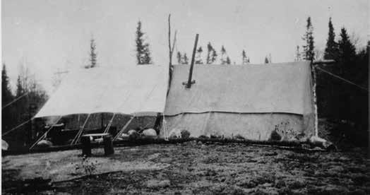
Lismer and Jackson. Yet, there has only been one small exhibition on this subject, and only one recent article on the Group’s work at Lake Superior. Curator Dennis Reid once summarized that, “Lake Superior was Harris’ country” but, over these eight years, the work of most artists was transformed by the stunning topography and impact of nature’s power at this remarkable junction of lake and land. Iconic Lake Superior paintings include Harris’ Pic Island, Lake Superior, 1924 (McMichael Canadian Art Collection, and Carmichael’s Evening, North Shore, Lake Superior, 1927 (Montreal Museum of Fine Arts). ! at it was a serious commitment to work in this location there is no doubt. William G. Harris, curator of the exhibition e Group of Seven and Lake Superior (1964), described their two-day trip out to Slate Islands in 1925 taken with a local " sherman, during which time they “met the full swell of Lake Superior” during “a blizzard and high seas.”
!e artists worked in graphite when it was too cold for watercolour and oil. Once back in their Toronto studios, they eagerly selected sketches for the annual Little Pictures Exhibition by Members of the Ontario Society of Artists held at year-end to showcase their recent work. From there, important easel paintings were created and these held a strong presence in exhibitions, including those of the Group of Seven, the Ontario Society of Artists, and the Canadian National Exhibition. In the 1930 Group of Seven exhibition, Carmichael and Casson
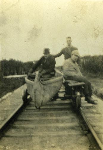
both outperformed their peers with no less than ten Lake Superior paintings in their unique watercolour-only presentation.
In 2015, !e Group of Seven Lake Superior Trail Association based in Marathon, Ontario, o%cially recognized the importance of the Group of Seven’s interpretations of a topography of extraordinary beauty and geological complexity. !e following artworks o#er insights into each artist’s approach to the condition and landscape they encountered.
We extend our thanks to Catharine Mastin, independent curator and writer, for contributing the preceding essay.
Northern Lake, circa 1925 ink and graphite titled on a typewritten label on the reverse 4.5 ins x 6 ins; 11.4 cms x 15.2 cms
Lawren P. Harris
By descent to Susan E. Harris (daughter), 1978 Masters Gallery, Calgary Private Collection, Calgary
!e ink drawings of Lawren Harris are rare and engaging works that combine the monochrome and line-based approach of his on-site pencil sketches with the careful consideration and contemplation of his oil studies and canvases. For Harris, they were an additional way for him to explore stripping away the unnecessary super "cial details of the world to capture the underlying essence of the landscape.
Lawren S. Harris
Near Lake Superior, circa 1922-1923 oil on board, 26.4 x 35.2 cms
Private Collection
Not for sale with this lot
Often based on existing paintings, Harris created works in ink for multiple purposes. In the 1925 Group of Seven show he exhibited a group of ink drawings alongside his paintings, as well as contributed four designs to a collection of prints sold in an edition of 100, Canadian Drawings by Members of the Group of Seven: A Portfolio of Lithographs During the 1920s, Lawren Harris was on the publishing committee of Canadian Forum , a "Monthly Journal of Literature and Public A #airs" which published on a range of topics and reproduced one piece of art in its pages each month. Harris regularly contributed drawings several times per year, and though no known reproduction of this work was published, it is possible that he was considering submitting it.
Harris based this quiet and peaceful drawing on an oil sketch from an early trip to Lake Superior’s north shore, Near Lake Superior, circa 1922-23 (Private Collection). Likely featuring one of the small inland lakes found on the Coldwell peninsula, the sketch showcases a late fall scene, where ice has formed around the shallows, and the colour of autumn has long fallen away from the trees. In this drawing, the oil sketch’s rapid and lively brushstrokes are translated into a rhythmic depiction of rolling hills, covered with varying textures representing the receding, forested slopes. !e removal of the colour from the image gives a new opportunity for the expansive topography of the scene to take centre stage, and the solemnity of the scene is heightened by the clarity that the reductions bring, emphasizing the stillness of the water and the serene re$ection of the far shore. As with so many of the artist’s inspiring works, it transports the audience to a meditative moment, o#ering a connection to the landscape, and to the larger spirit that encompasses such grand places across Canada.
We extend our thanks to Alec Blair, Director/Lead Researcher of the Lawren S. Harris Inventory Project, for contributing the preceding essay.
$15,000–$20,000
Northern Lake, 1922 oil on wood
signed lower left, signed, titled and inscribed "not for sale" with cross in circle on the reverse 10.5 ins x 13.75 ins; 26.7 cms x 34.9 cms
PROVENANCE
Roberts Gallery, Toronto Private Collection, North York, Ontario Sotheby's, auction, Toronto, 3 December 1997, lot 155 Mayberry Fine Art, Winnipeg Masters Gallery, Calgary Private Collection, Alberta
LITERATURE
Paul Duval, Lawren Harris: Where the Universe Sings, Toronto, 2011, reproduced page 212 as Northern Lake c. 1918
Charles C. Hill, "Quiet Lake (Northern Painting 12)," in An Important Private Collection of Canadian Art, Part II, Cowley Abbott, Toronto, 8 June 2023, reproduced page 56
From the streets of Toronto to the Laurentian hills, to Algoma and the north shore of Lake Superior, from the Rocky Mountains to the Arctic, Lawren Harris constantly explored the varying aspects of Canada’s many landscapes, seeking out new forms re$ective of a burgeoning Canadian identity.
Harris and A.Y. Jackson " rst painted on Lake Superior in October 1921 when they sketched brie$y around Rossport and Schreiber. Harris would return to paint and draw on the north shore of Lake Superior almost every October until 1928. His Lake Superior paintings range from depictions of the rocks, hills, bays and interior lakes to dramatic visions of the light over the vast body of water.
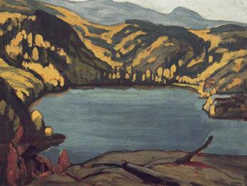
Harris frequently returned to the same sites, reinterpreting similar subjects in new pictorial languages. He painted the lake depicted in this sketch in 1922 on a panel measuring 10.5 x 13.5 ins (26.3 x 34.4 cms), the dimensions he favoured before 1925 when he began painting on panels measuring 12 x 15 ins (30.5 x 37.6 cms). !e same lake is probably that depicted, though from a di #erent angle, in another sketch measuring 10.5 x 13.5 ins titled Bay, Lake Superior (Lake Superior Sketch LXXX) (sold at Joyner Fine Art, Toronto, 14 May 2002, lot 50D) and the site is identi "ed in a larger sketch titled Above Coldwell Bay, North Shore, Lake Superior Sketch XX (sold at Sotheby Parke Bernet (Canada) Inc., Toronto, 5 November 1979, lot 156). !e "shing village of Port Coldwell became a favoured site when Jackson and Harris " rst painted there, and at nearby Port Munro and Pike Lake, in October 1922.
!e two 1922 sketches are characterized by a similar rhythm of yellow foliage crowning the distant slopes. In Bay, Lake Superior a bare hill with dead branches provides a foothold for the viewer overlooking the blue water. !e paint has been rapidly applied, forms are sketchily de" ned. Northern Lake is more polished. !e lake is viewed from above the foreground trees that are painted in varying shades of green. !e darker conifers on the far shore are more sculptural and the shores a #ectionately embrace the body of water on all sides. !e mood is tranquil, looking forward to the large canvas of the same lake depicted in Harris’ canvas Quiet Lake, sold by Cowley Abbott from An Important Private Collection on 8 June 2023, lot 125.
We extend our thanks to Charles Hill, Canadian art historian, former Curator of Canadian Art at the National Gallery of Canada and author of e Group of Seven‒ Art for a Nation (1995), for contributing the preceding essay.
$300,000–$500,000
Not for sale with this lot
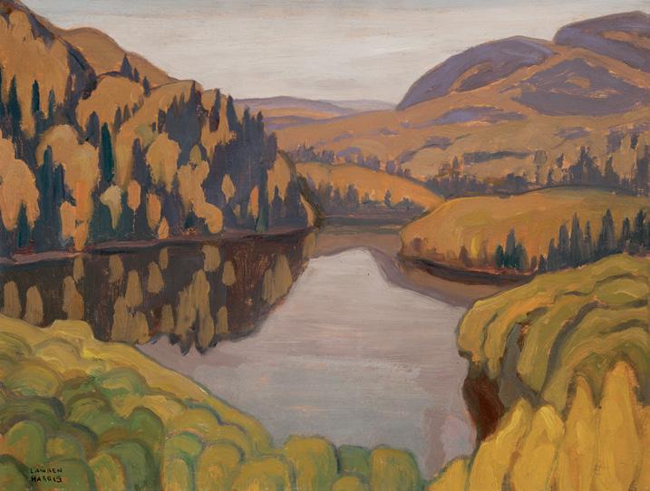
North Shore, Superior, Near Coldwell, 1923 oil on board
signed lower right; titled, dated 1923 and inscribed "North Shore, Superior", "Near Coldwell", "S. Walter Stewart", "with Lawren Harris 1923", "Wendy Stewart Birthday, 21 You Are a Woman [sic]!" and "37" on the reverse 8.25 ins x 10.5 ins; 21 cms x 26.7 cms
Collection of the Artist
S. Walter and Jane Stewart, Toronto By descent to Wendy Stewart Roberts Gallery, Toronto Private Collection, Calgary
A.Y. Jackson, A Painter's Country: e Autobiography of A.Y. Jackson , Toronto/Vancouver, 1958, page 57
Wayne Larsen, A.Y. Jackson, e Life of a Landscape Painter, Toronto, 2009, page 127
A.Y. Jackson is known to have taken at least six trips to the north shore of Lake Superior between 1921 and 1928, all of them with Lawren S. Harris, and some with other artists from the Group of Seven. !e " rst trip in 1921 was an extension of his Algoma trip when he and Harris ventured west of Sault Ste. Marie to Schreiber, and from there hiked on to Rossport. In 1922 and 1923, Jackson went to Port Coldwell, and in 1924 to Jack "sh Bay. !e 1925 trip included time at Jack "sh Bay, the Slate Islands and Port Coldwell with Frank Carmichael joining them for the " rst time. By then, as Jackson’s biographer Wayne Larsen observes, “Lake Superior with Harris was a sacred annual ritual.” Finally in 1928, he returned to Port Coldwell and Carmichael and Casson joined him and Harris.
Lake Superior had clearly been important to Jackson who had this to say about it in his autobiography, A Painter’s Country: “I know of no more impressive scenery in Canada for the landscape painter. !ere is a sublime order to it, the long curves of the beaches, the sweeping ranges of hills, and headlands that push out into the lake. Inland there are intimate little lakes, stretches of muskeg, outcrops of rock... In the autumn the whole country glows with colour. !e huckleberry and pincherry turn crimson, the mountain ash is loaded with red berries, the poplar and the birch turn yellow and the tamarac greenish gold.”
Yet, despite Jackson’s enthusiasm for Lake Superior, he was very selective about producing sketches and enlarging studio paintings from them. An exhibition list from his solo show at Hart House, University of Toronto in 1926, suggests that he may have produced up to four major Lake Superior paintings, the best-known of which is Lake Superior Country, 1924 in the McMichael Canadian Art Collection. Unlike Harris and Carmichael, Jackson showed almost no Lake Superior work in the Group of Seven exhibitions, and close to no recent sketches in the annual Ontario Society of Artists Small Pictures exhibitions after 1921. Neither have his retrospective exhibitions of 1953 at the Art Gallery of Hamilton, and of 1960 at the Art Gallery of Toronto and National Gallery of Canada aided a deeper appreciation for Jackson at Lake Superior, with only two canvases included in the former, and one sketch in the latter.
Jackson’s limited production of work from Lake Superior makes this sketch from his 1923 trip a rare and di #erent one from that of his sketching and camping mate. Harris had already identi "ed Pic Island to be an iconic subject in his sketching practices and it was with consideration that Jackson sought out a di #erent option—the inland topography, rather than the spatial expanses extending out from the coastlines. ! is subject o#ered a continuation of Jackson’s interest in landscape scenes de" ned by rolling hills, one of his favourite themes. ! is sketch is remarkable for his use of blue, umber and orange, placed on the sketch board like alternating ribbons of colour to shape the distant hills on this bleak, overcast and no doubt cool October day.
It was collectors S. Walter and Jane Stewart who were the " rst owners of this sketch. Walter had met Jackson when he was a student at the University of Toronto writing an article on art for e Varsity student newspaper. After his marriage, and once settled in the insurance business, the Stewarts soon became earnest collectors of Jackson’s work. Accounts by both the artist and Robert McMichael (co-founder of the McMichael Canadian Art Collection) describe the Stewart home as having once been " lled with Jackson paintings in virtually every room. It was from this collection that the McMichael received two major gifts in 1968 and 1980, including the sketch October Lake Superior, 1923, and the renowned canvas, Lake Superior Country, 1924. Some works, though, remained in the family and it was the twenty" rst birthday of the Stewart’s youngest daughter, Wendy, that North Shore, Superior, Near Coldwell changed hands to become part of her collection.
We extend our thanks to Catharine Mastin, independent curator and writer, for contributing the preceding essay.
$30,000–$50,000
Port Coldwell, Lake Superior, 1928 oil on beaverboard
signed lower right; titled and dated 1928 in the artist's hand in graphite on the reverse 10 ins x 12 ins; 25.4 cms x 30.5 cms
PROVENANCE
Ada Carmichael/Estate of the Artist Laing Galleries, Toronto Private Collection Masters Gallery, Calgary Private Collection, Edmonton
LITERATURE
Wayne Larsen, A.Y. Jackson: e Life of a Landscape Painter, Toronto, 2009, page 127
Nicole Marie McKowen, "Transcendental Nature and Canadian National Identity: Franklin Carmichael’s Representation of the Canadian Landscape" (Master of Arts !esis: Texas Christian University, Fort Worth Texas, 2019), pages 30-31
For two weeks beginning in mid-October 1928, Group of Seven co-founder Franklin Carmichael made his last sketching trip to Port Coldwell, Lake Superior, this time with artists Lawren S. Harris, A.Y. Jackson, and A.J. Casson. He had been there twice before in 1925 with Harris and Jackson, and in 1926 just with Harris. An outback experience to be sure, Casson recalled the journey there with great clarity of mind: “ !e problem was that heading west the train could not stop in Port Coldwell because there was a steep grade... Lawren Harris negotiated with the conductor, some money exchanged hands, and the train slowed down to twenty-"ve miles an hour at a spot Lawren had picked out. Our equipment and supplies were thrown out of the baggage car and we jumped after them… Lawren had arranged for some section hands with a jigger to meet us there. We loaded our
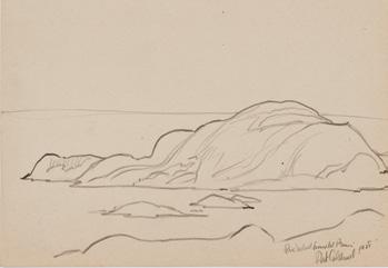
Pic
graphite
Montreal
Photo: MMFA, Jean-François Brière
Not for sale with this lot
equipment onto the jigger and were transported four miles further west. We then proceeded about a third of mile [.5 km] into the bush and set up camp.” !e artists chose a spot about a half-hour hike from the shores of Lake Superior to serve as their base of operations.
On arrival at their destination, the artists divided their e#ects into two tents, Carmichael and Casson sharing one, and Jackson and Harris the other, the division of camping arrangements was also a re$ection of the friendships and sketching histories between artists. Harris and Jackson had done several trips to Lake Superior together beginning in 1921. And ever since Casson had been hired by Carmichael as his apprentice in 1919 at Rous and Mann Ltd., Carmichael had taken him under his wing as both designer and painter. Under Carmichael’s lead, it would be a serious working trip for Casson, one which he never repeated, not with Carmichael.
As Casson’s drawing of the Casson-Carmichael camp shows (McMichael Canadian Art Collection), their tent was nestled into a small clearing which o#ered some protection from wind but not from snow. He recalled, “One storm was so bad that, in the middle of the night, we were… awakened to " nd our tent on the verge of being blown away.” Such cold temperatures precluded the possibility of them working in watercolour since the paint would freeze almost instantly. !us, both artists worked mainly in graphite and oil; with its viscous base, the oil was sti # but still malleable and less susceptible to freezing. Casson too made drawings in 1928 including one of the Ice House at Port Coldwell in the McMichael Canadian Art Collection (1966.4.3), and he also produced sketches in oil including one in the !omson Collection at the Art Gallery of Ontario (2017/54).
Carmichael’s oil sketch, Port Coldwell, Lake Superior, 1928, bears a close compositional relationship to one of his plein air drawings, Pic Island from Mount Premier, Port Coldwell, 1928 (Montreal Museum of Fine Arts), from which it appears to have evolved. Carmichael and Casson spent time on both the shores of Lake Superior and also the inland areas where the last of fall colour could be better enjoyed. Carmichael shifted his emphasis on the land rather than the lake in his oil sketch. Compared to his drawing, this gave him opportunity to add more colour to de" ne the hills and rocks. With more land than water,
Alfred Joseph Casson
Casson-Carmichael Camp, 1928 graphite on paper, 20.9 x 27.3 cms
Gift of the Artist, McMichael Canadian Art Collection (1972.2.2) Not for sale with this lot
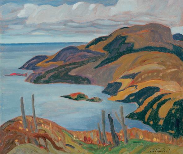
the decision enabled alternating bands of ochres, oranges, browns and purples to give shape to the shoreline hills. Carmichael’s heavy sky with ominous clouds and deep blue water o#ers a sense of the cold the artists experienced.
Port Coldwell, the artist’s title inscribed in his hand on the verso, was a ubiquitous one Carmichael used for many of his Lake Superior oil sketches in 1928, including those forming the Port Coldwell Series of four paintings held in the National Gallery of Canada collection (38407-38410). !e title also re$ected the fact that the artists only worked in the Port Coldwell area in 1928. Compared with the drawing, which notes an actual location, the oil sketches were more focused on the power of nature and were less concerned with topographical reference. As American art historian, Nicole Marie McKowen recently wrote of his Lake Superior work, “Carmichael’s complementary colours, hue variation, undulating lines, vastness of space, implied human experience through the verticality of the trees, and the surrounding e#ect of the landscape and sky all work together to evoke spiritual contemplation of and communion with nature.”
!ere is no known exhibition history for this sketch, but it is possible it was included in the Art Gallery of Toronto’s Little Pictures Exhibition by Members of the Ontario Society of Artists held in November 1928, just after Carmichael’s return from Lake Superior. ! at year Carmichael exhibited "ve sketches, only one of which was titled, and four he reserved from public sale. ! is was probably because he was considering them for enlargement in the studio, although Port
Coldwell, 1928 is not known to have been developed into a larger painting. Carmichael also exhibited some Lake Superior oil sketches at the annual Canadian National Exhibition but, as there was no Group of Seven exhibition in 1929, the Ontario Society of Artists exhibition would have been one of the few occasions Carmichael showed any of his Lake Superior oil sketches. Afterwards, hardly any of his Lake Superior oil sketches were shown during his lifetime. As a result of such a spartan exhibition history for this body of work, Port Coldwell, 1928 is a little-known painting, especially too since it has not been included in any of the important exhibitions featuring Carmichael’s life and work, such as his 1990 retrospective.
!e ownership history of this sketch would appear to have begun when the artist’s widow, Ada Carmichael, consigned the work to Toronto gallerist Blair Laing who represented Carmichael’s work for a time in the mid-twentieth century. ! is oil on beaverboard counts as among Carmichael’s " nest Lake Superior productions with its well-designed composition, subtle handling of colour, and compelling evocation of the chilly weather he and his protégé experienced in late October 1928. For the next three years, Carmichael continued to develop his Lake Superior works into studio paintings in watercolour and oil, works that are among the most important of his career.
We extend our thanks to Catharine Mastin, independent curator and writer, for contributing the preceding essay.
$70,000–$90,000
Light Breaking Through, Lake Superior, 1927 oil on board
signed and dated 1927 lower right; signed, titled and dated 1927 on a label on the reverse; titled and/or dated 1927 to gallery and exhibition labels on the reverse; inscribed "To André Biéler from A.L., June 1965" to a label on the reverse 12.75 ins x 16 ins; 32.4 cms x 40.6 cms
PROVENANCE
Gift of the Artist to André Biéler, Kingston Masters Gallery, Calgary Private Collection, Vancouver
EXHIBITED
Canadian Small Paintings, Small Pictures Department, Canadian National Exhibition, Toronto, 24 August-8 September 1928, no. 469 as Lake Superior Morning at $75
Kingston Collects: Canadian Paintings, Agnes Etherington Art Centre, Queen's University, Kingston, Ontario, 11 April-9 May 1976
LITERATURE
J.A.B. McLeigh, September Gale: A Study of the Group of Seven , Toronto/Vancouver, 1955, reproduced page 101 as October on the North Shore, Lake Superior
Lois Darroch, Bright Land: A Warm Look at Arthur Lismer, Toronto/Vancouver, 1981, reproduced page 80 as Sombre Isle of Pic, Lake Superior
Angela Nairne Grigor, Arthur Lismer: Visionary Art Educator, Montreal/Kingston/London/Ithaca, 2002, page 353
In October 1927, Arthur Lismer made his rst and only trip to Port Coldwell, Lake Superior with Lawren Harris. A master in planning, as A.J. Casson described Harris in 1982, he and Lismer would have hiked
Arthur Lismer
Evening Session, 7:30 pm, 1927 graphite on paper, 18.4 x 23.5 cms
Gift of Mrs. James H. Knox, McMichael Canadian Art Collection (1984.27.15)
Not for sale with this lot
into the woods to set up their campsite, nestled in a small clearing which provided some shelter from the cold fall wind—they were there in October. In a graphite sketch called Evening Session, 7:30 pm (McMichael Canadian Art Collection), Lismer documents the arrival of two bear cubs prowling around their tent. e scene is also a selfportrait. Lismer nervously shelters upright inside the tent sporting his big round glasses, his silhouette and balding scalp visible through the tent sheathing under some form of interior night illumination, perhaps a gas lamp or candle. Harris is either nowhere to be found or oblivious to the situation. But, no doubt, mama bear is not far away from her curious cubs. Normally, Lismer’s satiric drawings are pleasurably entertaining, even his self-portraits like this one, but maybe not this time in this backcountry setting where such wildlife was no rarity. Lismer’s sketch of the Harris-Lismer campsite is one of the few works to detail the experiences of the Group of Seven at Lake Superior.
Perhaps as a result of this experience, unlike the others who did spend time painting the evening hours, it seems Lismer preferred the sharpness of a full day. His oil sketches like this one show his proclivity for strong daylight, consistent with his three Lake Superior oil sketches in the McMichael Canadian Art Collection. Lismer was rather loose about the exact title for this sketch, noting two alternate titles, and showing it under a third one. Two labels on the verso include Morning Light, Lake Superior, and Light Breaking rough, L. Superior and, in the 1928 Canadian National Exhibition, it was shown as Lake Superior Morning. Common to all three is the importance of light. In this sketch, Lismer shared with Harris an interest in the common e ect of the unique light pools of Lake Superior. Casson reminisced about them in 1982 when he described them, “as a curious phenomenon... where shafts of light seem to break through the clouds and illuminate the surface of the water.” Lismer’s sketch, though, resists the simpli cation of form common to Harris’ approach. Instead, Lismer’s technique exposes his preference for an all-over textured surface that allows even the hairs of his paint brushes to remain evenly visible. He also punctuates the foreground with the remnants of fall colour in the delightful addition of red dabs of paint, akin to the brilliance of the red-turned leaves of maple trees.
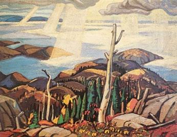
Arthur Lismer
North Shore, Lake Superior, 1928 oil on canvas, 101.6 x 127 cms Private Collection
Not for sale with this lot

Before arriving at Lake Superior, Lismer had sketched in numerous locations across Canada, including Georgian Bay, Halifax, Algoma, Lake Mazinaw, and Gaspé Peninsula, Quebec. Although Lake Superior only forms a small part of Lismer’s larger landscape painting career, his trip there was nonetheless fruitful. He realized sketches in graphite and oil, and also three large studio canvases— October on the North Shore, Lake Superior, 1927 (National Gallery of Canada), Sombre Isle of Pic, Lake Superior, 1927 (Winnipeg Art Gallery), and North Shore, Lake Superior, 1928 (Private Collection).
After Lismer and Harris returned to Toronto, they both exhibited their fresh new sketches of Lake Superior in the Small Pictures by Members of the OSA at the Art Gallery of Toronto in December 1927. All of Lismer’s six new sketches were simply called North Shore, Lake Superior, and thus it can not be known if Light Breaking rough, Lake Superior, was among them, given his loosened approach to precise titles. However, Lismer did surely exhibit the work in the 1928 CNE the following summer, as documented by the exhibition catalogue of Canadian Small Paintings and the exhibition label on the verso.
At this time in Lismer’s career, he had recently resigned from his position as Vice-Principal of the Ontario College of Art over di erences with then Principal, George Agnew Reid. In September,
he was appointed by the Art Gallery of Toronto to oversee and revamp the Education program, alongside then Curator, Frederick S. Haines. Amidst these critical life changes, the Lake Superior trip probably would have been welcome reprieve from a trying year of administration.
It is not entirely clear how this sketch came to be a gift from Lismer to fellow artist André Biéler, but the provenance does assure its origins from the artist’s studio. Biéler was then Professor of Fine Art at Queen’s University in Kingston, and coordinated the rst opportunity for artists from across Canada to meet together in June 1941, at the in $uential Kingston Conference, the eventual outcome of which would lead to the formation of the Canada Council for the Arts in 1957. Biéler served as the rst president of the Federation of Canadian Artists to emerge as a result of the event. As fellow educators and artists, the two had much to share and with the exchange of this sketch from artist to artist, an interest in Lake Superior.
We extend our thanks to Catharine Mastin, Independent Curator and Writer, for contributing the preceding essay.
$70,000–$90,000
The Country Road, Baie St. Paul oil on canvas signed lower right; titled to a label on the reverse 17.75 ins x 21.25 ins; 45.1 cms x 54 cms
PROVENANCE
Masters Gallery, Calgary Private Collection, Calgary
Born in Hamilton, Ontario, Albert Henry Robinson left Canada to pursue academic training in Paris in 1903. He studied at the Académie Julian under William Bouguereau and at the École des beaux-arts before embarking on painting trips throughout Normandy in the summers of 1904 and 1905. Holding fast to the tenets of his formal European training, Robinson would nonetheless remain faithful to his Canadian roots, returning to paint the rural landscapes of Ontario and Quebec for the remainder of his career alongside Clarence Gagnon, Edwin Holgate, and A.Y. Jackson. Despite his initial foray along the south shore of the Saint Lawrence River with Jackson in 1921, Robinson preferred to paint the north shore where, throughout the 1920s and into the early 1930s, his annual trips in Beaupré and Charlevoix counties included visits to Saint-Tite-des-Caps, Baie-SaintPaul, Les Éboulements, Murray Bay (now La Malbaie), Saint-Fidèle, and Saint-Siméon.
In contrast to the Group of Seven, Robinson would remain a sensitive and authentic interpreter of the Quebec landscape. In doing so, the painter shared much with the artists of the Beaver Hall Group in Montreal, where he found many travel companions along the paths through Quebec villages. In 1933, he was one of the founding members of the Canadian Group of Painters.
! is painting depicts a serene winter scene in the rural village of Baie-Saint-Paul. A winding, snow-covered path leads through the composition, bordered by a rustic wooden fence that adds depth and perspective. A horse pulls a sled " lled with logs and a seated " gure, heading into town. !e charming houses in muted yet warm colours— greens, yellows, and reds—contrast beautifully with the dominant whites and blues of the snow. !e soft, atmospheric light enhances the feeling of a peaceful winter day. Rather than capturing the country through depictions of barren terrain, Robinson narrows his focus on the dwellings of emerging towns and cities in the early twentieth century, lending life and narrative to the prevailing landscape painting tradition in Canada.
!e modern artist celebrates themes of traditional regionalism with great sophistication. As A.Y. Jackson wrote, the subject in Robinson’s work is not what matters; it is his personal interpretation of it that counts. ! is can be recognized by the re" ned and balanced architecture of the composition, the use of intense and dazzling colours, and his method of generous paint application.
$80,000–$120,000
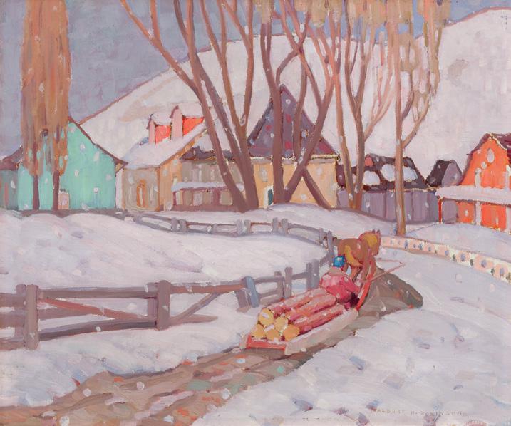
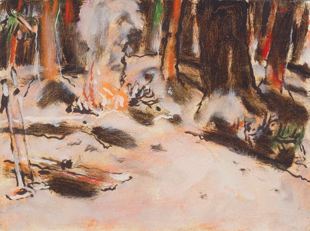
Campfre in Winter, circa 1946 oil on canvas
inscribed “608” (by the Duncan Estate) and “Camp# re in Winter” (by David Milne Jr.) on the stretcher on the reverse; catalogue raisonné no. 406.1 12 ins x 16 ins; 30.5 cms x 40.6 cms
PROVENANCE
Milne Family Collection
Mira Godard Gallery, Toronto Private Collection, Toronto
EXHIBITED
David Milne, McMichael Canadian Art Collection, Kleinburg; travelling to the Vancouver Art Gallery; National Gallery of Canada, Ottawa, 29 September 1991-7 September 1992 as Camp re in Winter
LITERATURE
Ian !om, David Milne, Vancouver/Kleinburg, 1991, reproduced page 142
David P. Silcox, Painting Place: e Life and Work of David B. Milne, Toronto, 1996, page 317
David Milne Jr. and David P. Silcox, David B. Milne: Catalogue Raisonné of the Paintings, Volume 2: 1929 ‒1953, Toronto, 1998, listed and reproduced page 881, no. 406.1
Following a tumultuous decade of " nancial and marital hardship, the 1940s brought many positive changes in David Milne’s career and personal life. In 1939, David and his wife Patsy separated, and shortly thereafter he fell in love with Kathleen Pavey, a nurse. ! at same year he left Six Mile Lake and the couple settled brie$y in Toronto before moving to Uxbridge where they lived from 1940 to 1952. Kathleen gave birth to their son, David Milne Jr., in 1941. In addition to his new family, Milne’s dealer and agent, Douglas Duncan, played a particularly positive role in Milne’s life during the 1940s. Duncan provided the artist with some long-awaited " nancial stability and success in the Toronto art milieu. David Silcox describes Kathleen and Duncan as the artist’s “wonderful guardian angels.”
Camp re in Winter was completed in 1946 in the characteristic painterly style of Milne’s later works. His brushstrokes in this composition are wider and looser than his early oils; their spontaneity and translucent application evoke a similar feel to watercolour painting. !e artist always maintained his attention to line, as visible in the jagged tree outlines and their re$ections in the river. !e painting also illustrates his preference for using black in a composition, regardless of the level of realism. !e forest, water, and foreground shoreline all include the same shade of black pigment, amid the remaining reductive colour palette of orange, brown, and white.
! is is one of a group of works stolen from Milne’s Baptiste Lake cabin and recovered by the police in 1963, hence the stamp on the reverse of the canvas from the Ontario Provincial Police.
$30,000–$40,000
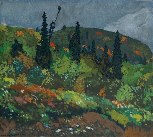
Along the Line, Algoma, 1918 oil on paper laid down on board signed lower left; titled and inscribed "Hubert" and "No. 65" on the reverse 9.25 ins x 10.25 ins; 23.5 cms x 26 cms
PROVENANCE
G. Blair Laing, Toronto Private Collection, Ottawa
EXHIBITED
Algoma Sketches and Pictures by J.E.H. MacDonald, A.R.C.A., Lawren Harris and Frank H. Johnston , !e Society of Canadian PainterEtchers, Art Museum of Toronto, April 1919, no. 65
LITERATURE
F.H. Johnston, Toronto to Eric Brown, Ottawa, File 5.42 Johnston, Library and Archives, National Gallery of Canada, Ottawa
Algoma Sketches and Pictures by J.E.H. MacDonald, Lawren Harris and Frank H. Johnston, !e Society of Canadian Painter-Etchers, Toronto, 1919, no. 65, listed page 9 "Etchings Predominate at Art Exhibition", Daily Star (3 May 1919)
Algoma is intimately associated with the early history of the Group of Seven. In August 1918 Frank Hans Johnston received a commission to draw and paint the activities of the $ ight training schools in southern Ontario for the Canadian War Memorials program; however, a trip to Algoma with Lawren S. Harris and J.E.H. MacDonald in October interrupted his war work and set him o# in a new direction. “Our trip north was a great success–we struck new country in every respect and had a wonderful time sketching for all that was in us,” he wrote to Eric Brown, director of the National Gallery.
Johnston had " fty-seven works in the Algoma exhibition at the Art Museum of Toronto in late April 1919, including Along the Line, Algoma !e works in the three-man exhibition, which included Harris and MacDonald, were arranged chronologically and geographically following the advance of the autumn colour from Canyon, to Hubert, to Batchewana. !e smaller works of this collection were made on a sketching trip along the line of the Algoma Central Railway during the last three weeks of September 1918. ! is work is noted as being painted in the vicinity of Hubert. !e oil sketch shows a lush forest in autumn; most of the foliage is green, with a few $ecks of orange and red dotting the background. !e writer in the Toronto Daily Star admired Johnston’s contributions in the exhibition, stating, “Mr. Johnston sees nature much as a huge decoration—the blue and purple mountains with a glimpse of orange sky; the sparkle of autumn foliage against the molten grey of a placid lake—he eliminates detail and " nds wide unbroken expanses.” In September 1919, Johnston returned to Algoma with Harris, MacDonald and A.Y. Jackson in preparation for the inaugural Group of Seven show in spring 1920.
$15,000–$20,000
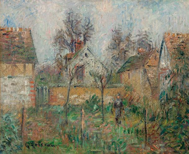
Paysage à Saint Cyr du Vaudreuil, circa 1926 oil on canvas
signed lower left and titled on a frame plaque 19.75 ins x 24 ins; 50.2 cms x 61 cms
PROVENANCE
Private Collection, Montreal
LITERATURE
Christophe Duvivier and Claude Cornu, Gustave Loiseau: Paysages d'Île-de-France et de Normandie [online publication] , Paris, 2018, accessed 15 April 2025
As one of the foremost Post-Impressionist painters, Gustave Loiseau was profoundly in $uenced by Claude Monet and Camille Pissarro. An adept of plein air painting, he nevertheless adopted a personal and abstract pictorial language by painting at unusual times of the day to capture the changes of light. Born in 1865 in Paris, Loiseau’s interest in art developed when his parents moved back to their hometown of Pontoise in 1884, a region that had also fascinated Pissarro and Paul Cézanne. After joining the artist colony at Pont-Aven in Brittany in 1890, Loiseau became friends with Henry Moret, Maxime Maufra and Paul Gauguin, which led him to adopt bolder colours and expand his Impressionist repertoire.
Here a lone " gure is depicted standing in a courtyard with lush greenery in shades of green, brown and ochre. Buildings rise on the periphery, with their gable roofs and brick chimneys. While the lower register is intensely colourful, the viewer’s eye is inevitably drawn to the tree branches stretching upward in the background to the atmospheric sky represented in shades of white, blue, pink and grey. Under Loiseau’s brush, the paint is dynamic, animated by a " ne network of superimposed and crossed hatches, fully rendering the transparency of the air, sky and the rich texture of the natural landscape.
Saint-Cyr-du-Vaudreuil was an old French commune in Normandy, which Loiseau visited in 1899 and 1932. It regrouped two neighbouring communes separated by the Eure river, thus o#ering the perfect setting for Post-Impressionist artists who were drawn to the waterscapes and the changing e#ects of light upon the environment. French art dealer Paul Durand-Ruel, celebrated for championing the Impressionists, started buying Loiseau’s paintings in 1897 and exhibited them regularly the following year in Paris and New York. In 1901, Durand-Ruel devoted a solo exhibition to the artist in SaintCyr-du-Vaudreuil alongside a show of Georges Manzana-Pissarro, the third of Pissarro’s seven children. With Durand-Ruel’s " nancial support, Loiseau travelled extensively to various regions outside Paris, to Normandy and Brittany, recording the changing seasons and the play of natural light on his surroundings.
We are grateful to Didier Imbert for con " rming the authenticity of this work.
$40,000–$60,000
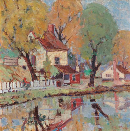
Autumn Scene oil on canvas signed lower right 16 ins x 16 ins; 40.6 cms x 40.6 cms
PROVENANCE
Gift of the Artist to Private Collection, Laurel, Delaware By descent to Private Collection, New Brunswick
New Hope, Pennsylvania, was a vibrant artist community in the early twentieth century, drawing inspiration from the outdoor practices of French Impressionists. ! is included the snowy landscapes painted by Edward Red "eld and Walter Elmer Scho"eld, as well as the luminous scenes of Daniel Garber. Unlike other American Impressionists, the artists of the New Hope School, primarily based in Bucks County, favoured thick brushstrokes and focused almost exclusively on landscape painting. While Pennsylvania Impressionism is often associated with male artists, women artists were also well-represented. !eir mastery of light and colour, as evidenced in this work, rivals that of their male contemporaries, capturing the essence of a scene through carefully chosen hues.
Fern Isabel Coppedge began her artistic career in her late twenties, " rst studying at New York’s Art Students League before moving to Philadelphia, where she studied at the Pennsylvania Academy with Daniel Garber. She " rst visited Bucks County in 1917 before settling in Lumberville in 1920. Coppedge joined the Philadelphia Ten, a women’s art organization dedicated to exhibiting the works of its members. Celebrated for her winter scenes, she would eventually shift towards Post-Impressionism, adopting more whimsical colours and an abstract style.
In this work, Coppedge has depicted an idyllic fall scene on the banks of the river. Towering leafy trees are tightly clustered around a house, which is rendered in textured shades of white, red, brown and gray. A white picket fence stretches horizontally to the left, and a small house with a red brick chimney is visible further down the shore. !e colourful leaves—in shades of vibrant yellow, orange and green— dominate the composition, while the hazy re$ection of the landscape on the water " lls the lower register. With loose brushstrokes and muted colours, Coppedge captures the $eeting e#ects of light, blurring the lines between the re$ected image and the actual scene.
$35,000–$55,000
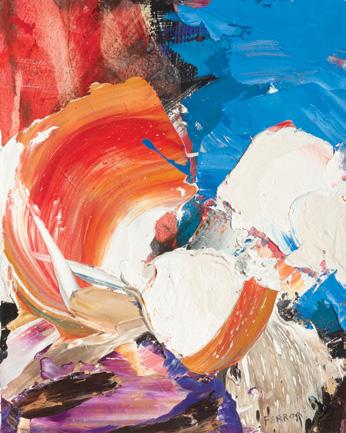
Sans titre
two oils on canvas each signed
10.5 ins x 8.75 ins and 10.75 ins x 8.5 ins; 27.3 cms x 22.2 cms and 26.6 cms x 22.2 cms
Private Collection, Toronto
Marcelle Ferron was born in 1924 in Louiseville, Quebec, and raised in Sainte-Élisabeth in the Lanaudière region. Her father was a doctor, and her mother encouraged the arts. Marcelle was one of several creative siblings—her sister Madeleine Ferron became a noted writer. After contracting tuberculosis as a teenager, she left high school and later studied at the École des beaux-arts de Québec, but found its academic style sti $ ing and left without graduating. Her frequent stays in a dim, drab hospital room during her illness sparked a deep appreciation for light and colour, which she infused into her abstract paintings. In Montreal in the 1940s, Ferron met Paul-Émile Borduas and became a member of the Automatistes group and a signatory of the Refus Global in 1948. Her " rst solo show was held in 1949 at the Librairie Tranquille on Sainte-Catherine Street in Montreal, one of the very few exhibition spaces at that time showing avant-garde art. Ferron’s paintings became progressively more forceful; vibrant colours and larger, $uid forms dominated the canvases.
By the late 1950s and into the early 1960s, Ferron was creating some of her most acclaimed and widely recognized work. She held solo exhibitions at increasingly prominent galleries in Paris and Brussels and participated in group shows alongside artists such as Borduas and Jean Paul Riopelle. In 1959, her work was featured in the ! ird Biennial Exhibition of Canadian Art at the National Gallery of Canada, and in 1961 she represented Canada at the sixth São Paulo Biennial. She was made a member of the Royal Canadian Academy of Arts in 1972 and was awarded the Paul-Émile Borduas Prize, the Quebec government’s highest honour for achievement in the visual arts, in 1983. !ese two paintings are examples of her mature style consisting of bold pigments, thick impasto and violent brushstrokes, all contained within complementary modest-sized canvases.
$25,000–$35,000
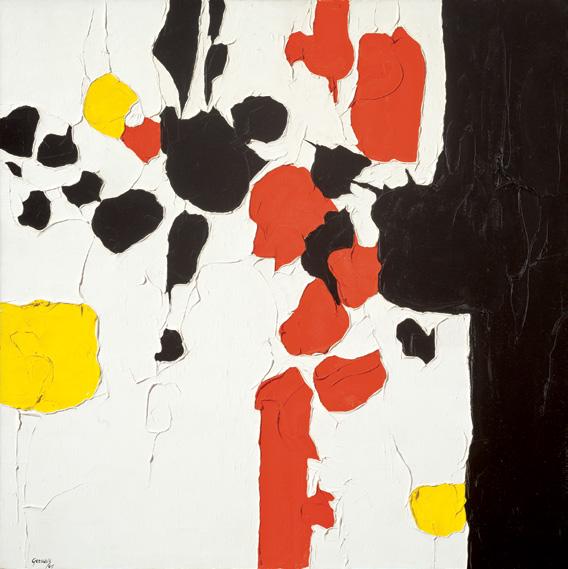
Le double anneau dans l’œil, 1964 oil on canvas
signed and dated 1964 lower left; signed to the stretcher, signed and titled to a gallery label on the reverse 36 ins x 36 ins; 91.4 cms x 91.4 cms
PROVENANCE
Galerie du Siècle, Montreal Private Collection, Montreal
Montreal-based artist Lise Gervais was inspired by Paul-Émile Borduas and Les Automatistes, although she was not an o%cial member of the group. She played a signi "cant role in Quebec's abstract painting movement in the 1960s, focusing on bold pigments and high contrast to bring energy to her art.
Gervais travelled to Spain in 1958, where she was particularly inspired by the work of Francisco Goya. Back in Montreal in 1961, she had her " rst solo show at the Galerie Denyse Delrue. She would go on to exhibit with Gallery Moos in 1962. Gervais then returned to teaching for sixteen years at the École des beaux-arts, Concordia University and L’Université du Québec in Montreal.
!e tactile and colourful surface of Le double anneau dans l’œil vividly captures the vibrant energy with which she infused her artwork. Gervais' personal interest in texture and materiality results in expressive and instinctive brushwork, with a high-contrast palette of black, white, yellow, and red. !ese colours, applied with precision, carry a dynamic and instinctive touch, creating a captivating composition that showcases Gervais's artistic expertise. Choosing pure, brilliant pigments, she allowed minimal blending to occur in her work. !us her colours are incredibly pure and rich. Building on one another, each stroke of paint creates depth, movement and contrast of colour and complexity within the grid-like composition. In Le double anneau dans l’œil, the viewer can see the foundations of the artist’s technique, steeped in the traditions of the Automatistes and focusing on the limitations of the medium she developed throughout the 1960s.
$20,000–$30,000
Two Fishermen, circa 1935-1940 mixed media on beaverboard signed lower right; titled on the gallery label on the reverse; inscribed "849/E" and "cost $10,000" on the reverse 9 ins x 12 ins; 22.9 cms x 30.5 cms
PROVENANCE
Manuge Gallery, Halifax Private Collection, Toronto
EXHIBITED
Maud Lewis, Manuge Gallery, Halifax, circa 1980
Created in the late 1940s, Two Fishermen encapsulates Maud Lewis’s signature folk style and her sentimental portrayal of rural life in Nova Scotia. !e painting depicts an idyllic coastal scene, with "shermen casting their lines and a moored sailboat set against rolling green hills and colourful seaside buildings. Lewis’s trademark $ attened perspective and bold colour palette lend her work a sense of cheer and clarity, capturing everyday moments with a unique and heartfelt vision. Although Lewis gained some recognition during her lifetime, it was not until circa 1980—more than a decade after her death—that her " rst commercial exhibition was held at the Manuge Gallery in Halifax. Since then, her work has been exhibited across Canada, solidifying her status as an iconic " gure in Canadian art.
$20,000–$30,000
ARTHUR LISMER
Killicks, Cape Breton, Nova Scotia, 1954 oil on canvas
signed and dated 1954 lower centre; signed and titled on the reverse 16 ins x 20 ins; 40.6 cms x 50.8 cms
PROVENANCE
Private Collection, Nova Scotia
LITERATURE
Dennis Reid, Canadian Jungle: e Later Work of Arthur Lismer, Toronto, 1985, page 43
Between 1940 and 1950, Cape Breton Island became a regular sketching destination for Arthur Lismer. In Lismer’s 1954 painting Killicks, Cape Breton, Nova Scotia , the artist focuses on the tools of a working "shing vessel, arranging ropes, buoys and killicks into a chaotic yet harmonious still life. Killicks are heavy stones used by small
boats in place of metal anchors, and their use has a long history in the Maritimes. For Lismer, killicks serve as both literal and symbolic anchors, grounding the composition in Nova Scotia’s seafaring heritage. According to Dennis Reid, “ !ese objects crafted by the "shermen were to Lismer evidence of a fundamental creative response to the environment, re$ecting attitudes " xed on simple but profound values.”
In Killicks, Lismer moves beyond mere representation to create a work that captures the enduring spirit of the East Coast’s seafaring communities. !e interplay of light and shadow, along with the juxtaposition of warm and cool tones, creates a sense of depth and movement within the con " ned space of the boat. !e thick application of paint and bold, gestural lines imbue the scene with energy, re$ecting both the rugged quality of the tools and the labour-intensive nature of seafaring life. By depicting these utilitarian items with such vibrancy, Lismer elevates them beyond mere functional tools, celebrating the hardworking Maritimers who rely on Canada’s coastal waters.
$25,000–$35,000
Wayne Gretzky #99 (F&S II.306)
colour screenprint on Lenox Museum Board signed and numbered 280/300 lower left, signed by Wayne Gretzky and inscribed "99" lower right, printed by Rupert Jasen Smith, New York; published by Frans Wynans, Vancouver
40 ins x 32 ins; 101.6 cms x 81.3 cms
PROVENANCE
Private Collection, British Columbia
LITERATURE
Frayda Feldman and Jörg Schellmann, Andy Warhol Prints: A Catalogue Raisonné 1962-1987, 4th edition, Milan, 2003, reproduced page 133, catalogue no. II.306 Pat Hackett, ed., e Andy Warhol Diaries, New York, 2014, page 515
"When Andy Warhol and Wayne Gretzky Teamed Up for a Portrait", CBC Archives [online publication], 12 December 2019, accessed 2 April 2025
“I’ve never met a person I couldn’t call a beauty,” —Andy Warhol
Andy Warhol and Wayne Gretzky were introduced by Vancouver dealer Frans Wynans. Gretzky had reportedly been a fan of the artist long before their meeting. ! is collaboration aligned with Warhol’s interests, as he had created the portfolio Athletes in 1977, which featured ten portraits, including Muhammad Ali, O.J. Simpson, Jack Nicklaus and Pelé.
!e original paintings Warhol created from the sitting originally sold for $35,000, while the screenprints sold for $2,000. Gretzky kept one of the portraits for himself, choosing the one he described as featuring “the Oiler colours, if you can see the blue with the orange and white. !ey all look the same, but the colour in that one was the one that I seemed to like the most.”
Warhol’s diary entry for !ursday, June 9, 1983—the day of their appointment—describes their meeting: “Got up early because I had a 10:00 appointment at the o%ce that Fred had made with Wayne Gretzky of the Oilers (cab $6). When I got there they said Gretzky had just called and said he was coming right down. Meanwhile Fred who had made this early, early meeting wasn’t there yet… By 12:30 I was still the only one there, and I was mad… And " nally Gretzky arrived and he was adorable, blond twenty-two and cute. He doesn’t wear shoulder pads when he plays. I told him he should go into the movies and he said that he was going to be in a Fall Guy and a Tom Selleck. He dates a Canadian singer.”
In this work, Warhol focuses on “ !e Great One’s” boyish blond hair and intense gaze, which he emphasized using neon colours set against a large white square that contrasts with an intense blue background. Additionally, a large neon pink square highlights Gretzky’s famous number ninety-nine, with stylistic coloured outlines drawing attention to the hockey stick he holds. !e last few letters of the hockey logo Titan are barely visible, a brand which Gretzky would be associated with throughout his career.
$20,000–$30,000
Composition, 1950
gouache on paper signed with initials, dated 1950, signed and inscribed "A Madame Matarazzo en souvenir de sa visite à mon atelier. Très cordialement F. Léger 21-5-52" lower right underneath the mat 12.5 ins x 8.75 ins; 23 cms x 19.5 cms
PROVENANCE
Gift of the Artist
Yolanda Penteado and Ciccillo Matarazzo, São Paulo
Harvey Lubitz Fine Art, New York Elca London Gallery, Montreal Private Collection, Toronto
LITERATURE
Fernand Léger, Functions of Painting, New York, 1973, page 168
In this simple composition, the focus is on abstract forms. A red amorphous shape outlined in black dominates the composition, positioned alongside an organic yellow form at the bottom and a smaller geometric black shape in the upper right corner. Black rectangular shapes of varying sizes punctuate the sobriety of the pale blue and white background. !e interplay of line, form, and colours animates the con " guration, creating a dynamic visual e#ect that re$ects modern life. Léger wrote in 1950: “ !e plastic life, the picture is made up of harmonious relationships among volumes, lines, and colors. !ese are the three forces that must govern works of art. If, in organizing these three essential elements harmoniously, one " nds that objects, elements of reality, can enter into the composition, it may be better and may give the work more richness.”
Dedication in the lower margin
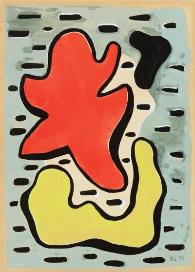
! is gouache was later transformed into a print series of the same name. Created in 1950, it was gifted to Madam Matarazzo in memory of her visit to Léger’s studio in 1952, referring to Yolanda Penteado, the wife of Ciccillo Matarazzo. !ey were Brazilian philanthropists and collectors who helped establish three major cultural institutions in São Paulo. !ey were fervent collectors of modern art and acquired several works by Cubists, including Léger, Georges Braque and Pablo Picasso.
We are grateful to the Comité Léger for con " rming the authenticity of this work.
$30,000–$50,000
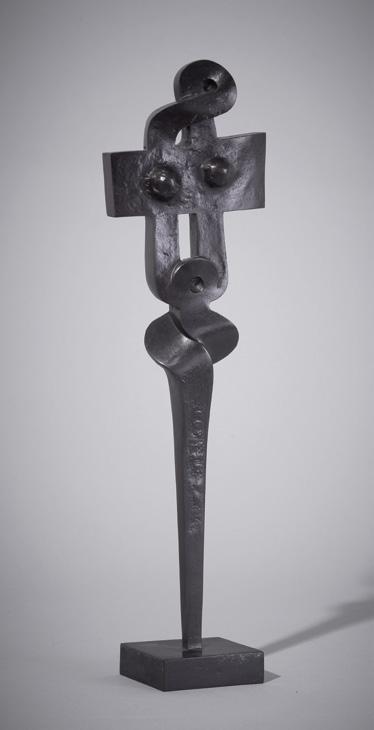
Adolescence Study, 1969
bronze stamped signature on the base 14.25 ins x 3.75 ins x 2.5 ins; 36.1 cms x 9.5 cms x 6.3 cms
PROVENANCE
Acquired directly from the Artist Private Collection, Toronto
LITERATURE
!eodore Allen Heinrich, Introduction to Etrog: Painting on Wood/ Sculptures/Drawings, Toronto, 1959, unpaginated
Romanian-born Canadian artist Sorel Etrog had his " rst solo exhibition in Canada in October 1959 at Gallery Moos in Toronto. In the early 1960s, while living in New York City and studying at the Brooklyn Museum Art School, Sorel Etrog was fascinated by the museum’s collection of African and Oceanic art. While trying to " nd gallery representation in New York City, Etrog befriended the prominent Jewish-Canadian art collector Samuel J. Zachs. Etrog was also becoming acquainted with the sculptures of Henry Moore, Barbara Hepworth and Constantin Brâncu 'i—all artists whose works were collected by Sam Zachs. !e combination of these new sources of inspiration would in $uence Etrog’s work in the years to come. !e artist emigrated to Canada in 1963 and, three years later, represented Canada at the Venice Biennale.
!eodore Allen Heinrich described Etrog’s understated yet compelling sculpture: “[Etrog] has a strongly musical sense for rhythms, balances and silence. He has a profound capacity for experiencing and conveying emotion. His work is imbued with poetic fantasy... Above all he has something to say. !e adventurous art of Sorel Etrog is centred on increasingly simple but constantly more meaningful form in conjunction with intricately subtle balances of movement, weight and colour.”
! is work is aptly titled Adolescence, as Etrog’s sculptures were in $uenced by his own adolescence spent under Soviet rule and an interest in philosophical writings that questioned the nature of post-war society.
$10,000–$15,000
SOREL ETROG
Powersoul Study, 1988
painted steel
8.75 ins x 7 ins x 5 ins; 22.2 cms x 17.8 cms x 12.7 cms
PROVENANCE
Acquired directly from the Artist Private Collection, Toronto
LITERATURE
Pierre Restany, Sorel Etrog, London/Munich/New York, 2001, page 133
Ihor Holubizky, Sorel Etrog: Five Decades, Toronto, 2013, page 13
Over the course of "ve decades, Sorel Etrog's artistic journey has seen a dynamic evolution across various forms, including free-standing sculptures, wall pieces, drawings, and prints, all crafted using diverse mediums and materials. In the 1980s, during a particularly productive phase, Etrog began to explore and create more streamlined drawings and collages, while simultaneously developing steel sculptures and wall pieces that re$ected this new direction.
Discussing the inspiration behind the transformation in his work, Etrog shared, “ !e hinge connected the $ at surfaces with its tubular swelling, creating a dialogue between the mechanical and organic. !e steel constructions were just the beginning of my work with steel. In the free-standing sculptures that followed, gone was the pedestal and the lostwax castings. I made maquettes which were studies for large outdoor works. In 1981, I created my " rst large steel sculpture entitled Spaceplough 1 which was shown at the opening of the new sculpture garden in Toronto. ! at was followed by other commissions for large works: Sunlife in 1984 and 1988 Powersoul for the Olympic Park in Seoul, Korea.”
! is artwork is a study for the monumental ten-metertall sculpture commissioned for the 1988 Summer Olympics in South Korea. Both the study and the completed sculpture are designed to sit directly on the ground without pedestals. Powersoul is composed of $ at forms and sheets, cleverly assembled to convey a sense of grandeur through its clear geometric simplicity. ! is rare model composed of steel is from an edition of three.
$8,000–$12,000
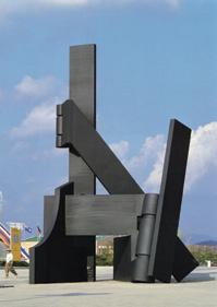
Sorel Etrog Powersoul, 1988
Olympic Park, Seoul, South Korea
Collection of the Government of South Korea
Copyright ! e Estate of Sorel Etrog
Not for sale with this lot
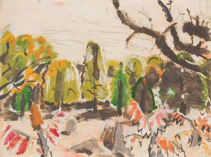
Green Woods and Sumach, September 1945 oil on canvas titled, dated "September 1945" and inscribed "David Milne" and "0-637" (by Douglas Duncan) on the stretcher; catalogue raisonné no. 405.69 12 ins x 16 ins; 30.5 cms x 40.6 cms
PROVENANCE
Douglas Duncan Picture Loan Society, Toronto Private Collection, Toronto Private Collection, Vancouver By descent to a Private Collection, Vancouver He#el, auction, Toronto, 2 December 2020, lot 142 Private Collection, Toronto
LITERATURE
Donald W. Buchanan, e Growth of Canadian Painting, London/Toronto, 1950, page 42
David Milne Jr. and David P. Silcox, David B. Milne: Catalogue Raisonné of the Paintings, Volume 2: 1929-1953, Toronto, 1998, listed and reproduced page 874, no. 405.69
In addition to a new marriage, the birth of his son, and increased commercial success during the mid-1940s, David Milne was also writing his autobiography, which was published in 1947. !e book not only demonstrated his gift for writing, but also exposed the degree of sacri "ce that Milne su #ered in order to devote his whole life to being an artist. ! roughout much of David Milne’s career, apart from occasionally bartering his labour in exchange for necessary supplies, the artist impressively managed to dedicate all of his time to painting.
Green Woods and Sumach was completed in September 1945 in Haliburton, Ontario, in his typical black and white colour palette of the decade, but also with lively accents of green and red foliage. !e distinct elongated leaves of the sumach tree feature regularly in his works of this time. Author Donald W. Buchanan writes: “ !e colours he uses are rarely linked directly to Nature; he employs them more often for decorative [rather] than for realistic e#ects. ! is cool and intellectual approach of his is the product of long years of thought and re$ection, of years of solitude devoted to the study of his craft.”
$30,000–$40,000
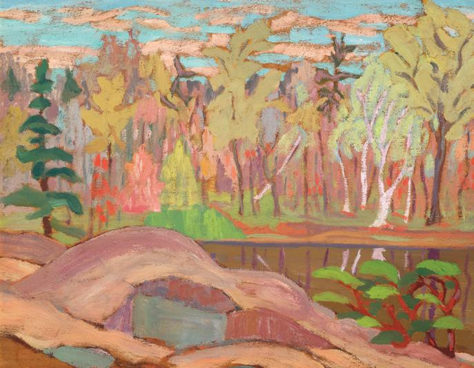
Forest Pool, Spring Day oil on board titled on the framing plaque 10.5 ins x 13.5 ins; 26.7 cms x 34.3 cms
PROVENANCE
Walker's, auction, Ottawa, 26 March 2003, lot 241 Private Collection, Ottawa
LITERATURE
Sir Frederick Banting, "Opening Remarks", International and Science Year, Canadian National Exhibition, Toronto, 1923
After his scienti "c success as the co-discoverer of insulin, painting became an escape from the fame and attention that Dr. Frederick Banting disliked so intensely. With an a % nity for watercolours and landscape painting, he often thought about retiring from medicine to
become a full-time artist. Banting found inspiration in the wilderness, often venturing into the forest with his sketch box, accompanied by his friend A.Y. Jackson. On these sketching excursions, he would often go by the pseudonym “Fred Grant,” dedicating his focus to creating sensitively observed works of art.
Banting’s scienti "c background and artistic sensibilities merge in his work. Forest Pool, Spring Day encapsulates the artist’s deep reverence for nature, his thick application of paint and simpli "ed forms suggesting both movement and a sense of solitude. !e bold, expressive brushstrokes bring the trees to life, their twisting trunks and vibrant foliage swaying as if caught in a passing breeze. !e rocky foreground anchors the scene, emphasizing the ruggedness of the land and the untouched beauty of Canada’s natural landscape. “Scienti "c research” Banting said, “is nothing more than the endeavour to unfold the secrets of nature.” Driven and inspired by a love of discovery, Banting invites the viewer to uncover the raw beauty of the forest landscape stretching beyond the horizon.
$18,000–$22,000
JAMES EDWARD HERVEY MACDONALD
Mt. Hungabee, from Odaray Bench, 1929 oil on board signed and dated 1929 lower right; signed, titled and dated "Sept. 1929?" on the reverse 8.5 ins x 10.5 ins; 21.6 cms x 26.7 cms
PROVENANCE
Laing Galleries, Toronto Private Collection, Ontario
LITERATURE
Paul Duval, "J.E.H. MacDonald Biography" in D.G. Carmichael, e McMichael Canadian Collection , Kleinburg, 1979, page 51
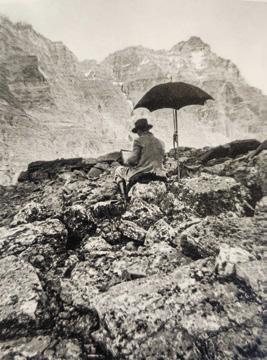
Peter
Archives
Not for sale with this lot
Since 1924, J.E.H. MacDonald had made regular trips to the Rockies, and his journey in August and September of 1929 would be his sixth and second-to-last. He stayed at the Lake O’Hara Lodge and its nearby cabins. In those days, the lodge was accessible only by horseback, and from there MacDonald would hike to his favourite locations. Known for his introspective and reserved demeanour, he nonetheless navigated the rugged terrain with ease, energized by the natural splendor around him.
One such favourite spot, the Odaray Bench—just southwest of Schä #er Lake on the McArthur Pass Trail—o#ered sweeping views to the north. MacDonald painted this scene using expressive brushwork and a re" ned colour palette, making this a particularly rich and textured rendering. !e painting captures a majestic mountain range, rendered with dramatic peaks, rolling contours, and a glowing glacier nestled between the slopes. !e composition rises sharply toward the sky, creating a sense of elevation and grandeur. MacDonald uses broad, expressive brushstrokes and a cool-toned palette dominated by blues, lavenders, soft creams, and ochres. !e ridges and valleys are built up with rhythmic, almost sculptural bands of color, giving the forms a carved, monumental quality. !e glacier at centre adds a bright, luminous contrast, catching the light and guiding the eye inward.
MacDonald’s artistic vision was grounded in a transcendental approach. For him, the subject itself mattered less than the emotional or spiritual response it evoked. In this work, he strove to convey his personal, poetic encounter with the grandeur of the landscape—the emotional resonance and the sense of the sublime it stirred in him. His process both challenged and supported this aim: painting oil sketches outdoors (en plein air), he had to respond quickly to shifting light and weather conditions. ! is urgency often brought a sense of immediacy to his work, and at times, sparked moments of poetic clarity.
MacDonald believed that the landscape was more than just scenery—it was a source of profound emotional and even metaphysical experience. His brushwork is expressive, and his palette bold, capturing the energy and vitality of nature, especially the forests, rivers, and mountain ranges of Canada. Author Paul Duval commented that "no Canadian landscape painter possessed a richer command of colour and pigment than J.E.H. MacDonald... His brushwork is at once disciplined and vigorous. His best on-the-spot sketches possess an intensity and freshness of execution not dissimilar from Van Gogh."
$70,000–$90,000


Quantifcateur, 1981
acrylic on canvas
signed and dated "6/81" on the reverse; unframed 78 ins x 60 ins; 198.1 cms x 152.4 cms
PROVENANCE
Yajima Galerie, Montreal
Acquired by the Art Gallery of Ontario, 1982 Private Collection
LITERATURE
Guido Molinari, "Quanti "cateur Chromatique" in Roald Nasgaard, Ten Canadian Artists of the 1970s, Toronto, 1980, page 72
Guido Molinari was a leader in art theory, education, artists’ organizations and galleries, and of course abstract painting in Montreal from the 1950s to the 2000s. Much of his national and international acclaim attaches to his monochromatic series. !e monochrome is the heart of twentieth-century abstract expression–itself central to Modernism globally–its essence and perhaps the greatest challenge for an artist. Not only must a painter recall the legacy of masters of the genre such as Malevich, Klein, Newman, and Rothko, they must also present work of such apparent simplicity to an often–uncomprehending public. Yet a sonorous painting such as Quanti cateur can be readily understood and appreciated, especially if one focuses less on cerebral understanding and more on the a #ective qualities of the surface, atmosphere, chromatics, scale, and as we might hope for from an artist so interested in classical music, the painting’s quietude.
Molinari focused on the Quanti "ers from the 1970s to the 1990s, working in many colours, compositions, and at di #erent scales. One of his ways of understanding these works was to insist on what he called their “energy balance.” If we give the painting the attention it requires of us, Quanti cateur emits a powerful, balanced force and creates a mysterious deep space that we can sense or even feel part of. While this example may at " rst appear to be black–Molinari created several near–black canvases in the series circa 1980–under this hue he has laid down a layer of purple, which then tints the uniquely ‘black’ surface. Rigorous in every way, Molinari has evenly divided his space into three vertical bars, registered subtly by the minimal edges left by the tape he used to create perfect edges in the composition. With an exquisitely re" ned touch on a dark but by no means heavy surface, Molinari evokes measurement and rhythm.
Quanti cateur is a large painting: its scale invites us to engage with it corporeally, almost as a human interlocutor. If we remain still in front of it, the painting too is motionless. If we move, so do its increasingly visible elements. We perceive, for example, that it is not literally a monochrome but plays with almost imperceptibly di #erent hues. We register its discreet textures, a suggestion that we are looking at a material object as well as delving into a deep, metaphysical space.
We extend our thanks to Mark A. Cheetham, a professor of Art History at the University of Toronto, an independent curator and art writer, for contributing the proceeding essay.
$30,000–$40,000
74
GERSHON ISKOWITZ
Violet Deep I, 1983 oil on canvas
signed, titled and dated 1983 on the reverse 38 ins x 70 ins; 96.5 cms x 177.8 cms
PROVENANCE
Artist's Studio, Toronto
Gershon Iskowitz Foundation, Toronto Private Collection, Toronto
LITERATURE
David Burnett, Iskowitz , Toronto, 1982, page 72
Adele Freedman, Gershon Iskowitz: Painter of Light, Toronto/Vancouver, 1982, page 148
Roald Nasgaard, Abstract Painting in Canada , Toronto/Vancouver, 2007, page 244
Often dubbed a painter of light, Gershon Iskowitz’s practice focused on the contrast between vibrant layered colour forms. Having devoted his practice throughout the 1960s and 1970s to the exploration of light in this new altered perspective, Iskowitz encountered a new challenge in 1981: “He wished to convey ‘a feeling of the night, a feeling of mystery with lots of depth, unity and composition.’ Iskowitz left the age of light behind and entered the era of electricity.” Roald Nasgaard writes that “In the 1980s, Iskowitz upped the ante by electrifying his colours, intensifying their contrasts and hardening the contours of his form.”
Violet Deep I is an excellent example of this artistic transition for the artist. Hovering in a unique space between abstraction and landscape, this painting typi "es the artist’s process, distilling the “moment when the vision of the landscape, the imagination, and the memory of experiences are united in the intuitive expression of the painting.”
$20,000–$30,000
School Garden, circa 1933 oil on board
inscribed "291" on the reverse 24 ins x 20 ins; 61 cms x 50.8 cms
PROVENANCE
Private Collection, Toronto
LITERATURE
Laura Brandon, Pegi by Herself: e Life of Pegi Nicol MacLeod, Canadian Artist, Kingston/Montreal, 2005, pages 62, 67
School Garden typi "es the characteristic vibrancy and swirling forms and " gures that mirrored the vivacity and seemingly uninhibited lifestyle of the artist herself. While landscapes formed the majority of Pegi Nicol MacLeod’s work, Laura Brandon notes, “In order to obtain a good perspective on a subject Pegi would bend down and look at it backwards through her legs. Although landscape remained a preference, her range had broadened substantially —more urban and human subjects, perhaps as a result of Montreal’s political and architectural stimulus”.
Around the time that School Garden was painted, MacLeod had begun representing youngsters, particularly children playing in the schoolyard and wished to create, in her words, a “kaleidoscope vision” which captured the immediacy of the world around her. It was a style that was distinctively her own. MacLeod knew that this new technique was a promising shift in her work and felt con "dent in this new direction. As Henri Masson, fellow Ottawa resident and artist, explained, “she was, in the ! irties, the ‘Enfant terrible’ of the rather dull and small group of Ottawa artists, strange dresses, active in the theatre group… she was so much more alive and interesting than the majority of Canadian painters who painted dull Canadian landscapes”. Her contribution to Canadian art lies in her distinctive perspective on her surroundings and personal experiences.
$10,000–$15,000
Orange Girl, 2008 oil on board
signed, titled and dated 2008 on the reverse; unframed 72 ins x 71.5 ins; 182.9 cms x 181.6 cms
PROVENANCE
Private Collection
LITERATURE
"Kim Dorland Interview", NBB Gallery [online publication], 14 March 2022, accessed 26 March 2025
Allison Meier, "Painting ! rough Your Obsession About Love", Hyperallergic [online publication], 23 August 2011, accessed 26 March 2025
Kim Dorland challenges traditional notions of painted representation by delving into themes such as memory, material, nostalgia, identity, and place. Dorland’s pictures are built up with vibrant, thick layers of paint that create a sculptural e#ect, extending outward from the canvas. In Orange Girl, Dorland employs a hallmark of his work by skillfully contrasting bold abstract impasto with softer stains
and washes. He describes this technique as a visual hook, stating, “Even though I’m often regarded as a ‘thick’ painter, I " nd all of the techniques at my disposal equally interesting. I think my paintings would look boring if they were only thick. It’s the mix of several approaches to painting that (I hope!) makes them pack a visual punch.”
Dorland further explains his creative process, saying, “If I " nd a tube of colour I like, I just buy all of them because I hate to run out of materials halfway through a painting. I try to approach painting in an experimental manner, meaning I let the materials interact with each other to help tell part of the painting's story. I don’t have a speci "c colour or paint that I would call a staple because I’m always changing my approach, but whatever I’m using, I need a lot of it. I guess I can’t live without neon pink and neon orange."
His wife and muse, Lori, appears in many of his paintings, even naming exhibitions after her. In a gallery interview conducted by Lori, when asked why he paints her so frequently, Dorland responds, “I paint you because I adore you.” His portraits of his wife are characterized by a blend of chaotic and passionate brushwork, featuring thick globs of oil paint that are dragged and slashed in a manner that conveys raw emotion and spontaneity.
$15,000–$20,000
Early Autumn, Canoe Lake, circa 1922 oil on board
titled on a gallery label and inscribed "Early Autumn, Canoe Lake" on the reverse
8.5 ins x 10.5 ins; 21.6 cms x 26.7 cms
PROVENANCE
Canadian Fine Arts, Toronto
Private Collection, Toronto
He#el, auction, Toronto, 29 November 2018, lot 302
Private Collection
Roberts Gallery, Toronto
Private Collection, Memphis
LITERATURE
Dorothy Mary Farr, J. W. Beatty, 1869-1941, Kingston, 1981, pages 10, 40
John William Beatty, a forerunner of the Group of Seven, belonged to a generation of early artists dedicated to the depiction of Canada in a distinctly Canadian style. Beatty was closely associated with the Group of Seven members, joining J.E.H. MacDonald and A.Y. Jackson, on sketching trips. Beatty also went on sketching trips with Tom !omson, working alongside all of the artists at the Studio Building in Toronto. !e location for this sketch, Canoe Lake in Algonquin Park, is a familiar setting for Beatty as it stems from these early trips into the Canadian wilderness. Following the death of Tom !omson in 1917 at Canoe Lake, Beatty would also lead the design and construction of a cairn erected in the memory of the artist. Although Early Autumn, Canoe Lake was painted years after !omson’s passing, Beatty’s connection to the location and its emotional weight remains palpable in this tranquil landscape.
$7,000–$9,000
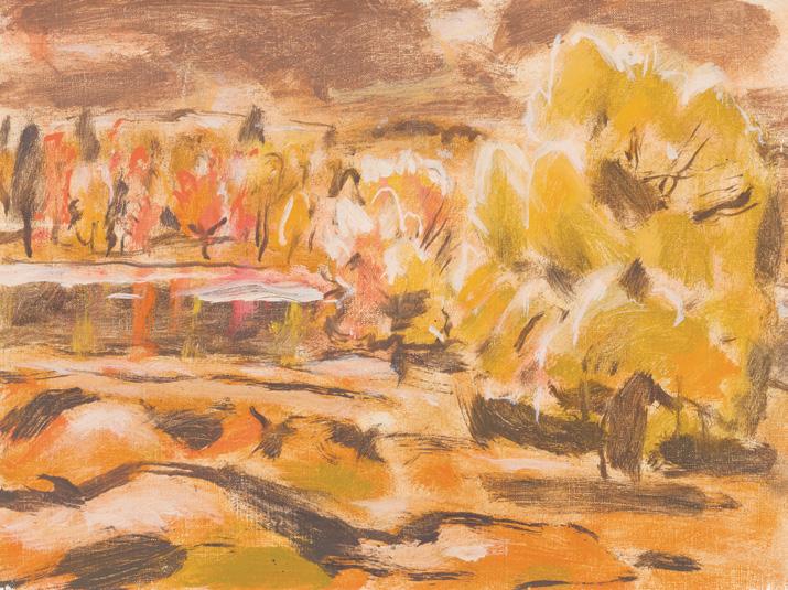
LITERATURE
David Milne: A Survey Exhibition , Toronto, 1978, no. 35 as Stormy October, Gull River
DAVID BROWN MILNE
Tree by the River (Stormy October: Gull River), 1945 oil on canvas
titled and dated 1945 to two gallery labels on the reverse; inscribed "642" on a label (by the Duncan Estate); catalogue raisonné no. 405.77 12 ins x 16 ins; 30.5 cms x 40.6 cms
PROVENANCE
Douglas Duncan, Toronto, 1953
Estate of the Artist
Private Collection
Mira Godard Gallery, Toronto
Private Collection
Masters Gallery, Calgary, 2004
Private Collection, Calgary
EXHIBITED
David Milne: A Survey Exhibition , Mira Godard Gallery, Toronto, 4-28 November 1978, no. 35 as Stormy October, Gull River
David Milne Retrospective Exhibition , Galerie Walter Klinkho#, Montreal, 15-29 September 2001, no. 57
David Milne Jr. and David P. Silcox, David B. Milne: Catalogue Raisonné of the Paintings, Volume 2: 1929-1953, Toronto, 1998, listed and reproduced page 876 as no. 405.77 Tree by the River (Stormy October: Gull River)
!e landmark Armory Show of 1913 marked the o%cial arrival of modernism in North America; "ve of David Milne’s works were included in the exhibition alongside Europe’s latest and best artists. !e period following the Armory Show was a productive time for Milne; he painted interior scenes, street scenes and broader landscape views, alternating between opaque paint application and loose washes with areas of exposed paper or canvas. During these years Milne developed an original and distinctive watercolour style that he would carry with him throughout his career.
Tree by the River (Stormy October: Gull River) presents a landscape with the artist’s characteristic loose paint application in a monochromatic palette of earth tones. !e work demonstrates how Milne’s approach has evolved into much looser brushstrokes but has also stayed consistent in the paint application in the use of negative space.
$20,000–$30,000
The Golden Pool oil on board
signed lower right; signed, titled and inscribed "$125" on the reverse 12 ins x 16 ins; 30.5 cms x 40.6 cms
PROVENANCE
Private Collection, King City, Ontario
Private Collection, Vancouver
He#el, auction, Toronto, 27 January 2011, lot 139
Private Collection
He#el, auction, Toronto, 29 November 2012, lot 215
Private Collection, Toronto
LITERATURE
Roger Burford Mason, A Grand Eye for Glory: A Life of Franz Johnston , Toronto, 1998, page 40
Frank Hans Johnston became one of the most sought-after lyrical painters, as his skill in rendering the quality of light and shadow on snow is unsurpassed. Johnston’s treatment of the Canadian landscape in a decorative style set him apart among Canadian artists. In a review of his " rst independent exhibition in 1920, e Globe and Mail commended his approach, remarking, “Mr. Johnston leans strongly to the decorative treatment of his subject, and with it he infuses much poetry and imagination.” Johnston exempli "es this approach in e Golden Pool, expertly capturing the warm glow of sunlight o# a pool of water in the centre of a wintery forest. Johnston achieves a remarkably realistic depiction of light in this winter scene, creating a strong atmospheric feeling.
$10,000–$12,000
Refections in the Creek, circa 1914 oil on panel signed lower right; signed on the reverse 8.5 ins x 10.5 ins; 21.6 cms x 26.7 cms
PROVENANCE
Roberts Gallery, Toronto
Joyner Waddington's, auction, Toronto, 1 June 2010, lot 68 Private Collection, Toronto
LITERATURE
A.Y. Jackson, A Painter's Country: e Autobiography of A.Y. Jackson , Toronto/Vancouver, 1958, page 35
Wayne Larsen, A.Y. Jackson: e Life of a Landscape Painter, Toronto, 2009, pages 63, 64
Re # ections in the Creek o#ers insight into the artistic evolution of Alexander Young Jackson before the maturing of his style. ! is composition, a precursor to the bold and expressive landscape of the Canadian wilderness, is believed to belong to Jackson’s earliest exploration of Algonquin Park. According to the labels attached to the reverse of the board, this work was presented to the artist in 1970, providing an approximate date and location for this wintery scene. ! is is further supported by Clare Bice, curator of the Williams Memorial Art Gallery and Museum (now Museum London) from 1940 to 1972. Bice was present at this meeting, and notes on the reverse that this work is similar to paintings created by Jackson during this early period of Algonquin Park sketches.
Jackson’s travels into Algonquin Park was inspired by the stories and artworks of Tom !omson. Eager to experience it for himself, Jackson set o# alone to traverse the frozen north in February of 1914. Exhilarated by the rugged Canadian wilderness, this trip proved to be a great success for Jackson. Re # ections in the Creek showcases Jackson’s skill of dynamic layering, where the thick white paint of the heavy snow is momentarily interrupted by tufts of grass. Bathed in sunlight, the partially hidden forest is brought to life under Jackson’s brush. Long shadows cast onto the snow are stretched across the board, while dense brush is re$ected in the still creek below.
$20,000–$30,000
Landscape, circa 1890-1892
oil on canvas laid down on board dated circa 1895 to the framing plaque; dated circa 1900 and certi# ed to the gallery label on the reverse 5.25 ins x 7.25 ins; 13.3 cms x 18.4 cms
Dominion Gallery, Montreal, 1975
René Turgeon, Les galeries St. Laurent, Ottawa, 1976
Private Collection, Ottawa
Private Collection, Calgary, 1987
Hodgins, auction, Calgary, 24 November 1997, lot 105
Private Collection, Calgary
Hodgins, auction, Calgary, 26 November 2002, lot 357B
Private Collection, Calgary
Born in Montreal, James Wilson Morrice was one of Canada’s leading modernist painters. !ough the artist studied law in Toronto and was called to the Ontario Bar in 1889, Morrice was already working as a professional artist. In 1890, he moved to London to study painting and eventually settled in Paris in 1891 to study at the Académie Julian. In Paris, he was drawn into the Anglo-American artist circle that had formed around the American artist James McNeill Whistler. It was through these circles that he was introduced to painting locales across France. ! is charming landscape painting was completed during these early years in Europe. It is set in the countryside, with cows and a " gure in a blue shirt, on a cloudy day in summer. His work embodies the trademark attributes of Impressionist painting: the preoccupation with light and colour.
We extend our thanks to Lucie Dorais, Canadian art historian and author of J.W. Morrice (1985), for assisting with researching this artwork.
$15,000–$20,000
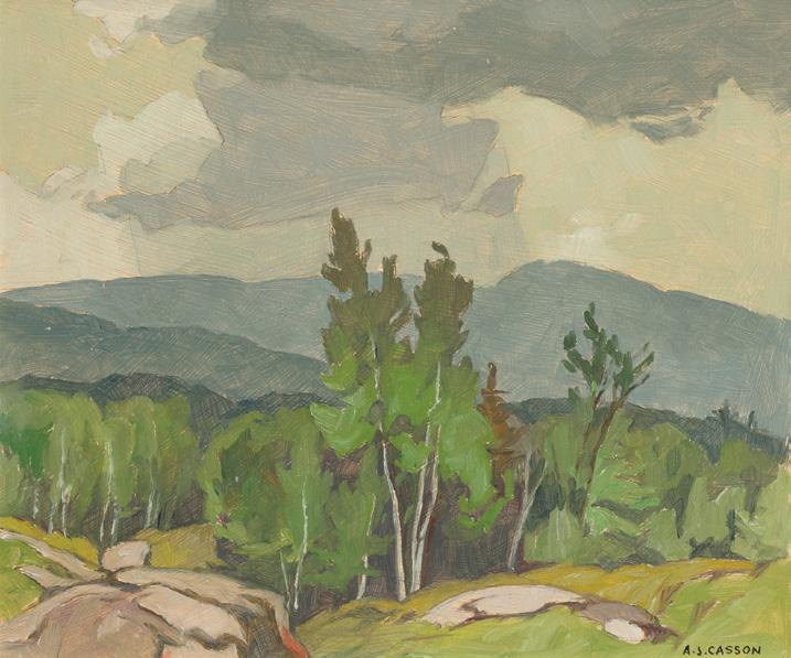
ALFRED JOSEPH CASSON
Rockingham Road, 1968 oil on board
signed lower right; titled and dated 1968 on the reverse 9.5 ins x 11.25 ins; 24.1 cms x 28.6 cms
PROVENANCE
Private Collection, Toronto
LITERATURE
Hubert de Santana, "A Painter's Life: A.J. Casson looks back on 60 years at the easel", Canadian Art (Spring 1985), pages 64-69
As a professional working designer, A.J. Casson often took his painting trips within the boundaries of Ontario on weekends, visiting rural and remote areas of the province. Whereas some of his Group colleagues travelled across Canada on extensive sketching trips, Casson was more limited to Ontario and nearby areas of Quebec given the realities of his career and family. He also stated: “I love travelling, but I can’t paint in a strange place. So why run all over?” As a result, Casson produced an extensive catalogue of works documenting the Ontario landscape and the unique personalities of each town, village, and hamlet he visited. He would paint a single location repeatedly at di #erent times of day and in di #erent seasons, becoming intimately familiar with the subject matter.
By the 1960s, Casson had recently retired from Sampson-Matthews and was " nally able to paint on a full-time basis. His strong design background shaped a unique painting style characterized by graceful lines and carefully considered compositions. Rockingham Road depicts a detailed view of a mountaintop with grassy and rocky slopes, a dense forest, and a sky of swirling clouds in Casson’s signature angular lines.
$20,000–$30,000
Exanimo (From the Heart), 1954 oil and Swedish putty on board signed twice, titled three times and dated 1954 on the reverse 48 ins x 31.75 ins; 121.9 cms x 80.6 cms
PROVENANCE
Estate of the Artist
Mr. and Mrs. E.R.S. McLaughlin, Oshawa Private Collection, 26 April 2004
EXHIBITED
75th Annual Exhibition , Royal Canadian Academy; travelling to Montreal Museum of Fine Arts, 19 November-19 December 1954, no. 54 (loaned by Mr. and Mrs. E.R.S. McLaughlin)
Towards the Spiritual in Canadian Art, Varley Art Gallery, Markham, 9 March-31 July 2005
LITERATURE
Michel Seuphor, Dictionary of Abstract Painting, New York, 1957, page 84
"Towards the Spiritual in Canadian Art", Markham News (2005)
Exanimo (From the Heart) is one of the few works in Canadian art which concerns the spiritual life of the individual and one of the only works in which an artist indicates that women can be completely changed with the aid of an outside power. Over the woman's " gure, to indicate her transformation, Alexandra Luke carved the outline of a phoenix. In front of the woman is "the Goddess," who has helped her achieve her new being.
Luke's unusual choice of medium, oil paint mixed with Swedish putty, which she applied to the rough side of a masonite board to achieve texture, was an inventive one for the time. She continued to experiment widely later in her work, adding sand to the medium, using birchbark, leather and string, and mixing crayon, watercolour, ink and collage on di #erent papers, as well as trying di #erent e#ects in her paintings.
In this work, Luke was likely thinking about the mythology, psychology and mysticism that permeated the work of artists in the New York abstract expressionist movement whom she regarded as models in her progress towards abstraction, such as Barnett Newman and Mark Rothko.
For Luke, as for many of these artists, making art was a way to live spiritually, a way of contemplating and " nding pleasure in the self, welcoming what comes from without and rejoicing in what lies within, to paraphrase a passage she marked in her copy of Michel Seuphor's Dictionary of Abstract Painting.
She would have been well aware of her situation as a woman within the male-dominated group of Painters Eleven, but being an outsider due to gender did not phase her. She recognized the transformative power inherent in creating an alter ego in which she was no longer Margaret McLaughlin, but "Alexandra Luke." In the struggle to create her artistic identity, she would have recognized the help she had received from a higher power which she visualized as "the Goddess." Possibly Luke thought here of System and Dialectics of Art (1937) by John Graham, one of the " gures who dominated the New York abstract art scene in the late 1930s. In the book, Graham writes about artists having to invent themselves spiritually in creating a work of art. ! is aspect of painting was of great importance to Luke, and she made many notes on the idea in her notebooks, owned books on the subject and often titled her works in a way which indicated her interest.
In the 1940s, Graham explored myth and primitivism in North American art, a subject Luke may have found sympathetic to her way of viewing abstraction as an essentially spiritual and philosophical activity, aligned with religion in its search for meaning. Exanimo has a subtitle on its verso, "From the Heart," words Luke would have felt described her own feelings in making art.
Although she could not strictly be called a feminist, Luke's use in this painting of the goddess " gure indicates that she was well aware of women's issues and matriarchal terms of reference. !e painting is of unique importance to her oeuvre and Canadian art.
We extend our thanks to Joan Murray, Canadian art historian, for contributing the preceding essay.
$20,000–$30,000
Untitled, 1959 oil on canvas
signed and dated 1959 upper left; catalogue raisonné no. 0.0.1959.00 20 ins x 18 ins; 50.8 cms x 45.7 cms
PROVENANCE
!e Artist
Unknown Collection
Christopher Horne Corporate Collection, circa 1994 Private Collection, Toronto
LITERATURE
Sarah Stanners, Jack Bush Paintings: A Catalogue Raisonné, Volume 2: 1955-1965, Toronto, 2024, reproduced pages 180181, no. 0.0.1959.00
Jack Bush made twenty-eight paintings in 1959, and for what we must assume were self-critical reasons, he personally destroyed no fewer than six of these paintings. It was a time of experimentation and a time when he began to (stylistically) venture out on his own, in earnest. (Notably, two of the largest paintings he destroyed that year were identi "ed in photos found in the papers of Clement Greenberg at the Getty Research Institute).
Some of the titles Bush used for his paintings in 1959 include: Cry, Cry; Agony; Hanging Figure; Let em All Fall; Fire; Black Sunset; and Crossroads. His terms may have been dark, but the history of Bush’s life and art has shown–repeatedly–that the toughest times always give way to brilliant new breakthroughs and powerful statements in paint. As seen in the present painting, Untitled (an assigned title), it foreshadows the ! rust paintings–the series that launched the artist’s international reputation in his " rst solo exhibition in New York at the Robert Elkon Gallery.
Untitled , with its rough shot strokes of green, orange, and blue is unlike any other painting and yet, when viewed as a key transition between his early-1950s a % nity for abstract expressionism (note the action-packed strokes of brushwork
throughout the composition) and his more self-assured thrusts of 1961-1962 (note the intrusion of thrusting shapes entering the picture space), you can see the seeds are planted here: the beginning of something new was emerging from uncertain but heartfelt terms.
By 1960, Painters Eleven had disbanded and by 1964, Bush abandoned all a % liations with art societies, such as the Ontario Society of Artists. !e steps he took before arriving to these brave moves are traced in paintings like Untitled: unabashed, unafraid, and unlike any other painting, but wholly his own.
We extend our thanks to Dr. Sarah Stanners, an Adjunct Professor, curator, and author who recently produced Jack Bush Paintings: A Catalogue Raisonné (2024), for contributing the preceding essay.
$25,000–$35,000
Characters Coming Out of the Clouds, 1974 oil on canvas
signed and dated 1974 lower left 48 ins x 36 ins; 121.9 cms x 91.4 cms
PROVENANCE
Galerie Manfred, Ontario
Private Collection, Ontario
EXHIBITED
E.F. Granell Paintings and Drawings, Galerie Manfred, Dundas, 15 October-11 November 1977
LITERATURE
E.F. Granell Paintings and Drawings, Dundas, 1977, unpaginated, reproduced
Born in the Corunna region of Spain in 1912, Eugenio Granell went into exile from his homeland due to his political associations during the Spanish Civil War. As a writer, political activist and musician, his exile included a signi "cant extended period in the Dominican Republic starting in 1940.
In the Dominican Republic, Granell initially worked as a violinist in the National Symphony Orchestra. A year later, inspired by Surrealism, he began taking up painting. His friendships with Wifredo Lam and Joaquín Torres-Garcia greatly in $uenced his work, leading him to use bright colours and indigenous symbols of the Americas as his subject matter. In 1943, he held his " rst solo exhibition of fortyfour Surrealist works at the National Gallery of Fine Arts in San Domingo—the " rst exhibition of its kind in the country.
When André Breton arrived on the island for a short visit, Granell interviewed him for a newspaper. Breton viewed Granell’s work and encouraged him to continue. He praised Granell as one of the painters reinventing Surrealism in the tropics. In 1947, Marcel Duchamp and André Breton invited Granell to participate in a group exhibition at the Maeght Gallery in Paris, which solidi "ed his association with the Surrealist movement.
In the catalogue accompanying the exhibition E.F. Granell Paintings and Drawings at Galerie Manfred, where Characters Coming Out of the Clouds was featured, French Surrealist Benjamin Péret, a close friend of Granell, describes the artist’s " gures: “ !e beings which he presents seem to have appeared from a yet undiscovered world. His forms, can it be that they are from another age, from a distant resting place towards which he leads us?”
$25,000–$35,000
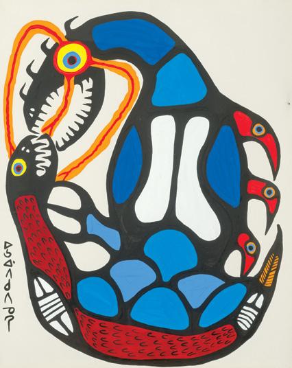
Protection of the Young, 1973 acrylic on board signed in syllabics lower left; titled and dated 1973 on the gallery label on the reverse
39.25 ins x 31.5 ins; 99.7 cms x 80 cms
PROVENANCE
!e Pollock Gallery, Toronto Private Collection, Toronto By descent to the present Private Collection, Maine
LITERATURE
Lister Sinclair and Jack Pollock, e Art of Norval Morrisseau , Toronto, 1979, reproduced page 96
Norval Morrisseau was the celebrated founder of the Woodland School, which revitalized Anishinaabe iconography, traditionally incised on rocks and Midewiwin birchbark scrolls. A self-taught painter, printmaker, and illustrator, Morrisseau created an innovative vocabulary which was initially criticized in the Indigenous community
for its disclosure of traditional spiritual knowledge. His colourful, " gurative images delineated with heavy black form lines and x-ray articulations, were characteristically signed with the syllabic spelling of Copper !underbird, the name Morrisseau’s grandfather gave him.
In Protection of the Young, small, vulnerable birds, " lled with a sense of anxiety, cling tightly to the back of the revered !underbird. !ey seek refuge from a menacing serpent that threatens to consume their eggs. With powerful lightning bolts shooting from its mouth and eyes, the !underbird stands strong and ready to protect them. From the outset of his artistic journey, Norval Morrisseau incorporated prominent themes from both Anishinaabe culture and Christianity into his work. However, in the mid-1970s, he began to explore a more personal and blended spiritual perspective. During this transformative phase, Morrisseau maintained his collaboration with art dealer Jack Pollock. It was through Pollock's assistant, Eva Quan, that he was introduced to the spiritual movement known as Eckankar. ! is movement integrates various Eastern spiritual traditions from India and China, and Morrisseau found particular resonance with two key elements: astral travel and the concept of spiritual light.
$20,000–$30,000
Dampier Salt Ponds #4, Dampier, Western Australia, 2007
chromogenic print on board signed, titled, dated 2007 and numbered 3/9 on a label on the reverse 39 ins x 49 ins; 99 cms x 124.4 cms
PROVENANCE
Nicholas Metivier Gallery, Toronto Private Collection, Toronto
LITERATURE
"Mines: Artist's Statement" [online publication], Edward Burtynsky, accessed 14 April 2025
Edward Burtynsky's Australian photography explores themes of human impact, resource extraction, and the transformation of landscapes, prompting viewers to re$ect on the relationship between humanity and the environment. During a trip in 2007, Burtynsky photographed sites like Lake Lefroy, Kalgoorlie, and Dampier Salt Ponds, showcasing the scale of mining operations and their impact on the landscape.
Dampier Salt Ponds #4, Dampier, Western Australia is a prime example of Burtynsky’s aerial photographs that depict ecological damage yet are visually stunning. !e large-scale image provides a grand, nearly abstract quality to the vast landscape and immerses the viewer in the subject. !e artist returned to Australia more recently in 2022 to take aerial photographs of Ravensworth Mine in the Hunter Valley, New South Wales, continuing to document the impact of human industry on the planet.
!e artist’s website describes the series of photographs that emerged from his 2007 trip to Australia: “What is at " rst glance merely a scarred landscape becomes poetic evidence of resources spent, nature transformed as well as realized–or failed–hopes and dreams. !e aerial images of the Silver Lake Operations at Lake Lefroy (see lot 88) and of the pits and tailings at Kalgoorlie, along with the Dampier Salt Ponds are among the most handsome that Burtynsky has ever made. !ey combine a kind of mapping with a keenly felt experience of all the hard rock grit, dust and labour transforming these arid lands.”
$10,000–$15,000
Silver Lake Operations #1, Lake Lefroy, Western Australia, 2007
chromogenic print on board signed, titled, dated 2007 and numbered 8/9 on a label on the reverse 40 ins x 50 ins; 101.6 cms x 127 cms
PROVENANCE
Nicholas Metivier Gallery, Toronto Private Collection, Toronto
LITERATURE
Edward Burtynsky, Edward Burtynsky: Australian Minescapes, Perth, 2008, reproduced page 25
Renowned Canadian photographer Edward Burtynsky is best known for his large-scale, highly detailed photographs of industrial landscapes. His work explores the profound impact of human activity on the natural world, capturing vast, often strikingly beautiful yet unsettling scenes of environmental transformation. He photographs landscapes shaped by industry, such as mining, oil drilling, and manufacturing. !ese images highlight how human intervention alters the planet and raises questions about sustainability, climate change, and resource depletion.
Burtynsky has extensively photographed landscapes in Australia, particularly Western Australia during a 2007 trip, showcasing the scale of resource extraction and its environmental consequences. ! is photograph depicts Lake Lefroy, approximately 500 km east of Perth, and is a prime example of how a landscape can be ravaged by the extraction of natural resources, in this instance, pit mining. ! is photograph is included in the book Burtynsky published in 2008 following his trip, entitled Edward Burtynsky: Australian Minescapes, illustrating the landscapes of resource-rich areas on the continent, including mining operations and their impact on the environment.
$14,000–$18,000
JACK HAMILTON BUSH
Sky Wash/Mabel's Release #3, May 1966
acrylic on canvas
signed, titled and dated "May 1966" on the reverse; titled to two labels on the reverse; catalogue raisonné no. 2.48.1966.128 30.25 ins x 19.5 ins; 76.8 cms x 49.5 cms
PROVENANCE
!e Artist
Vincent Melzac, Washington, DC, 1969 By descent to Sheila Melzac, 1989 Christie's, auction, New York, 15 February 2000, lot 86 Estate of Robert Noakes
EXHIBITED
e Vincent Melzac Collection , !e Corcoran Gallery of Art, Washington, DC, 18 December 1970-7 February 1971, no. 17 as Mabel's Release #5
Jack Bush: A Retrospective, Art Gallery of Ontario, Toronto; travelling to Vancouver Art Gallery; Edmonton Art Gallery; Musée d'Art contemporain, Montreal; National Gallery of Canada, Ottawa, 17 September 1976-3 July 1977, no. 22 as Mabel's Release #5
Color and Light: e Collection of Vincent Melzac, Sunrise Museum, Charleston, WV, 26 September-12 November 1995 as Mabel's Release #5
LITERATURE
e Vincent Melzac Collection , Washington, DC, 1971, no. 19, page 93 as Mabel's Release #5
Terry Fenton, Jack Bush: A Retrospective, Toronto, 1975, no. 22, unpaginated, reproduced as Mabel's Release #5
Color and Light: Selections from the Vincent Melzac Collection , Charleston, 1995, reproduced page 24 as Mabel's Release #5
Sarah Stanners, Jack Bush Paintings: A Catalogue Raisonné: Volume 3, 1966-1971, Toronto, 2024, reproduced pages 42-43, no. 2.48.1966.128 as Sky Wash/Mabel's Release #3
In the spring of 1966, Jack Bush made a critical transition in his painting practice when he stopped using oil and Magna paints on canvas and made the permanent switch to water-based acrylic paint. Sky Wash, also known as Mabel’s Release #3 (and for many years mistakenly identi "ed as Mabel’s Release #5 due to the appearance of the artist’s inscription on the verso which includes some soaked-through paint), is among the " rst paintings produced using what Bush called “acrylic polymer W.B.”
Oil and Magna paints require potent solvents to thin the paint or to clean dirty brushes. !e noxious fumes became too much for the artist’s wife, Mabel, whose eyes became increasingly sore and irritated in the years leading up to 1966–a time in which Bush and other Color Field artists were doing all they could to thin their paints; postpainterly abstractionists aimed to achieve the thinnest application of paint, as if to make colour and canvas one and the same. Bush was still painting at home at this time, having converted the north-facing room at the front of his family home into a painting studio in the 1940s. Giving up the choking mediums of his past, his " rst paintings made with water-based acrylic paint were thoughtfully titled Mabel’s Release, signalling her relief. ! is series totals only nine paintings and the present canvas, #3, is the smallest of the lot.
Its second title, Sky Wash, is no doubt a re$ection of what occupied Bush’s e#orts with this painting: the largest section of its striped composition appears to be soak-stained with blue–lighter at the outer edges and rubbed over throughout its centre. Bush was experimenting with his new medium. Another painting in the Mabel’s Release series, #1, also has a second title–Very Nice –indicating that he was pleased with the results, and he persisted, producing another 672 paintings using water-based acrylic paint on canvas.
Sky Wash " rst left the artist’s studio in 1969, when Bush sold the painting directly to Vincent Melzac, an American art collector and businessman who was a longtime supporter of the Washington Color School painters. Clement Greenberg, the venerable New York-based art critic, thought Melzac had guts, admiring his ability to pull the trigger on making purchases of art in strategic and forward-looking ways. Sky Wash was featured in two exhibitions celebrating Melzac’s impressive art collection: the Corcoran Gallery of Art in Washington, DC, when Melzac was the museum’s director (1970–1971), and in 1995 at the Sunrise Museum in Charleston, West Virginia. !e painting was also lent by Melzac to be included in the " rst Jack Bush retrospective exhibition, in 1976, which was organized by the Art Gallery of Ontario and toured across Canada.
After Melzac, Sky Wash was acquired by Robert Noakes, another art collector known for his discerning eye and impeccable taste. !e painting stems from a vitally important moment in the artist’s career, when Bush shifted gears in his choice of medium, and it is undeniably attractive–a double fortune which Melzac and Noakes recognized and prized.
We extend our thanks to Dr. Sarah Stanners, an Adjunct Professor, curator, and author who recently produced Jack Bush Paintings: A Catalogue Raisonné (2024), for contributing the preceding essay.
$30,000–$50,000
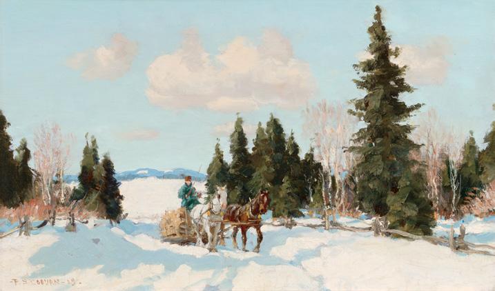
Logging, Eastern Townships, 1929 oil on canvas
signed and dated 1929 lower left; titled on a gallery label on the reverse 13 ins x 21.5 ins; 33 cms x 54.6 cms
PROVENANCE
Masters Gallery, Calgary Private Collection
LITERATURE
Evelyn L. Coburn, Coburn Beyond the Landscape, Erin, 1996, pages 67, 87
From his time as a young boy Frederick Simpson Coburn enjoyed sketching horses. When he turned to oil painting in 1914 at the encouragement of Maurice Cullen, Coburn would specialize in depicting horses and horse-drawn sleds in the Laurentian and Eastern Townships settings. Here, under a soft blue sky and $u # y clouds, a " gure commands two horses pulling a pile of logs, the results of a hard day's work. !e traditional life and inhabitants in the Canadian landscape were continually of great interest to Coburn and featured heavily in his works. 1929 was a signi "cant year for Coburn in the advancement of his career, as he established himself with dealers in Montreal and would exhibit at the Art Association of Montreal’s Spring Exhibition that year.
$5,000–$7,000
CLAUDE A. SIMARD
Flurry
acrylic on paper signed lower right 20 ins x 30.5 ins; 50.8 cms x 77.5 cms
PROVENANCE
Masters Gallery, Calgary Private Collection
Recognized for bright and bold compositions, Claude Simard captures the events of everyday life using vivid colour. Flurry takes us onto the snowy ice, watching groups of " gures twirling and moving about actively in a blizzard. Simard enjoys working within the rhythm of the seasons and nature heavily in $uences his artworks. !e winter months pose a great challenge for the artist, who prefers the brightness of spring and summer, although you would not know this from this work, as he vibrantly depicts the joy of winter in Flurry.
$2,000–$3,000
Additional images, details and extended essays related to the works of art included in the auction can be viewed at cowleyabbott.ca
Helen McNicoll: An Impressionist Journey is the most comprehensive solo exhibition of the Canadian artist’s work since 1925. Featuring over 60 works, the exhibition ofers an exceptional opportunity for audiences to explore McNicoll’s groundbreaking Impressionist style and themes of female independence, risk-taking, and global perspectives captured through her travels.
Witness the rediscovery of a lost masterpiece, The Bean Harvest, now on display for the frst time in 110 years.
Free Thursdays: 11 am - 9 pm
11 am - 6 pm
& Sundays: 11 am - 5 pm
123 King Street West, Hamilton 905.527.6610 artgalleryofhamilton.com/mcnicoll
noun phrase (origin Fr.) /ˌkadlôɡ ˌrezəˈnā/
A catalogue raisonné is a comprehensive, annotated listing of all the known works of an artist either in a particular medium or all media.

“Jack Bush Paintings: A Catalogue Raisonné by Sarah Stanners is superb. […] Catalogues raisonnés are rare among Canadian publications; this one is an accomplishment that is invaluable for art historians, museums, galleries, libraries, students, collectors, dealers and artists.”
— Katherine Ylitalo, Galleries West
“All of this makes for absorbing reading and—for those of us who were unfamiliar with Bush’s earlier works, before he found the style of abstract paintings for which he is best known—it is revelatory.”
— Gwendolyn Owens, Border Crossings www.jackbushcatalogue.com
!e provisions of these Terms and Conditions of Sale shall govern any proposed or actual transaction between Cowley Abbott (aka Consignor Auctions Limited) (“CAL”) and the prospective buyer/ bidder (“Bidder”). CAL is acting as agent for the person who has consigned the property to CAL for sale, whether as principal, owner or agent (“Consignor”).
1. !e descriptions of items o#ered by CAL (“Property”), including artist, title, medium, size, date of execution, provenance, exhibition history, inclusion/reproduction within literature sources, attribution and genuineness, are subject to change leading to the " nal sale of said Property (including the process during which bidding is active for the Property during CAL online auctions). Descriptions of Property provided by CAL are not meant to stand as a representation to Bidders and no guarantee or warranty of complete accuracy of the provided descriptions is intended or should be assumed. Bidders are provided the opportunity to view and inspect all Property o#ered for sale by CAL through public and/or pre arranged private viewings prior to a sale’s completion. No sale shall be rescinded due to a lack of correspondence between the provided description of the Property by CAL and the Property itself, including the illustration of the Property provided by CAL. It is the sole responsibility of a Bidder to make arrangements for the inspection of the Property of interest (by the Bidder itself and/ or by the Bidder’s advisers) prior to sale, and to bid in accordance to this actual inspection and/or reliance upon their advisers’ guidance.
2. !e Bidder who has successfully bid on Property (the “Successful Bidder”) con " rms that any claims relating thereto shall be claims against Consignor, without recourse to CAL. CAL represents the Consignor exclusively and makes no representation or warranty, express or implied, regarding legal title or ownership of the Property o#ered by CAL and has relied upon the Consignor con " rming same to CAL, without further independent investigation. !e Bidder shall be solely responsible for satisfying itself of the legal title or ownership of the Property and liens or encumbrances a #ecting same and the capacity of the Consignor to sell the Property o#ered.
However, notwithstanding the stipulations listed above, the Successful Bidder may make arrangements for a recognized and fully quali "ed authority, who is accepted by CAL, to inspect the Property prior to collection by the Successful Bidder from CAL’s premises. Should this authority submit in writing to CAL a statement regarding the challenge of genuineness and/ or authenticity of the lot in question, the sale can be rescinded by CAL and a full refund will be provided to the Successful Bidder. !e above process must take place within seven days of the " nal sale of the Property.
3. CAL is pleased to o#er a service of providing condition reports on the lots which are o#ered through its auctions. Please note that these reports are matters of opinion and are prepared by CAL specialists and are not a substitute for a physical inspection of the artwork by the Bidder or their advisors. CAL specialists are not trained restorers and the provided condition reports are not meant to equal a comprehensive report created by a professional restorer. !e reports provided by CAL are meant to provide assistance to the Bidder through observations of the artwork and the report will not disclose any imperfections which might be revealed through the process of subsequent restoration. In all cases, the Bidder is advised to consult their own conservator for a complete report with regard to condition (CAL is happy to provide access to the artwork by conservators through public previews and private pre arranged appointments). Bidders should be aware that CAL’s warranties with regard to the Property o#ered through their auctions are limited to the terms listed in the Terms and Conditions of Sale and in no case extend to the condition of the artwork.
4. A buyer’s premium of 20% of the successful bid price is to be paid by the Successful Bidder to CAL as part of the purchase price (a buyer’s premium of 21% of the successful bid price is to be paid by the Successful Bidder to CAL as part of the purchase price where the Auction Mobility technology is used to bid successfully during a live/catalogue auction). In addition, 13% HST (Harmonized Sales Tax) is applied to the successful bid (hammer) price and buyer’s premium. However, HST will not be charged on purchased Property which is shipped outside of Canada. Where purchased Property is shipped outside of the Province of Ontario but within Canada, the applicable HST or GST will be charged based on the tax applications within the province or territory of destination. In both cases, the Property must be collected from the o%ces of CAL with a waybill provided indicating the destination. It is the sole responsibility of the Purchaser to provide acceptable details and make the necessary arrangements to meet the requirements for altered tax responsibilities based on the destination of the shipped Property. Alterations of invoices and/ or crediting of tax payments will not be completed once CAL has released the Property.
5. !e Bidder acknowledges that CAL may collect a commission and associated fees through its agreement with the Consignor of a lot included in a CAL auction.
6. Purchases completed through CAL auctions are not represented to necessarily include copyright allowances to the Successful Bidder for the purchased Property.
7. CAL reserves the right to withdraw any Property from sale for any reason whatsoever and without liability. ! is withdrawal may occur up to the close of bidding for the Property. CAL also reserves the right to divide lots of Property into smaller lots or to combine individual lots of Property into larger lots. !e above can be carried out at the sole discretion of CAL and can occur without notice.
8. Each Bidder must register with CAL, agreeing to the Terms and Conditions of Sale. Registered Bidders represent that they are bidding on their own behalf and are responsible for those lots in which they are the successful high bidder (becoming the Purchaser or Successful Bidder). In the event that a registered Bidder is representing another party, CAL must be contacted regarding this arrangement at least twenty four hours prior to the opening of bidding for a particular auction and CAL reserves the right to refuse this arrangement for any reason whatsoever. Failure to abide by this provision shall entitle CAL to deem the Bidder as bidding on its own behalf. Splitting of and/or transferring of an invoice to an individual and/or organization other than the registered Bidder can only be completed at the discretion of CAL and must meet the requirements of such an amendment, including written authorization from both the registered Bidder and its bene"cial buyer and the individual or representative of the individual who will become the new invoiced client in such an arrangement.
9. CAL reserves the right to refuse any bid and/or bidd ing registration application at their absolute discretion. Further, CAL also reserves the right to suspend or cancel any account used for bidding at their sole and absolute discretion. CAL also reserves the right to refuse any bid which is not in relation to the provided pre sale auction estimate provided by CAL and also reserves the right to not accept a bid recognized to not fall within the set bidding increments during sale. Additionally, CAL reserves the right to accept any bid which does not meet any pre established reserve. In no instance may a Bidder withdraw or alter their submitted bid.
10. CAL reserves the right to accept and execute absentee or telephone bids on behalf of prospective purchasers, unable to directly participate in the particular auction. In such a case, CAL provides the service of absentee or telephone bidding as a privilege and shall not be responsible for failure to execute the absentee bid(s)
for any reason whatsoever and shall also not be responsible for errors and/or omissions related to the process. Bidders who wish to employ CAL in the process of absentee or telephone bidding must complete and sign the required documentation (absentee/ telephone bidding form) prior to the start of bidding for the particular auction. In the event that two identical absentee bids are submitted to CAL, the bid which is received earlier (and which has been submitted through a completed and signed absentee bidding form) will take precedence over the later bid(s), allowing the earlier submitted bid(s) to potentially purchase the lot(s) at bid level submitted.
CAL reserves the right to request and charge a deposit to a Bidder submitting an absentee or telephone bid, in relation to the value of the artwork, to a maximum of $10,000 CAD. CAL reserves the right to hold and apply this Deposit to the invoice, should the Bidder become the Successful Bidder. In the event that " nal payment and invoice settlement is not made within 30 days following the completion of the live auction, then CAL shall have the right to rescind the purchase and the Deposit shall be retained by CAL as liquidated damages. In the event that the Bidder is not successful, the Deposit will be refunded within 10 business days following the completion of the auction.
11. CAL is pleased to provide the opportunity for bidders to participate through online bidding during live auctions via Auction Mobility, a third party provider of these services. Please be aware that CAL is not responsible for errors or issues associated with this service which may have an adverse e#ect on the Client’s ability to bid. A buyer’s premium of 21% of the successful bid price is to be paid by the Successful Bidder to CAL as part of the purchase price where the Auction Mobility technology is used to bid successfully during a live/catalogue auction.
12. At the completion of the sale, the Successful Bidder shall be recognized as the Purchaser and shall then take on complete responsibility and risk for the purchased Property, adhering to all of the Terms and Conditions of Sale. In the event of a dispute between the Successful Bidder and any other Bidder regarding the result of the auction, CAL will have absolute discretion to rescind any transaction with the Successful Bidder and designate a new winning buyer or to withdraw the Property from the auction. In such a case, CAL may choose to re o#er the Property in a future auction or private sale. In all such cases, " nal decision shall be made solely by CAL.
13. !e Successful Bidder shall make arrangements with CAL for the payment of the whole invoiced amount following the immediate close of the auction, unless alternate arrangements are agreed by CAL for payment of a portion of the invoiced amount. Until full and " nal settlement of the invoice is completed by the Successful Bidder, the purchased Property will not be released to the Successful Bidder. Failure to pay for purchases may lead to the cancellation of the sale with no promise of re o#ering in a future auction. In the event of failure of payment by the Successful Bidder, CAL reserves the right to suspend and/or delete the bidding account of the Bidder and/or their representatives, all at the sole discretion of CAL. !e artwork must be collected by the Successful Bidder or his/her representative or delivered to the shipping destination within 14 days of the invoice date.
14. Immediately following the completion of a CAL online auction, the Successful Bidder shall be charged 10% up to a maximum of $10,000 of the hammer price (the “Deposit”), which amount will be held as a deposit against payment for the Property purchased. !e Successful Bidder hereby authorizes CAL to charge the Successful Bidder’s registered credit card with the Deposit. !e Successful Bidder shall settle " nal payment and collect their purchase(s) from CAL within "ve business days following the completion of any CAL auction. Failure to settle payment and/ or collect the property from CAL within "ve business days may lead to monthly interest charges of 1.5% in addition to the invoice
amount and/or storage charges for the Property being held on the premises of CAL. Property being held by CAL is being stored at the sole risk of the Successful Bidder and may be stored either on the premises of CAL or at a secondary storage location. In the event that " nal payment is not made within 30 days following the completion of the auction, then CAL shall have the right to rescind the purchase and, if it is in an online CAL auction, the Deposit shall be retained by CAL as liquidated damages.
15. CAL, its employees or agents, shall not be liable for the loss or damage of any Property purchased through a CAL auction (through negligence or otherwise) while the Property remains in the possession of CAL and once the allowed "ve business days following an auction closure or completion of a private sale has passed.
16. In any event resulting in failure by the Successful Bidder (Purchaser) to pay for Property purchased either through the de" ned auction process or a private sale within the "ve day period following the sale, CAL, in its sole discretion, may re o#er the Property in question without limiting the terms in place with the Consignor of the Property. Should CAL reo#er the Property, the original Successful Bidder (Purchaser) shall be responsible to CAL and the Consignor for the following: any di #erence marked as a de"ciency between the price achieved and amount invoiced upon the re sale of the Property versus the price achieved and amount invoiced to the Purchaser upon the original sale of the Property; any storage charges to CAL for the holding of the Property between its original o#ering and the reo#ering; and the total in sales commissions which CAL would have collected had the original sale of the Property been completed.
17. CAL accepts payment by cash, certi "ed cheque, wire transfer, VISA, Mastercard and/or American Express (AMEX) for the settlement of invoices. Credit card purchases are limited to a maximum of $25,000 CAD and the credit card holder must be present at the time of payment. Artwork purchased with a certi "ed cheque will not be released by CAL until the clearance of the cheque has been con " rmed by CAL’s bank. Payments arranged by wire transfer may be subject to administrative charges related to the transfer and banking processes.
18. CAL is pleased to assist clients in arranging for the shipment of their artwork from our Toronto premises. However, it is the responsibility of the Successful Bidder to make these arrangements in full, including the packing, insuring and actual shipment of the Property. Assistance provided by CAL in this regard is provided as a service and CAL carries absolutely no liability through this courtesy. CAL carries absolutely no liability to possible damage of framing (including glass) during shipment arranged by CAL or otherwise.
19. Without limitation, the Purchaser accepts that any lot (Property) purchased through CAL may be subject to provisions of the Cultural Property Export and Import Act (Canada).
20. CAL reserves the right to refuse admission, enrolment and/ or participation in any of their events and/or auctions. Further, CAL reserves the right to refuse admission to their premises to any individual or group of individuals.
21. !ese Terms and Conditions of Sale and all agreements related to the business of CAL shall be construed under the laws of Ontario and the parties hereby attorn to the exclusive jurisdiction of the Ontario Courts.
22. ! is agreement may be executed and delivered in a number of counterparts, each of which when executed and delivered is an original but all of which taken together constitute, as applicable, one and the same instrument.
Banting, Frederick Grant (1891-1941) 71
Beatty, John William (1869-1941) 77
Bloore, Ronald Langley (1925-2009) 32
Burtynsky, Edward (b. 1955) 87, 88
Bush, Jack Hamilton (1909-1977) 6, 17, 33, 41, 84, 89
Cahén, Oscar (1916-1956) 51
Casson, Alfred Joseph (1898-1992) 4, 26, 49, 82
Carmichael, Franklin (1890-1945) 46, 55
Carr, Emily (1871-1945) 25
Cicansky, Victor (1935-2025) 21
Coburn, Frederick Simpson (1871-1960) 90
Coppedge, Fern Isabel (1883-1951) 61
Cullen, Maurice Galbraith (1866-1934) 47
Dallaire, Jean-Philippe (1916-1965) 2
Davis, Gene (1920-1985) 7 de Grandmaison, Nicholas (1892-1978) 14
Dorland, Kim (b. 1974) 76
Etrog, Sorel (1933-2014) 10, 68, 69
Ferron, Marcelle (1924-2001) 16, 40, 62
FitzGerald, Lionel LeMoine (1890-1956) 45
Gaucher, Yves (1934-2000) 30
Gervais, Lise (1933-1998) 18, 63
Granell, Eugenio Fernández (1912-2001) 85
Harris, Lawren Stewart (1885-1970) 52, 53
Hopkins, Frances Anne (1838-1919) 12, 13
Iskowitz, Gershon (1919-1988) 74
Jackson, Alexander Young (1882-1974) 3, 24, 54, 80
Johnston, Frank Hans (1888-1949) 59, 79
Koop, Wanda (b. 1951) 22
riegho , Cornelius ( )
Kurelek, William (1927-1977) 23
Le Sidaner, Henri (1862-1939) 37
Léger, Fernand (1881-1955) 67
Letendre, Rita (1928-2021) 5, 19
Lewis, Maud (1903-1970) 64
Lismer, Arthur (1885-1969) 28, 56, 65
Loiseau, Gustave (1865-1935) 60
Luke, Alexandra (1901-1967) 83
MacDonald, James Edward Hervey (1873-1932) 36, 44, 72
MacLeod, Pegi Nicol (1904-1949) 75
Martin, Ronald Albert (b. 1943) 31
Matisse, Henri (1869-1954) 39
McEwen, John (b. 1945) 9
Milne, David Brown (1882-1953) 29, 34, 58, 70, 78
Molinari, Guido (1933-2004) 73
Morrice, James Wilson (1865-1924) 1, 42, 81
Morrisseau, Norval (1931-2007) 11, 86
Robinson, Albert Henry (1881-1956) 57
Sapp, Allen (1929-2015) 27
Sheppard, Peter Clapham (1879-1965) 35
Simard, Claude A. (1943-2014) 91
Smith, Jessie Willcox (1863-1935) 43
Town, Harold Barling (1924-1990) 50
Warhol, Andy (1928-1987) 8, 20, 66
Weston, William Percival (1879-1967) 48
Zúñiga, Francisco (1912-1998) 38
Front Cover
Emily Carr, Fir Trees (detail) (Lot 25)
Back Cover
Peter Clapham Sheppard, The Bridge Builders, Construction, Bloor Street Viaduct, 1915 (Lot 35)
Inside Front Cover
Franklin Carmichael, Old Orchard, 1940 (detail) (Lot 46)
Inside Back Cover
Yves Gaucher, Ocres, jaune et vert, 1974 (detail) (Lot 30)
Artwork Features
Page 1: Arthur Lismer, Light Breaking Through, Lake Superior, 1927 (detail) (Lot 56)
Page 2: J.E.H. MacDonald, Church by the Sea, N.S., 1922 (detail) (Lot 44)
Page 4: David Milne, Green and Brown, Boston Corners, 1917 (detail) (Lot 29)
Page 18/19: Frances Anne Hopkins, Canoes in a Fog, Lake Superior, 1864 (detail) (Lot 12)
Page 26/27: Marcelle Ferron, Sans titre, 1964 (detail) (Lot 16)
Page 38/39: William Kurelek, Farm Scene with Two Horses (Going to Feed and Rope), 1974 (detail) (Lot 23)