
Los Angeles
Letter from the Editor
The adage “no man is an island,” penned by English poet John Donne in the seventeenth century, has been recycled across culture so many times that it hardly feels revelatory. In the movie adaptation of the Nick Hornby book, About a Boy, the protagonist, played by Hugh Grant, hears the Donne quote and scoffs, opining that these days “all men are islands.”
He rants on about how we are living in an “island age.” “100 years ago,” he explains, “you had to depend on other people. No one had… DVDs or videos or espresso makers… whereas now… you can make yourself a little island paradise.”
The character, privileging his independence over community, later realizes (spoiler!) that we are all connected, and do, in fact, need other people.
While Grant’s lone-wolf character feels unrelatable, his techfueled isolation is certainly familiar. Mired on our own islands and ungratified by the connection that our phones claim to offer us, many of us still seek the kind of soul-fulfillment that being in connection with others can bring. Particularly as we face the rise of bigotry and fascism in our country, as well as direct harm being done to members of our community, we are searching for grassroots support networks and interconnectedness. Across this issue, we see stories of connection. Sean Koa Seu writes on Judy Baca’s decades-long Great Wall project and the ways she is tangibly rewriting history to more accurately include the diverse stories of our
communities, building relationships with students and volunteers along the way. As Seu describes, the project was “never a mere wall, the mural was mutual aid.” Echoing this notion, Sarah Plummer’s article on California’s printmaking history shines a light on many local outfits that have reworked the printmaker’s historical role (read: anonymous) into one that visualizes and celebrates the process of producing an editioned work— namely, the intimate collaboration between artist and printer. Here, too, relationships are more important than product.
Aaron Boehmer’s article looks at artists who utilize political typography, reconfiguring their artwork from a gallery context and repurposing it to be used in protest settings. These artists call upon the visual language of past movements, celebrating history by activating it in the present. Maya Livio speaks to a different kind of community relationship: the one between an artistin-residence and her environment, arguing that it is vital for visiting residents to attune with local ecology. Later, writer Andrea Gyorody explores Gregg Bordowitz’s intersecting identities and how congregating with others has become central to his worldview.
In L.A. and globally, we are seeing how mutual aid efforts are essential in combating threats to the well-being of our communities in real time. Donne’s original quote continues, “Any man’s death diminishes me, because I am involved in mankind.” This 41st issue points to the ways our communal existence is more important than ever, proposing some of the different shapes that communal support can take.
Lindsay Preston Zappas Founder, Editor-in-Chief, & Executive Director
L.A.’s History of Collaborative Printmaking
Sarah Plummer
Judy Baca and the Great Wash of Los Angeles
Sean Koa Seu
On Preserving Dissenting Letterforms
Aaron Boehmer
Maya Livio
Andrea Gyorody
The Dealers
Carlye Packer Bets Big
Photos and text: Claire Preston
Nellie Mae Rowe at California African American Museum
—Hannah Tishkoff
Earthshaker at Del Vaz Projects
—Teresa Fleming
Counter/Surveillance at Wende Museum
—Alexander Schneider
Carolee Schneemann at Lisson Gallery
—Olivia Gauthier
Tony Cokes at Hannah Hoffman Gallery —Shani Strand








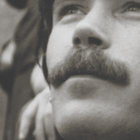











Image: Gay Activists at First Gay Pride Parade, Christopher Street, New York (detail), 1970, printed 2021, Arthur Tress. Gelatin silver print. Getty Museum, Gift of David Knaus.



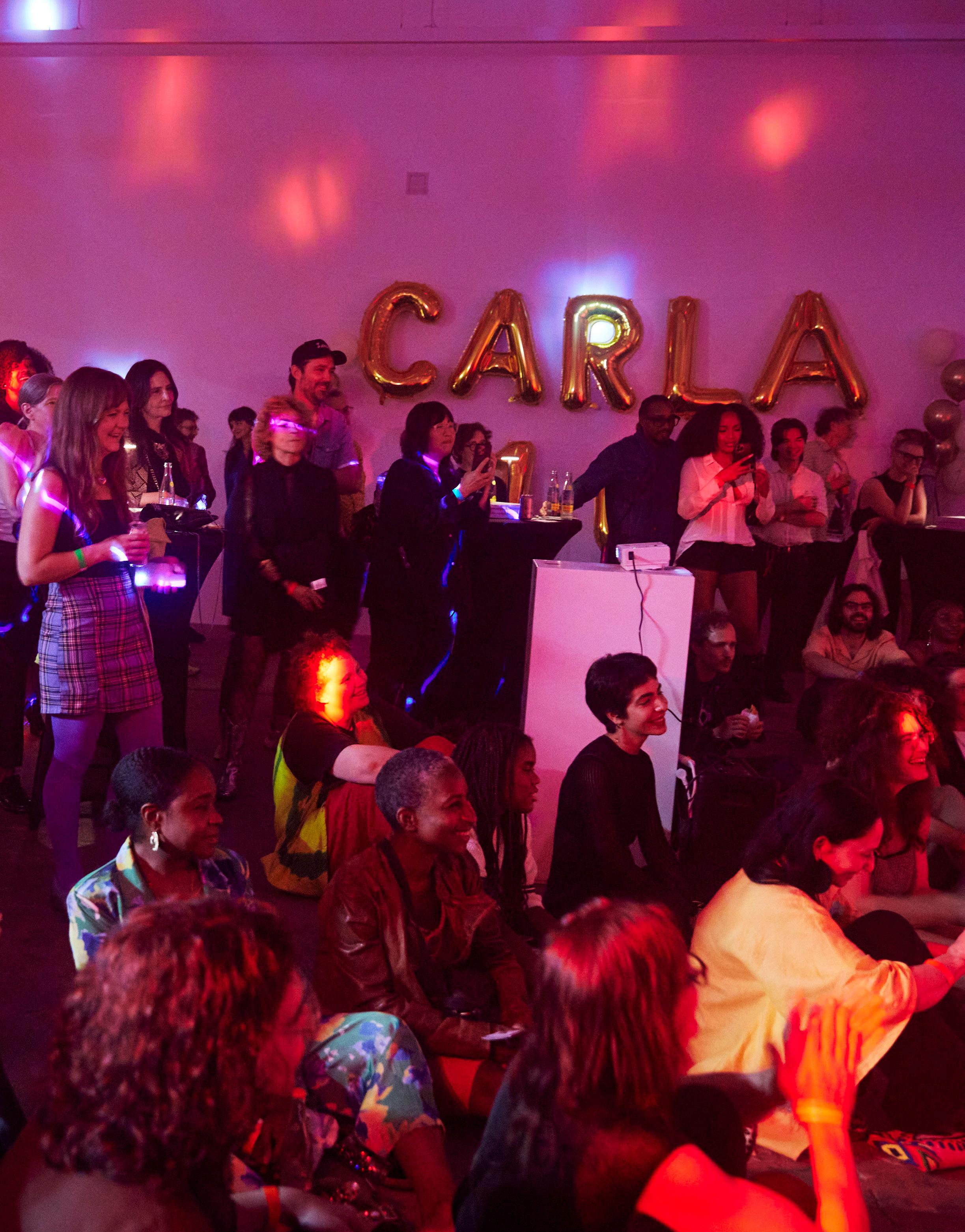
Contemporary Art Review Los Angeles is an essential voice made in and for Los Angeles. Founded in 2015 by artist and writer Lindsay Preston Zappas, Carla is a nonprofit organization and publishing platform that is dedicated to providing critical, thoughtful, and inclusive perspectives on contemporary art. Our quarterly print magazine is an active source of dialogue on Los Angeles’ art community and is available for free in over 160 galleries and art spaces in L.A. and beyond.
Editor-in-Chief & Executive Director
Lindsay Preston Zappas
Managing Editor Evan Nicole Brown
Contributing Editor Allison Noelle Conner
Graphic Designer Satoru Nihei
Copy Editor Rachel Paprocki
Administrative Assistant Aaron Boehmer
Getty Marrow Publications Intern Talia Tepper
Color Separations Echelon, Los Angeles
Printer Solisco Printed in Canada
Submissions
For submission guidelines, please visit contemporaryartreview.la/submissions, and direct all submissions to submit@contemporaryartreview.la.
Inquiries
For general inquiries, contact office@contemporaryartreview.la.
Advertising
For ad inquiries and rates, contact ads@contemporaryartreview.la.
W.A.G.E.
Carla pays writers’ fees in accordance with the payment guidelines established by W.A.G.E. in its certification program.
Copyright All content © the writers and Contemporary Art Review Los Angeles
Social Media
Instagram: @contemporaryartreview.la
Cover Image
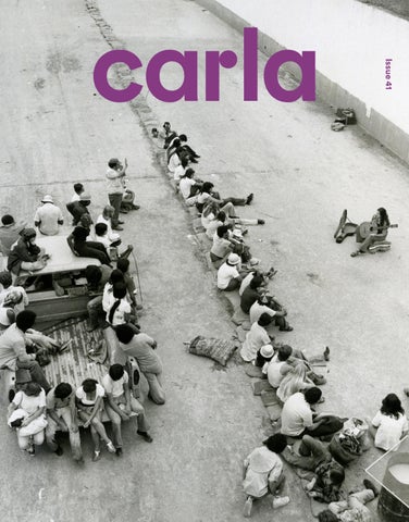
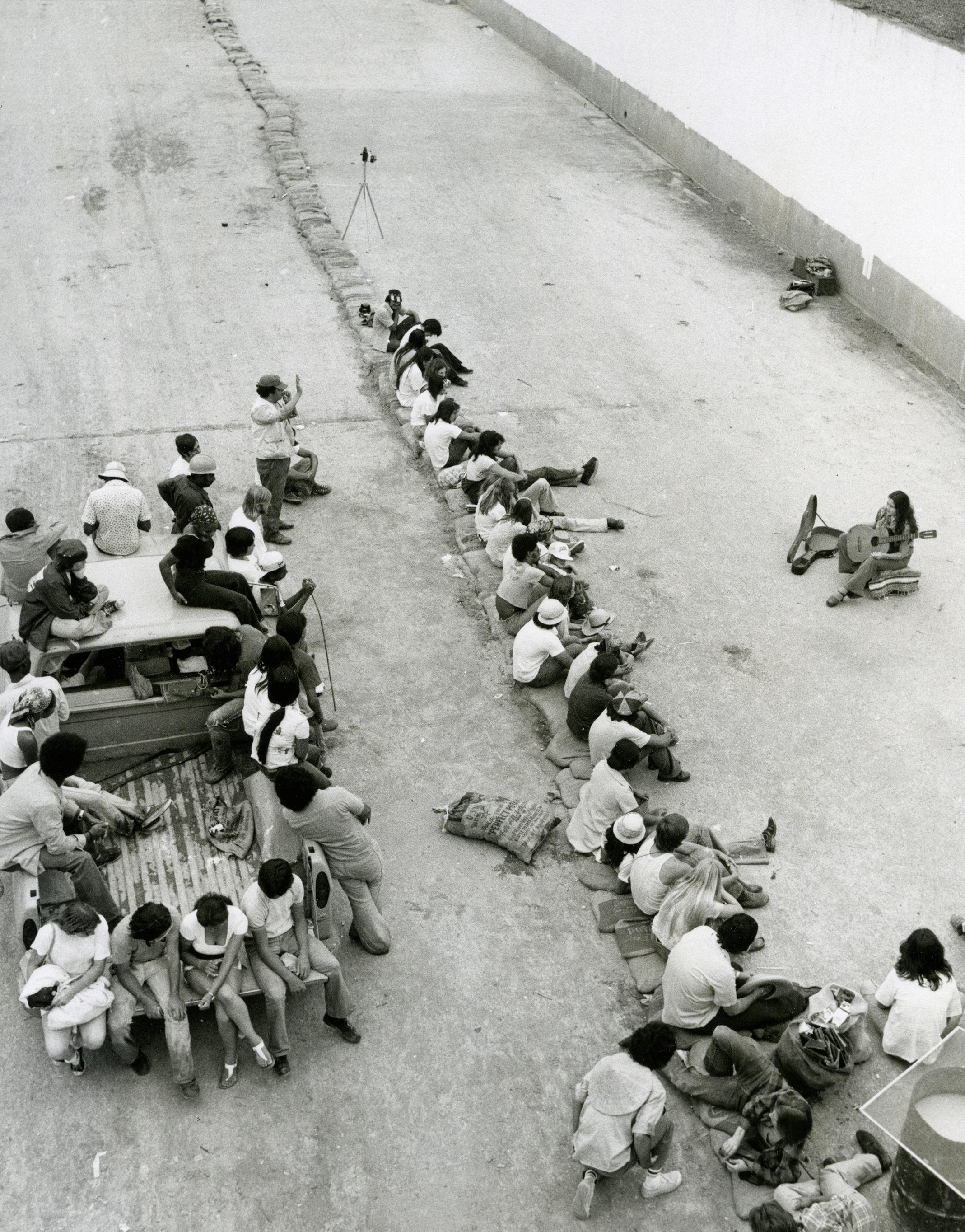
Aerial view of a music performance at The Great Wall of Los Angeles (1981). © SPARC. Image courtesy of the SPARC archives and LACMA. Photo: Linda Eber.
Contributors
Lindsay Preston Zappas is an L.A.-based artist, writer, and the founder of Carla. She received her MFA from Cranbrook Academy of Art and attended Skowhegan School of Painting and Sculpture in 2013. Her writing has appeared in Track Changes: A Handbook for Art Criticism, KCRW, Carla, ArtReview, Flash Art, SFAQ, Artsy, LACanvas, and Art21 Recent solo exhibitions include those at the Buffalo Institute for Contemporary Art (Buffalo, NY), OCHI (Los Angeles), and City Limits (Oakland).
Evan Nicole Brown is a Los Angeles-born writer, editor, and journalist who covers the arts and culture. Her work has been featured in Architectural Digest, Dwell, Getty Magazine, The Hollywood Reporter, L.A. Times Image, The New York Times, T Magazine, and elsewhere. She is also the founder and host of Group Chat, a conversation series in L.A.
Allison Noelle Conner is an arts and culture writer based in Los Angeles.
Satoru Nihei is a graphic designer with an MFA from Cranbrook Academy of Art. His work has been featured in The Tokyo TDC Design Annual, METROPOLIS, Graphic Design: The New Basics, and other publications, and has been showcased internationally at exhibitions including the Golden Bee Global Biennale of Graphic Design, Peru Design Biennial, Graphic Matters, Trnava Poster Triennial, Shenzhen International Poster Festival, and others. He judged the 2019 PRINT Magazine Regional Design Awards and received the Golden Bee Award in both 2022 and 2024.
Rachel Paprocki is an editor and librarian who lives and bikes in Los Angeles.
Aaron Boehmer is a writer based in New York City. He covers the arts, culture, and politics and has written for The Nation, Texas Monthly, Los Angeles Review of Books, The Drift, and others.
Talia Tepper is from Los Angeles and studies international literature, visual studies, and philosophy at Tufts University. She works on Currents Magazine, Tufts Observer, and loves Joan Didion.
Board of Directors
Lindsay Preston Zappas, Executive Director
MJ Brown Trulee Hall
Joseph Daniel Valencia
Membership
Carla is a free, grassroots, and artist-led publication. Club Carla members help us keep it that way. Become a member to support our work and gain access to special events and programming across Los Angeles.
Carla is a registered 501(c)(3) nonprofit organization; all donations are tax-deductible. To learn more, visit join.contemporaryartreview.la.
Thank you to all of our Club Carla members for supporting our work. A special thank you to our La Brea and Western members:
Philippe Browning, Anthony Cran, Tim Disney, Sarah Ippolito, Tiffiny Lendrum, Rebecca Morris, Jobert Poblete, Michal Hall Bravo Ramirez & Octavio Bravo Ramirez, Laurie & Rick Raskin, Anjelica & Neil Sarkar, Ian Stanton, Michael Zappas, Critical Minded, Solid Art Services, and West of West Architecture + Design.
Los Angeles Distribution
Central
1301 PE
7811 Gallery
Anat Ebgi (Wilshire)
Arcana Books
Artbook @ Hauser & Wirth
as-is.la
Babst Gallery
Baert Gallery
Bel Ami
Billis Williams Gallery
BLUM
Canary Test
Central Server Works Press
Charlie James Gallery
Château Shatto
Cheremoya
Chris Sharp Gallery
Cirrus Gallery
Clay ca
Commonwealth and Council
Craft Contemporary
D2 Art (Westwood)
David Kordansky Gallery
David Zwirner
Diane Rosenstein
dublab
FOYER–LA
François Ghebaly
Gana Art Los Angeles
Giovanni’s Room
Hannah Hoffman Gallery
Harkawik
Harper’s Gallery
Heavy Manners Library
Helen J Gallery
Human Resources
ICA LA
JOAN
KARMA
LACA
Lisson Gallery
Los Angeles Municipal
Art Gallery
Louis Stern Fine Arts
Lowell Ryan Projects
Luis De Jesus Los Angeles
M+B
MAK Center for Art and Architecture
Make Room
Matter Studio Gallery
Michael Werner Gallery
MOCA Grand Avenue
Monte Vista Projects
Morán Morán
Moskowitz Bayse
Murmurs
Nazarian / Curcio
Night Gallery
Nonaka-Hill
NOON Projects
O-Town House
OCHI
Official Welcome
One Trick Pony
Pace
Paradise Framing
Patricia Sweetow Gallery
REDCAT (Roy and Edna Disney CalArts Theater)
Regen Projects
Reparations Club
Roberts Projects
Royale Projects
Sean Kelly
Sebastian Gladstone
Shoshana Wayne Gallery
Smart Objects
SOLDES
Sprüth Magers
Steve Turner
Tanya Bonakdar Gallery
The Box
The Fulcrum
The Hole
The Journal Gallery
The Landing
The Poetic Research Bureau
The Wende Museum
Thinkspace Projects
Tierra del Sol Gallery
Tiger Strikes Asteroid
TORUS
Track 16
Tyler Park Presents
USC Fisher Museum of Art
Various Small Fires
Village Well Books & Coffee
Webber
Wönzimer
East
BOZOMAG
Feminist Center for Creative Work
Gattopardo
GGLA
Junior High la BEAST gallery
Marta
Nicodim Gallery
OXY ARTS
Parrasch Heijnen Gallery
Philip Martin Gallery
Rusha & Co.
Sea View
South Gate Museum and Art Gallery
The Armory Center for the Arts
The Pit Los Angeles
Umico Printing and Framing
Vielmetter Los Angeles
Vincent Price Art Museum
Wilding Cran Gallery
North
albertz benda
ArtCenter College of Design
ArtCenter College of Design, Graduate Art Complex
The Aster LA
South
Angels Gate Cultural Center
D2 Art (Inglewood)
Long Beach City College
The Den
Torrance Art Museum
West
18th Steet Arts
Beyond Baroque Literary Arts Center
Dorado 806 Projects
L.A. Louver
Laband Art Gallery at LMU
Marshall Gallery
ROSEGALLERY
Von Lintel
Zodiac Pictures
Outside L.A.
Bortolami Gallery (New York, NY)
Bread & Salt (San Diego, CA)
Buffalo Institute for Contemporary Art (Buffalo, NY)
Chess Club (Portland, OR)
DOCUMENT (Chicago, IL)
Et al. (San Francisco, CA)
Fresno City College (Fresno, CA)
High Desert Test Sites (Joshua Tree, CA)
Left Field (Los Osos, CA)
Level of Service Not Required (La Jolla, CA)
Los Angeles Valley College (Valley Glen, CA)
Museum of Contemporary Art San Diego (La Jolla, CA)
OCHI (Ketchum, ID)
Libraries/Collections
Baltimore Museum of Art (Baltimore, MD)
Bard College, CCS Library (Annandale-on-Hudson, NY)
Charlotte Street Foundation (Kansas City, MO)
Cranbrook Academy of Art (Bloomfield Hills, MI)
Getty Research Institute (Los Angeles, CA)
Los Angeles Contemporary Archive (Los Angeles, CA)
Los Angeles County Museum of Art (Los Angeles, CA)
Maryland Institute College of Art (Baltimore, MD)
Midway Contemporary Art (Minneapolis, MN)
Museum of Contemporary Art (Los Angeles, CA)
Pepperdine University (Malibu, CA)
San Francisco Museum of Modern Art (San Francisco, CA)
School of the Art Institute of Chicago (Chicago, IL)
The Metropolitan Museum of Art (New York, NY)
University of California Irvine, Langston IMCA (Irvine, CA)
University of Minnesota Duluth, Tweed Museum of Art (Deluth, MN)
University of Pennsylvania (Philadelphia, PA)
University of South Florida St. Petersburg (St. Petersburg, FL)
University of Washington (Seattle, WA)
Walker Art Center (Minneapolis, MN)
Whitney Museum of American Art (New York, NY)
Yale University Library (New Haven, CT)
Scan to access a map of Carla’s L.A. distribution locations.
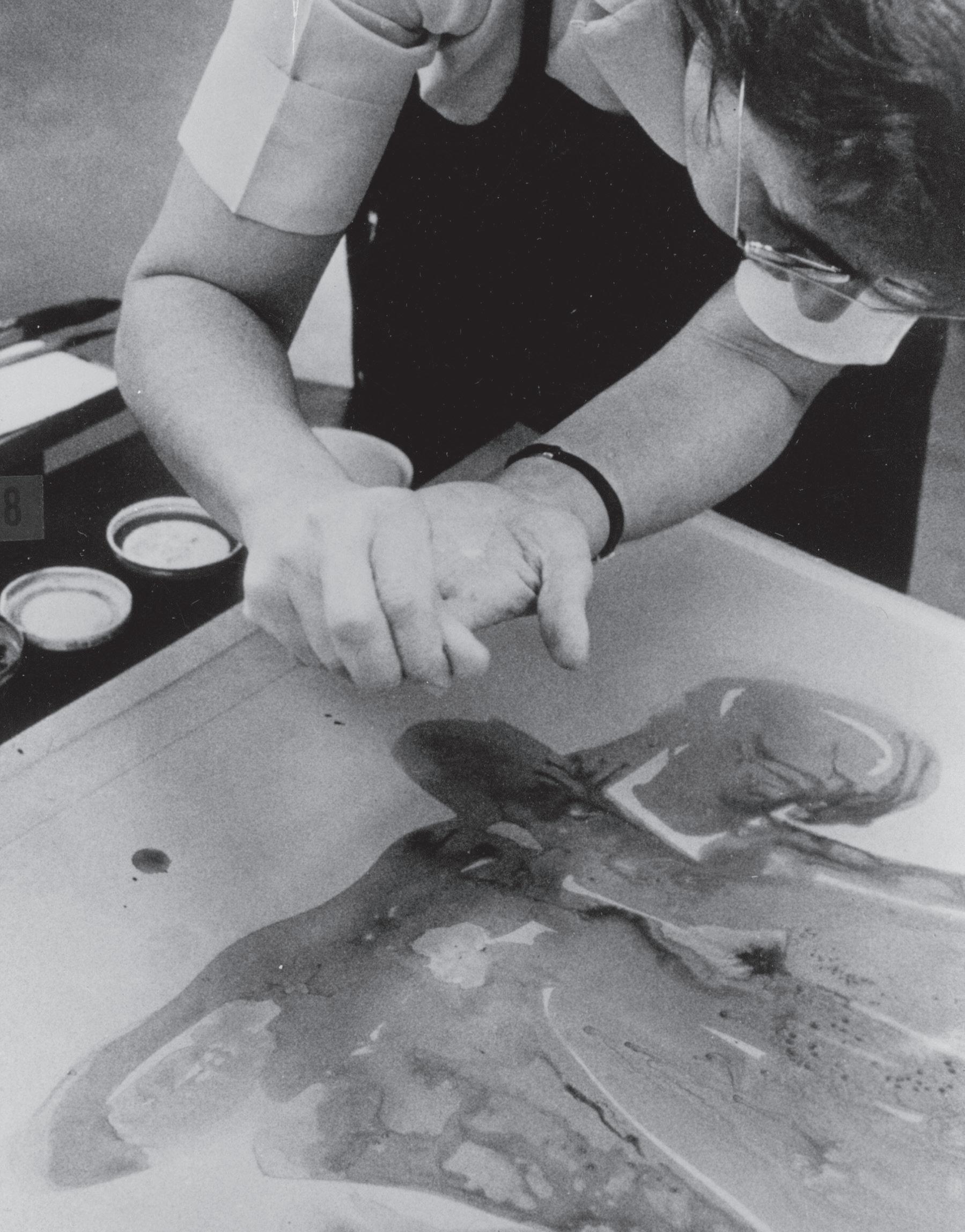
June Wayne working on a stone at Tamarind Lithography Workshop, Los Angeles (c. 1960).
Image courtesy of Tamarind Institute and the Center for Southwest Research, The University of New Mexico.
Working Hand-in-Hand
On L.A.’s History of Collaborative Printmaking
The first time I sat in Gemini G.E.L. co-founder Sidney Felsen’s office— nestled modestly within the striking Frank Gehry structure on Melrose Avenue—he gave me a gold star. Surrounded by wall-to-wall photographs of artists at work and the most colored pencils I’d seen in one place, Sidney held out his hand, offering me a jumbo-sized cardboard star, and with it, a job. “I think you might be the fourth member of the lithography team at Gemini,” he said. I had recently completed my training at Tamarind Institute—a long-term dream that remains one of the best things I’ve ever done. As I stood in that surreal moment amidst a salon hang of Sidney’s photographs —capturing countless collaborative moments at Gemini—and holding my jumbo star, I felt the intersection of vertices, as if I had entered one corner of a vast web, the silk threads of history unfolding around me.
Over the last 12 months, the fine-art print world has mourned the deaths of three of California’s most distinguished print publishers, Felsen among them. In addition to Felsen, Jean Milant, Master Printer and founder of Cirrus Editions, Los Angeles and Kathan Brown, Master Printer and founder of Crown Point Press, San Francisco have recently passed. This succession of losses constitutes a historic moment within the annals of American graphic arts. The post-war Print Renaissance1 (within which each of the aforementioned studios were of great consequence) engendered a lasting culture of collaboration
in California and brought a newfound visibility to the role of the printer. Nevertheless, the medium of print continues to be siloed within a broader arts discourse—having been left out of predominant narratives of Western art history in the past—while the visibility of labor is modulated by an art world shaped by capital. Today, these legacy workshops endure alongside younger print initiatives, having paved the way for a new type of artist /printer relationship: one that recognizes and celebrates the printer as a critical participant in the realization of an artist’s vision, within a highly relational collaborative process.
In 1957, dissatisfied with a local printshop’s inability to meet her creative demands, artist and printmaker June Wayne travelled to France to execute a series of lithographs with artist Joan Miro’s printer, Marcel Durassier.2 Here, she was inspired by the ubiquity of the European print atelier—in comparison, skilled technicians in the United States were scarce. Upon her return, Wayne envisioned an American workshop whose principal goal was the training of Master Printers, and soon enough, Tamarind was formed. Tamarind Institute (formerly Tamarind Lithography Workshop) was founded in Los Angeles in 1960 and quickly became one of the foremost exponents of the Print Renaissance on the West Coast. At a time when fine-art print publishing was nascent on the cultural map of America, the convergence of a boom economy with advances in technology gave rise to a broadening middle class and an artistic climate characterized by a spirit of possibility. “Hollywood is a giant craft preserve where every sort of creator, technician, and supplier lives and works,” Wayne articulated. “Dreaming, making, and hoping are a way of life here… Collaboration is so normal in Hollywood that it goes unnoticed.”3
Although printers had been working in collaboration with artists for centuries in both Europe and the US, the role of the printer had historically remained invisible.4 It was workshops such as Tamarind, followed shortly
Sarah Plummer
after by Crown Point Press (founded in 1962), Gemini G.E.L. (founded in 1966), and Cirrus Editions (founded in 1970), that subverted the insular guildship model inherited from Europe, whose criterion for artistry was for the printer to be traceless—a quality that was, in turn, conflated with insignificance. Forming a new, distinctly American paradigm, these Californian workshops saw printer-cum-publishers placing identifying printer marks (or chops)5 on the editions they printed, thus distinguishing their unique work as craftspeople.6 Kenneth Tyler, Gemini G.E.L.’s first Master Printer, was known for his dynamic personality to the extent that it shaped the workshop’s image in its early years. Clinton Adams, director of Tamarind Institute for over a decade, set Ken Tyler in the canon with his statement that “no other printer has so directly affected the work that has come from his studio.”7 Similarly, in a conversation with now-retired curator Ruth Fine 1984 Gemini G.E.L. attested to Tyler’s influence, sharing that “everything pretty much depended on his personal wizardry.”8 Like so, the identity of these key American workshops became inextricably linked to the printers and the people who led them, and the relationships built therein. Attuned to this, Gemini co-founder Sidney Felsen took photographs documenting the printshop’s projects, creating a vast archive that observes artists, printers, and historic moments of process-based innovation. The archive, amounting to over 70,000 photographs, is a collection whose impact on the understanding of—and respect for—collaborative printmaking cannot be underestimated. Felsen’s photographs encourage the viewer to consider print in ways that move beyond its replicative function, focusing instead on the processes of making and the human relationships that form around that process. In his book of photographs, The Artist Observed, Felsen writes, “The spirit of Gemini is best captured by the word ‘collaboration.’ It’s about artists and printers working hand-in-hand to create works of art.”9
One contemporary artist whose work is both complemented and amplified by the poetics of the print process is Analia Saban, an artist who has a longstanding collaborative relationship with Gemini G.E.L. While the vehement material inquiry that preoccupies much of Saban’s work well predates her indoctrination into the cult of print, the resonance she discovered there propelled the artist into collaboration with some of Los Angeles’s most renowned printshops, including Mixografia and El Nopal Press. Saban’s practice of deconstructing and reconstructing art materials afforded her a natural affinity with the language of printmaking, since the conception of any print begins with deconstruction into layers and into a sequence of processes. Her experimental print-projects have worked to reimagine the bounds of the printing process itself, taking router bits directly to printing plates or using dried and bonded cotton paper fibers to create sculptural, high-relief replicas of domestic hand towels, all the while working with Master Printers to help push against established technical boundaries. Regarding his experience collaborating with Saban, Gemini Master Printer Case Hudson shared, “When Analia first showed up, all she wanted to do was watch us work… She was looking at the materials we were using, the equipment, the way we were physically moving—all these things. It was a satisfying way of building a relationship with an artist.”10 While the intermedial practice of an artist like Analia Saban lends itself perfectly to print collaboration, it remains the printer’s duty to bring well-honored, innovative approaches to any artist’s work in a material language that can often feel foreign to them. This posture is typified by Master Printer and publisher Jacob Samuel, yet another West Coast print luminary who, alongside Kathan Brown of Crown Point, can be thanked for the revival of etching as a medium of serious art-making in America.11 In an interview discussing his 48-year career, Samuel reflected on his
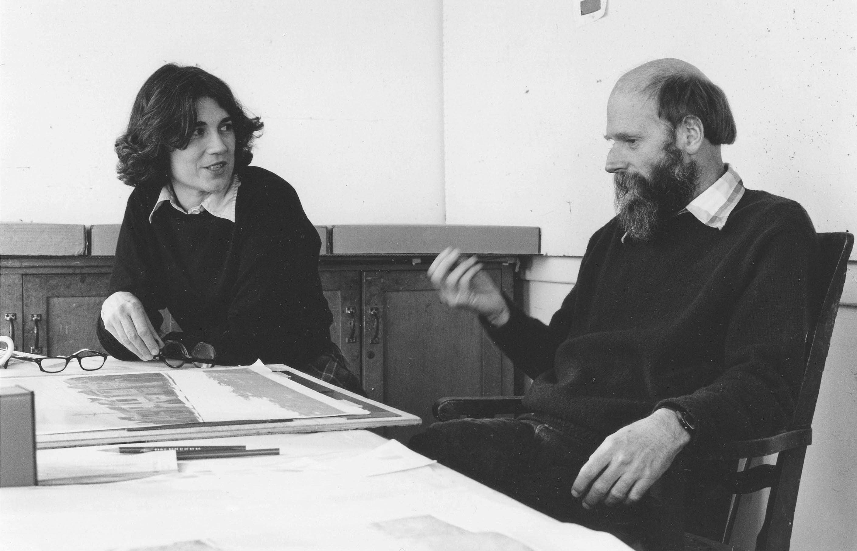

Top: Robert Bechtle with Kathan Brown in the Crown Point studio (1983).
Image courtesy of Crown Point Press.
Photo: Colin McRae.
Bottom: Judy Pfaff in the Crown Point studio (1987). Image courtesy of Crown Point Press.
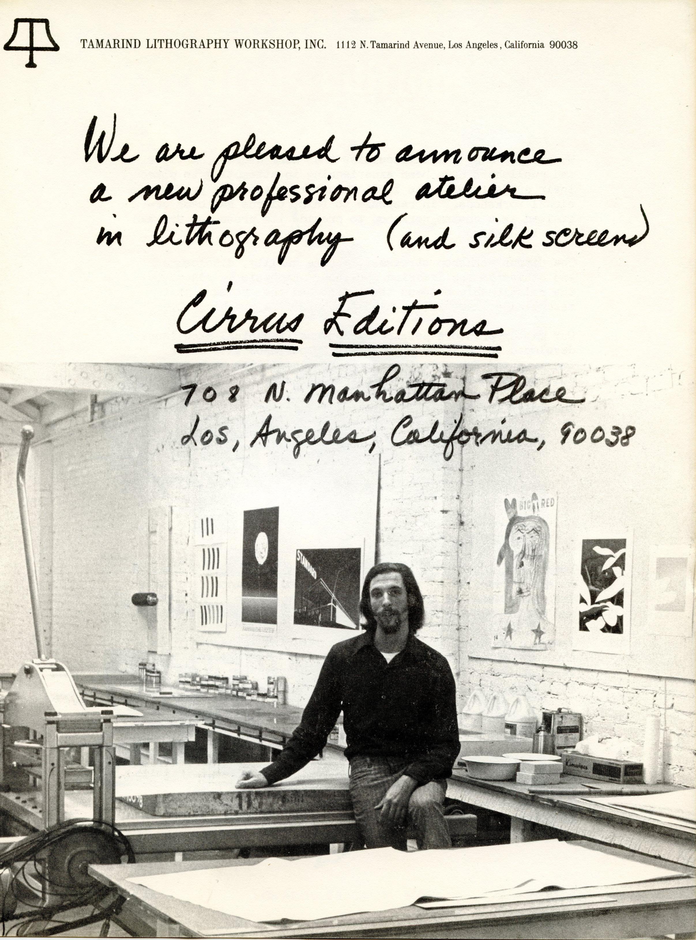
Jean Milant at Cirrus Gallery (c. 1970). Image courtesy of Cirrus Editions.
philosophy: “My goal is to leave no fingerprints,” he says. “All you see is the artist’s work…to do that and be completely spontaneous, I trust the materials.”12 This radical invisibility of the human hand can be traced all the way back in time to relics such as Claude Mellan’s The Sudarium of Saint Veronica (1649). Engraved with a single unbroken line, this portrait of Christ is considered acheiropoietic —translating literally to “made without hands.”13 The implications of this belief are profound, as they acknowledge the transfer of human perception to their materials with such finesse that human involvement is deemed impossible. While the invisibility of fingerprints may be something that many printers strive for, it is vital that the makers behind the process are visible, credited for their hand in realizing the artist’s work in print. A contemporary example of such sublime conception is Susan York’s Achromatopsia 1 (yellow) (orange) (red), published by Tamarind Institute in 2015. As an artist working primarily in values of grey and black, York is greatly interested in the experience of people affected by achromatopsia (a condition of total color blindness). Working with several monochromats, York had the individuals match colored ink samples with shades of grey in which they saw no discernable difference. These greys were then printed on the face of the print, with the corresponding color printed on the back. Floated against their bright white matting, a subtle glow from the edges of each float-mounted print offers a suggestion of their color-printed backs. Through a mastery of materials, Master Printer Bill Lagattuta’s translation of ideas illustrates a deep imbrication of the technical within the conceptual, allowing the duality of perception that so interested York to manifest within a single artwork. This tension between visibility and invisibility within printmaking exists on multiple planes and is difficult to reconcile. Over the last few years, several galleries including David Zwirner,
François Ghebaly, and most recently Marta L.A. have established in-house publishing programs for fine-art prints. By investing in production, these galleries support the tradition of collaborative printmaking and the Master Printers behind the work. Since independent printers are often dependent on contract work to sustain their own ventures, this kind of alliance is essential. Having said this, these gigs hold the potential to create an awkward double-bind where printers functioning in both capacities (as contract printers and print publishers) become own competitors, producing prints for galleries whose reach is much broader than their own. It is here that the matter of credit becomes essential in order to prevent a relapse into the kind of invisibility that the California print movement has been so instrumental in upending. One place where this standard is being set is Problems Printing, a fine-art silkscreen studio and print publisher located in South El Monte, Los Angeles. Founded just last year, Problems works with both emerging and established artists to produce and publish editions in collaboration with Lead Printmaker Tom Kracauer, a former printer at Cirrus Editions. Since each project requires many hands, Kracauer makes a point of crediting every person involved intentionally, and conspicuously. This kind of visibility is one of the privileges inherited by the current generation of fine art printers, the observance of which remains vital to our livelihood. Sidney Felsen, Jean Milant, and Kathan Brown (alongside other allies such as June Wayne, Ken Tyler, and the Remba family of Mixografia) understood that fine art print publishing—and the collaboration with artists that ensues— is a performance sport. The dynamism of these individuals was, without a doubt, essential to the growth and recognition of printmaking in California, and to the disruption of hidden labor trends that dominate the trade’s history. They established a degree of attention on prints and their makers, affording us the chance to clarify the collective role of printmakers as so much more
than skilled fabricators: We are listeners, mediators, counselors, technicians —the artist’s envoy—out of sight, and utterly essential.
Sarah Plummer is a collaborative lithographer, maker, and writer, lately of Australia and more recently of California. She has produced fine-art prints at Wingate Studio, Tamarind Institute, Gemini G.E.L., and for The Met. Sarah is captivated by the alchemic expanse of lithography and loves things that seem impossible. Her work leads an investigation into land, memory, material, grief, and love.
1. The Print Renaissance refers to a period from the mid-1940s to the late-1980s that saw a rapid revitalization of fine-art printmaking traditions in the United States. Several California-based print publishers are cited for their significance to the movement: “from Universal Limited Art Editions (ULAE) to Tamarind, from Crown Point Press to Gemini G.E.L. A veritable print renaissance, American artists gathered at these shops to create prints much like their European counterparts had done with verve since the nineteenth century.” Samantha Rippner, “The Postwar Print Renaissance in America,” October 1, 2004, The Metropolitan Museum of Art, https://www. metmuseum.org/essays/the-postwar-print-renaissancein-america.
2. June Wayne, “Broken Stones and Whooping Cranes: Thoughts of a Willful Artist,” Tamarind Papers 13, no. 1 (1990): 16–27.
3. Wayne, “Broken Stones,” 17.
4. How often do we hear about Roger Lacourière or Fernand Mourlot, two vital collaborative printers of Pablo Picasso’s work?
5. A printer’s chop is a symbol that is either embossed or stamped on each print of an edition as a way of identifying the printer or publisher.
6. Rosemary Miles, “Reviewed Work: Making Prints, Doing Art: 35 Years at Crown Point Press, by Karin Breuer, Ruth E. Fine, and Steven A. Nash,” Print Quarterly 15, no. 3 (1998): 330–333, http://www.jstor. org/stable/41825115.
7. Clinton Adams, review of Ken Tyler, Master Printer, and the American Print Renaissance, by Pat Gilmour, Print Collector’s Newsletter 17 (1986): 108.
8. Timothy Isham, conversation with author, 7 April 1983, as cited by Ruth Fine in Gemini G.E.L.: Art and Collaboration (Abbeville Press, 1984), 20.
9. Sidney B. Felsen and Constance W. Glenn, The Artist Observed: Photographs by Sidney B. Felsen (Los Angeles: Twin Palms Publishers, 2002).
10. Case Hudson, “Analia Saban and Printmaking in L.A,” Hammer Channel video, 1:24:17, May 6, 2025, https:// channel.hammer.ucla.edu/video/1947/analia-sabanand-printmaking-in-la.
11. Susan Tallman, The Contemporary Print: From Pre-pop to Postmodern (New York: Thames & Hudson, 1999).
12. Jacob Samuel, “A master printer makes his last print,” interview by Sarah Cowan, Museum of Modern Art, 2023, audio-visual, 3:21, https://www.moma.org/magazine/ articles/976.
13. Jennifer L. Roberts, Contact: Art and the Pull of the Print (Princeton University Press, 2024), 3.
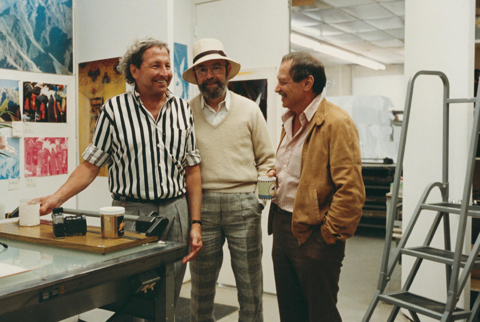
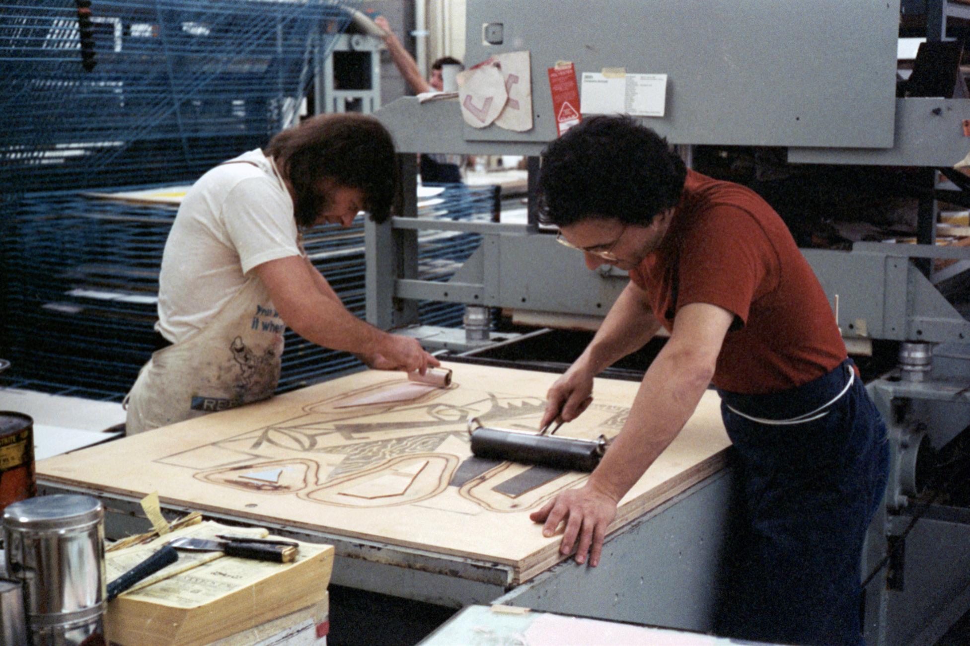
Top: Robert Rauschenberg with Sidney B. Felsen and Stanley Grinstein at Gemini G.E.L. during Rauschenberg’s Tibetan Keys and Locks project (1986). Image courtesy of Gemini G.E.L.
Bottom: Serge Lozingot and Anthony Zepeda at Gemini G.E.L. working on a woodblock for Roy Lichtenstein’s Head from the Expressionist Woodcuts series (c. 1980). © 1980 Sidney B. Felsen. Image courtesy of Gemini G.E.L.
Photo: Sidney B. Felsen.
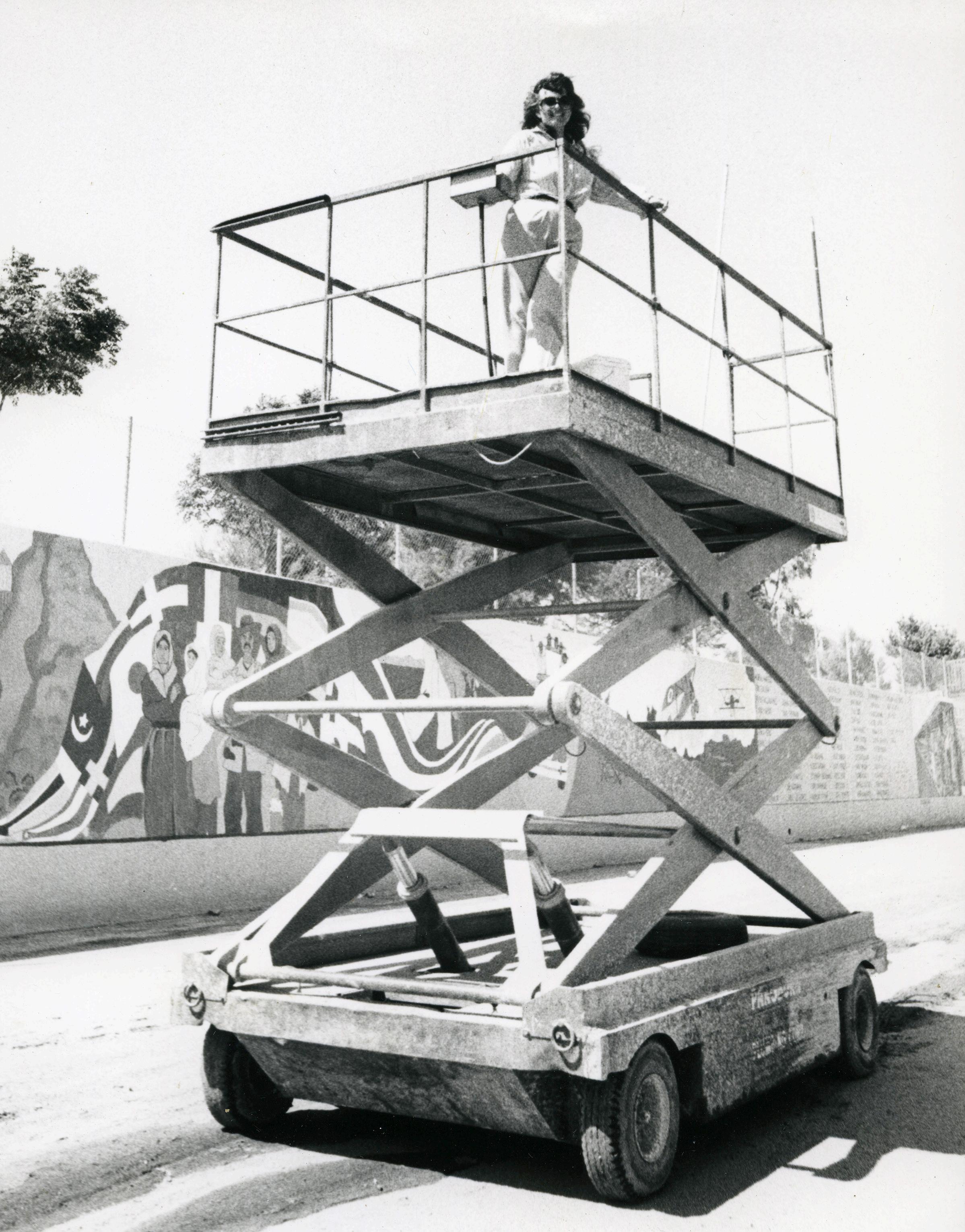
Judy Baca on a scissor lift (1983). © SPARC. Image courtesy of Judith F. Baca, the SPARC archives, and LACMA. Photo: Linda Eber.
History is a River
Judy Baca and the Great Wash of Los Angeles
The Tujunga Wash is a 13-mile stream that flows through the San Fernando Valley. It is a major tributary to the Los Angeles River, which, in the dry season, is not saying much, since both the Wash and the River become mere trickles. There is an old myth about the Tujunga, which translates to “place of the old woman” in Tongva. In this myth, a matriarch, whose daughter has been killed in a water dispute, retreats to the mountains and turns to stone.1
The stream itself has also turned to stone, concretized over decades of urban development, and it is within one of these concrete flood channels that artist Dr. Judith F. Baca painted
The Great Wall of Los Angeles. Commissioned in 1974 by the Army Corp of Engineers, Baca’s mural was meant to beautify the drab infrastructure. She and a team of local adolescents painted the half-milelong history directly onto the concrete, a timeline of Los Angeles’s development beginning with the mammoths in 20,000 BC and culminating in a tribute to the 1984 Olympic Games. After a nearly decade-long process of research, organizing, and painting, the wall was finally complete.2
The first time I saw the mural in 2023, it was a particularly hot July afternoon. The wash had all but dried up. The wall was dusty, monumental, as if it had been there forever. Despite all its color, the wall and its environment was not the dynamic Los Angeles I had come to recognize. Baking in the summer heat, I gazed at a relic from a lost century. A past set in stone.
That fall, as the Tujunga began to flow again, Judy Baca began to paint. In Painting in the River of Angels: Judy Baca and The Great Wall, an exhibition that ran from October 2023 to July 2024 at the Los Angeles County Museum of Art (LACMA), Baca transformed a gallery into a temporary studio. She and her team from the Social and Public Art Resource Center (SPARC) had started the years-long process of creating additions to the painting in the Tujunga Wash, an expansion that will eventually extend the piece by another half-mile. The goal: to update the wall’s historical timeline, adding vignettes from the 1960s through the 2010s.
I visited LACMA that winter and had the chance to observe Baca’s team painting. As I entered the gallery, I was greeted by the sounds of laughter, of conversation, of shoes on polished floors. To my left, a scissor lift buzzed as it raised an artist high into the air. She was coloring a new panel labeled “East L.A. Walkouts,” the 1968 protests lead by Chicano students. One of their demands: a rectification of LAUSD’s white-washed historical curriculum. The right-most portion of the panel was still only ink. In blue outline, students gathered in front of an old school building, carrying signs reading: “SCHOOLS NOT PRISON,” and “NO MORE RACIST TEACHINGS,” among other things. The left-most portion of the panel was slowly being filled in—three women’s hats had been painted a dull rust, emblematic of the Chicano paramilitary organization the Brown Berets. And the panel itself, I noted, was far from concrete—in fact, it seemed to be made of a flexible material, spooled on either end, continuously unfurling as the painters worked from left to right.
This was far from the dusty monument I had visited in the summer. It was fluid, dynamic: more of a performance than an object. I had a feeling that this performance was the entire point of the piece, wherein the process of not only art-making, but historymaking, was on full display.
Sean Koa Seu
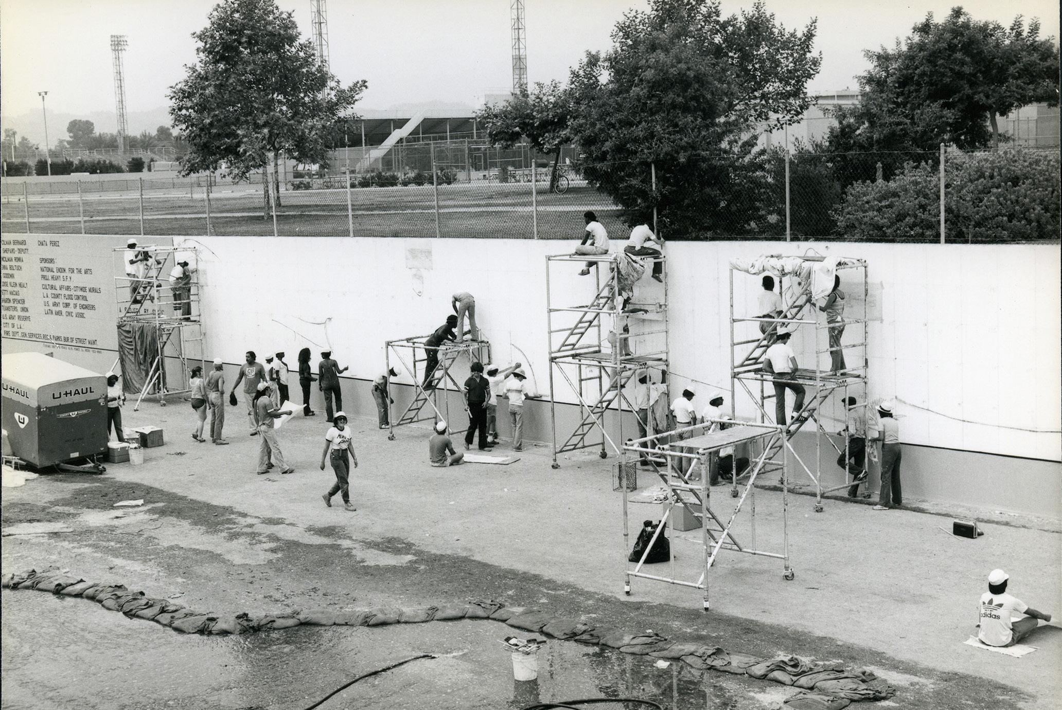
Top: Active worksite of The Great Wall of Los Angeles (1976). © SPARC.
Image courtesy of Judith F. Baca, the SPARC archives, and LACMA.
Photo: Linda Eber.
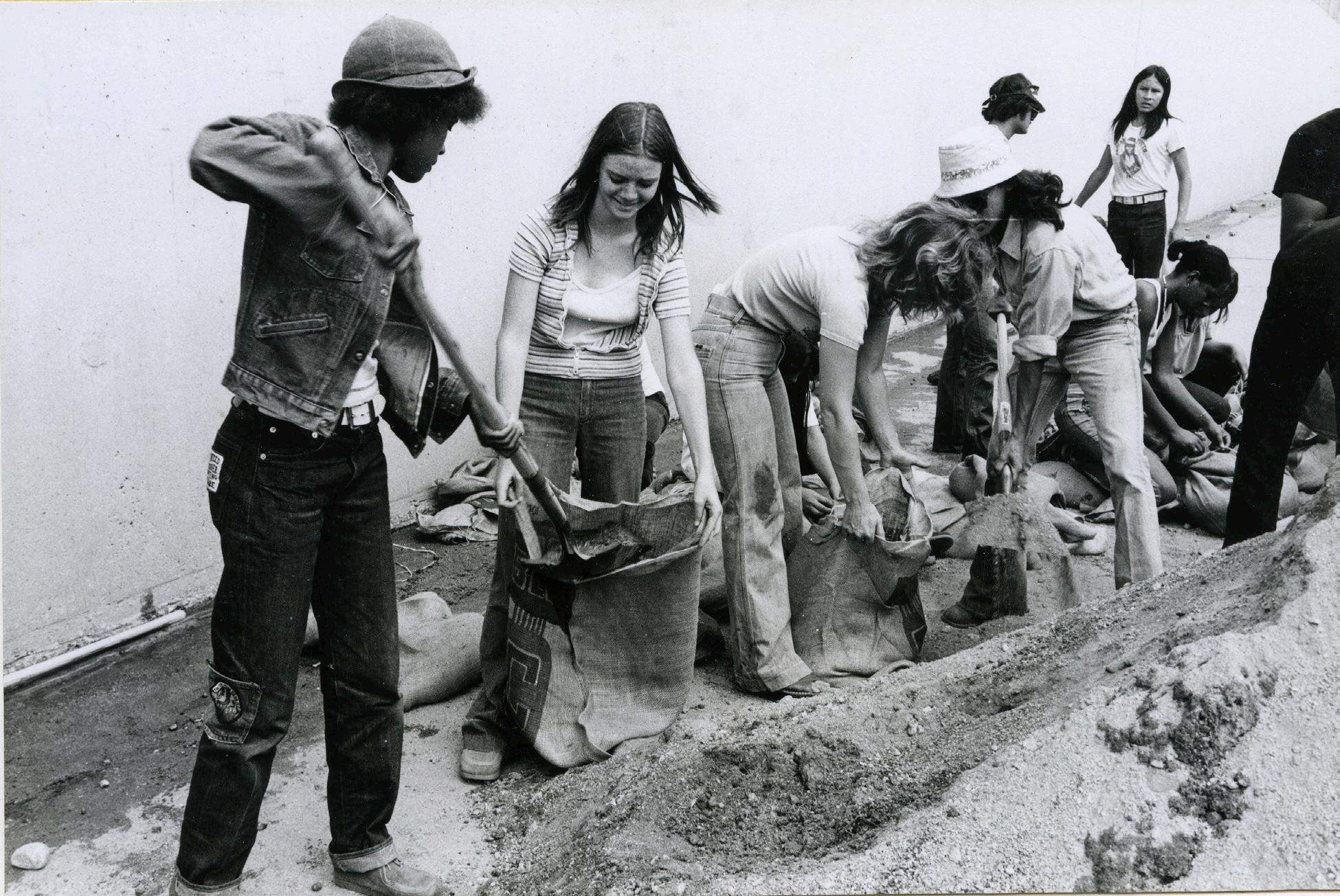
Bottom: Digging in the river during the production of The Great Wall of Los Angeles (1976).
© SPARC. Image courtesy of Judith F. Baca, the SPARC archives, and LACMA.
Photo: Linda Eber.
It goes without saying, but the Tujunga flood channel is designed to, well, flood. In fact, in 1983, just as The Great Wall was nearing completion, flooding wiped away the painters’ scaffolding.3 Additional funds were raised to offset this loss and complete the painting.4 But this has not prevented the wash from flooding in the decades since—nor has it prevented the wall from baking in the California sun, or shaking through its frequent earthquakes. This is no white box; it is precarious urban ecology.
As such, the mural undergoes continuous, though minor, restorations during the dry season—especially since 2011, when SPARC finally initiated The Wall’s first major restoration.5 The painting is a rather unstable object; it is not fixed, but instead undergoes minor replacements and revisions. The paint on the wall, like the river that washes it, is never the same.
The history depicted in The Great Wall was not an established one. In the 1970s, according to Baca, there were no shelves in “the library” devoted to Chicano history, to Black history, to a history of L.A.’s working poor.6 Instead, Baca proposed the creation of “an alternative form of history.”7 This was a history largely unacknowledged in the Valley, which had been redlined for decades and whose teachers once specialized in “Americanization,” a grim euphemism for the assimilation of Mexican children into “American” culture.8 Baca’s new history would be written by “ethnic groups—including women in the various groups—in a manner not taught in public schools.”9 This history—of Mexican farmers, of Jewish refugees, of Black students, of women laborers, of gays and lesbians—she dubbed a history of the People.10
In order to recover this history, Baca had to research not decades, but millennia. This was not a onewoman job. At first, Baca attempted to secure support from the Department of Recreation and Parks but had to
pivot due to censorship.11 To evade city interference, Baca—alongside artists Christina Schlesinger and Donna Deitch—founded SPARC and hired teams of artists and local historians who would conduct research alongside schoolchildren.12 These youth and educators worked together to excavate the under-told stories of the region’s most forgotten people. Many of these histories had never been—and sometimes are still not—officially recognized. But by taking the most scoffed-at historical claims seriously, the researchers did not just study history. They created it.
Take the panel featuring Thomas Alva Edison. He faces us, backgrounded by an illuminated cityscape, Los Angeles at night. In his left hand, a lightbulb; in his right, a piece of film. And then, floating above the city like an ancient UFO: an Aztec pyramid. A woman made of corn whispers something into Edison’s ear—the secret of electric light? This is alternative history in a mythic form, an allusion to a Mexican legend in which Edison was descended from Aztec kings.13
Another panel—this one a part of the new addition—depicts the Cooper Do-nuts Riot, a pre-Stonewall queer uprising on Main Street. Men on the roof of a shop hurl a slew of pink-frosted donuts at two cops. A trans woman raises a donut in defiance. Two men kiss in the foreground. Yet, the reality of these events is contested. The uprising left behind no articles in the L.A. Times, no police reports, no verifiable eyewitness accounts; if queer people did throw coffee at cops, it left no official record.14 Although it is now largely accepted as part of L.A.’s queer history, the story springs from John Rechy’s 1963 novel City of Night; it is a fiction, a fabulation, or perhaps an exaggeration of a real event.
The inclusion of these panels puzzled me. The anecdotes are somewhat ahistorical—not verifiable by the archive. They seem out of place next to much more “concrete” historical panels, such as the East L.A. Walkouts, Japanese Internment, or The Red Scare—events which are clearly rooted
in archival evidence. At first, I thought Baca might be distorting history and taking artistic liberties. I now realize it is precisely this artistic liberty that frees history from the prison of empiricism. If history is only what can be evidenced, then what are we to do when the evidence is burned, sold to the highest bidder, or painted over in white? Baca critiques this kind of history-making. Instead, she responds to archival erasure by opening up the historical record to speculation. She allows fiction to fill in the gaps, and in some cases to account for the unfathomable, for historical catastrophes. For example, on The Great Wall, colonization is explained by the legend of Queen Califia, who seduced the Spanish into seeking gold and silver on California’s shores. Today, Aztec Edison reclaims the advancement of technology from the so-called genius of a white man and dares to locate that genius in an Indigenous lineage. Cooper Do-nuts gives retrospective voice to queer and trans people, canonizing them in history despite official attempts to erase them. Whether these stories are strictly factual is irrelevant; the designation of history lends power to myth. From her place in the present, Baca changes the definition of history itself. History is not set. It can always be retold, revised, flooded over, repainted.
Today the Tujunga is a shallow but steady stream, like the blacktop under a carwash. As I write this, the students at Flintridge Preparatory School, near Altadena, are presenting The Great Wall of Los Angeles, an exhibit curated by the seventh grade class. A friend of mine attended the presentation and sent me a video: Two students read shyly from their notecards, discussing a panel called “Immigrant and Indigenous People Build California.” The poster behind them analyzes images of Chinese immigrants, fishing boats, oranges, the railroads. This exhibit—now a tradition at this small middle school—is just
one of many ways students across the Southland continue to engage with Baca’s wall as curriculum. These are not the first students to be enraptured by The Wall. The painters were students as well, many from starved corners of the city. SPARC had to “find homes for those who had to be runaways”15 from abuse and gang activity. Never a mere wall, the mural was mutual aid. Its legacy has never been just the painting or the history that it illustrates, but always the process in which the painting came to be, a process of care and ongoing education. The Wall asks not “What is the history?” but “How does our history help us live together—right here, right now?”
As another fire season returns and the wash runs dry, I can’t help but dwell on Los Angeles’s horrific present: neighborhoods up in flames, ICE ripping parents from their children, the denial of life-saving healthcare to working people and to our trans friends. Funding from the National Endowment for the Arts, once crucial to projects like Baca’s, rescinded. Histories foreclosed. And I feel stuck, as if the great march of time will abruptly end in total apocalypse. I am reminded of Tujunga, that old Tongva woman paralyzed by grief, and I wonder if we, too, will turn to stone forever.
But then I remember the first time I saw the wall, how wrong I was in calling it a monument, how The Wall’s apparent fixity was only an illusion. The Wall continues onward, a testament to the resilience of those people whom the wall historicizes, a people who have long managed to survive despite abandonment, denial, redlining, brutality. The Wall is already unfurling, incomplete, changing. History is not fate, but a practice. Not concrete, but a river.
Sean Koa Seu is a writer, dramaturg, and critic. He writes about representations of the Southland in art, film, and literature. His work has appeared in The Rebis and in zine form at the L.A. Art Book Fair. He is currently pursuing an MA in Aesthetics and Politics at CalArts.
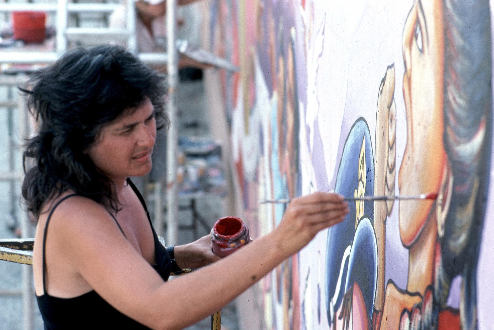
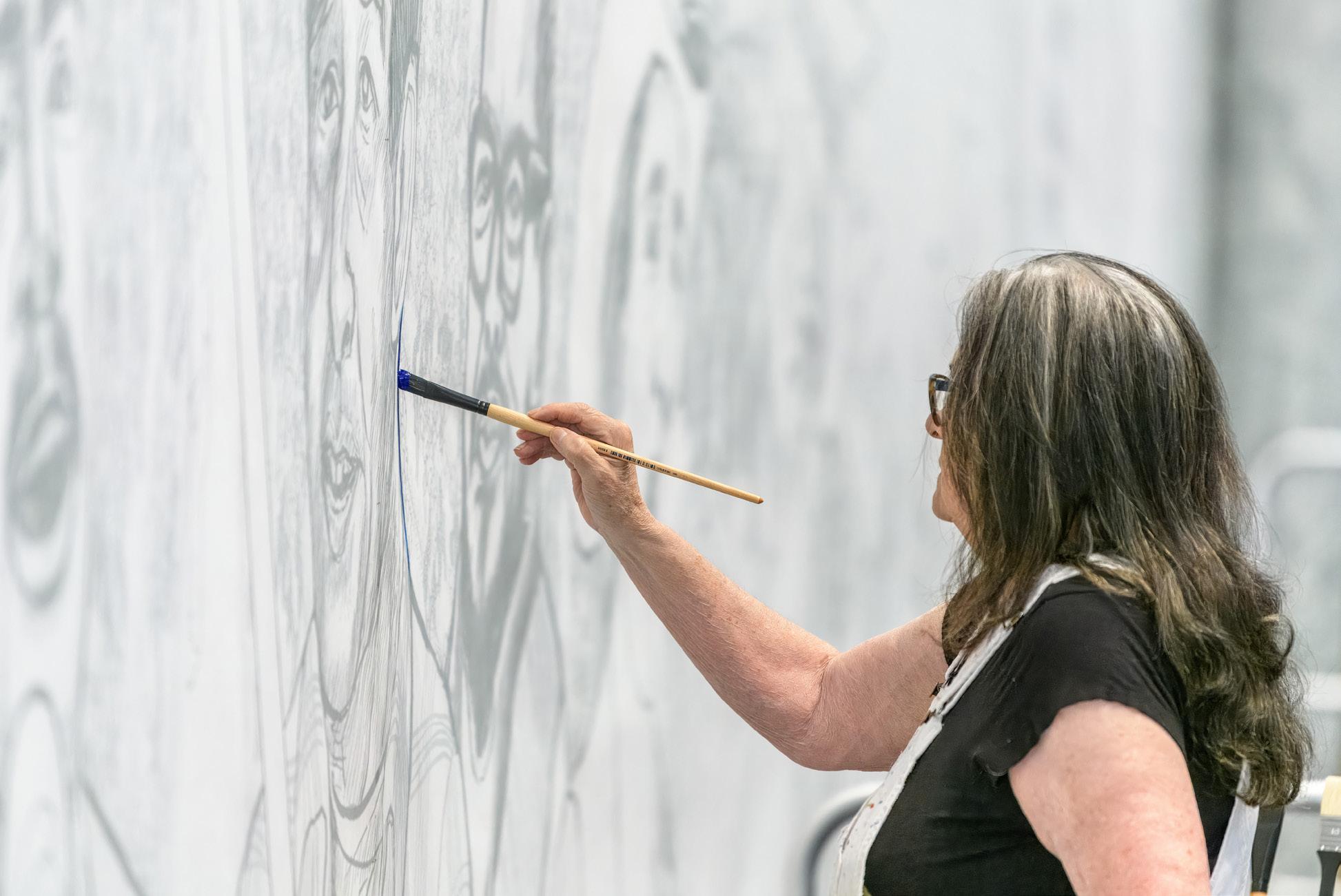
Top: Judy Baca painting The Great Wall of Los Angeles (1983). Image courtesy of Judith F. Baca, the SPARC archives, and LACMA.
Bottom: Judy Baca working on Painting in the River of Angels: Judy Baca and The Great Wall (installation view) (2024). © Judith F. Baca. Image courtesy of the artist and LACMA.
Photo: Museum Associates/LACMA.
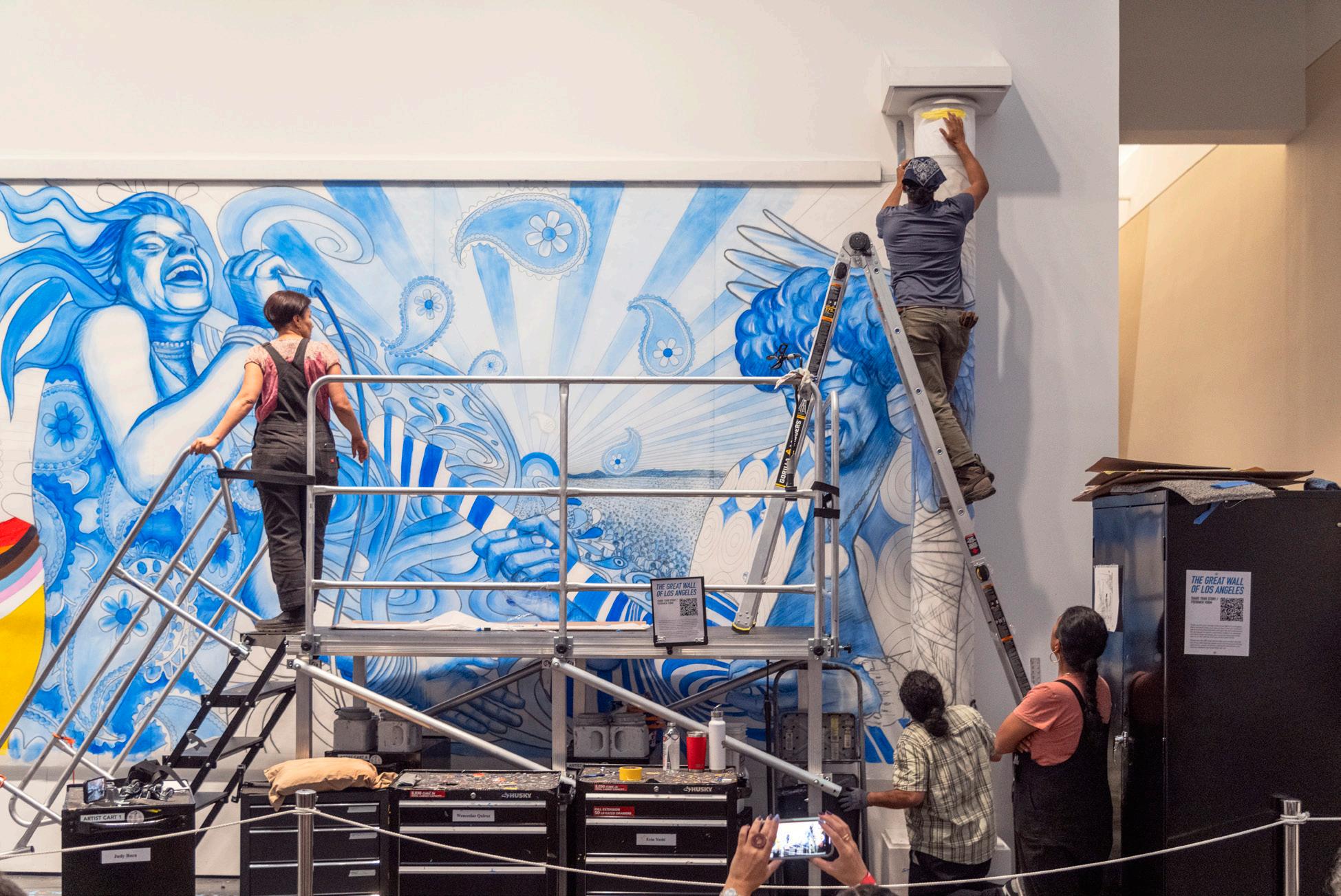
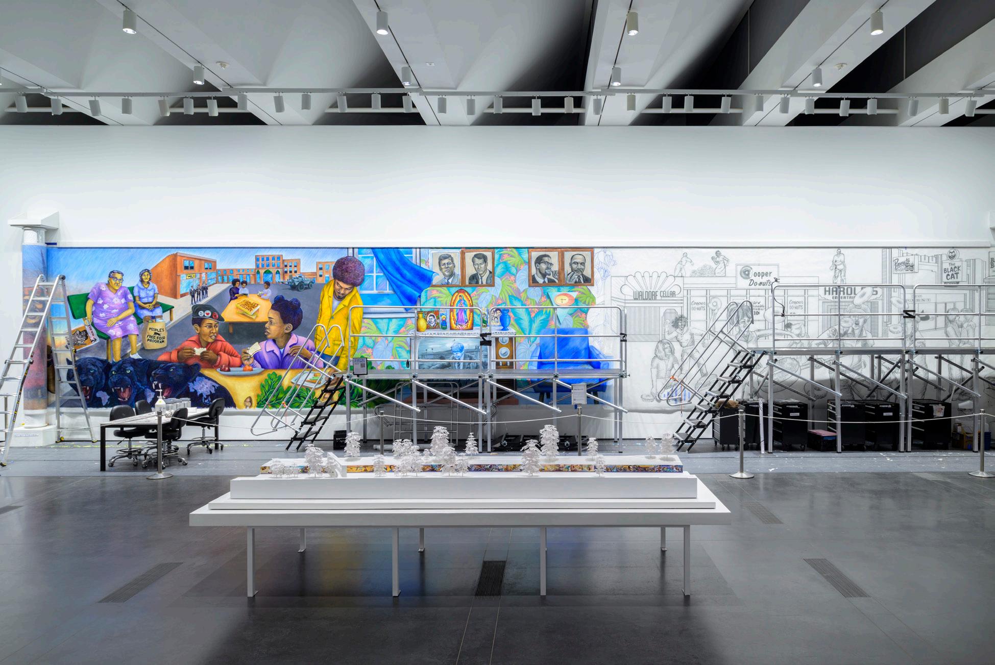
Judith F. Baca, Painting in the River of Angels: Judy Baca and The Great Wall (installation views) (2024). © Judith F. Baca. Images courtesy of the artist and LACMA. Photos: Museum Associates/LACMA.
1. Chester King, Overview of the History of American Indians in the Santa Monica Mountains (Topanga, CA: Topanga Anthropological Consultants, 2011), prepared for the National Park Service Pacific West Region Santa Monica Mountains National Recreation Area, 388—393.
2. Social and Public Art Resource Center, “History & Description,” Great Wall Institute, accessed July 3, 2025. https://sparcinla.org/programs/greatwallinstitute/ history-description/.
3. Greg Risling, “Mural Restoration Paints Bright Future,” Los Angeles Times, October 30, 2000, accessed July 3, 2025, https://www.latimes.com/archives/la-xpm-2000oct-30-me-44271-story.html. latimes.com
4. Risling, “Mural Restoration Paints Bright Future.”
5. Social and Public Art Resource Center, “Great Wall Restoration,” Mural Rescue, accessed July 3, 2025, https://sparcinla.org/programs/mural-rescue/greatwall-restoration/.
6. Judy Baca, interview by A Martínez, Morning Edition, NPR, July 4, 2024. https://www.npr.org/transcripts/ nx-s1-4914135.
7. Judith Francisca Baca, The Great Wall of Los Angeles (Master's thesis, California State University, Northridge, 1980), https://scholarworks.calstate.edu/downloads/ rn301472m, viii.
8. Kevin Roderick, The San Fernando Valley: America’s Suburb (Los Angeles: Los Angeles Times Books, 2001), 139.
9. Baca, The Great Wall of Los Angeles, viii.
10. Baca, The Great Wall of Los Angeles, iv.
11. Judith F. Baca, “Birth of a Movement,” in Community, Culture and Globalization, ed. Don Adams and Arlene Goldbard (New York: Rockefeller Foundation, Creativity & Culture Division, 2002), 36.
12. Alejandra Vasquez and Sam Osborn, Baca, Los Angeles Times Short Docs, March 18, 2024, https://www. latimes.com/shortdocs/0000018e-528f-dfc2-a1ce7eafcbdf0000-123.
13. “Links Edison Line to Old Aztec Kings: Mexican Woman Says Inventor’s Features Prove Descent—Sees Signs in His Face,” New York Times, March 13, 1923. https://www. nytimes.com/1923/03/13/archives/links-edison-line-toold-aztec-kings-mexican-woman-says-inventors.html.
14. There is some speculation as to whether the LAPD had an interest in destroying extant police reports on this incident. However, as Los Angeles historian Nathan Marsak points out, even if the LAPD had destroyed its records, an incident like this “would have made the papers.” See “We Need to Talk About Cooper Do-Nuts,” Bunker Hill, Los Angeles, June 15, 2021, https:// bunkerhilllosangeles.com/2021/06/15/we-need-totalk-about-cooper-do-nuts/.
15. Baca quoted in Vasquez and Osborn, Baca, 3:52.
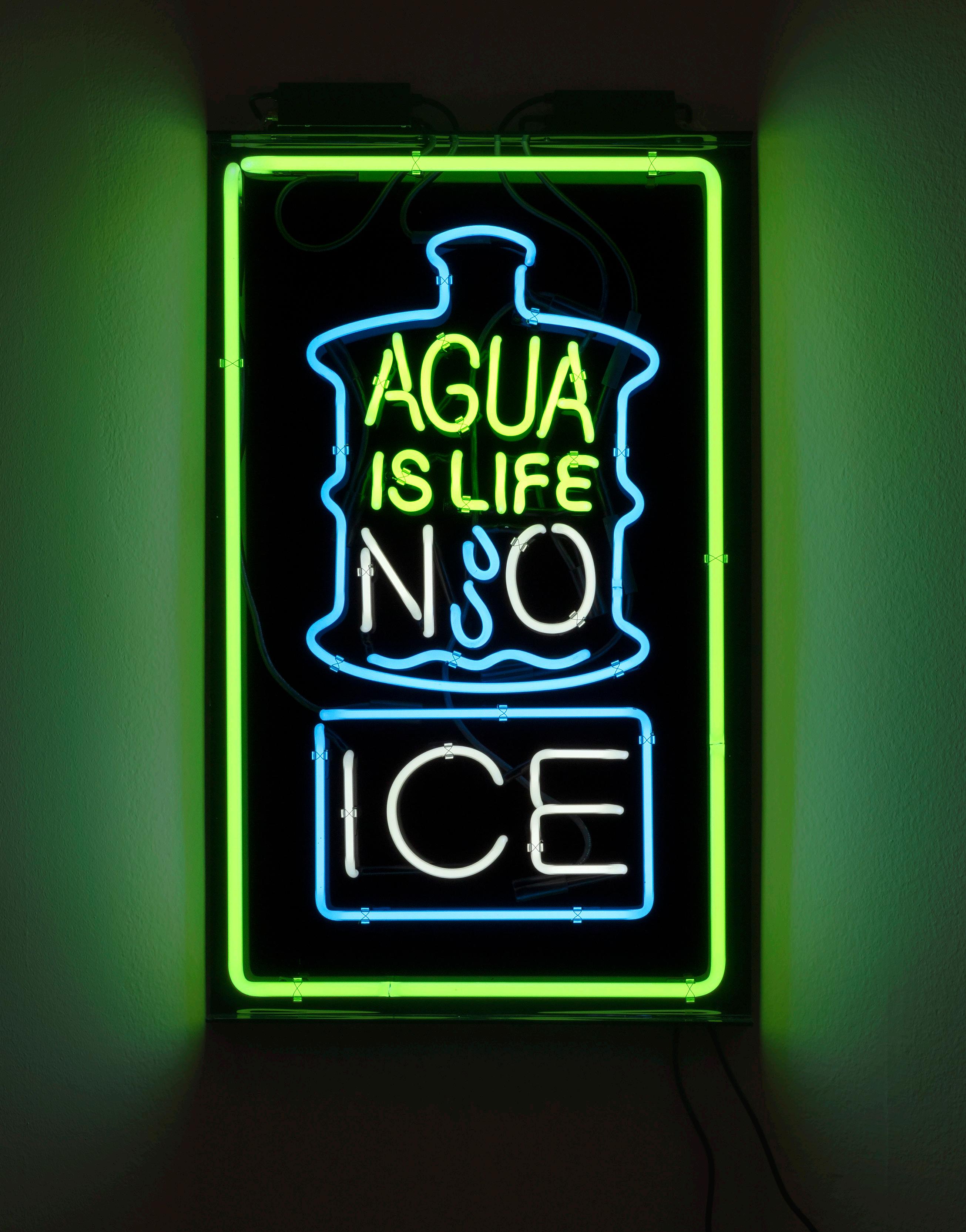
Patrick Martinez, Hold the Ice (2020). Neon on plexiglass, 36 × 22 inches; edition of 3. Image courtesy of the artist and Charlie James Gallery. Photo: Kevin Todora.
The Aesthetics of Protest Typography
On Preserving Dissenting Letterforms
In 1968, photojournalist Ernest C. Withers captured an image of the Memphis sanitation strike. The blackand-white photograph depicts a group of Black male workers holding up copies of the same sign: in a vertically elongated black typeface set on a stark white background, the signs read, “I AM a Man,” with “AM” bolded and underlined. Derived from the line “I am an invisible man” in Ralph Ellison’s National Book Award-winning novel Invisible Man, the posters edit out the word “invisible.” In doing so, they reinforce the Black worker’s presence in the workplace while simultaneously referencing Ellison’s expression of alienation brought on by the Jim Crow era.1 The “I AM a Man” signs would initiate an iconic protest phrase of the movement.
With knowledge of this history, typographer Tré Seals created Vocal Type, a type foundry for creatives of color, in 2016.2 “I had already known about the ‘I AM a Man’ signs since fourth grade,” Seals said.2 “That’s why Martin was the first [typeface] I made.” The Martin typeface takes from the original posters’ use of uneven bold lettering, mixed capitalization, and underlining, infusing a sense of urgency into the written text. Seals’s typefaces, many inspired by Black liberatory movements and figures, focus not only on the overall messaging of a letter, phrase, or sentence used in protest signage, but also the typography—the letter
shape, arrangement, and aesthetic— and how those elements convey, assert, or obscure meaning.
The need for dissenting typography is as abundant today as it was in 2016 or in 1968. In June of this year, ICE and law enforcement agencies at the federal, state, and local level conspired to facilitate mass raids across L.A., abducting people, tearing communities apart, and attacking those protesting against them. Thousands of people mobilized in response, taking to the streets to demand that ICE get out of Southern California. Some protesters in downtown L.A. held up 18 x 24-inch posters designed by L.A.-based artist Patrick Martinez with an image of a neon sign reading “DEPORT ICE,” glowing in a cold, arctic blue, a color that cheekily resembles an ice cube.3 (“ICE melts in the summer heat” is a common refrain at protests across the country.) Martinez’s neon works and accompanying protest signs appropriate a typographic form ubiquitous across L.A. His neon signs, hallmarks of consumerism, also signal the neighborhood momand-pop shop. As a result, he embeds protest language into the everyday, using commercial typeface design in ways that disrupt the consumerist status quo while pointing to the very fabric of L.A.’s diverse population and workforce.
A month earlier in New York City, demonstrators with Writers Against the War on Gaza held posters that utilized the plain serif font of The New York Times in all caps as though it were a breaking news headline on the front page of the paper. The text was placed above yet another image of Palestine on fire at the hands of the West. This sign, held up by a demonstrator standing in front of The New York Times offices, read: “NYT IGNORES GENOCIDE IN PALESTINE.”4 Through this typographic subversion, there’s no way the message could be more legible.
If typography is a study of and practice in legibility, then in reference to the language of protest, it is also a site of power, access, utility, and archival
Aaron Boehmer
history. The text and fonts printed on protest signs have the potential to remix the everyday in ways that provide powerfully layered meaning, rooting out contradictions, confronting power imbalances, and making clear our most intimate, innate demands: autonomy, freedom, love. The protest sign functions as the medium through which a movement speaks—to the world and to participants en masse. It’s the most direct screen onto which a protestor can cast demands if only because it is the protestor, the author of those demands, who controls what is written, how it is written, and the forms and shapes it takes.
What happens when these protest letterforms, originally created for an object meant for use at a demonstration (flag, banner, sign), are recycled into an artwork? On one hand, by bringing the language of protest into the gallery, there is potential for the lifespan of the referenced protest and its cause to be extended, brought into an art historical canon, and thereby preserved in the archive. Unavoidably, though, bringing protest language into a white-walled space also risks removing the protest ephemera and its letterforms from its vital context and, most importantly, from its utility. Though, if an artist is mindful of this dynamic, perhaps it creates an opportunity. An artist can bring a protest’s typography into an art space or institution, not to sterilize it or water it down, but to keep it from getting lost to a materialistic news cycle that is only focused on what’s next. The typography remains long after crowds are dispersed from a demonstration, slowing the protest so as to sustain its message over time. After all, substantive change is urgent, but that change is also a long-term project. Change takes time, care, and attention. Still, artists like Martinez are finding ways to strike a balance with their use of dissenting text, creating protest letterforms that introduce urgent messages to the archive (within institutions or galleries) while also offering utilitarian and community access to their typography,
so it might continue to do its work outside of the institution. The language of dissent, then, is at once preserved and usable.
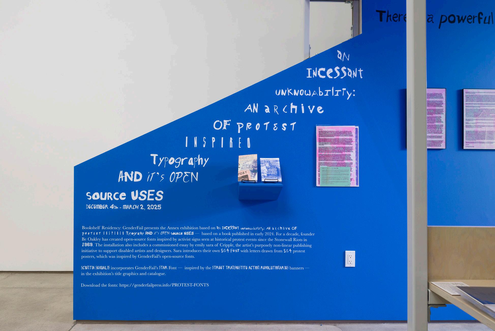
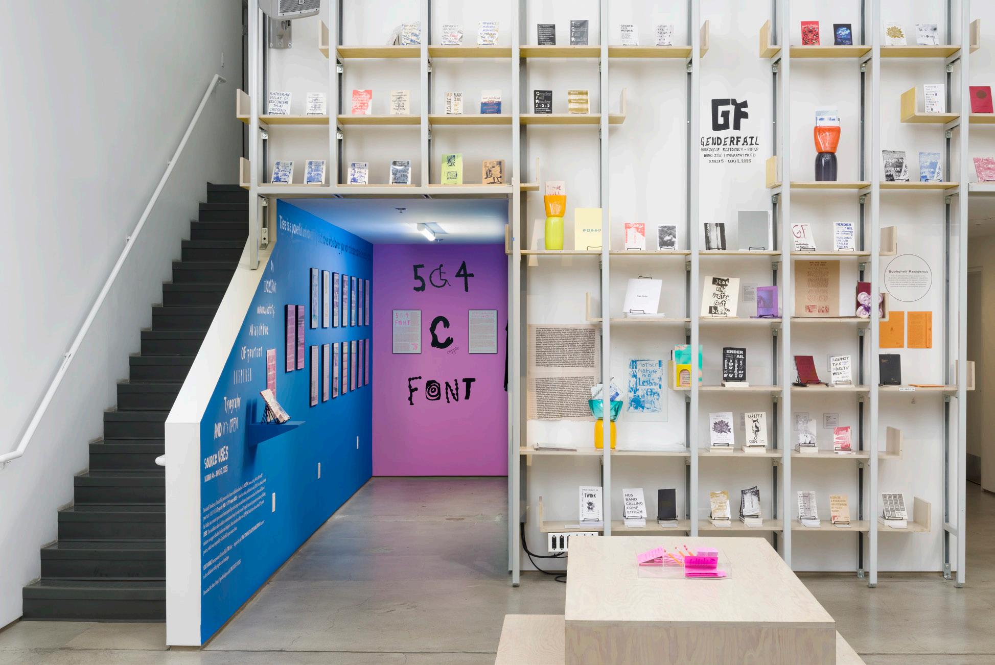
In 1970, during a Gay Liberation Day march in New York City, photographer Donna Gottschalk took to Christopher Street with a sign that read in imperfect, uppercase handwriting “I AM YOUR WORST FEAR I AM YOUR BEST FANTASY.”5 Nine years later in 1979, at the National March on Washington for Lesbian and Gay Rights, a group of demonstrators held up a banner that read in all-caps akin to Gottschalk’s sign from nearly a decade earlier that read “FIRST GAY AMERICANS” in a bold, confronting, and messy hand drawn scrawl.6 Through their publishing platform GenderFail, the artist Be Oakley coalesced these individual moments, both from the Gay Liberation Movement, to create a single, downloadable typeface called “I am your worst fear; I am your best fantasy / FIRST GAY AMERICANS.”7 This typeface and nine others produced since 2018 were the subject of Oakley’s 2024–25 exhibition at the Institute of Contemporary Art, Los Angeles. Each of Oakley’s fonts are derived from distinct but intrinsically interconnected socio-political movements—from the Stonewall Riots in 1969 and ACT UP in the 1980s and ’90s, to the resurgent calls for Black liberation in 2020, and the student uprisings for Palestine in 2023–25. The fonts are symbolically meaningful, wherein the “uppercase letters [do not have] any hierarchical importance over lowercase letters.”8 But they are also meant primarily to be useful, readily downloadable for queer, trans and non-binary folks, and queer people of color to use for protest signs, fundraising and mutual aid purposes, personal projects, and more.
In this way, an archive of past protest typography is transformed into a tool for the present and future. Oakley engages with the archive of protest not
An
GenderFail,
Incessant Unknowability: An Archive of Protest Inspired Typography and Its Open Source Uses (installation views) (2024–25).
Images courtesy of the Institute of Contemporary Art, Los Angeles. Photos: Jeff McLane/ICA LA.
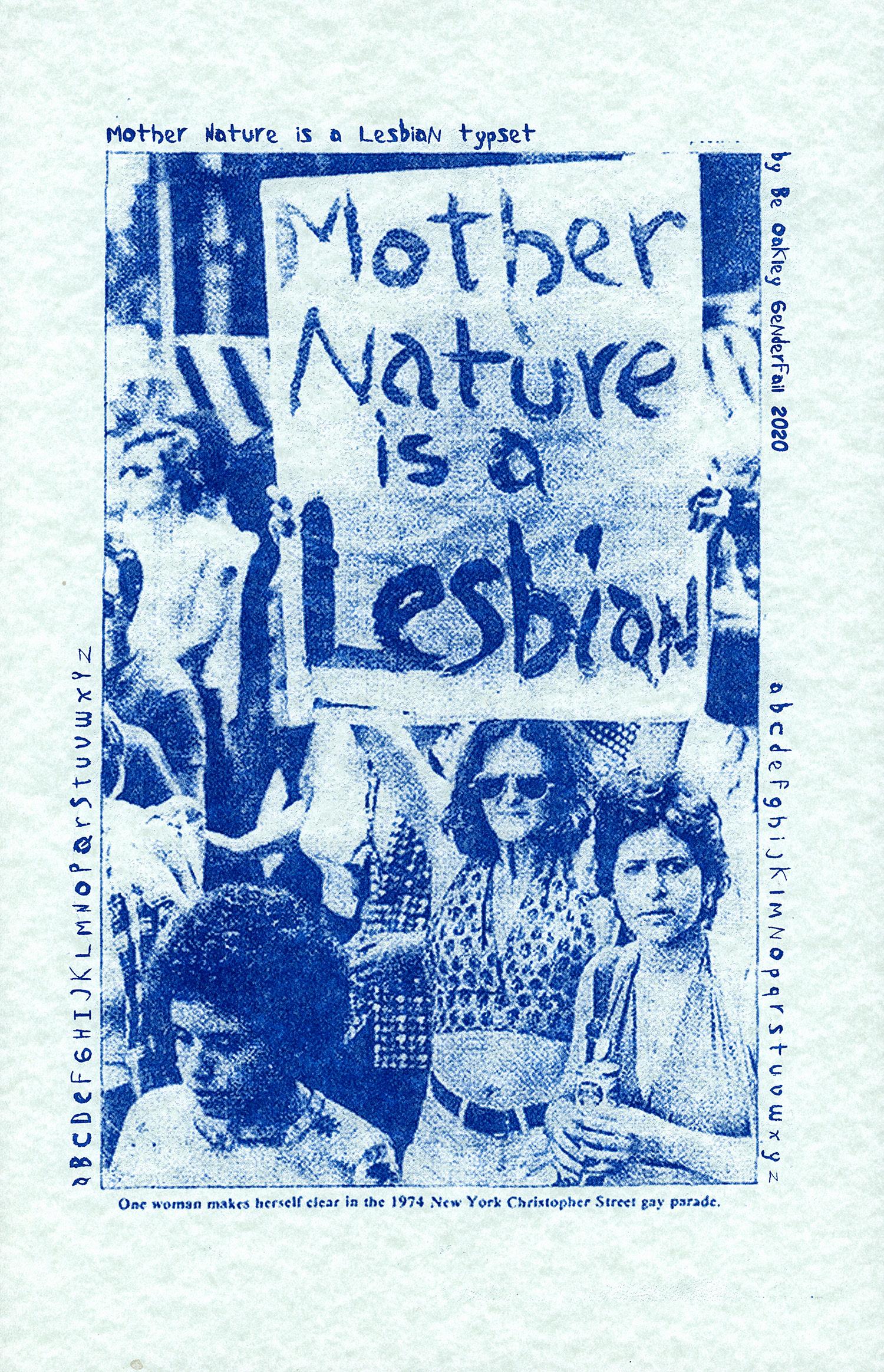
Be Oakley / GenderFail, Mother Nature is a Lesbian Font (2020). Image courtesy of the artist and GenderFail.
as a fixed or nostalgic look at the past, but as a dynamic and living resource —a place from which a movement can be both catalogued and continually reimagined. The “I am your worst fear” typeface is not merely a symbol of queer history, but an instrument for queer futurity, allowing generational knowledge from a movement that has been decades in the making to be passed down, active and defiant.
Oakley certainly isn’t the only contemporary artist to reference the histories of socio-political and economic upheaval in their work, nor is Oakley the only artist to employ a typographic means to do so, especially in Los Angeles. From Dr. Judith F. Baca’s Great Wall of Los Angeles and Mary-Linn Hughes and Reginald Zachary’s Love is for Everyone mural, to Elana Mann’s collaborative banners and sculptural protest rattles, to print projects by L.A.-based organizations such as the Feminist Center for Creative Work and the Center for the Study of Political Graphics, artists and collectives across the city continue to reference and, like Oakley, reinvigorate protest movements by way of typography.
Last summer, while visiting the Dallas Contemporary, I found the landscape of L.A. staring back at me. Patrick Martinez’s immersive Histories exhibition, which ran from April 2024 until January of this year, recalled the visual language of East Los Angeles through large-scale installations of brick walls adorned with vibrant murals that depicted an array of references: flowering bougainvillea and Sitting Bull, Mayan warriors and Emiliano Zapata, Larry Itliong and feathered serpents. The bricks in the sculptural mural were also collapsing, signifying rich and vital histories of place that are being disappeared by racialized eviction and gentrification.
Installed throughout the gallery were Martinez’s signature neon signs. These works reference street-level commercial marketing and its diverse
history within L.A., while also subverting it, swapping marketing copy for a more dissident kind. Among a tightly-packed line of neons, the border of a rectangular sign—the sign itself a little bigger in size than a storefront’s “open” display— glowed a bright purple, the inside reading “TIERRA Y LIBERTAD” in an uppercase type. Another, bigger sign nearby critiqued the city’s housing crisis (“NOTHING IS UP BUT THE RENT”) while others envisioned new and greater forms of collectivism (“MUTUAL GIVING CREATES COMMUNITY”) and demanded an end to racialized violence (“STOP ASIAN HATE”).
Subversively, Martinez also reworks his own neon artworks, which are purchased by institutions and collectors, into lawn signs. Partnering with Mixed Media Editions, Martinez brings objects that are otherwise secluded behind gallery walls into real neighborhoods and onto the city’s streets to be used at actual demonstrations and protests.9 While these lawn signs are for sale at $80 a piece (perhaps a bit expensive when compared to the few dollars one might spend to make their own), a portion of every sale goes to the Coalition for Humane Immigration Rights (CHIRLA), one of California’s largest immigrant rights organizations. In particularly urgent moments, Martinez distributes the signs for free, such as during the Solidarity L.A. March & Rally on March 15 at City Hall,10 or donates all of the proceeds to CHIRLA. The gesture, however complex, is meaningful. While the actual neon signs are displayed in privatized spaces, his lawn signs offer another way to engage with the work—an engagement that is accessible to a broader public and that enacts his typographic slogans in real spaces of dissent, working to actualize their impact.
Martinez and Oakley’s works are the most generative when they step outside of the art gallery and into the streets, as a lawn sign available at a demonstration or a free typeface that protestors can download and utilize. These works then operate on two levels. First, as art projects, they preserve
histories of protest inside institutions. Rather than maintaining the institution as an exclusionary boundary, the artists use the institution as just another tool at their disposal—one that allows for expansive record-keeping, maintenance, and exposure. These artists’ letterforms also operate in a second way: By turning their typographic artworks into tools to be used by protesters, they are creating accessible ways of disseminating history, aesthetic power, and knowledge to the public. This intentional use of letterforms becomes a means by which to continually dissent with every word, every consonant, every vowel—a living archive, and a slow (but steady) protest.
Aaron Boehmer is a writer based in New York City. He covers the arts, culture, and politics and has written for The Nation, Texas Monthly, Los Angeles Review of Books, The Drift, and others.
1. Tré Seals, “Martin,” Vocal Type, June 5, 2023. https:// www.vocaltype.co/history-of/martin.
2. Kaleena Sales, Centered: People + Ideas Diversifying Design, Princeton Architectural Press, 2023, 164-167.
3. Patrick Martinez, “Abolish Ice.” Crystal Bridges Museum of Art, 2018. https://crystalbridges.emuseum.com/ objects/11356/abolish-ice.
4. PYM NYC (@nycpym), May 28, 2025, https://www. instagram.com/p/DKLjetBtx3y/?utm_source=ig_web_ copy_link&igsh=MzRlODBiNWFlZA==.
5. Manuscripts and Archives Division, The New York Public Library. “Donna Gottschalk holds poster ...” New York Public Library Digital Collections. Accessed May 14, 2025. https://digitalcollections.nypl.org/ items/510d47e3-5f6e-a3d9-e040-e00a18064a99.
6. Joel Rinne and Earl Colvin, “FIRST GAY AMERIANS,” National March on Washington for Lesbian and Gay Rights, October 14, 1979.
7. Be Oakley, “i am your worst fear i am your best fantasy / FIRST GAY AMERICANS Bold Italic Version 2.000; hotconv 1.0.109; makeotfexe 2.5.65596. Open Type Font. Be Oakley, 2020. https://drive.google.com/file/d/ 1q3YCeH9-gsjFMJCL5P5wKb-v7NFnwRkv/view
8. Be Oakley, “GenderFail Open Sourced Protest-Inspired Fonts.”
9. Patrick Martinez (@patrick_martinez_studio), March 17, 2025, https://www.instagram.com/p/DHUtdCzPLs7/ ?utm_source=ig_web_copy_link&igsh= MzRlODBiNWFlZA==.
10. Patrick Martinez (@patrick_martinez_studio), “Abolish Ice” lawn signs / protest signs are now available...“ (Instagram), March 11, 2025, https://www.instagram. com/p/DHEVpn6v1Of/?utm_source=ig_web_copy_ link&igsh=MzRlODBiNWFlZA==.
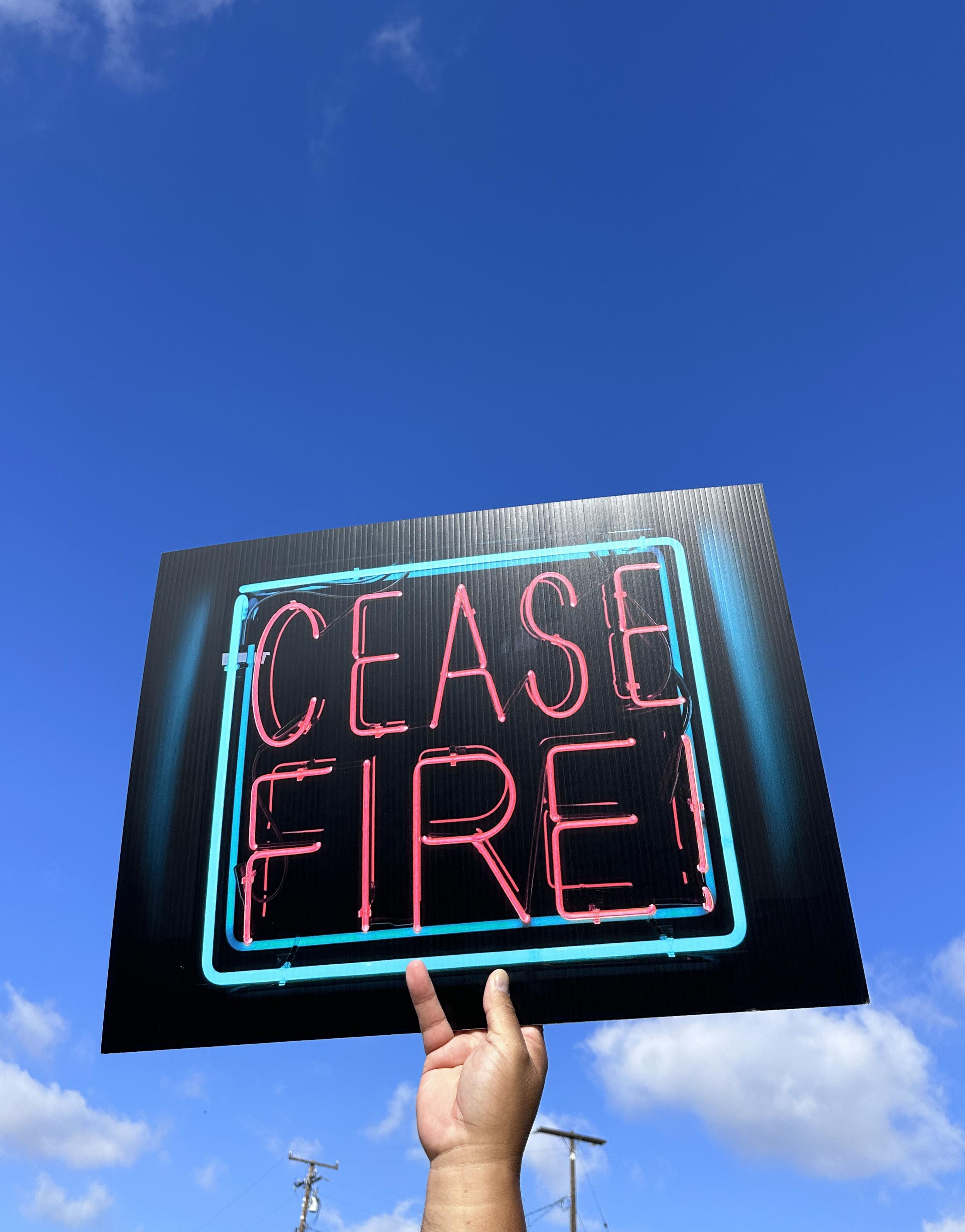
Patrick Martinez, Ceasefire (2024). Image courtesy of the artist and Charlie James Gallery.
Photo: Patrick Martinez.
Modeling Home
A Call for New Approaches to Art and Research Residencies
“These ants made their way inside again?!” I exclaim to myself, exasperated, wiping out lives with a damp rag while in residence at the FitzpatrickLeland House. I’m here for a project on cohabitation, mapping the connections and compromises necessary for human and more-than-human livability in Los Angeles. Naturally, my attention is drawn to the living in this living space, and the invasive ants represent only a few of my housemates. The title of my residency project is Hospes, the Latin root for multiple English words including, paradoxically, both ‘host’ and ‘guest’. Carrying dual meaning, hospes is a linguistic trick, a reminder that hosting and guesting are never binary. Those who are guests must on other occasions serve as hosts, and vice versa. The word hospes makes visible the fluid dynamics of reciprocal responsibility, all are active participants in creating conditions of home and well-being. My residency, itself hosted by the MAK Center and SOM Foundation, is grounded in questions such as: “What is required of good guests and hosts in order to cultivate just habitability?”
So far, I have shared this space with centipedes, a house spider who lives in the original jade green bathtub, a giant silverfish, and several daddy long-legs who lounge in tall corners. At least three crane flies have made themselves at home upstairs. Out of the house’s swimming pool, I scoop three or four honeybees a day. Most are still alive, hanging on in some energy-saving mode, but at least five
have died, not counting those who surely float into the pool filter unnoticed. Other survivors have included the iridescent jewel that is the native ultragreen sweat bee, butterflies, moths, and beetles. What does it mean to be in residence alongside so many others who already reside?
“Residence” is a sticky orienting principle in this proto-white box of glass and concrete which was never intended to be inhabited at all. Built in 1936, in the biodiversity hotspot that is Laurel Canyon, the Fitzpatrick-Leland House was commissioned by developer Clifton Fitzpatrick as a speculative home. It was then designed by R.M. Schindler, a student of Frank Lloyd Wright, as a gleaming lure with which to entice speculators and spectators to these Hollywood Hills.1 Eventually, what began as a model went through cycles of remodeling, inhabitation, and de-modeling through the mechanism of exponentially appreciating real estate. In the 1990s, it was restored to its original condition by architectural designer Russ Leland, who donated it to the MAK Center, and it has since served as an exhibition and residency space for artists such as Florian Hecker and Kim Gordon.
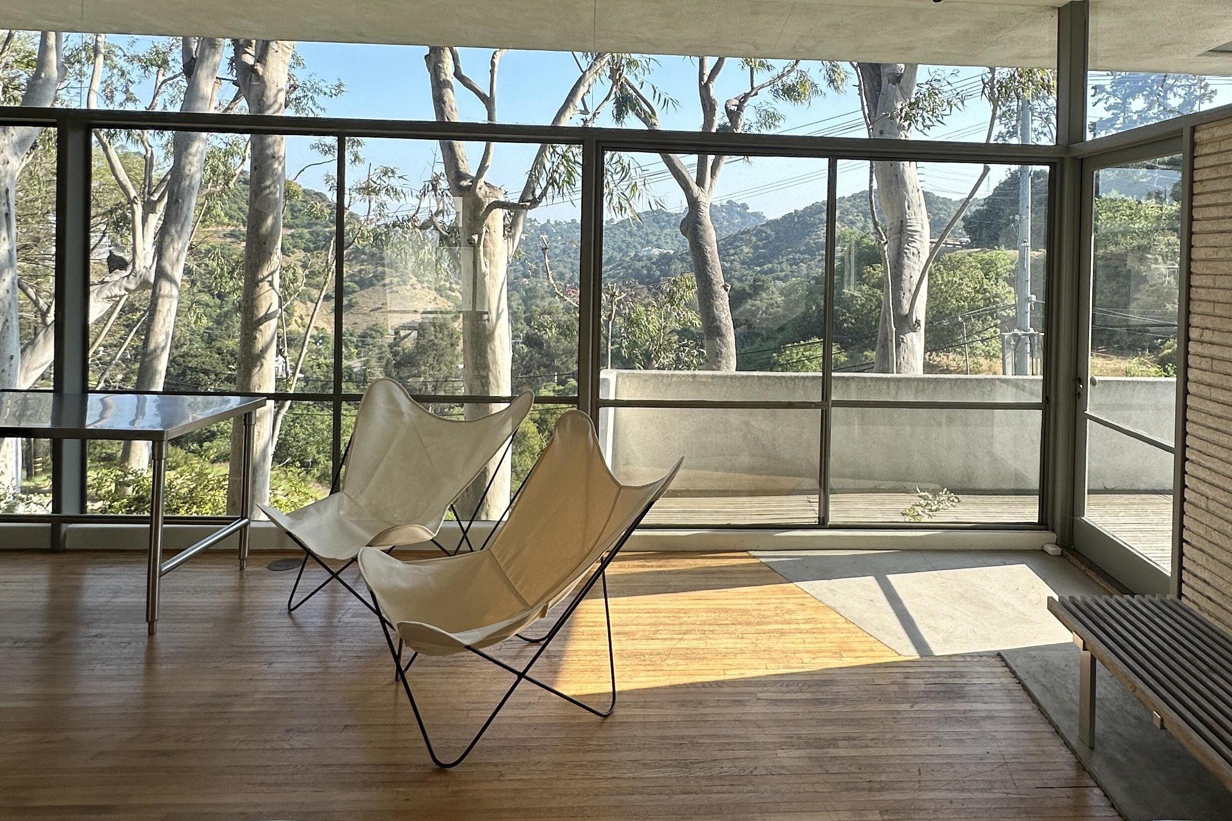
In predictable Wright protégé fashion, the house consistently negotiates the boundaries of inside and outside. Large windows open directly into tall beds of ferns that collapse indoors. Leaf litter and eucalyptus bark blow in from the west along the ocean breeze, as does smog from Mulholland Drive and Laurel Canyon Boulevard just below. The shower opens out to the surrounding hills, where every night in June a pack of baby coyotes can be heard rehearsing their serenades. Often, they sing in the round with passing sirens, a territorial call-and-response. As the weeks go by, a Dark-eyed junco and Western fence lizard have each made home visits through the windows. Though I’m intimately familiar with L.A.’s living landscapes, the act of “guesting” in this specific architecture, where the built and unbuilt environment have been made deliberately permeable, offers emergent perspectives. The
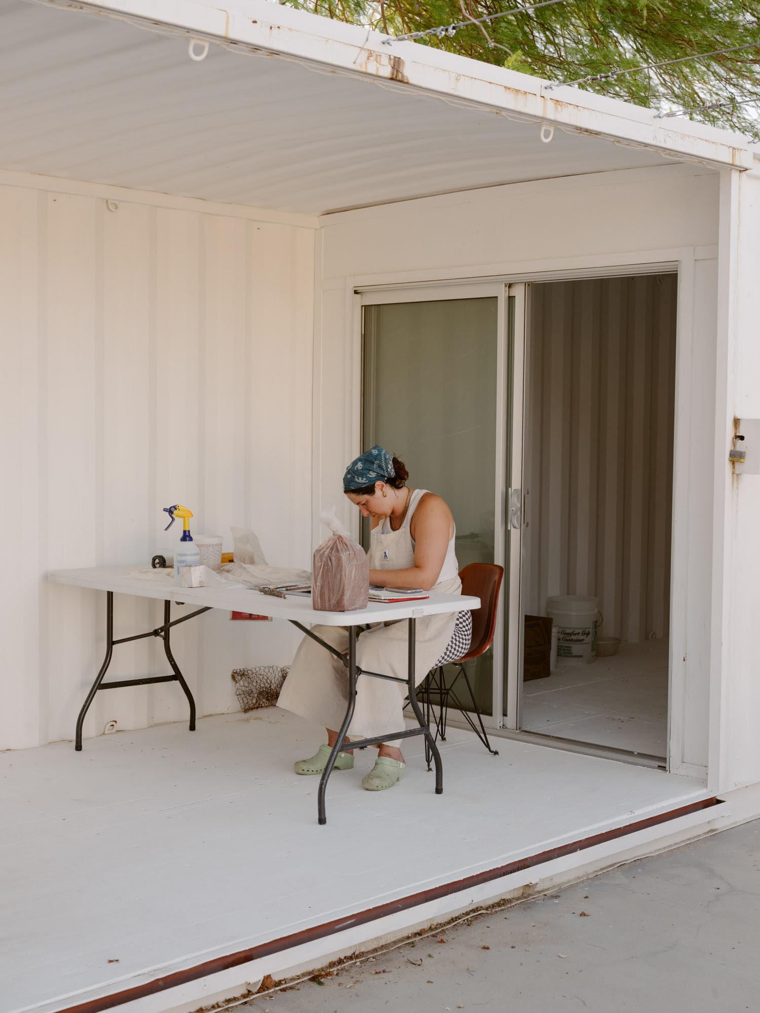
Ava DeCapri during a Work-Trade Residency at A–Z West / High Desert Test Sites.
Image courtesy of High Desert Test Sites.
Photo: Anne Müchler and Nico Schmitz.
frequent multispecies encounters of the porous house bring the concept of residency itself, with all its questions of shared stewardship, into focus. With origins as a speculative home, perhaps the Fitzpatrick-Leland House is now poised to function as a space for imagining what new models of residence could look like.
Art and research residencies in the U.S. today are rooted in longstanding lineages, from the informal artist colonies of New Mexico in the 1880s to Black Mountain College in the 1930s. But as cultural producer Irmeli Kokko reminds us, the structure and priorities of residencies have shifted over time, often in response to fluctuations in creative practices.2 Residencies of the 1970s and ’80s, for example, figured the studio as a private workspace, a protected isolation zone shielding artists and researchers from the outside world. According to curator Miwon Kwon, creative practitioners increasingly centered their work on travel during the broader turn towards globalization of the 1990s, and the number of residencies worldwide subsequently multiplied.3 Those residencies became more outwardfacing, no longer intended to insulate artists but instead to entwine them with peers, communities, and publics. Illustrating this development is the Guide of Host Facilities for Artists on Short-Term Stay in the World, the first international residency catalogue, published in 1995. To be eligible for inclusion, residencies were not only required to provide artists and researchers with workspace but also to embed them in place and to network them with “new contacts.”4 The creative works made in residence during this period became more thoroughly bound together with the locations and communities of their making. As a result, site-specificity was cemented as a residency priority, one which often continues today. In recent years,
that site-specificity has noticeably extended further, beyond the walls of the studio and into the land, with an increasing number of residencies asking visitors to connect with environmental place in their work. Potential residents are commonly asked to identify what draws them to the residency site in particular, or which of the residency’s spaces, tools, or communities would be useful to their practice. Today, land itself may also be offered up as potential “resource.”
This shift, from the residency as isolated and private to site- and land-specific, raises critical and ongoing questions about the colonial logics through which artists may “[parachute] in to suck up place:”5 If a resident has not spent time on this land or with this community before, are they capable of making meaningful interventions there? Is it possible for residents to make adequately responsive work without sustained and embodied relationbuilding? Site-specific residencies risk treating land and its inhabitants as mineable for cultural value. This extractive mode places host and guest in a hierarchical and antagonistic relationship, illustrating how nuanced and complicated the host/ guest coupling can be.
It also makes explicit the need for alternative models. For example, centering relations within a residency’s ecosystemic neighborhoods has become more pressing alongside accelerating environmental change. In Southern California in particular, which sits at the edge of the climate crisis and is built atop layered histories of extraction, residencies have become more environmentally vulnerable. This was brought into sharp relief during the January 2025 wildfires, when multiple residency spaces around the city were threatened or damaged, leaving institutions and residents from near and far to navigate increased volatility. The Villa Aurora residency, which houses artists and journalists from Germany, was damaged by the Palisades Fire,6 a warning regarding the changing tensions of welcoming
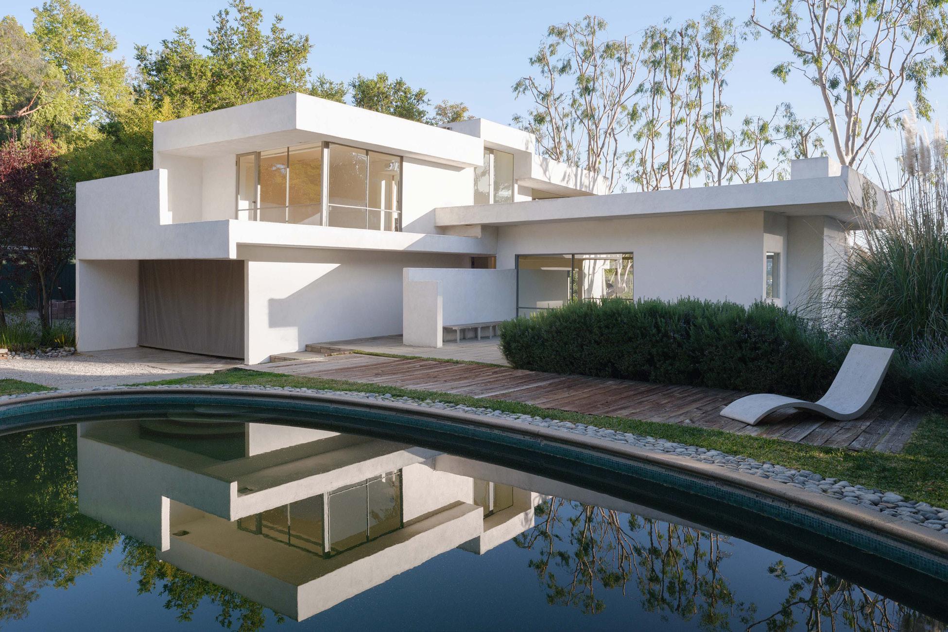
Top: The Fitzpatrick-Leland House (2022). Image courtesy of MAK Center for Art and Architecture. Photo: Tag Christof / MAK Center for Art and Architecture.
Bottom: Interior of the Fitzpatrick-Leland House during a research residency (2024–25).
Photo: Maya Livio.
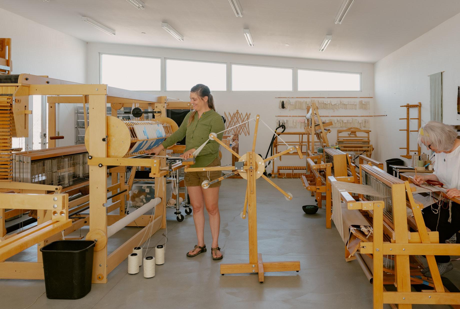
Top: Nora Rolf and Wendy Roberts in the A–Z West weaving studio at High Desert Test Sites.
Image courtesy of High Desert Test Sites.
Photo: Anne Müchler and Nico Schmitz.
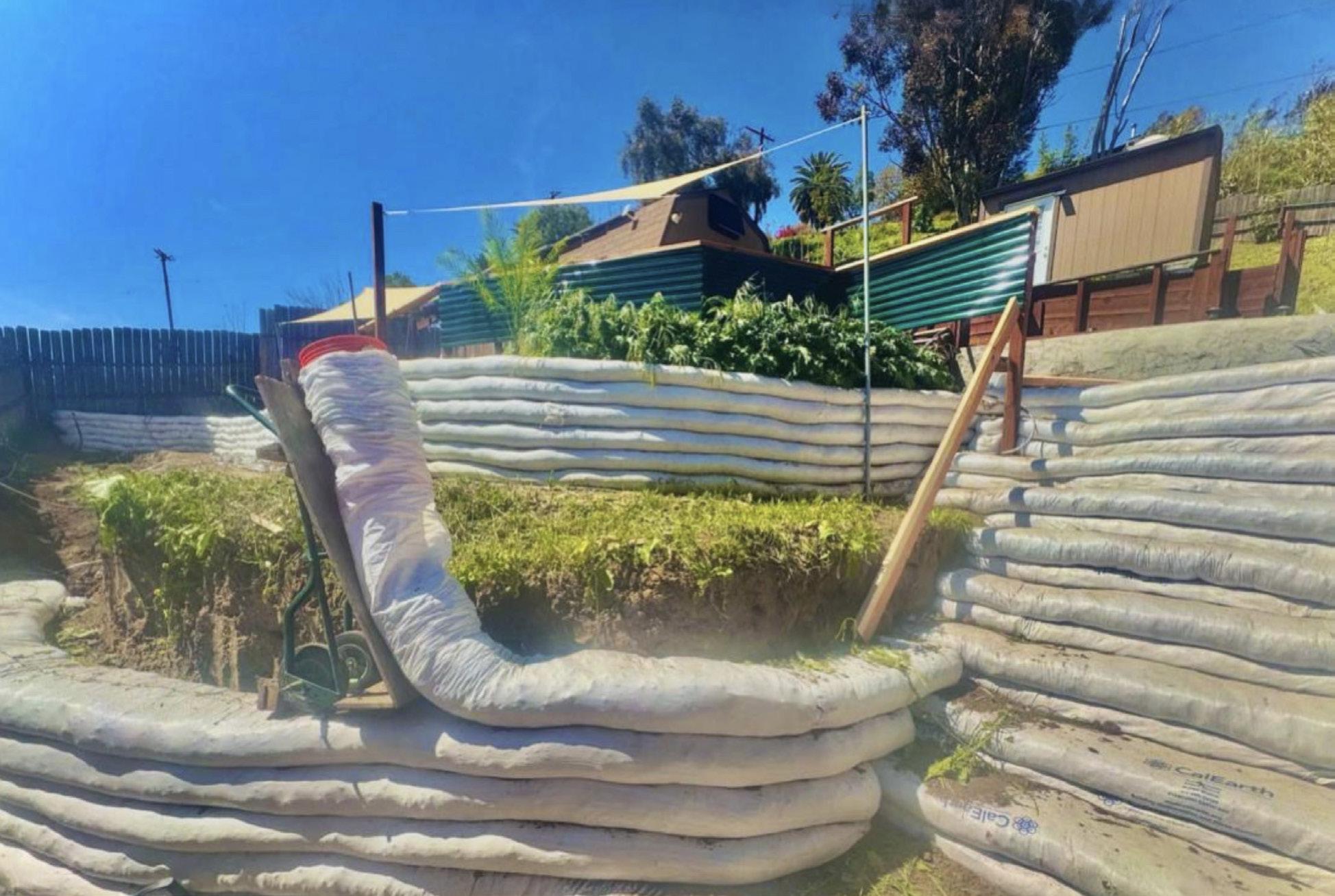
Bottom: Earthbag terrace construction at ExtraTerraceTrill residency in Los Angeles (2025). Photo: Huntrezz Janos.
international guests to the coastal sage and chaparral. The Residency Project, which supports visiting artists with housing in Pasadena, was similarly near enough to the Eaton fire to sustain ash, smoke, and wind damage.7 As environmental catastrophe continues to threaten both residents and treasured cultural institutions, what could new and adaptive residency models look like, ones that co-support human and nonhuman thriving in the face of rapid change?
Residencies are already wellequipped to evolve in response to mutating needs, as they have always been in flux alongside shifting creative practices. Much like host/guest relations, residencies flourish when they allow for continual transformation in response to internal and external environments.
off studio lights by 9 pm to reduce light pollution. The gleaming silver water tank of the main house is located directly outside of the shower window, where it seems to sit as a reminder of scarcity. Sparkling in the desert sun, it focuses host and guest attention on water usage. The majority of residents at A-Z West come in through the work-trade program, which offers lodging and studio access in exchange for the labor of maintaining the site of residence—tending compost, cleaning, feeding rescue tortoises, and crafting A-Z West Works Containers in the ceramics studio.
These trade-based and sustainable practices blur the boundaries of host and guest, making residents an active part of the residency structure and engaging them in what is already ongoing.
By July, the Fitzpatrick-Leland’s pool edges are dotted with dead insects. I now scoop four or five lifeless bodies a day, including a native yellow-faced bumblebee. Many still survive but enough die to make it uncomfortable. One morning, I find a mouse swimming laps. Thirst is presumably what drives these risky behaviors, everyone is a little more parched. The small patch of undeveloped canyon land across the street has dried up too and I occasionally see volunteers managing dry vegetation there for fire mitigation. It is an intervention that hints at opportunities for Southern California residencies to lead a new wave of residency adaptation, particularly given their situatedness at the front lines of environmental vulnerability. Several local residencies are already experimenting with methods and infrastructures that resonate with hospes. For example, A-Z West in Joshua Tree, founded by artist Andrea Zittel and now stewarded by High Desert Test Sites, has embedded environmentality into its processes and systems. The site relies on solar power and residents are asked to turn
In Los Angeles, the emerging residency project Extraterracetrill offers another salient example of how residency protocols can be refigured. Currently in development by artist Huntrezz Janos, the site already welcomes Janos’ own artist community as guests when visiting from elsewhere or seeking a gathering place. Once fully operational, it will also host programming. Extraterracetrill functions off-grid and features regenerative agricultural practices and water reclamation. It is partially built of earthbags, a sustainable building material. Moreover, Janos’ vision includes a novel approach that treats residency spaces as “public-private gradient,” allowing unhoused locals to use portions of the area in addition to visiting artists. In this way, the hierarchy of host and guest is destabilized, signaling the changing dynamics (and expanding the types of support) a residency can offer to local communities, especially those who are most vulnerable. If residencies were once conceived of as protecting artists and researchers from the outside world, then as encouraging engagement with that world as visitors, they now necessitate more reciprocal, responsible, and humble co-participation in place,
with local expertise as guide. While residents from afar are always at risk of perpetuating exploitative logics, their position as guests also offers an oblique perspective for noticing details and kinships anew. Residencies have an opportunity, then, to demonstrate the potential for hospes as a guiding principle, one that can function not as a restrictive framework but as generative provocation towards less extractive modes of relation.
1. The Fitzpatrick-Leland was not Fitzpatrick’s only speculation. He later developed the mythically imaginative Valhalla Memorial Park Cemetery in Burbank. After he and his development partner were caught reselling cemetery plots, some as many as 16 times, he was indicted by a federal grand jury. Like many in L.A., Fitzpatrick was in the business of peddling—though not necessarily delivering on—dreams, fabricating idyllic places in which to reside in life and in death. See Stephen G. Bloom, “Valhalla Cemetery Records History of Famous, Forgotten,” Los Angeles Times, Sept. 2, 1985.
2. Irmeli Kokko, “A Brief History of Artist Residencies,” in Bringing Worlds Together: A Rethinking Residencies Reader, eds. Kari Conte and Susan Hapgood (New York: Rethinking Residencies, 2023).
3. Miwon Kwon, One Place After Another: Site-Specific Art and Locational Identity (Cambridge, MA: The MIT Press, 2004).
As I close out my time at the Fitzpatrick-Leland House, I assemble a list of recommendations for more convivial forms of residence there, which my hosts warmly welcome: A resident communication channel for distributing leftover food and supplies to reduce waste, for instance, and a bee fountain and small ramp to help drowning animals. The coyotes have quieted down and blue dasher dragonflies have started to keep me company in the pool. Sometimes they dive over me to kiss the water.
Maya Livio works at the interfaces of ecosystems and technological systems. An assistant professor of environmental media at American University, she holds a PhD from the University of Colorado and MA from the University of Amsterdam. She is a resident of the California coastal sage & chaparral and Chesapeake rolling coastal plain ecoregions.
4. As cited in Kokko, “A Brief History of Artist Residencies,” 18.
5. Lucy Lipaprd, “Then and Now,” Canadian Art, October 9, 2018, https://canadianart.ca/essays/lucy-lippardthen-and-now/
6. “News,” Villa Aurora and Thomas Mann House, May 26, 2025, https://www.vatmh.org/en/newsreader-en/ on-the-current-situation-of-the-wildfires-in-los-angeles. html
7. Sarah Umles, “After the Eaton Fire,” The Residency Project, https://www.theresidencyproject.org/updates.
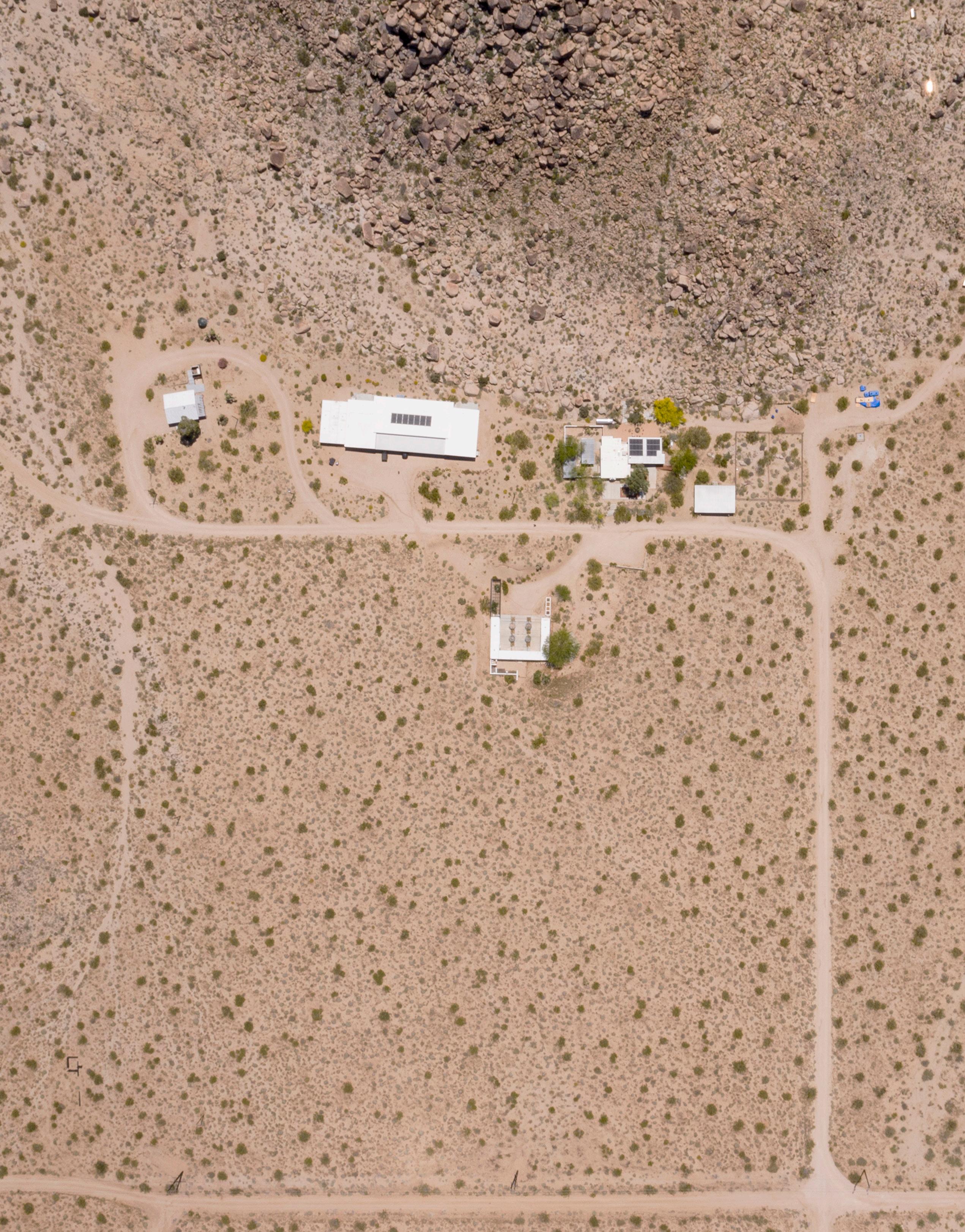
Aerial view of A-Z West, Joshua Tree, California. Image courtesy of High Desert Test Sites.
Photo: Josh Cho.
Interview with Gregg Bordowitz
In Exodus 3:14, G-d reveals his personal name to Moses, a name typically translated as “I will be what I will be” or “I am what I am.”1 In Hebrew, the name is composed of the four letters yod, he, vav, and he, spelling a word observant Jews consider too sacred to pronounce aloud and therefore simply refer to as the “Tetragrammaton.”
The letters of the Tetragrammaton appeared over and over in Gregg Bordowitz’s recent exhibition This is Not a Love Song, in calligraphic scrawls captured in a series of monotypes that encircled The Brick’s main gallery. The prints were shown alongside (and in some cases physically on top of) an epic associative poem in a funerary typeface; wooden structures that recalled tree protectors on the sidewalks of New York; a video of Bordowitz reading a poem by the light of a headlamp; and cartoonish plaster sculptures of clouds drawn from a Baroque monument to the plague. In an adjacent space played a feature-length video compilation of the artist’s deadpan stand-up routines, poetry readings, and a Yom Kippur sermon, interspersed with jarring cell phone footage of a man on his deathbed.
Altogether, the many individual components of the exhibition set a tone that alternated between holy and playful, heavy and buoyant— descriptors that could easily apply to Bordowitz’s relationship to Jewishness, a facet of his identity that has been an explicit part of his work from the beginning. His breakthrough video Fast Trip, Long Drop (1993), for example, is an autobiographical documentary
in which he contends with the complexities of living with HIV, with straight-to-camera narration and found footage set rather pointedly to stirring music by The Klezmatics. The video, much like This is Not a Love Song, transforms contradiction into life-affirming duality, centering identity in order to destabilize the self.
Over three hours of conversation at a café in Crown Heights, Brooklyn, Bordowitz graciously answered my questions, often with a dizzying array of references to pop culture and erudite Jewish scholarship, much of which did not make it into this condensed transcript. More importantly, he shared how experiences marked by pain, loss, joy, and hope have informed his evolving artistic practice, which continues to reach for the universal—and the political—through the personal.
Andrea Gyorody: I felt like the crux of your exhibition at The Brick was articulated in the compilation video, where you say that Jewishness is the key to understanding all the other identities that make up who you are. What is the Venn diagram for you between Jewishness and queerness, and how has that changed over time?
Gregg Bordowitz: The names and categories that we use to identify ourselves are impoverished in relationship to the lived complexity of our lives. I came up at a formative moment as an artist, as a young person within the framework of identity politics, and identity politics came to mean various things. For me it meant allowing identities and names and labels to attach to me and to embrace them in their contradictions and complexity so that the combined weight of all of the identities would actually lead to the collapse of the self. So ultimately, my definition of identity politics is about defeating identity structures.
At the same time—and I don’t think it’s a contradiction, it’s a conundrum that we live—identity politics or identitarian claims are extremely
Andrea Gyorody
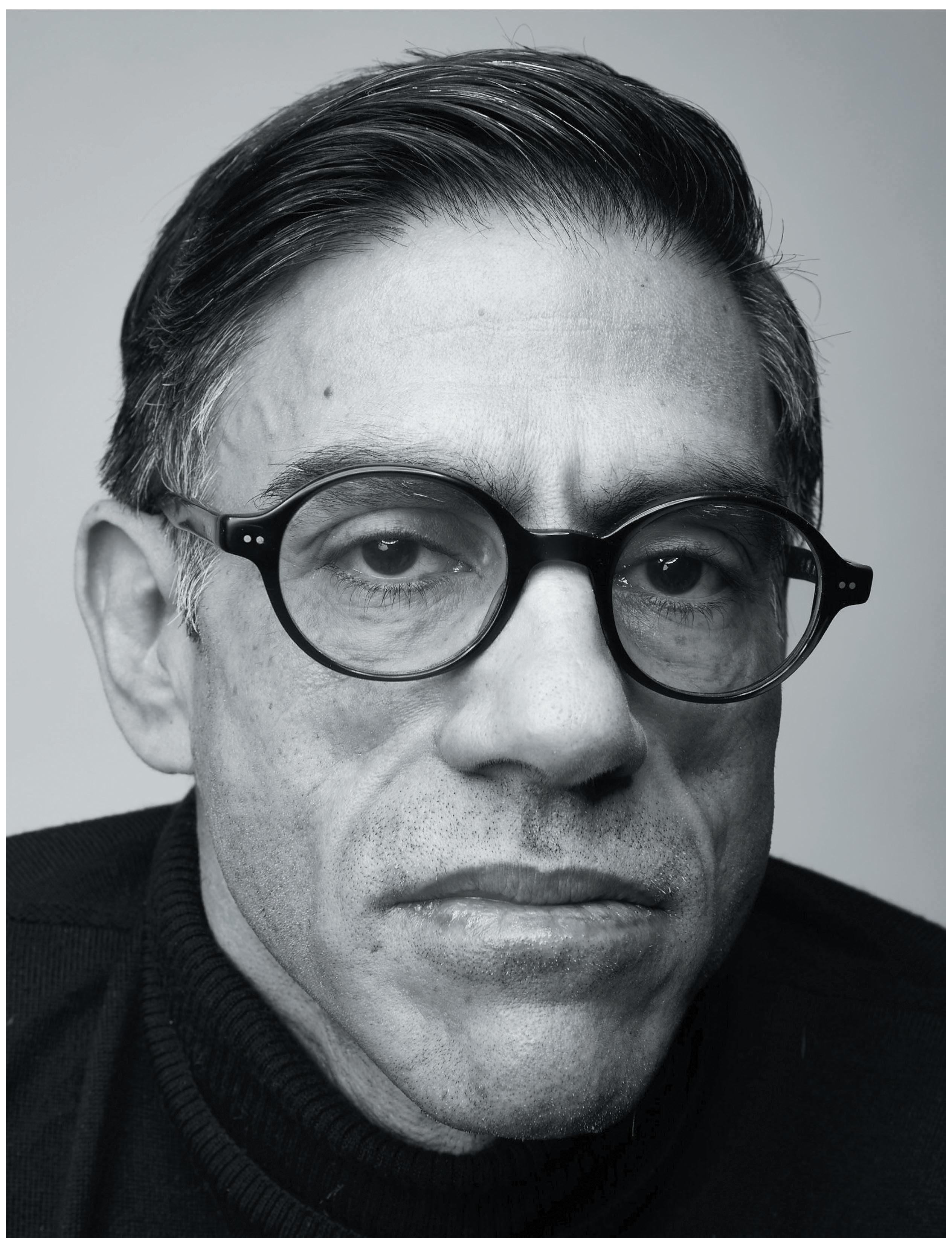
Image courtesy of the artist.
Photo: Justin Bettman.
important politically. In my experience, they can mean survival. It’s the way we form communities. It’s also the way we open ourselves up to the world.
AG: Was that the Jewish community for you, as a kid growing up in Queens?
GB: My family had a very complicated relationship to Jewish life. My parents were Jewish hippies. My grandfather was Orthodox. In my family it was all very culturally Jewish. And the older people, by that I mean my grandparents and their generation, my aunts, my uncles, they were all Yiddish speaking, they were all either from Europe or were the firstborn children to European immigrants. My family was huge when I was a child, and every Sunday we got together, at least 20 people at my Aunt Gertie’s house in Long Island. It’s Yiddish, Jewish food, but a varying level of commitment [to observance] based on various trajectories of complexity, of lived lives. […]
I went to heder [Hebrew school] as a young child. I was often used in the classroom as an example of the assimilated Jew, because I had really long hair, and it was clear that I wasn’t observant, or as observant as many of my fellow students. But I was well embraced and smart and had an amazing attachment to some of my teachers there. I fell in love with Jewish study, with Torah study, Talmud, and it shaped my intellectual aspirations.
AG: A lot of kids are repelled by Hebrew school, but it seems like you were drawn deeply to Torah study.
GB: In some ways it’s like any object attraction. It comes unbidden. My mom taught me how to read before I got into school. […] My mom was a reader. She loved reading. My grandfather was a reader. My grandfather was studious. These are not collegeeducated people, but they are really super smart. And yeah, I just fell for it. I kind of went queer for it in a certain way. […] There was something that
I couldn’t articulate when I was young, but I went to a gender-separated educational environment. […] I was invited to sit in with the older teenagers and men studying. There was something really hot about the smell of male BO and books, and the books had beard hairs in them. It's very homosocial.
The thing that [is] abiding, now that I have words for [it], is that the Torah has relevance to every generation… Not only the interpretation, but interpretation within and among a group. I have a chavruta, a study partner who I love, who’s 80 years old, and we meet every Friday morning to talk about the Torah portion before Torah study, which we attend at the same congregation, [Kolot Chayeinu].
AG: It’s remarkable to me that you’ve remained part of organized religion given the ostracization you must have experienced during the AIDS crisis.
GB: I became very alienated from orthodoxy as a teenager because of queerness, because of politics. I was deeply hurt in the ’80s when I started doing AIDS activism, having realized that I was probably—eventually finding out that I was—infected with HIV. The homophobia I encountered as an activist in the organized Jewish world and all [its] denominations was horrifying to me, very deeply alienating and hurtful… I had some very bad experiences, so I was really hurt, but I never gave up studying.
AG: More recently you’ve been drawing the Tetragrammaton, a much more mystical Jewish practice than textual study. How did that come about?
GB: [The art historian] Douglas [Crimp] got very sick with myeloma, a bloodborne cancer that disintegrates your bones. And Douglas and I were very close and best friends, and he was 20 years my senior. But we had a very deep relationship, and as fellow travelers, we’ve fought out loud together. We both started doing AIDS activism at the same time. In many ways, Douglas

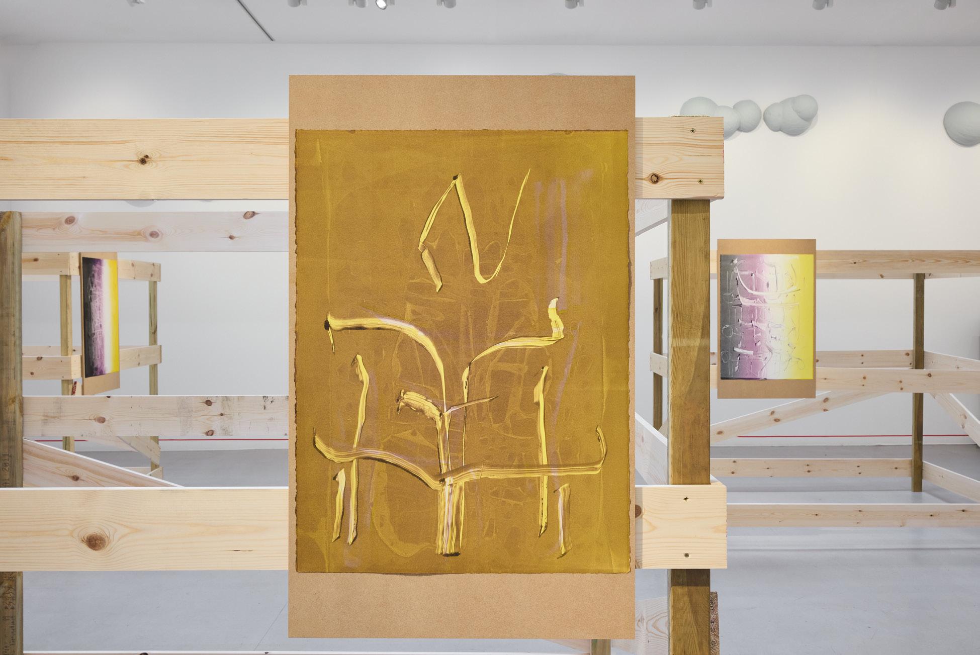
Top: Gregg Bordowitz, This is Not a Love Song (installation view) (2025).
Image courtesy of the artist and The Brick.
Photo: Ruben Diaz.
Bottom: Gregg Bordowitz, There: a Feeling (installation view) (2025). Image courtesy of the artist and Camden Art Centre.
Photo: Luke Walker.
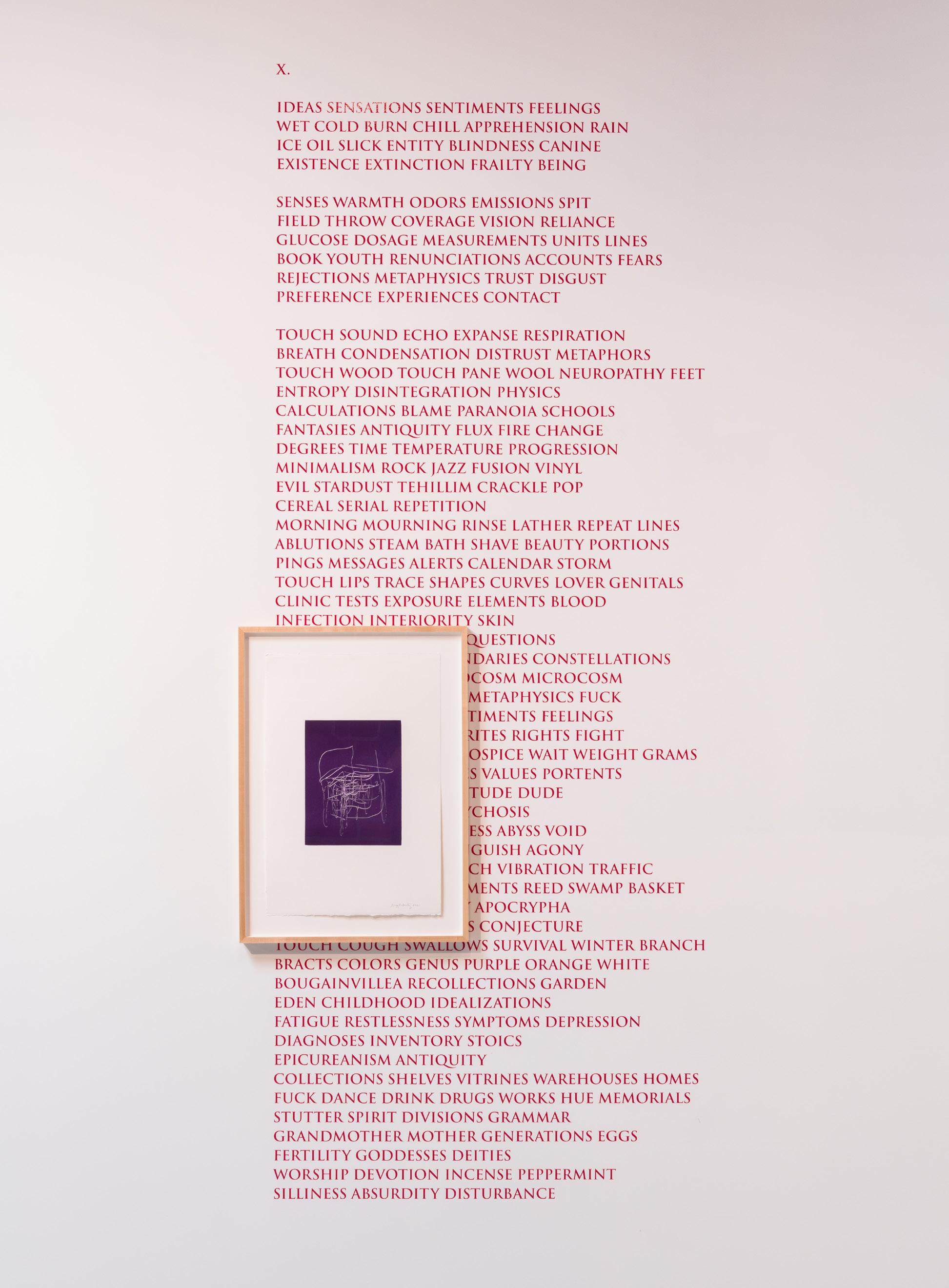
Gregg Bordowitz, This is Not a Love Song (installation view) (2025).
Image courtesy of the artist and The Brick.
Photo: Ruben Diaz.
was a mentor in the queer world for me. He was not religious, but he knew I was, or am. […]
And Douglas, like a lot of people I know who are facing terminal illness and mortality, got curious about spirituality. And that’s a long story, but the salient feature of that is I was talking to Douglas and he asked me to talk about it. He said, “How do you believe in G-d? I love you. You don’t really talk about this side, but I know you believe in G-d, and you're brilliant, and I love you. And I never understood how that's the case.” And so, well, I talked to him about negative theology, and G-d is what you can't define.
AG: So his curiosity reignited your own practice.
GB: Douglas and I were having these conversations… and I thought, “I need something. I don’t even know what day it is.” And then I said, “It’s… Shabbos. I know. I know what Shabbos is.” So I just started going back [to synagogue] then [and] in 2018 started going regularly and joined this Torah study group. It got me through the pandemic and the lockdown. I’m still very involved. And that’s what I tell people that say, “How can you be part of a congregation?” There’s no ACT UP [AIDS Coalition to Unleash Power] in my life anymore.2 I went to ACT UP meetings every night for seven years of my life. There's a committee in my congregation for acts of love and kindness… So this thing is about Jewish study, but there’s also just congregational life. I’ve always been making congregations.
AG: How did that lead you to the Tetragrammaton?
GB: [Douglas] asks me finally in our deep friendship to open up about this aspect of my life, which I was sharing with other people. So he’s reading the Bible, we’re talking about G-d. I talk to him about G-d, faith, all of these things. I find my way back to observance, weekly observance, and become deeply involved
with Kolot again… It becomes part of the poetry I write. I write daily… I didn’t get that discipline until my 40s. And now, I just wake up into writing. I fill books. It’s not precious. […] I start[ed] making drawings daily, based on a meditational practice that I have used that I get from [Rabbi] Aryeh Kaplan and others— [Rabbi] Zalman Schachter-Shalomi is an important figure.3 The way you imagine the Tetragrammaton in your head, and you move the letters in and out, and combine them. You take the four letters of the Tetragrammaton, imagine them as the Hebrew letters, and that is a meditational practice. […] [I thought,] what if I do this on paper? And then I had to figure out [how], because actually I’m one of those people who puts a dash between G and D… How do you do these drawings and make them kosher? They’re based on this exercise, but actually I purposely don’t complete them.
AG: What do the drawings accomplish for you that exceeds what’s possible through the meditational practice?
GB: What I’m interested in doing is defeating the distinctions between writing and drawing. I was retroactively thinking, “Oh, okay. So I’ve chosen a calligraphic practice that gets me back to a drawing practice, which is interesting.” I’m writing as drawing. Drawing as writing.
AG: How did the drawings then morph into the prints we saw in This Is Not a Love Song?
GB: I didn’t feel confident in picking up the paintbrush right away, but I was looking for a kind of wet ink-driven, paint-driven practice. […] I got a commission from [curator Liz Park at] the University at Buffalo Gallery, which I [produced with printmaker] Marina [Ancona] for two weeks [at 10 Grand Press]. And I loved it. I just loved it. […]
Every print we were making, we couldn’t predict what the press was
going to do. Especially because we were working with ghost prints and all these techniques. So that I loved too. I like giving myself over to that.
AG: The prints were of course just one part of the exhibition, which was wide-ranging in medium and tone. How would you describe your overall ambition?
GB: I’m trying to create a holding environment or a place of first permission, to emphasize the grounds upon which credibility is staged and, at the same time, produce a central engagement with ideas…There’s no such thing as a pure idea, which is why I kind of abandoned conceptualism. I don’t ideate and execute. I find these things through making, and what is an idea? It’s blood sugar and hormones and electrochemical reactions. That’s also the substance of an idea and so I’d be really interested in defeating distinctions, the distinction between the idea and beauty, the distinction between thought and feeling, this distinction between writing and drawing… There's no contradiction between the various aspects of my life. I live between Jewish experience and secular life.
Andrea Gyorody is director of the Frederick R. Weisman Museum of Art at Pepperdine University, shaping a curatorial program that fosters transformative dialogue through close engagement with contemporary art. Recent projects include solo exhibitions of Jeni Spota C., Karl Haendel, Cameron Harvey, Hildur Ásgeirsdóttir Jónsson, and Isabel Yellin; and the co-curated exhibitions Joseph Beuys: In Defense of Nature (The Broad, 2024); Forms Larger and Bolder: Eva Hesse Drawings (2019–22); and Afterlives of the Black Atlantic (Allen Memorial Art Museum, 2019–20), which received an Association of Art Museum Curators Award for Curatorial Excellence. Gyorody holds a doctorate in art history from the University of California, Los Angeles, and has been a long-time contributor to Artforum
Gregg Bordowitz’s art includes video, installation, performance, poetry, and prints—different modalities—all organised around the artist's central commitment to writing as an activity of thought manifesting in many forms. Words are gestures are images are letters in this artist's ongoing transdisciplinary project.
1. Many Jews render “G-d” with a hyphen in place of the vowel as a sign of respect for the sacred. The practice stems from the prohibition against erasing or discarding the name of G-d; by leaving the name incomplete, the writer prevents any accidental desecration.
2. Founded in New York in 1987, AIDS Coalition to Unleash Power, or ACT UP, was an international political action group that agitated to end the AIDS pandemic and hold authorities responsible for neglect and misinformation. Their work was wide-ranging, encompassing direct action, research, and advocacy, including now-iconic posters and slogans such as “Silence = Death.”
3. Aryeh Kaplan (1934–83) was an American Orthodox rabbi and writer who earned a reputation for his Kabbalistic commentaries, among which was a volume on Jewish meditation that describes a practice using the Tetragrammaton. Rabbi Zalman Schachter-Shalomi (1924–2014) also expanded the influence of mysticism among American Jews, particularly through his role in the countercultural Havurah movement of the late 1960s, which emphasized more intimate, anti-establishment forms of worship and community.
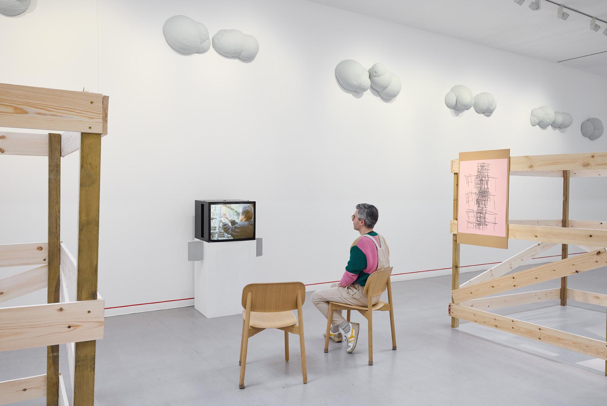
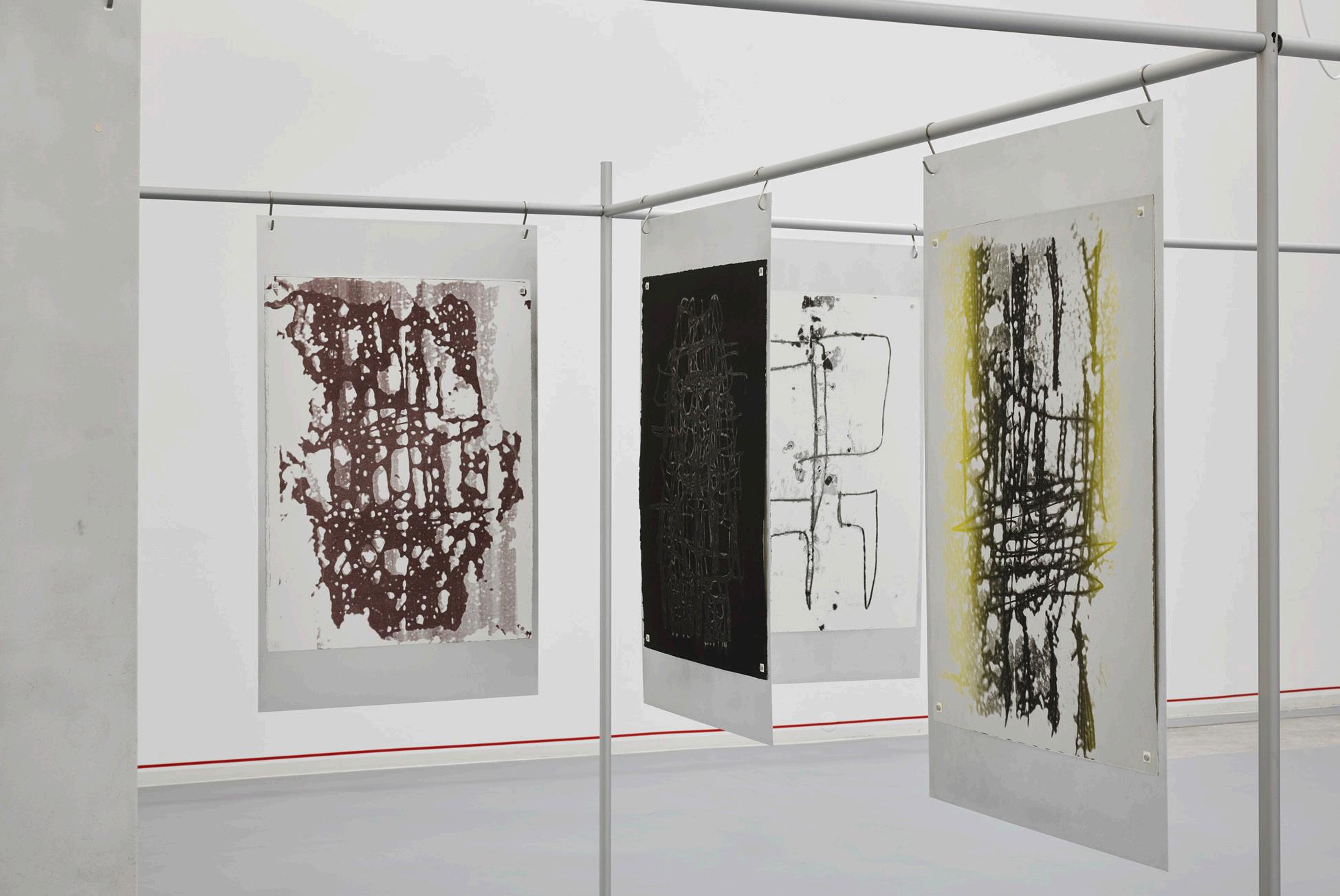
Bottom: Gregg Bordowitz, Tetragrammaton (2021) (installation view). Image courtesy of the artist and Bonner Kunstverein.
Photo: Mareike Tocha.
Top: Gregg Bordowitz, There: a Feeling (installation view) (2025). Image courtesy of the artist and Camden Art Centre. Photo: Luke Walker.
CARLYE PACKER BETS BIG THE DEALERS
With ten years of art brokering and under her belt, the small but mighty Carlye Packer is blazing new trails in the fine art world.
At Frieze L.A. earlier this year, she proved to be a dominant force, selling out her booth within hours of the fair’s opening. Rarely idle and often wired, the nimble Packer consistently collaborates with other galleries, and embraces new artists as clients while retaining a roster of people she’s worked with previously in equal measure. Having orchestrated over 75 exhibitions since 2016, Packer possesses the intangibles of a great tactician, moving headquarters thoughtfully and swiftly around town when a lease expires. When it comes to representation, gut-reliant Packer enjoys showing younger, burgeoning artists, and jockeying their growth through greater exposure and strategic consultation.
Packer, who often spends her off-days around the racetrack at Santa Anita Park in Arcadia, clearly has a penchant for taking risks…and a love of four-legged animals. As an L.A. native, she grew up spectating horse races at Hollywood Park with her grandfather; now, with a pen and statistics book in hand, Packer likes to observe the horses in the paddocks before each race. She admits to occasionally betting on the “beautiful grey horse,” or the one “favored by children.”
A masterful negotiator with an innate talent for spotting beauty in overlooked spaces, Packer has established herself as a front runner in the field. She is a taste-maker, a risk-taker, and this city’s top art jockey. Sounds like a good bet.
The Dealers is a year-long photo series featuring up-and-coming art dealers in L.A.
Photos and text by
Claire Preston
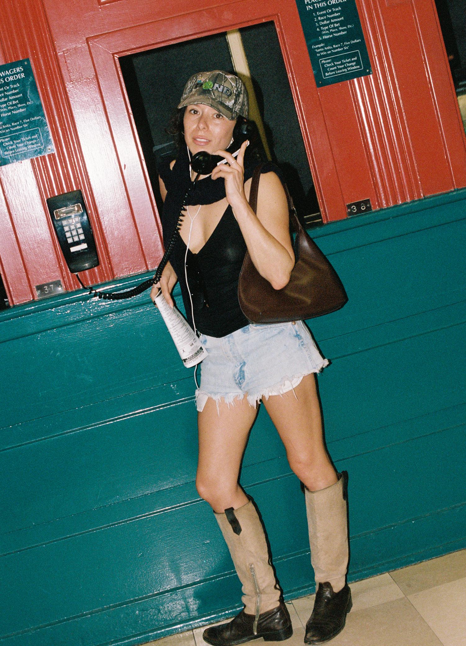
Born: April 20th, 1991, Los Angeles, CA
Current Residence: Silver Lake, Los Angeles, CA
Height: 5'1 ¾"
How do you think the gallery model will evolve? NATURALLY
What are you proud of?
PAYING MY BILLS / PAYING ARTIST’S BILLS / BUILDING CAREERS / WATCHING PEOPLE I LOVE SUCCEED / CONTRIBUTING TO THAT SUCCESS
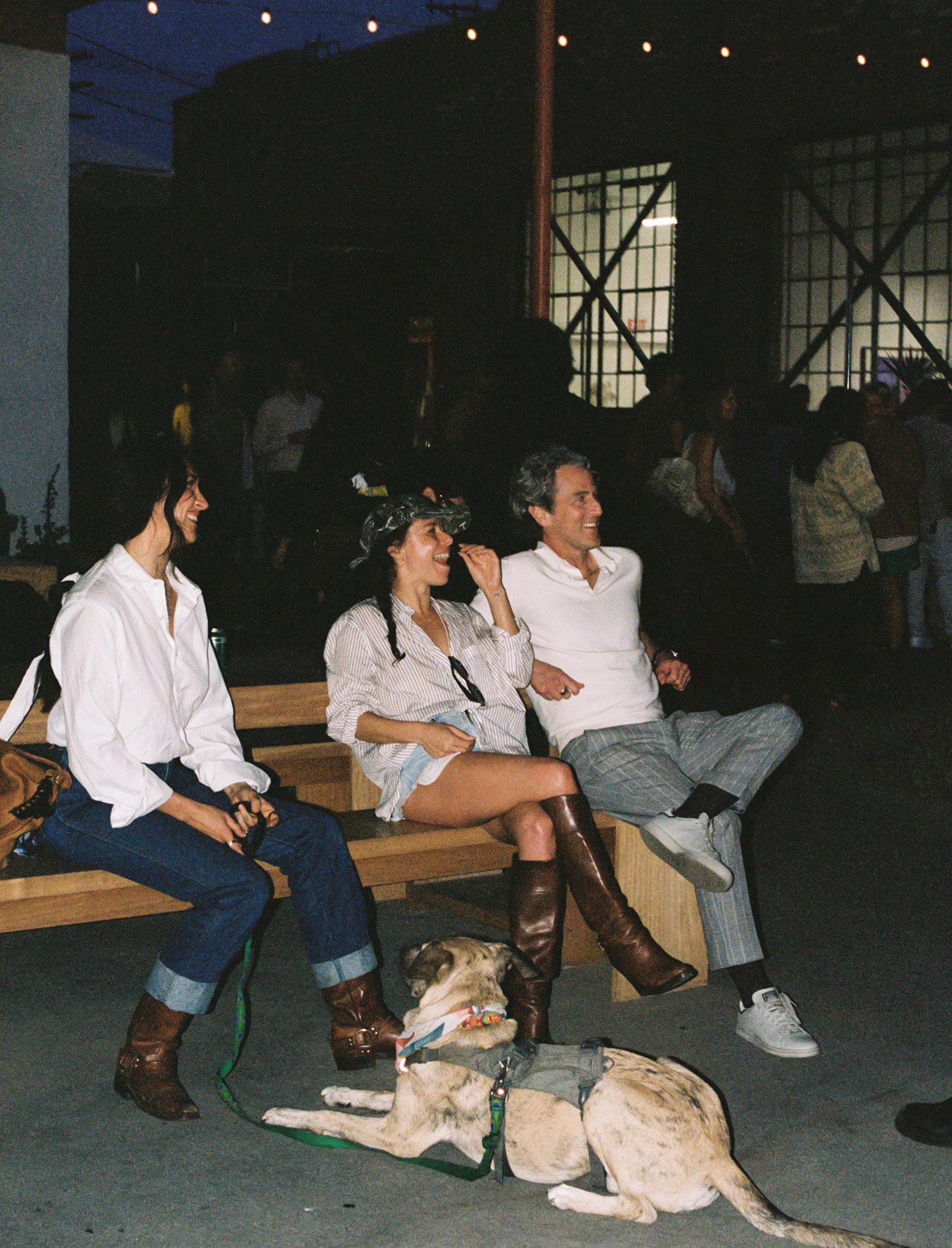
What makes a piece of art “important?” RESONATES FOR A LONG TIME
What is your relationship to risk? HIGH RISK HIGH REWARD
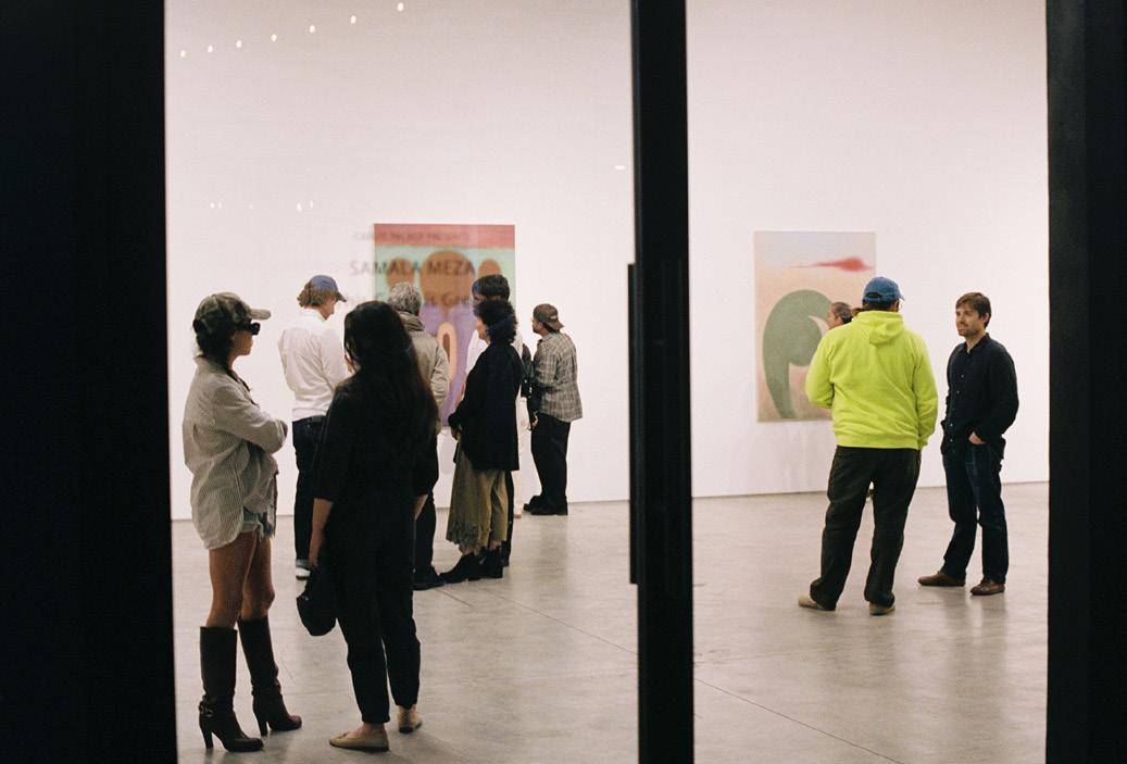
What changes would you like to see in the art industry?
LESS SCARCITY MINDSET / PEOPLE OPERATING OUT OF FEAR
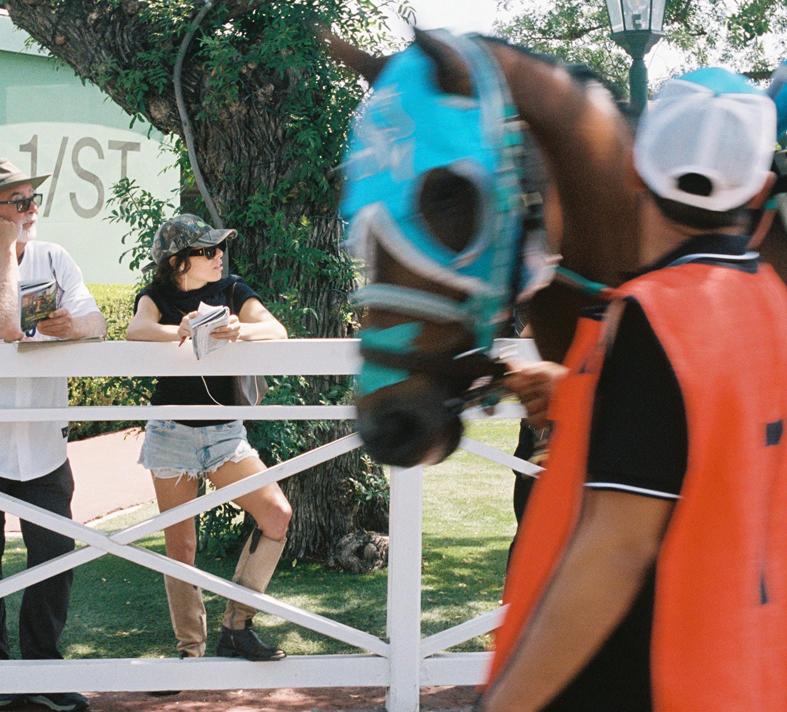
Best advice you have received? LET IT RUIN BREAKFAST BUT NOT LUNCH
What about you as an individual has contributed to your success? I’M LONG GAME

Worst advice you have received?
OPEN A GALLERY
What is your least favorite trend in contemporary art? WORKS THAT LOOK COMPLETELY DIFFERENT IN PERSON VS. ON THE PHONE
What do you value most in working with an artist? INTELLIGENCE / SELF-AWARENESS / A NECESSITY TO CREATE
How do you define good taste? NO SUCH THING AS GOOD TASTE THERE IS ONLY BAD TASTE AND THEN THERE IS EVERYTHING ELSE
Favorite institution? ULINE
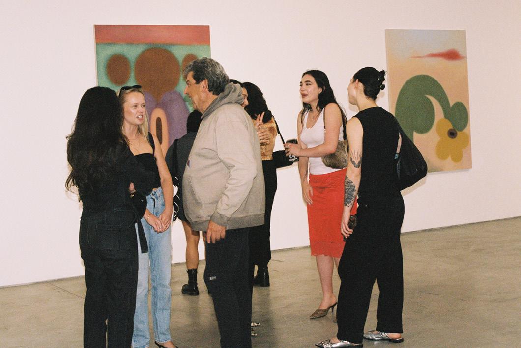
How do you measure long-term success for an artist you represent? SUCCESS MEANS SOMETHING DIFFERENT FOR EVERYONE
In your opinion, what responsibilities do galleries have beyond sales? CARE
Any studio visit red flags? ENTITLEMENT
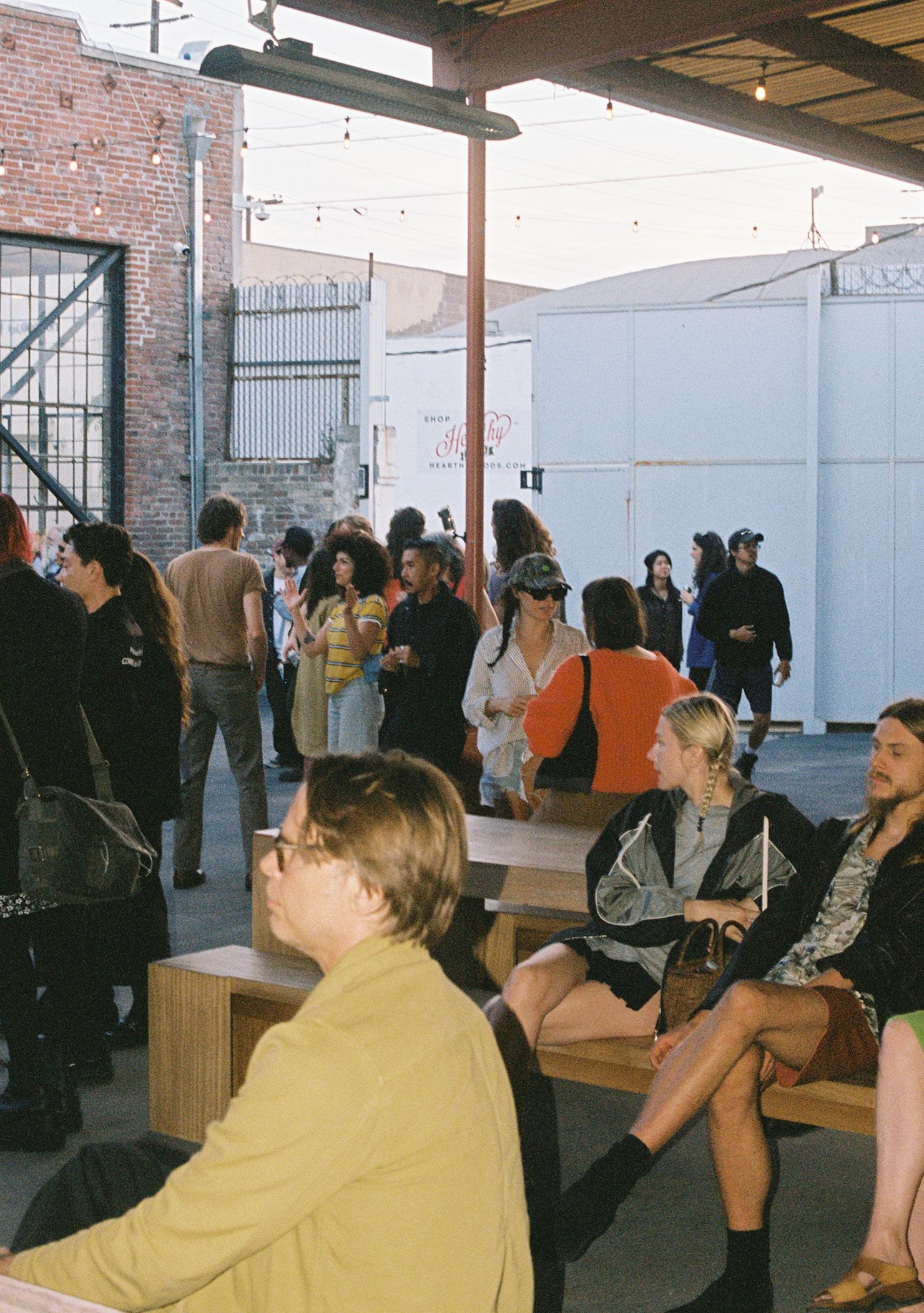
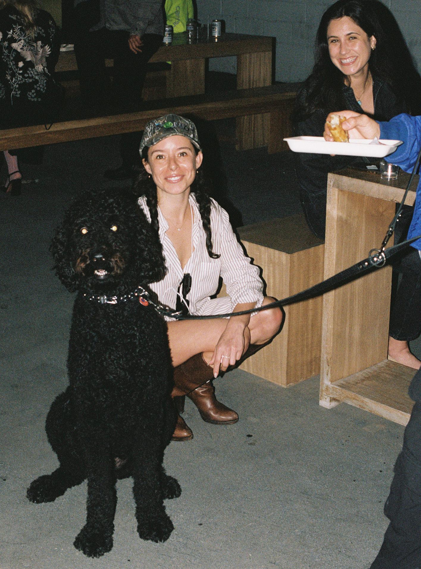
Is there a book, film, or person that has shaped how you work?
ROBIN HOOD
What do you think separates a good artist from a great one?
TIME
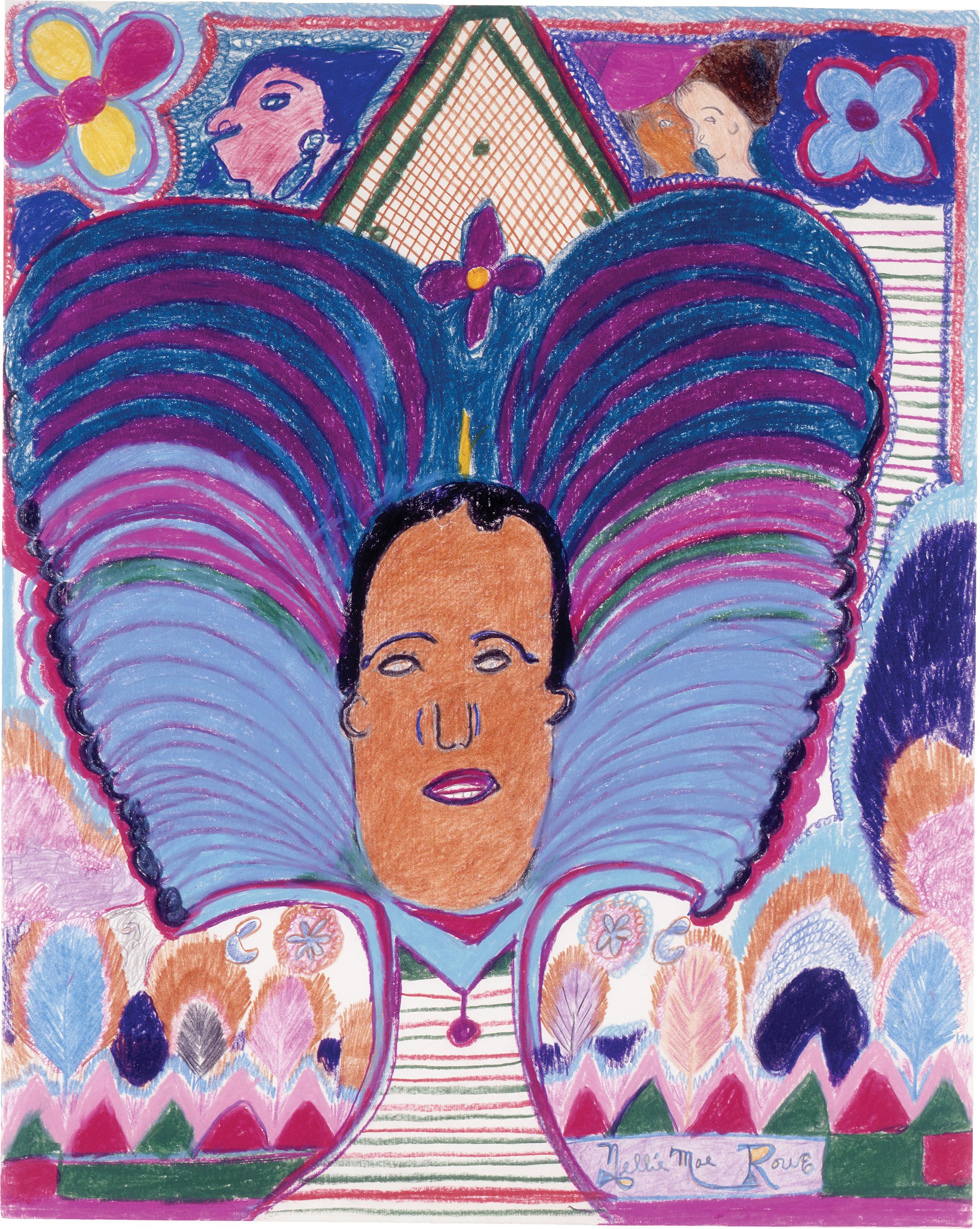
Nellie Mae Rowe, Untitled (Man with Headdress) (1978–82). Crayon, colored pencil, pen, and pencil on paper, 24 × 19 inches. Image courtesy of the artist and CAAM. Collection of the High Museum of Art, Atlanta, gift by Judith Alexander.
Nellie Mae Rowe at the California African American Museum
February 17–August 17, 2025
In a moment saturated with curatorial branding and institutional revisionism, Really Free: The Radical Art of Nellie Mae Rowe at the California African American Museum (CAAM) offers something unusually generous and unguarded. Organized by the High Museum of Art in Atlanta and presented in collaboration with CAAM, this expansive retrospective lends renewed significance to Rowe’s exuberant practice, which has long been positioned in the realm of outsider art. Her first major exhibition in over 20 years, Really Free invites reconsideration of the weight of that label, and how self-taught artists like Rowe have shaped, yet often remained outside of, institutional narratives of art history. The exhibition unfolds across two adjoining rooms, where densely populated colored pencil drawings, assemblage sculptures, and handmade dolls fill the space with color and tactility. Rowe’s hand is everywhere, guiding the viewer through worlds rich with symbolism, spiritual attunement, and ecstatic joy. Born in 1900 in Jim Crow-era Georgia, Nellie Mae Rowe (1900–1982) was a self-taught artist who created throughout her life but became especially prolific in her final 15 years. The show captures the full force of this late-period creativity—an outpouring
shaped by both her unique vision and difficult lived experience. Rowe’s work from this time is not simply the output of a singular imagination; it reflects her ongoing, intuitive dialogue with the world around her. Recurring motifs throughout Rowe’s body of work include pigs, religious totems, and the artist's own silhouette and hands. She often drew intuitively in a process that, in another context, might be called Surrealist automatism. Yet, to place Rowe in conversation with Surrealism is not to elevate her work through an external framework; rather, it reveals how Euro-American art history often borrows, without acknowledgment, from spiritual, improvisational, and ancestral practices long embedded outside Western art traditions. Her drawing What it is (1978–82) exemplifies this: A seated woman outlined in red (likely a self-portrait) extends a hand toward a hovering bird, as if it were pulling thoughts from her mind; meanwhile a pig lurks behind her purple chair and a disembodied blue leg floats nearby. The space is flattened and strange, bordered by a red-and-blue checkerboard floor and inscribed at the top with the phrase “What it is.” The phrase functions not just as a title, but as an artistic stance—a demand that the work simply speak for itself.
Central to Rowe’s vision was her home, which she transformed into an immersive art environment she called the “Playhouse.” In the back gallery, a monitor plays excerpts from This World Is Not My Own, a 2023 documentary featuring a miniature recreation of the house. The hand-built model
captures both the physicality of the Playhouse and its uncanny atmosphere, an extension of Rowe’s belief that making art was a form of communion. In clips from the film, Rowe’s voice (performed by actress Uzo Aduba) floats over stop-motion animation as she describes the visions that came to her in dreams, the spirit she felt in her materials, and the presence of God in her daily life. Rowe speaks of colors as messages and hands as instruments of something larger. Though the original house has been demolished, its onscreen presence underscores how inseparable Rowe’s drawings were from the world she built around them — how for Rowe, her spiritual practice, domestic space, and artmaking were deeply intertwined.
This rootedness in place— and the exhibition’s arrival at CAAM—prompted me to consider Rowe’s work alongside other California-based vernacular artists, such as Grandma Prisbrey of Bottle Village in Simi Valley and Elmer Long of the Bottle Tree Ranch in Oro Grande. These artists don’t offer outsider perspectives so much as alternate epistemologies: systems of meaning-making grounded in spiritual attunement, resourcefulness, and the divine. Positioning Rowe in conversation with other self-taught artists similarly rooted in place, I see how art environments can serve as both valid forms of expression and potent alternatives to the formalized world of galleries and museums.
As with many exhibitions of self-taught artists, there’s a curatorial tension in how biography frames the work. The show risks suggesting that Rowe’s art matters primarily
Hannah Tishkoff
because of her life’s hardships or her distance from institutional norms, but the strength of her work actively resists such reduction. One standout, If You Want to Be Seen Stand Up (1981), is a hallucinatory drawing lush with symbolic logic, where electric blues, acid yellows, and baby pinks collide in swirled, pulsing patterns. The surface teems with dogs sprouting human limbs, pig-headed figures with breasts, and bird-human hybrids, rendered with cartoonish precision. These beings float in psychic space, surrounded by the scrawl of an irreverent motto: “If you want to be seen, stand up. If you want to be heard, speak up. If you want to be appreciated, shut up.” Her compositions hum with visual noise as dots, hatch marks, and scumbled textures pull the eye in multiple directions. Steeped in personal mythology, Rowe’s work can be understood not as the product of marginality but as a liberating disruption of commercial art logic.
In Rowe’s world, art was not a commodity but a sacred act connecting her to community, the spirit, and herself. Yet she was also pragmatic, grateful to sell her work and receive recognition later in life. Rowe was neither a naïve artist nor merely a folk visionary; she was deliberate and self-aware, engaged in worldbuilding that both mirrored and defied her circumstances. Her drawings, sculptures, and the Playhouse itself challenge art historical assumptions and ask us to reconsider what it means to be truly free—free from categorization, from hierarchy, and the limiting expectations
placed upon artists based on race, class, or formal training. Really Free: The Radical Art of Nellie Mae Rowe doesn’t just showcase her genius—it honors the genius of all artists who have had to carve their own paths, uninvited, into the history of art.
Earthshaker at Del Vaz Projects
February 18–April 26, 2025
In entering the galleries of Del Vaz Projects’ recent exhibition Earthshaker, one ceded a certain degree of control. Across two rooms, the three-person exhibition paired photographs and films with collages and paintings, an assemblage of works dramatically cloaked in darkness for the duration of an illuminated video installation by P. Staff. But even when the lights went up, the works on display were reluctant to disclose their subjects—each one contained a sense of lack. What was withheld carried as much weight as what appeared in Earthshaker, which paired pieces from Ana Mendieta’s archive with works by Derek Jarman and Staff to explore the ways the trio of artists disseminated their embodied experiences across time and space. Despite their overt omissions, the works on display functioned as oblique self-portraits, and the installation invited intimate reflection on the artists’ practices and personhood.
In the second room of the gallery, Mendieta's Untitled (Silueta Series) (1978) animated the artist’s process on film.
Offered as a postscript to the photographs of her static Siluetas, the film reframes her oeuvre as a series of performances. Mendieta's most iconic photographs seem to belie their fragile subject matter, freezing her silhouette in a singular moment. Seeing her performance in motion, one is reminded that process undergirded Mendieta’s practice: the ritual recreation of the body’s outline across landscapes which inevitably erase it, leaving only a trace rendered on film.
The single, 3:14 minute reel, played on repeat, captures Mendieta’s silhouette traced in gunpowder and ignited, the chemical burn illuminating her shape before obscuring it in smoke. To watch her film on an endless loop is to encounter her process as Mendieta herself might have, drawing closer to the artist’s own vantage point as we witness the creation and erosion of a sculpture made permeable to the elements. If Mendieta’s practice took motion in Earthshaker, the pieces on display by Jarman might have seemed to distill his films into a fixed medium. In the final years of his life, Jarman created his Black Paintings (1986–93), small canvases of collected ephemera coated in layers of lead and tar. Following his diagnosis with HIV in 1986, Jarman moved to a cottage on the coast of Kent, situated in the shadow of a nuclear reactor, where he foraged for seeds, stones, and reclaimed industrial materials.1 The nuclear garden, like the body of the AIDS patient, is inscribed with decay but persists in producing new forms of life.
As Jarman’s illness progressed
Teresa Fleming
and his eyesight began to fade, the compressed color palette of his final films and paintings conveyed the limitations of his own physical form to his viewers, inviting different modes of seeing through their omissions.2
In Black Wedding (1987), a bullet casing and a wedding ring are embedded in a paper fan, their familiar forms legible in silhouette through the cracked black impasto surface. To encounter Jarman’s collected objects recast in shades of black is to imagine an environment known purely through touch; it is an invitation to inhabit, however temporarily, the tactile world of a sightless body. As his vision diminished and the flat images of the film camera which shaped his previous work grew increasingly inaccessible for Jarman, his collages constituted an alternate mode of worldmaking. Like Mendieta’s works, Jarman’s collages seem to speak most clearly through their constrictions, an echo of the artist’s embodied experience resounding decades after his death.
In Staff’s video installation In Ekstase (2023), mechanism and message are bound together: Five repurposed holographic fans drew a current of air through the gallery, their blades blurring into an opaque shape, overlaid with a flickering sequence of neon spheres and poetic fragments. Staff’s work is often read as an attempt to replicate the dysphoria of the marginal subject, but here it also spoke to the fragmentation of identity itself.3 The disparate elements of language and the blades of the fan only cohere into
a single entity, capable of displaying a legible message, for a few glowing moments. When the work flashes “are you feeling it,” it invokes its own speaker’s disembodied subjectivity as well as the viewer’s ambiguous affect.
If Staff was transmitting an identity here, it is a fractured one, dispersed across the gallery in reflections on the glossy surfaces of Jarman and Mendieta’s works. While their projects grant access to the artist’s embodied experiences, Staff’s work affords a certain intimacy with the self which remains unstable, inviting us to glimpse the immense effort undergirding the public performance of identity. The work’s refusal to resolve into a coherent subject is itself a form of disclosure. Across the assembled works in Earthshaker, we encountered a bodily vulnerability manifested mostly in overt omissions, where an excised sense allowed us to approximate an artist’s fading sight and an ad-hoc documentary reminded us of performance’s precarity. We came closest to the artists when we brushed up against their limitations, witnessing a subjectivity that only lasted as long as a flash of light against the wall.
1. Chris Steyaert, “Queering Space: Heterotopic Life in Derek Jarman’s Garden,” Gender, Work & Organization 17 (August 2008): 1–4.
2. Sam Moore, “Basking in Derek Jarman’s Private Garden,” Hyperallergic, August 13, 2020.
3. See Natalie Haddad “Reckoning With the ‘Science’ of Sexuality,” Hyperallergic, February 27, 2025, and Iarlaith Ni Fheorais, “Bathed in Light,” Frieze 248, January 28, 2025.
Counter/ Surveillance at Wende Museum
October 13, 2024–October 19, 2025
At the Wende Museum’s Counter/Surveillance: Control, Privacy, Agency, dozens of objects, artifacts, and archival materials from the German Democratic Republic, the Soviet Union, and the United States, among other countries from both sides of the Iron Curtain, chart the methods through which these states have observed and recorded their own citizens and each other. Given their reliance on image and audio capture, it’s not surprising that many of the objects suggest resonances between surveillance activity and art-making. A collection of hand-drawn facial recognition images (1975–89) used to train East German border guards at Checkpoint Charlie could be mistaken for pages from an artist’s sketchbook, while a covert listening device known as “The Thing” (c. 1952) used to bug the U.S. ambassador’s Moscow residence is revealed to have been invented by Leon Theremin, the Soviet electronic music pioneer and inventor of the eponymous instrument (an example of which can also be seen and heard at the Wende). Spying, it seems, is an art.
On the museum’s main wall, six sets of illustrated eyes peer down on the art and artifacts displayed in several sections of display cases and partition walls. Pieces by around a dozen
Alexander Schneider
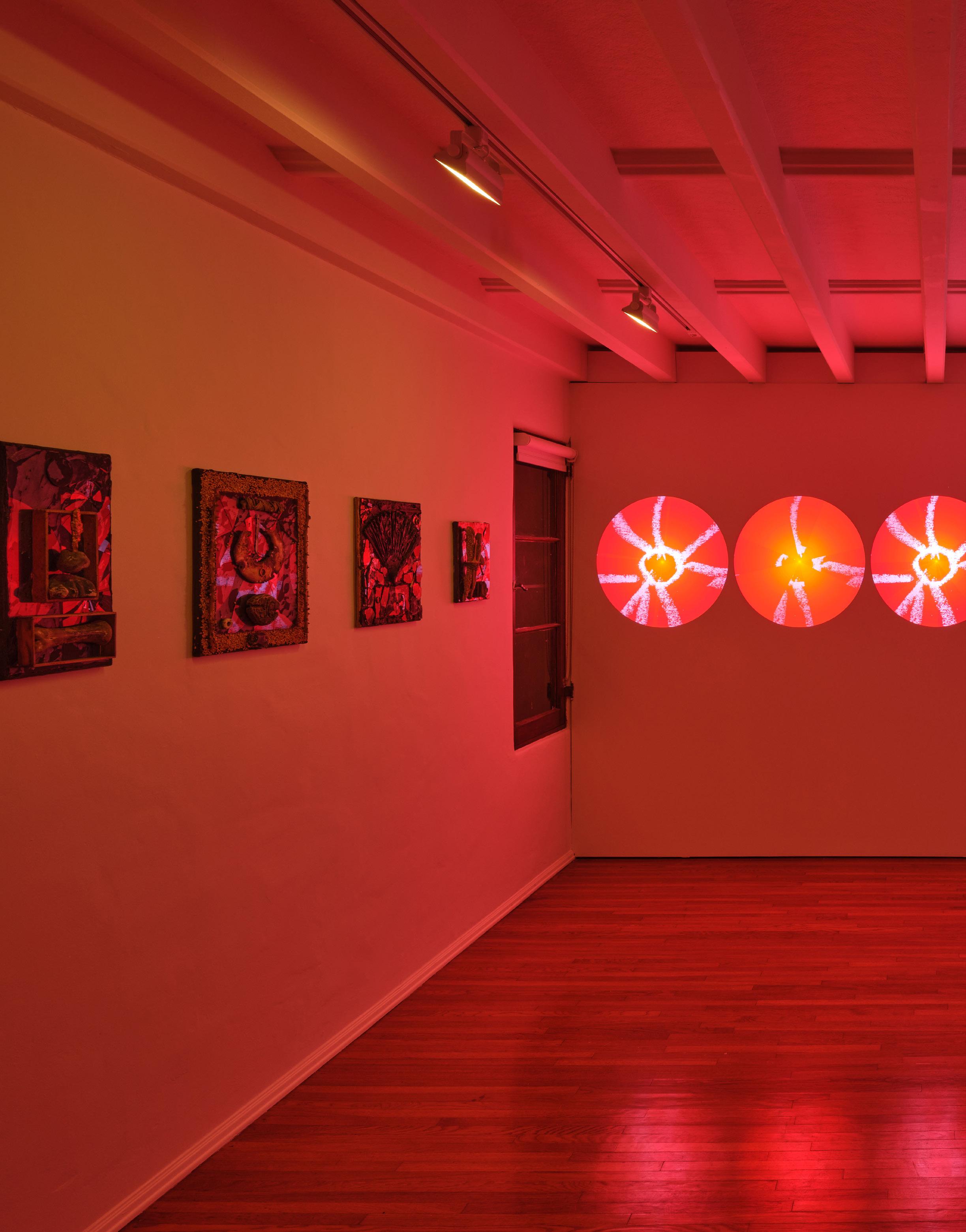
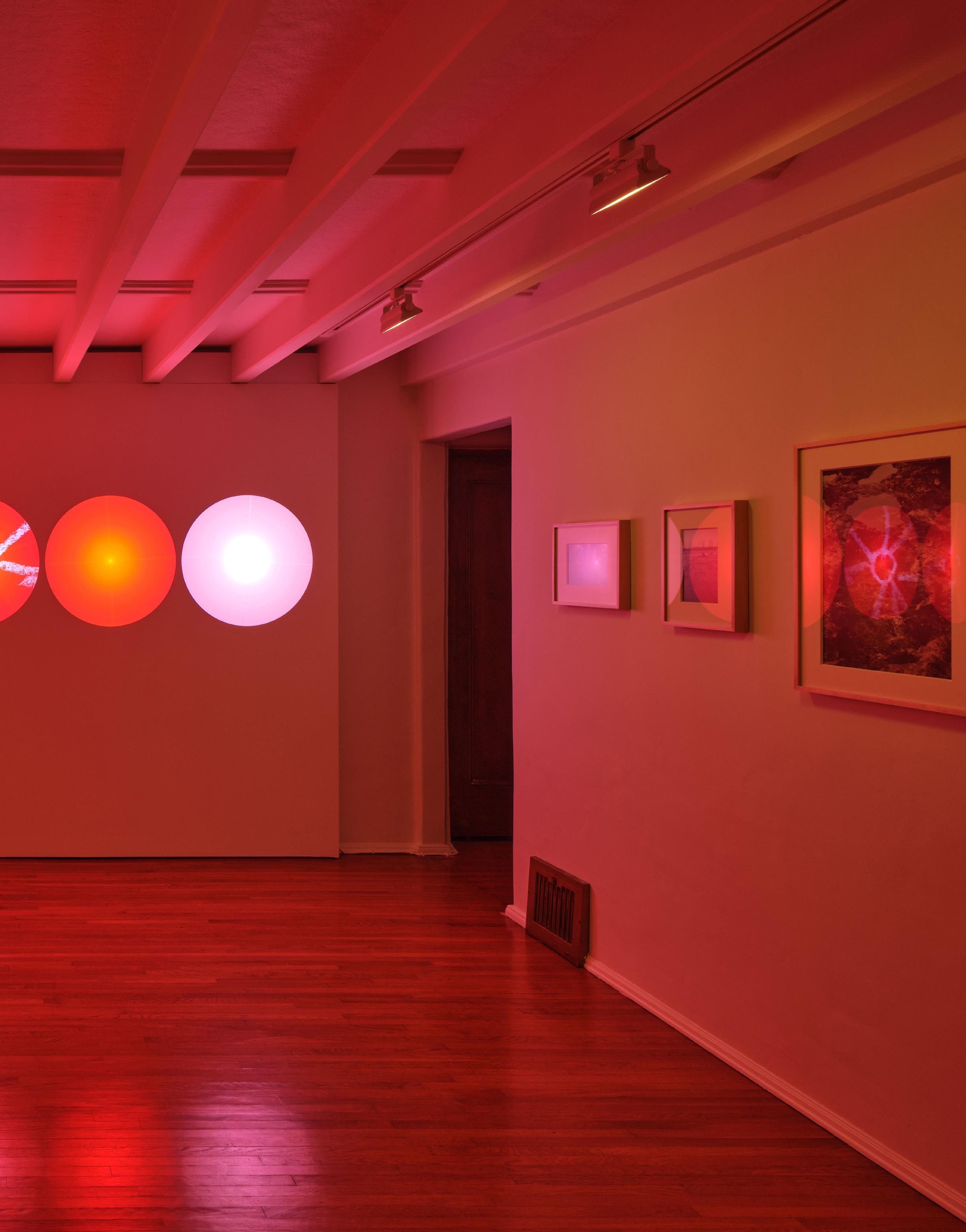
Earthshaker (installation view) (2024).
Image courtesy of the artists and Del Vaz Projects, Santa Monica.
Photo: Paul Salveson.
contemporary artists are also interspersed among the historical objects and clustered at the back of the room. The artworks approach the exhibition’s themes of the history and state of globalized mass surveillance with varying degrees of success, while the inclusion of others feels evasive, as if shoehorned into a concept that seems to limit their conceptual analysis.
Some of the artists engaged in methods of sousveillance,1 monitoring those who would normally monitor them. Paolo Cirio, for example, gathered unofficial snapshots of high-ranking FBI, CIA, and NSA officials from social media for his series Overexposed (2015), turning them into uncomfortably close-cropped portraits that look like evidence from a forensic case file.2 Other artists transformed the records produced by surveillance technologies. Xu Bing’s film Dragonfly Eyes (2017) splices together publicly accessible closed-circuit television footage to fabricate a narrative about a woman who goes missing and the man who assumes her identity. Retaining the anachronistic time codes of the source footage, the dissonant scenes emphasize that records are only as good as their interpretation, and, consequently, the technology that produces them can never actually be objective or apolitical.
Considering the social concerns of the exhibition, and that it is on view in a museum “of the Cold War” whose function is explicitly political, the sociopolitical particulars of some of the artworks could seem downplayed in comparison to
their historical counterparts. While Counter/Surveillance foregrounds the specific states, authorities, and conditions that gave rise to videos like the East German training film Grenzpassagn (Border Crossing) (1985), for example, less context is provided for those like Yazan Khalili’s Hiding Our Faces Like a Dancing Wind (2016), which presents digital footage of a Palestinian woman obscuring parts of her face with her hands while being recorded on an iPhone.
The device’s facial recognition software mistakes her for ancient African and Indigenous American masks stored on its camera roll, reflecting the way racialized communities are often conflated or erased by the colonial gaze, but here the exhibition has less to say about who exactly is being colonized and who is doing the colonizing.
Liat Segal’s site-specific installation Hyperreality (2024) also draws from personal photos on the artist’s smart phone. Simplified into matrices of colored dots and painted onto the windows of the museum, the subjects of these snapshots, from family members to scenes in her hometown of Tel Aviv, could be hard to identify. Segal’s essay in the exhibition’s catalogue offers salient points about how social media makes us all “our own spies,”3 and the illegibility of the images read as a form of resistance to this kind of self-surveillance. Considering the time and place Hyperreality was made (in a militarized border regime and during a “live-streamed genocide”4), the fact that Counter/Surveillance seems uninterested in identifying more of the specific issues
related precisely to surveillance technology and social media seems to have made the exhibition better equipped to confront Cold War histories than urgent contemporary issues.
Ken Gonzales-Day’s System Overload (2024), a mobile that hangs from the ceiling of the exhibition hall, also seems isolated in its context. Its panels are made from photographs of busts from museum collections, overlaid with different types of measurement markers. The trans-historical subjects and symbols—like a weathered plaster face of an Indigenous Mexican figure currently held in the National Museum of Natural History in Paris, layered with bright blue lines that seem to signify artistic proportions—gesture toward some of the pseudoscientific and racist legacies of today’s arts and technology, from physiognomy and phrenology to Western beauty standards. Even as the digital facial recognition grid on a ceramic bust of Lenin (from the Wende’s own collection) introduces contemporary concerns of digital surveillance and policing, hanging above everything else, the work becomes oddly decorative. Though the exhibition wastes no opportunity to contextualize the historical artifacts on view, devices like miniature cameras and pen microphones—and the Cold War narratives of espionage they invoke— appear almost quaint when seen from the socio-political urgency of the present moment, inundated as it is by ubiquitous, incomprehensible networks of state and commercial surveillance. Many of the contemporary works on view
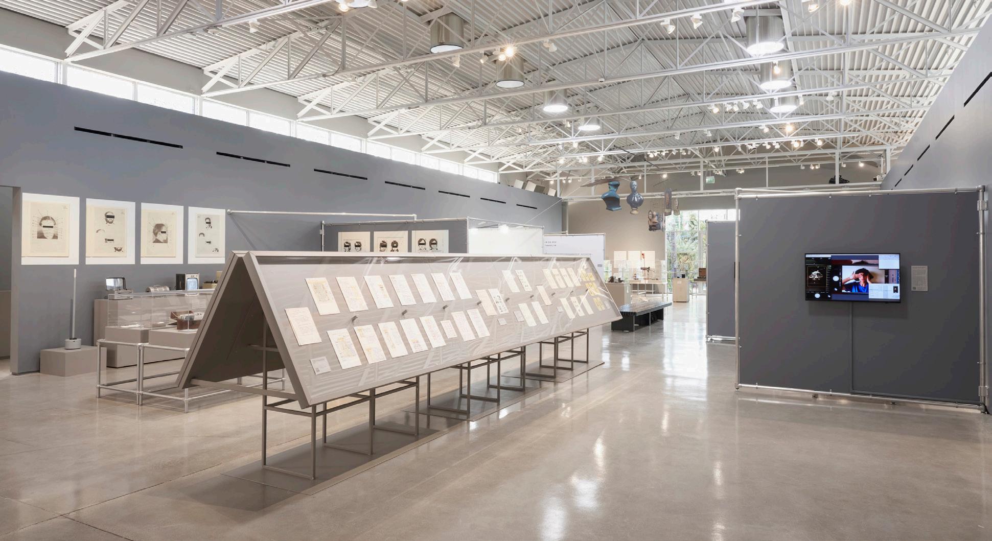
Counter/Surveillance (installation views) (2024–25).
Images courtesy of the artists and Wende Museum. Photos: Angel Xotlanihua and Dorian Hill.

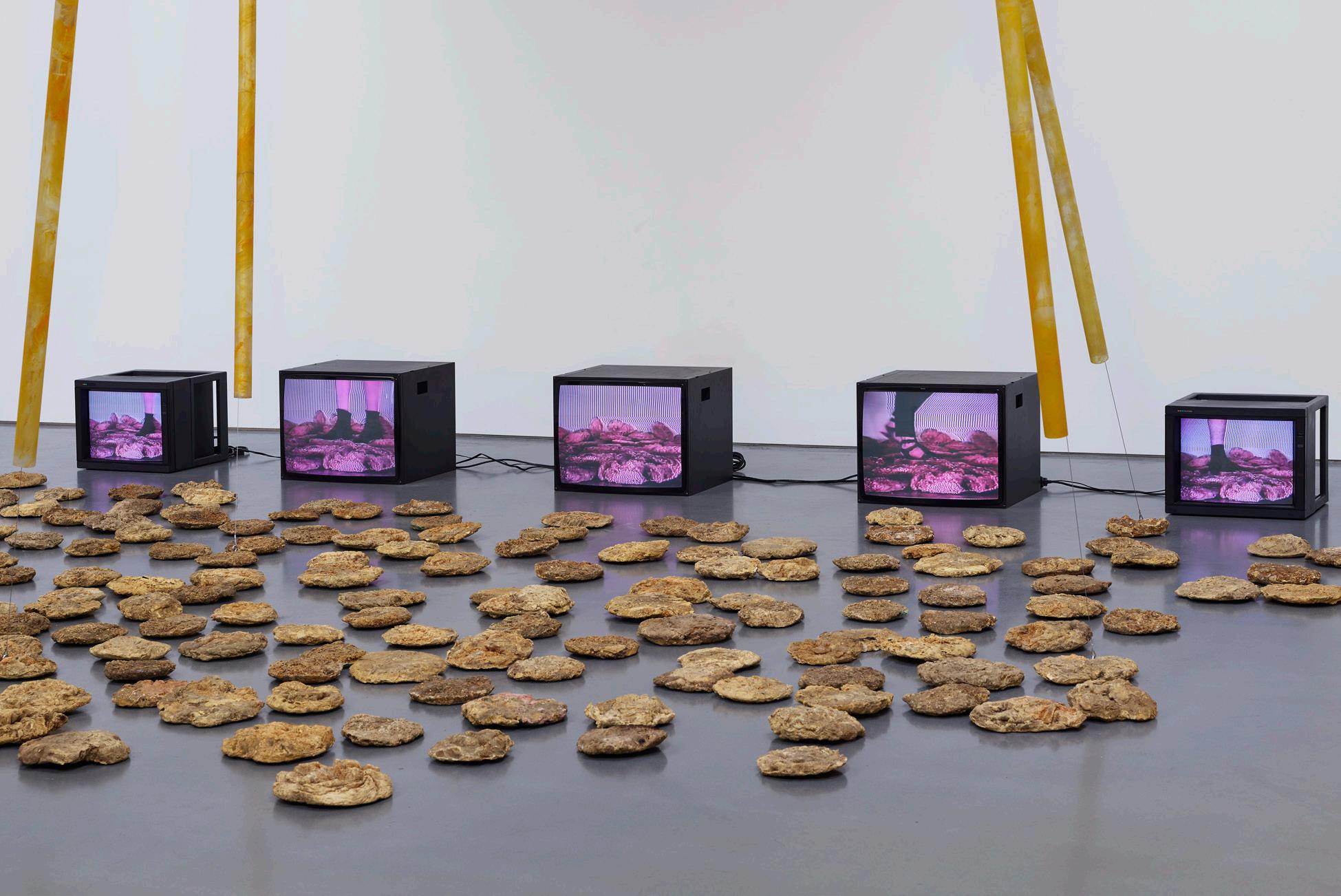
Bottom: Carolee Schneemann, Video Rocks (installation view) (1987). © Carolee Schneemann Foundation. Image courtesy of the artist and Lisson Gallery.
Top: Carolee Schneemann, Pixels Escaping T.V. (1987). Paint and crayon on paper, 23 × 35 inches. © Carolee Schneemann Foundation. Image courtesy of the artist and Lisson Gallery.
underscore the ingenuity and tenacity of their creators, but the register of detached indeterminacy Counter/ Surveillance seems to relegate them to in the show’s analysis might be an indication of art exhibitions’s limits in the face of these oppressive systems, and how easily these systems can be aestheticized without the responsibility of retrospection. Perhaps we’ll only be able to make sense of our moment of hyper-surveillance when we can look back on the recordings.
1. Steve Mann, “Sousveillance: Inverse Surveillance in Multimedia Imaging,” wearcam.org, 2004, http://wearcam. org/acmmm2004sousveillance/mann. pdf
2. Paul Cirio, “Overexposed,” 2015, paolocirio.net, https://paolocirio.net/ work/hd-stencils/overexposed/
3. Liat Segal, “Hypperreality,” in Counter/ Surveillance: Control, Agency, Privacy, eds. Marieke Drost and Joes Segal (Wende Museum, 2024), 229.
4. “Israel committing 'live-streamed genocide' in Gaza, says Amnesty International,” France 24, April 29, 2017,https://www.france24.com/en/ middle-east/20250429-israelperpetrating-live-streamed-genocideagainst-palestinians-in-gaza
Carolee Schneemann at Lisson Gallery
April 11–June 14, 2025
In September 1986, Carolee Schneemann wrote to her friend, poet Clayton Eshleman, about the process of making Video Rocks (1987–88): “I have been building—since returning from LALA— the dream/vision space I described to you.” Inspired by a vision the artist had while visiting Los Angeles in 1985, the multimedia installation offers an unexpected foray into Schneemann’s process
and concerns in her practice post-Interior Scroll (1975). Recently on view for the first time in Los Angeles at Lisson Gallery, Schneemann’s lesser-known installation work teased the numerous ways in which the late artist employed her transformative interrogations of unconventional materials: TV monitors, lights, cement, ashes, sawdust, urine, and ground glass. Schneemann pushes the boundaries of strict definitions of traditional forms of art and into the realm of the real—for Schneemann, the real is expansive and includes the experiences and materials of everyday life.
Comprised of five television monitors, 180 hand-cast “rocks” about the size of a standard cobblestone, and five (approximately nine-foot-long) glass light rods, Schneemann’s installation touches on her exploration of kinetic sculpture, and the tension between the melding of the body and technology. Across the five monitors, people and animals are shown from the knee down, walking across the rocks against a manipulated green screen background. The resulting installation engages with the formal interest of minimalist sculpture through the use of repetition to underscore the relationship between form and meaning: The monitors, beams, and rocks suggest the earth, light, and space. The walking figures become a meditative, almost ritualistic action. In her letter to Eshleman, Schneeman described the rocks as “‘unearthed,’ ancient,” and this primal quality is felt in the hum of the monitors’ static and the glow of the plexiglass lights.
Around the time the work was made, Schneemann had begun to explore melding of her film and video work with sculpture. War Mop (1983), for instance (which debuted at Max Hutchinson Gallery, New York), incorporated a motorized mop and video monitor depicting coverage of the war in Lebanon. Similarly to War Mop, Schneemann’s Video Rocks utilizes unexpected materials of everyday life, juxtaposing and arranging them to reveal an aesthetic language otherwise “unearthed.” Schneeman’s work of this time continued her logic of emphasizing the primacy of the materials of daily life, whether her own body, clothing, photos, dirt, or a mop to emphasize the aesthetic value of otherwise overlooked objects. For Schneeman, using these materials expands the possibilities of making art beyond the confines of traditional painting and sculpture and underscores the aesthetics of everyday life as holding artistic merit. First and foremost a painter, Schneemann’s installation-based work exposes her interest in and desire to push the boundaries of her medium beyond their usual constraints. In the exhibition at Lisson, several works on paper that refer to the installation were included, which exemplified Schneemann’s particular interest in the medium of video related to television as a sculptural object. Pixels Escaping T.V. (1987) and Images Escaping T.V. (1987) are energetic and frenetic drawings depicting television screens that explode with form and color through gestural marks in vivid pinks,
Olivia Gauthier
yellows, and blues. Alongside these drawings was a nearly 31.5-foot-long tempera painting on paper. Described by the gallery as “pink and yellow floral forms,” the backdropesque painting reads as more of an impressionistic sketch of the rocks nestled together to form a path. The shape of the rocks in this work on paper and the sheer scale make clear the visual similarities between the 2D forms and the final iteration of Video Rocks, pointing to drawing and painting as key steps in Schneemann’s working process.
As seen in Scheemann’s expressionistic visualizations of the installation through her works on paper, the rocks themselves become impressions of a landscape. In his essay for the New Museum iteration of the installation, Dan Cameron described Video Rocks as Schneemann’s “semi-concealed paean to Impressionism” and noted the risk the artist took in creating installations of this scale from her position as an American artist (and as a female artist).2 Throughout her career, Schneemann has discussed her early influences, noting Cezanne in particular. Describing her interest in Cezanne's paintings, she praises his works for being “structured and formally tough.”3 This influence is clearly at play in Video Rocks. Similarly to the post-Impressionist’s project, Schneemann’s work breaks down, distills, and re-formulates the landscape into three formal moves: the foreground of the earth as the hand-formed rocks, the background as the television screens, and the midground with depth created
by the formation of the plexiglass rods signifying light. As such, the installation comprises the formal qualities of a painting, pushing forward Schneemann’s project of breaking beyond the dimensionality of painting and expanding into the realm of reality. Revisiting Video Rocks in the installation at Lisson Gallery reveals the late artist’s longstanding investigation of remixing the materials of everyday life to transform them and reveal their aesthetic potentials, pushing forward her interest in underscoring the visual currency of such untraditional materials and breaking open the expansive possibilities of art in the age of postmodernism.
1. Carolee Schneemann, Carolee Schneemann Body Politics (Yale University Press, 2022), 322.
2. Dan Cameron, Carolee Schneemann: Up To And Including Her Limits (New Museum, 1996), 13.
3. Carolee Schneemann and Jarrett Earnest, Brooklyn Rail, December 6, 2016. https://brooklynrail.org/2016/12/art/ carolee-schneemann-with-jarrettearnest/.
Tony Cokes at Hannah Hoffman Gallery
May 17–June 28, 2025
In All About Evil (Selected Works 2006–2022), Tony Cokes’s recent solo show at Hannah Hoffman, three videos played all at once. A large LED screen, like a Jumbotron placed on the ground, was flanked by a smaller monitor mounted to the wall with two headphones. The third played on a large monitor that occupied the gallery’s front window and could be watched from
the gallery’s outdoor courtyard. Both the wall-mounted flat screen and the one in the window looped the same five videos in differing sequences, producing a repetitive but asynchronous mélange. The large LED screen played a series of eight (of the show’s 12 total) videos, their sound booming loudly. Across these three screens, Cokes presented an archive spanning 16 years of his attempts to illustrate political evil. In a sans serif font overlaid onto monochromatic backgrounds, Cokes strips down speeches, essays, books, and tweets—he pulls in quotes from President Donald Trump; Kanye West; comedian George Carlin; YouTuber DJ Joe Nice on Joe Biden’s failed policies regarding racial violence; David Frum’s article “This is Trump’s Fault,” originally published in The Atlantic and an article originally published in The Nation on how American pop music is used as an interrogation and torture tactic by the CIA. To drive this point home, the text-based videos are accompanied by music from the likes of the Pet Shop Boys, Postal Service, The Specials, David Bowie, Britney Spears, and Steel Pulse. I sat on a black foam block singing along to Britney Spears’ 2003 hit “Toxic,” which plays over Cokes’s 2022 video Evil.13.3.UKR (4OE) while reading about how Russia’s invasion of Ukraine could lead to “the worst war of the century,” a tragedy “for the entire world,” quotations by United Nations Secretary-General António Guterres rendered in alternating blue and yellow text on contrasting backgrounds. It felt jarring to be
Shani Strand
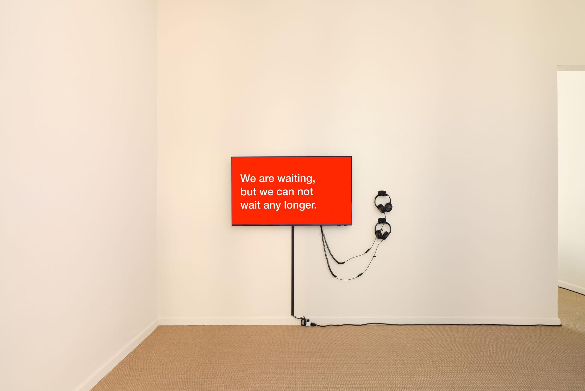
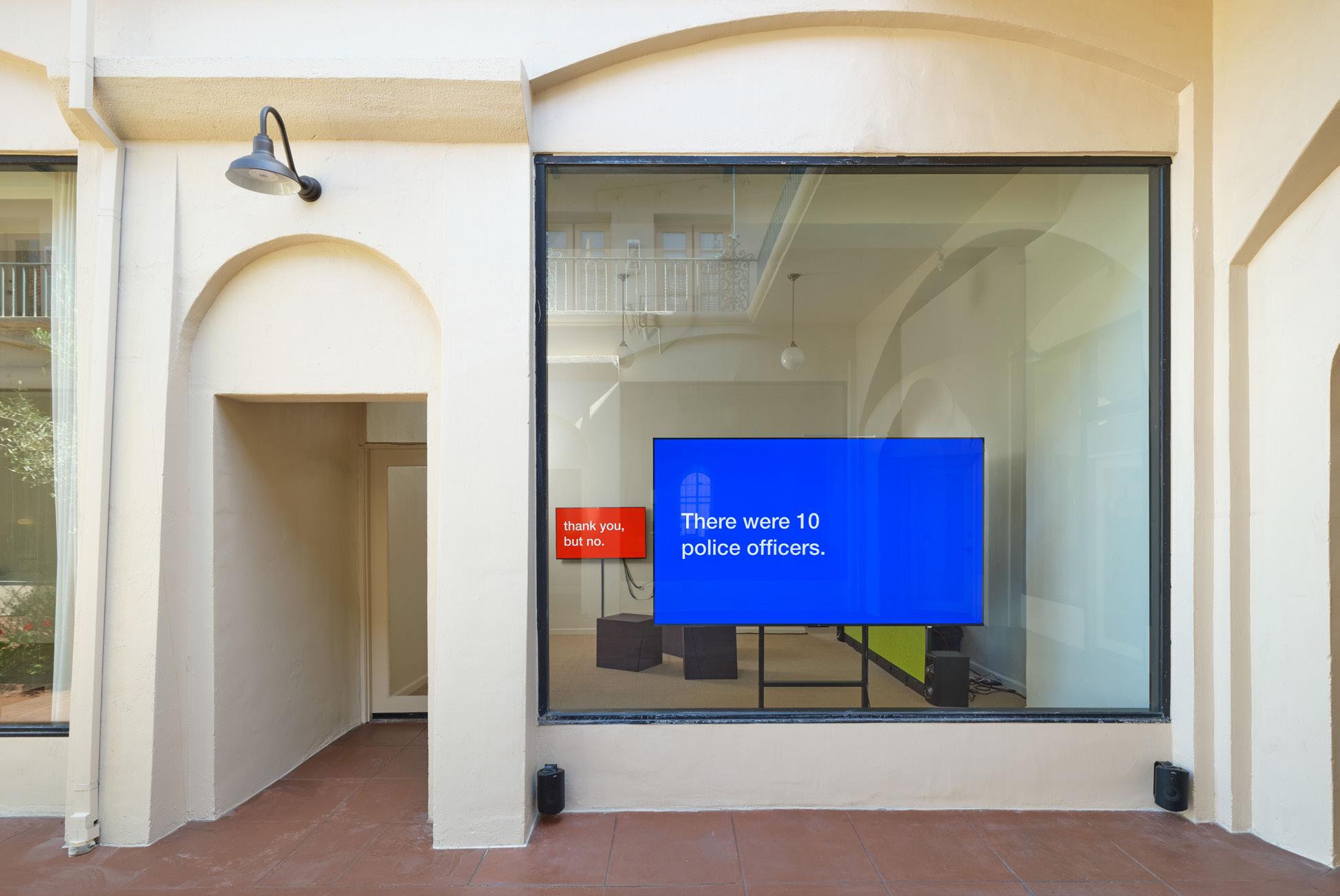
Tony Cokes, All About Evil (Selected Works: 2006–2022) (installation views) (2025).
Images courtesy of the artist and Hannah Hoffman Gallery.
Photos: Paul Salveson.
reading what’s on screen whilst dancing along to a song engrained in my memory from childhood. But it’s not just a nostalgic Britney song: Cokes intentionally uses her lyrics as a textual interplay with the words on screen. The accounts of various people being appalled by war become entangled with thoughts of being addicted to toxicity, a poison paradise. I continue singing and become hyperaware of how the language on screen is continuously failing to relay the actual magnitude of transgressions being described.
In Evil.13.3.UKR (4 OE), a section recounts the shared disgust of President Joe Biden, French President Emmanuel Macron, and British Prime Minister Boris Johnson with Russian President Vladimir Putin’s attack on Ukraine as well as the International Criminal Court charging Putin with war crimes. The video continues to disclaim, in Cokes’s voice, that “the term [war criminal] has been inconsistently interpreted and unevenly applied to leaders or countries—including the U.S. and its officials—who have initiated aggression for reasons considered unjustified.” Cokes highlights the irony of countries like the USA, UK, and France imploring the ICC to charge Putin with war crimes when their own countries have been accused of the very same imperialist agendas.
Cokes’s sequencing of text demonstrates how language is unstable, often relying on the authority of the author or speaker. This notion is articulated in Roland Barthes’ essay The Death of the Author, where the literary critic stresses
the importance of the reader’s interpretation of a work.1 Cokes doesn’t maintain the author’s authority over their work; he instead centers the viewer’s interpretations of text and sound to reveal the ways in which meaning is produced.
Cokes’s textual interplay is one of compilation. Everything he proposes in his works’ form—from their collaged components to their installation on multiple screens and at alternating sequences—is organized as a parataxis, or a structure without hierarchies, where all the components are simply adjacent to one another. The layered sequencing across the three videos in the gallery meant that three videos playing in unison at any given time almost never came into exact combination again, creating a unique real-time reading across the videos every time they played. I found myself listening to the headphones on the wallmounted video while reading text or listening to audio from other videos, further remixing their elements to produce new meanings in real time.
In titling the show All About Evil, Cokes seems to imply a certain amount of unattainability by using the phrase “all about.” It would be impossible to encompass and translate all evil, everywhere, present or past. This unattainability is also present in our flawed media, which can be burdened by sensational yet noncritical perspectives. Leaving gaps and slippery edges, Cokes is less interested in providing an authoritative definition of evil and more interested in allowing the viewer to interpret the media landscape through their own nuanced associations.
1. Roland Barthes, “The Death of the Author,” The Rustle of Language, translated by Richard Howard (New York: Hill and Wang, 1986), 49–55.
Photo Essay Contributor and Featured Subject
Based in Los Angeles, Claire Preston’s experience includes creative production (event/ photo), film photography, and artist marketing /management. She is skilled in understanding a vision, building on ideas, and wrangling humans for execution.
Carlye Packer is a contemporary art dealer based in Los Angeles, CA. Having launched the careers of many Los Angeles-based artists from an off-space called Club Pro LA that drew from the creative power of artist communities, Packer then reconfigured her emphasis and energy to form her own gallery focused on emerging Los Angeles-based artists across all mediums. Exhibitions that Packer has organized have been reviewed by Artforum, Los Angeles Times, The New York Times, Office Magazine, Artnet, ARTNews, The Art Newspaper, L’Officiel, and CULTURED, among others. Packer has participated in art fairs such as EXPO, Chicago; Felix, Los Angeles; Art Toronto, Toronto; Artissima, Turin; NADA, Miami; Frieze, Los Angeles; and ALAC, Los Angeles.
Review Contributors
Hannah Tishkoff is a writer and artist based in Los Angeles. Their writing has appeared in Artillery and Forever Magazine.
Teresa Fleming is a writer and arts worker based in L.A., where she works at the Hammer Museum. She received her MA in visual & critical studies from the School of the Art Institute of Chicago, and has previously worked at the Art Institute of Chicago and Museum of Contemporary Art Chicago.
Alexander Schneider is a writer and editor currently based in Los Angeles. He holds an MA in Contemporary Art Theory from Goldsmiths, University of London.
Olivia Gauthier is a writer and gallery director based in Los Angeles. Her work has previously been published in Art in America, The Brooklyn Rail, BOMB, and Hyperallergic. She holds an MA in Art History from CUNY Hunter College.
Shani Strand is a Los Angeles-based artist. They hold an MFA from the University of California, Los Angeles. They have been published in The Avery Review and Pin-Up Magazine.
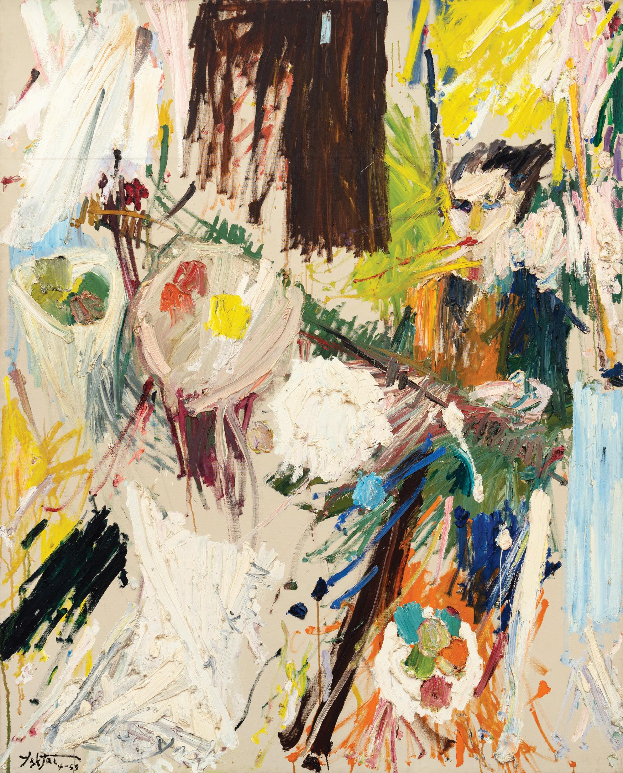
MOCA Focus: Takako Yamaguchi
Takako Yamaguchi, Stitch, 2023. Courtesy of the artist; Ortuzar, New York; and as-is.la, Los Angeles.
Photo: Gene Ogami.

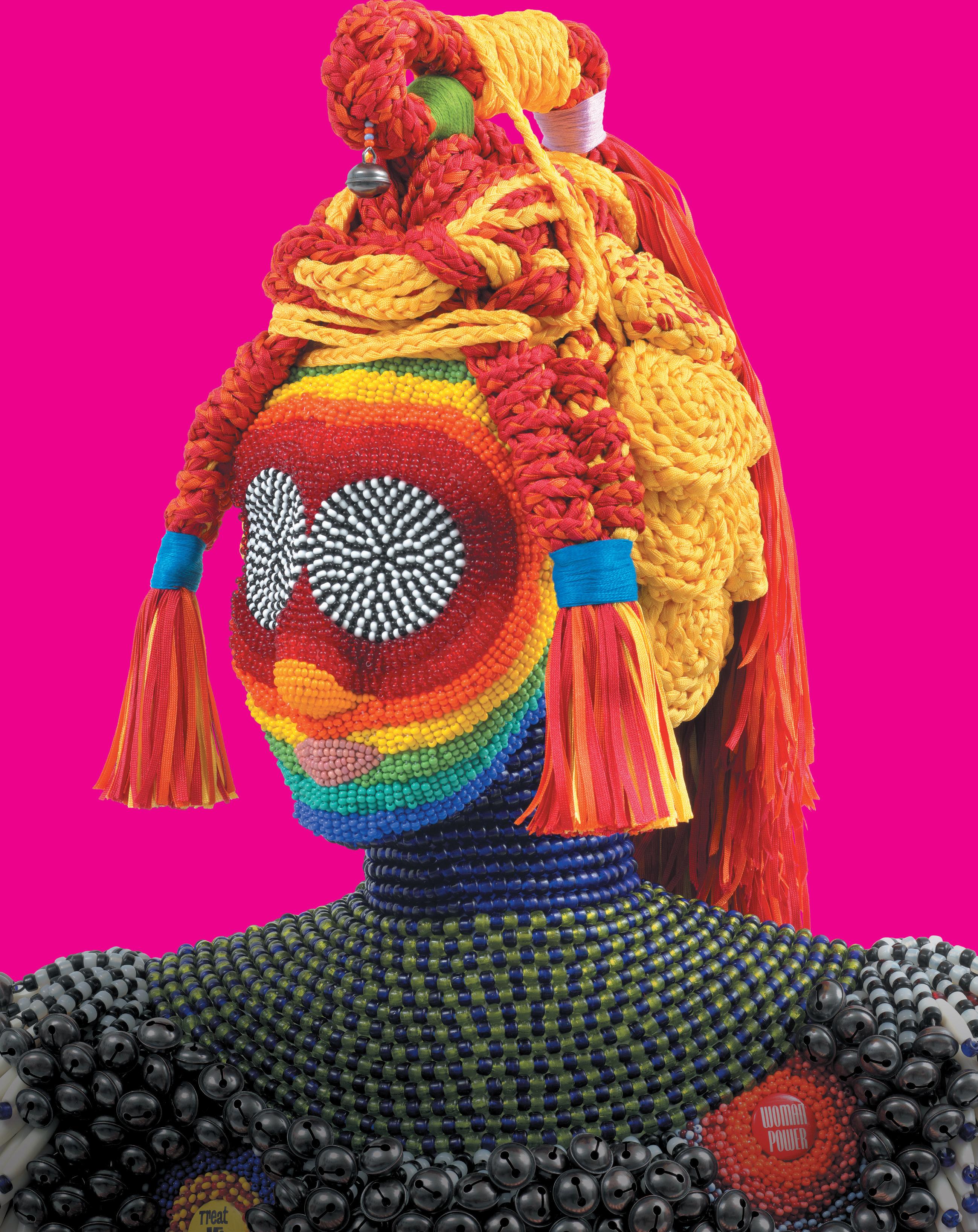
Jeffrey Gibson, Treat Me Right, 2024. Glass beads, nylon fringe, tin jingles, vintage pinback buttons, metal bells, plastic bone pipe beads, cold-rolled mild steel, nylon thread, acrylic felt, steel plate, marble base.
Courtesy of Jeffrey Gibson Studio and Sikkema Malloy Jenkins, NY. Photo by Jeffrey Schenck
Exhibition title: ©Layli Long Soldier, Whereas (2017), courtesy of Graywolf Press
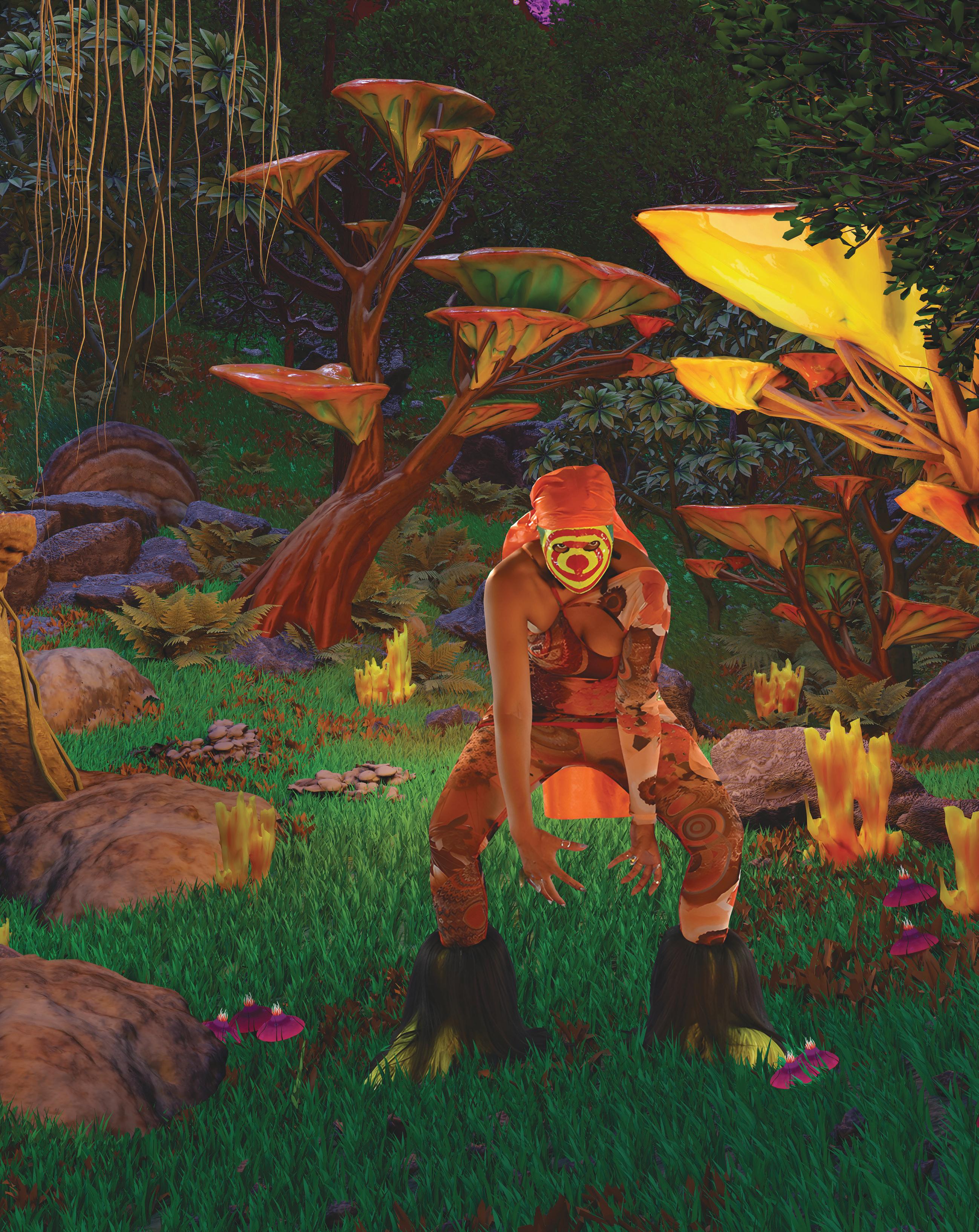
August 28— December 13

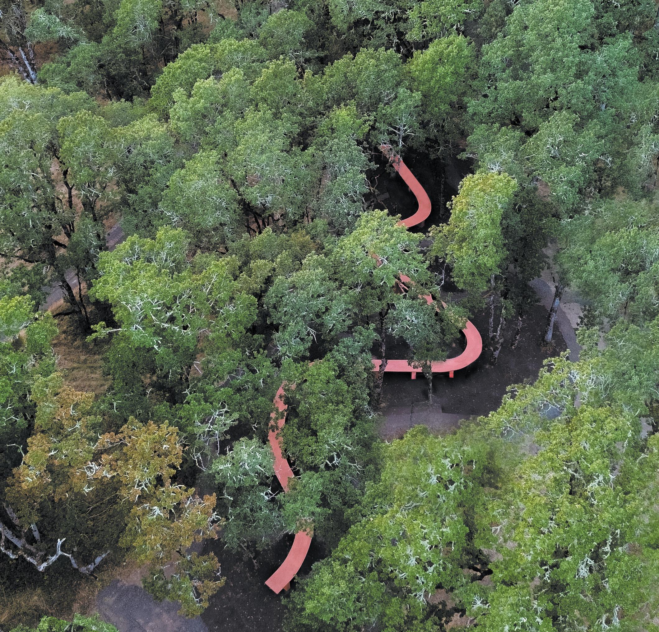
West of West Architecture + Design
West of West is an architecture and research practice that engages the worlds of design, art, culture, and technology to shape contemporary life and the built environment at all scales.
Table in the Trees
Concrete, pigment, local stone. Installed at Antica Terra.
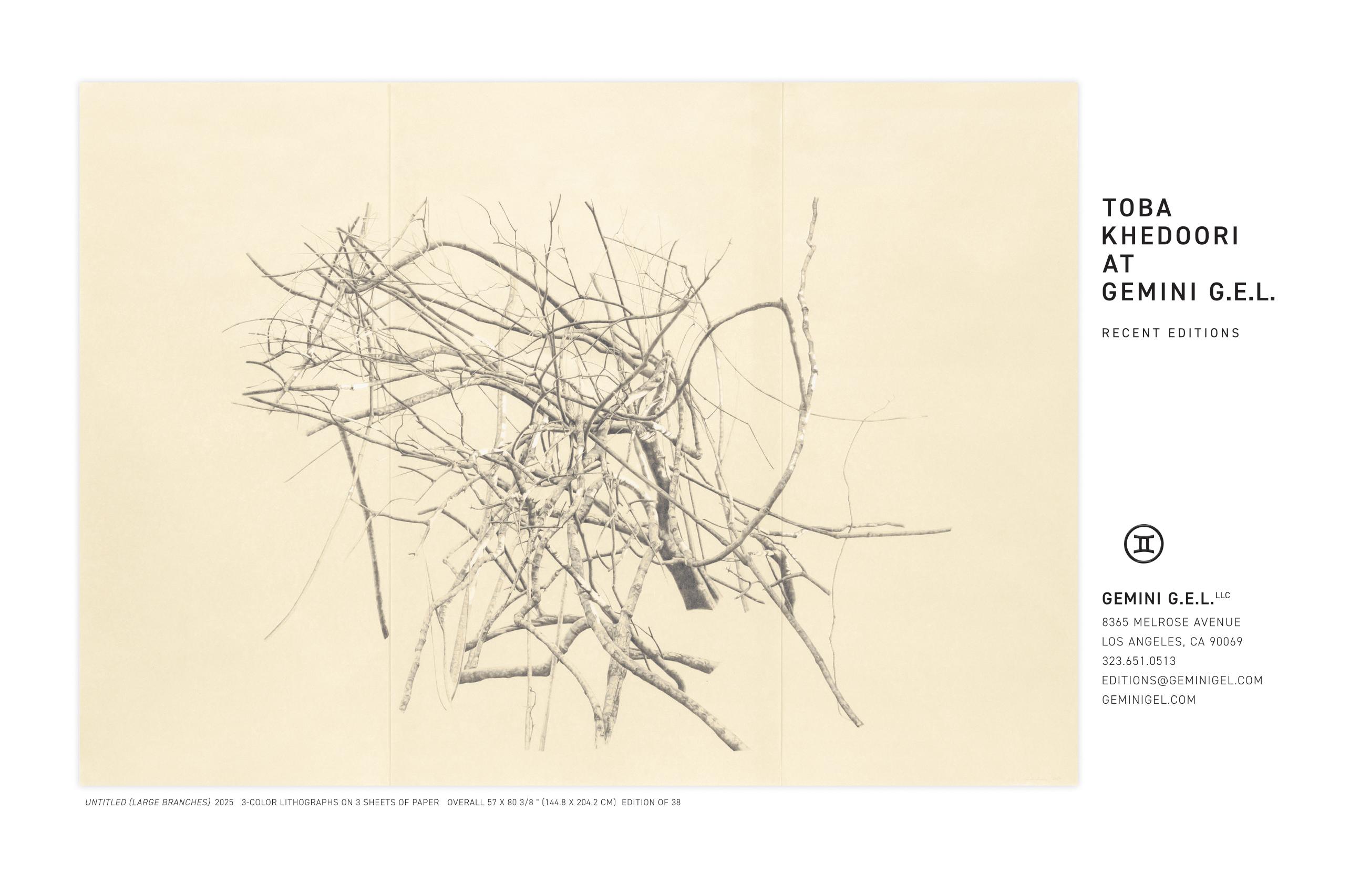
Carla Ten Year Soirée & Art Auction Recap!
Thank you so much for showing up and making the Carla Ten Year Soirée & Art Auction such a vibrant, unforgettable celebration. From the Viola Frey exhibition walk through and the delicious Bridgetown Roti grazing tables to Dynasty Handbag’s electric performance and the art bids flying in throughout the night, our community showed up full of energy, connection, and love for L.A.’s art scene.The event was held on June 14th at The Pit, and thanks to your support, this year’s fundraising event grossed over $57,000.
Our deepest gratitude for making this milestone moment possible. Your support helps us continue building platforms and entry points for artists and writers across L.A. You can continue to support Carla at join.contemporaryartreview.la.
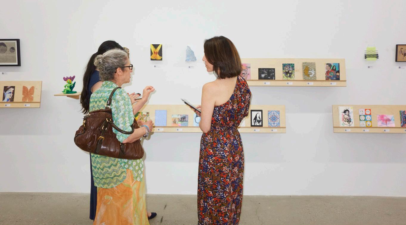

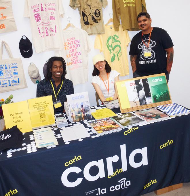
Thank you to our event hosts and sponsors:
Alex K. Scull, Amelia Hassani at FORMED, Analia Saban, Dominique Clayton, Echelon, Everybody. world, Hannah Sloan Curatorial & Advisory, Jenn Pablo & Paco De Leon, Jennifer Ferro, Jobert Poblete, Nazarian / Curcio, Michal Hall Bravo Ramirez & Octavio Bravo Ramirez, Neil and Anjelica Sarkar, Solid Art Services, Tim Disney, West of West Architecture + Design
Watch the video linked below to learn more about Carla's first ten years!

Photos: Leah Rom
