TO MY


Personal affirmations and words of self-encouragement have become invaluable during the demanding journey of college.
Each of us holds the power to create our own mantras—gentle reminders of resilience, positivity, and self-love. By embracing and nurturing ourselves, our inner light shines brightly, guiding us through moments of challenge and uncertainty.


Through darkness and through strain, Resilient in the light, I rise and shine again.


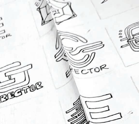
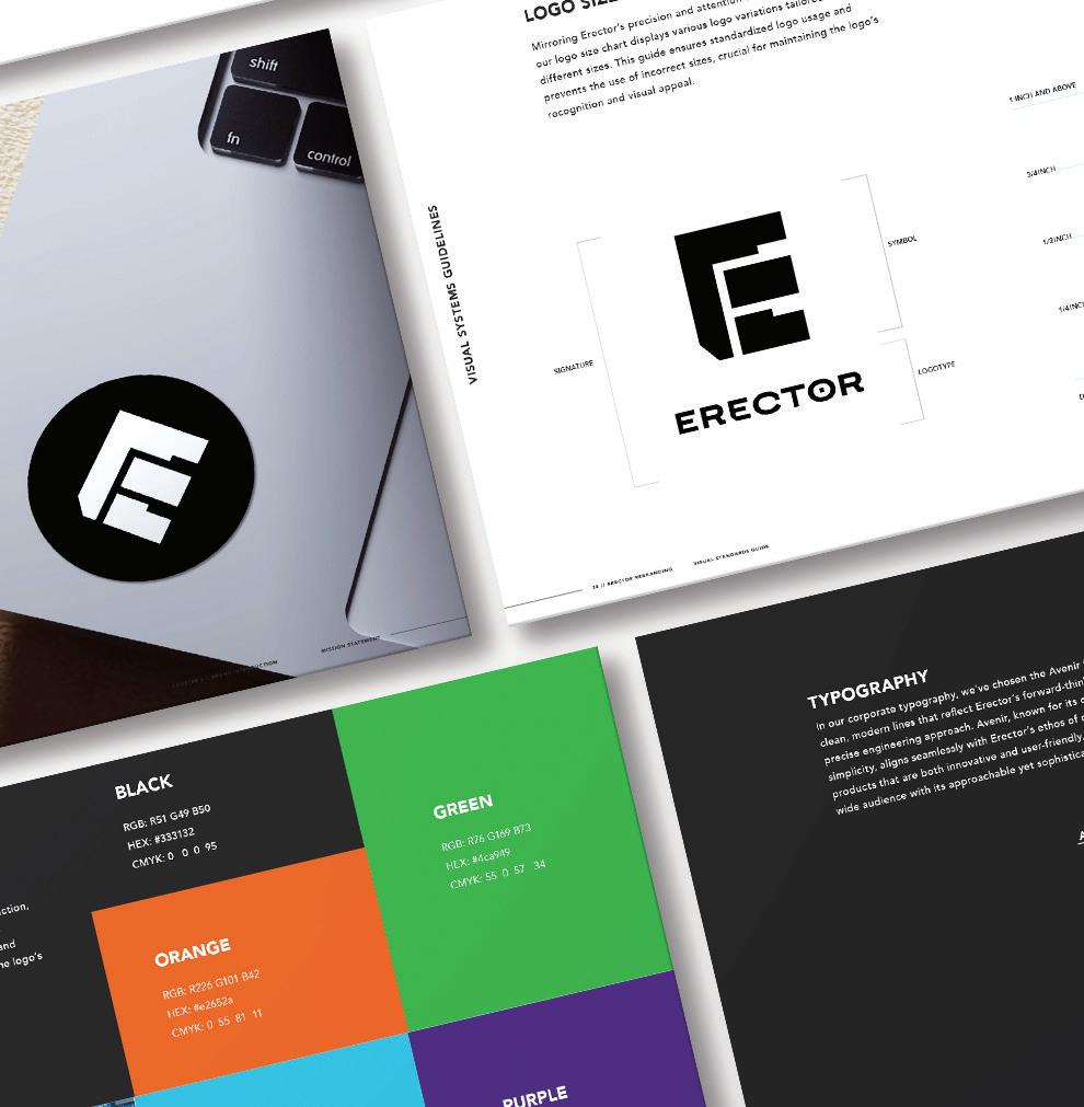
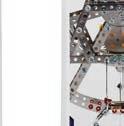
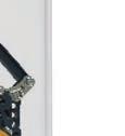
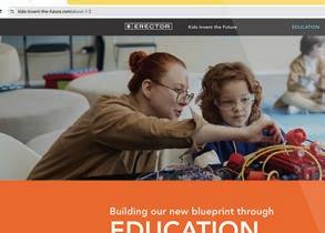
[ ERECTOR ]
and fun

COURSE TITLE
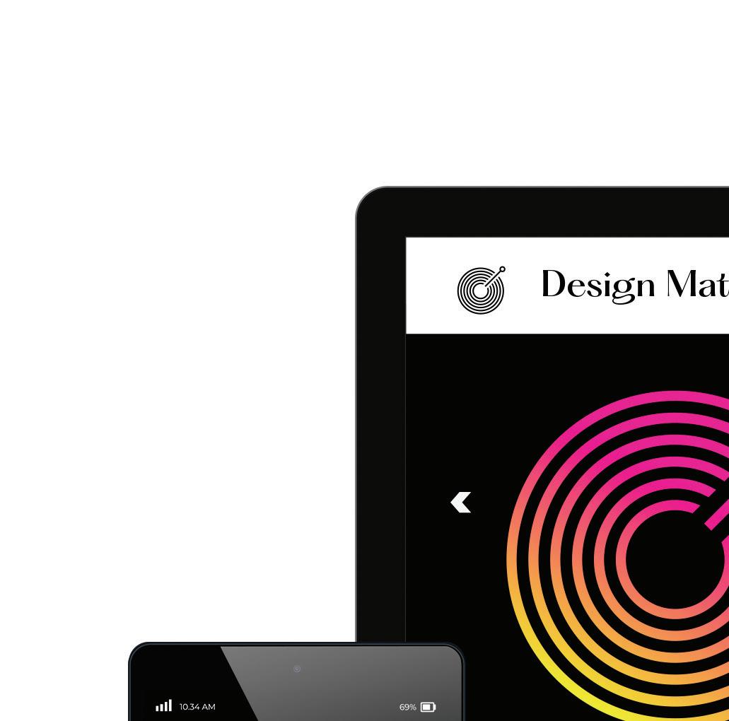
The Nature of Identity
INSTRUCTOR
Hunter Wimmer
DISCIPLINE
Branding
Educational Design
Visual Identity
Activity Design
OBJECTIVE

Transform Erector into a modern activity brand that fosters creativity, collaboration, and fun, redefining hands-on learning to focus on adaptability and innovation for a diverse, contemporary audience.

APPROACH

Reimagine Erector as a contemporary, forwardthinking brand that inspires creativity, collaboration, and education for a new generation. By redefining hands-on learning, the brand emphasizes adaptability and sparks innovation, engaging a diverse range of audiences.


PORTFOLIO


THE NATURE OF IDENTITY / HUNTER WIMMER


THE NATURE OF IDENTITY / HUNTER WIMMER


NATURE OF IDENTITY / HUNTER WIMMER


THE NATURE OF IDENTITY / HUNTER WIMMER


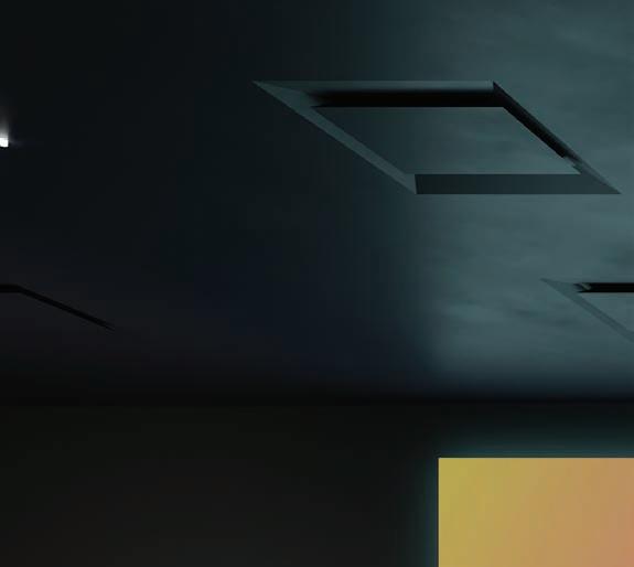
[ CHAPTER ] RESILIENT


THE NATURE OF IDENTITY / HUNTER WIMMER


THE NATURE OF IDENTITY / HUNTER WIMMER


Managing the unmanageable, I remain flexible and focused, ready to adjust and innovate with ease.


COURSE TITLE
Type Experiments
INSTRUCTOR
David Hake
DISCIPLINE
Video Production
Experimental Typography
Motional Graphics
Visual Storytelling
OBJECTIVE
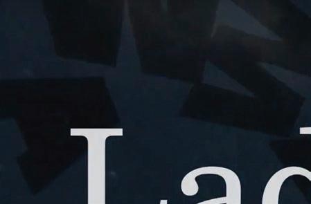
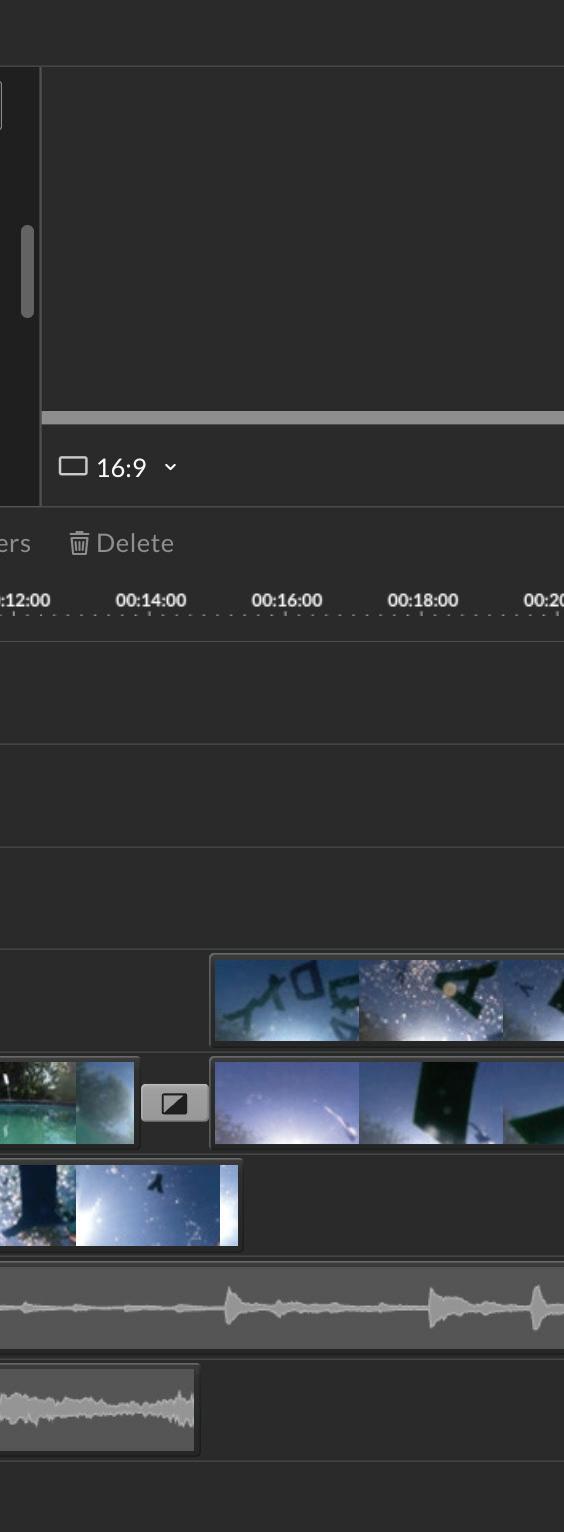
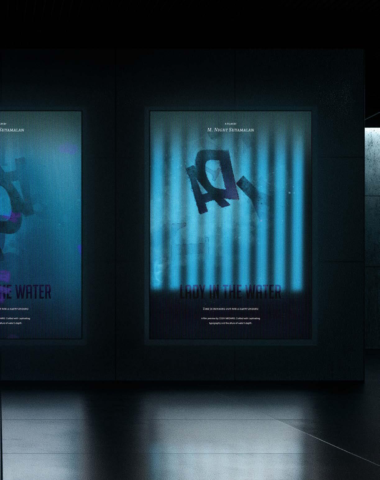
To create a visually captivating trailer for "Lady in the Water" that reflects the film’s mysterious and surreal themes. By using original imagery of cut-out letters submerged in water, the trailer aims to evoke a sense of discovery and intrigue, drawing viewers into the story’s enigmatic world.
APPROACH
I used cut-out letters submerged in water to capture fluid visuals reflecting the film’s ethereal tone. Digitally enhanced for a dreamlike effect, this approach blends physical experimentation with digital techniques, showcasing adaptability in creating an immersive and symbolic experience.


TYPE EXPERIMENTS / DAVID HAKE


TYPE EXPERIMENTS / DAVID HAKE 2: 26 / 16 : 46 40K 10K Lady In the Water 2,364,532 views
Cody Medaris
Published on Dec 20, 2022


TYPE


PORTFOLIO

[03] [04] [05] [06]
[ CHAPTER ] ADAPTABLE
[ DEGREE ] MASTERS OF
TYPE EXPERIMENTS / DAVID


In the midst of chaos, I find clarity, cutting through vague guidelines to uncover a clear direction.


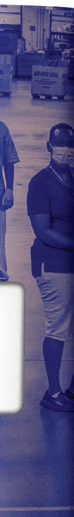
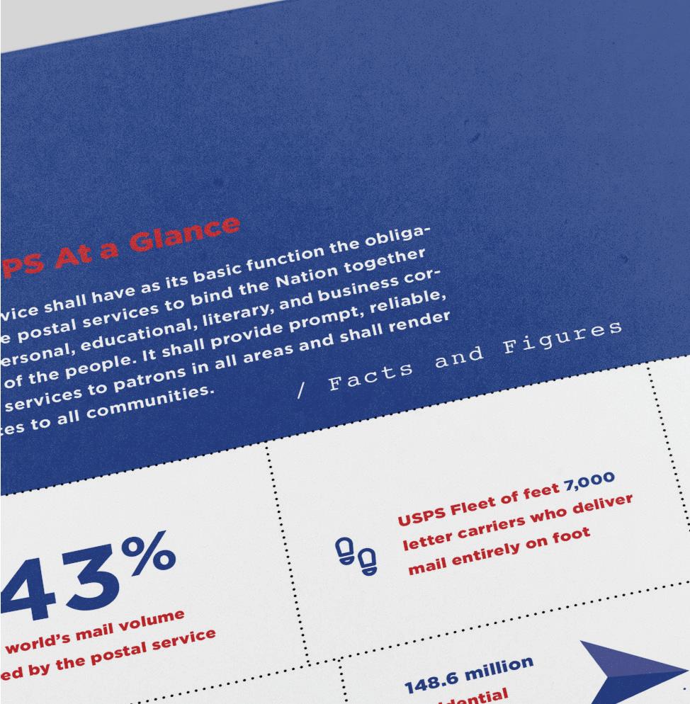
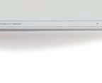
[ USPS SUSTAINABILITY REPORT ]
A report to enhance readability, reinforce brand identity, and highlight key environmental efforts.
COURSE TITLE
Type Systems
INSTRUCTOR
John Nettleton
OBJECTIVE
DISCIPLINE
Information Design
Editorial Design
Eco Communication
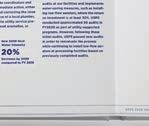
Redesign the USPS Sustainability Report into a clear, visually compelling document that effectively communicates USPS’s sustainability initiatives. The goal was to prioritize readability, reinforce brand identity, and highlight key environmental efforts with precision.
APPROACH
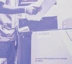
With a focused design approach, I utilized USPS’s red, white, and blue color scheme, clean layouts, and bold typography to emphasize clarity and impact. Infographics and photography were strategically incorporated to streamline complex information, ensuring the report remained accessible, engaging, and aligned with the brand’s mission.


[ CHAPTER ] FOCUSED

TYPE SYSTEMS / JOHN NETTLETON

[ CHAPTER ] FOCUSED


[ CHAPTER ] FOCUSED


[ DEGREE ] MASTERS OF FINE ARTS / GRAPHIC DESIGN


TYPE SYSTEMS / JOHN NETTLETON


[ CHAPTER ] FOCUSED

[ DEGREE ] MASTERS OF FINE ARTS / GRAPHIC DESIGN


˜ CHAPTER ] FOCUSED


[ CHAPTER ] FOCUSED


TYPE SYSTEMS / JOHN NETTLETON


[ CHAPTER ] FOCUSED


TYPE SYSTEMS / JOHN NETTLETON

[ CHAPTER ] FOCUSED

[ DEGREE ] MASTERS OF FINE ARTS / GRAPHIC DESIGN


Turning doubt into determination, I move forward with conviction and allow my vision to speak boldly.


A conference rebrand crafted to engage, inspire, and unite graphic designers.

COURSE TITLE
Type Systems
INSTRUCTOR
John Nettleton

DISCIPLINE
Branding
Event Design
Typography
Visual Identity Design
OBJECTIVE
To create a bold and cohesive brand identity for the 'Design Matters' conference, celebrating creativity, collaboration, and innovation. The campaign aimed to engage and inspire a diverse audience of designers and industry professionals.
APPROACH
I created a bold and dynamic brand identity that embodies the essence of contemporary design through confident typography, vibrant colors, and clean, striking visuals. By blending digital and print materials—including posters, digital displays, event merchandise, and on-stage visuals—I developed a cohesive brand experience that engages and resonates powerfully with the target audience.


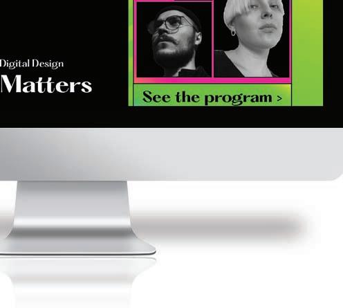

[ DESIGN MATTERS ] PROJECT [01] [02] [03] [04] [05] [06]


[ DESIGN MATTERS ] PROJECT [01] [02] [03] [04] [05] [06]


[ DESIGN MATTERS ] PROJECT [01] [02] [03] [04] [05] [06]


TYPE SYSTEMS


PORTFOLIO


[ DESIGN MATTERS ] PROJECT [01] [02] [03] [04] [05] [06]


TYPE


Managing multiple deadlines and projects simultaneously, I find harmony without compromising quality.


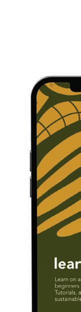
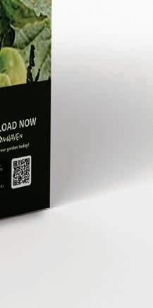
[ BLOOMHAVEN ]
COURSE TITLE
Nature of Interaction
INSTRUCTOR
Lloyd Mitchell

DISCIPLINE
Branding
Package Design
App Design
Environmental Design

OBJECTIVE
To bridge the gap between nature and technology by designing a seamless and engaging brand experience that resonates across digital and physical platforms.
APPROACH
This project exemplifies balance by establishing a cohesive visual identity across various touchpoints, including signage, web, and printed materials. Every design element was thoughtfully crafted to integrate nature and technology, delivering a unified and immersive experience while meeting event-specific needs.


BLOOMHAVEN ] PROJECT [01] [02] [03] [04] [05] [06]
NATURE OF INTERACTION / LLOYD MITCHELL


NATURE OF INTERACTION / LLOYD MITCHELL


Search Plants
Result
Invite to download the app
Invite to add the plant to the app


[ CHAPTER ] BALANCED

[ DEGREE ] MASTERS OF FINE ARTS / GRAPHIC DESIGN
NATURE OF INTERACTION / LLOYD MITCHELL


[ CHAPTER ] BALANCED
[ DEGREE ] MASTERS OF FINE ARTS / GRAPHIC DESIGN


NATURE OF INTERACTION / LLOYD MITCHELL


NATURE OF INTERACTION / LLOYD MITCHELL


[ CHAPTER ] BALANCED

NATURE OF INTERACTION / LLOYD MITCHELL


Pushing through creative slumps, I find renewed energy and vision to bring every project to its full potential.
slumps, I find renewed energy and vision to bring every project to its full potential.


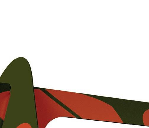
[ DZN—A GEN Z TOOLBOX ]

COURSE TITLE
Thesis 1-3
INSTRUCTOR
Laurie Makela
OBJECTIVE
DISCIPLINE
Branding
Guerrilla Marketing
Augmented Reality
User Experience Design
Motion Graphics
To establish a bold, innovative marketing agency that authentically connects brands with Generation Z by cutting through modern marketing clutter. The goal is to develop fresh, tailored strategies that align with Gen Z's unique values, preferences, and behaviors, enabling brands to resonate effectively in an oversaturated digital landscape.
APPROACH
By leveraging guerrilla marketing, AR-driven strategies, and disruptive brand activations, I developed a new, dynamic agency platform that empowers brands to authentically connect with Generation Z and enhance their brand experience with meaningfulvalue.


[ CHAPTER ] PERSISTENCE

[ DEGREE ] MASTERS OF FINE ARTS / GRAPHIC DESIGN


Grounded in real-time insights directly from Gen Z, we craft bold campaigns that authentically resonate with their values and engage them on their own terms. At DZN, we're always on the lookout, observing and understanding Gen Z in action to stay ahead of the curve.


˜ CHAPTER ] PERSISTENCE

] MASTERS OF FINE ARTS / GRAPHIC DESIGN


The 'ea' in 'Speak' uses hand-drawn icons to show how DZN navigates the ever-changing language of Gen Z.
[ CHAPTER ] PERSISTENCE


˜ CHAPTER ] PERSISTENCE

˜ DEGREE ] MASTERS OF FINE ARTS / GRAPHIC DESIGN
DZN empowers brands to cut through the noise because every

Specializing in guerrilla marketing, AR, and dynamic branding, DZN empowers brands to cut through the noise because every brand deserves to be seen, heard, and remembered.
1. Scan the QR code
2. Follow the prompt
3. Hover over the eye


CHAPTER ] PERSISTENCE


WE GO WHERE OTHERS DON’T, SEE WHAT OTHERS MISS, AND MAKE IT STICK DIFFERENTLY.


2,364,532 views
Cody Medaris
Published on Nov 08, 2024


To my amazing husband, I don’t know how I’d do life without you. You’re my rock, always cheering me on and believing in my crazy dreams. Love you forever—I’m so lucky to have eternity with you.
To my sweet daughter, Maycee—my go-to editor, soundboard, assistant, hair braider, biggest cheerleader, and friend. Love you to the moon and back, my little one.
To my mom, dad, and brother Wyatt—thank you for always having my back, cheering me on, and just being my people. Love you guys so much!
To my wonderful and supportive ladies. You know who you are! I love you all so much!
And to all my teachers who have been so patient with me—thank you for enduring my relentless eccentricities. For that, I am truly grateful!


ACADEMY OF ART UNIVERSITY
SCHOOL OF GRAPHIC DESIGN
DEGREE: MASTERS OF FINE ARTS
COURSE: SENIOR PORTFOLIO
INSTRUCTOR: IRENA MILEV
STUDENT: CODY MEDARIS CODYLARAE@GMAIL.COM CMEDARIS.COM

©2024 ALL RIGHTS RESERVED. NO PART OF THIS PUBLICATION CAN BE REPRODUCED WITHOUT EXPRESS WRITTEN PERMISSION FROM CODY MEDARIS.