46 minute read
Project Descriptions


Sub-header Artigo Regular 18 Section Title DJR Deck Forma 30 a b o u t
a b o u t my work
Advertisement
Sub-header Artigo Regular 18
Multipotentiality in Design
A Mapping Exercise
Mapping is an operation that associates each element of a given set with one or more elements of a second set. A territory is a specified sphere of activity or knowledge. A range is the scope of a person’s knowledge or abilities. A methodology is a system of procedures or processes used in a particular area of study or activity.
The prompt in this case asked me to create a matrix of territories and ranges that relate to my design methodology. To visualize and make connections between my ideas. To establish, then disrupt hierarchy among my ideas. The goal is to make connections between your ideas and references, to map individual territories, and define a methodology towards your thesis. We were to treat this assignment as a form of research.
I decided to test my theory that design is a multipotential discipline by mapping the design universe. First, I created a design matrix based on qualities of design. The x-axis stretches from emotional to analytical and the y-axis stretches from specialist to multipotentialite. The gradient aligns colors to the qualities to increase visual recognition and clarity.
Next, I placed designers I admire and different design disciplines within that matrix. I placed the designer/artist in the place I believe they fall in the matrix and where I felt they had additional qualities, I used the color related to that quality as an outline on their star shape. The aim being to visualize the overlaps and connections of the creators I look to for inspiration and their disciplines, in order to better understand what influences my methodology and interests in design.
Sub-header Artigo Regular 18
Design History
Influences on a Life
This project asked me to describe, define and curate the objects, events, and idiosyncrasies that inspire me as a graphic designer. Then take that collection and design a 100-page book based on my personal curatorial point of view.
I have a varied set of interests when it comes to art and design. I love high fashion, street style, and everything in between, so I decided to start there. When you’re from a small town in the Midwest, growing up in the 90’s (read pre-internet), magazines were the conduit to the outside world. And Vogue magazine was my favorite. I’d slice the editorial spreads out and wallpaper my room one page at a time. I also loved the Beastie Boys, they were brash and in your face, but smart and never vulgar. I considered both meaningful forms of art and design, but on opposite sides of the spectrum. So I took the look and feel of Vogue magazine—editorial layouts, sweeping images, classic typography, and a dreamy, high end feeling—and I melded it with Beastie Boy lyrics in beautiful, classic typographic setting using Didot.
These two styles represent wildly different perspectives and by combining them into one publication I’m demonstrating the equality of their contributions in the world. I may never make work like the Beastie Boys, but I can enjoy and respect their creativity, as well as learn and take inspiration from it.
It’s a reminder that it pays dividends to seek out, look at, and consider work you don’t ‘like’ or ‘isn’t your style’. Rarely do I learn from work I enjoy. It’s the work I wouldn’t make, or think I won’t like, that pushes me to explore and understand more. I always learn something new.
My visual style is more ‘Vogue’, but my vibe is more ‘Beastie Boys’, so by combining these two disparate styles I’m using the book to span the spectrum of the diverse interests and inspirations that influence my work.
Sub-header Artigo Regular 18
Reflection
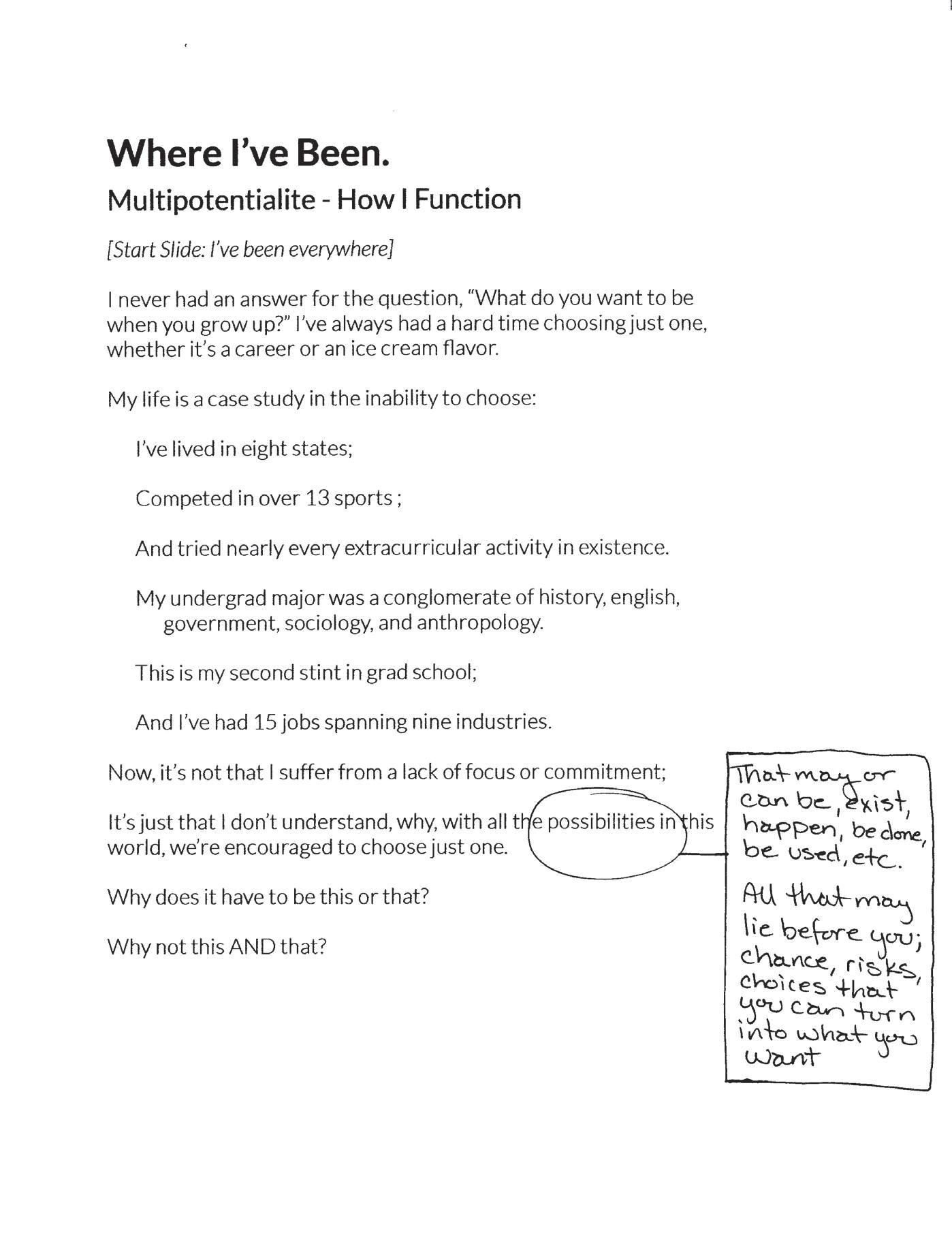
Where I've Been
We all come from somewhere, we all have a path to where we are today. And sometimes it helps us to refine where we want to go by taking stock of where we’ve been. This project in the Spring of first year (2020, but pre-pandemic) asked me to reflect on myself and craft a personal visual narrative that contemplated questions that address identity, both personal and design-wise. Then present to the class as a way to mark a point in time.
As I was beginning to focus on refining my creative processes, it was important, and maybe essential, to try and articulate it at the outset of the semester. It was nice to take stock of the progress I’d made over the previous year-and-a-half since I started formally pursuing art and design. It’s probably always important to continue these types of reflections; to constantly review and refine your process, to look back and see the progress you’ve made and the avenues you’ve explored. I have found that reflections are most useful once you’ve had a little space and time away from a project, or set of work, to be able to appropriately, honestly, and usefully learn from and appreciate the work. You may like it more, or less, but at the very least it’s an opportunity to mark a point in time.
About My Work 123
Filter of Perspective
Design isn’t made in a vacuum. We all reference the work of others. It inspires and influences in many ways, one of the most important being visual. This project asked me to catalog and analyze the inspiration I collected, saved, archived, or bookmarked to date. Then take stock of the formal strategies and ideas that appear, and identify the threads of connection between everything.
Collecting and analyzing work that inspires, impresses, and intrigues me confirmed two things. My taste is eclectic, but it’s consistent. I see a wide variety in styles and outputs that I appreciate and enjoy, but I also see the same artists and themes resurfacing again and again. Even when I find new artists and inspirations, they’re based on the same principles—pushing boundaries, experimenting, and providing delight for the viewer.
About My Work 125
Spectacular
It Was All Wonderful
When you’re on a threshold you don’t know what lies ahead. You may think you know, you may have a plan, but the truth is you never really know what’s coming next. There is so little in life that we actually control…
This may seem disheartening and scary, but rest assured, opportunities lie in those transitory gaps of life. I can attest to that.
In the midst of heartache and hardship, disaster and despair are you still able to experience joy? Can a terrbile situation sometimes feel like paradise? And after the greatest loss of your life, what have you gained?
This project asked us to explore the concept of liminality from a visual perspective. Liminality is a psychological, neurological, or metaphysical subjective state, conscious or unconscious, of being on the threshold of/or between two different existential planes.
My project was based on another a time in my life very similar to the pandemic of 2020, where I was basically quarantined with my family for six months. In November 2017, my father was diagnosed with a glioblastoma, a rare and incurable brain tumor, guaranteed to end in death. We didn’t know how long he would live, so we were living in a state between life and death. We waited on edge everyday for the next seizure or blood clot or yet to be discovered disaster to happen, just hoping nothing would.
Most days were a boring and uneventful string of simple tasks, something we welcomed, because that meant Dad had survived another day and he was safe. The tumor made Dad largely incapable of walking and needing 24/7 care, so I spent every day in the house with him. It was a time of anxiety and stillness, of long days and short weeks, where time didn’t seem to pass, except when marked by light or dark, but it was winter, so it was dark most of the time. There was no calendar, no deadlines to meet, time formed around doctor’s appointments and medication schedules. There was a distinct demarcation though between pre- and post-diagnosis. And then there was ‘after’.
How do you make the most of time when you know it’s limited? How do you experience joy and remain positive when the outcome is destined to be the opposite of what you desire? In the midst of all that heartache and hardship, disaster and despair it was still possible to experience joy. Surprisingly, if you look carefully enough, sometimes you can experience true happiness in a situation that is hell.
I would never have chosen for my dad to die of a brain tumor. It was torture to watch him suffer for six months, but it was also one of the greatest joys of my life to be with him every day. During the worst time of my life I had some of my happiest moments, and, without knowing at the time, that experience built a strength and sensitivity that would change everything.
In uncertain and tense times I keep coming back to my father’s words and how he explained our time together between his diagnosis and death, ‘I think every day how lucky we are to have each other. To be able to have this time together is really special. Our world has kind of stopped in a way. We know this is unique time. Most people never get this chance, but, for us, we get the chance to understand how valuable and how special this is. It’s a spectacular experience. It’s not the experience we thought we might have, but it’s really a unique experience and I love every minute of it.’
And what I realize, for myself, is that it’s all liminal, life is a continually liminal experience, if we do it right. It’s all change and adaptation, growth and a constant state of ‘becoming’, and deciding, who we will be next.
It’s not the experience we thought we might have.
It may take longer than you thought, or hoped.
It’s all unique.
It’s all spectacular.
Building Blocks
Hearing My Father's Voice Through a Visual System
This project asked us to explore scale, proportion, rhythm and meaning through designing a two dimensional set of symbols and then translating that symbol set to a three dimensional storytelling device.
I selected the topic of the feelings related to grief because it’s something that people don’t understand until they experience it. It’s also extremely challenging communicate to others about effectively with words. I wanted to see if I could create visuals for feelings.
I started by creating eight symbols to reflect feelings related to grief: angry, anxious, afraid, guilty, sad, empty/lonely, restless/unsettled, detached. But when I thought about being in a grieving place, what that person wants is a way forward, so I decided to design the eight symbols related to the relief feeling that countered each grief feeling: joyful/hopeful, composed/ peaceful, safe/assured/brave, unburdened/carefree, cheerful/buoyant, embraced/loved, calm/content, engaged/connected.
My three dimensional objects are a set of custom-cut pine wood blocks for my mother to use as a tool to help her move through feelings of grief related to my dad’s death. They are designed to sit out on a shelf to be viewed as a general visual item and most viewers will see them as purely objects d’art; however, since my mother is the intended audience, an audience of one, she can activate the design more fully.
When my mom feels one of the feelings in the set, she can pick up that block and hidden on the bottom are copy drawings of my dad’s handwriting taken from actual letters he wrote with a phrase he would have said to her in that specific situation to ease her mind if he were still alive today. The intent is that she can read the phrase and see his handwriting to be able to hear his voice in her head and move through that difficult emotional moment. People who never pick the block up will not see the personal sentiments on the bottom and be none the wiser, but if they do, that’s fine, they are not secret messages.
Twelve Months
A Visual Autobiography
The original prompt for this project was to write a 1000 word statement about a day in your life exactly five years from today and then create a body of graphic design that you, five years from now, will make. I had challenges with this project from the start. First of all, I don’t think next year is guaranteed, let alone five years from now... I used to believe in that, but after my dad was diagnosed with a brain tumor and dead six months later, I just don’t believe in waiting to do anything I want to do anymore. Why wait for a day that may never come when I can just do what I want now?
I honestly had no idea where to start, but I love the ocean and I started looking at signal flags. They’re bright, graphic, and I love the layered meaning behind them. Not only do they stand for single letters, but sequences can be strung together to create entire sentences.
Then I began exploring signals and coded language as a way to explore an emotional journey. I was interested in messages and information that can be both obvious and obscured at the same time. We all exist with the events of our lives, they’re a part of what shapes us—who we are, our values, our reactions, and how we move through life. We may not tell people everything about ourselves or what’s happened in our lives, but we encounter everyone as a whole sum of their experiences, whether we know it or not. This exhibition is a visual expression of a twelve month period from May 2018–May 2019 where most people I encountered did not know I had just experienced the worst six months of my life, yet they were interacting with that hidden aspect of my life story.
The exploration of a simultaneous hidden and obvious language led me to researching nautical flags. Each flag pattern stands for a letter and they can
be combined to spell out words, or they can be combined into combinations of letters that stand for words. An entire dictionary of words created through combinations of three or four nautical flags. I took the visual forms of the nautical flags, which are known as distress flags, and I wanted to change them into a personal language of visual forms that could express an emo- tional journey through distress and the process of enduring the state of despair and emerging into a life of limitless potential.
I kept the structure of the visual form the same as distress flags to signal to the audience that a coded language exists here and, if they are familiar with nautical flags, it’s likely they will be able to read the messages contained within the panels. However, I wanted to make these symbols my own, so I experimented with color to transform them from a language of distress to a language of evolution, adaptation, and resiliency. I began by hand painting all the flags, then I decided to create them digitally. I began the color exploration by translating the flags into their complementary colors, then I pushed them to a hue of their original color. I wanted a greater intensity of feeling for the audience, so finally I translated those hues into a highly vibrant hue to express the high energy of the emotion, which can be read as positive or negative, but always intense. I ended up with a vibrant set of color forms, rooted in coded communication, but now a language completely my own. A language that can express feeling and rhythm, even if the underlying message is not decoded by the viewer.
The exhibition contains 12 panels, representative of the twelve months following my father’s death where I wrestled through time to remake my life in a meaningful and purposeful way. During that time I collected bits and pieces of language in a notebook that provided encouragement or focus or motivation. I would read through them often and add to the notebook whenever I found something that hit home. These items included things my father said or wrote to me, both before and during his illness, song lyrics, quotes, and self-written notes. Each panel represents part of that 12-month journey from May 2018 - May 2019 and the messages on each panel are arranged to reflect the notes I kept or wrote down during that period, my emotional capacity and state at that time, and how I pushed myself through to create a new life.
Each panel can be decoded; however, I chose not to include a key to the visual form because they’ve become so much more than the phrases they contain. These panels now represent a journey, anyone’s journey, and that life can contain setbacks and devastations you think you cannot endure, but that sometimes, even in the worst of circumstances, something beautiful emerges. Possibilities still abound. Opportunities for joy and accomplishment that you never fathomed, and that never would have occurred, can materialize. These panels represent a period of time where I was constantly channeling sorrow, pain, and anxiety into joy through the process of making. In that process I remade myself, in the words of George Braque, turning my wounds into light.
The Price of Love
An Even, But Uncomfortable, Exchange
What do you value and why? How do you assess worth? Create a design that considers the idea of value within currency systems and beyond based on a text of your choosing and some instances of currency symbols.
In the past few years I’ve thought a great deal about what’s truly valuable and why, so I knew I wanted to make this piece about worth and value that can’t be quantified. I started by exploring the question: If everything comes at a cost, but some things are priceless, what is the price of things you cannot buy….?
Love is paid in grief dollars Wisdom is paid in youth dollars Empathy is paid in pain dollars Relationship/Companionship is paid in autonomy dollars Parenthood is paid in sacrificing yourself dollars Fame is paid in privacy dollars
Then I started thinking about how the people I love are the most valuable thing in my life, they always come first. I’ve also often heard that grief is the price of love, which feels true, but that can’t be the end of the story, can it? I decided to use this project to explore what love costs. And I came up with the following writing/poem to use for the poster:
Love will cost you Grief, but Grief buys Pain Pain buys Exhaustion Exhaustion buys Strength Strength buys Grit Grit buys Resilience Resilience buys Self-confidence Self-confidence buys Joy Joy buys Love
I then proceeded to make a series of nineteen exploratory posters to figure out how to translate this text into a visual form. I researched all types of currency symbols and used those symbols to construct the words in order to contrast the idea of monetary worth and emotional worth.
I hope in the end that people realize that love is always worth it.
Love buys more love.
Inquiry as Critique
An Open Source Conversation on Graphic Design
In graphic design theory class we created an image essay by collecting ten found and self-made images we wanted to explore more through writing. The images needed to relate thematically to our class readings and discussions. They could be work we enjoyed, images we made, or a project we made. I selected a mix of found graphic design, designs I find intriguing, and one personal project across a multitude of topics.
As I began to collect images, I had lots of questions about them, but not many answers. So, I decided to create a public Google doc to ask those questions and start open conversations about graphic design related to larger societal issues. I included instructions on how to participate and for each image I provide my commentary and leave space for people to leave their own comments.
I used architect’s daughter as the typeface to create a sense of familiarity and warmth, as it looks like a handwritten typeface. In addition, I am the daughter of an architect. Where I used the work or images of other artists, I highlighted their names to give credit and differentiate from the photos and work I created.
The result is an open-source, visual conversation about graphic design. A Google doc provides a broad, accessible platform for people to ask and answer questions and express opinions. Most importantly this document is a place to learn and evolve as designers and people.
Voting From a Distance
A Presidential Election in a Pandemic
For this data visualization project we examined what the 2020 Presidential Election would look like amid the coronavirus pandemic. Research an aspect of how the pandemic may impact traditional voting and create a infographic displaying multiple levels of information that reveal your insights, inform your viewers, and influence their thinking. I addressed the topic of whether we should adopt mail-in and/or remote voting to accommodate for people who felt uncomfortable voting at an in-person polling place.
Instead of jumping to adopt a new system so close to an election, I wanted to research existing voting methods that provided the ability to vote from a distance, via the US mail system, thereby allowing people to avoid the need to attend a polling place in person.
My research revealed five states already have permanent mail in voting and most of the remaining states allow for voting by absentee ballot for any reason, as long as a voter registers by a certain date.
Based on this research, I designed an Instagram campaign providing infor- mation about how to vote in the November 2020 presidential election in Wisconsin, my home state, without having to physically go to a polling place on November 3. The campaign includes registration date and requirements, ballot request date, and ballot return deadline and methods. I used nontraditional political colors to remove partisan bias.
Modes of Thinking
Divergent + Convergent = Lateral
I’ve always been equal parts ‘right’ and ‘left’ brain—analytical and creative, convergent and divergent. That mode of operating puts me a little in no man’s land when it comes to methodology. When I start a project it’s usually with a question, problem, or interest. Generally I go straight to the dictionary to define the language around what I’m trying to achieve and then it’s on the research, which tends to become a rabbit hole of interesting, if not exactly connected topics. In the beginning, I tend to collect more questions than answers.
Then I circle back to the brief, as well as the definitions and goals I wrote at the project’s outset to refocus. I start narrowing the questions that need to be addressed and tucking away the other interesting questions for use on a future project.
This is called lateral thinking—combining divergent and convergent modes of thinking. Asking questions creates ideas. Seeking answers necessitates collecting facts. And when I combine the two, I make my strongest work.
These two pieces, the postcard above and the poster to the right, demonstrate how I visualize my methodology around design research. Allowing questions to drive creativity and then organizing and carefully editing those questions to ultimately create the design.
About My Work 139
Aakash Nihilani
Artist Monograph
Teams within the class selected artists and we were assigned an artist and tasked with creating a book proposal for the artist that is visually engaging, relevant to the field of contemporary graphic design, and that speaks to the unique characteristics of the artist. The proposed design should formally and conceptually express facets of who the artist is, what they make, why they make it, and the impact of their work. Production specifications should be defined as well.
Aakash Nihalani’s work is mostly outdoors on walls and in the public as street art. It is characterized by three themes: Illusion of 3D, geometric forms, grids, and objects; Temporary Installations—using paper tape, cardboard, and paint; City Grid— ‘Coming from a suburban neighborhood, I was captivated by the urban architecture of the city—big boxes filled with smaller boxes—an endless network of cubes.’
Selected typefaces: display—Oskar Inline Two, inspired by 20th Century Dutch lettering on walls and shopfronts. Reminiscent of tape lines with hard, angular edges. Body & captions—Roboto Light, Nihalani said he wants to highlight the unexpected contours of the city and Roboto has elegant and unexpected curves in a san serif typeface.
Grid System: based on the Manhattan map with a city grid feel and some unexpected angled streets reminiscent of Broadway.
Production: trim size: 11’ x 11 ’ geometric, based on square or cube. The book will be a hefty size that still feels good in the hands. Unusual in size for a monograph, the book will easily sit atop a stack of books on a coffee table.
Cover: Soft and flexible reflects the impermanence of Nihalani’s work; pure magenta as Nihalani often works with CMYK colors and it’s eye catching on a shelf; saddle stitch with cyan thread; Artist’s name debossed into front and back cover to reflect 3D nature of his work. Includes a package of neon washi tape for reader to experiment with their own creations.
Pilates Remix
A Documentary of Movement
This project asked us to provide two interests and then make a project based on those. Mine were Pilates and documentary movies. Pilates is a specific sequence of thirty-six moves that increases balance, flexibility, and strength through an amalgamation of different physical exercises. I practice it daily and it provides me with mental grounding and calm, as well as physical exercise. I’ve never actually seen myself do Pilates, so I decided to make a documentary of the physical movements and see where it led me.
First, I made a video of myself doing Pilates, which takes about an hour in total. I then took still frames from that video for each movement and created a single gestural symbol for each movement to create the ‘alphabet’ or index of movements.
The resulting booklet allows the viewer to see stills of the movement from the original video in conjunction with the symbol. I sliced out the photograph of the image on three sides, like a frame, to allow the viewer to see the full movement in relation to the previous movement without turning the page because in Pilates, not only are the moves considered part of the exercise routine, but the transitions between the moves as well.
About My Work 143
Collection Bauhaus
Inspired by The 1923 Weimar Exhibition Poster
This project asked us to research an iconic, historical poster. Learn about its provenance and the designer who created it. Then, re-imagine the poster 50 ways. After creating 50 new posters, design a content specific framework to present your complete collection.
Attracted to the geometric shapes, I selected the poster for the 1923 Bauhaus Exhibition in Weimar designed by Joost Schmidt. Schmidt developed the poster, which was designed for a competition, in the form of a cross made up of circles and squares. The first section of this project called for us to take the elements of the poster, exactly as they exist, and create 50 new iterations of those elements and reassemble them into 50 new posters.
The second part of the assignment was to take the 50 new posters and apply them into a new framework to re-contextualize the work in an exciting way.
The elements of the poster and limited color palette led me to exploring abstract geometric patterns and motifs in cream, white, red, and black. Inspired by Bauhaus’ commitment to teaching every aspect of the fundamental elements of design across many disciplines including graphic design, architecture, interior design, carpentry, metal, ceramics, stained glass, wall painting, weaving, and typography; I decided to create a collection of homewares. The ensuing final design is a complete catalog for the Bauhaus Collection, a limited edition of bedding, towels, textiles, wallpaper, throw pillows, ceramic wares, aprons, totes, and fabric by the yard. The catalog includes product names, descriptions, and pricing all consistent with the Bauhaus theme of the collection.
Ruth Gikow, Painter
Book Design Based on Audio Interview
Karl Eugene Fortess (1907–1993) was a painter and printmaker who headed the BU School of Visual Arts printmaking department from 1956–1973. Beginning in the 1960s, Fortess created 269 ‘audio-portraits’ (recorded interviews) of prominent American artists.
I selected the Ruth Gikow interview from the Karl Fortess Audio Archive at Boston University to translate from listening experience into a reading experience. The assignment required us to listen to and transcribe an interview from the archive, combine it with a supplemental text of our choice, and integrate them into a single book. We were also asked to creatively include a second text within the book that would provide some sort of context or tie into the content of the interview. For my second text, I selected the article Eleven Female Abstract Expressionists You Should Know, which serves to illustrate the position of women painters at the time and contrast Ruth’s work.
Gikow was a figurative painter at a time when abstraction was more popular, thus her style bucked the trend of the day. Gikow, like many women painters at the time, felt slighted and under appreciated; however, her husband, Jack Levine, who was also a painter, was quite supportive of her work and she did have a number of solo and group shows during her lifetime—something many of her contemporaries did not, and went on to have a strong academic career as a painting professor.
I created a layout for the book based on the golden section and used separate scales of that area to denote sections for Fortess and Gikow’s voices. Fortess’ voice is in the largest version of the golden section because he is an open and welcoming interviewer, looking to draw Gikow out. Gikow is in the smallest version of the golden section because she is tight with her answers and not very forthcoming. Fortess is set in the Whitney typeface, a nod to Boston University, as this is the typeface they use. Gikow is set in Ortica, a typeface designed by Benedetta Bovani and published through Collletttivo in 2019, as a nod to female artists. The angularity of the typeface in the display version echoes Gikow’s caustic answers to some questions. I set pull quotes in Ortica bold in large red letters to demonstrate my agitation at some of the more arresting comments Gikow made during the interview. The book also includes images of Gikow’s work to show the reader the type of paintings she was producing during her lifetime.
At the center of the book is a large fold-out article on female abstract painters that were contemporaries of Ruth Gikow, but fairly unknown. This was used to contrast her work to the popular work of the time, but also demonstrate the differences between her and her contemporaries in terms of their personal lives and opportunities in the art world.
Top Runs 2020
Geography and Data as Symbol Set
This information design project asked us to collect personal data and create a set of symbols that could represent that data.
I examined the eight routes that I ran the most frequently in 2020 and outlined them on a map, creating 8 forms or symbols. In this way I took numerical and geographic data and transformed it into visual form with color codes for the topography and location of the run itself.
The forms now stand on their own as pure visual symbols, but are also embedded with data, as well as imbued with the feelings and emotions of past runs on that route. These symbols can now be used to catalog runs in a way that presents the data in an easily scannable format.
About My Work 149
Quarantine Runs Zine
Logging Miles in Photography
For the Fall 2021 studio kick off charrette, we were assigned random groups and asked to work together over Zoom to define design values and create an interaction or event to build community.
Our group thought about finding a way to share with others at a distance in the time of COVID-19. We all decided to make a zine that told something about us and our daily lives to get to know each other. We then used those zines to create a little library of books available to the public.
I made a zine that cataloged my daily runs from a visual perspective instead of the classic numerical perspective of mileage and time. In this way I introduced myself to my classmates not only through one of the things I enjoy doing outside of design, running, but also some of the qualities I consider core to who I am—commitment, consistency, toughness, and perseverance.
Along my runs I snapped photos so my group members could get a sense for where I live and where I’m coming from geographically. The design emphasizes the environment of the run, as well as the daily consistency of my runs every day. The design reflects my perspective on running—that
it’s less about being the fastest or best runner and more about making a commitment to yourself and improving, or at the very least getting out there, each day.
The layout mimics old print maps that allow you to find your location by coordinating a letter and number and then finding the town within that square. I took that familiar structure and flipped it, correlating a photo from each run (or a blank square if I didn’t take a photo that day) with a letter and number. Using that letter and number combination, the reader can find out the actual mileage and date of the run in the caption.
As the final piece of this project we all printed and bound a number of our zines and distributed them through the existing distribution channel of Little Libraries throughout the Boston area as a way to connect with the larger community in the time of COVID. We included a link to a Google map we created that shows all the locations of our zines.
Biography as Bookshelf
Kari Everson As Books She May Own
Day one of first year studio in 2019 we were partnered up with a random classmate and used The New York Times article ‘The 36 Questions That Lead to Love’ written by Daniel Jones in 2015 to get to know each other. Despite having never met, my partner, Kari Everson, and I spent a couple hours talking through these questions in a surprisingly open and honest conversation. We left studio that day feeling like the closest of friends (and today that is still true).
Using the content of our conversation, I was to develop a point of view on Kari, her narrative so to speak, and create a visual biography introducing her to the rest of our class.
Thinking about Kari I wanted to demonstrate her intelligence, introspection, and conscientiousness. Kari is extremely thoughtful and generally reserved, but well-informed, opinionated, and able to speak her mind. (All these things remain true about Kari, so maybe there really is some magic in those thirtysix questions…)
So, I imagined telling Kari’s life story through her bookshelf. What if someone could only understand Kari by looking at the books she owned? What would those books be, what would they communicate about her to a viewer? And how could I get the viewer to contemplate her through the book titles and not focus on the books themselves…?
I selected books that would tell Kari’s journey, expressing her unique and remarkable aspects. The resulting poster was a simplified color study of each book cover with the cover titles in a clean sans serif font to allow the viewer to contemplate what the forms represent, and how the titles relate to each other and the theme of the poster.
Safe Space
A Conversation as Foldable Booklet Poster
This prompt in typography class asked us to have a real time conversation with a classmate and use the content of that conversation to create a design emphasizing ideas and reflections on your personal understanding of the concept of an exchange.
Paired with a fellow second year, Sohini Mukherjee, we decided to delve into some deep questions since we already knew each other pretty well. We used Google docs to have our conversation because it’s been a frequent collaboration platform for us lately. Each of us posed four questions and we each answered all eight questions and commented on each other’s responses. We used some pretty deep and personal questions, so we agreed there would be no judgment regarding the answers, that this was a safe space for conversation.
The ensuing conversation only confirmed to me how very similar we all are as humans. Sohini and I have extremely different backgrounds, but the feelings we expressed about the topics brought up in the conversation were very similar. The resulting design is a folded booklet where each question is displayed on it’s own panel. I used different typefaces to represent each of our personalities, Mokoko, a modern serif for Sohini, and Forma DJR Deck, a modern sans serif for me. I used highlighting to help recreate the thread of comments between us. The entire booklet unfolds into a large scale poster titled Safe Space.
Signs & Signage
Collecting Type in the Wild
We’re surrounded by graphic design, we’re just not looking for it. To borrow from the movie Love Actually: type is, in fact, all around us.
This prompt asked us to start by observing the world around us and not only notice ‘type in the wild’, but start seeking it out and documenting it with our camera phones. The ultimate intention was to find a theme through documenting and collecting type, then organize that content into a book design.
I started this project as a purely exploratory process, photographing any typography I saw from spray paint on the street and hand painted type to slick business signage and neon signs. Being on the go all the time, walking through Boston and driving to the North Shore of Massachusetts. Slowly the theme emerged of signs and signage. I broke it out into six categories and used those categories as chapters ultimately creating a largely photo- graphic survey of type we pass by every day, without even noticing.
Hopefully this book inspires people to look around every once in a while because, to co-opt another famous movie, as Ferris Bueller would say, ‘Type moves pretty fast. If you don’t stop and look around once in a while, you could miss it.’
How to Make a 90′s Mix Tape
A Handmade Zine for Kids These Days
The project here had three goals: make a zine, show a personal response to where you are and how you’re feeling at the current moment, and have fun. No right, no wrong, just make.
I listened to A LOT of music as a way to cope with the pandemic quarantine. I listened while I worked and especially while I ran. Using Spotify, I can immediately find any song I want, which is kind of amazing. That made me think about how hard it used to be to listen to a specific song exactly when you wanted. You just had to wait for it to come on the radio. You couldn’t really choose what you heard when and you couldn’t replay it again.
I also thought about how much I missed my classmates and Professor OrtDinoor. So, I thought back to how I used to make mix tapes for my friends or sister to show them how important they were to me. It was really a labor of love because you curated the list, spent hours waiting for the songs to come on the radio, and then hand decorated the cover and made the song
list, so you only made mix tapes for really important people. As a ‘love letter’ to my classmates, and a nod to how rapidly evolving technology simultaneously makes life more easy while subtly confiscating its simplicity, I created an instructional zine on how to make a 90’s mix tape. It contains all the steps on physically how to make a mix tape, as well as capturing the handmade aesthetic of the peak of mix tape culture. I made the zine in the manner you would have back in the 90’s as well, hand drawn type and illustrations were scanned in, laid out on the computer and then printed on 8 ½” x 11” sheets of neon paper and saddle stitch stapled. The result was a fun, funky little zine that was a labor of love dedicated to my classmates and Professor Ort-Dinoor.
Fifty Questions
Research Methodology
This project asked us to explore our personal research methodology through conceptual and formal questions. I researched existing texts, within and outside of design, to develop a set of personal questions that relate to the way I think about design, but extend to life in general.
I have LOTS of questions and, usually, trying to answer those questions just leads me to more questions. The more I learn, the more I figure out how much I don’t know. The process for this project echoed my process for most of my projects: I started writing down every question that popped into my brain, trying to get the questions out onto a piece of paper as quickly as possible, in ‘stream of consciousness’ writing. I ended up with not fifty questions, but more like three hundred. Then I sorted the questions into categories and selected my favorites from there. The mixture of questions reflects my multipotentialite nature ranging from philosophical—Are feelings facts?— to hilarious—Is a hot dog a sandwich? Credit to the notorious RBG1 .
1 Ruth Bader Ginsburg settles it for Stephen Colbert: Hot dogs are sandwiches. ‘Is a hot dog a sandwich?’ Colbert asked Ginsburg, to which she quickly replies, ‘You tell me what a sandwich is and then I’ll tell you if a hot dog is a sandwich.’ https://www.cnn.com/2018/03/22/politics/ruth-baderginsburg-stephen-colbert-workout
As for output, I used to cross stitch as a kid and that’s a form of design, so I thought it appropriate to use sewing for this discovery process. Questions come and go in our heads, they reorder, some we dwell on for a while and some float away. Given the ephemeral nature of questions I didn’t knot any of the stitching; it can be pulled out at any time. Some of the questions were even left in pencil. Everything is in my handwriting since they’re personal questions. It took a while to hand stitch the questions and that process became a form of meditation on each one. The time it took to stitch each square forced me to roll the question around in my mind and contemplate it in a deeper way than if I simply printed them out on poster or in a booklet. I chose muslin because it’s used to make test garments before using expensive fabric for the final item, which mirrored this process of exploration.
The installation is totally flexible—it’s held together with safety pins and I can add or remove squares with ease. This construction accentuates the impermanence of the entire project and the impermanence in life. Questions come and go and some questions will never be answered.
Re-Memory
Collection as Experience
This project asked us to work in teams to think about the process of blending content, story, and design. We were asked to create a collection and make a collaborative project in one of three potential ways: a raw collection and a translation of that, documentation of an experience or event, or personal data collection. The output was to be a poster and some sort of motion graphic or video.
We decided to pursue a project around memory and how simple, everyday objectscould hold great value because of the memory associated with them instead of their monetary worth.
Instead of making three distinct posters and separate projects based on the same collected content, we decided to mix our three very different styles, and thus, our memories, into a single, multi-faceted project. Our poster was a large-scale, 8’ x 8’, collage installation of wheat-pasted posters. The motion portion of the project was time-lapse of the actual creation of the ‘poster’. The entire project became both an experience and event, creating a memory in the process.
We decided to compose our wheat-pasted piece of many posters in different sizes and styles, overlapping one another over the course of an extended time period. This would help us represent the individuality of memory; how memories can become layered over time, how they deteriorate and they crop back up, and sometimes get forgotten to time.
Thus, this project explored the concept of memory in two ways. First, how memory is connected to, and felt through, objects and how a tangible item can hold more, and be worth more, than the monetary value of the object itself. It also explored the creation of an installation piece as a memory itself, the event only happened once and there are some layers of the poster that are no longer visible, so the entire endeavor represents how memory can be created and lost to time.
Extreme Scale
Shifting Perspectives
Deeply feeling the extreme monotony of pandemic life—the same routine, the same location, the isolation—I endeavored to reflect it in a series of experimental projects. The pandemic lifestyle is isolating and repetitive to an extreme level, so this project attempted to communicate that state.
I photographed myself in my usual work spot at home and blew it up into a 5’ x 4’ poster as a backdrop, as if my condition was constantly looming over me each day. I then retook photos in front of that poster reflecting how much time I spend in one spot. My intention was to create a series of large scale posters of photos of myself embedded further and further in layers.
Then I remembered the paper fortune teller games I made as a kid. That got me thinking about how my ‘fortune’ was the same each day. So, I created a series of paper fortune tellers out of images to show that no matter what day it was I would be to be at home, doing work, in the same location.
Finally, I created a digital collage reflective of the fact that all the days are the same and it doesn’t matter what day it is, they all blend together. I imagine this could be a billboard that people would relate to, as this monotony and lack of bearing with relation to time is such a large part of life right now.
Typography as Response
How the News Makes Me Feel
Each week in the Fall of 2019 I chose two stories from the news to respond to in the form of a typographic poster. These were not illustrations for the stories, but commentary. The format constraints were: 8 1/2” x 11” portrait, black and white (including gray) and type only.
About My Work 167
All The Light We Rarely See
A Project About Nothing
The wheel's hub holds thirty spokes Utility depends on the hole through the hub. the potter's clay forms a vessel It is the space within that serves. A house id build with solid walls The nothingness of window and door alone renders it usable, That which exists may be transformed What is nonexistent has boundless uses. - Lao-Tse
A simple, yet brutal, project prompted by my conversation with Michael Rock. If thesis is not about content, but method, what happens when you remove content altogether and demand that the design be about nothing?
‘Of course, nothing is never nothing, it is always something, but in defining what you mean by Nothing, I hope you will reveal something specific about your thesis.’1
1 Rock, Michael. Multiple Signatures: on Designers, Authors, Readers and Users. Rizzoli International Publications, 2013. p. 96.
For Spring 2020 studio I took a series of photos of light and shadows for our collection project, but I never ended up using them. I thought they were so interesting in shape and form. I didn’t know how, or if, I would ever use them, but I saved them anyway. Light is the absence of darkness and shadow is the absence of light, so I though I would try and make something out of these photos. I traced the different shadows digitally and then removed the photos to simply leave the lines. I ended up with some interesting shapes and overlays, which I turned into patterns and graphic visuals.
I don’t love this project yet, I don’t even think it’s finished. It definitely needs a few more iterations. This project is important because it reminded me that you can create design out of anything, even nothing. It also reminded me to continue revisiting old work or collections that never produced work. By looking carefully, inspiration and design fodder is everywhere, even in the places where you think there’s nothing.
Have One More Try
An Inspirational Poem As Poster... With Rules
This project asked us to turn words of aspiration and inspiration into a poster to inspire and motivate our grad studio community. First, I had to find the right content. I selected the poem ‘The Quitter’ by Robert W. Service. It’s a poem my dad used to recite to me when I was frustrated or down, needed a kick in the rear, or even a laugh. It always got me going and still does. I thought my classmates could also find some encouragement and humor in the poem.
There was a twist in this project though. There were five constraints to accommodate in this poster. Constraints that we would randomly draw a from a hat full of paper slips full of wild and obscure adjectives or phrases.
My random constraints were: • Portrait • Landscape • Things you see from 10 feet • Urban • Heavy
First, I oriented the poster in portrait layout. I created the look of a cityscape with 3D type to satisfy the landscape and urban requirements. I used many different weights of the Knockout typeface to help reinforce the texture of an urban landscape and the density of buildings with windows that create points of light peeking through them. Knockout can be a very heavy and bold typeface, so that addressed the heavy element. I used some extremely large and bold type sizes to attract the viewer from far away into approaching the poster. As the viewer approaches the poster, smaller type draws them in to examine the details, thus , satisfying the ‘things you see from 10 feet’ constraint.
A Century of Trend
Pop Culture Data - Baby Names and Color
This information design project asked us to identify a topic and use two to three data sets to chronicle change over time to stimulate a new perspective. We were to correlate related topics to shape a layered informational experience, then visually simplify and summarize our idea through an information graphic.
For this project I started thinking about trends in popular society and how trends can alter slightly year over year, but reveal drastic changes when the scope is zoomed out to, say 100 years. I started Googling my own name and looking at the variability in its popularity over time.
Then I went down the rabbit hole of looking at the most popular baby names in the United States from 1900 to 2020. Popular baby names don’t have a great societal impact, but they are a reflection of their era. I wanted to find a second data set that was equally banal, but also indicative of a certain era, so I began researching colors. Starting with the Pantone color of the year in 2020, I worked backward to 1900 finding the most popular
color for each year. I combined the most popular baby name and year with a background color of the corresponding year into a poster composed of a series of squares that were organized into rows of decades. The resulting poster captures the feel of each decade surprisingly well as a visual representation. It also demonstrates how subtle things can shift from year to year, but in retrospect how much changes over the years.
I also created a corresponding GIF that cycles through each year’s name/ color combination. Based on the occurrences of 2020, I made a prediction for 2021’s color and most popular baby name.
Branding BU's Art Galleries
A Flexible System
This project in visual systems asked us to design an identity system to reflect and position Boston University’s art galleries. The system needed to act as a dynamic container, able to respond to any exhibition, no matter the scale or the medium.
The first thing I did to create a new branding system for the BU Art Galleries was to select five words that would embody the new brand. After many hours of mulling and consulting the thesaurus I settled on: accessible, creative, multimodal, vibrant, avant garde, and limitless. I took those words and wrote a mission statement to guide my design work.
Boston University Art Galleries are vibrant spaces to connect artists, evolving in their education and practice, to community members through showcasing their creations in accessible, welcoming environments. Unbounded in our ideas, mediums and practice, we invite conversation and create connection through avant garde exploration.
The galleries are split between two buildings and I wanted to create a system that would acknowledge the unique qualities of the galleries and join them under one brand. I started with BU campus map and drew a shape around each of the two buildings and the street they both sit on. In this way I took the physical location and geography that separates the galleries and joined them into a single mark.
I wanted a flexible system to accept any medium or input and portray movement, structure, so I took that mark and created a 3D version that could be oriented in multiple angles.1
I decided the core brand colors would be a simple, clean black and white, and created the main logo in black on white, which can easily be reversed out to white on a black background. Anchored by strong form and typo- graphy, as well as the consistency of black and white, this structure provides stable visual continuity.
Individual exhibitions can have unique accent colors to help differentiate shows and provide a visual cue that an exhibition space is hosting a new show. The complimentary colors will be drawn from dominant colors of one of the works in the exhibition.
I selected the Whitney typeface to balance space efficiency and legibility at a distance in a single design: its compact forms, larger lowercase, ample counters, and open shapes making it clear under any circumstances. It also connects to BU’s overall branding, as well as contemporary art and museums. The slanted terminals reflect the vibrancy and movement of Commonwealth Ave., where the BU galleries reside.
1 https://sagmeister.com/work/casa-da-musica/