As someone new to the city of Boston and to the field of Architecture, this first year has been quite a period of adjustment for me. While putting together my portfolio, it became clear to me just how much I have grown as a designer to this point. Looking back at my work from my first semester at the BAC, I can see my progress from the start of each class to the end, and from one semester to the next. Along the way, I have developed skills in analysis, design development, graphic representation, fabrication, collaboration, and so much more. This busy first year has given me the opportunity to develop my work ethic and time-management abilities, and has helped to clarify and solidify my reasons for studying architecture.
My Foundation courses taught me how to glean useful information from investigations like precedent studies and site analyses, and how to visually represent my findings through diagrams in order to translate and apply what I learned from my research to my design. I also learned that design investigation and research are not a single phase in the design process, but are interwoven throughout. Since design is an iterative and cyclical process, anything I learn along the way can be incorporated into the next iteration. I learned how to design with consideration to human scale, tectonics, sustainability and more in order to create more meaningful designs that establish connections between people and their environment. I learned how to articulate my ideas using written and graphic methods, and I learned that the strongest way to communicate design ideas is often using a combination of both. With this knowledge, I am now able to to discuss not only what I did in a project, but also why I made the decisions I made along the way.
I had the opportunity to work collaboratively in classes like Community Practice, Sustainable Material Assemblies, and Studio, where I learned that much of my creative energy comes from working with others. Finding a group of like-minded designers helped me land my first design job in Boston when a studio friend referred me to her boss. Networking has also led me to join organizations including AIAS and The Green Team at the BAC, and volunteer opportunities at Habitat for Humanity and Design Museum Boston. These opportunities are already leading to more job leads and other types of experience in the design community.
My Foundation year has taught me what kind of designer I want to be. I learned that I want to be continuously experimenting and creating, transcending disciplinary bounds to find inspiration anywhere and everywhere. I want to be an innovative critical thinker who questions traditional approaches to design and generates enthusiasm about the future of our field. Most importantly, I want to design with a purpose and do meaningful work. Design school affords me the ability to learn a little bit about everything, and design thinking can solve many of the world’s problems. This inspires me to challenge assumptions and break out of my comfort zone to pursue good ideas and make a change in the world through design. The BAC is a unique school where I am able to develop into the well-rounded designer that I am meant to be, and the skills that I have learned during this time have helped to form a solid foundation on which I will continue to build my design practice.
812 343 8842 | christine.e.banister@gmail.com
PROFICIENCIES
Project Management | Collaboration | Analytics Organization | Leadership | Communication Time Management | Critical Thinking | Problem Solving
Design | Research | Fabrication
Model Building 3D Printing Laser Cutting | Climate Analysis Structural Analysis | Sustainable Design
Software
MS Office Suite | Adobe InDesign | Adobe Illustrator | AutoCAD 2014 | SketchUp | Rhino
ACADEMIES
Boston Architectural College | Boston, MA Candidate for Master of Architecture | Current
Indiana University Design Studies Group Bloomington, IN Bachelor of Science in Interior Design 2010
Harvard University Graduate School of Design | Cambridge, MA Career Discovery Program | 2008
ACTIVITIES AND EMPLOYMENT
Design Museum Boston | Boston, MA Events Volunteer | Current
Robin Evans Landscapes | Boston, MA Design and Maintenance Assistantant | Current
Codor Design | Seattle, WA
Project Coordinator 2012 -2013
Restoration Hardware | Seattle, WA
Design Associate and Visual Merchandiser | 2013
Sugarleaf Events | Indianapolis, IN
Event Coordinator and Floral Designer | 2010 - 2012
TRANSDISCIPLINARY STUDIO 1
Field Operations
Instructors Mike Fiorillo and Justin Lodge Spring 2014

Introduction
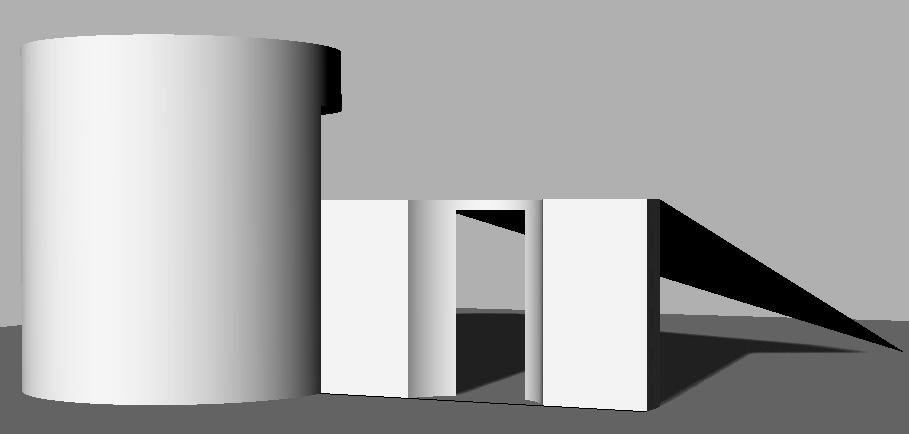
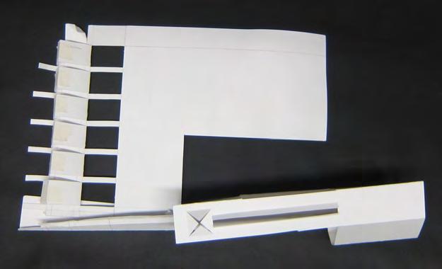
The task for this project was to manipulate a surface to create a volume for a marble to move through using a map of lines as a starting point. The marble should traverse from one end of the construction to the other and eventually come to a point of rest. It should move at two different speeds along the way and should disappear from sight at least once.
The first step was to determine what the different types of lines, varying thicknesses, and negative space meant in order to be able to ‘read’ the map. I developed a system of cutting along jagged lines and folding along solid lines in order to move the marble from one end of the paper to the other.


Iteration 1
Each iteration of the project brought about slight changes while keeping the original goal in mind. The first iteration met all the requirements, but part of the sheet of paper was going unused. I wanted to see if I could somehow use it to take the marble on an even longer journey.


Iteration 2
I liked that this iteration made the marble travel for longer, but the back side of the construction was somewhat boring.


plan
Iteration 3

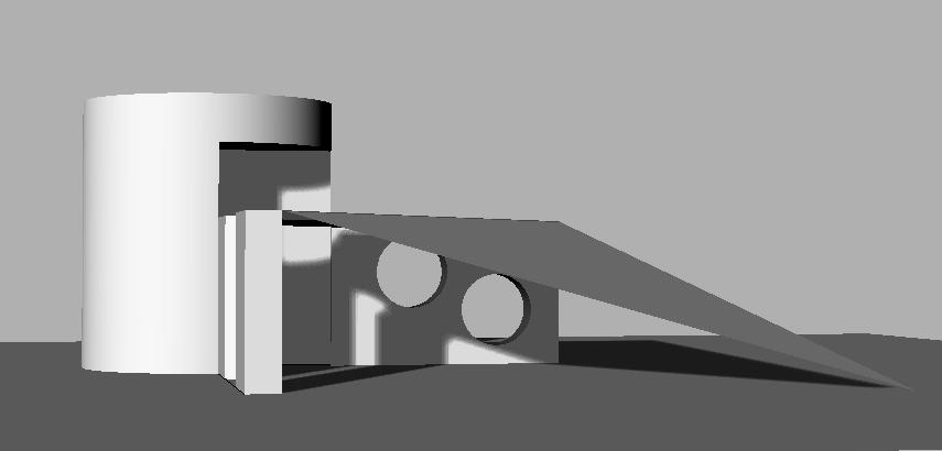
This iteration is where I ended with the project. It was the only iteration that related a sense of enclosure with the marble’s speed and materiality of the construction, as discussed on the following pages.
Enclosure and Speed

The enclosure of the track system was a result of creating slopes for the marble to travel down, but also reflects the speed at which the marble is traveling.


Where the track feels completely open is the section at which the marble is at its top speed. Where the marble feels like it is traveling through a tunnel system it is at a medium speed (accelerating or decelerating), and where the marble feels like it is inside of a box is where it rolls to a stop.


The marble has the option of making its way into the implied box within the track system, exploring the courtyard which its own path created.


Materials
When integrating cardboard into the assignment, I tried to use it as sparingly as possible. The only non-structural planes are the roof planes on the second story ramp, which help create a sense of enclosure. The use of cardboard also indicates a change of direction for the marblethe horizontal roof planes highlight a vertical change and the vertical planes indicate a horizontal direction change. These organizing techniques help to reinforce the original concept for the design, and ultimately create an interesting ‘hide and seek’ aesthetic that keeps the viewer engaged throughout the marble’s journey.
TRANSDISCIPLINARY
Introduction
The Dia Boston Gallery is a small satellite gallery for the Dia Art Foundation located at 10 Haviland Street in Boston, Massachusetts. The gallery houses three works of art which have been relocated and reinstalled according to the artists’ intentions.


Site Documentation
With the specific requirements of each piece in mind, the site was analyzed and documented as part of the pre-design phase. Extensive study and documentation was conducted on notable existing site features, natural and artificial light, circulation patterns, and current use.


Photos of the three works of art; Six
Middle: Sketches of the artworks that led to the realization that all three works share a language of planes- this became the inspiration for my design.

of https://maps.google.com/maps?q=boston+architectural+college&safe=off&ie=UTF-8&ei=ZxQvU9jQE6P40gHOgoHAAg&sqi=2&ved=0CAYQ_AUoAQ


Top Left: Aerial map of the context: city of Boston. The white dot indicates the site location. Top Right: Aerial view of the site and its immediate context. Bottom Left: Scale site model. Bottom Right: Sketch of the site showing the sizes of the surrounding buildings.


Concept
I believe that a museum’s architecture should reflect the nature of the works within, so I originally took inspiration from the explicit and implied planes found in each of the pieces to develop a concept for the design. As the design evolved, the focus moved to the treatment of space depending on function and natural light.
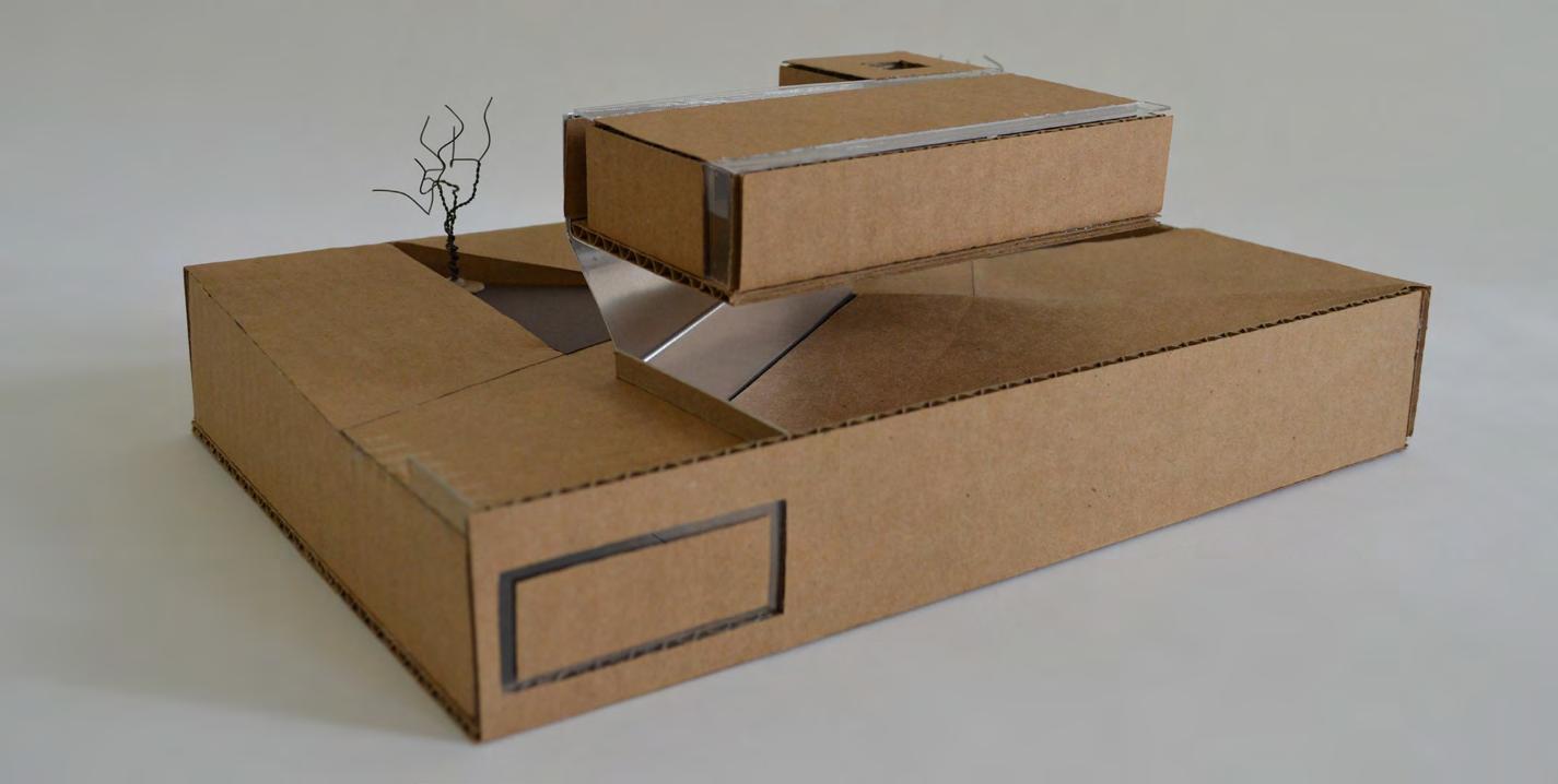
Three Levels of Inhabitation
The artwork is housed in the elevated and subgrade levels, while the ground level is reserved for circulation.


Spatial Layering
The organization of the site and placement of the artwork was developed through a system of spatial layering. There are two separate languages specific to each type of space.
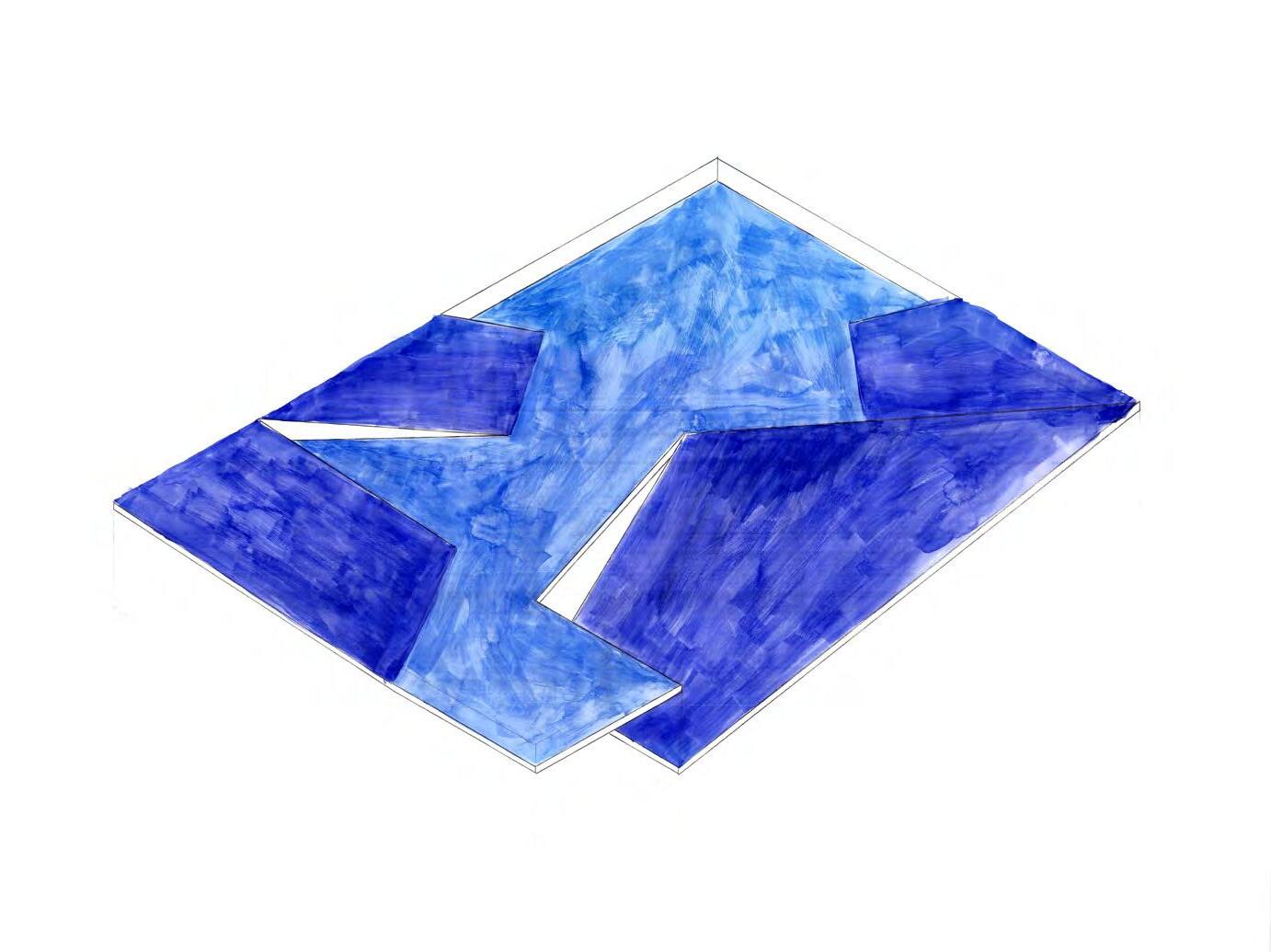
Treatment of the ground plane involves an origami-like folding of the surface in geometric patterns which have been determined by circulation patterns and site constraints. The undulating surface consists of slopes that serve as ‘guiding planes’ which direct visitors to the works of art, and flat spots as resting zones where one can appreciate the art from a different perspective.



Left Column: The Donovan piece is subtly framed by light that travels down the walls, floor and ceiling towards the piece located at the opposite end of the room.


Middle Column: Hanging Fire is sandwiched between two skylights on the floor and ceiling. This allows light to pass through the building and highlight the piece while casting interesting shadows on the ground plane where passersby can view the piece from below.
Right Column: The Sandback work is framed by a thin layer of light which enters the space through slitted windows on the edge of the ceiling and down the sides of the walls, creating a halo effect around the piece.
Light
In order to bring natural light into the space, treatment of the planes which make up the elevated and sub-grade rooms involves the carving of small glazed incisions that highlight the works of art without interrupting one’s view of the piece.
The Wall
The wall which supports the second floor ties the two languages together by taking part in each; it is folded in a similar way to the ground plane and becomes one of the highlighted walls of the second floor.
It takes part in the guiding planes language as a diagonal to the site boundaries, but by the time it becomes the wall upstairs it has aligned with the site and is taking part in the orthogonal layout of the artwork spaces.


CITY LAB INTENSIVE Sketches + Letter Home
Fall 2014
Dear Michael,
Last weekend I started my first class at the BAC called City Lab. Being new to the area, the first day of City Lab served not only as my first academic experience at the BAC, but as an orientation to the city of Boston. I got to experience the city on a deeper level than if I were just doing the tourist attractions or getting a generic tour. I explored, observed and questioned the way the city has developed and is used at various times of the day and by different types of people. It was an interesting experience, and taught me how to see things a bit differently.
Our first stop was the Prudential Skywalk, which provided a bird’s eye view of the city. It took me awhile to wrap my head around the layout of the city, but by identifying the different neighborhoods and then noting important landmarks now have a much clearer picture of Boston. The Skywalk is attached to a large mall which I could tell is high-end because of the expensive marble flooring and travertine benches, the stores were expensive and the people using the space were well-dressed.
Introduction
City Lab Intensive is a required orientation experience that introduces students to a set of observation, research, and documentation/ assessment tools to gain a heightened awareness of landscape, built environment, cultural heritage, and infrastructure. The sketches on this page were drawn during the intensive as a way to record the experience.


I noticed that everyone in the space seemed to be in a hurry, and after further observation realized that many of the people in the space were just passing through. It is amazing how much this space gets used. There were dozens of people in the mall, and it wasn’t even lunch hour or after work. There is a section of the mall that is intended to be an indoor sidewalk; a shared public space that gets users out of the elements as they move from one section of the city to another. Yet I noticed that the walk is monitored by security cameras and a staff ready to expel anyone who looks like trouble. It just doesn’t seem quite as public as an outdoor sidewalk. I even noticed a security guard eyeing my group as we stopped to chat. It was clear that he is not used to people loitering in that area.

The second half of the afternoon was spent exploring the transit system, and my group had the opportunity to interview a representative who was involved in making the T more accessible to users with physical challenges. They have an interesting system where people in wheelchairs can roll up to an area designated by white strips on the ground and the train operator will bring out a steel plate for the patron to wheel over as they get on the train. I got to see the system put to use when someone in a wheelchair needed to board the train. I noticed that this really isn’t in the spirit of Universal Design, where everyone has the same experience. Ideally, the train would be at the same height as the floor and close enough to the dock that the patron could simply wheel on instead of making a big scene and holding people up. This particular person seemed used to it, but I would be annoyed to have to wait for someone to help me instead of just wheeling onto the train myself.

The representative also talked a bit about a project in Boston to bring art into the T stations and we got to see a tile installation at Harvard Square. The art is meant to last 75 years, but I noticed that it already looks a bit dull compared to the advertisements that were plastered everywhere. While in Harvard Square we experienced another mall that was built in an old parking garage. It felt much more laid back than the Pru because people were hanging out there, and even the people passing through were walking at a slower pace.

We spent Saturday exploring an area called Roxbury. The old orange line used to run right through the city center, but when it was moved the city became a much less livable place. There aren’t many grocery stores nearby, and now public transportation is difficult. I experienced this first hand when we had to walk from the orange line station into town in the pouring rain and cold! On our way into the city noticed that many of the stores had metal grates or roll down metal security gates, making the whole city feel dangerous and unfriendly. would not want to hang out there after dark. In fact, if it weren’t for our amazing lunch at a small local cafe I would probably never go back to the area. Maybe it was because I was so happy to get out of the cold rain, but the Haley House Cafe is now one of my favorite places in Boston! There is hope for this neighborhood, and we even learned about a few developments going in that should help to revitalize the area with mixed income housing, stores and restaurants.

One project will be built on what is now an ‘urban wasteland’, which is actually pretty cool since they opened the old building up to graffiti artists to attract attention from the community. It is a shame that they have to tear it down! The other building is for the school corporation, and will use the facade of three landmark buildings in its new construction. It is going to be a very cool building when finished, but there is very little parking for employees and visitors. The area didn’t seem congested that day, but it will be interesting to see how the excess cars affect the surrounding area once the building is complete.
The City Lab experience has been eye opening so far, and I can’t wait to see what they have in store for us next weekend! Hope all is well with you, keep in touch. Love, Christine


Letter Home
This assignment demonstrates thoughtful/ reflective writing, the ability to know, understand and describe place specifically and the city more broadly through various conceptual and thematic lenses.

Commentary 2: Long Term Inhabitation

Commentary 1: Diagrams
Simple and intuitive diagrams make a stronger statement because they are usually understandable within a matter of seconds. Symbols and confusing doodles add clutter to an image and make it less graphically impactful. These diagrams illustrate perception of time and perception of color.
Commentary 3: Buildings Should Dance
present future distant future present future distant future

Trendy building created to wow the public which looks cool but doesn’t provide for long-term inhabitation of space because it is not adaptable or efficient.
Introduction
The City Lab Extension serves to reinforce ideas and viewpoints aligned with subject matter previously introduced in City Lab Intensive. These Commentaries are supplemental assignments to help reinforce concepts learned through readings and lectures.


Average-looking building that is highly functional because it is built for adaptation over time and serves many purposes well.
Commentary 4: The Iterative Process
The iterative process can be linear, cyclical, or a combination. One might choose to make only minor changes at each step, or start from square one each time. The best iterative processes are a combination of both methods, as shown above.


A building should be sculptural, friendly, and inviting. In contrast to typical linear circulation paths, an active circulation network allows for maximum interaction for the user while taking them on a dynamic journey. typical linear circulation active circulation network

Commentary 5: A New Direction For Architecture


ITERATION 1:
Cyclical styles that start over at each step allow for idea generation
ITERATION 2: Some ideas can be further developed through a more linear process
ITERATION 3: We might go back to generate more ideas as part of a larger cyclical process

Image of a typical ‘big box’ interior and a higher-quality custom interior
Commentary 6: Representational Architecture

One World Trade Center soars above the clouds, personifying our ability to rise above the devastation of 9/11 and rebuild. The tower stands at 1,776 feet; the year the Declaration of Independence was signed. As the tallest building in the United States, the building explicitly represents the abstract concept of freedom.
Lately it seems that space is the top priority in residential construction, and many ‘big box’ houses go up with lots of space but no character. I think this trend will shift back to a desire for sustainable quality construction, even if that means a smaller footprint.
Commentary 7: Museum Represents The Works Within


The Institute of Contemporary Art communicates the experience of the works within by exposing its inhabitants to unique spatial experiences that push the boundaries of traditional architecture.
Commentary 8: Light Accumulates Information


Yellow color, high intensity, deeply penetrating light informs us that it is daytime with nice weather. Blue color, low intensity, shallow penetrating light informs us that it is early morning or late afternoon/evening. Color, intensity and directionality of light are three features which inform the viewer about his or her surroundings. A comparison of these two images is an example of how we gather information about the time of day, weather conditions, and even the time of year through light.
ARCHITECTURE STUDIO 1


Precedent Study
Given a list of buildings, I chose the view terrace and pavilion in Memorial Park “The Garden of Destiny” as my precedent study.

This diagram shows how the two ‘arms of the pavilion are pulled out into nature while nature is pulled into the ‘built’ zone.


most ‘built’: completely man made natural but altered by humans least ‘built’: completely natural
Precedent Analysis
After analyzing the structure it became clear that the designers intended to create a gradual transition from a natural environment to a built environment. They accomplished this through the shape of the building, its interaction with the site, and its materials.

Site Documentation
The site for the project was a park in the North End. A preliminary site analysis led to a mapping exercise to identify pedestrian circulation through the site, as well as nearby landmarks and transportation nodes.


panoramic views from the site of the waterfront (top) and the north end (bottom)


collages derived from panoramic views showing materials and visual weight


horizon line tracings derived from panoramic views showing more fragmented horizon in the north end due to proximity


primary edges
secondary edges
primary district area
secondary district area
Urban Analysis


at washington and causeprince street at defilippo play - north station

During the site analysis I began to notice that the site sits between two distinct zones. While the North End is a bustling, chaotic neighborhood, the harbor is much more quiet and serene. I documented this difference through sketches and photos and began to analyze the reasons for the difference in feel.

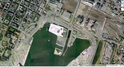
oslo opera house is a massive building that deals with the water’s edge by sloping directly into the water. people are able to relate to the building because of its human-scale elements like benches and material textures.


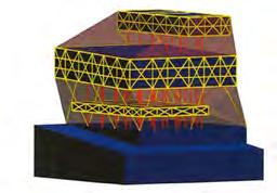
the seattle central library uses a system of columns and trusses to support the gravity load, while the skin is strictly wind and seismic resistance
image sources:
1. http://www.arcspace. com/CropUp/-/media/245032/seattle_public_library_16.jpg
2. https://architectureinmedia.files.wordpress. com/2008/03/3d_engineering.jpg

Research + Inspiration
I continued looking at precedents to glean inspiration for my design solution’s structural language, relationship to the water, and method of serving as a transportation hub.


Design Iteration
My analysis, precedent studies and research contributed to the design solution throughout the semester. Each new finding led to a new iteration of the design. Included here are a few of the iterations. Once the shape of the building was determined in plan the iterations become more subtle, dealing mostly with programming and materials.
iterations models of various iterations


Final Design Iteration
Via my research and analysis the final design serves as a gradual transition from water to the urban environment via its shape, interaction with the site, and materials. It responds to discovered urban conditions and blends into the harbor district. It incorporates plenty of things to touch in order to stay at human scale. The building uses one structural language for spaces which are specifically programmed and another for flexible areas. The building is naturally lit, has large waiting spaces, and open views to see the ferry arriving.


The model of the latest design iteration uses a steel mesh roof to depict the structure of the building skin. The building is encased in glass to allow for natural daylighting, but the roof still has solid places on which to walk. The interior walls use a language of compression, and less strictly programmed waiting spaces are open and have tall ceilings.


Interaction With The Site
The building sinks to meet the water at its lowest point where the passengers load the ferry. As the ferry pulls into its loading area, water is pushed under the building and into the urban zone. These two features mimic my precedent’s interaction with the site where the building sinks to meet the existing terrain and earth is built up to meet the building between the protruding arms.


These views of the model show what passengers see as they move through the space. Sightlines to the ferry are clear upon entry, and the interior walls filter traffic through the building with wider paths at heavily trafficked areas and narrower hallways leading to private spaces. The ceiling above is cut out over these walkways, highlighting the route for new visitors.

showing how sightlines influenced the programming layout and roof patterns


Programming
The programming was determined by sightlines, an idea that was inspired by my analysis of North Station. The interior walls are arranged such that passengers have a clear sightline to the ferry from the moment they walk into the building. Walking paths are highlighted through glazed opening in the ceiling- larger openings for heavily trafficked paths and narrower openings for less traffic.


CONCEPT
- Created entirely of recycled plastic bottles
- Allows user to interact by adding drawings
- Final product is user generated
- Educates the users about sustainable design through interaction and observation

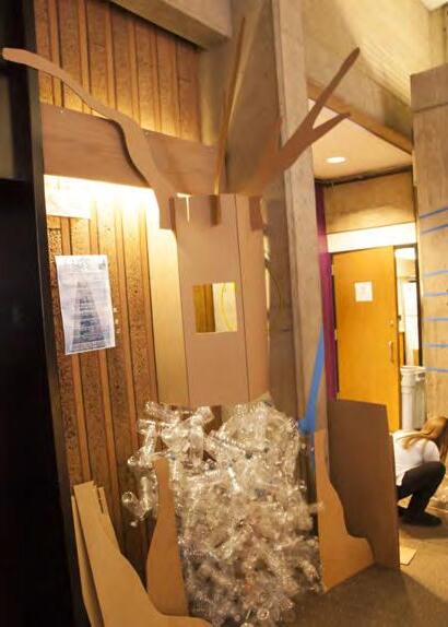
THE COLLABORATIVE PROCESS
In a group of five or more people there is bound to be some disagreement. We had planned to build the structure one way, but after the first few hours of work some of the group members realized that changes had to be made to the design. Those who were not present during this decision making time were not happy with the turn that the project took. While we could have called it quits, we instead pushed to get the project to a point of completion. While it was difficult to compromise, this was our only option. This approach paid off, as we were able to finish the project in the end despite things not going according to plan. This was a valuable learning experience for me because it helped to prepare me for a professional setting when may not agree with my colleagues. It was important to remain professional in order to come to a fair compromise.

Introduction
For this collaborative project we chose to design and build a piece of sustainable, interactive artwork since all the group members had an interest in sustainability, education, and art.


Evolution
Due to issues with the construction methods, the design of our final project evolved from its original concept drawing as a tree made from bottles into a receptacle which makes participants ponder the impact of throwing recyclables into the trash bin, and in turn adding to the landfill.
An analysis of the Barcelona Pavilion by Mies van der Rohe revealed planar layering techniques that blur the line between indoors and outdoors.


Learning Goals
During the coarse of this two-week project I learned AutoCAD 2D and Google Sketchup.

Site plan done in AutoCAD by importing a drawing and tracing the topography lines.

Analysis
An analysis of the Glass House by Phillip Johnson revealed the hidden complexity behind the apparent simplicity of the design.


Learning Goal: Assign materials in Google SketchUp

Model showing sightlines with black thread and circulation paths with wire, revealing the complexity within the Glass House.


Understanding
Precedent 1
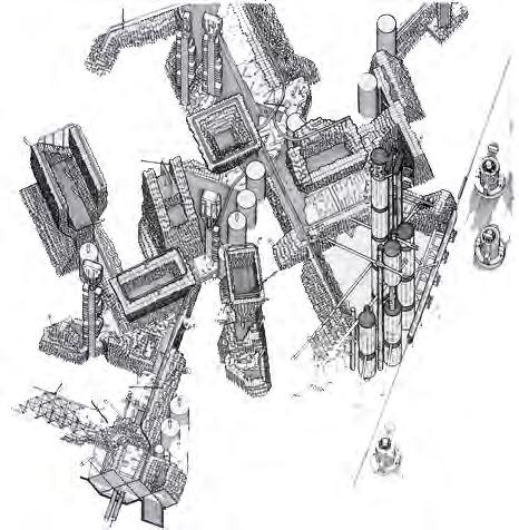
Plug-In City by Archigram is a 3-dimensional megamatrix infrastructure comprised of a complex grid framework that accommodates a variety of modules (highlighted in green to the right) and allows for constant change.


Understanding Precedent 2
The Water Temple by Tadao Ando is a spiritual space which exhibits many symbolic features. Of particular interest is the indirect path into the heart of the building, symbolizing one’s spiritual journey through a physical experience, as shown in these diagrams.


SKETCHES + WORDS OF INSPIRATION:
Modularity / Journey / Designed for Change / Spirituality / Plug-In System Meditative / Machine-Like Elegant / 3-Dimensional Contemplative Industrial / Meander
Phase 1: Labyrinth Game
Combine After analyzing the two precedents our task was to combine the big ideas from each into one product that we would fabricate. This diagram shows the non-linear process of reaching the final design idea.

Phase 2: Modular Artwork

Phase 3: Cat Shelves

PROCESS DIAGRAM
Each hexagon represents a design phase where one particular idea was being explored. There were some overlapping periods of time where two ideas were being explored simultaneously. The size of each hexagon represents the proportion of time spent in each phase.
Phase 4: Meditation Object

COMPONENTS:


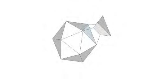

Transform I decided to move forward with the modular meditation object, which I named the ‘Zenosphere’. It applies the languages of both precedent studies to its design. The path on the surface of the object imitates the spiritual and physical journey one takes when visiting the water temple. The object has an effect much like that of the sand raking techniques in zen gardens; the mind settles as they eye follows the curved lines. The modular design of the zenosphere is also inspired by that of Plug-In City, and follows a similar plug-and-play language.
SUSTAINABLE MATERIAL ASSEMBLIES
Material Study: Timber
Instructor Michael Sadler
Fall 2014


Timber Mapping
This project was an introduction to the building material timber through research conducted in pairs. Our research revealed a significant difference in forest cover between the 1850’s and today. We also noticed that there are higher levels of production where the forest cover is mostly soft woods like Fir and Pine, which are mostly used for construction.


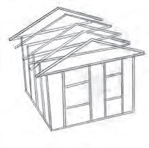


Hardwood applications include flooring, furniture, and some architectural details and trimwork. Softwood applications include furniture and trimwork, but is widely used in residential construction.
SUSTAINABLE MATERIAL ASSEMBLIES
Precedent Study:


Simplicity
Masks
Complexity
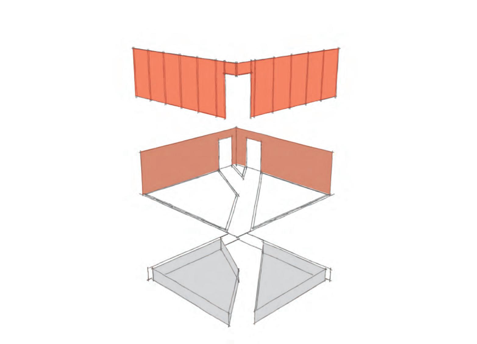
For this project my partner and I researched The Red Box at Zhongshan Shipyard Park. Through our analysis we learned that the assembly of this very simple form is actually quite complex. This structural quality mirrors the design intent as well, as The Red Box is a simple place where one can meditate and reflect upon the complex history of communist China.


SUSTAINABLE MATERIAL ASSEMBLIES
Precedent + Material Study: The Nora House
Fall 2014


The Nora House
This project was a culmination of the skills we had learned in the previous two projects. We analyzed the main construction material (timber), determining from where the timber was sourced and mapping the result of our efforts. We also discovered in our research that the Nora House utilizes several indigenous strategies in its design, so we sketched these elements in the precedent series. The large drawing on the right page of this spread shows the effect that these elements have on the inside of the house and shows how the building is constructed.


