6 minute read
THE NEW NEUTRALS The evolution of a colour palette and its roots in history


The new
NEUTRALS
Colour has the power to transform our homes and reflect the mood of the moment. We look at the evolution of a palette for our times and its roots in history
Artwork and companionable colour choices give gallery appeal to this kitchen. Cabinetry, Book Room Green; upper wall, Light Bronze Green; splashback Elysian Ground; highlight stripe, Nether Red, all Little Greene
Colour choices for interiors rarely stand still and recent decades have seen the fall of magnolia, a love affair with taupe, and more than a decade of grey in all its moods. Deeper shades are confidently in the mix too, but off-whites and soft neutrals remain the bedrock of home decorating as every paint chart makes plain.
Whilst many of us have been turning to richer, darker colours in recent years, light colours are still the essential backdrop to everyday living, and seem to be even more so at a time when a large majority of us have been confined to our homes. David Mottershead, founder and managing director of paint company Little Greene, noted early on in the pandemic that people had begun buying warmer off-whites. “It was as if time spent working and living in the same environment had instigated an intuitive move towards more companionable tints,” he says.
The search began for the signature tint that matches this far from ordinary moment. “I talked to the National Trust about a new capsule collection based on our mutual interest in keeping the colour concept related to nature,” Mottershead says. A plan was agreed for Little Greene to introduce a new collection named ‘Stone’, reflecting historic colours derived from earths rich in iron oxides. These encompass ochres for soft yellows and reds; siennas for brownish oranges and reds, and umbers for a range of browns. Some colours in this collection were taken from Little Greene’s
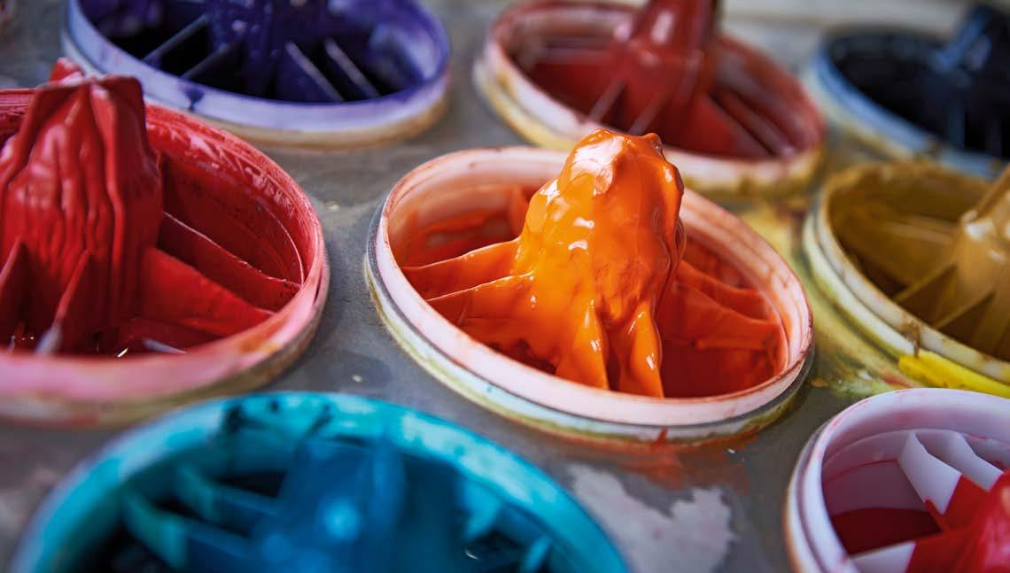
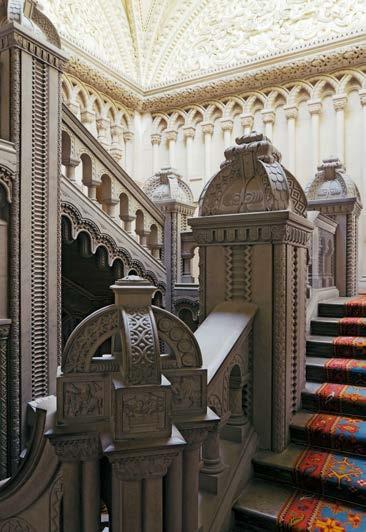
ABOVE Pigment dispenser tubs at Little Greene. MIDDLE LEFT The imposing great staircase at Penrhyn Castle in North Wales that inspired Little Greene’s Baluster and Castell Pink shades. MIDDLE RIGHT Chocolate Colour by Little Greene on walls and woodwork highlights the bright contrast in colour and pattern of the seating and rug. RIGHT In recent decades paint companies have sought to replicate colours seen in period buildings, including The Royal Pavilion in Brighton.
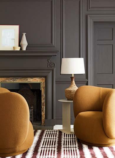

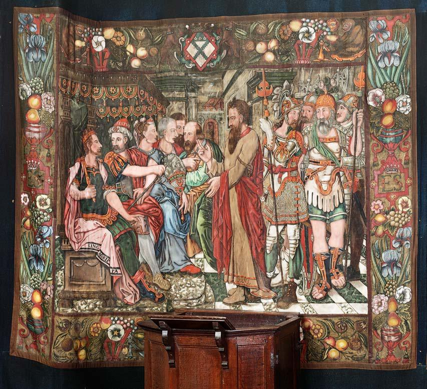
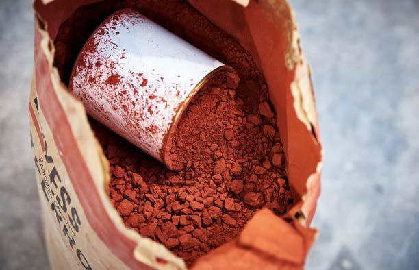
LEFT One of a series of four painted wallhangings in the chapel at Hardwick Hall, Derbyshire. The prominent deep red provided the reference for Arras in Little Greene’s Stone collection. BELOW LEFT Red ochre pigment as it comes into the Little Greene paintworks. It is the red base from which many warmer neutrals, as well as reds, are made. BELOW A warm earthy sienna tone runs through this study in a variety of concentrations. Ceiling and cornices, Ferdinand; upper wall, Castell Pink; lower wall, Nether Red; shutters, Arras, all Little Greene OPPOSITE Hues with ochre pigment at their core are shown here in varying shades of Little Greene’s Clay on the walls, the central panel in Scullery, and lower walls in Purple Brown.
existing palette, others were sourced from National Trust properties and taken directly from stonework. A hue named Baluster captures the limestone grey of the imposing staircase at Penrhyn Castle in North Wales, and another, named Nether Red – inspired by the stone walls at Nether Alderley Mill in Cheshire – speaks of rich sienna earth.
“We have a spectrophotometer that analyses colour mathematically so it can be reproduced in the lab,” Mottershead explains. “Then we return to the site with that paint colour to check the match. There’s a lot of science in the maths of colour. Surprisingly the eye is more sensitive to analysing light colours accurately, whereas science is better with strong colours. We also analyse paint chips chemically.”
In previous centuries, the majority of people relied on just two off-white finishes for walls and ceilings:
These finely crafted, steam-bent oak planters are designed and made in Cornwall by Tom Raffield. Merryn floor-standing planters: Short, £695; tall, £745, both Tom Raffield
The enduring properties of stone have never lost their appeal. The subtlety of its colours and the reassuring resilience we draw from its strength underfoot have registered at this moment of change

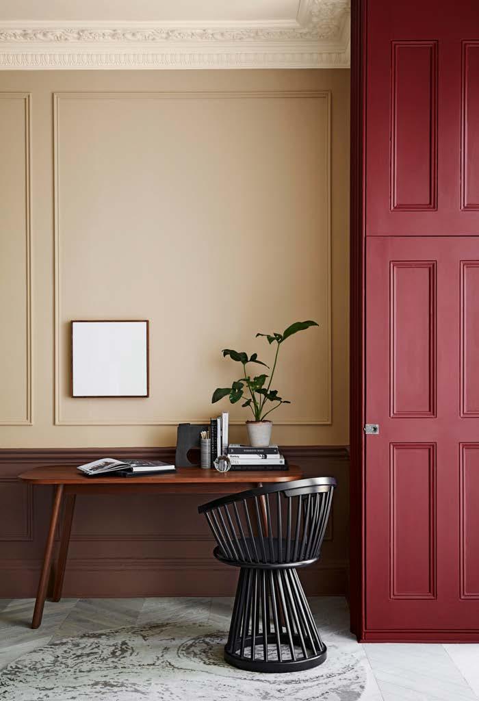
A stronger colour on doors can define a junction between different areas whilst keeping walls neutral for continuity. Ceiling, upper walls, dado, door and trim, in different shades of Portland Stone; doors in adjoining passageway, Dark Brunswick Green, all Little Greene

limewash from limestone burned in kilns and mixed with water gave a disinfectant wash; and chalk combined with water and glue from animal bones and horn gave a hardier distemper. Most colour added to paint before the discovery of synthetic dyes came from earth pigments. Architectural historian Edward Bulmer’s paint brand Edward Bulmer Natural Paint offers thoroughly researched colours for every era and he makes a particular point of restating how decorating colours available to most people before the arrival of colour chemistry were based on common colours derived from digging up earths rich in iron oxides.
Bright paint colours were hugely expensive – with the brilliant blue from crushed lapis lazuli defining the status of the few who could afford it – and sometimes toxic: vivid arsenic-based greens and yellows were not only costly but could also poison painters with their fumes. Events such as discoveries at Pompeii and Herculaneum in the mid-eighteenth century set off a fashion for terracotta reds in grand houses, and when chrome yellow was discovered in the early nineteenth century, it became a key colour in the Regency period.
With the discovery of aniline (or synthetic) dye in 1856 came the ability to colour paint and a previously unimagined freedom in home decoration. Decorating choices throughout the twentieth century celebrated the ever-increasing palette of hues on offer, though it was brilliant white that surprised the 1920s when it was first formulated. Orange hues and greens from lime to olive were post-War favourites in the 1950s and 1960s, and a new interest in traditional colours ran from the late 1970s through to the 1980s.
Patrick Baty at Papers and Paints was one of the first to track down historic paint colours like blue verditer, once a costly by-product of silver refining. He found it on the gallery walls at The Royal Pavilion in Brighton and the colour is among many more in his Traditional Colours paint collection. Other strong brights with historic associations include Farrow & Ball’s Picture Gallery Red, based on the gallery walls at Attingham Park in Shrophshire, and Cook’s Blue found in the cook’s closet at Calke Abbey in Derbyshire.
The subtlety of stone and the reassuring strength we draw from its resilience underfoot have registered at this time of change, with our homes suggesting the colour most needed now. If this is truly a new stone age, its many tints can be discovered across all paint collections, waiting to match the mood of the moment. n
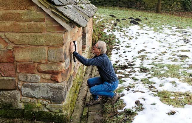
TOP RIGHT Nether Alderley Mill in Cheshire was the source of Nether Red, the colour recurring through its walls. TOP MIDDLE David Mottershead, founder of Little Greene, using a spectrophotometer to take a reading from the wall at the Nether Alderley Mill. A green taken from the early nineteenthcentury Book Room at Wimpole Hall in Cambridgeshire is used for the upper wall. Upper wall, Book Room Green; lower wall, dado and skirting, Sage Green; right-hand wall, Green Stone Pale, all Little Greene