8 minute read
CHARACTER STUDY A layered aesthetic brings warmth and charm to a Victorian terrace in West London


Character STUDY
A layered aesthetic has brought warmth and personality to this Victorian terrace, enabling its owners to fall in love with it all over again
FEATURE RACHEL LEEDHAM PHOTOGRAPHY RACHAEL SMITH
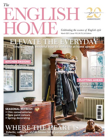
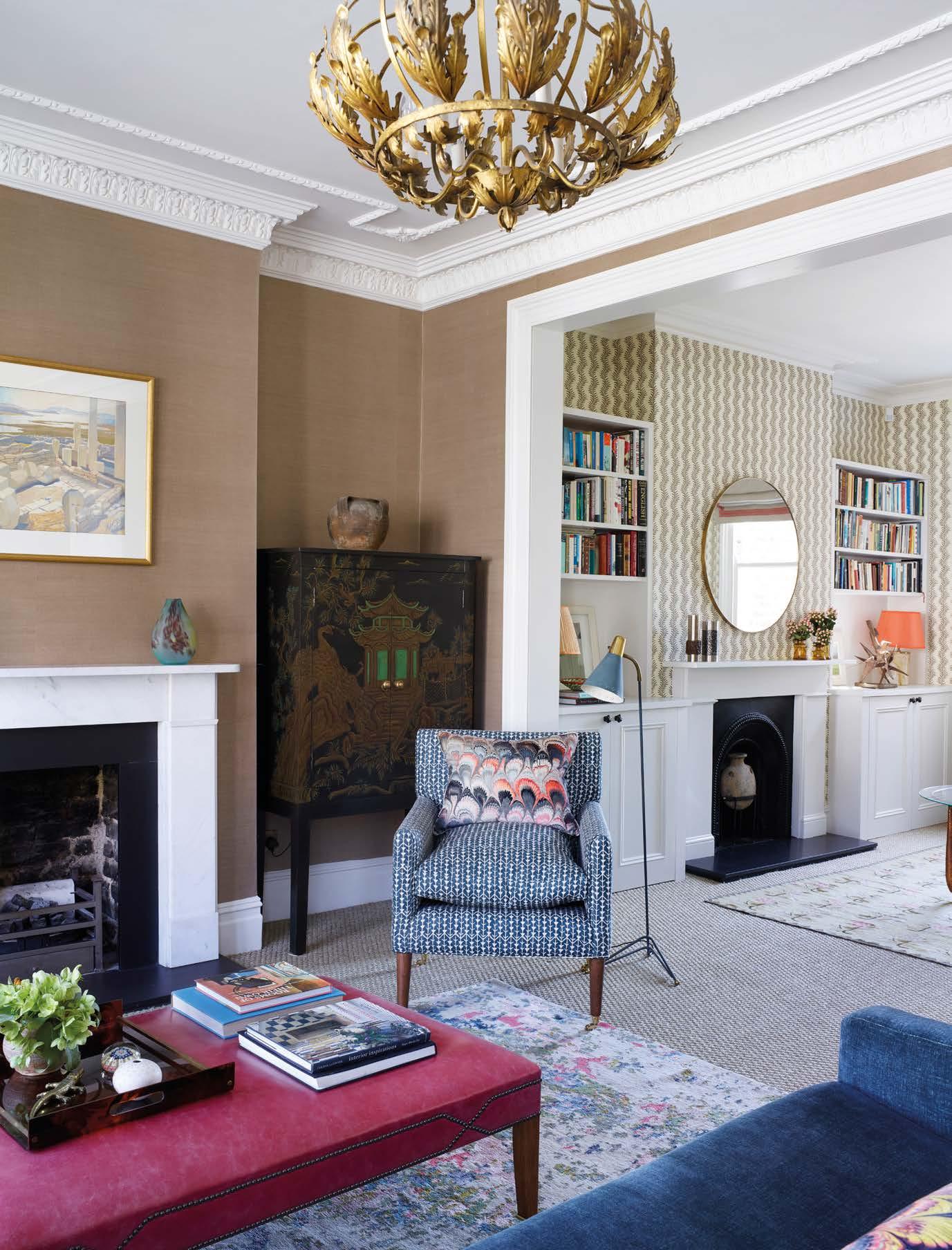
Purchased whilst the project was underway, this painting by Julia Whitehead was a serendipitous find. The Luca wall lights in Amethyst are by Fiona Makes at Fiona McDonald.
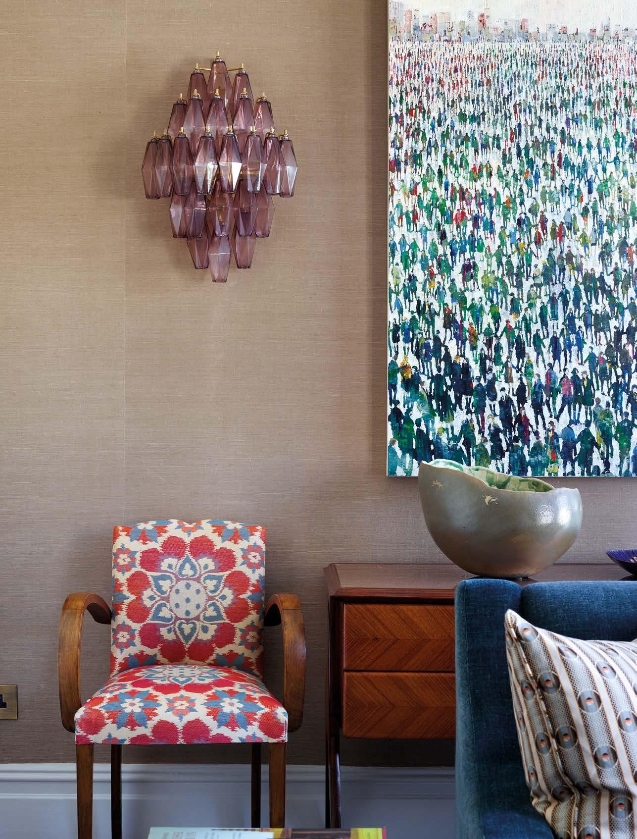
The walls in the drawing room are covered in Sacramentograsscloth from Stereo. Thetelevisionis hidden in a chinoiserie-style cabinet by Oka. The cushion in Marbleized velvet is by Beata Heuman; the ottoman in sorbet pink leatheris by David Seyfried.
This space opposite the drawing room on the first floor also serves as a guest bedroom. A truckle divan bed covered in Verandah Peacock Blue by Veere Grenney doubles as a day bed. The Verona mirror and 1940s French coffee table are both from Fiona McDonald. Scrolling Fern wallpaper in Chestnut by Soane adds lively pattern to the walls.
ABOVE The armchairs by Fiona Makes at Fiona McDonald are covered in Span in Honey by Christopher Farr Cloth. The impressive 1920s gilded iron chandelier is from Carlton Davidson Antiques and the large table lamp is the Larimar from Porta Romana. The Rhodonite rug by Jennifer Manners beautifully pulls the palette together. F amily dynamics change as children grow and a love affair with a house can wane in the process. It sometimes takes a real shake-up to reignite the passion first felt for a family home, and such was the case with this four-storey Victorian terraced property in West London. Its owners, Jane and John, had bought and renovated it as newlyweds, but now, with three children aged 15, 14 and nine, plus a dog, they were finding its layout lacked the flexibility they needed. “The children had got to the point where they wanted their own space, but we all lived in the family room off the kitchen, while the large double reception room on the first floor was very rarely used,” Jane says.
The family had recently completed a lengthy project building a second home in the Cotswolds, and having plundered their London abode for furniture and art, it now felt rather bare and unloved. “It certainly needed more furniture but it also lacked warmth – I was tired of white walls and ready for something much more colourful,” recalls Jane, who tasked interior designer Kate Arbuthnott with refurbishing the house over the course of six short weeks during the children’s summer holidays. The brief included tweaking the kitchen, redesigning the bathrooms and building new fitted storage. “It was a tall order, but having emerged from such a lengthy build, we felt that speed was of the essence with this project,” Jane explains.
Kate cut her teeth working with Emma Burns at Sibyl Colefax & John Fowler and she is known for her inviting, layered interiors that are underpinned with a sharp eye for detail. Her knowledge of fabrics and wallpapers is encyclopaedic and it was with these that she kicked off the key schemes for the house, starting
The striking Cupola pendant by Tamasine Osher Design brings an organic element to the dining room. The Chestnut wallpaper is by Marthe Armitage and the patterned chair fabric is Antalya by Borderline.
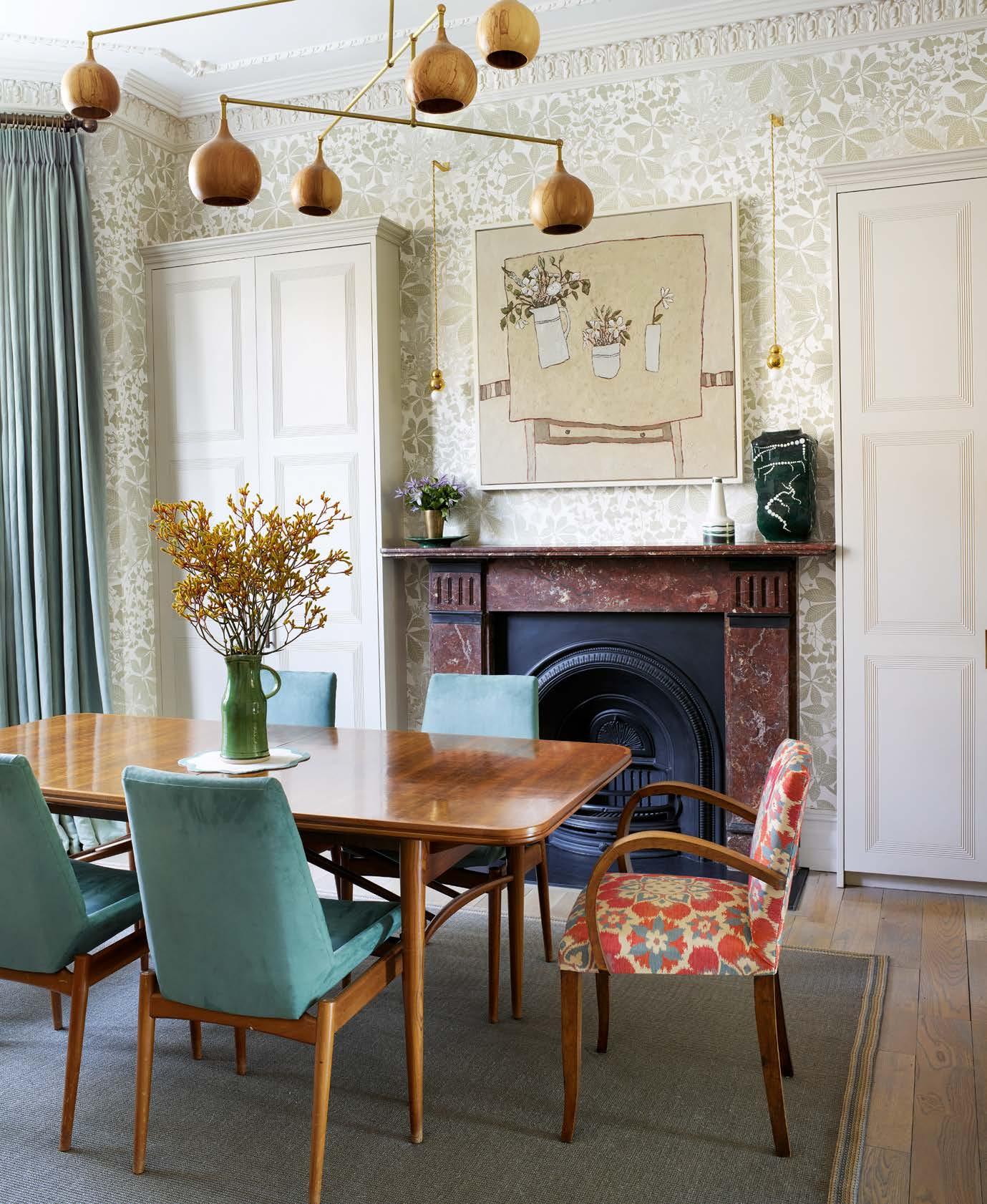


The leafy wallpaper in the dining room was one of the hero designs Jane selected: ‘It had particular resonance as it is block-printed nearby’
with the much under-used first-floor drawing room. “I encouraged Jane to select a few hero designs that guided me for the palette,” Kate explains, pointing out the arresting abstract print used to upholster a pair of 1960s-style armchairs. “Jane alighted on this design, which then inspired the fabrics in soft blues and the gorgeous amethyst glass wall lights.” Kate suggested the tobacco-hued grass cloth on the walls to offset the couple’s art. “People are often afraid of using colour when it comes to displaying paintings, but it can really make the pieces stand out,” she says.
The same rich shade was picked up in an elegant fern-print wallpaper for the other half of this double reception space, which serves primarily as a study. “There isn’t a spare room, so this area needed to double as an occasional guest room,” says Kate, adding, “The sofa is in fact a truckle divan that we dressed in a textural peacock blue linen so that it looks like a smart day bed.” A leafy wallpaper in soft, silvery hues, was another of the hero designs Jane selected, this time for the dining room next to the kitchen on the ground floor. “It had particular resonance as it is block-printed in a studio not far from the house,” explains Jane, who reveals that she also loved Kate’s suggestion of an organic pendant light crafted from spalted beech, whose asymmetrical design was a deliberate choice to mitigate the fact that the ceiling rose is not perfectly centred above the dining table. “Kate is wonderful at layering lighting, so she also included table lamps, and wall-hung pendants by Michael Anastassiades at Sigmar,” Jane says. “And having dimmer switches means that when we have guests for dinner it feels wonderfully intimate, but also that this room works as a place where the children can do their homework.”
New fitted storage in the dining room was an important part of the brief, too, and includes
ABOVE The island unit is topped with Calacatta Tigre honed marble from Artisans of Devizes and the cabinets are painted French Gray by Farrow & Ball. The cupboard handles are from Chloe Alberry. OPPOSITE The ultra-slim Empire console table from Scumble Goosie is painted in Dragon’s Blood by Fired Earth. The Ebury mirror is available to order from Julian Chichester.
Interior designer Emma Sims-Hilditch designed the headboard and used Mark Alexander’s Retro fabric from Romo to cover it. A false wall was built behind the bed to create Rupert’s dressing area. The bedside cabinets are from Chelsea Textiles, with lamps by Vaughan and the bedspread is from The White Company.
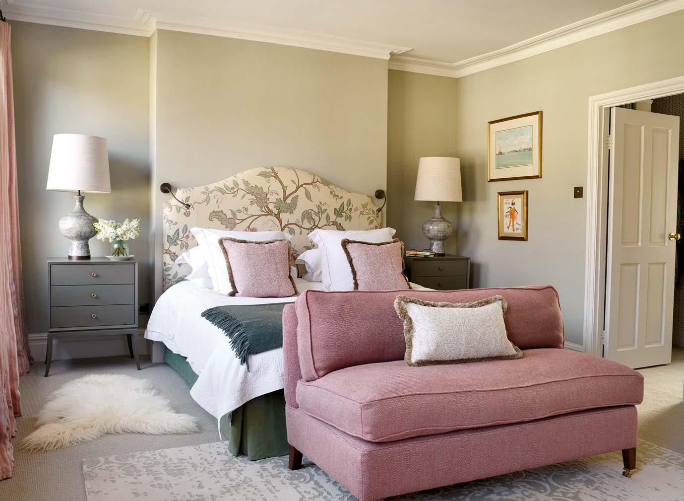

ABOVE Details such as cut fringing on the cushions add all-important tactile touches in the master bedroom. The Zulu lamp bases are by Porta Romana whilst the Mid Century Modern bedside tables are from Chelsea Textiles. The Erased rug is by Jennifer Manners. LEFT This pleasing arrangement showcases a Countess mirror by Julian Chichester flanked by tall Acanthus column table lamps by Vaughan. The Drummond sideboard is from Oka. generous cupboards built into the alcoves either side of the chimneybreast. Although they look deceptively shallow, the dining room cupboards extend into the alcoves and provide storage for all manner of things –from shoes to dog leads to cycle helmets – that had formerly cluttered the nearby entrance hall. “The cupboards are deep enough for coats but I filled in the alcoves above them so that they don’t appear bulky in the space,” says Kate, who created more storage in the kitchen by designing an island unit to complement the existing cabinetry. It is topped with a richly veined marble to add a touch of pizzazz to the space.
Whilst the main works were completed within the rigid timeline – “I had a programme of what each tradesperson had to do each day, and needless to say, it was detailed,” laughs Kate – it was inevitable that some of the pieces would be added at a gentler pace. “I think it’s important to leave a few holes,” she explains. “For example, once the main pieces were in place in the drawing room, I suggested adding an enormous table lamp, as I realised the space could take it – this is the sort of thing that I couldn’t have envisaged at the planning stage.”

Jane is the first to admit that Kate nudged her into making braver decisions than she would have taken on her own. For instance, when Kate suggested a bold pink floral wallpaper for the tiny downstairs loo – with woodwork in a matching rhubarb pink – Jane wondered if it was a step too far. “At first I thought it seemed so loud. I called Kate up saying, ‘I hate the loo!’,” she remembers. “She suggested I should live with it for a few days and now I really do like it, as does John, who is the least pink person.”
“The house now gets used in a much more fluid way,” Jane says. “It is a really inviting place for entertaining friends, and my husband and I love the fact that we have a comfortable drawing room we can retreat to. Even the children comment on how much better it is to live in. I think everyone has fallen in love with the house all over again.” n
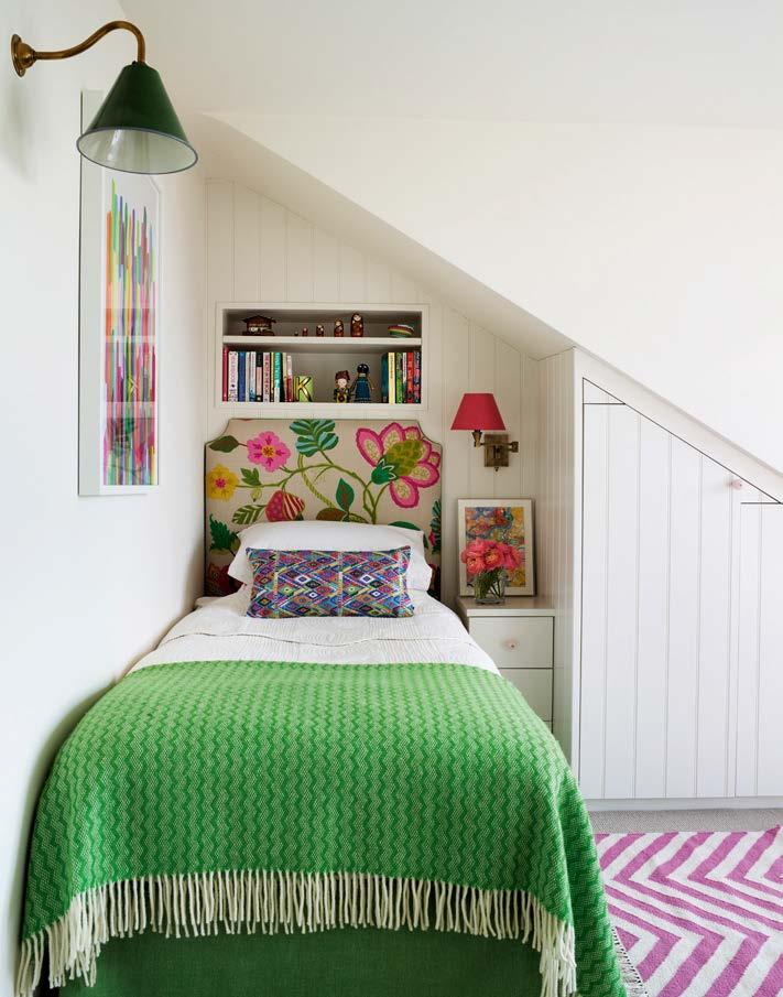
ABOVE LEFT The woodwork in the cloakroom has been painted in Rhubarb by Paint & Paper Library to match the Palampore Blossom wallpaper in Pink and Red by Soane Britain. RIGHT The master en-suite bathroom floor is in North Haven Penny Mosaic by Fired Earth unites and the blind fabric is Fez Seafoam from the Guy Goodfellow Collection. The couple’s daughter selected this vibrant crewelwork design, Kaliska in Rose Indien by Manuel Canovas at Colefax and Fowler, for her headboard. The bespoke Altiplano brocade cushion is by A Rum Fellow.