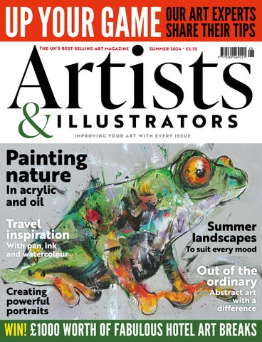


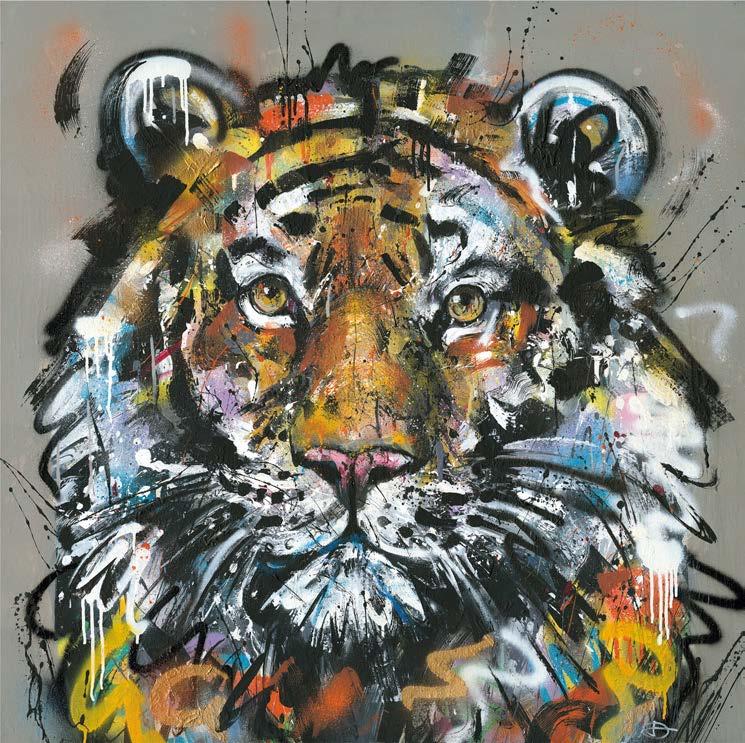
SUMMER 2024 • £5.75 THE UK’S BEST- SELLING ART MAGAZINE Out of the ordinary Creating powerful portraits ordinary Abstract art with a difference To suit every mood Summer landscapes Travel inspiration With pen, ink and watercolour WIN! £1000 WORTH OF FABULOUS HOTEL ART BREAKS IMPROVING YOUR ART WITH EVERY ISSUE Painting nature In acrylic and oil UP YOUR GAME OUR ART EXPERTS SHARE THEIR TIPS
Regulars
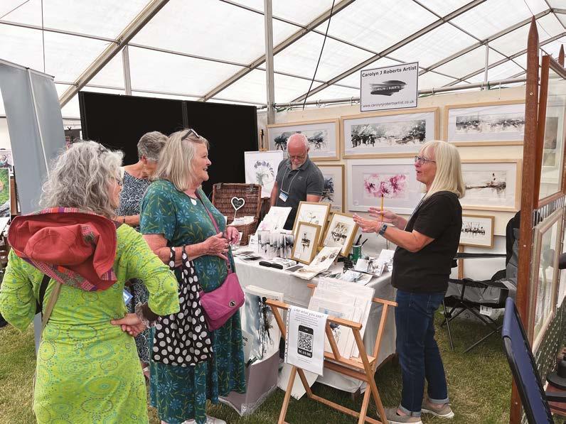
SKETCHBOOK Quick tips, ideas and inspiration. Plus, this month’s exhibitions
PRIZE DRAW Win hotel stays worth £1000
WE PRESENT British art club member Serghei Stepanov
HOW I MAKE IT WORK with ink artist Phoebe Jane YOU TELL US Write in and tell us what inspires you
PICTURE THIS Landscape artist Allie Datillio tells us what her painting means to her
Inspiration
IN THE STUDIO with British wildlife artist Elaine Kazimierczuk
HOW I PAINT Former Olympian Danielle Tomlinson shares how she became an artist
Abstract painter Kate Shooter on capturing life’s essence ART HISTORY We look into a new exhibition on Michelangelo’s later life RETROSPECTIVE Henry VIII’s six
EXHIBITION
Contents ARTISTS & ILLUSTRATORS • SUMMER 202 4 ARTISTS & ILLUSTRATORS 3
BIG INTERVIEW
THE
lives are the subject of a new display
painting remembrances with
Wall
wives and their
TRAVEL Creating
Laura
Rob Cowan on how the British Art Prize gave him the boost for his rst solo show 5 12 14 22 78 82 16 24 30 36 42 46 48 SEASCAPE Terence Clarke shows you how to paint a Mediterranean scene WATERCOLOUR Phil Hobbs paints a local Lake District landscape PORTRAIT Charcoal artist Elías Flores demonstrates how to create with depth and emotion FLORAL Alyona Creates shows you how to paint a beautiful peony in watercolour 56 60 66 72 STEP-BY-STEP STUDIO NEW SECTION 48 24 46
Stay inspired by subscribing!
ARTISTS & ILLUSTRATORS
Phone: +44 (0)1858 438789
Email:
artists@subscription.co.uk
Online:
subscription.co.uk/chelsea/solo Post:
Artists & Illustrators, Subscriptions Department, Chelsea Magazines, Tower House, Sovereign Park, Lathkill Street, Market Harborough, LE16 9EF
Renew:
subscription.co.uk/chelsea/solo
Annual subscription rates UK: £75, US: $150, RoW: £110
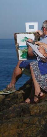
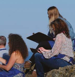
Welcome to
Painting en plein air…
…o ers possibilities artists can’t nd inside the studio. When setting up outside, painters put themselves at one with nature and the environment. Responsiveness to the outside’s changing light, forms and colours yields work that’s lively and spontaneous. In this issue, three artists show you how they do it in very diverse ways. Elaine Kazimierczuk’s practice is based on her close studies of plant habitats and meadows; she takes her paints all over the world. Phil Hobbs likes to venture out early in the morning and sketch the landscape in the Lake District, before returning to his studio to ‘take the outside in.’ Terence Clarke is a keen en pleinair painter and shows you how he painted the bay near La Ciotat, a small French shing village not far from Marseille, a place famous in art history as Braque, Matisse and other Fauves worked there in the early 20th century.
If you have holidays or travel plans for this summer, take motivation from Laura Walls who documented her trip to India and Vietnam in a variety of sketchbooks with watercolour and pen.
If it’s portrait inspiration you’re after, two artists show you how they approach the subject whilst we also feature two abstract painters, whose work is both personal and powerful.
Our fabulous website for showcasing and selling your art
For culture vultures, we cover two major exhibitions, one looking into the work Michelangelo created in the last decades of his life (spoiler alert: he didn’t let old age slow him down) and the other focusing in on the six wives of Henry VIII and the art that their fascinating lives have spawned ever after.
Enjoy the issue – and keep on painting and creating.

INTRODUCING
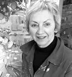
ELAINE KAZIMIERCZUK
Since taking early retirement, Elaine has built up a large and enthusiastic following for her distinctive, colour-saturated meadowscapes, which include large-scale diptychs and triptychs. Her practice is based on close studies of plant habitats en plein air
KATE SHOOTER
Kate studied ne art in Cardi and Wimbledon Working in acrylics, her practice is based in South Wales where she paints in her home studio in the Black Mountains. Her approach to painting has always been process driven with works often hovering between abstraction and guration.
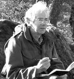
PHIL HOBBS
Working predominantly in watercolour, Yorkshire-born Phil has participated in many national exhibitions and held a number of solo shows in the UK, USA and Europe. His time more recently is divided between painting in the UK and Italy. He isan honorary life member of the Lake Artists Society.
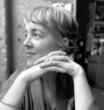
PHOEBE JANE
Born in the US, Phoebe Jane, having English parents, was brought to the UK where her earliest memories were drawing on any surface she could nd. Self-taught, she developed from doodles to detailed abstract pieces, whilst her travels and stints living abroad heavily in uence her work.
EDITORIAL
Editor
Niki Browes
Art Editor
Stuart Selner
Assistant Editor Ramsha Vistro
Contributors
Terence Clarke, Alyona Creates, Sarah Edghill, Hayem El-sayed, Elias Flores, Phil Hobbs, Amanda Hodges, Jenny Lunnon, Sara Mumtaz, Laura Walls
info@artistsandillustrators.co.uk
ADVERTISING
Group Sales Director Catherine Chapman (020) 7349 3709 catherine.chapman@ chelseamagazines.com
Advertising Manager Hannah Lees 07715631382 hannah.lees@ chelseamagazines.com
Advertising Production allpointsmedia.co.uk
MANAGEMENT & PUBLISHING
Managing Director James Dobson
Publisher Simon Temlett Chief Financial O cer Vicki Gavin Subs Marketing Manager Bret Weekes
BACK ISSUES chelseamagazines.com/shop
GET IN TOUCH
Artists & Illustrators, © The Chelsea Magazine Company Ltd 2023, part of the Telegraph Media Group, 111 Buckingham Palace Road, London, SW1W ODT Phone: (020) 7349 3700 artistsandillustrators.co.uk
Artists & Illustrators (ISSN No: 14734729, USPS No: 0950) is published monthly by The Chelsea Magazine Company Limited, and distributed in the USA by Asendia USA, 701 Ashland Ave, Folcroft PA, POSTMASTER: send address changes to Artists & Illustrators, 701 Ashland Ave, Folcroft, PA. 19032.


4 ARTISTS & ILLUSTRATORS CLUB British Art THE Send us your latest paintings, tips or artistic discoveries at: info@artistsandillustrators.co.uk @AandImagazine /ArtistsAndIllustrators @AandImagazine @AandImagazine Write to us!
Niki Browes Editor
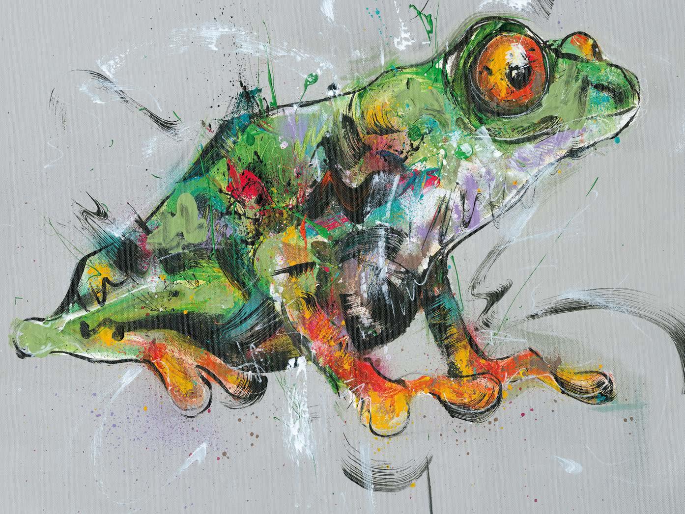
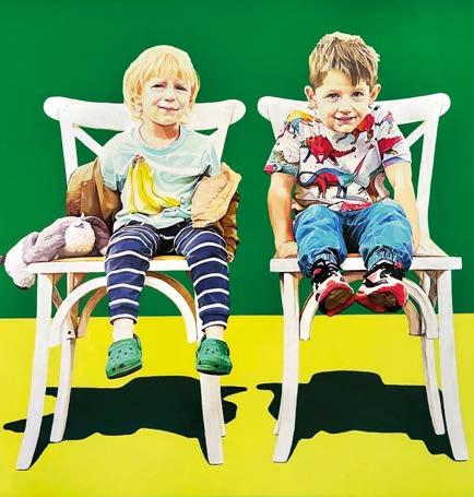
THIS MONTH’S COVER BY DANIELLE TOMLINSON
EDITOR'S LETTER
GO TO BRITISHARTCLUB.CO.UK BECOME A MEMBER TODAY!
Sketchbook
TIPS • ADVICE • EXHIBITIONS
REVIEWS
EDITED BY RAMSHA VISTRO
Things we love...
This summer, rediscover the British painter, Fred Appleyard. Despite his Turner Gold Medal and Royal Academy recognition, Appleyard’s legacy has been overlooked. With over 100 works, including unseen pieces, the exhibition will showcase his Pre-Raphaelite beginnings, post-war impressionism and mastery of light. Located in Hampshire, where Appleyard lived post-World War I, the display honours his connection to the county. Rising Splendour: Fred Appleyard, From the Royal Academy to the Itchen Valley offers a longoverdue tribute to a British artistic great. From 21 June to 18 September 2024 at The Gallery in The Arc, Winchester. hampshireculture.org.uk
• NEWS •
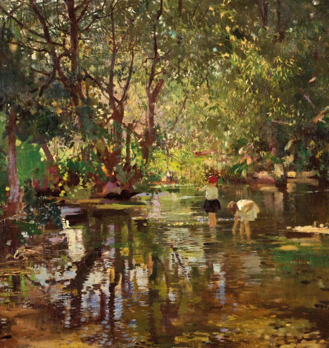
Shaded Water, oil on canvas, 64x76cm
▫ ARTISTS & ILLUSTRATORS 5 COURTESY OF THE ARTIST’S ESTATE © HAMPSHIRE CULTURAL TRUST 2024
Sketchbook
Don’t miss...
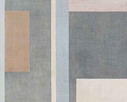
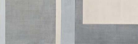
a new exhibition by German artist Kim Bartelt, opening in London and running until 21 June 2024. Developing from an earlier series based on iconic paintings and sculptures of the Renaissance, Bartelt’s latest body of work applies her distinct, abstract geometric style to pared-down, emotive scenes inspired by the Annunciation. These works refer to the German proverb Zwischen Tür und Angel, evoking a sense of something happening quickly and spontaneously, often with someone on the threshold of moving on or passing by. This subtle sense of uncertainty is both emphasised and de ed by her deceptively simple language of rectangles and squares. cadogangallery.com
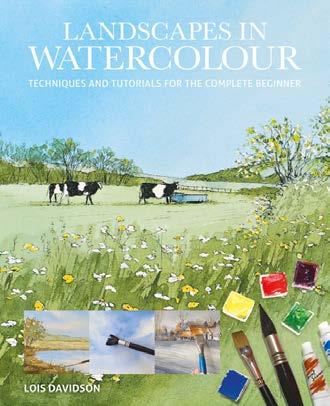
BOOK OF THE MONTH
LANDSCAPES IN WATERCOLOUR: TECHNIQUES AND TUTORIALS FOR THE COMPLETE BEGINNER
Lois Davidson
Dive into the enchanting world of watercolour painting with this insightful book. With practical techniques and inspiring landscape projects, this guide is ideal for beginners and seasoned enthusiasts alike. Embrace the uidity of watercolour to unravel your imagination and improve your art. GMC Publications, £9.99
THE
DIARY
Open calls, prizes and artist opportunities
30 JUNE
Enter the Almenara Art Prize with your Figurative paintings. The prize fund totals €27,000 and it costs €45 to enter. thealmenaracollection. com
EXPLORE
…the Summer Exhibition at the Royal Academy, running from 18 June to 18 August 2024 in the Main Galleries. This 256th edition is a unique celebration of contemporary art and architecture, providing vital support for the artistic community. British sculptor Ann Christopher RA, along with the Summer Exhibition Committee, will explore the theme of making space. Works by invited artists include Ackroyd & Harvey, Vivien Blackett, Diana Copperwhite, Andrew Pierre Hart, Permindar Kaur, Radhika Khimji, Kathy Prendergast, Rachel Whiteread and Charmaine Watkiss. royalacademy.org.uk

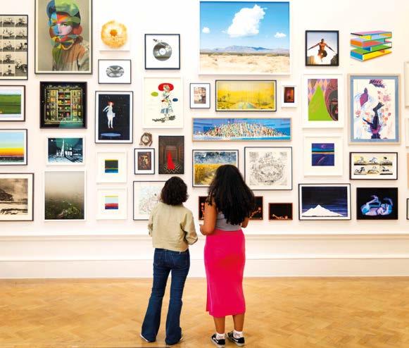
There's a ton of art inspiration amongst these pages. But if you're looking for more? Find it on the fabulous Artists & Illustrators website. It's one of the best digital resources for artists from every realm, whilst the refreshing redesign makes our practical guides, competitions and interviews even more insightful See you there. artistsandillustrators.co.uk
30 JUNE
Submit your animal or wildlife art to Sketch For Survival to help raise funds and awareness for threatened species. Open to all. Entry costs £15. explorersagainst extinction.co.uk
2 JULY
Join the Embracing Our Di erences exhibition. Celebrate diversity and inclusion with billboardsize art. Prize fund totals $6,000 and it’s free entry. embracingour di erences.org
17 JULY
The Saatchi Gallery’s £20,000 annual art prize is seeking artists to respond to the theme ‘Tomorrow’ing: Visions of a better future.’ Free entry. mcsaatchi.com
6 ARTISTS & ILLUSTRATORS
Join us online!
SANDRO, 2024. PAPER ON LINEN, 160CMX210CM IMAGE COURTESY ROYAL ACADEMY
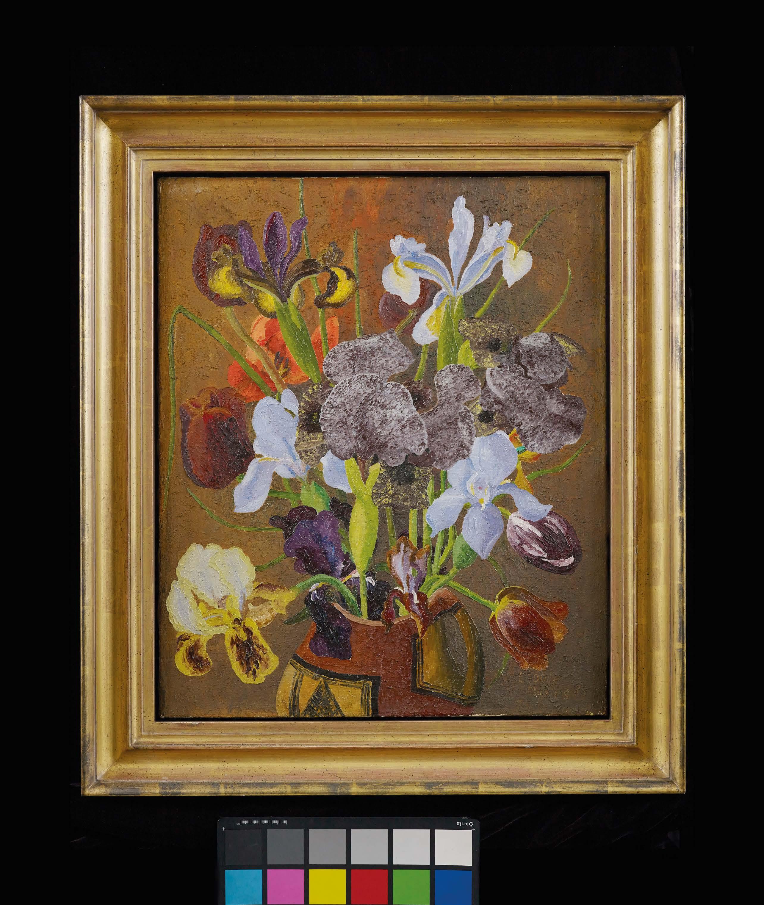
The Shape of Things: Still Life in Britain
Until 20 Oct 2024 pallant. org.uk
Modern art in the South [Chichester, West Sussex)
Cedric Morris, Irises and Tulips, 1935, Oil on canvas, Private Collection Registered Charity No: 1102435
Headline Sponsor
Sketchbook
PATCHINGS ARTFEST


The Patchings ARTfest gathers prominent artists, artisans and art supplies from the UK, Europe and beyond. Celebrating its 31st year, this year, it will features workshops and demonstrations by top artists, such as Adebanji Alade, Haidee-JoSummers and Hazel Soan. Visitors can purchase unique artworks directly from creators and explore deals from leading art material manufacturers. Whether you’re a beginner, professional or art enthusiast, there’s something for everyone. Patchings ARTfest runs from 11 to 13 July 2024, 10am to 5pm. Discounted tickets available online or by phone. patchingsartcentre.co.uk, 01159653479.
Be inspired...
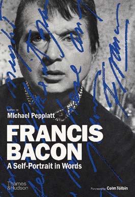
...by Francis Bacon: A Self-Portrait in Words by Michael Peppiatt. This collection delves into the innermost thoughts of one of the 20th century’s most in uential artists. Through letters, statements, studio notes and interviews, Bacon’s sharp wit and complex ideas come to life. Expertly annotated by Peppiatt, the book also includes unpublished letters to friends like Lucian Freud. This compelling verbal self-portrait, enriched with photographs and archive material, reveals both the man and the artist. Thames & Hudson, £40.00


A LETTER IN MIND


Join leading artists and celebrities in creating colourful art on envelopes to support The National Brain Appeal’s A Letter in Mind exhibition. This display, themed ‘The Wonder of Colour,’ unites artists for charity. Artworks, sold anonymously for £85 each, support neurological conditions. Renowned gures like Christopher Nolan and Dame Zandra Rhodes participate, amplifying its impact. Over £300,000 raised in a decade underscores its success. Curator Eva Tait lauds artists’ contributions, highlighting colour’s emotive power and its role in perception. This year’s theme promises a vibrant, captivating showcase, demonstrating art’s ability to evoke emotion and drive change. The exhibition is on from 29 October to 2 November 2024 at Gallery Di erent. The deadline for entries is 16 September 2024. For more details and to to take part, go to: aletterinmind.org ▫


ARTISTS & ILLUSTRATORS 9
ARTWORK BY AXEL SCHEFFLER FOR A LETTER IN MIND 2023
Exhibitions
THE BEST ART SHOWS TO VISIT FROM THIS MONTH ONWARDS
NENGI OMUKU: THE DANCE OF PEOPLE AND THE
NATURAL WORLD
Until 29 September 2024
Journey into the lush landscapes of Nigerian artist Nengi Omuku’s exhibition, The Dance of People and the Natural World. Omuku masterfully merges human forms with nature, unveiling the intricate interplay between individual and collective
consciousness, and the essence of belonging. Her art goes beyond conventional Western landscape norms, fostering a symbiotic coexistence of humanity and the natural world, transcending temporal boundaries. Through her work, Omuku invites viewers to immerse themselves in expansive psychological spaces Arnol ni, 16 Narrow Quay, Bristol BS1 4QA arnol ni.org.uk
ED CLARKE
Until 1 September 2024
This show will be Ed Clark’s rst institutional exhibition in Europe, highlighting his global journey. Like many American artists, he used his GI Bill to move to Europe, studying at Académie de la Grande Chaumière, Paris. The Grey Art Museum at New York University is currently showcasing American artists who made Paris their home. Clark, a trailblazer, used a janitorial push-broom for his ‘big sweep’ technique and created unusually shaped canvases. Turner Contemporary, Rendezvous, Margate, Kent CT9 1HG. turnercontemporary.org
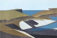
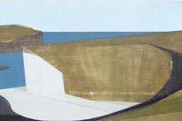
SEA CLIFFS
Until 12 July 2024
Vanessa Gardiner’s art is characterised by clean lines, dynamic surfaces and captivating coastal themes. Her latest exhibition showcases stunning paintings of familiar locales like Boscastle, Tintagel and Godrevy, alongside exciting new vistas, notably from Orkney. Inspired by the rugged beauty of Orkney’s landscapes, Vanessa’s recent works exude a newfound energy and intensity. She captures the monumental cli s, dramatic angles and vibrant hues with precision, while also exploring multiple perspectives simultaneously. Her process mirrors the natural erosion, with surfaces textured to convey depth. Slader’s Yard, Contemporary Art & Craft Gallery, Bridport, Dorset DT6 4EL. sladersyard.co.uk
10 ARTISTS & ILLUSTRATORS NENGI OMUKU UNTITLED, 2022. OIL ON SANYAN, 92X62CM COVE 2 (ORKNEY), 2023, ACRYLIC ON PLYWOOD, 40X81CM © VANESSA GARDINER DETAIL OF A WORK IN PROGRESS, YOU KEEP COMING BACK IN 2024 © KAROLIINA HELLBERG ED CLARK, UNTITLED C.1976 © THE ESTATE OF ED CLARK Sketchbook
BRITISH IMPRESSIONS
Until 24 July 2024
This display presents over 60 museumquality paintings that showcase the diversity and in uence of the Post-Impressionist movement in Britain from the 1860s onwards. Featuring many recently rediscovered works and pieces from private collections never before seen by the public, the exhibition highlights the importance of this movement from its earliest days.
David Messum Fine Art, 12 Bury Street St. James’s. messums.com
LABYRINTH
Until 3 August 2024
Karoliina Hellberg’s rst UK solo exhibition showcases new works and a wallpaper print designed by the artist. Based in Helsinki, Hellberg is renowned for her large, vibrant oil, acrylic and ink canvases. Her art immerses viewers in a labyrinth of repeated imagery, signs and symbols, blending layers, forms and elements. The artist’s dream-like visions merge the everyday with the ethereal, featuring indoor scenes, plants, owers, clouds, animals and textiles inspired by memories, imagination and research.
Elizabeth Xi Bauer Gallery, Fuel Tank, 8-12 Creekside, London SE8 3DX. elizabethxibauer.com
MATTHEW SMITH: THROUGH THE EYES OF PATRICK HERON
Until 13 October 2024
This exhibition explores the in uence of English painter Matthew Smith on post-war artist Patrick Heron. This showcase of paintings by two of the 20th century’s most signi cant colourists examines Smith’s dynamic use of colour and its impact on Heron’s vibrant palette. Smith (1879–1959) crafted luminous landscapes, portraits and still lifes in uenced by fauvism. Studying under Henri Matisse, Smith became a key gure in post-impressionist British art. His legacy, admired by artists like Frank Auerbach and Francis Bacon, positioned him as a trailblazer within 20th-century modernism. Charleston Trust, Firle, West Firle, Lewes BN8 6LL. charleston.org.uk
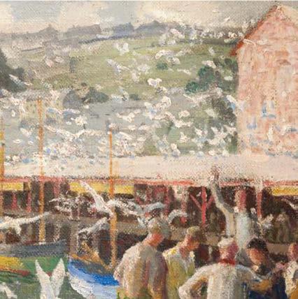
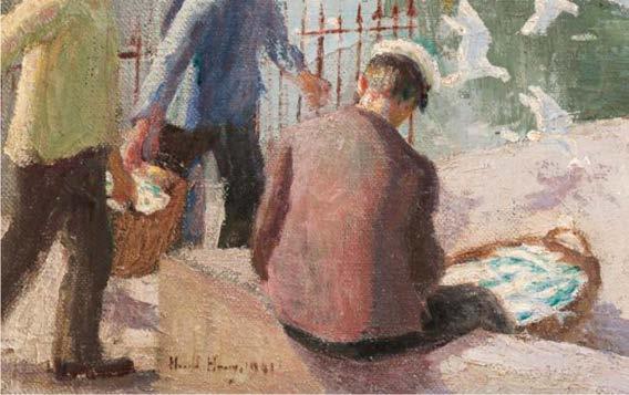
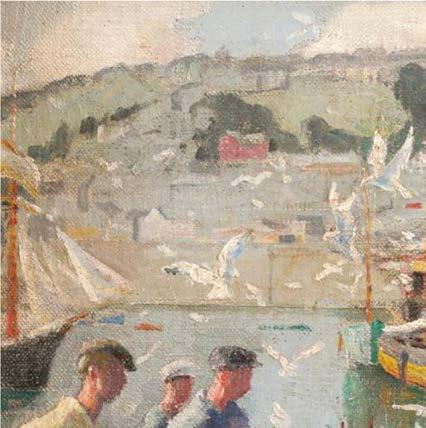
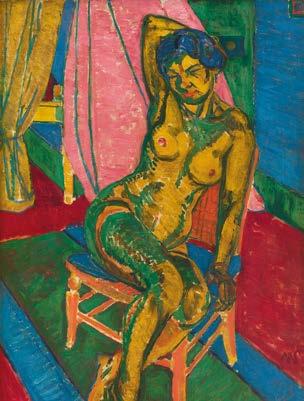
HAROLD HARVEY (18741941), THE FISHING WHARF, NEWLYN, 1941, OIL ON CANVAS, 50X60CM MATTHEW SMITH, FITZROY STREET NUDE NO.2, 1916, OIL ON CANVAS, 101.5X76CM. © THE ESTATE OF SIR MATTHEW SMITH. PHOTO © THE BRITISH COUNCIL
PRIZE DRAW
Hotel breaks worth £1000 WIN!
Don’t miss your chance to win a two-night hotel stay, courtesy of MASTER BUILDER’S HOUSE HOTEL

Bucklers Hard, nestled along the picturesque River Beaulieu in the New Forest, was the stunning backdrop for the semi- nals of Sky Arts Landscape Artist of the Year 2024.
Now, you have the opportunity to win a luxury hotel break for two, worth £500, in this charming locale. The Beaulieu Break includes accommodation for two in a Riverview Room with a full English breakfast served each morning and £30 towards food and drink per person each evening.
Tasked with capturingBuckler’s Hard’snatural charm and rich maritime history, the semi- nalists positioned their easels within sight of the historic Master Builder’s House Hotel, once home to Henry
Adams, a renowned shipbuilder of the late 18th century.
Adjacent to the 26-bedroom hotel is the new Art of Buckler’s Hard free exhibition, showcasing paintings of Buckler’s Hard by the semi- nalists, as well as artworks from the esteemed Montagu family collection. This exhibition will remain open to the public until 3 November 2024. themasterbuilders.co.uk
THE PRIZE
Two lucky readers will each win a prize package worth £500. As well as the accommodation and food, the prize package also features two general admission tickets to the Beaulieu estate, two tickets for the Buckler’s Hard River Cruise, two tickets to the Buckler’s Hard Museum and a day’s hire of the Master Builder’s Pashley bikes each.
HOW TO ENTER
Enter by noon on 29 July 2024, either at artistsandillustrators.co.uk/competitions or by lling in the form below and returning it to: Hotel Prize Draw, Artists & Illustrators, Chelsea Magazine Company Ltd, Telegraph Media Group, 111 Buckingham Palace Road, London, SW1W ODT
BONUS READER OFFER
All Artists & Illustrators readers can enjoy a discounted stay at The MasterBuilder’sHouse Hotel, paying only £200 per couple (reduced from £284) for one night in a Henry Adams room. This o er includes a full English breakfast plus £30 per person towards dinner at the Riverview Restaurant. For more details or to book, please call 01590 616253, quoting ARTISTS.
TERMS & CONDITIONS
The prize is non-transferable. No cash alternatives are available. Prizes are based on two sharing a double/twin Riverview Room, valid until March 31, 2025, excluding Bank Holidays, Christmas and New Year and subject to availability. Dinner allocation of £30 per person.
Reader o er based on two sharing a Henry Adams Room, valid until September 30, 2024, subject to availability. Dinner allocation of £30 per person. £25 per stay charge for dogs. For full terms and conditions, visit chelseamagazines.com/terms
HOTEL BREAK PRIZE DRAW
Name:
Address: Postcode:
Email:
Telephone:
The closing date for entries is noon on 29 July 2024.
Please tick if you are happy to receive relevant information from The Chelsea Magazine Company Ltd. via email post or phone or Master Builder’s House Hotel via email * NOT AVAILABLE IN NEW ZEALAND
PATCHINGS
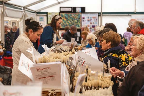
Sarah Manolescue ROI Roger Dellar ROI EEU
artists & artisans artmaterials artlive *Group over 10 people **More than 1 day ***Student Card Holders only Children under 16 FREE when part of a family group. SAVE TODAY - ADVANCED Tickets Now Available Day Ticket £14 Group Ticket* £12 Multi-Day Pass** £10 Students*** £10 ON THE DAY £17
in
31st year,
largest
celebrates
best
art, craft
materials.
Nottinghamshire countryside,
year’s Patchings ARTfest promises
day of enjoyment and inspiration. Amazing show offers An unrivalled opportunity to buy favourite materials, explore what is new and hear from the professionals. Buy individually designed and created work direct from the artist and artisans Patchings Art Centre Oxton Road . Calverton . Nottinghamshire . NG14 6NU 0115 9653479 : festival@patchingsartcentre.co.uk BUY TICKETS ONLINE OR OVER THE PHONE www.patchingsartcentre.co.uk 0115 965 3479 SEE BUY DO WORKSHOPS - HANDS ON - DEMONSTRATIONS SEE WEBSITE FOR MORE INFORMATION
Now
it’s
the
event of its kind,
the very
in
and
Within a backdrop of
this
a
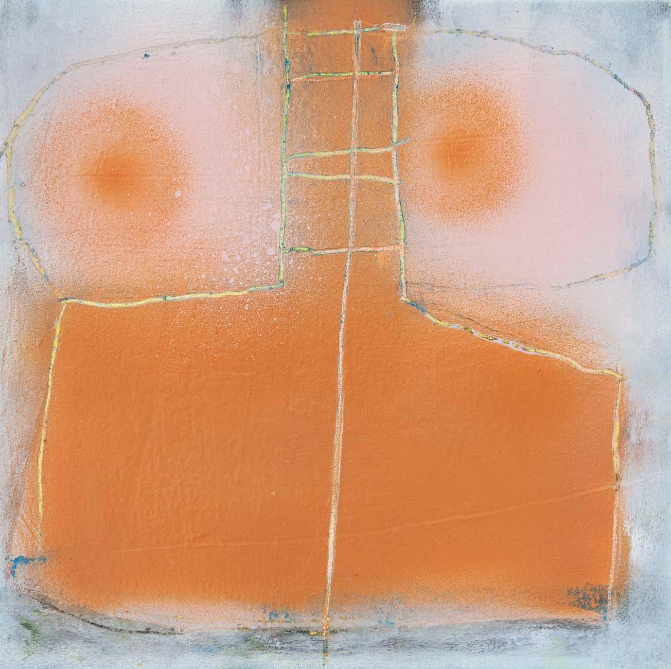
This month’s spotlight on a British Art Club member
We present...
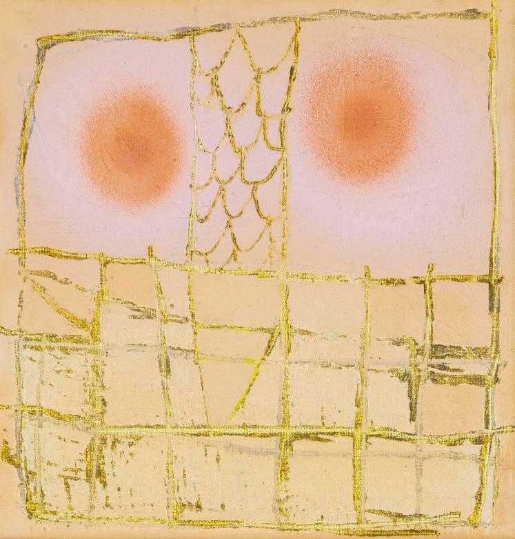
SERGHEI STEPANOV
This contemporary
artist creates thought-provoking pieces, exploring
the chaos found in nature, with a touch of surrealism
Serghei Stepanov’s journey into the world of art was shaped by a natural inclination and a rich variety of influences. “I had many beautiful people around me who inspired me and opened my eyes to seeing things differently,” he reflects. “My father, being a photo-correspondent for various arts, sports and culture magazines, was always taking me with him to art gallery openings, cultural events and sports competitions around Chisinau, Moldova.”
Like many children of the early eighties, Serghei spent his days engrossed in outdoor play. “By observing and imitating our neighbour, who was a university art teacher, I gained traction in working on my drawings and gouache painting,” he recalls. “I was thinking about the nature surrounding me, observing details with my own eyes and then drawing on paper.” Influenced by illustrations in science manuals and his knack for DIY toys, Serghei honed his skills by sketching his ideas before bringing them to life by building them.
After years of varied experiences, Serghei reignited his passion for art in 2020, following a period of redundancy during the pandemic. “I decided to go ahead and follow my dream to become a full-time artist,” he shares. “I think it comes naturally if you work hard and do not give up.”
Serghei’s creative process is intuitive, starting as a tabula rasa (Latin for ‘clean slate.’) “It will take time until it makes sense, but eventually, my ideas will surface ‘victoriously’ on my medium,” he smiles. “Frustration, disappointment and anger are all there, covered at the end of the process in an aesthetic sense.”
Influenced by various forms and shapes, Serghei finds inspiration in the chaos of nature. “Constructivism and deconstructivism with a hint of surrealism are my favourite ways of building a painting or drawing,” he shares. “I can stare into the horizon and find in it an element that is unique, as if it has absolutely no reason to be there.” His subjects often focus on memory, encompassing both dreams and reality. britishartclub.co.uk/profile/Serghei-Stepanov ▫
14 ARTISTS & ILLUSTRATORS
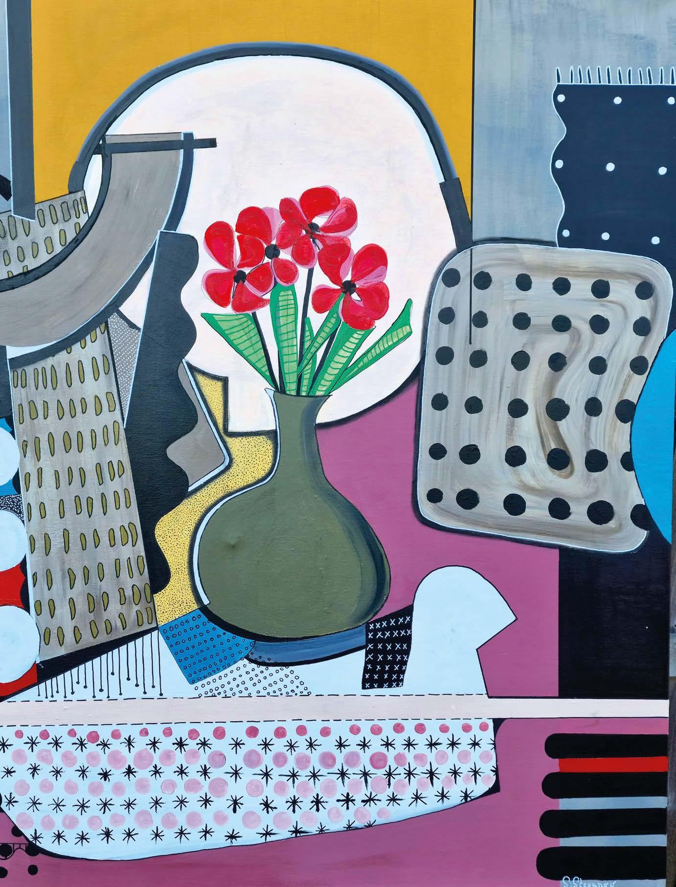 Kitchen, a magical place, acrylic, 100x100cm
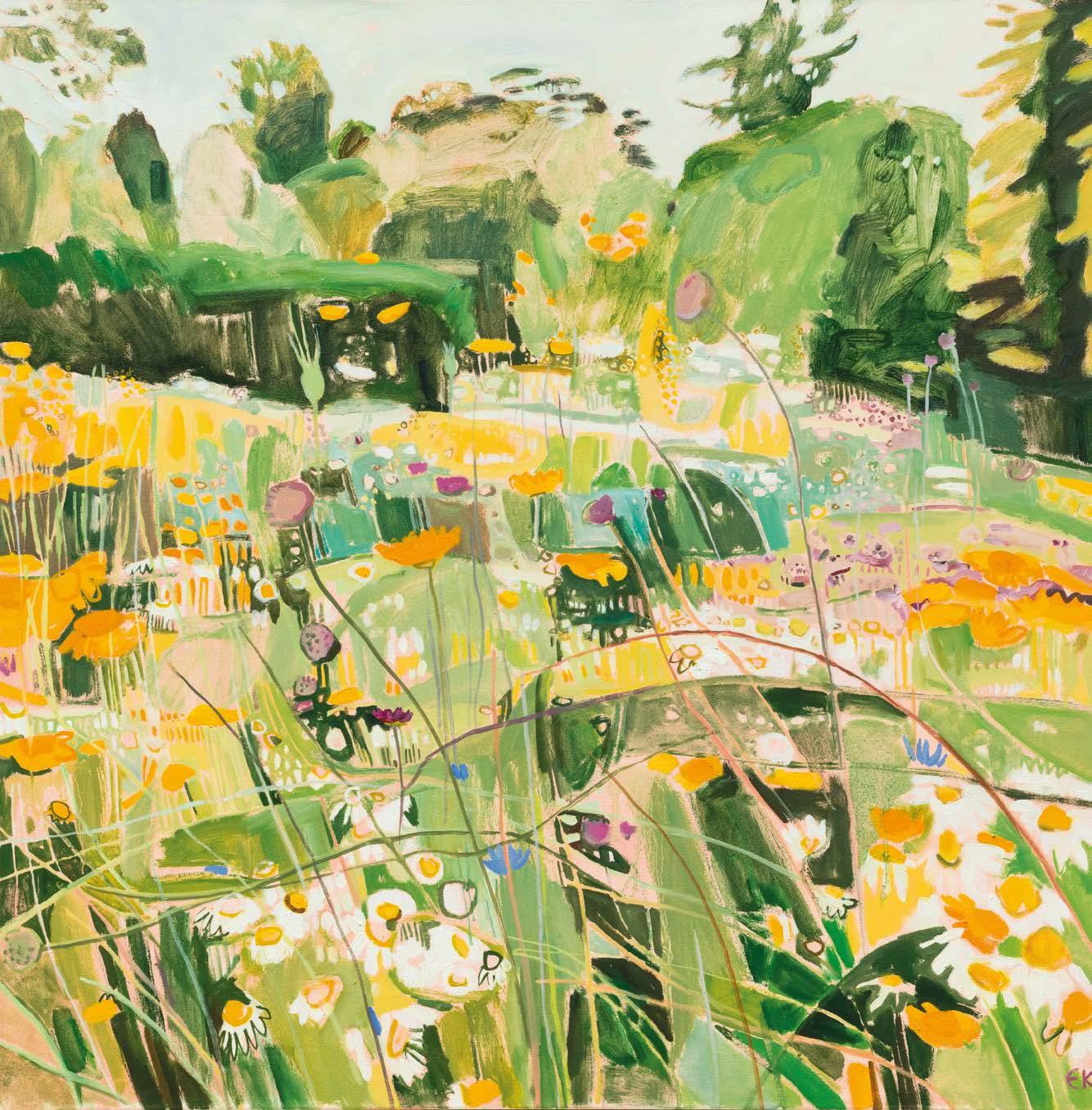
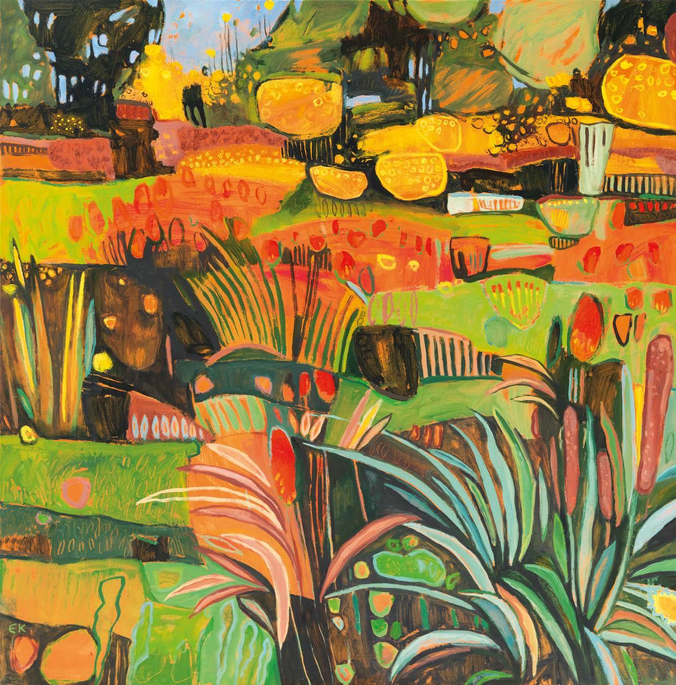
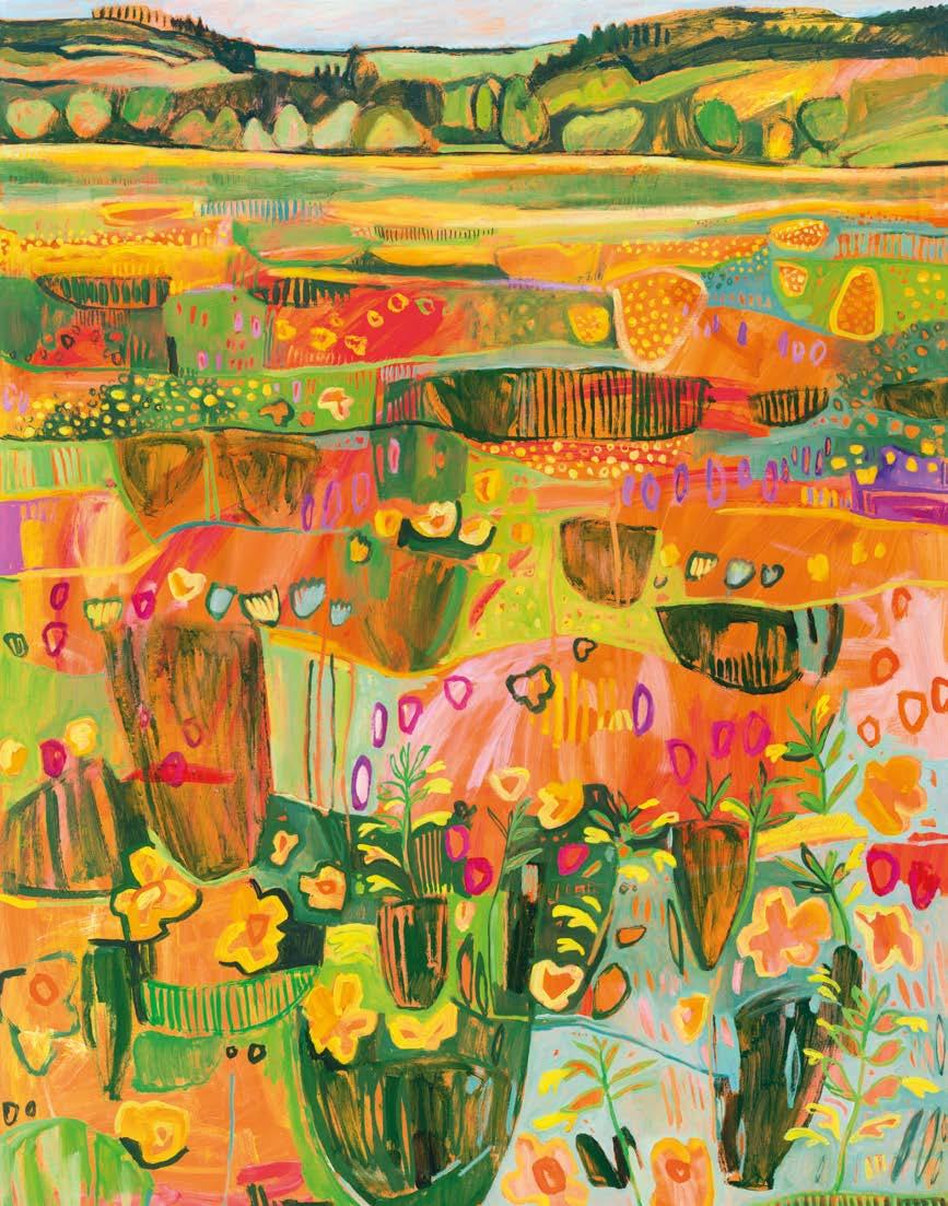
Elaine Kaz
Oxfordshire-based painter ELAINE KAZIMIERCZUK wants us to cherish our planet’s variety of plants
My Studio Garden, oil, 100x100cm
imierczuk
and habitats, especially our disappearing native wildflower meadows as told to Jenny Lunnon
▸ ARTISTS & ILLUSTRATORS 17
HOW I WORK IN THE STUDIO
Very Red Hot Pokers, oil, 97x97cm
In the window of the art shop in Mansfield’s Handley Arcade was a tin of proper artist’s watercolour paints.
Seven-year-old Elaine Kazimierczuk was “always drawing, always with a pencil in my hand” and she longed to buy them, but her pocket money was only 6d a week. Then fate intervened: she found a handbag full of money. It had been dropped by an insurance rep who had been collecting premiums door-to-door. Handing it in to her school lost property, Elaine was later rewarded with a 10-shilling note – about £14 today. She promptly bought the watercolours and some good brushes, and began painting.
“I used the tin for years,” she says.
In the academic stream at a girls’ grammar school, she was encouraged to study sciences.
“My teachers said: ‘You can do art in your spare time.’” At university, Elaine studied Chemistry and Applied Zoology. She considered combining her interests in chemistry and art to work in picture conservation, and began saving for specialist training by working as a chemistry teacher. This led on to a long career in further education, including as a teacher of environmental science.
Early retirement in 2014 offered an opportunity to realise her never-forgotten ambition to be a professional artist. “I was at the easel the very next day,” she says. Her children had left home and finally, she had the space and time she needed. “To really push things forward you have to put the hours in and they have got to be continuous. You can’t be tidying up and putting things away. It’s not about inspiration striking; it’s just about getting on with it.”
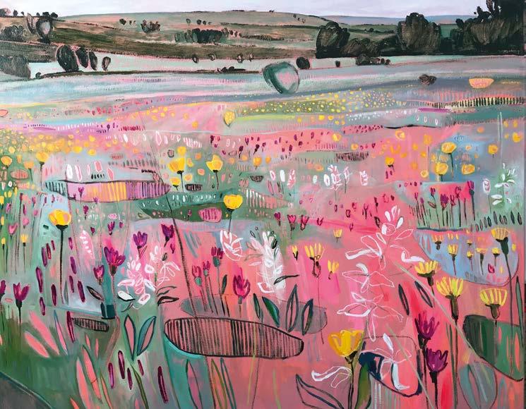
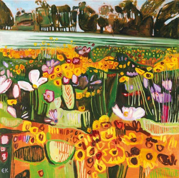
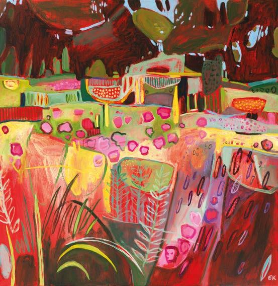
Over the past decade, the subject she’s returned to most often has been wildflower meadows, painting them in vivid colours in oils, often layered over acrylic. According to the charity Plantlife, 97% of the UK’s wildflower meadows and 80% of its chalk grasslands have been eradicated since the 1940s, mainly due to the intensification of agriculture and a reduction in sustainable farming practices.
Through her work, Elaine raises awareness of this tragic habitat loss. She also actively supports plant conservation, such as the current effort to save Hinksey Meadows in Oxford from a proposed flood channel scheme that threatens to destroy their biodiversity. The painting she donated to raise funds for the campaign was bought by University of Oxford college St Edmund Hall for its collection of environmental art and now hangs in the senior common room.
Her practice is based on close study of plant habitats; she makes quick preliminary ▸
Joan’s Hill Farm, oil, 127x97cm
Orchids on the Hill at Cae Blean-Dyffryn, oil, 127x150cm
 Hedgerow Bouquet II, oil, 30x30cm
Summer Meadow, oil, 61x61cm
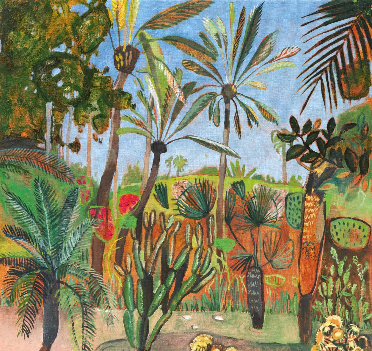
Majorelle Garden with Cacti and Palms, oil, 92x92cm
Hedgerow Bouquet II, oil, 30x30cm
Summer Meadow, oil, 61x61cm
Majorelle Garden with Cacti and Palms, oil, 92x92cm
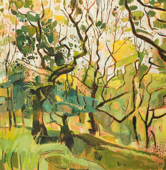
sketches in pencil and oil pastels en plein air
Before embarking on a recent series of butterfly orchid studies, she spent a day surveying them with Plantlife botanists at the Cae Blaen-dyffryn site of Special Scientific Interest near Lampeter in Wales. Several recent works have featured Great Burnett, a feature of flood-plain meadows. “They are very architectural flowers; strange and alien-looking.”
During lockdown, in spring 2020, Elaine initiated Paint my Meadow, a social media campaign that encouraged people all over the country to send her photos of their local meadows. One evocative painting from this time is Wind Across the Gorse from Menstrie Glen, Scotland
She also paints other fragile and threatened ecosystems, including temperate rainforests, the fascinating moss and fern-filled remnants of vast ancient forests that have recently gained greater public attention, for example through Guy Shrubsole’s 2022 book The Lost Rainforests of Britain
Elaine first came across this habitat in Wistman’s Wood on Dartmoor, when she visited as a student, “It was magical, most surprising and mysterious.” She has returned in recent years to paint its stunted, contorted trees dripping with epiphytes. The trees grow out of gaps in the granite boulders that protect them from the depredations of sheep. She has been stopped in her tracks by an exuberant flowering of devil’s bit scabious on a roadside verge in a neighbouring village, hopping out of her car to take photos. Staying with friends in the Tuscan countryside, she’s painted the surrounding fields of chicory and
The subjects Elaine returns to most often are wildflower meadows
wild carrot. In Ireland, she has been inspired by tree ferns in the shady nooks of the Blarney Castle stumpery and in Morocco, by the sun-soaked cacti and exotic gardens of Marrakech.
Elaine has created her own mini meadow on the slope in front of the 1970s bungalow in Charlbury, Oxfordshire where she has lived for three years. Her studio is a converted garage, the roll-over door now a floor-toceiling window overlooking ox-eye daisies, wild oregano and ragged robin, with a backdrop of hawthorn, birch, limes and a majestic copper beech on top of the hill opposite. She loves her studio for its convenience, “I can paint in my pyjamas!” She catches up with paperwork in the mornings, which can be quite protracted, “Sometimes it’s not until four in the afternoon, after tea and cake, that I get in to the studio.” Sometimes she’s still working at one or two in the morning. But a home studio does have drawbacks, “It’s nowhere near big enough.” Her pictures are already large in scale, typically over a metre square. Like the artists Helen Frankenthaler and Joan Mitchell, whom she admires, Elaine needs space. “I much prefer large. You can make big
gestural marks and you don’t get lost in detail. You can bring all the energy of the natural world on to the canvas.”
One practical way she resolves the scale issue is by painting diptychs, triptychs and polyptychs. She also likes this format because it imitates the act of looking. “When we look at things, we don’t see the whole vista all in one go; we take it in eye-full sized portions.”
Every May, during Oxfordshire Artweeks, Elaine’s whole house becomes a gallery, “Charlbury’s answer to Kettle’s Yard,” as she welcomes around 250 visitors to view work hung in every room, even the bathroom, where the turquoise 1970s suite was complemented this year by a painting of the azure skies, aloes and prickly pears of Le Jardin Majorelle.
Current commissions include work for the new office of a local solicitor and a Michelinstarred restaurant. Two of her meadow paintings can be seen in the home of architects Charlie and Kate Luxton in a video on The Modern House website. One of her more abstract works has been licensed by Samsung as a TV screensaver.
Upcoming exhibitions include the Affordable Art Fair in Battersea in October and her first ever show in the United States, in New York, in spring 2025. She is also planning a trip to Costa Rica, to absorb the saturated colours of tropical flora and the unique atmosphere of its cloud forests.
“I’d like to look at foliage of a different dimension. I want to go somewhere where I’m less certain of the outcome.” elainekazimierczuk.com ▫
HOW I WORK IN THE STUDIO 20 ARTISTS & ILLUSTRATORS
Red Hot Summer, oil, 97x97cm
Left Ancient Oaks, oil, 120x120cm


thamesandhudson.com
A compelling verbal self-portrait of Francis Bacon, including a new selection of letters and interviews that reveal both man and artist OUT NOW charleston.org.uk ARTISTS & ILLUSTRATORS 21
Phoebe Jane HOW I MAKE IT WORK

From childhood doodles to intricate art, this artist’s hand-drawn work resonates worldwide
Ihave always doodled, for as long as I remember. Any surface I could nd, I would put a pen in my hand and draw on it. I was quite a shy child for the rst few years, so drawing must have been my way of expressing myself, as well as being destructive and scribbling in beautiful copies of Beatrix Potter (sorry Mum). It was at school that I was able to learn more about perspective and technique. I was very lucky to have a wonderful art teacher who helped me perfect my skills.
The pandemic was the reason for my transition into the art world. At the time, I was a music promoter and event organiser. However, when COVID hit, the events and live entertainment world was put on hold so, I had to nd a way to make another living. Initially, I started drawing again out of escapism to help get me through the upset of losing my job and moving out of London. I used art as my therapy. My sister suggested I put all of my doodles onto social media and after a few weeks of showcasing my work, my friends and followers wanted bespoke pieces; so my passion then became a small business. Four years later, here we are.
In this current climate, I am grateful for the privilege of waking up every day and having the freedom to draw. My family have played a huge part in my artistic journey. If it wasn’t for their support and love through a trying time, I don’t think I would have been able to pursue this career.
I have some very exciting ideas up my sleeve; venturing into clothing, having my designs on bespoke pieces, as well as scaling up my artwork into murals. I also have some projects taking me to Sydney and Bali this summer, where I will be building my brand. I plan to develop and collaborate more than ever, meet new people and get inspired by di erent cultures which will inspire more captivating work. My journey has been ful lling, eye-opening and pleasantly surprising. I wouldn’t change anything at all. phoebejaneprints.me ▫
22 ARTISTS & ILLUSTRATORS
Brigade House Beeston, Nottingham, Tombow black and blue watercolour pens, A3


PHOEBE’S TIPS ON BECOMING A FULL -TIME ARTIST
1
Believe in yourself You are here to create and be seen. Speak to other artists Build a community through socials or artistic groups.
2

3

Draw every day

Even if it’s a ve-minute drawing, pick up a pen everyday and perfect your craft. Discipline is freedom.

GUEST COLUMNIST
Sydney at Night, Tombow black pen and gold ink pen, A4
Market Square in Nottingham, Pigma Micron black ink pens and blue crayon with shading on Procreate, A3
Duomo di Milano, black ink Tombow pen, cleaned up on Procreate, A4
Skull, black ink Tombow pen, A4
Brooklyn Bridge, Pigma Micron black ink pens and blue crayon, A3
Danielle Tomlinson
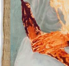
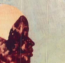
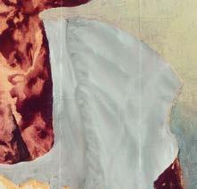
This Leicestershire-based former Olympian creates vibrant pieces, driven by a passion for wildlife conservation, finds Sara Mumtaz
HOW I WORK HOW I PAINT
24 ARTISTS & ILLUSTRATORS What Once Was, mixed media, 100x100cm
At just 26, danielle Tomlinson has carved a niche for herself as a contemporary wildlife painter. It was her simple love for vibrant colours and a deep-rooted connection to her surroundings that paved the way for her success. Her paintings, characterised by layered washes and vigorous brushstrokes, o er a glimpse into the soul of the wilderness.
Drawing inspiration from her urban upbringing, Danielle infuses a modern twist into traditional subjects. Yet, beneath the bold strokes lies a subtle narrative – each piece a re ection of personal moments, symbolised by animal emblems and thoughtful titles. Danielle’s art serves a dual purpose. It not only graces the walls of her clients’ homes but also serves as a silent call to action, urging viewers to protect the world around them.
Before becoming a full-time artist, Danielle was part of Team GB’s swimming team, competing globally in the nation’s most prestigious competitions; the Olympic Games, Commonwealth Games and World Trials. danielletomlinsonart.com
My journey as an artist began during my swimming career.
At school, PE and art were my loves. I balanced these with a competitive swimming career from the age of 11 to 21. While I was studying Sports Science at Loughborough University, I would paint my classmates, family and friends, as well as their pets for pocket money to get me through university. I then graduated at the peak of COVID and felt uninspired when looking at jobs, so I decided to take the leap to become a full-time artist.
My parents were very supportive of letting me explore di erent avenues. I’m very grateful for this as I was able to narrow down what ignites that spark inside me. I used to look through my aunty’s sketchbook and I was always really amazed with the intricate graphite drawings. This encouraged me to have more of an interest in it at school. I also had a brilliant secondary school teacher who nurtured this. Funnily enough, I didn’t study art and I’m fully self-taught, but the passion has always been there from a young age!
Colourful artwork can trigger the release of dopamine.
I try to always paint vibrantly as I’d like my work to be a celebration of the natural world. Like most people, the outdoors, dreams and a relaxing bath trigger most of my ideas. But seeing animals in their natural habitat is the most inspirational as their characters and
Since I Laid Eyes on You, mixed media, 90x90cm

26 ARTISTS & ILLUSTRATORS
Tyrant Reign, mixed media, 90x120cm
spirit are so prominent which leads to how I’d portray them in a pose or colour palette.
I have no plan when it comes to painting. I discover the direction of the finished piece with every brush stroke and layer. I work in several different mediums – from acrylics and spray paints to oil pastels and sticks – so I’m not confined to any traditional techniques, which suits my fast-paced style. It’s amazing how far you can push an acrylic, especially with the diversity of all the brands out there now. In the last few years, the pigments have really rivalled oil paints. They’re also fast-setting, which suits my style to a tee.
I always start off with a pencil sketch when creating a piece.
Then, I go in with a couple of base layers to sort the lights from the darks. Then, it’s just a layering process between mark-making, splats, spray paints and acrylics to create the subject’s overall form and vibrancy.
My studio is a large, bare-bricked, 700 sq ft space with high ceilings. ▸
HOW I WORK HOW I PAINT
ARTISTS & ILLUSTRATORS 27
Polar Night, mixed media, 90x90cm
Walking My Dreams, mixed media, 90x90cm
It’s in an old, converted hosiery factory from the 1800s. It has a New York-style loft vibe, with natural light, wooden beams, exposed pipework and windows on either side with lots of airflow. I paint in one end and pack and ship in the other. It’s a dream. I’m very lucky.
You can’t force painting.
I have a set amount of painting and admin to do every week. I may work 9-5, or until late and bash it all out or sometimes, I have slower weeks. I go with the flow. I love the flexibility.
Experimentation is a brilliant way to help my artistic exploration. When doing this as a full-time job, burnout can sneak up on you sooner than you think. I make sure I take regular holidays or breaks away from the studio. It’s hard to not think about creating as an artist, but it’s good to rest my hands from the brushes. Self-doubt or imposter syndrome is something I think everyone suffers from in some way, but I like to acknowledge it as a step towards my goal. If I don’t feel uncomfortable occasionally, then I wouldn’t be growing as an artist or person.
My advice to those looking to start their art career is to experiment tons. Try out loads of ideas and see what you enjoy the most. Don’t be scared of being ‘cringe’ or worry about what others think of your work (even though it’s hard not to). Start an Instagram page, follow the best creators in your niche and document your process. Or drop me a message – I’m always happy to discuss options.
Wanting to make a difference is what motivates me to continue creating. I want to make a real difference for wildlife and place significance on the things that really matter while making animal art a more respected subject in the art world.
When buying my art, I want audiences to tap into that childlike admiration for wildlife.
The one they had staring at the grandeur of an elephant or giraffe for the first time at a safari park or documentary. I want the colour and energy of my work to fill the space and set a positive tone for the day.
The most fulfilling aspect of my career is the reactions from clients.
It never gets boring. It also reassures me that there are way more people in this world than we think, who do care about our wildlife and want to celebrate the beauty of it in their homes. ▫
HOW I WORK HOW I PAINT
You’re Flawless, mixed media, 60x60cm
Have No Fear, mixed media, 90x90cm
 Reaching New Heights, mixed media, 90x120cm
30 ARTISTS & ILLUSTRATORS
Kate Shooter
This artist captures life’s essence through vibrant hues and abstract forms, inviting viewers into a world of introspection, says Ramsha Vistro
Nestled in the serene Black Mountains of South Wales, Kate Shooter’s studio is a place of creativity and contemplation. Trained at Howard Gardens Art School in Cardiff and Wimbledon School of Art in London, Kate’s journey as an artist is one of exploration.
In her studio, each brushstroke is a reflection of her innermost thoughts and emotions. Her art? A fusion of abstraction and narrative, offering a glimpse into the complexities of life. Whether exploring the depths of the subconscious or reflecting on the beauty of the natural world, each piece is imbued with a sense of curiosity and wonder.
With an eye for detail and a love for vibrant hues, Kate crafts compositions that blur the lines between reality and imagination. Through her work, she aims to capture the essence of being human. Her compositions – though primarily abstract – often incorporate elements of figurative representation and textual commentary that spark conversations about identity, belonging and the human condition through the interplay of shape and colour. kateshooter.com ▸
THE BIG INTERVIEW ARTISTS & ILLUSTRATORS 31
Too Small For Amen, acrylic and wax pastel on wood panel, 52x54cm
I think it was the books I pored over as a kid that made me want to make things. I never really pondered on the storylines. It was always the accompanying illustrations that fascinated me; Maurice Sendak and Edward Gorey were favourites. I remember looking at those books before I could even read the words; the text just becoming a decorative part of the pictures.
Mr Men books were my earliest artistic influence.
I obsessively drew rooms with staircases, striped wallpaper and bare lightbulbs; so graphic and colourful that they hurt your eyes when looked at. Later, I went through my obligatory Guston phase. I think it was his cartoonish motif-making that piqued my interest. I was right back in my early picture-making world. Today, I think I still obsess over details like that: anthropomorphising objects or spaces – single things charged with drama.
I have a few paint-splattered books in my studio that are always close to hand. Staying Alive – an anthology of poetry edited by Neil Astley, Time Is A Mother by Ocean Vuong, Mickey In The Night Kitchen by Maurice Sendak and The Violet Hour by Katie Roiphe. It’s usually writing and mostly poetry that inspires my making.
I don’t worry too much about maintaining a unique voice. I think that comes naturally in the doing.
32 ARTISTS & ILLUSTRATORS
Peepers, acrylic, spray paint and oil pastel on linen, 33x33cm
I know when my work is authentic because I’ve fully lost myself in the instinct of mark-making. Imitation happens along the way naturally, but it’s all part of development and I try not to get hung up on it.
I remember in my twenties suddenly realising that you can look at art with your gut and heart, rather than your brain. I slowly began to understand that art is ‘felt’ not decoded like some kind of puzzle. I think that gave me permission with my own work to make and not evaluate at the same time. It released me from the tyranny of linear storylines and intellectualising painting.
I try to get into a dialogue with the mark-making, so the painting is a conversation with myself.
I tend to constrain myself to a chosen palette initially and certain tools so that colour isn’t too random, or I’d be in a world of pain. Then, it’s a case of laying down materials until I have problems to solve. After that, a period of ‘mark and response’ until the painting sort of finds itself. It’s a long, peculiar process and my paintings go through agonising transitions along the way but I’ve learnt to trust it.
The liminal space between abstraction and figuration in my work goes back to looking at picture books.
I’m not interested in linear storylines, but I do understand the need for ‘the familiar’ to find a way into a painting. The sweet spot for me is always teetering on the brink of knowable. A sort of subversion of the everyday – like saying the same word over and over until it becomes something else entirely.
I did conclude some time ago that all my works are self-portraits . It’s a compulsion to communicate myself as authentically as possible through paint on a surface. The work is meant to remain enigmatic. It isn’t for unravelling – the paintings become little totems of the many aspects of my psyche and the hope is that those aspects are in some way universal.
Art schools gave me permission to explore making without having to present reasoning all the time.
I was a sculptor at Wimbledon and the practicalities of working in three dimensions formed the basis of how I approach painting today. It was there that I became fully ‘process’ driven with no clear idea beforehand of what I was making and no end in sight. I loved the conversation ▸
THE BIG INTERVIEW ARTISTS & ILLUSTRATORS 33
Wide Open, acrylic, spray paint and oil stick on linen, 80x80cm
The Shadows, acrylic and wax pastel on wood panel, 44x34cm
along the way and began to trust that problem-solving formal stuff such as questions like: ‘Will it stand up?’ can resolve a piece more successfully than looking at the bigger picture.
When I’m not tied up in admin or travelling for shows, I’m in the studio. I generally start the day off with a small charcoal drawing – just 10 minutes to warm up and then that gets pinned up on the ever-changing wall over my desk. My studio is tiny and stuffed to the gills with everything I need to work with – it’s a very organised chaos. The size of the room means that working across several pieces at the same time is like an orchestrated dance – lots of work propped closely together on my painting wall and one always on the floor in transition. In this way, a whole body of work comes slowly together, until the individual pieces start to chat to each other.
I did conclude some time ago that all my works are self-portraits
I try to leave something resolved at the end of the day, so I don’t lie awake problem-solving.
My studio being in the house means the temptation is always to sneak back to paint in the early hours. I generally don’t though; I have kids so knackeredness prevails!
Working instinctively and losing myself in mark and response allows for subconscious motif-making to bubble up through the layers.
This narrative is really the heart and soul of the painting – its own authentic voice if you like. I don’t think of the narrative in a linear fashion though. There are many blurry stories that make up a whole, but they morph and change. The narrative is a bit like trying to remember a dream that is fading fast. The paintings can make sense to me years later but rarely at the time of working.
I recently completed a four-month residency in printmaking. Working in a new discipline felt like it exercised an entirely different part of my
THE BIG INTERVIEW 34 ARTISTS & ILLUSTRATORS
Prayer, acrylic and wax pastel on wood panel, 40x30cm Bird, acrylic, spray paint and oil stick on linen, 33x33cm
brain, and it has definitely energised my mark making. I have been running automatic drawing workshops and interacting with others is always nourishing. Talking to artist friends, visiting exhibitions, walking, reading and even films all help to feed my creative practice.
Themes and motifs are constantly evolving in my work. Recently, it has had an ‘inside’ body quality. I like to play with scale in that the objects depicted could be both minute or cosmic in size. Some pieces appear to be at once psychedelic X-rays or objects floating in space. My preoccupation with the edges of things is usually present – spaces where the drama takes place rather than the event itself. Pareidolia is a situation where you see faces in inanimate objects and is an obsession. Vague faces sometimes pop up in the work.
No one exists in my head so my work will inevitably be very much my own. I think when one works instinctively there is a process of decision-making that is unfailingly authentic to that person. We all overlap creatively as humans, so I recognise similarities with other artists, but I trust that in the overlaps there is still a multitude of minute differences. It’s all about communication in the end – painting is an extension of who we are, and we are all infinite combinations of the same thing. ▫
ARTISTS & ILLUSTRATORS 35
Your Face Or The Moon, acrylic and wax pastel on board, 45x35cm
Valium (In A Blue Dress), acrylic, oil stick and spray paint on linen, 120x100cm
Pilgrim (Spare Rib), acrylic, oil stick and wax pastel on wood panel, 53x39cm
Michelangelo: The Last Decades
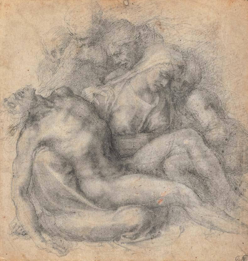
Many people aren’t aware that Michelangelo lived until the age of almost 89 and was working until the end, adapting and evolving all the time. Amanda Hodges looks into a new exhibition on his later life
The British Museum’s exciting exhibition tracing the final decades of Michelangelo’s life offers demonstrable proof that an artist’s maturity can be as fruitful as that of his youth. Challenging the conventional stereotype of inevitable artistic decline, lead curator Sarah Vowles describes the exhibition’s evolution, citing recent shows exploring “continuing creativity and dynamism in later life; we felt there was much to explore in Michelangelo’s own late period.” Born Michelangelo di Lodovico Buonarroti Simoni, Michelangelo thought of himself primarily as a sculptor, gaining his love for marble during an early childhood in Arezzo. He’d declare, “It is well with me only when I have a chisel in my hand,” yet gained great acclaim in many artistic disciplines. Often called Il Divino (the divine one), he was acclaimed within his lifetime for the quality of ‘terribilità;’ this translates as his art’s capacity to instill a sense of awe.
Project curator Grant Lewis says the exhibition’s genesis sprang from the fact that “quite simply, it completes our picture of Michelangelo. We all know the David and the Sistine Chapel, but don’t often think about what he did after these triumphs.” Popular perception invariably focuses on earlier works yet delves further and one discovers his lifelong professional vitality.
As Sarah points out, “Michelangelo’s last 30 years were, incredibly, busier than any ▸
ART HISTORY 36 ARTISTS & ILLUSTRATORS
© THE TRUSTEES OF THE BRITISH MUSEUM
LEFT Print of the Last Judgement, 1540, engraving RIGHT Epifania, 1550-53, chalk
© THE TRUSTEES OF THE BRITISH MUSEUM
previous period. He was involved in major fresco projects, like The Last Judgment in the Sistine Chapel [which depicts the second coming of Christ] and lesser-known frescoes in the Pauline Chapel.” Grant expands upon this. “We’re essentially asking ‘what happened next?’ as Michelangelo went from becoming Europe’s most famous artist to being Europe’s most famous artist. The answer’s remarkable: in his sixties, seventies and eighties, he was producing an array of paintings, sculptures and buildings. Some are familiar, but we seldom associate them with Michelangelo, such as the dome of St Peter’s Basilica, one of the iconic landmarks of Rome.”
“The British Museum has one of the richest collections of Michelangelo’s work,” says Sarah, “and we’re always keen to make our works on paper available to visitors.”
Speci cally, she alludes to drawings representing paintings prepared for the Sistine Chapel’s altar wall; Pope Clement VII’s commission was the catalyst for Michelangelo’s return to Rome, leaving his beloved Florence.
ABOVE Study For The Puri cation of the Temple, 1550, chalk ABOVE RIGHT The Puri cation of the Temple, 1550, oil RIGHT Pietà, 1535, chalk FAR
RIGHT Study For The Last Judgement, 1534-36, chalk
38 ARTISTS & ILLUSTRATORS
© THE TRUSTEES OF THE BRITISH MUSEUM © THE TRUSTEES OF THE BRITISH MUSEUM
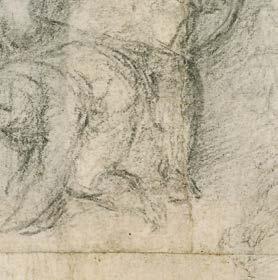
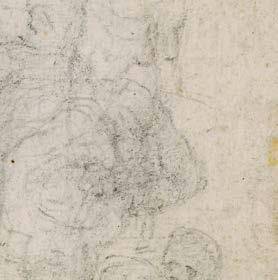
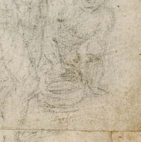
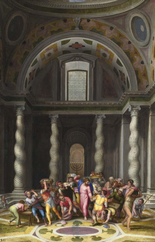
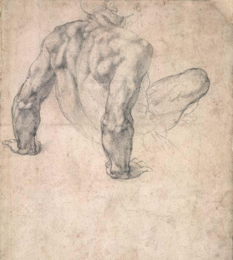
“The Last Judgment drawings are a remarkable display of virtuosity and show the full range of Michelangelo’s preparatory process. We start with compositional drawings of the fresco and then he hones in on particular gures and creates the most extraordinary studies.” Grant agrees: “A fresco like The Last Judgmentrequired a huge amount of planning. Drawingsshow Michelangelo sweated over every last detail. There are studies of the same composition as the nished fresco, and yet when you look carefully you realise virtually every idea was modi ed before painting began.”
It’s clear, he says, “that for Michelangelo, as much as anyone, nothing was straightforward. It’s easy to imagine an artistic genius who e ortlessly conjured feats such as the ceiling of the Sistine Chapel, but he was constantly critiquing what he made. On one drawing, he even writes a note to a friend asking if he likes it! With such obvious insecurity, it’s impossible not to see Michelangelo the man as well asthe artist.”
The exhibition o ers a fully comprehensive view of its subject. “We’ve tried hard to give a sense of Michelangelo as a person,” explains Sarah, with “very candid” letters and poems included, “because we’re keen to give visitors ▸
ARTISTS & ILLUSTRATORS 39
© THE TRUSTEES OF THE BRITISH MUSEUM THE NATIONAL GALLERY, LONDON GALLERY, LONDON
the chance to hear his own voice. Even now, when you look at his writing, it’s so vivid, whether earthy letters written to his nephew in Florence, or the poignant imagery of late poems.” Grant Lewis adds, “The man is central to our story: all we’re celebrating is produced by someone whose body increasingly couldn’t do what it did in his youth, forcing him to adopt new ways of working. As he ages, he’s increasingly fixated on salvation, and the fate of his soul becomes the central preoccupation.”
One of Michelangelo’s later creations, the monumental Epifania (c. 1550–53) is seen for the first time since its conservation. Among the largest Renaissance works on paper, depicting the Virgin Mary with the infant Christ at her feet, it’s the only complete surviving cartoon (a full-scale preparatory drawing, from the Italian word for a large sheet of paper) by Michelangelo, and remains one of the British Museum’s great treasures.
Sarah says enthusiastically, “The Epifania is looking absolutely marvellous. Our hard-working colleagues in the Conservation department have reduced discolouration caused by old backings and adhesives – the cartoon is looking much fresher and crisper. We’re really excited to get it back on display again. One of the most interesting aspects of the show will be the chance to see the Epifania alongside the painting made after it by Michelangelo’s assistant and biographer Ascanio Condivi,” she adds. “The painting,
Michelangelo’s later works don’t just leave you in awe; they have the power to move
now in Casa Buonarroti, has also been conserved and the work revealed remarkably vivid colours. It’s the first time the drawing and painting have been shown together since made in the mid-16th century.”
Michelangelo’s tremendous versatility meant “a vast array of architectural projects” also beckoned during this period, “which he couldn’t refuse, even though he protested, saying he wasn’t an architect. Needless to say, the designs he did make for architecture are often remarkable,” says Sarah, “not only for a visionary approach to space but also for artistic beauty. Michelangelo’s late years were a time of experimentation and creativity in a variety of media.” Grant adds that he “made few architectural forays before the age of 40, so you see a different side of his talent. And he’s a fantastic architect.” Elsewhere there’s “more of Michelangelo doing what he wants. Because he has such a reputation, he’s able to produce the work he wants, in addition to what his patrons want him to do.”
Michelangelo himself declared, “I believe I
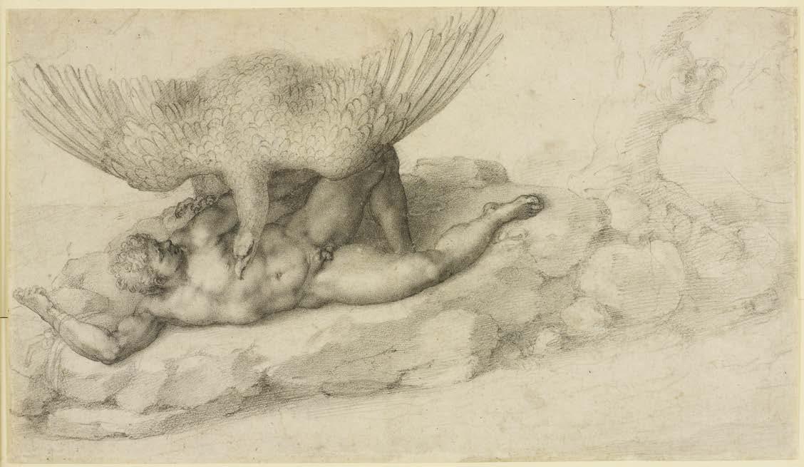
ABOVE The Punishment of Tityus, 1532, chalk
have been designated for this work by God. In spite of old age, I do not want to give it up; I work out of love for God and put all hope in Him.” Sarah asserts, “I think, as a man of faith, he found religious changes challenging and inspiring, and we see how he developed a very intimate, meditative kind of faith expressed through late drawings of religious subjects.”
What might people glean from this exhibition? Sarah’s hopes are high. “I’d love visitors to feel that they have a better sense of Michelangelo as a person, not just as a ‘great name,’ to get a sense of the continued innovation of his work between 59 and 88, and to appreciate the drive and focus he had, even at a period increasingly challenging –due to bereavements, ill health and all the other relatable human costs of ageing.”
And, as Grant Lewis adds, “In many respects, Michelangelo’s also better than ever, producing highly charged, often personal works that don’t just leave you in awe – as the famous early work does – but have the power to move you.” He mentions “the fresco of The Last Judgment that, Michelangelo finished in his mid-sixtie s, or the Pietàs he was working on in his eighties,” and concludes, “I’d like to think that the show will have an overwhelmingly positive spirit, a celebration of what humanity can achieve at any age.”
Michelangelo: The Last Decades is on until 28 July 2024. britishmuseum.org ▫
ART HISTORY 40 ARTISTS & ILLUSTRATORS ROYAL COLLECTION TRUST/© HIS MAJESTY KING CHARLES III 2024 AS PUNISHMENT FOR HIS ATTEMPTED RAPE OF THE GODDESS LETO


ARTIST
A SURFACE FOR EVERY ARTIST AND MEDIUM,
WATERCOLOUR • ACRYLIC • MIXED MEDIA • CARTRIDGE • DRAWING • OIL • CANVAS PASTEL • CALLIGRAPHY • MARKER • TRACING • NEWSPRINT Available at leading retailers, in store and online 0161 3515094 • sales@artcoe.co.uk • www.artcoe.co.uk
PADS PROVIDING
WITH OVER 30 TO CHOOSE FROM IN VARIOUS SIZES FROM A6-A2
Six lives
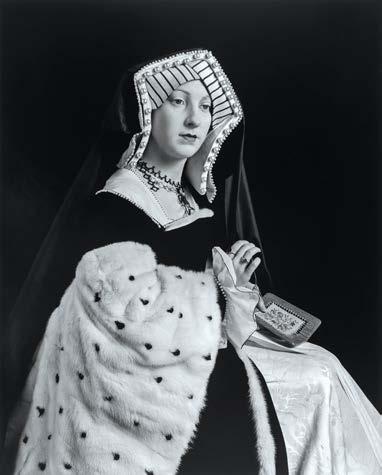
Henry VIII is one of history’s most famous monarchs who is best known for his six marriages. His wives and their lives are the subject of much fascination and speculation that continues to this day. A new exhibition at the National Portrait Gallery fans the flame, finds Amanda Hodges
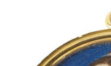
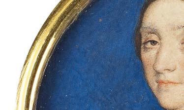
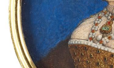
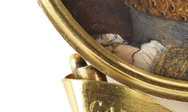

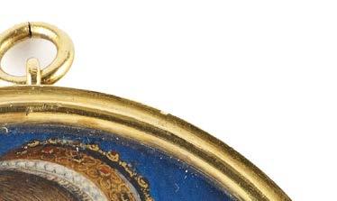
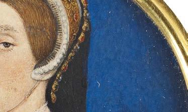
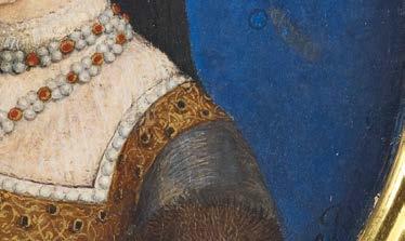
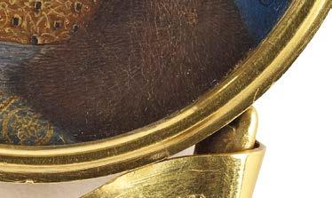
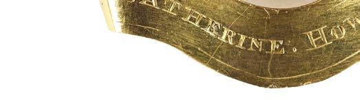
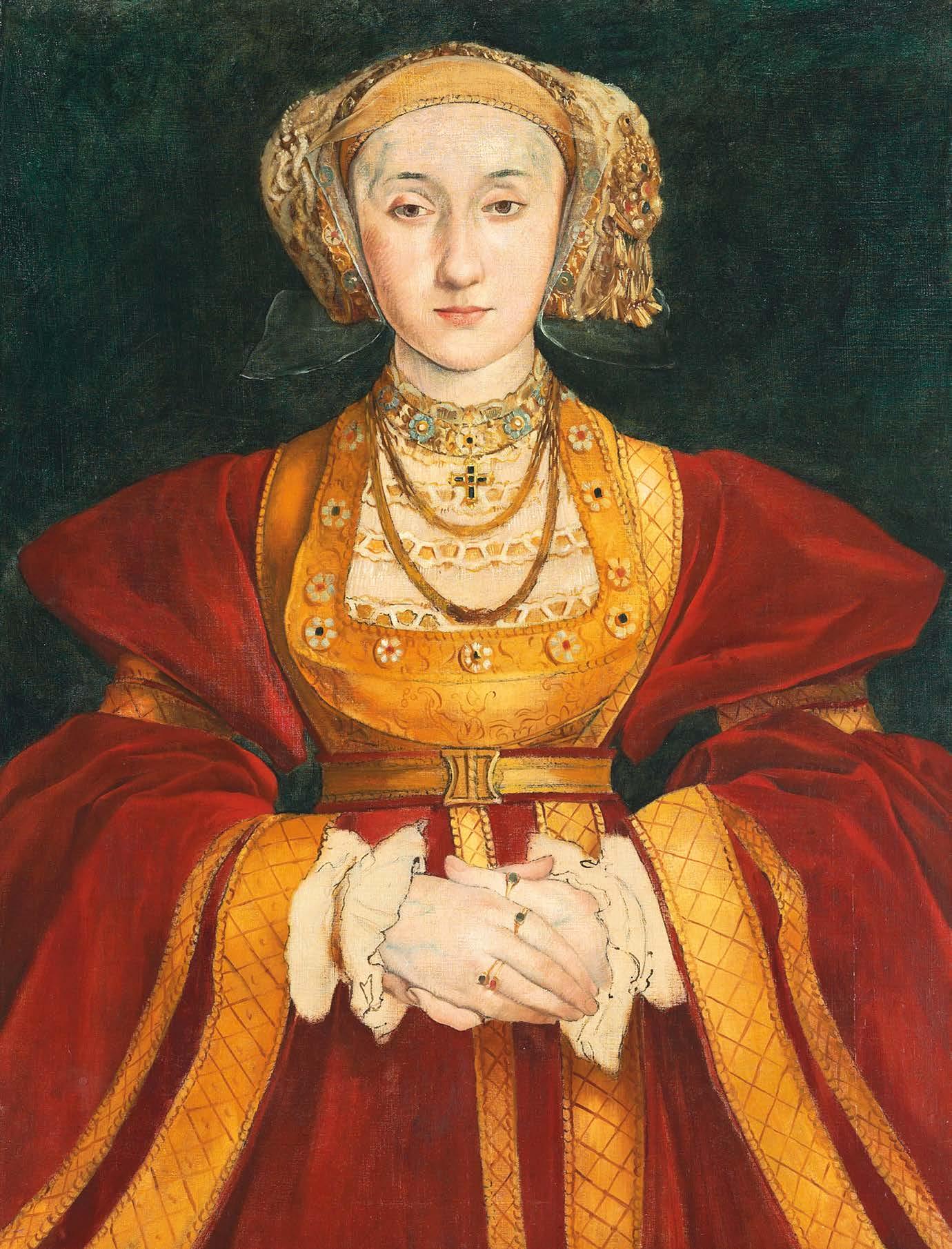
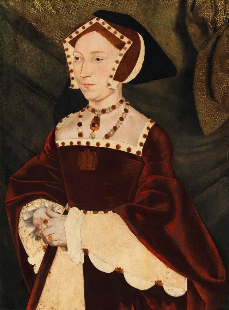
KProbably Katherine Howard (c. 1540) Hans Holbein the Younger
atherine of Aragon. Anne Boleyn. Jane Seymour. Anne of Cleves. Catherine Howard and Katherine Parr. There’s a familiar classroom mnemonic encompassingthe fate of the six women fated to be the queens of infamous Tudor monarch Henry VIII: ‘Divorced, Beheaded, Died; Divorced, Beheaded, Survived,’ it rather glibly runs. Now a major new exhibition at the National Portrait Gallery aims to discard the collective grouping and restore thesewomen’sindividuality;each stepping out from underneathHenry’s substantial shadow.
Six Lives curator Dr Charlotte Bolland says, “The events of the 16th century, in particular the Reformation, have shaped the country for centuries, but beyond the broad strokes of historical narrative,it’s the lives of people that draw us in. I hope that in this exhibition – the rst to focus on the six queens – the Gallery can o er visitors a richer encounter with the women as individuals.”In essence, the aim is “to take people beyond the reductive image of the queens in the famous rhyme,” and examine their evolving legacy within history and popular culture.
“The Gallery is fortunate to own several signi cant portraits of the queens, which are among the most iconic works in the Collection,”says Charlotte. “Portraiture has played a central role in the commemoration of the queens for centuries and therefore, the National Portrait Gallery – with its dual role considering portraiture and biography – o ers the ideal space in which to consider the lives of these women.”
There is a wealth of diverse material on display, encompassing historic paintings from Holbein the Younger to modern photography (by artist Hiroshi Sugimoto) plus drawings, costume and lm, all given a distinctive cachet by the presence of personal items owned by each queen. This will include the likes of Katherine Parr’s book of prayers, Anne Boleyn’s book of
RETROSPECTIVE
© CHRISTIE’S IMAGES/ BRISGEMAN IMAGES. PRIVATE COLLECTION © THE BUCCLEUCH CHATTELS TRUST
 Anne of Cleaves (c. 1860-62), Edgar Degas after Hans Holbein the Younger
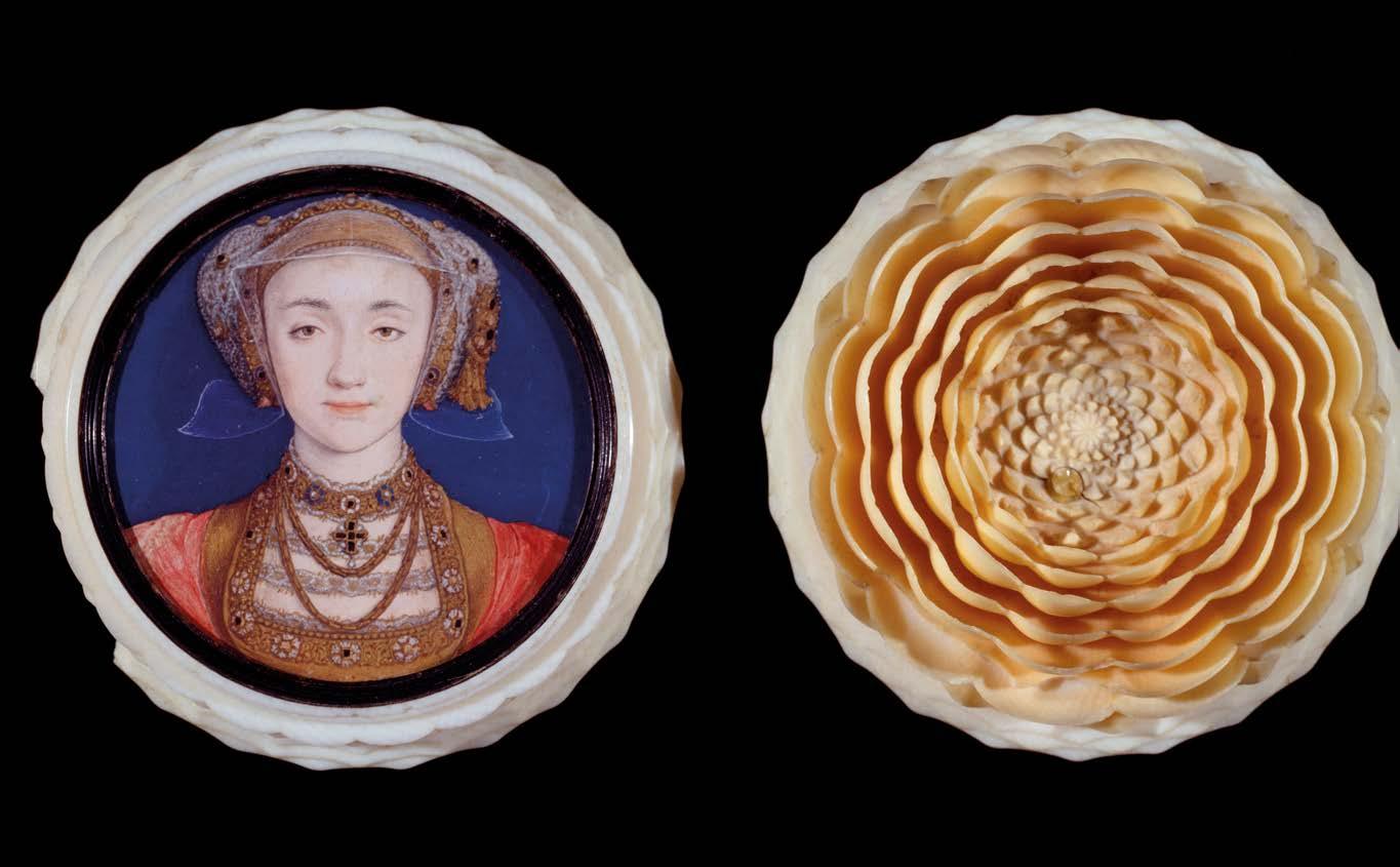
hours (her signature ignominiously erased) and Anne of Cleaves’ account of household expenses when briefly Queen, amongst many other personal artefacts; some being publicly displayed for the first time.
Intruiging too are notes and letters that fully flesh out the characters of women involved in what Charlotte describes as “an almost implausible melodrama,” where their lives became distorted by myth.
“I think the combination of portraiture and performance helps the six queens to step out of history. Henry VIII’s court is the first in an English context from which large numbers of portraits survive, most magnificently in the work of Hans Holbein the Younger and therefore, the cast of characters are the first historical figures we readily recognis e,” comments Charlotte. In addition to their likenesses being painted, the Tudor period also witnessed other art forms recording their lives for posterity.
“Their stories started to be written down and then performed, such as in William Shakespeare and John Fletcher’s Henry VIII, which has the wonderful alternative title All is True. With art and theatre both paying
Henry VIII’s court is the first where a large number of portraits survive
homage, “this offers an unusually strong foundation for the creation of a shared understanding of a period in history, even after 500 years.”
The idea of theatre contributing to the women’s renown is an interesting one.
On a personal level, Charlotte has found that much lies beneath the surface gloss. “Beyond their portraiture, I have greatly enjoyed learning more about the way in which the queens constructed their own stories during their reign. As a result, the thread of performance runs through the exhibition, because the women could never forget that they were performers on the court stage. Often this was literal as they joined pageants, most notably perhaps in
the case of Anne Boleyn performing as Perseverance at her first appearance at court.”
Within the exhibition’s broad scope, historical painting and contemporary photography seek to identify how the images that have evolved of the queens in the past five centuries have shaped our lasting perception of them. Visitors first encounter Hiroshi Sugimoto’s 1999 blackand-white pictures of Madame Tussaud waxworks. “Sugimoto’s portraits of the six queens open the exhibition as they offer a fascinating means of drawing attention to the extraordinary position these women occupy in the shared popular imagination,” Charlotte says. “Almost without realising it, we read photographs of the waxworks as images of living sitters, because the women’s lives are so familiar from history books and stories on stage and screen; their likenesses instantly recognisable from their repeated reproduction on everything from stamps to novelty china.”
A decision has been made to stage the exhibition in chronological fashion but “stepping back through time from the
RETROSPECTIVE
44 ARTISTS & ILLUSTRATORS
© VICTORIA & ALBERT MUSEUM, LONDON
Anne of Cleaves, (1539) , Hans Holbein the Younger
21st century to the 16th century,” and includes works within an intriguingly diverse range of media. Within contemporary sections there will be costumes and designs from productions such as the recent hit show Six the Musical and also from the classic 1970 BBC television series, The Six Wives of Henry VIII, allied to film and photographs.
Travelling back to the Tudor world, “we hope to be able to share a sense of the magnificence of Henry VIII’s court with visitors,” says Charlotte, “bringing tapestries, jewellery and stained glass into dialogue with extraordinary portrait paintings, drawings and miniatures; including numerous works by Hans Holbein the Younger.” Paintings were then used as invaluable tools of propaganda and prestige. The versatile Holbein, called ‘a wonderful artist’ by no less than Sir Thomas More (whom he memorably painted), is acclaimed as one of the supreme portrait painters, renowned for the lifelike way he captured his distinguished sitters. He painted the infamous matchmaking oil portrait of Anne of Cleves for a curious Henry and the fact
that he survived the King’s subsequent disenchantment with the lady’s actual appearance is testament to his diplomacy, discretion and sheer skill.
“This is the first exhibition of historical portraiture since the Gallery’s reopening last year,” mentions Charlotte. “With the transformation of the building, there’s a greater sense of the relationship between the Gallery and its site at the heart of the West End and therefore, in dialogue with the theatres, opera houses and cinemas where the queens’ stories are now most commonly encountered.” NPG director Dr Nicholas Cullinan adds, “bringing the smoke and mirrors of stage and screen into dialogue with the magnificence of the Tudor court, Six Lives hopes to engender empathy, reminding us to consider the stories that we collectively construct and the ease with which we can define people by a single moment in their lives,” the resonant echoes of which ripple throughout the course of English history.
Six Lives: The Stories of Henry VIII’s Queens, 20 June to 8 September 2024. npg.org.uk ▫
TOP Catherine Parr (1999) , Hiroshi Sugimoto
MIDDLE Anne Boleyn (1999) , Hiroshi Sugimoto
BOTTOM Catherine of Aragon (1999) , Hiroshi Sugimoto
©NATIONAL PORTRAIT GALLERY, LONDON © HIROSHI SUGIMOTO. COLLECTION OF ODAWARA ART FOUNDATION, KANAGAWA, JAPAN © HIROSHI SUGIMOTO. COLLECTION OF ODAWARA ART FOUNDATION, KANAGAWA, JAPAN © HIROSHI SUGIMOTO. COLLECTION OF ODAWARA ART FOUNDATION, KANAGAWA, JAPAN XXXXXXXXX ARTISTS & ILLUSTRATORS 45
Jane Seymour (c. 1537) , Hans Holbein the Younger
Asian inspiration
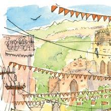
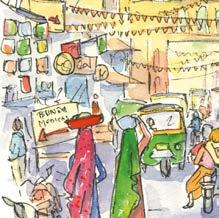
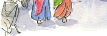
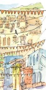
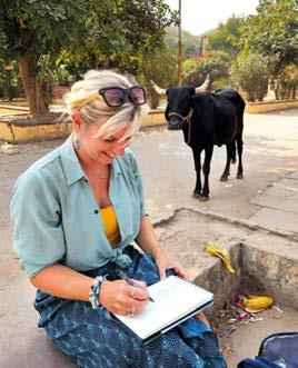
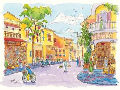
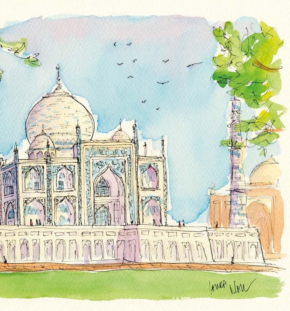
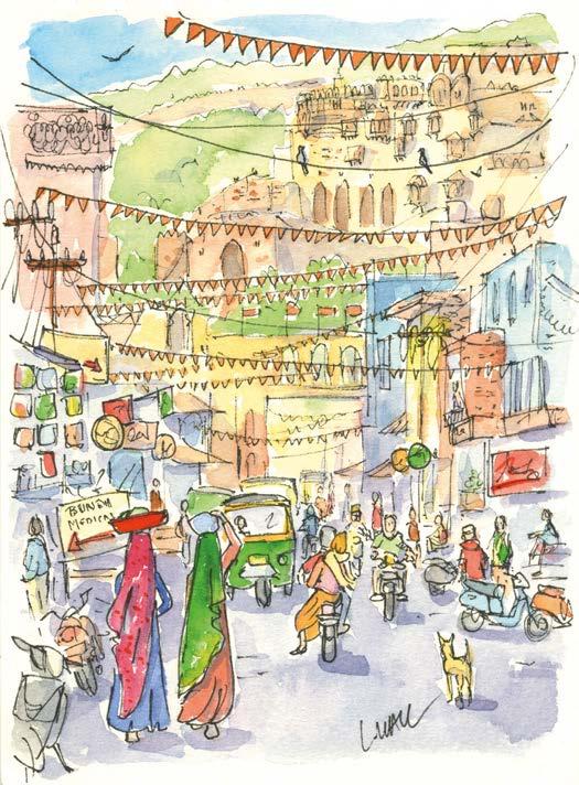
A
seven-week holiday proved to be a perfect art adventure for award-winning artist LAURA WALL . Here, she explains how she created painting remembrances from her trip
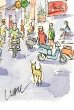
Earlier this year, my husband and I spent seven weeks travelling around Vietnam and India. Our adventure was nothing short of magical. The contradictions of daily life fuelled my creativity and these beautiful countries have left lasting impressions on me. As much as I’d have loved to, I couldn’t paint every day as we had a busy schedule soaking in all the sights, but I immersed myself in painting and sketching wherever I could which has resulted in a colourful collection of painted memories. laurawall.com
MATERIALS
From a practical level, what do you bring along for a seven-week journey with only one case? In the end, I decided to take three types of sketchbooks, a professional travel watercolour set, a variety
of black Faber-Castell pens, a table easel and a white Posca pen. It might seem excessive to bring three sketchbooks, but each had a purpose.
The smallest was my moleskin pocket A6 watercolour book, which was purely for notetaking and jotting down colours and
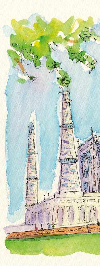
quick compositions, like an art diary. My A5 spiral-bound watercolour pad was the most used of all three. It was great for creating paintings in situ when I had a little more time on my hands. The largest paper I took, was primarily used for works painted back at my hotel, rather
than in-situ sketches. This was 300lb NOT paper, which I cut into A3 sheets before I left so they’d fit in my case. It was fantastic to get out this quality paper, set up the easel and get lost in a painting.
PAINTING IN SITU
Finding a quiet corner to paint was always a challenge, but it was easier in Vietnam than in India. Vietnam has a huge coffee
46 ARTISTS & ILLUSTRATORS
Taj Mahal, India, watercolour and pen
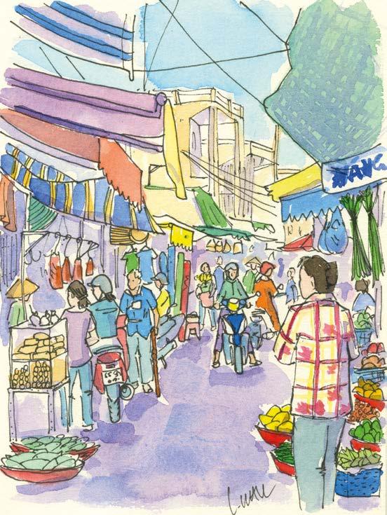
Hoi An, Vietnam, watercolour and pen
Mekong Delta Market, Vietnam, watercolour and pen
Laura painting in Bundi, India
quieter moment, preferably as soon as possible so I still had the sounds and atmosphere of the place surrounding me.
INDIA
culture so there are endless cafes where you’re welcome to while away the hours doing as you please, in my case: painting. In India, it was tricky due to the bustling nature of the places we visited, so if I ever saw an opportunity to sit somewhere quietly without an audience, I would jump at the chance. It was during the more challenging situations I was glad of my recent experience painting for Unwind with ITV, which forced me to work quickly under pressure as the cameras were rolling. It trained me not to overthink things and to paint more fluidly.
PAINTING FROM PHOTOGRAPHS
In those places where it wasn’t feasible to paint, I would snap as many photographs as possible, and take videos to use as aide-memoire when I found a
I have always wanted to visit India to see the Taj Mahal, so I knew I wanted to paint it. I chose to paint it from an off-centre perspective, in hazy purple hues, evoking a dreamlike quality. Despite it being crowded during our visit, there was a real sense of peace that I wanted to capture.
VIETNAM
Vietnam is a much calmer country, full of gentle scenes of rural life. As mentioned before, the cafe culture was useful for allowing me the time and space to paint. One such occasion was in a gorgeous cafe in a coconut forest where I set up my paints on a table overlooking the river.
WHAT I LEARNED
I learned to let go a little bit and lose some inhibitions. I started out quite nervous to paint in public, but I soon got over this. Finding the ‘perfect spot’ is rare and actually, just working with what was in front of me was much better. It’s all real life. For me, it’s all about capturing a feeling and evoking the essence of a place to capture a moment in time. ▫
ART AND TRAVELS ARTISTS & ILLUSTRATORS 47
Coconut Forest, Vietnam, watercolour and pen
Bundi, India, watercolour and pen
Colour kapow!
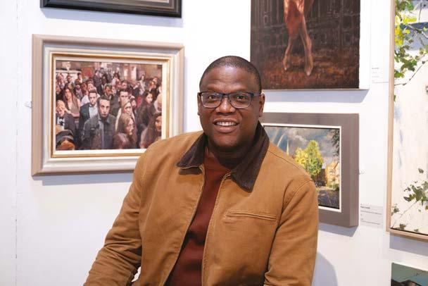
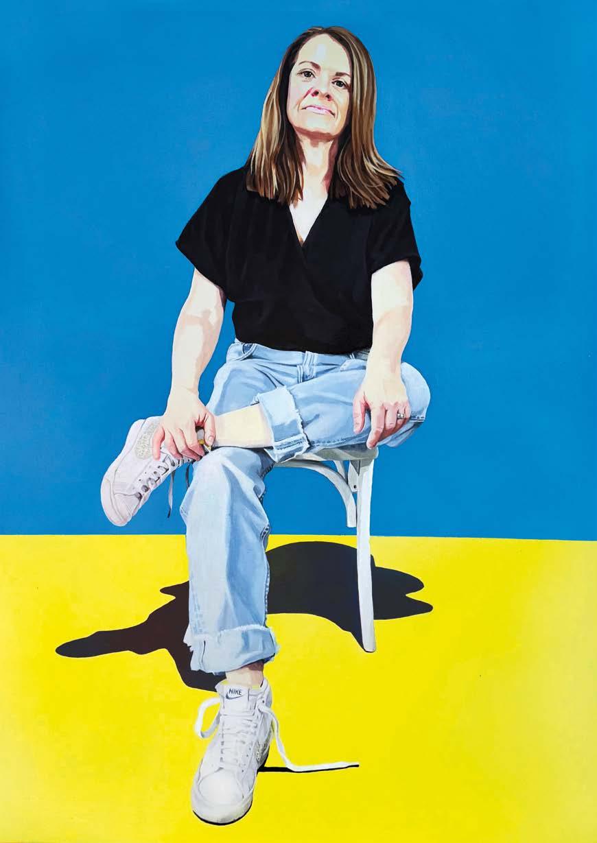
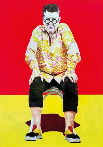
Being a finalist in the British Art Prize 2023 gave ROB COWAN the boost to hold his first solo exhibition. Sarah Edghill finds an artist fizzing with energy ▸
EXHIBITION ARTISTS & ILLUSTRATORS 49
Dave, acrylic, 122x90cm

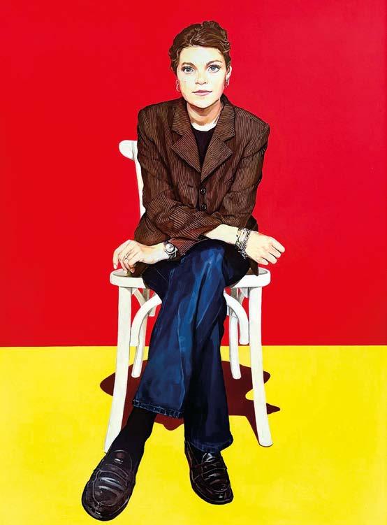
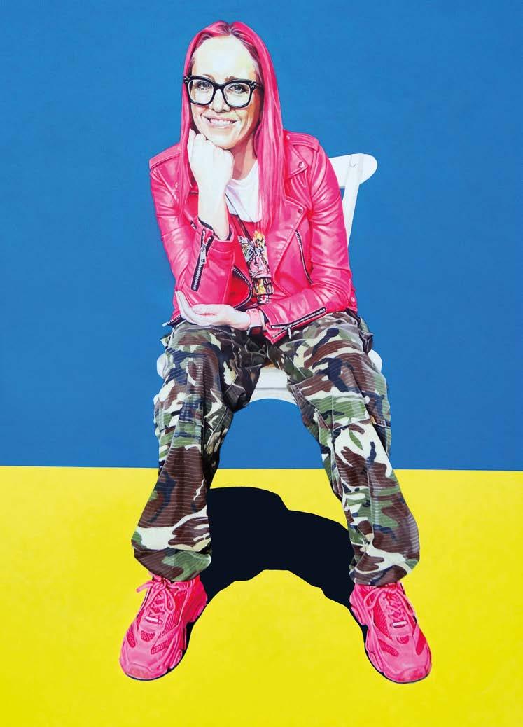
Rob Cowan is one of life’s optimists. He speaks so quickly, that it’s sometimes hard to keep up, and there’s no doubting his enthusiasm for his art as he talks about preparation for his new exhibition, White Chair, in July at the Moosey Hoxton, London. “I’m not a sit-still person,” he says. “I’m 52 now and really understand who I am as an artist. I’m excited about putting my work out there.”
After studying art at Central Saint Martins, Rob worked as a commercial illustrator for many years. He used a mixture of traditional and digital media to create portraits, illustrations and public murals. But he was forced to reconsider his future during the pandemic. “Everything stopped, so I went back into the studio and painted,” he says. “In many ways, it was exactly what I needed because I’d started to dread the commercial illustrator jobs; everyone wanted the same thing – it felt like I was drawing and painting by numbers. Then, in 2021, I smashed out a self-portrait and thought, I can do this. I spent the next two years in my studio, having a massive fight between my love of traditional painting and this graphic effect I was using.”
Rob’s large self-portrait was shortlisted for the British Art Prize 2023 and he remembers that when he finished painting , he stood back and looked at it, realising he was finally happy with what he’d achieved. “It was a eureka moment for me. For the first time, I knew what I’d created was right. The colours weren’t natural – it came from the digital
Karolina, acrylic, 122x90cm
Rob, acrylic, 122x90cm
Sarah, acrylic, 122x90cm
processing world and you don’t find those colours in nature – but it worked.”
As Rob began to paint more portraits, he became fascinated by the idea that people would plan how they wanted to be portrayed. “I’ve always thought there’s more to a portrait than the face,” he explains. “How people dress and the way they put
themselves into a position, says so much about their personality. If I ask someone to sit for me, they won’t just rock up in the first clothes they find that morning; they’ll plan what to wear. When I did my own selfportrait, I did exactly that, because I was conscious of how I wanted the world to see me, right down to the bright yellow shoes
and the way I sat. That was the essence of me and how I wanted to be seen: I’m forthright, I talk a lot, I’m in your face.”
Being shortlisted in the British Art Prize 2023 kickstarted his career as a portrait artist. “I knew I’d been long-listed, then the email came saying I was a finalist and I was ecstatic. I was lecturing at the time, so ▸
EXHIBITION
ARTISTS & ILLUSTRATORS 51
Isaiah and Asher, acrylic, 122x122cm
I ran down the corridor and bumped into a fellow lecturer and gave him a massive hug! It’s a brilliant feeling: you’re down to the last 40 out of thousands and there’s a great sense of validation.”
At the British Art Prize 2023 private view, Rob met many fellow artists and made some fantastic connections. “Everyone was so supportive and I came away feeling part of an art community, which I never had before. I was chatting to Sarah Graham, one of the judges, and asked if I could paint her for my show. I was amazed when she said yes, but it was that kind of night, just magical. Another judge, Tom Croft, is part of Contemporary British Portrait Painters, and I’ve always admired that group and have now made a connection with him too.”
I’m not a sit-still person. I’m excited about putting my artwork out there
Fuelled by his success, Rob decided to put on a solo exhibition, and White Chair runs for four days at the Moosey Hoxton in London. “I lived in Australia for a while and owned a gallery, where I did a few shows, but this one feels like my first proper solo exhibition.”
All the portraits on display are new. “I’ve
been working on a series of 12 paintings for this exhibition. The intention is to mix it up: I like painting individuals, but I also love doing two people and seeing how they interact and sit together. I want to show the diversity of what I can do and I love the idea of scale. As an illustrator, even though my work was going to be reproduced fairly small on the pages of a magazine, I was still painting on A1. That means my work lacks detail and when you get near you can see all the brush marks. But I need that scale to be able to deliver – I enjoy the freedom of it and I can’t diddle about.”
The paintings also reflect Rob’s full-on, positive attitude to life. “I want them to be celebrations of people,” he says. “You look at them and they put a smile on your face. Art should be for everybody and I want people to be able to talk about my paintings and express their feelings. In some less accessible galleries, that isn’t possible because visitors feel intimidated. I’d be very happy if my show opened me up to commissions because I want the people I paint to have those paintings – to own a brilliant celebration of themselves.”
Still buzzing from his success at the British Art Prize 2023 , Rob intends to enter again this year. “It’s the artist’s art prize. It’s a great way of getting your work out there and getting recognition. It has given my career a big boost and given me confidence in my work. I sold paintings as a result of it and some lovely woman now has a portrait of me hanging on her wall, which paid for me to put on my solo show in Islington.”
White Chair is at the Moosey Hoxton, 93-137 Hackney Road, Hoxton, London E2 8GY from 4 to 7 July 2024 ▫
52 ARTISTS & ILLUSTRATORS
Juliet, acrylic, 122x90cm
Deb, acrylic, 122x90cm


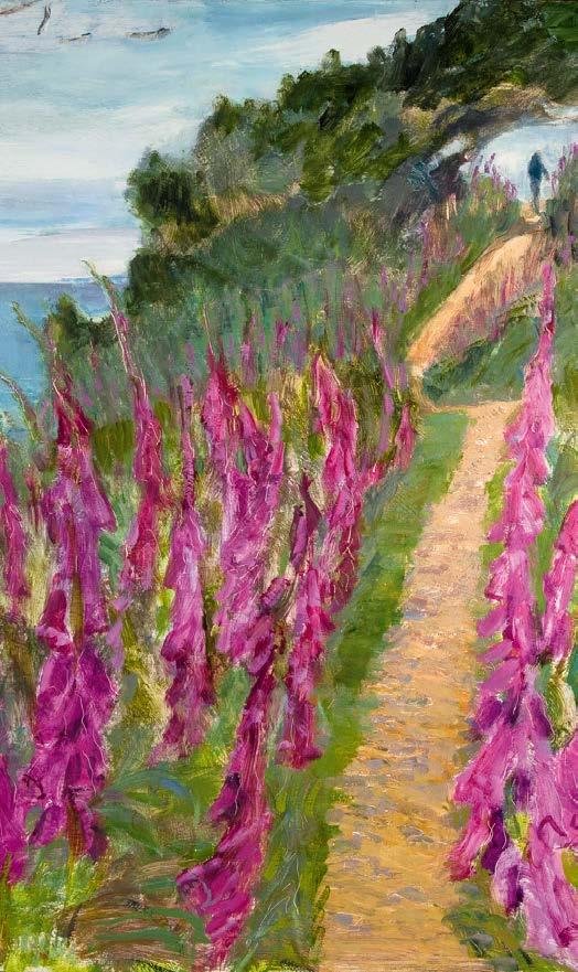
Set against the edge of the English coastline, the South West Coast Path offers walkers a breathtaking experience of the landscape.
Set against the edge of the English coastline, the South West Coast Path offers walkers a breathtaking experience of the landscape.
Artist Janet Johnson unveils a new collection of paintings that celebrate the beauty of the Path.
Artist Janet Johnson unveils a new collection of paintings that celebrate the beauty of the Path.
JANET
JANET JOHNSON
JOHNSON
Foxgloves along the South West Coast Path (detail), oil on hardboard, 61 x 61 cm
www. janetjohnsonart.co.uk @swcp_janetjohnson
www. janetjohnsonart.co.uk @swcp_janetjohnson
Foxgloves along the South West Coast Path (detail), oil on hardboard, 61 x 61 cm
JJohnson_Coast_ad_v6_vertical_final_b.indd 4 03/04/2024 22:10 2405-6110-SSP-Brand Adverts May 2024-AW-OUTLINED.indd 1 28/05/2024 10:56 RWA85_AOE171_A&I99x129_OUT_V01.indd 1 28/03/2024 13:37 ARTISTS & ILLUSTRATORS 53


★ Join a community of artists
★ Create your personalised gallery page
★ Showcase unlimited pieces of artwork


★ Sell your artwork commission-free Share, showcase and sell your artwork commission-free from your own personalised online art portfolio for as little as £2.99 per month
★ Appear in online exhibitions
★ Share your art with 1000s of website visitors
Go to www.britishartclub.co.uk BROUGHT TO YOU BY SHUTTERSTOCK CLUB British A rt THE YOUR ONLINE GALLERY BECOME A MEMBER TODAY!
STEP-BY-STEP
In this insightful How-To section, professional artists show you how they perfected their painting techniques. Here, portrait artist HAYAM EL - SAYED discloses how she approaches her practice
EVERYTHING YOU NEED TO PAINT AND CREATE
1
Choosing the right model is crucial for me as it sets the tone and emotion of the artwork
Connecting emotionally with the photos helps me capture the subject’s essence, personality and mood. It allows me the room to convey the depth of the individual’s character, which enhances the overall impact of the artwork. Additionally, a strong emotional connection can inspire creativity and imbue the portrait with authenticity and depth. Quality is key I make sure to use superior paints, brushes and canvases. It can really make a difference in how a portrait turns out. Whenever I can, I try to play with colours and get creative by mixing hues to create beautiful skin tones and lifelike portraits. I try different combinations to see what works best, always using a test strip before applying paint to canvas.
2
3
I give the eyes special treatment
It’s very important to realise that they are never pure white – there are always shadows and variations in the white part of the eye. I never hard outline the shape of the eye and the eyes rarely match each other; they have subtle differences. We need to force our brains to see what’s really there to give a portrait purpose. hayamelsayed.com
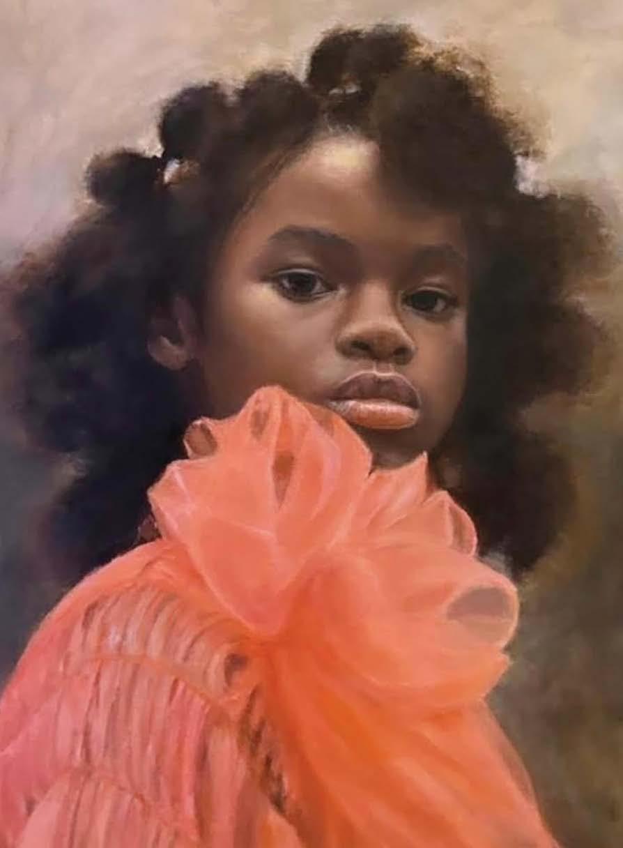
ARTISTS & ILLUSTRATORS 55 FOLLOW THE LIGHT, OIL, 40X50CM
Bay wat
TERENCE CLARKE captures the essence of a French bay in oil and acrylic
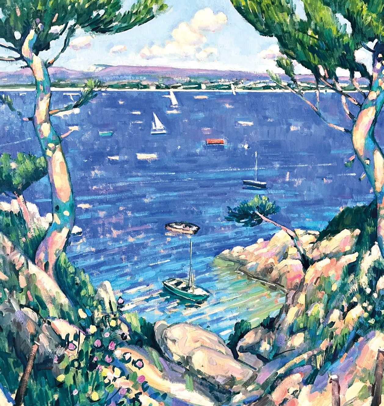
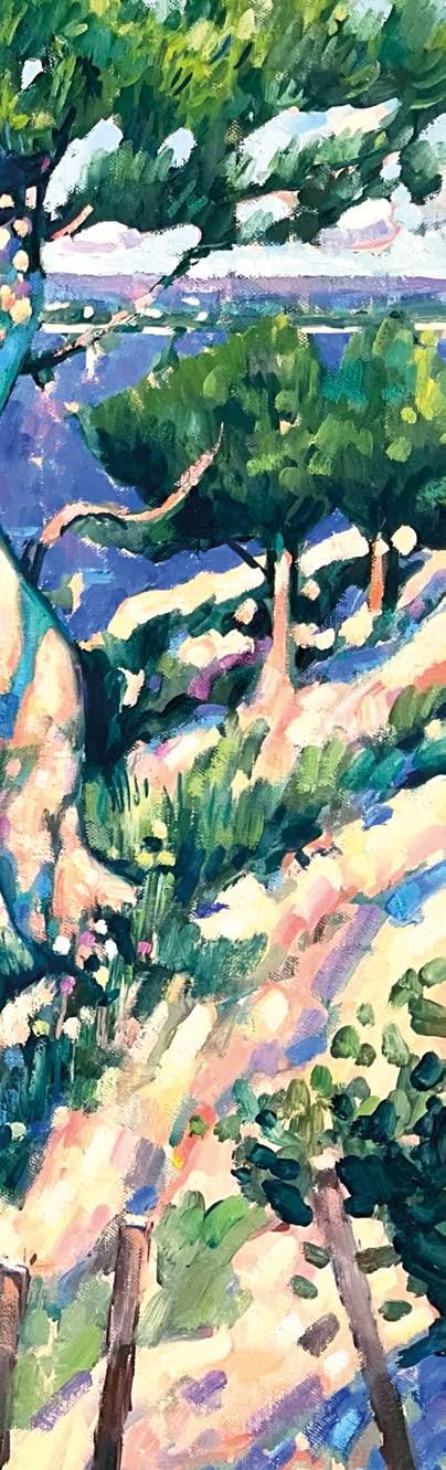
Tchhis painting is a view of the bay near La Ciotat, a small French fishing village not far from Marseille. It’s famous in the history of painting because Braque, Matisse and other Fauves worked there in the early part of the 20th century. Their work brought the excitement of the use of pure colour into painting. A painting isn’t just about copying the landscape but trying to give a real sense of the experience of looking at it. You are trying to evoke an emotional response that is equivalent to actually being there. This is what I was hoping to do here, by letting the expressive handling of the paint engage you in the landscape, drenched as it was in beautiful light. The artist’s job is not just to copy but to transform reality and engage the viewer in a leap of imagination.
Instagram: @terence_clarke_paintings
TERENCE’S MATERIALS
Paints
Sennelier A rtists Oil
Paints: Yellow Ochre, Lemon Yellow, Quinacridone Magenta, Vermillion Red, Pthalo Green, Ultramarine Blue, Prussian Blue, Manganese Blue, Titanium White
Acrylic: Prussian Blue Brushes
Rosemary Ivory filbert brushes
Numbers 2,3,4,6 Support Gerstaeker Linen canvas
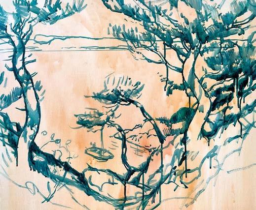
BE BOLD
1
Having applied a light warm wash over the canvas surface, I used a thin inky mix of Prussian Blue acrylic to get the drawing in. I like to create a bold drawn statement so that the structure of the composition is there from the get-go. It doesn’t matter about drips or the odd mistake as long as you break into the surface and generate pictorial space to work with. This bold drawing will hold up as the paint goes in over the top of it.
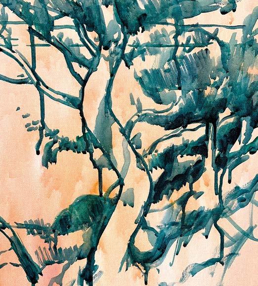
HAVE CONFIDENCE
2
Here, you can see that I’m expressing the intense contrast of tone that strong light gives. In a sense, the light in the picture is generated by the intensity of the darks. The structure of the shadows on the pines was very important too. It gives them form and a certain spacial presence. Although the marks are tentative, being confident with your drawing gets the painting off to a good start. ▸
STEP-BY-STEP ARTISTS & ILLUSTRATORS 57
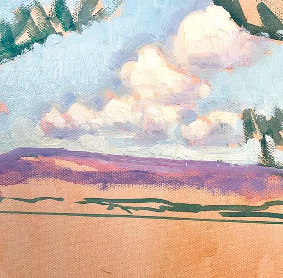
ESTABLISH THE SKY
These clouds were important. They create a sense of space in the sky. This helps pull your eye in as the picture develops. The fact that they recede helps establish the horizon as a space, not just a flat line. In my experience, clouds have to be painted spontaneously. They are the most ephemeral structures, but they need to contribute to the space and light. I always take a deep breath and then just go for it, mapping the basic tones and shapes in thickly applied opaque paint.
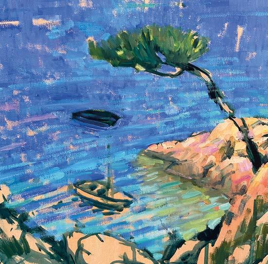
FOCUS
The inlet and the painting of the reflections allow me to bring the block of blue sea into some kind of realistic focus. Without this note of realism in the reflections, the sea would look flat and unreal. I have used tints of Yellow Ochre and Pthalo Green to suggest the ripples and reflections of the light on the water. The light and intense notes of magenta on the rocks start to energise the foreground and add complimentary colour tones to the shoreline.
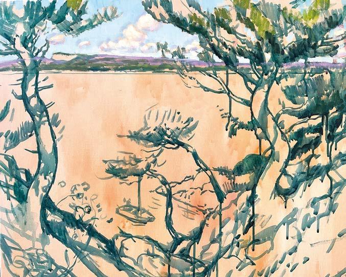
THINK ABOUT TONE
Here, the sky is fully painted and this will give me a good sense of the light in the whole picture. Establishing something of the horizon suggests the kind of distant space that is to be incorporated into the composition. The pine trees are also underway and I am using a mixture of Yellow Ochre and Prussian Blue to indicate the eventual tone of the pine canopy. These first few marks give me my first approach to painting the trees and relating them to the sky in the background.
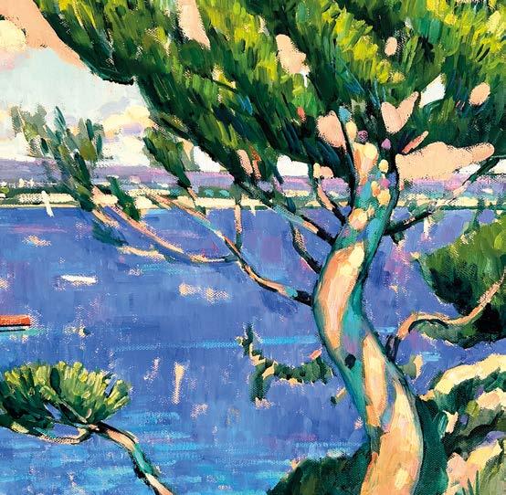
COLOUR EFFECTS
There is an element of Fauvist colour here so that the shadows on the tree trunks are filled with light using greens, blues and purples. Those colours are harmonising with the horizon and the modulated blues of the sea. You can see also that I have used a soft pink to re-draw the structure of the pine tree foliage. It’s never too late to correct the details of the original drawing. Painting something out often really progresses a picture. 3 7 8 4
58 ARTISTS & ILLUSTRATORS
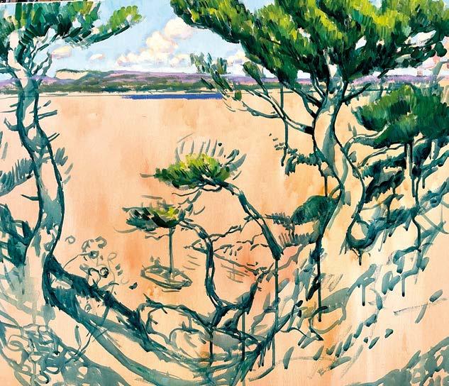
THINK ABOUT FORM
The pine tree foliage has an almost solid quality and it’s important that leafage is painted as a form, not just a vague patch of green. The light was catching the top of the trees and you can see, there is a huge range of tone, which was implied in my original drawing. Note the wide variety of greens, moving from lemon tints through to ochres and touches of Pthalo Green. At this point, I added the very first notes of blue in the sea.
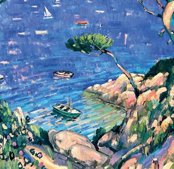
EDIT
In the original drawing, there were two pines overhanging the little bay. I agonised over changing it but I decided to axe the second one as it was massively interfering with the reading of the boat and the space in the bay. It was a small sacrifice of topographical accuracy in favour of the experience of space in the picture. Never forget that you are trying to make art, not just descriptions.
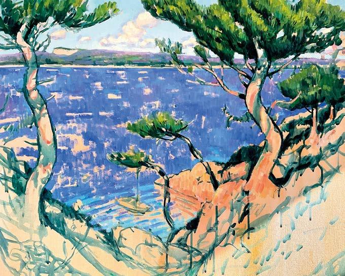
THE SEA
As I paint in the foreground, you can see the light really starts to bounce around the picture. Although there are lots of light tones here, it’s those intense darks within the foreground that really dictate the strong light effect. The two trees act as a kind of compositional gateway, ushering you into the distance and the beautiful, modulated blues of the seas. All that was needed to complete the picture was the few bits of detail in the close foreground and the composition was completely resolved. ▫ 9 10 5 6
Because the original drawing established the trees and foreground so clearly, I was able to flood the picture with the large block of ultramarine for the sea. The underpainting is very important here. The warmth of the underpainting complements the blue tones and keeps them energised by the use of contrast. I have begun to modulate the blue, using purples and notes of Manganese blue. The details of the little inlet begin to suggest the reflective quality of the water
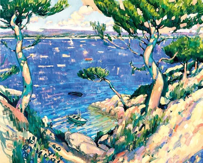
THE FINAL DETAILS
STEP-BY-STEP ARTISTS & ILLUSTRATORS 59
Nature’s way
PHIL HOBBS has lived and
worked in
the English Lake District for over 50 years. Here, he shows you how he painted a local scene in pure watercolour
Millerground on the shores of Windermere, lies at the foot of a wooded ravine or ghyll, where the lively, chattering waters of the beck meet the lake. Just a short stroll from my studio, I have painted and sketched around here, throughout every season over the years, both in the company of friends and students but more often alone.
In the quiet of an early winter’s morning, the world gently comes alive. First, there is just the lapping of the water, against and between the jetties and the boathouses but as the light increases, so does the birdsong. The animals with more nocturnal leanings make their way home to be replaced by those for whom the rising sun provides patches of hardly perceptible warmth in which to stretch or preen and prepare for the coming day. Human activity at this hour is minimal. A passing fisherman, the keenest of sailors and sitting, well wrapped against the chill, tucked quietly among the boulders – me.
People across the world, by force of habit, often lay claim to, if not a place, then a period of time when that patch of the planet, public as it may be, is theirs. Any intrusion will lead to inevitable scrutiny. As a frequent interloper myself, I have found that accepting that scrutiny often leads to uncovering rich seams of narrative, insights into the lives of others and sometimes even friendships.
I enjoy creating or recreating these observations as threads within a painting. I feel it provides a further level of interest to the landscape. plhobbs.co.uk
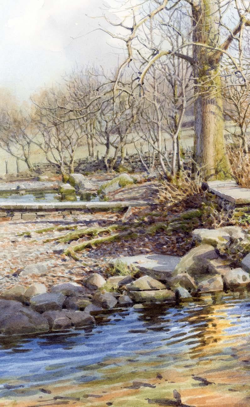
PHIL’S MATERIALS
Paint
Winsor & Newton
Professional Watercolours: Raw Sienna, Burnt Sienna, Light Red, Cerulean Blue, Cobalt Blue, French Ultramarine Paper
Saunders Waterford
300 gsm not Brushes
Various old mop brushes sizes 10-12
Winsor & Newton
Series 7 size 5
Rosemary & Co
S eries 33 sizes 9 and 5
Da Vinci Maestro
S eries 10 size 4
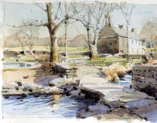
60 ARTISTS & ILLUSTRATORS
STEP-BY-STEP
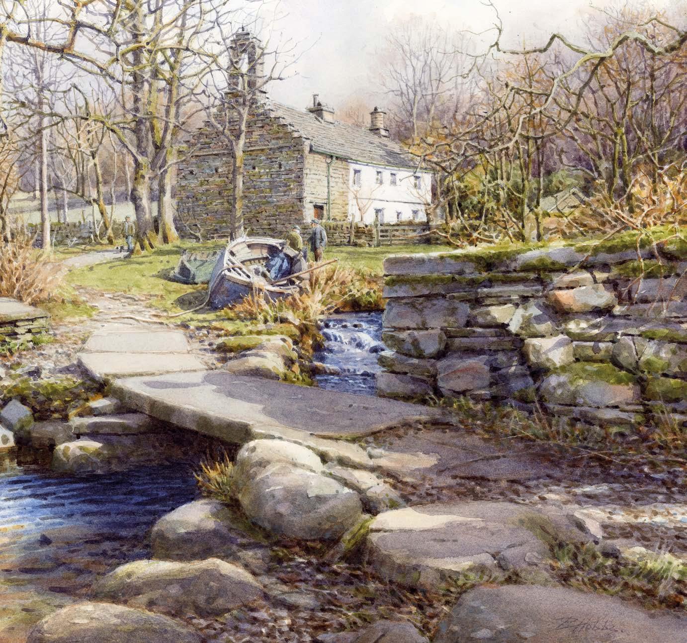
PAINT WHAT YOU SEE
The following demonstration was created in the studio, using several on-site sketches from my sketchbooks and a study once produced as a workshop demo.This method of working allows a more considered approach to picture making, providing a good opportunity to adjust elements of composition to better serve communication of the subject matter without hopefully losing that initial spark that attracted my attention in the rst place. It is also worth bearing in mind a couple of points when working on-site. Paint what you see, not what you think you know, otherwise, you run the risk of producing work that could appear formulaic. ▸
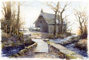
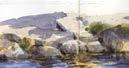
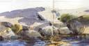


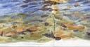
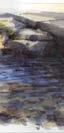

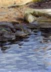
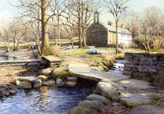
ARTISTS & ILLUSTRATORS 61
1
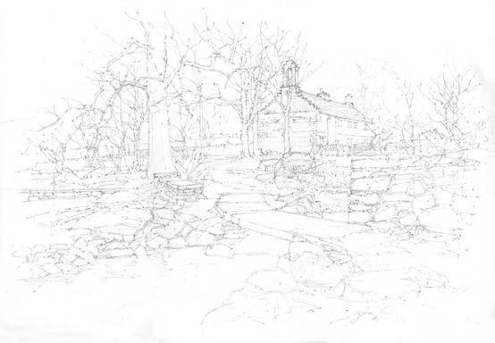
THE UNDERLYING DRAWING
This is the skeleton of a watercolour. At its simplest, it’s a way of checking that the composition will fit on the sheet. I always leave room around the edge to allow for adjustment; you can always cut some off whilst you cannot add any on. I feel that the drawing should be accurate but not detailed. There needs to be enough for you to feel confident but not so much as to prevent some change of heart or preclude the retention of the occasional happy accident.
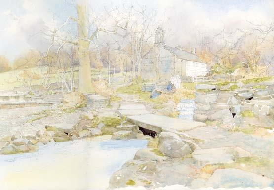
GHOST IN THE IMAGE
The last step was largely about temperature. This one begins to incorporate texture. Both are important in creating the illusion of depth. Whilst the drawing establishes the pattern, this step is the beginning of painting the space between objects, front to back. At this stage, I often reinforce areas of drawing to assist with the next stage, or just to keep things on track. 2 4 3
I work in pure watercolour and so the whole process has to proceed from light to dark. Working quickly I ghost in the image, being careful not to obliterate any white areas that I may wish to retain. You can use masking fluid for fiddly bits but I find it often causes as many problems as it solves. Establishing a couple of the darkest darks at this stage helps set the tonal parameters.
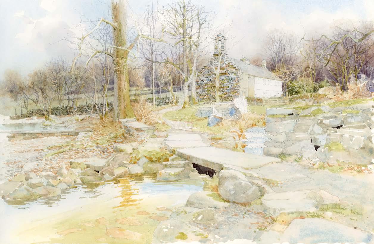
TEXTURE AND DEPTH
62 ARTISTS & ILLUSTRATORS
STEP-BY-STEP
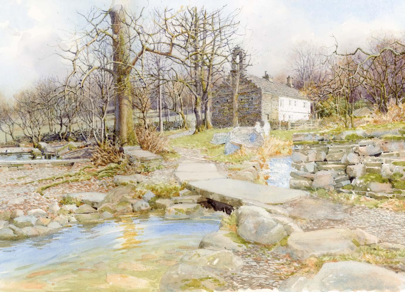
TONE AND EDGES
At this stage, I am beginning to resolve certain areas, so that I can relate one to another. I am using a mixture of tone and edges to create the various forms. Edges are particularly important. Soft, hard, lost, found and the juxtaposition of light against dark. There are no lines in nature, only edges. I find myself increasingly thinking in terms of smooth or brittle, solid or fluid.
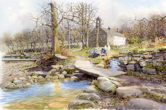
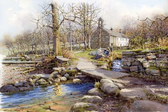
MAINTAIN TRANSPARENCY
6 7
Now, I am concerning myself with the play of light, trying to create the impression of the increasing warmth after a cool night, of the shifting, dancing light, drawing the viewer into the painting. I am at great pains to try and maintain transparency within the shadows and give some idea of the shape and quality of the surfaces onto which they are falling.
INTRODUCE PEOPLE
I continue in the same vein, pushing and pulling the various elements around, breathing a little life into the beck feeding the pool and introducing my characters onto the stage, endeavouring to see that they sit right within the landscape. We cannot see their expressions, so any feelings have to be portrayed through posture. ▸
ARTISTS & ILLUSTRATORS 63
5
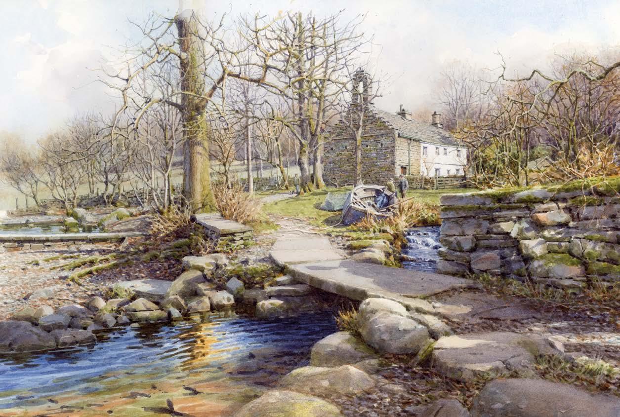
BELIEVE!
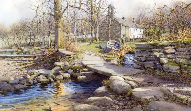
DON’T FIDDLE
This is the point at which I wish I could start again, the point we all reach when we realise that what we set out to achieve, is not going to be entirely achieved, as if that were ever possible. We have to believe in that possibility, to begin our next painting or any other serious creative endeavour. Slightly unhappy with some of the foreground edges, I begin to wash down and reinstate them. 8 9
Having re-established the foreground edges, I move around the subject, checking relationships between the various objects. Realising that I am in serious danger of ‘ ddling’ and thus ruining the whole thing. Now is the time for this painting to go into a drawer for some time, before re-emerging and being assessed for any necessary tweaks before framing.

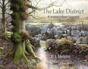

book,

, is available now from your local bookshop, £39.00, Sable Point Press. For a signed copy, buy online at plhobbs.co.uk ▫
64 ARTISTS & ILLUSTRATORS
STEP-BY-STEP
Phil’s
The Lake District A Watercolour Journey
Tim Patrick Short Course Tutor, Painting Painters, poets, weavers, welders, gardeners, gilders, calligraphers, conservators…
Experience the joy of making something truly your own, guided by expert crafters in inspirational surroundings.
Be inspired at westdean.ac.uk
MEET THE MAKER
Blurred lines
Charcoal artist ELÍAS FLORES shows you how to create a portrait with depth and emotion
Cr eating a portrait with charcoal is, for me, an act of immersion into the very essence of the subject. I delve into the creative process, allowing each line and shadow to reveal, not only the subject’s physical appearance, but also their deepest and subtlest traits.
I greatly enjoy this art because it allows me to go beyond mere visual representation and explore the complexity of the human experience. Inspired by both Impressionist and Expressionist styles, I seek to capture the fleeting nature of the moment and the richness of emotions.
My focus is on conveying, not only the subject’s physical appearance, but also their emotional and psychological state. Each charcoal stroke is an expression of my own interpretation of the world around me, an invitation for the viewer to immerse themselves in the complexity and beauty of the human condition. Ultimately, through my art, I seek not only to capture the image of an individual but also to share an intimate and exciting vision of the world around us.
Instagram: @zeeliasfineart
SKETCH IT OUT
To start a charcoal portrait, I use the Loomis method. I draw an oval for the head and divide it horizontally into thirds. These divisions serve as a reference to position the eyes, nose and mouth. Using a soft charcoal or a flat Sofft PanPastel spatula, I sketch light lines following these guidelines. This method ensures a solid structure to accurately capture facial likeness and maintain proper proportions. ▸
Charcoal Willow Charcoal: Nitram Charcoal B Nitram Charcoal Extra Soft General’s Charcoal Powder Paper Canson C A Grain Support Knead e raser Perfection 7058 e raser Pencil w ith brush Knife Sofft Panpastel, oval Knife Sofft Panpastel, p oint EL ÍA’S
66 ARTISTS & ILLUSTRATORS
MATERIALS STEP-BY-STEP
1
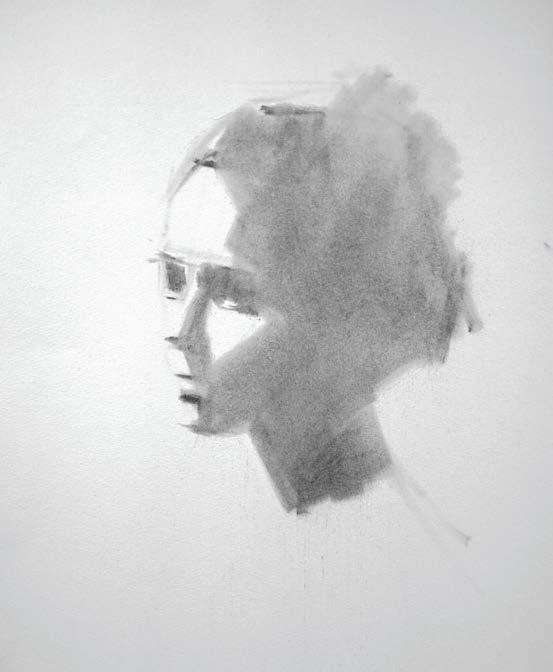
APPLY CONTRAST
I apply the Big Shape method, highlighting the dark shadows and contrasting them with the lighter areas. This technique reduces the image to two values, simplifying the identification of basic shapes and allowing for a gradual progression of the drawing. I use charcoal powder and an oval Sofft PanPastel spatula for this purpose, achieving an effective representation from the general to the specific.
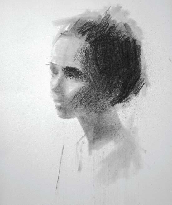
ENHANCE THE PRECISION
In the second layer, I use willow charcoal sticks to define the shapes, adding more material to achieve a truer shadow value. This process aims to enhance the depth and precision of the portrait, capturing the shaded areas more faithfully, enriching the final representation of the drawing.
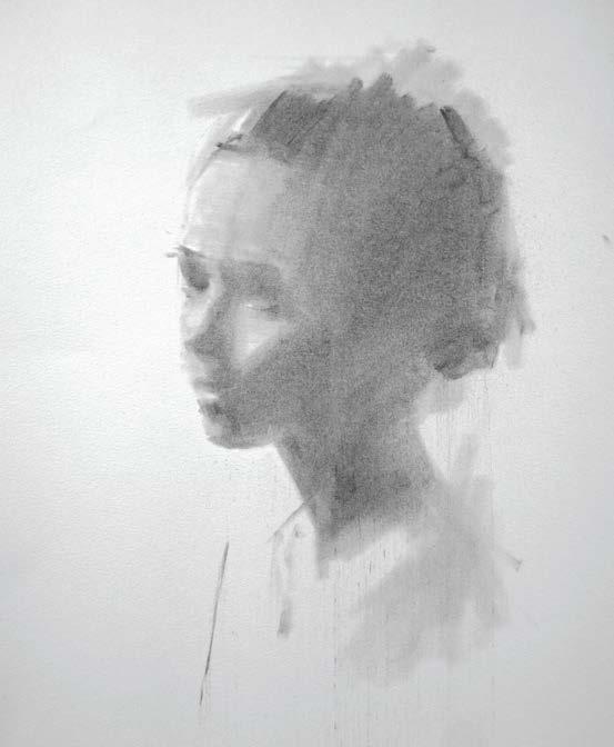
2 4 3 5
CREATE MID - TONES
I evenly apply a thin layer of charcoal over the highlighted areas of the portrait, using an oval Sofft PanPastel spatula. I gently drag the charcoal to create mid-tones, achieving a smooth transition between lights and shadows.
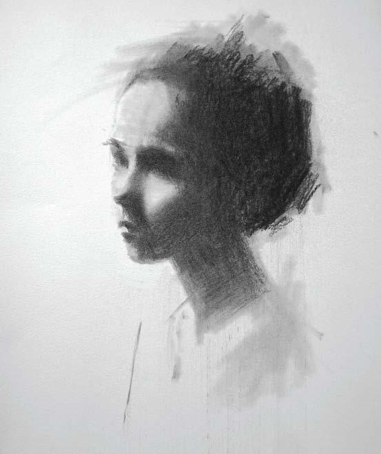
TIME FOR TEXTURE
Next, I go over using a Nitram B charcoal to compress and create a more uniform texture in the shaded areas of the portrait. This process aims to improve consistency and smooth out the appearance of shadows, adding cohesion and detail to the piece.
68 ARTISTS & ILLUSTRATORS
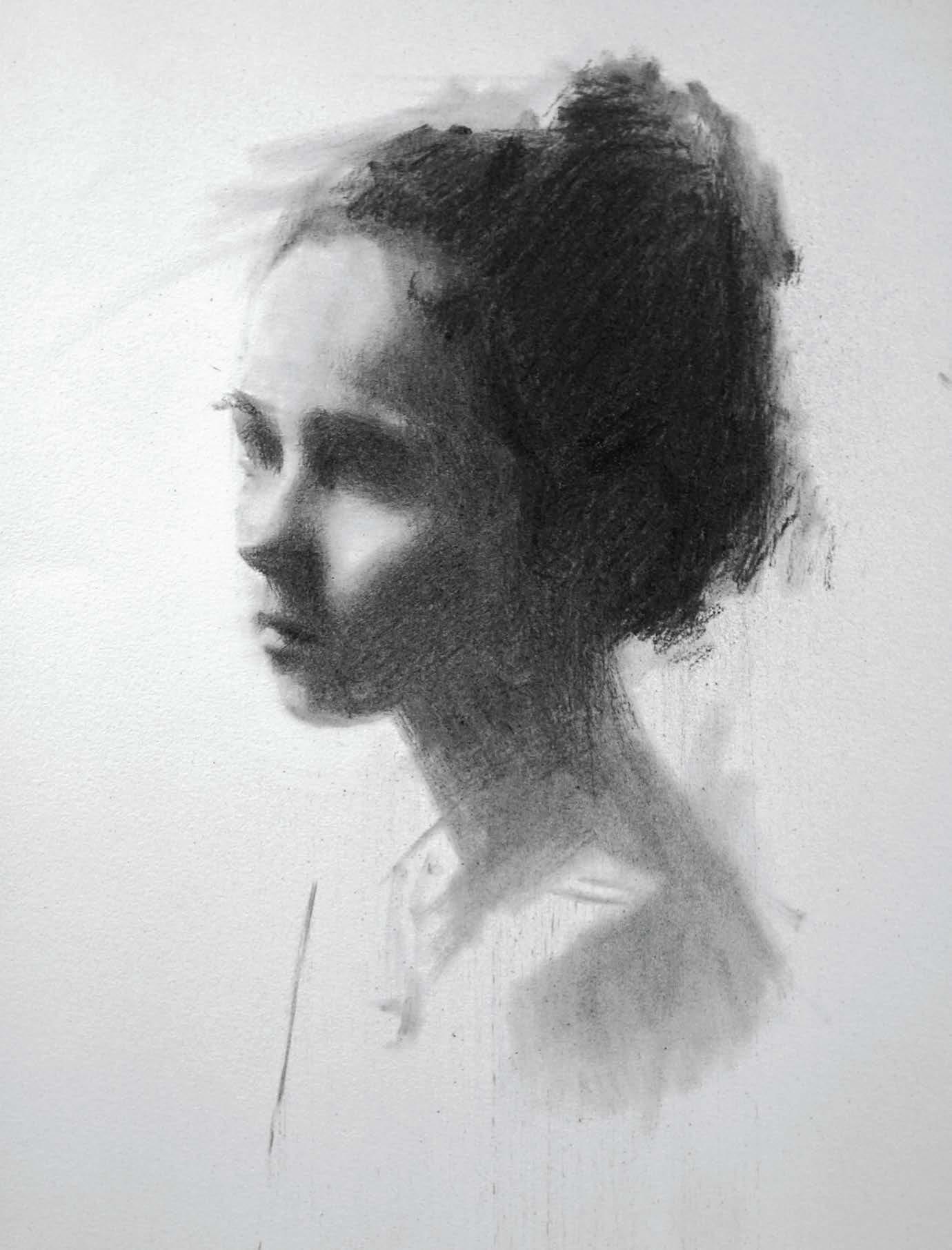
ADD IN THE SHADOWS
I use Nitram Extra Soft charcoal, known for its durability under pressure, to generate deeper shadows and detail specific areas in the shaded regions of the portrait. This tool enables precise and controlled application, facilitating the creation of shadows with lower values. ▸
6
STEP-BY-STEP
THE FINER FEATURES
Now I detail the eyes, mouth and key areas with Nitram B charcoal. This process requires precision to highlight the essential features of the portrait. This charcoal offers the perfect combination of softness and durability, allowing precise control as I add definition to the most important facial details.
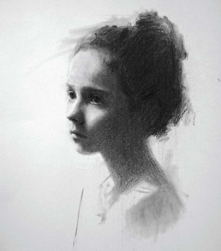
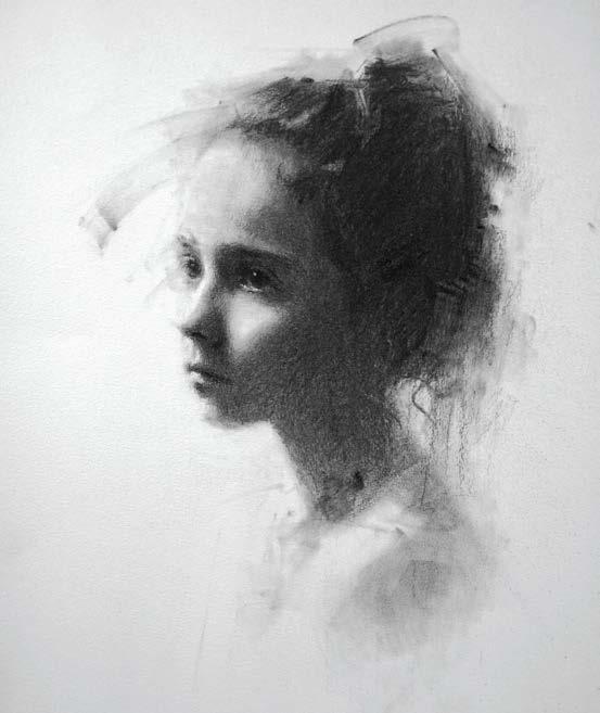
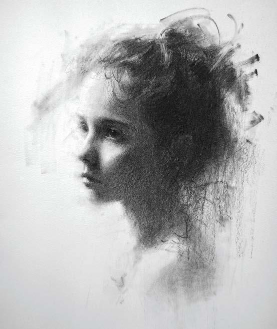
GENERATE SUBTLE BLURS
8 9
I start by creating atmospheric effects and softening edges using the blending stump. This tool allows me to generate subtle blurs, adding depth and atmosphere to the artwork. With the blending stump, I achieve smooth transitions between areas, enhancing the sense of space and adding a pictorial quality to the portrait.
BE SPONTANEOUS
I finish the piece with gestural effects for a personal touch. These dynamic details add unique expression. Using spontaneous strokes, I infuse life and emotional connection, creating a work with depth and emotion. ▫
70 ARTISTS & ILLUSTRATORS
7
P ERCHANCE TO D REAM
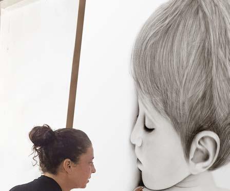
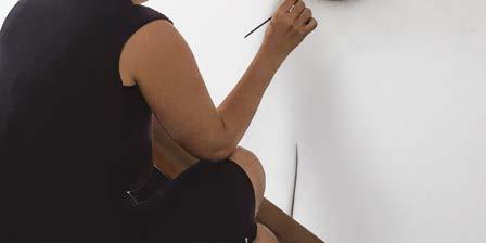
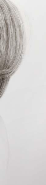
“Trampoline”, 2018, 150 cm x 170 cm, Charcoal on paper
WITH NITRAM CHARCOAL

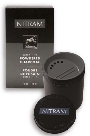
“Inspired by a calm and serene moment, I embarked on a monumental drawing of my son fast asleep on our trampoline. For nearly two months, I meticulously captured every detail using many layers of Nitram Charcoal Powder, from my son’s soft hair and features to the bright sunlight.
The base of the drawing is formed with pencil sketches, following which commences a process of slow and gentle brushing. Many layers were carefully added, using brushes dipped in dry charcoal powder. This technique allows me to gradually fill large surface areas and facilitates the transition of smooth shades and different textures. Stage by stage, the subjects acquire depth, creating the illusion of bursting through the paper and coming to life.
As an artist, working with Nitram Charcoal is an incredibly rewarding experience for me. Its versatility and clean erasing make it indispensable. But what truly sets Nitram Charcoal apart is its brilliant blending capabilities. I can achieve seamless tonal transitions and gradients. With a brush, I create sweeping gradients effortlessly, infusing my pieces with atmosphere.”
~ Reut Dafna
To watch videos of Reut Dafna draw with Nitram Charcoal and to read the entire article, please visit: https://nitramcharcoal.com/ReutDafna or scan the QR code
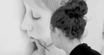


Reut Dafna is a painter and resident of Kibbutz Maoz Haim, situated against the backdrop of the lush Emek HaMa’ayanot in Israel’s north. A graduate of the Tel-Hai Arts Institute in Israel, where she studied Fine Art, Reut holds a Bachelor's degree from The Arts Institute of Tel-Hai College. She pursued advanced drawing studies with the artists Avinoam Kosowsky in Tel Aviv and Elie Shamir. She specializes in the unique technique of drawing with powdered charcoal. “I draw my inspiration mainly from those who surround me in daily life. I enjoy deep contemplation as I consider people from different perspectives, as well as the ability to capture certain moments that remain suspended in time.” Instagram: @reutdafna | https://www.reutdafna.com
www.nitramcharcoal.com NITRAMTM MC FINE ART CHARCOAL
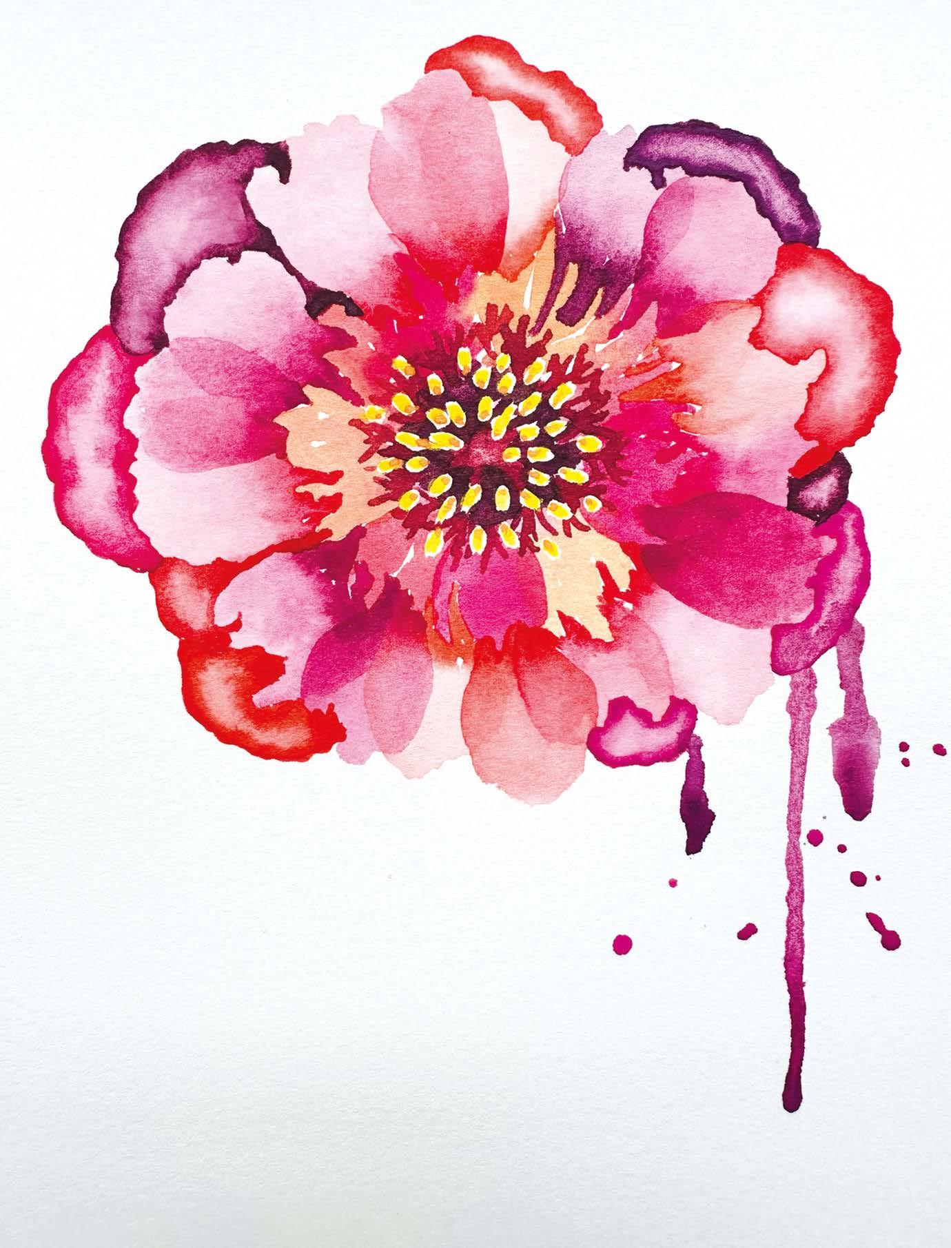
Petal power
ALYONA CREATES shows you how she painted this beautiful peony using the new compact Derwent watercolour paint pan set
STEP-BY-STEP
Peonies are a beautiful addition to any garden during the spring and summer. Although they are stunning to look at, when it comes to painting them, it can sometimes be an overwhelming process due to the hundreds of petals held together by a gorgeous centre with an almost glowing yellow stamen. I find it best to try to break it down into layers; usually, a few are enough to suggest a full head of petals.
When tackling a peony painting, value is the key; it provides a great contrast between petals. Visually, you can layer a petal or you can curve it by using wet-into-wet or lifting watercolour techniques or a combination of both. The more variety you have in shapes and patterns, the more dimensional the flower will look.
As a watercolour enthusiast, I was very excited when Derwent announced the addition of their first watercolour to the range. Vibrancy and smoothness are what made me fall in love with watercolours in the first place. These vibrant paints have great transparency and allow you to build up the intensity level of the colour, create an ultra-smooth and beautiful wash, as well as a variety of tones. In this case, the smoothness of the Derwent watercolour is important as you don’t want a granulating effect that will provide a lot of texture on a smooth, satin-like petal. As well as being easy to use, the compact palette means it’s easily transportable for painting en plein air, be that in your garden or anywhere else. alyonacreates.com
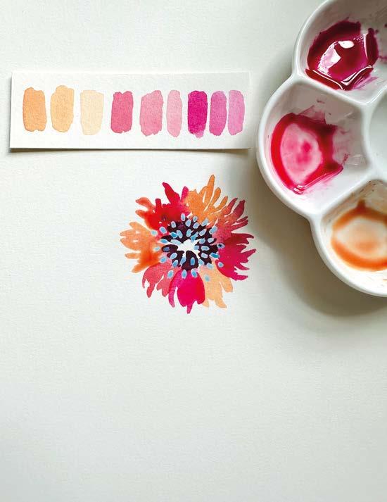
1
LOOSEN UP
For me, every watercolour painting begins with a warm-up. I teach my students to always start by swatching out all of the colours in a lovely gradient to see how you can stretch them from the deepest to the lightest values. Then I suggest exploring the new watercolour set even further by creating colour recipes by mixing your own unique colours. Finally, based on the swatches and colour mixes, pull together a rough colour palette that you intend to work with.
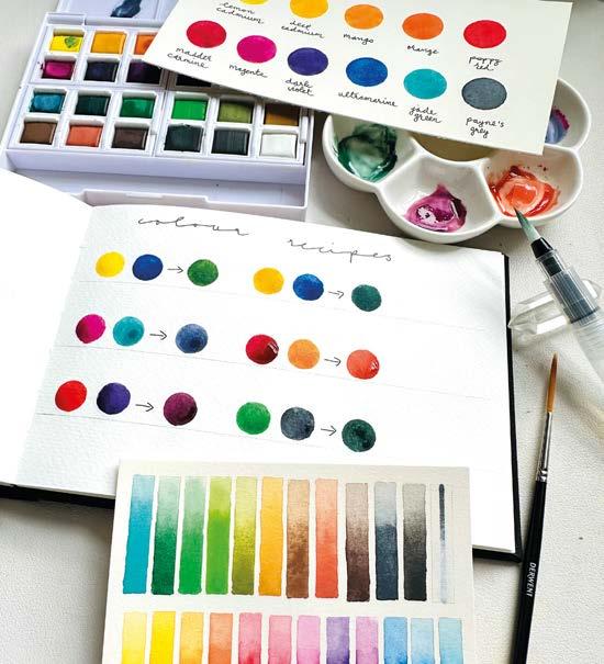
BEGIN
Using an old small brush, add a stamen-like pattern into the centre of your peony flower using masking fluid, which is often blue, making it easy to spot. Wait until it’s completely dry. This will maintain the white of the paper. Mix the deepest tone from your selected colour palette and add it around the stamen. Pick a couple of colours and different tones with a variety of opacity levels by adding more water. Then, paint the first layer of petals with a feathered edge
3 2
BE ORGANISED
Start by pre-mixing as many colours as you want, so you have them ready, as you will need to change colour going from petal to petal. For this painting, you will also need a liner brush for detail. Starting with the liner brush (here I’m using a Derwent Technique Brush) go into the feathered edges with the darkest value, then swap to the regular brush and just pull out the ultra-smooth watercolour with clean water. This will create a soft but contrasting gradient. ▸
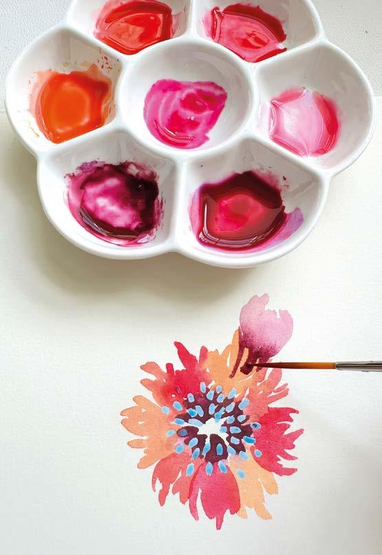
STEP-BY-STEP
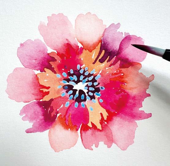
STEP BACK AND OBSERVE
4
For this stage, the petals have to be completely dry. If you see any gaps, layer petals on top. This is called the glazing technique in botanical art and is often used in watercolour due to its beautiful transparency and smooth quality. Here, the petals need to be less feathered. Now we can see a great variety in values and shapes to di erentiate between every individual petal.
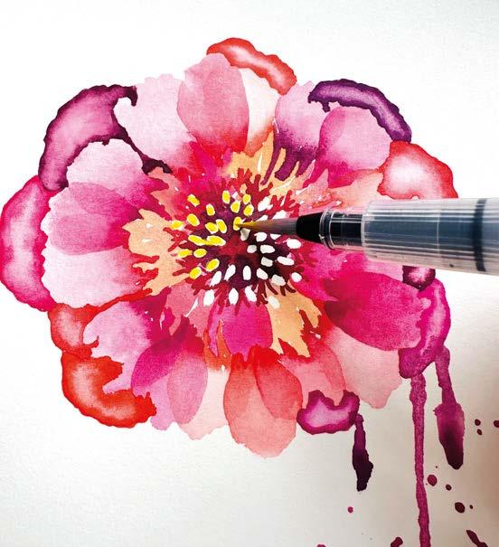
THE STAMEN
6
Using the liner brush, add a more coral-like pattern around the centre of the peony. We want this to stand out and not get lost in the layers of petals. Before rubbing o the masking uid, wait for the watercolour to dry. Finally, add yellow into the stamen area (here I’m using the Derwent Waterbrush included in the paint pan) leaving a white outline which will make the centre pop even more.
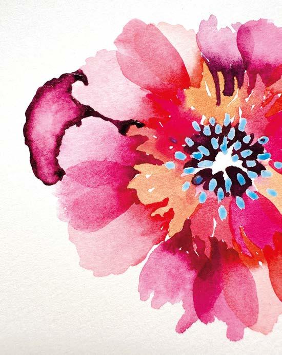
THE FINAL LAYER OF PETALS
5
Starting with the liner brush, create a rounder, uneven petal shape. With a regular brush and clean water, blend the two together. Work quickly as you do not want a hard edge – you want a soft blend. Then make sure your regular brush is not too wet and use it like a sponge to soak up some of that colour. This is called a lifting technique and is used to create highlights.
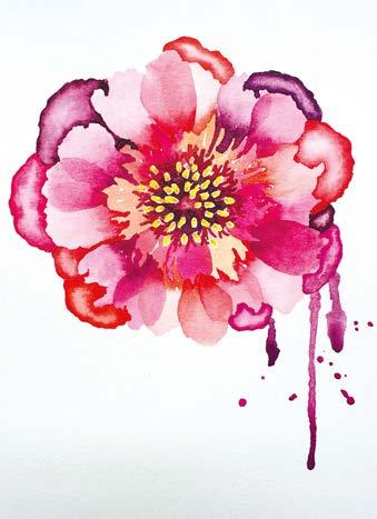

Derwent Watercolour Paint Pan sets are available at: derwentart.com/en-gb, in art stores and on the Derwent Amazon Store. ▫


7
FINISHING TOUCHES
Now, you may add a couple more petals, but remember nature is not perfect. Imperfection is beautiful. Now is a good time to add small details if you feel they would add extra interest without overworking the painting. In my case, I have just added small dots of a deeper yellow into the stamen. Also, using the lifting technique, I have added a small highlight into the very centre of the peony.


74 ARTISTS & ILLUSTRATORS


Scan the QR code to subscribe or visit telegraph.co.uk/tmg-newsuk To scan the QR code, open your phone camera, point it at the code and tap the banner that appears on screen. On older phones, you may need to download a QR code reader first. Enjoy 3 months free Plan your next steps with The Telegraph by your side. Unlock our award-winning website and app, including expert advice for your money, health, holidays and more.

Introducing Derwent Watercolour Paint Pan Sets
Discover the new standard in watercolour painting
In the world of fine art supplies, Derwent stands out as a trusted name, renowned for its commitment to quality and innovation. While the brand has long been associated with pencils, its entry into watercolour paint marks an exciting new chapter for artists worldwide. With the launch of Derwent Watercolour Paint Pan Sets in 12 and 24 colours, artists of all levels can now experience the performance and consistency that Derwent is revered for.
Formulated with ne art quality pigments, Derwent Watercolour Paint Pan Sets o er artists an a ordable yet professional-grade option for their creative endeavours. The highly pigmented formula delivers vibrant, translucent washes with each stroke whilst maintaining high lightfastness for lasting brilliance.
What sets Derwent Watercolour Paint Pan Sets apart is their
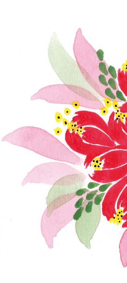
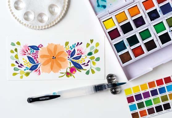
consistently ultra-smooth and even nish that ensures beautiful artwork is imbued with colour and texture. Say goodbye to unwanted grain, grit, or uneven patches. With Derwent, each colour behaves consistently, allowing artists to create with con dence and precision.
Ease of use is paramount, so each set includes a convenient waterbrush, often only found in more expensive sets, and an
integrated mixing palette in the lid, making it the perfect companion for on-the-go painting sessions, art classes and outdoor, en plein air adventures. Whether you're a beginner embarking on your watercolour journey or a seasoned artist seeking versatility, Derwent has you covered.
The carefully curated colour selection in each set caters to a variety of subjects, ensuring that
artists have the perfect palette at their ngertips. From vibrant landscapes to delicate orals, Derwent Watercolour Paint Pan sets o er a spectrum of hues to bring any piece to life.
Plus, the paint is easy to lift o the pan, allowing for manipulation and creative freedom. You can mix or combine di erent colours to expand your palette and explore new shades. Whether you’re creating subtle gradients or bold contrasts, they o er versatility for experimentation.
The Derwent Watercolour Paint Pan Set stands out for its ultra-smooth nish, quality and ease of use meaning achieving professional-looking results is made easier for all to experience the joy of watercolour.
Derwent Watercolour Paint Pan sets are available at: derwentart.com/en-gb, in art stores and on the Derwent Amazon Store. ▫
ADVERTORIAL
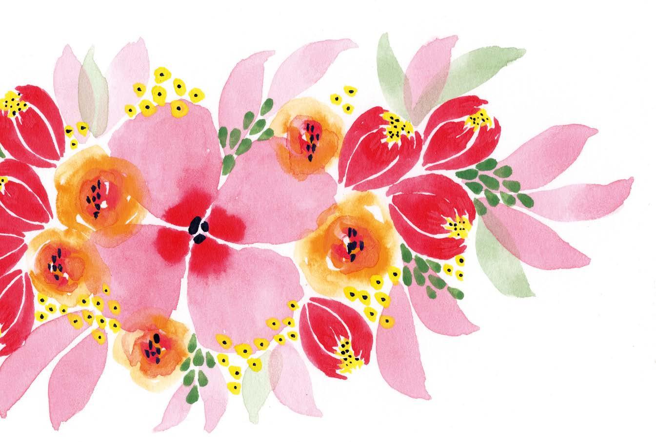
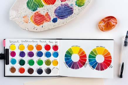
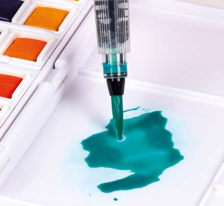

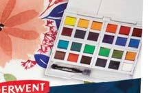


Scan to see Derwent Watercolour in use
You tell us
MESSAGE OF THE MONTH
Hazel Cope
Having been a registered nurse and artist for 46 years, my painting of Florence Pringle (a World War I nurse) is close to my heart. Not only is it a historical record depicting the great profession of nursing, but I have also sought to convey the experience of caring in the work. It is these illusive qualities of caring or the art of nursing which include empathy, kindness and compassion that I seek to express in my painting. This large portrait is painted in acrylic paint with some chromatic grey and brings a calm and peace to the foyer of Holy Spirit Northside Hospital, Brisbane, Australia, where it now resides.
hazelmarycopeartist.com.au
Sam Gould
Jane Appleton
I loved art as an A Level student but never envisaged a future where that could be a career path. I was actively dissuaded not to go further as it wasn’t a viable means of earning a living (so I was told). I’ve been subscribed to Artists and Illustrators for four years now – and feel supported and encouraged – and my interest has been rekindled. It’s been 37 years since completing Art A level and I have had the con dence to produce a series of pencil drawings to form a new product: Share The Chores card game that is going to be used in schools as part of a PSHE programme to address the gender imbalance of who does the chores whilst also raising money for victims of domestic violence. I am so happy to have found my way back to drawing; it’s been therapeutic for me. I couldn’t have done it without you.
I am a multimedia artist and have drawn, collaged and painted to produce four books (the fth is waiting to be printed). Two are for autistic children.
I come from a jewellery and 3D background so my artistic journey is interesting. It is in English, French and Occitan (a Roman language spoken in Southern France). It is produced by the education authority here in France to help preserve the Occitan language, as well as make English available to school children and share the ancient stories of local Totemic animals.
jane-appleton. com
Share your stories and get adaily doseof Artists & Illustrators tips, advice and inspiration by following us on our social media channels...

LETTERS 78 ARTISTS & ILLUSTRATORS Write to us! Send your letter or email to the addresses below: Post: Your Letters, Artists & Illustrators, Chelsea Magazine Company Ltd, Telegraph Media Group, 111 Buckingham Palace Road, London SW1W ODT Email: info@artists andillustrators.co.uk
@AandImagazine /ArtistsAndIllustrators @AandImagazine @AandImagazine

Scan the QR code or visit telegraph.co.uk/tele-puzzles To scan the QR code, open your phone camera, point it at the code and tap the banner that appears on screen. On older phones, you may need to download a QR code reader first. Enjoy 1 year for £1 Feel brighter every day with Telegraph Puzzles
THE CLASSIFIED DIRECTORY
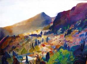
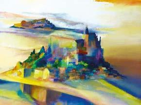
Visits by appointment only at Studio 126, Wimbledon Art Studios


PEGASUS ART
Finest Art Materials since 2005 www.pegasusart.co.uk


pegasusart.co.uk
Workshops - Art Classes- Canvas Making - Stretcher bars 01453 886560 info@pegasusart.co.uk

PAINTING WORKSHOPS ON ZOOM WITH JONATHAN NEWEY
Learn how to draw and paint from the comfort of your own home.
Media: watercolour, acrylic, pencils For more information:
T: 07947 237505
E: jnewey210@gmail.com
To advertise please call Hannah on 07715 631382 ARTISTS WANTED RANDOLPH KELLMAN CONTEMPORARY ARTIST. Visit my online galleries. www. rakeart.co.uk www.artists.de Telephone 020 8889 4714 Mobile 07979842456 Jacqueline Midgen – Artist Commissions and products 07854 734 290 | jackiemidgen@hotmail.co.uk www.jacquelinemidgen.wordpress.com
W: www.jonathannewey.com
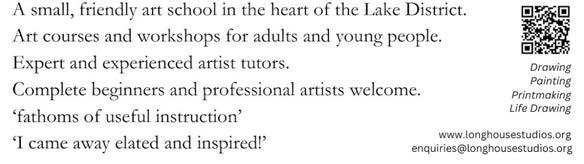
East Devon Art.co.uk
www.artistsandillustrators.co.uk ARTISTS MATERIALS
DEVON COAST ART COURSES
Top tutors include Claire McCall, John Hoar, Chris Forsey, Maria Rose, Catherine Osbond, Richard Suckling, Julie Dunster, James Tatum, Paula Dunn, Liese Webley, Jake Winkle and many more. Spectacular location 3 minutes from the coast. 01395 516284 • info@eastdevonart.co.uk www.eastdevonart.co.uk East Devon Art Academy Old Fore Street, Sidmouth EX10 8LS
• One, two and three day courses for beginners and experienced artists
• Specialist courses for artists new to oil painting
• Landscape, Still Life, Skies, Plein Air & Impressionism
www.pewseyvalestudio.co.uk Oil painting tuition in the heart of Wiltshire
& Inspiring Oakhill Hotel, Derbyshire Tues 11th-Thurs 13th June ‘24
Dedham Hall, Essex Wed 30th Oct-Sat 2nd Nov ‘24
Ilsington Hotel, Devon TBC May 2025
annebarnham22@gmail.com www.annebarnhamsart.com 01526 320626
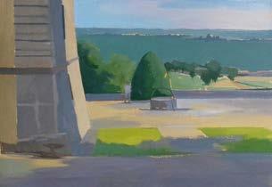
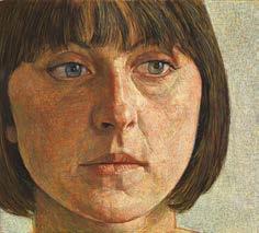
To
07715 631382
advertise here please call
ART TUITION COURSES ART FOR SALE
STUDIO Really learn to paint
oils
heart
All inclusive weeks of intensive Tuition by Elizabeth Parsons who was taught in Florence by Nerina Simi Please visit website or telephone www.thurnwood.co.uk
THURNWOOD
in
In the
of Dorset
07980 744 551
Anne Barnham Watercolour Friendly
ANTONY WILLIAMS & CAROLINE BAYS PORTRAITS AND LANDSCAPES SUMMER WORKSHOPS IN FRANCE www.maisonduguit.com | 07850 438732/07802 481068 ANTONY WILLIAMS RP Portrait workshop in
France For more information: www.maisonduguit.com 07802 481068 / 07850 438732 28 Aug
4 Sept 2024
South West
–
❱ June 2024 Westcott
❱ 2025 La Salle, France (June) & Kalymnos, Greece (September).
(2
❱ Inspirational, relaxed, encouraging, fun tuition
experienced teacher with many
and recommendations.
Details available via Sue’s website or by email. www.suebradleyart.co.uk suebradleyart@gmail.com www.facebook.com/SueBradleyArt/
big

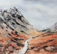
SOUTH WEST ART
Old Fore Street, Sidmouth EX10 8LP
Tel: 01395 514717
info@southwestartmaterials.co.uk www.southwestartmaterials.co.uk
Run by artists, for artists –extensive range of quality fine art materials & professional bespoke picture framing service. Friendly & knowledgeable service. Delivery or store collection of orders online or over the phone.
PEGASUS ART – suppliers of the finest art materials
Griffin Mill, London Road Thrupp, Stroud, Glos GL5 2AZ Tel: 01453 886560
info@pegasusart.co.uk www.pegasusart.co.uk
THE ART SHOP & CHAPEL
8 Cross Street, Abergavenny NP7 5EH
Tel: 01873852690
admin@artshopandchapel.co.uk www.artshopandchapel.co.uk
GOSLINGS
50 Station Road, Sudbury, Suffolk C010 2SP
Tel: 01787 371932
A family run business specialising in Bespoke Picture Framing and Artist Materials
THE ART TRADING COMPANY
55 Earsham Street, Bungay NR35 1AF
Tel: 01986 897939
TheArtTradingCo@btinternet.com
www.thearttradingcompany.co.uk
“...a truly excellent art materials shop” East Coast Net
HM CANVASES LTD
Fine Art Supplies
Unit 20 Watery Lane
Industrial Estate Watery Lane, Willenhall WV13 3SU
Tel: 01902 633 332 hello@hmcanvases.co.uk www.hmcanvases.co.uk
Wide range of fine art materials and papers. Programme of events - exhibitions, workshops, talks, concerts and creative dishes from our Chapel Café.
ATLANTIS ART MATERIALS
– UK’s largest and one of Europes biggest art stores
Unit 1 - Main Shop
Unit 6 - Office & Warehouse
Unit 7 - Paper Department
Bayford Street Industrial Centre Bayford Street, London E8 3SE Tel: 020 7377 8855 www.atlantisart.co.uk Car parking, open 7 days.
ART4ALL & ARTYCRAFTY
5 Market Square, Crewkerne TA18 7LE
Tel: 01460 78574

www.artistsandillustrators.co.uk
www.art4allframing.co.uk www.artycraftysupplies.co.uk
Bespoke framers, art, craft, hobby supplies. Open 6 days a week. EASY PARKING.
Specialists in Artists Canvases and Professional Painting Supplies.
THE ARTIST’S PALETTE
1 Millgate, Thirsk North Yorkshire YO7 1AA Tel: (01845) 574457
Independent stockists of fine art materials by Winsor & Newton, Sennelier, Golden, Faber Castell, Pro Arte, Caran d’Ache, Panpastels and more. A great range of specialist papers, crafts and kits. Friendly service from experienced art tutor.
WORD OF MOUTH
2 Wragley House, Valley Road, Hebden Bridge HX7 7BN Tel 01422 648299
www.itswordofmouth.com
jinny@itswordofmouth.co.uk
Purveyors of art and creative supplies including Jakar, Caran D’Ache, Rosa, Winsor & Newton, Daler Rowney, Pro Arte. Buy in store or order online for Nationwide delivery.
THE CLASSIFIED DIRECTORY To advertise here please call 07715 631382
PRINTING HOLIDAYS
THE ART SHOP
DEVON SOMERSET/ DORSET GLOUCESTERSHIRE GWENT WEST YORKSHIRE WEST MIDLANDS SUFFOLK / NORFOLK LONDON NORTH YORKSHIRE based at The White House near Burnham Market situated in beautiful countryside fabulous food inspirational coastal locations airy onsite studio non-painting partners welcome bigskyartcourses.com +44 (0) 7785 439727
DIRECTORY
Luxury residential art breaks in North Norfolk with superb tutors 2024 brochure now available online or by request 01306 875 150 info@eyeswidedigital.com www.eyeswidedigital.com • Giclée Fine Art Printing • Greeting Cards • Canvas Prints • High Quality Reproductions Produced From Original Artwork Or Digital Files Fine Art Giclée Printing Service Hahnemühle Papers & Canvas Photography and Scanning Service Greeting Cards and Postcards Professional and Friendly Advice No Set Up Fees & Free Art Guides Call us on 01656 652447 www.geminidigitalcolour.co.uk l l l l l l Making Art
Historic Devon Village Wonderful locations, Spacious studio Small groups, all levels, individual attention Holiday dates Spring-Autumn 2024 with Catherine Stott many Workshops and Painting Holidays with Sue Bradley Award-winning watercolour artist and tutor Watercolour and Mixed Media for beginners, improvers and beyond. Workshops run in S.E. London & Kent throughout the year.
Holidays
sky art
Work
Painting
Barton,
Devon
courses).
North
by a
excellent reviews
qualified,
Picture this
In the Orange, oil and 24k gold leaf on canvas, 61x76cm
Every month, we ask an artist to tell us about a painting that means a lot to them. This month, we speak to Maryland-based fine artist ALLIE DATTILIO
My gold leaf landscapes are always anchored in the emotions of hope and renewal – capturing the peaceful transition from chaos to calm, evoking a sense of quiet optimism. This particular piece is much brighter than the majority of my work, inspired by the vibrant glow of a summer sunset.
My connection to hope and renewal stems from loss and grief. My brother passed away in an accident when we were kids and that has shaped both my life and work in every way imaginable. Before painting landscapes, I was a portrait painter and spent my senior year of art school working on a series of paintings from childhood photographs of us. It was painful and cathartic all at once. After that series, I never
painted a person again. Instead, I turned to landscapes as a personal escape from the heaviness and ability to let grief and hope coexist.
I don’t speak about my grief explicitly anymore because I don’t want my paintings to be too much about me. I want the viewer to be able to bring their own histories and memories into each piece and I think my use of gold leaf can connect to the universal experience of seeking the silver (or gold) lining in any situation.
Ultimately, I aim to evoke a sense of peace and optimism by providing a moment of respite from the chaos and anxieties of daily life; allowing viewers to immerse themselves in the tranquil horizon. alliedattilio.com ▫
82 ARTISTS & ILLUSTRATORS
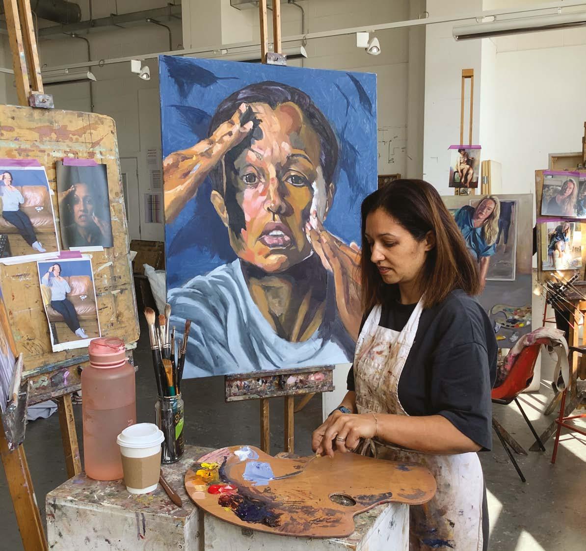
THE HEATHERLE Y SCHOOL OF FINE ART Diploma in Portraiture Chelsea. Established 1845. www.heatherleys.org ANNIS BOOKER Ph: 020 7351 4190
COURSES UPCO
BOOK NOW!
CHARLES WEED
27-30 JUNE
LEARN INDIRECT PAINTING AND ACHIEVE INCREDIBLE EFFECTS IN YOUR WORK
LUCA INDRACCOLO
ANASTASIA POLLARD

19-21 JULY
LEARN A STRUCTURED, REPRODUCIBLE APPROACH TO PAINTING THE PORTRAIT
24-27 JULY
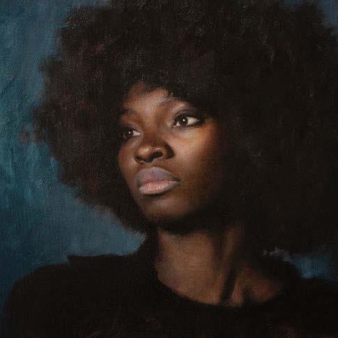
IMPROVE YOUR PORTRAITURE IN OILS. PERFECT FOR ARTISTS OF ALL LEVELS
LYDIA CECIL
2-4 AUGUST
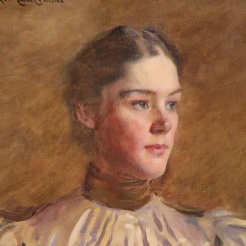
LEARN TO PAINT LIKE A MASTER BY COPYING ONE OF THEIR WORKS
BOOK NOW RAWUMBERSTUDIOS.COM • 01453 497001 • 16 NELSON STREET, STROUD GL5 2HN
TO FIND OUT MORE SCAN ME
LIMITED PLACES
UPCOMING
RSES