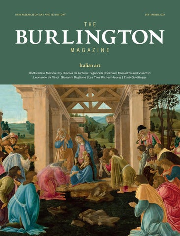
Botticelli in Mexico City | Nicola da Urbino | Signorelli | Bernini | Canaletto and Visentini Leonardo da Vinci | Giovanni Baglione | Les
Très Riches Heures | Ernő Goldfinger
20-24 SEPT. 2025
100 INTERNATIONAL ART GALLERIES 20 DISCIPLINES
20–24 September 2025
Grand Palais, Paris
FINE ARTS LA BIENNALE FAB PARIS
Heraclitus, by Pietro della Vecchia (1603–78). Oil on canvas, 97.5 by 70 cm.
GALERIE RATTONLADRIÈRE, PARIS
THIS YEAR’S EDITION OF FINE ARTS LA BIENNALE (FAB), held at the Grand Palais in Paris, introduces special displays dedicated to the decorative arts and the Art Deco movement in celebration of the centenary of the International Exhibition of Modern Decorative and Industrial Arts held at the same venue in 1925. These displays will sit alongside the main showcase of fine art, antiques, furniture and jewellery from one hundred international specialist dealers. Held two months earlier than previous iterations, the fair heralds the beginning of Paris’s autumn art season.
Echoing the Art Nouveau architecture of the Grand Palais, Art Deco at 100 will feature, among a broader selection, twenty museum-quality French Art Deco pieces presented by Galerie Vallois, Paris – one of the movement’s early proponents. A display of eighteenth-century French decorative arts from the Musée Nissim de Camondo, closed for renovation until 2026, will offer visitors a rare opportunity to see objects from the collection of the late Moïse de Camondo outside the hôtel particulier. As part of the fair, art historian Jean-Hubert Martin, former director of the Musée National d’Art Moderne, Paris, and Kunsthalle Bern, will curate an exhibition titled Disordered Beauties, featuring 140 works of art in a broad range of genres, that draws on the rich holdings of special objects from many of the exhibiting galleries.
For more information, please visit fabparis.com
Leaf from book by a master in calligraphy Italy,
Manuscript on paper, 20.4 by 13.4 cm.
LIBRAIRIE CLAVREUIL, PARIS
Portrait of a young man in profile, by Charles Mellin (1597–1649). c.1630. Oil on marble, 54 by 54 cm. GALERIE ERIC COATALEM, PARIS
Pastel on blue paper, 35.5 by 29.5 cm.
GALERIE DE BAYSER, PARIS
Head of a girl, raising her eyes to heaven, by Rosalba Carriera (1673–1757).
1500.
Predella panel from the San Giorgio a Ruballa polyptych, by Bernardo Daddi (c.1290–1348). 1348. Tempera and gold on panel, 21 by 38.6 cm. BRIMO DE LAROUSSIHLE, PARIS
OLD MASTER PAINTINGS
AUCTION VENUE
SINCE 1852
SCHOOL OF PARMA, CIRCA 1540
THE HOLY FAMILY
BARON RIBEYRE & ASSOCIÉS, AUCTION ON 23 SEPTEMBER 2025
20–24 September 2025
Grand Palais, Paris
FINE ARTS LA BIENNALE FAB PARIS
life
ENRICO FRASCIONE, FLORENCE
Louis XVI mantel clock. Vase, late Ming celadon. 1600–44. Clock movement by Gilles L’Aîné. France, c.1775. 49.5 by 40.5 by 32 cm. GALERIE LÉAGE, PARIS
The triumph of Lucius Aemilius Paulus after the Battle of Pydna, by Bernardo di Stefano Rosselli (1450–1526).
c.1470. Front of a cassone, tempera, gold and silver on panel, 57.8 by 157.8 cm.
G. SARTI, PARIS
Sideboard, by Agnès De Frumerie (1869–1937) and Adrien Dalpayrat (1844–1910). c.1895. Carved oak and glazed stoneware, 245 by 200 by 66 cm.
GALLERY TREBOSC & VAN LELYVELD, PARIS
Mask study for Hanako Type E 1907–1908, by Auguste Rodin (1840–1917). Cast c.1920–25. Bronze, all’antica green patina, 17.9 by 11.4 by 11.9 cm. UNIVERS DU BRONZE, PARIS
Geneviève Sophie Le Couteulx du Molay (1753–1801), by Élisabeth Vigée Lebrun (1755–1842). 1788. Oil on canvas, 100 by 79 cm. MUSÉE NISSIM DE CAMONDO, PARIS
Still
with copper jug, flower and fruit, by Bernardo Strozzi, called Il Cappucino (1582–1644). 1610–15. Oil on canvas, 38 by 50.5 cm.
The Banquet of the Lapiths
A major rediscovery of a lost French 17th century masterpiece, Oil on canvas, 204 x 270 cm. Mentionned in the posthumous estate inventory of the artist in 1657.
€ 500,000/800,000
Auction in Orléans Saturday November 15
TADDEO DI BARTOLO Siena's Painter in the Early Quattrocento
By Gail E. Solberg
AUTUMN SALES 2025
26 SEPT.
RARE BOOKS MANUSCRIPTS
AUTOGRAPHS OLD PRINTS
27 SEPT.
MODERN PRINTS
CONTEMPORARY PRINTS
Duerer. The Bagpiper. 1514. Copperplate engraving.
his chronicle of an indefatigable and successful late medieval career positions Taddeo, his colleagues, and his patrons in their political, economic, and social circumstances. It provides new insights on Siena’s artistic culture at the start of the Renaissance.
Saatchi Gallery, London | 25th–28th September 2025 | britishartfair.co.uk
Table Piece XCV, by Anthony Caro (1924–2013). 1970.
Painted steel, 35.6 by 59.7 by 64.8 cm. WILLOUGHBY GERRISH, LONDON AND THIRSK
The Holy Ghost, by Tristram Hillier (1905–83). 1939.
Crayon and watercolour on paper, 56 by 37 cm.
PATRICK
BOURNE & CO., LONDON
NOW IN ITS THIRTY-THIRD EDITION , the British Art Fair returns to the Saatchi Gallery this September. More than eighty dealers from across the United Kingdom will exhibit works ranging from the early twentieth century to the present day, including pieces by Henry Moore, Barbara Hepworth and Stanley Spencer, alongside works by established contemporary creators, like Bridget Riley.
This year’s curated sections include Unsung, which will present the work of around thirty Modern British artists who were overlooked in their lifetime, such as William Burns; SOLO Contemporary, which will focus on individual presentations by emerging artists; while Digitalism will explore intersections between digital technology and visual art.
The British Art Fair provides a meeting point for historical perspective and current practice, presenting a considered survey of Modern and Contemporary British art. Collectors can buy with confidence and the more casual visitor can discover the rich variety of the last century of British artistic practice.
For more information visit britishartfair.co.uk
Study for ‘John Donne arriving in Heaven’, by Stanley Spencer (1891–1959). 1911. Oil on paper laid on card, 16.5 by 16.5 cm.
ABBOTT AND HOLDER, LONDON
Little holyhock, by Cecilia Moore. 2024. Copper, sheet bronze, patina and paint, 26 by 20 by 16 cm. CAVALIERO FINN, LONDON
The boatyard, by William Burns (1921–72). c.1952. Oil on board, 60 by 90.5 cm. THE SCOTTISH GALLERY, EDINBURGH
Simiolus
In the present issue of Simiolus, Stephan Kemperdick critically reviews the traditional identification of the man portrayed by Jan van Eyck as Niccolò Albergati, and Harald Deceulaer discusses spectacular, newly discovered documents on Michael Sweerts in Brussels, offering a unique insight into his spirituality. Ankie de Jongh Vermeulen reveals contacts between César Domela Nieuwenhuis, Hilla Rebay and Solomon R. Guggenheim, while Susana Puente Matos proposes a new interpretation of Pyke Koch’s oeuvre, based on recently uncovered biographical information. Finally, Boudewijn Bakker reviews Walter Melion’s English translation of Karel van Mander’s Grondt der edel vry Schilder-const, and Thijs Weststeijn reviews Aaron Hyman’s Rubens in Repeat
Institutions pay € 100 a year and individuals pay € 60. Visit simiolus.nl for the conditions of subscription and information on how to advertise, where to send your copy and how to order back issues not yet available via JSTOR . We are now also accepting submissions for the 2025 Haboldt-Mutters Prize.
18–23 September 2025
Palazzo Barberini
ARTE E COLLEZIONISMO A ROMA
Hercules and Omphale, by Giuseppe Maria Mazza (1653–1741). 1700–10. Terracotta, 52 by 63 cm. STUART LOCHHEAD SCULPTURE, LONDON
ORGANISED BY THE ASSOCIAZIONE ANTIQUARI D’ITALIA, who are also responsible for the long-established and prestigious Biennale Internazionale dell’Antiquariato di Firenze, the Arte e Collezionismo event in Rome upholds the same commitment to outstanding quality. Following the success of its inaugural edition in 2023, the fair’s second iteration sees sixty-three old masters and antique specialists convene at the Palazzo Barberini, the seventeenth-century palazzo that houses the collection of the Galleria Nazionale d’Arte Antica. Paintings, drawings, sculptures, furniture and decorative arts are vetted by dedicated scientific committees comprising experts and art historians, reflecting the fair’s emphasis on research, scholarship and intellectual exchange.
Arte e Collezionismo is the first industry fair to benefit from the tax reduction on the sale and import of works of art in Italy – from twenty-two to five per cent – marking a significant endorsement of the capital’s position within the art market. The fair draws an audience of Italian and international collectors, dealers and enthusiasts and presents exceptional works of art, many of which are previously unseen and unpublished.
Duke Ferdinando Orsini, by Ottavio Leoni (1578–1630). 1625–28. Oil on copper, 22 by 17.5 cm. ROB SMEETS
OLD MASTER PAINTINGS, GENEVA
Visit antiquariditalia.it/it/ac_roma/2025 for more information.
Tabernacle. Italy, c.1520. Marble, 92 by 74 by 18 cm. BOTTICELLI
ANTICHITÀ, FLORENCE
Sacrifice of Isaac, by the Master of Resina (active c.1610–c.1620). c.1615. Oil on canvas, 219 by 155 cm.
MAURIZIO NOBILE
FINE ART, BOLOGNA AND PARIS
Allegory of Envy, by Giuseppe Mazzuoli (1644–1725). 1701. Marble, 70 by 165 cm. BRUN FINE ART, MILAN, LONDON AND FLORENCE
CARLO ORSI
Old Master Paintings and Sculpture
Architectural Capriccio with a Sibyl in Front of the Pyramid of Cestius (detail) Oil on canvas, one of a pair, 49.5 x 64.7 cm
Palazzo Barberini 18 – 23 September 2025
Giovanni Paolo Panini
TRINITY FINE ART
15 old bond street
15 old bond street
london w 1 s 4 ax www.trinityfineart.com
info @ trinityfineart.com
london w 1 s 4 ax www.trinityfineart.com info @ trinityfineart.com
Daniel Katz G allery from antiquity to the 2oth century
Daniel Katz G allery from antiquity to the 2oth century www.katz.art
www.katz.art
+44 (0)20 7493 4916 NEW RARITET GALLERY
15 old bond street london w 1 s 4 ax www.trinityfineart.com info @ trinityfineart.com +44 (0)20 7493 4916
OLD MASTER PAINTINGS
From Renaissance to the 20th Century www.newraritetgallery.com
862 A Botticelli fragment in Mexico City by CHRISTOPHER DALY
872 An early maiolica dish by Nicola da Urbino: attribution and provenance by CELIA CURNOW
880 Reconstructing Luca Signorelli’s Matelica altarpiece by TOM HENRY
888 An unpublished drawing of the Fonseca Chapel: a ‘destroyed’ idea by Gian Lorenzo Bernini by MARCO COPPOLARO
896 Canaletto’s use of drawings on Venetian buildings by Antonio Visentini by GREGORIO ASTENGO and PHILIP STEADMAN
Shorter notice
906 Luca Signorelli in Cortona by SERENA NOCENTINI
Cover Detail of Adoration of the Magi, by Sandro Botticelli. c.1480–81.(p.867).
Above Plum garden at Kameido, by Utagawa Hiroshige. 1857. (p.930).
Above right Samson and Delilah, by Nicola da Urbino. c.1521–23. (p.872).
Right Detail of Four standing gures, by Luca Signorelli. c.1504–05. (p.882).
Exhibitions
908 Les Très Riches Heures du duc de Berry by CATHERINE REYNOLDS
912 The World of King James VI and I by CHRISTINA J. FARADAY
914 Paolo Veronese (1528–1588) by BEVERLY LOUISE BROWN
918 Painted Gold: El Greco and Art between Crete and Venice by GEORGIOS E. MARKOU
921 Artus Quellinus: Sculptor of Amsterdam by CHRISTOPHER BROWN
924 Duplessis (1725–1802): The Art of Painting Life by PHILIPPE BORDES
927 Hiroshige: Artist of the Open Road by MONIKA HINKEL
930 Toward the Modern: Christian Skredsvig by SIMEN FRITS FRANTZEN
933 Ithell Colquhoun by DAWN ADES
936 Art Brut: Dans l’intimité d’une collection by COLIN RHODES
Books
940 Leonardo da Vinci: An Untraceable Life, S.J. Campbell by FRANCIS AMES-LEWIS
941 Bringing the Holy Land Home: The Crusades, Chertsey Abbey, and the Reconstruction of a Medieval Masterpiece, A. Luyster, ed. by ANNE E. LESTER
943 Luxembourg Court Cultures in the Long Fourteenth Century: Performing Empire, Celebrating Kingship, I. Ciulisová, K. Kügle, V. Žůrek, eds by JANA GAJDOŠOVÁ
944 Giovanni Baglione: Le vite de’ pittori, scultori et architetti (Roma 1642), con commento e apparati critici, B. Agosti and P. Tosini, eds by STÉPHANE LOIRE
945 Beyond the Fringe: Painting for the Market in 17th-Century Italy, N. Hall, ed. by ERIC M. ZAFRAN
946 Artists’ Things: Rediscovering Lost Property from Eighteenth-Century France, K. Scott and H. Williams by COLIN B. BAILEY
948 Ernő Gold nger, E. Harwood and A. Powers by THADDEUS ZUPANČIČ
950 Mary Kelly’s Concentric Pedagogy: Selected Writings, J. Carson, ed. by ELISABETTA GARLETTI
Short reviews
951 L’Arsenal au l des siècles: De l’hôtel du grand maître de l’Artillerie à la bibliothèque de l’Arsenal, O. Bosc and S. Guérinot, eds by KARL-GEORG PFÄNDTNER
952 Campaspe Talks Back: Women Who Made a Di erence in Early Modern Art, L. van Deinsen, B. Schepers, M. Sterckx, H. Vlieghe and B. Watteeuw, eds by TIMOTHY REVELL
953 Ingenious Italians: Immigrant Artists in Eighteenth-Century Britain, K.J. McHale by JONNY YARKER
953 Toi Te Mana: An Indigenous History of Māori Art, D. Brown and N. Ellis, with J. Mane-Wheoki by CONAL MCCARTHY
954 Modern Buildings in Blackheath and Greenwich: London 1950–2000, A. Francisco Sutherland by JOHN RATTRAY
Obituary
955 John McNeill (1957–2024) by JULIAN LUXFORD
956 AMONG THIS MONTH’S CONTRIBUTORS
Editor
Christopher Baker
Deputy Editor
Alexandra Gajewski
Contemporary Art Editor
Kathryn Lloyd
Articles Editor
Christine Gardner-Dseagu
Assistant Reviews Editor
John Rattray
Editorial Assistant, Burlington Contemporary Yi Ting Lee
Editorial Assistant
Rachel Dastgir
Art Editor
Tzortzis Rallis
Directors, BMPL
Caroline Campbell
Craig Clunas fba
Helen Jacobsen fsa
Nathanael Price
Andrea Rose cmg obe
Desmond Shawe-Taylor cvo, chairman
Anna Starling
Catherine Whistler
Contributing institutions
www.burlington.org.uk
www.contemporary.burlington.org.uk
14–16 Duke’s Road, London wc1h 9sz Tel: 020–7388 1228
Printed in Wales by Stephens & George, Merthyr Tydfil
Print issn 0007 6287
Online issn 2044 9925
The Burlington Magazine is owned and published by Burlington Magazine Publications Ltd. Registered in England, company no.790136. Registered charity in England and Wales no.29502. Burlington Magazine Publications Ltd is owned and supported by the Burlington Magazine Foundation CIO (charity no.1187286).
Managing Director
Andrew Dunn
Head of Partnerships
Sarah Bolwell
Head of Commercial Design & Production
Chris Hall
Marketing and Readership Manager
Hannah Daldry
Senior Marketing and Advertising Executive
Nicole Gilchrist-Reeves
Office Administrator
Sylvie Makower
Partnerships Executive
Yi Ting Lee
Trustees, BMF CIO
Hugo Chapman
Sir Gabriele Finaldi
David Landau cbe
Sir Nicholas Penny fba fsa
Andrea Rose cmg obe
Karen Sanig
Desmond Shawe-Taylor cvo, chairman
Catherine Whistler
the burlington magazine foundation’s benefactors and supporters
The Morgan Library & Museum, New York
The Museum of Fine Arts, Houston Kimbell Art Museum, Fort Worth Fondation Custodia, Paris
The Metropolitan Museum of Art, New York
The J. Paul Getty Museum Director’s Council Yale Center for British Art, New Haven The Frick Collection, New York
Dawn Ades cbe fba
Colin B. Bailey
Christopher Brown cbe
Richard Calvocoressi cbe
Lorne Campbell
Lynne Cooke
Elizabeth Cropper
Caroline Elam
Benefactors
Richard Mansell-Jones
Adrian Sassoon
The Rick Mather David Scrase Foundation
Supporters
Charles Booth-Clibborn
Tavolozza Foundation Thistle Trust
Commercial supporters
Bridgeman Images • John Sandoe Books Ltd
The European Fine Art Foundation (TEFAF)
consultative committee
David Franklin
Julian Gardner fsa
Elizabeth Goldring fsa frhists
Christopher Green fba
Michael Hall
Tanya Harrod
Simon Swynfen Jervis fsa
Rose Kerr
Past benefactors & supporters
The late Gilbert de Botton • Sir Harry Djanogly cbe
The late Francis Finlay • Nicholas and Judith Goodison’s Charitable Settlement • Daisaku Ikeda
The late Paul Z. Josefowitz • John Lewis obe
The late Timothy Llewellyn obe • The Michael Marks
Charitable Trust • The late Jan Mitchell • Mr and Mrs
Brian Pilkington • Mrs Frank E. Richardson • Sir Paul Ruddock fsa • Nancy Schwartz • Madame Andrée
Stassart • The late Saul P. Steinberg • Janet de Botton
Gifford Combs • The late Hester Diamond
Mark Fisch • The Lady Heseltine • The late Lord Rothschild om gbe fba • Patricia Wengraf
Felix Krämer
Shane McCausland
Elizabeth McGrath fba
Robin Middleton
Jennifer Montagu cbe lvo fba fsa
Peta Motture fsa
Sir Nicholas Penny fba fsa
Pierre Rosenberg
John-Paul Stonard
Deborah Swallow
Gary Tinterow
Julian Treuherz
Jeremy Warren fsa
Simon Watney
Sir Christopher White cvo fba
Paul Williamson obe fsa frhists
Roma Giubileo
This is a jubilee year in Rome and the cultural aspects of the celebration have provided many enticements to draw visitors to the Eternal City. The first Jubilee, or Holy Year, was devised by Pope Boniface VIII in 1300. Since then, intermittent Jubilees have taken on a variety of roles. They are primarily, as one would expect, a focus for pilgrimages, and the vast crowds pouring in from all over the Catholic world today amply demonstrate that they still succeed as such. Historically, Jubilees have also been a mechanism for swelling the coffers of the Church through the sale of indulgences. Aside from such matters of faith and cupidity, there are now a number of wider roles they additionally take on, which include forging connections with the city’s great collections and exhibition spaces and endless restoration projects, so benefitting all those who are in Rome, whether tourists, scholars or the devout.
In anticipation of this year’s Jubilee, one of the greatest of Roman conservation projects of modern times was completed at the end of 2024: the cleaning of the frescos in the Raphael Stanze in the Vatican Palace. Longterm readers of this Magazine will know that this herculean endeavour has reaped some remarkable rewards – including the identification by Arnold Nesselrath of Lorenzo Lotto (1480–1556) as a collaborator with Raphael on the Stanza della Segnatura and the Stanza di Eliodoro.1 The final and largest room in the cycle, the Sala di Constantino, has now had all of its frescos conserved, a process that has taken nine years.2 This grand space was intended for official events such as the consistory (the meeting of the college of cardinals) and banquets. Its decoration was undertaken in phases by Raphael’s school, led by Gianfrancesco Penni (1488–1528) and Giulio Romano (1499–1546). The last part of the scheme to be conserved was the vault, which has as its centrepiece the dramatic Triumph of Christianity over paganism (Figs.1, 3 and 4) by Tommaso Laureti (1530–1602). Two allegorical figures on the walls below, Comitas and Iusticia, executed in oil rather than fresco, are now widely considered to be by Raphael himself and his final works from 1520.3
The Vatican Museums have, as further contributions to the Jubilee, arranged loans and put on special displays. Paintings have been sent to Castel Sant’Angelo and Castel Gandolfo. Meanwhile, the Vatican Library has mounted an exhibition of documents related to the history of the Jubilees, which included the Bull of Boniface VIII that established the first. Other initiatives have included a new display of the Vatican’s micromosaics, which are presented in modern cases that have been ingeniously set within eighteenth-century cabinets, in the Pauline Hall II (Fig.2). The Vatican Pinacoteca is also hosting a small exhibition on the new attribution to Andrea Mantegna (1431–1506) of a Deposition from the Santuario della Beata Vergine del Rosario, Pompei, which has recently been conserved and published.4
Moving away from the Vatican, two significant exhibitions have been a great attraction for visitors to Rome this year. The sold-out monographic Caravaggio show at the Palazzo Barberini (closed 6th July), which has been reviewed in this Magazine, offered gold-standard masterpieces as well as works that scholars continue to enjoy tussling over the attributional status of, along with a crush of visitors.5 Among the most spectacular inclusions was the artist’s first, rejected version of the commission for the Cerasi Chapel in S. Maria del Popolo, his Conversion of St Paul from the Odescalchi
1. The recently conserved vault of the Sala di Constantino, Vatican Museums, Rome.
2. The new presentation of the collection of micro-mosaics in the Library Galleries of the Pauline Hall II, Vatican Museums, Rome.
Editorial
Balbi Collection, Rome (Fig.5). A frenzied, congested and not well-known work, teeming with Renaissance quotations and naturalistic details, it repaid repeated scrutiny. None of this had a strong Jubilee dimension, but it played well to the cult following the artist now attracts and has undoubtedly drawn visitors into Rome.
More obviously aligned to the nature of a Jubilee was the Barocco Globale, Il Mondo a Roma nel Secolo di Bernini exhibition at the Scuderie del Quirinale (closed 13th July).6 It illustrated how a multicultural city and the societal, artistic and intellectual benefits that accrue from such a status are certainly not an invention of the modern world. A marble polychrome portrait of the Congolese ambassador to Rome, António Manuel ne Vunda (1571–1608), made by Francesco Caporale, opened the exhibition. It was commissioned by Pope Paul V for the ambassador’s grand funerary monument in S. Maria Maggiore. Various themes were then used to illustrate the cosmopolitan nature of Rome, such as representations of visitors from the Roma community and Egypt, along with cultural connections more widely dispersed across the globe, notably in Asia, which were forged by the Jesuits. The study of international natural wonders was also explored. None of these strands of interaction were treated in a judgmental way, which compared them with twenty-first-century perspectives on such matters, but were instead succinctly described and illustrated with impressive loans. These included startling survivals – such as, in the latter stages of the exhibition, immaculately preserved vestments decorated with feathers that were probably made in Mexico and arrived at the Congregation of the Oratory of S. Filippo Neri in 1759.
Visual surprises are also a feature of the work of contemporary artists who have created works for the Jubilee. Notable among such contributions is the large sculpture, titled CORONA GLORIAE, by the Austrian artist
3.
of
Christianity
4. Detail of Triumph of Christianity over paganism (post-conservation), by Tommaso Laureti. 1585. Fresco. (Sala di Costantino, Vatican Palace, Rome).
Opposite
5. Conversion of St Paul, by Caravaggio. 1600–01. Oil on wood, 237 by 189 cm. (Odescalchi Balbi Collection, Rome).
Helga Vockenhuber (b.1963), which has been installed in the centre of the pavement of the Pantheon (to 16th September). A monumental, dark and dismembered bronze crown of thorns, it appears almost like a giant insect and offers an alarming presence in this revered space.7
The election of a new pope in the spring created only a brief interregnum in this memorable year of new perspectives being offered through art. The Jubilee concludes on 6th January 2026 in traditional fashion, when the Holy Doors of the four major papal basilicas, which have been opened for the year, are resealed with mortar.
1 A. Nesselrath: ‘Lorenzo Lotto in the Stanza della Segnatura’, THE BURLINGTON MAGAZINE 142 (2000), pp.4–12; and idem: ‘Lotto as Raphael’s collaborator in the Stanza di Eliodoro’, THE BURLINGTON MAGAZINE 146 (2004), pp.732–41.
2 See www.museivaticani.va/content/museivaticani/en/eventi-e-novita/iniziative/ Eventi/2025/restauro-sala-costantino.html, accessed 18th August 2025.
3 G. Cornini: ‘The master and the workshop: the frescoes in the Sala di Constantino in the light of the recent restoration’, in M. Faietti, M. Lafranconi et al.: exh. cat. Raphael 1520–1483, Rome (Scuderie del Quirinale) 2020, pp.269–80.
4 B. Jatta and F. Biferali, eds: exh. cat. Il Mantegna di Pompei, Un capolavoro ritrovato, Vatican City (Pinacoteca) 2025.
5 Reviewed by John Gash in this Magazine, 167 (2025), pp.598–600.
6 F. Cappelletti and F. Freddolini: Barocco Globale, Il Mondo a Roma nel Secolo di Bernini, Rome 2025.
7 See cultura.gov.it/evento/helga-vockenhuber-corona-gloriae, accessed 18th August 2025.
Detail
Triumph of
over paganism (pre-conservation), by Tommaso Laureti. 1585. Fresco. (Sala di Costantino, Vatican Palace, Rome).
A Botticelli fragment in Mexico City
A painting of the Holy Family by Sandro Botticelli, which is a fragment of a larger work, has for decades been presumed lost. It has, however, been in the Museo Nacional de San Carlos, Mexico City, since 1971. Long overlooked by specialists, the painting is here returned to Botticelli’s œuvre and compared with other versions that enable a reconstruction of its original composition.
by christopher daly
Those familiar with the early twentieth-century monographs on Sandro Botticelli (1445–1510) might already know the painting presented here: a small, fragmentary panel of the Holy Family (Fig.1), of the early 1490s, once in the celebrated collection of Eduard Simon (1864–1929) in Berlin1 and then in that of Axel WennerGren (1881–1961) in Stockholm.2 In the Botticelli literature the picture has been considered lost or untraced since the mid-twentieth century. It has, however, been at the Museo Nacional de San Carlos, Mexico City, since 1971.3 Following a recent examination of the painting firsthand, this article confirms the work’s high quality and reinstates its position in Botticelli’s œuvre. It further considers the painting’s relationship to the other versions of the design, including two little-known pictures of the Adoration of the Magi, which help to reconstruct the Mexico City painting’s original composition.
The painting in its present form is small, measuring only 51 centimetres high and 38 centimetres wide. The panel is thinned and cut down on all four sides. Modern edging strips have been added to the left and bottom, perhaps to fit it into its modern frame. Two horizontal
For advice and encouragement on early drafts of this article I thank Stephen Campbell, Jonathan Nelson, Nicoletta Pons, Héctor Santamaría and Rachel A. Young. My thanks also to the anonymous reviewer for their valuable suggestions. I am greatly indebted to Mariano Meza Marroquín, former curator of the Museo Nacional de San Carlos, Mexico City, who arranged for me to study the picture at the core of this article in October 2023 and remained extremely helpful throughout my research. My thanks also to Eduardo Galindo for new photography of the painting, and to the staff at the Centro Nacional de Conservación y Registro del Patrimonio Artistico Mueble (CENCOPRAM) for examining the painting with me in laboratory conditions.
1 Simon acquired the work from Robert Langton Douglas, who was the first scholar publish it; see the note by
R. Langton Douglas in J.A. Crowe and G.B. Cavalcaselle: A History of Painting in Italy: Umbria, Florence and Siena from the Second to the Sixteenth Century, Vol. IV: Florentine Masters of the Fifteenth Century, ed. R. Langton Douglas, New York 1911, p.269. Sale, Paul Cassirer, Berlin, Die Sammlung Dr. Eduard Simon, Berlin, 11th October 1929, p.28, lot 6, claims the painting was once owned by Charles Butler (1822–1910), but it does not appear in Butler’s posthumous sales at Christie’s, London, 25th–26th May 1911. Butler may have disposed of the work privately, as he did with Giovanni Bellini’s St Jerome reading (1505; National Gallery of Art, Washington; inv. no.1939.1.217) and Francesco di Giorgio’s Nativity (Metropolitan Museum of Art, New York; inv. no.41.100.2). Before being acquired by Simon the work was with Colnaghi,
Opposite 1. Holy Family (fragment of an Adoration of the Magi), here attributed to Sandro Botticelli and workshop. c.1490. Tempera (and oil?) on panel, 51 by 38 cm. (Museo Nacional de San Carlos, Mexico City; photograph Eduardo Galindo).
battens have been attached to the back along the upper and lower edges, and there are several labels with old museum inventory numbers adhered to it (Fig.3). The surface of the painting is covered in a highly reflective varnish. Examination under ultraviolet light reveals numerous retouches; the largest are on the Virgin’s forehead above her proper left eye, on her chest, her waist, her proper right knee and Christ’s left leg. Smaller retouches are scattered throughout.
The painting is dominated by the Virgin, dressed in her typical deep red robe and blue cloak, her light brown hair tucked into a pale violet scarf wrapped around her shoulders. The nude Christ Child is seated on her lap, while St Joseph stands beside the Virgin, wearing a yellow mantle. The background features a craggy brown rock, a verdant landscape, a dirt path and a row of bushes. Both the Christ Child and Joseph gesture towards the lower left of the picture, once occupied by the head of another figure, in
London, as reported in a handwritten note on the backs of two photographs in the Fototeca Berenson (Fig.14). Both show St Joseph painted out, suggesting the painting is the one described in Y. Yashiro: Sandro Botticelli and the Florentine Renaissance, London 1929, p.237: ‘Madonna and Child. Formerly at Messrs. Colnaghi’s, London. An exact copy of the [ex-Rockefeller] Madonna. St. John is omitted. Dark background’.
2 The bulk of Wenner-Gren’s collection – but not the Botticelli – was sold at Sotheby’s, London, on 24th March 1965. Wenner-Gren’s heirs kept the painting until 1971, when they donated a group of old masters to the Mexican government in lieu of taxes owed on some of Wenner-Gren’s business dealings. The government placed these works with the national collection of European art, the Museo Nacional de
San Carlos. The donation was commemorated with a small unpaginated catalogue Museo de San Carlos (Sala de Exposiciones Temporales), Mexico City 1971, where the Botticelli appears in cat. no.2, as ‘Sandro Botticelli (atrib.)’. 3 Inv. no.SIGROPAM 8462. Although described in the Botticelli literature as untraced (see note 23 below), the painting appears in a few museum publications: Museo de San Carlos op. cit. (note 2); L. Rublúo: ‘The theme of the Nativity in the San Carlos Museum in Mexico City’, Artes de México 157 (1972), pp.102–03, as ‘Botticelli?. . .may be a copy of a lost [work]’; and F. Lacouture et al.: ‘Museo de San Carlos de Mexico’, Artes de México 164 (1973), pp.9 and 31, no.9, as ‘circulo de Botticelli’. It is presently registered at the museum as by the circle of Botticelli.
profile, as revealed by old photographs (Fig.2) and still plainly visible today in raking light. As discussed below, this head almost certainly belonged to a magus, indicating that the work is a fragment from what was once a much larger composition of the Adoration of the Magi
This particular composition of the Virgin and Child was a favourite in Botticelli’s workshop in the 1490s. Repeated in no less than four paintings, it is best known from the so-called Rockefeller Madonna (Fig.4), which last appeared at Christie’s, New York, in 2013 and has since disappeared into private hands.4 In that work, the Virgin is dressed more elaborately than here, wearing a red scarf and turquoise robe, both embellished with gold; the infant St John appears in the lower left as the recipient of the Virgin’s attention and the Christ Child’s blessing. Another version, lesser known but routinely invoked in the literature, is the one which until recently belonged to the Bass Museum, Miami Beach, and is now in a private collection.5 Here the iconography is transformed into the Mystic marriage of
4 Sale, Christie’s, New York, Renaissance, 30th January 2013, lot 148, with a catalogue entry by E. Fahy. For a summary of earlier literature, see the entry by G. Cornini in D. Arasse, ed.: exh. cat. Botticelli and Filippino: Passion and Grace in Fifteenth-Century Florentine Painting, Florence (Palazzo Strozzi)
2004, pp.206–08, no.30.
5 Formerly inv. no.1968.100; deaccessioned and sold at Sotheby’s, New York, Master Paintings Part I, 6th February 2025, lot 302. See P.L. Roberts: Corpus of Early Italian Paintings in North American Public Collections: The South, Athens GA 2009, II, p.508, with earlier literature.
2. Fig.1 as it appeared in 1933. (From sale, Paul Cassirer, Berlin, Die Sammlung Dr. Eduard Simon, Berlin, 11th October 1929, p.28, lot 6).
3. Reverse of Fig.1. (Photograph the author).
4. Madonna and Child with the infant St John the Baptist (the Rockefeller Madonna), by Sandro Botticelli. c.1490. Tempera and oil on panel, 46.3 by 36.8 cm. (Private collection; Bridgeman Images).
St Catherine of Alexandria (Fig.5). The awkwardly oversized saint kneels at the lower left, receiving a ring from the infant Christ. The landscape is omitted and replaced with a stately arcade. A fourth version of the design (Fig.6), attributable to Botticelli’s close associate and collaborator the Master of the Gothic Buildings, features yet another saint before the Virgin and Child: St John Gualbert.6 It adopts the arcade from the ex-Bass picture, but instead of looking out onto an open sky, the architecture frames a view of the Castel Sant’Angelo in Rome, a favoured background motif of the artist.7
The figure that once appeared in the lower left of the Mexico City panel was long ago scraped away and painted out, presumably to disguise
6 The painting was offered (but withdrawn) at Galerie Moenius, Muri, Art and Antiques & Modern and Contemporary Art, 29th June 2024, lot 248 as an autograph Botticelli. For the attribution to the Master of the Gothic Buildings, see C. Daly: ‘Dans l’atelier de Botticelli: l’exemple du Maître des bâtiments gothiques’, in A. Debenedetti and P. Curie, eds: exh. cat. Botticelli artiste et designer, Paris (Musée Jacquemart-André) 2021, p.74. For general discussion of the painting, see A. Padoa Rizzo: Iconografia di San Giovanni Gualberto, Vallombrosa 2002, p.165, no.II.B.55.
the picture’s fragmentary state.8 The identification of the figure as one of the three Magi, first proposed by Osvald Sirén, is supported by the inclusion of St Joseph. Absent in all of the other versions, Joseph is commonly found standing behind the Virgin in representations of the Adoration of the Magi In Botticelli’s other known treatments of the theme, it is the eldest magus who is shown in this position, genuflecting before the Virgin to pay homage to the newborn Christ on her lap.
The Adoration of the Magi was a subject that Botticelli treated no less than six times, with a notable variety of compositional solutions. The earliest was the spalliera panel in the National Gallery, London, which he and his pupil and early collaborator Filippino Lippi worked on intermittently throughout the early 1470s.9 Roughly contemporary with this work is the great tondo, also in the National Gallery, which may be ‘the tondo of the Epiphany’ that Giorgio Vasari saw in the collection of the Pucci family.10 In the mid-1470s Botticelli painted his first and only known altarpiece of the subject, the famous Del Lama Adoration (Fig.7)
7 See also the Roman vistas in his Nativity at the Metropolitan Museum of Art, New York (inv. no.1975.1.61) and Portrait of a lady in a private collection (cfr. Fototeca Fahy, entry no.107918). The present author is grateful to the owner of the latter for facilitating an in-person examination.
8 O. Sirén: Italienska tavlor och teckningar i Nationalmuseum och andra Svenska och finska samlingar, Stockholm 1933, pp.56–58.
9 J. Dunkerton et al.: ‘A case of collaboration: the Adoration of the Kings by Botticelli and Filippino Lippi’, National Gallery Technical Bulletin 41 (2021), pp.18–67.
10 R . Lightbown: Sandro Botticelli: Life and Work, Berkeley 1978, II, pp.25–26.
A Botticelli fragment in Mexico City
5. Mystic marriage of St Catherine of Alexandria, by the workshop of Sandro Botticelli. c.1490–1500. Tempera on panel, 73.5 by 49 cm. (Private collection; photograph Sotheby’s New York).
6. Madonna and Child with St John Gualbert, by the Master of the Gothic Buildings. c.1490–95. Tempera (and oil?) on panel, 70.5 by 48.5 cm. (Present whereabouts unknown).
8. Adoration of the Magi, by Sandro Botticelli. c.1480–81. Tempera and oil on panel, 68 by 102 cm. (National Gallery of Art, Washington).
9. Adoration of the Magi, by Sandro Botticelli. c.1505–10 (partially retouched in the 18th century). Oil on panel, 107 by 173 cm. (Gallerie degli Uffizi, Florence).
from S. Maria Novella, Florence.11 Filled with portraits of the Medici and their allies, as well as a portrait of Sandro himself, this painting is unquestionably one of the artist’s most important commissions and the one that cemented his reputation with the Medici and their circle. In the first years of the 1480s Botticelli returned to the subject in a medium-
11 For the most recent discussion, see D. Parenti: ‘“L’Adorazione dei Magi” di Botticelli, dalla chiesa di Santa Maria Novella agli Uffizi’, in P. Leone de Castris,
ed.: exh. cat. Botticelli a Donnaregina: L’Adorazione dei Magi, Naples (Museo Donnaregina) 2023, pp.15–21.
12 See the entry by M. Boskovits in
sized panel (Fig.8) now in Washington, which is contemporary with his frescos in the Sistine chapel and probably the ‘panel of the magi’ by the artist, which old sources mention as being in a Roman private collection.12 At the very end of his career, Botticelli treated the subject one final time, in a large unfinished panel (Fig.9) in the Gallerie degli Uffizi, Florence.13 Characterised by its dense crowds of figures in dramatically contorted poses, this panel relates to a highly finished brush drawing on linen, perhaps a modello, now dismantled and housed in the Morgan Library & Museum, New York, and the Fitzwilliam Museum, Cambridge.14
Each of these Adorations demonstrates Botticelli’s mastery in devising large, complex stories, replete with figures, in a variety of sizes and formats. It can reasonably be assumed that, although fragmentary, the Mexico City panel was cut from an equally impressive work. Two unpublished and unlocated paintings (Figs.10 and 11), both executed by an anonymous
idem and D.A. Brown: Italian Paintings of the Fifteenth Century, Oxford 2003, pp.161–65, with previous literature.
13 See the entry by F. Rinaldi in idem,
ed.: exh. cat. Botticelli Drawings, San Francisco (Fine Arts Museums) 2023, pp.240–46.
14 Ibid
7. Adoration of the Magi (the Del Lama Adoration), by Sandro Botticelli. c.1475–76. Tempera (and oil?) on panel, 111 by 137 cm. (Gallerie degli Uffizi, Florence; Bridgeman Images). Opposite
A Botticelli fragment in Mexico City
follower of Botticelli, may help to shed light on the original composition of the Mexico City panel.15 In these works the Virgin and Child appear at the centre in a pose similar to, but more frontal than, that in the Mexico City fragment, and St Joseph’s posture is nearly identical. Furthermore, in both ‘copies’ a magus kneels before the child in a position approximate to that in the fragment, and a landscape opens behind the figures. The landscapes are all generally similar but must have been more expansive in the Mexico City
10. Adoration of the Magi, by a follower of Sandro Botticelli. c.1500–10. Oil(?) on canvas, 85 by 180 cm. (Present whereabouts unknown; photograph Fototeca della Fondazione Federico Zeri, Bologna).
11. Adoration of the Magi, by a follower of Sandro Botticelli. c.1500–10. Oil(?) on canvas transferred from panel, 80 by 171.3 cm. (Present whereabouts unknown; photograph the author).
panel, which situates the Virgin before a mass of rocks instead of against open sky. A particularly interesting detail in the copies is the splayed sotto in sù perspective and pronounced vertical thrust of the composition, which suggests that these panels – and presumably their prototype – were designed to be seen from below. In the Mexico City fragment, the upwards tilt of the Virgin’s head and seemingly high horizon line likewise appear to indicate such a viewpoint.
The ‘copies’ may also indicate the original format of the Mexico City fragment, as they are horizontally oriented. Curiously, however, the direction of the wood grain of the fragment is vertical. Therefore, it may be possible that the ‘copies’ corresponded to the Mexico City Adoration in overall design but differed in their general format. For now, one can do no more than speculate, but it is worth considering whether the Mexico City
A Botticelli fragment in Mexico City
panel could have originally been square, like the Del Lama altarpiece, or cut from a tondo, like the one formerly in the Pucci collection.16 Only the eventual emergence of other fragments, or perhaps the fortuitous discovery of a drawing, will offer more certainty.
Equally uncertain are the origins of the now fragmentary Adoration of the Magi, although an early source does mention one version of the subject by Botticelli that remains unaccounted for. According to the Codice Magliabechiano (c.1540–47), written by the so-called Anonimo Magliabechiano, Botticelli painted ‘nel palazo de’ Signori, sopra la schala che va alla Catena, l’istoria de’ 3 magi’ (‘in the Palazzo de’ Signori, above the hall that goes to the Catena, the story of the 3 Magi’).17 The Catena, demolished in Vasari’s mid-sixteenth-century renovations of the palace, was the name of the doorway at the top of the staircase that led to the signoria’s quarters. According to Nicolai Rubinstein, the stair emptied into a small antechamber in front of the Sala dei Gigli.18 Herbert Horne believed the Botticelli painting mentioned in the Anonimo’s account to have been a fresco, which he proposed was executed in or around 1476, when Andrea del Verrocchio’s cast-bronze David (c.1468–70; Museo Nazionale del Bargello, Florence) was placed in the same area of the palace.19 There is, however, no direct evidence to support either assertion, and the Anonimo’s description is vague. It is entirely possible that the work he described was on panel, as Alessandro Cecchi has also suggested,20 and was displayed quite high up, either as a spalliera or overdoor.21 Therefore, it may be worth considering the possibility, however remote, that the Mexico City panel is a fragment of the work the Anonimo saw at Palazzo Vecchio. To hazard one further conjecture, it is not inconceivable that the work near the staircase was removed during Vasari’s renovations and eventually placed in the palace’s depositeria (storeroom), where a fire broke out on 17th December 1690, damaging or destroying many works of art including, Horne believed, other now-lost paintings by Botticelli – a scenario that could explain the compromised state of the Mexico City picture.22 Although enticing, such an explanation can be for now only hypothetical, and the possibility remains that the work in question may have belonged to some other commission to Botticelli for which documents have yet to be found.
Regardless of these uncertainties, that the Mexico City fragment belonged to a much larger painting of the Adoration of the Magi underscores its importance, enhancing the likelihood that it was a commission awarded to Botticelli himself and, therefore, should be considered the prime version of this particular composition of the Virgin and Child. Indeed, when
15 The more elaborate of the two (Fig.10) was sold at Sotheby’s, New York, Important Paintings by Old Masters, 31st May 1979, lot 209, as ‘manner of Bartolomeo di Giovanni’. Everett Fahy (Fototeca Fahy, inv. no.437691) apparently considered it a fake, but the style seems consistent with Botticelli’s following of the early sixteenth century. The other example (Fig.11) last appeared at sale, Finarte, Milan, Dipinti Antichi, 13th December 1989, lot 169, as ‘Bartolomeo di Giovanni’ on the advice of M. Gregori.
16 For an image of the reverse of the Del Lama Adoration, see Parenti, op. cit. (note 11), fig.5. R.J.M. Olson: The Florentine Tondo, Oxford 2000, pp.166–69, notes that the planks of tondi were often laid diagonally, which is true, but there are also many examples in which the planks are laid vertically.
17 For this transcription, see The Codex of the Anonimo Magliabechiano: Newly Edited with a Transcription Faithful to the Original Manuscript and Provided with an Introduction, ed. B.
Wierda, L. van ter Toolen and H.Th. Van Veen, Leiden and Boston 2024, esp. pp.227 and 398–99.
18 N. Rubinstein: The Palazzo Vecchio 1298–1532: Government, Architecture, and Imagery in the Civic Palace of the Florentine Republic, Oxford 1995, p.37.
19 H. Horne: ‘A lost Adoration of the Magi by Sandro Botticelli’, THE BURLINGTON MAGAZINE 1 (1903), pp.63–74. His arguments were repeated by Lightbown, op. cit. (note 10), p.216. Horne thought the commission might be reflected in Botticelli’s dismantled cartoon (see note 13 above) and a small panel then in the Uffizi storerooms. This second work, now at Palazzo Davanzati, is by the Master of Apollo and Daphne, who has been plausibly identified with Botticelli’s pupil Giovanni di Benedetto Cianfanini, see N. Pons: ‘Giovanni Cianfanini e l’identificazione con il Maestro di Apollo e Dafne’, in A. Debenedetti and M. Gianeselli, eds: Botticelli designer: actes des colloques (1 decembre 2021), forthcoming.
20 A. Cecchi: Botticelli, Milan 2005,
compared to the other examples of the design, the figural relationships are resolved with much greater conviction: the Virgin’s movements are more fluid and she more forcefully pulls the child in towards her abdomen, creating a very warm, human interaction between mother and son that is common to inventions by Botticelli himself. She draws the infant back into her lap in a tender embrace, as though restraining him as he wriggles forward to bless the magus or receive his gift. She, in turn, leans forwards to examine the gift herself, creating an interaction – rich in narrative charge – that makes far more sense here than in the other iterations of the design, which lack the same context. In addition, the proportions are more natural and accurate, avoiding the enlargement of the Virgin’s head seen in the Rockefeller Madonna and the general stiffness that pervades the Sts Catherine and John Gualbert panels.
The pictorial quality of the Mexico City painting, which damage and retouching have not entirely obscured, also deserves to be highlighted. The delicate treatment of the paint is still visible in the better preserved areas, such as the Virgin’s lilac scarf, the freely painted landscape behind her and the delicately painted heads. The Virgin’s is, however, made slightly
pp.103 and 110, suggested the Botticelli might be a panel Vasari saw on the first-floor landing of the staircase in Palazzo Vecchio and attributed to Pesellino (‘gli fu dalla Signoria di Fiorenza fatto dipingere una tavola a tempera, quando i Magi offeriscono a Cristo; che fu collocata a mezza scala del loro Palazzo’), which seems plausible. He also agreed with Horne that it probably dated to the 1470s, and on p.176, note 24, wondered if it might be the panel now in London by Botticelli and Filippino (see note 9 above). In the entry by C. Frosinini in idem and R.L. McGarry, eds: exh. cat. Botticelli and Renaissance Florence: Masterworks from the Uffizi, Minneapolis (Institute of Art) 2022, p.182, she agreed that the Anonimo and Vasari were referring to the same picture, which she conjectured might be a panel by Cosimo Rosselli now at the Uffizi. 21 On the intended height of spalliere see J.K. Nelson: ‘Putting Botticelli and Filippino in their place: the intended height of spalliera paintings and tondi’,
in N. Baldini, ed.: Invisibile agli occhi: atti della giornata di studio in ricordo di Lisa Venturini, Florence 2007, pp.53–63. As for the idea of an overdoor, Filippo Lippi painted two on panel for the palace, one of which, an Annunciation, is described in the Anonimo’s codex in terms similar to the Botticelli, as ‘sopra la schala’, and was further specified by Vasari as on panel. This work is generally, but not certainly, identified with a panel at the National Gallery of Art, Washington, and its pendant is the Vision of St Bernard now in the National Gallery, London. For both, see D. Gordon: National Gallery Catalogues: The Fifteenth Century Italian Paintings, London 2003, I, pp.134–41. The grain of most (but not all) lunettes or overdoors is horizontal, whereas the Mexico City panel’s is vertical, but this might not necessarily be a hindrance to the identification depending on the configuration of the original space.
22 H. Horne: Sandro Botticelli, Painter of Florence, London 1908, pp.318–19.
Botticelli fragment in Mexico City
12. Detail of Calumny of Apelles, by Sandro Botticelli. c.1495. Tempera and oil on panel. (Gallerie degli Uffizi, Florence).
A Botticelli fragment in Mexico City
more awkward by the different levels of deterioration of the paint in her eyes, which are now two different tones. In the view of the present author, the quality is high enough to endorse the work’s autograph status, a view expressed earlier in the literature by Wilhelm von Bode, Robert Langton Douglas, Raimond Van Marle and Ronald Lightbown.23 The grainy consistency of the paint is furthermore typical of Botticelli’s small-figure works of the early to mid-1490s,24 offering analogies to the famous Calumny of Apelles (Fig.12) or the widely replicated Last communion of St Jerome (Fig.13) made for Francesco del Pugliese.25
It would be unwise, however, to insist on a fully autograph classification, firstly because the St Joseph is considerably weaker than the Virgin and Child He could have conceivably been executed by a studio assistant, but is also the figure most altered by damage and repaint, having been entirely painted over in the early twentieth century (Fig.14) before the work was acquired
23 Bode’s opinion is recorded on a label on the back of the picture and in the sale catalogue of Simon’s collection (see note 1). For the other endorsements, see Langton Douglas, op. cit. (note 1), p.269; R. Van Marle: The Development of the Italian Schools of Painting, The Hague 1923–38, XII, p.171; Lightbown, op. cit. (note 10), p.133, no.C32, ‘in spite of its bad condition it seems to be an authentic work more or less contemporary with the Ambrosiana tondo, as Van Marle thought’. Lacouture et al., op cit. (note 3), pp.39 and 100, cited Federico Zeri’s oral statement of 1972 that the painting is by ‘an artist very close to
Botticelli himself’. Those who attribute it to the workshop include Sirén, op. cit. (note 8), p.57, as ‘school of’; R. Salvini: All the Paintings of Botticelli, Milan 1965, IV, pp.182–83, as ‘school, ca 1490’; N. Pons: Botticelli: catalogo completo, Milan 1989, p.81, no.96, as ‘probably school of’; and Cornini, op. cit. (note 4), p.208, listed among replicas of the Rockefeller Madonna.
24 R.J.M. Olson: ‘Studies in the later works of Sandro Botticelli’, unpublished PhD thesis (Princeton University, 1975), p.403, remarked on the ‘grainy’ texture of the paint in Botticelli’s small-scale late works.
25 See also the Annunciation in the
14. Fig.1 as it appeared before 1911. (Courtesy the President and Fellows of Harvard College; photograph Biblioteca Berenson Tatti, Harvard University Center for Italian Renaissance Studies).
by Eduard Simon.26
More importantly, Botticelli’s workshop from the late 1480s onwards was a highly collaborative enterprise, in which few paintings could be classified as entirely autograph in the modern sense. But even if one considers the panel to have been painted entirely by assistants, it cannot be denied that it was carried out under the master’s control and that it left the shop as a Botticelli.27 As such, it is no less relevant to our understanding of the master’s development and to his broader enterprise. Therefore, while certainly designed by Botticelli and painted in his workshop – under his direct supervision and perhaps with his participation – it may be best to classify the Mexico City panel as by Botticelli and workshop.
As the fragment of a much larger picture, the Mexico City panel gains a primacy among the aforementioned works that share its design, usurping the position of prototype previously held by the Rockefeller Madonna. This reorientation should not, however, diminish the significance of the latter, which, despite the inelegant proportions of the figures (a common occurrence in Botticelli’s later works), displays all the hallmarks of Botticelli himself – from the inventive gold embellishments to the rapidly painted liquid landscape and the meticulously described antique parapet. At the same time, it is worth remembering that Botticelli seems to have designed works specifically for mass replication.28 When devising the present Adoration of the Magi he may have already had it in mind to pass on the designs for the principal figures to assistants and collaborators, who could reuse and recombine them in modest devotional panels such as the Mystic marriage of St Catherine and Madonna and Child with St John Gualbert It can also not be discounted that the now-fragmentary Adoration of the Magi itself utilised drawings that Botticelli had in stock, since the Virgin’s head, for instance, corresponds to the roughly contemporaneous Madonna of the pavilion (c.1490–93; Pinacoteca Ambrosiana, Milan), executed in large part by a gifted collaborator, the young Raffaellino del Garbo.29 Considered alongside the other versions, the fragment testifies to the rich modes of recycling and recomposition that were prevalent in Botticelli’s workshop in its last two decades of activity and which assured its success in the highly competitive Florentine market.
In light of its high quality and its status as a fragment of a much larger work of art, the panel at the Museo Nacional de San Carlos deserves to be reinstated in Botticelli’s corpus. Although compromised, it is the sole extant remnant of a major commission of the early 1490s. As such, it should now be appreciated as the record of a once-ambitious composition, and the probable primary version of a design that remained popular in Botticelli’s circle into the sixteenth century.
Pushkin Museum, Moscow, and Judith in the Rijksmuseum, Amsterdam. For recent discussion of some versions of the St Jerome – of which only the Metropolitan’s example is by Botticelli himself – see Rinaldi, op. cit. (note 13), p.220.
26 See note 1 above.
27 J.K. Nelson: ‘Botticelli or Filippino? How to define authorship in a Renaissance workshop’, in R. Hatfield, ed.: Sandro Botticelli and Herbert Horne: New Research, Florence 2009, pp.137–67.
28 A. Debenedetti: Botticelli: Artist and Designer, London 2021, pp.89–139.
29 The suggestion that this work was
begun by Botticelli and finished by Raffaellino is due to M. Boskovits: ‘Una mostra su Botticelli e Filippino’, Arte Cristiana 92 (2004), pp.419–20. It has been supported by A. Cecchi: Botticelli, Milan 2005, p.291; Nelson, op. cit. (note 21), p.60; entry by C. Daly in Debenedetti and Curie, op. cit. (note 6), p.193; M. Hernandez: ‘La pittura della “seconda età” vasariana e la storia delle due “Crocifissioni” di Andrea del Castagno’, in C. De Benedictis, C. Milloschi and G. Tigler, eds: Santa Maria degli Angeli a Firenze: da monastero camaldolese a biblioteca umanistica, Florence 2022, pp.329–31; and Rinaldi, op. cit. (note 13), p.24.
A Botticelli fragment in Mexico City
13. Last communion of St Jerome, by Sandro Botticelli. c.1492–95. Tempera on panel, 34.3 by 25.4 cm. (Metropolitan Museum of Art, New York).
An early maiolica dish by Nicola da Urbino: attribution and provenance
A maiolica dish recently discovered in Scotland is identified here as a rare work by Nicola da Urbino (c.1480–1537/8), the ‘Raphael of maiolica painting’. It is decorated in the ‘istoriato’ style that the ceramicist pioneered, with a depiction of Samson and Delilah. The dish was probably acquired during the flourishing of Scottish antiquarianism by James Ewing (1775–1853) of Strathleven, Dumbartonshire.
by celia curnow
In november 2020 auctioneers were listing the remaining contents of a house in the Scottish Borders for a sale. Among many varied items they found two broken but superb Italian maiolica dishes.1 One was a lustred istoriato dish (1530s; private collection) from the Gubbio workshop of Maestro Giorgio Andreoli (1465–1555) decorated with a scene from the Aeneid (Aeneas and Achates leaving to explore the Libyan coast); the other was an unrecorded shallow dish (Fig.1) painted by Nicola di Gabriele Sbraghe, known as Nicola da Urbino (c.1480–1537/8).2 The discovery of such an early work by Nicola, the workshop owner and master of the istoriato style, was unprecedented.3 This article aims to give context to this dish within Nicola’s œuvre and to add further information about its provenance.
The dish is on a low coppa (foot) and is decorated with the Old Testament subject of Samson and Delilah. Having learnt that Samson’s physical strength lies in his long hair, Delilah cuts it off while he sleeps; five lords of the Philistines, two dressed in Classical armour, step forward to capture him, presaging his blinding and imprisonment. The inscriptions – ‘dalida’ to the left on the bench and ‘sanson’ on the wall just above Samson’s head – leave no doubt as to the subject. Other narrative details include the skeletal jaw of an ass, prominently placed at the feet of the two main figures. This is a symbolic reference to Samson’s earlier superhuman victories, achieved when he used this weapon: ‘With the jaw of an ass have I slain a thousand men’ (Judges 15:16).4
The decoration on the dish is typical of Nicola’s early style of painting. He has been described as the ‘Raphael of maiolica painting’, a compliment justified by his understanding of perspective, use of Classically inspired
The author would like to acknowledge the help of the late Michael Bury, Justin Raccanello, Elisa P. Sani, Timothy Wilson, John Mallet, Theo Burrell and Sam Fogg.
1 These were both subsequently sold by Lyon and Turnbull Auctioneers, Edinburgh, The Contents of Lowood House, 6th October 2021, lots 64–65.
2 T. Wilson: exh. cat. Tin-glaze and Image Culture: The MAK Maiolica Collection in its Wider Context, Vienna (MAK) 2022, p.74; and C.M.
Cherido et al.: Maioliche italiane del Rinascimento, Venice 2022, I, p.78. See also J.V.G. Mallet: ‘Nicola da Urbino and Francesco Xanto Avelli’, Faenza93 4–6 (2007), pp.199–250; idem et al., eds: exh. cat. Xanto: Pottery-painter, Poet, Man of The Italian Renaissance, London (Wallace Collection) 2007; E.P. Sani: exh. cat. Fit For a Feast –a Celebration of Europe: a Depiction of the Myth of Europa and the Bull by Nicola da Urbino for the Calini Service, Paris, TEFAF 2020; and T.
architectural views, fluid and graceful draughtsmanship and lyrically drawn figures, all of which are characteristic of his work at this early date.5 The Urbino painter Timoteo Viti (1469–1523) was a formative influence on Nicola at the time. Trained in the dynamic humanist environment offered by Bologna in the workshop of Francesco Francia (1447–1517), Viti is known to have worked with Raphael in the Chigi Chapel in S. Maria della Pace, Rome. As a friend of Raphael, Viti is also reputed to have obtained or inherited the most important group of Raphael’s studio drawings and to have brought them back to Urbino after his death in 1520. It is possible that Nicola’s direct knowledge of Raphael’s work, and especially his drawings, is due to his links with Viti before his death in 1523; Nicola may well have frequented his workshop in Urbino or possibly trained there.6
Support for this premise might be seen in Nicola’s depiction of the central turbaned figure of the armed Philistine (Fig.2). His facial expression and head position are very broadly similar to the expression and pose of the armed figure in the left-middle ground of Raphael’s early Resurrected Christ (Figs.3 and 4). This work is connected to three surviving sheets of metalpoint and chalk drawings by the artist: one now in Biblioteca Oliveriana, Pesaro (Fig.5), and two in Ashmolean Museum, Oxford (Figs.6 and 7). On these three sheets there are studies of the five principal figures in the painting, but not the armed figure in the left-middle ground.7 The drawings may be linked by way of reputed provenance to the group of drawings that Viti brought back to Urbino after Raphael’s death – part of the Viti-Antaldi
Wilson: ‘Nicola da Urbino’, in F. Barbe et al.: exh. cat. Majolique: La faïence italienne au temps des humanistes, 1480–1530, Écouen (Musée national de la Renaissance) 2011, pp.157–64.
3 For a plate from the Isabella d’Este service of 1524 decorated with the subject of Hippomenes and Atalanta, which emerged at auction in 2009, see Wilson 2022, op. cit. (note 2), pp.74–76.
4 Justin Raccanello, in correspondence with the present author, 13th September 2021.
5 T. Wilson et al.: exh. cat. Ceramic Art of the Italian Renaissance, London (British Museum) 1987, p.44; idem and D. Thornton: Italian Renaissance Ceramics: A Catalogue of the British Museum Collection, London 2009, p.229; and Sani, op. cit. (note 2), pp.8, 10, 14 and 230.
6 Wilson 2011, op. cit. (note 2), pp.157–64, at p.160.
7 C. Plazzotta and T. Henry: exh. cat. Raphael from Urbino to Rome, London (National Gallery) 2004, pp.108–115.
Opposite
1. Samson and Delilah, by Nicola da Urbino. c.1521–23. Maiolica, diameter 27.2 cm. (Private collection).
Early maiolica by Nicola da Urbino
Collection of drawings. This gives some credence to the possibility that Viti was the source of Nicola’s knowledge of Raphael’s work at this early date, before 1523. A connection between Raphael’s drawings and Nicola’s work by the mid-1520s was suggested by Francis Ames-Lewis in 1988, but the drawing in question lacks the Antaldi provenence.8 Later, in the 1530s, Viti’s imagery was certainly used by Nicola and his workshop. Elisa Sani has recently shown that a dish from his workshop, decorated with the story of the Finding of Moses, with the arms of St Severino impaling Orsini, was based on a drawing by the artist known as the ‘Calligraphic Fazer’, who specialised in making copies after Viti and Raphael.9
Prints, however, appear to be a more secure and less tendentious primary source for the recently discovered dish. The composition of its painting cannot have been made without knowledge of a print of the same subject, a circular composition (Fig.8) by the northern Italian engraver Giovanni Antonio da Brescia (1460–1523) made in the 1510s, who was working in Rome at that date.10 Nicola’s interpretation of the image, reversed from the print, is extensively adapted. He took various elements, such as the figure of Delilah, scissors in hand, and the elderly kneeling Samson with shaven hair, and breathed his own style into them. As a reproductive engraver, Giovanni Antonio would have copied another image (now lost), one which may have led ultimately back to Andrea Mantegna (1431–1506), who provided him with drawings to engrave earlier in his career.11 This scene appears on only one other known maiolica object: a Castelli pharmacy jar of the Orsini Colonna type of c.1540.12 The use of such a source is one of Nicola’s earliest direct employments of ideas from engravings and anticipates his interpretation of Raphael-school engravings and drawings in the Este Gonzaga and Calini services of 1524 and 1525.13
Despite his prolific output as an engraver, Giovanni Antonio’s life is mostly undocumented, and the chronology of his output relies on the individual dating of works, between 1505 and 1519.14 From the mid-1510s in Rome he came under the influence of the printmaker Marcantonio Raimondi (c.1476/82–d.1527/34).15 Raimondi, like Viti, had also trained under Francesco Francia and he and his circle did more than anyone to disseminate Raphael’s ideas in Italy and abroad from about 1510. Nicola and his contemporary, the potter Francesco Xanto Avelli da Rovigo (1487–1542) – the other master of istoriato – made use of Raimondi’s images early in their careers from around 1521.
The rediscovered dish relates to a maiolica dish monogrammed and inscribed ‘1521’ on the reverse with the image of a seated sovereign (Fig.9), as well as another dish illustrating the Calumny of Apelles (Fig.12), which is dated by Wilson to around 1522.16 The image of the seated sovereign is based on a print by Raimondi.17 This politically inspired iconography probably marks the return and restoration of Francesco Maria, Duke of Urbino, to his duchy in late 1521. In the foreground, the presence of a swallow suggests renewal; if this dish is indeed a commemorative piece, it may have been made early in 1522. This dating also aligns with Francesco Maria’s birthday on the feast of the Annunciation, which was celebrated on 25th March.18 The monogram on the reverse possibly indicates that Nicola was head of his pottery workshop by this date and the dish may be an early workshop collaboration with Xanto Avelli da Rovigo.19
These connections are plausible, but above all the Samson and Delilah dish relates most closely to the earliest acclaimed series of dishes from 1520
2. Detail of Fig.1, showing the armed Philistine.
3. Detail of Fig.4, showing the armed figure.
4. Resurrected Christ, by Raphael. c.1501–02. Oil on wood panel, 52 by 44 cm. (Museu de Arte de São Paulo Assis Chateaubriand, São Paulo).
to 1523 by Nicola now in the Correr Museum, Venice. This series, which encapsulates Nicola’s early poetical style, consists of seventeen surviving pieces and was made for an unknown client; it was donated to the city of Venice by Teodoro Correr (1750–1830) after his death.20 The group was probably acquired by Correr after 1797, who was ‘saving these marvels of Italian skill and genius from leaving the country at the end of the Venetian Republic’.21 By his donation to a single collection, Correr created the largest surviving set of sixteenth-century istoriato maiolica in the world, and the service has long been considered some of finest examples of the genre.22
There are reasons, on grounds of composition and style, to speculate that the Samson and Delilah dish may originally have been part of this series and that the group was made to celebrate a marriage.23 The set has no discernible overall iconographic programme; however, the subjectmatter of some of the surviving pieces can be grouped together. For example, the stories of Orpheus and Eurydice and Giulia and Ottinello are depicted, perhaps illustrating the theme of love.24 Two of the dishes from the set relate to the Samson and Delilah dish being considered here. They also depict Old Testament scenes and are identical in shape, size and tonality, as well as comparable in subject-matter and style. All three works – the Scottish dish and the two Correr dishes – depict the same type of simple, Classical architectural interior, with scenes that are framed at the bottom of the image with distinctive steps and tiling. The first Correr dish (Fig.10) tells the story of Solomon, who was persuaded by his wives and concubines to worship foreign gods.25 The subject on the second dish (Fig.11) probably depicts Solomon warning his son and other young, foolish men of the dangers of licentiousness.26 Scenes from the life of Solomon on maiolica are not uncommon in the first half of the sixteenth century, but these specific scenes are rarely depicted, with artists instead illustrating, for example, the Judgment of Solomon.
Despite the rarity of this scene on maiolica, the theme of Samson and Delilah does appear on painted furniture from the second half the fifteenth century – in particular, on wooden deschi da parto (birth trays given to mothers after childbirth).27 Two of these trays (one in Victoria and Albert Museum, London, and the other in National Gallery, London), both painted by Florentine artists, include the figures of Samson and Delilah with Aristotle and Phyllis in the foreground.28 They form part of a series of illustrations detailing Petrarch’s allegorical poem the Triumph of Love, which mixes Classical subjects with Christian messages. The theme of Samson and Delilah on this dish – in the context of the related narratives – seems to support the idea that the whole service may have
8 F. Ames-Lewis: ‘Nicola da Urbino and Raphael’, THE BURLINGTON MAGAZINE 130 (1988) pp.691–92.
9 E.P. Sani: ‘Il ritorno degli eroi: L’ideale classico delle maioliche istoriate al tempo di Francesco Maria
1 Della Rovere’, in F. Paoli and T. Spike, eds: exh. cat. Francesco Maria 1 Della Rovere di Tiziano: Le collezioni roveresche nel palazzo ducale di Casteldurante, Urbino (Palazzo Ducale) 2019, pp.58–60.
10 M. Zucher, ed.: The illustrated Bartsch: Early Italian Masters, New York 1984, XXV, pp.315, 317 and 321. The present author is grateful to the late Michael Bury for suggestions that led to the identification of this source.
11 Ibid., p.315. A link to Mantegna from other pieces from this service was made as early as 1905 by H. Wallis: XVII Plates by Nicola Fontana da Urbino at the Correr Museum Venice: a Study in Early XVIth Century
Maiolica with Illustrations by Henry Wallis, London 1905, pp.12 and 17.
12 Elisa Sani, in correspondence with the present author, 8th November 2023.
13 Thornton and Wilson, op. cit. (note 5), p.231; and Sani, op. cit. (note 2), p.35. T. Wilson: ‘Maiolica and prints’, Print Quarterly 10 (1993), pp.64–66, first suggested the idea that in 1524, en route to Mantua, Giulio Romano in the company of Baldesar Castiglione brought drawings to Urbino by Raphael. Alternatively, M. Palvarini
Gobio Casali: La Ceramica a Mantova, Ferrara 1987, (note 27), p.211, notes documentary evidence that Nicola was away from Urbino sometime in 1523 and therefore somehow able to access unpublished images by Raphael.
14 S. Boorsch: ‘Mantegna and his printmakers’, in J. Martineau, ed.: exh. cat. Andrea Mantegna, London (Royal Academy of Arts) 1992, pp.56–66.
been made for a patron in celebration of a marriage, in spite of the fact that they offer a marked contrast to the more exclusively Classical subject themes of the remaining pieces in the Correr set.29
The group of three dishes also demonstrate a similar understanding of perspective found in Nicola’s earlier decoration of the seated sovereign bowl (Fig.9): they all have framing classical columns; similar lettering on columns, walls and furniture; there is, in addition, a comparable style of tiling and placement of narrative symbols in the foreground. The Correr dishes also look forward to the Ashmolean’s Calumny of Apelles (Fig.12), which has similar compositional features, and which also shows a wide knowledge of contemporary artistic practice – for example, Signorelli’s lost fresco for the Palazzo Petrucci, Siena.30 The group demonstrates to what
15 Zucher, op. cit. (note 10), p.317.
16 T. Wilson: Italian Maiolica and Europe, Oxford 2017, pp.133–35.
17 K . Oberhuber, ed.: The illustrated Bartsch: The Works of Marcantonio Raimondi and of His School, New York 1978, XXVII, p.119.
18 F. Cioci: ‘Nicola da Urbino e Francesco Maria 1 Della Rovere’, in G.Bojani, ed.: I Della Rovere nell’Italia delle corti, Atti del convegno di Urbania 1999, Urbino 2002, IV, p.79.
19 Mallet, op. cit. (note 2), p.201.
20 All seventeen plates were published in Wilson 2011, op. cit. (note 2), pp.157–64. There is one other dish in Berlin that may be part of the service, decorated with the subject of Vulcan and Apollo with a bianco-sopra-bianco border and the theme of Mars and Venus in bed in the centre well, T. Hausmann: Majolika Spanische und italienische Keramik vom 14. Bis zum 18.Jahrhundert, Berlin 1972, pp.230–32.
21 Wallis, op. cit. (note 11), p.2.
22 Wilson, op. cit. (note 16), p.133.
23 Sani, op. cit. (note 12).
24 See, for example, Wallis, op. cit. (note 11), p.13; and Thornton and Wilson, op cit. (note 5), p.232.
25 See Wallis, op. cit. (note 11), pp.18–19.
26 Ibid., p.20. Lazari, Fortnum and Mallet connect the scene to the stories of Bathsheba, Mallet, op. cit. (note 2), p.218.
27 Sani, op. cit. (note 12).
28 J.M. Musacchio: The Art and Ritual of Childbirth in Renaissance Italy, New Haven and London 1999, pp.69–70.
29 Sani, op. cit. (note 12).
30 J. Massing: ‘Nicola da Urbino and Signorelli’s lost Calumny of Apelles’, in T. Wilson, ed.: Italian Renaissance Pottery: Papers Written in Association with a Colloquium at the British Museum, London 1991, pp.150–56.
Early maiolica by Nicola da Urbino
Early maiolica
by Nicola da Urbino
5. Study for the Resurrected Christ, by Raphael. c.1501–02. Black chalk heightened with white on paper, 21.5 by 10.4 cm. (Ente Olivieri, Biblioteca Oliveriana, Pesaro).
6. Study of two guards for the Resurrected Christ, by Raphael. c.1501–02. Metalpoint heightened with white on grey prepared paper, 32 by 22 cm. (Ashmolean Museum, Oxford).
7. Study of an angel and a guard for the Resurrected Christ, by Raphael. c.1501–02. Metalpoint heightened with white on grey prepared paper, 32.7 by 23.6 cm. (Ashmolean Museum, Oxford).
8. Samson and Delilah, by Giovanni Antonio da Brescia. 1510–20. Engraving, diameter 24 cm. (British Museum, London).
Opposite
9. Seated sovereign, by Nicola da Urbino, possibly in collaboration with Francesco Xanto Avelli da Rovigo Urbino. 1522–23. Maiolica, diameter 25.5 cm. (State Hermitage Museum, St Petersburg).
extent Nicola was aware of developments in contemporary art in the years surrounding the death of Raphael and heralds his prestigious commissions for his Este-Gonzaga, Calini and Valenti-Gambara clients in the mid-1520s.
Regarding provenance, the earliest reference to the maiolica dishes discovered in 2020 is found in a Ewing family inventory dated 1926, in which two dishes are listed; one broken, and both framed in ‘Quaint Gilt Circular Frames’.31 This inventory also lists a number of old master paintings linked to James Ewing (1775–1853) of Strathleven, Dunbartonshire, and it seems not unreasonable to suppose that the maiolica dishes were also acquired by him. A wealthy collector, he is best known for his old master Venetian paintings, which included Titian’s portrait of Jacopo Dolfin (c.1531; Los Angeles County Museum of Art).32 Ewing’s initial wealth came from sugar, as he was both a plantation owner and a West India merchant. He was a founding member of the pro-slavery Glasgow West India Association in 1807, as well as both the Provident Savings Bank from 1815 and the Royal Exchange of Glasgow. He was also chairman of the Glasgow Chamber of Commerce from 1818 to 1819 and made significant contributions to Glasgow’s
civic life. He was dean of Guild of the Merchant House (1816 and 1831), Lord Provost of Glasgow (1832–33) and a Member of Parliament for Glasgow following the Reform Act of 1832.33 In his will of 1845, written eight years before his death, he bequeathed £70,070 to twenty-six Glasgow institutions that each supported widows and orphans, as well as to hospitals, asylums
Early maiolica
by Nicola da Urbino
and institutions for the homeless.34 As a member of the Free Church of Scotland, a significant proportion of his wealth was left to various examples of missionary work in Scotland.
Having attended the University of Glasgow from the age of twelve, in 1826 Ewing was awarded an honorary Legum Doctor (LL.D). Ewing was an early and lifelong member of Glasgow’s historical and literary
31 Private archive, Lyndhurst, Hampshire, ‘Inventory and valuation of household furniture and plenishings, Amhurst Lodge’, 8th November 1926.
32 P. Humfrey: ‘1-Paintings’, in A. Weston-Lewis, ed.: exh. cat. The Age of Titian – Venetian Renaissance Art from Scottish Collections, Edinburgh (National Galleries of Scotland) 2004, pp.122 and 416.
33 In 1836–37 he claimed, as an
absentee claimant, compensation of £9,327 for 586 enslaved people on three estates in Jamaica, Centre for the Study of British Slavery, available at www.depts-live.ucl.ac.uk/lbs/person/ view/21020, accessed 5th August 2025.
S. Mullen: Glasgow, Slavery and Atlantic Commerce: An Audit of Historic Connections and Modern Legacies, Glasgow 2022, pp.31 and 81–82, available at www.glasgow.gov.uk/article/6531/
Maitland Club, founded in 1828, the stated aim of which was ‘to print Works illustrative of the Antiquities, History and Literature of Scotland’.35 Other notable members of the club included the historical novelist Sir Walter Scott and his son-in-law John Gibson Lockhart, the Renaissance antiquarian James Dennistoun of Dennistoun (1803–55), and the AngloCatholic antiquary James Hamilton (1816–c.1851).36
Glasgow-Slavery-Audit, accessed on 31st July 2025.
34 ‘The largest amount on record of benefactions made by one citizen of Glasgow, hitherto, to similar objects’, M. Mackay: Memoir of James Ewing Esq. of Strathleven [. . .], Glasgow 1866, p.127.
35 Maitland Club: Catalogue of the Works Printed for the Maitland Club, Glasgow 1836, no.39, pp.5 and 33; and W. Muir, ed.: ‘Notices from the local
records of Dysart’, The Maitland Club 12 (1853), p.11–12.
36 Maitland Club, op. cit. (note 35), pp.34–35; J.G. Lockhart: Memoirs of the Life of Sir Walter Scott, Philadelphia 1838, II, pp.636–37; J. Stevenson: ‘Notices of original unprinted documents preserved in the Office of the Queen’s Remembrance and the Chapter-House Westminster illustrative of the history of Scotland’, Maitland Club 58 (1842), p.14.
by Nicola da Urbino
Opposite
10. Solomon persuaded by his wives to worship foreign gods, by Nicola da Urbino. c.1521–23. Mailocia, diameter 28.4 cm. (Fondazione Musei Civici, Museo Correr, Venice).
11. Solomon warns his sons against licentious behaviour, by Nicola da Urbino. c.1521–23. Maiolica, diameter 27.8 cm. (Fondazione Musei Civici, Museo Correr, Venice).
Above
12. The Calumny of Apelles, by Nicola da Urbino. c.1522. Maiolica, diameter 27.9 cm. (Ashmolean Museum, Oxford.)
Ewing married in his sixties and travelled with his wife on a tour of Europe and Italy in 1844–45. Correspondence with his friend and colleague William Mathieson in connection with this tour was later privately published in 1866 as a memoir by the Revd MacIntosh Mackay. In these letters there are a few references to acquiring works of art.37 In a letter written in Florence and dated 27th November 1844, he wrote of purchasing ‘China pieces of the fourteenth century’ when he was in Genoa a few weeks earlier, suggesting that he acquired ceramics – and possibly maiolica – on this journey.38
Ewing was part of a network of collectors with a taste for maiolica. By 1851 A.W. Franks (1826–97) was acquiring maiolica for the Department of Antiquities at British Museum, London. One of his first acquisitions
37 Mackay, op. cit. (note 34) pp.147, 304 and 319.
38 Ibid., p.148.
39 P.J. Finney: ‘Abbé James Hamilton: antiquary, patron of the arts, Victorian Anglo-Catholic’, in C. Entwistle, ed.: Through a Glass Brightly: Studies in Byzantine and Medieval Art and Archaeology, Oxford 2003, pp.190–98.
40 Thornton and Wilson, op. cit. (note 5), p.8.
41 Mackay, op. cit. (note 34), p.201.
42 Humphrey, op. cit. (note 32), p.416.
43 J. Dennistoun: Memoirs of the Dukes of Urbino, Illustrating the Arms
and Literature of Italy, from 1460–1630 in Three Volumes, London 1851, III, pp.382–404.
44 Ibid., p.382.
45 Ibid., p.387.
46 Mackay, op. cit. (note 34), p.316.
47 Ibid., p.279.
48 C. Curnow: ‘Some early private sources and donors of Italian maiolica in the National Museums of Scotland’, in Wilson, op. cit. (note 30), pp.201–06.
49 A . Allardyce, ed.: Letters from and to Charles Kirkpatrick Sharpe, Esq, with a Memoir by the Rev. W.K.R. Bedford, Edinburgh and London 1888, p.64; and D. Douglas: The Journal of
was a collection originally created by James Hamilton in Rome, who by now went by the name of ‘Monsieur l’Abbé’.39 It consisted of approximately fifteen substantial pieces of Gubbio lustreware from the 1520s and 1530s.40 Hamilton knew Ewing through the Maitland Club in the 1840s and had also met Ewing in Rome.41 In addition to owning a dish that was most probably by Nicola, Ewing also owned his own example of superb Gubbio lusterware: the other piece appears in the 2020 sale and was produced by the workshop of Maestro Giorgio Andreoli. It seems possible that this acquisition could have been influenced by Ewing’s contact with Hamilton when in Rome.
However, of greater significance is the interaction that Ewing had with James Dennistoun of Dennistoun (1805–55). Dennistoun took a pioneering interest in fourteenth- and fifteenth-century Italian painting but was also one of the first British historians of maiolica.42 The final chapter in his history of the Della Rovere dynasty, Memoirs of the Dukes of Urbino, Illustrating the Arms and literature of Italy, from 1460–1630 in three volumes (1851) was short but authoritative and devoted exclusively to maiolica.43 For example, he understood the importance of Urbino as a centre of istoriato production and its connections to the art of Raphael.44 He also noted the importance of the Della Rovere family as early patrons of maiolica in Pesaro and Urbino.45
It is clear from published correspondence that Ewing knew Dennistoun well, with a friendship that had lasted many years. Ewing references earlier travels with him before 1823 together with Giovanni Belzoni (1778–1823), the archaeologist of Egyptian antiquities.46 Furthermore, on this European tour Ewing visited Dennistoun several times in Venice and discussed with him the forthcoming publication of Memoirs of the Dukes of Urbino.47 It is possible that Ewing’s acquisition of such an important early work of Nicola in 1845 was influenced by Dennistoun’s research.
Remarkably, in the mid-1840s other rare and important early istoriato maioliche decorated by Nicola were also to be found in Scotland. These were the five dishes from his Calini service dated around 1525, arguably the most important pieces that now make up the maiolica collection at the National Museums Scotland. These five dishes were owned by the Scottish antiquarian Charles Kirkpatrick Sharpe (1781–1851), the life-long friend of Scott, who provided him with material for his historical novels.48 Although not a member, Sharpe was a friend of many of the early members of the Maitland Club, including James Gibson Craig and John Gibson Lockhart.49 His extraordinary collection of artefacts and antiquities, known as ‘The Scottish Strawberry Hill’ in Edinburgh’s New Town, was open to favoured members of the public, writers and scholars alike.50 It is entirely plausible that both Ewing and Dennistoun (who by 1831 also owned property in New Town) knew this exceptional assemblage well – Dennistoun before he left to live in Italy in 1836, and Ewing before his European tour.51 Scottish antiquarianism stimulated critical research into historical documents, old and rare objects, artefacts and archaeology. It is against this rich cultural background that Ewing’s and Sharpe’s important and remarkable acquisitions of early maiolica decorated by Nicola should be seen.
Sir Walter Scott 1825-32 from the original manuscript at Abbotsford, Edinburgh 1891, pp.121–22 and 618.
50 Catalogue of the highly interesting collection of objects of virtu, prints [. . .] of the late Charles Kirkpatrick Sharpe [. . .] which will be sold by auction by Messrs C.B. Tait & Nisbet [. . .] 12th June 1851, Edinburgh 1851, p.vi, quoting The Gentleman’s Magazine 35 (May 1851), p.559: ‘March 17. At his house in Drummond-place [. . .] Mr Sharpe’s collection of antiquities is amongst the richest which any private gentleman has ever accumulated in the North’. Edinburgh
Post-Office Annual Directory and Calendar 109 (1845–46), p.137. 51 The Post-office Annual Directory, Edinburgh 74 (1831–32), p.48; Scottish Post Office Directories, Gray’s Directory and Almanac, Edinburgh 155 (1836–37); and Scottish Post Office Directories, Post-Office Annual Directory and Calendar, Edinburgh 137 (1843–44), p.109. See also Curnow, op. cit. (note 48), p.202; and H. Brigstocke: ‘Memoirs of the Dukes of Urbino’, in C. Richardson et al. eds: Britannia Italia Germania –Taste and Travel in the Nineteenth Century, Edinburgh 2001, pp.98–125.
Luca Signorelli’s high altarpiece for Sant’Agostino, Matelica, in the Marche, was commissioned in 1504. It was cut into saleable pieces in the late eighteenth or early nineteenth century and various reconstructions of its original appearance have been attempted. A new reconstruction is presented here, based on close examinations of the surviving fragments, which are dispersed between collections in Italy, the United Kingdom and the United States.
by tom henry
In may 1504 Luca Signorelli (c.1450–1523) was commissioned to paint the high altarpiece of the church of Sant’Agostino, Matelica, in the Marche. His patron was Giovannantonio di Luca, a doctor from Matelica who lived in Cortona, where he had married Michelangela di Antonio di Angelo Mai, a Cortonese woman. The work was paid for in September 1505 and at this time it was noted that Signorelli had been required to paint this new altarpiece ‘prout pinxit ac perfecit in tabula maioris altaris ecclesie Sancte Margherite de dicta civitate Cortone’ (‘just as he has painted and perfected the high altarpiece of the church of Santa Margherita in Cortona’).1 This is the spectacular Lamentation over the dead Christ (1502; Museo Diocesano, Cortona; see Fig.1 on p.906, where recent discoveries related to its genesis are discussed). The immediate notoriety of the S. Margherita Lamentation is established by these documents, and its lasting fame was stressed by Giorgio Vasari, who recorded in 1550 that the altarpiece was ‘tenuto cosa bellissima e di gran lode non pure da’ Cortonesi ma dagli artefici ancora’ (‘held to be most beautiful, and greatly praised not only by the citizens of Cortona but to this day by other artists’).2
The Sant’Agostino altarpiece was painted in Cortona and then transported to Matelica. Signorelli received 105 florins for his picture, and accepted payment in the form of two houses in Cortona, which were worth 30 and 70 florins, with a small balance being paid in cash. Although the commission was received from Giovannantonio di Luca,
This article has benefitted from the invaluable assistance of Elizabeth Walmsley at the National Gallery of Art, Washington, who took on the time-consuming task of making the measured reconstruction. In addition, the author is grateful for the kind assistance of Rachel Billinge (National Gallery, London), Ruth Waddington, Simon Bobak, Thomas Bobak, Michaela Burdelski, Osvaldo Mazza, Andrea G. De Marchi, Andrea Bacchi, Daniele Rossi, Claudia Virdis and Serena Nocentini. I would also like to acknowledge the ambition and support of the mayor and assessore alla cultura of Cortona, Luciano Meoni and Francesco Attesti.
1 For the commission and reconstruction, see L.B. Kanter and D.
Franklin: ‘Some Passion scenes by Luca Signorelli after 1500’, Mitteilungen des Kunsthistorischen Institutes in Florenz 35 (1991), pp.171–91, esp. pp.172–81; and L.B. Kanter: ‘The late works of Luca Signorelli and his followers 1498–1559’, unpublished PhD thesis (New York University, 1989), pp.129–38.
2 G. Vasari: Le vite de’ piú eccellenti pittori, scultori ed architettori, eds R. Bettarini and P. Barocchi, Florence 1966–87, III, p.635.
3 A. Bufali: ‘Nuovi documenti per Carlo Crivelli e Luca Signorelli ed una ipotesi per gli inizi di Gentile da Fabriano’, in P. Moriconi, ed.: Storie da un archivio: frequentazione, vicende e ricerche negli archivi camerinesi, atti della conferenza (Camerino, 8 aprile 2006) Camerino 2006, pp.35–43 and 53–61.
Opposite
1. Reconstruction of the Matelica altarpiece, by Luca Signorelli, with Figs.2–7 and the Resurrection. (Reconstruction by Tom Henry and Elizabeth Walmsley; Resurrection photograph Biblioteca Berenson, I Tatti; Harvard University Center for Italian Renaissance Studies).
documents discovered in Camerino demonstrate that he was acting on behalf of the prior of Sant’Agostino and was fully reimbursed by the local Augustinians.3 These documents also establish that the picture had a predella, which has not been securely identified.4
Signorelli’s altarpiece remained in situ on the high altar of Sant’Agostino at least until 1736, when the friars apparently gave it to a local citizen, Giovan Francesco Cenci, in return for his contribution to the redecoration of the church.5 Sometime in the eighteenth or early nineteenth century (certainly before 1820) it was cut into saleable pieces; six fragments have been identified, and a seventh was formerly in an Italian collection and is known from twentieth-century photographs. Various reconstructions of the altarpiece have been proposed, most recently by the present author in the catalogue of the monographic exhibition held in Cortona in 2023 to commemorate the quincentenary of Signorelli’s death.6 All of these reconstructions stem from the original proposal of Mario Salmi,7 followed by Laurence Kanter,8 and they have been modified as further fragments have been identified.9 In this article the reconstruction is revised to take
4 The predella might be identified as a picture now in Altenburg, see the entry by T. Henry in idem and L.B. Kanter: Luca Signorelli: The Complete Paintings, London 2002, no.84, pp.218–19; see also A. Bacchi: ‘Luca Signorelli: un nuovo frammento della pala di Matelica’, in F. Elsig, N. Etienne and G. Extermann, eds: Il più dolce lavorare che sia: Mélanges en l’honneur de Mauro Natale, Milan 2009, pp.25–31, at. p.28. It has also been suggested that a painting in the Museum and Gallery at Bob Jones University, Greenville, might have been part of it, M. Boskovits and D.A. Brown: Italian Paintings of the Fifteenth Century, Oxford 2003, p.644.
5 Bufali, op. cit. (note 3).
6 T. Henry, ed.: exh. cat. Signorelli
500: Maestro Luca da Cortona, pittore di luce e poesia, Cortona (Museo dell’Accademia Etrusca) 2023, pp.146–53, nos.13–18; reviewed by L. Goodson in this Magazine, 165 (2023), pp.1127–30.
7 M. Salmi: Luca Signorelli, Novara 1953, pp.59, 62 and 71; and idem: ‘Chiosa Signorelliana’, Commentari 4 (1953), pp.107–18, at p.114. An earlier, unpublished, suggestion written by Roberto Longhi in 1948 and now in an NGA curatorial file, grouped together the London and Washington fragments.
8 Kanter, op. cit. (note 1), pp.129–38; and see Kanter and Franklin op. cit. (note 1), pp.172–81.
9 For further bibliography, see Boskovits and Brown, op. cit. (note 4), pp.643–48; and Bacchi, op. cit. (note 4).
Signorelli’s Matelica altarpiece
account of new measurements and other examinations undertaken in Cortona and Rome, at the National Gallery, London, and at the National Gallery of Art, Washington. Although the revisions are relatively small, the opportunity of studying all the surviving panels together in Cortona in 2023, as well as in studio conditions before and after the exhibition, was unprecedented, and provided the impetus to work on a new reconstruction (Fig.1). The six fragments may never be shown together again, but in the event that this does occur, what follows should prove useful for future reconstructions and analyses.
The altarpiece was painted on vertical boards of poplar, which vary slightly in width (ranging from 34.9 to 37.8 centimetres) but appear to have been relatively regular.10 Given that the Cross must have been the central element in the composition – as it is in the S. Margherita Lamentation – it probably follows that the altarpiece was painted on six boards (indicated by the letters A–F) of approximately 35 to 38 centimetres each and it probably had an overall width of approximately 220 to 230 centimetres. Taken together and used to align the surviving fragments (even allowing for
some irregularity along the length of a board), the joins between the boards create the foundations for a reconstruction. Fragments of all of these boards survive, with the exception of F (which is, nonetheless, identifiable in an old photograph referred to above and discussed below). All of these planks have been cut down on all sides. The first fragment to reappear after the altarpiece was separated was the Four standing figures (Fig.2); it was part of the collection of Cardinal Fesch in Rome by 1839 and had probably been acquired before the fall of Napoleon in 1815.11 It measures 71.7 by 89 centimetres and was removed from an old cradle in 2023 as part of a limited restoration, which revealed the individual boards (A, B and C).12 A second fragment depicting the Crucifixion (Fig.3), now in the National Gallery of Art, measures 72.3 by 101.4 centimetres. It was cradled in c.1948–49 but its panel structure can be established from an X-radiograph and surface examination. Contrary to previous claims, the Crucifixion is on three boards (A, B and C), not two.13 The Head of the Virgin Mary (Fig.4), now in a private collection, measures 17.4 by 21.4 centimetres and is painted on board B. The Head and torso of the dead Christ (Fig.5) in the UniCredit Art Collection, currently on loan to the Musei Civici d’Arte Antica, Bologna, is seven-sided; the history of its transformation into a saleable work included changing its
2. Four standing figures, by Luca Signorelli. c.1504–05. Oil on panel, 71.7 by 89 cm. (Private collection).
and is assumed to be part of a fragment that is known only through a photograph. This now missing fragment was painted primarily on board F.
orientation and overpainting the Virgin’s dress. From the highest point, clockwise, the sides measure 23, 1.7, 37.8, 28.2, 27.2, 11 and 29 centimetres. When placed in the correct orientation, the maximum dimensions from top to bottom and side to side are 41 by 45.8 centimetres; the shortest side coincides with a panel join and the support constitutes the full width of board C (35 centimetres) and a small section of board B (10.8 centimetres). Another fragment, the Man on a ladder (Fig.7), in the National Gallery, measures 93.4 by 52 centimetres and is also painted on three boards: thin strips of boards C and E, and the full width of board D. The Holy woman weeping (Fig.6), in the Musei Civici d’Arte Antica, measures 25.8 by 24.4 centimetres and is painted on boards C and D. Board E only survives as
10 Only the widths of the complete boards can be stated with any certainty: 37.8 / 36.2–35.2 centimetres (B); 35–35.3 centimetres (C, at bottom); and 35.8–34.9 centimetres (D).
11 It was no.388, ‘antica scuola veneta’, in Fesch’s posthumous inventory, Archivio di Stato, Rome, Notai Capitolini, ufficio 11, Inventaire après décès, Augusto Appolloni, vol. 611, 1839, fols.37r–503v [5.9.1839] and subsequently Catalogue des tableaux
composant la Galerie de Feu Son Eminence le Cardinal Fesch, Rome 1841, p.28, as no.578. It was purchased by the family of the current owners at the Fesch sale (Catalogue des Tableaux, 22-25.3.1844, p.62, no.1677-578).
12 The panel work was undertaken by Simon Bobak, who was insistent that the cradle – which had been put on in the wrong orientation and so had further stressed the panel –
It seems probable that the Matelica altarpiece was a little bit taller than it was wide – like the S. Margherita Lamentation. The surviving fragments extend as far as the top edge of the painted area, and when aligned, as discussed below, suggest that the full height of the altarpiece was approximately 225 centimetres, which was probably then extended by a few centimetres all around following the common practice of leaving an unpainted border beyond the painted area.14 This calculation is supported by the existence of part of the lower section of a dovetailed batten-channel at the top of the Man on a ladder; this appears as a tapered groove along the top edge of the support and runs from right to left (as seen from the back) and was made to house a batten, which held the multiple boards rigid. This
dated from the eighteenth century.
13 For the previous conclusion, see Boskovits and Brown, op. cit. (note 4), p.643.
14 The combined heights of the Crucifixion, Holy woman weeping, Head of the Virgin and Head and torso of the dead Christ, plus the distance from the bottom of the Holy woman weeping to the bottom of the Four standing figures when aligned by the ribbon and the figure’s shoulder (24 centimetres;
the ribbon crosses into the Four standing figures at 44 centimetres from the base and at 20 centimetres from base of the Holy woman weeping, the difference is 24 centimetres), comes to 201.6–7 centimetres. An additional 24 centimetres should be estimated for the missing area (Christ’s right arm); plus at least another 10 centimetres to allow for the batten-channel close to the top edge and an unpainted border.
Signorelli’s Matelica altarpiece
the right-hand strip of the Man on a ladder
3. Crucifixion, by Luca Signorelli. c.1504–05. Tempera, oil and gilding on panel, 72.3 by 101.3 cm. (excluding cradle). (National Gallery of Art, Washington).
Signorelli’s Matelica altarpiece
Signorelli’s Matelica altarpiece
is taller (5.4 centimetres) on the right than on the left (5.1 centimetres), and the batten would only have braced the altarpiece if it was closed on the top edge with sufficient wood for it to press against.
The reverse of the panel was roughly sawn and two fragments –the Man on a ladder and the Head of the Virgin Mary – have retained their original uneven thickness of approximately 3 to 3.4 centimetres. The other fragments have all been thinned to varying degrees; for example, the Crucifixion has been thinned to 1.7 centimetres. The sides and reverse of the Man on a ladder also offer some further evidence regarding the panel’s construction. The boards were butt-joined and a rectangular dowel (1 by 0.8 centimetres) on the left edge suggests the use of dowels to hold the panels together, along with the tapered batten-channel, several nails hammered in from the front of the panels before painting and some butterfly joints, which were probably a later attempt to hold the original panel together before it was cut into fragments.15 Old nails are also found in the Holy woman weeping in Bologna, and are visible in the X-radiograph of the Crucifixion
Further aspects of the reconstruction follow from surface examination. Kanter observed that the ribbon in the hair of the Holy woman weeping is interrupted where that panel is cut on its left edge and that it can be seen floating at the right of the Four standing figures. In fact, the shoulder of the holy woman (abraded and then overpainted) can also be seen in this fragment. On the right of the Holy woman weeping is the lower part of a ladder that continues in the Man on a ladder, and a small section of her halo can be seen there. There is also indicative continuity between the landscape of the Four standing figures and the Crucifixion, which stood above it. In addition, the side of the Cross can be seen along the right edge of the Crucifixion. This was overpainted when the painting was in the Cook Collection but recent examinations establish its presence, together with an incised ruled edge on all sides of the Cross and the ladder, in the fragments where these elements are found.
These four fragments were first assembled as a group by Kanter, who added one other work, which could not be traced at that time and has not reappeared since: a Resurrection (oil on wood, said to measure 124 by 82 centimetres), which was last recorded with the dealer Luigi Albrighi (1896–1979) in Florence in 1956 after some years in a Genoese private collection, having apparently been acquired in 1926 by a Roman dealer named Paolini, ‘from [a] Cardinal in Bologna’.16 These dimensions are recorded in manuscript in at least one copy of the first edition of the catalogue of the 1953 Signorelli exhibition, which was held in Cortona and then transferred to Florence (as cat. no.31, although the picture was not, in fact, lent).17 There are grounds for suspecting that this annotation exaggerates the size of the fragment, perhaps by including the frame.18
15 See the technical report of Daniele Rossi cited in Bacchi, op. cit. (note 4), pp.30–31, note 4, with reference to another lost butterfly joint that had been inserted into the panel join in the Head and torso of the dead Christ
16 Bernard Berenson’s pencil annotation is found on a photograph in the Berenson fototeca at Villa I Tatti (inv. no.120411). The picture was published in the same year by M. Biancale: ‘Una Resurrezione di Luca Signorelli’, Vita Artistica I (1926), p.97 (not illustrated and no dimensions given).
17 M. Moriondo, ed.: exh. cat. Luca Signorelli, Cortona (Palazzo del Girifalco) and Florence (Palazzo Pitti) 1953, p.61 (1st edn). The second edition of the catalogue omits the picture and records on p.59 that ‘poichè fu promesso alla Mostra venne riprodotto nella prima edizione di questo Catalogo. Peraltro, non essendo stato poi inviato
dal proprietario, tale dipinto non figura nella presente edizione’. The present author is grateful to Claire Van Cleave for drawing this to his attention.
18 This copy of the 1953 catalogue is in the present author’s possession and was acquired second-hand in the 1990s. The original owner (and annotator) of this copy is not identified, but notes on the same page were written in Italian. Very slightly different dimensions (125 by 81 centimetres) are given in Kanter and Franklin, op. cit. (note 1), p.187, note 11, and subsequently repeated, e.g., in Boskovits and Brown, op. cit. (note 4), p.648. The present author has not been able to trace the source of this claim.
The dimensions are not to be found on any of the photographs in the Berenson fototeca and the annotation is not in the copy of the 1953 exhibition catalogue in the library at Villa I Tatti. Dimensions are not given by Biancale, op. cit. (note 16) or Salmi, op. cit. (note 7).
Logically, and as in the Cortona Lamentation, this group would be closer in scale to the Crucifixion scene on the left of the composition – in the revised reconstruction (Fig.1), the scale has been adapted to suggest this relationship and to reflect the proportions of the S. Margherita Lamentation A tiny section of a head and halo is said to be visible at the bottom left of
Opposite
4. Head of the Virgin Mary, by Luca Signorelli. c.1504–05. Oil on panel, 17.4 by 21.4 cm. (Private collection).
5. Head and torso of the dead Christ, by Luca Signorelli. c.1504–05. Oil on panel, 41 by 45.8 cm. (UniCredit Art Collection, Bologna).
6. Holy woman weeping, by Luca Signorelli. c.1504–05. Oil on panel, 25.8 by 24.4 cm. (Musei Civici d’Arte Antica, Bologna, Collezioni Comunali d’Arte).
7. Man on a ladder, by Luca Signorelli. c.1504–05. Oil on panel, 93.2 by 52 cm. (National Gallery, London).
the known photographs, suggesting the position of other figures in the reconstruction (who probably resembled a figure on the right of the later version in Castiglion Fiorentino), but the present author cannot make this out in the photograph.19 However, if there was such a figure, one can safely assume that the height of the missing panel cannot have been greater than the distance between the top of the head of St John in the Crucifixion and the top of that panel – i.e. no more than 86 centimetres. The top edge of the painting anchors this Resurrection at approximately the height of the Man on a ladder fragment. It appears as though there is a
panel join on the top edge of the missing Resurrection; if the panels were regular and panel F measured approximately 37 centimetres, then the Resurrection probably measured approximately 67.7 by 43.8 centimetres, 6.8 centimetres of which would have been painted on board E. If board E, of which 15 centimetres is found on the Man on a ladder, also measured approximately 37 centimetres, then there would have been a gap of 15.2 centimetres between the right edge of the Man on a ladder and the left edge of the Resurrection. A position almost touching the top edge of the painting leaves room for a tall standing figure below and helps to establish an overall width of approximately 220 to 230 centimetres for the composition as a whole, with a centre line in the middle of the Cross. But it should be noted
Signorelli’s Matelica altarpiece
8. Lamentation, by Luca Signorelli. c.1505–07. Fresco, 191 by 268 cm. (Collegiata of S. Giuliano, Castiglion Fiorentino).
Signorelli’s Matelica altarpiece
that these estimated dimensions are only slightly more than half of the measurements recorded for this work in 1953.
The reconstruction can be further developed by studying the surviving paintings. The vertical element of the Cross was the central axis of the composition, as it was in the Cortona Lamentation, and provides an essential fixed point. Visible complete in the Holy woman weeping (where it is 9 centimetres wide), it helps to establish the distance between the edges of the Man on a ladder and the Crucifixion. The former has a tapering vertical strip of the right-hand side of the Cross along its left edge: this strip is 3 centimetres wide at the base and 1.4 centimetres at the top. The latter also has a section of the left-hand side of the Cross, which increases from 0.2 centimetres at the base to 0.4 centimetres at the top. It follows that in any reconstruction these edges should be parallel and aligned at 9 centimetres from one another – and so the gap between the top edges of these two fragments should be 7.2 centimetres.
Previous reconstructions have suggested that the horizontal arm of the Cross was painted at the very top edge of the Man on a ladder and the Crucifixion, but it now seems that – again as in the Cortona Lamentation –this beam was not shown and the ladder leans instead against the frame of the picture (or against the horizontal of the Cross, implied to be outside of the visible area). Brown paint and incisions along the top of the Man on a ladder and the Crucifixion, which had been taken to be part of the Cross, do not seem to have had this function; crucially, the incised lines that indicate the straight vertical sides of the Cross and of the ladder all stop short of the edge of the two panels, implying that these elements were also expected to finish at this point.
As things stood in 1989 it seemed that the only parts of the altarpiece to have survived to the present day were from the top two-thirds of the composition, and the present author was one of those to conclude that the bottom third had probably been so badly damaged as to make the survival of fragments from this area unlikely. But since that date two further fragments have emerged, both from the bottom third of the composition; and one can now reasonably hope not only that the Resurrection will reappear but also that some of the untraced figures from the lower right-hand side might also have survived. In addition to the male figure mentioned above, these are likely to include Mary Magdalene and one other female figure – in all probability closely resembling their respective counterparts in Signorelli’s slightly later version of this composition in S. Giuliano, Castiglion Fiorentino (Fig.8).
The first new fragment to be identified was the Head and torso of the dead Christ (Fig.5). Initially attributed to Bartolommeo della Gatta, the correct attribution to Signorelli and related association with the Matelica Lamentation was made by Andrea Bacchi in 2009, and it followed from this that the head actually rested horizontally in the Virgin’s lap – not vertically, as it was when presented as an independent work – which much better explained the fall of Christ’s hair, limp muscles and drapery.20 It should also be noted that the Virgin’s chest and the bottom edges of her veil are now visible (they had been overpainted but were revealed by cleaning in 2004), which also helps to accurately position this fragment in the overall reconstruction.
In 2019 Andrea G. De Marchi identified the other new fragment, the Head of the Virgin Mary (Fig.4). This painting, which was bought at
an auction in Brussels by a private collector, was lent ex-catalogue to the exhibition Signorelli e Roma: Oblio e Riscoperte at the Musei Capitolini, Rome, in 2019. The head of the Virgin Mary, who has fainted in the moment of cradling her dead son after he has been taken down from the Cross, is gently supported from behind by the right-hand figure in the Four standing figures and the very top of the Virgin’s head and her halo is also seen in this fragment. The red drapery behind the Virgin on the left belongs to the other female figure in the group.
Taken together, these fragments demonstrate that Signorelli continued to develop the composition that so impressed when it was installed on the high altar of S. Margherita, Cortona. Although the roles and positions of many of the figures in the Matelica altarpiece are best understood with reference to the Cortona Lamentation, none of them are direct copies. Figures have been moved from right to left and each pose has been further developed: for example, to push John the Evangelist’s head up or pivot the woman who raises a hand to wipe away a tear from her first appearance in profile, to appearing in three-quarter view in the Matelica altarpiece. In fact, the composition of the Matelica altarpiece is much closer to the fresco in the Collegiata of S. Giuliano at Castiglion Fiorentino than to the S. Margherita altarpiece.21 The central grouping around the prone body of Christ of the Virgin Mary (left), St Mary Magdalene (right) and a third Mary (centrally and supporting or focusing on Christ’s left arm) is maintained from the earlier picture but variations are introduced, especially with regard to the Magdalene. In addition, St John the Evangelist leans in at Cortona, but in the Matelica altarpiece (and at Castiglion Fiorentino) he raises his head and his eyes towards Heaven. In the S. Margherita altarpiece there are only three other figures to the left of the Cross, while in the Matelica altarpiece, and subsequently at Castiglion Fiorentino, these three women are joined by two elderly male figures, who bear some resemblance to the two men (presumably Joseph of Arimathea and Nicodemus) shown on the right in the S. Margherita altarpiece. In their place at Castiglion Fiorentino (and most probably in the Matelica altarpiece too), a single elderly male saint, who holds a folded white shroud in anticipation of Christ’s Entombment, was inserted, but we might suspect that one or more additional figures were painted in the right foreground to better balance the two sides of the composition. The man on a ladder, who has removed Christ’s body from the Cross, was also a new addition to the iconography. The freehand, liquid underdrawing of the Crucifixion also suggests how loosely Signorelli was tied to the original model specified in his contract. The Head and torso of the dead Christ was transferred onto the panel from a cartoon (spolvero is visible on the surface in Christ’s lips and eyebrows). This cartoon, and to an extent the revised composition as a whole, subsequently served as the model for the Castiglion Fiorentino fresco. The Head and torso of the dead Christ differs from the head now visible in the Cortona Lamentation, which hangs lower and is also turned slightly towards the ground, but one can now see how it corresponds with the first version that was drawn and painted onto the S. Margherita altarpiece. It thus seems that the Matelica altarpiece closely followed the first version of the S. Margherita composition, rather than the revised version that Signorelli painted, perhaps at a later date and certainly after the S. Margherita cartoon had been prepared.22
19 Kanter, op. cit. (note 1), pp.133–34; and Kanter and Franklin, op. cit. (note 1), p.178. There might be a faint arc (not unlike the halo on St John the Evangelist in the Man on a ladder) on top of the vertical angle of the bottom corner of the lid of the tomb. If this is correct, the top of this halo would need to be roughly aligned with the top of the London halo, but where would the front half of the horse in London then appear?
20 Bacchi, op. cit. (note 4), pp.25–31.
21 First described by Vasari in 1550, this fresco was moved from the chapel of the Sacrament to the baptismal chapel in 1629, see Henry, op. cit. (note 4), p.212, no.72; and the entry by F. Mavilla and V. Ricci Vitiani in T. Henry and E. Sandrelli, eds: In viaggio con Luca Signorelli nelle sue terre, Milan 2023, pp.43–44.
22 The frontal view seen in the first version of the Cortona Lamentation as has now been revealed by infra-red reflectography is also the version that was used (in reverse) when Signorelli painted a fourth Lamentation in the Chapel of the Relics in the Cappella Nova at Orvieto in 1503, see T. Henry: The Life and Art of Luca Signorelli, New Haven and London 2012, p.191, fig.175, and the discussion on pp.193 and 198. The scale is one to one, making reversal and reuse of the original cartoon from Cortona almost certain.
An unpublished drawing of the Fonseca Chapel: a ‘destroyed’ idea by Gian Lorenzo Bernini
A drawing in the Istituto Centrale per la Grafica, Rome, dating from 1667, is a unique depiction of part of the Fonseca Chapel in S. Lorenzo in Lucina, Rome. It provides evidence, hitherto unavailable, of the evolution of Gian Lorenzo Bernini’s work on this important commission and allows comparisons to be drawn with other works of his maturity.
by marco
coppolaro
The istituto centrale per la Grafica, Rome (ICG), under the authority of the Italian Ministry of Culture, recently acquired a seventeenth-century notebook containing a series of pen, ink and watercolour drawings. The drawings consist of plans of entire architectural complexes, individual portions of buildings, sculptural decorations, furnishings, ephemeral apparatuses and technical devices, which appear to be organised without a precise criterion. The author can be identified as a Lombard sculptor active in the second half of the seventeenth century in Milan, particularly on the Fabbrica del Duomo 1 During a stay in Rome, which can be dated to 1667 thanks to an inscription in the notebook, the artist created a repertoire of what he considered to be the most interesting models of the Roman Baroque, with a particular focus on sculptural decoration in relation to architecture. Among the sheets is a drawing that depicts the front wall of the Fonseca Chapel (Fig.1), the third on the right in S. Lorenzo in Lucina, Rome. It provides valuable and unique evidence of the condition of the wall before the extensive changes made to it during the two centuries following its construction. Like almost all the studies in the notebook, the drawing is accompanied by a descriptive commentary:
In a chapel in the church of Santo Lorenzo in Lucina there is an altarpiece of the Santissima Nontiata with a frame decorated in black and, bordering the paintings, a carved stucco with the marked glories of stucco, all in gold, an adored tribune that is
For the comparisons and advice during the writing of this article, I would like to thank Mario Bevilacqua, Vittoria Brunetti, Tod A. Marder and Stefano Pierguidi. The notebook, presented by the present author at a study day held at the ICG in September 2024, will be published in full in the future. I would also like to thank the ICG director Marta Picciau, Giorgio Marini and Martina Moroni for their research support.
1 The identification of the author, which will be argued when the notebook
is published, could be either Carlo Simonetta or Giuseppe Vismara, both active in Milan at the time. On these two sculptors, see S. Zanuso: La scultura del Seicento a Milano, Bologna 2024, pp.223–31 and 247–51.
2 ‘In una cappella nella chiesa di Santo Lorenzo in Lucina trovasi un’ancona della Santissima Nontiata con telaro ornato di nero et in confine delle pitture un stuccho intagliato con le segnate glorie di stuccho tutte a oro tribuna adorata che fa molto bella destinzione all’occhio il quale
Opposite
1. Drawing of the front wall of the Fonseca Chapel in S. Lorenzo in Lucina, Rome. 1667. Pen, ink and watercolour on paper, 23.1 by 17 2 cm. (Italian Ministry of Culture, Istituto Centrale per la Grafica, Rome).
very pleasing to the eye, which is satisfied because it is done with great grace.2
The work on the chapel had been commissioned by the Portuguese physician Gabriel da Fonseca (1586–1668).3 On 14th April 1661, after negotiations over four years,4 Fonseca concluded a contract with the order of Clerici Regolari Minori (known as the Caracciolini), who officiated in the church, to acquire his patronage.5 The document stipulated the concessionaire’s obligation to decorate the sacellum ‘in honorem Sanctae Mariae Annuntiatae’ (‘in honour of the Blessed Mary of the Annunciation) and granted Fonseca ‘permesso di potervi fare la sepoltura per la sua famiglia, e parenti, con farvi seppellire etiam estranei’ (‘permission to bury his family and relatives, and to bury strangers as well’). This initiative was part of the vast campaign of changes made to the church’s structure at the beginning of the seventeenth century, after it had been entrusted to the care of the Caracciolini, which were aimed in particular at the construction of a series of chapels in place of the aisles.6
The Fonseca Chapel project was given by the patron to Gian Lorenzo Bernini (1598–1680), who designed the entire sacellum (Fig.2).7 The space is built according to a rectangular floor plan: from the capitals of four pillars springs a small dome, which is surmounted by a windowed lantern.
si rende pagho essendo ciò fatto con molta gratia’.
3 See J.W. Nelson Novoa: ‘Gabriel da Fonseca: a new Christian doctor in Bernini’s Rome’, in A.M.L. Andrade, C. de Miguel Mora and J.M.N. Torrão, eds: Humanismo e ciência: Antiguidade e Renascimento, Coimbra 2015, pp.227–48; idem and R. Fiorentini: ‘Gabriel da Fonseca: Un medico portoghese nella Roma dei Seicento’, Archivio della Società Romana di Storia Patria 143 (2020), pp.277–311.
4 B. Contardi: ‘Precisazioni sul Bernini
nella cappella Fonseca’, Studi di storia dell’arte 1 (1990), pp.273–83, at p.275. 5 Rome, Archivio di Stato (hereafter ASR), Trenta Notai Capitolini, uff.36, vol.104, fols.645–46. See Contardi, op. cit. (note 4), pp.275–76.
6 See M.E. Bertoldi: S. Lorenzo in Lucina, Rome 1994, pp.40–44. For more on the chapels and their patronage, see Contardi, op. cit. (note 4), pp.273–74.
7 On the chapel, see M.G. Bernardini: Bernini: catalogo delle sculture, Turin 2021, II, pp.399–402, no.121.
A drawing of the Fonseca Chapel
A door on each side connects the chapel with the adjacent rooms. A large oval painting hangs on the back wall, with an altar below it; two more canvases are placed above the side doors, which are flanked by two deep panels intended to house four busts.
The work, already well underway in the late spring of 1662, would be completed by early 1665 as attested by payments to artists and other workers.8 The craftsmen involved were all members of Bernini’s circle and were also present on other construction sites more or less concurrently, also managed by Bernini. The stonemasons Gabriele and Filippo Renzi created the rosso di Sabina (using cottanello marble) facing on the walls, the large cartouches in giallo antico under the panels for the busts, the crowning of the paintings and the door jambs in nero di Carrara (nero di Marquina marble), the floor in marmi mischi and the altar frontal in bardiglio scuro. 9 The sculptor Antonio Raggi (1624–86) worked on the two large stucco angels placed in the act of supporting the oval marble frame of the front wall.10 The intagliatore Antonio Chiccari executed the carved and gilded wooden frames for the paintings.11 The remaining stucco work was carried out by the stuccatore Pietro Sassi.12 The various messa ad oro (gilded) works were executed by the indoratore Vincenzo Corallo.13 The Flemish vetraro Andrea Haghe made the glass, most probably decorated, for the small windows of the lantern.14
For the altar, Ludovico Gimignani (1643–97) executed a copy of the Annunciation painted by Guido Reni for the private chapel of the Apostolic Palace at the Quirinale, Rome.15 On the sides, Guglielmo Cortese (1628–79) and Giacinto Gimignani (1606–81), Ludovico’s father, painted respectively Ahab and the prophet Elijah on Mount Carmel (on the left), now lost,16 and Elisha purifies the waters of Jericho (on the right), still in situ 17 Neither of these Old Testament scenes are very common; an interpretation of this choice of subject-matter has been proposed for them that connects the commissioner’s medical activities – in particular his discoveries concerning the use of quinine as a cure for malaria – with their depiction in the chapel.18 Both themes deal with the relationship between faith and science, between care of the body and care of the soul, the latter strongly linked to the mystery of the Annunciation , to which Fonseca was particularly devoted.19 The altarpiece by Giacinto Gimignani is signed and dated 1664, a timeline that aligns well with the completion of the work by the beginning of the following year, which is also confirmed by the minutes of the apostolic visitation that affected the church and religious community from 5th March 1665. According to these reports, the work in the chapel was completed, despite the lack of an accurate description and indication of the artists involved.20
8 F. Barry: ‘New documents on the decoration of Bernini’s Fonseca Chapel’, THE BURLINGTON MAGAZINE 146 (2004), pp.396–99.
9 Ibid., p.397.
10 J. Curzietti: Antonio Raggi scultore ticinese nella Roma barocca, Rome 2020, pp.227–29, no.29.
11 On the intagliatore (carver) whose surname is also attested in the variants Chicari, Chicci or Chiccheri, see M. Fagiolo dell’Arco: Berniniana: Novità sul regista del barocco, Milan 2002, pp.147–56.
12 For many years, before the publication of the payments (see note 8 above), it was assumed that all the stuccos in the chapel were made by Giovanni Rinaldi.
13 On the indoratore (gilder), see the reports of A. GonzálezPalacios, F. Petrucci and R. Valeriani in M.G. Bernardini and M. Fagiolo dell’Arco, eds: exh. cat. Gian Lorenzo Bernini: Regista del Barocco, Rome
(Palazzo Venezia) 1999, pp.385–410.
14 Barry, op. cit. (note 8), pp.397–98.
15 S. Prosperi Valenti Rodinò: ‘“Quel giovane lavorante del Cavalier Bernino . . .”: Un’aggiunta a Ludovico Gimignani giovane’, in D. Gallavotti Cavallero, ed.: Bernini e la pittura, Rome 2003, pp.217–32, at pp.217–18.
16 The first identification of the work through a drawing, with a wrong iconographic reading (David admonished by the prophet Nathan), is attributed to D. Graf and E. Schleier: ‘Some unknown works by Guglielmo Cortese’, THE BURLINGTON MAGAZINE 115 (1973), pp.794–801, at p.801. For the definitive recognition of the subject, see J. Dobias: ‘Gian Lorenzo Bernini’s Fonseca chapel in S. Lorenzo in Lucina in Rome’, THE BURLINGTON MAGAZINE 120 (1978), pp.65–71. See also D. Graf: Die Handzeichnungen von Guglielmo Cortese und Giovanni Battista Gaulli, Düsseldorf 1976, I, pp.33–34; S. Prosperi Valenti Rodinò:
Opposite 2. View of the Fonseca Chapel, S. Lorenzo in Lucina, Rome. (FEC-Fondo Edifici di Culto; photograph the author).
The earliest source that mentions Bernini’s name in relation to the Fonseca Chapel is Giovanni Battista Mola’s manual, in its version dated 1663, when the work was still in progress: ‘La cappella di SS.ri Fuseca è disegno del S. Cav.r Gio. Lorenzo Bernini’.21 A clear sign of how the building site was not yet completed is the fact that the author would only later record the side paintings, with a note in the margin, which in the first version were not yet in loco. Fioravante Martinelli also mentioned the chapel in the 1663 edition of his Roma Ornata: ‘la cappella dell’Annuntiata è architettura del cav. Bernino’; he cited the artists responsible for the three paintings.22 However, neither of these sources mentions the marble bust of Gabriele Fonseca, recognised as the work of Bernini himself. It is now believed that it was completed at a later date, close to the doctor’s death on 10th December 1668, and perhaps installed shortly afterwards.23 The sculpture, mentioned in the artist’s life written by Filippo Baldinucci, is located on the left wall, inside the panel near the altar. He lists it among the ‘Statue di Marmo’, while mentioning the entire chapel project among the ‘Opere di Architettura e Miste’.24
While these texts provide valuable details about the process of constructing and decorating the Fonseca Chapel, none of them include a general description or illustration of it. In fact, no information of this sort would appear until the end of the eighteenth century. Therefore, the drawing presented here is a considerable and unique testimony of the state of the chapel’s front wall about two years after its completion. It is especially notable that the apparatus surrounding the oval frame of the painting on the altar was much more complex and richly articulated than has been previously assumed. The bipartition shows the left half of the altar wall’s decorative elements, as well as ratios and proportions that have been altered due to a relief executed a vista. One large angel at the bottom of the frame, holding it up while in flight, is here aided by putti below the left impost of the arch as well as at its apex. Another angel perches atop the pillar capital. Presumably, the same composition was repeated on the altar’s right side. The commentary fills most of the rest of the sheet. The extensive gilded stucco decoration – the ‘glorie’ noted in the commentary – is also mentioned in the contemporary description of the Fonseca Chapel by Giovanni Antonio Bruzio in Theatrum Romanae Urbis sive Rom rum sacrae aedes Chiese, conservatori e monasteri di monache della cit di Rom, which states about the altar painting: ‘coronis qua ovato circumducitur ex marmore nigro cariarensi, quod albo interstinctus, angeli puellisque sustinenti
exh. cat. Disegni di Guglielmo Cortese (Guillaume Courtois) detto il Bergognone nelle collezioni del Gabinetto Nazionale delle Stampe, Rome (Villa Farnesina) 1979, pp.52–56. 17 U.V. Fischer Pace: Giacinto Gimignani (1606–1681): Eine Studie zur römischen Malerei des Seicento, Freiburg im Breisgau 1973, p.169, no.83. On the confusion generated by the original inverted placement of the two paintings, Gimignani on the left and Cortese on the right, see E. Coda: ‘La Cappella Fonseca in San Lorenzo in Lucina’, in M.G. Bernardini and C. Strinati, eds: Gian Lorenzo Bernini regista del barocco: I restauri, Milan 1999, pp.57–65, at p.57, and note 7. 18 Dobias, op. cit. (note 16), pp.65–71.
19 Ibid., pp.69–70. See, moreover, F. Borsi: Bernini Architetto, Milan 1980, p.332, no.54.
21 G.B. Mola: Breve racconto delle miglior opere d’architettura, scultura et pittura fatte in Roma et alcuni fuor di Roma descritto da Giov. Battista Mola l’anno 1663, ed. K. Noehles, Berlin 1966, p.116.
22 C. D’Onofrio: Roma nel Seicento, Rome 1966, p.77. The text must have been written between 1660 and 1664, the very same years in which the chapel was being built and decorated.
23 See Bernardini, op. cit. (note 7), II, pp.443–44, no.134. On the epigraph once placed on the giallo antico (ancient yellow) cartouche below the bust of Gabriele Fonseca, see Coda, op. cit. (note 17), p.61.
24 F. Baldinucci: Vita del Cavaliere Gio. Lorenzo Bernino, Florence 1682, pp.105–06. For more on the artist’s life, see M. Delbeke, E. Levy and S.F. Ostrow, eds: Bernini’s Biographies: Critical Essays, Philadelphia 2006.
A drawing of the Fonseca Chapel
et marmorato quod aurus imbutus’ (‘The frame, which surrounds the oval, [is made] from black Carrar marble, divided by the white of the angel and supported by putti made in marble-stucco, which is highlighted in gold’).25 This confirms the presence of both angels and putti made of gilded stucco, in continuity with those on the dome, which, together with the large frame hovering with heavenly support, created an effect of a mystical apparition. This effect was amplified by the clouds placed in the intermediate space between the altar and the painting. It is not known whether these were made with inlays, painted or in relief; it is also unclear if originally the antependium was made of bardiglio with alabaster inserts in the shape of clouds and a cross in the centre, as is also documented in the drawing.26
4. Cross section of the Fonseca Chapel in S. Lorenzo in Lucina, Rome, by Alessandro Specchi. Etching, 36.8 by 19.3 cm. (Italian Ministry of Culture, Istituto Centrale per la Grafica).
A comprehensive understanding of the genesis of the design of the Fonseca Chapel is made more complicated by a drawing conserved in the Royal Collection (Fig.3), which traditionally has been associated with S. Lorenzo in Lucina.27 Although never firmly proposed as Bernini’s work but rather a realisation of his studio, it could be considered a later tracing, made after the modifications to the front wall, or perhaps a drawing executed as a model to be used elsewhere.28 Until now, the only useful clue in the reconstruction of the original state of the Fonseca Chapel has always been found in the two engravings dedicated to it in the Disegni di vari altari e cappelle nelle chiese di Roma con le loro facciate fianchi piante e misure de’ più celebri architetti date in luce da Gio. Giacomo De Rossi, first published by the Roman editor Giovanni Giacomo De Rossi between 1688 and 1689. Among the known copies of the work today, all of which are eighteenth-century reprints, the final three plates –including the longitudinal and cross sections of the chapel in S. Lorenzo in Lucina – are the only ones signed by Alessandro Specchi as engraver and draughtsman, together with the inscription: ‘Date in luce da Domenico figlio et erede di G. Giacomo De Rossi nella sua Stamperia ’ (‘Published
A drawing of the Fonseca Chapel
by Domenico, son and heir of G. Giacomo De Rossi, in his printing house’).29 However, this was probably simply the name of the head of the publishing business. In fact, in the reproduction of the volume of the Disegni promoted by the publisher Johann Jakob von Sandrart and printed in Nuremberg around 1690 with the title Altaria et sacella varia templorum Romae a celeberrimis quondam architectis structa quibus sistuntur singulorum orthographia exterior scenographia ichnographia cum additis ubique mensuris, the two plates on the Fonseca Chapel appear to be identical to those in the aforementioned eighteenth-century copies of the work printed in Rome. The cross section (Fig.4), in which the front wall is framed, illustrates that changes had already been made by the end of the penultimate decade of the seventeenth century: the angels on the pillars and the putti at the top of the frame had disappeared, and only the putti positioned just below the cornice survived.30
In his last will, drawn up on 27th March 1668 and opened on 10th December of the same year, Gabriele Fonseca had designated his eldest son, Gaspare Francesco, as his deicommissary heir and arranged for his burial in the family chapel, establishing a perpetual ad nutum chaplaincy with a daily mass.31 The testator also stipulated that the remains of his mother and sister, who were already buried in the same church near the high altar, be transported to the sacellum. When Gaspare died in August 1673 with a testamentary provision for burial in the chapel, in the absence of descendants his brother Baldassarre succeeded him in the deicommissum.32 The latter, a canon of S. Maria Ma iore, in his will of 3rd January 1682 – opened after he died in 1691 – renounced the family burial site, opting instead for the Liberian basilica. However, Baldassarre stipulated that ‘doppo la morte dell’infr.a sua erede si fac[essero] di bronzo quei dui angeli di stuccho che al presente sono nella chiesa di S. Lorenzo in Lucina alla Cappella della Santissima Annuntiata della fameglia e casata Fonsecha’ (‘after his death, his heir have made of bronze the two stucco angels that are currently in the church of S. Lorenzo in Lucina in the chapel of the Santissima Annuntiata of the Fonsecha family and lineage’).33 The cited heir, regarding the free assets, was his sister Antonia Fonseca Argoli. The deicommissum patrimony passed to the eldest children of the other two sisters, Olimpia Fonseca Galli and Anna Fonseca Panizza.34
Between March and August 1693, Antonia arranged two payments to the sculptor Giulio Cartarè for a bust of a woman (most probably depicting her mother, Isabella Cardosa Fonseca),35 identi ed as the one placed in the external panel on the right wall of the Fonseca chapel.36 However, it remains unclear when the bust placed on the same wall in the opposite panel, the one facing the altar, was made. According to a stylistic
25 Vatican City, Biblioteca Apostolica, Fondo Manoscritti, Vat.Lat.11881, fol.285r.
26 Compare with Barry, op. cit. (note 8), pp.397–98; and Coda, op. cit. (note 17), p.62.
27 See R. Wittkower: Gian Lorenzo Bernini: The Sculptor of the Roman Baroque, London 1955, p.236, no.75. On the reconstruction of Bernini’s corpus of drawings in general, see S. EbertSchifferer, T.A. Marder and S. Schütze, eds: Bernini disegnatore: Nuove prospettive di ricerca, Rome 2017.
28 Tod A. Marder also agrees that the drawing is not by Bernini’s hand and that it is probably not from the seventeenth century. Along these lines, the two putti at the bottom, which are not reflected in the reconstruction proposed here, could be a free insertion by the author.
29 See A. Antinori: ‘Rappresentare Roma moderna: La stamperia De Rossi alla Pace tra industria del libro e cultura
architettonica (1648–1738)’, in idem, ed.: Studio d’Architettura Civile: Gli atlanti di architettura moderna e la diffusione dei modelli romani nell’Europa del Settecento, Rome 2012, pp.11–69, at p.34.
30 Disegni di vari altari e cappelle tav.XLIX. For a detailed analysis of the engraving, see B. Ciuffa: Bernini tradotto: La fortuna attraverso le stampe del tempo (1620–1720), Rome 2018, pp.545–49, no.LVII.
31 ASR, Trenta Notai Capitolini, uff.9, vol.419, fols.140r–145v and 154r–159r.
See Contardi, op. cit. (note 4), p.276 and note 38. The will, discovered by Irving Lavin, was first reported in Dobias, op. cit. (note 16), p.65.
32 ASR, Trenta Notai Capitolini, uff.15, vol.786, fols.570–77. See also Contardi, op. cit. (note 4), pp.276–77.
33 ASR, Uffici della Curia del Cardinal Vicario, uff.30, vol.279, fol.17. See also Contardi, op. cit. (note 4), p.277.
34 Another sister, Isabella, was a nun in
A drawing of the Fonseca Chapel
analysis, it is more or less contemporary with the bust of a woman and can be dated to within the rst decade of the eighteenth century.37
When Antonia died, probably in 1711, her heir was her sister Olimpia, who, after a few years, followed up on what her brother Baldassare’s will had established for the family chapel.38 On 9th August 1715 Olimpia ordered a payment of 1,960 scudi to the smelter Giuseppe Bartoso (or Bertosi) for the ‘fattura di due Angeli di metallo’ (‘invoice for two metal angels’).39 It was an undertaking of considerable importance, rst and foremost because of the huge expense. The architect Pietro Bracci, in his recently published manuscript Memorie diverse di opere di architettura, noted that the ‘Angeloni di metallo nella Cappella Fonseca di S. Lorenzo in Lucina costorno la libra s. 1 compresovi anche le spese di porli in opera’ (‘metal angel statues in the Fonseca Chapel of S. Lorenzo in Lucina cost around 1 libra, including installation costs’).40
The two bronze angels appear to have been modelled on the previous ones, as can be surmised by a comparison with the cross section by Specchi. Their installation required a physical connection with the remaining gilded stuccos (Fig.5). This operation is documented by the payment of no less than 381 scudi made by Olimpia on 30th August 1715 to the stucco decorator Biagio Antonio Ferrari.41 Further con rmation of the survival of some of the stuccos can be found in an inventory of the goods in the church of S. Lorenzo in Lucina drawn up on 20th October 1726, most probably in view of the apostolic visitation that was to begin on 30th May of the following year. The document for the Fonseca Chapel
the Monastery of Santa Maria in Campo Marzio under the name Maria Elena. 35 Rome, Archivio Storico Banca d’Italia (hereafter ASBI), Banco di Santo Spirito, Contabilità, Registri, sez.II.1.112, fol.1172. The payments, amounting to 36 scudi in total, are published in A. Marchionne Gunter: ‘Documenti e nuove attribuzioni di opere in chiese romane tra Sei e Settecento’, Studi romani 51 (2003), pp.339–60, at p.354, doc.13.
36 See A. Bacchi and S. Zanuso: Scultura del ’600 a Roma, Milan 1996, pp.793–94; and J. Curzietti: ‘Sull’origine francese di Giulio Cartarè (1642–1699): Documenti e precisazioni in merito al nucleo familiare dell’ultimo allievo di Gian Lorenzo Bernini’, RIHA Journal 10 (2019), doi.org/10.11588/ riha.2019.0.68099.
37 The present author would like to thank Vittoria Brunetti and Davide Lipari for their insight on this hypothesis.
38 The date of death is inferred from
the closing of his account at the Banco di Santo Spirito.
39 ASBI, Banco di Santo Spirito, Contabilità, Registri, sez.II.1.147, fol.2488. See also Marchionne Gunter, op. cit. (note 35), p.354, doc.13. In view of the creation of the two bronze angels, Antonia Fonseca had already established a census of 2,000 scudi with don Livio Odescalchi in 1693. On the identity of the smelter, see ibid., pp.342–43; and in particular the report by A. Bacchi in E.P. Bowron and J.J. Rishel, eds: exh. cat. Art in Rome in the Eighteenth Century, Philadelphia (Museum of Art) and Houston (Museum of Fine Arts) 2000, pp.278–79, no.148.
40 J. Benincampi and E. Gambuti: Pietro Bracci architetto del ‘Buon Governo’: Professione e servizio pubblico nel primo Ottocento pontificio, Rome 2023, p.180.
41 ASBI, Banco di Santo Spirito, Contabilità, Registri, sez.II.1.147, fol.2488.
5. Detail of Fig.2, showing two bronze frame-holding angels.
A drawing of the Fonseca Chapel
mentions the painting on the altar supported ‘da due Angioli di Bronzo, et altri di stucco dorati’ (‘by two bronze angels and others in gilded stucco’), presumably the same ones that survived in Specchi’s engraving.42
By reconstructing the state of the chapel in 1667, the one born of Bernini’s design ideas, many comparisons can be made with more or less contemporary works by the master. These parallels show how the artist continually reflected on the multiple potentials of certain design elements and their possible application in different materials and compositions. The motif of an oval frame being held up by angels, who rest on top of the architecture with a certain poise and confidence, can be found in both the de Sylva Chapel in Sant’Isidoro a Capo le Case, Rome (Fig.7), and the high altar of S. Tommaso di Villanova, Castel Gandolfo (Fig.8), albeit in
different materials, colours and dimensions. The gilded stuccos around the altar painting – once in organic continuity with the small dome populated by festive putti and musician angels – recall both the Cathedra Petri in St Peter’s Basilica and the high altar of Sant’Andrea al Quirinale (Fig.6), both in Rome. The latter is also referenced in the sloping lacunars used in the dome, although not directly linked to the theme of the frontal wall, which can be found in the relatively contemporary Voto Chapel in Siena Cathedral, the Collegiate church of S. Maria Assunta, Ariccia, and the funeral monument of Alexander VII in St Peter’s. The most direct reference of the clouds in the space between the altar and the cornice in the Fonseca Chapel is to the de Sylva Chapel; all of these instances speak to Bernini’s more general predilection to use the sky as the background for his compositional dialogues between architecture, sculpture and painting.43
Over the years, various other changes were made to the chapel. Certainly after 1731, the painting by Guglielmo Cortese was removed and replaced with the present painting depicting the apparition of the Salus Populi Romani, encircled by a large illusionistic drape.44 This was probably at the instigation of Monsignor Antonio Fonseca, Bishop of Jesi, in view of his great devotion to the Liberian icon, to which he attributed the miracle of emerging unharmed from a lightning strike.45 This substitution, upon closer inspection, was particularly impactful on the decorative concept of the chapel as conceived by Bernini. Effects of ephemeral or material fiction rendered in the painting are not common in Bernini’s works, as these were entrusted to the conjunction of architecture and sculpture. The eighteenth-century painting is a jarring addition to the chapel’s decorative programme, and easily identifiable as extraneous to the original design of the chapel.
Further alterations to the original scheme were necessary after July 1733, when a crazed cow being driven to slaughter entered the church and destroyed the original balustrade, which had to be replaced.46 Over almost a century of gradual neglect, the sacellum fell into such a bad state that in the early 1920s, the Fonseca heirs had to undertake a major restoration at the request of the Caracciolini.47 This permanently compromised the composition and colour scheme of the front wall. From the document Spese occorse per il restauro della Cappella della SS.ma Nunziata in San Lorenzo in Lucina, dated 1824, it can be seen that a workman had ‘messo e levato dal muro dui Angeli di metallo’ (‘removed and reinstalled from the wall two metal angels’).48 There followed a series of payments, totalling 210 scudi, to various workers including a plasterer, stonemason and gilder. It was almost certainly at this stage that the few gilded stuccos that had resisted previous tampering and the clouds below the frame were completely lost. Only the bronze angels remained. The back of the wall was painted in faux marble, a solution that, with a long series of retouches, would last until the restorations in the 1890s. In 1849, when the last member of the Fonseca family died, the patronage of the chapel was granted to the knight Antonio De Witten. On this occasion, the family coats of arms on the sides of the altar and the inscription below the bust of the physician were removed and replaced, both elements clearly visible in the two sections engraved by Specchi. Upon the death of the knight’s son, Luigi De Witten, his brother Ignazio had his bust made and placed in the only remaining empty panel, the external one on the left wall.49
42 AAV, Congregazione Visita Apostolica, b.122, fasc.12, fols.7–8. On the altar can be seen ‘la croce con sei candelieri col Arme Fonseca’ (‘the cross with six candlesticks bearing the Fonseca coat of arms’).
43 See M. Bevilacqua: ‘Aria Naturale: Bernini e l’abside di Sant’Andrea la Quirinale’, in idem and A. Capriotti, eds: Sant’Andrea al Quirinale: Il restauro della decorazione della cupola e nuovi
studi berniniani, Rome 2016, pp.77–91; and F. Ackermann: Die Altäre des Gian Lorenzo Bernini, Hesse 2007, esp. pp.96–156.
44 On Cortese’s work, see note 16 above. A sketch of the lost painting was published by A. Brejon de Lavergnèe: ‘Guillaume Courtois et le Bernin’, Bulletin de la Société de l’Histoire de l’Art Français (1990), pp.11–17.
45 Contardi, op. cit. (note 4), p.277.
6. View of the high altar, Sant’Andrea al Quirinale, Rome. (FEC-Fondo Edifici di Culto; photograph the author).
oval altarpiece supported by the two lone angels, deprived of the outline of the other gilded stuccos and the cloud base, seems disconnected from the chapel’s decorative syntax. The dialogue with the stuccos of the dome, emphasised by the continuous pendentives and in a bath of natural light from above, has also been interrupted.
For the almost two centuries since the 1824 restorations, the Fonseca Chapel appeared as a reformulation of Bernini’s ideas (especially on the front wall), albeit at times approximate and arti cial. The current state of the front wall, with its at, cerulean backdrop chosen following the removal of the faux-marble painting, creates an e ect of aphonic emptiness. The
See F. De’ Conti Fabi Montani: Dell’Antica Immagine di Maria Santissima nella Basilica Liberiana e del suo culto, Rome 1861, pp.143–44.
46 F. Valesio: Diario di Roma, ed. G. Scano, Rome 1977–79, V, p.612.
47 Contardi, op. cit. (note 4), p.277.
48 ASR, Congregazioni Religiose Maschili, Chierici Regolari Minori in San Lorenzo in Lucina, b.1410, unnumbered. See Contardi, op. cit. (note 4), p.277.
49 Contardi, op. cit. (note 4), pp.277–78.
50 The first critical reading of Bernini’s ‘beautiful composition’ can be found in M. Fagiolo and M. Fagiolo dell’Arco: Bernini: una introduzione al gran teatro del barocco, Rome 1967, pp.61–63. Its interpretation was then richly developed in I. Lavin: Bernini and the Unity of the Visual Arts, New York and London 1980, esp. pp.6–15. See also Ancora M. Fagiolo: ‘Bernini e l’unità delle
The evidence from the drawing published here allows for the nuances of Bernini’s bel composto as they were made manifest in the design of the Fonseca Chapel to be more fully appreciated.50 Appropriately, the draughtsman of the sheet concluded that the overall e ect was ‘very pleasing to the eye, which is satis ed because it is done with great grace’.
arti: la “maravigliosa composizione”’, in idem, ed.: Gian Lorenzo Bernini e le arti visive, Rome 1987, pp.7–10; S. Pierguidi: ‘Gian Lorenzo Bernini tra teoria e prassi artistica: la speaking likeness, il “bel composto”, e il “paragone”’, in Artibus et Historiae 32 (2011), pp.143–64, esp. pp.148–54; T. Montanari: ‘Il “bel composto”: nota filologica su un nodo della storiografia berniniana’, Studi secenteschi 46 (2005), pp.195–210; and M. Delbeke: ‘Gianlorenzo Bernini’s “bel composto”: the unification of life and work in biography and historiography’, in idem, Levy and Ostrow, op. cit. (note 24), pp.251–74. With specific attention to the Cornaro chapel, see also R. Preimesberger: ‘Bernini’s Cappella Cornaro: Eine Bild-Wort-Synthese des siebzehnten Jahrhunderts? Zu Irving Lavins Bernini-Buch’, Zeitschrift für Kunstgeschichte 49 (1986), pp.190–219.
A drawing of the Fonseca Chapel
7. View of the de Sylva Chapel, Sant’Isidoro a Capo le Case, Rome. (Photograph the author).
8. View of the high altar, S. Tommaso di Villanova, Castel Gandolfo. (Governatorato SCV, Parrocchia Pontificia di Castel Gandolfo; photograph the author).
Canaletto’s use of drawings of Venetian buildings by Antonio Visentini
The use by Canaletto of measured drawings by Antonio Visentini and his assistants is fully considered here for the rst time. He ingeniously utilised them at di erent points in his career to provide images of buildings in both his ‘vedute’ and ‘capricci’. This creative borrowing was possible because both painters formed part of the same successful network of artists, scientists and patrons.
by GREGORIO ASTENGO and PHILIP STEADMAN
IN 1958 ANTHONY BLUNT published an article in this Magazine about the paintings of English neo-Palladian buildings that Antonio Visentini (1688–1782) and Francesco Zuccarelli (1702–88) made for Consul Joseph Smith in Venice in 1746.1 These overdoors include pictures by Visentini of the Banqueting House and Somerset House in London, as well as country houses by Inigo Jones, Lord Burlington and John Vanbrugh. However, Visentini never visited England and Blunt demonstrated that, for the buildings in these paintings, he relied on engravings, mostly from Colen Campbell’s Vitruvius Britannicus (1715–25). Some buildings were painted in frontal views; in others, elevations were put into oblique perspective.
This article demonstrates how Canaletto (1697–1768) made use of a large number of measured drawings of Venetian monuments by Visentini and his assistants – some of which relate to the Smith overdoors – for both his vedute and for many capricci. Aside from two minor exceptions, this appropriation has not previously been noted by Canaletto scholars. The drawings, the majority of which formed part of Smith’s sale to George III, amount to several hundred sheets that are now mostly held in the British Library, London, and the Victoria and Albert Museum, London (V&A). Many have been reproduced by Elena Bassi, and others catalogued by John McAndrew; but they have never been published all together.2 After demonstrating that Canaletto had continuous access to this signi cant body of drawings throughout most of his career, the present authors illustrate how he employed them by superimposing the drawings over a selection of his paintings. In this way it is also possible to show
1 A. Blunt: ‘A neo-Palladian programme executed by Visentini and Zuccarelli for Consul Smith’, THE BURLINGTON MAGAZINE 100 (1958), pp.282–86. More recent scholarship includes J. Harris: ‘An English neo-Palladian episode and its connections with Visentini in Venice’, Architectural History 27 (1984), pp.231–40; and N. Munz: ‘Canaletto and neo-Palladianism’, in L. Whitaker and R. Razzall, eds: Canaletto and the Art of Venice, London 2017, pp.279–83.
2 The drawings produced by Visentini’s atelier between 1730 and 1770 amount to approximately seven
hundred sheets. The BL holds the three volumes Admiranda Urbis Venetiae (71.i.1) and a volume of thirtyfour drawings of buildings in other Italian cities (Add.26.107). The Royal Library, Windsor, holds the volume Admiranda Artis Architecturae Varia (RCIN 910506 to 910567) and a group of twenty-five sheets, probably intended as a similar volume (RCIN 919288 to 919311, 933744 and 933745). The Royal Institute of British Architects, London (RIBA), holds three volumes of drawings of buildings in Venice and other Italian cities (SB31 to
of Canaletto’s quaderno (Gallerie dell’Accademia, Venice). The highlighted portion shows how the edge of the Scuola Grande is drawn, but the building itself is omitted from the camera sketches.
1. Fol.52r
how Canaletto was able to employ the principles of linear perspective to integrate the drawings into several versions of the same veduta, as well as into his capricci. As context for these observations, it is necessary to emphasise that Canaletto made extensive use of the camera obscura as an aid to drawing, despite the scepticism of some scholars, notably J.G. Links.3 Some of the artist’s contemporaries commented on his mastery of the instrument. For example, Anton Maria Zanetti the Younger noted that:
Canal taught the proper use of the camera ottica and showed what defects can be introduced into a painting when its whole perspective arrangement is taken from what can be seen in the camera, particularly the colours of the atmosphere, and when one does not eliminate things offensive to the senses.4
Francesco Algarotti, Pierre-Jean Mariette and Antonio Conti also wrote about Canaletto working with the instrument.5 The most significant evidence in support of this can be found in Canaletto’s sketchbook, his quaderno, which was donated in 1949 to the Gallerie dell’Accademia,
SB45). The V&A holds sixty-six drawings of Venetian buildings (E8.2001). E. Bassi: Palazzi Di Venezia: Admiranda Urbis Venetae, Venice 1987; andJ. McAndrew: Catalogue of the Drawing Collection of the Royal Institute of British Architects: Antonio Visentini, London 1974.
3 See, for example, J.G. Links: ‘Canaletto: A biographical sketch’, in idem and K. Baetjer, eds: exh. cat. Canaletto, New York (Metropolitan Museum of Art) 1989–90, p.14. In contrast, a positive and seriously argued case is provided by D. Gioseffi:
Canaletto: Il Quaderno delle Gallerie Veneziane e l’Impiego della Camera Ottica. Università degli Studi di Trieste, Istituto di Storia dell’Arte Antica e Moderna, Trieste 1959.
4 A.M. Zanetti the Younger: Della Pittura Veneziana e delle Opere Pubbliche de’ Veneziani Maestri, Venice 1771, p.463.
5 F. Algarotti: Il Newtonianismo per le Dame, ovvero Dialoghi sopra le Luce e i Colori, Naples 1737; transl. E. Carter: Sir Isaac Newton’s Philosophy Explain’d For the Use of the Ladies, London 1739, pp.131–32; P.-J. Mariette:
Venice.6 This contains 140 pages of views of Venetian scenes, the majority of which are highly detailed. Almost all of them are preparatory works for paintings or finished drawings produced by the artist in the 1730s.7 Many were used as the basis for the twenty-four paintings commissioned by the Duke of Bedford and in the Woburn Collection.8 Key features of these drawings indicate that they were made using a camera obscura. The most telling characteristic is the placement of the subjects on the paper. Each page of the quaderno is filled completely. Buildings run off the edges of the page and important monuments such as churches and palazzi are often cut off arbitrarily. This type of framing of scenes shows that Canaletto was using a standard page size, which could be moved around to fit all parts of a projected image onto the page.
In the Museo Correr, Venice, there is a small box camera obscura with the name ‘a canal’ stamped on the case. This was presented to the museum by Luigi Vason in 1901.9 While some believe that it is the camera that Canaletto used to make the quaderno drawings, there are two
Abecedario sur les arts et les artistes, Paris 1851–53, I, p.298; and A. Conti: Prose e poesie, Venice 1739, II, p.250.
6 A facsimile of the sketchbook by T. Pignatti, ed.: Il quaderno di disegni di Canaletto alle Gallerie di Venezia, Venice 1958, contains an introduction and catalogue relating all the pages to Canaletto’s paintings and finished drawings. Two more facsimiles have since been published: G. Nepi Scirè, ed.: Canaletto’s Sketchbook Venice 1997, again with extensive notes, in English; and as part of A. Perissa Torrini, ed.: Canaletto:
il quaderno veneziano, Venice (Palazzo Grimani) 2012.
7 Pignatti, op. cit. (note 6); and V. Moschini: ‘Il libro di schizzi del Canaletto alle Gallerie di Venezia’, Arte Veneta 4 (1950), pp.57–75.
8 On the Bedford commission, see C. Beddington: Canaletto: Painting Venice. The Woburn Series, London 2021.
9 For the object, see www. archiviodellacomunicazione.it/sicap/ lista/any:Canaletto%20camera%20 oscura/?WEB=MuseiVE, accessed 1st August 2025.
3. Palazzo Corner [Ca’ Corner], by Luca Carlevarjis. 1703. Etching, 20.8 by 29.2 cm. (From L. Carlevarjis: Le fabriche e vedute di Venezia, Venice 1703, table 64).
4. Palazzo Corner dalla Ca’ Grande [Ca’ Corner], by Canaletto. Oil on canvas. (Private collection).
Opposite
5. The Grand Canal, looking north-west from Ca’ Corner to Ca’ Contarini degli Scrigni, with the campanile of S. Maria della Carità, by Canaletto. 1730s. Oil on canvas, 47 by 78.2 cm. (Private collection).
6. Fol.11r of Canaletto’s quaderno (Gallerie dell’Accademia, Venice). The highlighted portion shows how the bare outline of Ca’ Corner is drawn but all other detail is purposely left out of the camera sketch.
7. Elevation of Palazzo Corner della Ca’ Granda, by Antonio Visentini. Mid-18th century. Pencil, pen and ink with grey wash on paper, 48.7 by 35.7 cm. (Victoria and Albert Museum, London).
8. Visentini’s façade superimposed onto Canaletto’s veduta. The Visentini drawing is made partially transparent in this and the following examples to show the correspondence between painting and elevation.
compelling reasons why it cannot be. Firstly, with a box camera of this type, the optical image is projected upwards onto a ground glass screen and must be traced on transparent paper; the pages of the quaderno are thick, opaque and drawn on both sides. Secondly, the images obtained in a box camera are mirrored left to right; the quaderno drawings are not. In order to generate sketches in the correct orientation, Canaletto must have had a different type of camera, one in the form of a tent or cubicle. Cameras of these kinds were on sale in Venice during this period.10 Canaletto’s contemporary Giovanni Francesco Costa published a view of the Brenta canal in the 1750s in which an artist is seen working with such a camera.11
The scenes depicted in the quaderno are views along the Grand Canal and of some of the minor campi. Close analysis of them reveals an odd phenomenon. Canaletto works his way along a row of buildings lining a canal or the side of a campo; however, when he comes to an architecturally significant church or palazzo, he often does not draw it and leaves a gap. One example is provided by the Scuola Grande di S. Marco at the left of a painting of SS. Giovanni e Paolo and the Monument to Bartolomeo Colleoni (Fig.2).12 Canaletto drew the exact profile of the corner of this building where it meets the church but omitted the remainder (Fig.1). Another case is the Ca’ Corner, to the right of The Grand Canal, looking north-west from the Ca’ Corner to the Ca’ Contarini degli Scrigni (Fig.5).13 Here, Canaletto sketches an outline and blocks in the height of the second floor for reference but does not fill in any detail (Fig.6). These omissions suggest that he intends to rely instead on other sources of images.
It has been suggested by W.G. Constable, André Corboz and others that Canaletto could have borrowed from the etchings in Le fabriche e vedute di Venezia (1703) by the older vedute painter Luca Carlevarijs (1663–1730).14 Canaletto certainly took compositional ideas from Carlevarijs but he did
10 For example, from the workshop of Domenico Selva and sons, see L. Selva: Esposizione delle Comuni, e Nuove Spezie di Cannocchiali, Telescopj, Microscopj, ed Altri Istrumenti Diottrici, Catottrici, e Catadiottrici: Perfezionati ed Inventati de Domenico Selva, Venice 1761; and the workshop of Biagio Burlini, see Raccolta di Macchine ed Istrumenti d’Ottica, Venice 1758.
11 Veduta del Canale verso la Chiesa della Mira, by G.F. Costa, in Delle Delicie del Fiume Brenta, Venice 1750–62, plate XXXIX. Canaletto’s systematic use of this type of camera is examined in P. Steadman, Canaletto’s Camera, UCL Press, London 2025.
12 W.G. Constable: Canaletto: Giovanni Antonio Canal, 1697–1768, 2nd rev. edn by J.G. Links, Oxford 1989 (hereafter Constable), II, no.308.
13 Constable, no.193a.
14 L . Carlevarijs: Le fabriche e vedute di Venezia, Venice 1703. Constable, I, pp.67–74; and A. Corboz: Canaletto: una Venezia immaginaria, Milan 1985, I, ‘Fonti grafiche’, pp.188–239.
15 For Visentini’s biography and his relationship with Joseph Smith and Giovanni Poleni, see F. Vivian: ‘Joseph Smith, Giovanni Poleni and Antonio Visentini’, Italian Studies 18 (1963), pp.54–66; and F. Vivian Il Console Smith, mercante e collezionista, Vicenza 1971. Smith became the British Consul in Venice in 1744.
not copy building façades in detail from the etchings. A comparison of the Ca’ Corner as depicted frontally in a painting by Canaletto with an etching by Carlevarijs (Figs.3 and 4) shows that the latter has different proportions, being much thinner in relation to its height compared both with Canaletto’s version and with the real building. This narrowing of façades is a general tendency in the work of Carlevarijs, who also drew and painted other inaccuracies of spacing and fenestration.
Other possible graphic sources for Canaletto are the engravings of Domenico Lovisa (c.1690–c.1750), published around 1720 in Il gran Teatro di Venezia. Lovisa and Canaletto focus on similar subjects, but Lovisa’s views are quite schematic, and he is much more approximate and uncertain in his command of perspective than Carlevarijs. Instead, the more likely source for Canaletto’s vedute is Visentini. Eleven years older than Canaletto, Visentini was a painter, engraver and architect who worked in Venice his entire life.15 He was a long-term colleague, and perhaps a friend, of Canaletto’s. Their best-known collaboration is the collection of fourteen engravings by Visentini of paintings of the Grand Canal by Canaletto, the Prospectus Magni Canalis Venetiarum, published by their common patron Joseph Smith in 1735. The collection went into a second expanded edition in 1742, which featured engraved portraits of both artists in the frontispiece. However, the two men were acquainted before and after this.
Much of their professional connection was through Smith and his friend Giovanni Poleni (1683–1761), who taught at the University of
Canaletto and Visentini
Padua. Poleni was a professor in a succession of subjects, appointed to a chair in astronomy in 1709, then natural philosophy, then mathematics and nally experimental philosophy in 1738. His wide interests were not limited to the sciences but extended to architecture and Classical antiquity. Smith visited Padua in the rst decades of the century, where he and Poleni must have met. Their earliest surviving correspondence dates from 1738 but it is clear from the content of the letters that their acquaintance was already well established. Their shared intellectual
interests included the new optics and cosmology of Isaac Newton, and the Palladian revival in architecture.
Visentini trained originally as a painter with Giovanni Antonio Pellegrini (1675–1741). It seems that he was working for Poleni as a draughtsman and engraver as early as 1717, and by the 1730s was employed by him on a series of commissions that lasted up until the 1760s. These mostly involved drawing illustrations and decorations for Poleni’s books, which were produced by the publishing business La Felicità delle Lettere (The
Canaletto and Visentini
and Visentini
Happiness of Letters) set up by Smith and his partner Giovanni Battista Pasquali. Frances Vivian describes this as ‘a period of great fecundity in Visentini’s art as a book illustrator’.16 Visentini made figures for Poleni’s edition of Vitruvius’ De Architectura, and for a report on the structural condition of the dome of St. Peters, Rome, both published by La Felicità delle Lettere. It seems likely that Visentini learned much about architecture from Poleni. Smith employed Visentini as an architect to remodel both his palazzo on the Grand Canal and his country house at Mogliano.
Meanwhile, Smith became Canaletto’s principal patron in the late 1720s, an arrangement that continued until Canaletto’s departure for England in 1746. One of Smith’s last commissions from Canaletto, in 1743–44, was for a series of thirteen overdoors, prefiguring the similar commission, made shortly afterwards, for English pictures from Visentini. Canaletto’s subjects were Venetian capricci, some of which bring schemes and buildings by Palladio to the city. Another common patron of both artists was Francesco Algarotti (1712–64), who in the early 1740s commissioned from Canaletto his celebrated Palladian capriccio with the Rialto Bridge. Algarotti also commissioned pictures from Visentini.17
It is clear from all these connections that Canaletto and Visentini, if they did not share a studio, must have been in contact for much of their lives, working especially closely in the 1730s and 1740s. Both would have had access to Smith’s library, in particular his architectural books. Canaletto successfully applied for membership to the Venetian Accademia di Belle Arti in 1763 and William Barcham has suggested that his candidature might have been supported by his friend Visentini, who at the time was professor of ‘Architettura Prospettica’.18
Starting in the early 1720s and for the next half century, Visentini’s atelier produced a huge number of measured architectural drawings of Venetian architecture, primarily to cater to a growing market of foreign connoisseurs and grand tourists, as well as for Smith’s personal collection.19 Many of these architectural plans and elevations of churches and palazzi were collected in the volume Admiranda Artis Architecturae Varia, now in the Royal Collection, and in the three volumes of Admiranda Urbis Venetiae in the British Library. An additional corpus of miscellaneous drawings is held at the V&A.20 The drawings were executed by different hands, and most of them are undated, but Bassi has suggested that the corpus for the Admiranda Urbis was probably completed sometime between 1730 and 1740.21 We know that in 1722 Visentini submitted to the Reformers of the University of Padua a request for a privilege to print and sell plans and elevations of Venice’s most important churches. Although a publication never materialised, the privilege was successfully renewed twice, the second time in 1744, proving that by then Visentini’s workshop was still producing and selling architectural drawings.22 Multiple copies of some of the drawings exist, again indicating that a market was established, probably with Smith himself as a leading agent, and a variety of clients, including William Chambers and Lord Bute, who were still commissioning drawings in the 1770s.23
16 Vivian 1963, op. cit. (note 15), p.59.
17 P. Pastres: ‘Disegni inediti di Francesco Algarotti ed il capriccio con San Francesco della Vigna di Antonio Visentini, Francesco Zuccarelli e Giambattista Tiepolo’, Atti dell’Accademia “San Marco” di Pordenone 17 (2015), pp.568–72.
18 W. Barcham: ‘Canaletto and a commission from Consul Smith’, The Art Bulletin 59 (1977), pp.383–93, at p.392.
19 P. Modesti: ‘“Palladio must have had a strange predilection for porticoes”: Rilievi e critica delle facciate delle chiese Palladiane fra sei e ottocento’, in idem, A. Guerra and M. Borgherini, eds: Architettura
della facciate: le chiese di Palladio a Venezia. Nuovi rilievi, storia, materiali, Venice 2010, pp.118–25. 20 RCIN 187 A/13; and BL, 71.i.1-3. Many of these drawings have been made available online. Visentini’s authorship of the Admiranda Urbis has been recently questioned, and instead the name of a certain Antonio Adami, perhaps an architect, has been suggested as author of many of these. See P. Modesti: ‘I disegni architettonici di Antonio Visentini (1688–1782): un corpus autografo inedito e una produzione con un’etichetta da riconsiderare’, in A. Brodini and G. Curcio, eds: Porre un limite all’infinito errore: studi di storia dell’architettura dedicati a Christof
The subject-matter of Visentini’s architectural studies includes palazzi, churches and other significant buildings of Venice, such as the Procuratie Nuove and the Zecca.24 Most of Visentini’s drawings share a common graphic language, from a black double-line frame around the edge of the sheet, to the dark-brown ink and grey wash for the lines and shading.25 The minutely drawn elevations produced by Visentini’s workshop form an austere and carefully composed catalogue of Venetian façades. Although some of the measurements provided – at times in English feet and at times in Venetian feet – are inconsistent, the elevations are, in general, very precise.26 Paola Modesti has illustrated, for example, how the elevation of the church of S. Francesco della Vigna matches a modern photogrammetric survey, except for some slight adaptations and realignments in the decorative elements. Similarly, in a drawing of S. Pietro in Castello, completed around 1770, the church is represented accurately, except for the diminished incline of the pediment.27 The subtle adjustments made in these drawings can be described as an ‘attenuation of Baroque exuberance’; toning down the sculptural registers of the façades and rectifying symmetries, they position the drawings fully within the neo-Palladian taste of Smith’s circle.28
Canaletto, while he was working on his own artistic projects, must have been aware of Visentini’s growing enterprise. At any point between the 1720s and 1760s, very large numbers of these drawings were circulating between Visentini’s workshop and Smith’s residence. Through Smith’s entourage, Canaletto and Visentini were consistently working closely, especially in the 1730s and 1740s, the central years of their respective production. Having demonstrated Canaletto’s knowledge of and access to Visentini’s drawings, it is possible to examine their correspondence to some of the painter’s works.
The selective absence of some key buildings from Canaletto’s quaderno discussed above makes it reasonable to hypothesise that it was Visentini who provided the models to complete his vedute. This possibility has never previously been raised by Canaletto scholars, with some very minor exceptions.29 To test the idea, Visentini’s architectural drawings can be digitally superimposed in a systematic way onto Canaletto’s canvases in order to identify possible alignments. Of the buildings that are absent from the quaderno, Ca’ Corner offers perhaps the most significant case. It appears in the view of The Grand Canal, looking north-west from the Ca’ Corner to the Ca’ Contarini degli Scrigni (Fig.5), which was one of the vedute engraved by Visentini for the Prospectus Magni Canalis in 1735. A drawing, View of the lower reaches of the Grand Canal (Royal Library, Windsor), was made around the same time and certainly before 1741, when the Campanile della Carità collapsed.30 The preparatory sketches for this veduta occupy three double spreads, sheets 10v–14r, in Canaletto’s quaderno. Only the left corner of Ca’ Corner is indicated, to the far right of page 11r, indicating that Canaletto must have found another source with which to complete the view (Fig.6). This was provided by Visentini, who at the time had already been working on his surveys for about ten years. An elevation of Ca’ Corner by Visentini’s
Thoenes, Rome 2012, pp.191–202.
21 Bassi, op. cit. (note 2), p.37.
22 Modesti, op. cit. (note 19), p.118. V. Mariotti’s Iconografia della Ducal Basilica, Venice 1726, is the only publication in which any of Visentini’s drawings were printed.
23 Modesti, op. cit. (note 19), pp.122–23.
24 Bassi, op. cit. (note 2), used the Admiranda Urbis to examine the vast documentation of Venetian palazzi.
25 Modesti, op. cit. (note 19), p.125.
26 McAndrew, op. cit. (note 2), p.10.
27 Modesti, op. cit. (note 19), p.122.
28 Vivian 1971, op. cit. (note 15), p.124.
29 Corboz, op. cit. (note 14), pp.119–20, fig.127 and p.435, fig.489, presents two cases where Canaletto used measured
drawings of doorways (the entrance gate to the Palazzo Tasca and the Porta da Vittone) by Visentini.
30 RCIN 907469; Constable, no.584.
31 Constable, nos.181–84, 187–89, 190, 192 and 323.
32 R. Razzall: ‘“What lies beneath”: infrared reflectance imaging of Canaletto’s drawings’, Master Drawings 57, no.1 (2019), pp.71–92.
33 Ibid., pp.82-84 discusses a drawing of the Campo San Stefano which is – unusually – a frontal view of a rectangular open space with a single vanishing point for all the buildings. In most of the vedute there are buildings at many angles, each with its own vanishing point or points.
workshop, now in the V&A, is the source for Canaletto’s composition (Fig.7). The façade, which in the veduta is seen obliquely, can be matched with Visentini’s elevation (Fig.8).
Ca’ Corner is one of the most frequently recurring buildings in Canaletto’s vedute, appearing in as many as ten more pictures.31 The majority are views of the Grand Canal from Campo S. Ivo, with Ca’ Corner seen on the left bank. No preparatory sketches survive, but we can see that, by referring time and again to Visentini’s elevation or to a master drawing developed from it, Canaletto was able to place the building – the
9. Elevation and plan of the Libreria Marciana and of the Procuratie Nuove, by Antonio Visentini. Mid-18th century. Pencil, pen and ink with brown wash on paper, 48.8 by 35.8 cm. (Victoria and Albert Museum, London).
10. Elevation and plan of the Procuratie Nuove, by Antonio Visentini. Mid-18th century. Pencil, pen and ink with brown wash on paper, 48.2 by 36.4 cm. (Victoria and Albert Museum, London).
11. Piazza San Marco, looking east from south of Centra Line, by Canaletto. c.1730–34. Oil on canvas, 76.2 by 118.8 cm. (Harvard Art Museums, Cambridge MA).
12. The façades in Figs.9 and 10 superimposed onto Fig.11.
symmetrical façade of which could be tilted to sit as seen from either side of the canal – in his various views. The frontal view of the palazzo also closely matches Visentini’s elevation, rather than Carlevarjis’s (Figs.3 and 4). Here, Canaletto maintained the exact dimensions of the first two floors but successively narrowed the cornice on the second level and shortened the height of the top floor, perhaps to achieve a subtle overall effect of vertical perspective diminution.
Rosie Razzall has shown through an infra-red analysis of several of Canaletto’s finished drawings, including Ca’ Corner, that there are ruled lines under the penwork, marking horizon lines, receding orthogonals and, in some cases, the details of façades and their fenestration.32 She interpreted these as evidence that the drawings are perspectives constructed geometrically from plans and elevations. Canaletto was certainly very skilled in perspective, and some of the images of buildings in the capricci are constructed. It is conceivable that he might have set up perspective views of individual monuments. However, it is untenable that the larger vedute – for example, long views down the Grand Canal – were produced in this way.33 To do so would have required detailed geometrical surveys of hundreds of everyday buildings that make up the greater part of the urban
Canaletto and Visentini
13. Detail of S. Francesco della Vigna: church and campo, by Canaletto. 1744. Oil on canvas. (Private collection).
14. Church of S. Francesco della Vigna, Venice: elevation of the entrance façade with plan, by Antonio Visentini. 1700. Pen, ink and watercolour on paper, 67.7 by 51.2 cm. (Victoria and Albert Museum, London).
15. The façade in Fig.14 superimposed onto Fig.13. Opposite
16. Elevation and plan of Le Prigioni Nuove, by Antonio Visentini. Mid-18th century. Pencil, pen and ink with brown wash on paper, 48.7 by 35.7 cm. (Victoria and Albert Museum, London).
17. Capriccio of the prisons of S. Marco, by Canaletto. c.1744. Oil on canvas, 105.5 by 127.5 cm. (Private collection).
fabric – data that simply did not exist in the eighteenth century and has only become available in the late twentieth century, with the advent of automated surveying techniques and computer modelling. In perspective drawings that are constructed geometrically, evidence of the process is often seen in the form of distance points, measurements transferred from plans or marked positions for the picture plane relative to the viewpoint. None of these are present in Canaletto’s drawings. Rather, the pencil lines under Canaletto’s finished drawings are guidelines. Their purpose was to neaten and regularise the graphic elements of the drawings transferred either from camera sketches, or from measured architectural drawings by Visentini and others. One of the operations for which these construction lines were useful was the geometrical transformation of façades from frontal into oblique perspectival views, which relied on techniques that both Canaletto and Visentini would have been familiar with.
Further superimpositions can be made with paintings for which sketches do not appear in the quaderno, but which still provide close matches between Visentini’s elevations and Canaletto’s vedute. As with Ca’ Corner, the consistency of images of the same building as they appear in successive versions of the same picture suggests a common master model, which once again may be found in Visentini’s collections of drawings. A group of paintings of Piazza San Marco from the west offers a good example (Fig.11). Several versions of the same view exist, and it can be demonstrated that Canaletto also employed a form of montage
here, making slight modifications to each composition.34 Each picture is perspectivally consistent in itself; but some buildings, including the campanile, are altered radically in size, and the part of the Doge’s Palace that is glimpsed between the Campanile and the Procuratie Nuove differs from one picture to the next.
Visentini’s two elevations of the Procuratie Nuove (Figs.9 and 10) can be superimposed in succession on the right side of one of Canaletto’s paintings, closely matching the proportions of the building, especially in the vertical articulation of the bays (Fig.12).35 Here, it is possible to assume that, in producing different versions of this picture, Visentini’s elevations,
Canaletto and Visentini
34 Constable, nos.1–15.
35 Constable, no.14.
Canaletto and Visentini
Canaletto and Visentini
as well as camera sketches or drawings by other artists, were used time and again, either directly or through master sketches. These models were used to fill the canvas, and their position and size were adjusted each time to obtain subtly different compositional effects.
Other vedute, of which Canaletto made successive versions, can similarly be matched with Visentini drawings, again demonstrating a process of inventive montage. A revealing case is the church of S. Francesco della Vigna, which featured in pictures by both Visentini and Canaletto in the early 1740s. Canaletto completed the painting S. Francesco della Vigna: church and campo (Fig.13) in 1744,36 the same year that Visentini painted his own version of the same view for Algarotti, probably inspired by Canaletto’s example.37 Canaletto then went on to make three more painted capricci based on this view and two finished drawings. There is also an engraving based on a lost picture.38 In every case, the church of S. Francesco is seen frontally. Over the years, Visentini drew several versions of this elevation (Fig.14), which, when superimposed onto Canaletto’s veduta, again match almost perfectly (Fig.15).39 As mentioned, the close alignment of the church’s façade in both the veduta and the capricci indicates that Canaletto composed them all in the same way: by introducing Visentini’s precise elevation directly onto the canvas.
Canaletto’s capricci provide especially relevant cases, as they are composed by combining well-known Venetian buildings freely in imaginary settings. For example, Canaletto’s capriccio with the Prigioni Nuove, as well as his capriccio with the Zecca, both feature frontal views of the buildings, and match closely to Visentini’s elevations (Figs.16 and 17 and Figs.18 and 19).40 The capricci were an especially important ground for stylistic and compositional experimentation even for Visentini, an aspect of his work
discussed by Annalia Dalnieri.41 In a series of Italian capricci completed after 1746, Visentini again added views of Palladian buildings to Zuccarelli’s landscapes. Two of these capricci feature the Church of Redentore seen obliquely, but with the façade represented frontally.42 Visentini’s studio made different versions of this church’s façade.43 A similar operation was executed by Canaletto in many of his paintings, including SS. Giovanni e Paolo, in which the oblique body of the church is combined with an elevation of its façade (Fig.2). Furthermore, in the two pictures the buildings are painted in the same exact view, but as mirrored images, suggesting that Visentini may have adopted his own elevation of the Redentore to compose both paintings. This further points at both Canaletto and Visentini using similar methods of composition for their capricci
One way in which Canaletto might in principle have introduced Visentini’s or other drawings into his vedute and capricci could have been by copying them directly with the aid of grids. This method would have been straightforward enough with S. Francesco della Vigna or other pictures featuring frontal views of buildings. When buildings are represented in oblique views, as in the case of Ca’ Corner or Piazza San Marco, Canaletto might have deployed his extensive knowledge of perspective acquired while working with his father earlier in the century. Father and son worked together as stage painters and designers in Venice and Rome from 1716 to 1718.44 One of the most common geometrical tasks in scenic construction of the time was taking frontal views of buildings and turning them into tapering flats.
Methods for doing this are explained in Nicola Sabbatini’s Manual for Constructing Theatrical Scenes and Machines (Practica di fabricar scene e machine ne’ teatri; 1638), which was still circulating a century later. Another possible source could have been L’Architettura Civile: Preparata sù la Geometria, e Ridotta alla Prospettive: Considerazioni Pratiche (1711), written by the great stage designer Ferdinando Galli-Bibbiena (1657–1743). Canaletto might have adapted this system by superimposing a grid on a copy of Visentini’s elevation, then transferring it onto a distorted grid on his canvas, maintaining perspectival coherence. In theory, this would have allowed him to make simple geometrical alterations, as in the case of the elevation of Ca’ Corner discussed above. There is, however, one problem with this hypothesis: there are no grids discernible under the paint on those of his canvases that have been forensically examined.
The case of Visentini is different. As demonstrated by a volume of preparatory drawings in the Museo Correr, Visentini himself had adopted a grid method in the early 1730s to reduce the size of Canaletto’s canvases in order to engrave them for the Prospectus Magni Canalis Venetiarum. By imposing grids on copies of the paintings, Visentini was able to redraw them at a smaller size and later engrave them on copper plates.45 The same collection includes a drawing by Visentini of a temple in Baalbek, copied from an elevation in a book by Robert Wood (1717–71) and turned into an oblique perspective view.46
If the grid method is problematic in Canaletto’s case, there is another technique that he could have used, which would explain the
19.
presence of geometrical variations and inconsistencies in versions of the same veduta, as in those of Piazza San Marco. Rather than using a point-by-point graphical method to transfer Visentini’s elevations, Canaletto may have used his camera booth to project elevations optically onto his canvas and copy them directly. A second standard use for the camera obscura in the eighteenth century, in addition to transcribing images from life, involved copying existing pictures and altering their scales in the process. This is described by several authors, including Willem Jacob ‘s Gravesande in his Essai de Perspective. 47 The idea that Canaletto used such an optical method would explain both the perspectival inconsistencies present in many of his canvases, as well as the substantial absence of any evidence of him using traditional geometrical methods of perspective construction.48 This hypothesis is explored further in Canaletto’s Camera (2025), which presents systematic experiments with a camera booth to demonstrate the artist’s applied compositional method.49
By superimposing Visentini’s elevations onto Canaletto’s canvases, it is possible to demonstrate that these drawings have been used in the composition of many of his Venetian paintings. Not only are there the Visentini drawings of buildings that fill the gaps in the quaderno, but there are many others that can be related directly to Canaletto’s paintings and finished drawings, suggesting with a significant degree of certainty that Canaletto was using them methodically and consistently. This type of analysis could be extended to all of Visentini’s elevations of buildings that appear in Canaletto’s canvases. A few mismatches have been found, but in general the degree of correspondence is close throughout.
The hypothesis that Canaletto employed graphical methods from stage design, or optical methods with his own camera booth, to project Visentini’s elevations onto his canvases helps to clarify a few oddities in his vedute that are still matters for debate. For instance, the apparently incoherent perspective geometry of some of his pictures, such as those of Piazza San Marco, was arguably the result of a process of montaged or optical composition that was not produced using traditional perspective construction methods.
There is a more permeable boundary between Canaletto’s Venetian vedute and his capricci from the 1740s than has previously been thought. For both types of work, he used combinations of camera sketches with engravings or drawings by other artists, notably Visentini. He made subtle and largely unnoticed manipulations of the true appearance of the city in the vedute, and very obvious and extreme manipulations in the capricci; but both employ a similar method of composition. There is a certain pleasing symmetry in the working partnership of Visentini and Canaletto. Visentini largely relied on the drawings of English Palladians, as Blunt demonstrated; and Canaletto relied in turn on Visentini’s prodigious catalogue of Neo-classical and Palladian monuments.
36 Constable, no.295.
37 Pastres, op. cit. (note 17).
38 Constable, nos.296, 460 and 460*. The two drawings and one painting are not listed in Constable.
39 Modesti, op. cit. (note 19), pp.120–24.
40 Constable, no.374 and 454 respectively.
41 A. Delnieri: ‘Antonio Visentini, 1688–1782’, in D. Succi, ed.: Capricci Veneziani del settecento, Turin 1988), pp.223–51.
42 Ibid., pp.248–49.
43 For example, V&A, inv. no.D.14601886 and Royal Library, RCIN 919301.
44 As described by both Zanetti, op. cit. (note 4); and Mariette, op. cit. (note 5)
45 F.J.B. Watson: ‘Notes on Canaletto and his engravers – II’, THE BURLINGTON
MAGAZINE 92 (1950), pp.351–54.
46 Bassi, op. cit. (note 2), p.22, referring to R. Wood: The Ruins of Balbec, London 1757.
47 A design for a copying camera by Marco Antonio Cellio was reported in J. Grossium and J.F. Gletitschium: Acta eruditorum, Leipzig 1687, pp.701–02, and plate XI, fig.5 facing p.692.
Another is described by R. Smith: A Compleat System of Opticks, Cambridge and London 1738.
48 As assumed for example by C.J. Erkelens: ‘Perspective on Canaletto’s paintings of Piazza San Marco in Venice’, Art & Perception 8, no.1 (2020), pp.49–67.
49 Steadman, op. cit. (note 11), chs.6 and 8.
Canaletto and Visentini
Architectural Drawing (Zecca), by Antonio Visentini. 18th century. Pen, ink and watercolour on paper, 67.7 by 51.2 cm. (Victoria and Albert Museum, London).
notice
Luca Signorelli in Cortona
by SERENA NOCENTINI
in 1499, at the height of his career, Luca Signorelli (c.1450–1523) was commissioned to complete the fresco cycle in the chapel of S. Brizio in the Duomo of Orvieto begun by Fra Angelico and his then collaborator, Benozzo Gozzoli. Although it kept him busy for some years, this prestigious commission did not stop Signorelli from returning to his hometown, Cortona, where he not only attended to his personal business but also held public office and took up new commissions. He did so because he was aware that, as the years passed, it would
become more difficult to reconcile travelling with old age. In 1501 he was commissioned by the Soprastanti of S. Margherita, Cortona, to paint a Lamentation over the dead Christ (Fig.1) for the main altar of the church. By 1502 the work had been completed: this was testified by an inscription on the lost original frame, which was fortunately transcribed in 1640 by the judges who presided over the beatification of St Margaret of Cortona.1 Two pilasters – one decorated with Sts Michael, John the Baptist, Anthony Abbot and Basil and the other with
Jerome, Francis, Bonaventure and Louis of Toulouse – were part of the altarpiece’s frame. The work was completed by a predella with a hinged door depicting a chalice and the consecrated host at its centre, which concealed the tabernacle.
The Lamentation is among the most important works that Signorelli realised for his hometown. As observed by Girolamo Mancini, Signorelli was aware that nemo propheta in patria sua and, as such, wanted to prove his ability to his fellow citizens with this painting.2 Indeed, the work was greatly valued by his contemporaries, so much so that Bartolomeo della Gatta valued it at 200 florins – double the sum that Signorelli had agreed with his patrons – and Giorgio Vasari called it ‘one of the rarest of his works’.3
The sacred scene is depicted with heightened drama, expressed through the gestures and sorrowful expressions of the bystanders. Mary, who is comforted by the pious women, rests the lifeless body of her son, deposed from the Cross, on her knees. The annotators of the edition of Vasari’s Lives published by Le Monnier associated the detailed and precise anatomy of Christ’s body with a famous episode in the text:
It is said that a son of [Signorelli], most beautiful in countenance and in person, whom he loved dearly, was killed at Cortona; and that Luca, heartbroken as he was, had him stripped naked, and with the greatest firmness of soul, without lamenting or shredding a tear, portrayed him, to the end that, whenever he might wish, he might be able by means of the work of his own hands to see that which nature had given him and adverse fortune had snatched away.4
Mancini made clear that there is no documentary evidence to suggest that any of Signorelli’s sons died violently;5 the idea that it could be his son Antonio, who died of plague in 1502, is implausible, as the bodies of people who died of plague were immediately buried. Consequently, it is unlikely that Antonio’s body would have been available for his father to portray.
Tom Henry brought some clarity to the story when he published documents that show that Antonio was still alive in February 1502, when the work was delivered and appraised by Bartolomeo della Gatta.6 Why, then, did Vasari pass on this anecdote, which as he
1. Lamentation over the dead Christ, by Luca Signorelli. Oil on panel, 258 by 242 cm. (Museo Diocesano, Cortona).
himself admitted was just a rumour (‘dicesi’)? It is important to remember that the Lives, historically a valuable source for artists and their works, is not a wholly veritable text – Vasari
mixes the style of the historical treatise with that of the Renaissance novella and its intimate biographical details. It is precisely the accuracy of the personal anecdotes about which scholars
2. Detail of Fig.1, showing Christ’s face.
3. IRR of Fig.2, showing an earlier version of Christ’s face.
have often raised doubts, with the Signorellian ‘tragedy’ proving no exception. Henry tried to explain Vasari’s anecdote by speculating that Antonio had been the model for the figure of Christ, something that became all the more poignant because of his subsequent death, which coincided with the public unveiling of the work.7
The truth often lies somewhere in between. Thanks to a campaign of multispectral imaging conducted by Paolo Pettinari as part of the commemorations of the quincentenary of Signorelli’s death, exceptional new findings have emerged.8 In particular, infra-red reflectography (IRR) has revealed that underneath the painted surface there is an earlier version of Christ’s face (Figs.2 and 3). Not only does the original paint from this version survive, but also the spolvero underdrawing. This face, which dates back to the version of the painting delivered in February 1502, is entirely similar to that later painted by Signorelli in Orvieto and in Castiglion Fiorentino.9 This new discovery confirms the use of the same cartoon for the two works, something about which scholars had already speculated. It is plausible that Signorelli reworked Christ’s face in the summer of 1502 and that the result we see today is based on the facial features of his son. Antonio’s death would have been a particularly traumatic moment in the painter’s life and the subsequent revision to the Lamentation turns the act of painting into an act of memory and personal grief. The universal sorrow for Christ’s death merges with Signorelli’s intimate suffering, making the work a masterpiece of empathy, which testifies not only to his creative genius but also to the depth of his human experience.
1 G. Mancini: Vita di Luca Signorelli, Cortona 1903, p.135, note 1, and p.139, note 2.
2 Ibid., p.135.
3 G. Vasari: Le vite de’ piú eccellenti pittori, scultori ed architettori, transl. Gaston du C. de Vere, London 1912–14, IV, p.72.
4 Ibid., p.74.
5 Mancini, op. cit. (note 1), p.13.
6 See the entry by T. Henry in idem, L. Kanter and G. Testa, eds: Luca Signorelli, Turin 2001, Tav. XIV, no.59; and T. Henry: La vita e l’arte di Luca Signorelli, Città di Castello 2014, p.215.
7 Henry 2001, op. cit. (note 6), Tav. XIV.
8 These multispectral investigations, which were conducted at the Museo Diocesano, Cortona, aimed at studying Signorelli’s drawing techniques, were part of the work undertaken in preparation for the restoration of the S. Cecilia altarpiece at the Pinacoteca Comunale, Città di Castello.
9 IRR has revealed another interesting detail of the first version of the painting: the capital letters AONIEG or AQNLEG on Mary Magdalene’s blue stole. Research on the meaning of these letters is ongoing.
Exhibitions
The unbinding
of the calendar section of the Très Riches Heures has provided a unique opportunity to display the
leaves and explore their attributions
Berry
Musée Condé, Chantilly 7th June–5th October
by catherine reynolds
A poster advertises this exhibition’s centrepiece, the Très Riches Heures (Musée Condé, MS 65, cat. no.1), as the Mona Lisa of manuscripts.1 The painting’s iconic status is, however, matched by only some of the 206 leaves of the complex manuscript: those with miniatures by the three Limbourg brothers, Paul, Jean and Herman, who worked for Jean, duc de Berry, between c.1405 and 1416, when the duke and all three brothers died, and those by an artist identified as Barthélemy d’Eyck, who worked for an unknown patron, possibly in or after 1446. Their fame and allure
are not matched by Jean Colombe’s completion of the book for Charles I, duke of Savoy, in c.1485. Both the Mona Lisa and the iconic images of the manuscript’s first phases circulate in numerous forms, from digital images to depictions on coffee mugs and shower curtains. But unlike the Mona Lisa, the Très Riches Heures is effectively known only through reproductions: public access has been limited by conservation concerns and the prohibition of loans by Henri d’Orléans, duke of Aumale (1822–97), the founder of the Musée Condé. Two major exhibitions in 1956 and 2004, to which it could not be lent, stimulated its only previous public appearances at Chantilly.2 The current exhibition is, therefore, an exceptional opportunity and a unique one, since the entire calendar, with the manuscript’s most famous images, has
been detached from the eighteenthcentury binding and is displayed in double-sided cases, with the bound volume open at a changing selection of miniatures by the Limbourgs (Fig.1). The encounter with the reality more than lives up to expectations. The display of the Très Riches Heures is the culmination of the exhibition, with much to explore beforehand –too much, arguably, for the limited space available. There are 111 exhibits with catalogue entries, as well as further, uncatalogued exhibits on the manuscript’s fame. The entries appear only in the French edition of the wideranging catalogue, to which twentyfive specialists have contributed.
The exhibition opens with the duke of Aumale and his purchase of the Très Riches Heures in 1856 while exiled in England amid London’s flourishing bibliophile community. A section on its commissioner, the duc de Berry, follows. He is dramatically represented by the gisant from his tomb in Bourges Cathedral (cat. no.12; Fig.2), accompanied by further statues that give a sense of the scale and extent of his artistic patronage before the inevitable concentration on smaller objects: works in semiprecious stones, cameos, medals and books. Berry’s library rightly receives the greatest attention. On display is a sequence of manuscripts grouped by category of text, concluding with an unforgettable demonstration of his pursuit of artistic excellence and variety by bringing together all his other surviving commissioned books of hours and his psalter. Among them, the Limbourg brothers are seen in their Belles Heures (Metropolitan Museum of Art, New York, MS 54.1.1a; no.51) and in miniatures in the Petites Heures and Très Belles Heures de Notre Dame (both Bibliothèque nationale de France, Paris, hereafter BnF, MSS NAL 3093 and Latin 18014; nos.50 and 52).3 Opposite, in the section devoted to the Limbourgs, is the bible on which Paul and Jean worked for Berry’s brother, Philip the Bold, duke of Burgundy (BnF, MS Français 166; no.55). Their probable work outside books is evoked by a Virgin and Child (c.1410–15; Gemäldegalerie, Berlin; no.60), perhaps, by their uncle Jean Malouel,
Les Très Riches Heures du duc de
and a Dead Christ (c.1410; Musée des Beaux-Arts et d’Archéologie, Troyes; no.61), a version of the compositional pattern that underlies the much larger panel of the same subject in the Musée du Louvre, Paris, now attributed to the Limbourgs. Their contemporaries, sources and subsequent influence are presented chiefly through manuscripts, including the Boucicaut Hours (Musée Jacquemart-André, Paris, MS 2; no.67), dated c.1408–09 in the catalogue, and through two further paintings, an embroidery depicting St John the Baptist (c.1410; Musée des Tissus et des Arts Décoratifs, Lyon; no.76) and a metalwork triptych with scenes from the Passion (c.1400–20; Met; no.77). Herman and Jean had been apprenticed to a goldsmith: the exquisite craftsmanship with which gold and silver are deployed, impossible to convey adequately in reproduction, is one of the exhibition’s many delights (Fig.3).
Other contributors to the Très Riches Heures are understandably given more summary treatment.
The Bedford Master, identified as Haincelin de Haguenau, is represented by two manuscripts, although he also appears elsewhere, for instance in the duc de Berry’s Grandes Heures. A single exhibit, a book of hours (c.1447; Morgan Library & Museum, New York, MS M.358; no.80) that is an accepted attribution to Barthélemy d’Eyck, is available to test the identification of this artist as the hand in the miniatures for March (fol.3v), June (fol.4v), September (Fig.4), October (fol.10v) and December (fol.12v). In contrast, fourteen manuscripts represent Colombe and his followers in Bourges: his more ponderous hand is evident in November and in the grape harvest in the lower part of September. The calendar’s afterlife in the Netherlands is shown by miniatures from Simon Bening’s Hennessy Hours (c.1535; Royal Library of Belgium, MS II 158; no.96). Such unmistakable borrowings as Bening’s serve to recreate the manuscript’s history but some of the more standard scenes presented as copies, such as the sower
in the Morgan Hours (fol.11), lack conclusively distinctive features from the Très Riches Heures and cloud the argument. The climax of the calendar leaves and bound volume follows, with the entire manuscript accessible on two unobtrusive screens and, in the adjoining room, a bound facsimile. A film showing spectacularly enlarged details precedes the final section, which charts the manuscript’s fame.
Although the many themes are clearly introduced by wall panels, nuance is inevitably lost in short exhibition texts. Unfortunately, the catalogue also presents some deductions and hypotheses as certainties. The date of the inception of the Très Riches Heures is given as c.1411 because veneration of St Albert of Trepani was approved in that year and a St Albert appears in the litany. As he occurs in litanies of earlier books, however, work may well have begun before 1411, especially since the noble costume in the calendar seems datable to c.1410.4 Despite the fact that the manuscript
2. Installation view of Les Très Riches Heures du duc de Berry at the Musée Condé, Chantilly, 2025, showing the gisant of Jean, duc de Berry, by Jean de Cambrai. c.1415. Marble, 200 by 38 by 64 cm. (Saint-Étienne, Bourges; exh. Musée Condé, Chantilly).
cannot certainly be identified in the inventories of the widow of Philibert II, duke of Savoy, Margaret of Austria (1480–1530), who most probably brought it to the Netherlands, an unlikely identification with an unbound book of hours in her chapel underlies the statements that it was first bound in the sixteenth century and subsequently owned by Jean Raffault (usually Ruffault), the treasurer-general of Charles V and not of Margaret, as written in the catalogue. Uncertain certainties, such as the putative sixteenth-century binding, have then influenced the interpretation of the volume’s physical evidence.
Highly significant new evidence, referred to in the exhibition and discussed in the catalogue, has come from the technical examination of thirty-six miniatures. The underdrawings of the Christmas Mass (fol.158), the Funeral of Raymond
3. Installation view of Les Très Riches Heures du duc de Berry at the Musée Condé, Chantilly, 2025, showing bifolio January (fol.1v) and text for July (fol.8), from the Très Riches Heures, by the Limbourg brothers. Before 1416. Parchment, each folio 29 by 21 cm. (Musée Condé, Chantilly, MS 65).
Diocrès (fol.86v) and the Crucifixion (fol.152v), all painted by Colombe, are executed in material different from the Limbourgs’ drawings but like that of the Bedford Master’s borders of c.1415; the Mass relates closely to his unfinished miniature in the exhibited missal of Louis of Guyenne (d.1415; Bibliothèque Mazarine, Paris, MS 406; no.63). Stylistically, the Bedford Master is independent of the Limbourgs, despite giving Diocrès’s funeral a setting from their Belles Heures, and his demonstrable responsibility for miniature underdrawings raises important questions about this phase of the manuscript’s making. Interpretation of other discoveries is more complex and apparently not altogether established. A loose foldout sheet in the French catalogue includes commentaries on the calendar miniatures and indicates that Limbourg underdrawings underlie
all of them. This is an emendation or a simplification of the cautious account given in the catalogue, which says that the presence of Limbourg underdrawings in June and September can neither be proved nor disproved. A much fuller publication of the technical findings is highly desirable. It would help to elucidate the roles of the Limbourg brothers, Colombe and the painter identified as Barthélemy d’Eyck – as well as the validity of that identification. Limbourg underdrawing could help explain the difference between Barthélemy’s elsewhere simplified, geometrically solid figures, as in the Morgan Hours, and the calendar’s lanky ones but the uneasy placing of the calendar figures’ feet is characteristic of neither the Limbourgs nor Barthélemy, whose landscapes, furthermore, never equal the most ambitious calendar scenes. Attributing all the compositions, with their profound changes in landscape
4. Installation view of Les Très Riches Heures du duc de Berry at the Musée Condé, Chantilly, 2025, showing bifolio September (fol.9v) and text for November (fol.12), from the Très Riches Heures, by the Limbourg brothers(?), hand identified as Barthélemy d’Eyck and Jean Colombe. Before 1485. Parchment, each folio 29 by 21 cm. (Musée Condé, Chantilly, MS 65).
depiction, to the Limbourgs would necessitate a rewriting of the history of landscape painting, an exciting prospect if necessary. If the brothers were indeed responsible for the depiction of buildings not owned by the duc de Berry, little evidence remains for possible patronage of the second campaign, dated from September, in which the perron of the Pas de perron of 1446 is depicted by the château de Saumur’s lists. The summarily detailed perron is evidently painted by Colombe and its underdrawing, if any was detected, is not described. If it is by the hand identified as Barthélemy’s, the 1446 terminus post quem for his contribution stands; otherwise, an earlier dating remains possible.
More detail on the conservation reasons for unbinding the first two gatherings would also be welcome. There are no easy solutions to the
complex issues of determining the best approach to conservation, of balancing preservation for posterity with public access in the financially challenged present. This extraordinary opportunity having been created, it should be seized as a chance to see some of the most entrancing works of European art in an informative context of beautiful objects and the results of new research. From the exhibition in the Jeu de Paume, the visitor should continue to the nearby château for the Chevalier Hours (c.1452–60) by Jean Fouquet, a decisive influence on Colombe, and for Une autre histoire de livres d’heures (until 6th October), an excellent in-house exhibition of manuscript and printed books of hours through seven centuries.
1 Catalogue: Les Très Riches Heures du duc de Berry. Edited by Mathieu Deldicque. 496 pp. incl. 460 col. ills. (Château de Chantilly and
In Fine éditions d’art, Paris, 2025), €59. ISBN 978–2–38203–223–7. English edition: 296 pp. (Hannibal Books, Antwerp, 2025), €64.50. ISBN 978–94–6494–192–0. German edition: 384 pp. (Belser Verlag, Stuttgart, 2025), €69. ISBN 978–3–7630–2927–3.
2 See J. Porcher, ed.: exh. cat. Les plus beaux manuscrits à peintures du Musée Condé, Chantilly (Musée Condé) 1956; exh. cat. Les manuscrits à peintures en France du XIIIe au XVIe siècle, Paris (Bibliothèque nationale de France) 1955–56; P.T. Stirnemann et al.: exh. cat. Les Très Riches Heures du duc de Berry et l’enluminure en France au début du XVe siècle, Chantilly (Musée Condé) 2004; and É. Taburet-Delahaye and F Avril, eds: exh. cat. Paris 1400: Les arts sous Charles VI, Paris (Musée du Louvre) 2004, reviewed by Susie Nash in this Magazine, 146 (2004), pp.483–85.
3 The other manuscripts are the Grandes Heures (BnF, MS Latin 919; no.53), with the leaf that most probably comes from it (Musée du Louvre, Paris, RF 2835; no.54); the Brussels Hours (Royal Library of Belgium, Brussels, MS 11060-61; no.49); and the psalter (BnF, MS Fr 13091; no.48).
4 See C. Reynolds: ‘The “Très Riches Heures”, the Bedford Workshop and Barthélemy d’Eyck’, THE BURLINGTON MAGAZINE 147 (2005), pp.526–33, p.526, n.1; for Albert in earlier litanies in addition to that of the Belles Heures, see BnF, MSS Lat.1364 and Lat.1403, detailed in V. Leroquais: Les livres d’heures de la Bibliothèque nationale, Paris 1927, I, pp.178 and 240.
The World of King James VI and I National Galleries Scotland: Portrait, Edinburgh 26th April–14th September
by christina j. faraday
As the curators of this exhibition observe, James (1566–1642) is a king who has fallen through the cracks of history. His accession to the English throne in 1603 united Scotland and England – in ‘personal’, if not political terms – for the first time.1 Yet in the popular imagination he has been overshadowed on one side by the tragic life of his mother, Mary, queen of Scots, and by the execution of his son, Charles I, on the other. This exhibition, presented in the 400th anniversary year of his death, sets out to reposition him in the public consciousness as a monarch whose almost fifty-eight-year reign witnessed significant political, geographical and cultural shifts. The display opens with an overview of the tumultuous events
surrounding James’s birth in 1566. When he was eight months old, his father Henry Stuart, Lord Darnley, was murdered. The blame fell on his mother and her soon-to-be-third husband, James Hepburn, 4th Earl of Bothwell. Later that year Mary was forced to abdicate and escaped to England, leaving her son behind to be crowned at the age of just thirteen months. This backstory is neatly communicated by the large Memorial of Lord Darnley (cat. no.30; Fig.5), positioned at the exhibition entrance. Signed by Livinus de Vogelaare, a Flemish artist known almost exclusively for this work, the painting was commissioned by Darnley’s parents, Matthew and Margaret Stewart, as a call for revenge shortly after the murder, and perfectly encapsulates the charismatic, outlandish and information-rich style found in much British art of the sixteenth century.
The unusual composition depicts the infant King James kneeling before
5. Memorial of Lord Darnley, by Livinus de Vogelaare. 1567. Oil on canvas, 142.3 by 224 cm. (Royal Collection Trust; exh. National Galleries Scotland: Portrait, Edinburgh; Bridgeman Images).
an altar next to his father’s tomb; behind him are his grandparents and his uncle, Charles Stewart. Latin speech scrolls issued from their mouths call on God to avenge Darnley’s death. An inset scene in the bottom left shows the defeat of Mary’s troops by the Lords of Scotland at Carberry Hill on 15th June 1567; it resembles (and may well be based on) the eyewitness sketch (National Archives, London) sent shortly after the battle to William Cecil in England. Both images faithfully record the Lords’ standard – on which James is shown kneeling again, this time next to a representation of Darnley’s naked corpse – and the English inscription ‘judge and revenge my cause o Lord’.
Nearby in the exhibition, a largescale posthumous portrait of Queen Mary (c.1610–15; National Galleries of Scotland, hereafter NGS; no.32), and a pair of unusual miniature paintings on copper of Bothwell and his first wife Jean Gordon (both 1566; NGS; nos.53 and 54) complete the cast of
characters who featured in the first months of James’s life and set up another of the show’s aims: to give Scotland its due while considering the two parts of his reign – in Scotland from 1567, in England from 1603 – as a cultural whole. Meanwhile, a copy of the controversial memoir by Anthony Weldon, The Court and Character of King James (1650; NGS; no.145), published during the Interregnum, is presented as a key source for later historians’ prejudices against James’s reign, which this exhibition sets out to correct.
The next section deals with James’s early years under the care of John Erskine, 1st Earl of Mar, and his wife, Annabella Murray. Murray’s oak chair (late sixteenth century; National Museums Scotland, Edinburgh; no.72), imitation wall hangings and a pair of embroidered hunting gloves (1610–25; Glove Collection Trust; no.60) give a sense of James’s childhood surroundings and pastimes, reinforced by an early portrait of James, aged around eight, with a sparrowhawk (no.1; Fig.6). A fictive double portrait (1580s; Blair Castle, Perthshire; no.31) shows him aged about seventeen alongside his mother, whom he had not seen since he was a baby; a reminder that throughout this period, Mary was still in exile in England, making plans –rejected by James – for her return and joint rule with her son in Scotland.
A portrait of the adolescent James (c.1587; Royal Collection Trust; no.34) and a later Dutch watercolour
of Mary’s execution that same year (c.1613; NGS; no.49) underscore the contrast between the relative peace of James’s Scottish reign and the regicide that occurred over the border. The event surely shaped his views on absolute monarchy, which he would go on to express in his treatise on government, Basilikon Doron, first published in 1599: the copy on display here (1603; Blackie House Library and Museum, Edinburgh; no.19) is just one of several publications in the exhibition that demonstrate his intellectual interests. Alongside examples of his manuscript and printed poetry are a 1672 edition of his prescient tirade
A Counterblast to Tobacco and a first edition of Daemonologie printed in 1597 (both National Library of Scotland, Edinburgh; nos.23 and 24), his treatise on black magic. This was written after his return from Copenhagen with his new wife Anne of Denmark – he attributed the stormy sea crossing to the interference of a group of witches in North Berwick.
Hilliard (no.15; Fig.7), and a largescale oil portrait of George Heriot (1698; private collection; no.47), the goldsmith who created it. Once alert to the ubiquity of such objects in the period, the visitor finds them everywhere in the portraits and stories that fill the exhibition.
6. James IV with a sparrowhawk Netherlandish, c.1574. Oil on panel, 45.7 by 30.6 cm. (National Galleries of Scotland, Edinburgh).
Displayed alongside Daemonologie are a mounted bezoar stone (National Museums Scotland; no.101), usually taken from the stomach of a goat and believed at the time to be an antidote to poison, and a sphere of rock crystal set in silver, known as the charmstone of the Stewarts of Ardsheal (late sixteenth century; National Museums Scotland; no.58), which was also thought to have protective powers. A demonstration of the subtle blurring between magic and medicine in the period, their inclusion also points to the more glamorous side of James’s rule, in which so much political and cultural messaging was expressed through jewels. Examples of lockets, posy rings and a filigree watch case reveal the intricate workmanship of these high-status luxury objects, while portraits of James, Anne of Denmark and Agnes Douglas, countess of Argyll, demonstrate the political value they held for the elite. Later in the show, a neat grouping links a portrait of Anna Livingstone wearing the Eglinton Jewel (c.1612; private collection; no.14) with the jewel itself, a locket containing a miniature of Anne of Denmark by Nicholas
If jewels rarely survive, a more poignant casualty is the ephemeral architecture that enlivened Jacobean court ritual. A set of prints depicting triumphal arches for James’s entrance into the City of London in March 1604 (1604; Victoria and Albert Museum, London; no.21), a portrait of Inigo Jones by Robertus van Voerst after Anthony van Dyck (c.1632–35; NGS; no.112) and a miniature of Anne of Denmark in masque costume by Isaac Oliver (c.1610; Royal Collection Trust; no.56), constitute the exhibition’s relatively sedate references to the period’s marvellous innovations in theatrical design and engineering. This is one area where the curators could have widened their ambitions. No mention is made of the French Huguenot hydraulic engineer Salomon de Caus (1576–1626)
and his colleague Constantino dei Servi (1554–1622), the Medicean architect and probable spy, who spent time together in England designing a never completed garden for Henry, prince of Wales in 1610–12, nor of Cornelis
7. Anne of Denmark (the Eglinton Jewel), by the studio of Nicholas Hilliard and George Heriot. c.1610. Watercolour and body colour with gold and silver on vellum, 5.4 by 4.3 cm. (Fitzwilliam Museum, Cambridge; exh National Galleries of Scotland, Edinburgh).
Drebbel, who took time out from masque design to build a navigable submarine, on which James became the first monarch to travel underwater. This was also a period when Britain looked across the seas with greater ambition. An English print of the Powhatan princess Pocahontas wearing English dress (1616; British Museum, London; no.91) and a Mughal miniature depicting Thomas Roe (c.1616; British Museum; no.51), the first official English Ambassador to Emperor Jahangir, offer fascinating windows onto the world beyond British shores. What The World of James VI and I reveals best of all, however, is the transitional nature of this moment in British art. From Robert Peake’s strange and charismatic portraits of James’s offspring to the freer, painterly handling of Peter Paul Rubens’s portrait of George Villiers (c.1625; Glasgow Museums; no.28), the objects on display run the gamut of early seventeenth-century British style. They demonstrate the conflicting pressures exerted by tradition, on the one hand, and increased contact with continental Europe following the 1604 peace with Spain on the other. The artistic interest of the reign lies not only in the enormous sums lavished on commissions, but also in their variety; a fact amply demonstrated by this rich and reputation-shifting exhibition.
1 Catalogue: Art & Court of James VI & I By Kate Anderson, Catriona Murray, Jemma Field, Anna Groundwater, Karen Hearn and Liz Louis. 160 pp. incl. 105. col. ills. (National Galleries of Scotland, Edinburgh, 2025), £24.99. ISBN 978–1–911054–70–2.
Paolo Veronese (1528–1588)
Museo Nacional del Prado, Madrid 27th May–21st September
by beverly louise brown
A century after Paolo Veronese’s death, the Venetian critic Marco Boschini enthusiastically called him ‘the treasurer of painting’, explaining that his brush had the power to place all the jewels of the world before the viewer’s eyes.1 Now, in this splendid exhibition, the chromatic brilliance of Veronese’s painterly jewels is once
again on display. Yet as the catalogue is quick to point out, beneath this dazzling vision of Venice’s golden age runs a darker current of religious turbulence and the first signs of economic and political decline in the Venetian Republic. In every sense of the word, Veronese was painting the ‘myth of Venice’.
Paolo was born in Verona in 1528 to a family of stonecutters (spezaprede). The family name was Bazaro but instead he adopted the aristocratic surname Caliari, taken from his mother, who was the illegitimate daughter of Antonio Caliari. Once he had established himself in Venice in the mid-1550s, he began to prominently sign such paintings as the Pilgrims of Emmaus (1555; Musée du Louvre, Paris; cat. no.39) ‘Paolo Veronese’, the name by which he became universally known. His close association with his birthplace is explored in the first of six thematic sections, which opens with the badly damaged Bevilacqua-Lazise altarpiece (no.19; Fig.8) painted for the family’s chapel in S. Fermo Maggiore, Verona. The asymmetrical composition, in which the Virgin and Child are placed on a high pedestal, derives from Titian’s monumental Pesaro Madonna (c.1519–26; S. Maria Gloriosa dei Frari, Venice), an altarpiece that had already served as the inspiration for Veronese’s teacher Antonio Badile’s Madonna of the Piazza dei Signori (1544; Museo di Castelvecchio, Verona). The elegance of Veronese’s elongated Virgin and Child and the exaggerated gestures of the saints find their precedents in Parmigianino’s graphic work, which was widely accessible in Verona.
A carefully finished preparatory drawing (Chatsworth House, Derbyshire; no.17) and an oil sketch (Gallerie degli Uffizi, Florence; no.18) that served as modelli for the Bevilacqua-Lazise altarpiece provide insight into Veronese’s early working methods. Unlike his later, rapidly drawn wiry figure studies (1563; J. Paul Getty Museum, Los Angeles; no.21; and c.1580; National Gallery of Art, Washington; no.82), these must have been produced for the patron’s approval. Both differ in a number of ways from the finished altarpiece: the
idealised features of the two donors have become more naturalistic and a parrot has been placed on the base of the column above the figure on the right, who is usually identified as St Louis of Toulouse. The boyish bishop, too, has undergone a transformation, including the addition of a beard and a more fulsome adult body to fill his voluminous robes. This may represent a change in his identity to St Augustine,
who preached that the parrot was a symbol of Christ’s virgin birth.2
The full vibrancy of Veronese’s palette, as well as his ability to orchestrate a complex group of figures, is apparent in the Conversion of Mary Magdalene (no.10; Fig.10). Kneeling at the exact centre of the composition in a revealing powder-blue dress with a muted gold skirt is the Magdalene, who is enclosed in a parenthesis of
8. Virgin and Child with saints and donors (Bevilacqua-Lazise altarpiece), by Paolo Veronese. c.1546–48. Oil on canvas, 233 by 172 cm. (Museo di Castelvecchio, Verona; exh. Museo Nacional del Prado, Madrid).
brilliant colour; the sharp blue and dusty rose of Christ’s garments play off against the acid green cloak and deep lilac dress worn by Martha, who reaches down and helps her sister remove a glittering jewelled necklace. The gyrating group of figures to the right create a diagonal line that leads the eye back to the centre of the composition. Impressively, this dense crowd is counterbalanced by the inward curving walls of a courtyard seen to the left, where a man half hides behind an Ionic column.
Veronese seems to have appropriated not only the idea of compressing the figures onto a shallow stage but also the pose and garments of the figure hiding behind the Ionic column from Giulio Romano’s drawing (c.1532–35; Musée du Louvre, Paris; inv. no.3540) for the now lost Modesty of Tiberius.3 The design of the circular courtyard is generally assumed to have been based on Michele Sanmicheli’s circular choir in S. Maria Matricolare, Verona. Yet as Deborah Howard points out in her catalogue essay on Veronese’s painted architecture, despite their common origins in Verona, Veronese’s creations have little in common with the hard-edged robustness of Sanmicheli’s architecture.4 This reviewer would suggest that Veronese’s source of inspiration may have been Giulio’s copy of a drawing by Raphael depicting Bramante’s famous spiral staircase in the Belvedere courtyard in the Vatican (Albertina, Vienna). Giulio’s sizeable collection of drawings were kept in a large armadio in Mantua and after his death in 1546 they passed to Giovanni Battista Bertani, who on behalf of Cardinal Ercole Gonzaga commissioned the Temptation of St Anthony (1552–53; Musée des BeauxArts, Caen; no.15) from Veronese. It seems likely that it was through Bertani that Veronese gained access to Giulio’s collection of drawings. The second section of the exhibition is devoted to Veronese’s creative process. It reveals how his painting procedures changed from the more traditional methods he used in Verona to the personal manner he developed after arriving in Venice. A number of videos illustrate his
application of glazes and show the technical studies undertaken on the Prado’s paintings in advance of the exhibition. These are also fully explained in Ana González Mozo’s catalogue essay.
The organisers, Enrico Maria Dal Pozzolo and Miguel Falomir, faced the difficulty of representing an artist whose major works are immovable, the same problem that has plagued all exhibitions of Veronese’s work, from the National Gallery of Art, Washington, in 1988 to the dual shows staged some ten years ago in London and Verona.5 His important frescos in the Villa Barbaro, Maser, the superb wall and ceiling decorations in Venice’s S. Sebastiano and the Palazzo Ducale and the monumental feast scenes painted for monastic refectories are the backbone of his output but are all too large to be lent. They are, however,
more than adequately discussed in the catalogue. In the exhibition something of their scale and opulence is suggested by his earliest banquet scene, the Feast in the house of Simon (no.38; Fig.9), which was commissioned in 1556 by the Benedictine monks of SS. Nazaro e Celso, Verona. A majestic loggia bisects the composition into two contrasting halves. On the right Christ’s feet are being anointed by Mary, the sister of Lazarus, while to the left of the centre Judas asks why the costly ointment she uses is not sold and the proceeds given to the poor. Judas’s position is accentuated by a gilt ewer and basin precariously tilted above his head. Veronese’s keen recreation of luxury items such as these is explored in Marta Ajmar’s essay on material culture and punctuated in the exhibition by the inclusion of contemporary objects, such as an
opulent rock crystal and silver gilt cutlery set (Musei Civici di Venezia; no.57). It is said to be sixteenth-century Venetian but it is nearly identical to a set in the Victoria and Albert Museum, London, where it is identified as being mid-seventeenth-century German.
Writing in the seventeenth century, Carlo Ridolfi was impressed by the monumental columns, the veining of which reminded him of climbing clematis.6 What he did not notice was an almost invisible detail halfway up the front column. Inserted into a crack in the marble is a small nail, which may or may not have caused the fracture visible in the column. Nails are associated with the words of the wise in Ecclesiastes (12:11–13) and here may refer to Christ’s message against Judas and the murmuring Pharisees. It was the type of verse that would have been read in the otherwise silent refectory
9. Feast in the house of Simon, by Paolo Veronese. c.1556–60. Oil on canvas, 315 by 451 cm. (Galleria Sabauda, Turin; exh. Museo Nacional del Prado, Madrid).
as the monks of SS. Nazaro e Celso ate their meal and suggests that the brothers should recognise themselves as sinners. Yet as Dal Pozzolo points out in his introductory essay, this may also be a refence to Veronese’s roots in a stonecutting dynasty. Similar nails appear in his contemporaneous work for S. Sebastiano, Venice, so perhaps this inconspicuous detail is also a cryptic signature.7
Ridolfi realised that there was a formidable rivalry between Veronese and Jacopo Tintoretto, and argued that this led them to be especially creative and daring in their painting.8
The two artists’ differing approaches to placing a religious narrative within a theatrically inspired setting is admirably illustrated in the third section by the juxtaposition of Veronese’s monumental Christ among the doctors in the temple (1550s; Prado; no.35) and Tintoretto’s equally large Washing of the feet (1548–49; Prado; no.37). Whereas Tintoretto chose to place his figures within a deep space based on Sebastiano Serlio’s set design for a tragic scene, Veronese, following Daniele Barbaro’s 1556 edition of Vitruvius’ De architectura, places his figures in front of a closed architectural structure. As is so often the case in Veronese’s work, there is a shift in scale from the foreground to the background, with the figures in the distance seeming to almost evaporate or appear unfinished. As with other undocumented works, there are serious questions about the dating of Christ among the doctors. The Roman numerals mdxlviii (1548) on the edge of the open book in the foreground have in the past been taken as the date of the painting. However, Veronese’s use of Barbaro’s Vitruvius would suggest a later date; in his essay on theatrical structures in the artist’s work, Piermario Vescovo proposes a date of ‘around 1560’ (p.201), while Falomir, in his essay on spatial representation, prefers an earlier dating of c.1550–56.
The fourth section of the exhibition is devoted to Veronese’s delightfully scintillating secular subjects. A libidinous bull in the Abduction of Europa (1575–80; Palazzo Ducale, Venezia; no.68) seductively
licks the maiden’s toes as he prepares to ferry her off across the sea. In Mars and Venus united by Love (1570s; Metropolitan Museum of Art, New York; no.70), the two competing opposites are tied together by Cupid, while a second Cupid (perhaps his brother Anteros) uses the warrior’s sword to render his horse motionless. The most beguiling of all the scenes, however, is the smallest, which depicts Mars and Venus with Cupid (no.67; Fig.11). Entwined in a balletic dance of lovemaking, the couple is startled by the sudden appearance of Cupid leading Mars’ warhorse down the spiral staircase. The whimsical horse winks at the viewers, as if to remind them that they too are a voyeuristic participant in this interrupted pas de deux. Veronese’s mythical scenes often contain references to Classical art. In his Venus and Adonis (c.1580; Prado; no.73), for example, the recumbent Adonis is based on a sarcophagus depicting Endymion and Selene, which Veronese could have seen during a trip to Rome in 1560 in the entourage of Girolamo Grimani, a procurator of S. Marco, Venice. The figure of Cupid restraining the salivating hound is reminiscent of a late Hellenistic
10. Conversion of Mary Magdalene, by Paolo Veronese. c.1548. Oil on canvas, 117.5 by 163.5. (National Gallery, London; exh. Museo Nacional del Prado, Madrid).
statuette of a Boy with a goose that belonged to the Grimani family and is represented in the exhibition by a plaster cast (late nineteenth century; Real Academia de Bellas Artes de San Fernando, Madrid; no.74).
Veronese’s late career, the subject of the fifth section, sees a dramatic shift in the tenor of his religious works. Grandiose architectural settings give way to lyrical landscapes and there is a new emotional pathos. In the Agony in the garden (1582–83; Pinacoteca di Brera, Milan; no.89) Christ collapses in anguish into the arms of an angel as he abandons himself to God’s will. A ray of divine light bathes the figures in a lemony glow as the sleeping disciples are shrouded in darkness. As Ottavia Niccoli points out in her essay on Veronese’s religious paintings, the Classical buildings created by man and now in ruins may represent St Augustine’s earthly city (civitas terrena), while the blast of light comes from the city of God (civitas Dei). Yet more importantly, the picture is a mediation on what is to come. Christ’s slumped body echoes the pose of Mary fainting at the foot of the cross, as seen in paintings such as the Crucifixion (c.1575; Musée du Louvre, Paris; no.79). This latter work is dominated by a tall
11. Mars and Venus with Cupid, by Paolo Veronese. c.1565–70. Oil on canvas, 48 by 39.5 cm. (Galleria Sabauda, Turin; exh. Museo Nacional del Prado, Madrid).
female figure shrouded in a vibrant yellow cloak. She is identified in the catalogue as representing Synagogue despite the fact that she is neither blindfolded, nor wearing a broken crown nor holding the broken tablets of the Ten Commandments. It is more likely that she is meant to function as a guide to the spiritual journey from the suffering of the Virgin to the sacrifice of Christ.9
Veronese’s last altarpiece, the Miracle of St Pantaleon (1588; no.91) was commissioned in 1587 by the parish priest Bartolomeo Borghi for S. Pantalon, Venice, where it remains today. ‘Miracle’ is perhaps a bit of a misnomer, since the picture does not depict the miraculous salvation of the young boy bitten by the vicious winged viper in the right corner. Rather it depicts the moment when the physician Pantaleon realises that his earthly remedies – held in the box offered by his page – will not save the boy and that only his prayers to God can revive him. It is at this moment that Pantaleon converts to Christianity, symbolised by the timely arrival of an angel with a martyr’s palm in a burst of divine light, which illuminates the face of the young boy held in the arms of Borghi. The collapse of the pagan world and the futility of past medical practices is further underscored by the inclusion of a broken statue representing Aesculapius, the
Greek god of medicine, which was based on a statuette of the god in the Grimani collection.10
The Miracle of St Pantaleon would have made a triumphant ending to the exhibition, since it shows that even in the last months of his life Veronese was able to manipulate his brush with exquisite brilliance. Instead, the final room of the exhibition is something of an anticlimax, as it is devoted to Veronese’s legacy and the production of his family workshop, which continued to sign pictures ‘Haeredes Pauli’ until the end of the century. An undated letter from Paolo’s brother Benedetto to Giacomo Contarini explains how the collaboration among family members worked: after the patron had chosen a subject, Benedetto would make sketches, his nephew Carletto would transfer the ideas to the canvas and his other nephew Gabriele would complete the painting.11 As Falomir notes in his essay on Veronese’s legacy, modern technical studies have questioned the accuracy of this account. Nevertheless, a variety of hands can be spotted in such works as the Wedding feast at Cana (after 1588; Prado; no.95), which, like so many paintings attributed to the heirs, is repetitive, flat and inferior to Paolo’s own work in every way.
There are always pluses and minuses when an exhibition is conceived for the general public. In this case the Prado has made the laudable decision to ban photography. This gives viewers a welcome respite from over-zealous mobile phone users, who are, instead, looking at the paintings and reading the labels. This is a double bonus since the labels are clear and informative and, like the catalogue, are in both Spanish and English. It is sad that they were not also reproduced on the blank pages opposite images in the catalogue, which contains no entries, no provenance and no selected bibliography. Although some information is buried in the essays, it is not easy to ferret out and does not exist for every object. Despite the shortcomings of the catalogue, the exhibition itself could not be better summed up than by the speech on Veronese that Jean Nocret delivered
to the Académie Royale de Peinture et de Sculpture, Paris, in October 1667, when he declared ‘that there is nothing which at first glance does not surprise the eye and charm the mind’.12
1 M. Boschini: Le ricche minere della pittura veneziana, Venice 1674, ed. A. Pallucchini, Rome 1966, pp.732–33.
2 D. Rosand: Paolo Veronese, London 2023, p.33.
3 B.L. Brown: ‘The view from behind: Veronese, Giulio Romano and the Rape of Europa’, Artibus et Historiae 74 (2016), pp.207–22. The catalogue, p.10, suggests that the figure is derived from a print by Dürer without sighting which one. This reviewer assumes that they mean the Presentation of Christ in the Temple, where a differently draped figure embraces a column.
4 Catalogue: Paolo Veronese 1528–1588. Edited by Enrico Maria Dal Pozzolo and Miguel Falomir. 456 pp. incl. 224 col. ills. (Museo Nacional del Prado, Madrid, 2025), €37. ISBN 978–84–8480–638–7. English edition: ISBN 978–84–8480–639–4.
5 The Washington exhibition was reviewed by Richard Cocke in this Magazine, 131 (1989), pp.61–64; the London and Verona shows were reviewed by Tom Nichols in this Magazine, 156 (2014), pp.682–86.
6 C. Ridolfi: Le maraviglie dell’arte, Venice 1648, ed. D. von Hadeln, Berlin 1914–24, I, p.307.
7 M. Di Monte: ‘Le immagini in dettaglio: La pittura vista all distanza giusta’, Venezia Cinquecento 22 (2012), pp.135–53.
8 Ridolfi, op. cit. (note 6), II, p.45.
9 C. Corsato: ‘Colour of devotion: Veronese’s Crucifixion in the Musée du Louvre’, Artibus et Historiae 78 (2018), pp.125–40.
10 Others have suggested that it is based on a statue of Silenus in the Grimani collection, see for example W.R. Rearick: exh. cat. The Art of Paolo Veronese 1528–1588, Washington (National Gallery of Art) 1988, p.200.
11 P. Caliari: Paolo Veronese: Sua vita e sue opere, Rome 1888, pp.177–78, n.2. The original letter in the Biblioteca Nazionale Marciana, Venice (Cod.XI, n.90) has disappeared.
12 J. Lichtenstein and C. Michel, eds: Les Conférences au temps d’Henry Testelin: 1648–1681, Paris 2006, I, p.149.
Painted Gold: El Greco and Art between Crete and Venice Palazzo Ducale, Venice 30th April–29th September
by georgios e. markou
Gold (oro) has long shimmered at the heart of Venice’s visual vocabulary and cultural lexicon. From S. Marco’s Pala d’Oro to the Ca’ d’Oro and oro di Cipro (Cypriot gold), it embodies both aesthetic splendour and symbolic depth in the imagination of residents and visitors alike. As a foundational element of Byzantine art, an idiom to which Venetians turned in the eleventh century to shape their own visual language, gold carried connotations
of divine light, eternity and sanctity. Byzantine icons, in particular, portable in format and with deep historical and devotional resonance, functioned as agents of spiritual transmission and artistic influence, linking sacred and artistic centres across the Mediterranean. Typically imported into Venice from key Greek islands within its maritime dominion (Stato da Mar), especially Candia (modern-day Crete), although at times produced locally, these icons adorned both domestic interiors and ecclesiastical spaces throughout the city, becoming enduring fixtures of collective piety and individual devotion.
This exhibition, curated by Chiara Squarcina, Katerina Dellaporta and Andrea Bellieni, traces the rich history of Cretan icons and iconpainting from the early fifteenth to the eighteenth century, unravelling the complex entanglement of faith, artistic exchange and Mediterranean
connectivity. Set within the majestic ducal apartments of the Palazzo Ducale, it unfolds across seven thematically and chronologically arranged sections that trace the way in which the circulation of artists, icons and devotional practices between Crete and Venice shaped traditional icon painting. Featuring over one hundred works – including maps, manuscripts, medals and coins as well as icons and other paintings – the exhibition invites viewers to reconsider gold not merely as a symbol of splendour but as a medium of transcultural dialogue and spiritual significance.
The exhibition opens with an introduction to Crete, foregrounding both the physical realities and the administrative structures of the Venetian presence, while establishing a visual foundation in Byzantine art through a selection of early-fifteenthcentury icons. In the concluding part of the first section, the narrative
shifts to examine the second half of the fifteenth century, when Cretan painters began to move beyond strict Byzantine conventions and engage with Western Gothic influences.
Among the featured artists is Andreas Ritzos (c.1421–1492), whose wellstudied and compelling JHS panel (Byzantine and Christian Museum, Athens; cat. no.1b.4), painted in Athens in the second half of the fifteenth century, exemplifies how the sacred landscape of Venetian Candia, shaped in part by mendicant friars, fostered visual expressions that bridged Latin and Greek spirituality. A similar coexistence is reflected in the nearby Virgin and Child enthroned between St Catherine and St Lucy (no.2.4; Fig.14), in which the inscriptions for the Virgin and St Catherine appear in Greek, whereas Lucy is labelled in Latin, suggesting a keen sensitivity to the island’s multilingual and multicultural devotional practices. This section
12. Wedding feast at Cana, by Michael Damaskinos. 1575–80. Tempera and oil on canvas and panel, 79.5 by 115.5 cm. (Museo Correr, Venice; exh. Palazzo Ducale, Venice).
showcases the distinctive ability of Cretan masters to weave together diverse religious traditions with transcultural visual forms, inviting visitors to reconsider fixed notions of identity and appreciate the fluidity of borders in Early Modern Candia and the Mediterranean at large.
In the sixteenth century this artistic synthesis intensified. Cretan painters increasingly blended Byzantine traditions with Western stylistic elements, shaped by their exposure to printed imagery as well as by direct encounters with Italian art, as illustrated in the following three sections. Such prominent figures as Georgios Klontzas (1530–1608) and Michael Damaskinos (1530–92), who spent his life between Venice and Candia, exemplify the fertile interplay of artistic traditions that defined the period. Damaskinos, in
particular, stands as a testament to the adaptability of these masters, capable of working across a range of techniques and stylistic registers. His Wedding feast at Cana (no.4.2; Fig.12), a composition based on Jacopo Tintoretto’s celebrated painting for the refectory of the Crociferi (1561; S. Maria della Salute, Venice) – not illustrated in either the exhibition or catalogue – is a prime example of such cross-cultural engagement. It is displayed here alongside a selection of Damaskinos’s icons, highlighting his command of both Italianate and traditional Byzantine forms. At the heart of this artistic evolution stands Domenikos Theotokopoulos (1541–1614), better known as El Greco, the most celebrated figure of the Cretan School. Trained within the post-Byzantine tradition, El Greco’s move to Venice in 1567
proved decisive. There he absorbed the innovations of local masters, a pivotal phase in his stylistic development prior to his move to Rome and ultimately to Spain, where he achieved acclaim. In the fifth section, six works associated with him are presented in an effort to chart his stylistic evolution from Candia to Toledo in the early years of the seventeenth century. However, none reflects his early use of gold or engagement with Byzantine iconographic conventions, aspects of his practice that would have been apparent had the exhibition included his St Luke painting the Virgin (1560–66; Benaki Museum, Athens) or Dormition of the Virgin (1565–66; Holy Cathedral of the Dormition of the Virgin, Hermoupolis).
The sixth section focuses on the profound impact of the Morean Wars and the Ottoman conquest of Candia
13. St Demetrius with scenes of the saint’s life and the donor’s portrait, by Emmanuel Tzanes. 1646. Tempera and oil on panel, 76.5 by 107 cm. (Byzantine and Christian Museum, Athens; exh. Palazzo Ducale, Venice).
in 1669, which led to the displacement of many Cretan painters to other Venetian-controlled territories, most notably the Ionian islands, including Corfu and Zakynthos. Such artists as Theodoros Poulakis (1620–92) and the priest Emmanuel Tzanes (1610–90) continued to cultivate and transform the Cretan tradition in these new settings, with some eventually establishing themselves in Venice, where a thriving Greek community provided support and patronage. Tzanes, who moved between Venice and Corfu, represents the next generation of masters, who both preserved and reinterpreted the iconographic legacy of Crete. Among his works in the exhibition is a striking St Demetrius (no.6b.2; Fig.13), which encapsulates the diverse influences that define the late phase of the tradition: the central figure of the horse-riding saint retains the hierarchical posture of Byzantine iconography; the surrounding scenes, rendered with Western spatial logic and perspectival depth, narrate the saint’s martyrdom in a way designed to engage the viewer emotionally and didactically; and the donor, depicted in Venetian attire of the seventeenth century, appears within an illusionistic frame that echoes Baroque portrait conventions.
The seventh section, devoted to the Greek community in Venice and centred on their church, S. Giorgio dei Greci, presents archival sources, architectural plans and artefacts illustrating its cultural heritage. This is followed by a display that explores the icon as an object, examining its material composition and technical execution. It offers visitors rare insight into the craftsmanship, scientific study and enduring resonance of a centuries-old tradition of sacred image-making, conveyed through interactive video presentations.
The exhibition successfully communicates its overarching themes, but more detailed labels providing information about the individual works would have enhanced contextual understanding and deepened visitor engagement. In addition, a more profound exploration of artistic connections between the featured
14. Virgin enthroned with Child between St Catherine and St Lucy. Crete, mid15th century. Tempera and oil on panel, 60 by 61 cm. (Byzantine and Christian Museum, Athens; exh. Palazzo Ducale, Venice).
artists would have strengthened the narrative. In the case of El Greco, for instance, Klontzas – who is represented by two works, one autograph and one attributed – served as one of the appraisers of El Greco’s now lost Passion of Christ, executed on a gold background and evaluated in Candia on 27th December 1566, shortly before the artist’s departure for Venice.1 Likewise, Georgios Kalapodas (also called Georgio Sideri and Callapoda da Candia), whose map is on display in the exhibition’s opening room (1562; Museo Correr, Venice; no.ST.I.4), is one of the few documented collaborators of El Greco in Candia.2 Such connections, had they been more fully drawn out, would have offered visitors a deeper appreciation of the complex web of artistic exchange that shaped the cultural landscape presented in the exhibition. On the other hand, the catalogue offers valuable overviews that complement the exhibition effectively.3 A particular highlight is the inclusion of three essays by the late Maria ConstantoudakiKitromilides, a pioneering scholar of many of the featured artists. Her contributions are a fitting culmination of a distinguished scholarly career, embodying the intellectual clarity, depth and critical acumen for which she will be remembered.
Icons were an integral component of Venetian visual culture. They were versatile, mobile and adaptable to a
wide array of devotional, commercial and aesthetic contexts. Far from being static relics of a bygone tradition, the works assembled in this exhibition reveal the extraordinary dynamism of their makers, who responded with creativity and nuance to shifting tastes, religious needs and the demands of transregional exchange. The exhibition compellingly demonstrates that Cretan painters were not passive preservers of Byzantine heritage, nor merely precursors to the singular figure of El Greco. Instead, they emerge as active agents in the broader landscape of Early Modern artistic production, negotiating inherited conventions and contemporary innovations with remarkable sophistication. By tracing their movements, as well as their stylistic and iconographic evolutions, Painted Gold invites a reassessment of the so-called peripheries of Renaissance art, positioning the Cretan School as central to understanding the cultural fluidity and artistic plurality of the Early Modern Mediterranean.
1 un quadro della Passione del nostro Signor Giesu Christo, dorato’, M. Constantoudaki: ‘Dominicos Thèotocopoulos (El Greco) de Candie à Venise: Documents inédits (1566–1568)’, Thesaurismata 12 (1975), pp.292–308, at p.296.
2 In 1568 El Greco supplied Kalapodas with drawings for an unidentified project; see ibid., p.306.
3 Catalogue: L’oro dipinto: El Greco e la pittura tra Creta e Venezia. Edited by Chiara Squarcina, Katerina Dellaporta and Andrea Bellieni. 288 pp. incl. numerous col. ills. (Antiga Edizioni, Crocetta del Montello and Treviso, 2025), €35. ISBN 978–88–8435–525–6.
Artus Quellinus: Sculptor of Amsterdam
Royal Palace, Amsterdam 8th June–27th October by christopher brown
It is surely unusual, if not unique, for a retrospective to be held within a key work produced by the artist, but that is the case with this exhibition, a collaboration between Amsterdam’s Royal Palace and the Rijksmuseum. Begun in 1648 – the year of the Treaty of Münster, which ended the Netherlands’s long war of independence against Spain – and officially opened in 1655, the Royal
Palace is a remarkable expression of civic pride. Conceived as the city’s town hall, which purpose it served for almost 150 years, it has largely austere exteriors facing the Dam Square and the Nieuwezijds Voorburgwal (Fig.15), which are surmounted on both sides by triangular pediments with elaborate sculptural decoration and six large bronze sculptures of allegorical figures. Its interior is richly decorated by paintings and sculpture. In the corridors are lunette paintings by Jacob Jordaens, Jan Lievens, Govert Flinck and Juriaan Ovens, which tell the story of the Batavian revolt against Rome, a model for the Dutch Revolt against Spain (1548–1648). They are, however, undoubtedly secondary to the
sculpture, which is the work of Artus Quellinus the Elder (1609–68).1
Indeed, so extensive is the sculptural decoration within the building that it is unique in the Netherlands and hard to equal anywhere else. The controlling intelligence of the creation of this ‘eighth wonder of the world’ (p.99), as it was proudly named by Joost van den Vondel, was the great Classicist architect Jacob van Campen (1595–1657). It was presumably Van Campen who persuaded the city’s burgomasters to bring Quellinus from Antwerp in 1650 to carry out the sculptural campaign, although Constantijn Huygens has also been suggested as the intermediary. Michel le Blon had recommended Quellinus to Huygens
as early as 1646. Both he and Van Campen were closely associated with the Orange stadtholders, but this does not seem to have deterred the antiOrangist city council. Quellinus was to remain in Amsterdam for fifteen years, based in a large workshop on the north side of the Molenpad, bordering the Prinsengracht. He may have had between forty and fifty assistants and was generously rewarded for his work. There were, apparently, no sculptors in the Dutch Republic capable of this enormous undertaking. Quellinus had already been running a large workshop in his native Antwerp, which he had inherited from his father, Erasmus. Quellinus had trained in his father’s workshop and then from about 1635 spent three or
15. Façade of the Royal Palace, Amsterdam, designed by Jacob van Campen. 1645–c.1655.
four years in Rome, where, according to Joachim von Sandrart, he was in contact with (although probably not a pupil of) Francois Duquesnoy. He was profoundly influenced by Duquesnoy’s classicising style, as opposed to Bernini’s more dramatic and flamboyant manner. On his return to Antwerp, carrying with him a number of casts of Duquesnoy’s work, he established himself as the city’s leading sculptor and was at the centre of a large artistic network. Among the many members of his extensive family, one brother, Erasmus the Younger (1607–68), was a painter trained in Peter Paul Rubens’s studio; another, Hubertus (1619–87), was a printmaker (who engraved the designs of Artus’s sculpture in the town hall in two volumes published in 1655 and 1663); his cousin Artus the Younger (1625–1700) was also a sculptor and joined him for several years in Amsterdam. Nothing better exemplifies Artus the Elder’s position at the heart of Antwerp’s artistic community than the gable stone he sculpted for the Plantin-Moretus publishing house around 1639 based on Rubens’s design for the printer’s mark. It was placed above the entrance to the press and remains in situ
The exhibition is displayed in the spacious corridors that lead off the Burgerzaal, the great hall at the heart of Van Campen’s building. It begins with a convincing new attribution, a terracotta Hercules and the Nemean lion (c.1630–35; Rubenshuis, Antwerp), the only known work believed to have been made before he left for Italy and powerfully influenced by Rubens. It is shown alongside the terracotta Samson and Delilah (c.1640; Staatliche Museen, Berlin), which owes much to Rubens’s treatment of the subject (c.1609–10; National Gallery, London). Nearby is an over-life-size wooden putto from a pulpit by Erasmus the Elder (c.1636; Rijksmuseum, Amsterdam), which emphasises the degree to which he was surpassed by his son at an early date. Also on display is the so-called Zingarella (Musée du Louvre, Paris), an antique Roman marble statue with early seventeenth-century bronze additions. It seems highly probable that Quellinus studied the work
in Scipione Borghese’s collection in Rome, because it profoundly influenced the terracotta model (Fig.16) for his Prudence, one of the nearly four-metre-tall bronze figures on the roof of the building. Elsewhere in this first section is his terracotta copy (1658; Rijksmuseum) after Michelangelo’s Day (c.1524–c.1531) in the Medici Chapel of S. Lorenzo, Florence, in which Quellinus ‘completes’ the bearded head. From
his pre-Amsterdam years there are two delicate terracottas of the Virgin and Child (both c.1640–50; Statens Museum for Kunst, Copenhagen; and private collection).
Quellinus moved to Amsterdam in 1650. The rich decoration of the town hall lauds the city and the Dutch Republic and identifies the functions of the various rooms; the Fall of Icarus (1654), for example, is shown over the entrance to the bankruptcy chamber. The decorative scheme was modelled in terracotta, shown to Van Campen and the burgomasters –notably Cornelis de Graeff and Joan Huydecoper – and then sculpted in Carrara marble and Avesnes stone painted white to look like marble. Such a large amount of marble was required that Amsterdam became the most important centre for its importation into northern Europe. The terracotta models became – and still are –the property of the city and were dispersed between the Rijksmuseum and the Amsterdam Museum. It is in these works, as in the oil sketches of Rubens, that one sees the artist at his most creative. For the finished marbles he must have employed assistants, but he presumably worked alone on the terracottas, creating a remarkable range of images. In the exhibition they have been placed, where possible, within the sight lines of the in situ marbles, making for a series of endlessly fascinating comparisons. Also on display are the terracottas for the tympanums of the front and rear façade pediments (c.1651–58; Amsterdam Museum), based on sketchy drawings by Van Campen shown nearby (both c.1650; Rijksmuseum) but imaginatively developed by Quellinus. There are also two outstanding loans to the exhibition from further afield: the magnificent over-life-size St Peter (c.1659; St Andrew’s, Antwerp) and the great Pallas Athena fountain, with its glorious fall of drapery (1659–60; Museum Kurhaus, Cleve). The latter prominently bears the arms of the city of Amsterdam, since it was a diplomatic gift from the city to Johan Maurits, prince of Nassau-Siegen, for his garden at Cleve, where it is replaced by a copy today.
16. Prudence, by Artus Quellinus the Elder. 1650–51. Terracotta, height 91 cm. (Rijksmuseum, Amsterdam; exh. Royal Palace, Amsterdam).
17. Judgment of Zaleucus, Judgment of Solomon and the Execution of the sons of Brutus, by Artus Quellinus the Elder. c.1651–53. Marble, approx. 240 by 700 cm. (Royal Palace, Amsterdam).
In the Burgerzaal is a wonderful display of Quellinus’s half-length busts of the burgomasters and other Dutch dignitaries. For comparative purposes busts of two Orange stadtholders by François Dieussart are displayed (both 1650; Kulturstiftung Dessau-Wörlitz), a juxtaposition that is entirely to the advantage of Quellinus. His superb bust of Johan de Witt (1664–65; Rijksmuseum) with its delicately modelled left hand, which required a separate sitting, is just one of a series of highly impressive portraits of togaed republicans indebted to the sculptor’s study of Roman busts while in Italy. At the end of the exhibition are sections devoted to Rombout Verhulst and Bartholomeus Eggers, both of whom were pupils and assistants of Quellinus. Verhulst signed a handful of the sculptures in the town hall and so may well have been working independently for Van Campen; Eggers stayed on in the north and memorialised the rulers and heroes of the Republic. There is also a group of works by Giusto Le Court, another pupil of Quellinus, who became one of the leading sculptors of Baroque Venice. From the Burgerzaal the visitor is encouraged to visit Quellinus’s crowning achievement in the building, the Vierschaar (courtroom). It opens onto the Dam Square, where death sentences were pronounced against an almost theatrical marble backdrop of three great scenes of justice: the Judgment of Solomon flanked by two Classical stories, the Judgment of
Zaleucus and the Execution of the sons of Brutus (Fig.17), all superbly sculpted in both high and low relief.
This highly intelligent exhibition is accompanied by an impressive publication, edited and written in large part by Bieke van der Mark of the Rijksmuseum. Liesbeth van Noortwijk led the project on behalf of the Royal Palace. As well as contributions by the two principals, the volume includes essays by Frits Scholten, Alice Taatgen, Marjan Pantjes, Derek Biront, Wendy Frère, Maichol Clemente and Simone Guerriero. There are good, if grainy, full-page details. The design is in the now familiar Rijksmuseum style of Irma Boom Office, which eschews capital letters in the chapter titles and names, eccentrically places page numbers in the central gutter at right angles to the page and omits them from pages with illustrations, making it hard to navigate. It is a book about the subject with a list of exhibits and a list of sculptures in situ, rather than a conventional catalogue, and there is no index. The English translation is occasionally wilful: should a putto ever be described as a ‘little tyke’ (p.181)? These are minor issues, however. This is a rewarding exhibition that triumphantly reassesses one of the greatest sculptors of the seventeenth century.
1 Accompanying publication: Artus Quellinus: Sculptor of Amsterdam. Edited by Bieke van der Mark. 240 pp. incl. numerous col. + b. & w. ills. (Uitgevers, Amsterdam, 2025), €35. ISBN 978–94–6208–912–9.
Duplessis (1725–1802): The Art of Painting Life Bibliothèque-Musée Inguimbertine, Carpentras 14th June–28th September
by philippe bordes
The bishop of Carpentras, Joseph Dominique Inguimbert (1683–1757), founded two institutions in his native town: a hôtel-dieu (hospice or hospital) and a library. Having left for Rome in 1709 and become the confessor and personal librarian to Clement XII, in 1735 Inguimbert obtained the episcopal see of his hometown. A bull of 1746 confirmed the foundation of a library, which was to be open to the public. Inguimbert bequeathed to it his more than 25,000 books, manuscripts, antiques, seals, coins, medals, prints and paintings, including the papers of Nicolas Claude Fabri de Peiresc (1580–1637) and a collection of Hebraica, reflecting the town’s important Jewish community. In 2009 the municipal authorities of Carpentras decided to renovate the disused hôtel-dieu. One of the wings, which reopened in 2017, now houses a multimedia centre, and the other one, inaugurated in 2024, accommodates the Inguimbertine bequest as well as the collections of several local museums. The result is a fitting expression of Inguimbert’s intention to create a ‘house of the muses’ (musarum domus).
The library-museum is currently holding a retrospective of Joseph
Siffred Duplessis, another native of Carpentras, which includes about sixty paintings.1 Most of these are portraits, Duplessis’s speciality, although today the artist is not as well known as some of his illustrious sitters, such as Benjamin Franklin and Christoph Willibald Gluck. His father, Joseph Guillaume, was the ‘Monsieur Duplessis, peintre’ (p.20), who in the early 1760s decorated some of the interiors of the recently completed hôtel-dieu, previously thought to be by his son. After training in Villeneuve-lès-Avignon with Joseph Gabriel Imbert, Duplessis fils left for Rome, where he is recorded from 1744 to 1747 as a pupil of Pierre Subleyras. The latter’s influence is visible in the ambitious Pentecost, painted on his return, now in a dark chapel of Carpentras Cathedral; it is evoked in the exhibition by a drawing and two sketches. A diverse group of religious scenes, some tenuously attributed, mark his farewell to history painting before devoting himself to portraiture. Neither the moment nor the motives for this choice are known. Probably the more commercial nature of portraiture was better suited to Duplessis, whose letters reveal an anxious and socially insecure personality.
While in Carpentras, Duplessis accepted portrait commissions from aristocrats and notables living in the area, who continued to solicit him after he moved away, first to Lyon in 1751 and then, probably in the following year, to Paris. Duplessis was slow to make his mark on the city’s artistic scene and, as a provincial outsider, he had trouble steering his way through Parisian society. However, in 1764, having become a member of the Académie de Saint-Luc, the guild of painters and sculptors, he exhibited five portraits there, and in 1769, just after he had become a junior member of the Académie royale, he sent ten paintings to the Salon. Critics, notably Denis Diderot, were struck by the portrait of François Arnaud (Fig.18), an erudite cleric and member of the Académie française, as well as a key figure in the network of prominent Comtadins in Paris, who supported the painter.
Arnaud is shown sitting casually, with his arm dangling over the back of his seat, distracted by some thought that made him pause his writing.
Duplessis could portray tense and even gratingly uncomfortable poses, but this ability never became a signature component of his work, as it did for Louis Gabriel Blanchet (1705–72), whose portraits he would have seen in Rome. Duplessis’s portrait of Joseph Marie Vien (1784; Musée du Louvre, Paris), destined for the Académie royale, amplifies and freezes the contradictory sensations that enliven Arnaud’s pose. When exhibited in 1785, it was praised for
18. Abbot François Arnaud, by Joseph Siffred Duplessis. 1763–69. Oil on canvas, 80 by 65 cm. (BibliothèqueMusée Inguimbertine, Carpentras).
its powerful likeness, although some critics observed that the portrait was ‘stiff, strained and mannered’ (p.55), preferring instead a more relaxed naturalism that was standard for most other prominent portraitists, notably Elisabeth Vigée Le Brun.
In 1774, upon seeing Duplessis’s portrait of Gluck (1775; Kunsthistorisches Museum, Vienna), the Salon hostess Julie de Lespinasse praised it for its ‘degree of truth and perfection that is better and greater than nature itself’ (p.143).
Duplessis gave the unembellished and often unappealing features of his sitters a moral radiance, a bonhomie
19. Éléonore Élisabeth Angélique de Beauterne, by Joseph Siffred Duplessis. 1776. Oil on canvas, 100.3 by 81 cm. (Metropolitan Museum of Art, New York; exh. BibliothèqueMusée Inguimbertine, Carpentras).
embedded in a narrative provided by the dress and the accessories. Exhibited in 1764, the portrait of François Guillot de Montjoye (Musée de Picardie, Amiens), the cleric who oversaw the building of the new sacristy and treasury of Notre-Dame, Paris, shows him proudly holding a floorplan of the project bearing the signature of its architect, Jacques Germain Soufflot. Fifteen years later, Duplessis applied the same formula when paying homage to the comte d’Angiviller (Musée national des châteaux de Versailles et de Trianon, Versailles), the head of the king’s
works and Duplessis’s protector. The lifeless and dryly executed portrait exhibited in Carpentras is a reminder of the strain put on Duplessis by the demand for multiple versions of his official commissions.
Katharine Baetjer has noted with respect to the portrait of Éléonore de Beauterne (Fig.19), the wife of the voracious collector of drawings Charles Paul Jean-Baptiste de Bourgevin Vialart de Saint-Morys, that Duplessis did not make the usual tweaks to flatter the sitter.2 Perhaps for this reason, a few years later her husband sought out Greuze instead for
portraits of himself and his son. Many of the highlights of this retrospective are paintings in which Duplessis makes his sitters look relaxed and friendly, as in his famous portrait of Benjamin Franklin (1778; Metropolitan Museum of Art, New York), displayed here without its elaborate contemporary frame inscribed vir, and that of Abraham Fontanel (1778–89; private collection), an enterprising art lover from Montpellier, whose silvery white shirt and mischievous smile prompted a Salon critic in 1779 to invoke the popular stage figure of Gilles, the archetype of a silly, naive character.3
In 1771 followed the prestigious commission to paint an equestrian portrait of the dauphine and in 1774 the first state portrait of Louis XVI (Versailles). However, the 1771 commission was annulled after Duplessis had produced a sketch, and the state portrait proved a curse. The king agreed to only a few sittings, and the result did not adequately reflect the change to a less authoritarian rulership expected of the new reign. Once the full-length portrait was finished, the task of delivering more than fifty half-length replicas and copies of a less pompous type burdened the artist for fifteen years and reduced his private clientele. Duplessis’s career peaked around 1780, the year he was elected to the academy’s governing body, which he celebrated with a coquettishly overdressed self-portrait (Bibliothèque-Musée Inguimbertine). The following year, Jacques Necker and his wife Suzanne Curchod sat for him (château de Coppet); the portrait of Pierre de Buissy (1780–87; Musée des Beaux-Arts du Canada, Ottawa) in a dazzling red suit also dates from this period. But a downward spiral quickly followed: all his savings were swallowed up in the bankruptcy of Henri Louis Marie de Rohan, the corrupt prince de Guéménée; his eyesight and hearing were increasingly impaired; and, as he wrote to d’Angiviller, his brush was often idle. During the Revolution, his return to Carpentras was a miserable experience: an absence of forty years had made him a stranger. In 1796 the Directory government offered him a lifeline by giving him a curatorial position at the museum-depot created
20. Self-portrait, by Joseph Siffred Duplessis. c.1799. Oil on canvas, 58 by 49 cm. (Musée national des châteaux de Versailles et de Trianon, Versailles; exh. BibliothèqueMusée Inguimbertine, Carpentras).
in the château of Versailles. Clinging to his battered pride, the former peintre du roi produced a second self-portrait with uncompromising honesty, dressed for the job of conserving the nation’s collections (Fig.20).
In the publication that accompanies the exhibition, Xavier Salmon makes frequent reference to the debt his book owes to Jules Belleudy’s study, published in 1913.4 His corrections and additions are useful, as are the illustrations; comparative material such as that provided for the state portraits of Louis XVI is illuminating but rare. Digressive
details better suited for the notes and long citations of letters published by Belleudy make for a patchy read. Salmon is receptive to the ‘illusionism’ (passim) of the portraits and engages with familiar themes, such as the way Salon critics repeatedly measured Duplessis against his contemporary Alexander Roslin and his unhappy interactions with the royal family. A closer look at his relationships with other fellow artists would have been welcome, as it might have nuanced the impression of loneliness that his letters give. These include Jean-François Hue, a portrait of whose wife Duplessis
exhibited in 1781, identified in the exhibition with a portrait of a woman holding a folder with drawings (private collection); Antoine Vestier, whose admission to the Académie royale he actively supported in 1785; and Marie Geneviève Bouliar, who exhibited her portraits as his pupil in 1796. Duplessis should now be integrated into the critical discussions of portraiture that have been led over the last thirty years by such scholars as Aileen Ribeiro, concerning the social history of fashion, evolving choices with regard to format, pose, gesture and facial expression, the embourgeoisement of the portrait genre and its shifting status at court and within the academy, as well as the rise of artistic branding. Duplessis was capable of dazzling virtuosity, but he never mustered enough drive or confidence to create a visual world that was distinctly his own, in contrast to Greuze, Vigée Le Brun, Jean Honoré Fragonard and Jacques Louis David. Beyond allowing the visitor to judge Duplessis on his own merits, the importance of this exhibition lies in the many ways it enriches and challenges our perception of the practice of portrait painting in his lifetime.
1 Accompanying publication: Le Van Dyck de la France: Joseph Siffred Duplessis 1725–1802, by Xavier Salmon. 224 pp. incl. 140 col. ills. (Bibliothèque-Musée Inguimbertine, Carpentras, and Lienart Éditions, Paris, 2025), €35. ISBN 978–2–35906–465–0.
2 K . Baetjer: French Painting in The Metropolitan Museum of Art from the Early Eighteenth Century through the Revolution, New York 2019, p.196, reviewed by Colin B. Bailey in this Magazine, 163 (2021), pp.469–73.
3 The painting is on loan from a religious confraternity of Montpellier, to which Fontanel bequeathed it. The works he chose became the kernel of the municipal collection and the long-term loan of his portrait to the Musée Fabre, Montpellier, would be merited.
4 J. Belleudy: J.-S. Duplessis, peintre du roi, 1725–1802, Chartres 1913.
Hiroshige: Artist of the Open Road
British Museum, London 1st May–7th September
by monika hinkel
This landmark display is the first major exhibition of the work of Utagawa Hiroshige (1797–1858) in
21. Nihonbashi, morning scene from the series Fifty-three stations of the Tōkaidō, by Utagawa Hiroshige. c.1833–35. Colourwoodblock print on paper, 23.8 by 36.3 cm. (British Museum, London).
London in over twenty-five years. It marks the gift of thirty-five prints by Hiroshige to the American Friends of the British Museum from a private collector, who has also lent eightytwo other high-quality works. In all, there are 120 exhibits, which include prints, drawings, illustrated books and paintings. Many are being displayed publicly for the first time, and several prints are believed to be unique examples. The works on show span landscapes, cityscapes, nature studies and bird-and-flower compositions, providing a comprehensive view of Hiroshige’s œuvre.1 The accompanying catalogue is richly illustrated and represents a significant contribution to scholarship on Japanese woodblock prints, mirroring the curatorial insights offered by the display. It provides indepth contextualisation of Hiroshige’s diverse work, print techniques, visual language and his legacy. Hiroshige is renowned for his woodblock prints, which capture the
essence of nineteenth-century Edoperiod Japan (1603–1868). He was born Andō Tokutarō in Edo, present-day Tokyo, into a low-ranking samurai family. His father served as a fire warden for Edo Castle, the seat of the Shōgun. When he died, Hiroshige, then aged twelve, inherited his father’s title. However, Tokutarō was an artist at heart and around 1812 he became a pupil of the print master Utagawa Toyohiro (1769–1830). It was Toyohiro who granted him the ‘artist name’ (p.30), or professional pseudonym, of Hiroshige, in recognition of his talent. His early works reflect the typical themes of the ukiyo-e genre and the Utagawa school, such as actor portraits, prints of beauties, as well as illustrated books and genre scenes. By the 1830s he had become one of Japan’s most prolific and popular artists, who was redefining ukiyo-e by shifting the emphasis from depictions of actors and women to landscapes and renowned places in Japan. His scenes
were inspired by his travels and study of landscape paintings and guidebooks. Rather than following a strictly chronological approach, the curator of the exhibition, Alfred Haft, has organised the works thematically, inviting visitors to explore nature, travel, seasons, weather and urban life under the overarching metaphor of the ‘open road’. This highlights the fluidity and emotional depth of Hiroshige’s vision. Recordings of sounds from the natural world are played out loud in the section displaying nature prints and panels with parallax animation effects bring Hiroshige’s prints to life by adding depth and motion to the works, without distracting the viewer from the examples on show. The experience is further enriched by a video of the contemporary London-based print artist Hiroko Imada recreating the gradation technique (bokashi) that Hiroshige and the printers he collaborated with applied so
exquisitely. The technique is applied by the printer, who adds a pigment to the woodblock and distributes the dye with a brush in order to create the gradation. It lends itself to suggestions of depth and atmosphere, as can be seen in the sky of the print Nihonbashi, morning scene (cat. no.32; Fig.21), from the series Fifty-three stations of the Tōkaidō (c.1833–35), and the river in Seba (no.46; Fig.22), from Sixty-Nine stations of the Kiso highway, made in the late 1830s. Extracts from the film A life in prints by the artist Kawase Hasui (1883–1957), who is widely regarded as Hiroshige’s main successor in the early twentieth century and whose work appears in the final part of the exhibition, show the block cutter Maeda Kentarō (1900–65) carving a key block, which is used to print the outline of a design before colours are added. Fifty-three stations of the Tōkaidō (c.1833–35) represented a pivotal moment in not only Hiroshige’s
practice but also the landscape genre more broadly. Based on a journey he undertook along the Tōkaidō route, one of the two main roads that connected Edo and Kyoto, the series combined formal innovation with narrative intimacy. Nihonbashi shows the Bridge of Japan, the first station of the Tōkaidō and the point from which all distances in Japan were measured.
As the sun rises, a samurai lord (daimyō) procession crosses the bridge. Instead of static views of landmarks, Hiroshige captured the rhythm of travel and the human presence within the scenes of nature he depicted.
Offering insights into the experiences of travellers during a time of significant social and cultural change, his landscapes are distinguished by their use of dramatic perspectives and an emphasis on weather and effects of light and mood. The selection on show from Sixty-Nine stations of the Kiso highway highlights the blend of realism, lyricism and atmospheric
effect for which he became famous. Reflecting the growing interest in travel during the late Edo period, Hiroshige pioneered a narrative approach to landscape prints, which although poetic, were not necessarily idealised; they reflect the social infrastructure of travel, depicting post towns, bridges and modes of transport, presenting the experience of an increasingly mobile society. Hiroshige’s famous bird-andflower prints represent a quieter, more introspective side of his prolific career. They are distinct from his acclaimed landscapes and cityscapes but no less masterful in composition, atmosphere and innovation, as can be seen in Three geese and full moon from (1830s; no.99). Although often overshadowed by his landscape series, these prints are essential to understanding his sensibility as a poetic observer of nature. The exhibition’s discerning selection shows his frequent use of asymmetry, negative space and
22. Seba from the series Sixtynine stations of the Kiso highway, by Utagawa Hiroshige. Late 1830s. Colourwoodblock print on paper, 24.3 by 36.8 cm. (British Museum, London).
diagonals, techniques drawn from Japanese painting traditions such as ink painting and influenced by the aesthetics of haiku poetry.
Another highlight is the section on a lesser-known aspect of Hiroshige’s work: his fan-print designs. Designed as not only works of art but also functional accessories, these demonstrate his exceptional ability to adapt pictorial storytelling to unconventional formats and stricter compositional constraints. As the selection on display underlines, Hiroshige’s fan prints are crucial for understanding his graphic innovation, spatial economy and engagement with popular visual culture in Edo-period Japan.
Prints from an ambitious latecareer project, One hundred famous views of Edo (1856–58), offer a richly textured panorama of Hiroshige’s hometown. They reflect his interest in the seasons, novel compositions and glimpses of urban ethnography. Depicting both celebrated landmarks
and diverse neighbourhoods, he portrayed the city as not only a physical space but also the setting for the daily lives of its inhabitants.
The final section of the exhibition examines Hiroshige’s enduring legacy. His prints were widely collected in late nineteenth-century Europe, influencing the Impressionists and Post-Impressionists, most notably Vincent van Gogh, who copied two of Hiroshige’s views: Sudden shower over Ōhashi and Atake (1857; British Museum, London; no.60) and Plum garden at Kameido (no.3; Fig.23), both from the series One hundred famous views of Edo Van Gogh owned an edition of the latter, which is now in the collection of the Van Gogh Museum, Amsterdam (no.163). Yet the exhibition goes further, exploring Hiroshige’s impact on contemporary artists, such as Julian Opie, Emily Allchurch and Sarah Brayer and situating him within a global art-historical narrative. Elegant, immersive and visually outstanding, this show offers an exploration of Hiroshige’s intimate, observant and deeply human work that emphasises his reputation as both artist and poet of the road.
1 Catalogue: Hiroshige: Artist of the Open Road. By Alfred Haft and Capucine Korenberg. 224 pp. incl. 172 col. ills. (British Museum Press, London, 2025), £40. ISBN 978–07–141–3700–1.
Toward the Modern: Christian Skredsvig
Prins Eugens Waldemarsudde, Stockholm 5th April–5th October
by simen frits frantzen
Fra Paris (Winter in Paris; Fig.25) is one of the lesser-known works by the Norwegian painter Christian Skredsvig (1854–1924). It is small, executed in oil on paper and characterised by loose, sketch-like brushwork and a monochromatic grey-blue palette with subtle grisaille and Impressionist inflections. Due to its modest dimensions its absence from this exhibition is hard to spot. Absences such as this are understandable, if not inevitable. However, in this case it is
unfortunate because Fra Paris offers a neat visual summary of the tension in Skredsvig’s work between novel artistic impulses and conservative inclinations, the result of his vacillating attraction to Modernism. That tension is one of the central themes of the exhibition, which explores his trajectory as he negotiated the different approaches to painting current in the nineteenth-century.1
The Prins Eugens Waldemarsudde museum, which holds a collection of works by several Norwegian artists, including Skredsvig, is a fitting venue for the first major presentation of the artist’s work in Sweden curated by Caroline Ugelstad, Øystein Sjåstad and Victor Plahte Tschudi. On show are more than eighty works in a range of media, reflecting the variety of both the techniques he employed and the subjects he depicted, ranging from naturalistic depictions of animals, landscapes and portraits to genre scenes, religious themes and folklore.2 Also included in the exhibition are works by Swedish and Norwegian contemporaries, including Edvard Munch, Kitty Kielland, Ernst Josephson and, notably, the founder of the museum, Prince Eugen of Sweden and Norway, duke of Närke (1865–1947). Although Skredsvig and Eugen belonged to different generations, they followed parallel artistic paths: both studied in Paris under Léon Bonnat – Skredsvig briefly in 1874, and Eugen from 1887 to 1889 – and both engaged, at different times, with the vibrant Scandinavian artist colony that flourished in the city throughout the late nineteenth century.
Born Christian Eriksen in rural Norway, Skredsvig grew up in modest circumstances as the fourth of nine children. At fifteen, he was awarded a scholarship to attend Eckersberg’s School of Drawing and Painting in Kristiania (now Oslo). From 1870–74 he studied at the Royal Danish Academy of Fine Arts, Copenhagen, under the landscape painter Vilhelm Kyhn. The Academy focused primarily on drawing; it was study trips to the Danish countryside that offered Skredsvig his first training in oil and watercolour painting. In 1874 he travelled extensively in Norway, particularly in the district
23. Plum garden at Kameido from the series One hundred famous views of Edo, by Utagawa Hiroshige. 1857. Colourwoodblock print on paper, 35.5 by 24.1 cm. (private collection; exh. British Museum, London).
of Hardanger, in the west. Its scenery greatly influenced some of his major works, including Sankthansaften (Midsummer’s eve; 1886; National Gallery of Denmark, Copenhagen) and Gutten med seljefløyten (Boy with the willow flute; 1889; private collection). Skredsvig moved to Munich in 1875 to continue his education at the Academy of Fine Arts. He then spent five formative years in Paris, from 1879 to 1885, during which he became familiar with Romantic and naturalist approaches to painting. It was the latter that would come to inform the works for which he was celebrated in France.
The way in which Skredsvig blended naturalist and plein air influences with the Romantic tradition is seen in such works as Aften på fjellet (Evening in the mountains; c.1876; Christian Skredsvigs Kunstnerhje, Hagan) and Snekjøring på Seinen (Sleigh ride on the Seine; 1880; Kode Art Museum, Bergen). Another important turning point came in 1886, when, with his wife, Maggie Plahte, he settled at Fleskum farm in Bærum, just outside Oslo, hosting a group of fellow artists in what became known as the Fleskum Summer (Fleskumsommaren). This gathering is seen as marking the transition from naturalism to neo-Romanticism in Norwegian art – a key moment explored both in the
24. Une ferme à Venoix, by Christian Skredsvig. 1881. Oil on canvas, 200 by 300 cm. (Musée de Normandie, Caen).
25. Fra Paris, by Christian Skredsvig. 1880s. Oil on paper mounted on cardboard, 18 by 25 cm. (National Museum, Oslo).
exhibition, through the inclusion of works by such fellow Fleskum artists as Kitty Kielland and Eilif Peterssen, and in the accompanying publication, where it receives in-depth discussion, particularly in Tschudi’s essay ‘The Fleskum summer deconstructed’ and Inger Gudmundson’s contribution ‘Row, row, row your boat’.
The display is loosely divided into eight sections, which broadly align with the structure of the book and draw out motifs, formal transitions and recurring preoccupations in Skredsvig’s work. The essays in the
publication enrich the project and seek to reposition Skredsvig, who is typically seen as a late Romantic painter, not as a modernist but as an artist responding to a modernising world. This positioning is both intriguing and problematic. Although Skredsvig responded to the artistic developments of his time, he was not consistent and often chose to work in a conservative pictorial language. In the book, Tschudi, Sjåstad and Clarence Burton Sheffield Jr rightly highlight this experimentation and fluctuation between innovation and tradition. In the exhibition, however, this more theoretical narrative is not conveyed with the same clarity. Rather than embracing ambivalence as a productive space, the exhibition presents an unfulfilled trajectory and obscures the more compelling aspects of Skredsvig’s practice. This is reflected in the emphasis on Skredsvig’s most conventionally refined works, such as Blomsterselgersken på place Clichy (Flower seller at place Clichy; 1885; private collection) and Vannliljer Paris (Waterlilies from Paris; 1888; Henie Onstad Kunstsenter), which comes at the expense of a more investigative narrative that might have foregrounded the complexities and contradictions that defined his practice.
This ambivalence is perhaps best exemplified by the contrast between Fra Paris and Une ferme à Venoix (Farm at Venoix; Fig.24). Skredsvig received a gold medal for Une ferme at the 1881
Paris Salon – just a year before he is thought to have painted Fra Paris. The balanced composition, precise naturalism and idealised rural subject of Une Ferme aligned with academic standards of the time and helped secure his reputation and financial security, yet it also exemplifies why, ultimately, he did not succeed as a modernist. Modernism was, in many ways, about rethinking the self – about forging new identities in
response to a rapidly changing world. Although his decision to adopt the name Skredsvig – after the farm on which he was born – around 1870 was an act of self-fashioning that mirrored the broader avant-garde culture of reinvention celebrated at the Salon des Refusés and reflected his determination to align himself with the cultural establishment, his work remained, on the whole, more traditional. While many of his more
privileged contemporaries could afford to experiment freely, Skredsvig did not have independent means, and so relied on institutional recognition to sustain his career and keep himself afloat. This makes his relationship with the Salon – and by extension the painting Une Ferme – both strategic and symptomatic of his position. Fra Paris would not have aligned with the official Salon’s expectations, and therein lies its significance: it shows the potential he chose not to pursue.
The exhibition gestures toward this theme in its presentation of a series of self-portraits and portraits (Fig.26) but stops short of fully exploring these aspects of his life and the way in which they shaped his career, and the extent to which Skredsvig succeeded in this regard. The catalogue, on the other hand, discusses Skredsvig’s class background, social mobility and personal reinvention in greater depth. Clarence Burton Sheffield Jr’s catalogue essay, ‘What’s hidden in a name? Christian Skredsvig and poetic self-construction’, describes Skredsvig’s name change as ‘his greatest poetic achievement’ (p.35) and suggests that, in the midst of a career marked by stylistic fluctuation, it represents a clear alignment with the ideals – if not the painting practices – of the avant-garde. Tschudi examines Skredvig’s literary output, which included autobiographies and was characterised by a dialect-inflected style, and observes that, in his writing, identity is a flexible construct, with the artist adopting what he described as ‘a spectrum of roles from farmer to baron’ (p.195).
Toward the Modern is a visually rich and ambitious exhibition. It succeeds in demonstrating the range and quality of Skredsvig’s work and inviting viewers to reflect on broader questions of innovation, tradition and modernity. But its conceptual framework risks imposing a teleological narrative of stylistic progress and modernist aspirations that the exhibited works only partially support. Skredsvig was a painter of humble origins with cultural ambitions. He pursued stability and recognition more than formal innovation. A more
26. Self-portrait, by Christian Skredsvig. 1886. Oil on canvas mounted on wood panel, 38.4 by 28.9 cm. (Oslo Museum; exh. Prins Eugens Waldemarsudde, Stockholm).
productive curatorial framing might have explored the possibility that his work reflects a negotiation of social identity rather than a formal or stylistic alignment with modernism. Fra Paris reinforces this reading: it demonstrates that he had the ability to pursue more modern tendencies, but also that this ability was ultimately secondary to self-reinvention, upward social mobility and institutional and financial recognition. His ambition, in other words, may simply have been to be a successful artist, not necessarily a modern one.
1 The exhibition was first shown at Henie Onstad Kunstsenter, Høvikodden (8th November 2024–2nd March 2025).
2 Accompanying publication: Mot det moderne: Christian Skredsvig. Edited by Øystein Sjåstad. 208 pp. incl. 80 col. + 45 b. & w. ills. (Orfeus Publishing, Oslo, 2024), NOK 349. ISBN 978–82–92870–43–0.
Ithell Colquhoun
Tate Britain, London 13th June–19th October
by dawn ades
Scylla (méditerranée) (Fig.27), the painting chosen as the poster image for this exhibition, occupies a curious place in the career of Ithell Colquhoun (1906–88).1 Her best-known work, it was acquired by Tate in 1977 and was the only work of hers included in Dada and Surrealism Reviewed at the Hayward Gallery, London, in 1978.2 Yet, despite its prominence, it is far from typical of her work, as this major retrospective makes clear. The most comprehensive account to date, it reveals an artist whose output was informed by Surrealism as well as esoteric and magical traditions, and who was equally prolific in writing as she was in drawing and painting. There are complex reasons for Colquhoun’s relative invisibility both before and after her death, not least her will, in which she left the contents of her workshop to the National Trust and her archive of occult works to Tate. Happily, the subsequent complications – including issues of overlap between the two bequests and questions over the legal and physical status of major paintings stored by the National Trust
– have, according to the exhibition catalogue, now been resolved.3
It is fitting that this exhibition first opened at Tate St Ives before travelling to Tate Britain, London, as Cornwall – its landscapes, culture, myths and ancient histories – was of profound significance to Colquhoun.4
Although both shows follow the same thematic structure, there have been some changes in the London iteration and inevitably the spaces hold the works differently. The galleries at St Ives seemed to this reviewer to be more sympathetic to the work: intimate and free flowing. By contrast,
the Tate Britain rooms are more formal, the works are more crowded and the wall colours too emphatic; pink is singularly ill-suited to Scylla, for example. The exhibition was also slightly larger at St Ives. Some watercolours and oil paintings, such as the hallucinatory Woman of Beare (1950; private collection), have not travelled to London. Also missing are the artist’s mural designs from the late 1920s; Decad of intelligence (1978–79), a series of ten enamel paintings on paper bound in a sketchbook; and some of the illustrations to The Living Stones: Cornwall (1957), Colquhoun’s personal account of the region. A dozen or so works on paper, including fumages, have been added at Tate Britain. Nonetheless, across both venues, Tate’s painstaking conservation efforts and restoration of the works from the archive have finally made the full range and depth of Colquhoun’s work accessible. Among the resulting surprises is a sequence of tiny, evocative photo-collages from Bonsoir (1939), an unrealised film project that follows a heterosexual couple setting out for the evening, during which the female partner takes up with a woman. Alyce Mahon and Sarah Pucill discuss the project in a brief contribution to the exhibition catalogue titled ‘Reflections on film: “Bonsoir” and the queer female gaze’. Indeed, the catalogue wisely includes a number of relatively short essays that explore the many different aspects of Colquhoun’s creative life, not always in accord with one another, as well as tributes from the contemporary artists Tai Shani (b.1976) and Linder (b.1954), which underline her contemporary relevance. It also scrupulously identifies which works are only exhibited at one of the two venues.
Both exhibitions begin with a relatively straightforward chronological approach, presenting early paintings alongside an anticipatory nod towards Colquhoun’s long-term, if officially brief, engagement with Surrealism. After joining in the late 1930s, Colquhoun refused to accept E.L.T. Mesens’s demands of the English group, which required members to sever ties with any other association or secret
society and to boycott exhibitions or publications not affiliated with the Surrealist movement. Her tentative move to reassociate with the English Surrealists in the late 1940s was brusquely rejected. Colquhoun’s early paintings, made while she was studying at the Slade School of Fine Art, London, in the late 1920s, are quite startling: heavily modelled, they show a kind of exaggerated figuration, without a trace of modernism (Fig.28). The prescribed subjects for the school’s Summer Composition Prize were still drawn from history, the bible and other myths, as they had been in the past. Colquhoun was awarded the 1929 prize for Judith showing the head of Holfernes (1929; UCL Art Museum, London). Whether she was aware of Artemisia Gentileschi’s versions (Museo e Real Bosco di Capodimonte, Naples; and Gallerie degli Uffizi, Florence) is an interesting question, although there is no clear evidence of this.
In Colquhoun’s scene, the severed head with streams of
blood clashing with flames, the surrounding bystanders, the devillike figure on the right and the strange, ghostly architecture all suggest an unorthodox emotional and intellectual engagement. As the curator, Katy Norris, points out in her introduction to the catalogue, Colquhoun’s spiritual search for meaning in the world started early, and by the time she was at the Slade she was already a member of the Quest Society, which was dedicated to the ‘comparative study of religion, philosophy and science’ (p.14). The next group of paintings, from the early 1930s – also based on mythological and biblical subjects –were unsuccessful attempts to win the Rome Scholarship in Decorative Painting, awarded by the British School at Rome. From this point onwards, a tension emerges between the worldly pursuit of a career through exhibitions and publications and an uncompromising commitment to her own work and research into alchemical and esoteric forms of knowledge and instruction.
In the following gallery, titled ‘Into Surrealism’, a beautiful sequence of plant and flower paintings (Fig.29) usher in Colquhoun’s discovery of the movement. Here, there is a kind of collective sigh of relief as the artist encounters the ideas and practices that informed the rest of the career and released her from the pictorial traditions taught at the Slade. Colquhoun began to engage with Surrealism after a visit to Paris in 1931. The International Surrealist Exhibition in London five years later, and above all the work of Salvador Dalí, was a revelation. In 1939 she exhibited at the Mayor Gallery, London, alongside Roland Penrose (1900–84), where she showed some botanical paintings and a new group of works known as the Méditerranée series (c.1938–40), which included Scylla.
In response to the relative invisibility of women painters in Surrealism, this reviewer published the article ‘Notes on two women Surrealist painters: Eileen Agar and Ithell Colquhoun’, which addressed the contradictions in the male Surrealists’ attitudes to women (‘we loved them’)
and the impact of their emphasis on eroticism.5 Colquhoun responded with a generous letter recognising the attempt: ‘Please thank Dawn Ades for her perceptive essay [. . .] She may be interested in the following points: 1. Breton said somewhere – I quote from memory, “que la femme soit libre et adorée”. But I’m sorry to say that, as her essay implies, most of Breton’s followers were no less chauvinist for all that. Among them, women as human beings tended to be “permitted not required”’.6 To the suggestion that the sexual imagery in Scylla was somewhat phallic, Colquhoun replied ‘Scylla in my view is primarily a feminine symbol, but I suppose one could see it as phallic as well’.7 A feminine symbol it undoubtedly is, with the vulvic opening between the knees and the seaweed pubic hair, but the erect fleshy forms of the clashing rocks nonetheless challenge the classic gender trope of woman as nature: passive, fecund, often lying flat and
awaiting entry. In their catalogue essay, Norah Bowman and Astrida Neimanis develop Colquhoun’s visual critique of an outworn gender identity with gusto, turning it on its head in a protest against climate disaster and the rape of land and waters: ‘In Colquhoun’s vision, where lands and waters are no longer necessarily, submissively, and violably feminised, can we also reimagine our (Western, masculinist) mastery of the earth?’ (p.141).
Colquhoun ascribed what she called the ‘double images’ in Scylla and other paintings of the Mediterranée group to Dalí’s paranoiac-critical method. However, her double images are not quite the same as Dalí’s. As the exhibition wall texts state, Colquhoun’s configurations produce two or more associations that are simultaneous, whereas Dali’s are read alternately. As with the well-known psychoanalytic sign of the duck/ rabbit, which he added to one of his most elaborate paranoiac paintings, it is either/or. The closest Dalí comes to Colquhoun’s approach is Metamorphosis of Narcissus (1937; Tate Modern, London), in which two forms – a hunched body and a skeletal hand – mirror one another and are meant to fuse together through an optical trick. With Colquhoun, the associations prompted by the forms flow into or grate against one another, functioning as poetic metaphors.
As meagrely represented in Dada and Surrealism Reviewed as women painters was automatism. As Colquhoun put it, ‘the fact that automatism was underexposed in a show as comprehensive as Dada and Surrealism Reviewed at the Hayward Gallery in 1978 suggests that its possibilities have yet to be fully appreciated’.8 Colquhoun may be the most faithful and inventive of all the artists who belonged at some point to the Surrealist movement and its founding principle of automatism. After the group of paintings that includes Scylla and Gouffres amers (méditerranée) (1939; Hunterian Gallery, University of Glasgow) – works in which her traditional training at the Slade is deployed to such unusual ends – Colquhoun’s expressive vocabulary was greatly
enriched by the ideas, histories and possibilities of automatism. It melded naturally with her long-term investigations into the unconscious and ‘the beyond’ of different belief systems and occult practices. In the summer of 1939 she met Roberto Matta (1911–2002), Gordon Onslow Ford (1912–2003) and other members of the Surrealist group at the château de Chemillieu – their last gathering before the outbreak of the Second World War – and embraced Matta’s version of automatism, which he termed psychological morphology. In her essay ‘Children of the mantic stain’, Colquhoun described her understanding of psychomorphology as ‘the discovery by various automatic processes of the hidden contents of the psyche and their expression through different media. The principle of all these processes is the making of a stain by chance, or “objective hazard” to use the surrealist term, the gazing at the stain in order to see what it suggests to the imagination, and, finally, the developing of these suggestions in plastic terms’.9
Colquhoun practised, wrote and lectured about automatism –for example, in Cambridge, where she gave a ‘Live demonstration with paint’ in November 1951 – and explored its potential in original ways. For this exhibition, the curators have uncovered a film she made for the BBC in 1948, in which she demonstrates several different processes, including one she invented herself, named parsemage. This involved sprinkling powdered chalk and graphite over water, then passing a sheet of paper below to skim the surface and capture the marks. She also demonstrated fumage and the most well-known and successful of the automatic techniques, decalcomania, which is the basis for many of the striking works on view here, in a section titled ‘The mantic stain’. Decalcomania is a flexible process, in which gouache, oil paint or ink is freely applied to a surface such as paper, before another is pressed on to it and carefully lifted off. Seeing the works in this context is revelatory: the textures of the originals, along with the details and subtleties of
Colquhoun’s interpretations cannot be fully captured in reproduction. In the oil on wood panel Attributes of the moon (Fig.30), for example, the figure of Hecate emerges from passages of delicately developed decalcomania;
30. Attributes of the moon, by Ithell Colquhoun. 1947. Oil on wood panel, 98.1 by 45.5 cm. (Tate; exh. Tate Britain, London).
images move effortlessly between figuration and abstraction.
The final work in both exhibitions – more accessible at Tate Britain, where it is hung at eye level – is Colquhoun’s Taro series (1977). Her cards, which are conjured through mesmerisingly varied abstract forms and colours, offer a fascinating contrast with the Jeu de Marseilles, the deck inspired by the Tarot de Marseille created by the Surrealists in Marseille in 1941 – a reminder of how much Colquhoun shared with the movement, not least in terms of their common interests in alchemy, occultism and magic. It has taken a long time for women – both as human beings and artists – to be recognised as supremely eloquent exponents of the ideas of a movement that did not always appreciate them. This exhibition is a significant step in redressing this oversight.
1 The artist’s name is pronounced ‘Eye-thell’, as she regularly explained.
2 D. Ades: exh. cat. Dada and Surrealism Reviewed, London (Hayward Gallery) 1978.
3 Catalogue: Ithell Colquhoun: Between Worlds. Edited by Katy Norris and Emma Chambers. 240 pp. incl. numerous col. ills. (Tate Publishing, London, 2025), £40. ISBN 978–1–84976–943–3, pp.6–7 and 87–89.
4 The exhibition at Tate St Ives and the accompanying catalogue have the subtitle Between Worlds, which has been dropped for the Tate Britain iteration.
5 D. Ades: ‘Notes on two women Surrealist painters: Eileen Agar and Ithell Colquhoun’, Oxford Art Journal 3 (1980), pp.36–42.
6 I. Colquhoun: ‘Women in art’ (Letters to the Editors), Oxford Art Journal 4 (1981), p.65.
7 Ibid.
8 I. Colquhoun: ‘Notes on automatism’, in R. Shillitoe, ed.: Medea’s Charms: Selected Shorter Writing of Ithell Colquhoun, London 2019, pp.255–57, at p.257.
9 I. Colquhoun: ‘Children of the mantic stain’, in Shillitoe, op. cit. (note 8), pp.245–54, at p.246. This essay is a revised version of ‘The mantic stain’, Enquiry 2 (1949), pp.15–21.
Art Brut: Dans l’intimité d’une collection
Grand Palais, Paris 20th June–21st September
by colin rhodes
In 1967 Jean Dubuffet (1901–85), the originator of the term art brut, showed a large selection of work from his collection at the Musée des Arts Décoratifs, Paris. In tune with the spirit of the time, the
heterogeny of drawing, embroidery and three-dimensional objects was presented as a direct challenge to the prevailing dominant culture, which Dubuffet saw as beholden to state sponsorship, public approbation and the exigencies of fashion: it was an act of ‘incivism’, as Dubuffet put it in his introduction to the catalogue.1
Already concerned about the danger of institutional appropriation of art brut posed by the exhibition, Dubuffet subsequently rejected several offers from the French minister of culture to acquire his collection for the state. He eventually settled for a deal with the city of Lausanne, Switzerland, which promised to provide facilities devoted solely to its display. Nearly sixty years later, Paris is host to another largescale exhibition of art brut, this time drawn from a recent gift to the Centre Pompidou from the collection of the French film-maker Bruno Decharme (b.1951). It includes works by many of the artists who were in Dubuffet’s exhibition, including now-pivotal figures such as Adolf Wölfli and Aloïse Corbaz, as well as many subsequent discoveries and additions to the canon of this strangest of modern fields.
As the Pompidou has now begun a period of major renovation, the show is hosted in the Grand Palais, itself recently reopened after a fouryear restoration project; indeed, so recent that the opening of this
For more writing on recent art, visit Burlington Contemporary, our online platform for the latest research and reviews on contemporary art: contemporary.burlington.org.uk
exhibition was postponed by a week due to unfinished building work. There are 402 works by 156 artists, which are grouped into thematic sections that are a mixture of presumed creative impulses – ‘Repair the World’, ‘Order in God’s Name’, ‘Dance with the Spirits’, ‘Heavenly Epics’ – and practical categorisations – ‘Art Brut Around the World’ and ‘Ateliers Brut’. In the press release, the curators suggest rather gnomically that these are organised around ‘questions, obsessions, doubts, and even torments’. The divisions between these are porous – something acknowledged in the excellent exhibition design, which features gaps in many of the dividing walls, encouraging visitors to look through and across spaces. Given an evident fear that the public might not fully
understand the smorgasbord of work on display, there is an overabundance of explanatory wall text, and each room also contains a ‘video capsule’ presented by Decharme and his co-curator, Barbara Safarova. A final room consists entirely of an illustrated contextual chronology of art brut. The sheer volume of information risks overwhelming both viewers and the art, much of which is modest in scale, and at times it seems as though one has stumbled into a thesis, rather than an exhibition. Despite this, there appears to be little attempt to define art brut precisely. The curators prefer to make it ‘a question rather than a category’ (p.5) and the Dubuffet quote they have chosen to lead with – ‘Art brut is art brut and everyone has understood’ – is far from helpful.2 Yet,
on at least two occasions, in 1949 and 1967, Dubuffet made two very public attempts to provide a definition for his term. Each time, his approach was to situate art brut as anti-social, resistant to cultural institutions and superior to the accepted products of the art mainstream. In the 1967 catalogue he wrote, ‘The authors of these works are mostly of rudimentary instruction. In other cases, they have managed, thanks to loss of memory, or a strongly contradictory disposition of mind, to free themselves from the magnetizations of culture and regain a fruitful naivety’.3 This, he claimed, is what made the work authentic and pure. It is unsurprising, perhaps, that in an exhibition organised and hosted by national museums – one also shaped by the need to affirm the legitimacy of this generous gift
Henry Boxer Gallery, Richmond; exh. Grand Palais, Paris).
33. Untitled, by Georgiana Houghton. 1867. Gouache, coloured pencil, felt-tip pen and ink on paper, 48 by 34.8 cm. (Centre Pompidou, Paris; exh. Grand Palais, Paris).
– Dubuffet’s foundational antiinstitutional rhetoric is downplayed. This is continued in the substantial publication that accompanies the show. Where Dubuffet provided a short, anti-institutional obloquy in 1967, in 2025 readers are offered numerous earnest explanatory essays that seek to integrate art brut in broader histories of modern and contemporary art.
That said, this is an absorbing exhibition packed with fascinating images and objects. As the title infers, it presents art brut through the lens of a particular sensibility. It is noticeably weighted towards work that privileges text, numbers and charts – from the predictive and cosmogonical pieces of Zdeněk Košek, Jean Perdrizet, Melvin Way and George Widener (Fig.31) to the fantastical narratives of Charles Dellschau and the paranoid attempts to fix the perceived threats of a chaotic quotidian experience by the self-proclaimed prophet Royal Robertson and Horst Ademeit. These works are all strangely compelling, despite the strong sense one has of peering into a series of hermetically sealed worlds, comprehensible only to their creators. Nowhere is this more apparent than in works composed of vestigial words or invented text, as in those by Palanc (Francis Palanque), Kunizo Matsumoto, Dwight Mackintosh, Dan Miller, J. B. Murray and Harald Stoffers. Mediumistic and spiritualist creations are another noticeable strand in the collection. Examples range from works by artists admired by the Surrealists – such as Hélène Smith (Catherine Élise Müller),
Augustin Lesage and Victorien Sardou – to those by a strikingly international group, including Helen Butler Wells, Georgiana Houghton (Fig.33), Margarethe Held and Madge Gill, as well as several artists associated with
Czech spiritualist circles, among them Cecílie Marková, Vlasta Kodríková and Anna Zemánková.
Work produced in psychiatric hospitals formed a significant aspect of Dubuffet’s early collecting,
grounded in the then-popular belief that psychosis could liberate the individual from all cultural exigencies. It is therefore unsurprising that this exhibition includes art brut ‘classics’ made in psychiatric contexts that were largely unsupportive of art making, such as works by Wölfli, Aloïse Corbaz (Fig.34), Auguste Forestier and Martín Ramírez. Also present are pieces by Johann Hauser, August Walla and Rudolf Horacek, from the well-known House of Artists at the Maria Gugging Psychiatric Clinic – a project founded on values of the anti-psychiatry movement, which reflected Dubuffet’s intellectual position in many ways, most notably a questioning of the concept of mental illness and a belief in the authenticity of personal communication that is neither controlled nor mediated by authority figures. More recently, art made in specialised studios supporting people with learning and cognitive disabilities has – somewhat controversially – been integrated into the art brut circle. Art brut purists often argue that the level of intervention by professional arts workers is too great to guarantee real freedom from cultural influence, while others reasonably argue that association with art brut is negative and marginalising for artists striving for mainstream agency. There is no sign of this debate in the exhibition, even though ‘Ateliers Brut’ merits its own thematic section. This is arguably the weakest aspect of an otherwise compelling curatorial narrative. Despite the fact that there is strong representation here of neurodivergent artists from several supported studios around the world (Fig.32), only three such initiatives are highlighted: Creative Growth Art Center, Oakland; La ‘S’ Grand Atelier, Vielsalm; and the Gugging House of Artists. The inclusion of the latter here is puzzling, given its origins in psychiatric care, which distinguish it significantly from the other two. La ‘S’ is represented by works resulting from a themed and directed project that included collaborations with other contemporary artists. Although the outcome is intrinsically interesting, its unexamined inclusion in an exhibition devoted to art brut, and especially
one displaying so much contextual information, is baffling. Art Brut: Dans l’intimité d’une collection is a welcome intervention in narratives of modern and contemporary art, demonstrating the existence and history of an alternate field that has long been consigned to the margins of dominant discourses. One hopes that the Decharme gift signals the beginning of further judicious collecting and expansion of the holdings of art brut by the
Pompidou – and that this exhibition will pave the way for future projects that focus on individual artists and aspects of the art brut phenomenon.
1 J. Dubuffet: ‘Place à l’incivisme’, in exh. cat. L’Art brut: selection des collections de la Compagnie de l’Art Brut, Paris (Musée des Arts Décoratifs) 1967, pp.3–7.
2 Catalogue: Art Brut: Dans l’intimité d’une collection. Edited by Bruno Decharme and Barbara Safarora. 350 pp. incl. 650 col. + b. & w. ills. (GrandPalaisRmn Editions and Centre Pompidou, Paris, 2025), €45. ISBN 978–2–7118–8097–3. Unless otherwise stated, all translations are by the author. 3 Dubuffet, op. cit. (note 1), p.4.
Books
The need for an anti-biography of Leonardo da Vinci is demonstrated by a provocative new study of the artist
Leonardo da Vinci: An Untraceable Life
By Stephen J. Campbell. 309 pp. incl. numerous col. + b. & w. ills. (Princeton University Press, 2025), £30. ISBN 978–0–691–19368–7.
by francis ames-lewis
The idea proposed in the subtitle to Stephen Campbell’s new book on Leonardo da Vinci, that Leonardo’s life cannot be ‘traced’, is not reflected in the text. On a couple of occasions ‘traces’ are noted, such as ‘traces of the artist’s [. . .] persona’ (p.209) and ‘traces of a life’ (p.255), but the rather ambiguous word ‘untraceable’ is not used. Perhaps this was a late inclusion, brought in to render the subtitle a little more mysterious, more provocative. In the publisher’s prelims, facing the contents page, however, the book’s title is given more prosaically as ‘Leonardo da Vinci: the anti-biography’. ‘Be reassured’, writes Campbell, ‘this is a book about Leonardo da Vinci [but] it is also a book about biography’. Modern forms of biography may ‘succeed as entertainment’, he acknowledges, but ‘they often fail as history with regard to individuals like Leonardo da Vinci’. His book ‘is about Leonardo’s resistance to becoming a subject of biography’ (pp.2–3). Hence the notion of ‘anti-biography’, which is central to Campbell’s project. ‘To write an antibiography means to disrupt the illusion of familiarity and organic coherence that conventional biographies present’, argues Campbell in his conclusion, adding that ‘it means writing against the grain of received ideas through which the life of an individual is endowed with meaning in advance’. Antibiography means ‘demonstrating how the traces of a life – its documents and material legacy – already disrupt the shape that has been forced upon it’ (p.255).
This sense of disruption, of subversion of the standard ways of writing biography, runs through the first chapter, ‘Da Vinci Worlds’, in which with dry humour Campbell explores
his idea of ‘environments in which the legacy of the Florentine artist polymath is put on show for a mass of public spectators’ (p.19). These include virtual displays in electronic media, reconstruction models of Leonardo’s machine designs and increasingly strident
debates over attribution, for example of the Salvator Mundi (c.1500; private collection). Chapter 2, ‘“Now unmade by time”’, a quote from Leonardo’s notebooks, is subtitled ‘Toward an anti-biography of Leonardo da Vinci’. It opens with a critical examination of interpretations of a celebrated landscape drawing often identified as showing the Arno valley (Gallerie degli Uffizi, Florence), exceptionally dated by inscription to 5th August 1473. Rightly, Campbell concludes that the drawing ‘is not concerned with the rendering of a specific topography’ (p.79) but may, rather, be a study for the landscape in a painting made while Leonardo was
working in Andrea del Verrocchio’s workshop. Campbell compares it to the landscape in the background of the Virgin and Child with two angels (c.1476–78; National Gallery, London), attributed to Andrea del Verrocchio with the assistance of Lorenzo di Credi. What interests Campbell here is that ‘in a career so lacking in autobiographical disclosures’ (p.77), Leonardo situates himself ‘in a workshop [. . .] and as part of a collective of artisans’ during his apprenticeship (p.79). This is followed by consideration of the biographical value and plausibility of the few surviving snippets of evidence about Leonardo’s family background, and about his personality and sexuality, that can be found in the meagre documentary record or that he reveals about himself in his writings.
In connection with this, Campbell discusses the vexed issue of self-portraiture in Leonardo’s drawings. He focuses on a black-chalk drawing of ‘an old man with braided hair and a tapering nose’ (Fig.1). Campbell is correct to declare that this ‘is not, by any conventional understanding, a portrait of Leonardo’, and that ‘it probably belongs with the extravagant and grotesque fantasy likenesses the artist and his pupils drew throughout his career’ (p.83). Yet, surprisingly, the drawing is reproduced on the dust jacket in red, as though it is a study in red chalk. It thereby gains a prominence that might well incline the reader to believe it to be a self-portrait.
Chapter 3, ‘Leonardo and the biographers’, examines with deep critical insight written biographies of Leonardo. The authors range from Jacob Burckhardt and Walter Pater, who ‘clearly regarded his Leonardo as an imaginary creation’ (p.136), to Paul Valéry, whose ‘notion of the “universal” Leonardo has inspired accounts both deeply historical and also celebratory to the point of hagiography’ (p.139; inverted commas in original). Bernard Berenson’s and Kenneth Clark’s contributions are also scrutinised. After the Second World War, ‘Leonardo specialists [focused] less on the life story than the body of work – the artist as practitioner, inventor, as a maker of knowledge, as writer. The works would become highly visible case studies in the scientific examination and technical investigation of works of art’ (p.145). This provides the backdrop for the recent frenetic biographical activity: Campbell estimates that some ‘two hundred and fifty books on Leonardo were published or republished in 2019, the quincentenary of Leonardo’s death. More than fifty of these
were devoted specifically to the artist’s life and for a nonspecialist audience’ (p.149). The value of, and perhaps urgent need for, an ‘antibiography’ seems evident.
Campbell’s critical handling of the textual material, from Leonardo’s own writings and contemporary biographical and art-theoretical texts to nineteenth- and twentieth-century criticism and publications of the last few years, is exemplary. But because his anti-biography focuses on the variable evidential quality and value of textual materials, and on the sizeable gaps in the documentary record, it perhaps inevitably underrates the works of art as biographical evidence. Thus, there is in this book a noticeable paucity of visual criticism. Fortyfour works, almost all of which are generally accepted as by Leonardo, are reproduced in colour, but are often hardly noticed in the text. A prime example is the pair of masterly, vigorous studies of soldiers’ heads (both c.1505; Museum of Fine Arts, Budapest), respectively in red and black chalk, related to the unfinished and no longer extant mural in the Palazzo della Signoria depicting the Battle of Anghiari. These prompt only the brief comment that they show Leonardo ‘rendering the pazzia bestiale of the warriors’ aggression’ (p.224; italics in original). Another example is the lack of attention given to the two versions of the Madonna of the yarnwinder – the Buccleuch Madonna (c.1501; Scottish National Gallery, Edinburgh) and the Lansdowne Madonna (c.1501; private collection) –described as problematic examples of assistants’ collaboration within Leonardo’s workshop. Paying so much critical attention to biography, and its antithesis, abstracts this anti-biographer from providing as full an engagement with the visual and artistic properties of Leonardo’s œuvre as readers might wish for in a book about the master.
Bringing the Holy Land Home: The Crusades, Chertsey Abbey, and the Reconstruction of a Medieval Masterpiece Edited by Amanda Luyster. 376 pp. incl. 136 col. ills. (Harvey Miller Publishers, London, 2023), €100. ISBN 978–1–912554–94–2.
by anne e. lester
Recently, interest in crusade studies has shifted to the objects crusaders brought back from their journeys and the ways in which this
material transfer affected the movement of ideas, aesthetics, values and experiences. This volume, the result of a collaborative study led by Amanda Luyster, takes the Chertsey tiles as a starting point for an exploration of that dynamic. The tiles once formed part of a mosaic pavement that decorated the chapter house of Chertsey Abbey, a Benedictine monastery south-west of London. The floor mosaic consisted of a series of figurative roundels – some surrounded by inscriptions – set within decorative tiles with foliate motifs. Probably commissioned in the 1250s by Eleanor of Provence, around the time that she and her husband, Henry III, took a vow to go on crusade, the series may have originally been intended for Westminster Palace. At some point after 1250, many of the tiles and their moulds were brought to Chertsey, where they were used to create an inlaid pavement for the chapter house. In June 1538, as a result of the dissolution of the monasteries, much of the abbey was torn down and the floor demolished. The majority of the tiles known today were found in excavations at Chertsey in the 1850s, broken into hundreds of fragments. Most of them are in the British Museum and the Victoria and Albert Museum, London; smaller groups can be found in Guildford Museum and the Chertsey Museum.
The present volume was published to coincide with an exhibition about the tiles and their context at the Iris and B. Gerald Cantor Art Gallery at the College of Holy Cross, Worcester MA, in 2023.1 It consists of eleven essays, followed by a section called ‘Objects in Focus’, in which various scholars offer brief analyses of specific objects. The first essay, by Luyster, introduces the fragments and explains her approach. In the 1970s Elizabeth Eames, a curator at the British Museum, reconstructed two of the roundels thought to depict Richard Lionheart defeating Saladin. Luyster is the first to consider all the surviving fragments and to propose a reconstruction working from high-resolution photographs and using digital imaging tools. Made of red clay stamped with patterns that were then painted white, yellow and occasionally green, the tiles were fired with an overglaze that gave each one a shimmering effect. Together they would look like iridescent patterned silk. Indeed, as Luyster argues, their roundel patterns resembled Byzantine silks depicting riders in combat, which were known in England at the time.
She and her team were able to identify three themes in the fourteen pictorial
designs that remain from the series. One is a combat tile sequence, the most famous of which depicts Richard and Saladin locked in a battle that is fictional, because the two adversaries never met. This image condensed the familiar crusade narrative into a versatile visual shorthand for the events of the Third Crusade. A second set of roundels depicts scenes from romances, in particular Tristan and Isolde; it includes images of riders on horseback and of Isolde and her nurse travelling by boat across the sea, which would have resonated with crusading. The third showed the zodiac and labours of the months.
Judging from the fragments, it is impossible to reconstruct the original order of the roundels, but Luyster has used digital images to move and sequence each scanned fragment, resulting in three possible reconstructions of the floor; the third, version C, includes her interpretation of the arrangement of the inscriptions that surrounded some of the roundels (Fig.2). Whereas previous research had identified the general theme of the floor generically as famous combats, Luyster concludes that ‘all of these scenes refer to crusading deeds accomplished in the eastern Mediterranean, portrayed in the light of an invented English victory’ (p.29).
The essays that follow Luyster’s contribution contextualise the tiles as a
product of the mid- to late thirteenth century and position them within a network of exchange. Suleiman A. Mourad discusses crusade sources and challenges the clash of civilisations narrative, highlighting instead the complexity and range of interactions between Muslims and Christians in the period. David Nicolle provides a short history of the crusades, emphasising the transfer of knowledge that resulted from it despite the ongoing violent conflict. Euan Roger uses the archival records of Chertsey Abbey to study the history of the foundation, the daily life of the monks and the abbey’s surrender to the Crown in 1537–38. The following two essays address aspects of cultural interaction by examining works in various media. Richard A. Leson traces what he calls ‘epic sensibilities’ (p.129) evident in such crusader narratives as the Chanson d’Antioche and expressed in manuscript illuminations of battle imagery. Cynthia Hahn investigates ideas of the sacred by following the movement of relics from the East to the West and the meaning conveyed by the opulent containers used to hold and display them, arguing that, as the physical remains of crusading, relics possessed a ‘persistent power’ (p.172).
The five remaining essays consider specific materials on the move. Elizabeth Dospěl Williams discusses textiles and the mobility of fabric; Eva Hoffman focuses on portable metalwork objects; Sarah M. Guérin examines African ivory in England; Scott Redford analyses Syrian ceramic traditions and visual motifs; and Paroma Chatterjee asks how the crusaders who ransacked Constantinople in 1204 reacted to the city’s sculpture. These diverse media served as conduits for ideas and images. As Hoffman argues, the ‘sharing of visual culture between Christians and Muslims went far beyond an exchange of particular motifs or elements of style’ (p.219). Indeed, ‘it mattered to [the kings and queens of England]’, as Guérin writes, ‘that the devotional objects they prayed before knit them into the interconnected world of trade and material exchange’, a world that was built upon ‘interregional and interfaith connections’ (p.249). These insights are illustrated by the thirteen short object studies that conclude the volume, each of which represents the different, discrete but powerful effects of cultural transfer.
In the preface to the volume, Luyster quotes Fulcher of Chartres, who asked the reader of his twelfth-century chronicle to ‘consider [. . .] and reflect how in our time God has transformed the Occident into
2. Digital reconstruction of the Chertsey combat tile mosaic pavement (Janis Desmarais and Amanda Luyster).
the Orient [. . .] He who was of Rheims or Chartres has now become a citizen of Tyre or Antioch’ (p.22). It is a tantalising thought, and one that upends the simplistic dichotomies that have dominated crusader history and historiography. The transformation of cultural identity is surely one of the most powerful effects of the crusades. One minor quibble is that for a volume as ambitious and useful as this, it would have been helpful to have included a map. Relatedly, one would wish to hear a bit more about the practicalities of bringing objects from the East to the West, for example, about the many places that served as stopover points, such as the ports of Bari, Limassol and Alexandria. Nevertheless, the volume redefines how we understand crusading culture.
1 See A. Luyster: ‘Bringing the Holy Land home: the Crusades, Chertsey Abbey, and the reconstruction of a medieval masterpiece’, available at chertseytiles. holycross.edu, accessed 25th July 2025.
Luxembourg Court Cultures in the Long Fourteenth Century: Performing Empire, Celebrating Kingship
Edited by Ingrid Ciulisová, Karl Kügle and Václav Žůrek. 536 pp. incl. numerous col. + b. & w. ills. (Boydell and Brewer, London, 2024), £29.99. ISBN 978–1–80543–218–0.
by jana gajdošová
The authors of this volume of thirteen articles set out to establish the importance of the Luxembourg dynasty in the long fourteenth century – a period defined here as spanning from 1308, when Henry VII was elected King of the Romans, to 1437, the year of Sigismund of Luxembourg’s death.1 They examine works of art, music and literature related to its court and consider questions of language and gender by exploring the sources, including chronicles, letters and financial documents. In their introduction, the editors, Ingrid Ciulisová, Karl Kügle and Václav Žůrek, argue that until now the dynasty has not received the interest it deserves in the historiography of the late Middle Ages, despite the fact that it included two Holy Roman Emperors and three Kings of the Romans. Since the book is available on open access and all the articles are written in English, it will reach more scholars and students than previous German or Czech publications that dealt with some of the topics discussed here.2
The volume is divided into four sections, which are organised roughly chronologically,
with the last section dealing with matters the editors perceive as warranting ‘particular, urgent attention’ (p.16). The first part focuses on John of Luxembourg (1296–1346), who became king of Bohemia through his marriage to Elizabeth Přemysl in 1310. He was dubbed the foreign king not only because he was a foreigner in Bohemia but also because he was frequently absent from the kingdom. Many of the contributors in this section use his apparent foreignness to emphasise the international cultural links that the ruler brought to Bohemia. Uri Smilansky and Jana Fantysová Matĕjková both discuss Guillaume de Machaut (d.1337), a poet and composer who worked at John’s court. They argue that his presence reflects John’s Francophone outlook and a close link between the Valois and Luxembourg courts. Lenka Panušková’s essay focuses on the Vyšší Brod cycle (c.1340s; National Gallery, Prague), a series of nine panels depicting scenes of the Incarnation, the Passion, Resurrection and Ascension, and explores the connections it is said to have with French painting. In the past, it has been argued that the first four panels, the Annunciation, Nativity, Adoration of the Magi and Christ on the Mount of Olives, were painted by a single master painter. Panušková not only rejects this notion, but also places the cycle in a wider context, convincingly arguing that the style of the altarpiece was deeply rooted in local artistic tradition and is a workshop production, reminding readers that modern notions of the genius artist, who works alone, do not align with medieval practices.
The second section considers Emperor Charles IV (1316–78) and the visual and literary tools he used to fashion an image of himself. Ingrid Ciulisová begins the section with a discussion about the coronation cross (Treasury of St Vitus Cathedral, Prague), which Charles commissioned. She presents it as an object with multiple functions – a reliquary, a coronation cross and a talismanic device – and multiple layers of meaning, which enabled Charles to associate himself with his illustrious predecessors, who commissioned similar composite works.3 Václav Žůrek discusses the Luxembourg court of Charles as a multilingual place, focusing on the way in which different languages were used in different contexts and the role they may have played in the emperor’s political programme. Latin was used by Charles and his chroniclers to legitimise the dynasty’s position, while German was used as an administrative language; surprisingly, Czech was used only sparingly, for specific purposes
such as translation and adaptation of texts including Jacobus de Voragine’s Legenda Aurea, first published in the mid-thirteenth century. Matouš Jaluška adopts a similarly linguistic approach, comparing the tone of the Chronicon Bohemiae (c.1374), the Moralitates Caroli quarti imperatoris (1370s) and Charles’s autobiography, the Vita Caroli (c.1350), to that of the Chronicle of Dalimil (after 1310).
The third section focuses on King Wenceslas IV (1361–1419) and Emperor Sigismund (1368–1437), two of Charles IV’s sons. Ondřej Schmidt discusses the way the two rulers were perceived by Italian ambassadors who visited the imperial court, noting a clear contrast: whereas Sigismund was seen as wise, kind and pleasant, Wenceslas was portrayed as unreliable and difficult, and his court as corrupt. Mark Whelan examines a codex (Staatsarchiv Ludwigsburg; MS B 383, V/9) containing the accounts of the imperial abbey of Ellwangen for 1427–35, focusing on the expenditure incurred by various forms of contacts with the emperor, ranging from the sending of emissaries to hosting the ruler. He demonstrates that imperial institutions such as Ellwangen had great difficulty finding the huge sums required in order to accommodate the emperor’s itinerant court. Clues from material culture offer another perspective. Maria Theisen, for instance, discusses the complex instructions that the illuminators and scribes of the Wenceslas Bible (Austrian National Library, Vienna; Cod.2759–2764) received from the project’s coordinator (conceptor), probably a master theologian, and highlights the iconographic knowledge of the illuminators. Gia Toussaint analyses the margins of the Wenceslas Bible, focusing specifically on images in which the king is naked. She argues convincingly that these depictions were intended as an encouragement or prayer for the childless king to adopt the strength and virility portrayed in these marginalia.
In the fourth part of the volume, which tackles what has been neglected in scholarship on the Luxembourgs, Julia Burkhard investigates the role and impact of the female members of the dynasty – a challenging task given that information about these women is often distorted by stereotypes and omissions in contemporary sources. Burkhard examines women as heiresses, regents and patronesses – elaborating in one section on Elizabeth of Luxembourg (c.1409–1442), the only daughter of Sigismund, and her efforts to hold onto the crown after her husband Albert of Habsburg died in 1439.
Len Scales studies the laudatory visual and literary image of Charles IV and observes that, although it may seem praiseworthy to viewers today, during Charles’s time it was met with mixed reactions outside the Bohemian court. Lastly, Karl Kügle examines music at the Luxembourg court and its place in modern historiography, arguing that musicologists have neglected the chants, minstrels, heralds and poetic repertoires developed there. This stimulating book grew out of a collaborative workshop, and the diversity of viewpoints here illustrates the potential of such a multi-disciplinary approach. That said, the multifarious nature of the essays can be confusing for the reader, especially as they differ in style, approach and quality. The chronological organisation of the sections by ruler creates a logical thread, but the individual essays often feel forced together. And given the high degree of scholarly specificity, it is difficult to say whether the volume’s aim of engaging a diverse academic audience has been achieved. Nevertheless, many of the essays offer new and exciting perspectives on the Luxembourgs and add to the established scholarship.
1 An open-access e-book is available at library. oapen.org/handle/20.500.12657/86008, accessed 22nd July 2025.
2 A. Legner: Die Parler und der Schöne Stil, 1350–1400: Europäische Kunst unter den Luxemburgern, Cologne 1978; F. Kavka: Život na dvoře Karla IV, Prague 1993; K. Benešovská, ed.: exh. cat. Královský sňatek: Eliška Přemyslovna a Jan Lucemburský 1310, Prague (Stone Bell House) 2010; F. Šmahel and L. Bobková, eds: Lucemburkové: česká koruna uprostřed Evropy, Prague 2012.
3 See also I. Ciulisová: Charles of Luxembourg and his Gemstones, Prague 2024.
Giovanni Baglione: Le vite de’ pittori, scultori et architetti (Roma 1642), con commento e apparati critici Edited by Barbara Agosti and Patrizia Tosini. 2 vols, 1205 pp. incl. 1 b. & w. ill. (Officina Libraria, Rome, 2023), €80. ISBN 978–88–3367–205–2. by stéphane loire
First published in 1642, Le vite de’ pittori, scultori et architetti: dal pontificato di Gregorio XIII del 1572 in fino a’ tempi del papa Urbano Ottavo nel 1642 by Giovanni Baglione (1566–1643) is an essential source on artistic activity in Rome in the last quarter of the sixteenth century and the first half of the seventeenth. One of the most prominent painters of the period, Baglione had previously written a guide to the city’s nine main churches, Le nove chiese di Roma (1639). His collection of artists’
biographies was conceived as the second part of a guide to modern Rome and as a continuation of Giorgio Vasari’s Lives (1550–68). But where the latter favoured Tuscan artists, Baglione’s perspective was resolutely Roman. With fewer moralising introductions, savoury anecdotes and general stylistic analyses, it had no ambition to replace Vasari’s grand account of the entire history of the arts in the Italian peninsula. For the pivotal period of 1572–1642, however, during which Rome was arguably the centre of artistic creativity in Italy, it provides a considerable amount of detailed information on artists and works. The book takes the form of a dialogue between a foreigner (forestiere) and a Roman gentleman (gentiluomo romano), which is spread over five days, each day corresponding to the pontificate of one of five successive popes: Gregory XIII, Sixtus V, Clement VIII, Paul V and Urban VIII. After recording the main projects initiated by these pontiffs, the artists are listed chronologically in order of their date of death, with a short text on their life and career. Altogether there are 186 biographies for a total of two hundred artists, since some of the texts cover several members of the same family. The majority of the biographies – 135 of them – concern painters, but Baglione also included thirty-two of the most prominent sculptors and fifteen architects as well as eighteen engravers, with some artists specialised in two areas. In the case of artists who spent merely part of their career in Rome, Baglione was interested only in what these artists had produced when they were there; examples include Vasari, Iacopo Barozzi da Vignola, Pirro Ligorio, Giulio Clovio, Bartolomeo Ammannati, Federico Zuccaro and Federico Barocci, as well as artists that stayed in Rome for only a short time, such as Agostino Carracci. Baglione knew some of the artists directly, for example Annibale Carracci and Domenichino; in such cases, his biography was often the first in print. Caravaggio occupies an important place, as do his disciples Carlo Saraceni, Bartolomeo Manfredi and Valentin de Boulogne. The book also includes lives of some lesser-known artists, such as Domenico Fetti and Pietro Bernini, as well as of foreigners who left their mark on the Roman school, including Paul Bril, Adam Elsheimer, Hendrick Goltzius and Peter Paul Rubens.
In the section covering the last of the five days Baglione briefly mentions the achievements of a younger generation of artists: Gian Lorenzo Bernini, Pietro da Cortona and Francesco Borromini, who
were beginning to change the face of Rome. However, the most detailed biographies are those devoted to his contemporaries, such as Cesare Nebbia, Carlo Maderno and Nicolas Cordier. Keen to highlight the social recognition that the latter received, he includes short sections on their houses, their collections, their right to wear a sword and their funerals, and he never fails to highlight if their portraits are at the Accademia di San Luca. The life devoted to his colleague and friend, Giuseppe Cesari (1577–1635), known as the Cavalier d’Arpino, is the most detailed. Like Vasari’s Lives, Baglione’s ends with an account of his own accomplishments.
Both an encyclopaedia of biographies and a visitor’s guide to Rome, Baglione’s book also discusses works of art, mentioning only those that can be seen in public places. Based on detailed knowledge of the city’s heritage, the lives are introduced by information on the origins and training of each artist, their personality and the circumstances of their death. Although this biographical information is sometimes inaccurate, he is rarely wrong about the works, who commissioned them and how they were dispersed. By the time Baglione began writing in 1636, such painters as Caravaggio and Orazio Gentileschi, whom he had opposed at the beginning of the century, had died, and he was able to evoke them with relative objectivity.
The first edition of the book was preceded by a poem by Giovanni Pietro Bellori (1613–96). However, around 1665, more than twenty years after publication, Bellori wrote harsh comments in several copies of the volume. In these he described Baglione as a bad painter and an even worse writer, dismissing his book as ‘completely useless’ (p.xxii). He added that the book had been written only to take revenge on Gaspare Celio, a rival painter and author of an earlier guide to Rome and its art (1638), who had omitted to mention Baglione’s works. This seems unconvincing given that Baglione certainly had a strong desire to record the history of the artists of his time. Bellori also alleged that a large part of the writing was the work of the Roman poet Ottavio Tronsarelli (c.1586–1646), whose role in the creation of the book was probably more akin to that of an editor.
Today, the value of Baglione’s book lies in the fact that it provides such a detailed picture of the artistic scene in Rome over the period of half a century. In his own Lives (1672), Bellori took a radically different
approach, focusing on just twelve artists, the great reformers driven by a philosophical quest for ideal beauty, the importance of which he emphasised by providing descriptions of a few selected works. However, it was Baglione’s book that provided the most widely copied model for local chronicles –not only in Rome, where it was adopted by Giovanni Battista Passeri (1610–79) and by Leone Pascoli (1674–1744), but also in Venice, Florence and Bologna, as well as many other European artistic centres.
Each of the artists’ lives included in this edition is preceded by a brief introduction highlighting its contributions and shortcomings as well as any errors. Most important are the copious annotations that accompany each life, which are remarkably well balanced throughout the book. Based on a wealth of bibliographical references, they reflect the formidable historiographical effort made by scholars from the second half of the twentieth century onwards in Italy and elsewhere, who were interested in the fact that, during the period covered by Baglione, Rome saw not only the latest developments in the Mannerist tradition, but also the affirmation of naturalism and the Classical and Baroque movements. A previous attempt to edit Baglione’s work had remained incomplete.1 With contributions from around a hundred authors, this substantial work finally provides a definitive critical edition of Baglione’s text.
et
Röttgen, Vatican 1995.
Beyond the Fringe: Painting for the Market in 17th-Century Italy
Edited by Nicholas Hall. 206 pp. incl. 32 col. ills. (Nicholas Hall, New York, 2025), $58. ISBN 978–1–7326492–8–6.
by eric m. zafran
Once again, a New York art dealer has presented a significant exhibition with a scholarly catalogue. For the exhibition (23rd April–24th May), Nicholas Hall brought together twenty-nine paintings that throw light on the ways in which seventeenthcentury Italian artists produced a wide variety of works outside the conventional channels of church and aristocratic patronage. As Hall writes in his introduction to the compact catalogue, there was ‘a complex world’ of
‘well-connected middlemen’ who played an important role in helping artists, particularly young ones, find buyers (p.14). The skeleton of this project, to which the two major essays in the catalogue have added much new flesh, is Francis Haskell’s Patrons and Painters (1963). Although that book is mostly devoted to religious and other wealthy patrons, in the section ‘The Wider Public’ Haskell observed that the art dealers of the period ‘usually combined their business with some other activity on the fringes of art such as selling colours or gilding. But they also included barbers, tailors, cobblers and so on [. . .] There were also sellers of rosaries and other religious goods who dealt only in small devotional pictures’.1 This has been the jumping-off point for much recent research into the phenomenon, and it is fitting that in this exhibition and its catalogue it is explored by an art dealer.
In the first essay, ‘On some aspects of the Roman art market’, Patrizia Cavazzini points out that in Rome the crux of the issue was that the Accademia di San Luca forbade its members to display their works in public or to sell them from shops (botteghe). This made little difference to established artists of high standing, but others, both Italian and foreign, who flooded the city, were forced to seek more immediate means to find buyers, and thus despite the rules a great many botteghe were established to sell both original works and copies. Some were run semi-clandestinely
by painters, such as Cavaliere d’Arpino and Antiveduto Grammatica, both of whom employed the young Caravaggio for a time. As she notes, other painters who were later to achieve renown, such as Jusepe de Ribera and Mattia Preti, also worked for this market in their youth.
Cavazzani has unearthed some notable examples of the middlemen running these enterprises, who were known as bottegari One was a barber, Paolo Guerra, who, while living in the home of a cardinal, dealt in paintings by Spadarino. Another was the woodcarver Giovanni Battista Galante, who dealt in more expensive works by the Flemish artist Michael Sweerts, Pietro Testa and Michelangelo Cerquozzi; his customers included Cardinal Federico Cornaro. Others sold pictures from their home ‘collections’, most notably Ferrante Carli, who lived in the Palazzo Borghese, where his studio di pitture displayed prized pieces by older artists as well as a changing array of works by the current generation. One of the most significant and better-known middlemen was the Genoeseborn Giovanni Stefano Roccatagliata, a member of the papal court. He provided assistance to the young Nicolas Poussin, who is represented in the exhibition by a
1 G. Baglione: Le vite de’ pittori, scultori
architetti, dal pontificato di Gregorio XIII del 1572 in fino a’ tempi del papa Urbano Ottavo nel 1642, ed. J. Hess and H.
3. Still life with melon, watermelon, pomegranate, grapes and other fruits, by Pensionante del Saraceni. c.1615–20. Oil on canvas, 56 by 72 cm. (Kimbell Art Museum, Fort Worth).
depiction of Midas, Pan and shepherds set in an arcadian landscape (c.1625; private collection; cat. no.10).
The second essay, ‘Painters, poets, musicians, merchants and chamberlains: a look at mid-seventeenth century Rome’ by Caterina Volpi, approaches the question more from the perspective of the painters. Focusing on artists who ‘were at the mercy of variable fortunes on account of their dependence on the market and its changing laws’ (p.123), such as Pietro Testa, Pier Francesco Mola, Salvator Rosa and Giovanni Benedetto Castiglione, she delves into the intriguing relationships between artists and the city’s poets, musicians and scientists. One of the most significant poets in this regard was Sebastiano Baldini, to whom many artists ‘gravitated’ (p.135). He was secretary to Cardinal Francesco Rapaccioli, notable for his patronage of both Michelangelo Cerquozzi and Giovanni Battista Salvi, known as Sassoferrato, described here as ‘a painter, copyist and “forger”’ (p.136). Volpi’s essay concludes with interesting comments on the close relationship between the works of Cerquozzi and Sweerts, both of whom painted genre scenes of Roman life set among the city’s monuments. She groups them with such artists as Rosa and Mola who sought out ‘the novel and the exotic’ (p.140), as embodied in Rosa’s Witchcraft (c.1645–47; private collection; no.21).
The catalogue contains numerous well-chosen colour illustrations as well as entries on the individual works by noted scholars, of which fuller footnoted versions are available on the gallery’s website (an index would have been a helpful addition).2 The choice of paintings gives some idea of the dizzying variety available in seventeenthcentury Rome. Among the religious works are paintings by Nicolas Régnier, Bartolomeo Cavarozzi, Dirck van Baburen, Orazio Riminaldi, Angelo Caroselli and Artemisia Gentileschi, the sole woman in the exhibition. She is represented by a large and beautifully restored version of a favourite subject of hers, Susanna and the elders (c.1644–48; private collection; no.23), which combines sexuality and morality in what the Artemisia expert Sheila Barker describes as ‘a graceful paragon of feminine virtue’ (p.187). Among the genre and landscape subjects, there is most notably an early Landscape with the Holy Family and St John the Baptist on copper by Claude Lorrain (c.1629; private collection; no.14). The one erotic subject, an Allegory of Love with a singing violinist and a courtesan with coins in her palm,
painted on slate (private collection; no.16), was formerly given to Caroselli but is here attributed to an unidentified close follower known as Pseudo-Caroselli, whom Hall in his catalogue entry prefers to designate ‘Amico di Caroselli’ (active c.1625).
The major work in the exhibition, and the one that, according to Hall, inspired it, is the grand Still life with melon, watermelon, pomegranate, grapes and other fruit (no.1; Fig.3) It is by an unidentified painter known as Pensionante del Saraceni on the grounds of the debt he clearly owes to Carlo Saraceni. Its dimensions are very similar to Pensionante’s Still life with fruit and carafe (c.1610–20; National Gallery of Art, Washington), which was once attributed to Caravaggio. Although it does not include the flies (symbols of death or evil) seen in the Washington painting, Still life with melon shares the motif of an illusionistic nail, here placed on the upper right side of the wall. Perhaps intended for hanging a household item, a rosary or a small religious painting, this contributes to the painting’s remarkable sense of subtle mystery. Religious subjects, still lifes and genre scenes have been attributed to this artist, whom Pierre Rosenberg, together with other art historians, believes to have been French, although the National Gallery of Art catalogues its painting as Italian.3 Despite their matching sizes, the paintings do not appear to be pendants but are rather (in keeping with the exhibition’s thrust) variations on a theme produced to feed the hungry picture market.
A similar question about the origin of an anonymous artist is raised by the one museum loan to the exhibition, the recently restored Head of a boy by the so-called Master of the Open-Mouthed Boys (c.1620–25; Wadsworth Atheneum Museum of Art, Hartford; no.6). This artist has also been repeatedly identified as French, although he could just as well be an Italian or northern follower of Caravaggio. Over half a century ago Donald Posner published an article on Caravaggio’s homoerotic early works, and although there is continuing debate about the artist’s own sexuality, there is little doubt as to the proclivities of some of his patrons.4 A number of the Caravaggisti went on to cater to their tastes, as illustrated by a Sacrifice of Isaac by Cavarozzi (c.1615–17; private collection; no.4) and a small Martyrdom of St Lawrence on copper by Jan Miel (c.1650; private collection; no.25). There was clearly a market for these wellformed, nearly nude youths. What to make of the multitude of testacce (character heads) of sympathetic boys or young men, however,
is harder to know. In addition to the Boy from the Wadsworth Atheneum, examples in the exhibition included Theodoor Rombouts’s A young soldier (c.1624; private collection; no. 9) and Rosa’s recently attributed Portrait of a young man in oriental dress (c.1650–55; private collection; no.26), but there are, as Volpi notes, countless others by a great range of artists. It remains open to question who wanted to display these ostensible genre subjects in their intimate interiors. Whatever the answer, and as with all the subjects represented by the works in the exhibition, the market rose to fill the demand.
1 F. Haskell: Patrons and Painters, London 1986, p.121.
2 Available at www.nicholashall.art/ exhibitionchecklist/beyond-the-fringe-paintingfor-the-market-in-17th-century-italy, accessed 29th July 2025.
3 P. Rosenberg: exh. cat. France in the Golden Age: Seventeenth-century French paintings in American collections, Paris (Grand Palais), New York (Metropolitan Museum of Art) and Chicago (Art Institute) 1982, p.298.
4 D. Posner: ‘Caravaggio’s homo-erotic early works’, Art Quarterly 34 (1971), pp.301–24. See also B. Nicolson and L. Vertova: Caravaggism in Europe, Turin 1990, I, pp.87 and 228, reviewed by Michael R. Waddingham in this Magazine, 133 (1991), p.462.
Artists’ Things: Rediscovering Lost Property from EighteenthCentury France
By Katie Scott and Hannah Williams. 374 pp. incl. 50 col. + 140 b. & w. ills. (Getty Research Institute, Los Angeles, 2024), £50. ISBN 978–1–60606–863–2.
by colin b. bailey
This is one of the most stimulating surveys of eighteenth-century French art and artists to have appeared in decades. Impressive in its depth of research into primary and secondary sources, the volume is engaging and erudite, as well as a model of clarity.1 The authors, Katie Scott and Hannah Williams, have compiled a catalogue of fifty-five objects owned and used by fifty-one artists – painters, sculptors and printmakers – all of whom were affiliated with the Académie royale de peinture et de sculpture, Paris. The entries are ordered alphabetically and most if not all of the objects have been examined by the authors first-hand. In the introduction, Scott and Williams admonish art historians for their lack of interest in the wills, estate inventories and financial documents available in the notarial archives in Paris; they rather overlook the contribution of the monographs published by Arthena (Association pour la
Diffusion de l’Histoire de l’Art), but their point nonetheless sets the stage and whets the appetite for what is to follow.2 ‘We know things about artists the knowing of which is often discounted in advance as irrelevant by normative art-historical discourses on the artist’, write Scott and Williams. ‘Does it matter’, they ask, ‘that the portraitist Maurice-Quentin de La Tour had a passion for telescopes, that history painter JeanBaptiste-Marie Pierre kept chickens, and that sculptor Clodion owned a clyster for administering enemas?’ (p.1) The authors make a strong case that it does, encouraging the investigation of the social, economic and
cultural lives of eighteenth-century French artists. They argue that foregrounding their networks and communities in Paris and its environs and understanding the way in which they worked can provide fresh insights into the significance of the works of art produced. The emphasis is on artists’ tools and techniques, such as pastel sticks (MauriceQuentin de La Tour), palettes (Jacques Louis David) and colour boxes (Jean Honoré Fragonard). Artist’s paraphernalia, their furnishings and the objects they consumed are another rich source. Scott and Williams have scrutinised their domestic spaces, notably the grace-and-favour logements in the Louvre – living quarters the size of small terraced houses – that were bestowed upon academicians by the Bâtiments du roi. Thus
the reader learns about Jacques-Philippe Le Bas’s collapsible umbrellas, Charles Antoine Coypel’s parade bed and Claude Joseph Vernet’s wigs (and payments to his wig servant, or lacquais perruquier), as well as much else. Many artists kept well-stocked cellars. Jean-Baptiste Greuze seems to have had a preference for white wine, Jean Siméon Chardin for red. Coypel had sixty bottles of both; and Jean-Baptiste Le Prince, who owned property in Champagne, may have produced red and white wine from that region. Among the luxury items owned by artists are snuff boxes (Jean-Baptiste Oudry), porcelain tea cups (Jean Marc Nattier), silver sifter sugar spoons with which to dispense a colonial commodity (François Hubert Drouais), repeater watches that chimed on the hour (Coypel), antique gems (Charles Joseph Natoire) and shells and naturalia (François Boucher).
Noteworthy also are the sections devoted to artists’ intimate lives, beliefs and infirmities. In April 1788 the cantankerous portraitist Joseph-Siffred Duplessis, having been refused permission to install a bath in his apartments (a holdover of sumptuary distinctions), petitioned the comte d’Angiviller, the director of the Bâtiments du roi, to be allowed to bring a small hunting dog to live with him. Since deafness prevented him from socialising with his neighbours in the Louvre, the pet would help alleviate his loneliness and sense of isolation. Although his relic of the true cross has not been located, the portraitist Hyacinthe Rigaud wore it on his person at all times, encased in a gold cross-shaped reliquary that hung as a pendant around his neck ‘in an act of daily devotion’ (p.281). Furthermore, an investigation of Rigaud’s library suggests that, like Philippe and Jean de Champaigne, Jean Restout and Charles-Nicolas Cochin, he was sympathetic to the doctrines of Jansenism.
Mental illness afflicted François Lemoyne, the Premier peintre du roi, who committed suicide on 4th June 1737 by stabbing himself nine times with his sword. The sword no longer survives but the police records describe it as an ‘olinde’, which has allowed the authors to identify it as a small sword manufactured in Solingen. With the relaxation of sumptuary laws, ownership of a sword, previously an attribute of the nobility, had infiltrated the professional classes; several portraits and self-portraits show academicians, ennobled or not, wearing them.3 In 1708 the young Lemoyne – along with the painter Nicolas Lancret and the
4. Copper cistern, by Jean Siméon Chardin. c.1734. Oil on panel, 28.5 by 23 cm. (Musée du Louvre, Paris).
medal engraver Joseph Charles Roettiers –were temporarily expelled from the academy for wearing swords and using them to fight other students.
Another incidence of mental derangement discussed by Scott and Williams concerns the engraver Pierre Imbert Drevet, who in 1739 inscribed the words ‘pray to God for him’ in the lower right-hand corner of the plate he used for his print after Jean Restout’s lost Christ’s agony in the garden, a painting he owned. Having descended into ‘total insanity’, as noted in the court records, Drevet was nonetheless able to complete his votive engraving, ‘carving those tentative, elusive words in a final effort to come back from the margins of his mind and retrieve his place in this world, or find a new one in the next’ (pp.348–49). Just as Drevet’s engraving gives no sense of the inner turmoil he was suffering, so too Lemoyne’s final work, Time saving Truth from Falsehood and Envy (1737; Wallace Collection, London), completed the day before he committed suicide, shows not the slightest trace of diminishment or impairment.
The academy’s procedures and protocols are examined in chapters on the secretary’s document box and the concierge’s funeral book, as well as in a review of the ennoblement of academicians into the Order of Saint Michel. Originally, the chivalric order required hereditary nobility and ten years’ service in the sword or the robe, but by the eighteenth century it had gradually transformed into a celebration of artistic distinction. Among those honoured with membership were Rigaud, Jean François de Troy and Joseph Marie Vien; the last was the son of a locksmith. Although the Order of Saint Michel was not conferred on François Boucher – despite the fact that he was the Premier peintre du roi with a lavish dwelling in the Louvre – it should be remembered that he was the son of a jobbing guild painter and his illiterate wife. The evolving identity and enhanced social ranking of academicians are themes that run throughout this book. The hierarchy of the genres and the privileges assigned to history painters at all periods, but especially under the administration of d’Angiviller and the Premier peintre JeanBaptiste Marie Pierre, are discussed less with regard to theoretical and doctrinal issues – comprehensively studied in Christian Michel’s The Académie royale de peinture et de sculpture: the birth of the French school, 1648–1793 (2018) – than as part of an investigation into the status and shared values of this emergent professional class.4
An example is Scott and Williams’s entry on the key to the studio in the Louvre’s Cour Carrée allocated in February 1783 to the twenty-nine-year-old history painter Pierre Peyron, who had recently returned from four years of study at the Académie de France, Rome. Peyron was still officially a student – he would become an associate member (agréé) of the academy only in September 1783 – but such was his promise, and such was the director-general’s commitment to this new generation of history painters, that he was fast-tracked to take occupancy of a large studio formerly used by Louis Jean François Lagrenée, who had become director of the Académie de France in Rome in 1781. When Peyron arrived, the room was occupied by the eminent landscape painter Joseph Vernet; he was sixty-nine at the time and had used the room to complete six monumental canvases for Carlos, prince of Asturias, which had been sent to the Escorial at the end of the previous year. This ‘microhistory of a key’ (p.184) reveals in practical terms how the administration was prepared to ignore seniority and precedence in service of la grande peinture by providing the young history painter with the space and opportunity ‘to realise even larger and more consequential work for the king’ (p.187).
Each essay in the book demonstrates methodological rigour and the value of returning to sources, whether visual or documentary. Scott and Williams revisit the pioneering research of late nineteenth- and early twentieth-century French archivists and historians such as Émile Campardon, Anatole de Montaiglon and Jules Joseph Guiffrey, alongside the standard monographs and arthistorical journals. But they also review and integrate recent scholarship in anthropology, material culture and consumption studies, with a consideration of how globalism and technological innovation inflected the working lives of eighteenth-century European artists. Of particular interest to them is thing theory, pioneered by Bill Brown of the University of Chicago, which focuses on human-object interactions in literature and wider cultural contexts.
One final example of how familiar works are revisited from unexpected perspectives is the entry on a water fountain, which takes Chardin’s much-studied Copper cistern (Fig.4) as its point of departure. The authors identify the cistern as being in the kitchen on the third floor of the home on the rue de la Princesse that Chardin and Marguerite Saintard sublet from his mother after their marriage in 1731.
Enquiry into the supply, consumption and storage of water demonstrates how labourintensive distribution and usage were. Delivered by watercarriers, the unfiltered water was stored in tin-lined copper cisterns, which had to be regularly maintained and polished both inside and out by a female servant. In Chardin’s still life, the cistern and various other utensils have been removed from the kitchen; instead they are placed, somewhat incongruously, on the stone floor, where the copper fountain occupies pride of place as ‘the fulcrum of a system of collection and distribution’ (p.359). It symbolises not so much a ‘feminine’ space but a household economy constituted by craftsmen, labourers and family members, with Chardin at its apex (p.360). Taking their investigation further, Scott and Williams note that the kitchen was situated directly opposite Chardin’s studio, which was out of bounds to his students and patrons alike. In the unusually hot years of 1731 and 1733, when Paris experienced severe drought, water would have been an even more precious commodity, brought in two or three times a week to the open and busy kitchen, which provided a constant ‘background rhythm’ to the quiet, protected studio across the landing. The notion of la vie silencieuse of still-life painting – and Chardin’s Copper cistern in particular – assumes new resonance in this bravura reading.5
1 The book is available as an open-access e-book at www.getty.edu/publications/artists-things, accessed 28th July 2025.
2 See, recently, N. Lesur: Pierre Subleyras (1699–1749), Paris 2023, reviewed by Humphrey Wine in this Magazine, 167 (2025), pp.846–47.
3 See, for example, Adolf-Ulric Wertmüller’s portrait of the sculptor Jean Jacques Caffieri (1784; Museum of Fine Arts, Boston).
4 Reviewed by François Marandet in this Magazine, 157 (2015), p.276.
5 This reviewer noted a number of small errors: p.215, Bouchardon’s model is in the Musée des Beaux-Arts de Lille, and not, as captioned, in a private collection; p.300, note 37, the postmortem inventory cited is Bouchardon’s, not Boucher’s; p.308, the artist arrested for sodomy in 1725 was the history painter JeanBaptiste Nattier (1678–1726), not his younger brother the portraitist Jean Marc Nattier.
Ernő Goldfinger
By Elain Harwood and Alan Powers. 200 pp. incl. 82 col. + 48 b. & w. ills. (Liverpool University Press and the Twentieth Century Society, London, 2024), £30. ISBN 978–1–84802–274–4.
by thaddeus zupančič
In March 2019 the first few square metres of the tarpaulin that had covered Balfron Tower, east London, during its
refurbishment were removed. Designed from 1963 by Ernő Goldfinger (1902–87), the residential tower block was commissioned for social housing by the London County Council (LCC) and completed in 1968 by its successor, the Greater London Council (GLC). The refurbishment was overseen by Ab Rogers Design and Studio Egret West, following the decision to turn the apartments into private flats. A number of the changes were questionable, but among the most egregious was the replacement of the white window frames and glazing bars with darker anodised aluminium ones. Goldfinger’s gentle dialogue between raw
concrete and white frames was eradicated, supposedly in the ‘interest of reinstating uniformity to the fenestration and architectural integrity to the elevations’, as Historic England, the notional champions of England’s heritage, claimed at the time.1
In correspondence with this reviewer shortly after the completion of the refurbishment, Elain Harwood, one of the authors of this well-written and generously illustrated monograph, described it as ‘outrageous’, adding that it ‘should not have been allowed’ and that she hoped
the Twentieth Century Society, a charity founded to protect architecture and design after 1914 (hereafter C20 Society), would protest. It had successfully campaigned to upgrade the heritage protection of Balfron Tower from grade II to grade II* in 2015 and, although it strongly opposed the refurbishment, their protests were to no avail. The profound changes made to the building’s appearance were particularly surprising because by 2019, Goldfinger had become one of Britain’s most celebrated modern architects, as Harwood and Alan Powers – both founding members of the C20 Society – highlight in this book, published as part of the Twentieth Century Architects series, which they initiated and co-edit. Sadly, Harwood died in April 2023; but, as Powers notes, she had ‘delivered the text and pictures for this book two months previously’ and ‘the bulk of the work in [the book] is hers’ (p.179).
Goldfinger was born in Budapest, then in the Austro-Hungarian Empire (Ernő is the Hungarian version of Ernest). The Goldfingers were secular Jews who spoke German at home; Hungarian was spoken by the servants. His comfortable childhood was interrupted by the First World War, after which, because of the changes made to state borders, he became a Polish citizen. In 1920 he moved to Paris; a year later he enrolled in an architecture course at the École des Beaux-Arts, joining the atelier of Léon Jaussely. In 1923, on the advice of Le Corbusier, he moved to the atelier of Auguste Perret, who remained a lifelong inspiration.
In 1933, after myriad small jobs and furniture designs, Goldfinger completed his first building: a house extension called the Outlook in Cucq, Le Touquet. In April that year he married Ursula Blackwell, whose family owned the company Crosse and Blackwell, which produced pickles and condiments. In 1935 they took a lease on a flat in Berthold Lubetkin’s newly built Highpoint I in Highgate, north London, where they remained until 1939. The beginning of his career in the United Kingdom was characterised by unrealised projects and small commissions – shop interiors, exhibitions and furniture design, including work for Paul and Marjorie Abbatt, who produced children’s toys, for whom he designed a logo, toys and, notably, in 1936 their shop at 94 Wimpole Street, London. In 1938 his first commission in England was built: Hill Pasture in Broxted, Essex. The following year – against much
5. Trellick Tower, London, designed by Ernő Goldfinger. 1968–72.
opposition from architecturally conservative locals – came 1–3 Willow Road, where he lived to the end of his life. The house, which, as Harwood and Powers observe, is a ‘reinterpretation of the Georgian terraced house, taking advantage of the spanning capacity of reinforced concrete’ (pp.34–35), was an extraordinary architectural addition to Hampstead.
Goldfinger’s career took off after the Second World War. As well as working for various private clients, among them the developer Arnold Lee, for whom he designed Alexander Fleming House (1960–66), a large office complex at the Elephant and Castle interchange, south London, and the Hille furniture factory, Watford (1962). He also worked for the LCC and GLC, beginning with primary schools in Hammersmith (1951) and Putney (1952), followed by a secondary one in Hackney (1967). It was in the late 1960s and early 1970s that Balfron Tower and its taller sibling Trellick Tower (Fig.5), the two concrete housing schemes in London for which Goldfinger is perhaps best known, were built. These two strikingly sculptural blocks with separate service towers – linked every third floor to the main blocks and topped by boiler houses – are the focal points of their respective estates. Their unusual profiles set them apart from the most of other tall blocks. It is not surprising, therefore, that Goldfinger’s reputation is based largely on his public housing, ‘for nowhere are to be found such distinctive and well-planned tower blocks where every space is conceived with imagination and foresight’ (p.127).
According to the figures given in the book, the tenure in Trellick Tower remains eighty per cent social renters and eighteen per cent leaseholders. By contrast, the developers of Balfron Tower did not sell a single flat and were forced to turn it into a rental property, which is what it remains. There is no doubt what situation Goldfinger, who was known for having Marxist sympathies, would have preferred. Harwood and Powers are restrained in their commentary on Balfron Tower, but the cover of the book offers perhaps the harshest criticism of the devastating effects of deliberate gentrification: it shows the pre-refurbishment building, in all its imperfect glory.
1 Quoted in ‘C20 Society’s fears are confirmed as the Balfron Tower’s new look is unveiled’, C20 Society e-newsletter (March 2019), available at c20society.org.uk/news/c20-societys-fears-areconfirmed-as-the-balfron-towers-new-look-isunveiled, accessed 28th July 2025.
Mary Kelly’s Concentric Pedagogy: Selected Writings
Edited by Juli Carson. 336 pp. incl. 100 col. ills. (Bloomsbury, London, 2024), £24.99. ISBN 978–1–350–35243–8.
by elisabetta garletti
‘Are you taking the “phallocentric” crit or the “concentric” crit?’ (p.1). This wry question circulated among students at the California Institute of the Arts, Santa Clarita (CalArts), in the 1980s. It referred to the distinct approaches to critiques (crits) taken by two of their lecturers: Michael Asher (1943–2012) led sessions that placed the artist at the centre of an intense interrogation process; those led by Mary Kelly (b.1941) radically reconfigured this dynamic. In Kelly’s crits, students sat in a circle with the artist positioned among them as a silent observer. Her method assumed the work of art as a visual proposition requiring no further verbal elaboration from its maker. Drawing on semiotics, psychoanalysis and such feminist practices as consciousnessraising, Kelly’s approach shifted authority away from the artist, emphasising the viewer’s phenomenological experience and collective decoding to resist interpretive projection.
Kelly’s concentric pedagogy is the subject of the book under review, edited by Juli Carson and published as part of Bloomsbury’s New Encounters: Arts, Culture, Concepts series, edited by Griselda Pollock. The series foregrounds an understanding of ‘research as encounter’ (p.xvi; emphasis in original) to critically reflect on the growing interconnectedness of disciplinary discourses in the post-1968 cultural landscape. Kelly’s career as an artist, theorist and educator – shaped by the political activism of the period as well as her involvement in the women’s liberation movement – is a testament to the era’s transdisciplinary and revolutionary ethos. Carson’s documentation of Kelly’s practice-based pedagogy is both overdue and timely, as practice-based programmes and research-led artistic methods are gaining increasing momentum.1
The volume assembles essays, dialogues and previously unpublished archival material, including course schedules, handwritten notes, classroom photographs, posters and symposia readers. These document Kelly’s approach, which she developed between 1980 and 2017 at such institutions as CalArts, the University of California, Los Angeles (UCLA) and the Independent Study Program (ISP) at the Whitney Museum of American Art, New York. Among the book’s strengths are its
dialogic components, such as conversations between Kelly, her students and colleagues. They vividly capture the dynamic, nonprescriptive, collective spirit of Kelly’s teaching, illustrating the enduring influence of her methods on a transgenerational network of artists and educators, who continue to build on her pedagogical framework.
Carson adopts a deliberately restrained editorial stance, aligning with the open-endedness of Kelly’s methods. Her introduction concisely outlines three foundational concepts of Kelly’s teaching: the method, the project and the field. These also lend the book its tripartite structure. Beyond this scaffolding, Carson prioritises the reader’s direct engagement with Kelly’s writings, archival materials and testimonies, immersing them in the immediacy of her teaching style. This mirrors the phenomenological emphasis of Kelly’s crits, in which meaning emerged through dialogue and interaction with the primary source rather than through prescriptive models of interpretation. These sections offer readers a vivid sense of the collaborative, fluid thinking Kelly fostered in her classroom.
However, Carson’s approach has limitations in places. Some of the material lacks sufficient contextualisation, hindering the reader’s appreciation of its full significance. This issue is particularly evident in the chapter titled ‘Formations in the studio’, which features illustrations of MFA thesis projects by Kelly’s students. These include stills from moving image works, performances and installations, such as the two-channel projection Here and elsewhere (2002) by Kerry Tribe (b.1973), and an installation by Every Ocean Hughes (formerly known as Emily Roysdon; b.1977) that combines issues of the feminist genderqueer journal LTTR with her photographic project Strategic Form (2001–06). Although the author’s decision to prioritise the immediacy of the reader’s encounter with the works of art aligns with Kelly’s pedagogical
ORDER A BOOK
To order a book reviewed in The Burlington Magazine, please visit www.burlington.org.uk, where a link will take you to John Sandoe Books. By ordering your book through our website, John Sandoe Books will generously donate a percentage of the sale back to the Magazine, supporting our mission to publish new research on art and its history.
ethos, it fails to convey the complexity of these projects. This raises broader questions about how to frame project-based practices in print, given that their potency tends to be rooted in live exhibition contexts.
The book’s structure progresses from specific pedagogical techniques to broader political and discursive frameworks. The first section, ‘The Method’, examines Kelly’s practice of ‘ethical observation’ during group crits. These begin by examining the audience’s somatic and perceptual responses to the work’s smallest visual element, which are then considered in relation to disciplinary and institutional settings, before concluding with situational agreements on meaning. This emphasis on contingency and perceptual immediacy challenges contemporary interpretive tendencies, whereby overpowering curatorial ideas often prevent unmediated encounters with works of art.
The second section, ‘The Project’, further explores the relationship between artistic practice and politics. Drawing on Sigmund Freud’s notion of the ‘primal scene’, Kelly frames the project as an artist’s longterm engagement with the consequences of a formative political and personal event. This concept locates the artist as a witness of their own sociopolitical reality while providing a framework for understanding transgenerational political history. By acknowledging how contemporary politics inherits the aspirations and failures of previous generations, Kelly’s approach challenges dominant progressive models that historicise political movements through narratives of generational antagonism.
This is further emphasised in the final section of the volume, ‘The Method and Project in the Field’, which examines ‘On the passage of a few people through a rather brief period of time’, an online conversation hosted by Kelly at Tate Modern, London, in 2015. Featuring contributions from a network of students and collaborators, this polyphonic collection of responses reflects on the legacy of 1968, a pivotal historical moment that gave rise to transformative social movements and played a formative role in shaping Kelly’s pedagogical approach. The testimonies are candid and capture the political utopianism of an era in which art and theory met and drove social change. Amid predominantly positive recollections and responses to the period, Michelle Dizon’s contribution stands out as a particularly thoughtful reflection on the shortcomings of legacy as a potentially colonial concept, advocating
for a decolonial feminist relationship to political and theoretical traditions – one that emphasises the ‘plural, heterogenous and often irreconcilable legacies that we inhabit’ (p.256).
Carson’s volume succeeds in capturing the enduring relevance of Kelly’s pedagogy while situating it attentively within its historical context. Despite occasional editorial gaps, the book offers an immersive encounter with Kelly’s approach, inviting readers to engage with her revolutionary teaching methods, while also revealing their potential to reshape publishing conventions. Rather than presenting the material in a dogmatic or prescriptive manner, the book instead encourages a more open-ended, exploratory mode of engagement with the written and visual records left by Kelly.
Kelly’s writings remain relevant today, particularly in their examination of the relationship between art, theory and grassroots politics. Furthermore, as academia becomes more corporatised and knowledge production accelerates to meet the demands of capitalism, this volume serves as a reminder that, when slowed down to allow for deep engagement and self-reflection, pedagogy can be a space where theory, artistic practice and lived experience converge to drive societal change.
1 In a series of talks the visual culture scholar Irit Rogoff has spoken of a ‘research turn’ in contemporary art and curating, for example, ‘Irit Rogoff: becoming research’, De Brakke Grond, Amsterdam (22nd February 2019), available at www.youtube.com/watch?v=D3AcgQoGaSU, accessed 22nd July 2025; ‘Keynote: Irit Rogoff (architectures of education)’, Nottingham Contemporary (10th December 2019), available at www.nottinghamcontemporary.org/record/ keynote-irit-rogoff, accessed 22nd July 2025; and ‘Irit Rogoff: becoming research’, Association for Art History 48th Annual Conference (6th April 2022).
Short reviews
L’Arsenal au fil des siècles: De l’hôtel du grand maître de l’Artillerie à la bibliothèque de l’Arsenal Edited by Oliver Bosc and Sophie Guérinot. 256 pp. incl. 253 col. ills. (Bibliothèque nationale de France and Le Passage, Paris, 2024), €49. ISBN 978–2–84742–522–2.
by karl-georg pfändtner
This book is the first study of the history of the Bibliothèque de l’Arsenal, Paris. It traces the building’s transformation over five centuries, from a royal artillery factory to a department
of the Bibliothèque nationale de France that houses over one million items including 150,000 works predating 1880, when legal deposit was introduced. Twenty-two authors have contributed to the essays. The first is by Sophie Guérinot, who begins in 1547, when Henri II appropriated two granges in the east of Paris to stock gunpowder. She provides an overview of the Arsenal’s early functions, highlighting its role in military production, including the casting of monumental bronze equestrian statues of Louis XIV (1699) and Louis XV (1758). Marianne CojannotLe Blanc and Étienne Faisant discuss the ‘golden age’ of the Arsenal, when, under François I (1494–1547), the officer in charge of the Arsenal became the grand maître de l’artillerie, responsible for the artillery in the whole kingdom. Under Maximilien de Béthune, baron de Rosny, later the duc de Sully (1560–1641), the site was expanded with grand galleries and lavish interiors, reflecting royal power. Artistic contributions from renowned painters and sculptors further enriched the building, notably the apartments of the maréchale de La Meilleraye, Marie de Cossé-Brissac, decorated by Charles Poerson, a student of Simon Vouet, in the 1640s.
Jérémy Chaponneau and Claire Lesage examine the Arsenal’s evolution into a library, initiated by Marc Antoine René de Voyer d’Argenson, marquis de Paulmy (1722–87). A passionate bibliophile, he amassed a vast collection. By 1784, his library was the second largest in Paris. After being denied the post of royal librarian – despite having offered his library to the king in exchange for the post – he sold his collection to the comte d’Artois, the king’s brother, thus securing its preservation. His acquisitions included medieval illuminated manuscripts and rare printed works, some of which remain highlights of the Arsenal’s collection. During the French Revolution, the state confiscated the library, which the comte d’Artois had returned to the Arsenal in 1789. Aware that the books would have to be sold below their value at that time, the Commission des monuments did not sell the collection. Later, the library flourished under the direction of Charles Nodier (1780–1844), whose literary salon attracted figures such as Victor Hugo, Eugène Delacroix and Franz Liszt, making it a cultural hub of Romanticism.
Subsequent chapters explore the library’s architectural transformations and the changes to its functions from the late nineteenth century to the present, including modern renovations and its integration into the Bibliothèque nationale de France
in 1977. Marine Le Bail’s research reveals a little-known aspect: in the mid-nineteenth century, the Arsenal temporarily housed the art collection of Théophile Thoré, which included Vermeer’s Young woman standing at a virginal (1670–72), later acquired by the National Gallery, London. The final sections discuss the literary and cultural significance of the Arsenal’s holdings, which include Raymond Queneau’s archives and rare manuscripts such as the 120 Journées de Sodome by the Marquis de Sade, written in 1785. Sophie Nauleau’s essay is a personal tribute to the library, emphasising its enduring allure. Richly illustrated and engagingly written, this book provides deep insights into the library’s historical and cultural importance.
It is a heartfelt appreciation of one of France’s most remarkable literary institutions. The book ends with a list of the printed sources used, a bibliography and a table of credits and photographs.
Campaspe Talks Back: Women Who Made a Difference in Early Modern Art Edited by Lieke van Deinsen, Bert Schepers, Marjan Sterckx, Hans Vlieghe and Bert Watteeuw. 436 pp. incl. 196 col. + 10 b. & w. ills. (Brepols, Turnhout, 2024), €125. ISBN 978–2–503–61305–5.
by timothy revell
As the editors of this Festschrift note, Katlijne Van der Stighelen ‘single-handedly rescued [Michaelina Wautier (Fig.6)] from oblivion’
(p.11). The volume, written to celebrate Van der Stighelen’s achievements, contains forty-three essays by forty-six scholars. They are divided into three sections – ‘Sitters and Subjects’, ‘Artists and Artisans’ and ‘Partners and Patrons’ – and cover an array of material on women in such roles as artists, patrons and models and in various fields, including sculpture, architectural decoration, glass engraving, tapestry and dollmaking. Also included is fresh documentation on Helena Fourment, Peter Paul Rubens’s second wife. The analogy with the muse Campaspe is well made, although the editors stretch it perhaps too far when, in the introduction, they describe Elizabeth, duchess of Somerset (1667–1722), discussed in an article by Jeremy Wood, as ‘a compulsive Campaspe, who – despite tirelessly sitting for portraits – never manages to escape the cold embrace of her Alexanderhusband’ (p.11). The volume also includes new research on Rubens and Anthony Van Dyck, two artists on whom Van der Stighelen has made important contributions.
In ‘Sitters and Subjects’ the visual depiction of women as models, biblical heroines, midwives, liberators and even Spartan warriors is examined. New attributions and identifications are made by Karen Hearn and Bert Schepers, and a new interpretation of the genesis of Rubens’s famous Peace and war (1629–30; National Gallery, London) is put forward by Elizabeth McGrath. In ‘Artists and Artisans’, Inez De Prekel and Jan van der Stock demonstrate that women had a stronger presence and more rights (including health insurance) in Antwerp’s Guild of St Luke than previously known. Anna Orlando posits Sofonisba Anguissola’s influence on Van Dyck and suggests that Rubens may have been the catalyst for Van Dyck’s interest in her. However, the portrait by Rubens and his workshop of Elisabeth of Valois, dated here to 1603 and cited by Orlando as evidence for Rubens’s interest in Sofonisba, was more probably executed c.1610 after a copy and commissioned by Archduchess Isabella in Brussels.1 Wautier’s signing practice is brought into focus by Kirsten Derks, but her argument that Wautier’s gender played a role in the way she signed her pictures is debatable. The need to differentiate works by siblings or other family members seems to go back to the Van Eyck brothers (who incidentally had an artist sister).
The contributions in ‘Partners and Patrons’ discuss women as patrons of stucco artists, architectural decoration programmes
6. Self-portrait with easel, by Michaelina Wautier. c.1645. Oil on canvas, 120 by 102 cm. (Private collection).
and portraits by Rembrandt. The husbandand-wife team of Juriaan Pool and Rachel Ruysch are discussed by Carla van de Puttelaar, and Martine van Elk examines the glass inscriptions by Anna Maria van Schurman. At times, some scholars are partial to valorising and glamourising the artists they discuss; for example, Sarah Joan Moran’s essay is titled ‘Court Beguinage mistresses as art curators’. It is impossible to extol all the virtues of this volume, but no one can gainsay the importance of the contributions and of the work of Van der Stighelen, which will continue to provide inspiration and avenues of explorations for many years to come. A full bibliography of her work is included.
1 See J. Wood: Copies and Adaptations from Renaissance and Later Masters. Italian Artists: Titian and North Italian Art (Corpus Rubenianum Ludwig Burchard, 26.I), London 2010, II, no.161, pp.409–14, reviewed by Karolien De Clippel in this Magazine, 154 (2012), p.126.
Ingenious Italians: Immigrant Artists in Eighteenth-Century Britain
By Katherine Jean McHale. 344 pp. incl. 165 col. + 2 b. & w. ills. (Brepols, Turnhout, 2024), €175. ISBN 978–1–915487–17–9.
by jonny yarker
The complex bilateral relationship between Britain and Italy during the eighteenth century is usually examined through the lens of the Grand Tour. Accounts of elite British travellers acquiring works by Continental artists for display back in Britain are familiar. Katherine Jean McHale’s book is refreshing in approaching the dynamic from the view of artists who travelled from Italy to Britain, beginning with the arrival of the Neapolitan Antonio Verrio in 1672. McHale mines the experience of a rich and varied list of Italian painters, sculptors, architects and engravers, covering both Italian-born artists and, more tangentially, artists of Italian heritage born in Britain. The book helpfully includes an appendix with short bibliographical references for each artist. Curiously, there are some well-documented artists in the list who barely figure in the accompanying text. These include many who, like the Nottingham-born sculptor John Charles Felix Rossi, would certainly have considered themselves British.
McHale rapidly covers familiar ground. The first chapter is handled chronologically, beginning with Verrio and the first wave of Venetian painters – Giovanni Antonio
Pellegrini, Marco and Sebastiano Ricci –whose works decorated the first Palladian interiors of Augustan England. The following three chapters are thematic. The first brings together information on Italian artists and their experience of Britain – including their families and practicalities such as language and accommodation – and ultimately addresses the question of integration. This ranged from assimilation, for example in the case of the four Italians who were founding members of the Royal Academy, London (the Venetian engraver Francesco Bartolozzi, the Genoese sculptor Agostino Carlini, the Florentine painter Giovanni Battista Cipriani and the Tuscan painter Francesco Zuccarelli), to rejection and rapid return to Italy. The final two chapters examine the ways in which Italian artists innovated and the impact they had on domestic art. Here McHale rehearses the importance of Canaletto to the development of British landscape painting, as well as Antonio Zucchi’s contributions to the decorative ruinscape and Barolozzi’s to engraving.
What McHale never fully explains is that the success of Italian artists was largely vested in their nationality. The eighteenthcentury world of art was an inversion of today’s: contemporary artists struggled against the prevailing taste for an exiguous group of old masters. The taste, both decorative and academic, was for works by the best Italian painters of the sixteenth and seventeenth centuries. The painters who came to Britain often did so with the purpose of producing works in imitation or as direct copies of admired earlier examples. Sebastiano Ricci painted essays in Veronese for Lord Burlington; artists such as Giuseppe Mattia Borgnis exclusively produced fresco copies of admired Roman ceilings for British patrons, including Francis Dashwood at West Wycombe Park, Buckinghamshire, and Thomas Duncombe II at Rievaulx Terrace, Yorkshire. The narrowness of this taste angered William Hogarth, who disparaged foreign-trained artists who ‘talk of the antiques in a kind of cant in half or whole Italian’ and prompted him to undercut Jacopo Amigoni, painting the staircase of St Bartholomew’s Hospital, London, for free.1 It was British xenophilia that motivated a series of entrepreneurial figures to commission Italian artists for projects in Britain.
Moreover, the complex political makeup of the Italian peninsula is never explained and, as a result, the vital diplomatic and commercial infrastructure of British actors across Italy is all but ignored. It was, more often than not, resident British consuls and
agents who acted as the catalyst for Italian artists to travel to London. In Rome, where Britain maintained no official representative, resident antiquaries and travelling artists filled the position. Robert and James Adam, for example, used their respective periods in Italy to recruit a roster of Italian technicians capable of realising their brand of Neo-classicism back in Britain. McHale’s wide-ranging book brings into focus the lives of many artists who have been neglected by scholarship and offers an introduction to an understudied aspect of eighteenth-century art history.
1 Quoted in M. Kitson: ‘Hogarth’s apology for painters’, The Walpole Society 41 (1966–1968), p.103.
Toi Te Mana: An Indigenous History of Māori Art
By Deidre Brown and Ngarino Ellis with Jonathan Mane-Wheoki. 603 pp. incl. numerous col. + b. & w. ills. (Auckland University Press, 2024), $99.99. ISBN 978–1–86940–919–7.
by conal mccarthy
Written by three Māori art historians, Deidre Brown, Ngarino Ellis and Jonathan ManeWheoki, this books offers a comprehensive, readable and up-to-date survey of Māori art. It covers a wide range of material, from customary carving, weaving and body adornment to modern and contemporary art, architecture, design, ceramics and clothing. Although there is already a large body of international literature on this topic, the book is distinctive in presenting visual and material culture through an Indigenous lens. The authors draw on tribal sources, and their contributions, which explore the themes of whenua (land), tikanga (cultural outlook and practices) and whakapapa (genealogies and relatedness), are divided into three sections following the mythological ‘three baskets of knowledge’: the kete-aronui, the kete-tuauri and the kete-tuatea. The result is a substantial volume, written in a lively style, beautifully designed and richly illustrated.
One of the striking things about this study is how different it is from Augustus Hamilton’s Maori Art (1901), one of the first accounts of the subject. The two volumes bookend an important shift in the scholarship on the topic: from an outsider to an insider view. ‘The central premise of Toi te mana’, write Brown, Ellis and Mane-Wheoki, ‘is that Māori art is art made by Māori’ (p.536). The authors construct a Māori art history.
Although some readers might quibble with the art-historical analysis, which tends to aestheticise objects that were not made as art nor viewed as such by their source communities, it is hard to disagree with the indigenising sentiment. The same transformation has occurred, quite rightly, in art museums. This May a new Arts of Oceania gallery opened in the Rockefeller wing at the Metropolitan Museum of Art, New York. Curated by Maia Nuku, it occupies the space in which the Te Maori exhibition was held in 1984. The latter had a dramatic impact on the display of native and tribal culture, as it was developed in partnership with the people who were being represented.1 Like that exhibition, this book is part of a new decolonial phase of academic and professional work, as foreseen by Sidney ‘Hirini’ Moko Mead: ‘the Maori people want to control their own heritage [. . .] and they want to present themselves their way to the world and to themselves’.2
1 See S.M. Mead, et al., eds: exh. cat. Te Maori: Maori Art from New Zealand Collections, New York (Metropolitan Museum of Art), 1983–84.
2 S.M. Mead: ‘Te Maori comes home’, Walter Auburn memorial lecture presented to the Friends of the Auckland City Art Gallery, 31st July 1985, p.4, available at www.aucklandmuseum.com/discover/collections/ record/1319429#gallery, accessed 30th July 2025.
Modern Buildings in Blackheath and Greenwich: London 1950–2000
By Ana Francisco Sutherland. 416 pp. incl. 73 col. + 328 b. & w. ills. (Park Books, Zurich, 2024), CHF 39. ISBN 978–3–03860–342–9.
by john rattray
This book is billed as a guide, and it fulfils that purpose brilliantly. The sixty-four building projects it presents are arranged in alphabetical order according to the first name of the architect or practice that designed them. Date of completion, client and listing status, where applicable, are given. Photographs, site and floor plans, elevations and written descriptions of each building are preceded by succinct biographies. These are plain, to the point and rich in information, with endnotes indicating extensive research into a variety of sources (given the shortness of each section, footnotes would have been easier to use). Sensibly, those who have been the subject of a monograph are given less space; those who are not well known, such as Julian Sofaer, Paul Tvrtkovic and Teresa Forrest, are given more. The author, Ana Francisco Sutherland – a practising architect
and Blackheath resident – has spoken to many of the figures featured and, where that has not been possible, to their relatives, so her accounts are also a rich oral history.
All of this makes the book very useful. But its value goes beyond being a gazetteer of modern buildings. It offers a picture of a particular moment in the history of British architecture, and one that is all the more informative for being tightly focused on Blackheath and Greenwich, since it shows how an apparently diverse group of thirtyeight architects and practices responded to broadly similar suburban circumstances.
Most of the buildings are residential, but a school, a theatre and three religious buildings also feature. All but one of the projects are still standing and, although some have been altered, what they have in common is clear. The dominant materials are brick and timber, there is a strong emphasis on horizontality in elevation and almost all are low-rise. The tower on Chamberlin, Powell and Bon’s Vanbrugh Park Estate (1965), which has a modest eight storeys, is an outlier. Where they have been used, concrete and steel are for the most part clad, one of the few exceptions being Trevor Dannat’s Quaker Meeting House (1972).
The first entry is Oak Yard (Fig.7), a house designed by Allies and Morrison and
completed in 1992. It has a pitched slate roof, brick walls, a gable end and an unassuming presence on the street, which winds between Georgian villas and The Keep, a 1957 Span development of forty-four type T2 houses (with pitched aluminium roofs) designed by Eric Lyons. Like so many of the buildings that follow, superficially it is not what one might typically associate with Modernism and the work and writing of its most famous practitioners.
Indeed, the appearance of most of the projects suggests that their designers agreed with Leslie Martin’s argument that ‘the urgent need is an architectural prose’, not individualistic, Corbusian machineage poetry.1 Sutherland quotes Graham Morrison – who was taught by Martin at Cambridge University, worked for Lyons and lived in a Span house – as saying that he and Bob Allies ‘were students at the perfect time’, characterised by ‘a questioning of the orthodoxy of modernism’ and a sense of freedom to ‘talk about history as being useful and helpful, without worrying whether Le Corbusier would have approved’ (p.32).
1 J.L. Martin: ‘The language of architecture’, in Journal of the University of Manchester Architectural and Planning Society 4 (1955), p.15.
7. Oak Yard, London, designed by Allies and Morrison. 1992.
Obituary John McNeill (1957–2024)
John McNeill was an expert on medieval Europe, especially on Romanesque architecture and sculpture. Through extensive teaching, organising conferences and his meticulously researched publications, he had a profound and inspiring influence on generations of academics and students.
by julian luxford
ohn mcneill was born during the mild winter of 1957. He grew up in Retford, Nottinghamshire, where he had the benefit of a grammar school education. Surprisingly, perhaps, this included art history up to A-level. Later, he studied at the University of East Anglia (1976–81), at a time when that institution was a powerhouse of medieval art history. Eric Fernie was a mentor there, one with whom John never lost touch. John completed his formal academic studies with an MA from the Courtauld Institute of Art, London. He did not go on to doctoral study. This meant, in effect, that he never attempted to become a career academic. From one angle, that is a pity, because he was a brilliant teacher to whom able students would inevitably have flocked. But from another, it allowed him to develop a freelance career, which he found enthralling, and in the course of which he probably did more good for more people than would have been possible from a university seat.
John’s career involved a roughly equal measure of paid and unpaid work. The former included lecturing (for example, at the Camberwell School of Art, Birkbeck College, both London, and in the Department of Continuing Education at the University of Oxford) and tour guiding: in total, he led over two hundred tours for Martin Randall Travel, London, in France, Italy, Portugal, Spain and the United Kingdom, and also organised tours of his own. His voluntary work centred on the British Archaeological Association, London (BAA), the principal British organisation dedicated to the study of Roman and medieval buildings and art. He served the BAA as Secretary for almost a quarter of a century, taking a leading role in its scholarly and outreach activities. Among other things, he convened at least twelve international conferences, eight of them devoted to Romanesque subjects, for each of which he co-edited an ambitious and valuable volume of transactions. Although such efforts may be counted, it would be pointless to try to estimate the extent or value of his work for the BAA, for much of it was done behind the scenes, anonymously. It is a standing tribute to John that he brought dozens of people of diverse ages and backgrounds into the BAA, not least research students and new academics. John’s success as a recruiter had everything to do with personal character. He was genuinely charismatic, and with it, cheerful, kind and interested in others. He listened much more than he spoke and could be patient to the point of seeming diffident. At the same time, he rested in quiet awareness of his own historical knowledge, his command of languages (particularly French) and the richness of his life experience.
It is tempting to say more about John’s work for the BAA, for the reason that such service does the cause of medieval studies much but seldom-recognised good, and also because it had remarkable results that invite singling out. However, it is precisely because John is associated primarily with organisational and editorial work that a lasting word
should be said about his scholarship. Early in his career, his publications, which included Blue Guides to Normandy and the Loire Valley, were often aimed at lay readers.1 But with time, his scholarly output increased. John was an expert on large rather than little subjects. European John McNeill in 2024. (Photograph Jana Gajdošová).
Romanesque architecture and sculpture were his main interests. A particular enthusiasm for cloisters and claustral buildings inclined him to the study of monasticism. It is unlikely that anyone knew more than he about the Romanesque cloisters of England and France, and few people can have seen as much of the surviving European corpus. So it is that, although most of the thirty-four publications listed under his name on the RI OPAC database are on French and English subjects, almost all are informed by catholic knowledge.2 He would not write about something until he had investigated it from all the relevant angles. This often involved work on pre-Romanesque and Gothic material. He understood the value that pre- and parallel histories play in the interpretation of any architectural subject, and, when he had the time, he would write a study that demonstrates the fact. These include two exemplary essays written to introduce special issues of the Journal of The British Archaeological Association. 3 One of these, on the continental context, fronts a collection of essays about English and Welsh medieval cloisters; the other sets out the European ‘Prehistory’ in a volume on chantries and chantry chapels otherwise dedicated to English examples. As John’s publications tend to, each of these studies has a long and detailed apparatus, standing ready for anyone who might want to take the research further.
John’s cosmopolitan outlook won him friends and admirers equally in North America and Europe. No doubt all of them regret the fact that he did not write an overarching monograph on the medieval cloister. Although he sometimes spoke of doing this, his career was too miscellaneous, active and exhausting to admit the necessary clear time. Latterly, when colleagues suggested that ways and means existed to find him such time, he demurred. A second large project, also discussed over several years, was a joint-authored monograph on British medieval
Dawn Ades is Professor Emerita of the History and Theory of Art at the University of Essex.
Francis Ames-Lewis is the former Pevsner Professor of the History of Art at Birkbeck College, University of London.
Gregorio Astengo is an architect and Adjunct Professor at the School of Architecture and Design of IE University, Madrid.
Colin B. Bailey is Katharine J. Rayner Director of the Morgan Library & Museum, New York.
Philippe Bordes is Emeritus Professor of History of Art at the Université de Lyon.
Christopher Brown is the former director of the Ashmolean Museum, Oxford.
Beverly Louise Brown is a senior research fellow of the Warburg Institute, London.
Marco Coppolaro is an art historian working at the Italian Ministry of Culture.
sculpture, of which John was to have written the first half. This he was certainly willing and able to do. Later, he said some of his piece on the subject in essays, but a very great deal of learning on both subjects died with him.4
Last but not least, John was a husband and father. He married Anna Eavis, a heritage professional and expert on stained glass, in 2002, and their son, Freddie, was born in 2005. Their home in Oxford was an oasis of good cheer and good living for many visitors. John is also survived by his sister Jane and her family. He died in Oxford after a short illness on 28th December 2024. A memorial service at Islip in early February was so crowded that an onlooker might almost have envied a man who could inspire so much affection and be so sorely missed.
1 J. McNeill: Blue Guide: Normandy, London and New York 1993; and idem: Blue Guide: The Loire Valley, London 1995.
2 This list – not exhaustive – is available at opac.regesta-imperii.de/lang_en/suche. php?qs=John+McNeill, accessed 21st July 2025. In all, John authored or edited approximately fifty scholarly publications. A generous selection of his work is currently available at oxford.academia.edu/JohnMcNeill, accessed 21st July 2025.
3 J. McNeill: ‘The continental context’, in The Medieval Cloister in England and Wales, special issue of the Journal of the British Archaeological Association 159 (2006), pp.1–47; and idem: ‘A prehistory of the chantry’, in The Medieval Chantry in England, special issue of the Journal of the British Archaeological Association 164 (2011), pp.1–38.
4 Including but not limited to: J. McNeill: ‘Towards an anatomy of a regional workshop: the Herefordshire school revisited’, in idem and R. Plant, eds: The Regional and Transregional in Romanesque Europe, London 2021, pp.189–218; J. McNeill: ‘Late Romanesque sculpture in England: how far can the evidence take us?’, in idem, G.B. Varela and M. Serrano Coll, eds: Emerging Naturalism: Contexts and Narratives in European Sculpture, 1140–1220, Turnhout 2020, pp.167–96; J. McNeill: ‘Romanesque sculpture in England and Aquitaine’, in M. Angheben, P. Martin and É. Sparhubert, eds: Regards croisés sur le monument médiéval: mélanges offerts à Claude Andrault-Schmitt, Turnhout 2018, pp.355–66; and J. McNeill: ‘La redécouverte du cloître roman en Angleterre: topographie, iconographie, chronologie’, Les cahiers de Saint-Michel de Cuxa 46 (2015), pp.133–47.
among this month’s contributors
Christopher Daly is Andrew W. Mellon Postdoctoral Fellow in the Robert Lehman Collection at the Metropolitan Museum of Art, New York.
Christina J. Faraday is a research fellow in History of Art at Gonville and Caius College, Cambridge.
Simen Frits Frantzen is an art historian, curator and writer.
Jana Gajdošová is a medieval art specialist at Sam Fogg, London.
Elisabetta Garletti is a postdoctoral fellow in History of Art at Murray Edwards College, Cambridge.
Tom Henry is Emeritus Professor of History of Art at the University of Kent, and teaches at John Cabot University, Rome.
Monika Hinkel is a curator and lecturer of Japanese Art at SOAS, University of London.
Anne E. Lester is Associate Professor of Medieval History at Johns Hopkins University, Baltimore.
Stéphane Loire is Curator of seventeenthand eighteenth-century Italian paintings at the Musée du Louvre, Paris.
Julian Luxford is Professor of Art History at the University of St Andrews.
Georgios E. Markou is Assistant Professor in History of Art at the Cyprus University of Technology, Limassol.
Conal McCarthy is Director of the Museum and Heritage Studies programme at the Te Herenga Waka Victoria University of Wellington, Aotearoa New Zealand.
Serena Nocentini is Director of the Benozzo Gozzoli Museum, Castelfiorentino, and an art historian working for the Italian Ministry of Culture, currently assigned to the National Museums of Siena.
Karl-Georg Pfändtner is Director of the State and City Library of Augsburg.
Timothy Revell is an art historian working at the National Gallery, London.
Catherine Reynolds is an independent scholar and consultant on medieval and Renaissance manuscripts for Christie’s.
Colin Rhodes is Distinguished Professor of Art and Xiaoxiang Scholar at the Hunan Normal University, China.
Philip Steadman is Emeritus Professor of Urban and Built Form Studies at University College London.
Jonny Yarker is a Director of Lowell Libson & Jonny Yarker Ltd.
Eric M. Zafran is a former museum curator of European art with specialisms in Baroque and French painting and the history of collecting.
Thaddeus Zupančič is the author of London Estates: Modernist Council Housing 1946–1981 (2024).
Guido RENI (1575-1642) David with the head of Goliath Canvas, 227 × 145,5 cm (89½ × 57¼ in.)
Provenance: Bought directly from the painter by the duke Francesco d’Este (1610-1658) ; Prince Eugene of Savoy (1663-1736) in his Palace of the Belvedere, Vienna ; Dukes of Savoy in their Turin palace until 1795 ; General Pierre Dupont de l’Etang (1765-1840) in his Hotel de Beauvau, Paris With his descendants until now.