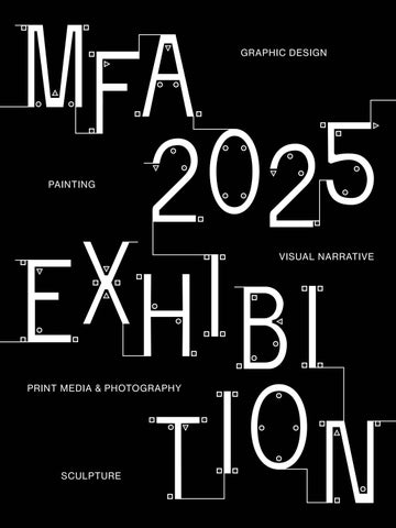
I am pleased to introduce the Boston University School of Visual Arts Class of 2025 Master of Fine Arts thesis catalog featuring work by graduating students in the MFA programs in Graphic Design, Painting, Sculpture, Print Media & Photography, and Visual Narrative.
The 2025 MFA Thesis Exhibition at the School of Visual Arts at Boston University is not a culmination, but it marks a transition—a launching point between graduate study and a sustained professional practice. For students beginning their two-year Master of Fine Arts programs, the capstone thesis is often (mis)perceived as a conclusion of their artistic development. While it marks the completion of one of the most intensive periods of collaboration, research, experimentation, and critique, it is ultimately the beginning of new inquiries, connections, and opportunities.
The work presented by SVA’s MFA students in Graphic Design, Painting, Sculpture, Print Media & Photography, and Visual Narrative reflects not only the rigorous training and conceptual development fostered at BU, but also each artist’s ability to engage through their medium with the world around them. The work we see represents two years of collaborative dialogue with faculty, peers, and critics. Situated within the College of Fine Arts’ rich artistic community—one that, in turn, is embedded in Boston’s vibrant artistic community the exhibition serves as a bridge to the broader art world, where these emerging artists will continue refining their voices, building networks, and navigating the complexities of sustaining a creative life. Rather than an endpoint, this exhibition marks the beginning of a lifelong commitment to artmaking, one that will evolve through experience, risk, and dedication.
On behalf of SVA, I want to especially thank Professor Sleboda for his mentorship in overseeing this catalog and thesis identity, created in partnership with his MFA Graphic Design students. Sincere thanks to current MFA program chairs Kristen Coogan, Rina Goldfield, J. M. Howey, E. Tubergen, Lynne Allen, and Joel Christian Gill, along with Director of Graduate Studies Nick Rock, for their leadership roles in graduate studies and the collaborative learning environments that you have engendered for our students. I am also grateful to all of the faculty
who have worked directly with our graduate students. Thank you to Dean Harvey Young for his leadership and to Boston University Art Galleries Director Lissa Cramer for her partnership and assistance in professionally preparing our students. Lastly, a huge thank you to the SVA staff: Josh Brennan, Nerissa Cooney, Jessica Caccamo, Jesse Finkelstein, Mackenzie Hill, Sam Thomas, Gus Wheeler, Beth Zerega, and Logen Zimmerman who not only ensure that the thesis process runs smoothly but that everything we do throughout the busy year happens in a timely and professional manner. Together we congratulate the MFA Class of 2025 for their extraordinary work, and we look forward to following your future contributions to the fields of contemporary art and design.
Marc Schepens Director, School of Visual Arts
Manjing Chen
Hangi Cho
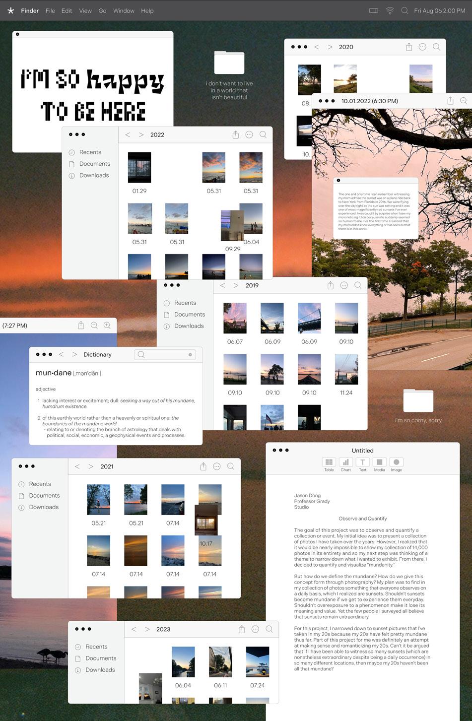
Jason Dong
Wenbin Huang
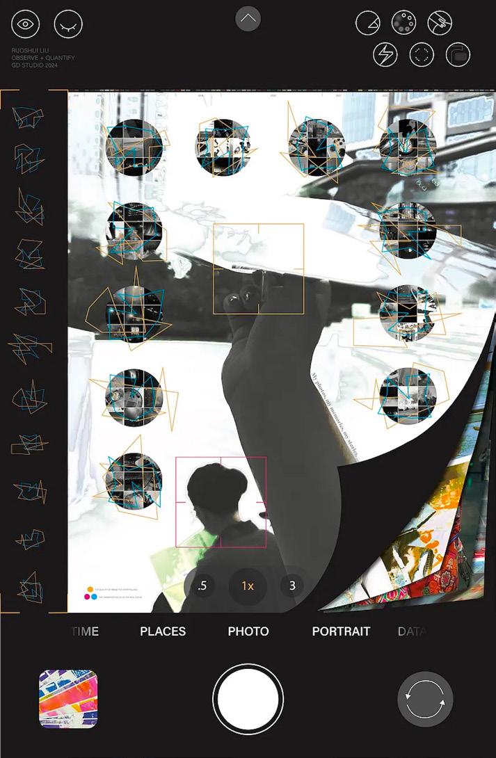
Ruoshui Liu
Caitlin Lu
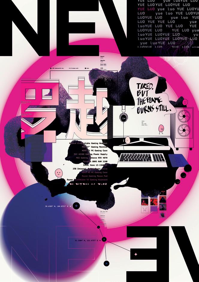
Neve Luo
Ghazaleh Farrokhi
Amanda Mundy
Brady George
Lauren Greenblatt
Yuhong (Rainbow) Hui
Lucy Purvis
Xiuqi Ran
Xinran Wang
Niharika Yellamraju
Jingyi Zhang
Maidah Salman
Micaela Sato
Xuru (Chichi) Zhao
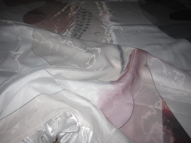
Scroll(s)
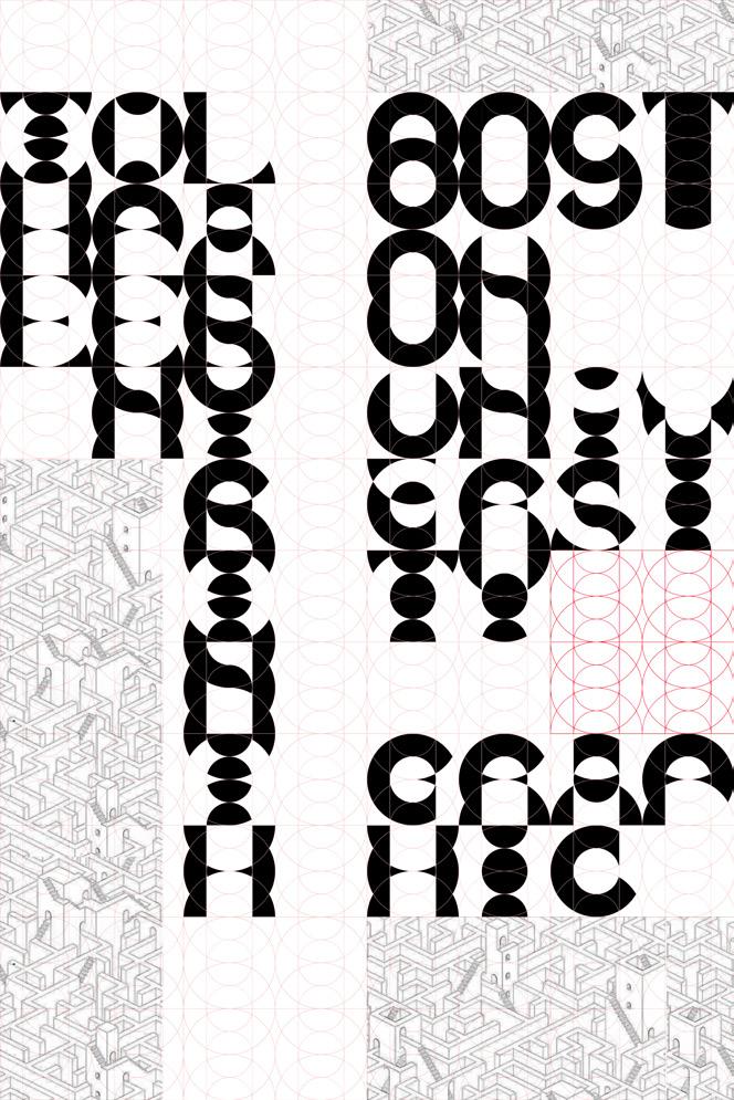
To scroll is to move forward, navigate, and traverse a space. The 2025 Boston University Graphic Design MFA Exhibition, Scroll(s), explores how we engage with information, craft, and form. The exhibition’s title is embedded with multiple meanings: from the ancient tradition of scrolls as vehicles for recordkeeping and storytelling to the contemporary act of scrolling through digital interfaces—our primary mode of accessing and processing vast amounts of information is intimately tied to the term.
Within this framework, Scroll(s) serves as both noun and verb. It refers to artifacts documents that preserve thought and intent but also to the action of moving through knowledge, ideas, and experiences. The twenty Graphic Design MFA candidates featured in this exhibition each chart their own paths through the field, navigating research and practice in ways that are simultaneously independent and interconnected. The pluralizing in the title acknowledges this multiplicity, reflecting a group of designers working in tandem, yet each with their own methodologies, inquiries, and outcomes.
The time spent in the MFA program can be understood as an ever-evolving scroll one that unspools through a continuous stream of prompts and responses, design problems, and inventive solutions. Each iteration builds upon the last, each critique opens new possibilities, and each unexpected challenge—whether a printer error or a misaligned grid—becomes an opportunity for discovery. Like the motion of a scroll, learning in this space is fluid, recursive, and full of momentum. The projects presented here are not conclusions but moments of clarity in an ongoing exploration waypoints in a larger trajectory of lifelong design inquiry.
Beyond its contemporary digital associations, the scroll as a physical object has a deep historical lineage, used across civilizations as a tool for recording and disseminating knowledge. The transition from scroll to codex to screen speaks to shifts not just in technology but in the ways we comprehend and encounter information. The designers in Scroll(s) engage with this lineage some questioning the interface of the book, others investigating typography, motion, interaction, and the
porous border between print and digital spaces. Their work resists a singular definition of graphic design, instead embracing an open-ended and evolving discipline.
Scroll(s) brings these investigations together in one space, inviting viewers to move through and engage with a collection of diverse ideas. As visitors navigate the work, the metaphor of scrolling takes on new resonance—reminding us that to design is to move forward, to search, to question, and to continually reframe our understanding of the world.
Kristen Coogan
Associate Professor of Art, Graphic Design
Christopher Sleboda
Associate Professor of Art, Graphic Design
Manjing Chen
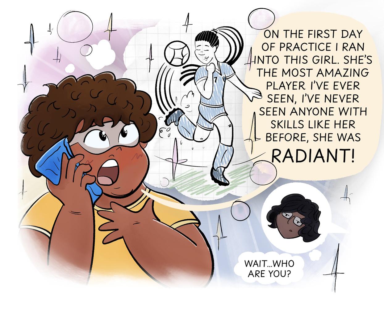
In the digital age, the boundary between fantasy and reality becomes increasingly blurred, with questions about the mind’s ability to transcend the body. Brands and fandoms now co-create narratives, with fans extracting and reshaping their own stories. Digital media, unlike physical media, is highly replicable, editable, and scalable, which changes how we remember and interact with content. While physical media helps crystallize memories, digital media is mutable, altering our engagement with experiences.
The shift from the culture you pay for to the culture you engage with reflects a change in how we access and own information. This transformation in cultural participation is influenced by the rise of digital tools, including AI, which further blurs the lines between the physical and digital realms, posing new challenges and opportunities. Design plays a crucial role in this shift, not only as a tool for information transmission but as a medium for creating meaningful experiences. Through the combination of design and technology, particularly motion capture and participatory processes, immersive and customizable digital experiences can be crafted. These experiences engage users through serendipity, curiosity, and joy, encouraging reflection on our connections to both the virtual and physical worlds.
In this evolving landscape, the potential for fostering deeper human connections through innovative digital interactions becomes clearer. As technology advances, it offers new ways to enhance collaboration, learning, and productivity, while also inviting us to reconsider how we relate to the world and each other.
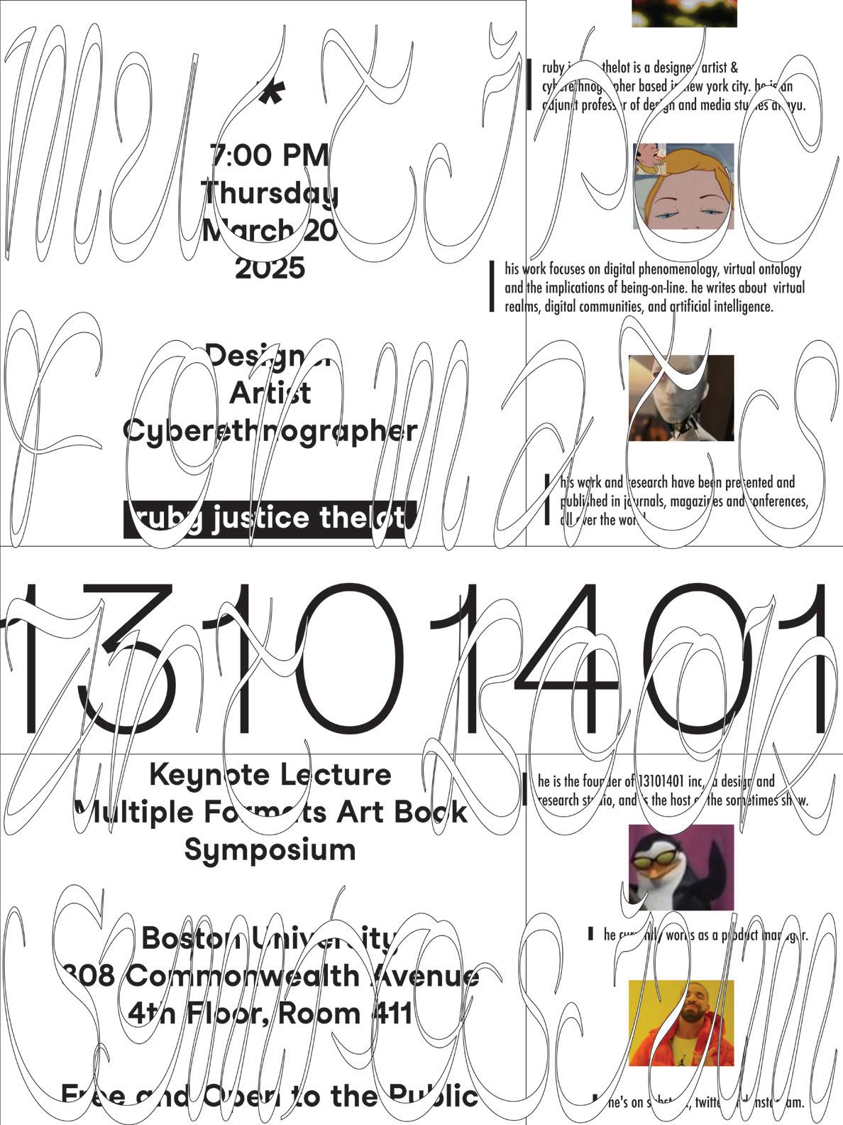
▪ B
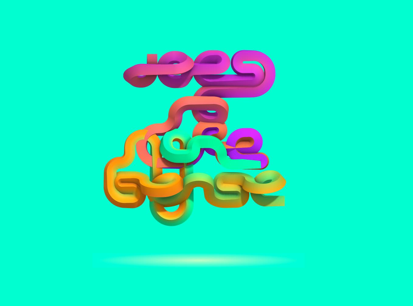
Ruby J. Thelot, 2025. Poster, 24 × 18 in. Walking in the forest, 2024. Website. Does it make sense (3D typography), 2024. Website.
Q Garden, 2024. Website.
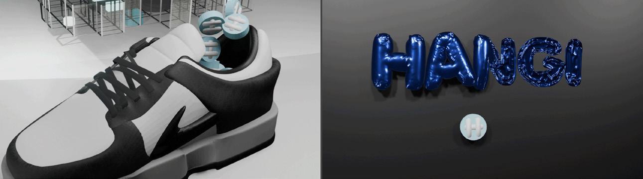
Hangi Cho
CTRL + I
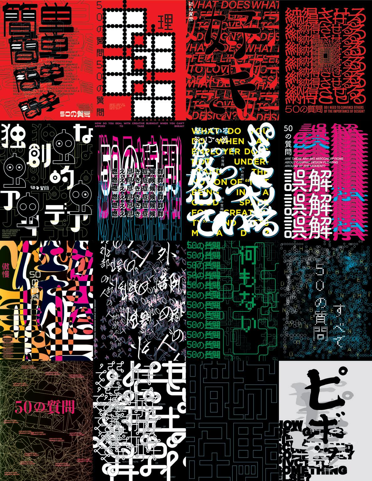
To me, graphic design exists in people’s daily lives and conveys information and even provides enjoyment. And graphic design always plays the role of a communicator. For example, decades ago, people received information and gained interests through books and posters, but in the modern era, if graphic designers want to convey information, messages, and interests to people, we must focus on the platforms and methods that people currently use in common. Therefore, graphic design must be aware of trends because it must find the best way to communicate as a communicator. For this reason, my thesis is a way to experience current trends and conversation/delivery methods and apply them to my work. In design tools, Control + I is a keyboard shortcut to use the eyedropper tool. Like the eyedropper tool, my approach and thesis as a graphic designer is to capture what people focus on with an eyedropper and apply it in my own style. Unlike painting or fine art, graphic design has great significance in conveying what the other person wants to say, not what I want to say. Because it is important to know what they want and how I can effectively convey it to others as a graphic designer, I want to be a graphic designer who continues to communicate by challenging new formats and designs.
▪ B
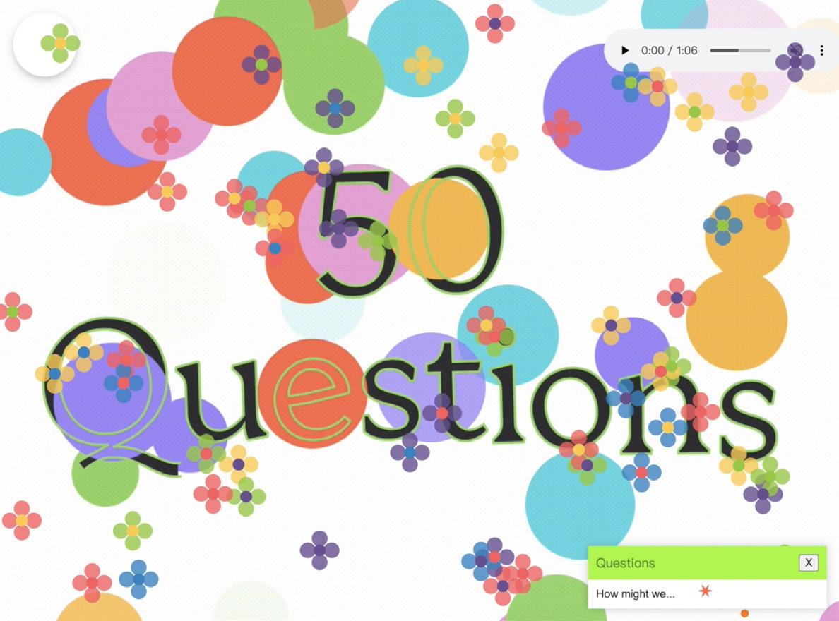
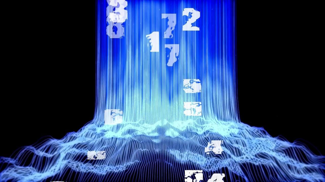
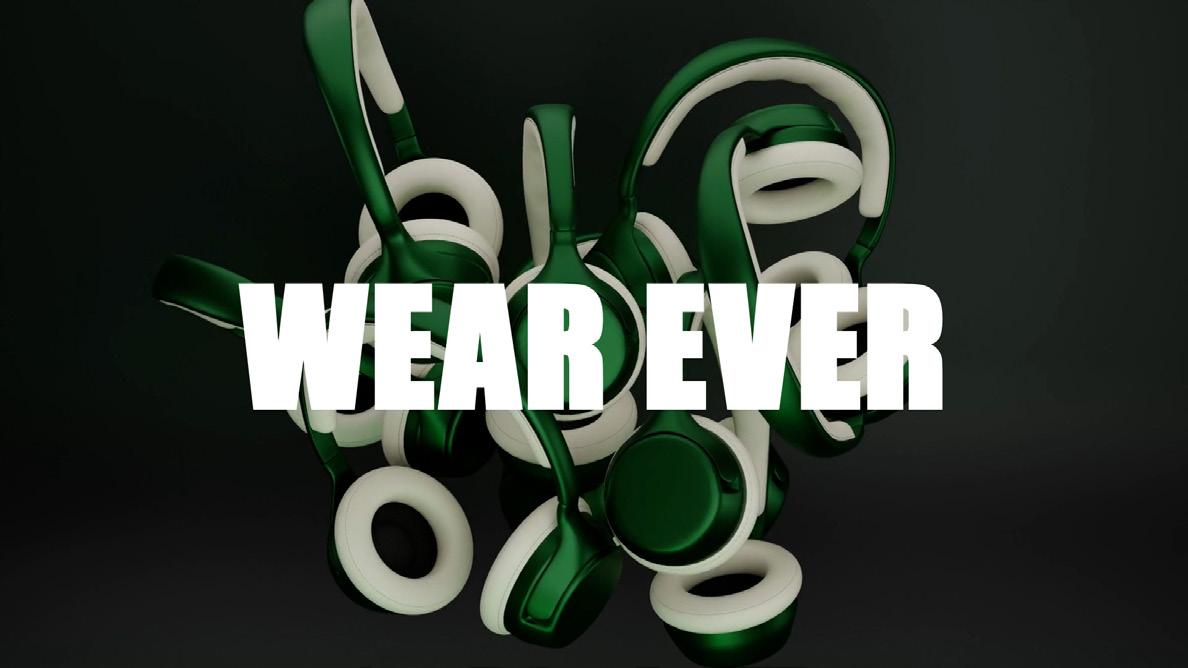
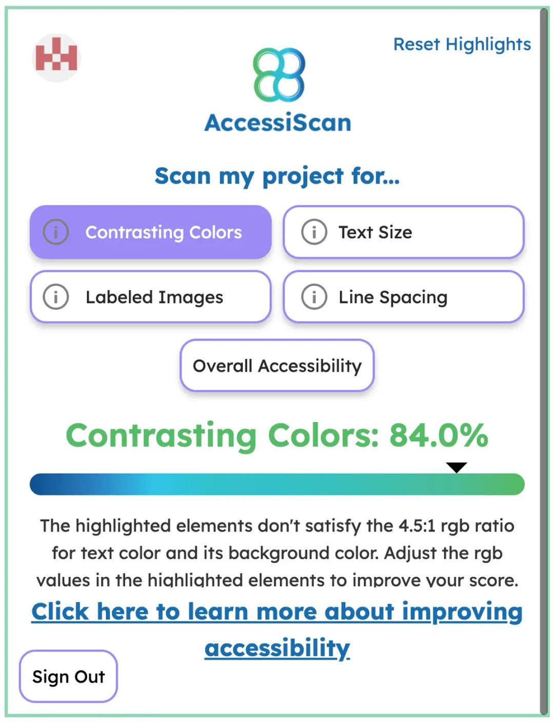
Time Like a Water Fall, 2024. 3D and motion design. Wear Ever, 2024. Motion design. AccessiScan, 2024. Web and logo design. The Logo Play, 2024. 3D and motion design. 50 Questions, 2024. Motion design.
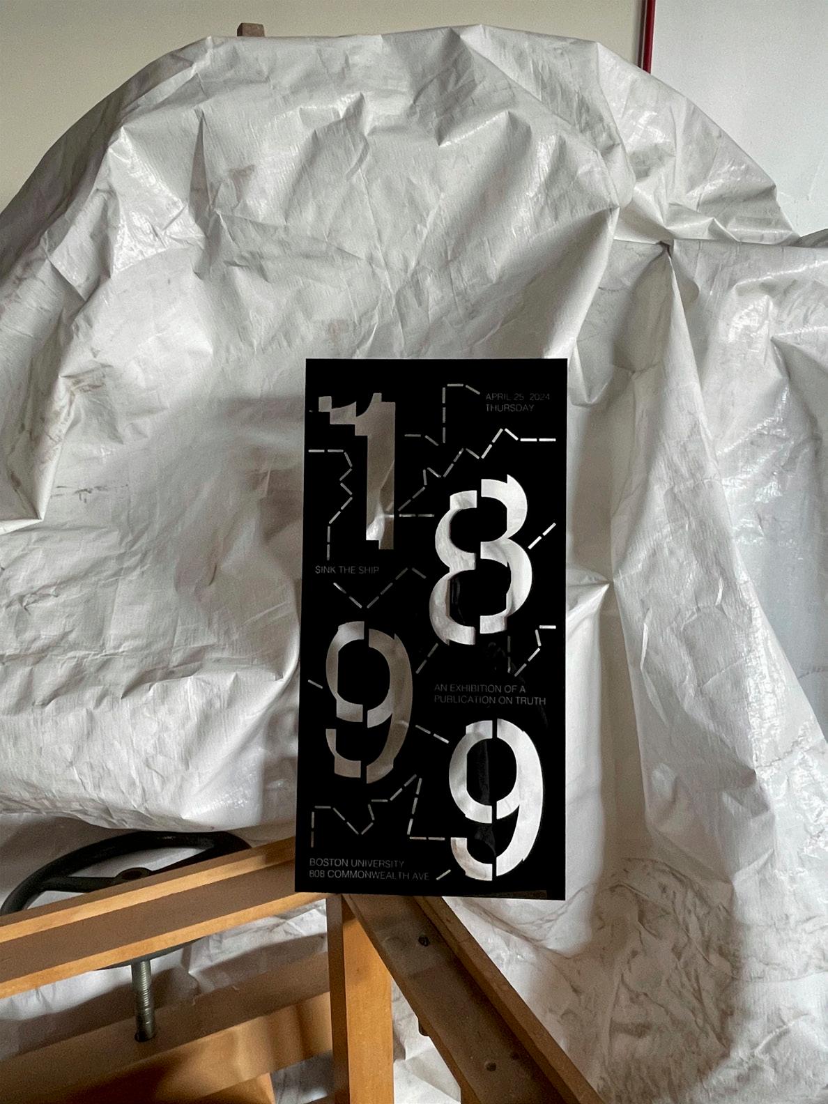
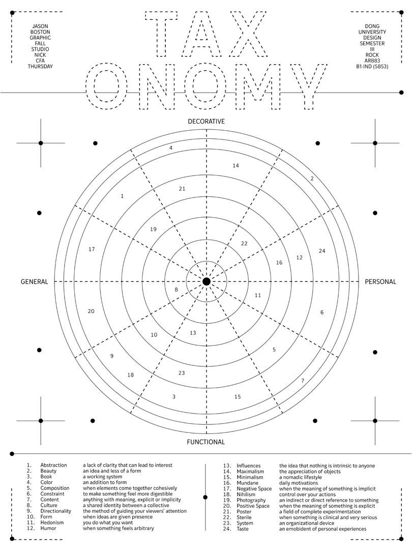
Jason Dong
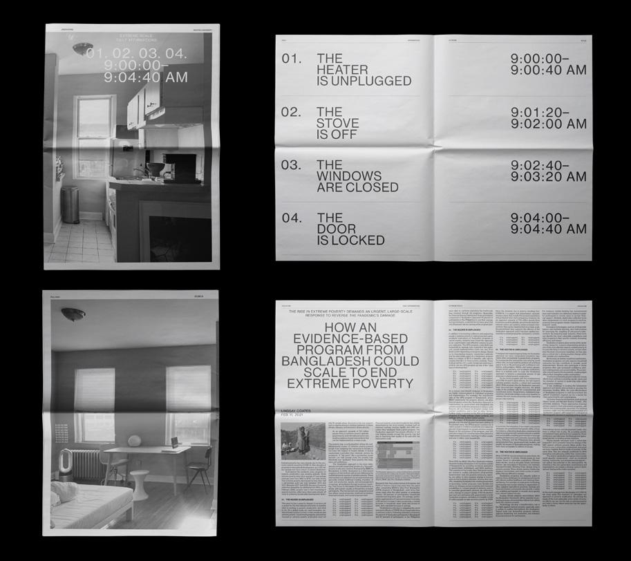
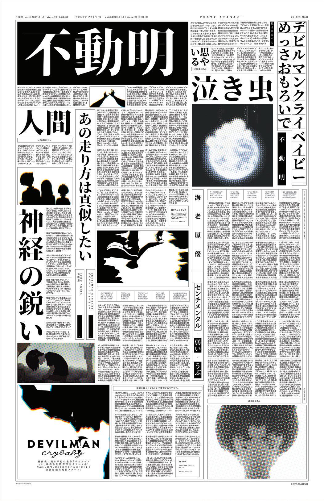
My thesis aims to explore negative space not as a lack of something, but rather in the context of humor, function, and the mundane. Negative space is inherently humorous to me because while it is necessary in design for effective communication, it can simultaneously appear odd given how it can be argued as wasted space. Along similar lines, negative space serves as both a functional technique but also as an aesthetic choice. As an aesthetic employment, negative space can also subvert function. Lastly, my exploration of negative space as the mundane is mostly where my methodology will manifest itself. To do so, I’m interested in giving dimensionality to negative space through the exploration of objects and phenomena that have become banalized through everyday interaction. Essentially, I am defining negative space as the mundane or what has been overlooked. The result of this thesis is not just an exploration of the linkage between negative space and the mundane, but also a reconsideration and recontextualization of the two. The broader significance of this thesis is hopefully an investigation of what design is and how it can manifest visually. Perhaps subconsciously my goal is to show that design is not about extravagance but more about subtleties.
▪ B
1899, 2024. Acrylic poster, 24 × 12 in.
Taxonomy, 2024. Poster, 24 × 18 in.
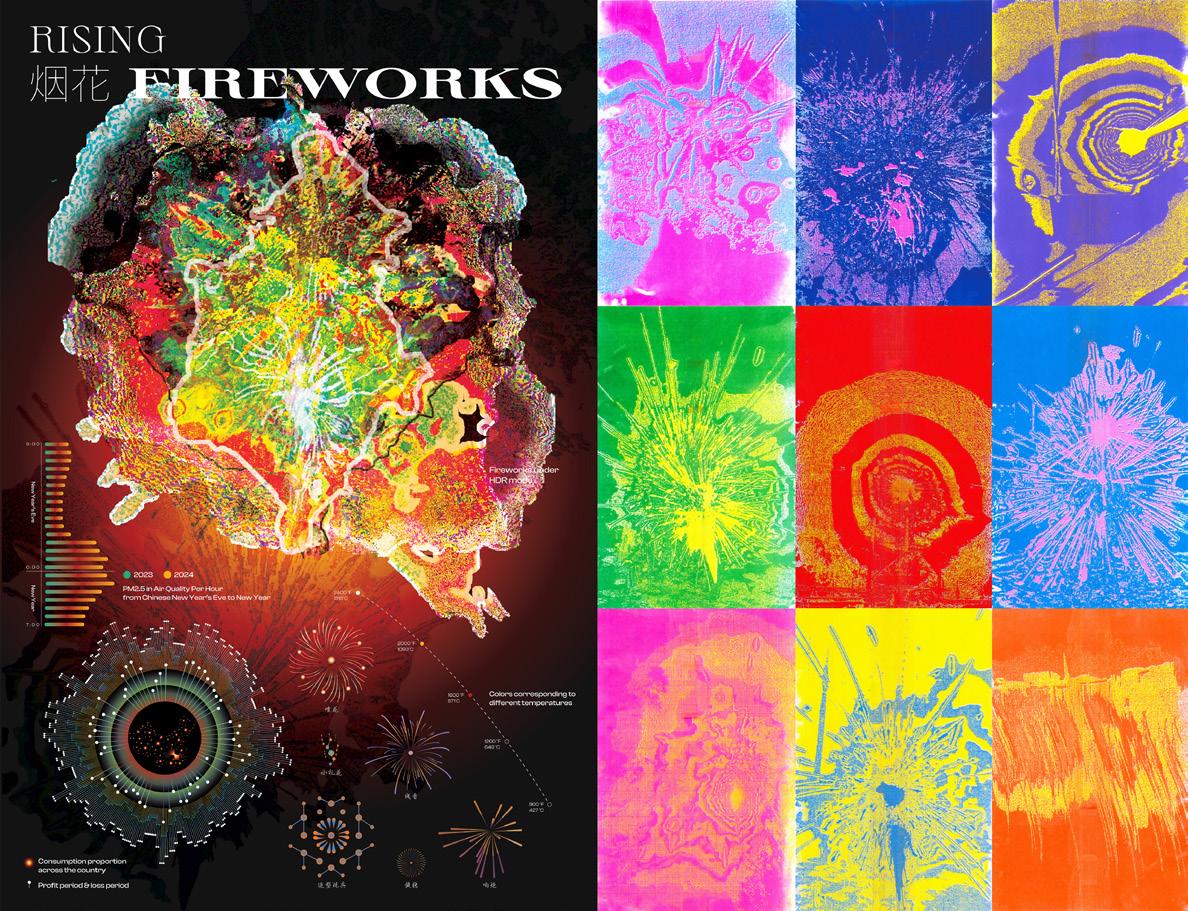
Extreme Scale, 2024. Newspaper, 20 × 12 in.
Beautiful World, 2024. Poster, 52 × 34 in.
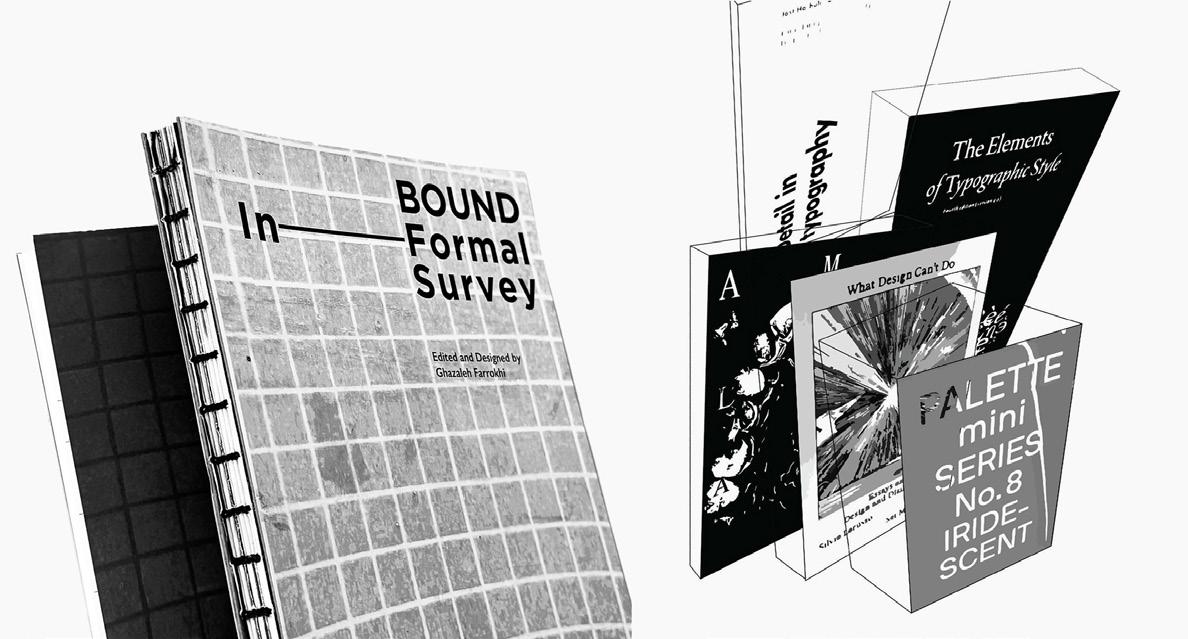
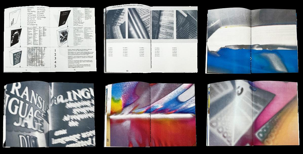
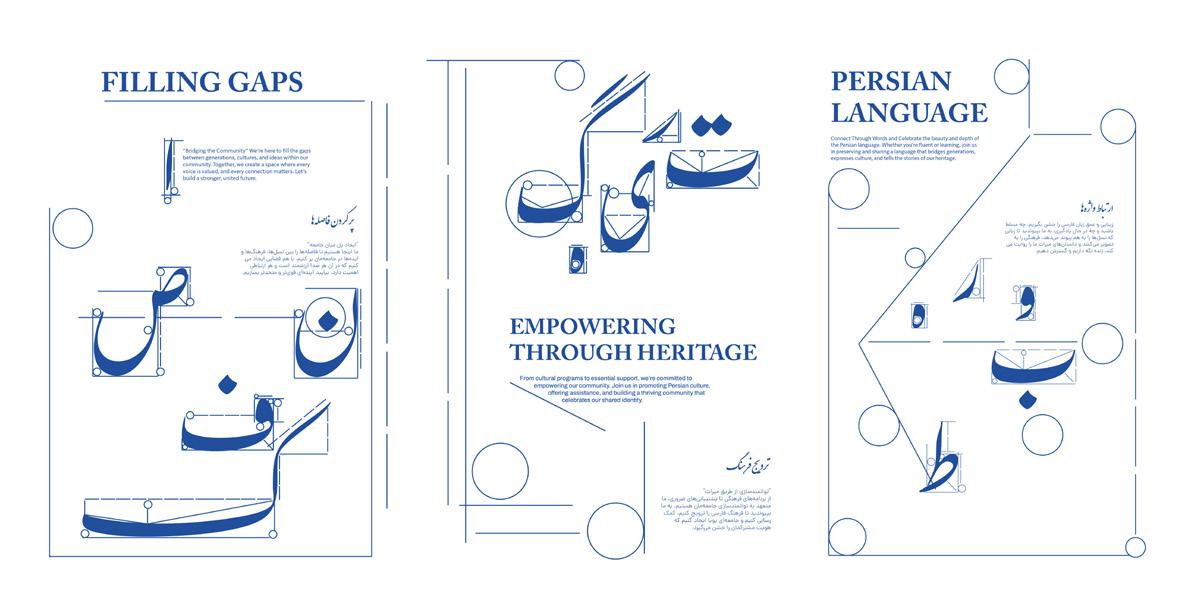
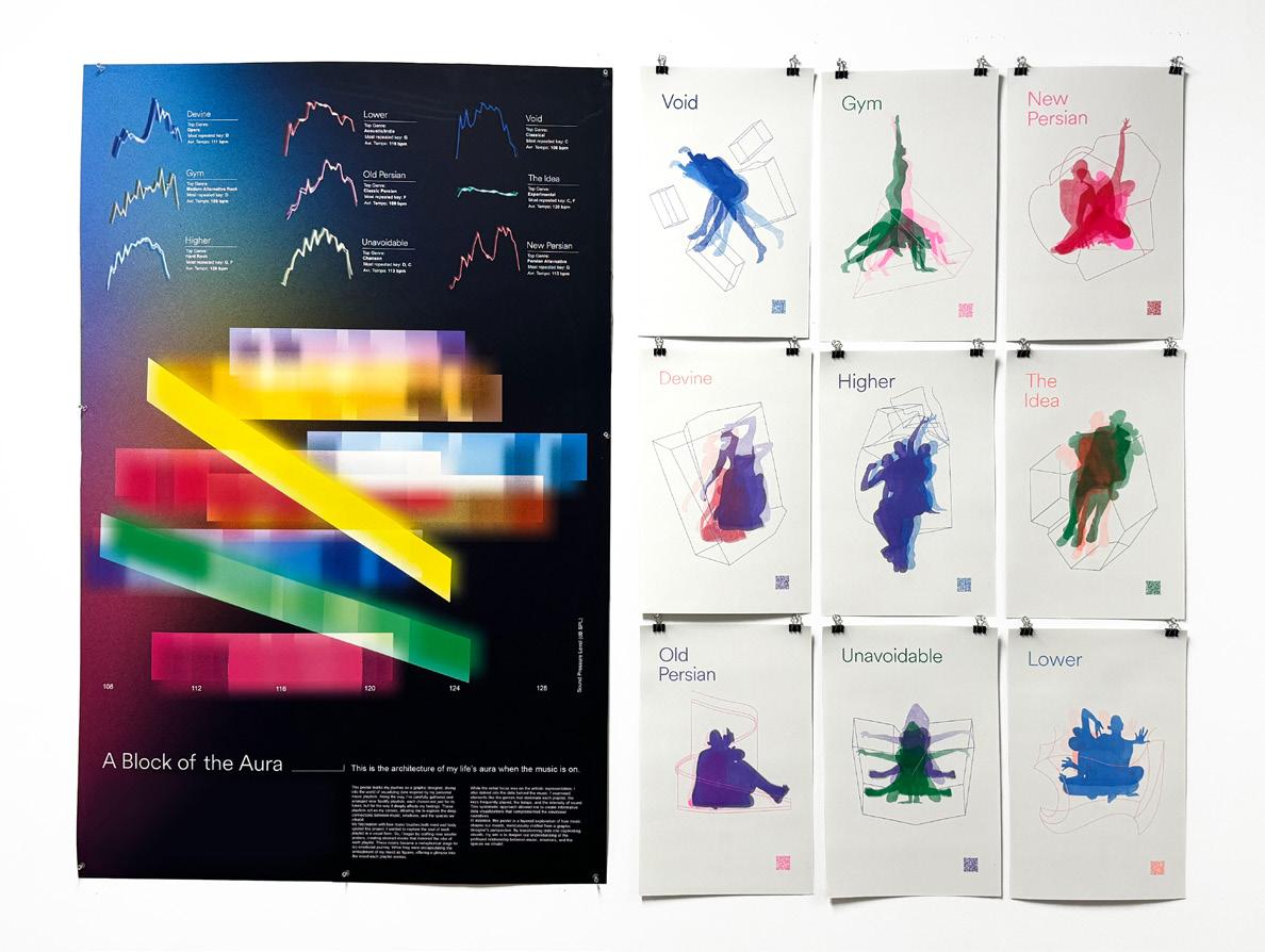
Ghazaleh Farrokhi
Intuition is an essential force in the design process, emerging through spaces, abstraction, perception, temporality, and randomness. It is neither fully deliberate nor entirely accidental; rather, it operates in the in-between the gaps where structured logic fades and instinct takes over. My thesis explores how intuition manifests in graphic design— how it materializes in design and translates into visual language in the way designers navigate composition, spatial relationships, and the balance between form and meaning. It examines how abstract thought informs concrete decisions, how perception shapes graphic interpretation, and how randomness can become a tool for discovery. Unlike purely methodical approaches, intuitive design thrives on ambiguity and latent connections, allowing for fluid ideas to emerge and a dynamic process.
By investigating how intuition operates within spatial thinking, typographic expression, and graphic systems, this study seeks to understand its role as both an unconscious guide and an active design principle. Through this lens, intuition is not a passive or mystical force— it is an integral part of design practice, shaping creativity through subtle perceptions, ephemeral insights, and the interplay between spontaneity and structure.
Bound Survey, 2024. Publication, 11 ⅝ × 8 ⁵⁄₁₆ in. Bound Survey, 2024. Publication, 11 ⅝ × 8 ⁵⁄₁₆ in.
An Applicable Measurement, 2024. Poster series, each 17 × 11 in.
A Block of the Aura, 2024. Poster, 52 × 36 in. List/Histories, 2023. Poster, 36 × 24 in.
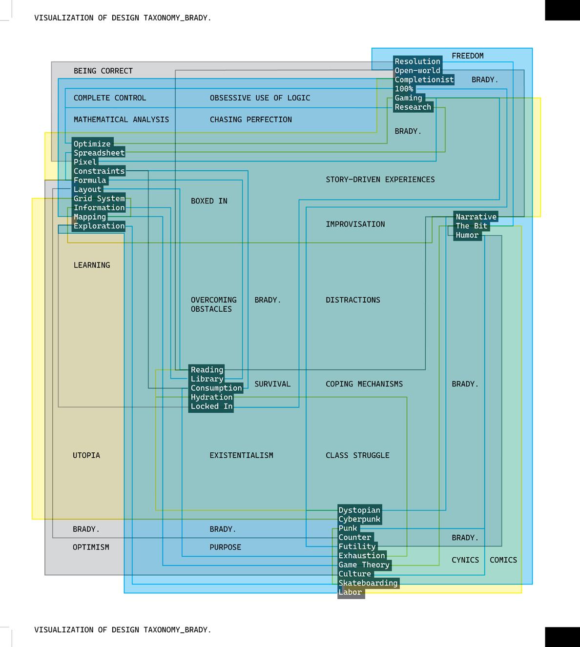
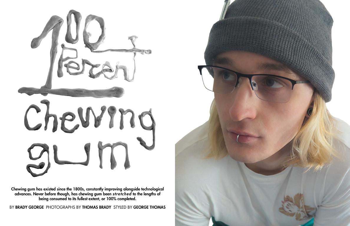
Brady George
100 PERCENT
Graphic design is a field that largely focuses itself on the dissection and recombination of ideas and visual forms to create “new” things. As the field of graphic design continues to mature though, its combinations include previous examples of graphic design more and more. Self-referential design rarely creates work that is truly valuable though. When designers look to the field of graphic design for inspiration, then use what they find to influence their current work, the overall landscape of graphic design becomes more recursive and oversaturated day by day. The introduction of artificial intelligence (AI) has only proliferated this issue, since the source files that machine learning actually “learns” from are all design solutions from the past. Due to the commercial value of these AI systems and their ability to do tasks originally relegated to human problem solving, more than ever, we are creating uninspired kaleidoscopes of past design and passing it off as new and original design work.
Instead, consider the idea of creating design work without any predetermined lenses. Through the 100 PERCENT method, I analyze and codify every aspect of a prompt, creating a system based on the needs of the data, then shaping the project to fit that system. If your work is always beholden to a system that was born from the work itself, it can only be embedded with meaning and value at every instance. Through 100 PERCENT completion, we can create work that feels unique and unexpected to viewers but is calculated and connected to the methods of its creation, without regurgitating old solutions.
▪ B
▪ C
VISUALIZATION OF DESIGN TAXONOMY_BRADY, 2024. Poster, 17 × 11 in. 100 PERCENT Chewing Gum, 2025. Magazine article, 8 ½ × 11 in. Noah Crenshaw, 2025. Band brand logo. 50 Questions, 2024. Posters, each 17 × 11 in.
Lauren Greenblatt
THE 33° ANGLE OF APPROACH
Thirty-three degrees is the average angle at which left-handed individuals tilt their paper to write. As a left-handed designer, I have found that approaching design challenges from a different angle, both literally and conceptually, is often necessary. This perspective has developed into a mindset that allows me to view limitations, accidents, and glitches not as obstacles but as opportunities. I have thus defined my thesis as the 33° Angle of Approach. This is a left-handed design philosophy that embraces curiosity as a process and promotes authenticity within design outcomes.
At its core, the 33° Angle of Approach is about expecting the unexpected. This involves utilizing hand-crafted techniques in both physical and digital spaces, exploring material as form and form as content, embracing tedious processes while performing fast-paced experiments, the misappropriation of tools, and most importantly, being open. Designing at thirty-three degrees is being open to moments of discovery and serendipity, allowing that to drive the creative direction. With a background in the visual arts, music, and film, I have always been drawn to media that celebrates chance and “happy accidents” as exciting opportunities for expression. I find that leaning into imperfection results in work that feels authentic. My thesis therefore explores how adopting a left-handed methodology generates design that is explorative, playful, and real.
▪ B
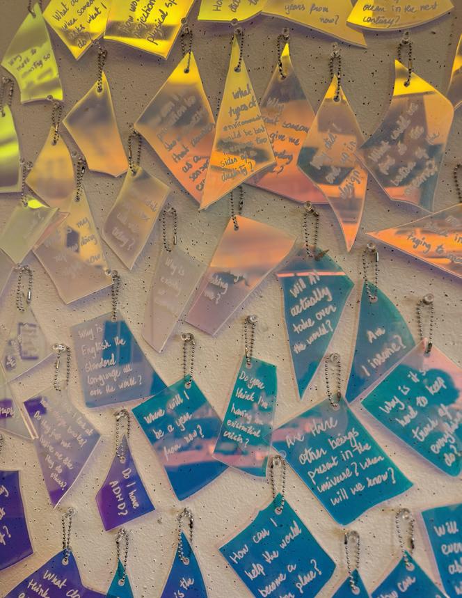
50 Questions, 2024. Projection on folded paper, 48 × 32 in.
Abstract Possessions, 2025. Poster, 33 ⅛ × 23 ⁷⁄₁₆ in.
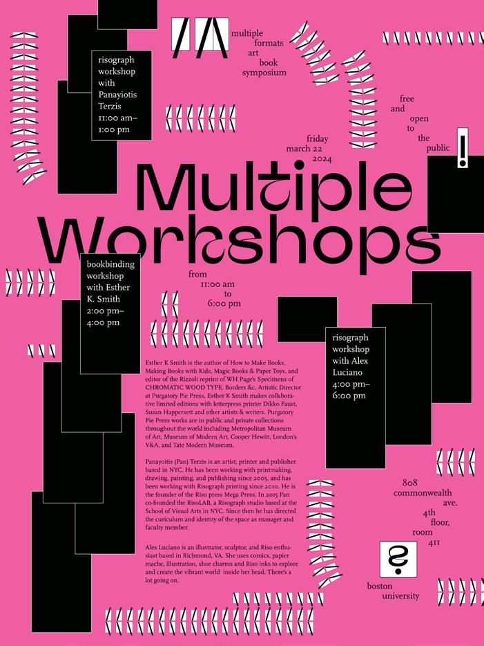
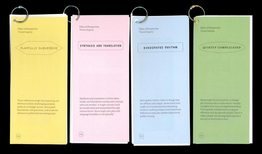
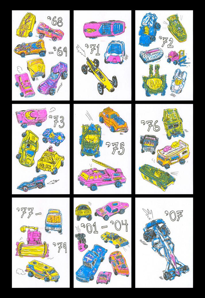
Multiple Workshops, 2024. Poster, 24 × 18 in. Filter of Perspective, 2024. Books, each 9 × 4 in. My Toy Cars, 2024. Risograph posters, each 17 × 11 in.
▪ D
Wenbin Huang
As we grow, we learn from our environment, shaped by the sensations of mostly visuals and sounds. According to psychologist Lisa Feldman Barrett’s theory of constructed emotion, our brain constructs emotions by drawing on memories of past experiences and sensations. This intricate mechanism inspires me to self-express through my work and drives my fascination with uncovering visual clues and fragments of memory that evoke human emotion.
As a photographer and graphic designer, I am captivated by the interplay of functionality and artistic expression in visual communication. Each time I capture a photograph, I aim to document ephemeral moments filled with the transformative power of bridging the past and present with narrative potential. Whether it’s a smiling face or a still-life object, a story has been documented when the frame instantly freezes, arousing me to investigate the questions of “who, what, when, why, and how” behind the captured moment. By organizing visual clues through design, I seek ways to construct functional communication, evoking emotional resonance.
Effective communication can not exist without stimulating emotional perceptions, which are influenced by countless factors, including cultural context and individual sensory abilities. To create immersive and inclusive environments that resonate with diverse audiences, I am developing a user-centered methodology that emphasizes thoughtful design strategies for reinterpreting original stories while inviting audience feedback. By integrating these insights into my design practice, I aim to bridge the gap between narrative, emotion, and interaction.
▪ B
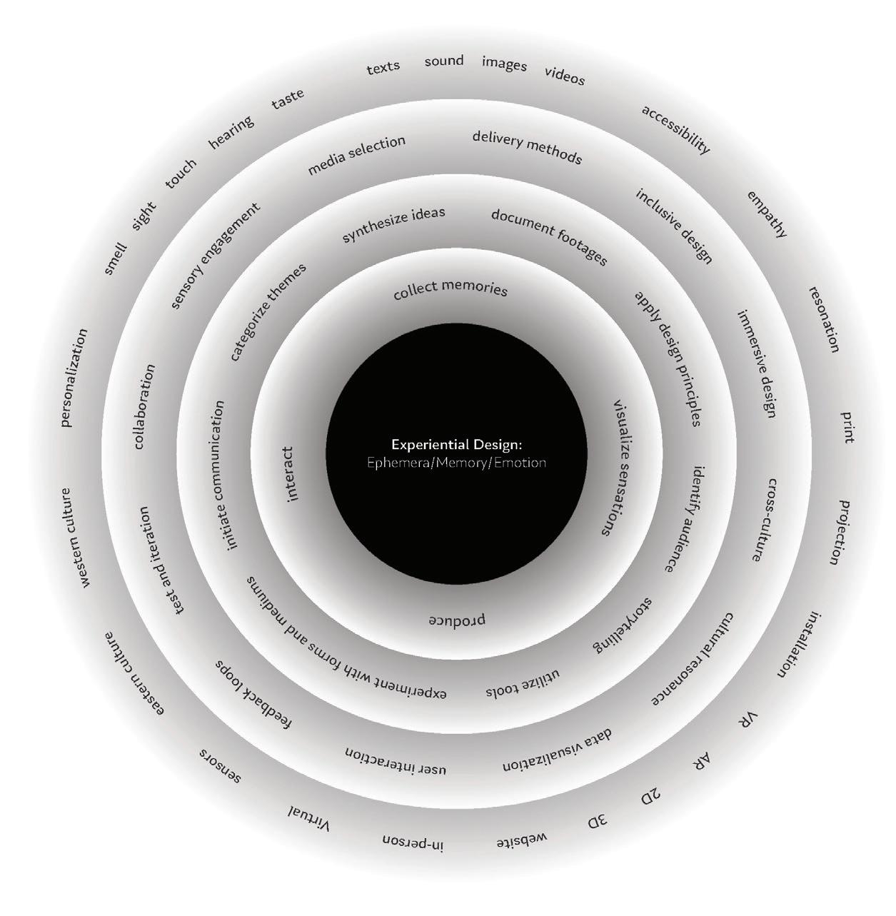
Experiential Design, 2024. Poster, 10 × 10 in.
Time, Space, and Love, 2024. Installation, 96 × 45 × 15 in.
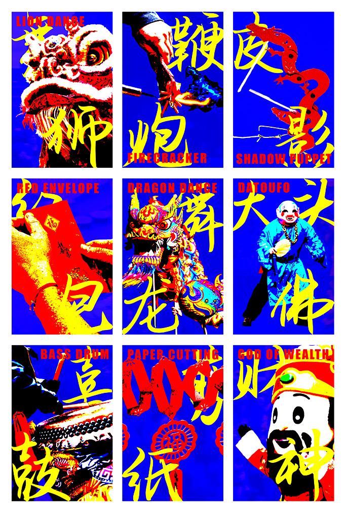
Chinese New Year, 2024. Risograph posters, each 17 × 11 in.
50 Questions, 2024. Video, 35 seconds. Time Scale, 2024. Flip book, 7 ½ × 1 × ¾ in.
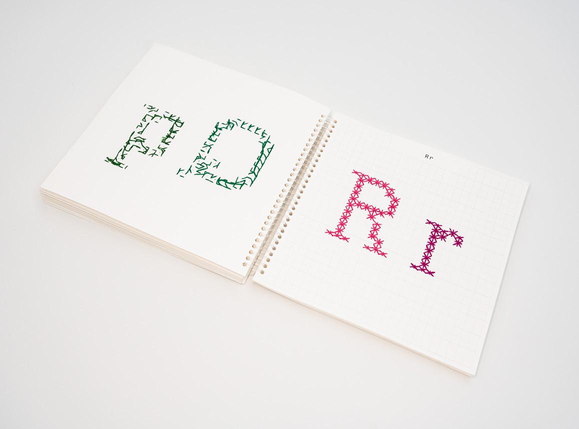
Yuhong (Rainbow) Hui
For me, design has never been about simply putting forms together; it contains the silent understanding and dialogue between the designer and the artist. Just as architects design spaces that serve functional needs while also sparking reflection and interaction, my design attempts to provide a perfect vessel for the artist’s work through every detail from the texture of the paper to the binding method, from the color scheme to the layout. This vessel is not only for displaying art but for evoking an emotional resonance, allowing every reader to connect with the work on a deeper level. The value of design lies in this delicate and balanced presentation, enabling the artist’s emotions and thoughts to be conveyed without words, moving away from mere visual enjoyment and reaching the resonance of the soul.
My project emphasizes the concepts of connection and collaboration, where designers and artists jointly explore unknown expressive spaces, blending design and art to create a unique form of communication. In this process, design is not merely used as a tool for display, but a profound collaboration and interaction. It becomes a bridge that establishes a deep connection between the artist and the audience. This is not just the presentation of design, but a profound exchange of ideas and emotions a dialogue of the soul.
Stitch, 2024. Paper and thread, 8 × 8 in.
Lychee Debt, 2024. Paper and thread, 6 × 9 in.
50 Questions, 2024. Paper and twine, 6 × 6 in.
VARIED Temperatures, 2024. Paper and thread, 7 × 7 in.
Design operates within established structures, frameworks, and methodologies that guide how we think and create. These systems bring order and efficiency, yet they shape our instincts and decisions in ways we don’t always notice. I began to recognize how naturally I followed these patterns, relying on them as both a foundation and a constraint. We are encouraged to break rules, yet how do we rethink the very tools that shaped our approach?
My thesis explores the concept of unlearning as a transformative process in design. It is not about forgetting but reinterpreting things from new perspectives. Don’t we unlearn before we can truly create? Through reflecting, questioning, and deconstructing established norms, my thesis functions as both a conceptual inquiry and a practical framework for invention. I develop my tools and explore the interplay between clarity and ambiguity. My works examine the concept of what is and what could be. I aim to find a flexible, adaptive design approach that allows for uncertainty, iteration, and experimentation.
▪ B
Undo, 2025. Website.
Imperfection, 2024. Poster, 53 × 35 in.
Remix, 2024. Website.
Liminality, 2024. Transparency film, 9 × 6 × 40 in.
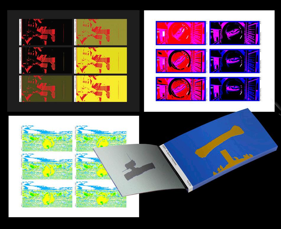
A Space Odyssey, 2024. Paper, 2 ⅝ × 4 ⁵⁄₁₆ in.
▪
Caitlin Lu
UNLIMITED LINKS
Unlimited Links explores how design brings people together by revealing the layered interactions between people, places, objects, and histories. This thesis examines how intentional design can surface hidden connections, facilitate meaningful exchanges, and build shared experiences. I see design as a tool for uncovering relationships that already exist around us, sometimes unnoticed but always present.
Guided by actor network theory, I approach design as an active mediator between people, materials, and spaces. I think of myself as a connector, someone who identifies, strengthens, and translates these links into tangible experiences. While in the design process, I find ways to bring ideas or people together and create something that can act as a space of reflection.
I am particularly drawn to the energy between people and objects, the role of community spaces, and how design can activate connections between them. My work invites engagement, reflection, and new ways of seeing, encouraging people to notice what might otherwise go unnoticed. Whether through a hands-on experience, an immersive environment, or printed matter, I aim to reveal something, spark curiosity, and create moments of interaction. At its core, Unlimited Links is about design as a way of seeing, recognizing patterns, making connections, and creating a sense of belonging.
▪ B
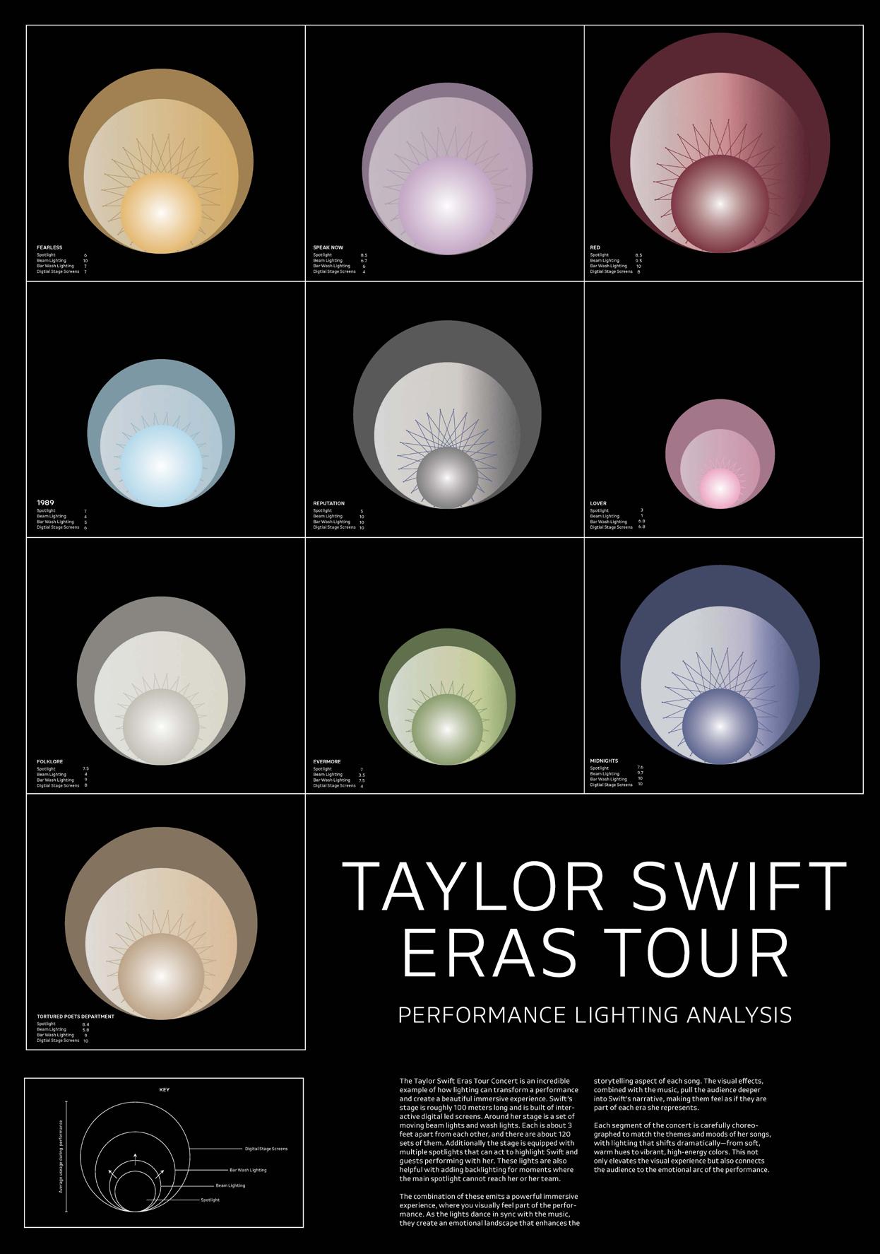
Data Visualization of Taylor Swift Eras Tour, 2024. Poster, 50 × 40 in.
The Science of Senescence, 2024. Risograph prints, each 3 × 6 in.
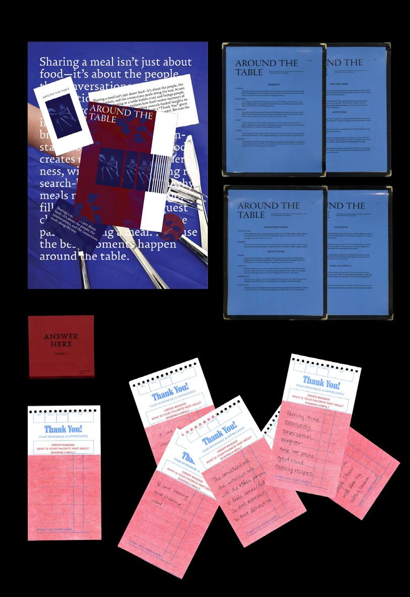
Around the Table, 2025. Printed matter, dimensions variable.
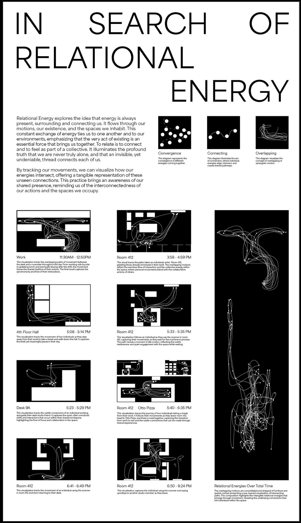
In Search of Relational Energy, 2025. Poster, 43 × 34 in.
Neve Luo
This thesis explores the perception of Latin character design by non-native speakers, specifically examining how designers from Chinese-speaking backgrounds approach Latin typography differently from Chinese character design. As globalization increases the demand for cross-cultural communication and visual literacy, understanding the cognitive and cultural influences that shape typographic choices is vital. This research challenges the conventional view that Latin character design and Chinese character design are distinct, separate practices. It argues that non-native designers, particularly from China, bring unique insights into the design of Latin scripts influenced by their experience with Chinese characters, leading to the creation of typographic forms that blur cultural and linguistic boundaries. The study combines design analysis, cognitive theory, and cultural studies to investigate how Chinese-speaking designers interpret the Latin alphabet through the lens of their native language’s writing system. By comparing examples of Latin typefaces created by both native and non-native designers, the research identifies key differences in form, structure, and visual meaning. It also examines how Chinese character design principles, such as balance, proportion, and visual hierarchy, inform the interpretation and adaptation of Latin characters.
▪ C
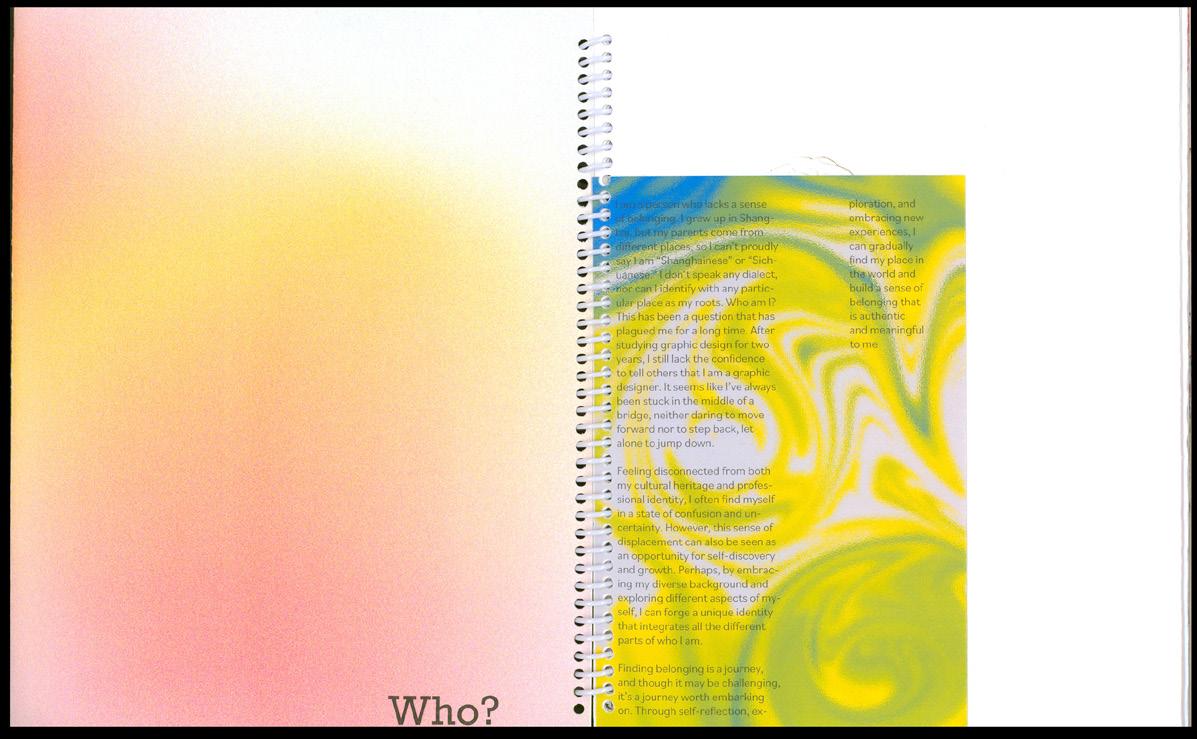
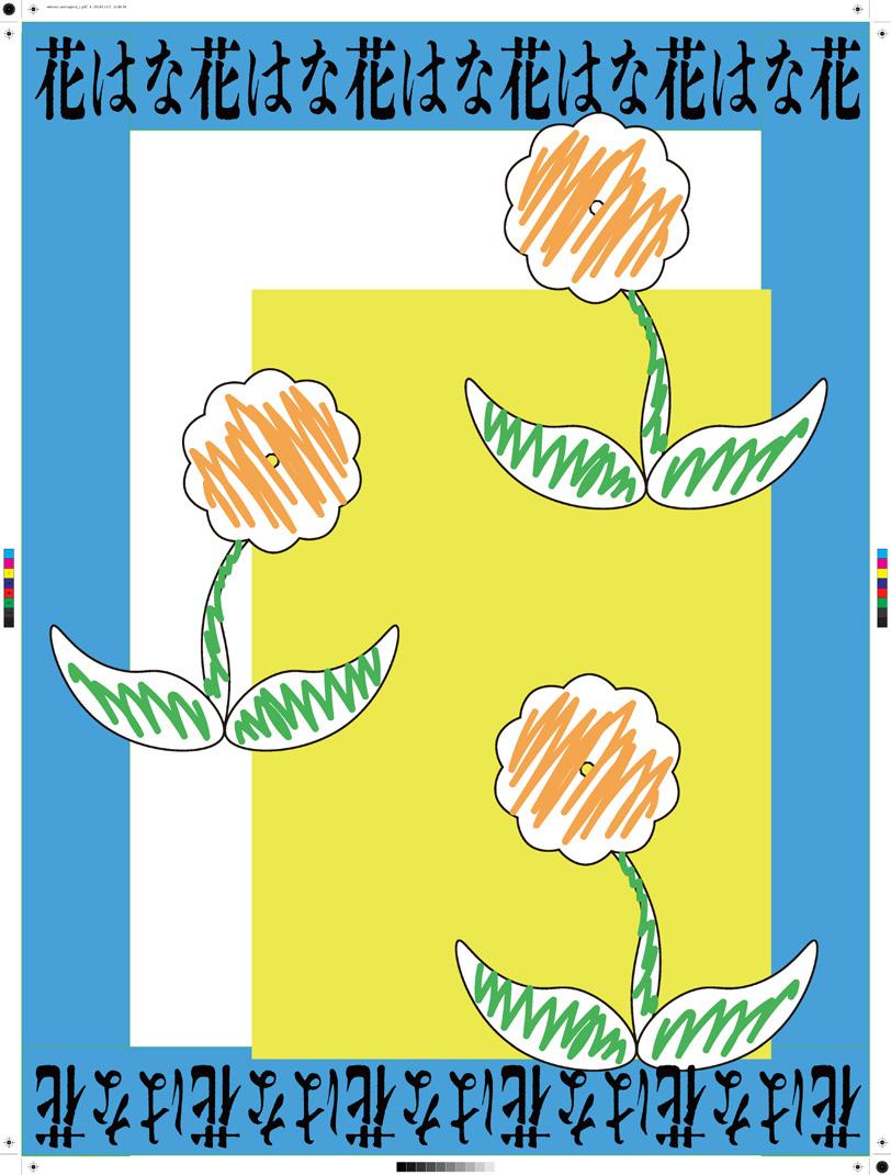
WHO?ME, 2024. Spiral-bound book, 11 × 8 ½ in. Hana, 2024. Poster, 52 × 39 in.
Observe & Quantity, 2024. Risograph posters, each 17 × 11 in.
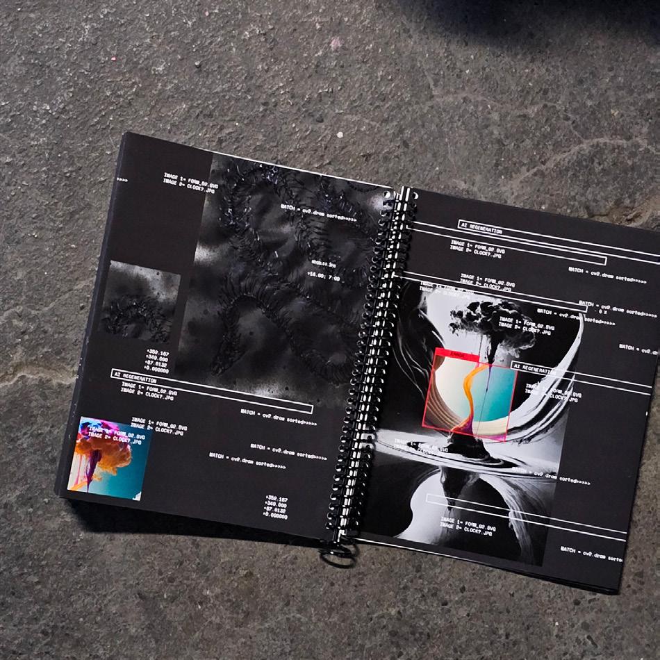
Typographic Labyrinth, 2023. Poster, 112 × 75 in.
Future/Past Book, 2024. Transparent paper printing, 13 × 145 in.
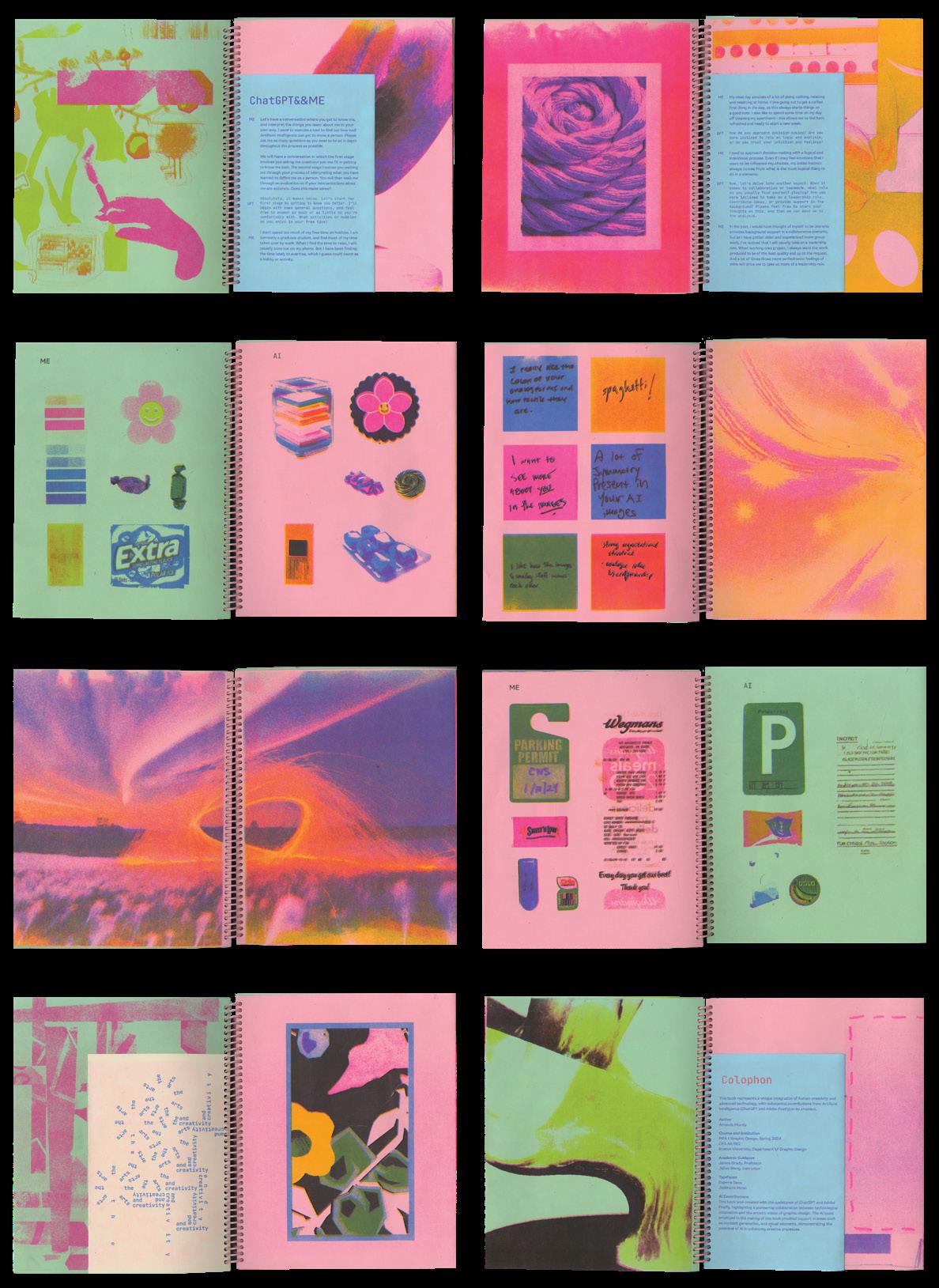
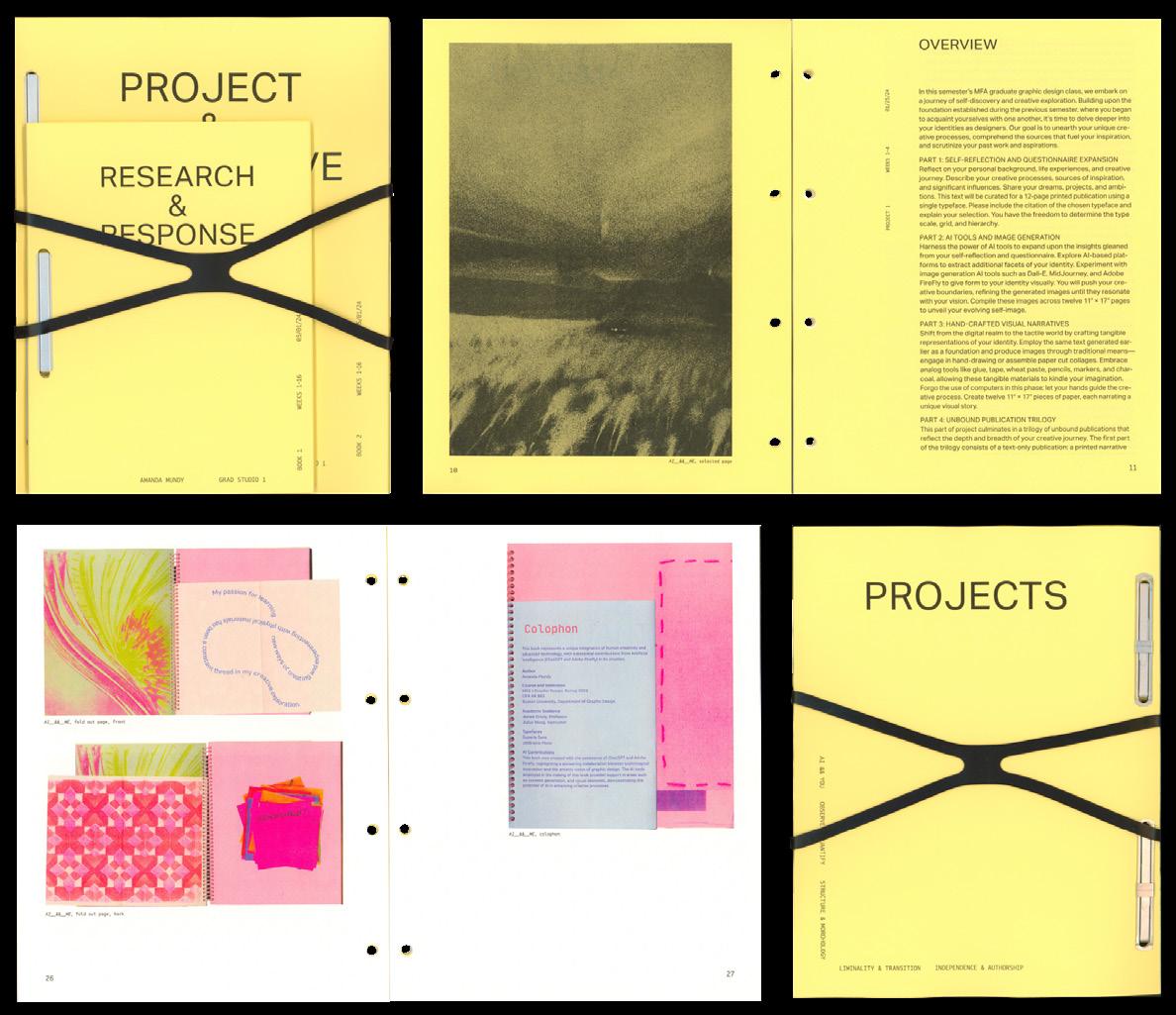
Amanda Mundy
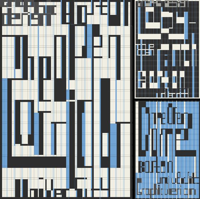
OPEN
This thesis explores the concept of openness in design, investigating how predetermined systems, structures, and rules can foster flexibility and unexpected outcomes. While traditional design often relies on fixed solutions that limit engagement, this thesis challenges that approach by embracing openness as both a methodology and a dynamic tool for design. This research examines how the very concept of openness through variability, adaptability, and context-driven responses—can guide design towards subversive and unanticipated directions.
Motivated by the need for design to evolve with complex and shifting contexts, this research investigates how systems can maintain consistency while introducing room for variability. This tension between structure and freedom allows for a nuanced approach to design that highlights human creativity, decision-making, and interpretation.
Ultimately, this thesis explores the tension between openness and closedness and how this dynamic can inform and reshape design practices. By reframing design as an open, iterative process, it challenges static methodologies and embraces the potential for unforeseen and ambiguous outcomes. This approach not only encourages a deeper understanding of how systems can evolve, but also highlights how embracing uncertainty can expand creative boundaries and lead to new, unexplored avenues in design, particularly in the context of my own work as a designer.
▪ B
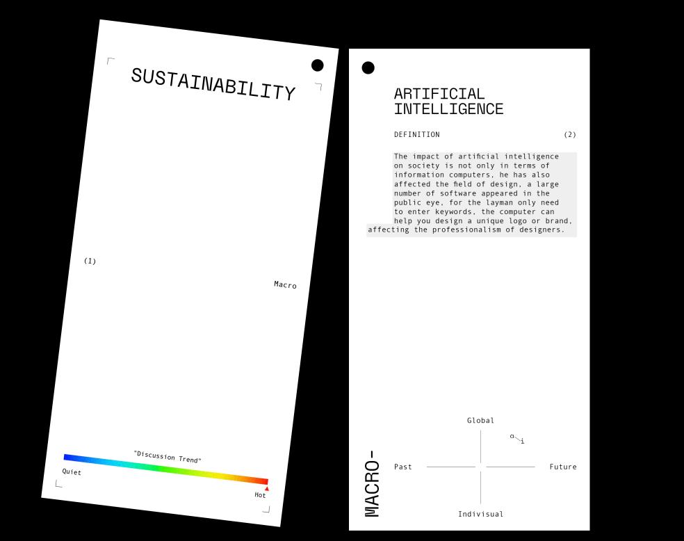
AI__&&__ME, 2024. Risograph, 11 × 8 ½ in.
Angular Antiqua (Specimen), 2024. Black PLA filament and poster board, 20 × 16 in.
Research & Publish, 2024. Book, 11 × 8 ½ in.
Typographic Constraints (Workshop), 2024. Paper and tape, 17 × 11 in.
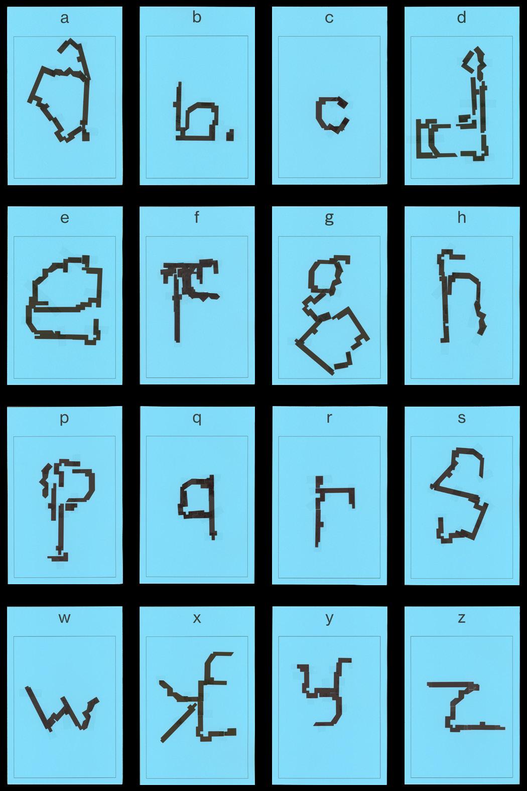
Lucy Purvis
I started by considering what I like about design. Why am I here? What motivates me? And what can I do to keep design a passion? I established a topic of interest and some themes within it that I am curious about: the development process of typefaces for non-Latin script language writing systems, the unique ways in which these typefaces are designed and utilized for communication, and how these systems lend themselves to type as image. I’ve gathered and continue to contribute to a collection of questions I have regarding differences between the typography I am most familiar with and that which I wish to learn more about. Through visual exploration, I want to highlight the differences in approach to the practices, standards, and processes between Western type and those of character-based languages, for those like myself who might be unfamiliar but curious.
My approach to this process is still being developed. Right now, it consists of gathering information on the specific topics that I am interested, leaning heavily into form-making for exploration and creation within the non-Latin typographic space to familiarize myself with it and gain a better understanding through practical application. I have come up with a comprehensive examination of the work that I found myself paying attention and going back to in my practice. I continue to take note of these designers and collect artifacts of reference.
There are existing sources that delve into this topic but I have consolidated the information found through my own explorations, for myself to a degree, but hopefully also for the benefit of those who interact with my thesis work. Ultimately, I seek to spark interest, using what I have gathered and created, in people who are also looking to enter into the world of non-Latin script-based typography, or simply challenge what they are familiar with by using the standards and practices not widely utilized in the Western design world.
50 Questions, 2024. Poster series, each 11 × 8 1/2 in.
Newspaper, 2024. Poster, 53 × 34 in.
Neve, 2023. Poster, 47 × 33 in.
Daily, 2023. Risograph prints, each 17 × 11 in.
▪ C
Xiuqi Ran
WHEN THE CAT OPENS THE DOOR
In life, we see people open doors all the time, but when a cat opens a door, it becomes a viral Tik Tok video. People are surprised by a cat that can open a door, yet they seldom consider why opening doors is so difficult for cats. The height of the handle and the mechanism by which the door operates are designed by and for humans. As a result, opening a door becomes a challenging task for animals or any being that doesn’t fit the human norm.
Rather than just complain about this limitation, I want to explore how we can design doors that accommodate cats—an approach that can extend to broader issues of inclusivity in design. Just as humans take door opening for granted because doors are designed with our bodies in mind, countless other systems are created with a narrow perspective that overlooks the diverse ways people—and non-human beings—interact with the world.
This cat-and-door metaphor can be applied to many situations. It reflects the relationship between marginalized groups and design methodologies that prioritize a dominant or normative experience. For example, women in a society where men are seen as the default, Asian Americans living in the US, or minorities in a world built for the majority. The struggle to engage with a world designed for others becomes an everyday experience for these groups, just as the cat struggles with a door built for human bodies.
Ultimately, my thesis calls for a new approach to design—one that doesn’t center the human or the masculine but recognizes the complexity of all identities. By embracing the other, design can move beyond the limitations of exclusion and open up new possibilities for how we interact with the world. Through this lens, I hope to encourage designers to think beyond designing for the dominant group and create with a broader, more inclusive perspective. Then, perhaps, we would no longer be surprised by the fact that cats can open a door, because doors were designed for them to be opened in the first place.
▪ C
I Scream -Board Game Design
▪ D
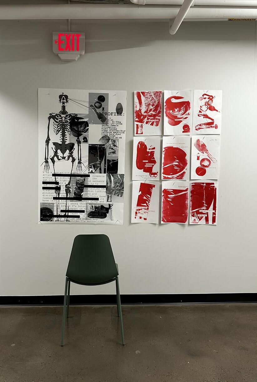
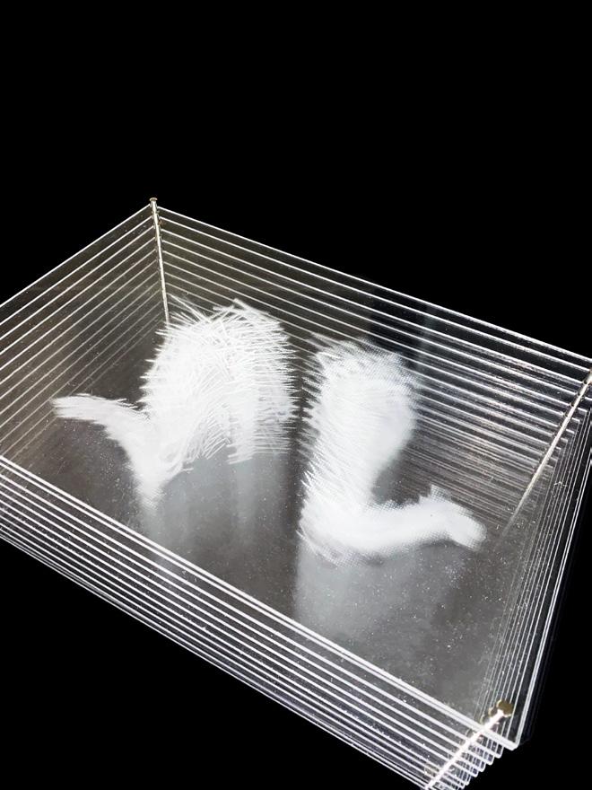
Suspect V, 2024. Risograph posters, each 17 × 11 in.
Blow-ups, 2024. Patterns on textile, 60 × 209 in. IScream, 2024. Board game on acrylic boards, 3 × 3 in.
Log(-?), 2023. Printed archive, 8 ⁵⁄₁₆ × 5 ⅞ in.
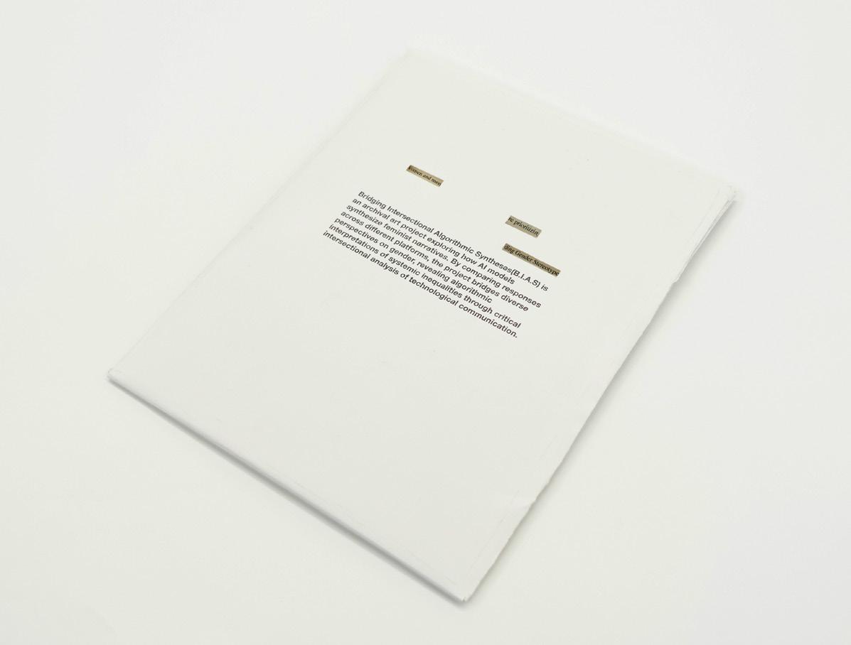
B.I.A.S., 2024. Printed archive, 11 × 8 ½ in.
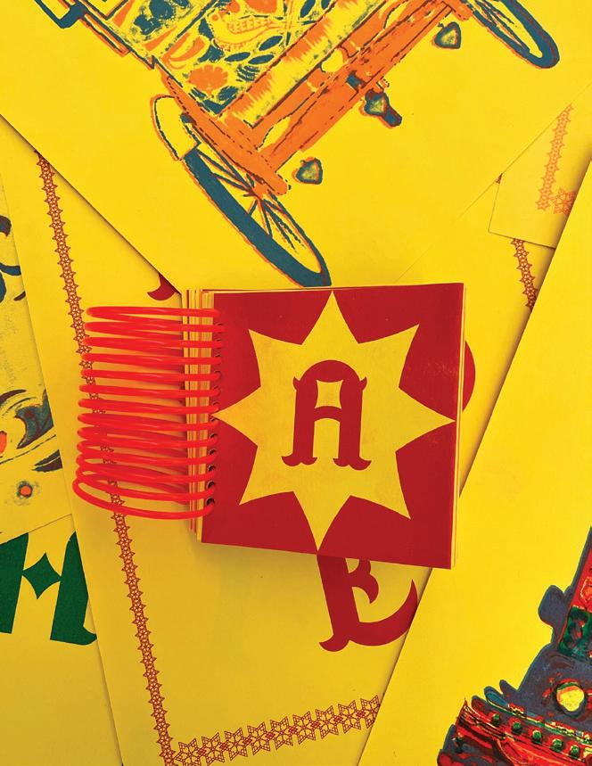
Maidah Salman
From architecture to photography, my journey with design has consistently been guided by the theme of duality—a recurring exploration of oppositions and intersections in both concept and form. This thesis investigates how duality can be expressed and amplified through projection as a tool for narrative and sensory exploration. By combining methods from photography, bilingual typography, and cross-cultural design, the project examines how elements such as light and shadow, static and dynamic forces, and native and foreign spaces can create new dialogues. This thesis focuses on duality as a foundation for understanding and developing immersive design experiences, using projection as both a literal and metaphorical tool.
Duality, defined by The Oxford English Dictionary as “an instance of opposition or contrast between two concepts,” is central to this research. Historical and contemporary examples, including yin-yang philosophy, the Doppler effect, and dual-exposure photography, highlight how dualities have long been a source of inspiration in art and science. Artists such as Krzysztof Wodiczko, Tseng Kwong Chi, and Claude Cahun further influence this inquiry through their use of projection, identity, and layered storytelling. At its core, projection serves as both a physical phenomenon and a metaphorical act—one that represents growth, perspective, and the act of sharing ideas.
Projection, in this context, is more than light cast onto a surface; it is a means of storytelling, growth, and expressing the tension or harmony between opposing forces. My creative journey has been shaped by experimentation across media and materials and these experiments have revealed recurring themes in my work, especially the exploration of the intersection of two spaces.
Ultimately, this thesis contributes to the discourse on design methodologies by offering new approaches to visualizing and experiencing duality. It invites viewers to engage with complex, multi-sensory environments that deepen their understanding of dualistic relationships in both physical and conceptual spaces.
▪ B
▪ C
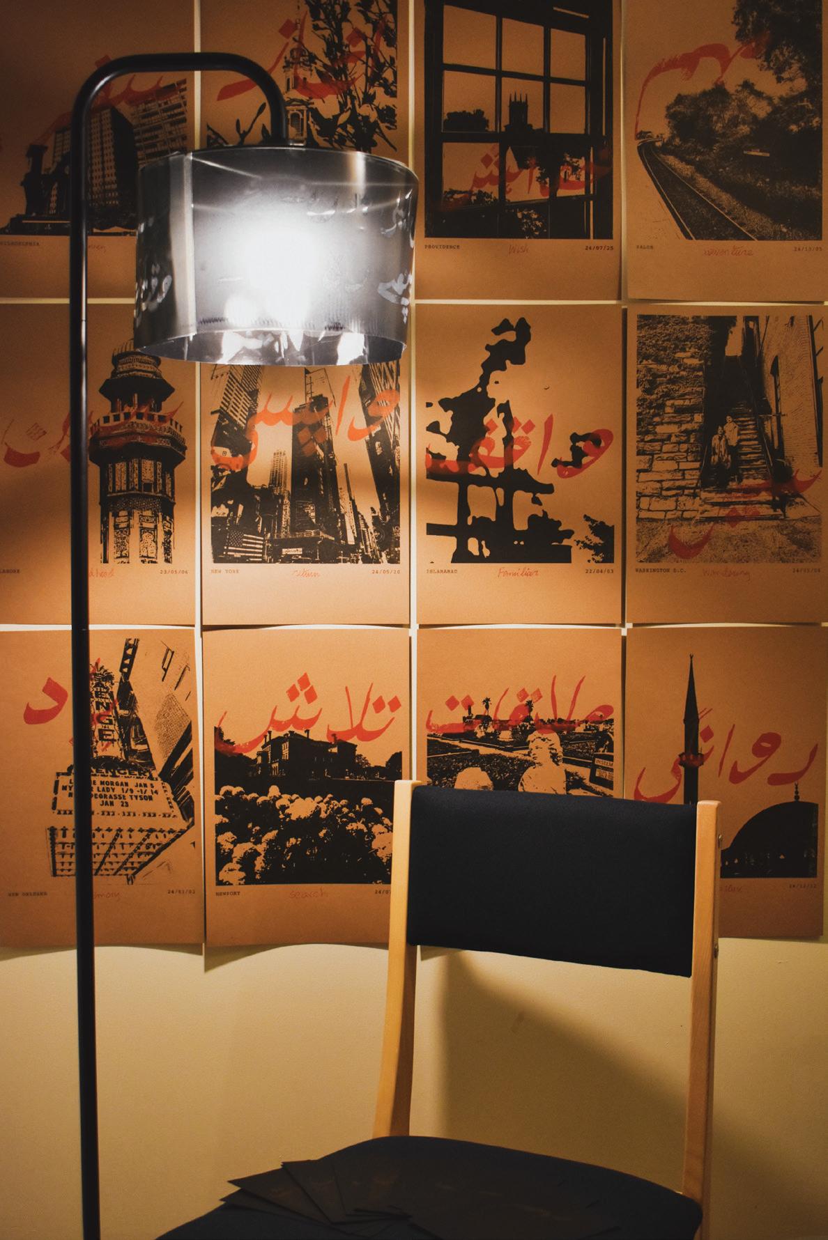
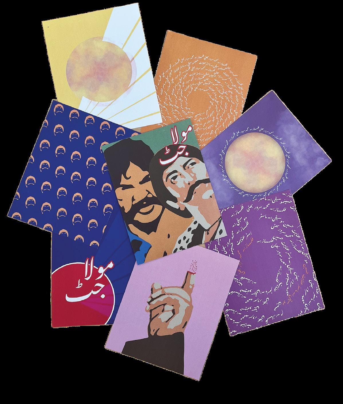
Letters to myself, 2025. Risograph and film prints with lamp and chair, dimensions variable. Truck Art Typeface, 2024. Risograph prints, each 6 × 6 in.
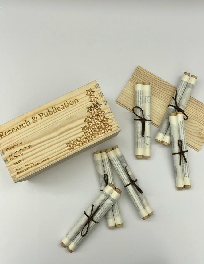
50 Questions, 2024. Laser etching on acrylic, dimensions variable. Research & publication, 2024. Wood and Japanese washi paper, dimensions variable.
50 Iterations, 2023. Posters, each 6 × 4 in.
Micaela Sato
BLEND OF IDENTITIES
Identity is the sense of self that defines who we are. It is influenced by internal factors, like our personality, and external influences, such as culture, community, and life experiences. It shapes the understanding of our role in this world. For some of us, identity is not singular but a fusion of multiple influences, resulting in something entirely unique a hybrid identity. The same blending happens in art and design. This dynamic interplay of identities also finds its expression in groundbreaking mixed-media projects showcased in design galleries. Here, diverse techniques—ranging from digital innovations to traditional craftsmanship—merge seamlessly to create captivating and boundary-pushing works of art. From a young age, I had the privilege of traveling the world, which gave me insight into how different cultures perceive life and express themselves artistically, particularly through design. I was fascinated by how design in every place reflected a distinct mix of cultural influences, each telling a different story. This intersection of identity and design became the foundation for my creative exploration, where I aim to celebrate the richness of hybrid forms—both in people and design.
▪ C
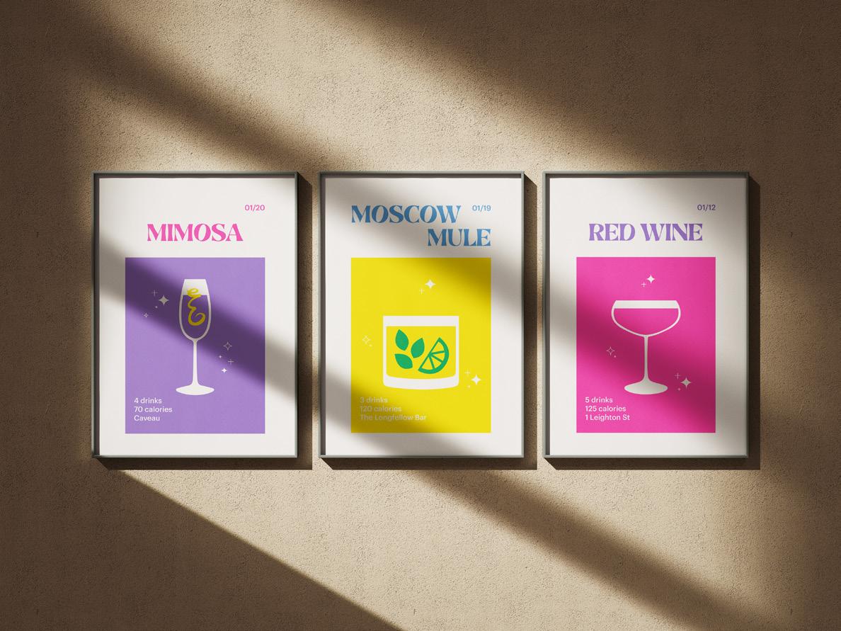
Cocktail Riso Prints, 2024. Risograph prints, 17 × 11 in.
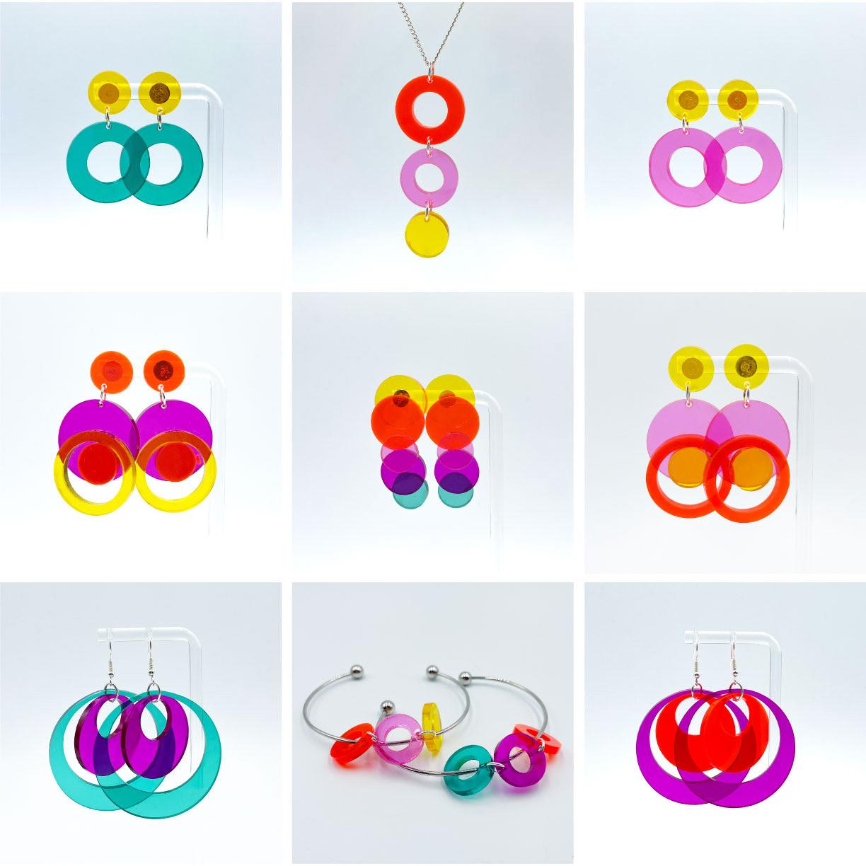
Deja Vu Circular Jewelry, 2024. Laser-cut acrylic, dimensions variable.
Branches of Faith, 2024. Mixed media, 17 × 11 in. AI & Me, 2024. AI, 1:1 (square).
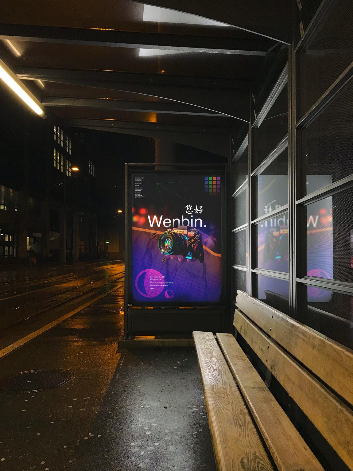
Meet Wenbin, 2023. Poster, 47 × 33 in.
xinranwang23.cargo.site
Xinran Wang
IN/OUT
The in and out in design are binary opposites that are also connected. It emphasizes transforming elements from order to chaos, from visible to invisible, from inside to outside. An aspect is not a static being but a dynamic flow. In graphic design, everything flows and transforms between in and out. A poster needs a visual formal language, one that goes from focusing on the poster’s key information (in) to the overall poster (out), and a book needs a deep reading logic (in) to the formal state of the entire book (out). The dynamic process of in and out is used as a method and guide to break the design boundaries and explore the visual tension between visible and invisible, inside and outside, order and chaos.
▪
▪ B
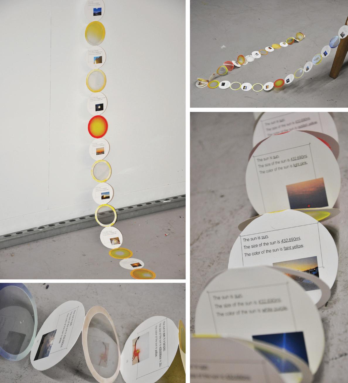
The sun, 2024. Paper, 400 × 5 in.
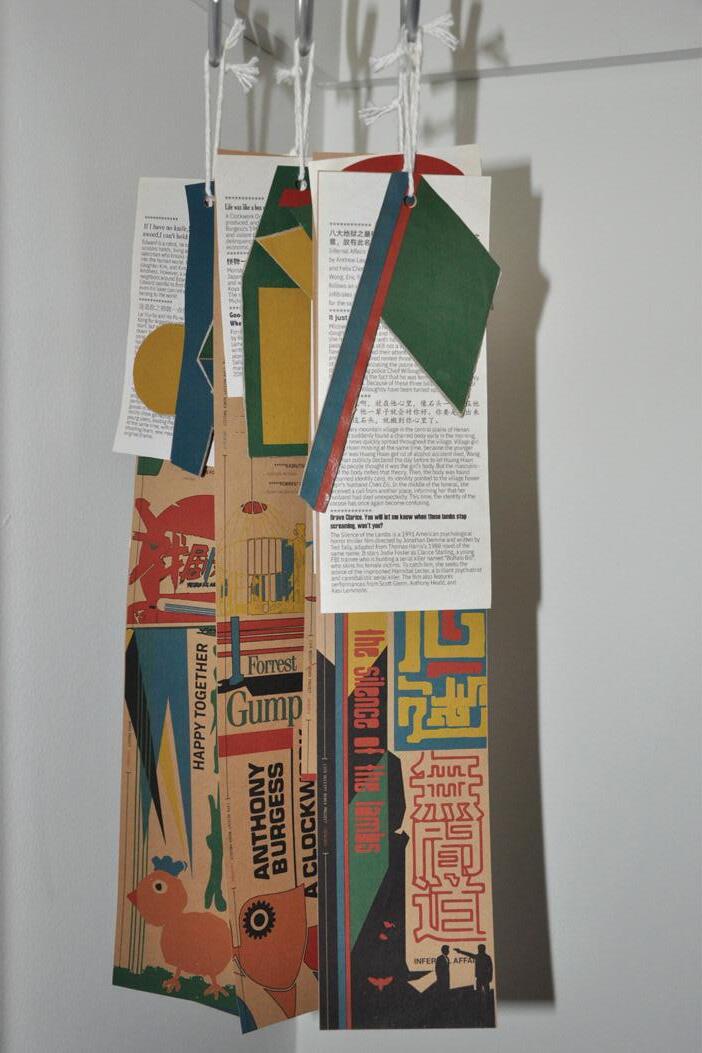
Remix, 2024. Paper, 16 × 3 ³⁄₁₆ in.
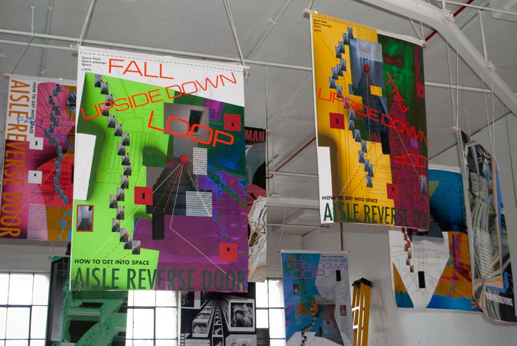
I am Alien, 2024. Posters, 9 parts, each 46 × 33 in.
Masonry, 2023. Poster, 36 × 24 in.
Books, 2023. Poster, 36 × 24 in.
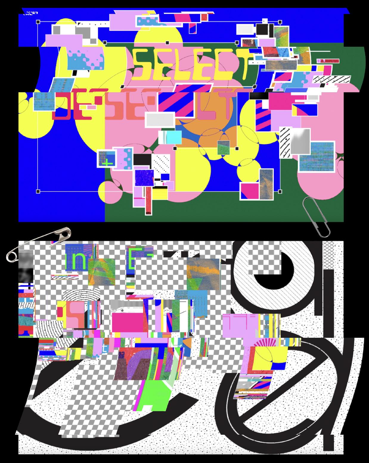
Niharika Yellamraju
ALT
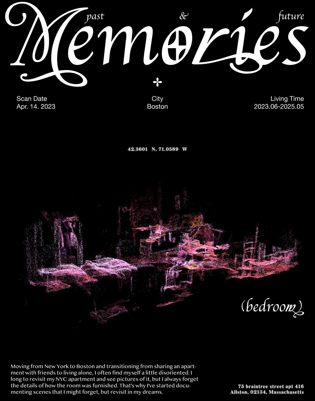
Memory no longer belongs solely to humans. It now lives in machines, archives, and algorithms, shaping how we perceive, remember, and experience the world. In an age when forgetting is nearly impossible, yet true recollection remains hard-to-grasp, our engagement with reality is shifting. My methodology challenges this transformation, viewing memory not as a singular truth, but as a fluid, evolving construct shaped by perception, familiarity, technology, and time.
Fascinated by the gaps, distortions, and contradictions in how we remember, my work explores the tension between the individual and the collective. Through printed media, experimental typography, and unconventional formats, I aim to reintroduce tactility and presence—offering a counterbalance to the transient, hyper-digital world we navigate. My work examines how inherited structures, societal frameworks, and digital systems dictate what we remember, what we forget, and ultimately, how reality is shaped.
ALT operates on the premise that time is non-linear, memory is unstable, and reality is in constant flux. Through distortion, fragmentation, and recontextualization, ALT disrupts the static and re-positions design as a dynamic force one that does not merely document reality but actively constructs it. My work exists in the space between past and future, logic and intuition, permanence and impermanence. It is a reflection on the fleeting nature of now an invitation to pause, reconsider, and explore how memory, perception, and reality are not just recorded, but designed.
▪ B
Age of Conversion, 2024. Inkjet print on paper and vellum, dimensions variable.
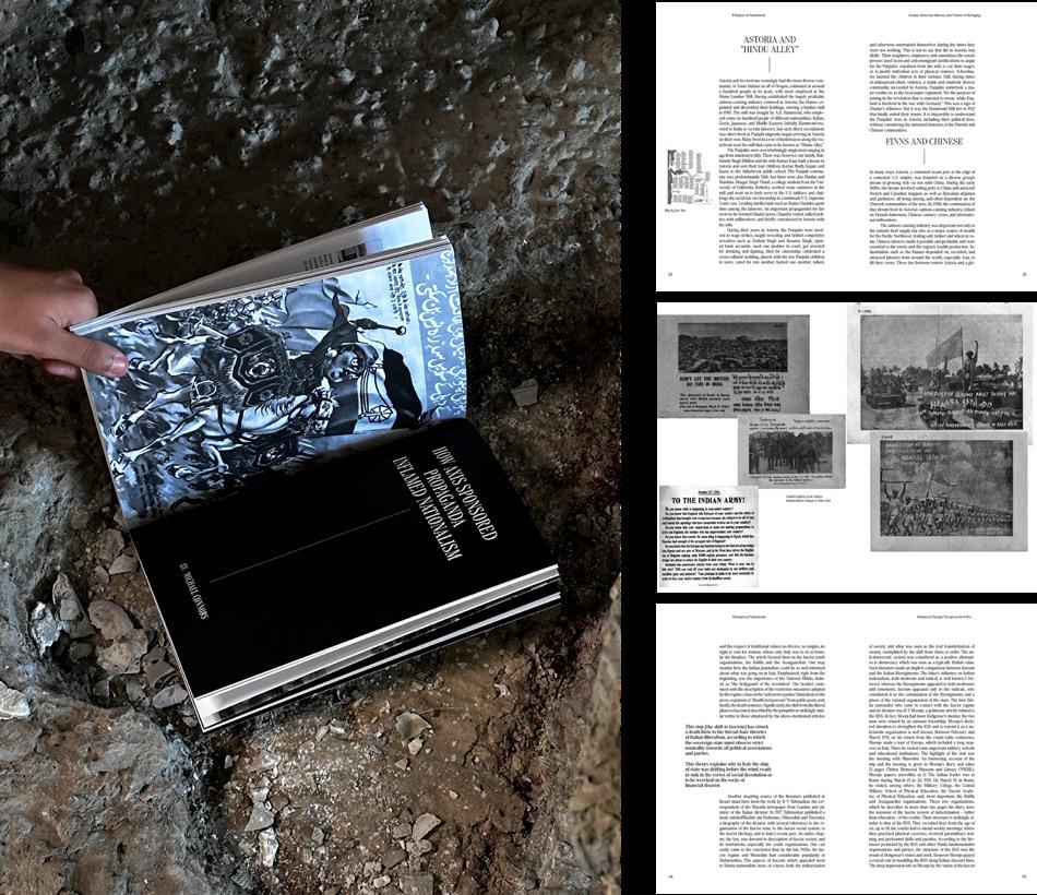
Whispers of Nationhood, 2023. Selected spreads, perfect bound, 9 × 6 in.
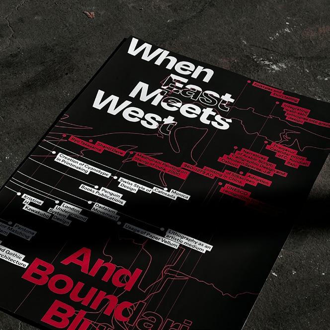
AI & ME, 2024. Spiral bound, 11 × 8 ½ in. When boundaries Blur, 2024. Poster, 46 × 33 in.
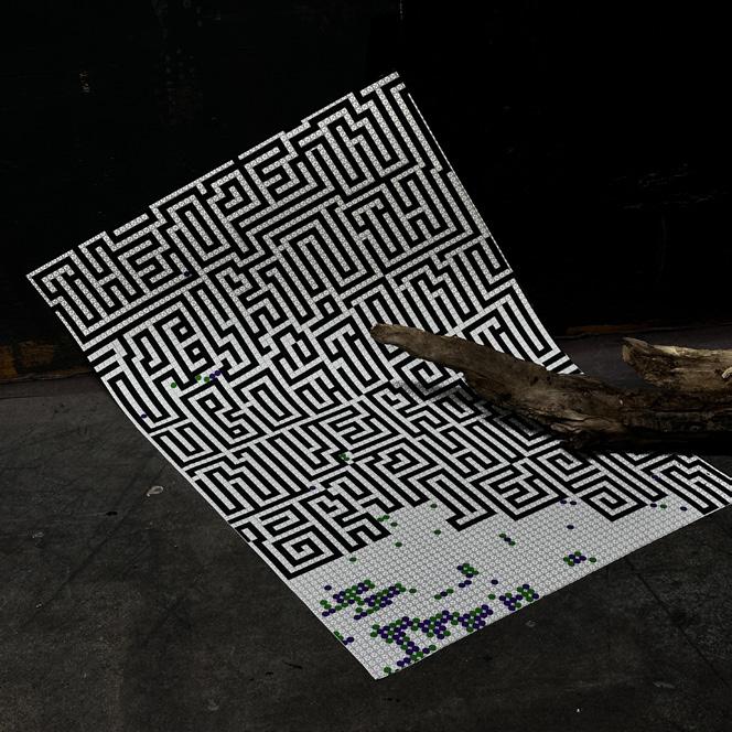
The Open Labyrinth, 2024. Poster, 46 × 33 in.
Jingyi Zhang
REDEFINING DESIGN THROUGH NON-TRADITIONAL DESIGN AND UNCONVENTIONAL TOOLS
Design has traditionally been guided by structured systems such as grids, which are often seen as necessary to achieve balance and order. However, I have always been drawn to a more visual and free-flowing approach, avoiding rigid systems such as grids and experimenting with alternative methods. In China, logical thinking was very important since primary school, but I always struggled with this, especially in exams that required strict logic. This personal challenge has deeply influenced my view of design, prompting me to explore ways to break out of the traditional logical framework.
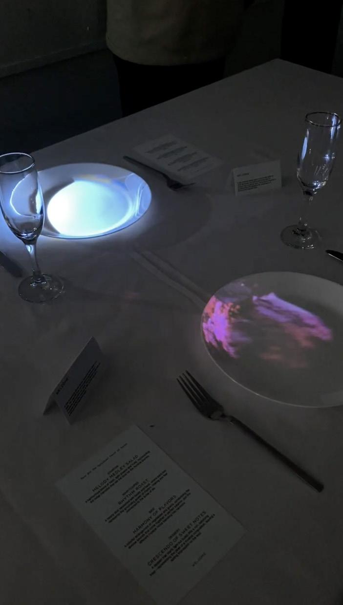
My thesis investigated how breaking down traditional design systems, such as grids, can lead to more creative and expressive outcomes. My goal was to challenge the notion that design must always follow strict rules, and instead explore how new tools and materials can contribute to organic, emotional, and innovative design. For example, one of my projects uses TouchDesigner to map audio-responsive visuals onto plates, visualizing music as spiritual food. This project transformed a purely auditory experience into a multi-sensory one, merging technology with metaphorical storytelling. Another project incorporates Risograph printing, combining tactile, hands-on techniques with bold visual experimentation, highlighting the potential of combining traditional craftsmanship with modern tools.
This thesis reflects my belief that design does not have to conform to traditional rules to be meaningful. By embracing experimentation and exploring non-linear tools and materials, I aim to redefine the way design connects with its audience. My work emphasizes how abandoning traditional systems opens up new possibilities for creative expression, inspiring others to go beyond the boundaries of traditional design. Ultimately, my research contributes to the field by encouraging a more fluid and intuitive approach to design, where tools and systems are not constraints but starting points for innovation.
Dream, 2023. TouchDesigner-generated poster, 24 ½ × 18 ½ in.
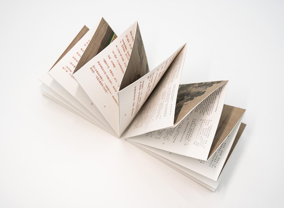
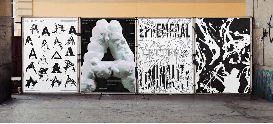
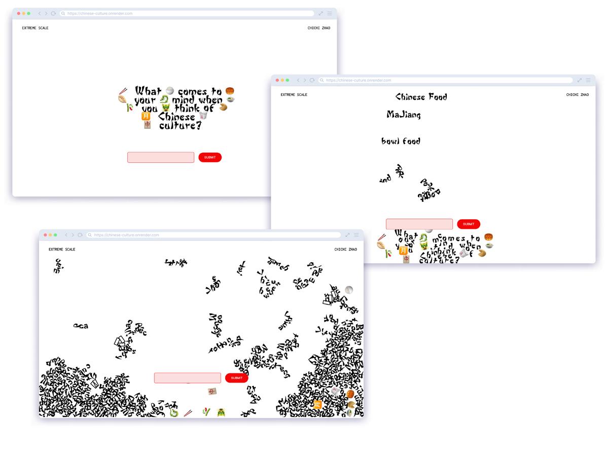
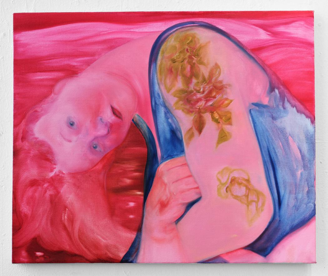
Xuru (Chichi) Zhao
TRANSLATION & REINTERPRETATION
Design is an act of translation—of ideas into form, of concepts into experiences, of one medium into another. This thesis explores how meaning shifts through transformation, whether through scaling an object to extreme proportions, shifting between analog and digital, or reinterpreting typography, space, and materiality. Translation is not just about language but about movement, adaptation, and the evolution of ideas across different states.
Within this broader context, the thesis also examines cultural translation—specifically, how Chinese identity is represented in Western design. Culture is neither fixed nor homogeneous; it evolves through historical, sociological, and individual influences. Through vernacular design—authentic expressions of lived experiences— Translation & Reinterpretation explores how grassroots aesthetics transition into mainstream design trends, often reinforcing stereotypes or distorting meaning. The thesis questions how cultural symbols and narratives are constructed, appropriated, and reimagined, analyzing how immigration has shaped Chinatown’s visual landscape and hybridized identity.
This collection of projects demonstrates how translation in design extends beyond replication it becomes a tool for inquiry, questioning authorship, perception, and context. Whether transforming letterforms into physical space, translating cultural motifs into interactive experiences, or reinterpreting scale as a narrative device, each project reveals how shifts in medium and perspective create new meanings. Some translations preserve intent, while others abstract or reconstruct, raising critical questions about authenticity and representation. By integrating my design methodologies, this thesis positions translation as both a conceptual framework and a practical tool. It seeks to uncover how design can dispel stereotypes, honor cultural complexity, and expand creative possibilities, advocating for reinterpretation as a means of discovery and deeper engagement.
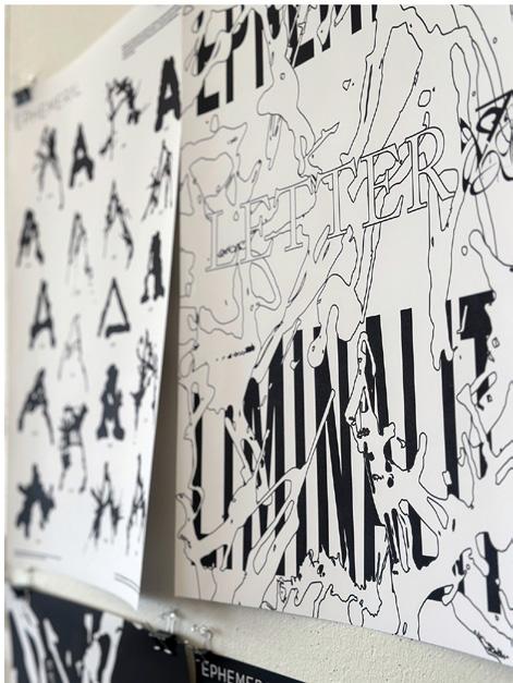
Ephemeral, 2024. Poster, 24 × 18 in.
Masonry, 2023. Posters, each 36 × 24 in.
Extreme Scale, 2024. Website.
Observe & Quantify, 2024. Poster and Risograph prints, 34 × 52 in.
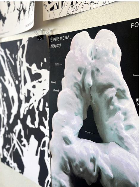
Liminality, 2023. Foam on acrylic, dimensions variable.
Sam Bittaker
Adel DiPersio
Lemuel E. Saputra
J. Grace Giordano
Nasiri Guzman
Ivo Makianich
Andrea Manning
Sylvie Mayer
Dylan Foster Mintz
Miranda Pikul
Hannah Stoll
Noah Wertheimer
Friendship connects the 2025 MFA in Painting class. Through changing faculty, a presidential election, popup shows, camping trips, peer-learning workshops, and nights at the Dugout, they insisted upon camaraderie and mutual support.
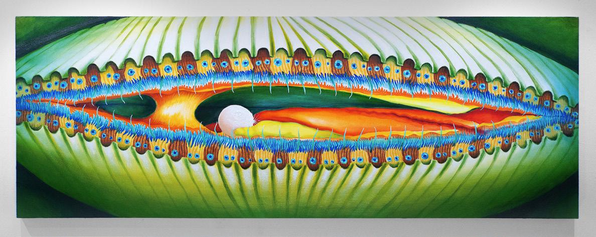
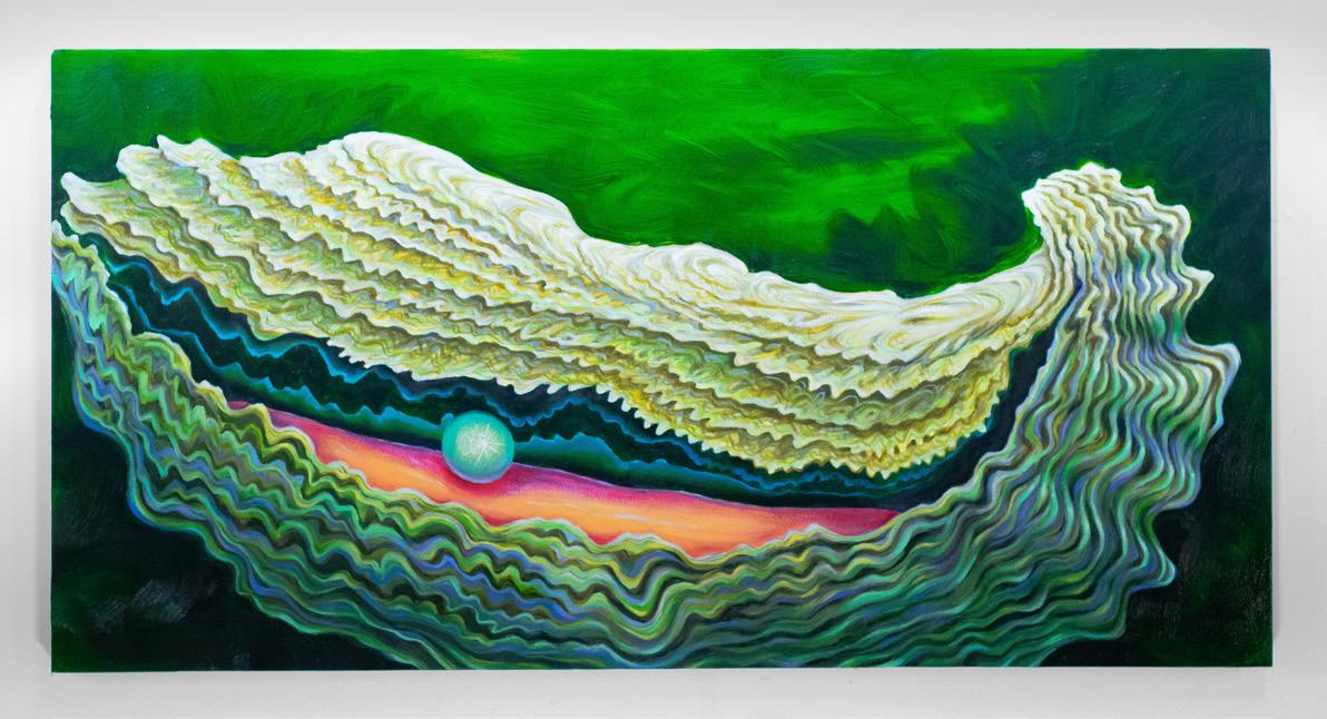
The landscape of “home” serves as source material for many of these painters. Adel DiPersio gathers urban flora like woodchips, gravel, plastic tarps and netting, loose wires, and sand on daily walks through Eastern Massachusetts, her place of origin. She incorporates this detritus into works that move between mediums and scales, alchemically upending received hierarchies. A crumple of paper becomes a painting—“trash” becomes “art”—suggesting that trash and paint might share equal value. Sam Bittaker sands, scrapes, glazes, combs, masks, brushes, embeds, sculpts, wipes, and scrumbles his dense and materially exploratory paintings. The works bridge opposing forces, veering between chaos and harmony; figure and ground; structure and surface. Presence and place ground them, with images of post-industrial Ohio and the artist’s body submerged within layers of abstraction.
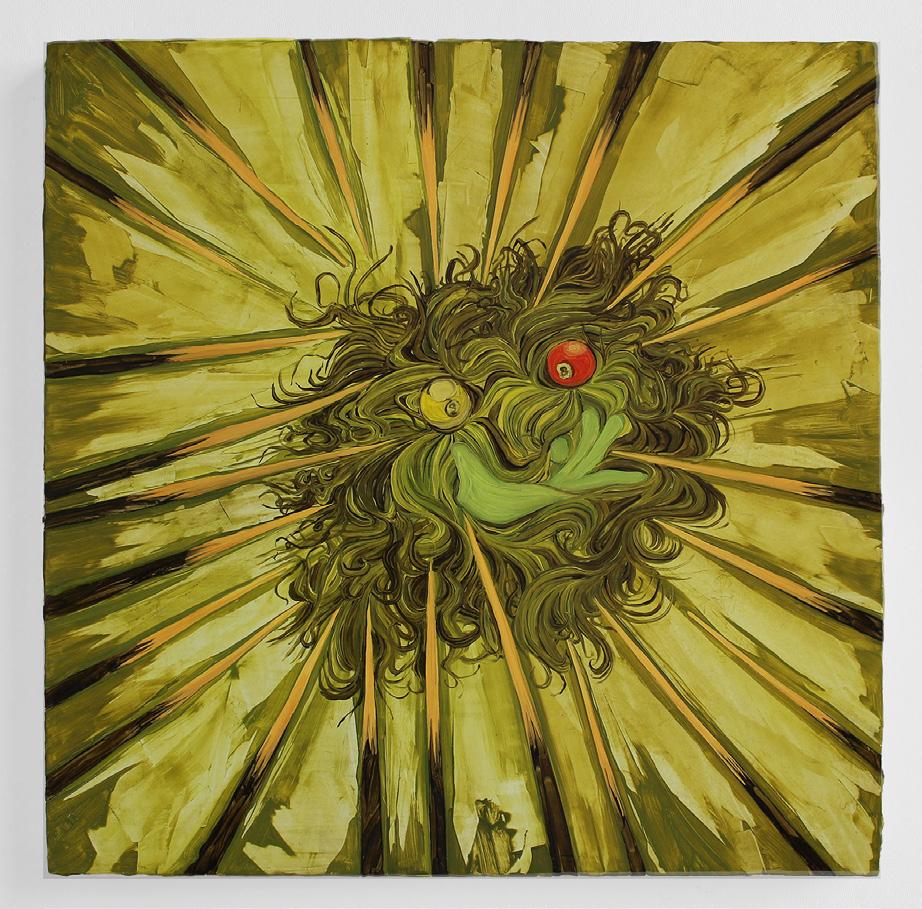
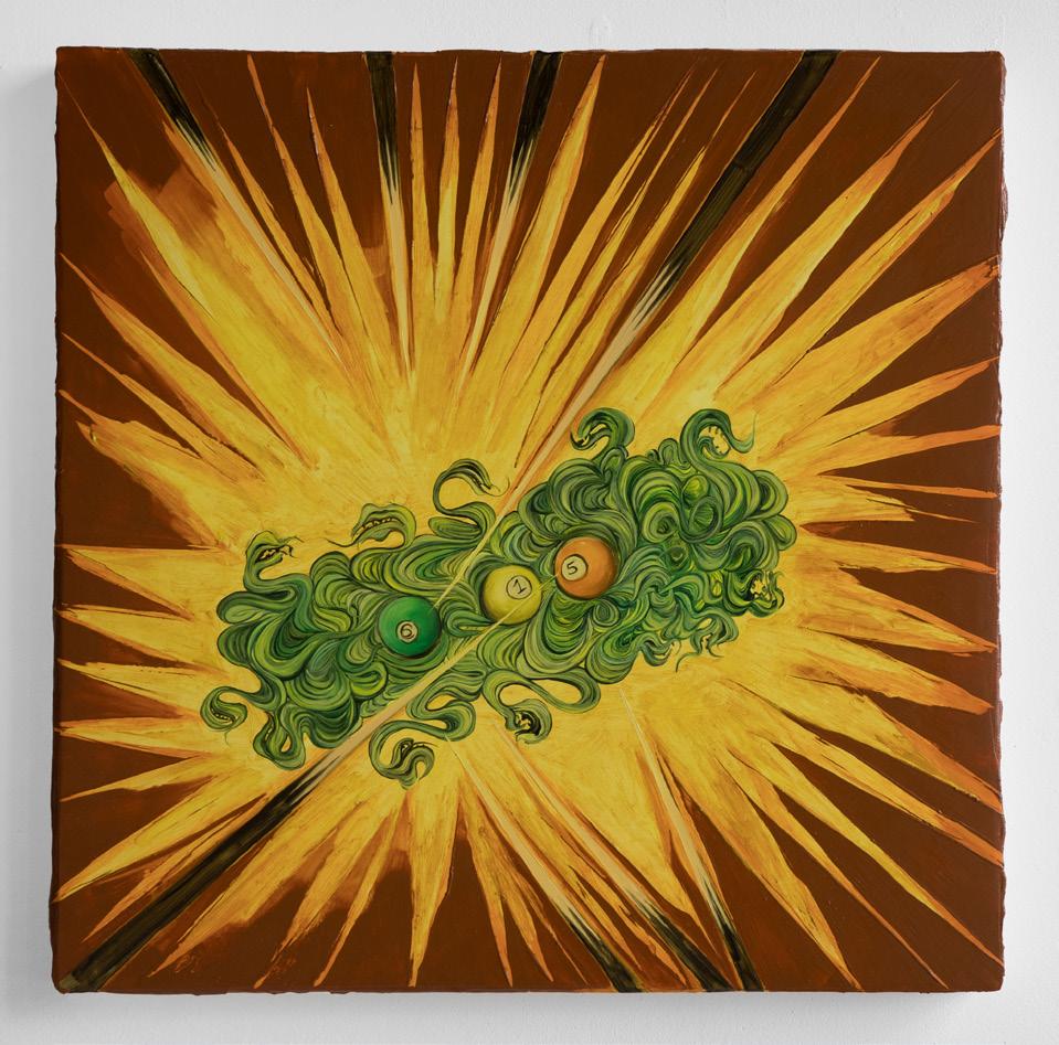
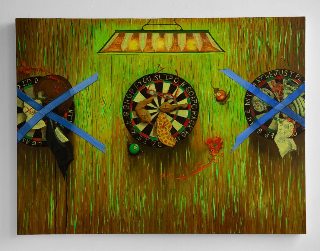
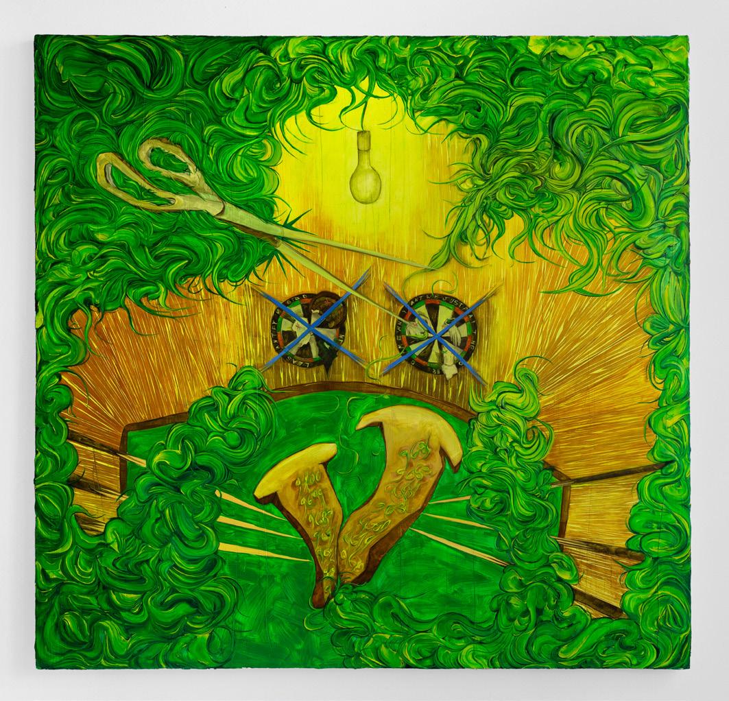
The gold light of the Dominican Republic suffuses Nasiri Guzman’s tender paintings of family. He depicts his loved ones in their new home in Boston, but this remembered light forges a glowing link between here and there. The everyday joys of dancing in the living room, resting on the couch, and looking in the bathroom mirror expand to contain the past and future of a family. Light also becomes a character in Andrea Manning’s fantastical paintings, with Nickelodeon-slime green illuminating her haunted dive bars. Tomatoes and pizza splat on dart boards; animated brooms overtake pool tables; shadows and green monsters box in rings. Manning serves up fights and their aftermaths, staging battles with the mind, with naysayers, and with paint itself.
Some painters zoom to broader views of human history and more-than-human ecologies. Noah Wertheimer looks at the rubble of the twentieth and twenty-first centuries. Carnivalesque piles of war, cruelty, trash, games, and sex urge the viewer to witness everything, even the painful, even the beautiful. Fragile glimpses of redemption appear in spots of color, mythological figures, and pastel-colored poppies poking from burnt fields. Lemuel E. Saputra paints around
gaps in historic archives. He translates photographic images from the Dutch colonization of Indonesia into paint, a medium that was implicated in Dutch colonialism but was also a site of Indigenous agency. His small, layered works form constellations of repeated figures and scenes that imply but don’t directly depict violence, spiraling and complicating the question of what happened.
Hannah Stoll envisions interconnected ecologies of living beings. Tiny forms emerge from thick and luscious brushwork, twinkling like eyes, iridescent birds, or planets, before melting back into the swamp. She offers the possibility of eternal change, recombination, and material entanglement. Dylan Foster Mintz also explores the natural world but incorporates symbolism and a rainbow-hued aesthetic reminiscent of Disney or Lisa Frank. His glazed paintings delight in the “coming out” of cicadas, the goofy eyeballs of conch shells, and the oyster’s ability to create beauty from pain in the form of the pearl. Mintz oscillates between queering nature and naturalizing queerness, presenting the animal world as both familiar and strange, guileless and performed, frightening and friendly.
Narrative tropes inform Sylvie Mayer and Miranda Pikul’s figurative paintings. Mayer probes themes of grief and stage performance through embodied repetition. Depicting historic film stills and photographs, her own cyanotypes and sketches, and family snapshots, Mayer finds subterranean forms and meanings with her hand. Palimpsests of underpaintings, wiped-away shapes, and hidden figures suggest layers of time and meaning. Inspired by story structure, Pikul develops characters who seem to teeter between freedom and danger. They are drifters at the margins of society, travelling American highways, motels, and diners; scrabbling on brown cliffs; and getting stuck within the confines of the picture frame. Pikul paints with vibrant color and subtractive techniques, creating emotionally charged images that evoke isolation, constriction—and connection.
Systems and subjectivity meet in Ivo Makianich and J. Grace Giordano’s works. Makianich works with strict parameters rooted in an atelier tradition. He limits himself to particular recipes for black, follows Renaissance rules for perspective, and restricts himself to depicting
whatever forms are at hand. Yet as much as Makianich’s works are algorithmic, they are also romantic: his systems result in mysterious black-and-white scenes of empty spaces, oceans, and shafts of light. Giordano plays with the infinite combinatorics of language and syntax. A highly personal dictionary of colors, shapes, materials, and phrases combine into playground-like installations that evoke secret codes, fake forests, and idiosyncratic crafters. Giordano’s works explore how meaning is constructed and what roles (non)sense and (in)comprehensibility might have in symbolic systems.
Join me in congratulating the class of 2025. They are wonderful painters and wonderful people.
Rina Goldfield Lecturer in Art, Painting
E. E. Ikeler Lecturer in Art, Painting
Sam Bittaker
I grew up in a place that sits between the hustle of urban life and the quiet pull of nature. My city wasn’t a central metropolitan area, nor was it purely rural. It occupies a space in between, where the transitions from nature to urban can be abrupt, subtle, or sometimes, nearly indistinguishable. As a child, I spent a lot of time in a park near my house—a space that, to me and my friends, felt like a hidden forest, far from the reach of civilization. In reality, it was just a small, underwhelming park surrounded by suburban developments. It wasn’t until we examined the ground, finding fragments of old pottery and household items, or looked up the hill to see the encroaching rows of houses that we realized the park’s true context. Our perception of being in a remote, untouched space was at odds with the actual place we inhabited. This tension between illusion and reality, the uncertainty of what is there versus what is experienced, is central to my work.
My paintings engage with these themes of interweaving, negotiation, and transformation. I am deeply interested in creating conditions for an experience that can fluctuate over time. The paintings I create are not fixed but rather belong to multiple contexts and formats. They start with nods to visual information systems that, when made physical through painting, scraping, sanding, wiping, and digging, are unlodged from their namable qualities and allowed to develop in a constant state of becoming. The elements in the works shift in meaning, scale, and context. Things can interchange from big to small, from near to far, from familiar to foreign. In this way, the picture plane becomes an arena for exploration.
▪
Untitled 1a, 2024. Acrylic, 90 × 77 in.
Day by the Lake, 2024. Acrylic, 11 × 8 ½ in.
Untitled 1b (See to Touch Series), 2024. Acrylic, 11 × 8 ½ in.
Untitled 1c (See to Touch Series), 2024. Acrylic, 11 × 8 ½ in.
Untitled 1d, 2024. Acrylic, 11 × 8 ½ in.
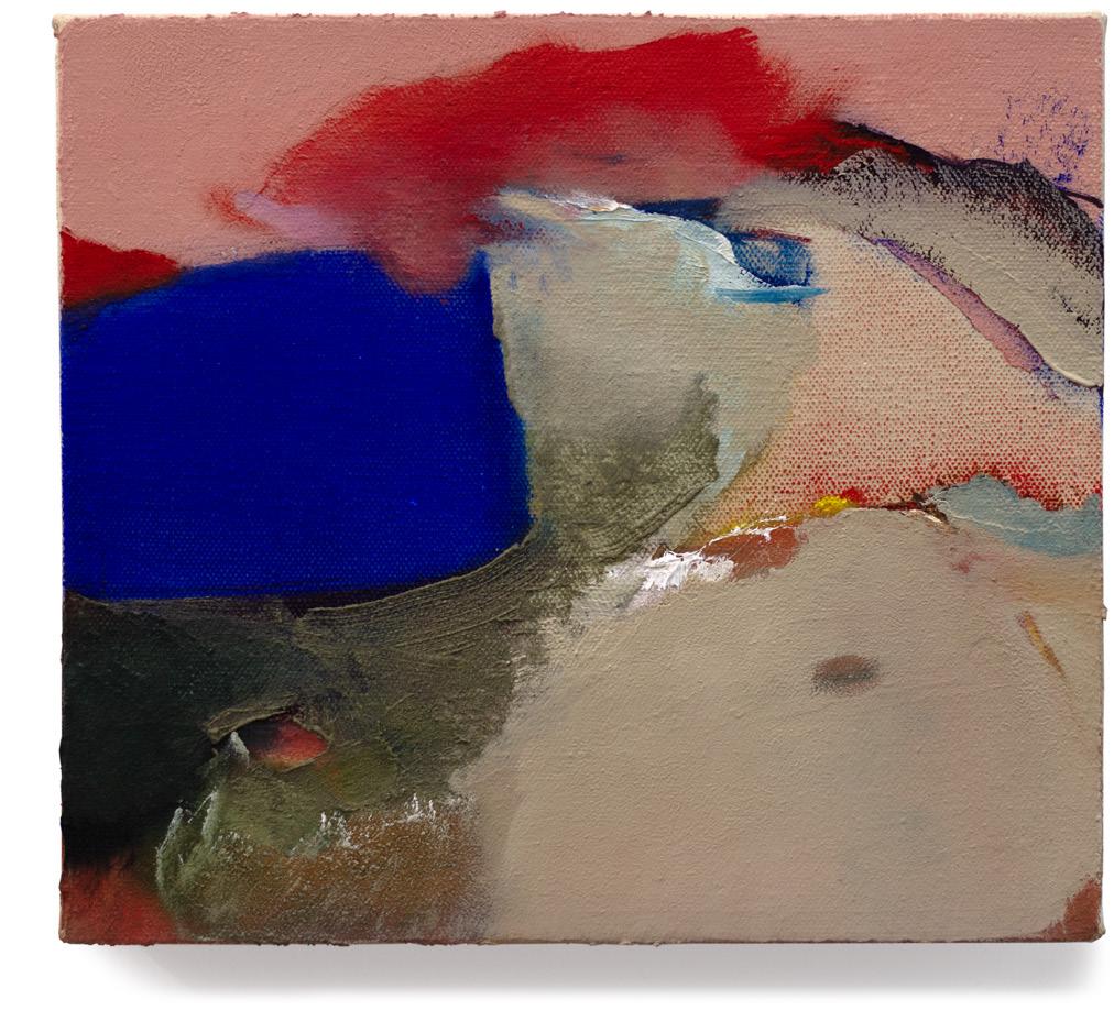
Adel DiPersio
How we define painting is loose, but the definition of drawing has to be completely inexplicable. There are no edges to what drawing could be; due to this, I know it is wonderfully impossible for me to ever fully understand it. Painting lives by stricter rules. This material hierarchy is what fuels the weight projected onto painting and has always felt like something I have to contend with.
I am most interested in the space between drawing and painting for it allows me to question freely. Recently, I have been asking questions about mark making and its relationship to material, accumulation, and time. Additionally, there are always constructional questions and conceptual questions throughout my process. Some constructional questions are: Can the inherent air of a material be playful? Can I itch the back of a shape? Can the speed stop where it needs to? What does drawing have that painting doesn’t? While conceptual questions ask: Can a mark feel like handwriting, drawing, and painting at the same time? Can air be eliminating? How do different speeds touch? Can a painting have everything that I love about drawing?
Though all of my work is imbued with questions, the answers are not as important to me. My work is simply a love letter to concepts and questions that I will never fully know, but hope to gain a better understanding of.
Love Letter to a B+ Drawing, 2024. Oil, pastel, and tiling caulk on panel, 54 × 64 in.
Handwriting, 2023. Oil, pastel, and charcoal on panel, 16½ × 23 ½ in.
Love Letter to Speed, 2023. Oil and pastel on panel, 18 × 22 in.
Memory of Spring, 2023. Pastel on paper, 13 × 15 ½ in.
Love Letter to Drawing, 2023. Oil on panel, 12 × 16 in.
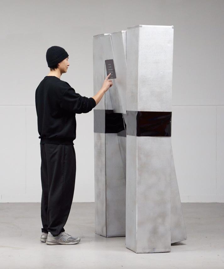
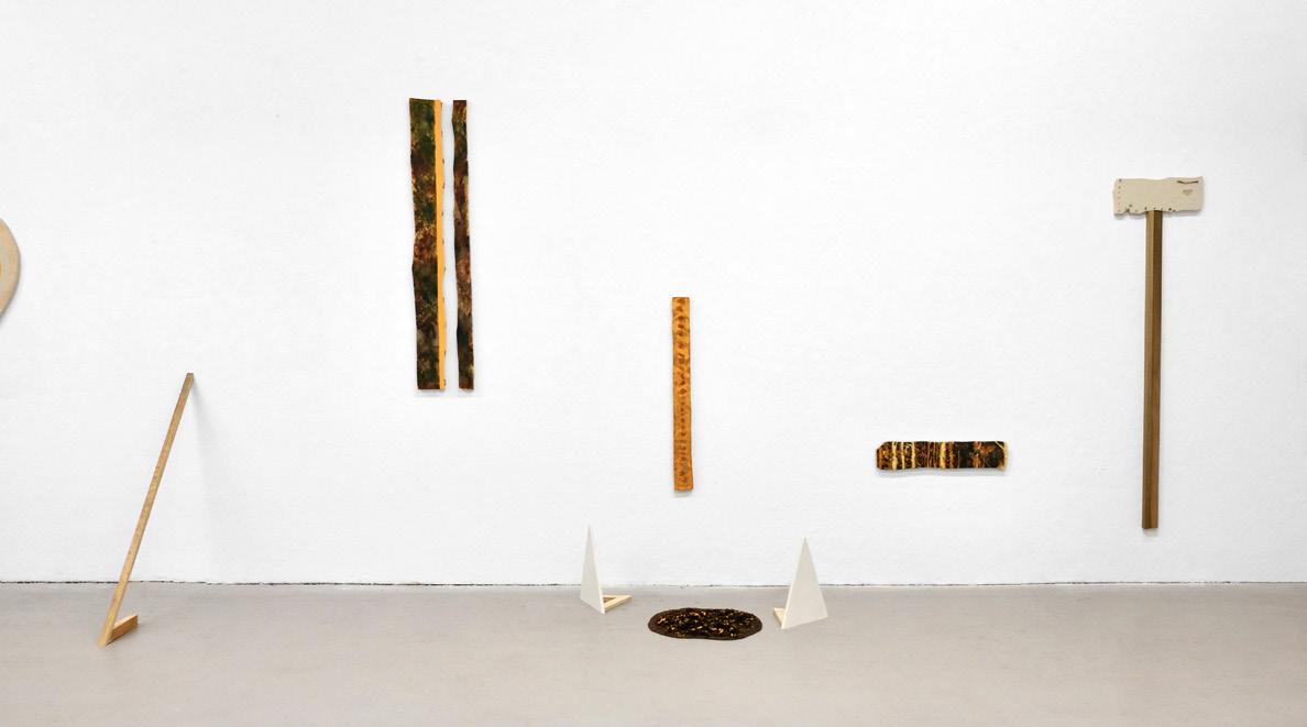
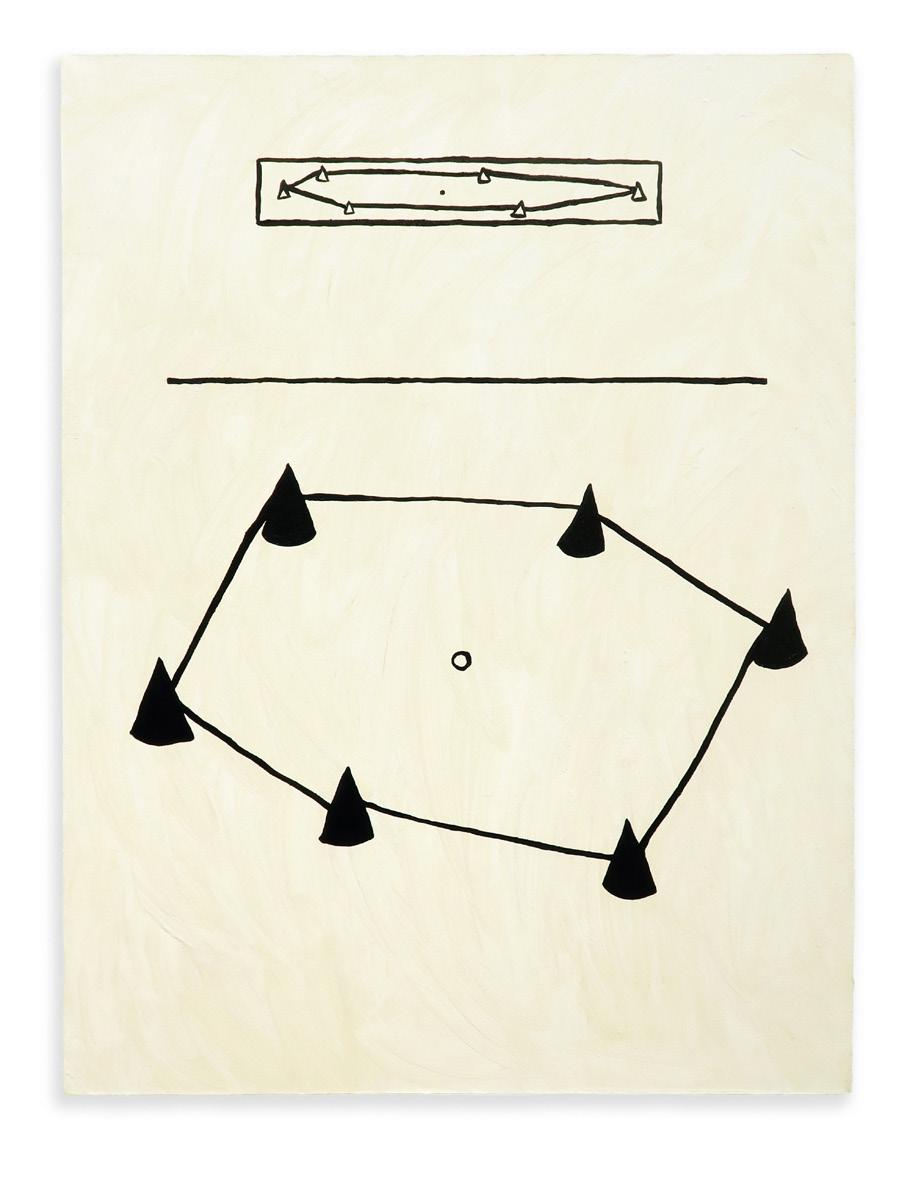
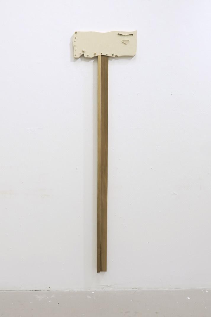
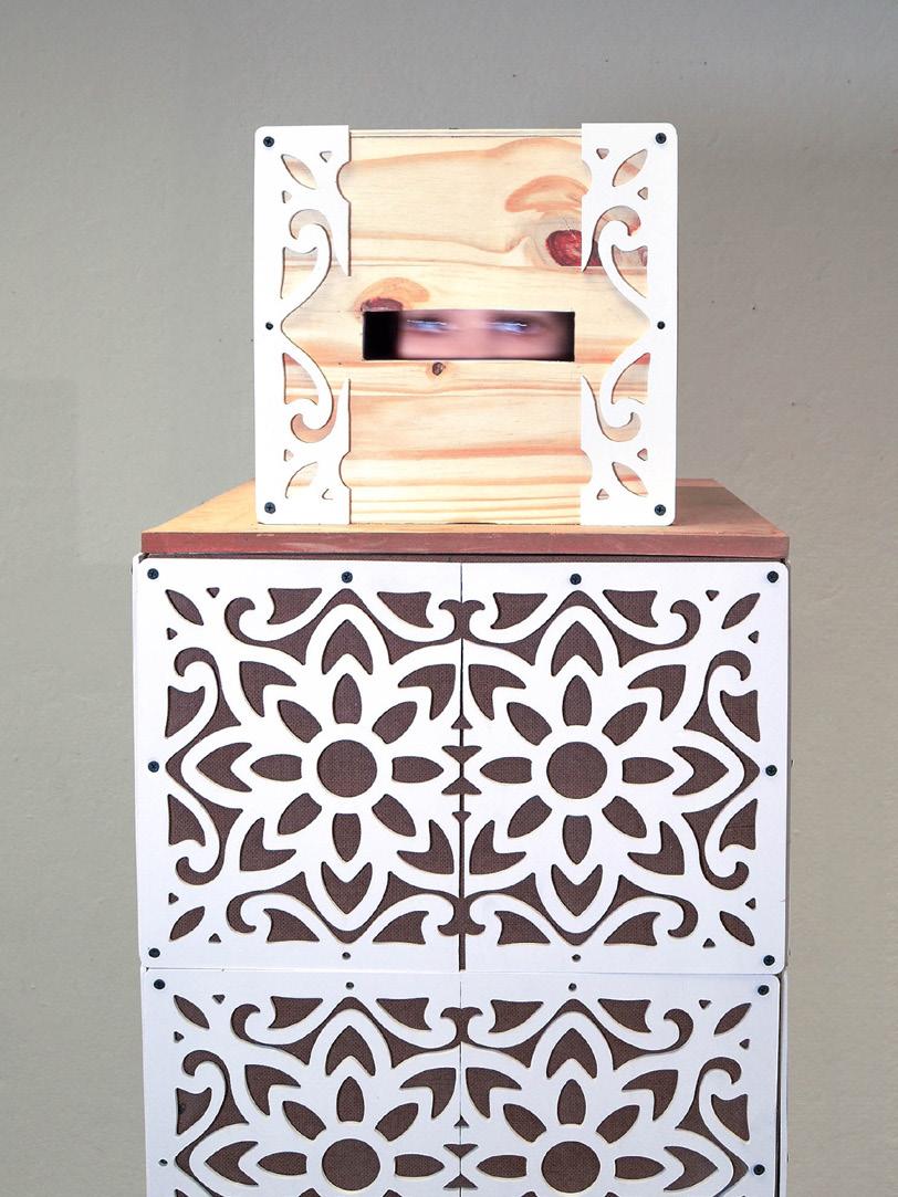
J. Grace Giordano
I make objects, paintings, and installations which devolve into complex, self-referencing systems of meaning-making, representation, and experience. Using the structures of language as a starting point, my work investigates the ways that systems are built and the instability of frameworks that exist in continual change. Resituating the idea of finish, I repeatedly arrange and rearrange my modular painting-objects, letting the work rewrite itself over and over again.
Through foregrounding the work’s relationship to physical space, I place the challenges of navigating language into an experience that can be had with the body. I use wood as a centralizing material, connecting the histories of painting, sculpture, architecture, craft, toys, and paper with the woods of Kentucky as a grounding site.
▪ A
Untitled, 2024. Installation, dimensions variable. cones, 2024. Oil on canvas, 32 × 24 in. ax, 2024. Handmade gesso, rocks, dirt, stick, and glass on cradled wooden panel, 58 × 14 ½ in. Untitled, 2024. Installation, dimensions variable. untitled, 2024. Oil on panel, 5 × 22 in.
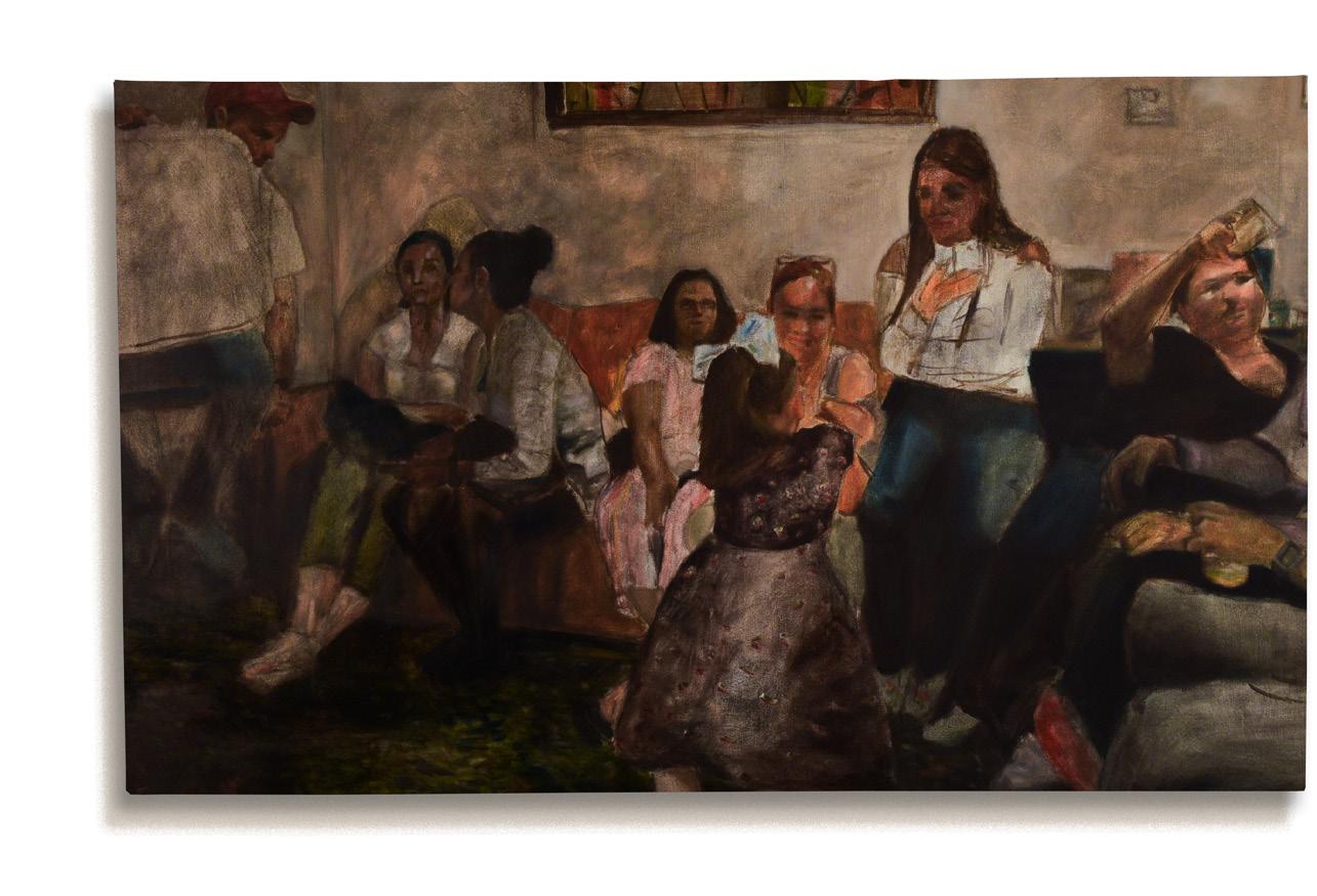
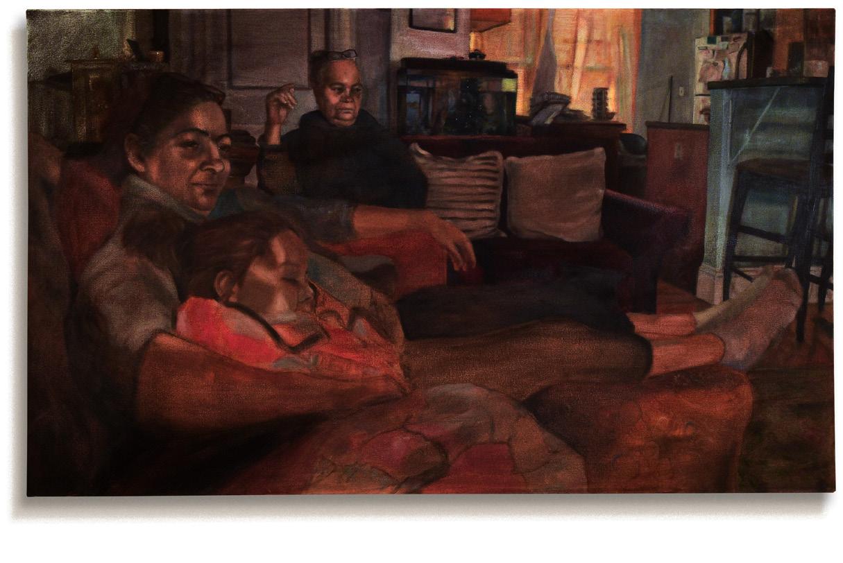
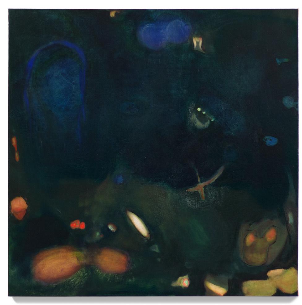
Nasiri Guzman
My work represents the revival and manifestation of the moments we share with friends and family or in solitude within an interior space. While growing up in the Dominican Republic, I witnessed many people living in extreme poverty and experienced the loss of several family members and friends. This shaped my perspective on the world, making me realize how society often conditions us to think like machines rather than as living beings, prioritizing productivity over the time we have to spend with our loved ones.
In my paintings, I aim to depict family gatherings and everyday life activities. I focus on the overall event without going into an excessive amount of detail. This method allows for loose brushstrokes, making some areas feel like sketches. The use of chiaroscuro in my paintings evokes my experiences in my country during blackouts. At night, it was always dark, and the only light we had came from the moon or candles, creating a lovely obscurity among vibrant colors. Much of the work I created over the past year plays with obscuring colors, which helps to direct the viewer’s focus to the objects within the composition. The most important aspect of this technique is the control I achieve in desaturating colors and fading unnecessary elements into dark areas.
I aim to capture the essence of fleeting moments in my artwork, utilizing rich, evocative dark colors to bring life to intricate portraits and serene domestic scenes. Each work tells a story, inviting viewers to pause and immerse themselves in a world brimming with emotion and beauty. Every brushstroke reflects my understanding of the deep significance found in our interactions with the living world—whether it’s the soulful gaze of a beloved pet or the warmth shared with friends and family.
▪
Baño de Luz, 2023. Oil paint, 30 × 24 × 1 in.
Se Fue la Luz, 2024. Oil paint, 24 × 30 × 1 in.
Cada quien en su esquina, 2025. Oil on canvas, 36 × 60 × 2 in.
Room 211, 2025. Oil on canvas, 36 × 60 × 2 in.
La sabanita, mama y mama, 2025. Oil on canvas, 36 × 60 × 2 in.
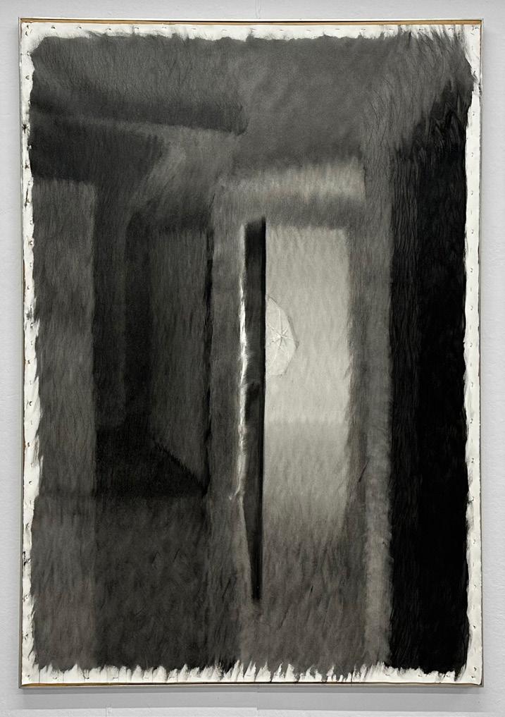
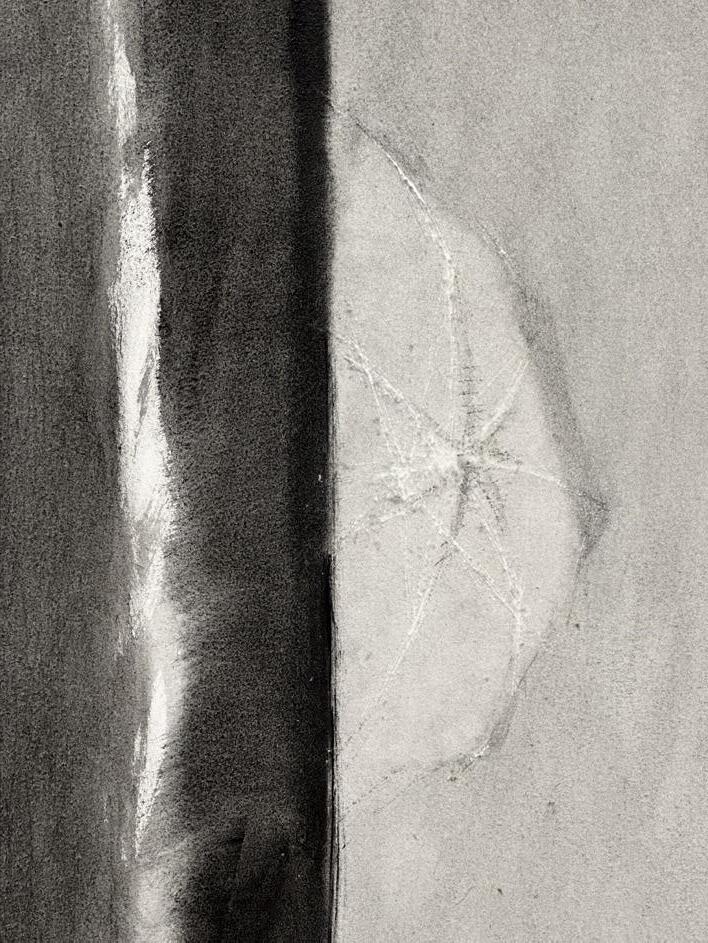
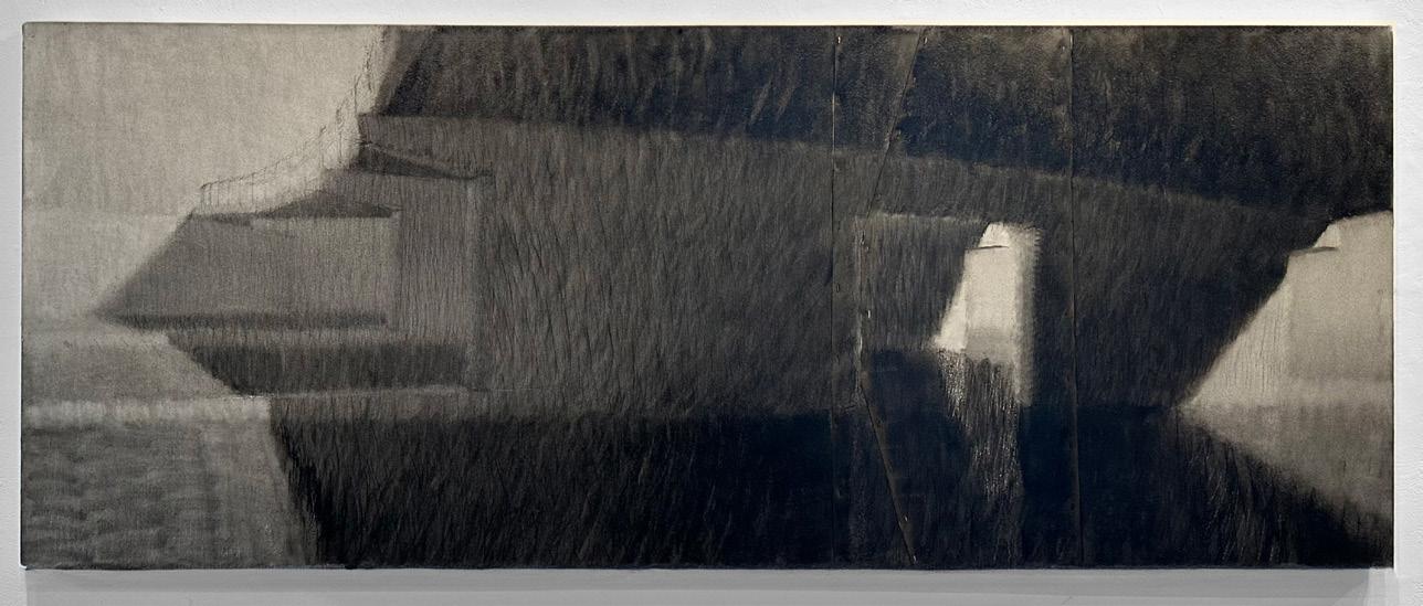
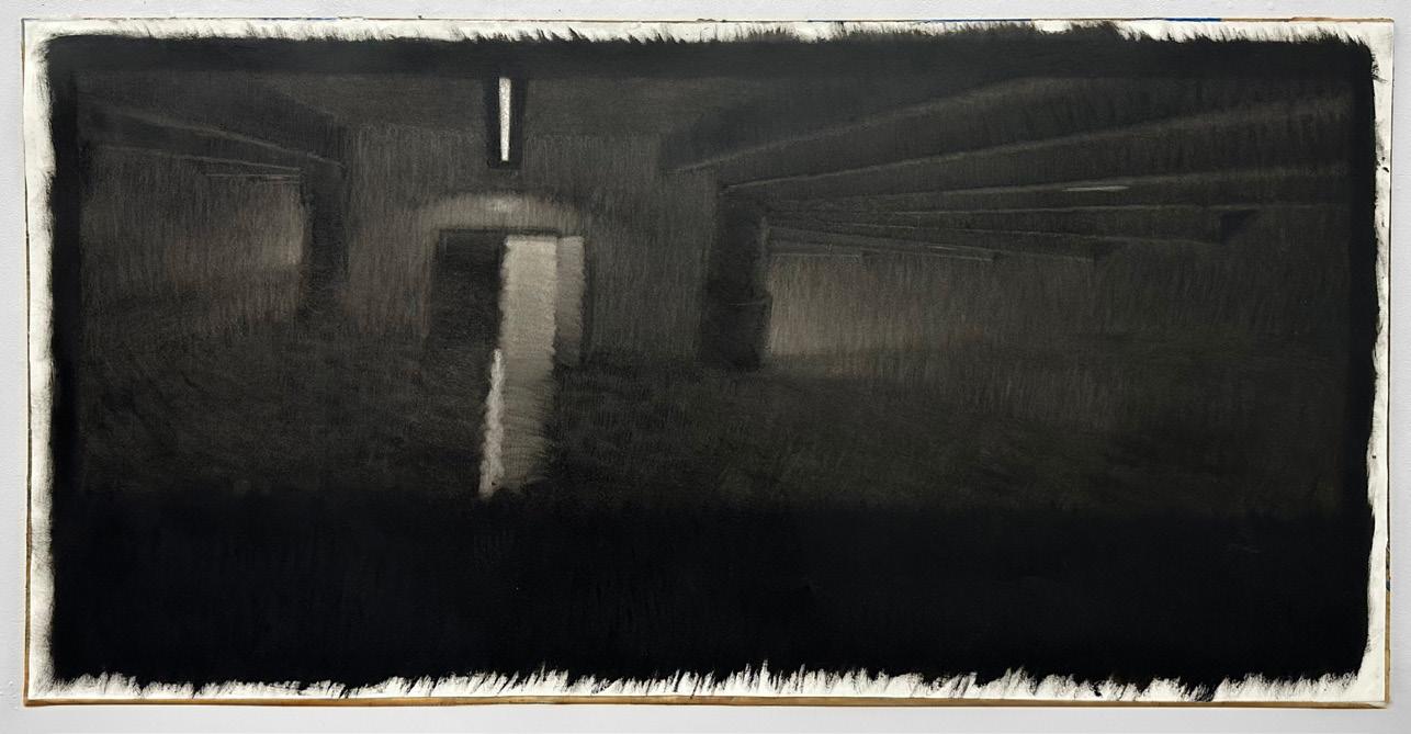
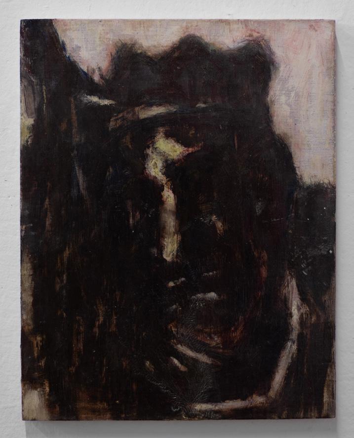
Ivo Makianich
The space and architecture depicted in the images of these works appear to be divorced from time, existing instead in a similar liminal twilight. Yet each subtractive mark subtly betrays this sense of timelessness; felt viscerally, each mark builds toward a montage of images that construct architecture. The process begins with an even layer of black paint applied to paper, then paint is gradually removed with a brush, slowly revealing the image beneath. Eventually, the process requires physical scarring of the paper through repetitive cuts, pulling out the whitest whites and highest values.
Each painting is created within a strict one-week timeframe. In a sense, looking at any of these works is akin to watching an accumulation of marks form into an image. However, rarely does each mark represent so succinctly the constraint of time. To walk through a parking garage, beach, bridge, or an industrial building is to experience time as a factor of space. That time exists in our memories of having passed through it, where it unfolds as single images of space, configured linearly in retrospect. Looking at one of these paintings is to witness the way time sees space.
▪
Documentation Room, 2024. Oil on mounted paper, 75 × 52 × 2 in.
Documentation Room (detail), 2024. Oil on mounted paper, 75 × 52 × 2 in.
Bridge, 2024. Oil on stretched paper, 80 × 32 × 2 in.
The Ramp, 2024. Oil on paper, 48 × 96 in.
Dog Beach, 2023. Charcoal on paper, 3 parts, 96 × 40 in., 82 × 36 in., 96 × 40 in.
Andrea Manning
I’ve always had trouble understanding things. When we look at something head on, details tend to get lost in translation. Instead, I’ve found that looking slightly left of the thing reveals a truer meaning of the thing than a direct view. Clear and more meaningful understanding occurs here. This has led me to the use of metaphor and symbolism in the paintings. Deeper understanding is revealed through the relationship to its like.
I’ve never been on the battlefield, but I have stood in front of a white canvas. Who am I? Who is this? Who are we? What are we fighting for? Every time it changes. Every time it should. I am not the same as I was yesterday. The painting is not the same as it was three hours ago. We fight together with common goals, to figure out what we are and to gain perspective in the experience.
The content of the work is contradiction and the balance that occurs within this state. Hard but soft. Object but idea. Here but there. Wobbly but centered. Teammate but adversary. Clear but mumbled. Epic but ordinary. Balance can only occur when two sides of the same coin are present, existing together and simultaneously pulling at the other’s existence.
▪
▪
Rat Saw God, 2024. Oil on panel, 24 × 24 in.
No Alarm Clock Like Fear, 2024. Oil on panel, 24 × 24 in.
Maybe Wish That You Kinder, 2024. Oil on canvas, 36 × 48 in.
Genius Hour, 2024. Oil on canvas, 56 × 58 in.
Stage at Sharkey’s, 2024. Oil on canvas, 24 × 24 in.
Sylvie Mayer
Through layers of translucent washes that build to opacity, my paintings consider intimacy, interiority, and impermanence. Drawing from sources with varied markers of time, my work evokes a sense of anachronism. Repetition and duplication play a role; I repaint, rehearse, and alter images, shifting tone and texture to consider new meanings. My paintings examine the mechanics of fiction questioning the boundaries between reality and illusion and considering the construction of personal and collective narratives. Informed by my childhood spent backstage as the daughter of a ballet dancer, choreographer, and teacher, I am interested in the dynamics of revelation and concealment in theatrical settings. Preoccupied by thresholds and in-between states, I depict transitional spaces that mediate between public and private. Interior scenes are a frequent subject of my paintings, imagined as spaces of suspended time, imbued with traces of their inhabitants. I reflect on attachment, entanglement, and the complexities of interpersonal relationships. Suspended moments and hidden glimpses are altered through scale and perspective, converging to confront boundaries between the self and the external world.
▪
▪
Allegro, 2024. Oil on canvas, 54 × 64 in. Stage Door, 2024. Oil on canvas, 58 × 84 in. Reprocessing, 2024. Oil on canvas, 48 × 188 in. Broken Mirror, 2024. Oil on linen, 18 × 24 in. Daylight Saving, 2024. Oil on canvas, 15 × 16 in.
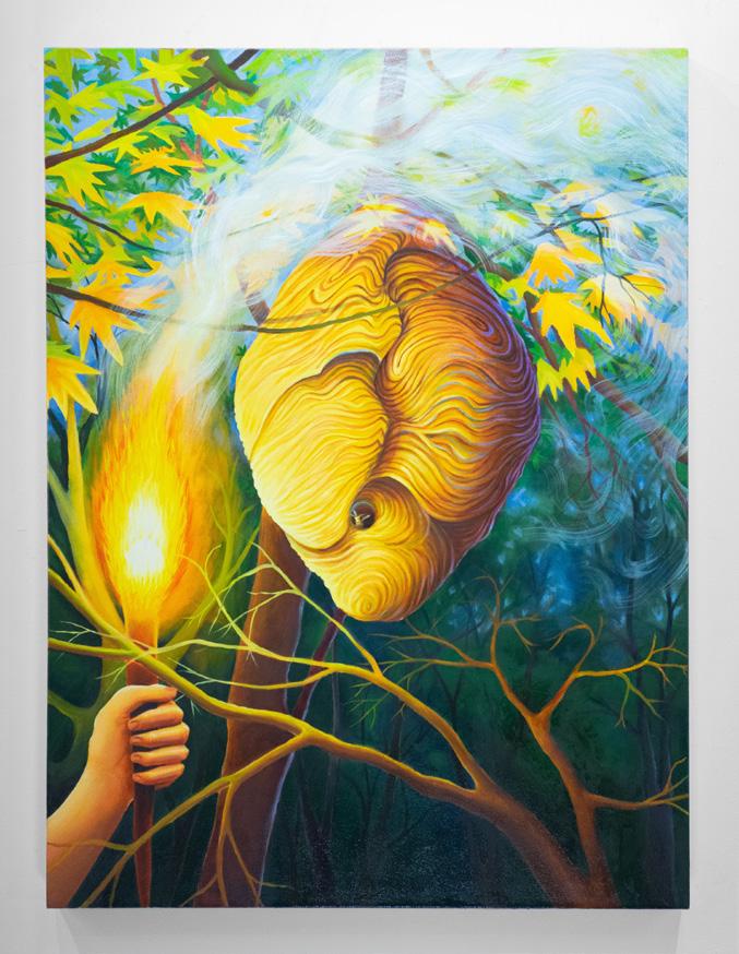
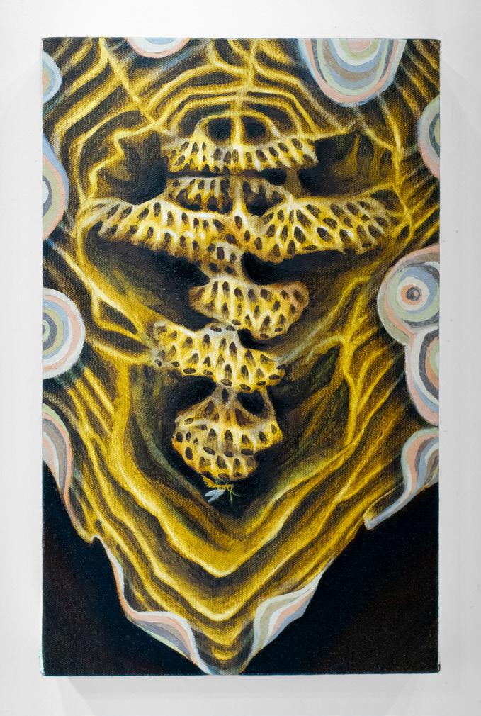
Dylan Foster Mintz
My paintings often freeze-frame moments of things I see in nature. Many of these paintings are based on encounters with strange yet natural forms, specifically those found in the coastal ecosystems of North Carolina. While the paintings represent subjects from reality, they are often relayed from imagined perspectives.
This body of work is devoted to the psychological revelations that occur when noticing small things in nature that feel larger than life. From a panpsychist worldview, my paintings behold compact sites of consciousness in unexpected places. This outlook is located in the presentation of figures, ranging from trees and flames to insects and mollusks. The paintings are struck with vivid interior illumination and shadowy recessiveness, which elicit dramas. Elements of the paintings coalesce like actors, making symbolic references to human relationships with nature.
My choice of subject is prioritized by a rediscovery of the familiar rather than an overvaluation of the novel, yet the image remains otherworldly. The figures in my work exist in a supernatural state of suspense. When rendering forms, I describe the character of a subject rather than the likeness of that thing. For example, I’ll emphasize the aura of a surface, a gleam of light, or a pocket of sensorial fluttering. This offers a more visionary or metaphorical representation, conjuring the mystical, sometimes cheesy, qualities that are evoked when noticing the subtle aliveness of everything.
Paper Wasp Nest, 2024. Oil on canvas, 40 ½ × 30 × 2 ½ in.
Paper Wasp Nest (Interior), 2024. Oil on canvas, 14 × 8 × 2 ½ in.
Scallop’s Gaze, 2024. Oil on panel, 16 × 48 × 2 ½ in.
The World is Your Oyster?, 2024. Oil on panel, 22 × 48 × 2 ½ in.
Gallery Beetle, 2024. Oil on canvas, 48 × 24 × 3 in.
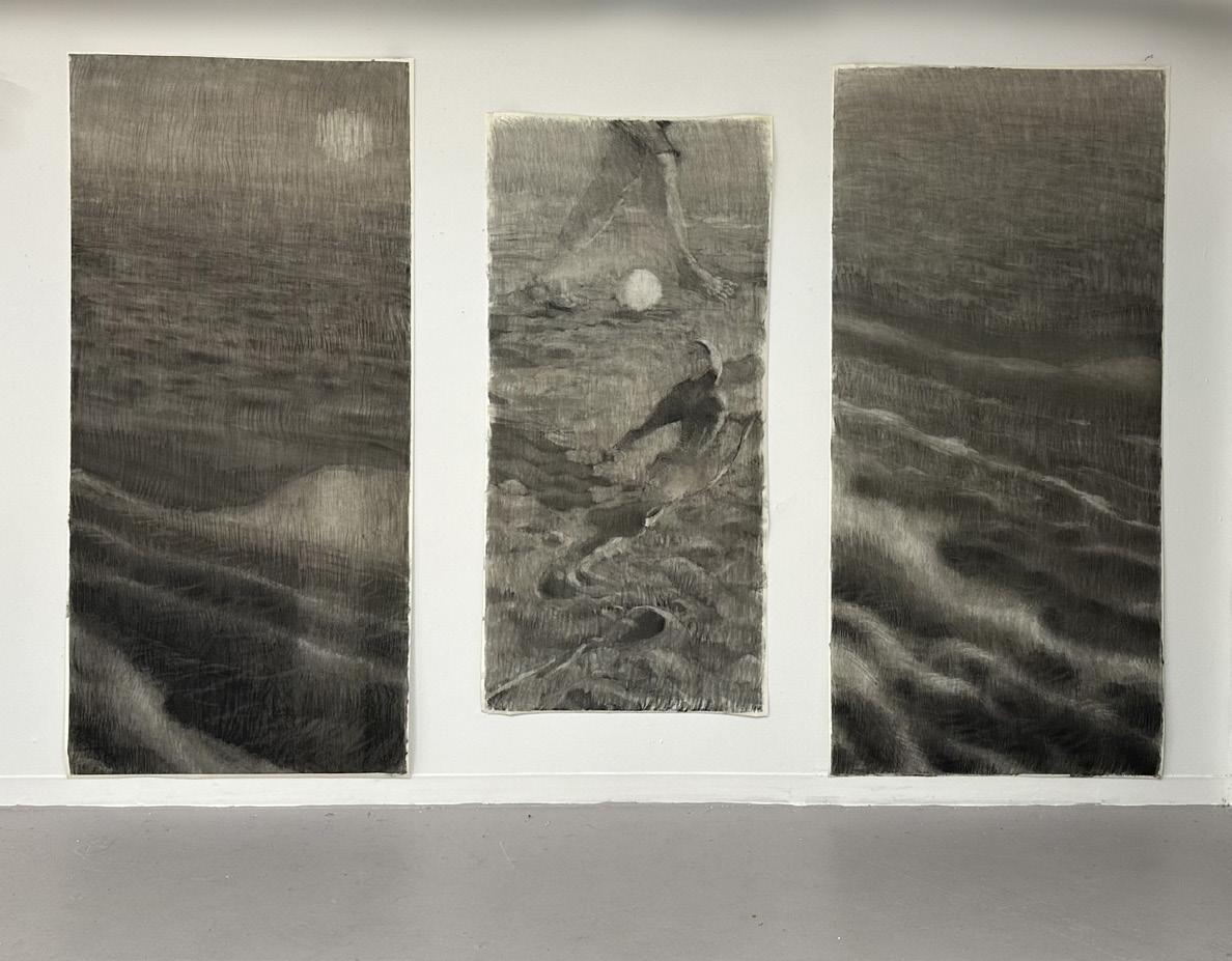
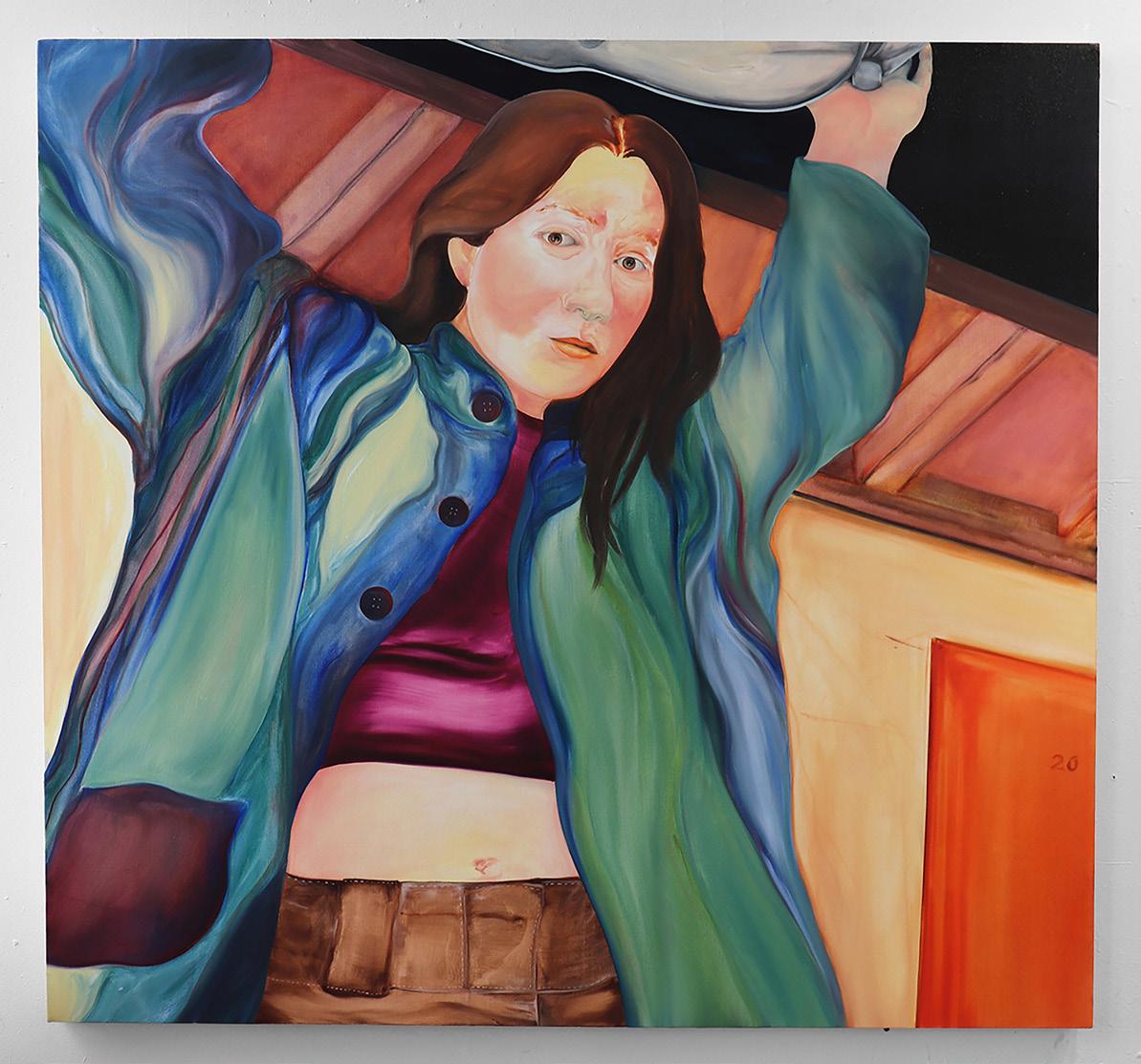
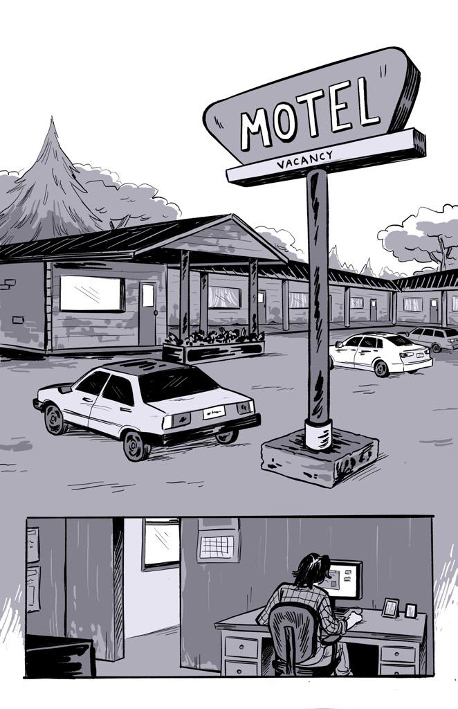
Miranda Pikul
A SHORT STORY
Sometimes, just to feel something, her strange awkward body will contort itself to fit along the edges of a canvas. Stay within frame, she thinks.
Easier said than done.
Sometimes, she’s not in frame at all and the painting becomes something else entirely. When this happens, she’s having a panic attack. But really I am. A contribution to her bad posture. My posture. She suspects her bad posture is obvious after all, considering people tend to adjust themselves while in proximity to her. While viewing her.
Now her skin is burning. My skin. Bright non-descript red paint. Sometimes a Pale Rose Blush mixed with Naples Yellow Light. Her face is powdering into wrinkles. Congesting. Pigment starts staining. And you’ve never felt worse. Wilted. Withering. Building up layers of washes and glazes. She’s just trying to figure it out. Which means there’s hope. She rehearses again and again, a spontaneous depiction of horror. Resilience.
Her unkempt dirty blonde hair—sometimes brown—hangs heavy. Twisted and knotted. She feels everything deeply or not at all. Too sensitive. Or not enough. She wants everything. Or nothing. But really, she just wants to fit in. No longer needing to contort her strange awkward body to fit along the grooves of anything. Maybe one day she’ll stand up straight and find a box worth fitting in. For now, she is a story told over and over again. A story you may recognize yourself in.
▪
The End of the World, 2025. Oil on canvas, 16 × 20 in.
Wilted, 2025. Oil on canvas, 18 × 24 in.
Mischief, 2024. Oil on canvas, 29 × 42 in.
Road Trip, 2024. Graphite on panel, 12 × 12 in.
Motor Lodge, 2024. Oil on canvas, 50 × 54 in.
Lemuel E. Saputra
My work engages painting and photography as a means of encountering Indonesia’s colonial past through embracing the limitations and tensions between both mediums—fixedness and ambiguity, indexicality and invention, and proximity and distance. Images of colonial Indonesia (from Dutch national archives) are translated and mistranslated using image transfer, collage, and assemblage in combination with painterly mark making. The layered painting surface becomes a screen between viewer and image, creating a push and pull between legibility and obfuscation. Through their sequence and placement in space, each painting begins to function as text, where meaning is constructed by the relationship between individual works. The images’ presentation and re-presentations through various material processes complicates the possibility of any single, fixed reading, questioning the capacity of photography, painting, and the archive to bear witness.
▪ A
▪
If I Depart, 2024. Oil on wood panel, 14 × 11 in.
Segala Tak Kukenal (Rawagede), 2024. Acrylic on wood panel, 9 × 12 in.
Dari, 2024. Acrylic gouache on mylar, mounted on wood panel, 8 ¾ × 12 in.
Lilit, 2024. Oil on canvas, 36 × 48 in.
If I Depart and Rawagede (installation view), 2024. Oil on wood panel and acrylic on cyanotype mounted on found wood, 2 parts, 14 × 11 in., 16 × 14 × 3 in.
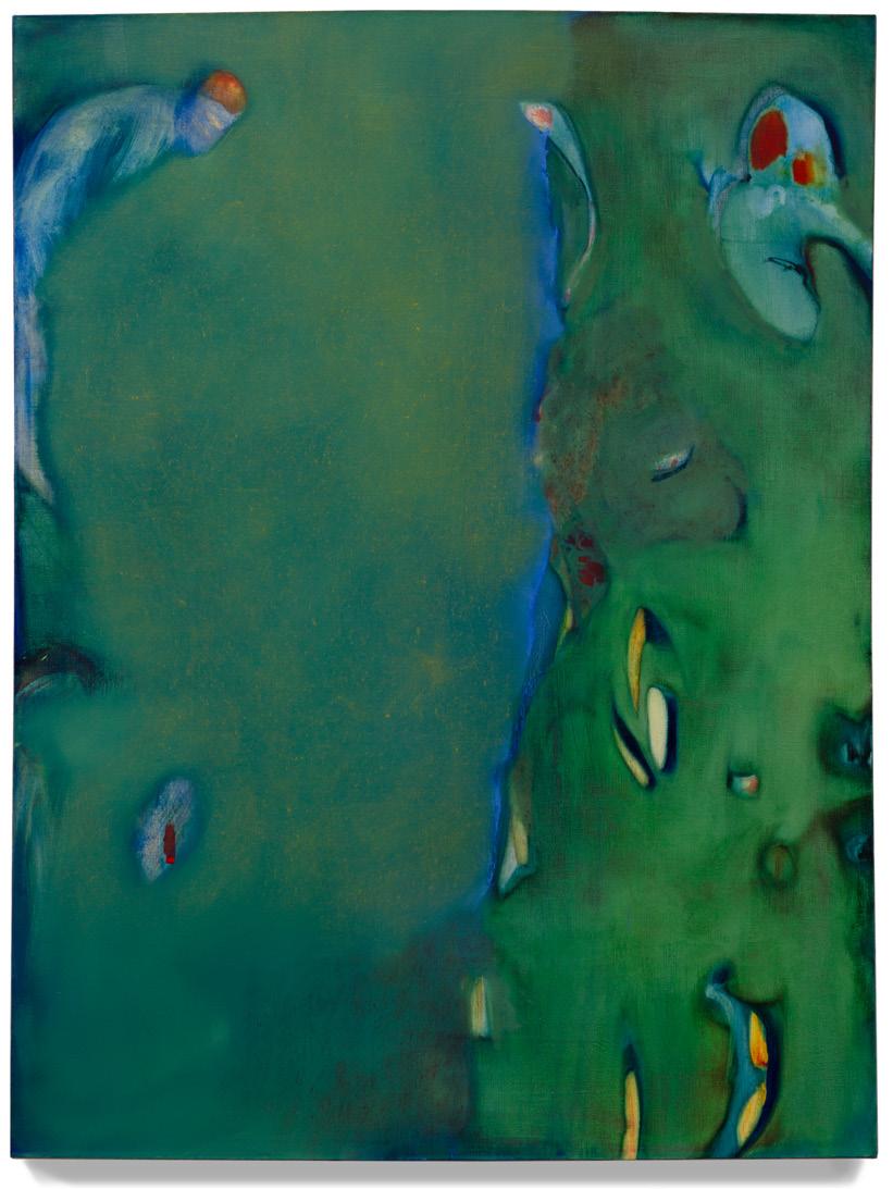
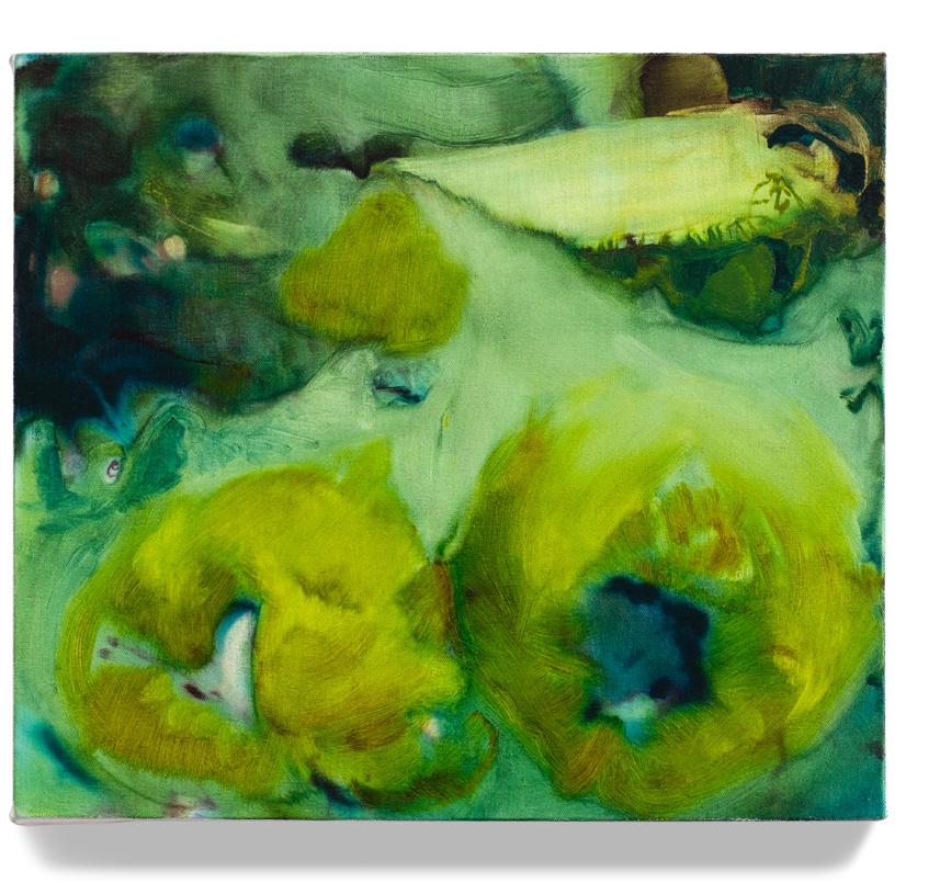
Hannah Stoll
A SHORT STORY
My work engages the convention of landscape painting with modern revelations in ecological thinking. Considered ecologically, landscape becomes a teeming extension of the self, holding countless sensory and temporal experiences. It becomes indistinguishable from portraits and arrangements of fruit. Painting is as old as cultural ideas about the way humans fit into ecology: I work within this tradition as a way to question these dominant socialized perceptions.
The paintings are built from layered drawings and glazes, observed contour, and invention. As they evolve, I continually negotiate each element’s relationship to nameable forms. I conflate qualities of scale ranging from micro to macro, and rework edges as membranes that merge or contain. Forms open up as deep empty space and breathe and crawl as living things. Pigment and fabric are laid bare while contributing to the depth and shape of images.
At the core of this work is an interest in bodies and ecosystems as both living and habitable places. Despite the reality that they are, many people seem to share my feeling of an alienating and excruciating distance. I think of it as the longing to inhabit, and I searched for it by painting a living place that is both seductive and inaccessible through its obfuscation. This longing, a carrot on a string, may approach a biological survival instinct that can activate the life of painted forms.
▪
▪ C
Mountain of Faith, 2024. Oil on canvas, 10 × 12 in. Fertilizer, 2024. Oil on canvas, 36 × 36 in.
Concentrations, 2024. Oil on canvas, 48 × 36 in.
Baleful, 2024. Oil on canvas, 16 × 18 in.
Smile, 2024. Oil on canvas, 12 × 16 in.
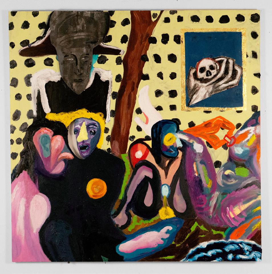
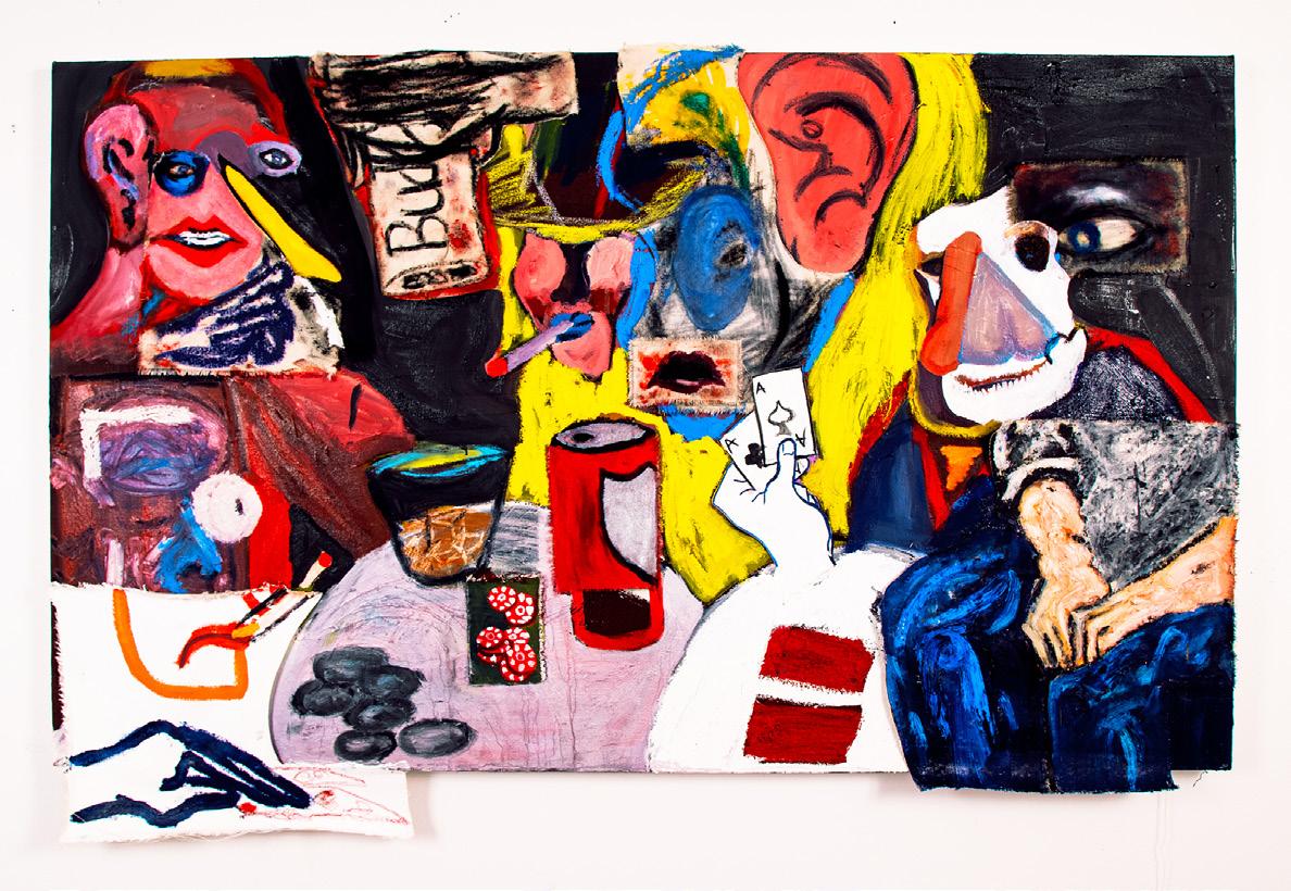
Noah Wertheimer
TELLING STORIES
In the unfolding of narratives, where does the image belong? Through perspective and framing does the image become fixed? Does the architecture of an image limit the ability for the malleability of narrative? How can we create images that tell multiple stories?
That is not to say that the image is in any way subservient or subsequent to narrative. The image shapes language. The very vocabulary from which the narrative is built is derived from the impulse for confirmation. From one to another. That what I see is also what you see.
Constantly caught between conveyance of perspective in an image and the construction of vocabulary through it.
Stories bleed into one another. From mythology to history, through icons to uncertainties.
Less of the story and more of the storyteller.
The debauchery of a late-night card game awakes to find the redemptive poppy. The moment of sexual discovery runs itself into fascist iconographies that shape the way we determine the attractive and beautiful. The siren song leads to dismemberment and cannibalism. Only to find the song again beautiful and redemptive.
The work dismembers itself. Through collage, through paint, the narrative unworks itself. Unraveling and beginning again elsewhere. Horrific and hopeful.
▪
Amputation at Austerlitz, 2024. Oil on canvas and panel, overall 48 × 48 in.
The Sirens, 2024. Oil on panel, fiberglass and plaster, 48 × 48 in.
Eichmann in the Nymphs Garden, 2024. Oil on panel, 48 × 48 in.
The Lovers, 2024. Oil on Panel, 48 × 48 in.
Poker Night, 2024. Oil on canvas and panel, overall 36 × 60 in.
Shannon Johnson
Jason Parent
Jerry Rodríguez Sosa
Susan Swirsley
Tung-lin Tsai
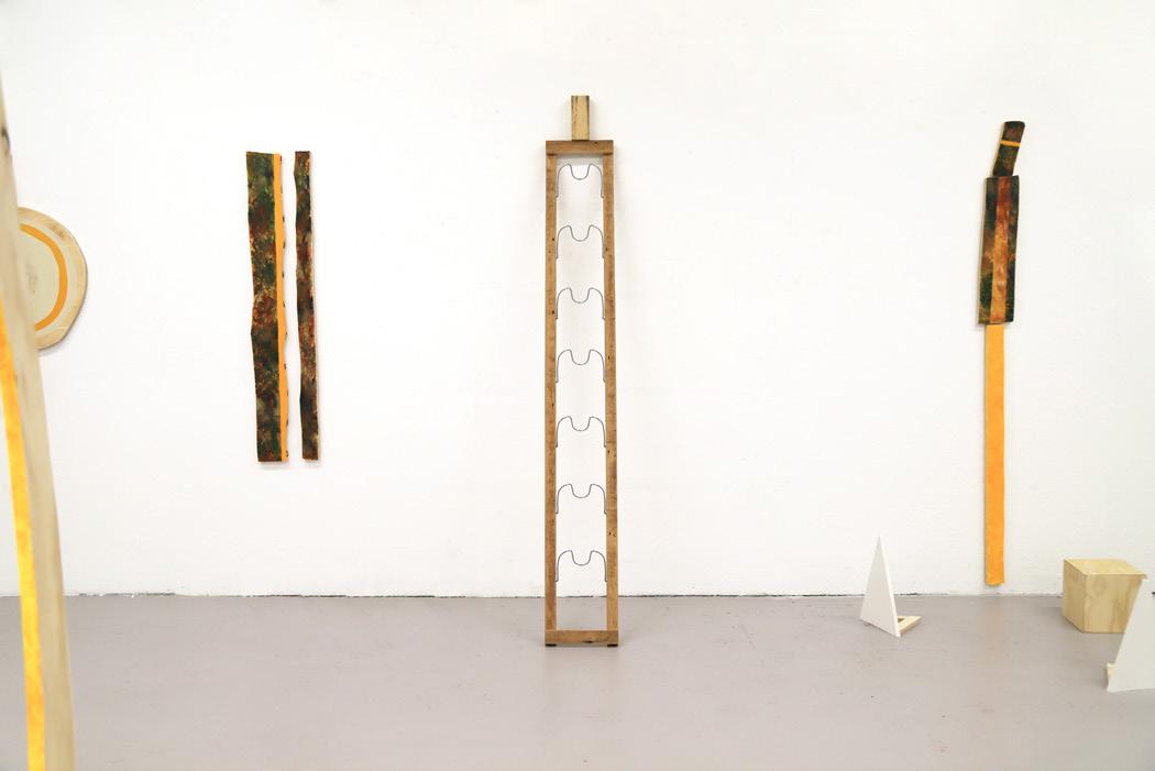
The Print Media & Photography MFA program at Boston University emphasizes an interdisciplinary, process-driven approach to studio practice, centering on the intersection of photography and printmaking. This approach engages with both the material and critical dimensions of these disciplines. We take pride in presenting the second cohort of MFA candidates graduating from this new program, whose work expands the boundaries of these closely related disciplines and exemplifies a steadfast commitment to experimentation and discovery. As printmaking and photography converge, fundamental concepts such as the artist's hand, memory, perception, illusion, time, and repetition come to the forefront. Mark-making, texture, light, and chemical reactions serve as a nuanced language that communicates the artist's intentions, providing viewers with multiple ways of seeing.
Shannon Johnson, Jason Parent, Jerry Rodríguez Sosa, Susan Swirsley, and Tung-lin Tsai present thoughtful and iterative explorations that intertwine psychological, environmental, and historical perspectives. Their work reveals what is often overlooked or marginalized, shedding light on the ephemeral and ever-shifting nature of time, as well as the fluidity of self and perception. In their treatment of both material and concept, they demonstrate a deep sense of empathy, approaching their subjects with sensitivity and care. Through a dynamic interplay of light, history, and personal narratives, their work invites viewers to question the familiar and challenge the status quo. This exhibition not only highlights the artists’ exceptional command of their mediums but also fosters profound intellectual engagement with the complex relationships between process, materiality, and conceptual inquiry within printmaking and photography.
Lynne Allen Professor of Art, Printmaking
Deborah Cornell Professor of Art, Printmaking
Toni Pepe Assistant Professor of Art
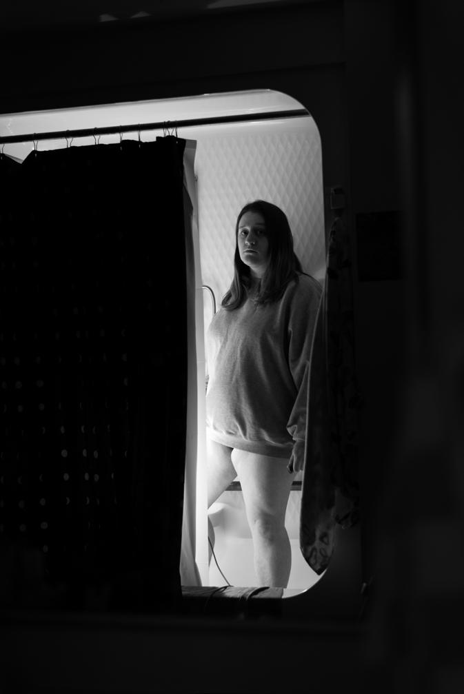
Shannon Johnson
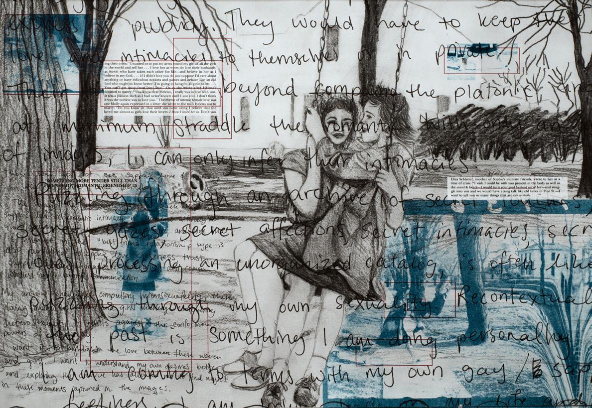
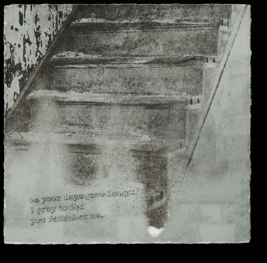
As a radical feminist, I see connections everywhere as I am constantly examining life through an understanding of structural patriarchy. While utilizing a feminist lens I explore issues of bodily autonomy, social justice, intimacy, trauma, mental illness, and sexual violence. Using photography, printmaking, bookmaking, and installation I seek to explore and understand the relationships between the images, objects, and interpretations of the roles and values of women and our bodies.
The art making process is an embodied activity. It engages the entire body in response to a creative urge or desire to express oneself. Printmaking is a strenuous practice that requires your whole mind and body to maintain an equal stamina to complete its process, not once but multiple times in hopes to present a uniformed final product. The way I make photographs is embodied. When I am making a self-portrait, I contort my body to extremes to get the just perfectly right angle or refraction of light. To photograph oneself is a radical act, because it’s an act that demonstrates self-reclamation. When I click the shutter, I rewrite every dialogue I have had.
As I am processing my sexuality, trauma, and identity, I am simultaneously gathering archival photographs creating my own archive of historical female identity, companionship, interaction, romantic friendship, and sororal solidarity. I am attempting to piece together my process of recovery from sexual violence and discover how integral these female relationships were and continue to be part of my processing of trauma. My work is explicit and raw—its direct confrontation is essential to convey the urgency of my rage and my abiding need for freedom.
▪ A
▪
I come back in with a one-two, 2025. Archival inkjet print, 20 × 13 in.
Don’t Fucking Touch Me (and I hope you fucking suffer), 2024. Monotype on Rives BFK paper, 30 × 22 in.
Something More Tender Still (that’s why I love fall), 2024. Photolithograph on inkjet print on Rives BFK paper, 20 × 30 in.
IT’S A CRAVING NOT A CRUSH, 2024. Silkscreen print on Somerset paper, 18 × 18 in. Pansies (darling, you’re so pretty, it hurts), 2025. Ink, colored pencil, and collage on inkjet print on paper, 16 × 20 in.
Jason Parent
My work began with a deep dive into my family’s photo albums, where I unearthed both personal histories and a nuanced, complex understanding of myself through the lens of the past. As I uncovered hidden narratives in the margins of these photographs, my queer identity emerged within the conversation. This exploration has expanded to photographs sourced from random eBay lots and flea markets, which I examine through the same lens—seeking layers beyond the surface. In these images, I discover evidence of queer existence, often in the form of a subtle touch, a coded glance, or a distant longing, all of which I uncover through careful investigation. As I continue to find and share these stories, I am compelled to confront the tenuous existence of queer archives, their fragility, and the ephemeral nature of queer identity. My work anchors these narratives in permanence, preserving the memories that might otherwise slip away, and presenting them in a way that invites audiences to see, feel, and understand.
▪
Truth (“I don’t want to know,” he says, staring down the barrel of my truth), 2024. Acetone image transfer on Japanese paper, 4 × 2 ½ in.
Transcript, 2024. Artist book, 7 ¾ × 6 ¼ in.
If You Only Knew (IV), 2024. Acetone image transfer on inkjet print, 4 ½ × 4 ½ in.
Ties That Bind I, 2024. Acetone image transfer on Japanese paper, 4 × 3 ½ in.
Hold On, 2025. Acetone image transfer on paper, 5 × 4 in.
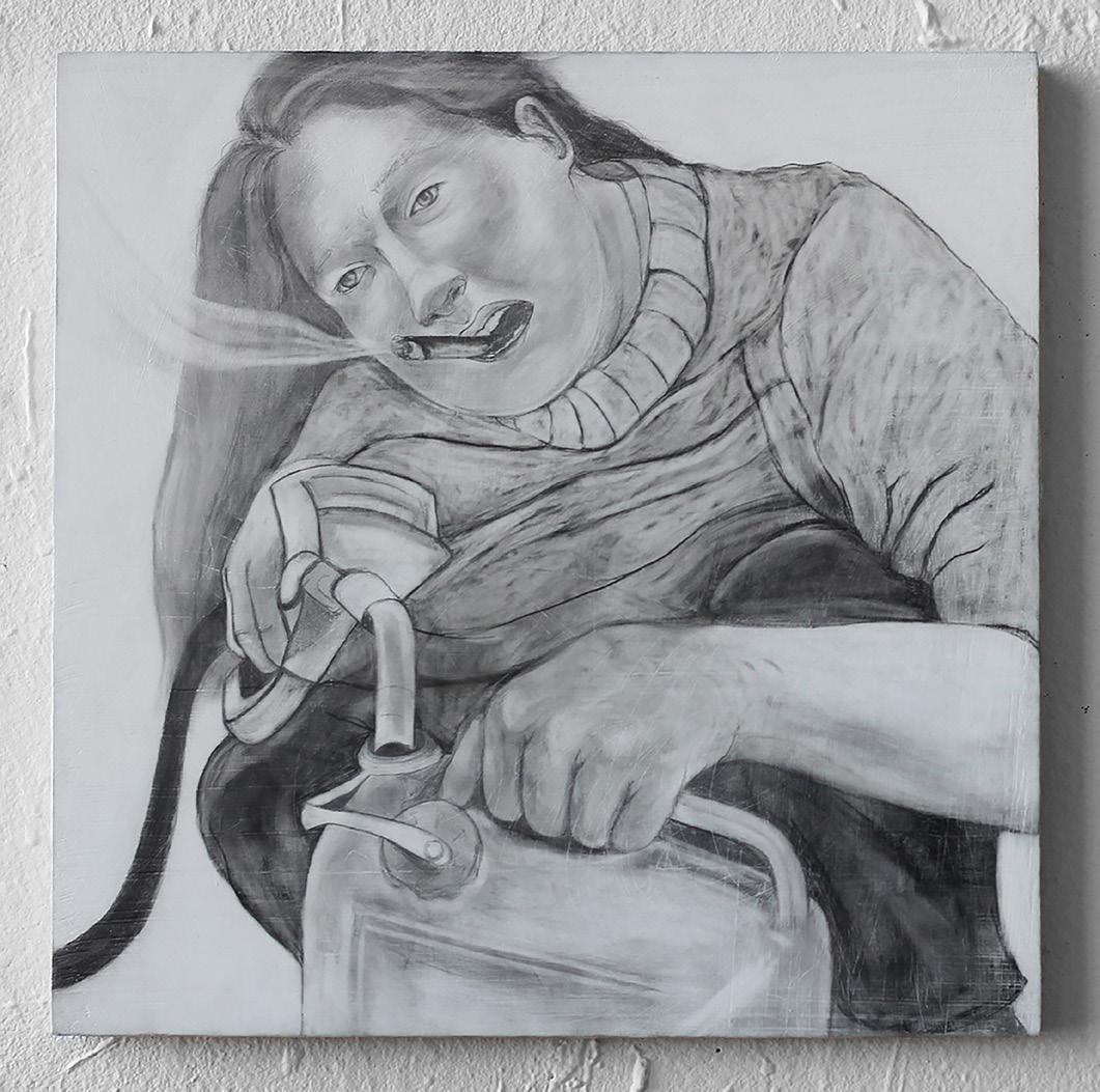
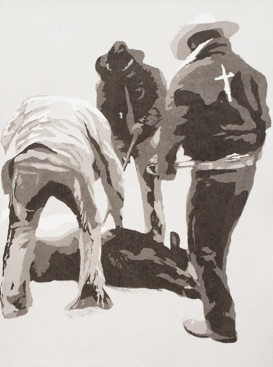
Jerry Rodríguez Sosa
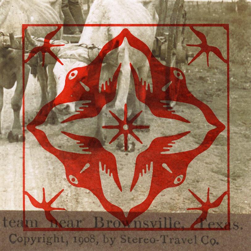
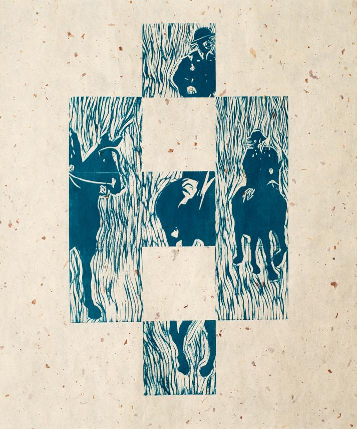
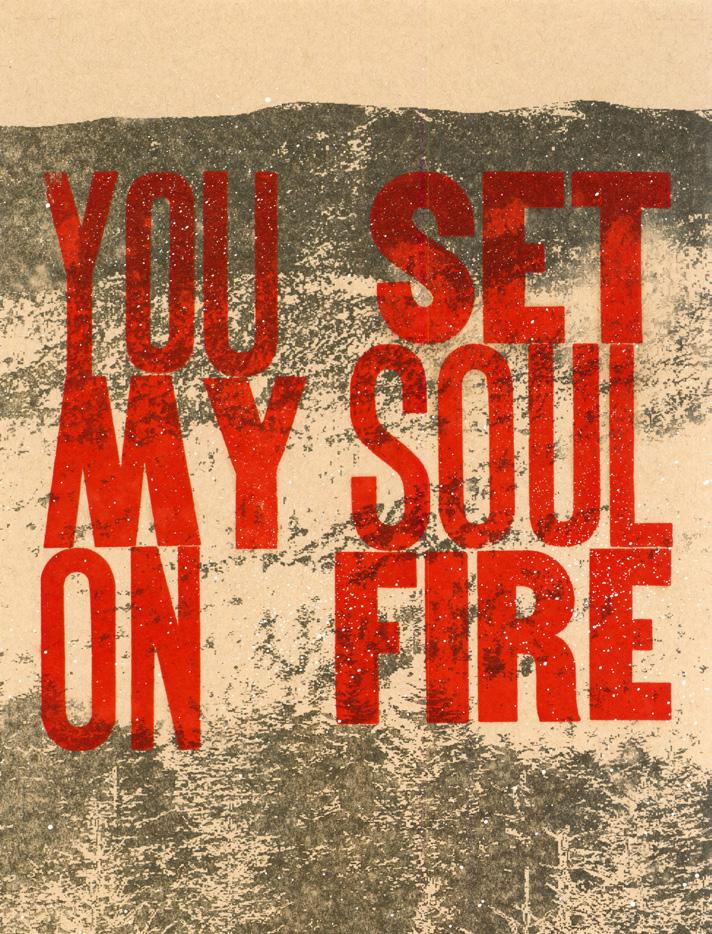
My art is rooted in my heritage as a Mexican American, queer artist from Brownsville, Texas. Through printmaking, photography, drawing, and sculpture, I unearth the intersections of my identity with the history and politics of the Borderlands. I navigate a border psyche, where themes of hybridity and queerness deconstruct personal, cultural, and international boundaries. I conceptualize the Borderlands as both physical and ideological spaces disrupted by clandestine crossings. I move between archival imagery and expressive mark-making, combining inks and earth-based materials, such as charcoal and clay to ground my work in the physicality of the landscape. Additionally, I build on my family’s legacy in tile installation, using the concept of tiling to construct layers and patterns of symbols rooted in my heritage. Through my interdisciplinary practice, I challenge personal and collective knowledge, using a visual language that confronts the borders around us.
▪ A ▪
▪
Terroir, 2024. Letterpress on archival inkjet print, 8 × 8 in.
Vigilantes, 2024. Monotype on paper, 30 × 22 in.
Parade, 2024. Relief on paper, 16 × 14 in.
You Set My Soul On Fire, 2024. Letterpress, acetone transfer, and spray paint on paper, 14 × 11 in.
Livestock, 2024. Reductive screen print on paper, 14 × 11 in.
Susan Swirsley
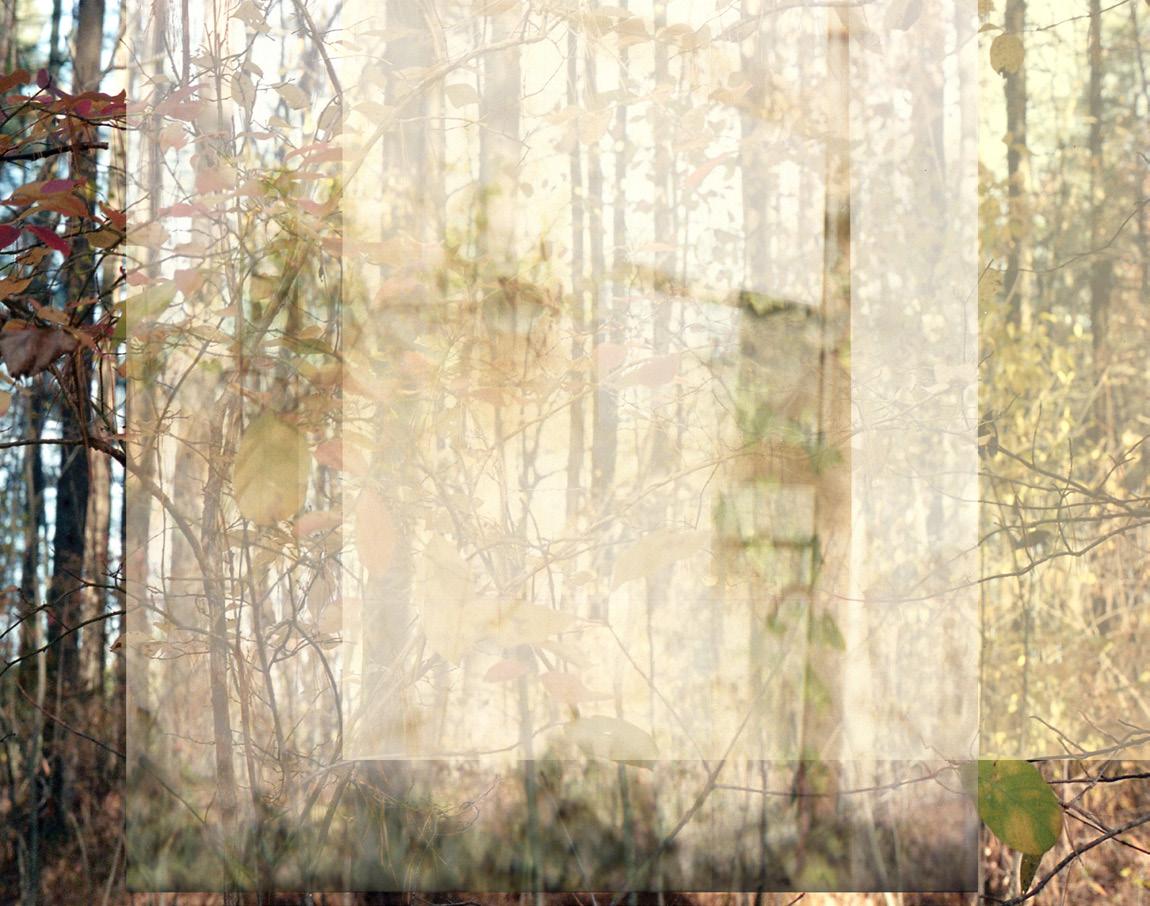
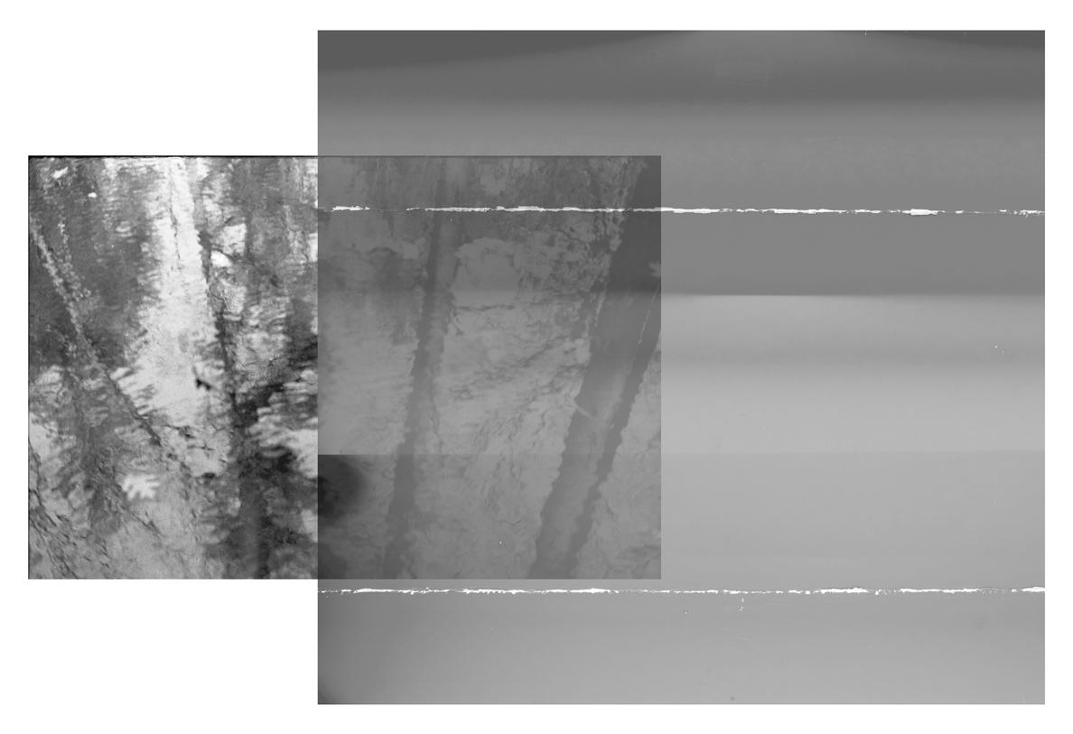
I use historical and contemporary photographic processes to translate digital, film, and camera-less images onto paper, fabric, acrylic, and other surfaces. Resourcefulness, experimentation, and the use of out-of-date materials, such as expired paper, and botanical remnants are integral to my practice. I create works ranging from intimate to large-scale, such as handmade books, prints, and installations.
I examine and question how photographic images function, what they represent and what we expect from them. My work is focused on the unpredictable intersection of abstract and representational images. Process, materiality, illusion, light, time, and the juncture of chance and preservation in photographic images play an important role in my artistic practice. I harness elements of chance by using photographic paper and chemicals in unexpected ways, pushing them beyond their intended functions. Experimentation shapes my practice, leading to an expanded version of photography, one that includes methods, materials and ideas more closely related to printmaking and painting.
▪ A
▪ B
A Certain Blue, 2025. Archival inkjet print on Japanese paper, 31 × 35 in.
Infinite Blue, 2025. Archival inkjet print on Japanese paper, 30 × 35 in.
Luminescence, 2024. Archival inkjet print on Japanese paper, 27 × 35 in.
Birth of the Simple Light, 2025. Archival inkjet print on Japanese paper, 13 × 19 in.
Tectonic Plates, 2025. Archival inkjet print on Japanese paper, overall 24 × 35 in.
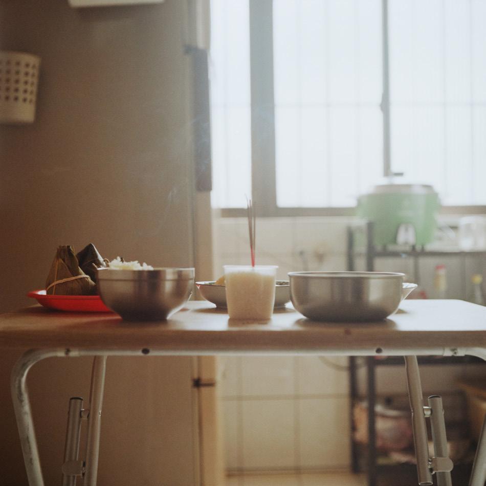
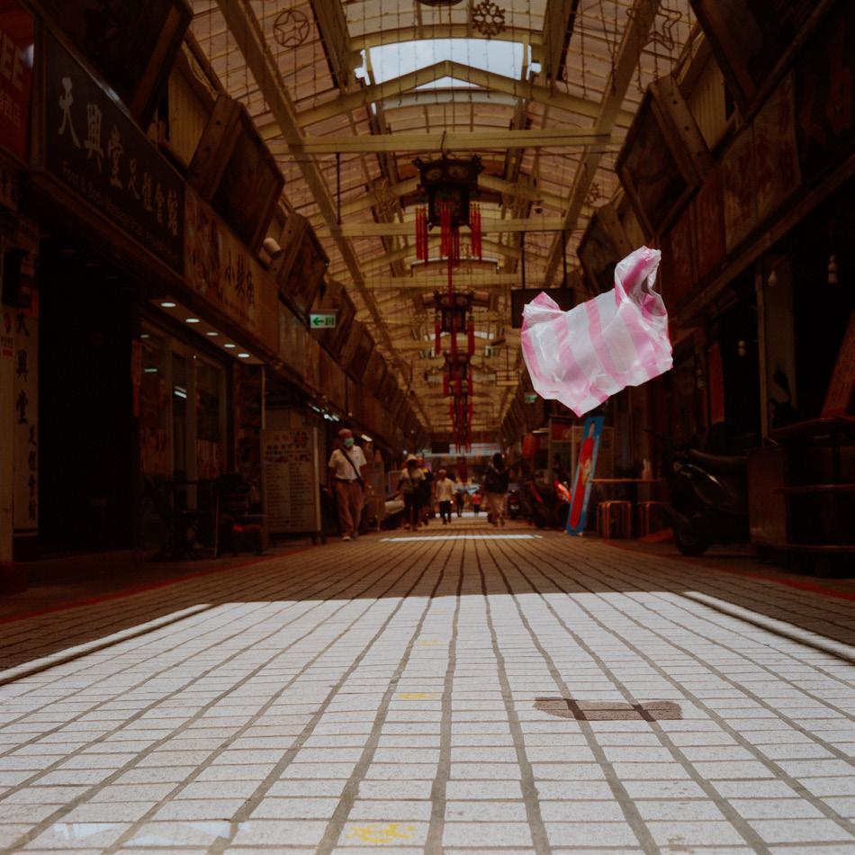
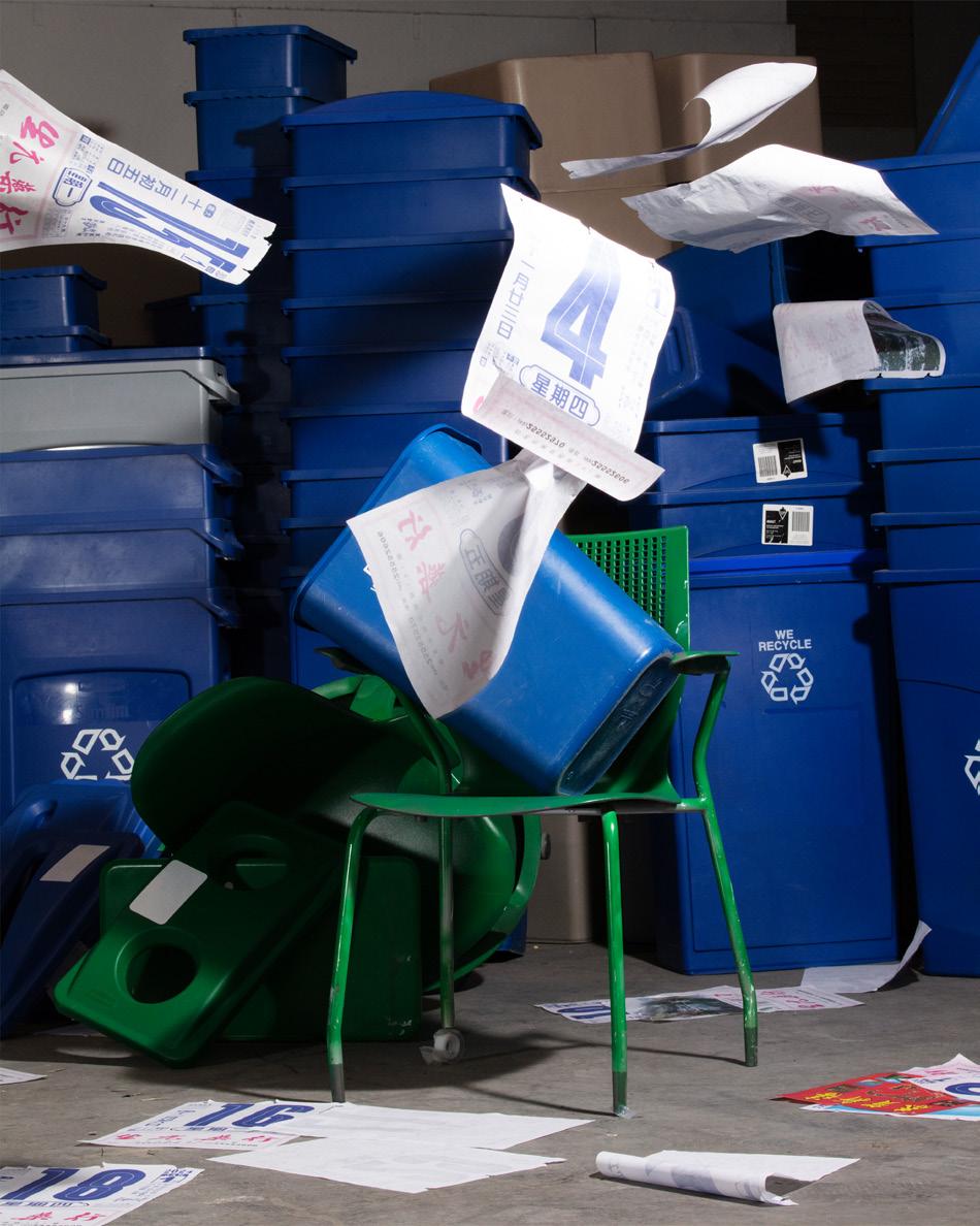
Tung-lin Tsai
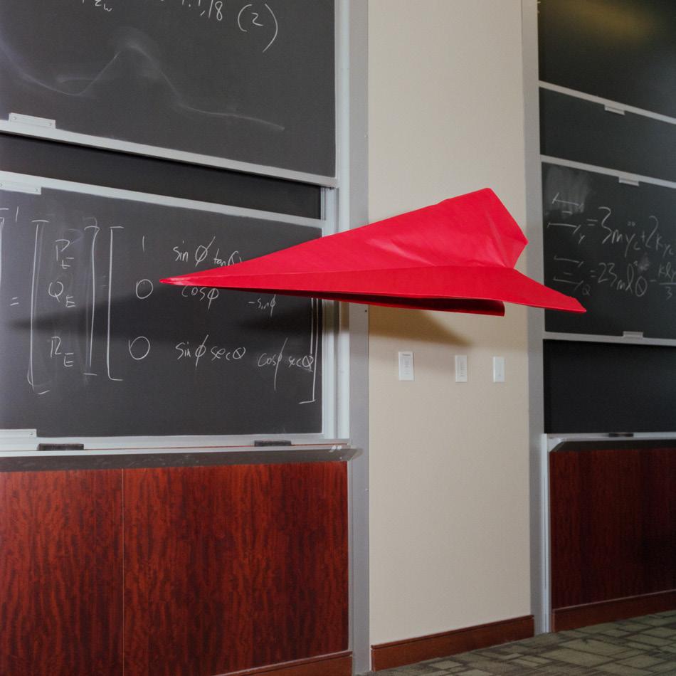
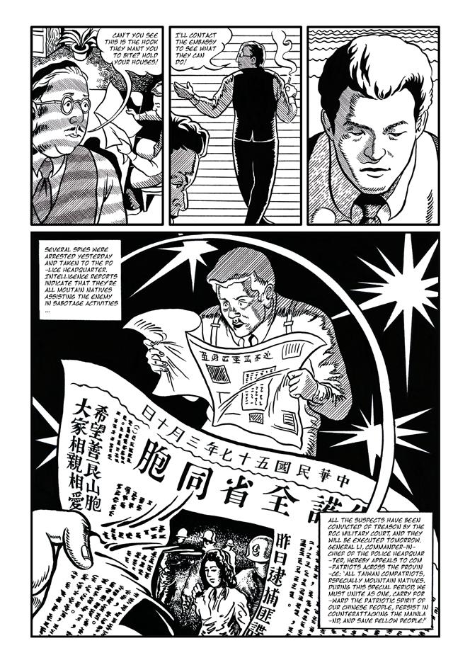
On August 2, 2022, Nancy Pelosi’s visit to Taiwan triggered an immediate response from China—trade restrictions were imposed, military exercises escalated, and the long-standing tensions in the Taiwan Strait once again surfaced on the global stage. At the time, I was in San Francisco, watching these developments unfold through the media. The images of Chinese fighter jets and naval formations conveyed a sense of impending war, even though no war had begun. The conflict that had always been an invisible undercurrent in my life was suddenly brought on the table.
Despite growing tensions and increased Chinese military activity in Taiwan’s Air Defense Identification Zone (ADIZ), when I returned home in 2024, daily life on this island continued as usual. The crisis I had witnessed through the media felt far removed from the normal rhythms of Taiwan’s streets. Taiwan embodied this duality crisis and normalcy coexisting. In a recurring dream, a giant red paper airplane drifts across a table. It is absurd yet persistent, weightless yet charged with meaning. This dream became the metaphor for my work. The photographs from How to Fold a Paper Airplane do not carry the burden of Taiwan’s unresolved history, nor do they attempt to define the complexities of crossstrait relations. Instead, they hold the weight of unbearable lightness itself as they unfold the absurdity of the current situation. Reality then resembles a paper airplane beyond our complete control. Yet perhaps we can still fold it and let it fly.
▪ C
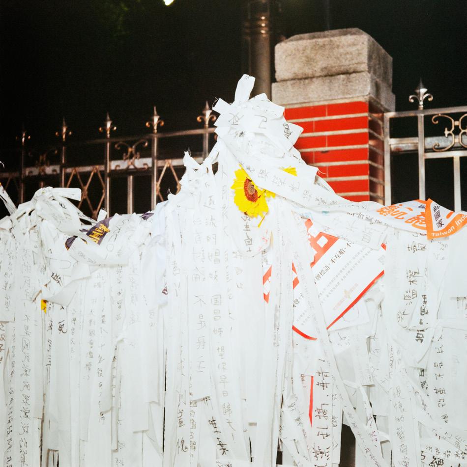
殲16 (Shenyang J-16), 2024. Photograph, 24 × 20 in.
太陽 (sunflower), 2024. Photograph, 24 × 20 in.
地基主 (Landlord Deity), 2024. Photograph, 24 × 20 in.
紅白塑膠袋 (red white plastic bag), 2024
Photograph, 24 × 20 in.
YYYY–MM–DD, 2024. Photograph, 36 × 24 in.
Joseph Metrano
Maithili Rajput
Ziwei (Helen) Sun
A quick google search for the definition of “sculpture” yields unsatisfying results. Encyclopedia Britannica defines sculpture as “an artistic form in which hard or plastic materials are worked into three-dimensional art objects.” Wikipedia points out that a sculpture is something that can be measured in terms of height, width, and depth. Far beyond these definitions and into the hallowed halls of our beloved former Cadillac dealership, sculpture expands from a catch-all discipline for everything that doesn’t belong somewhere else and into a highly particular way of thinking holistically about thing-ness and how things, our very selves included, come together to shape the world around us. After all, isn’t everything a thing, made from something else, with its own narrative, history, value, and intra-active agency?
This year’s MFA Sculpture cohort works material into objects that are defined by verbs more than their three measurements; they collect, chew, engineer, squeeze, count, stain, stand, breathe, gaze, and smash. Ziwei (Helen) Sun works primarily with clay, pressing it into small, handheld forms, and wrestling it into large, abstract shapes reminiscent of body parts. Guided by intuition, Sun’s sculptures welcome the physicality of clay as a collaborator and embrace process and material behavior as forces of indeterminate influence. Mashing together the past and present of New England, Joseph Metrano’s work delves deeply into what it means to engage with the material vernacular of a place. He layers together collected antique objects, architecture signifiers, and the landscape of Massachusetts in order to draw out the elasticity of our experience of time. In Maithili Rajput’s performances and sculptures, stillness and silence edge uncomfortably up against the sounds of breath, metal scraping on concrete, and whirring motors. Rajput wedges her body into small boxes made of steel, cardboard, or wood, creating provocations for viewers about constriction, the female body, and their own complicity in her discomfort. What is sculpture? In answer to this question, Sun, Metrano, and Rajput offer us a sense of possibility, at once open and highly specific to their manifold personal experiences and perspectives. They make things, yes, but perhaps far more importantly they invite us into new ways of seeing, doing, and making.
E. Tubergen Assistant Professor of Art, Sculpture
Joe(y) / Joseph / Joseph Metrano / Joseph Matthew Metrano
As idiosyncratic as it is historic, New England is defined less by geographic boundaries than by its characteristic commingling of old and new. Physical remnants of the past, and pressures to preserve them, here enmesh what to most would be 'history' with what to the Yankee is modern life and the spirit of the Old World commingles with the New to form a cultural landscape that vainly looks to its forebears from across a vast sea.
Defined just as much by its dying malls with pothole-riddled parking lots as by the dry-laid stone walls that cut through its lowland forests, the protean landscape of my upbringing is embodied within the logic of my practice by the resourceful employment of endemic material. Objects specific in their ubiquity and ubiquitous in their specificity have an unrivaled capacity to complicate memory, and it is in presenting them, comme ça, that the otherwise linear passage of time is folded on itself, to the point that it all too often becomes entangled. Such unassuming baubles as wooden nickels, wicker baskets, candy buttons, and plastic Easter eggs therefore serve to trouble conventional notions of authenticity, while fabrication, collection, and wordplay—all used in equal part to manipulate the readymade make apparent the inevitable intrusion of memory on physicality. It is through this multifaceted and decidedly introspective process that I strive to draw critical discourse away from the object itself and toward the oft-overlooked facets of being, whose sole commonality is that they are shared exclusively by those that call any one place home.
▪ B
There’s Scissors in the Hutch (detail), 2024. Heirloom apple peels cast in resin and mounted in applewood frames, dimensions variable. Gumball Machine, 2024. Used gumball machine purchased in Manchester, New Hampshire, through Facebook Marketplace transaction with green 1-inch gumballs, 40 × 12 × 12 in. Not the Teeth, 2025. 2,982 (give or take) candy buttons on paper, 1 ⅞ × 701 in. Thirty-four Baskets, 2024. 34 baskets, dimensions variable.
Maithili Rajput
What if discomfort is where power lives?
Through labor-intensive processes and intimate gestures, I explore endurance, resistance, and boundaries. Using sculpture, performance, video, and installation, I reinterpret everyday objects and bodies, revealing the inherent dangers within the mundane. Materials like steel, wood, and personal objects tied to my upbringing become vessels for these investigations.
Often, I conceal my body within these materials or disguise it in the environment, implicating the viewer in the tension between fragility and strength. By positioning my body in confined spaces, I force an encounter with vulnerability; asking how boundaries shape our connection to one another, to objects, and to the spaces we occupy.
Through cryptic and alluring arrangements, I challenge perceptions of belonging, intimacy, and displacement. These works create spaces where the familiar and unsettling coexist, urging viewers to confront the discomfort of the unknown. Through my practice, I highlight the stakes of what it means to be a woman, a target, and a vulnerable body in a world where the right to exist in space is always contested.
Not suffering, but the weight of struggle, the stretch of time, and the quiet resistance of limits. Encased in steel boxes or confined within structures barely larger than my body, I examine the boundaries of endurance. These works engage with cultural, gender, and social norms, inviting reflection on the forces that shape movement and the limitations we navigate. By confronting these constraints, the viewer becomes part of the experience, engaged in the delicate balance between agency and restriction. If discomfort is where power lives, then endurance is neither victory nor loss, but simply existence.
▪
431002, 2024. Two-channel video performance installation with rebar, coconut husk, lime, chili pepper, and human body, 16 × 18 × 31 in.
The Scarf, 2025. Live performance and installation with wood, steel, turmeric, clay, ghee, spinning motor, extension cord, screws, saw dust, aluminum, and human body, 77 × 17 × 17 in.
He[a]re, 2024. Site-specific live performance installation with steel, wood, screws, hinges, latches, galvanized steel pipes, fittings, cinder block, and human body, 32 × 25 × 12 in.
Dak ID: 404, 2024. Two-channel video performance installation with shipping box, shipping label, wood, plywood, screws, coconut sheets, monitors, media player, photograph, and human body, 96 × 96 × 24 in.
Ziwei (Helen) Sun
I explore the poetics of the body and mind primarily through ceramics, using the medium as a vessel for storytelling—revealing different selves each year and the various disguises I adopt in different relationships. I express my joy, pain, helplessness, and shame in an abstract way. Each piece I create carries a unique narrative, shaped by the evolving handprints, contours, and colors throughout the process. To me, ceramics mirror the human form malleable, fragile, and resilient constantly shaped by both intention and chance. Through my work, I seek to capture the ever-changing and evolving nature of selfhood.
My artistic practice embraces the unpredictable nature of ceramics, allowing randomness and abstraction to guide both the process and the final form. The way clay bends, cracks, and reacts to fire introduces an element of spontaneity, imbuing each piece with movement and life. Each year, I feel like a new person altered by my surroundings and relationships, molded by my circumstances. I find meaning in this balance between control and surrender, letting my work evolve naturally. The organic forms, layered textures, and subtle imperfections in my work evoke a sense of intimacy.
I engage with clay intuitively, shaping it with soft folds that eventually harden into rigid forms. I enjoy the tactile pleasure of working with clay—feeling it in my hands and transforming its shape and texture. What is wet becomes dry. Through this exploration, I offer a meditation on the passage of time, using clay to capture the ever-shifting relationship between body, mind, and emotion.
▪
▪ C
Memento Mori, 2024. Glazed ceramic, acrylic shelves, water beads, and water, 24 parts, each 3 × 3 × 3 in.
Here Lies ... (detail), 2024. Glazed ceramic, wood, and cement 50 × 16 × 16 in.
Lacuna, 2024. Glazed ceramic, wood, and cement, 70 × 12 × 24 in.
Specimen 01, 2023. Ceramic, wood pallet, steel pipe, monofilaments, and LED lights, 86 × 46 × 46 in.
Count the Sheep, 2024. Ceramic, river rocks, acrylic paint, and gloss media, 60 × 60 × 20 in.
Francis Bordeleau
Gabriel Joy Reid
Samantha Roberts
George Zachary (Zijian Guo)
Visual Narrative (Comics) is a multifaceted art form that requires mastery of both storytelling and aesthetics. A cartoonist is not just an artist but an auteur—shaping narrative and visual elements with a singular creative vision. Rooted in auteur theory from film criticism, this concept applies to cartoonists who write, illustrate, and design their work, ensuring every detail reflects their artistic intent. The medium demands fluency in composition, pacing, and visual storytelling, making the cartoonist both creator and director of their worlds. This year’s MFA in Visual Narrative thesis exhibition highlights five graduating cartoonist who exemplify this approach. As the second graduating class of the program, their work demonstrates the full creative control and depth of storytelling that define comics as both a literary and visual art form.
Joel Christian Gill Associate Professor of Art
Francis Bordeleau
ENIGMATA
ENIGMATA follows Pat, Robin, and Charlie, three childhood best friends from Sandset now grown and separated. When Charlie goes missing and is presumed to have died by suicide, Pat and Robin’s friendship is reignited on the day of his funeral. Soon after, Pat and Robin begin having mysterious film-like dreams, where Charlie always shows up. As the dreams continue and Pat and Robin attempt to figure out what’s going on in their heads, tensions ramp up in the real world as the characters are confronted with the town’s conservative atmosphere. When all seems hopeless in both realities, Pat and Robin realize they may have a chance to save their friend.
The book explores the social isolation of queer people in small-town America as its characters struggle to hold onto a reality that does not welcome them. It seeks to confront the distinction between reality, performance, and dream, finding them eventually interwoven and inseparable.
▪ B
ENIGMATA (Enter the Stage), 2024. Digital, 8 × 12 in.
ENIGMATA (main character designs), 2024. Digital, 7 × 10 in.
ENIGMATA (panels), 2024. Digital, 4 × 6 ½ in.
ENIGMATA (page 9), 2024. Digital, 6 ⅝ × 10 ¼ in.
ENIGMATA (page 12), 2024. Digital, 6 ⅝ × 10 ¼ in.
Gabriel Joy Reid
OFFSIDES
OFFSIDES is a young-adult webcomic and graphic novel in the genres of romantic comedy and coming-of-age. The story follows fifteen-year-old Alex Díaz, an effervescent goofball, and the underdog player of his new town’s boys’ soccer team. Practicing one field over on the premiere girls’ team is sixteen-year-old, Kamaria Jackson, the team’s serious-natured and slightly antisocial rising star player, who happens to be a trans girl. Despite being on two rivalrous teams, Alex and Kamaria’s friendship turns into an unlikely romance. The comic explores themes related to competition, developing healthy relationships, and breaking down the walls of gender segregation in sports. I spent many of my formative years playing soccer on many different teams. Some were great experiences. Some not so much. I want to unpack these stories through the characters of OFFSIDES with a queer/trans lens, a story that I wish I had when I was a teenager. While the story focuses on a sport that is often depicted as rough, action-oriented, and even violent, I want to portray the same sport in a style that is soft, light, and nostalgic, a style that lends well to romance.
OFFSIDES (key art), 2025. Digital, 6 × 5 in.
OFFSIDES (Wake Up! This Is The Start of It), 2025. Digital, 2342 × 1140 px.
OFFSIDES (page sample 1), 2025. Digital, 6 × 5 in.
OFFSIDES (page sample 2), 2025. Digital, 6 × 5 in.
Samantha Roberts
SEW IT SHALL BE
Several lives are threaded together in Sew It Shall Be, a historical romance set in 1816 London with an alternative history twist: the arts are just as competitive as traditional sports.
Phoebe Lewis is an anxiety-ridden single mother living in the basement of her best friend’s dress shop. How her daughter Bridget came to be? A well-kept secret from the high society she once belonged to. All the wealthy of the ton know is that she was disowned from her prominent textile merchant family. Thankfully, she has Margaret just upstairs, and together, the two work as dressmakers. However, both women are looking for a patron—a wealthy noble or socialite willing to pay them for their work, assist in developing their talents, and bring them into the upper echelons.
Ulric Beaument wasn’t supposed to become the Duke of Brispool, but after his older brother’s passing two years prior, he is forced to go from leisurely recluse to perfect noble. His father is breathing down his neck. He still isn’t married at 29 years old. He hasn’t picked an artist yet. Worst of all, his aloof and reserved persona prevents real relationships. As a result, his reputation is dangling by a threat, and he is desperate to prove himself just as capable of his war hero brother. It’s hard to do that when every artist and noble is just so desperate and annoying.
At the 1816 Spring Formal Runway, these two desperate souls find each other by total accident. What they don’t know is that their business partnership is soon woven into a partnership of another kind. That is, it will if Phoebe can impress Ulric in just one year.
▪ B
Sew It Shall Be (Inciting Incident page sample), 2024. Digital drawing, 1219 × 1255 px.
Sew It Shall Be (Margaret and Kitty meet page sample), 2024. Digital drawing, 859 × 1491 px.
Sew It Shall Be (After the Offer page in-progress), 2025. Digital drawing, 1282 × 1156 px.
Sew It Shall Be (Phoebe character design), 2024. Digital drawing, 1749 × 2481 px.
Sew It Shall Be (Kitty character design), 2024. Digital drawing, 1749 × 1710 px.
George Zachary (Zijian Guo)
FLOWERS IN THE RAINY NIGHT
Flowers in the Rainy Night is a detective novel and a portrait of the process of Taiwanese identity. Everything begins when Japanese detective Saigou Kazuya takes a case. He needs to go to Taiwan to find a missing singer called Kikuko, who is the daughter of the leader of a tribe of Taiwanese Indigenous people. On the journey to finding Kikuko, Kazuya gets to know the hidden scars of two generations of Taiwanese and how they wrote down the history with joys and sorrows of this island.
VISUAL NARRATIVE | GEORGE ZACHARY (ZIJIAN GUO)
▪ B
Flowers in the Rainy Night (chapter cover art), 2024. Woodblock print on paper, 16 × 12 in.
Flowers in the Rainy Night (page sample A), 2025. Comic on paper, 17 × 11 in.
Flowers in the Rainy Night (page sample B), 2025. Comic on paper, 17 × 11 in.
Flowers in the Rainy Night (page sample C), 2025. Comic on paper, 17 × 11 in.
BU SVA MFA Programs
Founded in 1839, Boston University is an internationally recognized institution of higher education and research. In 2012, BU joined the Association of American Universities (AAU), a consortium of leading research universities in the United States and Canada. Established in 1954 as part of the larger University, the College of Fine Arts (CFA) is a top-tier fine arts institution. Comprising the School of Music, School of Theatre, and School of Visual Arts, CFA offers professional training in the arts for undergraduate and graduate students.
The Master of Fine Arts (MFA) program in Painting at Boston University promotes the discipline in its varied manifestations as a fundamental form of artistic expression. At its core, the program is studio-driven, with rigorous expectations about each student’s focused commitment to their individual artistic practice.
The MFA program in Graphic Design provides a sequenced studio approach to advanced design thinking and problem-solving for visual communication, preparing students to thrive in a dynamic professional environment. A solution-based practice framed by key principles defines the core graphic design studios. Students are challenged to articulate a design perspective and method through studio projects emphasizing form, communication, authorship, audience, and medium.
The Print Media & Photography MFA emphasizes photographic and printmaking practices within a contemporary art context. Interdisciplinary by its nature, the program reimagines conventional methods and allows students to refine and expand their practice, encouraging inquiry, experimentation, and an inventive approach.
In the MFA program in Sculpture, students are encouraged to explore personal expression through a variety of media and diverse
stylistic forms. Work ranges from intense observation to imagination and invention and reflects various philosophical and artistic points of view.
The MFA in Visual Narrative program intertwines research in the humanities and sciences with the artistic disciplines of comics, picture books, and transmedia, forging multifaceted storytelling experiences. Students explore the medium’s capacity to convey narratives with empathy and to communicate effectively with a wide-ranging audience.
In all programs, a rigorous studio practice is supplemented with critical dialogue in the form of weekly seminars, lectures, discussions, critiques, and visiting artist programs.
Students form a close working relationship with faculty and peers, forging networks that will serve them professionally and socially for a lifetime. Students benefit from expansive facilities, including welding and wood shops, state-of-the-art printmaking studios, a 10,000-square-foot graduate graphic design studio, and individual studios for painters and sculptors. Students also have access to the Engineering Product Innovation Center, which features the newest and most exciting technologies available to makers.
Our award-winning faculty have work in the collections of major art museums across the globe, including the Museum of Modern Art, the Whitney Museum of American Art, the Solomon R. Guggenheim Museum, the National Gallery of Art, and the Victoria and Albert Museum. Our alumni have careers in exciting creative fields, develop innovative businesses, and exhibit their work widely in galleries and museums across the US and beyond.
We invite you to discover more about Boston University School of Visual Arts and the many accomplishments of our faculty, students, and alumni by visiting www.bu.edu/ cfa/visual-arts.
Published in conjunction with the Boston University 2025 School of Visual Arts MFA
Exhibition at the Faye G., Jo, and James Stone Gallery and the 808 Gallery. April 8–19 and April 29–May 10, 2025
Marc Schepens, Director, School of Visual Arts
Lynne Allen, Professor of Art, Printmaking
Kristen Coogan, Associate Professor of Art, Graphic Design
Deborah Cornell, Professor of Art, Printmaking
Rina Goldfield, Lecturer in Art, Painting
Joel Christian Gill, Associate Professor of Art, Visual Narrative
E. E. Ikeler, Lecturer in Art, Painting
Toni Pepe, Assistant Professor of Art, Photography
Christopher Sleboda, Associate Professor of Art, Graphic Design
E. Tubergen, Assistant Professor of Art, Sculpture
Lissa Cramer, Director, Boston University Art Galleries
Nerissa Cooney, Programming & Media Manager, School of Visual Arts
Designed by Amanda Mundy, Caitlin Lu, Erica Pritchett, and Lucy Ye
Faculty Advisor: Christopher Sleboda, Associate Professor of Art, Graphic Design
Edited by Bryne Rasmussen
Typeset in Neue Haas Grotesk
Printed by Fenway Group
Published by Boston University, College of Fine Arts, School of Visual Arts 855 Commonwealth Avenue Boston, Massachusetts 02215 www.bu.edu/cfa/visual-arts